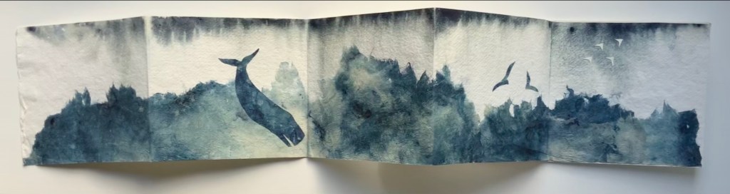
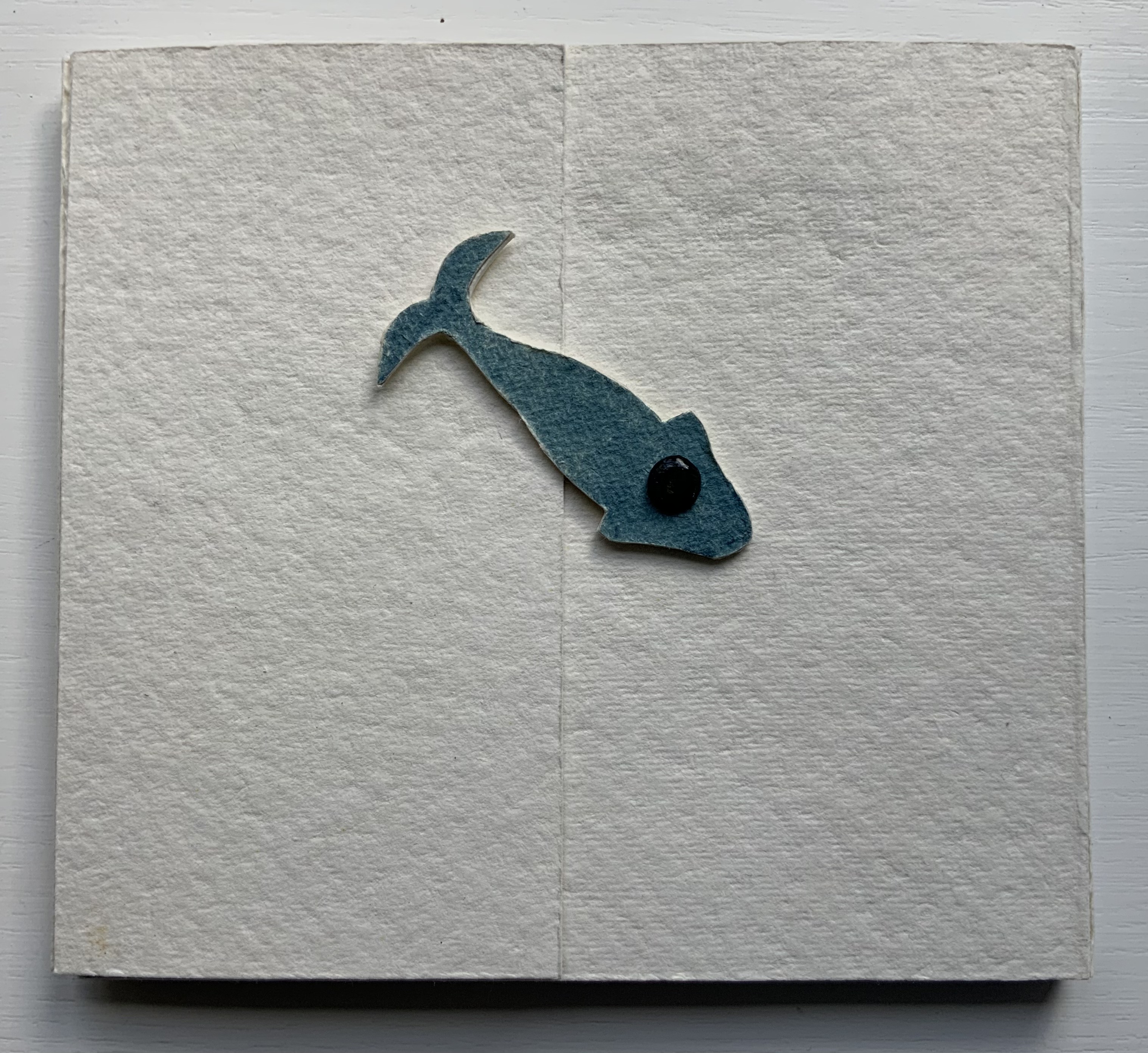
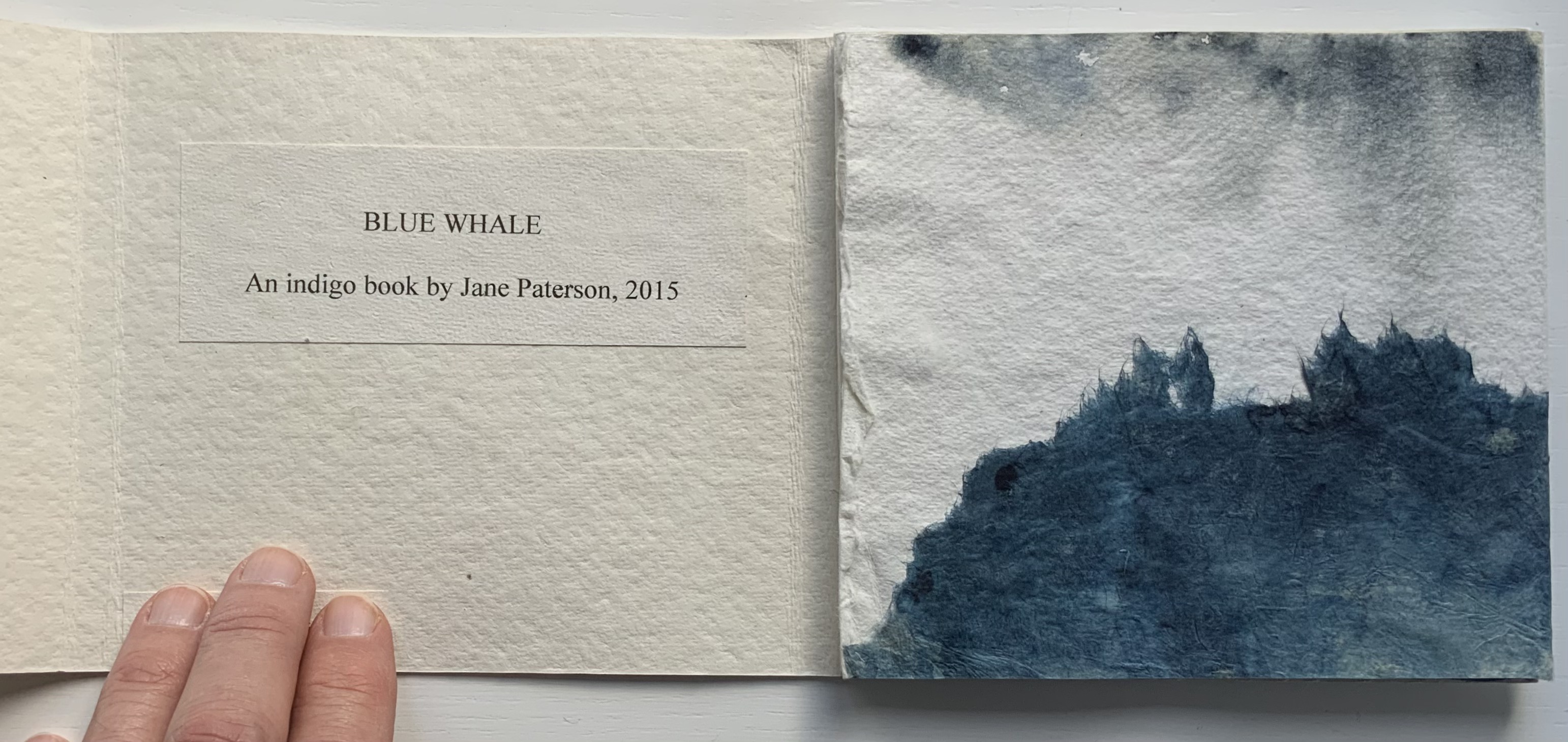
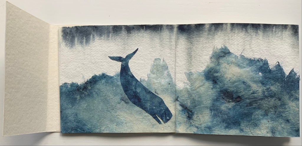
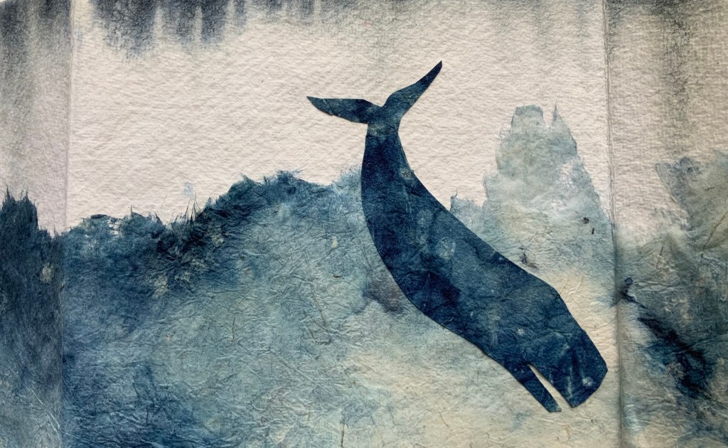
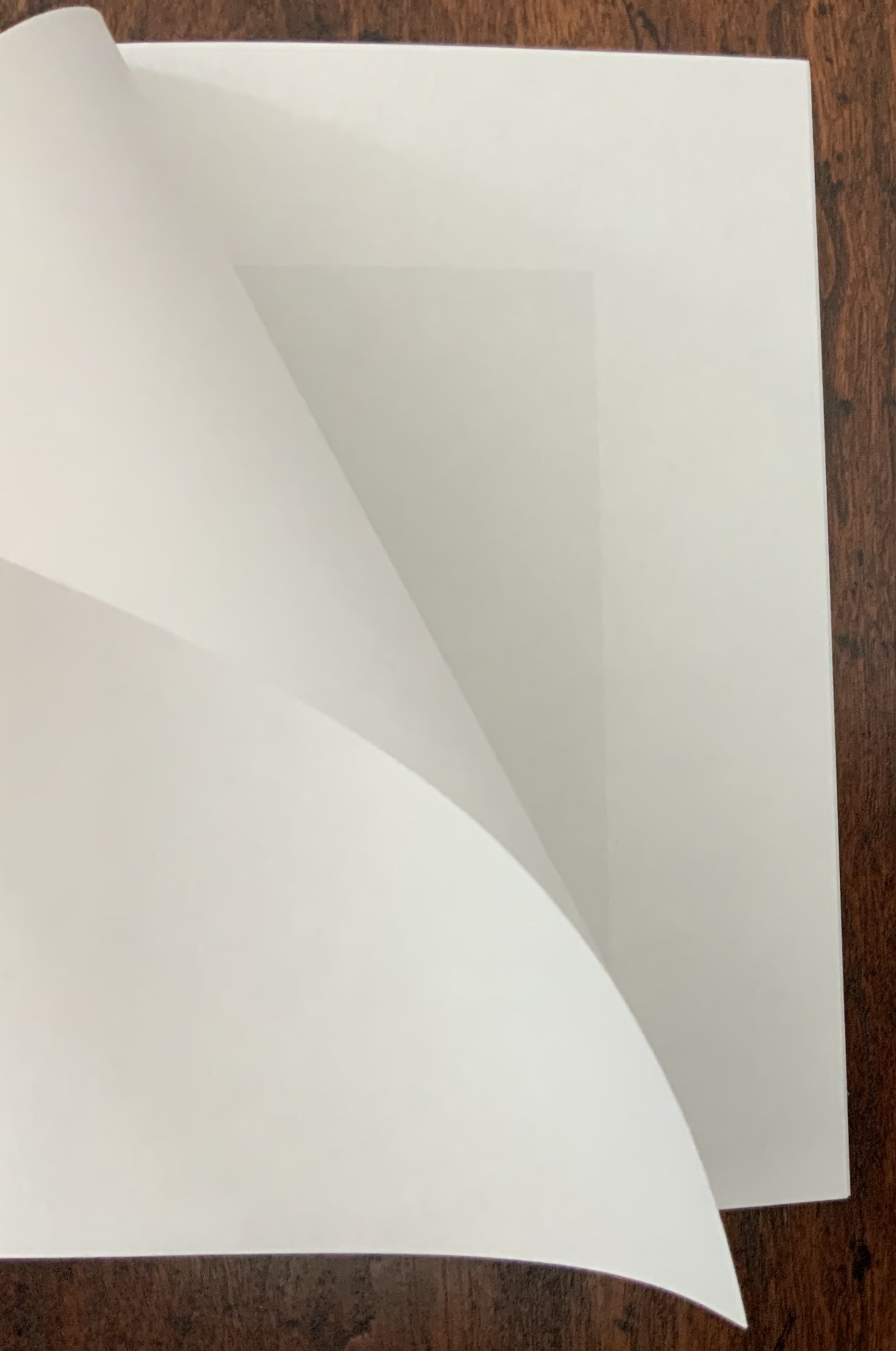
Blue Whale (2015) Jane Paterson Self-covering accordion book. H140 x W155 x D10 mm (closed); W750 mm (open). Unique. Acquired from the artist, 15 April 2015. Photos: Books On Books Collection.
An acquisition early in the early days of this collection, Blue Whale forged the way for later acquisitions that painted with paper. At the time, the artist was asked how Blue Whale was created:
In answer to your questions about the processes I use, I should explain that I have a background in textile design and a great love for indigo dye. Since starting making books I have experimented with dyeing paper in an indigo vat. I use khadi and various mulberry papers that have excellent wet strength and allow me to use many of the decorative processes that I use with textiles. I also dye card board from boxes and have exciting results tearing the wet layers apart. I made the sea in the Blue Whale book from fine paper that had partly disintegrated in the vat. The cover was made by clamping khadi paper between 2 square blocks so that the dye seeped underneath in interesting ways. The whales are made from dyed khadi. Artist’s correspondence, 9 April 2015.
Paterson’s technique in Blue Whale occupies a middle ground between collage and pulp painting. The way the artist has manipulated the nearly disintegrated, indigo-dyed fine paper to evoke the depth, surface and spray of the sea is remarkable. Additional examples of her work with indigo dye as well as other book art techniques can be found in the Artists Book Club Dove (ABCD) site.
Khadi is also the name of a papermaking company founded in the 1980s in India. Based outside the village of Tarihal near Hubli, in Karnataka, South India, Khadi runs a mill that manufactures the 100% cotton-rag paper. The company also works with suppliers in Nepal (GET Paper) and Bhutan (Jungshi). The process is described here and demonstrated here.
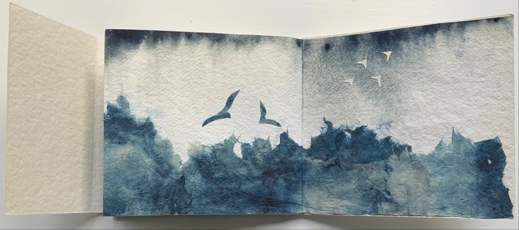
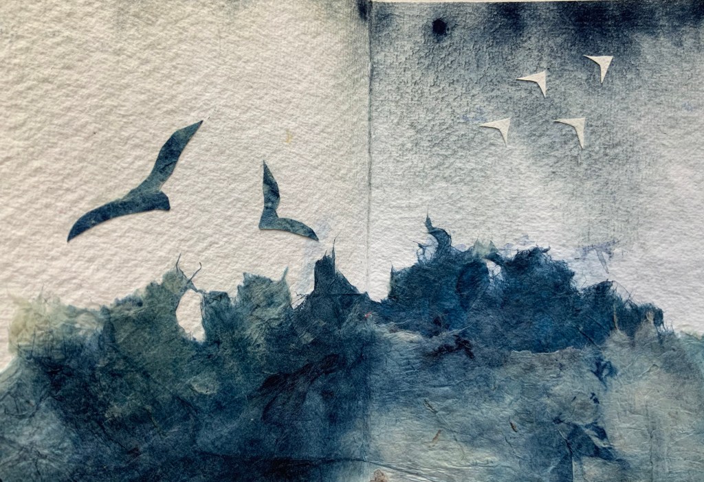
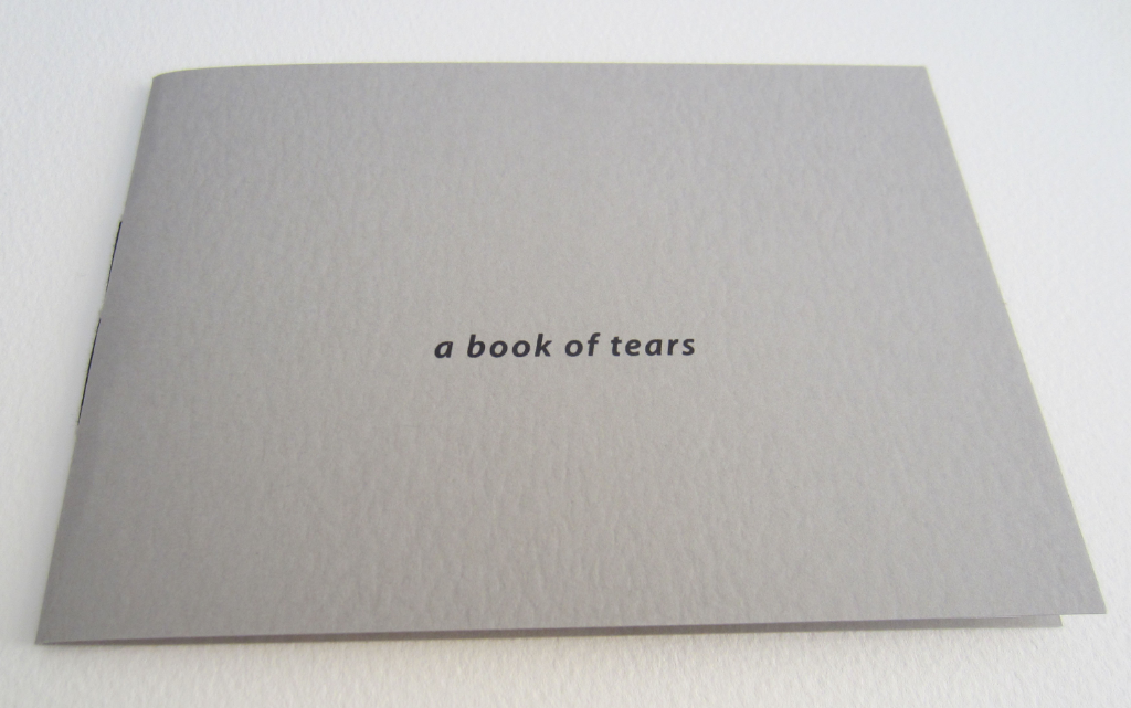
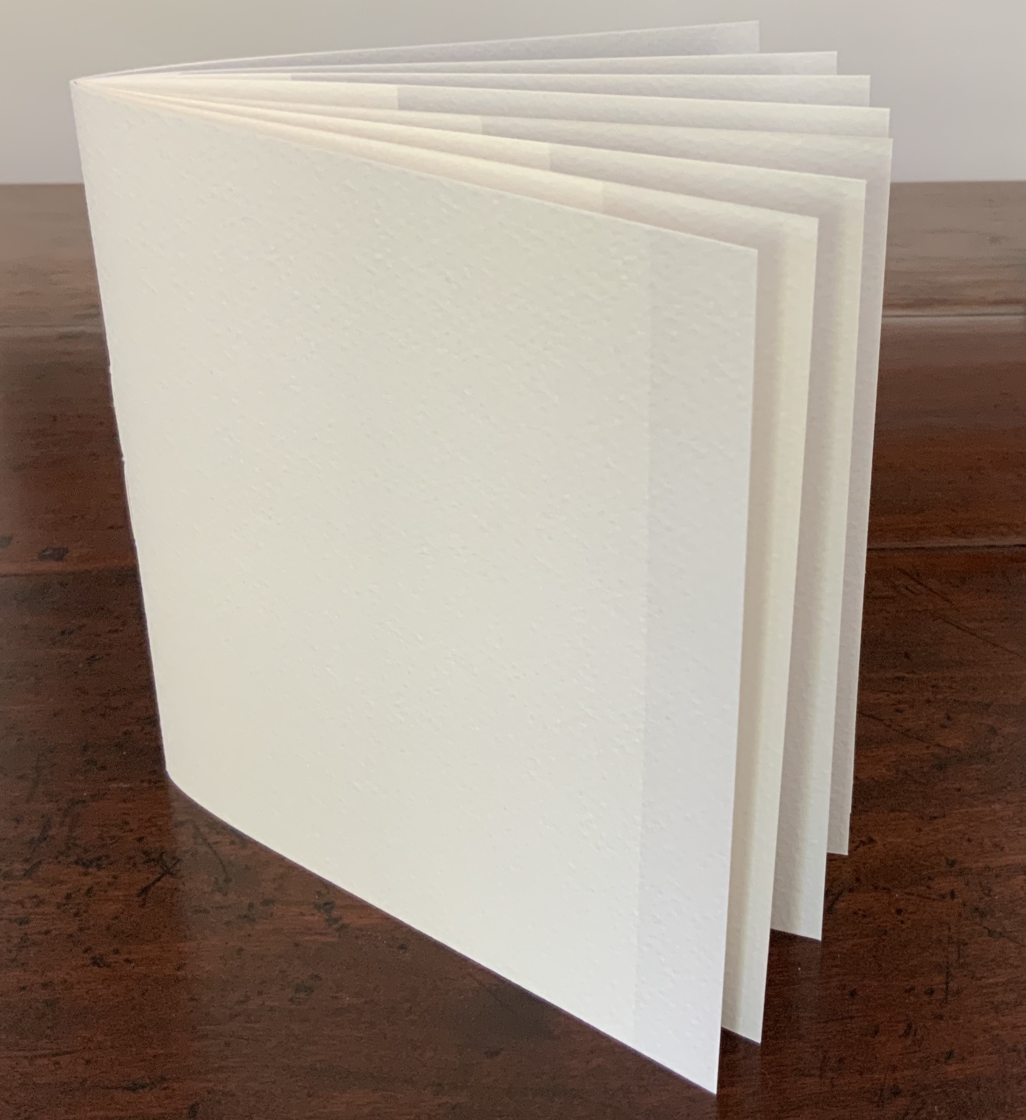
a book of tears (2006) Julie Johnstone Handbound with black linen thread, 5 sheets torn at both ends, card cover printed inkjet. Acquired from the artist, 12 December 2015. Photos: Courtesy of the artist.
a book of tears, Material | Immaterial and Point of View were the first of three Julie Johnstone bookworks in the Books On Books Collection. Like much book art, they depend on the interaction of verbal and visual puns.
Material | Immaterial (2012)
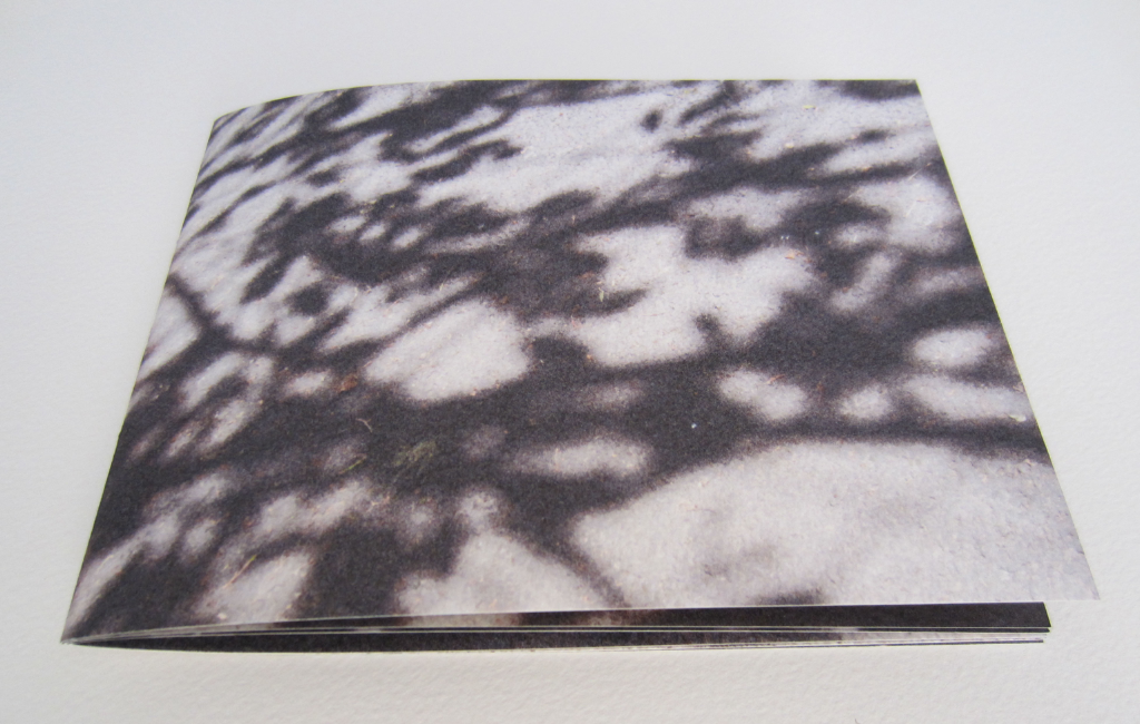
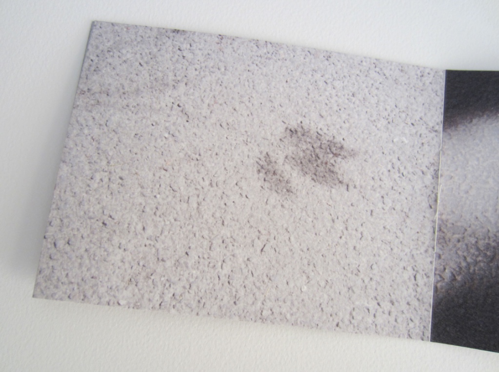
Material | Immaterial(2012) Julie Johnstone Handbound with linen thread, 12 pages, including cover. Eleven images, photographs of the shadows of trees and shrubs on city paving taken during the summer of 2012 and printed inkjet on Bockingford watercolour paper 300gsm. H130mm x w175mm. Acquired from the artist, 12 December 2015. Photos: Courtesy of the artist.
Johnstone’s tint-based works (see further below) evoke a half-tone world so much that it is strange that Material | Immaterial was one of her few (only?) photograph-based bookworks up until 2020 when the series Marks on a Surfacearrives.
Point of View: skyline tideline (2012)
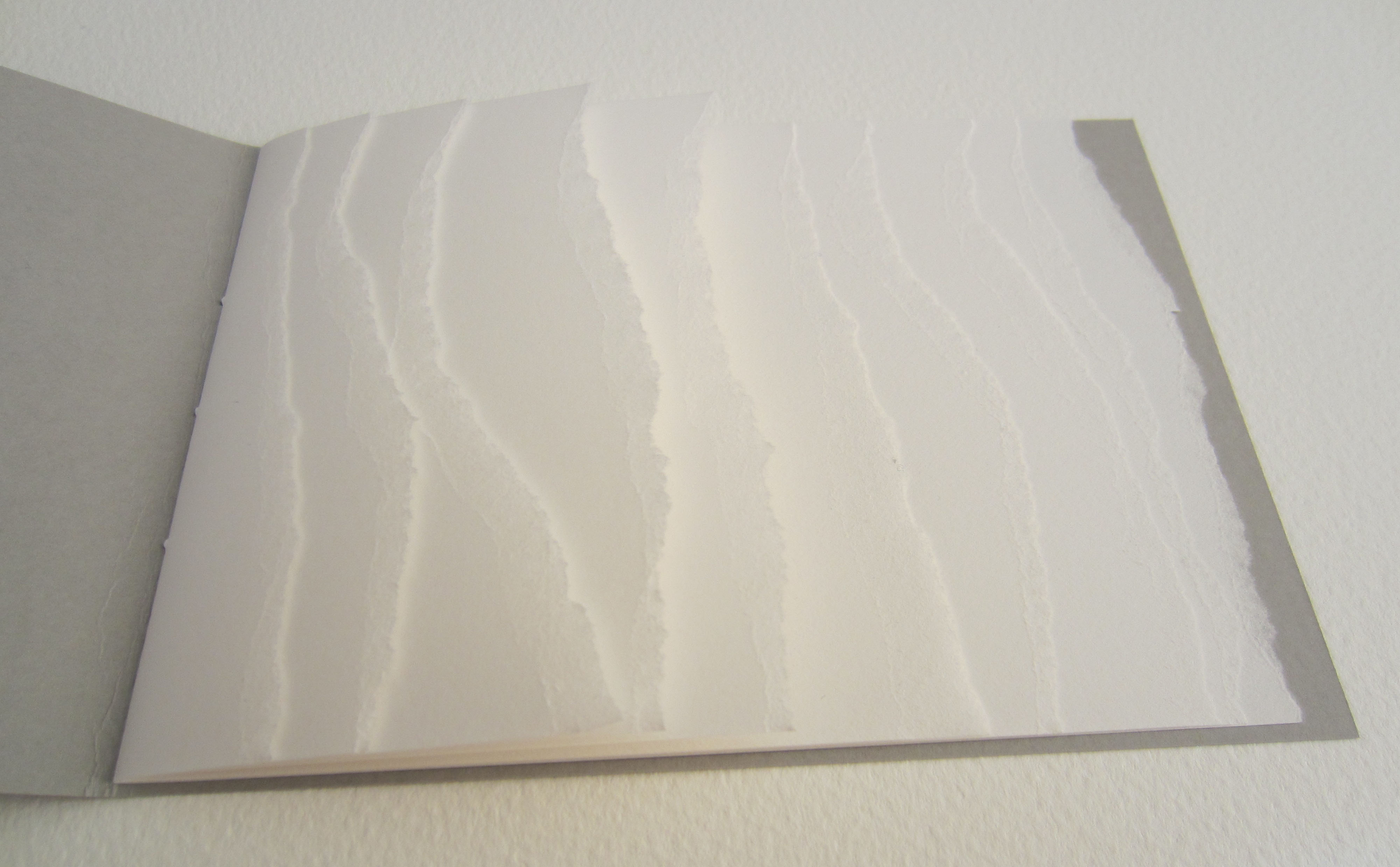
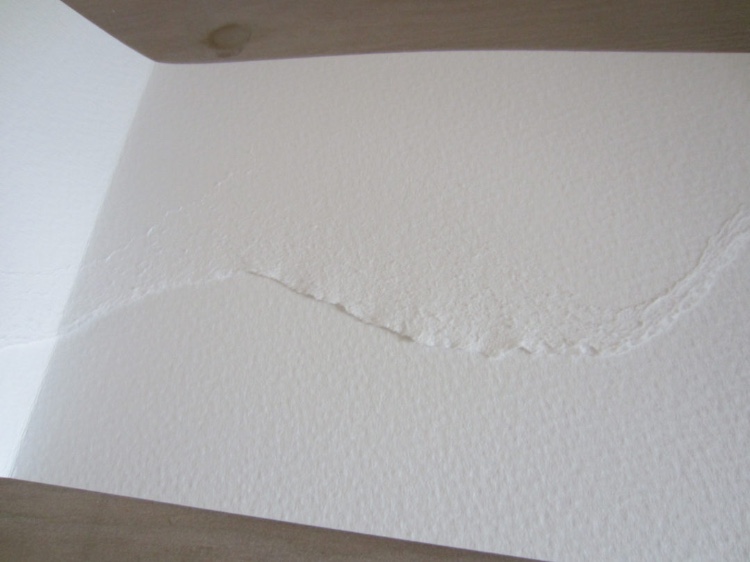
Point of View: skyline tideline (2012) Julie Johnstone Single folded book designed to be read forwards and then upside down and backwards; made from two pieces of card, inner sheet of card torn to create wavy line. skyline: front cover title in cyan blue; tideline: back cover title in cyan blue. Printed inkjet on Bockingford watercolour paper 300gsm. Closed: H120 x W190 mm; open: H120 x W380 mm. Edition of 35, of which this is #35. Acquired from the artist, 12 December 2015. Photos: Courtesy of the artist.
The shadows cast by the meticulous tears recall the larger-scale works to be found in the Rijswijk Papier Biënnale and Coda Apeldoorn. What happens with and within the physical space of this small book form is the meeting of metaphor and material, which is art.
1-16% (2013)
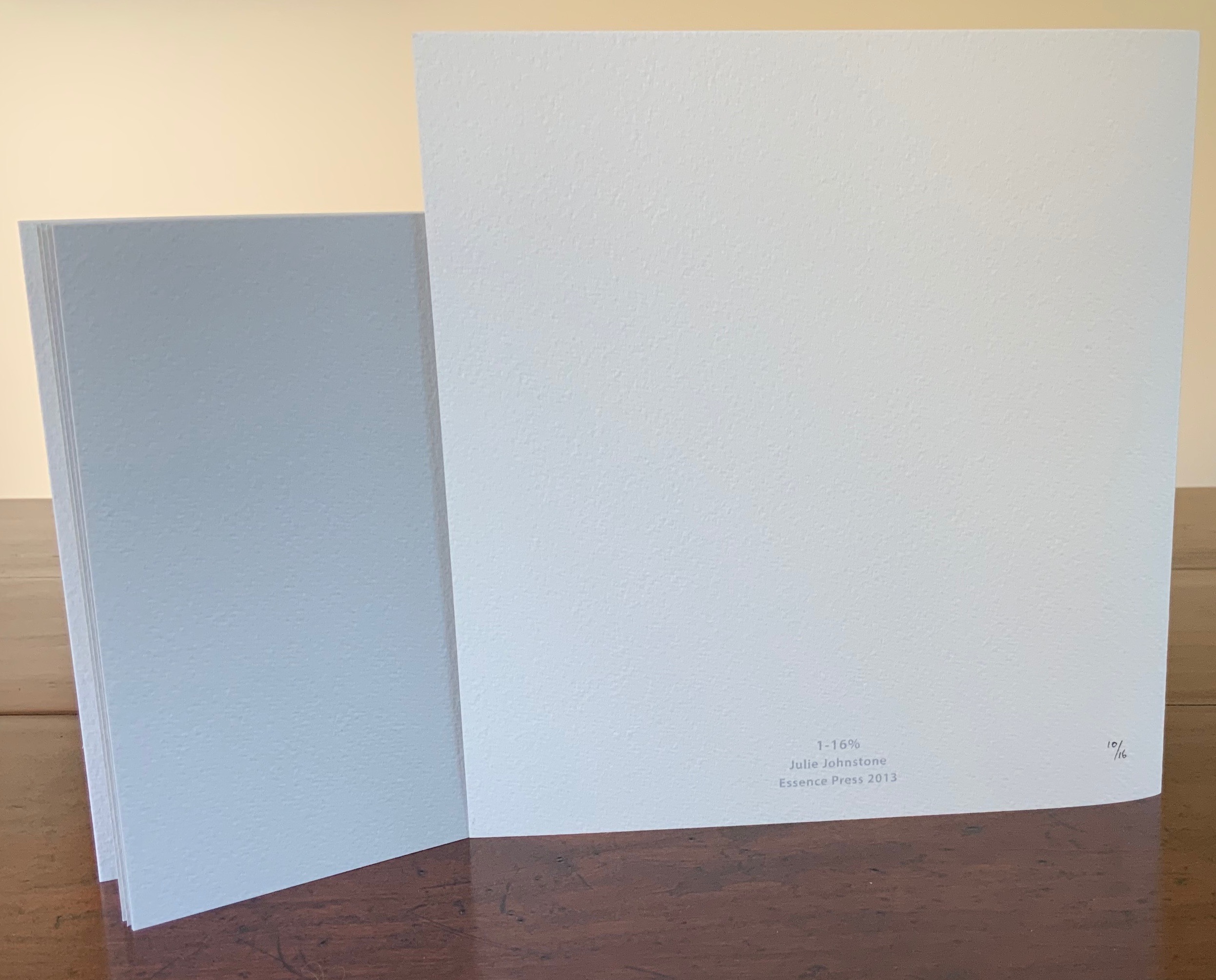
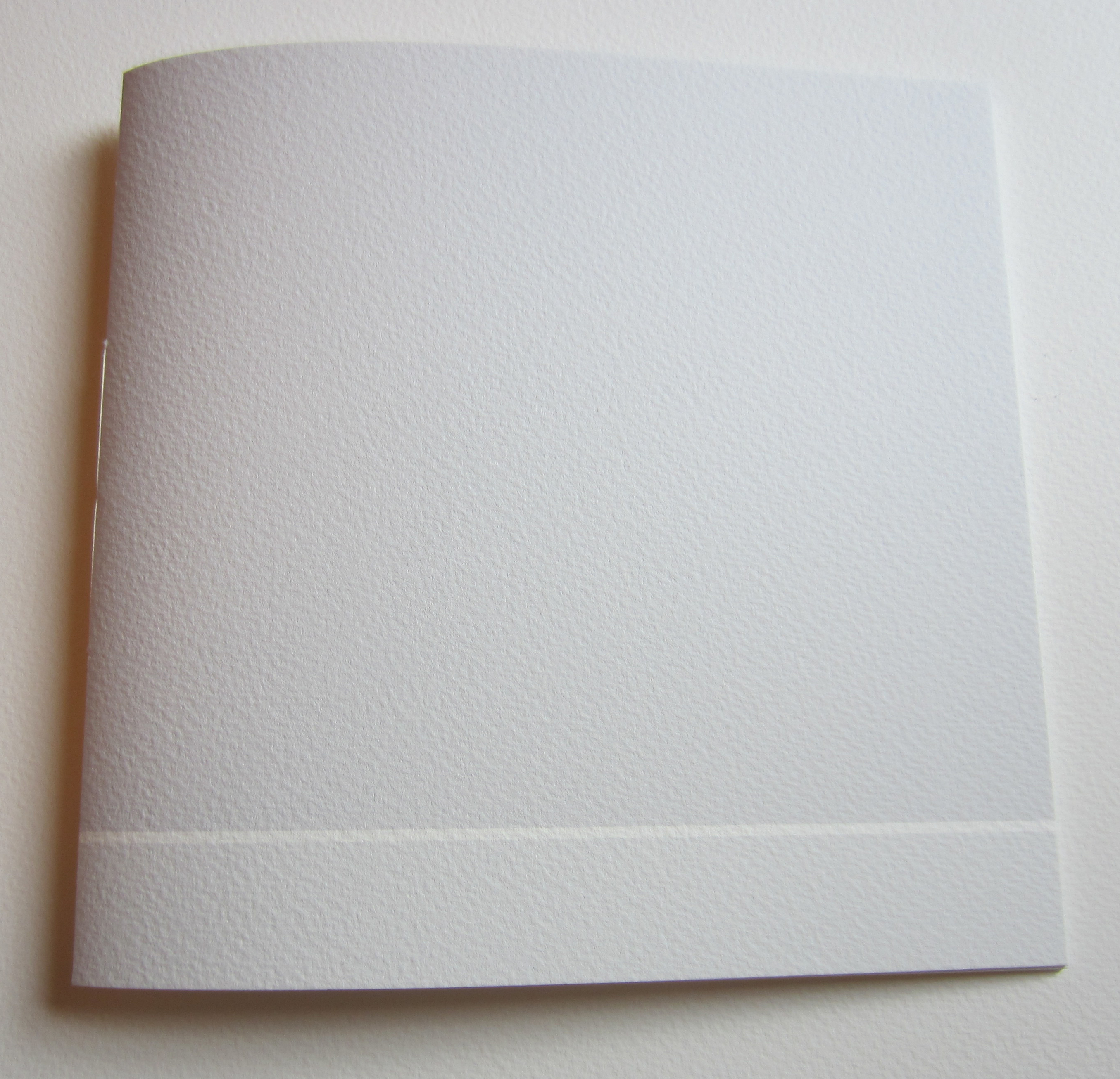
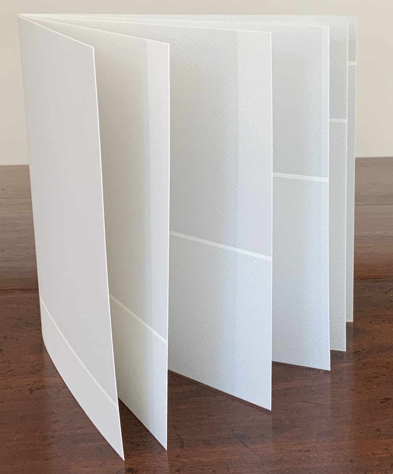
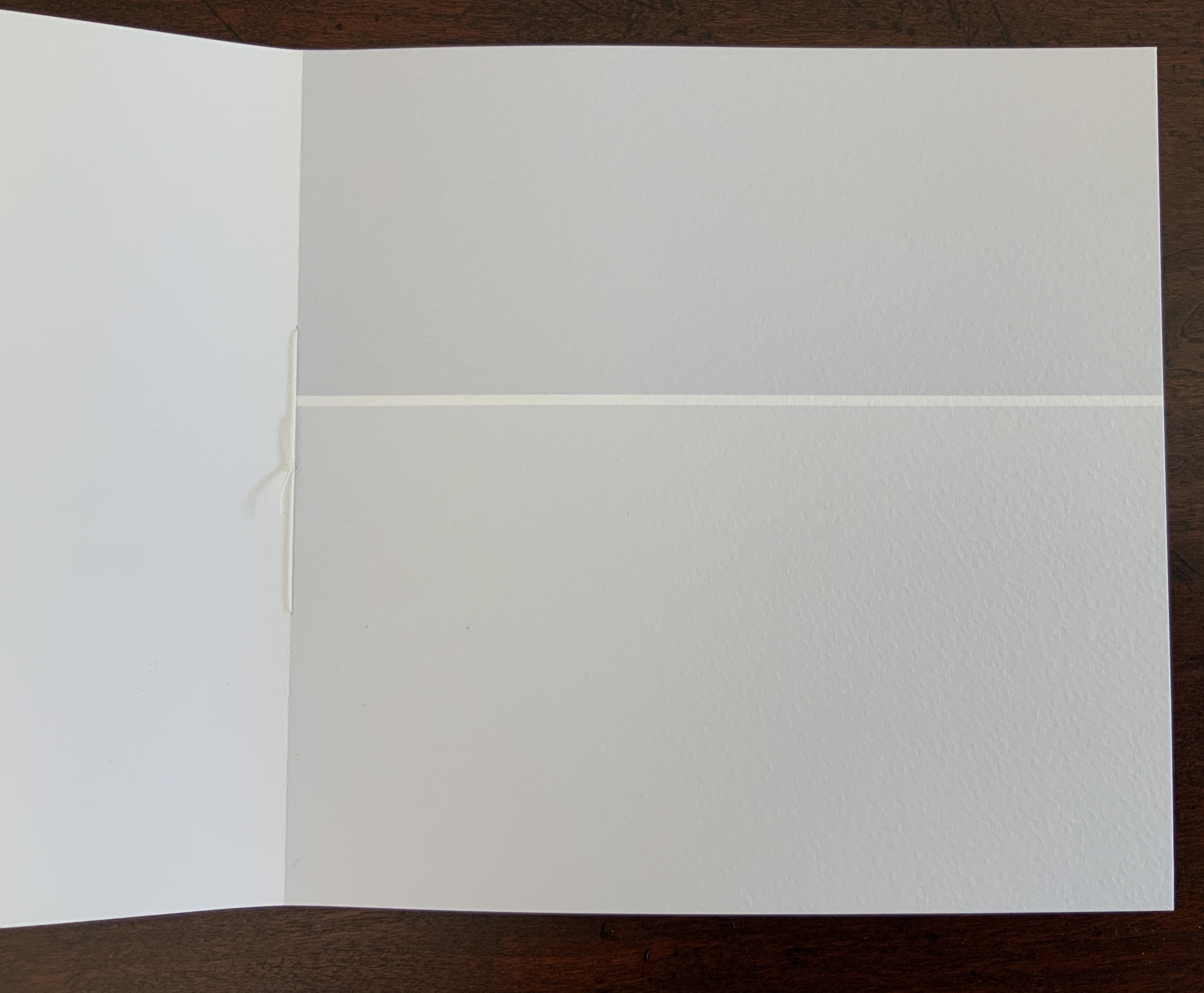
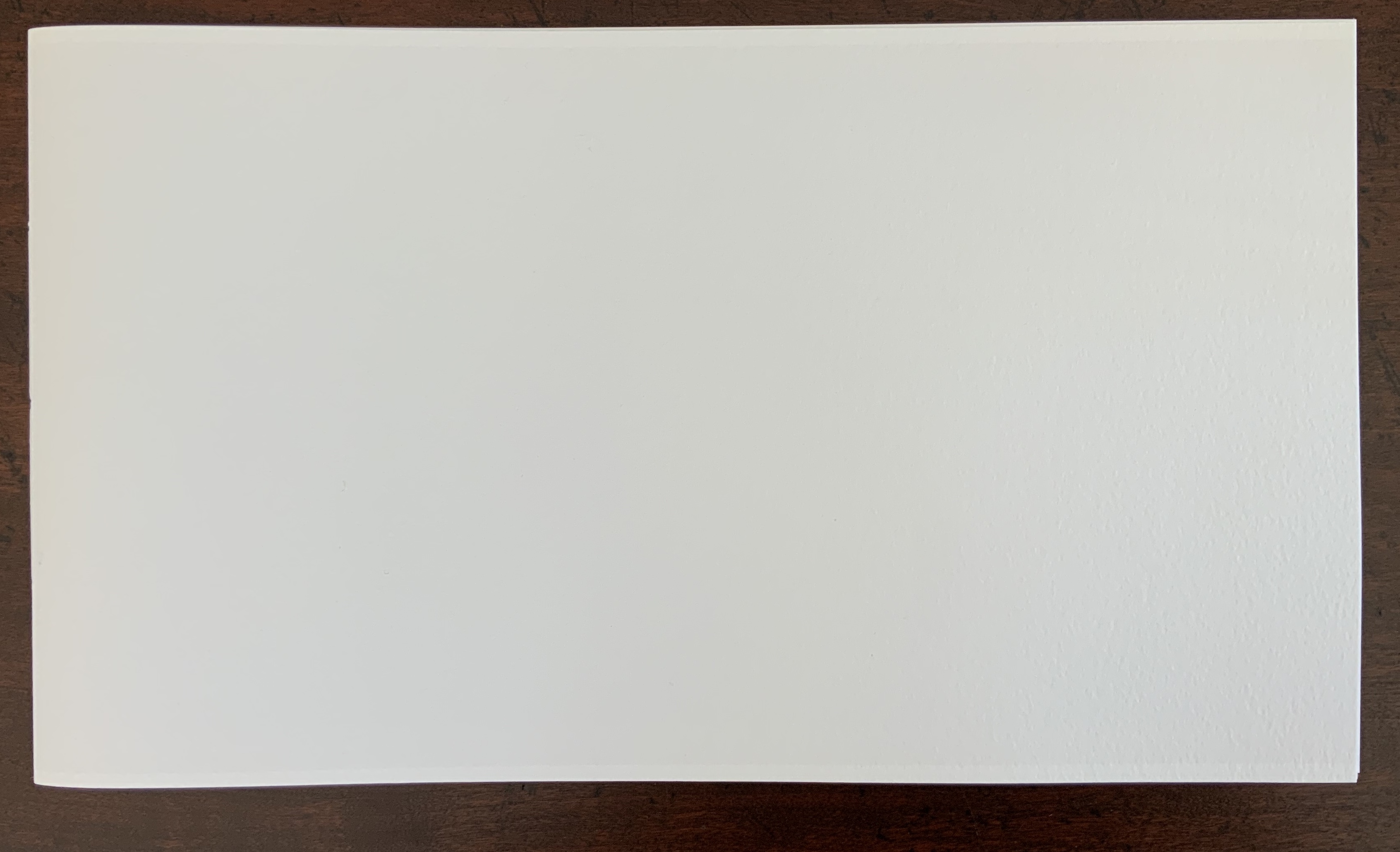
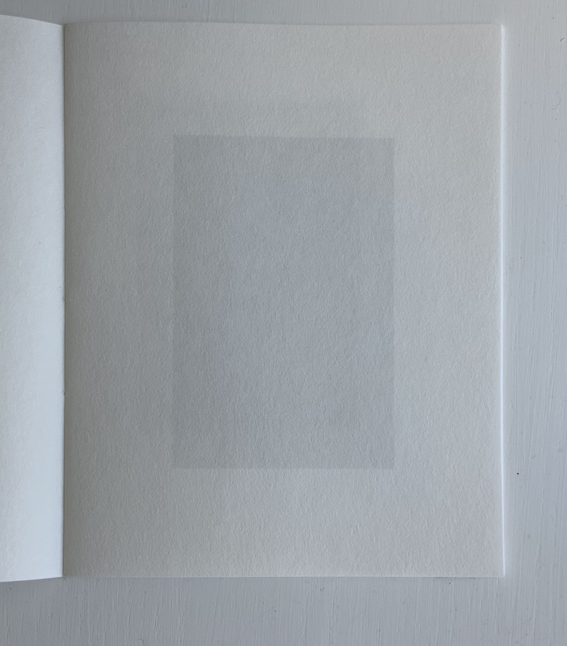
1-16% (2013) Julie Johnstone Handbound with linen thread, 16 pages, including cover; each page printed to edge with a tint of black, starting on the front cover with 1% and increasing by 1% with each page, through to 16% on the back cover; Bockingford watercolor paper 300gsm. H160 x W170 mm. Edition of 16, of which this is #10. Acquired from the artist, 26 September 2017. Photos: Books On Books Collection.
In the collection, this is the first work to use progression of tint, Johnstone’s signature technique. The space allocated to the tint remains constant. So that nothing distracts from this, a larger single-fold sheet is used as a loose jacket and for the colophon.
10%|15% (2013)
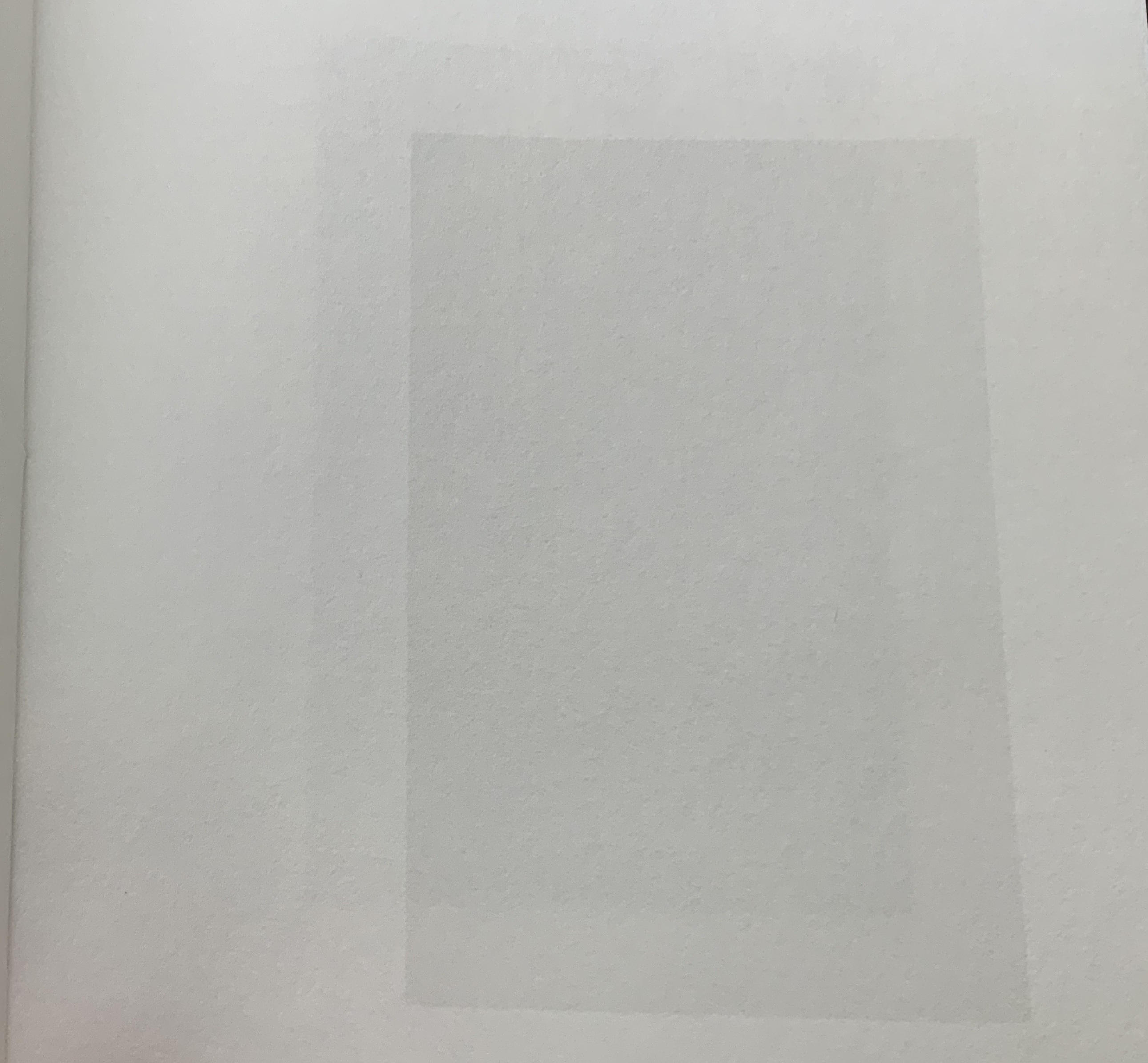
10%|15%(2013) Julie Johnstone Created for the AMBruno Lines project on the occasion of the Whitechapel Art Book Fair 2013. Handbound with linen thread, 12 pages, including covers; each facing page, including cover, printed to edge with two blocks of a tint of black, one 10% and the other 15%. The size of blocks changes progressively as the pages turn, moving the unprinted ‘line’ up the page in 2.5 cm increments. Printed inkjet on Bockingford watercolor paper 300gsm. H190 x W180 mm. Edition of 25, of which this is #20. Acquired from the artist, 26 September 2017. Photos: Books On Books Collection.
In this work, the tints hold steady, and the technique of progression shifts to changing the print area. The unprinted line that rises up the page recalls Bodil Rosenberg’s Vandstand (2019), where the water level in acrylic rises page after page. Vandstand and 10%|15% display well together.
2-20%|20-2CM (2014)
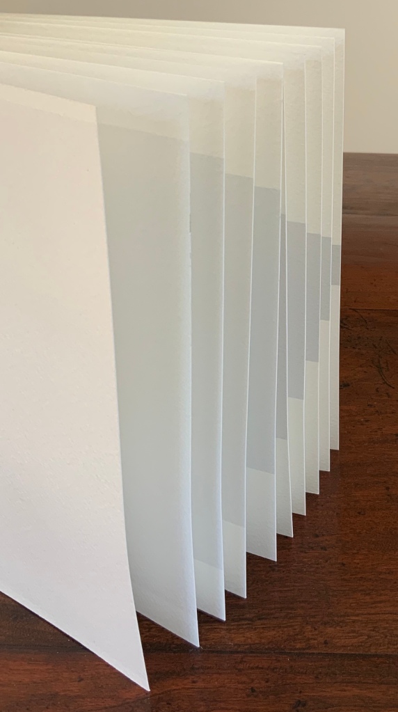
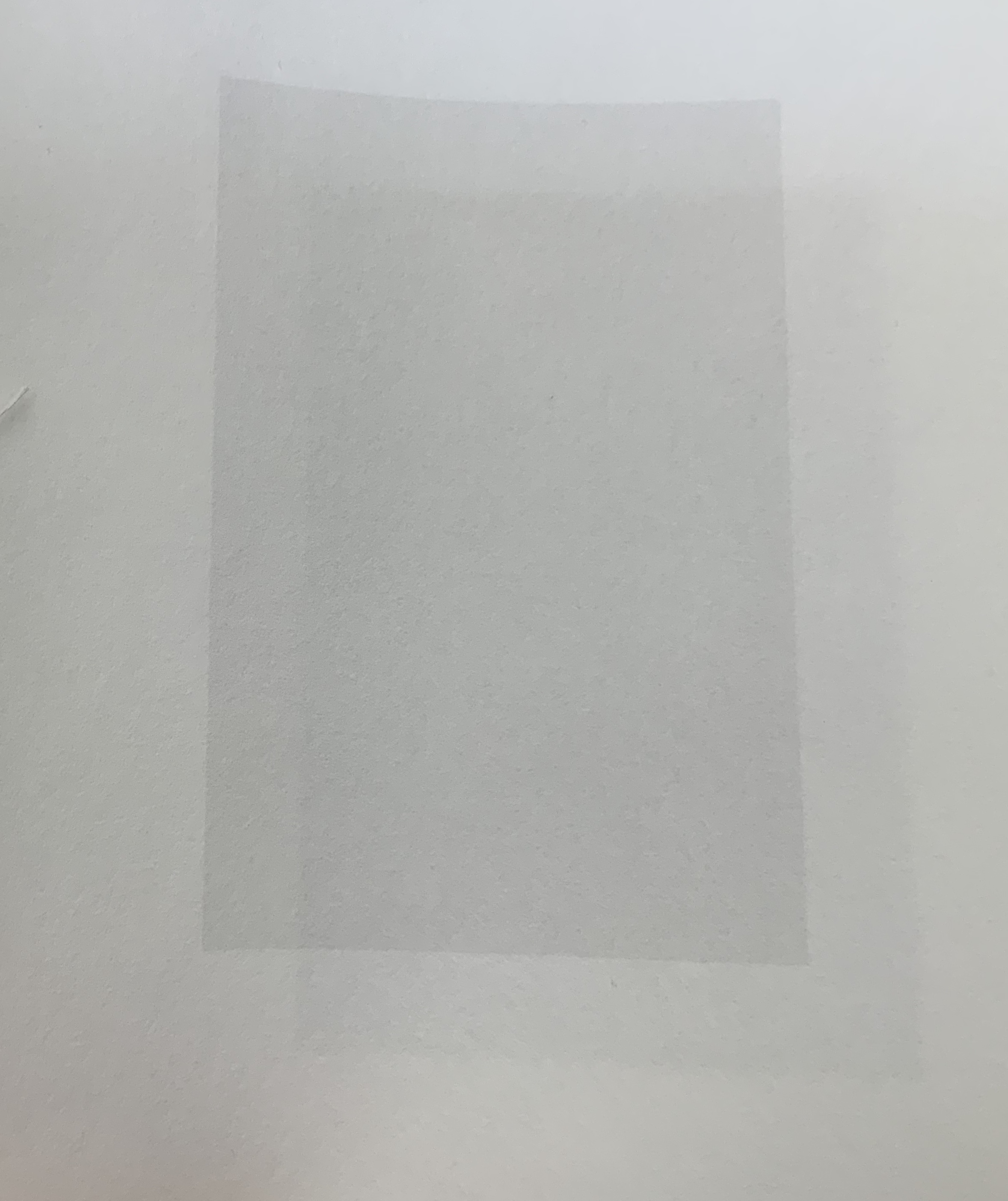
2-20%|20-2CM (2014) Julie Johnstone Handbound with linen thread, 20 pages, including the cover; printed inkjet on Bockingford watercolor paper 300gsm. H240 x W280 mm. Edition of 10, of which this is #5. Acquired from the artist, 26 September 2017. Photos: Books On Books Collection.
With this work, the technique becomes one of dual progression — both tint and printing area. Starting with the front cover, the tint is 2% black in a block of 20cm height. With each recto page, the tint increases by 2%, and the height reduces by 2cm. On the last recto page, the block of 2% black is 2cm in height.
With each new work varying tint and/or print space, Johnstone recalls the creative approaches of the OuLiPo movement. Its authors such as Italo Calvino, Raymond Queneau and Georges Perec set themselves strange writing constraints, such as write a novel without the letter “e”. Johnstone may rightly claim the visual artist’s crown in the movement (still ongoing) with this next work.
3% [1-5] (2015)
3% [1-5] (2015) Julie Johnstone Set of 5 booklets in folder; each booklet handbound with linen thread, 16 pages including cover, printed inkjet on Hahnemuhle Sumi-e paper 80gsm. H150 x W120 mm. Edition of 20, of which this is #10. Acquired from the artist, 26 September 2017. Photos: Books On Books Collection.
As noted above, this work recalls the “simple complexity” of the wordplay in Samuel Menashe’s short poem. Just as the pouring pot “fulfills” its spout, so Johnstone’s working of tint and semi-transparent paper fills and fools the hungry eye.
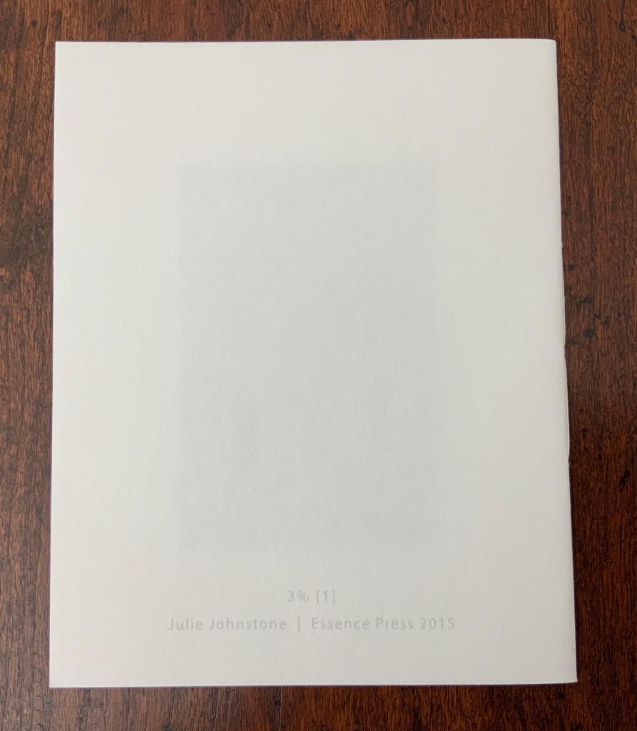
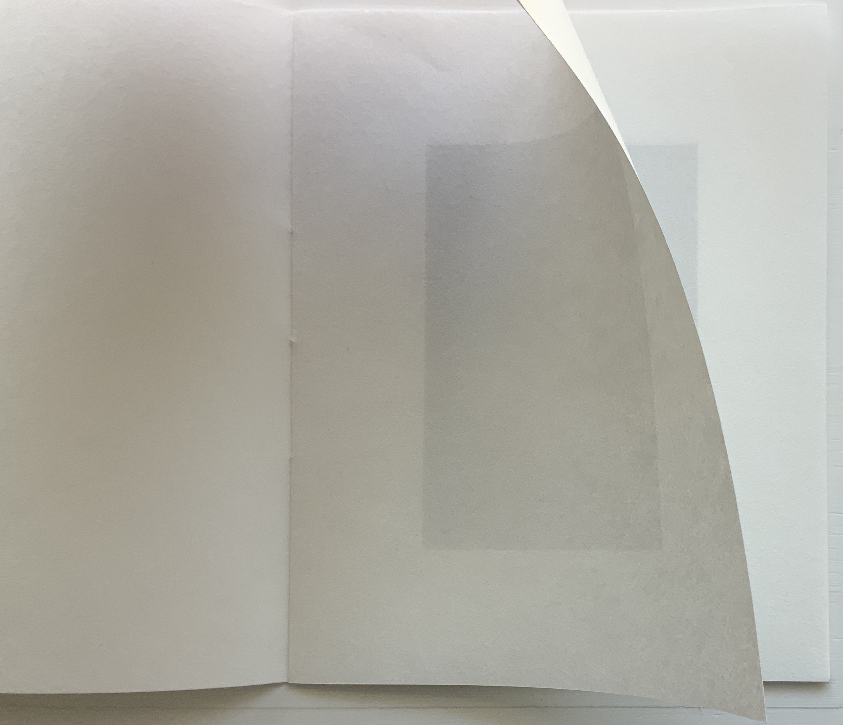
3% [1] Photos: Books On Books Collection
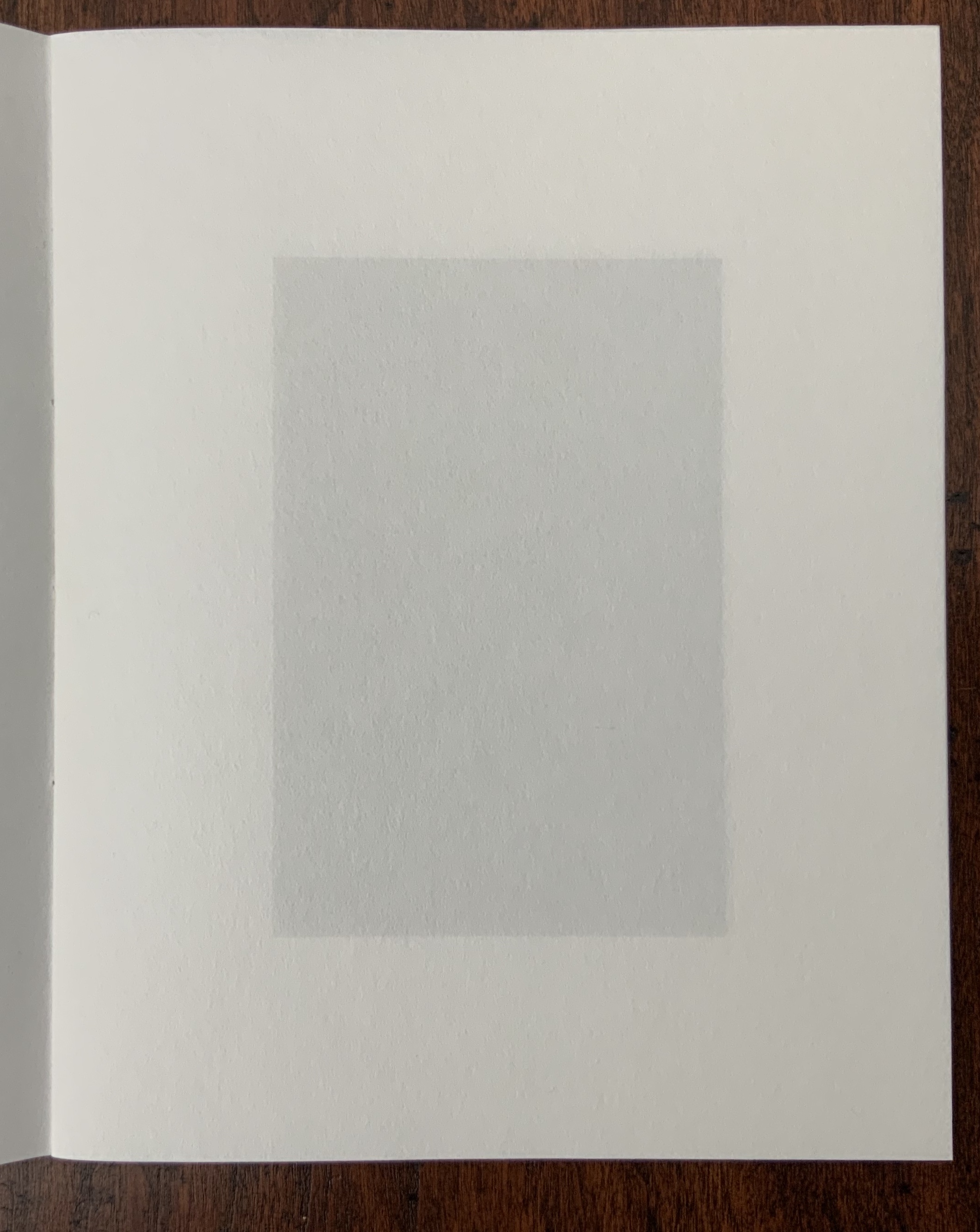
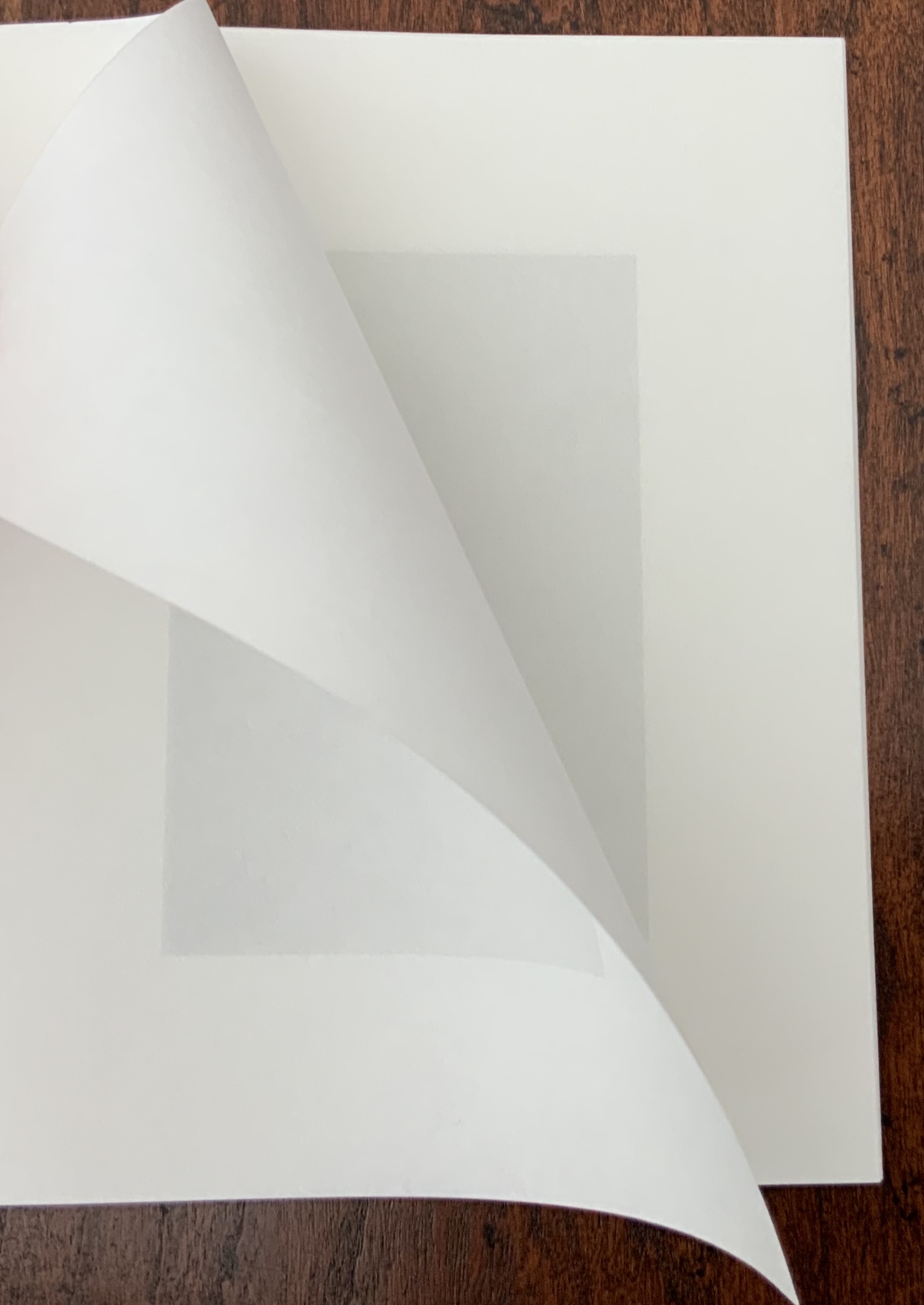
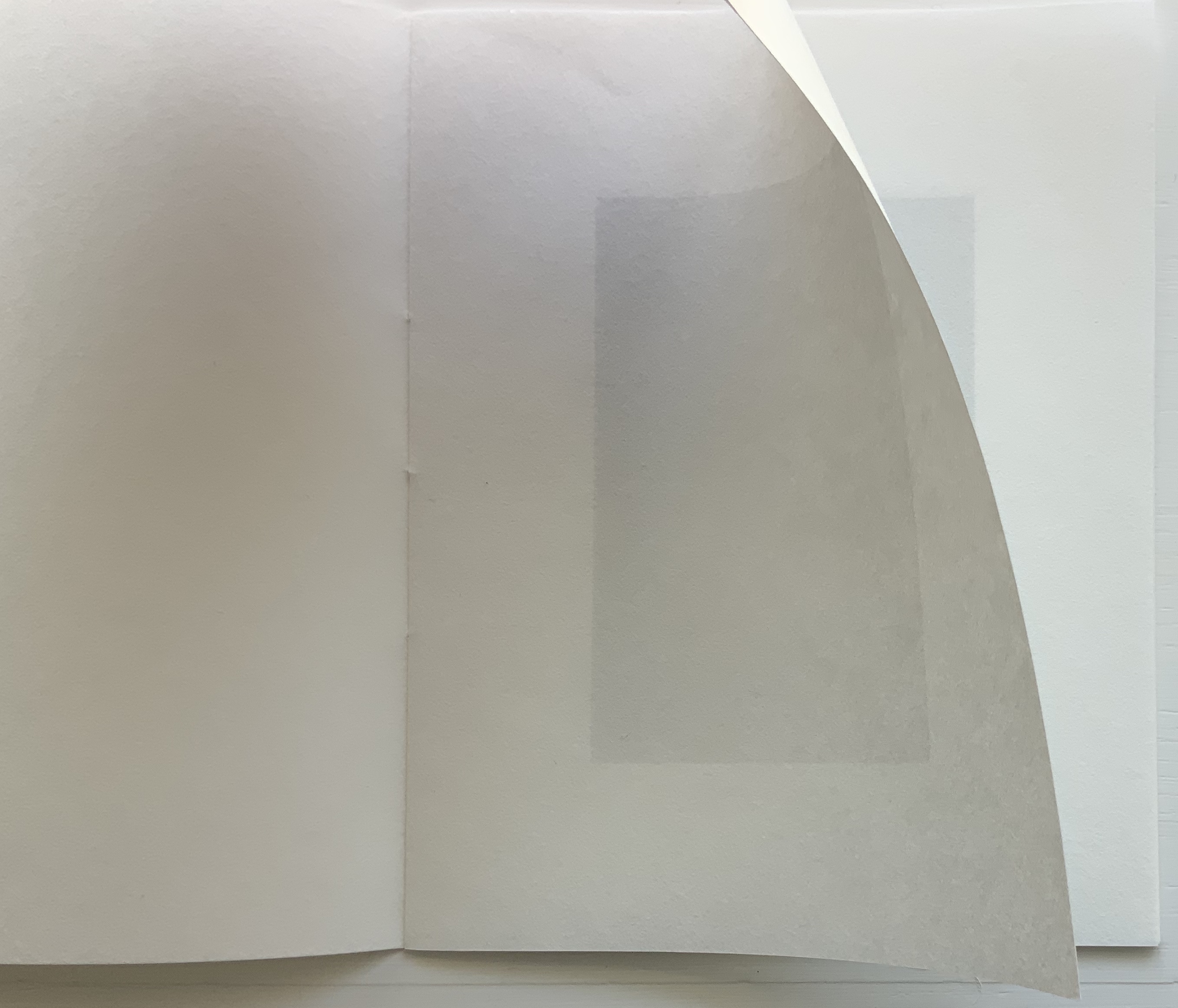
Booklet [1] serves as the baseline for the other four booklets. Each facing page (excluding cover and next page) is printed with a 3% black tinted rectangle (90 x 60 mm). As the semi-transparent page turns, the tint seems to vary. The precision of registration and sureness of touch across the pages amazes.
3% [1] The effect changes with the light. Photos: Books On Books Collection
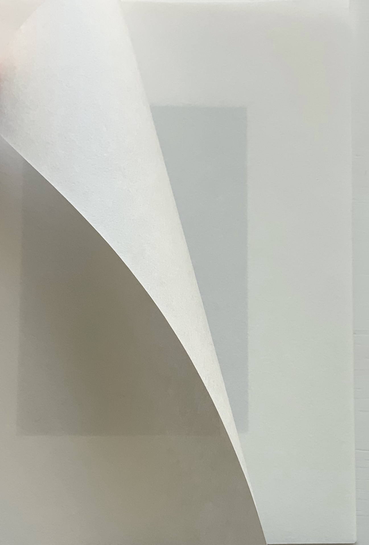
At first, Booklet [2] seems not to vary from [1], encouraging careful reading and looking to discover that every other page is blank in Booklet [2]. The choice of paper and tint as well as the “persistence of vision” combine to create the illusion that pages are printed when they are not.
3% [2] Photos: Books On Books Collection
Booklet [3] extends the play of book [2] with an empty 3pt frame printed in 3% black on every other page to create the illusion that the next page’s block appears to fill it. Booklet [4] also extends the play of book [2] with a half block printed in 3% black on every other page to create the illusion of a darker or lighter block next to it due to show-through. This play within the boundary of the 90 x 60 mm rectangle takes a leap in Booklet [5].
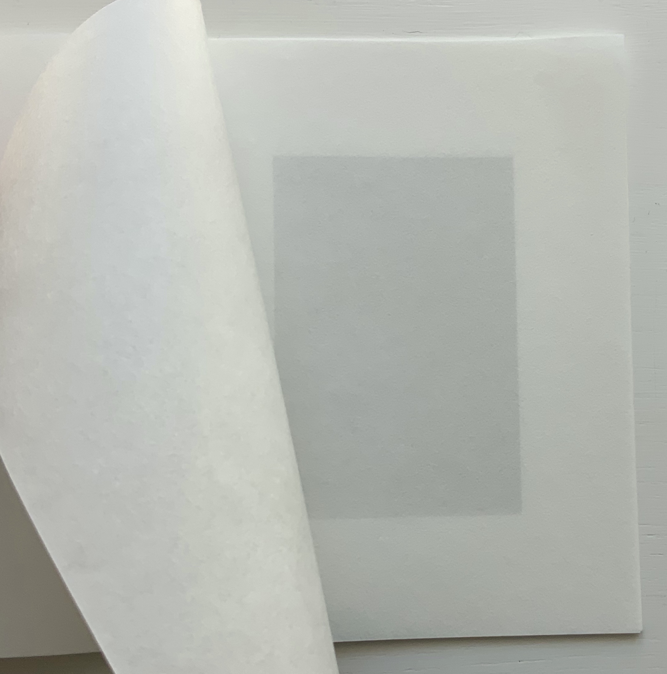
3% [5] The slight curving in the rectangles is due to how the booklet is being held. Photos: Books On Books.
Here in Booklet [5], the 3% block appears once on each facing page but shifts diagonally by 1cm either to the top and left or to the bottom and right. Now the eye is fooled into perceiving two differently tinted blocks printed off center one over the other. The pleasure in these works of book art lies in contemplating each page and the movement from page to page, back and forth.
Field (2014)
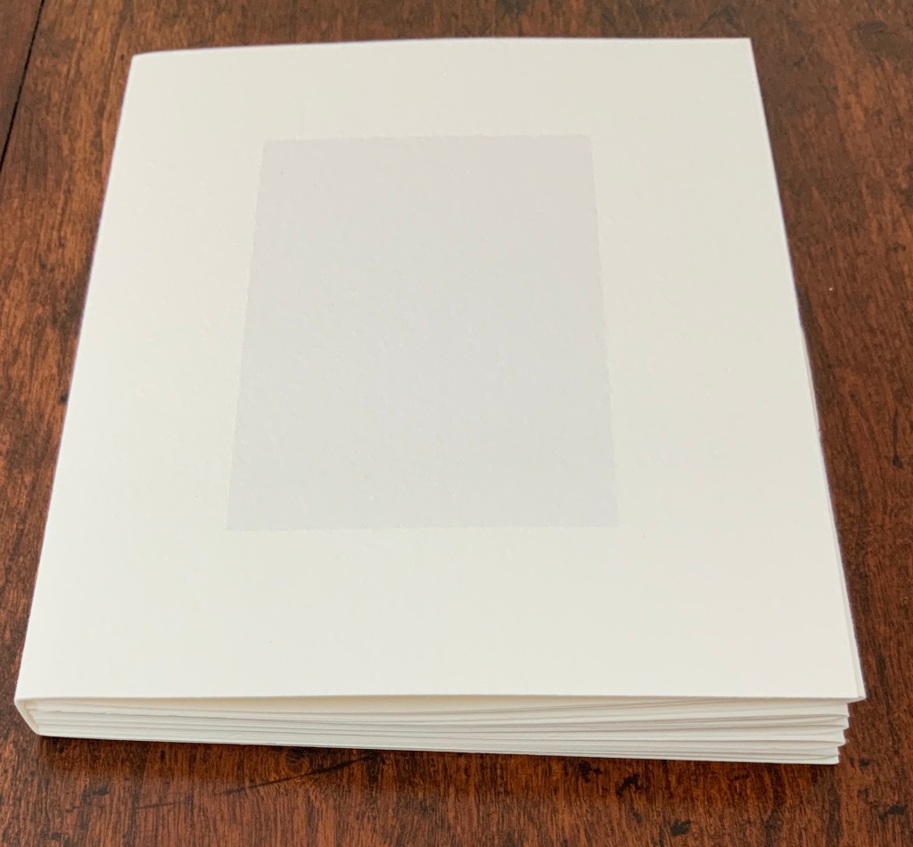
Field (2014) Julie Johnstone Handbound with linen thread, 16 pages, including cover, printed inkjet on Bockingford watercolor paper 300gsm. H160 x W160 mm. Edition of 25, of which this is #14. Acquired from the artist, 26 September 2017. Photos: Books On Books Collection.
Like 10%|15% and 2-20%|20-2CM, this work proceeds by dual progression, but the print area changes horizontally rather than vertically. Each facing page (including cover) is printed with a tint of black in a block flush along its fore-edge. The tint begins on the cover at 2% in a 2cm block. On each page after, the tint increases by 2% and the block by 2cm. The final page presents a 16% tint and 16cm block.
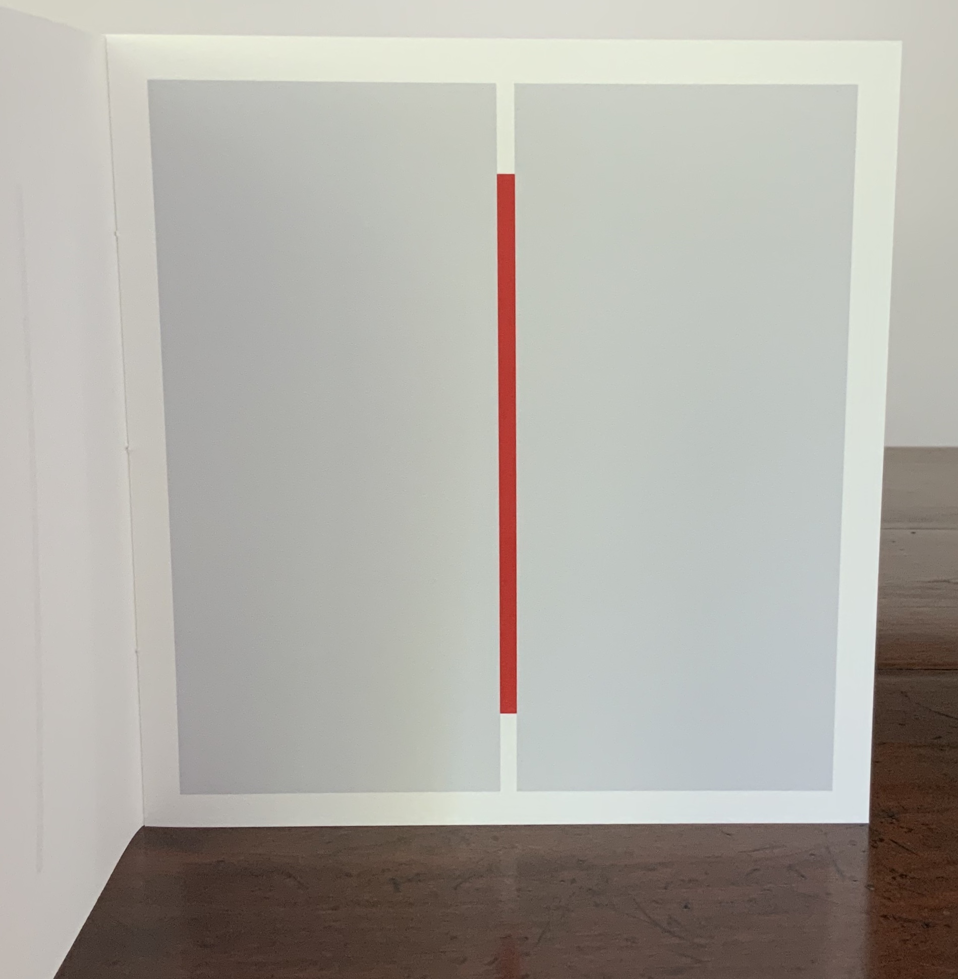
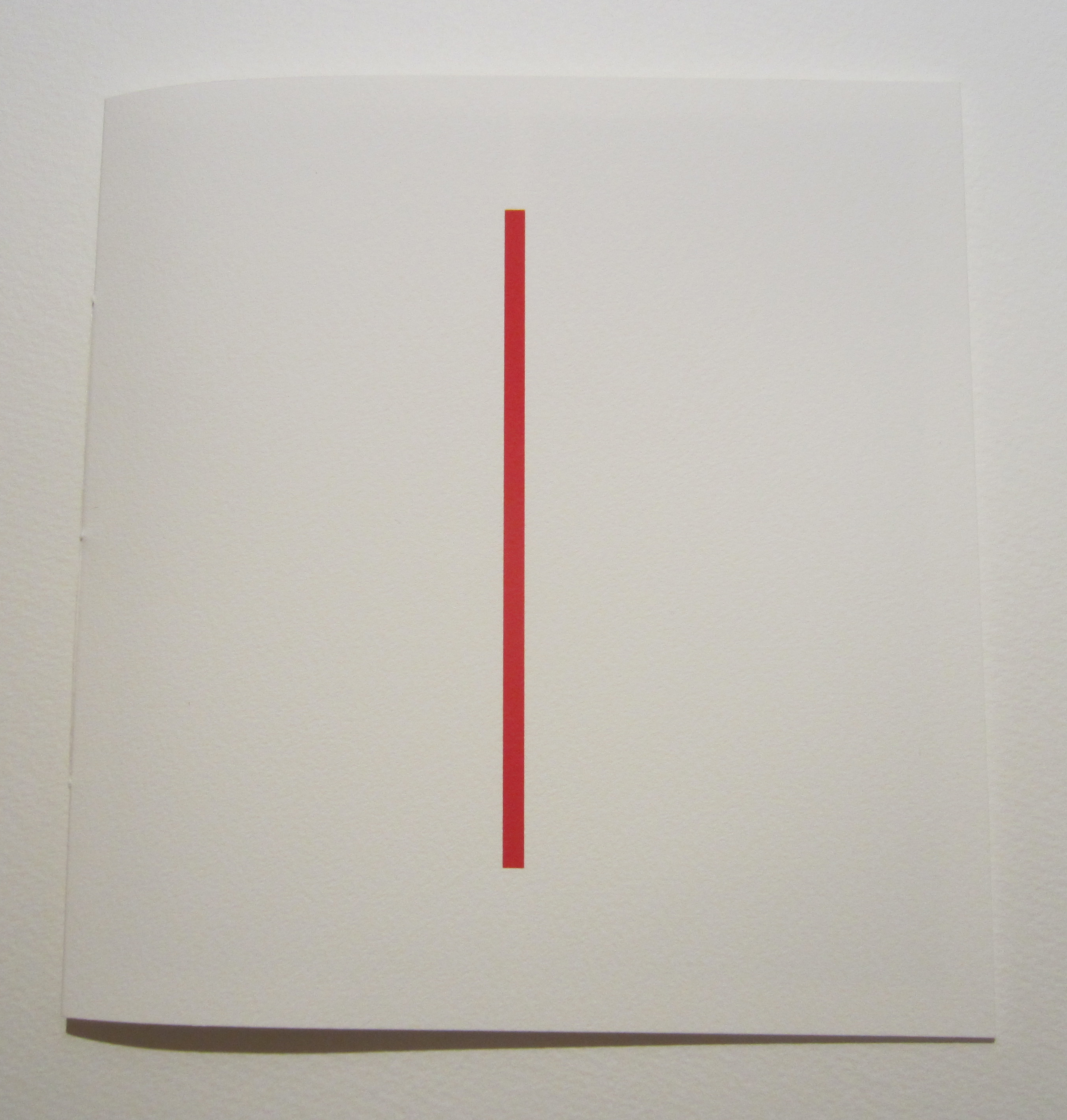
red (2015)
red(2015) Julie Johnstone Created for the AMBruno RED project. Handbound with linen thread, two sheets printed with three images (including cover image); printed inkjet on Bockingford inkjet watercolor paper 190gsm. H190 x W180 mm. Acquired from the artist, 26 September 2017. Photos: Books On Books Collection.
In most of Johnstone’s work, the color blue appears most frequently as the alternative to tints of black. This work, created for an AMBruno project, proves the exception, albeit continuing with the technique of dual progression — here, around the still point of a vertical red bar. The barely perceptible tint of black on the cover deepens on the first facing page to such an extent that the red bar seems to shorten (it doesn’t). Then on the next facing page, the tint remains the same, but the blocks turn perpendicular to the red bar and do truncate it.
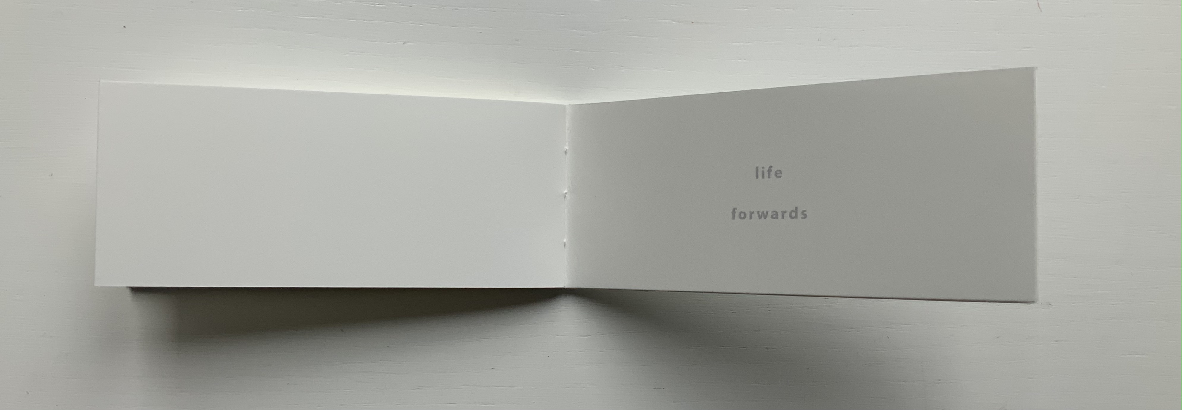
LIFE (2018)
LIFE (2018) Julie Johnstone (after Kierkegaard) Handsewn booklet; cover in Bockingford watercolor paper 300gsm. H60 x W140 mm, 12 pages. Acquired from Essence Press, 10 April 2021. Photos: Books On Books Collection.
This small work is another elegant demonstration of Johnstone’s artistic play with imposition and the act of reading, touching, looking and thinking.
This is Johnstone’s response to the AM Bruno 2021 call for works on the theme volume that capture “one, or a combination of these definitions: (i) a book forming part of a work or series; (ii) the amount of space that a substance or object occupies; and (iii) the quantity or power of sound'” (from the brief by John McDowall).
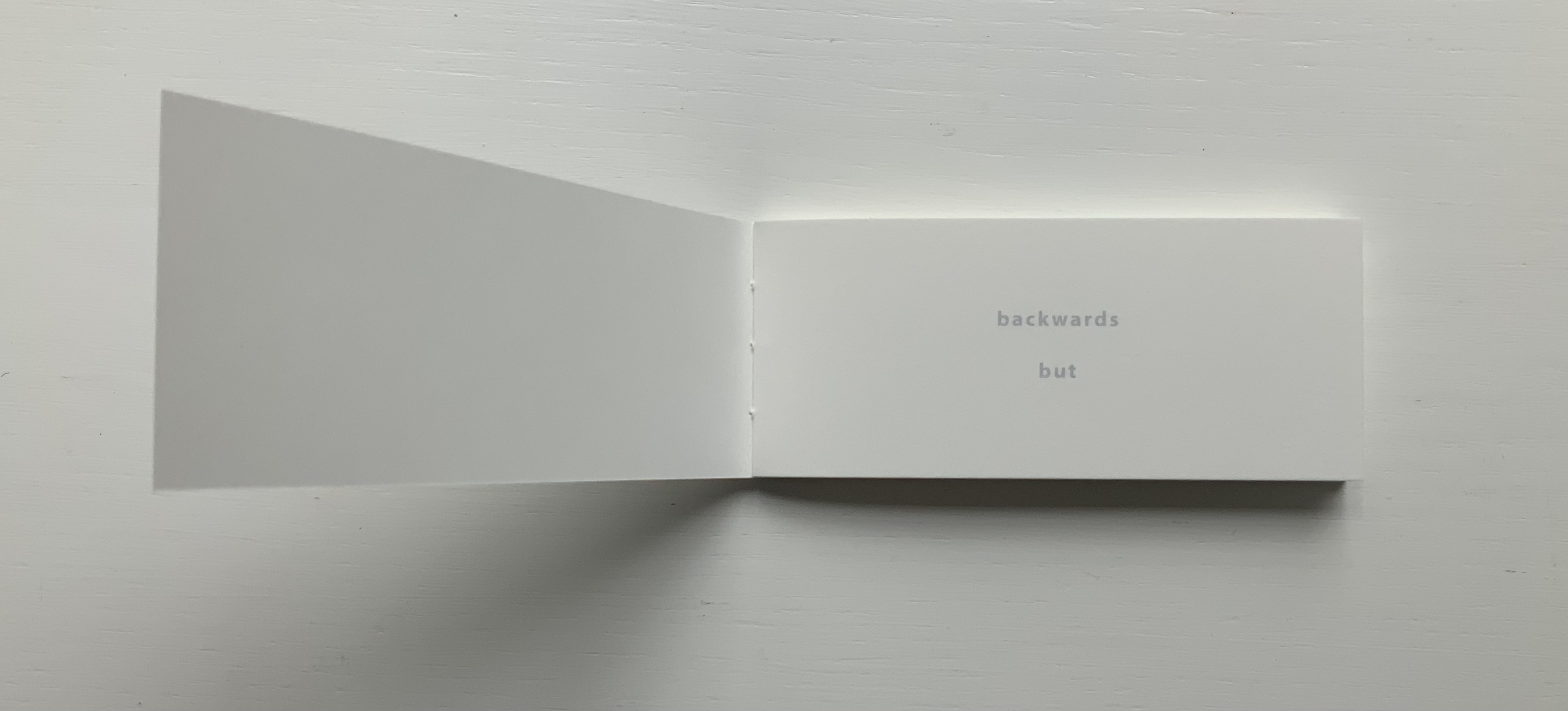
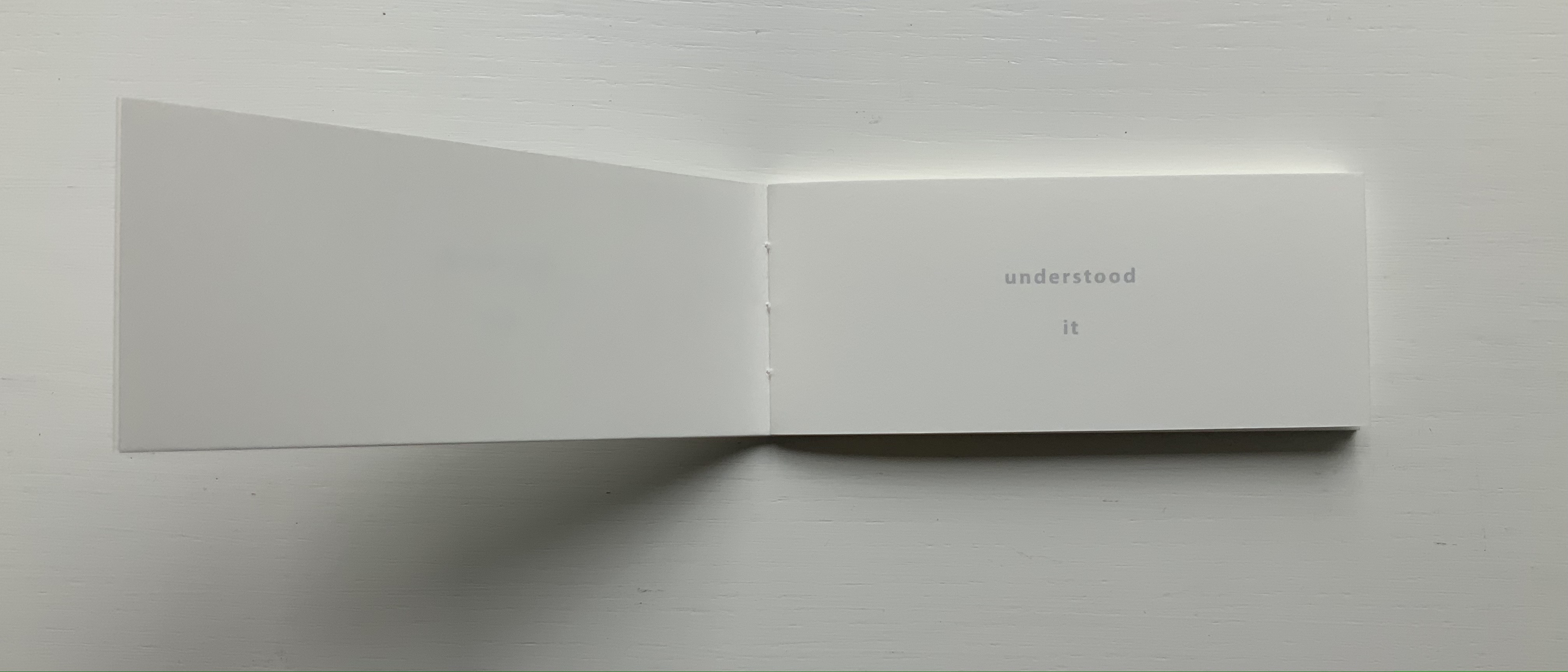
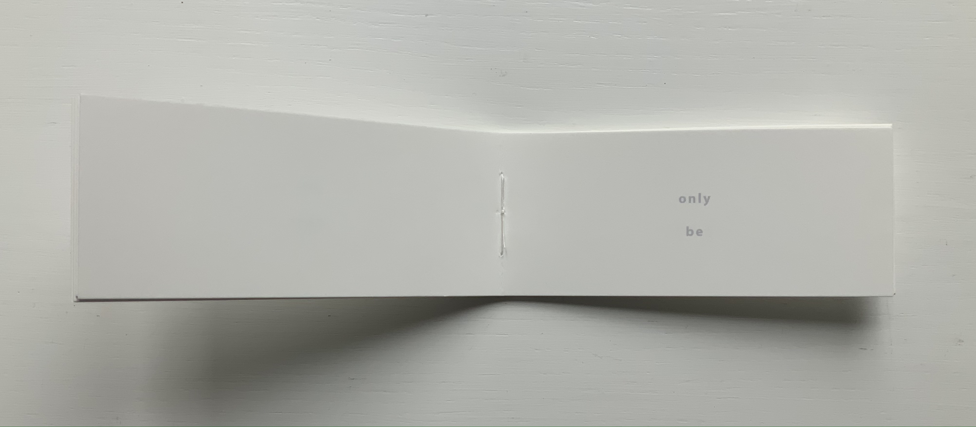
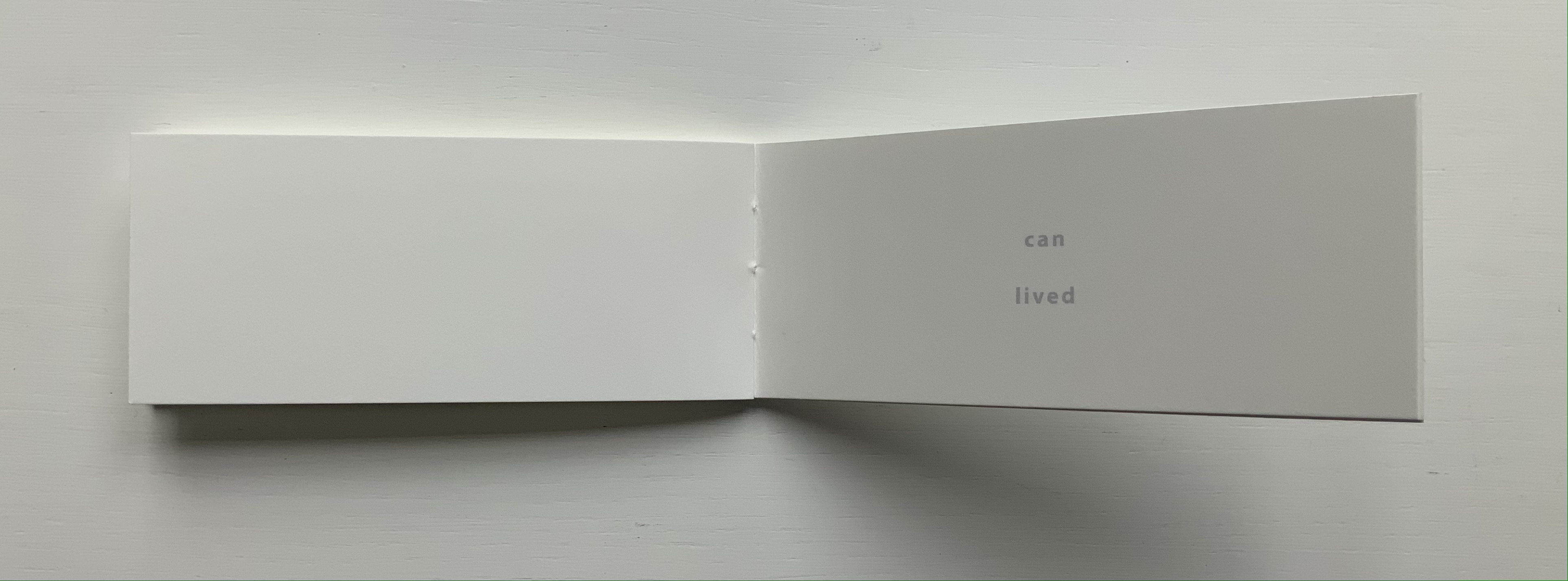
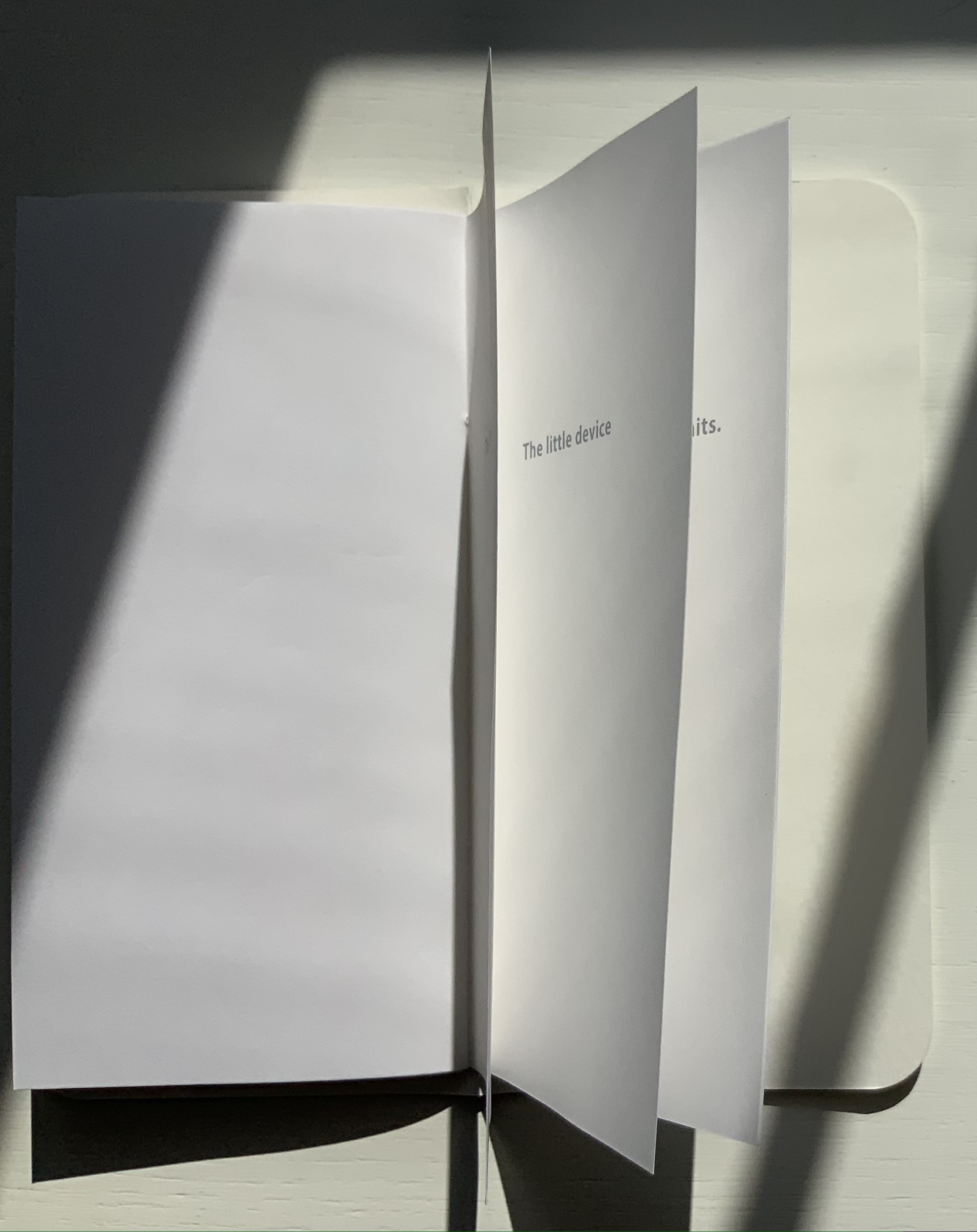
Johnstone calls Less “a minimalist and minimal journal”. Her un-improvable selection of Samuel Menashe to inaugurate her Less series in 2009 made that work a required item for the Books On Books Collection. Samuel Menashe was unmistakeable — in speech and on the page. Having heard his recorded poems, I knew the voice from the sofa behind me at the West Chester conference in 2006 was his. I can hear that voice every time these white, black, black-threaded, and black on white pages open.
The wordplay in Menashe’s poem is more complex than it seems at first glance — something which may have influenced Johnstone’s later visual play with tints, for example, 3% (2015).
The eighth issue in the first series is Richard Price’s eight-line poem. The stanzas have the kind of interesting arithmetical progression that Johnstone’s own works pursue by non-verbal means: two lines, then two plus one, then one line, then one plus one.
Little torn-offs, kept, gummed, and a bill window: large small change in matt grey and bronze. “Are these your medals, Dad?”
A list of do-it-ourselves in feet and inches. Half-hollow plastic letters, red red, blue blue. They won’t, can’t, endure an open word. Grr — consonant consensus.
A single staple, not yet folded, in self-assembly dust.
Up beyond the children this old drawer, laden (can stick). Easy with it. Extract and show.
Essence Press
Less [1] ran from 2009 to 2012. Less [2] begins in 2022. Where the first series applied a single format to all 12 issues, the second aims to arrive at formats through collaboration. The long gap underlines Johnstone’s characterization of the journal as an occasional series, but it belies the continuity of collaboration in her creativity and publishing. She has worked with numerous artists and poets outside the series but still under the Essence Press imprint. With Johnstone, collaboration rises to the levels of role model and even artform.
Digital (2018)
Digital (2018) Richard Price Booklet with rounded corners in Bockingford watercolour paper 300gsm. H150 x w W75mm, 36 pages. Acquired from Essence Press, 22 October 2021. Photo: Books On Books Collection.
The urge to add this work and 8: Richard Price to the Books On Books Collection stemmed not only from the subversiveness of the former and the evocativeness of the latter but also from Price’s collaborative appearance with Ron King in the collection.
Alphabet Book | Alphabet Week (2010)
Alphabet Book | Alphabet Week (2010) Maria White Two hand-bound booklets; covers in Bockingford watercolor paper 300gsm. H140 x W70 mm, 5 unnumbered leaves; H70 xW70 mm, 7 unnumbered leaves. Acquired from Essence Press, 19 March 2022. Photos: Courtesy of Essence Press.
The alphabet and artists’ books constitute a recurrent theme in the Books On Books Collection. Alphabet Book and Alphabet Week are playful reminders of the arbitrariness of the alphabet and every other means we pursue to bring order to our worlds.
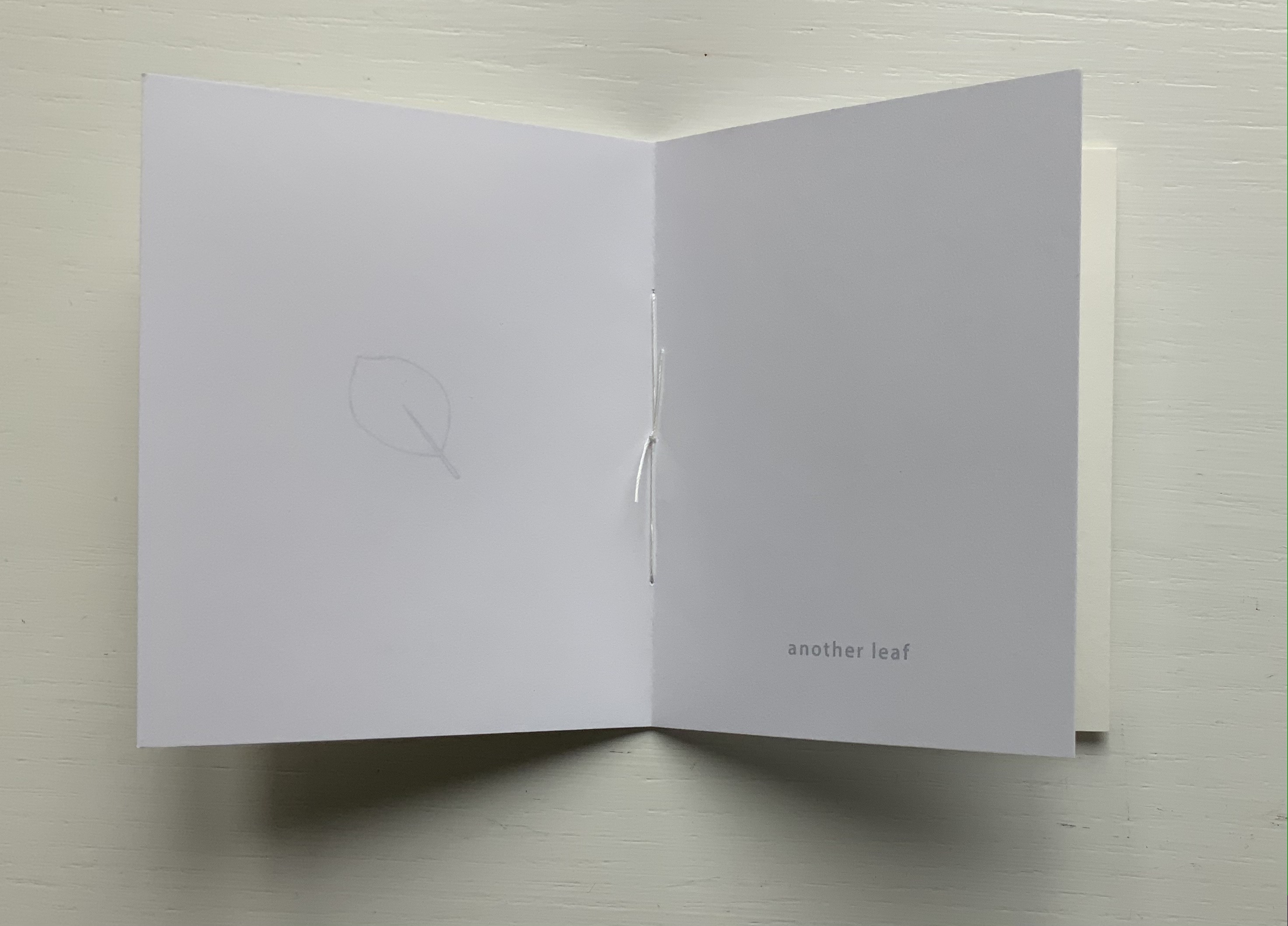
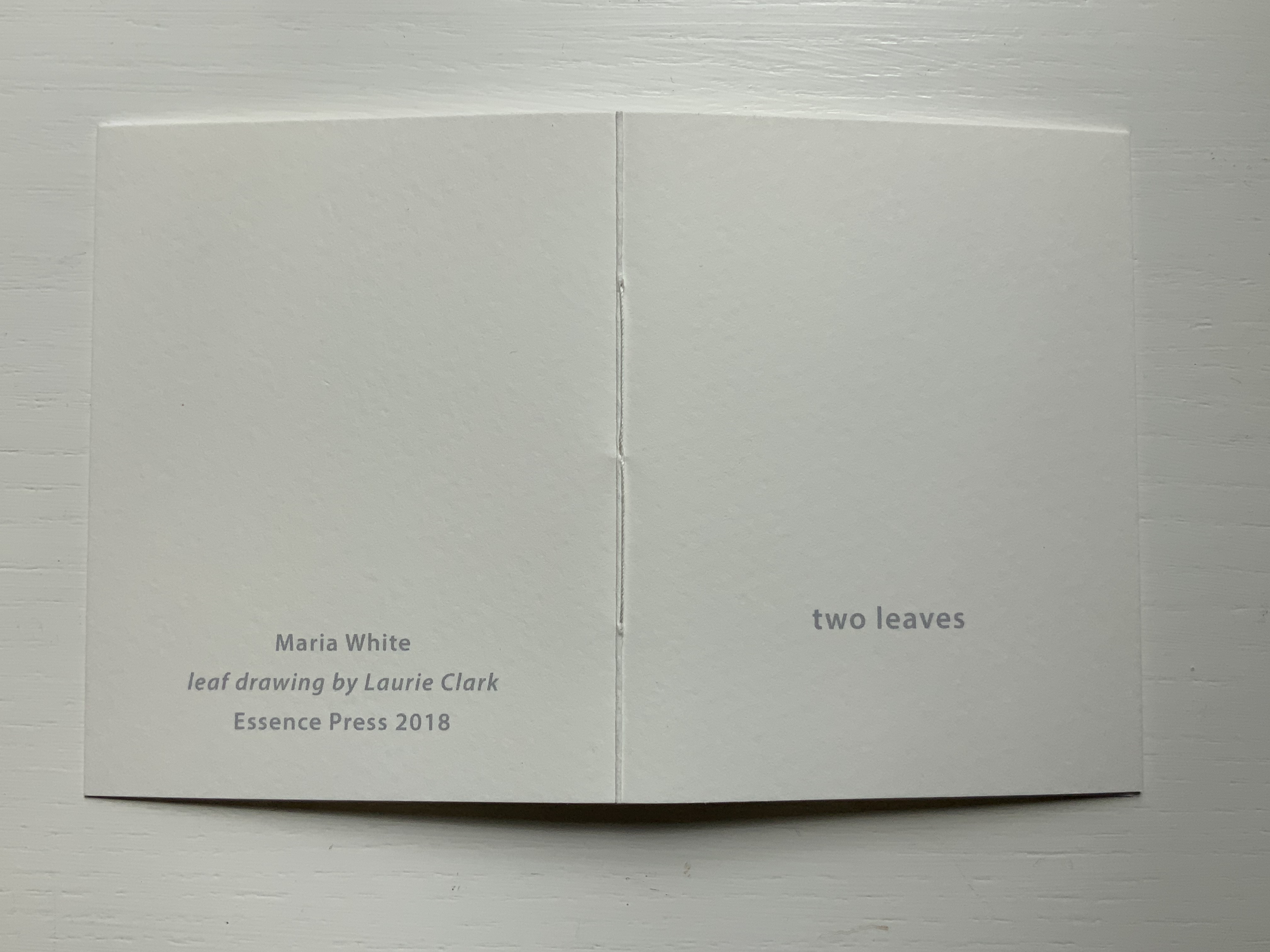
Two Leaves (2018)
Two Leaves(2018) Maria White (leaf drawing, Laurie Clark) Handsewn booklet; cover in Bockingford watercolor paper 300gsm. H100 x W80 mm, 4 pages (2 leaves). Acquired from Essence Press, 10 April 2021. Photos: Books On Books Collection.
This last (for now) little book in the collection underscores Johnstone’s celebration of collaboration and highlights her own production values. It is all well and good that Maria White describes herself as a librarian. So much of “bookness” is packed into this small space: word, image, page, leaf/folio and word/image/play.