Because he works with so many different materials, it is hard to classify Julien Nédélec as an artist: A polyfabricant? With language play being a more or less constant theme: A polywright? His website labels him a plasticien, the perfect French word that captures more of the media in which he works than its usual translation “visual artist” does. In Zéro2, Antoine Marchand writes:
Everything, with him, is subject to manipulation, appropriation, and diversion, at times in the most trivial and basic way imaginable. His work is based on permanent mischief, a desire to destabilize the viewer, and be forever creating a slight discrepancy, which barely ruffles the reading of the work—well removed from the showiness of many present-day productions. He bypasses the daily round and takes us towards somewhere else that is not that far away, but all the more joyful. … What should incidentally be underscored in this young artist’s praxis is his ability to move from one medium to another, without the slightest bother or apprehension. It is impossible to pigeonhole Julien Nédélec’s praxis in any one particular medium.
Several of his works have been hosted on the Greek island of Anafi by the Association Phenomenon and the Collection Kerenidis Pepe, whose website also notes that his
practice can take many forms, from sculpture to drawing, through books and photography, with a predilection for the paper, that he uses not only as a support, but also as a material that he bends, cuts, colors, stacks or crumples. His works are the result of linguistic and formal games that reveal the artist’s fascination with the potentialities of language, with a malice that places him as an heir apparent of the Oulipo, while his taste for geometric and serial shapes brings him closer to the tradition of minimalism.
With paper as a favorite medium, there are a handful of artist’s book among the many other forms. Taken together, his artist’s books almost make up an anthology of homage to book artists from the 1960s to the present. He also belongs to the school of appropriators embracing forerunners like Bruce Nauman, Richard Prince, and Richard Pettibone and contemporaries like Michalis Pichler, Antoine Lefebvre, and Jérémie Bennequin, all of whom have embraced the self-reflexive artist’s book as an appropriate medium for appropriation. No wonder Galaad Prigent’s Zédélé Éditions, the French publisher that hosts Anne Moeglin-Delcroix and Clive Phillpot’s Reprint Series of artists’ books, is so fond of his bookworks.
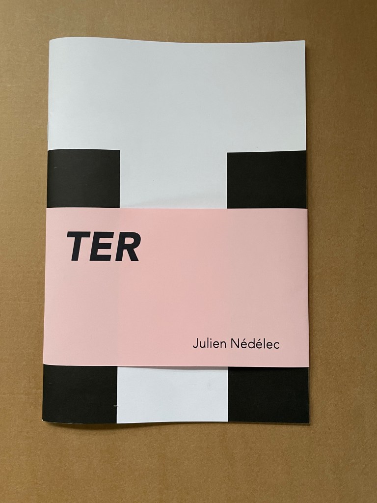
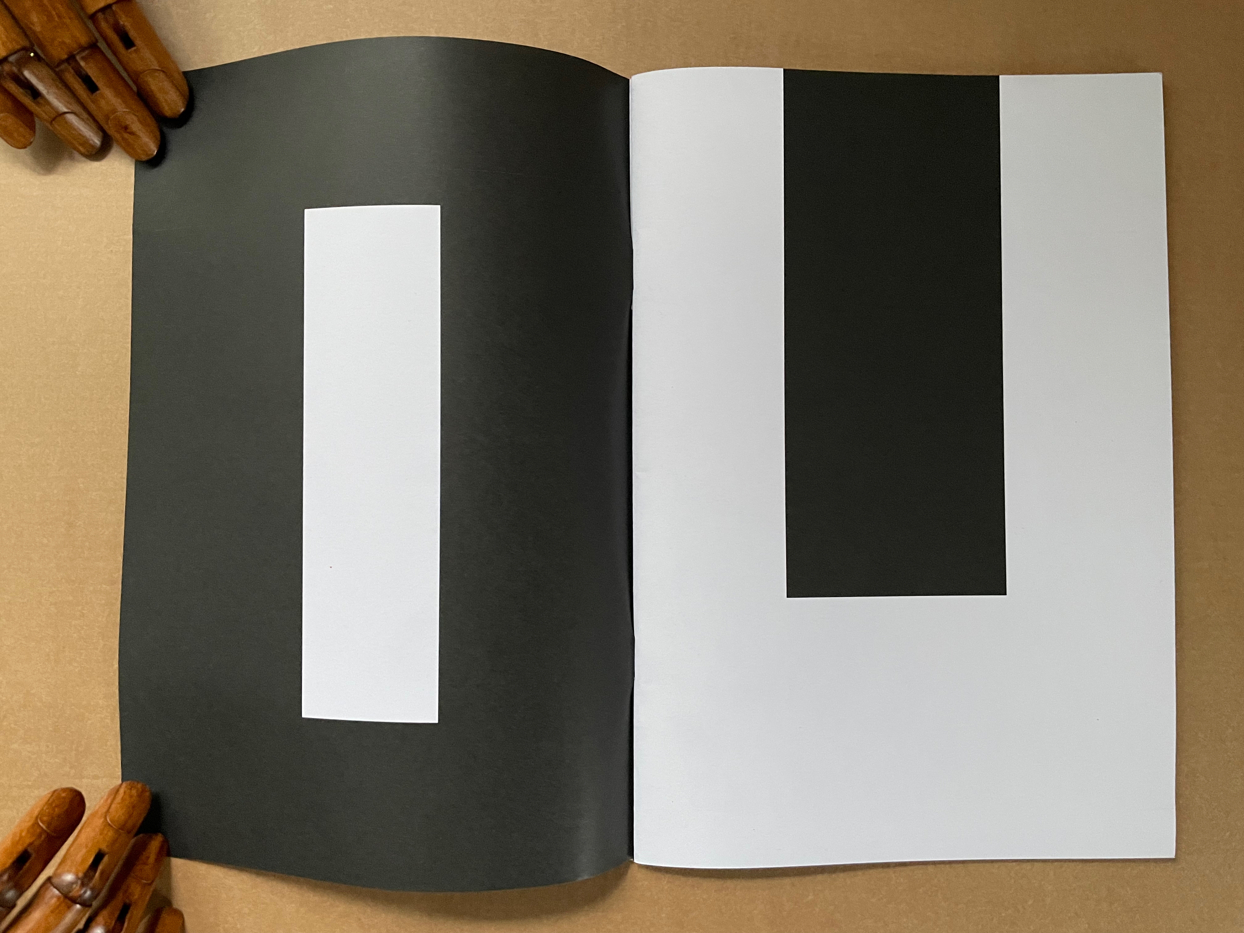
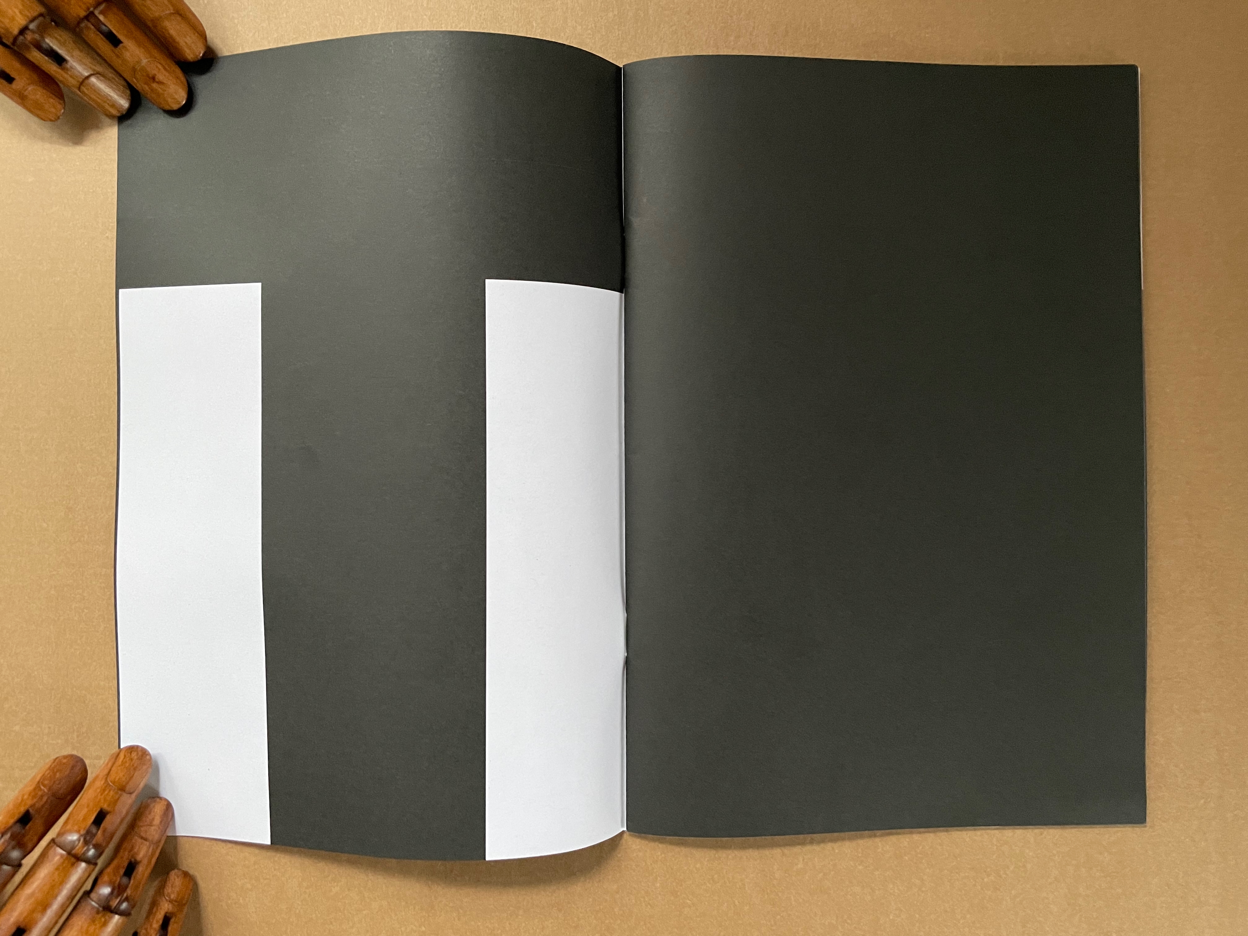
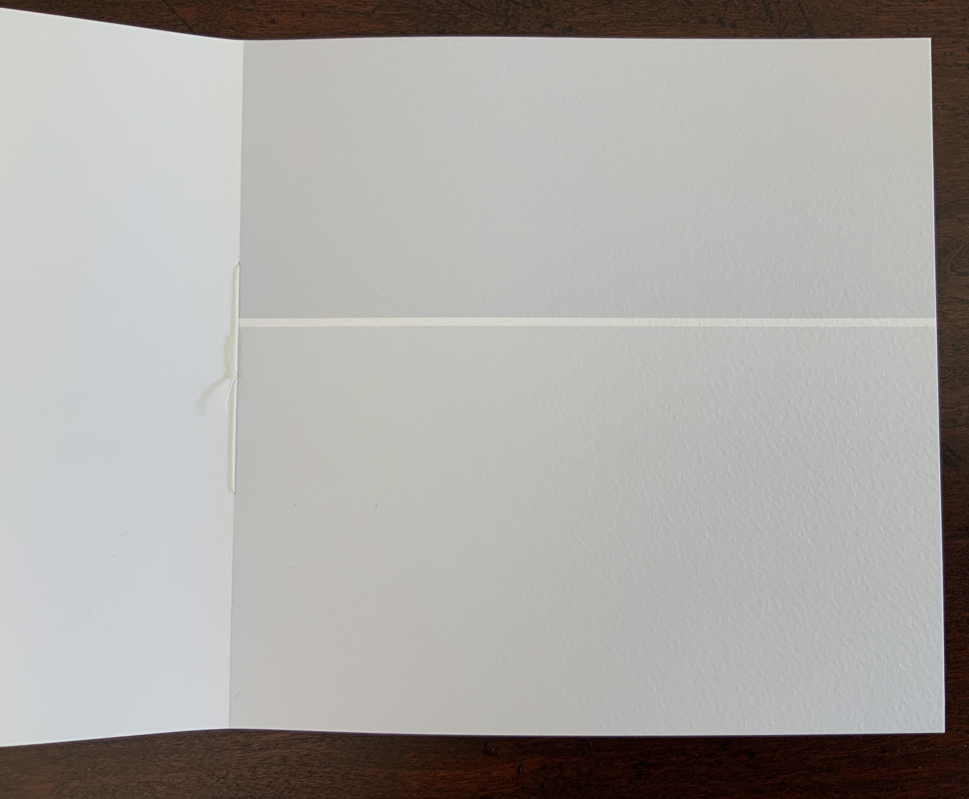
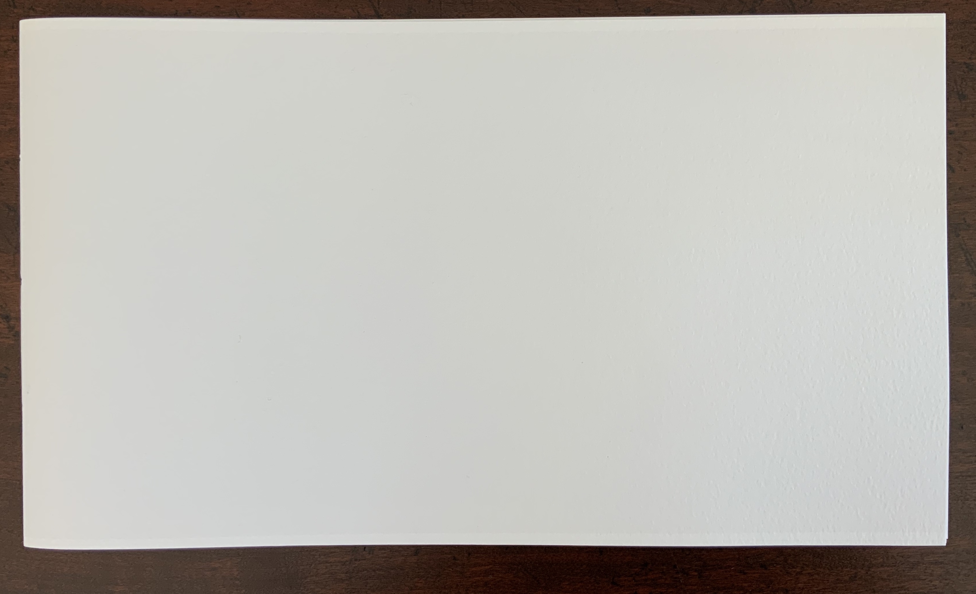
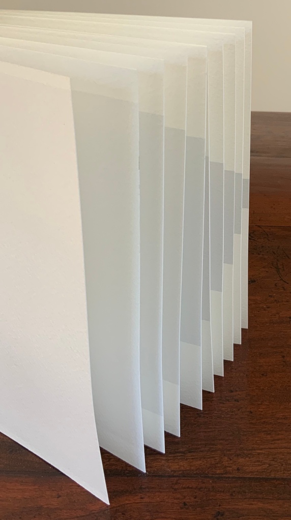
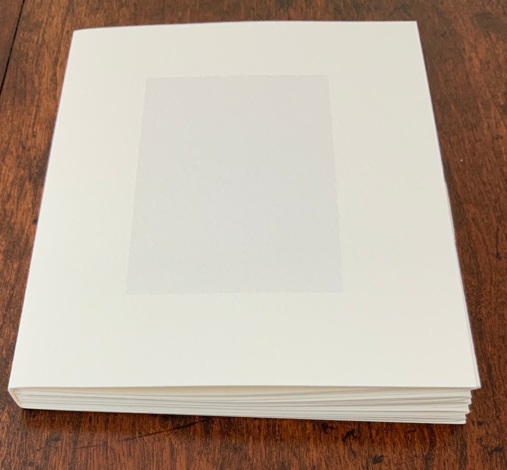
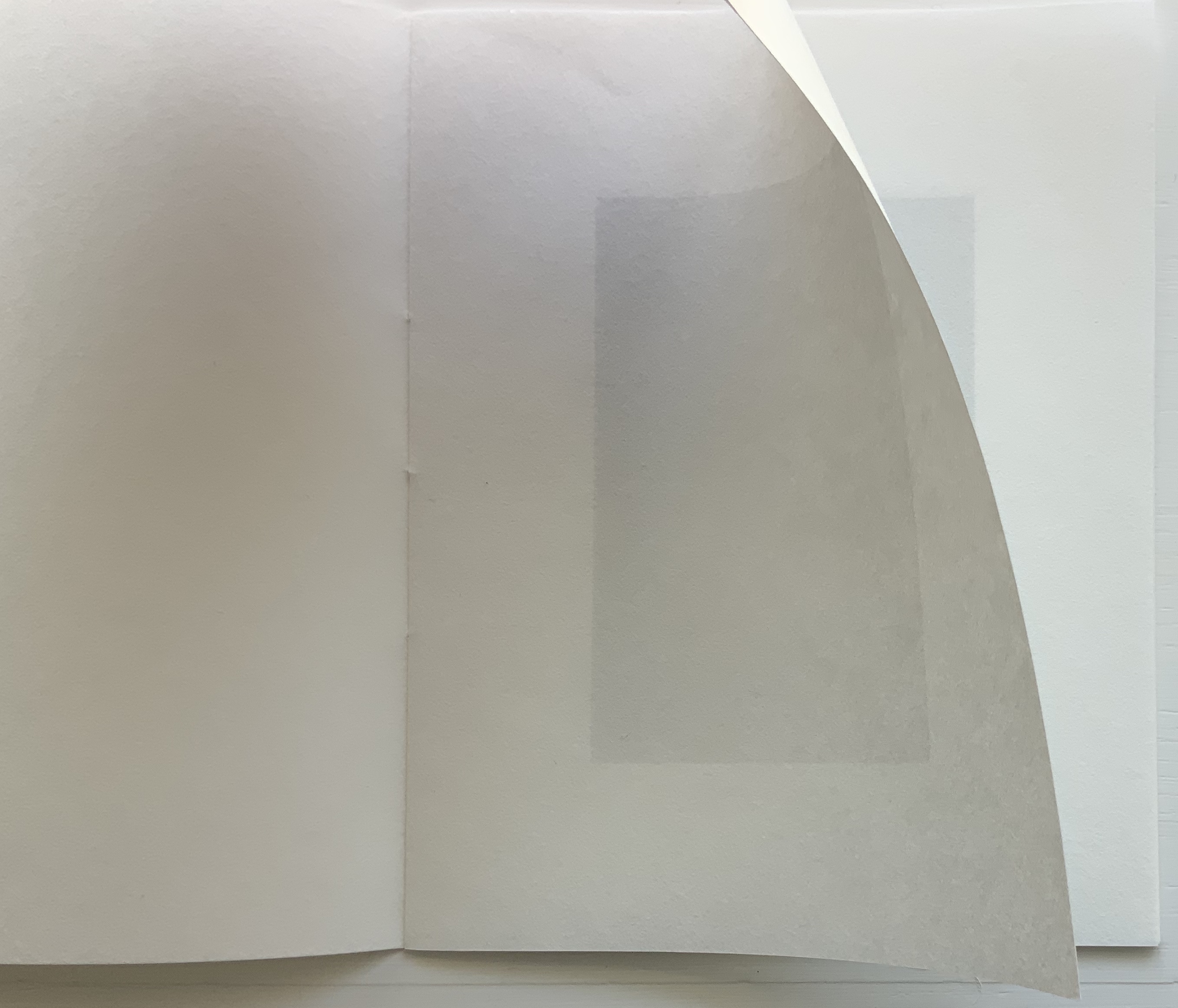
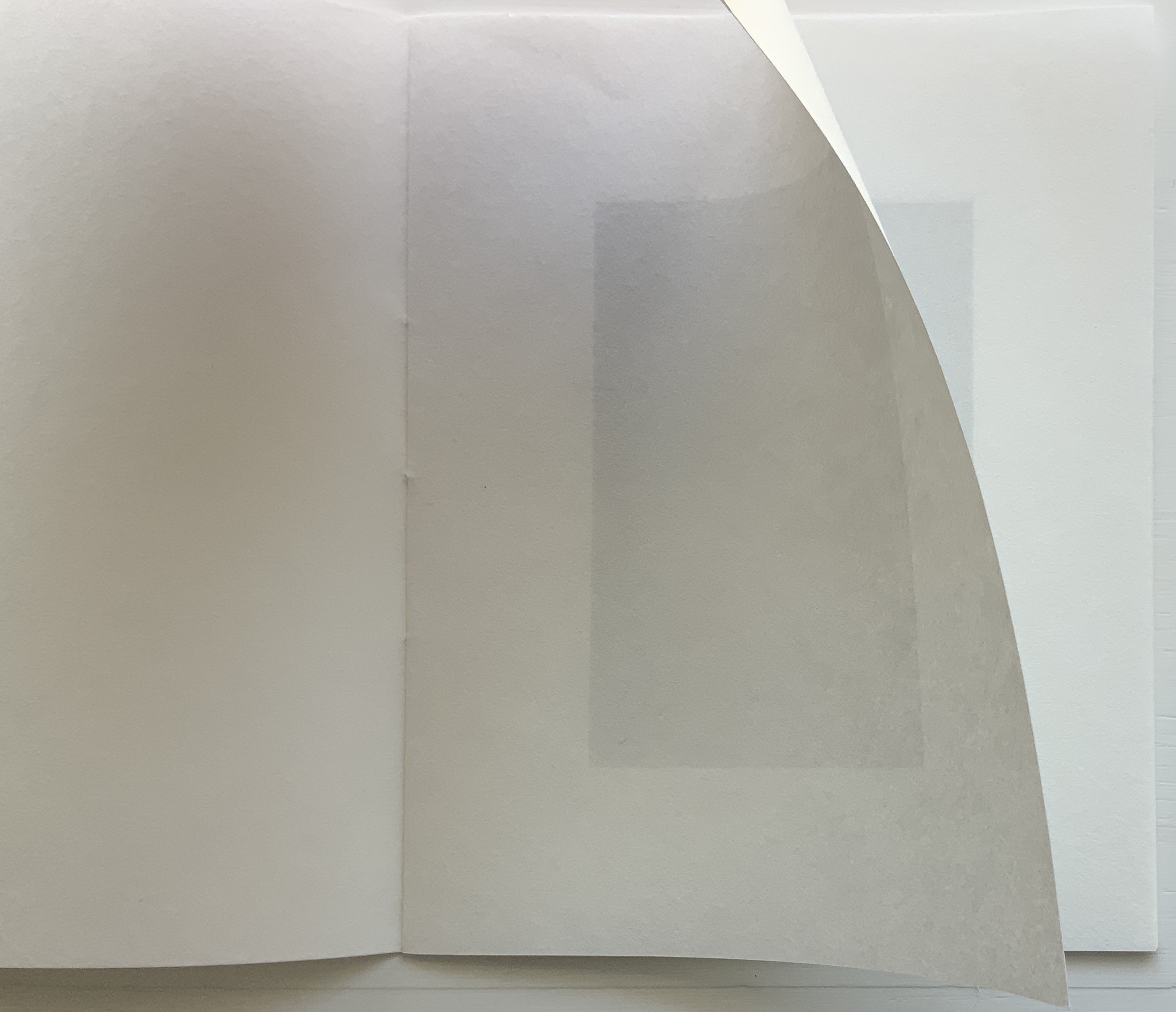
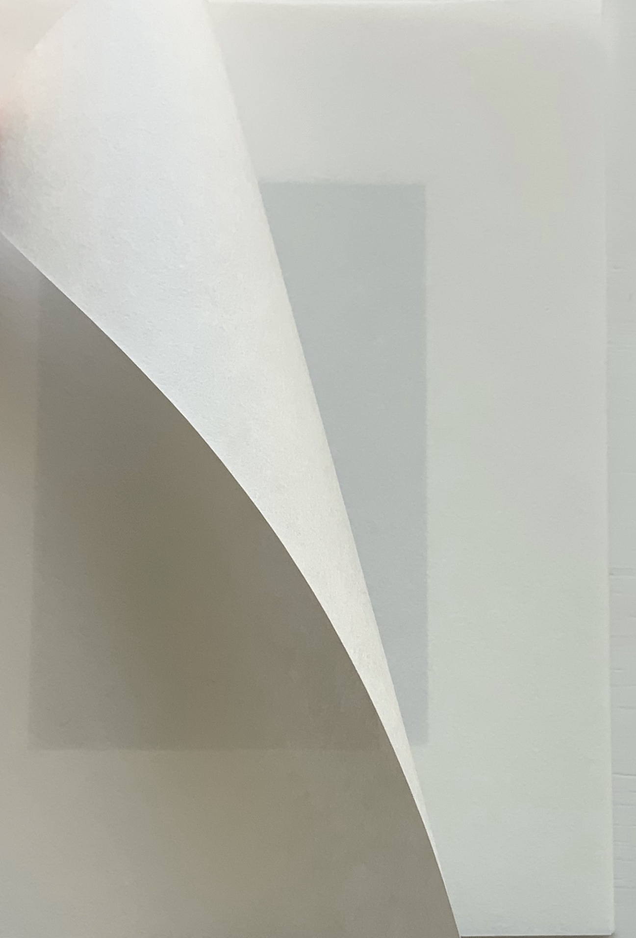
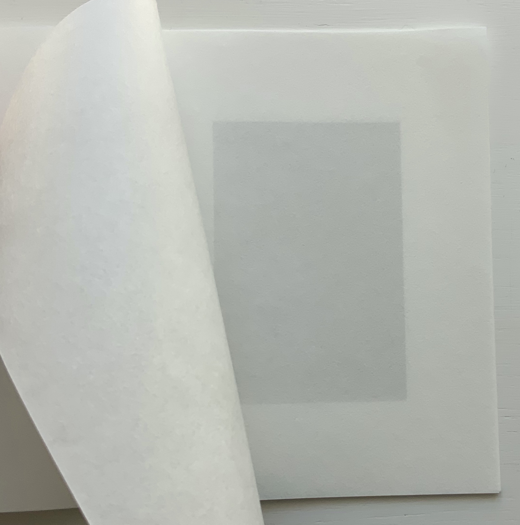
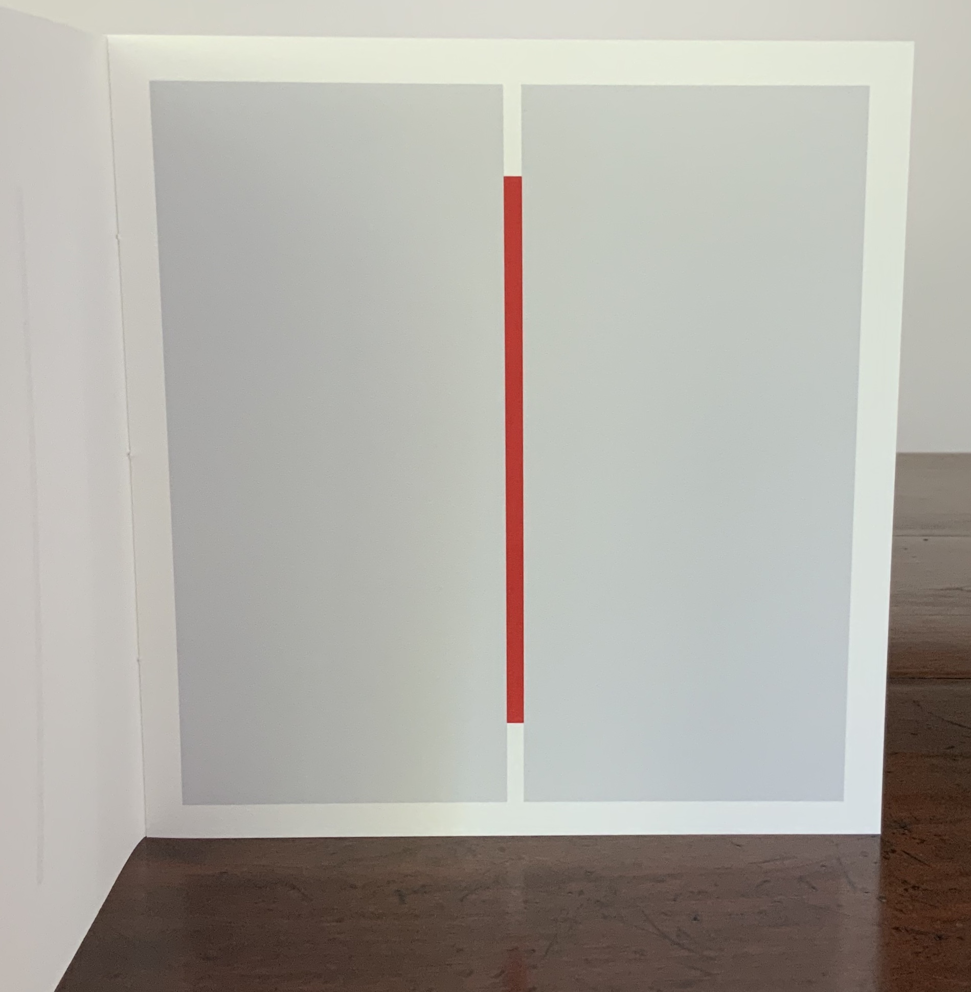
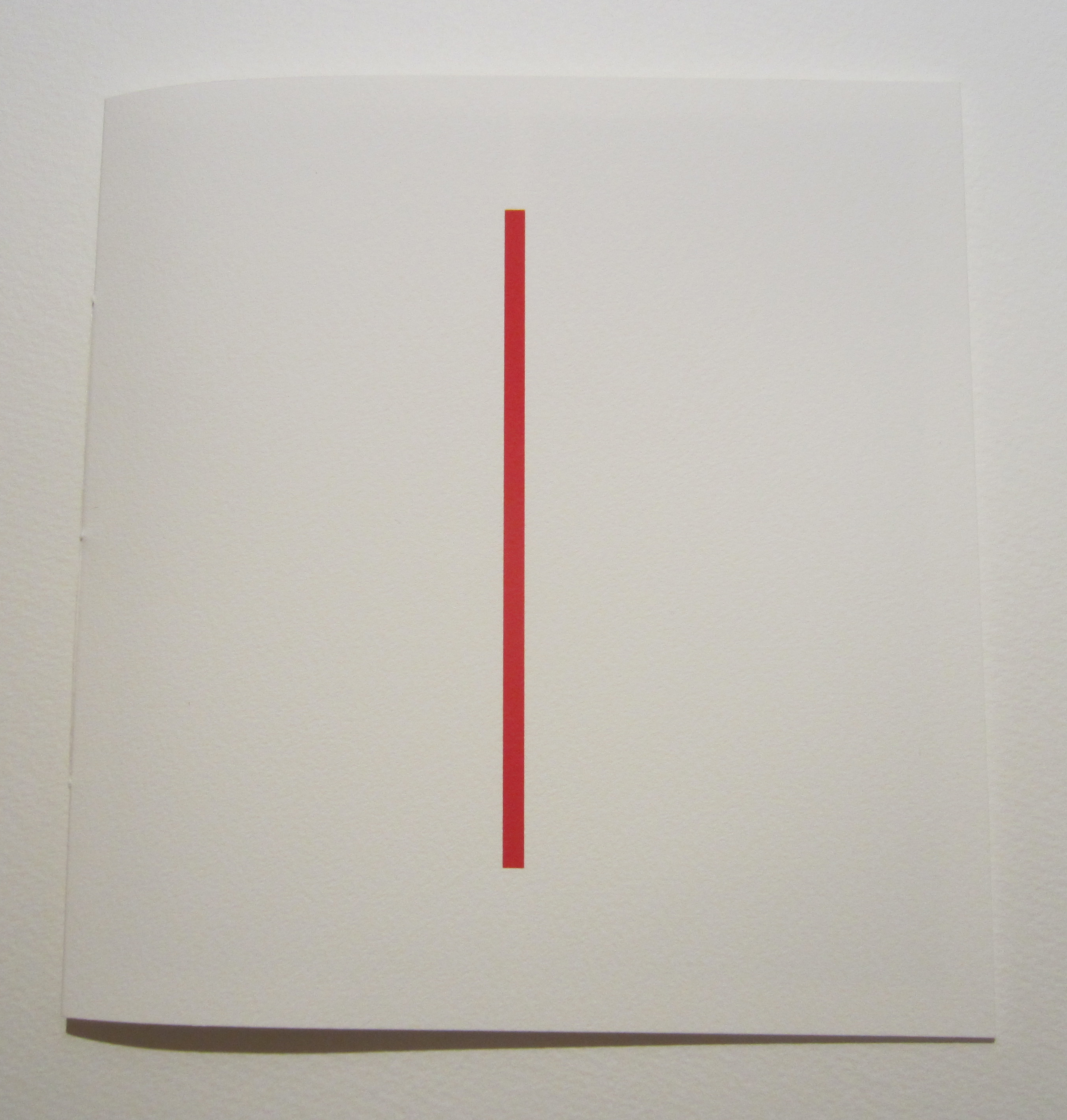
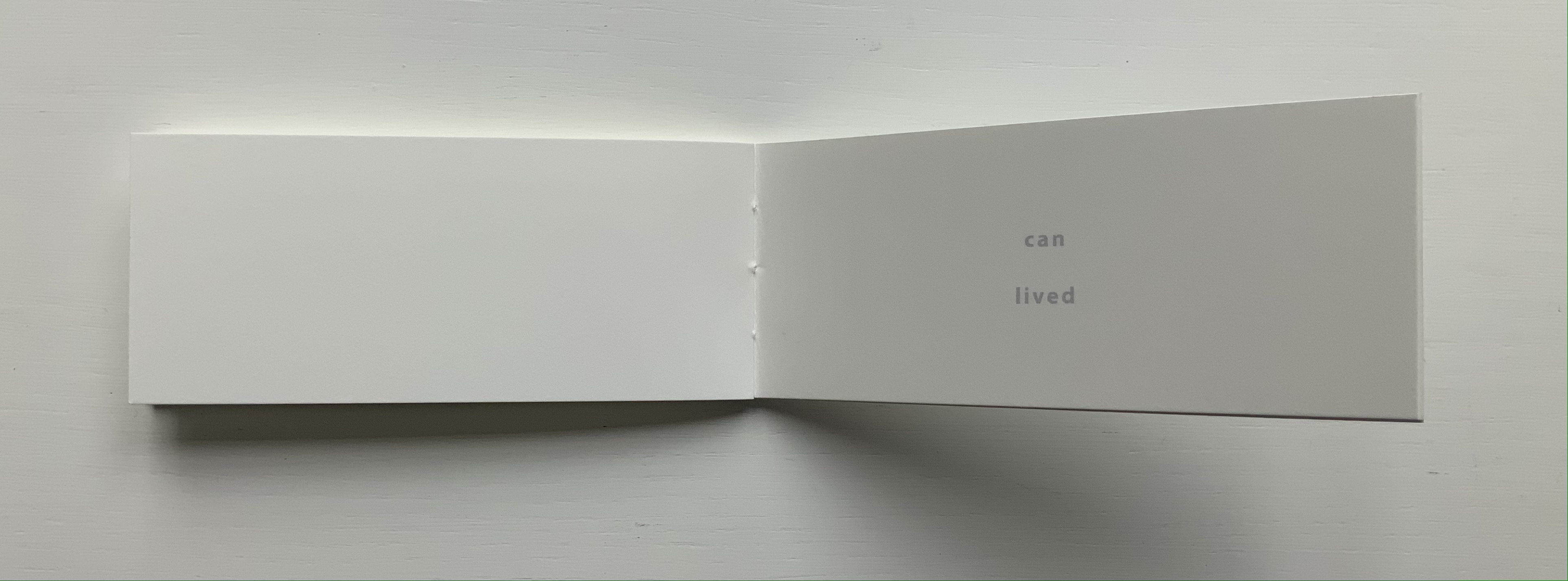
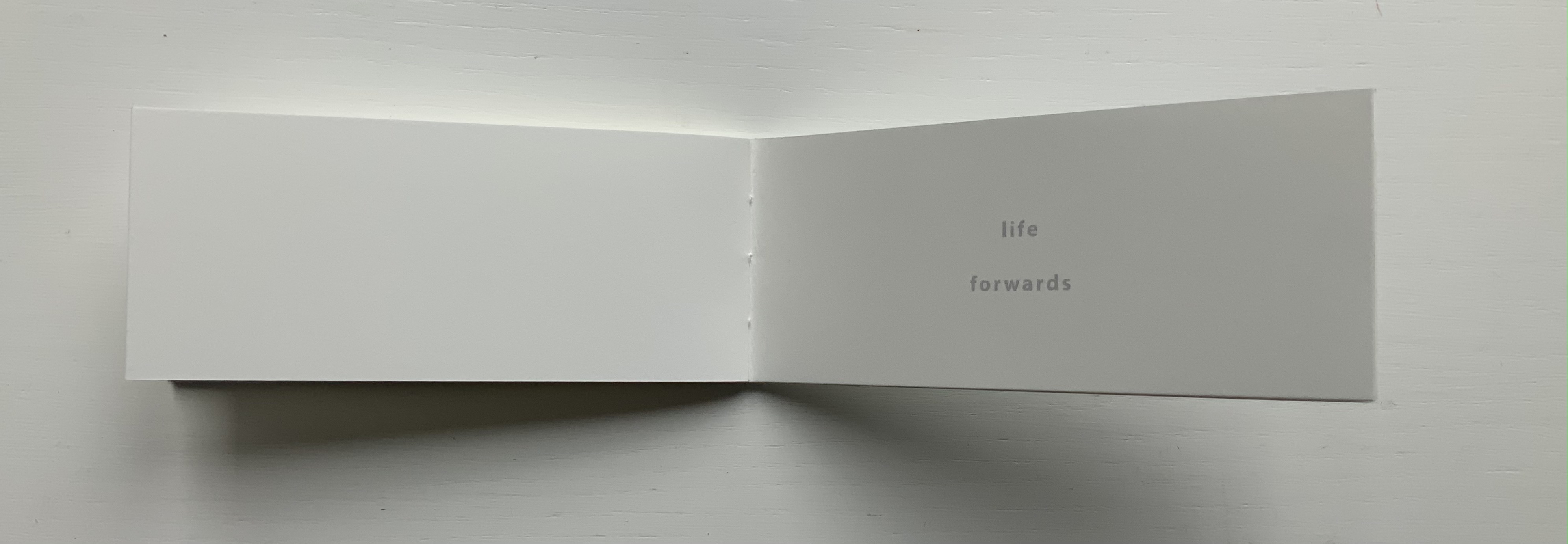
TER (2021)
TER (2021) Julien Nédélec Softcover, saddle stitch with staples. H240 W165 mm. [36] pages. Acquired from Zédélé Éditions, 21 September 2024. Photos: Books On Books Collection. Displayed with the artist’s permission.
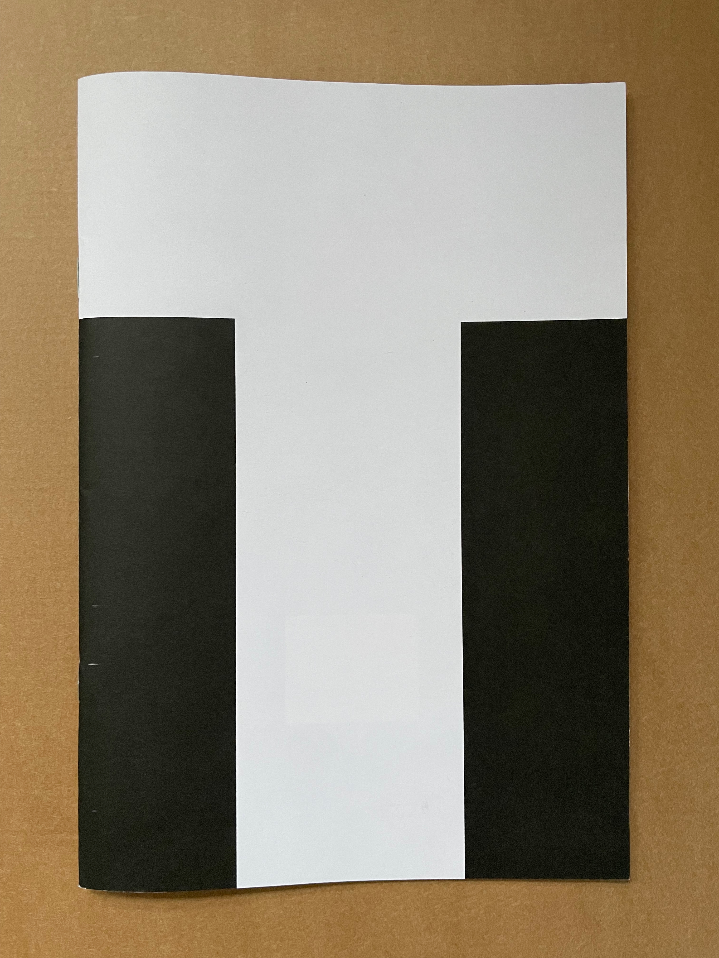
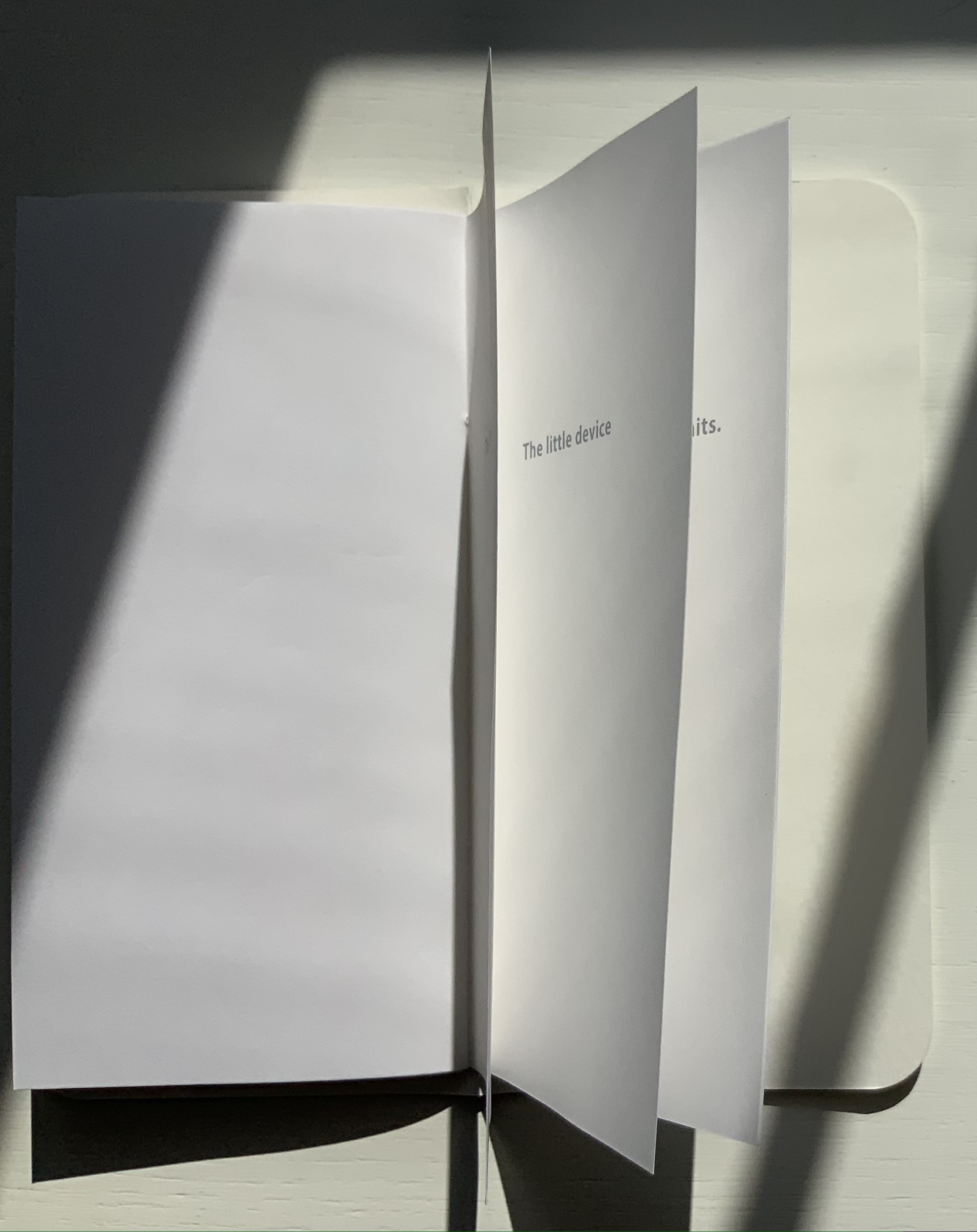
“Tout”
The sentences to be deciphered from these full-page-bleed letters are Tout a été redit. Tout a été refait, which, in English, would be “Everything has been said. Everything has been done.” But it also has the echoes of a French children’s song, “Tout ce que je fais“:
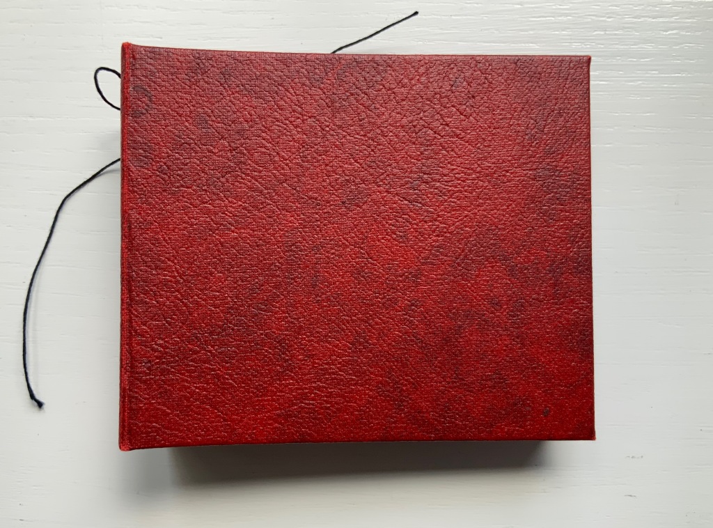
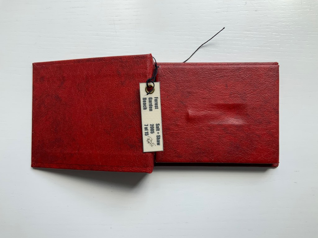
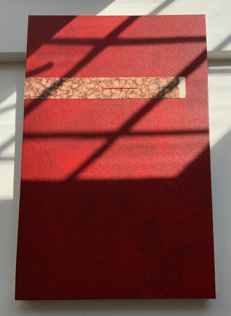
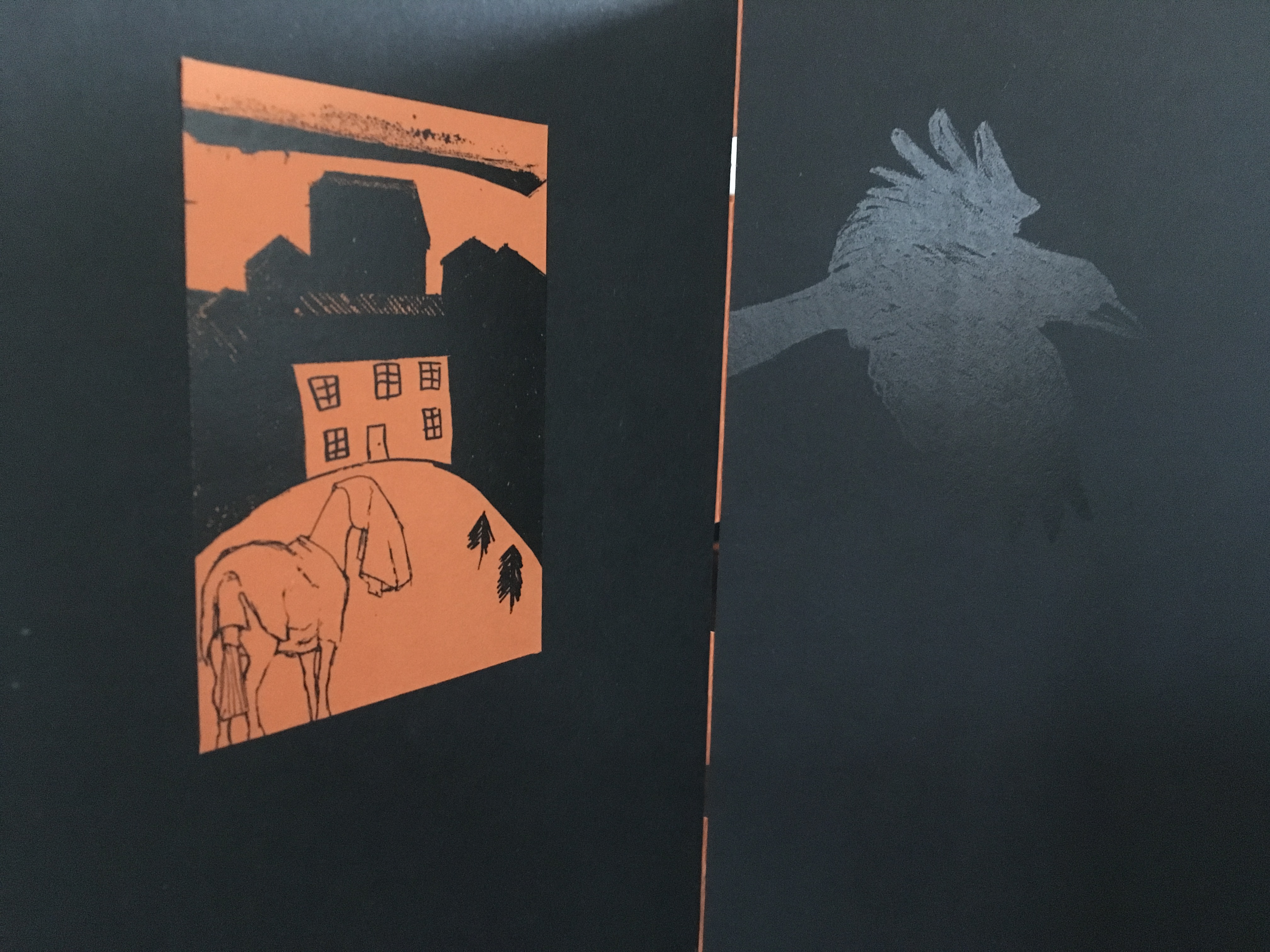
Paul Salt and Susan Shaw collaborate under the name Salt+Shaw. Individually and together, they present a wide range of book art. Much of it finds its most striking expressions in unusual bindings, sometimes to the extent that the binding absorbs the content — as is the case with a spent bullet in Forest Beach Garden.
FOREST GARDEN BEACH (2005)
FOREST GARDEN BEACH(2005) Salt + Shaw Hardcover. H90 x W110 x 30 mm. Edition of 15, of which this is #7. Acquired from the artist, 13 December 2021. Photos: Books On Books Collection. Displayed with permission of the artist.
The book block between the covers here is not a book block of pages. The only text in Forest Garden Beach is found on the tag attached to the work. On one side is the title, artists’ names, date and edition. On the other are UK National Grid Reference coordinates for locations in Scotland, South Yorkshire and East Yorkshire. The coordinates’ suggestion of precision, however, run into visual, tactile and textual ambiguities. This book shape opens on something concealed. The red leather case binding holds and withholds.
The shape seen and felt beneath it seems to be that of a bullet’s shell casing. There is an indentation, almost like a rifle chamber from which the casing is being ejected. According to the artists’ online description, it is a spent bullet “found in a forest, on a beach or in the garden”. But that is information apart, or evidence external to the work and its tag. Even if it were squeezed onto the tag somehow, the information leaves ambiguities: from which of the three locations did this single found object, now covered by leather, come; and why the precision of the coordinates if the source is uncertain?
Fusing location with the element(s) of the book form that they have chosen to exploit is another frequent characteristic of Salt+Shaw’s combined work. The next item is one of their most effective works of “local color”.
Mill (2006)
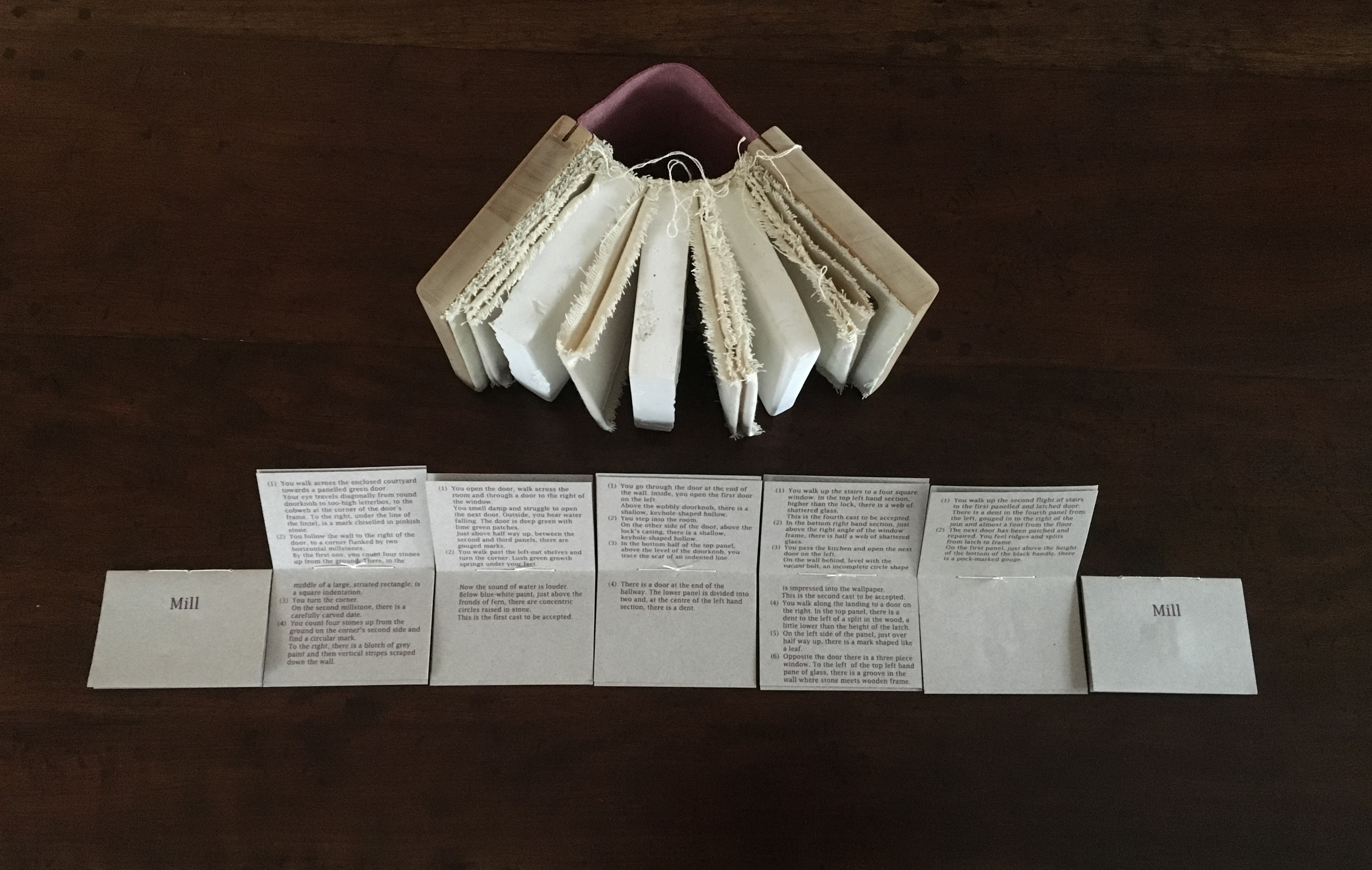
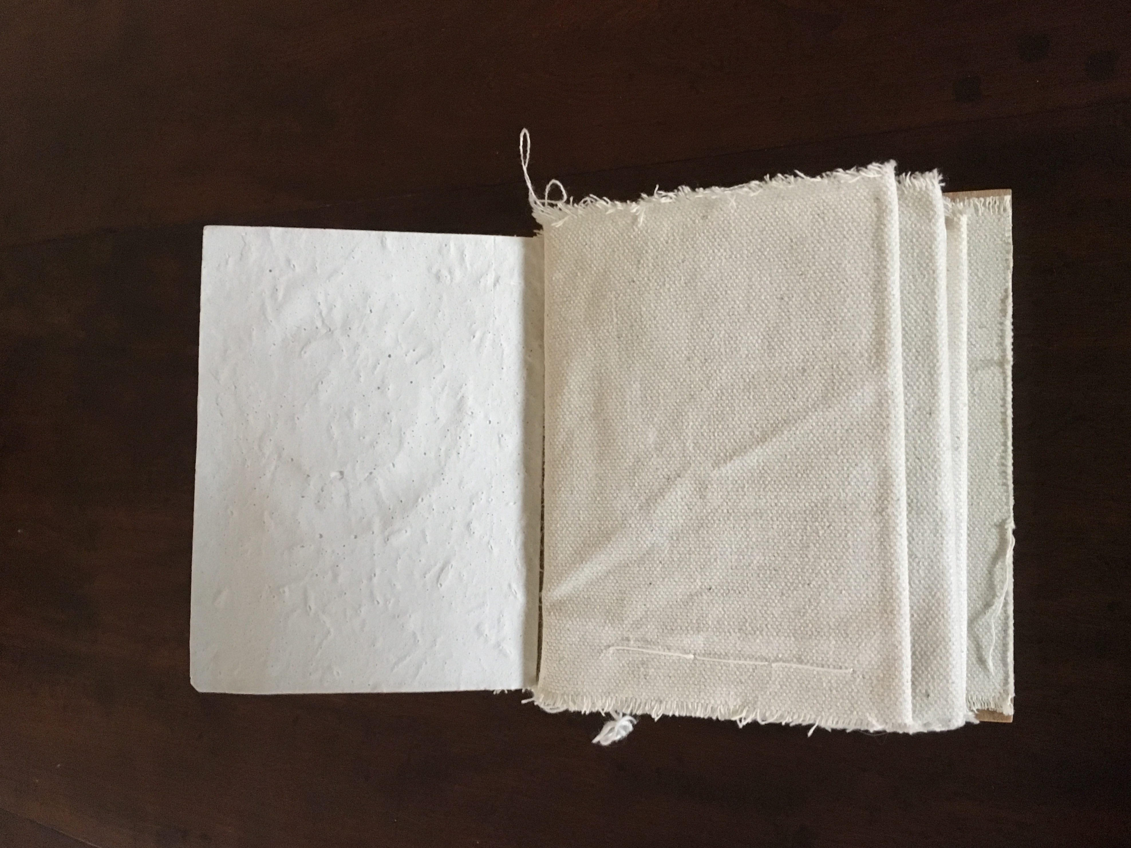
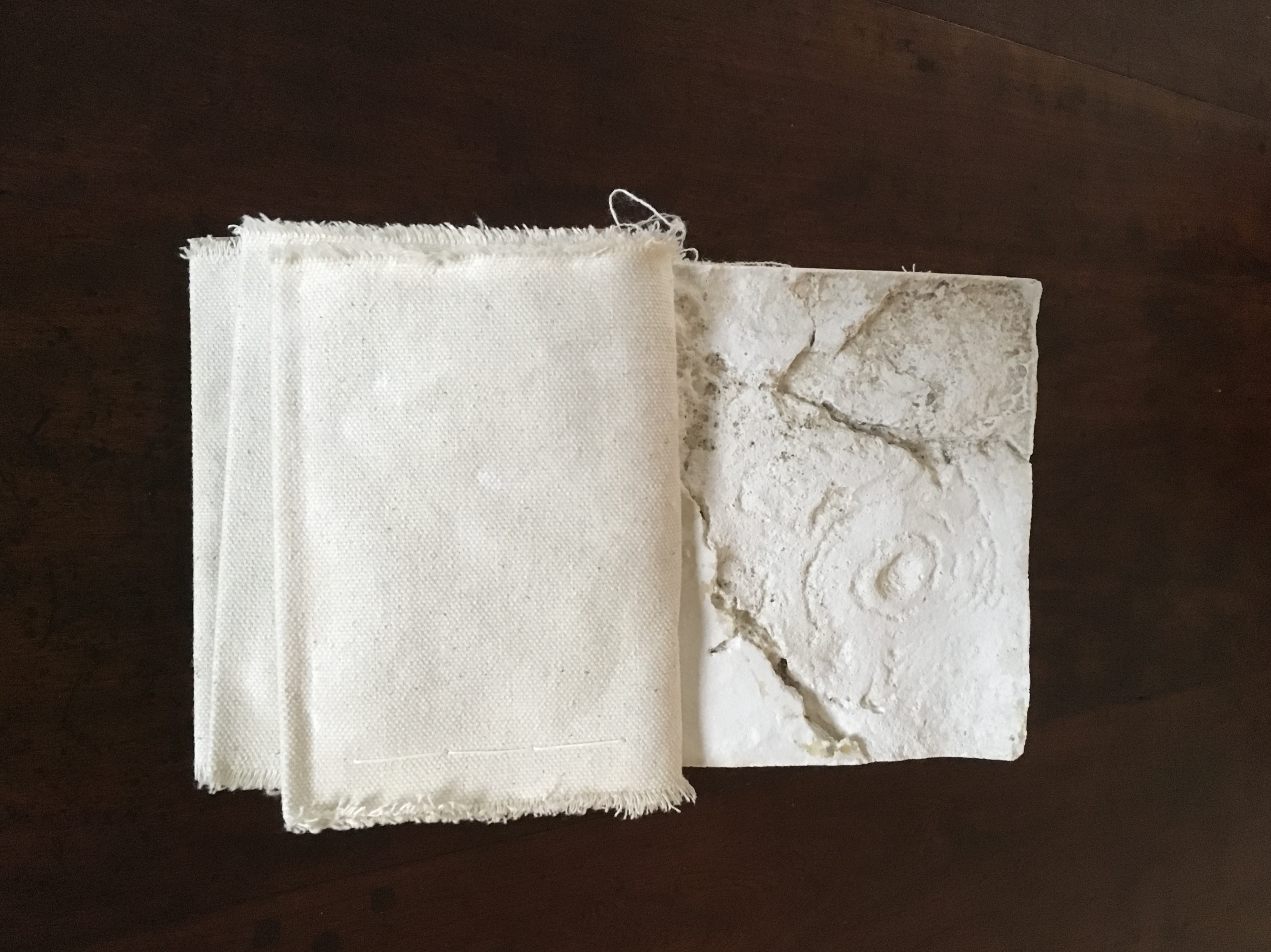
Mill (2006) Salt+Shaw Wood and leather binding, using discarded library shelves, canvas and upholstery nails. Plaster cast and canvas pages with individual pamphlet book text inserts printed on Canson paper. Casts made using water extracted in dehumidifying the building. H143 x W114 mm closed, H143 x W310 mm open. Edition of 24, of which this is #2. Acquired from the artists, 25 November 2018.
The work is a tactile exploration of the interior and exterior space of a corn mill in Cromford, built c.1780 to grind grain for workers at Arkwright’s cotton mill.A journey around Cromford Mill, Derbyshire.
Mill is an investigation of the marks of passage, which have become part of the fabric of the space and reveal time, energy, endeavour and change:
(i) recording the interaction of the human body with the building
(ii) recording the impact of natural forces upon the built environment
(iii) locating the marks that reveal a momentary connection or repetitious action
(iv) examining clues and ephemera.
Silicone moulds were taken from marks of usage around the mill, including the spotwhere a door handle impressed upon a wall and the shape of a break in a pane of glass. Plaster casts were then produced, using water from a dehumidifier within the building to make the plaster. A text piece, contained within canvas pocket pages, creates a unique map of the mill and takes a journey through the building – both to experience the environment and locate the plaster casts. [Correspondence from the artists, 5 December 2018.]
Just as the spent object in Forest Garden Beach lies buried or hidden but still tangible beneath the cover of the work, the spent object of Mill is plain to the touch but only through plaster impressions of it. Where the text related to Forest Garden Beach plays a game with precision and ambiguity, the text of Mill plays a game of hide-and-seek or blind man’s bluff.
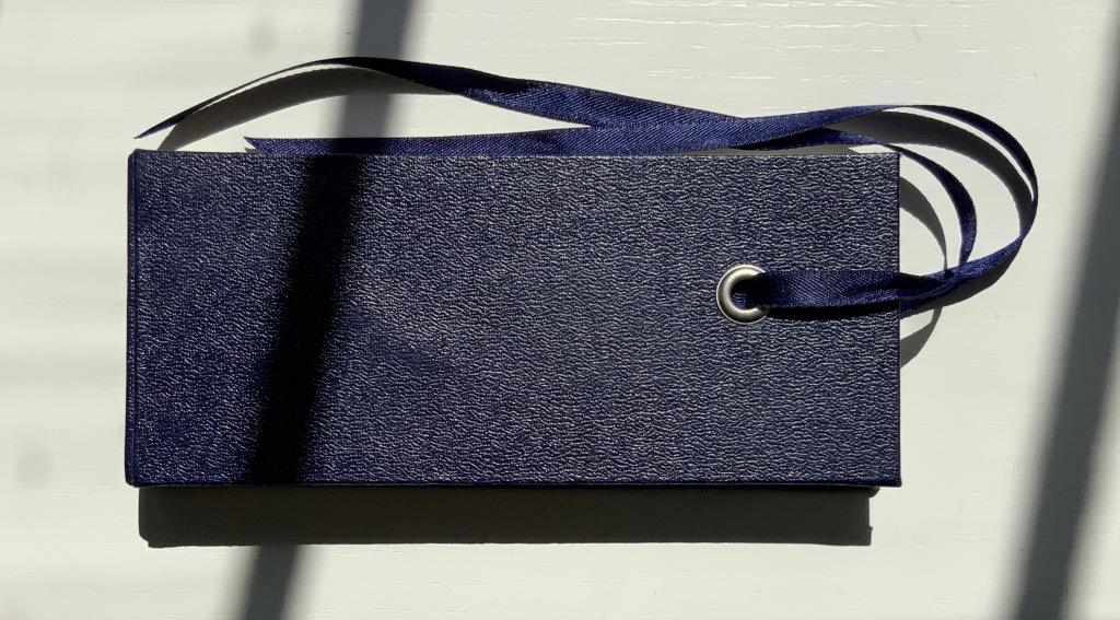
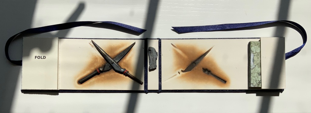
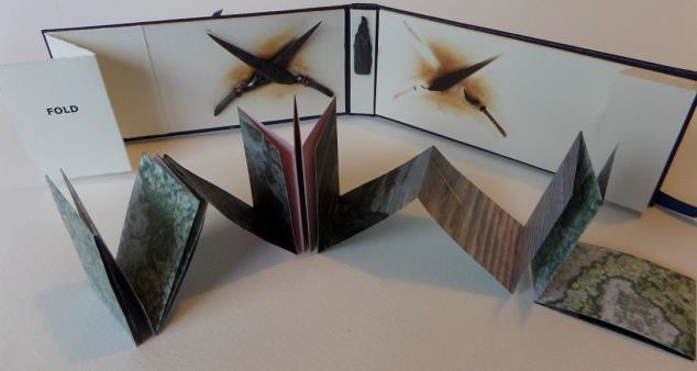
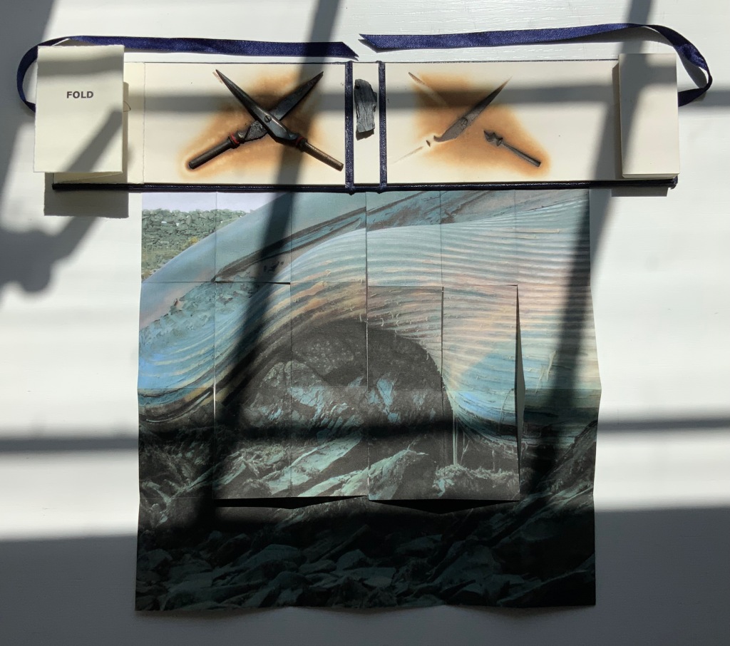
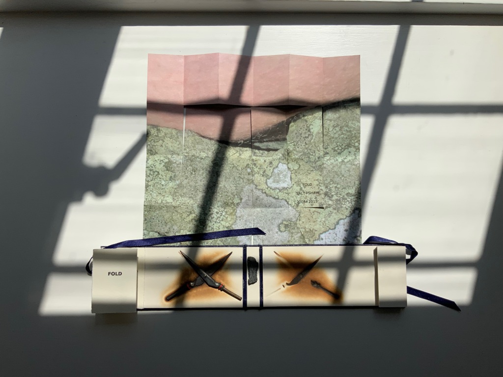
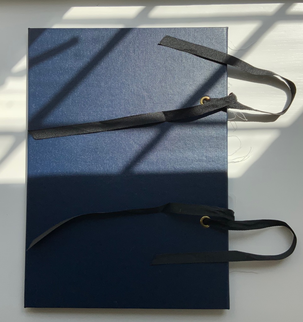
FOLD (2008-2015)
FOLD (2015) Salt + Shaw Cloth over board with eye-and-ribbon closing. H60 x W140 x D1.5 mm. Edition of 35, of which this is #19. Acquired from the artists, 13 December 2021. Photos: Provided by the artists and Books On Books Collection. Displayed with artists’ permission.
The cloth-over-board binding opens to reveal a single-fold title page on the inside front cover and a small book tucked into a receptacle on the inside back cover. Bolted to the inside front cover, a found miniature pair of Sheffield scissors. Glued to the inside spine, a small rock. And imprinted on the inside back cover, a rust-transferred reverse image of the scissors.
On removal and opening, the small book turns out to be a single sheet of paper in a “meander” fold.
On one side, it displays a close-up photograph of a beached whale’s skin lying in folds over rocks and shingle. On the other side is a close-up of human skin resting on a similar bed.
So here is a fourth option in the game of Rock-Paper-Scissors, but the game is one rather of Risk in which, whatever the craft, whatever the objects found and whatever the strategy played in rock-paper-scissors, the environment enfolds and binds.
This sort of implicit visual/verbal play becomes more explicit in the next work.
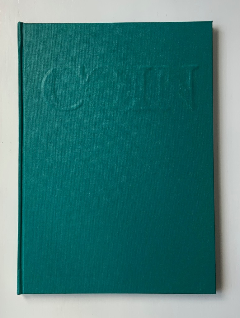
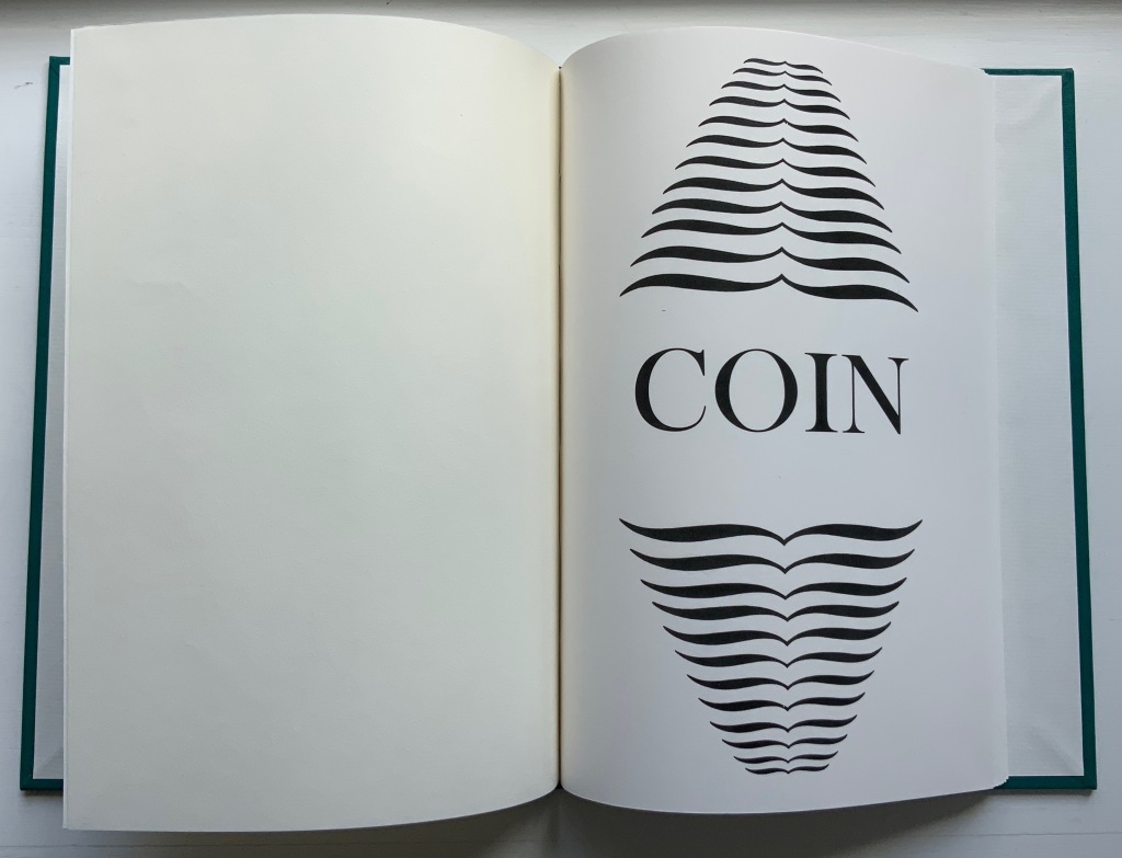
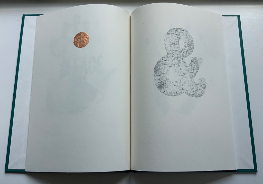
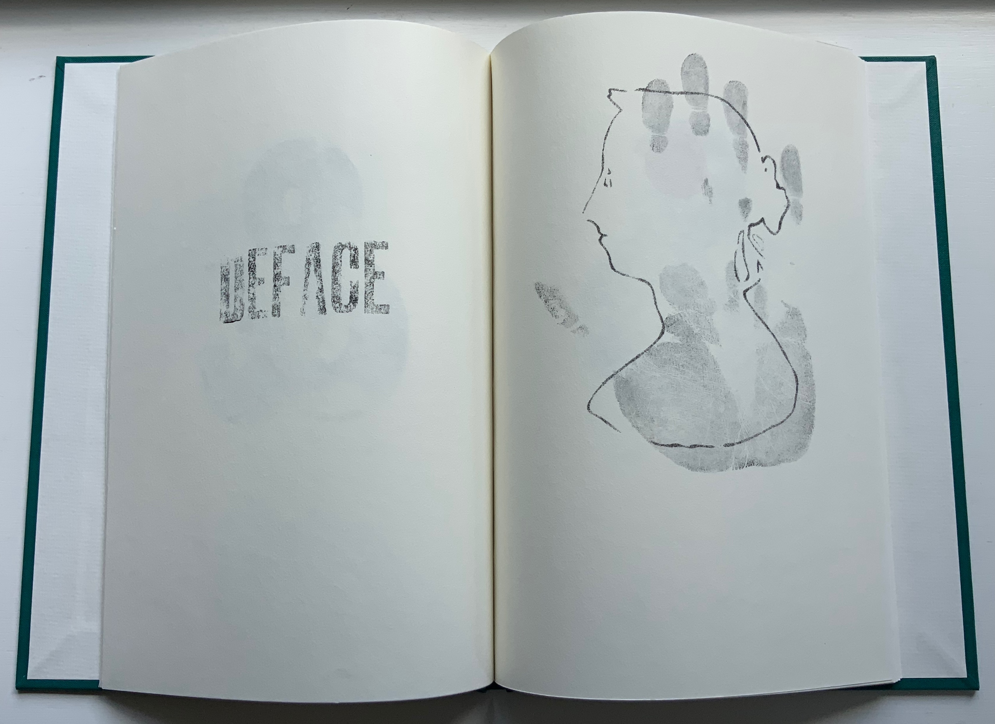
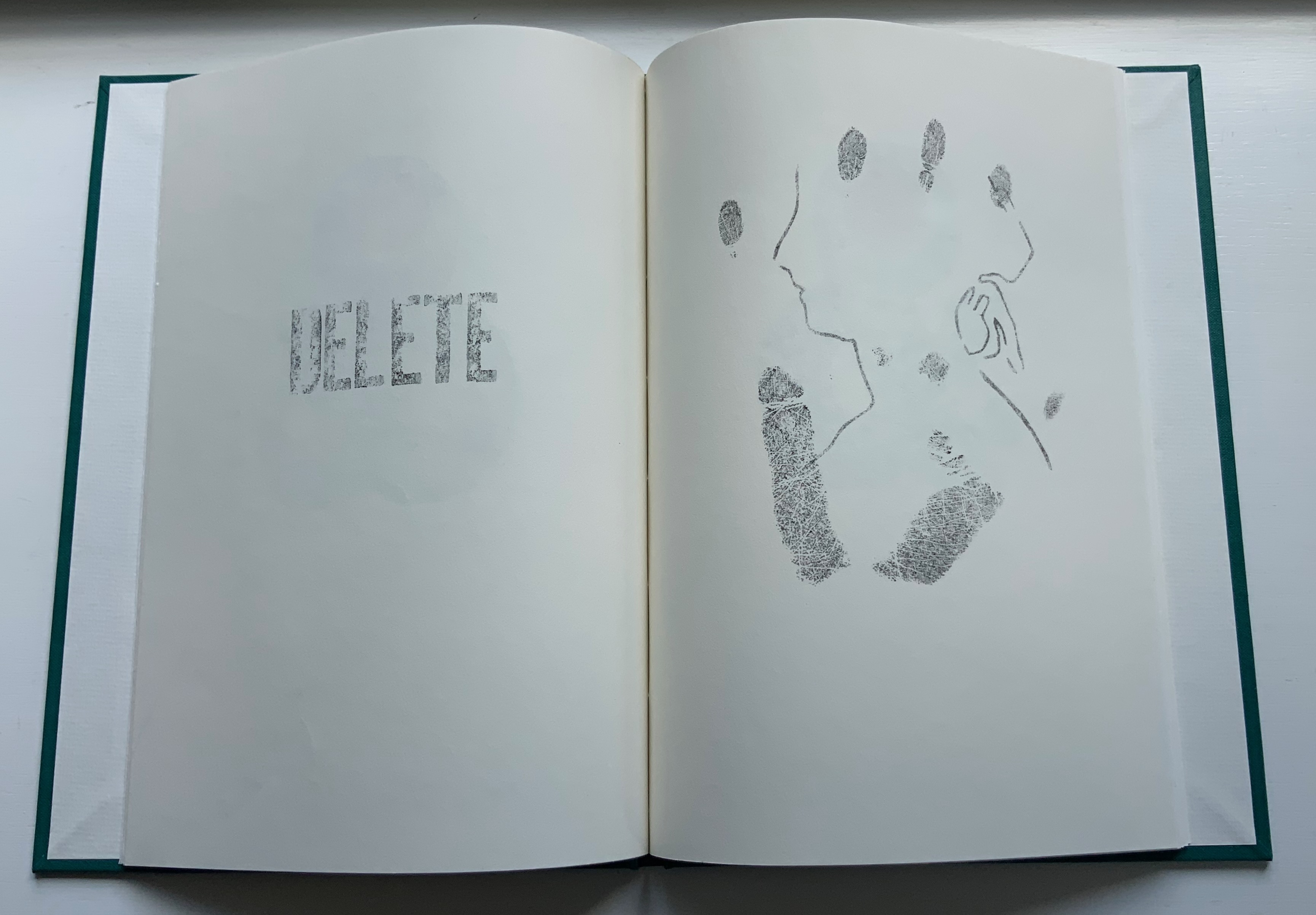
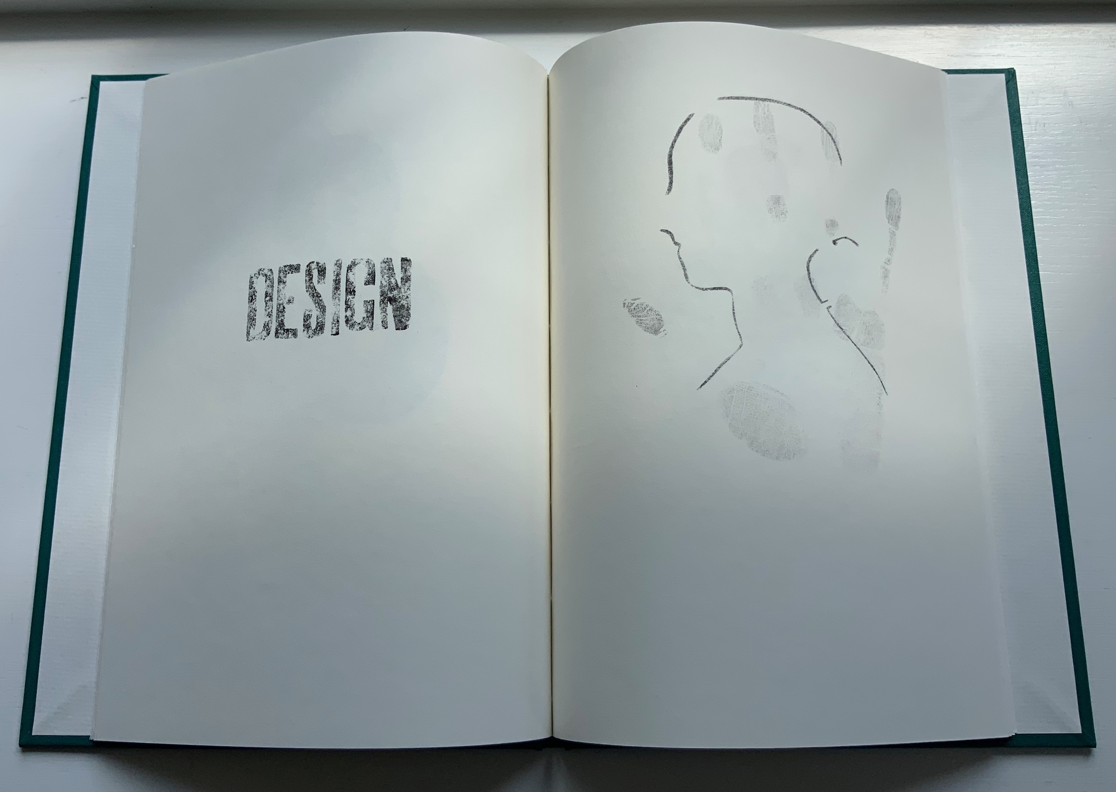
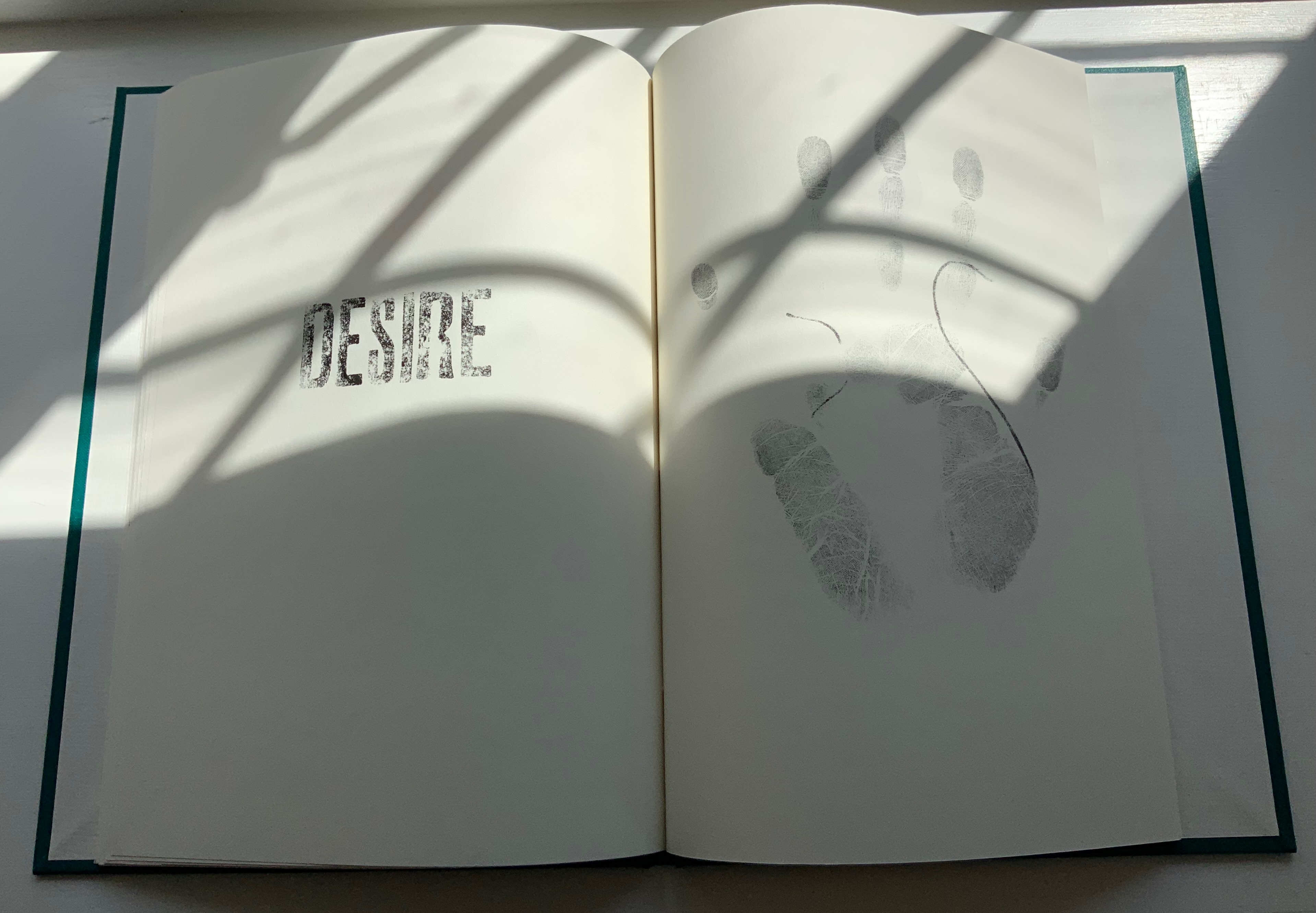
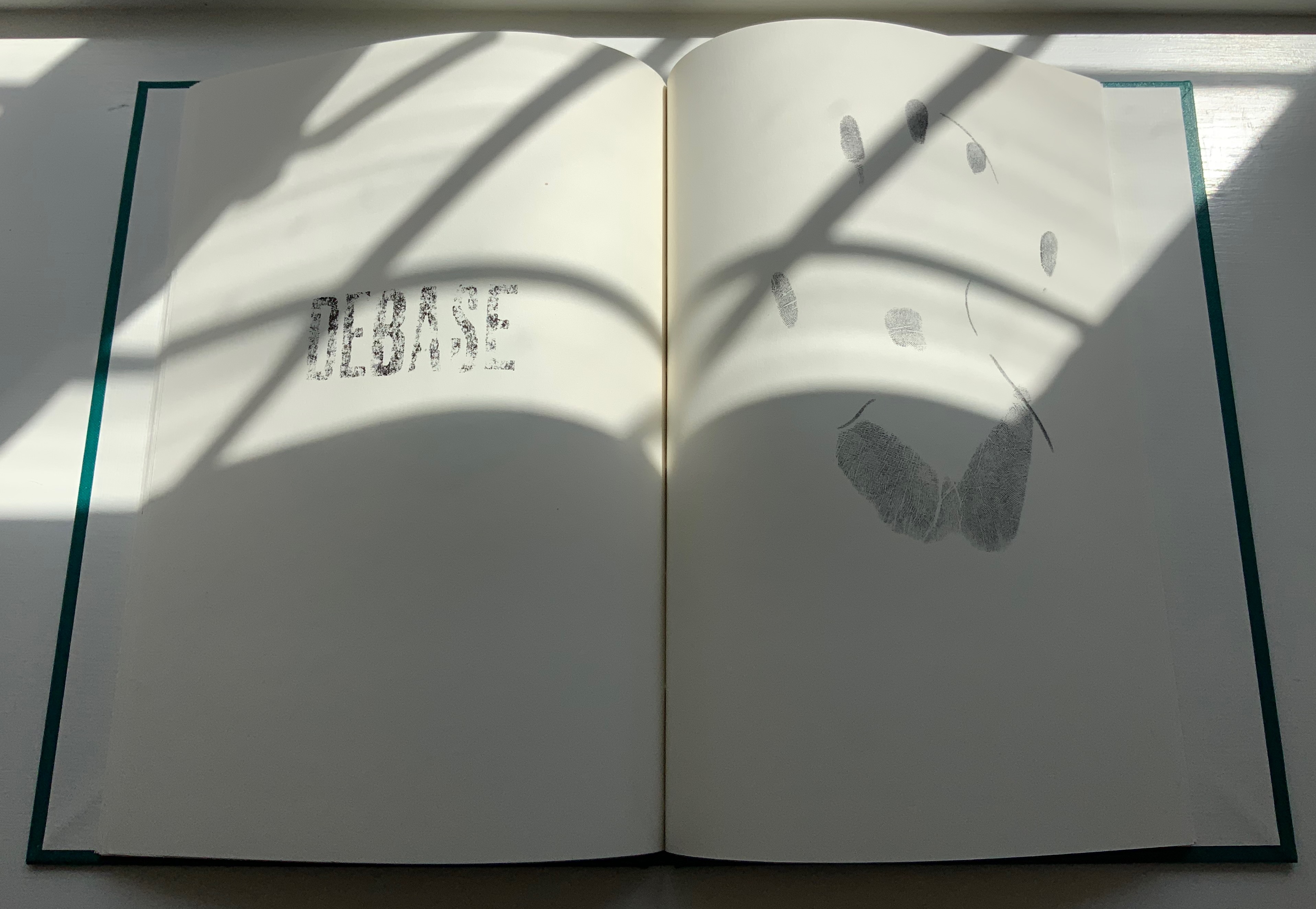
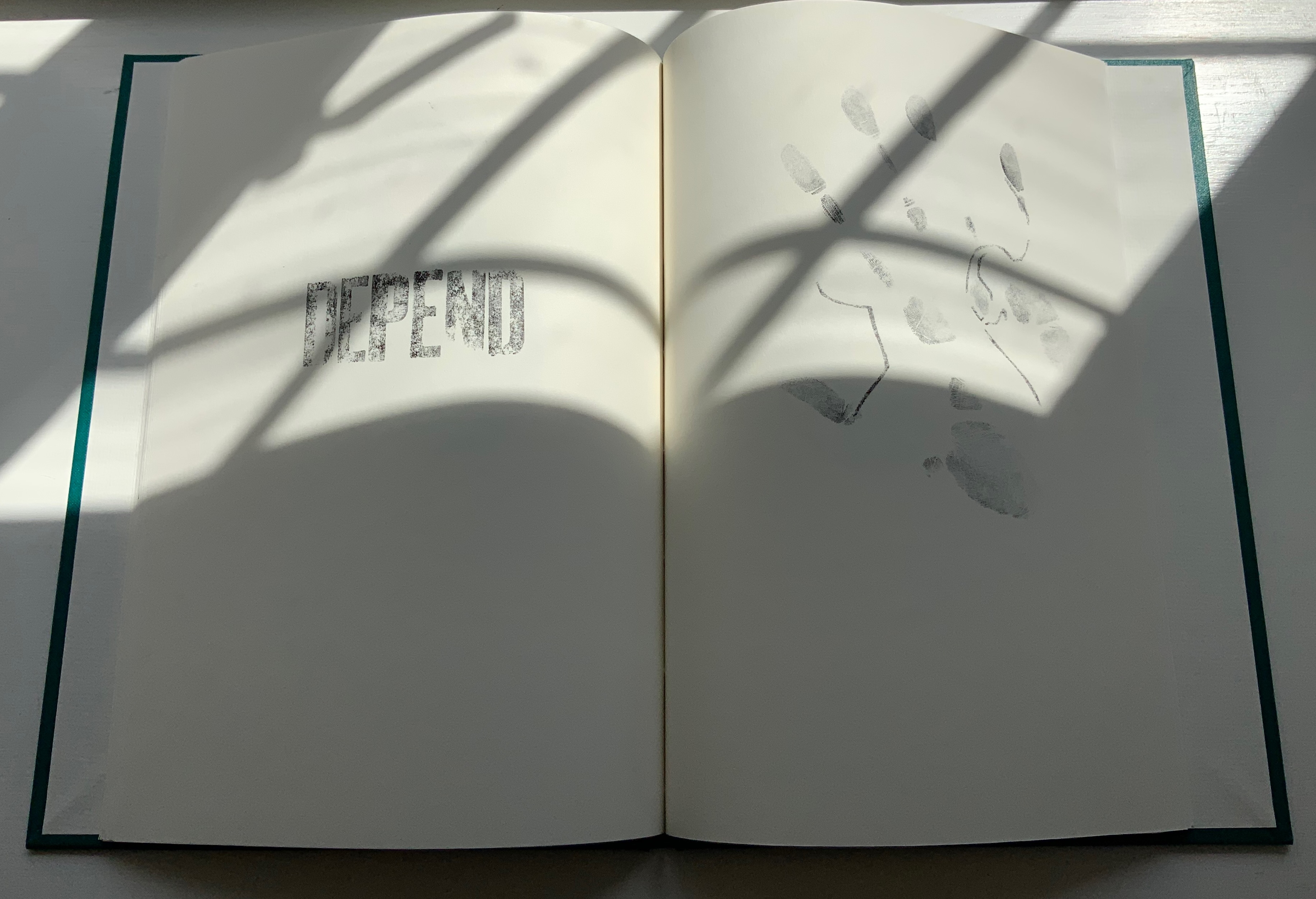
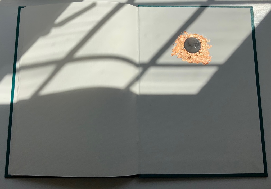
COIN (2017)
COIN (2017) Salt + Shaw Hardcover. H300 x W215 mm, 44 unnumbered pages. Edition of 9, of which this is #2. Acquired from the artists, 13 December 2021. Photos: Books On Books Collection. Displayed with permission of the artists.
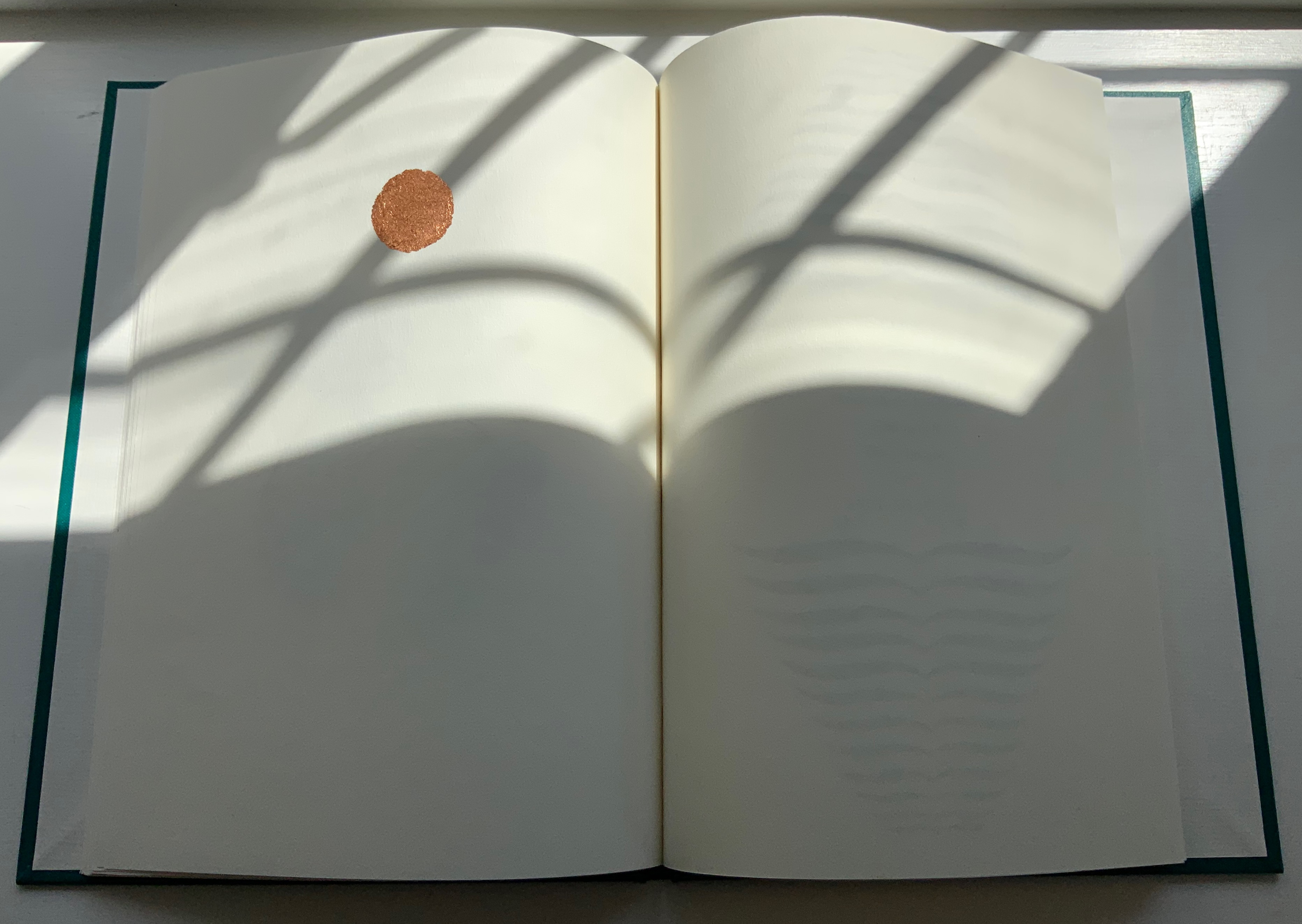
Faint handprints from nine individuals. Light imprints from an ampersand and a series of words all prefixed with “de”. A gradually disappearing profile of Queen Victoria. A hand-worn 1860-1894 penny coin fixed to a splatter of copper leaf. Along with the front cover’s embossed, eroded letters, this progression of letterpress and stencil work toward that coin echoes the archaeological aura of Forest Garden Beach, Mill and Fold, but through its progression, COIN enacts the strange movement through time that such found objects take.
The brackets on either side of the word on the title page might suggest a coin dropped in a pool of time, except that the brackets narrow rather than widen outwards. So, maybe the coin is rising through time. Or, look again at the title page and the coin on the last page, and maybe the brackets should be seen as “leaking” from the word just as the copper leaf can be seen as “leaking” from the coin.
Like the tangible shell casing in Forest Garden Beach beneath the leather, the letters of the word “COIN” rise beneath the front cover cloth. Take another look at those letters, and it becomes clear that their forms beneath the cloth are eroded, just as the bullet is spent and just as the copper coin has been worn. The mix of “de” words and the handprints over the queen’s deteriorating profile add the kind of irony to be found in Shelley’s sonnet “Ozymandias“.
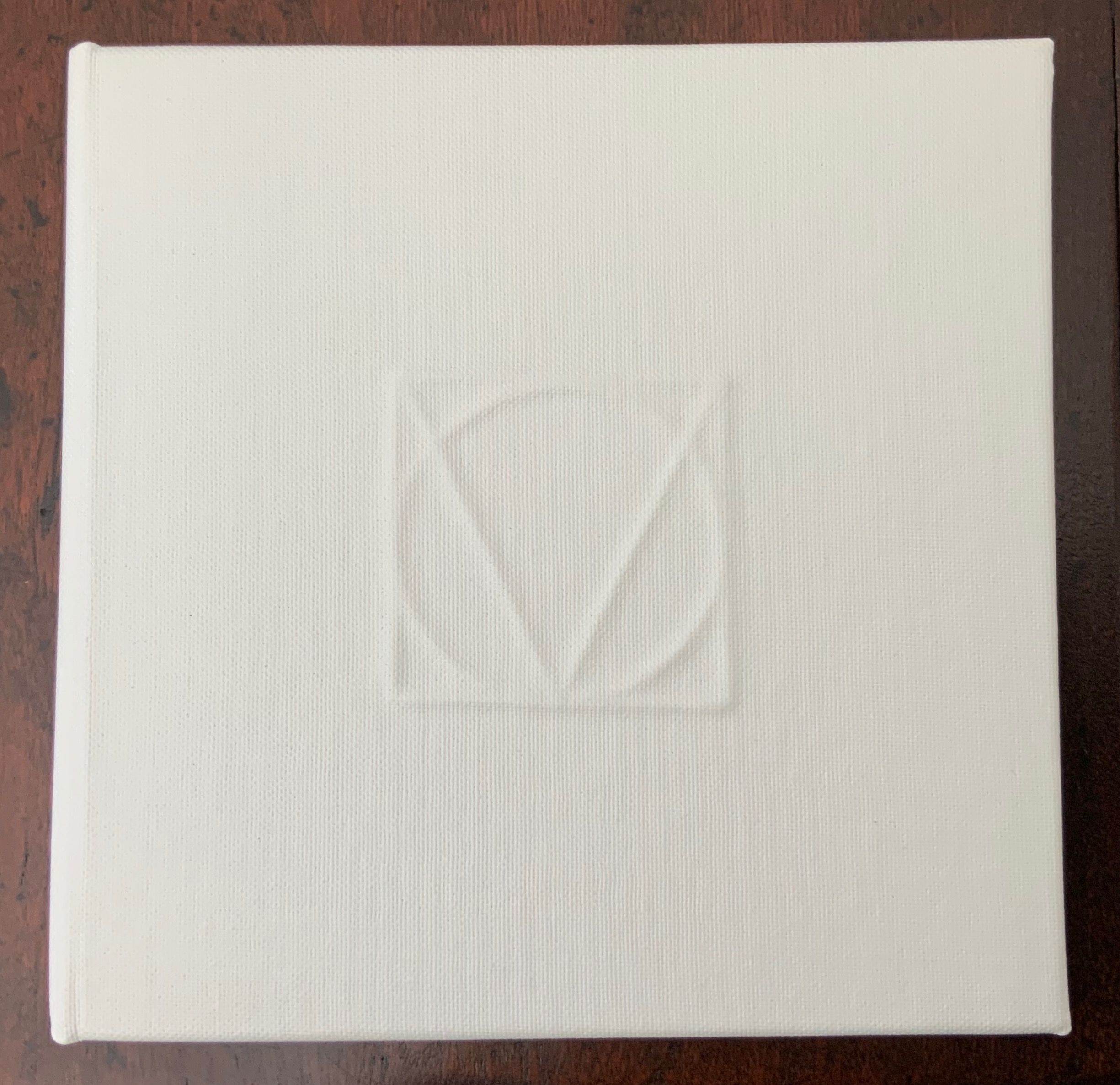
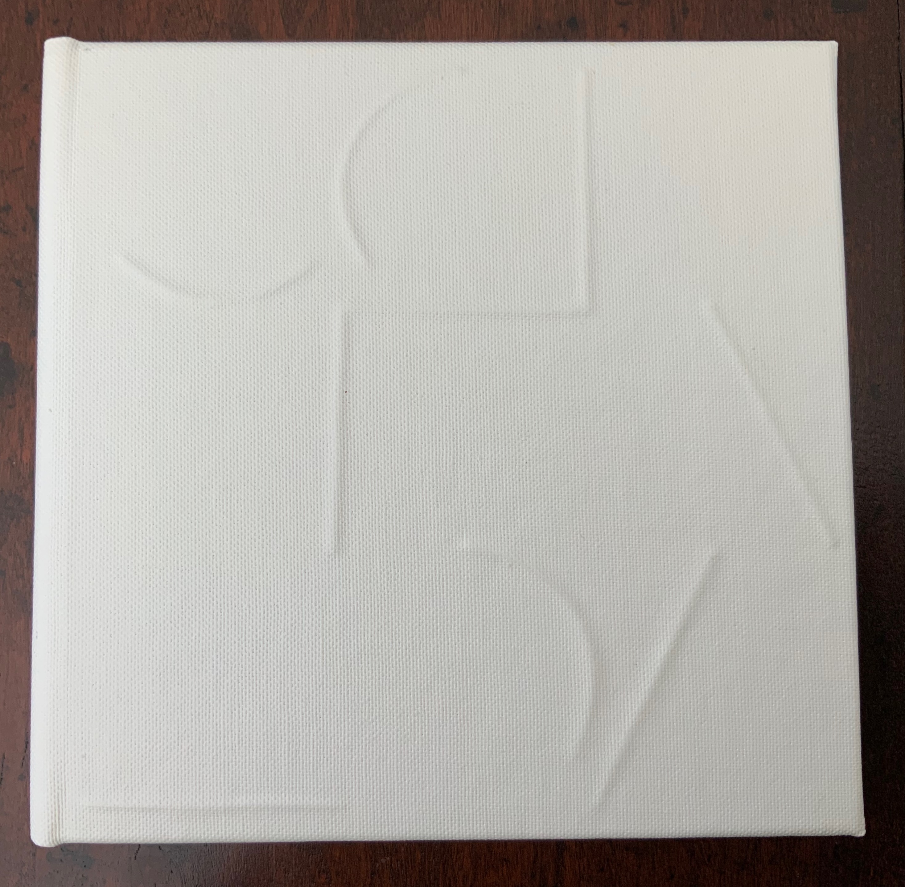
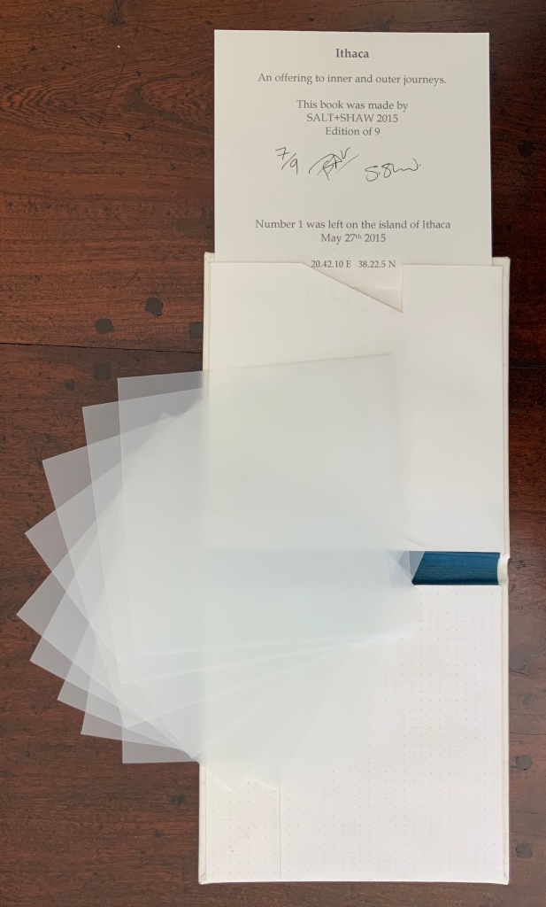
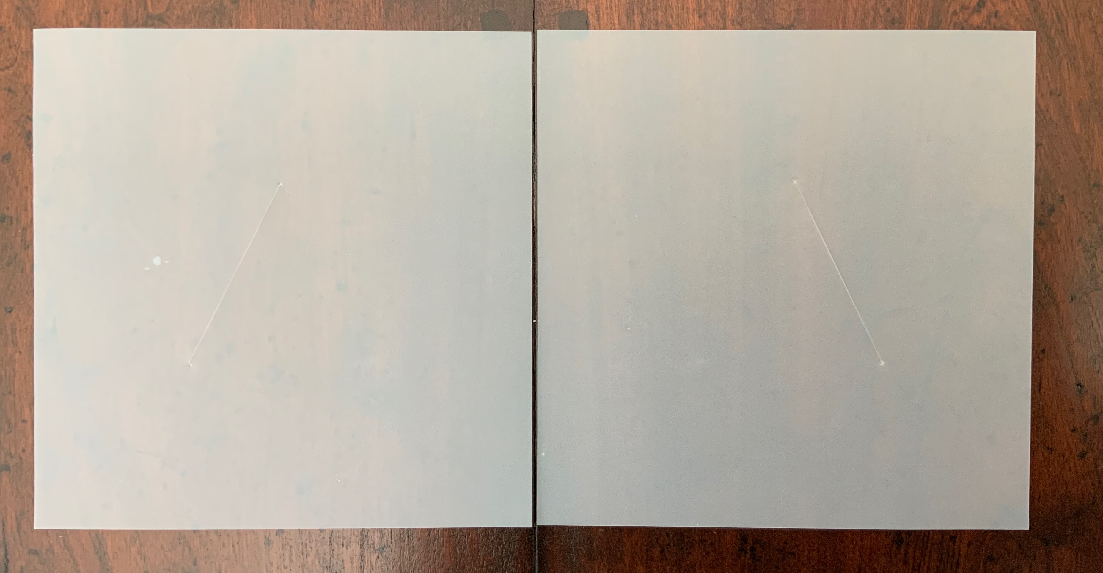
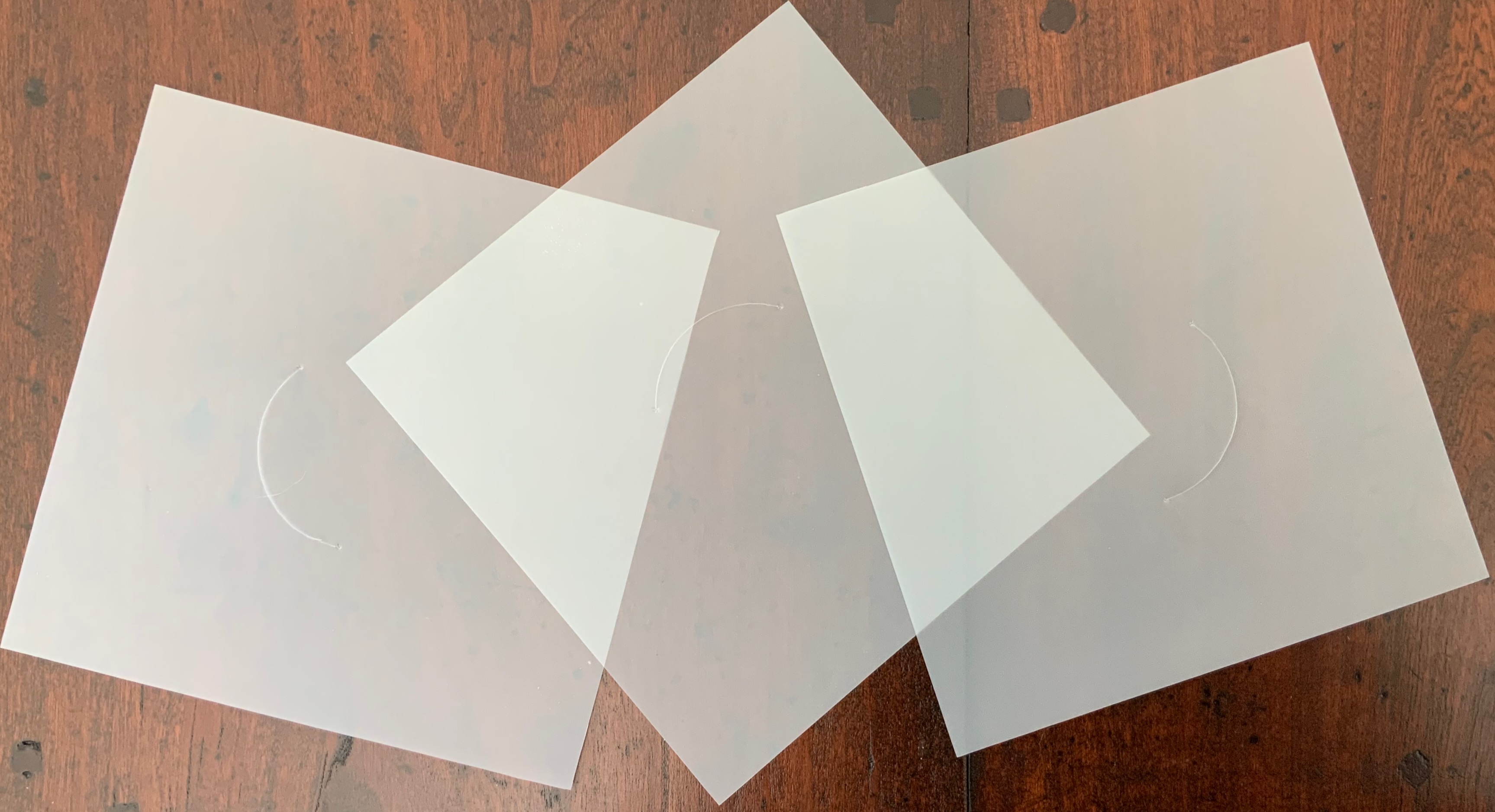
ITHACA(2015)
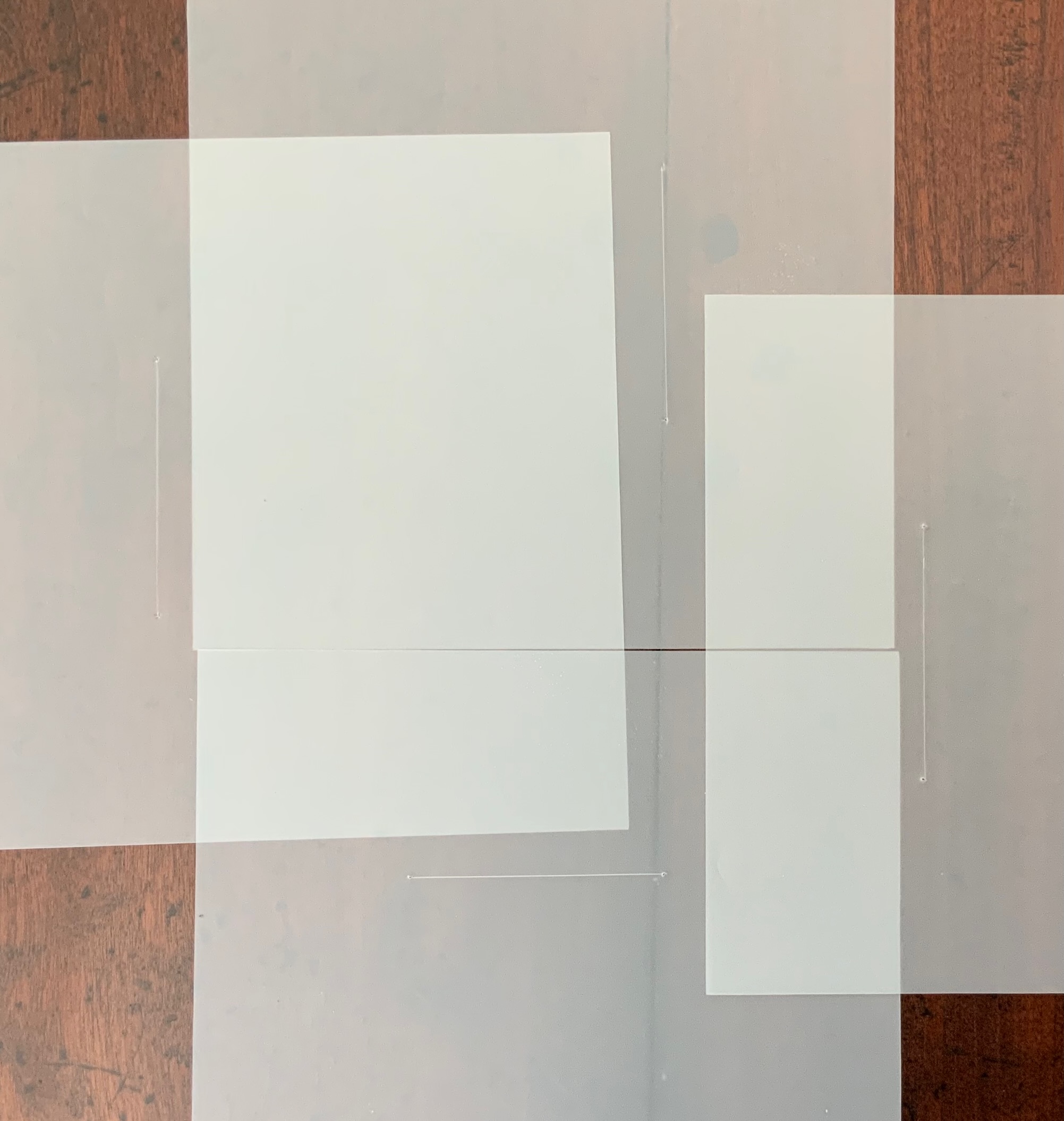
ITHACA(2015) Salt + Shaw Hardcover. 140 x 140 mm, 9 sheets of architectural tracing paper with hand-cut lines. Edition of 9, of which this is #7. Acquired from the artists, 13 December 2021. Photos: Books On Books Collection. Displayed with permission of the artists.
Ithaca gives a few twists both to the theme of the present’s interaction with the past and to the artists’ affection for blind printing. As the colophon indicates, the first copy of the edition of nine was left on the island of Ithaca and performs the act of an offering, much as objects left as offerings to the gods. “Journeys” and the work’s title, of course, suggest the most famous of journeying heroes — Odysseus; however,
the journeys to which the offering is dedicated are “inner and outer”, suggesting an allusion beyond the hero. The nine translucent sheets of architecture paper bear cuts whose shapes are each replicated by an embossed printing on the back (or front) cover of the work. If the sheets are rightly arranged, they will replicate the image of the circle and triangle embedded in the square on the front (or back cover).
The combined images of square, circle and triangle and the reference to inner and outer journeys suggest associations with sacred geometry (reflected elsewhere in the Books On Books Collection: Bruno Munari’s compendia on the square, circle and triangle and Jeffrey Morin’s and Steven Ferlauto’s two works) and with Zen (also reflected elsewhere in the collection: Julie Johnstone’s works).
The playing with the sheets of paper — a kind of inner and outer journey itself — to which Ithaca invites us highlights a growing insistence on audience interaction in all the works so far and especially so in the next.
LIMINAL KEEPSAKE (2015)
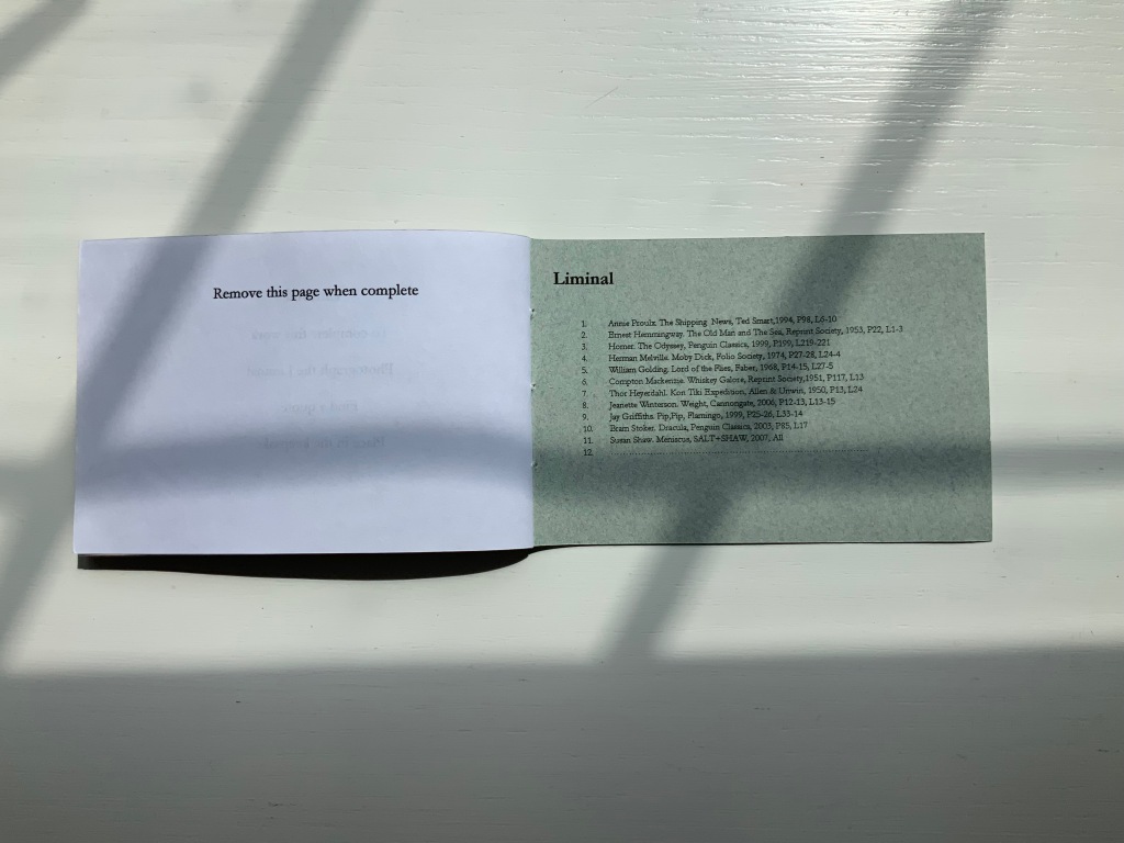
LIMINAL KEEPSAKE (2015) Salt + Shaw Pamphlet book. H70 x W105 mm, 12 unnumbered pages, half-sheet insert. Edition of 15, of which this is #11. Acquired from the artists, 13 December 2021. Photos: Books On Books Collection. Displayed with permission of the artists.
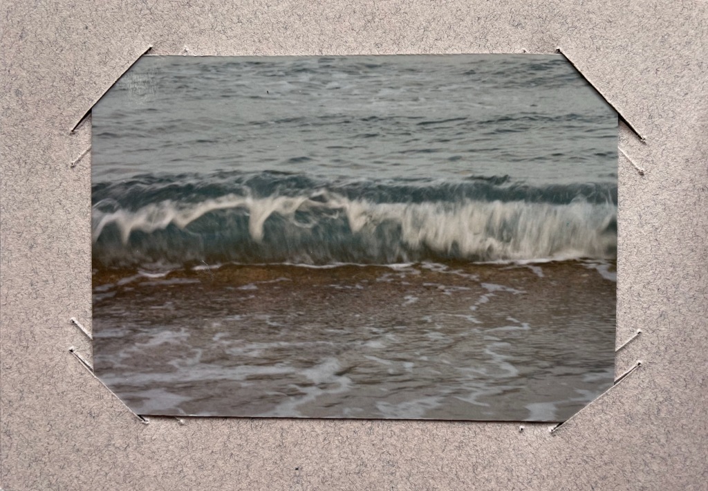
Liminal Keepsake realizes the sea:land allusion of Ithaca‘s title by presenting its audience with eleven photographs of sea and land meeting. The photos, unique to each copy in the edition, are held in hand-cut mounts. “Liminal” refers to “a space between” or “where edges meet”. The photos in Liminal Keepsake seem to be a collection of memories about where the edges of the sea and land meet.
But on the inside back cover is a list of references to literary works, each of which has a passage that aligns with the photo matching in the sequence. Here is another space between — the space between the images and the passages — a space into which any curious viewer is thrust. If the viewer expects to enjoy this work fully, the viewer has to seek out the passages in that list to see how the text matches the photo. Not that easy a task since each text is specific to a specific edition of the cited literary work. The For instance, the tenth photo in the sequence is aligned to a passage from Bram Stoker’s Dracula — specifically from page 85, line 17 of the 2003 Penguin edition. Fortunately, that edition can be easily found online. Here’s the passage (the 17th line is in bold):
… The day / was unusually fine till the afternoon, when some of the gossips / who frequent the East Cliff churchyard, and from that com- / manding eminence watch the wide sweep of sea visible to the / north and east, called attention to a sudden show of ‘mares’- / ‘tails’ high in the sky to the north-west. …
And here is the relevant photo in the collection’s copy of Liminal Keepsake.
So the viewer has to become researcher and reader to experience Liminal Keepsake fully, and the viewer/researcher/reader has to become something even more to finish Liminal Keepsake. Just as Ithaca invites its audience to arrange its translucent sheets to form the symbol on its cover, Liminal Keepsake invites its completion by the viewer/researcher/reader-cum-artist’s taking a photo of “the Liminal” and a bibliographical reference that echoes the photo.
In pondering completion of the work, would-be artists come across across other “spaces between” — the space between the visual and textual imaginations and the space between concept and execution. Apparently the artists took their photos, then found the texts to match. To hold an image in mind and be constantly on the lookout for matching text in whatever literary work happens to be in hand seems a tall order. To start the other way around — to have some sea:land text in hand and then seek a setting in which an appropriate image is likely to be found — looks easier to the more textual imagination. On top of this are the artist-manqué’s anxiety of crossing that space between concept and execution and the curator’s anxiety of sacrificing the object as-was and the aura of possibilities for perhaps a lesser object and one definitely without the aura of possibilities.
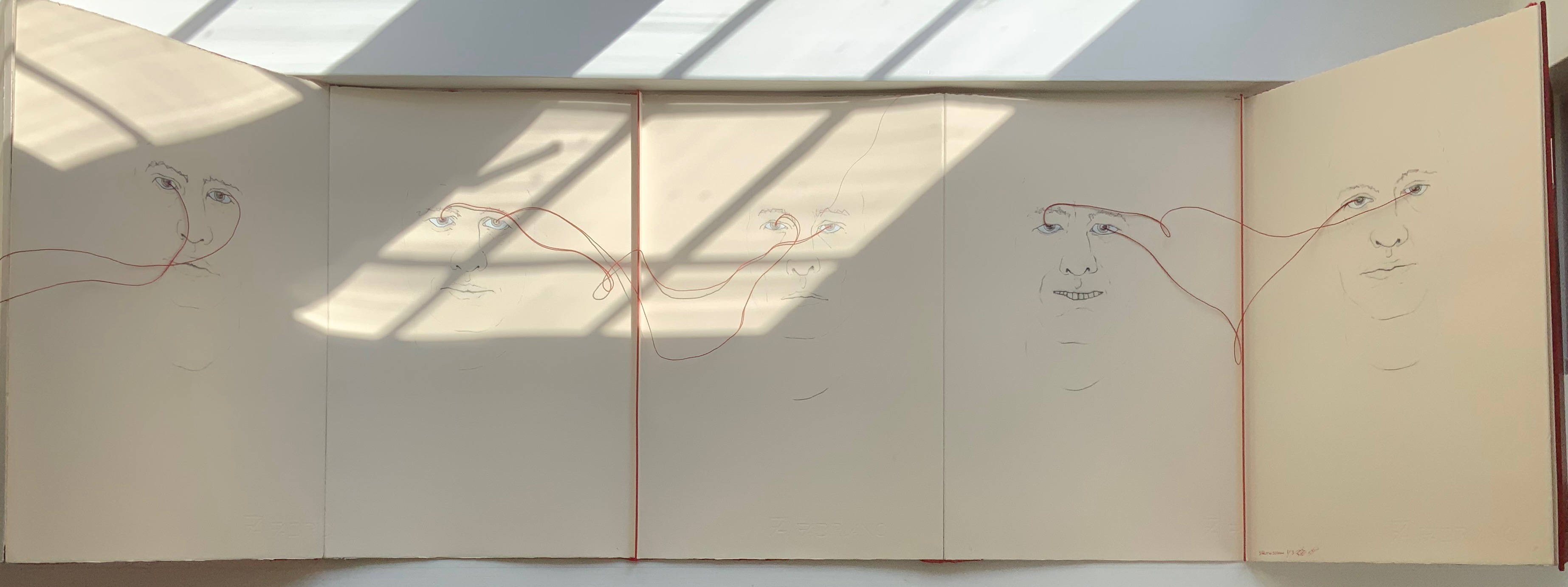
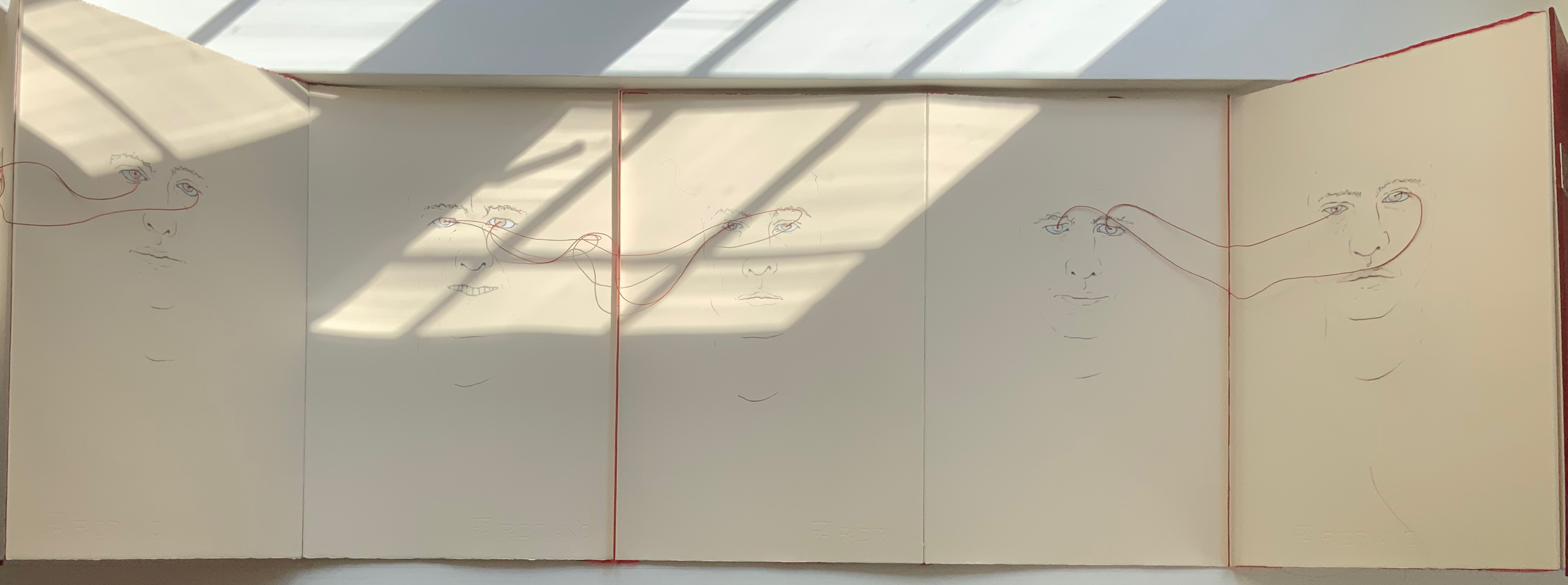
LOOK(2021)
LOOK (2021) Salt + Shaw Hardcover, double-sided concertina book. H350 x W230 mm, 10 unnumbered panels. Edition of 3, of which this is #1. Acquired from the artists, 13 December 2021. Photos: Books On Books Collection. Displayed with permission of the artists.
The core features of two individuals’ faces head-on have been drawn on both sides of this concertina book — “core” meaning no delimitation by hair, ears or other details at the edges of the visages. The red thread connecting the pairs of eyes with one another draws attention back to the title: Is it an instruction for the viewer to look? Is it a noun referring to appearance, the look of the faces? Or to expression, the look in the faces? Is it a noun referring to an action occurring between the depicted faces — if only via the thread connecting the pairs of eyes? Only when the concertina is closed do the faces face one another. Yet the color red, echoed between the cover and thread, suggests an intensity connecting these looks, these gazes.
A more textual predecessor to Look is Whorl (2007).
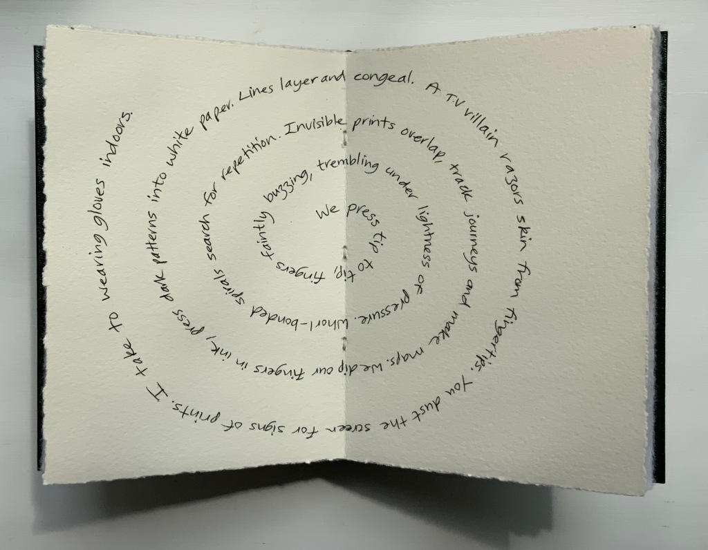
WHORL(2007)
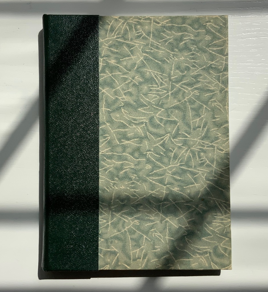
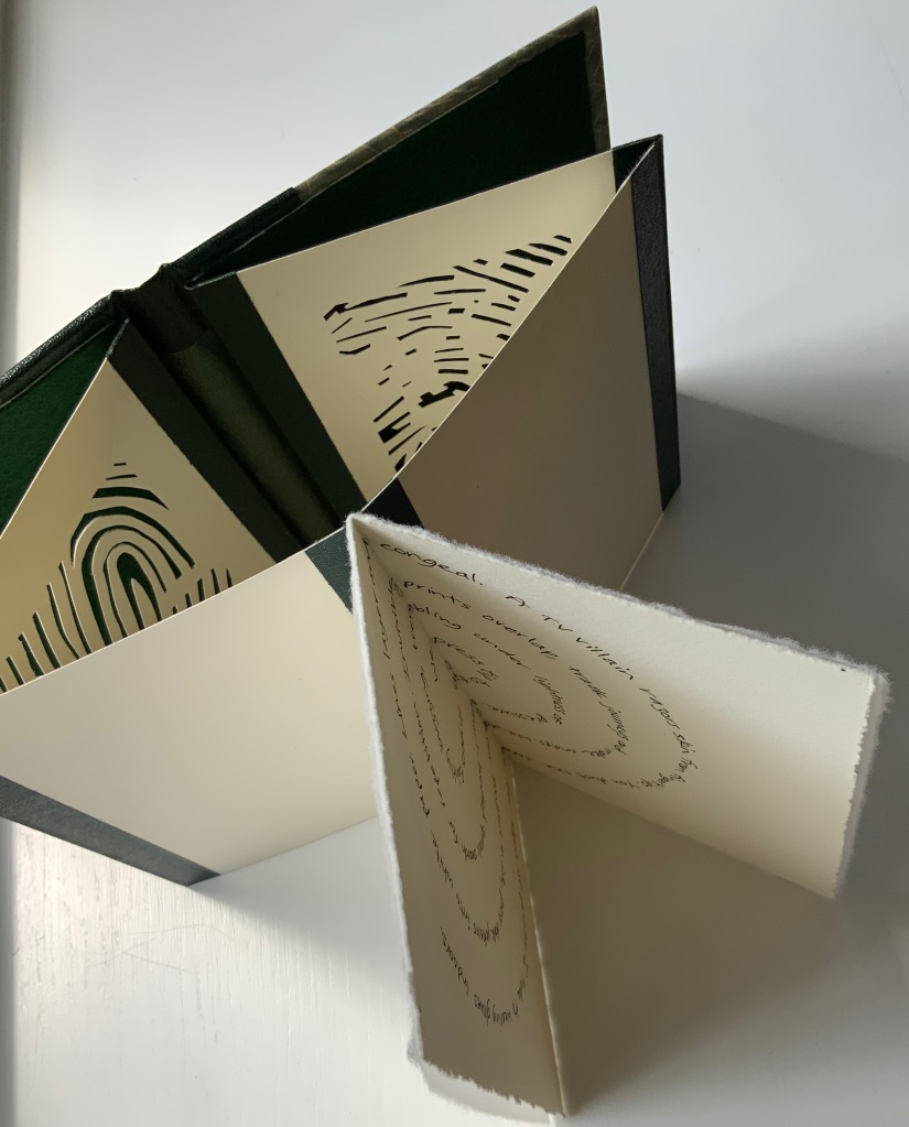
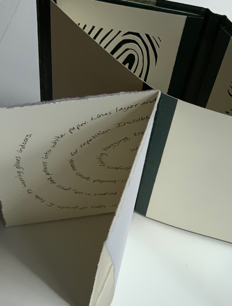
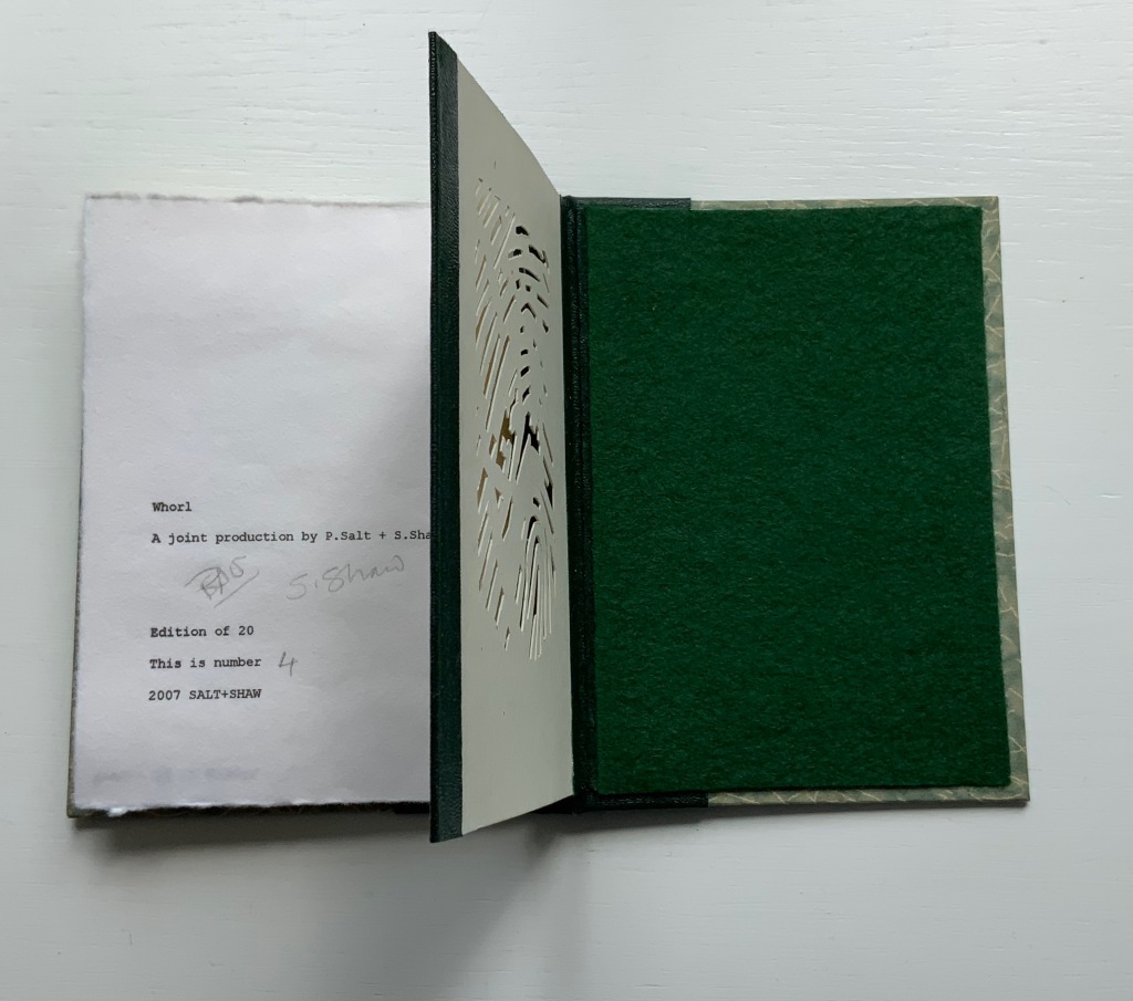
WHORL(2007) Salt + Shaw Hardcover, modified concertina and pamphlet book, H115 x W155 mm, 4 unnumbered panels, 2 unnumbered central sheets. Edition of 20, of which this is #4. Acquired from the artists, 13 December 2021. Photos: Books On Books Collection. Displayed with permission of the artists.
Here is a rare instance of a poem’s metaphysicality being physically enacted by the surface and structure on which the poem is inscribed. On a double-page spread at the work’s center, a poem begins at the center of its spiral, or whorl, with the words “We press tip to tip fingers ….” Pull the double-page spread outwards away from the spine. Because the spread’s centerfold serves to bind four panels into a diamond shape, two hand-cut stencils of two different fingerprints approach (“tremblingly” as the poem describes) to touch one another when the double-page spread is pulled completely outwards and away from the spine. If this does not renind the reader of John Donne’s poetry, nothing will.
The following works are individual to Susan Shaw and Paul Salt, respectively. Shaw’s individual works also deliver complete textual works — short stories or a poem — that fuse with their containers.
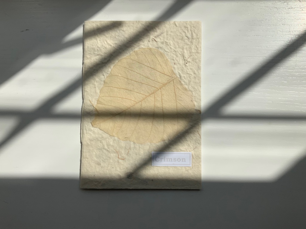
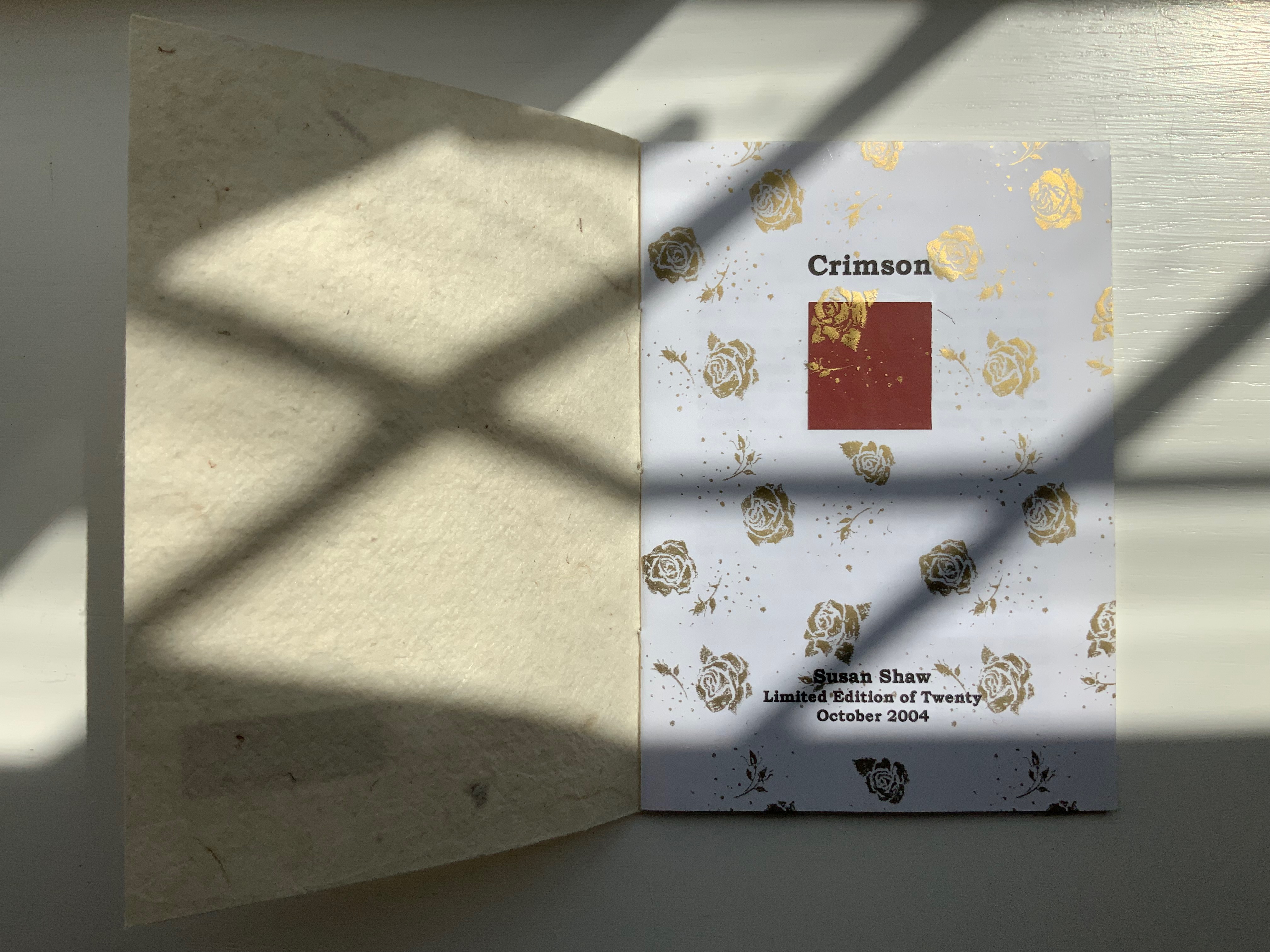
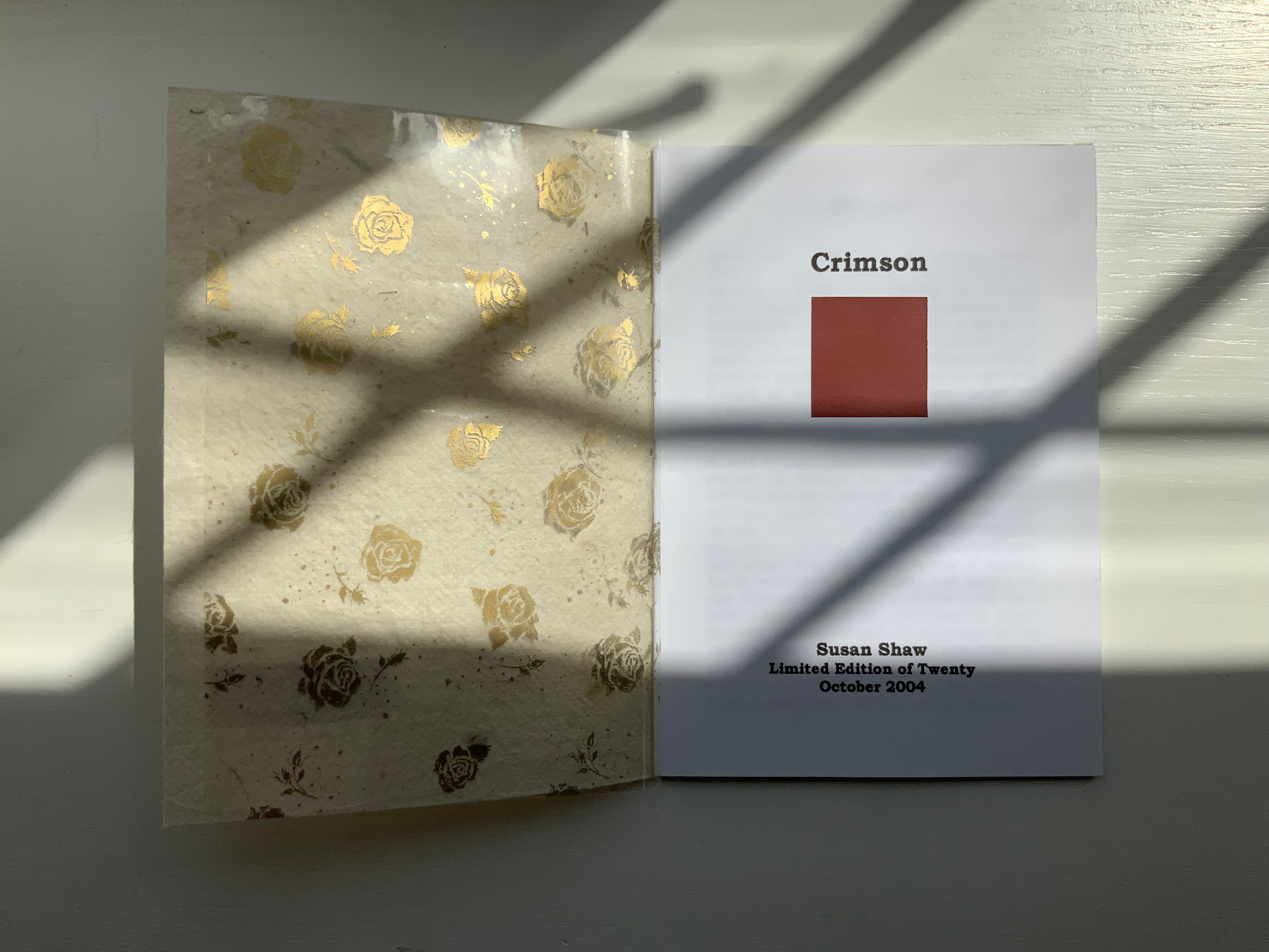
CRIMSON(2004)
Crimson(2004) Susan Shaw Hand-made paper cover. H155 x W110 mm, 8 unnumbered pages. Edition of 10, of which this is #2. Acquired from the artist, 13 December 2021. Photos:Books On Books Collection. Displayed with permission of the artist.
The washed-out cover, pressed fallen leaf and faded title signal the conclusion of the short story Crimson, in which a couple seemingly argue incessantly about choice of colors, both indoors and out in their garden.
Shaw’s attraction to fiction narrative perspective flutters recurs in the next work, but its leporello structure and photos add a different otherworldly touch.
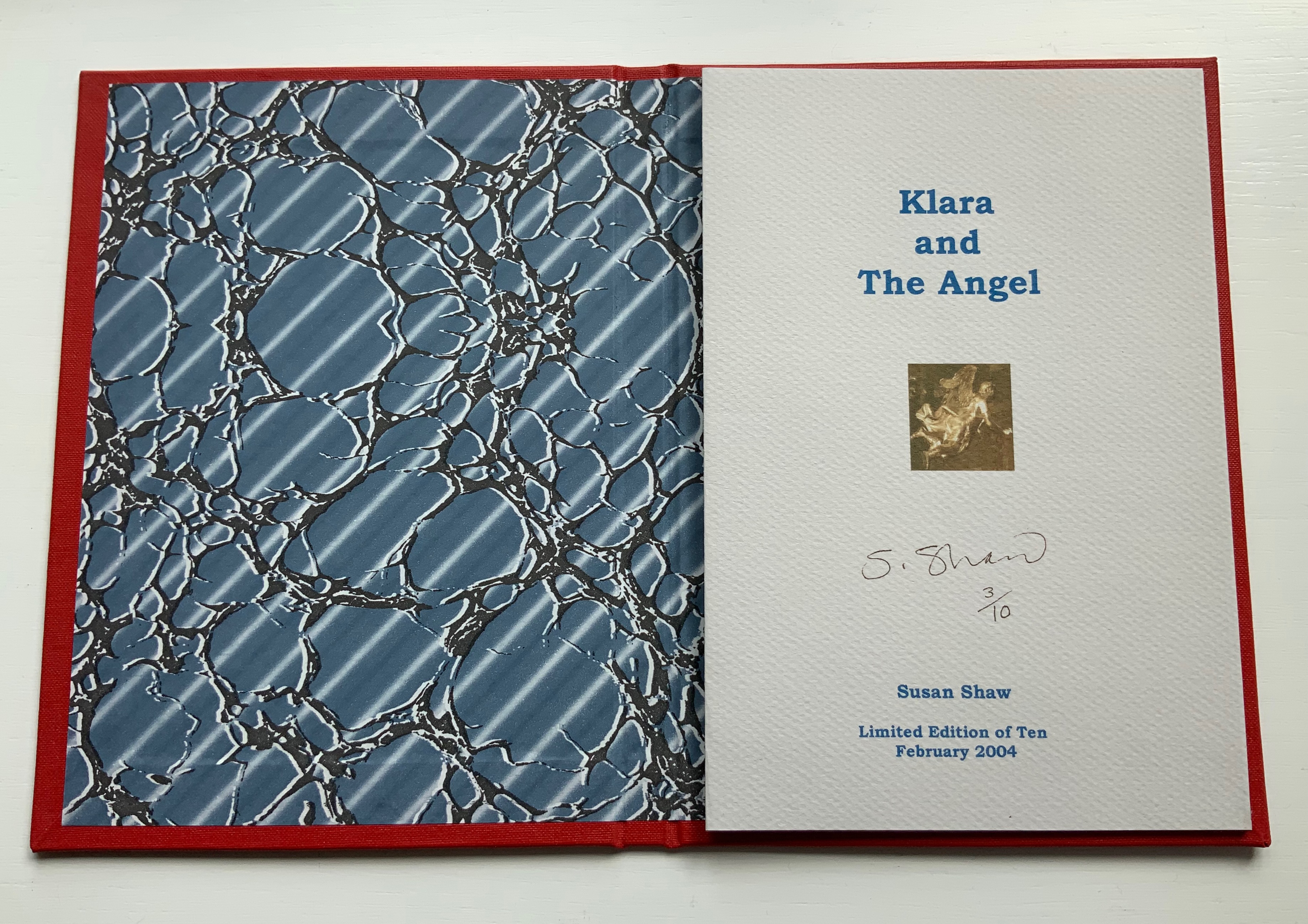
KLARA AND THE ANGEL (2004)
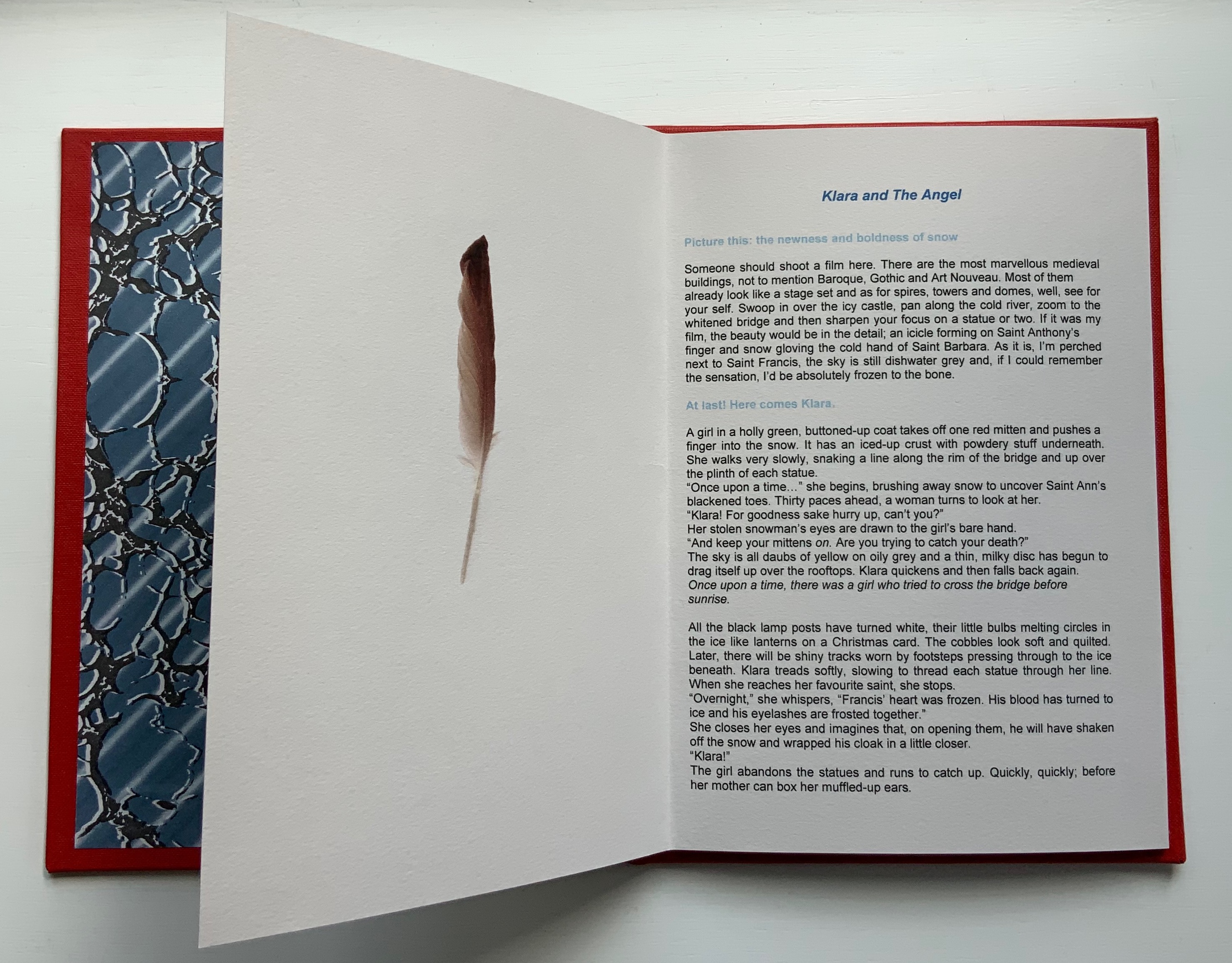
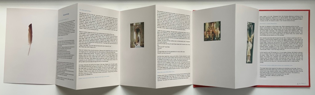
KLARA AND THE ANGEL(2004) Susan Shaw Hardcover, double-sided concertina book. H220 x W160 mm, 15 unnumbered panels. Edition of 10, of which this is #3. Acquired from the artists, 13 December 2021. Photos: Books On Books Collection. Displayed with permission of the artists.
The story begins in a Prague cemetery covered in snow, to which the reader’s attention is directed by the narrator’s direct address in light blue type. As the type shifts into black, the narrator continues to address the reader, and with the reference to being perched on St. Francis’s shoulder, the narrator gives some of the game but then deflects with the introduction in blue of Klara’s arrival. As the leporello unfolds, so does Klara’s story and the narrator’s identity as the angel with whom Klara has an appointment.
Snow and evocative photos feature in the next work but with less drama.
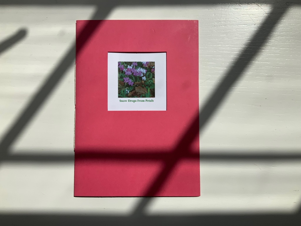
SNOW DROPS FROM PETALS(2008)
SNOW DROPS FROM PETALS(2008) Susan Shaw Pamphlet book. H150 x W105 mm, 12 unnumbered pages. Edition of 17, of which this is #4. Acquired from the artist, 13 December 2021. Photos: Books On Books Collection. Displayed with permission of the artist.
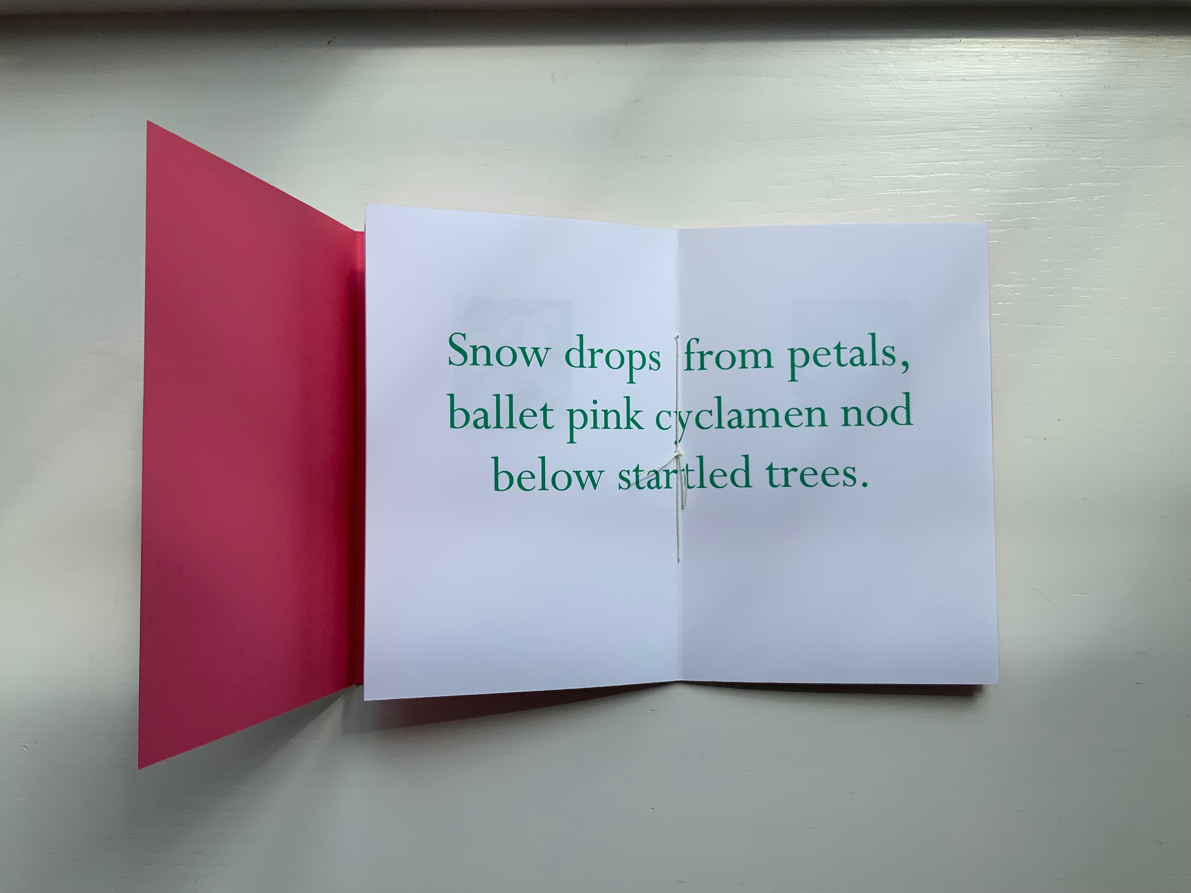
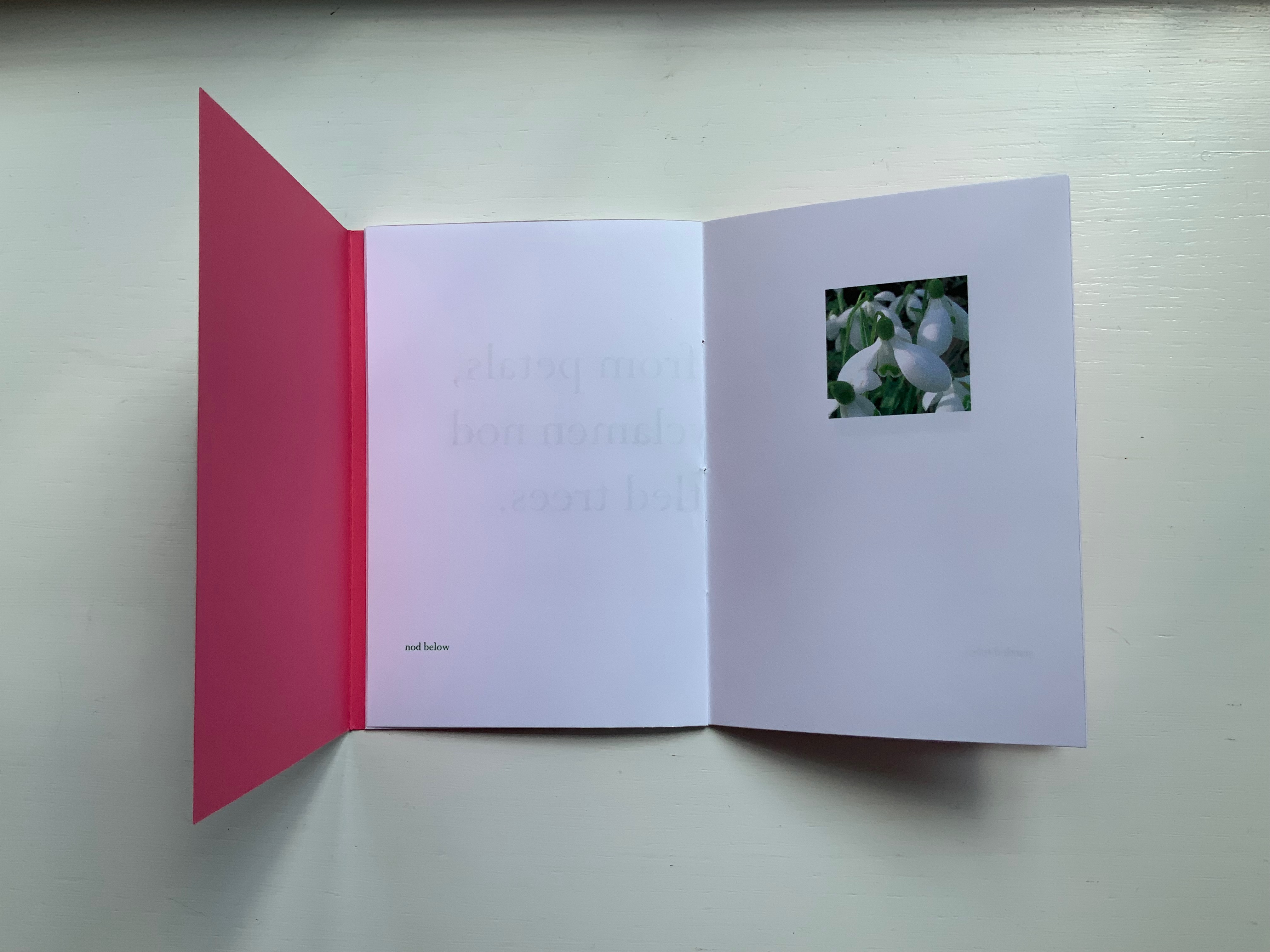
The front cover wraps around to overlap the back cover, which is rather like the way in which words often play multiple roles in poems. Here, the subject snow and its verb drops coincide with the flower’s name and its two photos that appear later. The center of the work presents the entire haiku, but more interesting and curious, the haiku’s traditional structure (lines of 5, 7 and 5 syllables) breaks up into four segments (5, 6, 3, 3) to appear on verso pages facing a photo.
Daffodils face the first line. Snow drops face the words “ballet pink cyclamens”. More snow drops face the words “nod below”. A bee perched on a blossom faces the words “startled trees”. The effect is to send the reader back and forth across these spreads and page turns like a bee moving from flower to flower.
Paul Salt’s individual works in the collection take a more sculptural expression. Even though this next work is garden-inspired like Snow Drops, its physical presentation reflects the more sculptural garden that inspired it.
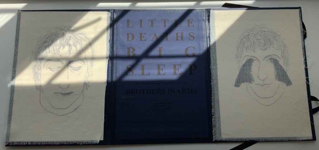
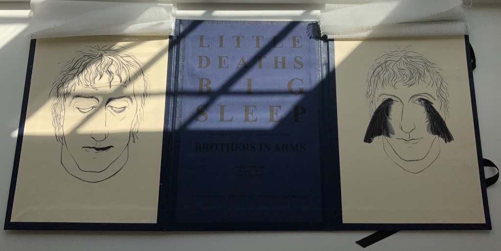
BROTHERS IN ARMS(2008)
BROTHERS IN ARMS(2008) Paul Salt Hardcover, folio. H300 x W220 mm close, W655 open. Edition of 24, of which this is #2. Acquired from the artist, 13 December 2021. Photos: Books On Books Collection. Displayed with permission of the artist.
The garden in question here is the more severe but still playful Little Sparta, created by Ian Hamilton Finlay. On a visit there, Salt found a pair of wings at the base of one of the sculptures.
In its imagery and structure, the final work by Salt reflects the physicality and preoccupations found in many of the works above: especially Mill, Coin and Fold. Although it has less whimsy than Coin or Fold, its abrupt title recalls Ed Ruscha’s humorous rule of thumb for distinguishing between bad and good art: Bad art makes you say ‘Wow! Huh?’ Good art makes you say ‘Huh? Wow!’
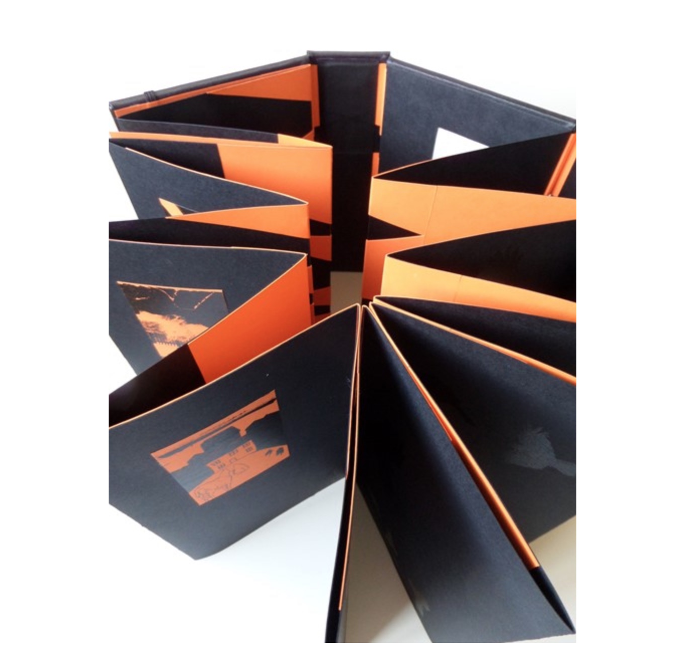
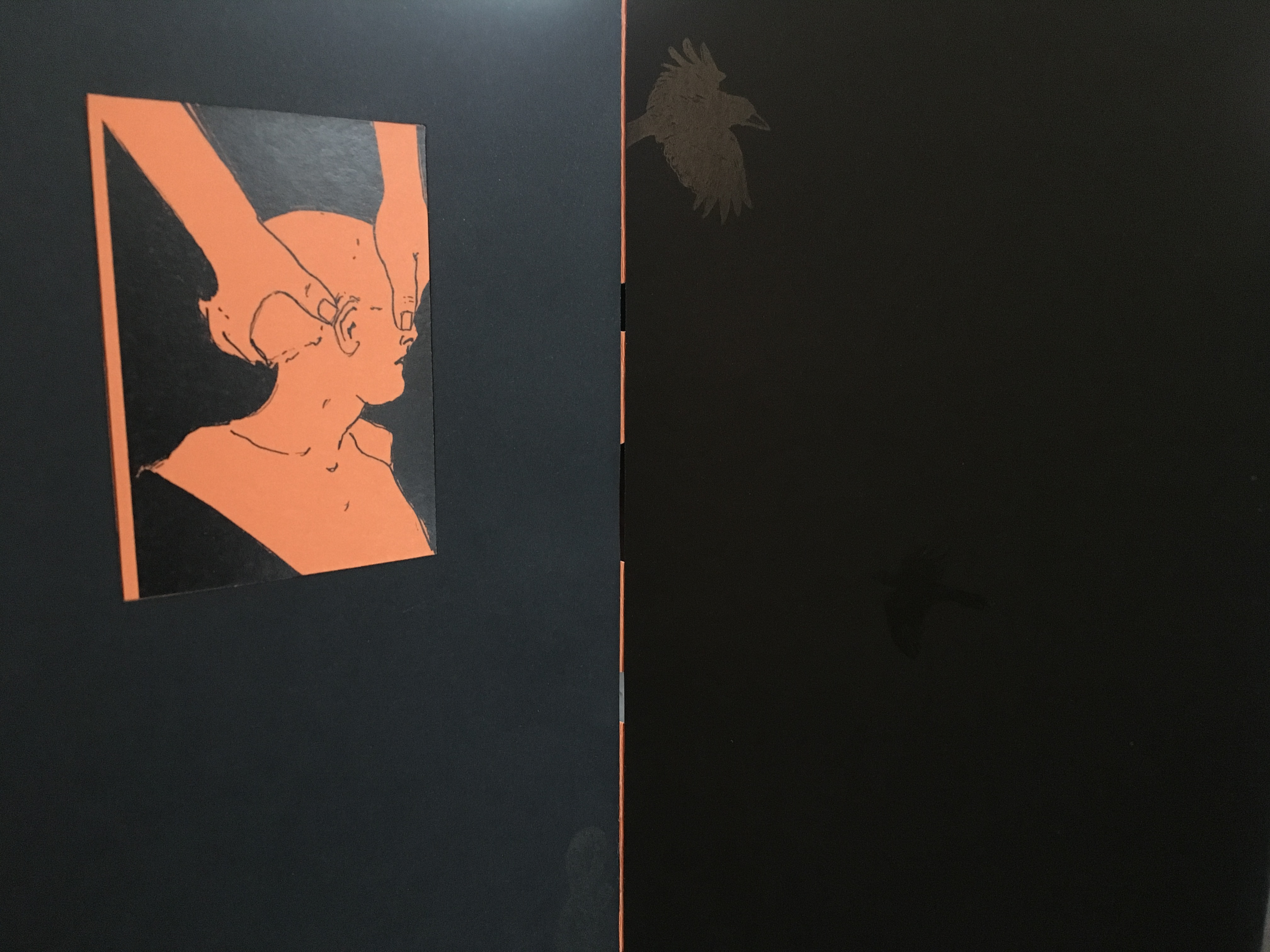
What …? (2018)
What …? (2018)
Salt+Shaw Hardback, boxed-bound, black book cloth, concertina book with magnetised and elasticated fastening. Drawings and collages printed on black and orange Canson card. Letterpress. Hinges engineered in Canson card to create a spring in the turning of the pages. H213 x W80 mm closed, H213 x W830 mm open Edition of 5, of which this is #2. Acquired from the artists, 25 November 2018.
What? is a book about finding solutions, both in its construction and content. Made over a period of several years, from the first drawing to the final binding, it prefers to raise questions, rather than provide answers. Hence the title. The relationship between What? and viewer therefore depends upon response, perception and making connections. Clues could include: • William Blake • harbingers • manipulation • dislocation • loss • finding a way out • George Orwell. [Correspondence with artists, 5 December 2018.]
What? … Wow!
Further Reading
Sarah Bodman (University of Western England) has highlighted their work in a-n News with some outstanding photos:
“At the recent 21st International Contemporary Artists’ Book Fair in Leeds, they launched Ocean Bestiary, a unique book of strange and miraculous Medieval-inspired sea creatures that features a concertina construction, letterpress text, acrylic paint, gold foil, whale bone and a leather inlay.” Sarah Bodman, “Artists’ Books #28: Salt+Shaw, collaborative book makers“, a-n News, 6 March 2018.
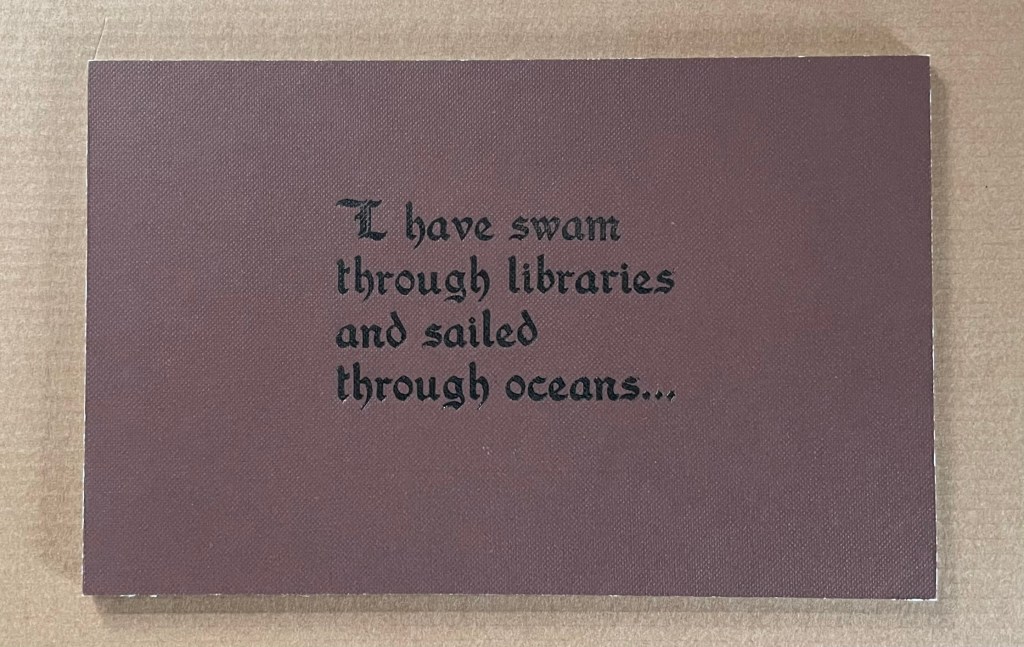
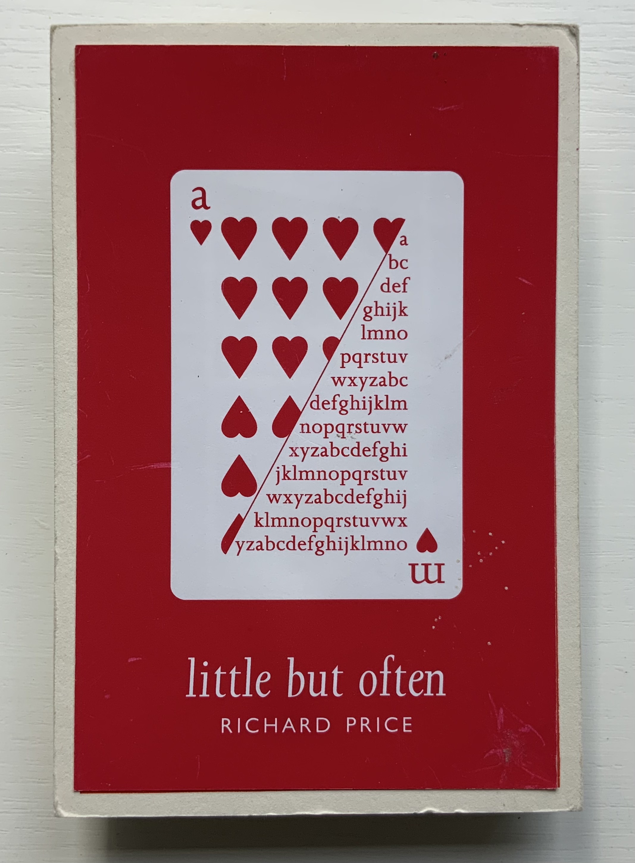
Richard Price’s lines recall the inventiveness of Emily Dickinson‘s and compression of Samuel Menashe‘s. For Dickinson, we have the artistry of Jen Bervin; for Menashe, we have that of Julie Johnstone; and for Price, we have his full-on collaboration with Ron King.
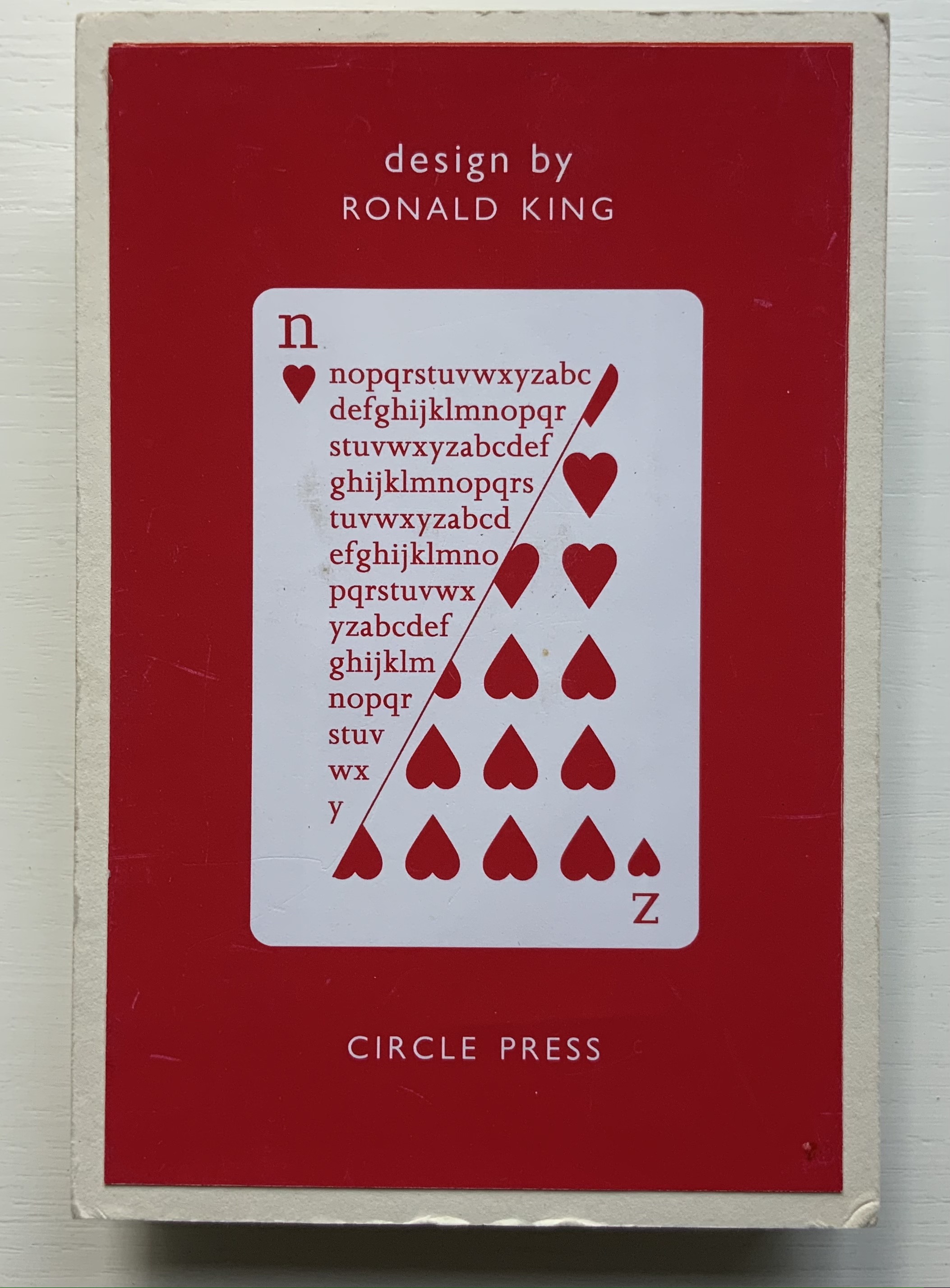
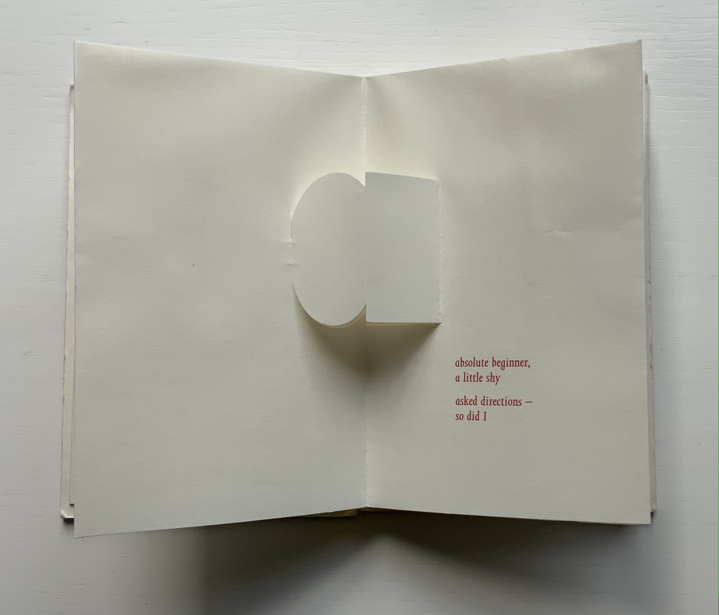
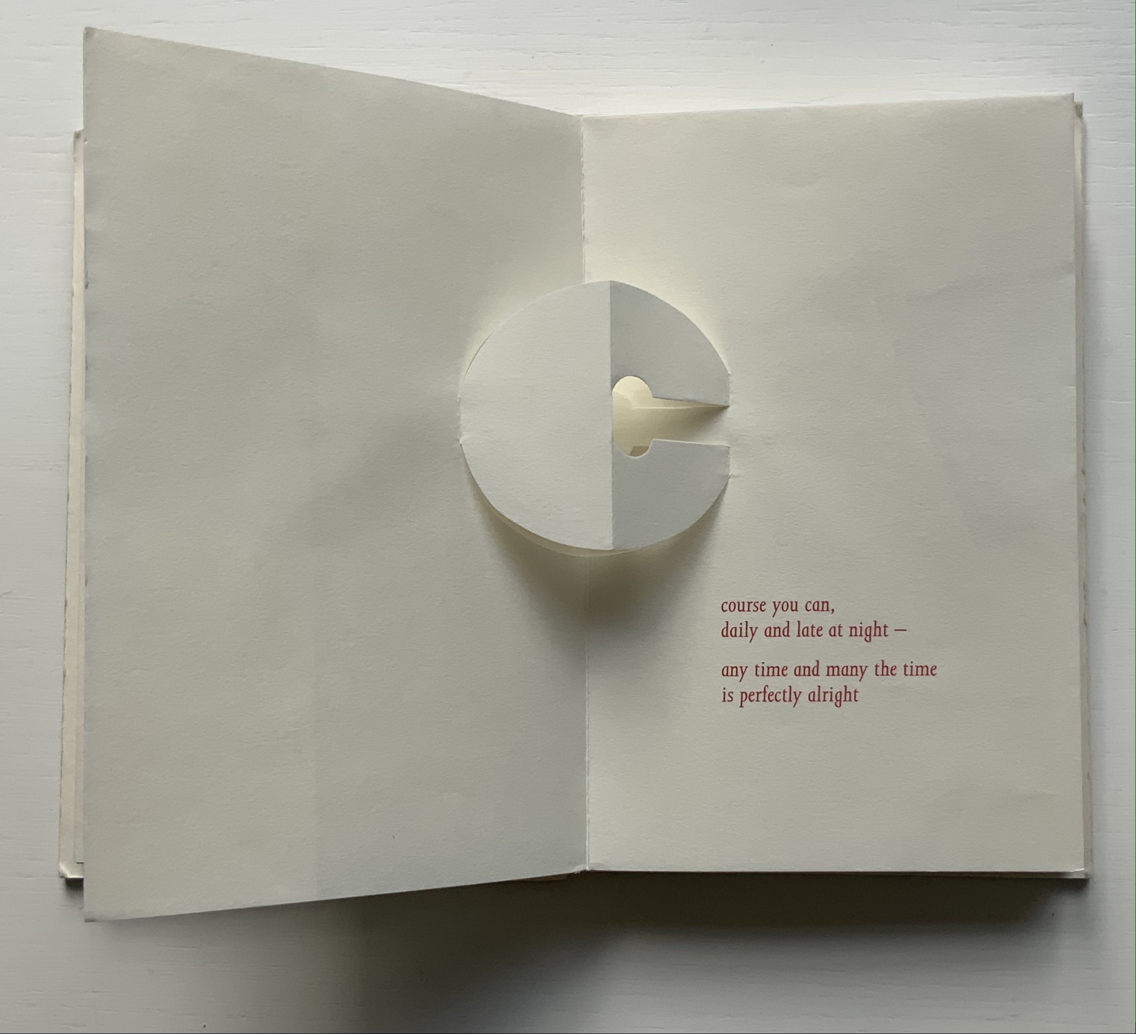
Harking back to The Half-Year Letters (1983), little but often pairs King’s lowercase pop-up alphabet with Price’s verses, just as its predecessor paired the uppercase with Roy Fisher‘s alphabet-inspired evocations of the 26 weeks from April through September. Also like its predecessor, little but often plays on the 52 weeks of the year, this time with its front and back covers illustrated with a playing-card suit of hearts, “numbered” a-m and n-z, and with two pages allotted to each week, each letter and each brief poem — as the title says, little but often. While The Half-Year Letters explores the forward movement of the letters alongside the movement of the year, this is love poetry in a book of back and forth. Text and design converse — and not merely by the letter.
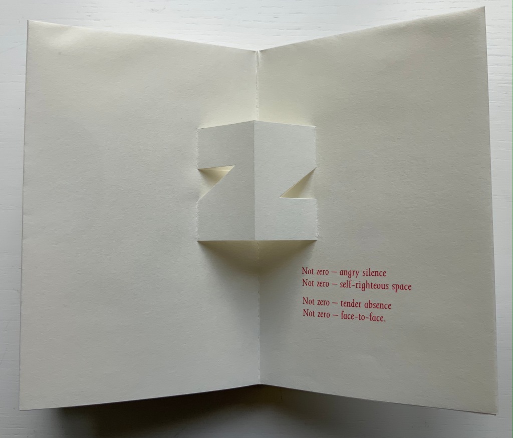
The last letter and lines in the book exemplify this to perfection.
Of the few other pairs of couplets in the book, none is as back and forth as the letter z’s. Paired against one another, rhyming abab, each line beginning alike with its N-z phrase, the two couplets echo the back-to-backness and balance of the dos-à-dos structure. The phrases self-righteous space and tender absence can be read as allusions to the cut-out space around the letters. Or vice versa. Again, back and forth. “Angry” and “tender” bat each other back and forth, just as the final phrase turns the dos-à-dos sweetly back on itself.
Together, Price and King make the concertina book “smile brighter”.†
“Ronald King“. 1 March 2021. Books On Books Collection.
Clark, Caroline. 23 January 2013. “Clark on Price“. Eyewear, the blog.
†Dante Alighieri. 1320. Purgatorio (Canto XI, 82). Hollander, Robert, Stephen Campbell, and Simone Marchesi. 1988. Dartmouth Dante project. When Dante meets and praises the illuminator Oderisi da Gubbio in purgatory, Oderisi directs the praise to his pupil Franco Bolognese as the one who really made “the pages smile brighter”.
Price, Richard. 2018. Digital. Essence Press. Collaboration with Julie Johnstone.
___________. 2008. folded. Essence Press. Collaboration with Julie Johnstone.
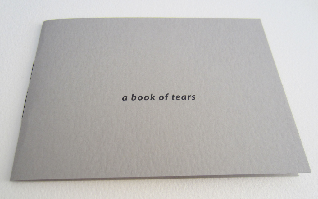
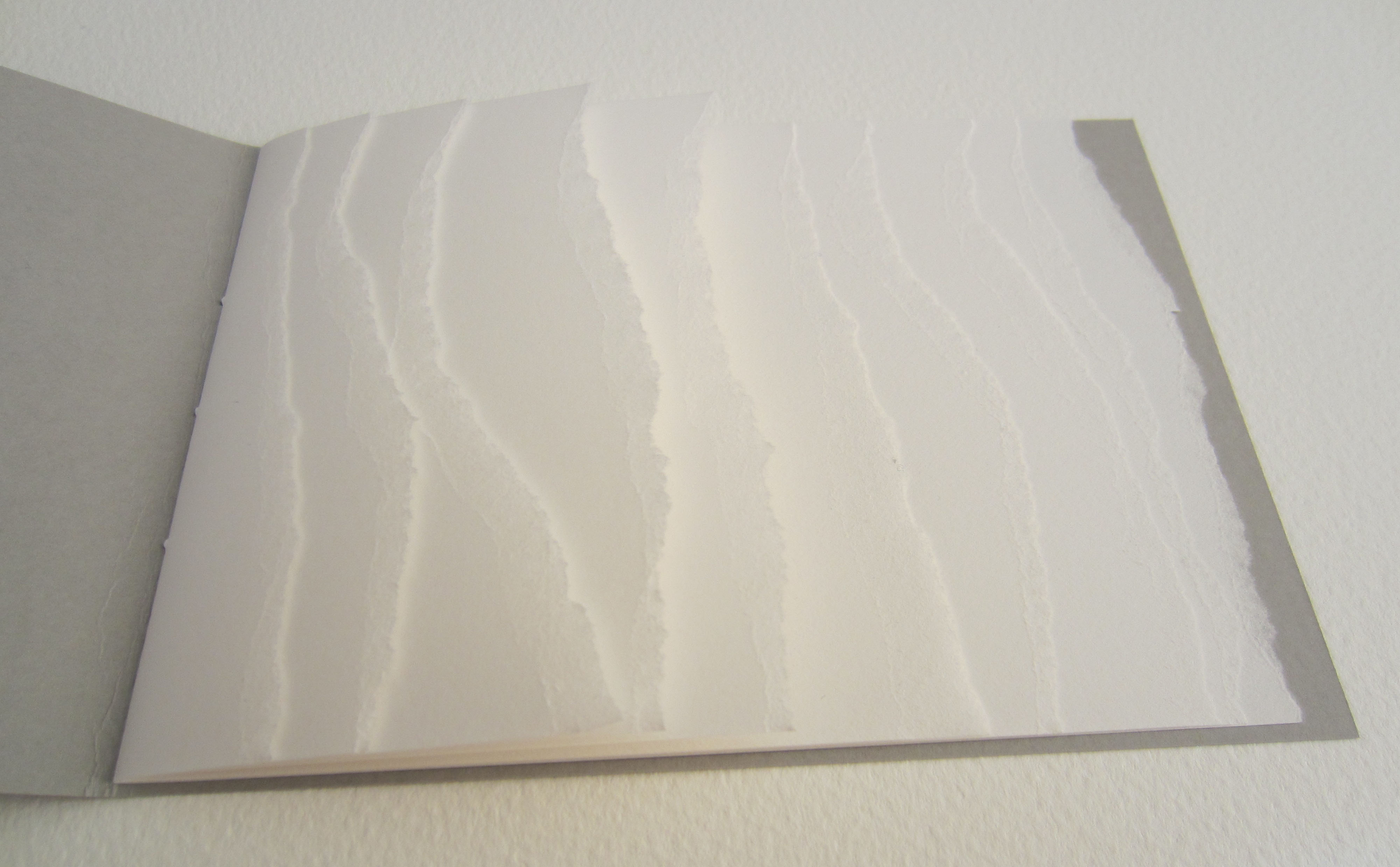
a book of tears (2006) Julie Johnstone Handbound with black linen thread, 5 sheets torn at both ends, card cover printed inkjet. Acquired from the artist, 12 December 2015. Photos: Courtesy of the artist.
a book of tears, Material | Immaterial and Point of View were the first of three Julie Johnstone bookworks in the Books On Books Collection. Like much book art, they depend on the interaction of verbal and visual puns.
Material | Immaterial (2012)
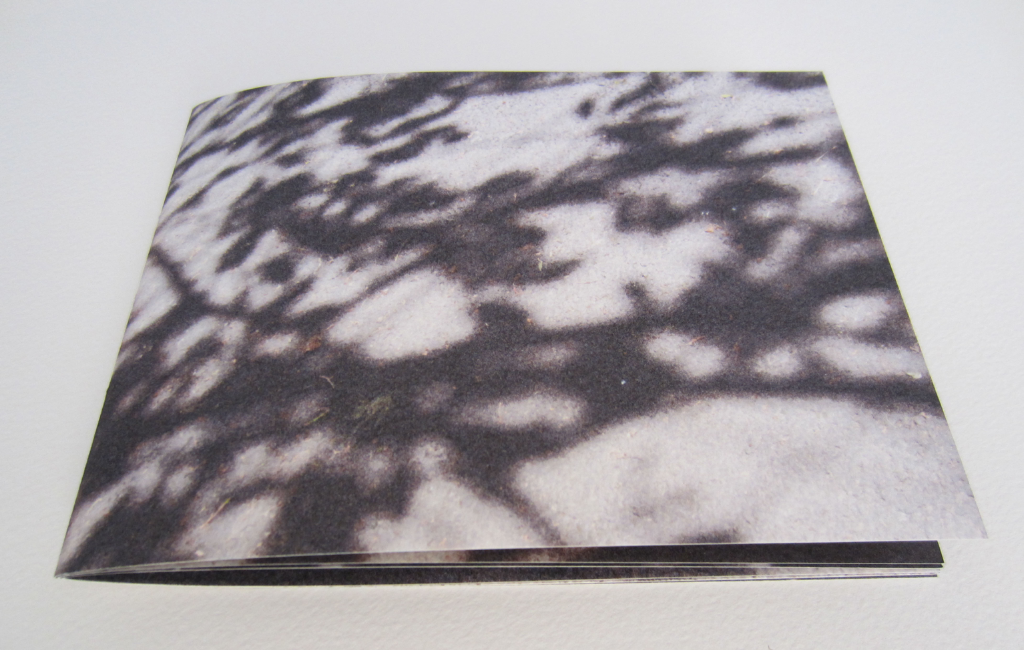
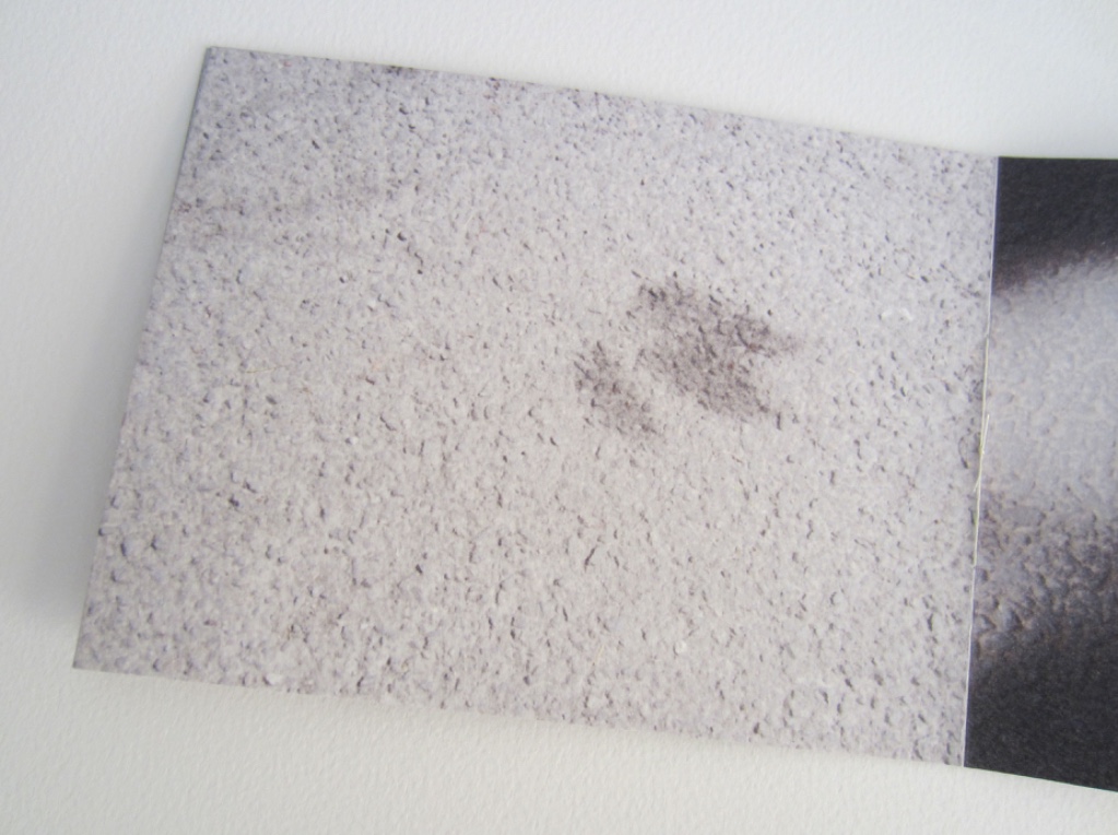
Material | Immaterial(2012) Julie Johnstone Handbound with linen thread, 12 pages, including cover. Eleven images, photographs of the shadows of trees and shrubs on city paving taken during the summer of 2012 and printed inkjet on Bockingford watercolour paper 300gsm. H130mm x w175mm. Acquired from the artist, 12 December 2015. Photos: Courtesy of the artist.
Johnstone’s tint-based works (see further below) evoke a half-tone world so much that it is strange that Material | Immaterial was one of her few (only?) photograph-based bookworks up until 2020 when the series Marks on a Surfacearrives.
Point of View: skyline tideline (2012)
Point of View: skyline tideline (2012) Julie Johnstone Single folded book designed to be read forwards and then upside down and backwards; made from two pieces of card, inner sheet of card torn to create wavy line. skyline: front cover title in cyan blue; tideline: back cover title in cyan blue. Printed inkjet on Bockingford watercolour paper 300gsm. Closed: H120 x W190 mm; open: H120 x W380 mm. Edition of 35, of which this is #35. Acquired from the artist, 12 December 2015. Photos: Courtesy of the artist.
The shadows cast by the meticulous tears recall the larger-scale works to be found in the Rijswijk Papier Biënnale and Coda Apeldoorn. What happens with and within the physical space of this small book form is the meeting of metaphor and material, which is art.
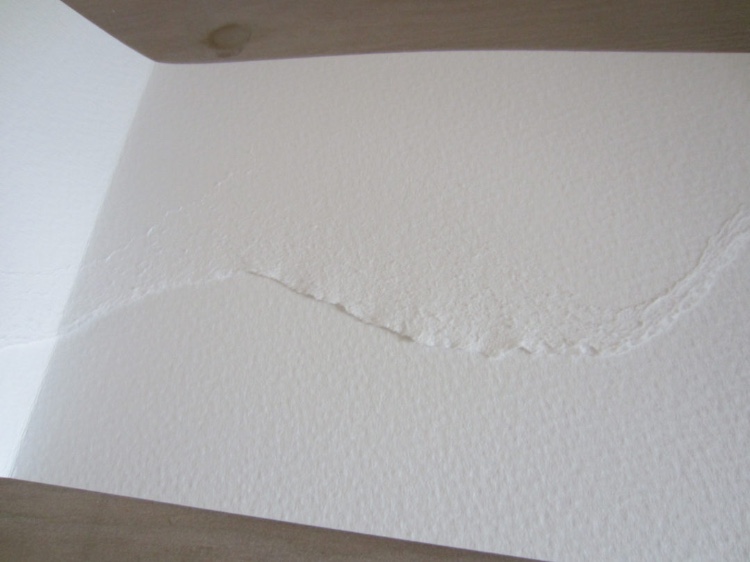
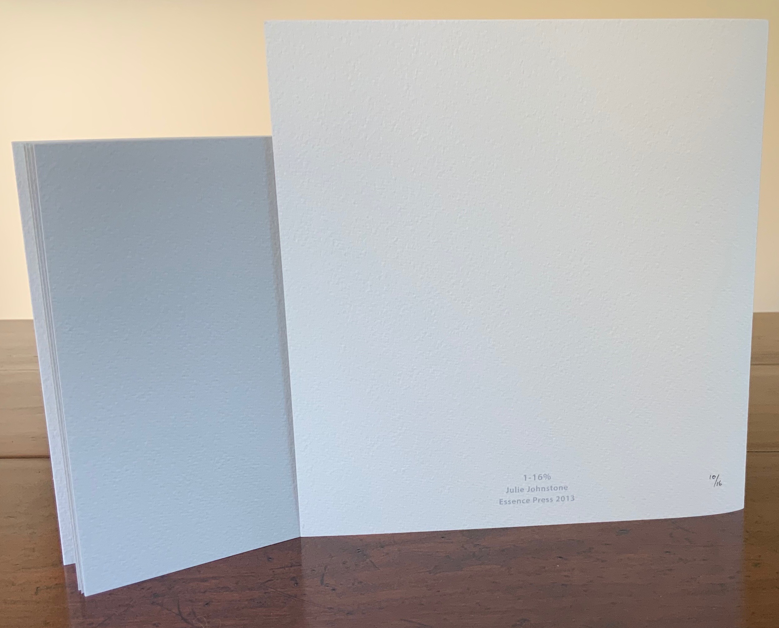
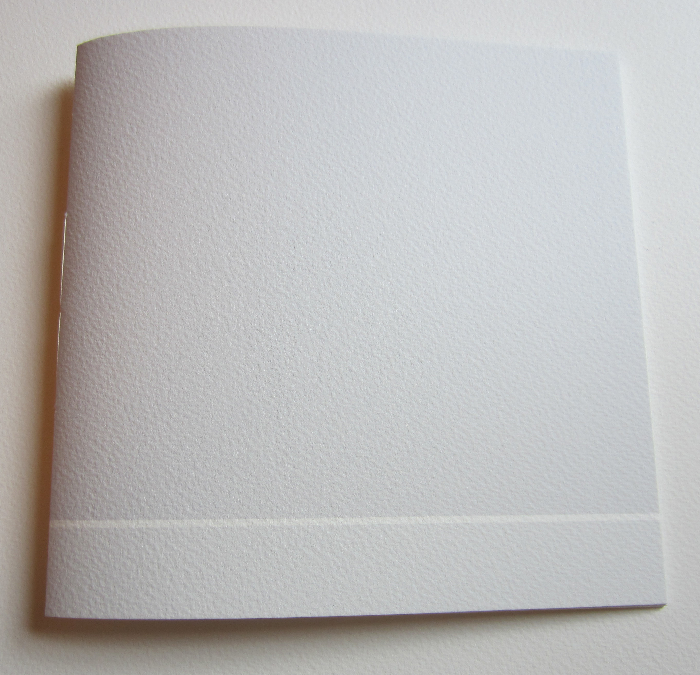
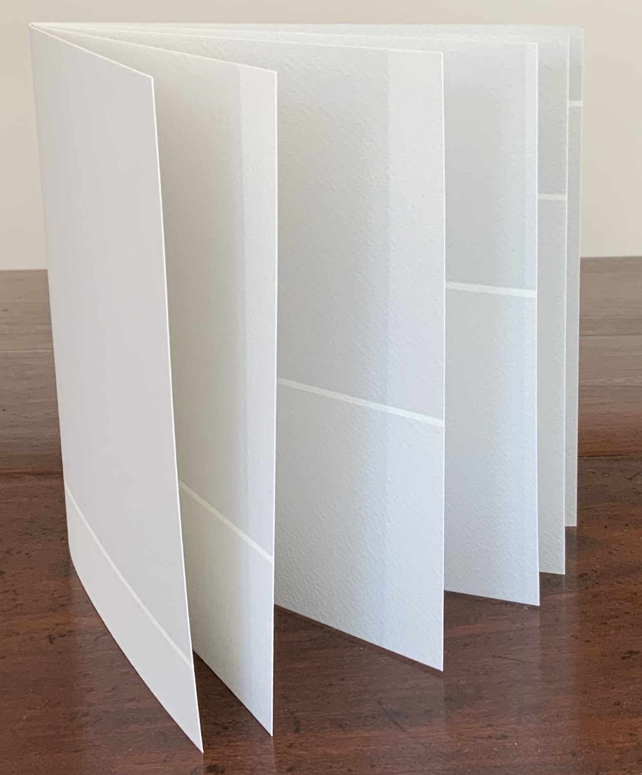
1-16% (2013)
1-16% (2013) Julie Johnstone Handbound with linen thread, 16 pages, including cover; each page printed to edge with a tint of black, starting on the front cover with 1% and increasing by 1% with each page, through to 16% on the back cover; Bockingford watercolor paper 300gsm. H160 x W170 mm. Edition of 16, of which this is #10. Acquired from the artist, 26 September 2017. Photos: Books On Books Collection.
In the collection, this is the first work to use progression of tint, Johnstone’s signature technique. The space allocated to the tint remains constant. So that nothing distracts from this, a larger single-fold sheet is used as a loose jacket and for the colophon.
10%|15% (2013)
10%|15%(2013) Julie Johnstone Created for the AMBruno Lines project on the occasion of the Whitechapel Art Book Fair 2013. Handbound with linen thread, 12 pages, including covers; each facing page, including cover, printed to edge with two blocks of a tint of black, one 10% and the other 15%. The size of blocks changes progressively as the pages turn, moving the unprinted ‘line’ up the page in 2.5 cm increments. Printed inkjet on Bockingford watercolor paper 300gsm. H190 x W180 mm. Edition of 25, of which this is #20. Acquired from the artist, 26 September 2017. Photos: Books On Books Collection.
In this work, the tints hold steady, and the technique of progression shifts to changing the print area. The unprinted line that rises up the page recalls Bodil Rosenberg’s Vandstand (2019), where the water level in acrylic rises page after page. Vandstand and 10%|15% display well together.
2-20%|20-2CM (2014)
2-20%|20-2CM (2014) Julie Johnstone Handbound with linen thread, 20 pages, including the cover; printed inkjet on Bockingford watercolor paper 300gsm. H240 x W280 mm. Edition of 10, of which this is #5. Acquired from the artist, 26 September 2017. Photos: Books On Books Collection.
With this work, the technique becomes one of dual progression — both tint and printing area. Starting with the front cover, the tint is 2% black in a block of 20cm height. With each recto page, the tint increases by 2%, and the height reduces by 2cm. On the last recto page, the block of 2% black is 2cm in height.
With each new work varying tint and/or print space, Johnstone recalls the creative approaches of the OuLiPo movement. Its authors such as Italo Calvino, Raymond Queneau and Georges Perec set themselves strange writing constraints, such as write a novel without the letter “e”. Johnstone may rightly claim the visual artist’s crown in the movement (still ongoing) with this next work.
3% [1-5] (2015)
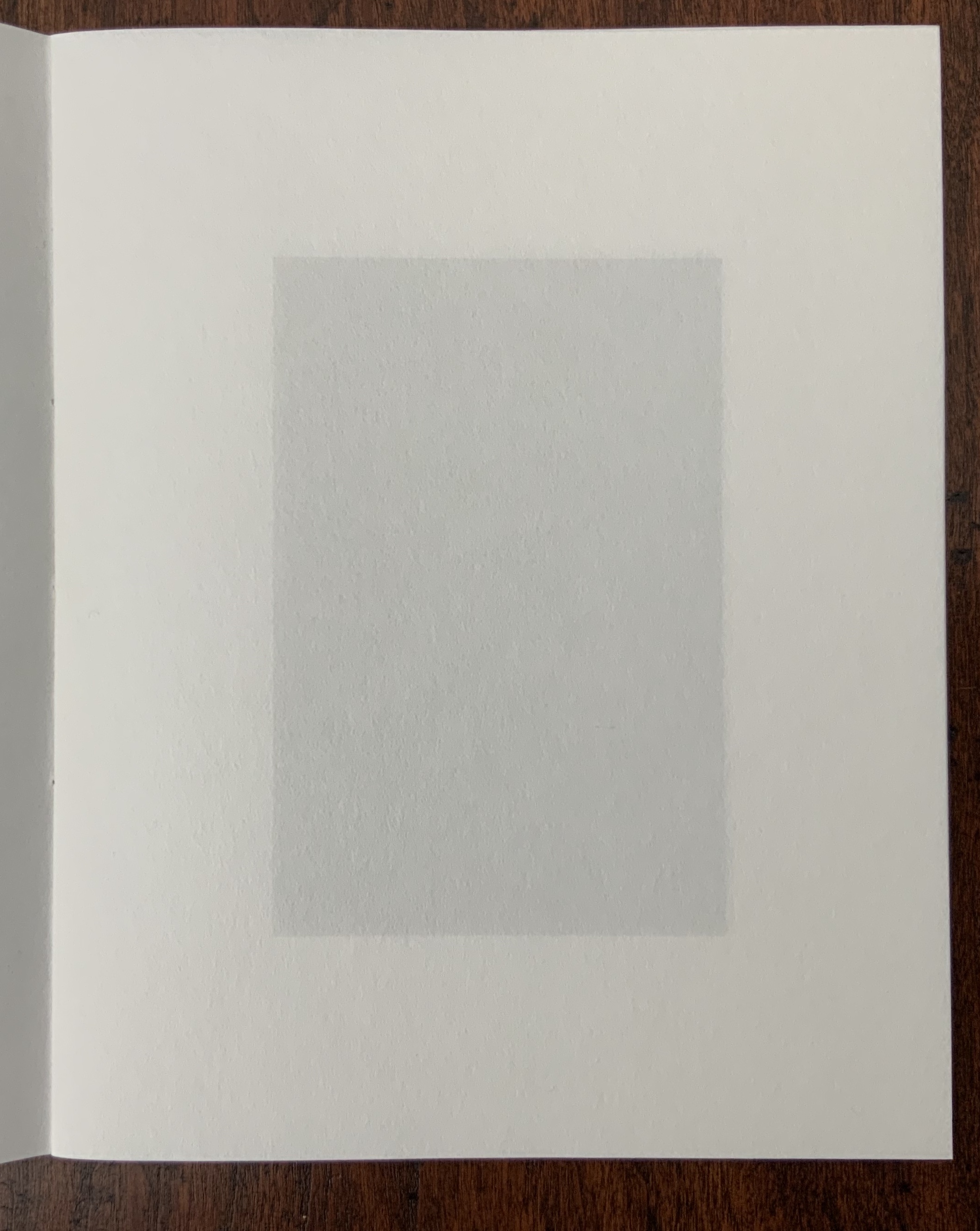
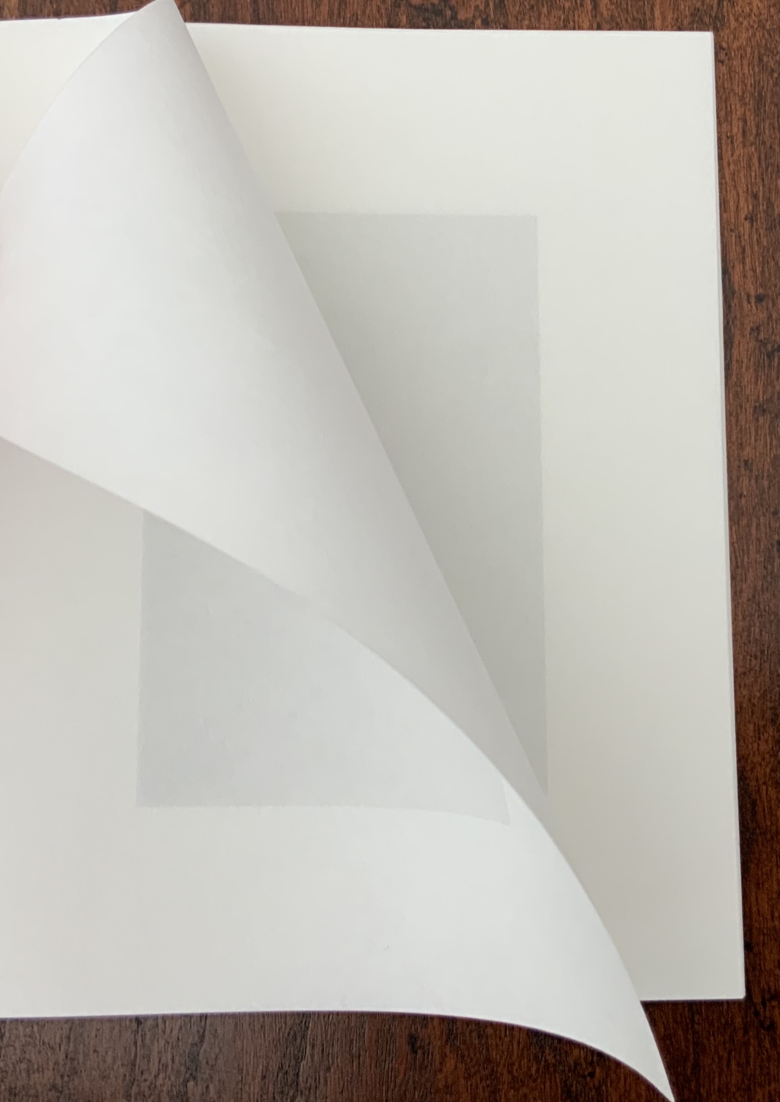
3% [1-5] (2015) Julie Johnstone Set of 5 booklets in folder; each booklet handbound with linen thread, 16 pages including cover, printed inkjet on Hahnemuhle Sumi-e paper 80gsm. H150 x W120 mm. Edition of 20, of which this is #10. Acquired from the artist, 26 September 2017. Photos: Books On Books Collection.
As noted above, this work recalls the “simple complexity” of the wordplay in Samuel Menashe’s short poem. Just as the pouring pot “fulfills” its spout, so Johnstone’s working of tint and semi-transparent paper fills and fools the hungry eye.
3% [1] Photos: Books On Books Collection
Booklet [1] serves as the baseline for the other four booklets. Each facing page (excluding cover and next page) is printed with a 3% black tinted rectangle (90 x 60 mm). As the semi-transparent page turns, the tint seems to vary. The precision of registration and sureness of touch across the pages amazes.
3% [1] The effect changes with the light. Photos: Books On Books Collection
At first, Booklet [2] seems not to vary from [1], encouraging careful reading and looking to discover that every other page is blank in Booklet [2]. The choice of paper and tint as well as the “persistence of vision” combine to create the illusion that pages are printed when they are not.
3% [2] Photos: Books On Books Collection
Booklet [3] extends the play of book [2] with an empty 3pt frame printed in 3% black on every other page to create the illusion that the next page’s block appears to fill it. Booklet [4] also extends the play of book [2] with a half block printed in 3% black on every other page to create the illusion of a darker or lighter block next to it due to show-through. This play within the boundary of the 90 x 60 mm rectangle takes a leap in Booklet [5].
3% [5] The slight curving in the rectangles is due to how the booklet is being held. Photos: Books On Books.
Here in Booklet [5], the 3% block appears once on each facing page but shifts diagonally by 1cm either to the top and left or to the bottom and right. Now the eye is fooled into perceiving two differently tinted blocks printed off center one over the other. The pleasure in these works of book art lies in contemplating each page and the movement from page to page, back and forth.
Field (2014)
Field (2014) Julie Johnstone Handbound with linen thread, 16 pages, including cover, printed inkjet on Bockingford watercolor paper 300gsm. H160 x W160 mm. Edition of 25, of which this is #14. Acquired from the artist, 26 September 2017. Photos: Books On Books Collection.
Like 10%|15% and 2-20%|20-2CM, this work proceeds by dual progression, but the print area changes horizontally rather than vertically. Each facing page (including cover) is printed with a tint of black in a block flush along its fore-edge. The tint begins on the cover at 2% in a 2cm block. On each page after, the tint increases by 2% and the block by 2cm. The final page presents a 16% tint and 16cm block.
red (2015)
red(2015) Julie Johnstone Created for the AMBruno RED project. Handbound with linen thread, two sheets printed with three images (including cover image); printed inkjet on Bockingford inkjet watercolor paper 190gsm. H190 x W180 mm. Acquired from the artist, 26 September 2017. Photos: Books On Books Collection.
In most of Johnstone’s work, the color blue appears most frequently as the alternative to tints of black. This work, created for an AMBruno project, proves the exception, albeit continuing with the technique of dual progression — here, around the still point of a vertical red bar. The barely perceptible tint of black on the cover deepens on the first facing page to such an extent that the red bar seems to shorten (it doesn’t). Then on the next facing page, the tint remains the same, but the blocks turn perpendicular to the red bar and do truncate it.
LIFE (2018)
LIFE (2018) Julie Johnstone (after Kierkegaard) Handsewn booklet; cover in Bockingford watercolor paper 300gsm. H60 x W140 mm, 12 pages. Acquired from Essence Press, 10 April 2021. Photos: Books On Books Collection.
This small work is another elegant demonstration of Johnstone’s artistic play with imposition and the act of reading, touching, looking and thinking.
This is Johnstone’s response to the AM Bruno 2021 call for works on the theme volume that capture “one, or a combination of these definitions: (i) a book forming part of a work or series; (ii) the amount of space that a substance or object occupies; and (iii) the quantity or power of sound'” (from the brief by John McDowall).
Johnstone calls Less “a minimalist and minimal journal”. Her un-improvable selection of Samuel Menashe to inaugurate her Less series in 2009 made that work a required item for the Books On Books Collection. Samuel Menashe was unmistakeable — in speech and on the page. Having heard his recorded poems, I knew the voice from the sofa behind me at the West Chester conference in 2006 was his. I can hear that voice every time these white, black, black-threaded, and black on white pages open.
The wordplay in Menashe’s poem is more complex than it seems at first glance — something which may have influenced Johnstone’s later visual play with tints, for example, 3% (2015).
The eighth issue in the first series is Richard Price’s eight-line poem. The stanzas have the kind of interesting arithmetical progression that Johnstone’s own works pursue by non-verbal means: two lines, then two plus one, then one line, then one plus one.
Little torn-offs, kept, gummed, and a bill window: large small change in matt grey and bronze. “Are these your medals, Dad?”
A list of do-it-ourselves in feet and inches. Half-hollow plastic letters, red red, blue blue. They won’t, can’t, endure an open word. Grr — consonant consensus.
A single staple, not yet folded, in self-assembly dust.
Up beyond the children this old drawer, laden (can stick). Easy with it. Extract and show.
Essence Press
Less [1] ran from 2009 to 2012. Less [2] begins in 2022. Where the first series applied a single format to all 12 issues, the second aims to arrive at formats through collaboration. The long gap underlines Johnstone’s characterization of the journal as an occasional series, but it belies the continuity of collaboration in her creativity and publishing. She has worked with numerous artists and poets outside the series but still under the Essence Press imprint. With Johnstone, collaboration rises to the levels of role model and even artform.
Digital (2018)
Digital (2018) Richard Price Booklet with rounded corners in Bockingford watercolour paper 300gsm. H150 x w W75mm, 36 pages. Acquired from Essence Press, 22 October 2021. Photo: Books On Books Collection.
The urge to add this work and 8: Richard Price to the Books On Books Collection stemmed not only from the subversiveness of the former and the evocativeness of the latter but also from Price’s collaborative appearance with Ron King in the collection.
Alphabet Book | Alphabet Week (2010)
Alphabet Book | Alphabet Week (2010) Maria White Two hand-bound booklets; covers in Bockingford watercolor paper 300gsm. H140 x W70 mm, 5 unnumbered leaves; H70 xW70 mm, 7 unnumbered leaves. Acquired from Essence Press, 19 March 2022. Photos: Courtesy of Essence Press.
The alphabet and artists’ books constitute a recurrent theme in the Books On Books Collection. Alphabet Book and Alphabet Week are playful reminders of the arbitrariness of the alphabet and every other means we pursue to bring order to our worlds.
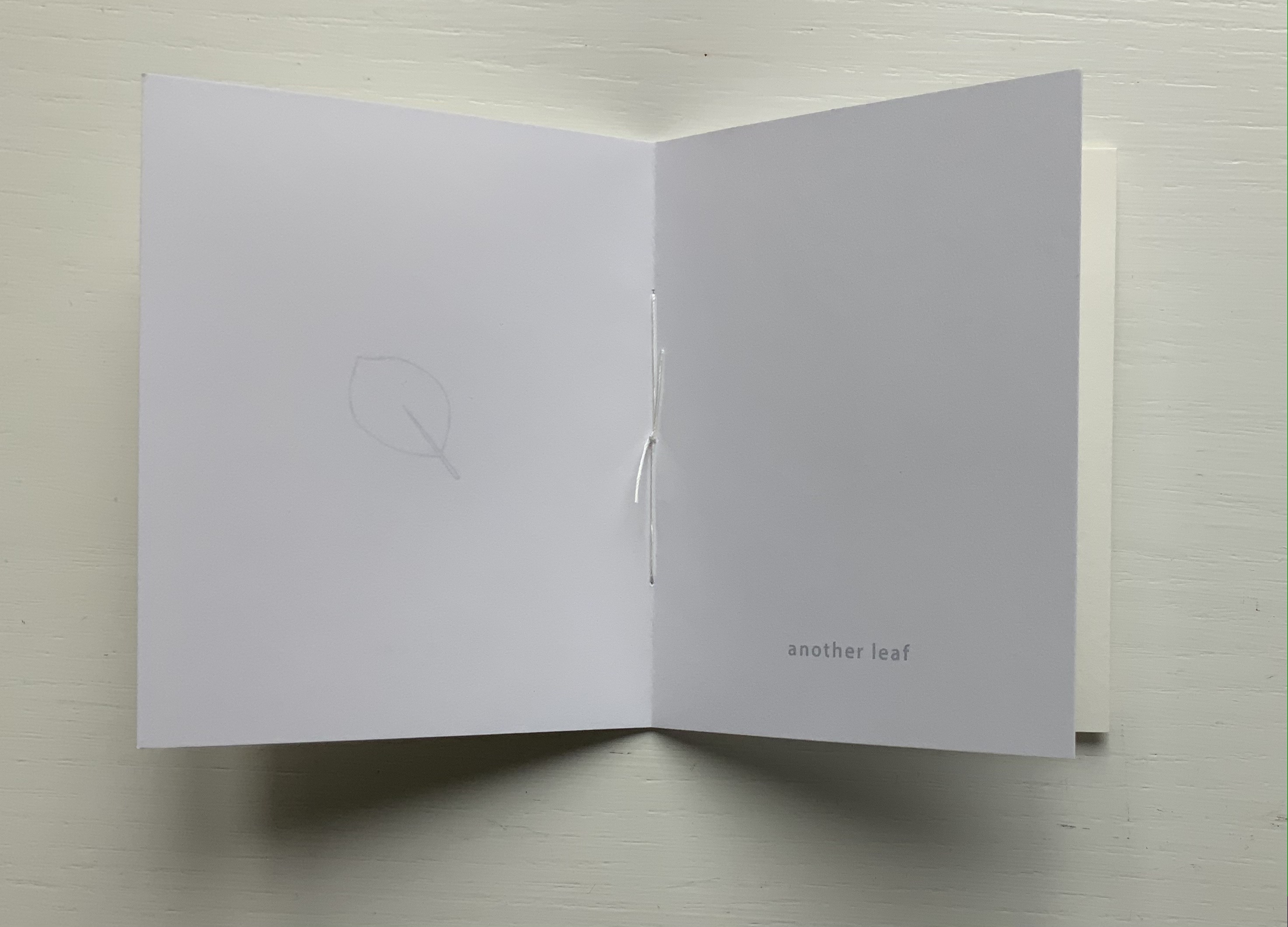
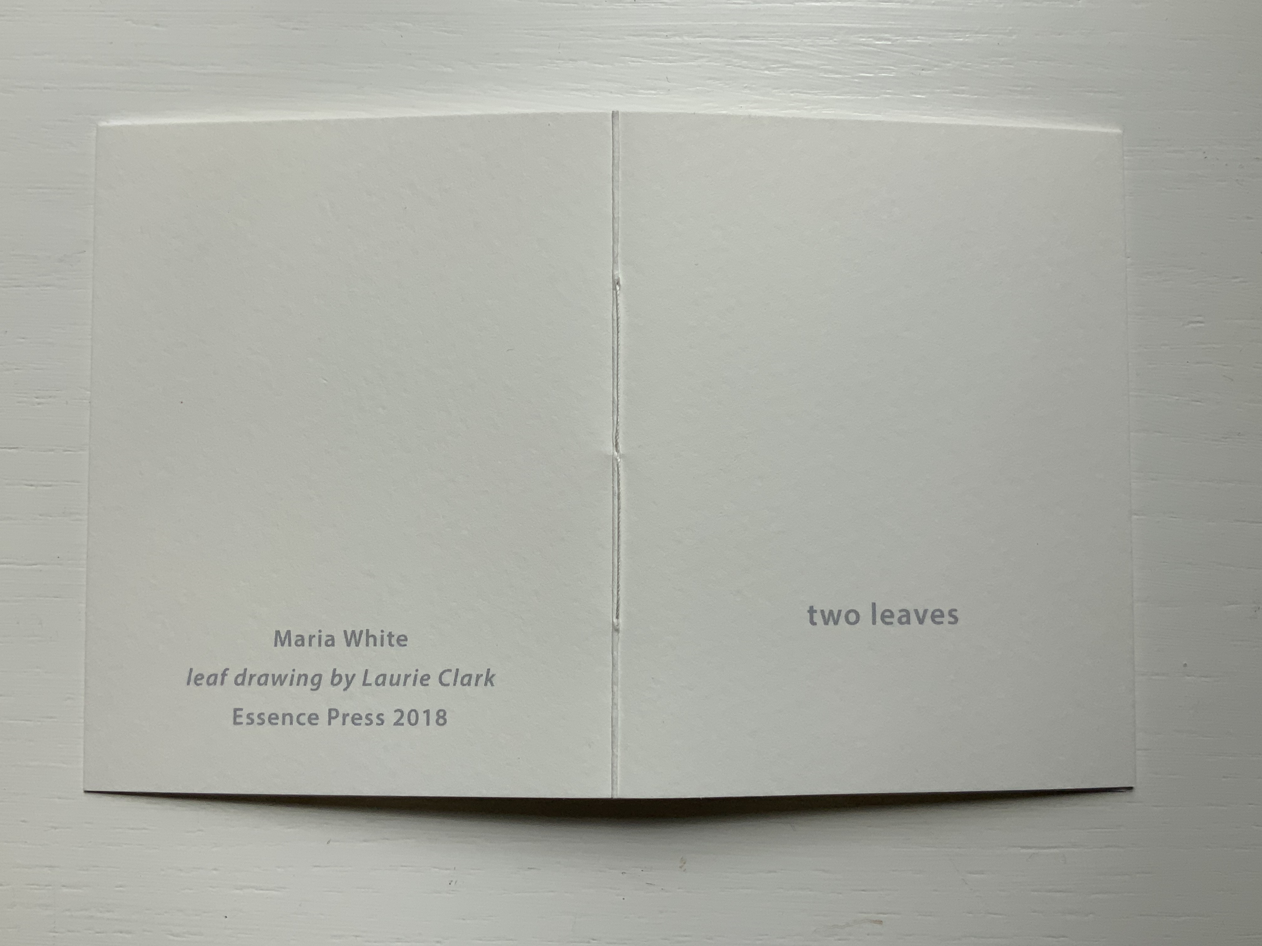
Two Leaves (2018)
Two Leaves(2018) Maria White (leaf drawing, Laurie Clark) Handsewn booklet; cover in Bockingford watercolor paper 300gsm. H100 x W80 mm, 4 pages (2 leaves). Acquired from Essence Press, 10 April 2021. Photos: Books On Books Collection.
This last (for now) little book in the collection underscores Johnstone’s celebration of collaboration and highlights her own production values. It is all well and good that Maria White describes herself as a librarian. So much of “bookness” is packed into this small space: word, image, page, leaf/folio and word/image/play.
A day’s visit with one hundred exhibitors hosted at the Arnolfini in Bristol leaves me reeling like a drunken sailor — drunk on colour, texture, light, line, shapes, words and artistry. Appropriate given the Arnolfini’s location on Narrow Quay in Bristol’s floating harbour.
Colour
Lucy May Schofield talked to me about her “search for the indigo that is infinity”. The Distance of Us is only one of several pieces demonstrating how close she is coming. The Longest Day on her site is one among many by which to enjoy her progress.
The Distance of Us Lucy May Schofield Photo: Books On Books
Mick Welbourn took time to explain how his search among inks, paper and geometric shapes kept leading him from a unique work (oil-based) to multiples and back to uniques. These colours reminded me of the work of Sonia Delaunay.
Mick Welbourn Photo: Books On Books
Texture
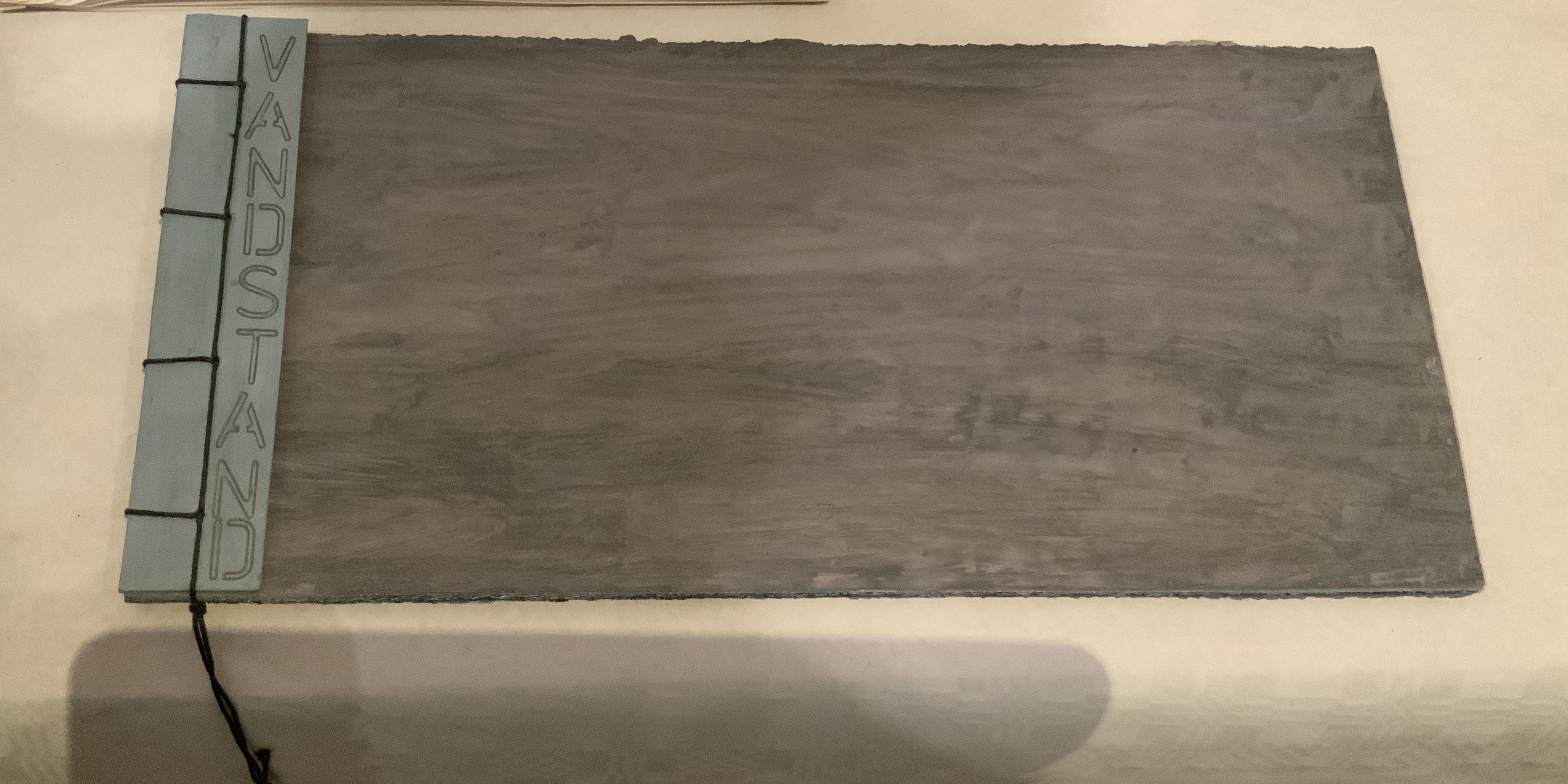
Bodil Rosenberg, a member of the Danish collective CNG (Anna Lindgren, Bertine Knudsen, Birgit Dalum, Pia Fonnesbech, Susanne Helweg), appeared delighted that I was surprised by the colour and texture of Vandstand (“water level”). Somehow after the saturation of the paper with layer upon layer of paint, each page has a supple leather- or cloth-like feel — a coolness to the touch. I think Ken Campbell would relish Vandstand.
Vandstand Bodil Rosenberg Photo: Books On Books
Vandstand Bodil Rosenberg Photo: Books On Books
Caroline Penn’s works comprised by Notes from Chesil Beach made me reach out to pick up one of the pebbles on the page. The trompe l’oeil effect of turnable pages in the photos is enhanced in one variation by inclusion of an actual small gathering of pages. The role of trompe l’oeil in book art is one worth investigating.
Notes from Chesil Beach Caroline Penn Photo: Books On Books
Light
Eileen White’s Haptic Narratives and her lumen prints for Printed Matter made a nice segue from texture to ghostly light. Printed Matter also looks forward to the “artistry” section here as book’s images are un-fixed and eventually fade away. To use the book form — the traditional form of permanent record — to present a language and reminder of material ephemerality: that is artistry.
Eileen White Photo: Books On Books
Haptic Narratives Eileen White Photo: Eileen White
Helen Douglas (Weproductions), fresh from exhibitions at Printed Matter in New York and Fruitmarket Gallery in Edinburgh, was displaying her 2017/2018 series Field Works as well as a new book Summer Alight. The photographic effects, the visual narrative and structure achieved in Douglas’s works define artistry.
Elena Zeppou’s Parallels first caught my eye because of its size, but closer inspection yielded appreciation of line — vertical as well as horizontal — and its union with text and form. Note how the lines of poetry read across the accordion.
Parallels Elena Zeppou Photo: Books On BooksParallels Elena Zeppou Photo: Zitrone PrintmakingParallels Elena Zeppou Photo: Zitrone Printmaking
Shapes
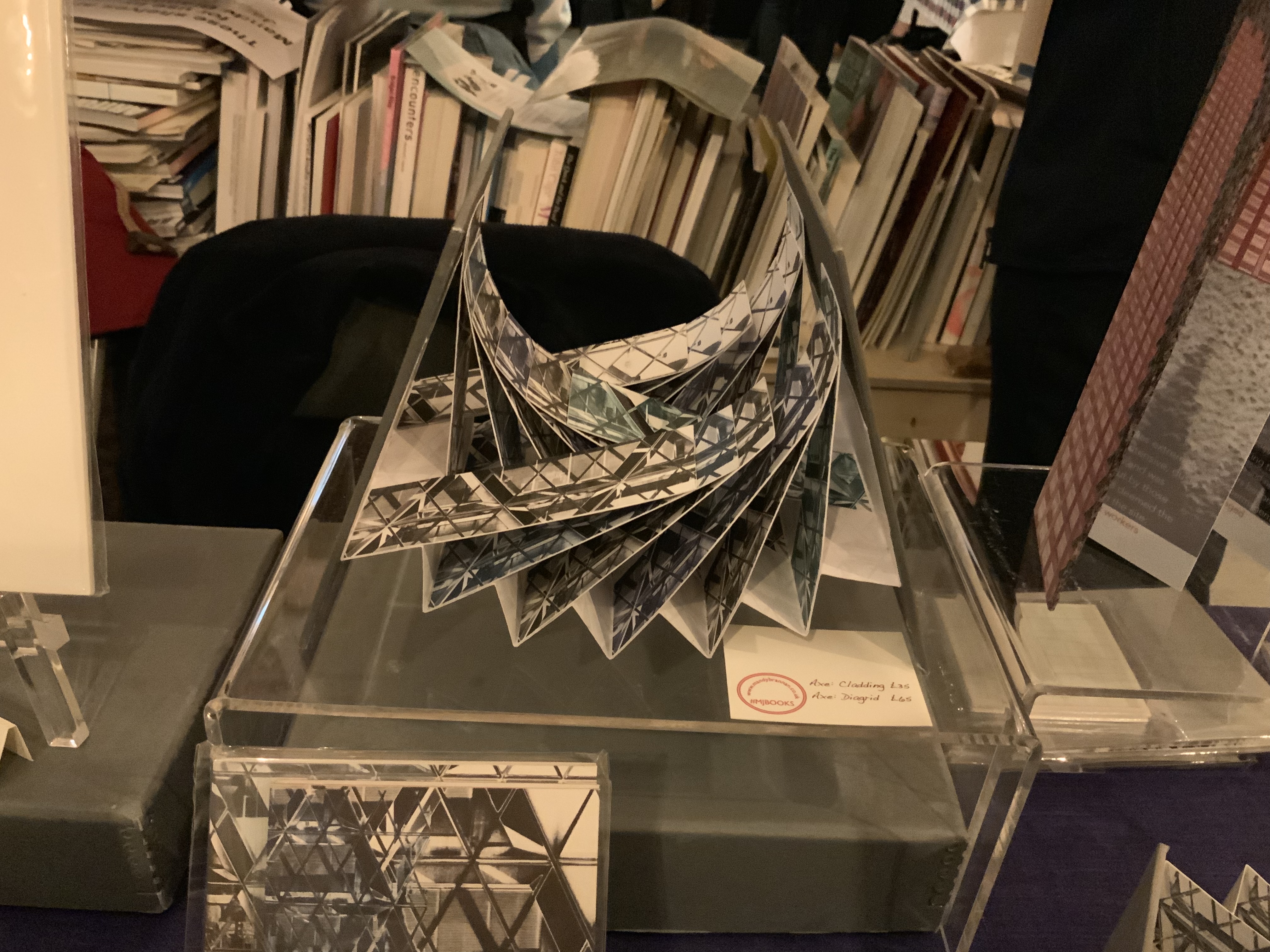
Listening to Mandy Brannan talk about custom papers, French fold books and modified flag books is almost as good as handling them. The work30 St Marys Axe (inspired by the building fondly known as the “Gherkin”) was what first drew me to her table. It has two variations — Diagrid and Cladding — which reward repeated handling as well as regarding.
30 St Marys Axe: Diagrid Mandy Brannan Photo: Books On Books
At the ArtistBooksOnline table, the shape-changer Inside/Outside by Susie Wilson kept me as busy as if it were a Rubik’s cube or paper puzzle with a medical mystery inside — or outside.
Inside/Outside Susie Wilson Photo: Books On BooksInside/Outside Susie Wilson Photo: Books On Books
Words
Puns, slippery words and slipperier concepts seemed to explode from Guy Bigland‘s table.
My inner metaphysician of Structuralism, Post-Structuralism, Deconstruction and Post-Deconstruction found its element(s) at the Atlas Press.
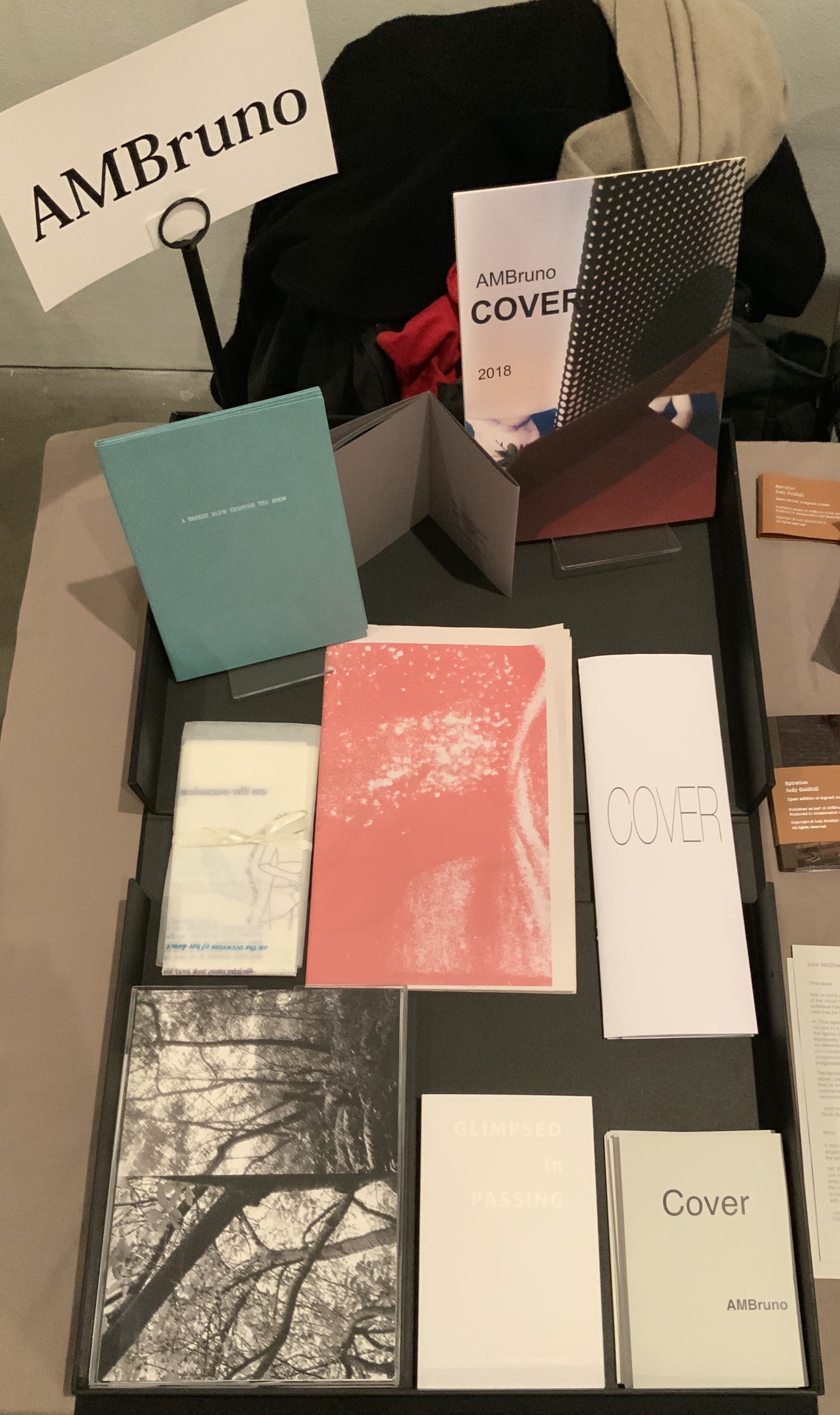
AM Bruno, run by Sophie Loss, and of which John McDowall is a founding member, is always a rich vein of artistry. The works from the 2018 theme-driven project, Cover, appear in the box below but warrant a closer inspection at the link behind the word. John McDowall had a new book on hand: Time-lapses. As I turned the brilliantly white pages, each segmented into squares like a comic-book page but only one square in each page holding an old black-and-white photo, the title began to sink home. And then came the idea that all the meaning that could possibly explain any one photo, its relation to the other squares or to other photos or to the author or to the reader/viewer — all of it — has to take place in the empty spaces between.
Janet Allsebrook displayed a Duchampian box with the Delaunay-esque title Nichoir. Although the drift of this work (“waste time making your own useless nest box”) is echoed in her other works, the echo reverberates with a deeper tone — often political or philosophical. The variety of book forms is impressive.
Nichoir Janet Allsebrook Photo: Books On Books
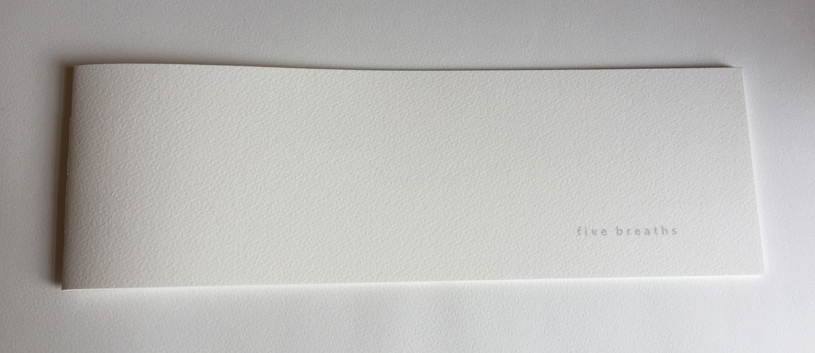
Next door was the artist of Zen book art — Julie Johnstone – Essence Press. In addition to extensions of her percentage tint series, she had on hand several explorations of breath, print and paper: each breath, a page; quietly breathing; five breaths; and ten breaths. Wherever they are, her books make a Zen garden.
Sarah Bodman and Arnolfini brought together a rich collection of talent and should be thanked for doing so and encouraged to repeat it in 2021. And to the artists mentioned — and those not — who took the time to share their thoughts on colour, texture, light, line, shapes, words and artistry: Encore!
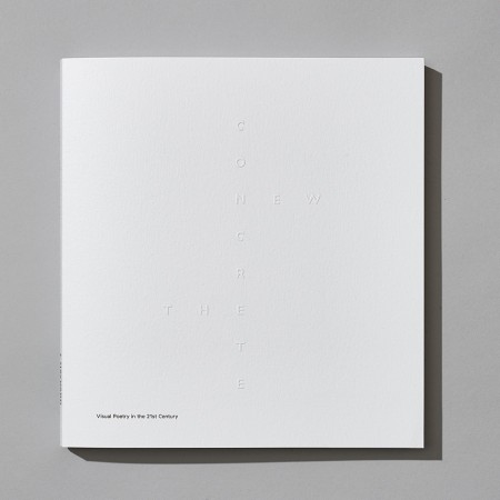
The New Concrete: Visual Poetry in the 21st Century is a testament on where this art made of letters has been and where it goes. We have put a sharp focus on the word ‘new’ in our title, exploring how image manipulation, cut and paste, digital text and the internet have all influenced work in this area. One of the most exciting strands can be seen in the work of James Hoff and Eric Zboya who use algorithms and viruses to form work in which text is in the back – rather than foreground; the ghost of the machine of visual poetics. This isn’t a book that could have been made through simply surfing the web. We asked all 106 contributors to suggest names of poets or artists that we should consider for the book. Visual poets spiralled into more visual poets. We have looked at well over 500 possible candidates. Enjoy the knowledge with us.
Among the Books On Books favorites included in this volume are Sam Winston, Julie Johnstone, Ian Hamilton Finlay and Vito Acconci. For a related MoMA exhibition of artists engaged in the material use of letters, words and language (Ecstatic Alphabets, Heaps of Language), click here.
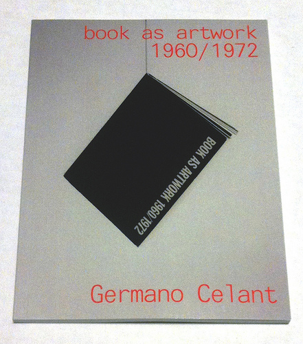
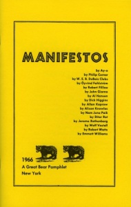
Where to go to compare and contrast the book art in Germano Celant’s pioneering “catalogue” of the Nigel Greenwood Gallery exhibition in London (1972) with that of the last half century?
Being a sort of small and portable catalogue and curator’s explanation for the gallery’s exhibition of ca. 300 works, Celant’s Book as Artwork is arranged chronologically and then alphabetically by artist. Presumably it was organized to match the exhibition’s organization (note the year 1967 in upper left of the photograph below and the distinctive Hidalgo cover, fifth from the left). With no photographs of the works, Book as Artwork gives no easily accessible visual sense of the 300 works in that exhibition. If we had that starting visual touchpoint, it would be easier to “place” the period or individual works in relation to book art from the 80’s onward.
Book as Artwork 1960 – 1972 – Exhibition Nigel Greenwood Gallery B, 1972.
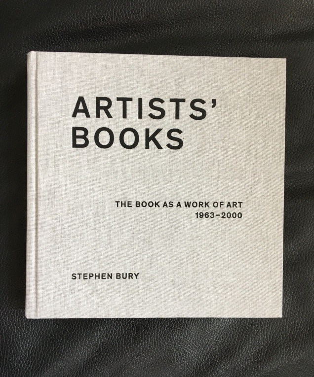
Stephen Bury’s Artists’ Books: The Book as a Work of Art, 1963 – 2000 (2015) includes, by design, only a handful of the artists and works selected for the Celano/Greenwood exhibition.
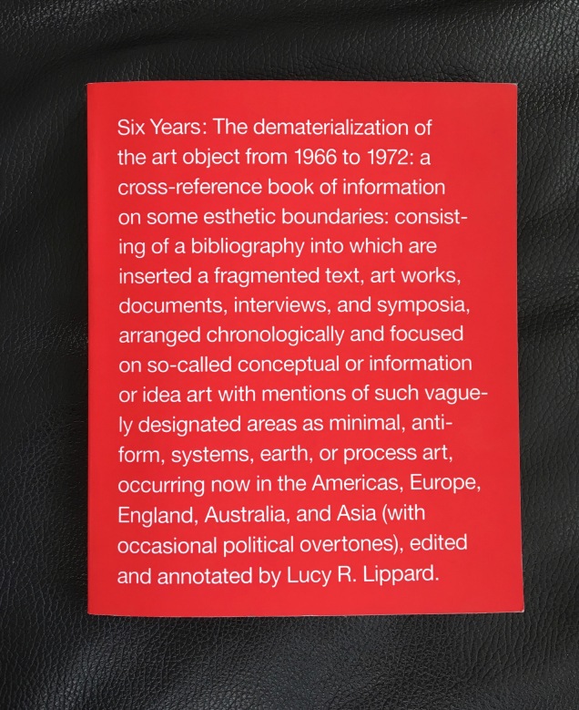
Lucy Lippard’s Six Years: The dematerialization of the art object from 1966 to 1972 (1973, 1997) — a “bibliography into which are inserted a fragmented text, art works, documents, interviews, and symposia, arranged chronologically” — comes as close as one might hope in black-and-white print for a starting visual touchpoint. Lippard’s scope, however, ranges beyond book art, so the number illustrated limits systematic visual comparison and contrast with the book art of the ensuing decades.
Phaidon’s Artists Who Make Books(2017) provides good coverage and bridges the 1960s to the 21st century. The essays and descriptions bring the book art off the page and into the mind’s hands.
Best of all is Lynda Morris’s mini-memoir of her role in organizing the Celant/Greenwood exhibition.
Germano had sent Nigel [Greenwood] a wonderful, arty handwritten letter in pink capitals … on December 22, 1970:
DEAR PUBLISHER I AM PREPARING FOR A NEW INTERNATIONAL MAGAZINE A COMPLETE ANTHOLOGY OF BOOKS MADE DIRECTLY BY ARTISTS.
…Nigel had met Germano and had his telephone number in Genoa. I was sitting beside him when he phoned and proposed Book as Artwork exhibition for September 1972. Germano immediately agreed.
For sources of book art since the close of the Celant/Greenwood exhibition, we are spoilt for choice. Print and digital, image-rich aggregations of book art abound. We can return to the Phaidon and Bury books. We can turn to the well-illustrated print and online publications from the Centre for Fine Print Research at the University of Western England, online library collections such as the MassArt Library or Chicago’s School of the Art Institute, the websites of dealers such as Zucker Art Books displaying their wares, the dozens of websites for recurring book art fairs such as International Artist’s Books Triennial Vilnius (1997 – present) and CODEX International Book Fair (2007 – present) and community sites suchas Artist Books 3.0. In the future, the Getty Research Institute‘s processing of the Steven Leiber Basement archive should also yield a rich source of images of works by the artists selected for the Celant/Greenwood exhibition.
Present-day online access challenges Mallarmé’s dictum: ”Everything in the world exists to end up in a book.” Now it seems:
Everything in the world exists to end up on the web.
As far as that premise holds, this annotation and rearrangement of Celant’s bibliography — a “webliography” — offers an online starting point for connecting the book as artwork 1960/1972 with the book as artwork since. In providing some images of the works and links to images, the webliography offers anyone interested in book art the means to gain a more colored impression of the period’s book art. That the primary impression is still black and white underscores the impact of xerographic technology on artists then as well as that of conceptualism driven by text or photograph. A webliographic approach also offers the opportunity to link the book art of the Celant exhibition with book-oriented Web-art or Net-art such as that of Amaranth Borsuk, Taeyoon Choi, Gunnar Green, Johannes Heldén, Bernhard Hopfengärtner and many others referenced below.
The reorganization here of Celant’s and Morris’s list — by artist alphabetically then chronologically — makes it easier to see the curators’ tendencies in selection as well as the influence of practical factors. The curators’ selection is obviously more Western, less Eastern European and even less Middle Eastern and Asian. Individuals’ prodigality surely played a role in whom and what was included. As Morris’s essay in the Phaidon book reveals, the geographical proximity of works available to be chosen played a role; so, too, the influence of the then-contemporary art network played a role (Atkinson, Beuys, Celant, Dwan,Greenwood, Hansjorg Mayer, Walther König, Maenz, Siegelaub, Sperone and the many other personalities of the Art-Language, Arte Povera, Conceptualist and Fluxus movements); and even the size of suitcases and availability of transport for bringing the artwork into the UK played a role.
Generally the online links for the artists’/authors’ names lead to biographies, either in their official websites, Wikipedia or other news sources. Where an artist/author is listed multiple times, the links vary from instance to instance to provide a wider range of information about the individual and, in some cases (such as Dieter Rot’s), more images. The links behind the publishers’ names go to publishers’ websites or Wikipedia entries about them. The links that follow each entry resolve to images of the work, videos, audio, interviews or essays relevant to the work. For selected entries in Celant’s list, a compare/contrast takes the user to websites or works whose juxtaposition might shed light on the similarities or differences between the item in Celant’s list and book art of the subsequent decades.
The webliography also supports the haptically as well as digitally inclined. The links behind the titles of the works provide information on the nearest library location of the work (although not all titles could be located). Be sure to enter your own location and refresh the results.
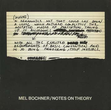
Bochner, Mel. The Singer Notes. New York: Self-published, 1968. [Images] [Compare/contrast Bochner’s notes and drawings resulting from conversations with scientists and engineers at Singer Labs in New Jersey with the Smithsonian Libraries’ online exhibition Science and the Artist’s Book, 1995]
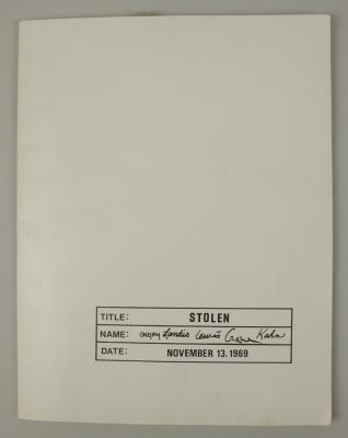
Gregory, Kathe; Landis, Marilyn; Lewis, Russell; Crane, David; Kahn, Scott. Stolen. New York: Colorcraft Lithographers/Dwan Gallery, 1970. [Images] [Compare/contrast with Andrew Savage’s Stolen White Goods, 2006, and then Cristina Garrido’s intervention White Goods, 2011]
Lole, Kevin; Smith, Paul. Handbook on Models. Coventry: Self-published, 1972. [Unable to locate a work of this title in WorldCat, but one with the title The Relativism of Emotion Handbook to the Model and same date of publication is described in Paul Robertson‘s “A Collection of Rare Art+ Language Books and Internal Documents – Many Unknown in Literature”, Gorebridge, Midlothian: Unoriginal Sins/Heart Fine Art, n.d.]
30 x 21cm, 50pp (printed recto only) plus printed card covers. Xerox inner pages as issued. The first and only edition of this theoretical work based on a physical model (electro-shock, photo beams and electronic buzzers) acting as metaphor for analogue, theoretical and representative models. Cover is very minority marked on the front and back cover has a faint diagonal crease else VG++. From the archive of David Rushton who believes only 10 or fewer of this book was published.
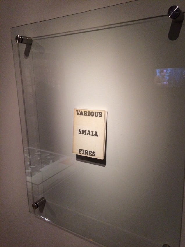
Display of Ed Ruscha’s Various Small Fires and Milk, 1964, at Pliure: La Part du Feu, 2 February – 12 April 2015, Paris. Photo by Robert Bolick. Reflected in the lower left hand corner is the display of Bruce Nauman’s Burning Small Fires; in the upper right corner, the film clip of Truffaut’s 1966 Fahrenheit 451; and in the upper left, Maria Helena Vieira da Silva’s La bibliotheque en feu, 1974.
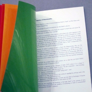
Pilkington, Philip; Rushton, David; Lole, Kevin; Smith, Paul. Concerning the Paradigm of Art. Zurich: Editions Bischofberger, 1971. [Last author’s name corrected from “Paul” to “Peter”] [From Paul Robertson, “A Collection of Rare Art+ Language Books and Internal Documents – Many Unknown in Literature”, Gorebridge, Midlothian: Unoriginal Sins/Heart Fine Art, n.d.
“30 x 21cm, 16pp (recto only). White card covers – with offset title. A text published by Bischofberger from a theoretical document written by Kevin Lole, Philip Pilkington, David Rushton and Peter Smith (formerly Analytical Art and by this time fully regarded as members of Art & Language) which applied Thomas Kuhn’s theory of paradigm shift to art (the original theory by Kuhn being a view that revolutions in scientific thought only occurred when sufficient contrary evidence to the prevailing orthodoxy had mounted up and the original hypothesis could no longer explain the physical evidence emerging from empirical studies). It is worth noting that at this time Bischofberger bought a great deal of Art + Language material from the group and published other documents by them including some of the group’s rarest publications – storing many of the more three-dimensional works for later resale. Bischofberger did not print the books himself – rather Art and Language arranged design and publication in Coventry (for free using the University’s resources) and David Rushton drove the books over in a camper van to Switzerland (breaking down just on the edge of the city due to running out of petrol and having little money left, Rushton coasted the last mile down hill on an empty tank).
The limitations of these series of books are usually placed at c. 200 but Rushton remembers taking far fewer than that with him and this Analytical Art book was in fact only produced in 50 copies taken to Zurich plus a few retained by the artists in the UK.
That said this is one of ONLY 5 copies which were numbered in roman numerals (this one being III/V) and signed by ALL of the four writers in pencil on the first title page.”]
Pilkington, Philip; Rushton, David. Sample from a Topological Notebook. Coventry: Self-published, 1972. [Video] [From Paul Robertson, “A Collection of Rare Art+ Language Books and Internal Documents – Many Unknown in Literature”, Gorebridge, Midlothian: Unoriginal Sins/Heart Fine Art, n.d.
“30 x 21cm, 28pp carbon copy pages and printed cover. This was one of ONLY four copies made and published by the group – two copies being signed by David Rushton and Peter [sic] Pilkington and created from original typed sheets and two copies remaining unsigned and created (as here) using the carbon copies from the originals. These latter two examples were regarded by the group as artist’s proofs of the book. This is the only copy of this book available for sale anywhere as from the original four prices: one is in Paul Maenz’s archive and another two copies are in the hands of private collectors (who purchased them from ourselves). This copy is signed by David Rushton and Philip Pilkington and has been stamped on the inside front cover with the official Art & Language Stamp and also designated in blue ink “Second Copy”. Fine estate and clearly rare.”]
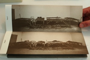
Magnet / Photo Series / Group 2000 / September 1968 / (4 Phase) / Continuous Photographic Photographs Continuously Photographs Up to 20,000 Shots / Run Time work / 10 years / annual series of 20,000 elements / technique / black and white photography / leafs / 3 M / K 203 3 / each 30 x 40 / constant time setting diaphragm / fixed tilt stand / 1969 / camera used maintains the original value and adds to the artistic market.
Ramsden, Mel. The Black Book. [Unable to find a work under this title in WorldCat]
Ramsden, Mel. Abstract Relations. New York: Art-Language, 1968. Edition of 5. [Unable to find a work under this title in WorldCat; the 5 images on the left in this photograph from the Philippe Méaille private collection at MACBA come closest.]
Rot, Dieter. Icelandic Leather. Reykjavik: Self-published, 1970. [Unable to locate by this title; may be referring to Volume 5, Bok 3 of the Collected Works]
Display of Ed Ruscha’s Various Small Fires and Milk, 1964, at Pliure: La Part du Feu, 2 February – 12 April 2015, Paris. Photo by Robert Bolick. Reflected in the lower left hand corner is the display of Bruce Nauman’s Burning Small Fires; in the upper right corner, the film clip of Truffaut’s 1966 Fahrenheit 451; and in the upper left, Maria Helena Vieira da Silva’s La bibliotheque en feu, 1974.


![Image result for art & language: texte zum phänomen kunst und sprache [book]](http://igem.adlibsoft.com/wwwopacx/wwwopac.ashx?command=getcontent&server=images&value=coda%5CAB00318.jpg)