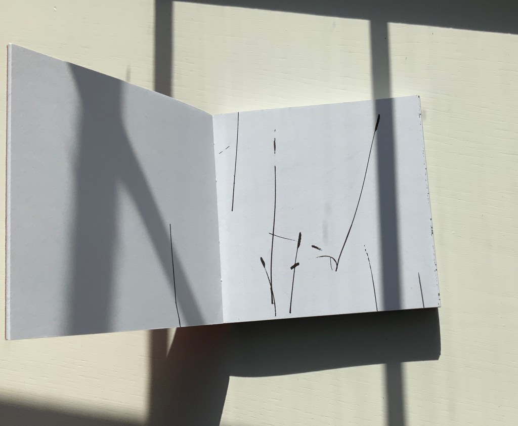
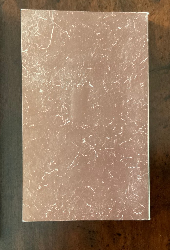
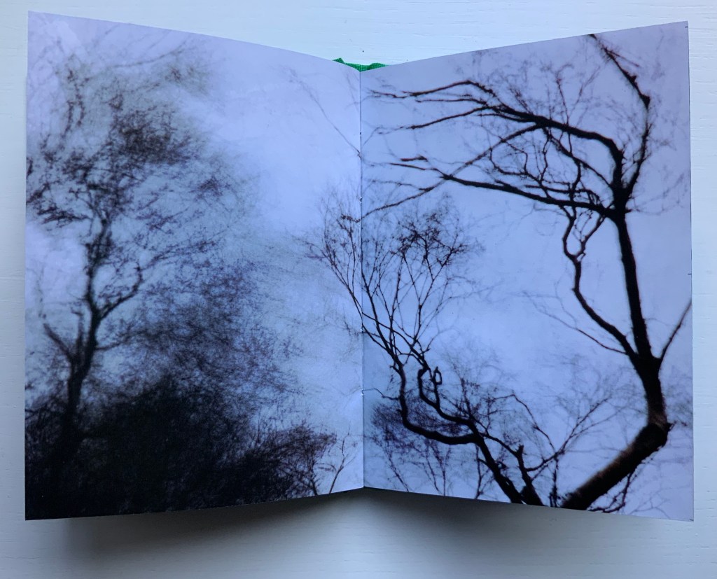
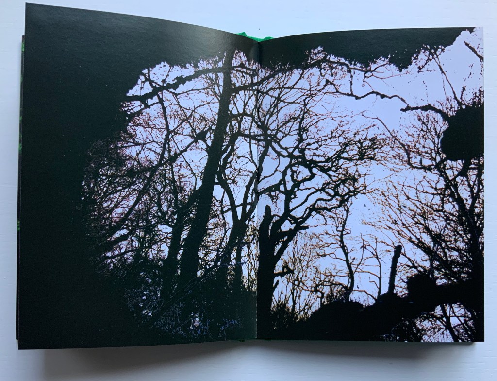
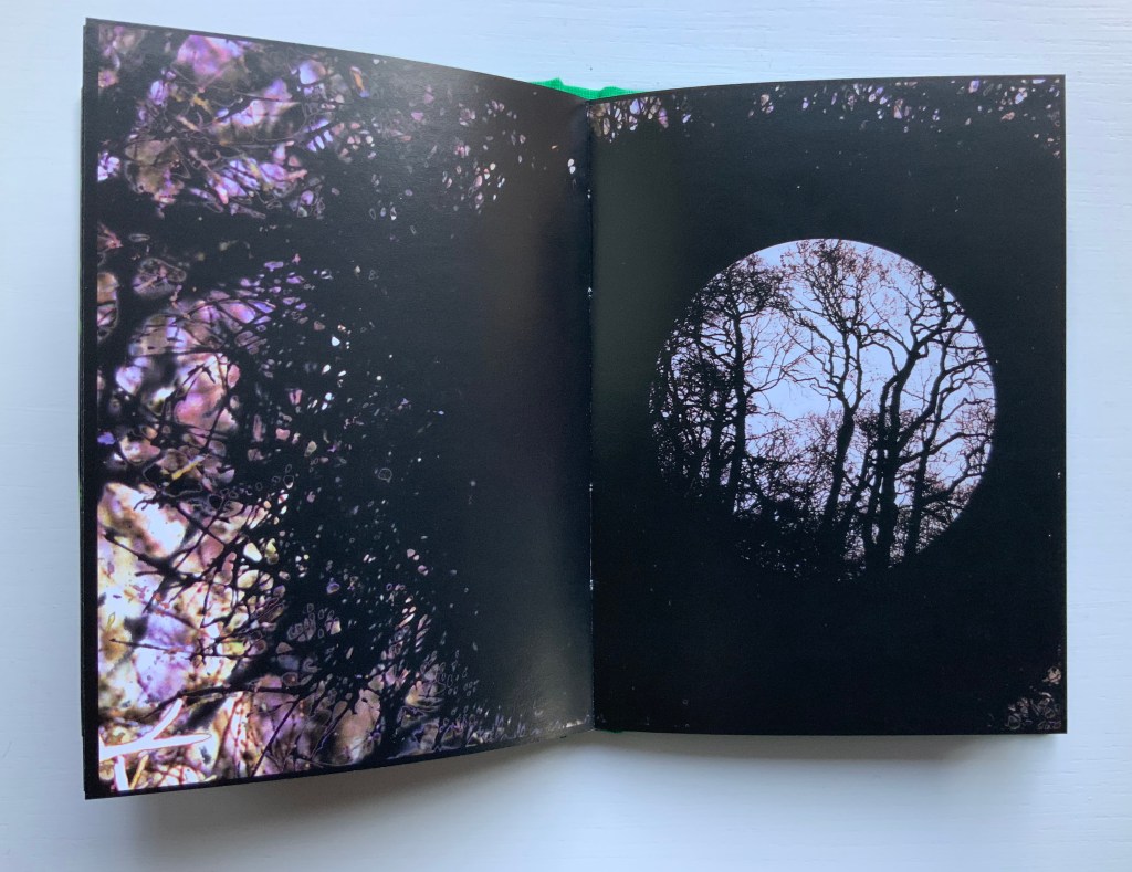
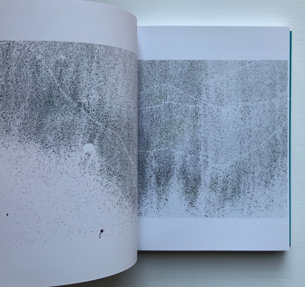
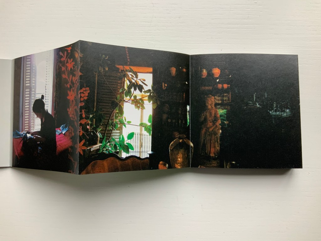
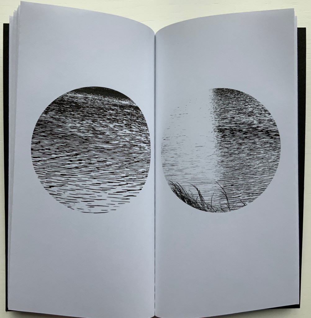
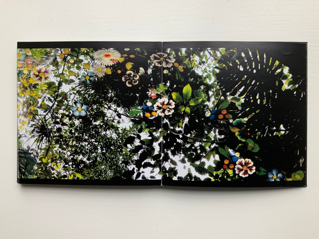
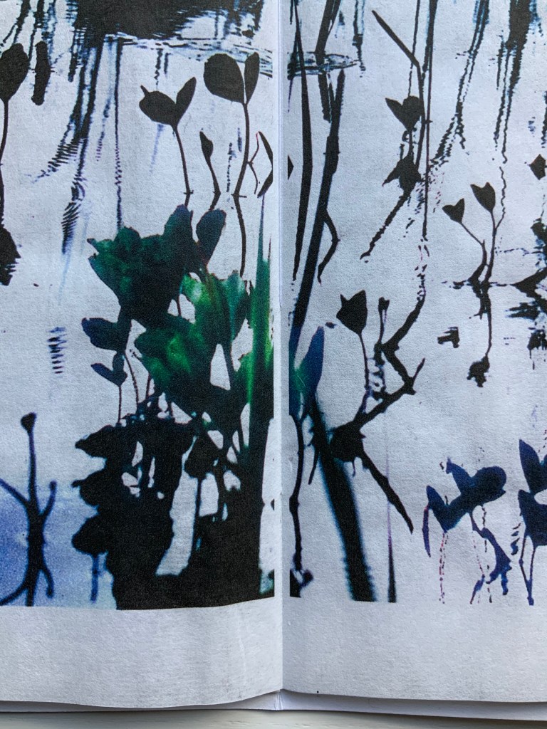
The Pond at Deuchar (2011)
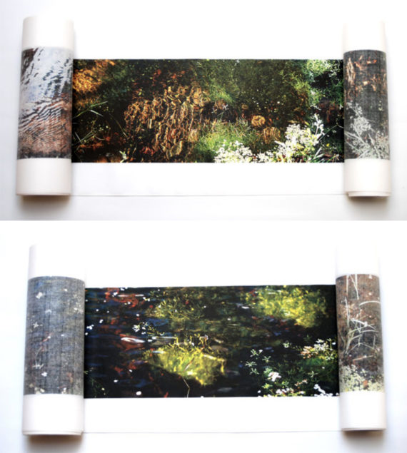
The Pond at Deuchar (2011)
Helen Douglas
Hand scroll, printed on Chinese Xuan paper, ultra chrome inks. Silk ribbon edged.
14 metres x 270 mm. Edition of 4.
Photos: Weproductions.
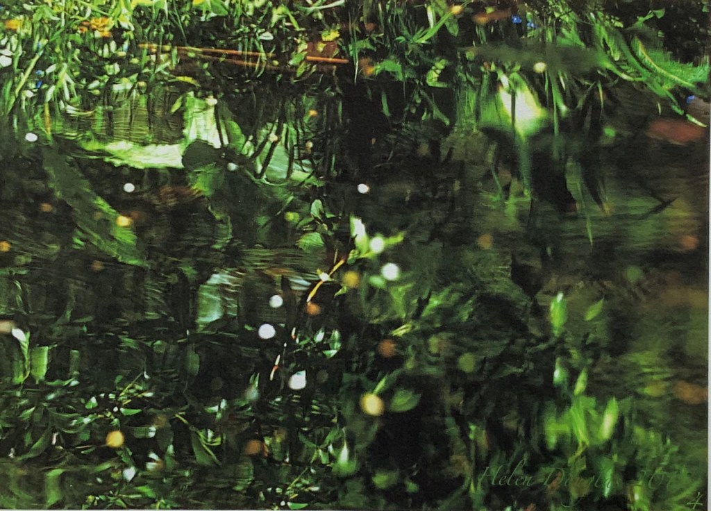
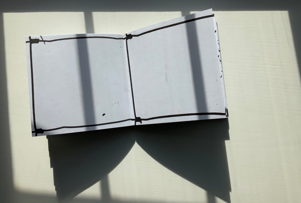
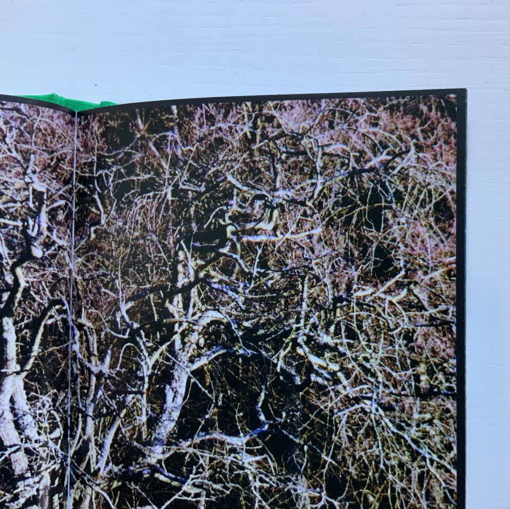
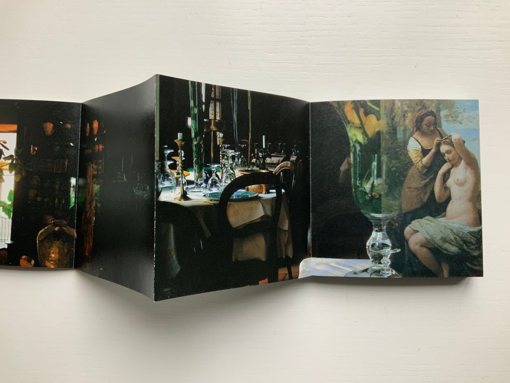
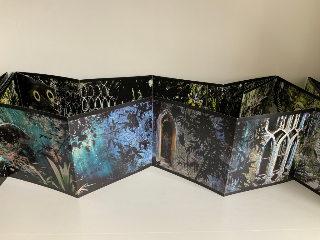
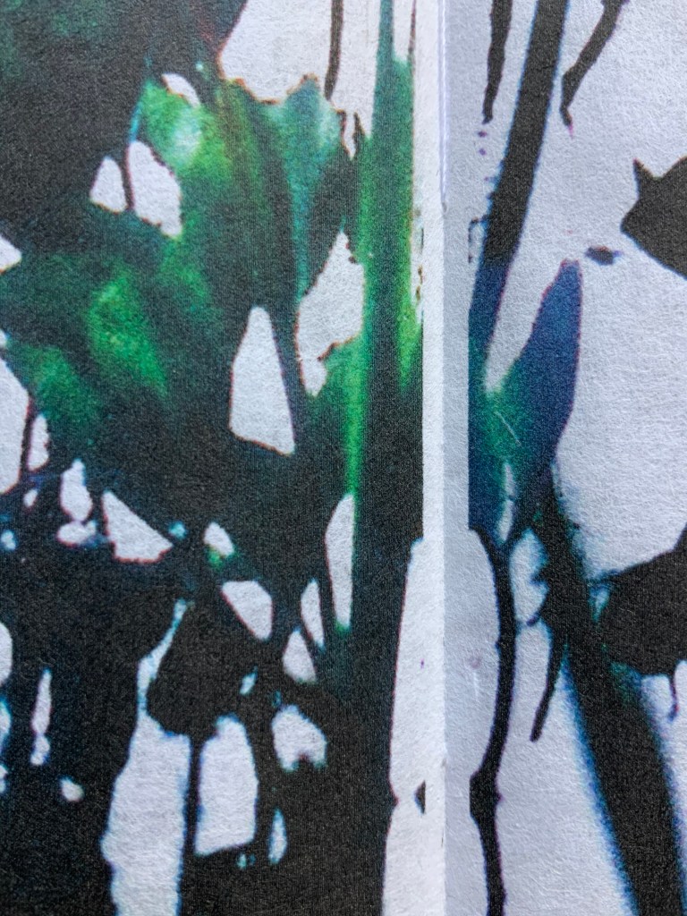
Details from end of The Pond at Deuchar (2011)
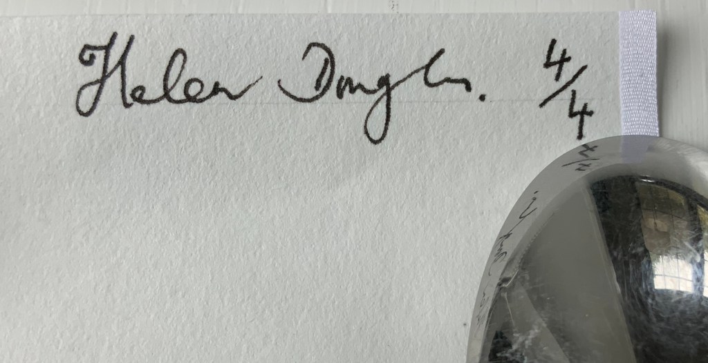
Edition of 4, of which this is #4. Acquired from the artist, 18 February 2019.
Photos: Books On Books.
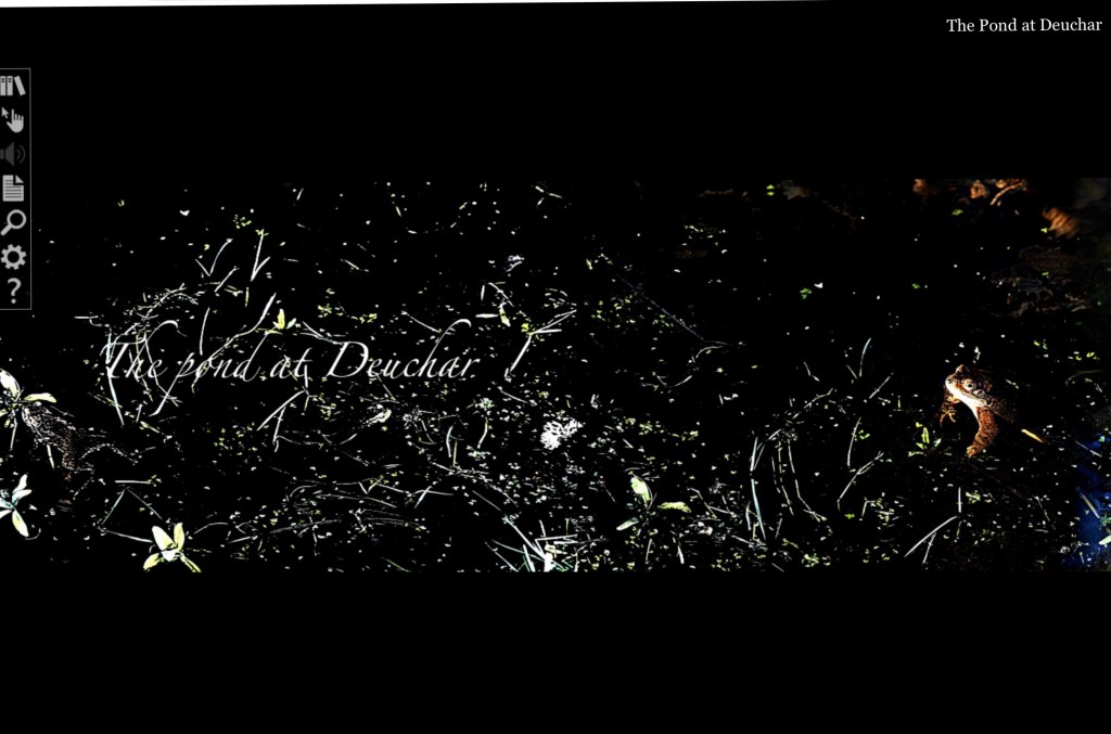
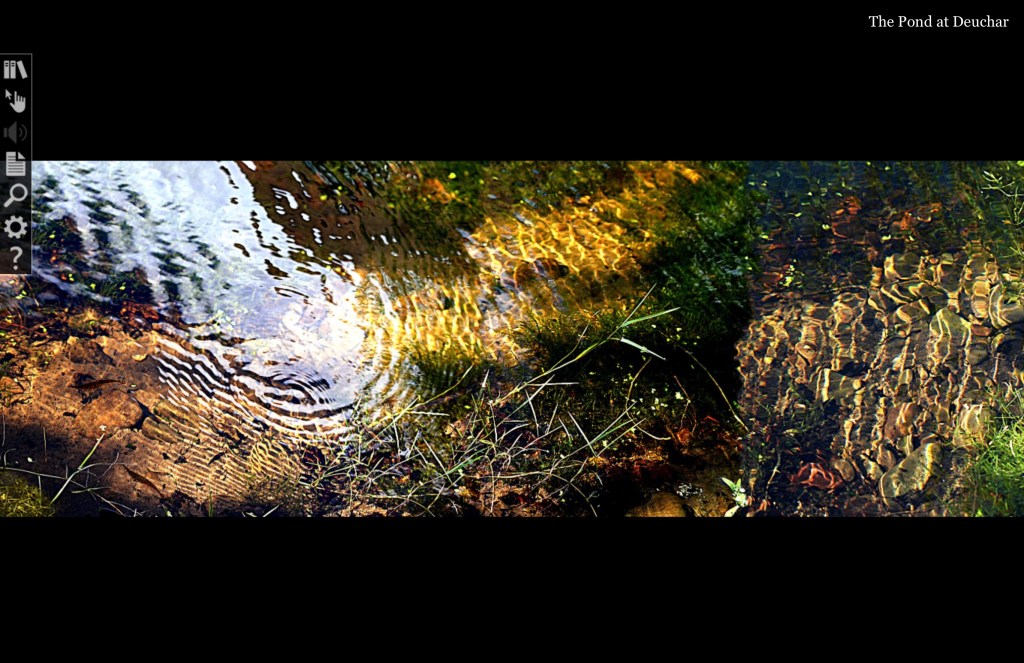
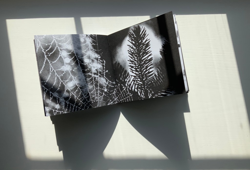
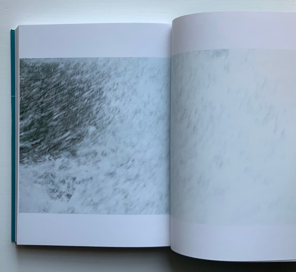
The Pond at Deuchar (2013)
Helen Douglas
Online version produced by Armadillo Systems. Screen captures: Books On Books.
Shortly after orchestrating the series of workshops Transforming Artist Books (2012), during which Helen Douglas created the digital version of The Pond at Deuchar (2011), art historian Beth Williamson marvelled at how the gestures of digital reading affect “our thinking as our (digital) hand navigates around the screen and thinks through the work”. That phrase “as our hand thinks” is magic in its aptness for all of Helen Douglas’s works. Helen Douglas is a book artist who makes our hands think. But what does that mean? Consider these three excerpts:
[t]he hand does not only grasp and catch, or push and pull. The hand reaches and extends, receives and welcomes — and not just things: the hand extends itself, and receives its own welcome in the hands of others. The hand holds. The hand carries … [e]very motion of the hand in every one of its works carries itself through the element of thinking, every bearing of the hand bears itself in that element. All the work of the hand is rooted in thinking.
Martin Heidegger, What Is Called Thinking? trans. J. Glenn Gray (New York: Harper Perennial, 19 68). P. 16.
… the digital hand is […] a version of what the artist’s hand, the craftsman’s hand, the poet or scholar’s hand, and the lover’s hand has always been: a means of marking, touching, selecting, interacting, molding, expressing, and refusing that remains essential to human thinking, even when that thought takes place increasingly in an immaterial environment ….
Tyrus Miller, ”Rethinking the Digital Hand”, CrossPollenBlog, 18 October 2013. Accessed 15 September 2019.
The Tongue and Heart th’intention oft divide: The Hand and Meaning ever are ally’de”.
Guil. Diconson, “To his ingenious Friend the Authour; on his CHIROLOGIA“ in John Bulwer, Chirologia, or The Natural Language of the Hand (1644).
When talking about her art and the “breadth” or ”span” of the spreads and their “flow” — as she did at the London Book Fair in 2013 and the British Library in 2020 — Douglas gestures in ways that evoke those words of Heidegger, Miller and Diconson. When experiencing The Pond at Deuchar — whether in its scroll edition or its digital version — the reader/viewer makes similar gestures — spreading arms wide, sweeping with the hands; or tapping, pointing, pinching, spreading and swiping with the fingers.
In its scroll edition and its digital version, The Pond at Deuchar draws the reader/viewer into two different literacies but with a continuity between them that does not yet exist between reading a print book and reading its ebook version. Are hand and eye more allied when processing the visual whether on paper or screen than when processing words? Is The Pond at Deuchar a special case because unrolling a scroll and scrolling across a screen are more gesturally similar than turning pages in a codex format and tapping a screen?
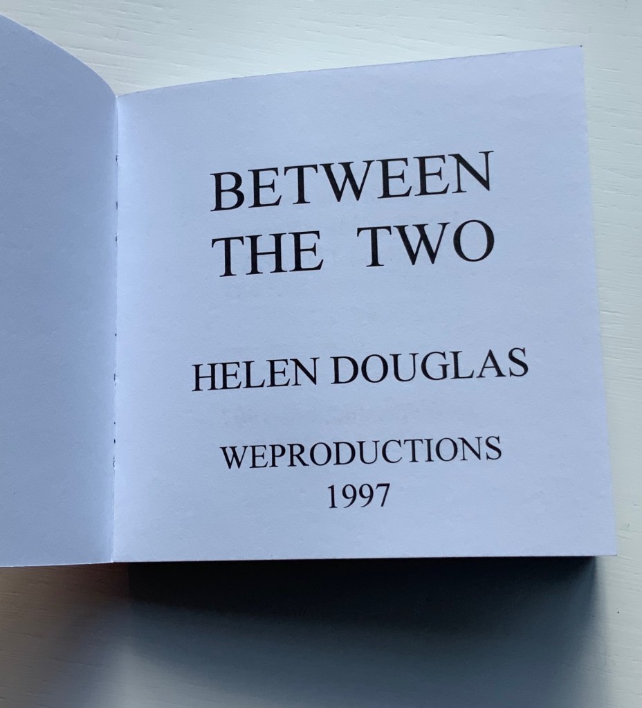
Douglas’s own description of the next work Between the Two (1997) brings this question about visual and textual literacies front and center.
Between the Two (1997)
This bookwork is constructed to unravel across the open spread and around the edge of the page to express one continuous visual narrative. It begins with sparse photographic renderings of grasses as black line on white, progresses into a softer tonal sequence embodying flight and finally, in the latter part of the book, develops an arabesque dance of tendrical peas, as light on dark, leading to a flowering of the book. Black and white throughout, the book is bound in scarlet crushed velvet.
Weproductions, accessed 26 February 2020.
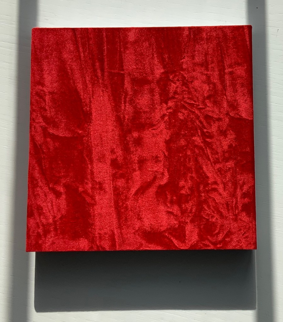
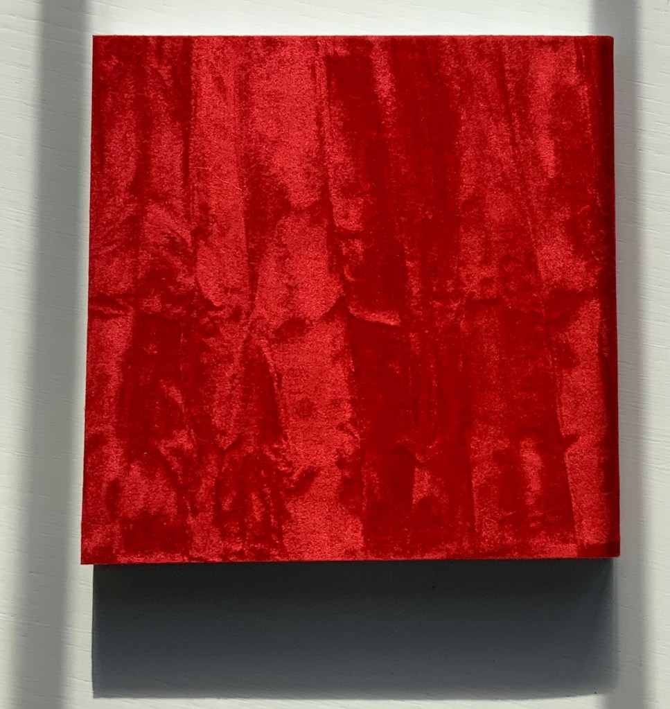
Between the Two (1997)
Helen Douglas
Offset, 130 x 130 mm, 168pp. Acquired from the artist, 29 November 2018.
Reading “around the edge of the page” in Between the Two is a “hard read”. Most turns from recto to verso effect a sense of continuity with stalks, fence, tendrils, etc., wrapping over the edge into the verso page; others do not. The codex format inherently presents this challenge. The edge of the page is a scant plane, although the earlier work Water on the Border (1994) exploits it well (see below). There are other visual strategies that work. Think of Michael Snow’s Cover to Cover (1975) and consider the following work from the same year.
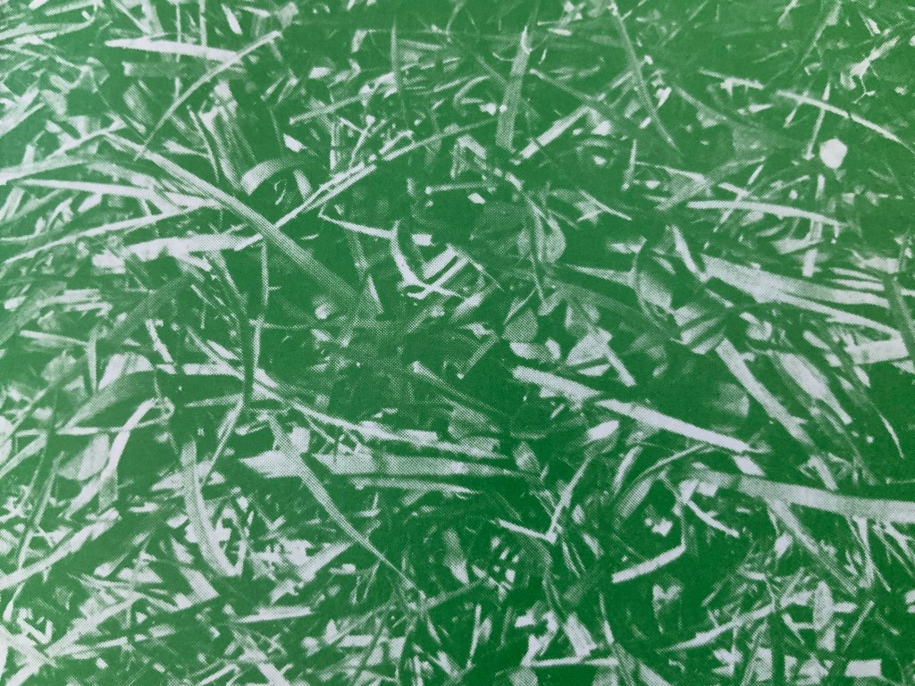
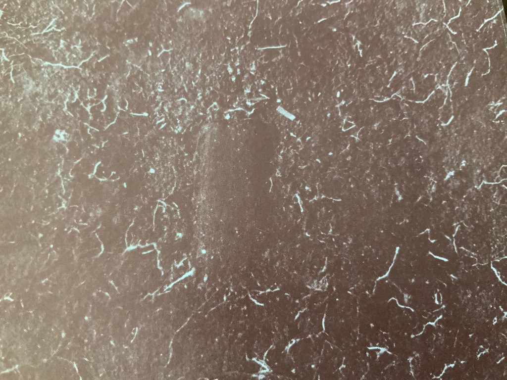
Chinese Whispers (1975)
Douglas has created numerous visual narratives in the codex format, but none of them have been reproduced in a digital format. If Chinese Whispers — one of her first books in partnership with Telfer Stokes — were delivered in a “tap-to-turn-the-page” digital format, would a sense of continuity between the different literacies occur or diminish? The tightness of the binding of Chinese Whispers makes full appreciation of the spreads and flow difficult, but on the other hand, the meeting in the gutter of the two photos on each double-page spread is essential. Say that two copies of the book were unbound, the “freed” double-page spreads would have to be displayed somehow in a way that still captures that meeting in the gutter. On a gallery wall? As Clive Phillpot has pointed out, to do so with Douglas’s work is to destroy what is going on in moving across and turning from one double-page spread to the next. A digital version would need to be fiendishly quirky in its own way to find a parallel semantic and artistic solution to its codex counterpart’s effects.
The front cover of Chinese Whispers (1975) shows lush green grass in a photo that bleeds to all four edges. Flip the book over and find another edge-to-edge photo showing the dirt and roots beneath the front cover’s patch of grass.
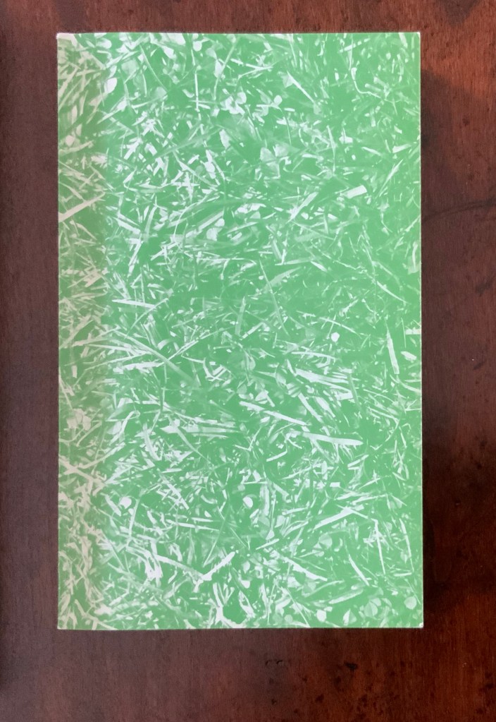
Chinese Whispers (1975)
Helen Douglas and Telfer Stokes
Offset, 110 x 180 mm, 176pp. Acquired from the artist, 29 November 2018.
Photos: Books On Books.
Doing this is a bit like jumping to the end of a detective story; it is literally jumping to the end of the game of visual Chinese Whispers to which the book invites us. Decades after the book’s appearance, Brandon S. Graham revealed some of the behind-the-scenes process, driving home the filmic character of the book. In correspondence with Books On Books, Douglas confirms the “absolutely continuous narrative” of Chinese Whispers, emphasising how the artists would “come up with a concept and starting point together and then … would go backwards and forwards“ (20 March 2020).
Like the give and take of a word game, this book was scripted, planned page by page and section by section. Stokes would suggest a starting point and a concept, Douglas would interpret the idea slightly differently, add to it and relay it back to Stokes. Stokes would run with the evolved idea and it would start again. In this way the book evolved as an honest representation of the collaborative process that yielded it. The photography began once they had the whole object planned.
Brandon S. Graham, “Chinese Whispers“, Fiction Doldrums, 26 July 2011. Accessed 9 December 2018.
… For the cover image, Douglas and Stokes used a spade to cut a rectangle of sod to the exact dimensions of the finished book and took a photo.
The visual narrative takes us from trimming the overgrowth from the outside of a derelict cottage, entering it and starting the process of building a corner cupboard, populating its shelves with a breadbox, a coffee pot and many other objects that lead from one element of the narrative to the next. Packets of seeds lead to a cabbage and pea pod. A bunch of berries leads to jam in a jar. Toward the end, a pair of scissors and sheet of paper lead to a cut-out butterfly whose wings gradually close along with the two “wings” of the corner cupboard, leaving us in the dark with a double-spread of black pages. Below are close-ups of the front and back covers. Notice the impression in the dirt-side photo? It looks like a rectangle the trim size of the book; whether it is or not, Chinese Whispers is a bookwork of continuous page-turning inside (and outside) jokes.
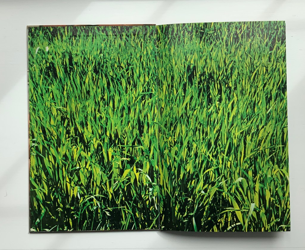
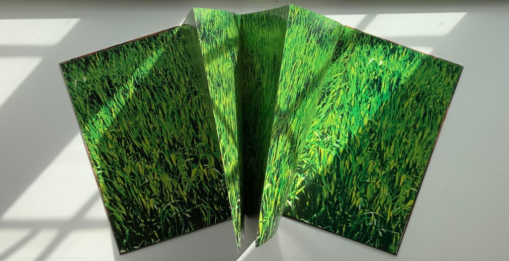
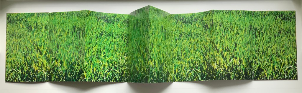
Clinkscale (1977)
“Clinkscale” is the name of a company that specialised in the musical instrument photographed by Douglas for the bookwork of the same name. Perhaps every book art collection has a one-note joke. Clinkscale is almost that for the Books On Book Collection. Brandon S. Graham defended the work against the characterisation years ago:
It would be easy to dismiss this as a clever one liner: accordion with an accordion fold format. But on closer examination there is more going on. Over top of the accordion body a band of atmospheric and biographical information can be observed: the blue sky, the green of the field, the bright spring sunlight, the work shirt and threadbare work coat. When one looks closely at Telfer’s hands and nails, particularly the thumb on the back cover, one can see a criss-cross of the shallow cuts that have been stained with dirt. All of these details speak of a place and a time and a situation. They are a record of standing in a field in rural Scotland on a crisp spring day, a record of the work that Telfer’s hands are performing on the Mill. These details ground the work and tie the work to a person at a moment in time. It is a record, a document.
Taken in this context there is another layer of meaning evident in Clinkscale: the idea of breath, air, anticipation, rejuvenation and renewal. As a viewer holds the book with the bellows closed the viewer sees Telfer’s fingers poised. This builds anticipation of a motion and perhaps a sound. As the book is opened the accordion inhales, the bellows expand and the rush of air stirs the spring grass. The hands are those of a workman. The workman is standing in a field with an accordion, taking a break; taking a breather. The sea of green spring grass is symbolic of rejuvenation and renewal.
Brandon S. Graham, “Telfer Stokes”, FictionDoldrums, 8 April 2011. Accessed.17 March 2020.
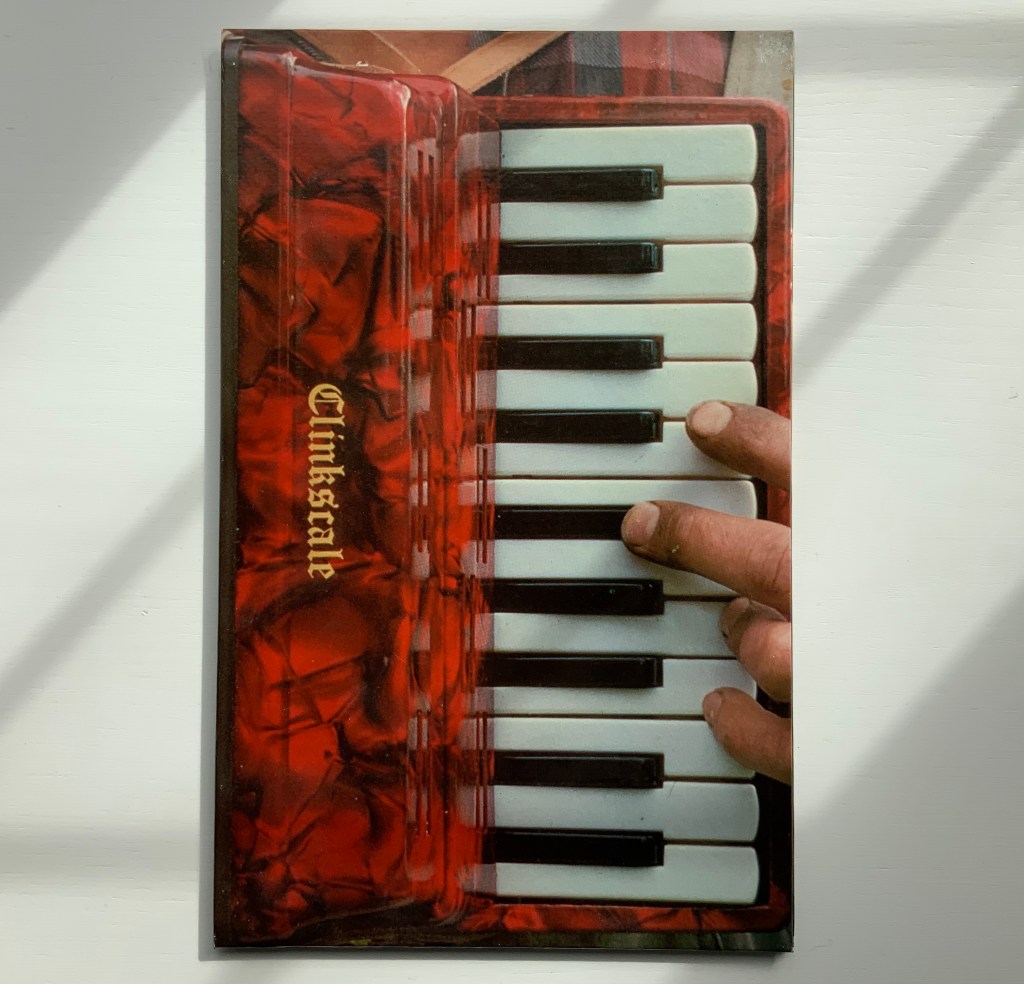
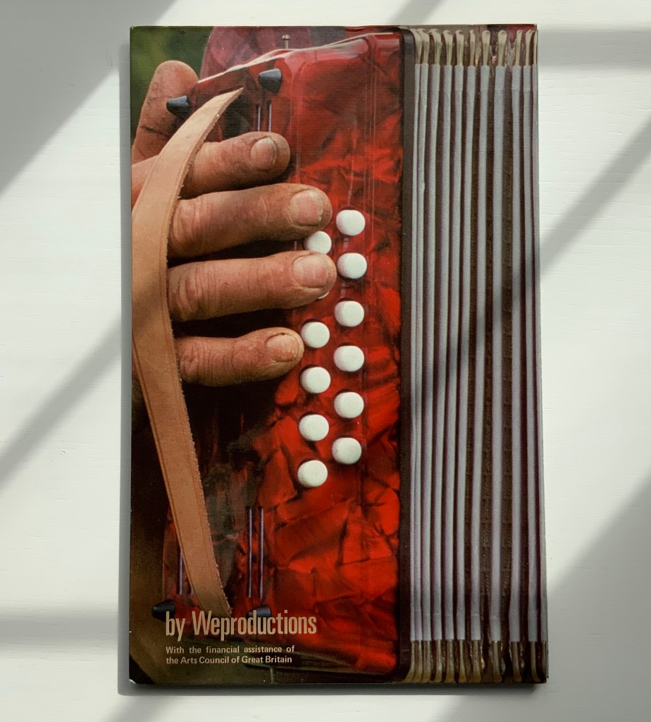
Clinkscale (1977)
Helen Douglas and Telfer Stokes
Accordion binding, two hardboards joined by a single leaf; full colour photograph commercially printed.
H278 x W174 mm (closed), W1708 mm (open). Acquired from Douglas, 29 November 2018.
Water on the Border (1994)
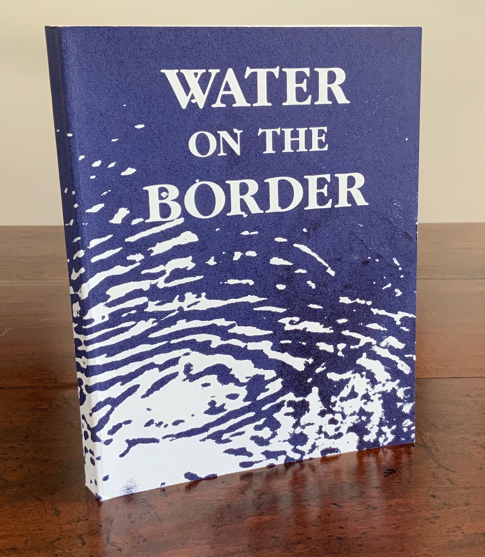
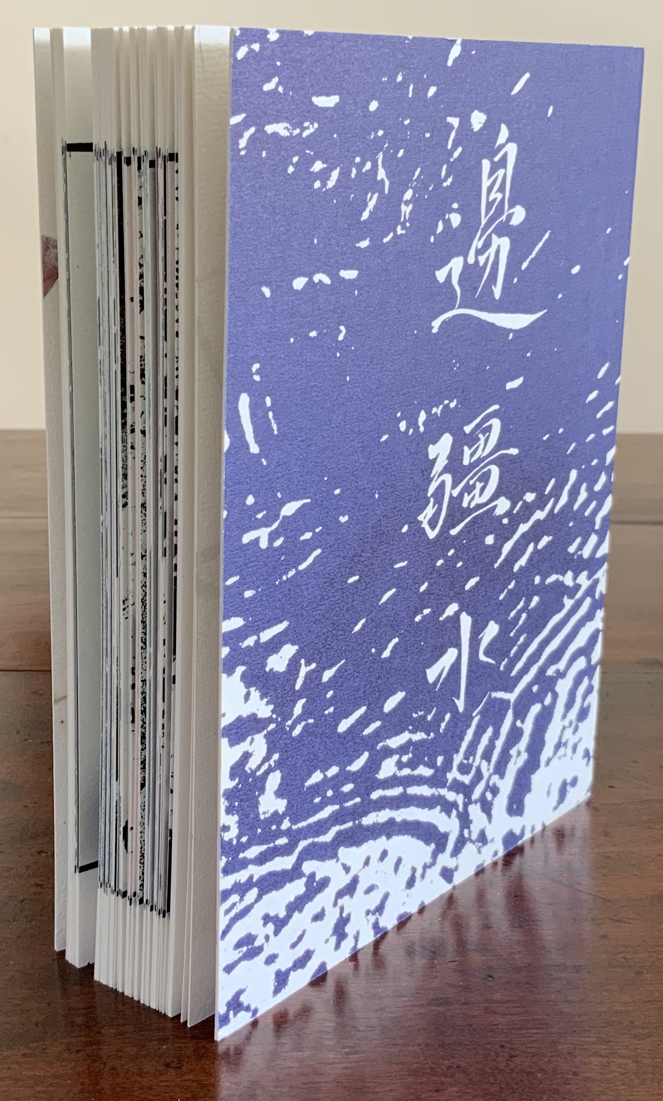
Water on the Border (1994)
Helen Douglas
Offset, 150 x 190 mm, 124pp. Acquired from the artist, 29 November 2018.
Photos: Books On Books.
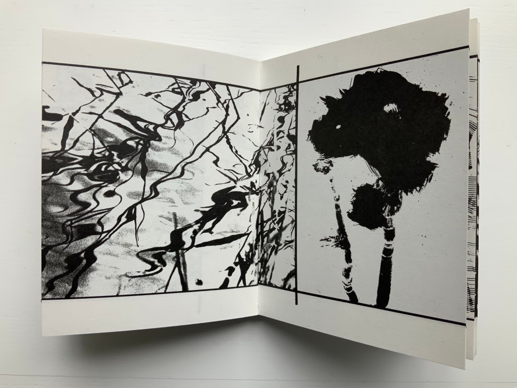
The two pairs of double-page spreads below demonstrate the artist’s success in taking the reader/viewer “around the edge of the page”. In the first pair, after the boat‘s prow disappears at the edge of the recto page and reappears from the verso’s, the artist introduces a vertical border at the tip of the prow. On the other side of the border is a photographic tracing of a building’s reflection in water. It is not necessarily the same stretch of water on either side of the border, but it feels that it is.
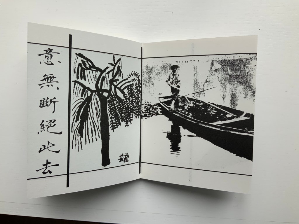

In the second pair, the seven columns of characters of a Chinese poem precede the picture of the lower part of a right leg that wraps around the edge of the recto page into the image of a man performing T‘ai Chi. As above, the verso page of that double-page spread is divided by a vertical border, which is followed by a child’s ink drawing that falls across the verso and recto pages. As with the continuity of water above, there is a continuity of the man’s pose on one side of the border and the lines of the drawing on the other side.
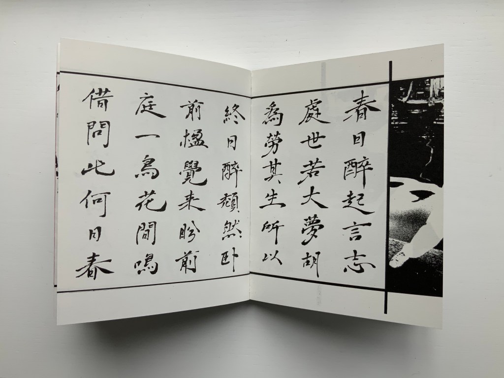
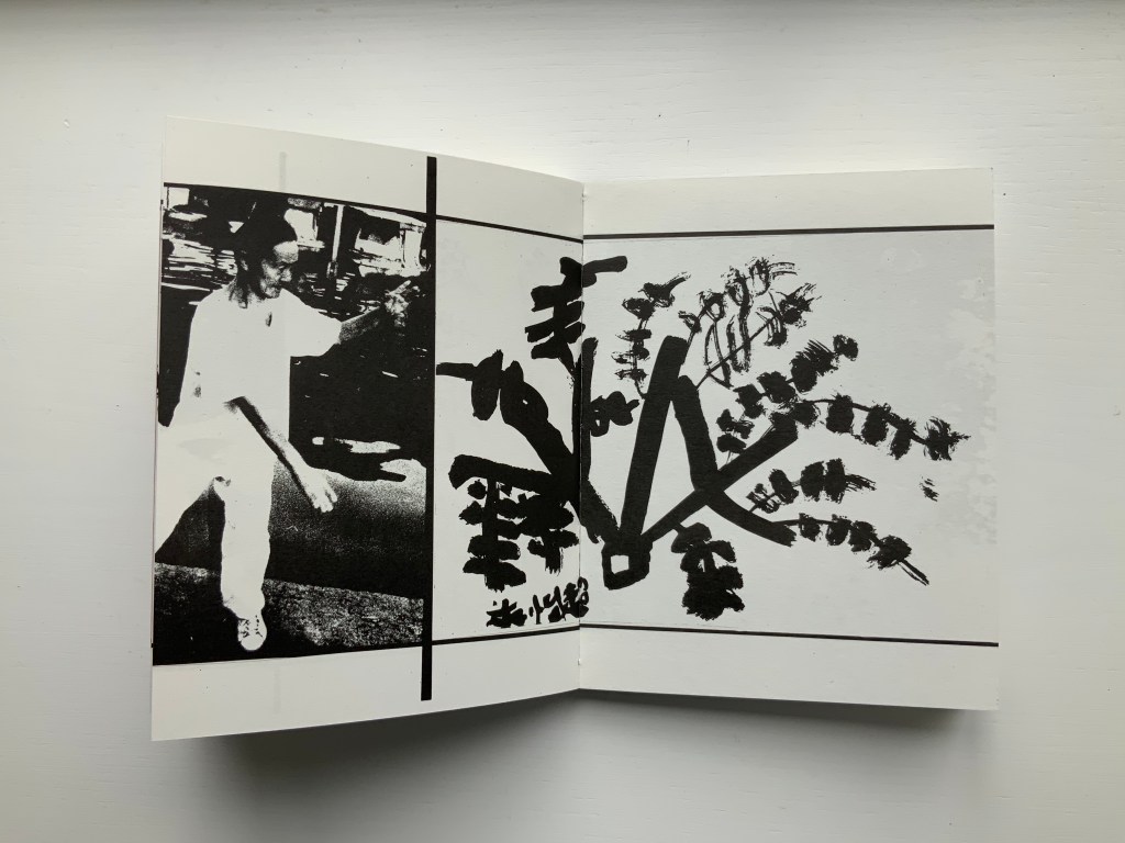
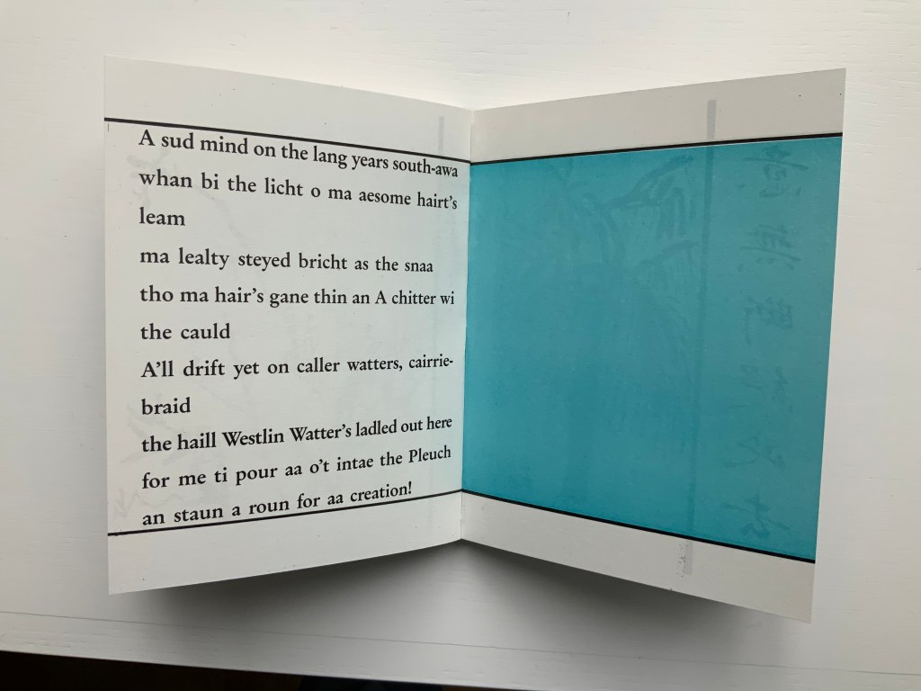
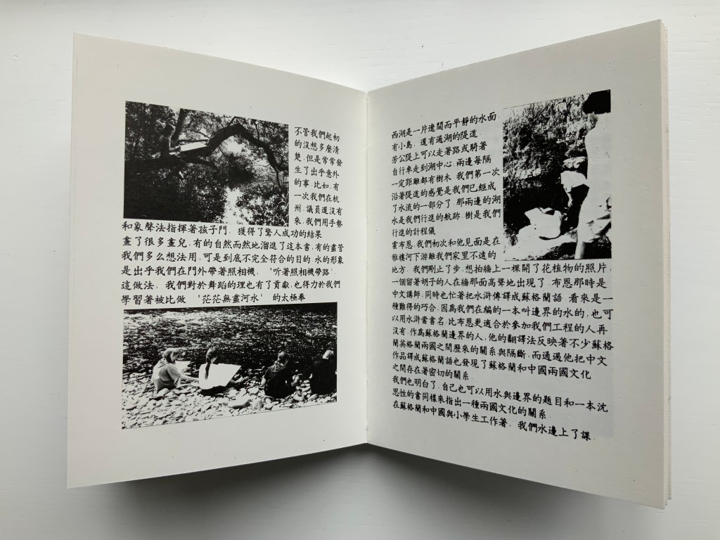
Water on the Border engages sides of multiple borders. Six Chinese poems rendered in calligraphy balance against Brian Holton’s transcriptions into Scots (first image, top row, below). Children from Scotland and China provided the drawings (second and third images, top row, and fourth image, below). The reflective images photographically traced come from the water surfaces of Yarrow Water Scotland and West Lake, Hangzhou.
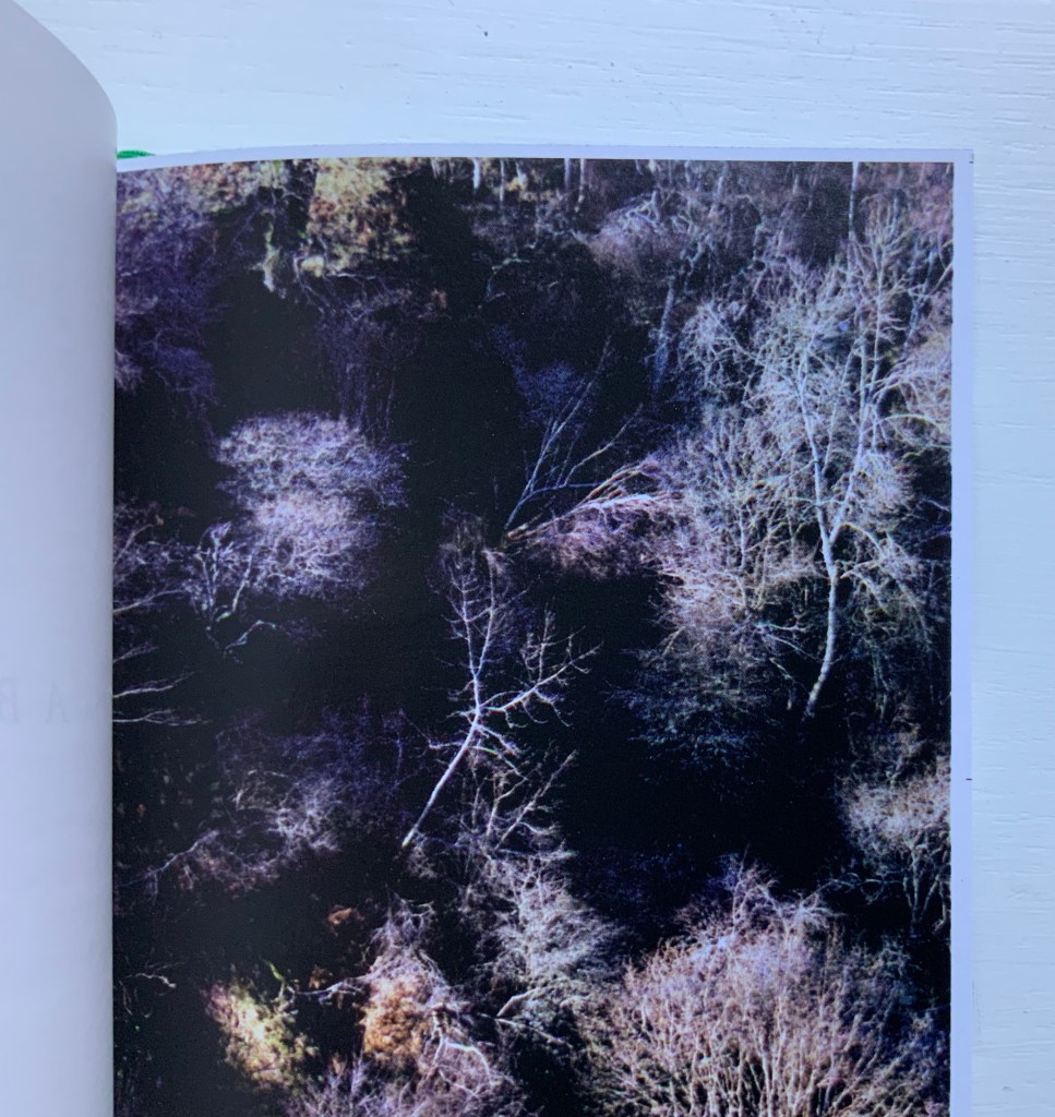
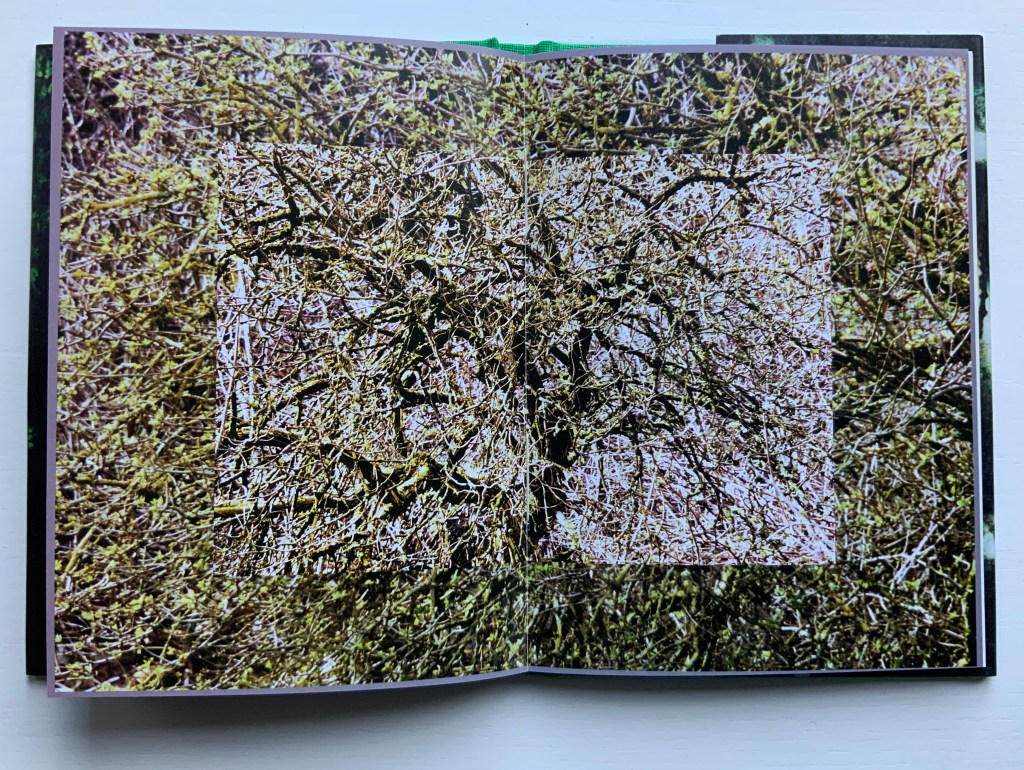
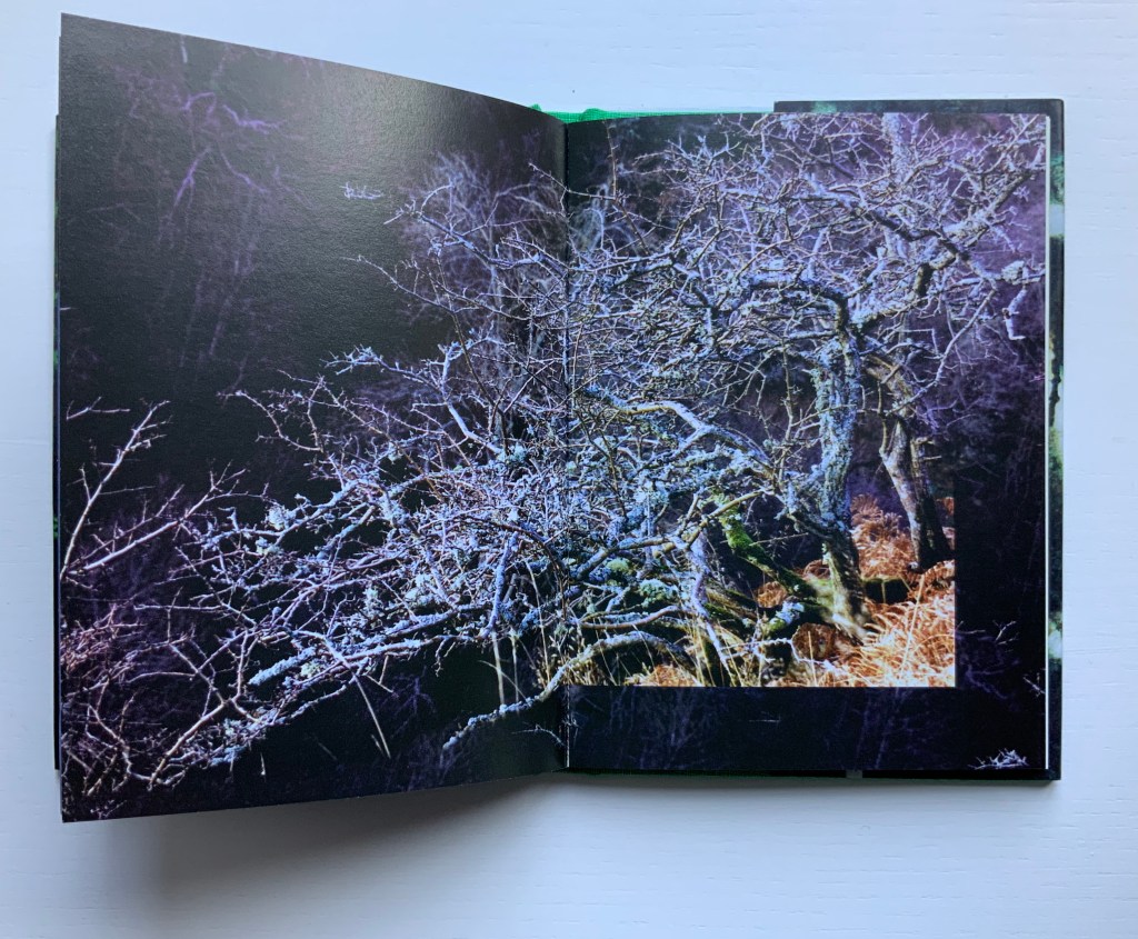
Wild Wood: A Border Ballad (1999)
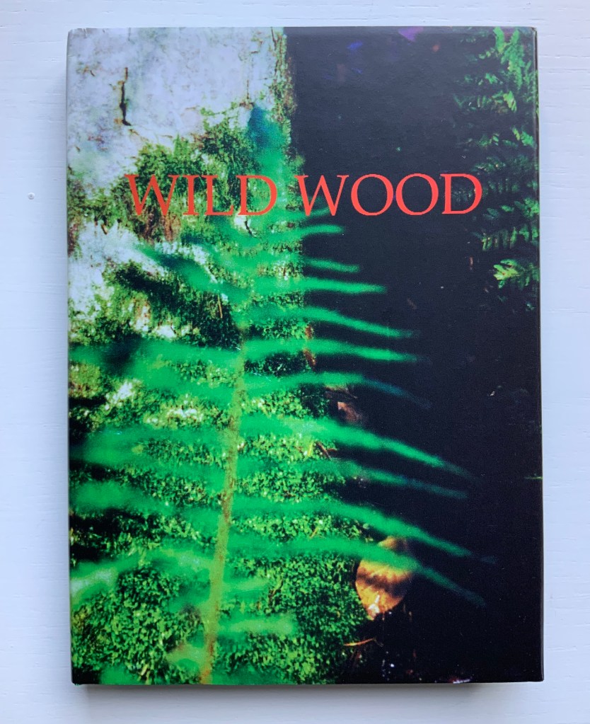
Wild Wood: A Border Ballad (1999)
Helen Douglas
Offset, 116 x 160 mm, 144pp. Acquired from the artist, 29 November 2018.
Photos: Books On Books.
Wild Wood has been conceived as a Border Ballad and takes as its inspiration the Carrifran Wildwood project and the ancient woods at Deuchar and Tinnis Stiel in Yarrow. In 2000 Wild Wood won The Nexus Press Atlanta Book Prize. Opening the book and turning the pages is analogous to entering and exploring the Wild Wood where different moods and feelings move the viewer through the visual narrative.
Weproductions, accessed 26 February 2020.
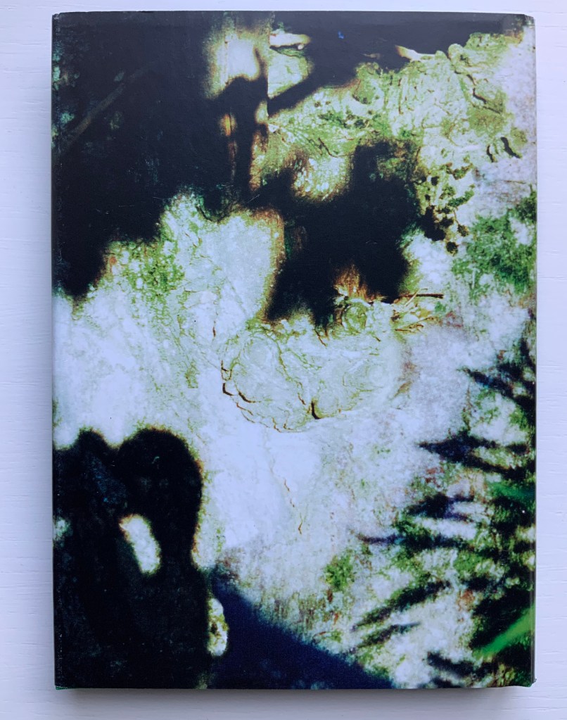
A fair enough and fair description of this bookwork, but what astounds is the manipulation of borders and the framing of photos within photos. Below, on the left, a thin white border around a recto page; on the right, a thin black border encircling a double-page spread (notice also the precision of alignment from verso to recto.
Borders yield to full-page bleeds (first spread below), and full-page bleeds are manipulated to create frames of images (second spread below).
Strange roundel vignettes of the forest appear within close-ups of a tree.
Photos of the wood create a border for other photos of the wood, and some burst wildly beyond those borders.
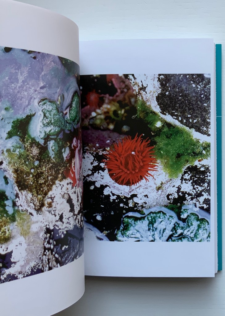
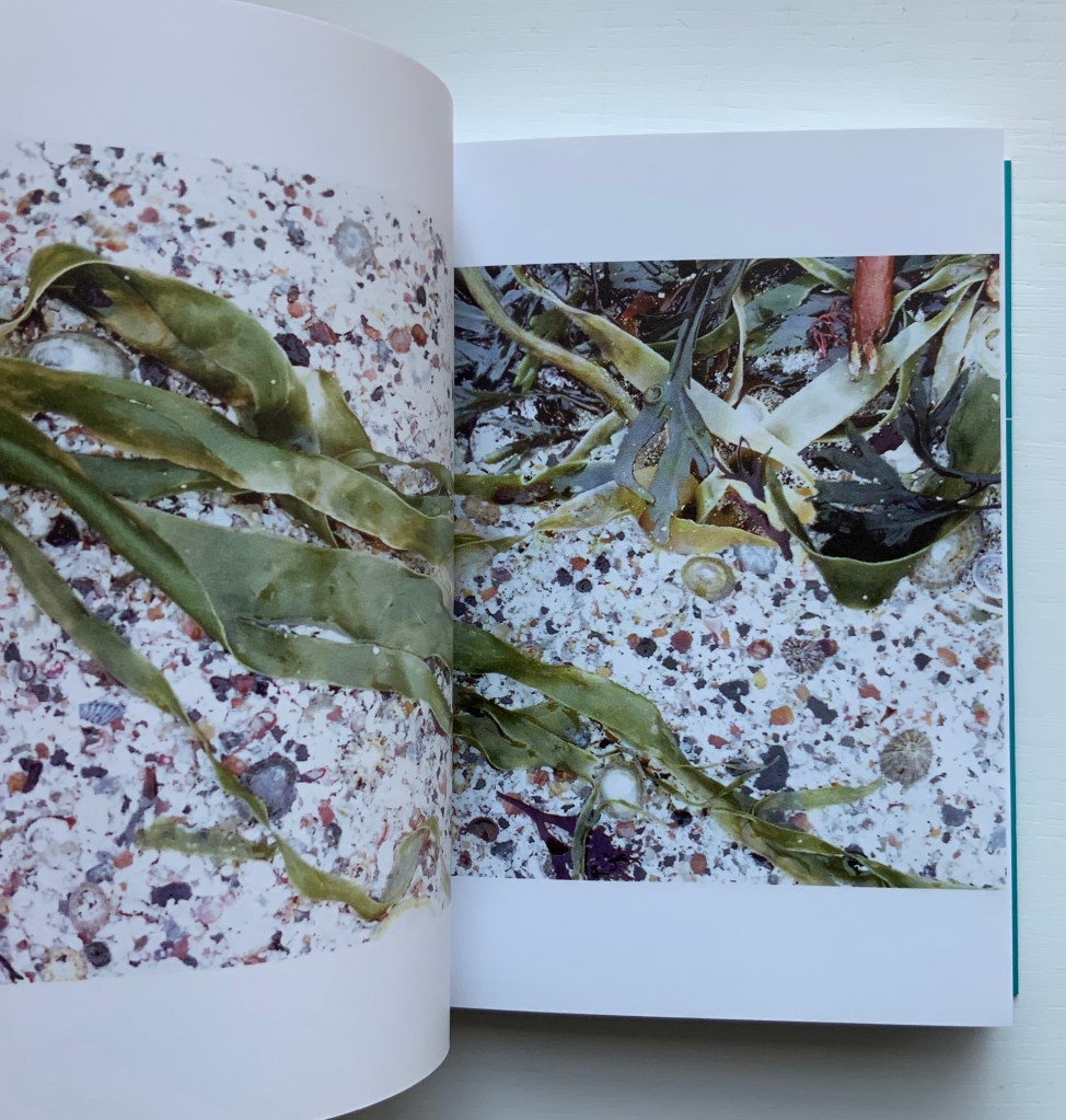
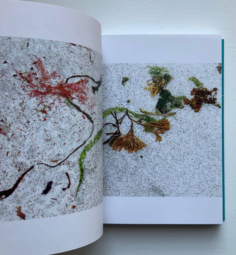
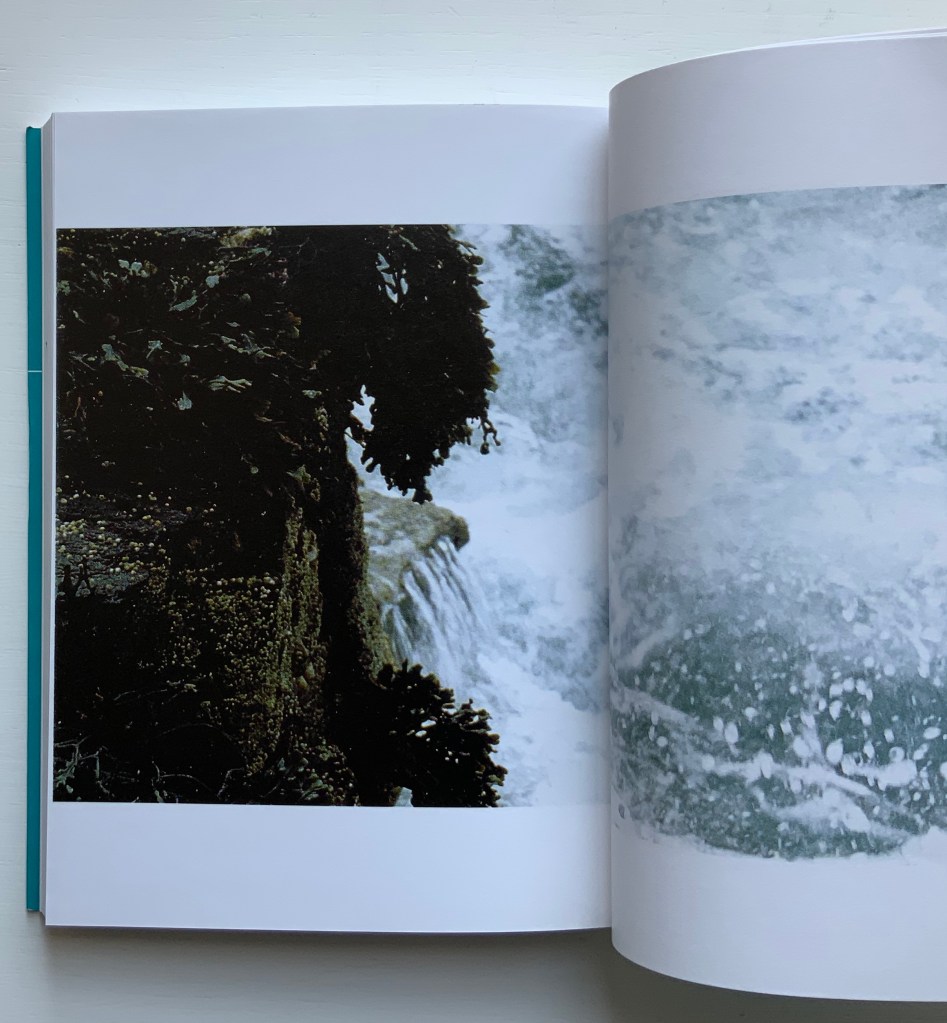
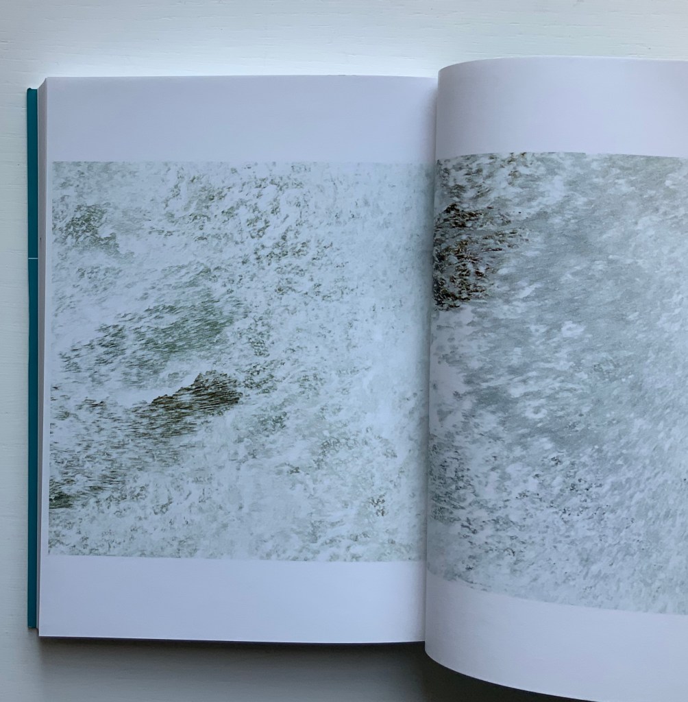
Unravelling the Ripple (2001)
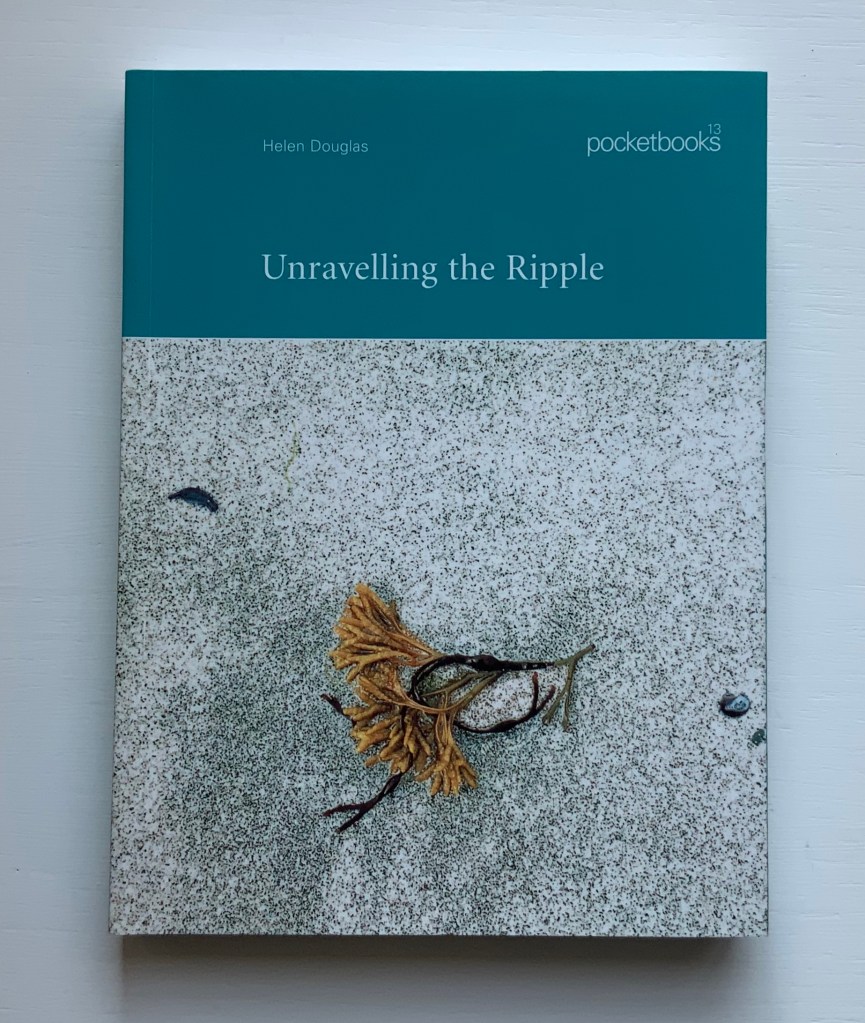
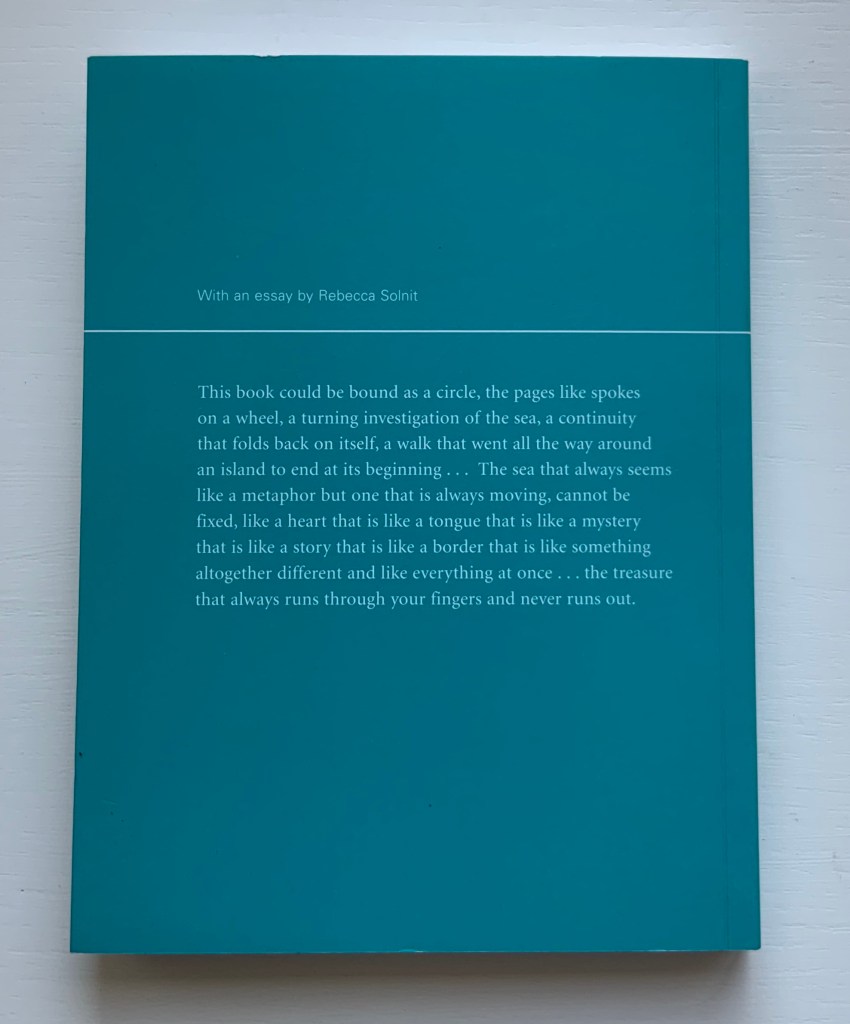
Unravelling the Ripple (2001)
Helen Douglas, Rebecca Solnit
Offset, 170 x 127 mm, 76pp. Perfect bound. Acquired from retail, 15 November 2019.
The opening and close of Unravelling the Ripple. Photos: Books On Books.
Like three of the following works — Illiers Combray, A Venetian Brocade and In Mexico — Unravelling the Ripple takes the reader/viewer on a journey away from the Scottish Borders to one along the coastline of a Hebridean island. Among the book’s many striking features is the precision of alignment across the double-page spreads. Slowly opening, then closing, then opening each spread is as much a pleasure as the sensation of peering through clear water at the sea wrack, urchins and shells. Moving the view from tidal pool to crashing waves and moving from greys to full colour then back to greys, the bookwork delivers on the back cover’s assertions. The assertion that “the book could be bound in a circle”, however, begs for an answer to the question “what if it were bound in a circle?” A variety of more sculptural solutions are possible: one of Hedi Kyle’s “blizzard book” variations or the Chinese dragon-scale binding. Without the codex structure, though, that pleasure of the double-page spreads would be lost. So the work must depend on the reader/viewer’s memory and perception to recognise the beginning in the end.

While Solnit’s essay is lyrically in keeping with the body of the bookwork, it stands apart. Where the livre d’artiste most often begins with the text and follows with the art, Unravelling the Ripple clearly starts with the art.
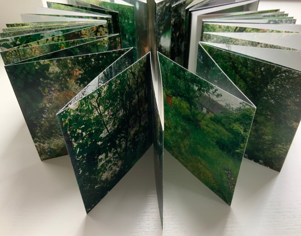
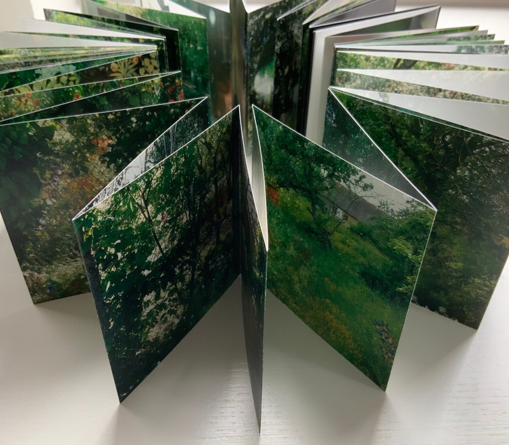
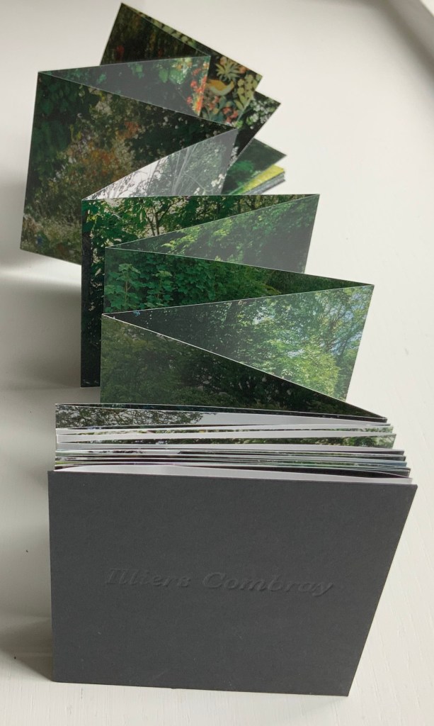
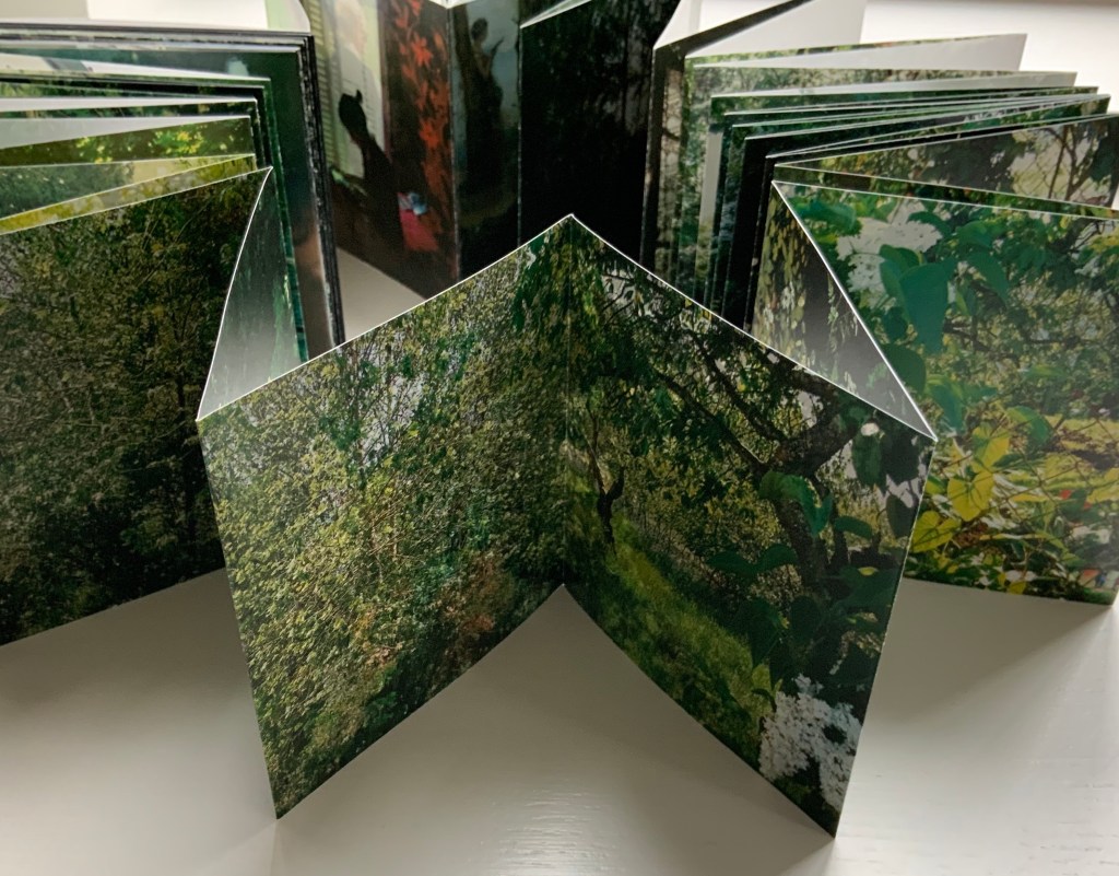
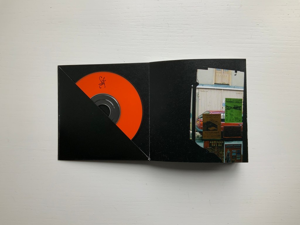
Illiers Combray (2004)
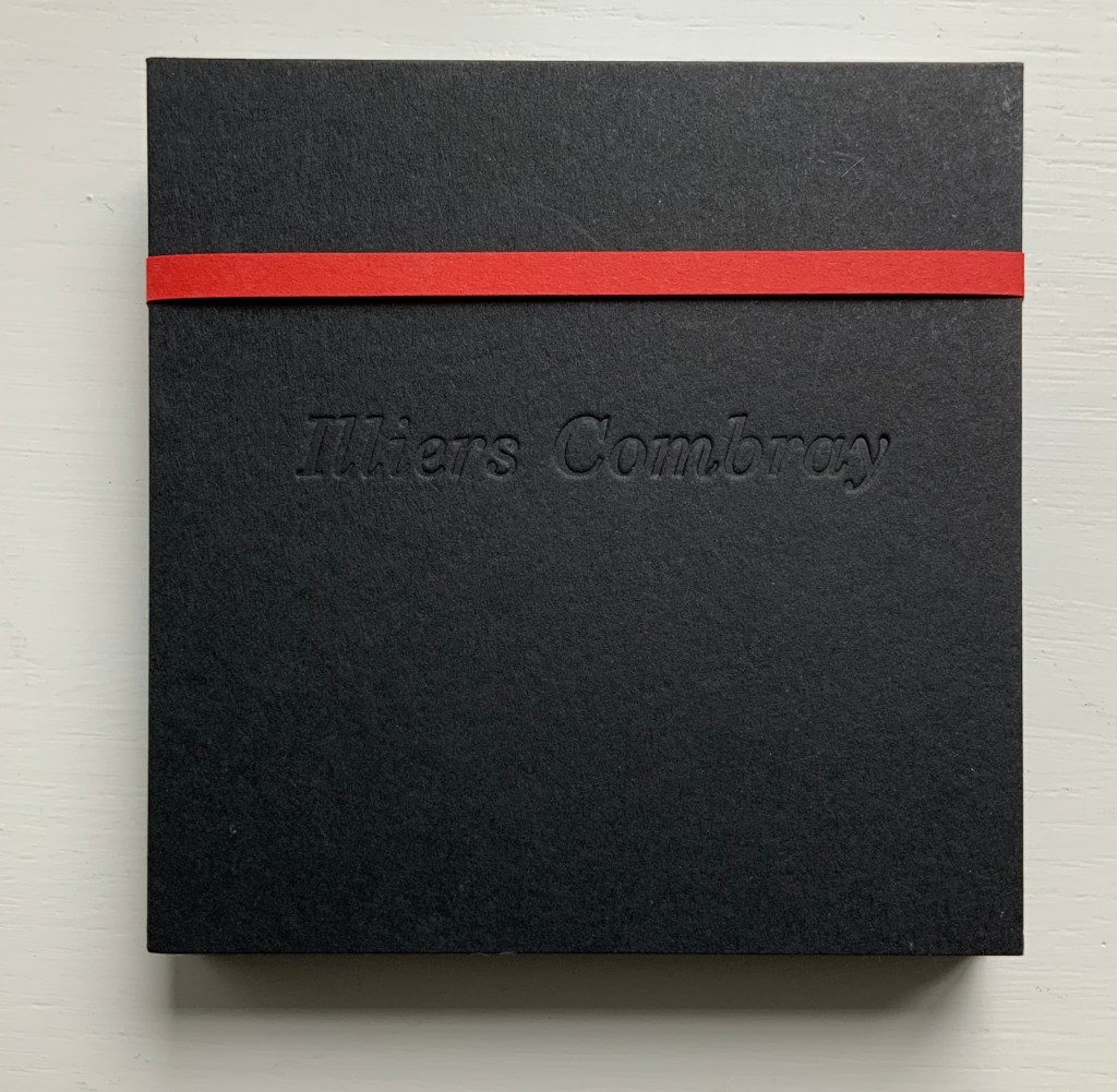
Illiers Combray (2004)
Helen Douglas and Zoë Irvine
Offset, four colour, 92 x 92 mm, 120 pages; two mini audio CDs, (18 mins each) placed in end pockets on board covering the two-sided accordion book; embossed title, red fastening band. Acquired from the artist, 29 November 2018. Photos: Books On Books Collection.
The journey to this small French town immortalised by Proust‘s In Search of Lost Time intensifies a recurrent feature or element of Helen Douglas’s art: the surreal weaving of images (drawn or photographed, present or past) into the photographed townscape and its environs — where the warp of the townscape/environs meets a weft of images taken from paintings, still-life arrangement of objects, poppy-coloured stitches, and words or ornaments that run like strings from panel to panel.
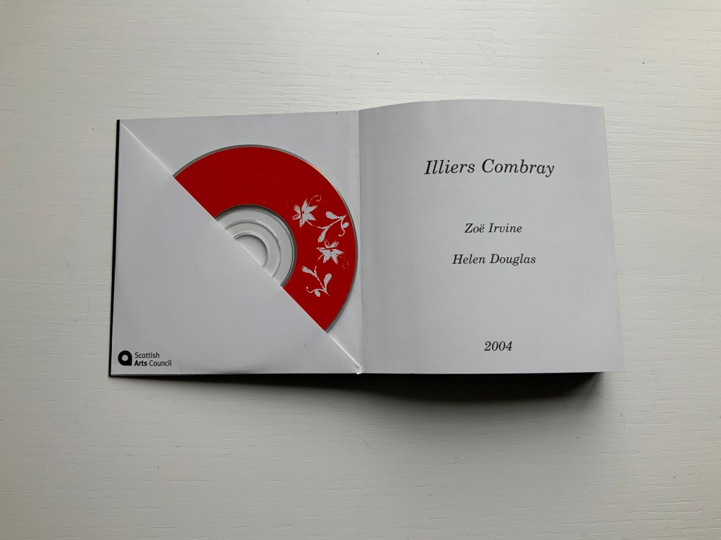
Sound artist Zoë Irvine and visual artist Helen Douglas collaborate to create a richly textured, multi layered soundscape composition (2 CDs: Irvine) and ornately interwoven visual narrative (2 sided concertina book: Douglas), exploring a sense of memory and place. Inspired in the month of May by a week long visit to Illiers Combray, the small town immortalized by Marcel Proust in his epic novel In Search of Lost Time, Irvine and Douglas weave together their own distinct mythologies and reveries; their subjective responses elliptically united by their shared sense of place. This book won the Birgit Skiöld Memorial Trust Award LAB 04 and the Seoul International Book Arts Award 2005.
Weproductions, accessed 26 February 2020.
In their obsolescence and presence in the front and back covers, the two mini-CDs bracket a gap that the artists’ collaborative effort could perhaps only close in performance or an installation. Irvine’s soundscape is available online, which, as long as the link lasts, overcomes the obsolescence of the mini-CDs but not necessarily the gap. Perhaps the technology of augmented reality could close the gap if Douglas integrated NFC (near field communication) tags in a new edition of Illiers Combray.
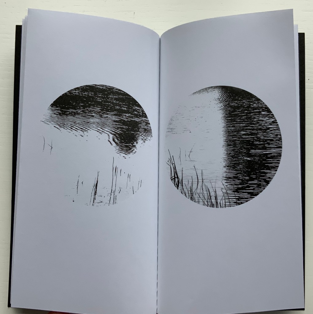
Loch (2005)
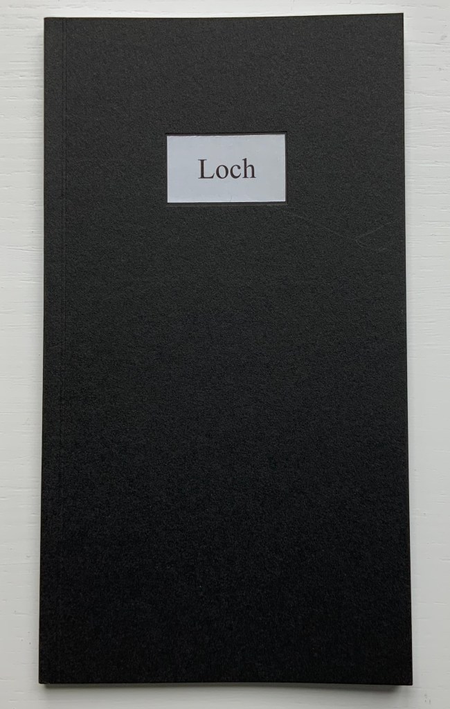
Loch (2005)
Helen Douglas
Offset b&w, french folds, 195 x 105mm, 28 pages; black cover with inset title. Acquired from the artist, 29 November 2018.
Loch consists of twenty images facing each other across eleven uncut leaves. The roundel vignettes capture a sense of wind and light moving across the loch’s surface. These roundels standing in their white space naturally differ from those in Wild Wood. They are more similar to those in a work unfortunately not in the Books On Books Collection: Winter: Celestial Mountain (2015).
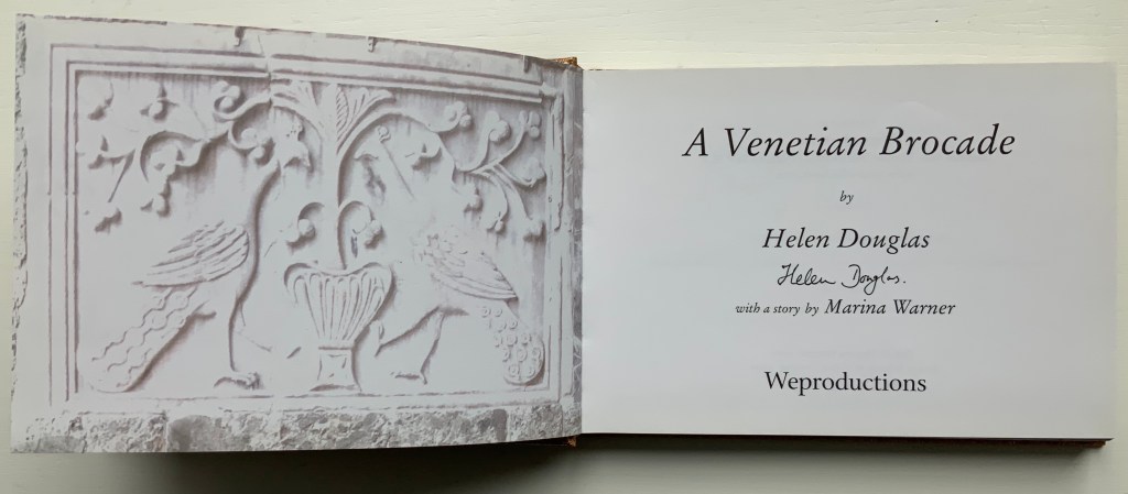
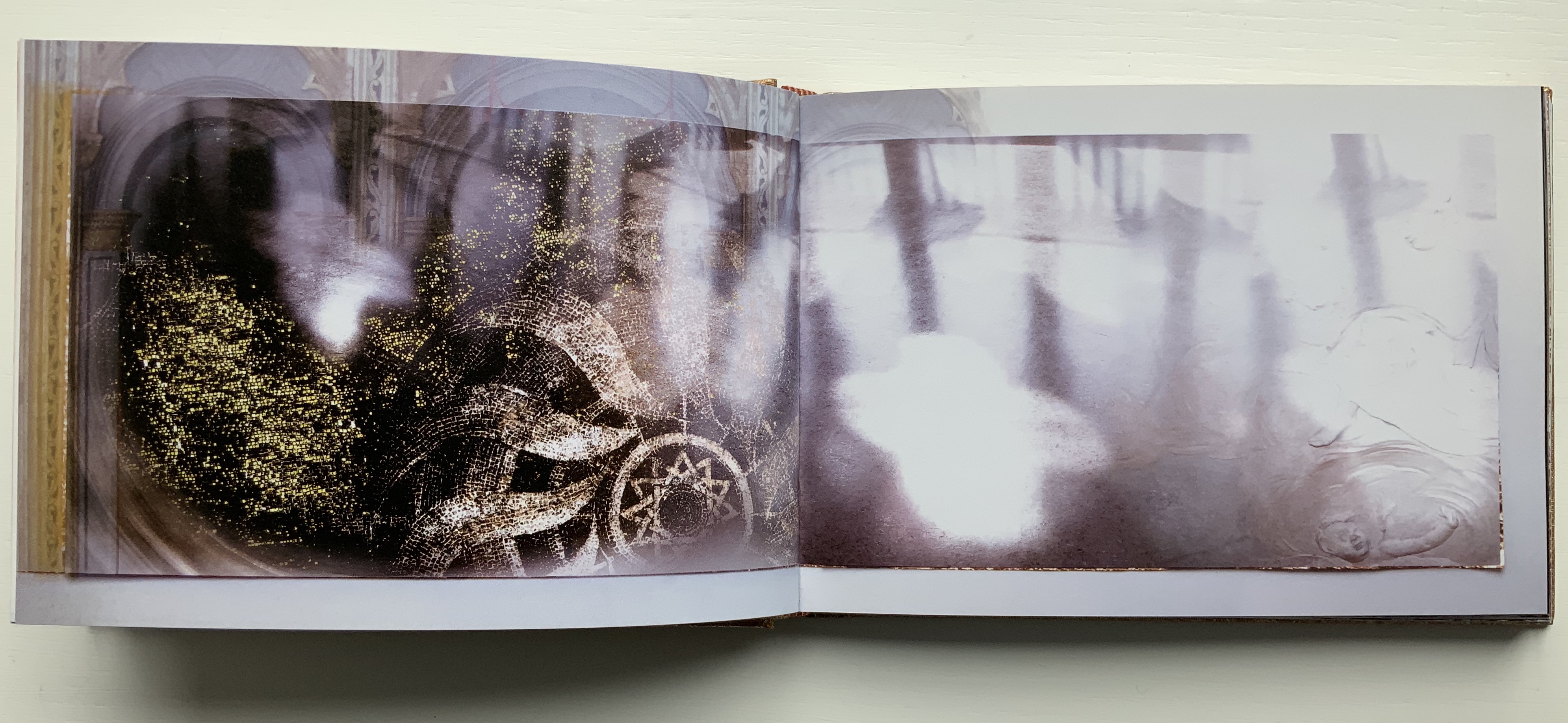
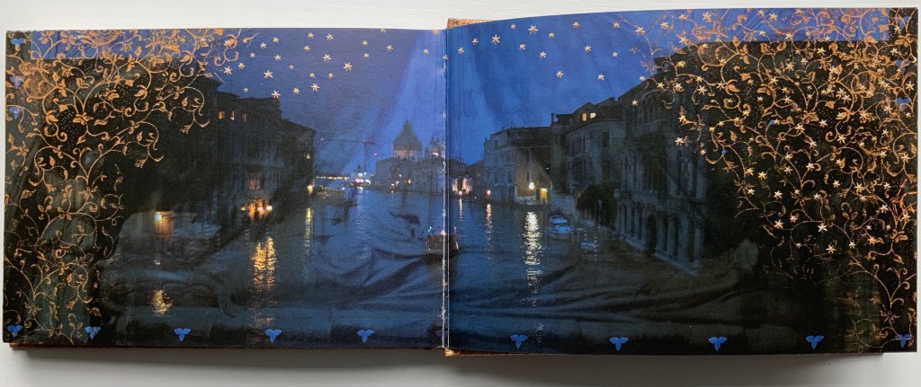
A Venetian Brocade (2010)
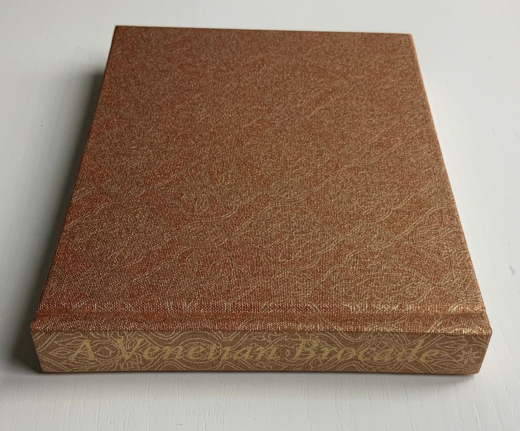
A Venetian Brocade (2010)
Helen Douglas, Marina Warner
Case bound in Ratchfords Inspiration with foil blocking. Offset, four-colour, on Hello Extra Matt 130gsm.
128×180 mm, 180 pages. Acquired from the artist, 6 September 2014.
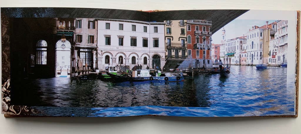
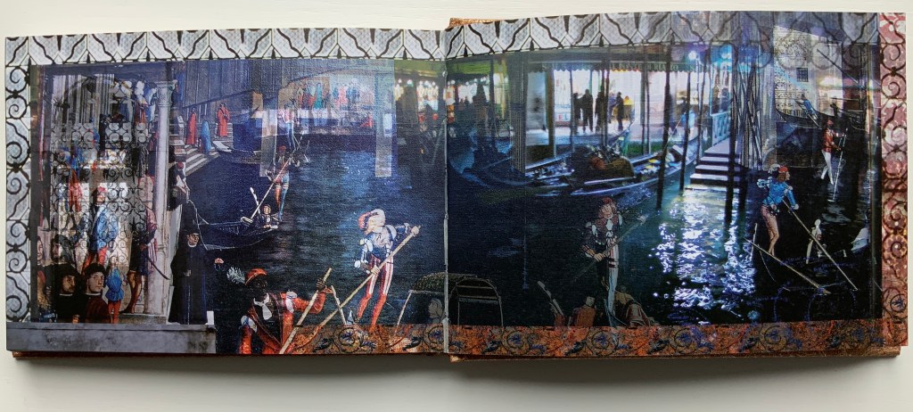
The journey here crosses space (the cityscape of Venice) and time (present and historic figures). The warp-and-weft technique from Illiers Combray blends with the bordering technique from Wild Wood. But what Douglas does with the double-sided accordion format of Illiers Combray and the codex format of A Venetian Brocade attests to her ambidextrous mastery of both.
From Tommaso Mocenigo’s tomb – its great curtain drawn back – the city of Venice unfolds in the hands of Douglas’ rich visual narrative, delighting in textural contrast and intricate layerings. As oneiric zone that Venice embodies, stone, brick, water, inside and out, near, far, night, day, east, west, past in present are juxtaposed and woven as one continuous brocade. Within each landscape-format spread an inner page is floated and embellished at its edge. Borders of brick dissolve as sky, images shift, merge and overlay, water laps and floods, whilst reflective glimmerings morph into mosaic and golden threads. As masterful threading within this Venetian Brocade – at its fore, Marina Warner contributes a dexterous story of unique, wondrous wide-eyed looking from East to West.
Weproductions, accessed 26 February 2020.
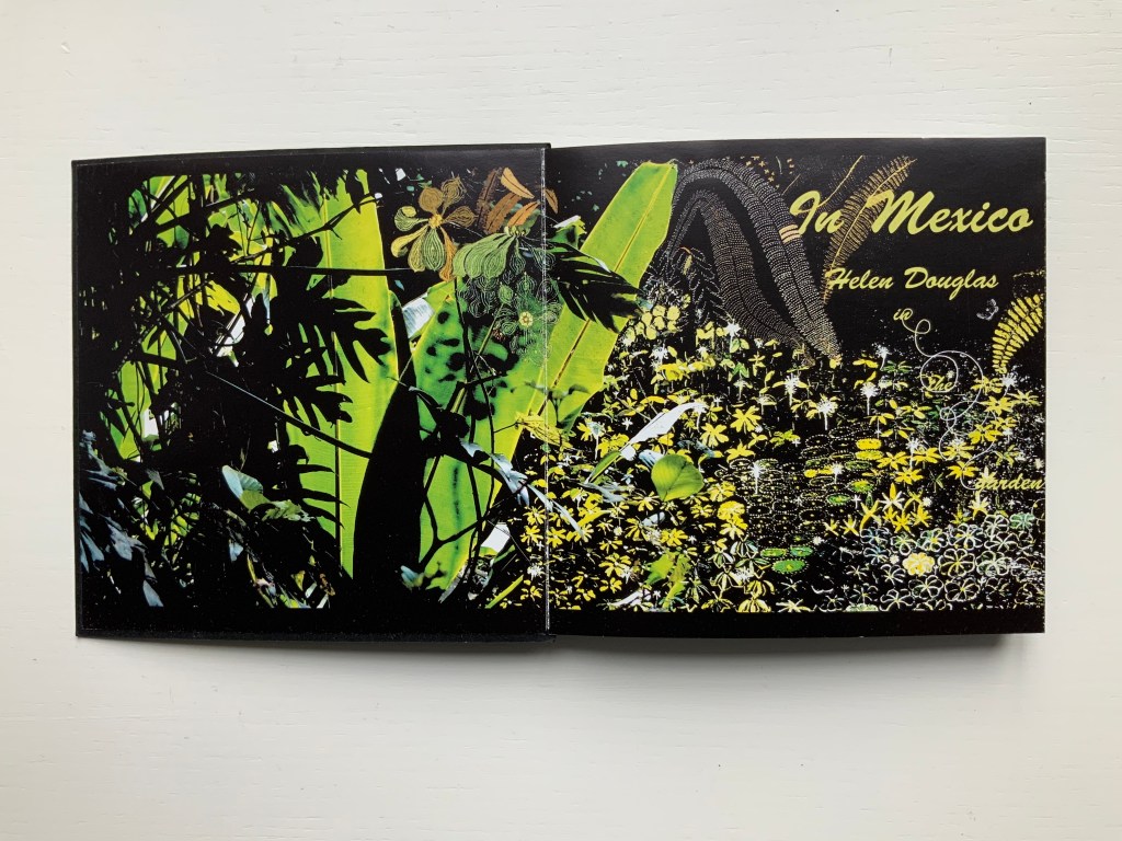
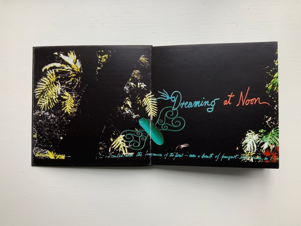
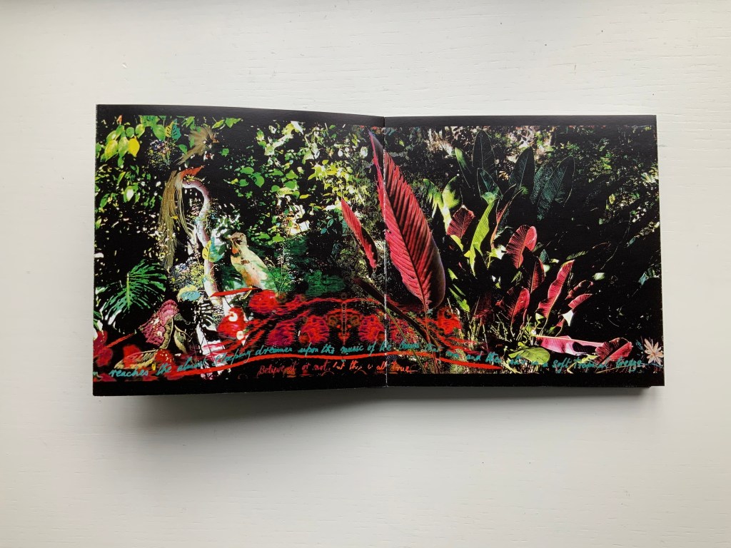
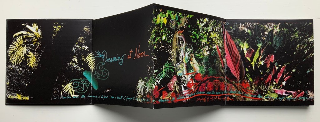
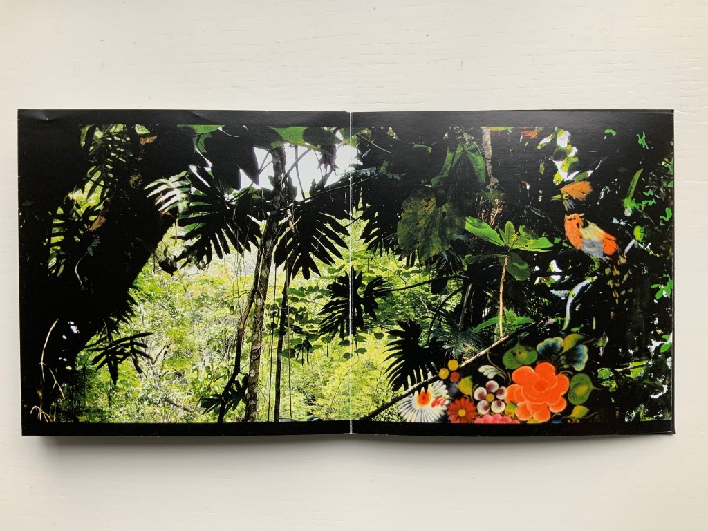
In Mexico (2014)
This concertina opens in vibrant colour to reveal in progressive spreads of two, four and six pages a rich sensory exploration of Edward James’ surreal jungle garden Las Posaz, in Mexico. Lush vegetation intertwines with the constructed buildings and staircases of James’ imagination and with Douglas’ own, in experiencing this garden and the rich culture of Mexico. Within the book the abundant garden is interwoven on the page with decorative threads from Mexican embroidery and feather work. Patterns of leaves are echoed by cut paper craft whilst the delicate encrustation of flora and fauna is enriched with ancient Indian beadwork. With the unfolding pages, from ground to tree tops, the viewer can ascend with the staircases and flit with the butterflies of the garden, suspending gravity and disbelief, venturing through gates and windows to boughs and fern vaults in the sky. And in so doing experience, within the small intimacy of book, something of the unfolding immensity of the garden and its timeless fusion of earth and paradise, real and surreal.
Weproductions, accessed 26 February 2020.
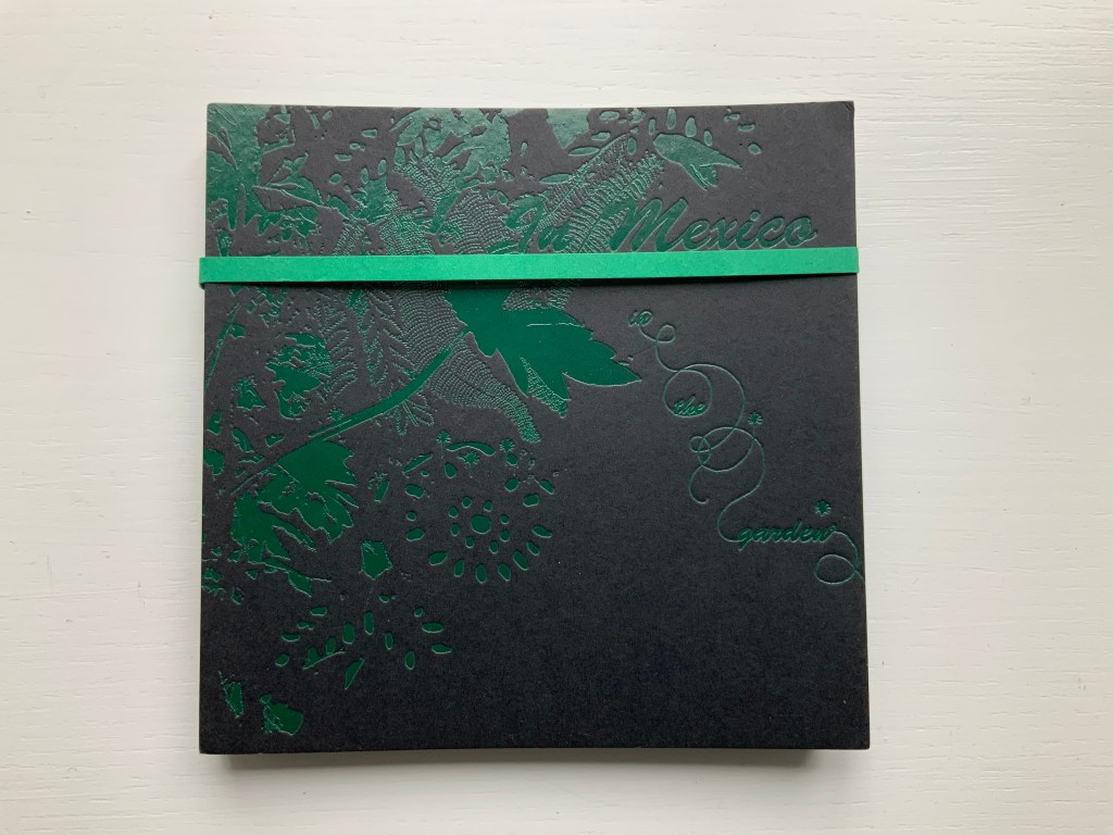
In Mexico (2014)
Helen Douglas
Offset, four-colour, 145 x 145 mm, 92 pages; green paper band around green foiled card covers, enclosing double-sided concertina. Acquired from the artist, 10 February 2015.
Dark Cloud (2015)
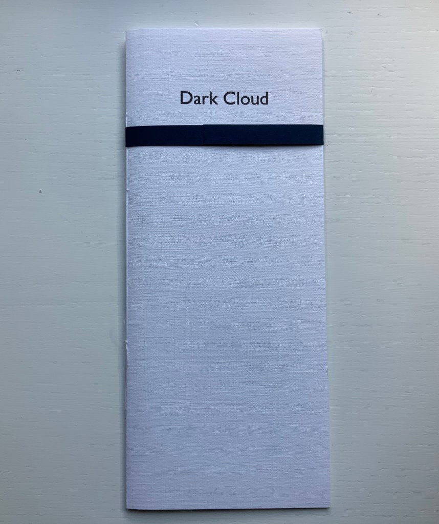
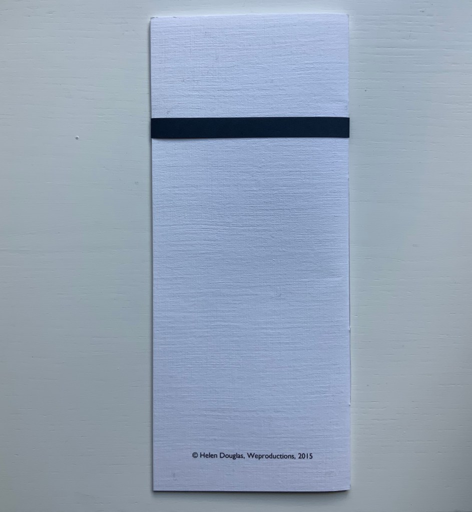
Dark Cloud (2015)
Helen Douglas
Printed on Toshu paper with ultra chrome inks, 105 x 250 mm, 24 pages; blue fastening paper band around card cover over 6 folded leaves hand stitched. Acquired from the artist, 29 November 2018.
The images, colours and texture’s appearance create an expectation that the paper will feel wet to the touch. The double spreads of the unprinted side of the leaves create a surface mist or cloud across the images.
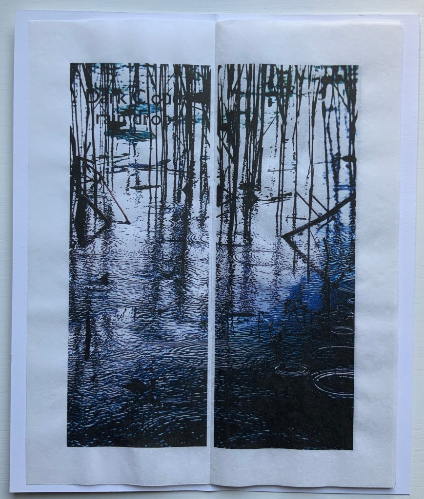
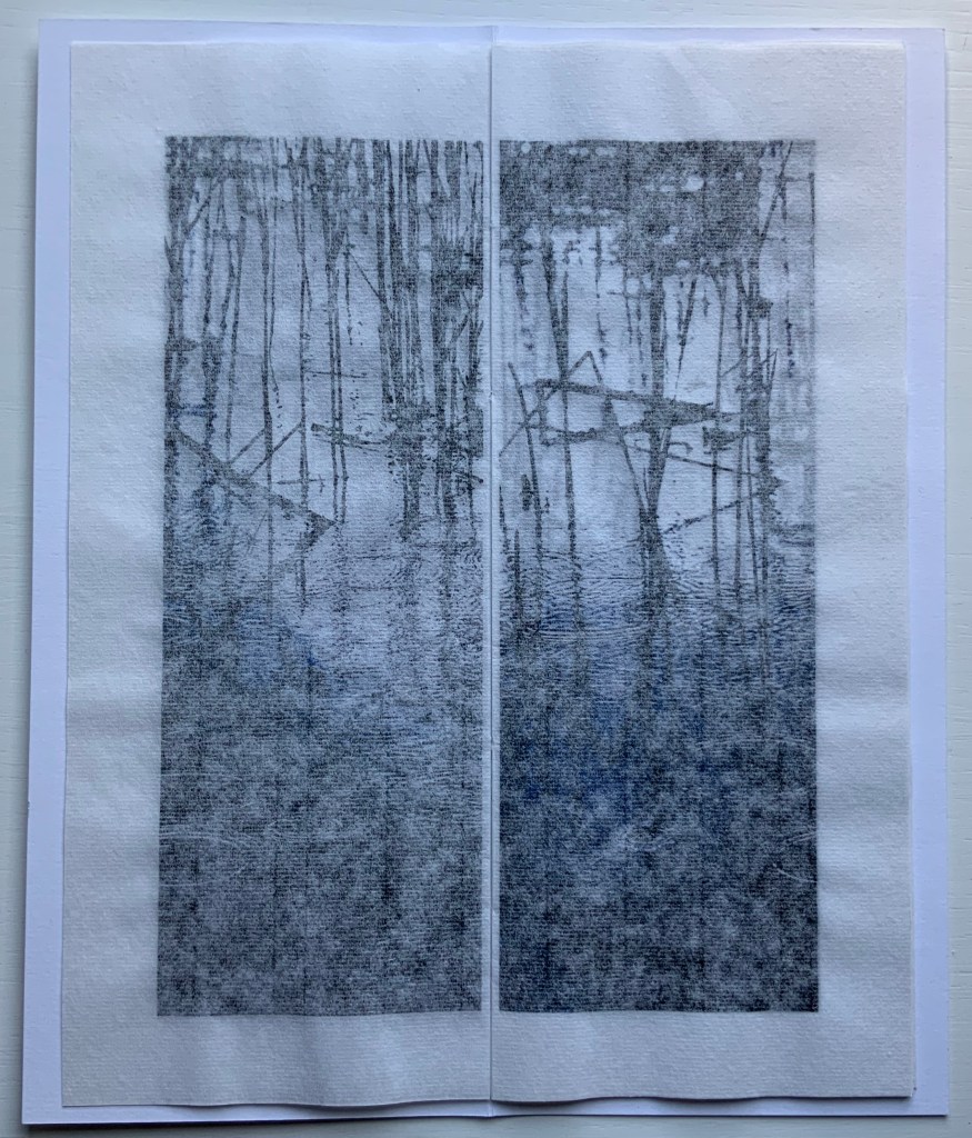
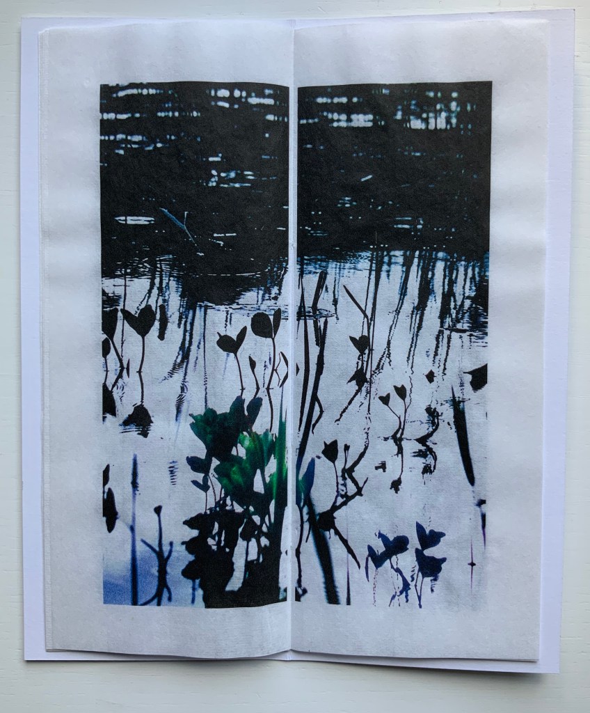
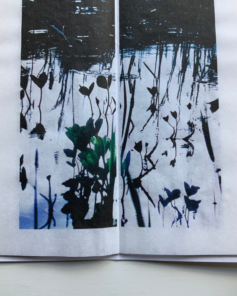
Odd to say, but the physical sensation — of fingers trailing in the water — created by the digital version of The Pond at Deuchar is best replicated by Dark Cloud and the next work.
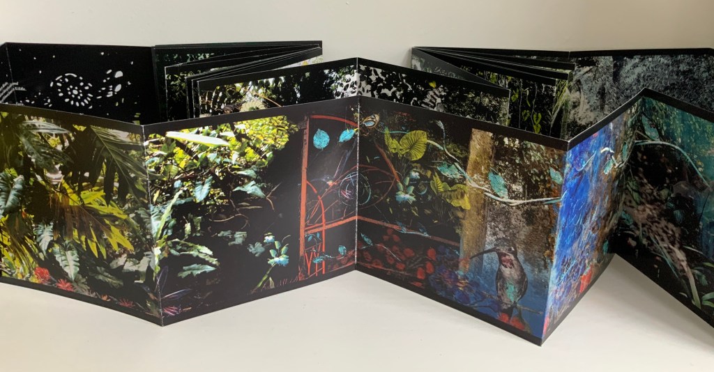
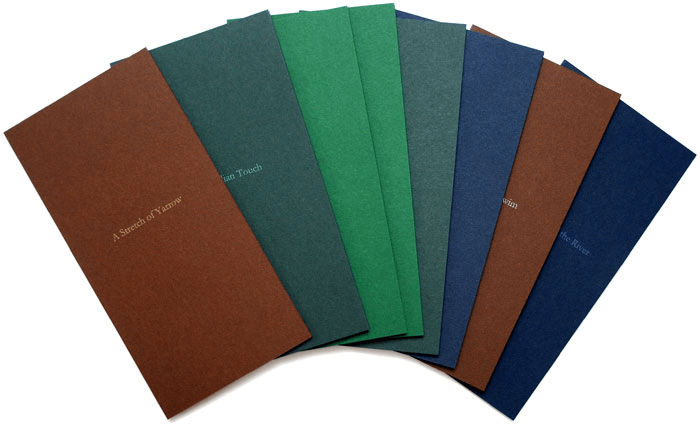
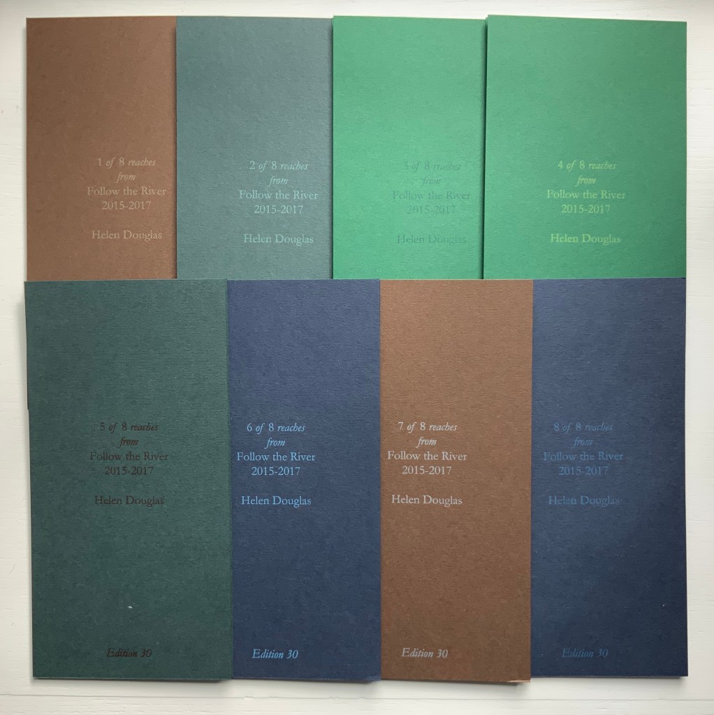
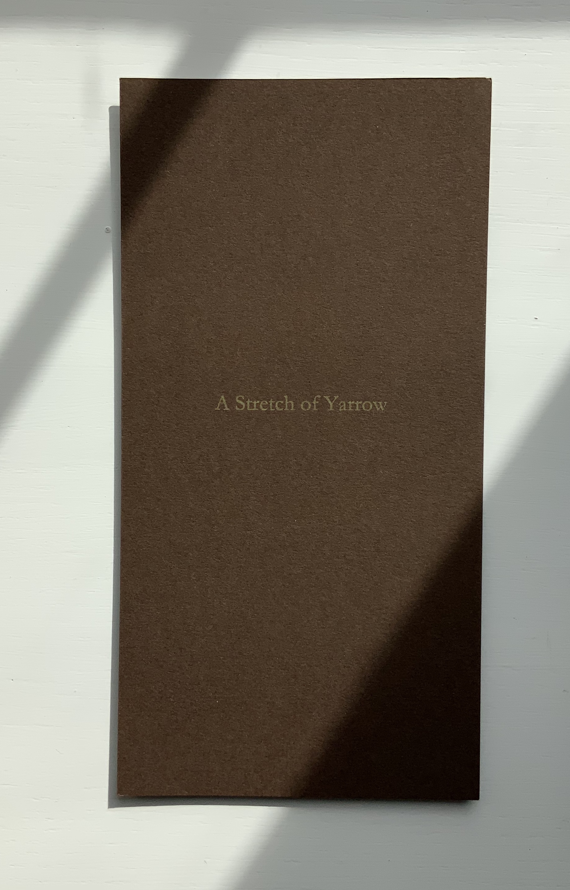
Follow the River (2015-17)
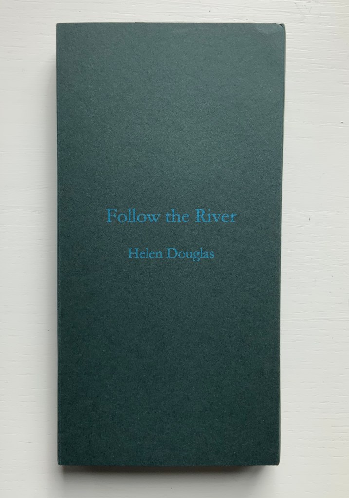
Follow the River (2105-17)
Helen Douglas
A set of 8 books, 930 x 183 mm; concertina binding; varying from 12 to 14 to 16 pages; printed on Chinese Paper, with Surecolour Inks; colour card end covers, letterpress title with back cover information of set number, date and edition; edition of 30, of which 25 sets are encased in a protective card sleeve produced in 4 different colours with the title Follow the River. Acquired from the artist, 29 November 2018.
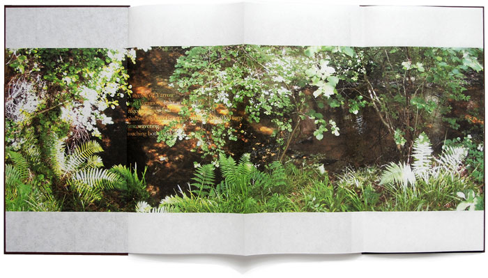
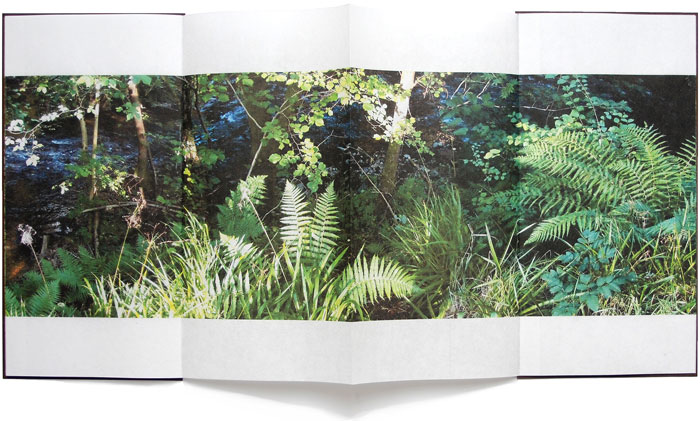
Follow the River (2017) takes the river’s stretches, bordering vegetation, and its seasonal changes as “narrative structure”, yet the eight pamphlets lend themselves to separate viewings and to composite views arranged vertically or horizontally. But this is the wrong way for the reader to seek structure.
Douglas provides a phrase that redirects the quest when she describes “the concertina form as unfolding arm’s breadths, each one with a distinct theme of light, colour and mood” (Weproductions). This returns to the gestures associated with The Pond at Deuchar.
Douglas continues:
Each open spread can be viewed individually, or in runs of 4, 6, 8 or more pages. The first spread contains a text poem, which, integral to the reach of the river draws the eye into the book and a close reading of its pages. Leaves, grasses, ferns, flowers and trees form part of following the river, at its edge. In light and shadow they frame and are interwoven with the water’s movement: its flow, light and shade, and reflective colour, taking in its nuanced surroundings, as one contemplative whole.
Be it scroll, codex or accordion — Douglas’s structural goal would seem to be arrival at that contemplative whole. By leading our hands to think, Douglas takes us with her.
Further Reading
“Bookmarking Book Art – Helen Douglas”, Books On Books, 3 February 2015.
“Bookmarking Book Art – Helen Douglas, Podcast by Bookbinding Now”, Books On Books, 12 March 2016.
“Ellen Lanyon“. 25 June 2024. Books On Books Collection. For comparison of Chinese Whispers with Transformations I (1977).
Admin, studiesinphotography.com. 24 March 2020. “Photography and the Artist’s Book: Helen Douglas in Conversation With Alex Hamilton“. News & Reviews, Studies in Photography. Accessed 15 June 2025. Re Water on the Border: “… with our own press and smaller sheet size we were able to work with many more papers, and to explore the textural relationship between photographic image, print and surface. With the book Mim, an exploration of mimicry in surface pattern and texture of clothing and architecture, we used different textured papers including wallpapers, throughout as an integral part of the visual and tactile reading of the book. We spliced photographic images together at the film stage to build the pages of the book. Flip-flopping images between positive and negative, we were able to drop tone, gain contrast and create negative backing for positive text. This was also possible with Water on the Border (1994), a book made in Scotland and China where line drawings by children were butted up next to photographic images of water and reflections. The latter were screened with a mezzotint half-tone screen which gave a beautiful velvety touch to the image and stroked the paper. The scaffolding armature of horizontals and verticals was made from offcuts of exposed film. Our artwork for the book was no longer layouts of continuous tone bromides but layouts of half-tone film.”
CDLA (Le Centre des livres d’artistes). “Helen Douglas — Telfer Stokes”, le cdla: Expositions publications et collection de livres d’artistes, 26 February 2020. Accessed 26 February 2020. A “catalog raisonné”-like listing of 30 works by Douglas, 9 of which are co-creations with Telfer Stokes.
Douglas, Helen. Video of talk on The Pond, given at Winchester School of Art, University of Southampton on 20 March 2013.
Graham, Brandon S. “Telfer Stokes”, FictionDoldrums, 8 April 2011. Accessed.17 March 2020. Commentary on Chinese Whispers.
____________________. “A Venetian Brocade and other topics“, FictionDoldrums, 4 June 2011.
Perkins, Stephen. 19 November 2015. Helen Douglas, In Mexico: in the garden of Edward Jones, Weproductions: Yarrow, Scotland, 2014. accordionbooks.com.
Perkins, Stephen. 19 March 2016. Helen Douglas and Zoe Irvine, Illiers Combray, Aeolus & Weproductions, 2004, 2nd edition. accordionbooks.com.
Taylor, Chris. “Books, Scrolls and Ripples: In Search of an Audience through the Printed Works of Helen Douglas”, Arts 2020, 9(1), 35.
Williamson, Beth. “What Does It Mean Not to Touch a Book?” in Code—X, edited by Danny Alfred and Emmanuel Wackerlé (London: bookRoom, 2015), pp. 01:53-2:06.
Williamson, Beth, and Eileen Hogan. Project: Transforming Artist Books, Tate Library, February 2012 – August 2012.
