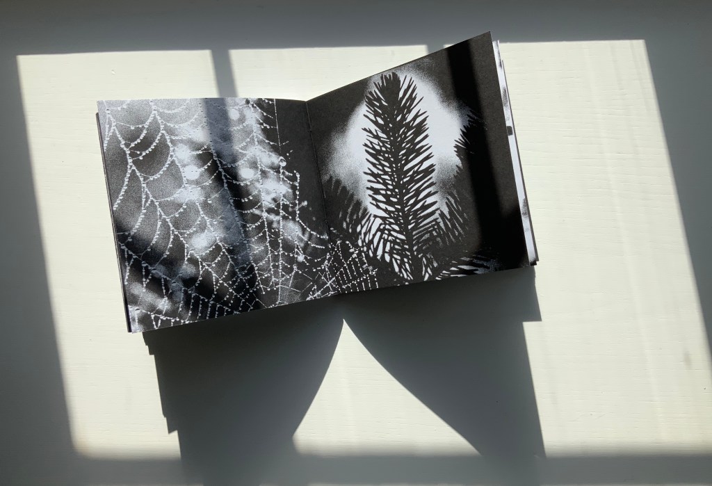
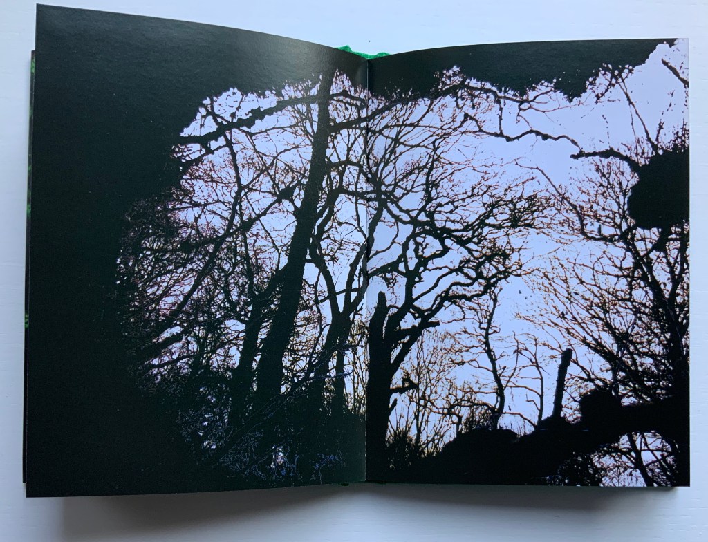
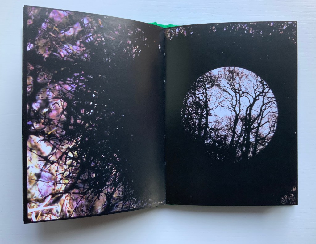
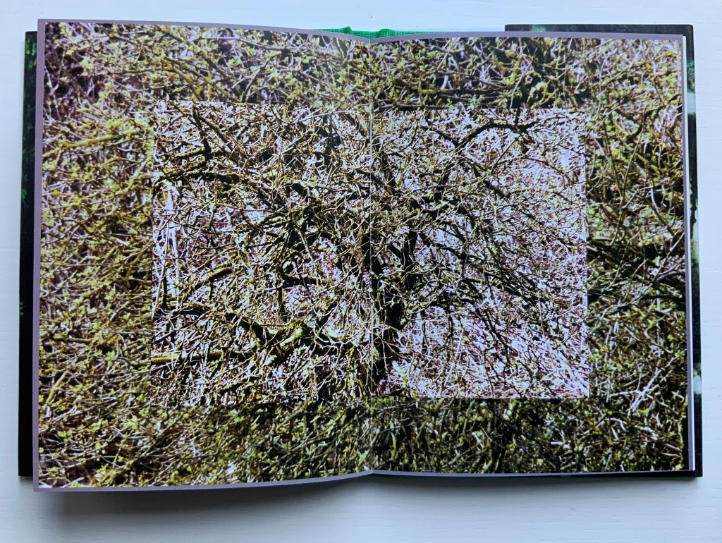
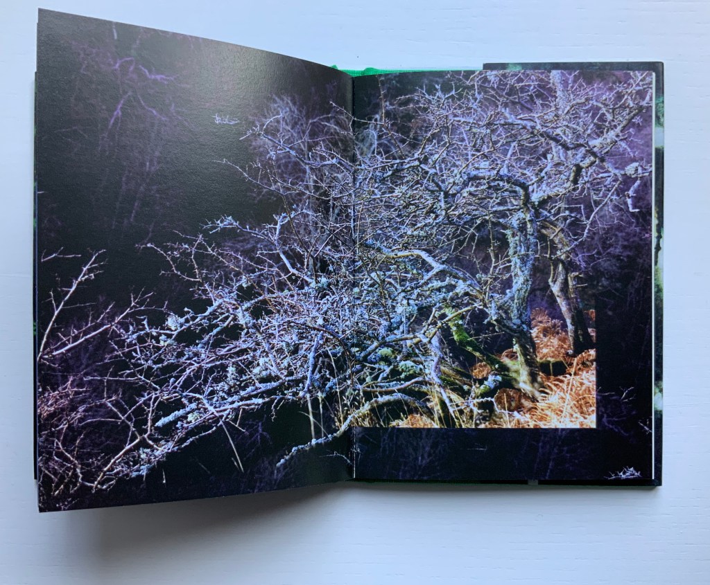
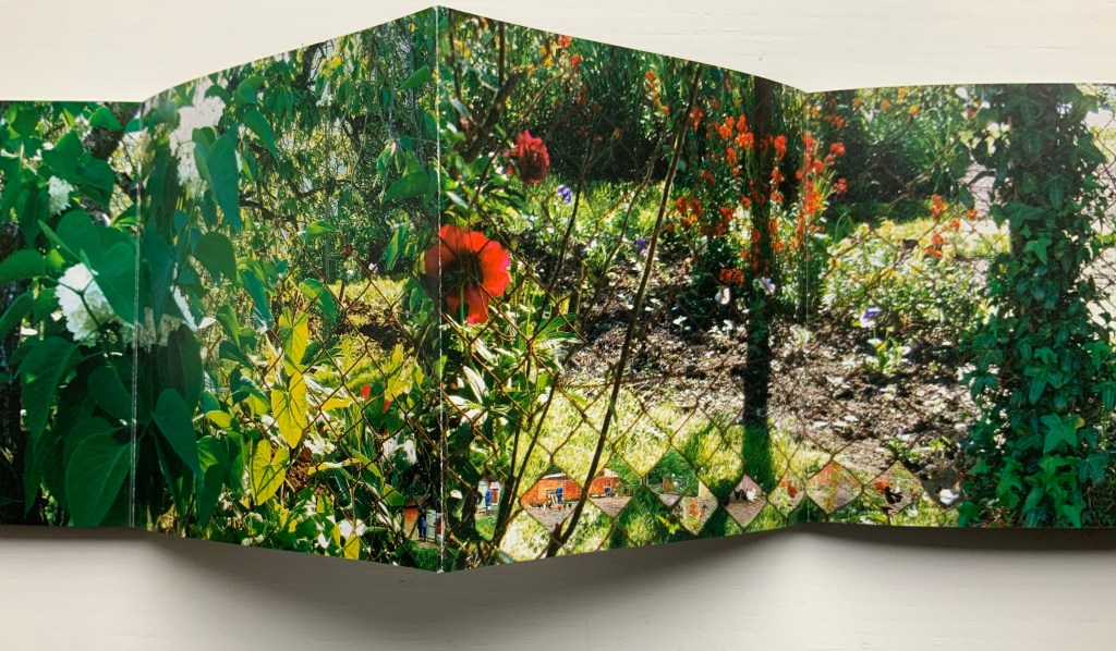
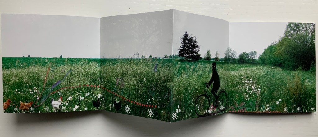
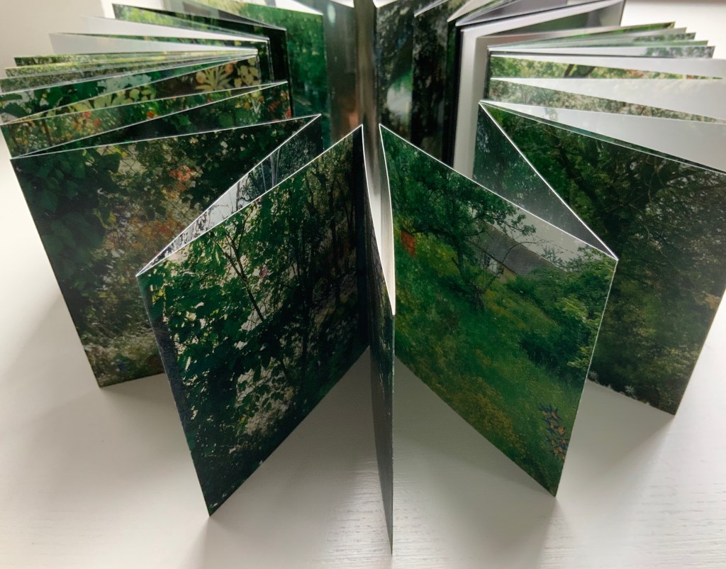
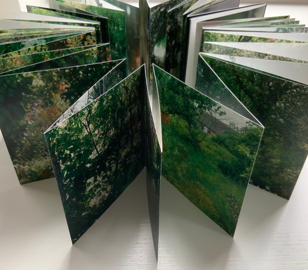
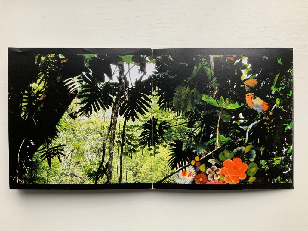
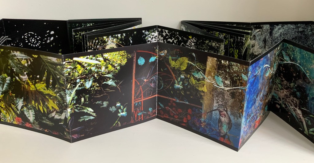
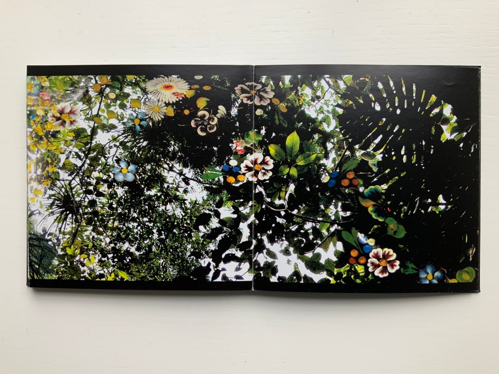
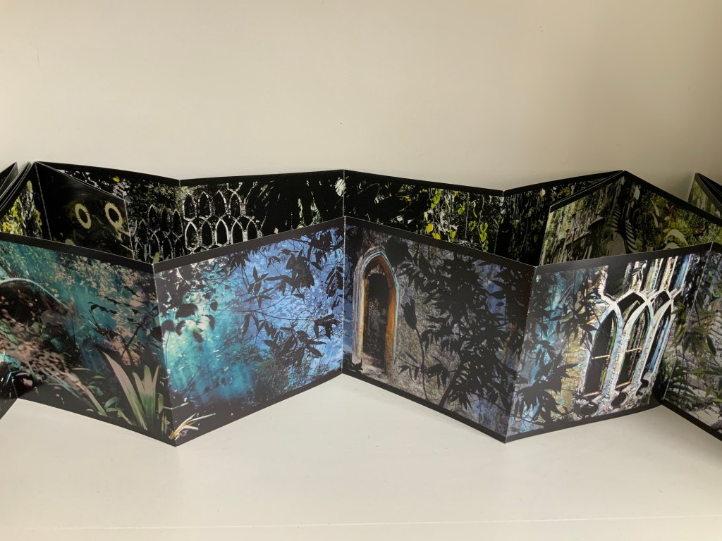
Marlene MacCallum achieves distinctive results by painting with photography and sculpting with book structure in her artist’s books. Her painting with photography has involved not only collage work but pinhole cameras, digital cameras, digital layering and masking as well as a variety of transfer processes — digital and analogue photogravure, lithography, digital pigment printing, and digital inkjet printing. Sculpting with book structure mainly includes varying the binding as in the accordion with fold-out of Obvert (1997), the tunnel book structure of Do Not Enter (1998), the gatefold of Domestic Arcana (1999), the tile format fold-outs of pink story (2004-05), the accordion of Quadrifid (2009), the dos-à-dos of Glaze: Reveal and Veiled (2013), and the Miura fold of Rise (2020). It also includes altering books as in Withdrawn (2010) and varying the substrate as in the lace paper, Moriki, double matte Mylar, Lanaquarelle, and embossed leather of Townsite House (2006) and the etched copperplate and Tyvek of Trompe l’Oreille (2011).
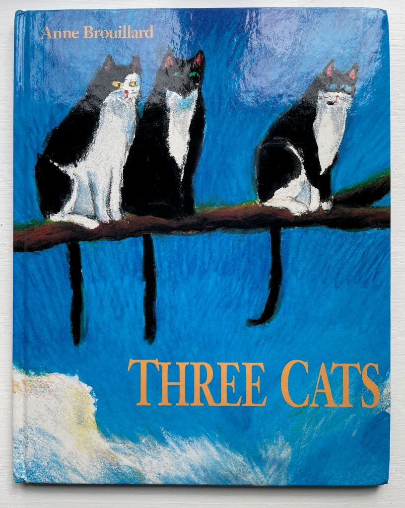
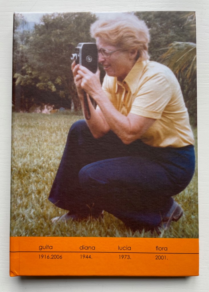
Three Cats (1992) Anne Brouillard Casebound, illustrated paper over boards, sewn, dustjacket. H280 x W223 mm. [28] pages. Acquired from private seller, 27 August 2023. Photos: Books On Books Collection.
This wordless picture book tells a humorous brief tale of three curious cats and three insouciant fish. It marks an early stage in Anne Brouillard’s journey from picture book artist to book artist.
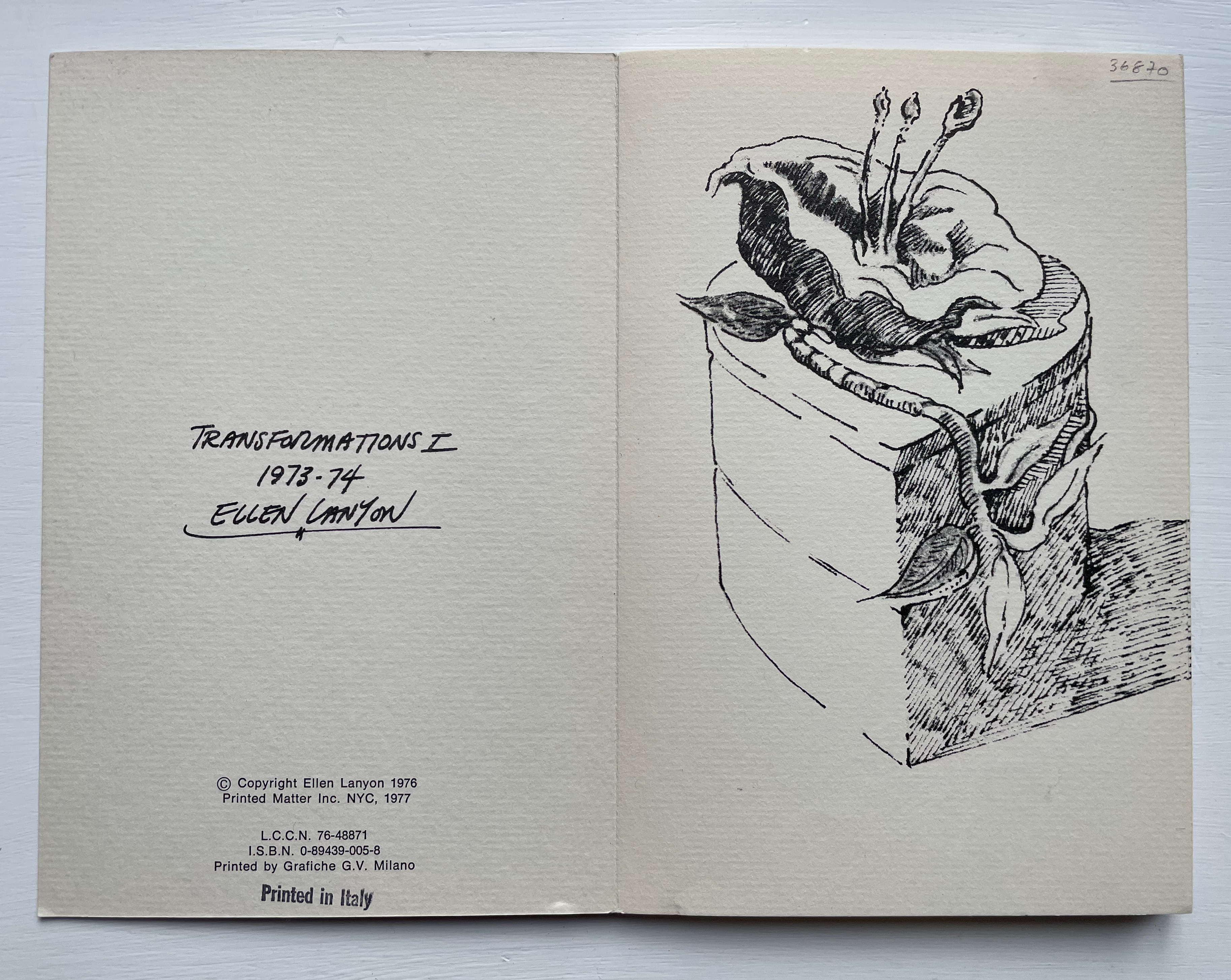
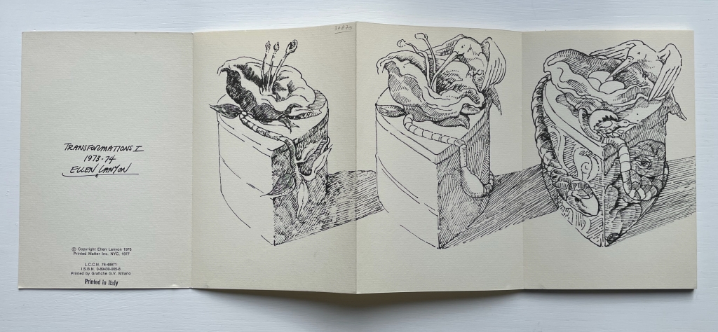
Transformations is a book as drawing. Across 24 panels of this accordion-fold book, Ellen Lanyon develops a surreal graphical fantasia from a single image.
A photographer since 1991, Brazilian Lucia Mindlin Loeb turned to the book as the surface and form for her art. Works such as Livro sobre Livros (“Book about Books“), Entre páginas (“Between Pages”) and Biblioteca (“Library“) speak to an academic fascination with the structural elements of the book — especially its volume, edges, pages and spine. Along with Memória fotográfica (“Photographic memory”), they explore what photography and the book can tell us about time, space, memory, the world we see and a familial experience of it. The works below from the Books On Books Collection show only a fraction of how far beyond the photobook Loeb has gone.
Abismo (2012)
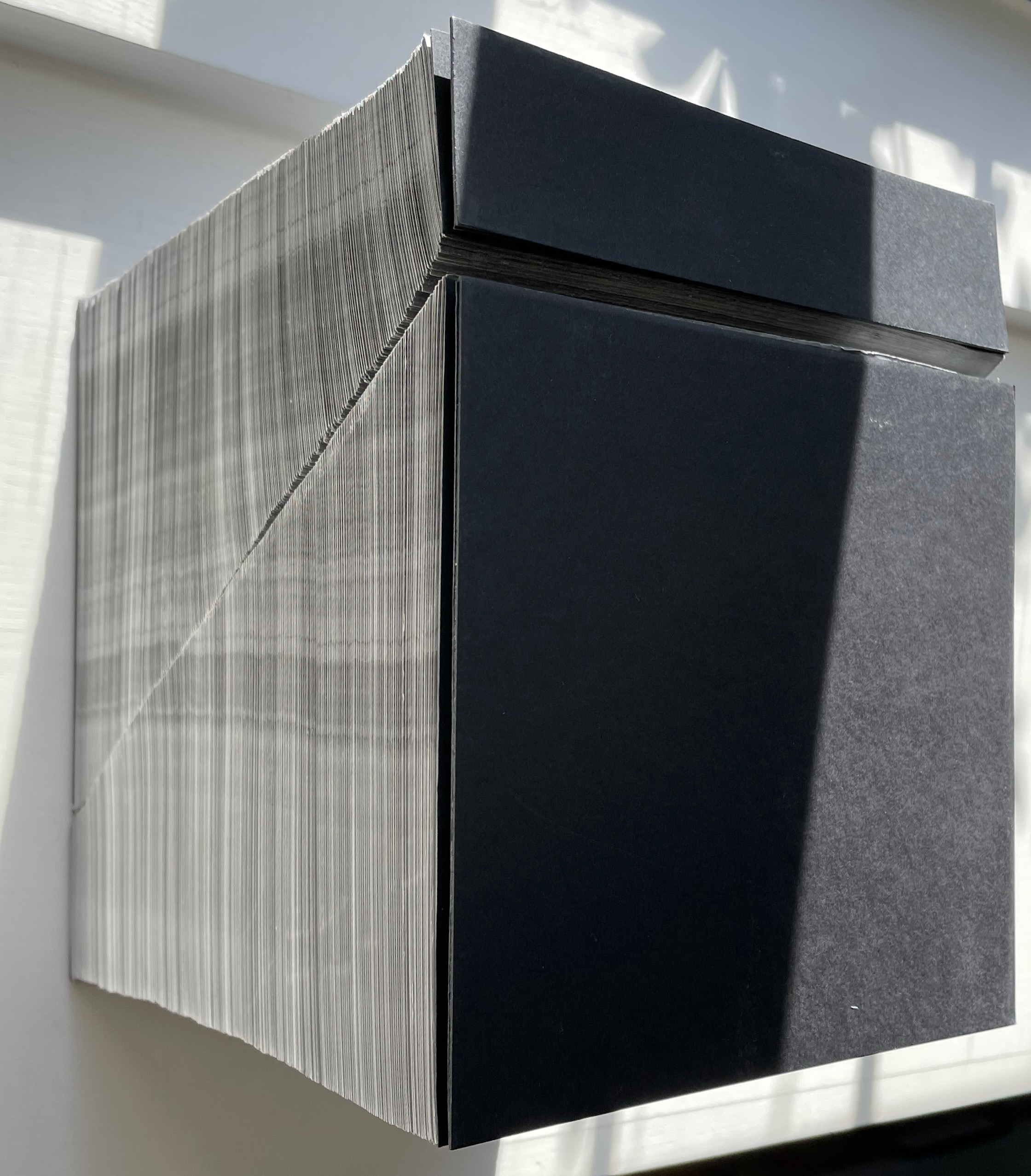
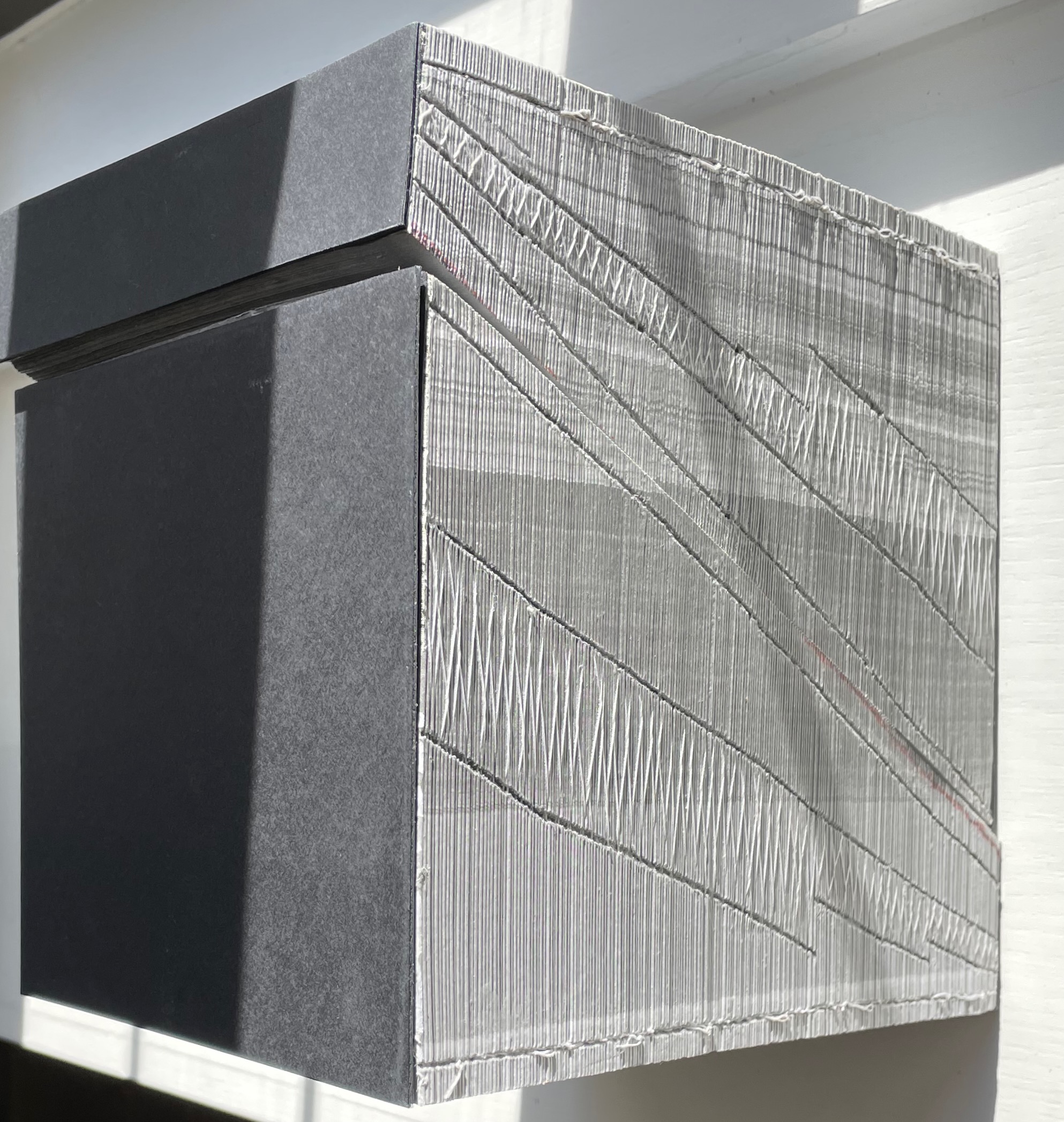
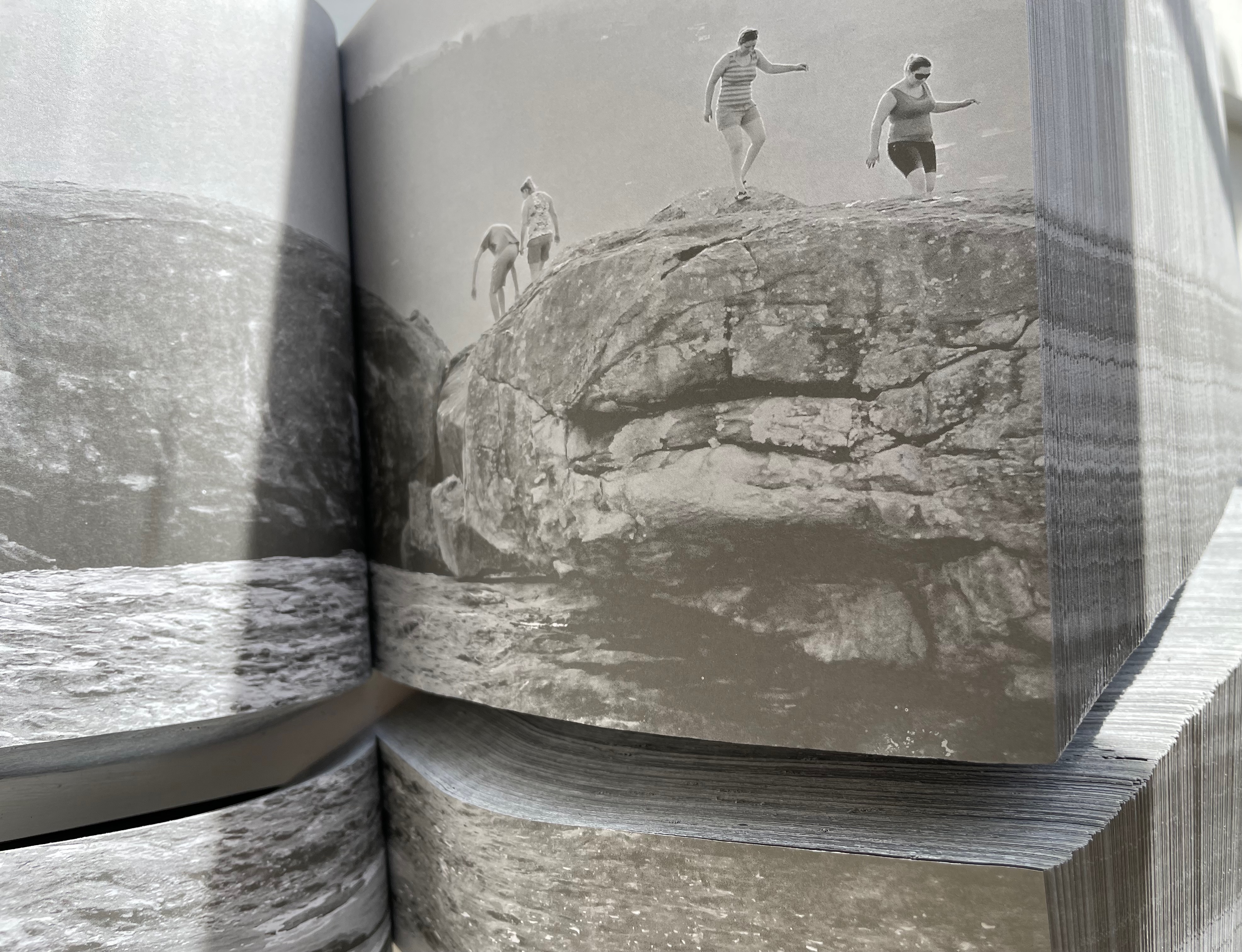
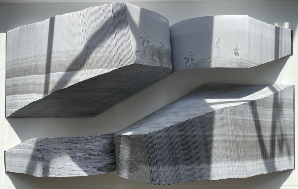
Abismo (2012) Lucia Mindlin Loeb Front and back card covers on a sewn, exposed-spine book block cut diagonally into two volumes, each housed in a custom archival box. H210 x W210 x D175 cm. Edition of 5 and 2 artist’s proofs, of which this is A/P #2. Acquired from the artist, 5 October 2022. Photos: Books On Books Collection.
Fore-edge view (L) and spine view (R) of the cut halves resting against each other.
Close up of spine.
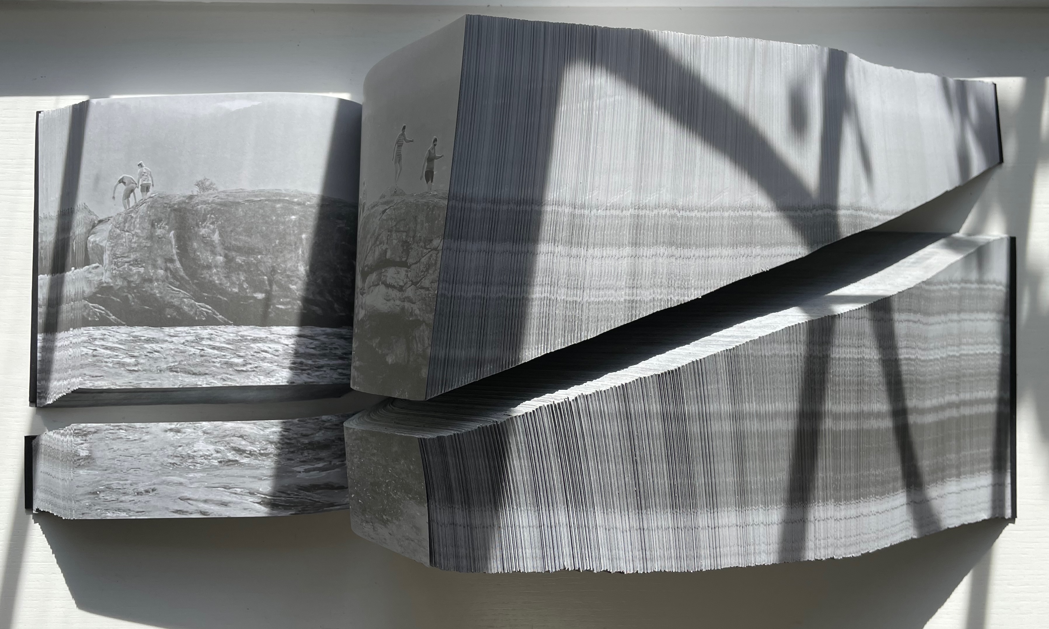
With the two halves open and positioned properly, their parallel opening and page turning soon creates a disorientation. The top half thickens and narrows, while the bottom half thickens and deepens.
Below, a close-up view of the abyss and the cliffwalkers evokes a sense of precariousness and vertigo.
Few books allow views of double-page spreads simultaneously from two different places in the book, and varying the position of the two halves can widen the abyss.
The brief clip below conveys more of the disorienting effects that “reading” this work offers. Perhaps the same feelings the cliffwalkers experienced.
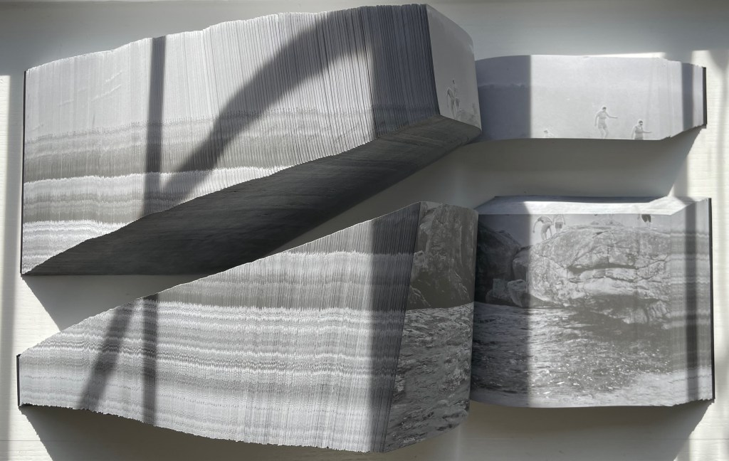
Devaneio (2015)
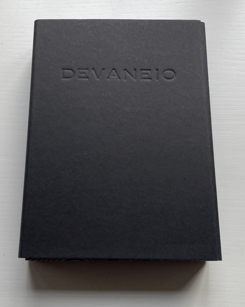
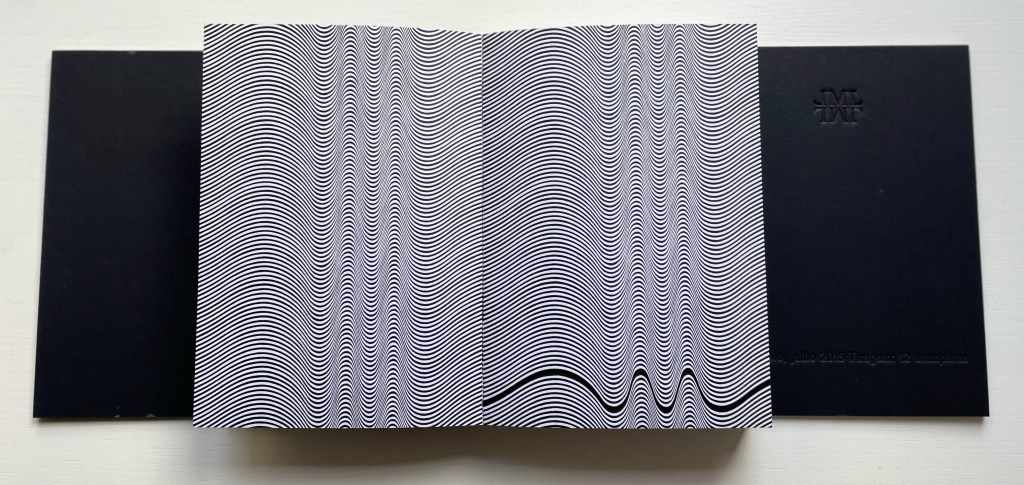
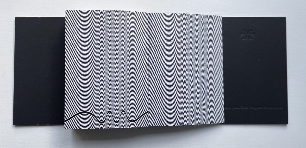
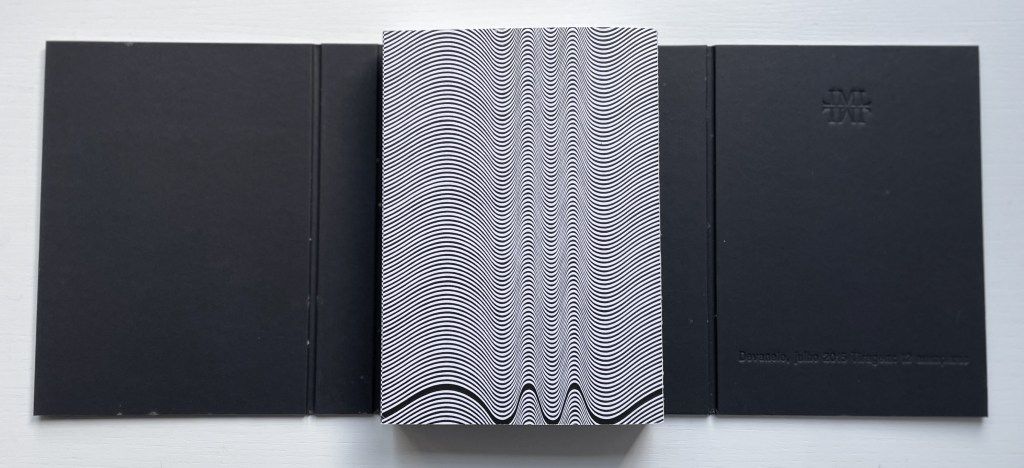
Devaneio (2015) Lucia Mindlin Loeb Exposed spine book block, handsewn and glued, loose in trifold case. H180 x W130 x D3 mm. 384 pages. Edition of 12, of which this is #5. Acquired from the artist, 5 October 2022. Photos: Books On Books Collection.
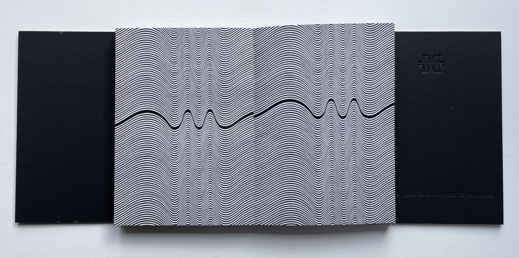
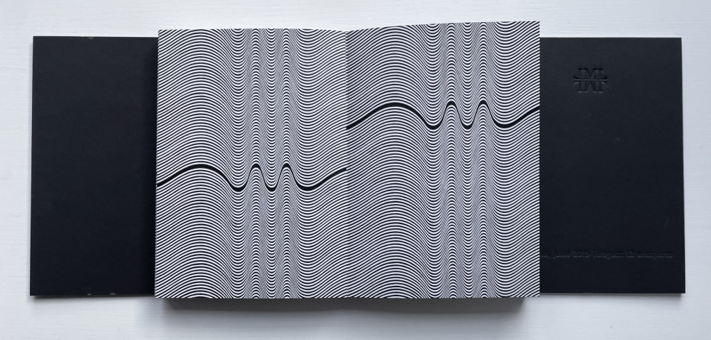
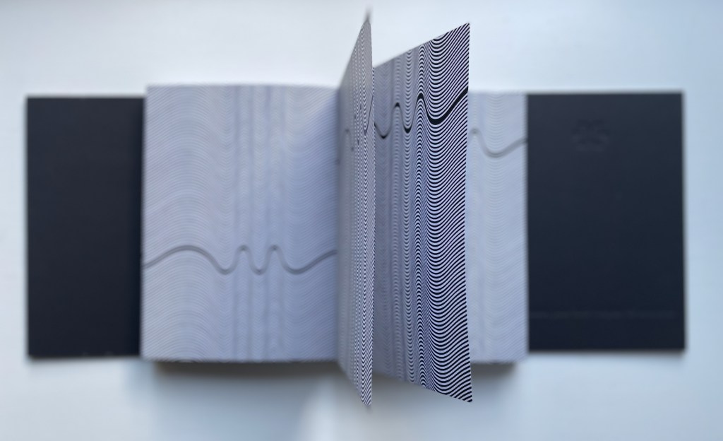
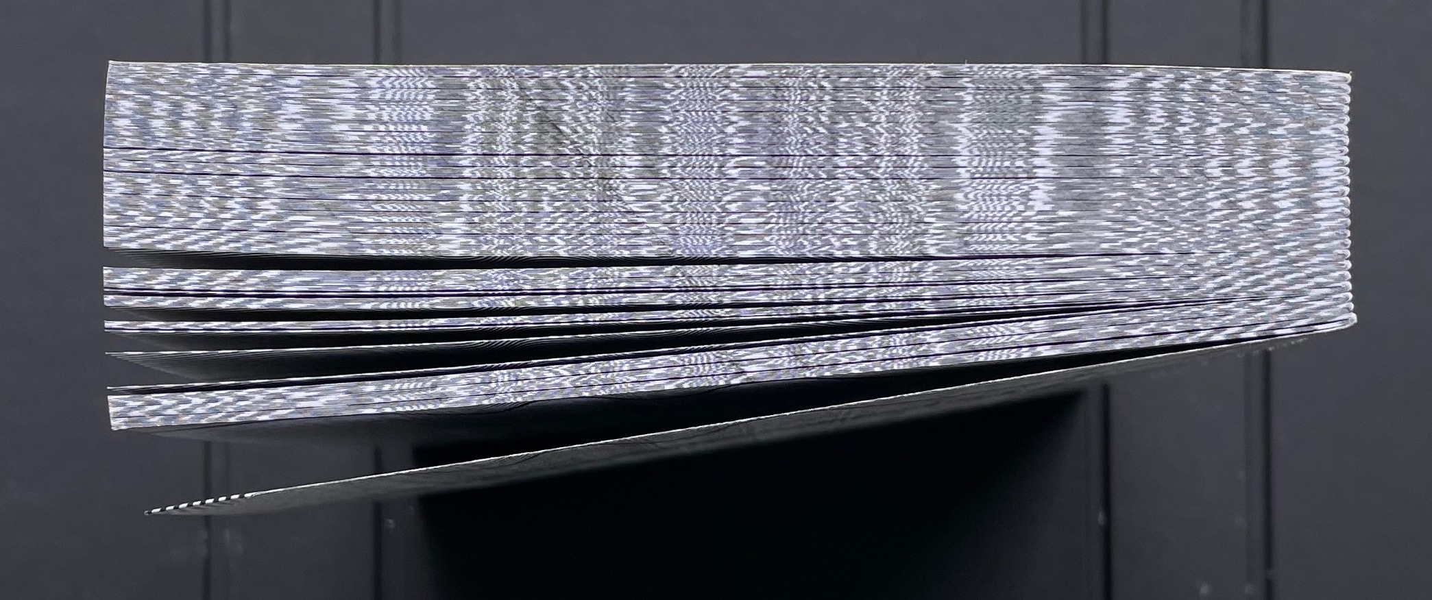
Devaneio means “daydream”, which is certainly elicited by the thick black line undulating over the hills and valleys optically created by the thinner lines parallel to each other and the thicker line. Over the first seventeen pages, the thick line appears only at the bottom of the recto page, but almost imperceptibly rises up the page.
First recto page
Seventeenth recto page
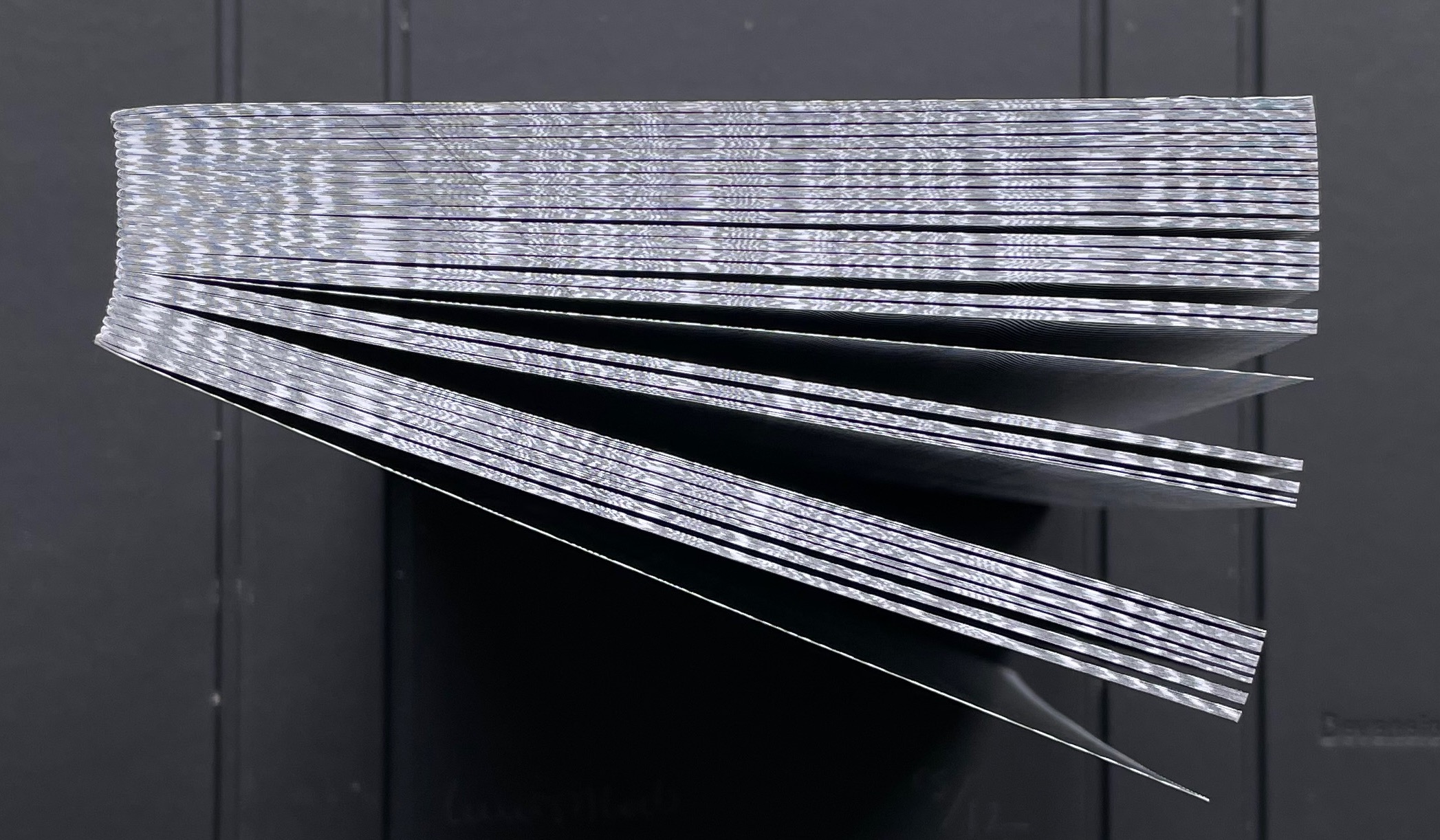
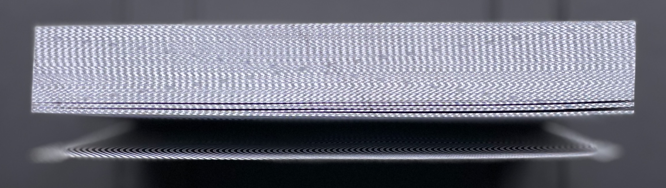
As the seventeenth recto page turns, another thick line begins its descent seemingly from outside the top edge of the eighteenth verso page. From here on, in their respective downward and upward movements, the thick lines on the verso and recto pages appear headed for convergence. The stroboscopic effect of the background of tightly packed thinner lines enhances this appearance of downward and upward motion. Although they converge, the thick lines skip over any direct intersection and continue their journeys toward the bottom edge of the verso page and top edge of the recto page.
The thick line on the verso page makes its appearance.
The lines begin to converge,
but do not intersect.
The lines diverge, the verso continuing downwards and the recto, upwards.
As the daydream begins to end, the upward bound thick line has almost disappeared at the top of its recto page. As the page turns, only the downward bound thick line remains to finish its journey at the bottom of the last verso page, the last page of the book. Of course, the the thick line’s end position on the last verso page is the same as its start position on the first recto page.
The upward bound thick line almost gone on the recto page.
The thick line has gone from the recto page.
The thick line at rest on the last verso page.
The crossover of the verso and recto thick lines can be observed on the book’s fore edge, and the thinner lines’ stroboscopic effect shows up even on the top and bottom edges.
Devised by Robert Sayer (1756), “harlequinade” was a form of children’s book. Also called a “metamorphosis” or “turn-up” book, its pages were cut horizontally so that their parts could turn independently of one another and generate amusing mix-and-mismatch images. Book artists such as Emily Martin have seized on the form to great satirical effect.
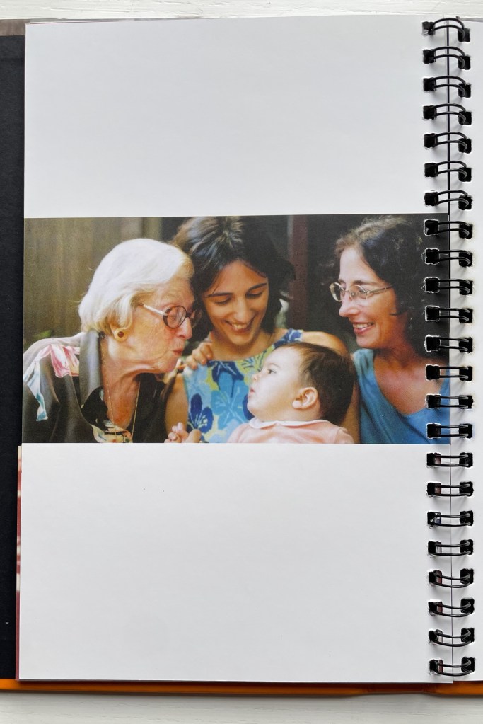
Loeb’s “Memories of You” maintains the form’s comic nature but blends it with the forms of the photobook and family photograph album to deliver a whimsical and sentimental celebration of four generations. Loeb plays her title’s deliberate ambiguity out with the form’s interchange of resemblances in faces, poses and costumes and lifts her work out of mere sentimentality. The video below provides a better view of the work than would photos of the book.
The sculptural mastery in Loeb’s works makes for intriguing and enjoyable comparison with that of Doug Beube, Andrew Hayes and Guy Laramée in the Books On Books Collection, while the photographic mastery calls up Scott Kernan, Marlene MacCallum and Michael Snow for similar revisits.
Further Reading
“Doug Beube“. 21 April 2020. Books On Books Collection.
“Andrew Hayes“. 4 September 2019. Books On Books Collection.
“Guy Laramée“. 18 September 2019. Books On Books Collection.
“Scott Kernan“. 22 February 2019. Books On Books Collection.
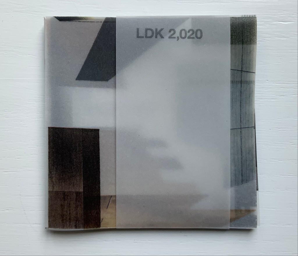
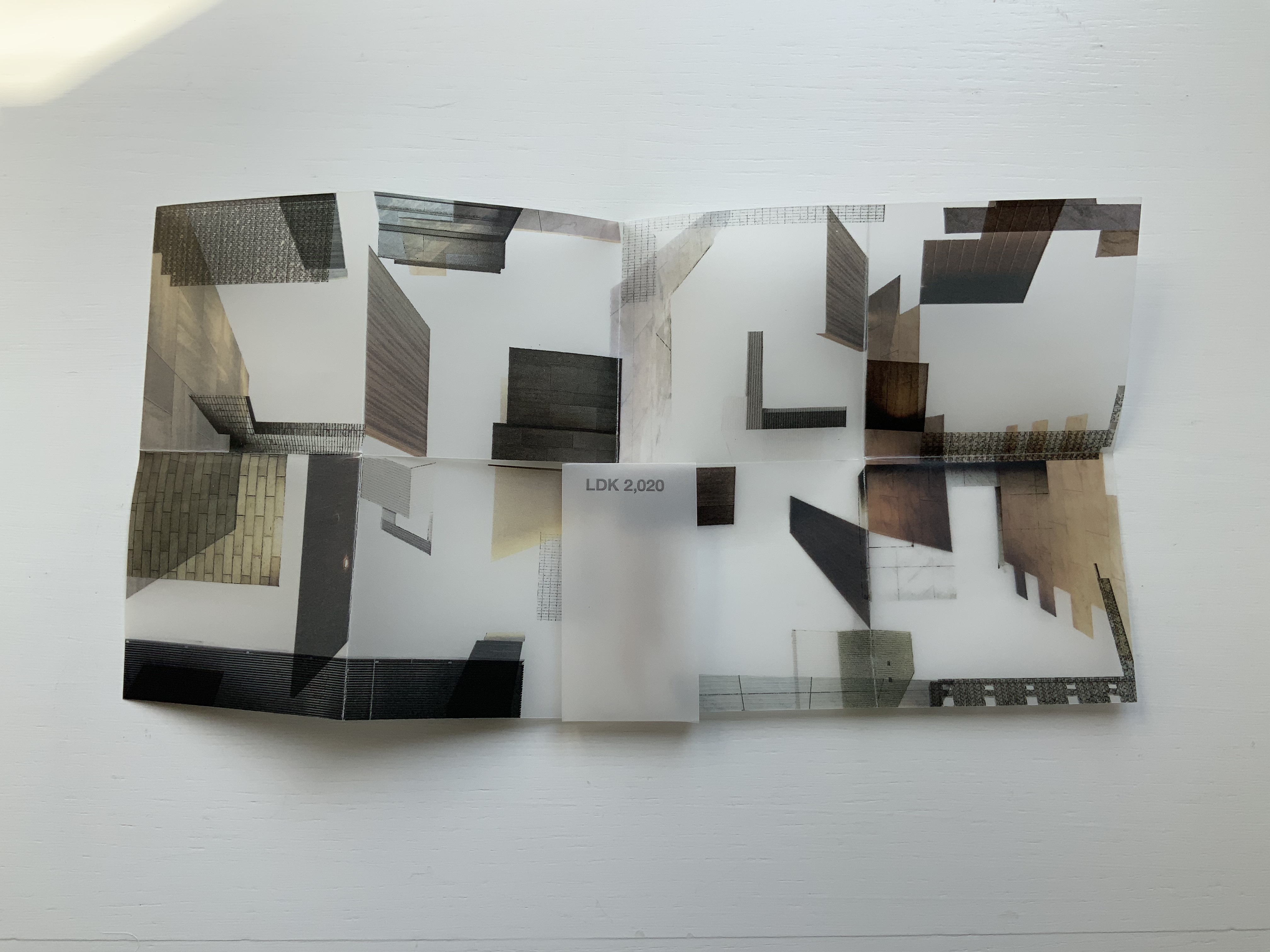
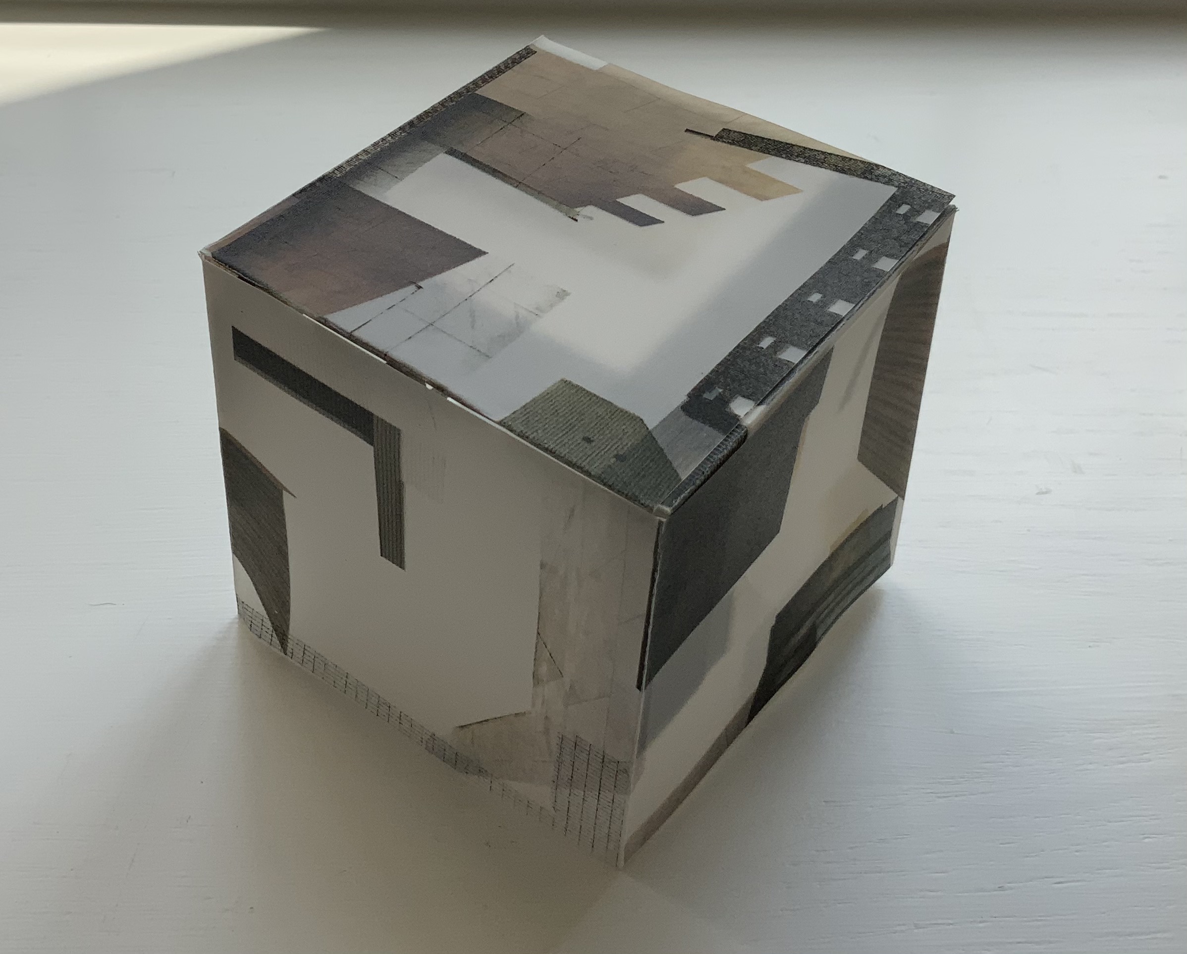
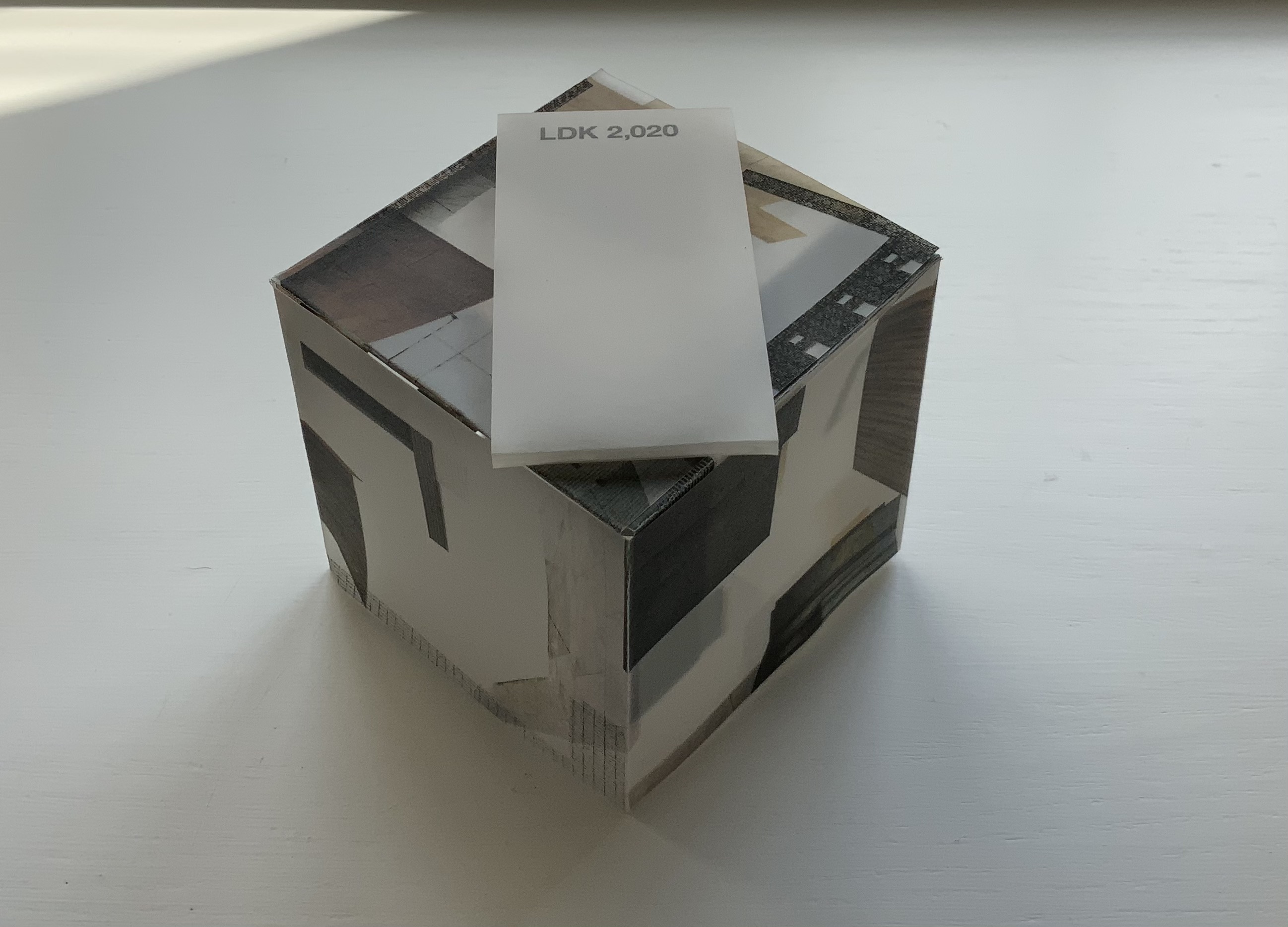
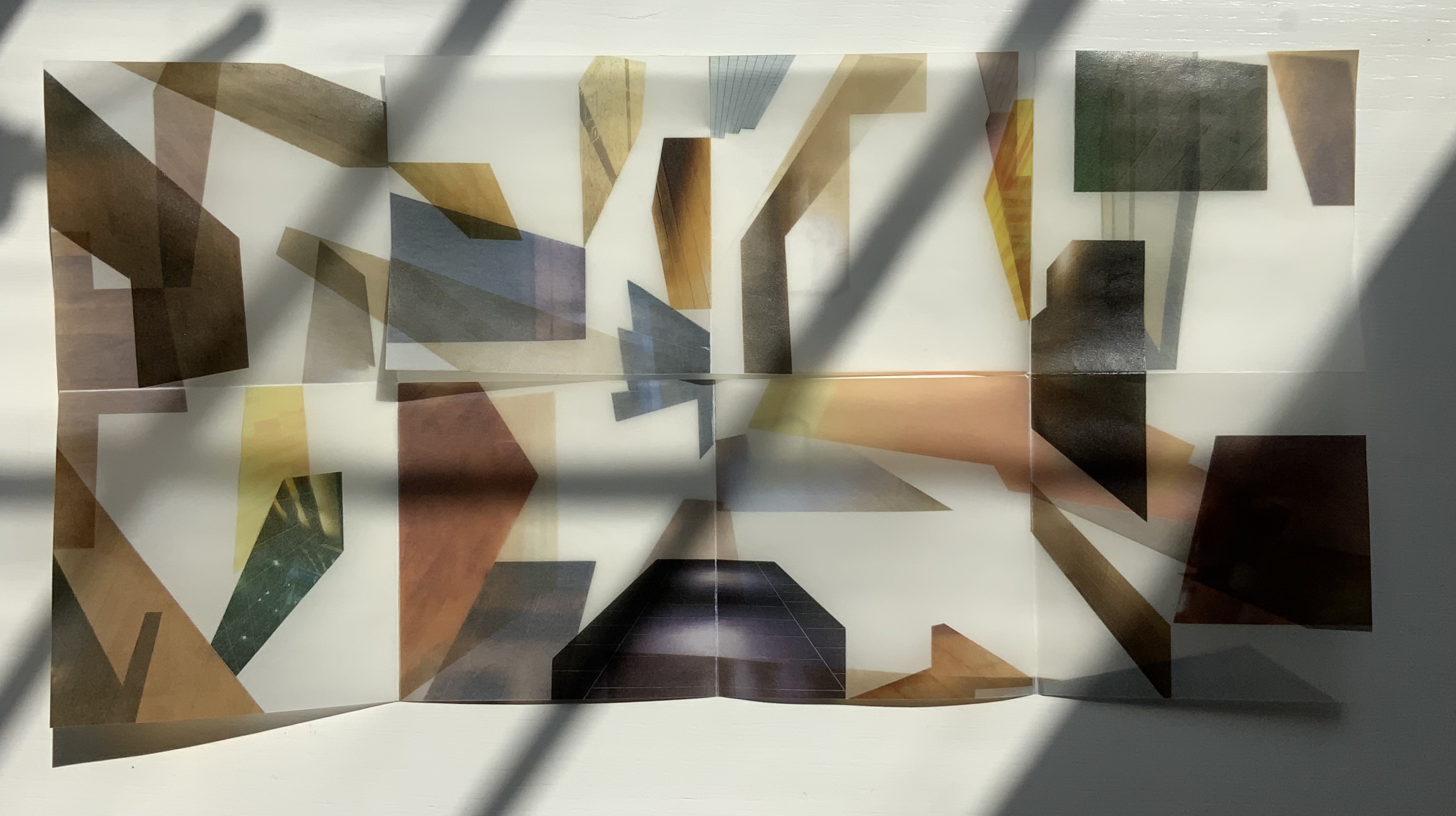
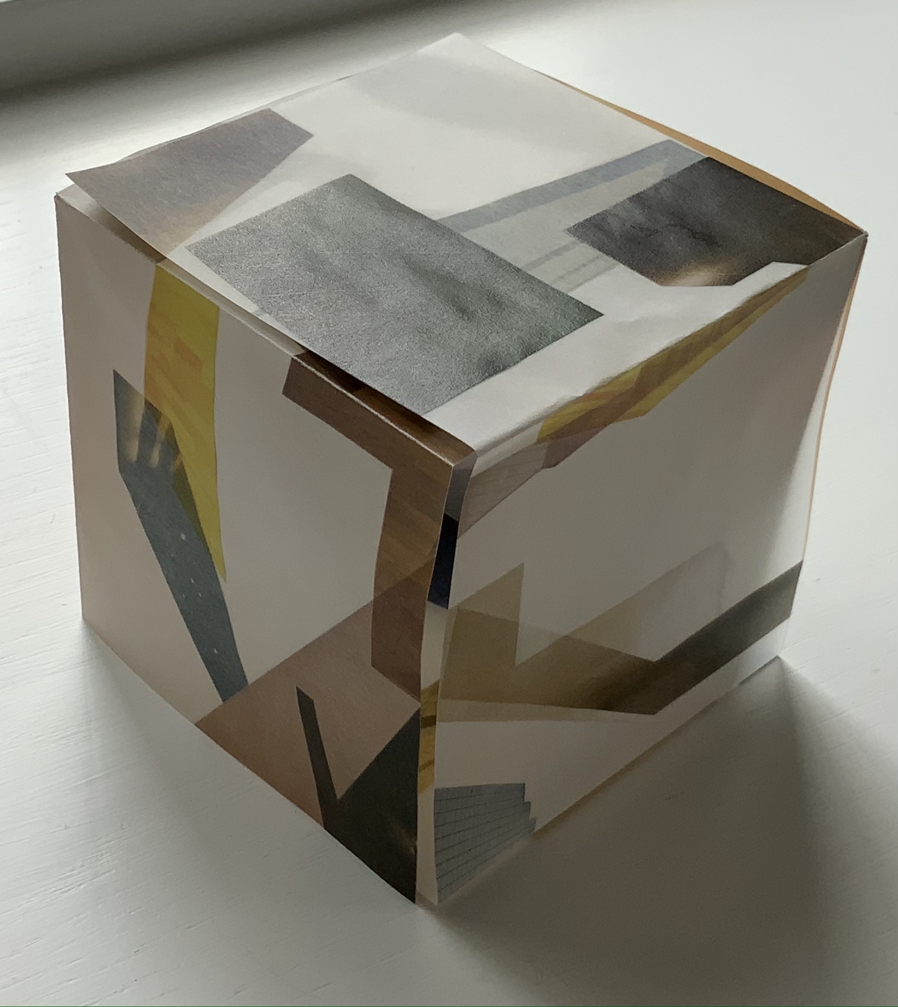
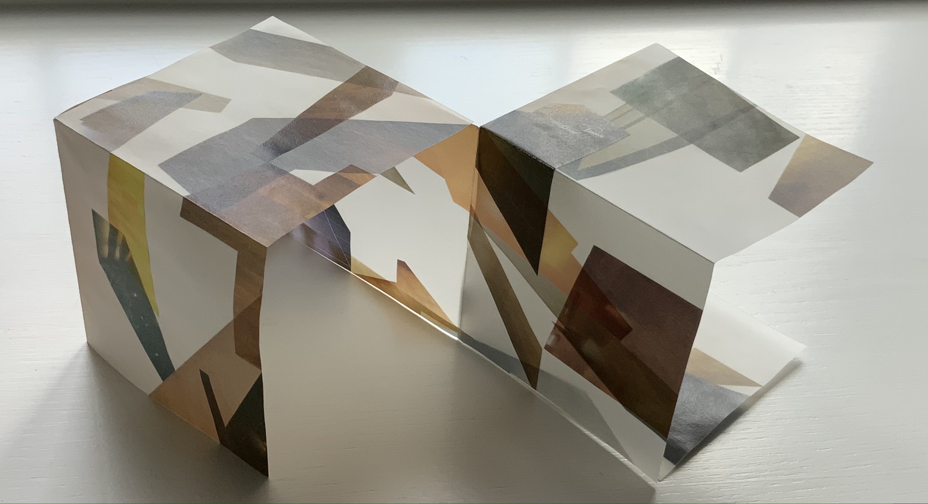
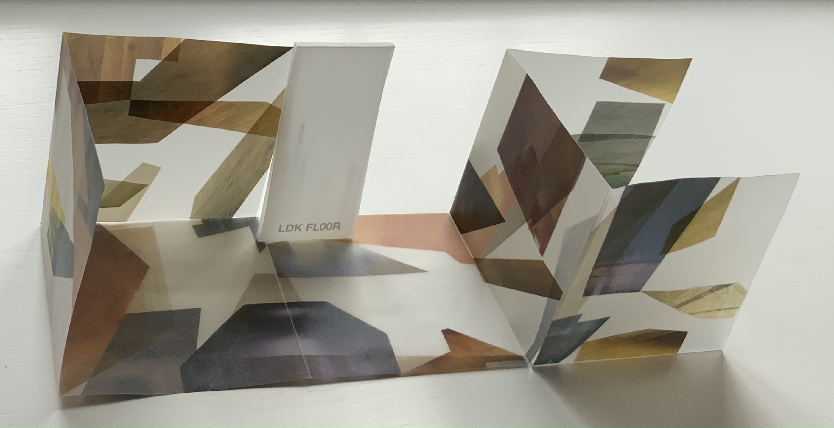
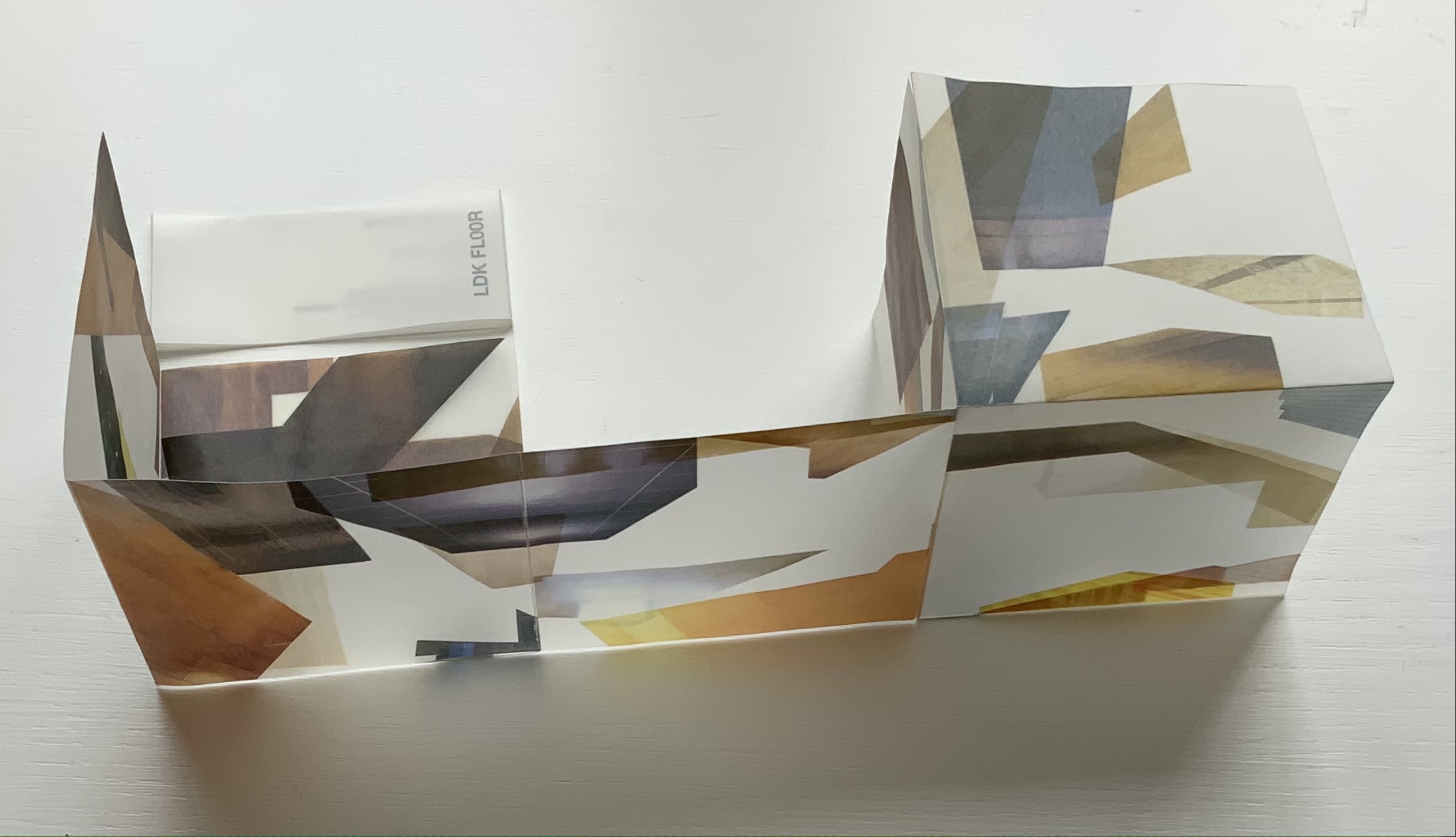
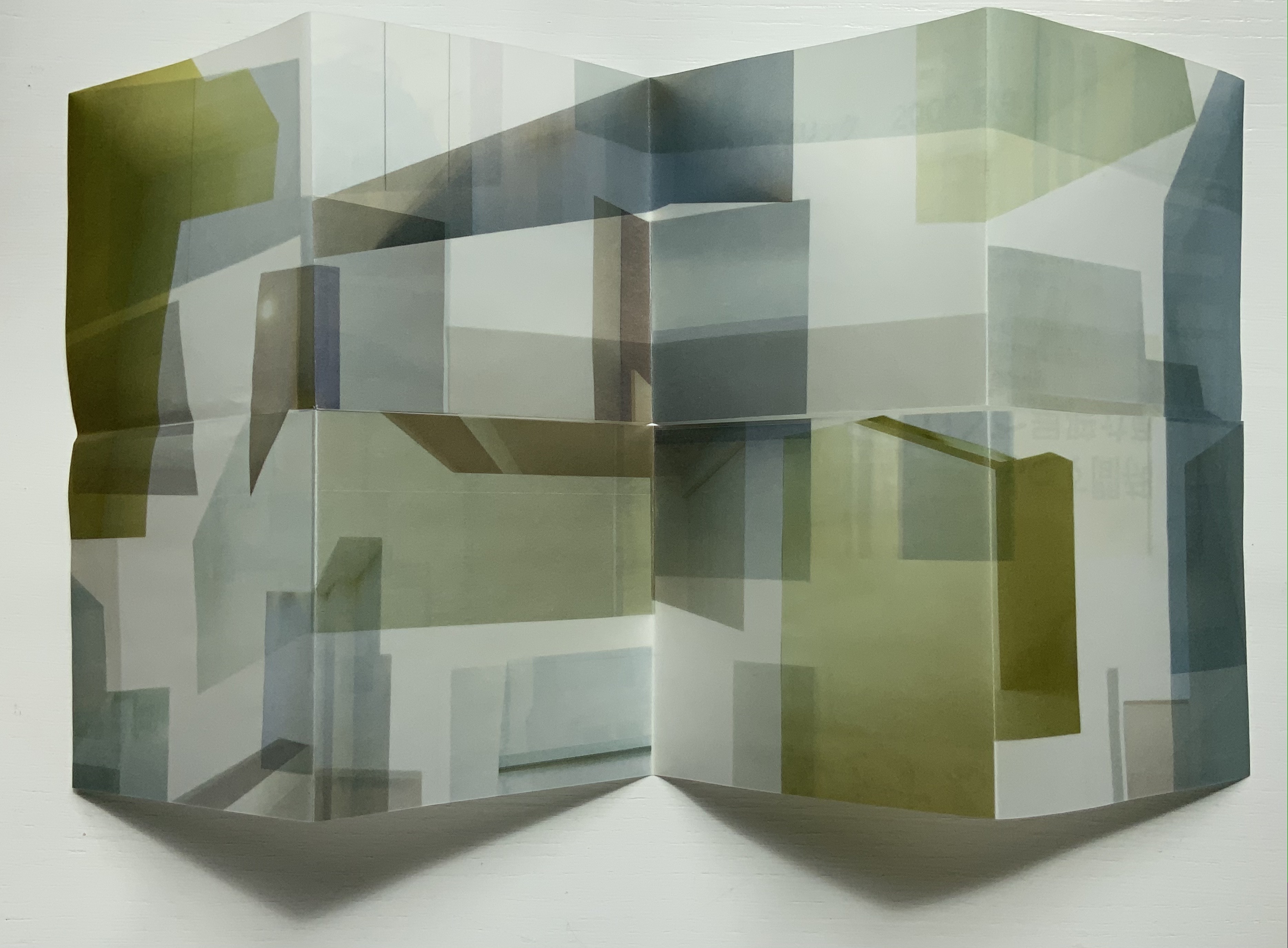
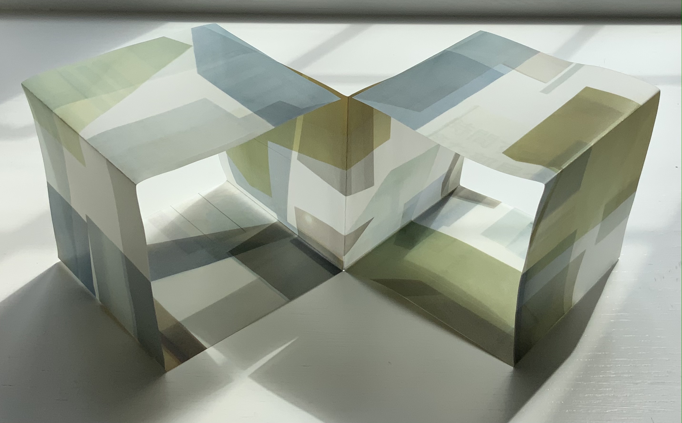
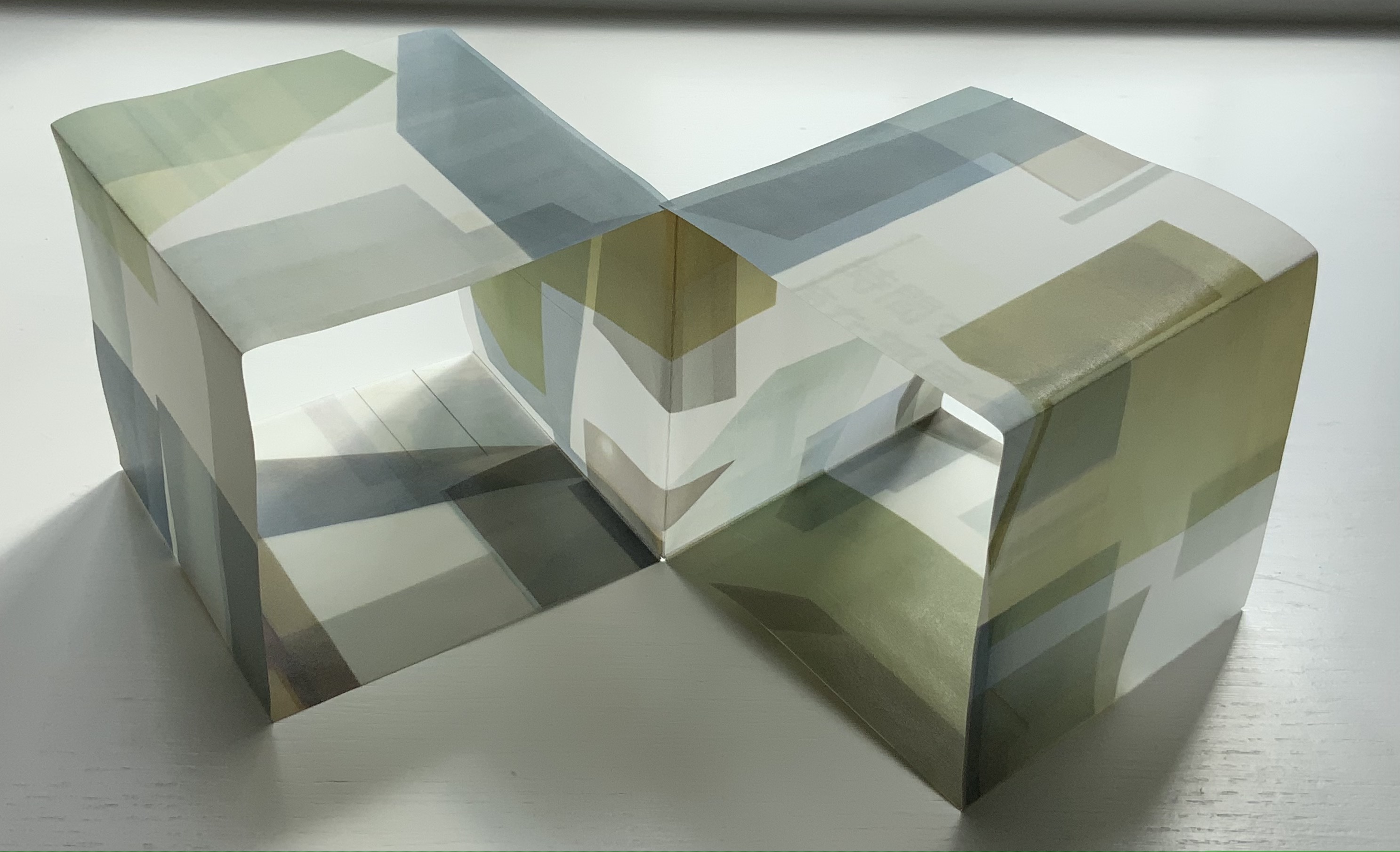
LDK 2,020 (2020) Yasushi Cho Banderole bound, single sheet cut and folded accordion style. 75 x 75 mm. Edition of 45, of which this is #7. Acquired from the artist 10 April 2021. Photos: Books On Books Collection.
LDK 2,020, LDK FL00R and LDK 2,009 make up part of a series. Their letters L, D and K stand for Living, Dining and Kitchen and are the usual abbreviations in Japanese apartment/flat sales leaflets. Every day they arrive or can be picked up on the street, and Cho creates collages from them, digitally printing them on stiff translucent paper to be cut and creased, then folded into an accordion-style booklet. For the reader, the folds and cuts of the stiff translucent paper make a tricky “assembly and disassembly” — or reading — of the work to make it into a cube or other three-dimensional shape.
In the process of flattening the booklets into a single sheet, then folding and creasing and re-creasing, the reader wonders how the aspects of LDK may have fit together before their abstraction into the collage. Eventually though, the assembly creates objects whose interiors are their exteriors — and vice versa — and inevitably recall the shoji screens still used in traditional houses and even apartments.
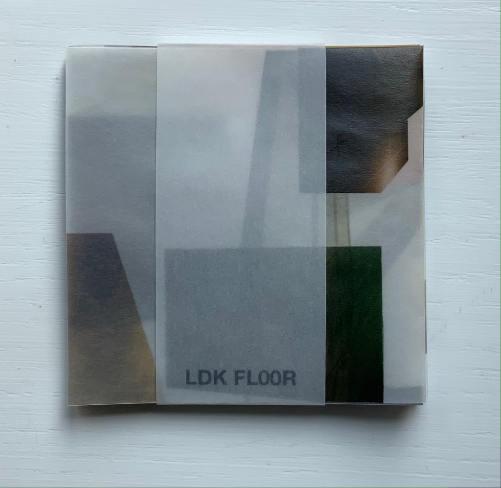
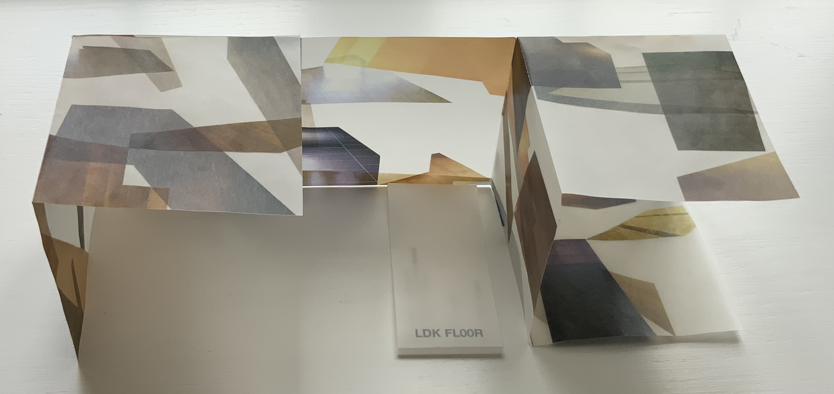
LDK FL00R (2010)
LDK FL00R (2010) Yasushi Cho Banderole bound, single sheet cut and folded accordion style. 85 x 85 mm. Edition of 45, of which this is #3. Acquired from the artist, 10 April 2021. Photos: Books On Books Collection.
Like the commas in LDK 2,020 (above) and LDK 2,009 (below), the zeroes in LDK FL00R play on the apartment prices listed in the sales leaflets, but also allude to the apartments’ floor numbers. The wordplay of the titles echoes the playful multiple shapes that the sheets can take and the resulting multiple views of the collages. The collaged images in LDK FL00R, however, are of the floor surfaces only.
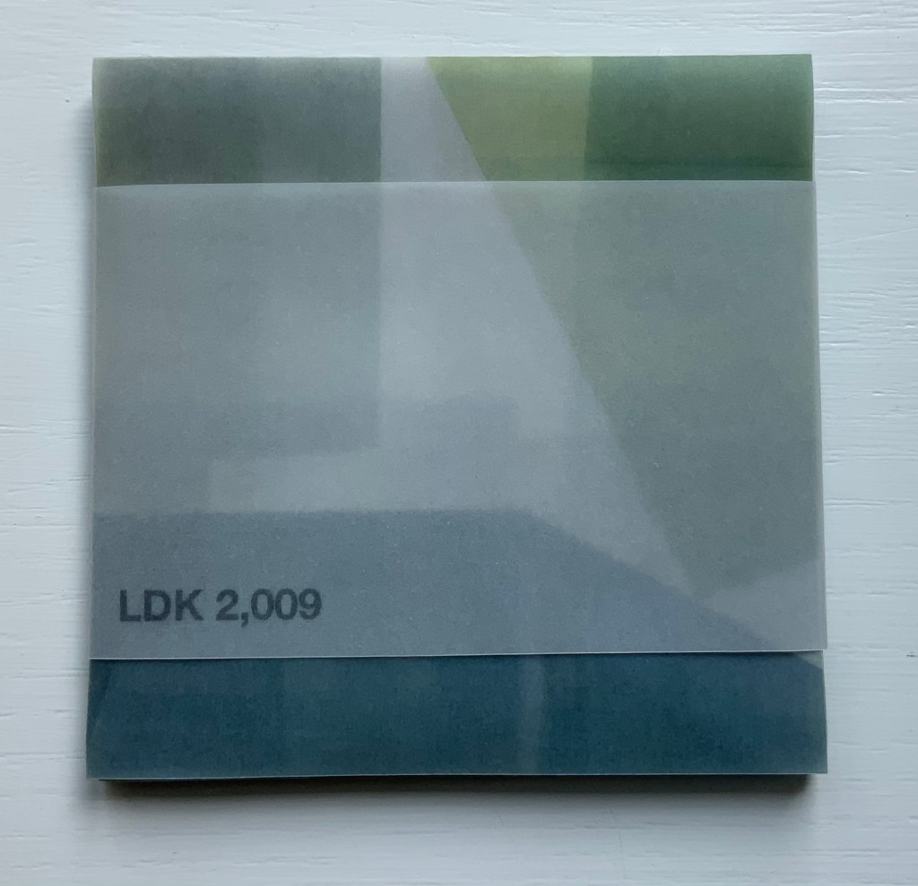
LDK 2,009 (2009)
LDK 2,009 (2009) Yasushi Cho Banderole bound, single sheet cut and folded accordion style. 75 x 75 mm. Edition of 45, of which this is #36. Acquired from the artist, 10 April 2021. Photos: Books On Books Collection
With smaller works of book art, size can disguise their depth and impact. In “reading” LDK 2,009 and its companions, an extraordinary depth and impact emerge. As the opened books assume their shapes and take their place in display, another element of the artful choice of material and printing technique emerges: the resulting play of light. This is a theme that Cho explores in two very different ways in the next works.
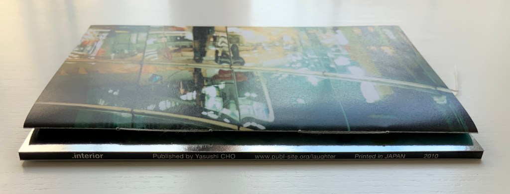
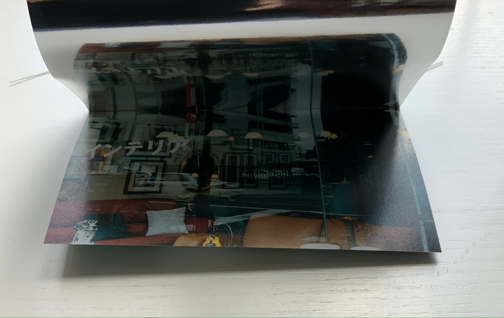
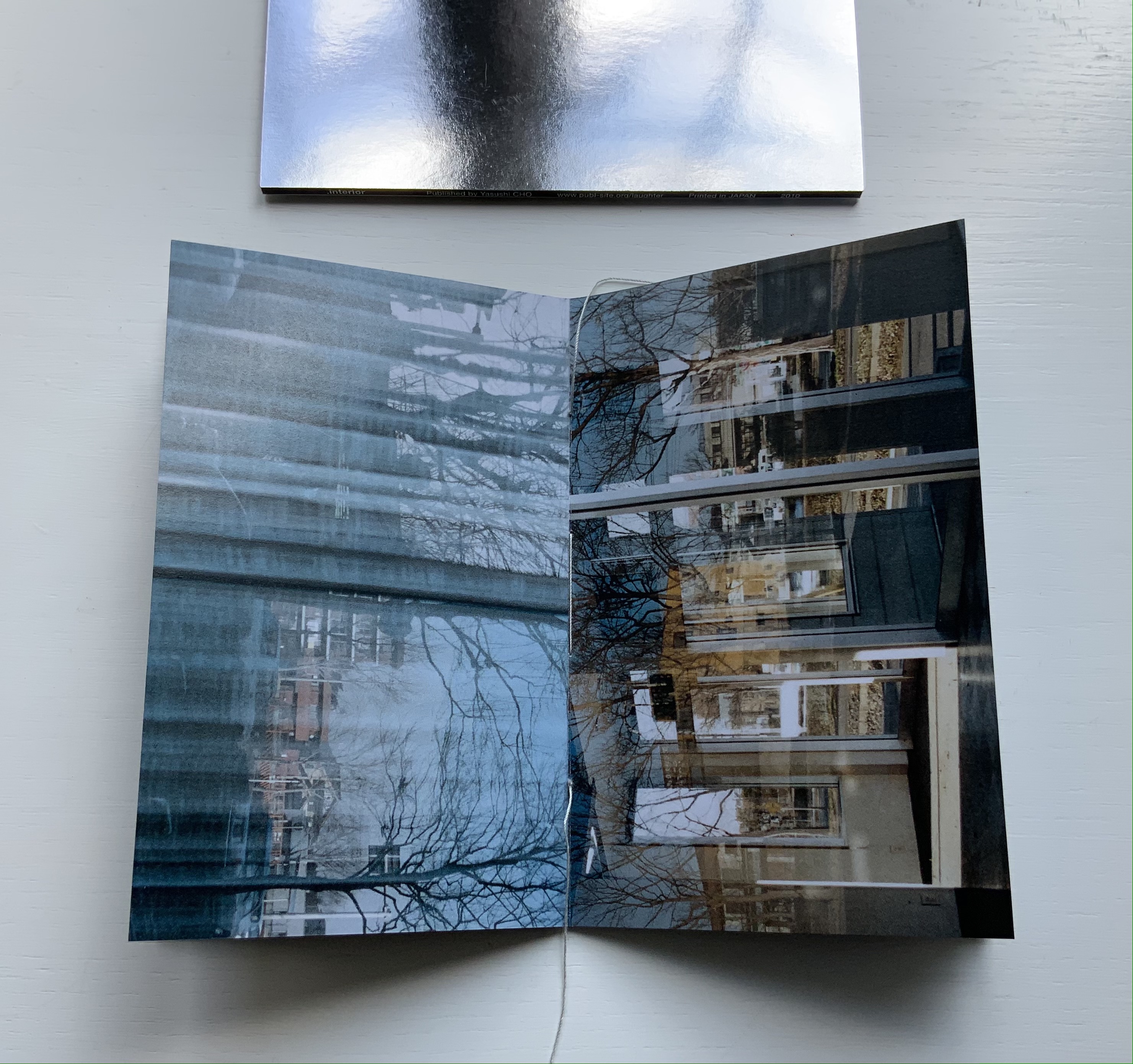
.interior (2010)
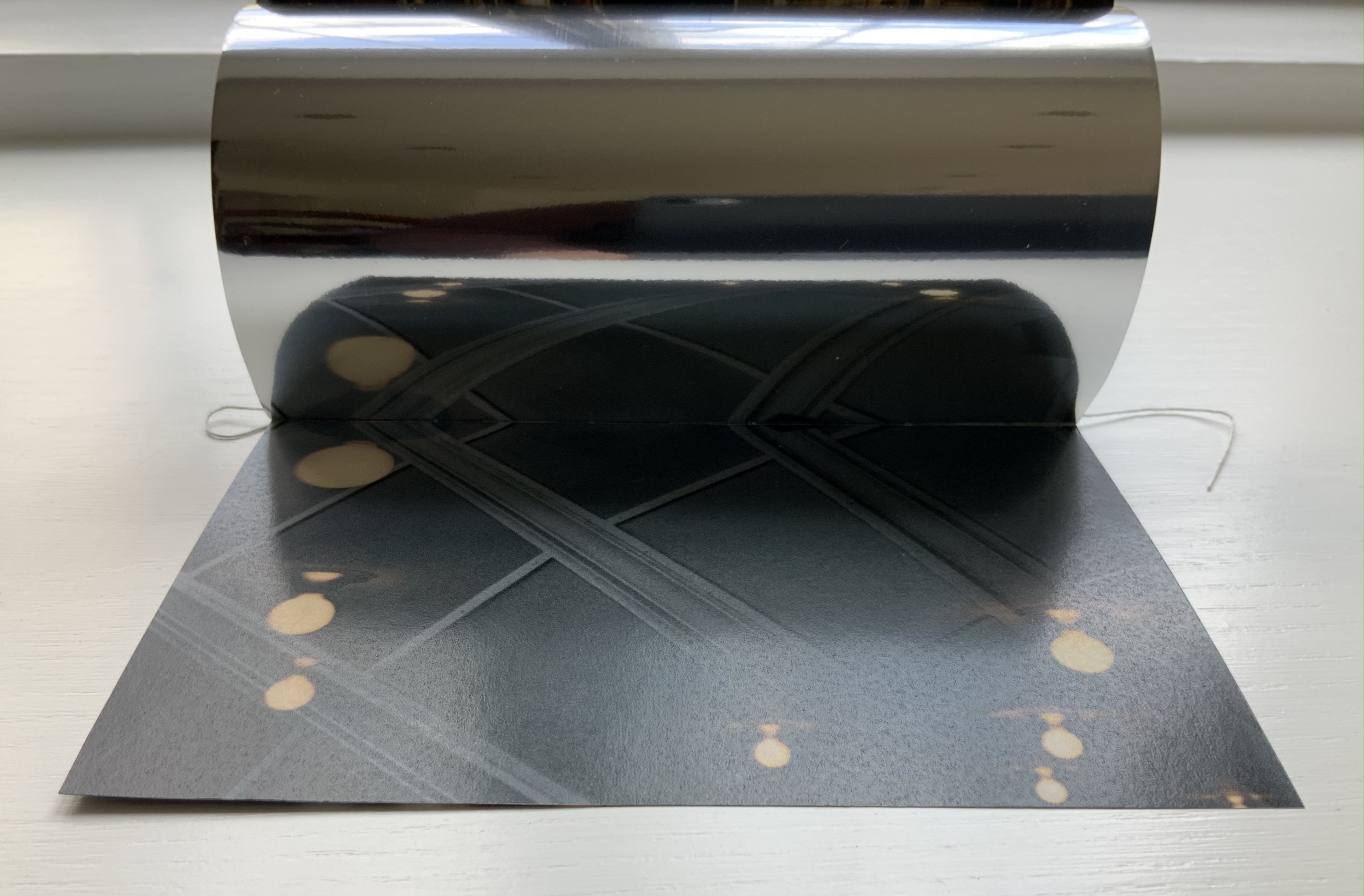
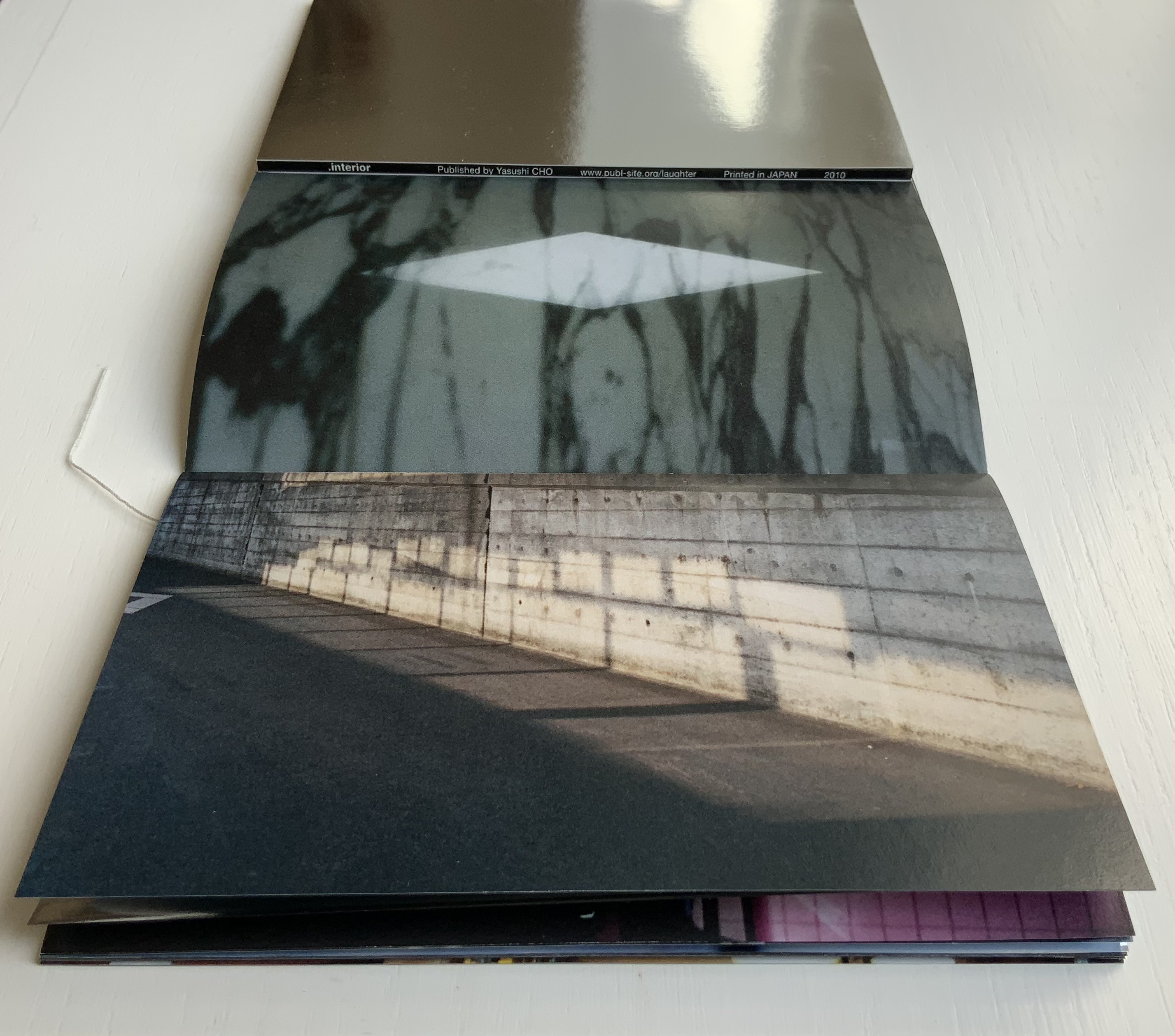
.interior (2010) Yasushi Cho Slipcase. Booklet, sewn. H150 x W98 mm, 24 pages. Edition of 30, of which this is #4. Acquired from the artist, 10 April 2021. Photos: Books On Books Collection.
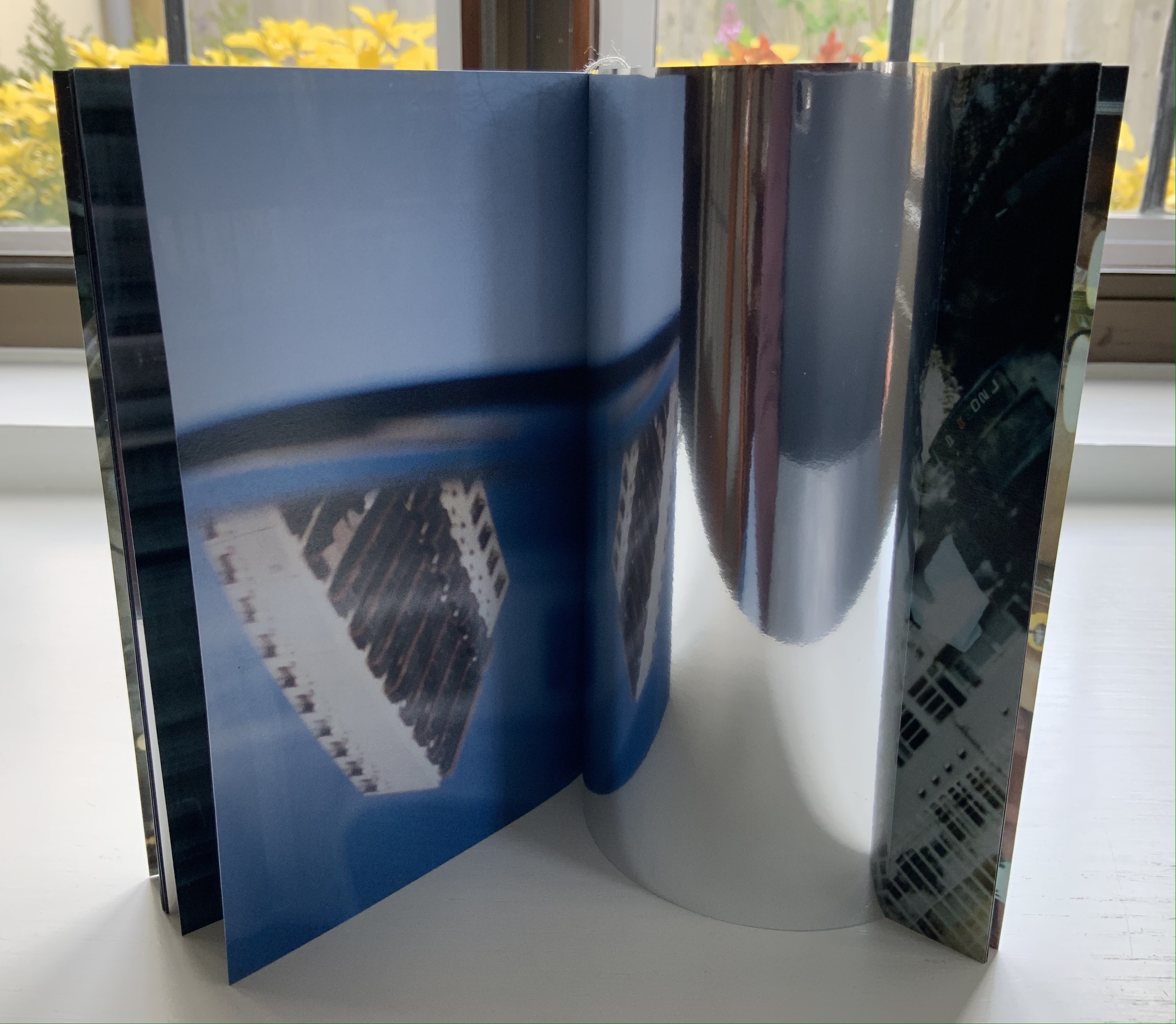
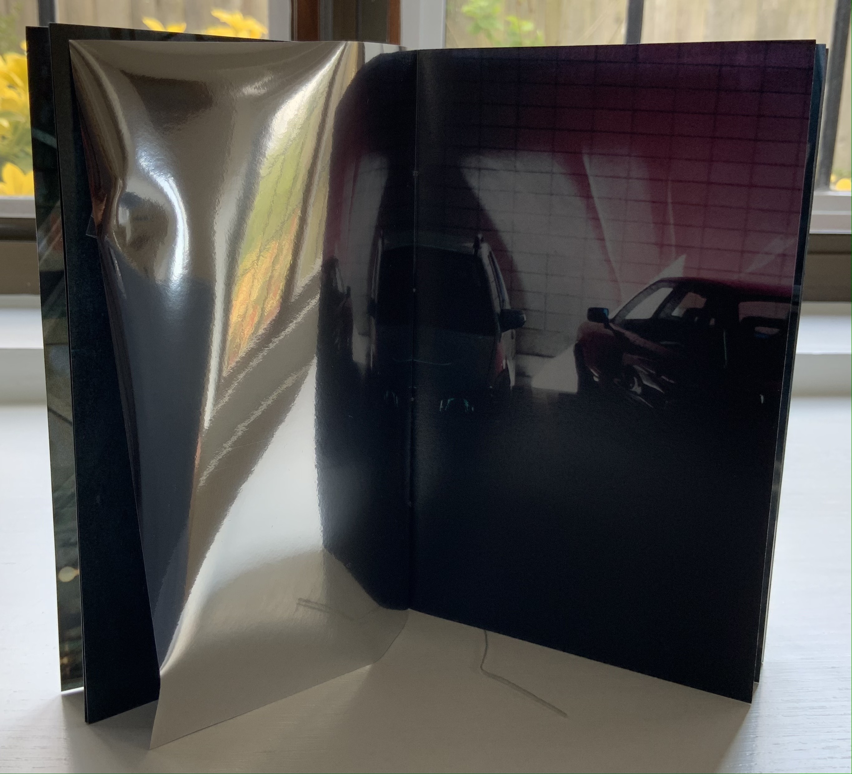
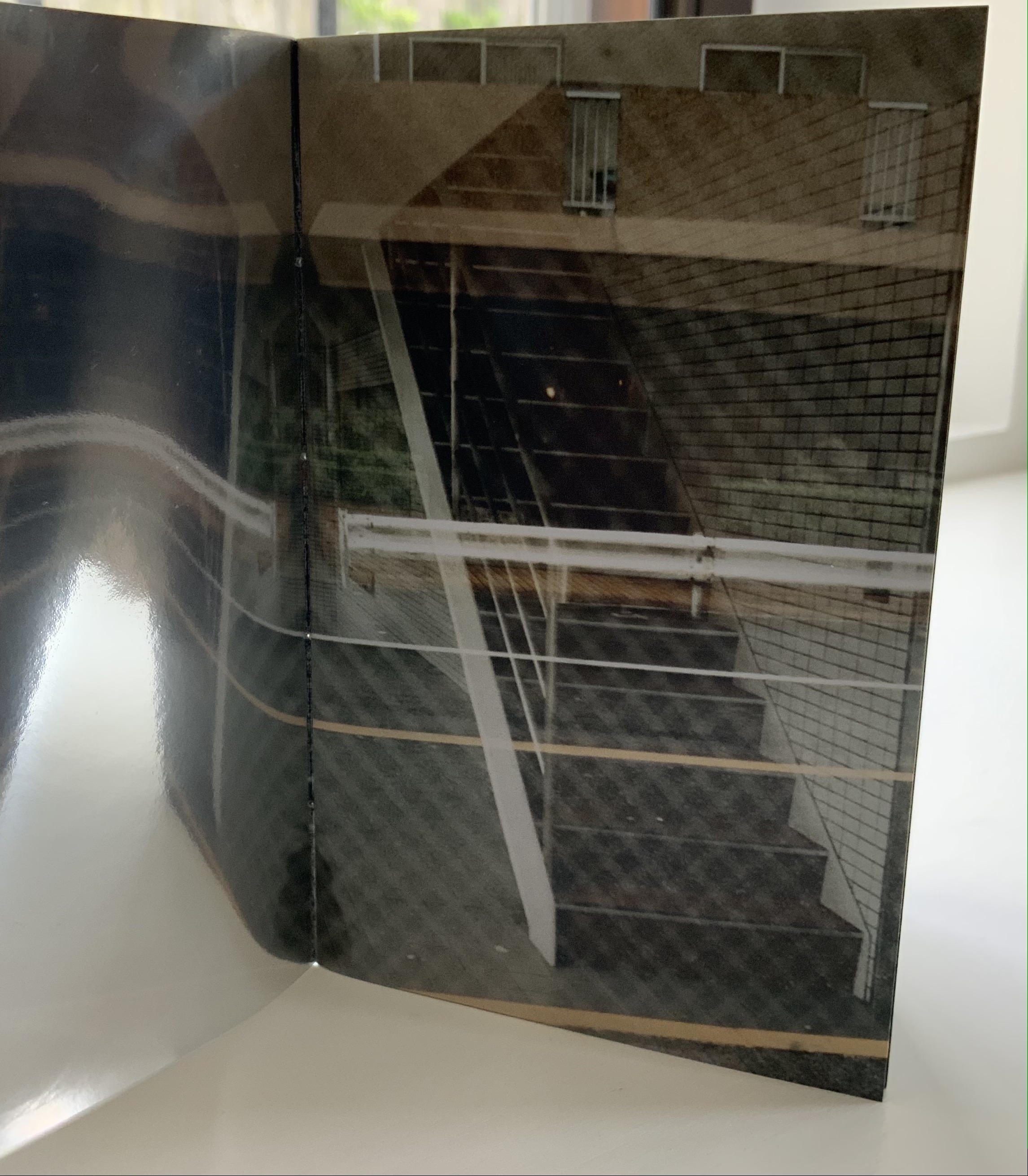
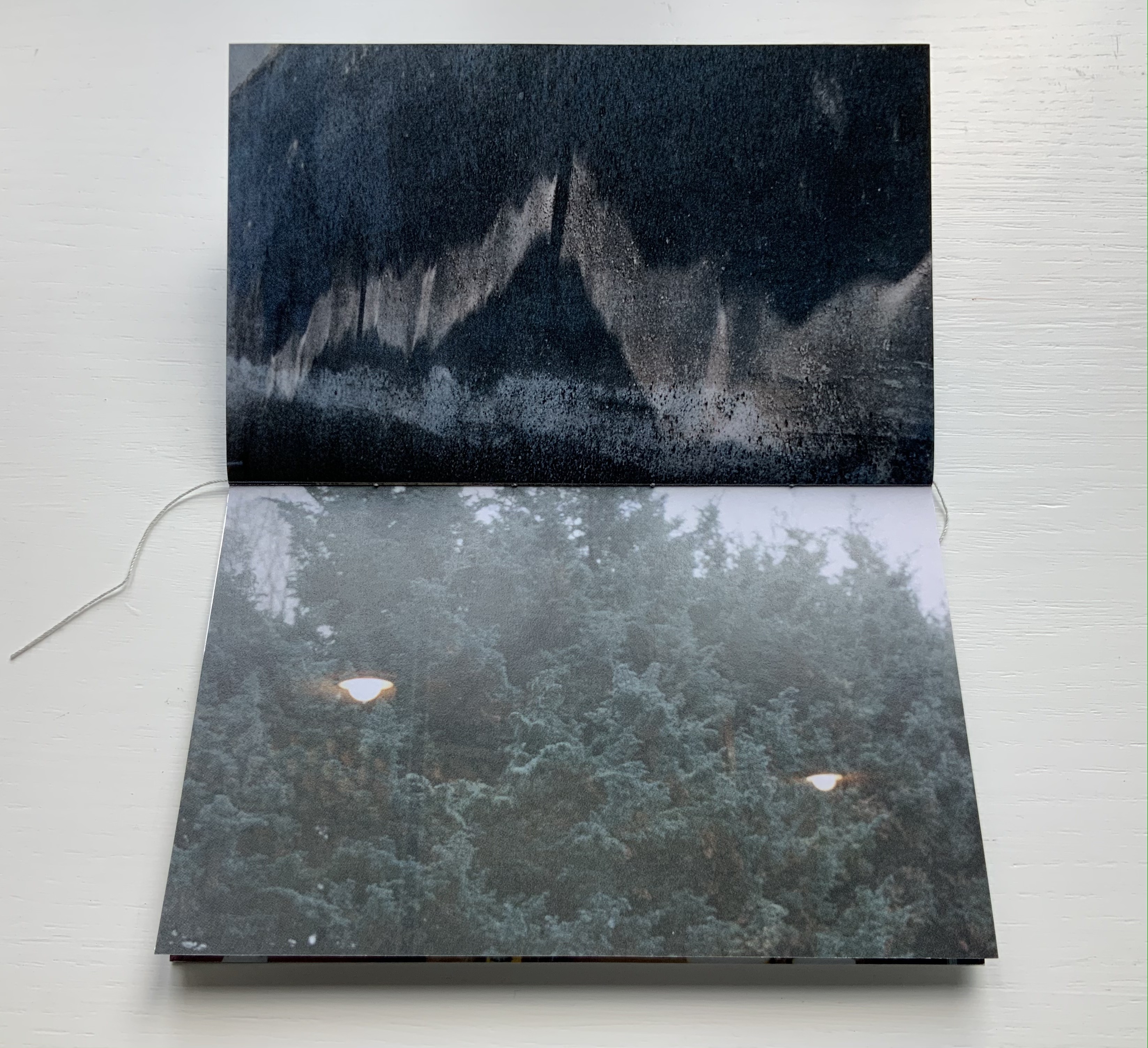
The photos in Cho’s book display views of the outside world, some of which appear to have been taken from inside an apartment whose interior is reflected in its window. Other photos display interiors — a café, an empty store — taken from an exterior vantage, resulting in reflections from the establishments’ window fronts. Some — a carpark, a walkway — seem unmediated. The playful title .interior, taken from the transposition of ・インテリア printed in the window below, and displayed on the spine of the mirrored slipcase above, confirms the artist’s theme of exploring the paradox of interior vs exterior, reflection and the mediation of vantage points.
The work’s theme of reflection is also compounded by the flimsy mirrored paper interpersed between some (not all) of the recto and verso pages. Depending on the image reflected and how the mirrored paper is turned, the reader may find a simple duplicate or an extension of a pattern. Above, the shop’s interior duplicates itself upside down; below, the high rise against a blue sky duplicates itself.
Above, the staircase seems to curve behind itself, the reflected car extends the row of parked cars, and below, the ceiling and light fixtures extend their pattern into the mirror.
Where the recto and verso are not divided by the mirrored paper, other permutations on the theme of reflection occur. Below, in the center of the book, the window in the recto page seems to reflect the vantage point from which the verso page’s photo was taken. The virtuosity in manipulating vantage points here recalls that of Michael Snow’s Cover to Cover (1975) and Marlene MacCallum’s Theme and Permutations (2012) or Shadow Cantos(2018-19).
In its composition, the photography fascinates the eye, and Cho’s use of the book and mirrored paper to present and transform the photos fascinates the mind, provoking contemplation of the paradoxes of interior, exterior and their reflections. No doubt, a gallery show could deliver similar fascination, but as a book, .interior is more than a gallery of artwork: it is a work of art.
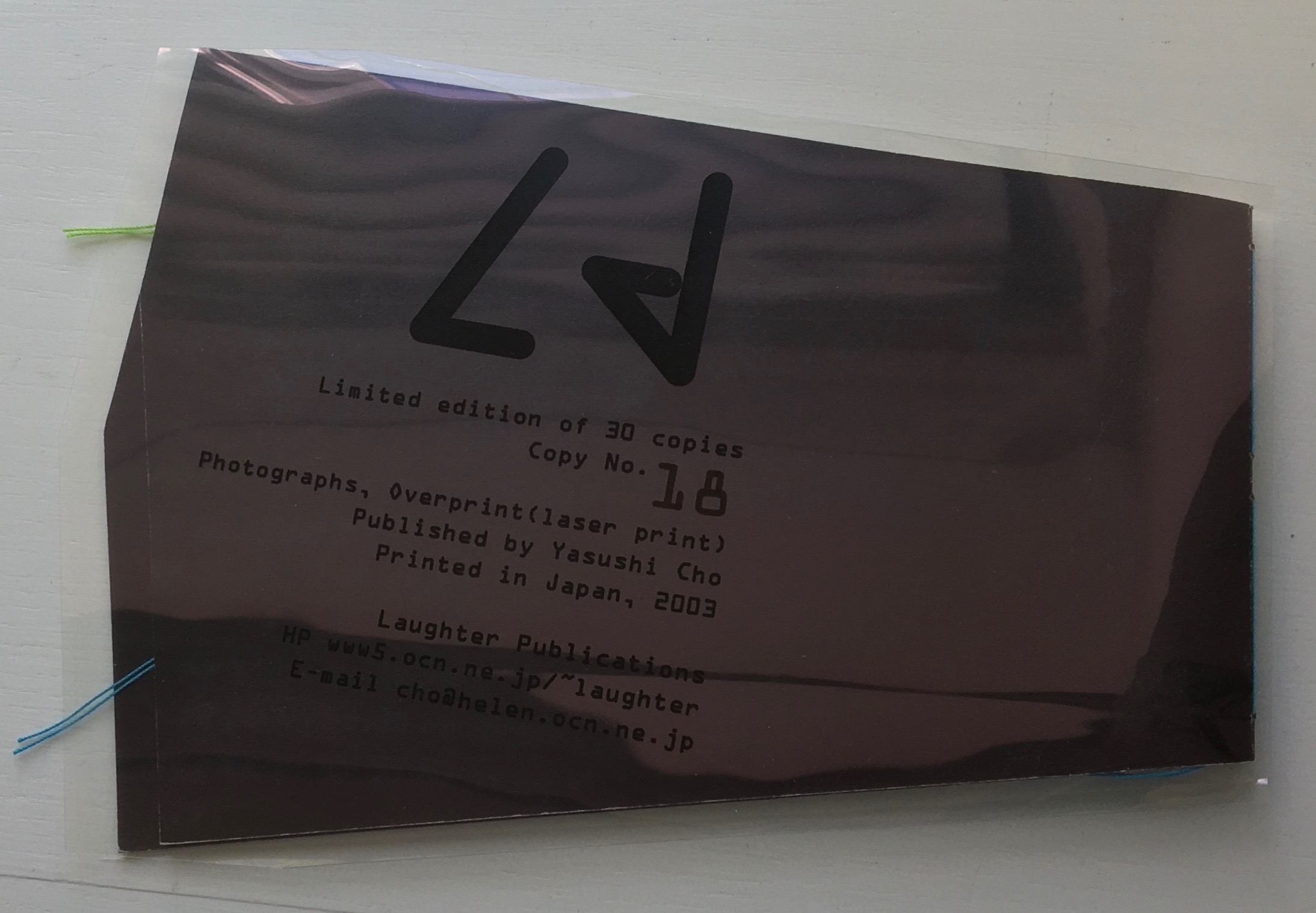
Ld (2003)
Ld (2003) Yasushi Cho Acetate sleeve. Booklet, handsewn. A5 nonstandard trim, 32 pages. Edition of 30, of which this is #18. Acquired from the artist, 10 April 2021. Photos of the work: Books On Books Collection.
If the stylized letters “L” and “d” do not suffice to distinguish this work from the LDK series, its shape, content and source certainly do. The way the images, surfaces and shapes play off one another suggests that “L” stands for light, and “d” for dark. The very different source from which the work arises — a night-time walk and shoot in Tokyo — confirms it.
On the black pages, the artist has overprinted in black to give a shadowy depth to the images and surface. The images in the dark sometimes reflect the images in the light — sometimes from the facing page, other times from previous pages. Below, for instance, the film-sprocket shapes just visible on a previous verso page’s lower edge reappear faintly, enlarged and in black over the red lights. The red lights, in turn, reappear faintly, also enlarged and in black on the lower half of the narrowing recto page.
These reflections begin to suggest those retinal images that appear after a flash of light or when eyes are held too tightly closed — both of which conjure up a night-time photo shoot in an environment of contrasts between neon lights or spotlights and the shadows they cast. By staring at the bright images on one page (below), the reader may also experience additional retinal images on the facing page.
The irregularly shaped pages recall Philip Zimmermann’s High Tension (1993) or Helmut Lohr’s Visual Poetry (1995). Cho’s pages alternate at angles, narrow or widen. With the flashes between light and dark, they evoke the photographer’s searching eye, focusing lens and movement through night-time Tokyo.
Both .interior and Ld are sophisticated — materially, conceptually and in execution. With the LDK series, they make a strong addition to the Books On Books Collection.
I tried to “define the book” when I designed (one of my books) Cover to Cover hoping that the “reader” would have a multi-sensory experience of the nature of what she/he held in her/his hands. (from The Book: 101 Definitions)
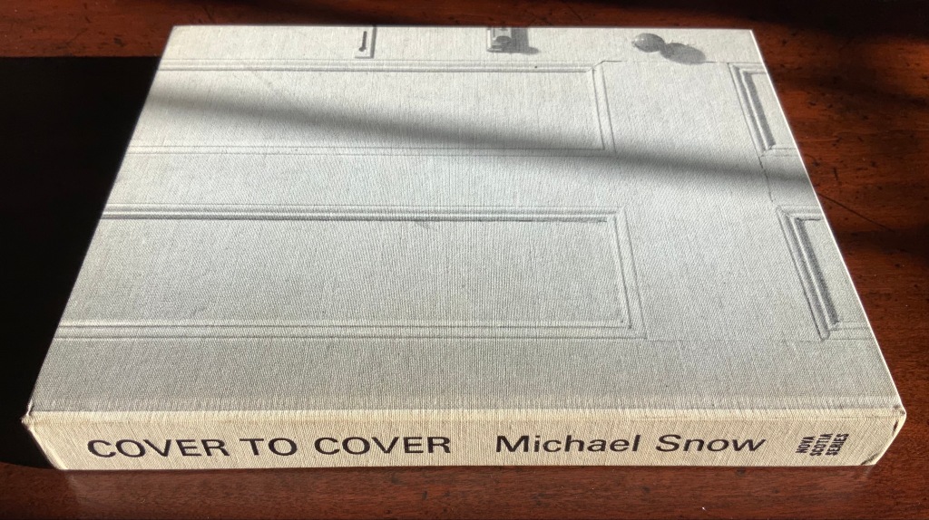
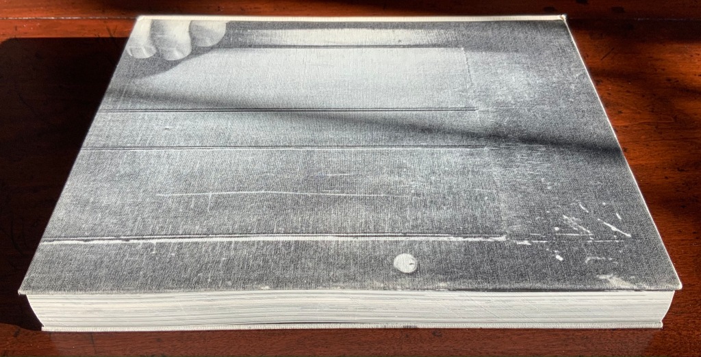
Cover to Cover (1975)
Cover to Cover (1975) Michael Snow Cloth on board, sewn and casebound. H230 x W180 mm. 310 unnumbered pages. Published by Nova Scotia College of Art and Design. Unnumbered edition of 300. Acquired from Mast Books, 10 December 2020. Photos of the work: Books On Books Collection.
After a long search since first sight of it in 2016 at Washington, D.C.’s now defunct Corcoran Gallery library, the original hardback edition of Michael Snow’s Cover to Cover (1975) finally joins the Books On Books Collection. Thanks to Philip Zimmermann, more readers/viewers have the chance to experience Cover to Cover — if only through the screen — than the original’s 300 copies and Primary Information’s 1000 facsimile paperback copies will allow.
Amaranth Borsuk describes the work and experience of it in The Book(2018), as do Martha Langford in Michael Snow (2014), Marian Macken in Binding Spaces (2017) and Zimmermann in his comments for the exhibition “Book Show: Fifty Years of Photographic Books, 1968–2018” (for all, see links below). Like Chinese Whispers by Telfer Stokes and Helen Douglas and Theme and Permutation by Marlene MacCallum, Michael Snow’s Cover to Cover evokes an urge to articulate what is going, how the bookwork is re-imagining visual narrative, how it is making us look, and how it makes us think about our interaction with our environs and the structure of the book.
The already existing commentary about Cover to Cover sets a high hurdle for worthwhile additional words. One thing going on in the book, though, seems to have gone unremarked. Some critics have asserted that, other than its title on the spine, the book has no text. There is text, however. It occurs within what I would call the preliminaries, and they show us how to read the book.
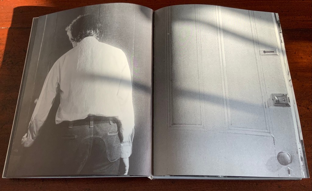
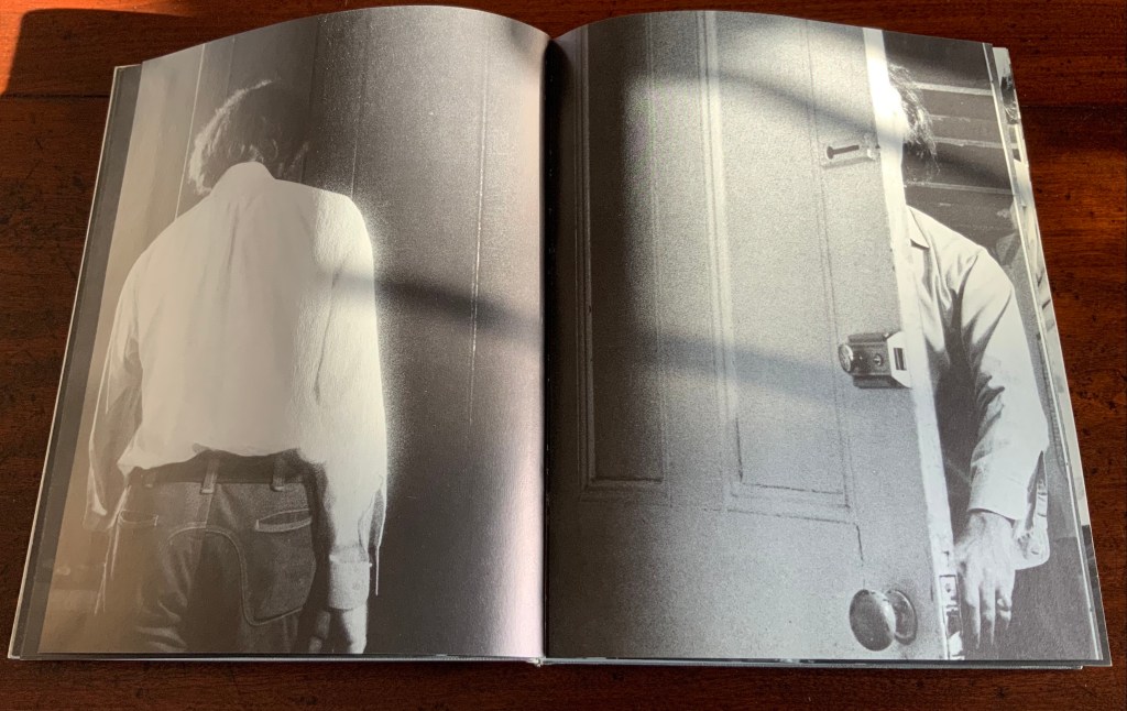
On the front cover, we see a door from the inside. Then, on its pastedown endpaper, the author outside the door with his back to us.
Front cover; pastedown end paper and page “1”.
On turning the “inside door” (page “1” of the preliminaries), we see in small type a copyright assertion and the Library of Congress catalogue number appearing vertically along the gutter of pages “2-3” (a tiny clue as to what is going on).
Pages “2-3”
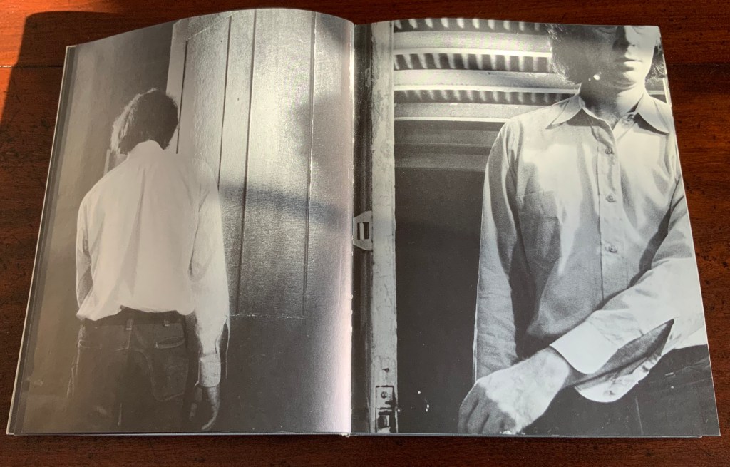
Over pages “4” through “14” from the same alternating viewpoints, the author reaches for the door handle, the door is seen opening from the inside, and the artist is seen walking through the door (from the outside) and into the room (from the inside). But who is recording these views?
Pages “10-11”, “12-13”, “14-15”
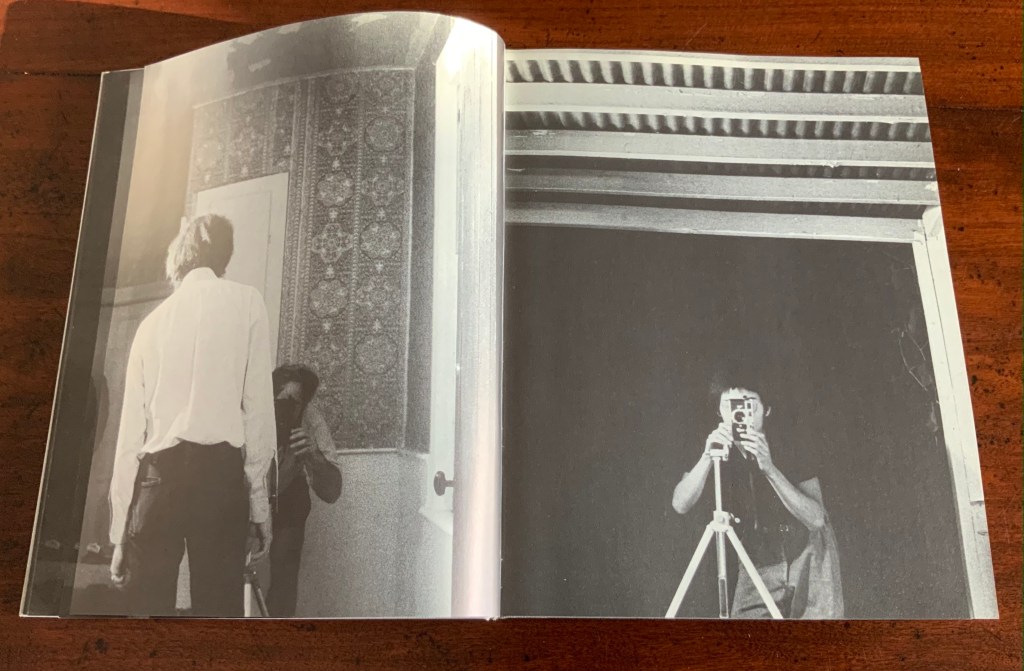
Over pages “16” through “24”, two photographers appear. Facing us, they are bent over their cameras — the one outside, clean shaven and wearing a short-sleeved shirt, is behind the author, and the one inside, bearded and wearing shorts, is in front of the author. As the author moves out of the frame, we see that the photographer inside is holding a piece of paper in his right hand. All of this occurs through the same alternating viewpoints. At page “21”, the corner of that paper descends into the frame of the inside photographer’s view of the outside photographer, and after the next switch in viewpoint that confirms what the inside photographer is doing, we see a completely white page “23”, presumably the blank sheet that is blocking the inside photographer’s camera aperture. Page “24” is the outside photographer’s view of the inside photographer whose face and camera are blocked by the piece of paper.
Pages “16-17”, pages “20-21” and pages “24-25”
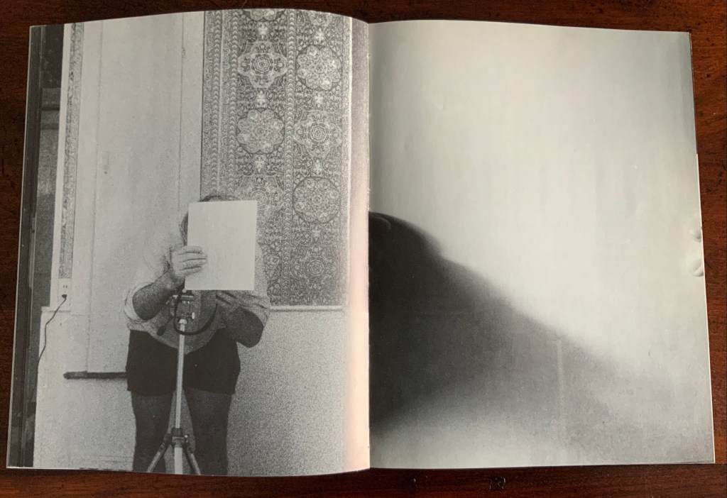
After the sequence above, something stranger still happens: on the left, a photo of the inside photographer holding the blank paper in front of his face appears. We can tell it is a photo by the tip of the thumb holding it (look in the gutter) between pages “26 and 27”. It is the developed photo the outside photographer just took of the inside photographer with his face and camera hidden by the sheet of paper. The image on page “27” is the reverse of that photograph. We can tell by the fingers on the right holding it.
Pages “26-27”
We are looking at images of images. But on pages “30-31”, whose fingers are holding the image of images?
Pages “30-31”
From there on, we see images of this piece of paper being manipulated by one pair of hands. The thumbs appear on the verso (the view from the outside photographer’s perspective), the fingers on the recto (the view seen by the inside photographer). By page “34”, it has been flipped upside down (the inside photographer is standing on his head), and on page “35”, we see a close up of the blank reverse side of the paper being held between the two photographers. By page “37”, we can see the blank side of the photo paper being fed into a manual typewriter. The pair of hands feeding the paper into the typewriter cannot belong to one of the photographers. Who is the typist — the author?
Pages “34-35” and pages “36-37”
For both pages “42” and “43”, the perspective is that of a typist advancing the photo paper and typing the title page of the book. On both pages, we can see the ribbon holder in the same position. As it progresses, more and more of the outside photographer’s camera appears above the typed page. Page “45” presents itself as the full text of the book’s title page, curling away from the typist and revealing the inside photographer on the other side of the typewriter. Page “46” shows the upside-down view of the title page as it moves toward the inside photographer and reveals the outside photographer on the other side of the typewriter. Not only are we seeing images of images, we are witnessing the making of the book’s preliminaries.
Pages “42-43”, “44-45”, and “46-47”.
From page “48” through page “54”, the photographers alternate views of blank paper advancing through the typewriter. By pages “55” and “56”, the typewriter has moved out of the frame. Look carefully at page “56”, however, and you can see the impression of the typewriter’s rubber holders on the paper. As a book’s preliminaries come to a close, there is often a blank verso page before the start of the book. If Cover to Cover is following that tradition, page “56” is that blank page at the end of the preliminaries, and page “57”, showing a record player, is the start of the book.
Pages “56-57”.
Zimmermann notes that, at somewhere near the book’s midpoint, the images turn upside down, and that readers who then happen to “flip the book over and start paging from the back soon realize that they are looking at images of images produced by the two-sided system, and indeed the very book that they are holding in their hands”. He notes this as another mind-bender added to the puzzlement of the two-sided system with which the book begins. Yet the long set of preliminaries foretold us that the upside-downness, back-to-frontness and self-reflexivity of images of images were on their way. Without doubt, Cover to Cover is an iconic work of book art.
Further Reading
Afterimage (1970). No. 11, 1982/83. On the occasion of an exhibition of his films at Canada House in London, an entire issue on Snow’s work.
… Cover to Cover is the result of another distanced use of self in the course of art-making. Snow is subject/participant as he and his actions are observed and analyzed by two 35 mm cameras… simulataneously recording front and back, the images then placed recto-verso on the page… Snow is subject observed in the book at the same time that he is also choosing and making decisions about images. Cover to Cover in 360 pages, [sic] becomes a full circle — front door to back door or the reverse. The book is designed so that it can be read front to back and in such a way that one is forced to turn it around at its centre in order to carry on. Regina Cornwell in Snow Seen and “Posting Snow”, Luzern catalogue.
But as the scene “progresses,” an action is not completed within the spread, but loops back in the next one, so that the minimal “progress” extracted from reading left to right is systematically stalled each time a page is turned, and the verso page recapitulates the photographic event printed on the recto side from the opposite angle. This is the disorienting part: to be denied “progress” as one turns the page seems oddly like flashback, which it patently is not; it might be called “extreme simultaneity.” Two versions of the same thing (two sides of the story) are happening at the same time. Zimmerman.
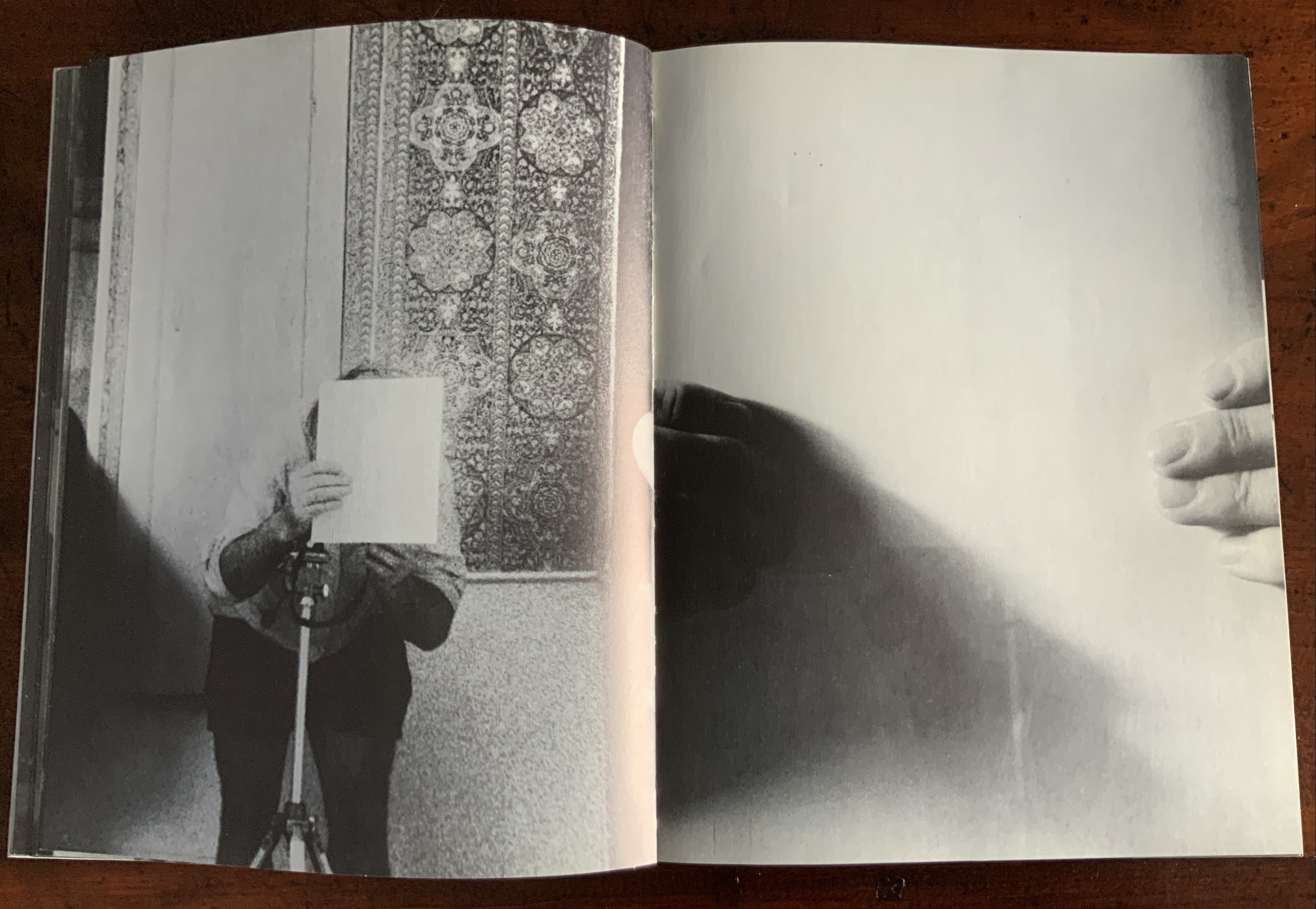
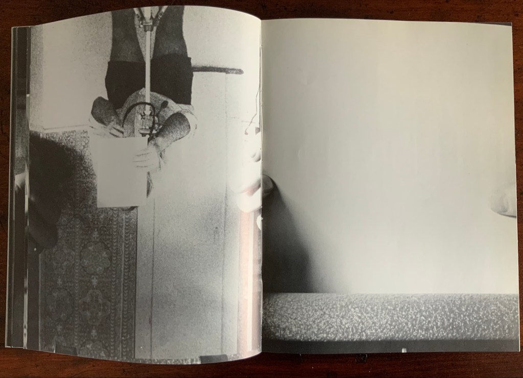
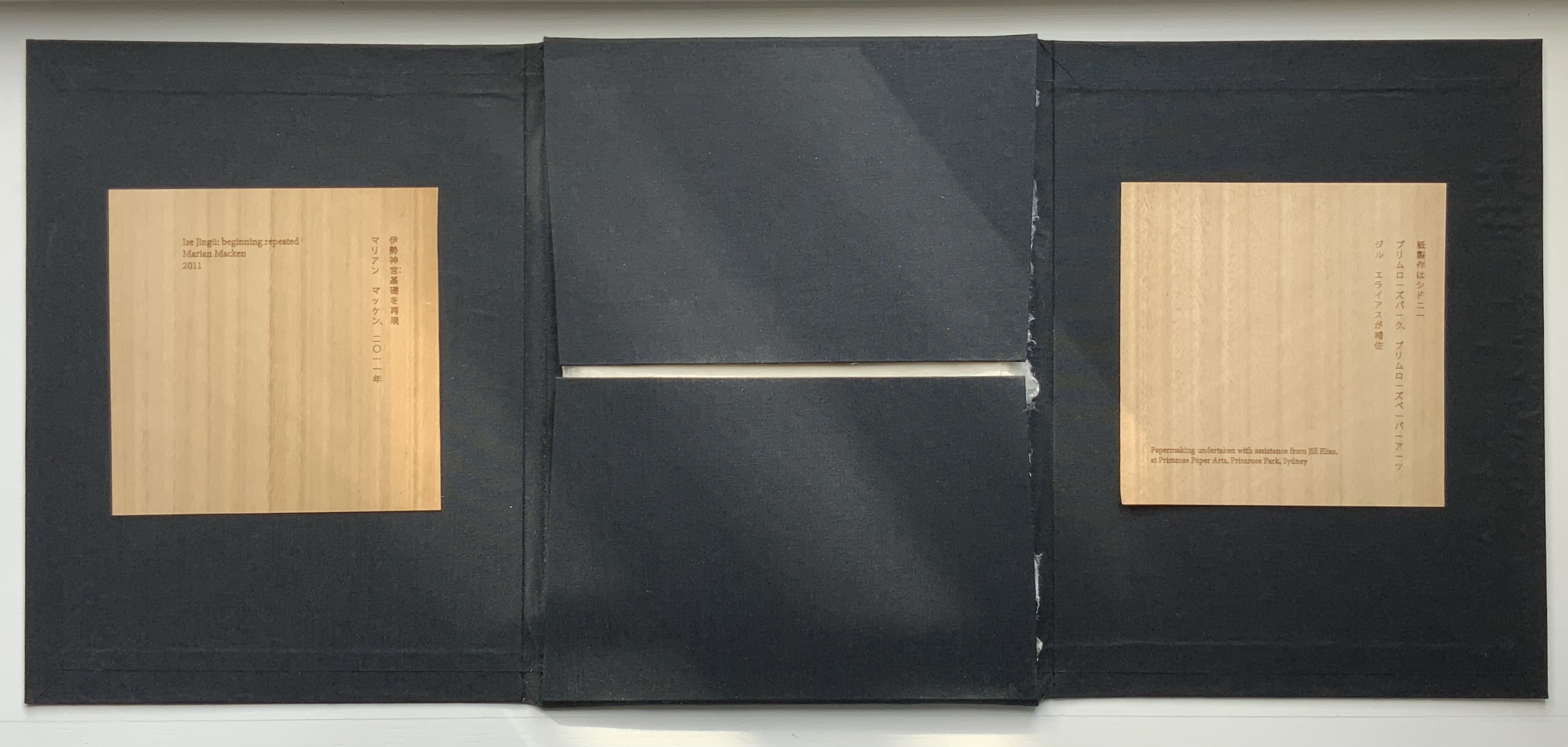
Ise Jingū: Beginning Repeated(2011) Marian Macken Black Cotona bookcloth portfolio, with embossed base; 61 sheets of handmade washi paper, made from kozo, with watermark images. H245 x W330 x D80 mm. Papermaking undertaken at Primrose Paper Arts, Sydney, with assistance from Jill Elias. Unique. Acquired from the artist, 5 February 2021. Photos of the work: Books On Books Collection. Displayed with permission of the artist.
Ise Jingū is a Shinto shrine complex in the Mie Prefecture, Japan, consisting of the Kōtai Kaijijingū, or Naikū (Inner Shrine), and the Toyouke Kaijingū, or Gekū (Outer Shrine). “Once every 20 years, since the reign of Emperor Tenmu in the seventh century, every fence and building is completely rebuilt on an identical adjoining site, a practice of transposition known as shikinen-zōkan. While empty and awaiting the next iteration of building, the unused site or kodenchi sits silently, covered with an expanse of pebbles” (Binding Space, p. 101). For Macken, this ritualistic rebuilding poses architecture as performative process rather than as inert object; it “manifests the replication of a beginning, of a process” (“Reading time”, p. 100).
What better suited phenomenon to be captured with book art?
Referring to the shikinen-zōkan process, Ise Jingū: Beginning Repeated consists of 61 loose sheets with a watermarked image within each, the number reflecting the 61 iterations of the shrine up until the making of Ise Jingū: Beginning Repeated. The watermark is a perspective image based on Yoshio Watanabe’s photograph of the East Treasure House of the Inner Shrine, taken in 1953 on the occasion of the 59th rebuilding. The contrast of the reduction of a photo to a drawing with the subtle embodiment of that image in kozo entices reflection on the phenomenon of representation.
By shifting the image’s placement on every other sheet to mirror its placement on the preceding one, Macken makes the reader’s page-turning replicate the process of shikinen-zōkan. As one sheet yields to the next, the differences between them, arising from the washi papermaking process, reflect the subtle variations within similarity arising in the shrine’s transposition from one site to the other. When the last sheet is removed from the portfolio, the position of the temple supports are revealed.
Macken’s book Binding Space: The Book as Spatial Practice offers further insight into Ise Jingū: Beginning Repeated, but more than that, it provides penetrating discussion of various forms of book art and specific works such as Olafur Eliasson’s Your House, Michael Snow’s Cover to Cover and Johann Hybschmann’s Book of Space. Although the book’s principal argument is why and how the artist book can serve as an important tool for design, documentation and critique of architecture, Macken’s perceptive descriptions show how to observe materiality and its functioning and understand how they contribute to the making of art. Reading Macken’s book will sharpen the ability of any reader or viewer to appreciate book art.
Exhibition: “The Book as Site”, Research Gallery, Sydney College of the Arts, University of Sydney, Australia, 2012. Photos: Joshua Morris. Displayed with permission of the artist.
Further Reading
“Architecture“, Bookmarking Book Art, 12 November 2018.
“Fred Siegenthaler“, Books On Books Collection, 10 January 2021. For more on “watermark art”.
Küng, Moritz, and John McDowall. 2022. “Of Artists’ Books and Architecture“. In Bodman, Sarah (ed.) 2022. Artist’s Book Yearbook. 2022-2023. Bristol: Impact Press at the Centre for Print Research, University of the West of England.
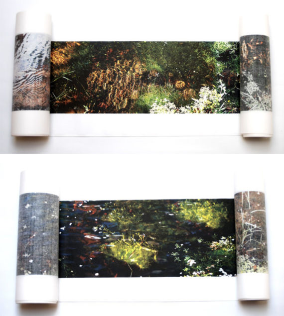
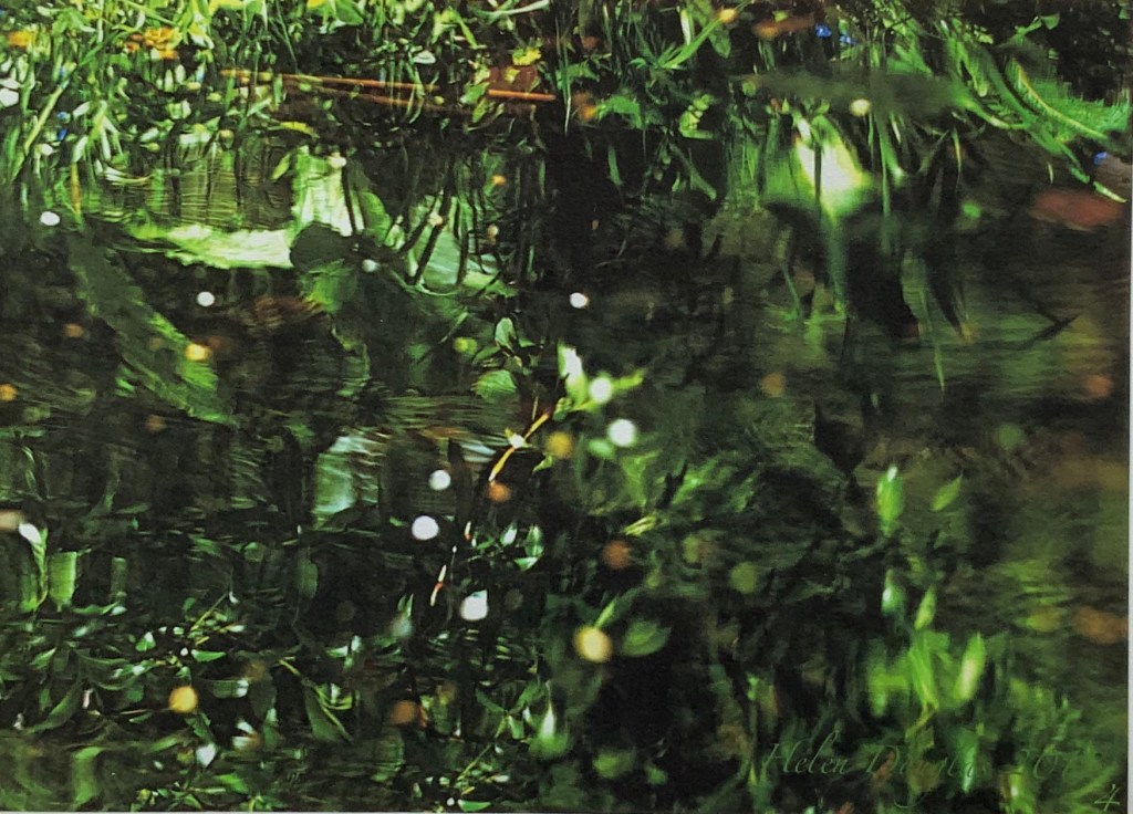
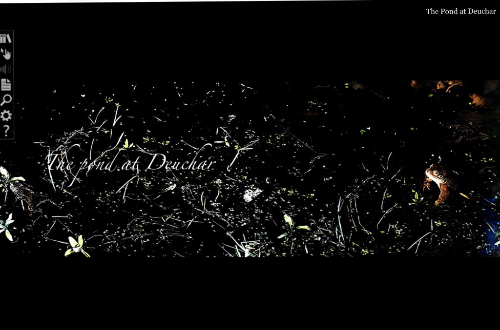
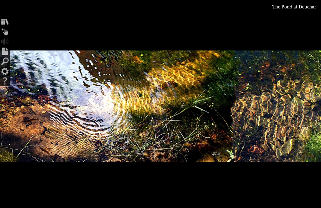
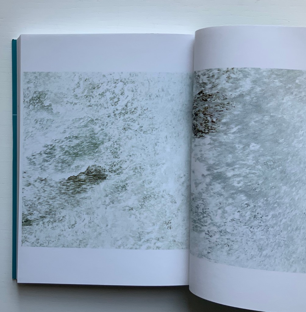
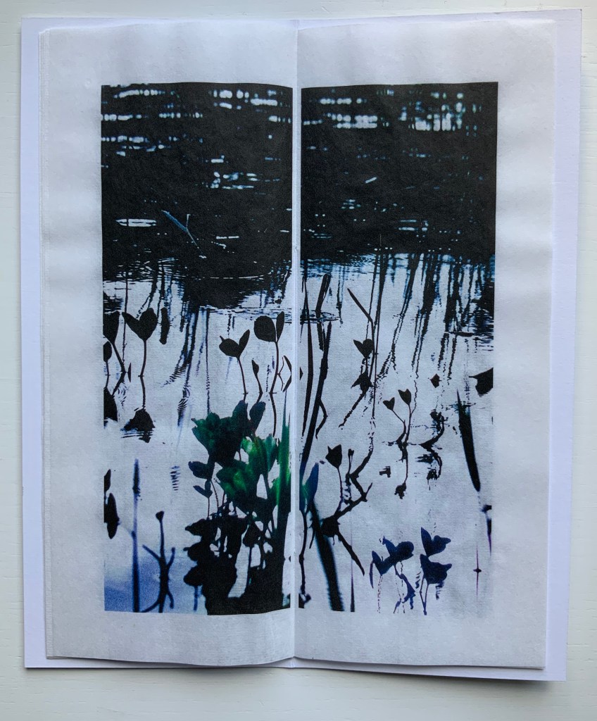
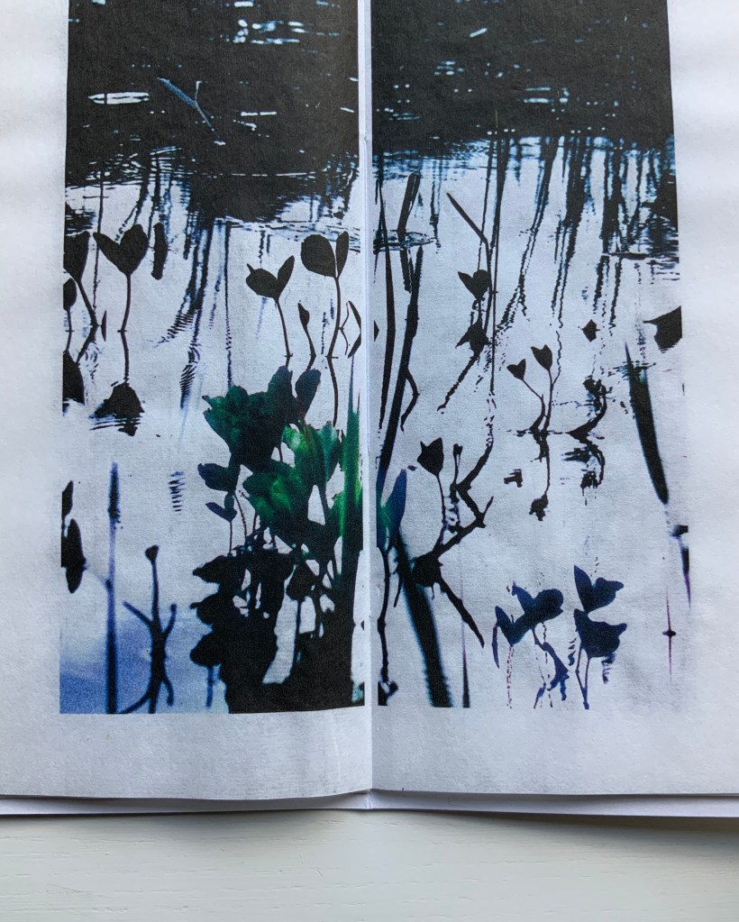
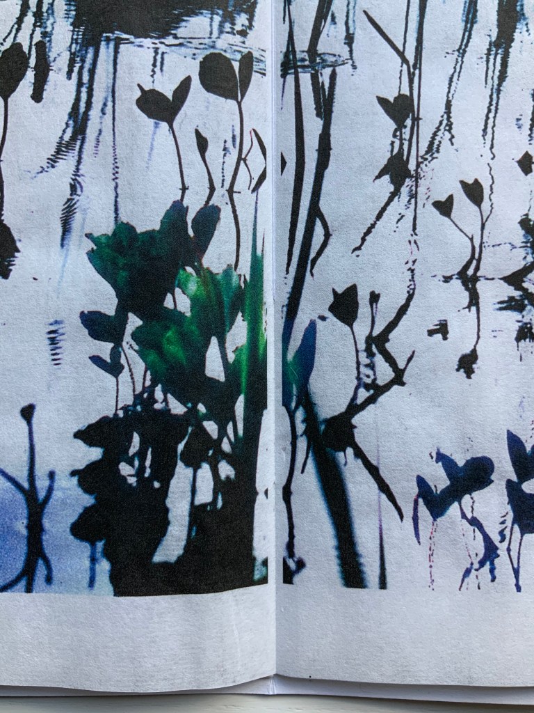
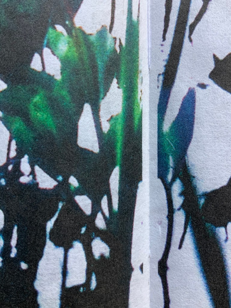
The Pond at Deuchar (2011) Helen Douglas Hand scroll, printed on Chinese Xuan paper, ultra chrome inks. Silk ribbon edged. 14 metres x 270 mm. Edition of 4. Photos: Weproductions.
Details from end of The Pond at Deuchar (2011) Edition of 4, of which this is #4. Acquired from the artist, 18 February 2019. Photos: Books On Books.
The Pond at Deuchar (2013) Helen Douglas Online version produced by Armadillo Systems. Screen captures: Books On Books.
Shortly after orchestrating the series of workshops Transforming Artist Books (2012), during which Helen Douglas created the digital version of The Pond at Deuchar (2011), art historian Beth Williamson marvelled at how the gestures of digital reading affect “our thinking as our (digital) hand navigates around the screen and thinks through the work”. That phrase “as our hand thinks” is magic in its aptness for all of Helen Douglas’s works. Helen Douglas is a book artist who makes our hands think. But what does that mean? Consider these three excerpts:
[t]he hand does not only grasp and catch, or push and pull. The hand reaches and extends, receives and welcomes — and not just things: the hand extends itself, and receives its own welcome in the hands of others. The hand holds. The hand carries … [e]very motion of the hand in every one of its works carries itself through the element of thinking, every bearing of the hand bears itself in that element. All the work of the hand is rooted in thinking.
Martin Heidegger, What Is Called Thinking? trans. J. Glenn Gray (New York: Harper Perennial, 19 68). P. 16.
… the digital hand is […] a version of what the artist’s hand, the craftsman’s hand, the poet or scholar’s hand, and the lover’s hand has always been: a means of marking, touching, selecting, interacting, molding, expressing, and refusing that remains essential to human thinking, even when that thought takes place increasingly in an immaterial environment ….
When talking about her art and the “breadth” or ”span” of the spreads and their “flow” — as she did at the London Book Fair in 2013 and the British Library in 2020 — Douglas gestures in ways that evoke those words of Heidegger, Miller and Diconson. When experiencing The Pond at Deuchar — whether in its scroll edition or its digital version — the reader/viewer makes similar gestures — spreading arms wide, sweeping with the hands; or tapping, pointing, pinching, spreading and swiping with the fingers.
In its scroll edition and its digital version, The Pond at Deuchar draws the reader/viewer into two different literacies but with a continuity between them that does not yet exist between reading a print book and reading its ebook version. Are hand and eye more allied when processing the visual whether on paper or screen than when processing words? Is The Pond at Deuchar a special case because unrolling a scroll and scrolling across a screen are more gesturally similar than turning pages in a codex format and tapping a screen?
Douglas’s own description of the next work Between the Two (1997) brings this question about visual and textual literacies front and center.
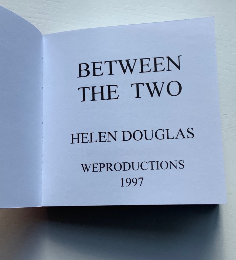
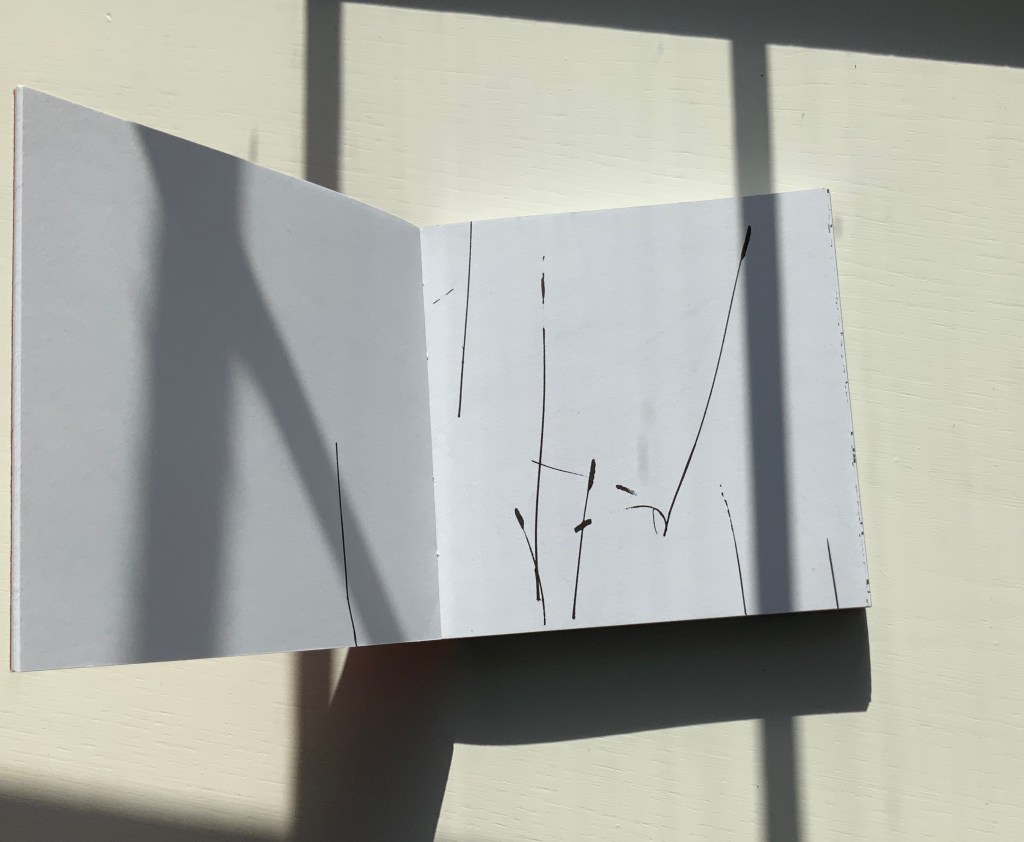
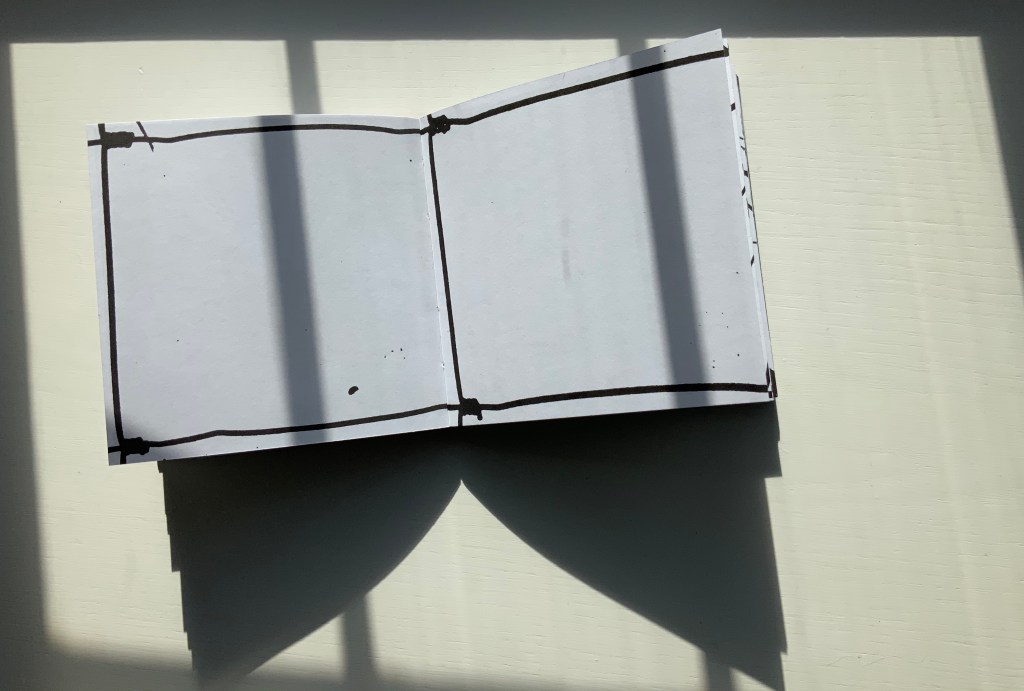
Between the Two (1997)
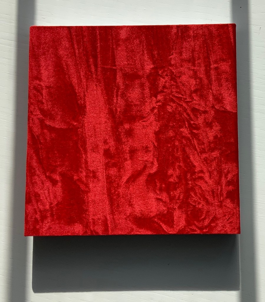
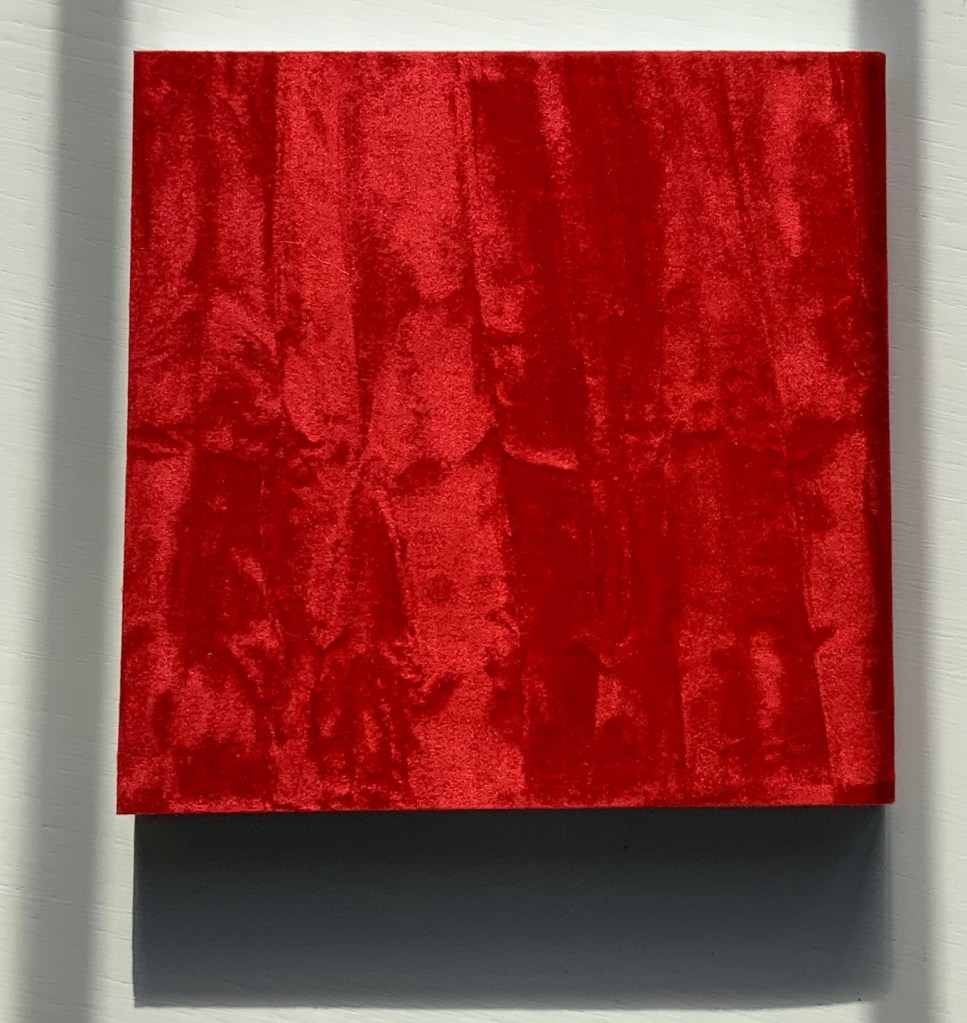
This bookwork is constructed to unravel across the open spread and around the edge of the page to express one continuous visual narrative. It begins with sparse photographic renderings of grasses as black line on white, progresses into a softer tonal sequence embodying flight and finally, in the latter part of the book, develops an arabesque dance of tendrical peas, as light on dark, leading to a flowering of the book. Black and white throughout, the book is bound in scarlet crushed velvet.
Between the Two (1997) Helen Douglas Offset, 130 x 130 mm, 168pp. Acquired from the artist, 29 November 2018.
Reading “around the edge of the page” in Between the Two is a “hard read”. Most turns from recto to verso effect a sense of continuity with stalks, fence, tendrils, etc., wrapping over the edge into the verso page; others do not. The codex format inherently presents this challenge. The edge of the page is a scant plane, although the earlier work Water on the Border (1994) exploits it well (see below). There are other visual strategies that work. Think of Michael Snow’s Cover to Cover (1975) and consider the following work from the same year.
Chinese Whispers (1975)
Douglas has created numerous visual narratives in the codex format, but none of them have been reproduced in a digital format. If Chinese Whispers — one of her first books in partnership with Telfer Stokes — were delivered in a “tap-to-turn-the-page” digital format, would a sense of continuity between the different literacies occur or diminish? The tightness of the binding of Chinese Whispers makes full appreciation of the spreads and flow difficult, but on the other hand, the meeting in the gutter of the two photos on each double-page spread is essential. Say that two copies of the book were unbound, the “freed” double-page spreads would have to be displayed somehow in a way that still captures that meeting in the gutter. On a gallery wall? As Clive Phillpot has pointed out, to do so with Douglas’s work is to destroy what is going on in moving across and turning from one double-page spread to the next. A digital version would need to be fiendishly quirky in its own way to find a parallel semantic and artistic solution to its codex counterpart’s effects.
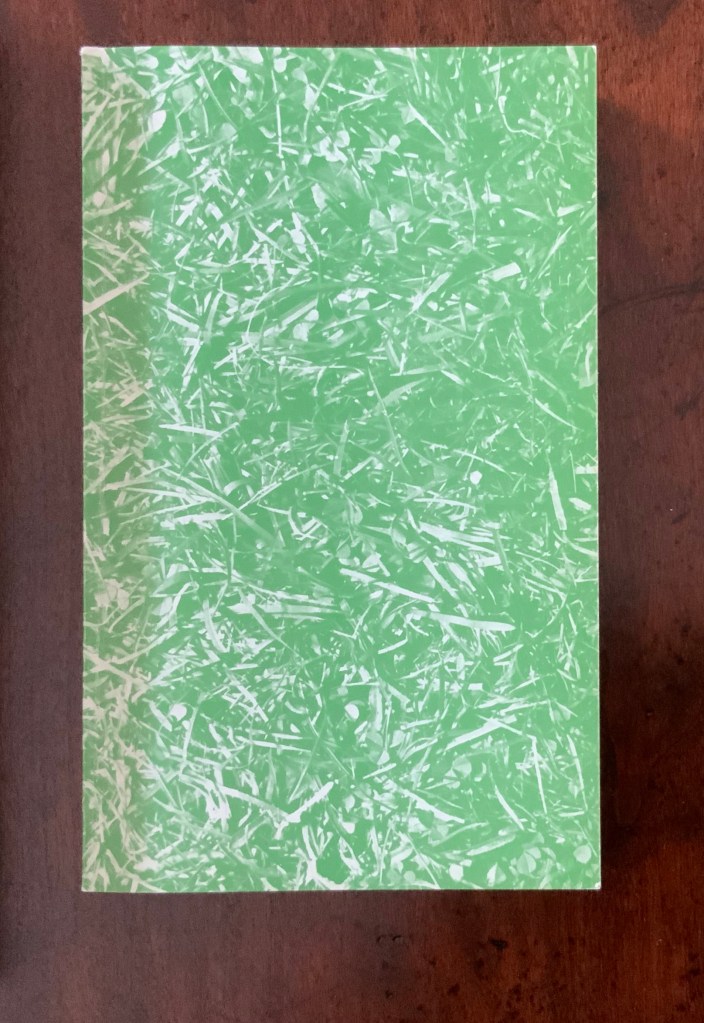
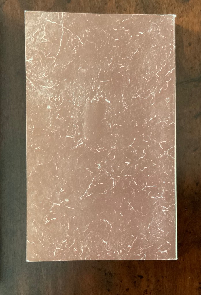
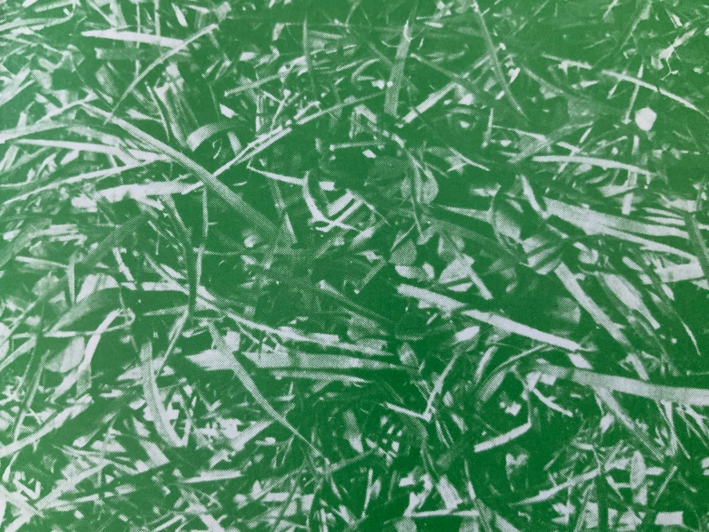
The front cover of Chinese Whispers (1975) shows lush green grass in a photo that bleeds to all four edges. Flip the book over and find another edge-to-edge photo showing the dirt and roots beneath the front cover’s patch of grass.
Chinese Whispers(1975) Helen Douglas and Telfer Stokes Offset, 110 x 180 mm, 176pp. Acquired from the artist, 29 November 2018. Photos: Books On Books.
Doing this is a bit like jumping to the end of a detective story; it is literally jumping to the end of the game of visual Chinese Whispers to which the book invites us. Decades after the book’s appearance, Brandon S. Graham revealed some of the behind-the-scenes process, driving home the filmic character of the book. In correspondence with Books On Books, Douglas confirms the “absolutely continuous narrative” of Chinese Whispers, emphasising how the artists would “come up with a concept and starting point together and then … would go backwards and forwards“ (20 March 2020).
Like the give and take of a word game, this book was scripted, planned page by page and section by section. Stokes would suggest a starting point and a concept, Douglas would interpret the idea slightly differently, add to it and relay it back to Stokes. Stokes would run with the evolved idea and it would start again. In this way the book evolved as an honest representation of the collaborative process that yielded it. The photography began once they had the whole object planned. … For the cover image, Douglas and Stokes used a spade to cut a rectangle of sod to the exact dimensions of the finished book and took a photo.
Brandon S. Graham, “Chinese Whispers“, Fiction Doldrums, 26 July 2011. Accessed 9 December 2018.
The visual narrative takes us from trimming the overgrowth from the outside of a derelict cottage, entering it and starting the process of building a corner cupboard, populating its shelves with a breadbox, a coffee pot and many other objects that lead from one element of the narrative to the next. Packets of seeds lead to a cabbage and pea pod. A bunch of berries leads to jam in a jar. Toward the end, a pair of scissors and sheet of paper lead to a cut-out butterfly whose wings gradually close along with the two “wings” of the corner cupboard, leaving us in the dark with a double-spread of black pages. Below are close-ups of the front and back covers. Notice the impression in the dirt-side photo? It looks like a rectangle the trim size of the book; whether it is or not, Chinese Whispers is a bookwork of continuous page-turning inside (and outside) jokes.
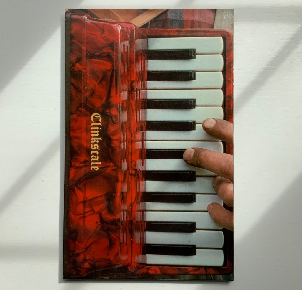
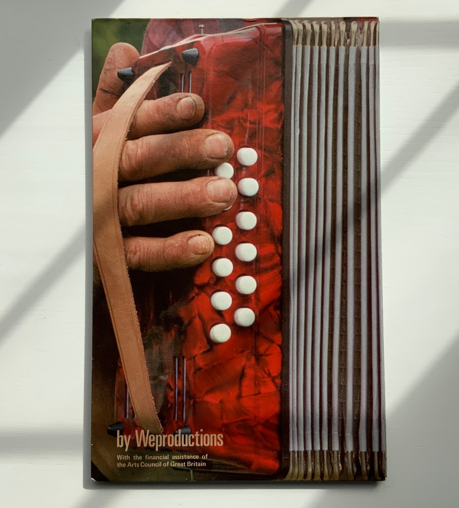
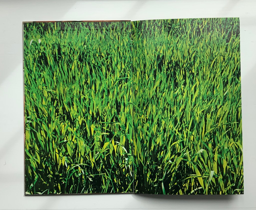
Clinkscale (1977)
“Clinkscale” is the name of a company that specialised in the musical instrument photographed by Douglas for the bookwork of the same name. Perhaps every book art collection has a one-note joke. Clinkscale is almost that for the Books On Book Collection. Brandon S. Graham defended the work against the characterisation years ago:
It would be easy to dismiss this as a clever one liner: accordion with an accordion fold format. But on closer examination there is more going on. Over top of the accordion body a band of atmospheric and biographical information can be observed: the blue sky, the green of the field, the bright spring sunlight, the work shirt and threadbare work coat. When one looks closely at Telfer’s hands and nails, particularly the thumb on the back cover, one can see a criss-cross of the shallow cuts that have been stained with dirt. All of these details speak of a place and a time and a situation. They are a record of standing in a field in rural Scotland on a crisp spring day, a record of the work that Telfer’s hands are performing on the Mill. These details ground the work and tie the work to a person at a moment in time. It is a record, a document.
Taken in this context there is another layer of meaning evident in Clinkscale: the idea of breath, air, anticipation, rejuvenation and renewal. As a viewer holds the book with the bellows closed the viewer sees Telfer’s fingers poised. This builds anticipation of a motion and perhaps a sound. As the book is opened the accordion inhales, the bellows expand and the rush of air stirs the spring grass. The hands are those of a workman. The workman is standing in a field with an accordion, taking a break; taking a breather. The sea of green spring grass is symbolic of rejuvenation and renewal.
Brandon S. Graham, “Telfer Stokes”, FictionDoldrums, 8 April 2011. Accessed.17 March 2020.
Clinkscale (1977) Helen Douglas and Telfer Stokes Accordion binding, two hardboards joined by a single leaf; full colour photograph commercially printed. H278 x W174 mm (closed), W1708 mm (open). Acquired from Douglas, 29 November 2018.
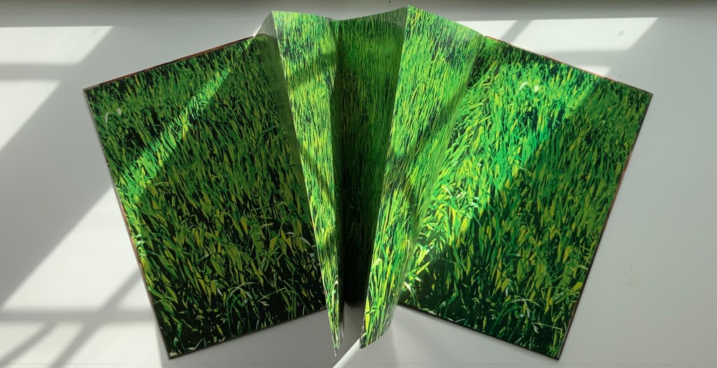
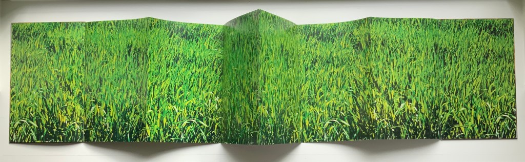
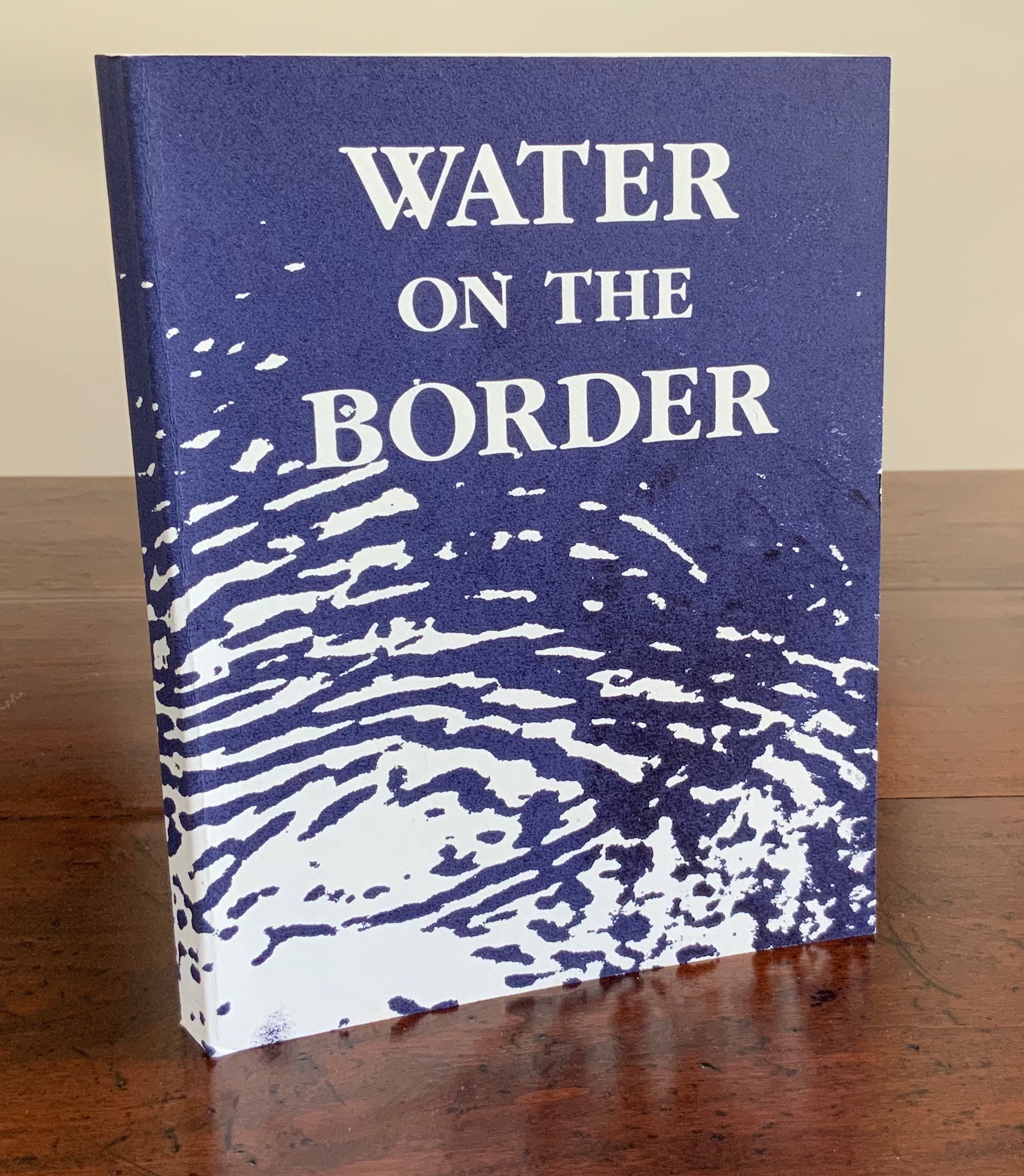
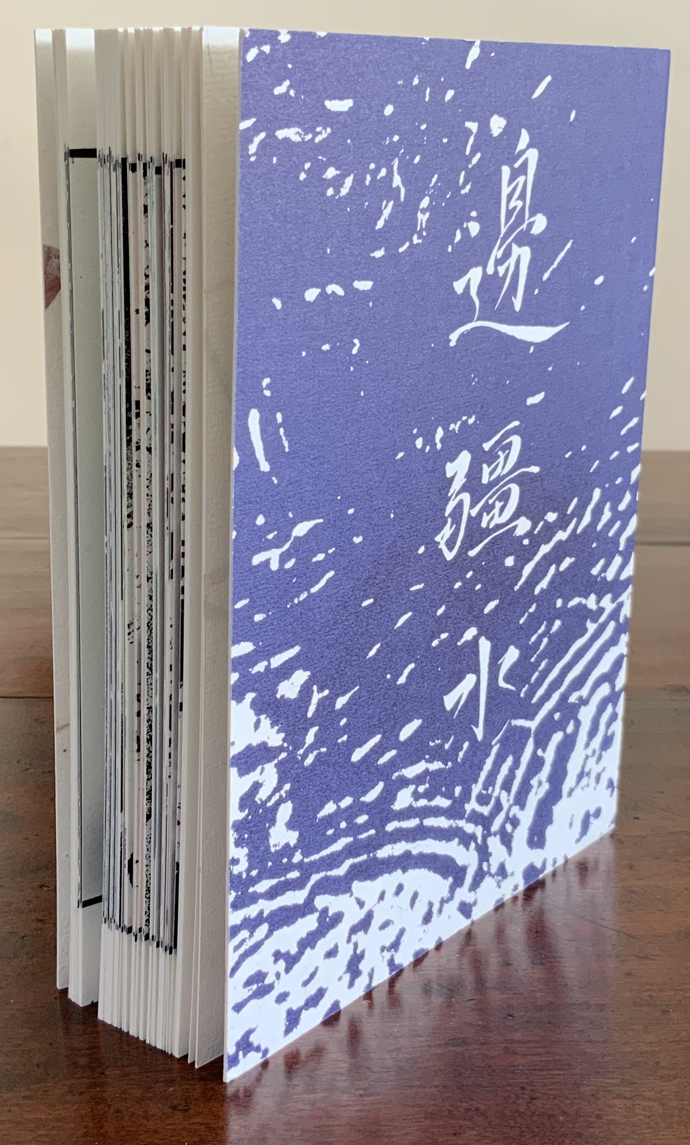
Water on the Border (1994)
Water on the Border (1994) Helen Douglas Offset, 150 x 190 mm, 124pp. Acquired from the artist, 29 November 2018. Photos: Books On Books.
The two pairs of double-page spreads below demonstrate the artist’s success in taking the reader/viewer “around the edge of the page”. In the first pair, after the boat‘s prow disappears at the edge of the recto page and reappears from the verso’s, the artist introduces a vertical border at the tip of the prow. On the other side of the border is a photographic tracing of a building’s reflection in water. It is not necessarily the same stretch of water on either side of the border, but it feels that it is.
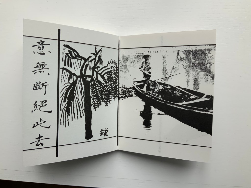
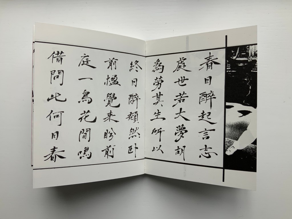
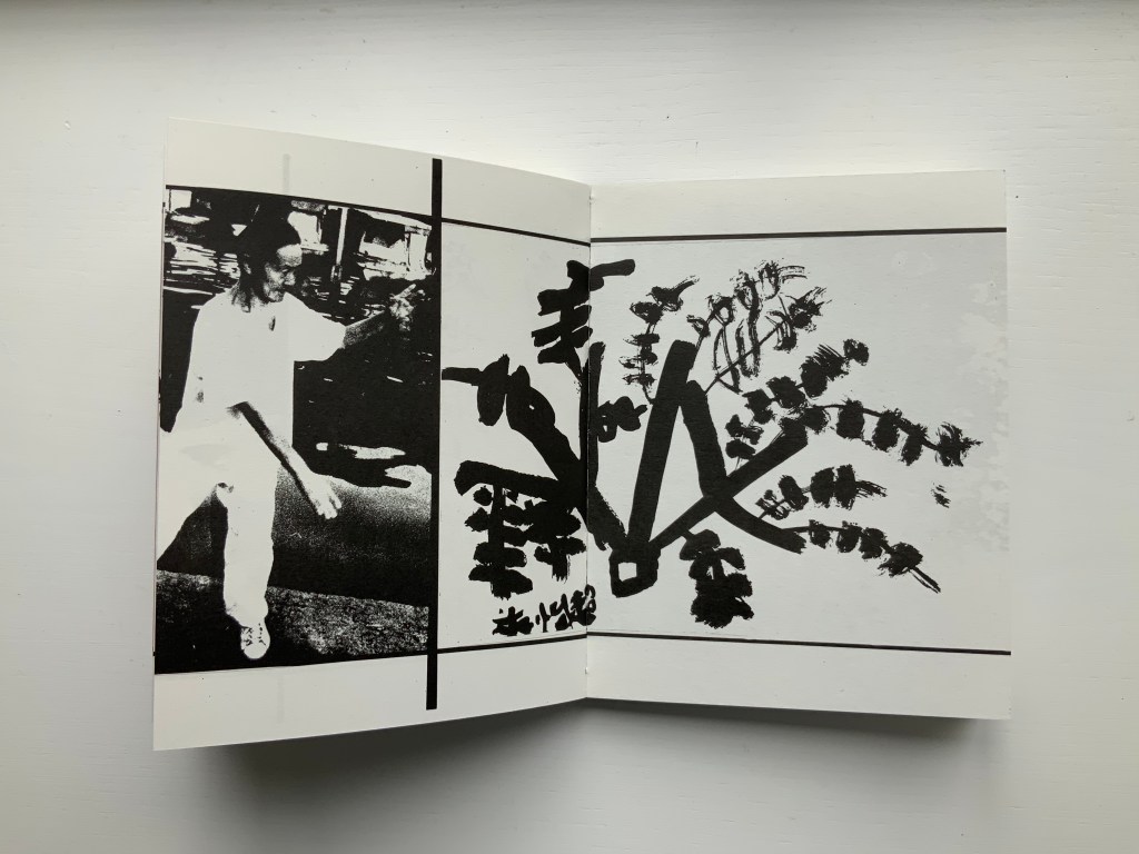
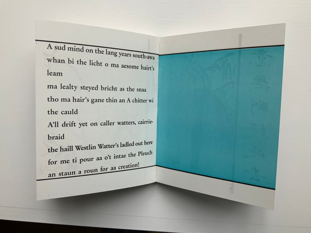
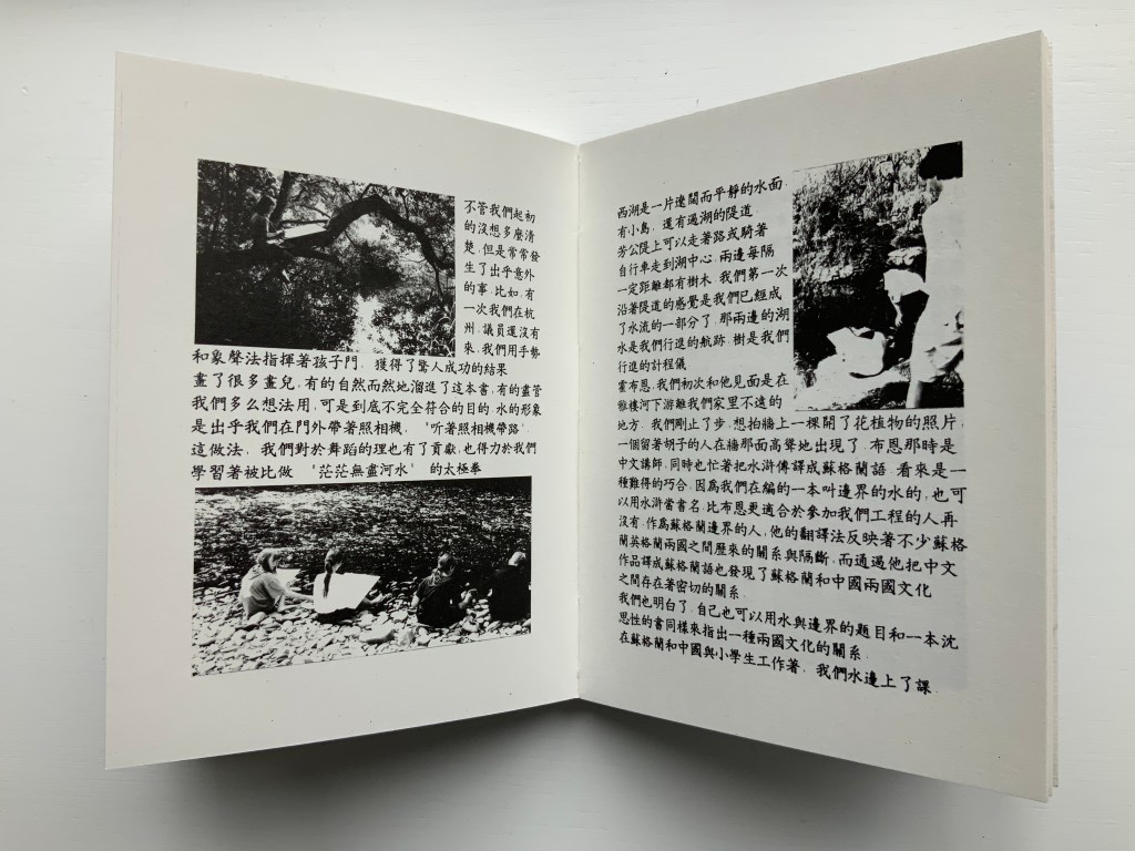
In the second pair, the seven columns of characters of a Chinese poem precede the picture of the lower part of a right leg that wraps around the edge of the recto page into the image of a man performing T‘ai Chi. As above, the verso page of that double-page spread is divided by a vertical border, which is followed by a child’s ink drawing that falls across the verso and recto pages. As with the continuity of water above, there is a continuity of the man’s pose on one side of the border and the lines of the drawing on the other side.
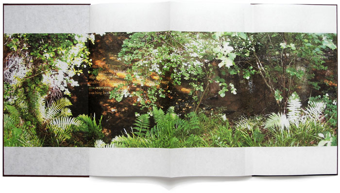
Water on the Border engages sides of multiple borders. Six Chinese poems rendered in calligraphy balance against Brian Holton’s transcriptions into Scots (first image, top row, below). Children from Scotland and China provided the drawings (second and third images, top row, and fourth image, below). The reflective images photographically traced come from the water surfaces of Yarrow Water Scotland and West Lake, Hangzhou.
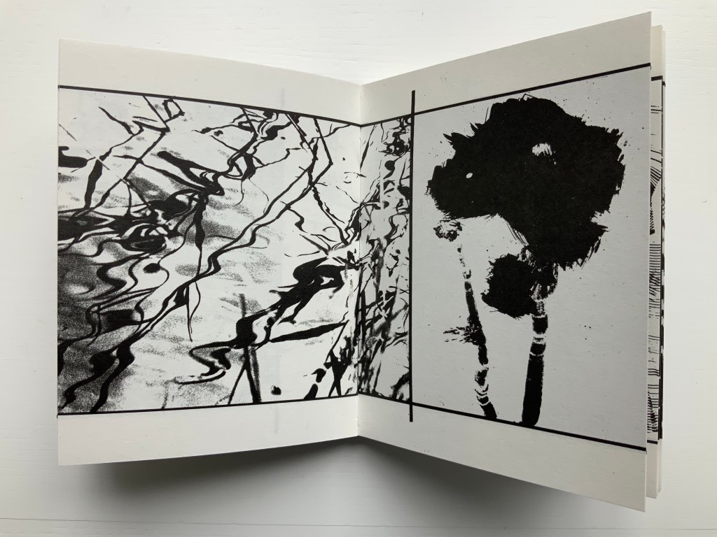
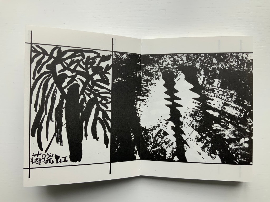
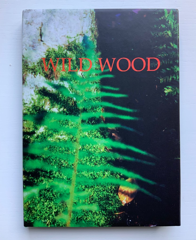
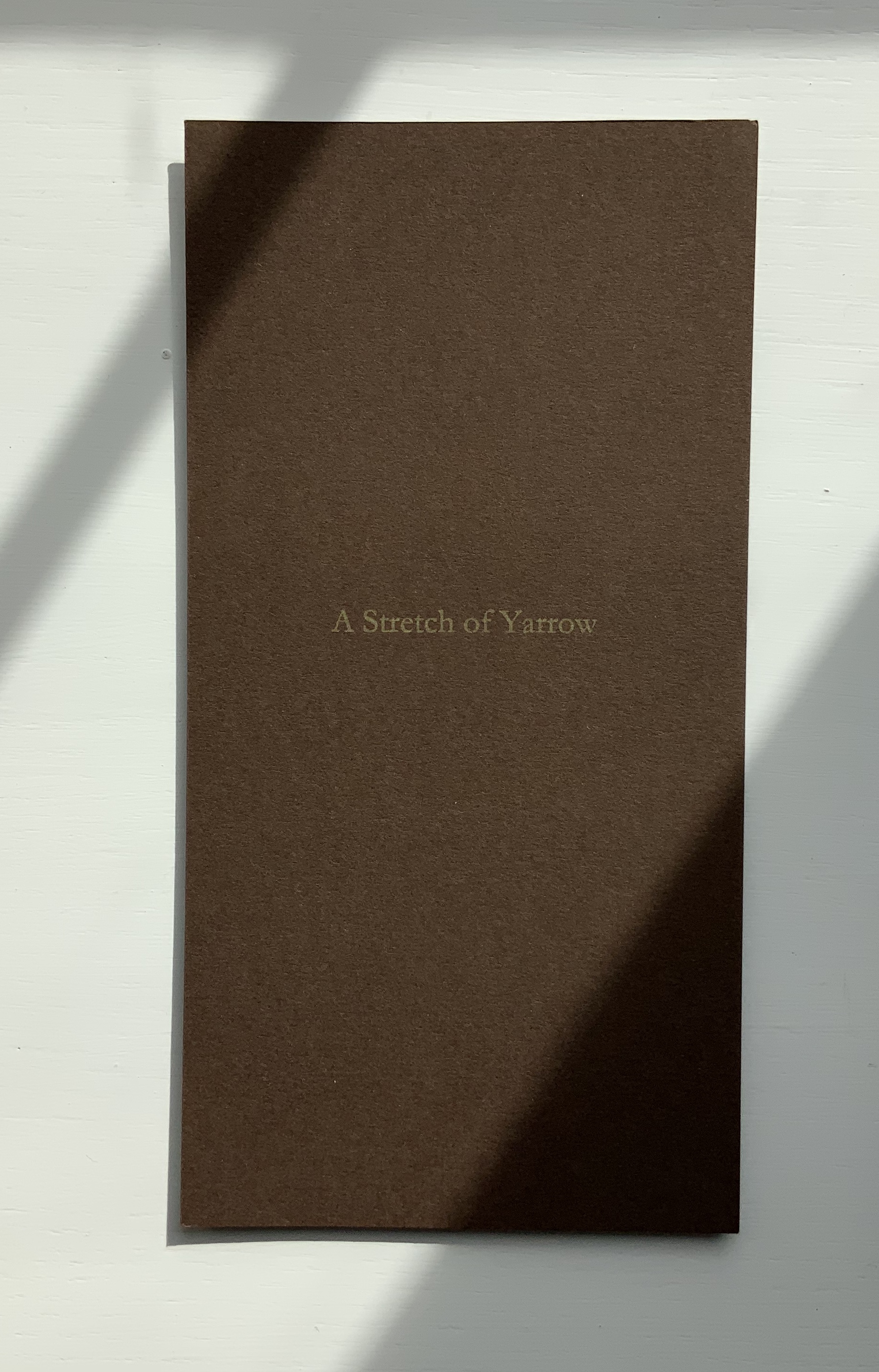
Wild Wood: A Border Ballad (1999)
Wild Wood: A Border Ballad(1999) Helen Douglas Offset, 116 x 160 mm, 144pp. Acquired from the artist, 29 November 2018. Photos: Books On Books.
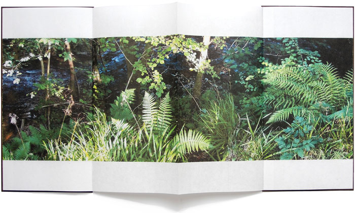
Wild Wood has been conceived as a Border Ballad and takes as its inspiration the Carrifran Wildwood project and the ancient woods at Deuchar and Tinnis Stiel in Yarrow. In 2000 Wild Wood won The Nexus Press Atlanta Book Prize. Opening the book and turning the pages is analogous to entering and exploring the Wild Wood where different moods and feelings move the viewer through the visual narrative.
A fair enough and fair description of this bookwork, but what astounds is the manipulation of borders and the framing of photos within photos. Below, on the left, a thin white border around a recto page; on the right, a thin black border encircling a double-page spread (notice also the precision of alignment from verso to recto.
Borders yield to full-page bleeds (first spread below), and full-page bleeds are manipulated to create frames of images (second spread below).
Strange roundel vignettes of the forest appear within close-ups of a tree.
Photos of the wood create a border for other photos of the wood, and some burst wildly beyond those borders.
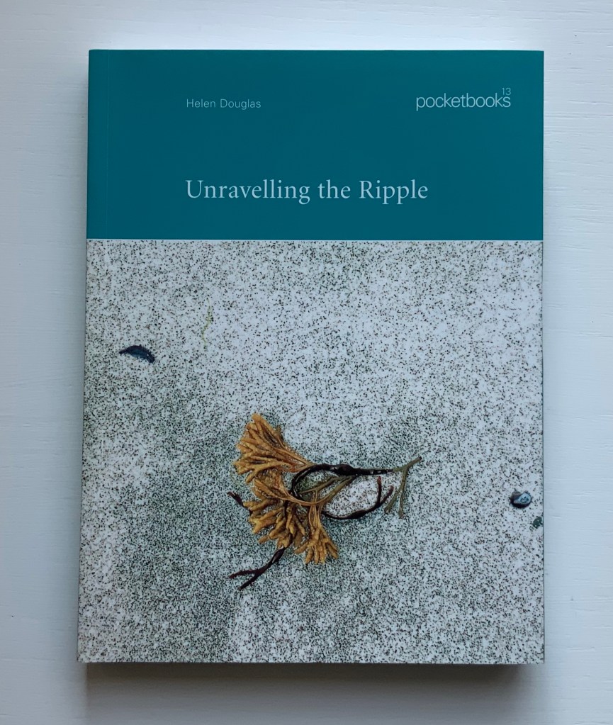
Unravelling the Ripple (2001)
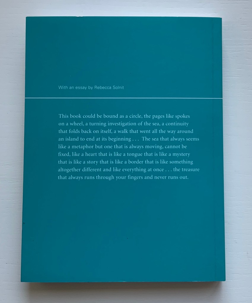
Unravelling the Ripple (2001) Helen Douglas, Rebecca Solnit Offset, 170 x 127 mm, 76pp. Perfect bound. Acquired from retail, 15 November 2019.
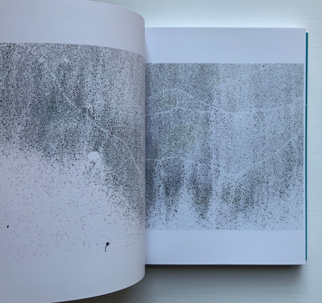
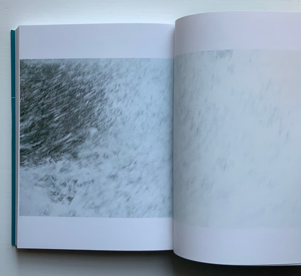
The opening and close of Unravelling the Ripple. Photos: Books On Books.
Like three of the following works — Illiers Combray, A Venetian Brocade and In Mexico — Unravelling the Ripple takes the reader/viewer on a journey away from the Scottish Borders to one along the coastline of a Hebridean island. Among the book’s many striking features is the precision of alignment across the double-page spreads. Slowly opening, then closing, then opening each spread is as much a pleasure as the sensation of peering through clear water at the sea wrack, urchins and shells. Moving the view from tidal pool to crashing waves and moving from greys to full colour then back to greys, the bookwork delivers on the back cover’s assertions. The assertion that “the book could be bound in a circle”, however, begs for an answer to the question “what if it were bound in a circle?” A variety of more sculptural solutions are possible: one of Hedi Kyle’s “blizzard book” variations or the Chinese dragon-scale binding. Without the codex structure, though, that pleasure of the double-page spreads would be lost. So the work must depend on the reader/viewer’s memory and perception to recognise the beginning in the end.
While Solnit’s essay is lyrically in keeping with the body of the bookwork, it stands apart. Where the livre d’artiste most often begins with the text and follows with the art, Unravelling the Ripple clearly starts with the art.
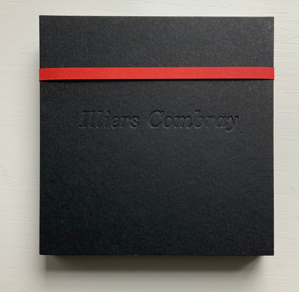
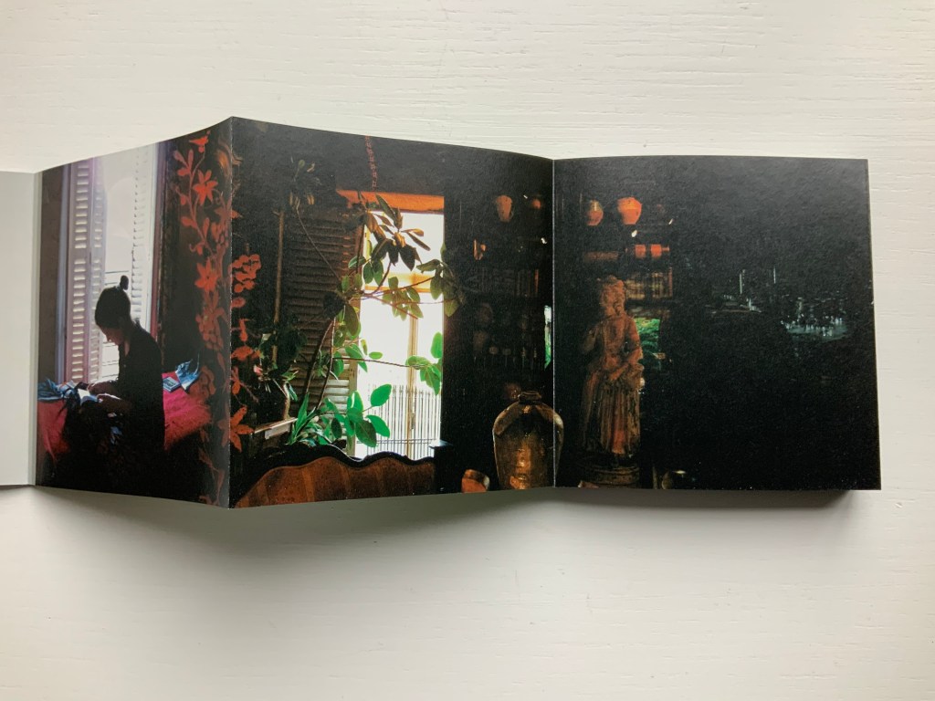
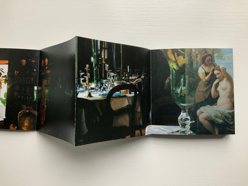
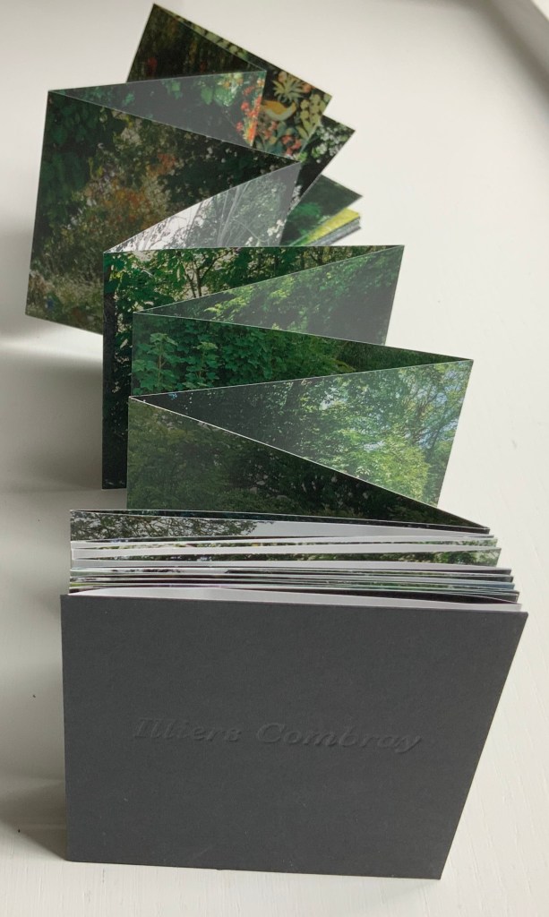
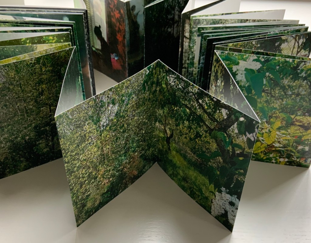
Illiers Combray (2004)
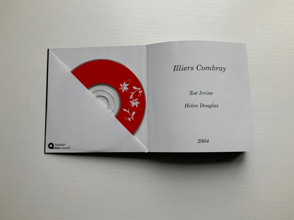
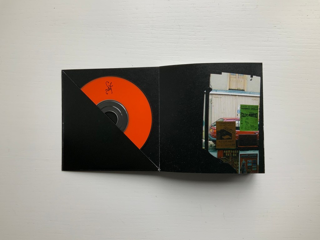
Illiers Combray (2004) Helen Douglas and Zoë Irvine Offset, four colour, 92 x 92 mm, 120 pages; two mini audio CDs, (18 mins each) placed in end pockets on board covering the two-sided accordion book; embossed title, red fastening band. Acquired from the artist, 29 November 2018. Photos: Books On Books Collection.
The journey to this small French town immortalised by Proust‘s In Search of Lost Time intensifies a recurrent feature or element of Helen Douglas’s art: the surreal weaving of images (drawn or photographed, present or past) into the photographed townscape and its environs — where the warp of the townscape/environs meets a weft of images taken from paintings, still-life arrangement of objects, poppy-coloured stitches, and words or ornaments that run like strings from panel to panel.
Sound artist Zoë Irvine and visual artist Helen Douglas collaborate to create a richly textured, multi layered soundscape composition (2 CDs: Irvine) and ornately interwoven visual narrative (2 sided concertina book: Douglas), exploring a sense of memory and place. Inspired in the month of May by a week long visit to Illiers Combray, the small town immortalized by Marcel Proust in his epic novel In Search of Lost Time, Irvine and Douglas weave together their own distinct mythologies and reveries; their subjective responses elliptically united by their shared sense of place. This book won the Birgit Skiöld Memorial Trust Award LAB 04 and the Seoul International Book Arts Award 2005.
In their obsolescence and presence in the front and back covers, the two mini-CDs bracket a gap that the artists’ collaborative effort could perhaps only close in performance or an installation. Irvine’s soundscape is available online, which, as long as the link lasts, overcomes the obsolescence of the mini-CDs but not necessarily the gap. Perhaps the technology of augmented reality could close the gap if Douglas integrated NFC (near field communication) tags in a new edition of Illiers Combray.
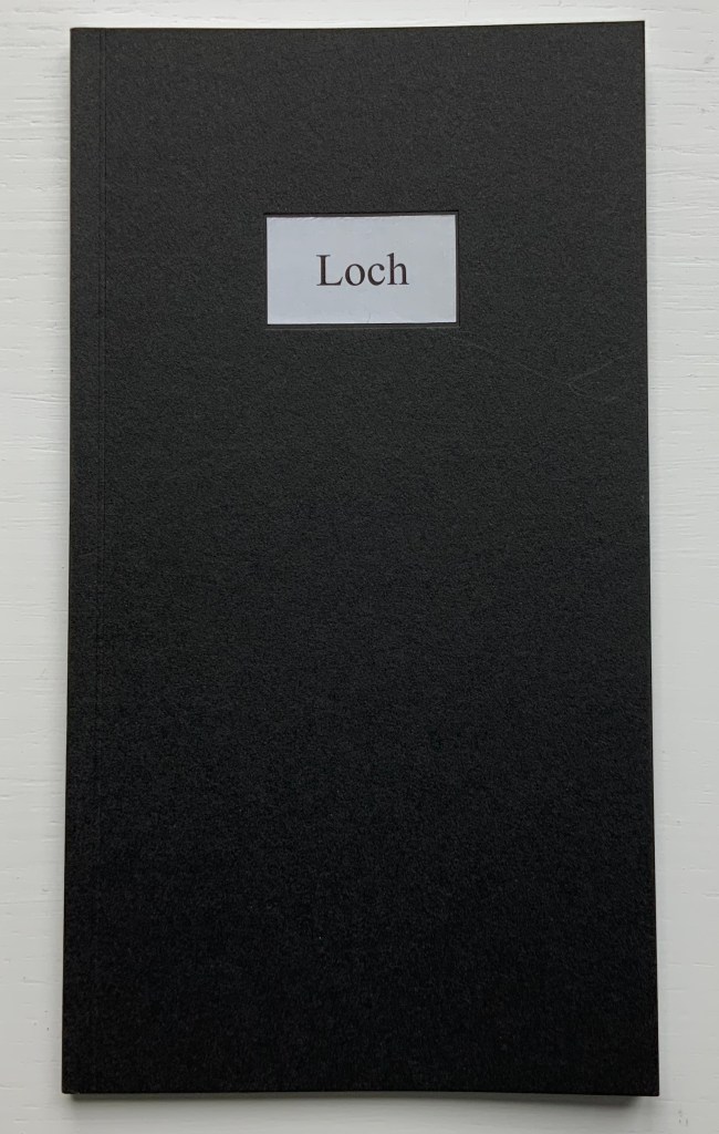
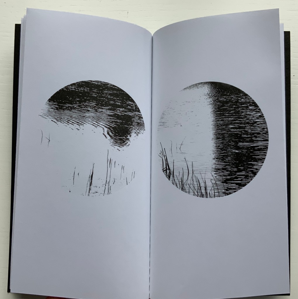
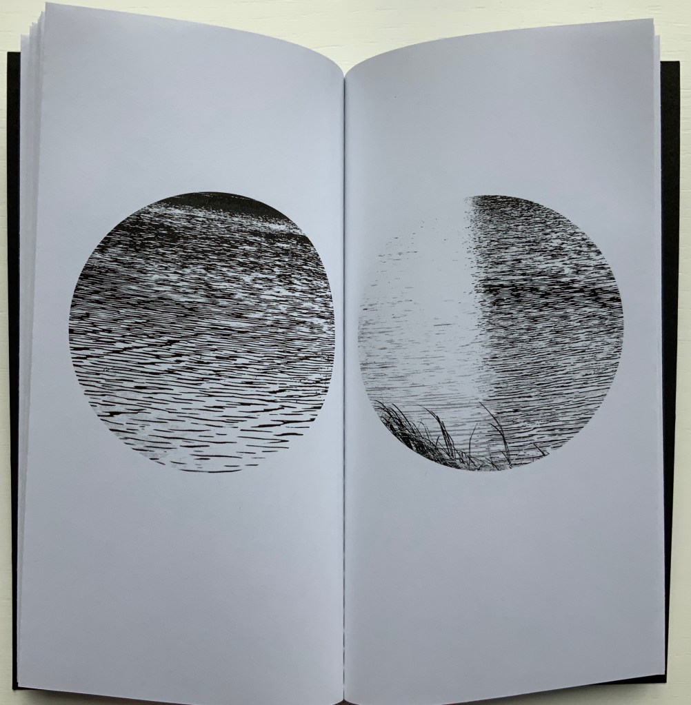
Loch (2005)
Loch (2005) Helen Douglas Offset b&w, french folds, 195 x 105mm, 28 pages; black cover with inset title. Acquired from the artist, 29 November 2018.
Loch consists of twenty images facing each other across eleven uncut leaves. The roundel vignettes capture a sense of wind and light moving across the loch’s surface. These roundels standing in their white space naturally differ from those in Wild Wood. They are more similar to those in a work unfortunately not in the Books On Books Collection: Winter: Celestial Mountain (2015).
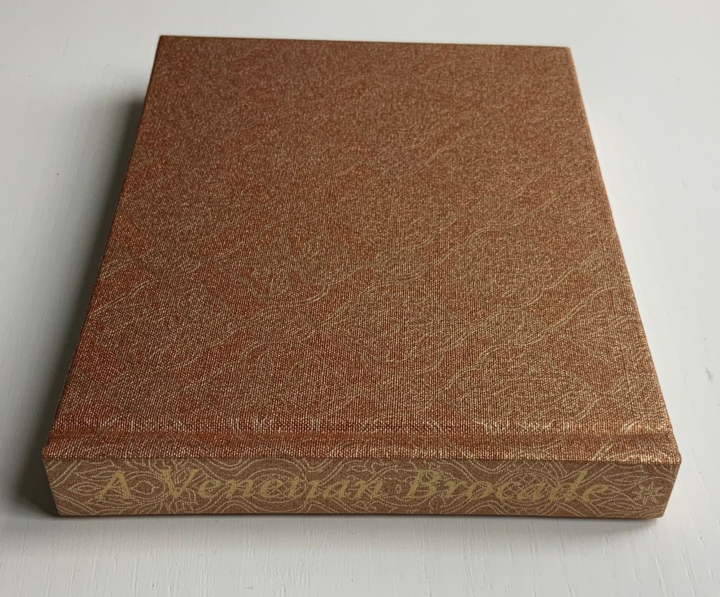
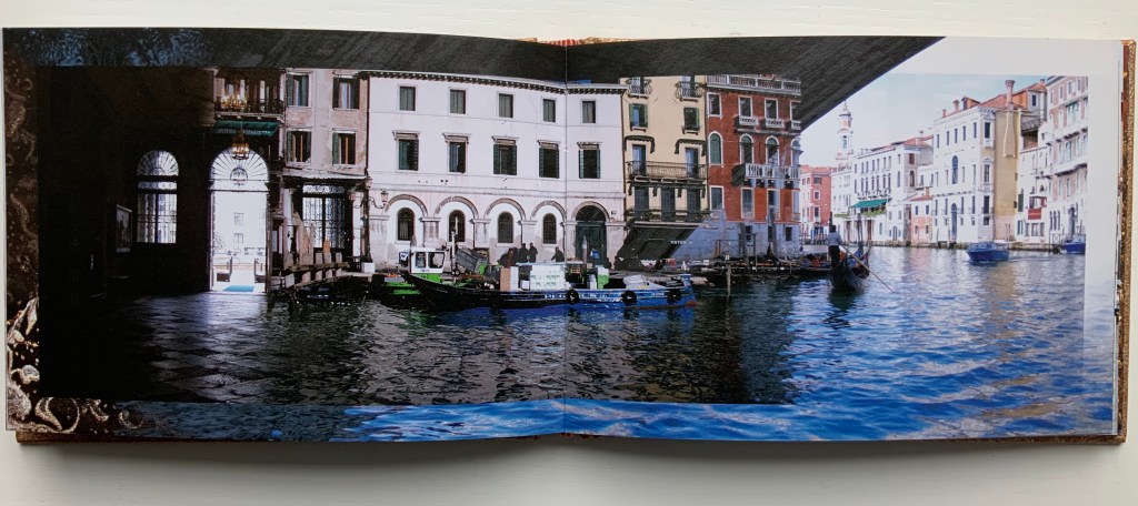
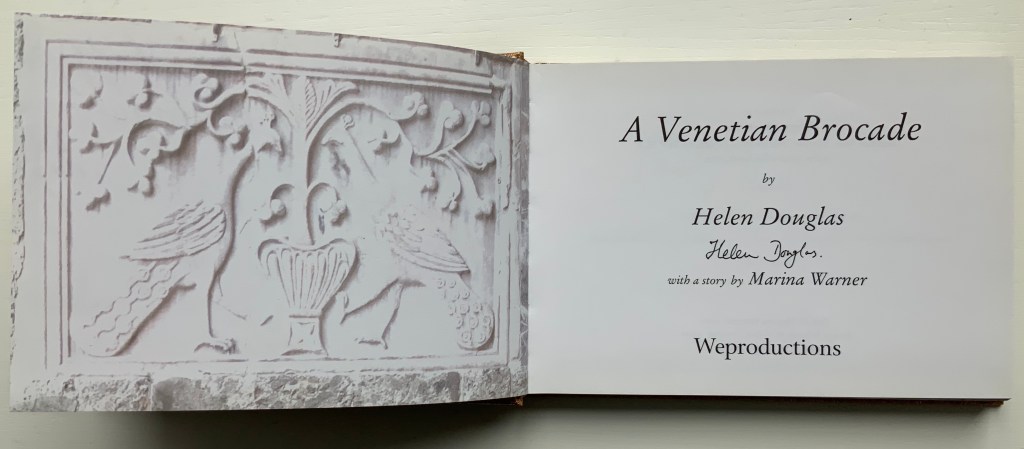
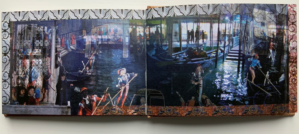
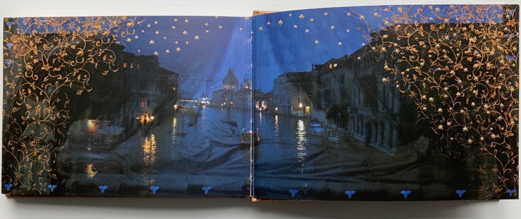
A Venetian Brocade (2010)
A Venetian Brocade (2010) Helen Douglas, Marina Warner Case bound in Ratchfords Inspiration with foil blocking. Offset, four-colour, on Hello Extra Matt 130gsm. 128×180 mm, 180 pages. Acquired from the artist, 6 September 2014.
The journey here crosses space (the cityscape of Venice) and time (present and historic figures). The warp-and-weft technique from Illiers Combray blends with the bordering technique from Wild Wood. But what Douglas does with the double-sided accordion format of Illiers Combray and the codex format of A Venetian Brocade attests to her ambidextrous mastery of both.
From Tommaso Mocenigo’s tomb – its great curtain drawn back – the city of Venice unfolds in the hands of Douglas’ rich visual narrative, delighting in textural contrast and intricate layerings. As oneiric zone that Venice embodies, stone, brick, water, inside and out, near, far, night, day, east, west, past in present are juxtaposed and woven as one continuous brocade. Within each landscape-format spread an inner page is floated and embellished at its edge. Borders of brick dissolve as sky, images shift, merge and overlay, water laps and floods, whilst reflective glimmerings morph into mosaic and golden threads. As masterful threading within this Venetian Brocade – at its fore, Marina Warner contributes a dexterous story of unique, wondrous wide-eyed looking from East to West.
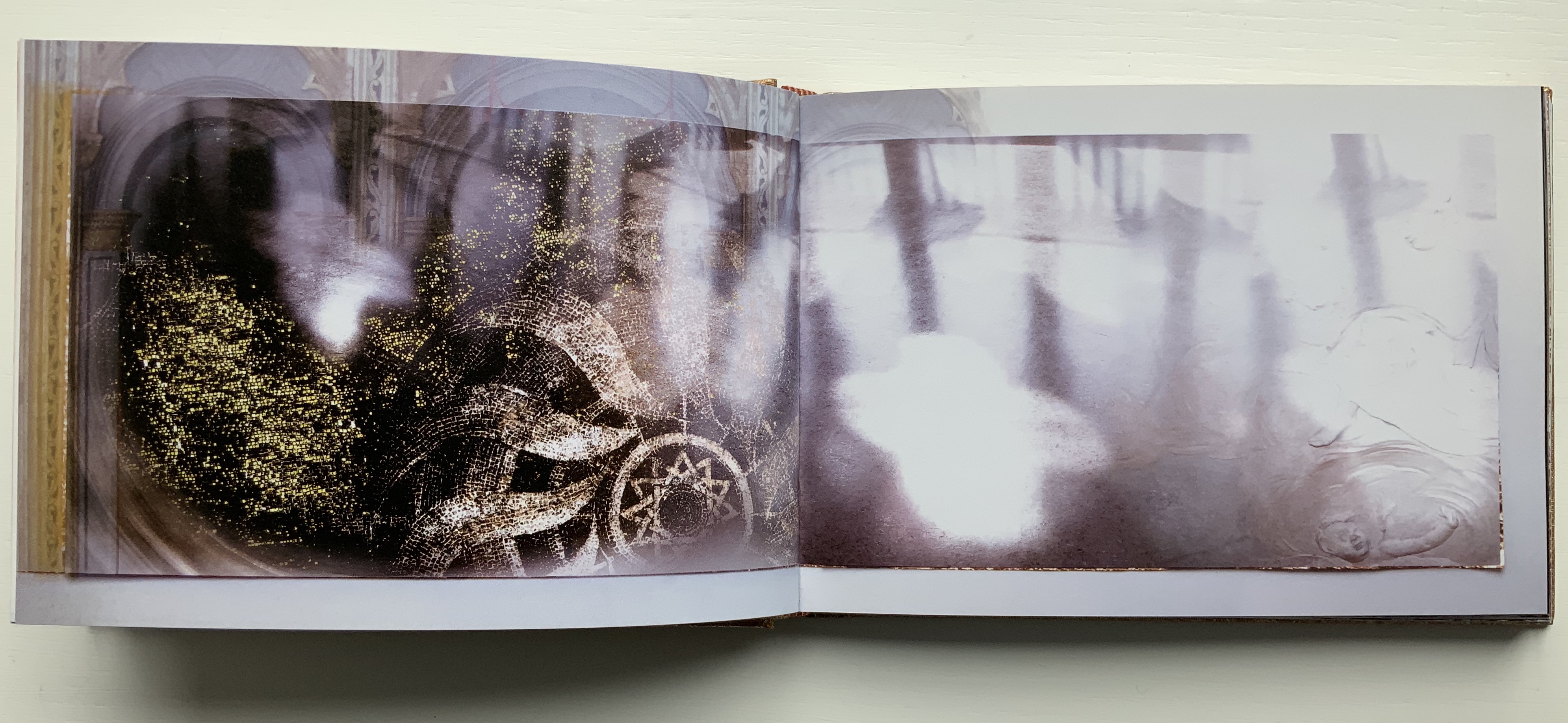
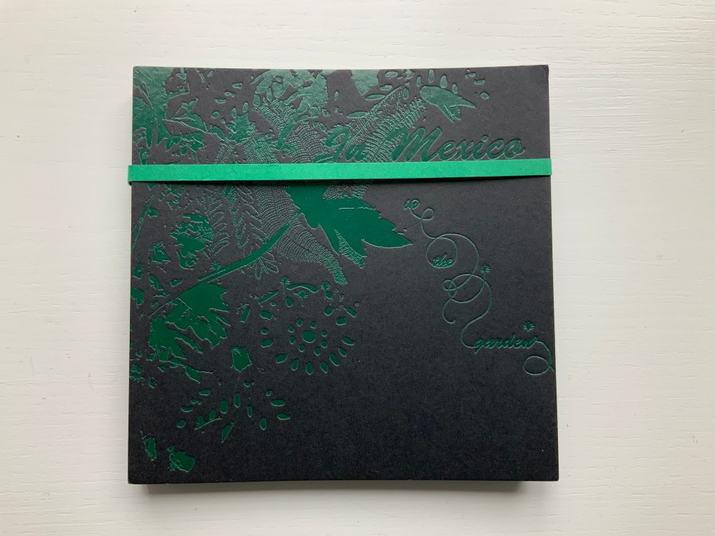
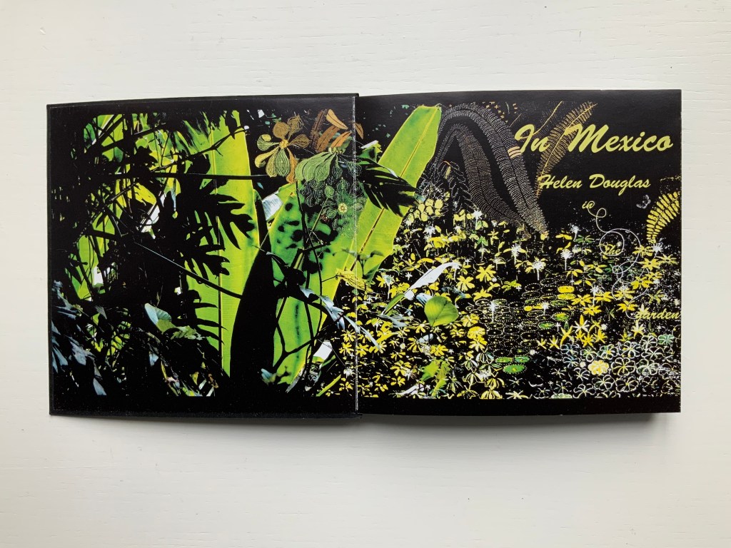
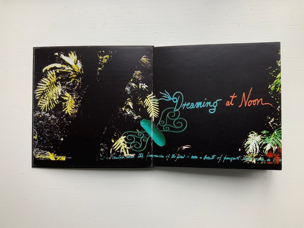
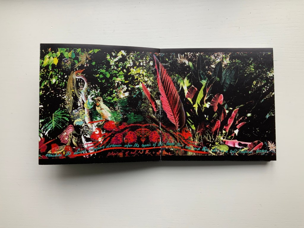
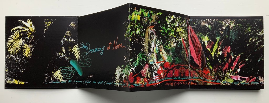
This concertina opens in vibrant colour to reveal in progressive spreads of two, four and six pages a rich sensory exploration of Edward James’ surreal jungle garden Las Posaz, in Mexico. Lush vegetation intertwines with the constructed buildings and staircases of James’ imagination and with Douglas’ own, in experiencing this garden and the rich culture of Mexico. Within the book the abundant garden is interwoven on the page with decorative threads from Mexican embroidery and feather work. Patterns of leaves are echoed by cut paper craft whilst the delicate encrustation of flora and fauna is enriched with ancient Indian beadwork. With the unfolding pages, from ground to tree tops, the viewer can ascend with the staircases and flit with the butterflies of the garden, suspending gravity and disbelief, venturing through gates and windows to boughs and fern vaults in the sky. And in so doing experience, within the small intimacy of book, something of the unfolding immensity of the garden and its timeless fusion of earth and paradise, real and surreal.
In Mexico (2014) Helen Douglas Offset, four-colour, 145 x 145 mm, 92 pages; green paper band around green foiled card covers, enclosing double-sided concertina. Acquired from the artist, 10 February 2015.
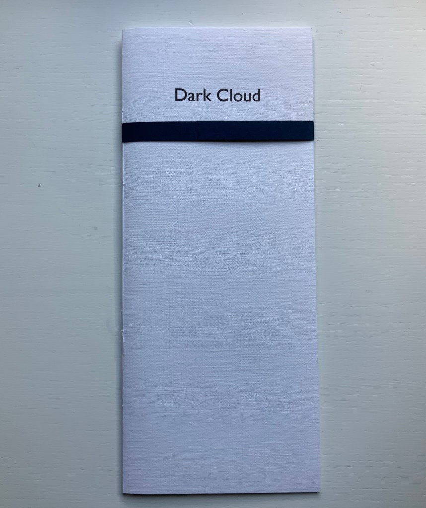
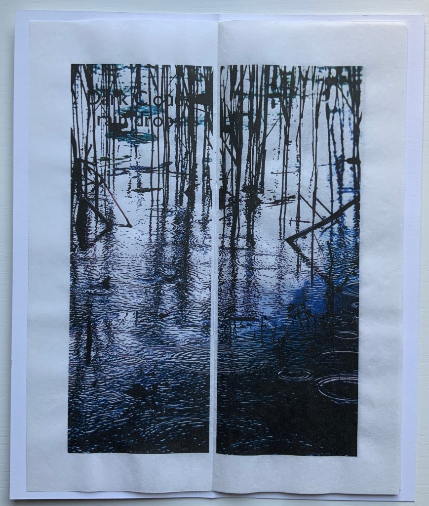
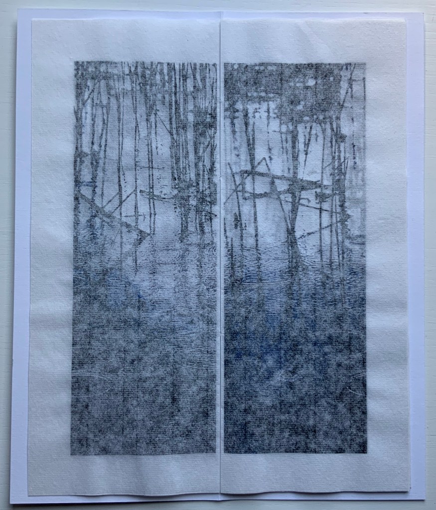
Dark Cloud (2015)
Dark Cloud (2015) Helen Douglas Printed on Toshu paper with ultra chrome inks, 105 x 250 mm, 24 pages; blue fastening paper band around card cover over 6 folded leaves hand stitched. Acquired from the artist, 29 November 2018.
The images, colours and texture’s appearance create an expectation that the paper will feel wet to the touch. The double spreads of the unprinted side of the leaves create a surface mist or cloud across the images.
Odd to say, but the physical sensation — of fingers trailing in the water — created by the digital version of The Pond at Deuchar is best replicated by Dark Cloud and the next work.
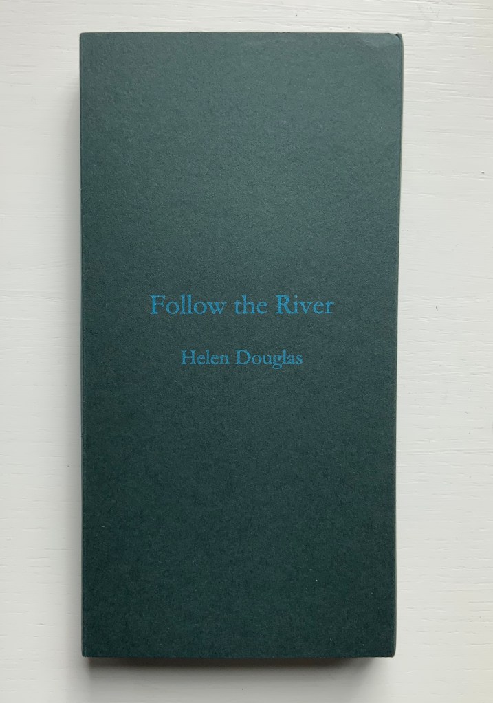
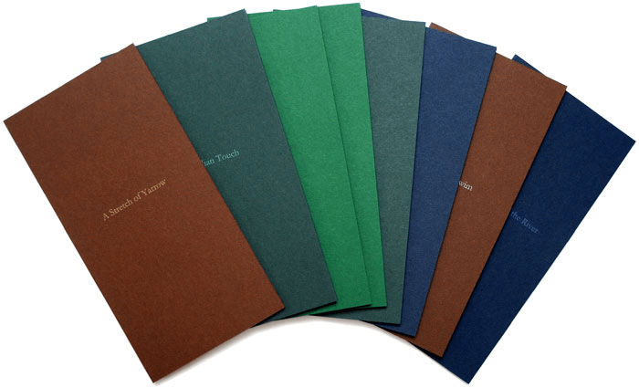
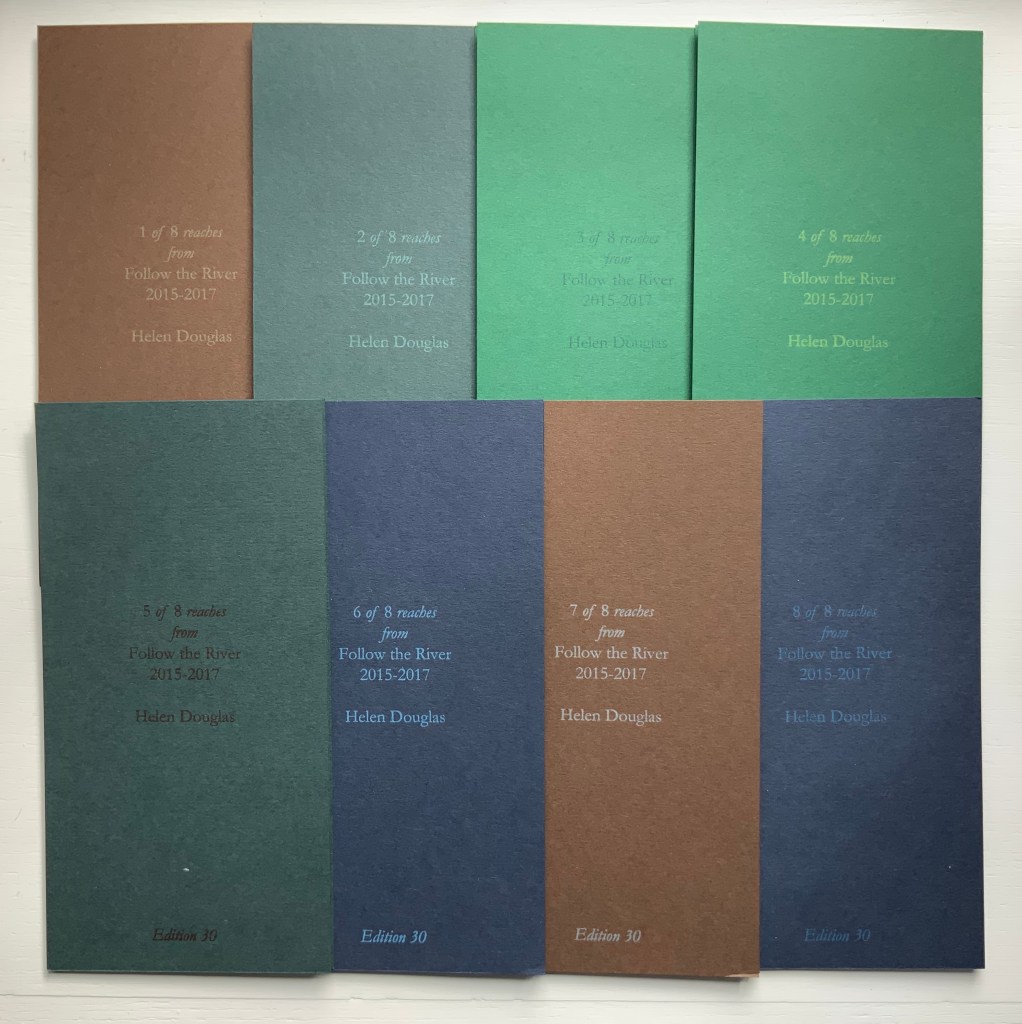
Follow the River (2015-17)
Follow the River (2105-17) Helen Douglas A set of 8 books, 930 x 183 mm; concertina binding; varying from 12 to 14 to 16 pages; printed on Chinese Paper, with Surecolour Inks; colour card end covers, letterpress title with back cover information of set number, date and edition; edition of 30, of which 25 sets are encased in a protective card sleeve produced in 4 different colours with the title Follow the River. Acquired from the artist, 29 November 2018.
Follow the River (2017) takes the river’s stretches, bordering vegetation, and its seasonal changes as “narrative structure”, yet the eight pamphlets lend themselves to separate viewings and to composite views arranged vertically or horizontally. But this is the wrong way for the reader to seek structure.
Douglas provides a phrase that redirects the quest when she describes “the concertina form as unfolding arm’s breadths, each one with a distinct theme of light, colour and mood” (Weproductions). This returns to the gestures associated with The Pond at Deuchar.
Douglas continues:
Each open spread can be viewed individually, or in runs of 4, 6, 8 or more pages. The first spread contains a text poem, which, integral to the reach of the river draws the eye into the book and a close reading of its pages. Leaves, grasses, ferns, flowers and trees form part of following the river, at its edge. In light and shadow they frame and are interwoven with the water’s movement: its flow, light and shade, and reflective colour, taking in its nuanced surroundings, as one contemplative whole.
Be it scroll, codex or accordion — Douglas’s structural goal would seem to be arrival at that contemplative whole. By leading our hands to think, Douglas takes us with her.
“Ellen Lanyon“. 25 June 2024. Books On Books Collection. For comparison of Chinese Whispers with Transformations I (1977).
Admin, studiesinphotography.com. 24 March 2020. “Photography and the Artist’s Book: Helen Douglas in Conversation With Alex Hamilton“. News & Reviews, Studies in Photography. Accessed 15 June 2025. Re Water on the Border: “… with our own press and smaller sheet size we were able to work with many more papers, and to explore the textural relationship between photographic image, print and surface. With the book Mim, an exploration of mimicry in surface pattern and texture of clothing and architecture, we used different textured papers including wallpapers, throughout as an integral part of the visual and tactile reading of the book. We spliced photographic images together at the film stage to build the pages of the book. Flip-flopping images between positive and negative, we were able to drop tone, gain contrast and create negative backing for positive text. This was also possible with Water on the Border (1994), a book made in Scotland and China where line drawings by children were butted up next to photographic images of water and reflections. The latter were screened with a mezzotint half-tone screen which gave a beautiful velvety touch to the image and stroked the paper. The scaffolding armature of horizontals and verticals was made from offcuts of exposed film. Our artwork for the book was no longer layouts of continuous tone bromides but layouts of half-tone film.”
CDLA (Le Centre des livres d’artistes). “Helen Douglas — Telfer Stokes”, le cdla: Expositions publications et collection de livres d’artistes, 26 February 2020. Accessed 26 February 2020. A “catalog raisonné”-like listing of 30 works by Douglas, 9 of which are co-creations with Telfer Stokes.
Douglas, Helen. Video of talk on The Pond, given at Winchester School of Art, University of Southampton on 20 March 2013.
Graham, Brandon S. “Telfer Stokes”, FictionDoldrums, 8 April 2011. Accessed.17 March 2020. Commentary on Chinese Whispers.
Williamson, Beth. “What Does It Mean Not to Touch a Book?” in Code—X, edited by Danny Alfred and Emmanuel Wackerlé (London: bookRoom, 2015), pp. 01:53-2:06.
With apologies to the preacher: Of making many books [on books] there is no end.
(Ecclesiastes 12:12)
With the choir of its forebearers, Amaranth Borsuk’s The Book (MIT Press, 2018) sounds an “amen” to that truth. The proliferation of degree programs in book studies covering the history of the book, the book arts and even book art ensures The Book will not be the last. What distinguishes Borsuk’s book are her perspective as an artist and the book’s breadth and depth despite its brevity.
The book has a long history of existential crises. What is a book? Is the end of the book nigh? For more than a century, those questions have returned again and again. The most recent recurrence stems from the ebook’s threat to dematerialize the book and the online world’s threat to take us into a post-text future. Even before these latest threats, book artists have long lived and worked with their own existential questions, a kind of higher existential calculus, or derivative of, the book’s crises: What is an artist’s book? What is book art? Stephen Bury, Riva Castleman, Johanna Drucker, Joan Lyons, Stefan Klima, Clive Philpott and many others in the last quarter of the 20th century dwelt on defining and categorizing book art.
Borsuk belongs to a later generation of book artists that has embraced these existential crises and recognized that the book’s existential crises are what make the book a rich medium in which and with which to create art — from bio-art miniature to the biblioclastic human-scale to large-scale installations and performances. Even to the digital.
The Origin of Species (2016) Dr. Simon Park, Guildford, Surrey “The small book shown here was grown from and made entirely from bacteria. Not only is the fabric of its pages (GXCELL) produced by bacteria, but the book is also printed and illustrated with naturally pigmented bacteria. ” Posted 27 March 2016. Photo credit: Dr. Simon F. Park
Silenda: Black Sea Book (2015) Jacqueline Rush Lee Transformed Peter Green‘s translation of Ovid’s Tristia and the Black Sea Letters H9.5″ x W12″ x D6.5.” Manipulated Text, Ink, Graphite Photo credit: Paul Kodama. In Private Collection, NL
Field (2015) Johannes Heldén Produced, and premiered, at HUMlab, Umeå University Reproduced with permission of the artist
Performance artist and academic as well, Borsuk brings that later generational and creative perspective to the existential question — What is the book? — and, with an artist’s perception of her medium of choice, displaces the old companion existential question — Is the end of the book nigh? — with an altogether more interesting one — Where next for the book?
To see where books might be going, we must think of them as objects that have experienced a long history of experimentation and play. Rather than bemoaning the death of books or creating a dichotomy between print and digital media, this guide points to continuities, positioning the book as a changing technology and highlighting the way artists in the twentieth and twenty-first centuries have pushed us to rethink and redefine the term. (pp. xiii-xiv)
In The Book, the future is not far from the physical past. Where once we had text on scrolls, now we scroll through text (albeit more vertically than horizontally). Where once human consciousness changed with the invention of the alphabet and writing, now it may be altering with our reading and writing through networked digital devices. Like the many historians before her, Borsuk starts with cuneiform (those wedge-shaped accounting marks on baked clay), hieroglyphics and the invention of the alphabet to set the scene for the advent of the book and its ongoing physicality:
its shape (scroll, accordion, codex)
its material (papyrus, vellum, paper, charcoal or mineral-based watercolor and ink)
its manufacture (scribing, printing by woodblock and movable type, design and typography, illumination and illustration, folding into pages, methods of binding)
its constituent and navigational parts (cover, book block, title page, table of contents, page numbering, index).
But Borsuk reminds us — from Sumer’s clay to Amazon’s Kindle, from Johannes Gutenberg to Project Gutenberg — the book as human artifact exists in a social, political, technological, economic and even ecological context. Who is allowed to make it, how it is transacted, how and where we use it, how we perceive and speak of it — all have affected the physicality of the book object and are reflected in it.
In the first half of The Book, Borsuk steers us through these interdependencies to a turning point. That turning point is where the pinnacle of the book arts — Beatrice Warde‘s and Jan Tschichold‘s vision of the book as a crystalline container of content — and the book’s commodification combine to cause the book’s physicality to disappear because it is so taken for granted, leaving us with “the book as idea”.
With the perception that books are ideas bestowed on readers by an authorial genius whose activity is purely intellectual, the book’s object status vanished for much of the reading public as we raised a glass to happily consume its contents…. Even though innumerable material elements come together to make the book, these features have been naturalized to such a degree that we now hardly notice them, since we have come to see content as the copyrightable, consumable, marketable aspect of the work. (pp. 106-9)
At this turning point — where “the historic relationship between materiality and text is severed” (p. 112) — the second half of The Book introduces book art. It is telling that the longest chapter in the book begins the second half, that it is called “The Book as Idea” and that it comes before any extended engagement with the digital dematerialization of the book. It is a wry pivot: the artistic genius supplants the authorial genius; what the latter takes as invisible background, the former re-makes as self-regarding foreground. As Borsuk shows and her book’s cover neatly demonstrates, works of book art are inevitably self-referential and self-aware.
As such, works of book art
have much to teach us about the changing nature of the book, in part because they highlight the “idea” by paradoxically drawing attention to the “object” we have come to take for granted. They disrupt our treatment of the book as a transparent container for literary and aesthetic “content” and engage its material form in the work’s meaning. (p. 113)
Rather than offer a chronological history of book art to explore what “artists’ books have to teach us about a path forward for the book”, Borsuk offers “flashpoints” that represent “the energies motivating artwork in book form”(p. 117). These “flashpoints” are William Blake, Stéphane Mallarmé, Ed Ruscha and Ulises Carrión. Following these flashpoints, Borsuk organizes the rest of the chapter into “key themes that recur throughout artists’ books of the twentieth century: spatiotemporal play, animation, recombinant structures, ephemerality, silence, and interactivity” (pp. 146-47).
Oddly, Blake as flashpoint does not illuminate these six particular themes. Rather Borsuk notes three other recurrent themes or “energies motivating artwork in book form” that Blake and his work represent: centering or re-centering the production processes on the author/artist; using the book as a sociopolitical and visionary platform; and redefining, developing and challenging the relationship between word and image.
Blake refers to himself as “The Author & Printer W. Blake,” making clear the union of creativity and craft in his work. (p. 121)
Blake’s engagement with the social issues of his day, and his use of book form to respond to child labor, urban squalor, and slavery, established an important trend in both artists’ books and independent publishing—the utility of the book as a means of spreading social justice. (pp. 121, 124)
Blake used his craftsmanship to develop the relationship between word and image (p. 140)
One need not look far among twentieth and twenty-first century book artists for resonance with those themes. That Blakean union of creativity and craft resurfaces in artists such as Ken Campbell (UK), Cathryn Miller (Canada), Pien Rotterdam (Netherlands), Barb Tetenbaum (US) and Xu Bing (China) — some of them even to the point of carving or setting their own type, making their own paper, pulp printing on it themselves or binding the finished work themselves. Vision and sociopolitical observation have risen up in the works of artists such as Doug Beube (Canada), Julie K. Dodd (UK), Basia Irland (US), Diane Jacobs (US), Anselm Kiefer (Germany) and Chris Ruston (UK). Blake’s redefining the relationship of word (or text) to image often reappears book artists’ abecedariesand their children’s books such as A Dictionary Storyby Sam Winston (UK).As for emulators of Blake in technical innovation, consider the analogue example of Australian Tim Mosely’s works created with his patented pulp printing process, where the “ink” is actually colored pulp, or the digital example of Borsuk’s work Between Page and Screen, where the pages contain no text—only QR codes that, when scanned with a webcam, activate the text’s appearance on the reader’s browser screen.
For her second flashpoint, Borsuk selects another visionary, Stéphane Mallarmé, who like Blake was reacting to his own perceived Satanic mills draining poetry of its spirituality. Mallarmé’s Satanic mills dispensed rigid columns of newsprint to the masses and bland expanses of poetry and fiction set by Linotype machines in the neo-classical Didot font. With his famous visionary dictum — “everything in the world exists in order to end up as a book” (p. 135) — Mallarmé nudged the book toward pure concept and opened its mystical covers to the Dadaists, Surrealists, Futurists, Vorticists, Lettrists, Conceptualists and biblioclasts. With spatiotemporal play — mixing type sizes and fonts, breaking up the line and even breaking the page — Mallarmé used text to evoke image and, in his view, remake the book as a “spiritual instrument”. His post-humous book-length poem Un coup de Dés jamais n’abolira le Hasard (A Throw of the Dice Will Never Abolish Chance), published in 1897, embodies that vision and continues to cast its flashpoint light across multiple generations of book artists’ efforts. From Marcel Broodthaers in 1969, we have his homage to Un Coup de Dés. From Jérémie Bennequin in 2014, we have his serial “omage” to Broodthaers’ homage. And, most recently, we have the 2015 new bilingual edition A Roll of the Dice by Jeff Clark and Robert Bononno, for which Borsuk provides a perceptive reading.
Where Mallarmé’s flashpoint enlisted his vision alongside the cry “épater le bourgeois” from Baudelaire and other late nineteenth-century poets, Ed Ruscha’s later flashpoint illuminates a democratic counterpoint, a Zen-like vision and a very different way of changing the relationship of text to image. Ruscha’s self-published photobooks were cheap and distributed outside the gallery-controlled channels of art. As Borsuk shows — directly with Ruscha and indirectly with the many book artists influenced by him — the text is restricted to the book’s title, which interacts with a series of deadpan photos and their layout to deliver a wry, tongue-in-cheek work of book art. Ruscha’s spatiotemporal play manifests itself across the accordion book format and out-of-sequence juxtapositions. Ironically Ruscha’s works now command thousands of dollars per copy, and one has more chance of seeing them in an exhibition than in a roadside stop’s rack of newspapers, magazines and mass-market paperbacks.
Mexico’s Ulises Carrión — polemicist, European bookshop owner, conceptual artist and Borsuk’s fourth choice of flashpoints — is a counter-flashpoint to Ruscha. Where Ruscha reveled in self-publishing commodification, Carrión sneered at the book in its traditional commercial form. Where Ruscha has resisted the label “conceptual artist”, Carrión played the role to the hilt. Where Ruscha’s work has elicited numerous homages (see Various Small Books from MIT Press in 2013) and achieved a high profile, Carrión’s work, much lower in profile, has provided a more compelling range of hooks or influences on which to hang many different manifestations of book art (or bookworks as Carrión preferred). In fact, Borsuk’s six stated key themes or “energies motivating artwork in book form” come from Carrión’s manifestos (pp. 146-47).
The first theme — “spatiotemporal play” — comes from Carrión’s initial definition of the book as a “sequence of spaces”, which Borsuk traces to tunnel books, pop-ups and even large-scale constructs, the latter illustrated by American Alison Knowles‘ inhabitable The Big Book (1968). One more possible future of the book implied by spatiotemporal play manifests itself in Borsuk’s own augmented-reality (AR) works, those of Caitlin Fisher (Canada) and Carla Gannis’ Selfie Drawings (2016), in which portraits on the hardcover book’s pages animate and change when viewed through smartphone or tablet.
Borsuk takes the second theme, that of “animation”, from Carrión’s dictum: “Each of these spaces is perceived at a different moment— a book is also a sequence of moments”. As her several examples illustrate, much book art is cinematic. Borsuk’s exposition of Canadian Michael Snow‘s Cover to Cover (1975) comes closest to reproducing the experience I enjoyed of “watching” that photo bookwork from cover to cover several times at the now closed Corcoran Art Gallery. Borsuk is quick and right to remind that the cinematic future of the book has been with us for a long time, even before the cinema. She bookends her exposition of Snow’s book and the text animation of American Emmett Williams‘ Sweethearts (1967) on one side with Victorian flip-books and on the other with American Bob Brown‘s 1930s The Readies (presumably pronounced “reedies” to follow Brown’s comparison of his scrolling one-line texts with the cinema’s “talkies”).
A forgotten modernist, Brown declared the obsolescence of the book, predicted a new form of reading and technology to enable it, an optical projector emitting text into the ether and directly into the eyeball. But what does this tell us about the future of the book? Borsuk notes Craig Saper‘s resurrection of Brown’s Roving Eye Press and how he even put together a website that emulates Brown’s reading machine. In her phrase describing the machine’s effect of “turning readers themselves into a kind of machine for making meaning” (p. 168), Borsuk hints at a future of digitally interactive books, which she takes up in the next section and more extensively in the next chapter. At this point, however, the reader could use a hint of practicality and skepticism. Linear-one-word-at-a-time reading, however accelerated, eliminates affordances of the page, ignores graphics and strains against the combination of peripheral vision and rapid eye movement we unconsciously (even atavistically?) deploy as we “read” whatever we see. Although in the next section Borsuk does bring on more likely examples of the book’s future exploitation of its cinematic affordances (manga, graphic novels and children’s books), this section’s treatment of animation misses the chance to cite actual recent successes like Moonbot Studios‘ The Fantastic Flying Books of Mr. Morris Lessmore (2012) and others.
Once into the third theme — “recombinant structure” — it is clear that Borsuk’s chosen Carriónesque themes overlap one another. Like the cinematic, the recombinant structure manifests itself in accordion books. It extends, however, to something more interactive: volvelles (or medieval apps as Erik Kwakkel calls them), interactive pop-ups, harlequinades (flap books) and more. Borsuk uses Raymond Queneau‘s harlequinade Cent mille milliards de poèmes ( One hundred thousand billion poems, 1961), Dieter Roth‘s slot books and works by Carolee Schneemann to illustrate book art’s celebration of the concept. The fact that Queneau’s book is still easily available on Amazon vouches for book art’s predictive qualities. The example of Marc Saporta’s Composition No.1 (Éditions du Seuil, 1962), “a box of 150 leaves printed on only one side that the reader is instructed to shuffle at the outset”, goes Queneau one better —ironically. In 2011, Visual Editions reissued Composition No. 1 in print and app forms. Alas, the former is out of print, and the latter is no longer available for download (although a video of it is available here).
Composition No. 1 (2011) Marc Saporta Translation by Richard Howard, Introduction by T.L. Uglow, Google Creative Lab, Diagrams by Salvador Plascencia and Designed by Universal Everything Photo credit: Books On Books
Borsuk draws her fourth theme — ephemerality — from Carrión’s dictum:
I firmly believe that every book that now exists will eventually disappear. And I see here no reason for lamentation. Like any other living organism, books will grow, multiply, change color, and, eventually, die. At the moment, bookworks represent the final phase of this irrevocable process. Libraries, museums, archives are the perfect cemeteries for books. (p. 145)
To illustrate, Borsuk begins with the physical biblioclasts — those who in Doug Beube‘s phrase are “breaking the codex“. They include Beube himself, Bruce Nauman (see above), Brian Dettmer, Cai Guo-Qiang, Marcel Duchamp, Dieter Roth and Xu Bing. While some of these artists reflect a twenty-first century surge of interest in altered books and book sculpture, “facilitated by the overarching notion that the book is an artifact not long for this world” (pp.82-84), others have taken a more generative archaeological approach — erasing or cutting away a book’s words to reveal another. Examples include Tom Phillips‘ A Humument (1966-2014) and Jonathan Safran Foer‘s Tree of Codes(2010). Phillips’ bookwork serves multiple purposes for Borsuk’s arguments. Not only does it represent the book art of “erasure”, its success across multiple editions, digital formats and presence in art galleries supports her notion of book art’s predictive qualities.
There is a variant on her theme that Borsuk does not illustrate and is worth consideration for her next edition: the self-destructing yet regenerative work of book art. Examples could include American Basia Irland‘s series ICE BOOKS: Ice receding/Books reseeding (2007-), which gives a formidably tangible and new meaning to “publishing as dissemination”; and Canadian Cathryn Miller‘s tail-chasing Recomp (2014); and Argentinian Pequeño Editor‘sMi Papa Estuvo en la Selva (2015), which after reading can be planted to grow into a jacaranda tree.
Recomp (2014) Cathryn Miller Copy of Decomp, Collis and Scott (2013) nailed to a tree. Photo credit: David G. Miller
Recomp (2015) Photo credit: David G. Miller
Recomp vandalized (2015) Photo credit: David G. Miller
The last section in this chapter expands on the fifth theme — silence — drawn from Carrión’s statement:
The most beautiful and perfect book in the world is a book with only blank pages, in the same way that the most complete language is that which lies beyond all that the words of a man can say. Every book of the new art is searching after that book of absolute whiteness in the same way that every poem searches for silence. Ulises Carrión, Second Thoughts (1980), pp. 15-16.
Among her several examples are Pamela Paulsrud‘s Touchstones (2007-10), which look like stones but are books sanded-down into stone-like shapes, and Scott McCarney‘s 1988 Never Read(Opposed to Ever Green), a sculpture composed of stacked library discards that narrows as it ascends. Paulsrud’s, McCarney’s, Irland’s and Miller’s works are what Borsuk calls “muted objects”, but they speak and signify nevertheless:
Muted books take on a totemic [metaphoric] significance…. The language of the book as a space of fixity, certainty, and order reminds us that the book has been transmuted into an idea and ideal based on the role it plays in culture…. Defining the book involves consideration for its use as much as its form. (pp. 193-95)
Never Read (Opposed to Ever Green) (1988) Scott McCarney Reproduced with permission of the artist
Never Read (Opposed to Ever Green) (1988) Scott McCarney Reproduced with permission of the artist
Never Read (Opposed to Ever Green) (1988) Scott McCarney Reproduced with permission of the artist
Borsuk is a superb stylist of the sentence and expository structure. The words above, concluding chapter three, launch the reader into Borsuk’s final theme of interactivity and her unifying metaphor: “the book as interface”. Owners of Kindles, buyers from Amazon, perusers of Facebook — we may think we know what’s coming next in The Book and for the book, but Borsuk pushes the reader to contemplate the almost real-time evolutionary change we have seen with ebook devices and apps, audiobooks, the ascension of books to the cloud via Project Gutenberg, the Internet Archive and Google Books, and their descent to Brewster Kahle‘s physical back-up warehouse (to be sited in Canada in light of recent political events) and into flattening ebook sales of late. Chapter 4 is a hard-paced narrative of the book’s digital history from the Memex in Vannevar Bush‘s 1945 classic “As we may think” to T.L. Uglow‘s 100-author blockchain collaboration in 2017, A Universe Explodes from Visual Editions’ series Editions at Play.
Borsuk reminds us:
Our current moment appears to be much like the first centuries of movable type, a cusp. Just as manuscript books persisted into the Gutenberg era, books currently exist in multiple forms simultaneously: as paperbacks, audiobooks, EPUB downloads, and, in rare cases, interactive digital experiences. (p. 244)
Borsuk weaves into this moment of the book’s future a reminder that print affordances such as tactility (or the haptic) and the paratextual (those peripheral elements like page numbers, running heads, ISBNs, etc., that Gary Frost argues “make the book a book”) have been finding fresh ways into the way we read digitally. The touchscreen enables us to read between the lines literally in the novella Pry (2014) by Samantha Gorman and Danny Cannizaro (2014). Breathe (2018) by Kate Pullinger, another work in the Editions at Play series, uses GPS to detect and insert the reader’s location, the time and weather, and when the reader tilts the device or rubs the screen, hidden messages from the story’s (the reader’s?) ghosts appear.
At this point, an earlier passage from The Book should haunt the reader:
Artists’ books continually remind us of the reader’s role in the book by forcing us to reckon with its materiality and, by extension, our own embodiment. Such experiments present a path forward for digital books, which would do well to consider the affordances of their media and the importance of the reader, rather than treating the e-reader as a Warde-ian crystal goblet for the delivery of content. (p. 147)
Borsuk convinces. Art, artifact, concept — wrought by hand and mind, hands and minds — the book is our consensual tool and toy for surviving beyond our DNA. So now what? Metaphor, hints and historical flashpoints may illuminate where we have been, how it shows up in contemporary books and book art and where we may be going with it. In ten or one hundred years though, how will a book publisher become a book publisher? Given the self-publishing capability today’s technology offers, will anyone with a file on a home computer and an internet connection consider himself or herself a book publisher? Borsuk thinks not:
The act of publication — of making public — is central to our cultural definition of the book. Publication might presume some cultural capital: some editorial body has deemed this work worthy of print. It might also presume an audience: a readership clamors for this text. But on a fundamental level, publication presumes the appendage of elements outside the text that help us recognize it as a book, even when published in digital form. (pp. 239-40)
How will future book publishers learn to master the appendage of these elements outside the text (the paratext) that make a book a book “even when published in digital form”? Borsuk’s commentary on the ISBN as one of these elements sheds oblique light on that. She points to the artist Fiona Banner’s uses of the ISBN under her imprint/pseudonym Vanity Press — tattooing one on her lower back, publishing a series Book 1/1(2009) consisting of sixty-five ISBN’d pieces of mirrored cardstock and then collecting them in a photobook entitled ISBN 978-1-907118-99-9 in order to deposit those one-offs with the British Library as required by the UK’s Legal Deposit Libraries Act. What can a future ebook publisher deduce from this?
That the use of a globally unique identifier (GUID) matters.
The backstory of the transition from ISBN10 to ISBN13 and that of ebooks, ISBNs and Digital Object Identifiers (DOIs) might provide interesting fodder. The notion that the book industry was running out of 10-digit ISBNs was a red herring used to convince industry executives to adopt the more widely used format of unique identifiers overseen by GS1. The real reason for moving to ISBN13 — reduced friction in the supply chain — was too hard to sell. About the same time, some major publishers proposed incorporating the ISBN into the DOI for an industry-standard ebook identifier. The DOI offered an existing digital, networked infrastructure already being used by most of the world’s scientific, technical and medical journals publishers. It is an offshoot of the Handle System, established by Robert Kahn. Sad to say, few book publishers adopted the DOI for their ebooks; still fewer used the DOI’s application- and network-friendliness to enable their ebooks to take advantage of the network’s digital affordances.
The DOI shares with the ISBN a feature that Borsuk points out as a limitation to more widespread use: it is not free. A significant percentage of ebooks exist without ISBNs, much less DOIs. If a digital GUID is to be used in ways that help us recognize the identified digital object as a book, future book publishers and their providers of a network ecosystem supporting ebooks, linking with the print ecosystem and reducing friction in the supply chain still have wide gaps in commerce and knowledge to close. Perhaps this particular paratextual element is unnecessary for the book’s digital future, but until those gaps are narrowed, the ecosystem for eBooks will remain balkanized by Amazon, Apple, Google, Lulu and the more digitally literate denizen of the print publishing industry. In the meantime, as Borsuk’s examples throughout her book show, there are boundless other print and digital affordances with which publishers, authors, editors, designers, typographers, developers and readers can play as they continue to shape the book.
The Book‘s publication month, June 2018, is auspicious, being the same for the Getty Center’s exhibition “Artists and Their Books/Books and Their Artists“, June 26 – October 28. The Center and MIT Press would do well to have stacks of The Book on hand. The Book will also serve as an excellent introductory textbook for courses on book art or the history of the book. And by virtue of its style and artist’s perspective, Borsuk’s book will appeal to anyone with even a passing interest in this essential technology of civilization and its growing role as a material and focus of art in the twentieth and twenty-first centuries.