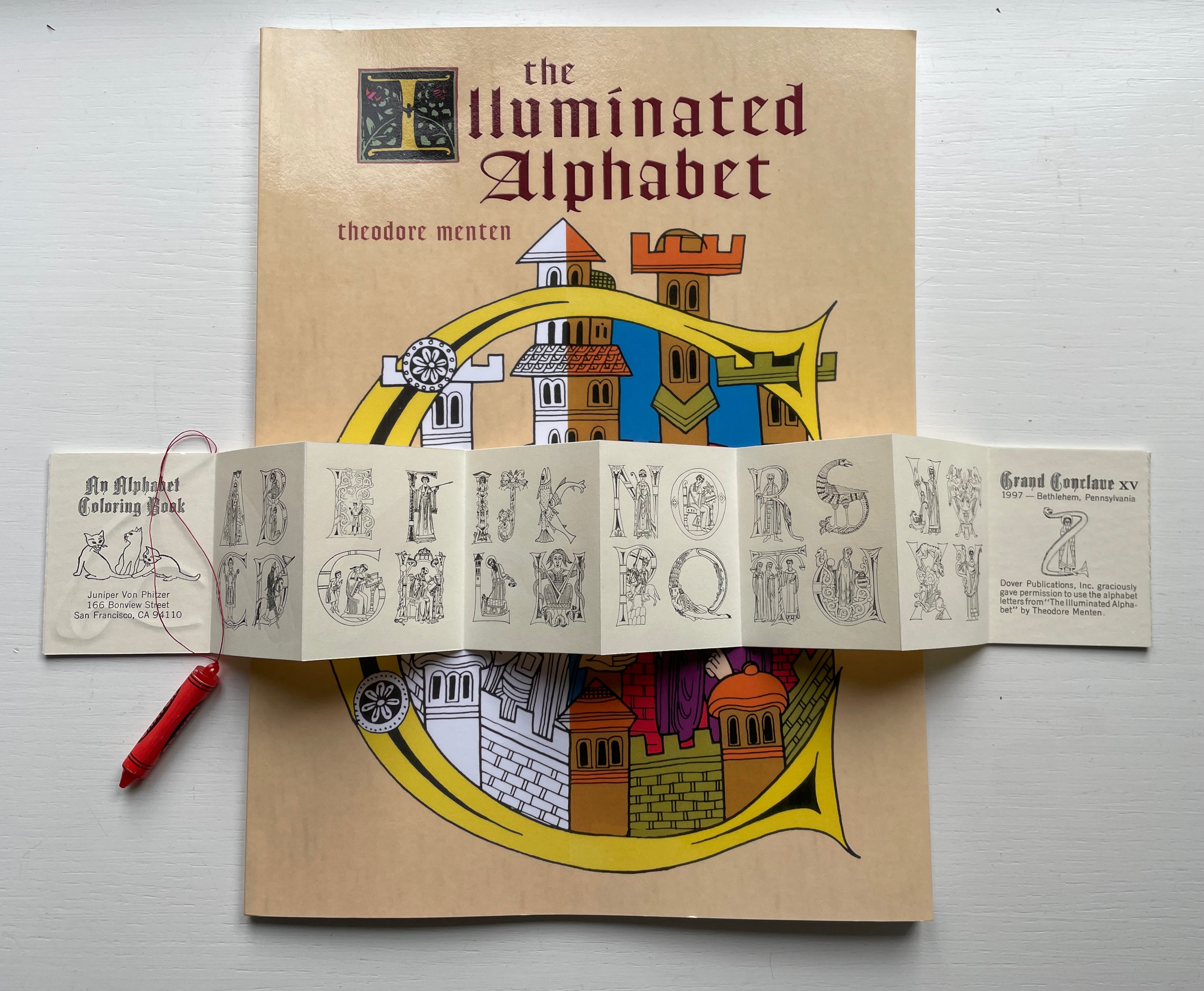
An Alphabet Coloring Book by Theodore Menten (1997)
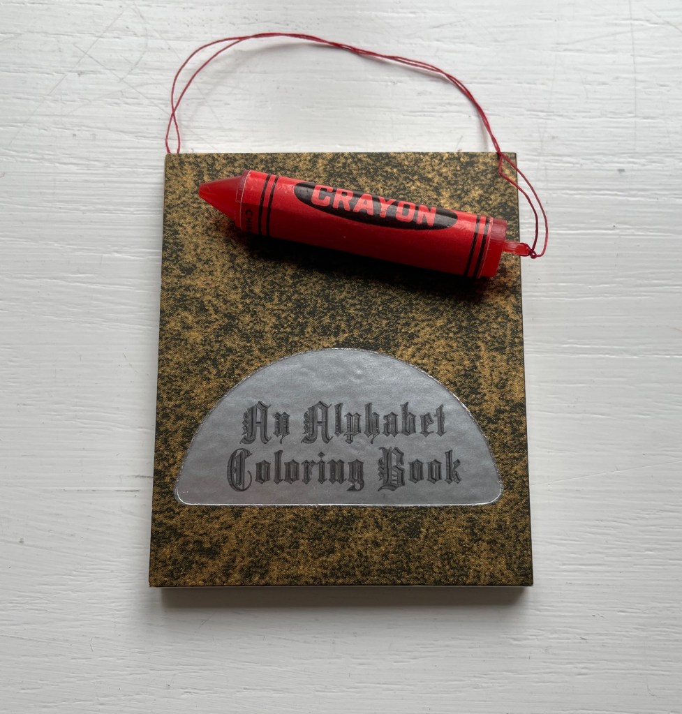
An Alphabet Coloring Book by Theodore Menten (1997) Juniper Von Phitzer Miniature leporello. Closed: H64 x W52 mm. 8 pages. Limited edition. Acquired from Book Lair, 30 October 2022. Photos: Books On Books Collection.
Lloyd L. Neilson, founder of Juniper Von Phitzer Press, compiled its name from those of his three cats, a sure sign of his sense of humor. This one signals that, like the cats, its humor was patient on the hunt. Theodore Menten had produced a coloring book called The Illuminated Alphabet in 1971 for Dover Publications. After a quarter century, Juniper Von Phitzer could not fail to pounce, capture and deposit the ultimate trophy: a miniature alphabet coloring book with a faux crayon. It was a limited edition, but individual copies could be distinguished by the color of the plastic crayon. The Books On Books Collection is proud to have this particular copy with its red crayon honoring the tradition of rubrication in medieval manuscripts.
The archives of Juniper Von Phitzer Press reside at Indiana University, several universities and institutions hold copies of its numerous alphabet miniatures, and Neilson’s dedication to the craft (and his cats) was honored with a miniature gilt-stamped bibliography from the equally humorously named Opuscula Press [opuscula = small or minor literary or musical works].
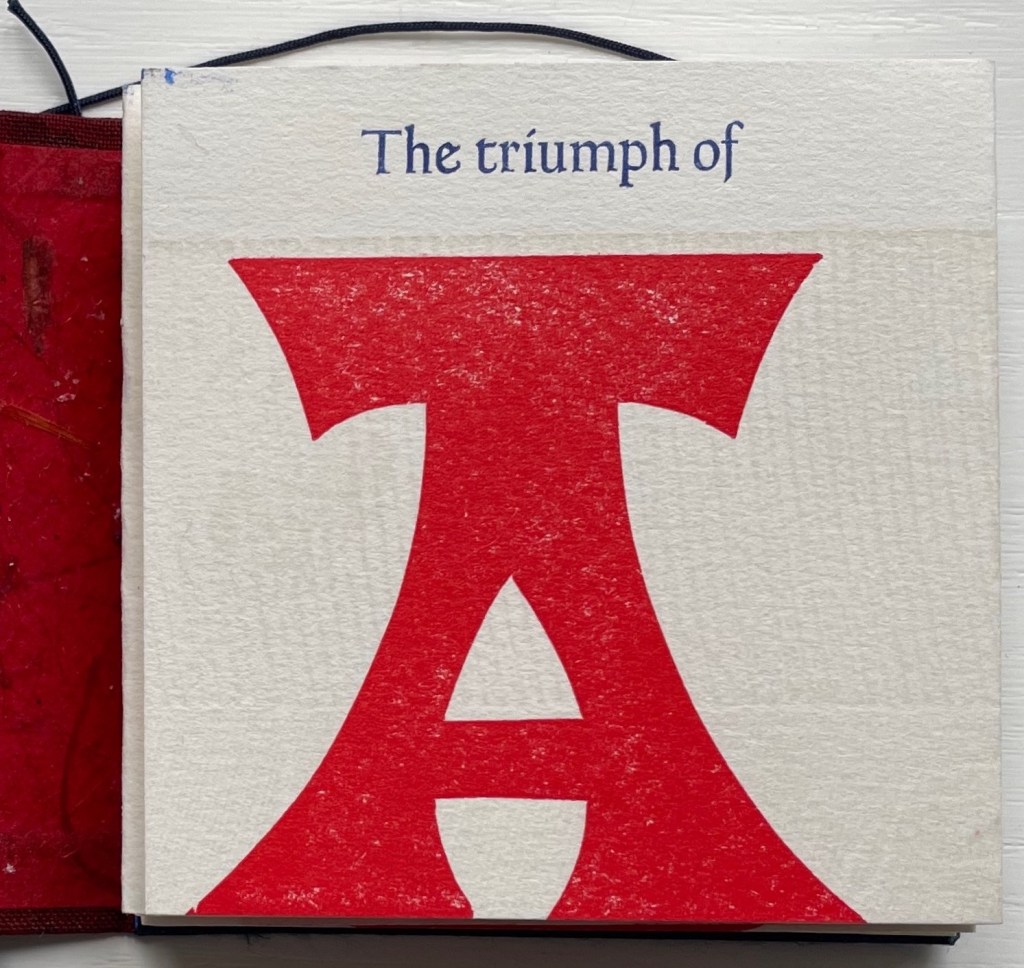
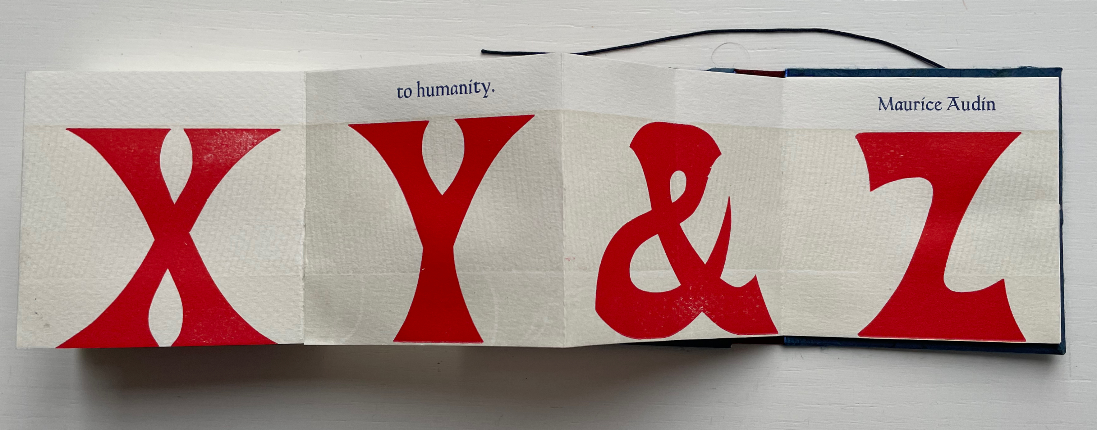
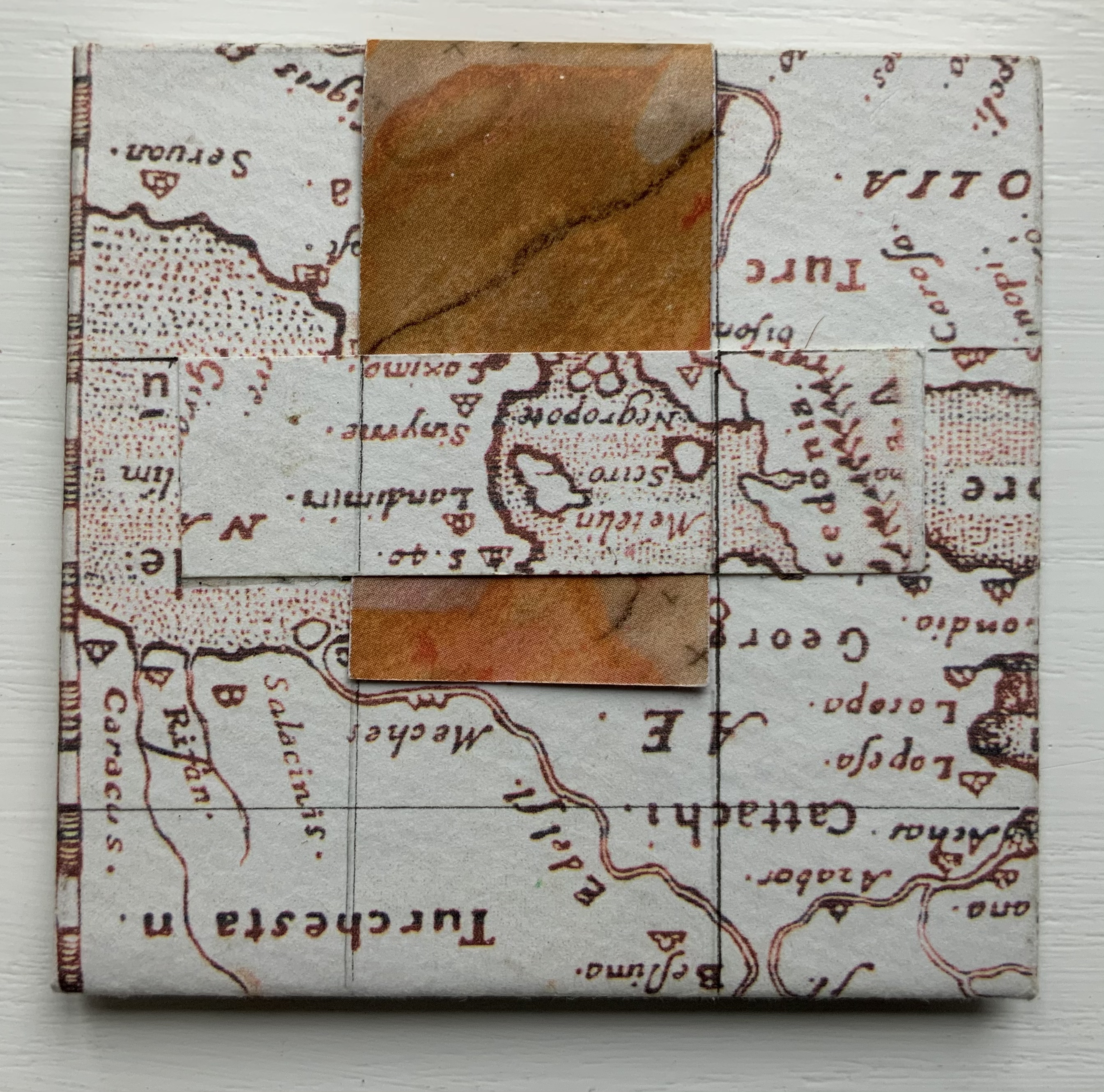
The Triumph of the Alphabet(2017) William Rueter Accordion fold extending from the back page. Bound in paper-covered boards with printed paper title on spine. Twine tie closure. 82.6 x 82.6 mm. 27 panels. Acquired from Vamp&Tramp Booksellers, 7 October 2022. Photos: Books On Books Collection.
From the colophon: “This nameless wood type alphabet was made c. 1900 by the Hamilton Mfg. Co. Here at The Aliquando Press it is affectionately called ‘Ali-oops!'”
The full quotation from Audin is “The triumph of the alphabet gave true impetus to our Western civilization … The alphabet made it possible to transmit all-embracing concepts and truths to humanity”. There was more than one Audin interested in letters. Marius was father to Maurice and Amable, and the three of them produced a multi-volume history of printing called Somme Typographique. Amable contributed the section on the birth of the alphabet, and Maurice wrote the section on the discovery of typography. A scan of this volume does not yield the pronouncement in the Aliquando Press miniature. Luc Devroye‘s entry on Marius Audin cites him as a major influence on the French typographical world, and his number of books exceeds those by his sons combined. Given his livelier style, it seems more likely that the quotation in The Triumph of the Alphabet belongs to Marius. If so, “Ali-oops” might deserve an erratum slip. Slip or no, the panels with their tripartite texture and dual contrast of colors and font make The Triumph of the Alphabet a triumph of printing pleasure.
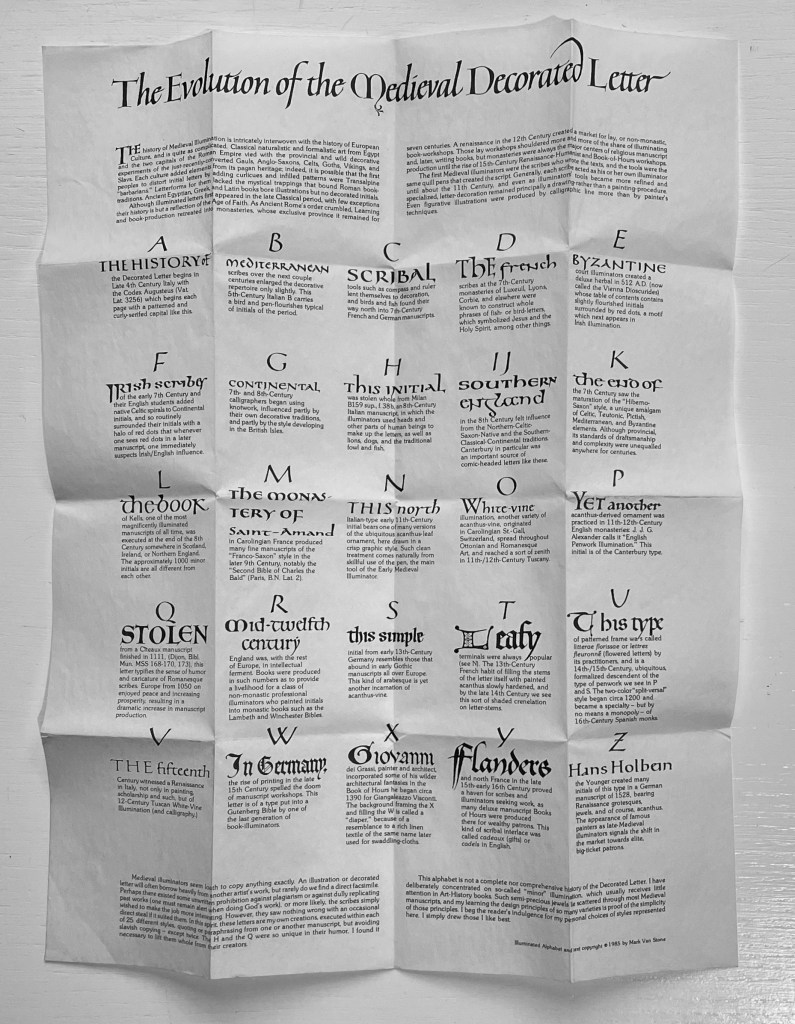
The Evolution of the Medieval Decorated Letter (1985)
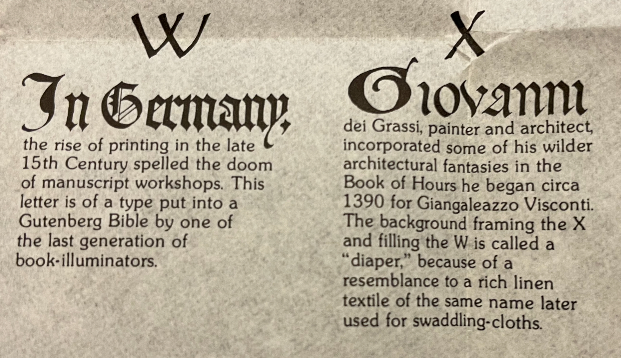
The Evolution of the Medieval Decorated Letter (1985) Mark Van Stone Leporello attached to black boards with ribbon tie and pocket for folded information sheet. Leporello: H65 x W68 mm closed; W1630 mm (including board) open. Sheet: H280 x W215 mm. 25 panels. Acquired from Lorson’s, 5 December 2022. Photos: Books On Books Collection. Displayed with permission of the artist.
Mark Van Stone is a professor of art history at Southwestern College in California. Scholarly books and a documentary attest to his expertise in his academic specialty: the interpretation of Mayan hieroglyphs and calligraphy. He also teaches workshops in versals and white vine decoration. His workshop qualification needs no endorsement beyond this miniaturized history of medieval illuminated letters: a calligraphic, bookmaking and scholarly tour de force.
In the spirit of medieval illuminators, Van Stone has imitated the hand of twenty-three of what he calls the “semi-precious jewels” of “‘minor’ illumination that usually receives little attention in the Art-History books”. Because of their medieval humor, two initials were copied outright rather than imitated. Below, you will find eight of these semi-precious jewels along with Van Stone’s commentary on each. Use the WorldCat link to find your way to the closest institution holding a copy of this work to revel in the rest.
The folded onionskin of text contained in the binding pocket is like a miniature poster. On it, Van Stone documents each of the 25 styles of illumination that he reproduces in the leporello between the soft black boards stiffened by folding. The black-on-white parchment-like appearance of the “poster” complements beautifully what unfolds between those boards, and each of its 25 notes begins with the calligraphic bookhand that would be appropriate to the period of its initial. Correspondence with the artist reveals a possible origin story for the poster-like nature of the insert.
The project began life as a portfolio of individual letters of six inches square. For each letterform, Van Stone “drew the color-separations individually in black ink, rather than making finished illuminated initials in color and photographically color-separating”. After specifying the colors for the four plates and learning that the project would require eight dozen separate screens far outstripping the budget, Van Stone — without a Renaissance patron to come to the rescue — transformed the project into a poster. This involved finding another printer and photographing the separations in a ganged and reduced size. “An unfortunate accident in the pressroom resulted in the printing of 1000 copies with a marred title-line, but with the body of the sheet undamaged.”
After the poster was reprinted, Van Stone turned his attention to the 1000 posters he couldn’t use:
… we cut them all into strips, I folded and pasted them all by hand (with archival polyvinyl acetate), designed and folded the black covers to slip on the stubs at each end, and threaded the ribbon through the hand-cut slits. Like a 15th-century publisher, much of the work was performed by hand.
So if you find your closest institution holding a copy of The Evolution of the Medieval Decorated Letter, keep in mind the work’s real-life evolution and that you might have been looking at individual letter prints or a poster ready for framing rather than this red-ribboned treasure ready to unfold and display gem after gem.
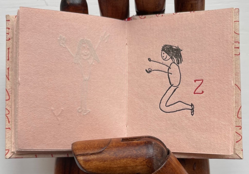
Alphabet People (1989) Peter and Donna Thomas Miniature codex with illustrated paper over boards, endband, sewn. H60.5 x W47.5 mm. 64 pages. Edition of 200, of which this is an artist’s proof. Acquired from Bromer’s Books, 16 February 2023. Photos: Books On Books Collection.
Peter and Donna Thomas have made several alphabet artists’ books. One made in the shape of an Apple MAC, one in the shape of mushrooms, one celebrating views of Yosemite, one for musical instruments (accordion to zither, of course), one for spring wildflowers and one, of course, just for the letters themselves.
This one may be their earliest. Handset in Greeting Monotone and letterpress printed by Peter Thomas on peach-colored handmade paper. The same paper is used for covering the boards. As with all the initials in the book, the alphabet on the cover and pastedown title card is inked in red. The illustrations are reproductions of twenty-seven line drawings by their daughter Tanya Thomas.
Seen end-on, the book shows some of its fine press features, especially the two-color sewn endbands and tight turn-ends of the cover paper. Handmade paper characterizes much of the Thomases’ output, and their interest in papermaking has extended as far as Africa, the Philippines and Totnes, Devon, England.
From the publisher’s description of the second edition:
A self-taught hand papermaker, Peter Thomas became interested in knowing how apprentice-trained hand papermakers working in production hand papermills made paper. He especially wanted to learn the “vatman’s shake,” the series of motions that papermakers used to form their sheets of paper. This desire circuitously led him and Donna to Tuckenhay, near Totnes, Devon, in England, where beginning in 1988, they recorded several hand papermakers, returning to make others in 1990 and 1994. The book begins with a short history of Tuckenhay Mill and the story about meeting the papermakers and recording their interviews. This is followed by eight interviews of men and women, some of whom worked in the Mill from between the World Wars until it closed in 1970. All of the papermakers are now deceased, but the stories – in their own words – remain an extraordinary, entertaining, and timeless record of their lives and work. In the 1830s, Richard Turner started manufacturing paper by hand in the Tuckenhay Mill, and paper was continuously made by hand there until 1962. From then until 1970, the Mill produced pulp (half-stuff) until the business went bankrupt….
The Thomases’ works are well represented at in University of Wisconsin-Madison’s Special Collections. Some of the several particularly related to papermaking — as well as other paper-related ones from the Books On Books Collection — are listed below. Any study of the intersection of book art and paper could not help but include Peter and Donna Thomas.
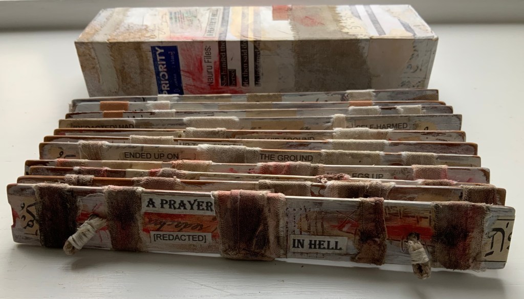
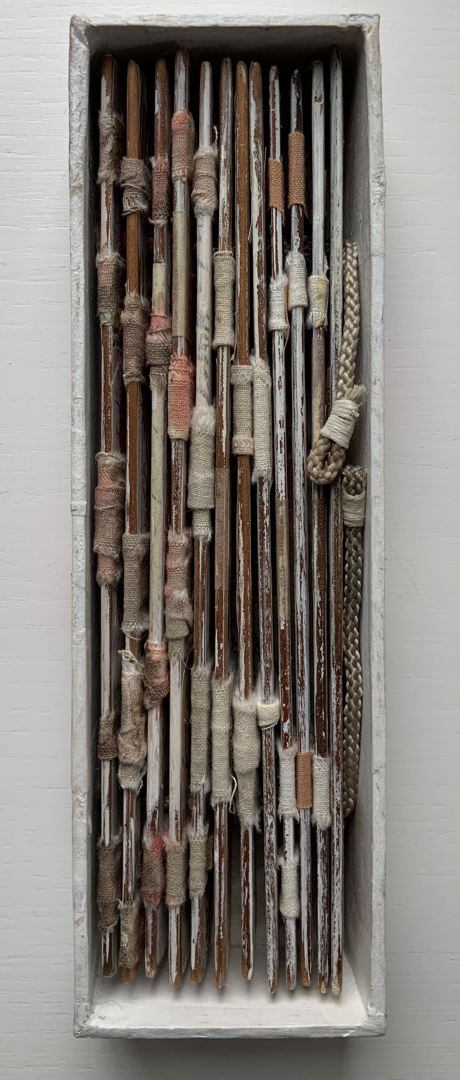
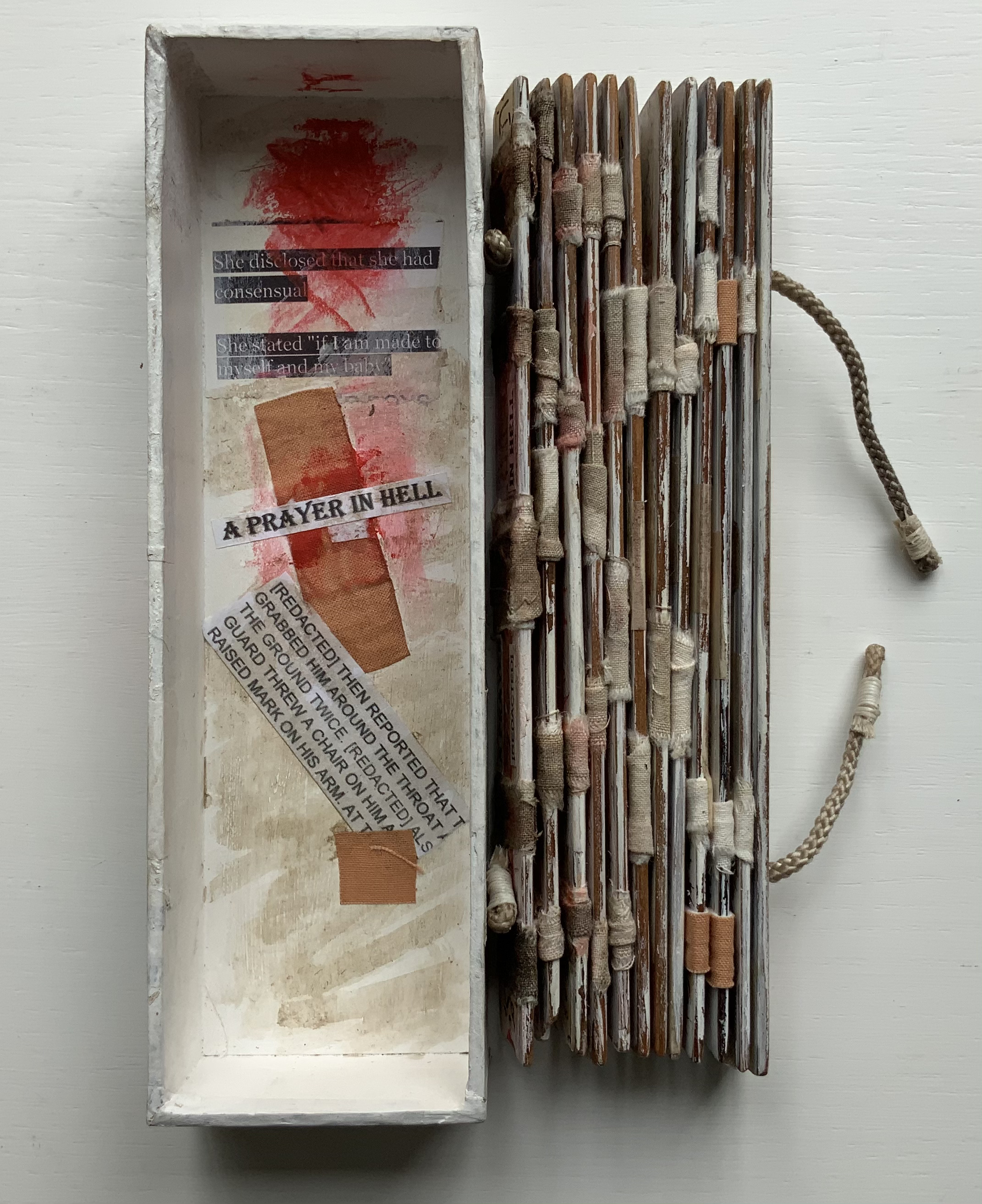
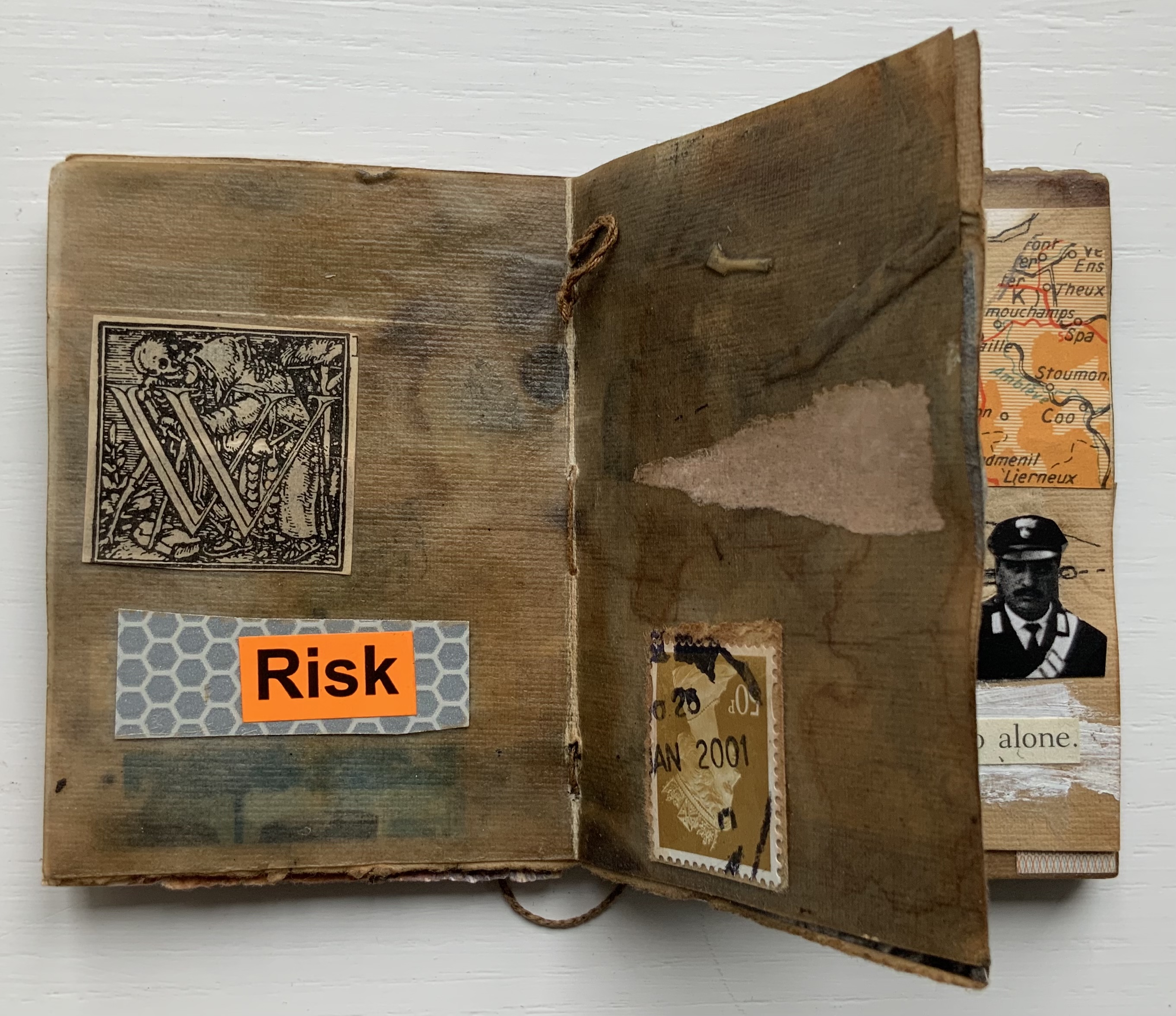
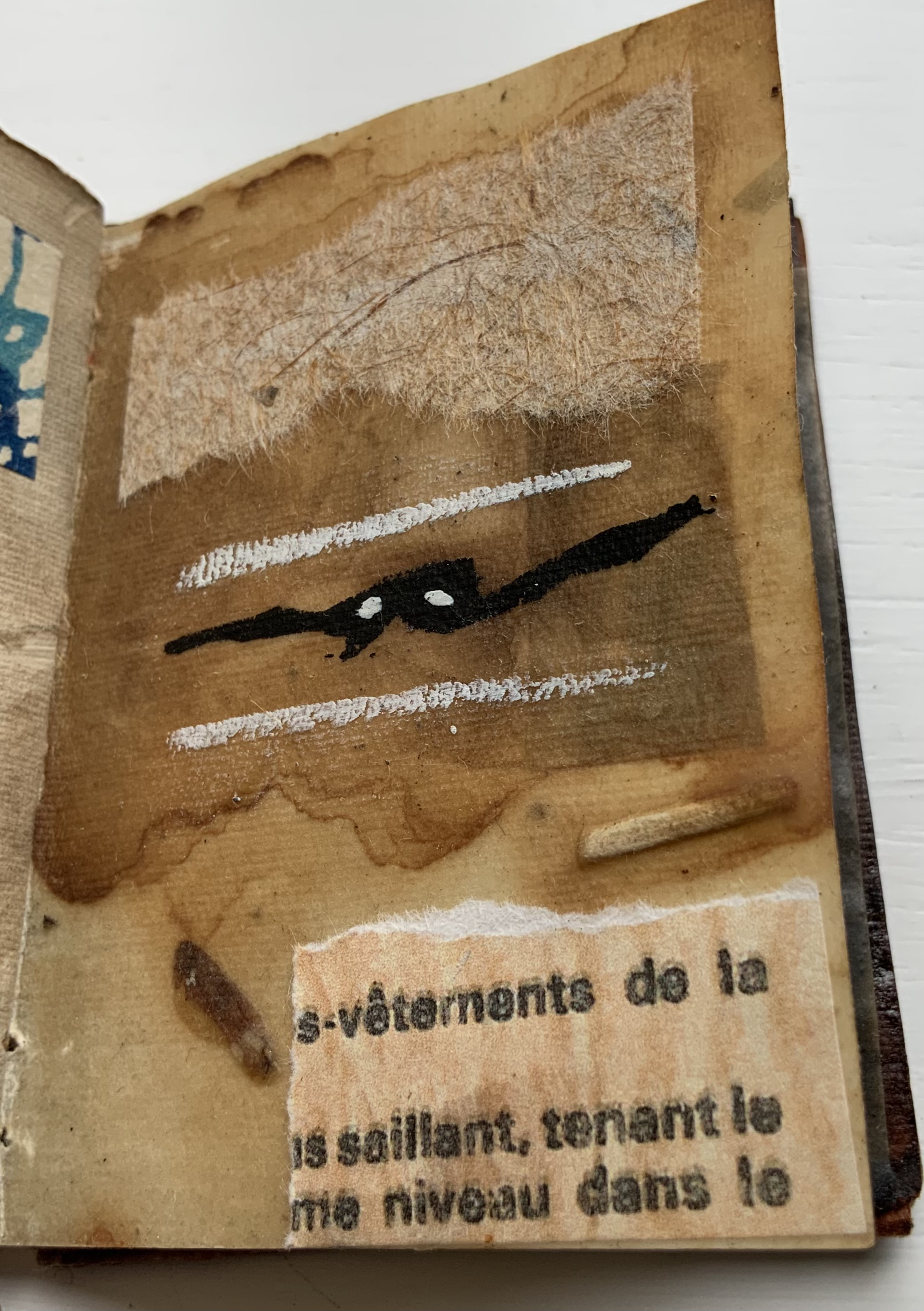
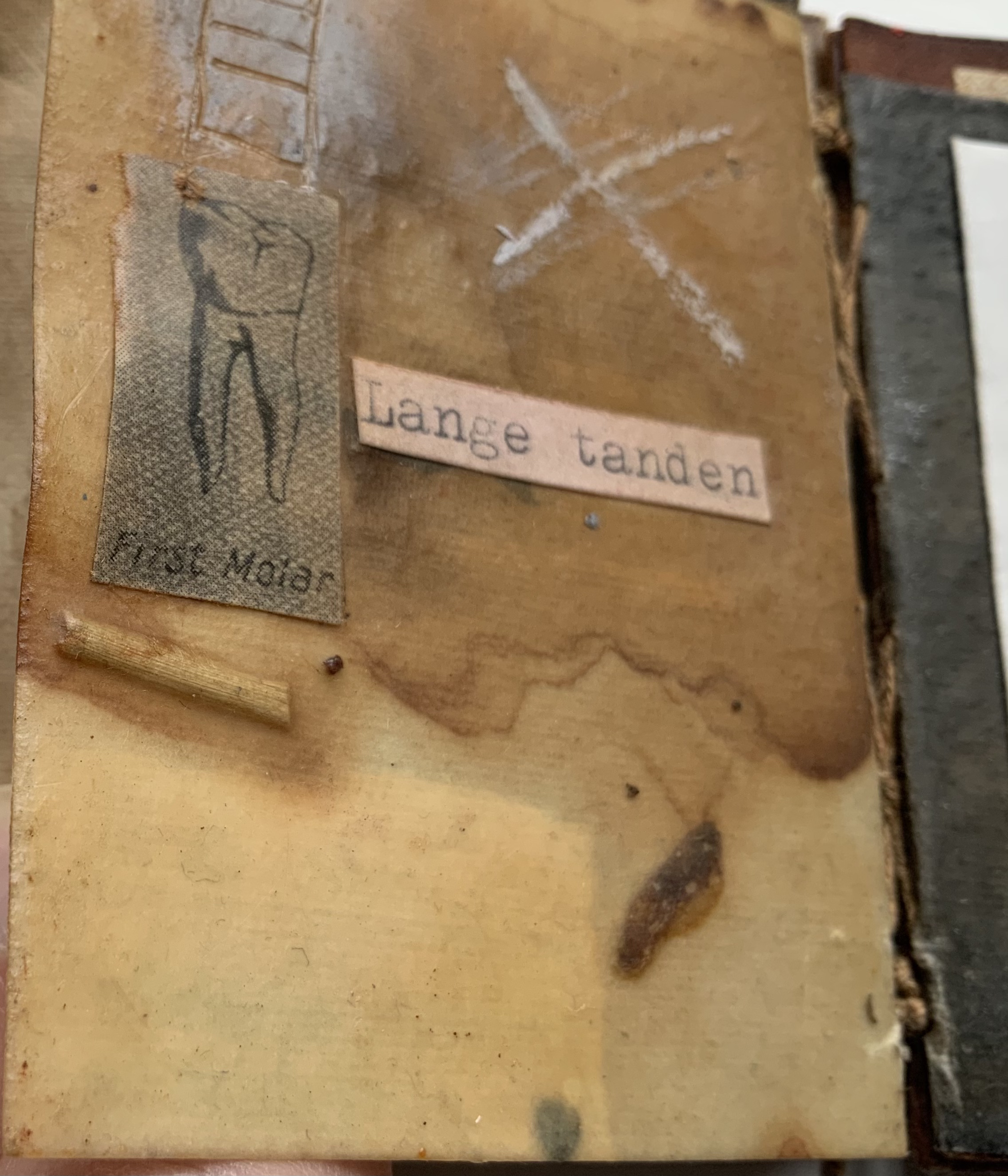
A Prayer in Hell (2018) Jacobus Oudyn Palm leaf prayer book format of 12 timber slats with double-sided collages materials and images made with pomegranate ink on antique paper, water soluble crayon calico, wound dressings and PVA adhesive. Text from Nauru Files — Guardian Newspaper and Islamic prayer book. Open: H195 x W130 mm. Closed: H195 x W 55 x D35 mm. Slip case: 2 mm card with collage, H202 x W60 x D38 mm, to be displayed with the book. Unique. Acquired from the artist, 4 January 2020. Photos: Books On Books Collection, displayed with permission of the artist.
A Prayer in Hell is one of Jack Oudyn’s larger works. works refer to the Australian experience of the world’s refugee crisis (perhaps the largest diaspora in history), A Prayer in Hell is the most scorching of them all.
Materially, the work embodies the refugees and their experience in many ways — its palm-leaf prayer book pages even consist of “stressed and recycled timber slats”. The binding cords penetrate drawings of eyes on each slat, creating the effect of the faceless staring through bars. Although the work’s title alludes to the English expression “not a hope in hell”, the work itself nods toward hope appears in how the wound dressings, wound round the slat pages, gradually become cleaner. Under and over the dressings, strips of English and Arabic text are collaged alongside handwritten extracts from Islamic prayer books and reports of events and conditions in Australian detention centers. Complete with redactions, the English text refers to the scandals associated with the centers at Nauru, Papua New Guinea, Christmas and Manu islands.
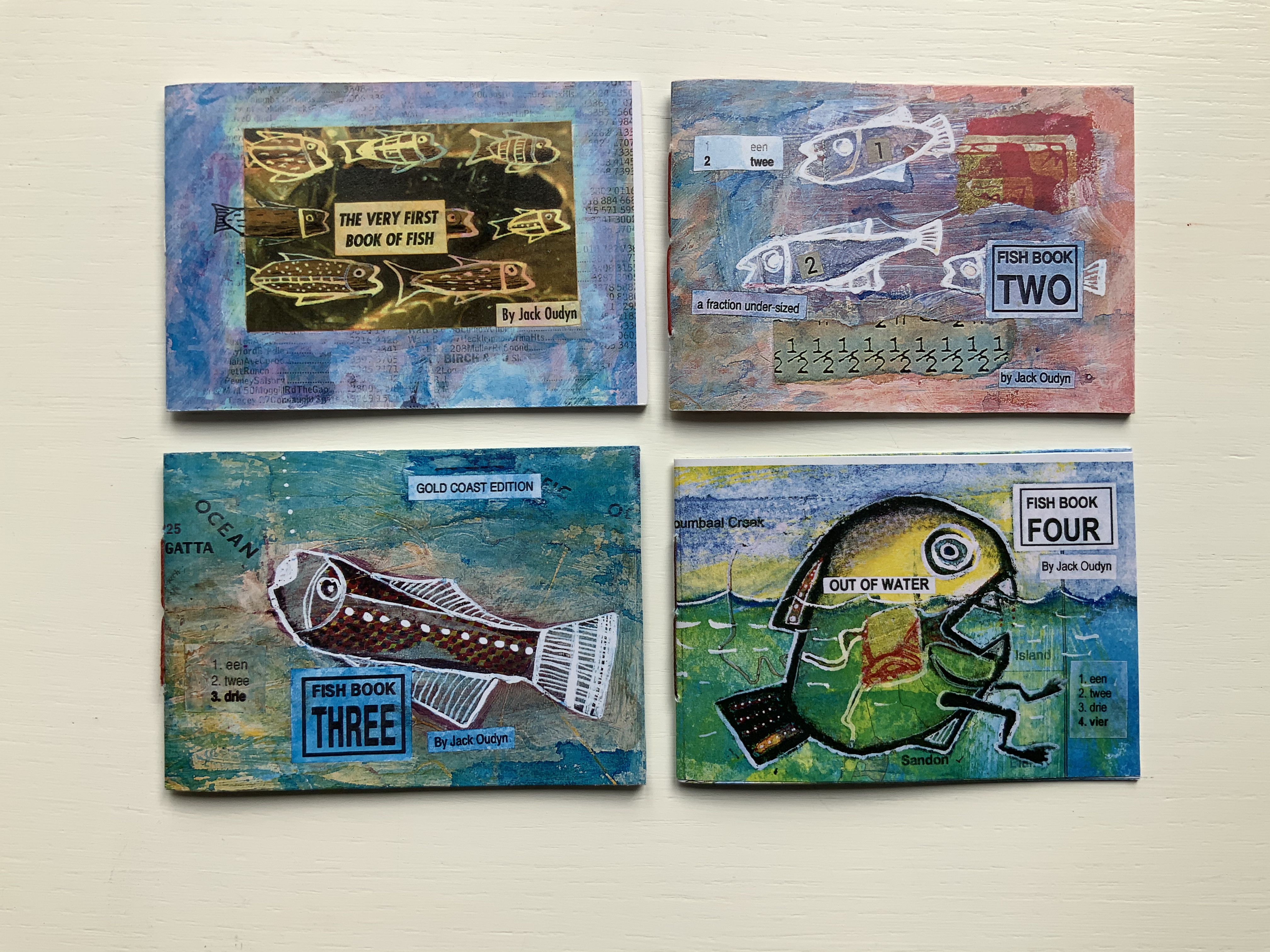
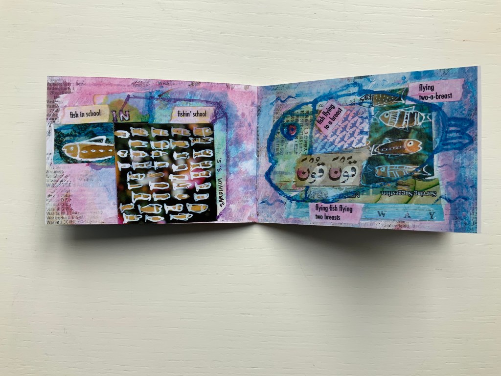
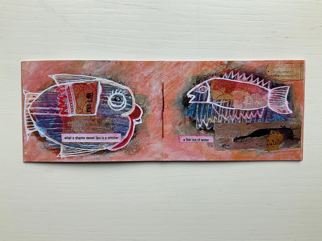
Fish Books One, Two, Threeand Four (1999 – 2001)
All acquired from the artist, 4 January 2020. Photos: Books On Books Collection, displayed with permission of the artist.
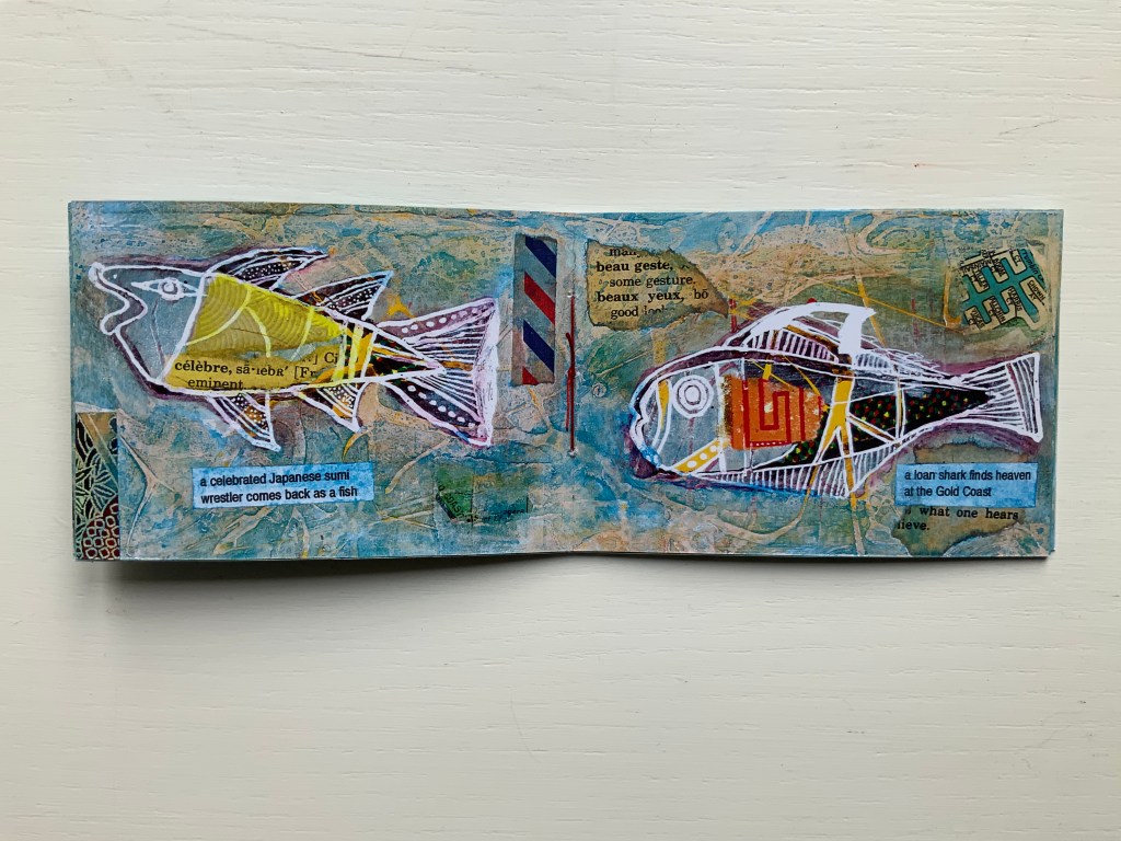
This complete set of his fish books represents Oudyn’s Micro Press imprint well. Many of the small works are playful with language, form, and material and, often, socially satirical or critical. More hook-in-mouth than tongue-in-cheek, the fish books have provided the artist with ground for playing with collage and printing techniques. In imagery, they are reminiscent of Ric Haynes, Breughel and Bosch. In text, they encapsulate the punsterdom of book art (albeit without the usual book-related self-referencing, though “fish wrapper” would have been good for their covers); reveal the artist’s Dutch heritage in their numbering; and revel in Australia’s odd common fishnames (dart, flattie, stargazer, sweetlips, etc.). By Fish Book Four (2001), however, a socially sharper tone emerges. The dates of publication, which vary from those in the WorldCat links for each title, are taken from the artist’s website.
The Very First Book of Fish (1999) Jack Oudyn Booklet made of 200 gsm digital paper, sewn with single white waxed thread, 16 pages. Color laser print of mixed media drawings; ink, paint, collage on pages from telephone directory. H70 x W105 mm, 16 pages. Edition of 50, of which this is #27. Photos: Books On Books Collection, displayed with permission of the artist.
Fish Book Two(1999) Same format as first, except sewn with single red waxed thread; #49 of 50.
Fish Book Three (2000) Same format as the second; #25 of 50.
Fish Book Four(2001) Same format as third, except sewn with single dark gray waxed thread: #13 of 50.
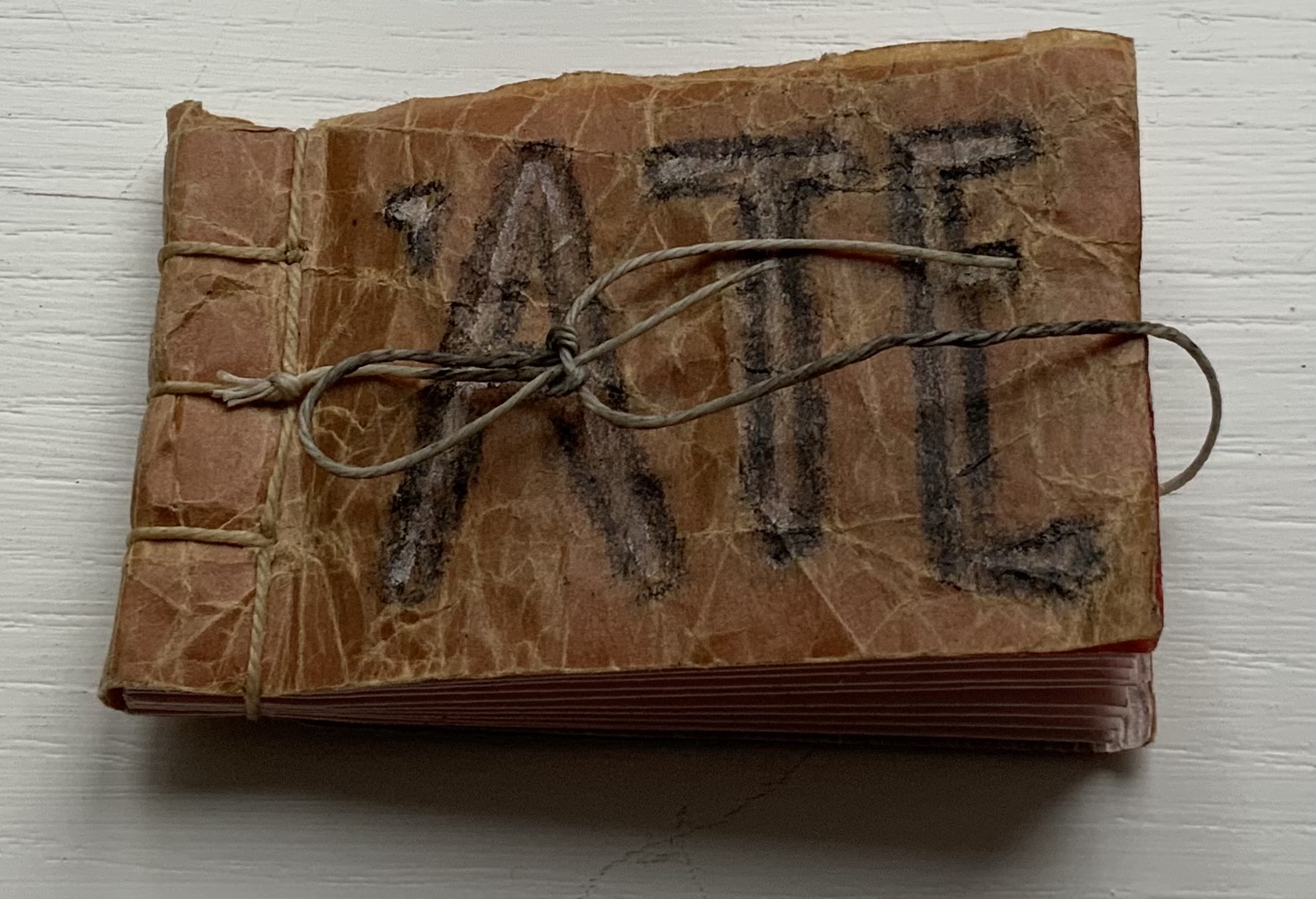
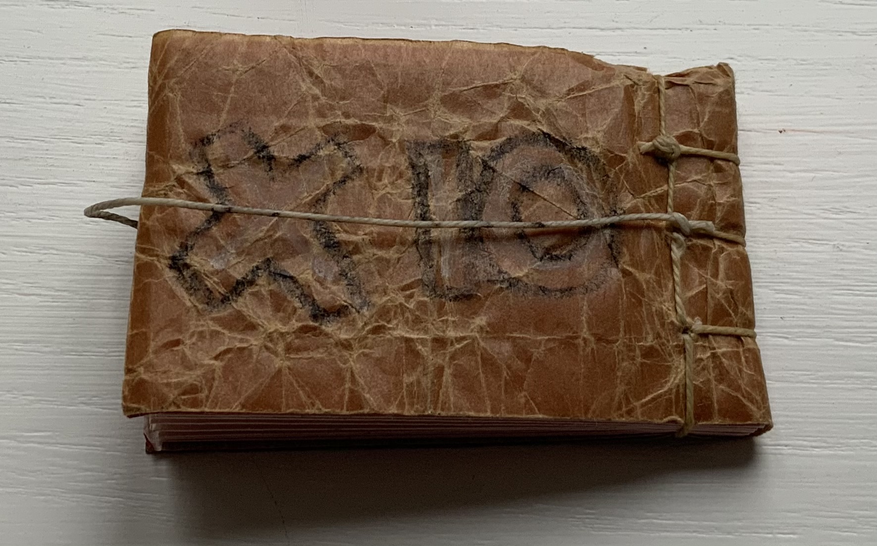
‘ATE (2011)
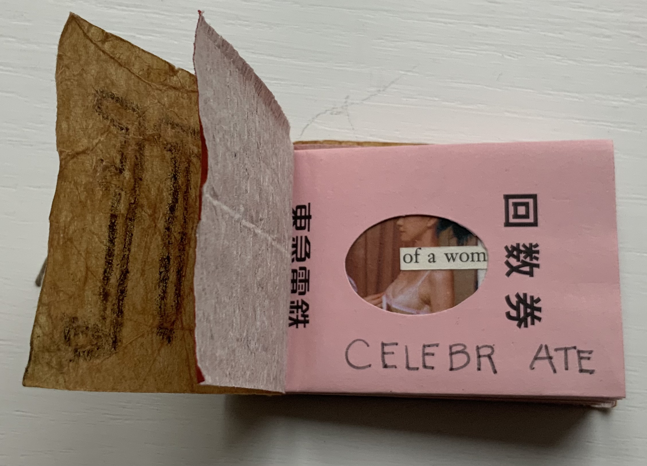
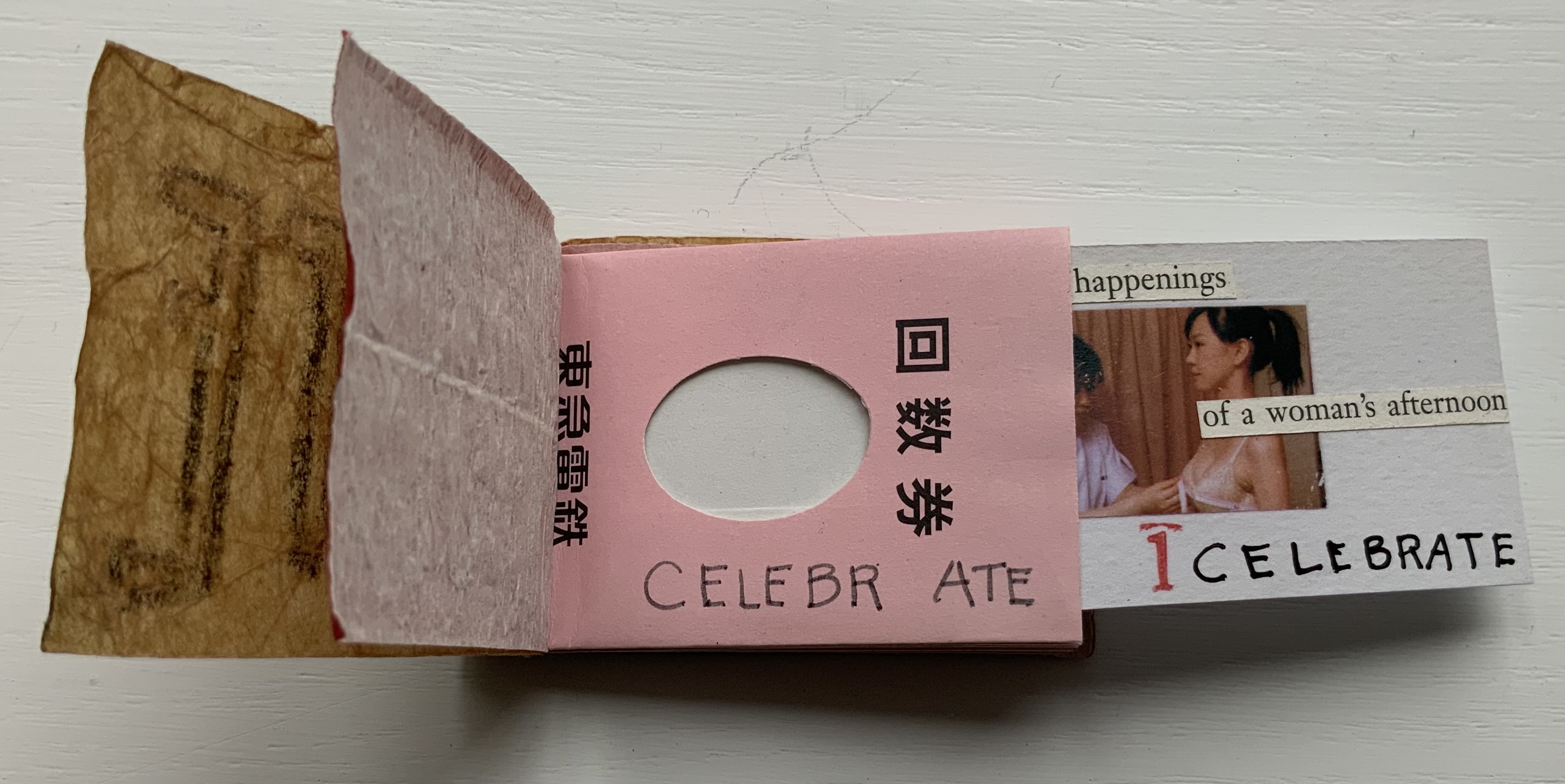
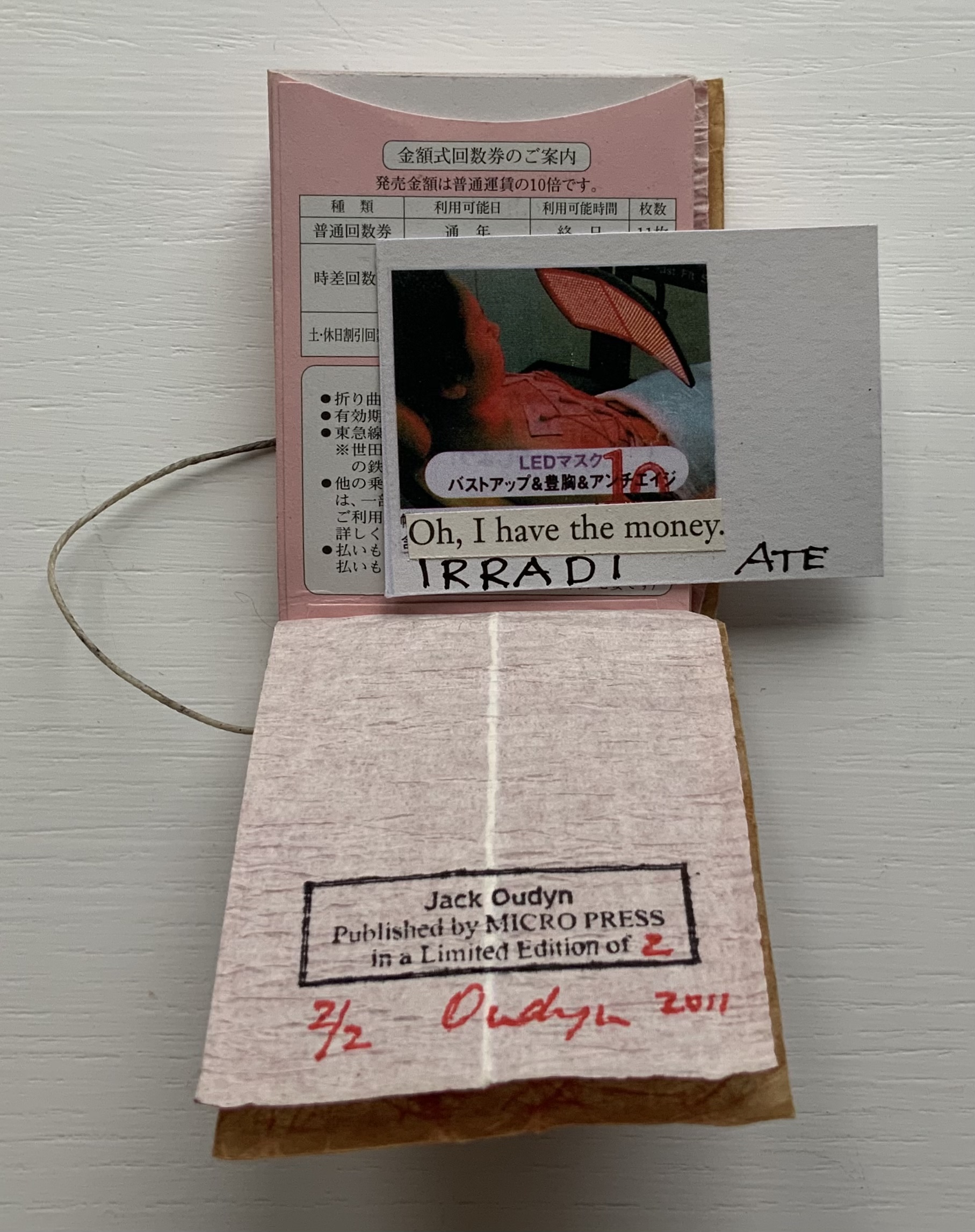
‘ATE X 10 (2011) Jack Oudyn Japanese stab-bound booklet, with wax paper cover and Momigami fly leaves. H54 x W74 mm, 10 train ticket sleeves holding 10 small numbered cards collaged with advertising brochure photos. Edition of 2, of which this is #2. Photos: Books On Books Collection, displayed with permission of the artist.
‘ATE X 10 demonstrates Oudyn’s wont to play language, form and material off image and vice versa. Bound in a Japanese stab binding by waxed thread and wax paper from the fish markets at Tsukiji in Tokyo, the book begins with a front fly leaf page bearing a tag line from the breast exercise mantra; on the same Momigami paper, the end fly leaf bears the colophon. The pages are made of Japanese train ticket sleeves containing numbered cards collaged with small photos from advertising brochures found near railway stations. As the fly leaf hints, the modest photos come from ads for breast enhancement services, an 8 x 10 promise relative to the images presented.
The works in the Micro Press imprint also reflect Oudyn’s interest (and presence) in mail art. He has been a member of the International Union of Mail Artists, and a section on his site is devoted to mail art.
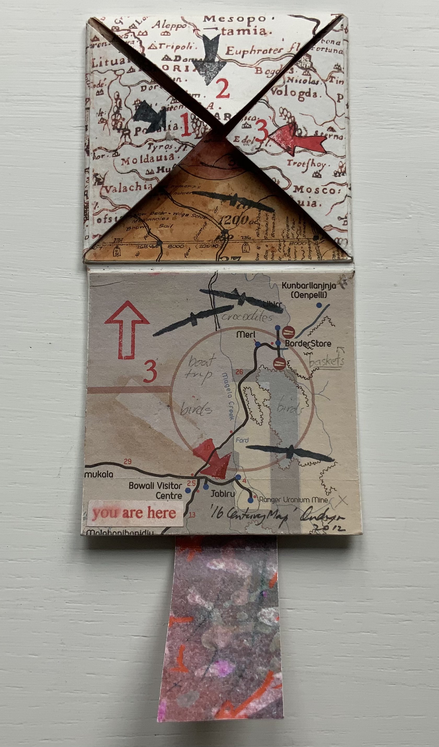
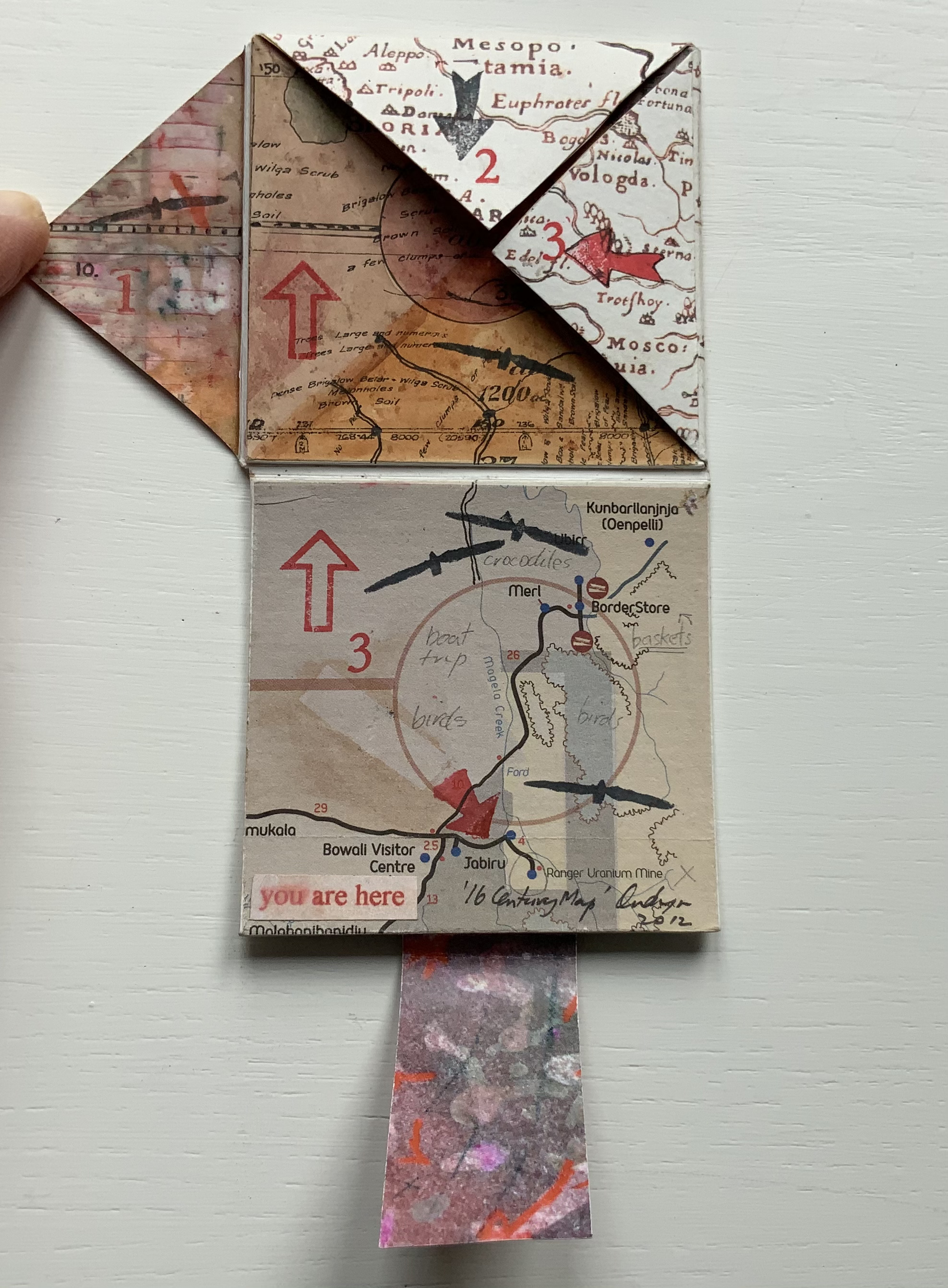
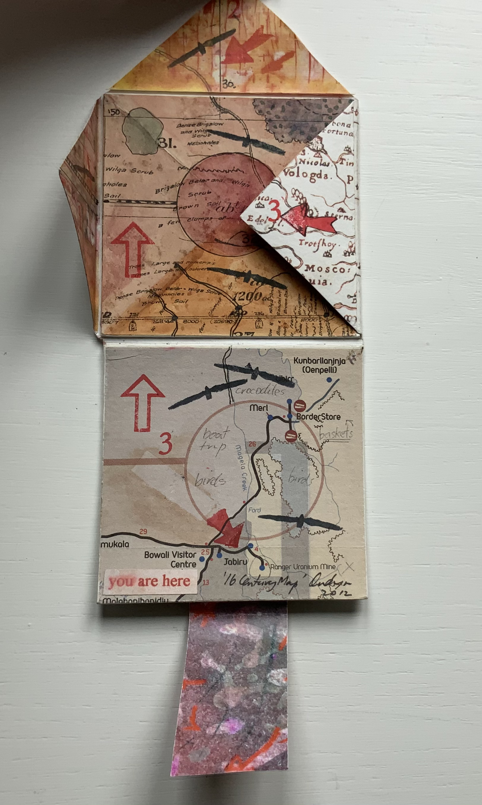
’16 Century Map’ (2012)
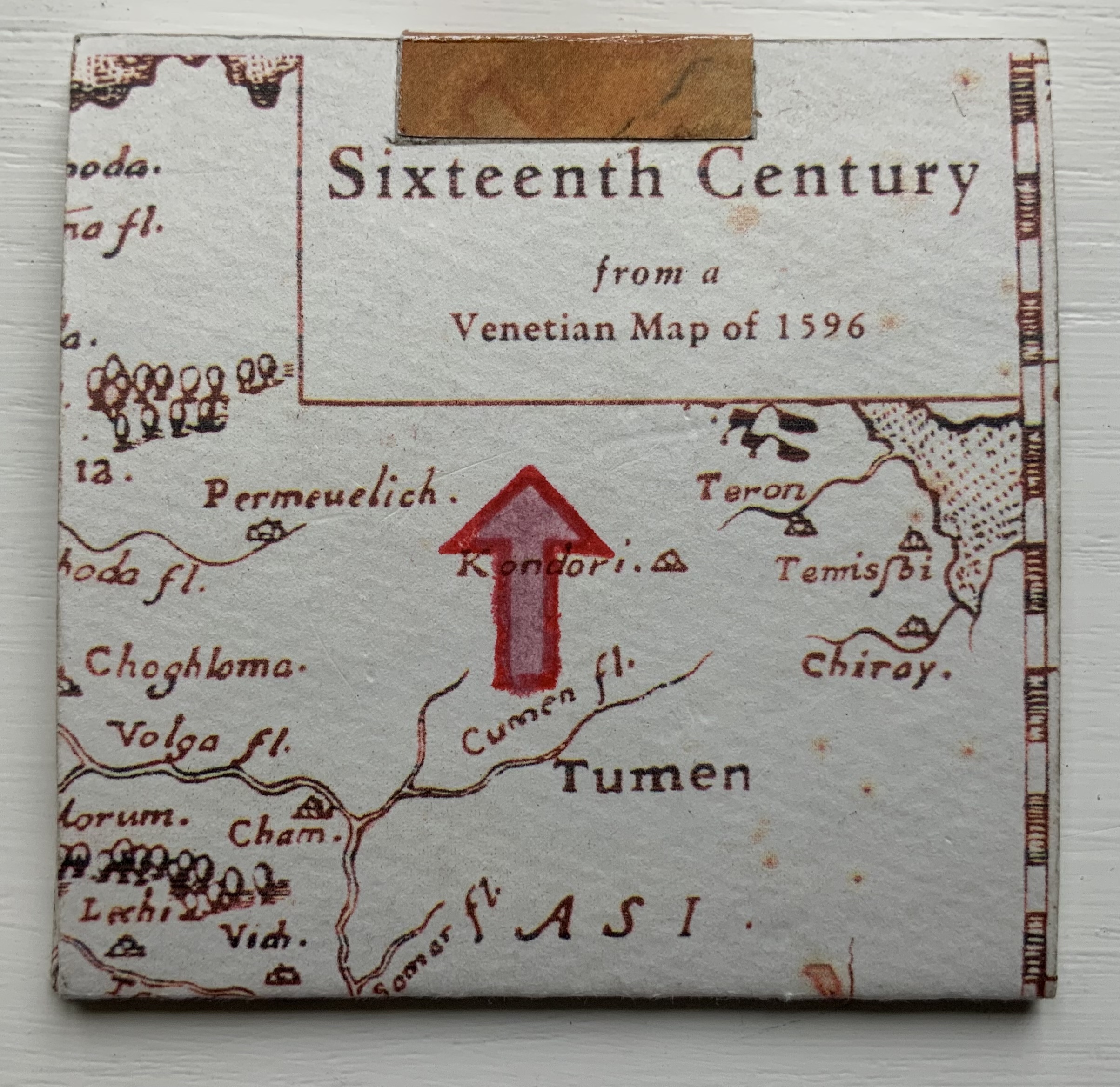
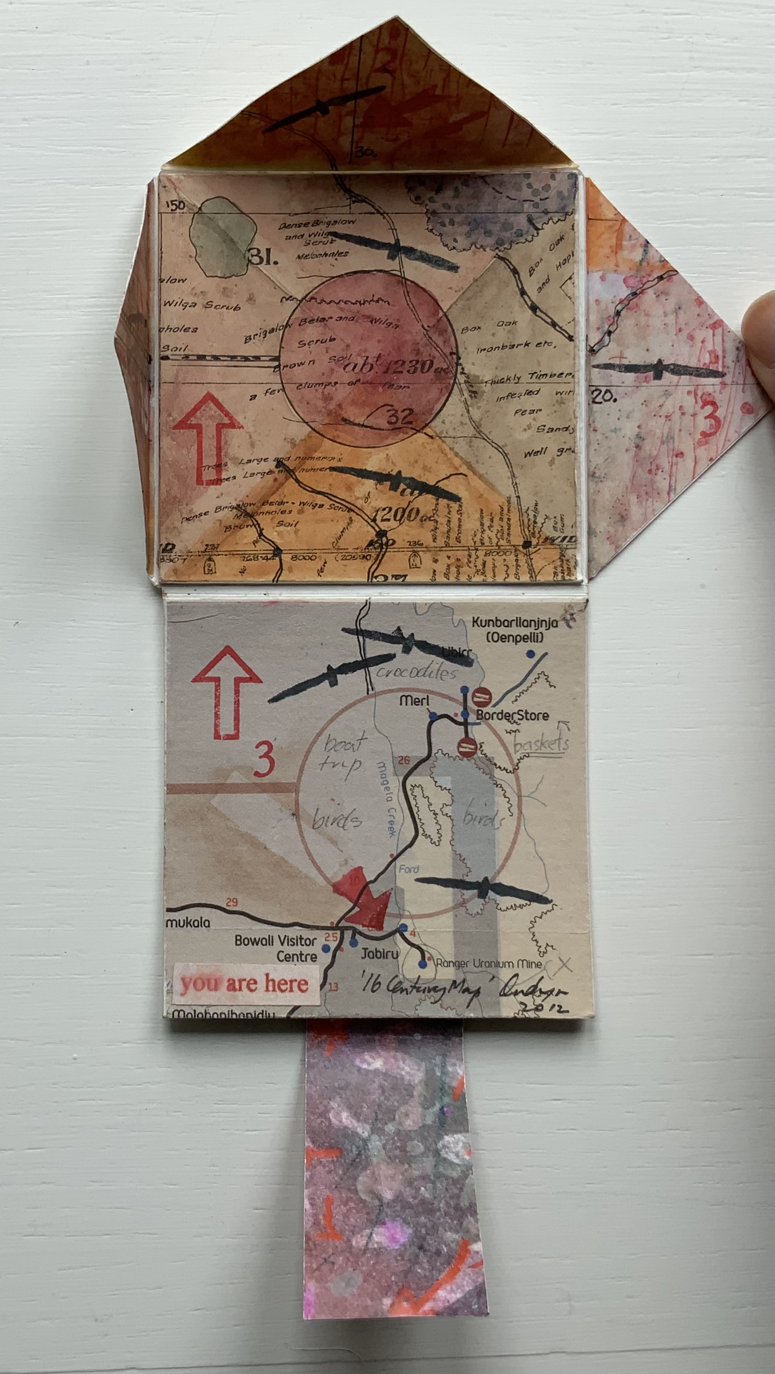
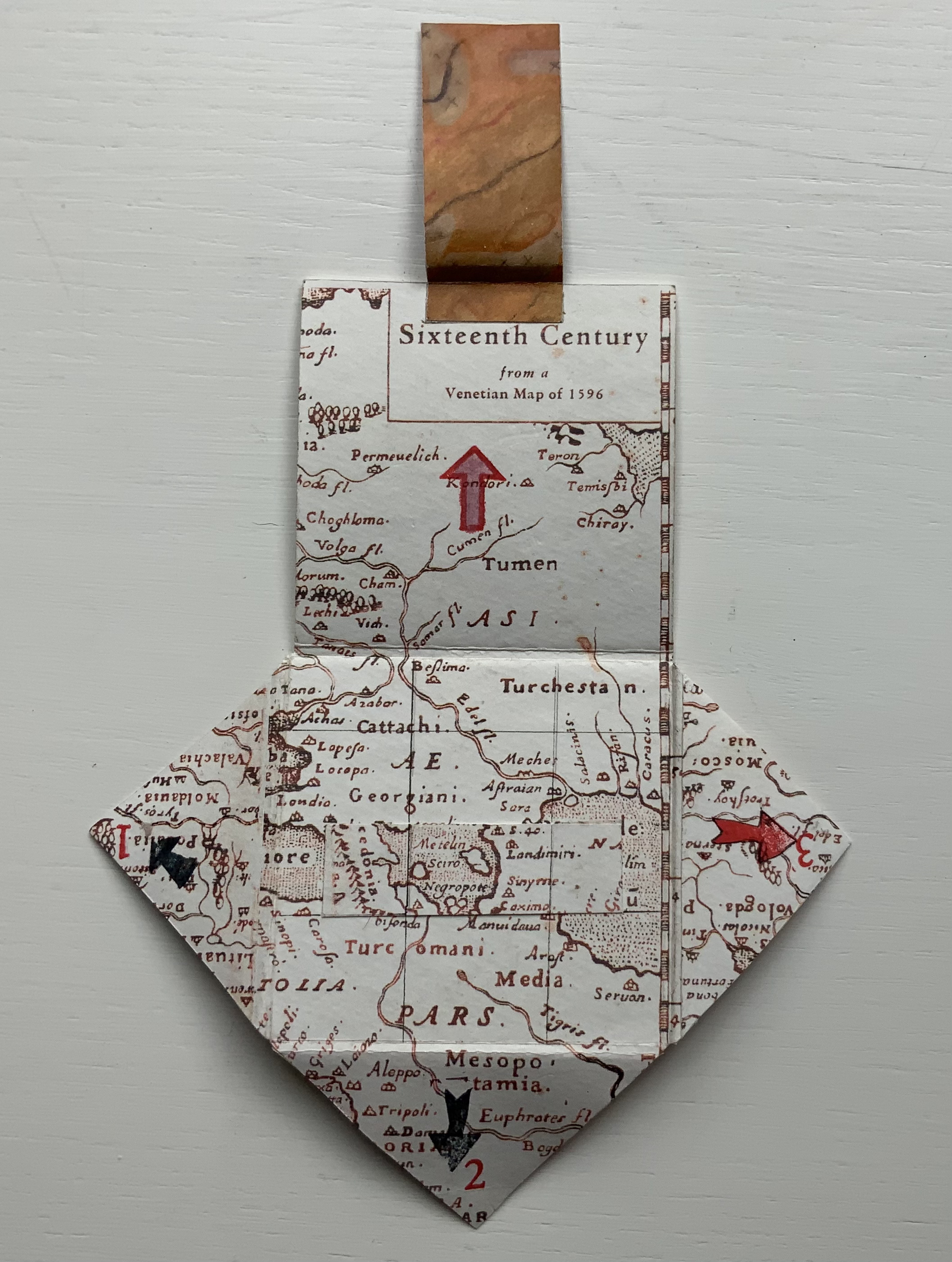
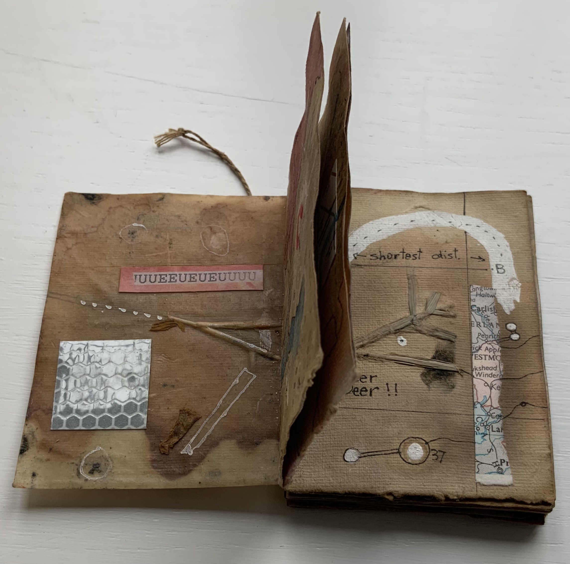
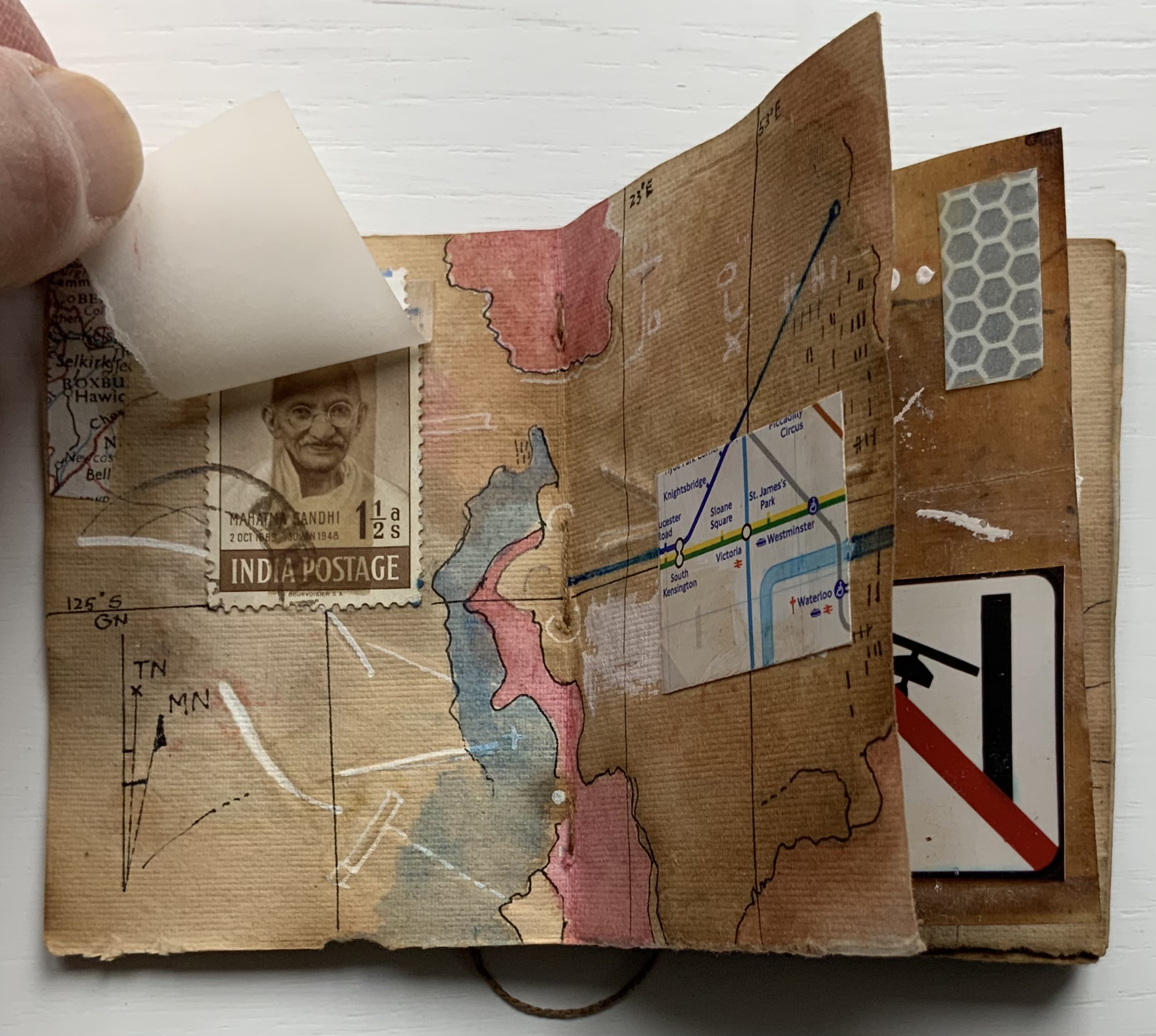
’16 Century Map’ (2012) Jack Oudyn Tab/slot-bound, single-fold, map paper on board, covering three outward-opening triangular cut tabs over center map paper on board; ink-stamped and drawn, with “you are here” sticker in lower left corner. H70 x W72 mm (closed). Unique. Acquired from the artist, 4 January 2020. Photos: Books On Books Collection, displayed with permission of the artist.
This small unique work — and those that follow — lie outside the Micro Press imprint. As the artist writes on his blog, this is a trial attempt at juxtaposing the exterior old European map (showing Mesopotamia and the Euphrates, the Northern hemisphere’s cradle of civilization) with the interior Australian map of the Kakadu National Park to get at the concept of Tjukurpa, by which Australia’s Anangu refer to the creation period.
It is not strictly a Turkish-fold map, but the way the tab with indigenous colors snugly closes ’16 Century Map’ is just as mechanically satisfying.
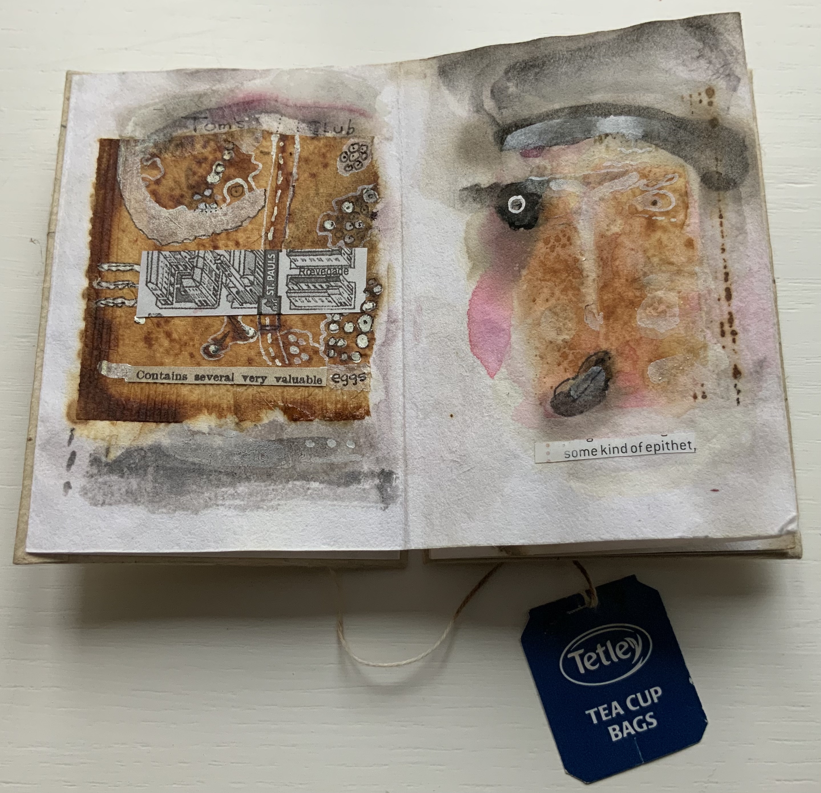
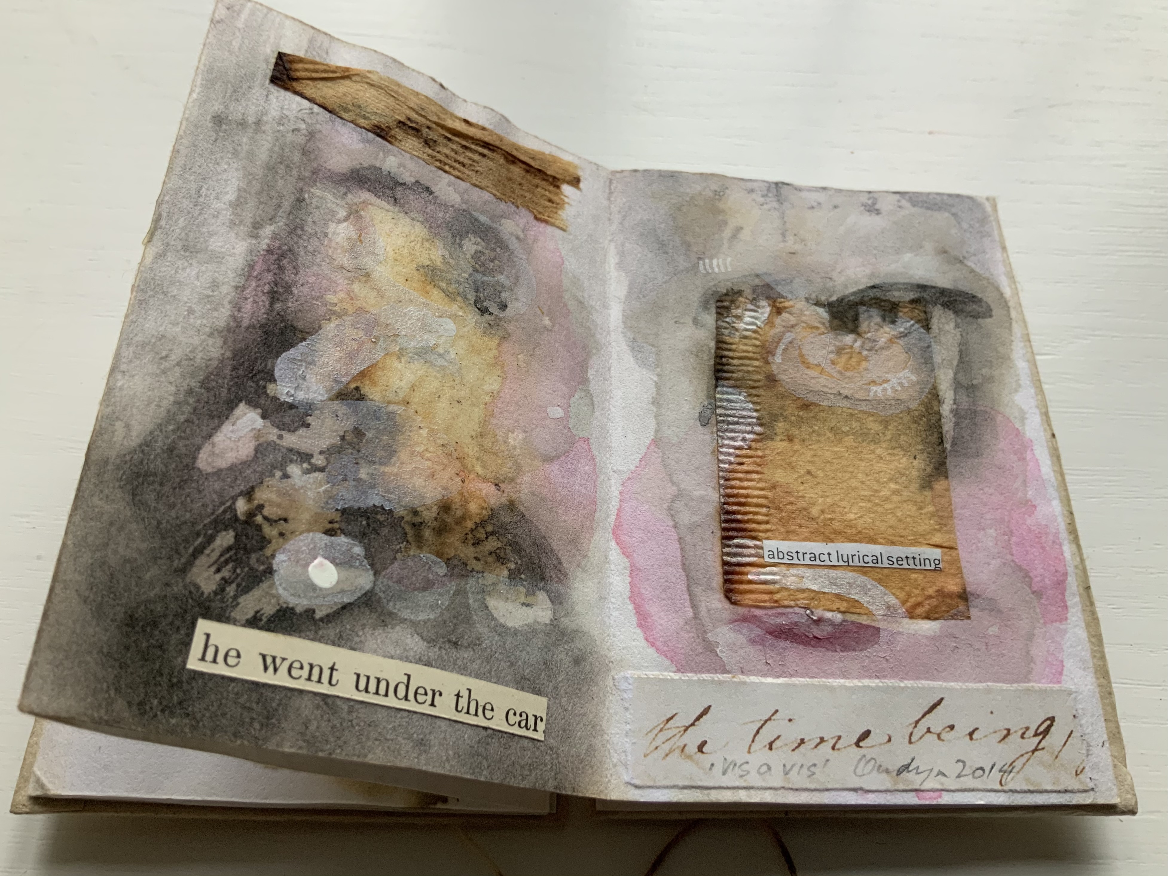
vis-à-vis | face to face (2014)
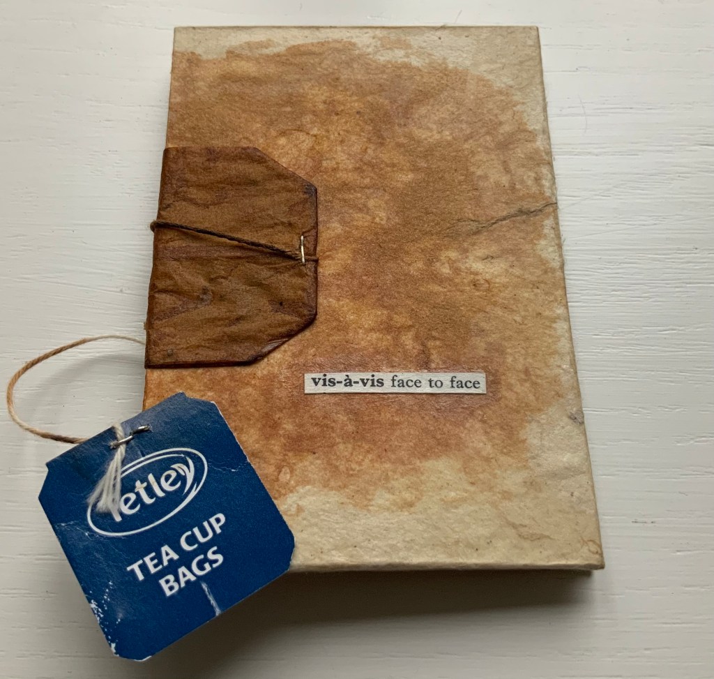
vis-à-vis | face to face (2014) Jack Oudyn Blizzard-fold booklet, mixed media and collage with tea bag paper. H100 x W70 mm, six panels. Unique. Acquired from the artist, 4 January 2020. Photos: Books On Books Collection, displayed with permission of the artist.
A heavily stained, empty teabag glued across the two boards, whose opening is closed with the teabag string wrapped around a wooden button, serves for this booklet’s binding. A conversation between two people struggling for words, hence the near random use of found text, occupies the six panels. The abstract faces profiles are characteristic of Oudyn’s work, as is the use of acrylic medium as a block out or resist. Or perhaps it is egg yolk, which would be in keeping with the reference to eggs and, with the tea stains, in keeping with a breakfast-table conversation.
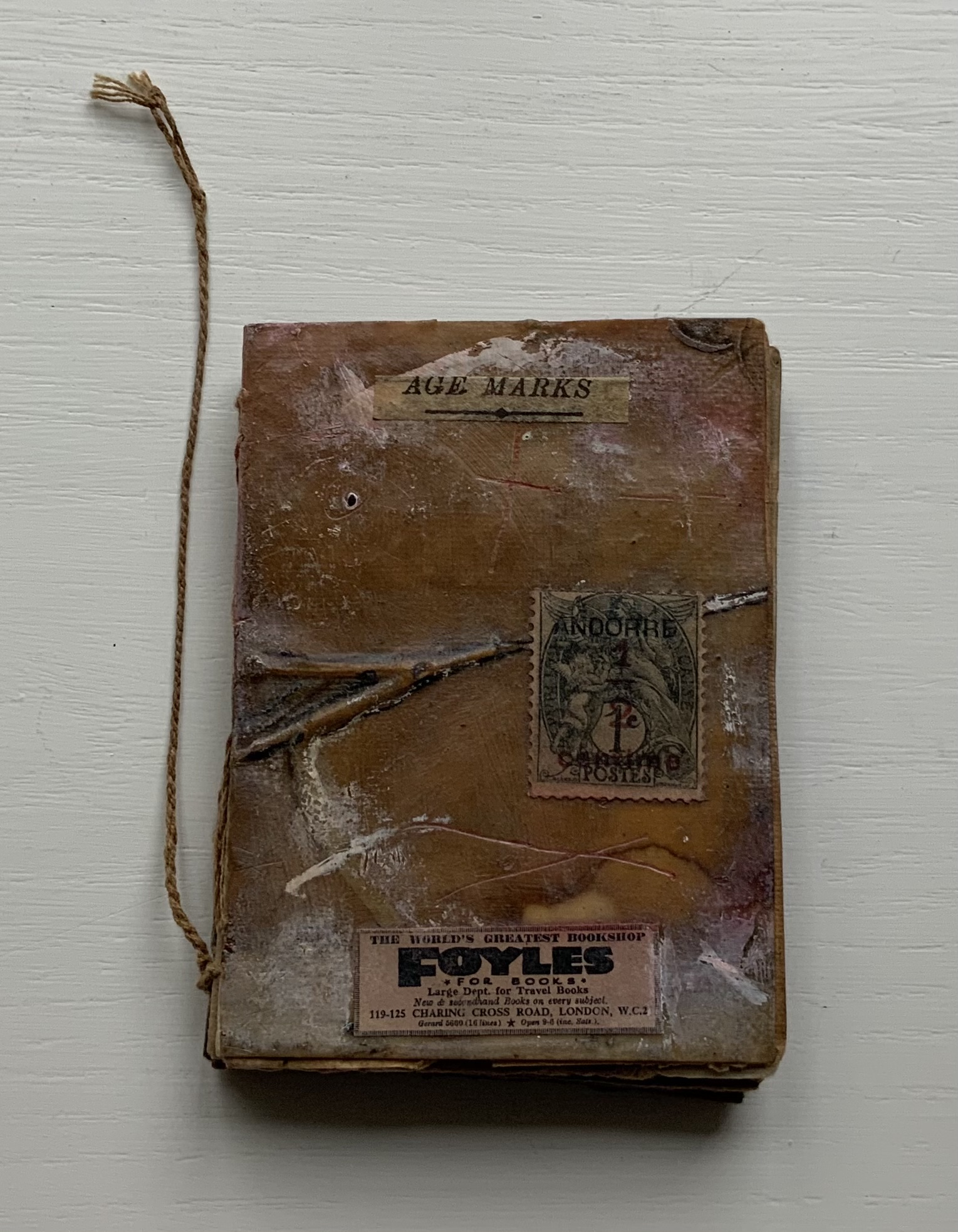
Age Marks (2014)
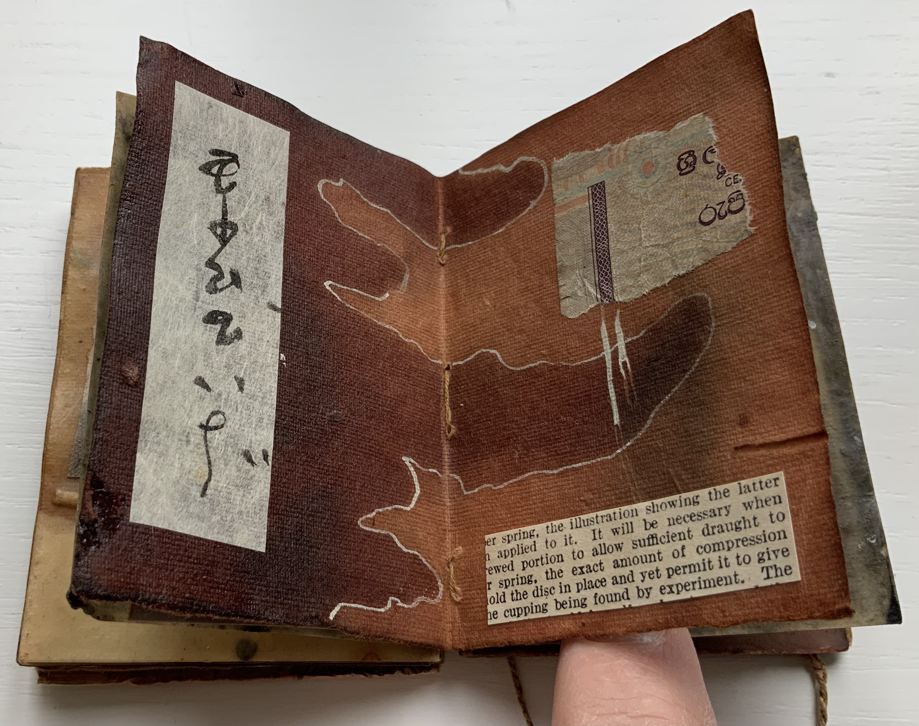
Age Marks (2014) Jack Oudyn Handmade waxed and stained paper book by Trace Willans. Mixed media and collage on paper. H85 x W65 x D10 mm, 44 pages. Unique. Acquired from the artist, 4 January 2020. Photos: Books On Books Collection, displayed with permission of the artist.
Trace Willans makes blank books from organic, sustainable media. Age Marks began as one of these blanks, its pages consisting of lightly textured machine-made lightweight paper (ca. 100 gsm), some stained and waxed. The result is not exactly an inscribed blank notebook, not exactly an altered book. Oudyn’s use of mixed media of different hand-made papers, tracing paper, found text, wax, reflective road tape, postage stamps, white acrylic ink, gouache and pigment creates a unique record of the aging process of mark making. Marks made by conversation, observation, inscription, printing, writing, drawing, collation, lifts and reveals, cutting, tearing, pasting, weaving, binding — all filtered through aging.
Small as it is, Age Marks is one of the most varied haptic experiences in the collection.
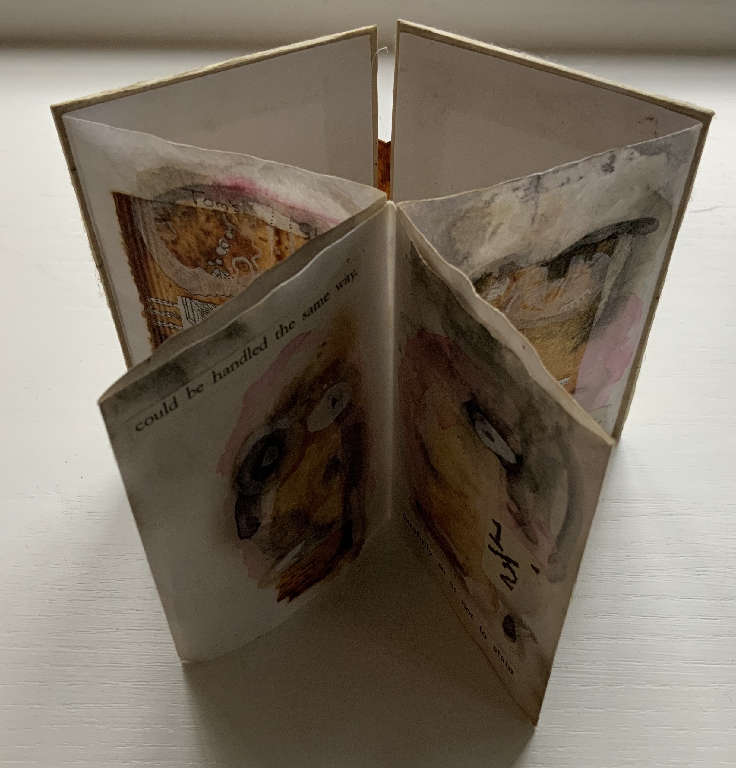
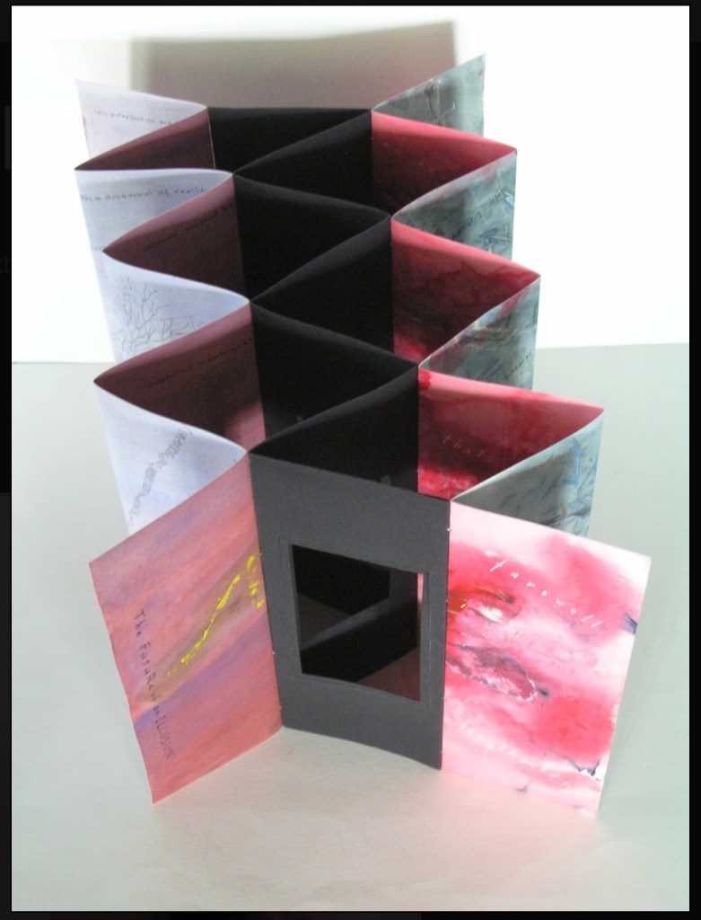
The Future of an Illusion (2017)
The Future of an Illusion (2017) Helen Malone and Jack Oudyn Sculptural tunnel book structure (three joined four-fold leporellos) enclosed in a folder and protective boxin a box,. Box made with Lamali handmade paper, suede paper (lining) and Somerset Black 280 gsm; Folder: Canson black 200gsm, skull button and waxed thread; Leporellos: center leporello made of Canson black 200 gsm, linen thread adjoining two leporellos made of Arches watercolour paper 185 gsm with acrylic, soluble carbon, gouache and transfer ink jet images. Box: H275 x W313 x D34 mm; Folder: H258 x W295 x D21 mm; Book: H250 x W290 x D16 mm closed, D410 mm open. One of an unnumbered, signed edition of 4. Acquired from Helen Malone, 12 September 2017.
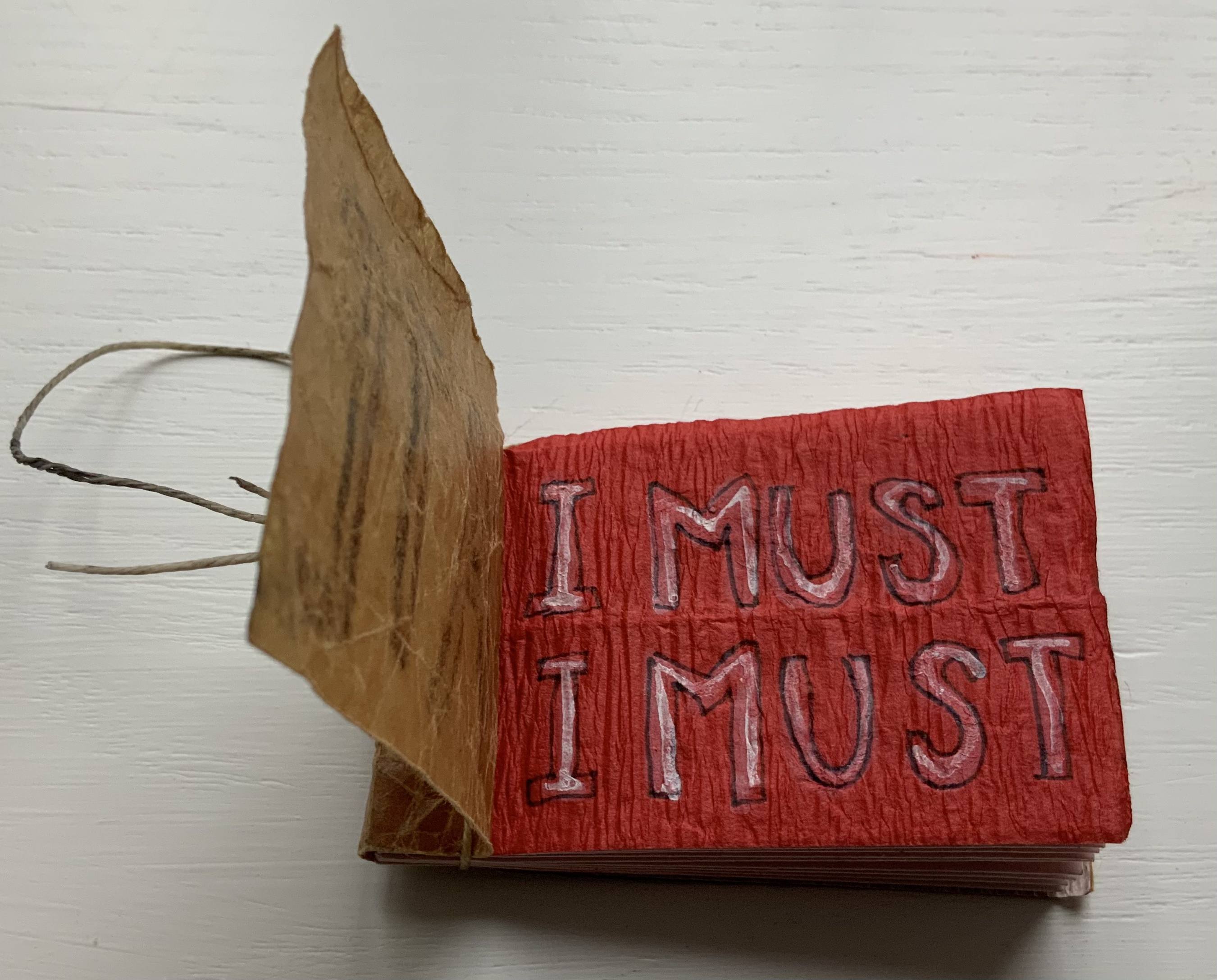
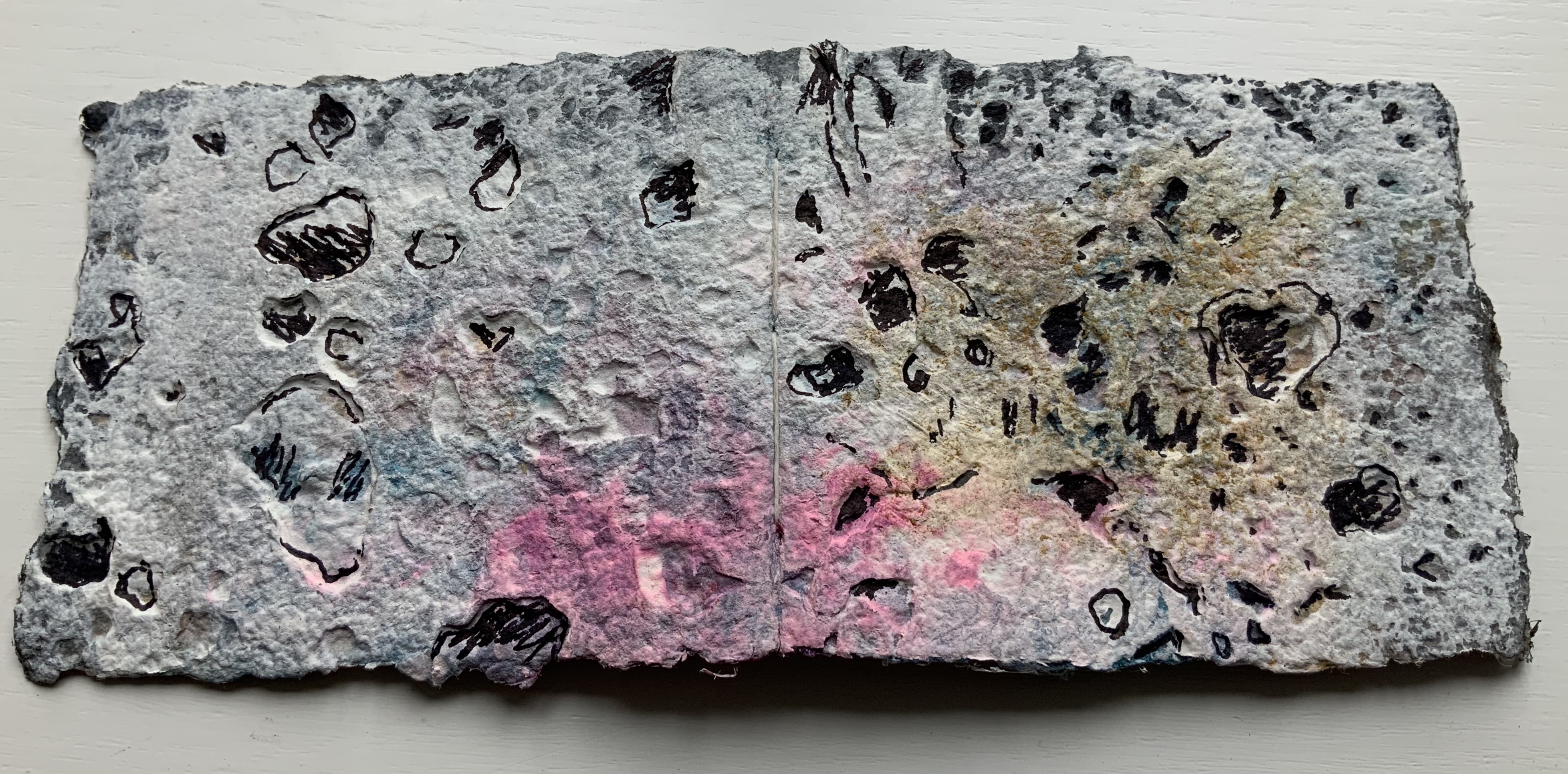
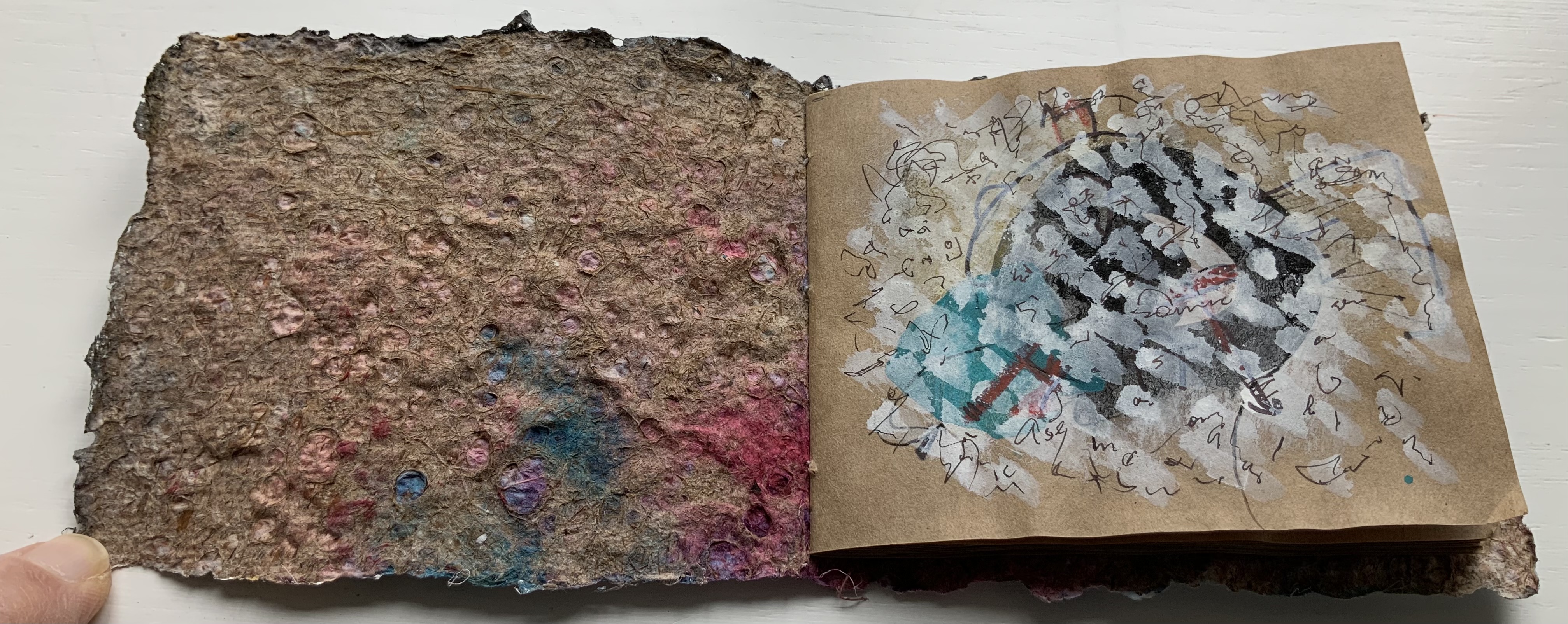
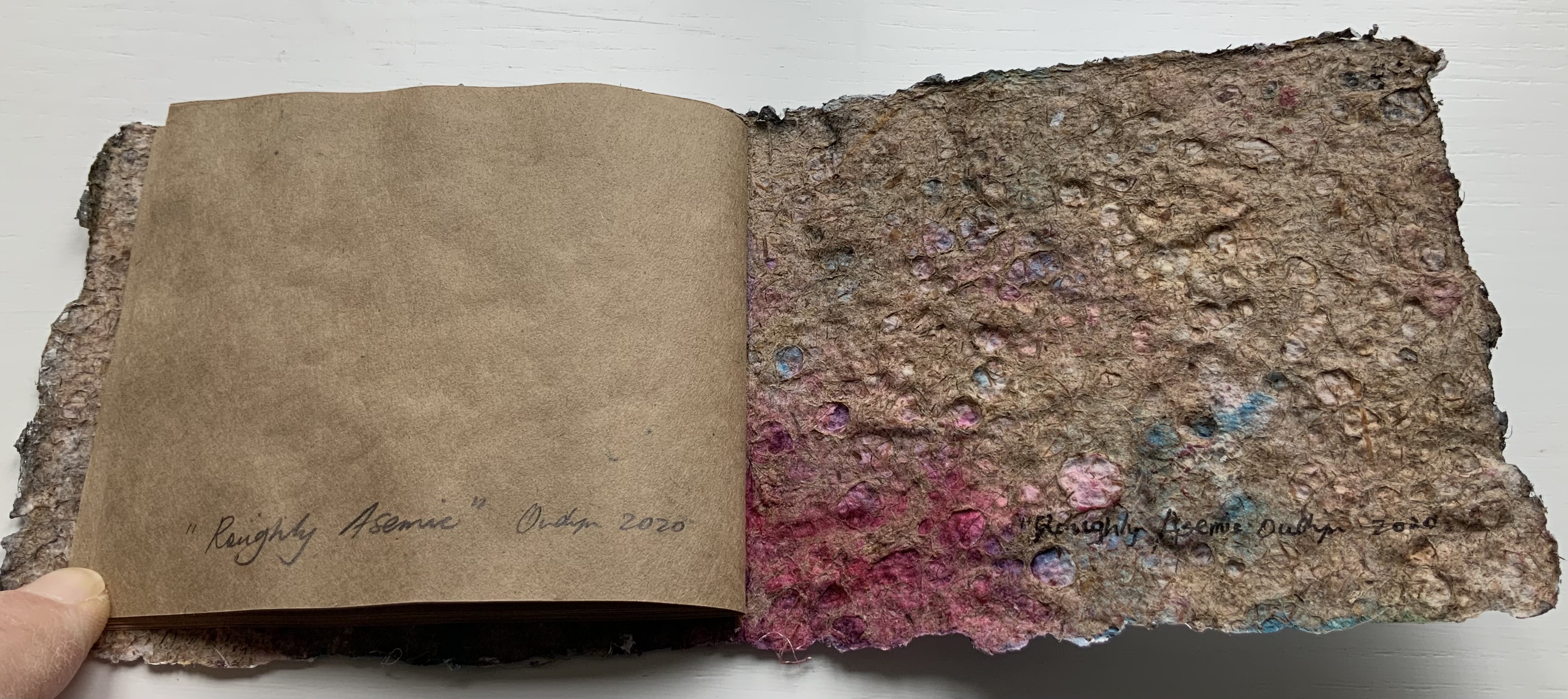
Roughly Asemic (2020) Jack Oudyn Booklet, single-thread stitched, handmade paper cover, painted and inked, over brown Kraft paper folios illustrated with drawings and markings in paint and ink. H105 X W123 mm, 7 leaves, folded in half making 28 unnumbered pages, 14 of which bear drawings and markings, 13 of which are left blank, and the last page bears the title, signature and year. Unique. Acquired from the artist, 4 January 2020. Photos: Books On Books Collection, displayed with permission of the artist.
This work’s title could not be more apropos. It is a scratchy thing to hold, its pages stiff and crackling as they turn. Patterns, images and letters struggle to emerge, only to be submerged by each other on the same or next page, which goes to show how difficult it must be to achieve entirely asemic markings. “Roughly asemic” might be the best hoped for.
Foster, Robin. “Feature Artist – Jack Oudyn“, Personal Histories, International Artist Book Exhibition, Redland Museum, UNSW, Canberra. 11 March 2014. Accessed 19 October 2020.
")