alpha seltzer (2023)
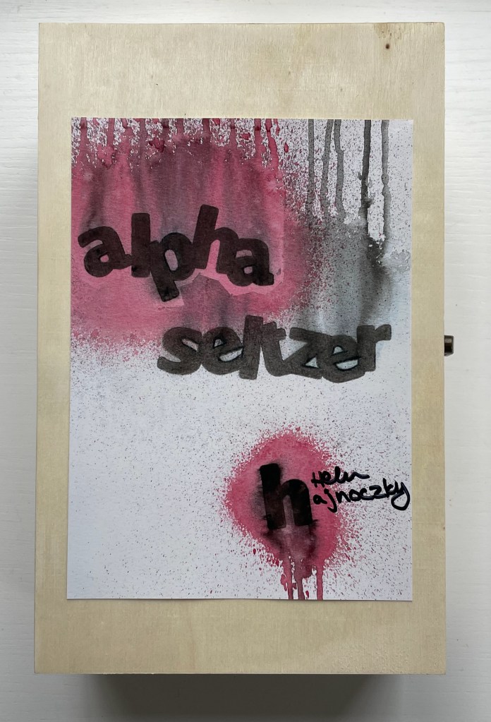
alpha seltzer (2023)
Helen Hajnoczky
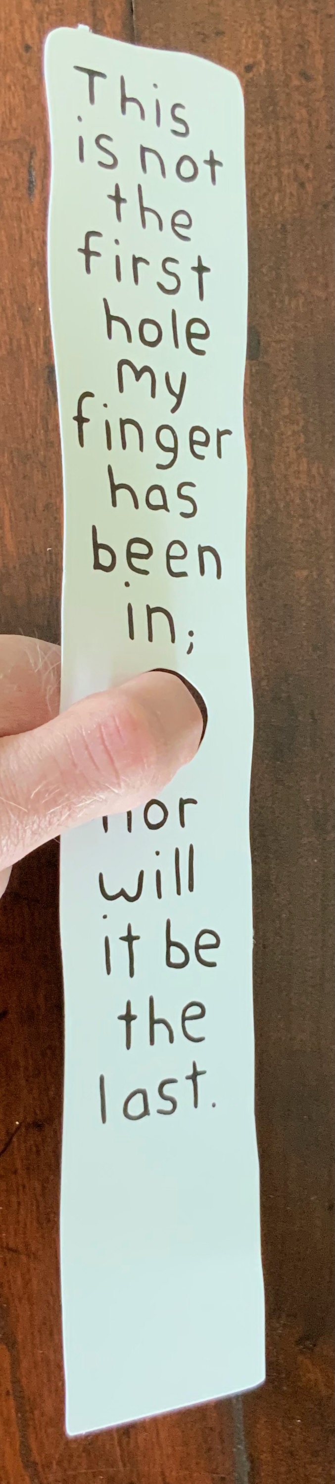
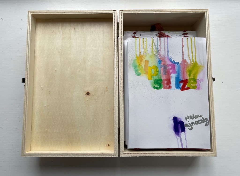
Canada balsa wood, hinged and clasped box, double-sided accordion structure attached to multicolored ribbons for vertical display. Box: H240 x W155 x D80 mm. Leporello panel: H178 x W126 mm. Open: 1041 cm. 56 panels. Acquired from the artist, 10 April 2023.
Photos: Books On Books Collection.
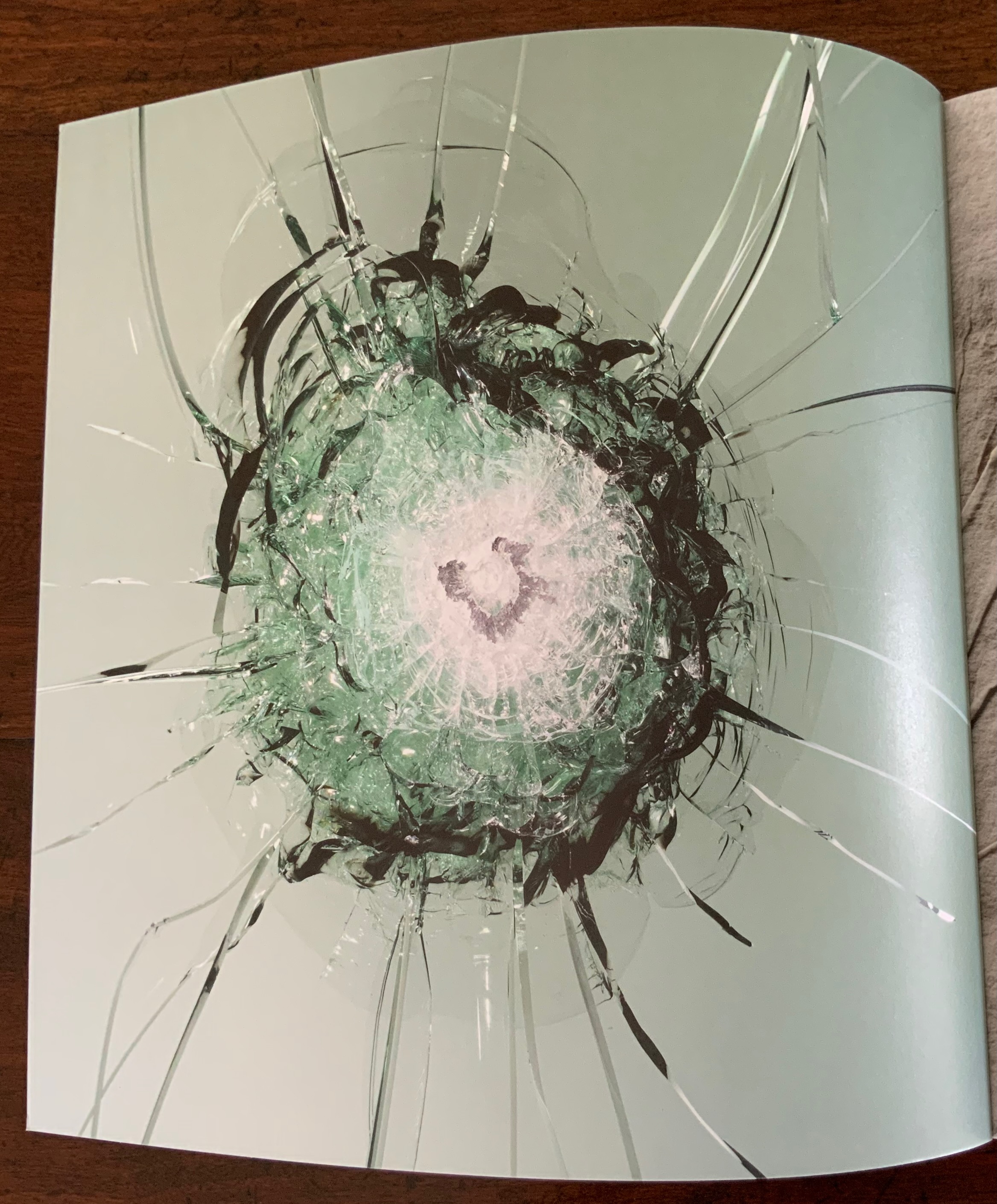
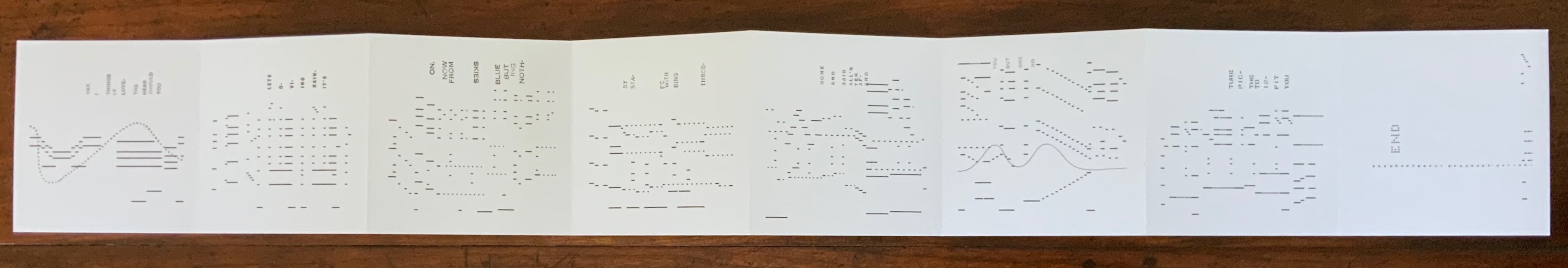
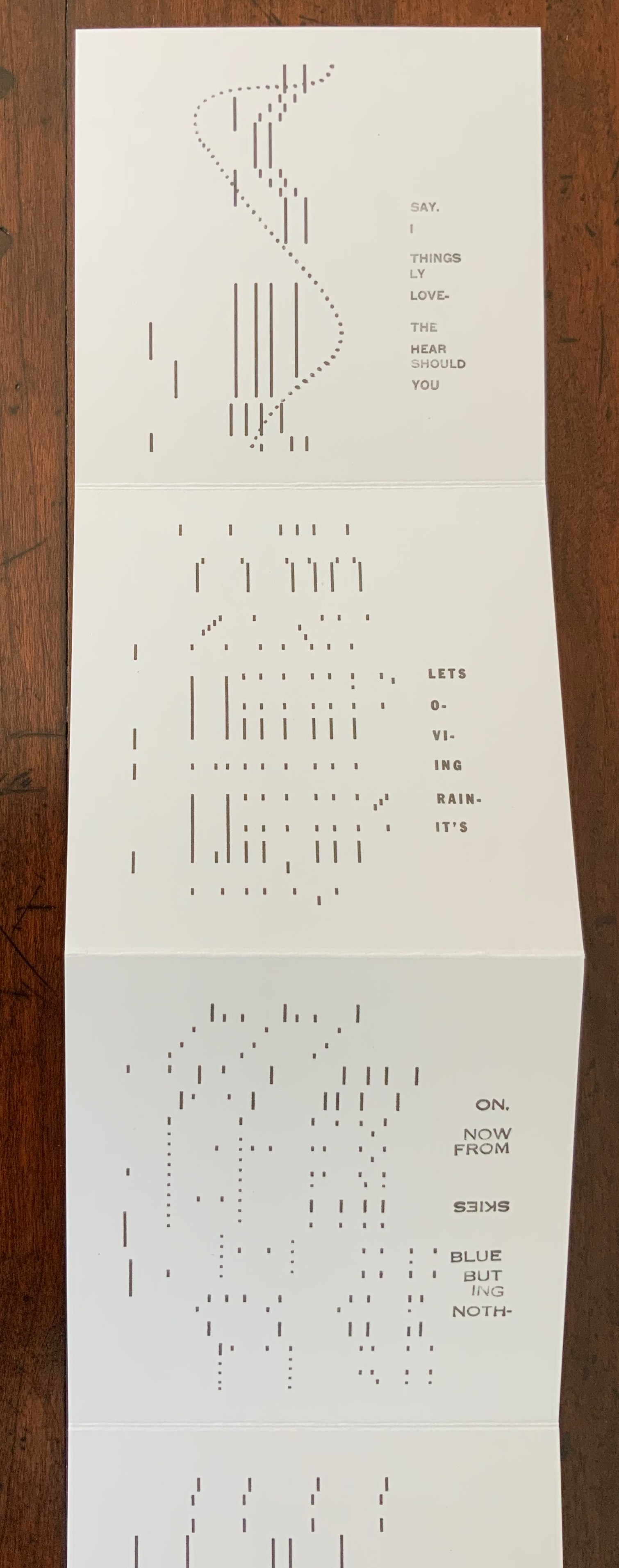
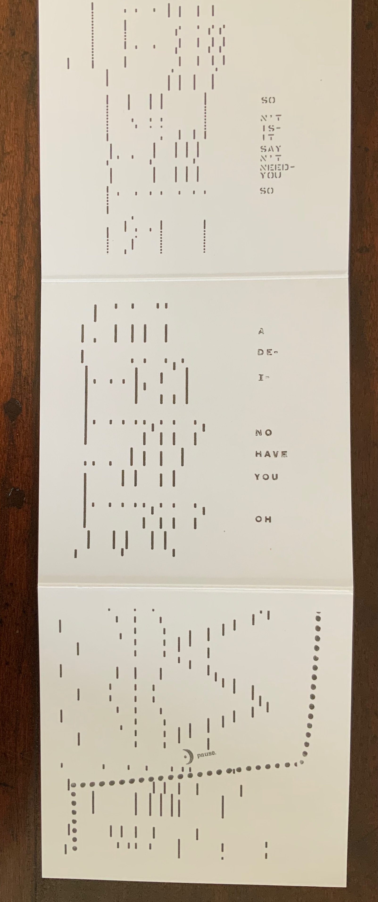
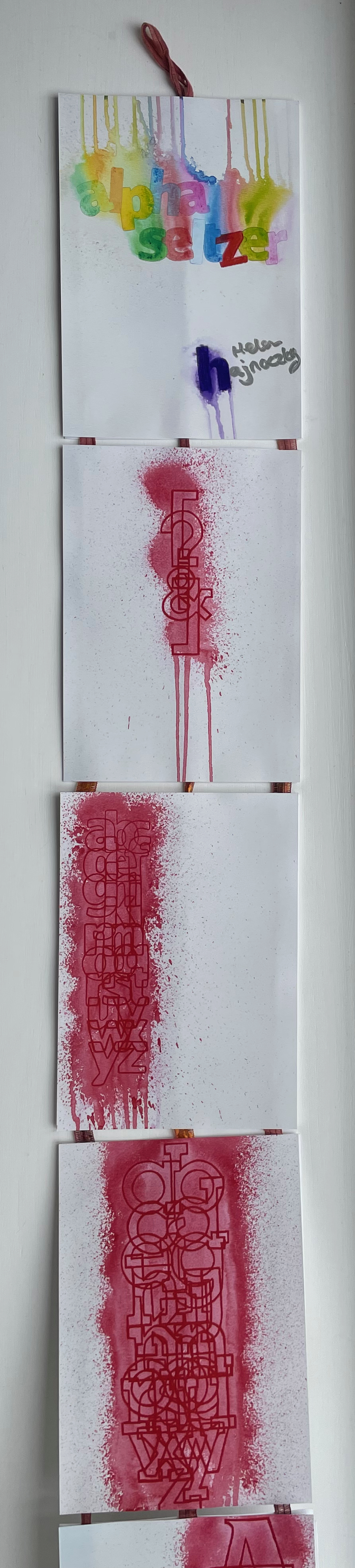
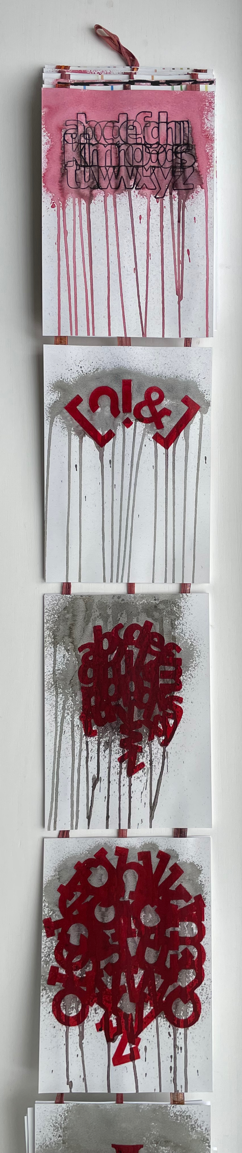
Letters and punctuation marks fall and rise and tumble in alpha seltzer like so many tablets of Alka-Seltzer. With her use of color, technique and orientation of the images, Hajnoczky holds to and takes the concept far beyond a one-trick visual metaphor. Anyone who has observed those dissolving heart-burn relief tablets closely will recognize how the colorless effervescing bubbles spin off each tablet in upwards and downwards directions. So, on the box cover’s title plate and on the first panel, colored drips surrounded by spatters rise from the title and fall from the artist’s name.
But what is it that the characters are dissolving in, and what are they dissolving into? Of course it’s just paper, but the Kodak Moment matte photo paper has a glossy shine suggesting a solution of water. As the accordion emerges from the box, a spattered and dripping red column made of overlapping characters (brackets, question mark, exclamation mark and ampersand) appears on the first panel; then with a shift to the left, the red column widens into one made of all the lowercase letters of the alphabet; then shifting back to the center, the column widens and comes closer; and then shifting to the right, it becomes a column of all the uppercase vowels overlapping. What is going on?
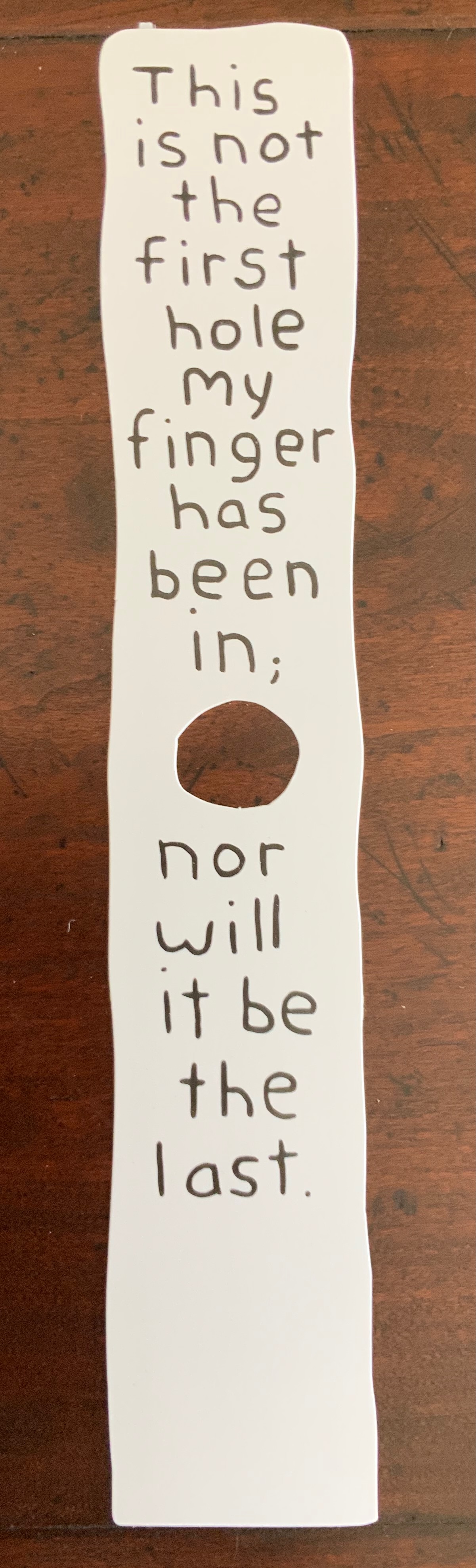
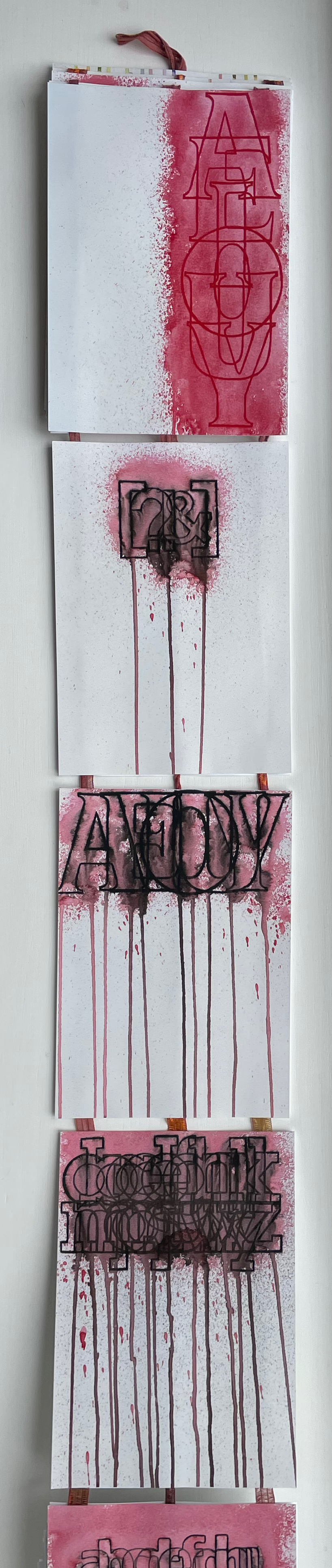
Now, the originally vertical column of brackets, question mark, exclamation point and ampersand goes horizontal and black, dripping pink and gray into the next panel of horizontal uppercase vowels in black, dripping gray, pink and black into a horizontal jumble of lowercase letters.
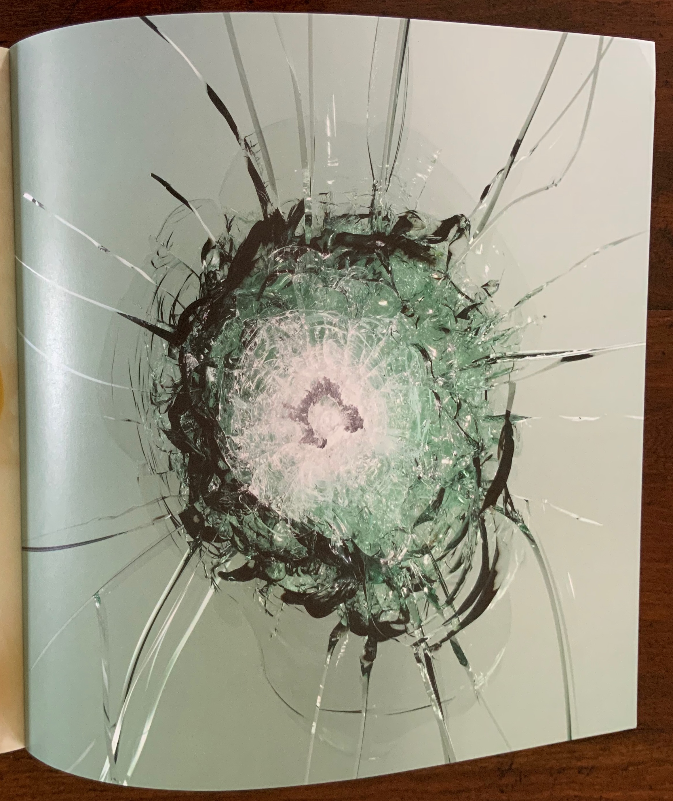
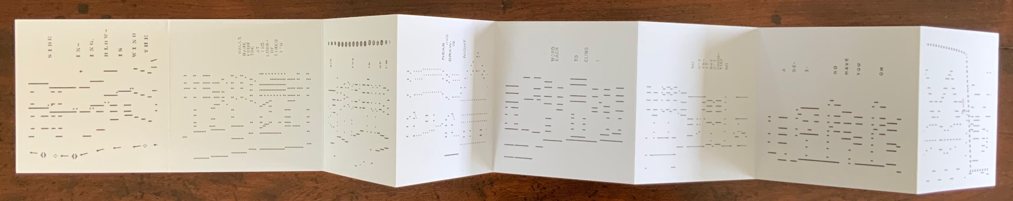
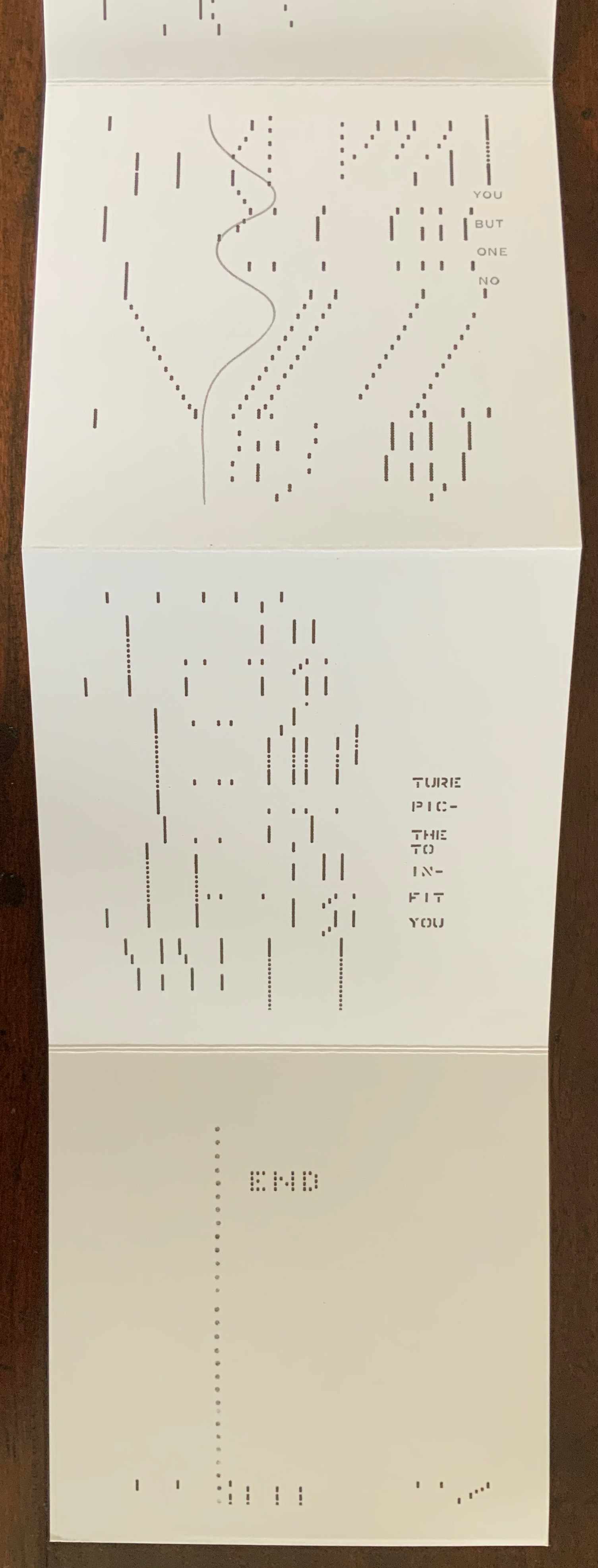
Then the characters bend into a deep red curve spattered and dripping in gray, eventually morphing into a ball of red vowels. Beneath that, the palette goes entirely black and gray, and the characters begin to angle down the panel into a heap of letters sliding downwards from right to left across the panel and squeezed at the bottom …

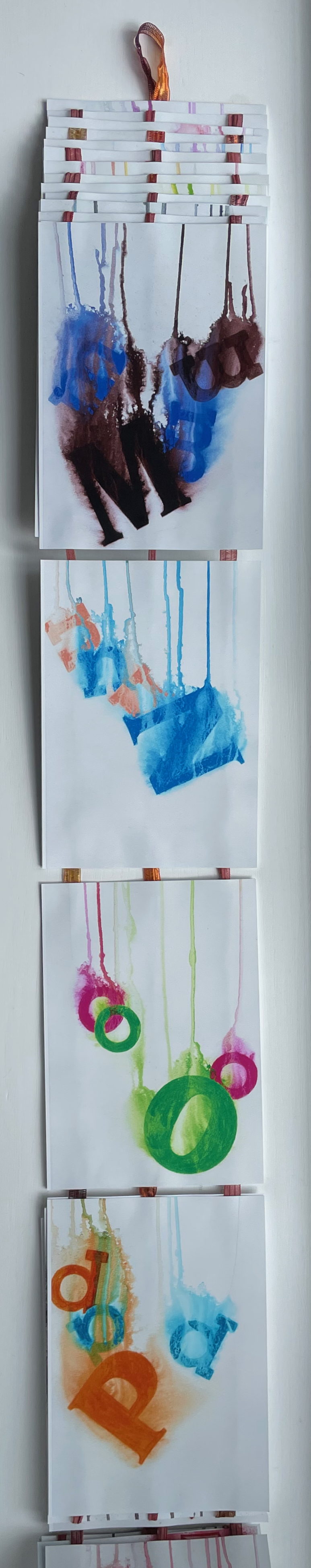
… until they have to cascade down from left to right, which is when a riot of color breaks out. At the end of the accordion, you realize there’s another loop; which side is up, which is down?
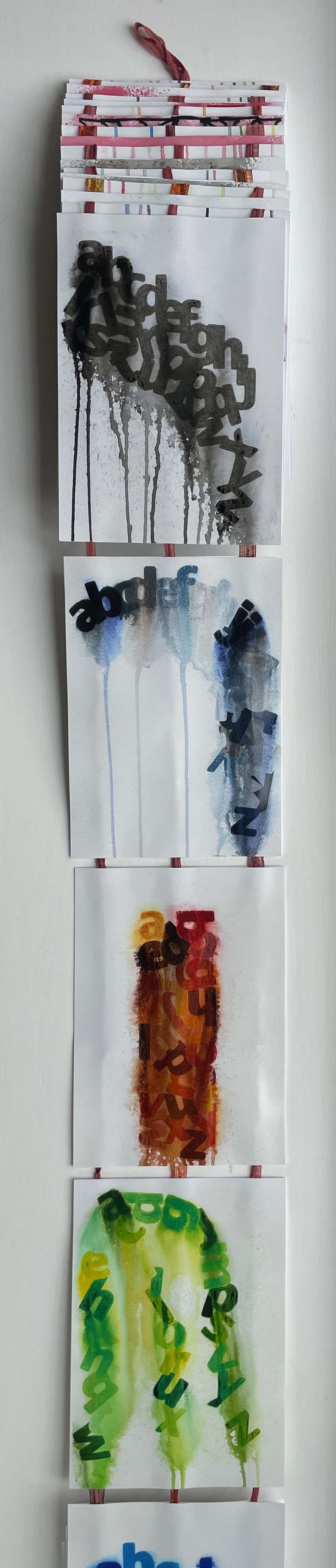

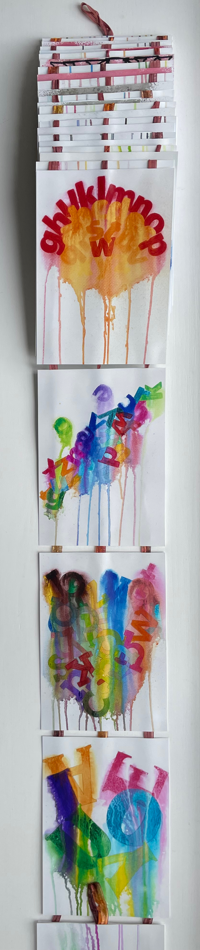

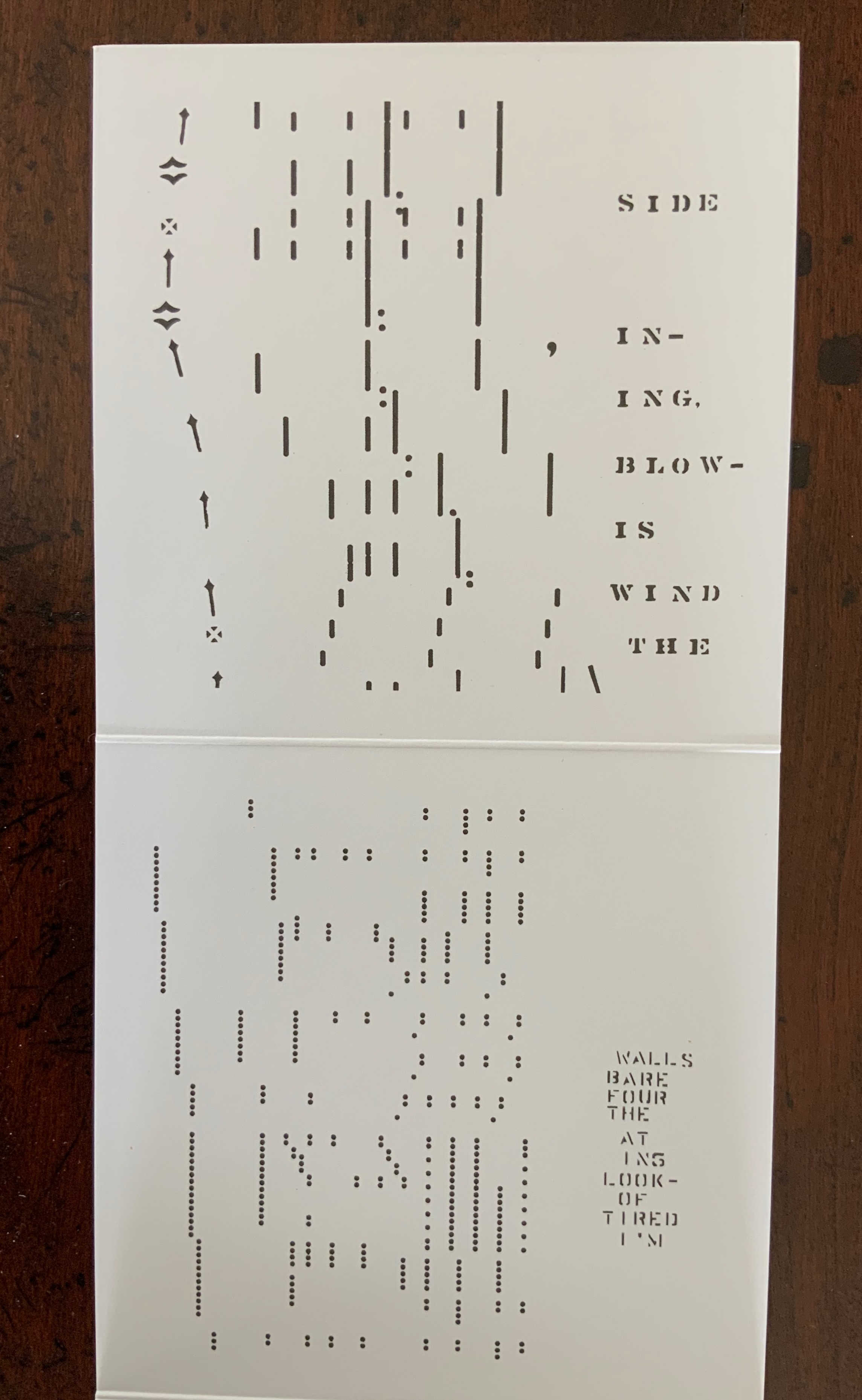
On the other side of the accordion, the riot of colors continues, but each panel presents a single-color uppercase letter that seems to be dissolving like an Alka-Seltzer tablet into multicolor lowercase versions of itself.


With layout, color, technique and metaphor, Hajnockzky has coaxed an element of abstraction from the alphabet that differs from the semiotic abstraction by which letters have come to be what they are. But in the end, it’s not a confusion from which relief is wanted. Rather it’s one in which to fall, be immersed and enjoy. And to have a laugh at the expense of the Dr. Miles Medicine Company of Elkhart, Indiana and its subsequent owner Bayer AG for missing a marketing trick for Alka-Seltzer tablets.

Magyarázni (2016)
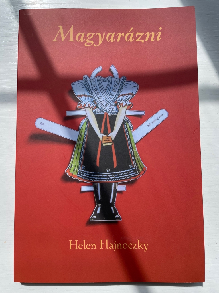
Magyarázni (2016)
Helen Hajnoczky
Perfect bound paperback. H210 x W140 mm. 104 pages. Acquired from the author, 14 December 2021. Photos: Books On Books Collection.
With all its diacritics and dipthongs, if there is an alphabet song in Hungarian, it must be operatic in length. It is fortunate, though, that it is as long as it is; otherwise we would have fewer poems in this volume by Helen Hajnoczky.
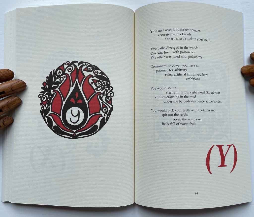
Hajnoczky is second-generation Hungarian-Canadian. These poems use the two languages to reflect on her dual roots of culture and the roots of memory. And for both, what better vehicle than an alphabet book. Even though there are 44 letters in Hungarian compared to 26 in English, Hajnoczky is a greedy poet, and taking her title literally — Magyarázni means “make it Hungarian” — she includes poems for the letters Q, W, X and Y even though Hungarian has no need of the phonemes behind them except for borrowed words.
Hajnoczky does not shy away from growing up in the English-language poetic tradition. In the poem below, she appropriates Robert Frost’s “The Road Not Taken”, turning and twisting its metaphor into one for her experience of growing up with two languages, making the letter Y and Robert Frost Hungarian.
Some of the poems might remind readers of Seamus Heaney. For the letter í (for Írástudatlanság/”ignorance, illiteracy”), Hajnoczky delves into the metaphor of the pen in a way that surely would have brought a smile to Heaney as a nod to his “Digging”; or he might have heard an echo of “Clearances” in Lyuk/”hole”) for the dipthong Ly when she hears a relative commenting on her needle-wielding: “you are/ Never going to sew anything/ as good as your grandmother”.
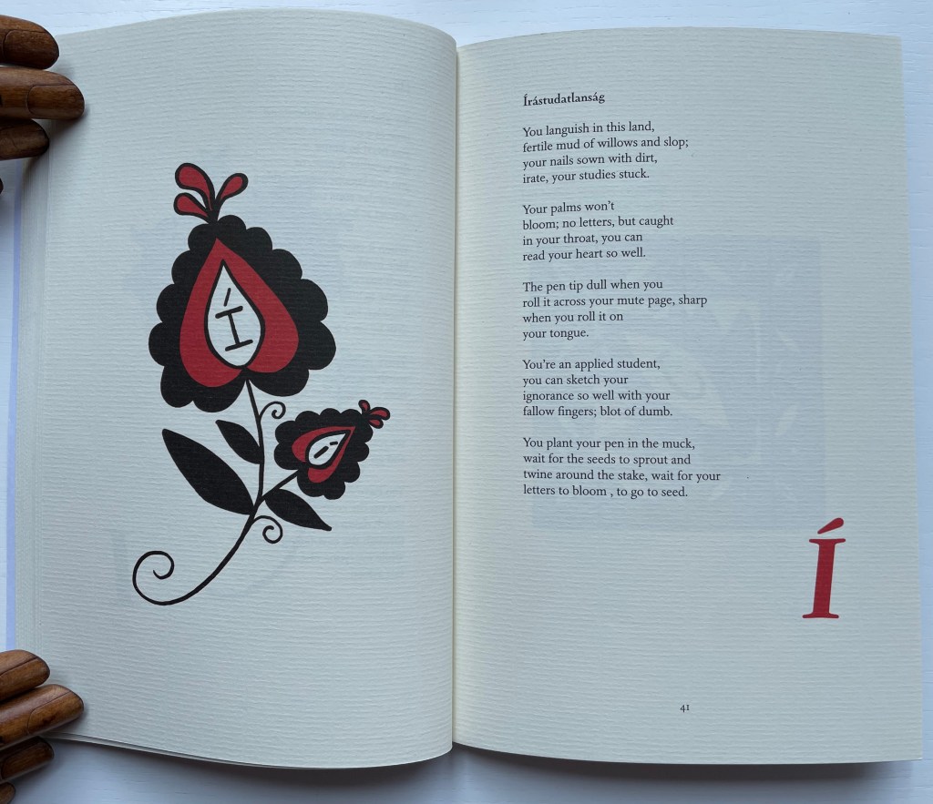
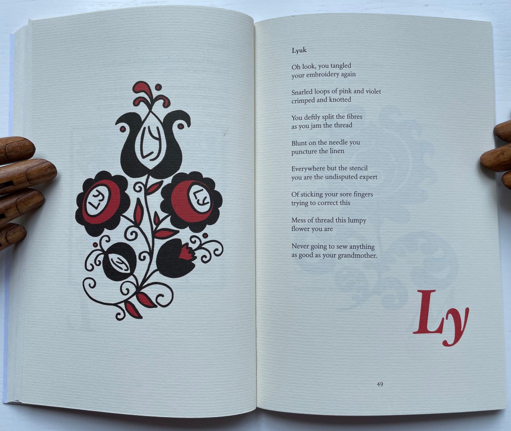
Hajnoczky calls the images facing the text “visual poems”. To create them, she has drawn from a difficult-to-find spiral bound book put together by Péter Czink and Lorraine Weideman. As with Alphaseltzer, the results are visually striking. Coach House Books has nicely complemented the images and type with vegetable-based ink and Zephyr Antique Laid paper.


Further Reading
“Abecedaries I (in progress)“. Books On Books Collection.
Hajnoczky, Helen. 2021. Frost & Pollen. Halifax: Invisible.