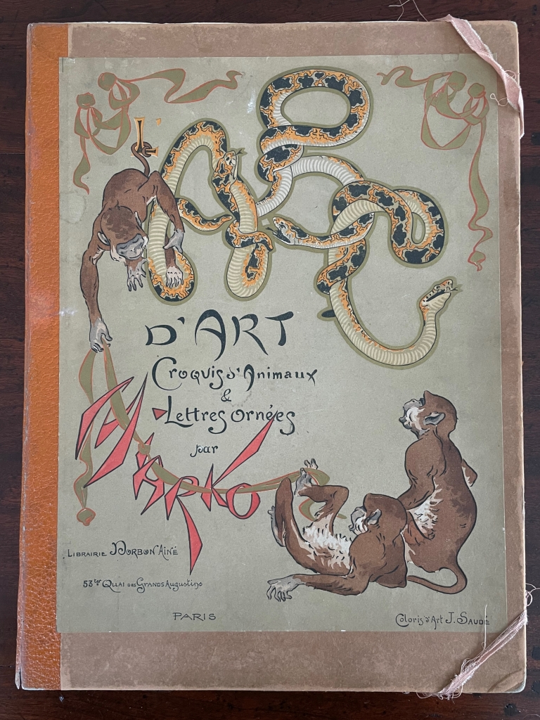
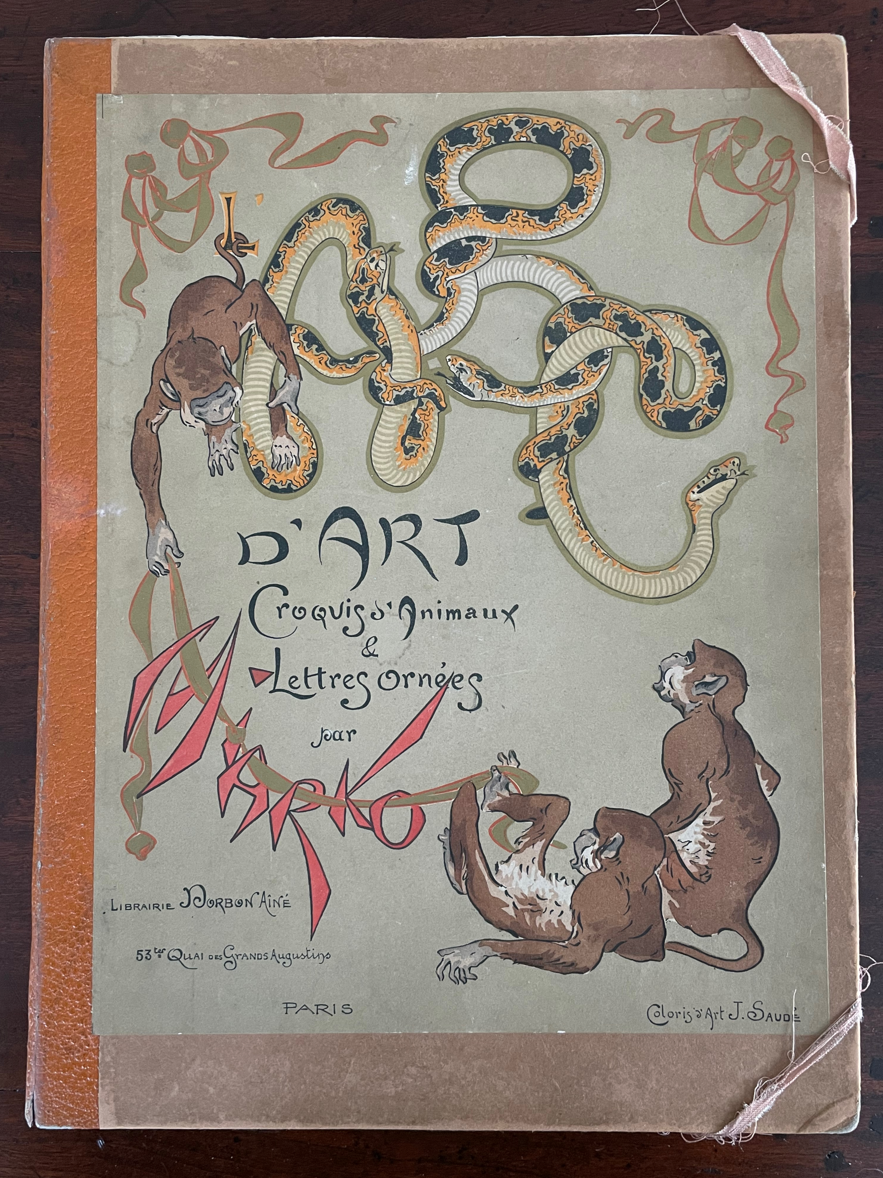
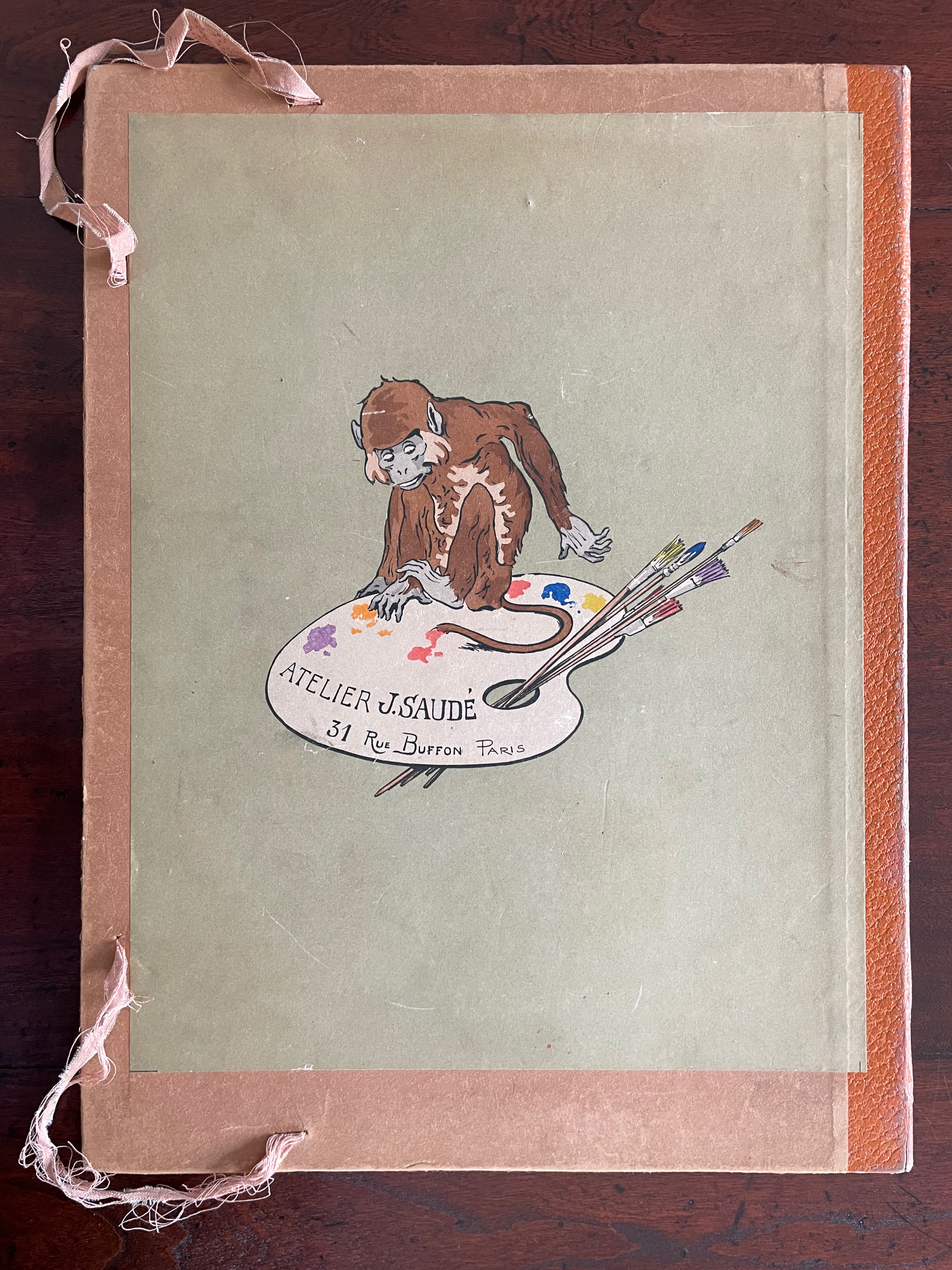
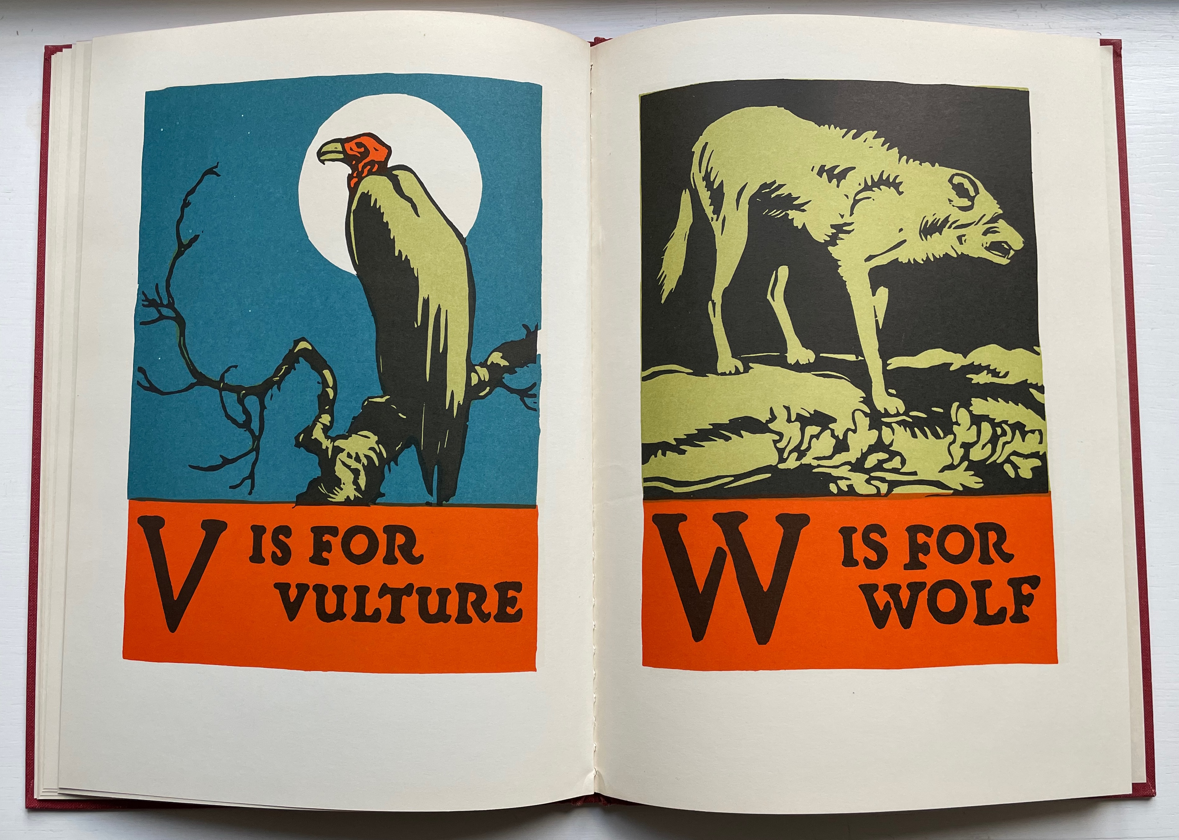
ABC d’Art: Croquis d’animaux & Lettres ornées [ABC of Art: Animal Sketches & Decorated Letters] (c. 1920) Miarko (Edmond Bouchard), Colored by Jean Saudé Portfolio, corner closures with ribbon, Portfolio: H385 x W285 mm. Prints: H380 x W280 mm. 27 folios. Acquired from ADER Nordmann & Dominique, 16 March 2023. Photos: Books On Books Collection.
Miarko (born Edmond Bouchard, 1889, Kyiv) was an illustrator, caricaturist, painter and expatriate in Paris when he died in 1924. His work followed in the Art Nouveau tradition and appeared in magazines likeThe Magpie.
Of his limited output, ABC d’Art is probably the best known. Produced by Jean Saudé, it provides a representative link in a chain of alphabet works with which to explore distinctions and affinities among different periods of art. Although Saudé was known for his pochoir work, the varying background colors of ochre, golden yellow, blue gray, mauve, etc., and use of gold paint in Miarko’s plates speak an entirely different language from that of fellow-expatriate Sonia Delaunay’s intense pochoir colors in Alphabet(1972) or even her work in the 1920s. Although some affinity with the woodcut of the horse in C. B. Falls’ ABC Book Boo(1923) can be seen, the handling of color, again, leads in different directions. Add Jasper Johns’ painting Alphabet (1959) to this chain, and marvel at the stylistic differences that arise from the artists’ blending of stencil work and brush work.
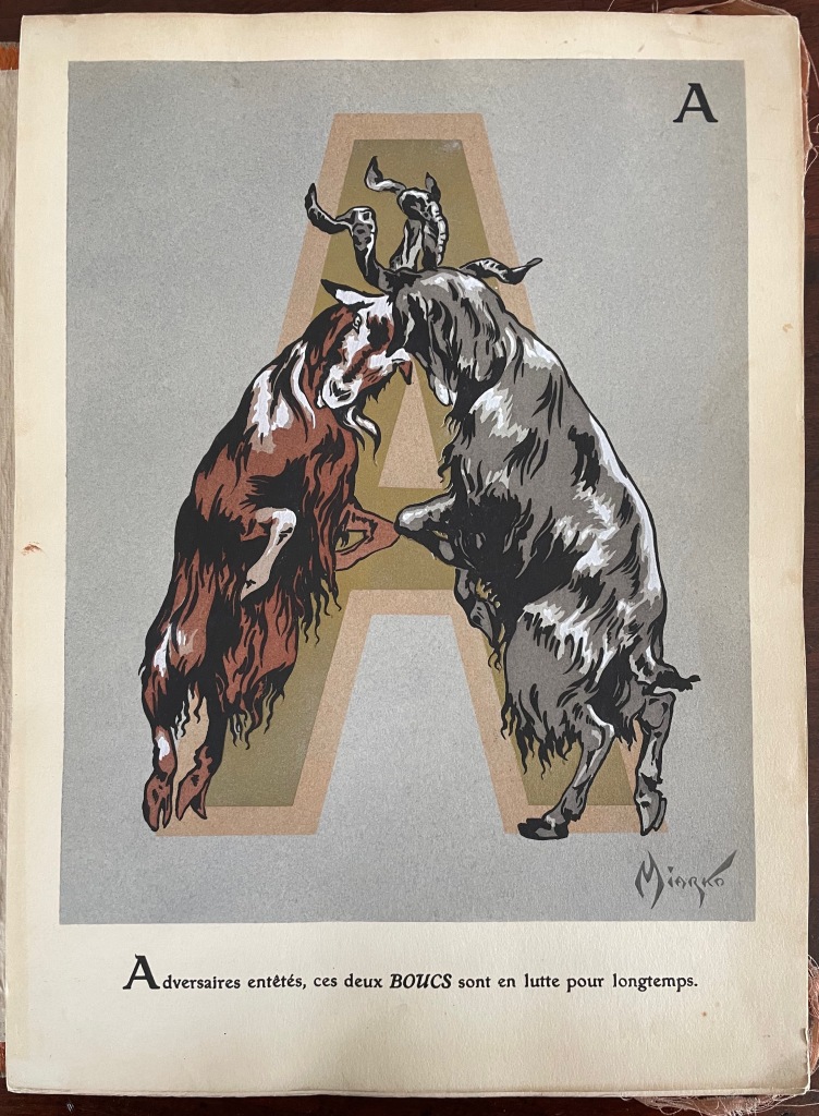
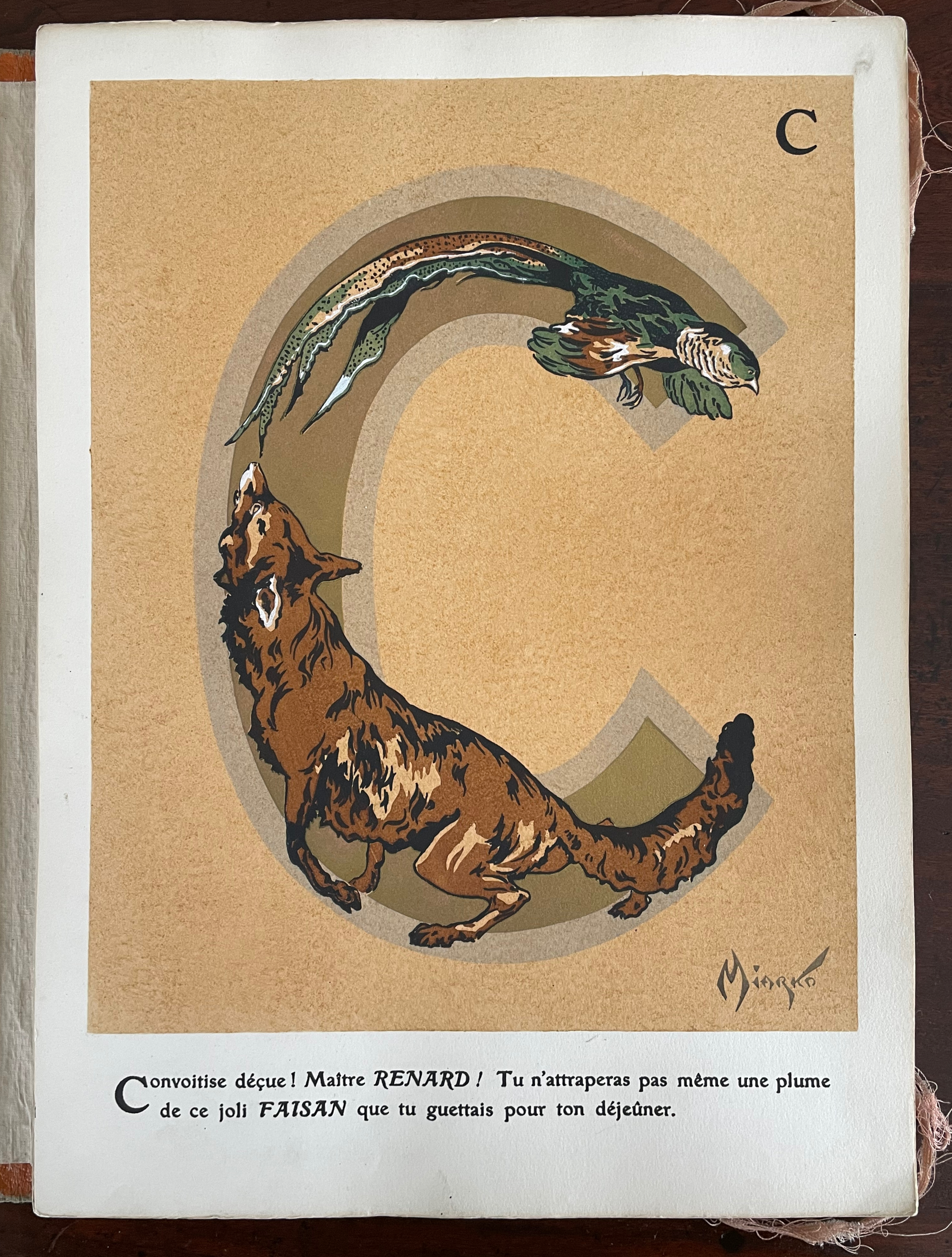
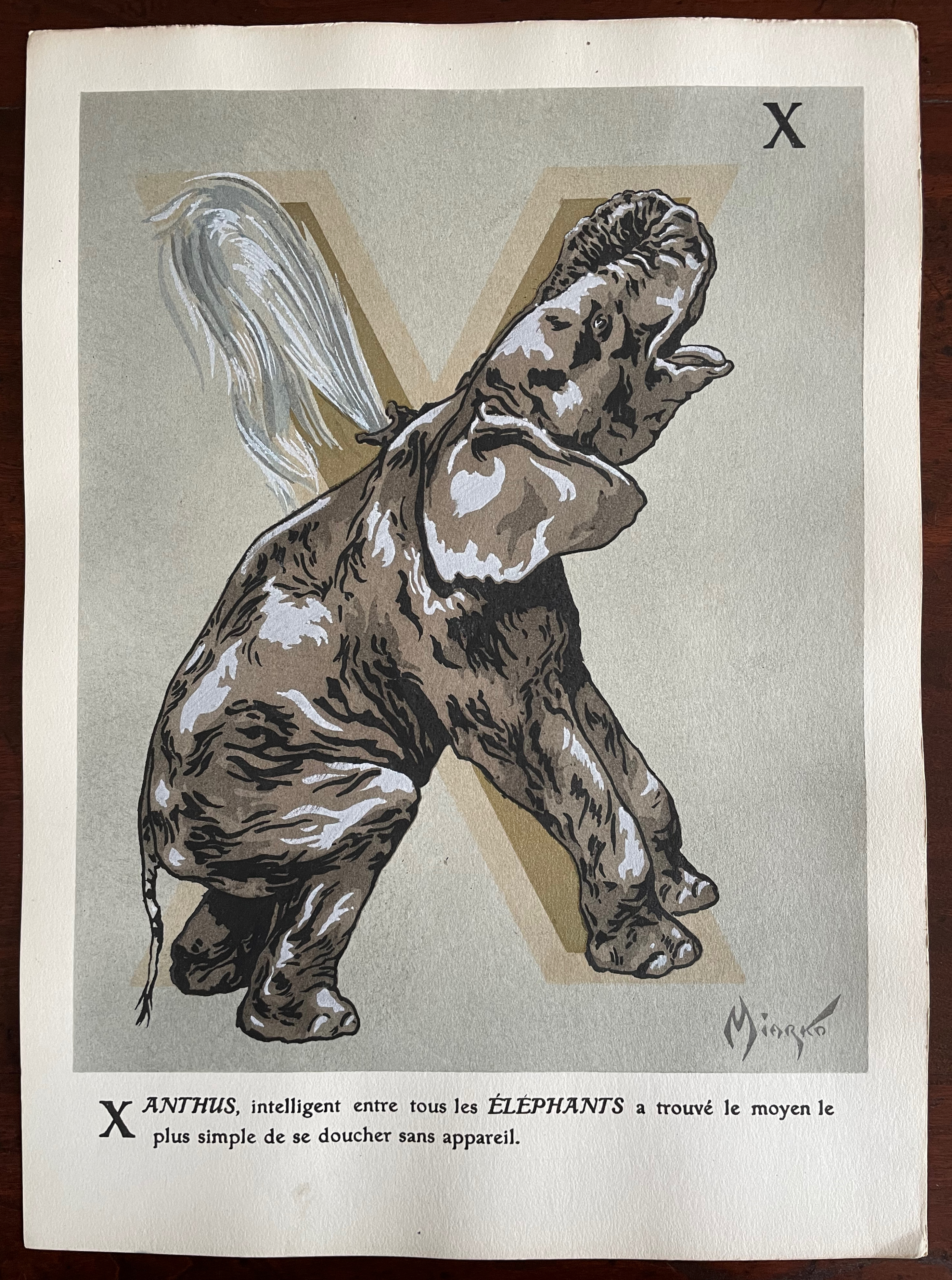
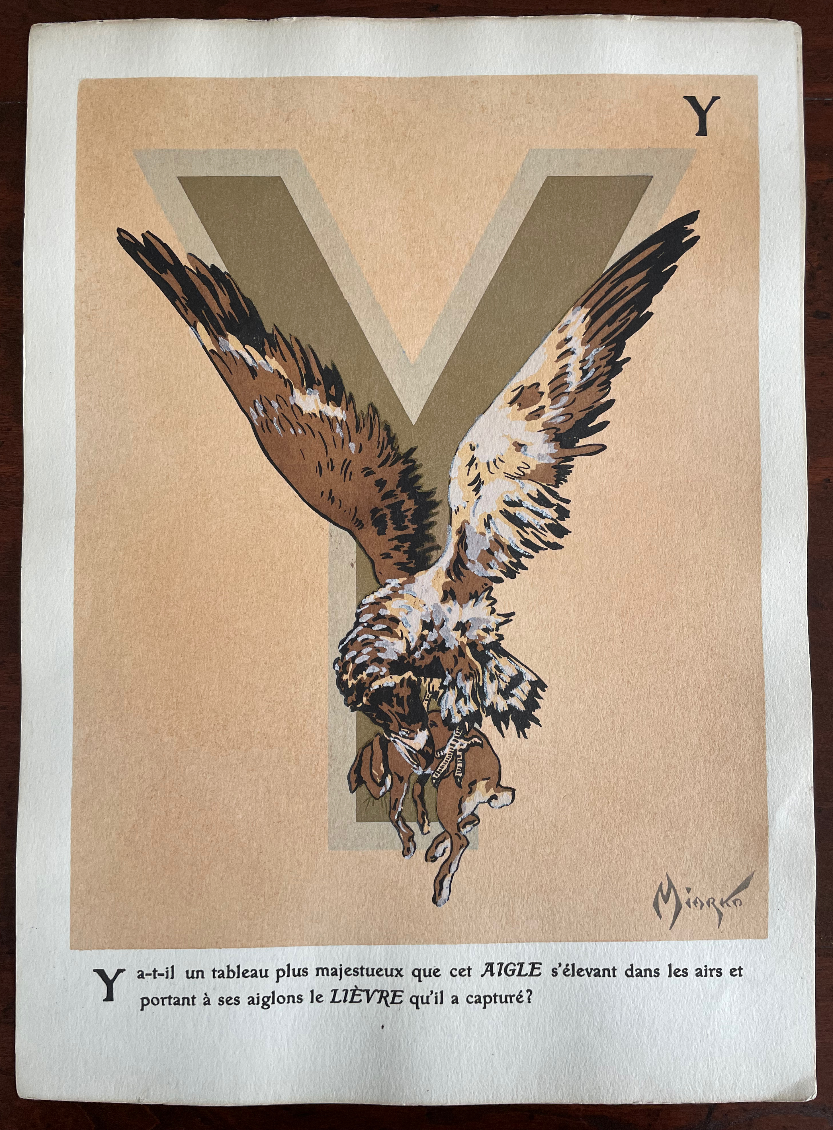
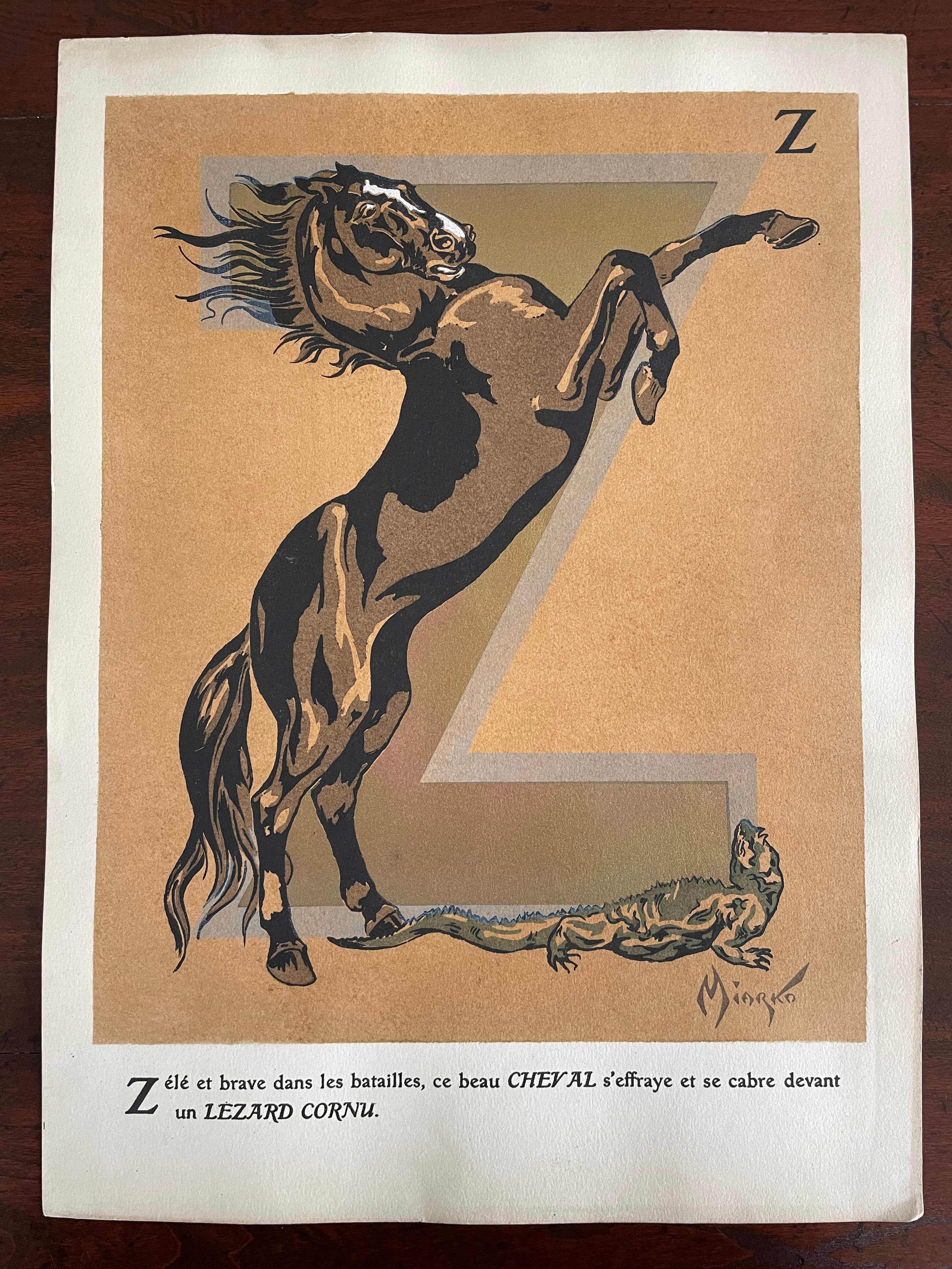
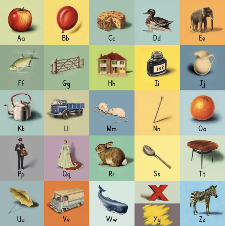
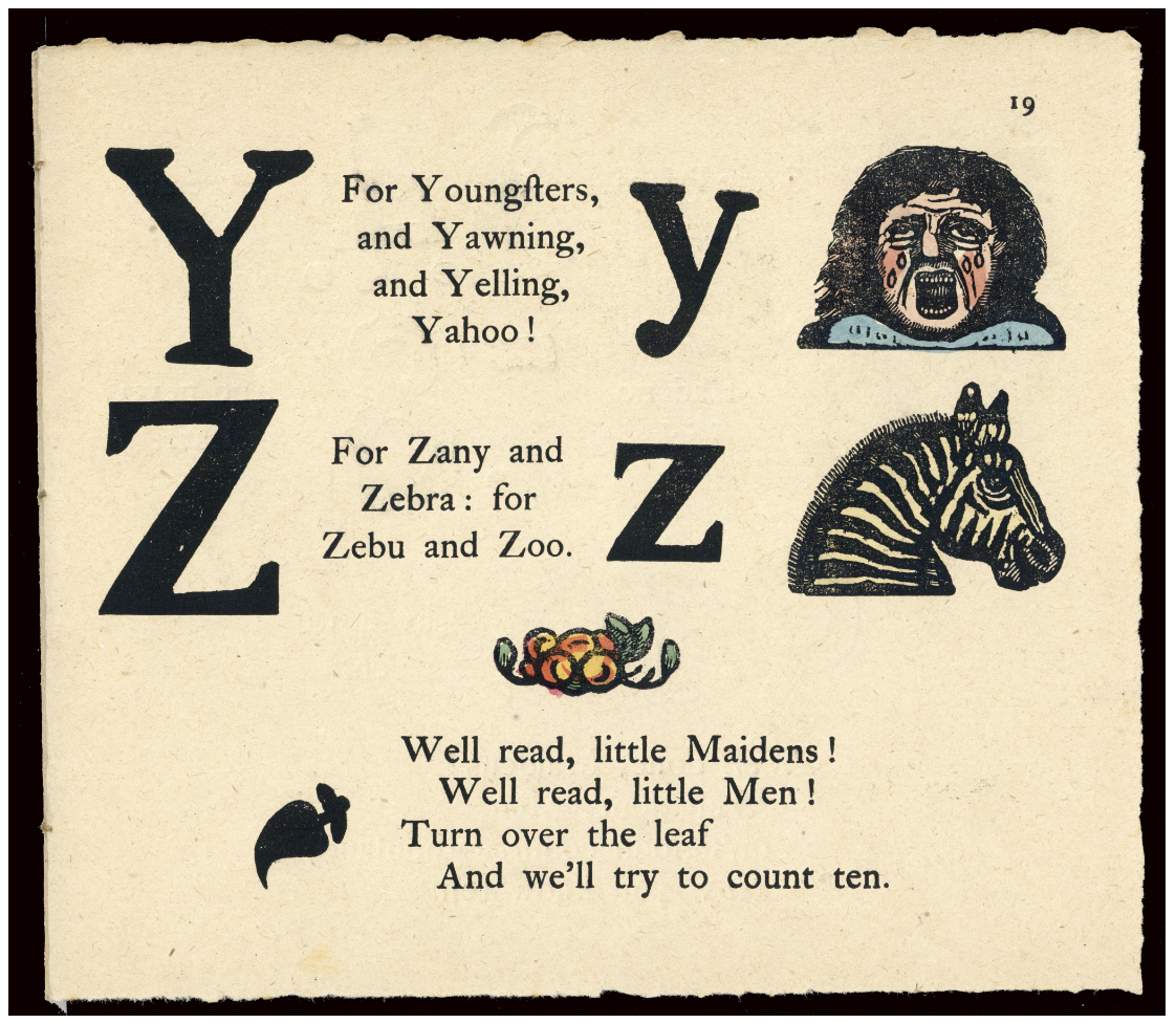
Miarko’s portfolio is a cardboard folder with an orange morocco paper spine. Its covers have lithographed illustrations in colors applied. The letters ABC formed by boas on the front cover are almost easily missed for the gamboling chimpanzees. There are twenty-seven lithographed plates in colors and gold. Each letter of the alphabet is rendered as a large initial in gold paint and outlined in another color. The twenty-seventh plate is devoted to the numerals 0-9.
Unlike most animal alphabet books, the animals do not always correspond to the initial they decorate. Rather, each initial corresponds to the first letter of the text beneath. More to the point of its difference from most animal alphabets, this one’s images and text seem to revel in nature’s tooth and claw.
“Alphabets Alive! – Animals“. 19 July 2023. Books On Books. An online version of the exhibition at the Bodleian Libraries, 19 July 2023 – 24 January 2024.
“Sonia Delaunay“. 17 July 2023. Books On Books Collection.
“C. B. Falls“.14 December 2022. Books On Books Collection.
ADER Nordmann et Dominique. 16 March 2023. Abécédaires, Etc.: Collection Bernard Farkas. Accessed 16 March 2023. Cf. Le Bestiaire by Albert Gérard and Robert Hanesse (c. 1960), p. 78.
Art Institute Chicago. Alphabet (1959). Jasper Johns. Ref. 2015.121.
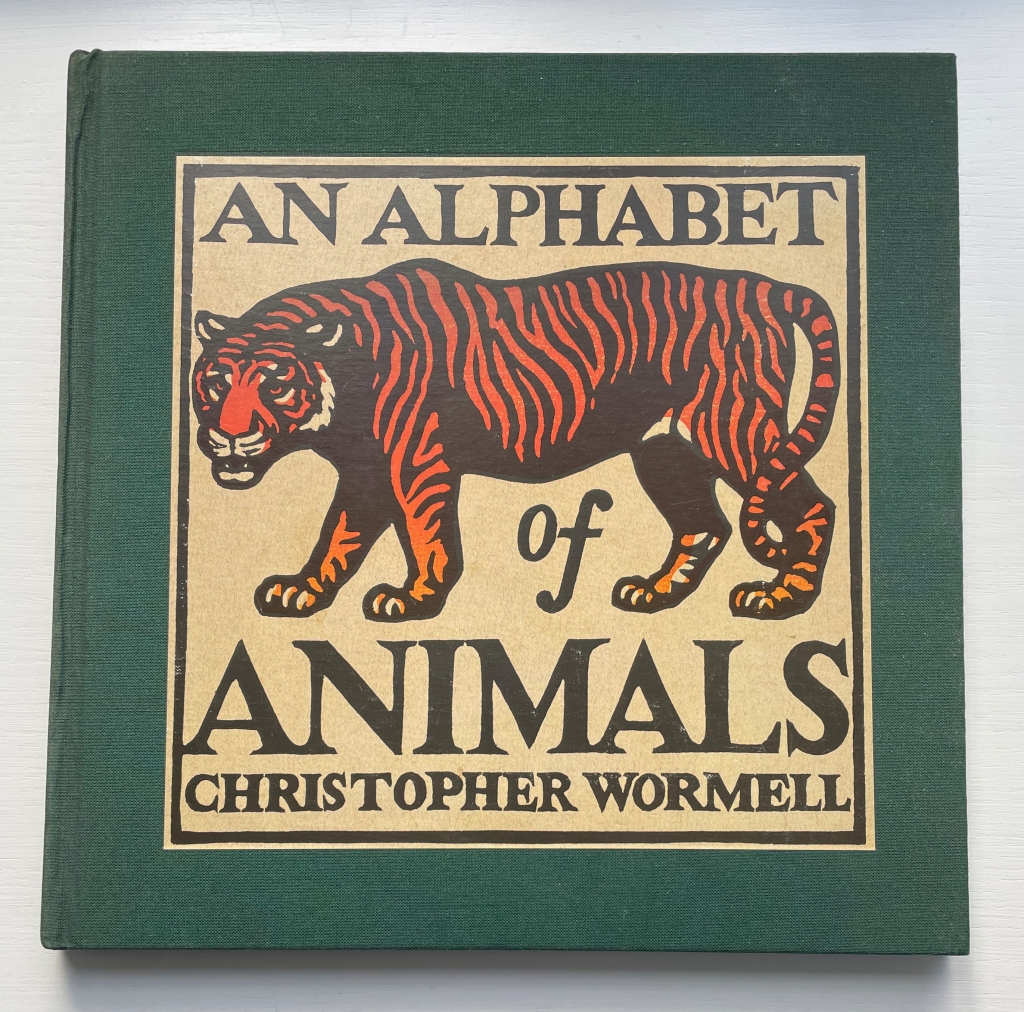
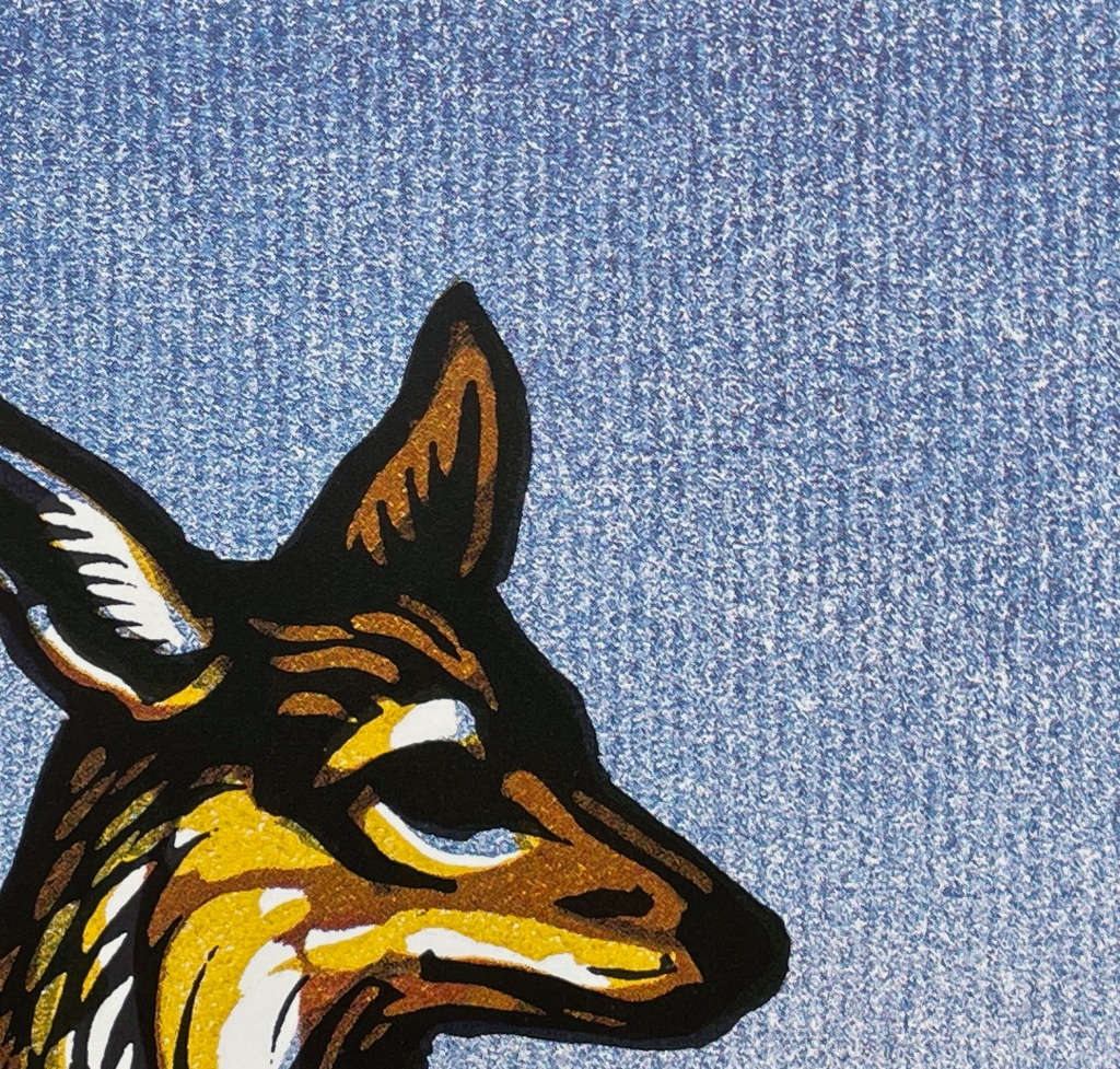
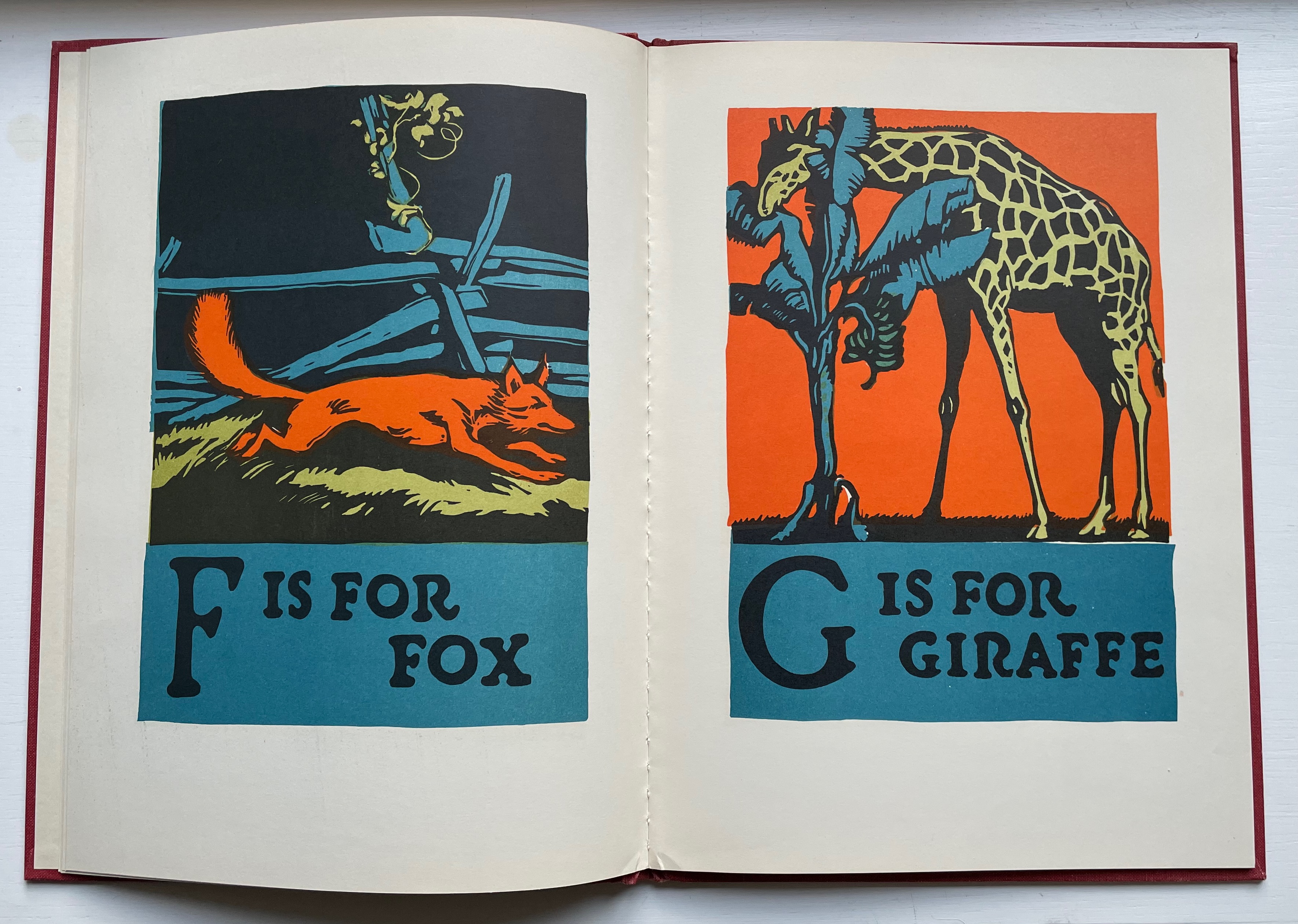
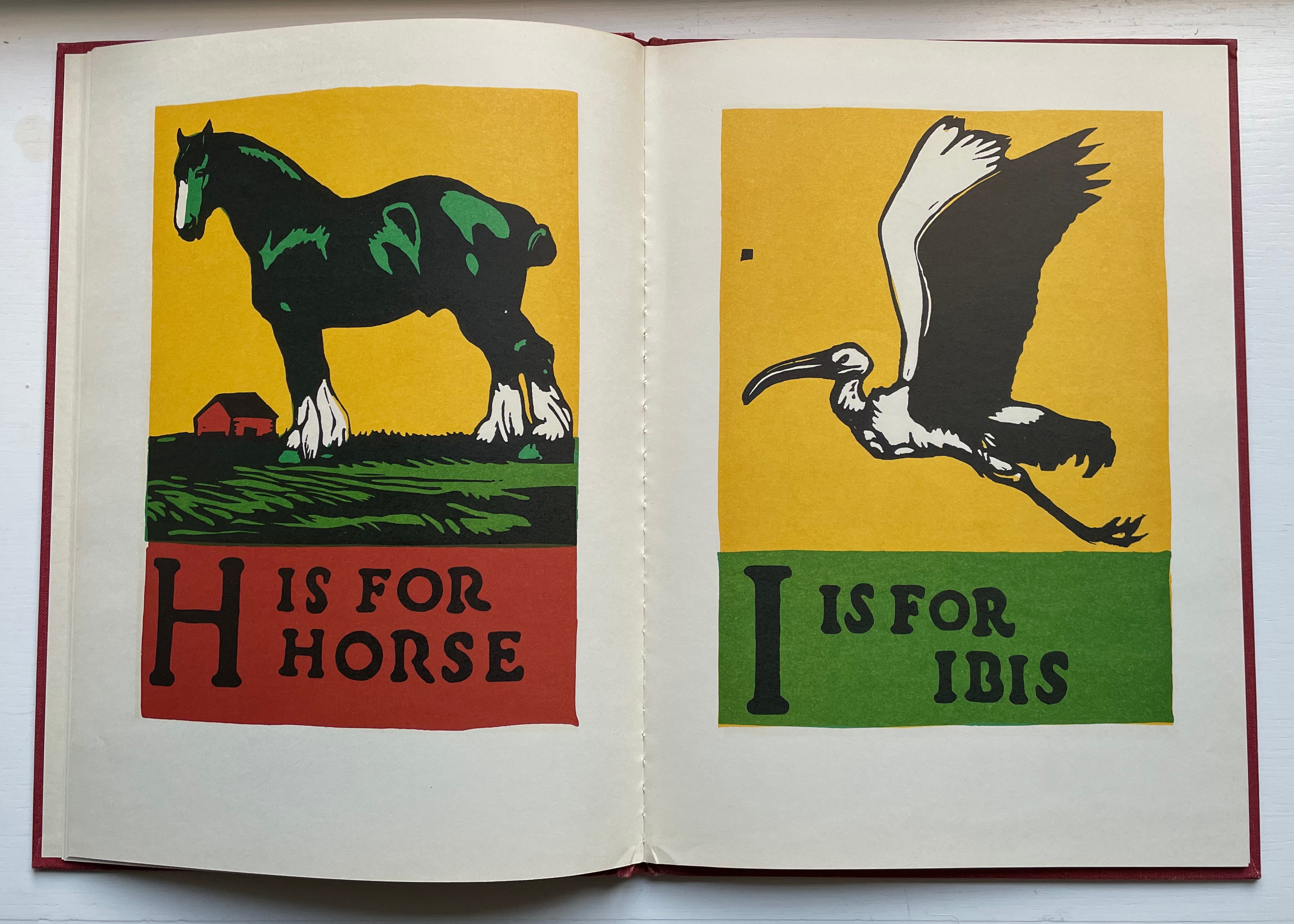
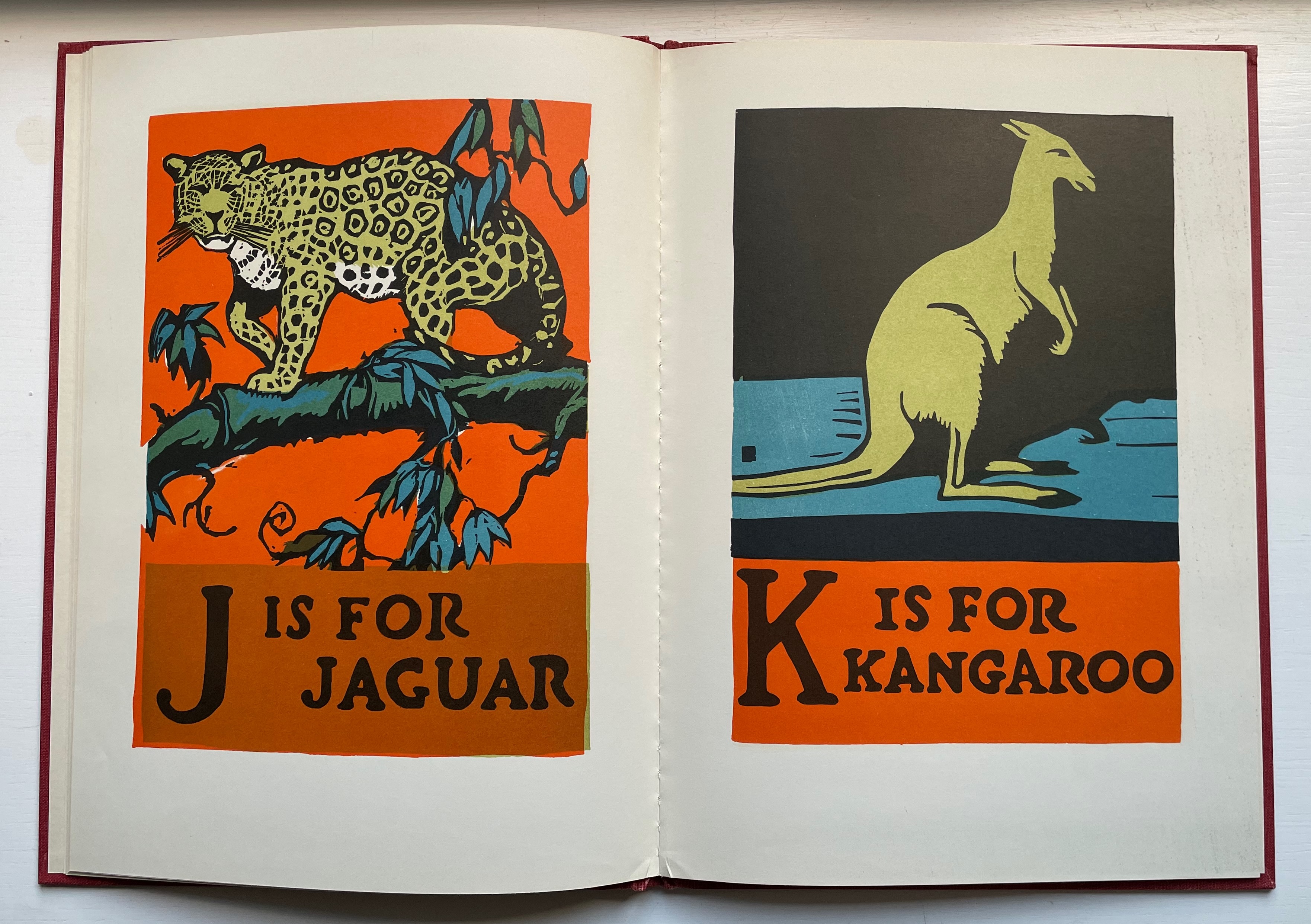
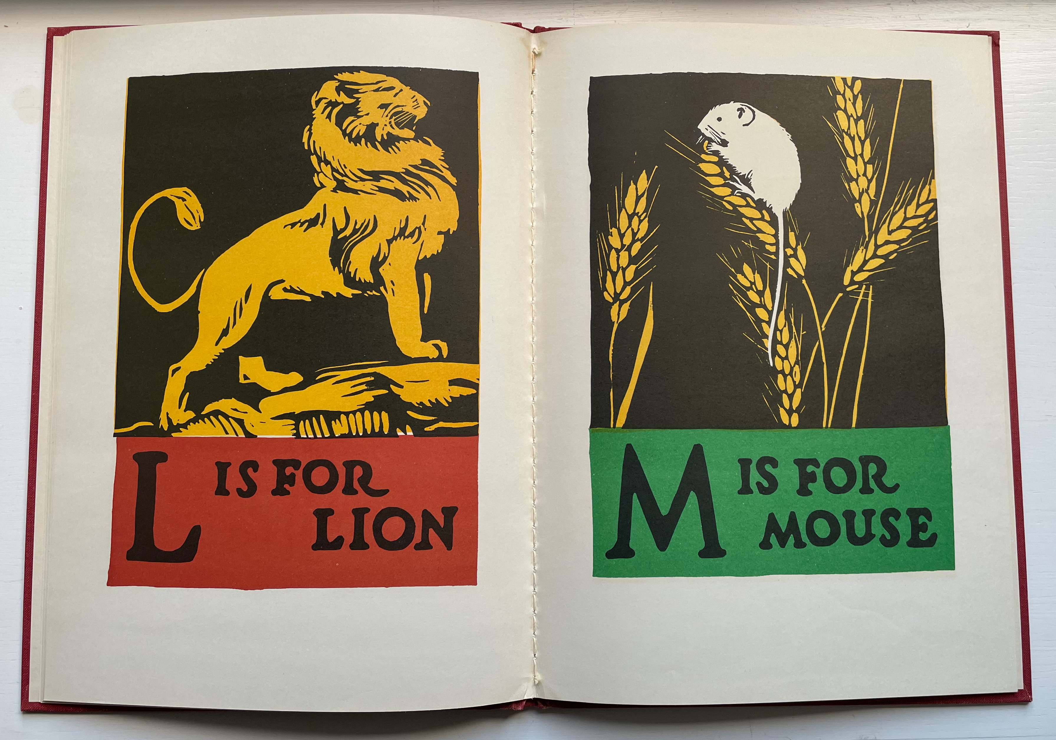
An Alphabet of Animals(1990) Christopher Wormell Casebound in cloth, sewn, title label on front cover. 272 x 272 mm. 64 pages. Acquired from MacKellar Art & Books, 14 March 2023. Photos: Books On Books Collection.
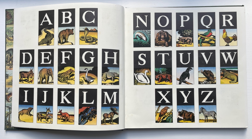
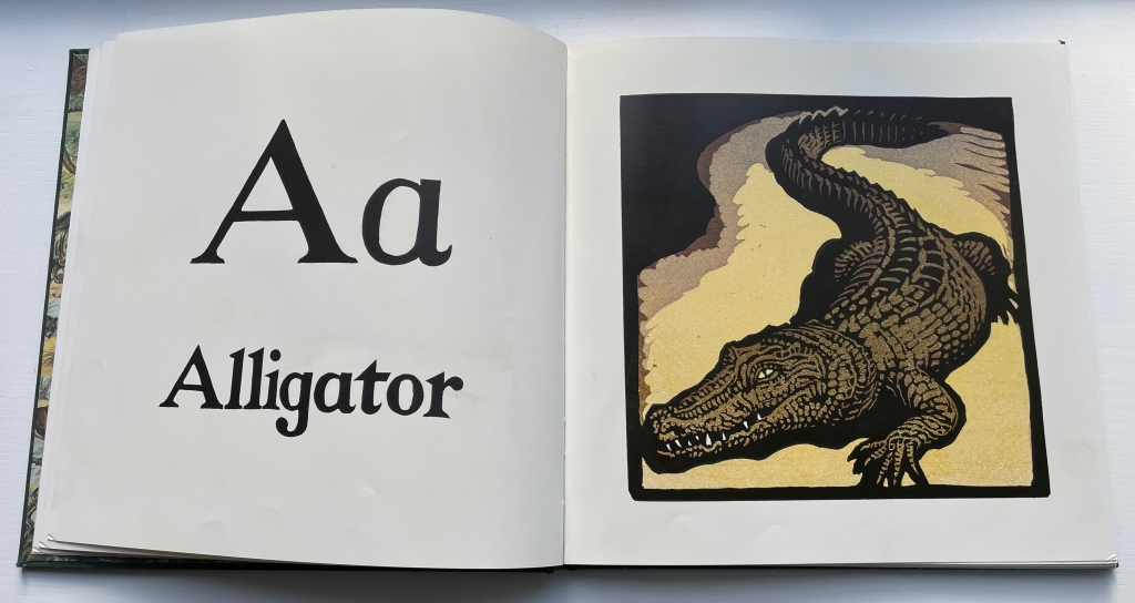
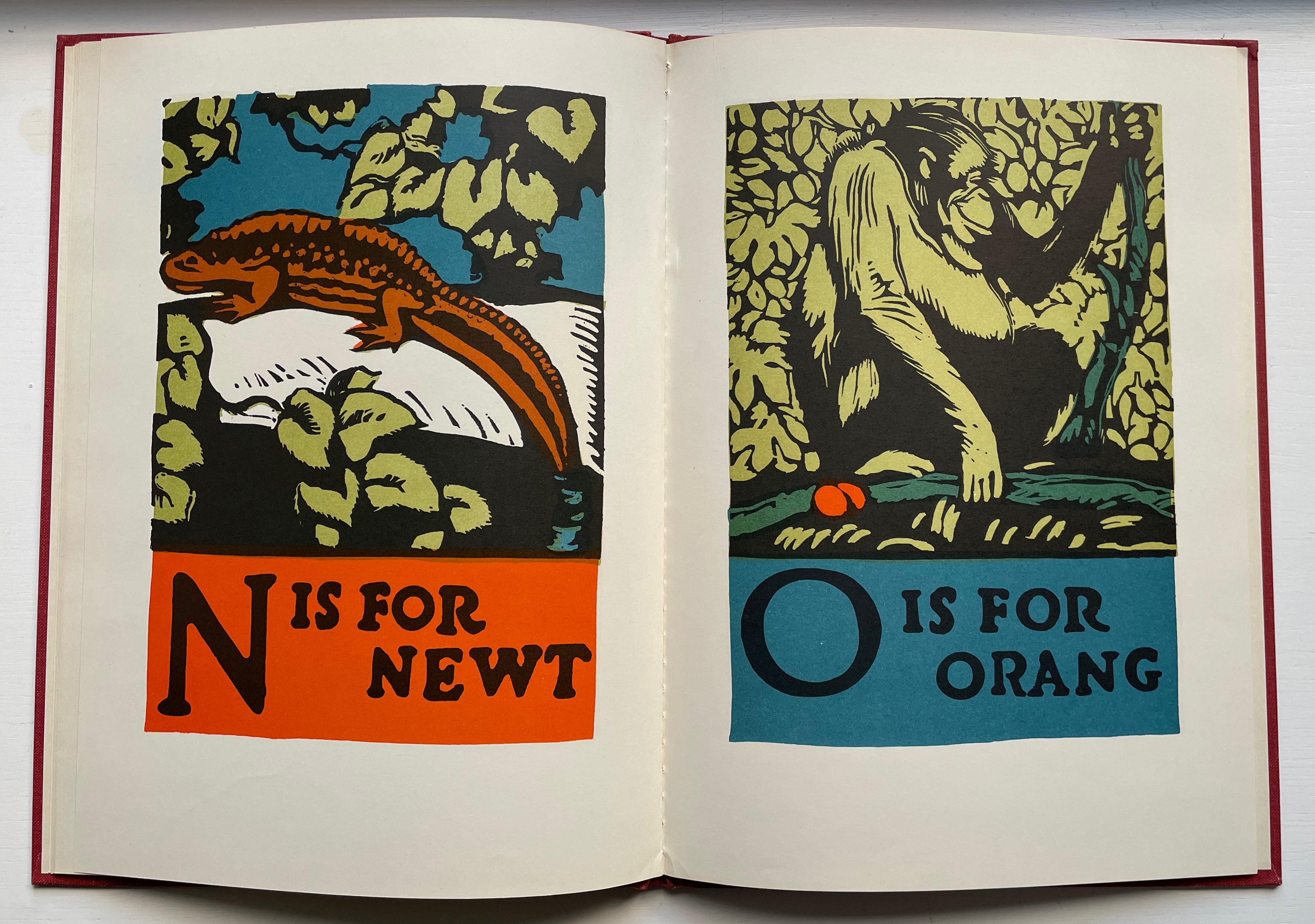
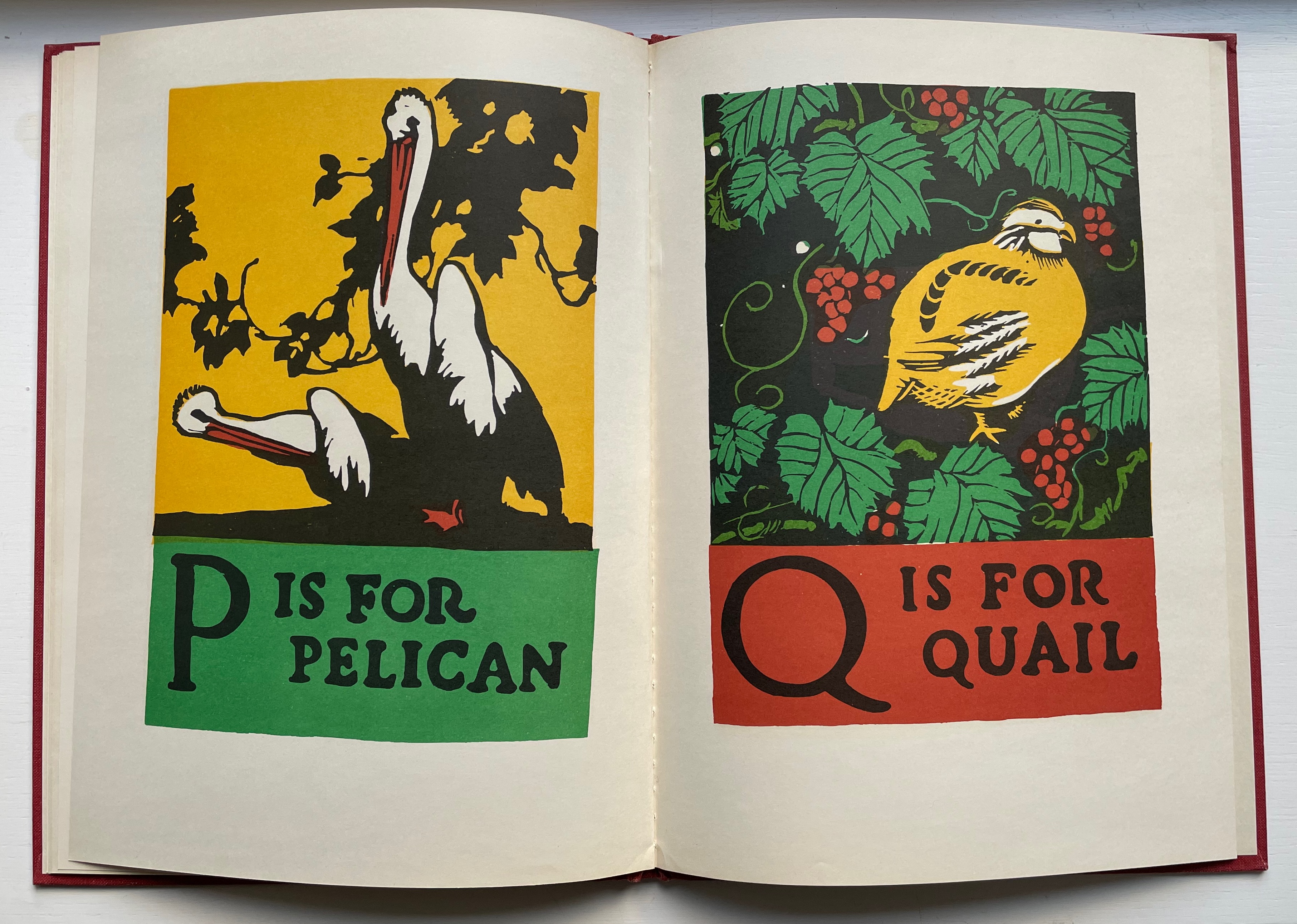
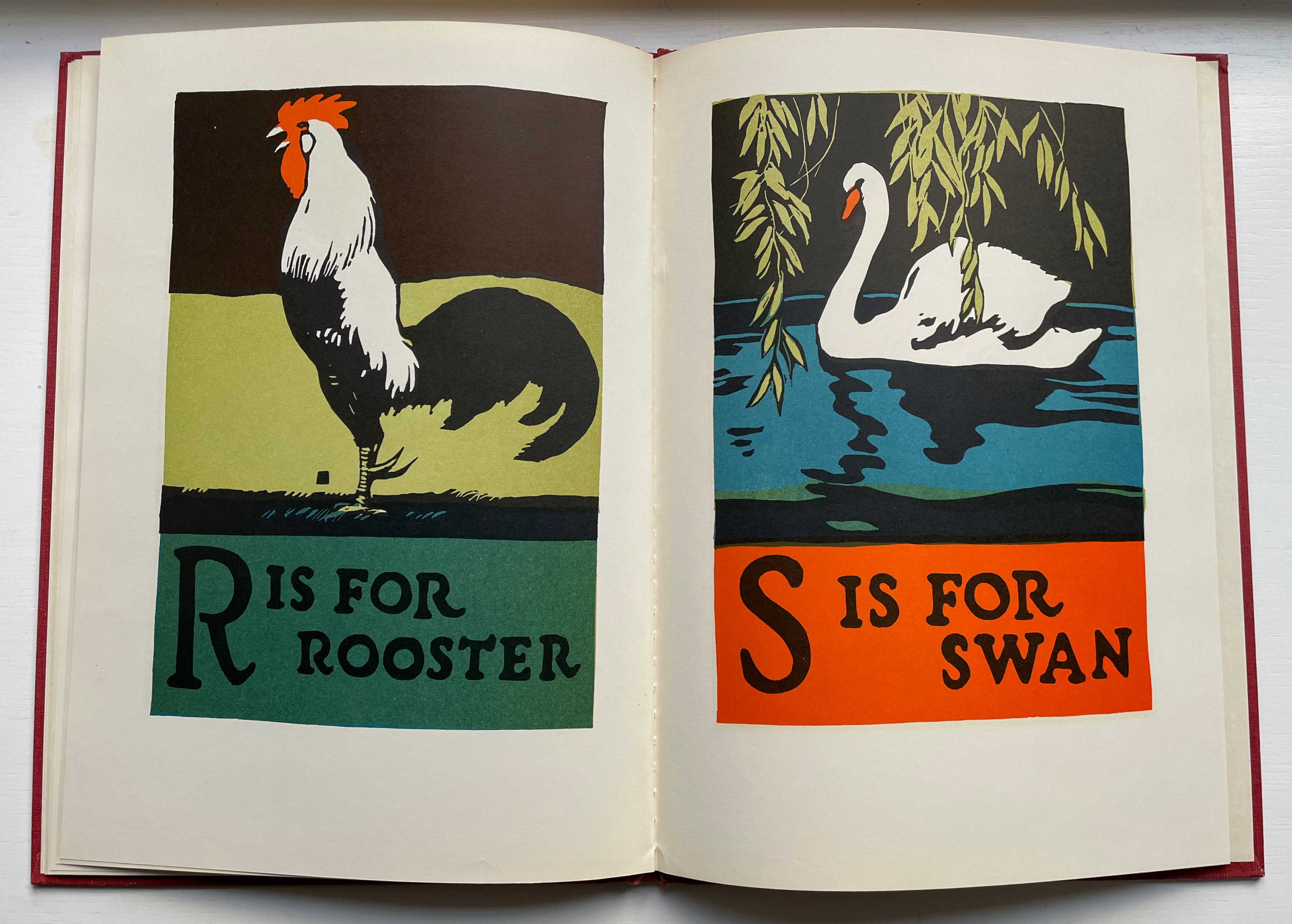
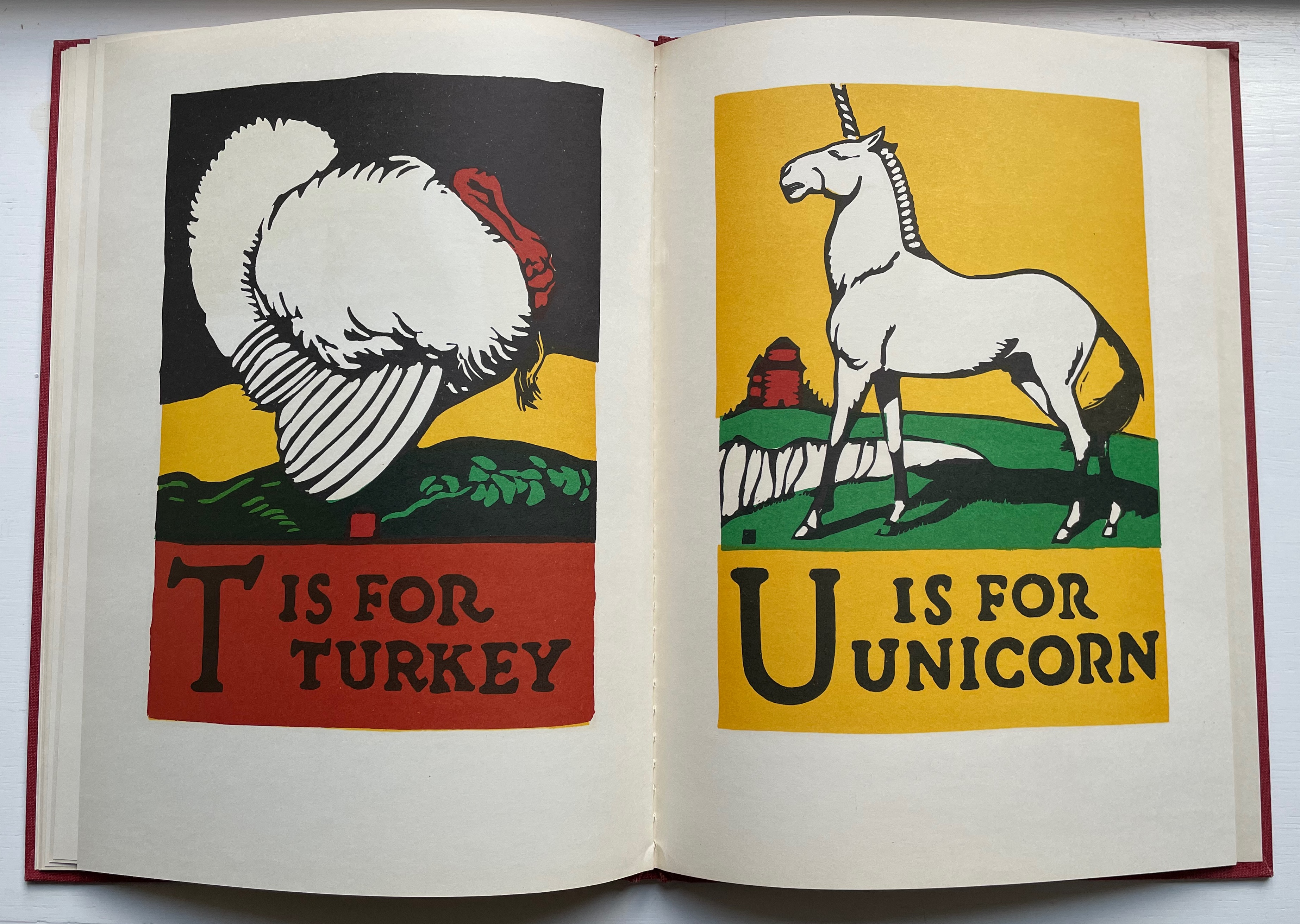
An Alphabet of Animals has several distinguishing features. Its art and lettering come from handcut lino block prints. Each picture would require multiple blocks. To produce the images and color, each block would be inked and printed separately by hand.
Another distinguishing feature is how Wormell’s art and lettering recall that of William Nicholson’s The Square Book of Animals (1899), Carton Moore Park’s Alphabet of Animals (1899) and C.B. Falls’ ABC Book (1923).
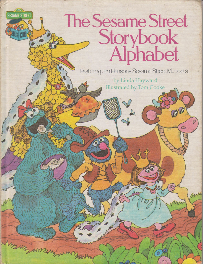
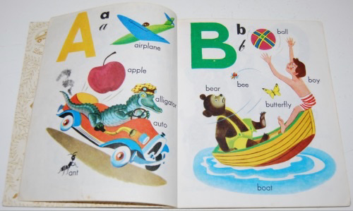
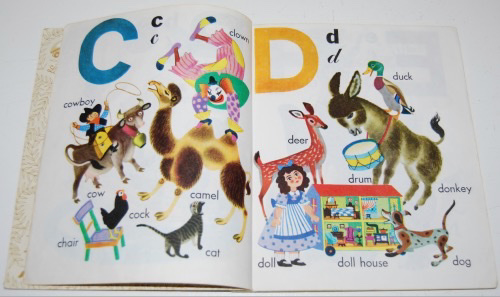
A century after the heyday of Nicholson, Park and Falls, Wormell found himself in an entirely different tradition of alphabet books and style of art: the world of The Sesame Street Storybook Alphabet (1980), the Little Golden Books (1970s/80s) and the Ladybird alphabet of the 1960s.
Alphabets from Sesame Street, Golden Books and Ladybird.
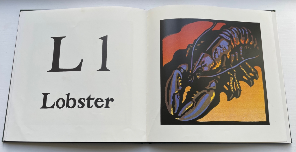
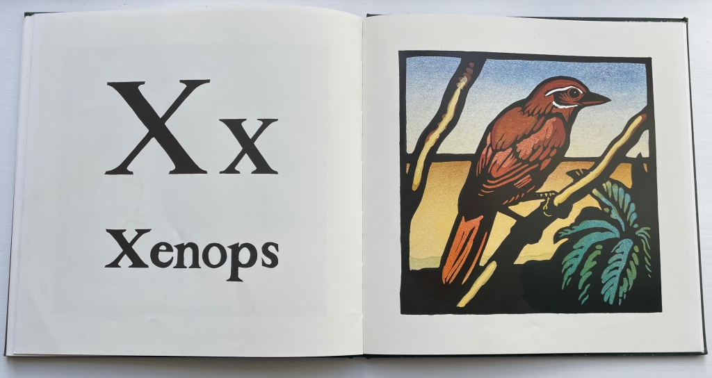
Wormell’s range of color across the animals is also a distinguishing feature as is the color gradient technique. The alligator’s colors are almost murky, the lobster’s electric, and the xenops’ soft in comparison.
Lino printing a color gradient is tricky. More than one color of ink has to be applied to the same block. The gradients achieved by Wormell are genius. In some of the images, the gradation benefits from the texture of the paper showing through, captured in the color separation by scanner and offset printing of the book and demonstrating Wormell’s touch.
Note how the grain of the paper on which the print was made peeks through.
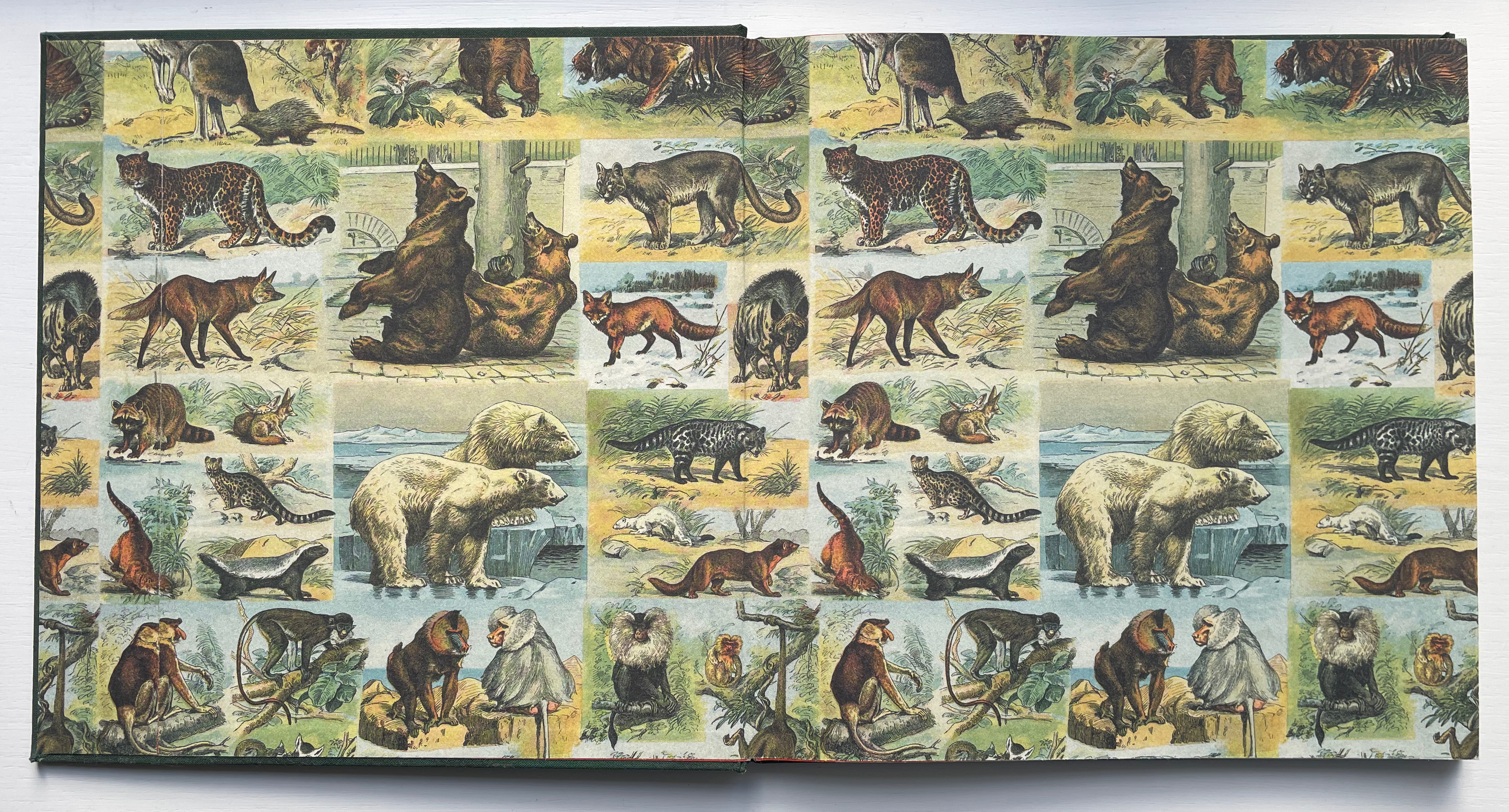
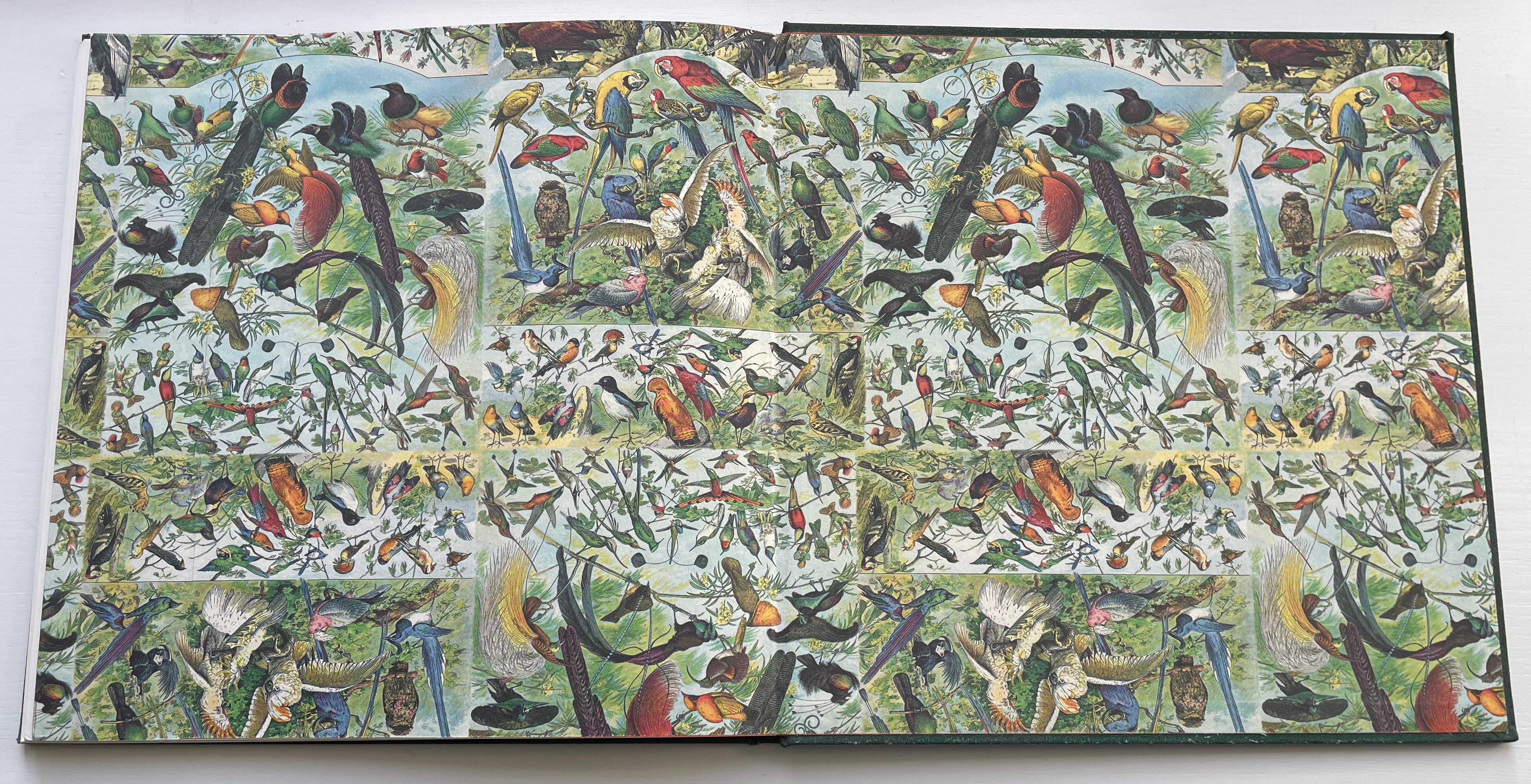
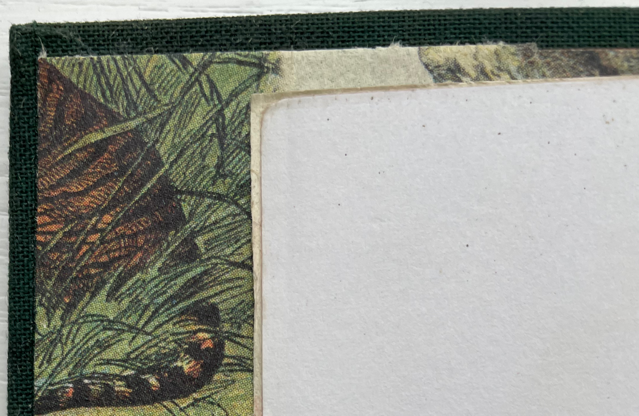
Another distinction — unintentional and for this particular copy only — is the endpaper treatment. The front endpapers — a doublure, one leaf of the end paper pasted to the board and one leaf free — present vintage images of animals, and the back doublure presents the same of birds. The free leaf is not actually free though.
At the front and back, these wallpaper-like leaves are glued to an original separate plain flyleaf in each case, which is detectable at the edges where one slightly overlaps the other.
The style of the decorated endpapers harks back to works like The Child’s Picture Book of Alphabets, published by Thomas Nelson & Sons in 1880 (see below). While the previous owner may have had good reason for adding these endpapers (and did or received a pretty good job of it), the contrast with Wormell’s book block is jarring.
From A Child’s Picture Book of Alphabets (1880), in the Osborne Collection of Early Children’s Books, Toronto Public Library.
The upside is that this copy inadvertently provides the student of alphabet books and illustration with a handy juxtaposition of the style of illustration against which Nicholson, Moore Park and Falls were reacting with Wormell’s distinctive revival of their approach, which in turn set his book apart from the late 20th century’s crowd.
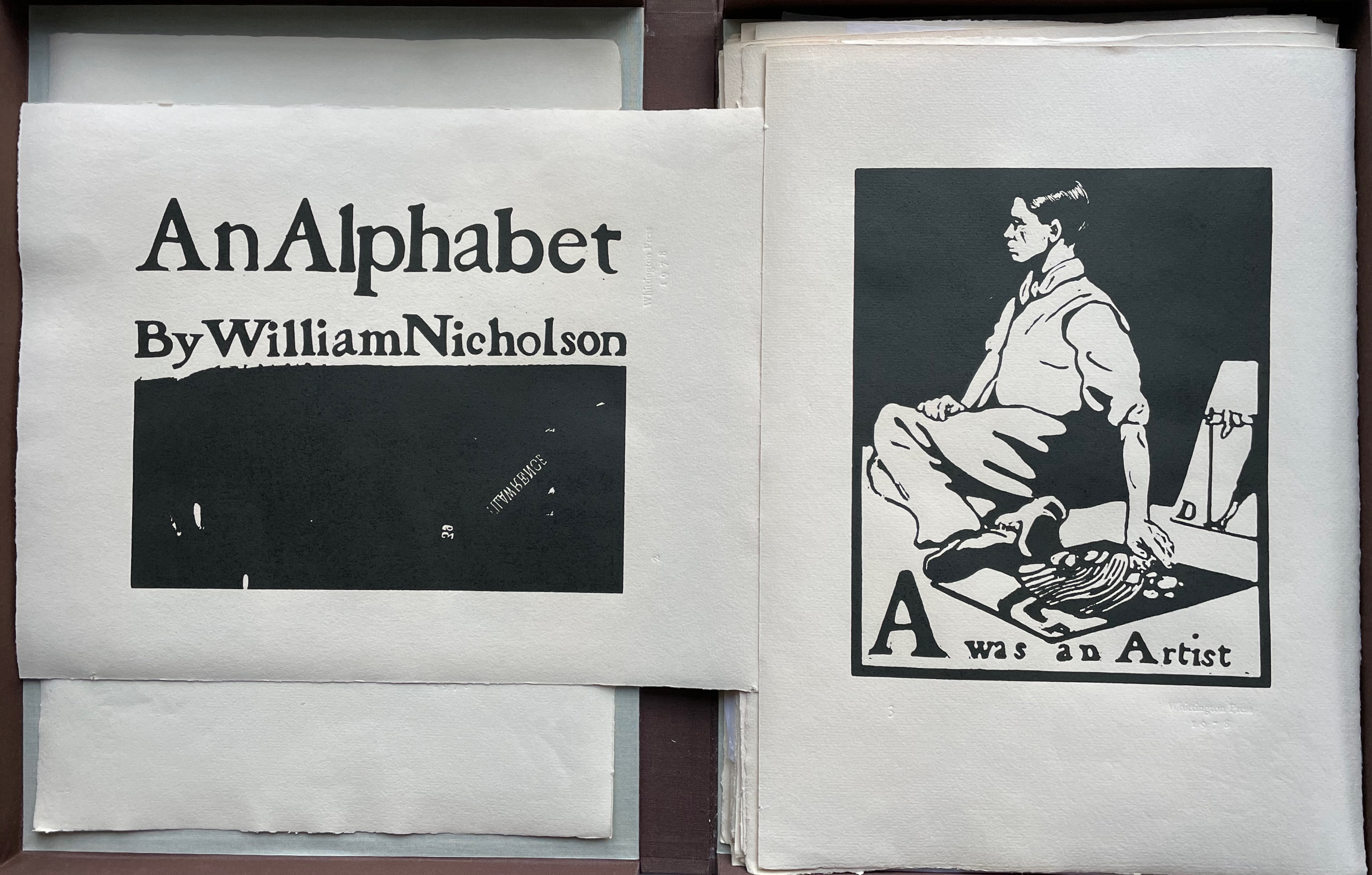
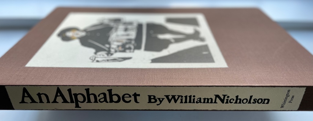
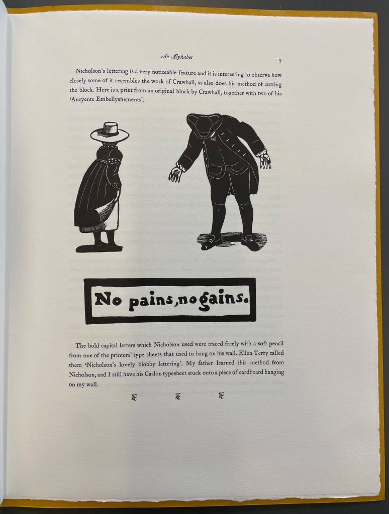
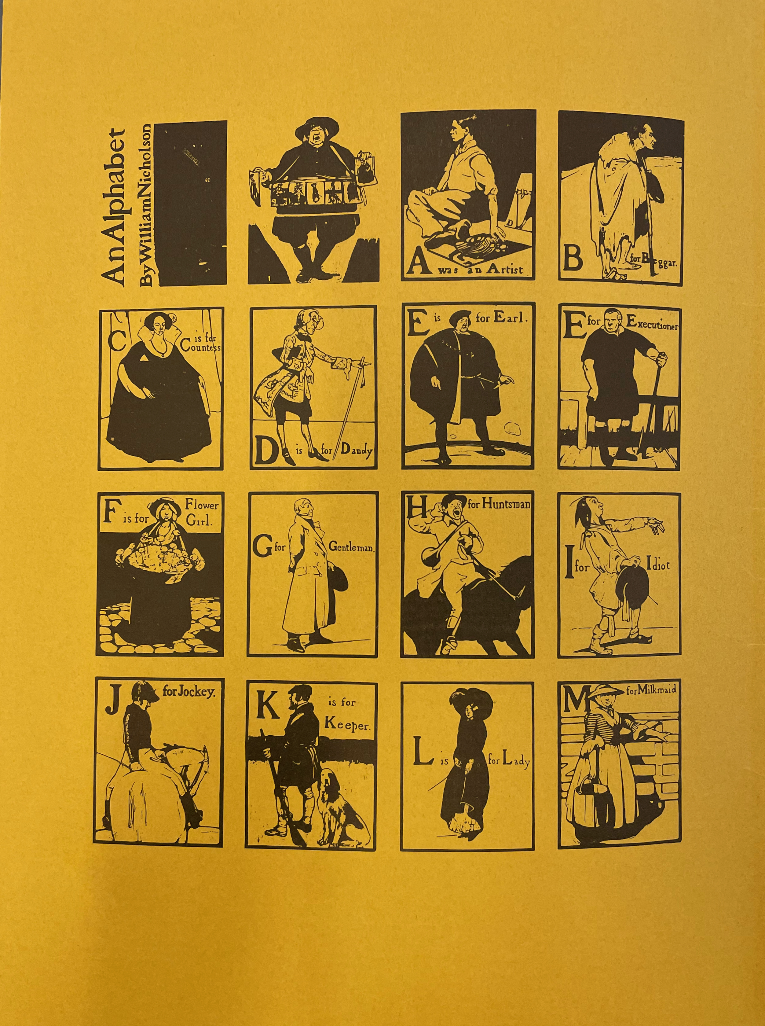
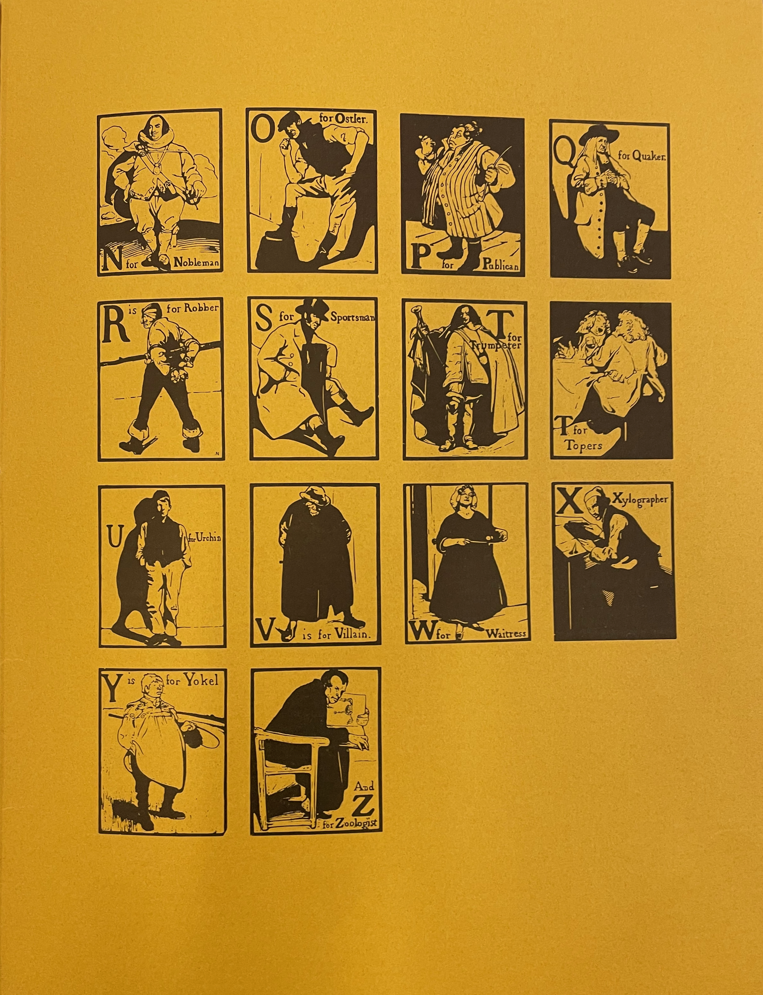
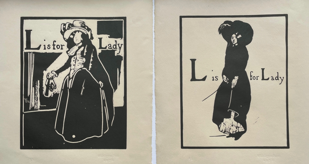
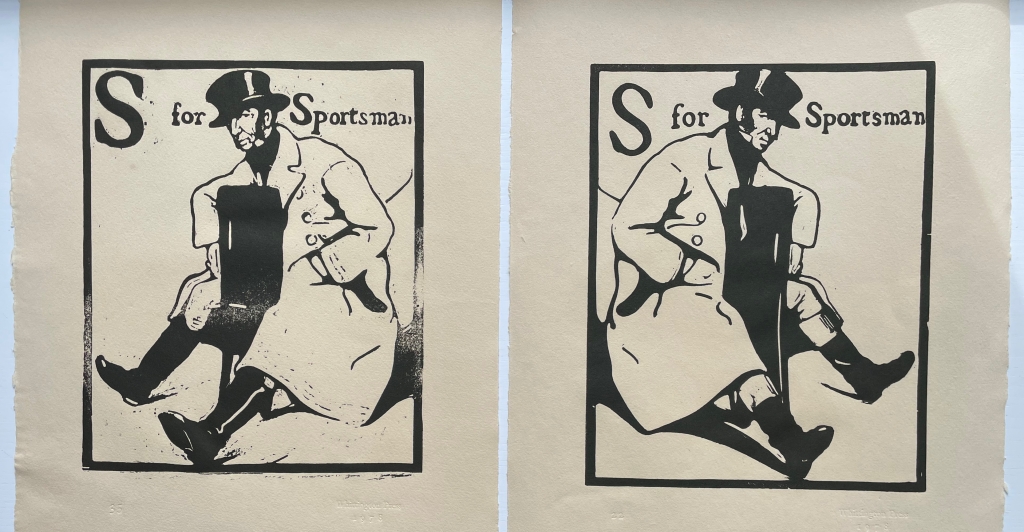
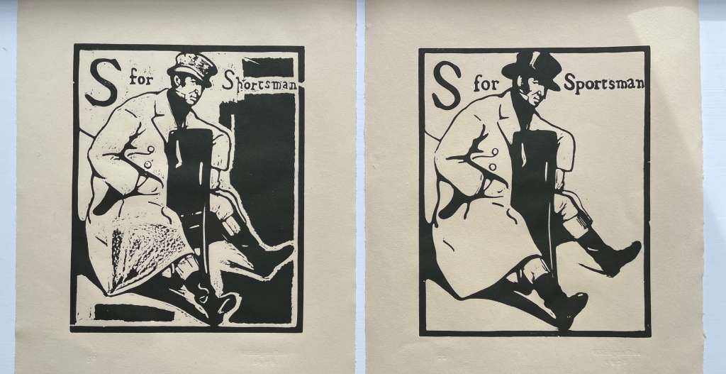
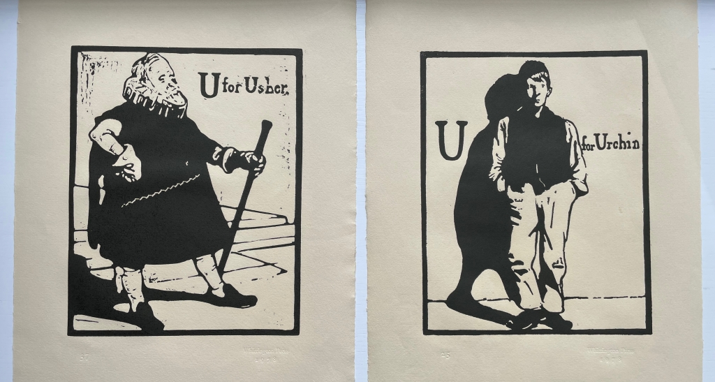
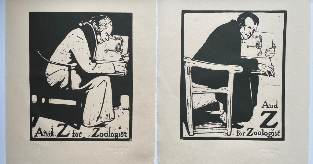
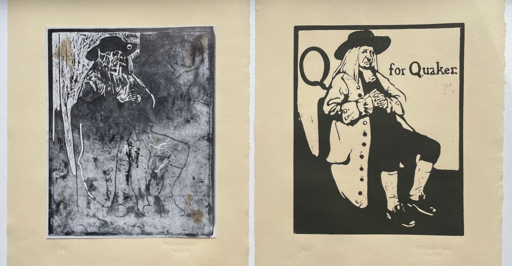
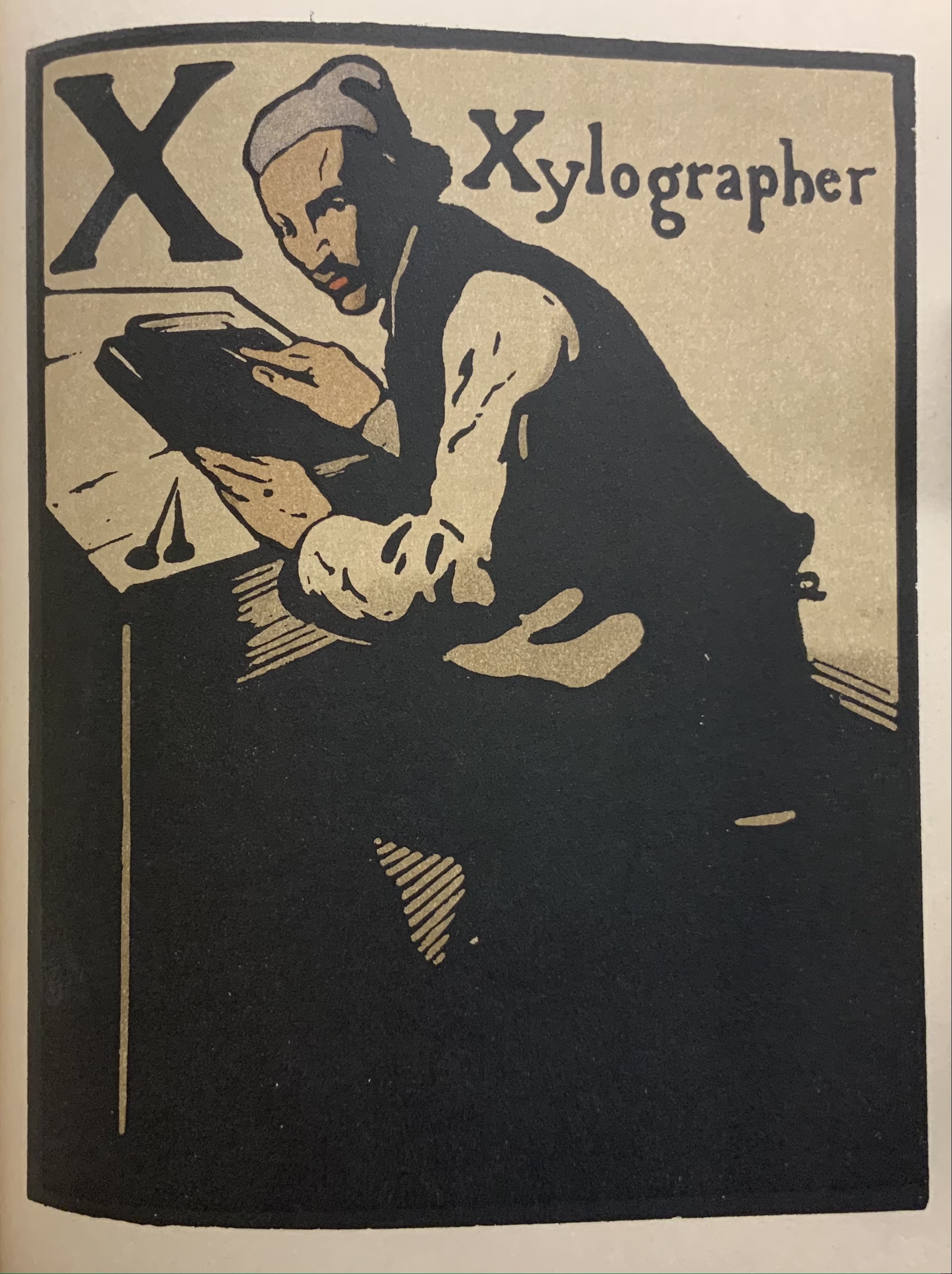
William Nicholson’s An Alphabet appeared in 1898. Eighty years later, with access to the original woodblocks (thanks to William Heinemann Ltd, which subsequently placed them with the Victoria & Albert Museum), Whittington Press and Edward Craig found themselves in a position to reproduce this famous alphabet. Craig, the son of Edward (Ted) Gordon Craig, who learned wood engraving from Nicholson, also had his father’s diaries as well as his own memories on which to draw for the booklet that accompanies the prints in this folio box. It provides a rich and diverse background that adds to their enjoyment. Craig brings to life the context and ties of friendship in which Nicholson’s art came on the scene. He even includes prints from three blocks cut by Joseph Crawhall (he of Old Aunt Elspa’s ABC fame) to show the affinities between Nicholson’s lettering and images and those of Crawhall.
The booklet’s inclusion of 28 thumbnails of the reproduced prints is a helpful quick guide to the portfolio, but this particular edition contains 38 prints. Among them are some unused prints — a Quakeress, an Usher replaced by the Urchin, and alternative versions of the Jockey, Lady, Sportsman and Zoologist. Also included is a photo of the woodblock for the Quaker. Alongside Craig’s description of Nicholson’s two preferred courses of design and drawing, the discards and the photo offer a very real sense of Nicholson at work when placed side by side with the final designs:
After some preliminary scribbling … he would convey what he wanted from that scribble to a piece of very thin paper, or tracing paper, by inserting a black transfer paper between the two layers, then, peering into the maze of lines, he would select just those that he fancied and trace them through. …. His other method … was to draw direct onto the block with a brush heavily loaded with India ink, then, when it was dry, to refine the design by drawing over it with great care, using a softish pencil. The lead pencil shone like silver on the Indian ink and added to the excitement when the next process, that of cutting, revealed the beautiful honey-coloured boxwood below.
Discarded vs final
Discarded vs final
Discarded vs final
Discarded vs final
Discarded vs final
Discarded vs final
Photo of discarded block, final design
Craig’s booklet draws on Marguerite Steen’s 1943 biography as well as his father’s diaries, both sources rich in anecdotes and observations about Nicholson, James Pryde (his colorful partner in their J&W Beggarstaff Brothers venture), moments of time and place and the social circles in which they moved. Steen must have had access to Ted’s diaries or heard the tales directly from him. Here are Steen and Craig on a scene at the Denham “Eight Bells”, a defunct pub where William Nicholson, his wife Mabel and her brother James lived (Jimmy came to visit for two days and stayed two years):
Steen: The floor was littered with scraps of brown paper, black paper, red paper, William and Jimmy argued for hours about spacing–for which Jimmy had a great eye. Oddly enough, he was impatient and clumsy-handed when it came to execution…. With the scissors he was completely outclassed by William–who used a knife on glass, and on whom fell most of the execution of the schemes they planned together. … From all accounts, William did the lion’s share of the Beggarstaff work, so it is amusing to find in a published interview of the period Jimmy taking the lead, “telling the tale,” with only an occasional, rather lordly, reference to his partner. (p. 56)
Craig from Ted’s diary: One visit to Denham found Nicholson on the floor pinning out rolls of brown paper. With a brief ‘Hello Ted’, he carried on working at great speed with a penknife, cutting up pieces of black paper on which were scribbled a few guide lines in chalk and arranging the shapes to resemble a huge figure in a cloak. A face and hands from some buff-coloured paper were being produced by Jimmy, who was draped over a chair in the corner; these were ‘floated’ into position, then pinned. They stood on chairs to look down on their work, then added a few extra shapes in coloured paper here and there. Suddenly a figure like one of the Three Musketeers materialised. They seemed pleased enough, and Jimmy remarked that ‘it would be good for something’. (p. 3)
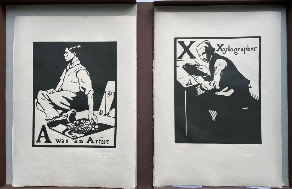
Several sources identify “A was an Artist” as Nicholson’s self-portrait, but might that three-quarters portrait of the Xylographer also be a self-portrait? Or is it his partner James Pryde in a portrait additional to the one of him in “B for Beggar”? Such is the speculation to which the warm color of Craig’s text and the vibrant reproductions created with Whittington Press would lead anyone exploring this portfolio.
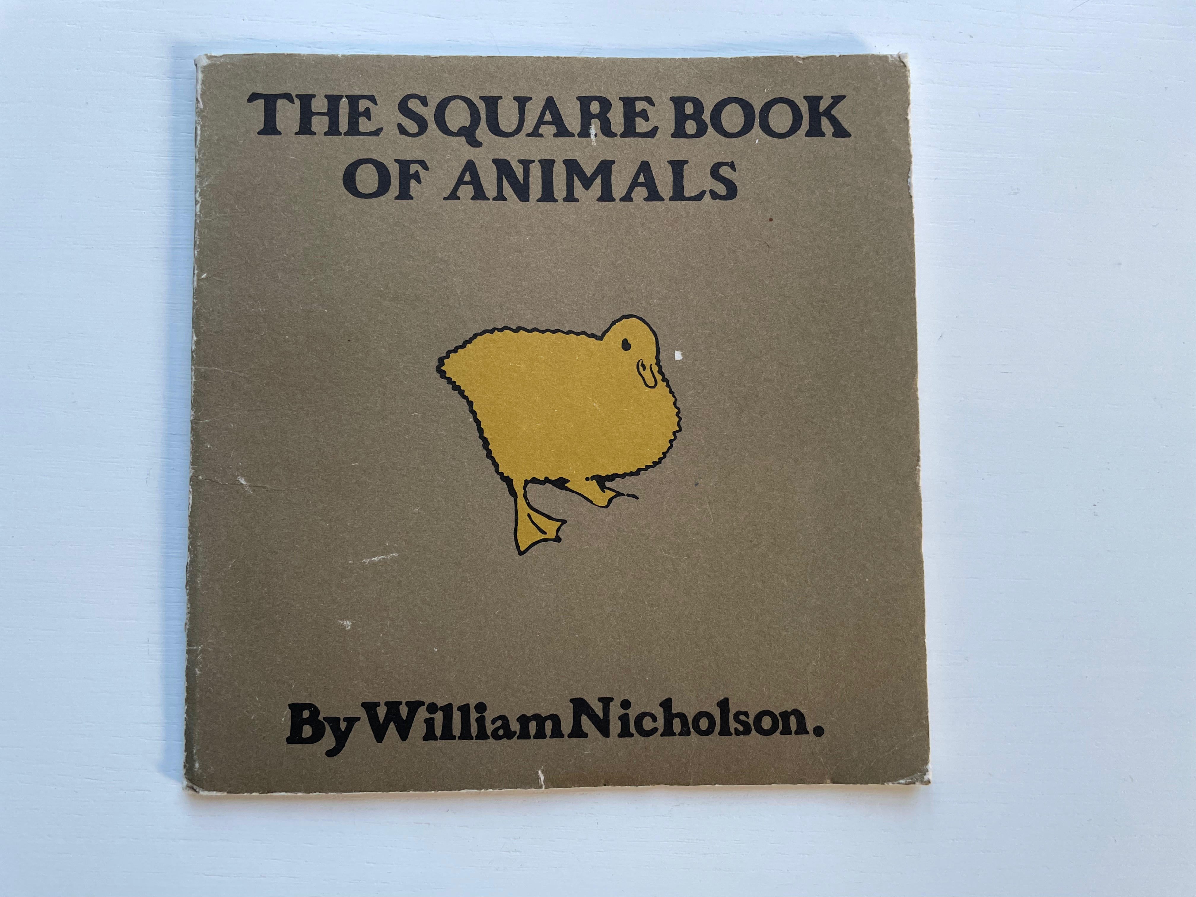
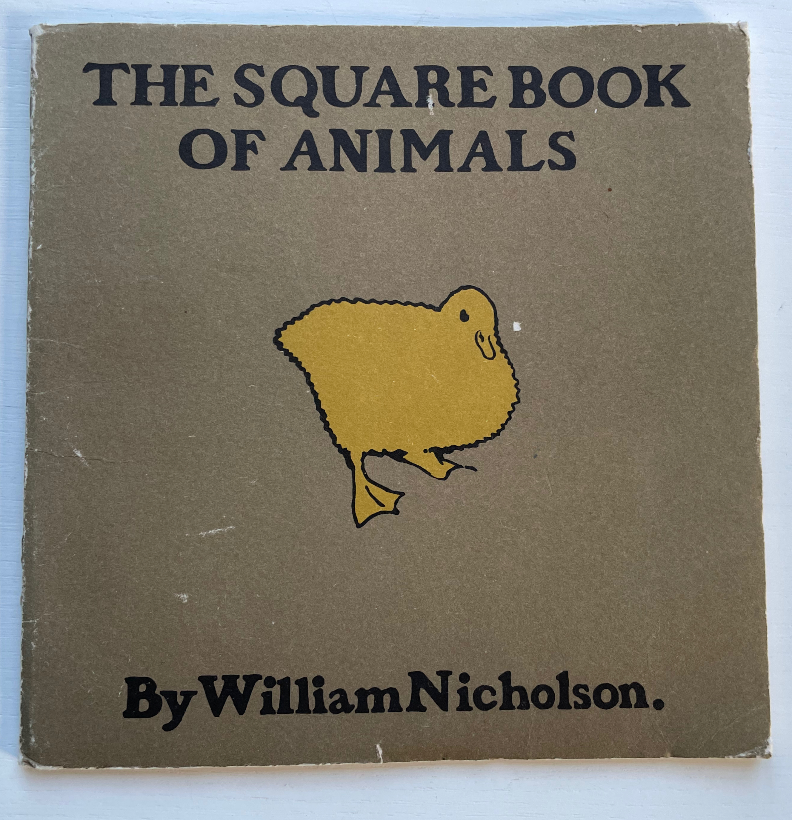
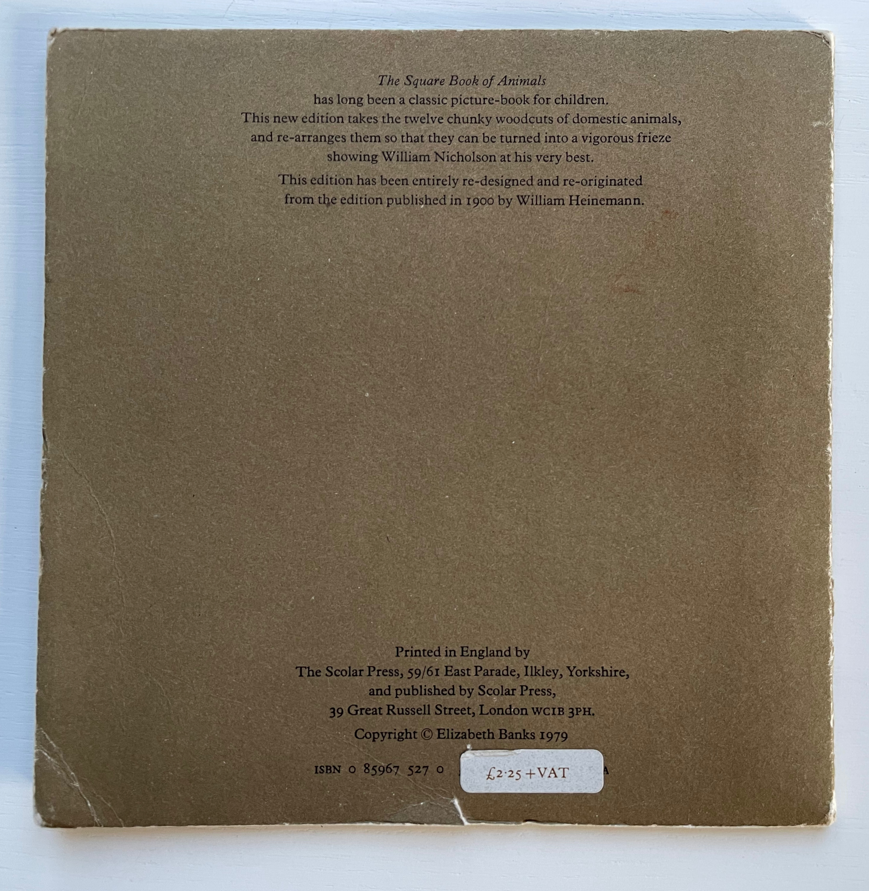
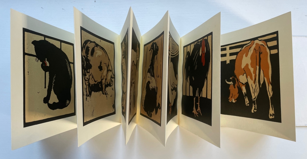
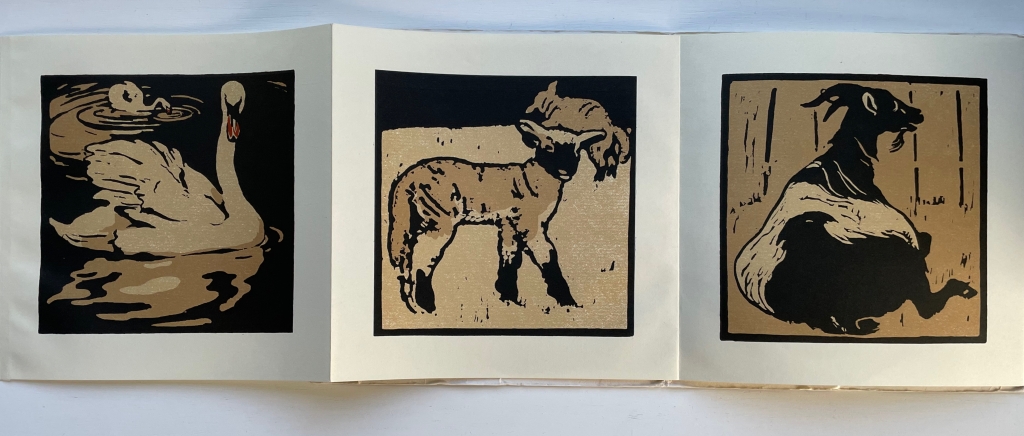
The Square Book of Animals (1900/1979)
The Square Book of Animals(1900/1979) William Nicholson Softcover, leporello. 290 x 290 mm. 12 panels. 2nd edition. Acquired from M.G. Manwaring, 2 April 2023. Photos: Books On Books Collection.
Scolar Press redesigned and re-originated the 1900 edition and brilliantly chose this leporello format, which makes one wish that Nicholson had added the book as artistic medium to his toolkit, which besides woodcuts and wood engraving included lithographs, oils, watercolors, tempera, frescos, painting on glass and photography. Given his poster work for the theater and exposure to the stage (the actor Henry Irving was a family friend and source of free tickets, and actress Ellen Terry was the mother of his friend Ted Craig) and given his facility with paper as a medium, Nicholson could have made pop-up and tunnel books of genius. But portraits, landscapes and still life beckoned as Colin Campbell tracks and explores so well in his two books (see below).
In the Books On Books collection, several works provide enjoyable comparison with Nicholson’s art: Carton Moore Park’s Alphabet of Animals (1899), C.B. Falls’ ABC Book (1923), Christopher Wormell’s An Alphabet of Animals (1990), Enid Marx’s Marco’s Animal Alphabet (2000) and Nick Wonham’s A Charm of Magpies (2018).
Campbell, Colin; James, Merlin; Reed, Patricia; and Schwarz, Sanford. 2004. The Art of William Nicholson. London; New York: Royal Academy of Arts ; Distributed in the U.S. and Canada by H.N. Abrams.
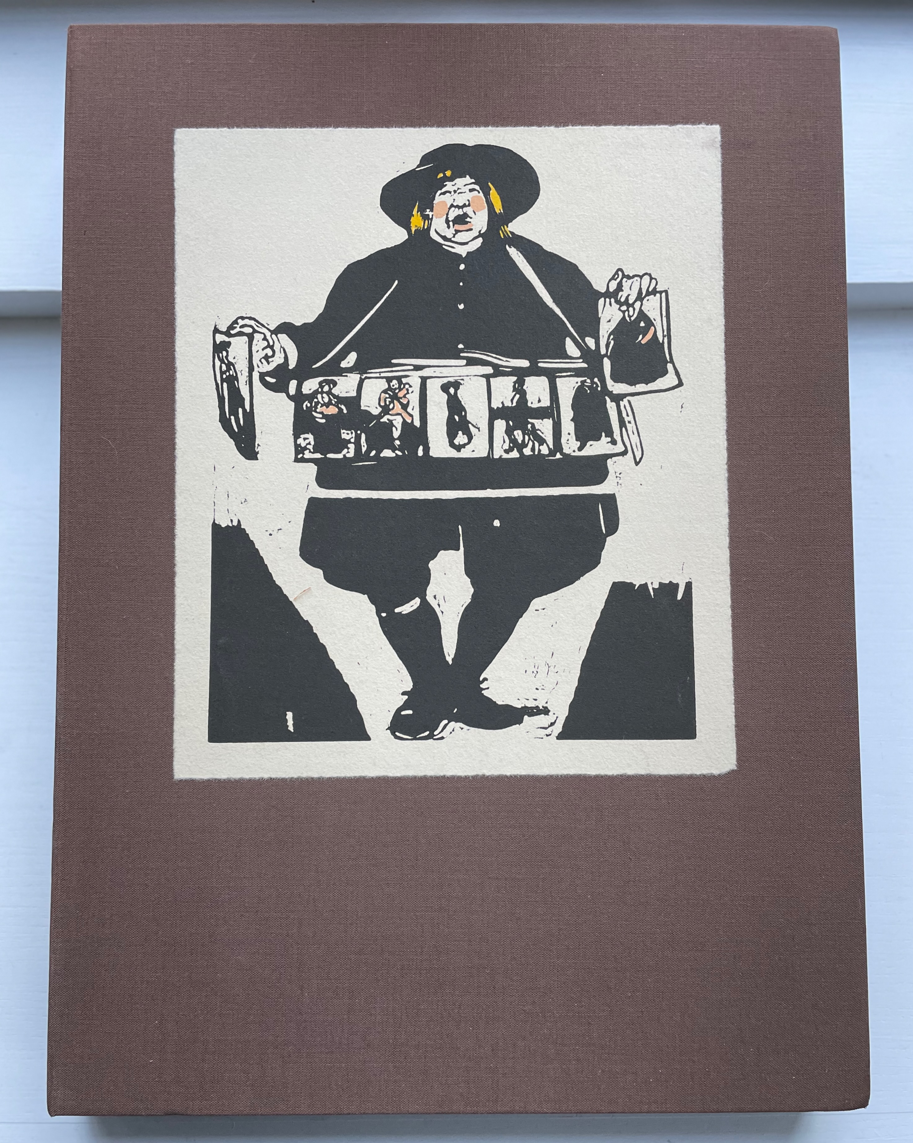
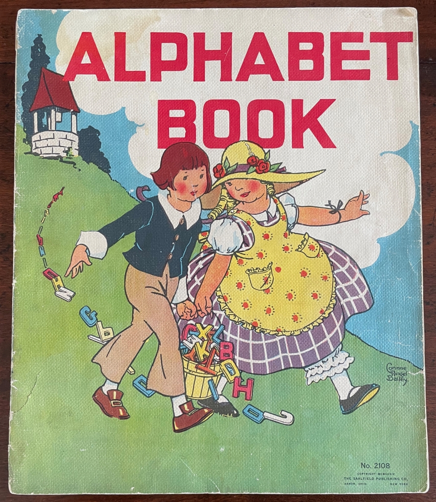
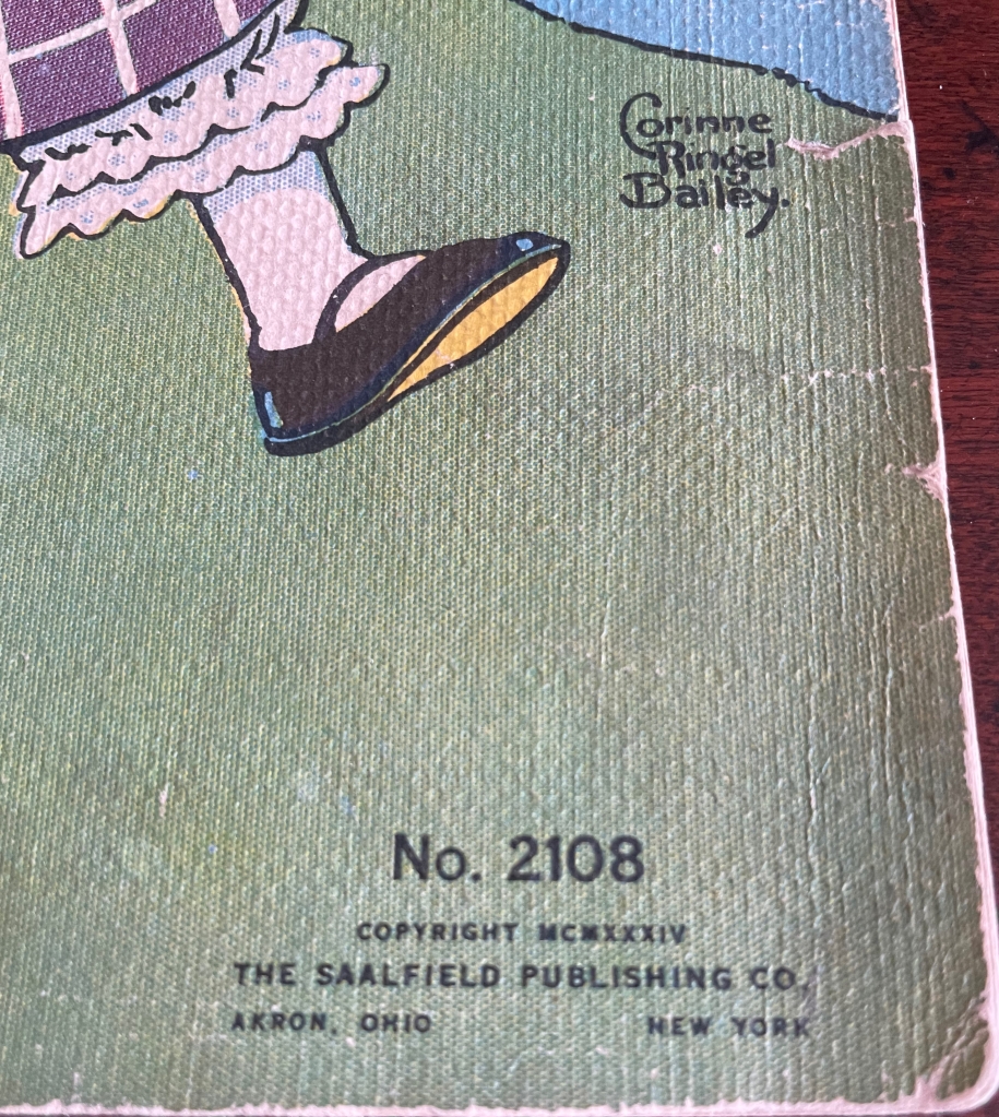
Alphabet BookNo. 2108 (1934) Corinne Ringel Bailey Linen book. Saddle-stitch, staples, H305 x w255 mm. 8 linen leaves including cover. Acquired 19 January 2023. Photos: Books On Books Collection.
Known now primarily for its Raggedy Ann books, The Saalfield Publishing Company (1900-77) published a wide range of linen books for children, naturally including numerous alphabet books with different themes. This last of four editions over 1928-34 — an alphabet of games, toys and entertainments — is one of Corinne Ringel Bailey’s more popular illustrated works. Based on library holdings, the most popular was The Adventures of Tom Sawyer published in 1931.
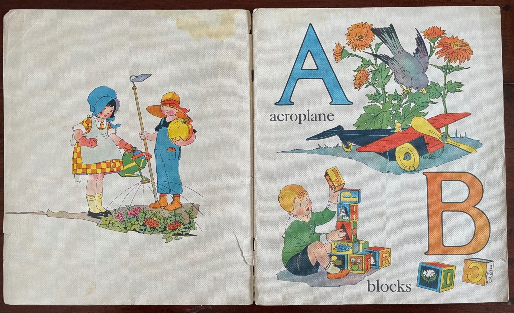
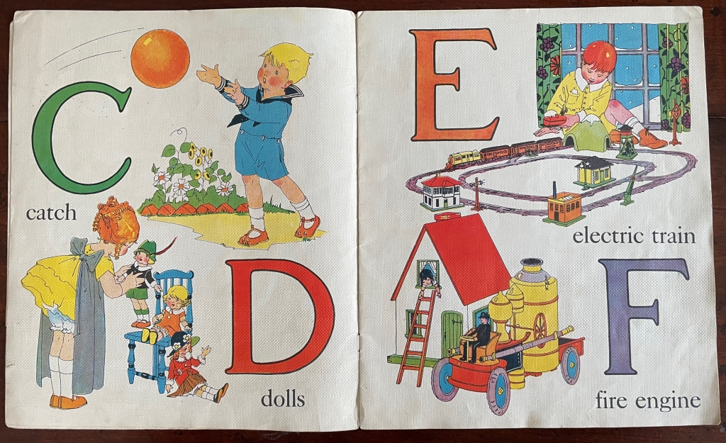
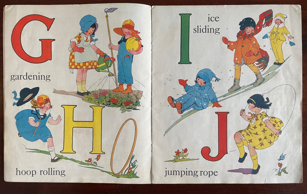
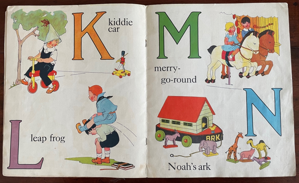
Although spanning the Great Depression, this abecedary depicts a world untouched by hardship. The “Jack & Jill” who come down this hill have a pail overflowing with letters. While the illustrations range back to inexpensive childhood activities (playing catch, hoop rolling, ice sliding and leapfrog), they also include a toy airplane, an electric train set, and a large radio cabinet for bedtime tales. Albeit not technologically advanced, both the pony cart for children under P and the tricycle under V (paying attention?) would have been luxuries — as would the replica steam-driven fire engine as well.
The booklet contains other peculiar leaps. While many of the activities have rural or suburban settings, the organ grinder was and remains an urban phenomenon. Words such as “aeroplane” and “quoits” have a British or European flavor to them (as do some of the dolls’ clothing), but a “yard” is where American children play while British children play in the “back garden”. The children’s clothing looks more American, and although animal crackers (biscuits) originated in England, the box depicted under Z (still paying attention?) looks suspiciously like the one created by Nabisco for its version of animal crackers.
Given the simplicity of most words in the book, “velocipede” seems a rather large one to include — even though it had been used since the mid-19th century on both sides of the Atlantic to cover bicycles and tricycles. Since other alphabet books of the period selected velocipede for V, the choice does not set Bailey’s apart from the crowd pedagogically. The absence of a more considered treatment of uppercase vs lowercase letters, however, does. From hornbooks onwards, most abecedaries present the uppercase and lowercase. In this respect and others, Bailey’s work is more picture book than alphabet book.
Illustration choices seem to have the upper hand. Echoing the animals in the image for Noah’s ark, there’s the clever illustration for “zoo” presenting a box of animal crackers with cookies shaped like those of Nabisco’s “Barnum’s Animals” escaping the box. Although the string attached to the box copies Nabisco’s that it introduced in 1902 for hanging the box as a treat on Christmas trees, the box is labeled “Kiddie Krackers” and does not look like the Nabisco brand box — probably to avoid trademark issues.
In fact, the intensity of colors — in the letters themselves, the bamboo umbrella’s pattern, the children’s ruddy cheeks and knees, and every image — delivers the overriding effect of this abecedary and looks back to the chromolithography of the 19th century, the woodcuts and posters of C.B. Falls and forward to such later 20th century abecedarians as Marie Angel, Sonia Delaunay, Carol DuBosch, Jean Holabird and many others in this collection.
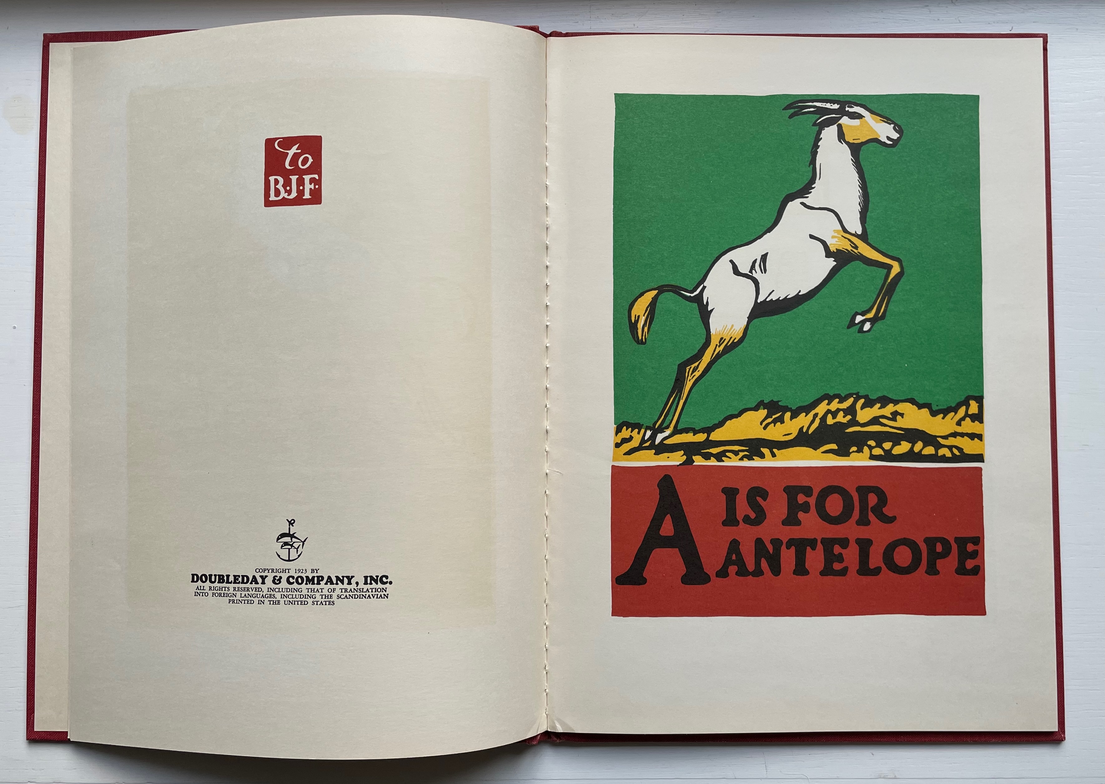
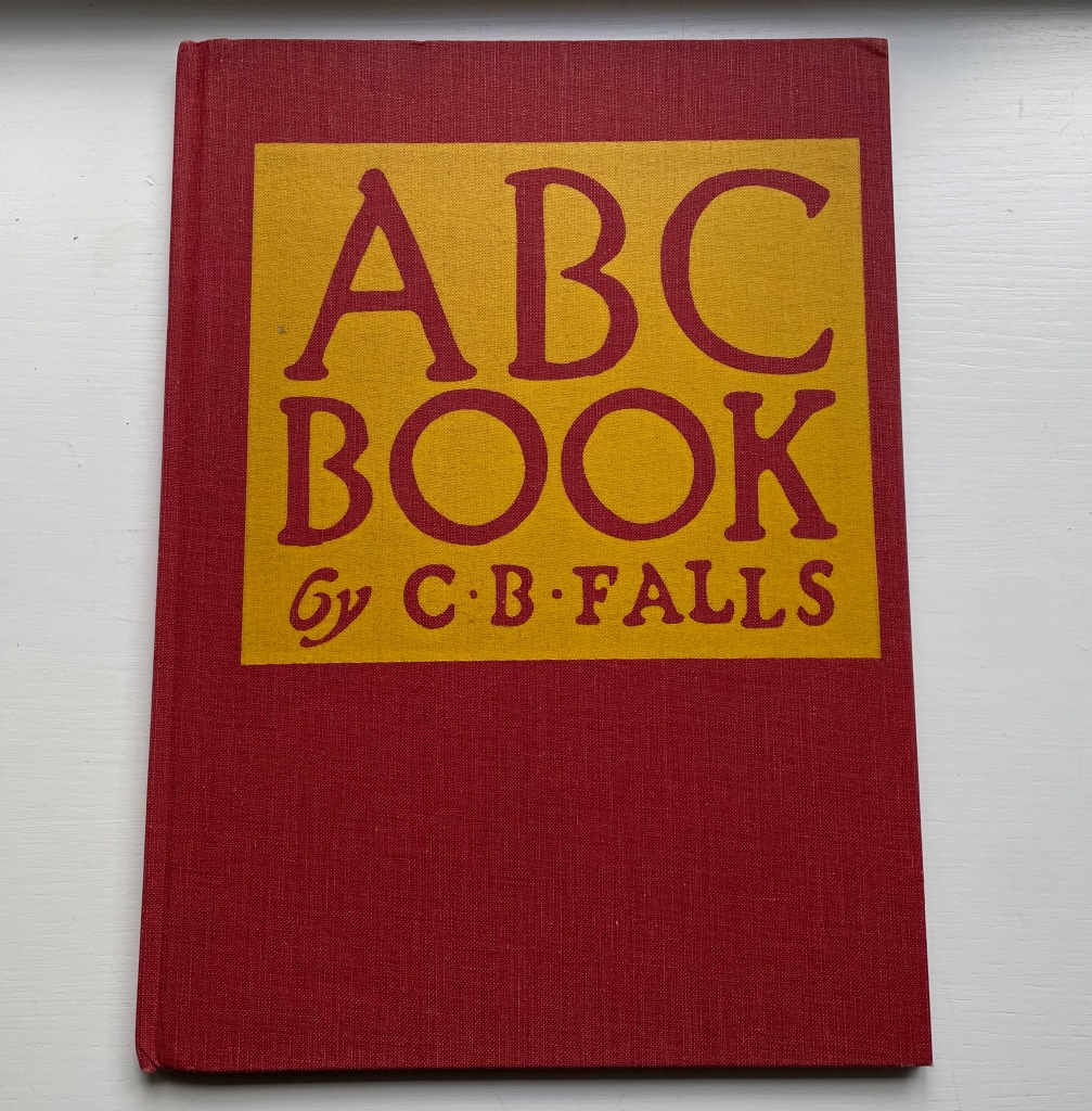
ABC Book (1923) C.B. Falls Casebound, cloth over boards, sewn. H318 x W232 mm. 32 unnumbered pages. Acquired from Derringer Books, 28 August 2022. Photos: Books On Books Collection.
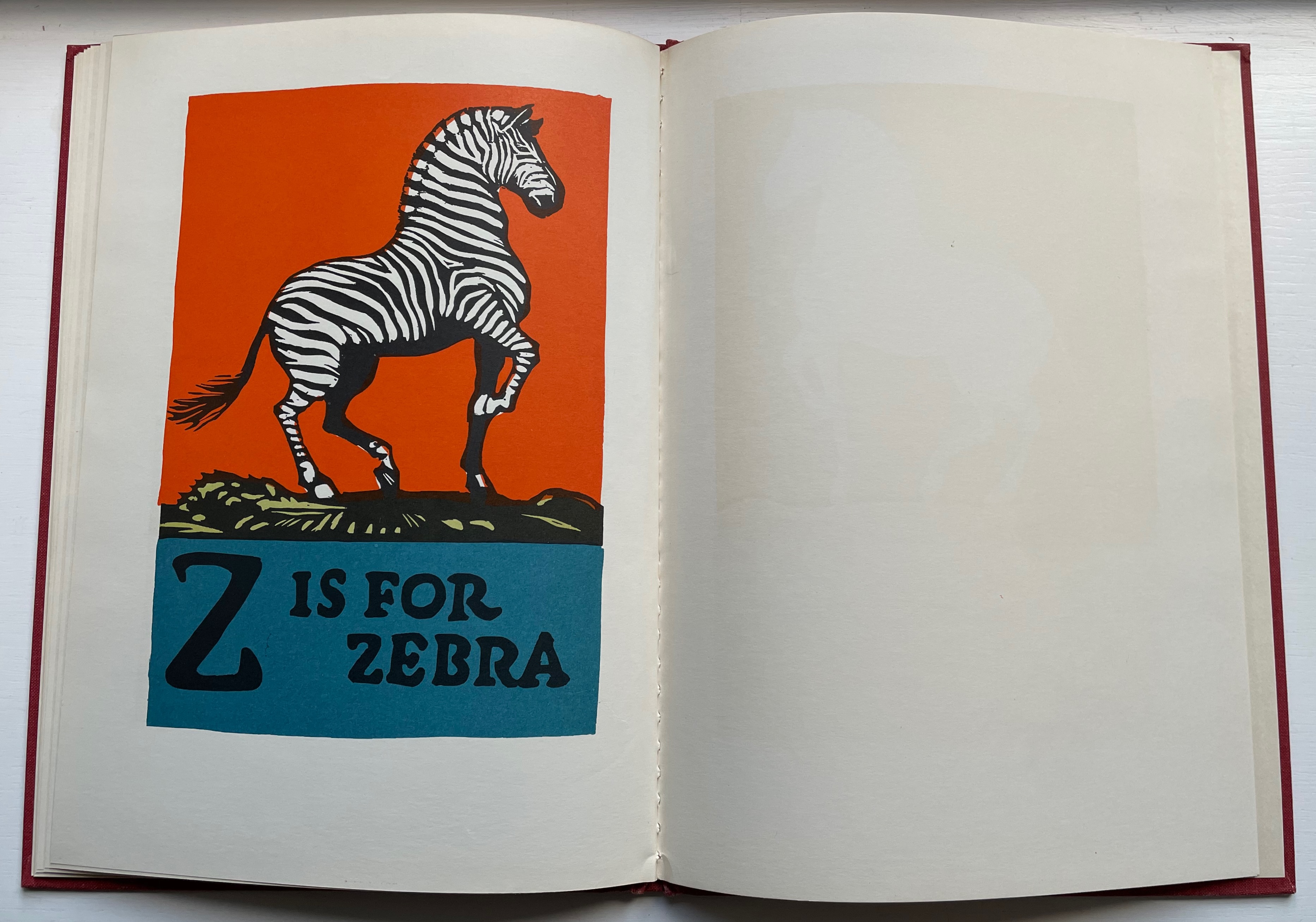
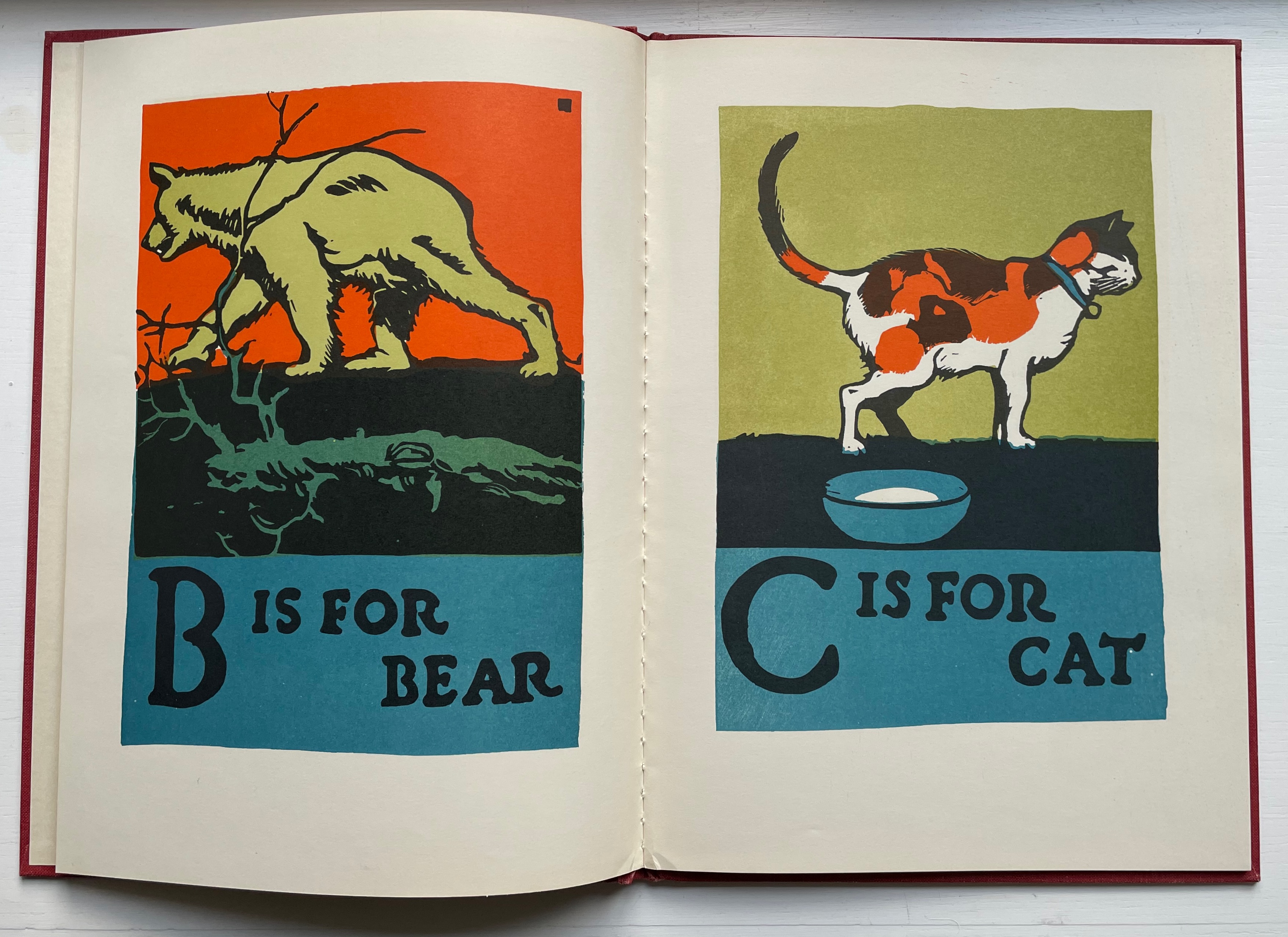
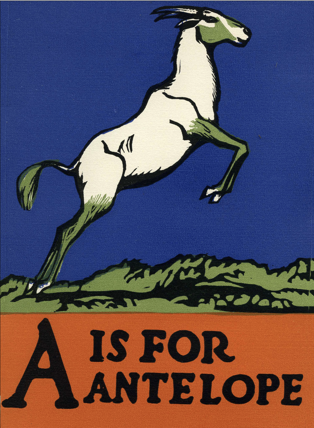
Charles Buckles Falls’ reputation as an illustrator working in woodcuts and poster design, especially WWI posters supporting book donations to the troops, led to Doubleday’s signing up the ABC Book in 1923. The influence of Art Nouveau appears in the lettering as well as the antelope’s pose (although the zebra’s pose seems based on an equestrian statue, naturally without a rider). A stronger influence from William Nicholson, England’s premiere wood-engraver at the time, shows through in the lettering and coloring. While both artists used color to emphasize their black lines, Falls made bolder, more eccentric choices, which may ultimately have led to a return transatlantic influence on the UK illustrator Chris Wormell and others (see Further Reading).
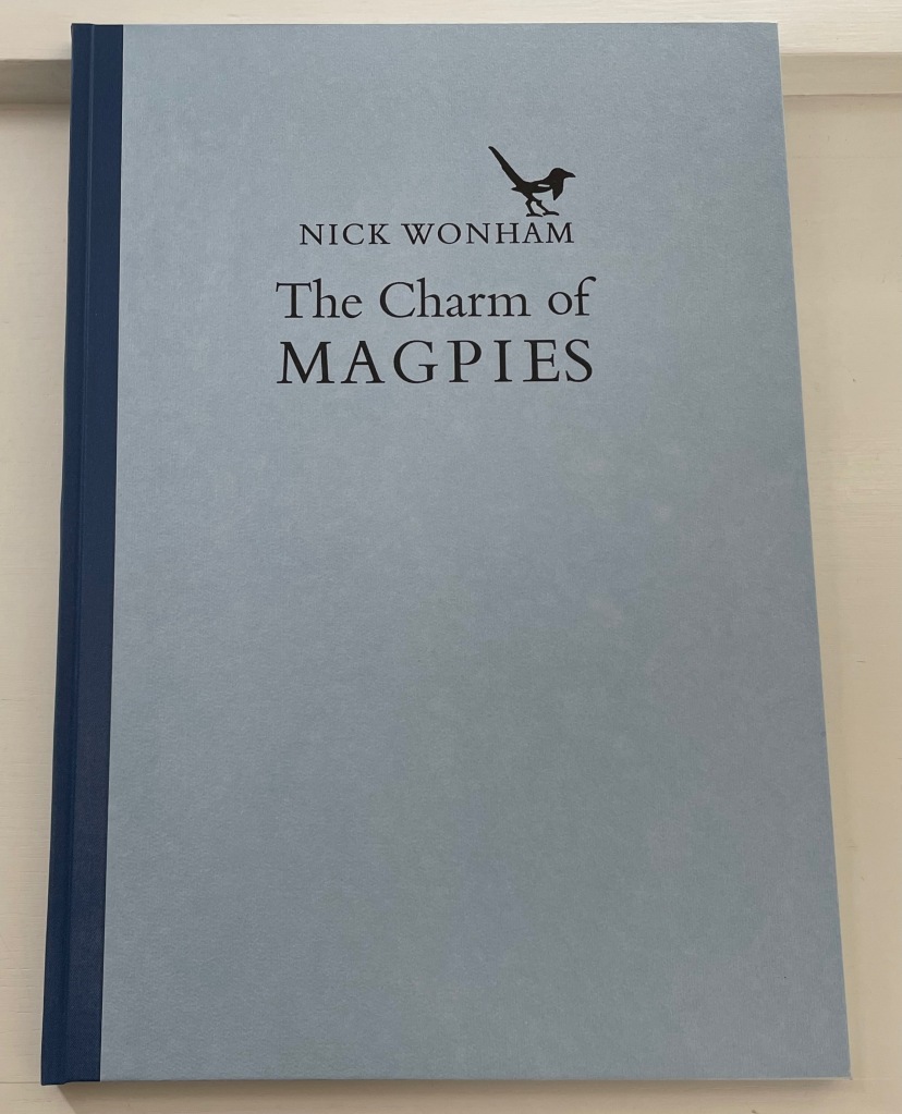
The Charm of Magpies (2018) Nick Wonham Casebound, cloth spine and paper over boards with specially printed flyleaves from Roger Grech at his Papercut Bindery. H370 x W260 mm. 27 pages unnumbered. Edition of 160 copies, of which this is #98. Acquired from Incline Press, 1 August 2022. Photos: Books On Books Collection.
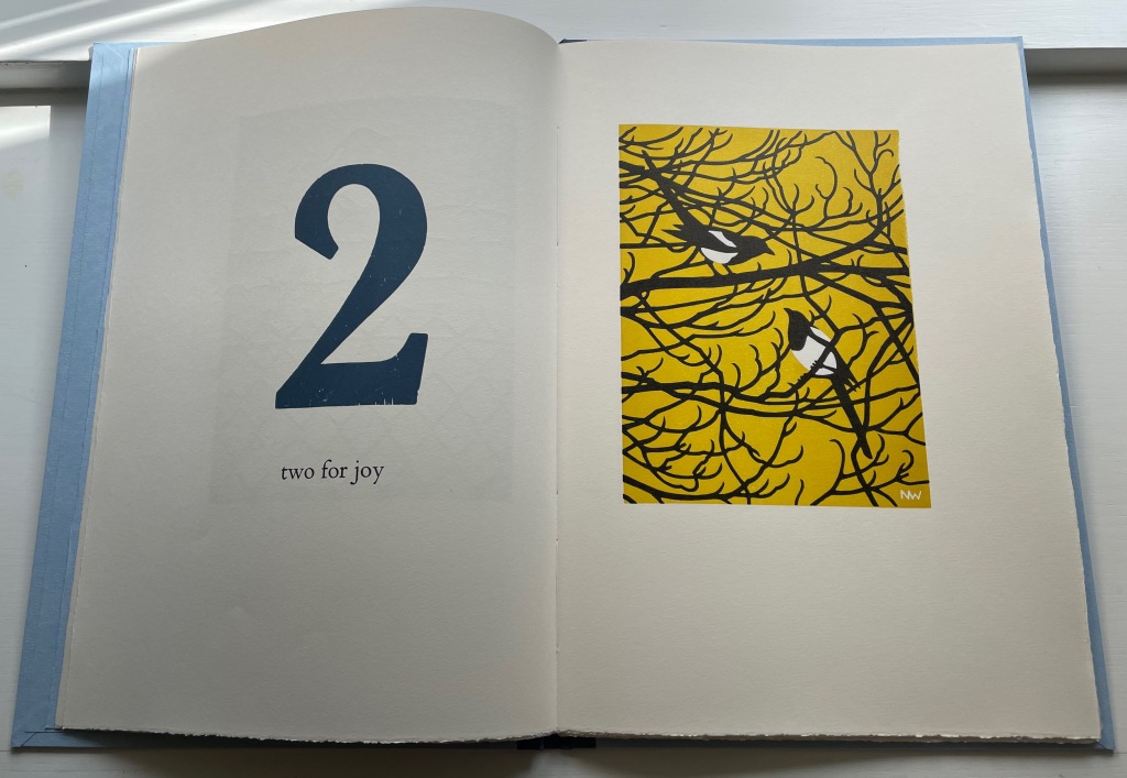
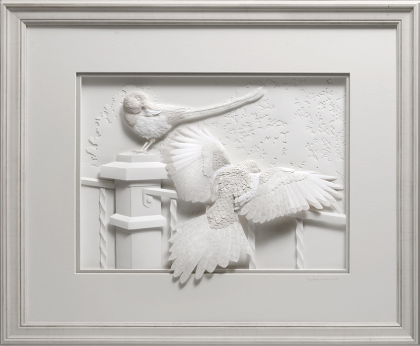
A long admiration for magpies has always threatened to crowd the Books On Books Collection beyond this beautiful work from Nick Wonham and Incline Press and the relief sculpture in paper by Calvin Nichols below. But one pair of works will have to be enough for joy.
Iridescence(2016) Calvin Nicholls Acquired from the artist, 1 September 2016. Photo: Courtesy of the artist.
On the Incline Press website, Graham Moss and his team write:
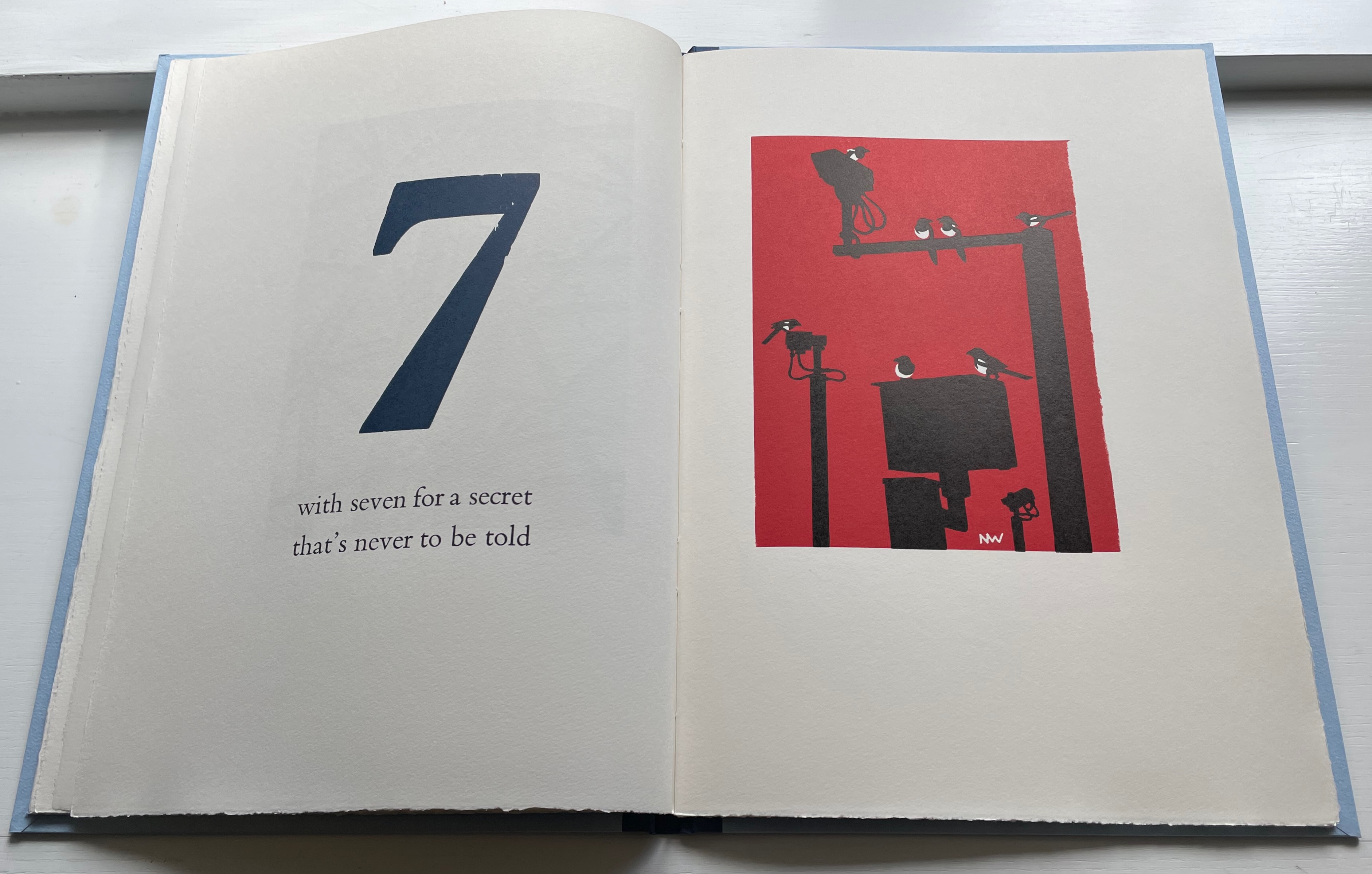
Collective nouns … A parliament of magpies has to be a favourite, especially if you’ve heard a group of them cackling together in the Springtime. But we prefer the alternative, a charm of magpies, which certainly suits this poem better. It is one version of a folk rhyme which has many local variants, all superstitiously foretelling the future through random occurrence.…
Magpies are often known a thugs in the garden, stealing eggs and chasing off their more delicate rivals. As printers, though, we have a fondness for them because of their “ink on paper” plumage and their latin name pica pica, which recalls the printshop unit of measure.
Left to right: Joseph Crawhall (1884), William Nicholson (1898), C.B. Falls (1930) and Christopher Wormell (1995).
As Moss and team point out on their site, the Oxford Dictionary of Nursery Rhymes does not include the magpies among the counting rhymes, which is odd with so many versions to be had. Birdspot, formerly British Bird Lovers, favors Nick Wonham’s chosen version. For magpies interested in shiny trivia, the site also provides a link to a BBC television program whose theme song was based on the magpie rhyme. It was “composed and played by the Spencer Davis Group under the alias The Murgatroyd Band, just after Steve Winwood had left to join the supergroup Blind Faith with Eric Clapton, Ginger Baker, and Ric Grech”.
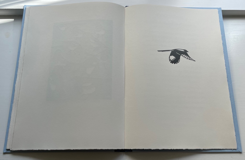
And to note just one touch of Nick Wonham’s subtlety, here is the page before the colophon. In all the other images, the magpies are roosting. This one in flight is also the only one in black and white. A brilliant “The End”.
Postscript: In correspondence, the artist has provided further insight on influences and his handling of color:
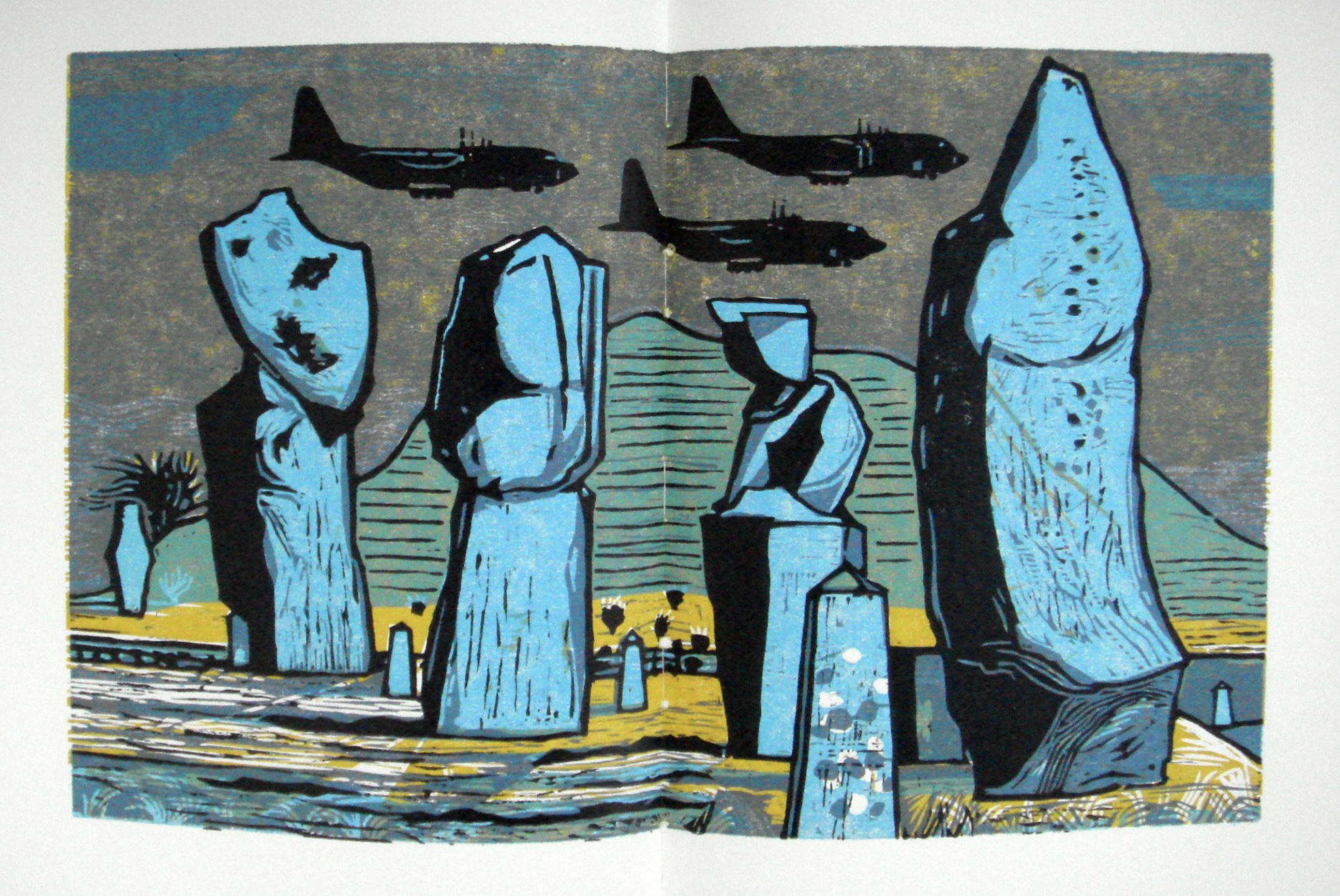
A note on the colour – the biggest influence on this was Rigby Graham, whose work Graham Moss introduced me to through the Old Stile Press book Kippers and Sawdust. Graham had just printed my first book, which had black and white linocuts, and was trying to inspire me to try colour. It worked; I was blown away by the majestic woodcuts and aspired to create books in a similar vein. Rigby liked an unusually coloured sky, he also liked to position his illustrations through the book so that the colours of prints on adjacent pages contrasted with each other to create dynamism and visual interest, something I have attempted in my book. Correspondence with Books On Books Collection, 9 September 2022.
Wonham also adopts and owns a compositional feature from Rigby Graham’s Kippers and Sawdust: the juxtaposition of the mechanical and the natural. His ownership is particularly apparent in his setting for the rhyme’s seventh verse.