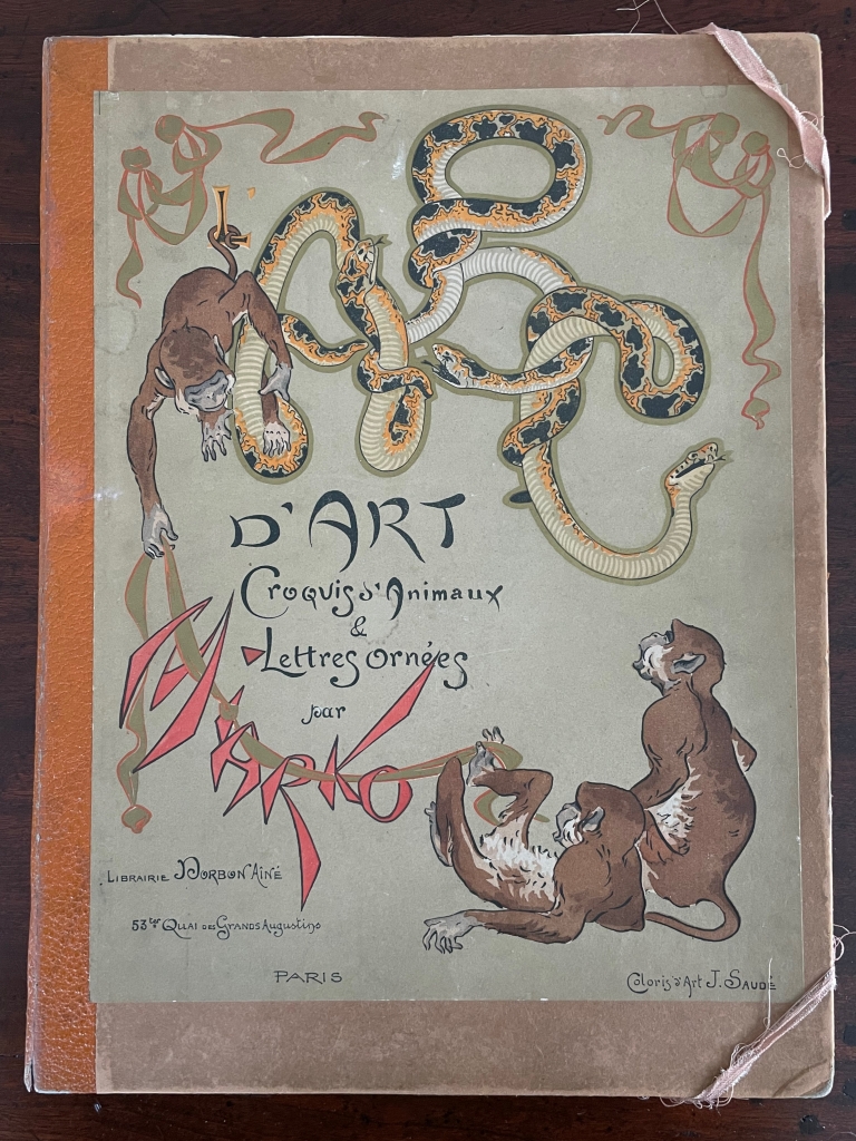
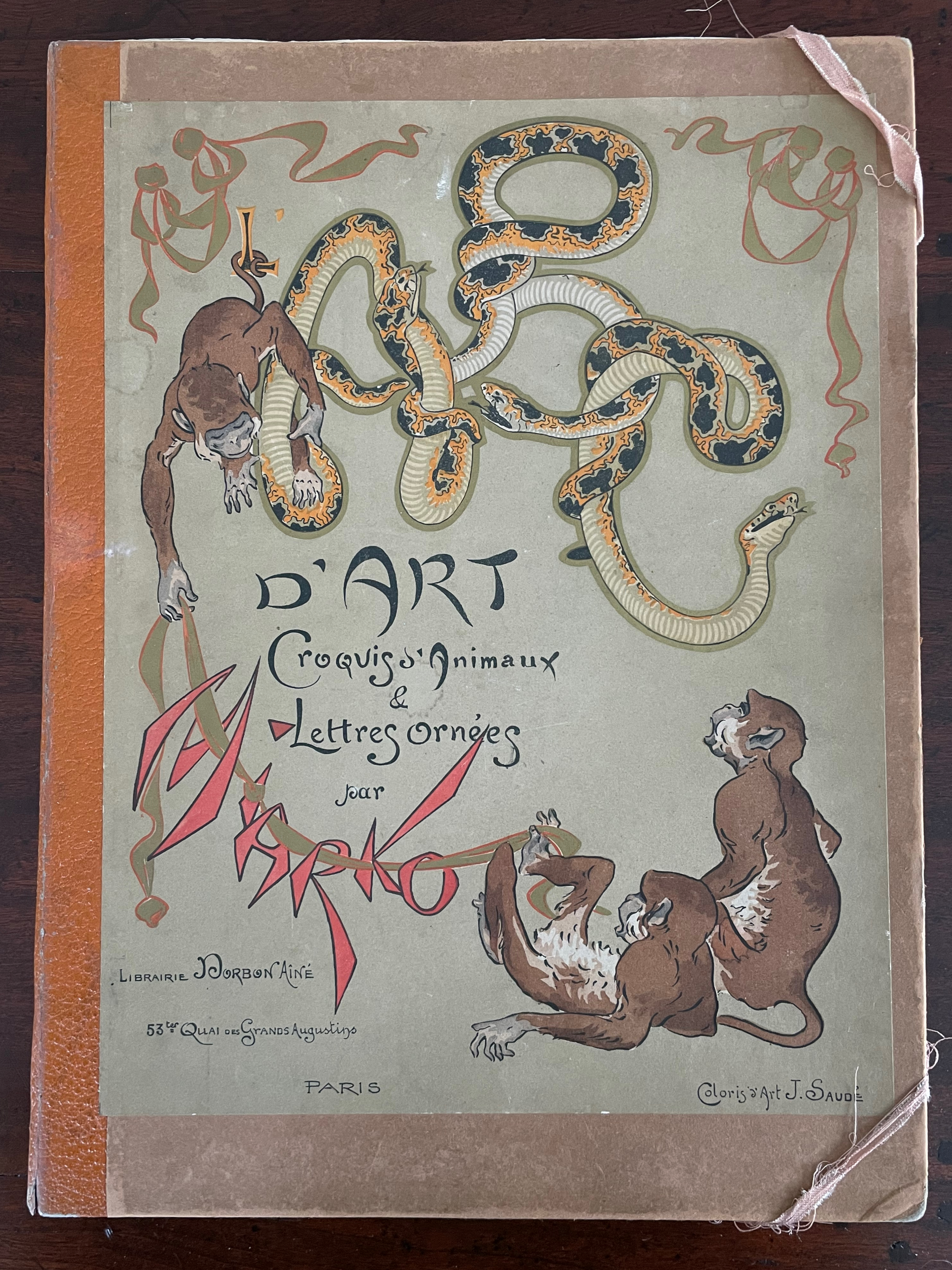
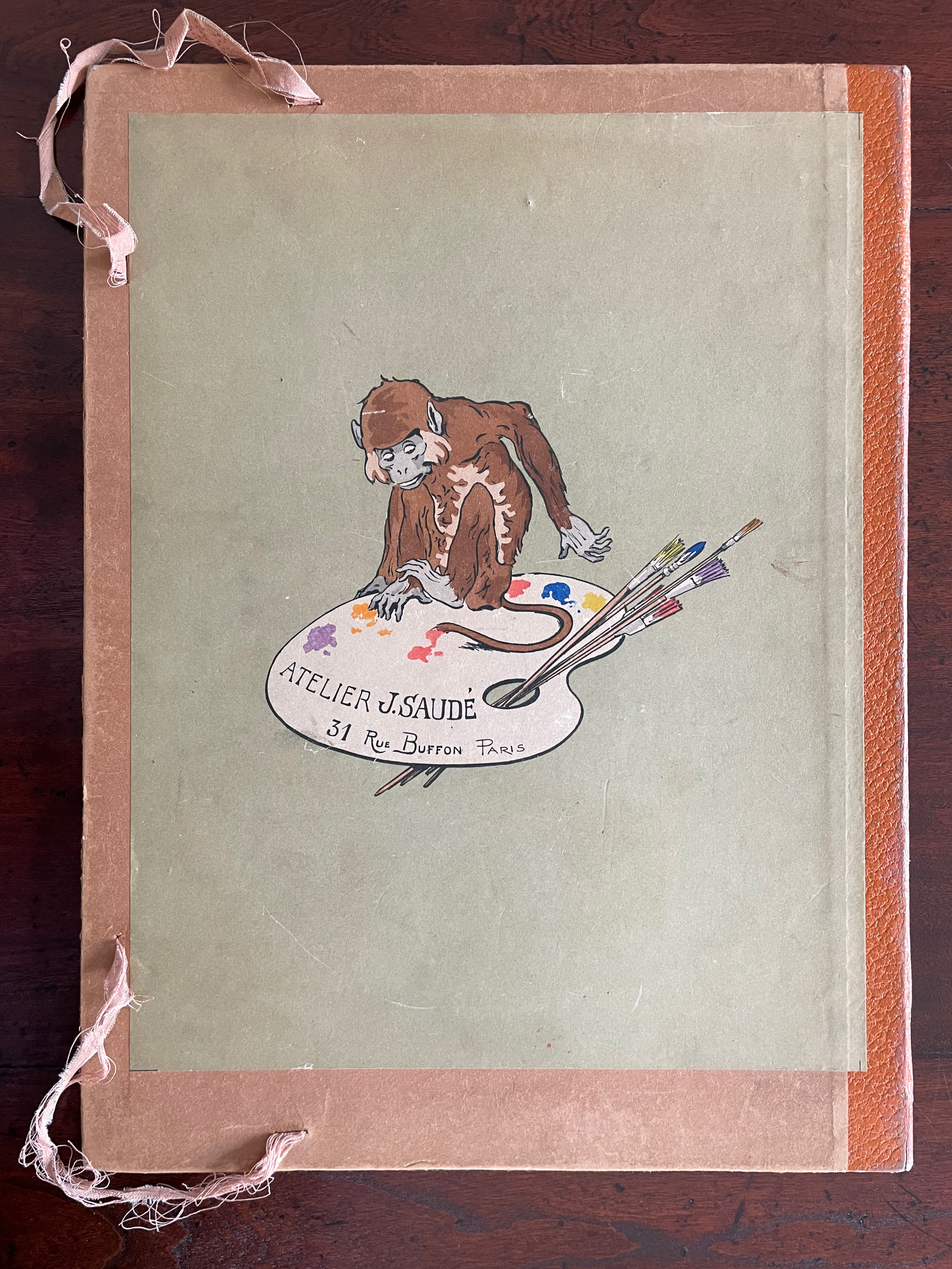
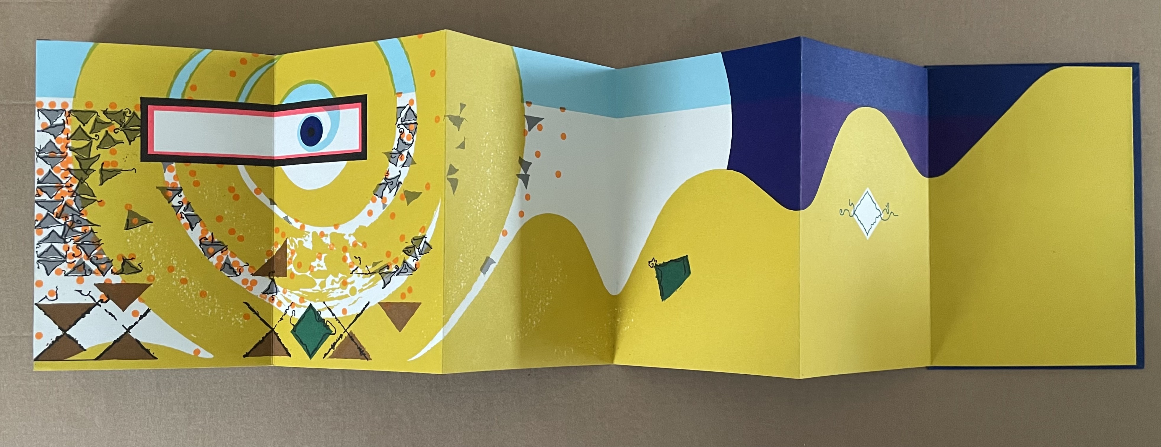
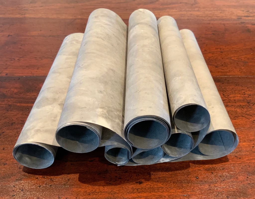
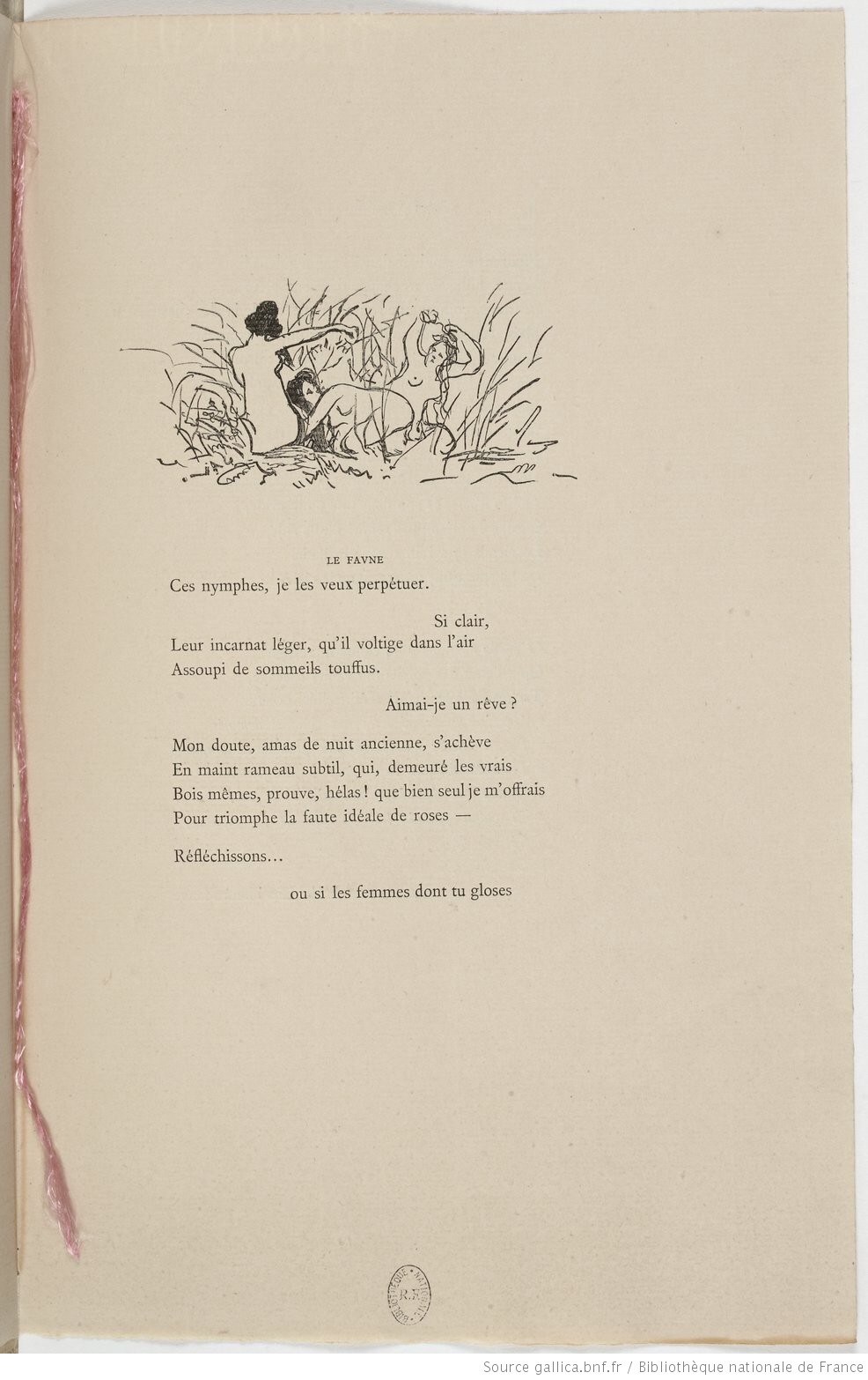
ABC d’Art: Croquis d’animaux & Lettres ornées [ABC of Art: Animal Sketches & Decorated Letters] (c. 1920) Miarko (Edmond Bouchard), Colored by Jean Saudé Portfolio, corner closures with ribbon, Portfolio: H385 x W285 mm. Prints: H380 x W280 mm. 27 folios. Acquired from ADER Nordmann & Dominique, 16 March 2023. Photos: Books On Books Collection.
Miarko (born Edmond Bouchard, 1889, Kyiv) was an illustrator, caricaturist, painter and expatriate in Paris when he died in 1924. His work followed in the Art Nouveau tradition and appeared in magazines likeThe Magpie.
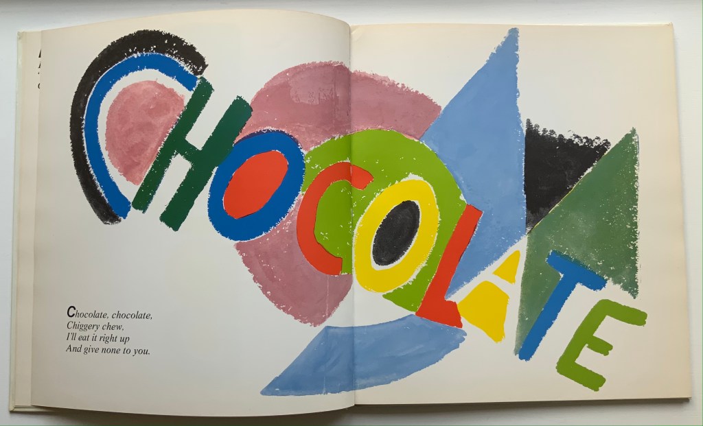
Of his limited output, ABC d’Art is probably the best known. Produced by Jean Saudé, it provides a representative link in a chain of alphabet works with which to explore distinctions and affinities among different periods of art. Although Saudé was known for his pochoir work, the varying background colors of ochre, golden yellow, blue gray, mauve, etc., and use of gold paint in Miarko’s plates speak an entirely different language from that of fellow-expatriate Sonia Delaunay’s intense pochoir colors in Alphabet(1972) or even her work in the 1920s. Although some affinity with the woodcut of the horse in C. B. Falls’ ABC Book Boo(1923) can be seen, the handling of color, again, leads in different directions. Add Jasper Johns’ painting Alphabet (1959) to this chain, and marvel at the stylistic differences that arise from the artists’ blending of stencil work and brush work.
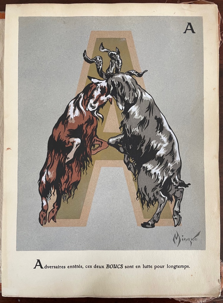
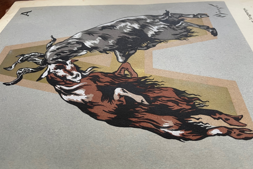
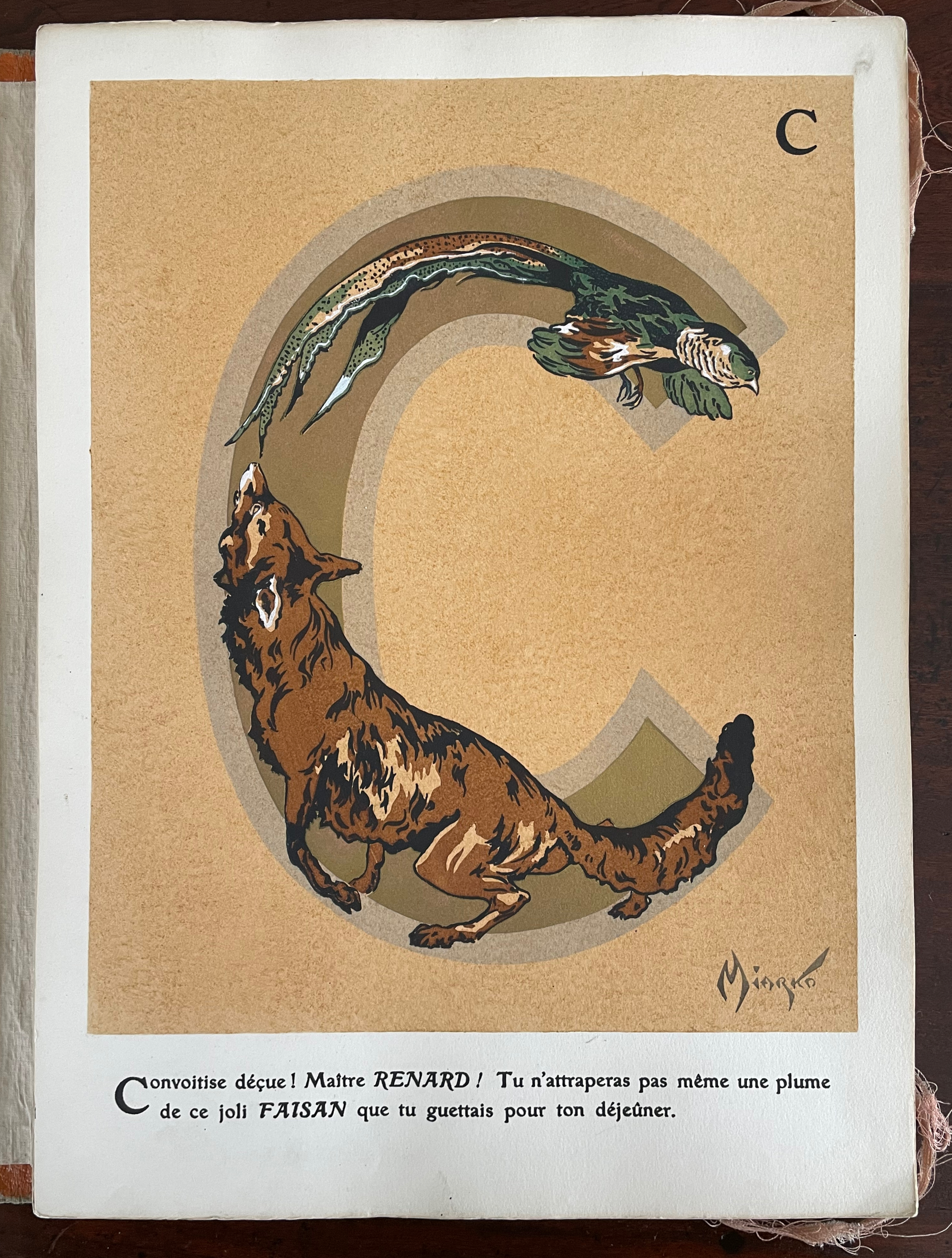
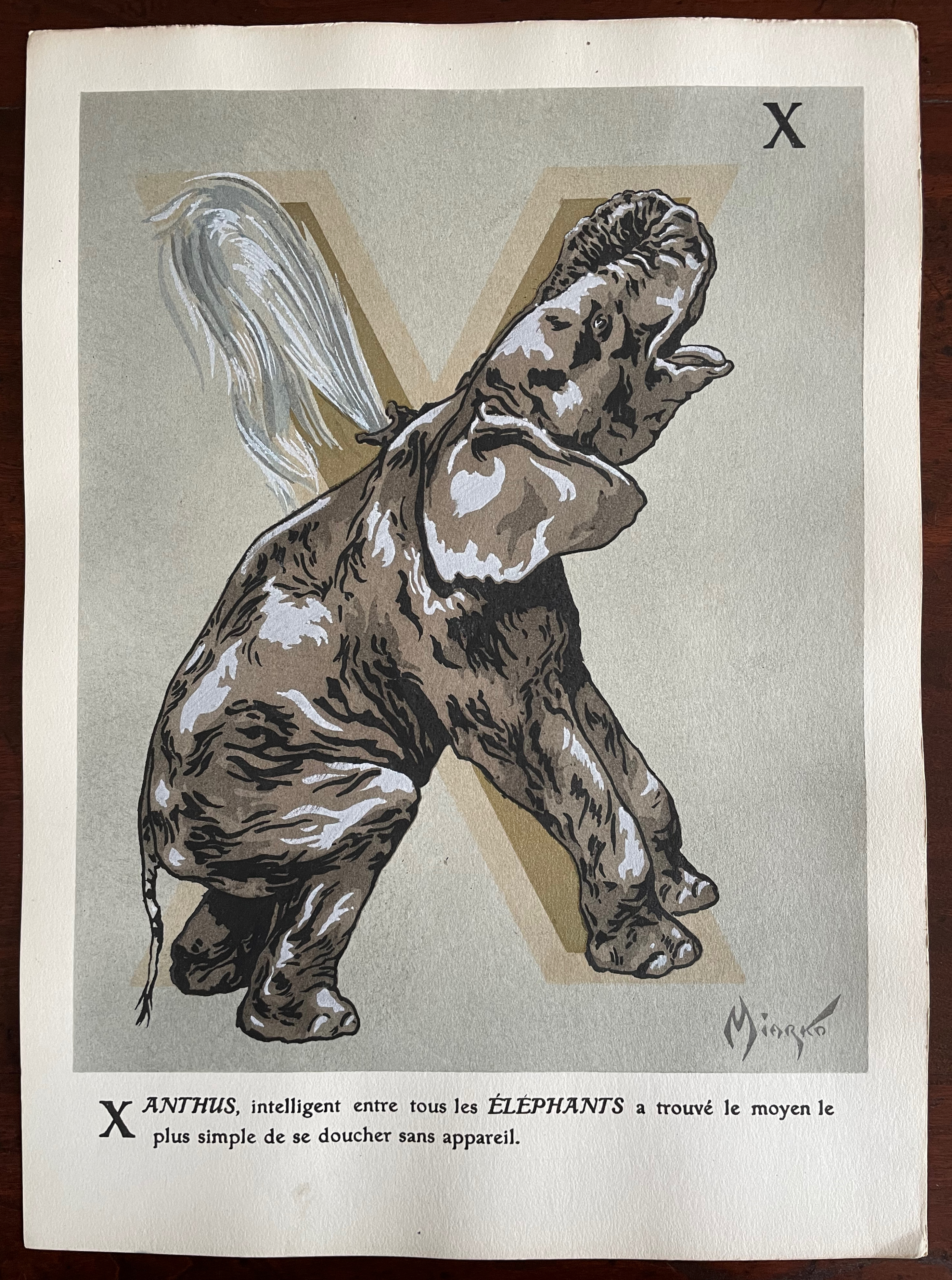
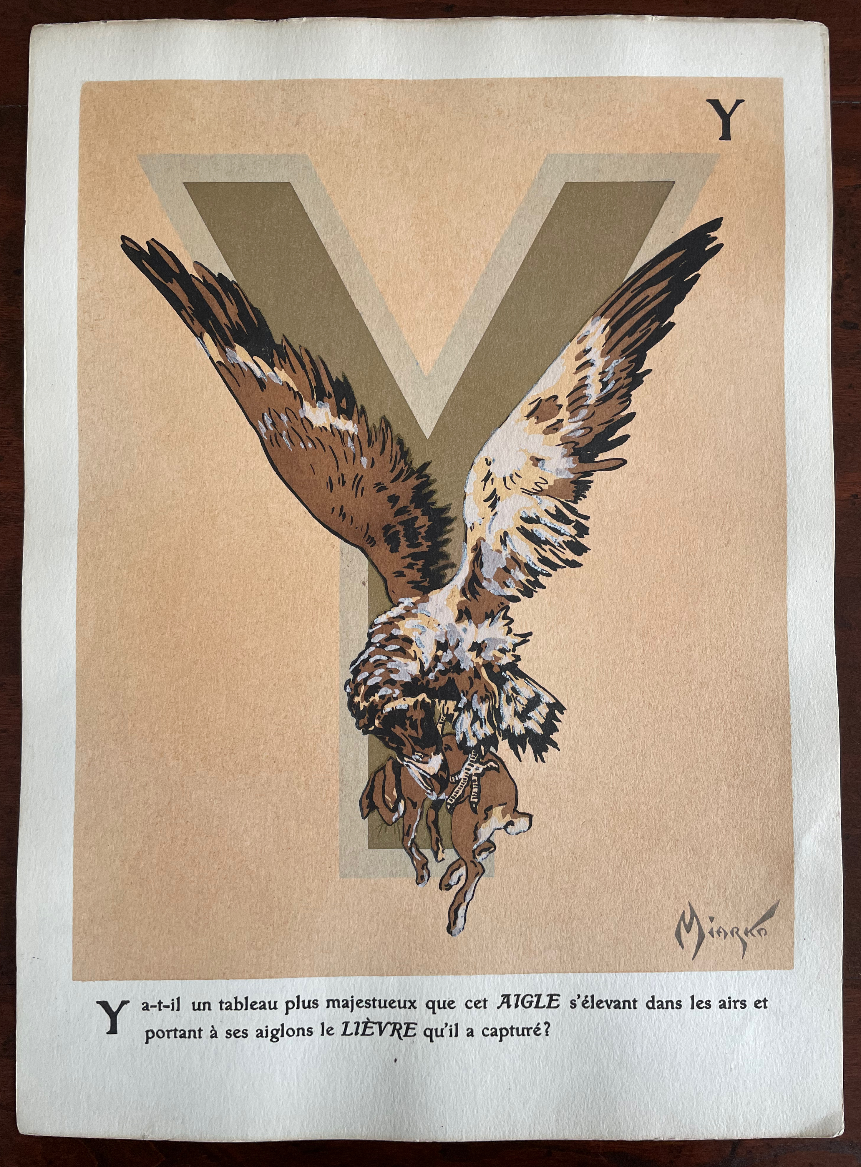
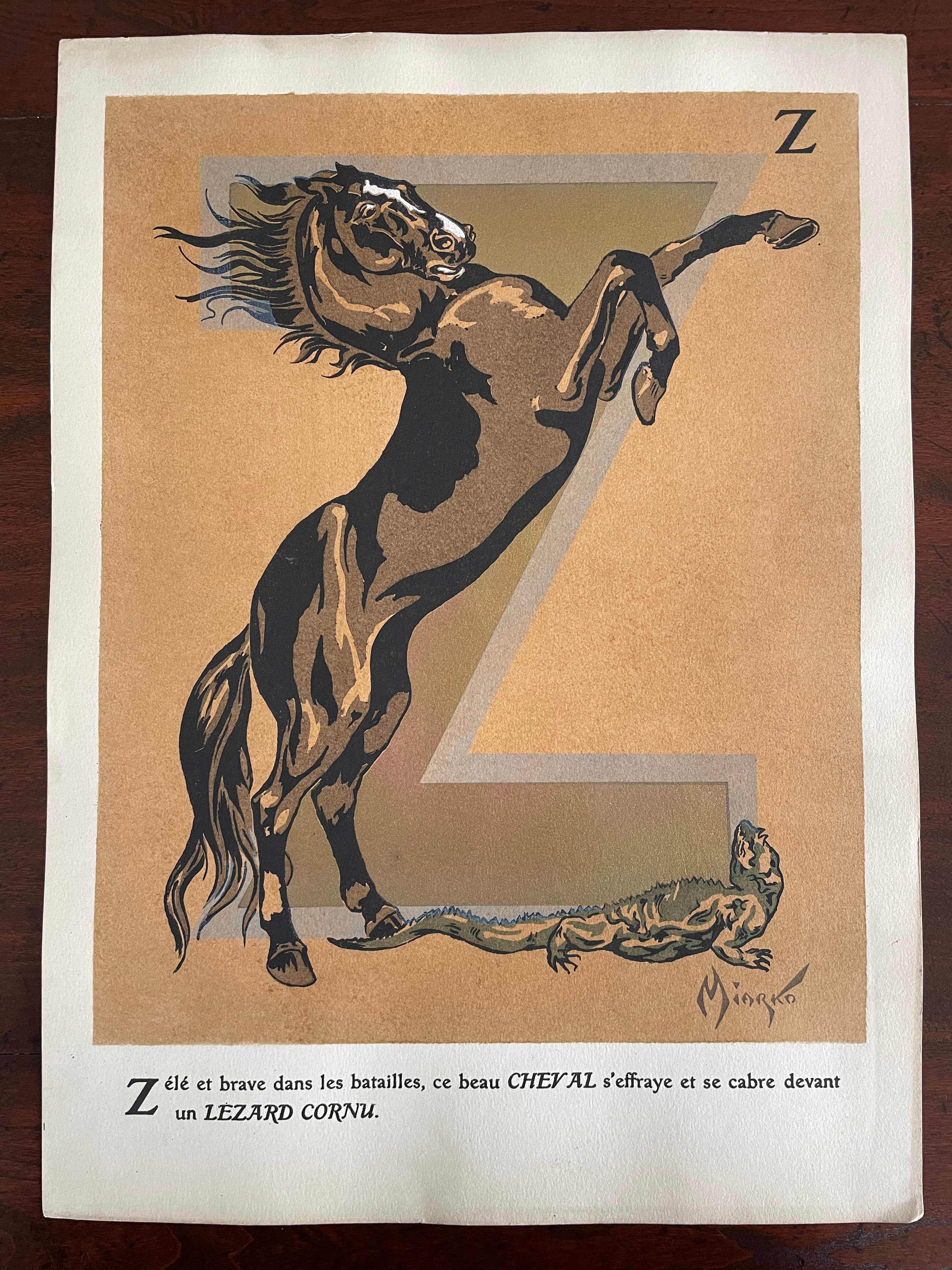
Miarko’s portfolio is a cardboard folder with an orange morocco paper spine. Its covers have lithographed illustrations in colors applied. The letters ABC formed by boas on the front cover are almost easily missed for the gamboling chimpanzees. There are twenty-seven lithographed plates in colors and gold. Each letter of the alphabet is rendered as a large initial in gold paint and outlined in another color. The twenty-seventh plate is devoted to the numerals 0-9.
Unlike most animal alphabet books, the animals do not always correspond to the initial they decorate. Rather, each initial corresponds to the first letter of the text beneath. More to the point of its difference from most animal alphabets, this one’s images and text seem to revel in nature’s tooth and claw.
“Alphabets Alive! – Animals“. 19 July 2023. Books On Books. An online version of the exhibition at the Bodleian Libraries, 19 July 2023 – 24 January 2024.
“Sonia Delaunay“. 17 July 2023. Books On Books Collection.
“C. B. Falls“.14 December 2022. Books On Books Collection.
ADER Nordmann et Dominique. 16 March 2023. Abécédaires, Etc.: Collection Bernard Farkas. Accessed 16 March 2023. Cf. Le Bestiaire by Albert Gérard and Robert Hanesse (c. 1960), p. 78.
Art Institute Chicago. Alphabet (1959). Jasper Johns. Ref. 2015.121.
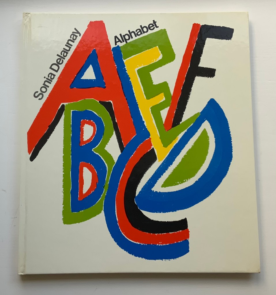
Alphabet (1972) Sonia Delaunay Casebound, illustrated paper over boards. H285 x W255 mm. 54 pages. Acquired from Argosy Bookstore, 7 August 2021. Photos: Books On Books Collection.
Building on a French scientist’s exposition of how perception of colors changes depending on the colors around them, Sonia and Robert Delaunay claimed that rhythmic, musical and spatial synesthetic elements were also at play. At least one page in Sonia Delaunay’s Alphabet suggests that this theory of simultanéisme may have extended to the sense of taste.
The lithographs that led to Alphabet appeared ten years before Delaunay’s death, so maybe it is greedy to wish for at least a fine press edition rather than this trade edition. Given the effort and inspiration needed to fuse the elements of alphabetic art with the elements of book art, it is definitely greedy to wish for an artist’s book edition.
Sonia Delaunay’s genius for merging colors, shapes, canvas, paper and fabric was celebrated in “Sonia Delaunay – A Retrospective” at the Tate Modern in 2015. Asserting a family bond with Delaunay, the artist Alla Malomane revived Maison Sonia Delaunay in 2014. In 2019, Kitty Maryatt re-created Delaunay and Blaise Cendrars’ famous work of book art, which they called le premier livre simultané — La Prose du Transsibérien et de la petite Jehanne de France. And more recently, the exhibition “Maison Sonia” appeared at the Kunstmuseen Krefeld in Germany. So perhaps Sonia Delaunay’s spirit endures, and a greedy wish may be fulfilled by some quarter. Since Maryatt’s effort, a pochoir revival certainly seems to be afoot.
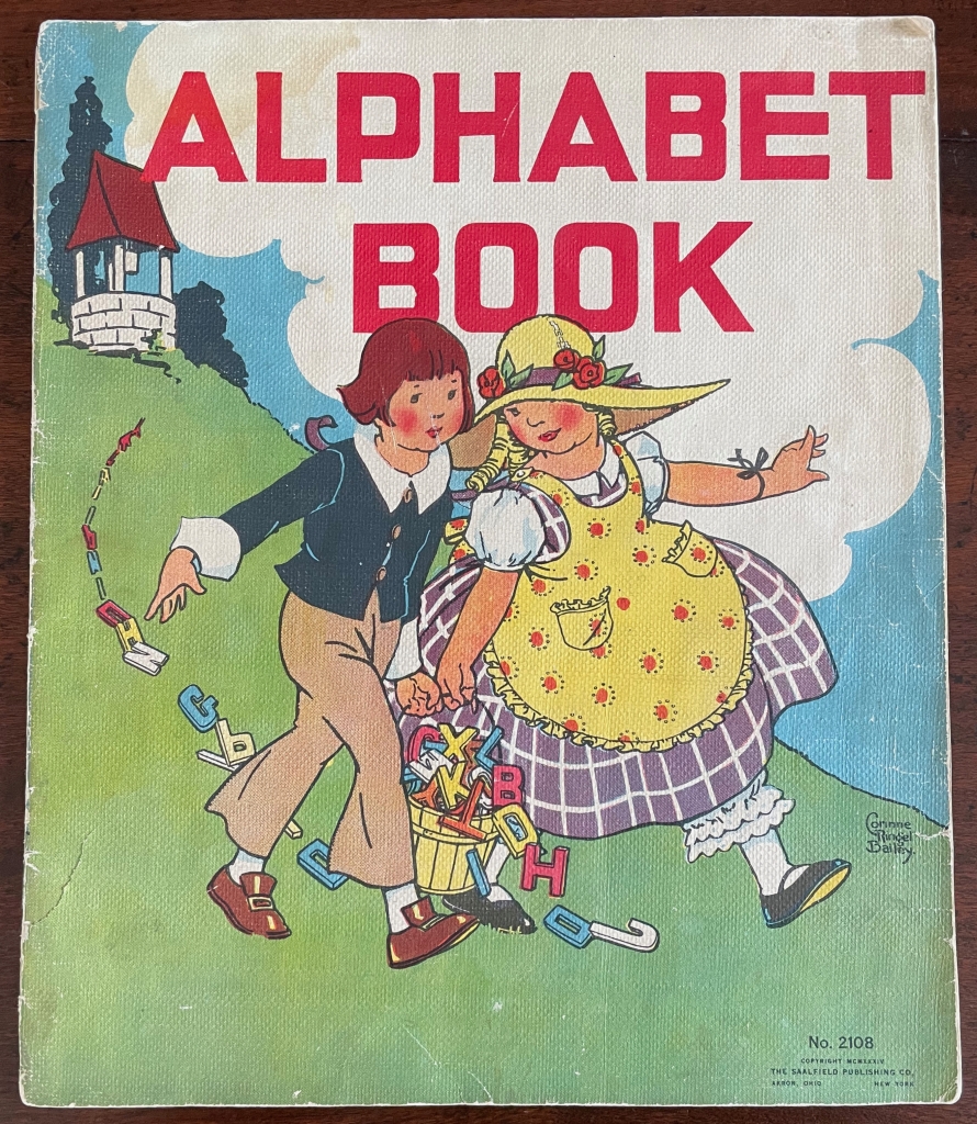
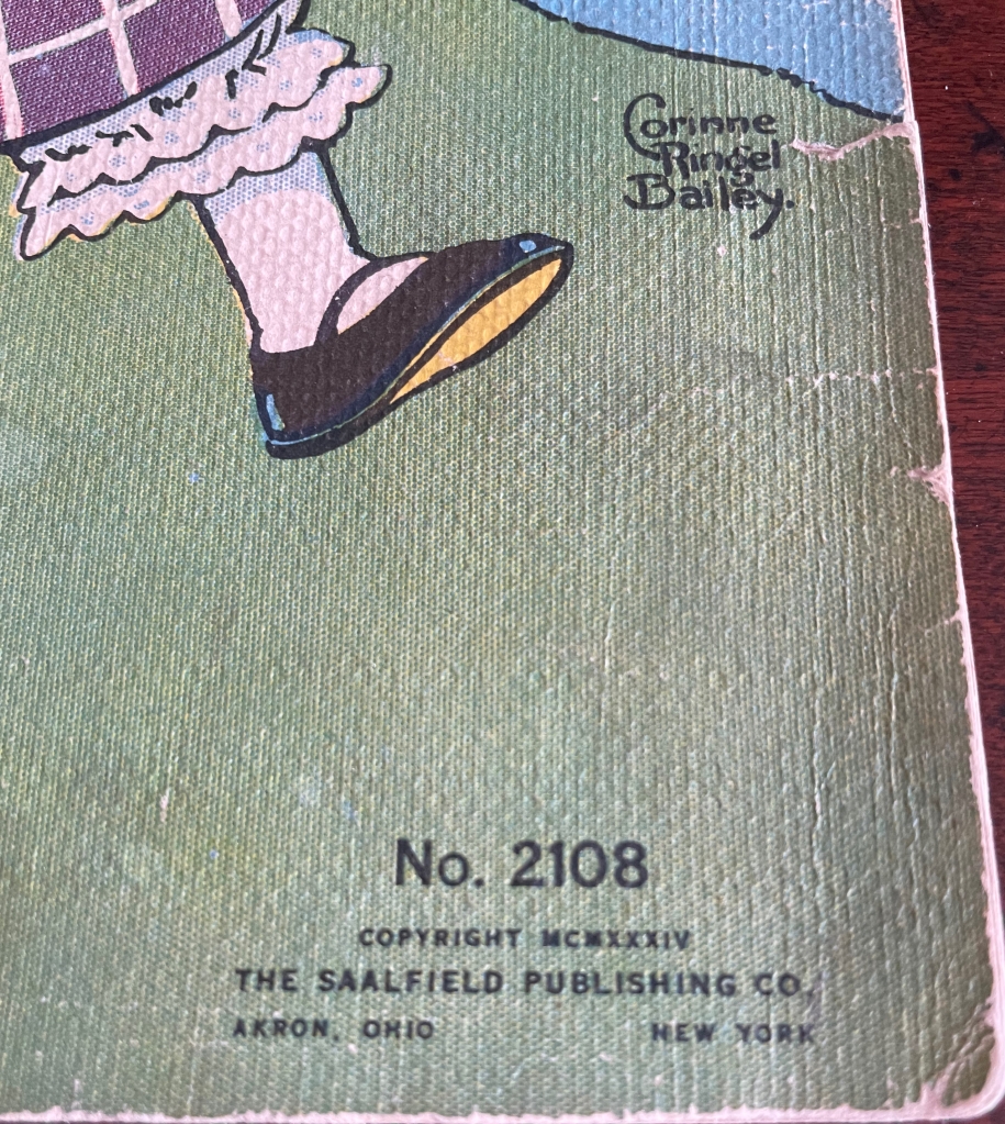
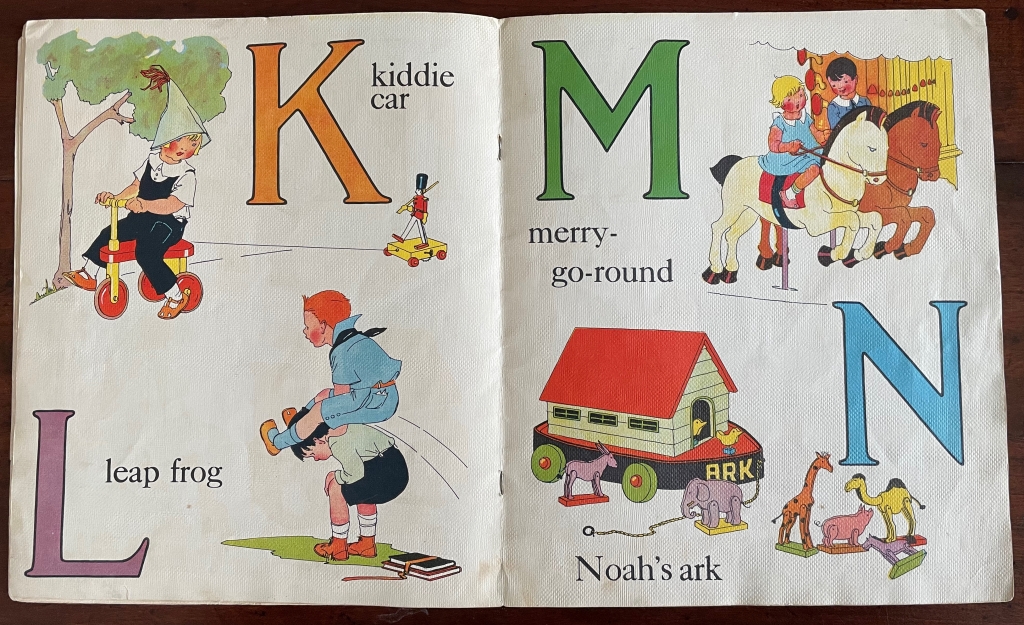
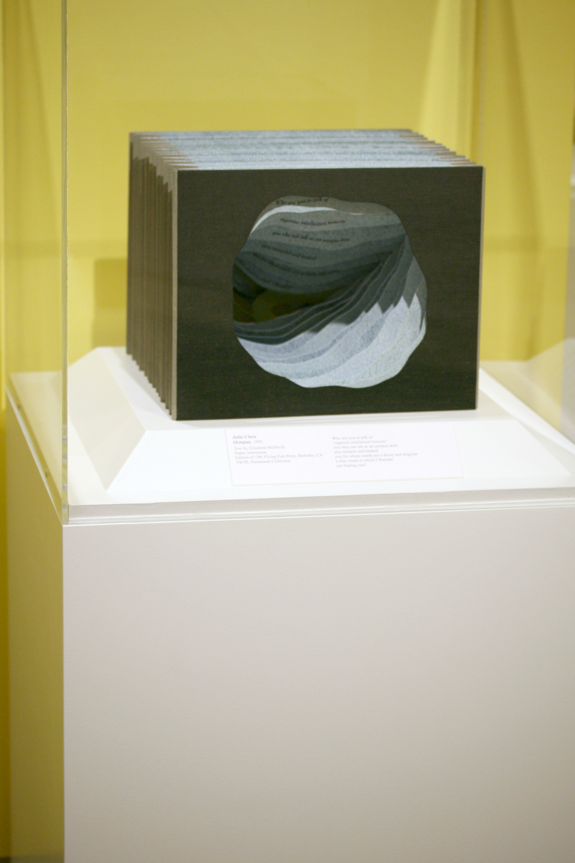
Alphabet BookNo. 2108 (1934) Corinne Ringel Bailey Linen book. Saddle-stitch, staples, H305 x w255 mm. 8 linen leaves including cover. Acquired 19 January 2023. Photos: Books On Books Collection.
Known now primarily for its Raggedy Ann books, The Saalfield Publishing Company (1900-77) published a wide range of linen books for children, naturally including numerous alphabet books with different themes. This last of four editions over 1928-34 — an alphabet of games, toys and entertainments — is one of Corinne Ringel Bailey’s more popular illustrated works. Based on library holdings, the most popular was The Adventures of Tom Sawyer published in 1931.
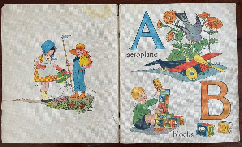
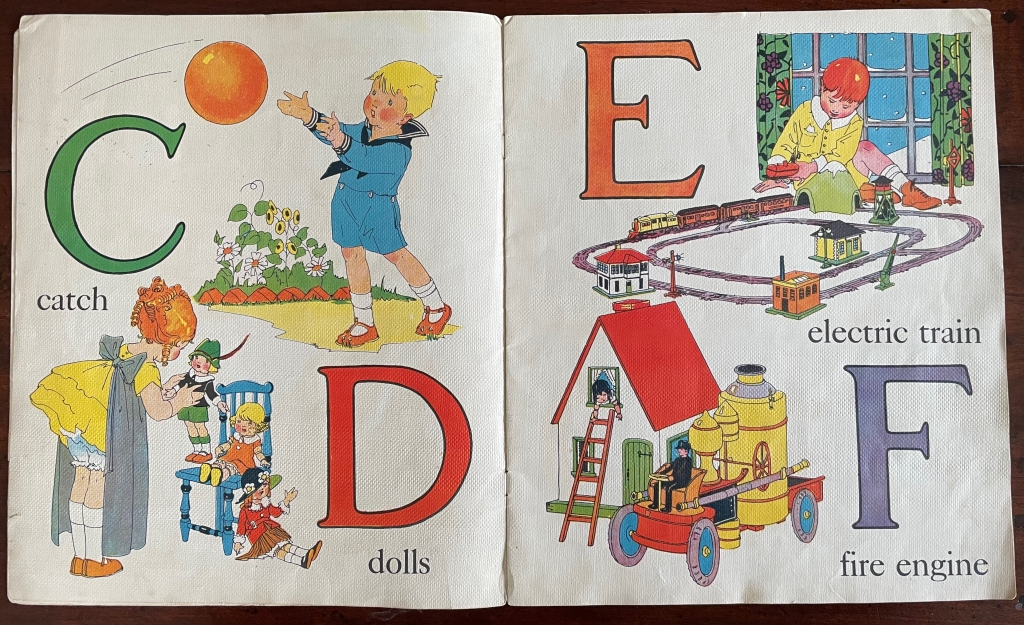
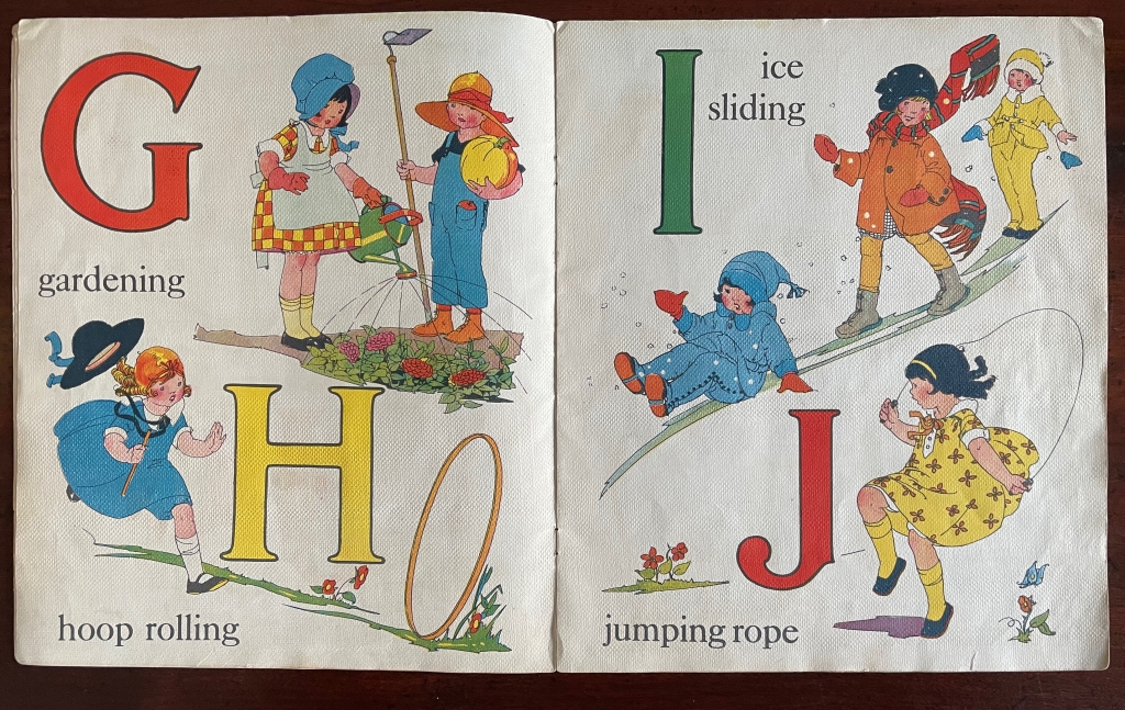
Although spanning the Great Depression, this abecedary depicts a world untouched by hardship. The “Jack & Jill” who come down this hill have a pail overflowing with letters. While the illustrations range back to inexpensive childhood activities (playing catch, hoop rolling, ice sliding and leapfrog), they also include a toy airplane, an electric train set, and a large radio cabinet for bedtime tales. Albeit not technologically advanced, both the pony cart for children under P and the tricycle under V (paying attention?) would have been luxuries — as would the replica steam-driven fire engine as well.
The booklet contains other peculiar leaps. While many of the activities have rural or suburban settings, the organ grinder was and remains an urban phenomenon. Words such as “aeroplane” and “quoits” have a British or European flavor to them (as do some of the dolls’ clothing), but a “yard” is where American children play while British children play in the “back garden”. The children’s clothing looks more American, and although animal crackers (biscuits) originated in England, the box depicted under Z (still paying attention?) looks suspiciously like the one created by Nabisco for its version of animal crackers.
Given the simplicity of most words in the book, “velocipede” seems a rather large one to include — even though it had been used since the mid-19th century on both sides of the Atlantic to cover bicycles and tricycles. Since other alphabet books of the period selected velocipede for V, the choice does not set Bailey’s apart from the crowd pedagogically. The absence of a more considered treatment of uppercase vs lowercase letters, however, does. From hornbooks onwards, most abecedaries present the uppercase and lowercase. In this respect and others, Bailey’s work is more picture book than alphabet book.
Illustration choices seem to have the upper hand. Echoing the animals in the image for Noah’s ark, there’s the clever illustration for “zoo” presenting a box of animal crackers with cookies shaped like those of Nabisco’s “Barnum’s Animals” escaping the box. Although the string attached to the box copies Nabisco’s that it introduced in 1902 for hanging the box as a treat on Christmas trees, the box is labeled “Kiddie Krackers” and does not look like the Nabisco brand box — probably to avoid trademark issues.
In fact, the intensity of colors — in the letters themselves, the bamboo umbrella’s pattern, the children’s ruddy cheeks and knees, and every image — delivers the overriding effect of this abecedary and looks back to the chromolithography of the 19th century, the woodcuts and posters of C.B. Falls and forward to such later 20th century abecedarians as Marie Angel, Sonia Delaunay, Carol DuBosch, Jean Holabird and many others in this collection.
Seven works in the Books On Books Collection represent Warja Lavater’s art: Le Petit Chaperon Rouge (1965), a later tactile version of the same work (2008), Sketchbook: Le Non-obéissant (1968), Spectacle (1990), Ourasima (1991), Tanabata (1994), and Kaguyahime (1998). The French publisher Adrien Maeght was Lavater’s most consistent champion, publishing several of her leporello works, including a now rare boxed set.
Le Petit Chaperon Rouge (1965)
Le Petit Chaperon Rouge (1965) Warja Lavater Accordion book in perspex slipcase. Slipcase: H167 x W117 x D26 mm; Book: H160 x W113 x D20 mm, closed; W4.5 m, open. 40 panels. Acquired from Patrick Wainwright Rare Books, 22 June 2022. Photos: Books On Books Collection.
Abstract shapes stand in for the characters and settings in this retelling of Little Red Riding Hood’s journey through the forest to visit her grandmother. With the only text being that matching symbols to the cast of characters and settings, the tale is told wordlessly.
Knowing the story and having the cast to hand, the reader/viewer easily follows the shapes and colors into a new and artful experience of the folktale. But what if the shapes and colors cannot be seen?
Le Petit Chaperon Rouge (2008)
Le Petit Chaperon Rouge (2008) Warja Lavater and Myriam Colin Accordion book boxed in cloth-covered board box. Box: H190 x W130 x D75 mm; Book: H176 x W122 x D70 mm. closed; W4.3 m, open. 40 panels. Acquired from Les Doigts Qui Rêvent, 30 October 2022. Photos: Books On Books Collection. Displayed with permissions of Les Doigts Qui Rêvent.
Artist Myriam Colin and publisher Les Doigts Qui Rêvent (“Fingers that Dream”) addressed this question with print, Braille, cloths of different texture, leather, blind embossed shapes, plastic filaments and sewing.
Between the printed text and Braille-rendering for the cast of characters and settings, buttons of different cloths and different embossed shapes appear. In the opening scene, the red felt button for Little Red Riding Hood is of course smaller than the orange-brown broadcloth button for Mother, who stands before the raised rectangle for the house and looks over her daughter’s head at the forest of raised dots.
Later, the wolf’s belly becomes a large sewn pouch with the slit cut by the Hunter through which Grandma and Little Red Riding can be felt, ready to escape.
The brown leather button for the Hunter unites the felt Red Riding Hood, nubby-cloth Grandmother and broadcloth Mother in a clearing in the forest. A satisfactory conclusion for the sighted and visually impaired.
Update Lavater
Seven works in the Books On Books Collection represent Warja Lavater’s art: Le Petit Chaperon Rouge (1965), a later tactile version of the same work (2008), Sketchbook: Le Non-obéissant (1968), Spectacle (1990), Ourasima (1991), Tanabata (1994), and Kaguyahime (1998). The French publisher Adrien Maeght was Lavater’s most consistent champion, publishing several of her leporello works, including a now rare boxed set.
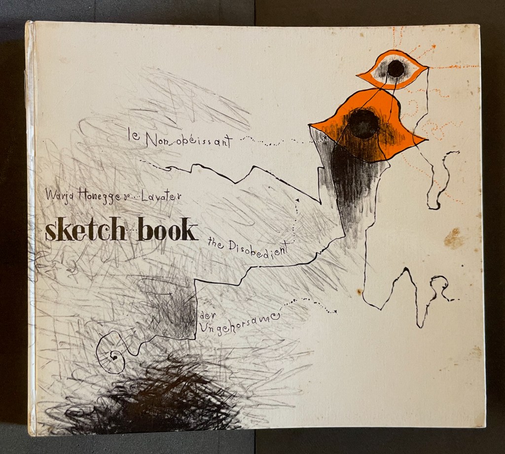
Sketchbook: Le Non-obéissant (1968)
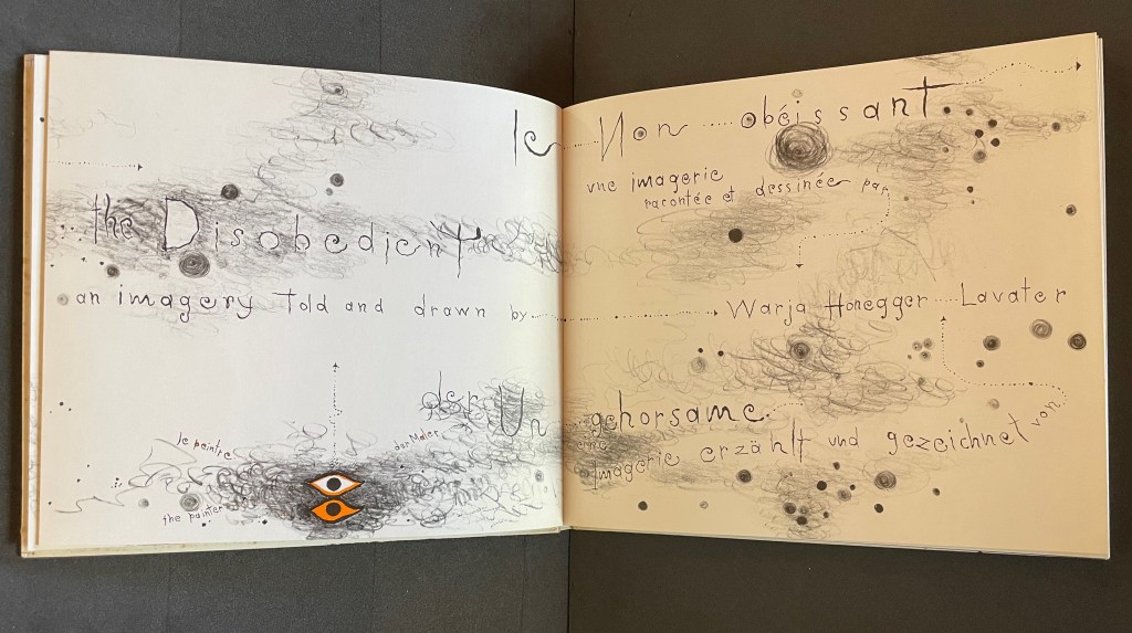
Sketchbook: Le Non-obéissant; The Disobedient (1968) Warja Lavater Casebound, printed gloss paper over boards, plain endpapers and fly leaves. H210 x W235 mm. [45] Chinese fold folios.Acquired from Ken Sanders Rare Books, 18 July 2024. Photos: Books On Books Collection.
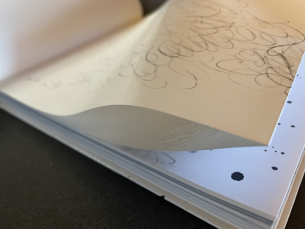
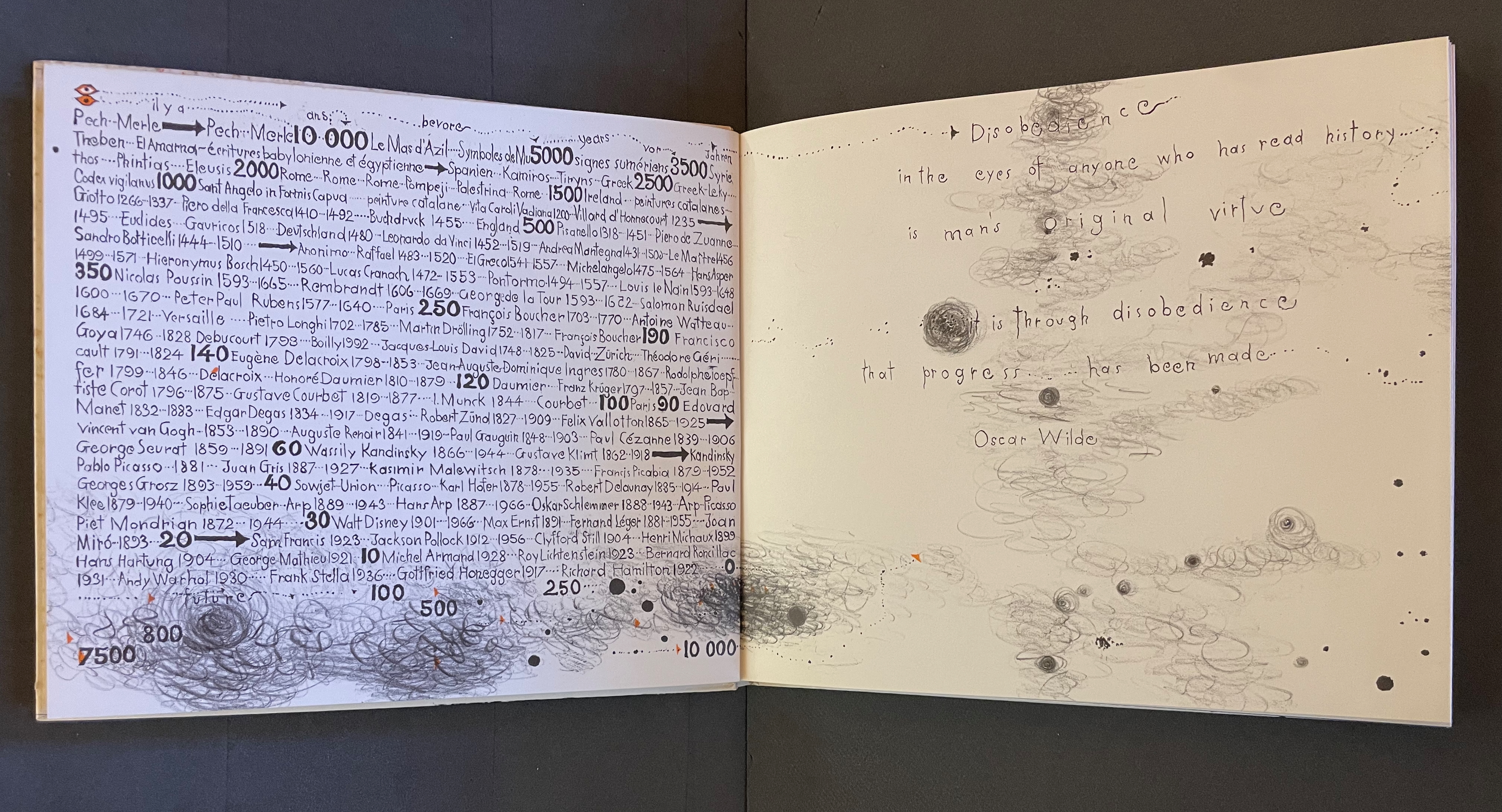
Warja Lavater’s Sketchbook opens with a page of pencil scrawling that wraps from the first side of a Chinese-fold folio, over the fold, and onto the folio’s other side, where a 10,000+ year timeline of artists appears in cramped handprint. The scribbling continues onto the next folio, embroidering Oscar Wilde’s aphorism
Disobedience in the eyes of anyone who has read history is man’s original virtue. It is through disobedience that progress has been made.
The scrawling runs over the fold of the folio and across a double-page spread to become the multilingual title page. Or rather the “subtitle becomes title page”. Look again at the cover. Wasn’t the title Sketchbook? Now it is Le Non-obéissant | The Disobedient | Der Ungehorsam, and it has acquired a new subtitle, and a strange one at that: Une Imagerie Racontée et dessinée par … |An Imagery Told and Drawn by … | Eine Imagerie Erzählt und Gezeichnet von Warja Lavater.
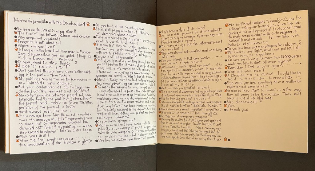
“An imagery told and drawn” captures well Lavater’s technique of abstract pictorial retelling of familiar fairy tales such as Little Red Riding Hood and Cinderella. Now, in this sketchbook, she uses it to create her own fairy tale of art history. As we are about the learn, the doodle labelled le peintre | the painter | der Maler on the left hand page above is the main character named “the Disobedient”. Reminiscent of Mel Brooks and Carl Reiner’s sketch “The 2000 Year Old Man”, the Disobedient, who has been around for almost 12,000 years, has some humorous and cantankerous answers to the interviewer’s questions about her experiences from cave art to Pop art.
“You make a living from this international art market?”
“The international art market makes a living out of me.”
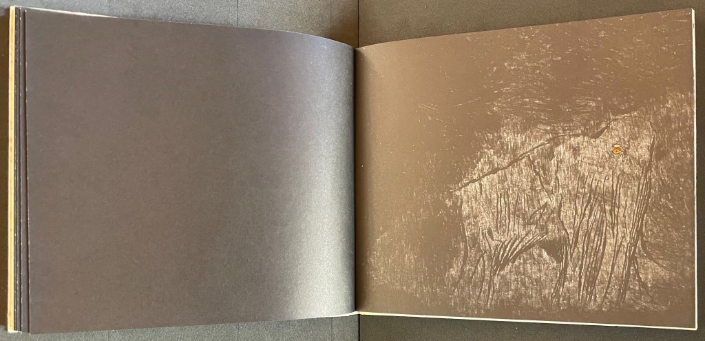
Unlike the Key pages in her fairy tales identifying the images and markings, The Disobedient’s Key page is delivered in her voice. She explains that the eye with white around its iris stands for her “exterior eye with which I look” and the eye with orange around its iris stands for her “interior eye with which I think”. Her techniques or “means of my performance” might be squiggles, geometric objects or figurative drawings. The clearly defined black dots represent her contemporaries. Orange markings represent her emotions, her ferveur and Gefuhl. All the bold numbers mark the “years more or less gone by”. But the story begins in earnest in the dark of four black folios and a fifth in which the artist appears for the first time in history followed by her first work, a drawing of a mammoth.
Spectacle (1990)
Spectacle: Pictoson Mural (1990) Warja Lavater H215 x W296 mm. 22 pages. Acquired from Antiquariat Übü, 3 August 2022. Photos: Books On Books Collection. Displayed with permission of the publisher.
Spectacle is an origin story of shapes, signs, the sounds of language, their alphabetic representation and use to form words. It is similar to the tale in Il était une fois un alphabet (1951/2009) by Souza Desnoyer and Marcelle Marquet. In both, the separate worlds of vowels and consonants join to create the alphabet. In Il était une fois, the letters already exist, have anthropomorphic shapes and engage in familiar activities like voyages, feasts, dances and processions. The narrative has scenes and settings to carry it along. Spectacle‘s origin narrative, however, letters develop from a system of signs created/discovered by a wizard. An abstract shape himself, the wizard presides over the story’s unfolding across an abstract landscape. Even though Lavater maps a written version (in eight languages) of the tale to the panels, the pictorial narrative remains challenging.
Elliptical and shamanic, the written narrative itself is challenging. It may remind the reader of Italo Calvino’s Big Bang story “Sul far del giorno” (“At daybreak”) in his collection Le Cosmicomiche (1965) (“Cosmicomics“1968), to which Shirley Sharoff paid homage in OVI: objets volants identifiés dans le ciel d’Italo Calvino, a work contemporary with Lavater’s. The verticality of Lavater’s extraordinary leporello might also remind the viewer of Blaise Cendrars and Sonia Delaunay’s La Prose du Transsibérien et de la petite Jehanne de France (1913).
Somehow, though, despite its winged emblems of words, the eleventh panel with its regimented alphabet seems visually diminished, not quite the joyous spectacle promised by the text. For that, we would have to turn elsewhere in the collection: William Joyce’s origin story The Numberlys (2014).
The Numberlys (2014) William Joyce and Christina Ellis Hardback, paper on board. H220 x W300 mm, 52 pages. Acquired from London Bridge Books, 15 April 2021. Photos of the book: Books On Books Collection.
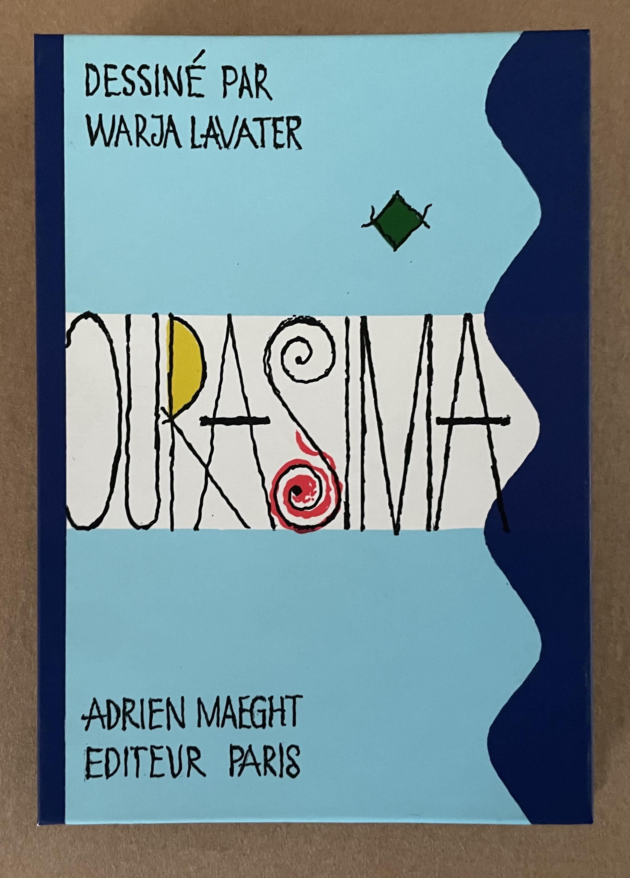
Ourasima (1991)
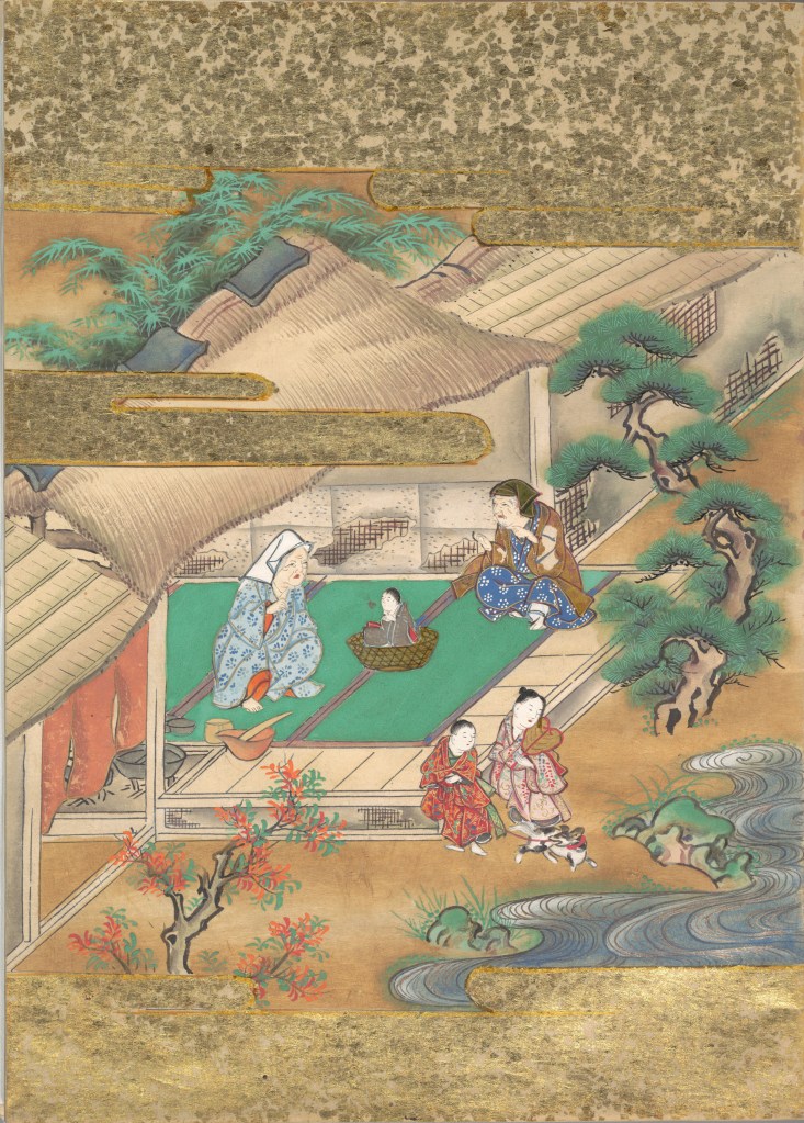
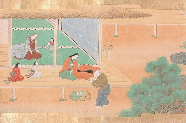
Ourasima: Une imagerie en transparence d’après le conte japonais (1991) Warja Lavater Plexiglas slipcase enclosing a double-sided accordion book. Box: H178 x W118. Closed accordion: H160 x W112 mm. Open accordion: W4624 mm. [86] panels. Acquired from Versand-Antiquariat Rainer Richner, 24 August 2023. Photos: Books On Books Collection.
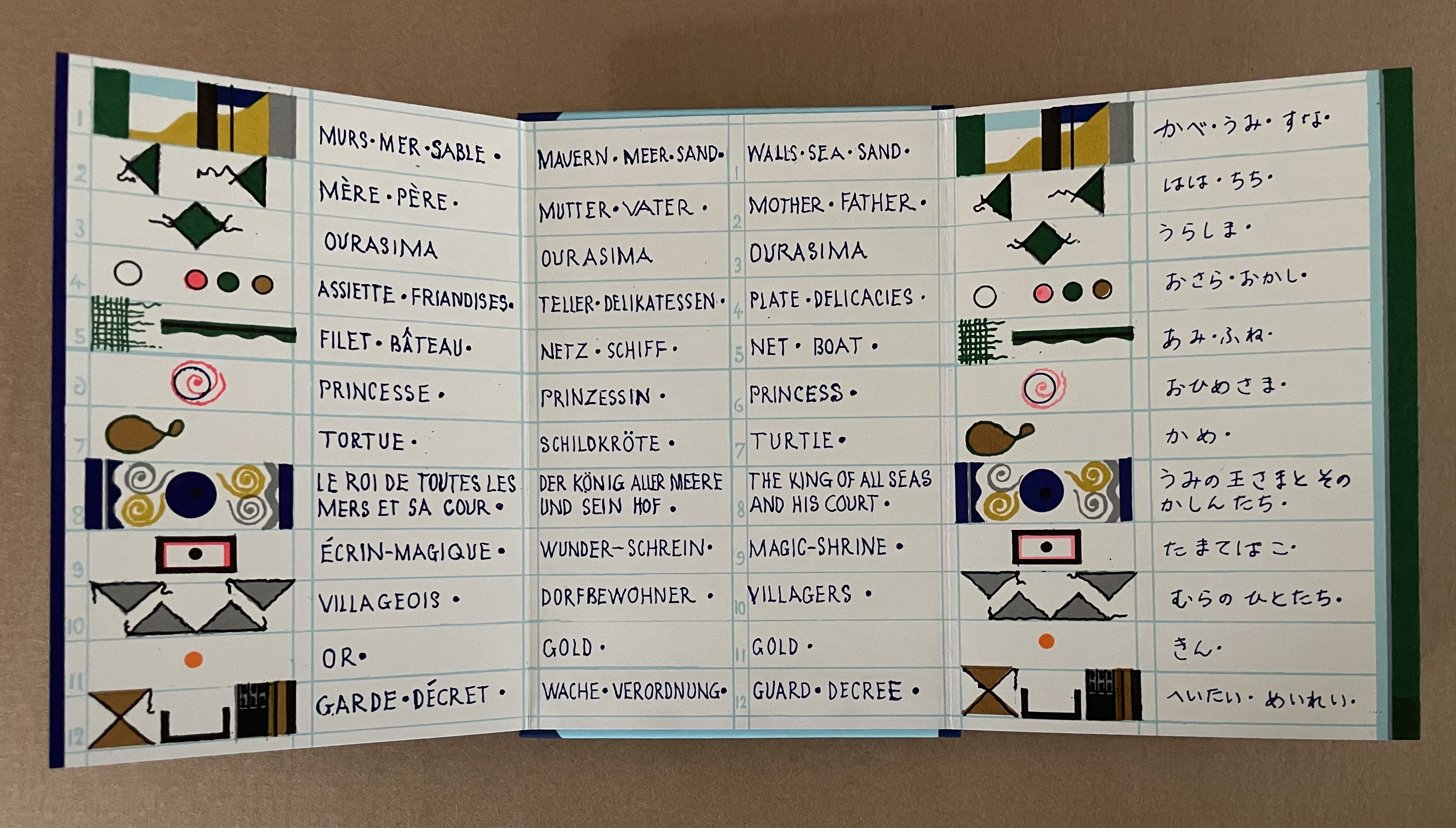
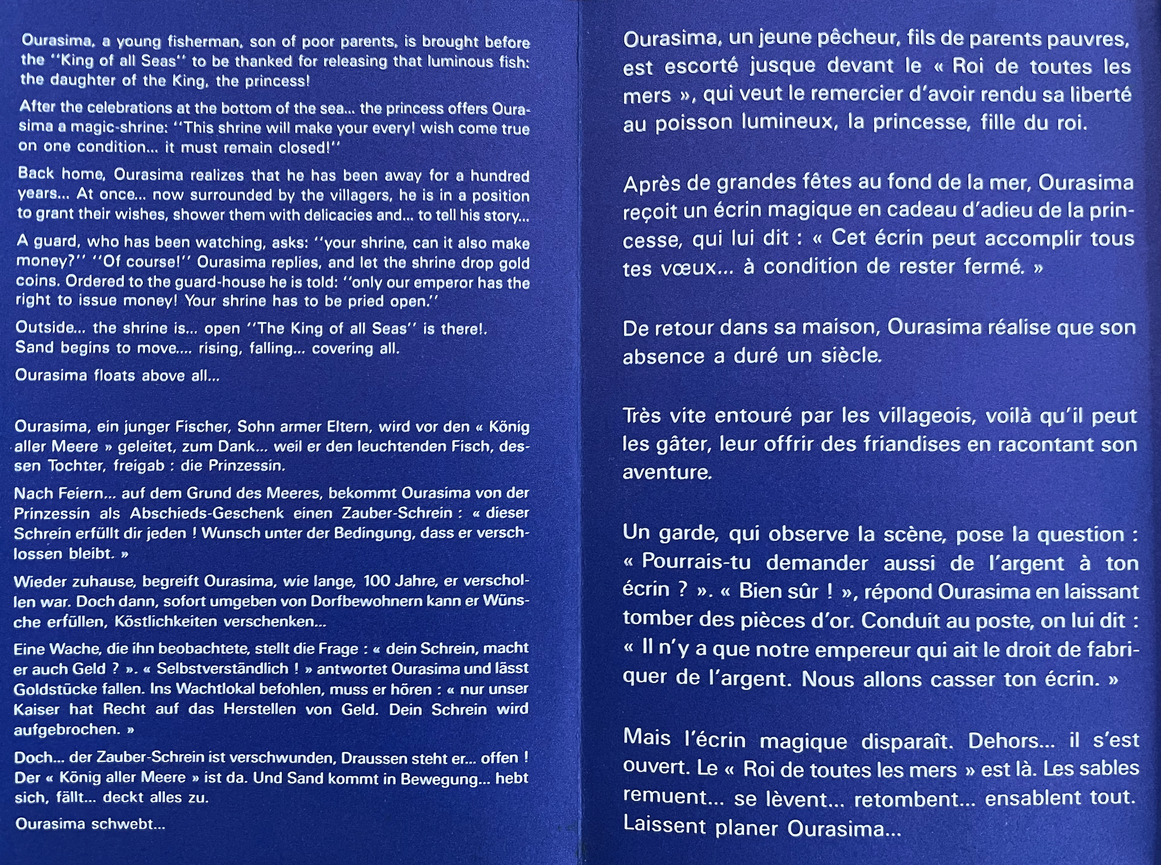
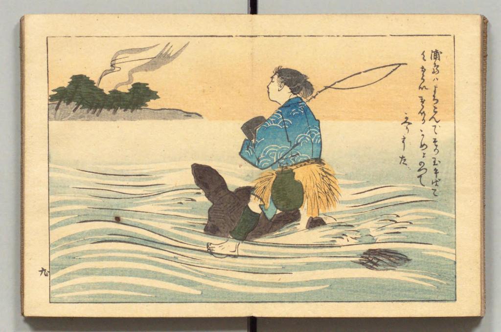
Ourasima, also known as Urasima Taro, is a Japanese folktale that reaches back to the eighth century. Lavater’s version is a cross between the stories of the Golden Goose, Rip Van Winkle and Pandora’s Box. In keeping with her treatments of Western folk and fairy tales, Lavater brackets her wordless retelling with a cast of characters, objects and their corresponding emblems at the beginning and a brief summary of the story at the end — all annotated in French, German, and English, but this time in Kanji as well.
Lavater’s version departs significantly from the traditional versions as described by the Library of Congress:
There are variations to the story depending on the intended audience and the period, and it is still known by its Japanese title Urashima Taro. It tells of a young and kind fisherman named Urashima. One day he catches a large turtle while he is out fishing. Taking pity on the turtle, he releases it back into the sea, whereupon the beautiful daughter of the god of the sea appears and tells him that the turtle was actually the personification of her. To thank him for saving her, she invites Urashima to Ryugu-jo (the Palace of the Dragon God) at the bottom of the sea. He then marries her and lives happily at the palace. Three years later he asks for permission to return to his village for a short time, because he wants to see his family. His wife gives him a box and makes him promise not to open it, as he would never be able to come back if he did. When Urashima returns home, he finds that everything has changed during those three years and that his family and his village have disappeared. He had in fact left his village 400 years before, so his parents, siblings and friends were all dead. Not knowing how to get back to the Palace of the Dragon God, he breaks his promise and opens the box, hoping that its contents can help him. After he opens the box, white smoke appears and Urashima turns into a white-haired old man and dies.
Lavater’s emblematic retelling works well with the basics such as the family home with Ourasima between his mother and father, Ourasima with his boat and fishing net, the capture and release of the princess, the turtle’s arrival and transport of Ourasima to the princess, the marriage, Ourasima’s return on the back of the turtle, and the distribution of delicacies and gold. But the “emblemism” struggles to reflect the verbal instructions of the princess and the guards’ rationale for arresting Ourasima.
Ourasima at home between his mother on the left and father on the right.
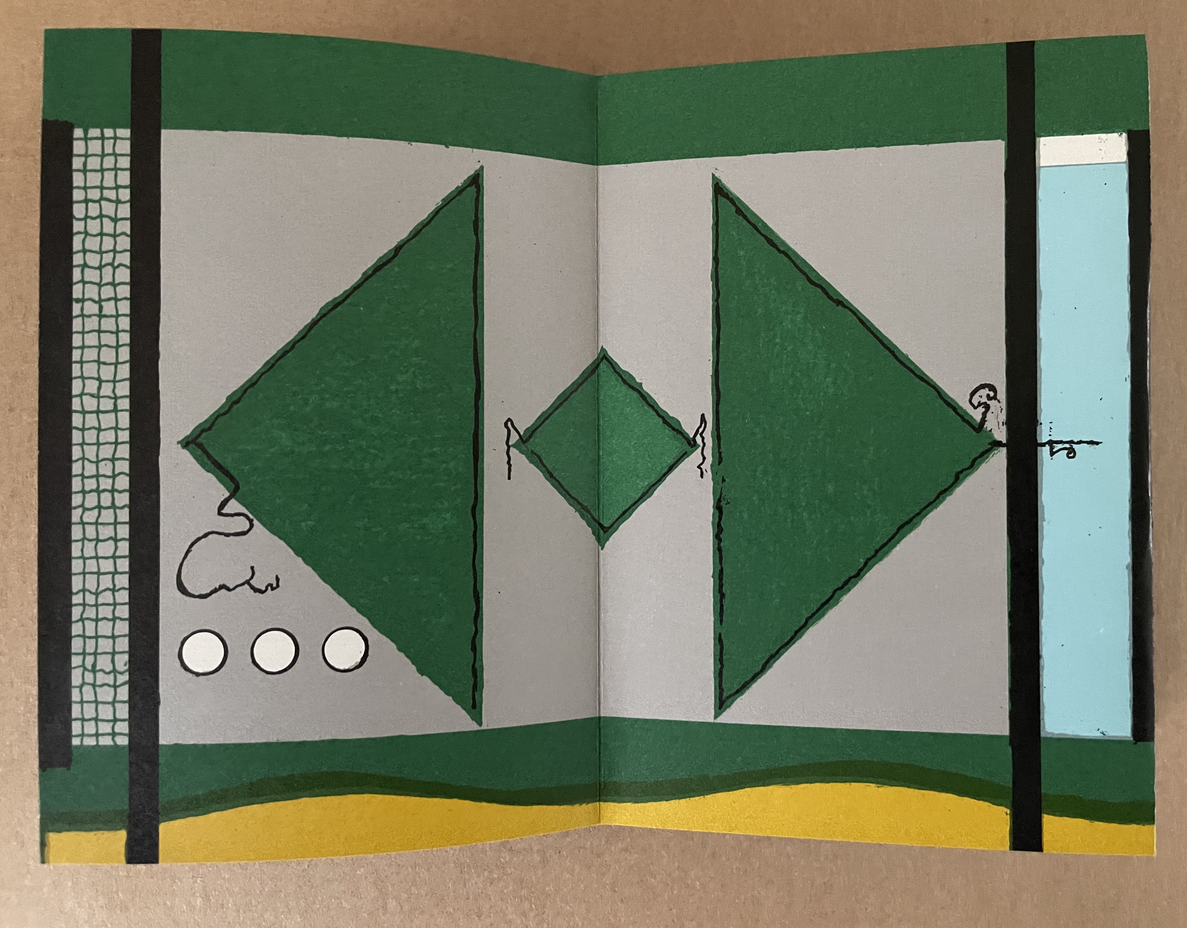
With the box forced open, chaos ensues with a whirlwind of sand dispersing everything and freeing Ourasima.Nothing in Lavater’s summary indicates that Ourasima becomes an old man at this point, but his emblem’s shift from green to white in the next panels aligns with the traditional version.
The chaos of sand freeing Ourasima and his becoming an old man.
To find Ourasima floating “above all” as Lavater’s summary indicates, we have to turn to the other side of the leporello, but the “emblemism” is difficult to follow. Has the sand, covering all, yielded to the domain of the sea? Has the empty magic box risen from the depths to float along the waves? Does the King recapture it? Has the white diamond-shaped Ourasima been transformed into a round sea creature?
Of course, text and illustrations went side by side in all the much earlier versions with calligraphy, watercolors, woodblock prints and, in the later Meiji period, with type.
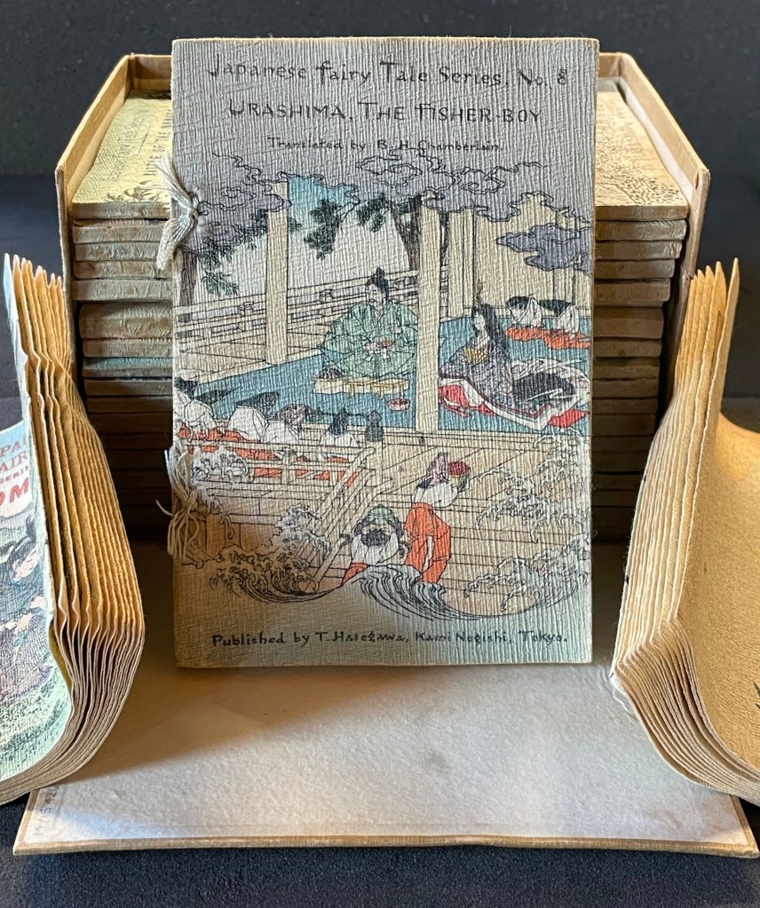
In the same period, the first translation into English appeared within a boxed set of Japanese fairy tales, printed on cloth folios and stab bound.
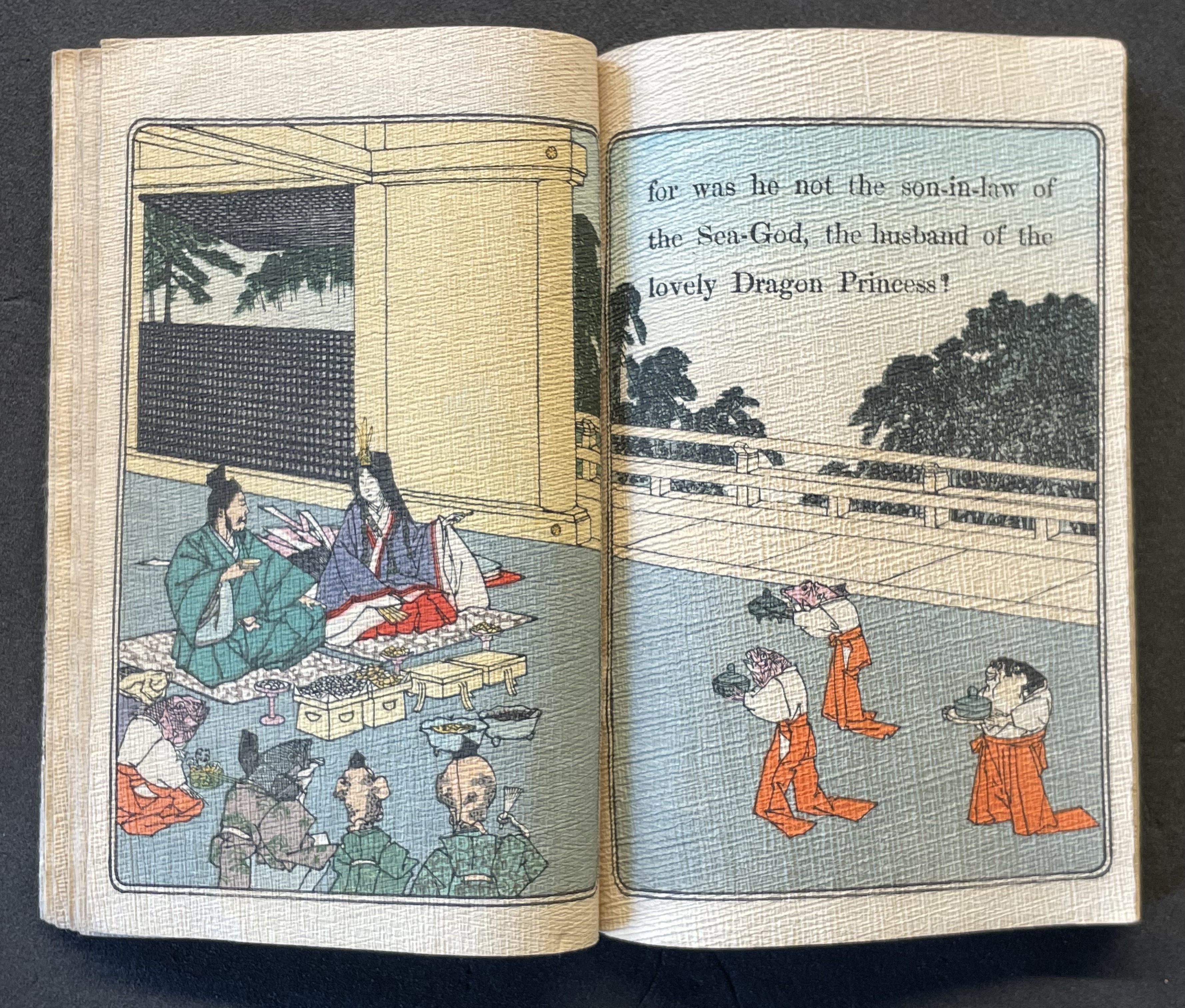
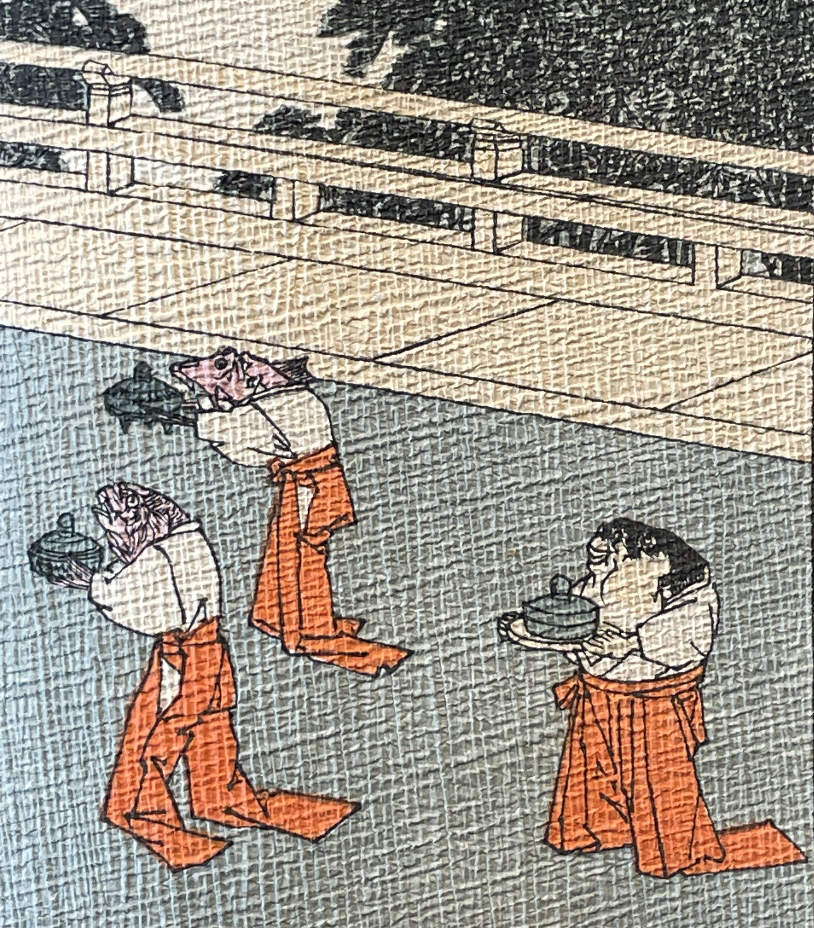
Japanese Fairy Tales Series. Bodleian Libraries. Schorr Collection f.22. The Fisher-boy Urashima, translated by Basil Hall Chamberlain, illustrated by Eitaku Kobayashi, and published by Hasegawa Takejiro (1886).
Ourasima and Otohime served in the palace by undersea servants.
In Lavater’s art, image and abstraction become the primary focus and vehicle for the narrative. As we shall see, this earliest of Lavater’s attempts with Japanese fairly tales is narratively the least straightforward, probably because of the deviations prompted by the inclusion of themes from the Golden Goose and Pandora’s Box.
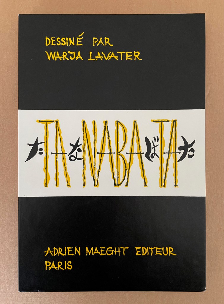
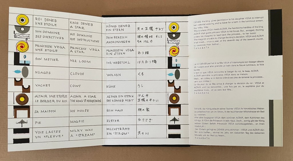
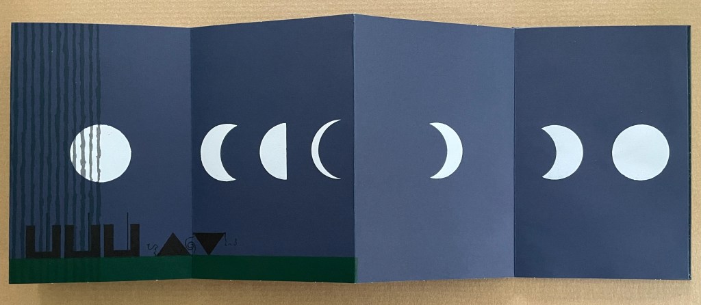
Tanabata (1994)
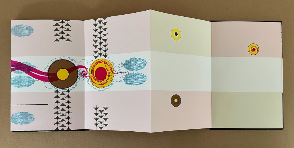
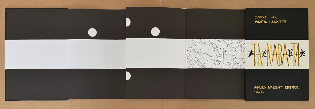
Tanabata(1994) Warja Lavater Acrylic slipcase, double-sided leporello. Slipcase: H216 x W150 mm; Book: H216 x W145 mm. 18 panels, each side, one foldout with 2 panels. Acquired from Dilat, 14 January 2025. Photos: Books On Books Collection.
Tanabata is Lavater’s version of a Sino-Japanese constellation myth about the stars Deneb, Vega, and Altair. The story is that the princess Orihime, associated with the star Vega, also known as the weaver star, falls in love with Hikoboshi, associated with the star Altair, also known as the cow-herder star. Her father, Deneb the Sky King, banishes her to one side of the Milky Way and Hikoboshi to the other side. Later he relents and allows them to meet only on the seventh day of the seventh month of the lunar calendar when a flock of magpies form a bridge for their reunion. This has become the date of the annual Star Festival in Japan.
As with Ourasima, Lavater modifies the tale. She has the King permit Orihime to bathe in the Milky Way where she first meets Hikoboshi. Additionally, the King has the magpies drag Orihime back to her weaving, but the birds persuade the King to permit the annual reunion at the Milky Way.
Reading from left to right. Altair (cowherd star) and Vega (weaver star) cross the Milky Way over the “magpie bridge” to unite during Tanabata, the annual Star Festival in Japan.
The reverse side of the leporello represents the two lovers as two solid white balls separated by the Milky Way represented as a solid white band, running right to left from the front cover. Over the course of the leporello, the lovers move to join one another on one side of the Milky Way then to separate according to their celestial fate.
Reading from the celestial map right to left: the white dots replicate the positions of Deneb and Vega above the Milky Way and Altair beneath it.
Despite the variations on the traditional tale, Tanabata is narratively more straightforward than Ourasima. With 10 emblems compared to Ourasima‘s 12, Tanabata ought to be visually more straightforward as well, but after the first two panels introducing Deneb, Vega, and Altair, every panel — except for the last two — seems just as busy as the most crowded in Ourasima. This, however, seems intentional. The last two panels stand out all the more in their simplicity mirroring the stars’ positions on the reverse side in the celestial map and the abstraction.
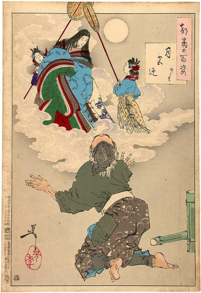
From 100 Aspects of the Moon, by Tsukioka Yoshitoshi. Late 1800’s. (Public Domain). Orihime and Hikoboshi during the night of Tanabata. Photo: Tomo Japan.
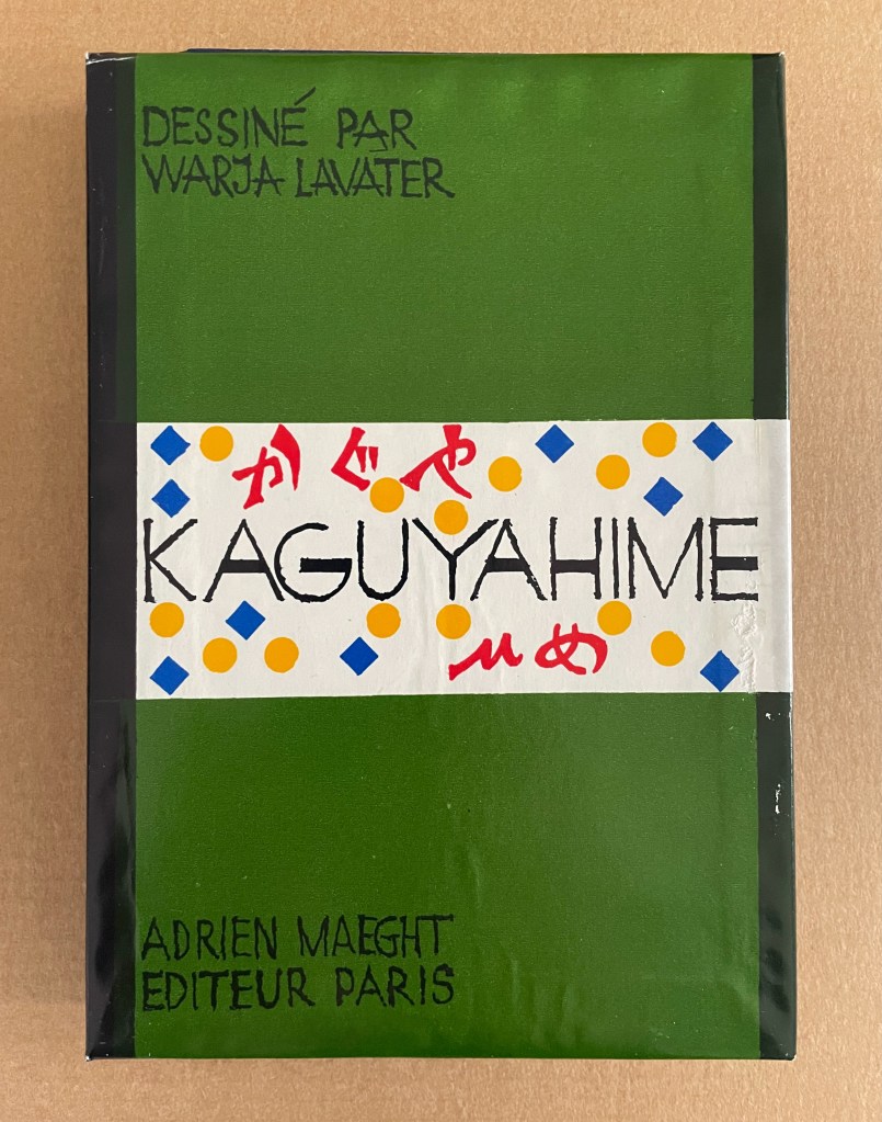
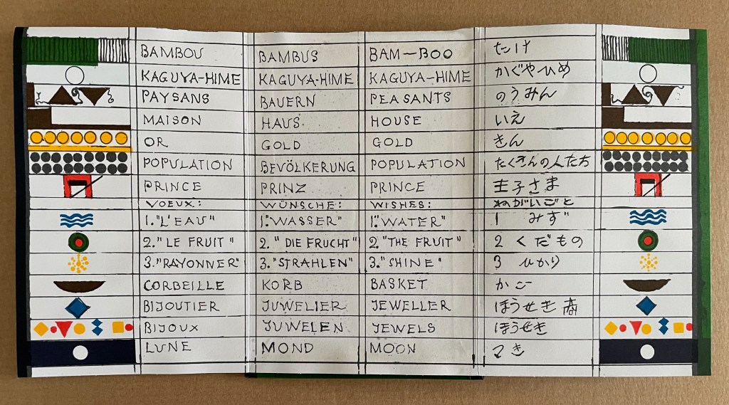
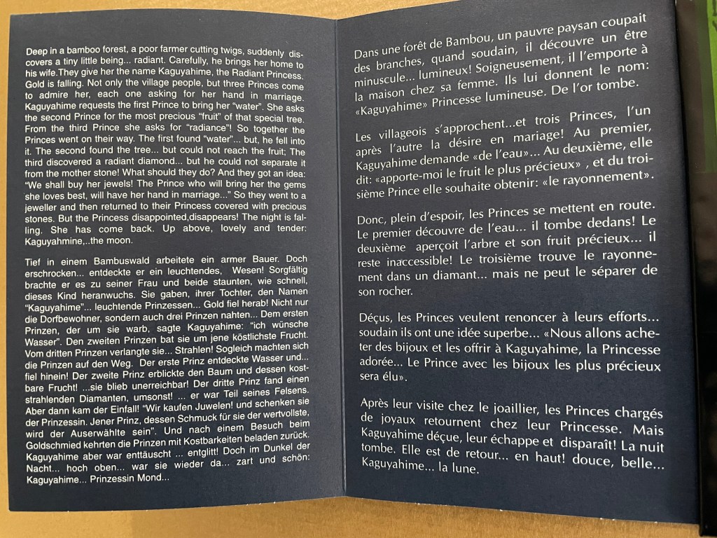
Kaguyahime (1998)
Kaguyahime(1998) Warja Lavater Acrylic slipcase, leporello. H160 x W11 mm. 44 panels. Acquired from Okmhistoire, 24 January 2025. Photos: Books On Books Collection.
With 14 emblems and with three princes whose emblems are distinguished by subtle variations, Kaguyahime seems bound to be more visually challenging than Ourasima or Tanabata.
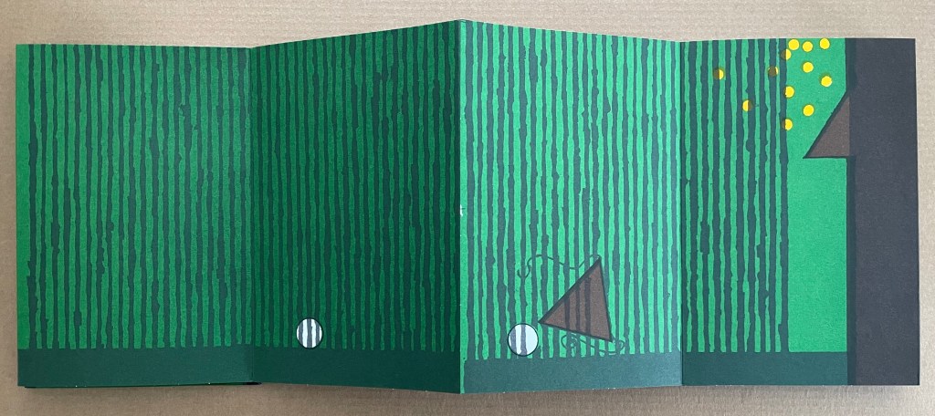
Kaguyahime in the bamboo forest. The poor farmer discovers her and takes her home, where already gold is beginning to fall.
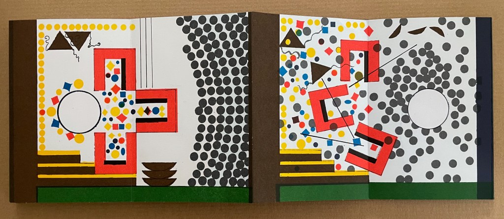
Having failed in their quests, the three princes, watched by her guardians and the gathered population, crowd around her to offer jewels and gold instead. But Kaguyahime storms away, scattering the jewels and gold, the princes and their baskets, and her guardians and the population in her wake.
On the other side of the leporello, Kaguyahime, the moon princess, watched by the princes and her guardians, rises through the bamboo forest into night sky where she waxes and wanes ever after.
Like Snow White and Sleeping Beauty embedded for centuries in Western culture, the tale of the moon princesss exerts a similar pull on Japanese culture. The princess and her story have appeared in many media including manga and anime. In 2023, the choreographer Jo Kanamori and the Tokyo Ballet produced Kaguyahime set to the music of Claude Debussy. A hybrid plant (E.acuminatum x E.dolichostemon) has even been named after the tale.
Lavater’s emblems in the Oriental tales do slightly differ from those in the Occidental tales, although the color palette does not vary. Her handling of Ourasima, Tanabata, and Kaguyahime does not seem as sure as that of Snow White and Sleeping Beauty nor of The Disobedient. Nevertheless, Lavater’s engagement across cultures speaks to one of the most recurrent influences on book artists: that of folk tales, fairy tales, and myths.
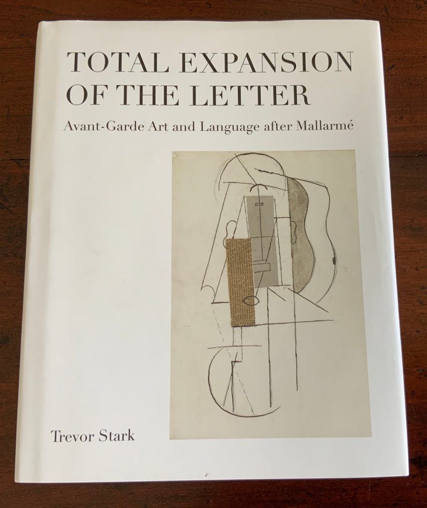
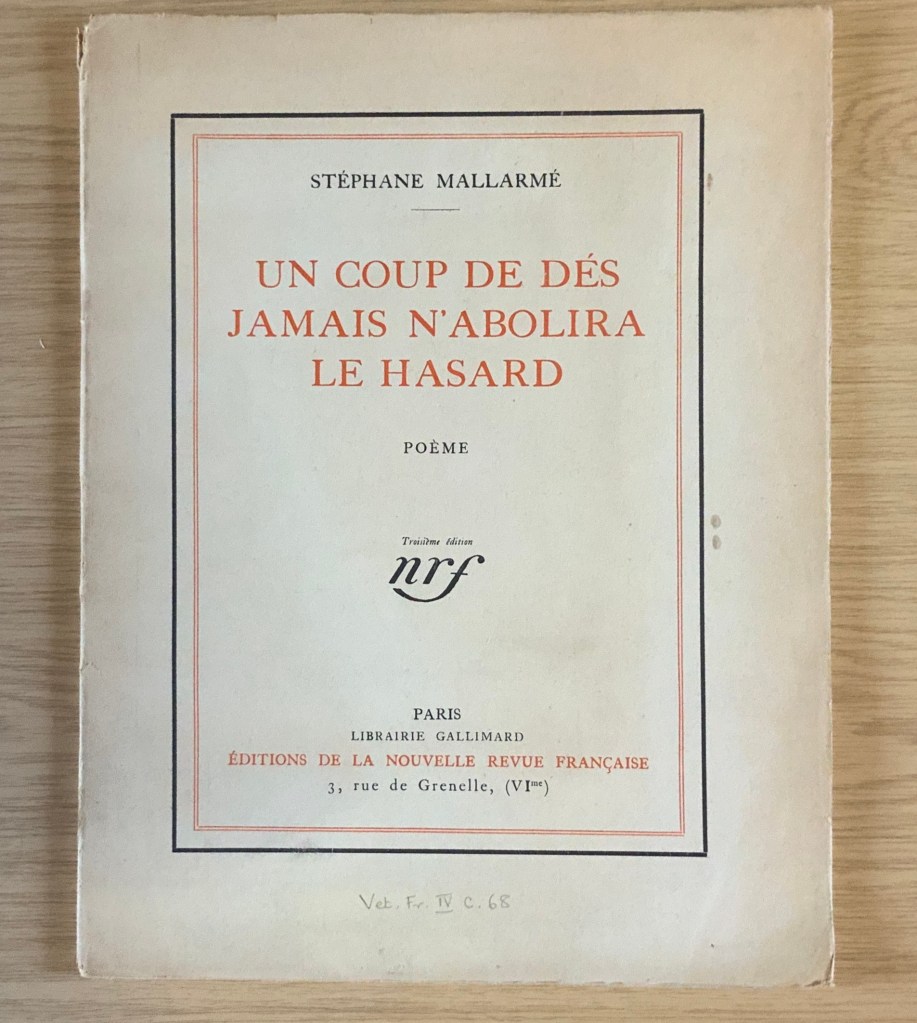
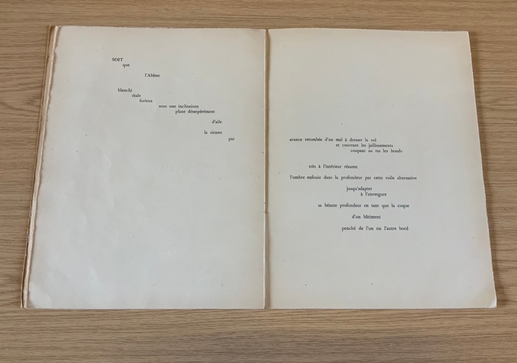
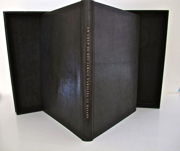
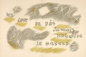
The 125th anniversary of the publication of Stéphane Mallarmé’s Un Coup de DésJamais N’Abolira le Hasard (1897) approaches, and Trevor Stark’s book is a welcome harbinger. Its title comes from Mallarmé’s essay/poem “The Book, Intellectual Instrument”:
The book, total expansion of the letter, should derive from it directly a spacious mobility, and by correspondences institute a play of elements that confirms the fiction (p. 6).
Often with Mallarmé, context is all (not to mention translation in the face of elliptical syntax!) — context is wrapped in self-enshrouded context. His seemingly cryptic sentence above becomes clearer only when the precedent to the word “it” (elle) is understood as la composition typographique from the essay/poem’s preceding paragraph, extolling the alphabet, language and typography.
Un miracle prime ce bienfait, au sens haut ou les mots, originellement, se réduisent à l’emploi, doué d’infinité jusqu’à sacrer une langue, des quelque vingt lettres — leur devenir, tout y rentre pour tantôt sourdre, principe — approchant d’un rite la composition typographique. (my emphasis)
So, the sentence is a proscription for what “the book” should get from typographic composition. Metaphorically (fictionally), the book is a total expansion of the typeset letter, or mark. As such, it should derive from the “near rite of typographic composition” a spaciousness and mobility and a play among elements that confirms the metaphor that it is a “total expansion of the letter”. Still a bit cryptic, but after all, this is what Mallarmé calls a “critical poem”, and the sentence is hardly more cryptic than the opening pronouncement: “everything in the world exists to end up in a book”.
It is a good choice of title for Stark’s endeavor. “Total expansion of the letter” juggles Mallarmé’s “heroic” vision for the book with the material world of metal type, idea with ink, the sacred with the profane. In painting, sculpture, music, dance, theater and film, the avant-gardists certainly brought together intellectuality and physicality forcefully. Stark shows that, in doing so, they also consciously and unconsciously raided Mallarmé’s open larder of skepticism about language and communication. The letter (or any mark of signifying, for that matter), scraps of newspaper, musical scores, dance notation, dresses and costumes (or lack thereof), wanted posters, financial bonds, and much more became ready objects for avant-garde art but only on the condition of their “becoming dysfunctional and incommunicative” (p. 7). Stark wants to know why.
Mallarmé’s skepticism about language and communication is Stark’s touchstone throughout: that language has an “ineradicable degree of chance built into” it; that there is inherently a suspension — a temporal gap, blank, void, lacuna, an “unfinished” state — between the sign’s expressed materiality and its meaning; and that, therefore, every act of communication as a historical and aesthetic phenomenon is like an anonymous, “impersonified” throw of the dice, “tossed into eternal circumstances’” (p.29). Applying that touchstone, he crosses the borders insightfully time and again “between the nineteenth and twentieth centuries, between dance, music, and letters, and between art history, the philosophy of language, politics, and poetics” (p. 30). Never reductive, he explores the continuities and variations between Mallarmé’s achievements and those of Paul Cezanne, Pablo Picasso, Georges Braque, Francis Picabia, Tristan Tzara, Hugo Ball, F.T. Marinetti, Marcel Duchamp, the Laban school of dance and others of the avant-garde. As he offers a reciprocal interpretation of Mallarmé and of avant-garde art, individual poems, paintings, collages, performances of dance and theater yield new clarities and sharpened expression of received assessments.
Consider Stark’s comparative reading/viewing of Mallarmé’s “Sonnet en X” (1887) and Picasso’s The Dressing Table (1910). Across eight pages of text and photographs of art, Stark helps the reader to follow Mallarmé’s “quest for a word that literally means nothing, ptyx, a word produced by the frolic of language”, a signifier that “attains a materiality and an opacity, allowing the poem to display a linguistic Void, to raise it from the latent to the patent.” The materiality to which Stark draws our attention is twofold: the bright rhymes (-yx, -ix, -ixe) that almost single-handedly drive the invention of the word ptyx and the mirror on the credenza in the poem that captures the empty room, its window and the constellation Ursa Major showing through it. Across the same pages, Stark conducts the viewer through Picasso’s painting — again a mirror, the surface of a dressing table, the drawer from which a key protrudes, a drawer handle, a glass with the long handle of a toothbrush and its bristles poking out, but all scattered into planes of reflection and refraction, their shapes “mutually implicated to the point of structural ambiguity”. Then, he draws them together: “In Mallarmé and Picasso, representation destroyed the object in order to proclaim its own mute materiality and, thereby, regain continuity with the world by becoming simply one more thing within it”(pp. 101-108).
In pursuing these reciprocal readings of Mallarmé and his avant-garde descendants, Stark keeps a bright light on the “between” — between an object and its reflection, between a word’s or sound’s utterance and its meaning, the blanks between words, the blanks between brushstrokes or those between them and the boundary of the painting, between the cosmic and domestic, between one media and another when brought together in a work, between the individualism of subjective imagination and impersonal modes of production, between author/artist and word/image and reader/viewer. His term for these spaces is intermedial. In her endorsement of Stark’s book, Julia Robinson (New York University) calls his neologism “luminous”. The term refers to “the zone of indeterminacy between mediums, social practices, and temporalities” into which Mallarmé found himself outwardly propelled even as he inwardly sought “absolute language”.
Looking back on the avant-gardists and his own contemporaries, Dick Higgins — the late twentieth century language-, book-, and publishing-artist — rejuvenated Samuel Taylor Coleridge’s term intermediation, a neologism similar and related to intermedial. It is not the same thing as intermediality or mixed media. As Higgins expressed it, “Many fine works are being done in mixed media: paintings which incorporate poems within their visual fields, for instance. But one knows which is which. In intermedia, on the other hand, the visual element (painting) is fused conceptually with the words” (p. 52). It can be argued that works of intermedia are one way in which artists address intermediality — that zone of indeterminacy.
The argument is ultimately a phenomenological one, a perspective that Stark embraces. When he applies the ideas of Edmund Husserl, Martin Heidegger, Maurice Merleau-Ponty, Theodor Adorno, Maurice Blanchot and others to Mallarmé’s poems and the artistic expressions of his “descendants”, both the philosophers and the artists become more accessible. Consider this passage summarizing Maurice Blanchot’s account of the history and function of language and its four stages:
The first was that of an Adamic or nomenclaturist model of language, which conceived words as names for the objects of the world. The second, dominant from Plato to Descartes, was the idealist model in which language constituted the link between sensible reality and the eternal realm of the Idea, and thus the guarantee of our ‘entrance into the intelligible world.’ [fn 223] Third, the ‘expressionist model’ of Hegel and Leibniz considered language itself the embodiment of what is sayable, thinkable, and possible at any given historical juncture, serving, therefore, as the medium of the progress of Spirit. Finally, illustrated with a quote from Valèry, the fourth stage was the ‘dialectical function of discourse,’ in which language regained an ‘essential power of constestation’ in the negativity of modern literature:
‘Literature seeks to revoke from language the properties that give linguistic signification, that make language appear as an affirmation of universality and intelligibility. But it doesn’t arrive at this goal (if it does arrive at this goal) by destroying language or through contempt of its rules. It wants to render language to what it believes to be its veritable destiny, which is to communicate silence through words and to express liberty through rules, which is to say to evoke language itself as destroyed by the circumstances that make it what it is.’ [fn 224] (pp. 110-11)
Clearly that passage links back to the touchstone of Mallarmé’s skepticism about language and communication. The strength of the touchstone is that it can also be fruitfully applied to the numerous works of homage to Mallarmé from contemporary book artists such as Jérémie Bennequin, Michael Maranda, Michalis Pichler, Eric Zboya and many others. Likewise it can used to shed light on the “material text” approach to understanding book art. A case in point is the first issue of Inscription: the Journal of Material Text – Theory, Practice, History, a work of book art in its own right.
Consider the hole drilled through the center of the journal. Does it not echo Stark’s reminder of Braque’s citing Mallarmé’s utterance: “‘The point of departure is the void'” (p. 88)? Consider the journal’s spatial challenge to the act of reading (a dos-à-dos binding, a text block that rotates around that hole). Does that not echo this passage from Total Expansion of the Letter?
But what remains after the ‘suspension’ of the represented object and the objectification of the means of representation? For Mallarmé, the ‘residuum’ was the act of reading itself, conceived not as a process of cognitive reconstruction, but instead as a gamble on the very possibility of forging meaning out of opacity and contingency of linguistic matter. As Mallarmé wrote in ‘The Mystery of Letters’
‘To read —
That practice —
To lean, according to the page, on the blank, whose innocence inaugurates it, forgetting even the title that would speak too loud: and when, in a hinge [brisure], the most minor and disseminated, chance is conquered word by word, unfailingly the blank returns, gratuitous earlier but certain now, concluding that there is nothing beyond it [rien au-delà] and authenticating the silence –‘” (pp. 108-109).
Not since Anna Sigrídur Arnar’s The Book as Instrument: Stéphane Mallarmé, the Artist’s Book and the Transformation of Print Culture (2011) has there been as useful a tool for appreciating Mallarmé, art and artist’s books as Trevor Stark’s Total Expansion of the Letter. On the eve of the 125th anniversary of Un Coup de Dés, it will be interesting to see whether Stark and others extend his work to art and book art after the avant-garde.
Higgins, Dick, and Hannah Higgins. “Intermedia“, republished in Leonardo, Volume 34, Number 1, February 2001, pp. 49-54.
McCombie, Elizabeth. Mallarmé and Debussy: Unheard Music, Unseen Text (Oxford: Oxford University Press, 2004). It would have been interesting to see how Stark would relate his exploration with McCombie’s exploration of Mallarmé’s views on poetry and music.
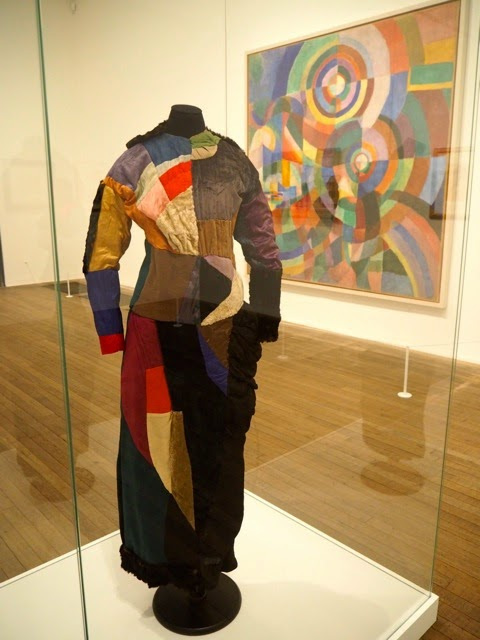
It was 1913. Stravinsky’s ballet “The Rite of Spring” debuted. The Cubists, Constructivists, Suprematists, Futurists all bound onto the art scene, many of them showcased in the Armory Show in New York that year. The Nouvelle revue française (NRF) attempted the first book form of Stéphane Mallarmé’s Un Coup de Dés Jamais N’Abolira le Hasard, which revived that 1897 typographic disruption of the page and prepared the ground for dozens of works of book art since. And Blaise Cendrars and Sonia Delaunay-Terk announced and published what they called le premier livre simultané. It was La Prose du Transsibérien et de la petite Jehanne de France.
From the Bodleian Library collection Photos: Books On Books
From the National Art Library, Victoria & Albert Photo: Books On Books
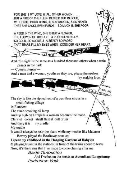
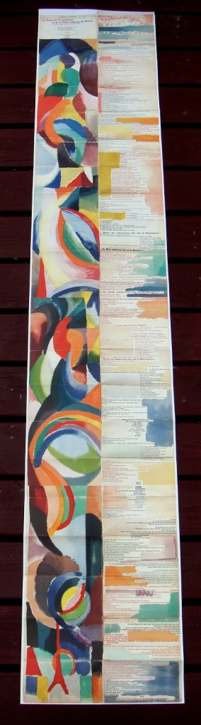
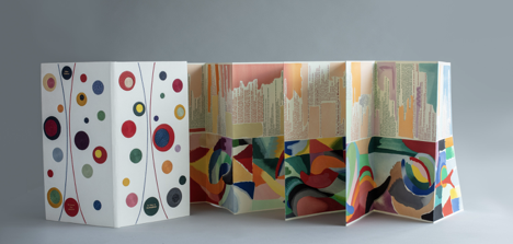
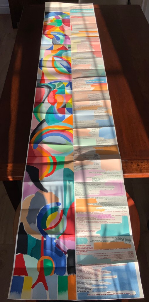
Like Mallarmé, Cendrars disrupts the page with multiple typefaces (thirty distinct ones in his case) and scattered placement of lines and stanzas. But La Prose presents an even more physical and structural disruption of the page and book than Un Coup de Dés. Unlike the latter, La Prose unfolds — twice — in an accordion format to over two metres in length or rather height since the text descends on the right and ends alongside the interlinked images of the Eiffel Tower and a Ferris wheel at the foot of the accordion. Cendrars and Delaunay had aimed to produce 150 copies of La Prose because, placed end to end, that would have equalled the Eiffel Tower’s height.
More than this monumental, sculptural, typographic and physical disruption of page and book, La Prose presents a temporal disruption. By le premier livre simultané, Cendrars meant a simultaneity of the verbal and visual — the way that text and image appear all at once — en un éclair. Early Bohemian that he was, Cendrars was co-opting a fair bit of artistic and literary theorising by the Cubists, Futurists and others. Most important and of the moment was his co-opting of Robert and Sonia Delaunay’s colour theory of simultanéisme. The “couleurs simultanées de Mme Delaunay-Terk” had also appeared in her 1913 robe simultanée and paintings. Building on a French scientist’s exposition on how perception of colours changes depending on the colours around them, the Delaunays claimed that rhythmic, musical and spatial synaesthetic elements were also at play. Sonia Delaunay asserted that the artwork produced for La Prose was not in response to reading the poem but hearing it from Cendrars. (Listen to it for yourself here.)
In presenting the adolescent Cendrars travelling physically eastward on the Transsibérien, travelling mentally to Flanders-Basle-Timbuctoo-Auteuil-Longchamps-Paris-New York while still registering the landscape outside, seeing the maimed and wounded returning from the front of the Russo-Japanese war, conversing with a prostitute named after Joan of Arc, doubting himself as a poet, and so on until a sudden transposition back to Paris, the process poem juxtaposes the sacred and profane, past/present/future, stationary and dynamic, national and international in outlook and locale. In short, simultaneously. In a format that is bound and unbound, the poem mirrors the swirling, interacting shapes and colours beside and in which it moves — and vice versa.
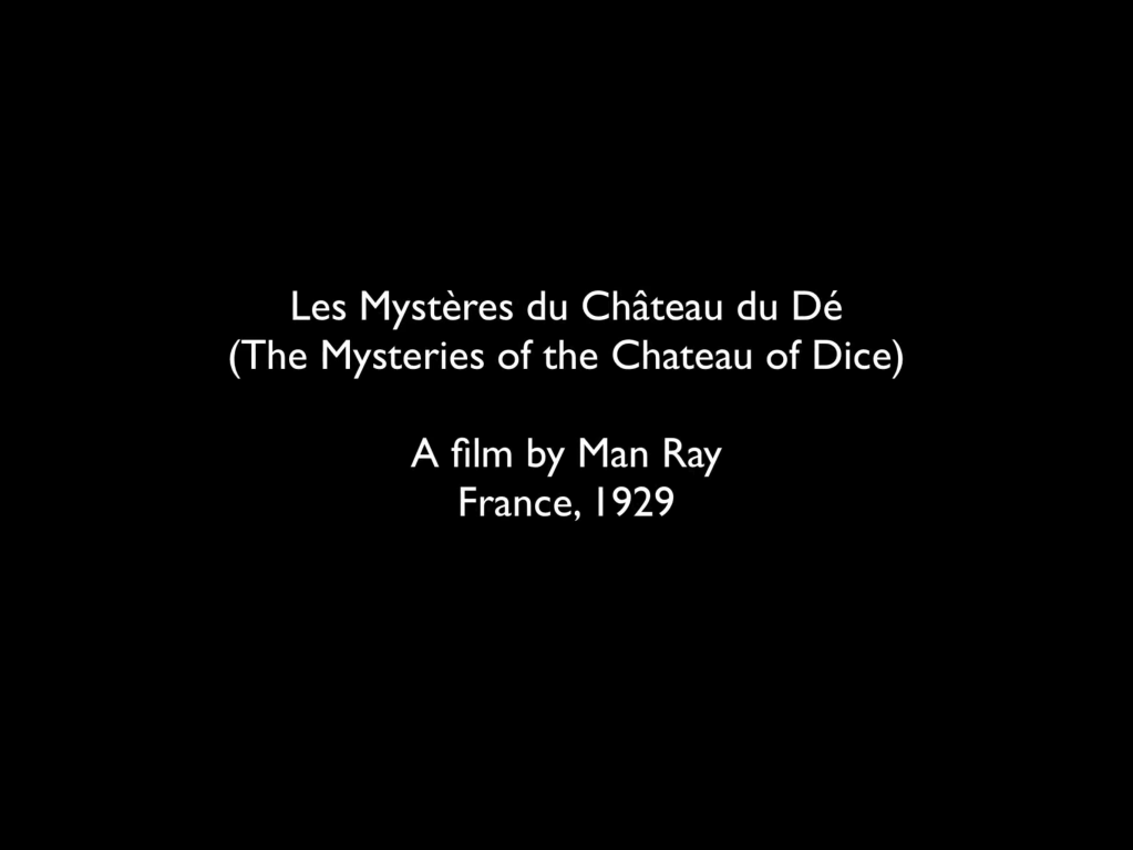
However more disruptive of the page and book La Prose may have been, it did not inspire the profusion of direct re-interpretations (or appropriations) that Un Coup de Dés prompted from artists such as Jérémie Bennequin, Ellsworth Kelly, Man Ray, Didier Mutel, Michel Pichler, Eric Zboya and dozens of others.
Not until 2001 did a re-versioning of La Prose appear. Tony Baker and Alan Halsey published an English translation and codex re-formatting. Its black on white imagery is reminiscent of the Russian Futurists, the type is monochromatic, and the typefaces, fonts and weights vary but not as much as in La Prose.
Baker and Halsey note in their colophon:
So far as we’re aware no translation of the poem into English has ever been attempted to give a sense of Cendrars and Delaunay’s original conception, not the least reason for which may have been the difficulty until recently of seeing the first edition, even in reproduction. — Prose of the Trans-Siberian and of the Little Jeanne de France (Sheffield: West House Books, 2001)
A well-founded lament — at least for the book art community. Not until 2000 had there been a reduced-scale reproduction of La Prose. It appeared in Granary Books’ A Book of the Book by Jerome Rothenberg and Steven Clay across a four-page foldout in the embrace of Ron Padgett’s English translation. Only in 2008 was there a full-scale, full-colour offset facsimile, produced by Yale University Press with an appended translation. It is now out of print.
With her work La Prose du Transsibérien Re-creation (2019), Kitty Maryatt has changed all that. With this deuxième livre simultané, she has more than caught the echo of Cendrars/Delaunay’s original and its arrival. As scholar, artist and veritable impresaria, she has reinvigorated the book art/arts community with the legacy of La Prose.
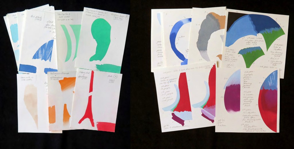
Her blogspot documents the research and production with rich details about sourcing the type, learning about stencil-cutting from Atelier Coloris (one of the few remaining businesses devoted to pochoir), determining the recipes for the ink colours, testing papers (Zerkall Crème, Biblio, and Rives HW), creating a census of the existing 1913/14 originals and their locations — all that and more, including the use of bacon fat and a wine bottle filled with lead shot. She also organized a documentary by Rosylyn Rhee: “The Pochoir Re-creation of La Prose du Transsibérien”. It brings the importance of the original and this re-creation to life in the expressions and voices of prominent collectors, librarians and scholars, artists, rare book dealers and the project’s funders.
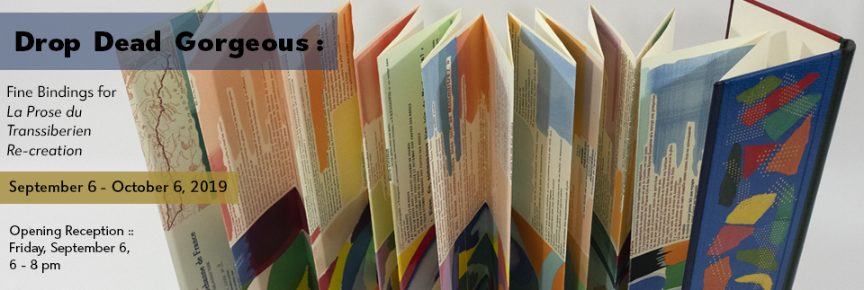
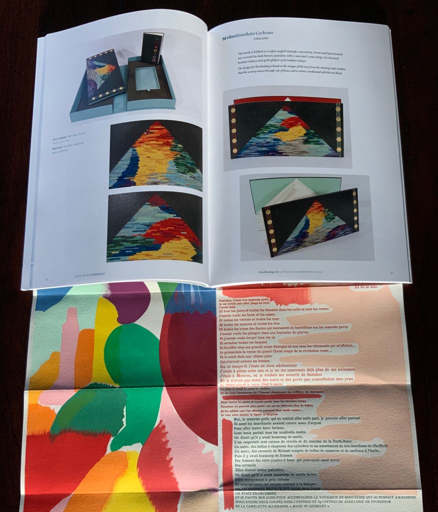
In addition, Maryatt has been either a contributor to, or the motivating force behind, several symposia and exhibitions such as “Paris 1913: Reinventing the Artist’s Book” (at the Legion of Honor Museum in San Francisco, 2018) and “Drop Dead Gorgeous”. The latter is a travelling exhibition resulting from invitations to twenty-four book artists and designer bookbinders to design and create bound copies of La Prose du Transsibérien Re-creation. For the San Francisco venue, Maryatt prepared a workshop on traditional French pochoir and provided text for the exhibition catalogue (available from the online store of the San Francisco Center for Books).
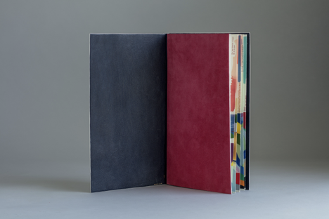
Monique Lallier’s fine binding of La Prose du Transsibérien Re-creation Photos: Courtesy of Monique Lallier
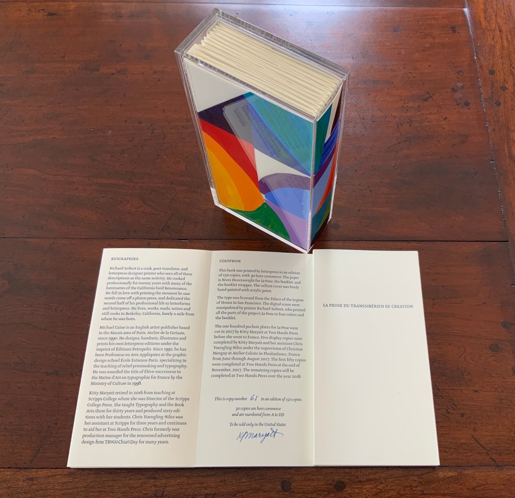
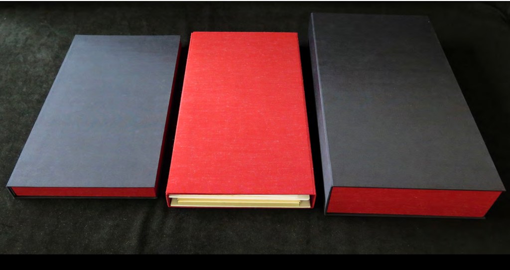
The pinnacle of Maryatt’s efforts, of course, is the standard and deluxe editions of La Prose. Both editions consist of 4 pages, glued together to create the tall single page. For the standard edition, the page is folded into 21 sections and loosely placed in a painted vellum cover with a booklet describing the project and production. An acrylic slipcase houses the covered bundle.
The standard edition Slipcase: H195 x W108 x D45 mm. Wrapper: H182 x W97 x D35 mm. Leporello: H81 x W95 mm (closed). H1954 x W160 mm (open). Booklet: H81 x W94 mm (closed), W1055 mm (open). Photo: Books On Books
Photo: Books On Books
Photos: Books On Books
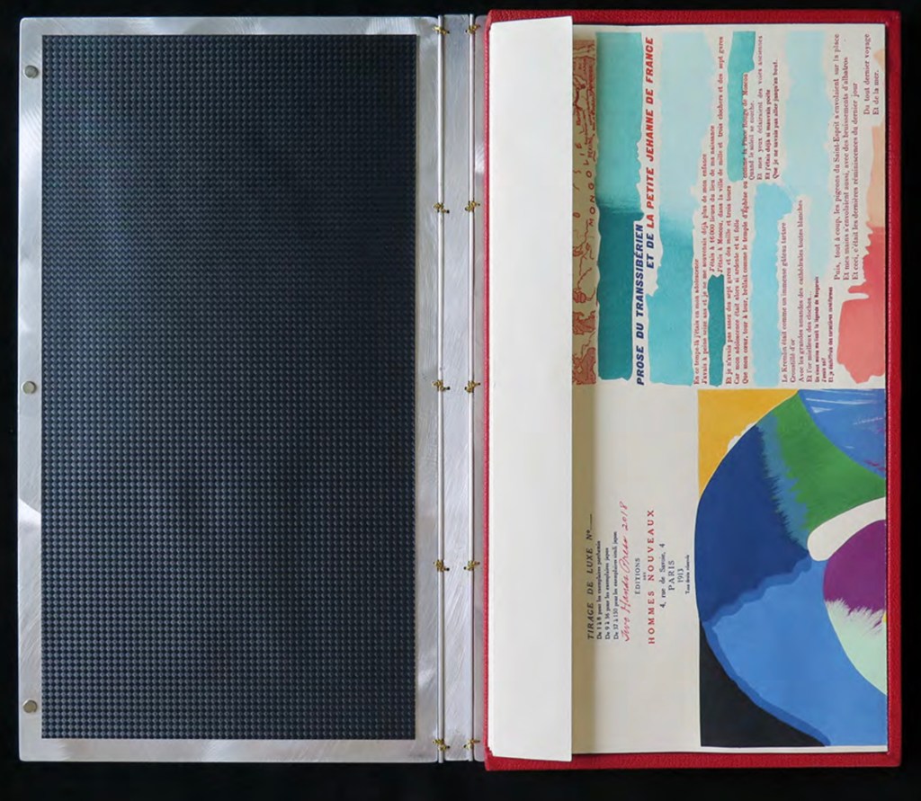
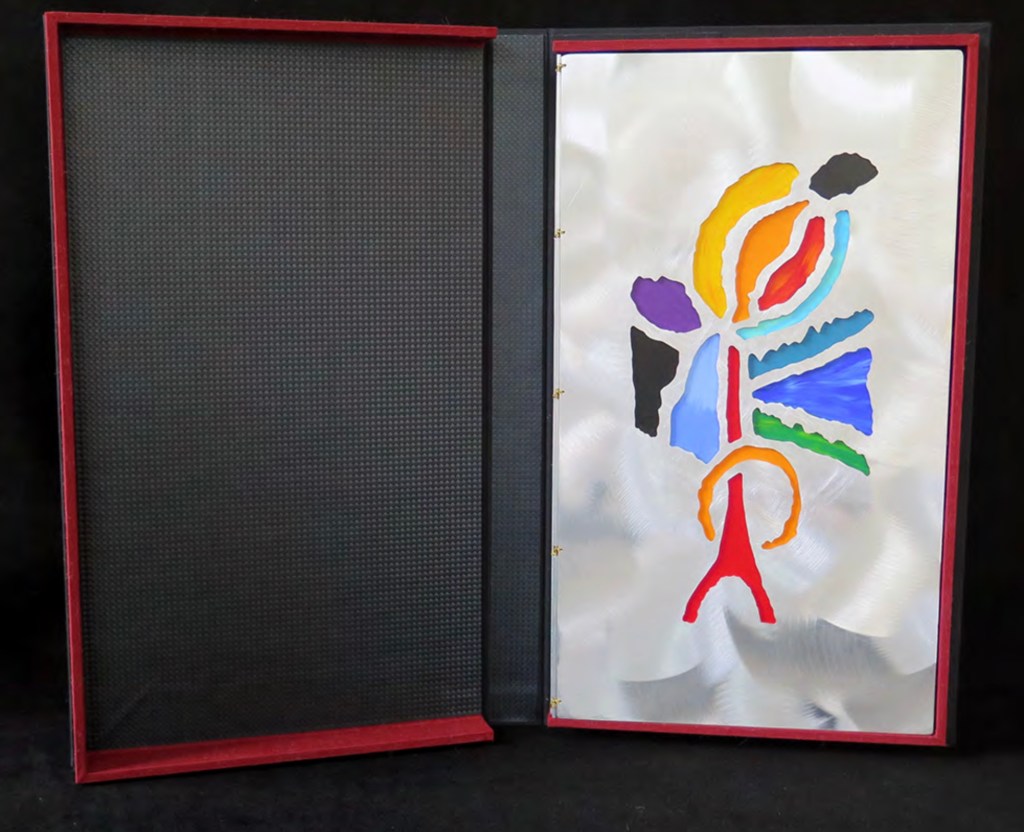
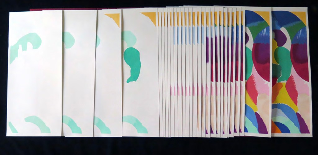
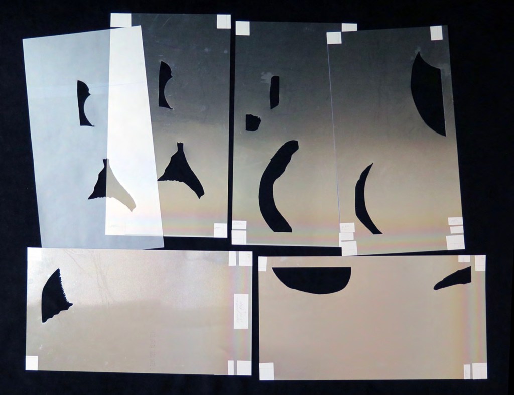
For the deluxe edition, the single page is left double-wide, accordion-folded double-tall between aluminum covers and housed in a clamshell box. A separate case holds the painted vellum cover, colour cards, Sonia’s visual vocabulary, 27 progressives for page one, 5 pochoir plates with tracing paper and registration system, the booklet with introduction and colophon, and the list of 30 typefaces Cendrars used. A large clamshell box houses this separate case and the boxed book. The colour cards include the recipe for mixing the gouache, and Sonia’s visual vocabulary shows the numbered steps of operations. The progressives for page one show the steps for doing the pochoir stencils and handwork.
The deluxe edition Photos: Courtesy of Kitty Maryatt
Any institution with a focus on book art or the graphic arts should seek out the standard edition of La Prose du Transsibérien Re-creation. Any institution with a focus on teaching and practice in those domains should seek out the deluxe edition. As indefatigable as Cendrars and as productive as Delaunay, Kitty Maryatt has provided the basis of master classes for generations. Now it is up to the book art community to respond as it has to Un Coup de Dés.
A shorter version of this essay appears in Parenthesis 39, Fall Issue, 2020.
Further Reading
Ashton, Doré. “On Blaise Cendrars. . . But I Digress.” Raritan 31, no. 2 (2011): 1-42,164. An entertaining extended anecdote sketching Cendrars and his milieu.
Gage, John. Colour and Meaning : Art, Science and Symbolism(Berkeley, CA: University of California Press, 1999). Despite her works’ better quality and representation of simultanéisme, Gage focuses on Robert and mentions Sonia only in passing or footnotes. (Telling that the Tate chose Sonia not Robert for a retrospective in 2015.) Nevertheless, there are passages that place her work in context.
P.198: Chevreul’s “privileging of the harmony of complementaries was essentially in the context of ‘painting in flat tints’, a method developed largely in the decorative arts, but which was increasingly integrated into many branches of French painting in the second half of the nineteenth century …”.
P.254 “When, probably early in 1912, Delaunay wrote to Kandinsky outlining his theories, he had shifted to a rather different approach, claiming: ‘the laws I discovered … are based on researches into the transparency of colour, that can be compared with musical tones. This has obliged me to discover the movement of colours.’ …
P.256 [Delaunay’s] Essay on Light, which was composed in the summer of 1912, attributed the movement of colours less to transparency than to the qualities of hue: ‘Movement is given by the relationship of unequal measures, of contrasts of colours among themselves which constitute Reality. The reality has depth (we see as far as the stars), and thus becomes rhythmic Simultaneity.’”
P.257 “For Chevreul in 1839 such painting [in flat tints] had only a decorative, accessory function, but the Delaunays did not feel the distinction, and Sonia had recently been experimenting with flat colours in appliqué textiles and in bookbindings decorated with collage.”
Maryatt, Kitty. “A Bookmaker’s Analysis of Blaise Cendrar’s and Sonia Delaunay’s La Prose du Transsibérien et de la Petite Jehanne de France”, The Quarterly Newsletter(Fall 2016), The Book Club of California. Online version available here.
Maryatt, Kitty. Interview with Steve Miller, Book Arts Podcasts, School of Library Information and Sciences, University of Alabama, 13 January 2006.
Rothenberg, Jerome; Clay, Steven. A Book of the Book: Some Works & Projections about the Book & Writing (New York City: Granary Books, 2000). Contains an excerpt from Perloff’s book above, Ron Padgett’s translation of La Prose and a four-page foldout showing a full-color photo-reduction of the 1913 original.
Shingler, Katherine. “Visual-verbal encounters in Cendrars and Delaunay‘s La Prose du Transsibérien“, e-France: an on-line Journal of French Studies, Vol. 3, 2012, pp. 1-28. Accessed 15 November 2019. Along with Perloff’s book, this is the best explication of the work and its lineage with Mallarmé’s Un Coup de Dés.
Woodall, Stephen. “La Prose du Transsibérien et de la Petite Jehanne de France”, Insights from the de Young and Legion of Honor (San Francisco: Fine Arts Museums of San Francisco, 2020. A spectacular website presenting the original work in its context and its influences on subsequent book art. The work can be viewed panel by panel, and its overall structure is presented in an animation of its unfolding and refolding.
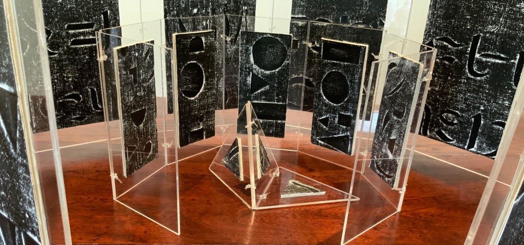
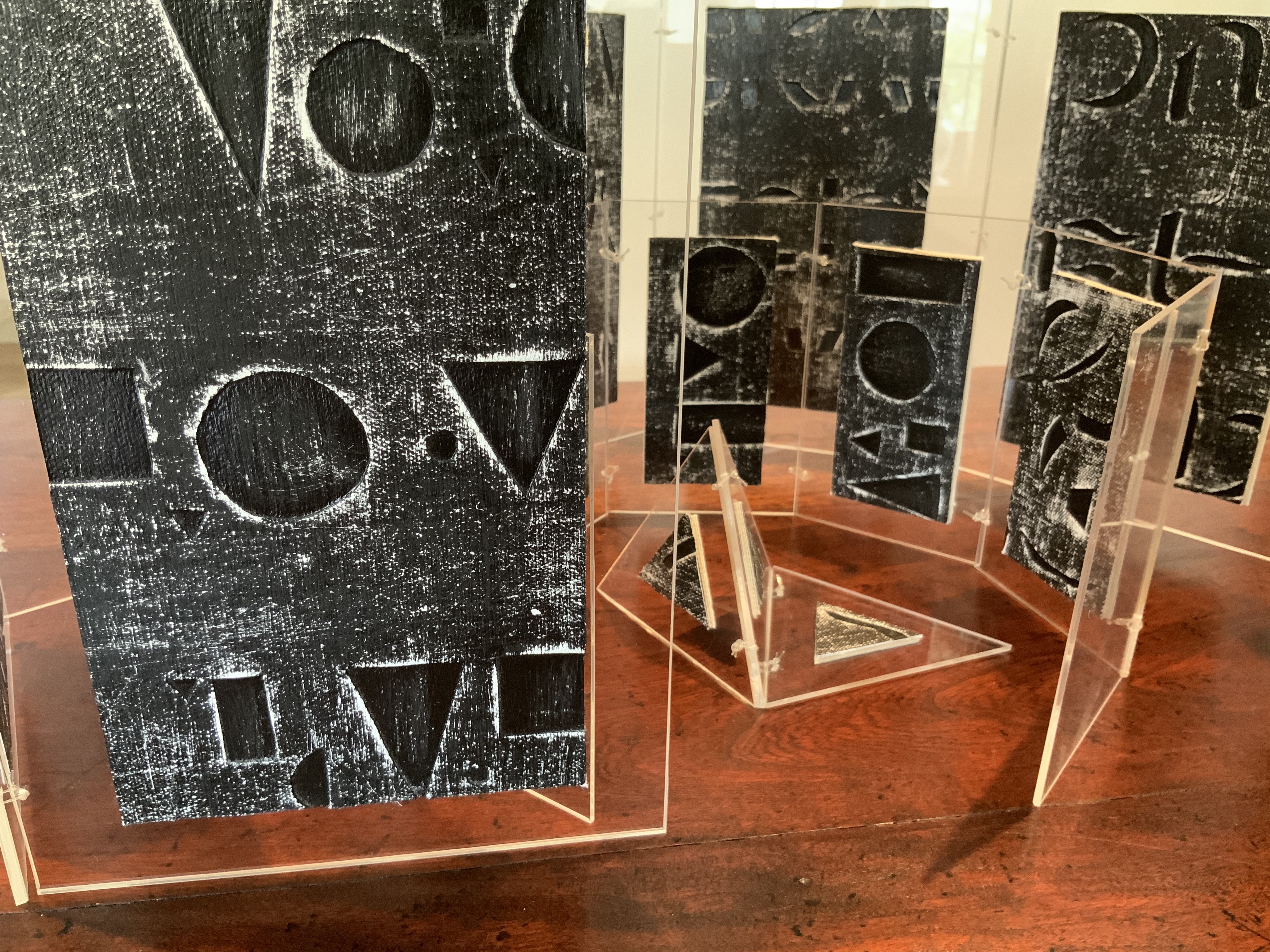
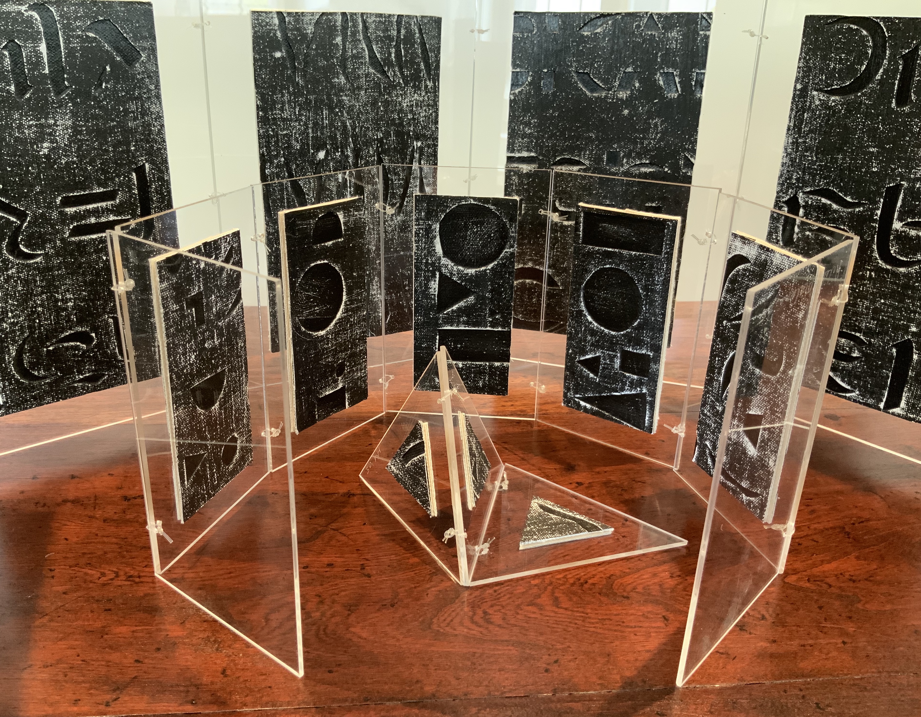
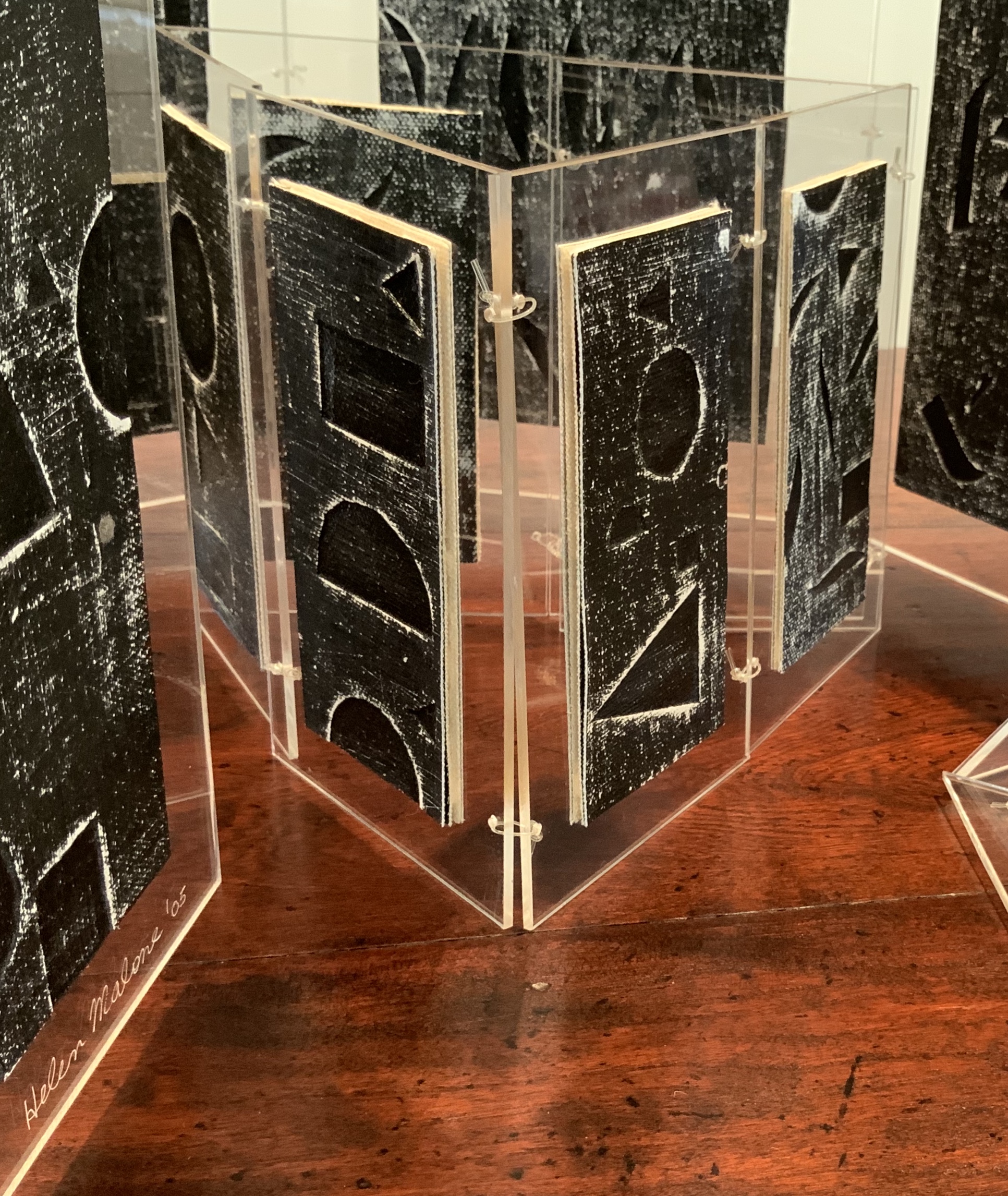
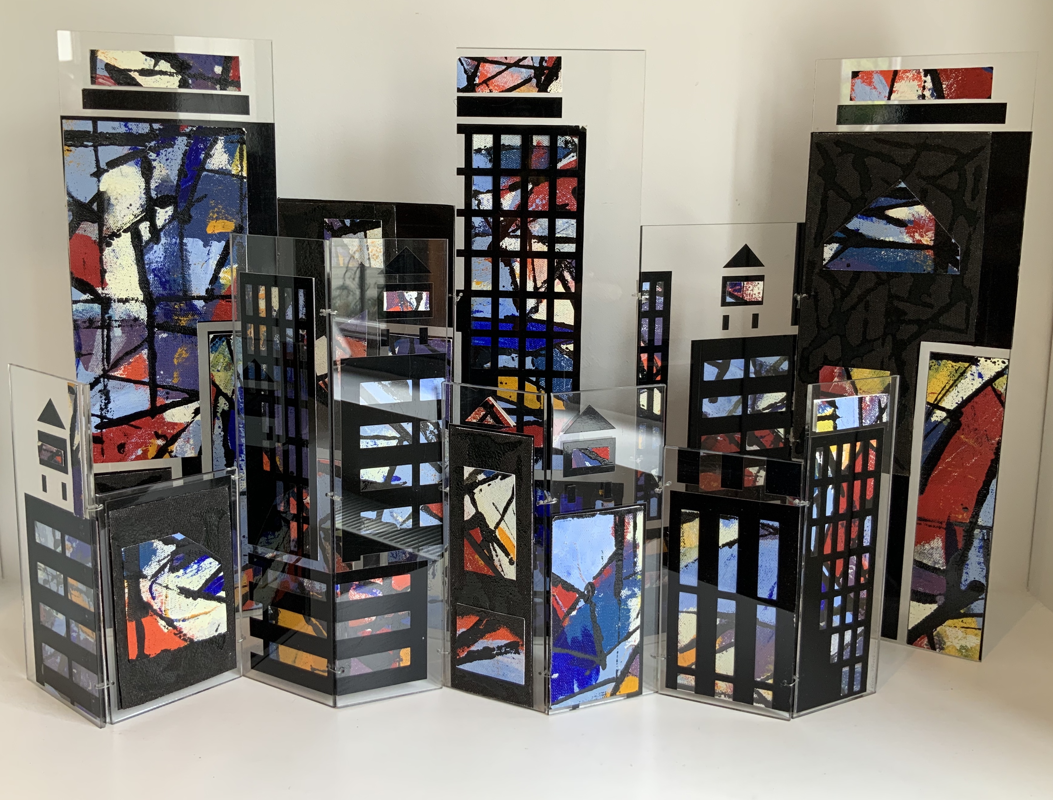
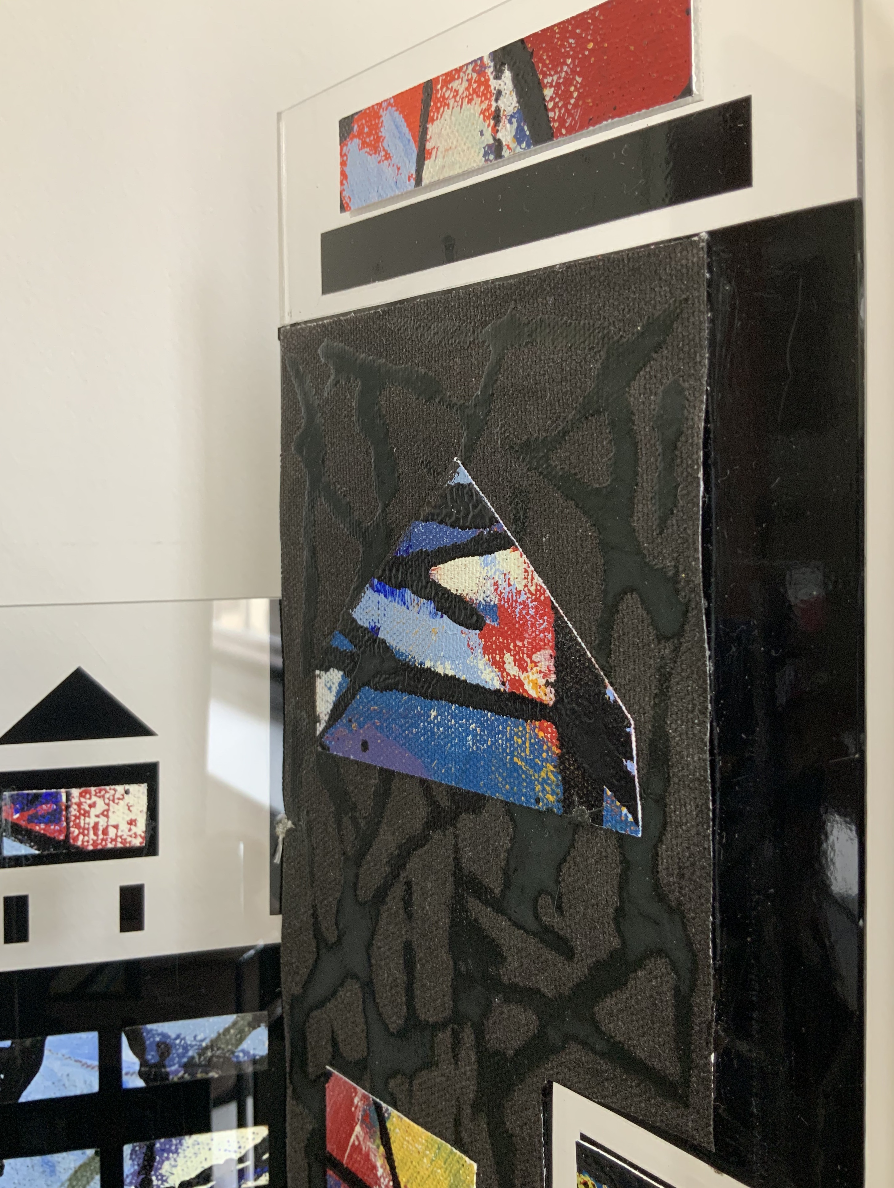
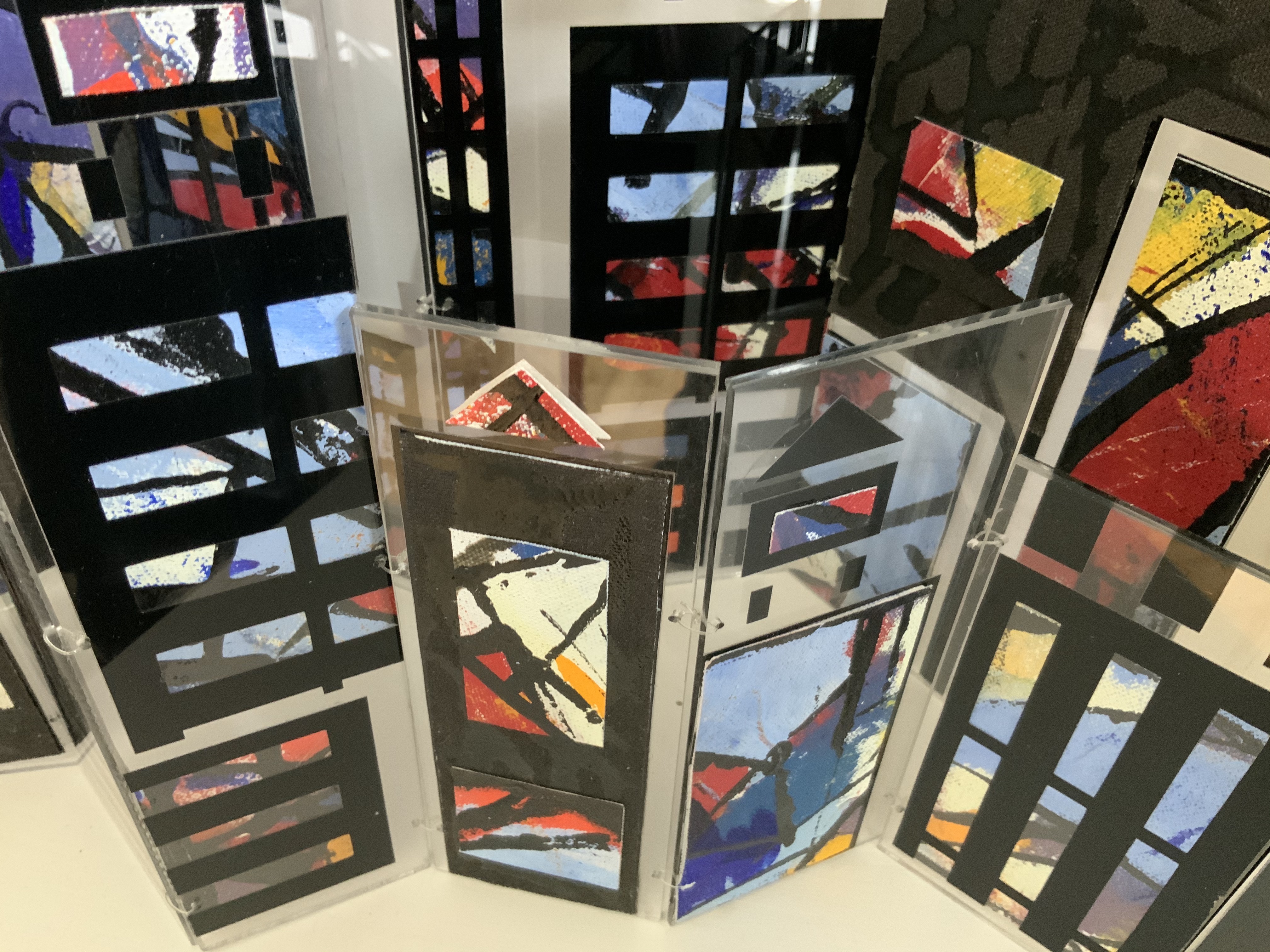
Box containing three books: two concertina books of different sizes and one tetrahedron shape of three pages. Two layered canvases painted with acrylic paint mounted on both sides of Perspex pages in Perspex box. Box: H230 x W160 x D80 mm. Unique edition. Acquired from the artist, 2 July 2020. Photos above: Courtesy of the artist. Photos below: Books On Books Collection.
Artist’s description:
Referencing ancient writing systems, hieroglyphs and engravings, this book is an investigation of sign systems and shared cultural knowledge. Fragmented coded images derived from familiar letterforms lie beneath the surface of the canvas and although visible remain undecipherable and incomprehensible.
The alphabet has traditionally served as calligraphic and typographic seed for book art, perhaps with roots of expression in illuminated letters, the Kabbalah, tomes on penmanship and calligraphy and typography specimen books. In its material and technique, Alphabetic Codes has a rough and smooth tactility; the former pointing to ancient, haptic forms, the latter to current, screen-generated forms. It enriches the subset of alphabet books and abecedaries in the Books On Books Collection.
Exhibitions:
Books 05 Image as Text as Image, Noosa Regional Gallery 9 September – 17 October 2005.
Botanical Books, Coffs Calligraphers, Botanic Garden, Coffs Harbour, 29 September 29 – 7 October 2007.
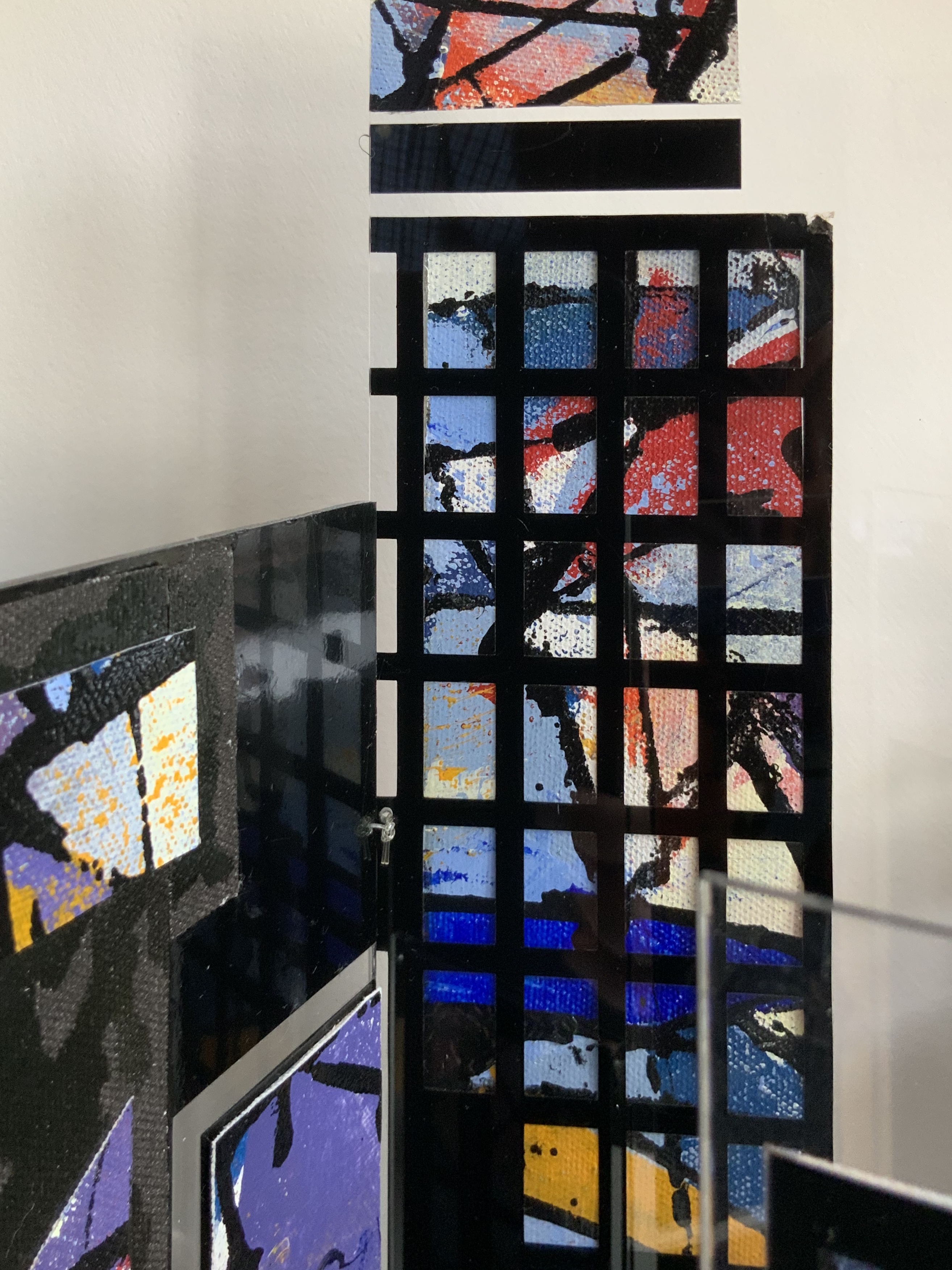
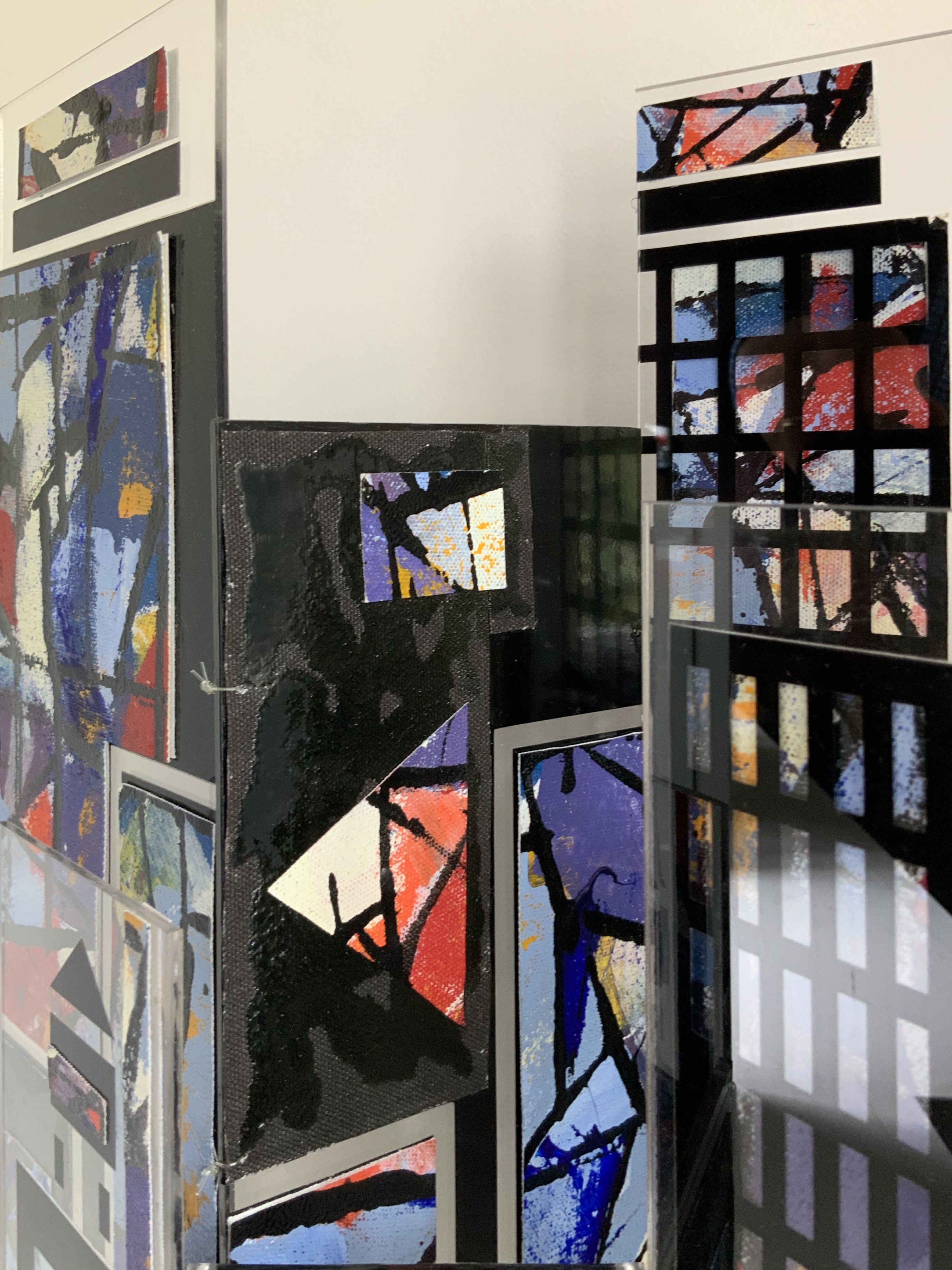
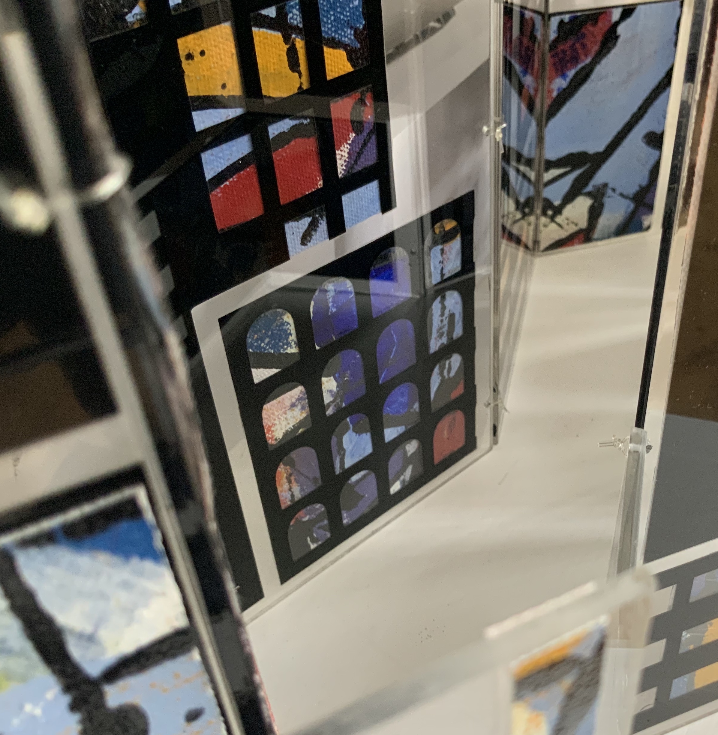
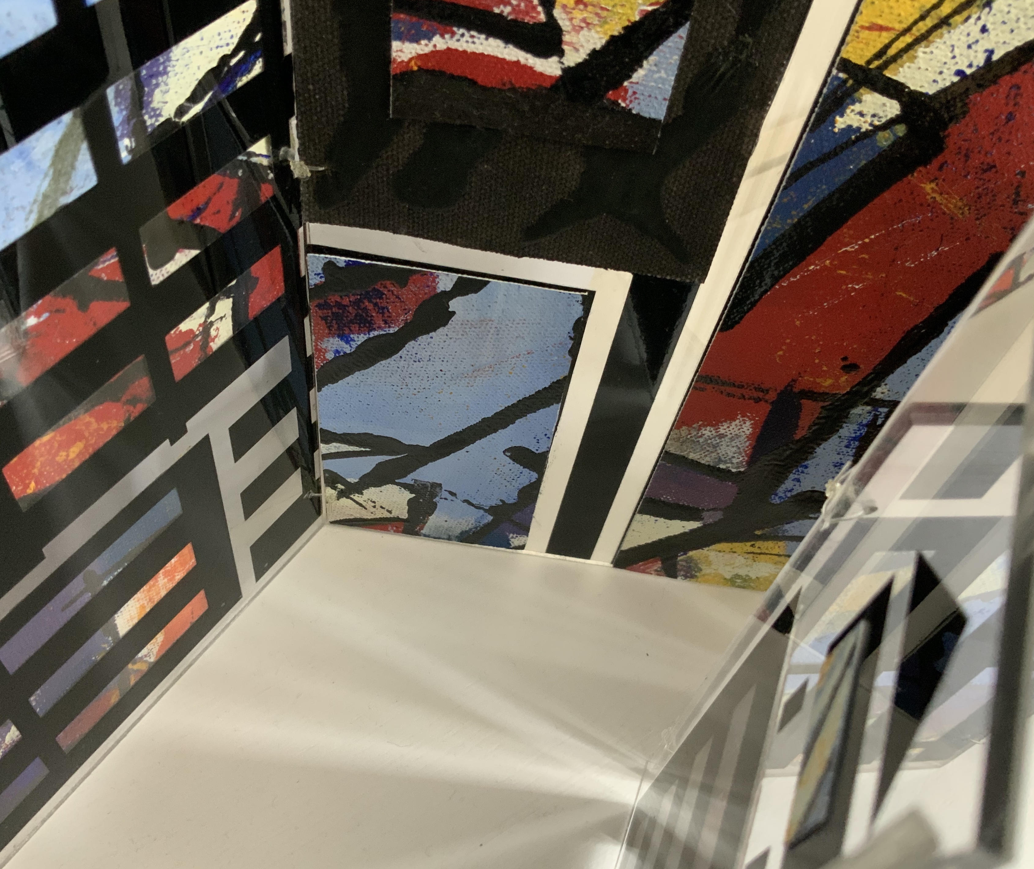
Perspex box containing two concertina books of different sizes made of recycled Perspex panels with mounted canvas painted with acrylics. Box: H360 x W125 x D75 mm. Unique edition. Acquired from the artist, 2 July 2020. Photo: Books On Books Collection.
Photos: Books On Books Collection.
Artist’s description:
Technological illuminations such as television screens, computer screens, big screens and advertising visually transmit images and act as carriers of global information, education and entertainment. The medieval purpose of stained glass windows, besides aesthetic and mystical was to visually educate and enlighten.
Purely in color, Windows on the World recalls Albers, Chagall, Mondrian (even though he hated stained glass) or Joep Nicolas. In material, technique and theme, it may echo Alphabetic Codes and its allusion to computer-screen-based windows, but Windows has a more architectural feel that can also be found in the I.M. Pei and Mies van der Rohe “volumes” of Ten Books on Architecture (2017) further enriching the architectural subset of the Books On Books Collection.
Exhibition:
Books 05, Image as text as Image, Noosa Regional Gallery, 9 September – 17 October 2005.
Beautiful One Day, Blown Away the Next (2011)
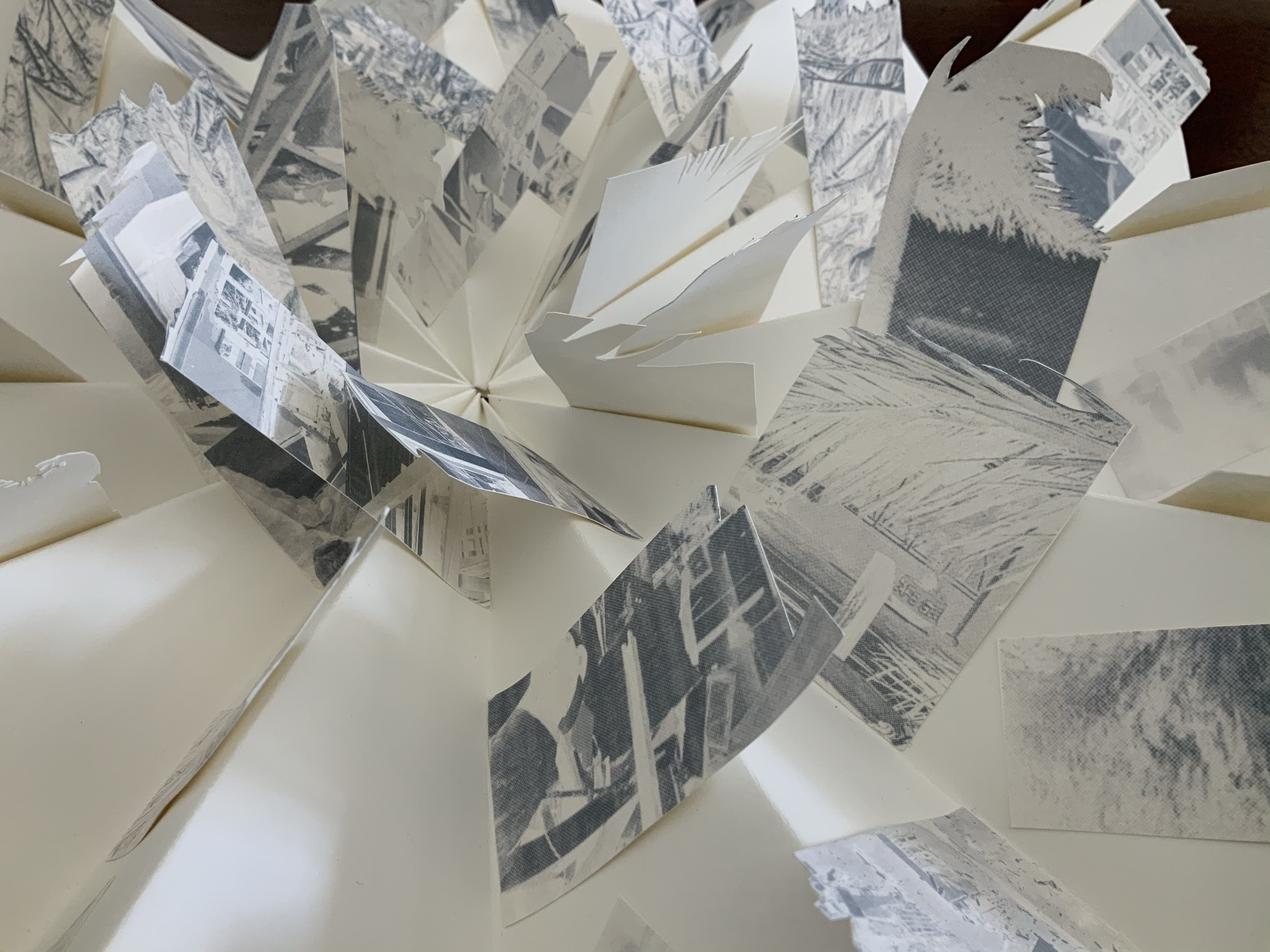
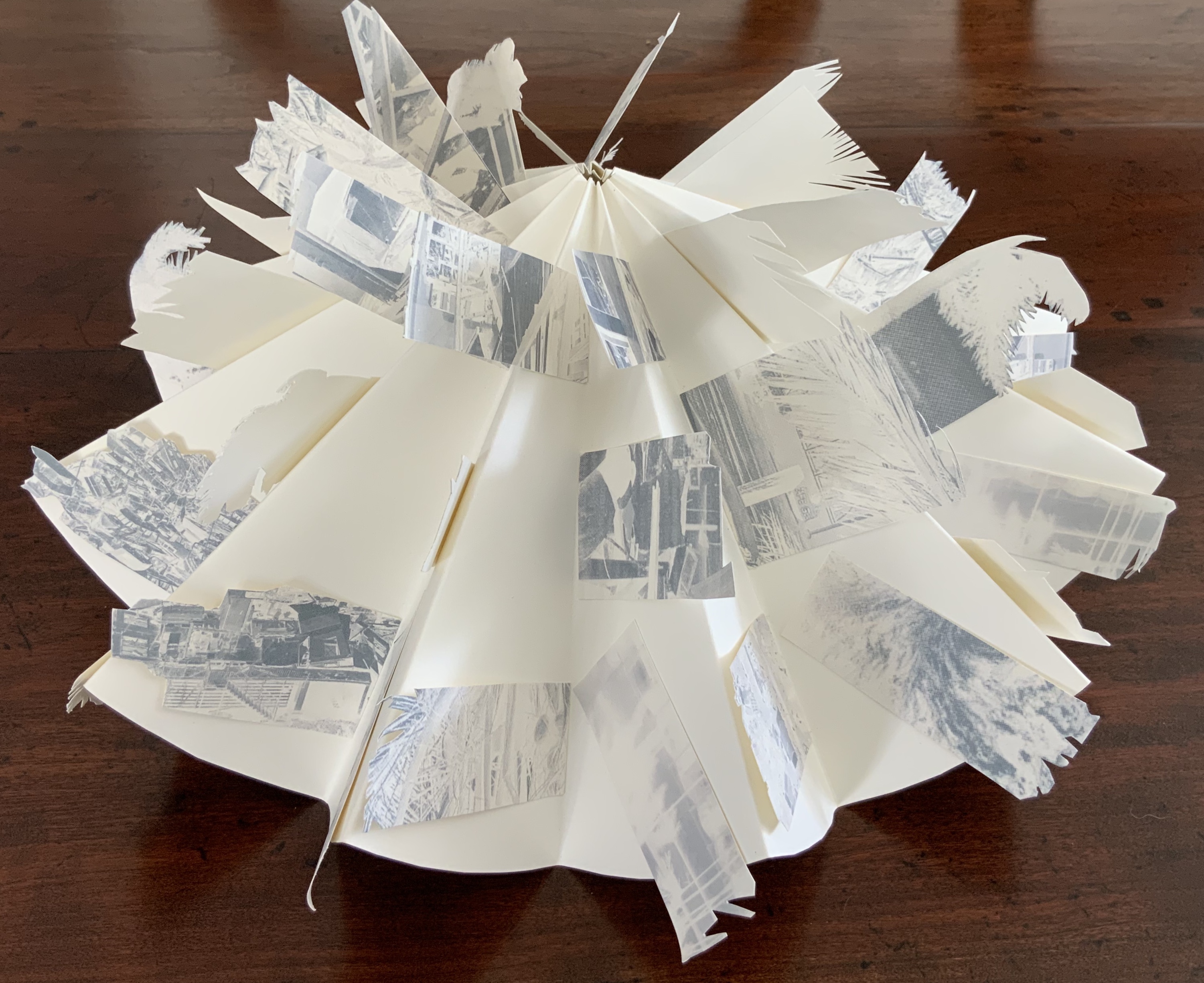
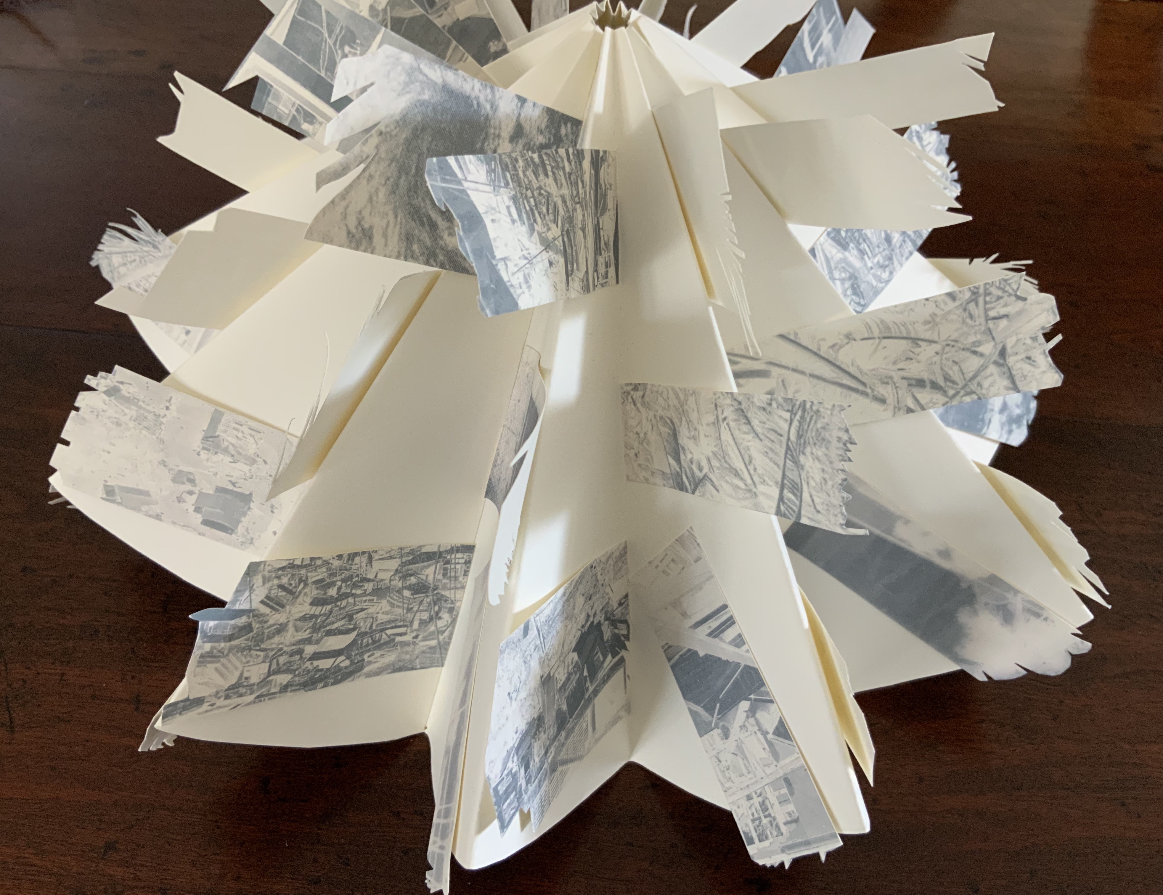
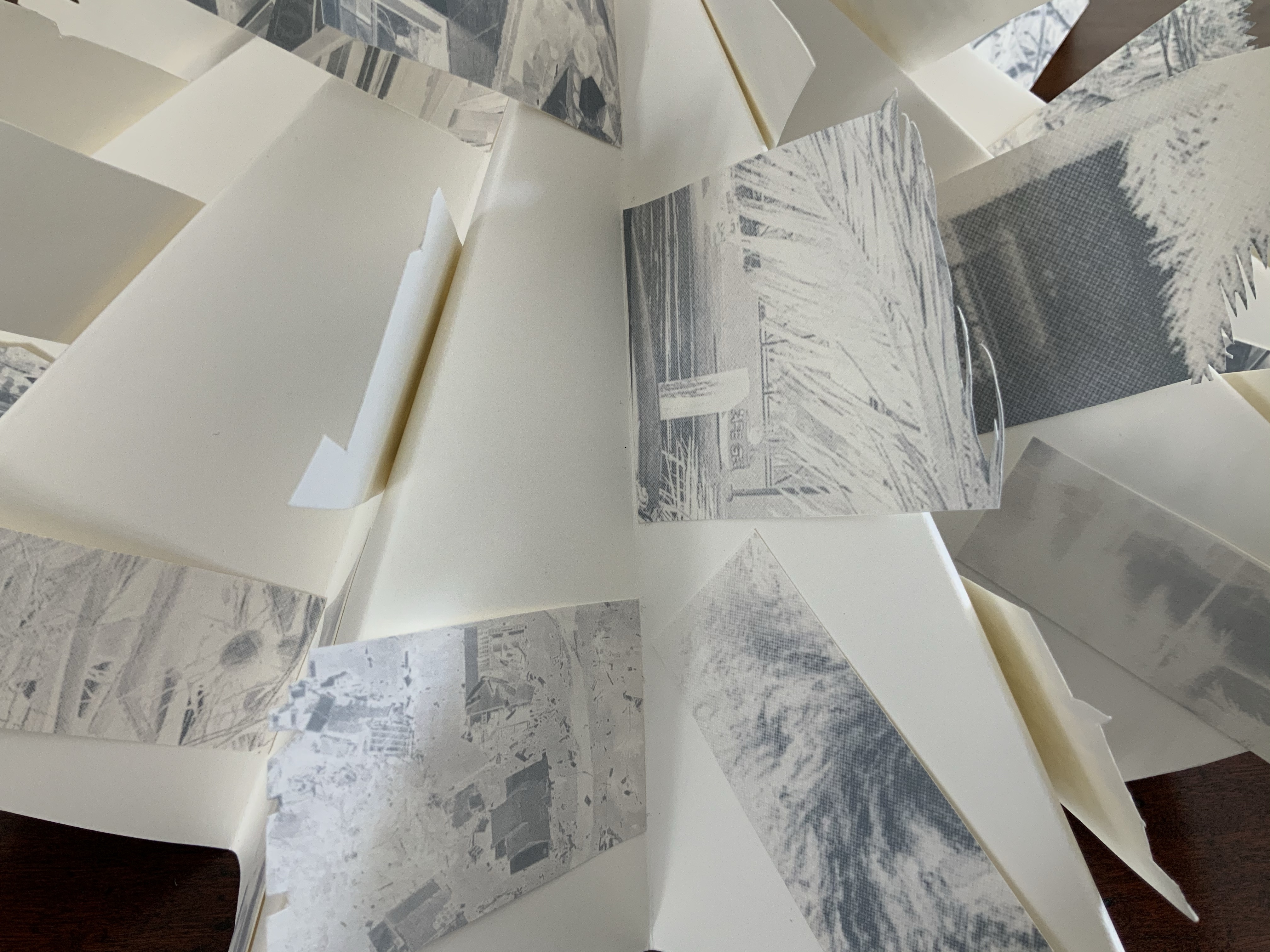
Beautiful One Day, Blown Away the Next (2011)
Helen Malone
Box containing circular concertina flag book of Fabriano paper, manipulated digital photographs cut and transferred to flags. H90 x W190 x D55 mm closed, 380 mm diameter open. Unique edition. Acquired from the artist, 2 July 2020. Photo: Books On Books Collection.
Artist’s description:
On the eve of 2 February 2011 Cyclone Yasi made landfall on the coast of Queensland. Sweeping through the coastal communities, the Category 5 Tropical Storm of historic proportions left a trail of mayhem and destruction that inspired the artist Malone to create this piece.
Photos: Books On Books Collection.
Bringing together a flag book, concertina and tab-and-lot closure, Malone engineers an ideal structure to evoke the meterological pattern and order of the cyclone. The shattered, blue-filtered photographic images transferred to the flags contribute a kaleidoscopic chaos. The theme of the environment and the struggle between the human race and natural forces is a subset of the Books On Books Collection well represented by this work, Tsunami (below) and others such as Holuhraun by Chris Ruston and Landscapes of the Late Anthropocene by Philip Zimmerman.
Exhibition:
Books…beyond words evolution, East Gippsland Art Gallery, Bairnsdale,Vic., 6 August – 3 September 2011.
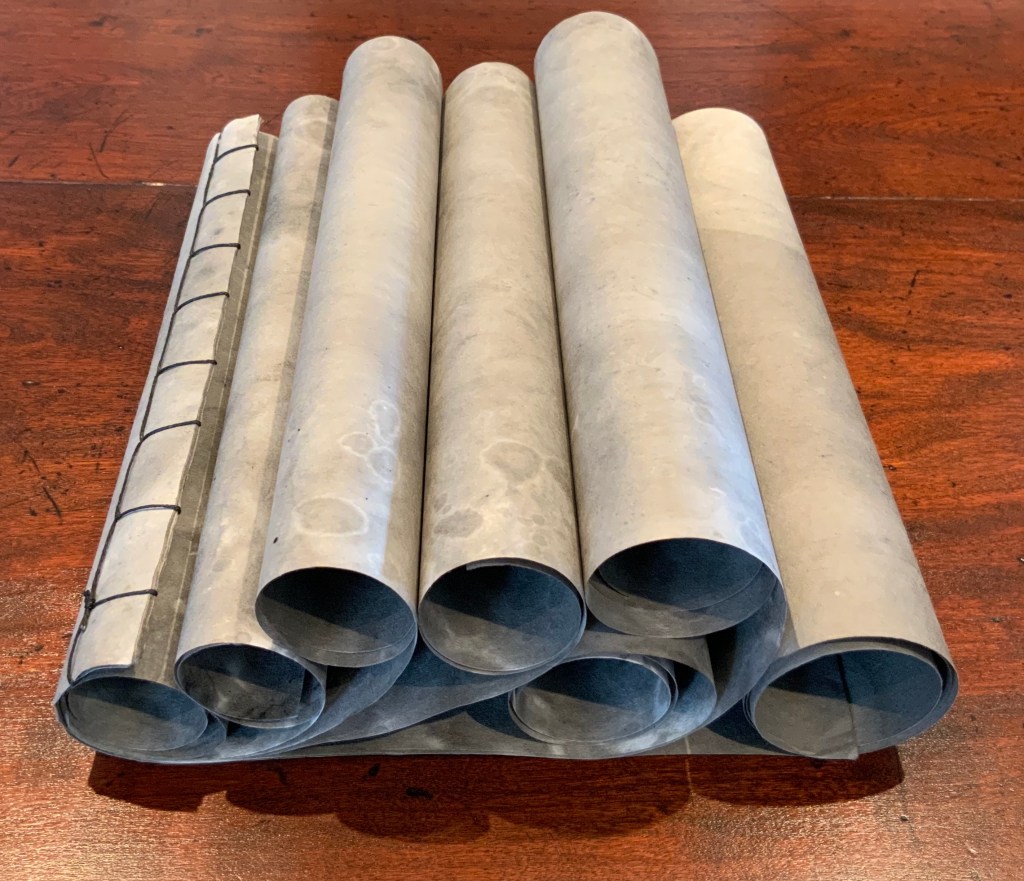
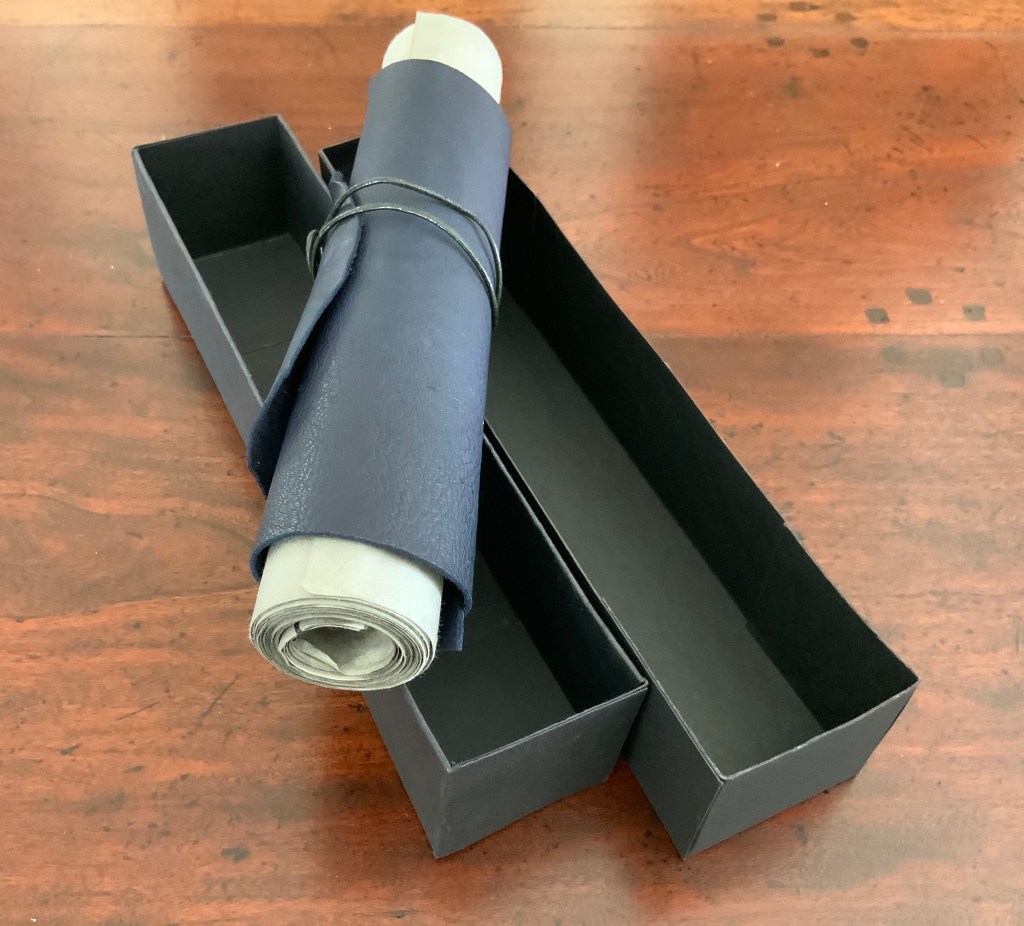
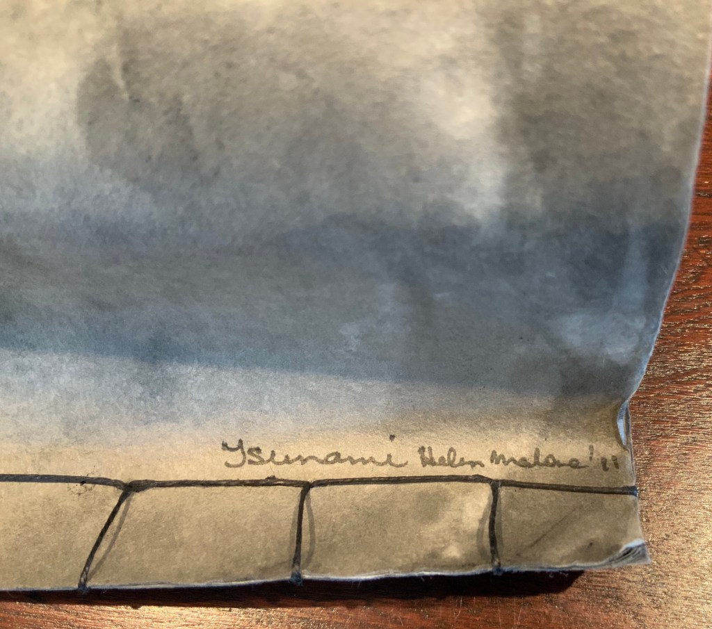
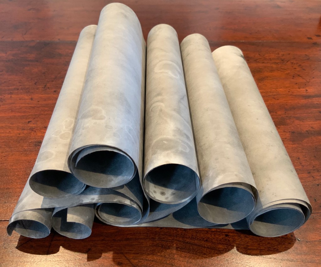
Tsunami (2011)
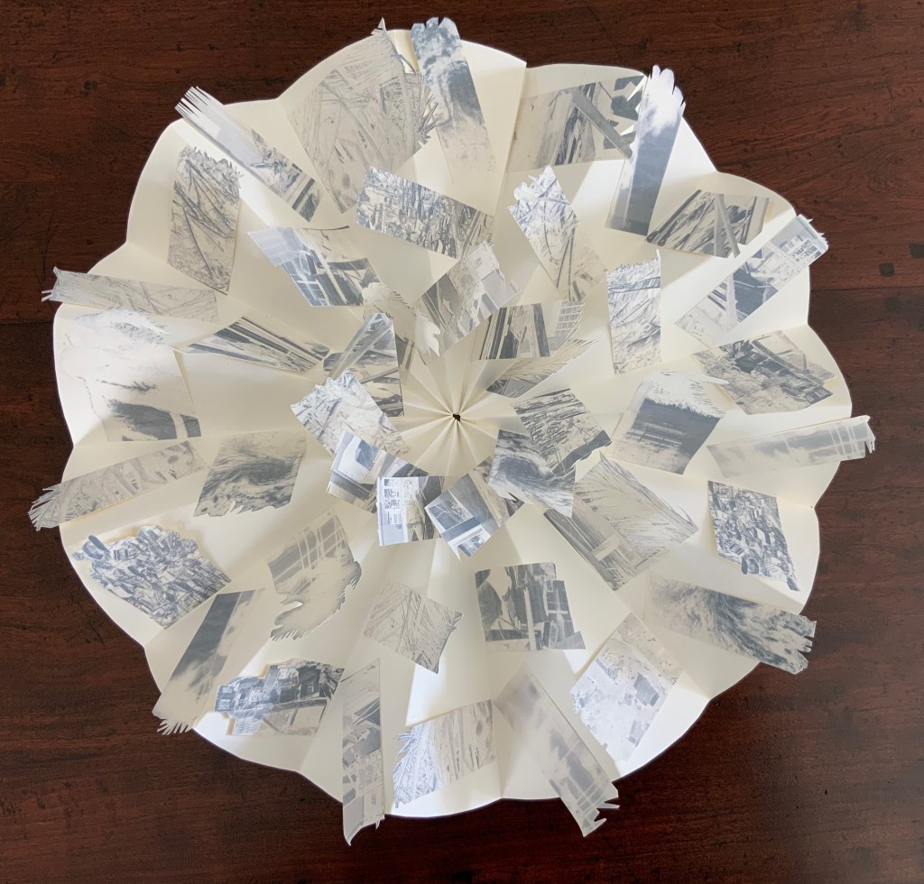
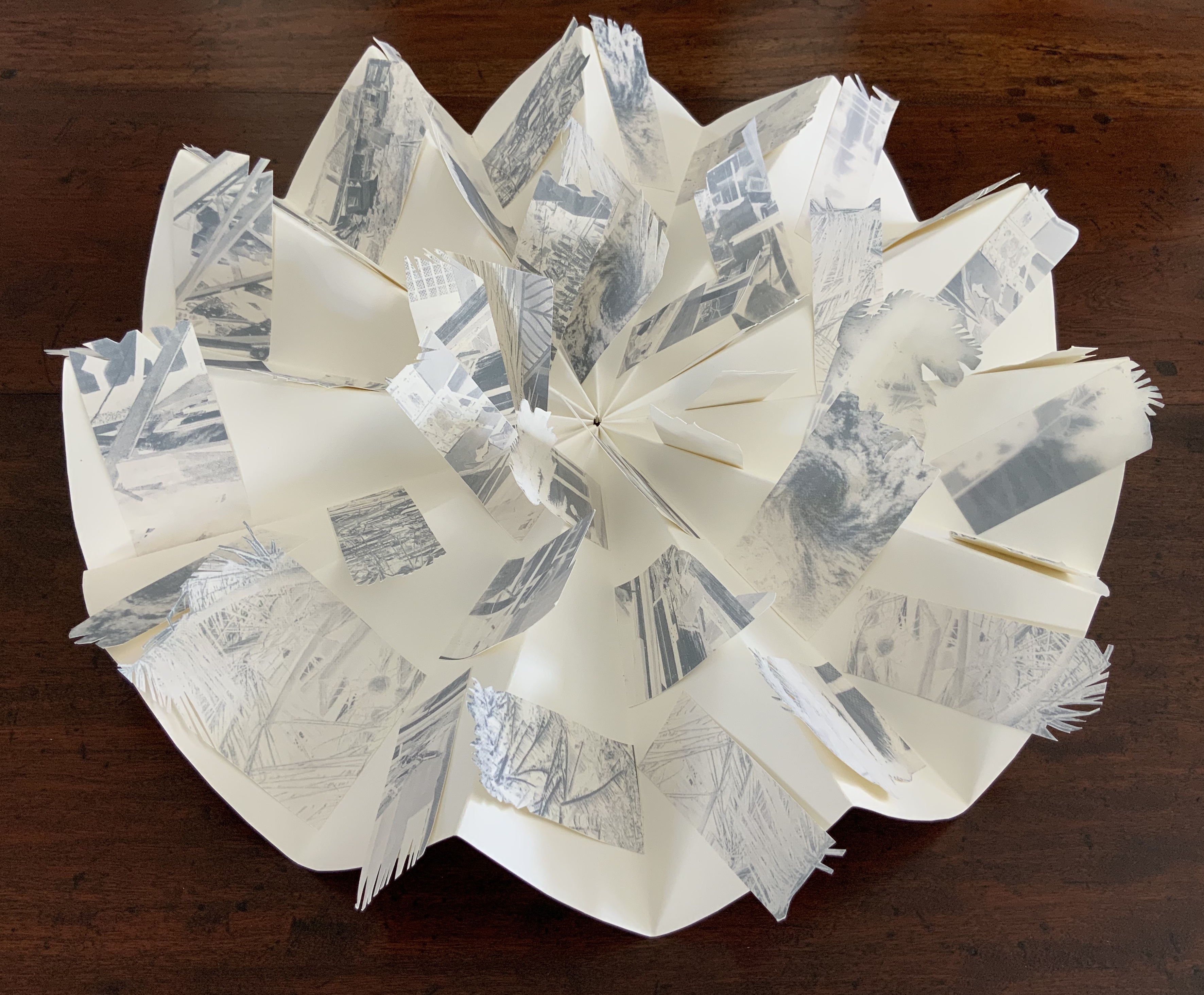
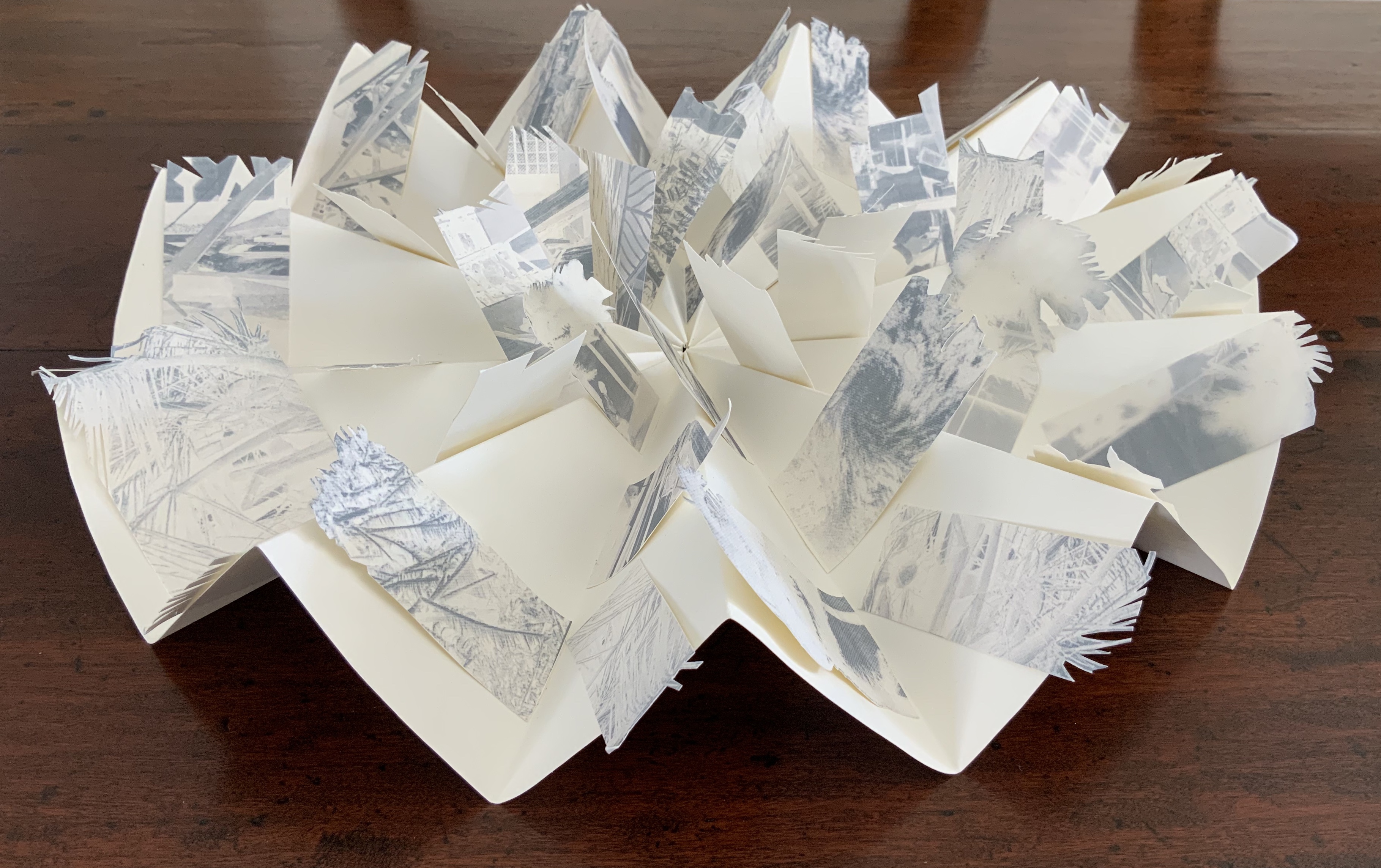
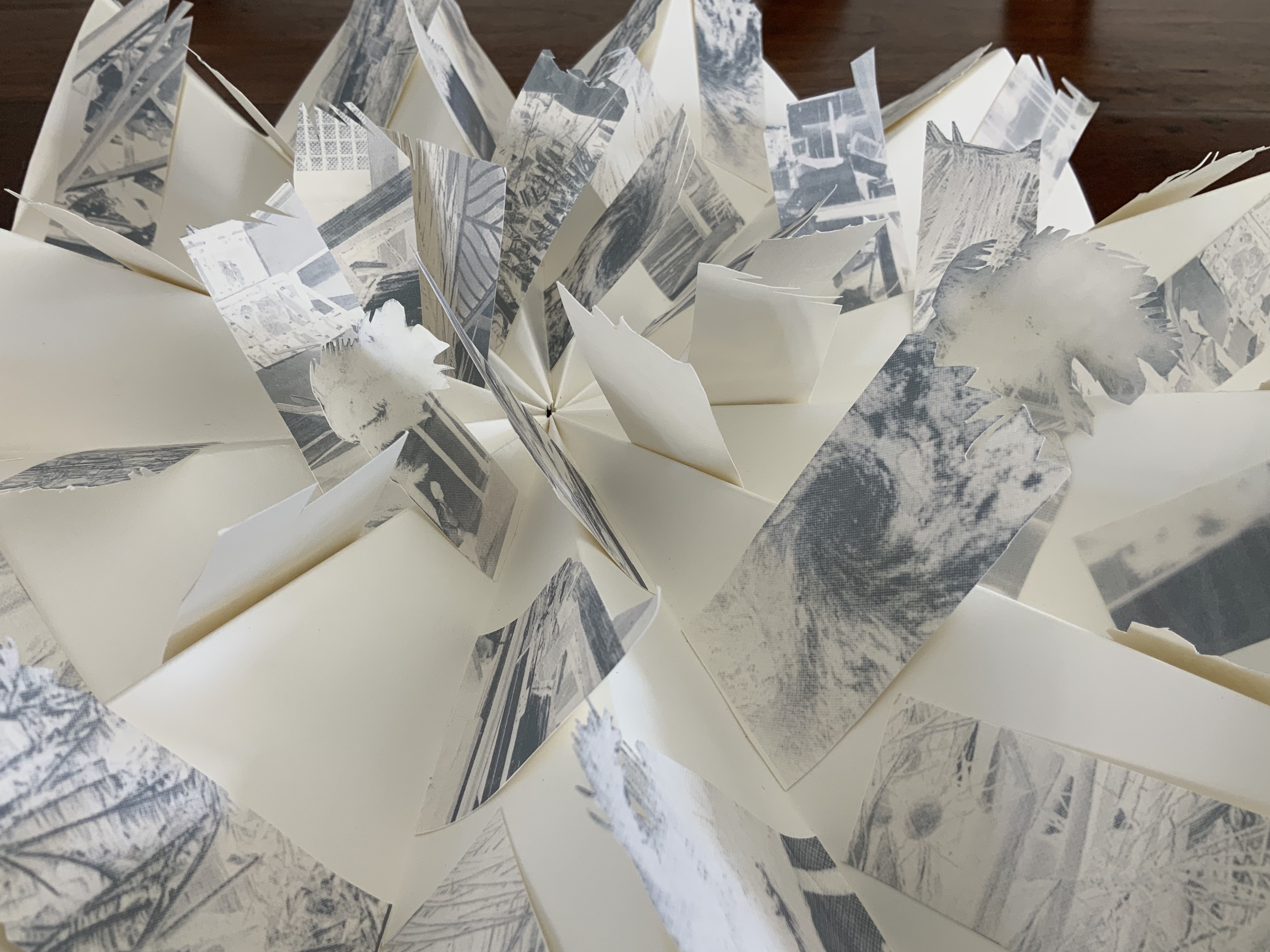
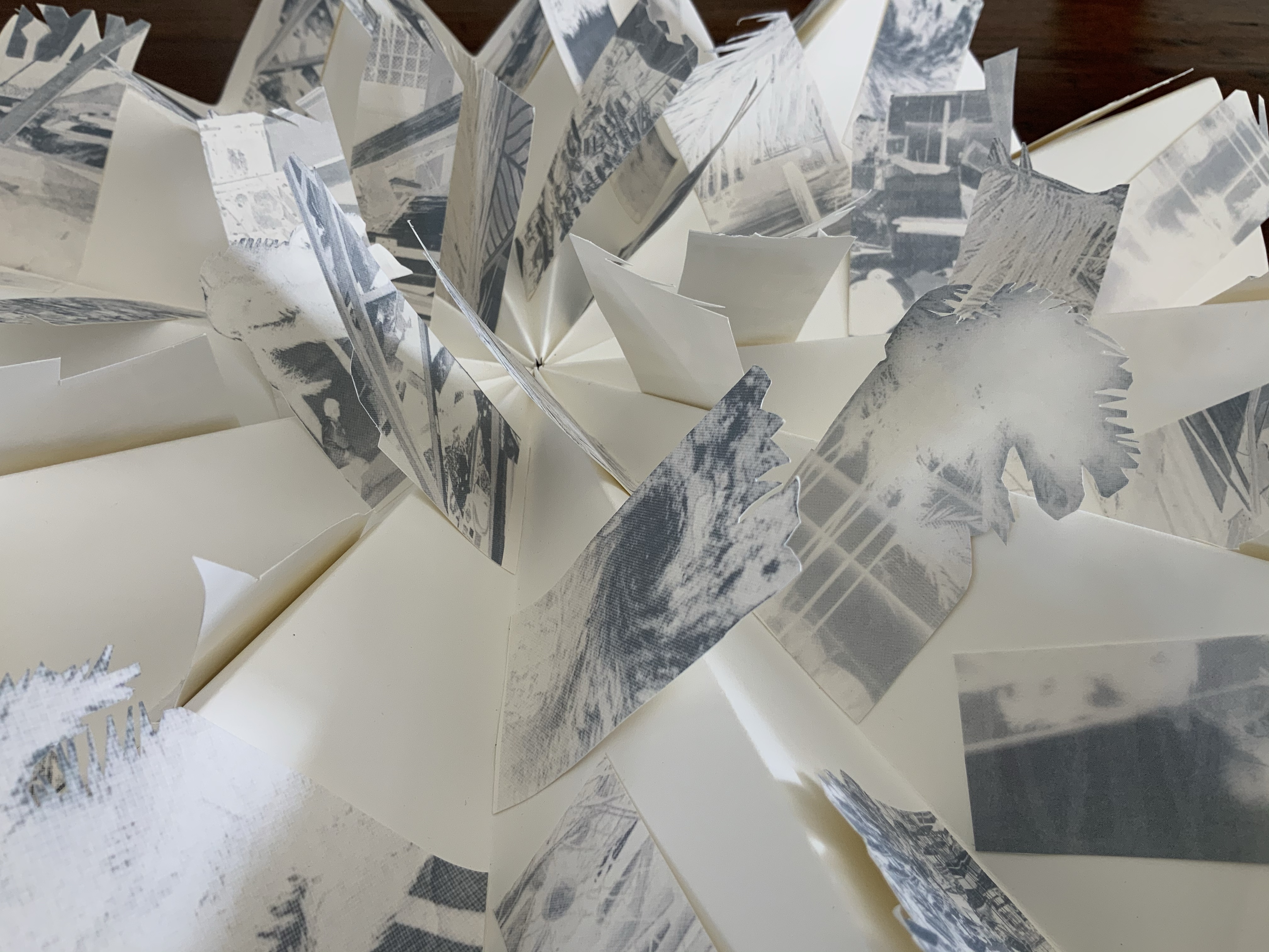
Tsunami (2011) Helen Malone Box containing “whirlwind” book of Japanese paper washed with sumi ink and water, Japanese stab binding, leather roll. H230 mm, variable width. Unique edition. Acquired from the artist, 2 July 2020. Photo: Books On Books Collection.
Photos: Books On Books Collection.
Artist’s description:
Part of the series of disasters explored by Malone through her art, this piece is her interpretation of the catastrophic tsunami that followed the massive earthquake that struck Japan in 2011.
The earthquake and tsunami were so powerful that their effects were felt around the globe: from Antarctica’s ice sheet to the fjords of Norway. Indeed the debris from the monstrous wave continues to wash up on North American shores nearly a decade later.
The combination of Japanese paper and mottled color of sumi ink and water, the way the work “fights back” as the scrolls are manipulated to display the work, the multiple displays generated by the piling wave-like scrolls — all evoke the picture of inescapable, roiling force of the 2011 tsunami.
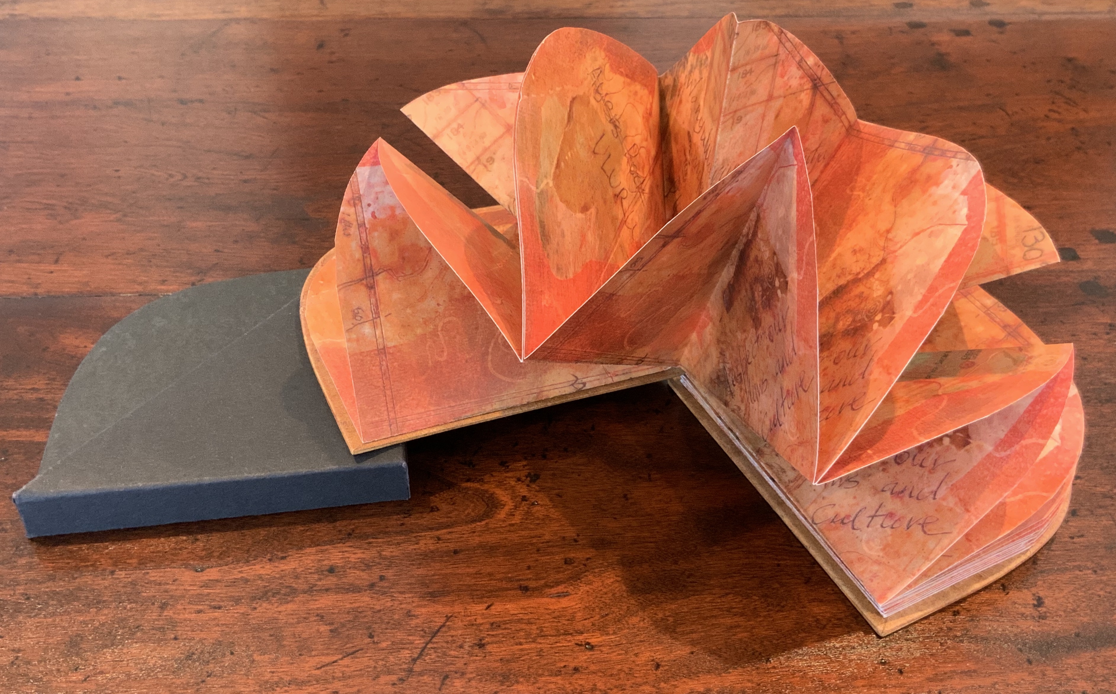
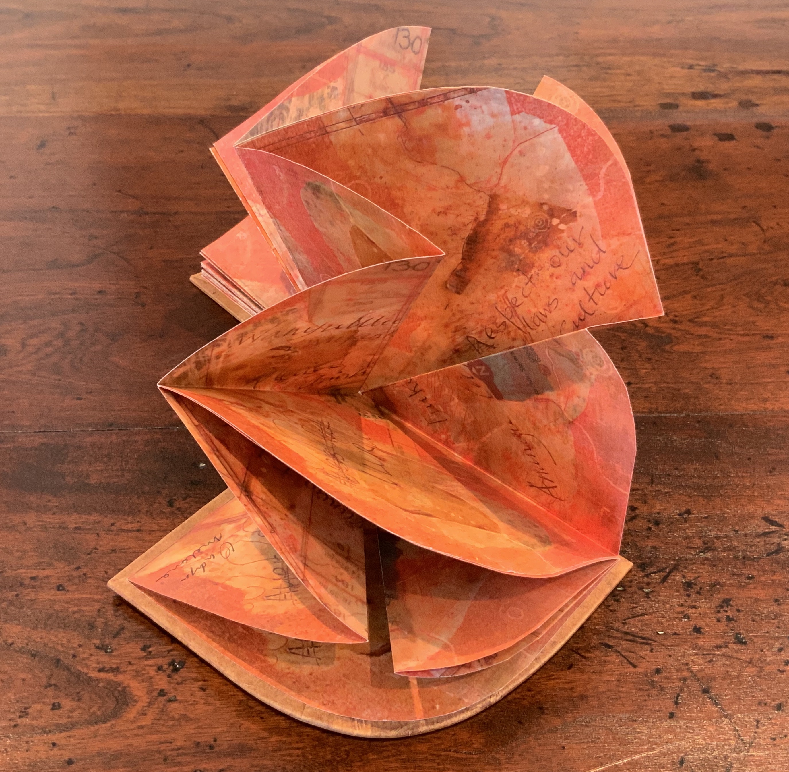
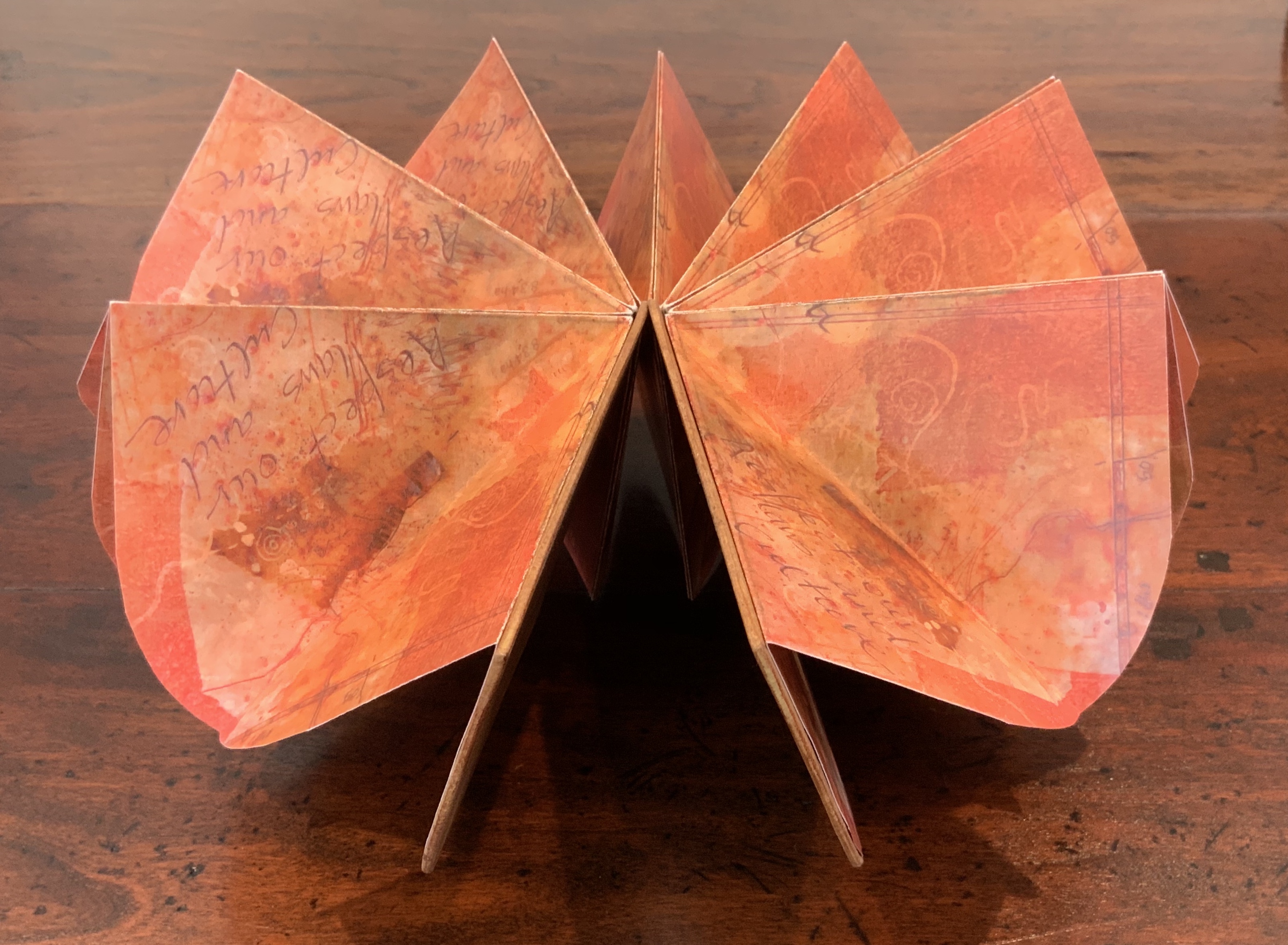
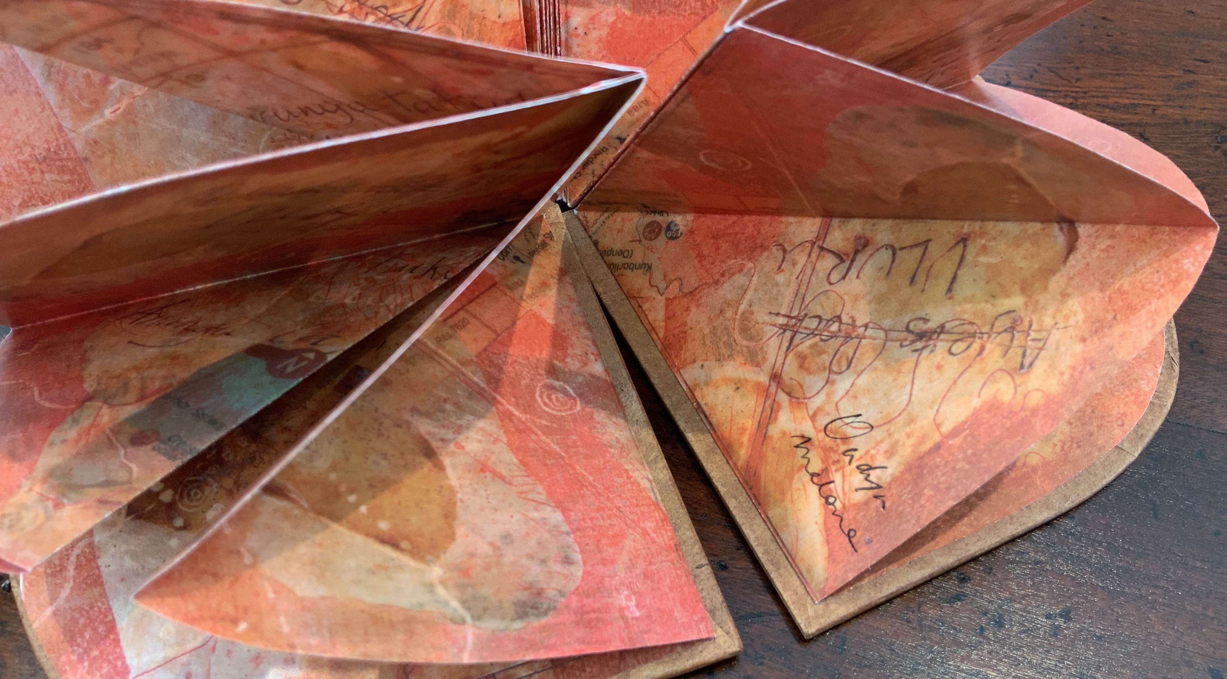
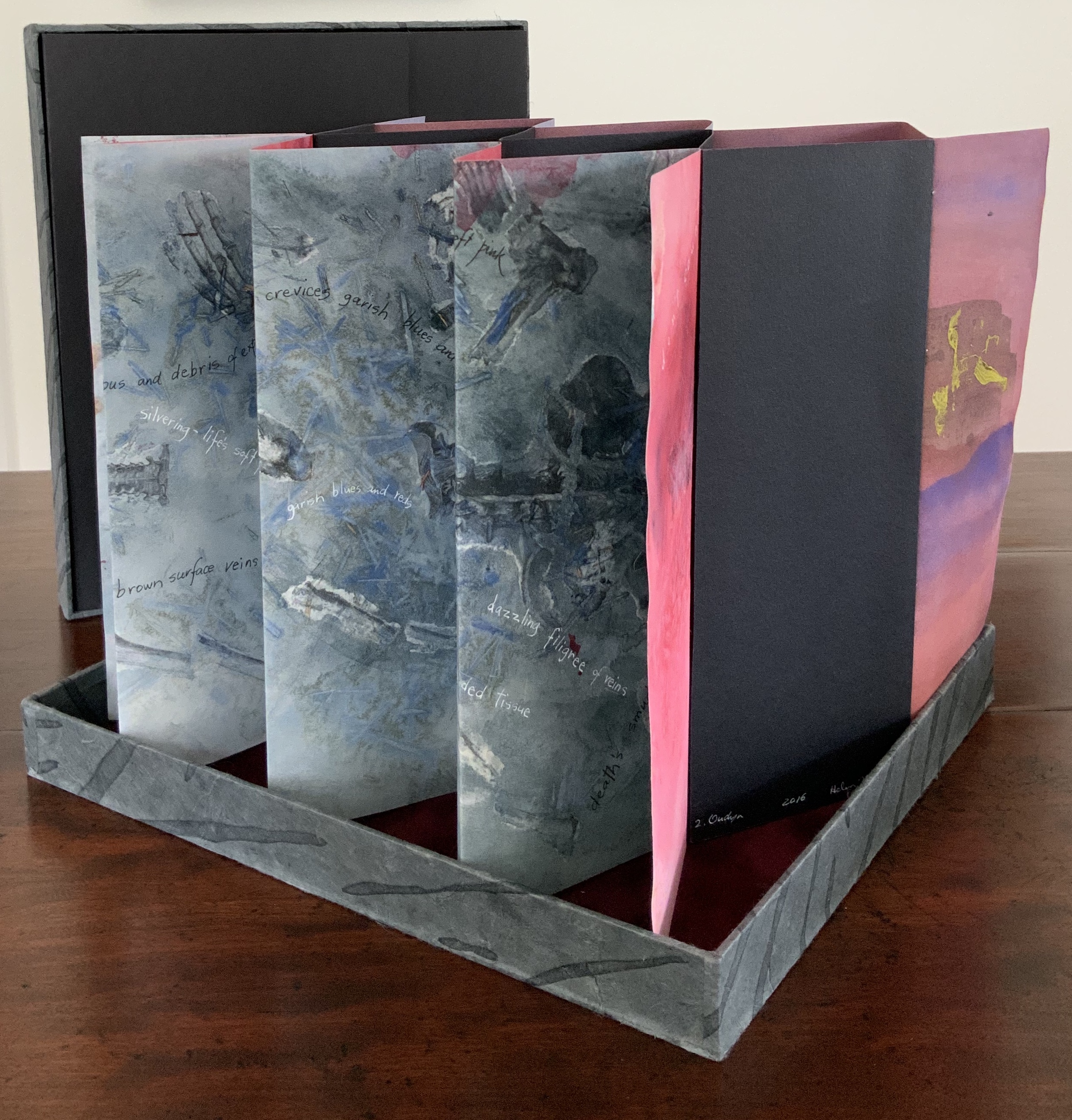
Laser printed images of waxed drawing, collage, painting and Chinese paper covered boards painted by Jack Oudyn with earth pigments, acrylic and xanthorrhoea resin. Sculptural folded page book structure and box by Helen Malone. H105 x W95 x D15 mm. Editions: 6 and 1 A/P. Acquired from Helen Malone, 2 July 2020. Photos: Books On Books Collection.
Photos: Books On Books Collection.
Artist’s description:
Malone and Jack Oudyn collaborated to create this representation of Uluru to resonate with the pleas of the indigenous Anangu people of the Northern Territory in Australia to “Wanyu Ulurunya Tatintja Wiyangku Wantima” (Respect our laws and culture).
For the Anangu the massive sandstone monolith is so sacred that they will not climb it nor photograph it. They ask visitors to respect the spirituality of the site and to follow their customs.
The blend of laser prints of wax drawings, Chinese paper, collage and painting seeks to capture the changing light of the rock as the sun passes over it throughout the day. The boards painted by Oudyn with earth pigments, acrylic and xanthorrhoea resin contribute a glowing depth of color to this homage to the Anangu. As with The Future of an Illusion (below), this collaboration presents an unusual unity of vision and integration of technique, materials and process with structural “rightness” for the subject at hand.
Exhibitions:
Art on Show Awards, Artspace Mackay Artist Book Award, Mackay Show Association, Mackay Qld, 16-19 June 2014.
Sheffield International Artists Book Prize, Bank Street Arts, Sheffield UK, 7-31 October 2015.
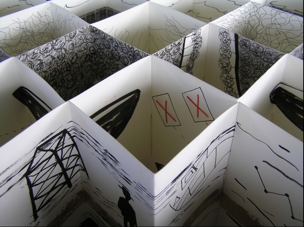
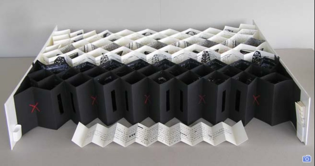
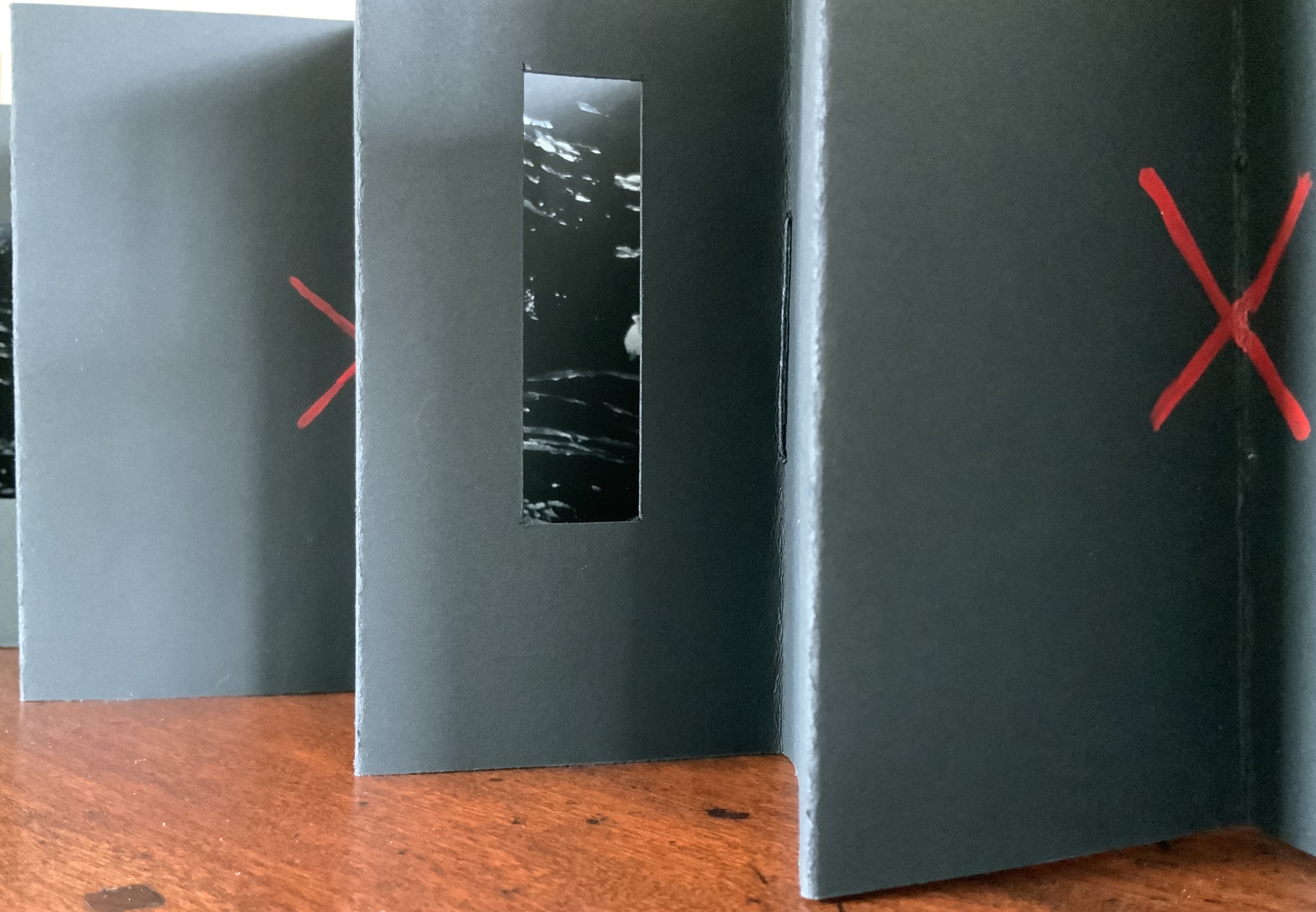
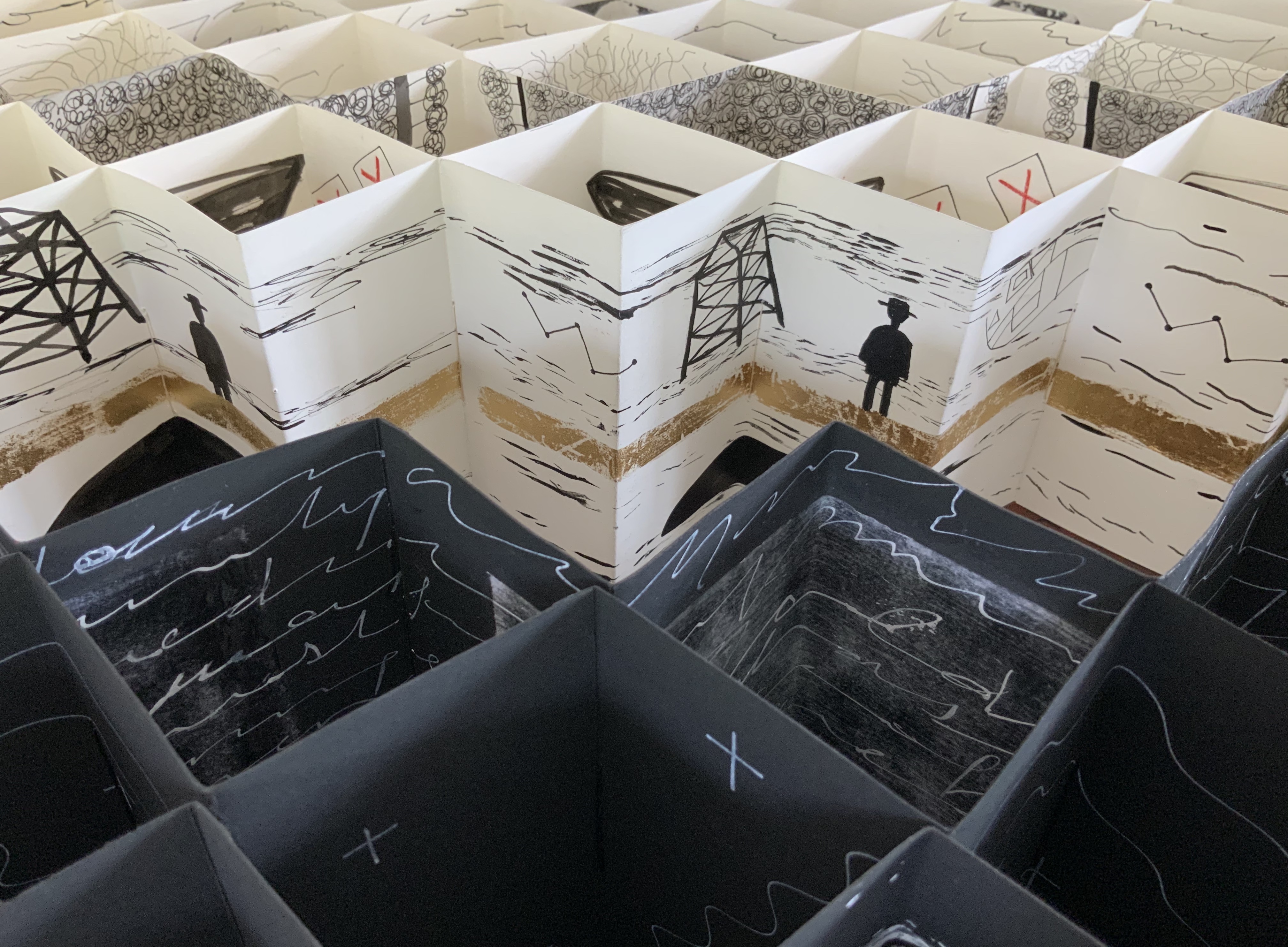
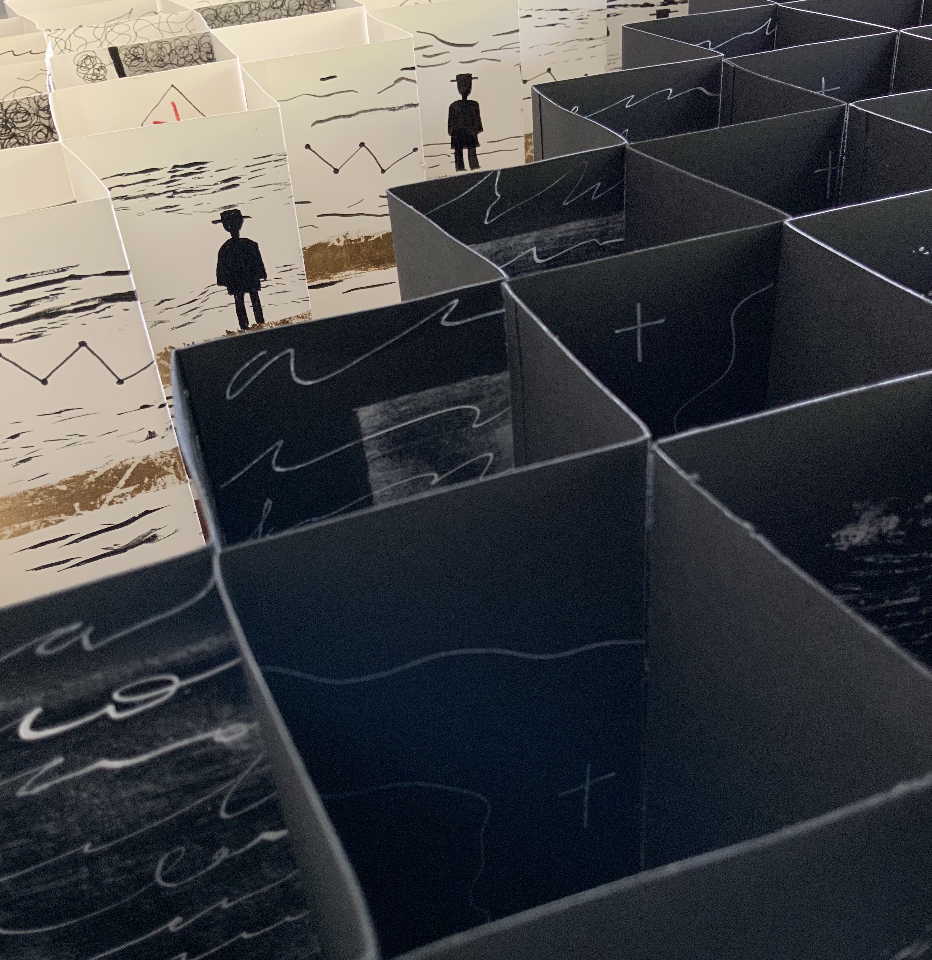
Binding of French faux leather. Multiple accordions in Fabriano 200gsm HP paper and Strathmore papers, pigmented ink, acrylic ink, printing ink, gold leaf, chinagraph pencil and image transfers. Closed: H780 x W50 x D150mm; Open: W750 mm. Unique edition. Acquired from the artist, 2 July 2020. Photos: Courtesy of the artist.
Artist’s description:
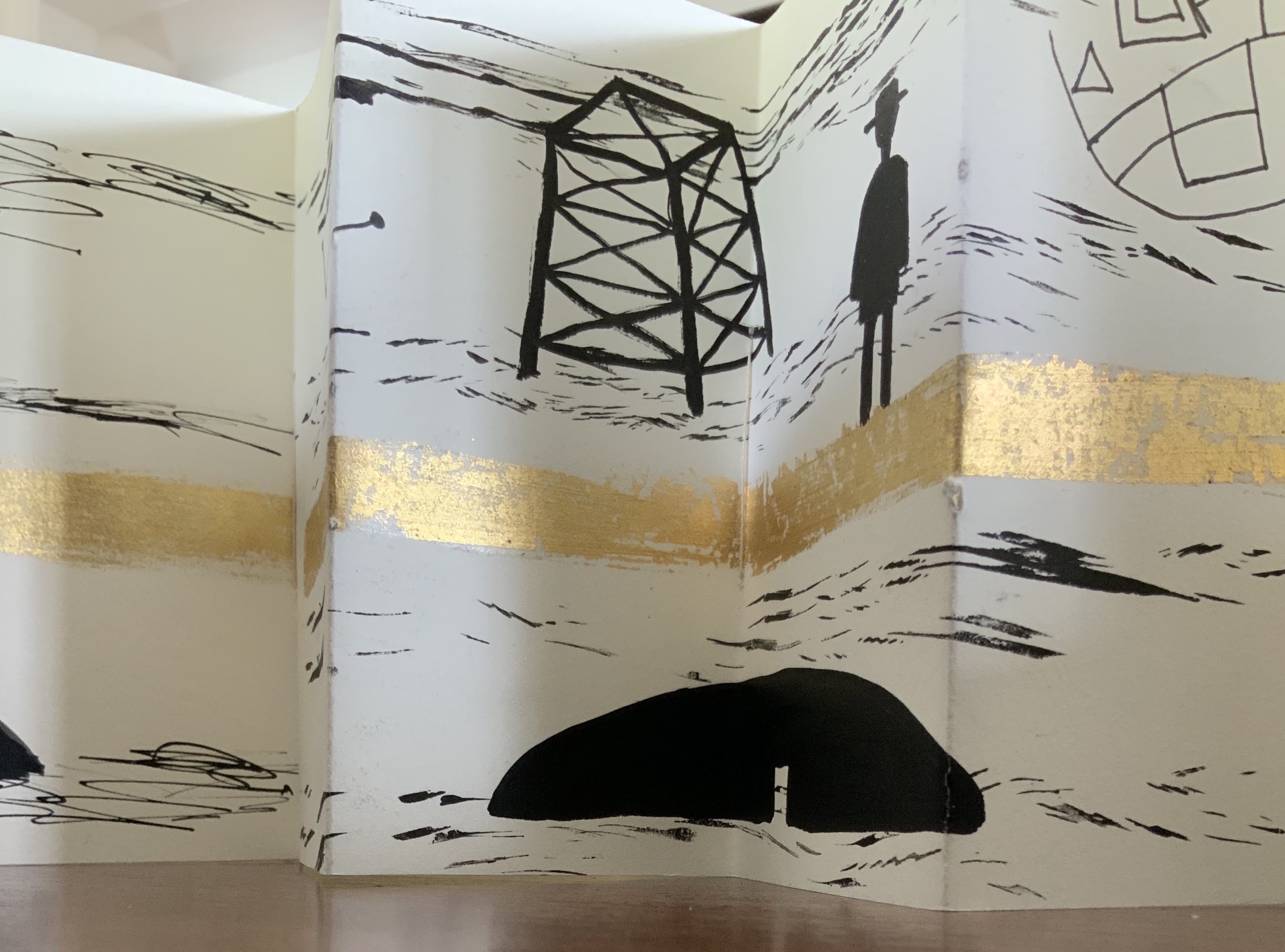
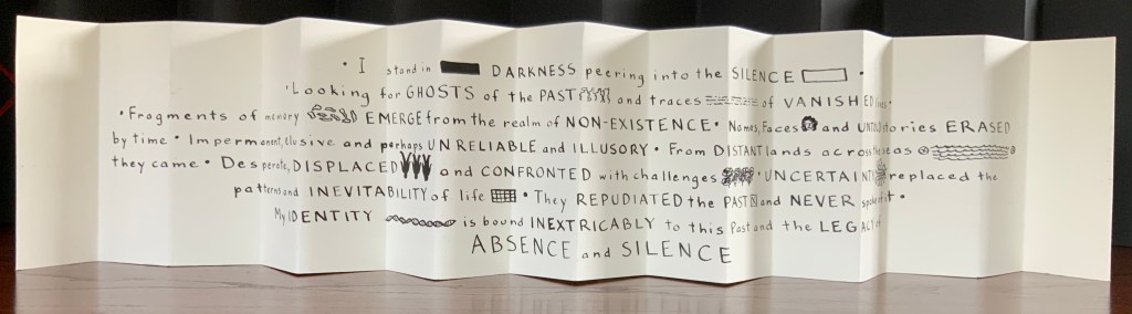
The Legacy of Absence and Silence refers to the present-day Australians whose forbears were immigrants to the continent in the nineteenth century. Many of those who came to Australia during that period made such an effort to assimilate that they have left no clues for their descendants to discover their origins. In fact some immigrants went to great lengths to eradicate their beginnings.In this work Malone has designed the structure of the book to reflect the effort of a search for meaning. The black foreground requires the viewer to struggle to peer inside the construction to glimpse details. Beyond the visual obstruction the white pages reveal snippets of information but never the full story.
Photos: Books On Books Collection.
This is a work that demands display in-the-round on a table allowing viewers to lean far enough over to catch the details within the cells formed by the joined accordions, to circle it to see how emblems and signs emerge and disappear, and to move closer and step back to experience the shifting geometric patterns.
Exhibition:
Libris Awards, Artspace Mackay, Queensland, from 26 August – 16 October 2016.
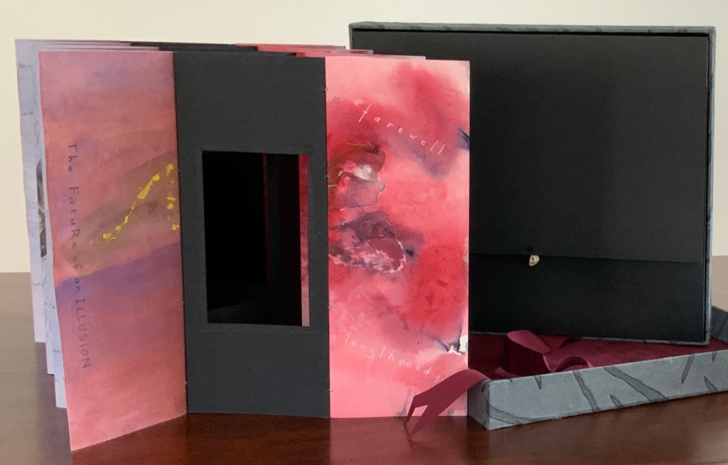
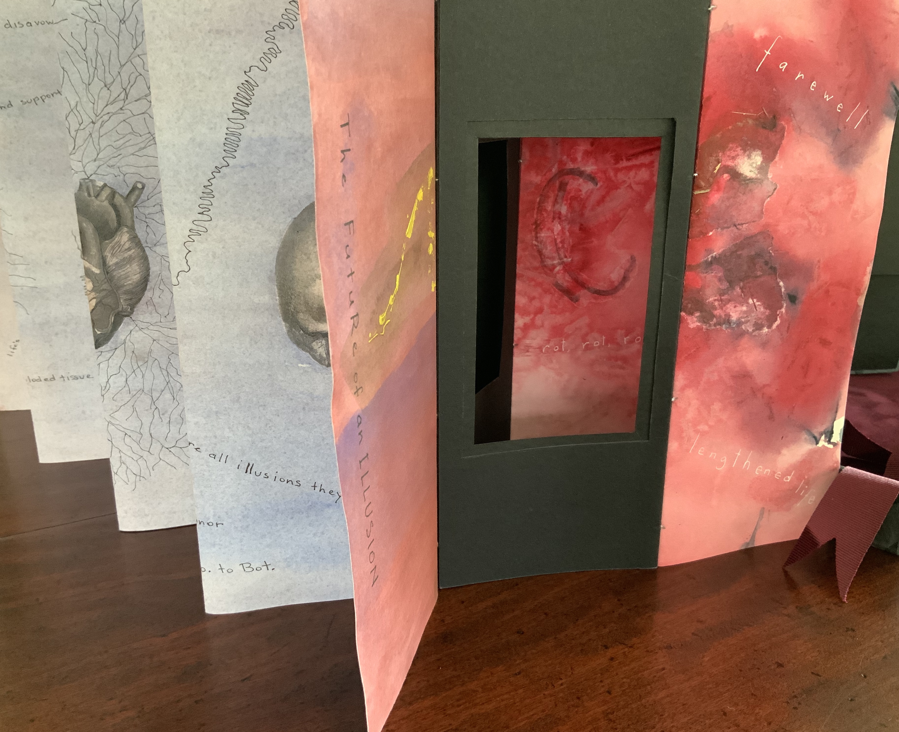
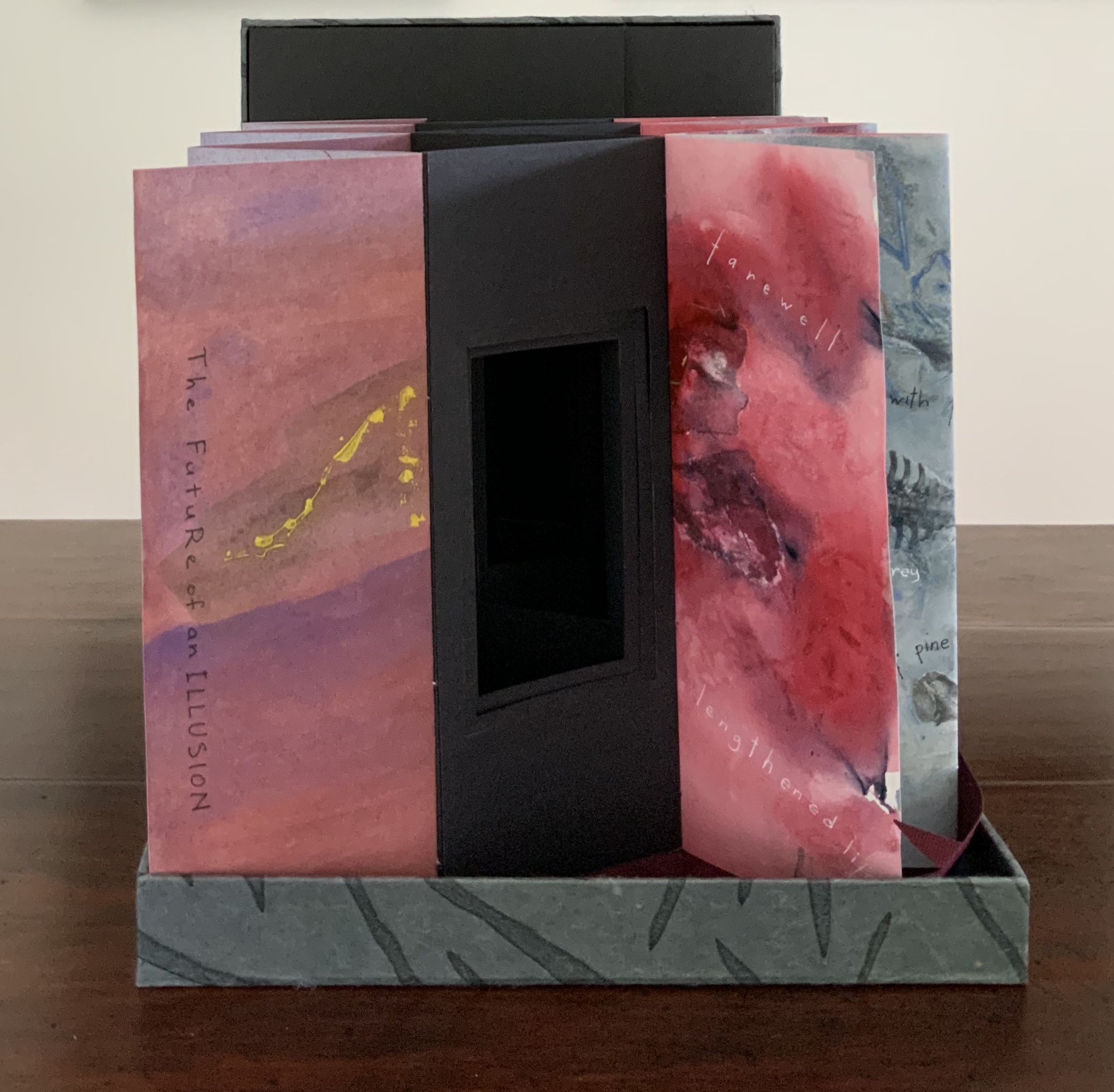
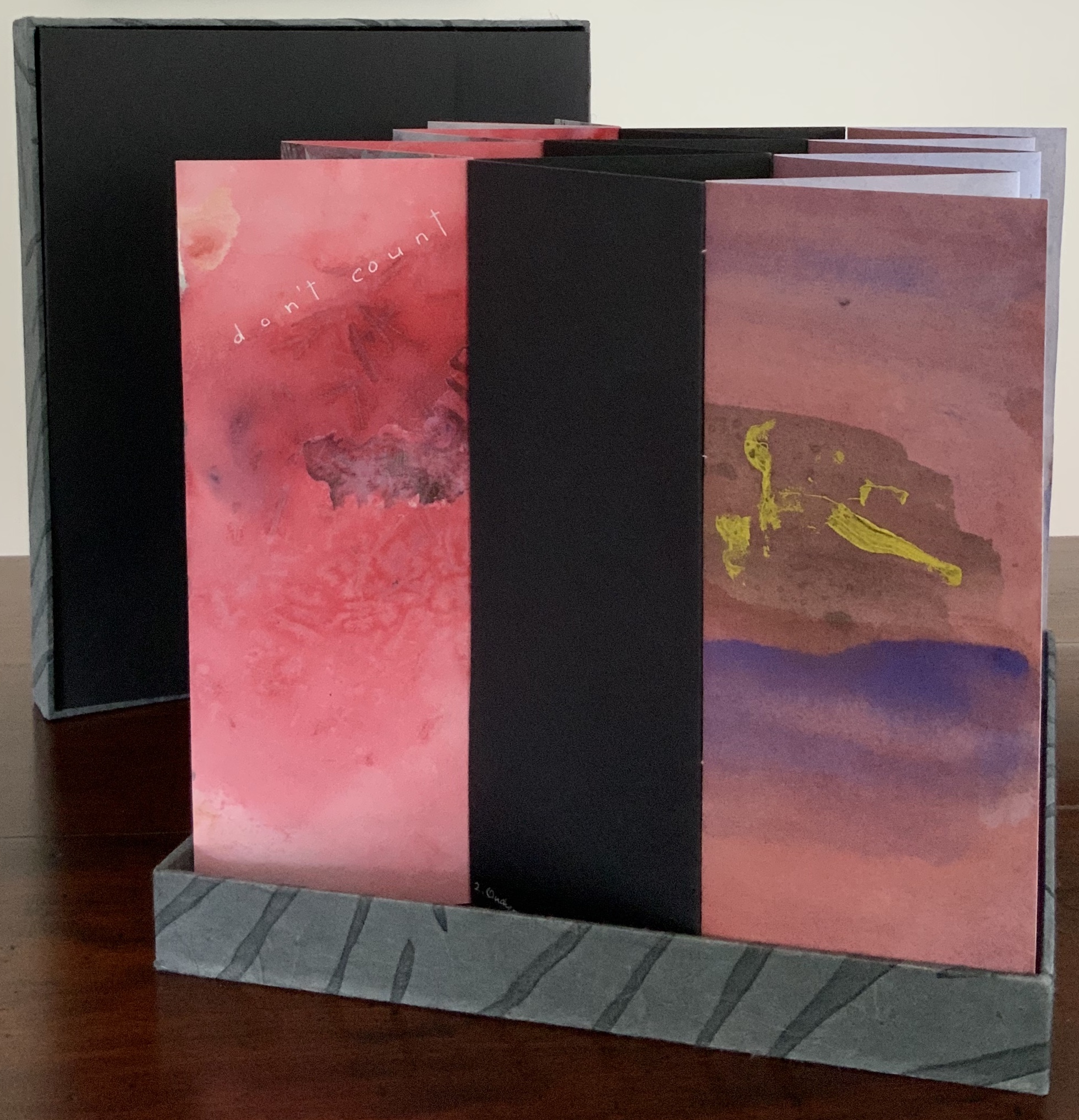
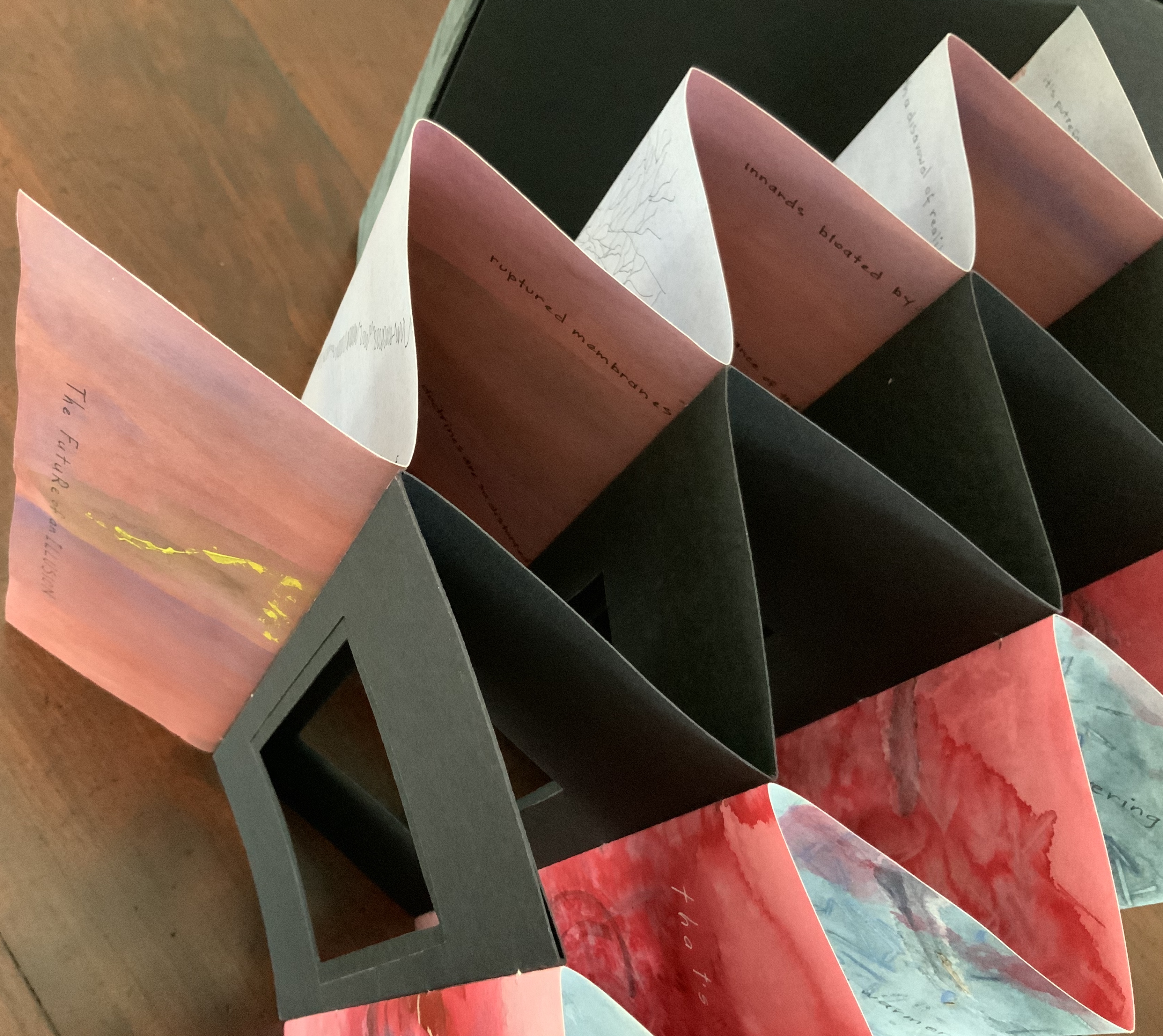
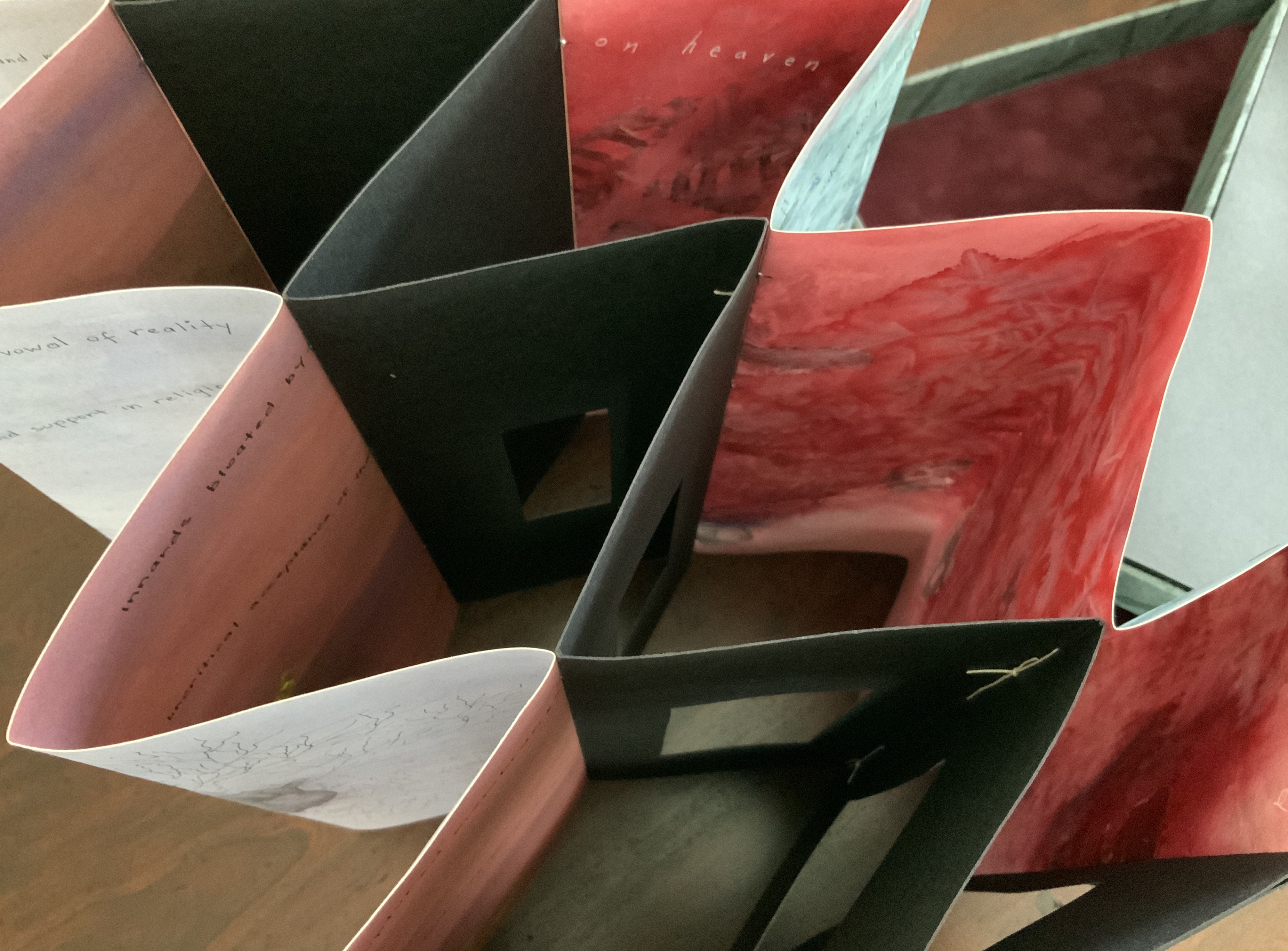
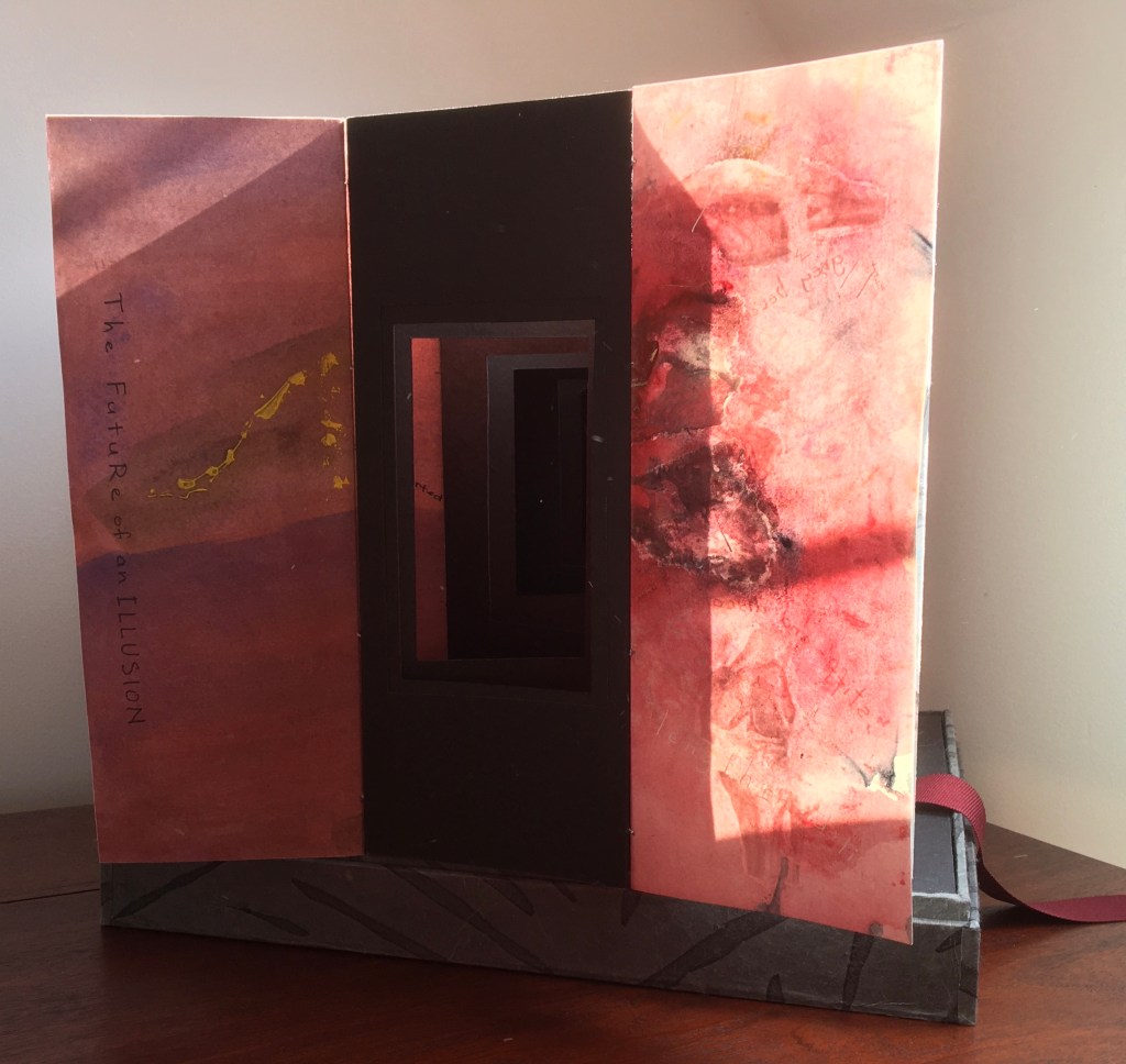
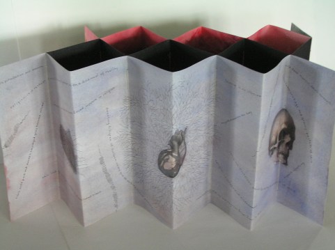
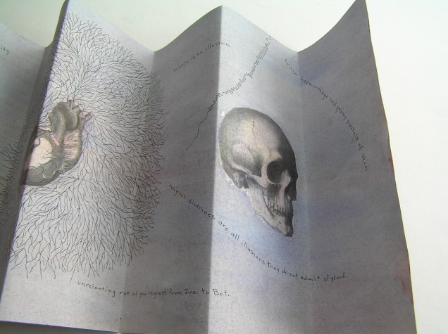
Sculptural tunnel book structure (three joined four-fold leporellos) enclosed in a folder and protective boxin a box,. Box made with Lamali handmade paper, suede paper (lining), silk ribbon and Somerset Black 280 gsm; Folder: Canson black 200gsm, skull button and waxed thread; Leporello: center leporello made of Canson black 200 gsm, adjoining leporellos made of Arches watercolour paper 185 gsm with acrylic, soluble carbon, gouache and transfer ink jet images. Box: H275 x W313 x D34 mm; Folder: H258 x W295 x D21 mm; Book: H250 x W290 x D16 mm closed, D770 mm. One of an unnumbered, signed edition of 4. Acquired from Helen Malone, 12 September 2017. Photo: Books On Books Collection.
Photos: Books On Books Collection.
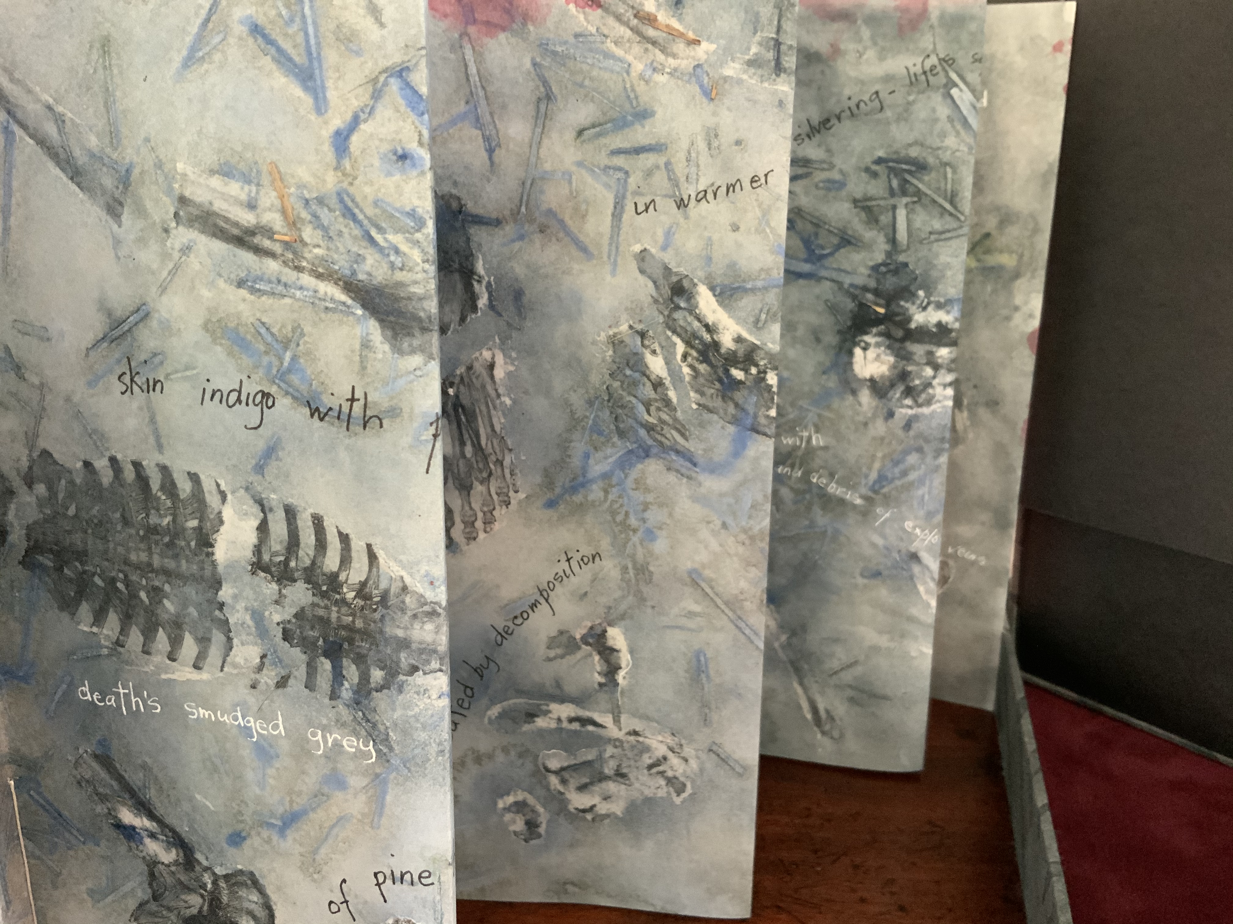
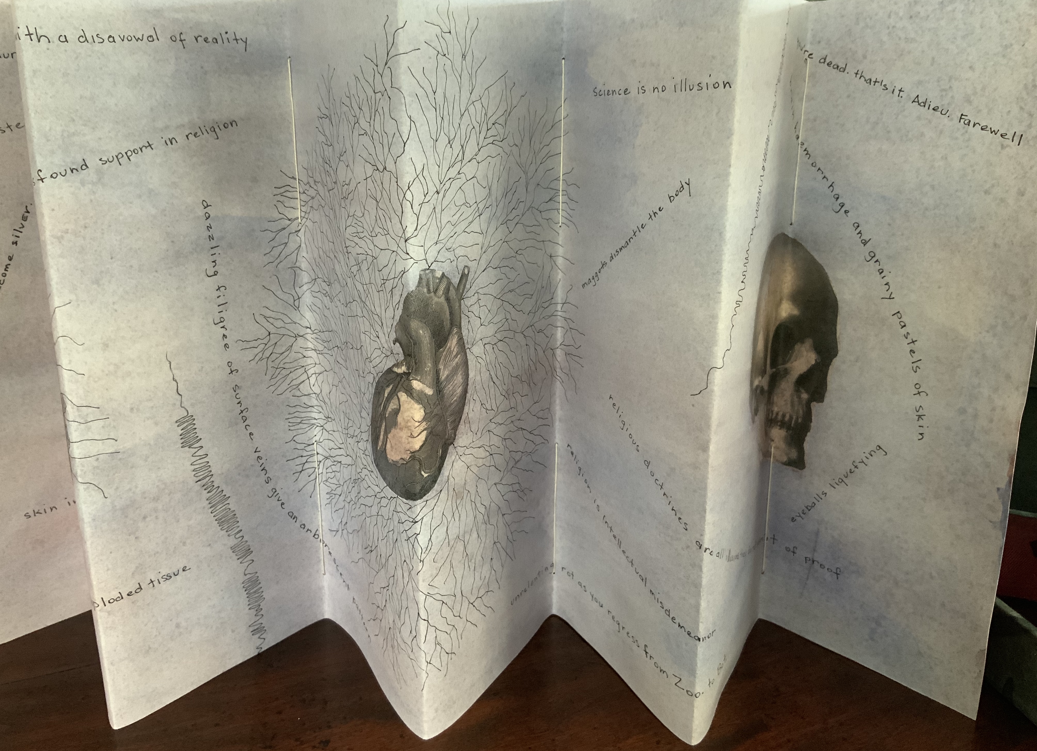
Like The Legacy of Absence and Silence, this work uses joined accordions, but builds on the cut-outs in the former to construct a tunnel book down the middle. The integration of structures here is further remarkable as a result of another collaboration between Malone and Jack Oudyn. Selected for the 2017 Manly Library Artists’ Book Award exhibition in New South Wales, Australia, The Future of an Illusion demonstrates an effective collaboration in a field of art densely populated with — almost defined by — collaborative efforts. One pair of artists to compare with Malone and Oudyn is Sonia Delaunay and Blaise Cendrars. Over a century ago and half a world away, they collaborated on La Prose du Transsibérien et de la Petite Jehanne de France, also in an accordion format modified perfectly to its subject with an aim to create a work in which color, image and words are experienced simultaneously. Malone writes that it “has always been very influential generally on my work” (correspondence with Malone, 24 September 2017).
Rather than springing from an interaction over one poem, The Future of an Illusion springs from two imaginations struck by two literary works: Sigmund Freud’s eponymous book arguing against belief in an afterlife and Jim Crace’s novel Being Dead documenting the decomposition of a dead body left in nature. The choice of the two texts, the colors of putrescence, the void toward which the central tunnel leads, the coffin-like box in which the work is stored, locked with a button skull — all create a simultaneous tension of several emotions — fear, humor, sorrow, hope, despair, revulsion and aesthetic pleasure.
Photo: Books On Books Collection.
Exhibitions:
Between the Sheets, Central Gallery, Perth , WA, 18 March – 8 April 2017.
Second venue for Between the Sheets, Australian Galleries, Collingwood, Melbourne, Vic, 13 June – 2 July 2017.
Manly Library Artists Book Award, The Creative Space, North Curl Curl, NSW, 30 March – 2 April 2017.
Art on Show Awards, Artspace Mackay in association with Mackay Show Association, 11-22 June 2017.
6th Artists Books Fair, Grahame Galleries in association with Griffith University, Brisbane, 7 – 9 July 2017.
Collections:
Artists (1/4 & 3/4), State Library of Queensland Artists Book Collection, Brisbane (4/4).
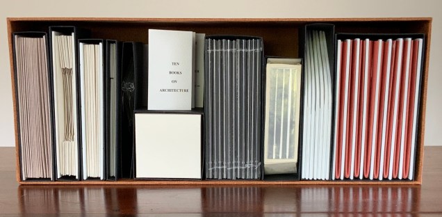
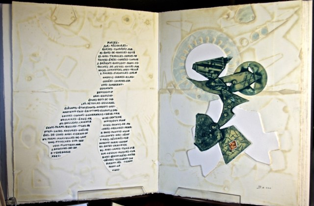
Open-sided box containing ten individual adapted book structures. Closed: H175 x W440 x D110 mm; Open: H500 x W600 mm. Version 4. Acquired from the artist, 24 November 2017. Photo: Books On Books Collection.
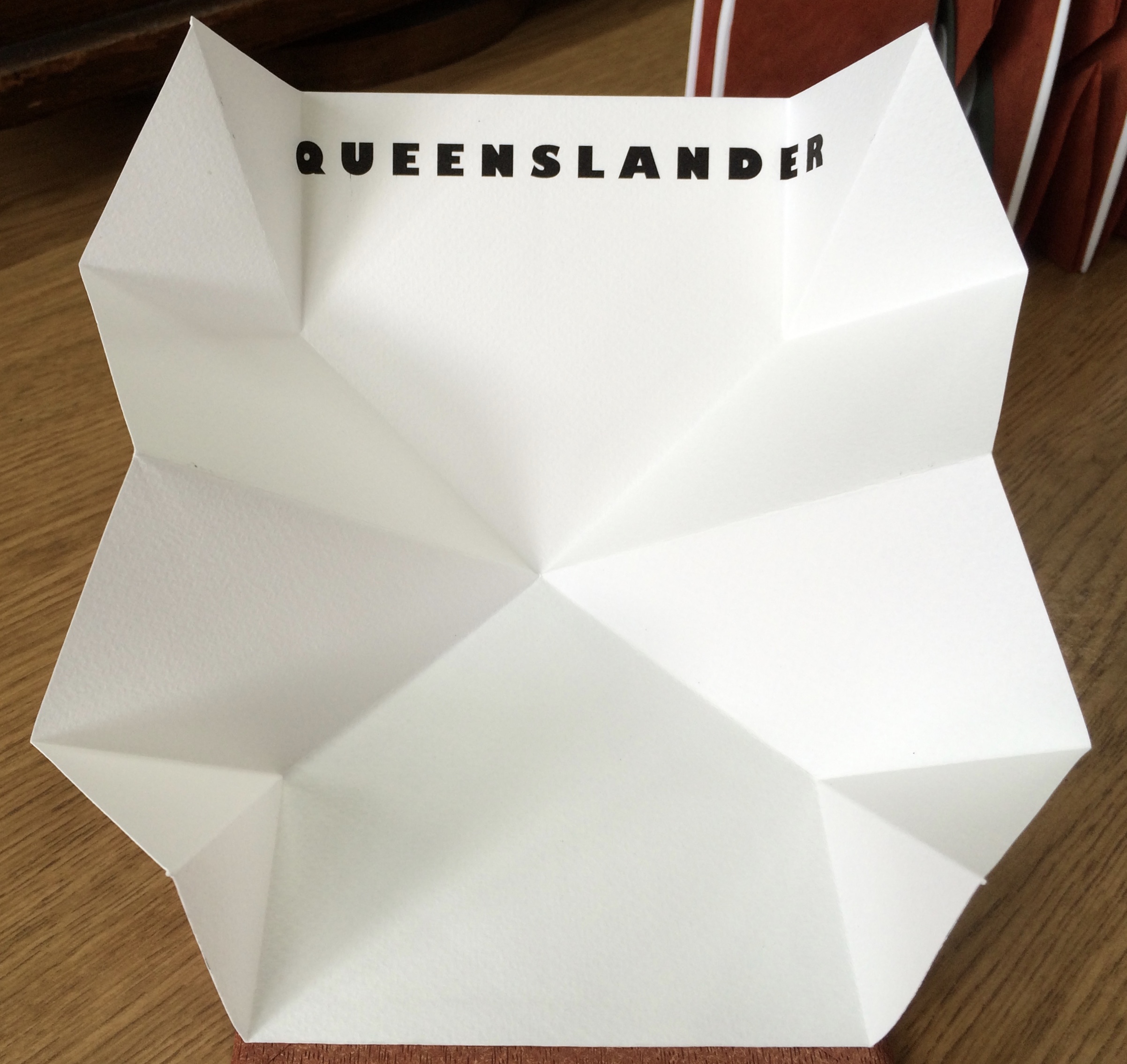
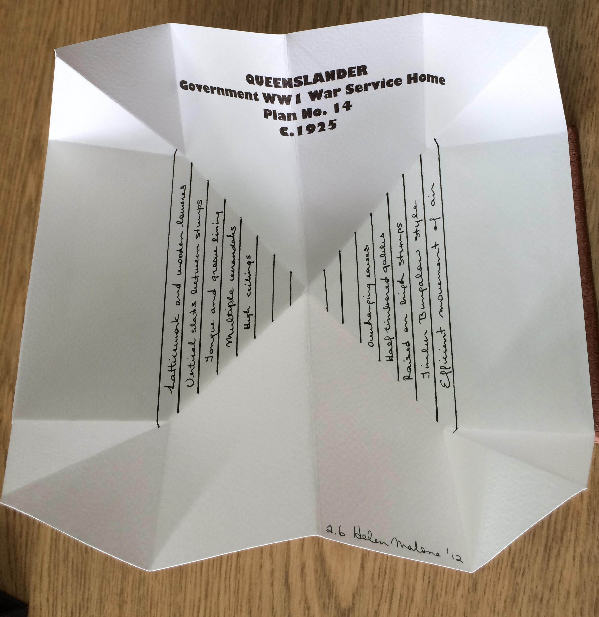
Inspired by De Architettura by Vitruvius and De Re Aedificatoria by Leon Battista Alberti, Malone created her first version of this work in 2006. Three others followed: in 2012, for the Pratt Institute; in 2013, for the State Library of Queensland; and in 2017, for this collection. In the 2012 version, the sixth book — Queenslander — differentiates that version from the others. The 2017 version is differentiated by its tenth book — Zaha Hahid.
These differentiators signal the abundant variety of structures within each version. Their unerring “rightness” for the subject of each “volume” astounds.
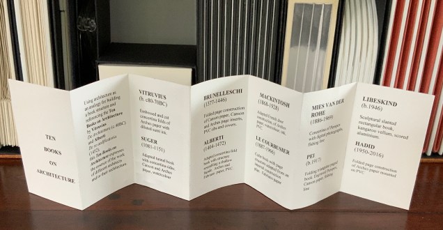
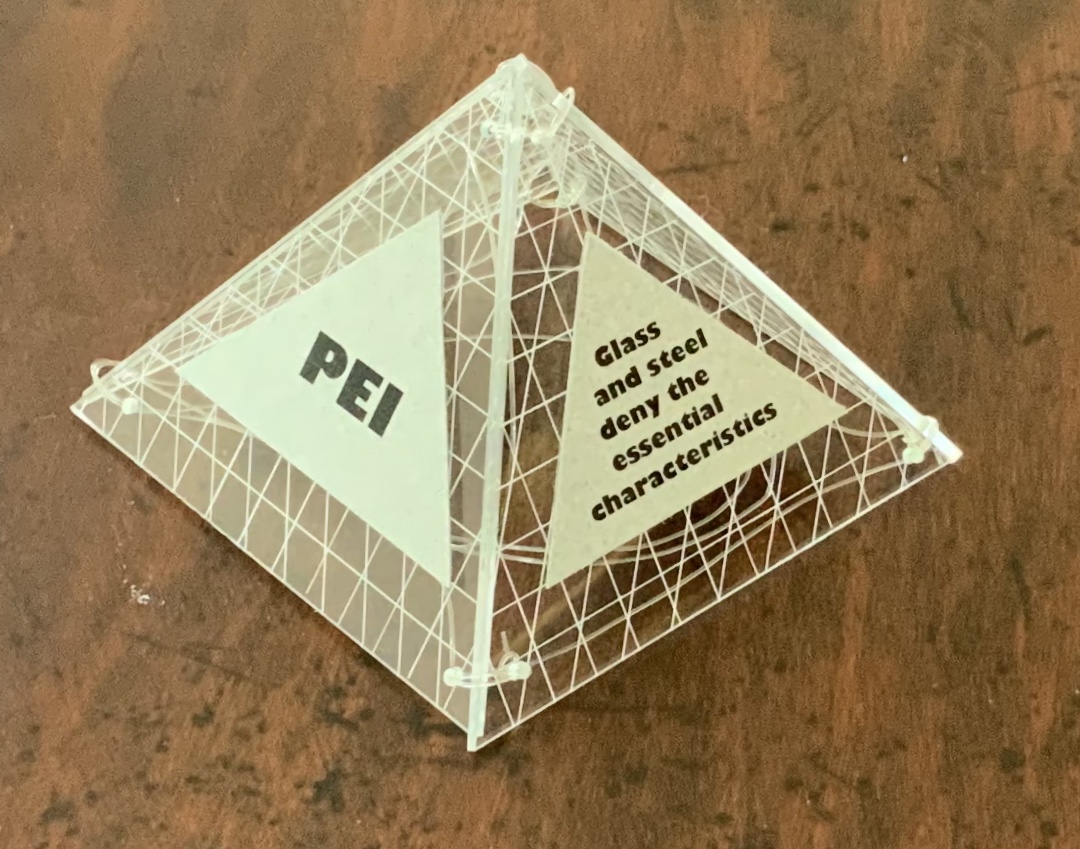
Book One — Vitruvius — consists of embossed and cut concertina folds of Arches paper with diluted sumi ink; when displayed, the line of columns suggests a Roman temple. Book Two — Suger — celebrates the French patron of Gothic architecture with an adapted tunnel book with cut concertina sides in Canson and Arches paper, ink and watercolor; when displayed, the structure suggests the stained glass windows of St. Denis. Book Three — Brunelleschi — is a folded page construction of Canson paper with page inserts of Canson and Arches paper, PVC ribs and covers; when displayed, it references the dome of the Cathedral of Santa Maria del Fiore in Florence, the internal colors of the cathedral and Brunelleschi’s credited invention of linear perspective. Book Four — Alberti — is a concertina fold book in Fabriano and Arches paper with PVC covers; its gutters and collaged pages make a structure resembling shallow facades on which several of Alberti’s statements elaborating Vitruvian principles are printed. Book Five — Mackintosh — adapts a French door construction in Arches paper, watercolor, ink and PVC to celebrate the Scottish architect and designer; when displayed, it echoes his design and its Japanese influences. Book Six — Le Corbusier — is a cube book of Fabriano paper and resembles a white concrete box; its page structure is adapted from Corbu’s internal construction plans with mezzanine floors. Book Seven — Mies van der Rohe — consists of a concertina of double Perspex pages linked with fishing line and containing digital photo images of Chicago taken by the artist; it can be manipulated to form various displays, with multiplying reflections suggesting the spread of the architect’s influence on twentieth-century cityscapes. Book Eight — Pei — is a folding triangular paged book made of Perspex and Canson paper, linked with fishing line; when displayed, the pyramid pays homage to Pei’s dome over the entrance to the Louvre. Book Nine — Libeskind — echoes the architect’s intentionally disorienting Jewish museum in Berlin; a slanted rectangular box book, made of kangaroo vellum and scored aluminum, presents its text in a way intentionally difficult to access and read. Book Ten — Zaha Hadid — consists of organic shapes and patterns on a folded pages construction of Arches paper mounted on PVC; when displayed, the book takes on a shape that echoes that of Hadid’s architectural designs.
Additional commentary and images for Ten Books of Architecture (2017) can be found here.
Exhibitions and collections:
2006 version was exhibited in Books.06, Ten and Beyond, Noosa Regional Gallery, 22 September – 22 October 2006 and was purchased from this exhibition by a private collector.
2012 version commissioned by The Pratt Institute, New York.The Collections on View at the Brooklyn Campus of the Pratt Institute and online, May – August 2013. Image published in 500 Handmade Books, Lark Publishers USA, September 2013.
2013 version commissioned by the State Library of Queensland, Brisbane.
2017 version commissioned by Books On Books Collection.
Bruce, Joan. 20 March 2023. “‘The River City’ by Helen Malone“. Queensland Memory. John Oxley Library, State Library of Queensland. Accessed 24 March 2023.
Cascio, Davide. Travel Architecture (2006). Compare with The Legacy of Absence and Silence.
Chen, Julie. 2013. 500 Handmade Books. Volume 2. New York: Lark. P. 144 (Ten Books).
Salamony, Sandra, and Peter and Donna Thomas. 2012. 1,000 Artists’ Books : Exploring the Book as Art. Minneapolis: Quarto Publishing Group USA. Pp. 95 (Tsunami), 170 (Shattered in the Shaky City).
A day’s visit with one hundred exhibitors hosted at the Arnolfini in Bristol leaves me reeling like a drunken sailor — drunk on colour, texture, light, line, shapes, words and artistry. Appropriate given the Arnolfini’s location on Narrow Quay in Bristol’s floating harbour.
Colour
Lucy May Schofield talked to me about her “search for the indigo that is infinity”. The Distance of Us is only one of several pieces demonstrating how close she is coming. The Longest Day on her site is one among many by which to enjoy her progress.
The Distance of Us Lucy May Schofield Photo: Books On Books
Mick Welbourn took time to explain how his search among inks, paper and geometric shapes kept leading him from a unique work (oil-based) to multiples and back to uniques. These colours reminded me of the work of Sonia Delaunay.
Mick Welbourn Photo: Books On Books
Texture
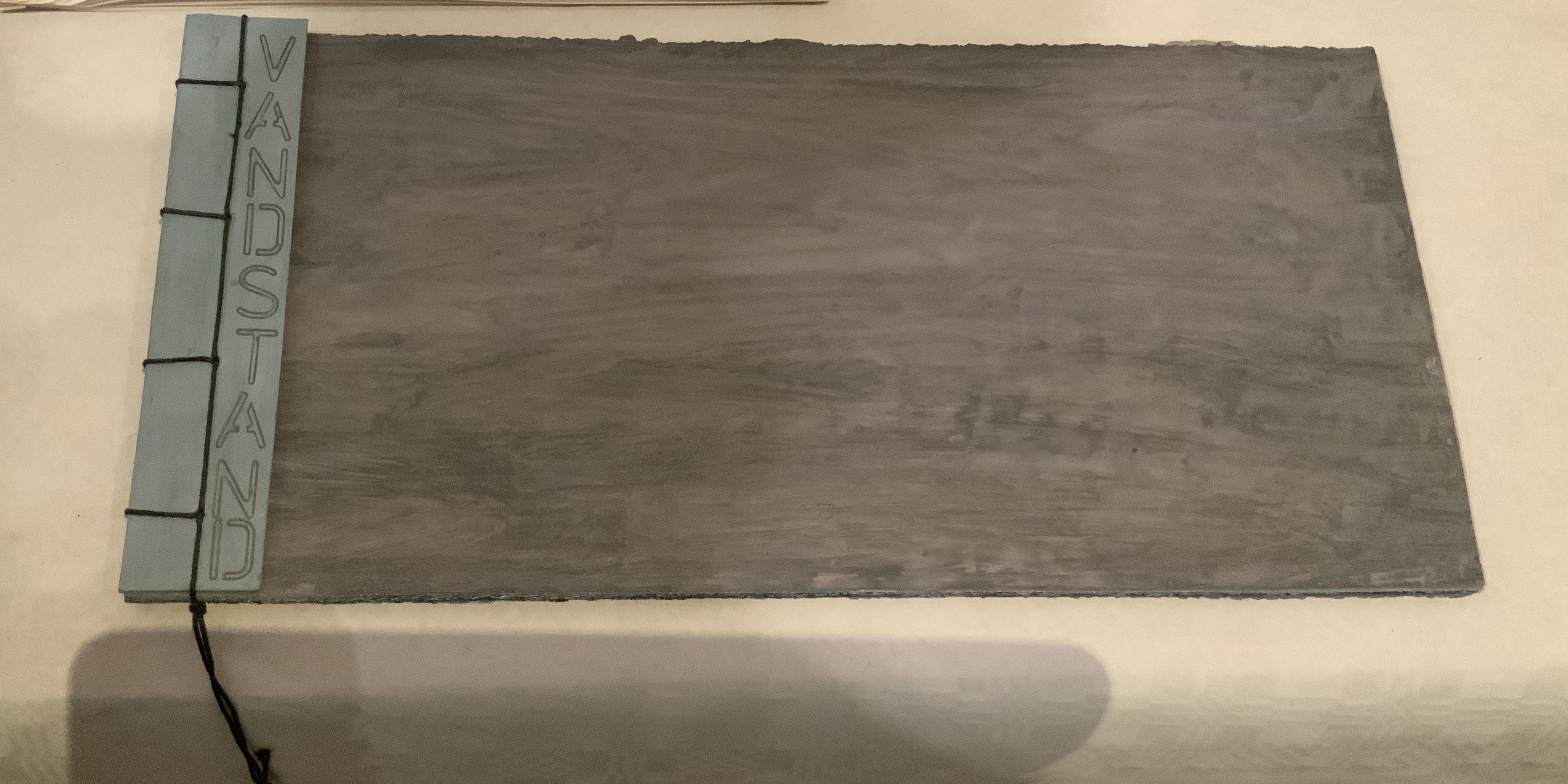
Bodil Rosenberg, a member of the Danish collective CNG (Anna Lindgren, Bertine Knudsen, Birgit Dalum, Pia Fonnesbech, Susanne Helweg), appeared delighted that I was surprised by the colour and texture of Vandstand (“water level”). Somehow after the saturation of the paper with layer upon layer of paint, each page has a supple leather- or cloth-like feel — a coolness to the touch. I think Ken Campbell would relish Vandstand.
Vandstand Bodil Rosenberg Photo: Books On Books
Vandstand Bodil Rosenberg Photo: Books On Books
Caroline Penn’s works comprised by Notes from Chesil Beach made me reach out to pick up one of the pebbles on the page. The trompe l’oeil effect of turnable pages in the photos is enhanced in one variation by inclusion of an actual small gathering of pages. The role of trompe l’oeil in book art is one worth investigating.
Notes from Chesil Beach Caroline Penn Photo: Books On Books
Light
Eileen White’s Haptic Narratives and her lumen prints for Printed Matter made a nice segue from texture to ghostly light. Printed Matter also looks forward to the “artistry” section here as book’s images are un-fixed and eventually fade away. To use the book form — the traditional form of permanent record — to present a language and reminder of material ephemerality: that is artistry.
Eileen White Photo: Books On Books
Haptic Narratives Eileen White Photo: Eileen White
Helen Douglas (Weproductions), fresh from exhibitions at Printed Matter in New York and Fruitmarket Gallery in Edinburgh, was displaying her 2017/2018 series Field Works as well as a new book Summer Alight. The photographic effects, the visual narrative and structure achieved in Douglas’s works define artistry.
Elena Zeppou’s Parallels first caught my eye because of its size, but closer inspection yielded appreciation of line — vertical as well as horizontal — and its union with text and form. Note how the lines of poetry read across the accordion.
Parallels Elena Zeppou Photo: Books On BooksParallels Elena Zeppou Photo: Zitrone PrintmakingParallels Elena Zeppou Photo: Zitrone Printmaking
Shapes
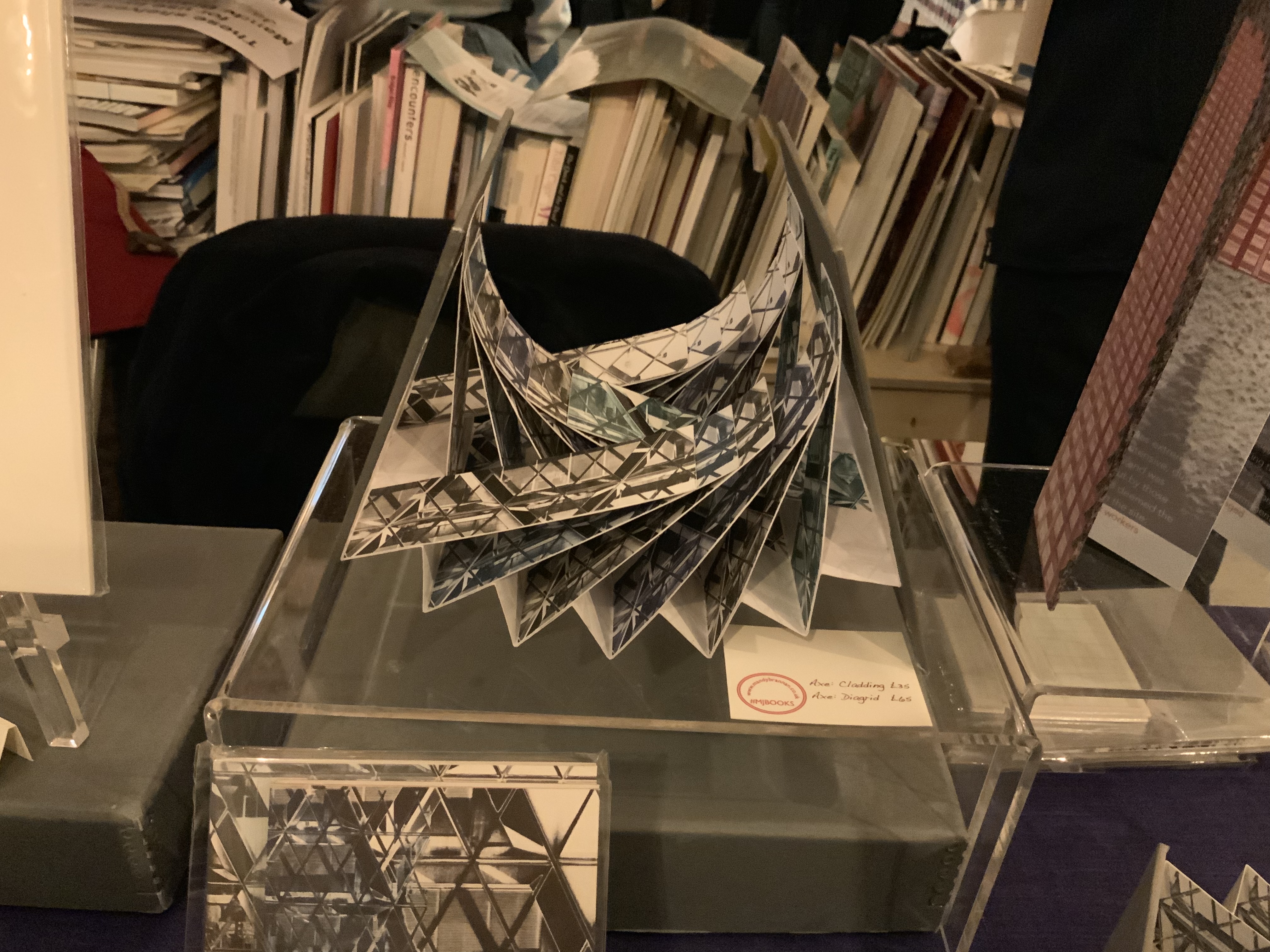
Listening to Mandy Brannan talk about custom papers, French fold books and modified flag books is almost as good as handling them. The work30 St Marys Axe (inspired by the building fondly known as the “Gherkin”) was what first drew me to her table. It has two variations — Diagrid and Cladding — which reward repeated handling as well as regarding.
30 St Marys Axe: Diagrid Mandy Brannan Photo: Books On Books
At the ArtistBooksOnline table, the shape-changer Inside/Outside by Susie Wilson kept me as busy as if it were a Rubik’s cube or paper puzzle with a medical mystery inside — or outside.
Inside/Outside Susie Wilson Photo: Books On BooksInside/Outside Susie Wilson Photo: Books On Books
Words
Puns, slippery words and slipperier concepts seemed to explode from Guy Bigland‘s table.
My inner metaphysician of Structuralism, Post-Structuralism, Deconstruction and Post-Deconstruction found its element(s) at the Atlas Press.
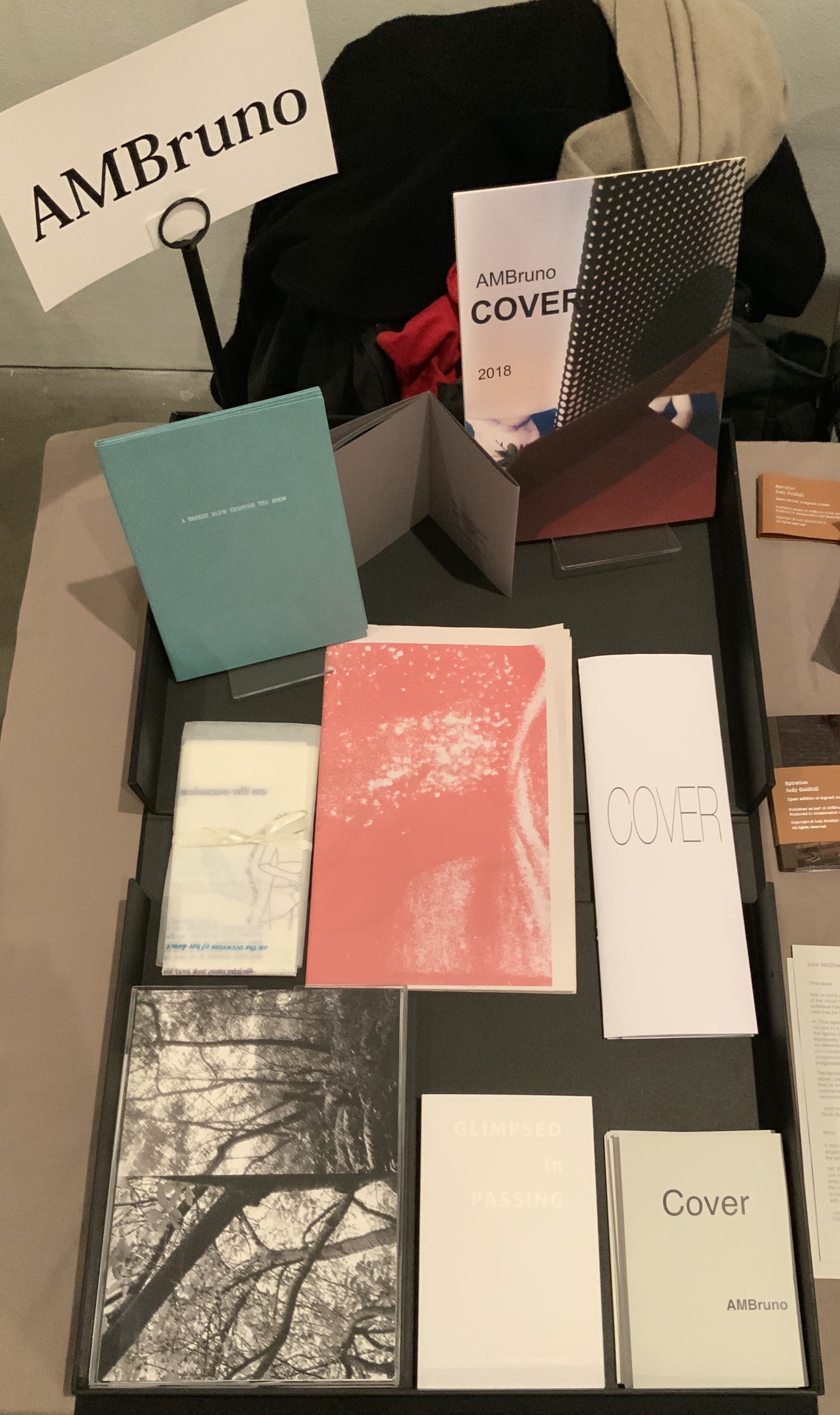
AM Bruno, run by Sophie Loss, and of which John McDowall is a founding member, is always a rich vein of artistry. The works from the 2018 theme-driven project, Cover, appear in the box below but warrant a closer inspection at the link behind the word. John McDowall had a new book on hand: Time-lapses. As I turned the brilliantly white pages, each segmented into squares like a comic-book page but only one square in each page holding an old black-and-white photo, the title began to sink home. And then came the idea that all the meaning that could possibly explain any one photo, its relation to the other squares or to other photos or to the author or to the reader/viewer — all of it — has to take place in the empty spaces between.
Janet Allsebrook displayed a Duchampian box with the Delaunay-esque title Nichoir. Although the drift of this work (“waste time making your own useless nest box”) is echoed in her other works, the echo reverberates with a deeper tone — often political or philosophical. The variety of book forms is impressive.
Nichoir Janet Allsebrook Photo: Books On Books
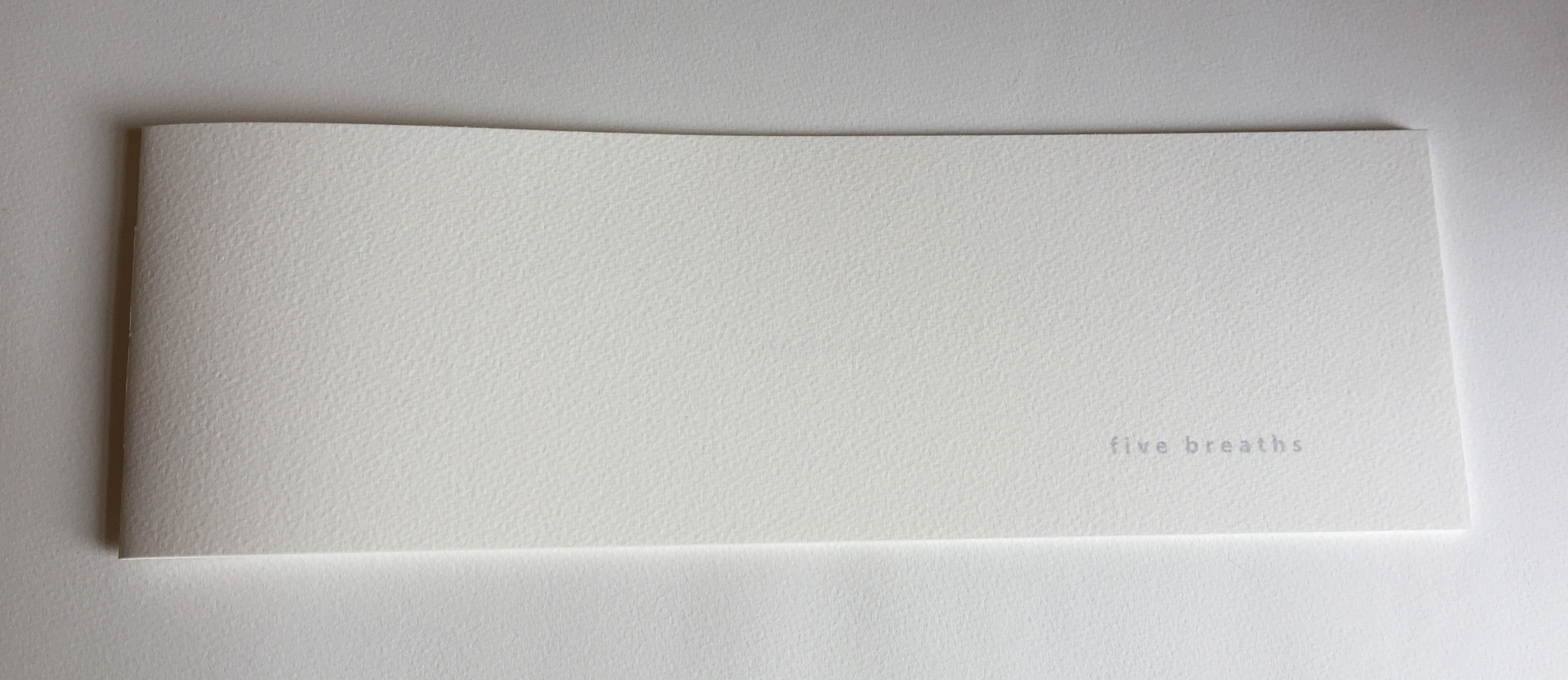
Next door was the artist of Zen book art — Julie Johnstone – Essence Press. In addition to extensions of her percentage tint series, she had on hand several explorations of breath, print and paper: each breath, a page; quietly breathing; five breaths; and ten breaths. Wherever they are, her books make a Zen garden.
Sarah Bodman and Arnolfini brought together a rich collection of talent and should be thanked for doing so and encouraged to repeat it in 2021. And to the artists mentioned — and those not — who took the time to share their thoughts on colour, texture, light, line, shapes, words and artistry: Encore!
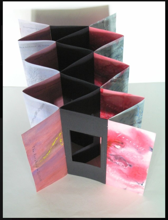
Selected for the 2017 Manly Library Artists’ Book Award exhibition in New South Wales, Australia, The Future of an Illusion by Helen Malone and Jack Oudyn demonstrates an effective collaboration in a field of art densely populated with — almost defined by — collaborative efforts:
The Future of an Illusion (2017) Helen Malone and Jack Oudyn Sculptural tunnel book structure (three joined four-fold leporellos) enclosed in a folder and protective boxin a box,. Box made with Lamali handmade paper, suede paper (lining) and Somerset Black 280 gsm; Folder: Canson black 200gsm, skull button and waxed thread; Leporellos: center leporello made of Canson black 200 gsm, linen thread adjoining two leporellos made of Arches watercolour paper 185 gsm with acrylic, soluble carbon, gouache and transfer ink jet images. Box: H275 x W313 x D34 mm; Folder: H258 x W295 x D21 mm; Book: H250 x W290 x D16 mm closed, D410 mm open. One of an unnumbered, signed edition of 4. Acquired from Helen Malone, 12 September 2017.
Edouard Manet and Stéphane Mallarmé; Bertrand Dorny and Michel Butor; Dorny and Michel Deguy; Barbara Fahrner and Kurt Schwitters; Ron King and Roy Fisher; Telfer Stokes and Helen Douglas; the Art + Language Group (Terry Atkinson, David Bainbridge, Michael Baldwin, Ian Burn, Harold Hurrell, Joseph Kosuth, Christine Kozlov and Mel Ramsden); Tom Rollins + K.O.S.; Julie Chen and Clifton Meador; and Chen and Barbara Tetenbaum.
That list is by no means comprehensive nor representative – chronologically or categorically — but it flags the strength of the tradition. One pair that is particularly apropos for Malone and Oudyn is Sonia Delaunay and Blaise Cendrars. Over a century ago and half a world away, they collaborated on La Prose du Transsibérien et de la Petite Jehanne de France, also in the leporello, accordion or concertina format. Malone writes that it “has always been very influential generally on my work.”
Cendrars as poet and publisher and Delaunay as painter were interested in achieving what they called simultaneisme, or a “simultaneous book.” They wanted to create a form of art in which painting and text could be united in expression. Delaunay painted the left column of color and abstract shapes guides us through the text, which is set in various typefaces, allowing for movement as the reader mimics the journey across the page as described in the train ride in the poem. Claire Kelly, Melville Books
The Future of an Illusion springs from two imaginations struck by two literary works: Sigmund Freud’s eponymous book on belief in an afterlife and Jim Crace’s novel Being Dead.
It delivers an emotional simultaneity that echoes the different kind of simultaneity Sonia Delaunay and Blaise Cendrars achieved. Malone and Oudyn have the advantage of their subject — death, decay and the afterlife — that provokes simultaneously conflicting emotions and states of mind. Fear, humor, sorrow, hope, despair, etc.
The choices of two texts, the double leporello and techniques — and the way they are applied — play with that emotional simultaneity beautifully. The use of Crace’s text (and the “inverse ekphrastic” influence of the whole novel, which documents the decomposition of a dead body left in nature) adds to the work’s physicality. The choice of title from Freud’s book centers the artwork’s perspective on death — the void toward which the central tunnel leads.
The Future of an Illusion appeared in exhibition at Grahame Galleries in Paddington, Brisbane, and a copy resides in the collection at the State Library of Queensland.
Renée Riese Hubert and Judd D. Hubert’s The Cutting Edge of Reading: Artists’ Books (Granary Books, 1999) is a signal work of appreciation and analysis of book art. Nearly twenty years on, it can be read and appreciated itself more vibrantly with a web browser open alongside it.
To facilitate that for others, here follows a linked version of the bibliography in The Cutting Edge of Reading — a “webliography”. Because web links do break, multiple, alternative links per entry and permanent links from libraries, repositories and collections have been used wherever possible. These appear in the captions as well as the text entries. Also included are links to videos relating to the works or the artists. At the end of the webliography, links for finding copies of The Cutting Edge (now out of print) are provided.