Books On Books Collection – Dave Wood

Alphabetica (2002)

Alphabetica (2002)
Dave Wood
Bound in vellum; open-spine binding sewn on vellum strips. H210 x W290 x D30 mm. 54 pages. Loosely inserted colophon. Edition of 26. Acquired from the artist, 27 July 2022.
Photos: Books On Books Collection. Displayed with permission of the artist.

From Alphabetica‘s description as an exploration of the alphabet’s “diverse development from historic shapes to the infinite variations we see today in typefaces and calligraphic forms of the Western alphabet”, the reader might expect an academic work. The deeply embossed and debossed royal purple cover presenting the title in landscape format suggests otherwise as do the marbled endpapers and embossed gold foil title page. The cover is built up with a very strong paper made in Nepal, painted with acrylic then sprayed with semi-matte varnish. Inside, the reader finds a portfolio of twenty-five distinct “canvases” in which Wood demonstrates both historical sensitivity and artistic inspiration.

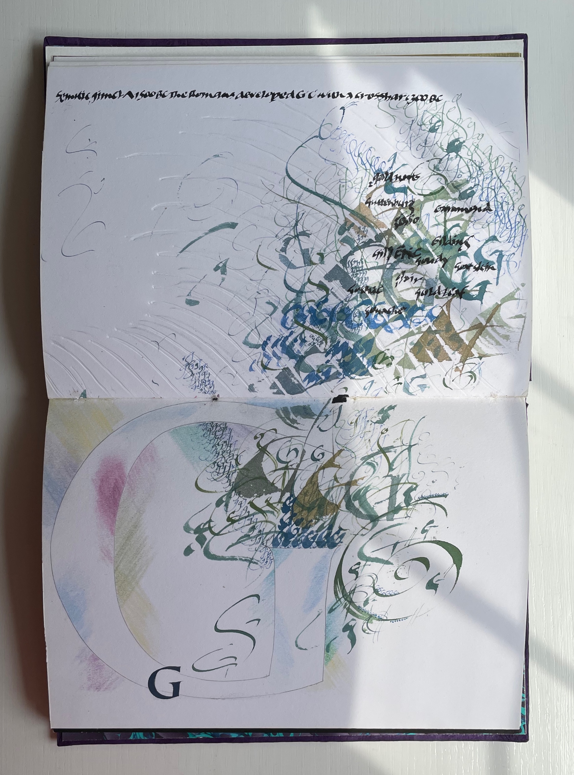
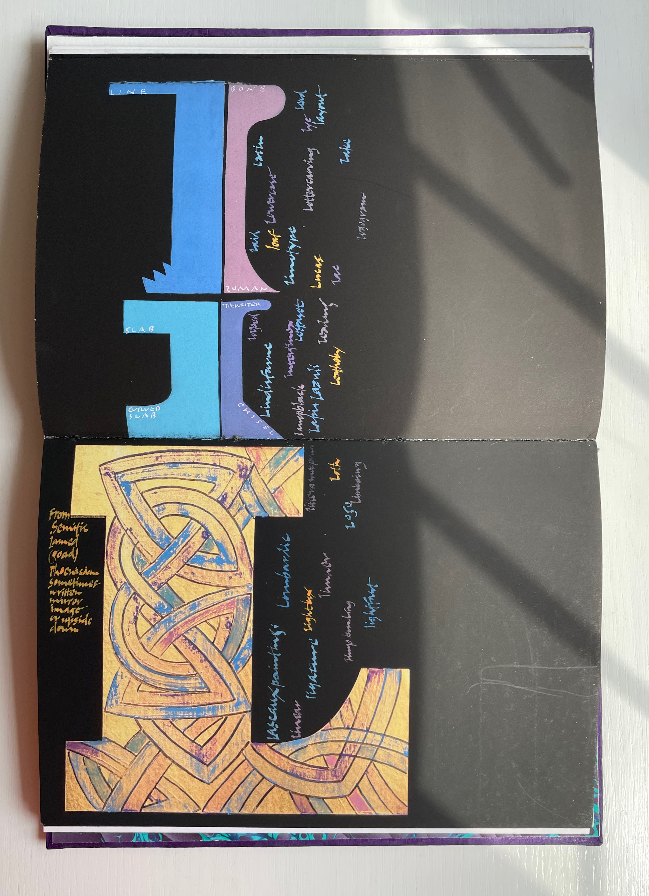
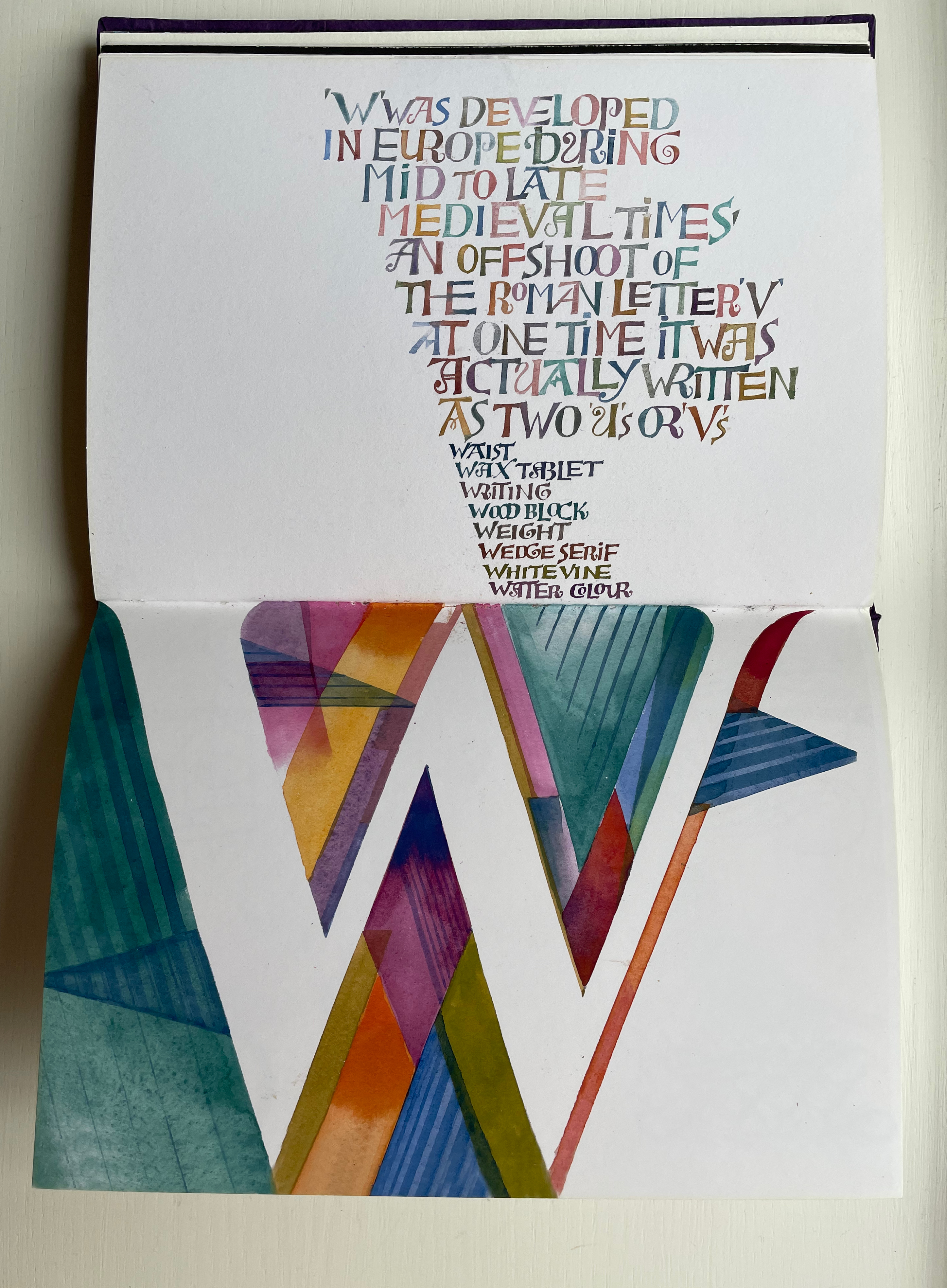
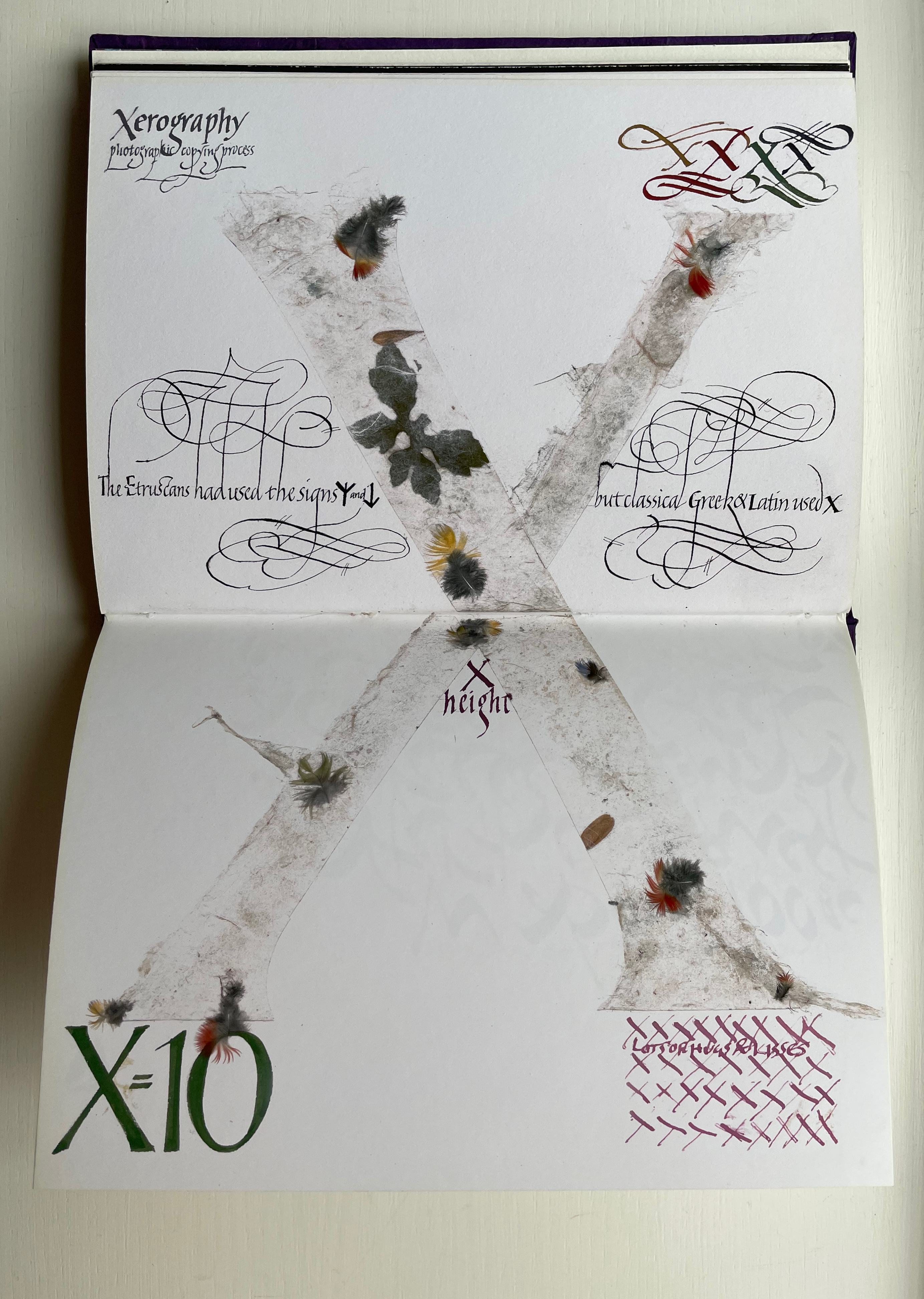
Across the twenty-six spreads, Dave Wood has captured each letter’s distinct story with multiple styles of calligraphy in Sumi ink and gouache paints as well as varying textures and techniques (Canson and Arches paper, glassine, foil, embossing, stamping, feathering and cutting), colors and layouts.

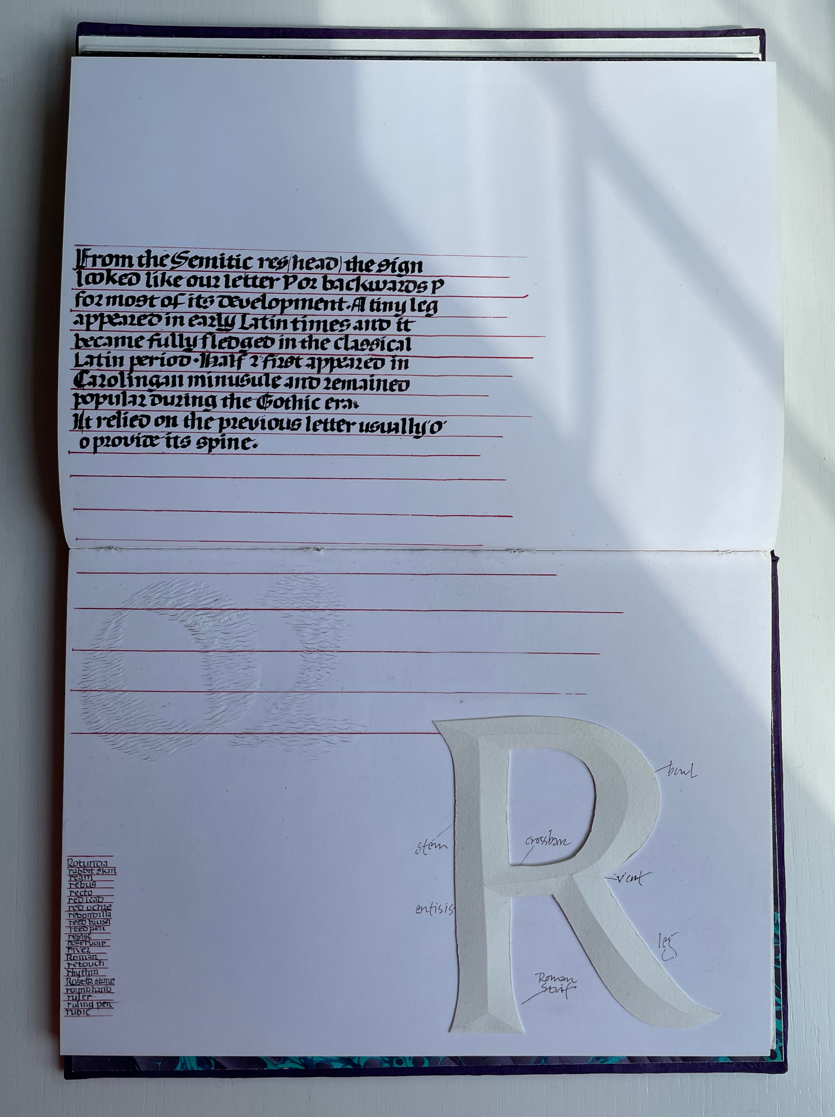
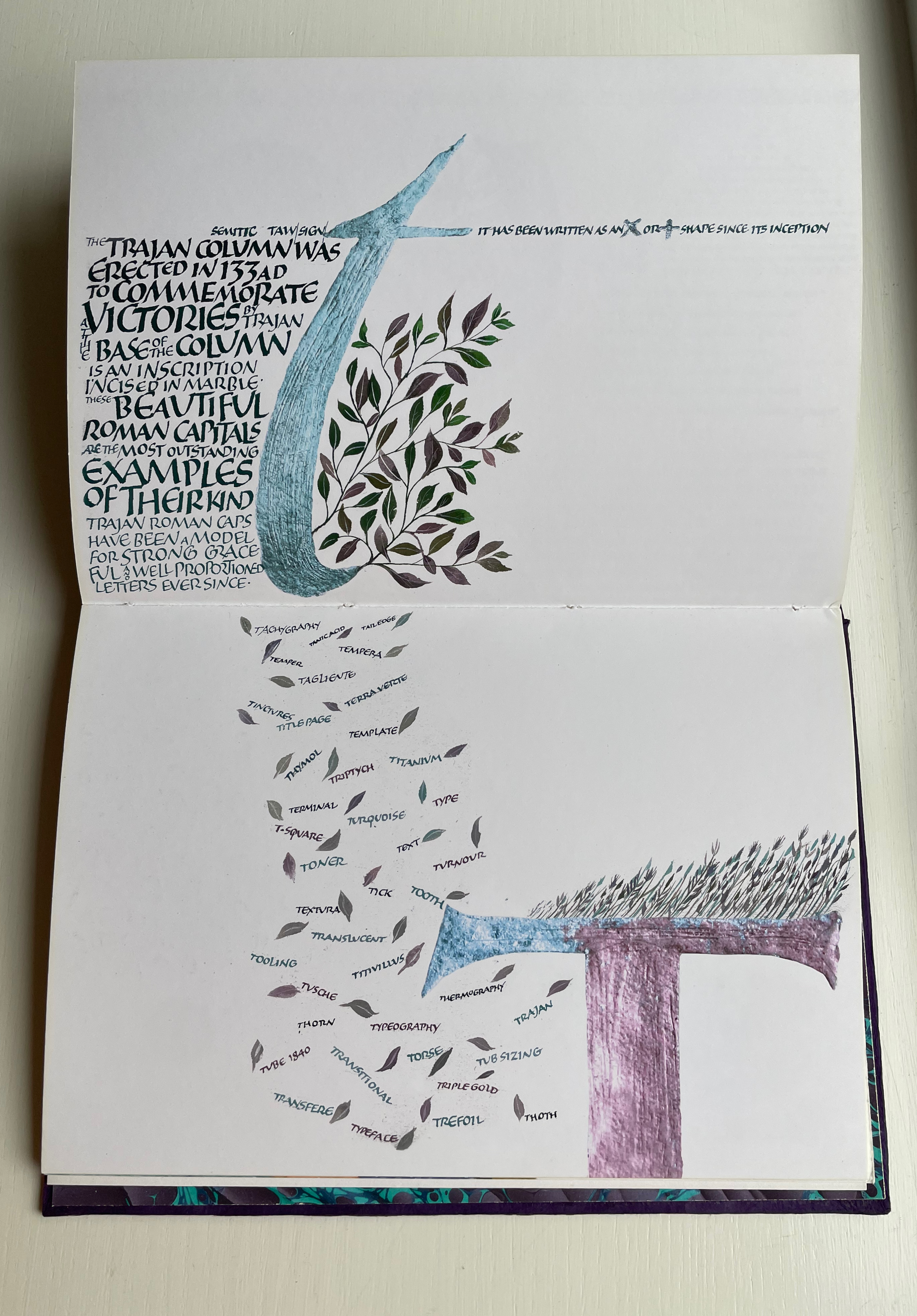
The letters’ developing shapes and periods are labeled. Starting with the letter B, Wood adds names of typefaces, structural terms for type, palaeographical terms and terms from the crafts of calligraphy, typesetting and printing — all beginning with /b/. Similar labeling occurs for the letter C but with a different layout. Across the twenty-five canvases, Wood excels at this balancing of difference and similarity. Notice, for example, how letters B and C incorporate the Renaissance style of illumination called bianchi girari (white vine stem decoration).

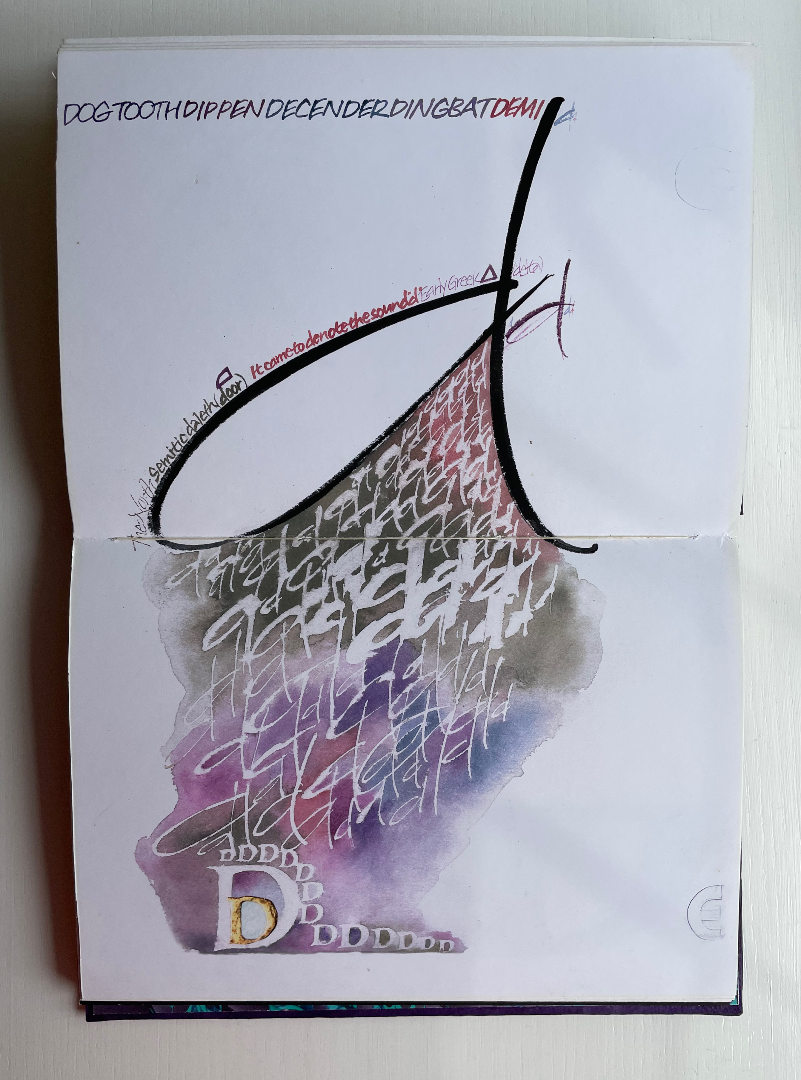
The ways in which uppercase-to-lowercase movements interact with the layout’s variations make for a dynamic experience. Sometime it’s subtle, sometimes vigorous. Note, for example, how the letter D de-emphasizes the gutter whereas the letter E emphasizes it.

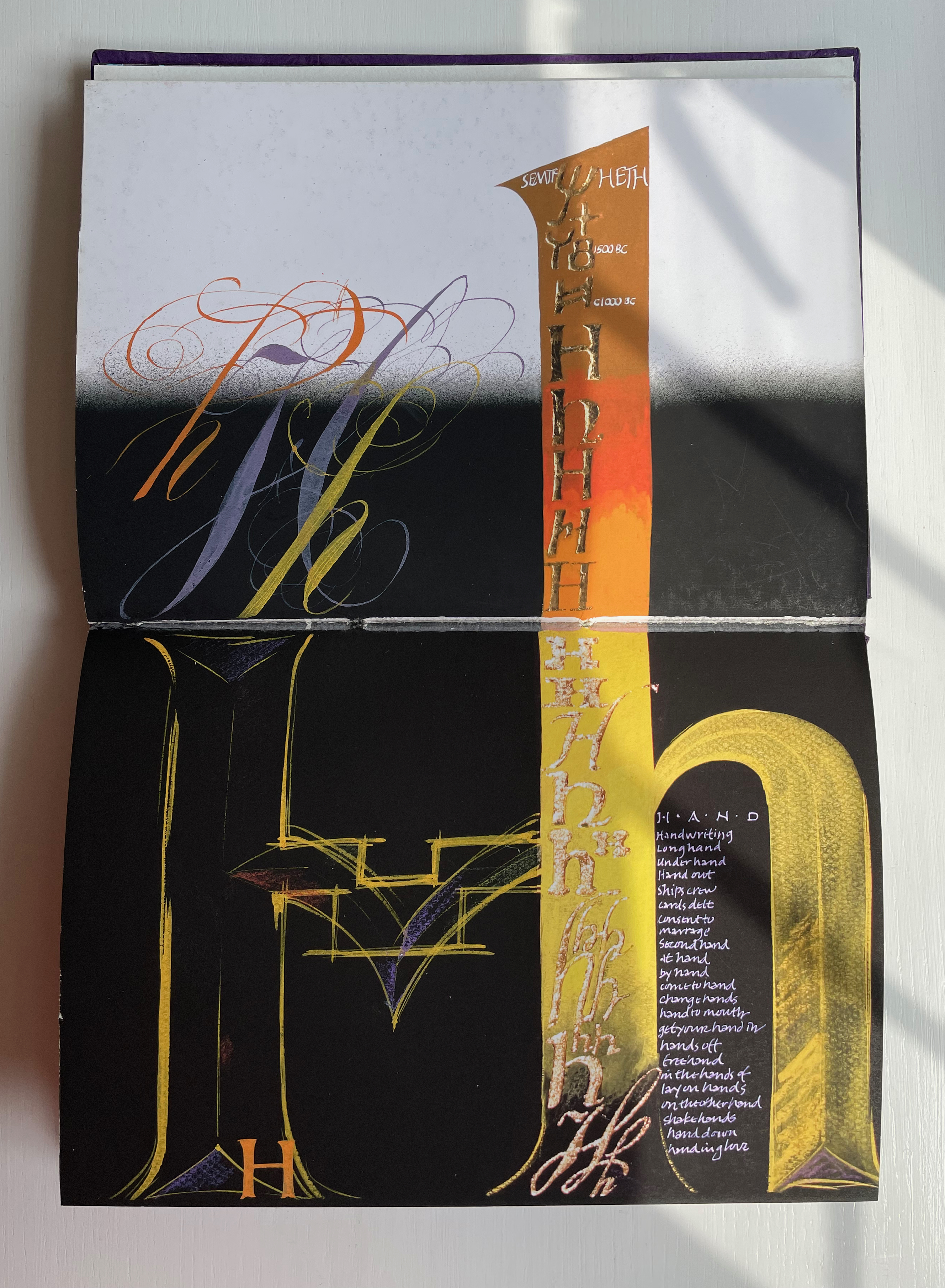
With letters H through Q, a shift from Arches white to Canson black paper and back adds to the overall dynamic movement. Yet Wood is attentive to elements of unity; for example, his playful handling of the gutter in the transition from letter H to letters I/J echoes that from letters D to E.

Only six letters perform the trick of extending across the gutter — lowercase H and uppercase K, M, O, U and X. While O, U and X take the similar approach of almost evenly straddling the gutter, each of the other three succeed differently. M is perhaps the most striking and interesting of them all. M derives from the Semitic word for “water” mem. As Wood points out in the loose insert colophon, the watery blue that fills the letter is intentional — as must be the precise alignment of the inner peaks of the letter with the gutter. Such attention to detail in the midst of so much activity on the page demands a similar attentiveness from the reader.

For example, the long tail of the Q does not show up until the bottom of the spread. And the reader may need to pick out the the word “or” in the text to spot the lowercase r in the textured, oversized written word “or” directly below the text.

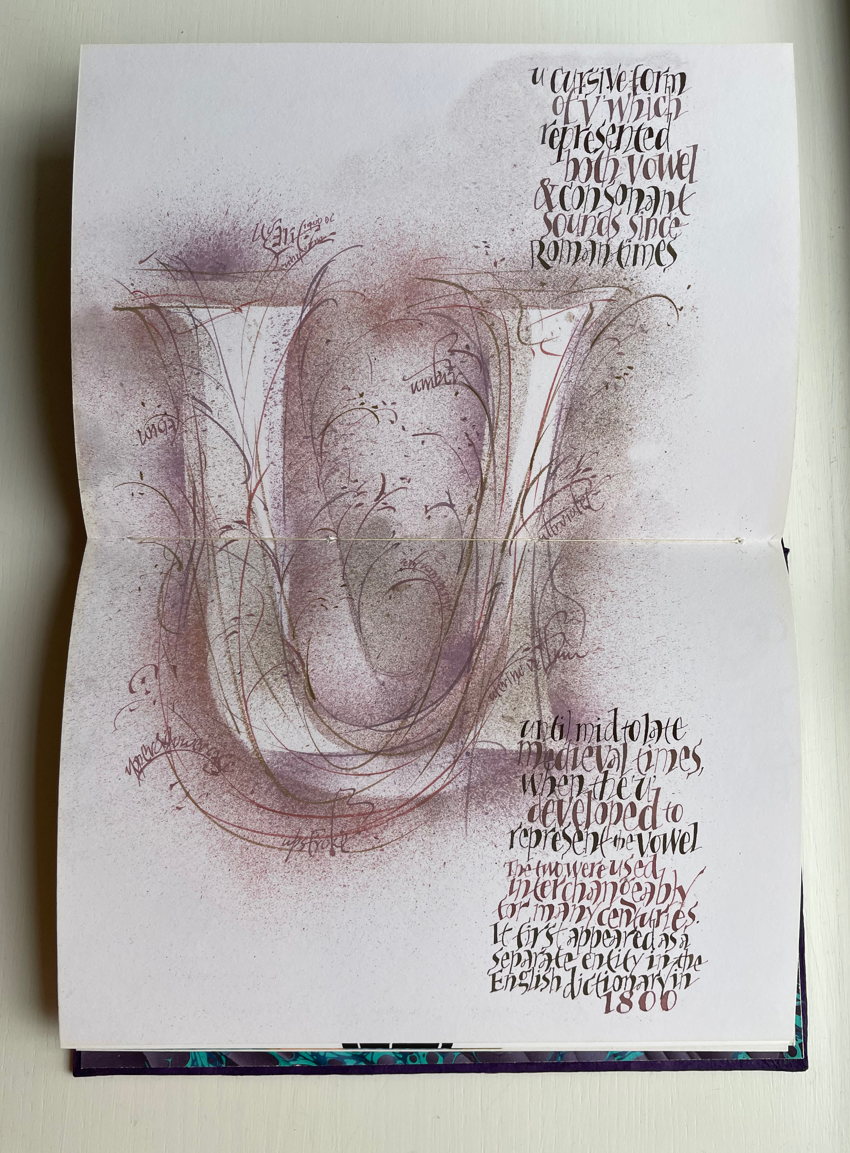
Visual puns abound. Celtic knots in a capital L (for the Lindisfarne gospels). An S formed of stones. Leaves falling from a lowercase t (for tree or tea, of course). A U growing underground.

Fortunately, the accordion-fold colophon loosely inserted in the book offers pointers to some (not all) allusions. For example, the beginning of the third line for the letter V pays homage to Titivillus, the 13th-century patron demon of scribes’ mistakes. The illustrated W is an homage to Ben Shahn’s letter design. The highly contrasting thicks and thins in the letter X allude, in calligraphic terms, to the thick mark’s determining the number of pen widths making up the x height (the body of the miniscule).

And while the colophon may be necessary to know that the typefaces written in color below were created by Hermann Zapf, any viewer can enjoy Wood’s incorporating the entire alphabet in the Sumi ink design culminating in the letter Z as a fitting self-referential conclusion to Alphabetica.

Further Reading and Viewing

Abecedaries I (in progress)“. Books On Books Collection.

Lyn Davies“. 7 August 2022. Books On Books Collection.

Timothy Donaldson“. Books On Books Collection.

Cari Ferraro“. Books On Books Collection.

David J. Goldman“. Books On Books Collection.

Rudyard Kipling and Chloë Cheese“. Books On Books Collection.

Abe Kuipers“. Books On Books Collection.

Don Robb and Anne Smith“. Books On Books Collection.

James Rumford. 21 November 2022. Books On Books Collection.

Tiphaine Samoyault“. Books On Books Collection.

Ben Shahn“. 20 July 2022. Books On Books Collection.

Tommy Thompson“. 21 August 2022. Books On Books Collection.

Mark Van Stone“. 1 June 2023. Books On Books Collection.

Demeude, Hugues. 1996. The Animated Alphabet. London: Thames and Hudson.

Shaw, Henry. 1845. Alphabets, Numerals and Devices of the Middle Ages. London: W. Pickering.

Books On Books Collection – Carol DuBosch

In these additions to the Collection, Carol DuBosch joins the art of calligraphy and the art of the fold at the hip. The subtlety and fineness in her execution of both reward multiple viewings from multiple angles and repeated manipulation.

Rainbow Alphabet Snowflake (2013)

Rainbow Alphabet Snowflake (2013)
Carol DuBosch
Star book enclosed in flap purse. H4”x W5.5”x .D75” closed, W8.5” diameter open. Edition of 20, of which this is #1. Acquired from the artist, 17 November 2022.
Photos: Books On Books Collection. Displayed with artist’s permission.

A frequent activity in book art is the thematic challenge. In 2010 from her studio in Maleny, Queensland, Australia, Fiona Dempster initiated an annual global challenge to calligraphers to create a letter a week. The challenge ran through 2014 and generated not only outstanding works of calligraphy but artists’ books as well. Two of these works came from Carol DuBosch.

Standing at the check-out counter of my art supply shop, I found myself gazing at a cabinet filled with bright color note cards and envelopes. I decided to take home a handful and try to make a book I had just become familiar with: Snowflake Book. I realized that the colorful notecards would be perfect for the pages of a Snowflake Book. And indeed, they were! Each module page of this book is made from two of the folded notecards. I simply added another fold to one of them and cut out the rectangle window. I printed six of my alphabet designs on acetate transparencies and attached them to view in the windows. The book opens fully to form a star-shape. The front & back cover attach using hidden strong magnets. — Carol DuBosch, 16 November 2022, Correspondence with Books On Books.

No two snowflakes are alike, yet they are all snowflakes. Taking her cue from this, DuBosch offers up five distinctive alphabets in her star-cum-snowflake book structure and, in one view, goes twenty-six better with a distinctive style for each letter.

Video: Courtesy of Carol DuBosch

Following in the tradition of so many artists, DuBosch creates and teaches. This next work neatly exemplifies that, reveals some of the techniques by which she achieves the subtlety in her work, and demonstrates her mastery of each.

Alphabet of Calligraphic Tricks (2014)

Alphabet of Calligraphic Tricks (2014)
Carol DuBosch
Double-sided leporello. H4” x W4” x D0.75” closed, W4’8” open. Unique. Acquire from the artist, 17 November 2022.
Photos: Books On Books Collection. Displayed with artist’s permission.

I made this collection of techniques to share with students in class. It is compact and easy to transport and set up as a display in classes. Each page is a Gothic majuscule rendered with specified materials or tools. The caption outlines the process. The book was a project for A Letter A Week in 2014, administered by Fiona Dempster in Australia. Each participant organized a project incorporating letters and posted each week. I was able to complete two different alphabet books during the year. The binding style is a Leporello, a form of Concertina fold books. The entire book is created by overlapping pieces of cardstock folded in half. This method of binding creates a sturdy book that opens for display on both sides easily. — Carol DuBosch, 16 November 2022, Correspondence with Books On Books.

DuBosch’s concluding comment above highlights an abiding concern with what the structure of a work contributes to function. A similar function is achieved in the next very different structure that Hedi Kyle has labeled as “Interlocking Loops” and DuBosch calls a “gallery structure”.

Embossed Alphabet Gallery (2019)

Embossed Alphabet Gallery (2019)
Carol DuBosch
Gallery structure combining leporello, flag and star book forms. H6.25”x W1.25”x D.5” closed, W9” open for display. Edition of 15, of which this #1. Acquired from the artist, 17 November 2022.
Photos: Books On Books Collection. Displayed with artist’s permission.

This book was made as an edition for a book-exchange. I wanted to use the Gallery structure and chose the alphabet as the subject. I used an embossing stencil I had made thirty years ago for the letters. I found parent sheets of the linen textured card stock, and it was excellent for the folding and embossing. I’ve always enjoyed the quote about the mystic art of writing by William Massey and was delighted to find a place for it in this structure. — Carol DuBosch, 16 November 2022, Correspondence with Books On Books.

The many ways of displaying this sculpture and its gallery of letters might cause the viewer to miss how they counterpoint the end of the quotation from William Massey’s The Origin and Progress of Letters (1763). The effect recalls the gray-white of Greek and Roman sculpture, many of which originally were painted.

Further Reading/Watching

Abecedaries I (in progress)“. Books On Books Collection.

Dempster, Fiona. 2010, 2011, 2012, 2013 and 2014. A Letter a Week.

DuBosch, Carol. 2020. The Calligraphic Coronavirus Chronicles Book. Portland: Carol DuBosch. Posted on YouTube by The Oregon Food Bank, 18 November 2020. Accessed 1 November 2022.

DuBosch, Carol. 2018. Folded Pen Adventures. Portland: Carol DuBosch.

Kyle, Hedi, and Ulla Warchol. 2018. The Art of the Fold How to Make Innovative Books and Paper Structures. London: Laurence King Publishing. See review here.

Paper & Ink Arts. 5 June 2014. “Calligrapher’s Corner: Consulting with the Experts, Volume 4 Carol DuBosch“. Paper & Ink Arts. Accessed 1 November 2022.