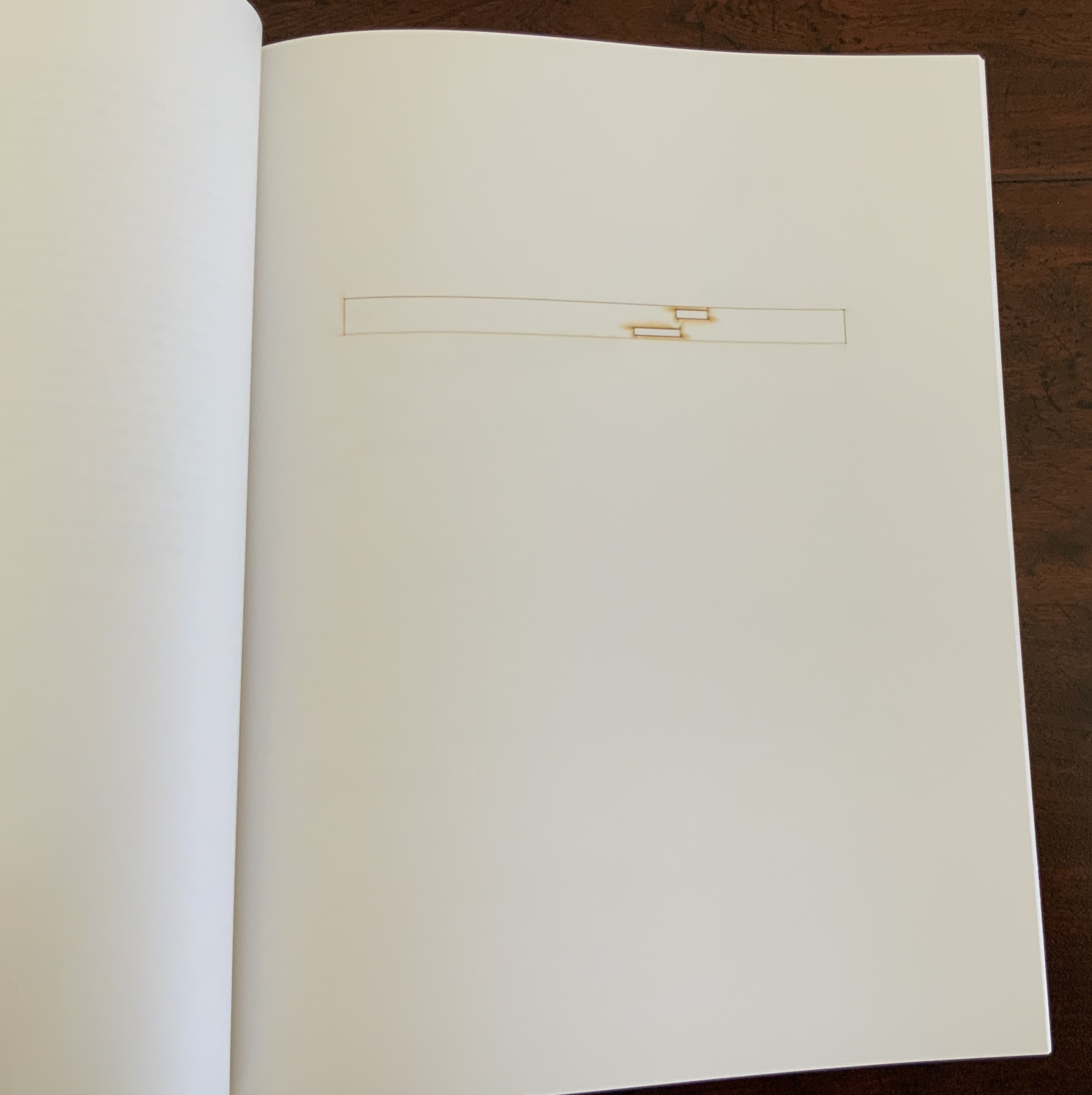
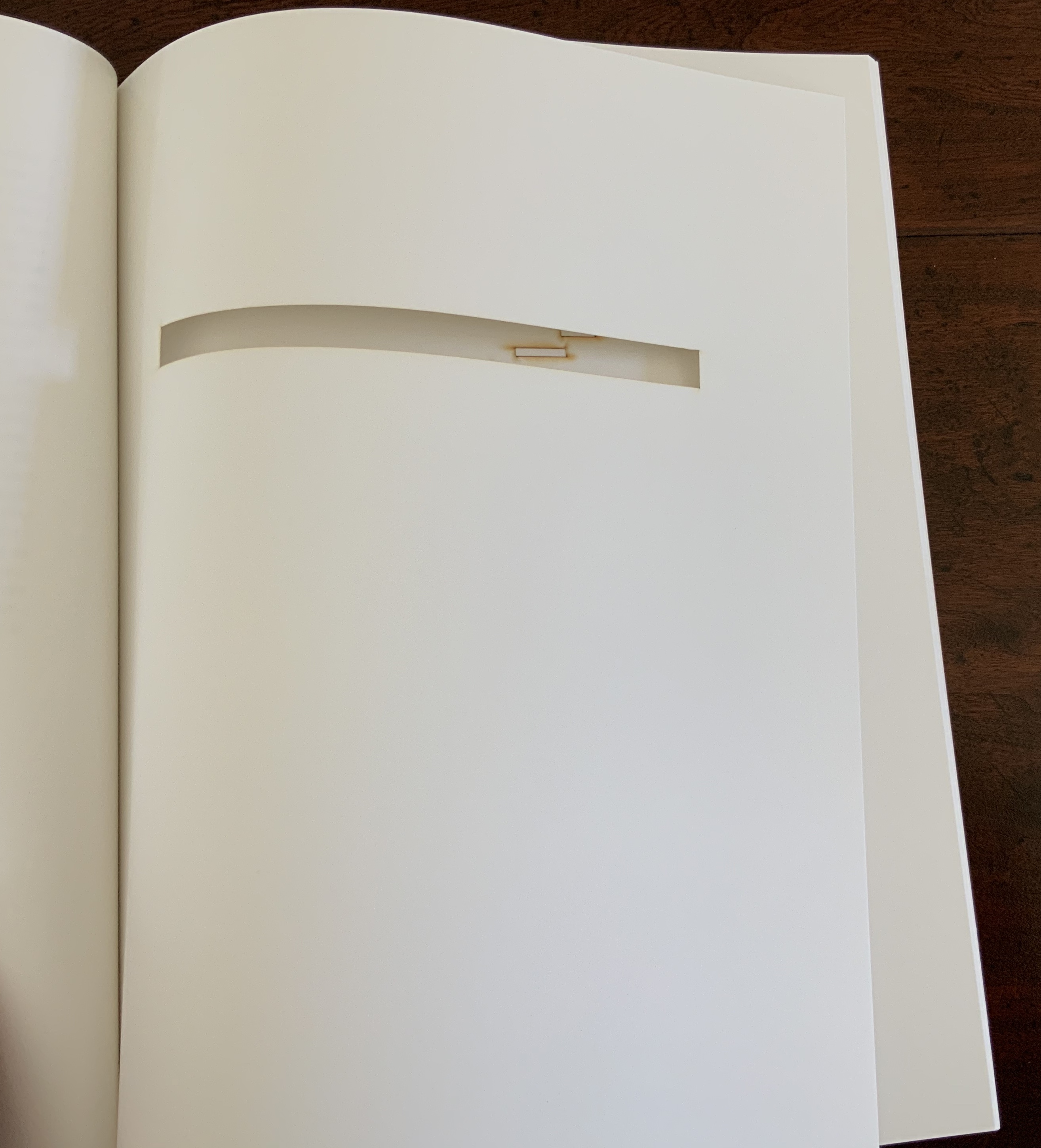
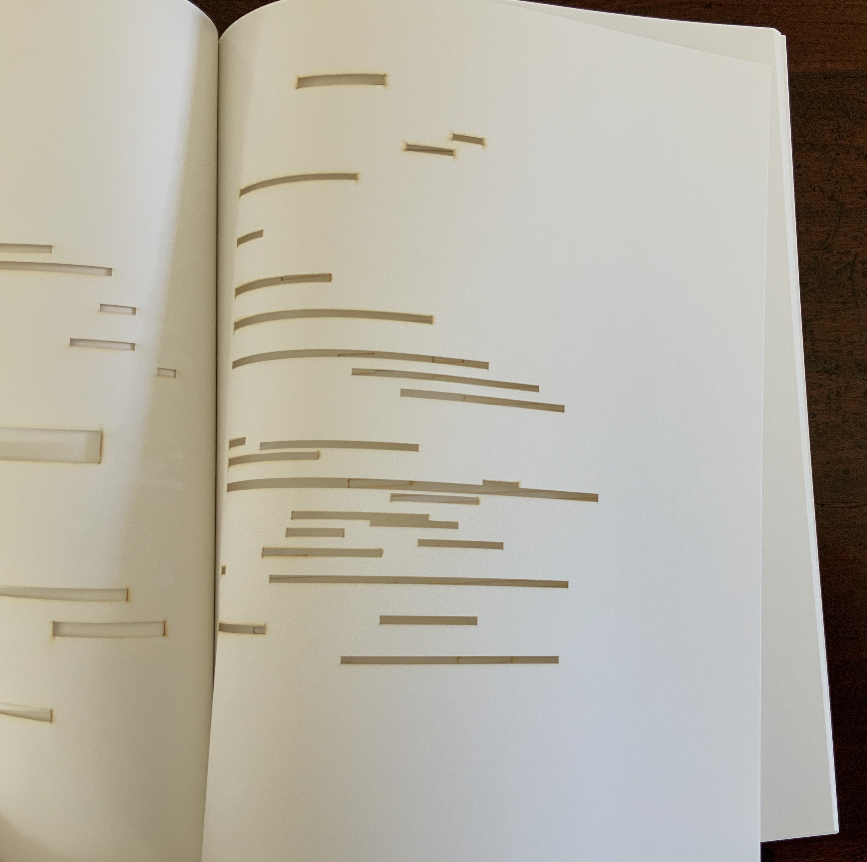
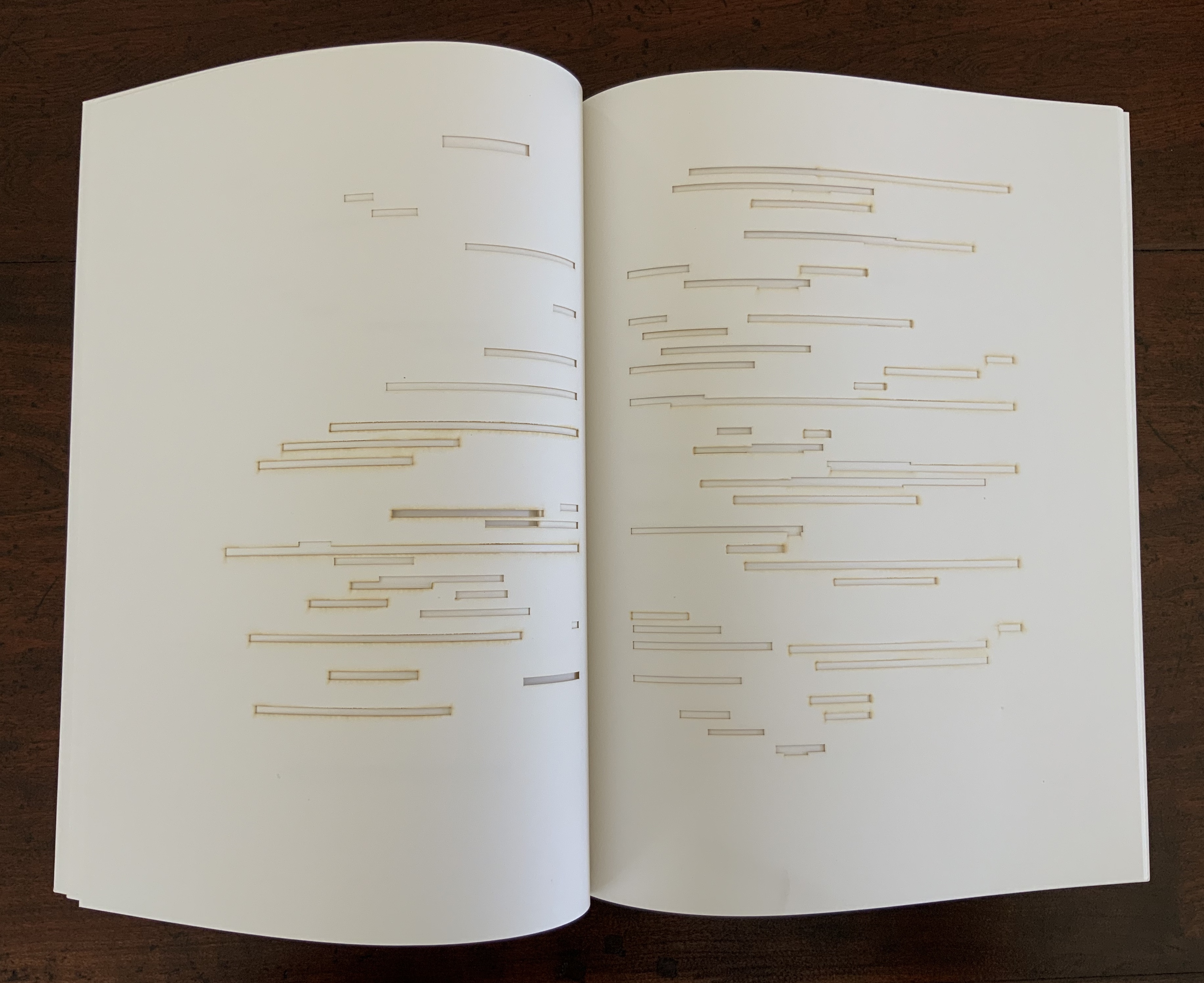
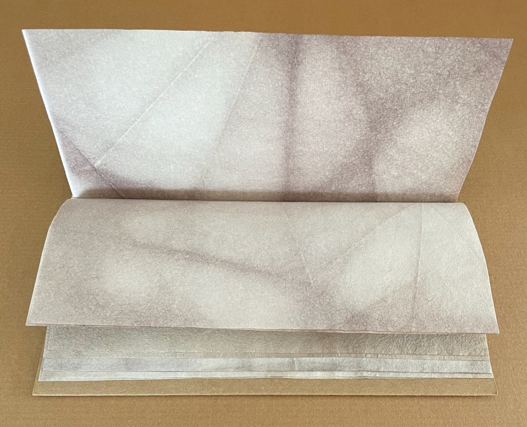
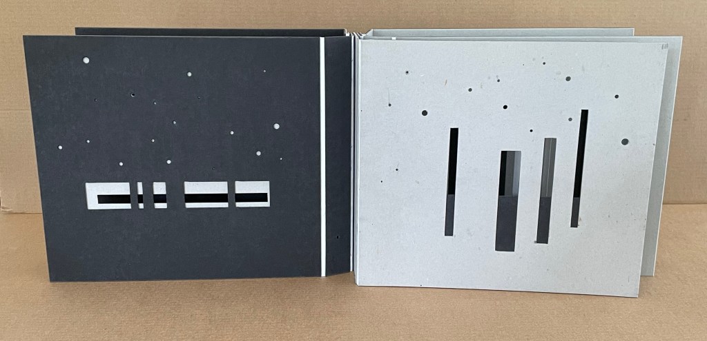
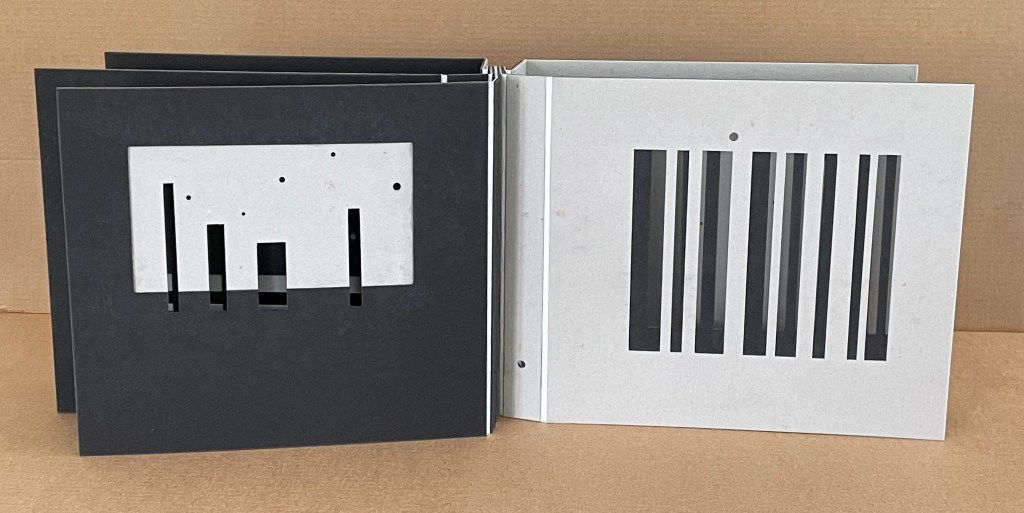
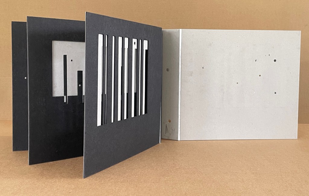
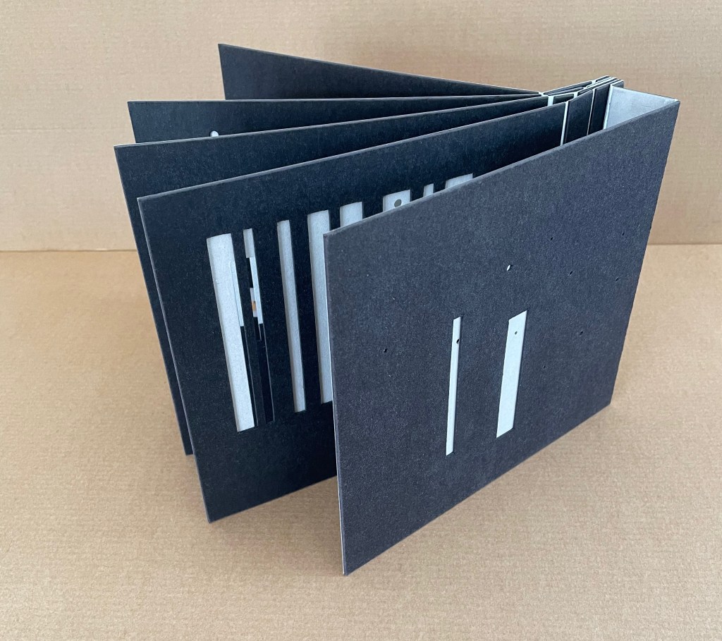
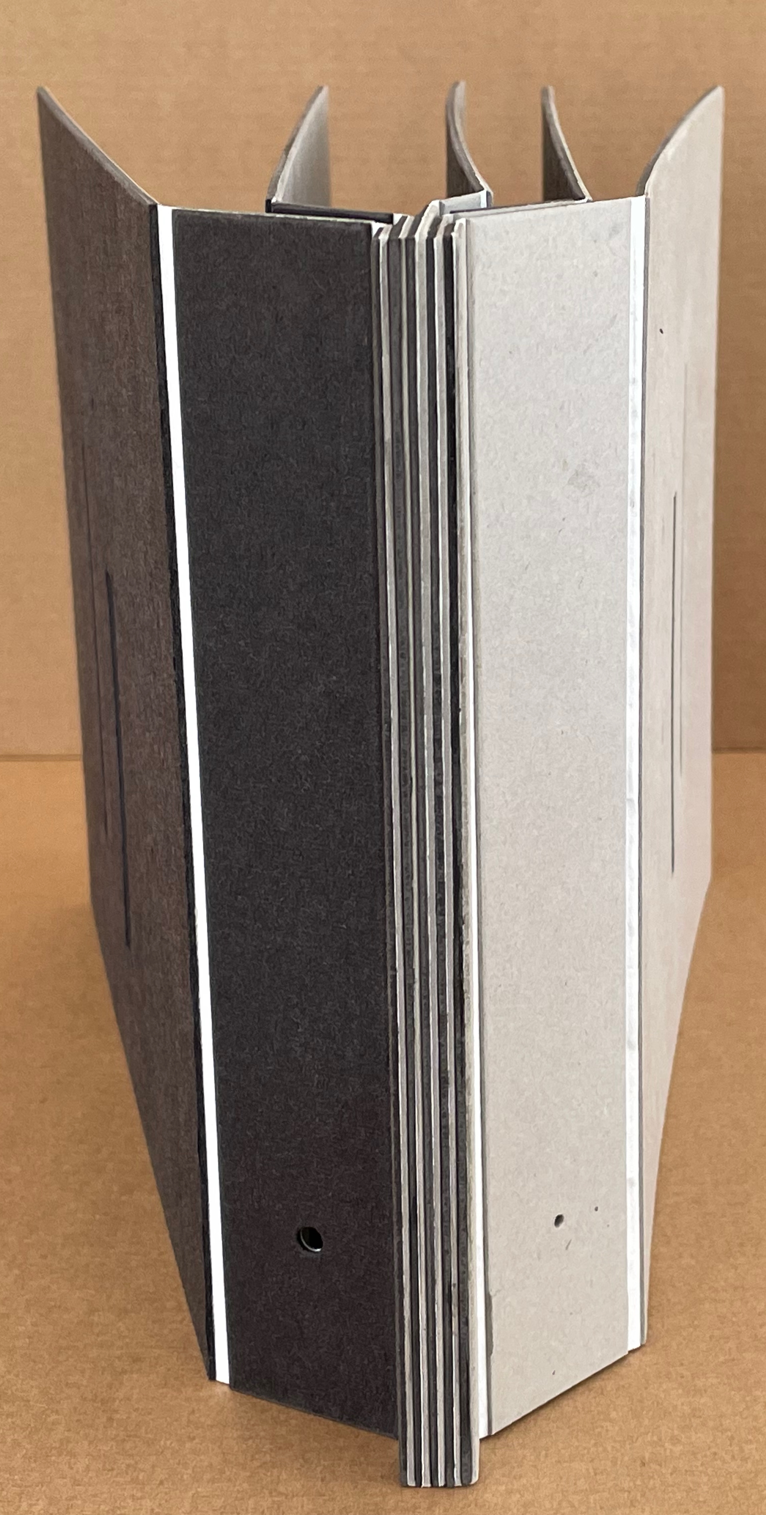
Within Every Room There is an Echo of the First (2018)
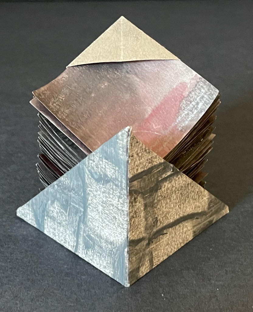
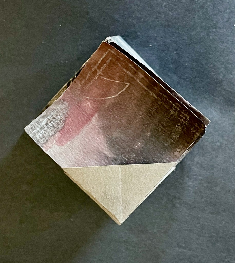
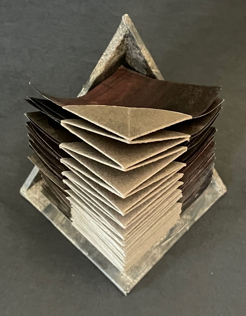
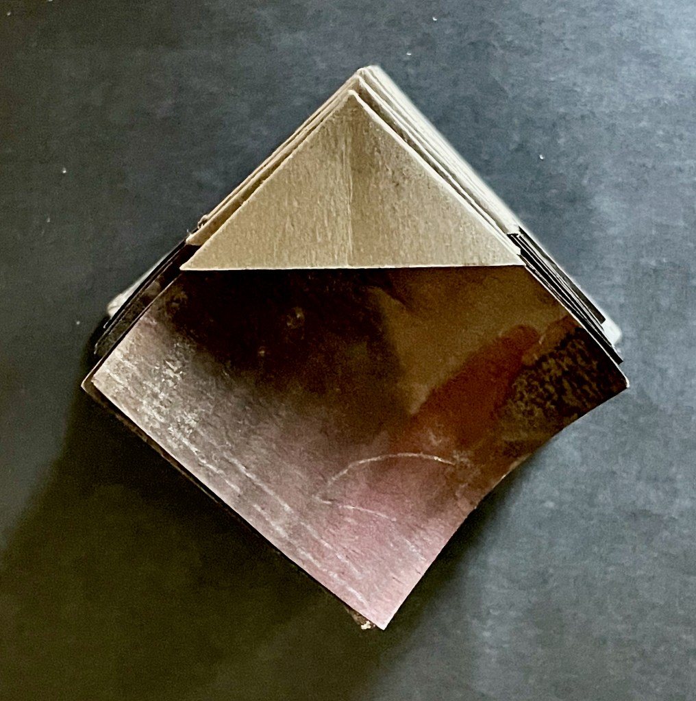
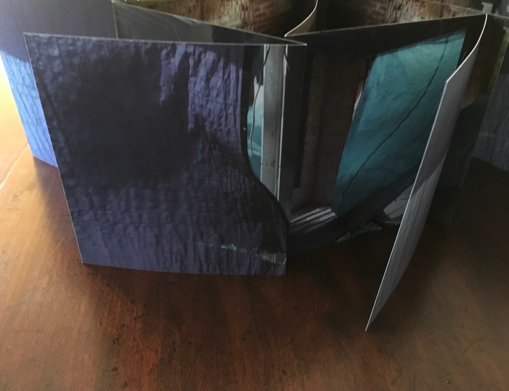
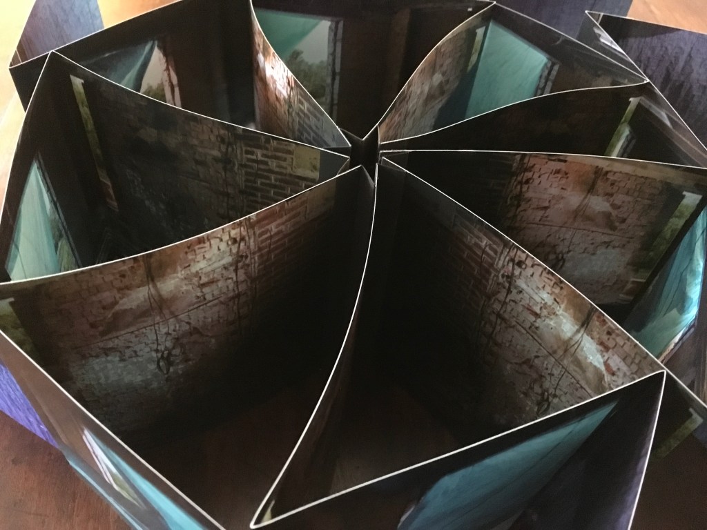
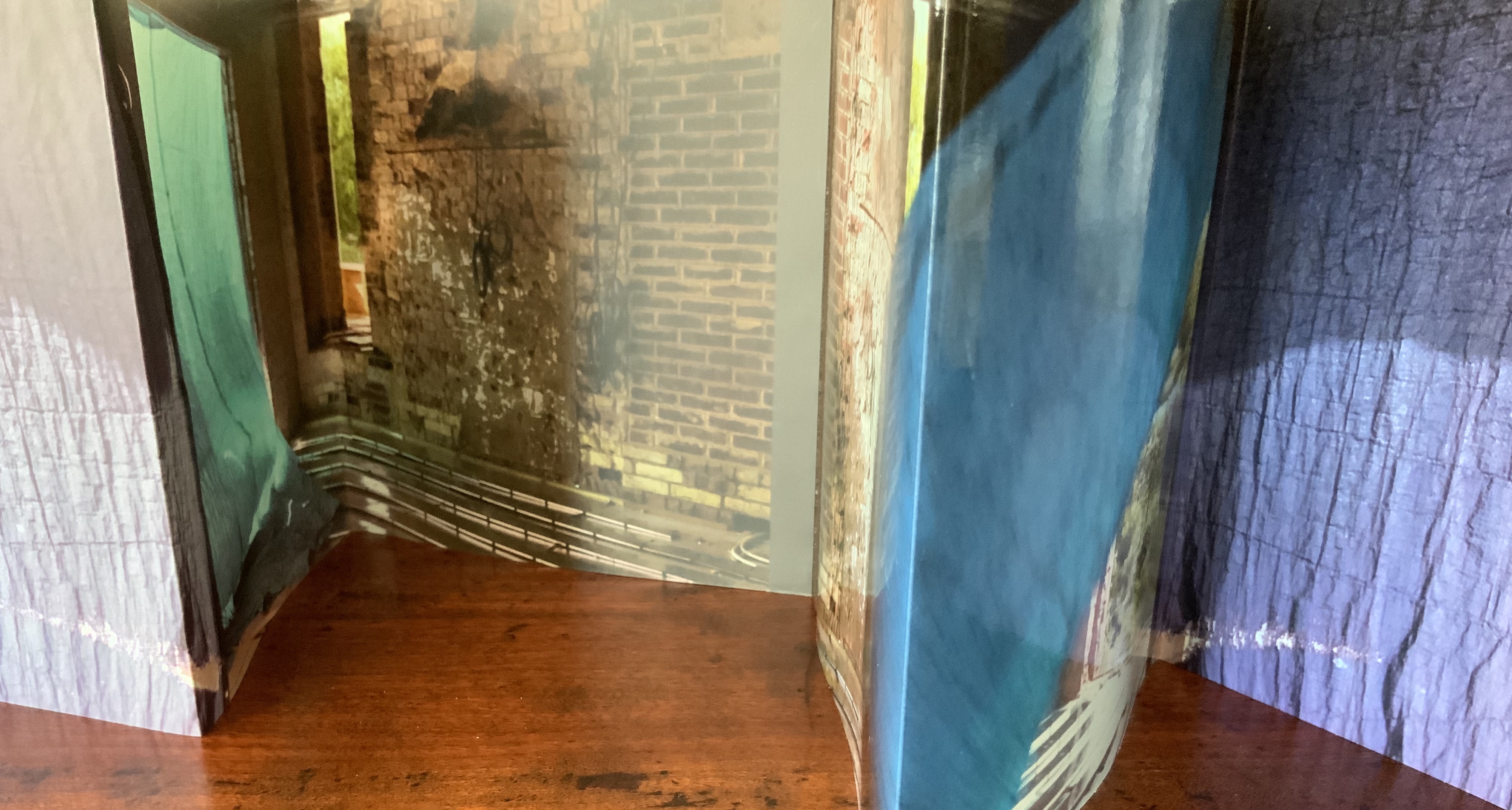
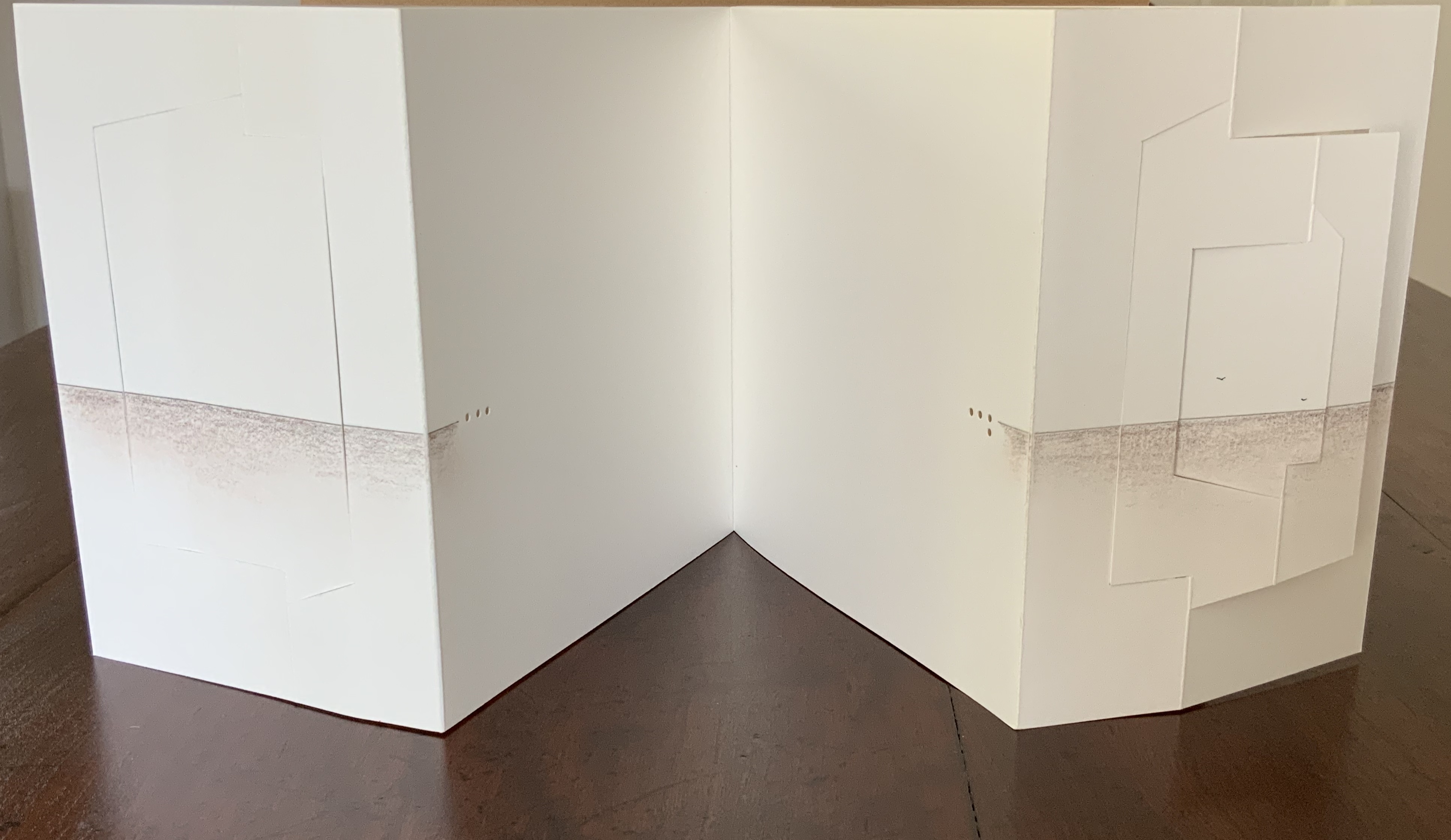
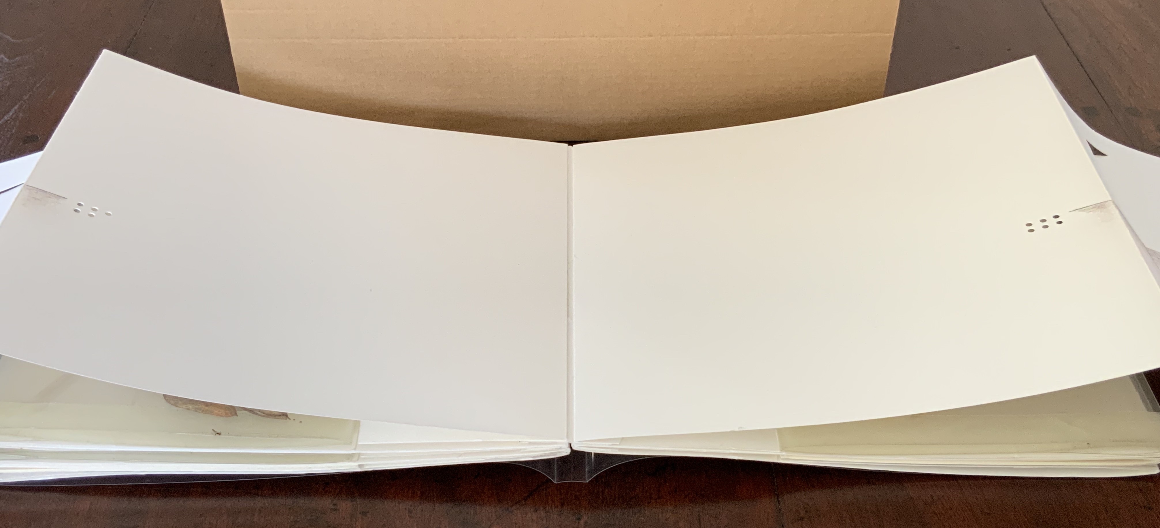
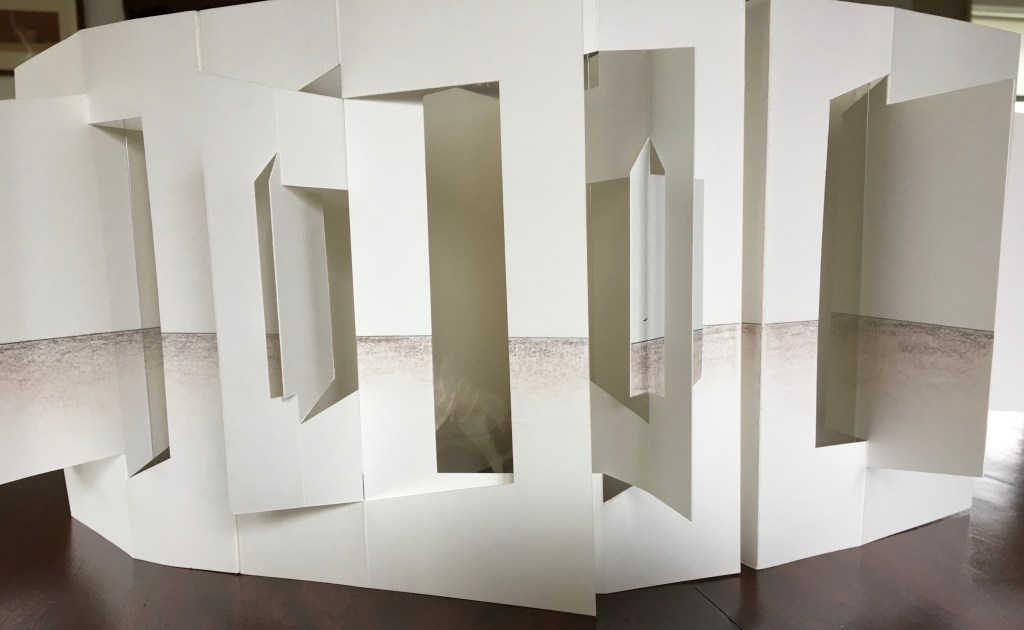
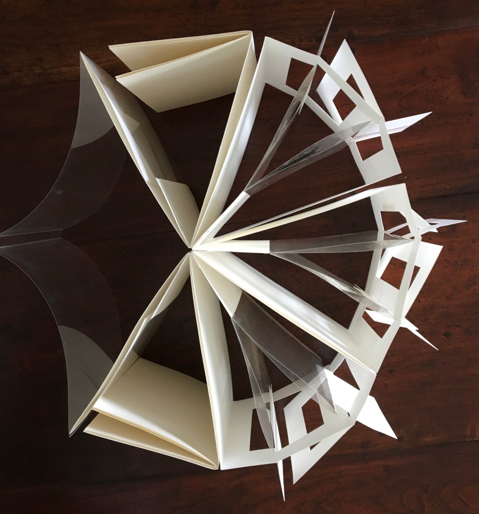
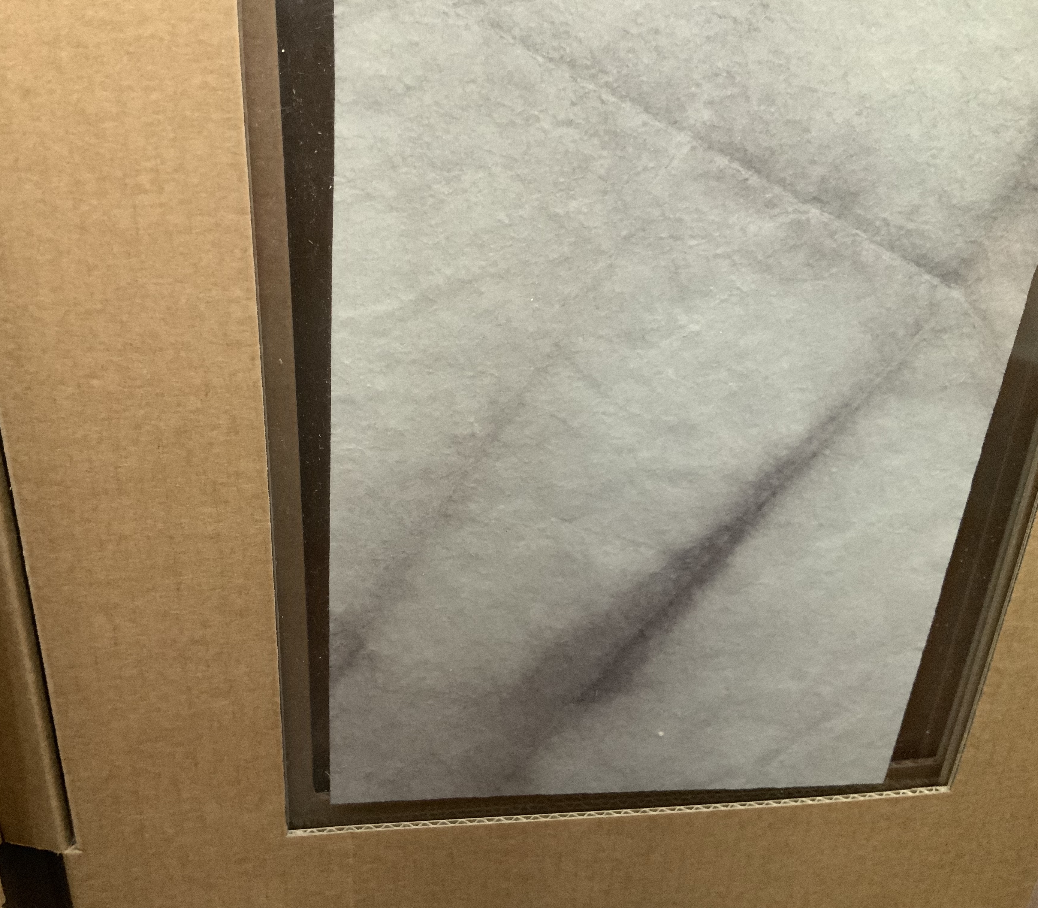
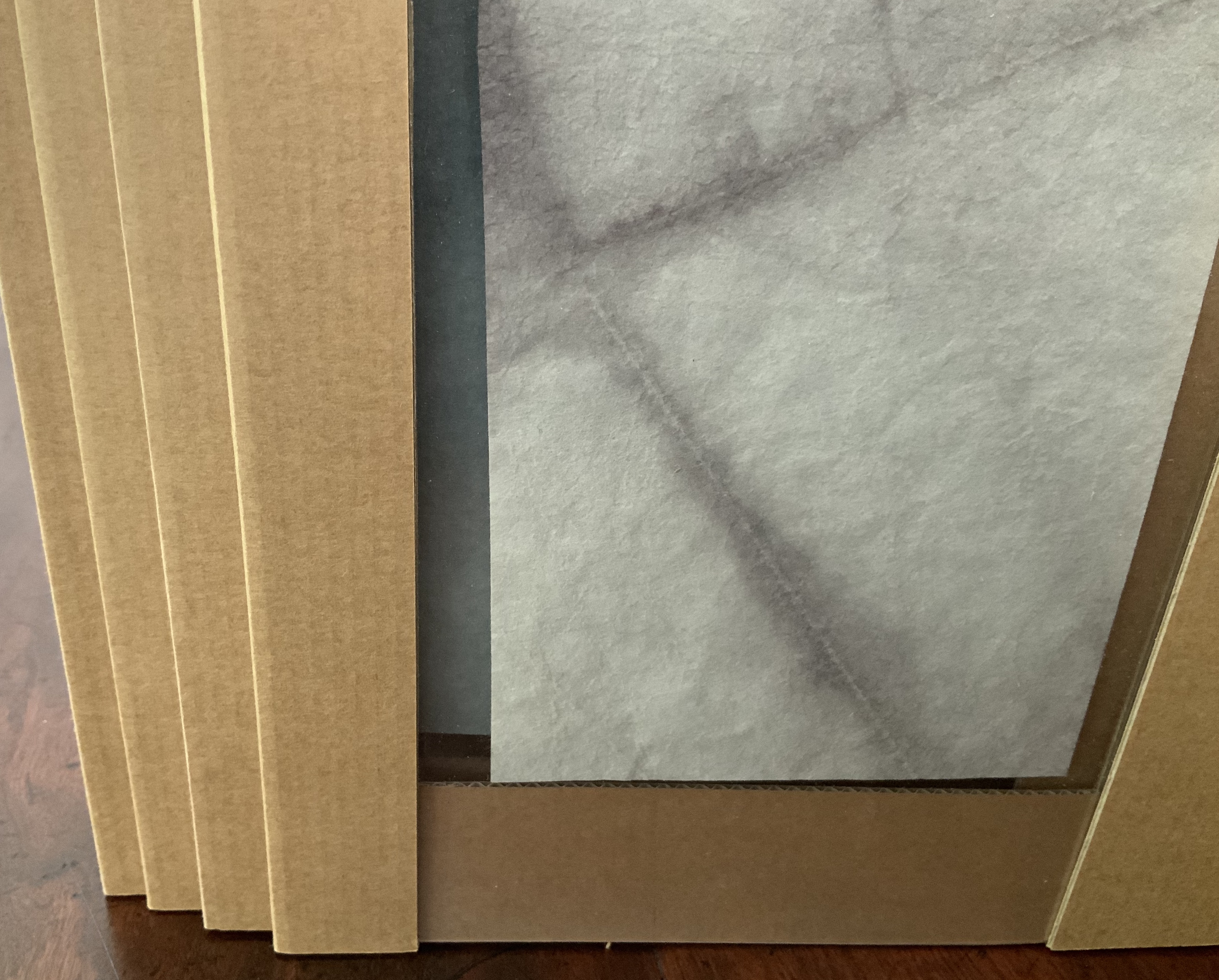
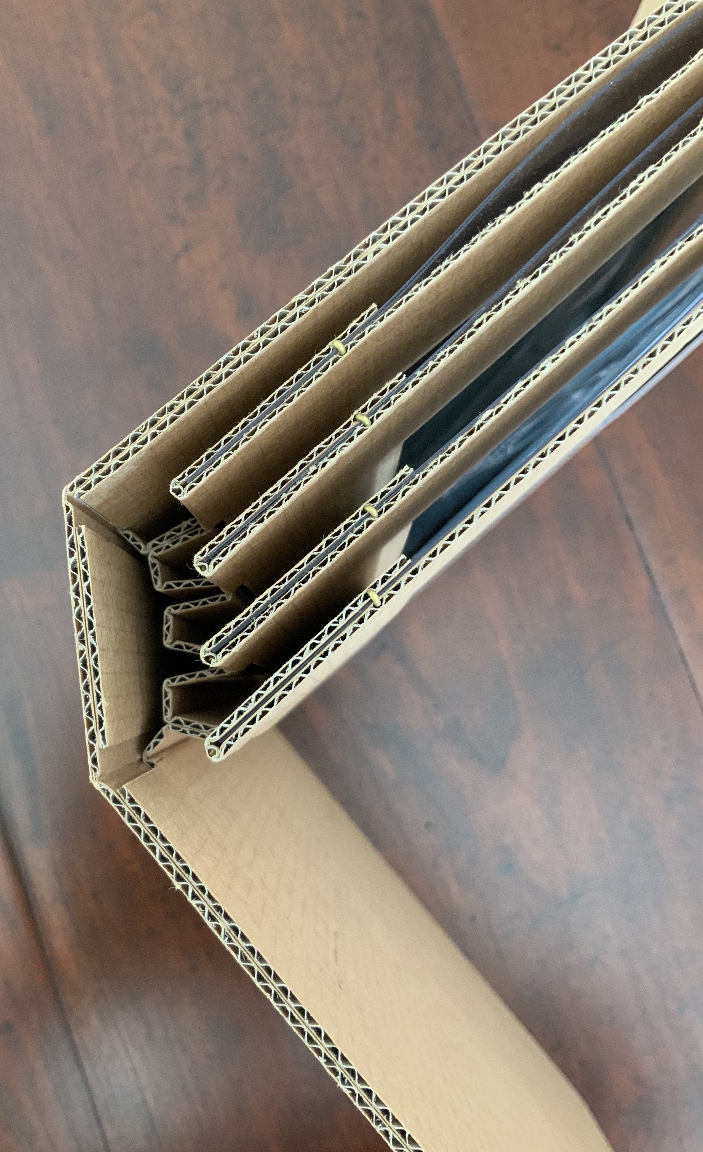
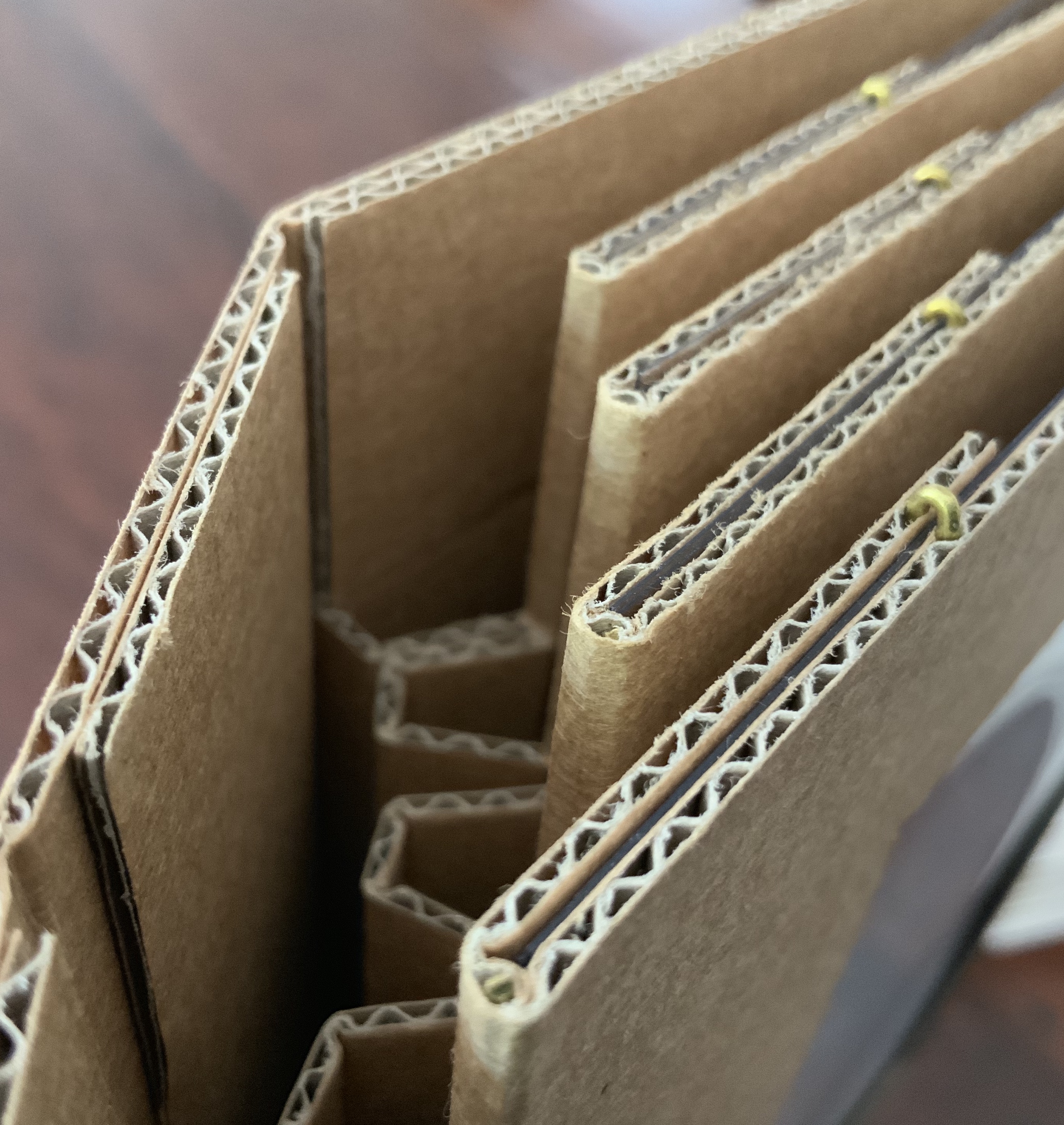
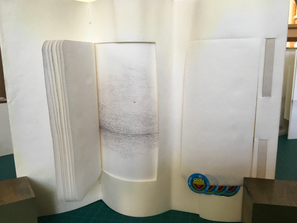
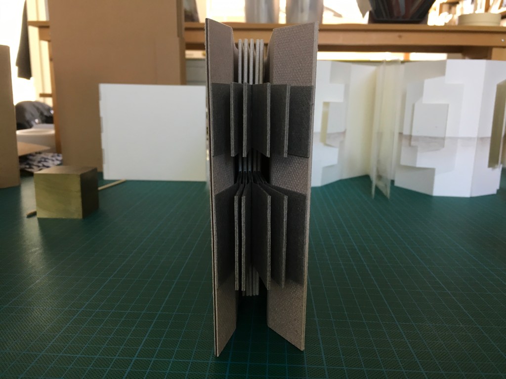
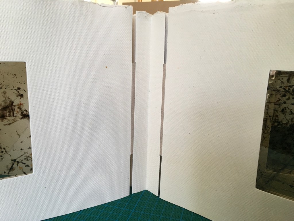
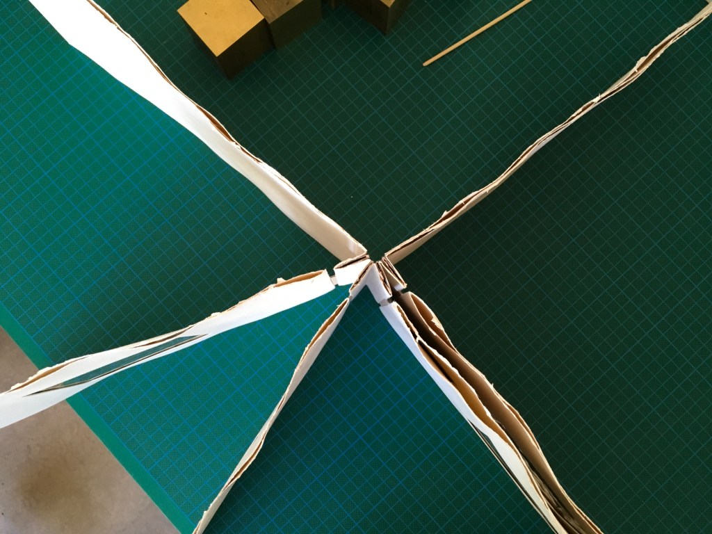
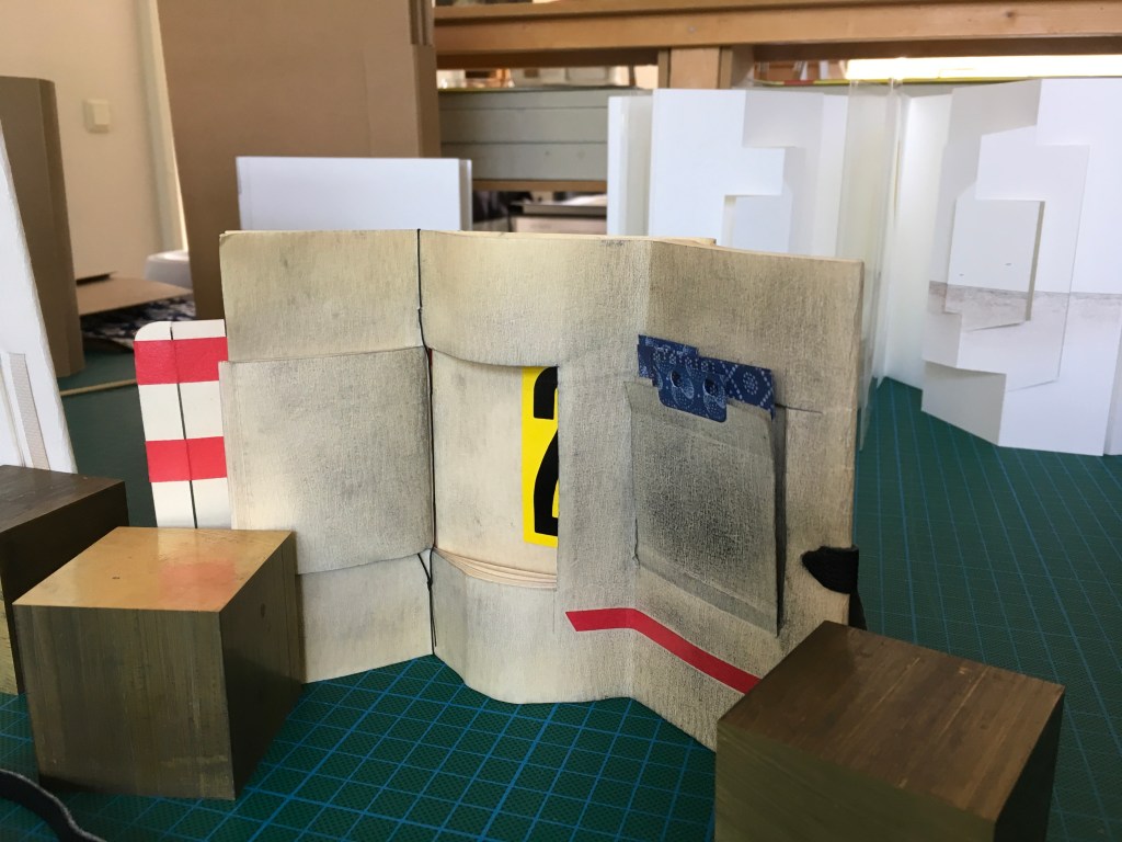
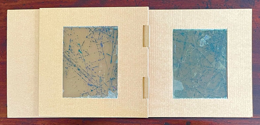
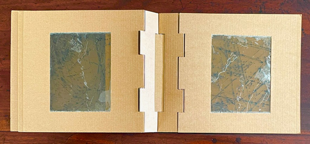
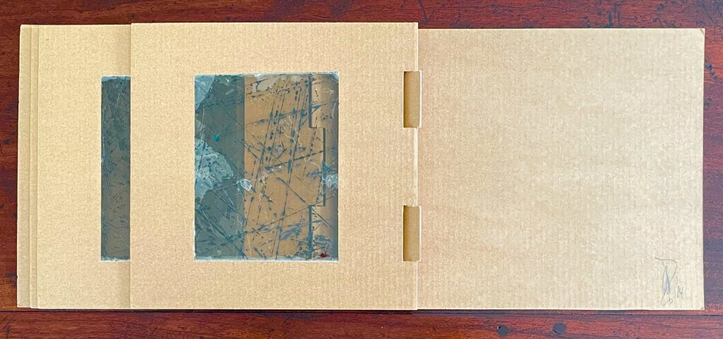
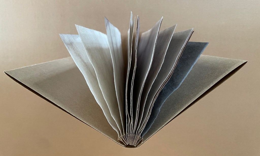
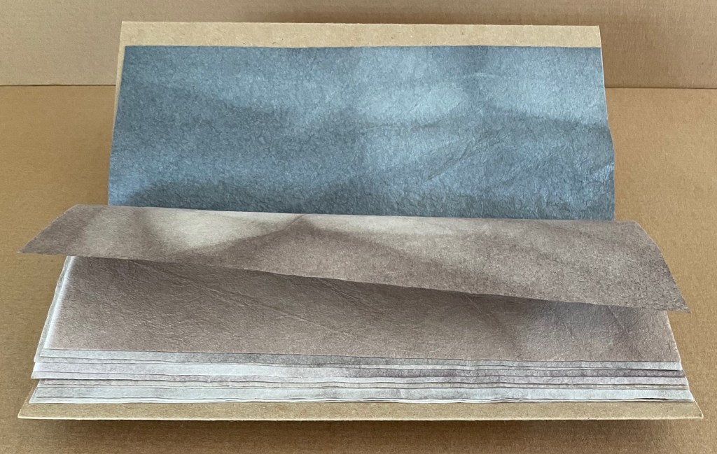
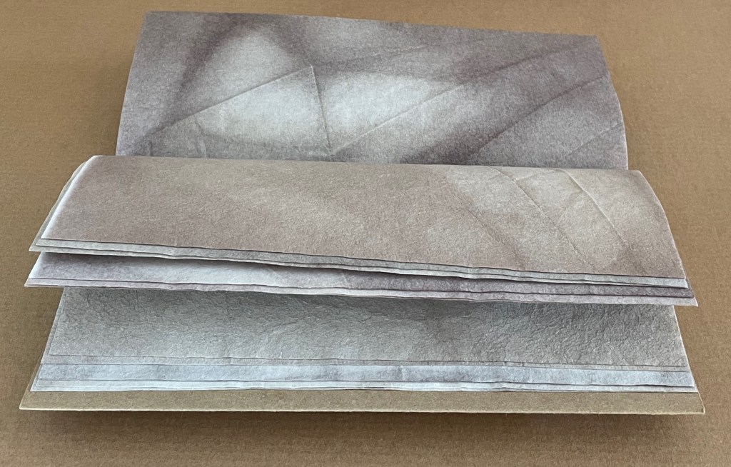
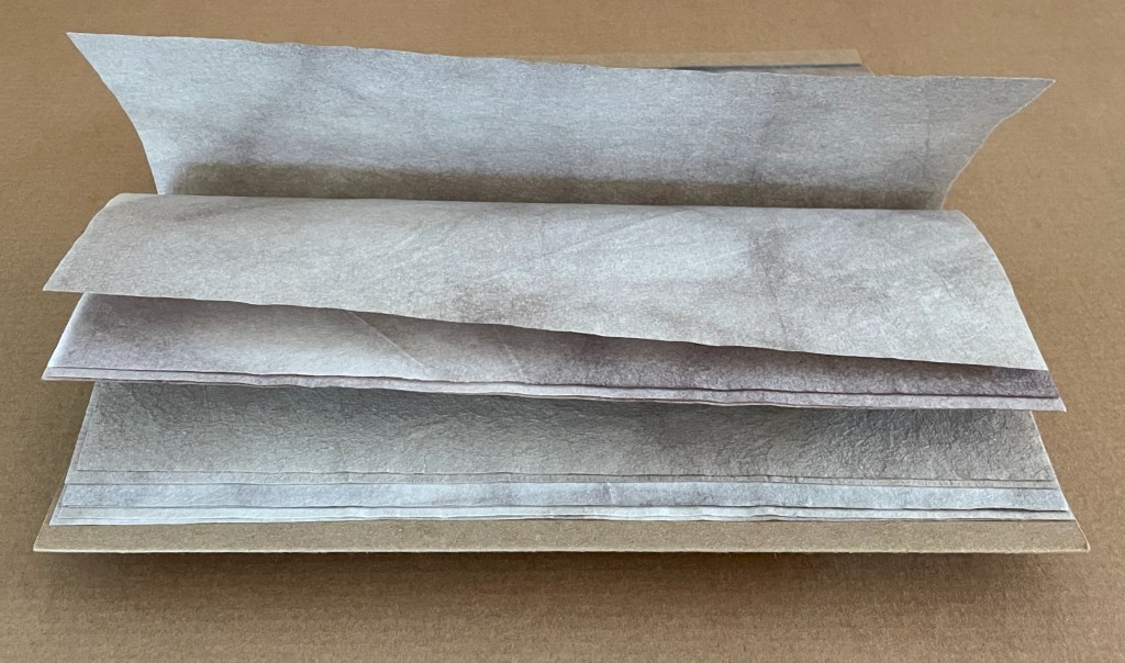
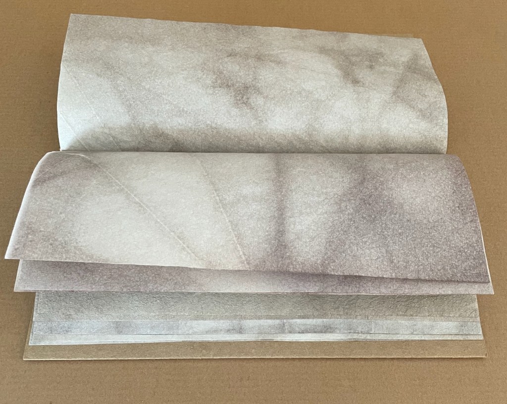
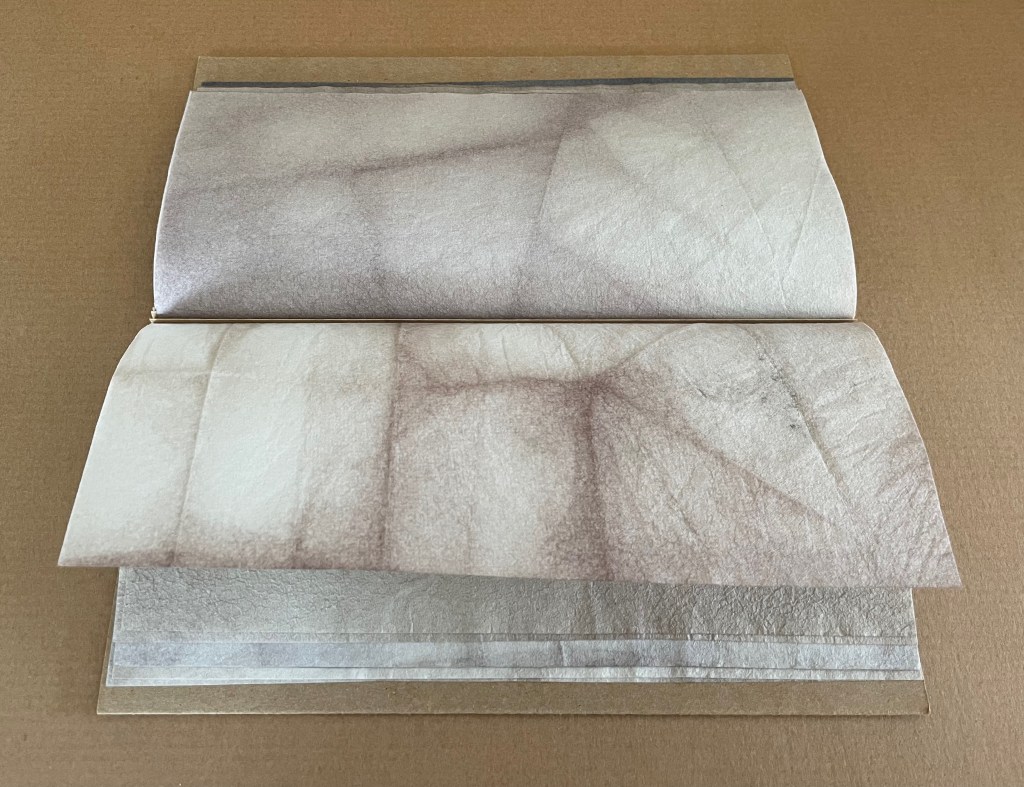
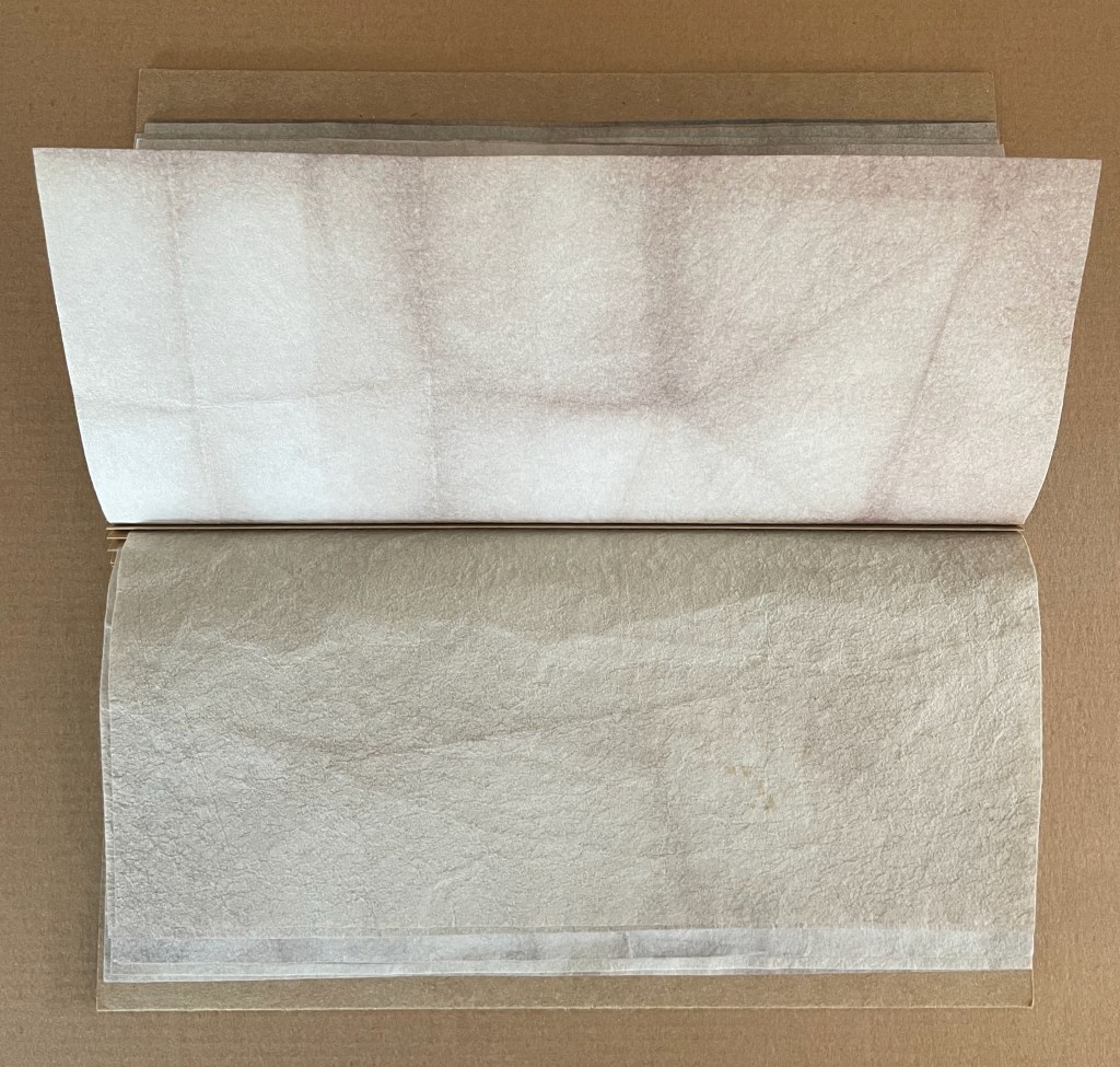
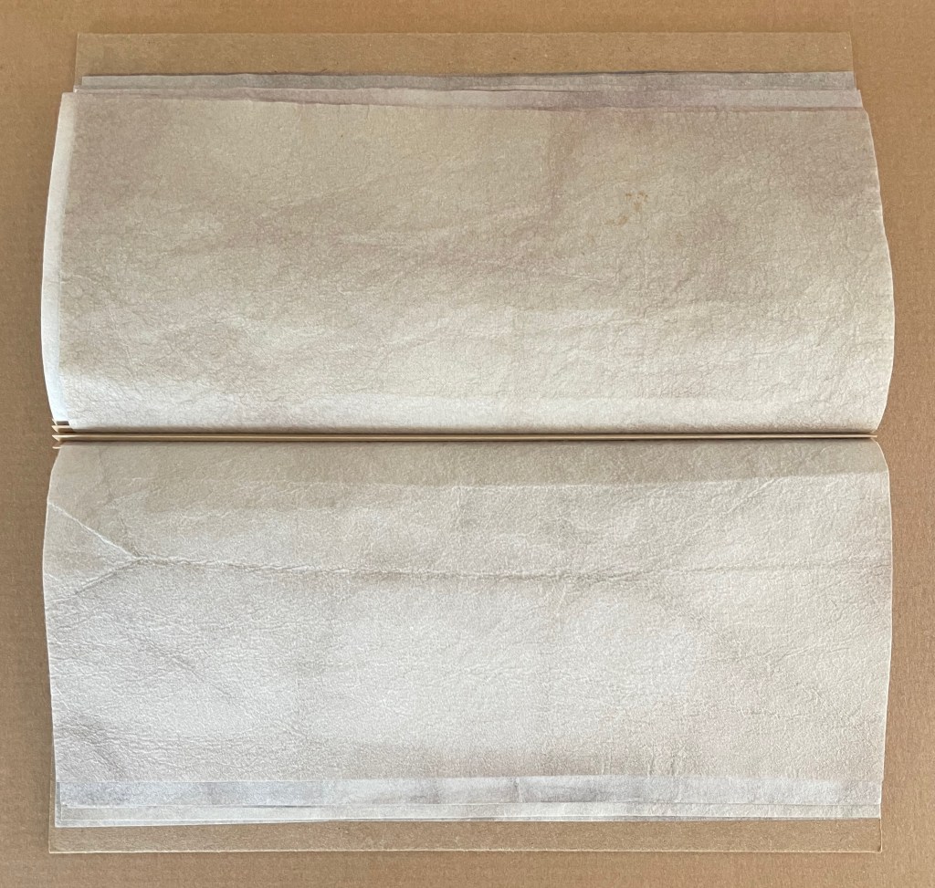
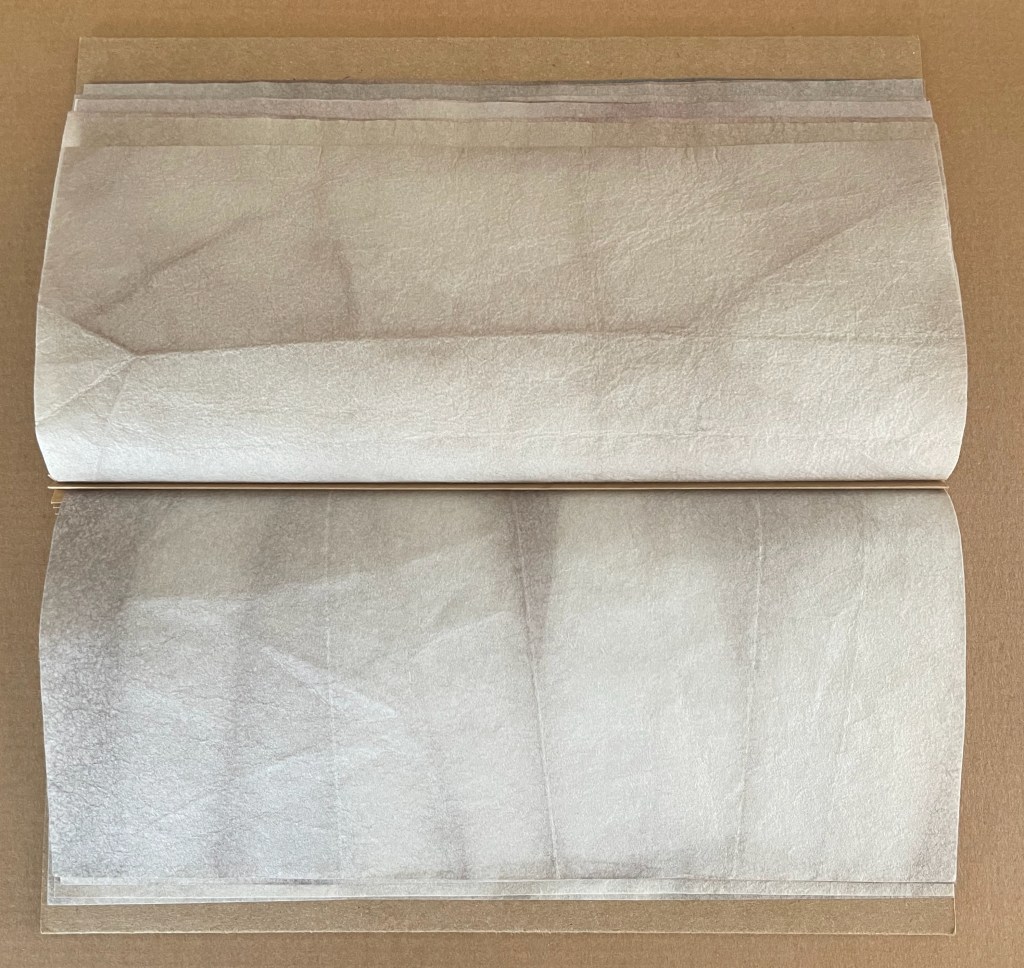
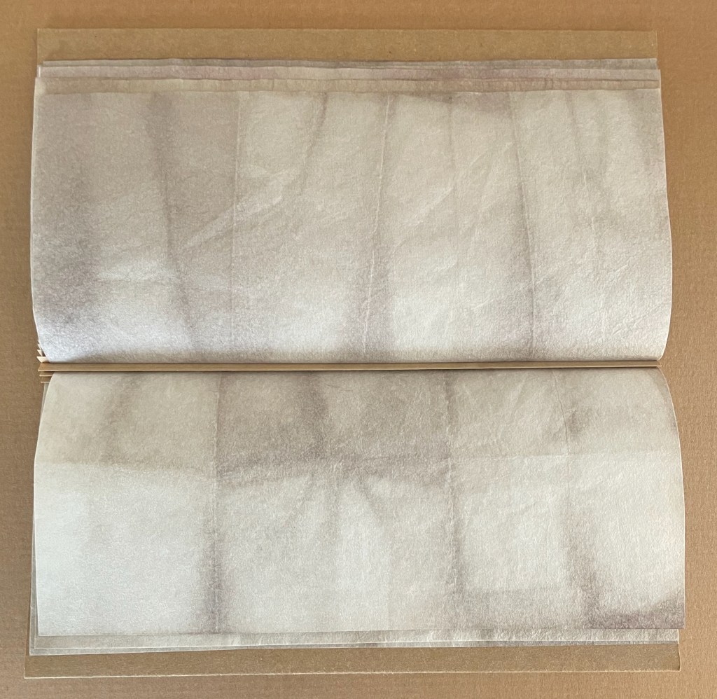
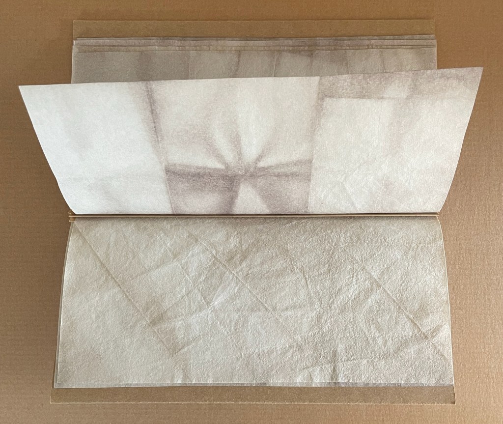
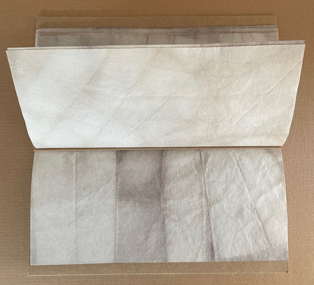
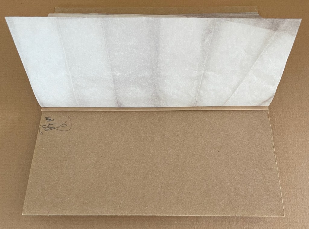
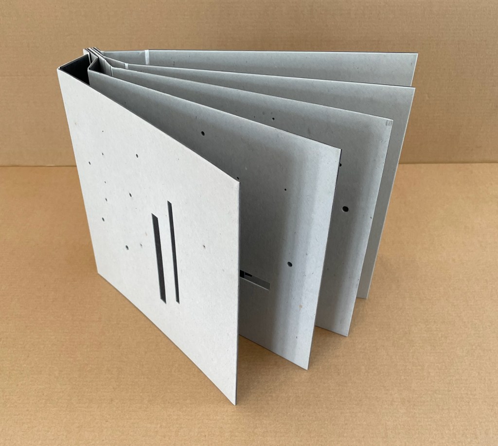
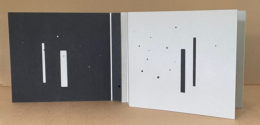
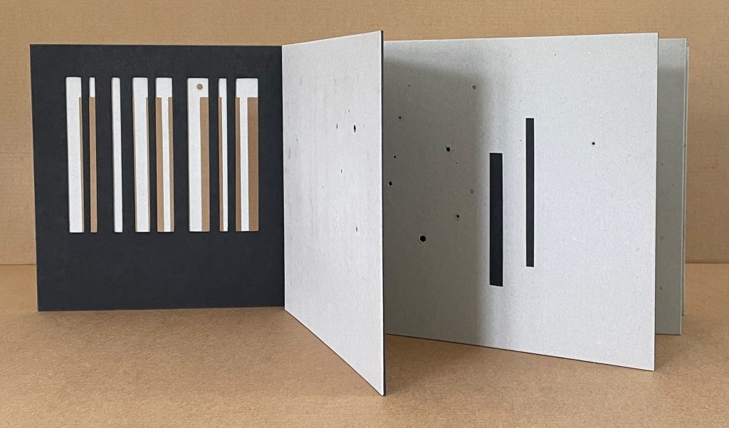
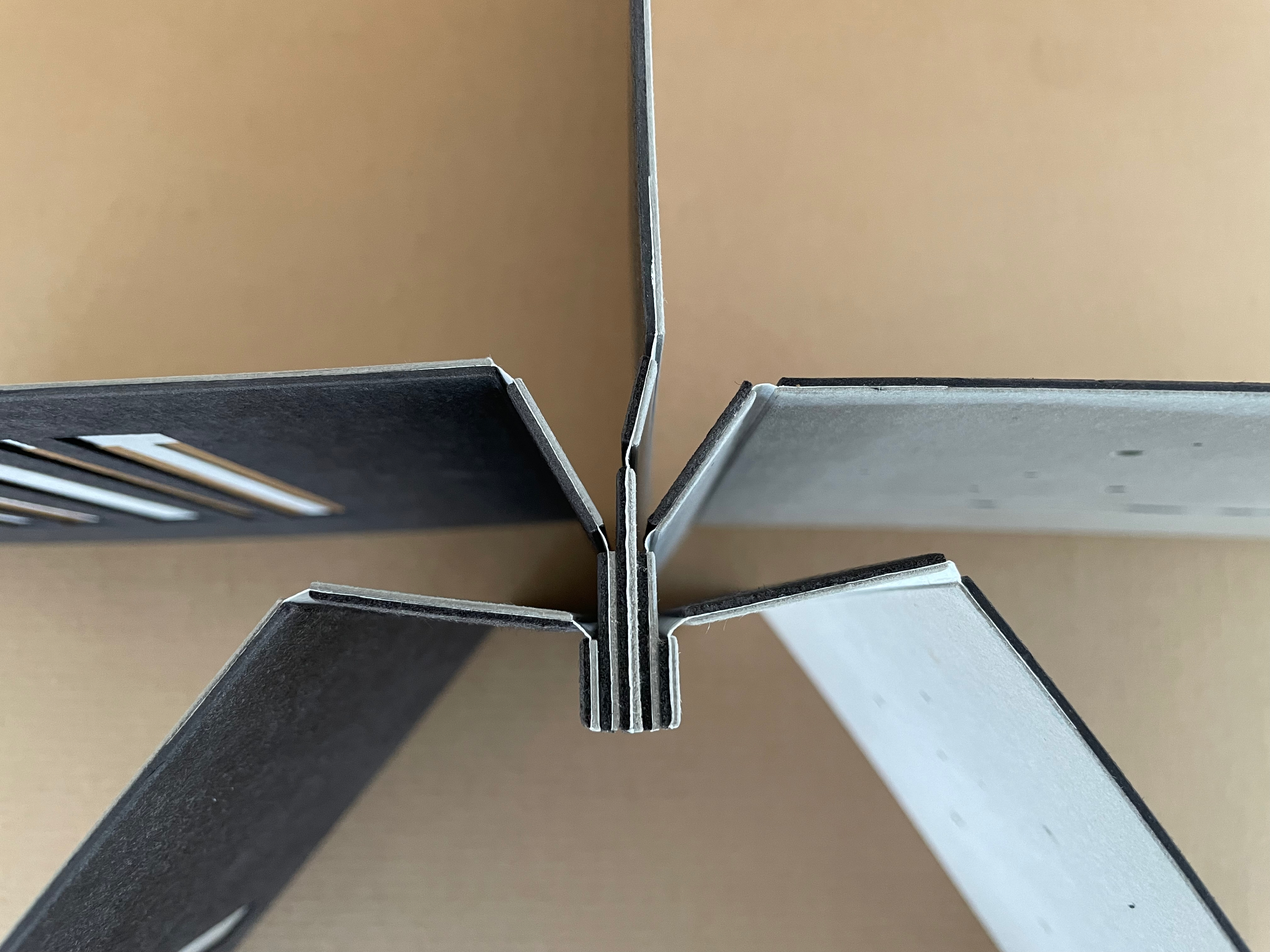
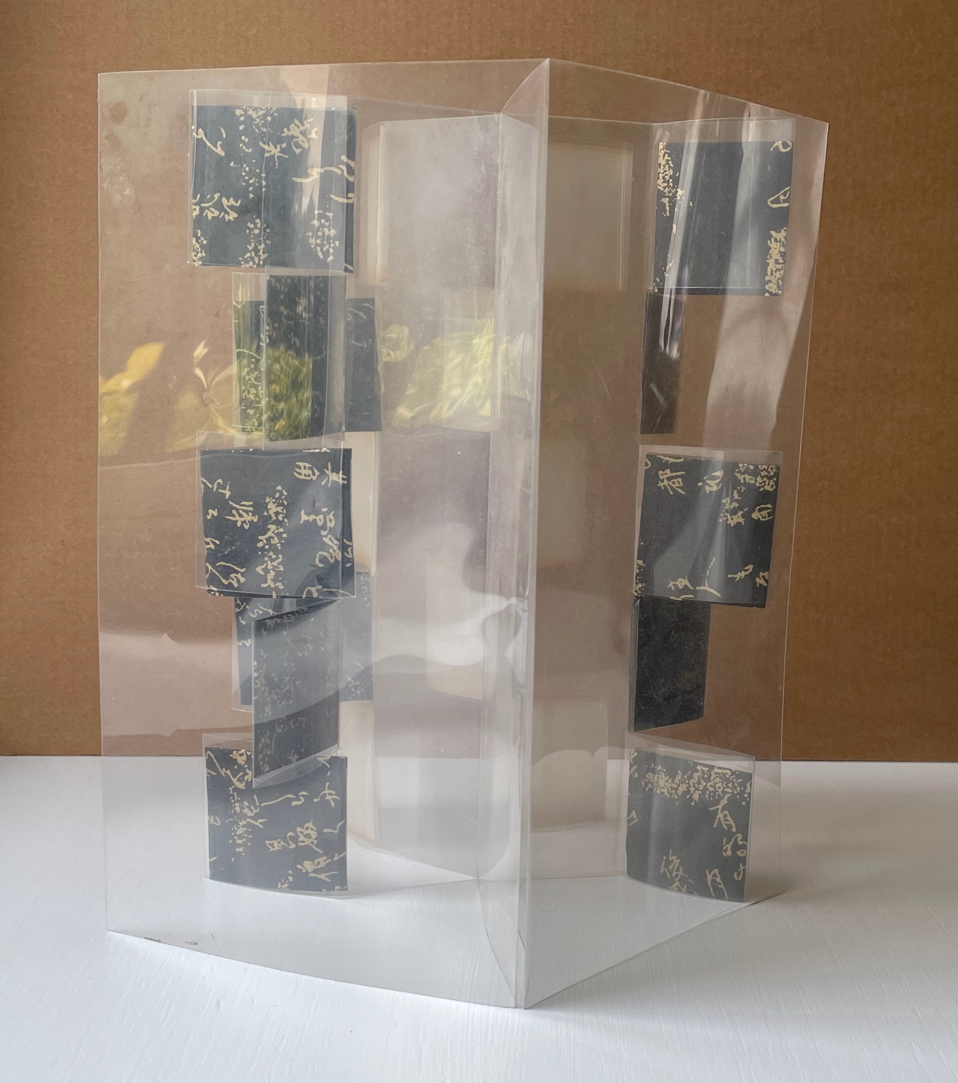
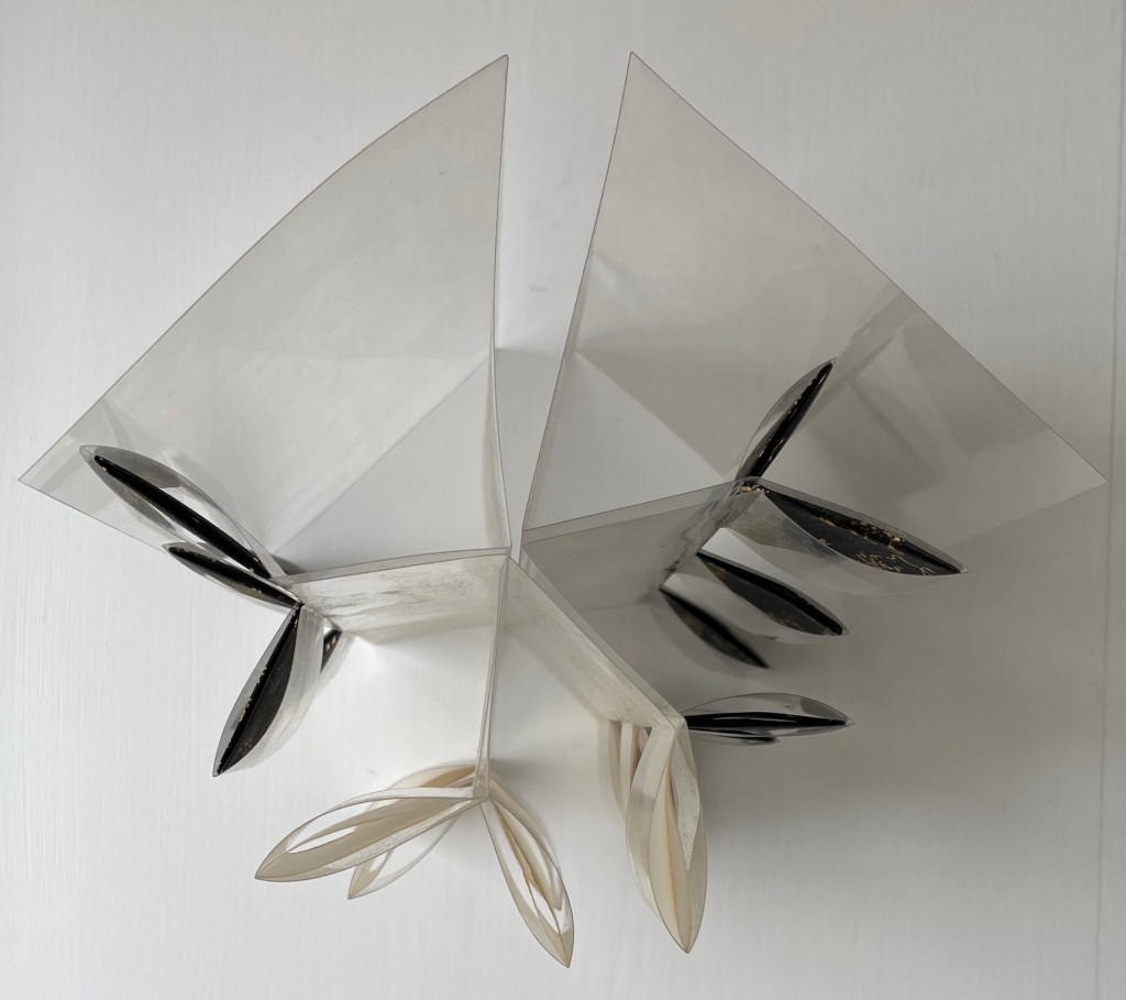
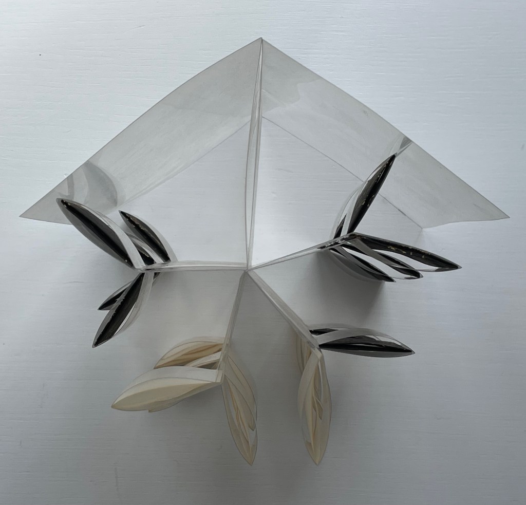
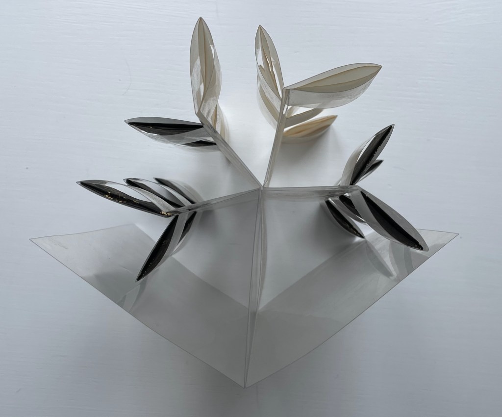
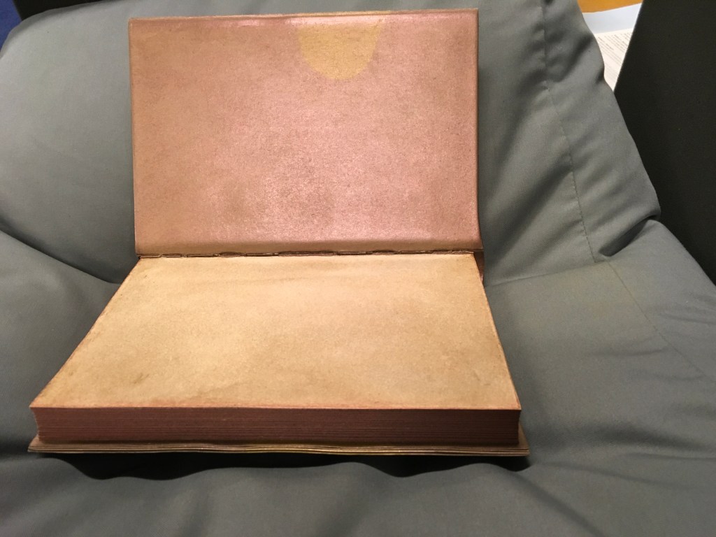
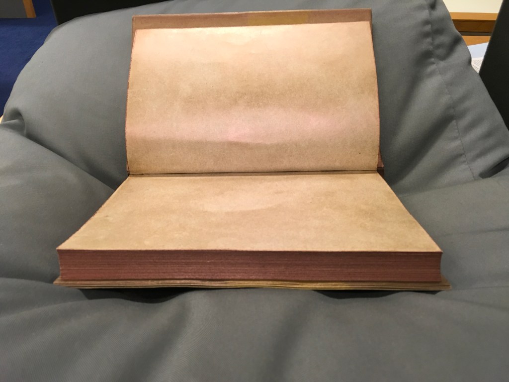
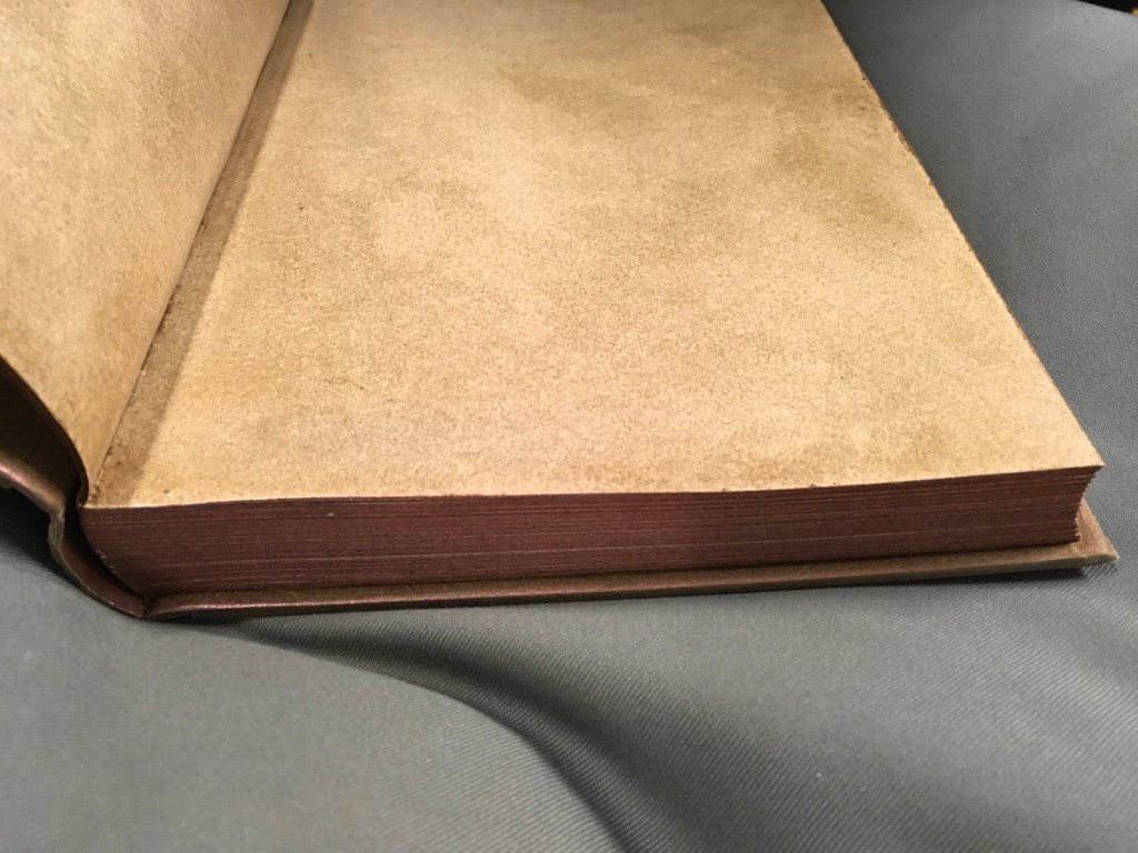
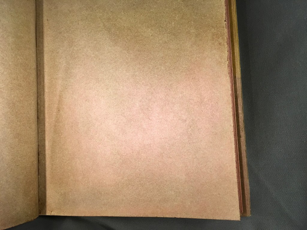
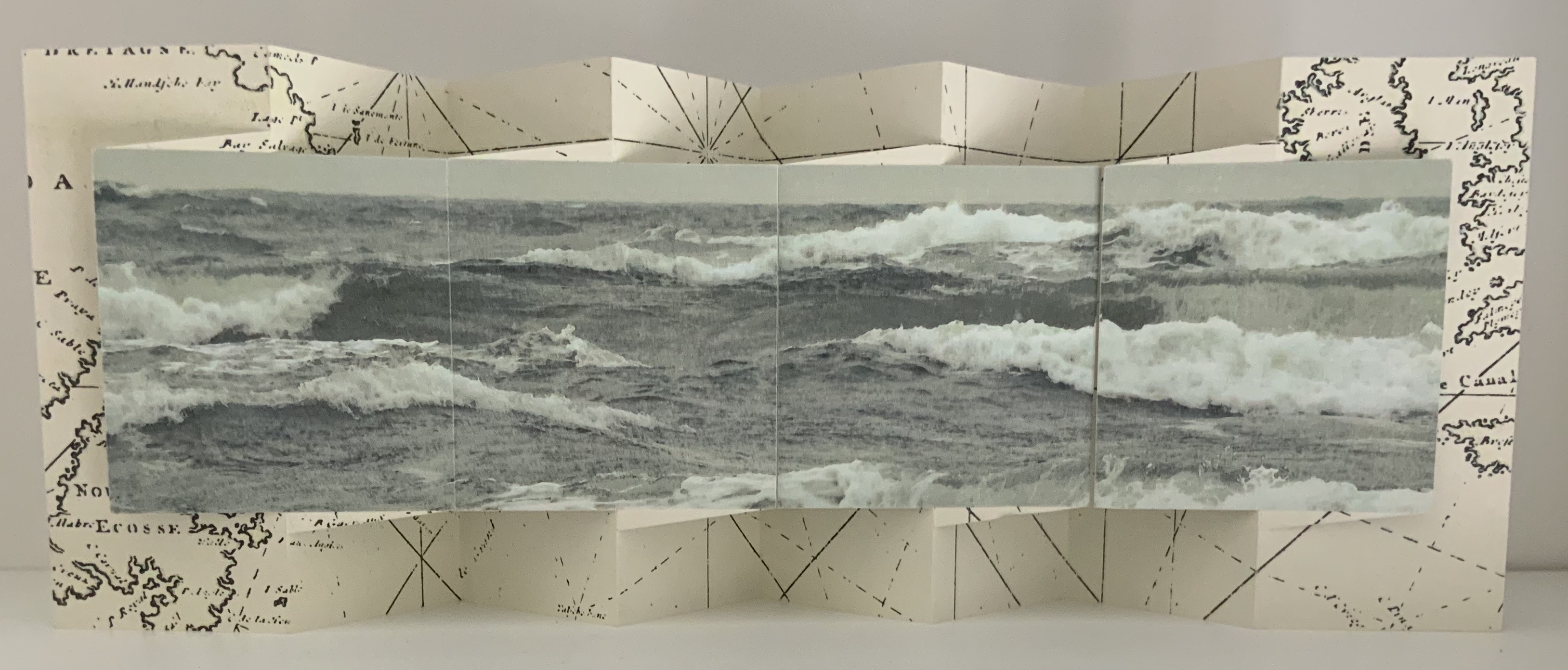
Within Every Room There is an Echo of the First (2018) Sarah Maker Diagonally halved box, painted-paper over millboard, paste paper. H65 x W65 x D65 (closed) mm, W730 (extended diagonally) mm. [45] panels Unique. Acquired from Ink and Awl, Seattle, US, 10 December 2025. Photos: Books On Books Collection. Displayed with permission of the artist.
This small sculptural artist’s book that enacts its title is an engineered accordion with architectural pencil drawings on paste paper. Every aspect is remarkable. The millboard “cover” is a diagonally halved cube that forms the “corner” of the room from which its echoes will unfold. The accordion spine consists of folded tabs into which the pages are pasted. The pages have been shaped so that as the book is opened (the top page being pulled by its tab), they curve against each other like artichoke leaves and then spread as the angled spine pleats push them outwards.
Anne Covell bridges the domains of book art and the book arts. The Record offers a skillfully constructed artist’s book that documents one of the first Trump Regime’s acts of depredation against history and truth. Historical Binding embodies her respect for the history of one of the book arts’ loveliest of crafts: stitching.
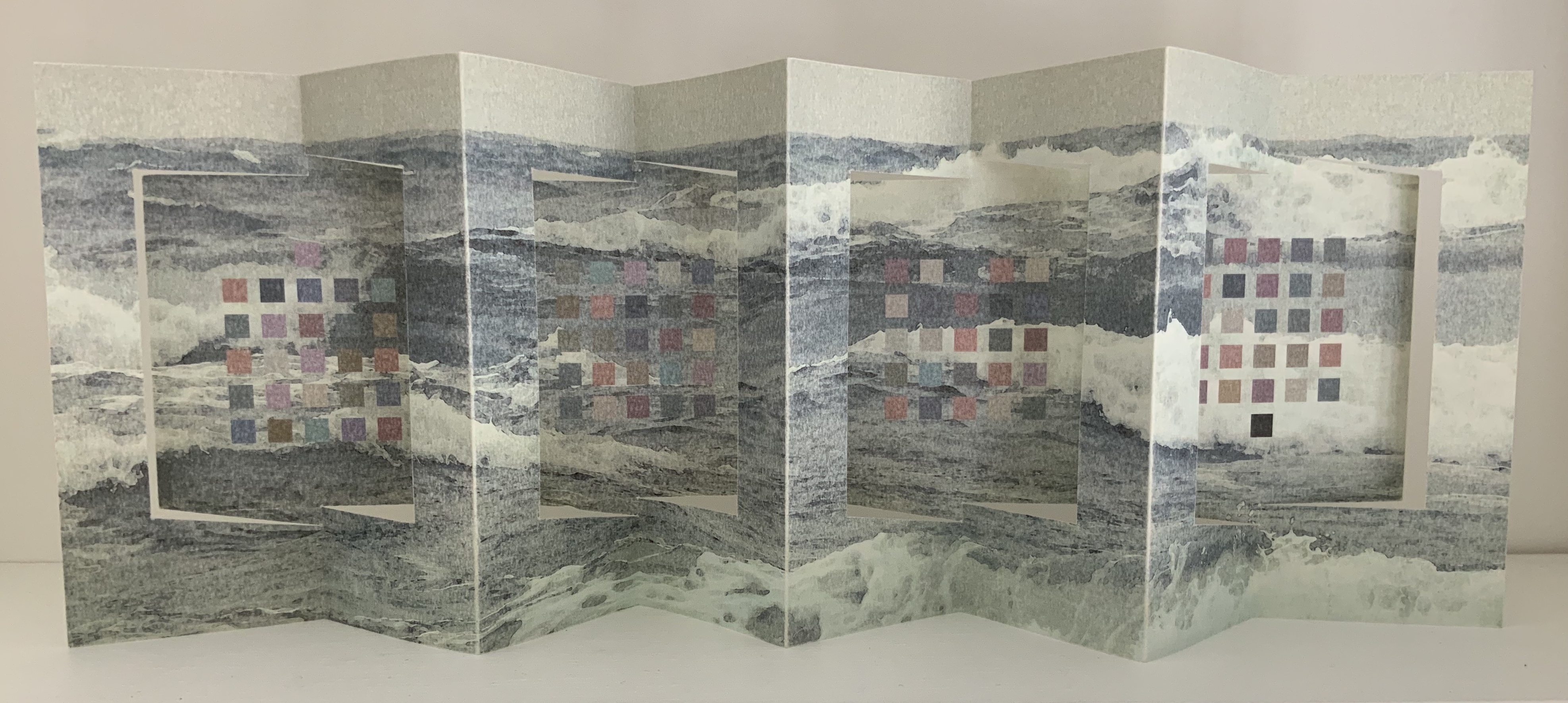
The Record (2017)
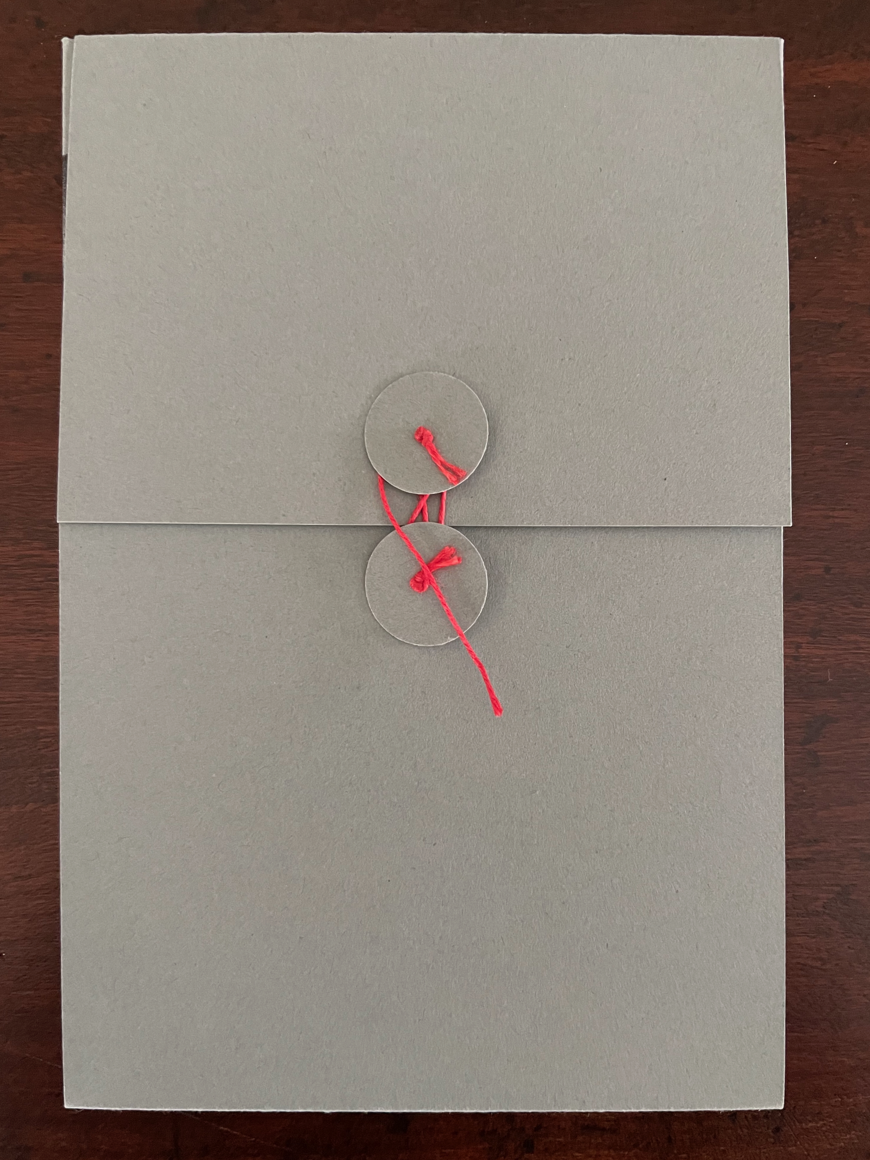
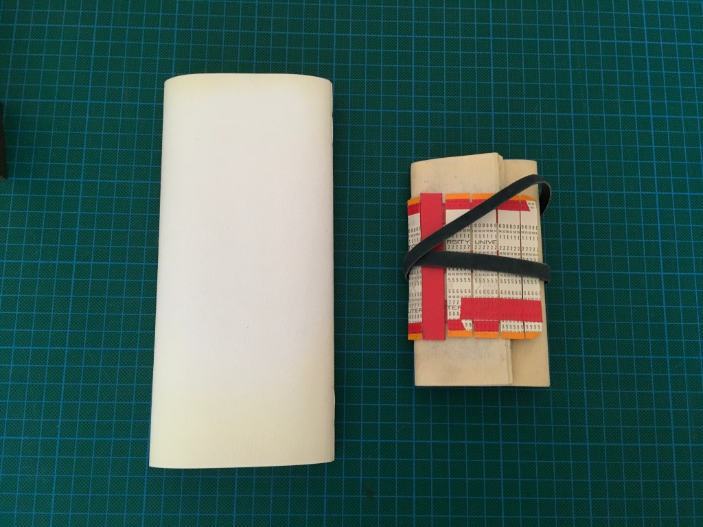
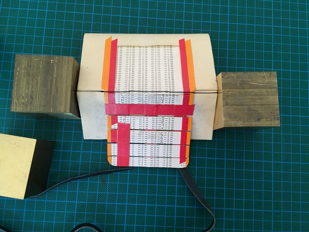
The Record (2017) Anne Covell Letterpress printed accordion on Masa paper with sumi wash and hand brayering. Housed in a 4-flap French paper enclosure with button and string ties. Enclosure: H165 x W110 x D6 mm. Book: H164 x W108 x D3 mm (closed); H327 x W1080 mm (open). 6.5 x 4.25 x .25 inches (closed), 13 x 42.5 x .25 inches (open) [36] panels. Edition of 60, of which this is #1. Acquired from the artist, 10 September 2025. Photos: Books On Books Collection.
On January 20th, 2017, Donald J. Trump was sworn in as the 45th president of the United States. That same day, the official White House website (whitehouse.gov) began the digital transition to archive and replace Obama’s policies with those of the new administration. Immediately, people began to notice that key issues such as health care, education, and immigration were nowhere to be found. Keyword searches for terms such as “climate change,” “LGBT,” and “civil rights” all returned 404 errors. Even more conspicuously, the Spanish-language version and the disabled-accessible version of the site were no longer available. Internet Archive, a non-profit digital library that has been archiving webpages since 1996, captured 167 snapshots of whitehouse.gov that day. This book records the last snapshots taken of Obama’s policies before they came down, the 404 errors that followed, as well as the Internet Archive timestamps for when the information was last available and when it disappeared. (Anne Covell).
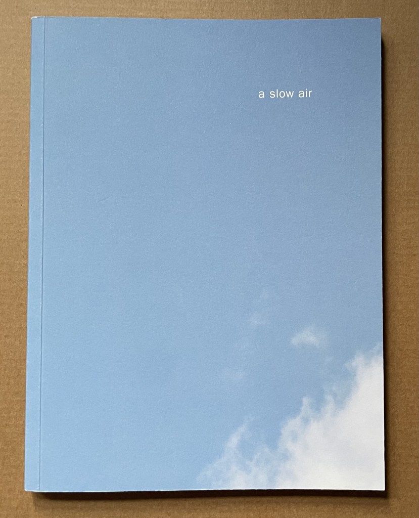
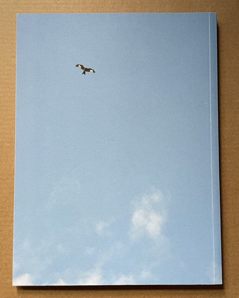
A Slow Air (2016) Thomas A. Clark and Diane Howse Perfect bound softcover. H200 x W150 mm. 64 pages. Edition of 750. Acquired at the Small Publishers Book Fair, London, in 2018. Photos of the work: Books On Books Collection.
If you live where red kites thrive, you will see them most often singly, in pairs or threes. If you are lucky, you may see as many as eight or ten at a time. Near Harewood House in West Yorkshire where red kites were reintroduced in 1999, there are hundreds. In 2016, photographer/artist Diane Howse (Countess of Harewood) and poet/artist Thomas A. Clark collaborated on an exhibition at Harewood House: the grove of delight. Using objects, words and images, the exhibition turned the house’s Terrace Gallery into a symbolic grove; also displayed was a series of 15 photographs by Howse of red kites over Harewood. For the exhibition and under the direction of Peter Foolen, the diligent Dutch publisher of herman de vries, Peter Liversidge and others, A Slow Air (the book) was produced and published by Harewood House. Foolen and the artists have assembled and manipulated the photos in a sequence of color and image that exerts a forward movement like a film or narrative. Like a real sighting of these birds circling and banking as if to a slow musical air, the book mesmerizes.
In these additions to the Collection, Carol DuBosch joins the art of calligraphy and the art of the fold at the hip. The subtlety and fineness in her execution of both reward multiple viewings from multiple angles and repeated manipulation.
Rainbow Alphabet Snowflake (2013)
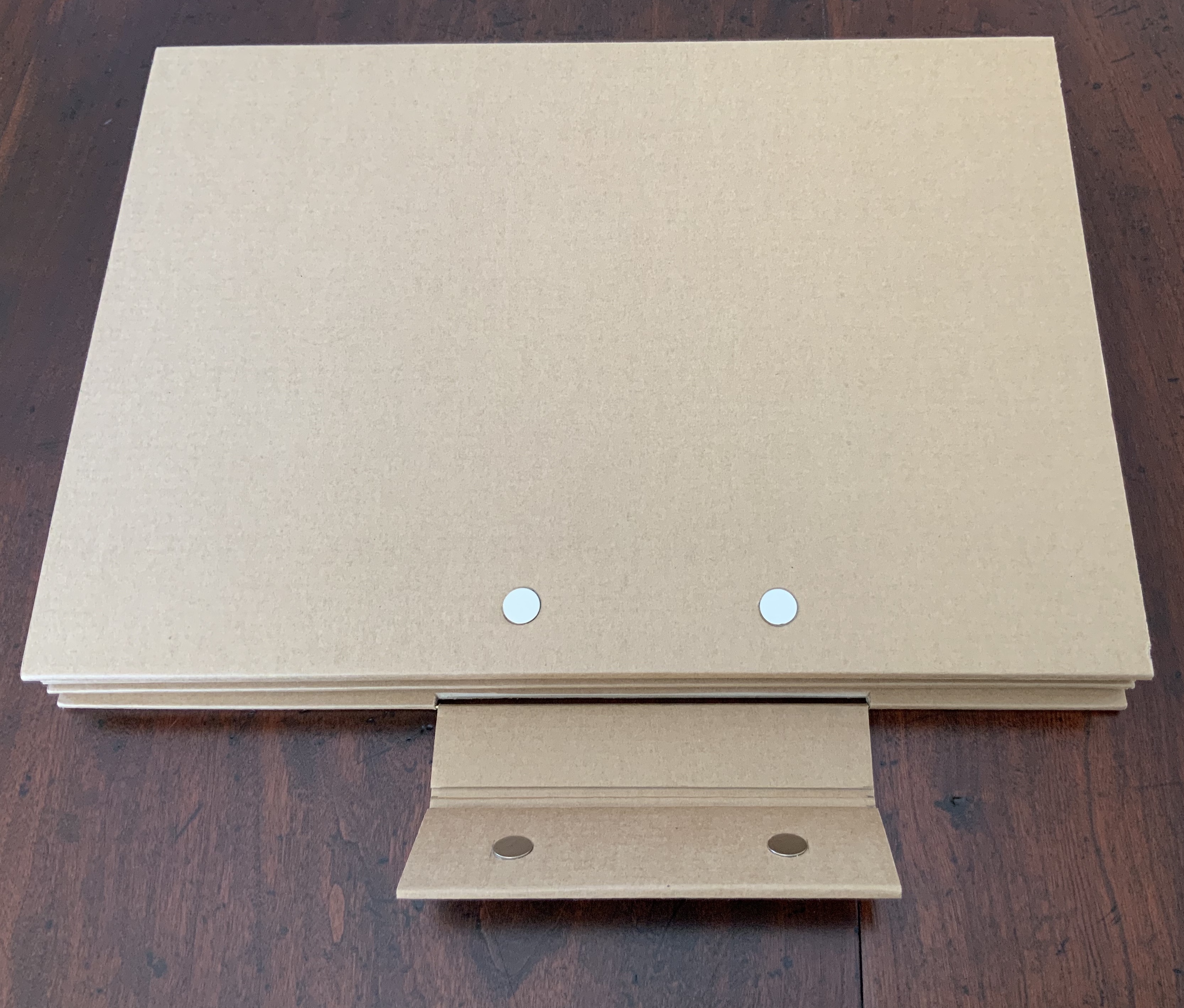
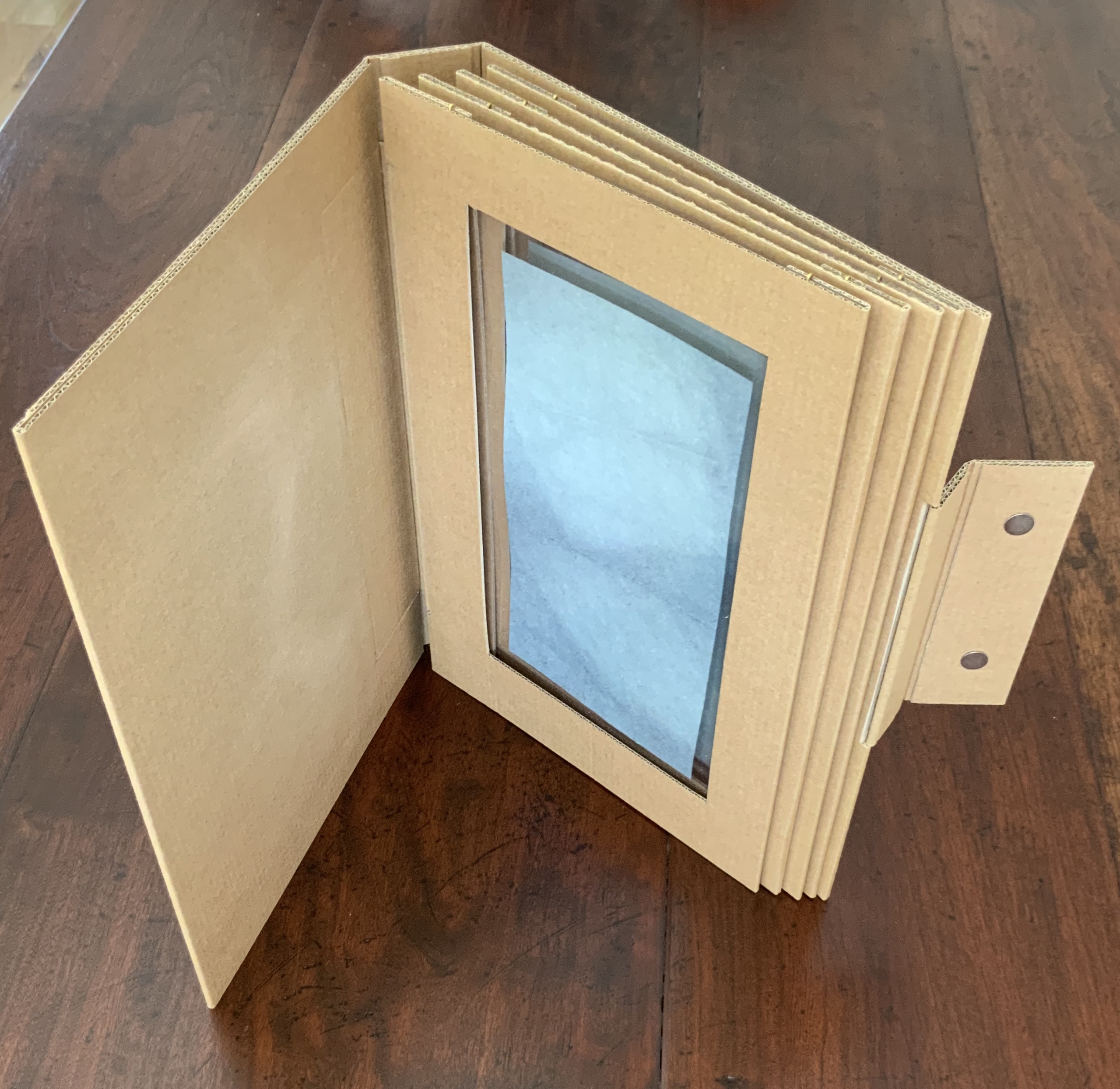
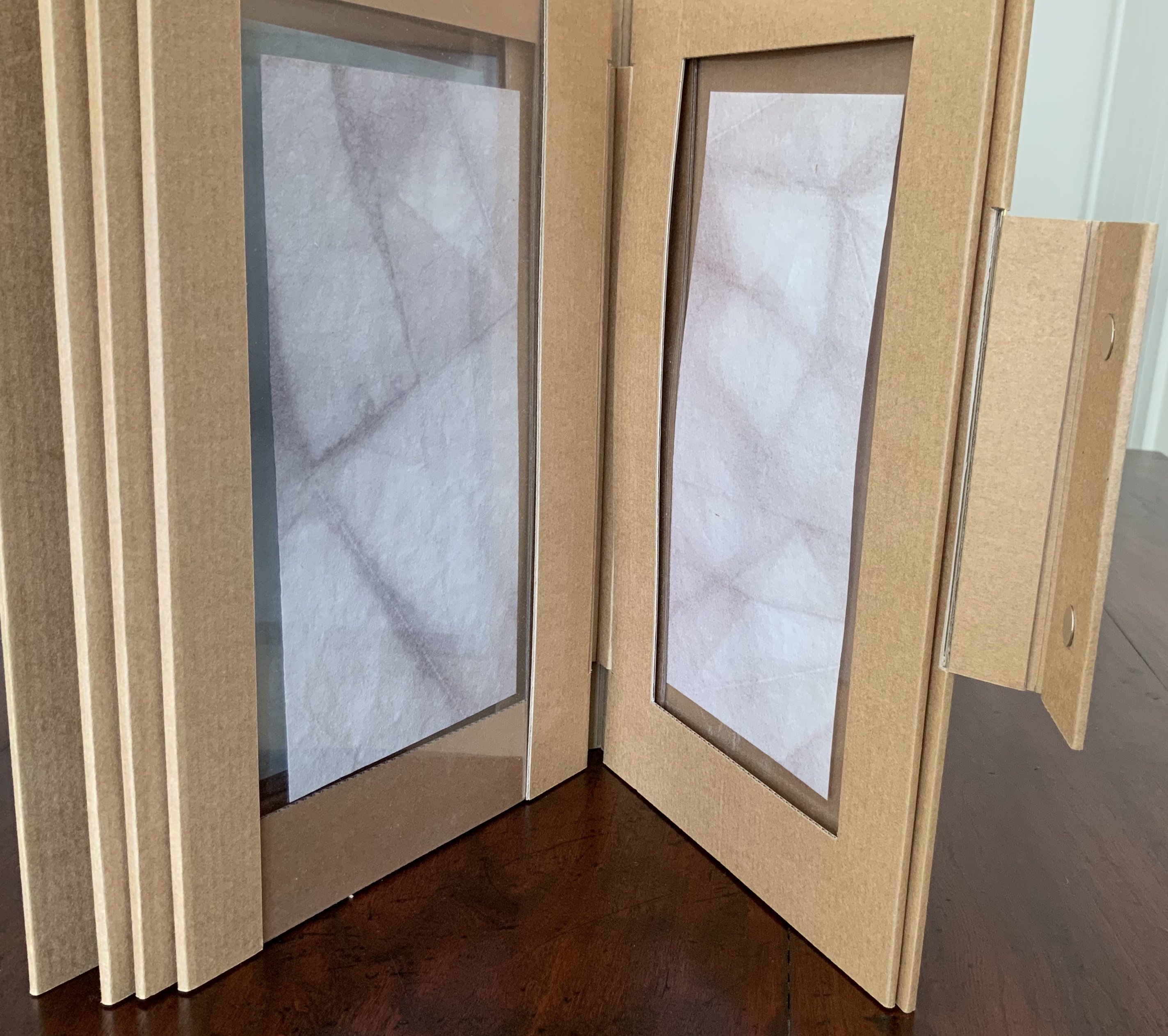
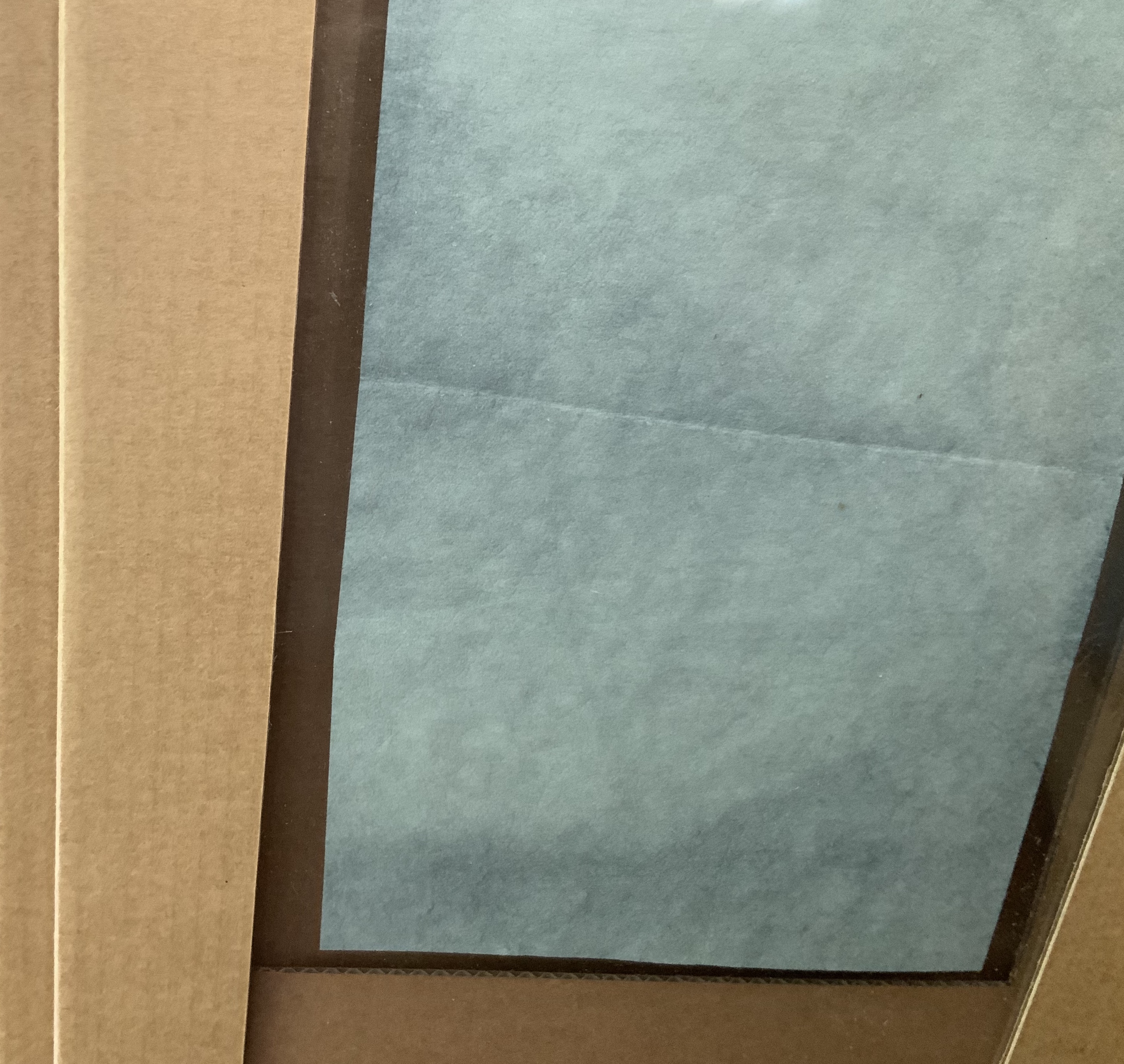
Rainbow Alphabet Snowflake (2013) Carol DuBosch Star book enclosed in flap purse. H4”x W5.5”x .D75” closed, W8.5” diameter open. Edition of 20, of which this is #1. Acquired from the artist, 17 November 2022. Photos: Books On Books Collection. Displayed with artist’s permission.
A frequent activity in book art is the thematic challenge. In 2010 from her studio in Maleny, Queensland, Australia, Fiona Dempster initiated an annual global challenge to calligraphers to create a letter a week. The challenge ran through 2014 and generated not only outstanding works of calligraphy but artists’ books as well. Two of these works came from Carol DuBosch.
Standing at the check-out counter of my art supply shop, I found myself gazing at a cabinet filled with bright color note cards and envelopes. I decided to take home a handful and try to make a book I had just become familiar with: Snowflake Book. I realized that the colorful notecards would be perfect for the pages of a Snowflake Book. And indeed, they were! Each module page of this book is made from two of the folded notecards. I simply added another fold to one of them and cut out the rectangle window. I printed six of my alphabet designs on acetate transparencies and attached them to view in the windows. The book opens fully to form a star-shape. The front & back cover attach using hidden strong magnets. — Carol DuBosch, 16 November 2022, Correspondence with Books On Books.
No two snowflakes are alike, yet they are all snowflakes. Taking her cue from this, DuBosch offers up five distinctive alphabets in her star-cum-snowflake book structure and, in one view, goes twenty-six better with a distinctive style for each letter.
Video: Courtesy of Carol DuBosch
Following in the tradition of so many artists, DuBosch creates and teaches. This next work neatly exemplifies that, reveals some of the techniques by which she achieves the subtlety in her work, and demonstrates her mastery of each.
Alphabet of Calligraphic Tricks (2014)
Alphabet of Calligraphic Tricks (2014) Carol DuBosch Double-sided leporello. H4” x W4” x D0.75” closed, W4’8” open. Unique. Acquire from the artist, 17 November 2022. Photos: Books On Books Collection. Displayed with artist’s permission.
I made this collection of techniques to share with students in class. It is compact and easy to transport and set up as a display in classes. Each page is a Gothic majuscule rendered with specified materials or tools. The caption outlines the process. The book was a project for A Letter A Week in 2014, administered by Fiona Dempster in Australia. Each participant organized a project incorporating letters and posted each week. I was able to complete two different alphabet books during the year. The binding style is a Leporello, a form of Concertina fold books. The entire book is created by overlapping pieces of cardstock folded in half. This method of binding creates a sturdy book that opens for display on both sides easily. — Carol DuBosch, 16 November 2022, Correspondence with Books On Books.
DuBosch’s concluding comment above highlights an abiding concern with what the structure of a work contributes to function. A similar function is achieved in the next very different structure that Hedi Kyle has labeled as “Interlocking Loops” and DuBosch calls a “gallery structure”.
Embossed Alphabet Gallery (2019)
Embossed Alphabet Gallery (2019) Carol DuBosch Gallery structure combining leporello, flag and star book forms. H6.25”x W1.25”x D.5” closed, W9” open for display. Edition of 15, of which this #1. Acquired from the artist, 17 November 2022. Photos: Books On Books Collection. Displayed with artist’s permission.
This book was made as an edition for a book-exchange. I wanted to use the Gallery structure and chose the alphabet as the subject. I used an embossing stencil I had made thirty years ago for the letters. I found parent sheets of the linen textured card stock, and it was excellent for the folding and embossing. I’ve always enjoyed the quote about the mystic art of writing by William Massey and was delighted to find a place for it in this structure. — Carol DuBosch, 16 November 2022, Correspondence with Books On Books.
The many ways of displaying this sculpture and its gallery of letters might cause the viewer to miss how they counterpoint the end of the quotation from William Massey’s The Origin and Progress of Letters (1763). The effect recalls the gray-white of Greek and Roman sculpture, many of which originally were painted.
DuBosch, Carol. 2020. The Calligraphic Coronavirus Chronicles Book. Portland: Carol DuBosch. Posted on YouTube by The Oregon Food Bank, 18 November 2020. Accessed 1 November 2022.
A particularly apropos video has arrived — apropos for its content, source and circumstances.
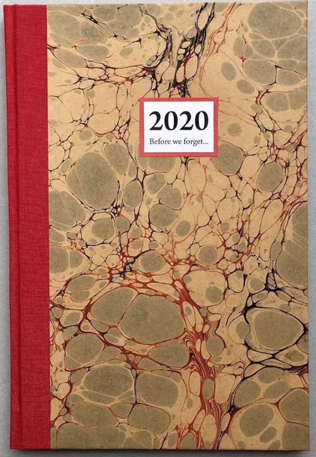
Patricia Silva, an artist working in Florence, Italy features in the Virginia Center for the Book’s Shelf Life video series. Virginia-based artist Lyall Harris interviewed Silva about Silva’s project Before We Forget 2020, a set of hand-bound artist’s journals. With each journal’s hand binding, unique cover of marbled paper, varied papers and inclusion of prompts to the owner, Silva draws on several rich traditions of book art.
Before We Forget (2020) Patricia Silva Thirty-six page journal (30 acid free writing pages + 6 specialty paper pages). Hand-crafted with hand-marbled paper and cloth covers. H215 x W145mm.
But in its technology, subject and circumstances, the video draws on an even more ancient literary tradition: Boccaccio’s Decameron. In March 2020, Italy was entering its months-long lockdown, and 4,461 miles away, the Virginia Festival of the Book was being cancelled due to the pandemic. Instead of decamping to the Blue Ridge or Tuscan hills with a handful of friends to escape the plague, Harris and Silva invited them via Zoom to their exchange.
Although a significant strain of book art falls into the conceptual and minimalist camps of art, an equally significant strain falls into the camp of the book arts and craft associated with them. Given the influence of her Italian mentor Carlo Saitta and University of the Arts professors like Hedi Kyle, it is no surprise that Before We Forget calls on the traditions of binding and paper marbling. The binding is a traditional case binding done with a link stitch on supports for sewing. The decorative papers come from several sources, almost all small artisans. Some are printed decorative papers, some are silkscreened, most are woodblock printed, of which several come from a small old-time family-run bindery in Venice that uses woodblocks dating back as far as the 1800s. Some of the paper is handmade by the artist.
The casual observer might mistake the journals of Before We Forget for the beautifully crafted blank journals that abound in outlets like Il Papiro or Paperchase. Yet there is surprise here to catch out the casual observer’s mistake and repay a bit of thought. At perhaps its most extreme, conceptual book art amounted to a set of instructions to the reader/viewer. The general interest in reader/viewer participation has several roots. One is craft-based and historical.
Recently in the context of the “other pandemic”, friendship journals and scrapbooks have drawn attention: for example, Amy Matilda Cassey’s Friendship Album (1833-56) and Alexander Gumby’s scrapbooks, including Negro in Bondage (1910-52). Older and more broadly, there are the Album Amicorum of Moyses Walens (1605-15) and Julia Chatfield’s Scrapbook (1845). Before We Forget does not present a set of completely blank pages. Each journal contains prompts to the owner to make notes, sketch, paste in, and add recollections of the days, weeks, and months of the 2020 Covid-19 pandemic.
Encouraging the owner’s intervention recalls another historical phenomenon: Grangerism or extra-illustration, where the owner embellishes a book with inserts. Richard Bull’s extra-illustrated copy of Count Anthony Hamilton’s Mémoires du comte de Gramont (1794) is a good example. Before We Forget does not present a previously printed body of text for Grangerizing, but each journal presents a unique copy to be overwritten.
In that context of the Covid-19 pandemic, this urging of reader/viewer participation evokes — perhaps callous to say — literally, not just metaphorically, Roland Barthes’ poser of the “death of the author”. Before We Forget plays to and against that metaphorical notion. Until a reader/viewer/owner acts upon an acquired copy, is there an author? Is the participating act one of authoring or mere “extra-illustration”? Barthes wrote: “the birth of the reader must be at the cost of the death of the Author” (p. 148). And if reader and author are one and the same?
Given Silva’s intentions stated in the interview, each copy acquired is meant to become a keepsake of events and time personal to its inscriber and be a memorial of the inscriber for future readers. Here is where the literalness of “death of the author” callously intrudes. Whether the owner/author falls prey to the virus or unrelated causes, the author dies.
The topic of the nature and experience of time recurs in book art sufficiently to warrant calling it a tradition. In Before We Forget, it plays out in general and in particular. On the general or theoretical side, we have Ulises Carrión and his definitions of “what a book is:
A book is a sequence of spaces. Each of these spaces is perceived at a different moment – a book is also a sequence of moments. … Written language is a sequence of signs expanding within the space; the reading of which occurs in the time. A book is a space-time sequence.
If seen as merely a blank journal, Before We Forget may seem not to warrant such “out there” statements. Or, on the contrary, those statements may seem not so “out there” when considered with Before We Forget in hand. On the particular and haptic side, we have in hand this object covered in a one-off piece of marbled paper and prodding our hands to mark it up and change the object to fix past time in it and to fix it in time to come. Theoretically or haptically, it engages the reader/viewer owner/author with the nature and experience of time.
Another tradition of book art in which Before We Forget is rooted, albeit loosely, is the found object and appropriation. In addition to its unique marbled paper cover, each journal contains six sheets of heavier or colored or patterned papers unique to the journal. In a sense, these papers are “found” as Silva has used only papers and cloth left over from older projects or collected (hoarded?) over the years. The marbled paper and specialist papers collected over time that found their way into Before We Forget are, however, only a part of the work — not the work itself as found object. Likewise, even if the owner/author fills the pages with pasted-in photos, postcards or other ephemera found or on hand, those found objects are not the work itself. It seems a stretch to deem the owned but yet-to-be-authored copy something that the owner/author has appropriated. In their collaboration Passato Prossimo (2017), Silva and Lyall Harris provide a magnificent demonstration of fusing book art with found objects and appropriation. The work is shown and discussed in the interview.
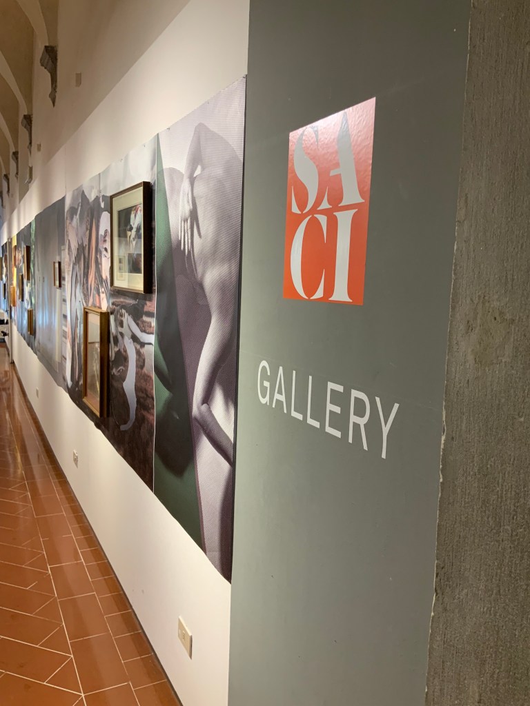
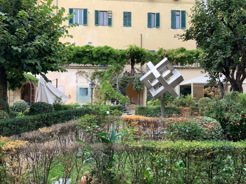
For Books On Books, the interview is a welcome reminder of another time. Patrica Silva teaches in both the Studio Arts College International (SACI) and Santa Reparata International School of Art (SRISA) and kindly arranged a visit to both in late September 2019. Florence was relatively empty at the time, and the visits to SACI and SRISA occurred at hours when there were no students around. The photos of the SACI’s gallery, library and grounds, the SRISA’s studio and equipment, and the works of Silva’s students will find their way into the Books On Books Collection’s copy of Before We Forget as strange harbingers.
By the end of September 2020, the Virginia Center for the Book had 40 episodes of Shelf Lifeon offer — well on the way to matching the Decameron‘s 100 stories. Unfortunately, with the current plague, the Center may be forced to exceed the Decameron‘s count, and Patricia Silva may face a demand for Before We Forget 2021.
Appropriated and sculpted bookwork was taking off in numerous forms even before 1964 when Marcel Broodthaers half-embedded the last fifty copies of his poetry book Pense-Bête in plaster. Bruno Munari had introduced libri illeggibili (“unreadable books”) in 1949. John Latham had already encased books with plaster in Shelf Number 2 (1961) and much else in his various skoob works. Tom Phillips’ line-by-line, found-book alteration A Humument was underway, first appearing in 1970, as was Dieter Roth’s string of sausage books Literaturwurst (1961-74). So Broodthaers could have taken any of several directions before deciding to replace Mallarmé’s lines of verse in Un Coup de Dés N’Abolira le Hasard: Poéme (1914) with printed and engraved placeholders in paper and anodized aluminum, respectively, to create Un Coup de Dés N’Abolira le Hasard: Image (1969).
Son of Giorgio Maffei (bookseller, curator, scholar and book artist in his own right), Giulio Maffei has made video catalogues for Studio Bibliografico Giorgio Maffei since 2015. Each catalogue is a work of video. In this twenty-sixth outing, Maffei has created a video from the 1914 edition and Broodthaers’ 1969 Image version of Un Coup de Dés.
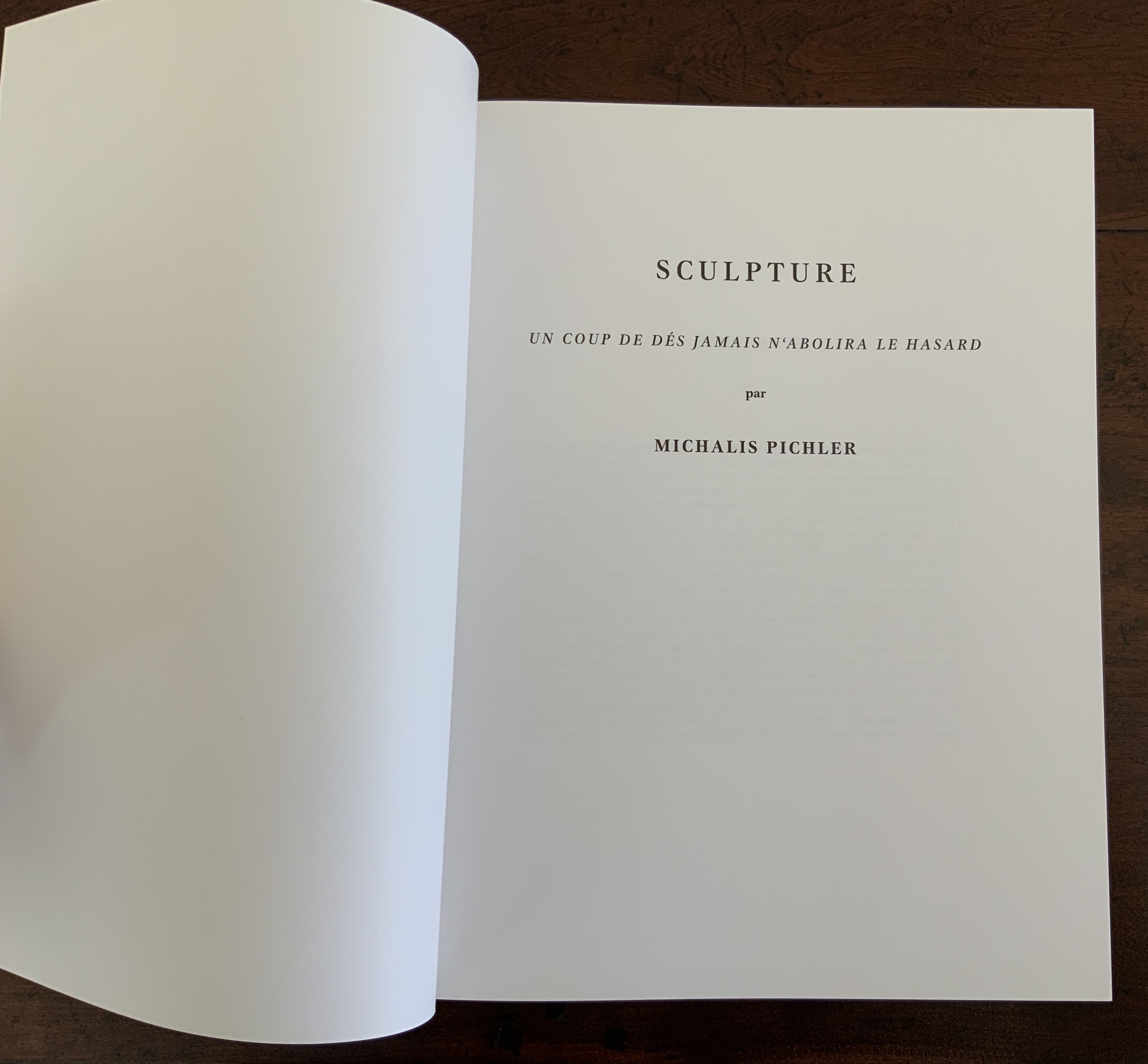
By 2008, Michalis Pichler had an even greater wealth of forms from which to choose for his double appropriation/homage to Mallarmé’s Poème and Broodthaers’ Image. Since the ’80s scores of book artists had been introduced to ingenious structures by Hedi Kyle and Keith A. Smith, among others, so why not an Aunt Sally’s shipwreck of string, canvas and torn paper? Long-Bin Chen had been sanding books and phone directories into busts since the ’90s, so why not a bust of Mallarmé from old editions of Un Coup de Dés and a bust of Broodthaers from catalogues of his works (a variation on Buzz Spector’s treatment)?
Instead Pichler appropriates Mallarmé through Broodthaers’ design and production: an efficient and direct double appropriation. He follows the trim size and layout of the 1914 and 1969 works. Further underscoring the double appropriation, he reprints verbatim Broodthaers’ preface (the full text of Mallarmé’s poem set in small type as a single paragraph with obliques separating the lines of verse). Like Broodthaers, he produced limited editions of three versions: 10 copies in plexiglas (rather than Broodthaers’ 10 in anodized aluminum), 90 copies in translucent paper (just as Broodthaers had done) and 500 copies in paper (rather than Broodthaers’ 300). Where Broodthaers had solid black stripes, though, Pichler substitutes laser cuts in the translucent and paper editions and engraving or abrasion in the plexiglas edition. Hence Sculpture (2008), rather than Image (1969) or Poème (1914).
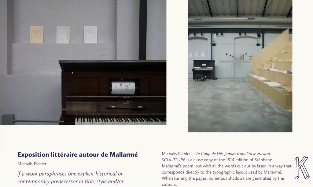
Not until 2016, though, was Pichler able to cap his double appropriation. Just as Broodthaers had held an exhibition entitled “Broodthaers: Exposition littéraire autour de Mallarmé” (Antwerp, December 1969), Pichler held one entitled “Pichler: Exposition Littéraire autour de Mallarmé” (Milan, December 2016). Like the Broodthaers exhibition, Pichler’s was an opportunity to showcase his own work: it was his first solo exhibition in Italy. Like Broodthaers, he included the Nrf 1914 edition, but also included numerous other editions and translations that had occurred since. Also, key to Pichler’s artistic intent, he included a host of other artists who by appropriation had made homage to Un Coup de Dés … Poème and, in some cases, Broodthaers’ … Image.
Book art is so self-referential in its instances (think of Real Fiction: An Inquiry into the Bookeresque by Helen Douglas and Telfer Stokes) and as a genre (think Burning Small Fires by Bruce Nauman) that appropriation offers a natural next step. In Pichler’s case, the subtlety of that step comes in how he reaches through Broodthaers’ Image all the way back to elements of Mallarmé’s Poème to achieve his aims.
When Broodthaers first appropriated Mallarmé’s layout, type sizes and roman/italic styles, he was engaged in a kind of reverse ekphrasis. Usually ekphrasis runs from the work of art (say, a Grecian urn) to the text in response (“Ode on a Grecian Urn”). Here, the poem and its shape come first, then the work of art — the Image of the poem. By calling his exhibition an exposition littéraire, Broodthaers underscored this. By calling out the shapes on the page, he elevated the original’s semblances of waves, an abyss, a foundering ship and a constellation and, in exposing them, performed a kind of literary study as well as artistic work.
Count it down from Pichler’s appropriation of Broodthaers’ exposition littéraire, from the inclusion/appropriation of other artists’ appropriations of Poème and/or Image, from his own work of book art Sculpture, from his own other works: Pichler’s appropriative ekphrasis is squared, cubed or perhaps raised to the fourth power. Clearly, book art and appropriation are Pichler’s chief palettes — or rather his twin decks from which, as DJ, he mixes what he calls “Greatest Hits”. The phrase simultaneously names Pichler’s imprint on Sculpture‘s cover and the series on his website. The series includes other appropriations such as Every Building on the Ginza Strip (2018) from Ed Ruscha and Some More Sonnet(s) aka Poem(s) (2011) from Ulises Carríon. “Greatest Hits”, however, suggests another subtlety in Sculpture, albeit one best appreciated in the context of all the exhibitions.
The first instance of Broodthaers’ exhibition in Antwerp included a continuous playing of the artist’s tape-recorded reading of the poem. In Cologne for its second instance, Broodthaers renamed it Exposition littéraire et musicale autour de Mallarmé. Broodthaers was simply taking Mallarmé’s musical cue in Un Coup de Dés’spreface, which advises reading the poem as if it were a “score” for music to be heard at a concert and its blank spaces as “silences”.
Taking Mallarmé’s and Broodthaers’ musical cues and that of his piano-roll-like slots in Sculpture, Pichler created for his exhibition Un Coup de Dés Jamais N’Abolira le Hasard: Musique, a piano-roll version of the poem to be played by any visitor who cared to sit and pedal the pianola on which it was installed. So in further appropriation of Mallarmé through Broodthaers, Pichler’s piano roll turns the empty spaces, where the words and black strips would be, into music while the blanks around them become what Magnus Wieland calls “white noise”.
In traditional literary ekphrasis, the referring text can stand on its own. Homer’s description of Achilles’ shield does not require a side-by-side engraving or painting of what Hephaestus forged. Nor does Auden’s exposition of Breughel’s Landscape with the Fall of Icarus (c. 1560) need an art history book to hand.
But without the context of the exhibition, the presence of other appropriations, or even Pichler’s translucent and plexiglas editions, what to make of Pichler’s paper edition on its own? The traditional Nrf cover design suggests no surprise to come, although the trim size looks non-traditional in today’s market. The book’s slimness, subtitle and preliminaries also warrant a raised eyebrow: how can this be a sculpture? Turning the pages, the reader/viewer comes to the cuts and sees through to the pages beneath. Shadows move through the leaves. The laser cut technique hints at something that a die cut does not. Do the burnt edges where the laser has cut suggest a more surgical approach to book burning, an allusion to burning decks, or a 19th century and 20th century legacy to the white spaces?
Both Mallarmé and Broodthaers noted the intent to draw attention to the white space of the page. Pichler appropriates both the poet’s and artist’s form and intent. He sculpts a conceptual double-palimpsest not by overwriting the first level of overwriting but by removing it and the original layer altogether. The core subtlety of Pichler’s paper edition of Un Coup de Dés lies in those empty spaces defined at their burnt edges and by the blankness around them. For Sartre, Mallarmé was the poet of nothingness. Broodthaers appropriated the nothingness with black ink. Pichler has appropriated both. The paradox is a work that stands on its own by invoking and eliminating what it appropriates.
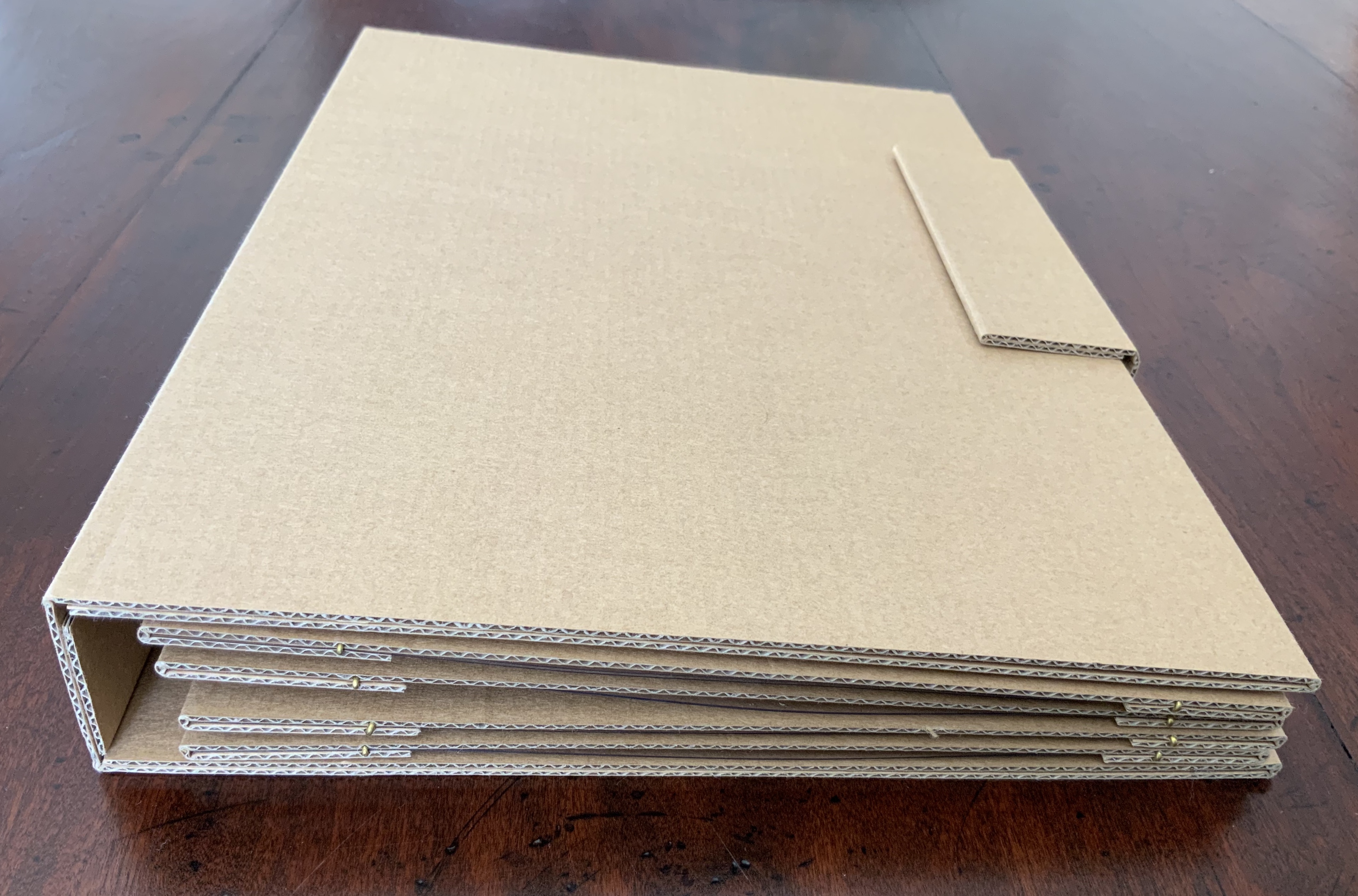
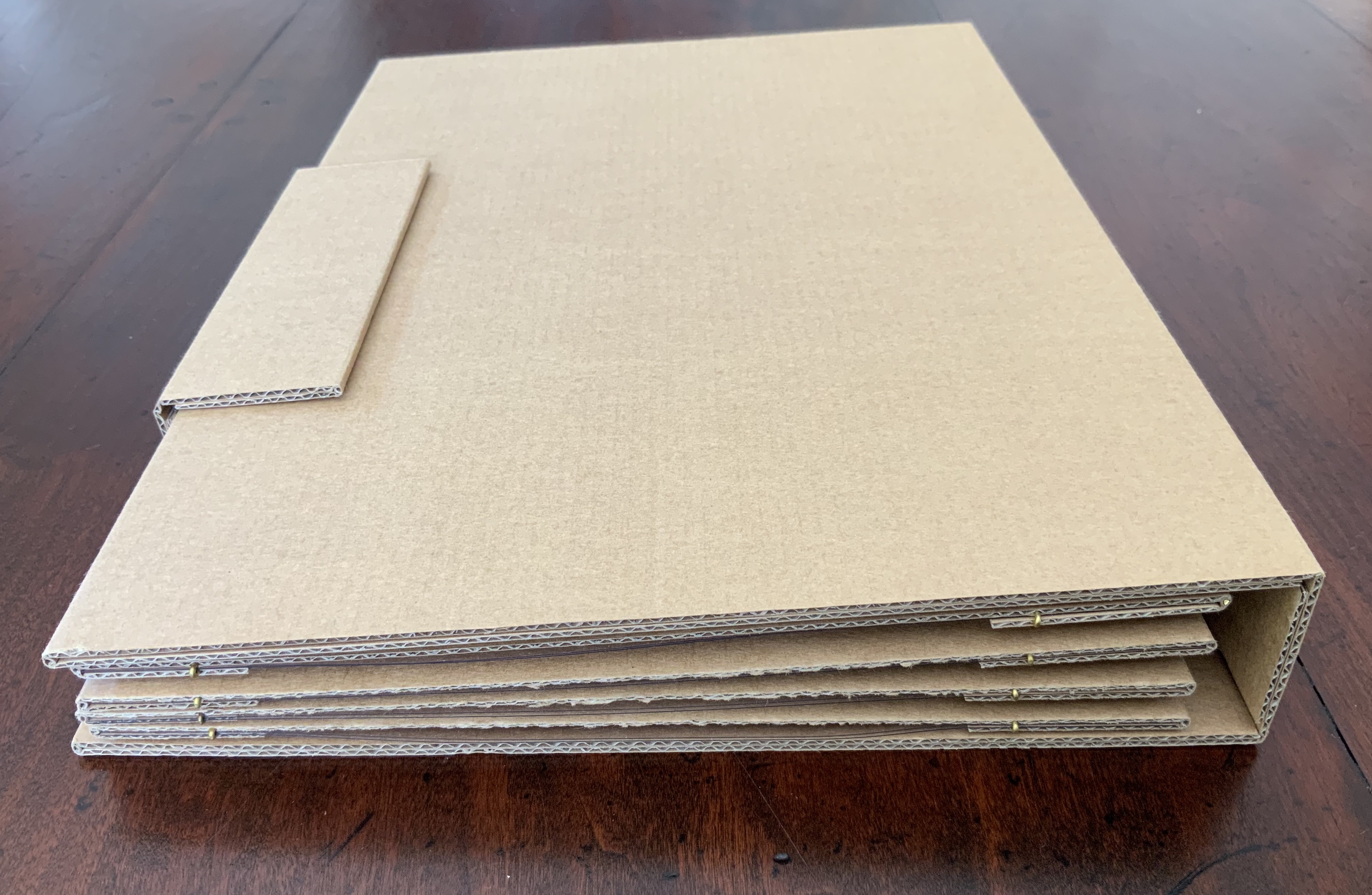
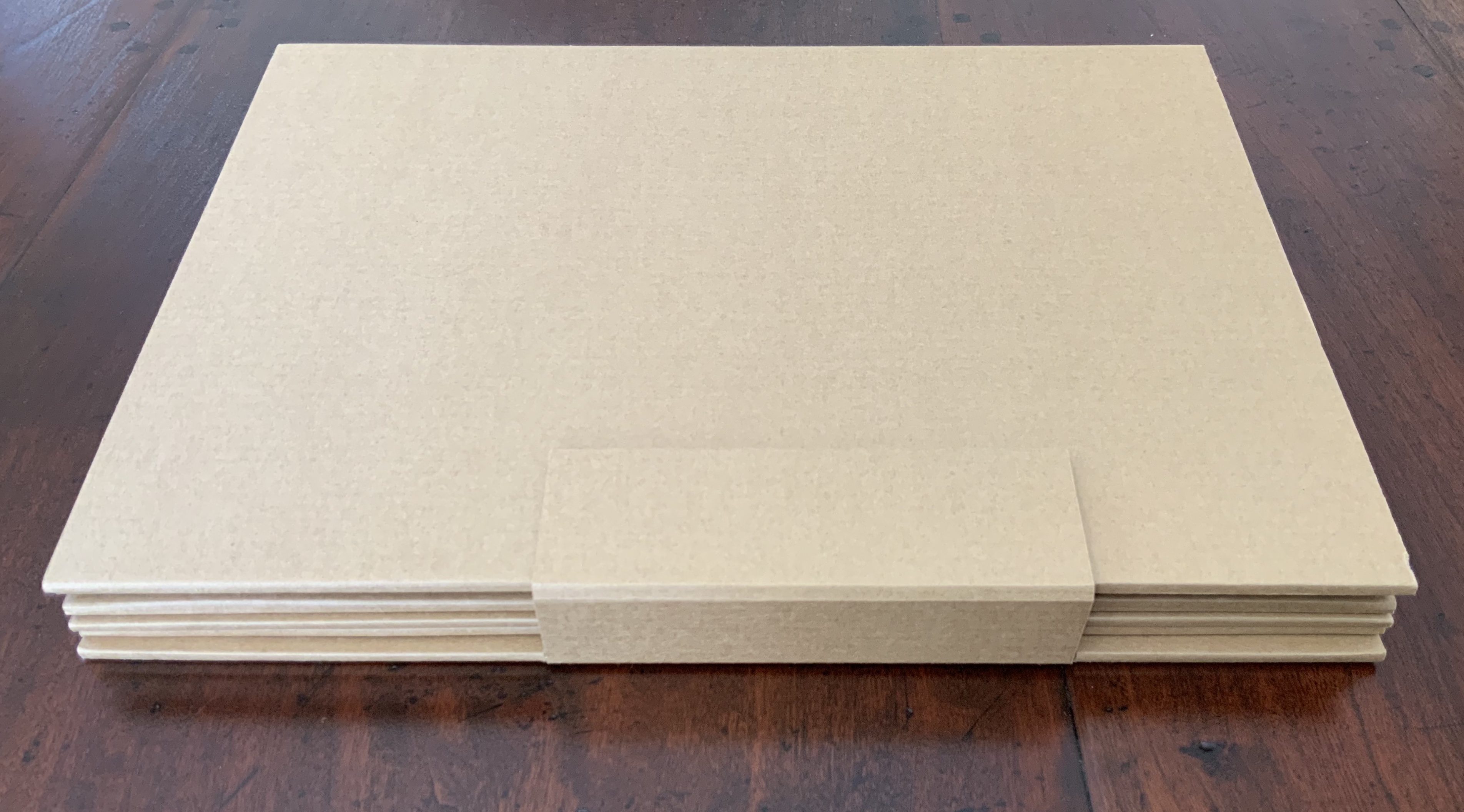
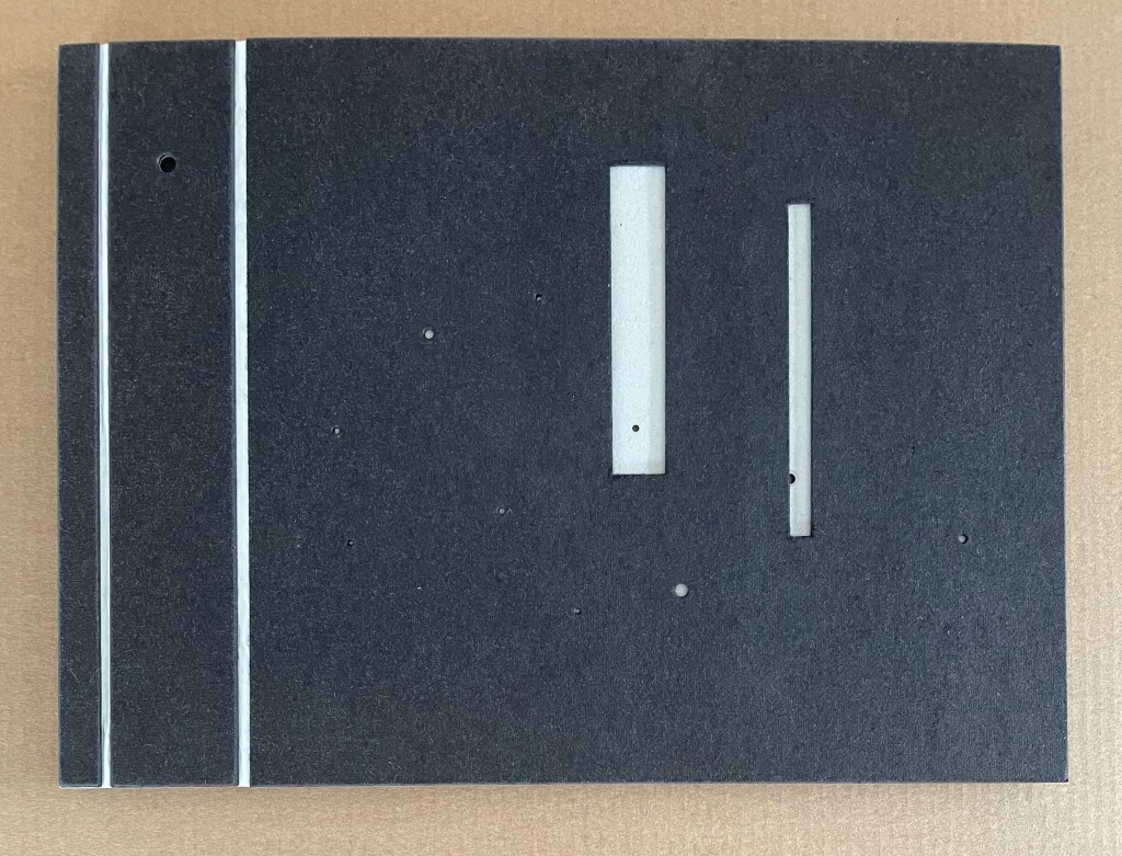
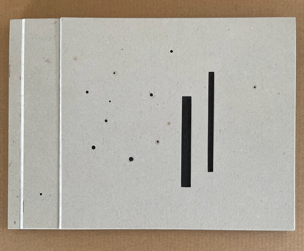
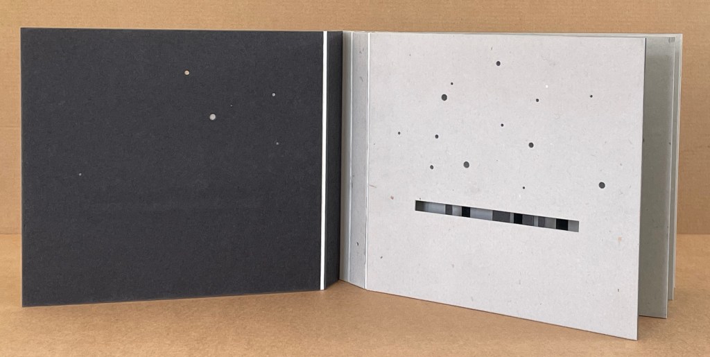
Belly band with edition details, spider style binding; eight leaves, 16 pages, 48 panels; laser printed onto 250gsm card glossy on one side. Open edition of signed copies. Acquired from AM Bruno, 9 November 2018. Photos: Books On Books Collection.
This spiral of imagery, is an allegory for breath, found in the material world, photographed in the house I was building. A variety of modalities of folds – from the fold of our material selves, our bodies – to the folding of time, or simply memory, an interiority and exteriority. — Artist’s description
The “spider style” binding here is not quite the same as that designated by Hedi Kyle as the “spider book” in The Art of the Fold (2018). It is more a cross between an accordion fold, crown fold and spider book as explained by Kyle. It also recalls the effect of the Chinese dragon fold, exemplified by the re-creation of the Diamond Sutra by Zhang Xiaodong. Whatever its source or name, the fold and binding create a prismatic bookwork that invites teasing away each sheet and fold, poring over each panel as well as setting the work up in various display aspects.
Although Spiration is not currently listed in WorldCat, several of Goldhill’s other publications are: for example, In the Beginning and Sanguine Shifts, both of which arose from projects posed to the AMBruno coalition of artists. Her work has drawn the attention of the British curator and writer David Alan Mellor.
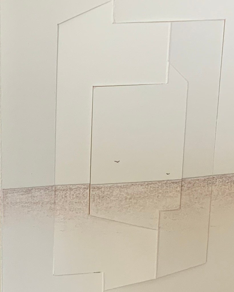
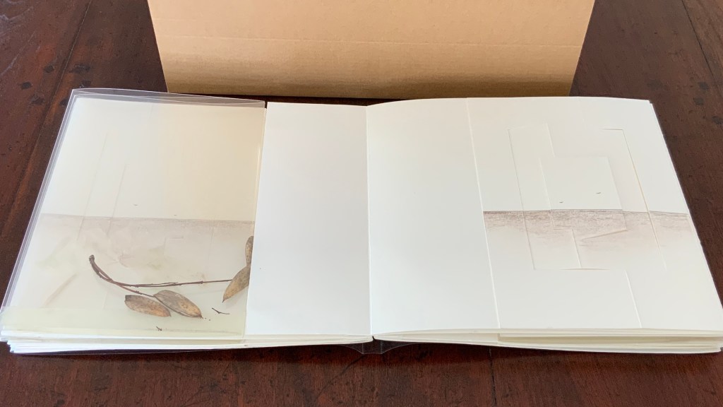
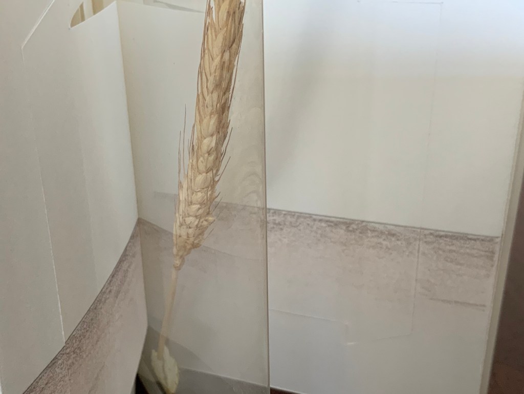
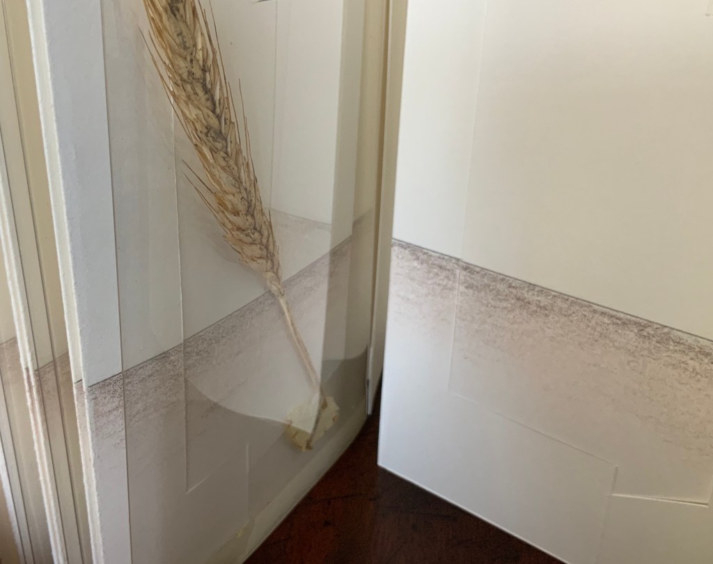
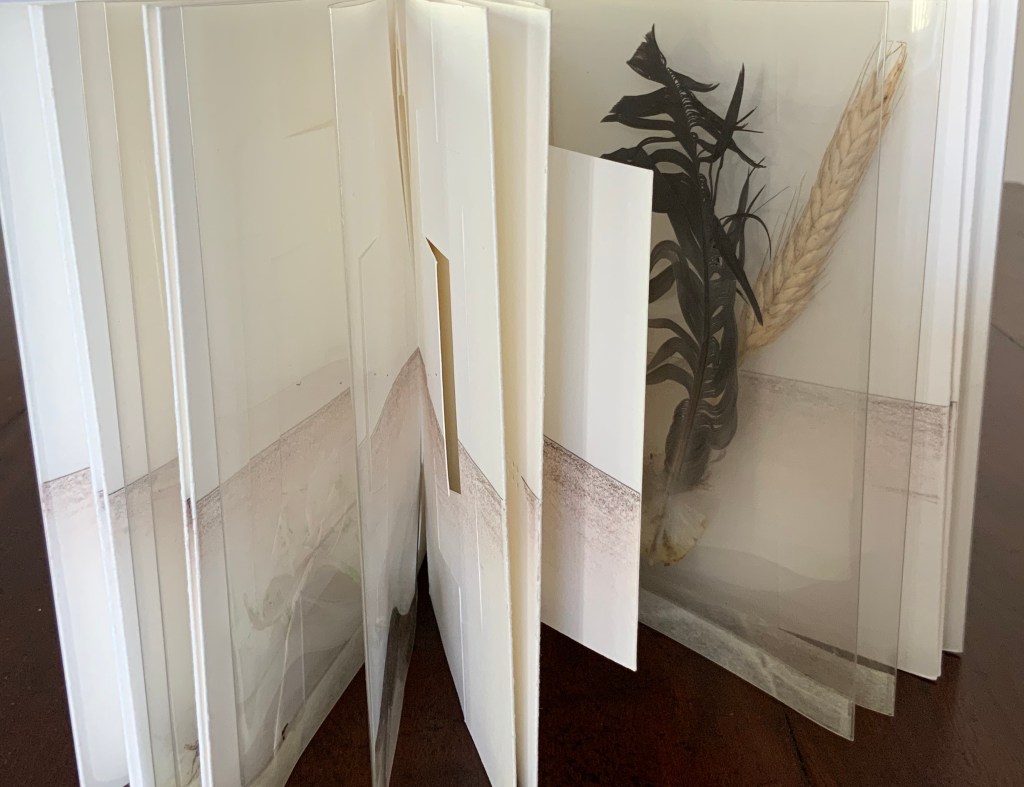
Aerssens and Hedi Kyle are long-time friends, whose correspondence has often consisted of an exchange of small models. Memories is an integrated variant of the Panorama Book structure, featuring as it does panels within panels, two 8-leaf booklets bound into front and back with paper hinges, and three pairs of mylar folders holding “found nature” items such as a feather, a grain stalk and whatever might have caught Aerssens’ eye.
Aerssen’s signature image of birds on his region’s wide, flat horizon.
Aerssens loves cardboard as a material and created Clamp to illustrate its beauty. It illustrates, too, his constant search for elegant closures (whether with magnets, folds, pin/dowel or tabs and slots). As he put it in a conversation, “I’m a structure guy”.
The four tinted papers that hang like small abstract paintings in the framing pages speak to another of Aerssens’ comments about his leanings: “Presentation — display — has always interested me”.
Aerssens’s first employment was in bookbinding, but early on, he turned to carpentry and its engineering side before ultimately returning to bookbinding and containers of books and other objects. The experience of careful planning and a carpenter’s approach shines out of his every work. Look especially under Further Reading at his design work for Pierre Lecuire’s Dédale. Yet his quick answer when asked what other bookbinders probably have to say about him and his work? “The anarchist of bookbinders!”
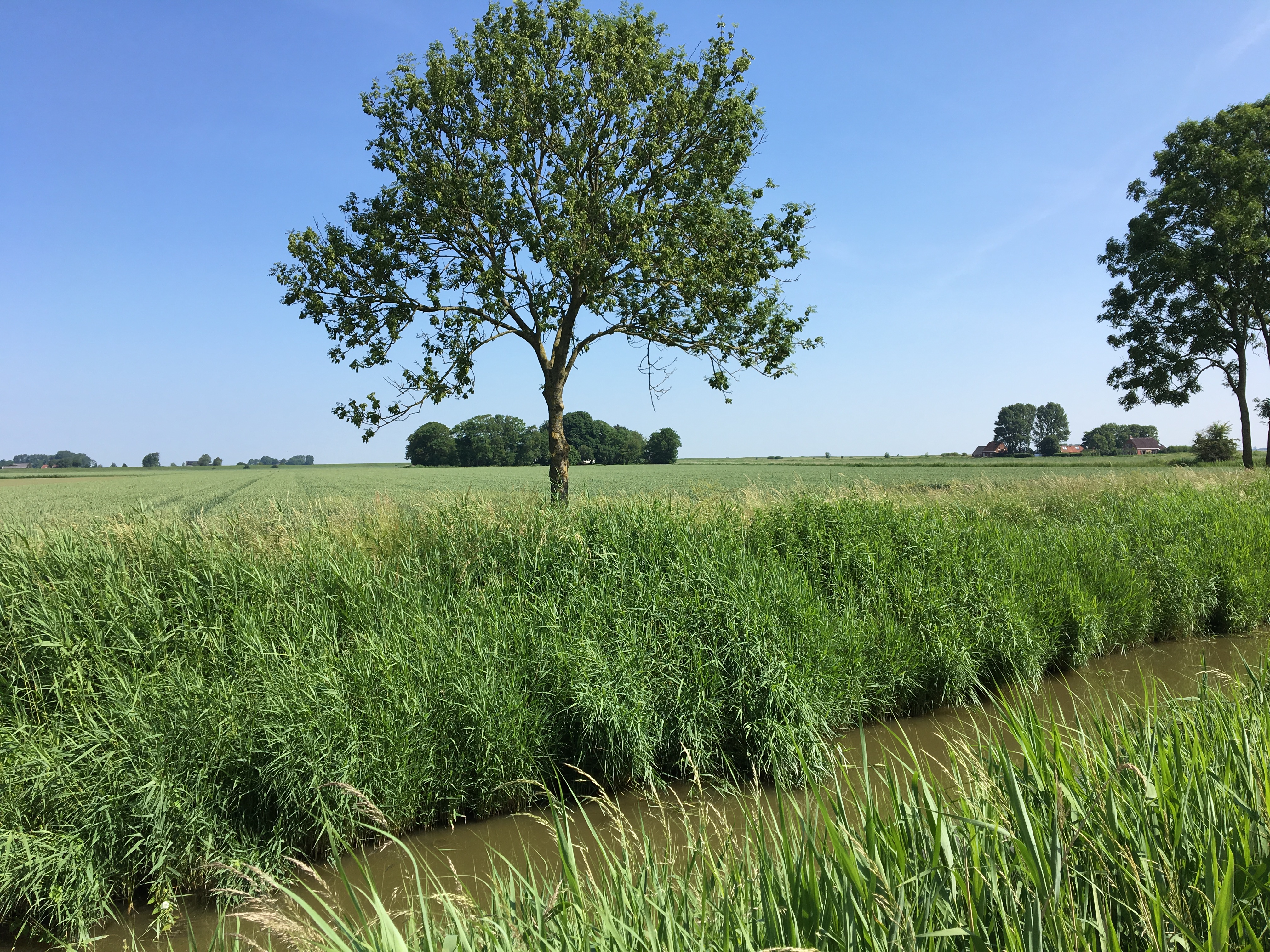
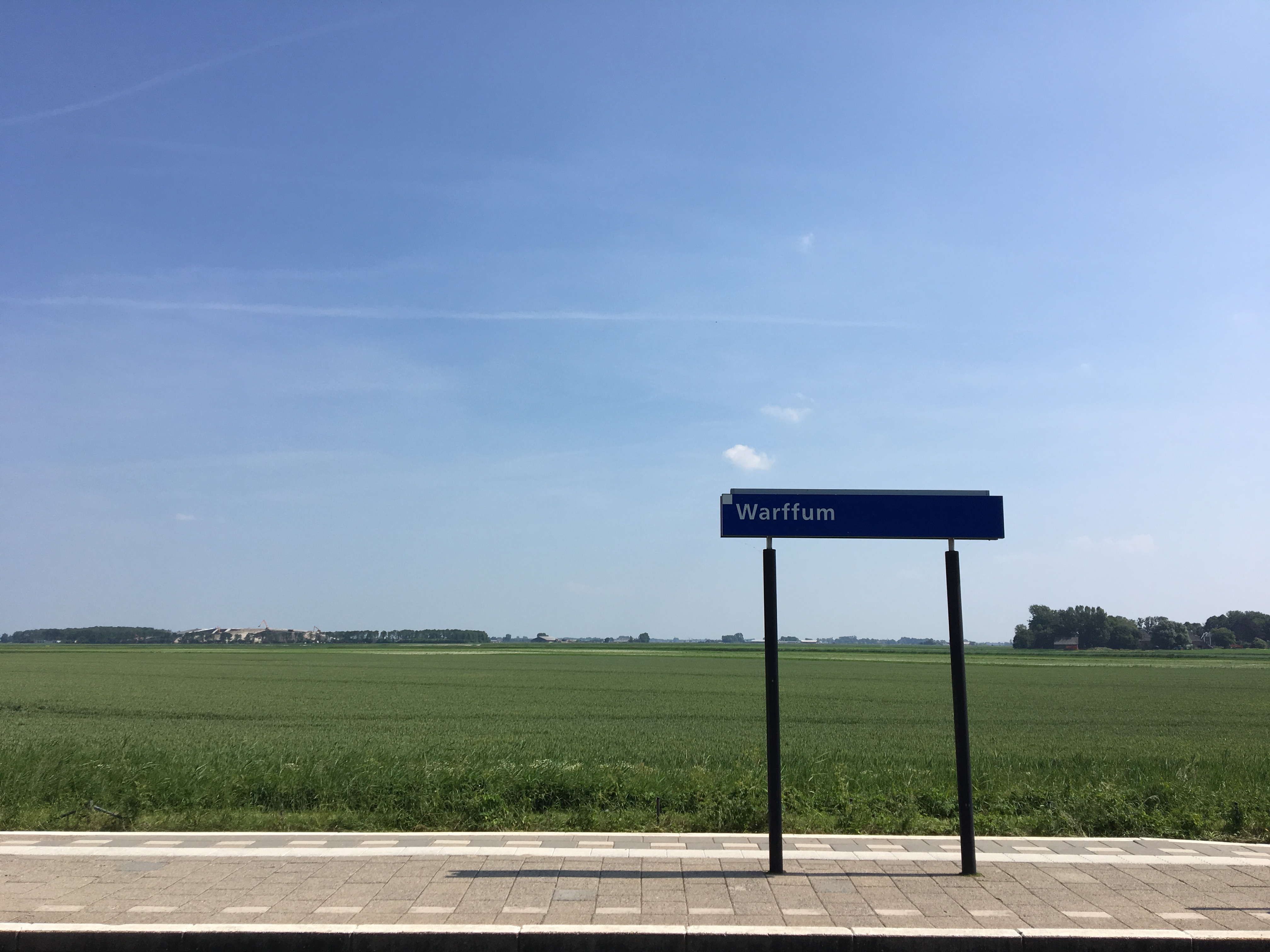
A Visit to Cor Aerssens’ Studio, Warffum, The Netherlands (7 June 2018)
Remote as Warffum may seem from the armchair, it is easily accessible by train (Amsterdam-Groningen-Warffum). Artists from around the world book the small number of places in Aerssens’ workshops years in advance.
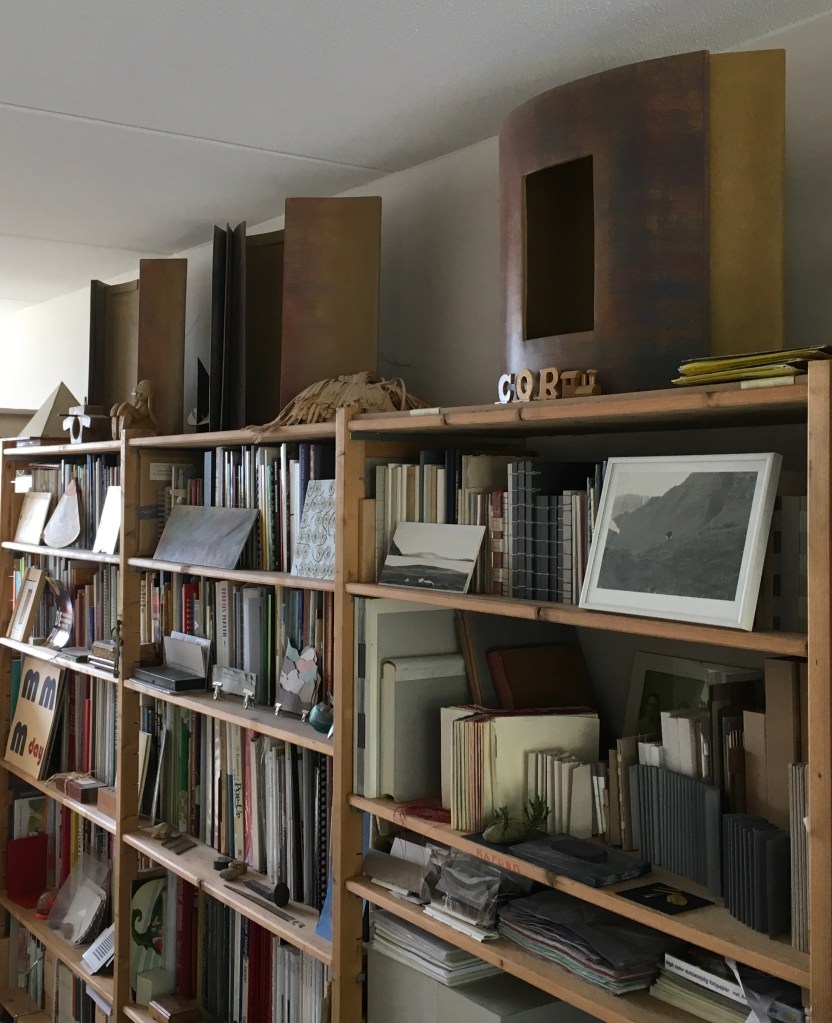
The large display objects and containers atop the bookshelf are finished in encaustic, another of the unusual features of Aerssens work.
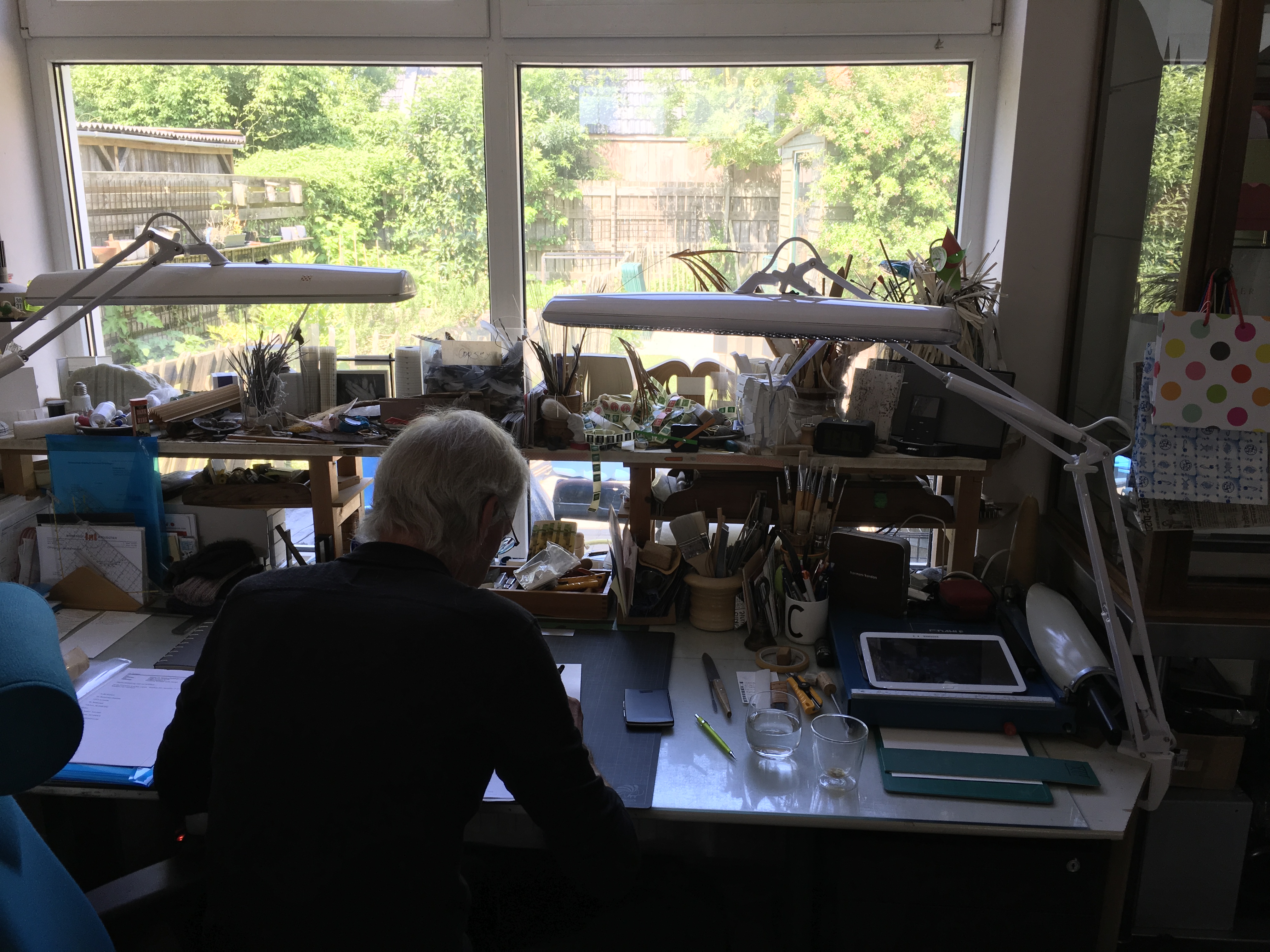
Good luck spotting on his desk the Corfolder (a bonefolder for boxes). Sweden’s Monica Langwe can provide a Teflon one made to Aerssens’ design if you like.
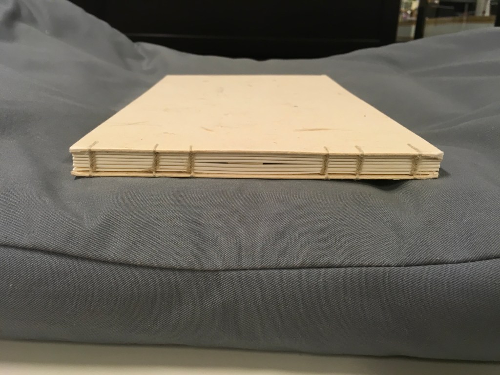
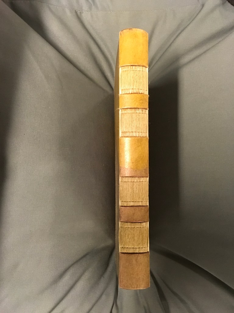
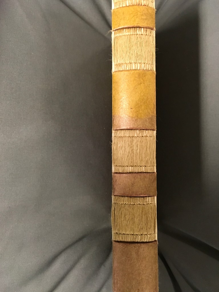
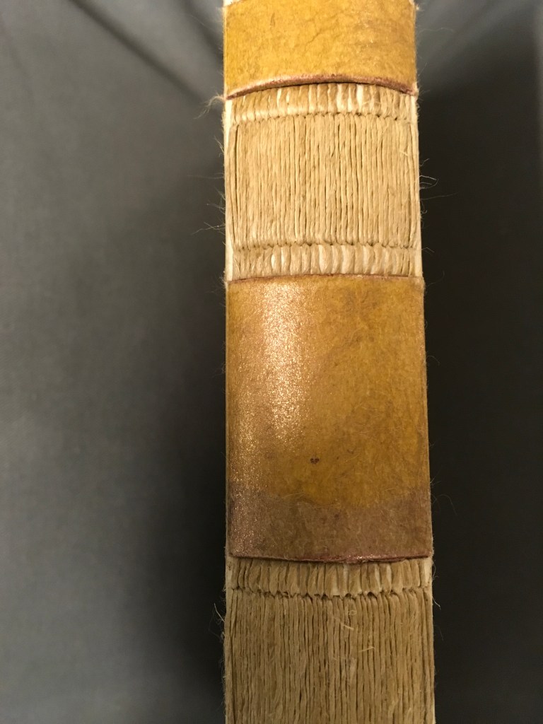
Every work opens to reveal some element of ingenuity such as layered reveal-flaps, framed sheets of mica or double-hinged spines. One of Aerssens several innovations is the Groninger binding, which is generally a fully cardboard binding. Books with this binding open and lay perfectly flat.
A part of the book block is sewn with and integrated in the boards as is the spine, which obviates any need for endpapers or covering on the boards to keep book block and boards together. Other material can be used for a Groninger binding, such as kozo in the example below.
“Judy Goldhill“, Books On Books Collection, 29 June 2020.
Aerssens, Cor. Het dozen : activiteiten rond het begrip ‘dozen’ (Groningen: Cor Aerssens, 1998). Consists of two workbooks on creating boxes: part I ‘construction and covering of functional boxes’ and part II ‘step-by-step plan and objective boxes’.
Aerssens, Cor. “‘Box’: A Monument to the Last Period of a Friendship.” New Bookbinder, vol. 32, July 2012, p. 23.
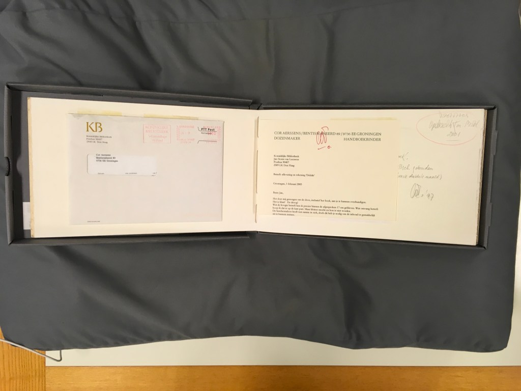
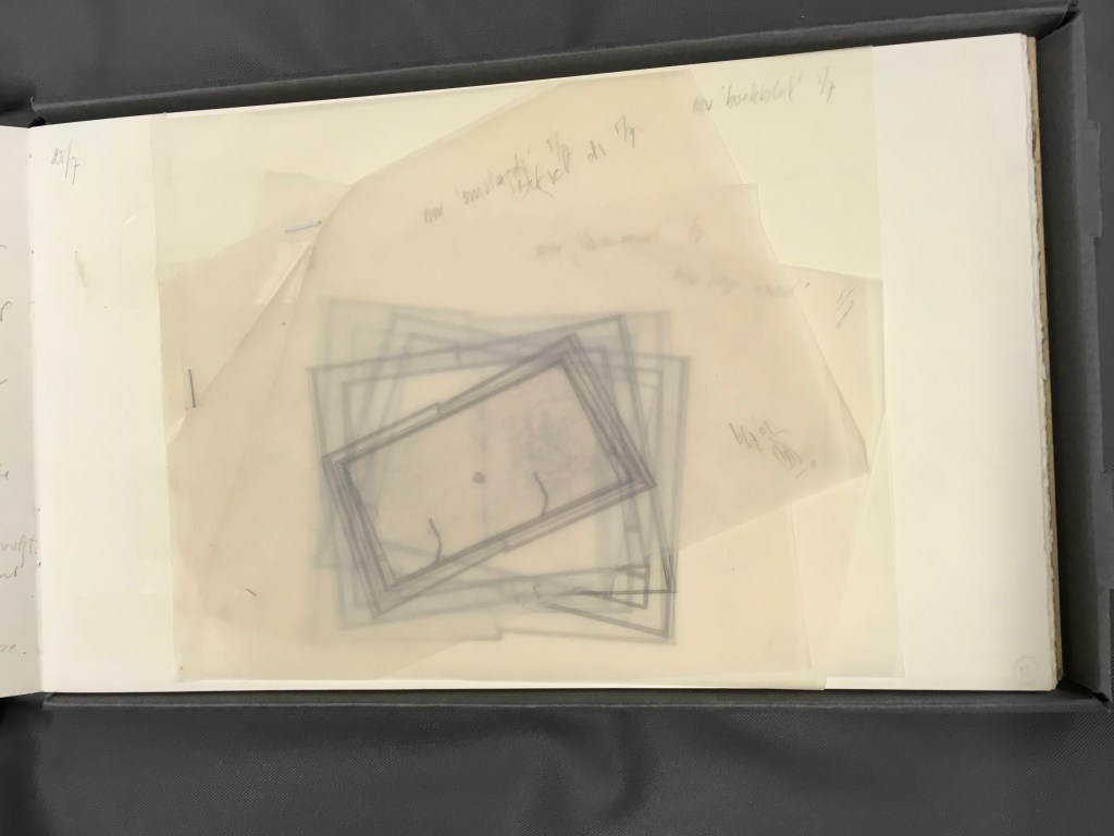
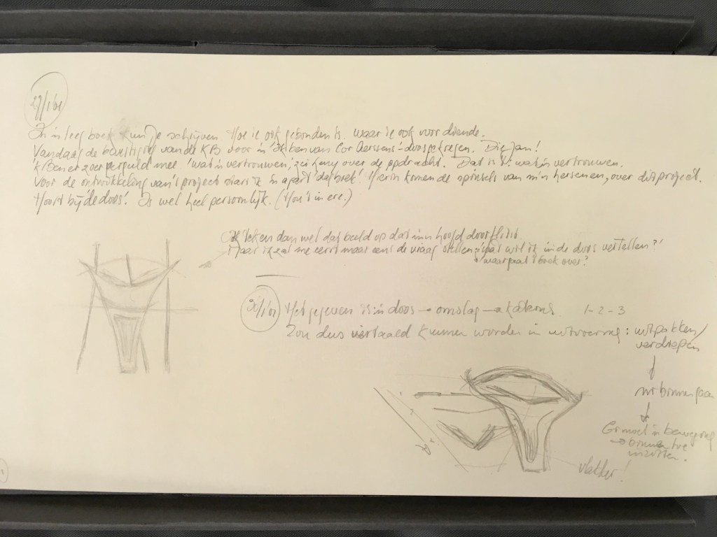
Aerssens, Cor. Ontwerp van Cor Aerssens voor Dédale van Pierre Lecuire. Met aantekeningen en schetsen (Warffum, 2003). The Koninklijke Bibliotheek commissioned Aerssens to create a display/binding for Lecuire’s artist’s book with André Lanskoy Dédale. In addition to the five boxes stacked in a pyramid (not pictured here), Aerssens delivered his detailed design notes and sketches (shown below), which demonstrate his carpentry background.
Goddijn, Peter. Westerse boekbindtechnieken van Middeleuwen tot heden: een handleiding voor het maken van boekmodellen (Amsterdam: De Buitenkant, 2001). Boekband. Met was behandeld bord in tinten goudbruin, en goudgeel (Warffum, 2002). The KB also commissioned this binding of Goddijn’s guidebook to making book models, based on his study of bookbinding techniques from the Middle Ages to the present. Note the encaustic finish of the cover and end papers. As the cover moves, the finish shimmers and changes colours across that spectrum of yellow-brown to yellow-gold in a way that the photos are hard-pressed to capture. In the preceding section, other works with an encaustic finish can been seen on the top shelf in the workshop photo. The binding itself takes a cue from the book’s content (see below), but it is in fact a Groninger binding (see section above).
My thanks to Paul van Capelleveen and the staff at the Dutch National Library in The Hague for their kind assistance.
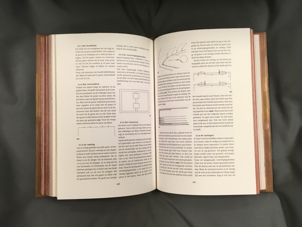
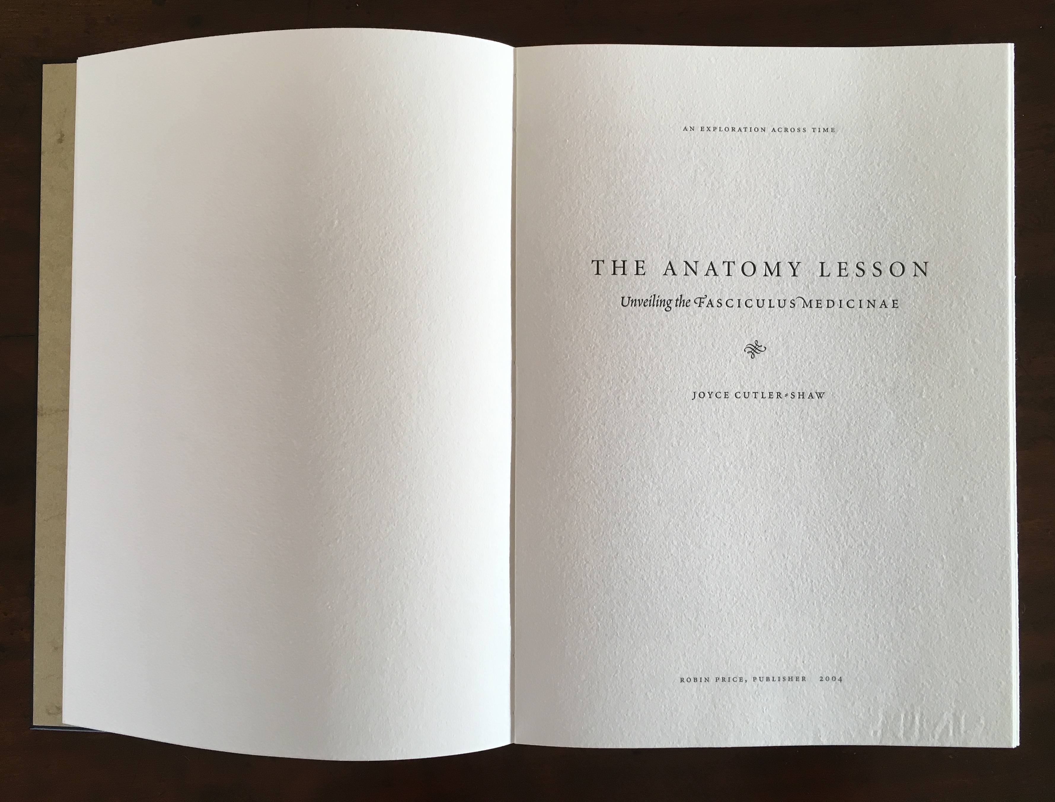
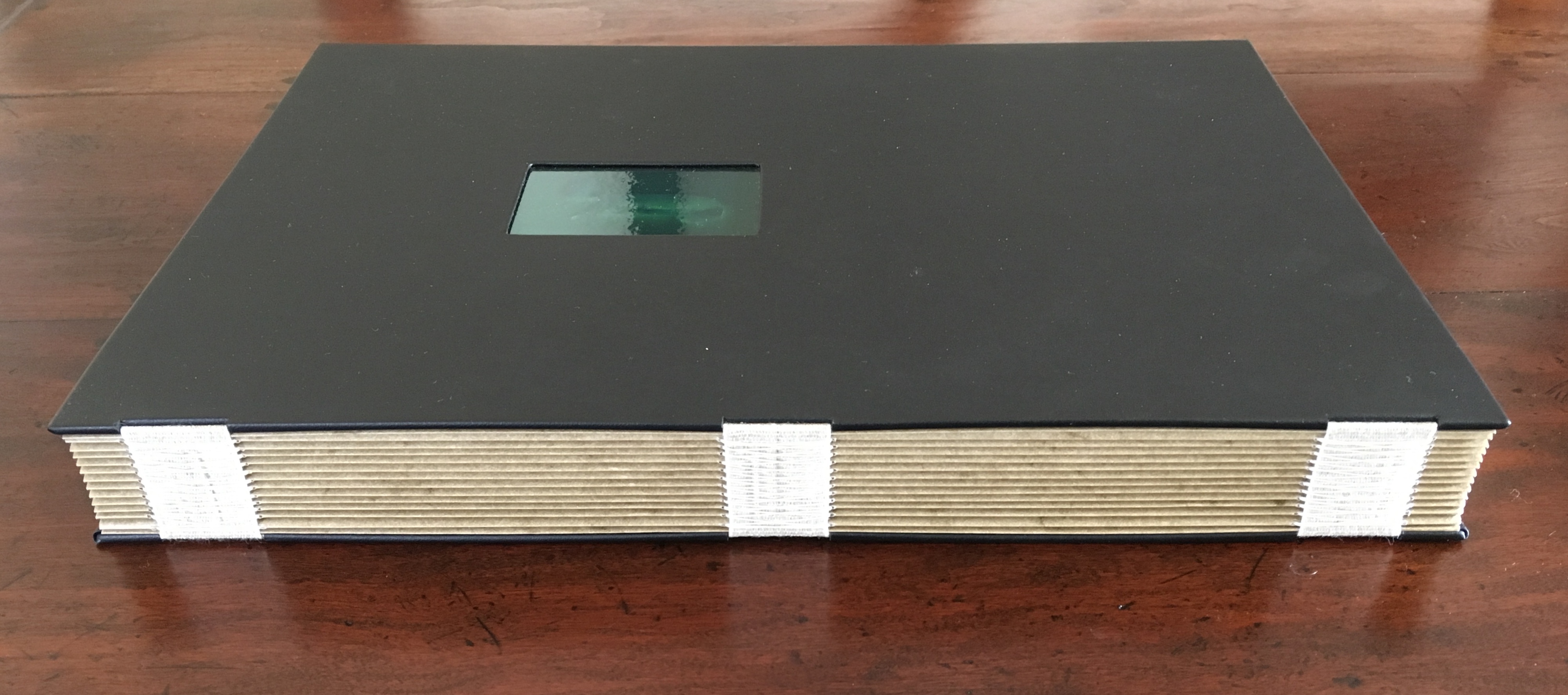
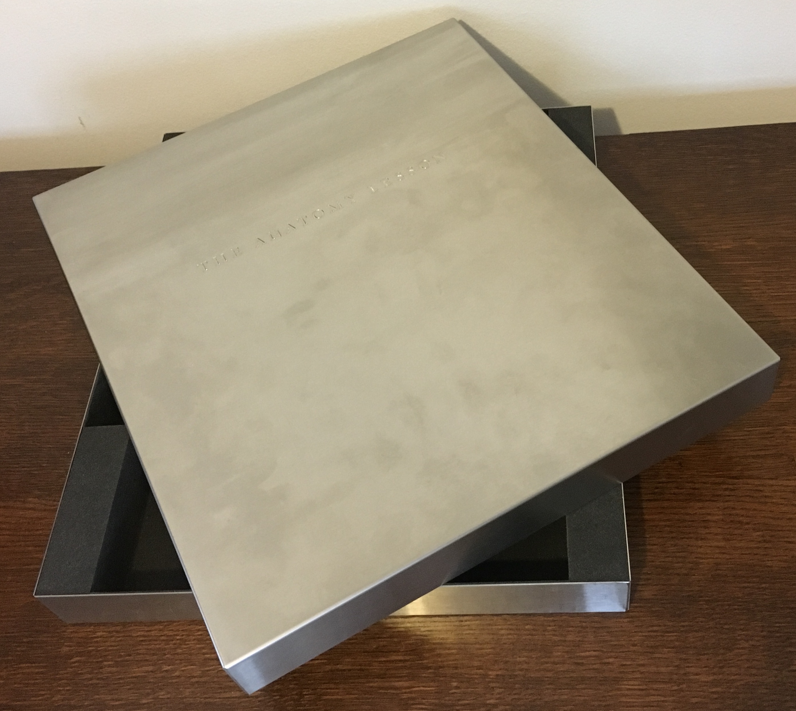
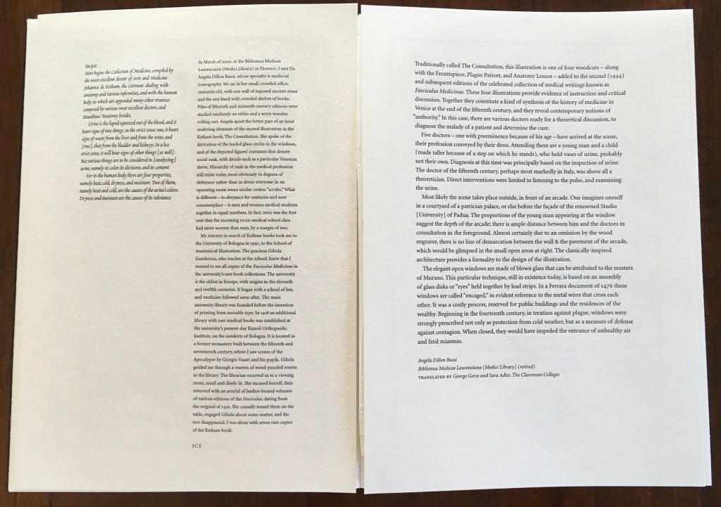
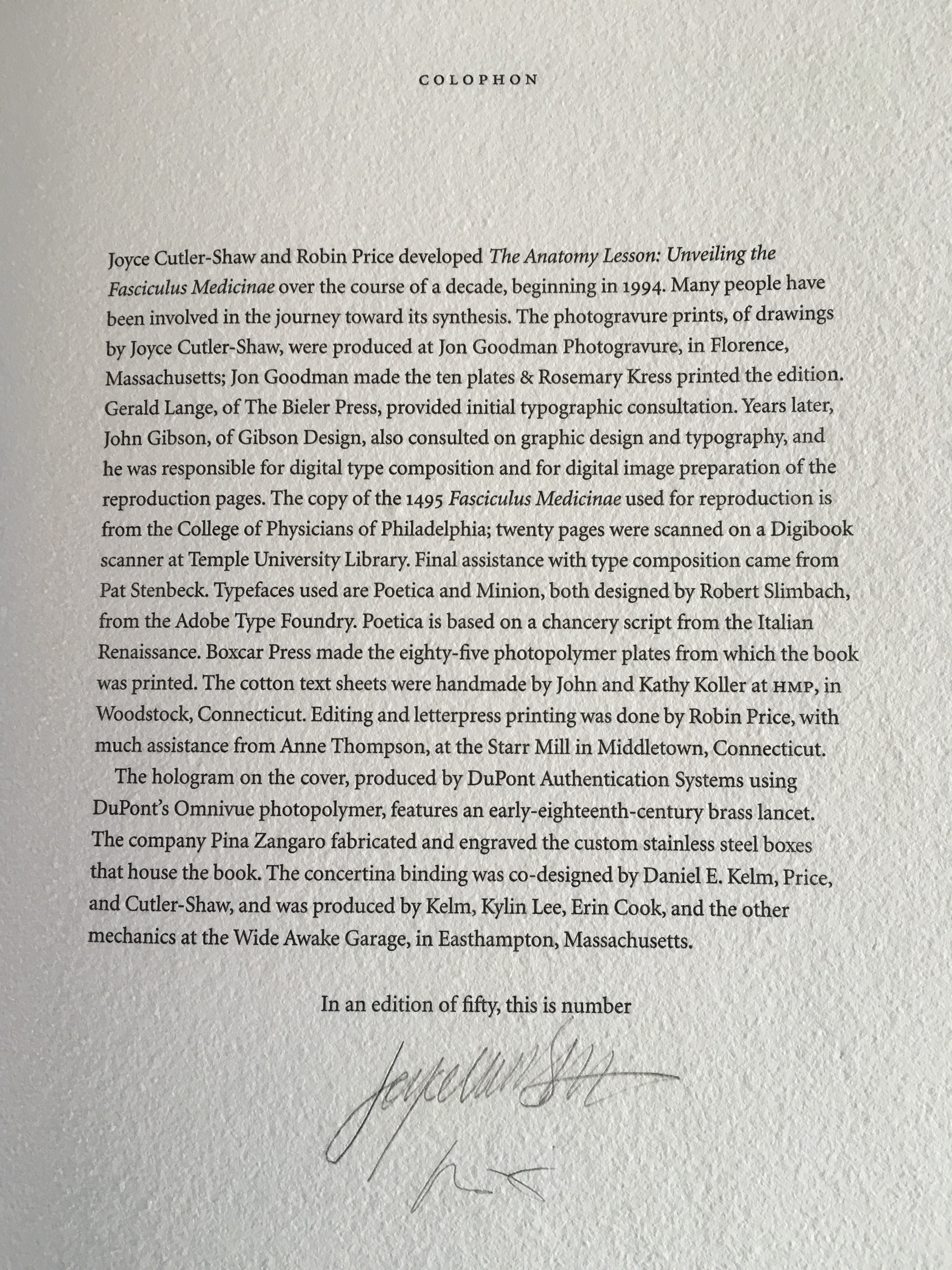
The Anatomy Lesson: Unveiling the Fasciculus Medicinae (2004)
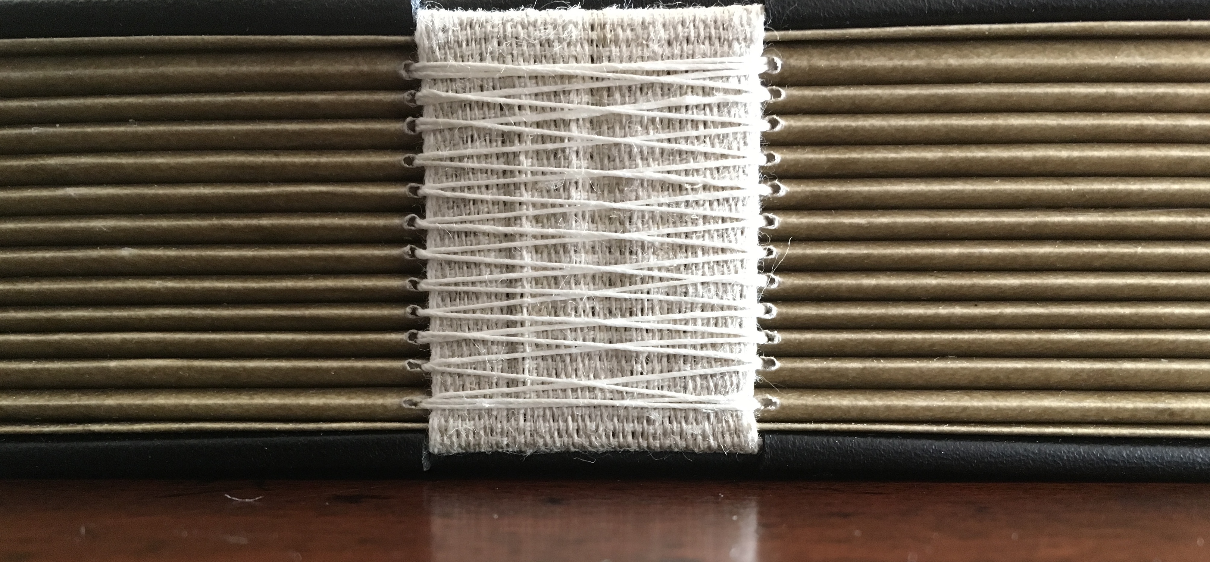
The Anatomy Lesson: Unveiling the Fasciculus Medicinae (2004) Joyce Cutler-Shaw Middletown, CT: Robin Price, Publisher, 2004) Housed in a custom-made, engraved stainless steel box (H370 x W326 x D44 mm), concertina binding co-designed with Daniel E. Kelm and Joyce Cutler-Shaw, produced at The Wide Awake Garage; twelve signatures of handmade cotton text paper, the central ten signatures each made up of one sheet H356 x W514 mm and one sheet H356 x W500 mm glued to the 14 mm margin of the first sheet, for a total of 96 pages, each measuring H356 x W253 mm. Binding of leather covered boards (a hologram embedded in front cover) with an open spine, taped and sewn into a reinforcing concertina structure: H361 X W259 mm. The hologram, produced by DuPont Authentication Systems, features an early eighteenth-century brass lancet. Edition of 50, of which this is a binder’s copy. Acquired from the binder, Daniel E. Kelm, 15 October 2018.
Twelve signatures of handmade cotton text paper, the central ten signatures each made up of one sheet H356 x W514 mm and one sheet H356 x W500 mm glued to the 14 mm margin of the first sheet, for a total of ninety-six pages, each measuring H356 x W253 mm. Binding of leather covered boards (a hologram embedded in front cover) with an open spine, taped and sewn into a reinforcing concertina structure: H361 X W259 mm. Contained in engraved steel box: H370 x W326 x D44 mm.
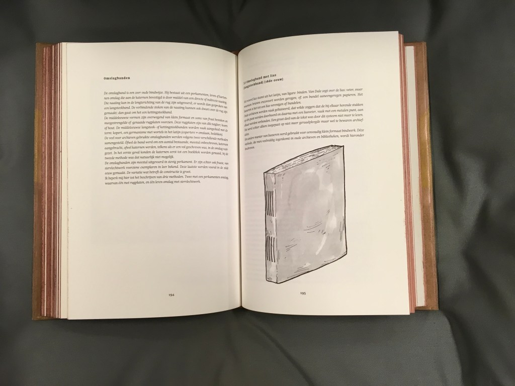
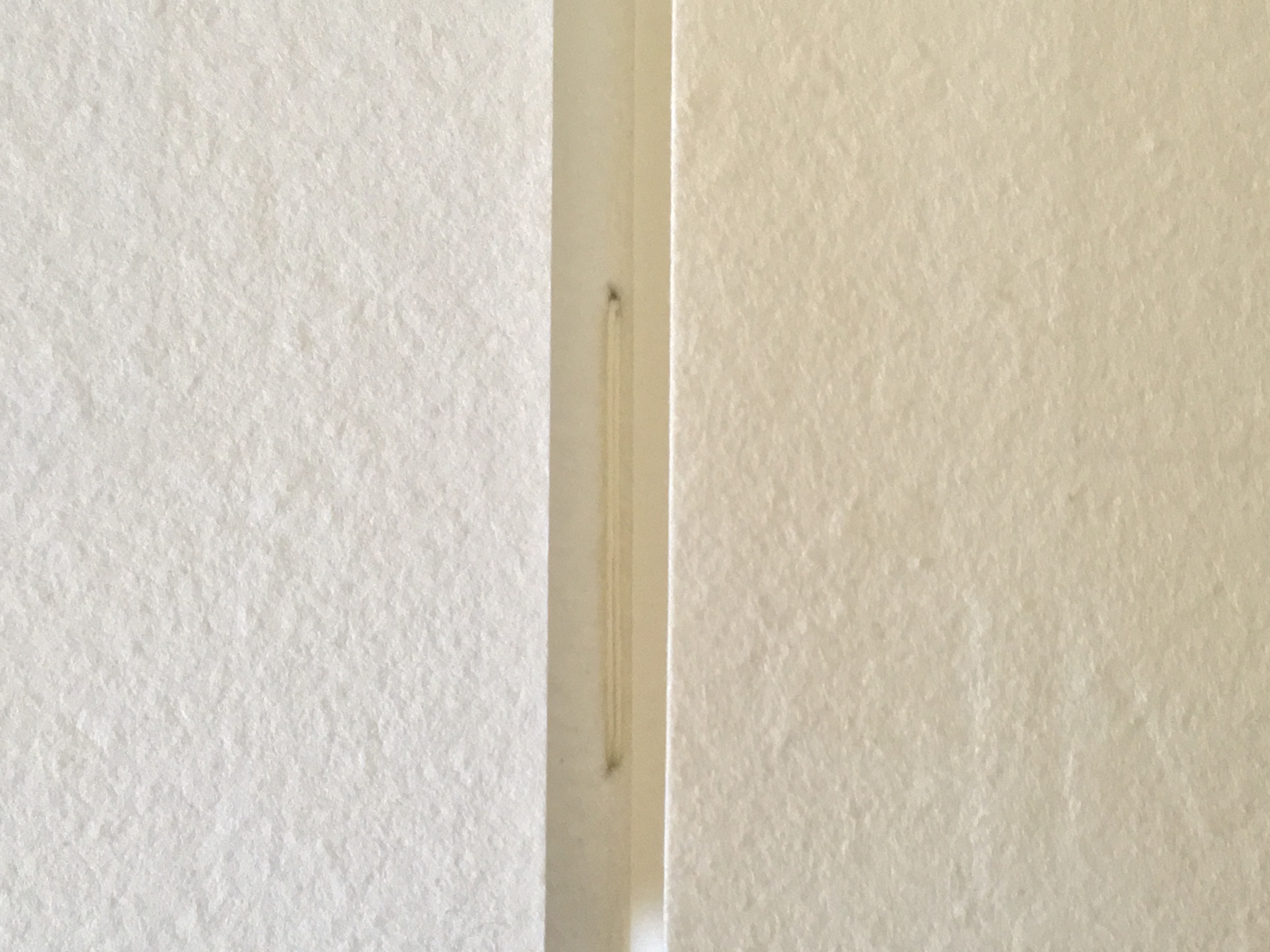
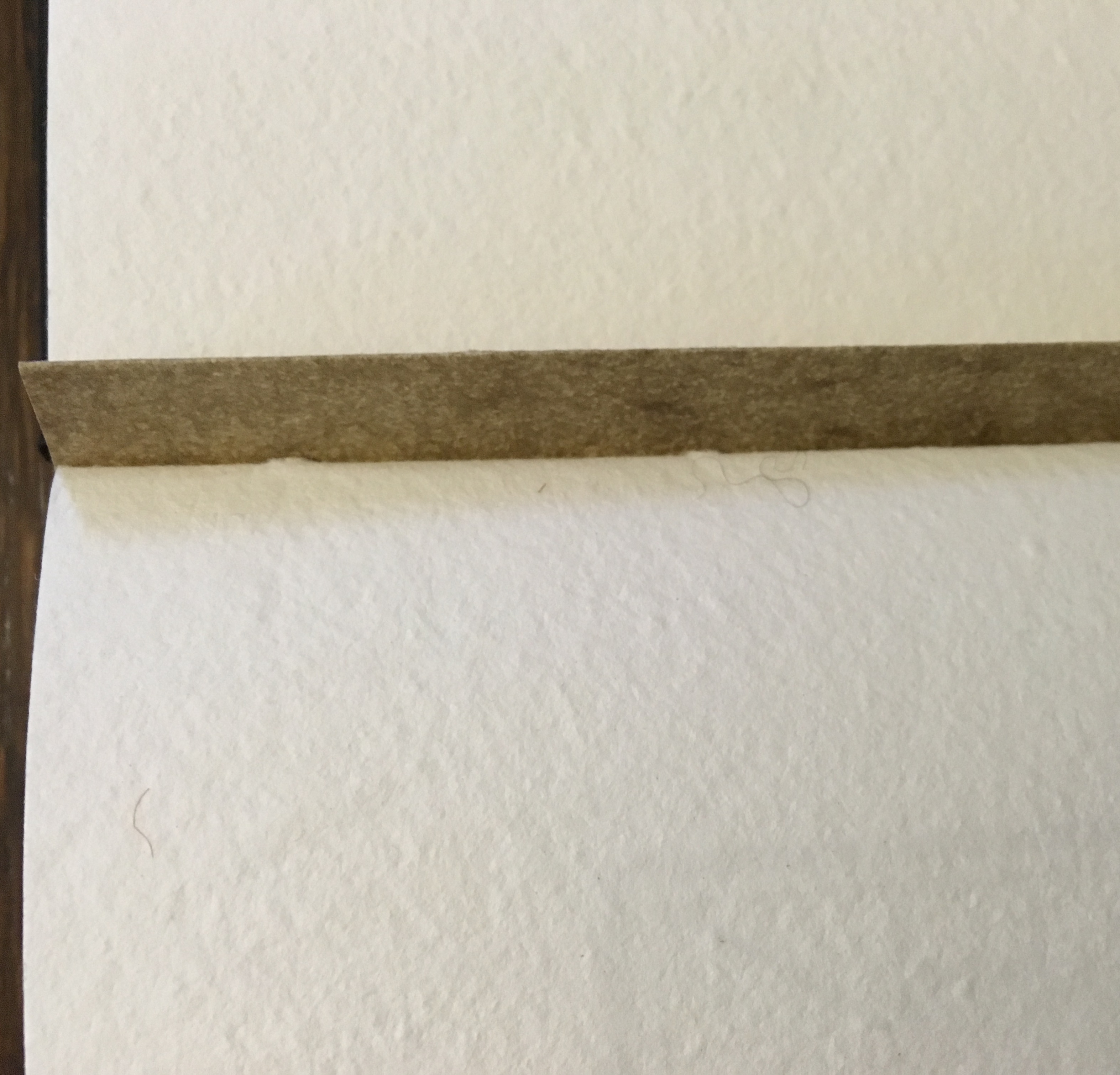
Clockwise: stainless steel box container, detail of sewing and detail of reinforcing accordion structure. For a description of this type of structure, see Hedi Kyle’s The Art of the Fold (London: Laurence King, 2018), pp. 82-85.
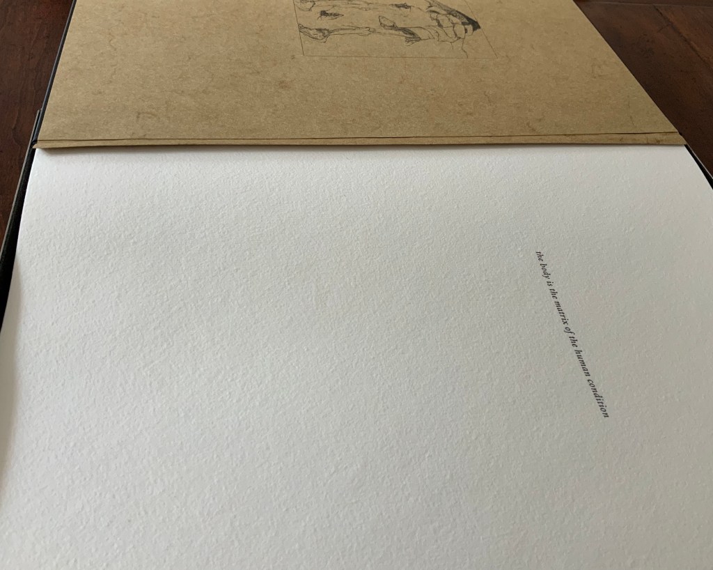
Top of photo: gives a view of the doublure, which is part of the reinforcing concertina structure. Bottom of photo: gives a view of page 1, which precedes a blank page and half-title. Note that pages are unnumbered.
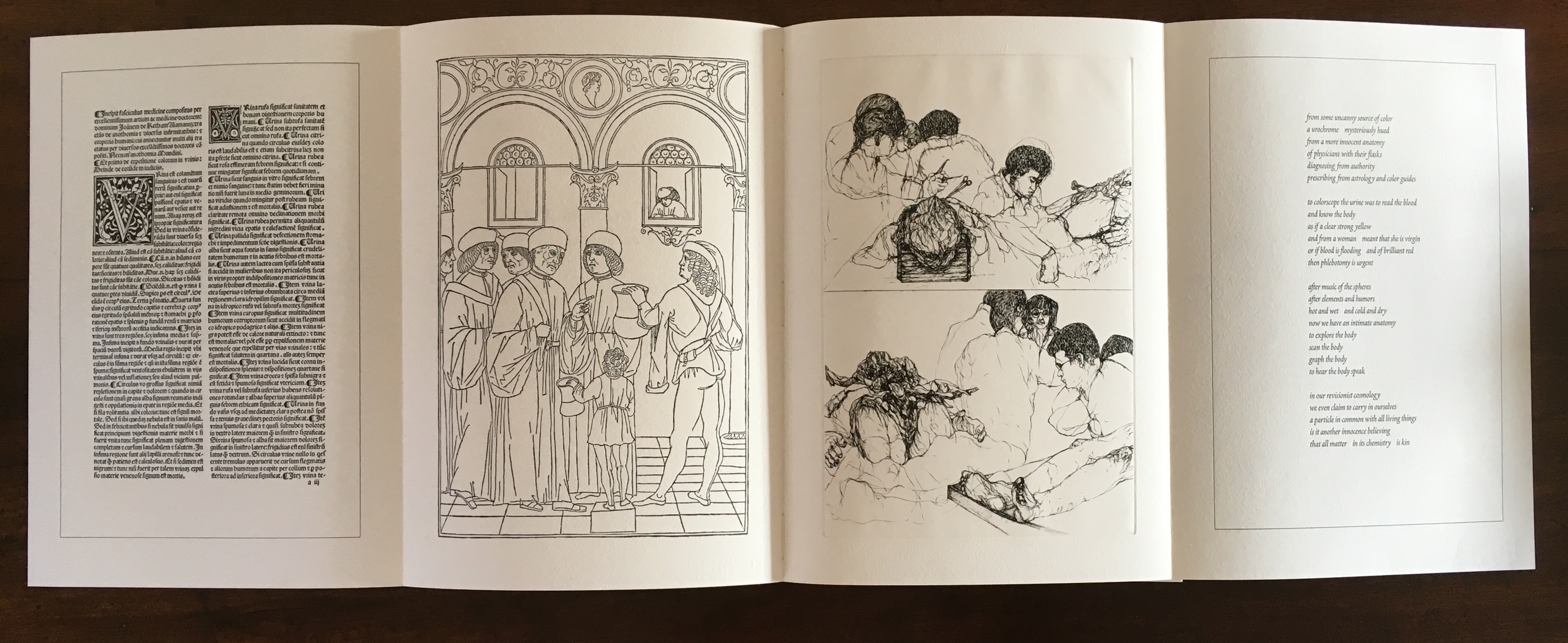
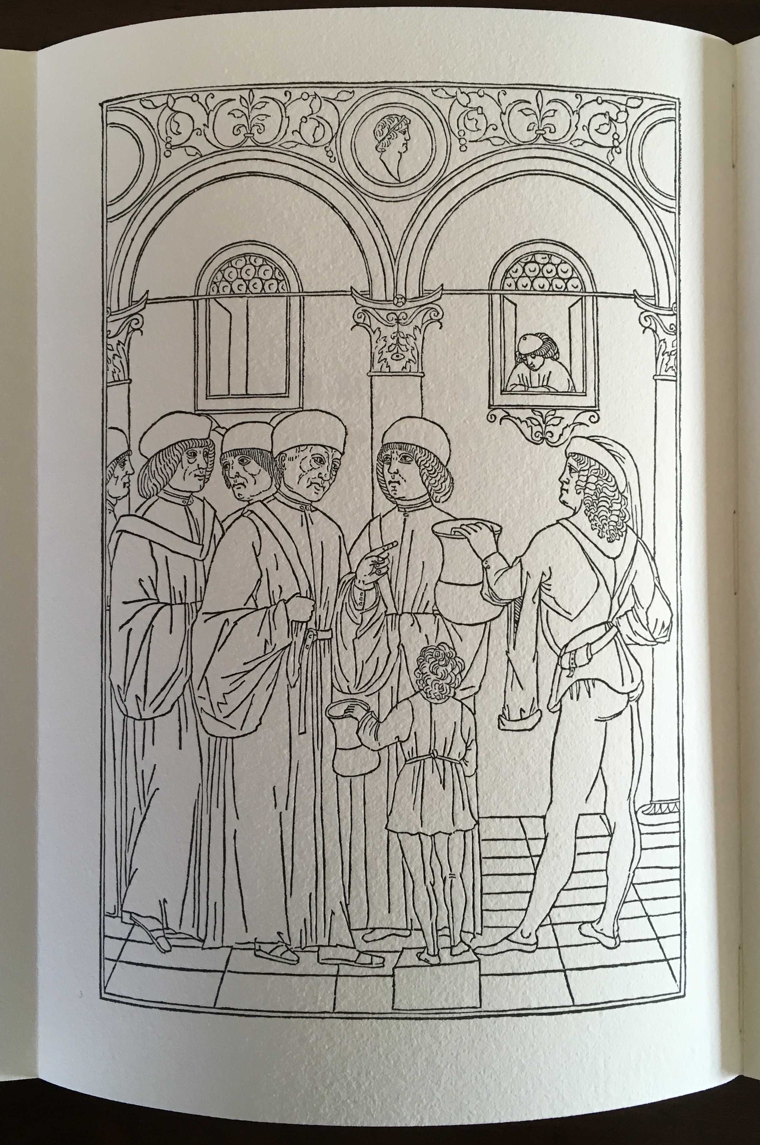
Title page of the third signature.
Opening of the third signature.
Internal four-page spread of the third signature.
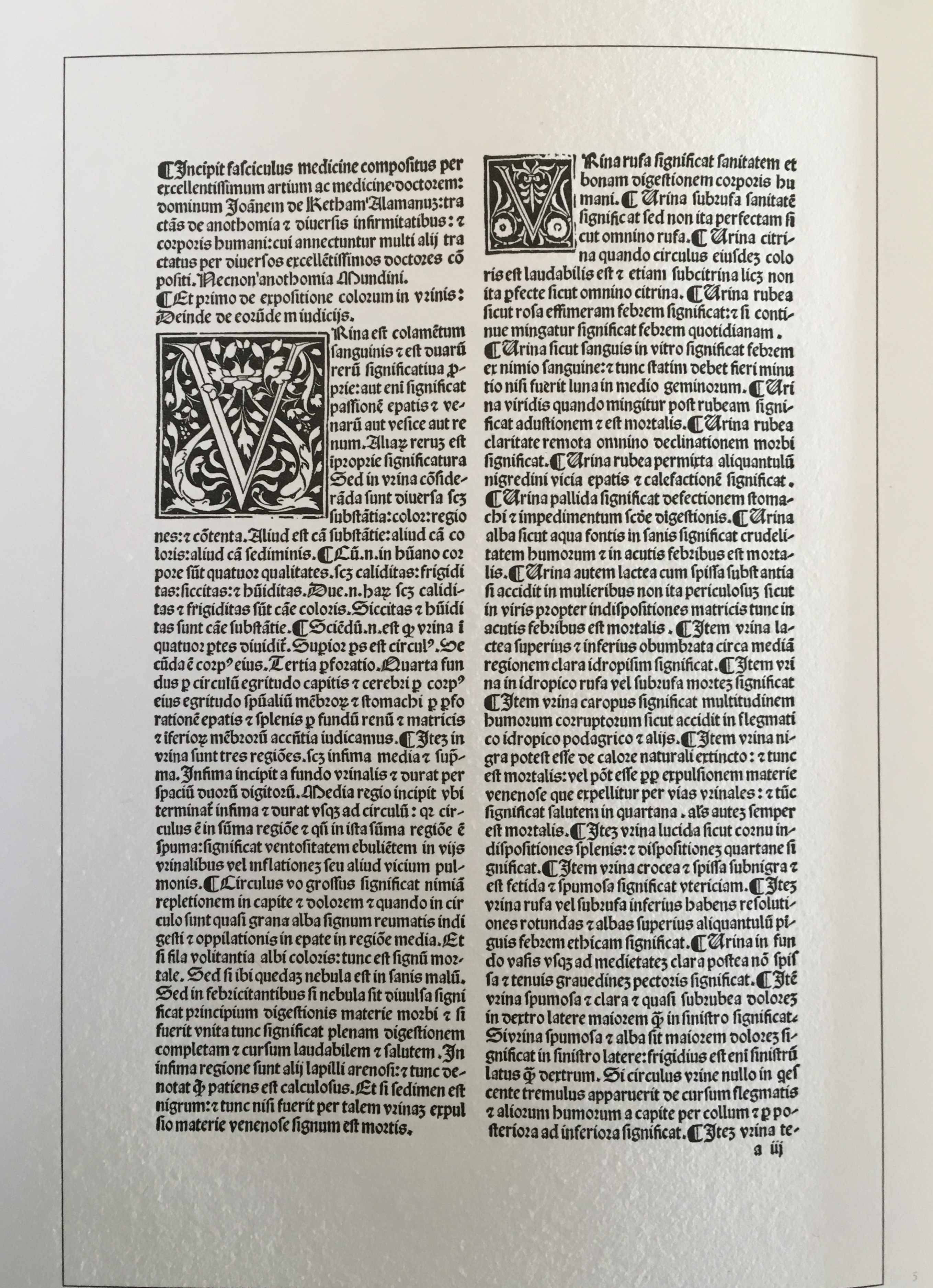
Left-hand page (from the Fasciculus Medicinae) of the four-page spread above. Note that the pagination (lower right) refers to the page number in the source text.
Second page (from Fasciculus Medicinae) of the four-page spread. Again note that the pagination (lower left) refers to the page number in the source text.
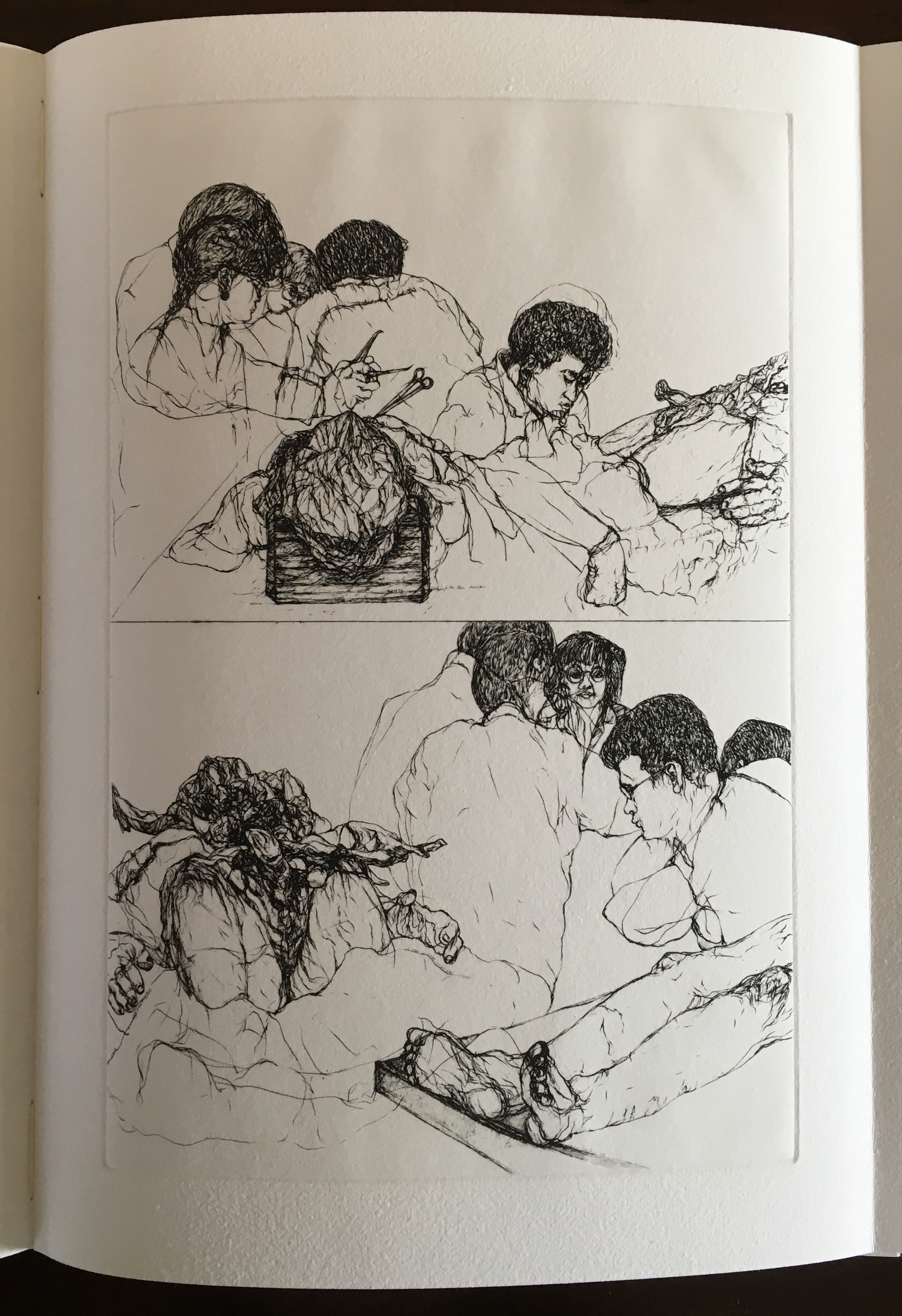
Third page from the four-page spread above. Print by Joyce Cutler-Shaw
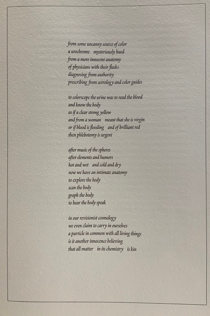
Fourth page from four-page spread above. Poem by Joyce Cutler-Shaw.
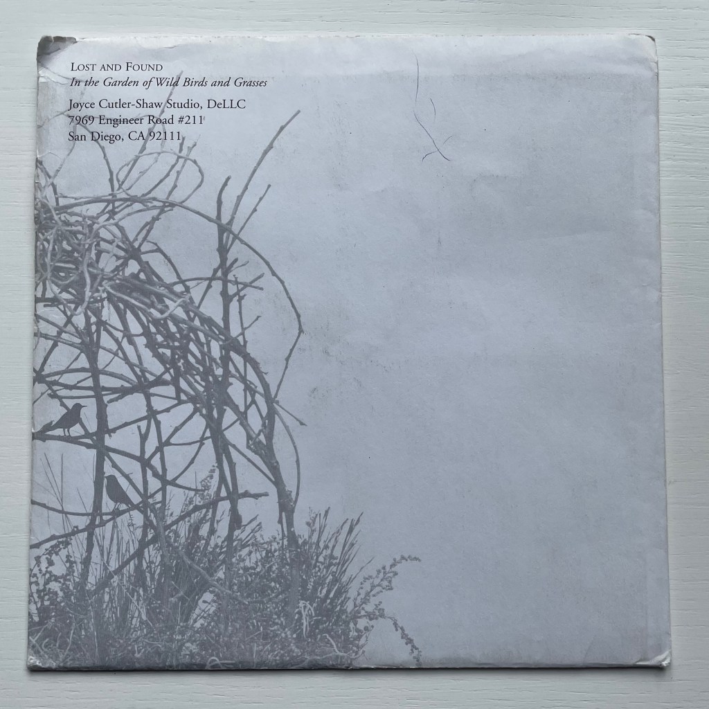
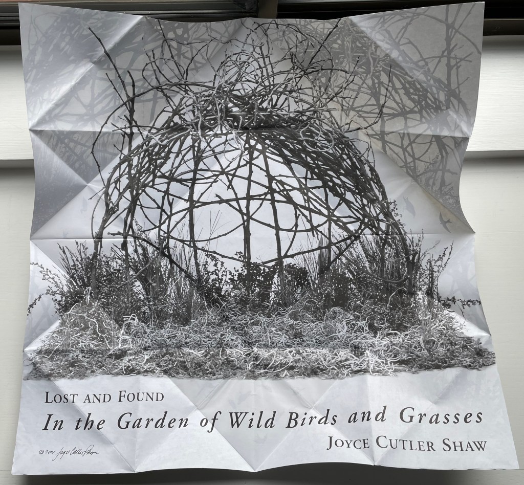
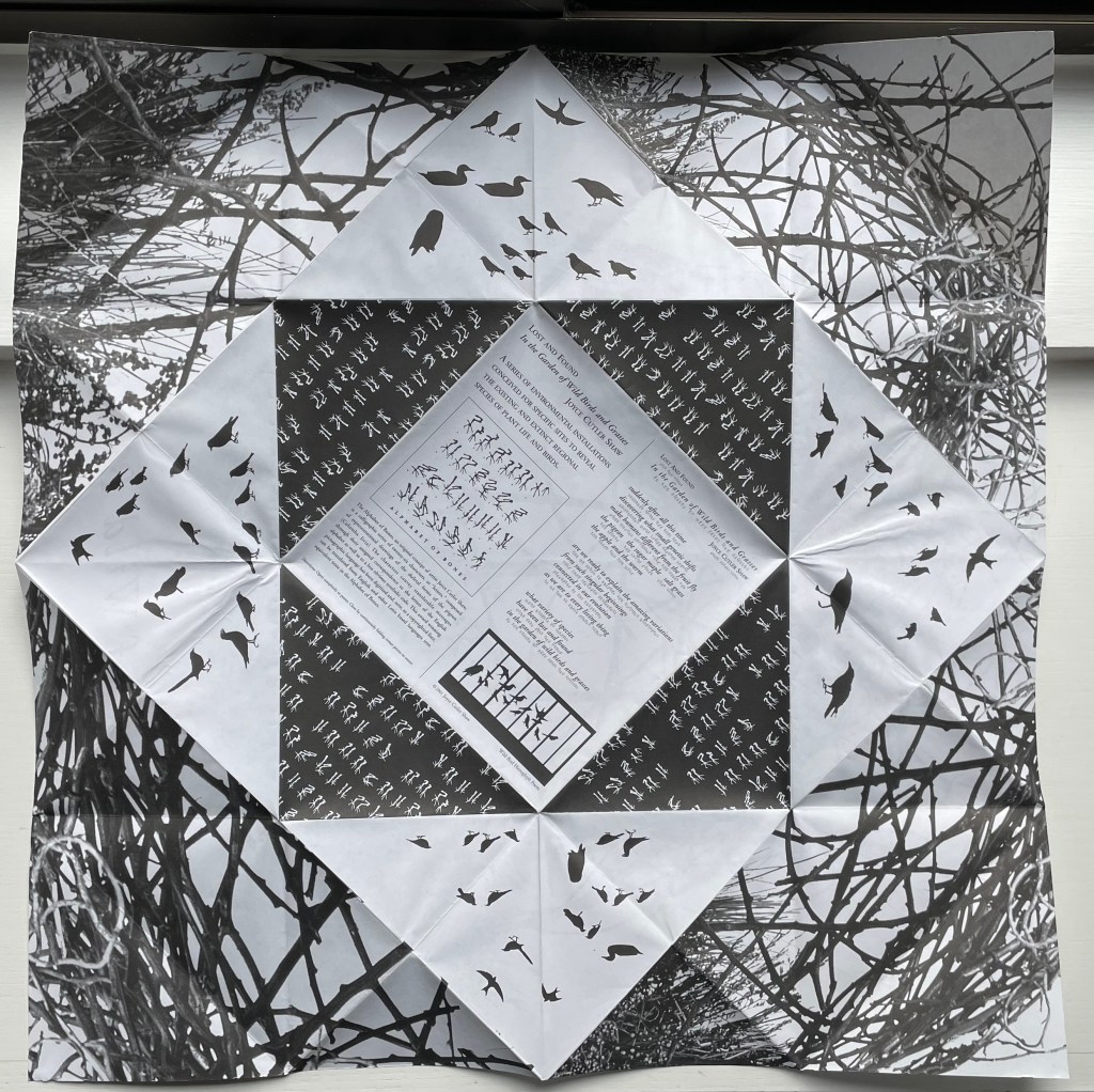
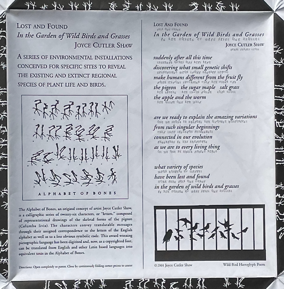
Lost and Found in the Garden of Wild Birds and Grasses (2001)
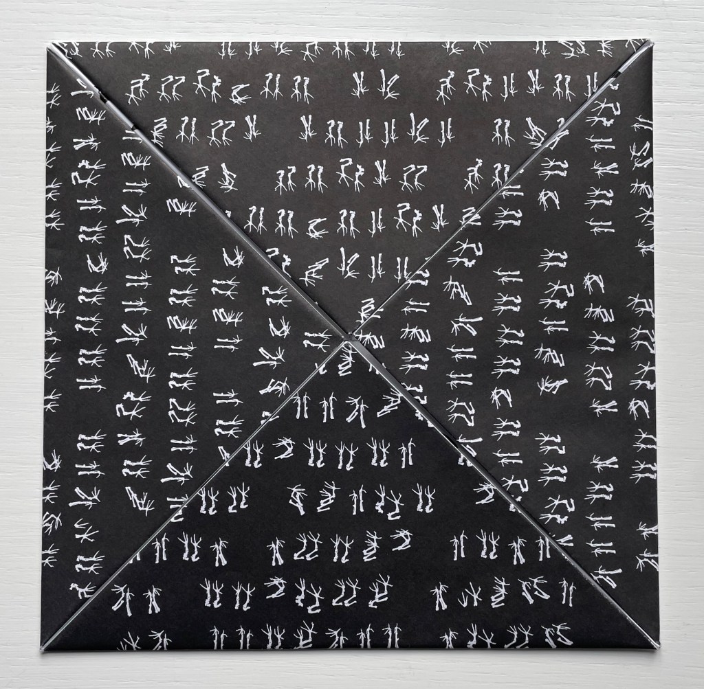
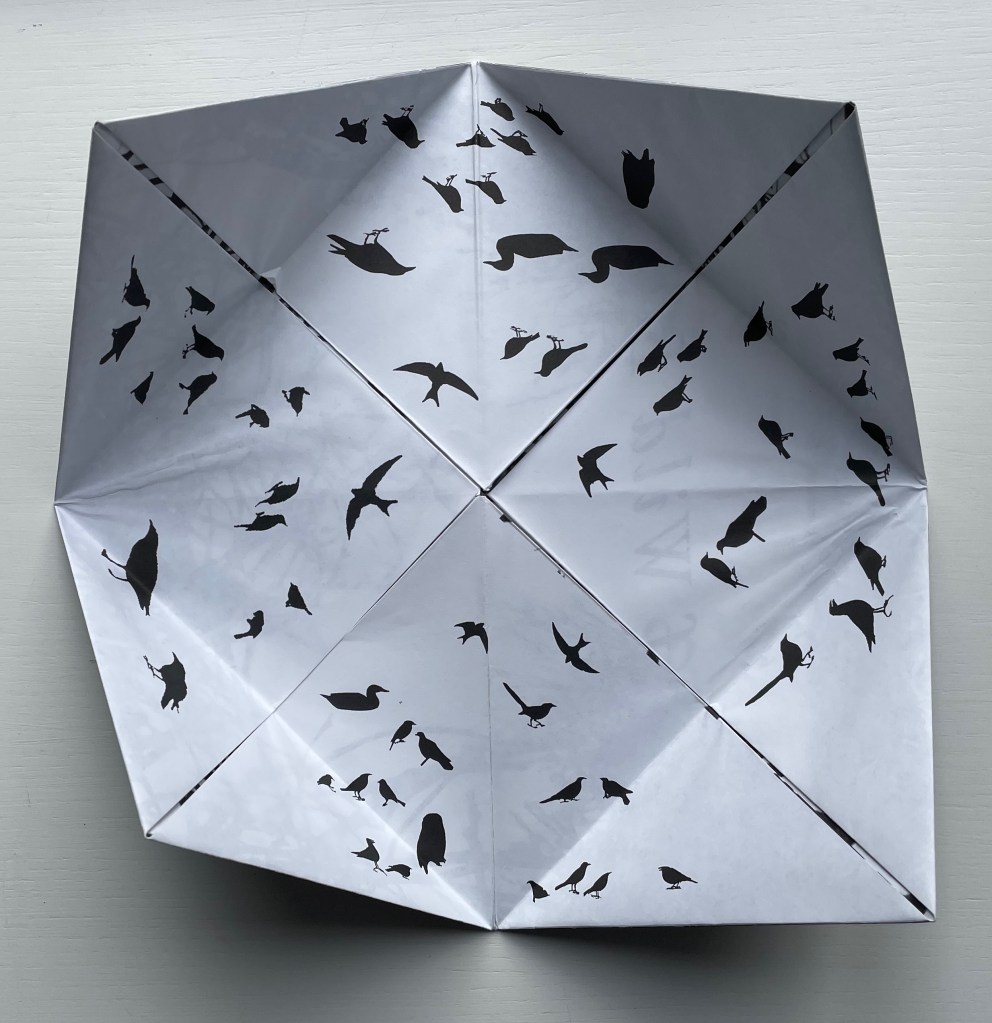
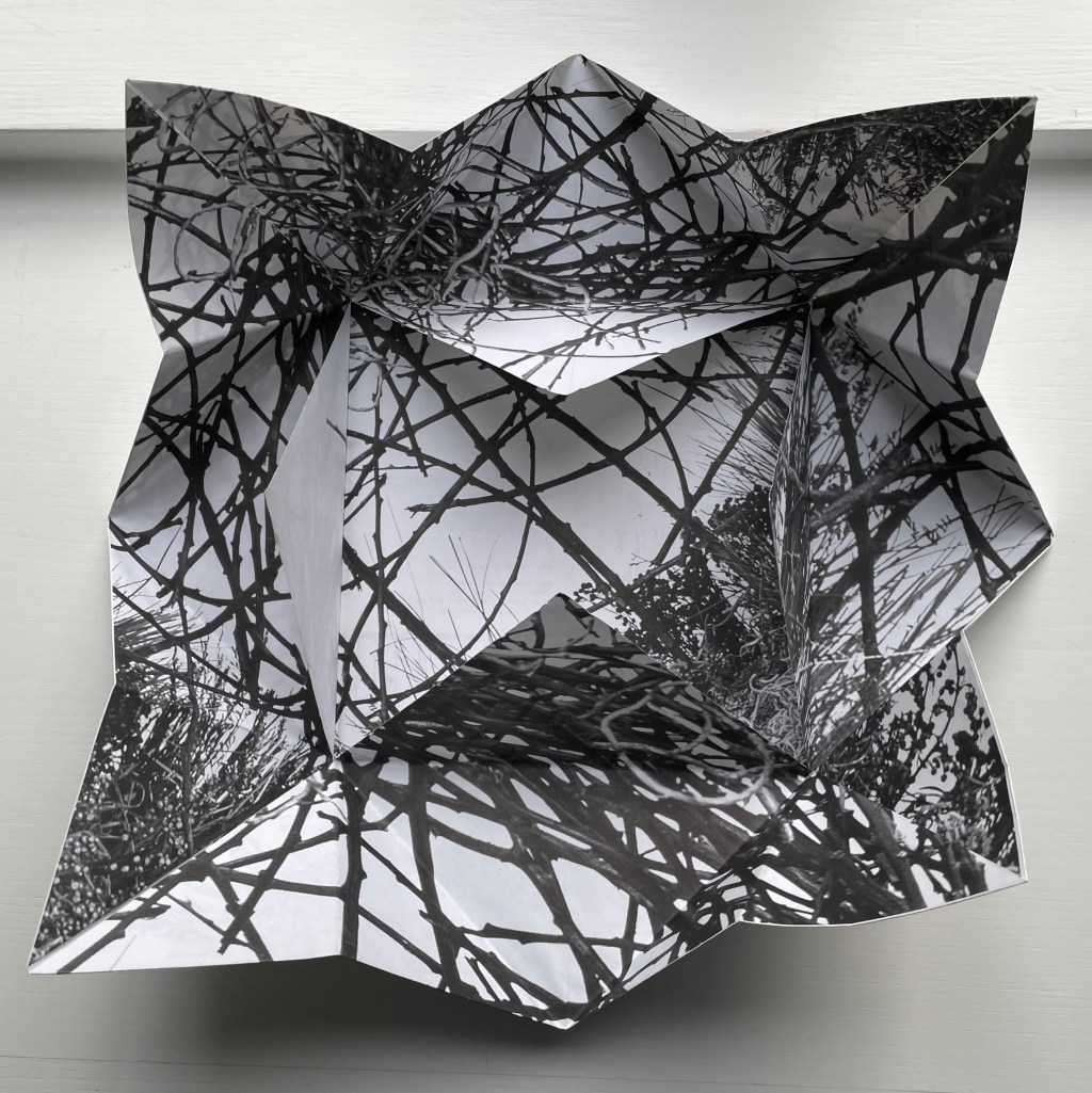
Lost and Found in the Garden of Wild Birds and Grasses (2001) Joyce Cutler-Shaw Two-sided sheet in triangle folds. 190 x 190 mm (closed). Edition of 1000. Acquired from Printed Matter, Inc., 23 September 2022. Photos: Books On Books Collection.
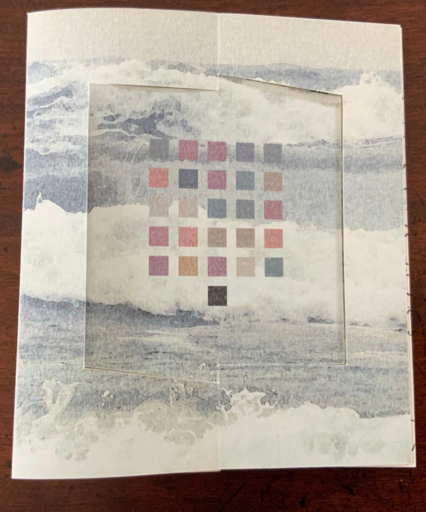
Distributor’s description: “Lost and Found in the Garden of Wild Birds and Grassesis a twelve part continuously unfolding paper narrative. Shaped like a fortune teller, the book’s four corners open out to reveal successive layers of the artist’s calligraphies – the first being her alphabet of bones, based on the hollow bones of birds, the next an alphabet based on the silhouettes of wild birds. The most interior layers of the book show photographs of an environment of grasses and branches, and at the final opening, the book becomes a single sheet on the back of which is printed an explanatory text and the translation of a poem inThe Alphabet of Bones.“
Printed Matter’s description of the origami fold as a “fortune teller”, also known as a chatterbox, whirlybird, or cootie catcher, is not quite right as can be seen from the images below.
The work is simultaneously a poster, a photographic collage from site-specific environmental installations, and, at the heart of one side of this single-sheet book, a poem dually presented in roman and Cutler-Shaw’s copyrighted font for the Alphabet of Bones. Note how the three squares framing the explanatory text and poem rotate to create a sculptural sense of depth, turning this side of the sheet almost into a nest. Like The Anatomy Lesson, this work reflects Cutler-Shaw’s engagement with uniting folds, binding, and printing to achieve singular artistic results. The same can be found in an earlier work showcasing the Alphabet of Bones font.
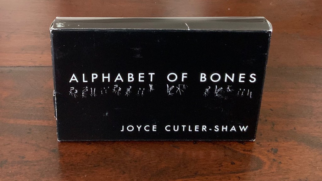
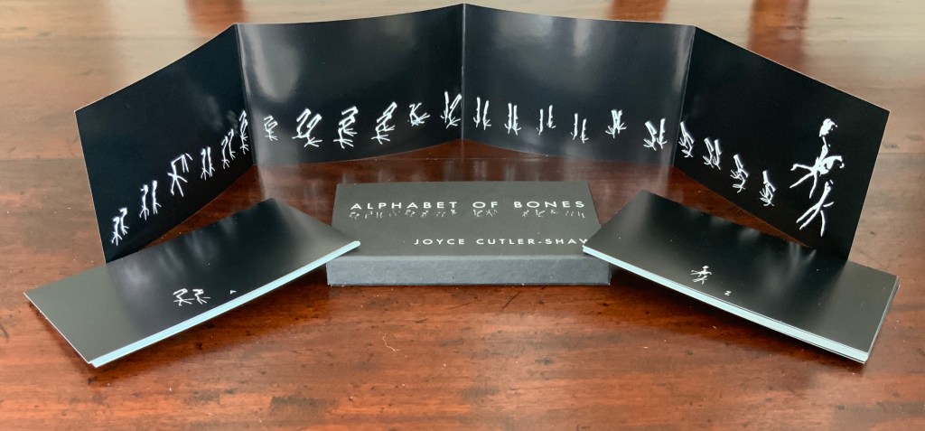
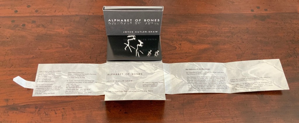
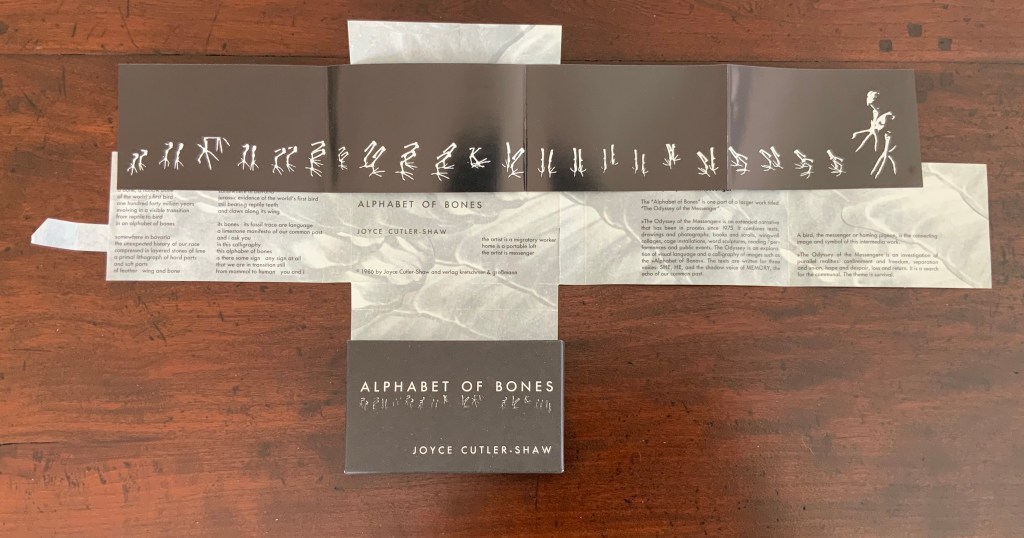
Alphabet of Bones (1987)
The Alphabet of Bones (1987) Joyce Cutler-Shaw Munich, West Germany: VerlagKretschmer and Grossman Edition of 700. Acquired as a gift from Hubert Kretschmer, 10 January 2019
Twenty-six glossy photo cards, offset white on black, H70 x W114 mm with trifold panel of glossy photo paper, offset white on black: H70 x W458 mm Contained in pasted, open-ended box of matte card, offset white on black: H72 x W117 x D14 mm Contained in fold-flap box: H73 x W118 x D15 closed, H72 x W498 open
Further Reading
Chen, Julie. 2013. 500 Handmade Books. Volume 2. New York: Lark. See Orbital Loops on p. 262 for comparison with Lost and Found in the Garden of Wild Birds and Grasses (2001).
Jury, David, and Peter Rutledge Koch (eds.) 2008. Book Art Object. Edited by David Jury. Berkeley, California: Codex Foundation. Pp. 198 (Where Do We Start?), 199 (Surplus Value Books #13).
Salamony, Sandra, and Peter and Donna Thomas. 2012. 1,000 Artists’ Books : Exploring the Book as Art. Minneapolis: Quarto Publishing Group USA. Pp. 10 (Chained Album), 11 (Altered), 220 (Crested), 298 (Collection).
Cutler-Shaw, Joyce. “Embodied/Disembodied”, LitMed Magazine, 10 March 2009. Accessed 3 September 2019.
Hoffberg, Judith A. “Birds, Bones, and Books”, Episodes of The City – New York as a Source Book, Wallworks and Artists Books of Joyce Cutler-Shaw, exhibition catalogue (New York, NY: Elmer Holmes Bobst Library, New York University, 2007).
Westron Wynde (2016) Cathryn Miller Double-sided accordion with swing panel structure, 4 double-page openings, based on Hedi Kyle’s panel or panorama fold. In wrapper with slip and slot closure. Initialed and numbered by the artist. Edition of 6, of which this is #3.
Cathryn Miller, colophon: “Part of an ongoing series of works based on exploration of colour-graphemic synesthesia. This book presents the poem ‘Westron Wynde‘ in a purely visual form. Letters become colours, and are used as graphic elements. The book manifests the essence, if not the sense, of the poem.”
Westron wynde when wyll thou blow, The smalle rayne down can rayne – Cryst, yf my love wer in my armys And I yn my bed agayne!
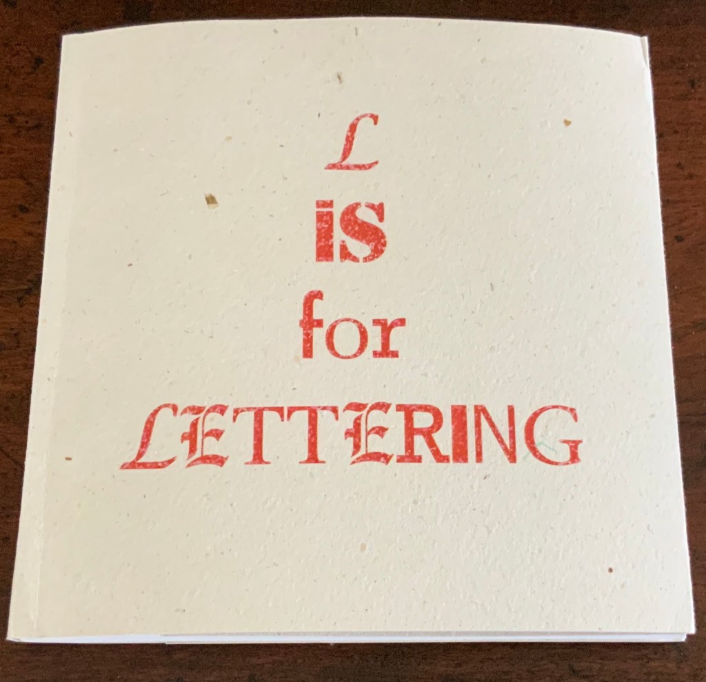
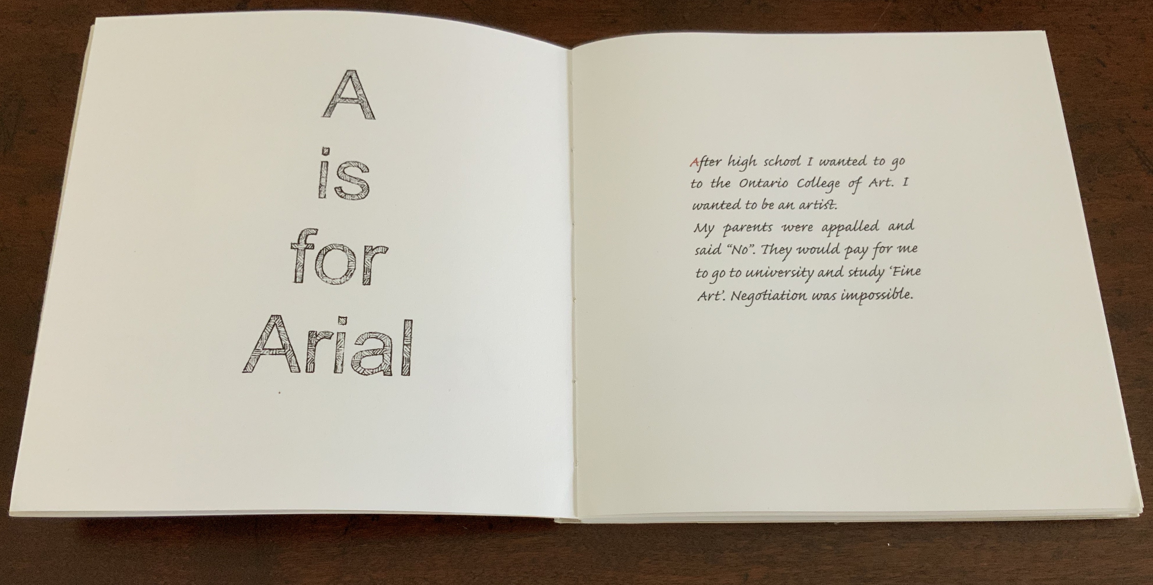
L is for Lettering (2011)
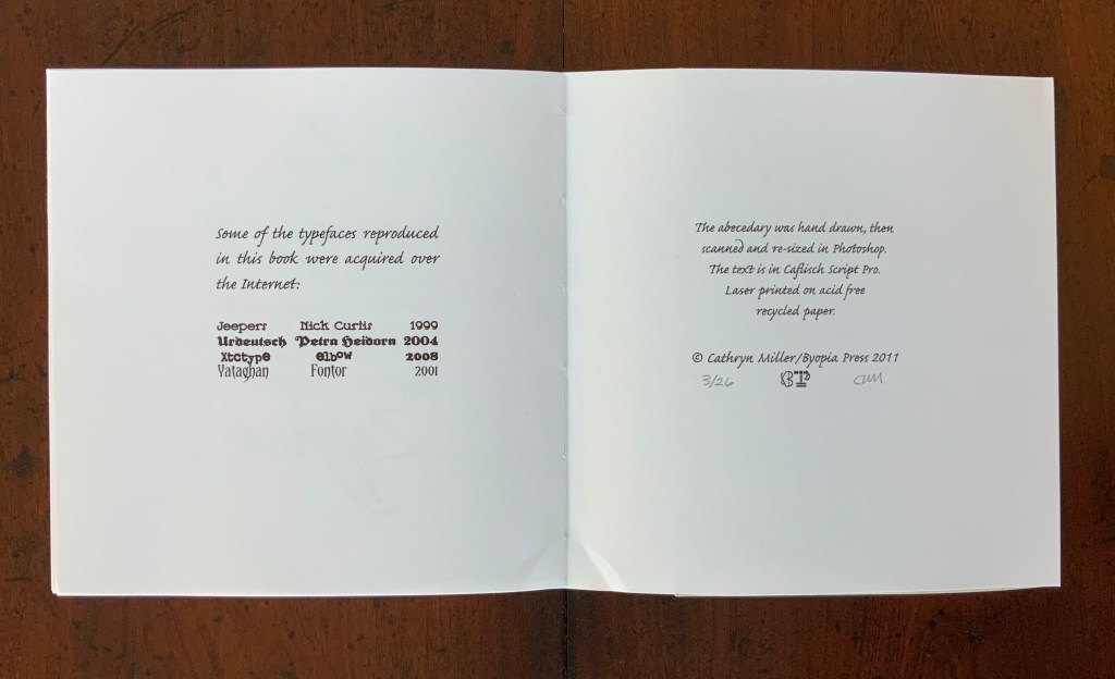
L is for Lettering (2011) Cathryn Miller Hand bound codex of 56 unnumbered pages. Laser printed on acid free recycled paper, hemp paper covers. The book was hand drawn, then scanned and resized in Photoshop. Text is Caflisch Script Pro. Hand annotated in red pencil. Edition of 26, of which this is #3. H160 x W158 mm
An alphabet book based on the artist’s personal struggle to become a practicing artist. Cathryn Miller: “The trials and tribulations of the art education process as recalled from a satisfactory distance after the author learns that everything is useful after all.”
Further Reading
“Lyn Davies“. 7 August 2022. Books On Books Collection. For Miller’s comment re Davies’ A is for Ox: “unable to resist this book when I saw it so it is part of my collection of books on letters and lettering. The use of a coloured initial letter on each page of my ‘L is for Lettering’ is a direct nod to the design of this book.”
“Ilka Van Schalwyk“. In progress. Books On Books Collection. A novel of color-graphemic synesthesia.
Chen, Julie. 2013. 500 Handmade Books. Volume 2. New York: Lark. Pp. 14 (Double Entendre), 414 (Tower of Babel).
Miller, Cathryn. 23 February 2020. “Almost There”, Byopia Press, Accessed 26 February 2020. The artist comments on L is for Lettering.
Miller, Cathryn. 22 February 2021. “Square Dance“. Video of talk and presentation for Sakatchewan Craft Council on the occasion of her solo exhibition at the SCC Gallery in Saskatoon, SK, from January 16 – March 06 2021.