word art/art words (1985)
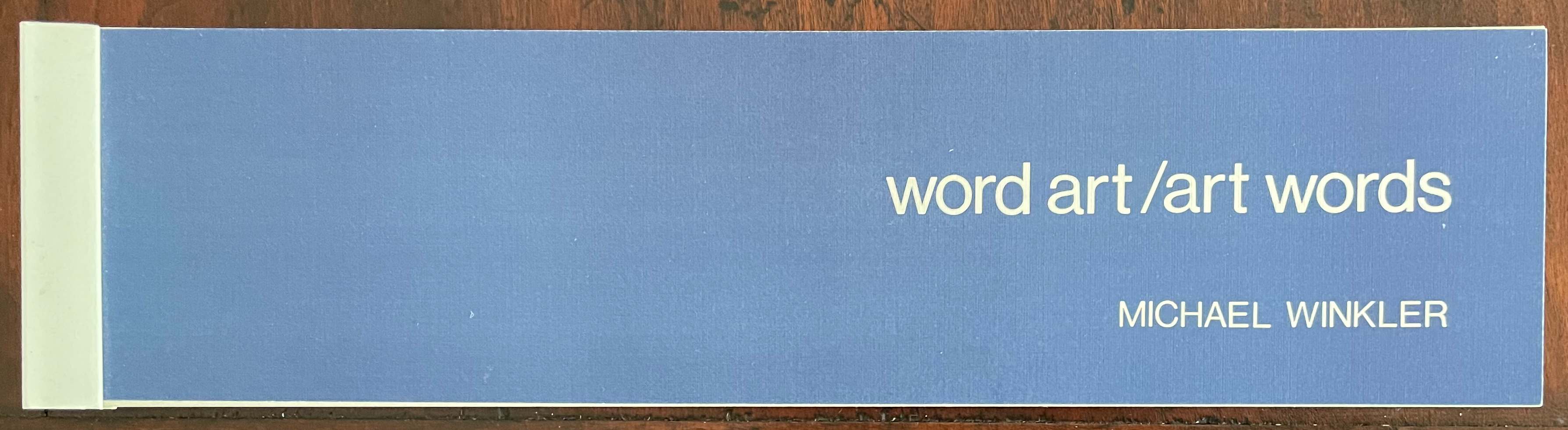
Word Art/Art Words (1985)
Michael Winkler
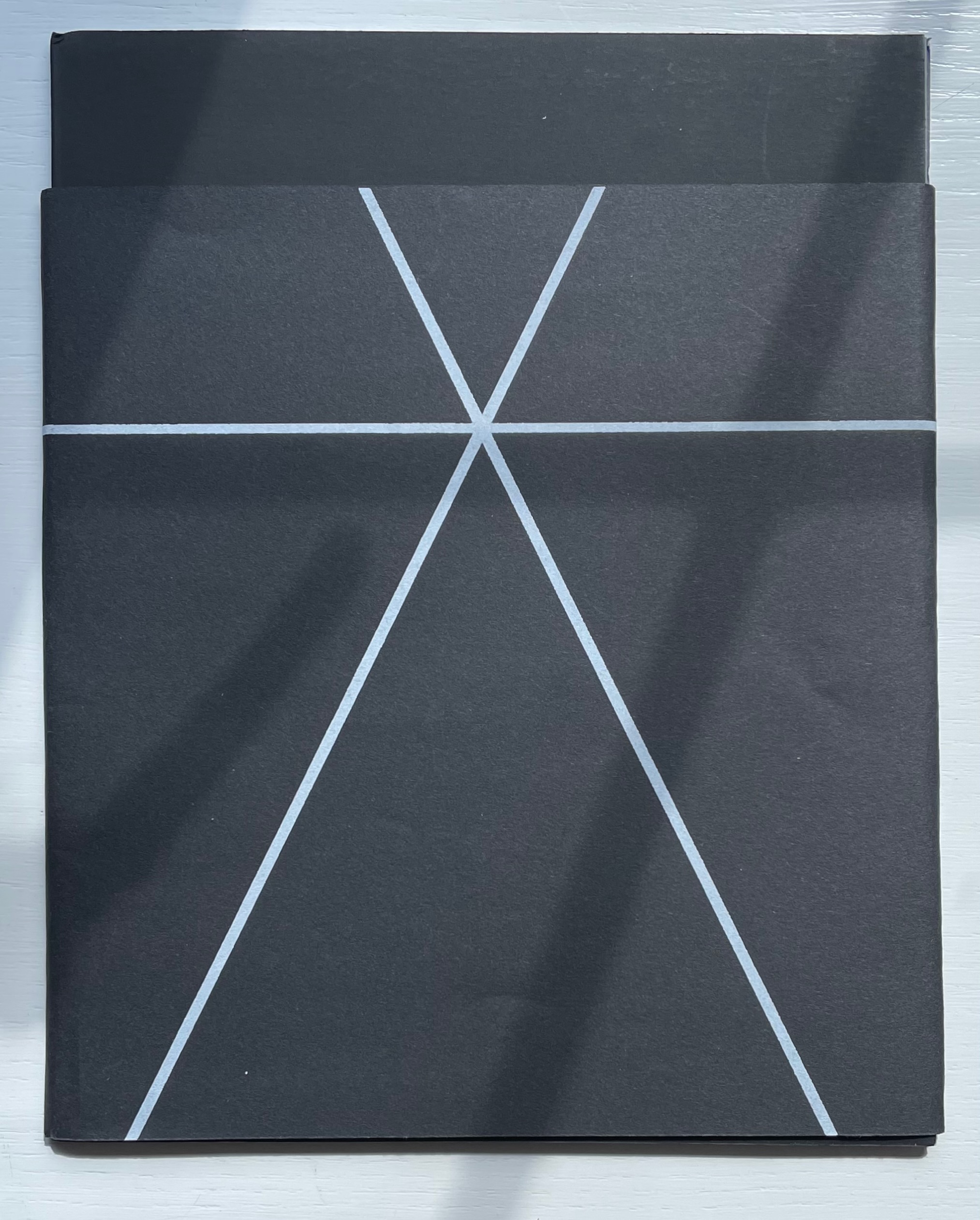
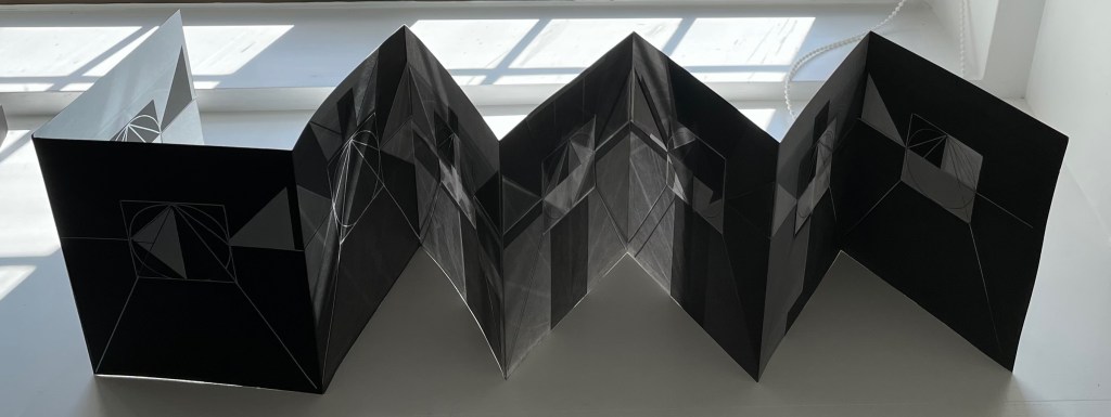
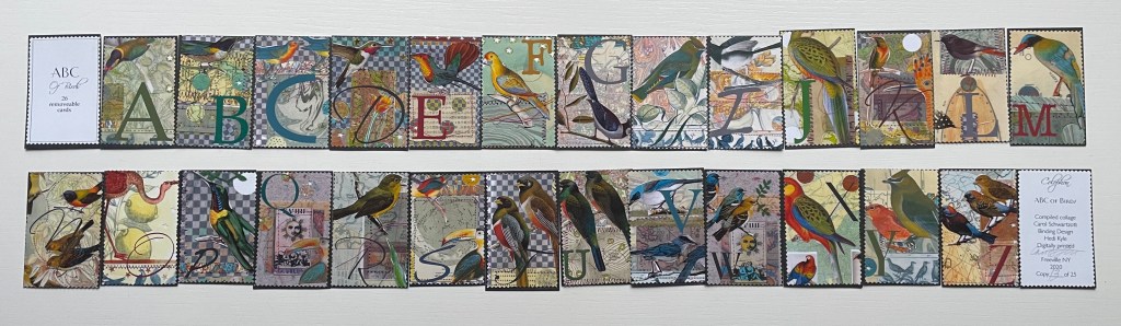
Booklet of 29 folios, including front and back covers, held in a white plastic clip. H73 x W288 mm. 27 folios, printed on recto only. Edition of 500. Acquired from Printed Matter, Inc., 23 September 2022.
Photos: Books On Books Collection. Displayed with artist’s permission.
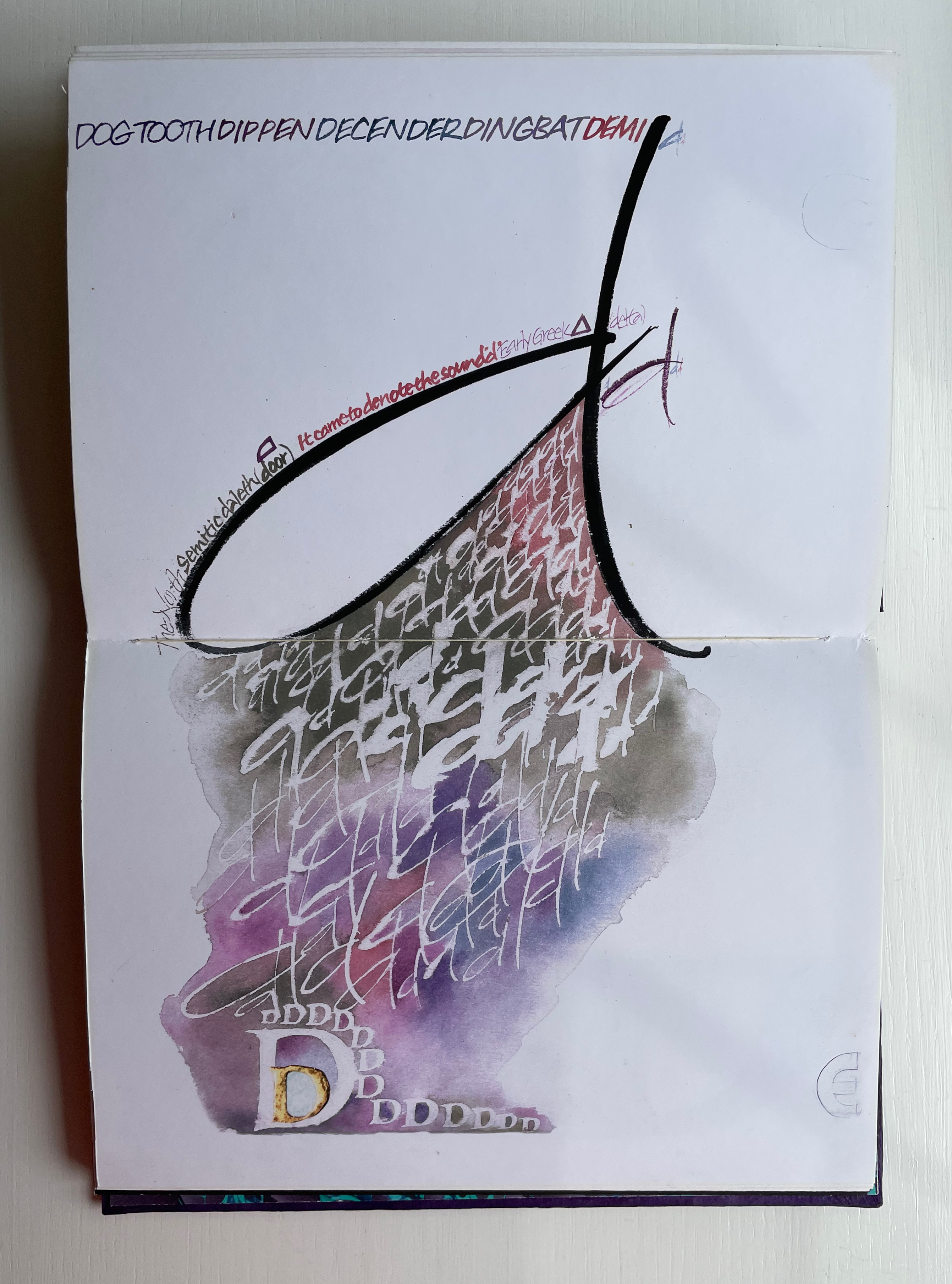
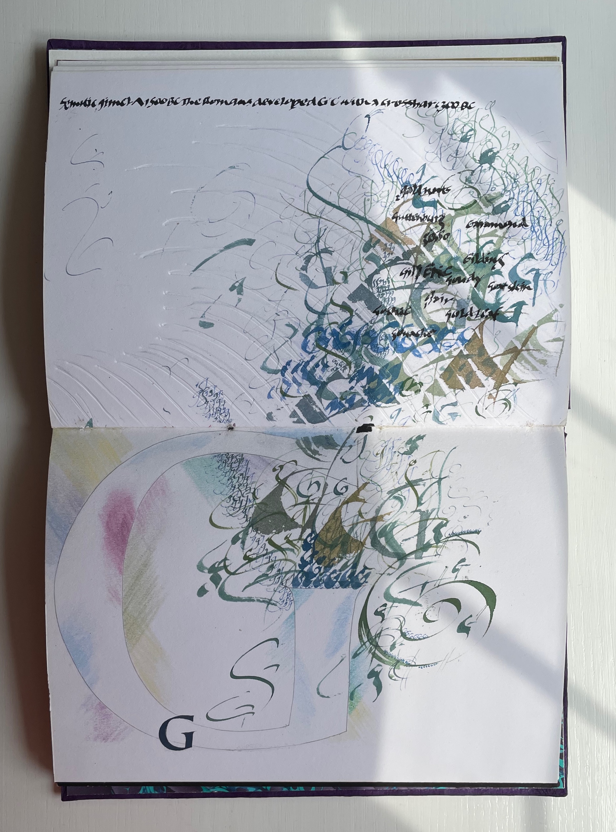
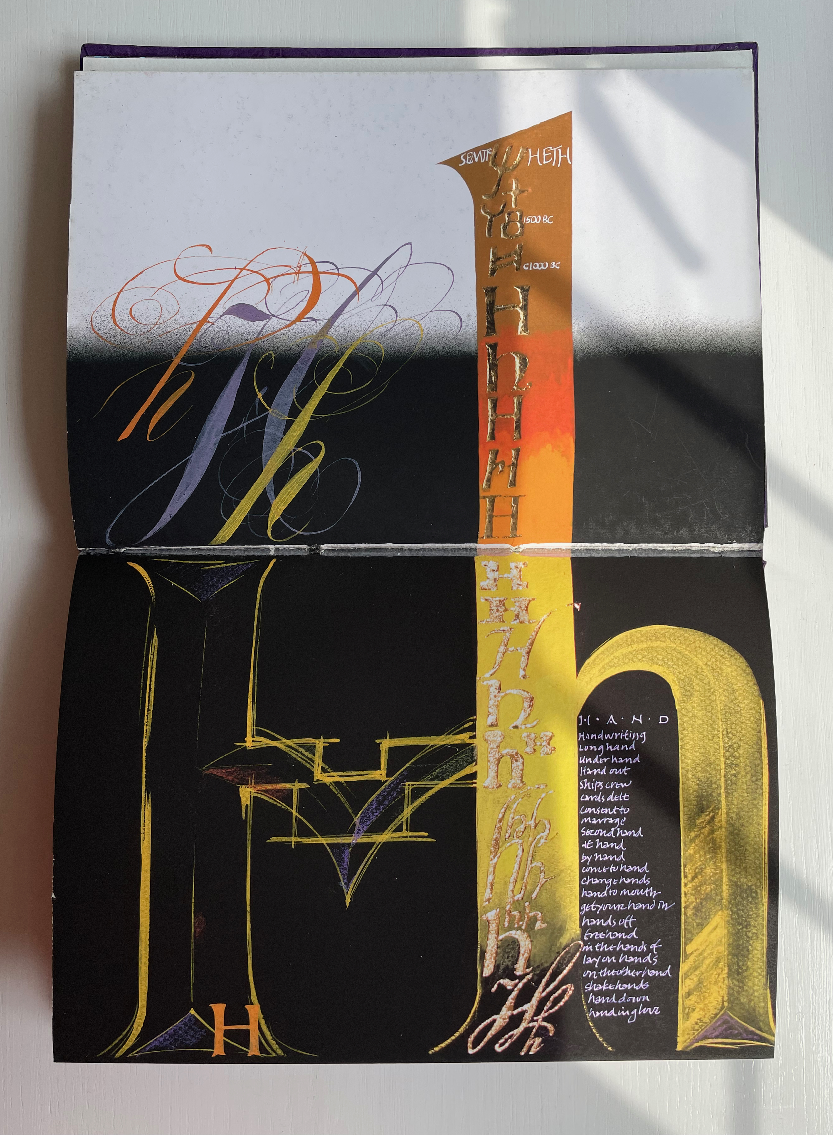
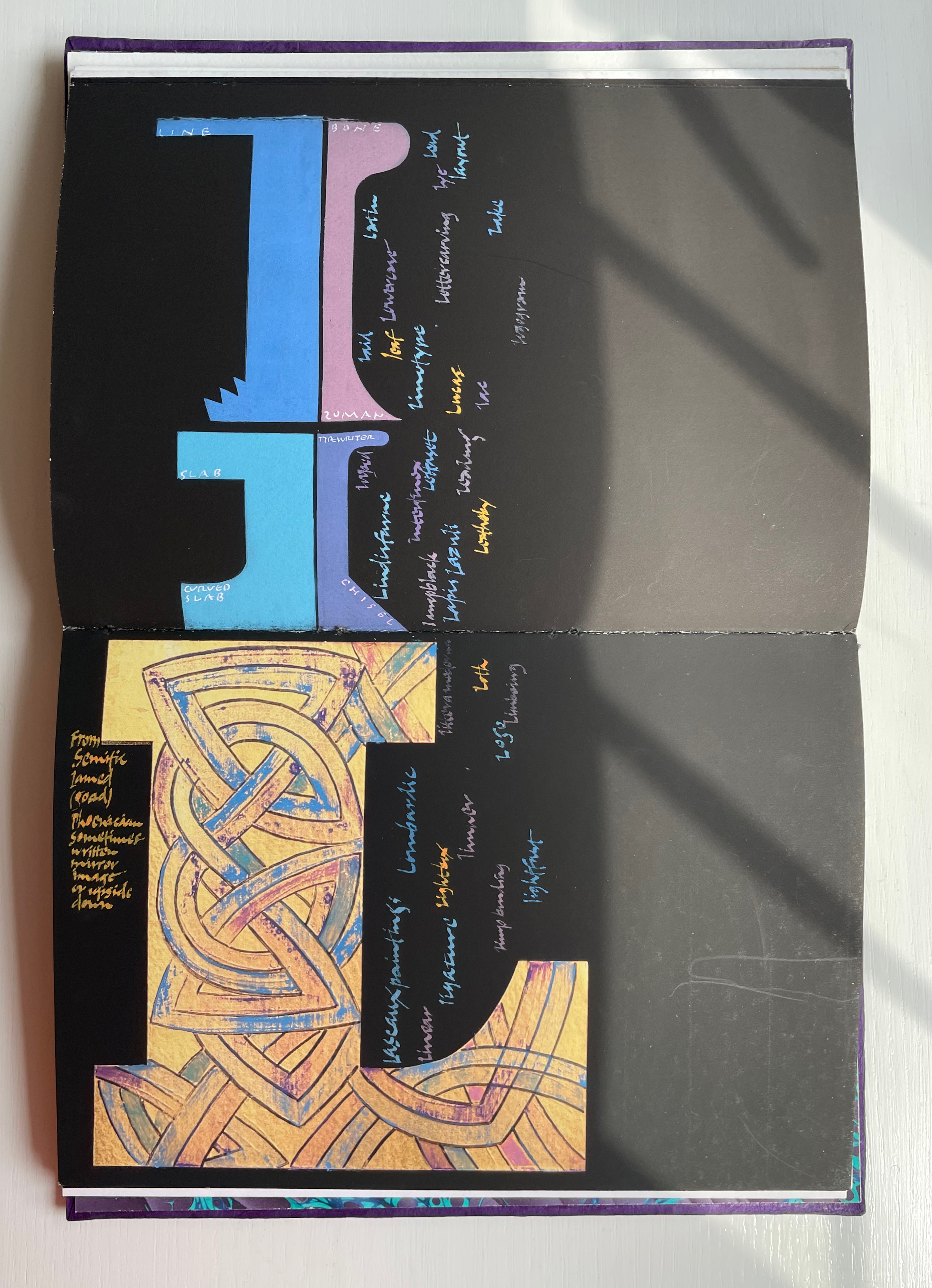
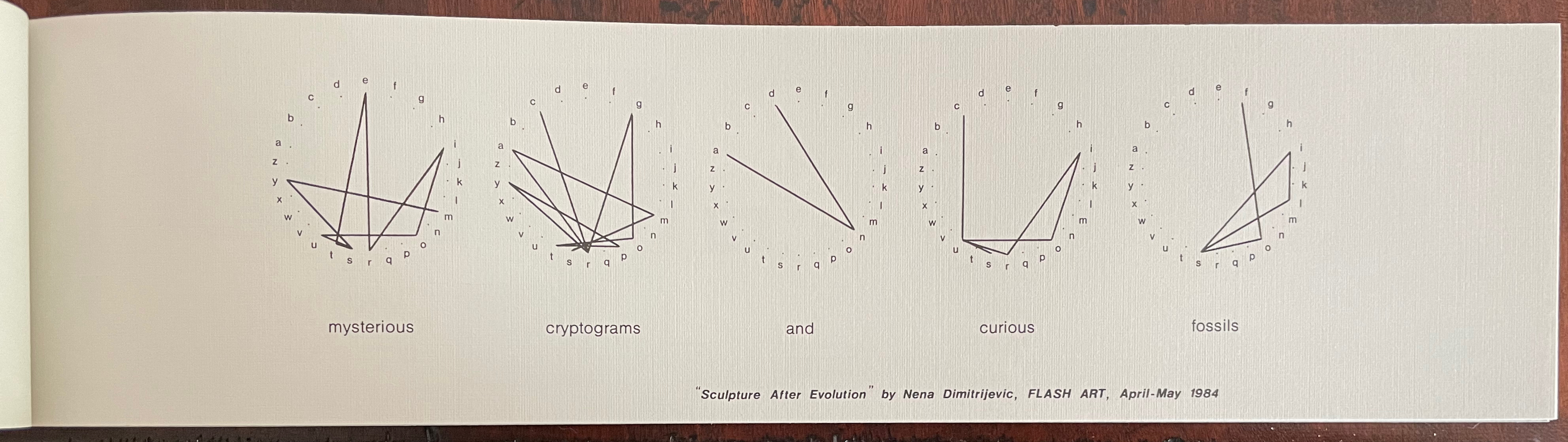
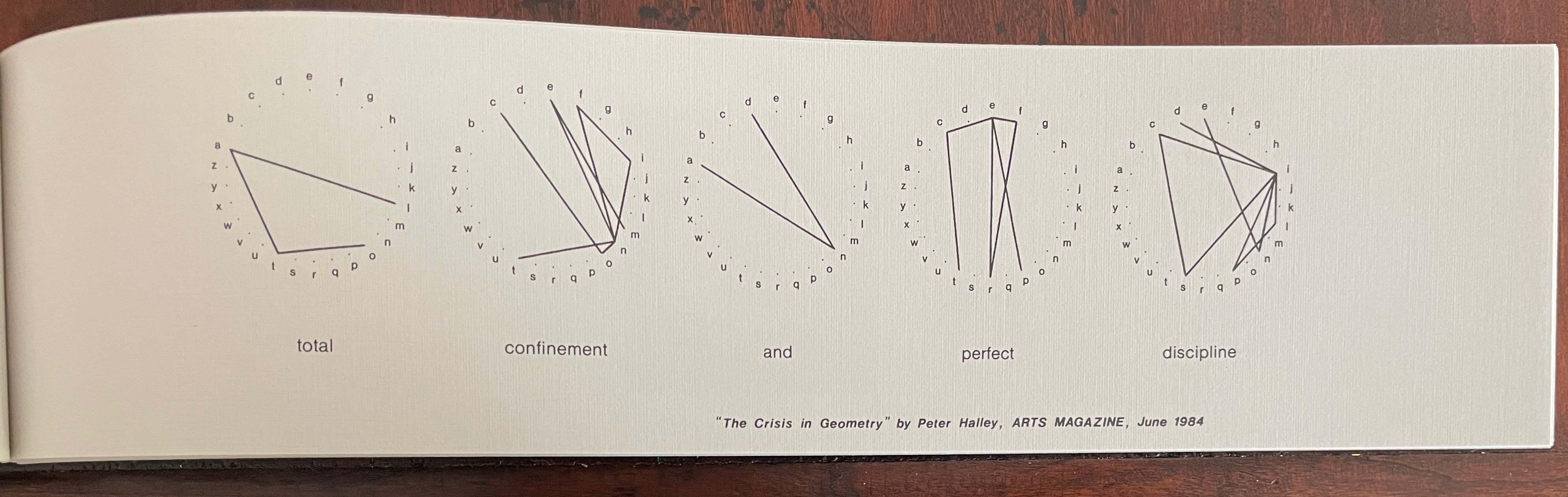
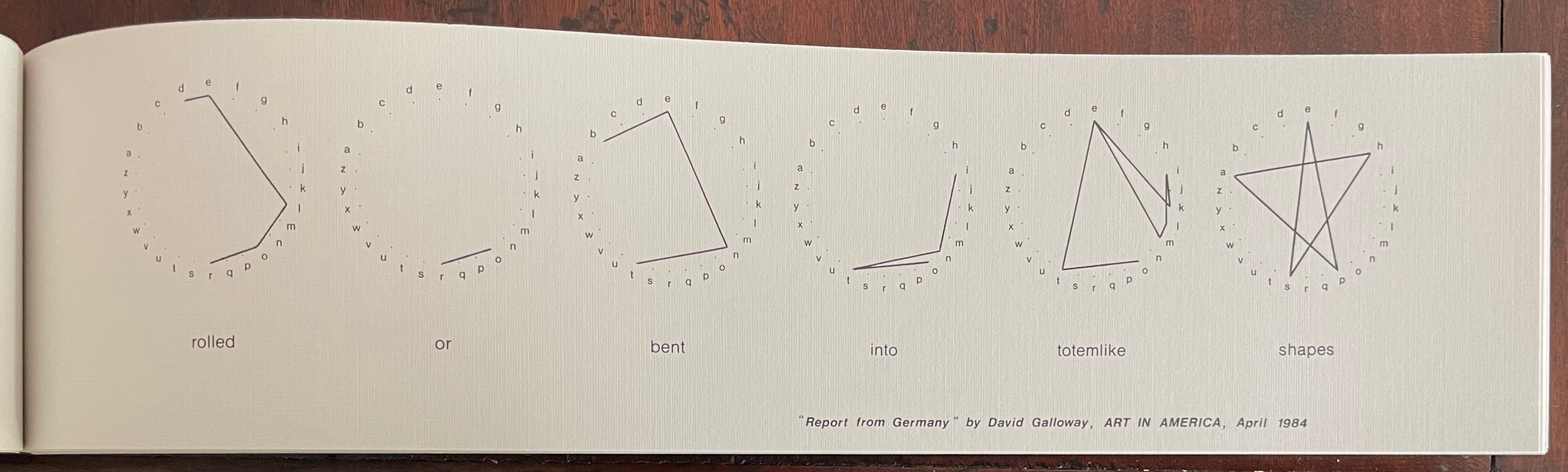
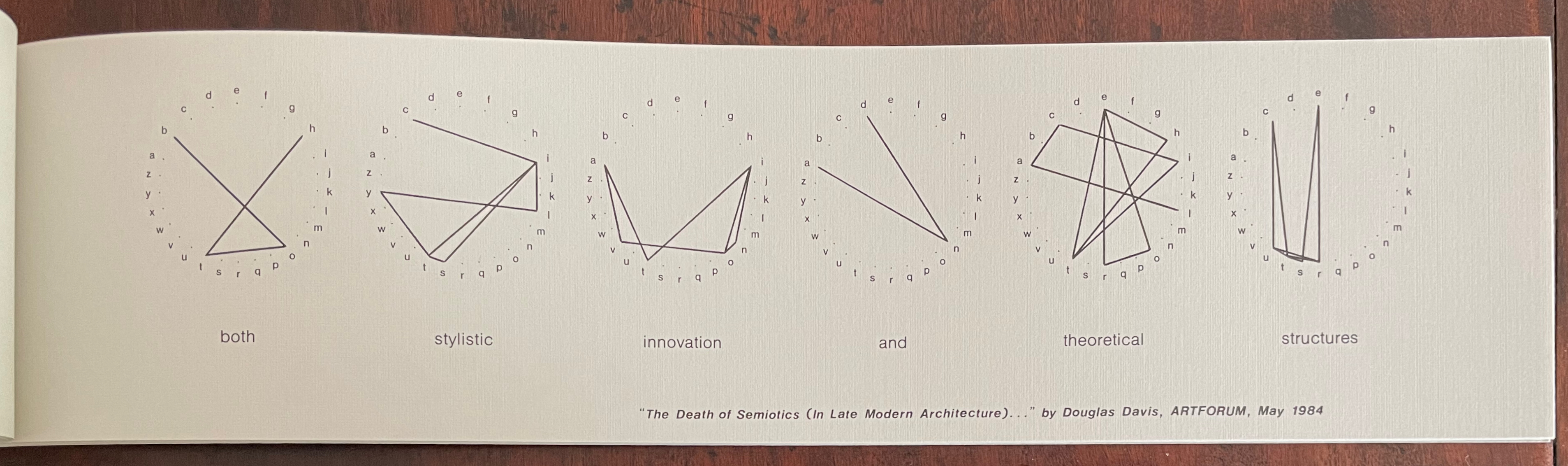
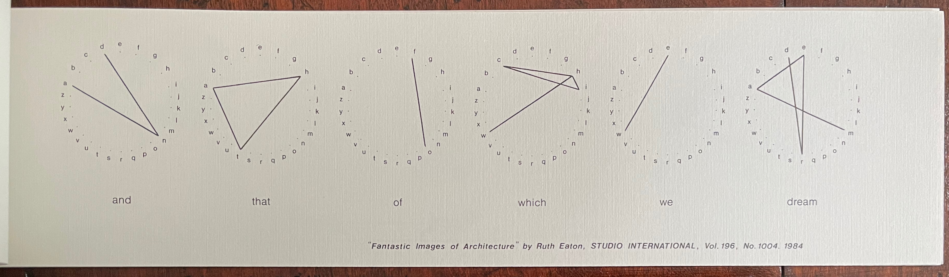
Among all the works of book art related to the notion of alphabets and signs in the Books On Books Collection, Michael Winkler’s word art/art words is one of the more unusual. Winkler’s view of the alphabet varies from traditional linguistic and semiotic theories that families of language arose from ur-languages and that letters evolved from pictographs into increasingly abstract abstractions arbitrarily associated with sounds by social convention. Winkler celebrates a different mystery.
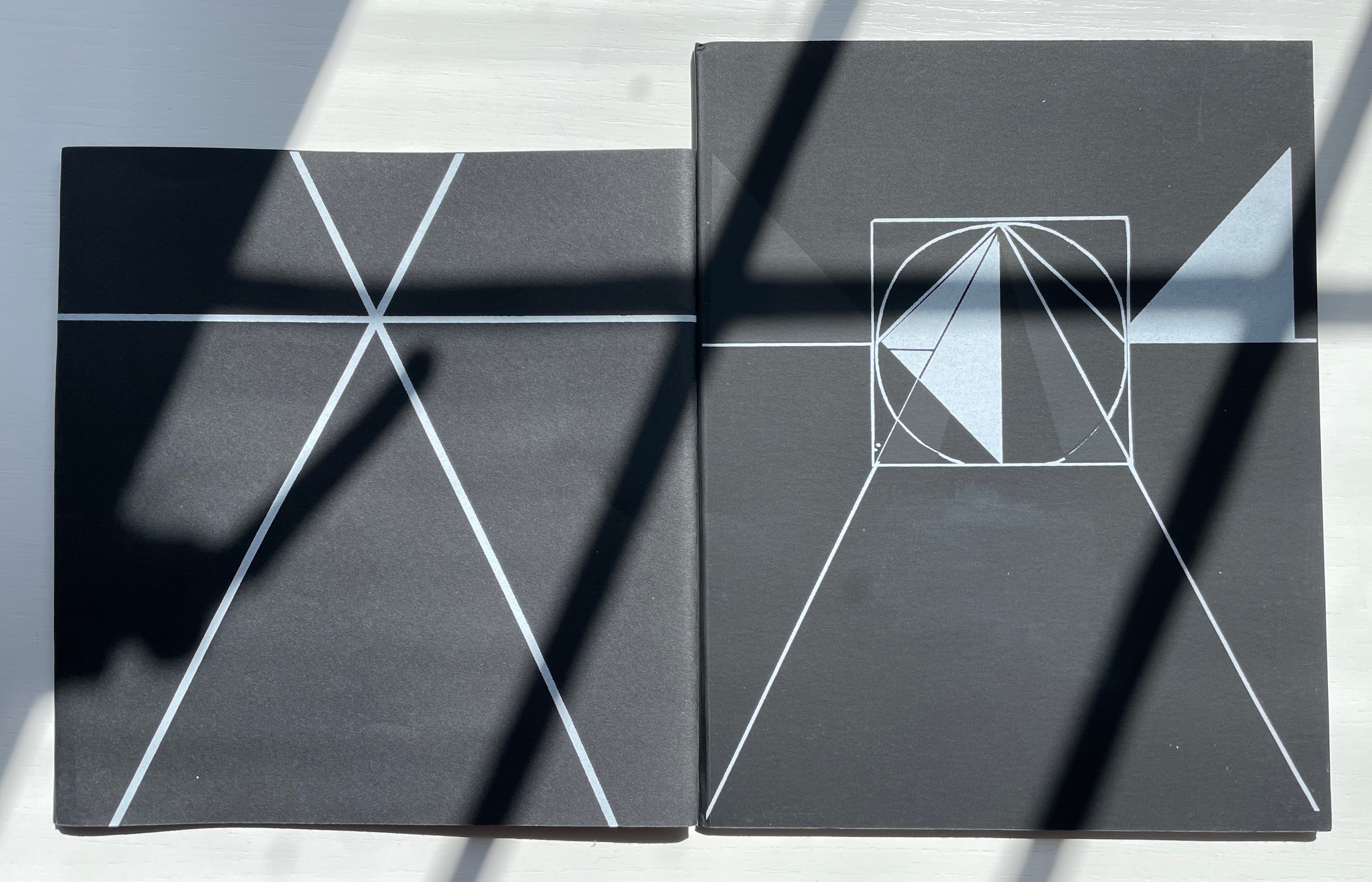
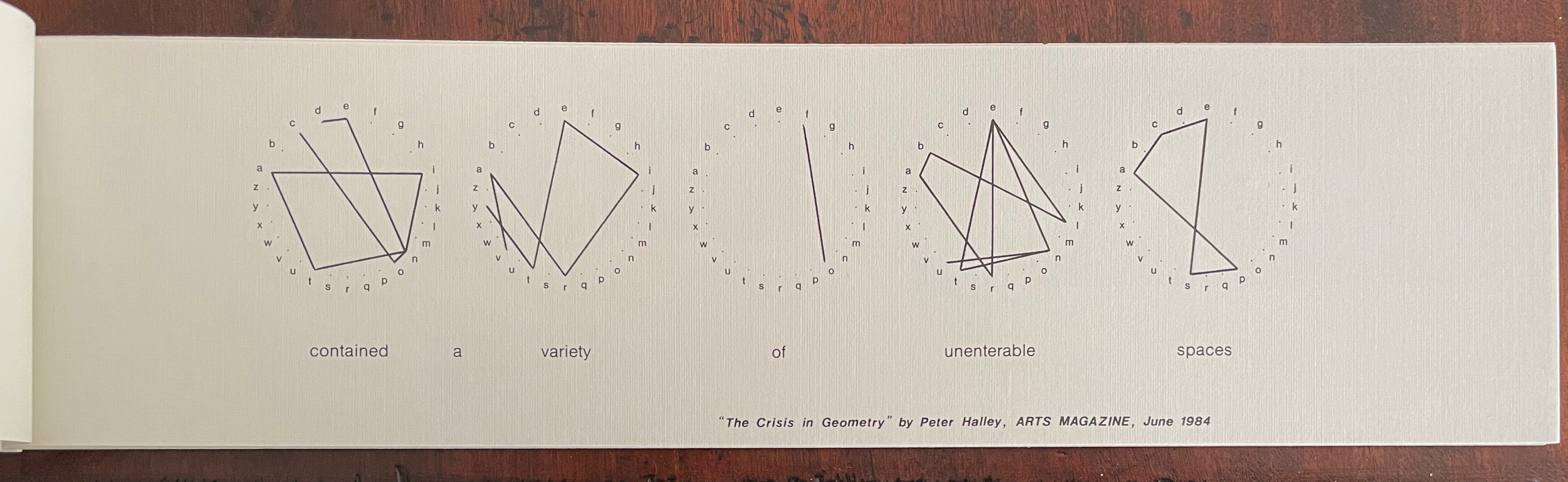
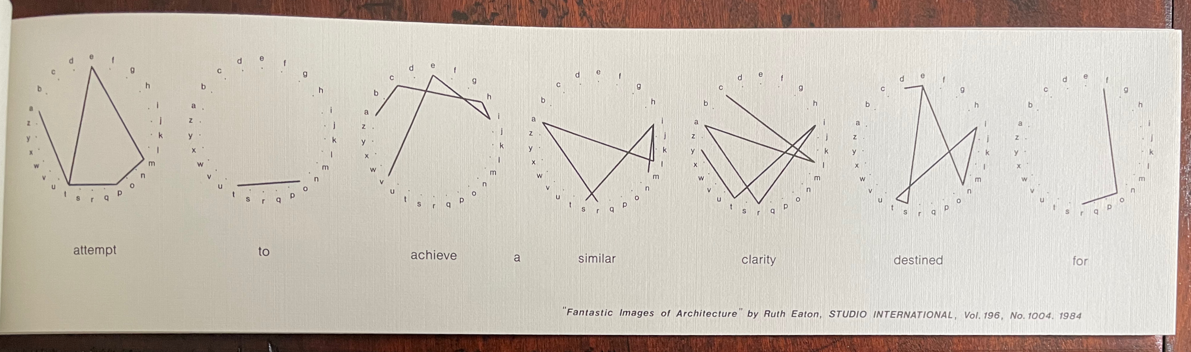
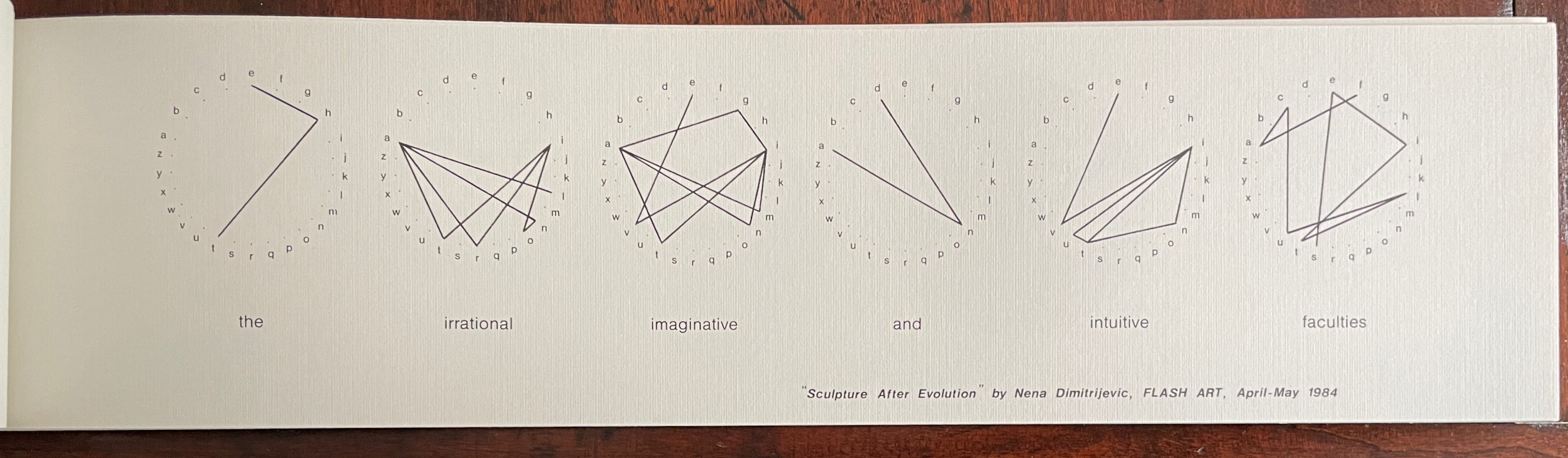
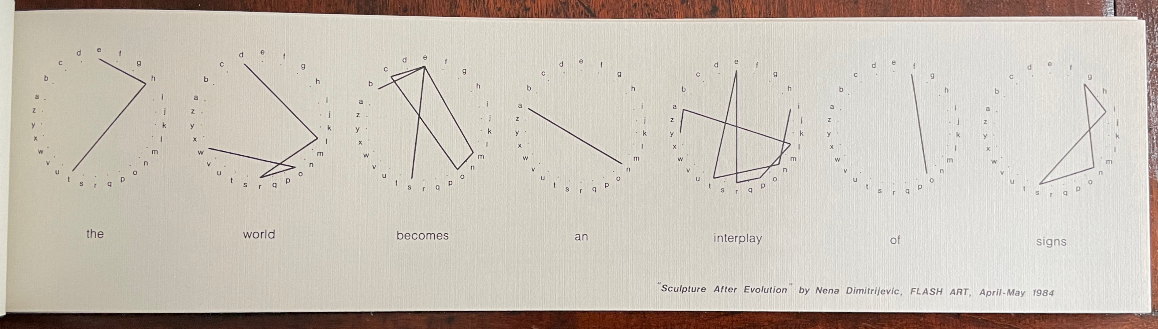
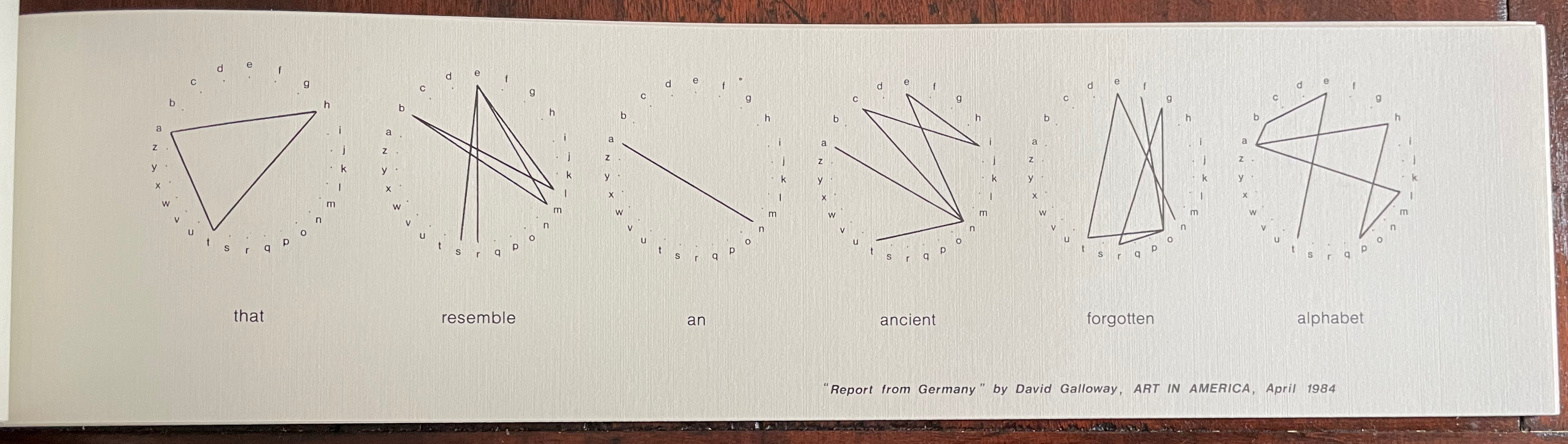
Each of twelve folios has a phrase taken out of context from an art review or essay about art and printed on one side. Above each word, Winkler presents the word’s transformation into an image by drawing lines from letterpoint to letterpoint in a circularly displayed alphabet. Here is the first folio that performs that transformation:
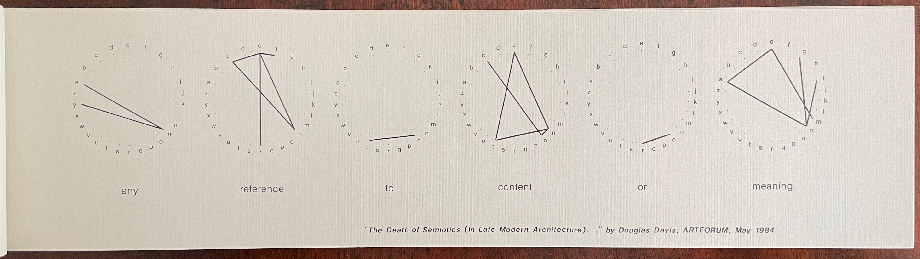
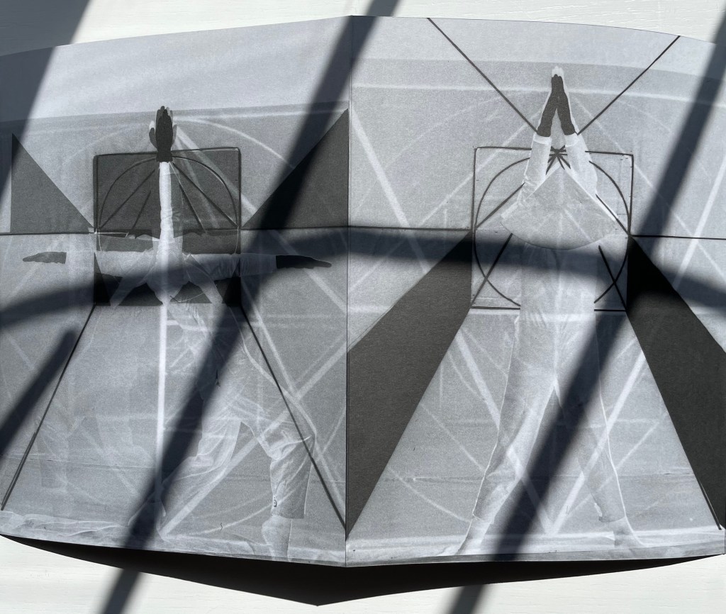
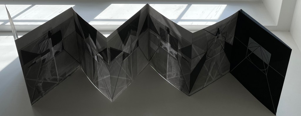
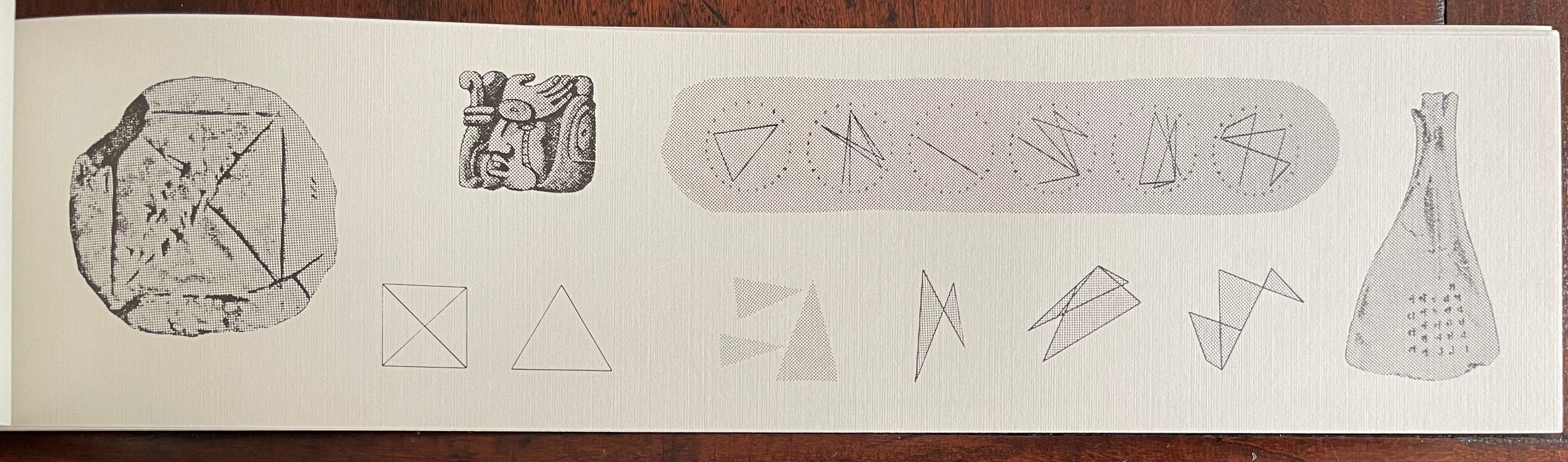
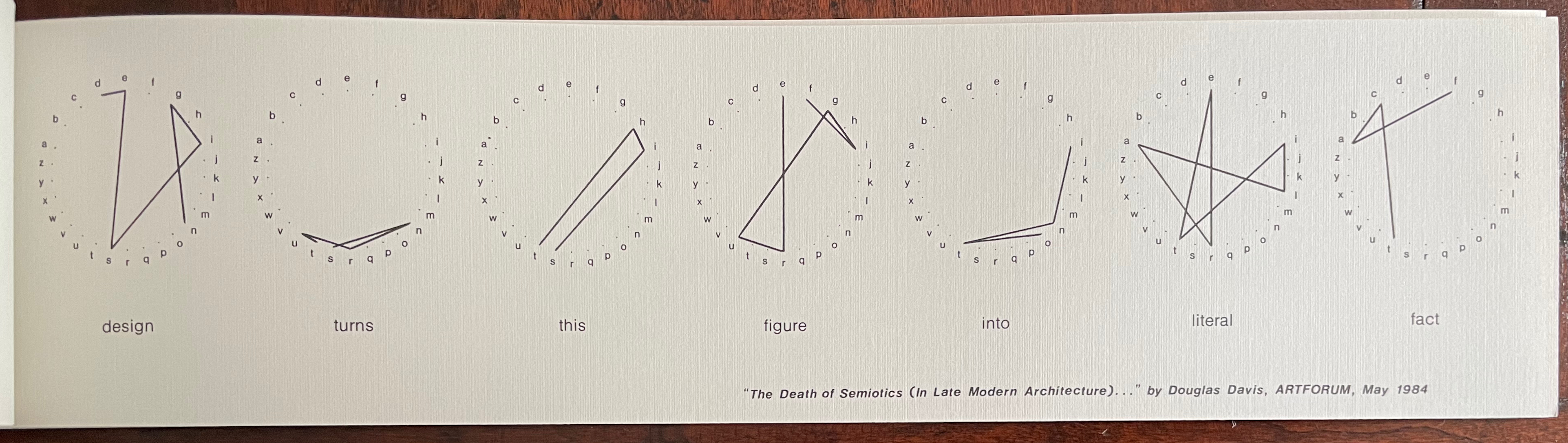
After each of these word-image folios, Winkler adds another folio with various images “based on the visual aspects of, or the implications of the meanings inherent in,” the preceding folio’s sequence of word/images. Below is the folio that follows the word/images above:
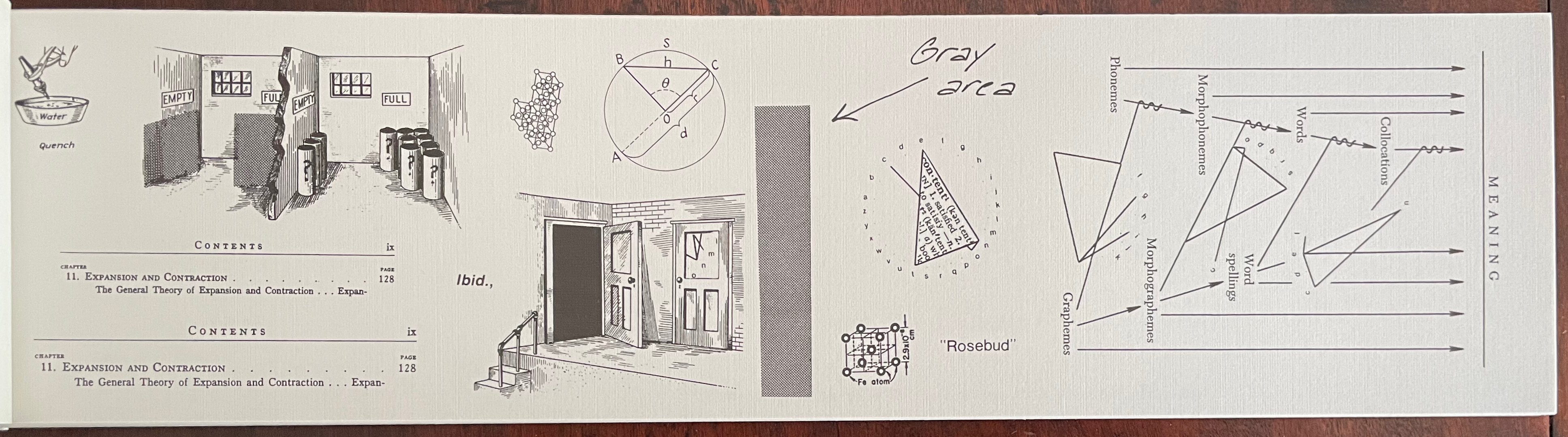
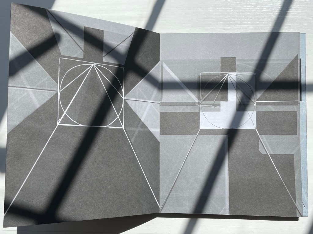
Notice that, just under the label “gray area”, the word/image for “content” is reproduced from the preceding folio but with the dictionary-definition of “content” (as meaning “satisfied”) collaged into the triangular space of the image. Text generates image, image captures text. To the left of the gray block, the lower arc of the image for “meaning” appears within the rectangular window of the doorframe. If we miss the point that geometric representation of text and meaning is linked to geometric definition and measurement of shape, there is the traditional image of circle, circumference, diameter, radius, segment and chord displayed just above the doorframe to remind us. If we miss the point that the “content” referenced by a circle can be empty or full of meaning, there are the closed and open portals as well as a cross section of rooms labeled “empty” and “full” to remind us. The ambiguity of the word “content” shows up in the section of a Table of Contents, whose reference to the paired opposites of expansion and contraction is reinforced by the metaphorical equation set up by ibid. (the “same source”) between the twice-repeated Contents section on the one hand and the open and closed portals on the other. The manifoldness of “meaning” as well is represented by the semantic diagram on the right.
And so it goes, folio after folio, which are otherwise loose but bound only by virtue of the plastic clip and meaningfulness of sequence. The plastic clip, the loose folios and the oblong shape contrary to expectations for a codex — they obliquely reprise Winkler’s suggestion of what meaning/making (or making meaning) is about. Circularly represented, the loose letters of the alphabet nevertheless combine in words and linear images in which meaning inheres.
But isn’t meaning associated with words arbitrary (as hinted at by the allusion to the mysterious Wellesian “Rosebud” from Citizen Kane)? Winkler’s circular word-decoder (or rather image-encoder) implies that it only seems so. The mystery doesn’t lie in arbitrariness, rather it lies in Nature. In Winkler’s view, language is a product of a Nature that is meaningfully patterned. If consciousness and language are products of Nature, the associations that he finds between the abstract linear images and external figurative images argue for an inherent meaningfulness perhaps resident in some “ancient forgotten alphabet”.

Although the preface to word art/art words signals the clinching argument that Winkler presents, it has to be experienced from front to back and back to front to appreciate it. The final page compiles all of the previous twelve phrases into a single paragraph of four sentences: a sort of textual collage that presents a syntactically and semantically coherent manifesto.

The seamlessness of the collaged paragraph implies a vision just waiting for discovery through application of the artist’s word/image technique. Albeit out of context and somewhat disparately sourced, though, the phrases were selected and combined to produce that articulate statement of artistic vision. The artistry in doing so is what celebrates the mystery of language and representation that Winkler finds in Nature.
Further Reading
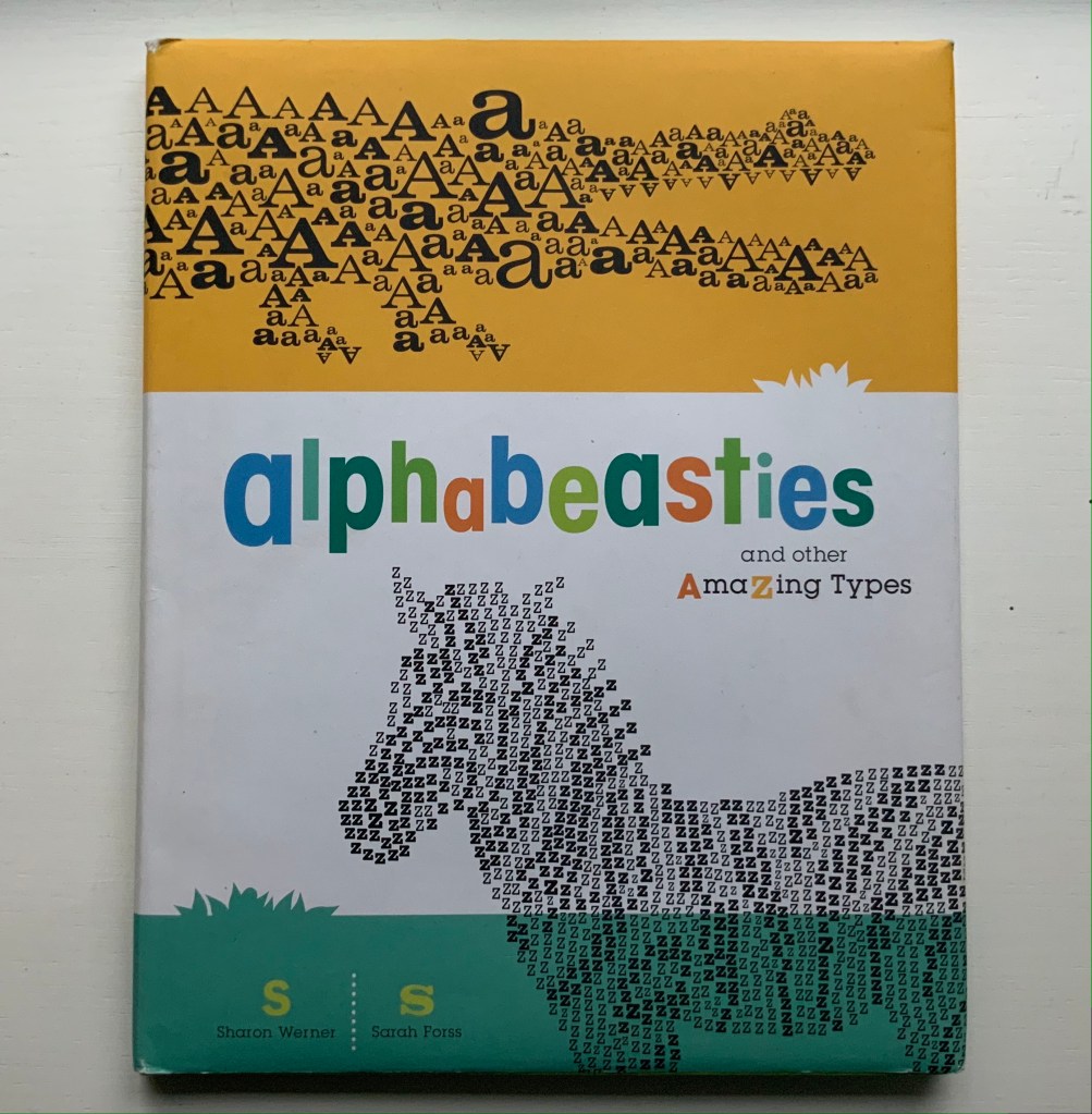
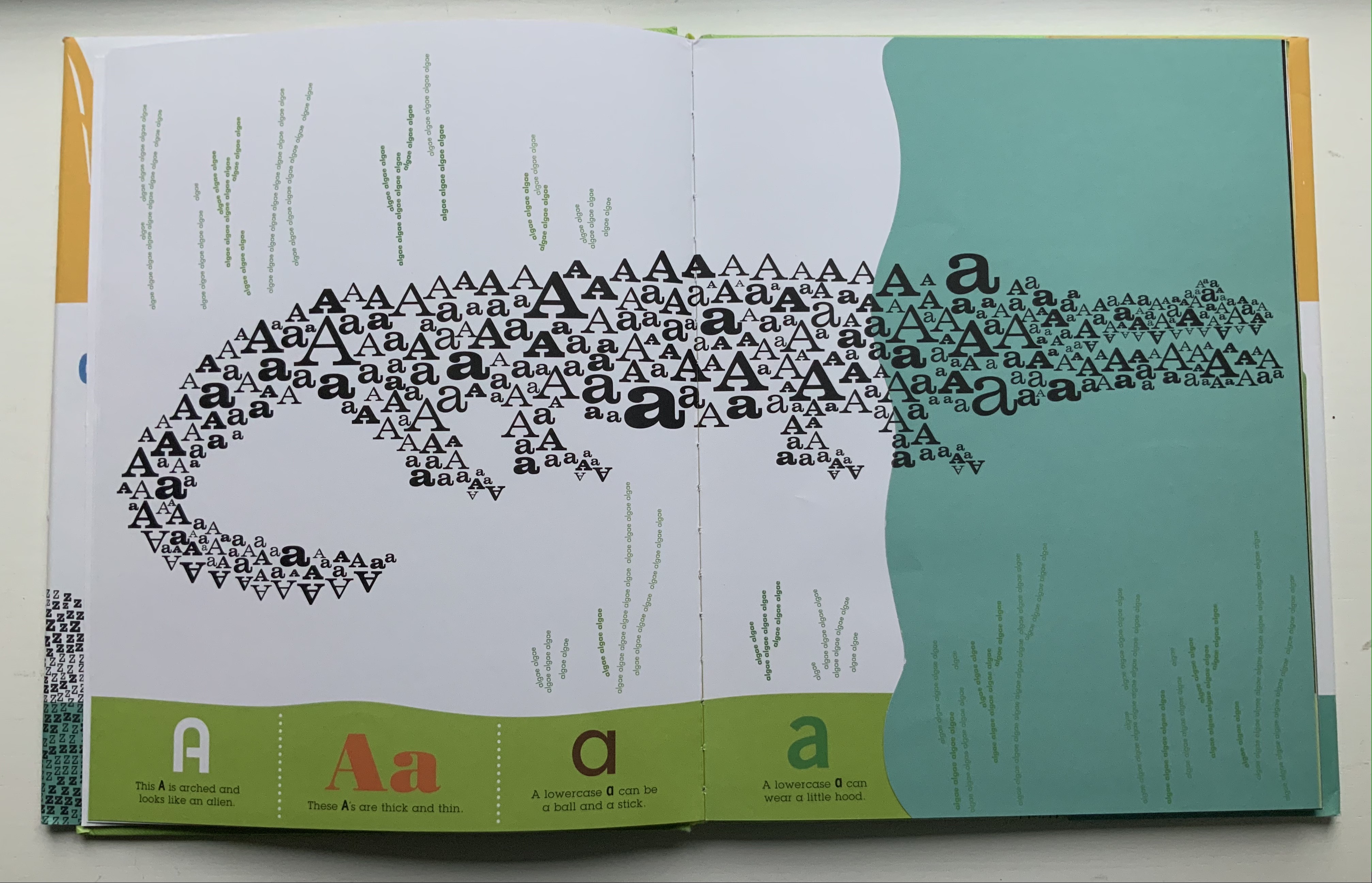
“Alphabets Alive!“. 19 July 2023. Books On Books Collection.
“Alberto Blanco“. Books On Books Collection. In process.
“Karen Shaw“. Books On Books Collection. In process.
Winkler, Michael Joseph. 2021. The Image of Language : An Artist’s Memoir. [North East, NY]: Artists Books Edition.Download the chapter “A Major Challenge“.
Winkler, Michael Joseph. 2018. Matters of Context. [Millerton, New York]: SignalGlyph Media.
Winkler, Michael Joseph. 1989. Extreme Measures. New York: [Michael Winkler].
Winkler, Michael Joseph. 1987. Equivalents. New York: M. Winkler.
Four of Winkler’s works can be found at Printed Matter, Inc.