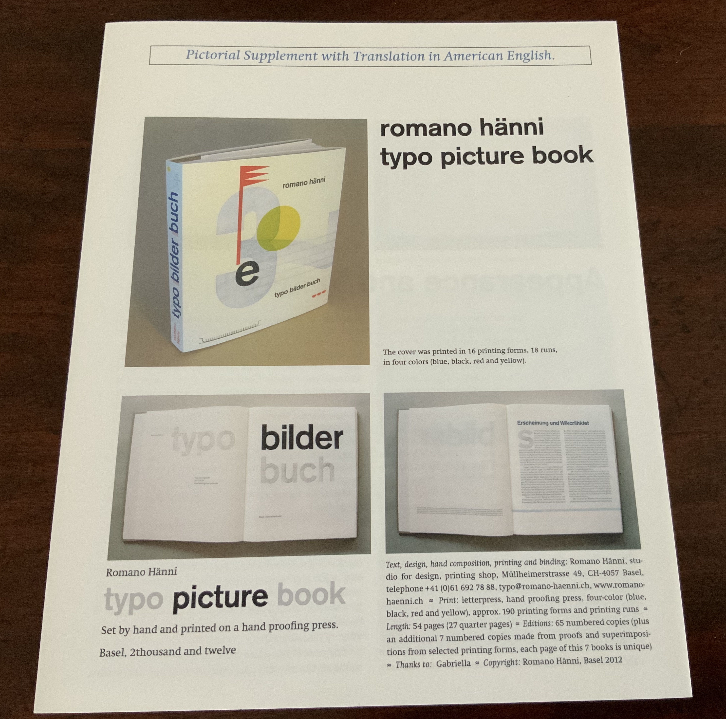
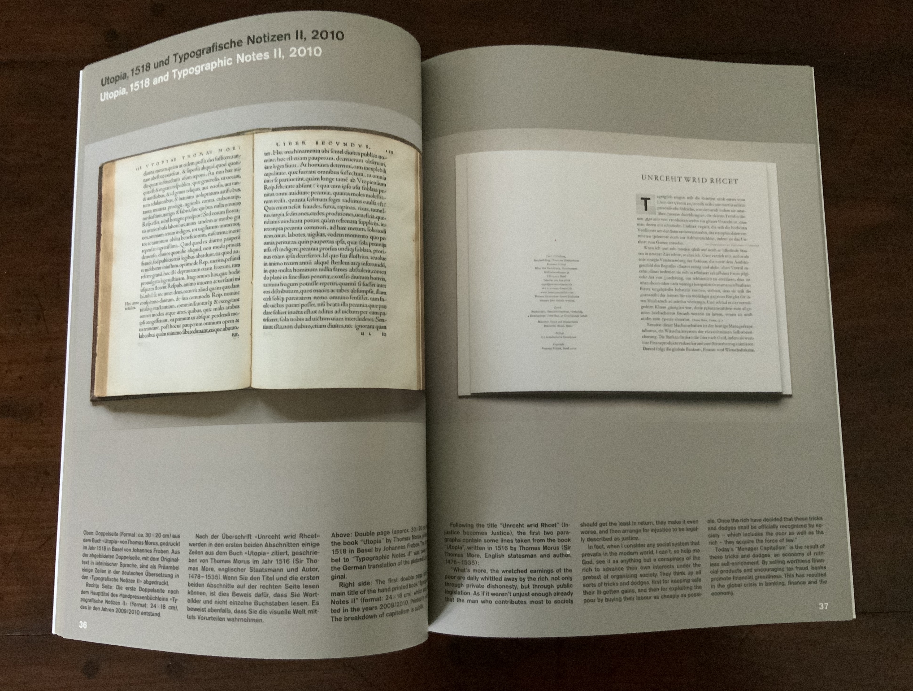
typo bilder buch (2012)
typo bilder buch (2012)
Romano Hänni
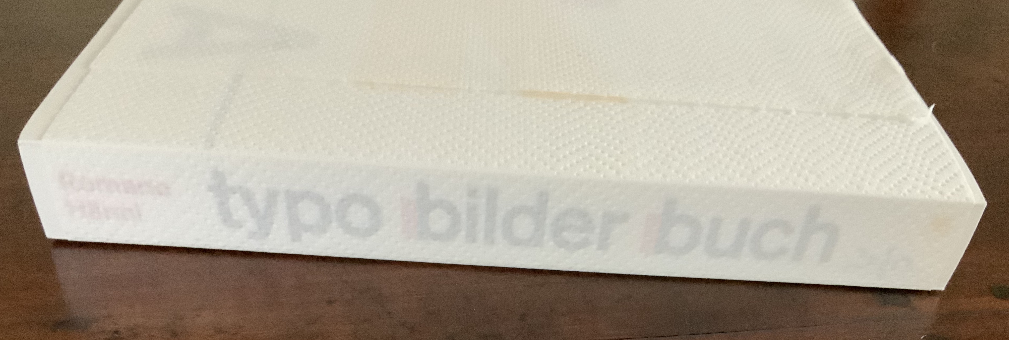
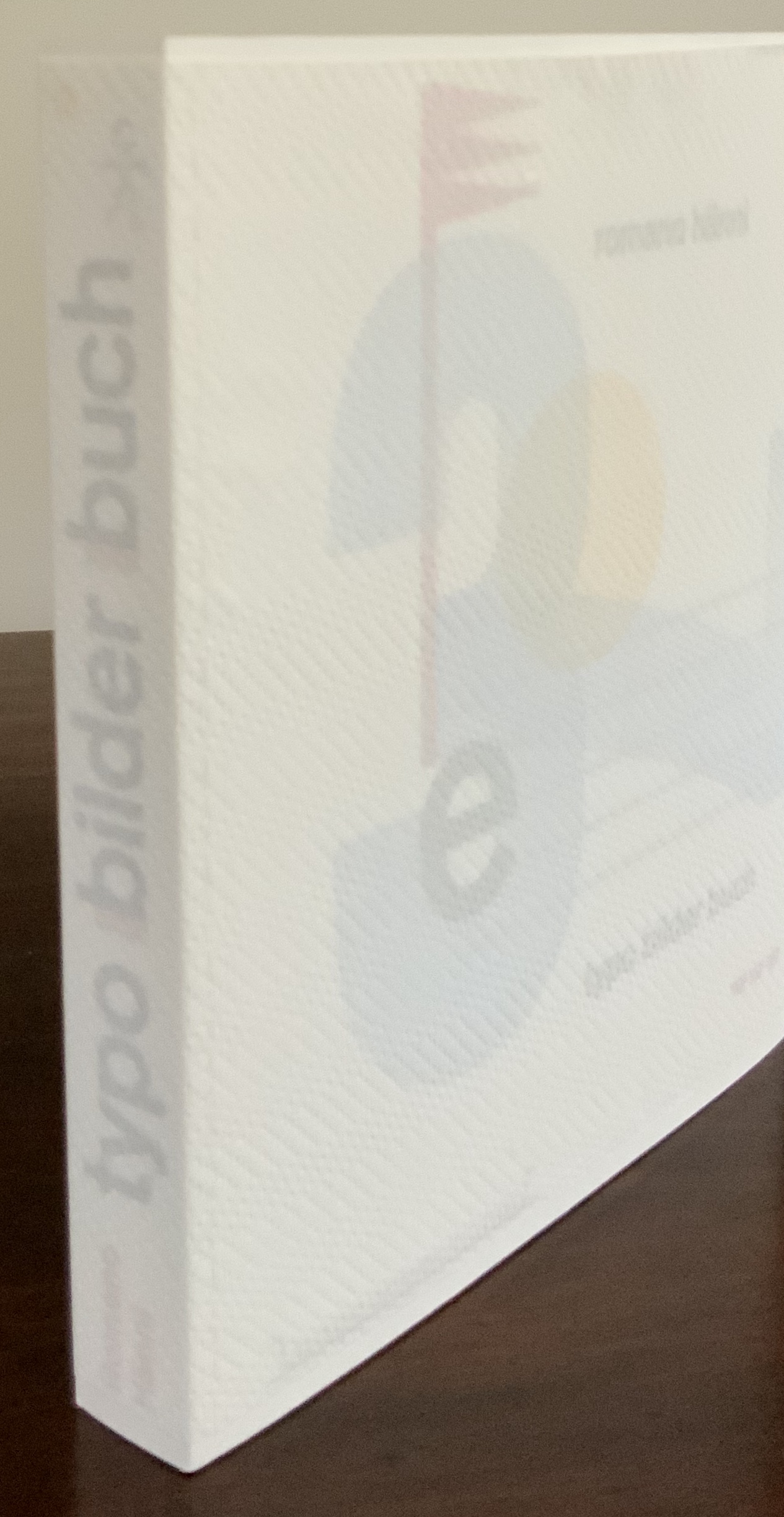
Printing: Letterpress on hand-proofing press. Binding: paper over cardboard glued to end papers glued to handsewn book block. Pages: 54.
H268 x W237 x D30 mm. Edition of 65, of which this is #62. Acquired from the artist, 26 February 2020.
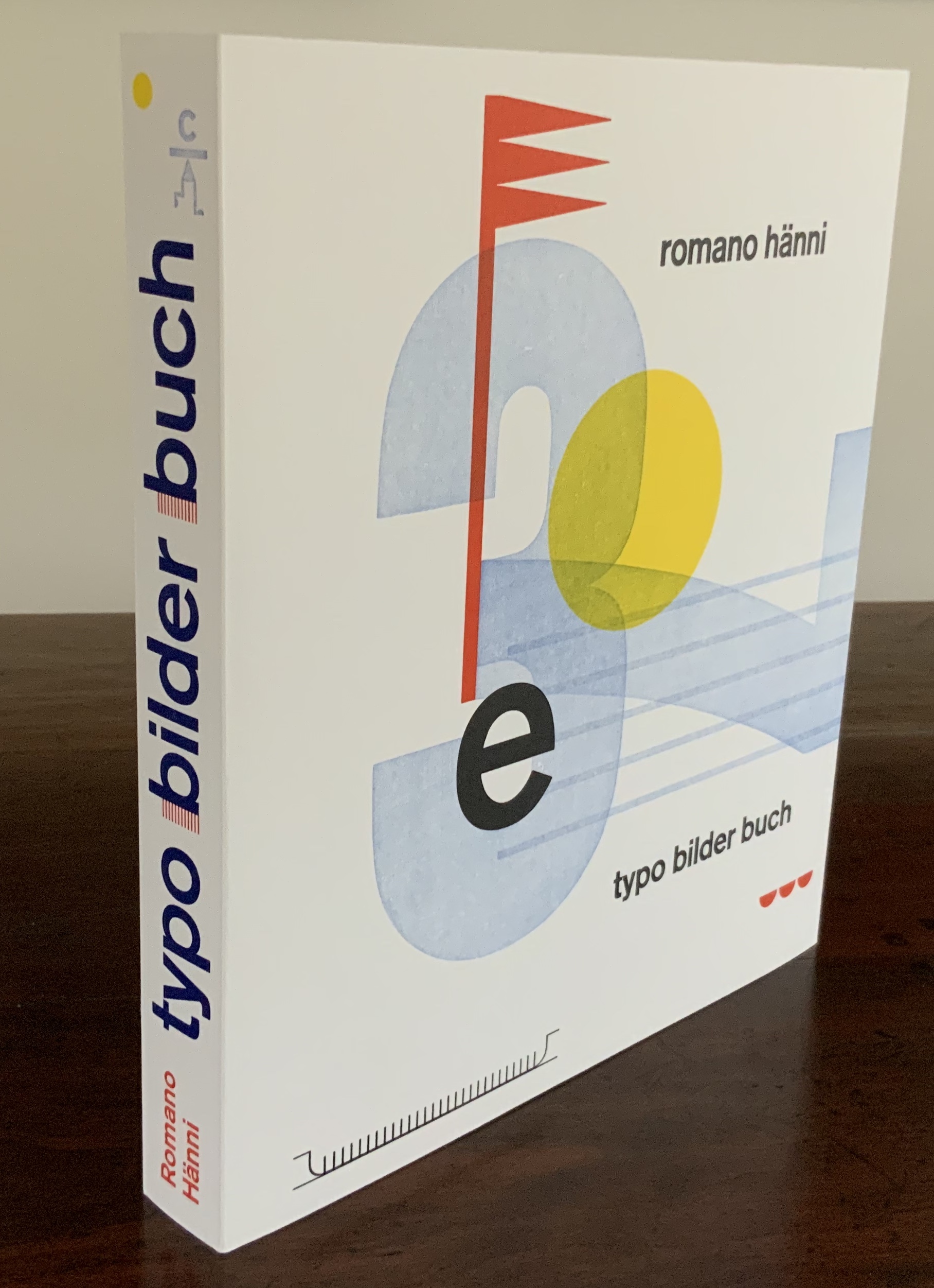
Appearance vs reality — one of the ancient standbys for philosophical conversation and disputation. But also for stimulating art. Romano Hänni’s typo bilder buch (2012) is a case in point.
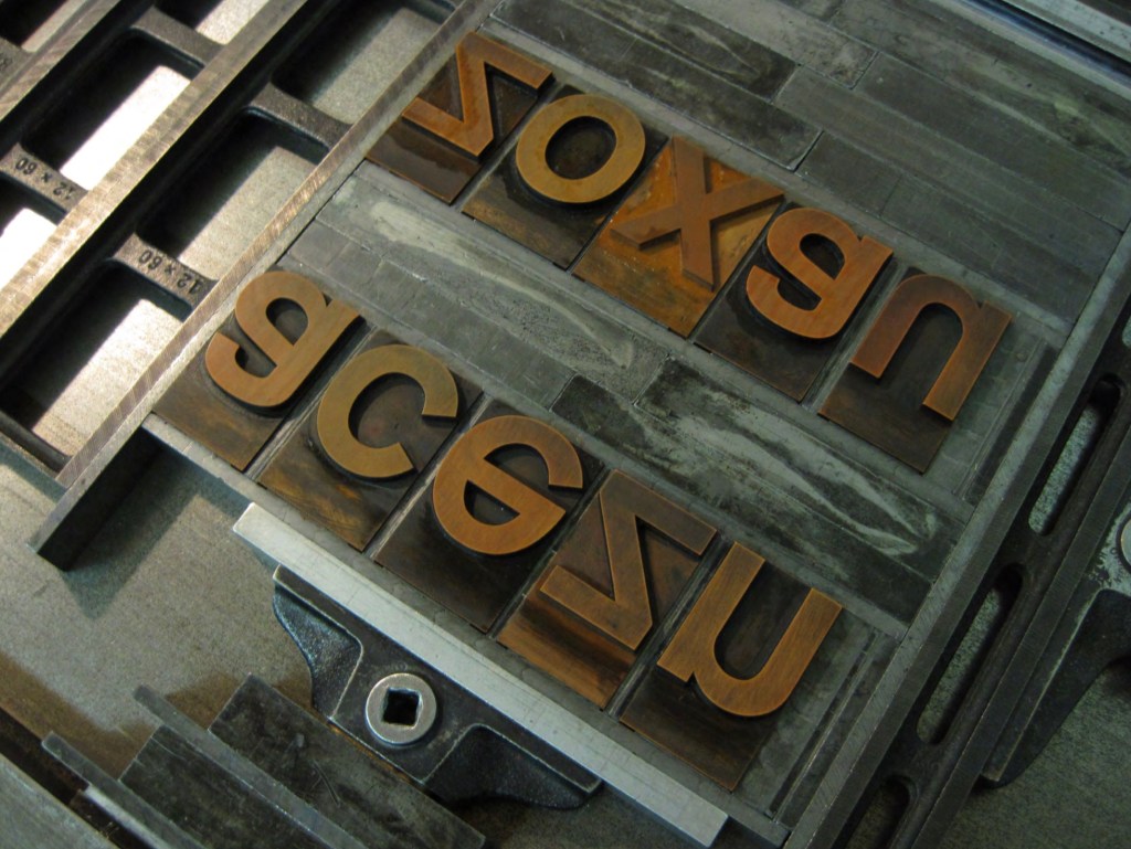
Tightly encased in its banderole, typo bilder buch deceives. Large and thick, it appears weighty, hefty, but is light. Too snug to slide off, the banderole requires breaking a perforated edge. Appearance must be penetrated to get at reality. The cover, made of stiff heavyweight paper, is precisely creased around the front and back boards, made of waffled cardboard, not the usual dense binders boards. The text on the flyleaves is scrambled, the letters in reverse and sometimes in the wrong order (deliberately), sometimes inverted, the uppercase sometimes aligned to drop below the line, the lowercase sometimes aligned to rise above the line. Reconstituted from its mirror appearance (and translated), the text declares:
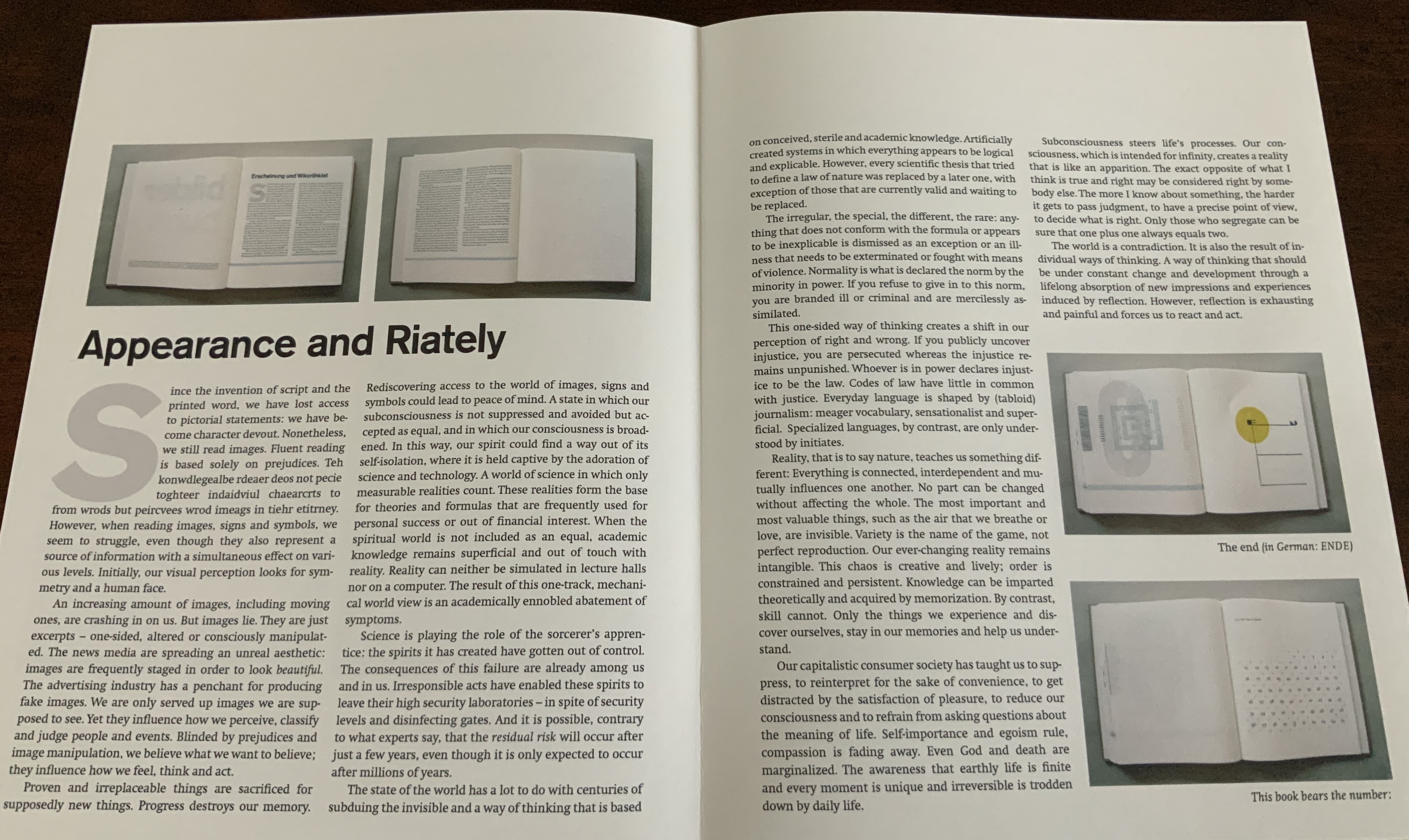
Appearance and Riately
Since the invention of script and the printed word, we have lost access to pictorial statements: we have become character devout. Nonetheless, we still read images. … However, when reading images, signs and symbols, we seem to struggle, even though they also represent a source of information with a simultaneous effect on various levels. Initially, our visual perception looks for symmetry and a human face.
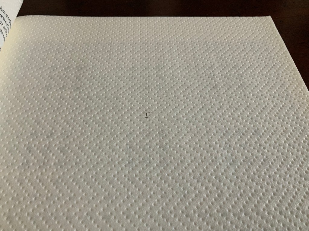
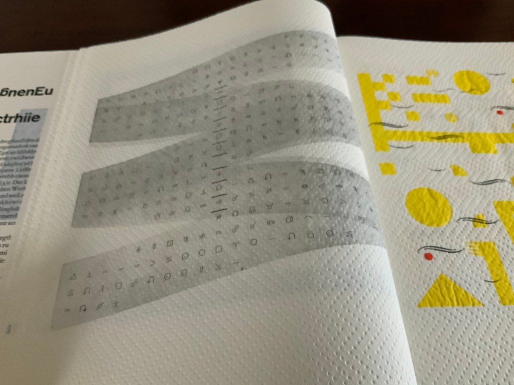
The book block’s first image: a small face in a white sea of embossed diagonals running from left to right, or is it from right to left, or downwards or upwards?
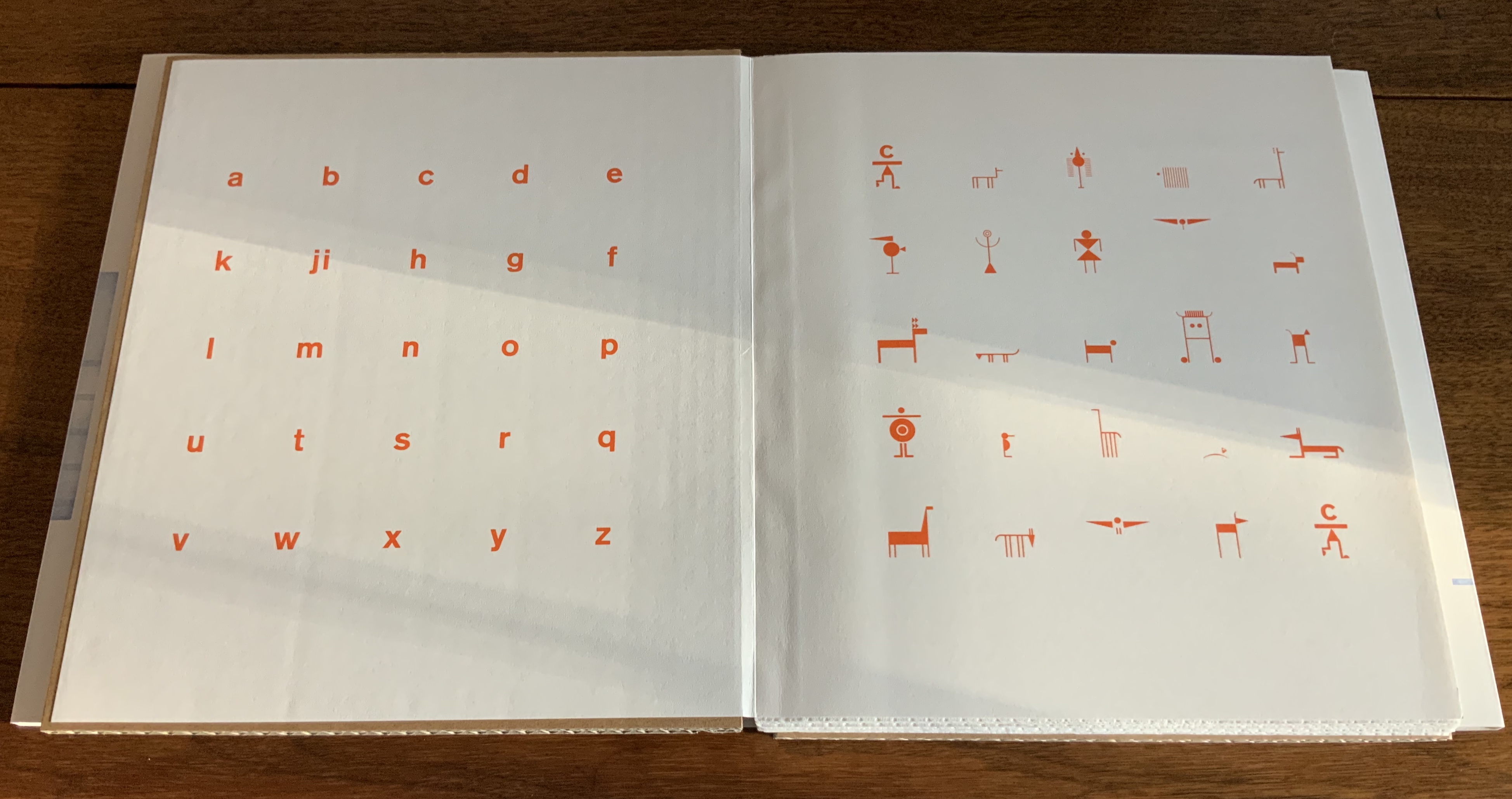
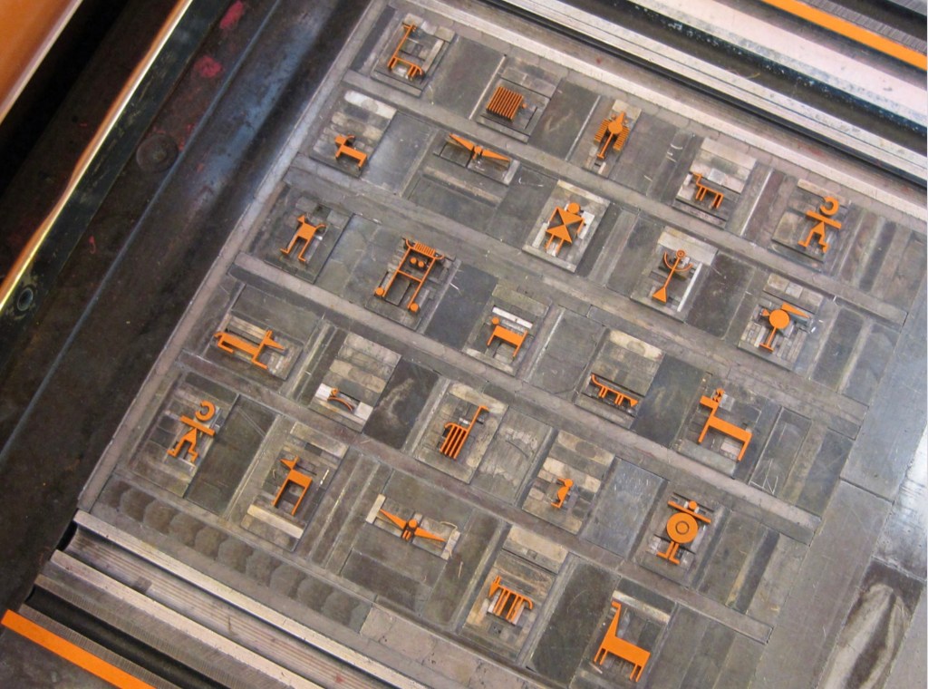
The book’s title and even its endpapers (the papers glued to the boards and attached to the book block) declare that typo bilder buch (“typo picture book”) will address this split between script and printed words (or letters) on the one hand and images on the other. On the pastedown is a bright orange lowercase alphabet; on the free endpaper are twenty-five signs, ornaments and images arranged in five rows and five columns. The alphabet’s twenty-six letters arrange themselves to match the five-by-five square of images by squeezing j and i together. Yes, in that order because the alphabet is set boustrophedon style (“as the ox plows”), which is at least the third or fourth clue that typo bilder buch wants us to play with our notions of books, reading and, as Hänni puts it, “appearance and riately”.
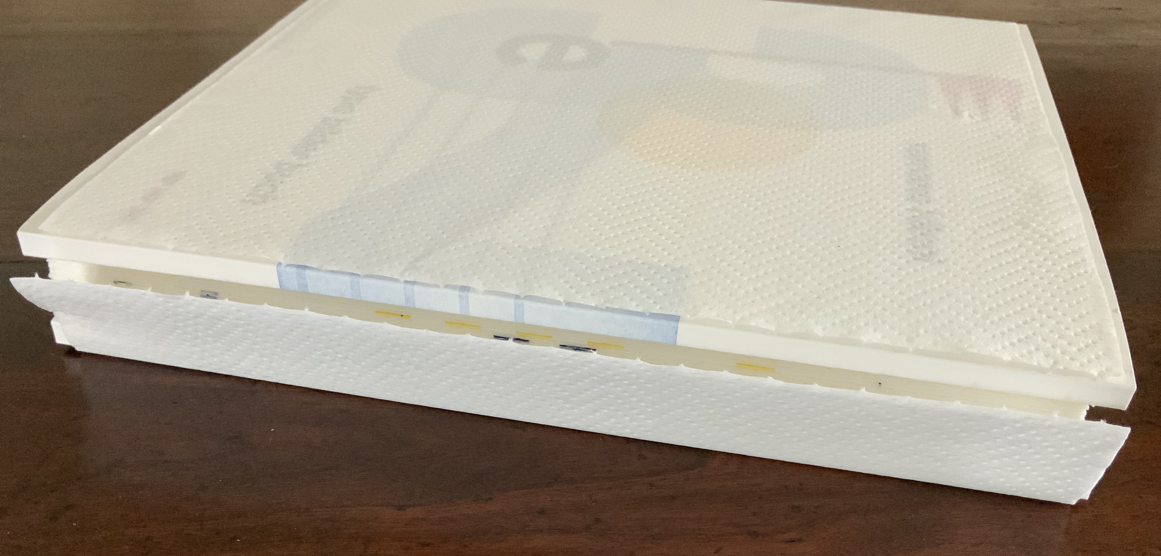
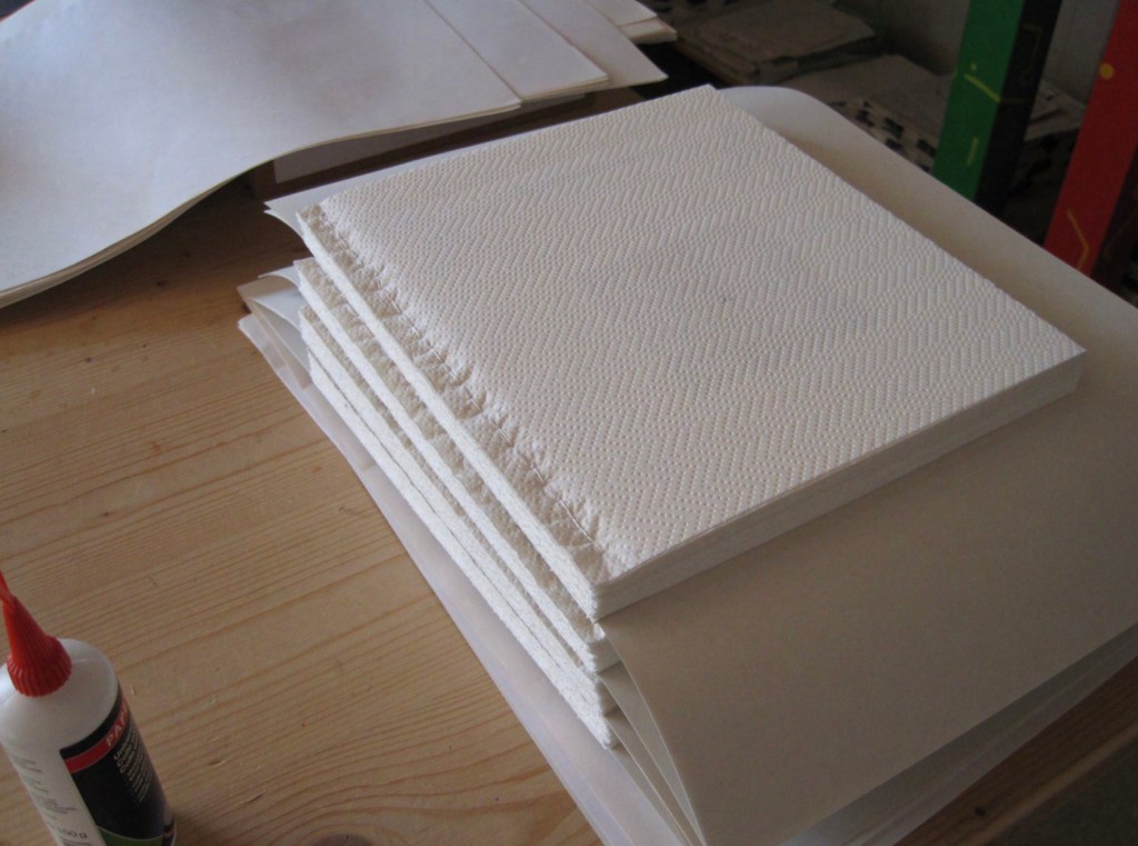
Spacing and layout are not the only toys at work here. To paraphrase Ellen Lupton: “Spacing, framing, punctuation, type style, layout, and other non-phonetic marks of difference [as well as the surface on or in which they appear] constitute the material interface of writing.” When any book opens, the fingers expect a firm block of pages for turning, but with typo bilder buch, the thumb on the free end paper sinks into the book block. All the leaves beneath the end paper, like the one with the tiny image of a human face, are two sheets of paper towel. These pages, this paper, are not merely a surface on which to print; the ink is not merely a medium. They play a physical and intellectual role in the composition of the work.
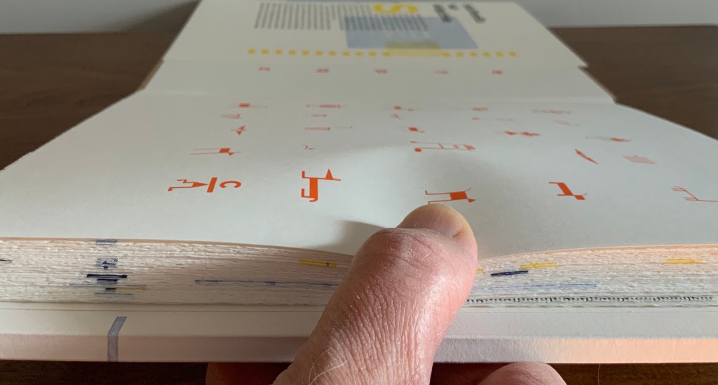
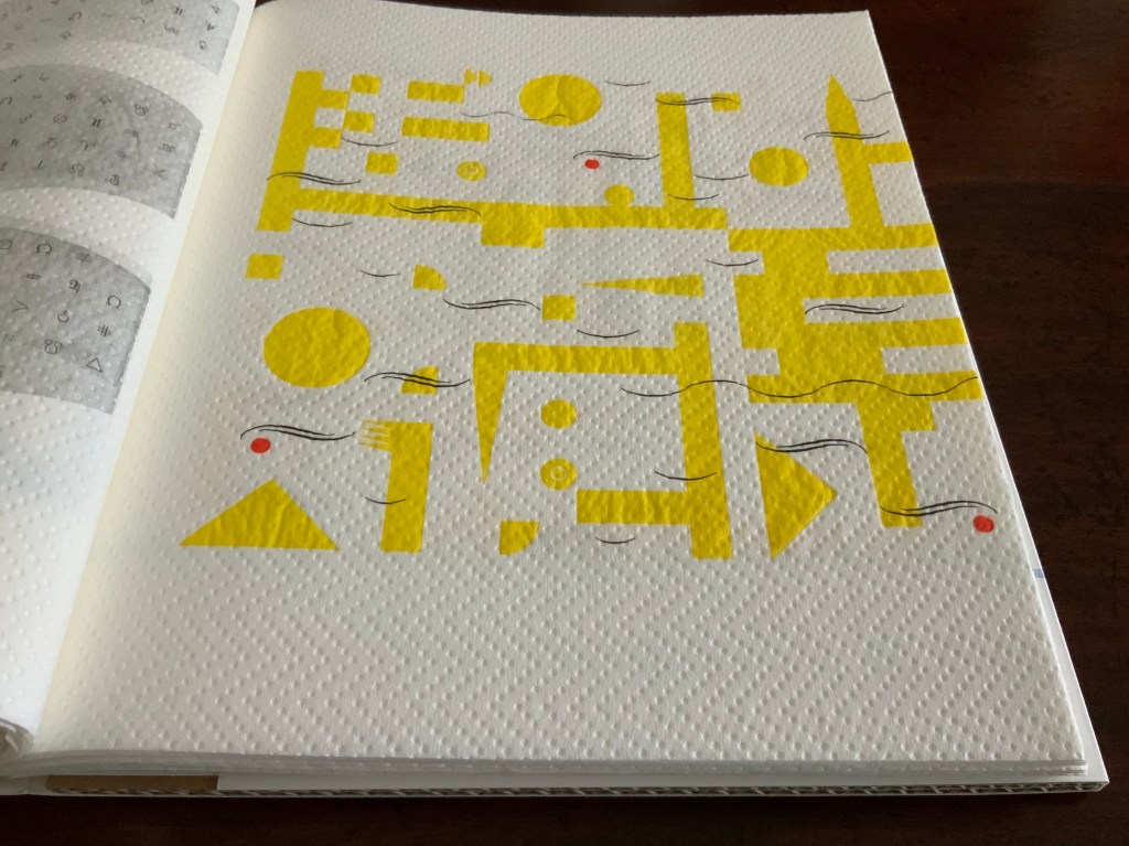
Through colorful, neighborhood mazes in a world Mondrian would love, small solid- and multi-colored geometric characters run or pose. Bosch would love the characters that look like human stick figures with birds’ heads, the figures with heads and legs but no bodies and the strange stick-figure animals. “Mr. Black” of The Book from the Ground (2014) by Xu Bing would recognize and sympathize with this cast of characters, although he would struggle to make narrative sense of it. His creator would smile, of course, over this book’s concluding pages:
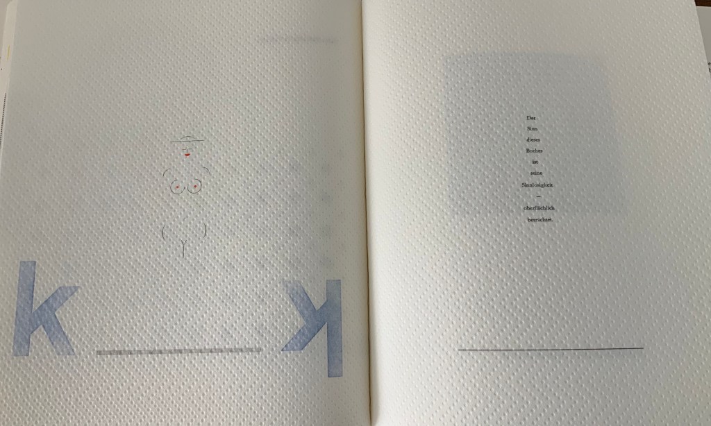
Der Sinn dieses Buches ist seine Sinnlosigkeit — oberflächlich betrachtet.
(”The meaning of this book is its meaninglessness — superficially considered.”).
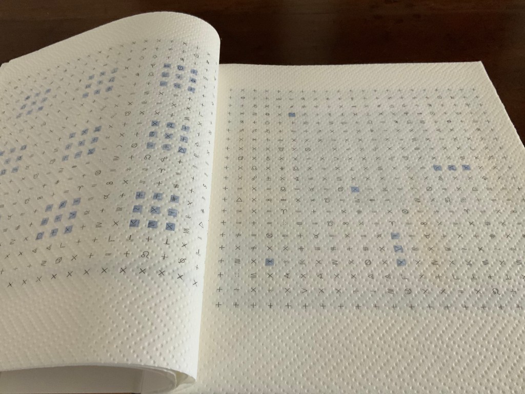
Some of the mazes could be the analogue version of a computer arcade game. Some seem to represent an arcane version of checkers or Chinese checkers combined with “magic squares” (they are not the traditional form of magic squares where the sum of any column, row or diagonal is equal to any other).
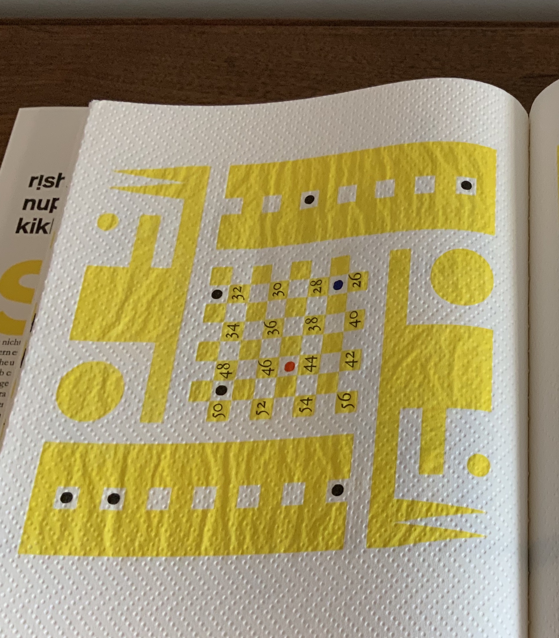
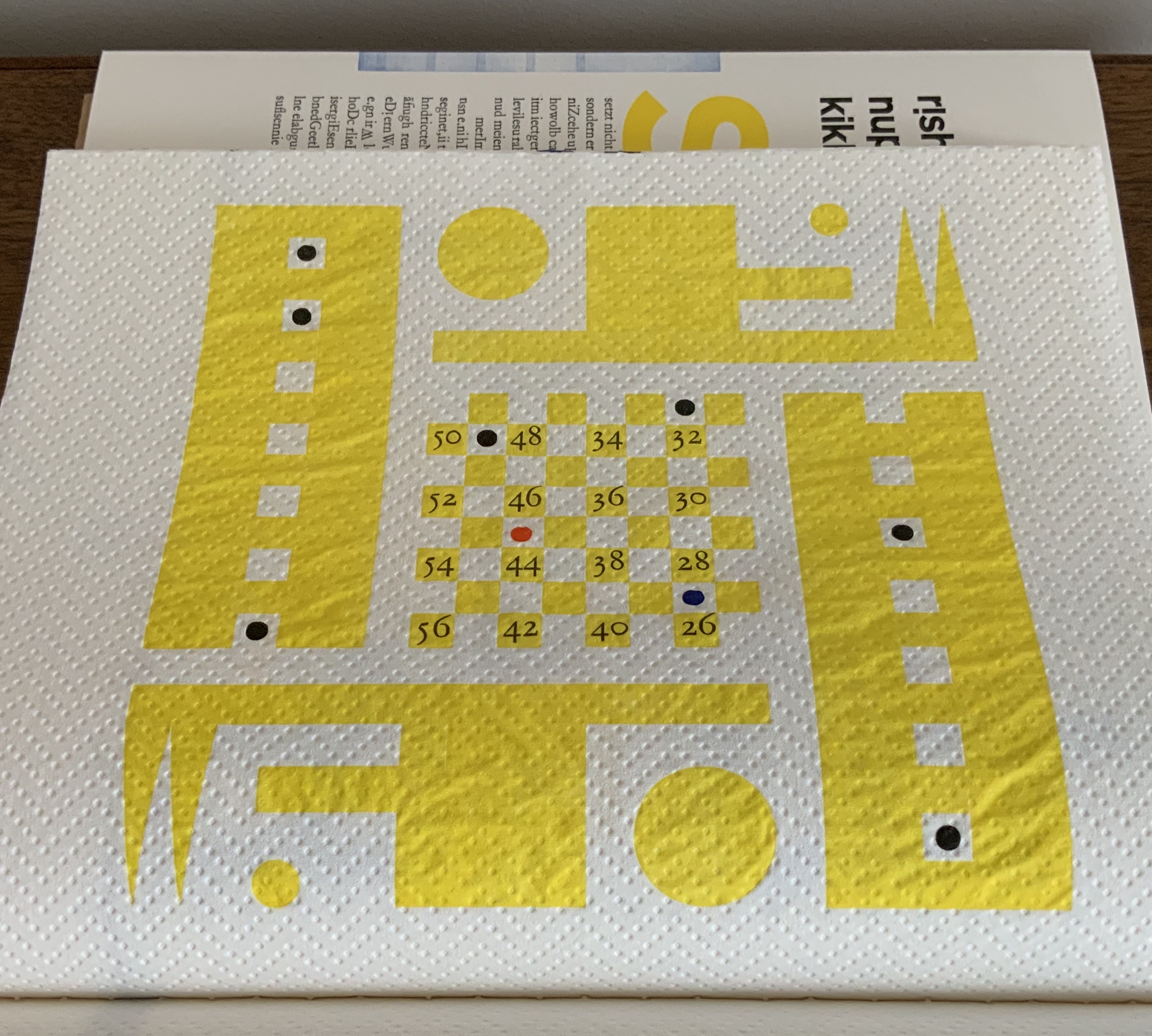
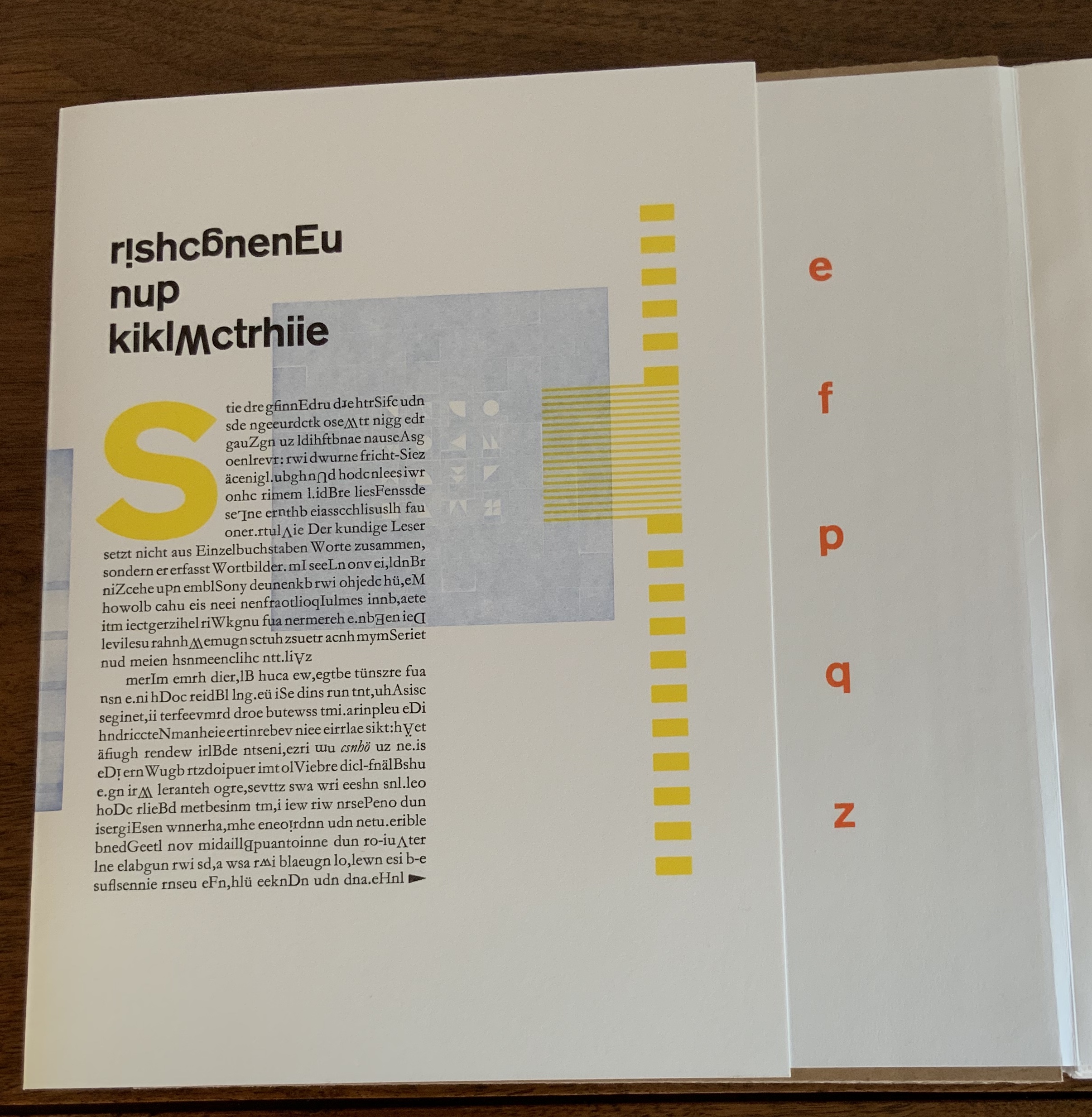
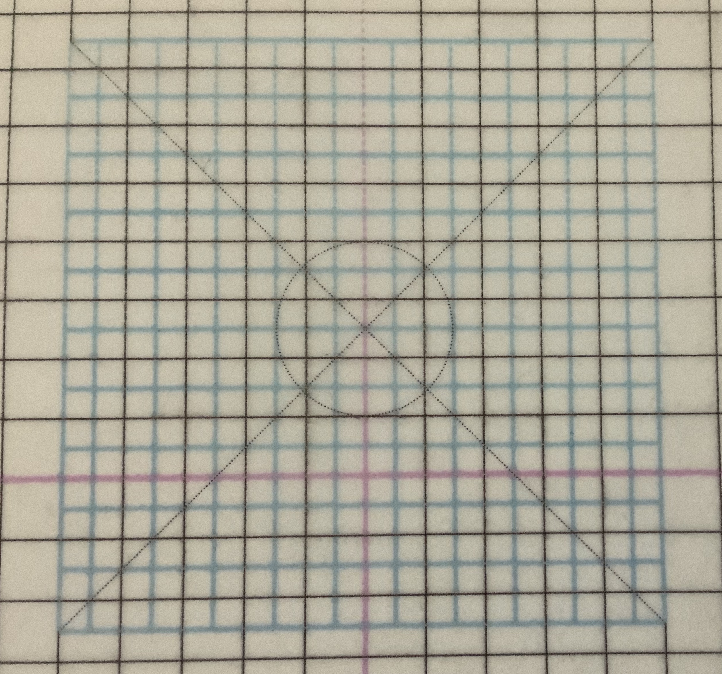
Reading typo bilder buch elicits, challenges and heightens pattern-seeking behavior. Expected patterns turn themselves on their heads. In the page above, the tilted numbers in the “magic squares” urge turning the book’s landscape orientation by 90º to the right into a portrait orientation. Notice how the numbers’ progression by 2 reads boustrophedon-style upwards from the lower right corner. Or perhaps the start lies with 56, decreasing by 2, which means reading upwards from the lower left corner then down and up and so on. Return the book to its landscape orientation, and the numerical plowing proceeds from right to left to right and so on. In either orientation, the numerical progression or regression challenges the notion of the “proper” direction for reading.
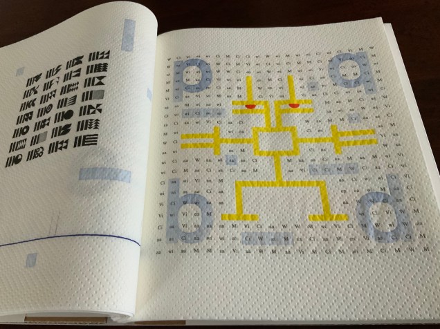
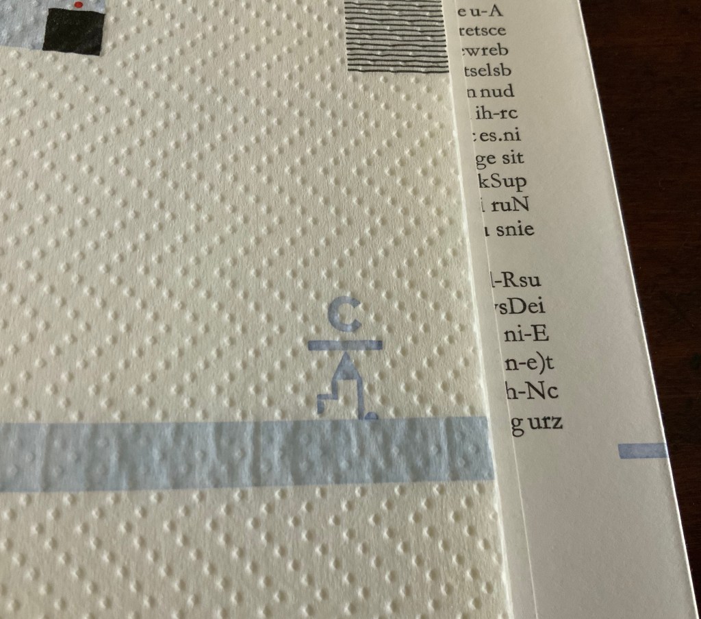
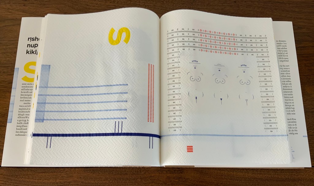
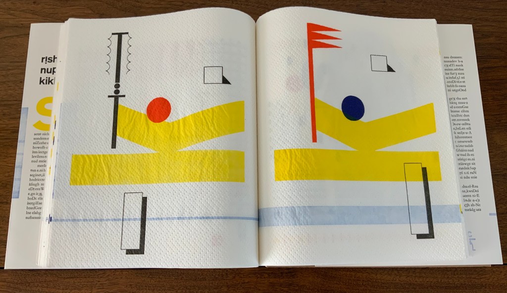
While trying to read typo bilder buch might lead from image to image, the realization often arrives that a larger subsuming image or pattern is in play, or vice versa. For instance, in the page above, the letters p and q declare their mirror image of each other from the upper left and right corners, but then so do the letters p and b from the upper and lower left corners, and so do the letters q and d from the upper and lower right corners, and likewise the b and d from the lower left and right corners, and likewise diagonally. But step further back, and the juggler in the middle may be laughing at this logic-chopping of “if p, then q; if q, then d; if d, then b; therefore, b, then q, and p, then d”. He laughs as if to ask, “I’m just juggling these four clubs; what are you doing?”
Ludic is the operative word for this book — even in the process by which it was created:
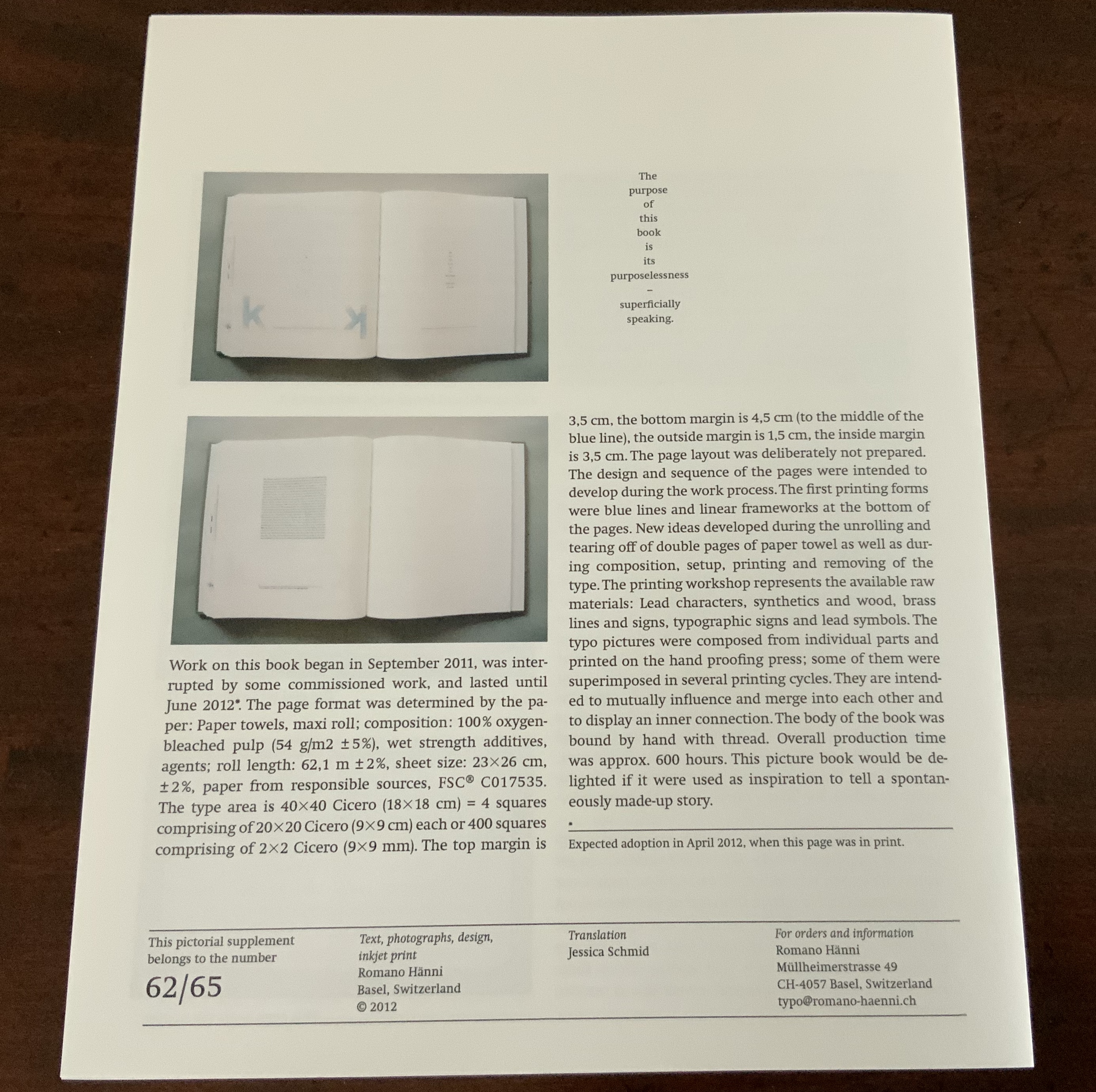
The page layout was deliberately not prepared. The design and sequence of the pages were intended to develop during the work process. The first printing forms were blue lines and linear frameworks at the bottom of the pages. New ideas developed during the unrolling and tearing off of double pages of paper towel as well as during composition, setup, printing and removing of the type. — Hänni, “Pictorial Supplement with Translation in American English”.
Photos: Books On Books.
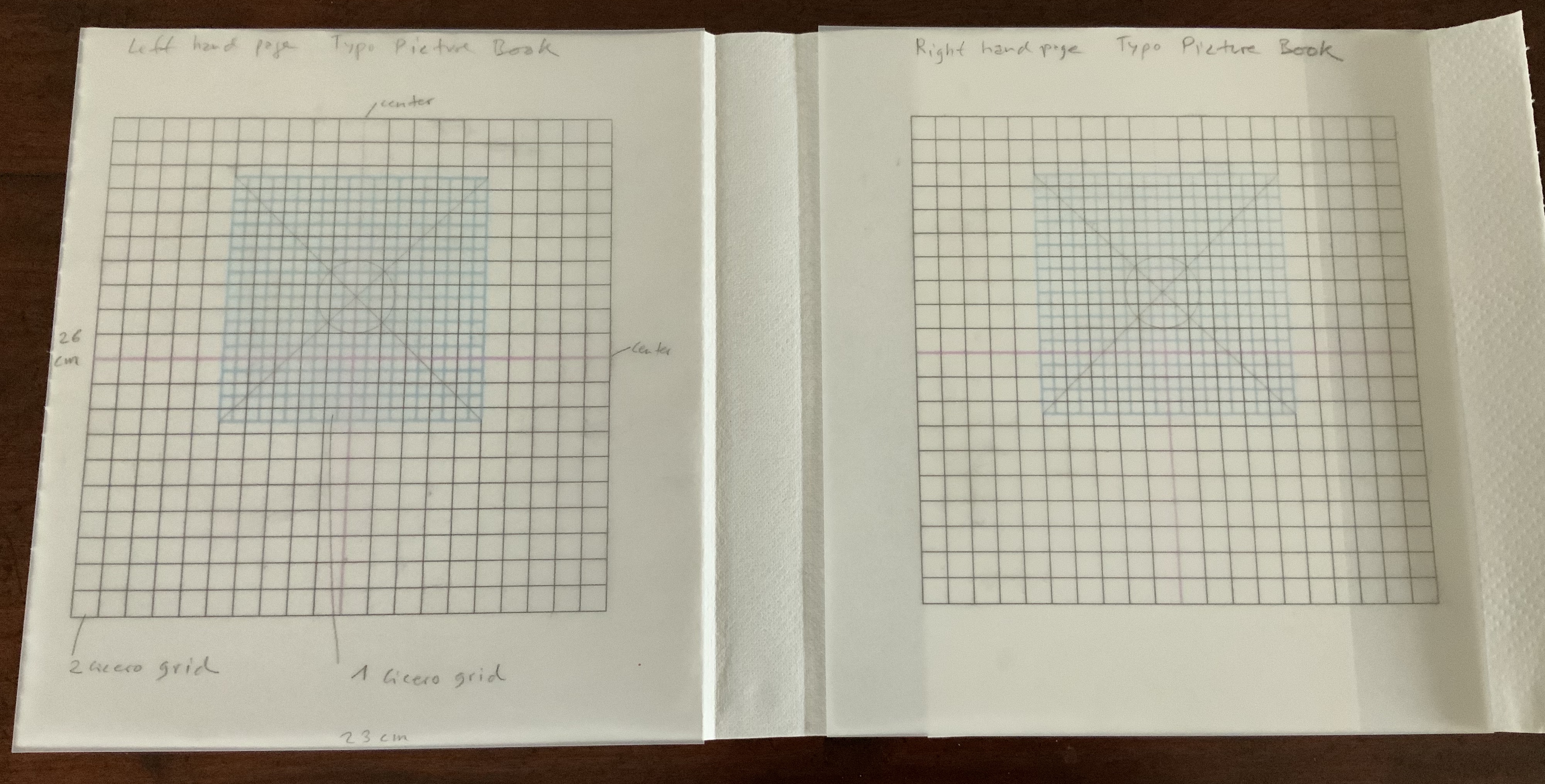
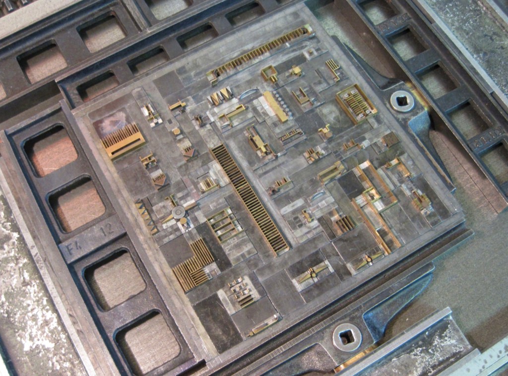
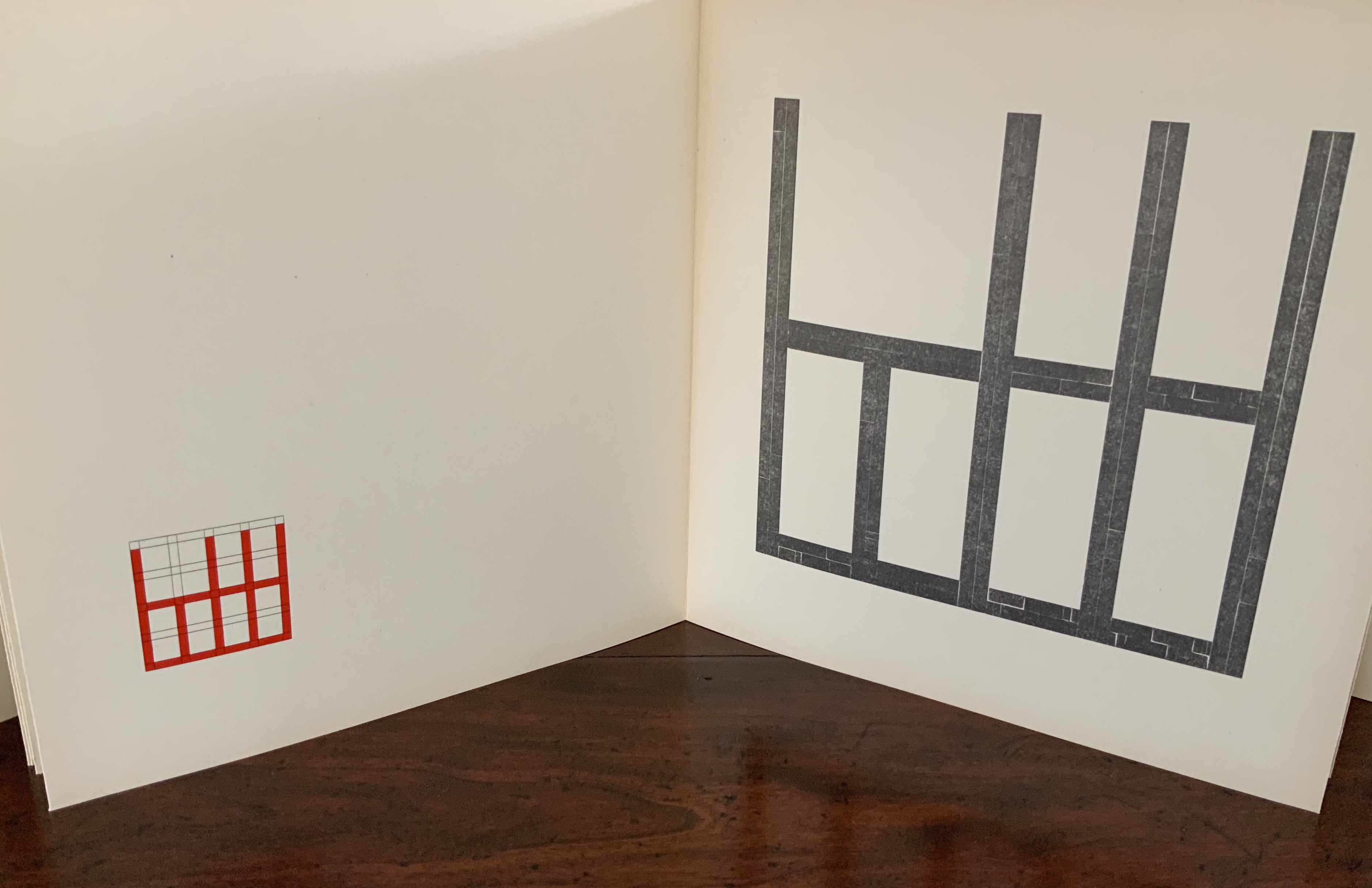
So, implicit in every pattern and change of pattern, in every modulation of color and evenness of inking that heightens or depresses the surface, is the excitement of creative play. The book is rich in information about its material and making, which offers added ways to follow that excitement. Consider, for instance, Hänni’s description of the type area within which he worked — and, separately, his samples of grid plans:
The type area is 40×40 Cicero (18×18 cm) = 4 squares comprising of 20×20 Cicero (9×9 cm) each or 400 squares comprising of 2×2 Cicero (9×9 mm). The top margin is 3,5 cm, the bottom margin is 4,5 cm (to the middle of the blue line), the outside margin is 1,5 cm, the inside margin is 3,5 cm. — Hänni, “Pictorial Supplement with Translation in American English”.
Romano Hänni, “Appearance and Riately”, translation by Jessica Schmid. Text, photographs, design, inkjet print © Romano Hänni, 2012.
Sample grid plans provided by the artist, © Romano Hänni.
Photos: Books On Books Collection. Permission to reproduce here: Courtesy of the artist.
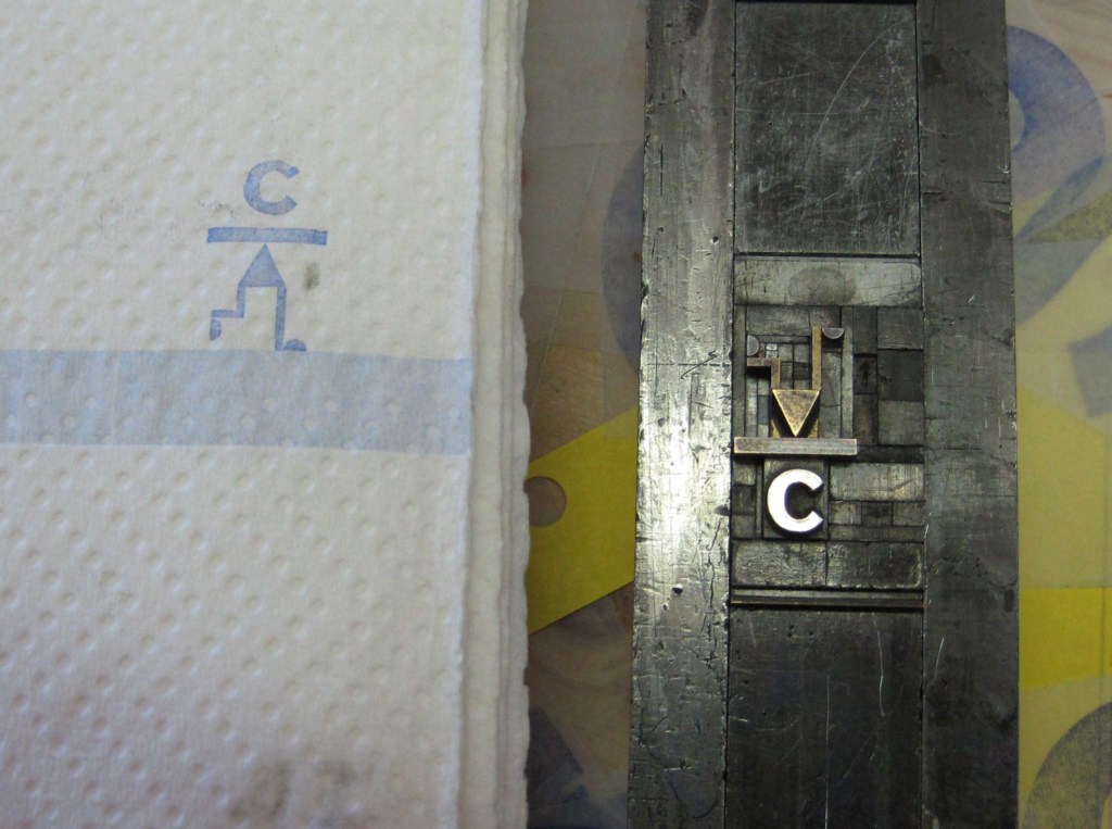
By his detail about this European unit of measure in typography, Hänni grounds typo bilder buch deeply in the tradition of bookmaking. The “Cicero” obtained its name from its first use by the printers in the 15th century. It may have been Peter Schöffer, who printed an edition of Marcus Tullius Cicero’s speeches in a similar font size in 1465. It may have been Arnold Pannartz and Konrad Sweynheim in Rome for their 1467/68 edition of Cicero’s Letters to Friends. Or it may have been for the typeface cutter Ulrich Hans Cicero, who created a 12-point typeface in Rome. As can be seen from his 2011 catalogue, tradition matters as a source of discipline and creativity for Hänni.
Hänni, Romano. Romano Hänni : handprinted books 1984-2010 (Basel : Romano Hänni Verlag, 2011).
Although an admirer of Jan Tschichold, another adherent to tradition, Hänni does not hold with perfection or a mechanical application of the Golden Ratio. The blue cicero sits at the page’s optical center — eyeballed, not mechanically determined, according to the artist. Like Tschichold, though, he values precision in craft, tools and material, and he seeks an ethics and morality through his craft and art. Consider these technical details from the book’s introductory essay:
The page format was determined by the paper : Paper towels, maxi roll; composition: 100 % oxygen-bleached pulp (54 g/m2 ± 5 %), wet strength additives, agents; roll length: 62.1 m ± 2 %, sheet size: 23×26 cm, ±2%, paper from responsible sources, FSC® C017535.
Note the point about responsible sourcing. One important departure from Tschichold’s views on discipline, craft and artistry is Hänni’s theme of “making do” and more openness to creativity “on the fly”:
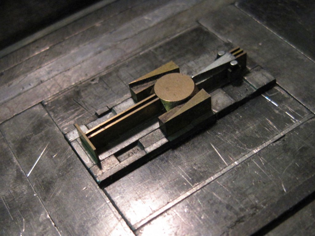
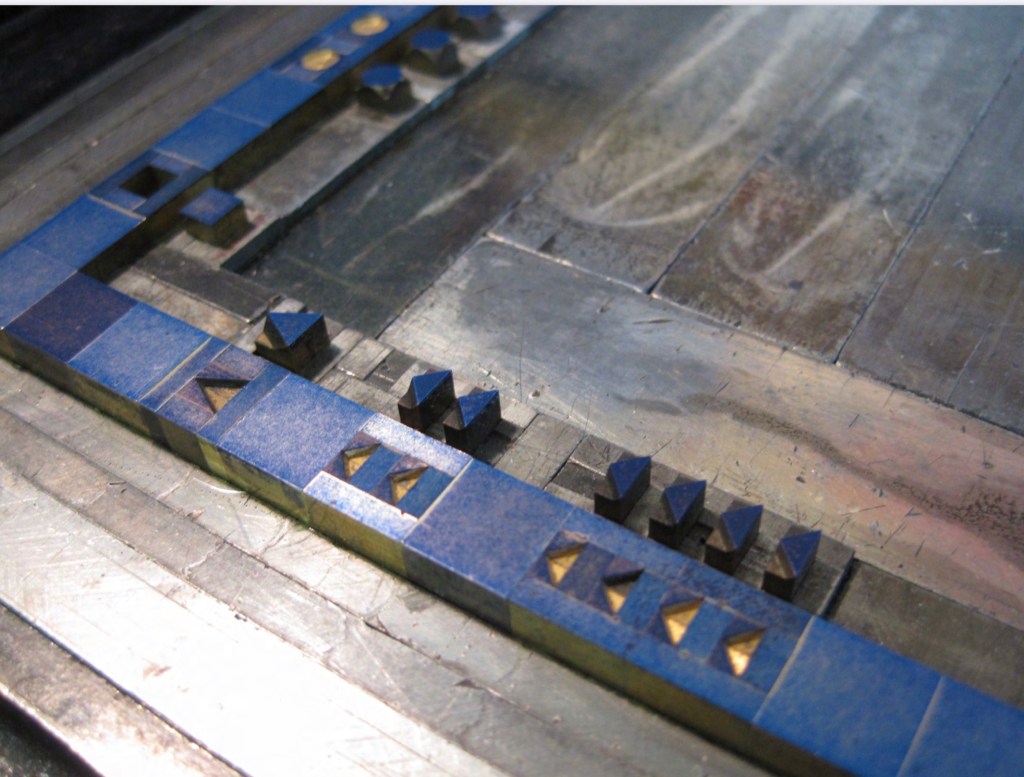
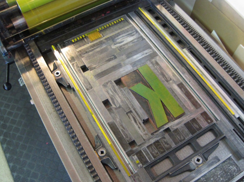
The printing workshop represents the available raw materials: Lead characters, synthetics and wood, brass lines and signs, typographic signs and lead symbols. The typo pictures were composed from individual parts and printed on the hand proofing press; some of them were superimposed in several printing cycles. They are intended to mutually influence and merge into each other and to display an inner connection. The body of the book was bound by hand with thread. Overall production time was approx. 600 hours.
Photos: Courtesy of the artist.
Hänni strikes a similar but different balance than Tschichold among craft, discipline, tools and material, imagination and artistry, and ethics. Despite their engineering appearance, the samples imply a drive toward artistry in that centered cicero eyeballed, not calculated. In its technical detail, the paper’s responsible sourcing weighs on the side of nature. The restriction to the printing material at hand weighs for a balance of discipline and creativity. The workings and hours weigh in for the human hand’s striving for connectedness.
Four years after typo bilder buch’s appearance, the New York Times Interactive published “Reading in a ‘Post-Text Future’“, which posed that text is succumbing to the sound and blurry of podcasts, YouTube, talking assistants, Netflix, face-reading phones, Instagram and augmented reality. As if humanity is passing through an internet portal turning the evolution from orality to literacy in on itself — where “text recedes to the background, and sounds and images become the universal language”.
For Hänni, this would simply confirm what he avers: “An increasing amount of images, including moving ones, are crashing in on us. … Proven and irreplaceable things are sacrificed for supposedly new things. Progress destroys our memory….”. His essay and typo bilder buch in itself argue for a different outcome:
Reality, that is to say nature, teaches us something different: Everything is connected, interdependent and mutually influences one another. No part can be changed without affecting the whole. The most important and most valuable things, such as the air that we breathe or love, are invisible. Variety is the name of the game, not perfect reproduction. Our ever-changing reality remains intangible. This chaos is creative and lively…. The world is a contradiction. It is also the result of individual ways of thinking. A way of thinking that should be under constant change and development through a lifelong absorption of new impressions and experiences induced by reflection.
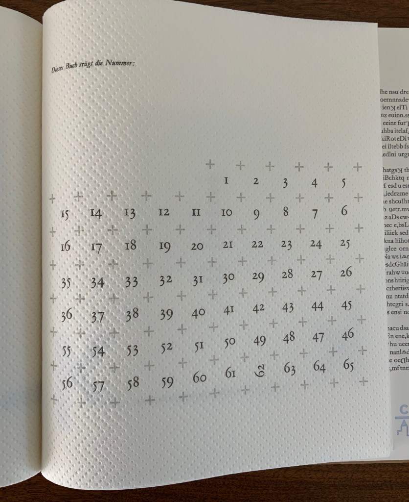
Examples of “random” regimentation; the size of the edition and number of this copy.
Photos: Books On Books.
Pages of regimentation, such as those above, tease at the theme of appearance and reality by inviting a search for underlying patterns that make up that regimentation only to yield discovery of breaks in the ranks. Even the means by which the book’s number and edition are presented on one of its last pages performs this invitation in typically tongue-in-cheek fashion: Dieses Buch trägt die Nummer: (“This book carries the number:”). What that number is must be discovered “as the ox plows”. To the end, typo bilder buch celebrates the “irregular, the special, the different, the rare” by the book.
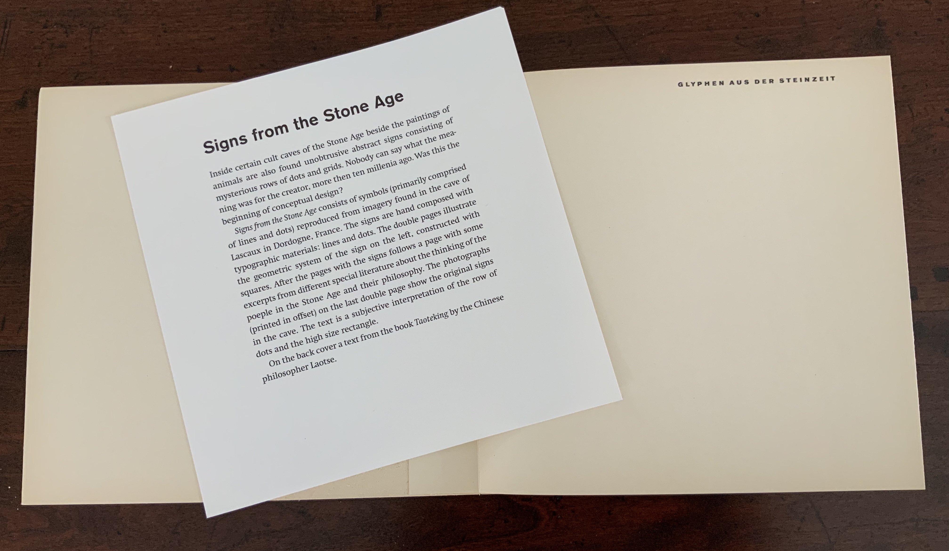
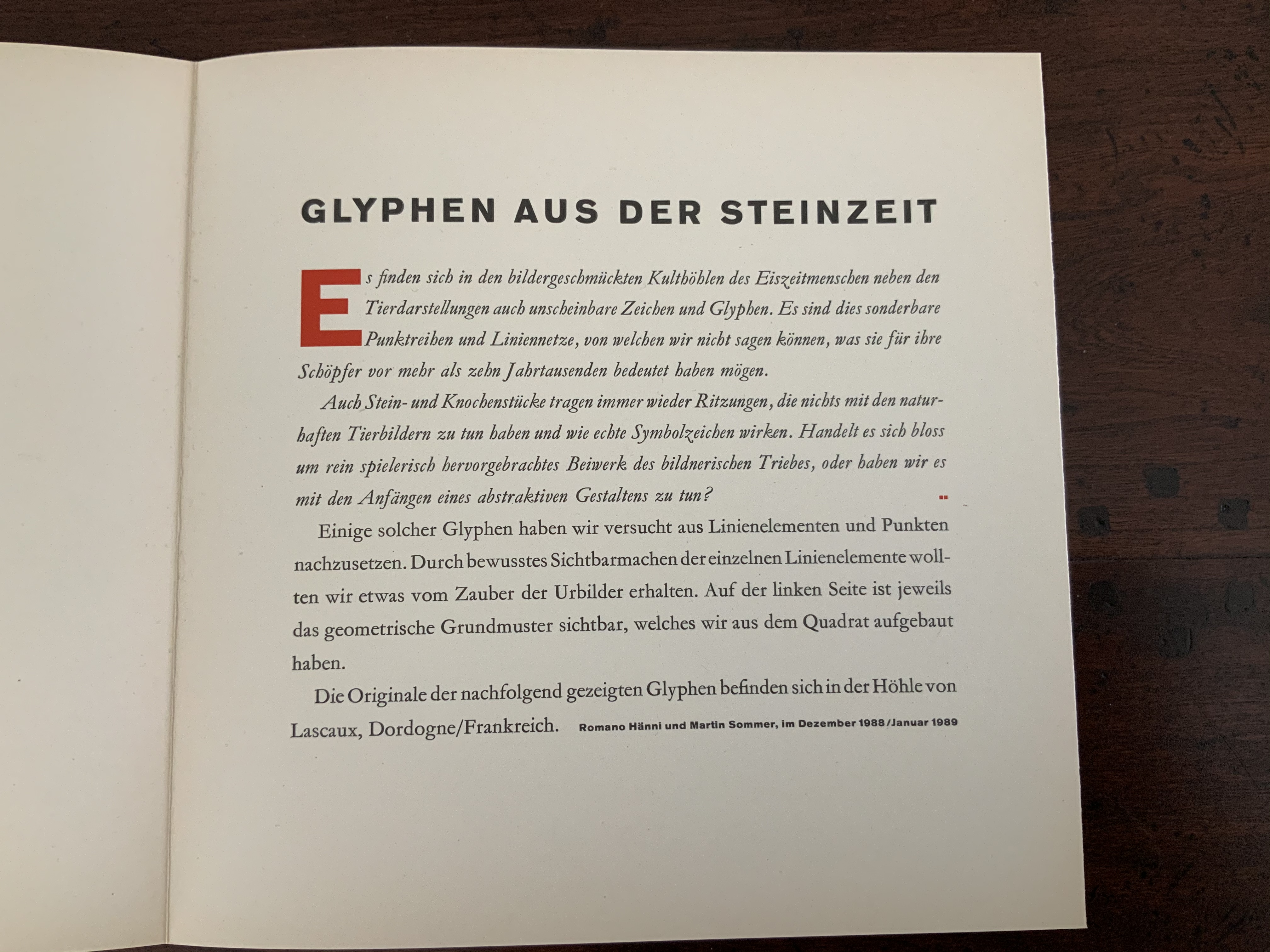
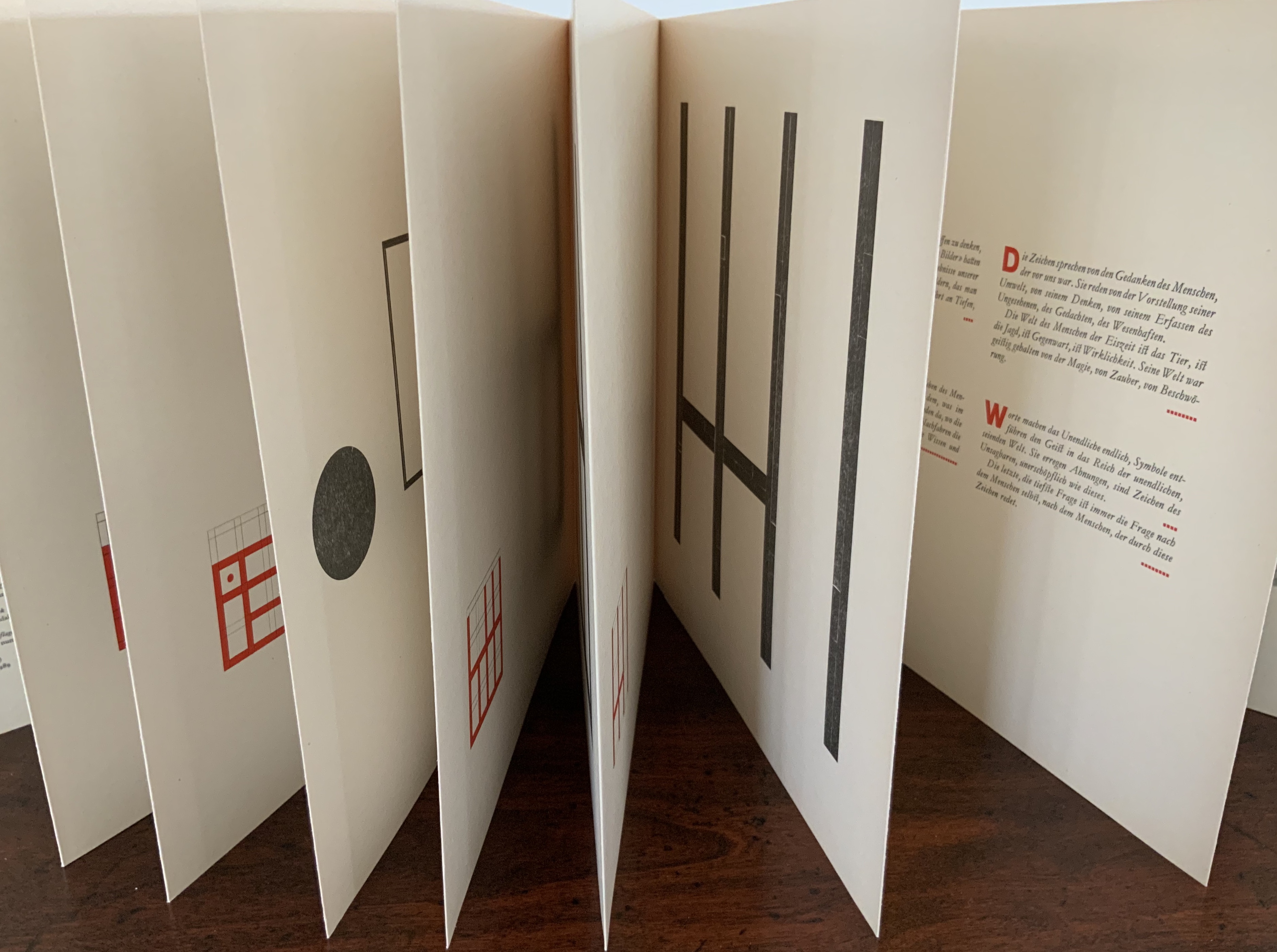
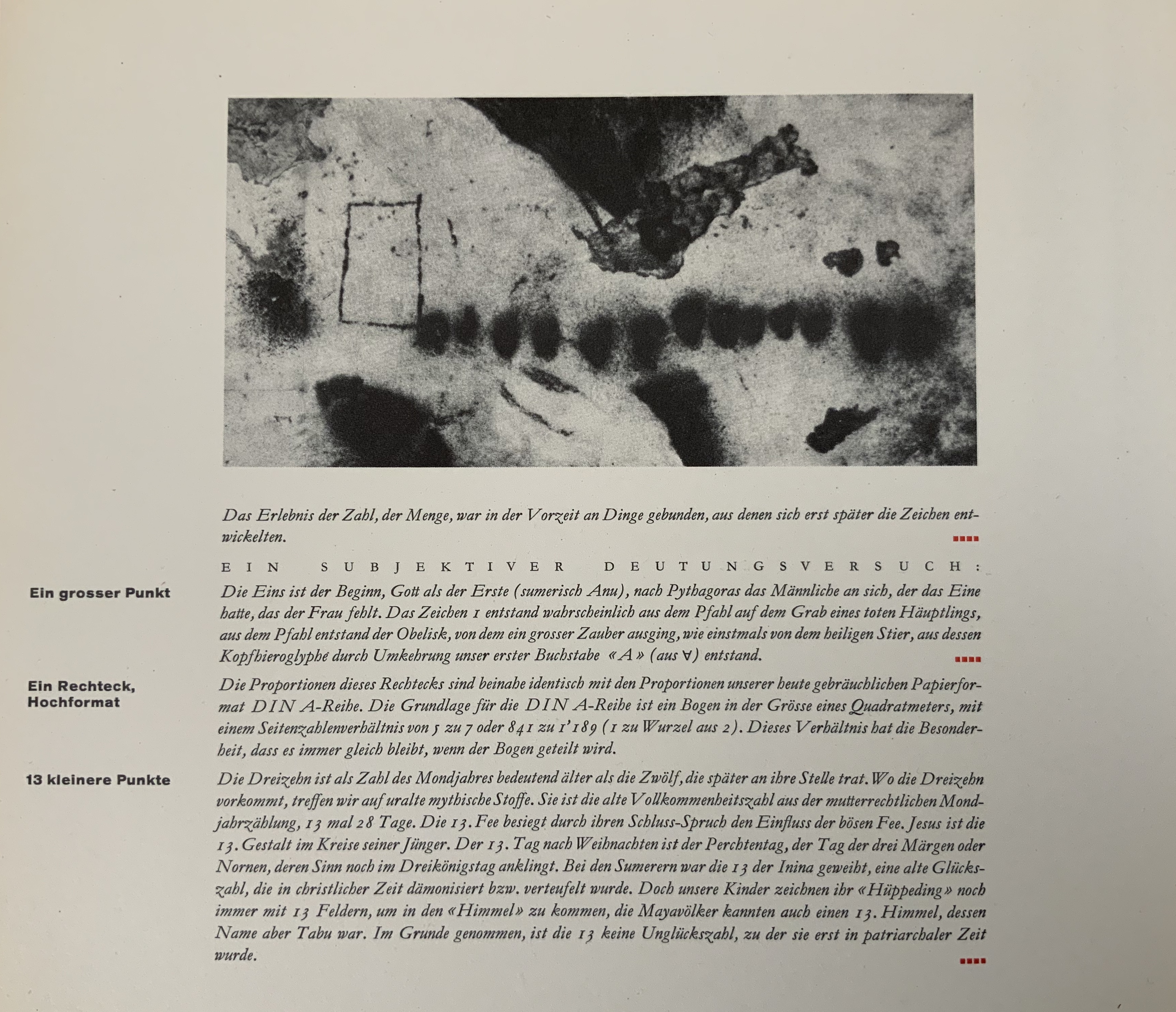
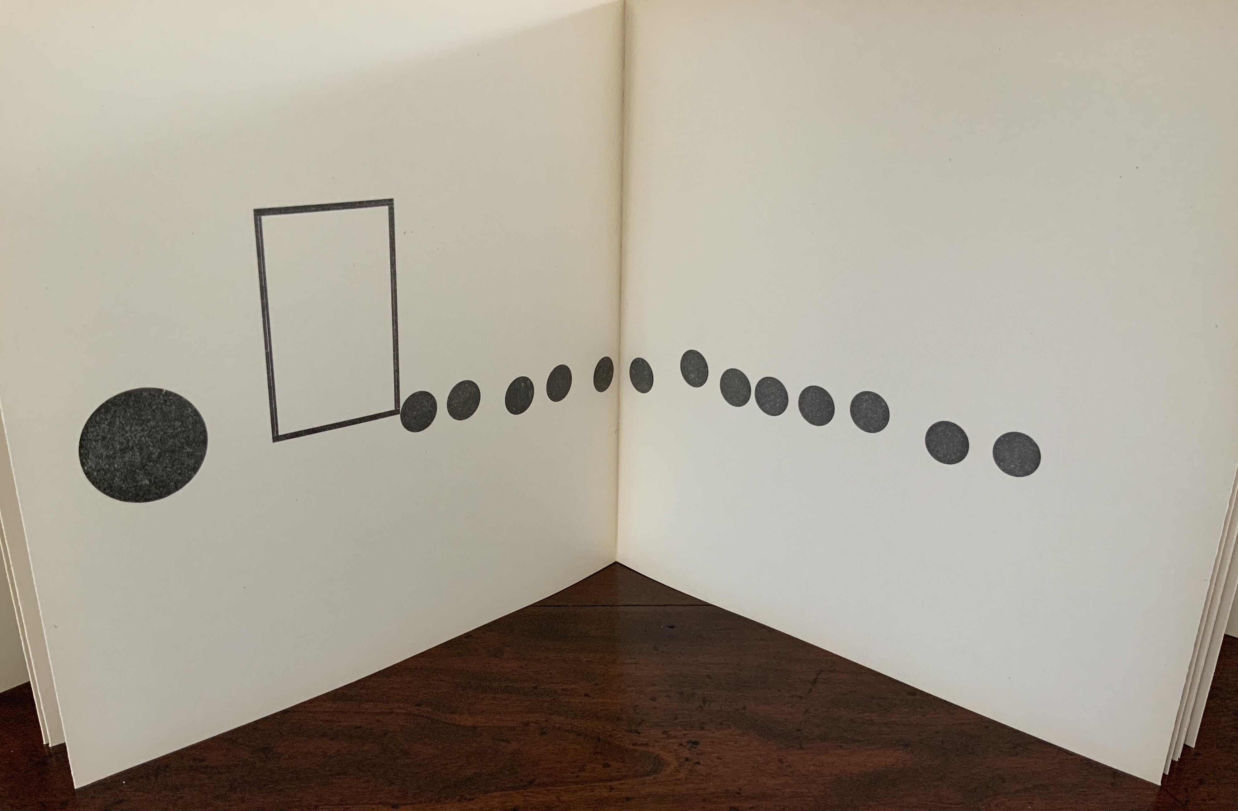
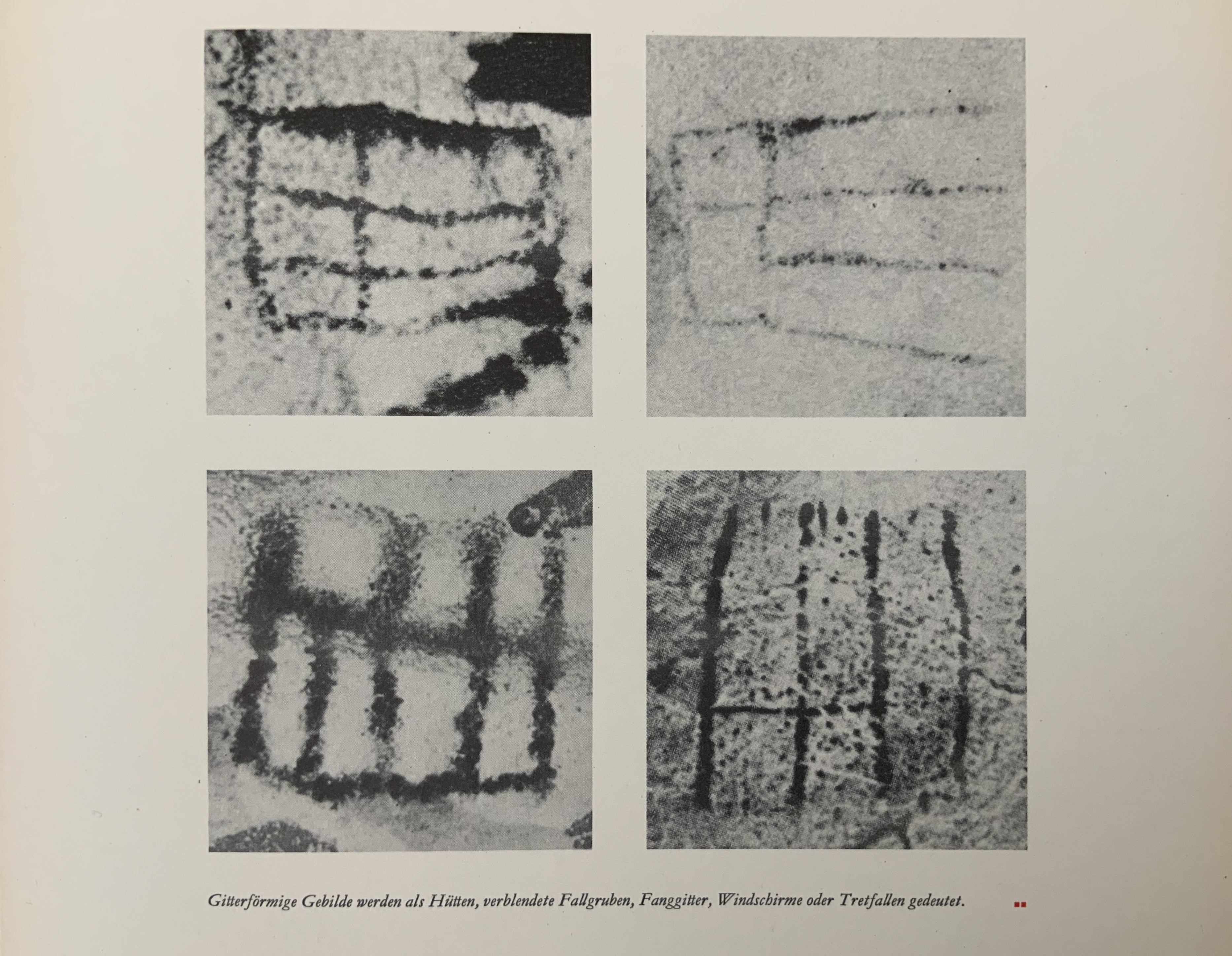
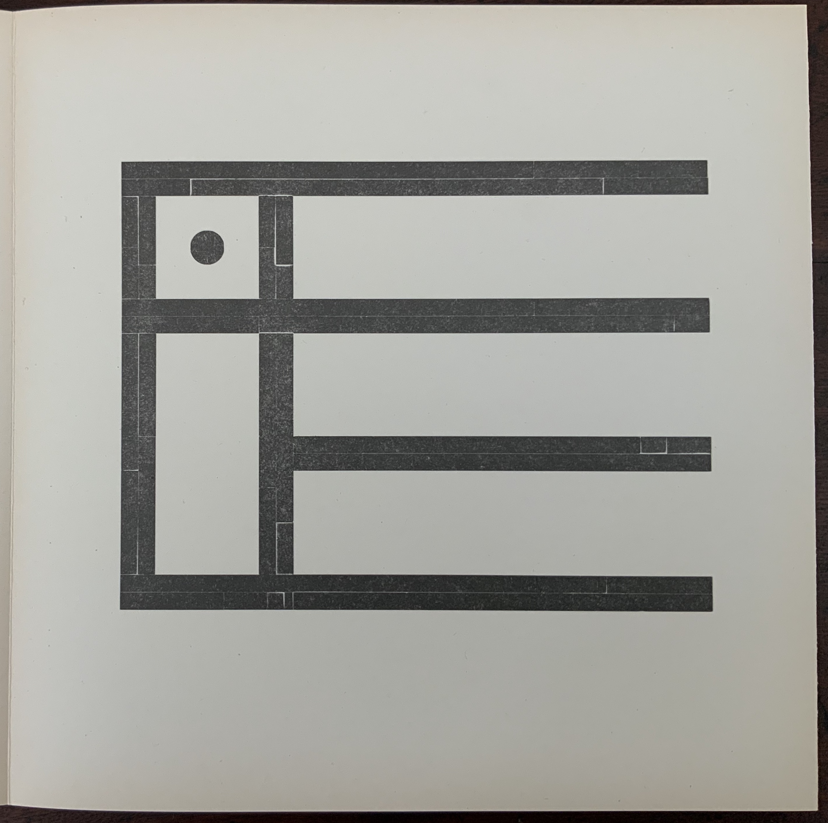
Glyphen aus der Steinzeit: [entdeckt in der Höhle von Lascaux, Dordogne/Frankreich] (1989)
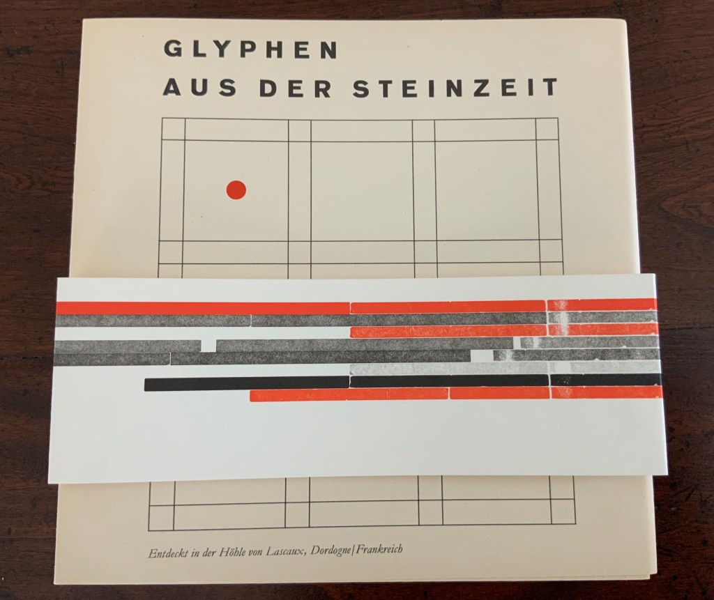
Glyphen aus der Steinzeit: [entdeckt in der Höhle von Lascaux, Dordogne/Frankreich] (1989)
Romano Hänni and Martin Sommer
Handbound, paper cover around accordion fold attached to board, 20 panels, letterpress and handset. Special edition of VI, of which this is III. Acquired from Kelmscott Book Shop, 2 July 2020. Photos: Books On Books Collection.
Further Reading
“Bookmark – Margins and making objects that live forever”, Books On Books, 20 August 2014. On ratios and page layout.
Hänni, Romano. Romano Hänni : handprinted books 1984-2010 (Basel : Romano Hänni Verlag, 2011).
Lupton, Ellen. “Deconstruction and Graphic Design: History Meets Theory”, Typotheque, 29 November 2004. Accessed 4 May 2020.
Tschichold, Jan. The Form of the Book: Essays on the Morality of Good Design (London: Lund Humphries, 1992).