Bookmarking Book Art – The Colophon and the Left-over “i”

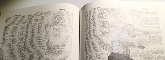
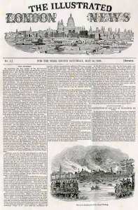
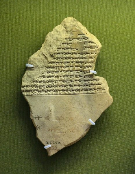
This tale comes from J. S. Kennard’s short 1901 tome on the colophon — that last page at the end of a manuscript or book. The colophon has served many purposes: giving the title of the work, identifying the scribe or printer, naming the place and date of completion or imprint, thanking and praising the patron, bragging, blaming, apologizing, entreating, praying and much more. Examples can be traced back to clay tablets and forward to websites.

Cuneiform tablet from the Library of Ashurbanipal, British Museum. Interesting that the colophon was added in ink after the clay had dried.
Colofon page of Rijksmuseum website

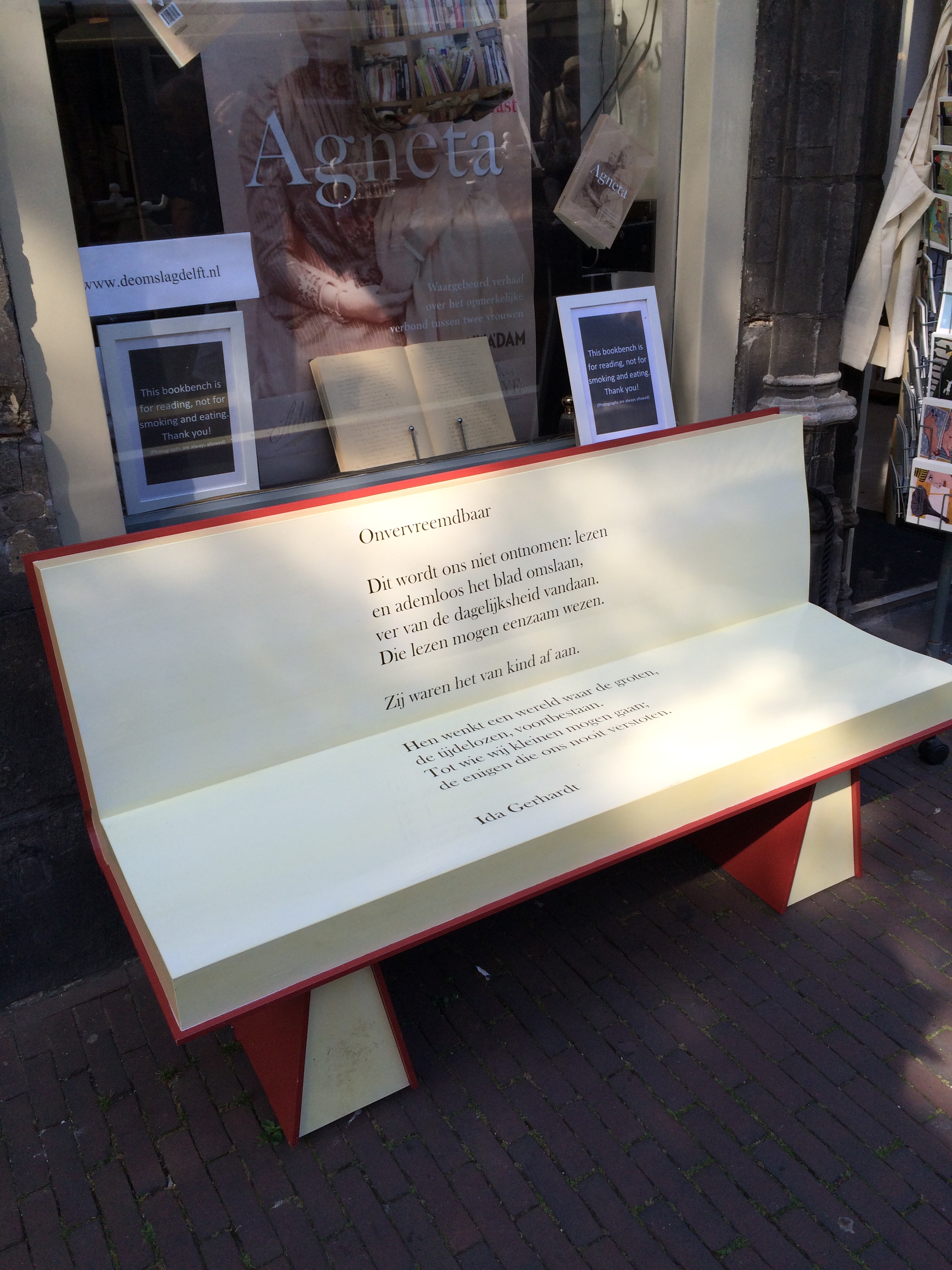
Its presence on websites may be one of those decried skeuomorphic hangovers from book publishing, but perhaps the colophon has an underlying value or purpose to serve in both the analogue and digital worlds. The late Bill Hill, who wrote the 1999 Microsoft white paper “The Magic of Reading” and was an early contributor to online typography, suggested making colophons a compulsory standard for website design and asked:

Why not introduce the venerable concept of the colophon to the Web? Could it be used to drive a new business model for fonts which would benefit the font industry, web developers and designers – and the people who visit their sites? [Sadly this page at the Bill Hill’s site is no longer available.]

Fanciful? Perhaps, but not much more fanciful than Erasmus’ proffered explanation of the word “colophon”. His expanded edition of Adagia printed by Manutius in 1508 includes this adage:

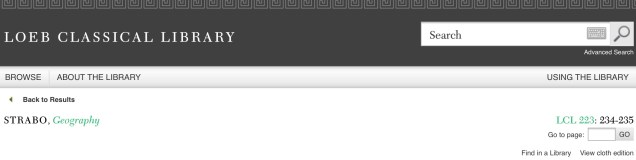
Colophonem addidit He added the colophon. This came to be used when the finishing touch is added to something, or when some addition is made without which a piece of business cannot be concluded. The origin of the adage is pointed out by Strabo in … his Geography, …

And here is Strabo from the Loeb Classical Library online; scroll down to paragraph 28:

As venerable a publishing custom as the colophon may be, it is more honoured in the breach than the observance. Book artists tend to be more observant, but not religiously so, and of course some works of book art might be disfigured by a colophon. Still, there are sound reasons why book artists should bother themselves with a colophon — even if it stands apart from the work. In her review of Book Artists and Artists Who Make Books (2017), India Johnson gives one of those sound reasons:

It’s probably impossible to include every detail of production in a colophon—but some give it their best stab, exhaustively listing everyone that took part in a project. More concise colophons recap only the most relevant details of making—perhaps those the primary creator feels will factor saliently into making meaning of the book.

The convention of the colophon in our field exposes an assumption that the meaning of an artwork is informed not only by the finished product, but by the specifics of artistic labor. Book Artists and Artists Who Make Books“, CBAA, 1 October 2018. Accessed 3 October 2018.

If craft does figure in a work’s meaning, then the more we can see how it figures, the greater our ability to appreciate and understand the work. For conveying insight — what materials and from what sources, what processes, what tools, who contributed, where and when the work occurred — the colophon stands ready. But where does it stand?

A contemporary of Kennard, A.W. Pollard declared that, to be a proper colophon, it had to appear at the conclusion or summit of the work. Artful as are some of the manuscripts and books that Kennard and Pollard cite, none push the envelope in the manner that works of contemporary book art do. Which brings us to another reason for book artists to consider the colophon: inspiration from history or tradition.

The last page of the codex may be a rightful spot for placing the codex, but what if the bookwork’s shape is challenging or musing about the shape of the book? Finishing touches might go anywhere. Think of Van Eyck’s self-portrait hidden in a reflection in The Arnolfini Portrait, or that of Vélazquez in Las Meninas.

Historians’ diligent cataloging of the “hands” of the scribes has enriched the self-identifications in colophons and connected those craftspersons with additional manuscripts. Book artists who use calligraphy or involve calligraphers should ponder the implications of this tool historians use to identify scribes by the style of their “hands”.

Late Medieval English Scribes (2011)
The Centre for Medieval Studies at the University of York

What potential, meaningful “tells” in a work’s colophon might the book artist or calligrapher leave to enrich the work — and provide insights for historians and connoisseurs poring over the finishing touch?

The colophon’s underlying value or purpose warrants book artists’ thinking about recording it offline and online, though this might be stretching the definition of the colophon. Our enjoyment of Kitty Maryatt’s 2018 reconstruction of La prose du Transsibérien et de la Petite Jehanne de France (1913) by Blaise Cendrars and Sonia Delaunay is certainly enhanced by the “colophonic” booklet she included with the work and the “About” page online.

Perhaps the story of the little “i” left over – the colophon – will prod the future historians of book art to examine bookworks and their artists’ websites for those finishing touches and stir artists to bestow that last finishing touch for the sake of the work’s soul if not their own.

A Prospect of Colophons
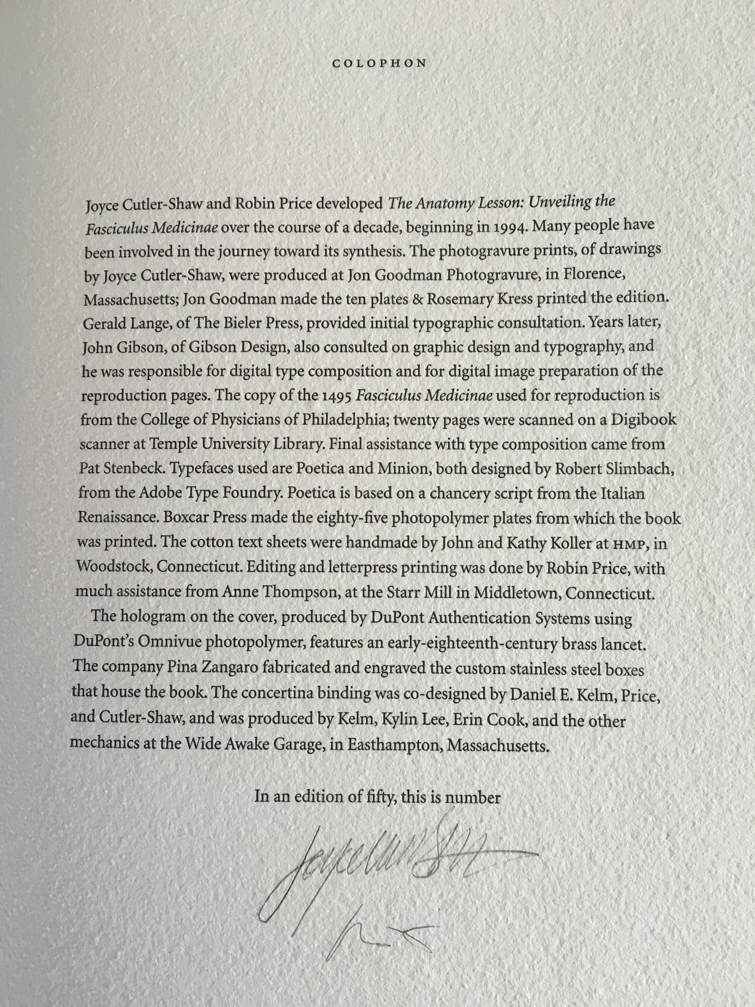
The Anatomy Lesson: Unveiling the Fasciculus Medicinae (2004)
Joyce Cutler-Shaw
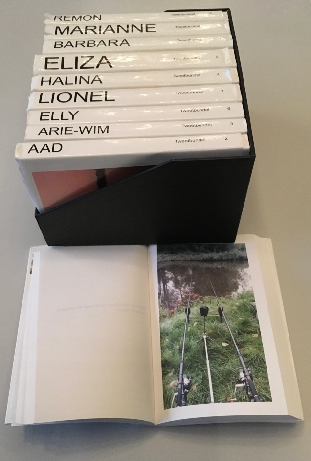
The careful reader will notice that the edition number is missing. This instance of the work is one of the binder’s signed but unnumbered copies, having been acquired directly from Daniel E. Kelm.
Lyn Dillin, The Ballad of the Self Same Thing (2019)
Can this be the first rhyming colophon?


Finding Home (2016)
Louise Levergneux
This may not be the first bilingual colophon I have seen, but its being inside the top of the box enclosing the work makes it the first to occupy the physical summit a work.
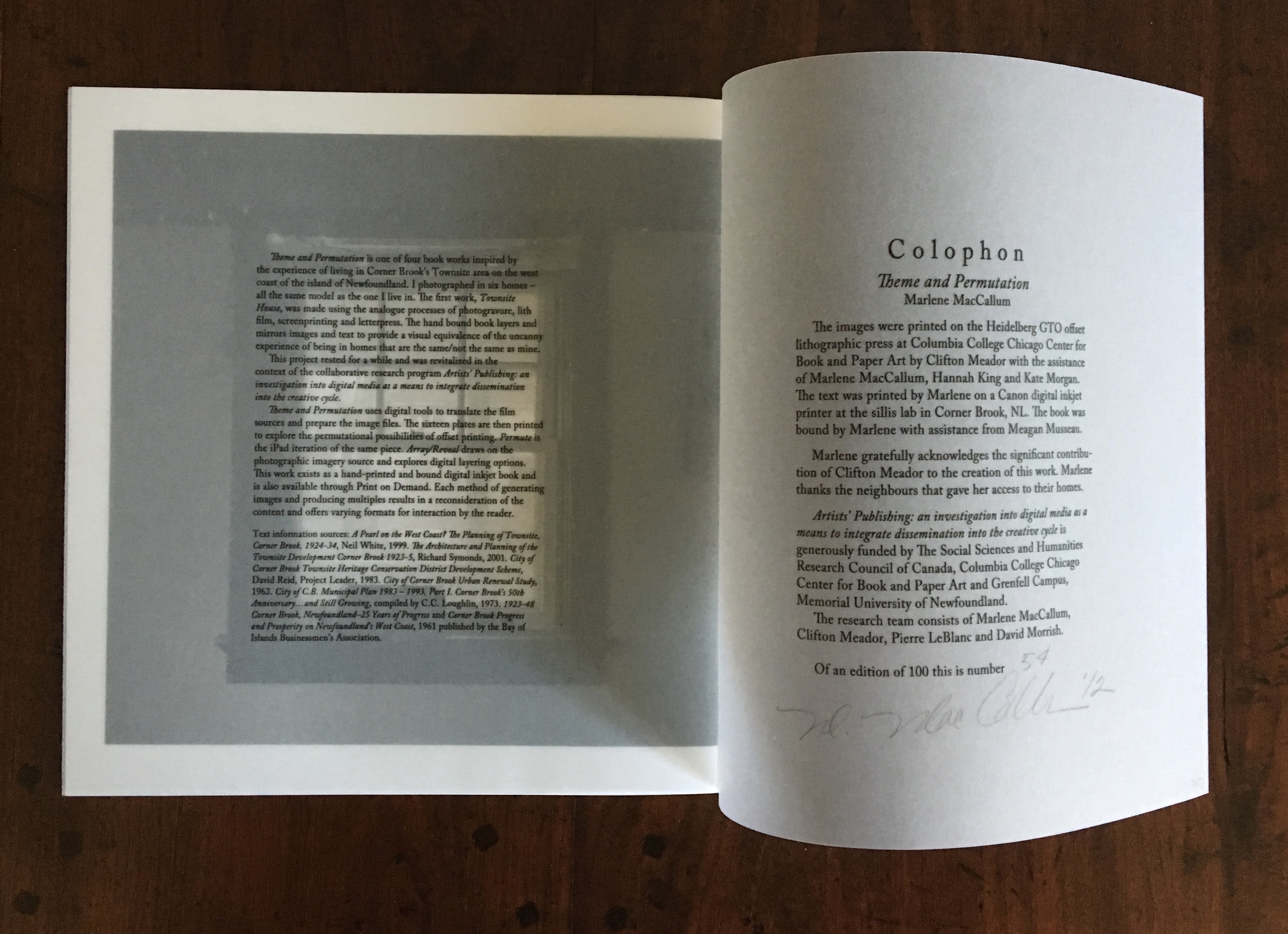
Theme and Permutation (2012)
Marlene MacCallum
This double-page spread reveals process information about the work that adds to the reader/viewer’s appreciation of the themes and permutations occurring in the pages.
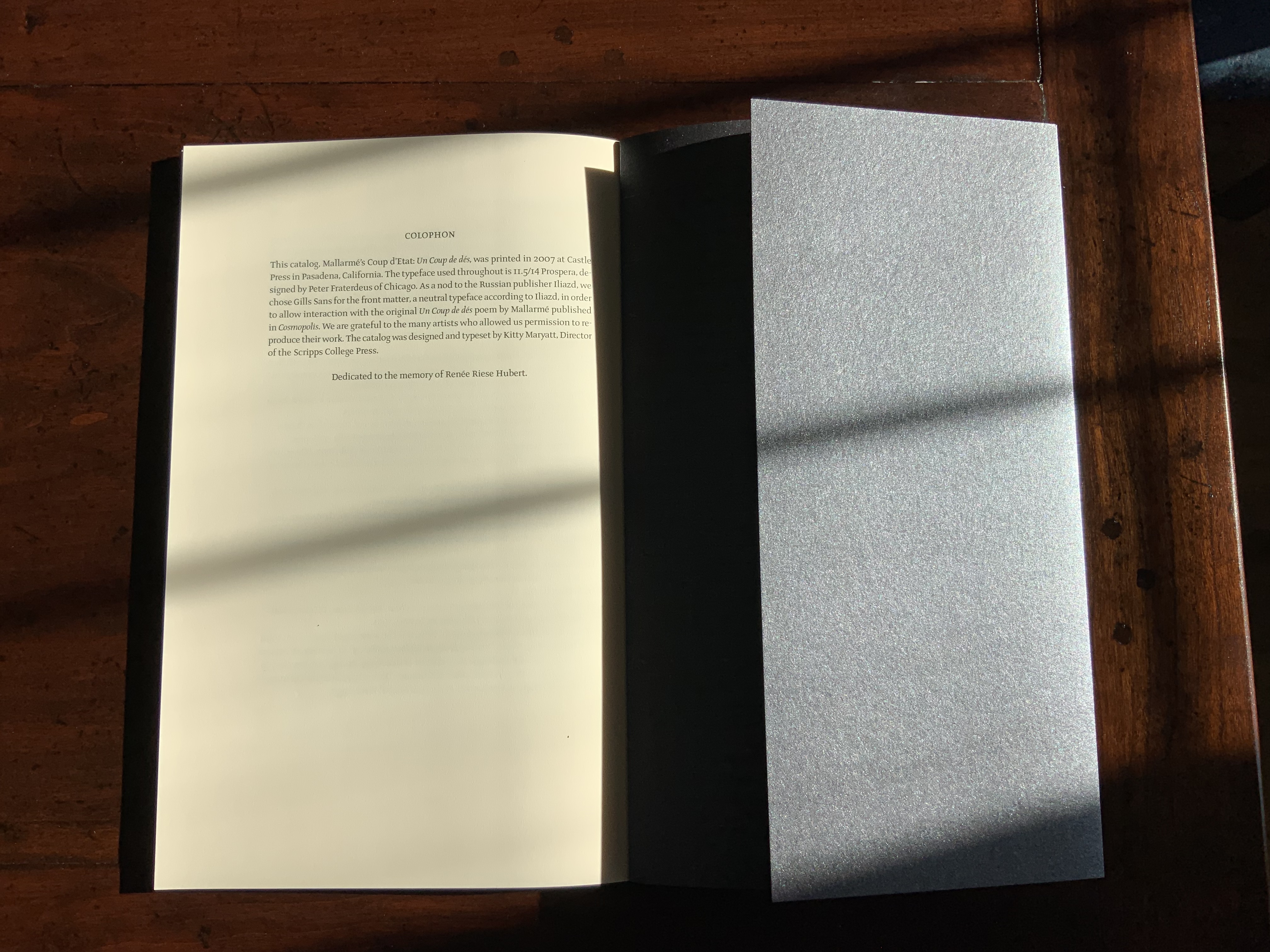
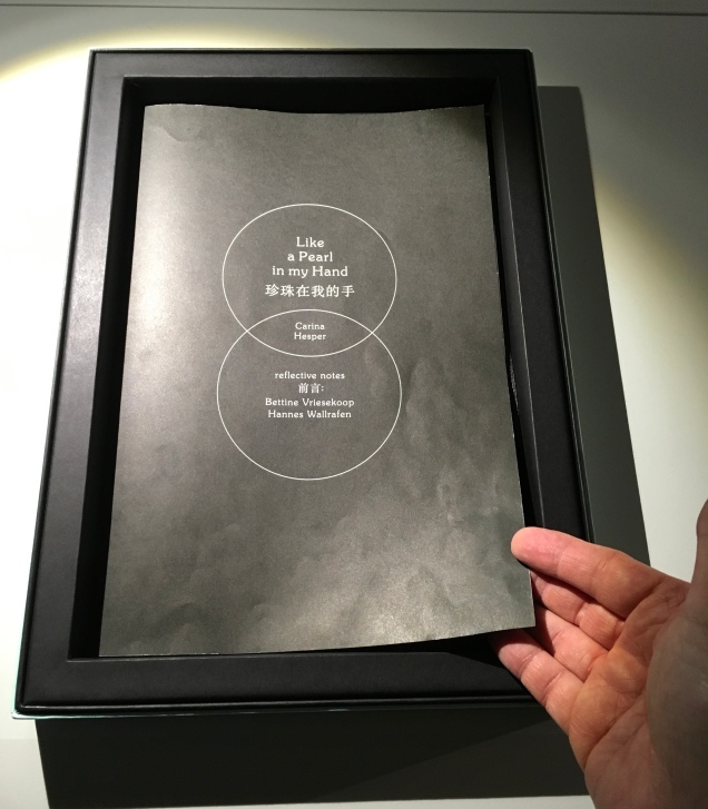
Mallarmé’s Coup d’État (2007)
Kitty Maryatt
The colophon’s nod to Iliazd sends the reader/viewer back to the start of this catalogue that is a bookwork in its own right.
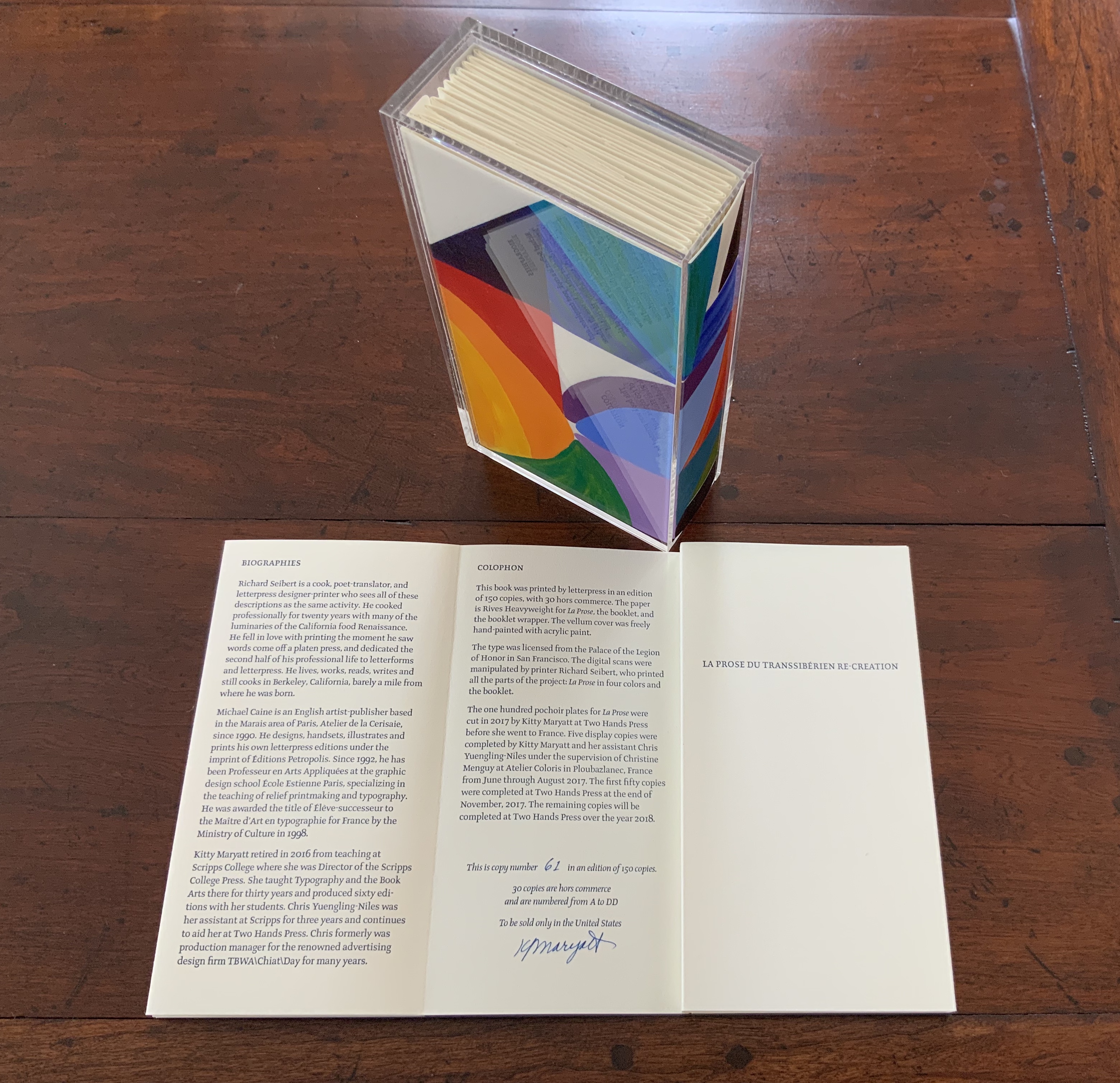
La prose du Transsibérien Re-Creation (2019)
Kitty Maryatt
A “colophon within a colophon”. The booklet providing details about the original work and Maryatt’s re-creation has an accordion structure and collapses into its own tri-fold wallet, which fits within the cover of the main work, seen here in its acetate holder.
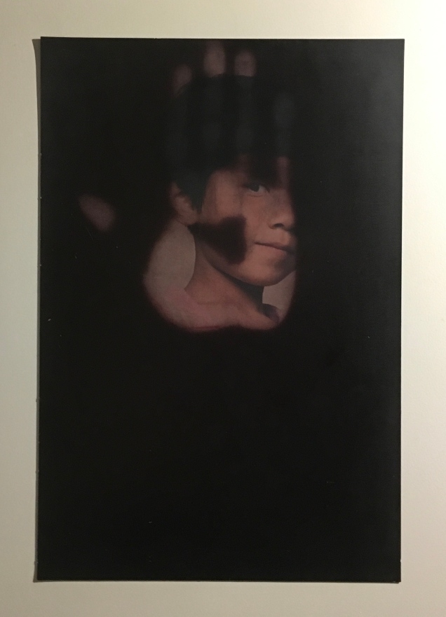
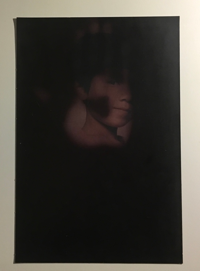
L is for Lettering (2011)
Cathryn Miller
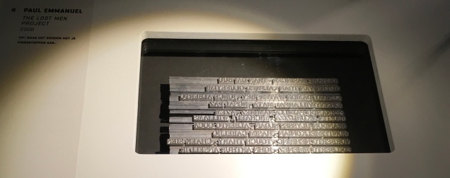
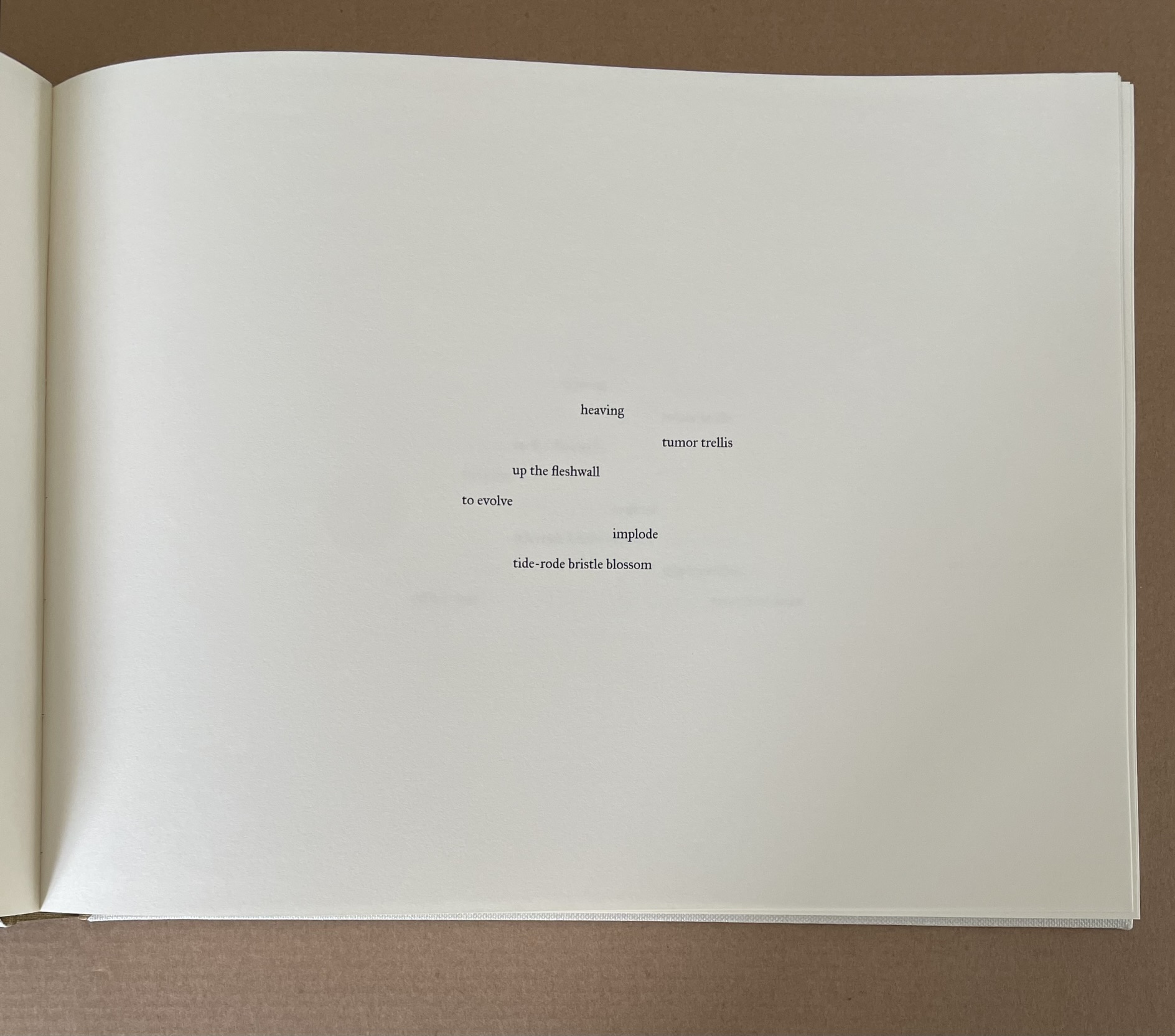
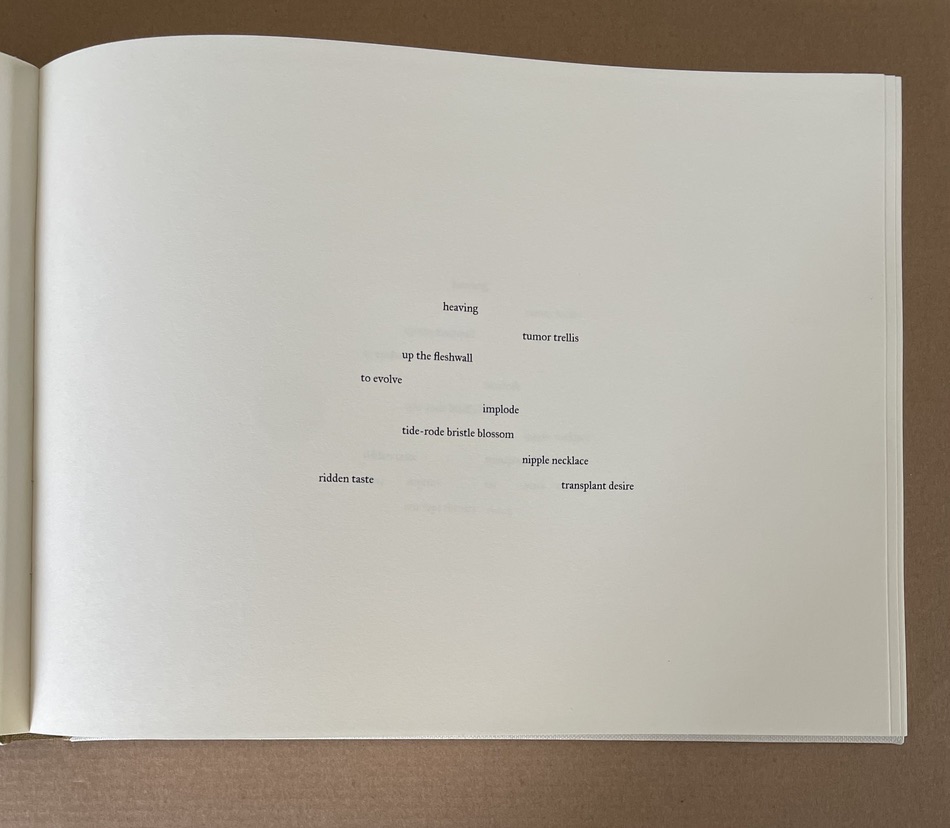
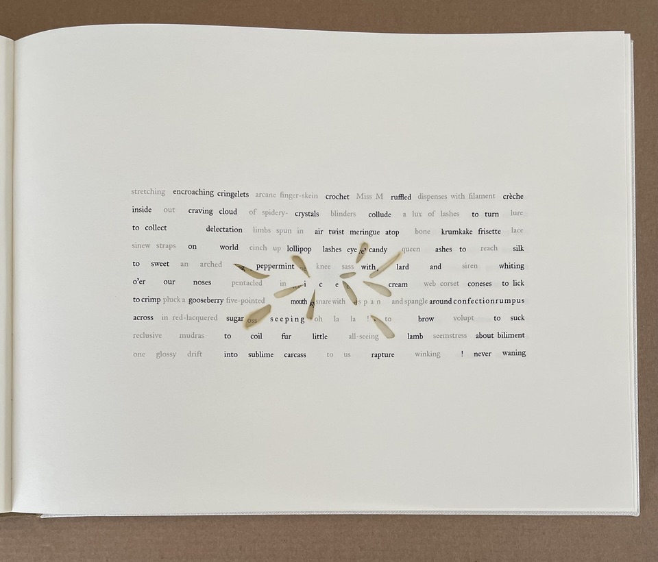
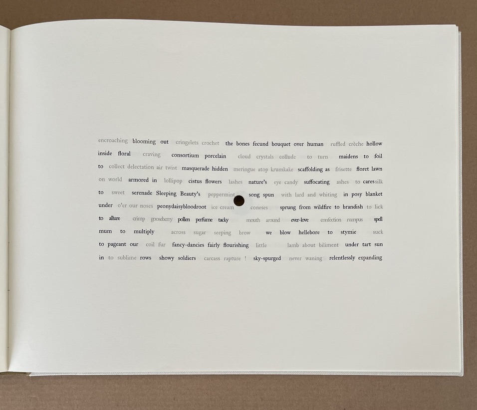
This hilarious and touching abecedary parades as a marked work handed in for a course, a portrait of the artist within a contemplation of the past and future of typography and letterpress. This colophon embodies the finishing touch.
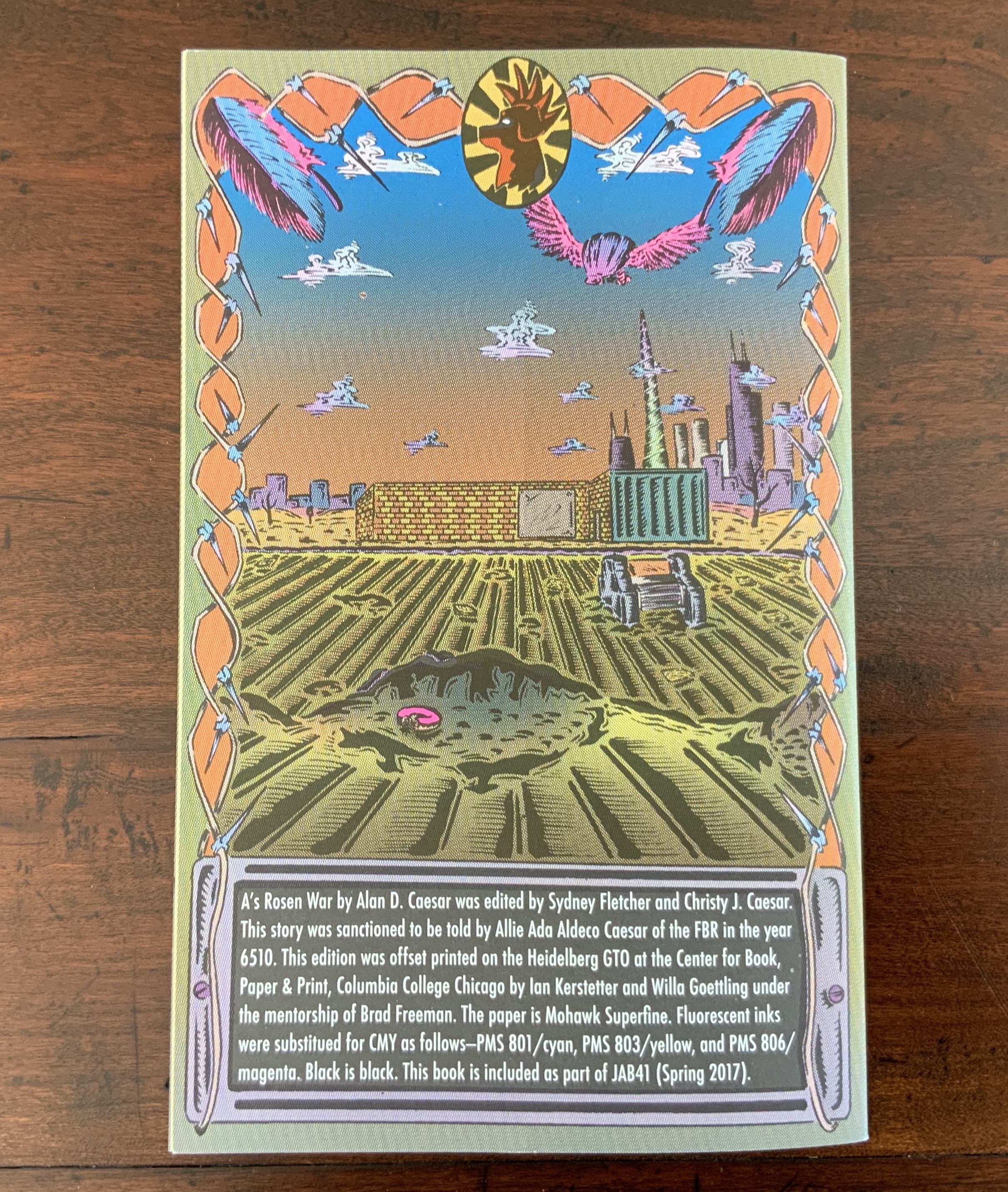
A’s Rosen War (2017)
Alan Caesar
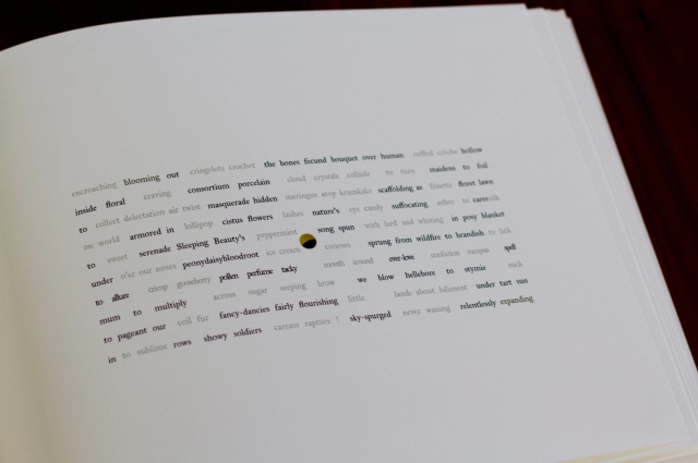
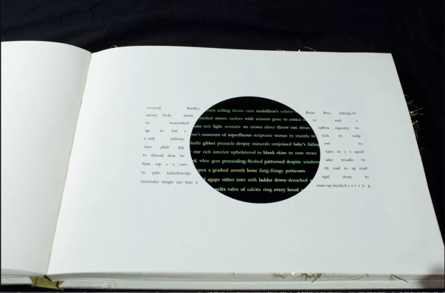
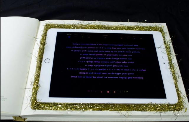
This colophon continues the premised date with which this work of science fiction book art begins.

Further Reading

CREWS Project, “Learning about Cuneiform Tablets Behind the Scenes at the British Museum”, 14 June 2017, accessed 20 April 201. (See for an example of scribes’ skill in ink on clay.)

Richard Gameson. The Scribe Speaks? Colophons in Early English Manuscripts. Cambridge: Cambridge University Press, 2001. (See for the human interest: “I, Aelfric, wrote this book in the monastery of Bath”; “Pray for Wigbald”; “Just as the port is welcome to sailors, so is the final verse to scribes”.)

Bill Hill, “The Magic of Reading”, accessed 20 April 2019.

Hurtig, Alain. “Les colophons“. L’outil typographique. Accessed 26 January 2022. (Seventeen brilliantly designed and shaped colophons.)

Joseph Spencer Kennard. Some early printers and their colophons. Philadelphia : G.W. Jacobs and Co., 1902. (Less academic but just as interesting and typographically more fun than Gameson.)

Alfred W. Pollard. An essay on colophons, with specimens and translations. Chicago: Caxton Club, 1905.

Alfred W. Pollard. Last words on the history of the title-page, with notes on some colophons and twenty-seven facsimiles of title-pages. London: J.C. Nimmo, 1891.

Ming-Sun Poon, “The Printer’s Colophon in Sung China, 960-1279”, The Library Quarterly,43:1 (January 1973). (See for the 34 calligraphic inscriptions and the colophon to the Diamond Sutra: “On the 15th of the 4th moon of the 9th year of Hsien-t’ung [May 11, 868], Wang Chiek on behalf of his two parents reverently made this for universal free distribution.”)

Christine Proust, “Reading Colophons from Mesopotamian Clay-Tablets Dealing with Mathematics”, NTM Zeitschrift für Geschichte der Wissenschaften, Technik und Medizin, 20:3 (September 2012). (Helpfully diagrammed black and white views of the difficult-to-see incisions in clay.)

Ding Wang, “A Buddhist Colophon from the 4th Century: Its Reading and Meaning”, Manuscript Cultures, 3 (2010). (Beautiful photos of the scroll scribed by Baoxian.)

David C. Weber, “Colophon: An Essay on its Derivation,” Book Collector 46 (Autumn 1997).

Bookmarking Book Art – Erin Zwaska

This is where (2014)
Print on demand, three booklets
Erin Zwaska

An ongoing chance-based publication project in the spirit of Ed Ruscha. Images are randomly-selected Google streetviews (which are often captured at noon to avoid shadowing) of cities like Paris, Tokyo, etc. The copy is compiled from all tweets containing the phrase “this is where” between noon and 12:15pm local time for each city. Consequently the text and imagery for each 15-minute issue originates from the same, albeit ambiguous, time and place. And though text and image are randomly paired, surprising narratives often emerge. Included in the collection of the Library of the Printed Web.

This is where is where the tradition of Ed Ruscha meets the Web. Go there and see for yourself.

Bookmark – e-Incunabla coming out of their swaddling clothes?

In 1774 the House of Lords declared that perpetual copyright was illegal and that the fourteen year limit established in 1710 was the law of the land. What this meant in practical terms is that anyone with a press could now print up their own editions of Chaucer, Milton, Swift, Dryden, Spencer, and others. If everyone could print the same texts, one way to differentiate your product from the inferior output of your competition was through editorial apparatus — introductions, author portraits, and notes. … I just want to call attention to one item in the Amherst College Archives and Special Collections that was sold by one of the more enterprising publishers of public domain material.Between 1777 and 1782, John Bell published a set of 109 volumes under the title Bell’s Edition. The Poets of Great Britain Complete from Chaucer to Churchill. He launched the series with Milton’s Paradise Lost in April 1777 and attempted to maintain a regular schedule of issuing one new volume each week.  Mike Kelly, Head of the Archives & Special Collections at Amherst College, commenting on William St. Clair’s The Reading Nation in the Romantic Period (Cambridge, 2004).

bell-2
British Poetry in a Box” by Mike Kelly
Consecrated Eminence, July 13, 2012 Accessed 13 June 2018

The photo here, presumably taken by Kelly, shows two boxes, hinged and stacked on one another and shaped like a stack of four or five large folios.  Together the two boxes hold 109 small volumes, bound in Morocco leather and gilt-edged, constituting “Bell’s Edition: The Poets of Great Britain Complete from Chaucer to Churchill”  (1777-83). The Kindle of its age, as Kelly puts it.

Anyone who downloads (or ever has downloaded) the free or cheap Kindle versions of the Complete Works of [name your favorite classic author] will know how little “there” there is to differentiate the products in accuracy, quality or even typography much less editorial apparatus. Possibly a sign that we are still in the Age of e-Incunabla.

Kelly’s photos and words led me on to PhD student Jacob Halford’s related comments in “Remediation, or How Digitisation is Changing the Meaning of Texts, Part 1“.  Halford explores how digitization affects how we read texts, understand and find meaning in them.  The digital text gives the reader a whole new experience of the text as the printed book’s structure, font, layout and tangibility of the book are distorted or eliminated.  That may seem an exaggeration, but look at Halford’s photos of Galileo’s “A Dialogue concerning the two chief world systems.”  In one, he holds the book in his hands; in another it appears on a microfilm reader; in yet another it is shown on a computer screen.  The perceptual differences are stark.

In Part 2, Halford illustrates equally well how digitization alters the experience of meaning through how we locate or find the work — from its position on a shelf among related works, to its entry form on the Early English Books Online (EEBO) screen or its entry lines on a screen of search results.   As he says, “Historians when trying to understand the past need to understand the meaning of the book, to understand how it was read, what its value within society was. To forget this because of the removal of the various indications found in a physical book when it is placed in digital collections provides the risk of us distorting our interpretation of the past. We can exaggerate the value of a particular book and in that process miss out on, or undervalue, other crucial books because there is little to inform us of a book’s value and meaning when it is accessed through EEBO. So whilst EEBO gives us access to more books, in that process it loses part of a book’s history, and it is a book’s history that helps us to know its value, meaning and significance.”

This is not to raise another Gutenberg Elegy but rather to ask, What functions and features should we demand of today’s e-incunabula that will make one worth more than another and, more important, will urge them “out of the cradle”? And what affordances “in the network” do we need to understand the social history of ebooks?

Bookmark – eCodices

default.jpg

From the e-codices project, here’s something the history of the book can teach us going forward.

Well designed digital work will be machine-actionable, but will also be capable of expressing its content when moved to other media, even non-digital media.  Neel Smith, College of Holy Cross, Boston, MA.

The manuscript page in the photograph above comes from a copy of Plato’s “Phaedo,” the description of Socrates’ death.  Its round humanistic script belongs to a single scribe, who identifies himself in red thus, “Marcus Speegnimbergensis scriptsit“ (fol. 75).

The attribution for the image associated with this item is Pellegrin Elisabeth, Manuscrits latins de la Bodmeriana, Cologny-Genève 1982, pp. 330-331. The item has a Digital Object Identifier: DOI: 10.5076/e-codices-cb-0137, which provides a fair bit of that metadata needed for Dr. Smith’s purposes.

Lesson? It might be a good idea for every book and ebook to have a DOI, but then the International DOI Foundation and its registration agencies would need to find a sustainable business model to provide easily accessed DOI-generators for everyone seeking to publish those items.

Smith’s comments on the Fondation Martin Bodmer Collection at Cologny also imply a tangential and harder question. In the absence of some persistent unique identifier like the DOI and well-provided and maintained metadata associate with it, what are the digital (but technology-agnostic) forensic tools with which we will uncover our ebooks’ “Marcus Speegnimbergensis” and the evidence of the social contexts and creative tools with which “our Marcus” worked? That’s a “poser” for the likes of Matthew Kirschenbaum and webliographic scholars to come.

Bookmarking Book Art – The Art of Reading in a “Post-Text Future”

Did you read on New York Times Interactive how text is succumbing to the sound and blurry of podcasts, YouTube, talking assistants, Netflix, face-reading phones, Instagram and augmented reality? We are passing through an internet portal turning our evolution from orality to literacy in on itself — where “text recedes to the background, and sounds and images become the universal language”.

Welcome to the post-text future.

The seemingly unintentional irony of delivering the welcome by text rather than by podcast or tweeted looping video meme undermines the hyperventilation a bit. But we should not roll our eyes and move on. The NYTI journalists are reminding us to pay attention.

Our literacy has always been multimodal (read and hear the orality in the opening text of Genesis in the The Douay Version). With each new medium it rapidly becomes more multimodal.  In Ringing the Changes on “The End of Books”, there’s the tongue-in-cheek evidence from 1894.

“The End of Books”, Scribner’s Magazine (August 1894)
Louis Octave Uzanne

In Literacies, Mary Kalantzis and Bill Cope at the University of Illinois, Urbana-Champaign, trace its occurrence back to the mid-twentieth century age of radio and television.  And not that long ago (2012), Amazon released Immersion Reading, enabling audio in sync with ebook reading.Leaving aside the apocalyptic speculation on the fate of letters, we should take the point: our literacies are entangled and evolve together. Putting the more scholarly view of differences between orality and text alongside the post-text Futurists’ observations about tweets, memes and other social media, we can see why we would benefit from closer attention to that entanglement and evolution.

Here is Walter J. Ong:

Oral folk prefer, especially in formal discourse, not the soldier, but the brave soldier; not the princess, but the beautiful princess; not the oak, but the sturdy oak. Oral expression thus carries a load of epithets and other formulary baggage which high literacy rejects as cumbersome and tiresomely redundant because of its aggregative weight … (Orality and Literacy: The Technologizing of the Word. London: Methuen, 1982, pp.31, 37-49).

Here is the post-text future:

An information system dominated by pictures and sounds prizes emotion over rationality. It’s a world where slogans and memes have more sticking power than arguments. — Farhad Manjoo

Here is Ong:

Writing fosters abstractions that disengage knowledge from the arena where human beings struggle with one another. It separates the knower from the known. By keeping knowledge embedded in the human lifeworld, orality situates knowledge within a context of struggle.

Here is the post-text future:

Doyle Canning, who wrote a book on using memes for political movements and co-founded the Center for Story-Based Strategy, said people have now realized memes are replacing nuanced political debate.

“People in 2016 declined to take seriously the impact of the memes and clung to this narrative that rational policy discourse would triumph, … And it didn’t.”

“Now politics,” she said, is just “a battle of the memes.” Nellie Bowles

These comparisons/contrasts underscore Kalantzis’ and Cope’s educational earnestness about the importance of teaching to these entangled and evolving literacies as perhaps the only systematic means we have of offering children social equity and a chance at social equality. Imbuing their literacies with critical thinking skills is paramount. The art of living depends on the art of reading.

At the Museum Meermanno in The Hague, you can step into this increasingly busy intersection of literacies at an exhibition called The Art of Reading.  The exhibition is divided into six rooms labeled “Reading is Turning the Page”, “Reading is Seeing”, Reading is Touching”, “Reading is Remembering”, “Reading is Concentrating” and “Reading is Reacting”. Unusually the art is not simply on display. Touching is allowed. Paul van Capelleveen, one of the curators organizing the show, insisted that each work be touchable. As a curator at the Dutch national library and advisor to the Museum Meermanno (The House of the Book), he felt strongly that the challenges of multimodal literacy cannot be understood “under glass”.

2nd Hand Reading (2014)
William Kentridge

Physicality or the haptic is an affordance that print literacy lords over digital literacy. We know where we are in a print book because we can feel as well as see where we are. Welcome then to the first room “Reading is Turning the Page”, where William Kentridge turns the tables on that claim. As you watch the “film of the book” across the room, you can try your hand at flipping the pages of the physical copy like a flipbook to mimic the video. Look closely though. The page numbers are not sequential.

2nd Hand Reading (2014)
Page 2388 then 2390?

And the entries are not in alphabetical order.

2nd Hand Reading (2014)
“Inquest” before “Heterogenesis”?

When the order of text, numerals, narrative and images collide, we are left with the literacy of art — be it digital or physical. Which brings you to the next room: “Reading is Touching”.

The Lost Men Project (2006)
Paul Emmanuel
The Lost Men Project (2006)
Paul Emmanuel

The names of South African soldiers, both black and white, killed in the First World War, are set in hot metal type then impressed without ink on flesh. Photographed and filmed, the names fade away. In the exhibition, a voice from the touchscreen device repeats, “Touch me, touch me”. Each touch upon the screen — on the skin before you —  advances the work running as a video on the touchscreen. Touching is the only way to read all of the names of the dead as they fade away. This work is but one of several that make up The Lost Men Project

Like a Pearl in My Hand (2017)
Carina Hesper

In this room of touch, you move from sorrow to sorrow. Glass and ink do not separate you from them very much.

Two pages from Like a Pearl in My Hand

To read the pages of Like a Pearl in My Hand, you must rest your hands on them then lift your hands away.

The face revealed on each page is the face of a blind or visually impaired child in a Chinese orphanage. As you read the page, the face fades into blackness.

The artist’s book is associated with Bethel China, a charity for the visually impaired. Click on the image above to visit the charity’s site.

The next room is “Reading is Seeing”.

Were the curators being tone deaf with this juxtaposition?  No, it is the bluntness and earnestness of recognition that literacies and our sensibilities are jumbled up.  The literacy of art does that. It can move us from somberness to whimsy and back. The first work in this room of sight is a children’s flashlight (or torch) book; the next, a device for the visually impaired; the next, an augmented reality app on iPads.

Hide & Eek! (2013)
Rebecca Sutherland
OrCam MyEye 2.0 (2017)
Amnon Shashua and Ziv Aviram
An artificial vision device with a lightweight smart camera that instantly reads text aloud –in this case, a poem by Gerrit Achterberg (Kinderangst or Childhood Fear).

The curators deftly paced the impact of these rooms. Something from the one before lingers with you in the next, or something in the next reminds you of the one before.

“Reading is Remembering” is the next room. Here the artists play with re-membering text vs dis-membering text, recalling vs forgetting, excavating vs filling in, deconstructing to reconstruct, destroying to create.

A Excavation, A Reading (2013)
Rick Myers

Rick Myers was commissioned by the Onassis Cultural Center to commemorate the Greek poet Constantine Cavafy. The work he proposed required permission to obtain Pentelic marble fragments (quarrying is restricted for the purpose of restoring the Acropolis) and grinding them into dust. He then sourced four different translations of Cavafy’s poem “Before the Statue of Endymion”, arranged a reading and recording of each, and, for each, cut a stencil. The chronologically first translation’s stencil was positioned on stretched plastic film suspended over speakers.  The marble dust was sifted onto the black plastic through the stencil, leaving the legible white text on the black background with which the video starts after the credits above. As the recording of the chronologically second translation plays, the sound’s vibration obliterates the  marble dust words of the first translation. Then comes the turn of the second stenciled translation to be obliterated by the third’s recorded reading. And so on.

An instant from “An Excavation, A Reading” (2013)
Rick Myers

Here, then, is a work of art that simultaneously endorses and refutes the premise that text recedes in favor of some new universal language of sound and image. It is a textual palimpsest in motion where sound dissipates the text of the past, making way for the next version of the text to be dissipated by the sound of the third and the text of the third to be dissipated by the sound of the fourth. A moment of the work is captured in Victoria Bean and Chris McCabe’s The New Concrete (see below). The work runs a little over three minutes, excerpts can be found here, but the experience under the exhibition room’s banner provides an unsurpassable frame for the work.

An Excavation, A Reading (2013)
Rick Myers
From The New Concrete: Visual Poetry in the 21st Century, Edited by Victoria Bean and Chris McCabe. London: Hayward Publishing, 2015

Inspired by The Royal Road Test by Ed Ruscha, Mason Williams and Patrick Blackwell (the crew that filmed a Royal typewriter being thrown out of a Buick travelling at 90mph), Simon Morris had seventy-eight students cut out all of the words from Freud’s The Interpretation of Dreams.  On Sunday, June 1st, 2003, he “threw the words out of the window of a Renault Clio Sport on Redbridge Road, Crossways, Dorset, traveling at a speed of 90mph, approximately 122 miles southwest of Freud’s psychoanalytical couch in London. The action freed the words from the structural unity of Freud’s text as it subjected them to an ‘aleatory moment’ – a seemingly random act of utter madness.” The work on display consists of a Ruscha-like book (right down to the plastic spiral binding) and a film of the epic literary littering.

If you are expecting the next room — “Reading is Concentrating” — to help you gather any scattered thoughts or words, think again.

Marinus van Dijke’s work draws your eye and ear first. Chickens clucking and strutting onscreen, superimposed small white circles the size of a chicken’s eye jerking and gliding across the screen, a sheet of paper being laid over the screen (ah, it’s a screen within a screen), and then a hand with pen enters the frame, picks a circle and, trying to track it, leaves a scrawl on the paper.

Eye (2013)
Marinus van Dijke

Van Dijke’s work echoes Jan Dibbets’ Robin Redbreast’s Territory: Sculpture 1969, April — June, which Germano Celant included in his Book as Artwork show in 1973. Like the deliberate echo of Morris/Ruscha, this chance echo of Van Dijke/Dibbets recalls the grounding of  contemporary textual and book art in the conceptualism of the 1960s/70s.

Robin Redbreast’s Territory: Sculpture 1969, April — June (1970)
Jan Dibbets

Dibbets documented the flight patterns of this highly territorial bird and presented that in a book as a conceptualization of an “as if” sculpture drawn in space.

Robin Redbreast’s Territory: Sculpture 1969, April — June (1970)
Jan Dibbets

There was admittedly some “artistic license” in Dibbets’ documentation — somewhat the same as when Van Dijke’s tracing pen cannot keep up with the peripatetic circles, which are projections of the chickens’ eye movements as they hunt for food.

“Reading is Reacting” is the last room. Here it seems that printed text comes out on top. Over in one corner is a Dutch encyclopedia, stacked vertically four feet high.

In the opposite corner, on shelves from floor to ceiling, is the Dutch version of Michael Mandiberg’s Print Wikipedia. The paperbacks scattered on the display table began their textual lives online. 

Print Wikipedia (Dutch edition, 2016)
Michael Mandiberg
Jack
Tweetbundel (2015)
Jan Dirk van der Burg
Unsolicited autobiography created from the subject’s Twitter feed.

Although printed text seems to be having the last word, attend to the curators’ last words on your way out:

Reading and writing have become increasingly open arenas: there are more readers than ever before, there are more books and publication outlets, which can reach vast readerships thanks to the internet. Readers feel more empowered and are able to combine or alter texts found online. Readers become writers. Online texts have therefore come to resemble oral literature, in that they are constantly changing and being passed on from one person to another, retold — sometimes differently. They are unstable and at the same time highly accessible.

Text in books appear to be fixed, but annotations and deletions change the printed text, just as editorial changes alter a page on the internet…. Even so, printed texts are in principle less changeable than those posted online. This makes them appear inviolable and irrefutable. Some people fear that young people believe everything they read on the internet. That is nothing new. Philosophers from Socrates to Locke thought that written or printed texts would be accepted as the absolute truth.

Where do we stand today? … How reading will develop in the future is unclear, but one thing is sure: connection and interaction will be key to that development.

Leaving The Art of Reading and thinking again about a post-text future, you can be sure of one other thing: the art of living will still depend on the art of reading.

Books On Books Collection – Amaranth Borsuk

Between Page and Screen (2012)

Amaranth Borsuk and Brad Bouse Between the Page and Screen (2012) Now available from SpringGun Press: http://www.springgunpress.com/between...

Between Page and Screen (2012)
Amaranth Borsuk and Brad Bouse
Website: Accessed 16 May 2014. Book: Perfect bound, H178 x W179 mm, 44 pages. Acquired 16 May 2014.

Between Page and Screen chronicles a love affair between the characters, P and S…. The book has no words, only inscrutable black and white geometric patterns that — when seen by a webcam — conjure the written word. Reflected on screen, the reader sees himself with open book in hand, language springing alive and shape-shifting with each turn of the page. The story unfolds through a playful and cryptic exchange of letters between P and S as they struggle to define their relationship. Rich with innuendo, anagrams, etymological and sonic affinities between words, Between Page and Screen revels in language and the act of reading. Publisher’s description.

Within months of its publication, this digital work of book art received attention from Johanna Drucker during the Tate Britain workshop “Transforming Artist Books (February 2012 — August 2012)“:

The finitude of a bound codex quite literally defines its limits in analogue form. Even … gesturing outward to the world of lived and imagined phenomena that comprise a shared realm of cultural knowledge, the book’s dimensions remain linked to its physical form. But where is such a book located in the spatial-temporal realms of networked environments? And when is a work produced? … Borsuk and Bouse’s depends on a linked connection between quick response (QR) codes on pages and files stored online. The capacity to conjure stored material that projects itself in augmented screens onto the perceived world further erodes the boundaries of interior/exterior edge and periphery that were traditionally defining features of an aesthetic work.

Between Page and Screen has been displayed in exhibitions such as “The Art of Reading (18 November 2017 — 4 March 2018)” held at the Meermanno Museum in The Hague.  Unusually, at that exhibition, the art was not simply on display. Touching was allowed. Paul van Capelleveen, one of the curators organizing the show, insisted that each work be touchable. As a curator at the Dutch national library and advisor to the Meermanno, he felt strongly that the challenges of multimodal literacy cannot be understood “under glass”. Apparently, the market agrees: Between Page and Screen is now in its second edition.

Further Reading

Created for the November 2016 issue of The Bellingham Review, “Abra: The Kinetic Page” is a polymorphic tour de force – online prose poem, video, review of and homage to an installation at the Henry Art Gallery in Seattle, WA, in 2014 and a promotion of the artists’ book Abra: The Living Book by Kate Durbin, Amaranth Borsuk and Ian Hatcher, published in 2014.

borsuk-abra

From where did such work spring?  From a project called “Expanded Artists’ Books: Envisioning the Future of the Book”. Inspired by the advent of the iPad in 2009 and a symposium held in 2011 with Bob Stein, Director of the Institute for the Future of the Book, Steve Woodall, then Director of Columbia College’s Center for Book and Paper Arts, secured funding for that project from the National Endowment for the Arts in 2012. Woodall later explained the intent of the project in that same workshop where Johanna Drucker drew attention to Between Page and Screen:

In its first phase, our project takes existing artist books and creates iPad applications that both represent and contextualise them. The apps will be made available as free downloads. With the many millions of portable devices running on the iOS platform, the reasoning goes that an under-distributed and too-obscure art form can gain wider reach and achieve greater public awareness. We will soon expand to include Android and other platforms, but we expect to stay within the ‘walled garden’ world of the app, as opposed to the open range of a purely browser-based platform – we feel that the smoother functionality and higher-quality user experience of the app work well with the expanded practices of authorship and craft engagement that define artist books.

In the project’s second phase we shall commission media artists to create born-digital artist book/apps, which will then be reverse engineered as physical books, or created in parallel with them. Owing to the creative countercharge it represents, we find this to be an extremely interesting phase of the project from a research standpoint.

It is the dialogue between the physical books and their digital avatars that provides a great part of the value of this project. … it is in the artist’s studio, whether that be an electronic workstation or a more traditional book art studio, where the dialogue will play out in the creative process. Artists will explore ways in which expression can take both virtual and physical manifestations, examining the advantages of each and how the interplay between the two can be leveraged to provide a comprehensive and powerful expression. Woodall, “Artists, Writers and the Future of the Book“.

Abra was funded by a grant from this project, and with Abra, Borsuk, Durbin and Hatcher have manifestly “embodied” the sponsor’s intent as will become clear as you read. But pause first on Borsuk’s Bellingham Review piece.

Borsuk is an inspired writer, a gifted conceptual and haptic artist. “Abra: The Kinetic Page” starts as a reflection on experiencing Ann Hamilton’s installation the common SENSE with its exploration and celebration of “touch”:

As I walked through the upper galleries, where newsprint images of the undersides of birds and small animals fluttered in the HVAC breeze, I thought about the way the exhibit invited us to read space. Hamilton’s juxtapositions, like the lines of a poem, rely on the visitor to bridge the between with their body. We provide the spark that leaps across the enjambed line where the tale of Cock Robin meets a downy hide.

I’ve strayed from what I wanted to tell you because Hamilton’s work requires it. It is, as she says, a form of attention she seeks to share with her audience—she creates installations as spaces animated by the viewer. She sets up the conditions for an experience or interaction, and then withdraws, trusting the reader / viewer / visitor to make meaning. To limn the contours of the work with their own gentle touch.

○ [Now note here how she pivots to experiencing Abra.] 

As I trace my finger along Abra’s cover, whose title is also the incipit, silently voiced by the reader, which activates the text, I’m invoking not only the magic word that brings things to pass as they are spoken, I’m invoking Hamilton, whose “handseeing” videos of the late 90s and early 2000s turn the fingertip into an eye, uniting reading and writing in a gesture that links dactyl and stylus, through the digital that fits like pen in glove.

Whether read on screen or heard in the video, Borsuk’s words and sentences are tactile. Listen:

borsuk-abra

Click on the image above for the video “Abra: The Kinetic Page” by Amaranth Borsuk

“Abra: The Kinetic Page” explores and celebrates the “fundamental relationship between the eye, the brain, and, critically, the hand” as Woodall hoped. It is a work of art as much as Abra itself.

If its artistry were not enough, The Bellingham Review piece takes things a bit further than might have been expected from the “Expanded Artists’ Book” project. Interestingly, The Bellingham Review piece also addresses changes in the value chain that hybrid books and hybrid book art must confront. As originally set out by Harvard’s Michael Porter, the value chain is the “set of activities that a firm operating in a specific industry performs in order to deliver a valuable product or service for the market.” Marketing is one of those key activities in the set.  In The Bellingham Reviewan online and print literary magazine, Borsuk has found not only a platform for marketing Abra, but a platform from which to offer a complementary work of art in the form of a video. An example of “art for art’s sake” that finally makes sense to the business school.

The example does not end there.  Reflecting in the Tate Britain workshop on the “Expanded Artist Book” project, Woodall remarked on “digitally trained designers … being drawn back to the fundamental relationship between the eye, the brain, and, critically, the hand, … photographers … combining digital processes with nineteenth-century ‘alternative’ techniques. … [and] … the enthusiasm most contemporary graphic designers have for letterpress printing.” Web skills, videographics and the YouTube/Vimeo channels are just as remarkably important, which is clear not only from the Abra siteThe Bellingham Review piece but from this shorter directly promotional video:

Abra: A Living Text Video editing by Louis Mayo: http://www.viewbility.com Shot by Nathan Evers at the Digital Future Lab, University of Washington, Bothell: http://www.bothell.washington.edu/dig... Music: Graham Bole, "We Are One": http://grahambole.bandcamp.com/releases

Abra: A Living Text
Video editing by Louis Mayo
Shot by Nathan Evers at the Digital Future Lab, University of Washington, Bothell 
Music: Graham Bole, “We Are One”

Woodall did wonder whether the project’s prompting a dialogue of the physical and digital would have implications for practical matters such as distribution. While Abra has a paperback version as an entry in the traditional channels to market, that offers little insight into such implications — not like the insight realized by the combination of website, promotional video and The Bellingham Review piece.

In fact, from a perspective of craft and product, the experience promised by the videos and website is completely available only if you download the app and have a copy of the limited edition of the artists’ book. Constructed by Amy Rabas, the artists’ book allows you to insert an iPad in the back of the book creating a continuous touch-screen interface. This interactivity with the reader is one more aspect of the work that realizes perhaps more than was expected from the “Expanded Artists’ Book” project.

The book’s simple, mysterious foil-stamped cover. Created by book artist Amy Rabas. Courtesy of the authors.

The book’s simple, mysterious foil-stamped cover. Created by book artist Amy Rabas.
Courtesy of the artists.

The laser-cut openings coalesce into a pinhole that begins to reveal the iPad below.

The laser-cut openings coalesce into a pinhole that begins to reveal the iPad below.
Courtesy of the artists.

Readers can begin to interact with the iPad, on which the book’s text is mutating on its own.

Readers can begin to interact with the iPad, on which the book’s text is mutating on its own.
Courtesy of the artists.

At the end of the book, the iPad is revealed, and the reader can make Abra their own using the menu at the top of the screen to “Mutate,” “Erase,” “Graft,” “Prune,” and cast an unpredictable “Cadabra” spell.

At the end of the book, the iPad is revealed, and the reader can make Abra their own using the menu at the top of the screen to “Mutate,” “Erase,” “Graft,” “Prune,” and cast an unpredictable “Cadabra” spell.
Courtesy of the artists.

With its poems mutating on the iPad screen, Abra challenges the play with boundedness beyond the effect Drucker explained when describing Between Page and Screen in 2012. In its digital challenge to boundedness, Abra has much in common with Visual Editions’ reimagining of Marc Saporta’s Composition No. 1  in an app format. The original work was published by Le Seuil in 1962 and translated by Richard Howard for Simon & Schuster the next year.

Marc Saporta Composition No. 1 Translated by Richard Howard Visual Editions (2011)

Marc Saporta
Composition No. 1
Translated by Richard Howard
Redesigned and reissued by Visual Editions (2011). Photo: Books On Books Collection.

Marc Saporta Composition No. 1 (2011) Introduction by T.L. Uglow, Google Creative Lab Diagrams by Salvador Plascencia Designed by Universal Everything

Composition No. 1 (the app)
Marc Saporta, Composition No. 1 
Diagrams by Salvador Plascencia, Designed by Universal Everything (2011). Photo: Books On Books Collection.

Introduction by T.L. Uglow, Google Creative Lab (2011) Marc Saporta Composition No. 1

Introduction by T.L. Uglow, Google Creative Lab and YouTube (2011). Photo: Books On Books Collection.

The unboundedness of Abra also has echoes in Field, the book, visual art and installation all in one produced by Johannes Heldén about the same time as Abra and The Bellingham Review piece. Field‘s interactivity, however, relies on a floor touchscreen of 20 square meters, one effect of which is to remove words from pages projected on a screen and another to animate a series of sculptural mutations of the Eurasian Jackdaw. The ephemerality of an installation combined with the effective of personal interactivity intensifies the challenge and play of unboundedness.

Field (2015) Produced, and premiered, at HUMlab, Umeå University Johannes Heldén

Johannes Heldén
Field (2015)
Produced and premiered at HUMlab, Umeå University. Screenshot: Courtesy of the artist.

Which brings us full circle to the installation-inspired “Abra: The Kinetic Page” and the last aspect of Abra: The Living Text that carries it beyond the expectations of the “Expanded Artists’ Book”. The work began as a collaborative book-length poem between Borsuk and Durbin.  Writing separately using a series of constraints, then weaving their words together and editing them side by side, the authors found a new voice emerging from the conjoined poem, that of ABRA herself. To give a body to that voice, they created a series of conjoined costumes, each an avatar reflecting various aspects of the poems.

Abra Woodnymph

Abra Woodnymph
Courtesy of the artists.

When I hear sad tales of “The End of Books“, I think of these artists and authors and the distances between them – Borsuk in Washington State, Durbin in southern California, Hatcher in New York, Hamilton in Ohio, Rabas and Woodall in Illinois and Heldén in Sweden. Then I look at the distance between my finger and screen, between my hand and the copy of Borsuk’s Between Page and Screen lying on the table here.  Those sad tales fade before the palpable vibrancy of book art and the transformative effect of the digital.

Abra features in Anne Royston’s piece on the media-bending of book art today at the College Book Art Association’s site.

See also Borsuk’s “Books and Bodies“, Cuaderno Waldhuter, August 2020. Accessed 25 September 2020.

And finally, see Borsuk’s The Book (MIT Press, 2018).


Bookmark – HYPNOCAROMACHIA _9MOTHER9HORSE9EYES9


from Hypnerotomachia Poliphili, 1499 University of Glasgow
from Hypnerotomachia Poliphili, 1499
University of Glasgow

Last year 2015 was the 500th anniversary of the death of Aldus Manutius, publisher of Hypnerotomachia Poliphili -“Poliphilo’s Dream of Strife with Love” -(1499). To mark the start of the second half millennium of the evolving book, we have an untitled online work as erudite, vulgar and almost bewildering appearing on Reddit (“the front page of the internet”):

[WP] Dreams are a manifestation of your desires whether they are overt, subconscious, or otherwise. Tell me of the man who does not dream.by DJ_Incognito in WritingPrompts

[–]_9MOTHER9HORSE9EYES9 [score hidden] 3 hours ago

V.O. SCRIPT:

Rachel does not dream. Rachel does not sleep. Rachel does not wake.

Rachel feels! All the time!

Rachel Head has a direct sense feed with Reinhardt Emotive FPS Blending™ for stunning clarity and total sensory presence. With the entire cultural library at her fingertips, Rachel can put herself into any scenario and create precision mixes at speed-of-mind.

And so it goes for entry after entry – a melange of characters and voices, whose utterances are attached as responses to postings in Reddit and coalesce into a sci-fi horror story that you might only find if you were a voracious Renaissance Reddit reader or clicked on the author’s name or if you were to come across The Interface Serieswhere other Reddit users have collected and annotated the entries.

“Interface” comes from the author’s recurrent theme of “flesh interface”:

TIL that after flights were grounded on 9/11, one plane was allowed to fly. It carried anti-venom from San Diego to Florida to save the life of a snake keeper suffering from a deadly taipan bite. The only other taipan anti-venom was in New York. by KidLando in todayilearned

[–]_9MOTHER9HORSE9EYES9 70 points 5 days ago*

Of all the children who had been returned from the portals, only one survived in the long term, though we didn’t even realize it until years later. She had been stolen (or rescued) from us by a rogue technician shortly after return and was thus lost to us for many years. We finally found her in Estonia and kidnapped her from her adoptive family in the middle of the night. She was seven when we lost her and thirteen when we found her again.

We did a preliminary interview, and she seemed normal in every respect. Mind you, this was a girl who entered a massive, possibly alien, biological device called a flesh interface, disappeared from existence for several minutes, then returned incased in an amniotic sac, attached to a placenta via umbilical cord with enough LSD in her bloodstream to turn all of Utah in one massive orgy. Naturally, we expected some sort of mental changes, especially since every child who returned from the portals had showed signs of mental aberration. Then again, every other child had died shortly after return, so she was clearly something special.

So “flesh” prompts the suggested title Hypnocaromachia – “Dream of Strife with Flesh”, which is not nearly as improvisational as the Netflix-style jump cuts from the Reddit postings that the author uses to spark each new entry. “Tell me of the man who does not dream”? How about Rachel who “feels! All the time!”

Like the identity of the author of Hypnerotomachia, the identity of the author of Hypnocaromachia (_9MOTHER9HORSE9EYES9) is a mystery.  Unlike the profusely and beautifully illustrated book of 1499, Hypnocaromachia is pure text.  I suppose that, in lieu, it arrives in gobbets of those seemingly non-sequitur responses to other postings on Reddit surrounded by advertising eye candy. It would have been as if the weekly serializations of Dickens’ Hard Times in Household Words (1854) had been inserted at the end of an article in The Age in Melbourne one week, tacked on to another in Harper’s Weekly in New York the next, popped into The Illustrated London News the next, and so on.

Hardtimes_serial_cover


440px-The_Age_first_edition,_Melbourne_Museum

545191742.0.l

Illustrated_London_News_-_front_page_-_first_edition

But there was no publishing technology available for such sowing, reaping or garnering then. Will Reddit be around 162 years from now? If so, we may be reading it (or interfacing with it) from our “hygiene beds” according to _9MOTHER9HORSE9EYES9.

I built a World Map dining room table. by Zending in DIY

[–]_9MOTHER9HORSE9EYES9 83 points 2 days ago

Consider this case:

A woman. 28 years old. Lives in a bed-rack apartment block in Alabama. She has engaged in heavy feed use since childhood, spending 70 to 80% of her free time connected. At age 16 she finds global success as mix guide, netting her a considerable sum of money. One day, when she is 19 years old, she connects to her feed. She does not disconnect again for 9 years.

9 years of continuous feed. 9 years without any direct human contact. 9 years alone in a hygiene bed. Dreaming.

Meanwhile, her feed is a veritable flurry of digital contact: mixes, life stories, role swaps, rooms, hunts, avatar makers, empathy games, sex play, and on and on. For a while, her mix tours sell well, and she enjoys her celebrity. But over the years, tastes changes, and her income falls. Try as she might, she cannot revive her popularity. She tries sortieing, tutoring, crowd matching, whatever will make her money. But the competition in these markets is harsh, and she has significant debts to several promotion companies. Her money runs out. She manages to credit bounce for a while, but the writing is on the wall: she must disconnect.

More on this cross between William Gibson and Philip K. Dick can be found here in The Guardian and previously online at Motherboard.

Bookmarking Book Art – Helen Douglas, Podcast by Bookbinding Now

On the occasion of the fortieth anniversary of Weproductions, Brandon Graham interviewed by Helen Douglas in 2011.  The podcast provided by Bookbinding Now is available here and is a companion piece to Journal of Artist Books, No. 30.

Douglas’s comments on the concertina or leporello form reveal the impact of Proust and Chinese scrolls on her use of it, which is particularly evident in the two-sided concertina In Mexico: in the Garden of Edward James, discussed here.

Helen Douglas, In Mexico: in the garden of Edward James, 2014 (reviewed in Der Tagesspeigel)

Bookmark – “Book Sleuthing” with Leah Price

Book Sleuthing

Leah Price – Harvard professor and author – has more than a bit of fun in her online course called “Book Sleuthing” in the EdX massive online open course (MOOC).

Price’s imagination overcomes the clunky Mirador tech and screen nav and comes wonderfully close to making the digital experience a haptic one.

Bookmarking Book Art – Ida Gerhardt

In front of a canal-side bookstore in Delft is this invitation to sit, read and be. 
In front of a canal-side bookstore in Delft is this invitation to sit, read and be.

Ida Gerhardt (1905-1997, Dutch). A well-loved poet of the last century.

In English the title is somewhere between “inalienable” and “freehold”, and the poem begins

This will not be taken from us: reading

Breathlessly the page turning,

Far away, far from the everyday.

%d bloggers like this: