In booklet form rather than broadside, Kenneth Hardacre pays homage to Victor Hugo and Hermann Zapf. The text is an extract from Hugo’s 1839 letters to his wife, published in 1910. The extract was translated by Paul Standard for Hermann Zapf’s Manuale Typographicum (1954), and Hardacre adds to his homage by typesetting the extract in Zapf’s Palatino. According to the booklet’s colophon, the papers for the cover, flyleaf and text are mould-made papers for private distribution by Hardacre and The Kit-Cat Press.
For the Books On Books Collection, Hardacre’s booklet has captured an idea that underlies both the alphabet-related and architecture-related themes in the collection. The list below provides some examples of the works reflecting those themes.
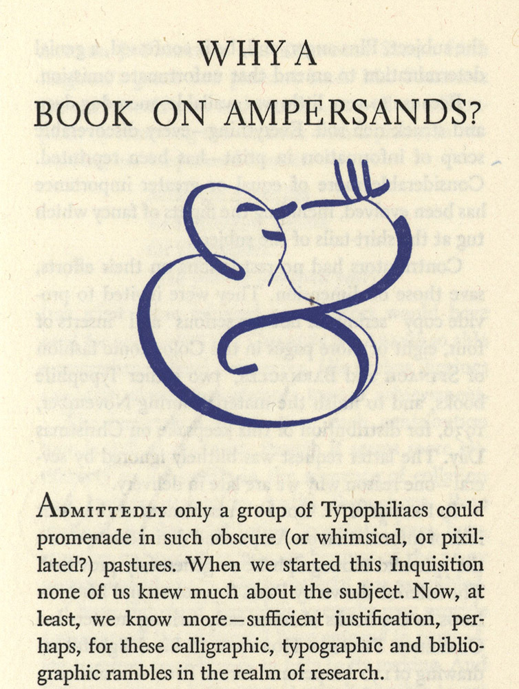
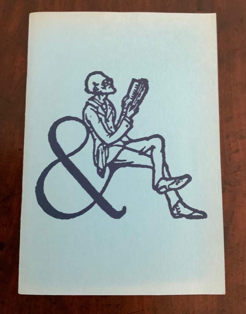
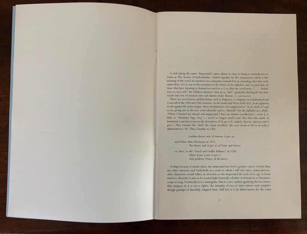
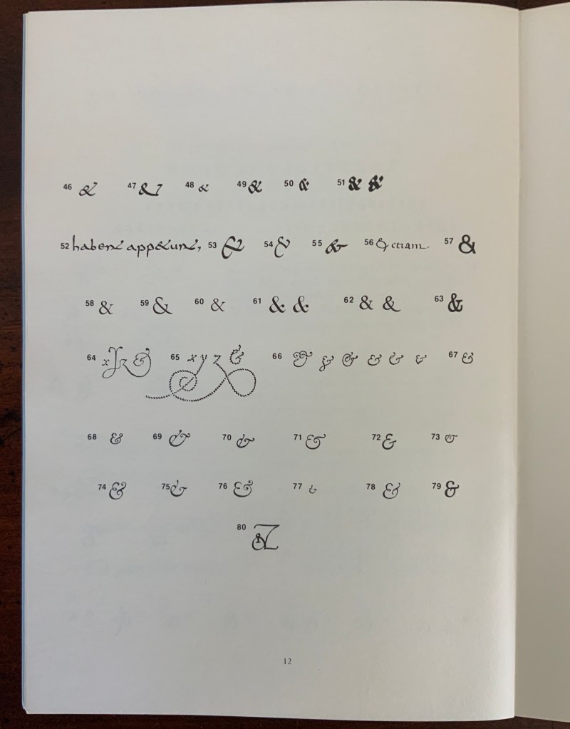
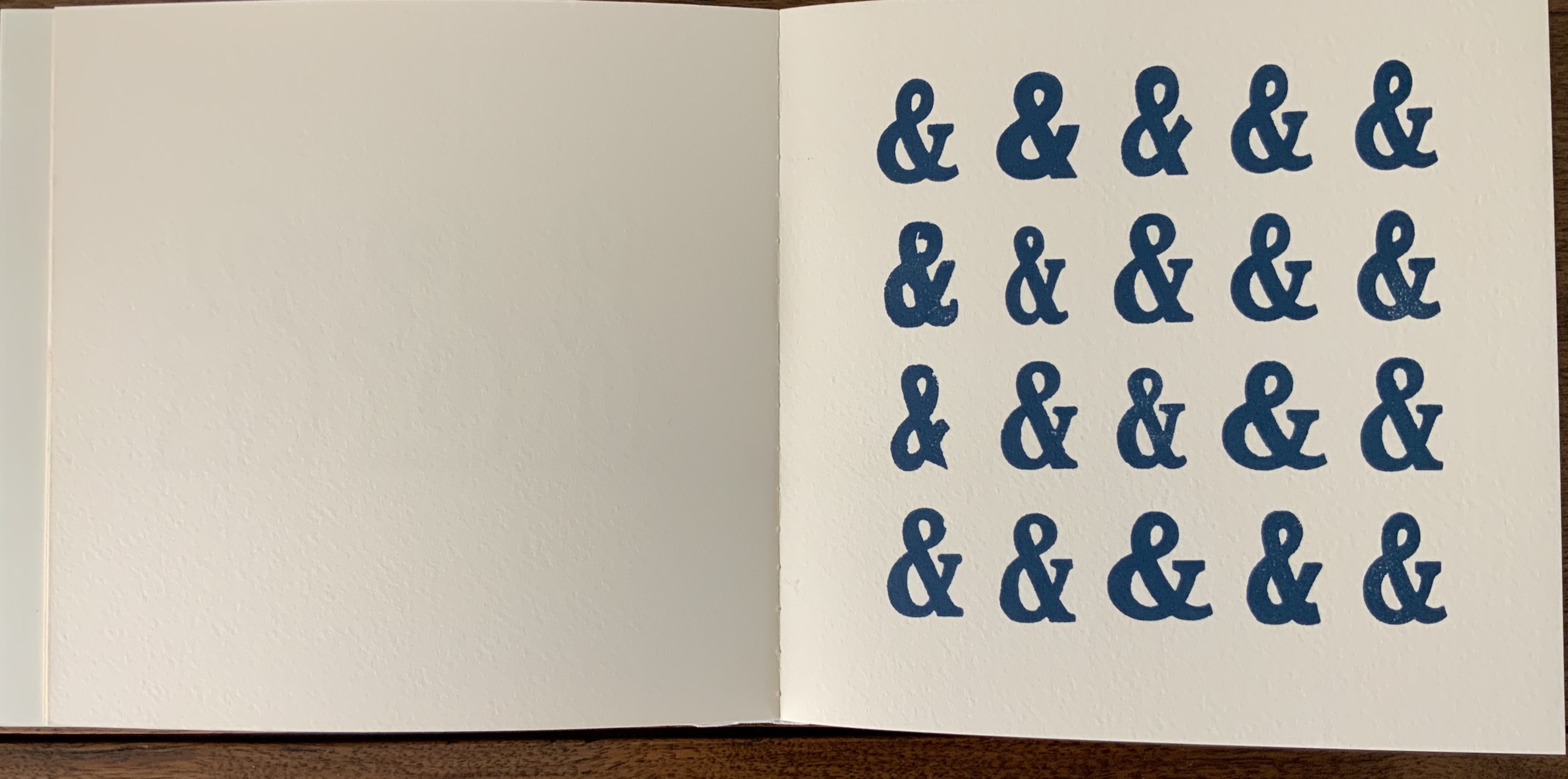
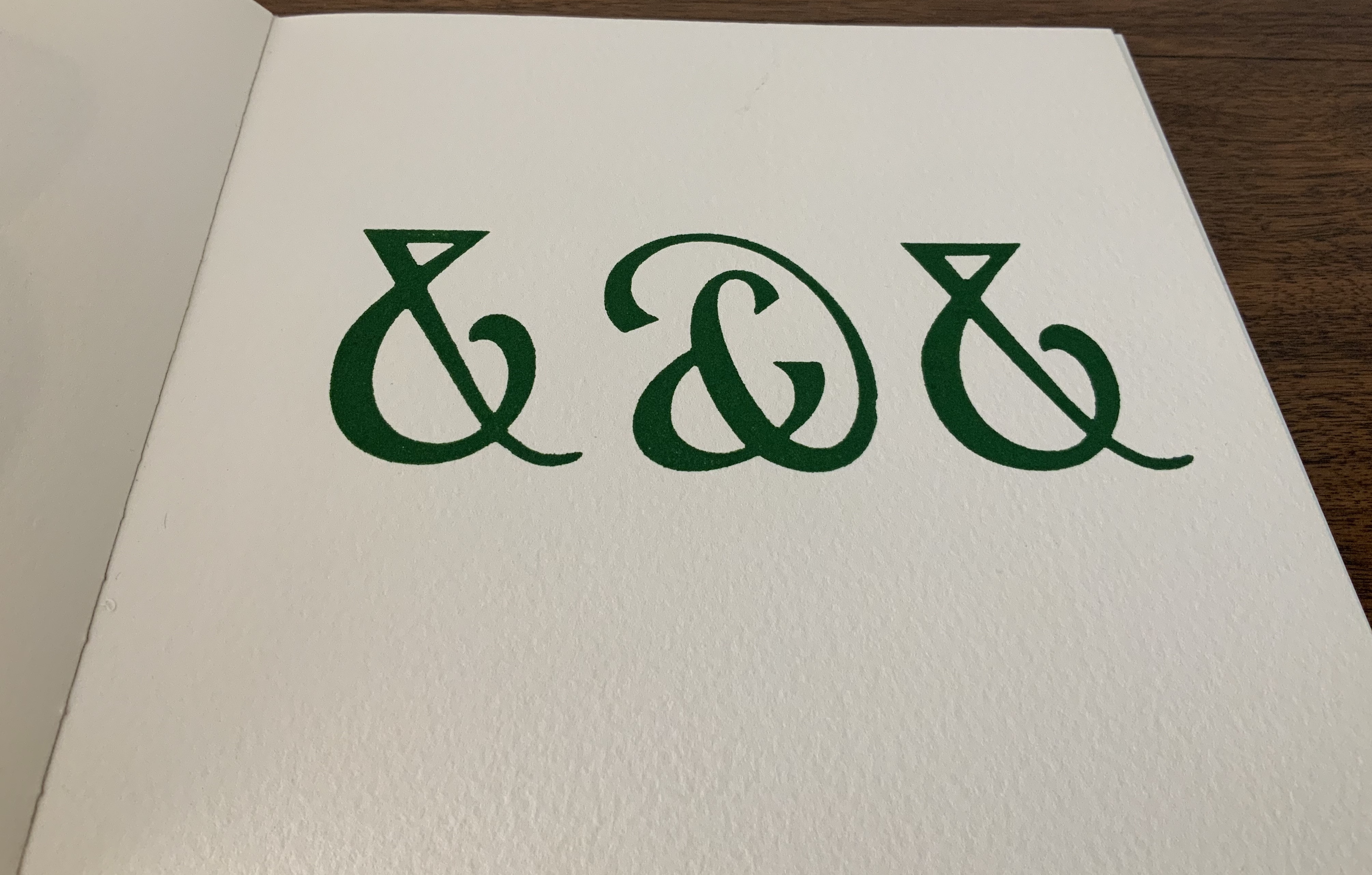
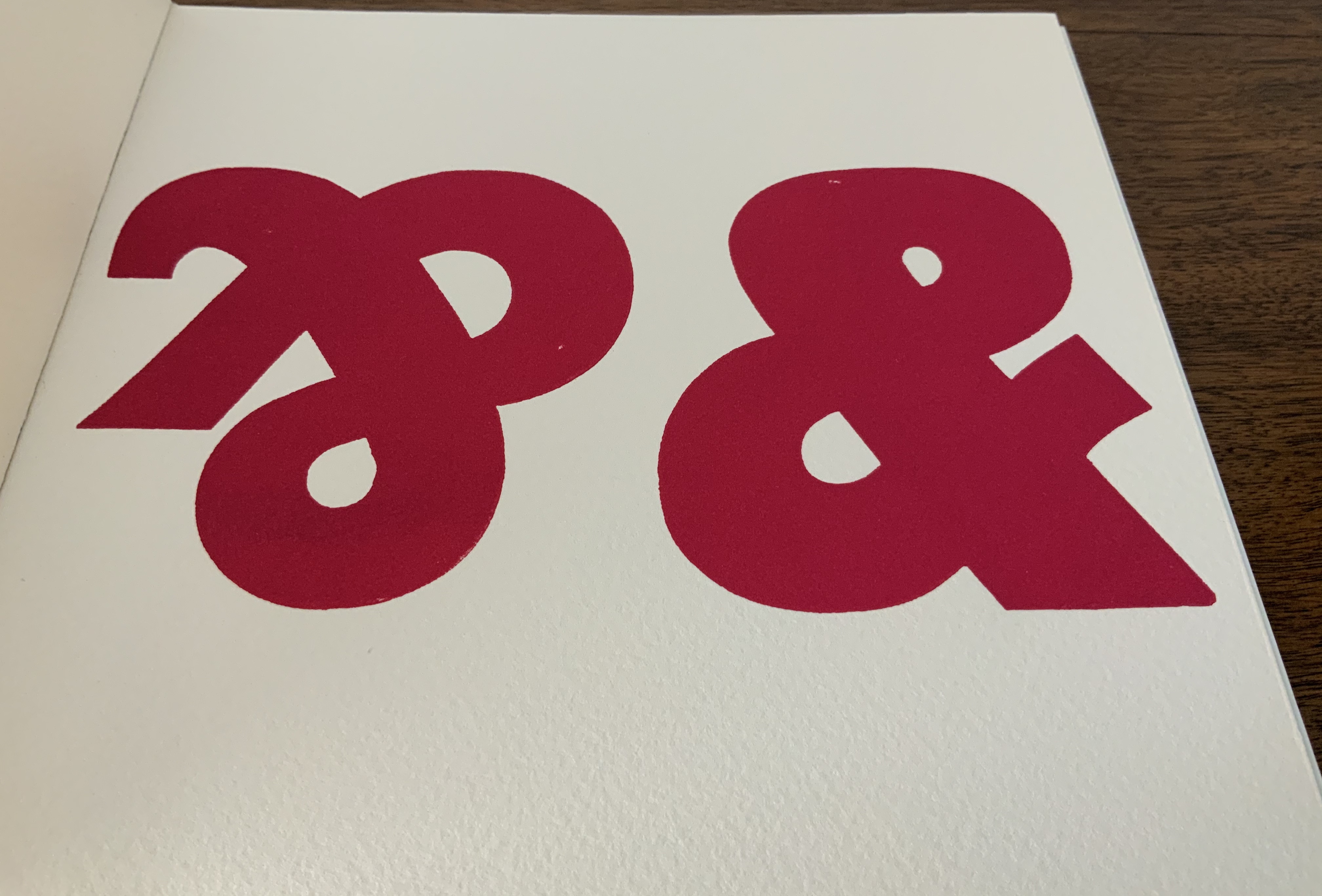
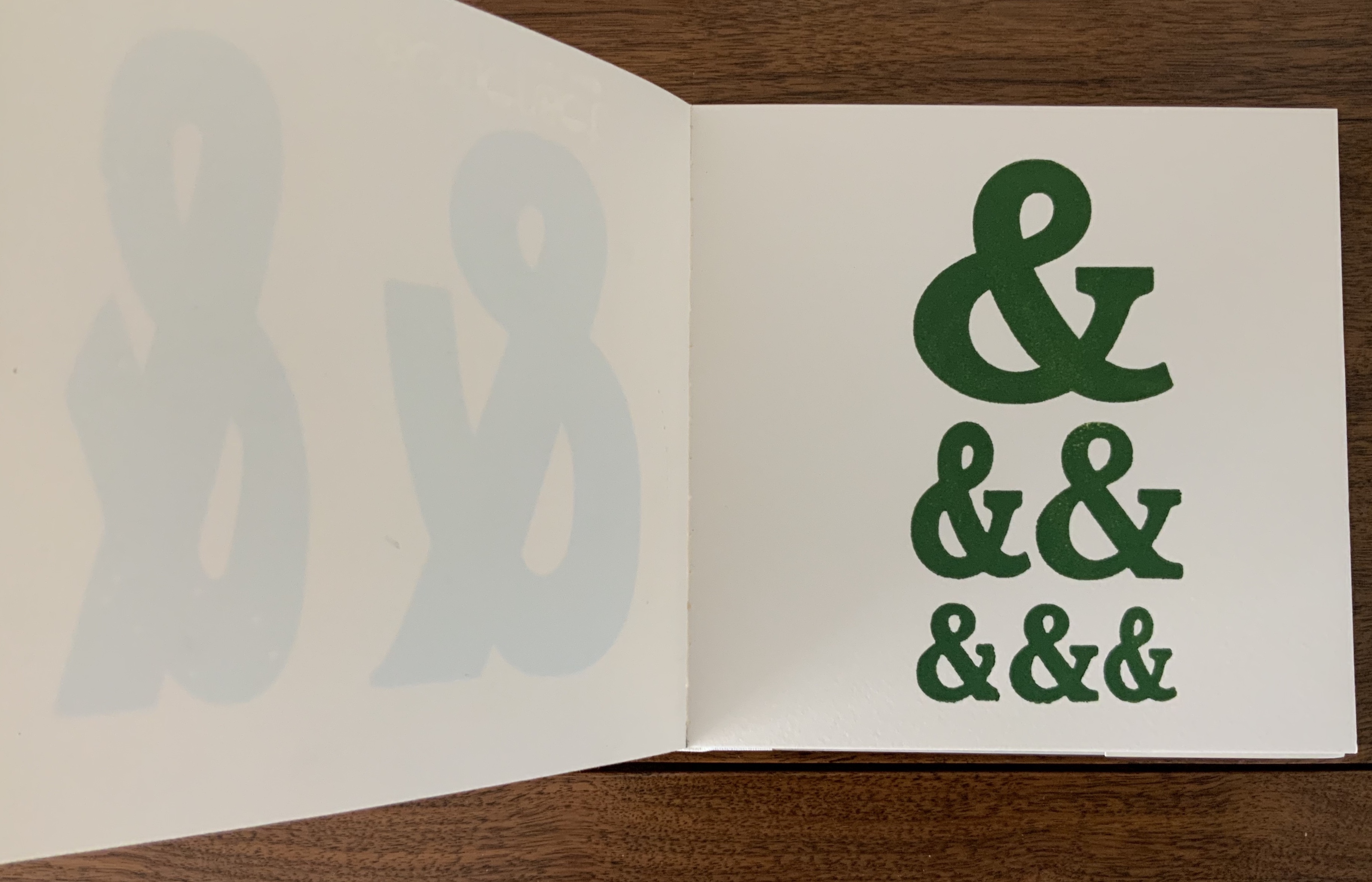
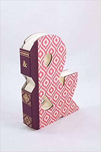
Isn’t it surprising that, given the greater frequency in human discourse of “yeah, but” over “yeah, and”, we can write “yeah, &”, but there is no logogram for “but”? No one can say that the last word has been said, written, printed or had about the ampersand. Someone will always be ready to append an & … but that has not stifled many an attempt. Apparently they have occurred every twenty years or so since 1936.
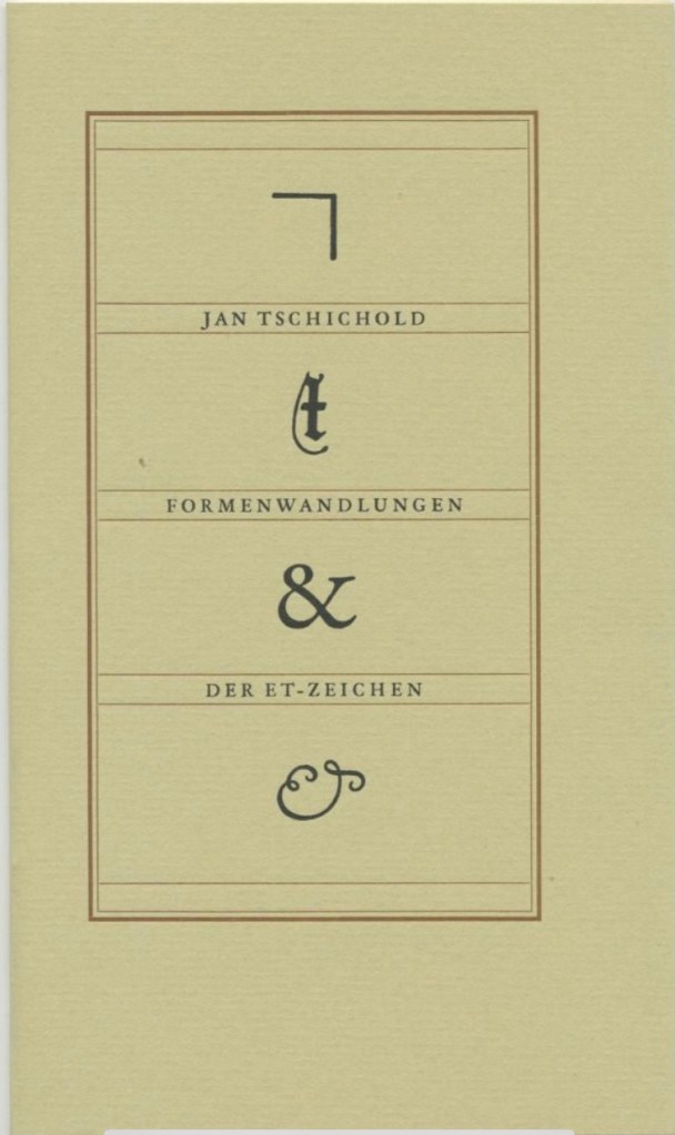
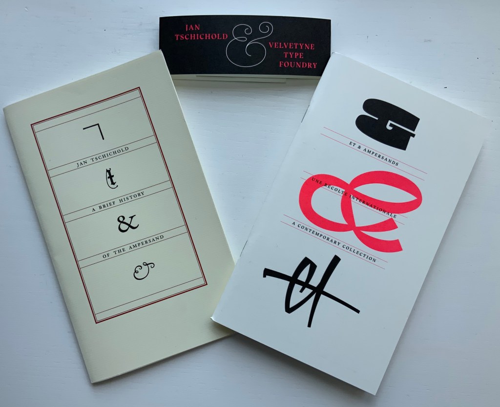
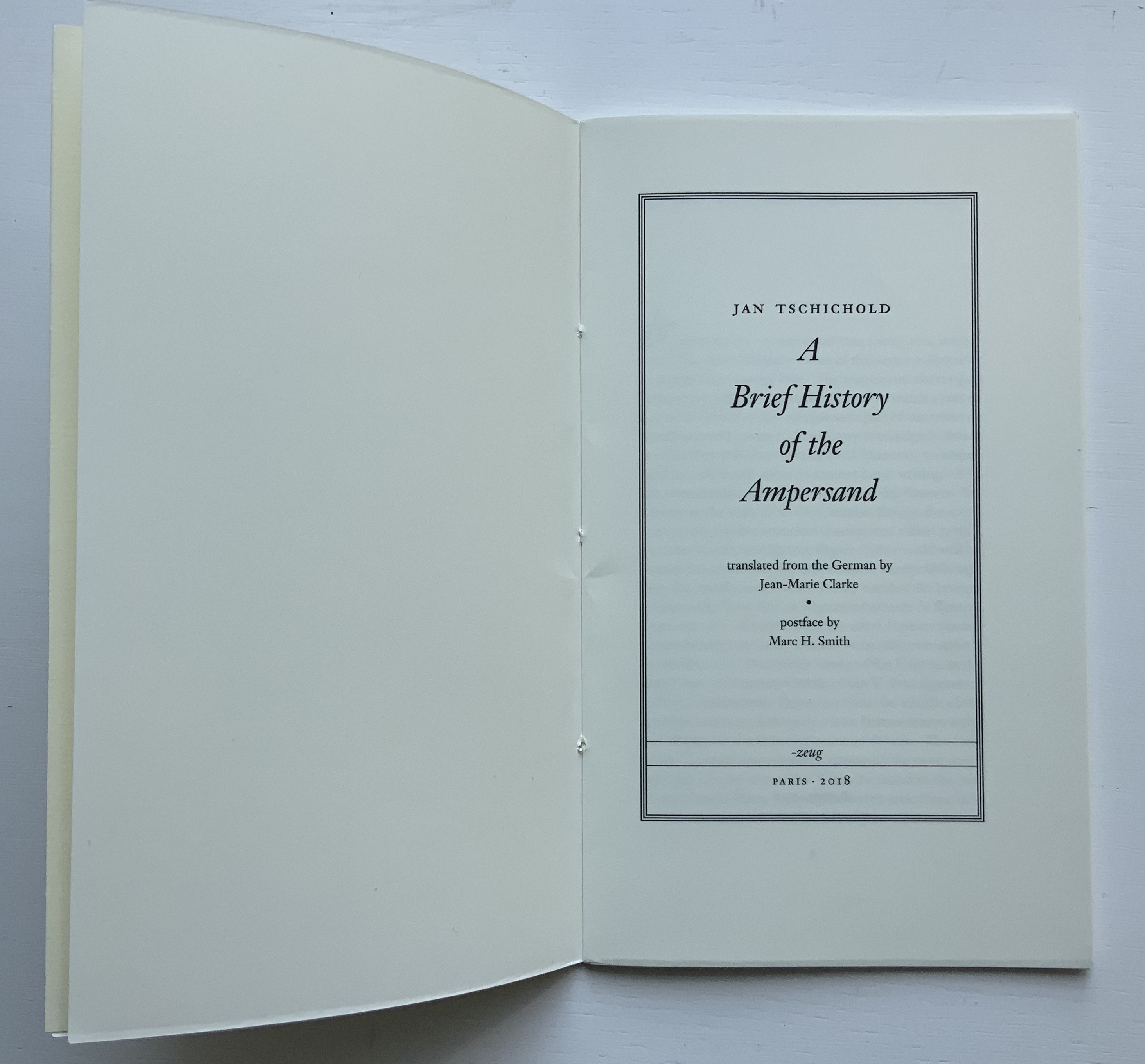
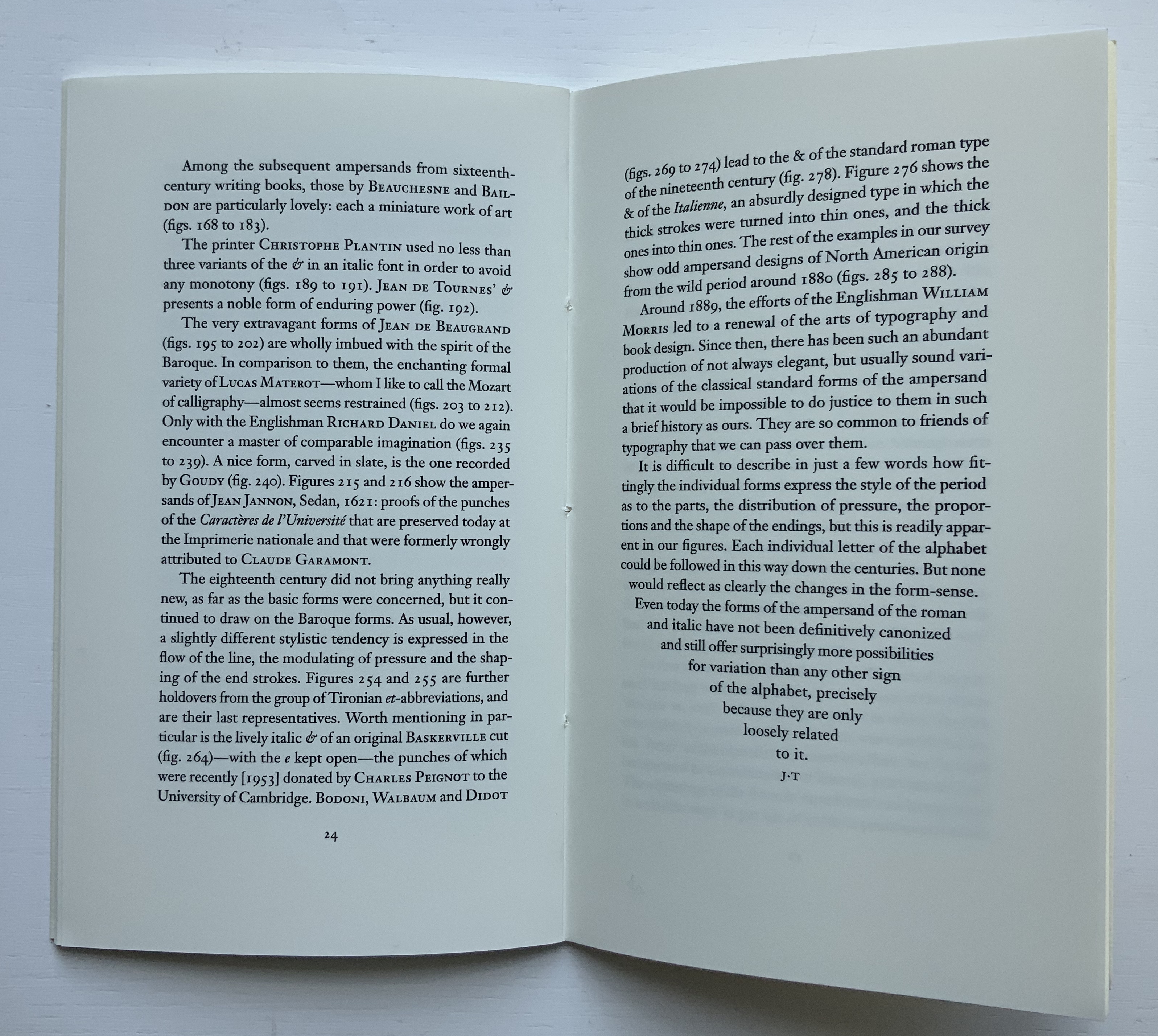
Some twenty years later along comes Jan Tschichold’s A Brief History of the Ampersand (1957), initially in German in 1953), which reproduced and updated Goudy’s set of examples and deepened the scholarship on the subject.
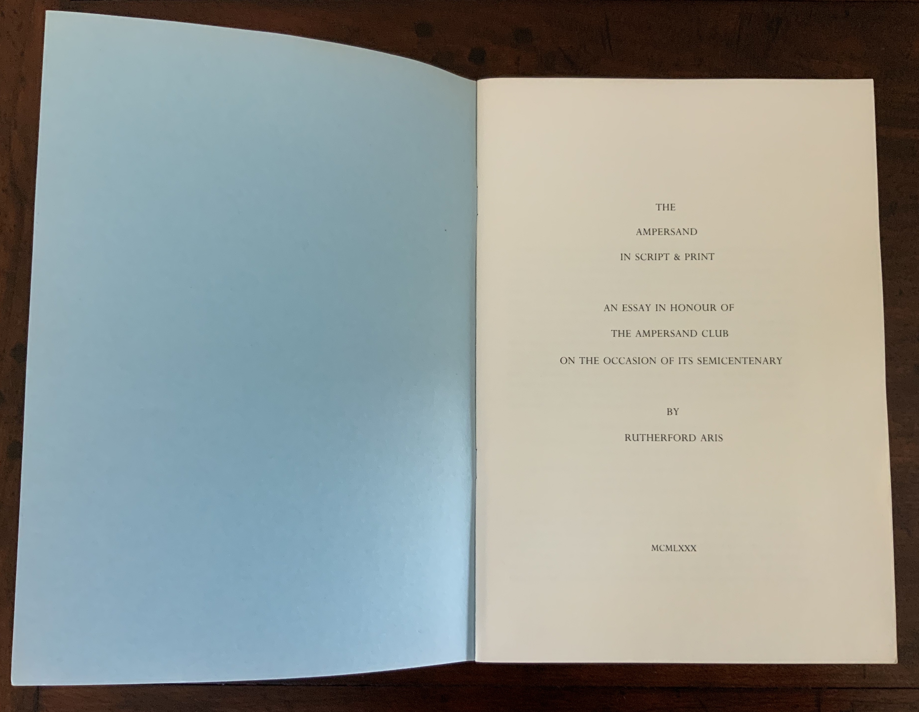
After Tschichold’s “last word”, The Ampersand Club (yes, there is one) invited one of its distinguished members — Rutherford Aris, Professor of Chemical Engineering (and Classics!) at the University of Minnesota — to attempt another “last word” in 1980.
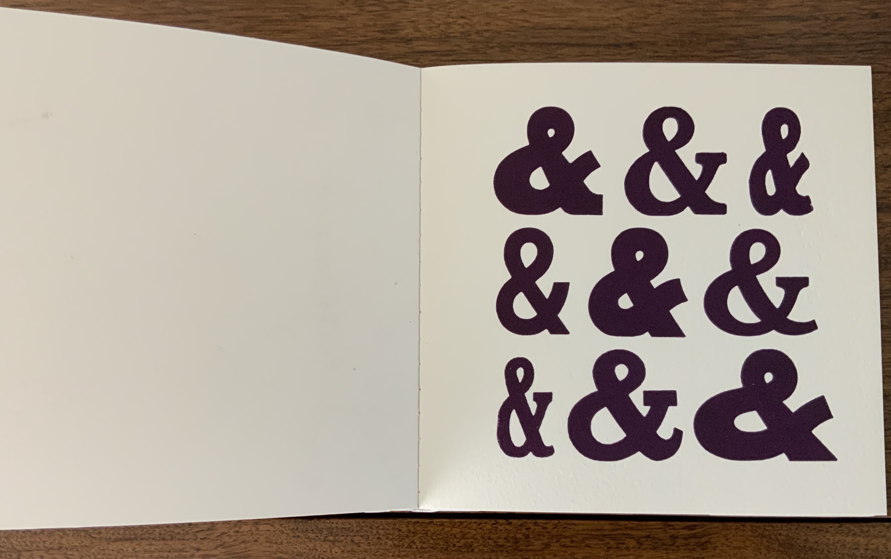
While there are a few publications falling around 1999/2000, nothing approaches the colophonic status of the Typophiles’, Tschichold’s or the Ampersanders’ efforts. It’s not as if ampersand aficionados were running out of &s. Consider Robert Slimbach’s Poetica™️ (1992), his family of type that boasts 62 different ampersands.
Robert Slimbach’s 62 ampersands in the Poetica™️ family
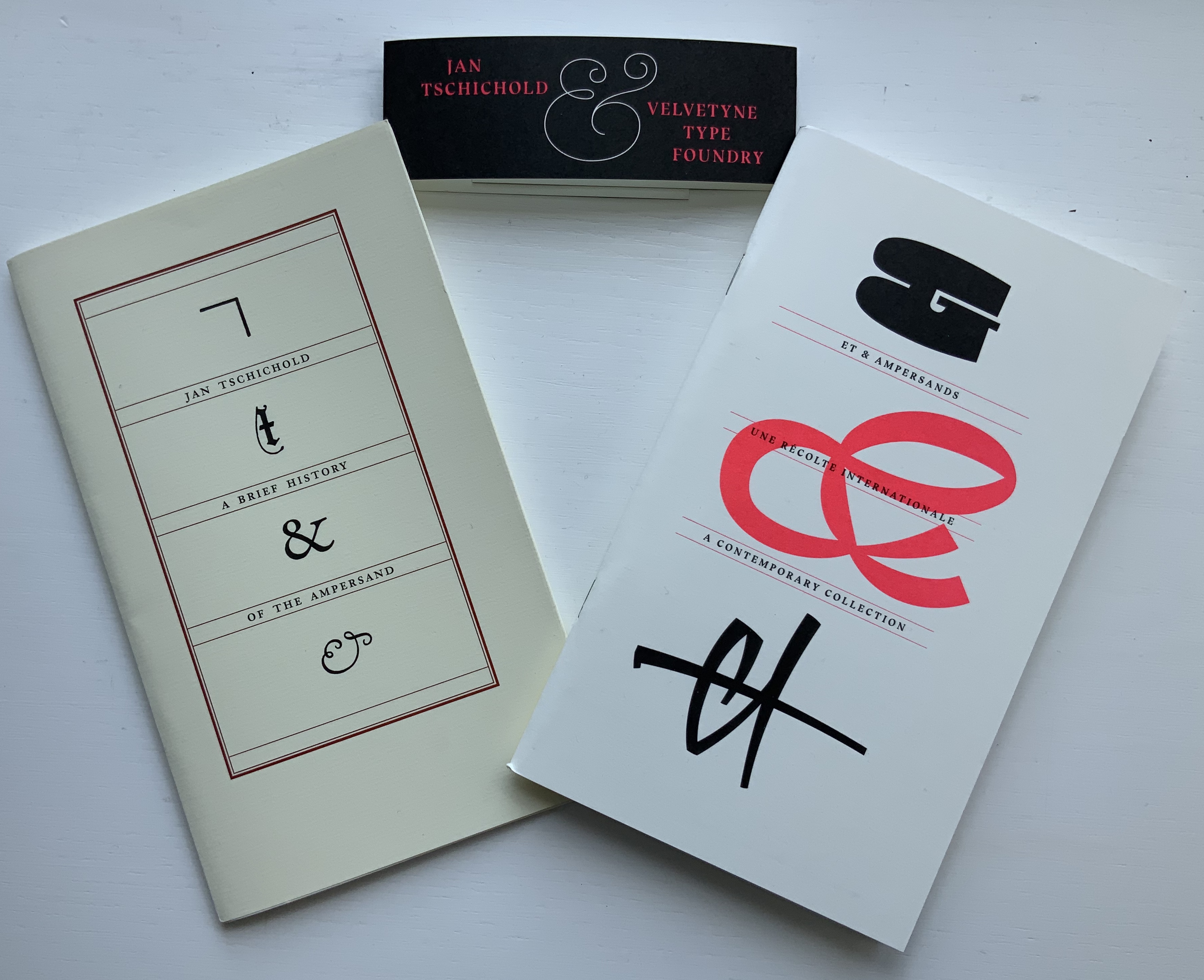
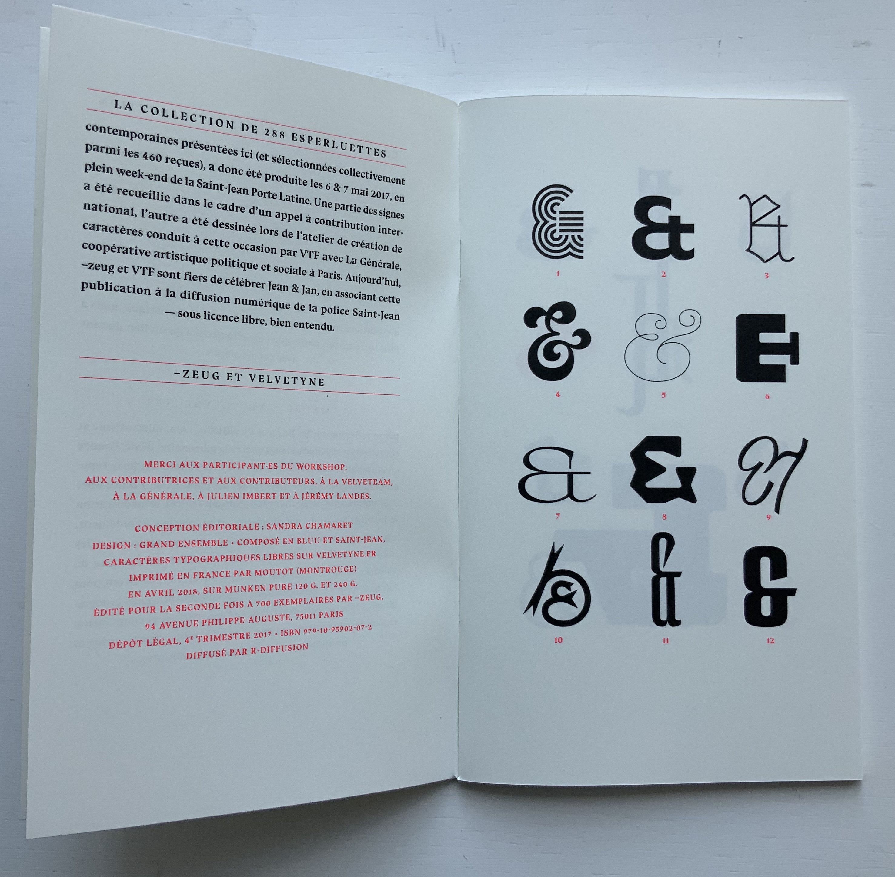
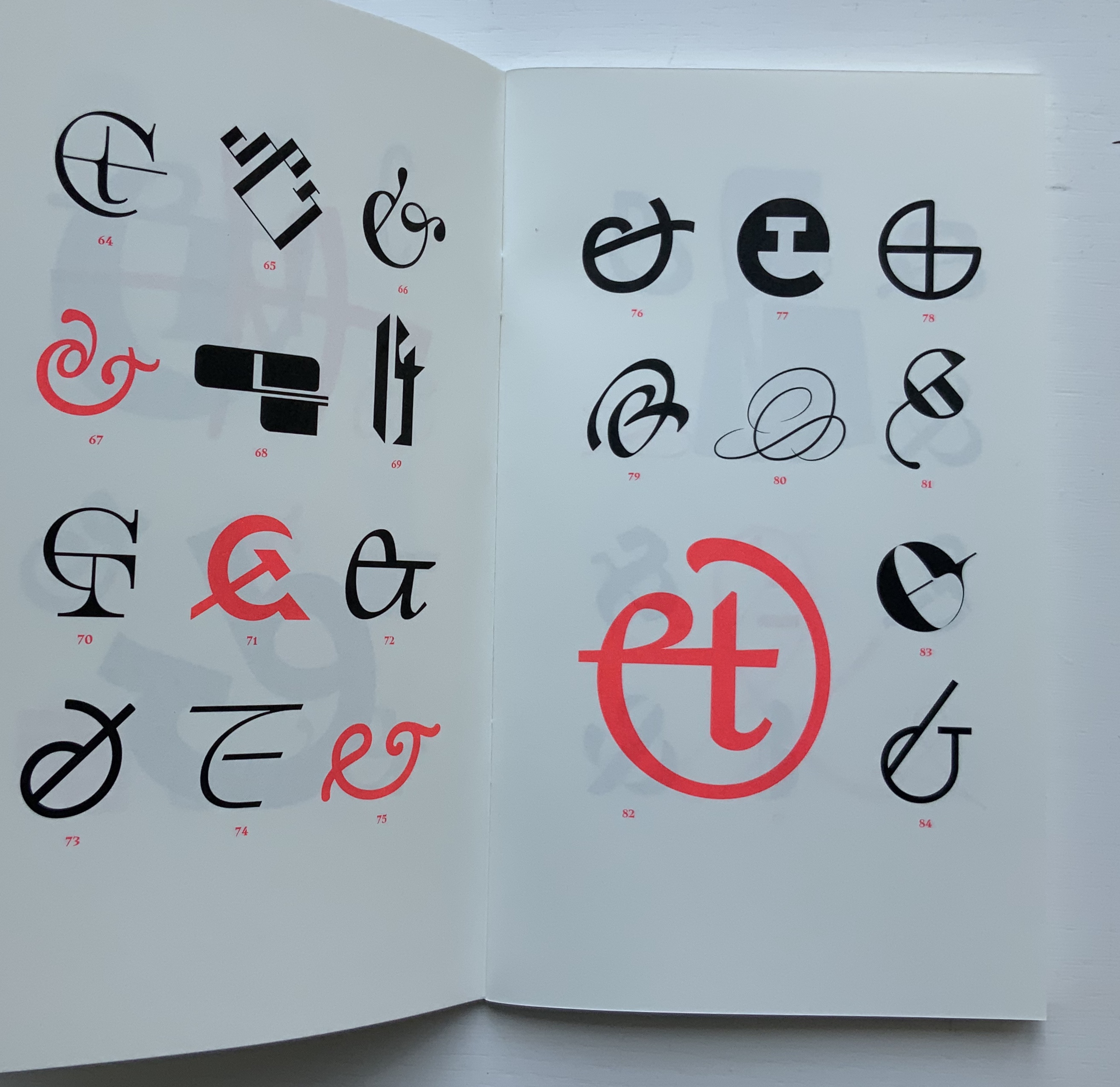
Jumping the gun on 2020, we have both the 2018 reissued edition of Tschichold’s “last word” on the subject and Ray Czapkowski‘s 2019 celebration of the Diggings of Many Ampersandhogs. It is somewhat fitting that the publisher of the reissue of Tschichold is named ~zeug, which is the German suffix appended to a verb to indicate the instrument for carrying out the verb’s activity — e.g., Spielen (to play), Spielzeug (toy). And entirely fitting, too, that ~zeug could not resist the urge to make up a deluxe version by adding Et & Ampersands: A Contemporary Collection to Tschichold’s A Brief History.
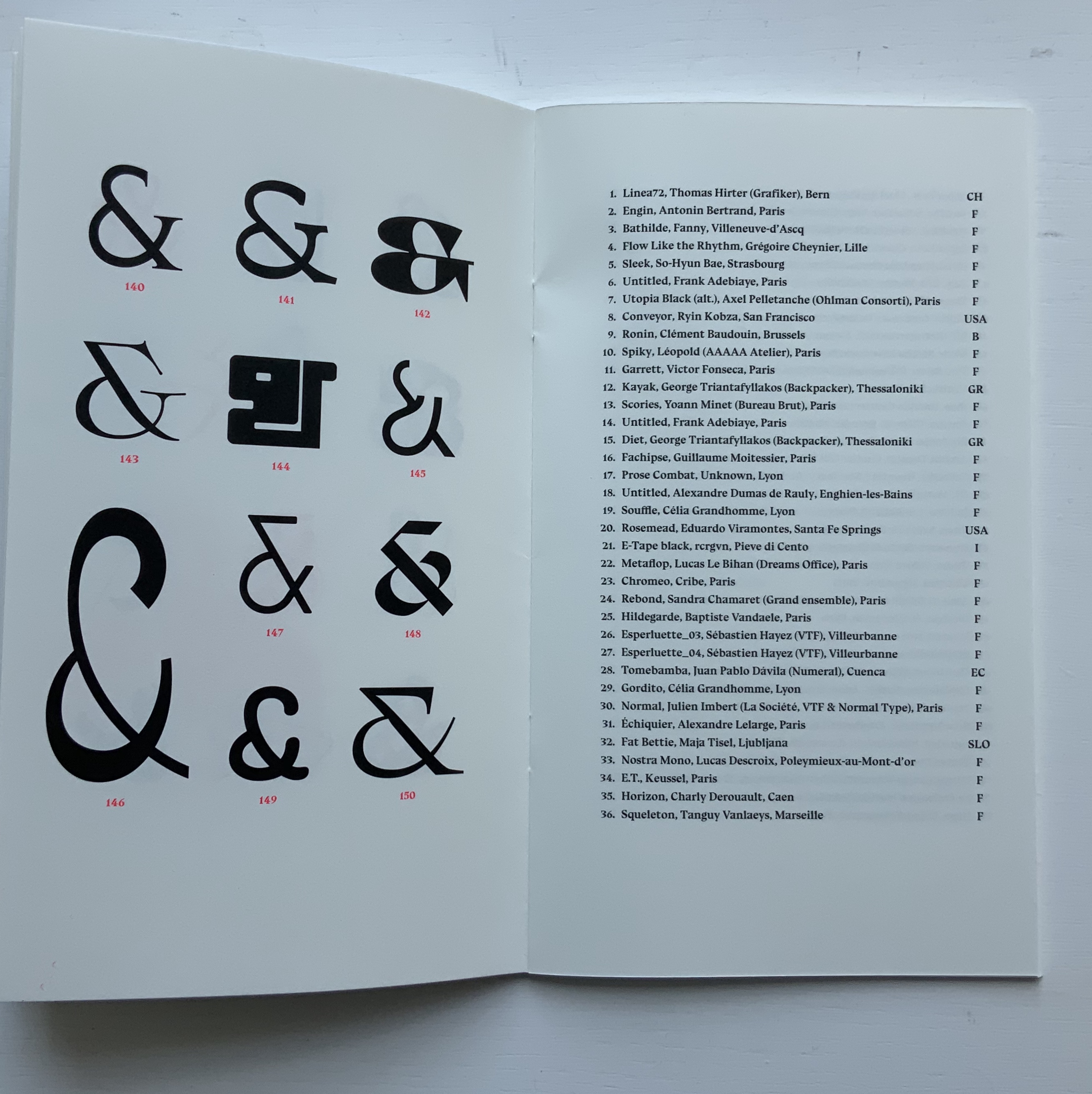
By definition, the Velvetyne/~zeug catalogue is not a last word, and its cataloging of newly designed ampersands attests to the ongoing “and-ness” of letter design, which brings us to the first item in this sub-collection within Books On Books …
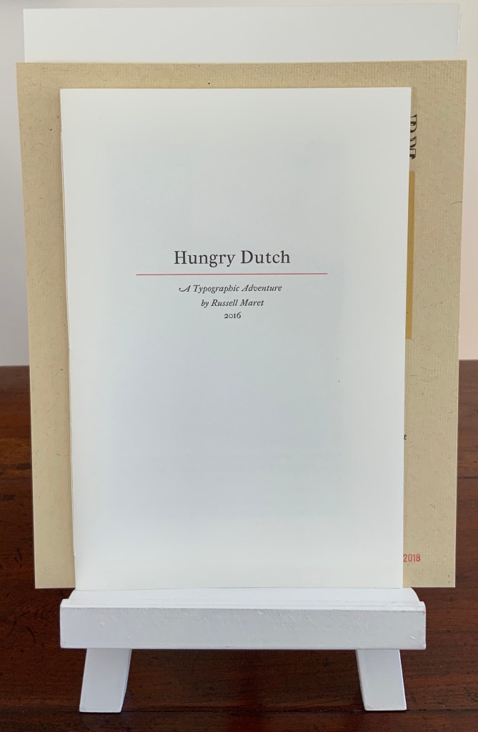
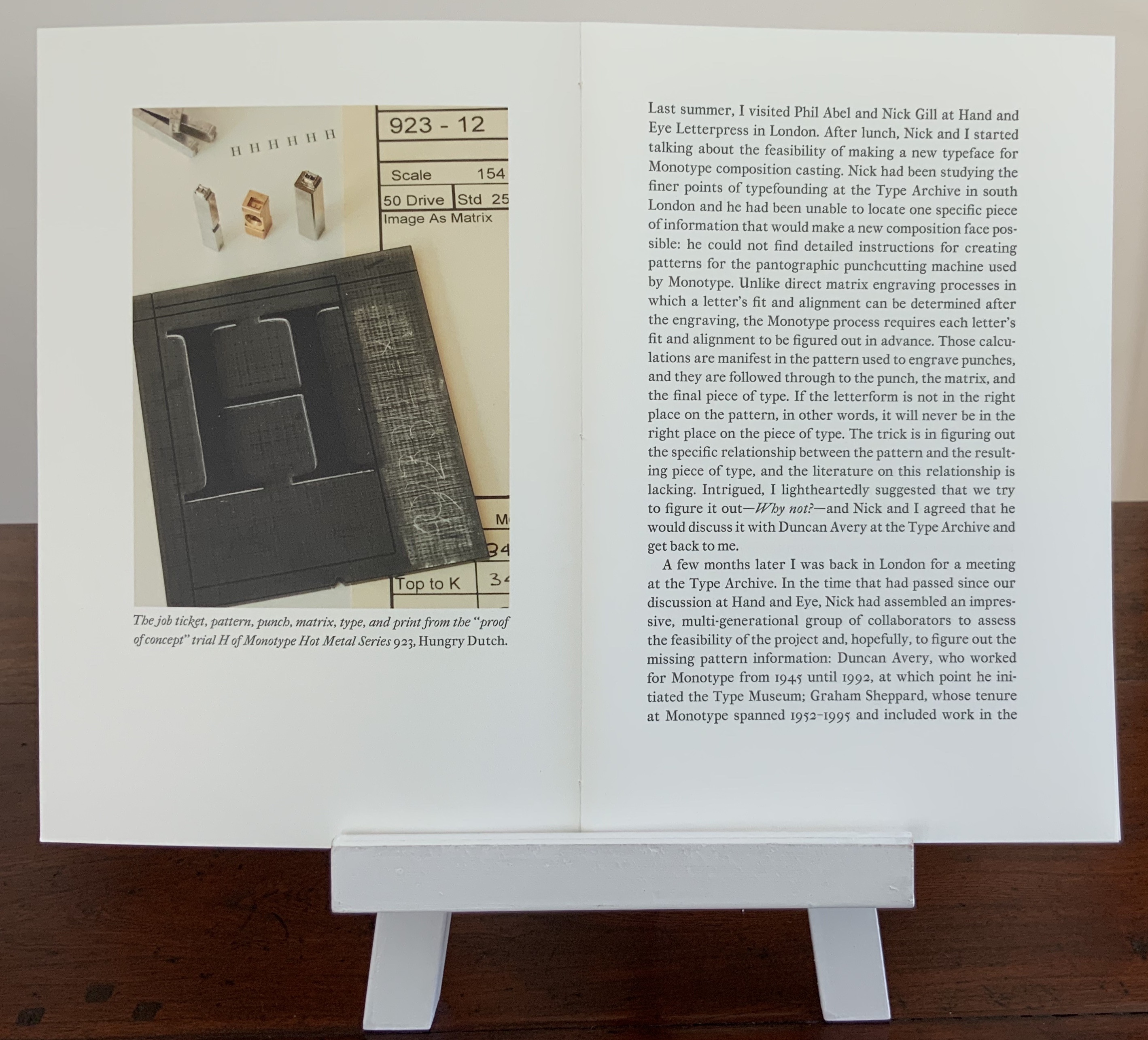
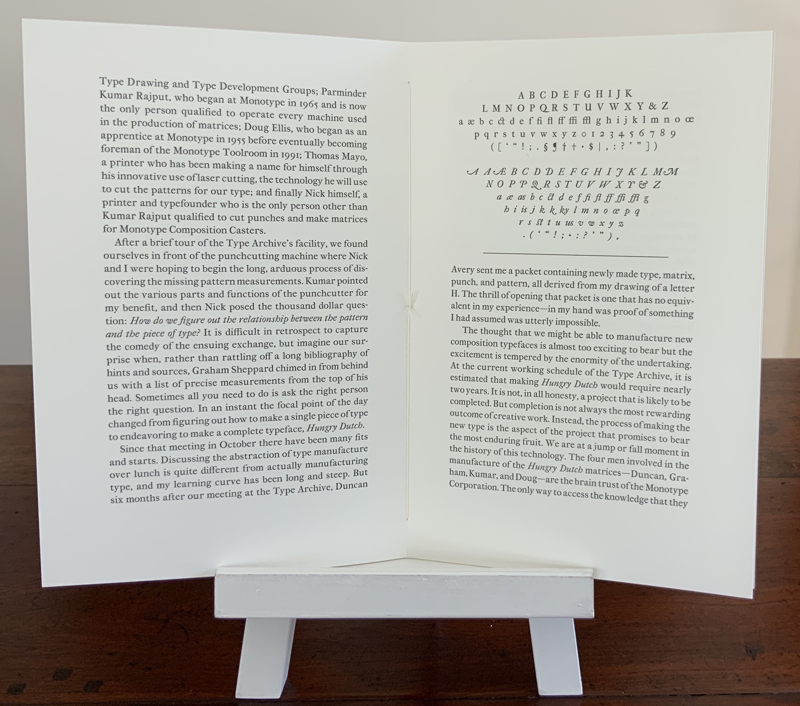
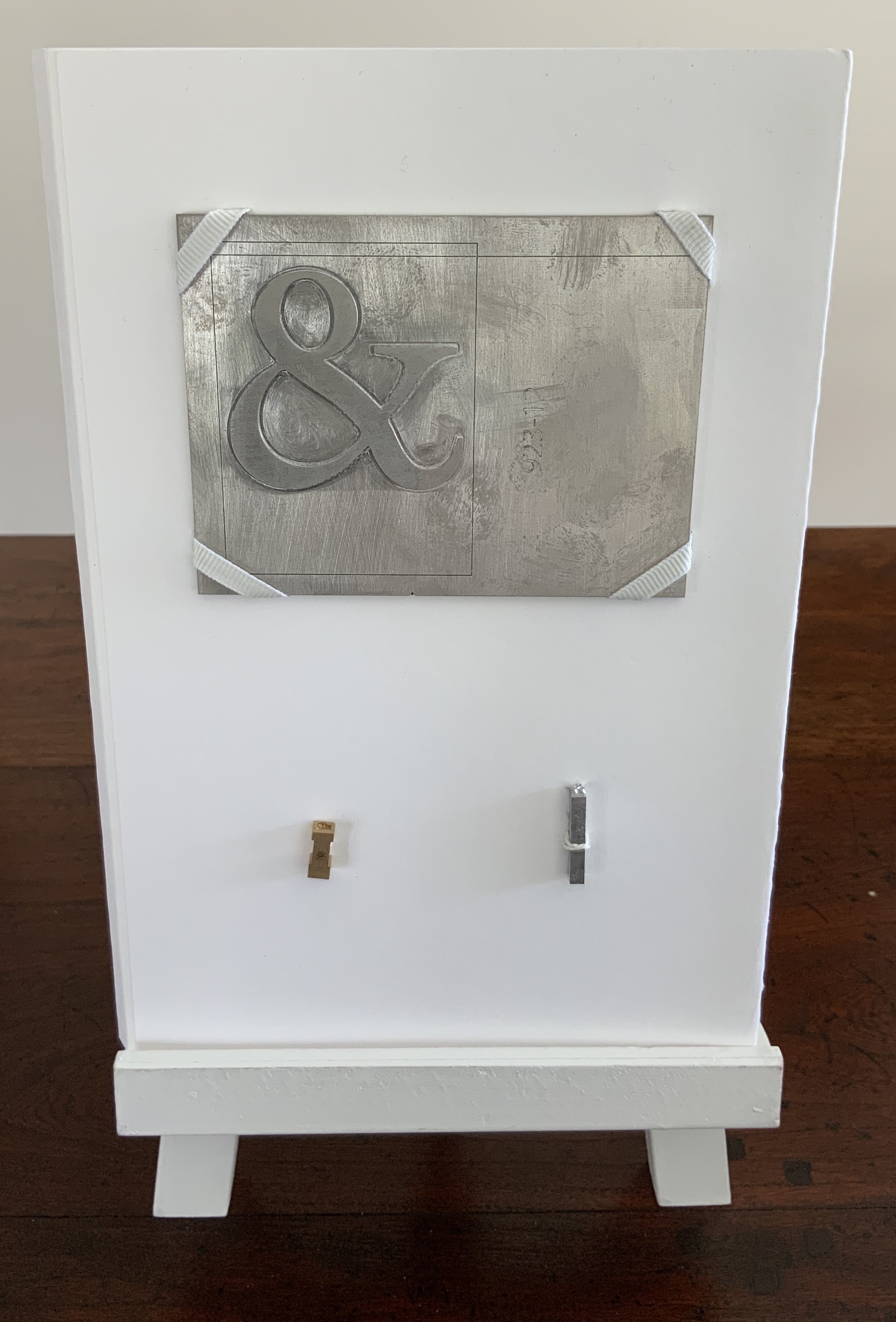
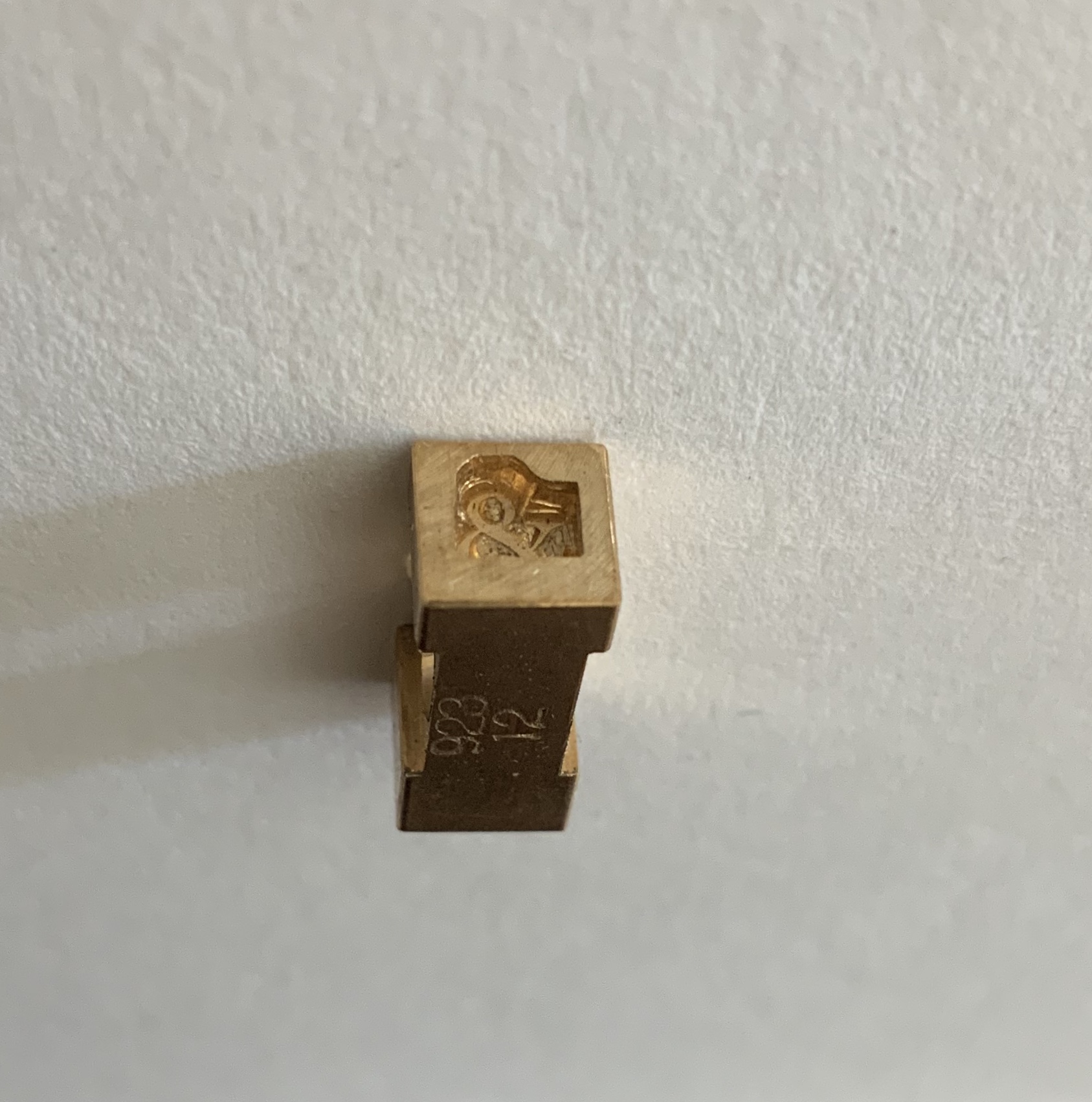
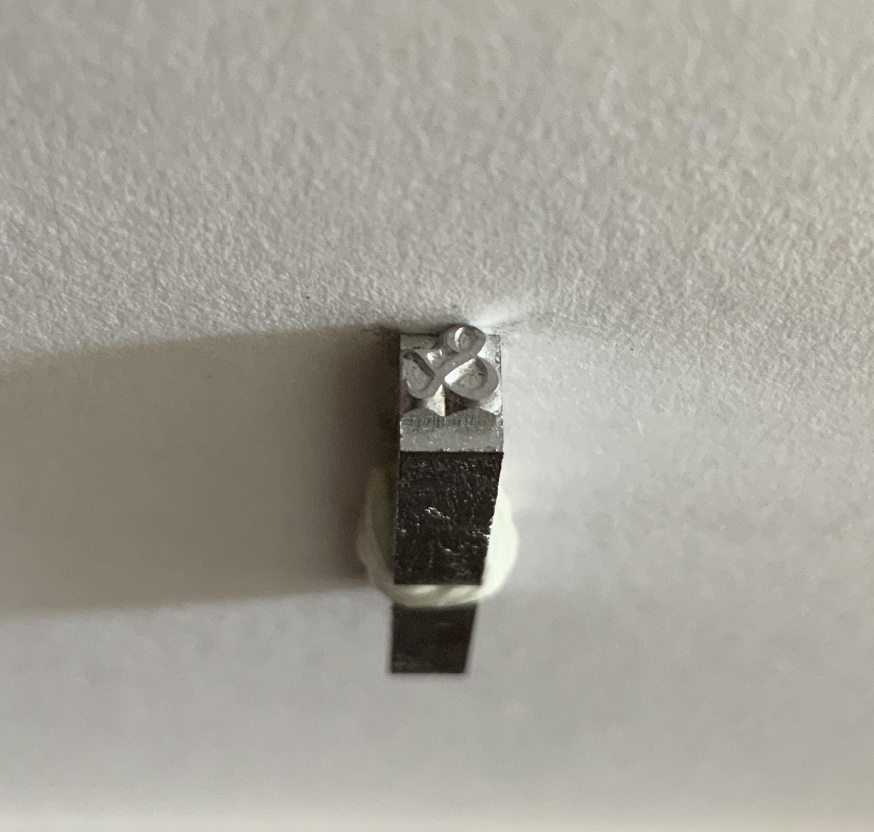
Maret’s pattern, matrix and punch for the Hungry Dutch ampersand came into the collection in 2020 as recognition of Books On Books’ contributing sponsorship of the design and manufacture of the typeface.
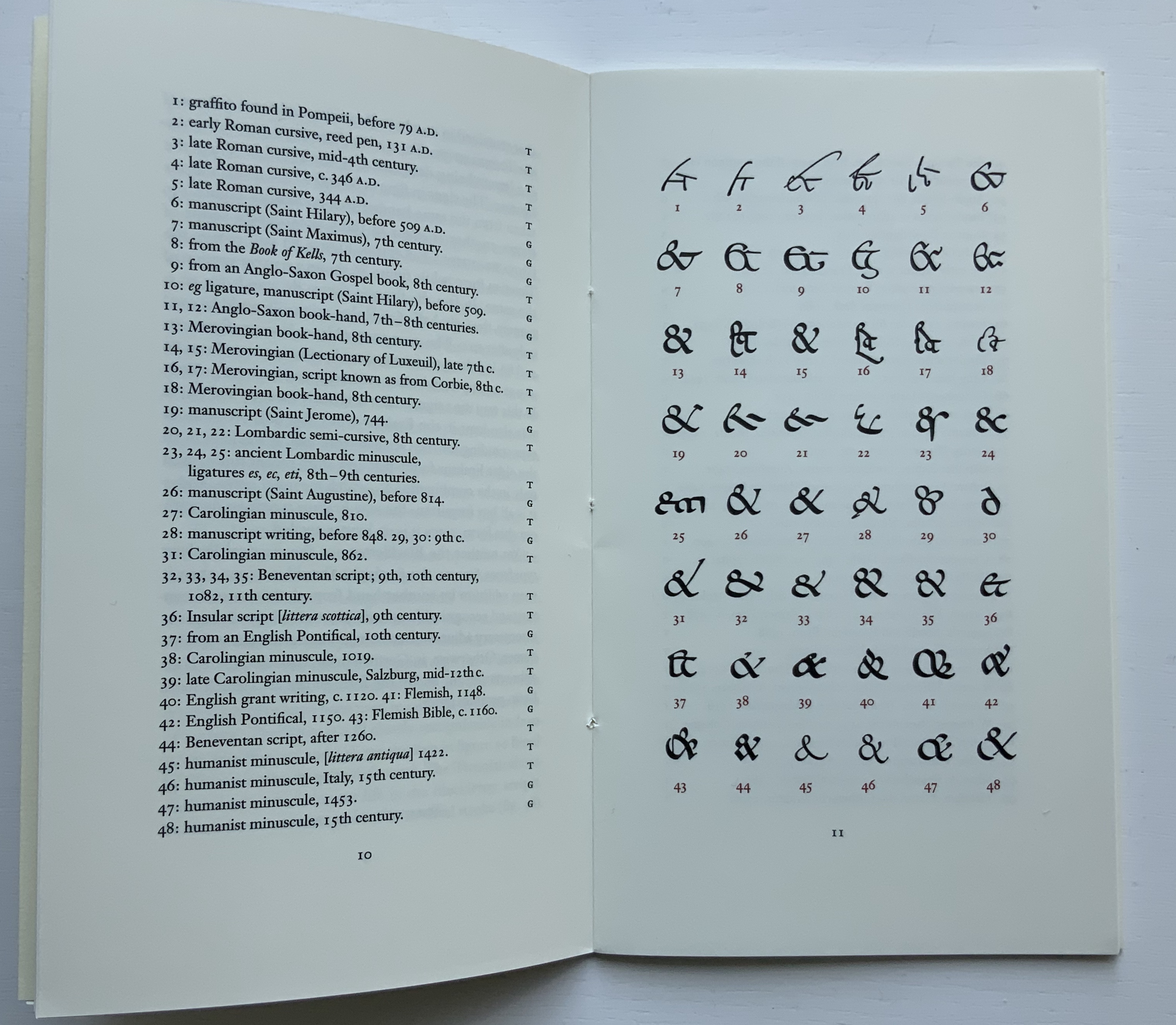
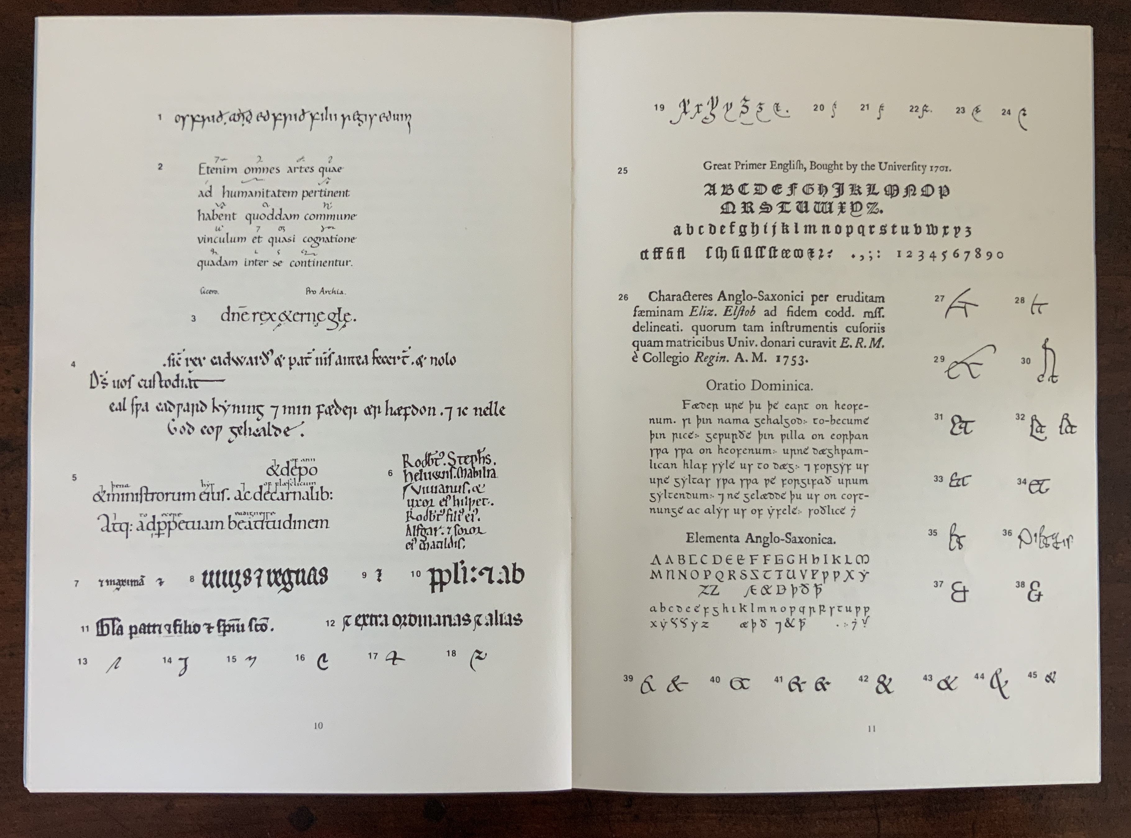
The endnoting to the pages displaying the numbered ampersands suits the publication of this scholarly “after-dinner” speech, which has one rocking back & forth between typographical puns and paleographical insights.
Board covers with a Caslon paper wrapper, cased over eleven linen-taped handsewn leaves of Somerset 300gsm, eleven images printed on a Vandercook proofing press. H175 x W180 mm. Acquired from the artist, 5 May 2020.
Printers have affection for the ampersand, not just because of its usefulness in shortening lines and in embellishing spaces, but also, I believe, because of its uniquely human shape; in one stroke it describes us, becomes a human pictogram. Placed together, ampersands appear endlessly various and take on human characteristics of slovenliness, arrogance, timidity and flamboyance. Ben Shahn said that the letters of the alphabet have an “austere dignity”, the ampersand in woodblock form, by contrast, is avuncular and buoyant. The book is a small celebration of the alphabet’s twenty-seventh letter and of design improvisation and characterisation within one simple symbolic form. It’s hard to identify all the fonts used as many wooden fonts are local variations of standard faces but the book includes Cheltenham, Windsor, Gill, Grotesque and Caslon as well as some ampersands hand cut for this production. The text on the final page is hand set in Albertus. — Information provided by the artist.
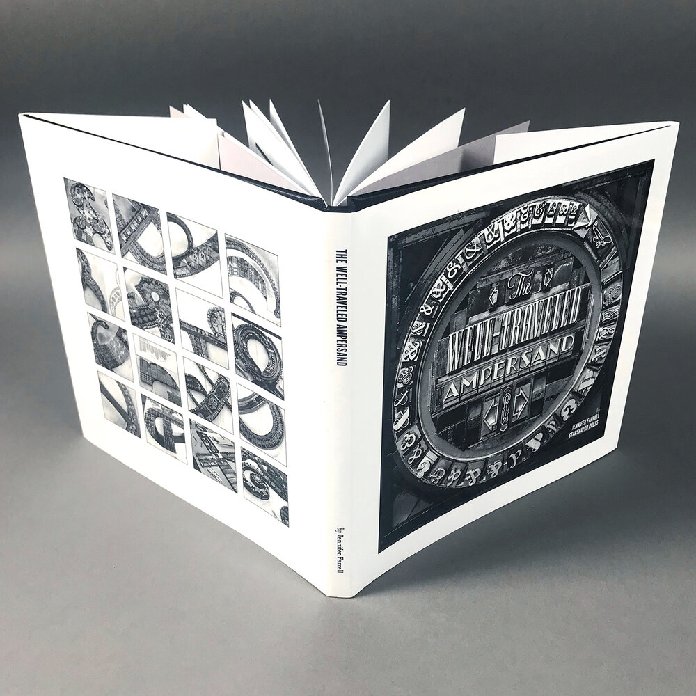
Book: Dustjacket and case over perfect binding of 34 pages, offset, multiple edition. 178 x 178 mm. Portfolio: Sleeve of gray French Kraftone encasing 16 prints on white French Kraftone. 305 x 305 mm. Edition of 50, of which this is #42. Acquired from the artist, 5 May 2020. Photos: Courtesy of the artist.
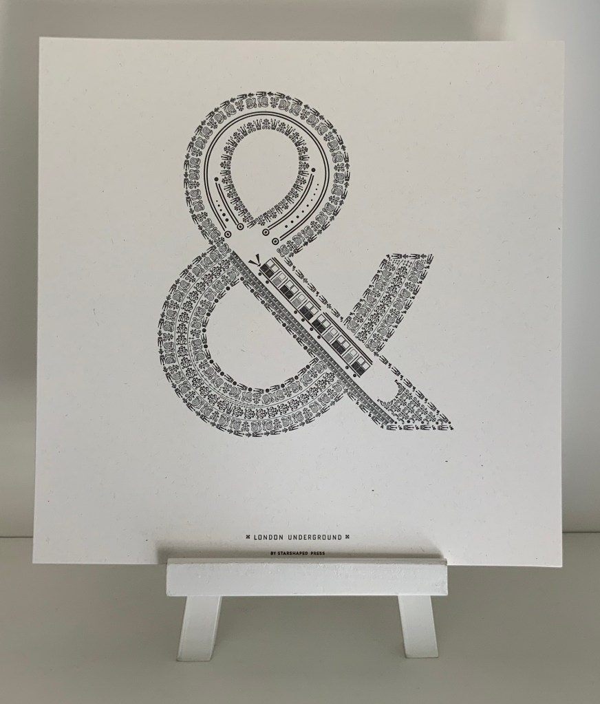
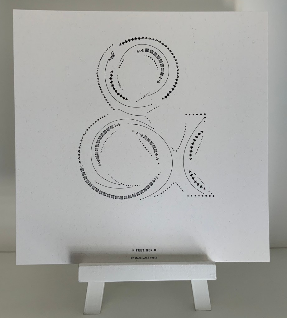
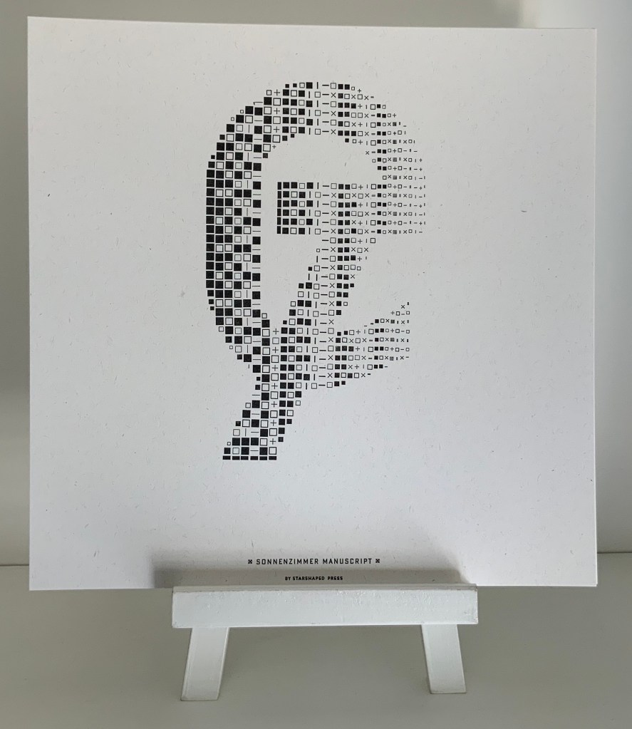
The book (2017) comes in response to interest in Farrell’s portfolio of sixteen prints of celebrated designers’ ampersands (2015-17). Farrell has constructed each designer’s ampersand with ornaments and flourishes carefully locked into shape with typesetting furniture forms. Each also contains images composed of ornaments, and each conveys the city or country associated with the original designer or typeface. The artist has provided extensive commentary and numerous photos here and here.
London: Johnston Underground (1916) Edward Johnston. Photo: Books On Books Collection.
Paris: Frutiger (1976) Adrian Frutiger. Photo: Books On Books Collection.
Switzerland: Sonnenzimmer (2015) Nick Butcher & Nadine Nakanishi. Photo: Books On Books Collection.
Further Reading (& Viewing)
“300&65 Ampersands” (NL: Ampersandampersand, ND). Accessed 19 June 2020.
Luse, Karen. An experiment in literary excavation (Portland, ME: Karen Luse, 2005). Cavity created in textblock within which sections of pages are removed to form an ampersand. book attached to painted wooden board.