Jon Agee, Z Goes Home (entry in progress)
Islam Aly, 28 Letters
Marie Angel, An Animated Alphabet, Angel’s Alphabet, An Alphabet of Flowers
Anonymous, Picture ABC (n.d.) — from Barbara Raheb’s collection (entry in progress)
Annesas Appel, Ruiten Alfabet (2006) in progress
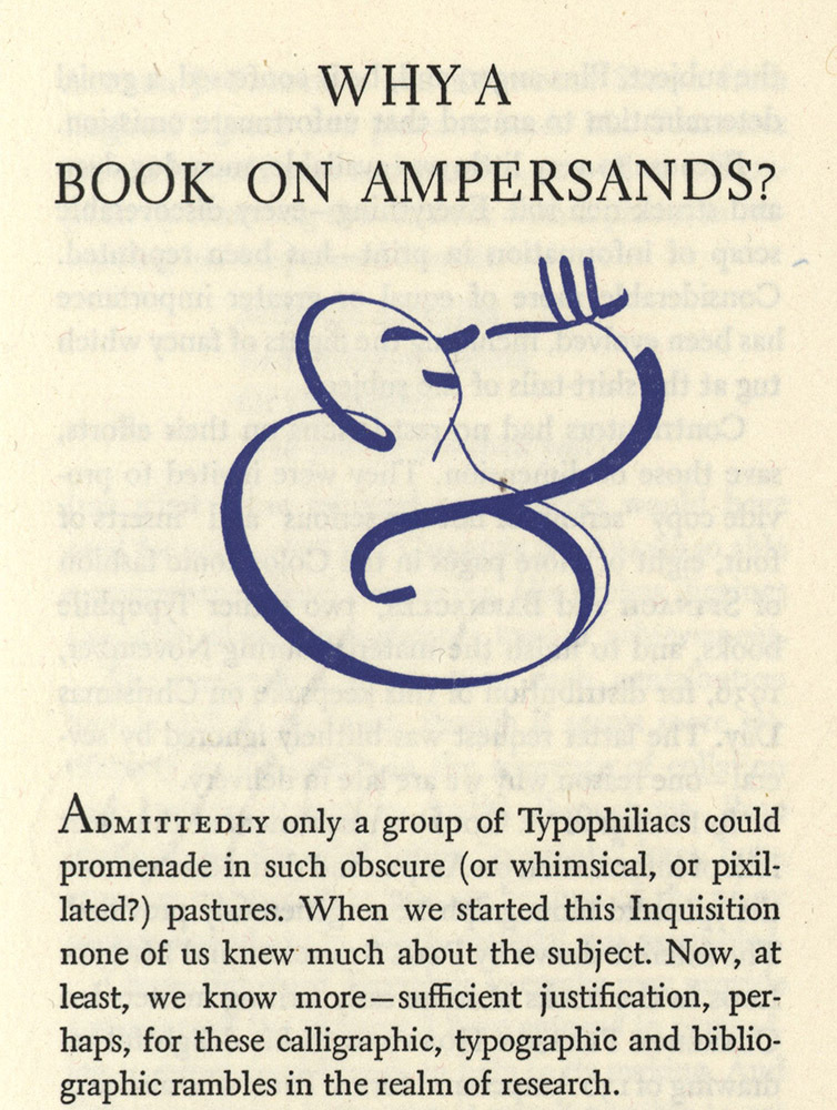
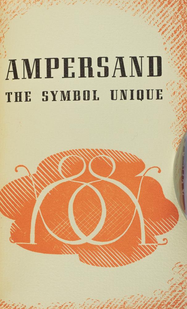
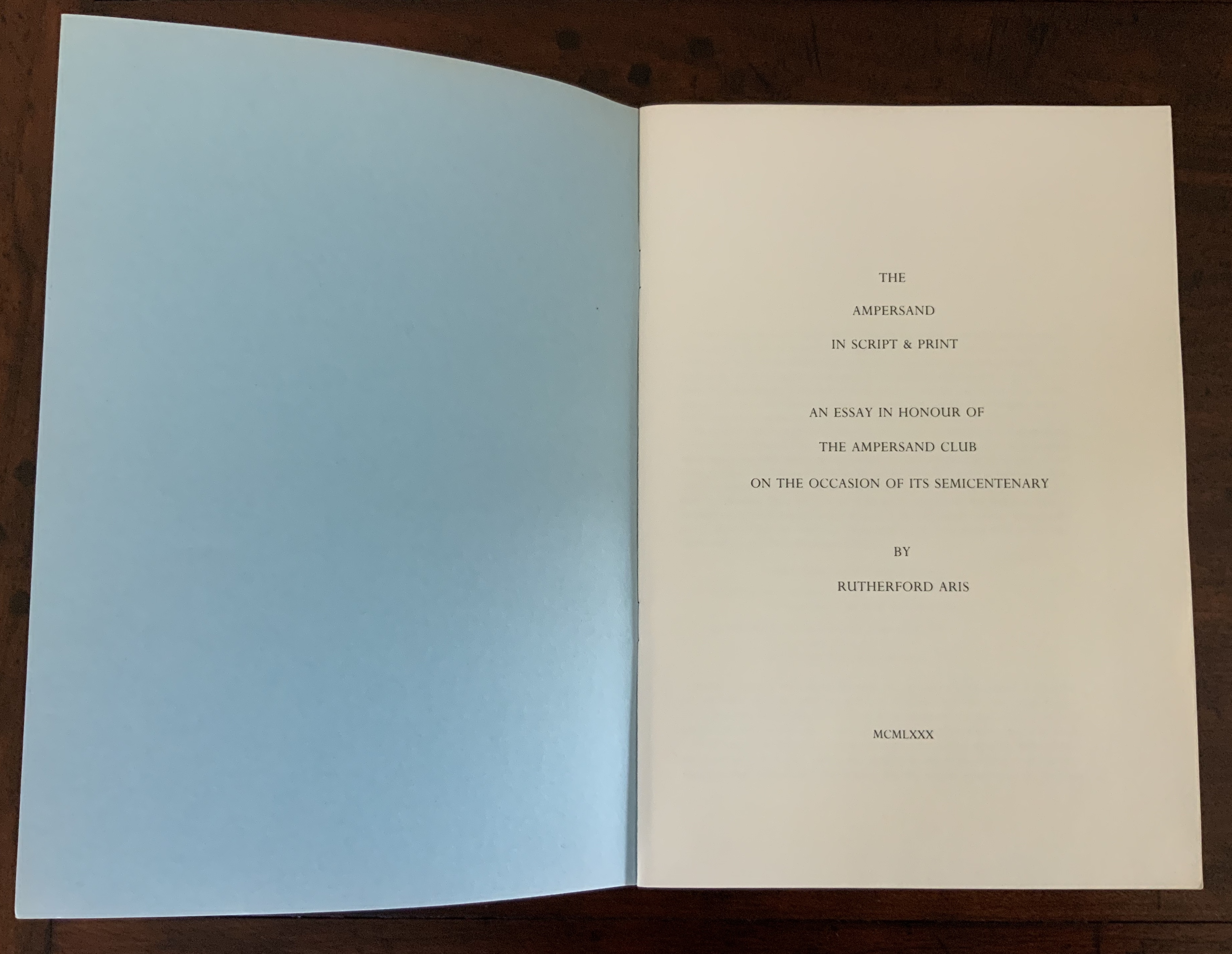
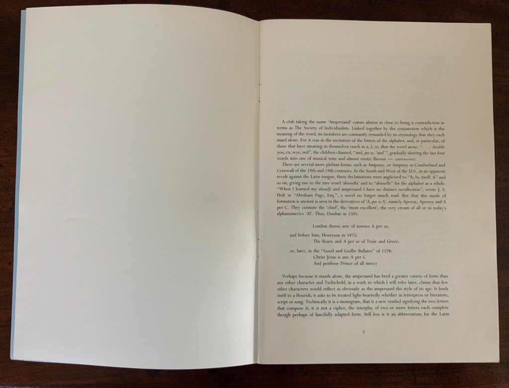
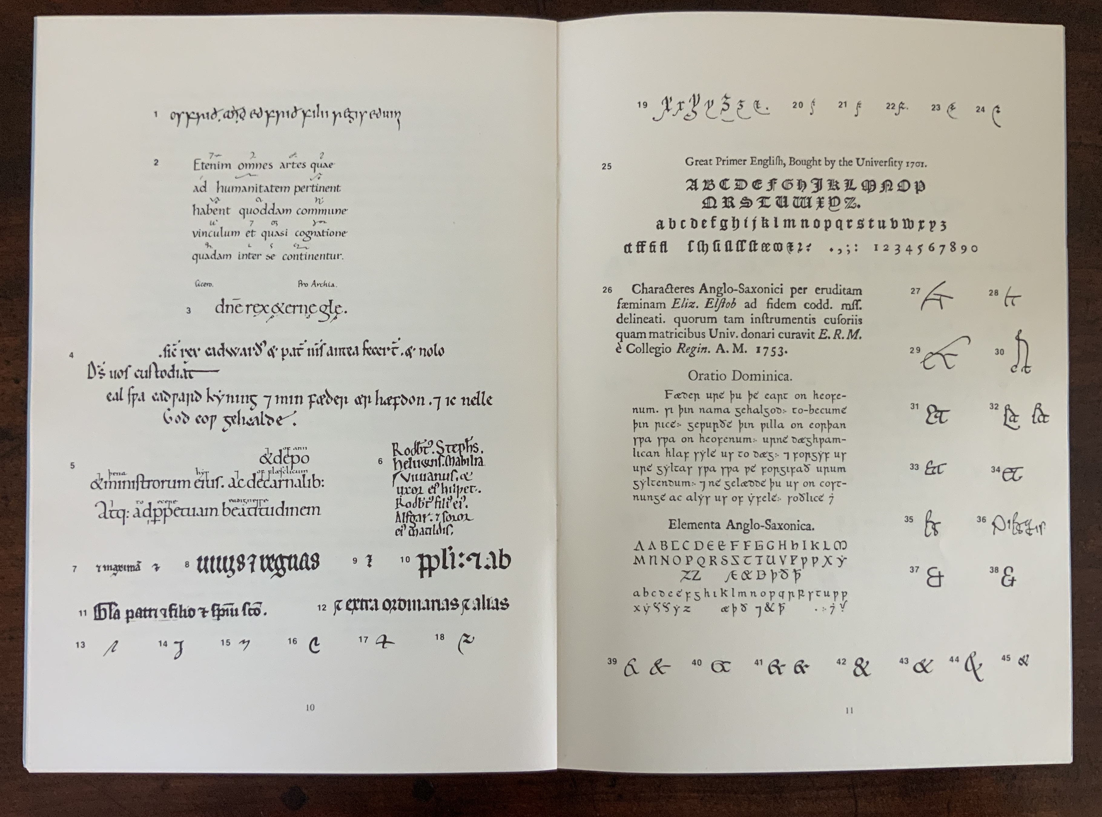
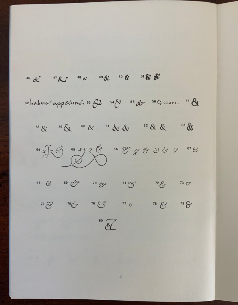
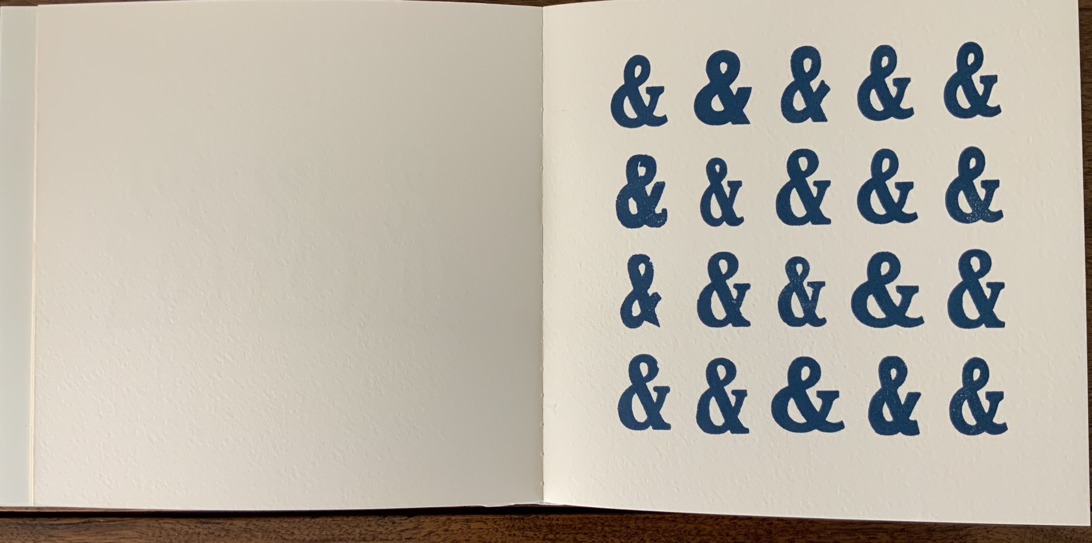
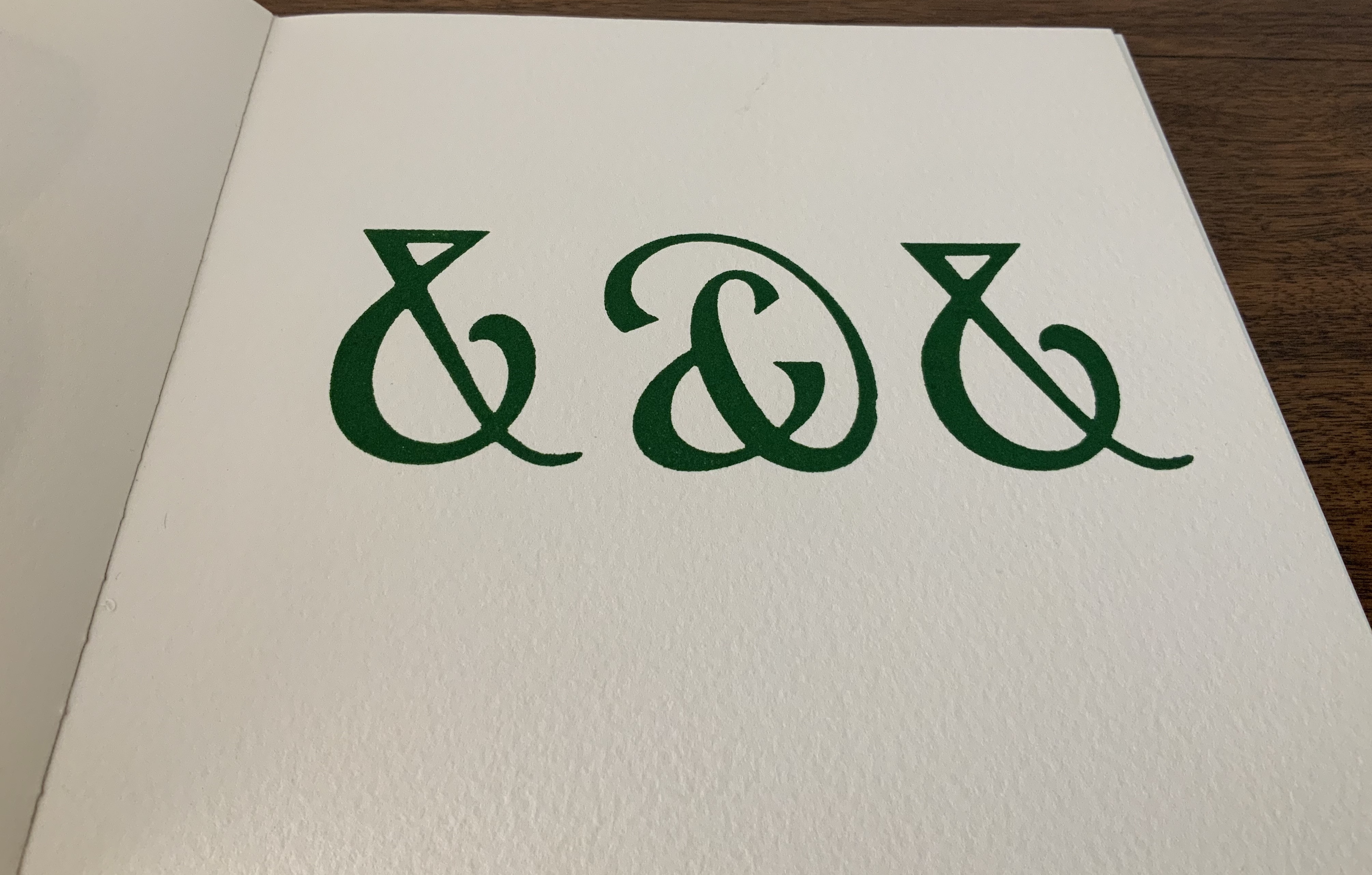
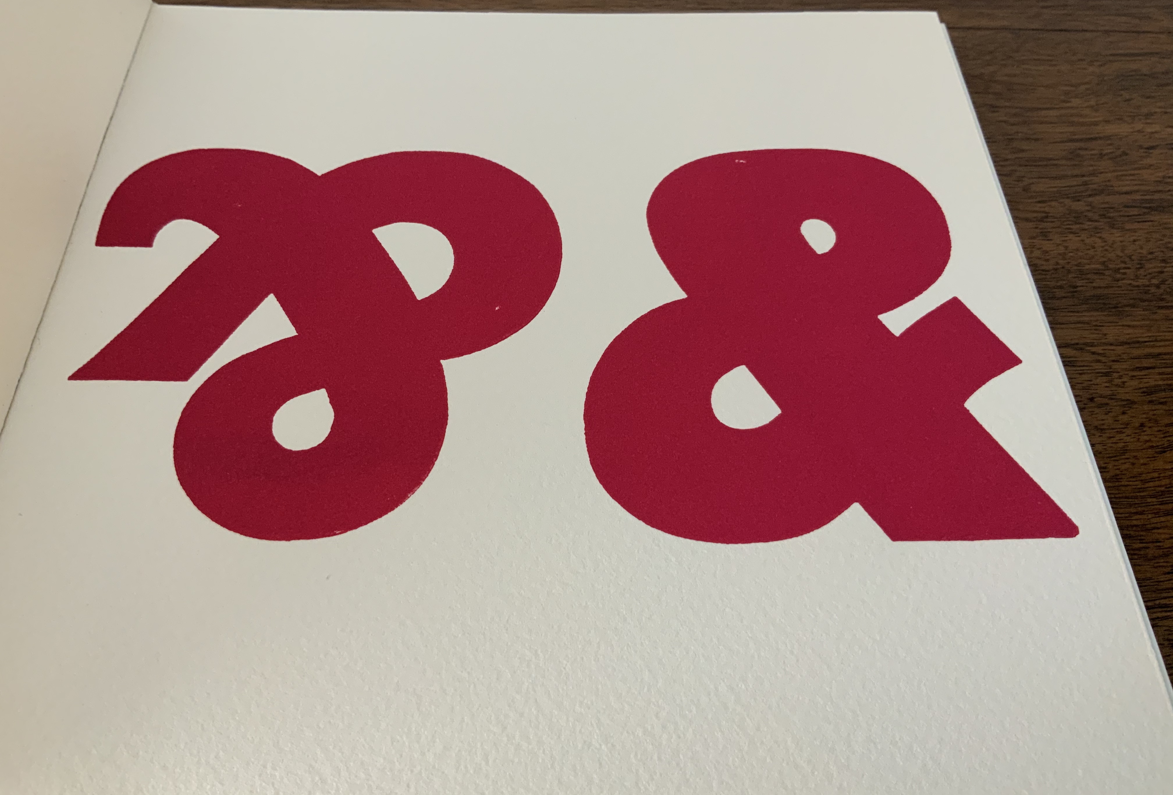
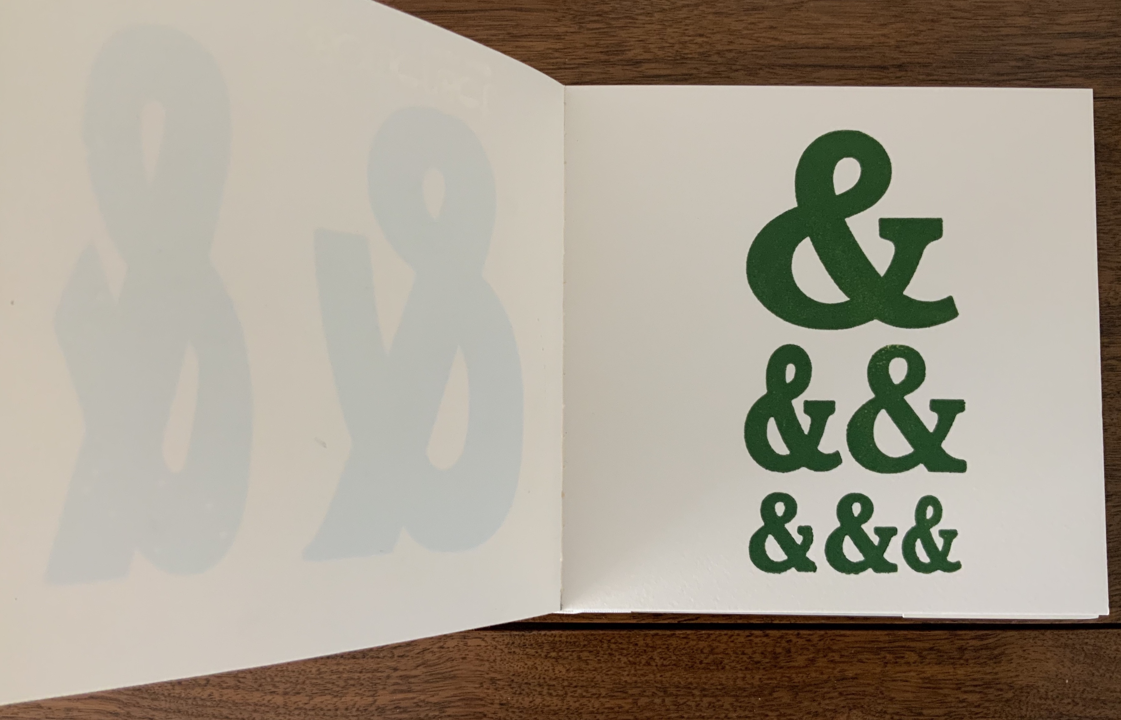
Rutherford Aris, The Ampersand in Script & Print: An Essay in Honour of the Ampersand Club on the Occasion of its Semicentenary
Tauba Auerbach, How to Spell the Alphabet
Federico Babina, Archibet
Cristina Balbiano d’Aramengo, Flag Book Alphabet
Leonard Baskin, Hosie’s Alphabet
Antonio Basoli, Alfabeto Pittorico
Marion Bataille, ABC3D
Anthon Beeke, Alphabet
Rebecca Bingham, Golden Alphabet
Alberto Blanco & “El Nacho”, The Book of Equis (entry in progress)
Tia Blassingame, Mourning/Warning: An Abecedarian; Mourning/Warning: Numbers and Repeaters
Frédéric Bruly Bouabré, Frédéric Bruly Bouabré (2013) in progress
Leonard Brett, A Surrealist Alphabet (2014)
Johann Theodor de Bry, Neiw Kunstliches Alphabet
Ken Campbell, AbaB
Pramod Chavan, The Voice of the Yarn (2023)
William Cheney, ABC for Tiny Schools (1975)
Henri Chopin, Alphabet pour Gratte-Ciel 1970-1985 (1991)
Annie Cicale, Patterned Alphabet (2013) and Detritus No. 30: Floppy Alphabet, Brush Alphabet (2020)
Roman Cieślewicz, Guide de la France Mystérieuse (Les Guides Noirs) (1964) (entry in progress)
David Clifford, Letterpress ABC
Michele Durkson Clise, Animal Alphabet
Mark Cockram, The Trial of the Letter ϒ alias Y by Thomas Edwards (binding)
Aaron Cohick, Alphabet One
Colleen (Ellis) Comerford, ABCing (2010)
Menena Cottin, Las Letras (2008/2018)
Robert Cottingham, A-Z: Robert Cottingham: An American Alphabet
Paul Cox, Abstract Alphabet
Nerma Prnjavorac Cridge, Sarajevska Abeceda
John Crosbie, ABC in a maze (1987)
Wim Crouwel, A New Alphabet
Roberto de Vicq de Cumptich, Bembo’s Zoo
Carol Cunningham, Alphabet Alfresco (1985)
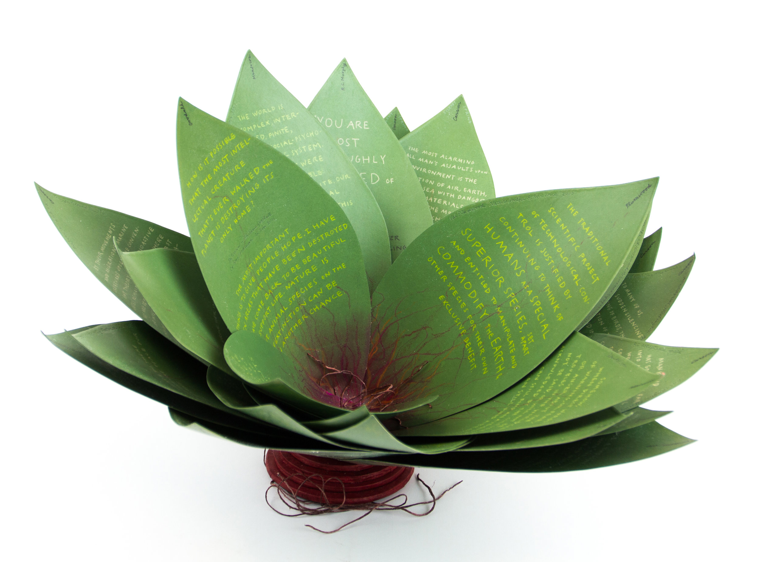
Joyce Cutler-Shaw, Alphabet of Bones
Jason D’Aquino, Jason D’Aquino’s Circus ABC (2010)
François Da Ros, Anakatabase
Jean-Renaud Dagon (Le Cadratin), Voyelles by Arthur Rimbaud
Lyn Davies, A is for Ox
The Three Delevines, A Human Alphabet (1897)
Raffaella della Olga, LINE UP
Sonia Delaunay, Alphabet (1972)
Klaus Peter Dencker, Dero Abecedarius! (2001)
William Dugan, How Our Alphabet Grew (1972)
Thomas Edwards, An Account of the Trial of the Letter ϒ [upsilon] alias Y, binding by Mark Cockram
Timothy Epps and Christopher Evans, Alphabet
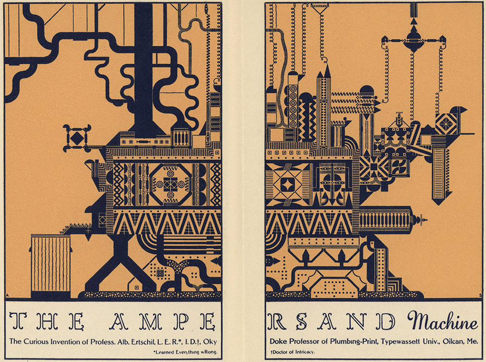
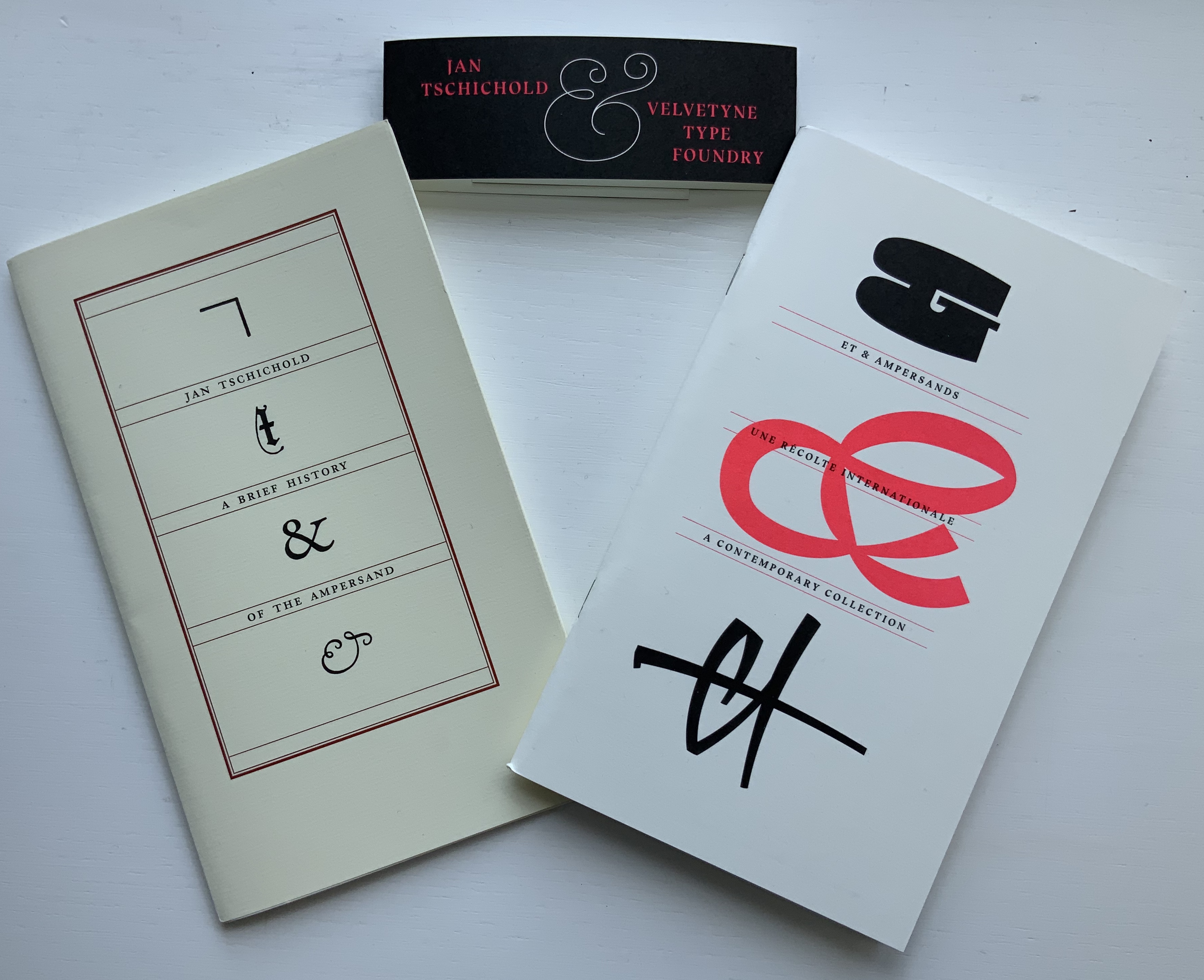
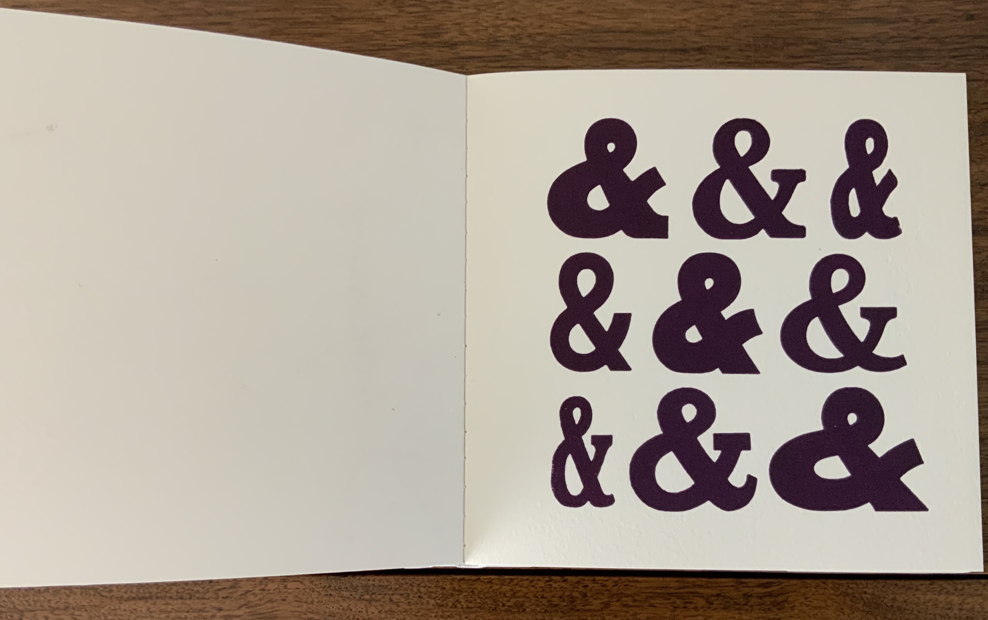
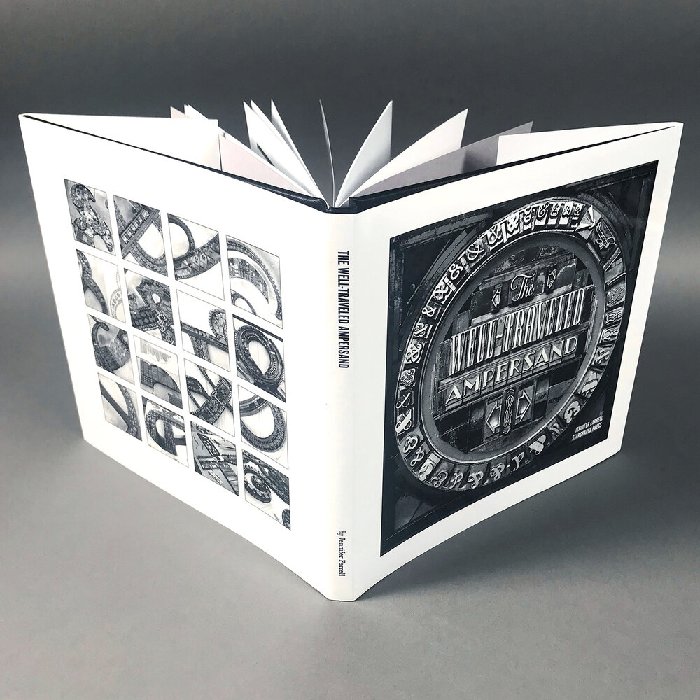
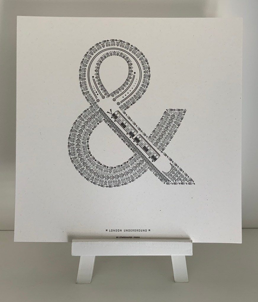
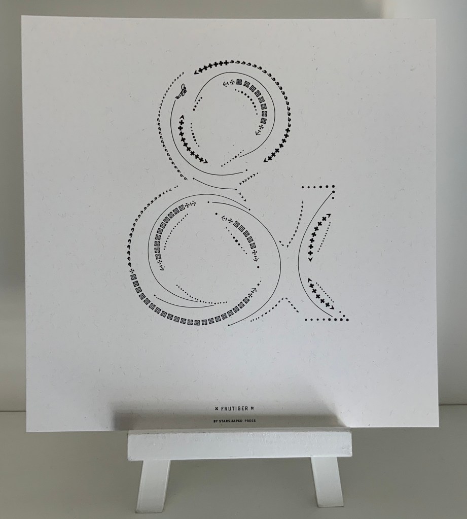
Jennifer Farrell, The Well-Travelled Ampersand
Leonard Everett Fisher, Alphabet Art (1978), The ABC Exhibit (1991)
Edmund Fry, Pantographia (1799/2022)
Neil Gaiman & Gris Grimly, The Dangerous Alphabet (entry in progress)
John Gerard, Alpha Beta
Julien Gineste, Alphabet
Edward Gorey, Thoughtful Alphabets: The Just Dessert / the Deadly Blotter, The Eclectic Abecedarium
Raj Haldar, Chris Carpenter & Maria Tina Beddia, P is for Pterodactyl: The Worst Alphabet Book Ever (2018)
Karen Hanmer, The Spectrum A-Z; A2Z
Steven Heller & Gail Anderson, The Typographic Universe
Christopher Hicks, A Bookbinder’s ABC (2003)
Helen Hiebert, Alpha Beta …
Susan Hiller, The Artist’s Palette Alphabet
Tana Hoban, A,B, See!
Richard J. Hoffman, “Don’t Nobody Care about Zeds” (1987) and The Story of the Alphabet (1988)
Jean Holabird, Vladimir Nabokov: AlphaBet in Color
Hans Holbein the Younger, Der Totentanz (entry in progress)
Erwin Huebner, Alphabeta Concertina Majuscule (2015) and alphabet concertina miniscule (2022)
Takenobu Igarashi, Igarashi Alphabets
Nayla Romanos Ilya, The Phoenician Alphabet (2022)
Bård Ionson, Battledore (2019)
Stephen T. Johnson, Alphabet City; A is for Art; Alphabet School
William Joyce and Christina Ellis, The Numberlys
Karl Kempton, 26 Voices
Ines von Ketelhodt, Alpha Beta
Ronald King, Alphabet II, Alphabeta Concertina, alphabeta concertina miniscule, The White Alphabet (in progress)
Margo Klass, Takeover (2023)
Moussa Kone: The Abecedarium of the Artist’s Death: 26 Dangers for Your Career
Alethea Kontis, AlphaOops: The Day Z Went First (entry in progress)
Lou Kuenzler & Julia Woolf, Not Yet Zebra (entry in progress)
Sean Lamb & Mike Perry, Z Goes First (entry in progress)
Amy Lapidow, Spiralbet
Ji Lee, Univers Revolved: A Three-Dimensional Alphabet
Francesca Lohmann, An Alphabetical Accumulation
Catherine Macorol, A is for Axolotl (2022)
Helen Malone, Alphabetic Codes
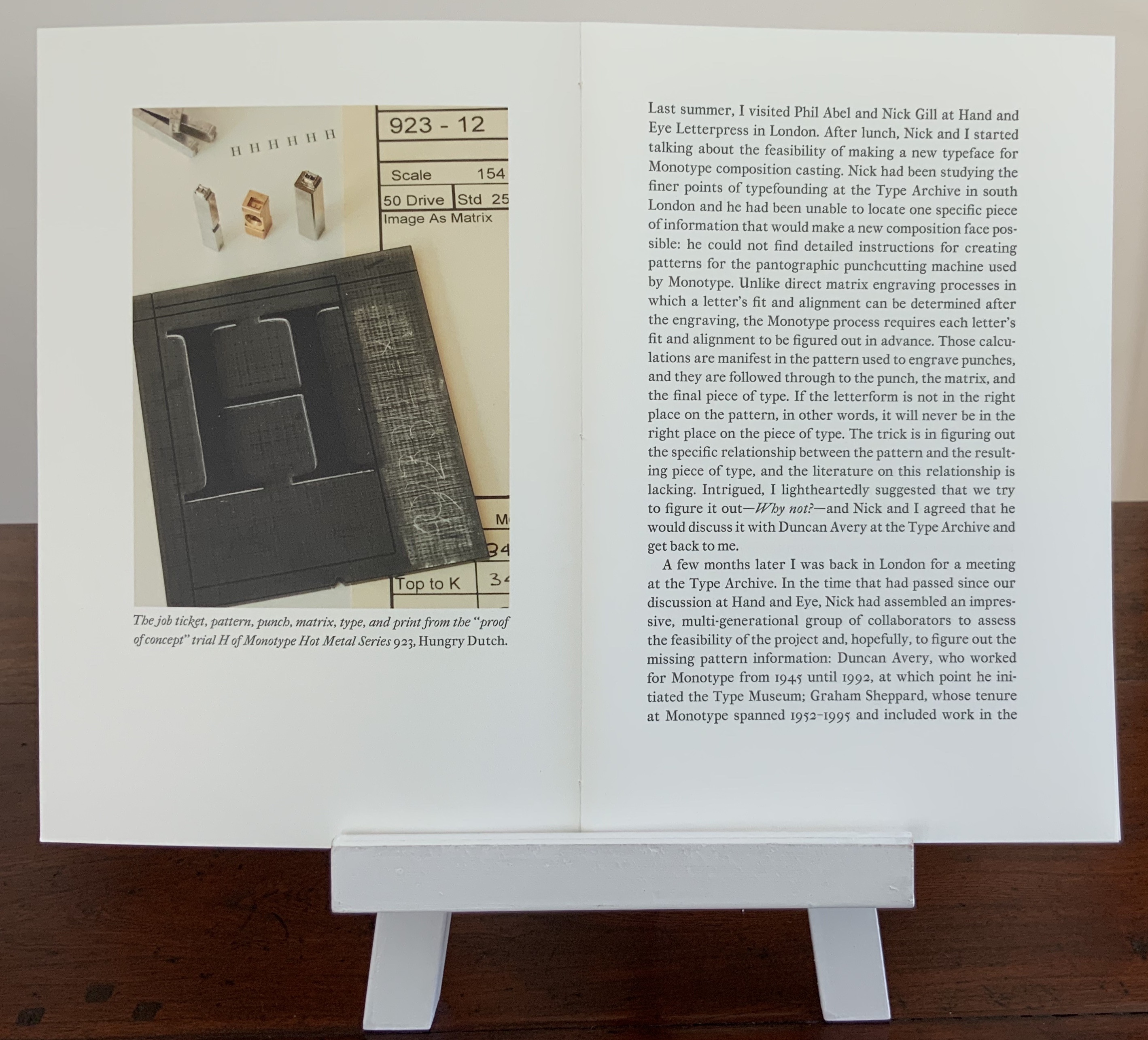
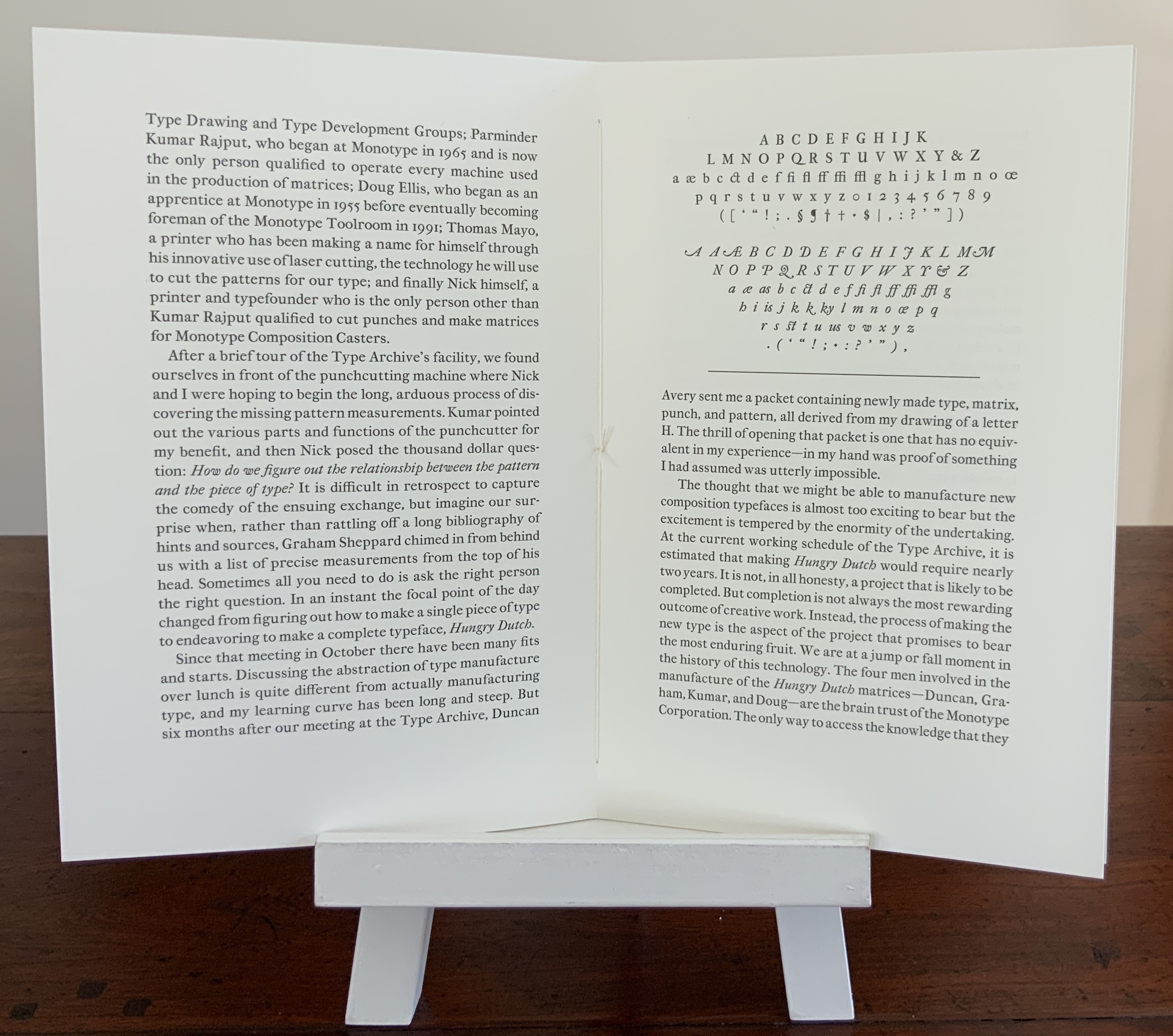
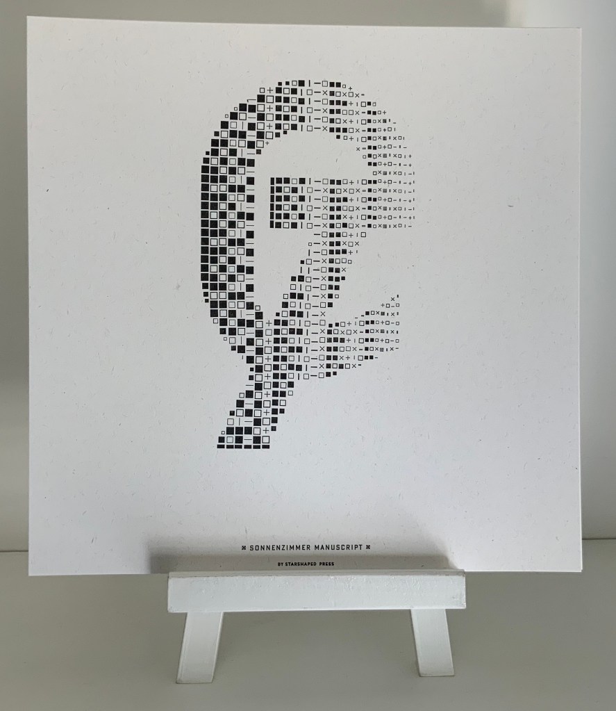
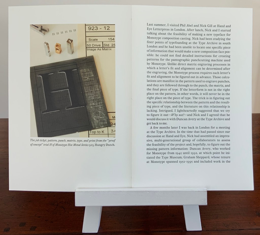
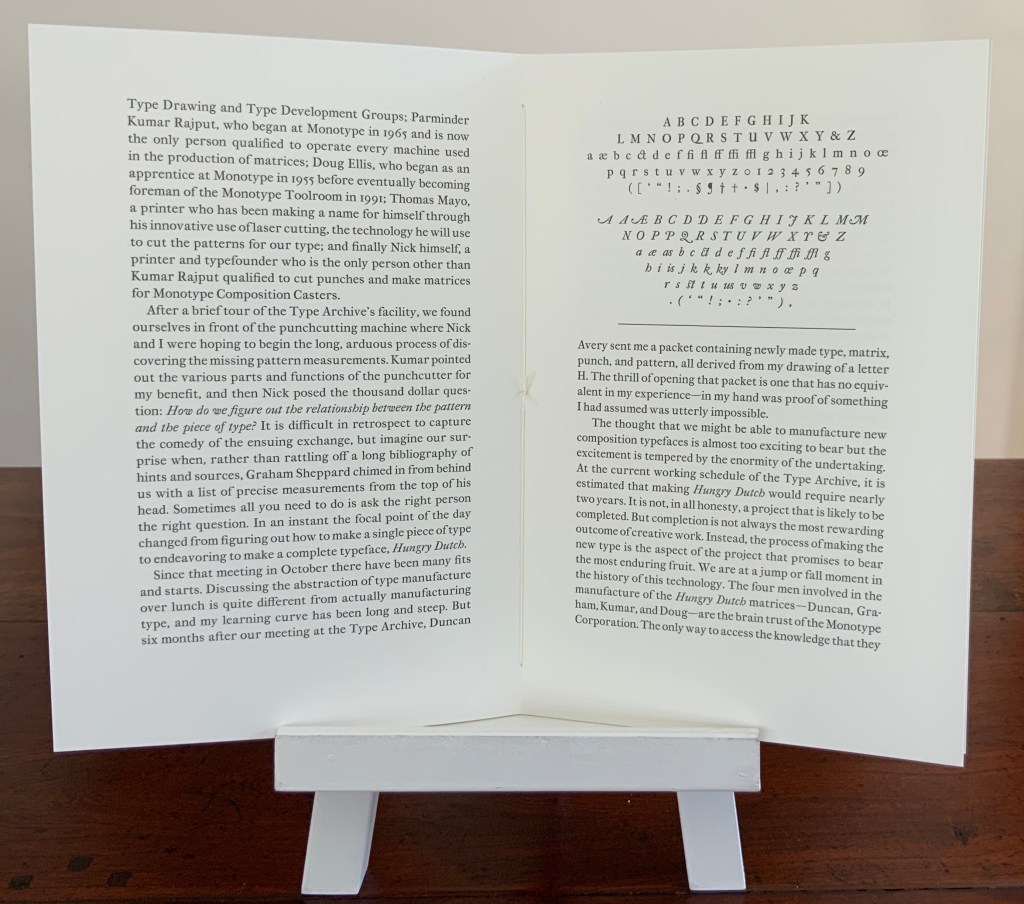
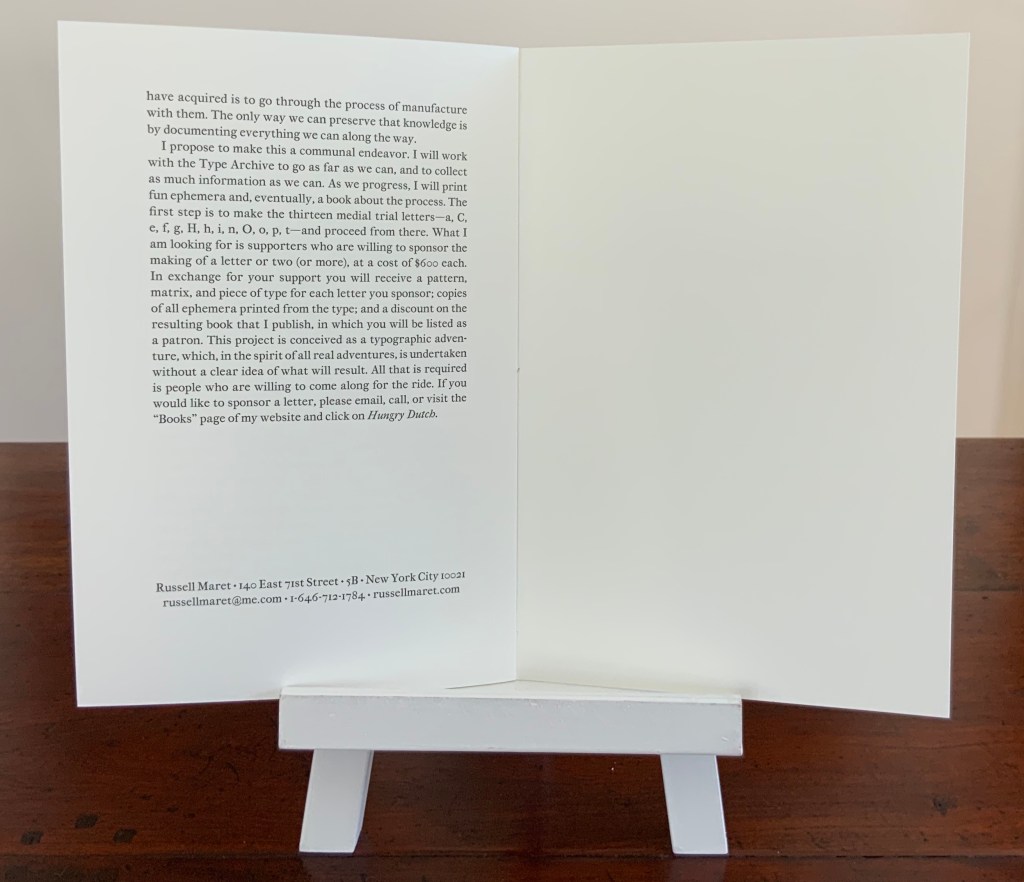
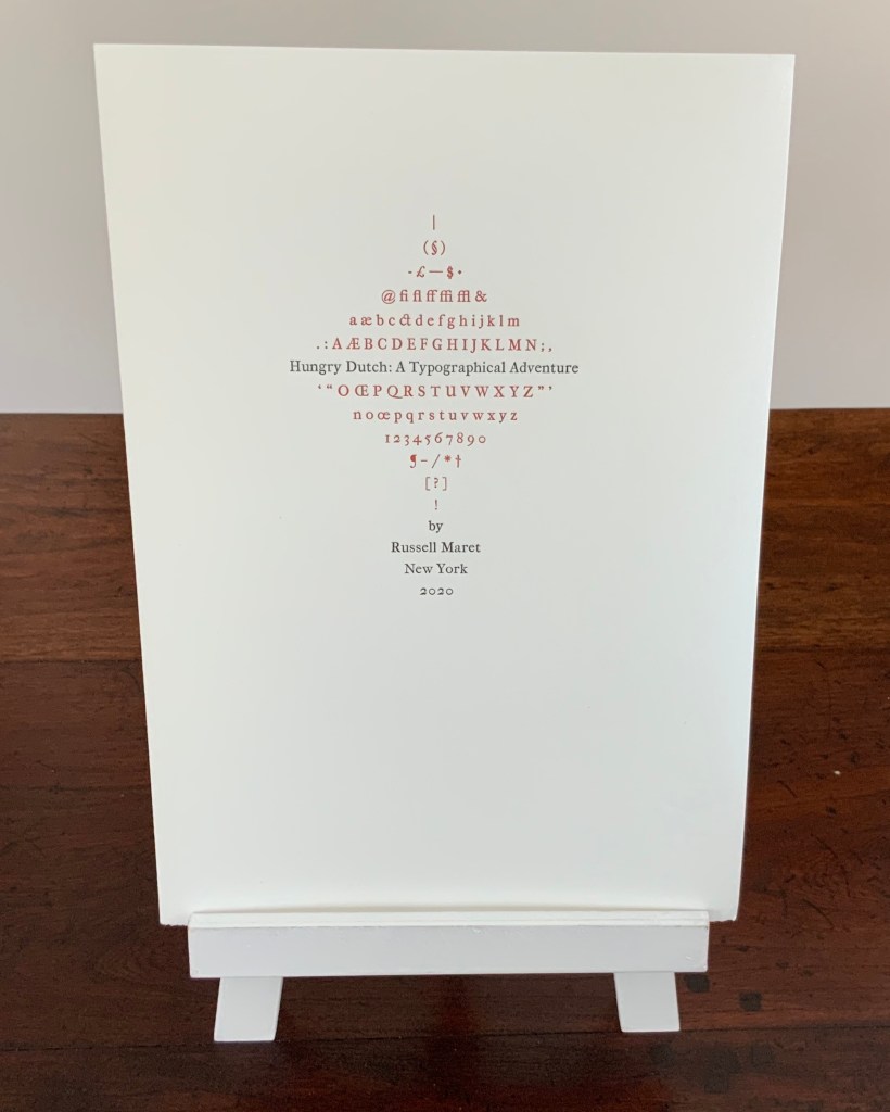
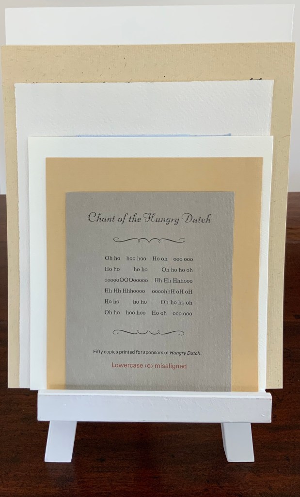
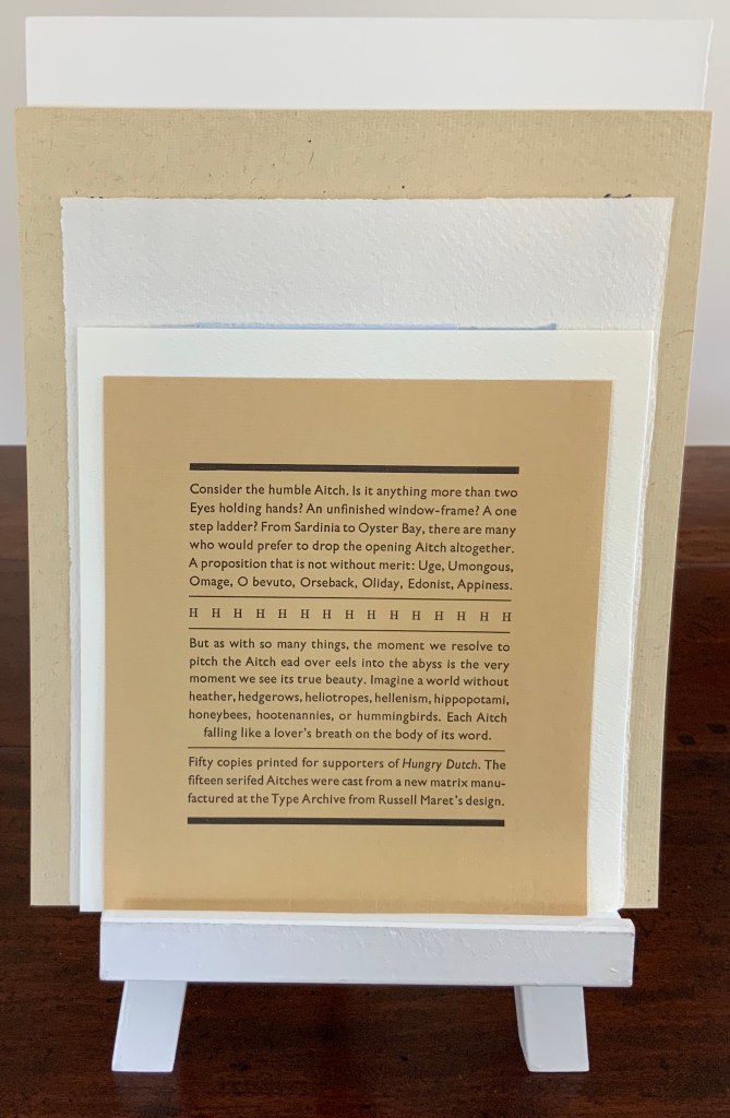
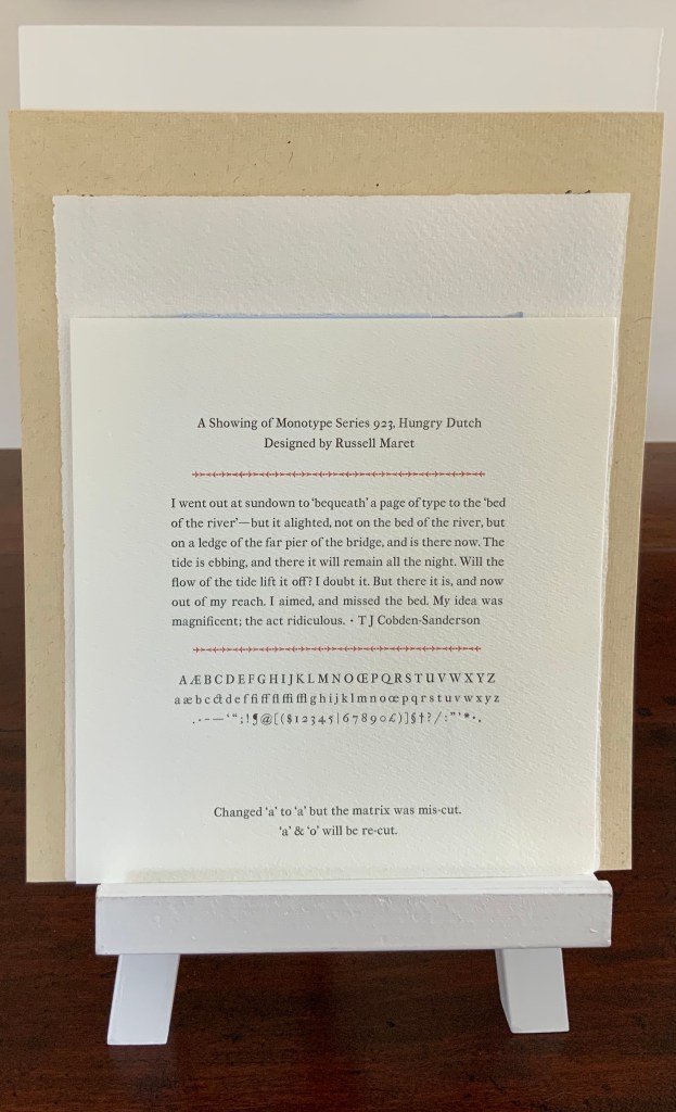
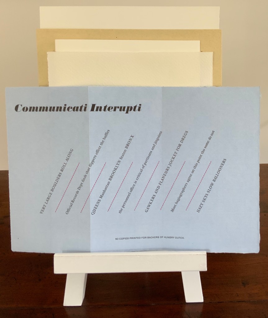
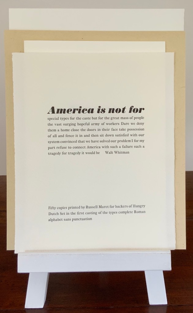
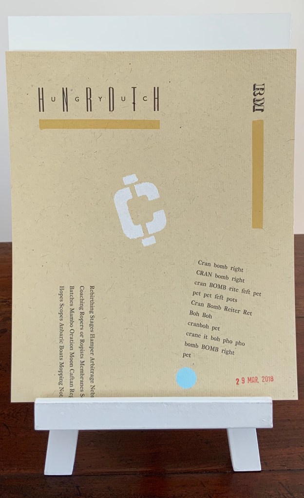
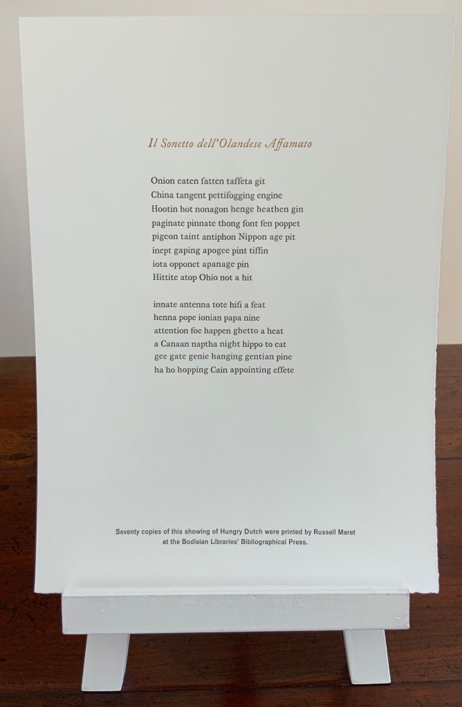
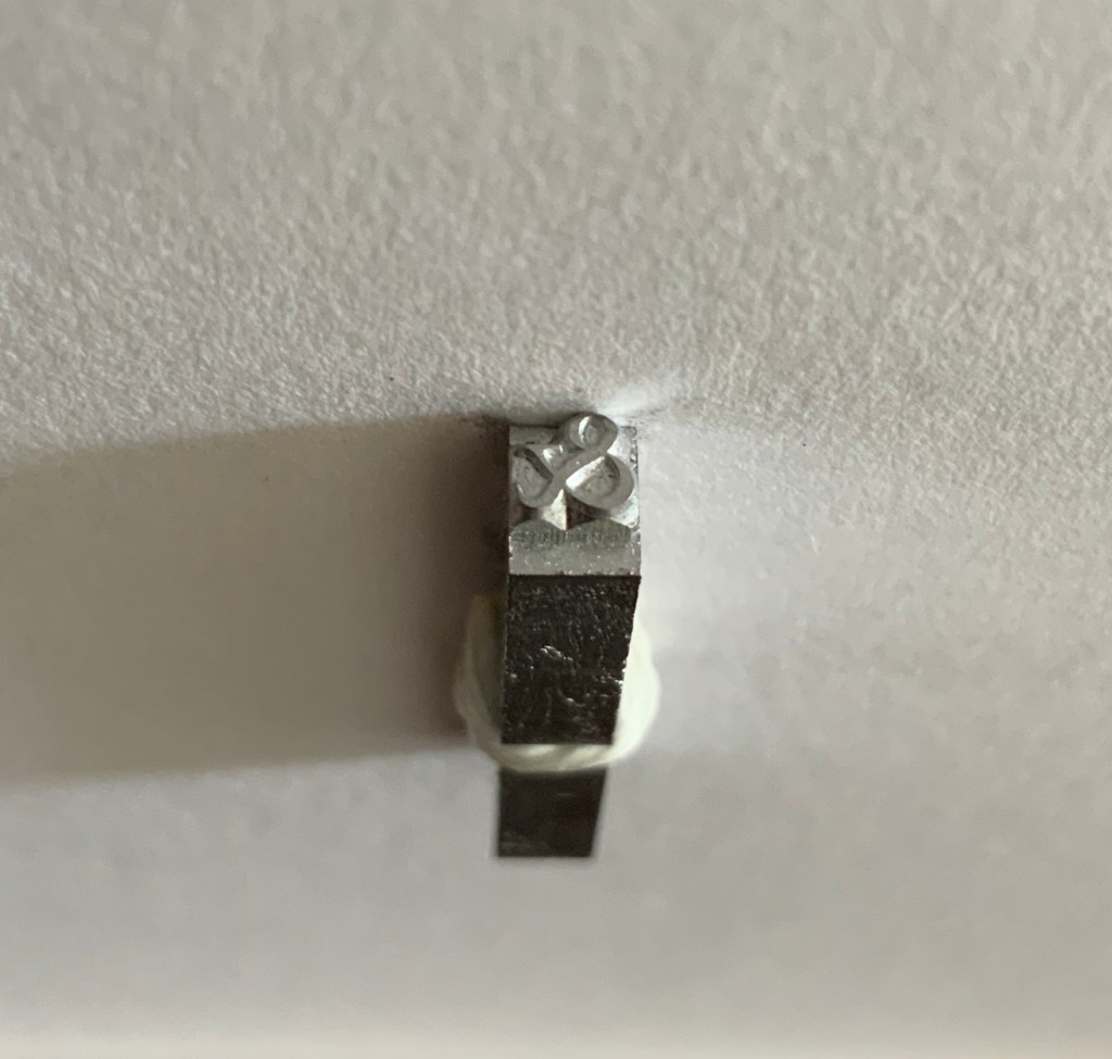
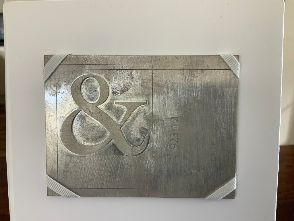
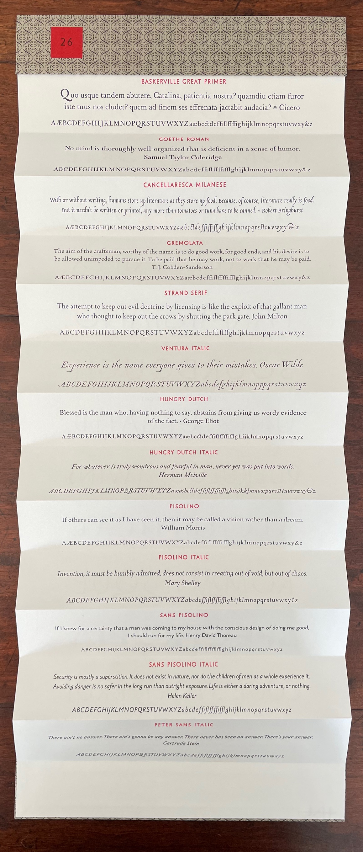
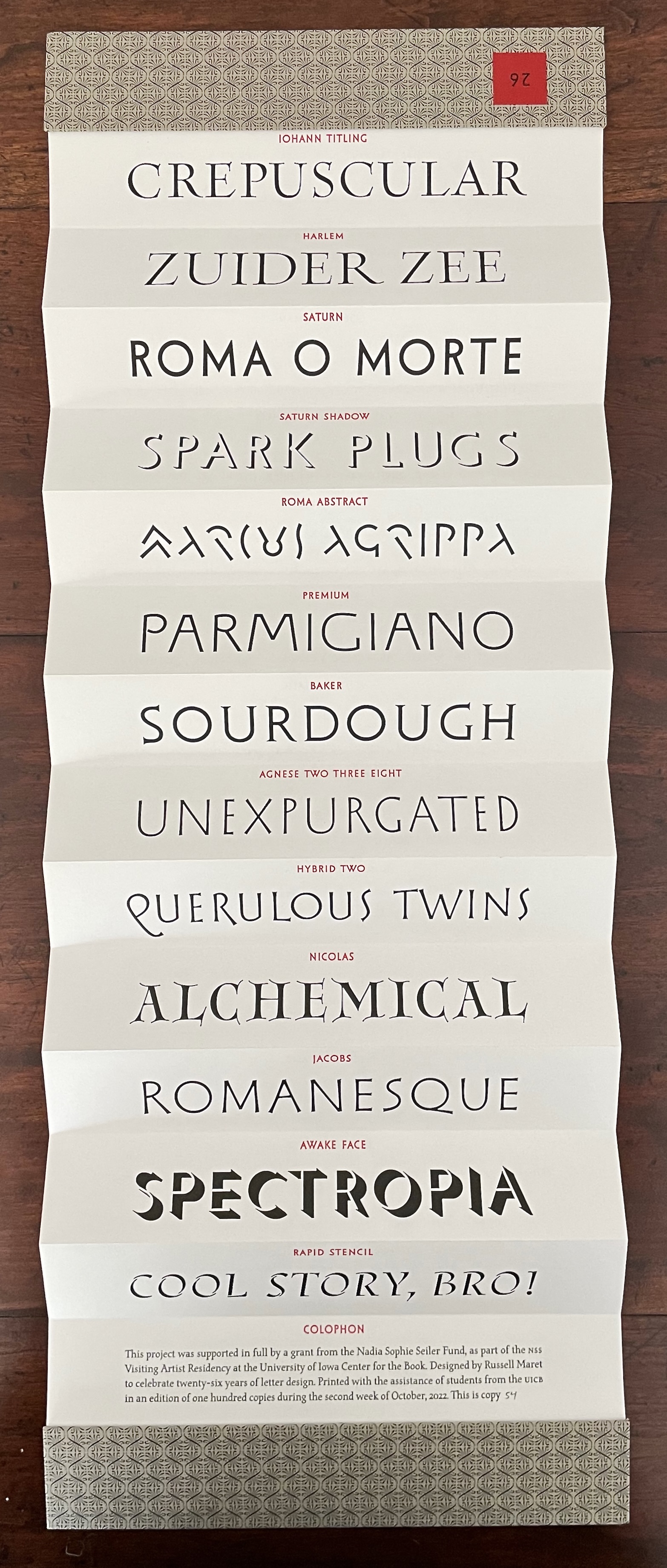
Russell Maret, Hungry Dutch
Enid Marx, Marco’s Animal Alphabet
Scott McCarney, Alphabook 3, Alphabook 10 and Alphabook 13
Tara McLeod, ABC
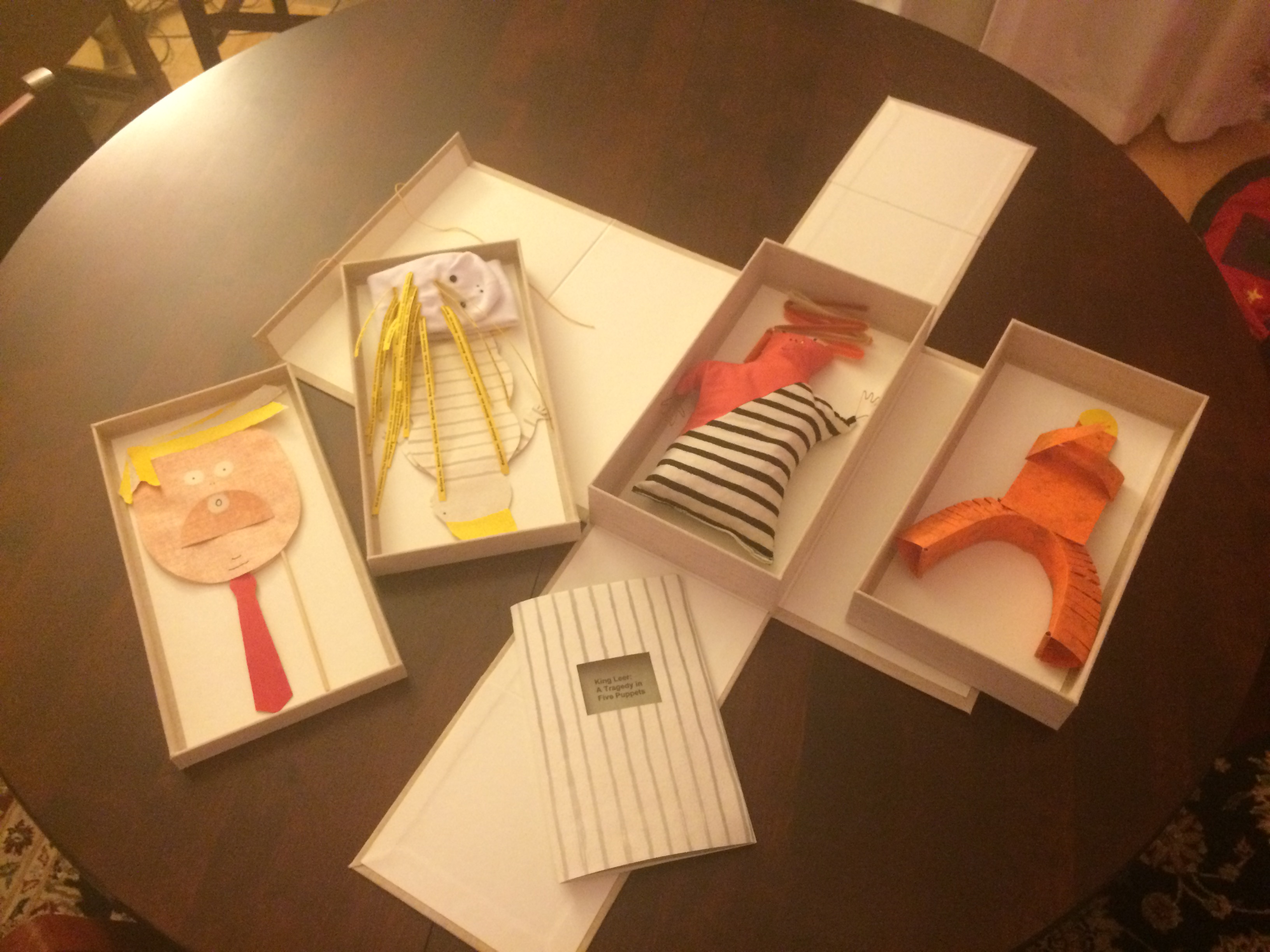
Clément Mériguet, ABCDead
Lisa Merkin, Bodies Making Letters (entry in progress)
Miarko (Edmond Bouchard), ABC d’Art (c. 1920)
Cathryn Miller, L is for Lettering
Patrice Miller, The Eclectic Abecedarium by Edward Gorey (binding)
Suzanne Moore, A Blind Alphabet
Dave Morice, A Visit from St. Alphabet
Jeffrey Morin & Steven Ferlauto, Sacred Space; The Sacred Abecedarium (entry in progress)
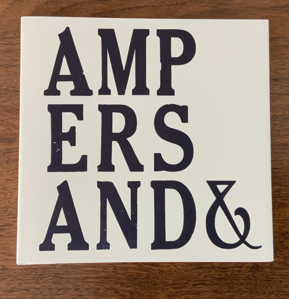
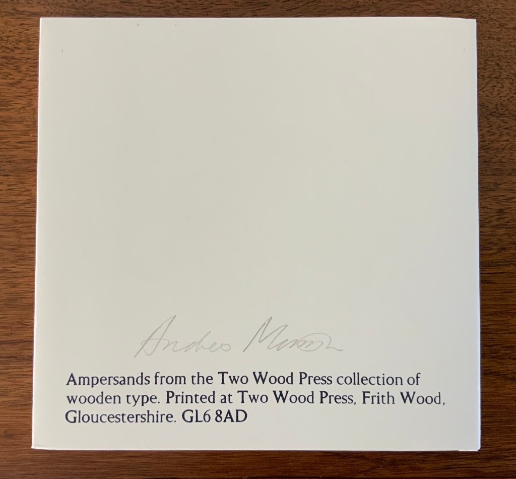
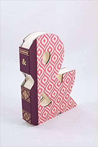
Andrew Morrison, Ampersands&; Two Wood Press A-Z
Movable Books Society, A to Z: Marvels in Paper Engineering
Bruno Munari, ABC con fantasia
Museum of Metropolitan Art, Animalphabet (1996)
Lloyd. L. Neilson, An Alphabet Coloring Book by Theodore Menten (1997)
Vítězslav Nezval, Abeceda/Alphabet
Richard Niessen, The Palace of Typographic Masonry
Paul Noble, Nobsons Newton
Clotilde Olyff, Lettered Typefaces and Alphabets by Clotilde Olyff (2000)
Květa Pacovská, À l’infini (2007)
Molly Peacock & Kara Kosaka, Alphabetique
Antonio & Giovanni Battista de Pian, Alphabetto Latino Schizzato and Alphabetto Pittoresque, respectively
Maria Pisano, XYZ
Étienne Pressager, Quelques îles en formation
Richard Price & Ronald King, little but often
Francisca Prieto, Printed Matter series
Alice & Martin Provensen, A Peaceable Kingdom (1978) in progress
David Rault, ABC of Typography (2019)
Bruce Rogers, Champ Rosé
Renzo Rossi, The Revolution of the Alphabet (2009), A Gift from the Gods (2009) and How Writing Began (2009)
Ornan Rotem, A Typographic Abecedarium (2015)
Sybil Rubottom & Jim Jim Machacek, Spice Market
Tiphaine Samoyault, Alphabetical Order (1998)
Claude Sarasas, The ABC’s of Origami
Claire Jeanine Satin, Alphabet Cordenons
Rowland Scherman, Love Letters (2008)
Judy Fairclough Sgantas, ABC of Bugs and Plants in a Northern Garden (2012)
Ben Shahn, The Alphabet of Creation
Levi Sherman, Frequency: An Abecedarian (entry in progress)
Jana Sim, Both but Between (2021)
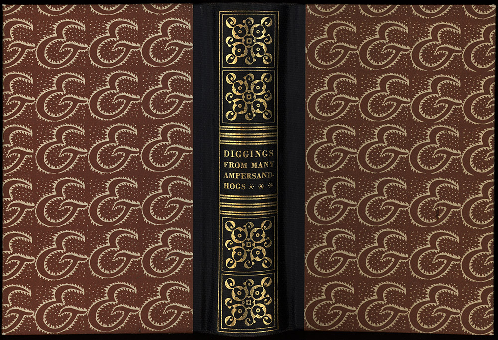
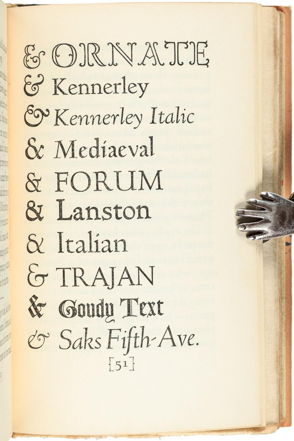
Paul Standard, Diggings of Many Ampersandhogs
Kevin M. Steele, The Movable Book of Letterforms (2009)
Johann David Steingruber, Architectonisches Alphabeth
Connie Stricks, A Cuneiform Hornbook (2023)
Borje Svennsson & James Diaz, Letters
Ashley Rose Thayer, Runic Alphabet (2023)
Geofroy Tory, Champ Fleury
Nancy Anderson Trottier, The Alphabet Effect (2013)
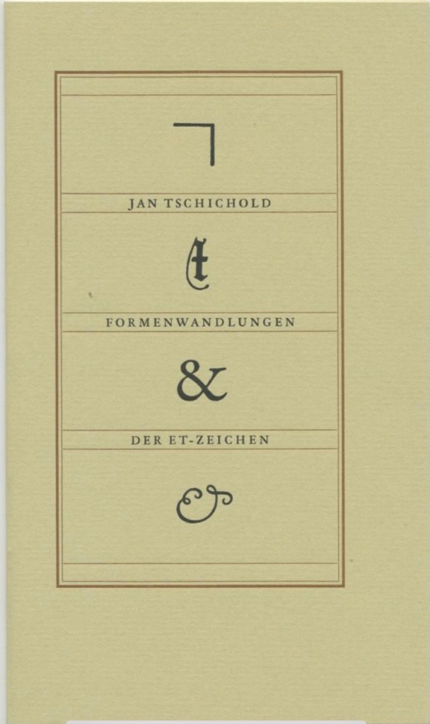
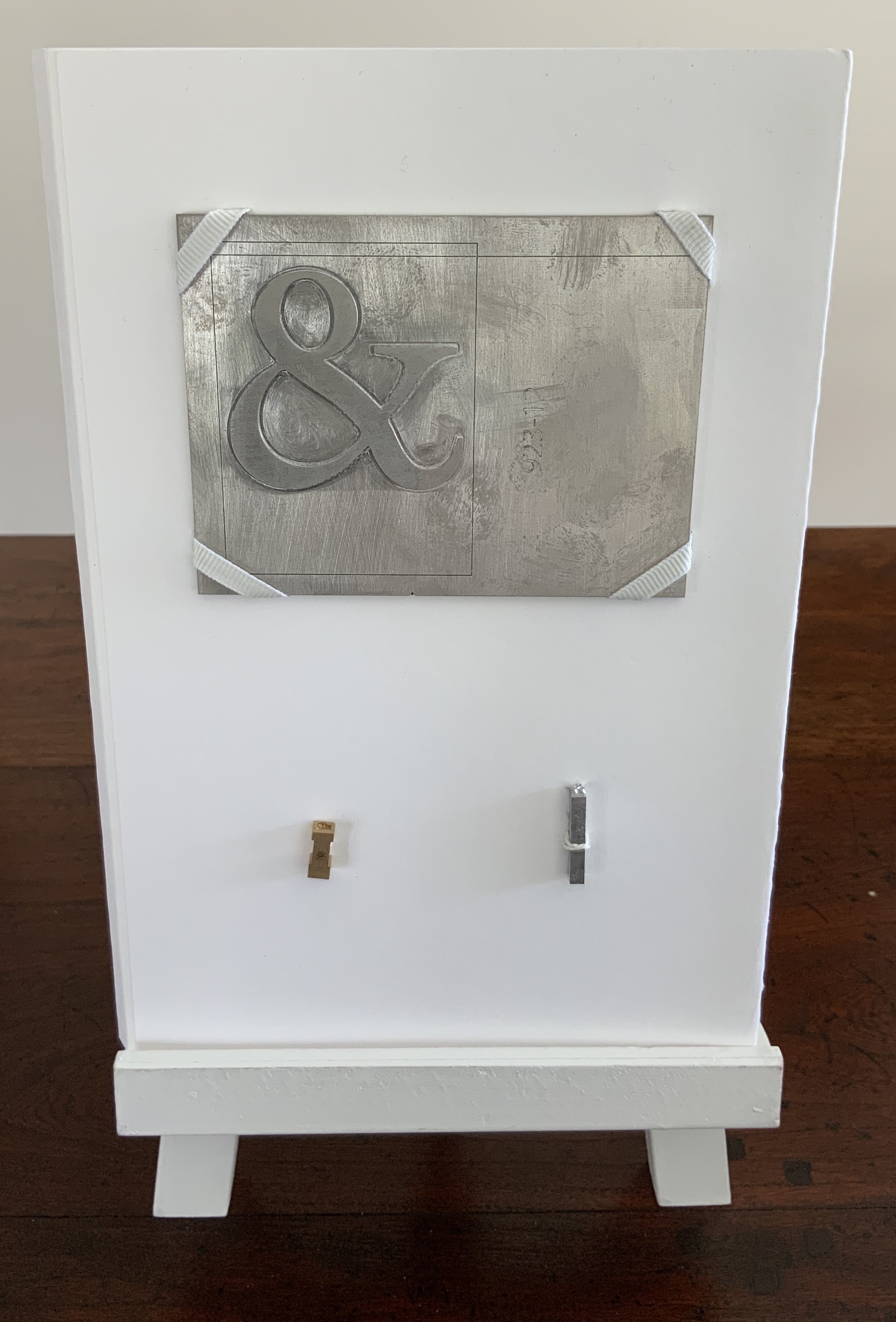
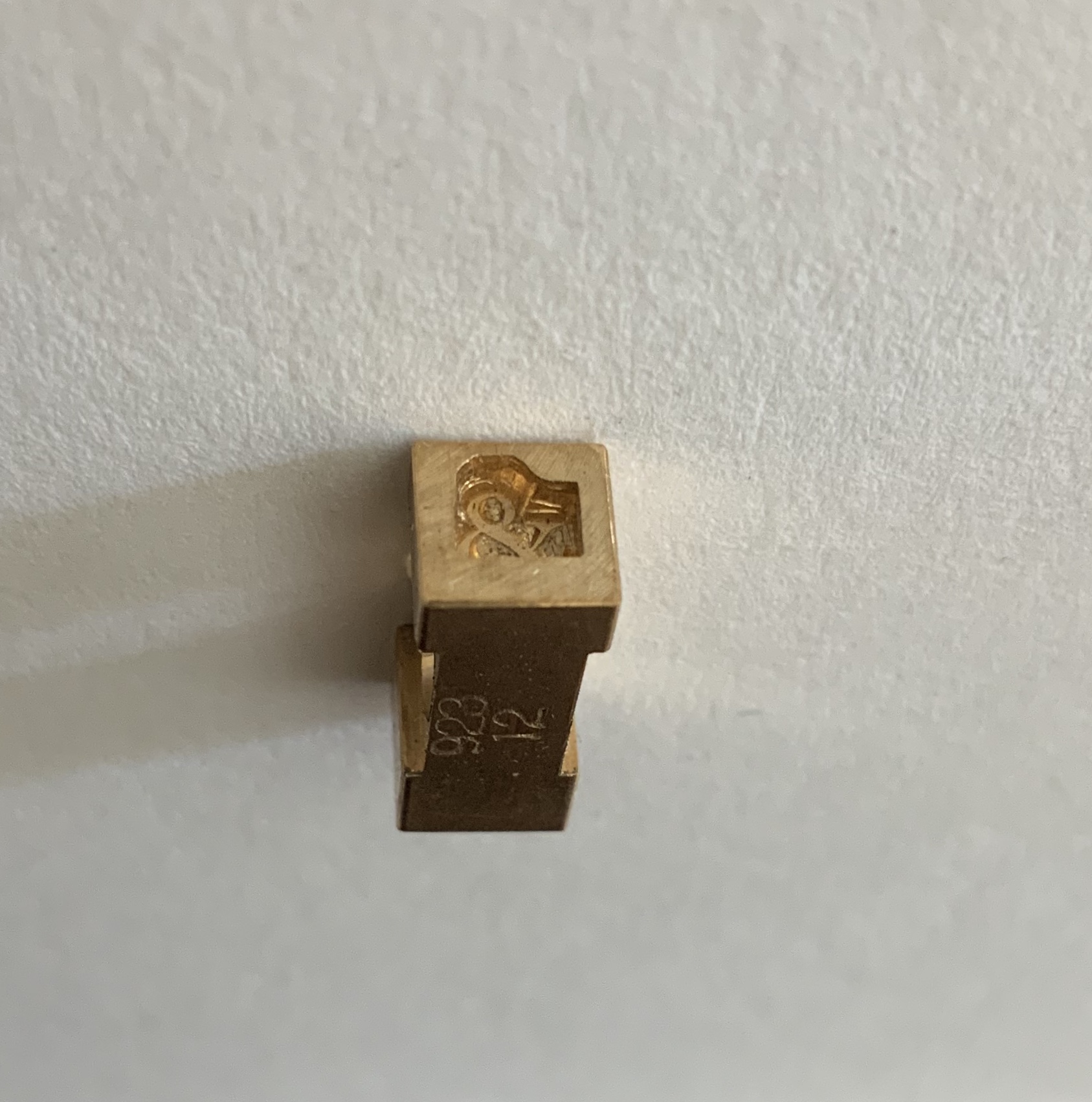
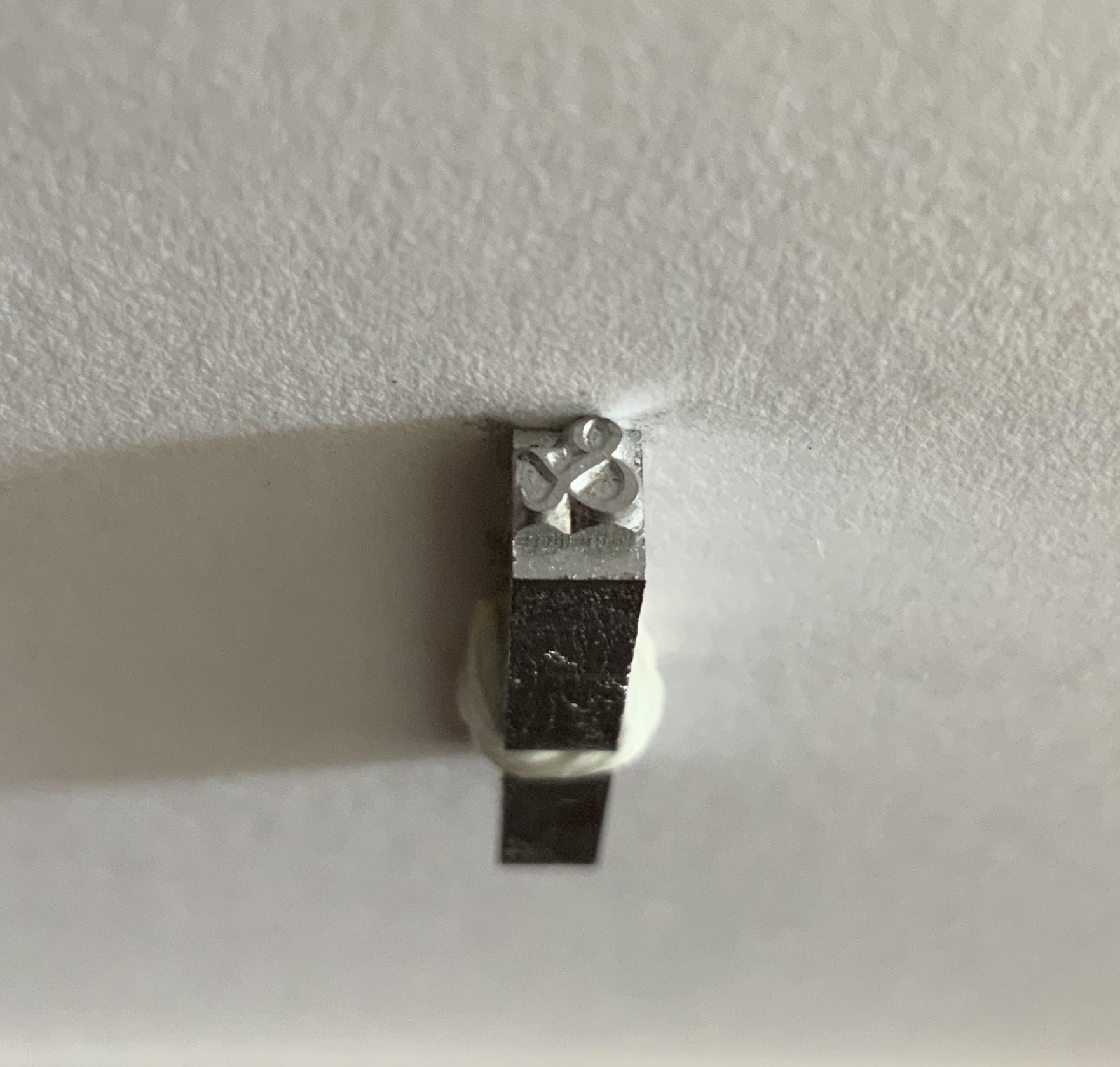
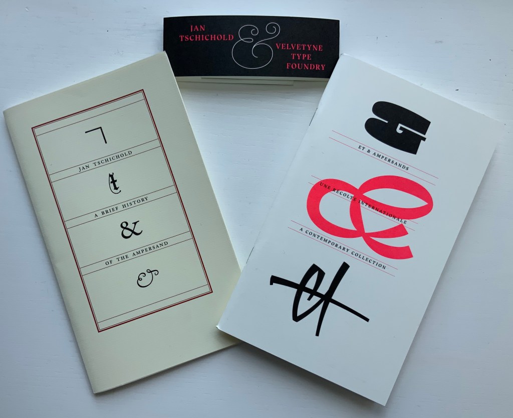
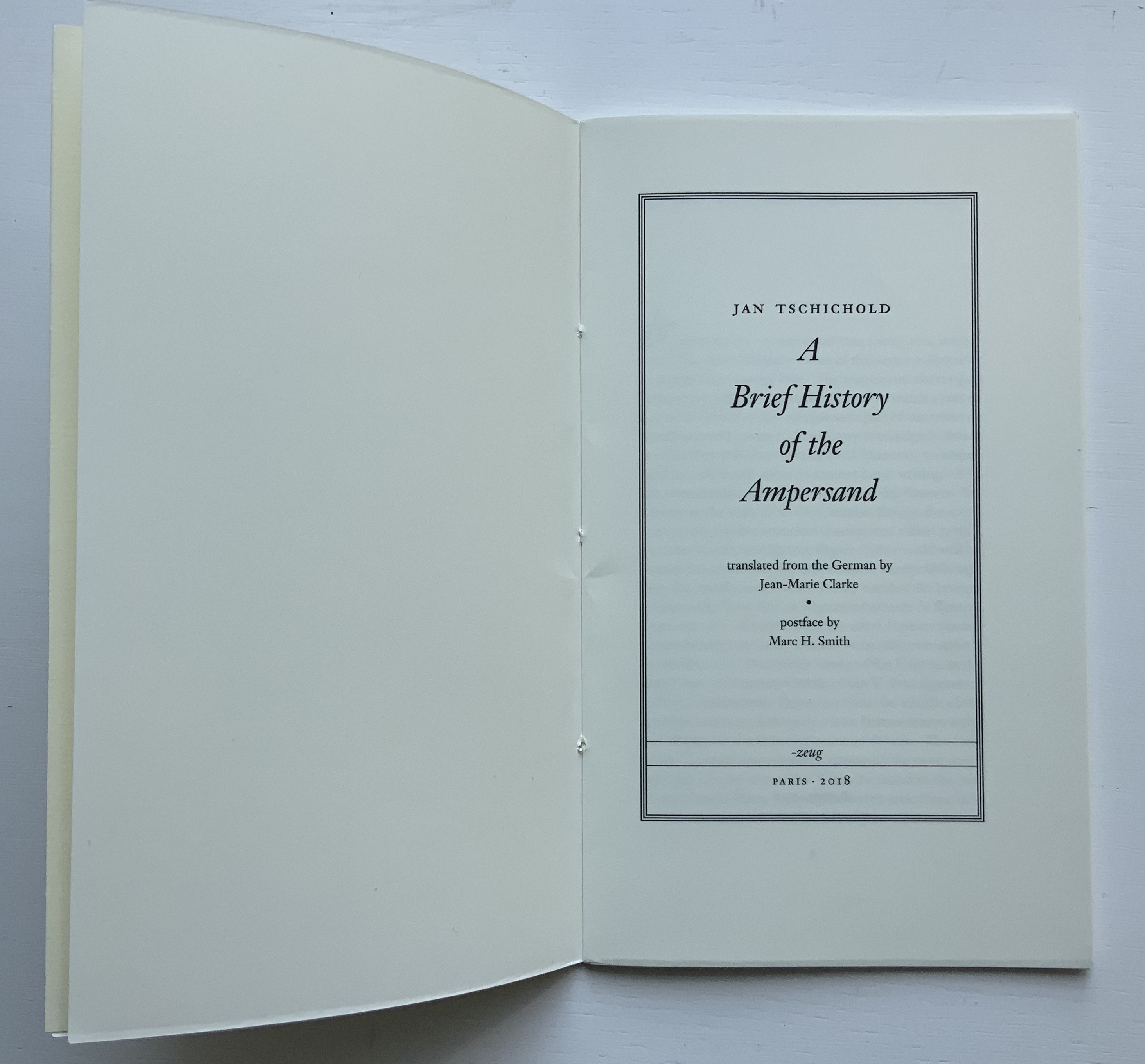
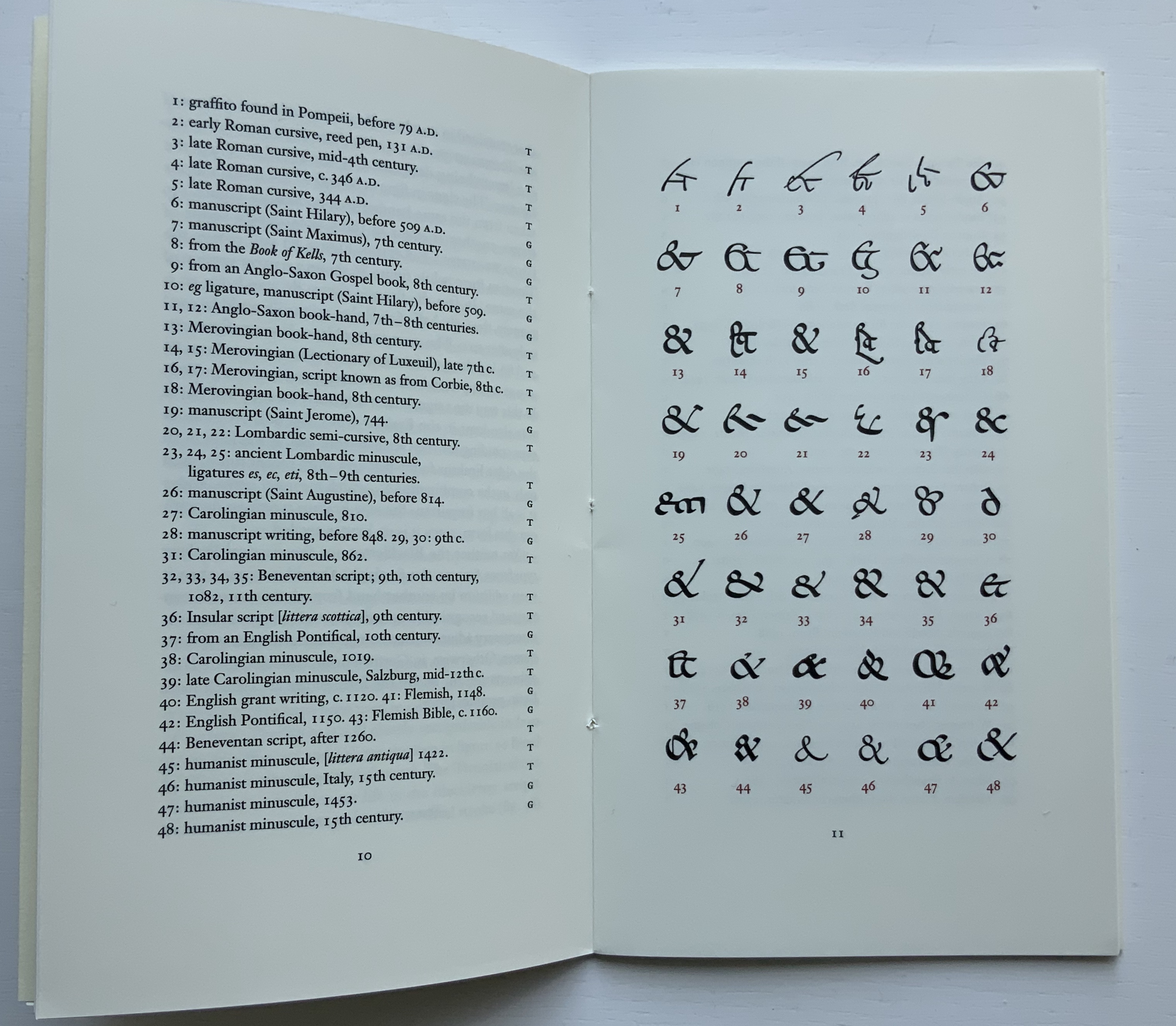
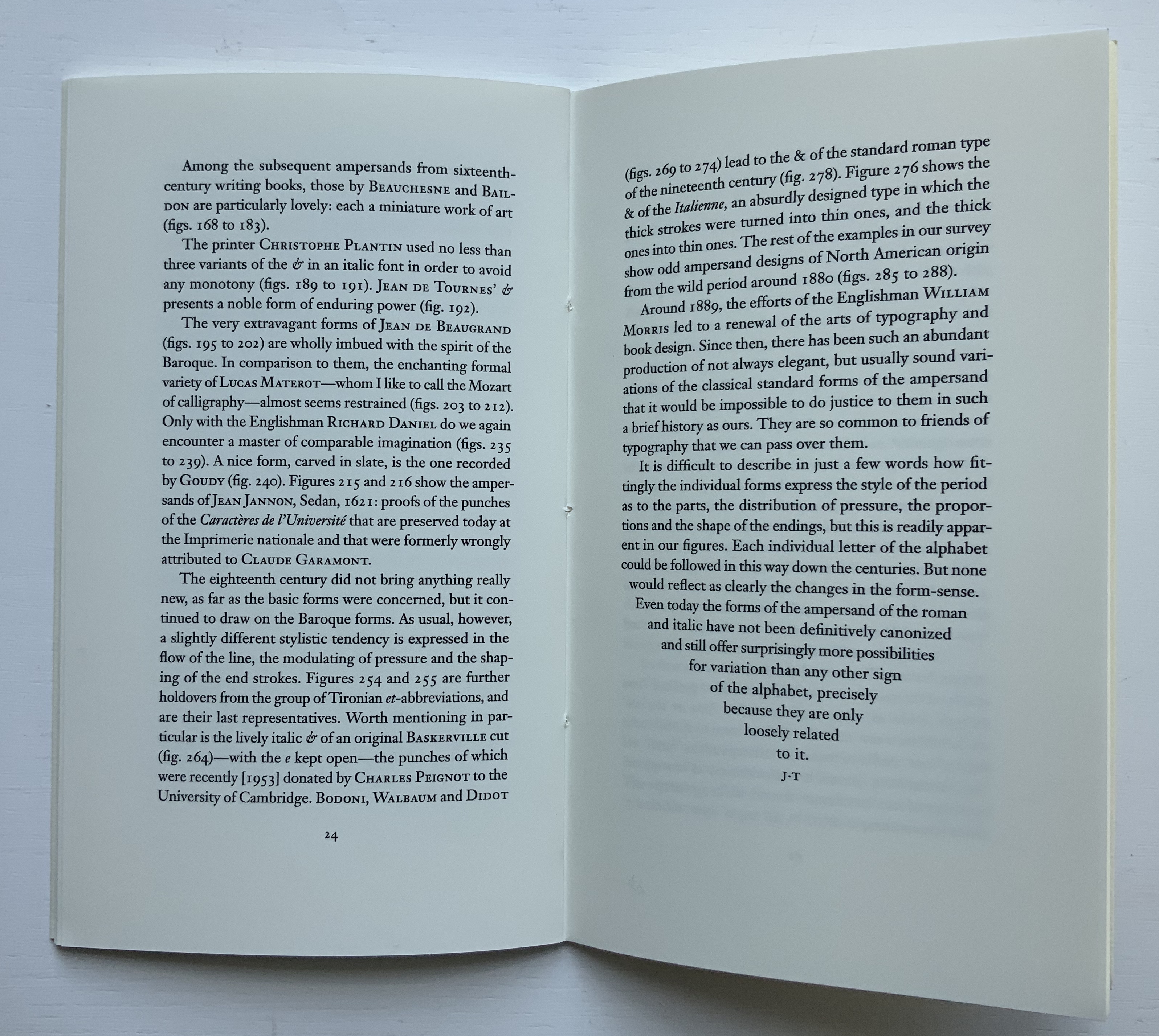
Jan Tschichold, A Brief History of the Ampersand
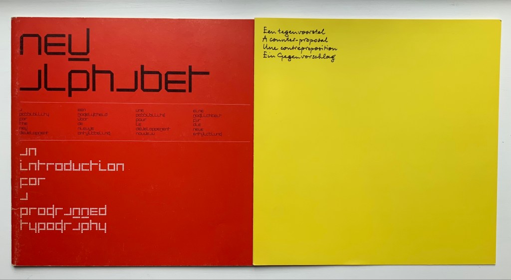
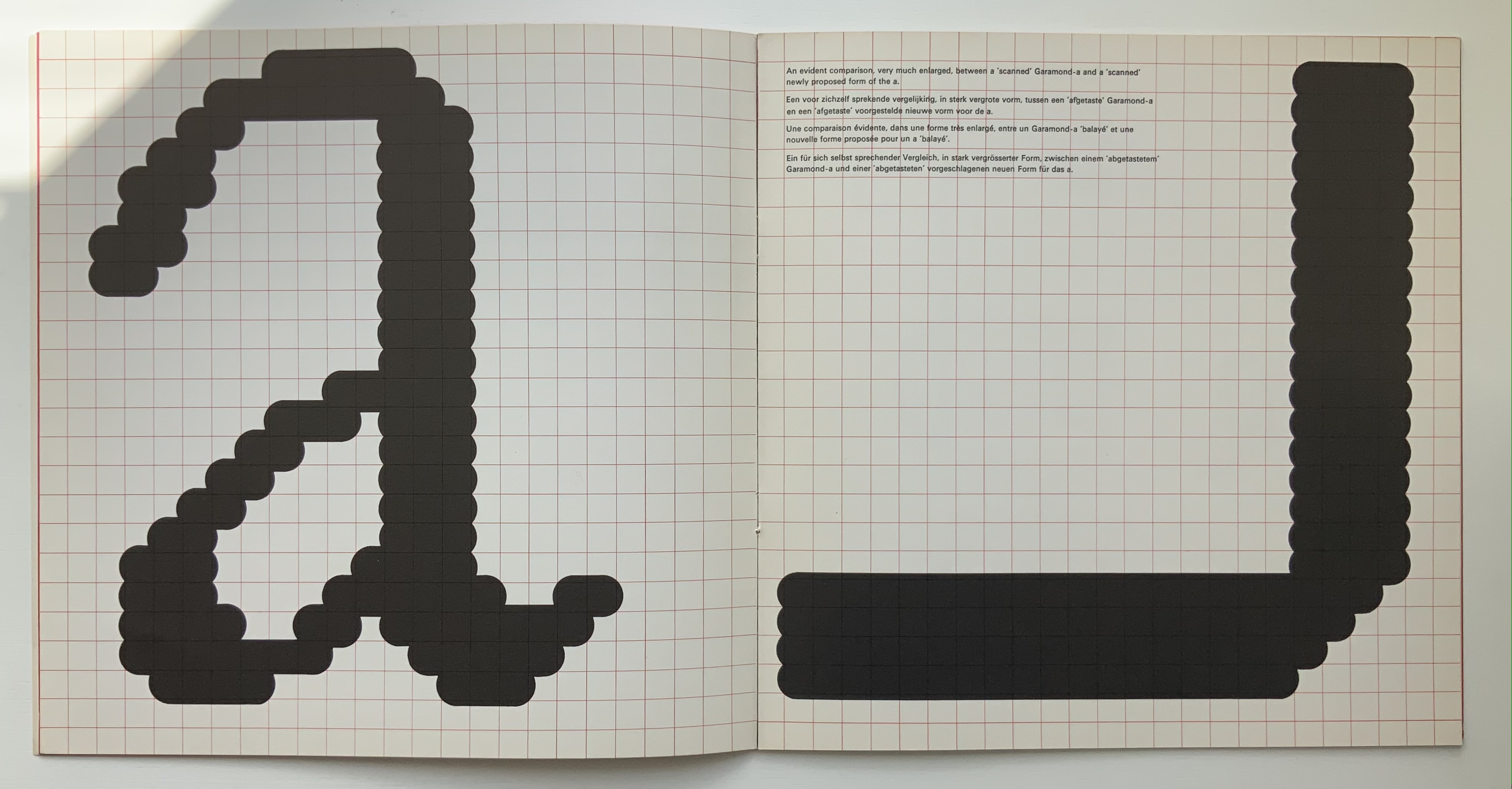
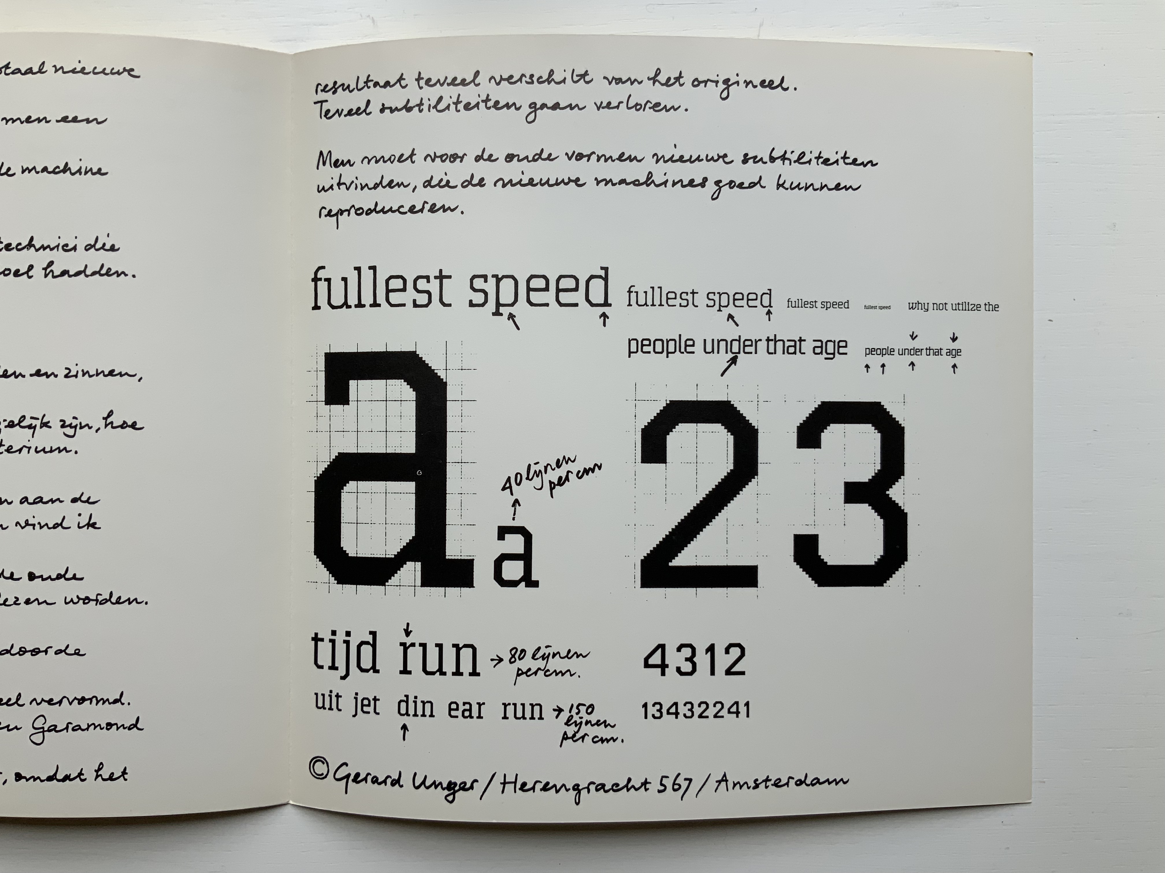
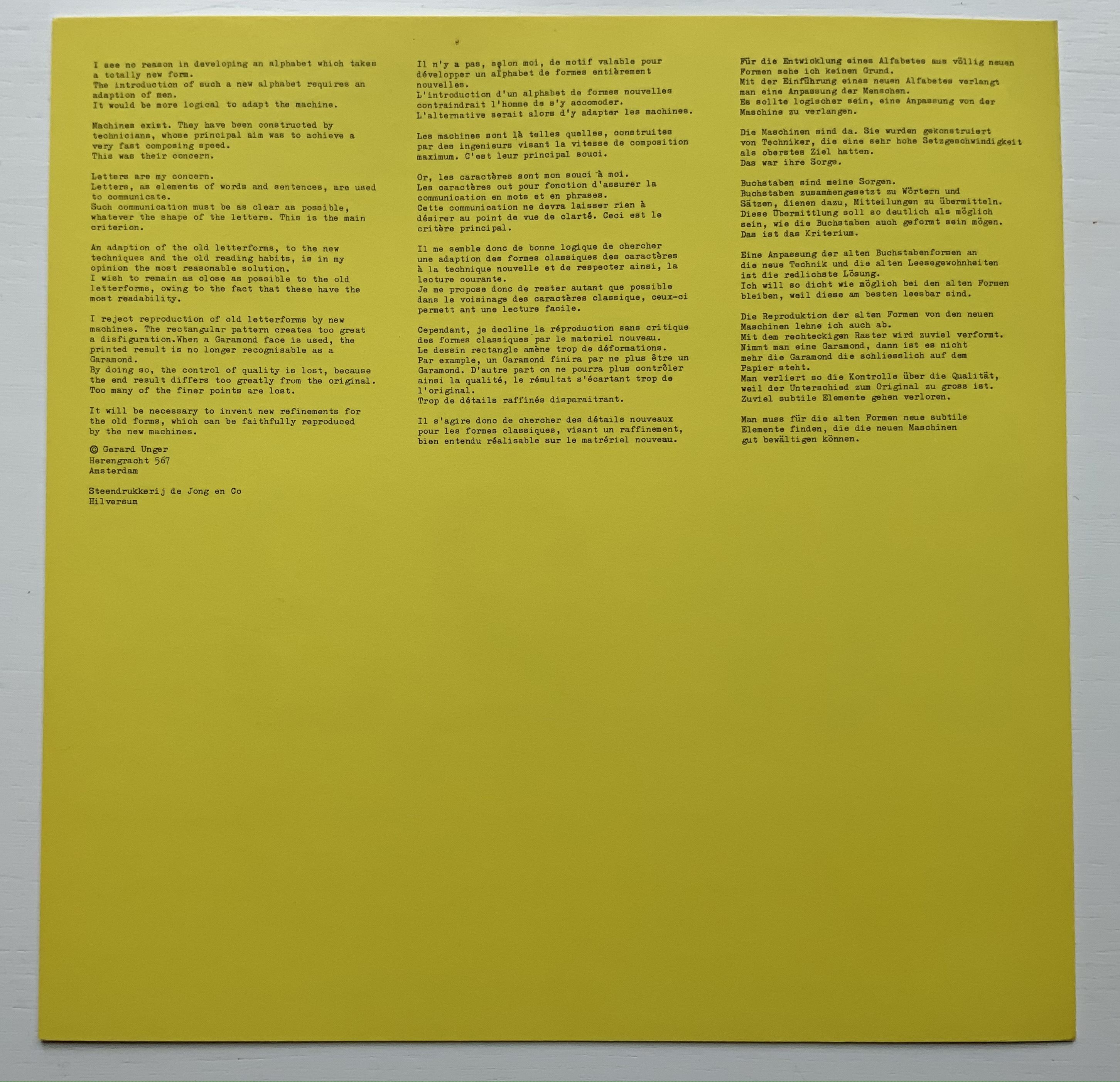
Gerard Unger, A Counterproposal
Claire Van Vliet, Tumbling Blocks for Pris and Bruce
Sharon Werner & Sharon Forss, Alphabeasties and Other Amazing Types
Teagan White, Adventures with Barefoot Critters (entry in progress)
Emmett Williams, abcdefghijklmnopqrstuvwxyz (1963)
Ada Yardeni, A- dventure- Z’ (2003)
Edward Andrew Zega & Bernd H. Dams, An Architectural Alphabet
Ludwig Zeller, Alphacollage
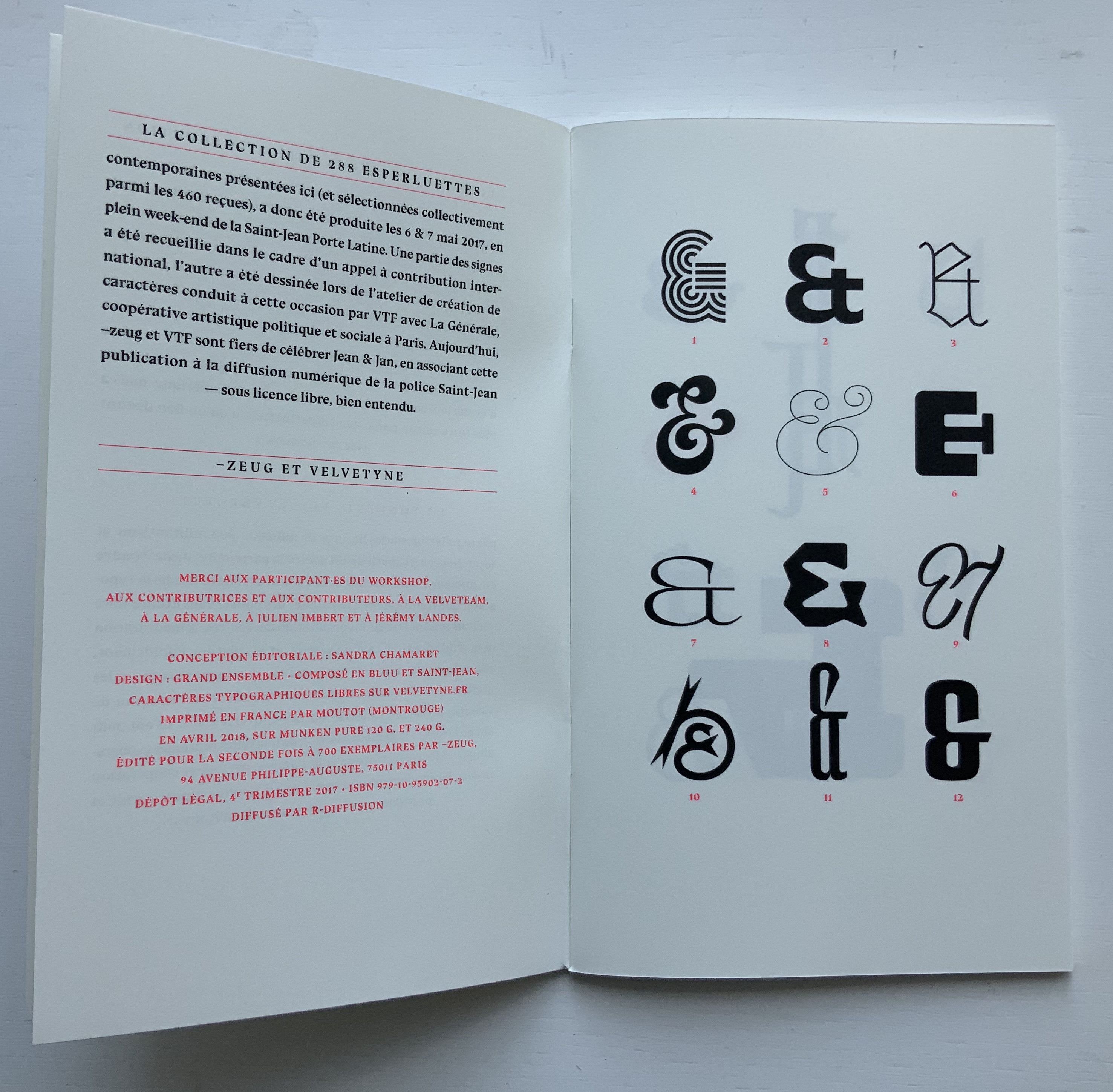
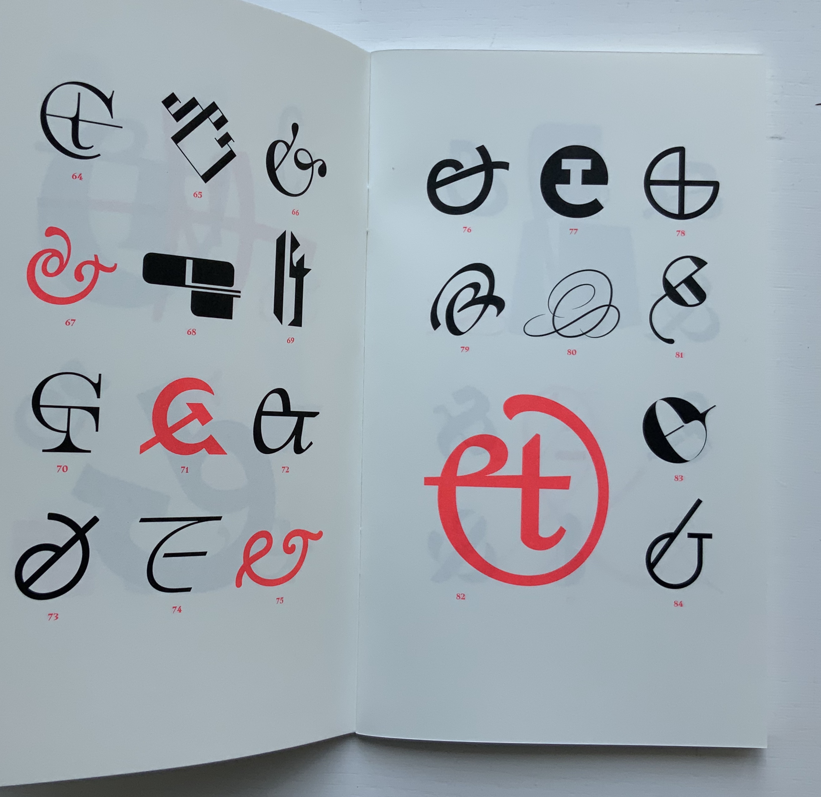
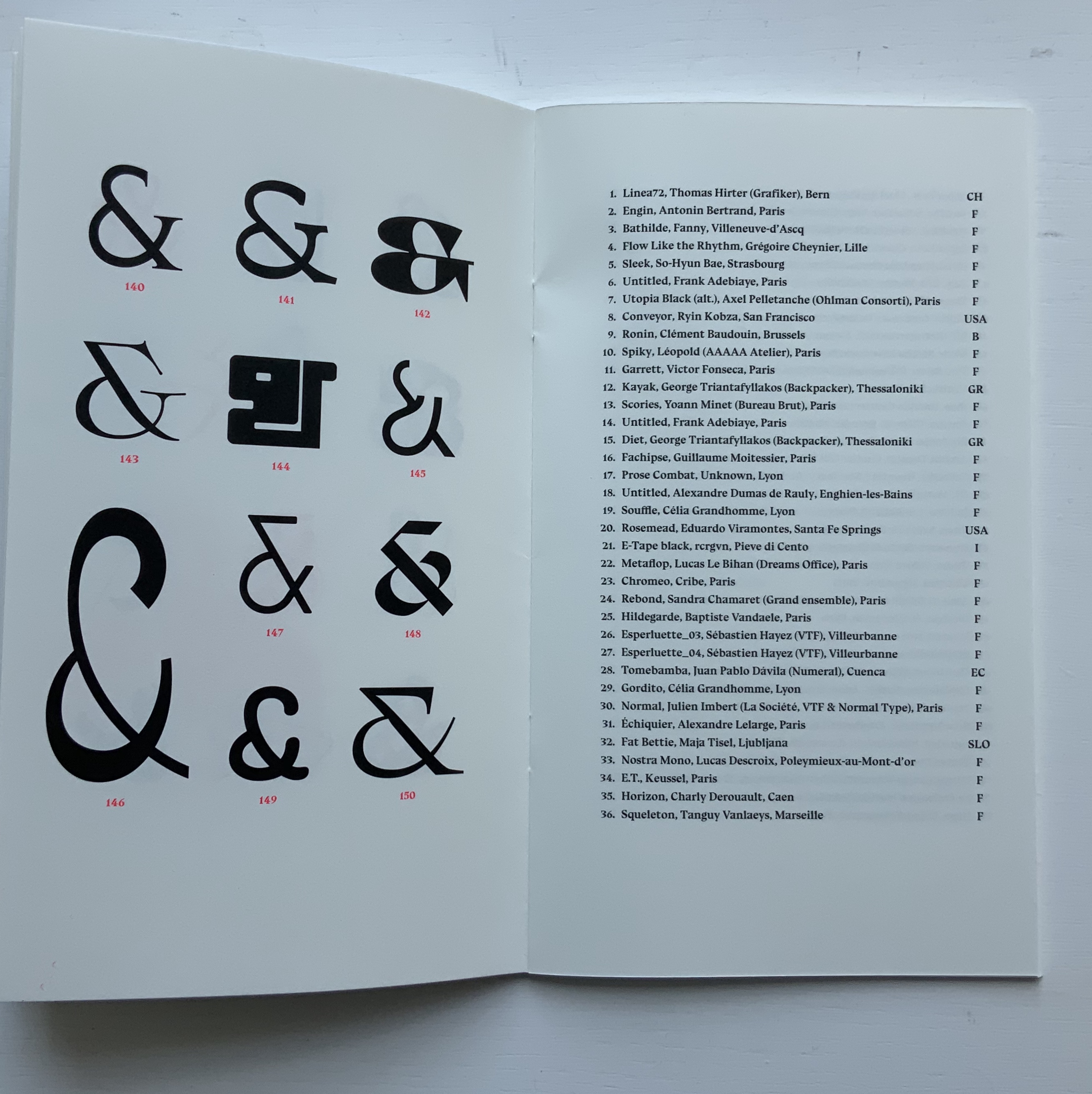
~zeug, Et & Ampersands: A Contemporary Collection
Heimo Zobernig, Farben Alphabet
Further Reading
Tien-Min Liao, Handmade Type. Compare/contrast with Tauba Auerbach’s Stacking (2007), which is covered in How to Spell the Alphabet (see above).
Poul Webb, “Alphabet Books — Parts 1-8” on Art & Artists. Google has designated this site “A Blog of Note”, well deserved for its historical breadth in examples, clarity of images and insight.