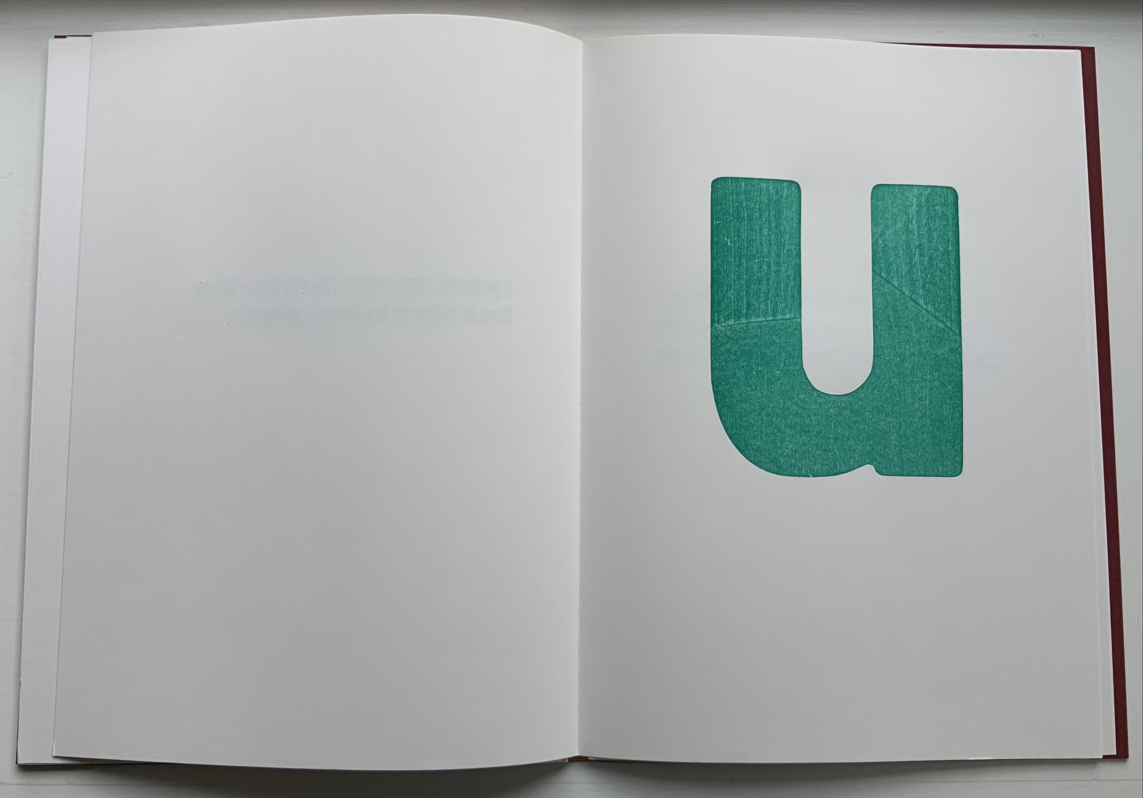
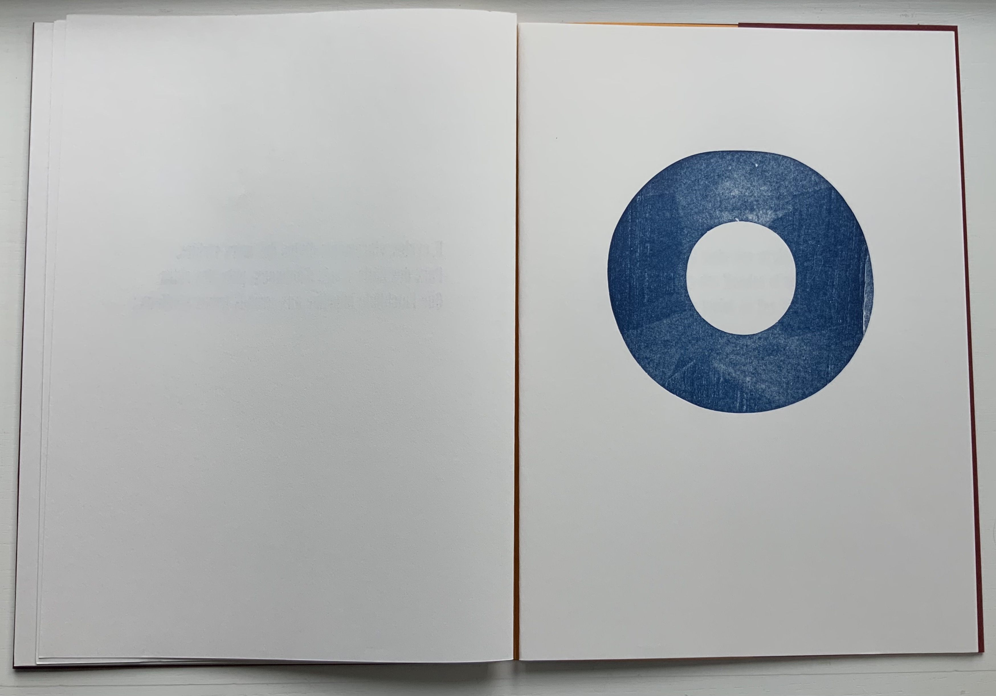
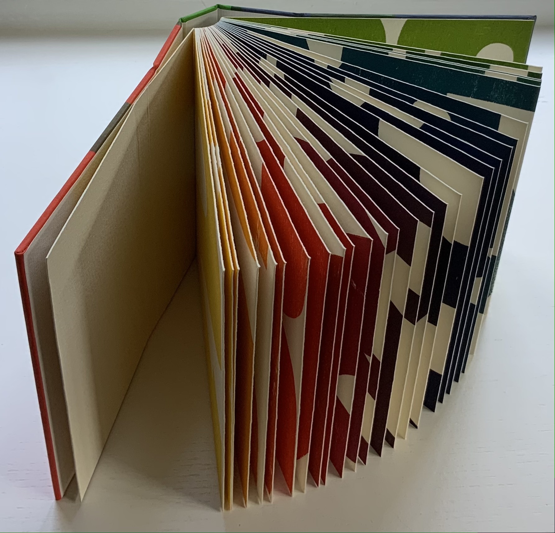
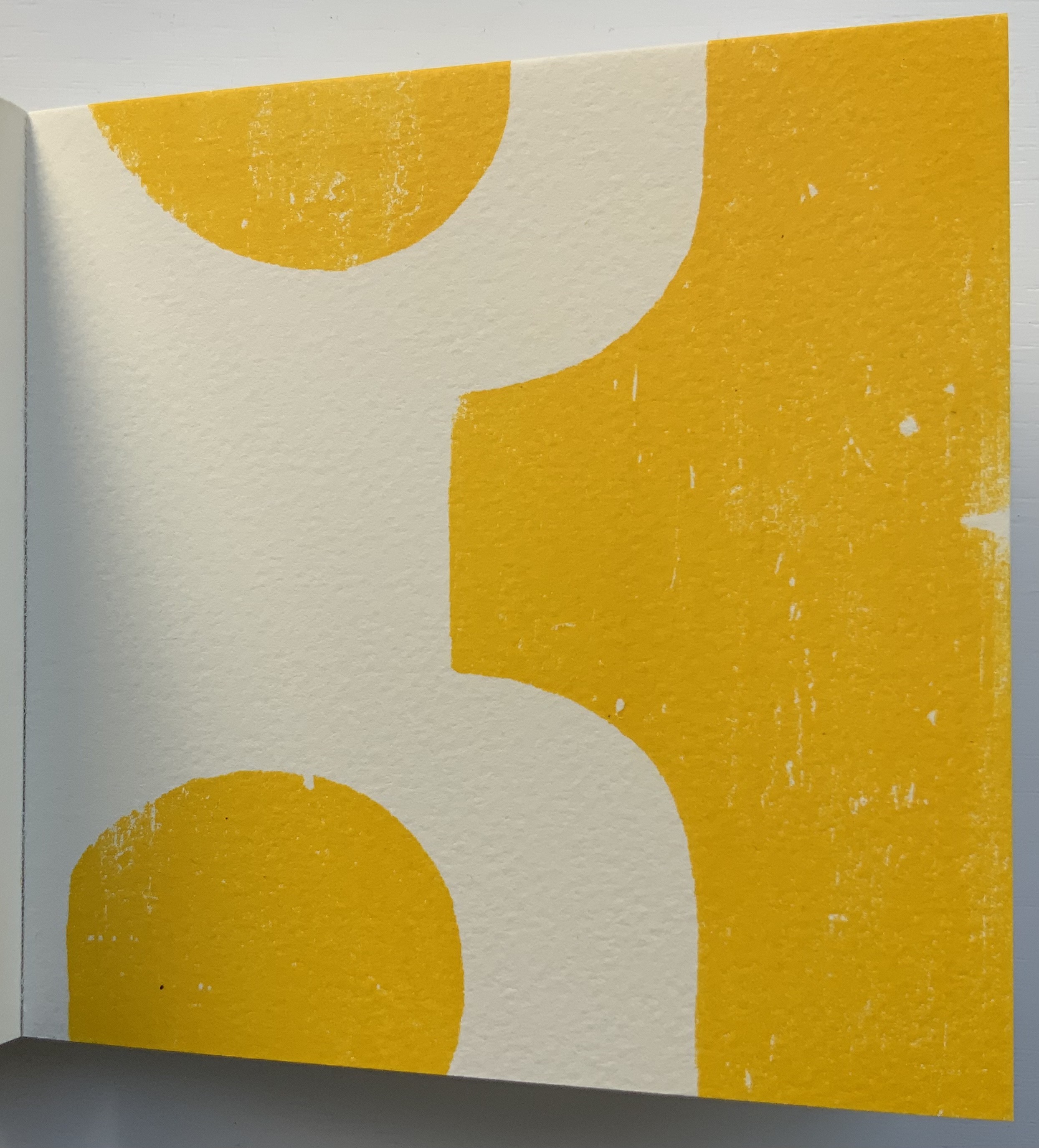
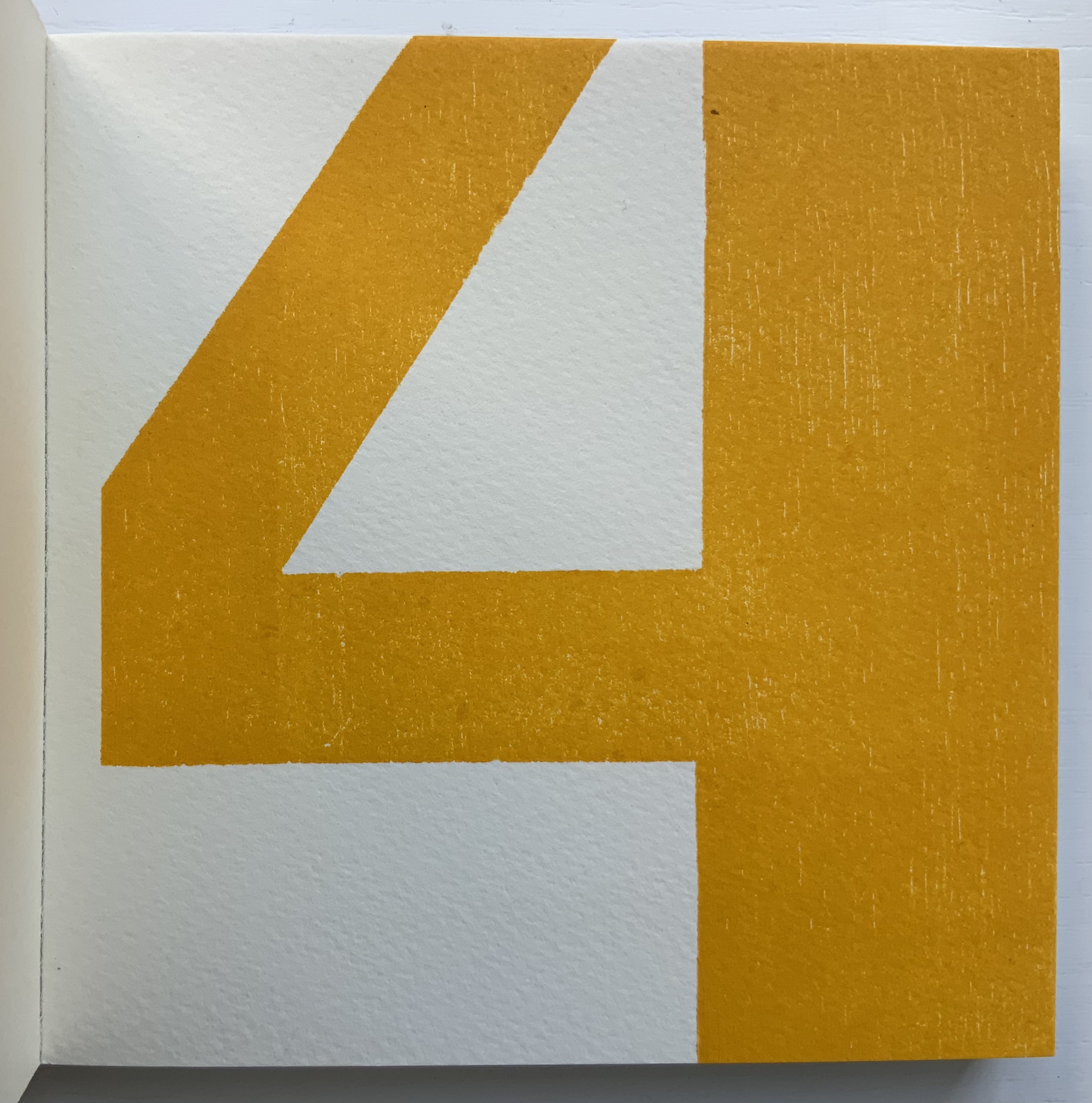
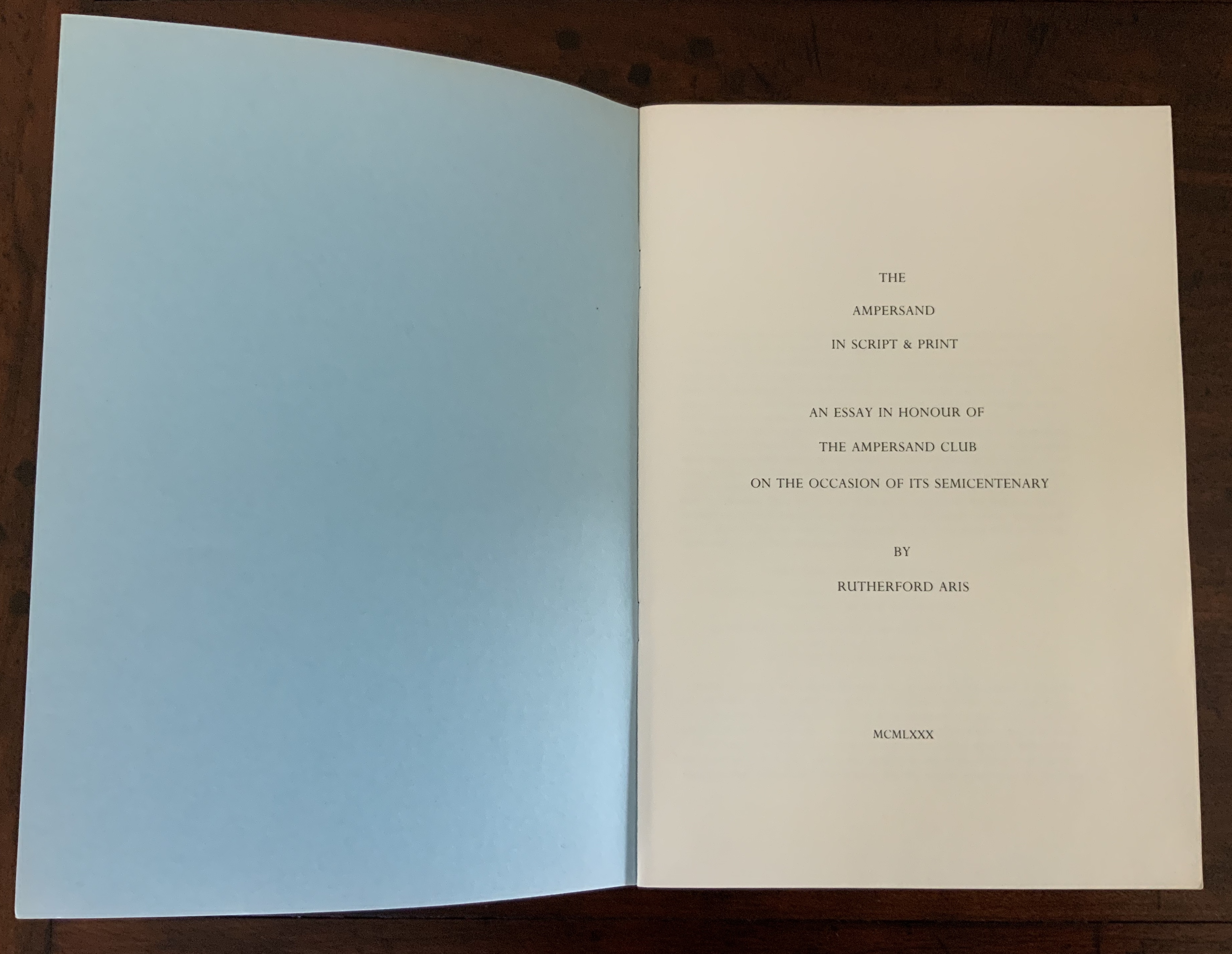
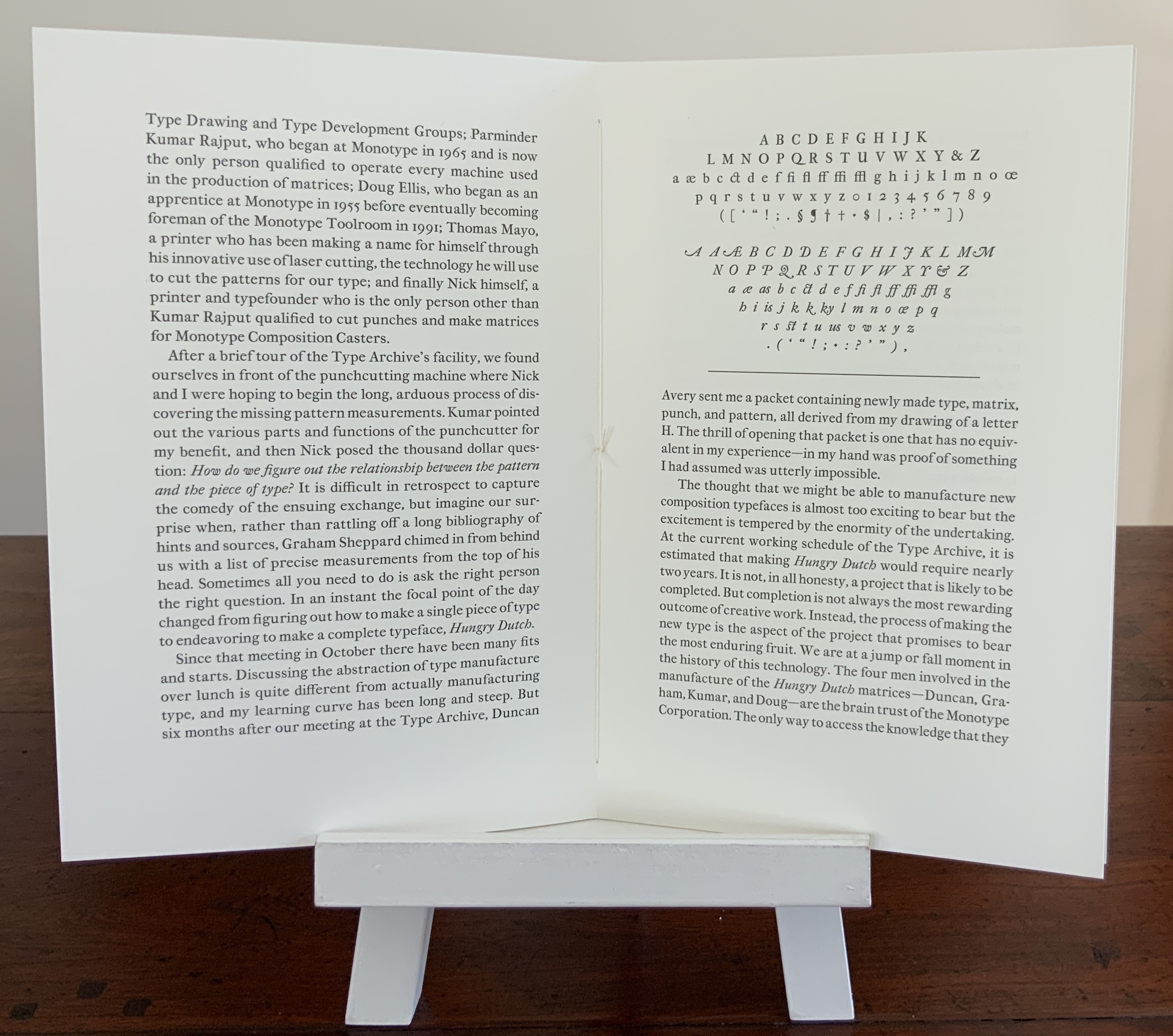
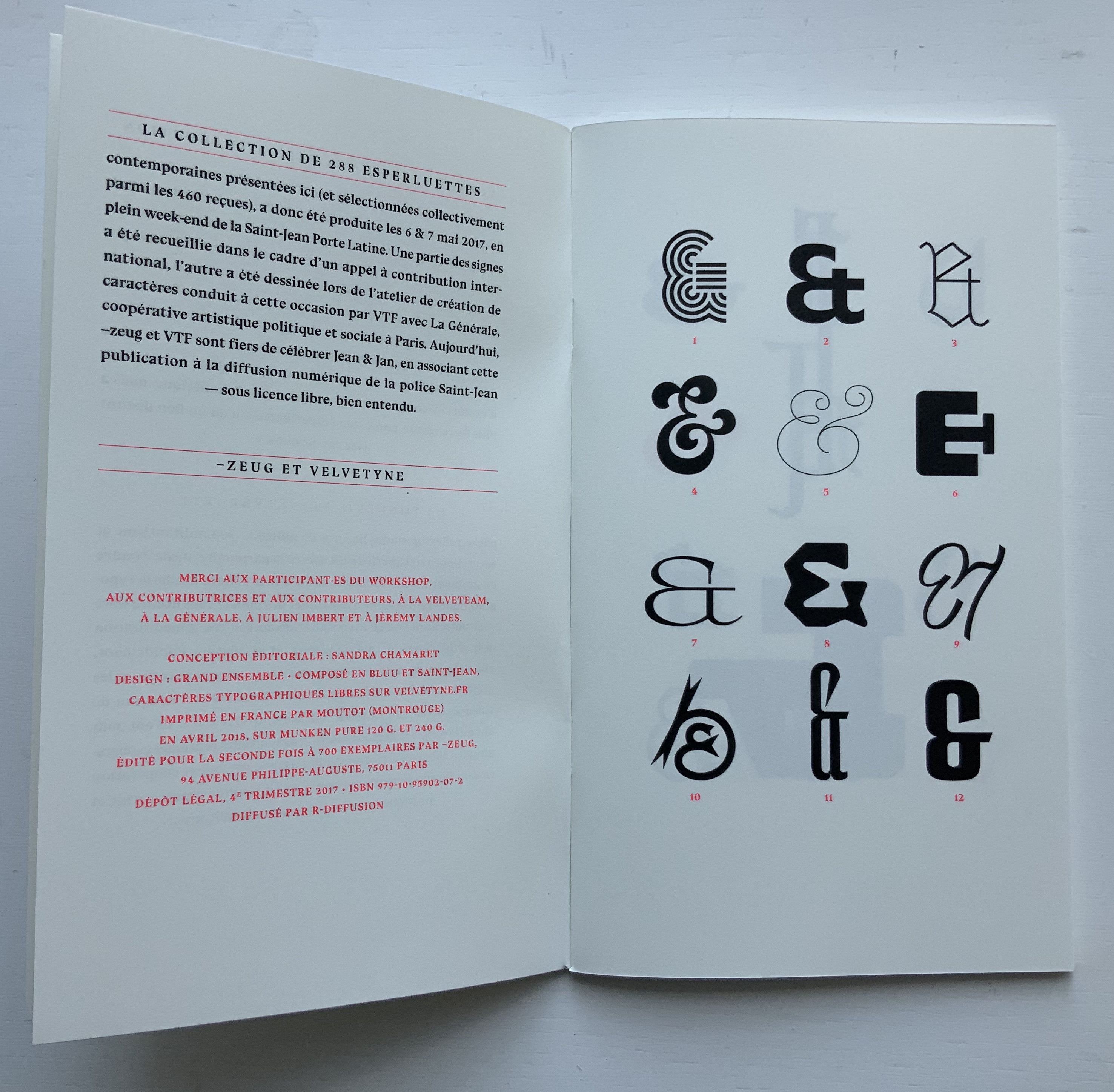
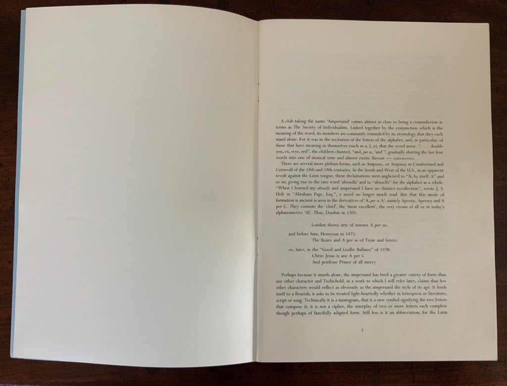
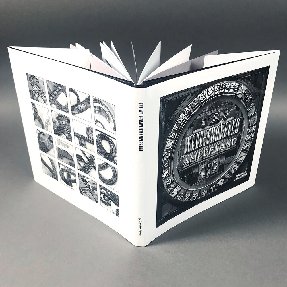
Chroma Numerica (2019)
Chroma Numerica (2019)
Andrew Morrison
Perfect bound cased in quarter-hinged paper-on-board binding. H143 x W145 mm, 60 pages, printed on one side. Edition of 30, of which this is #17. Acquired from the artist, 2 September 2021.
Photos of the work: Books On Books Collection. Displayed with artist’s permission.
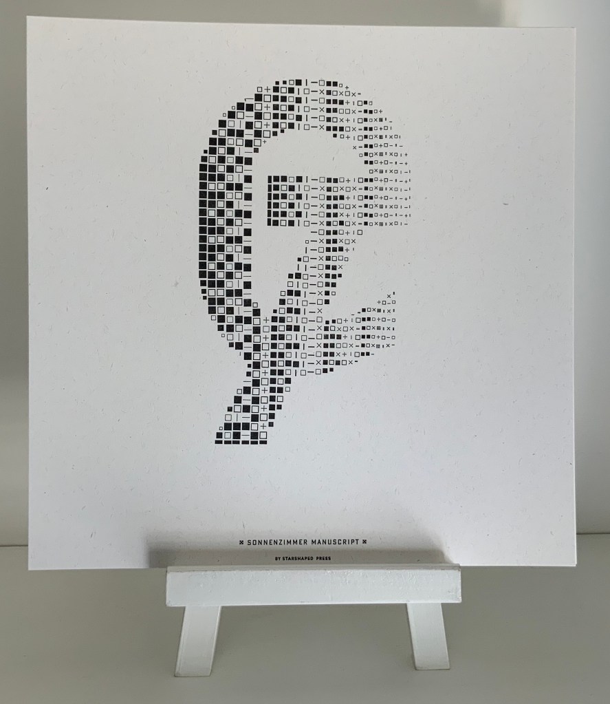
In the children’s book tradition, counting books and alphabet books often come paired. Chroma Numerica‘s partner appears with the same binding earlier in Andrew Morrison’s work below, and in both cases, the printing process is the real subject — not the learning of numbers or letters. From his wood type, Morrison rolls out oversized numbers 1-30 printed in a chromatic scale on Somerset Book 200gsm paper.
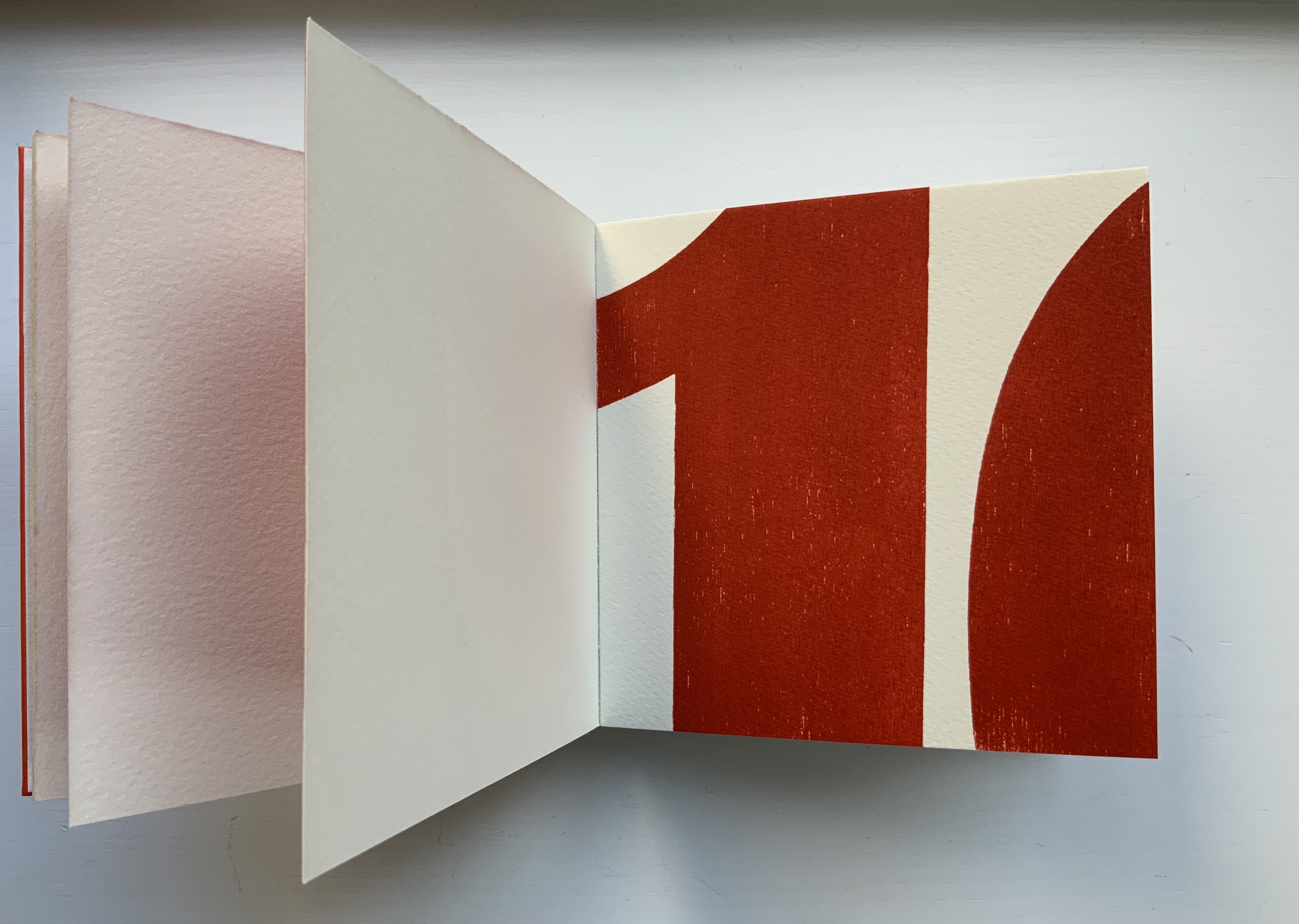
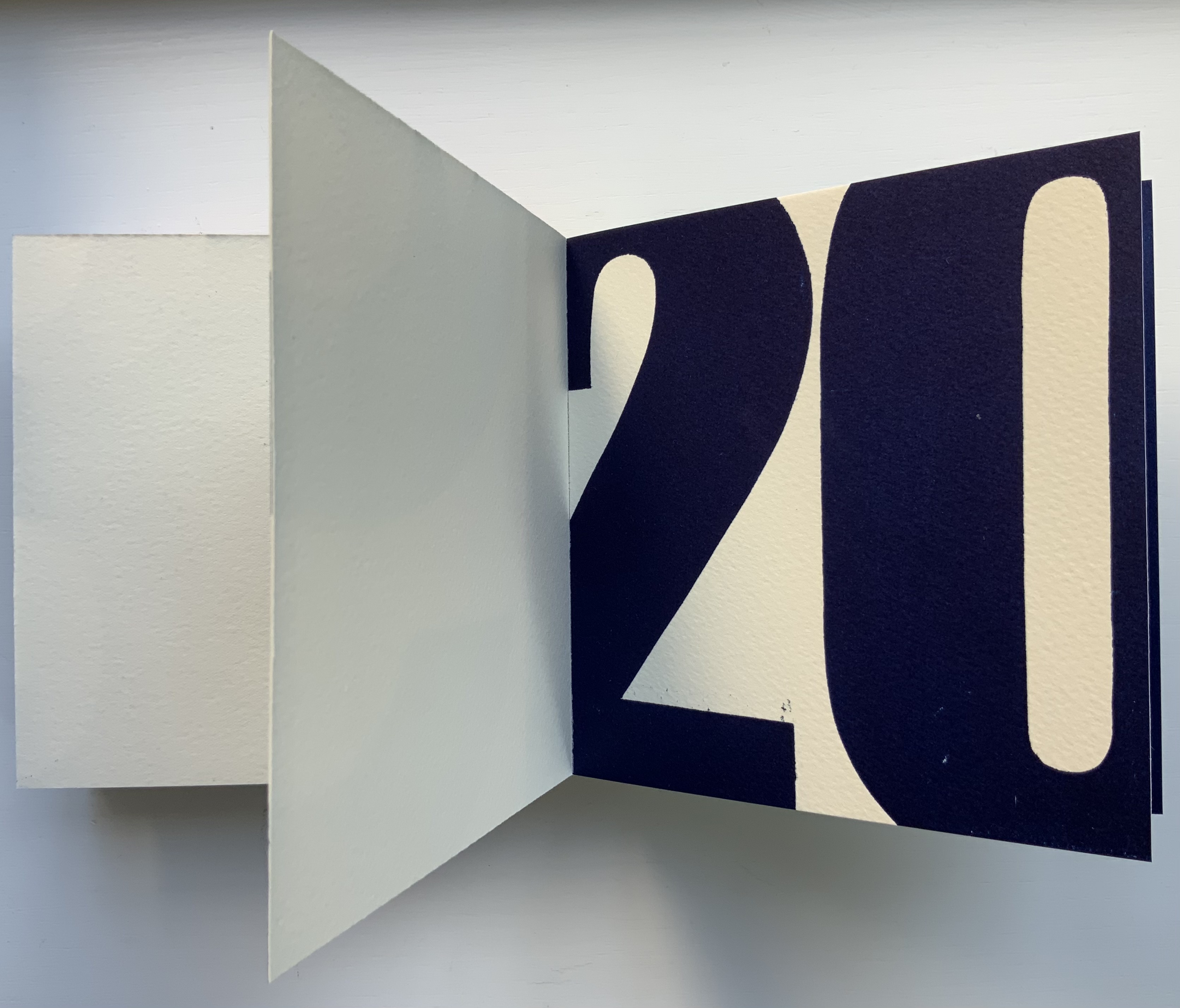
Provenance (2018)
Provenance (2018)
Andrew Morrison
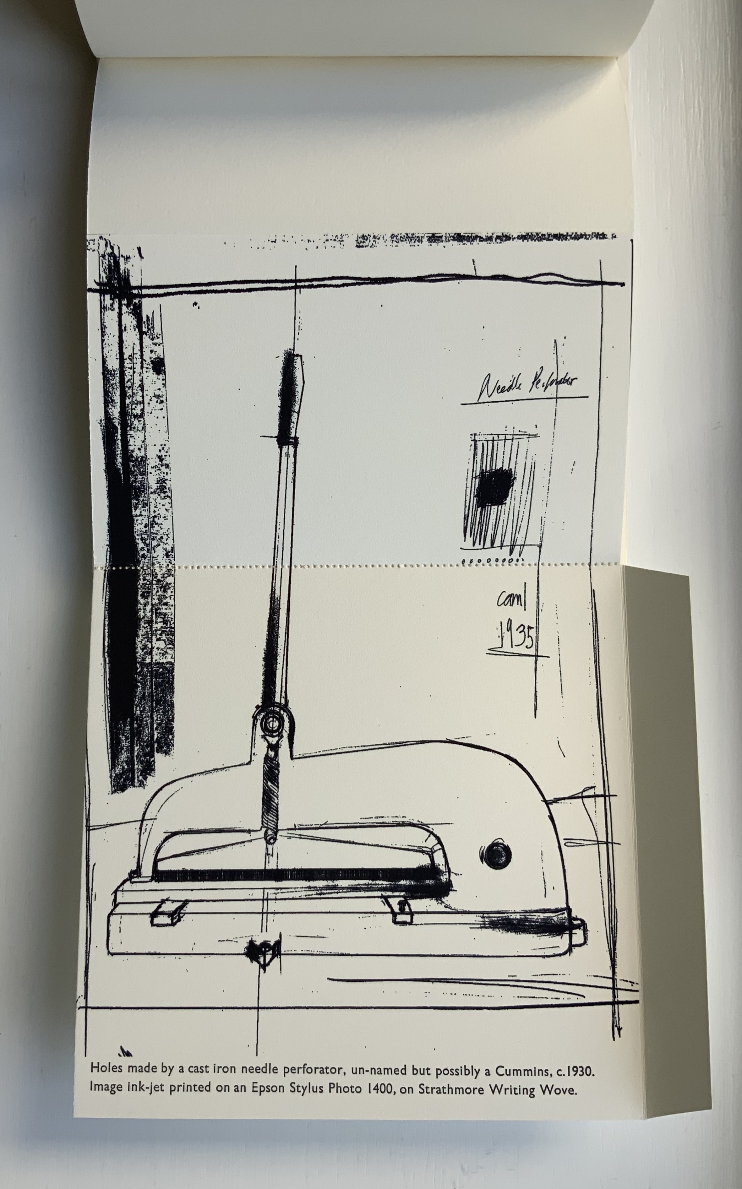
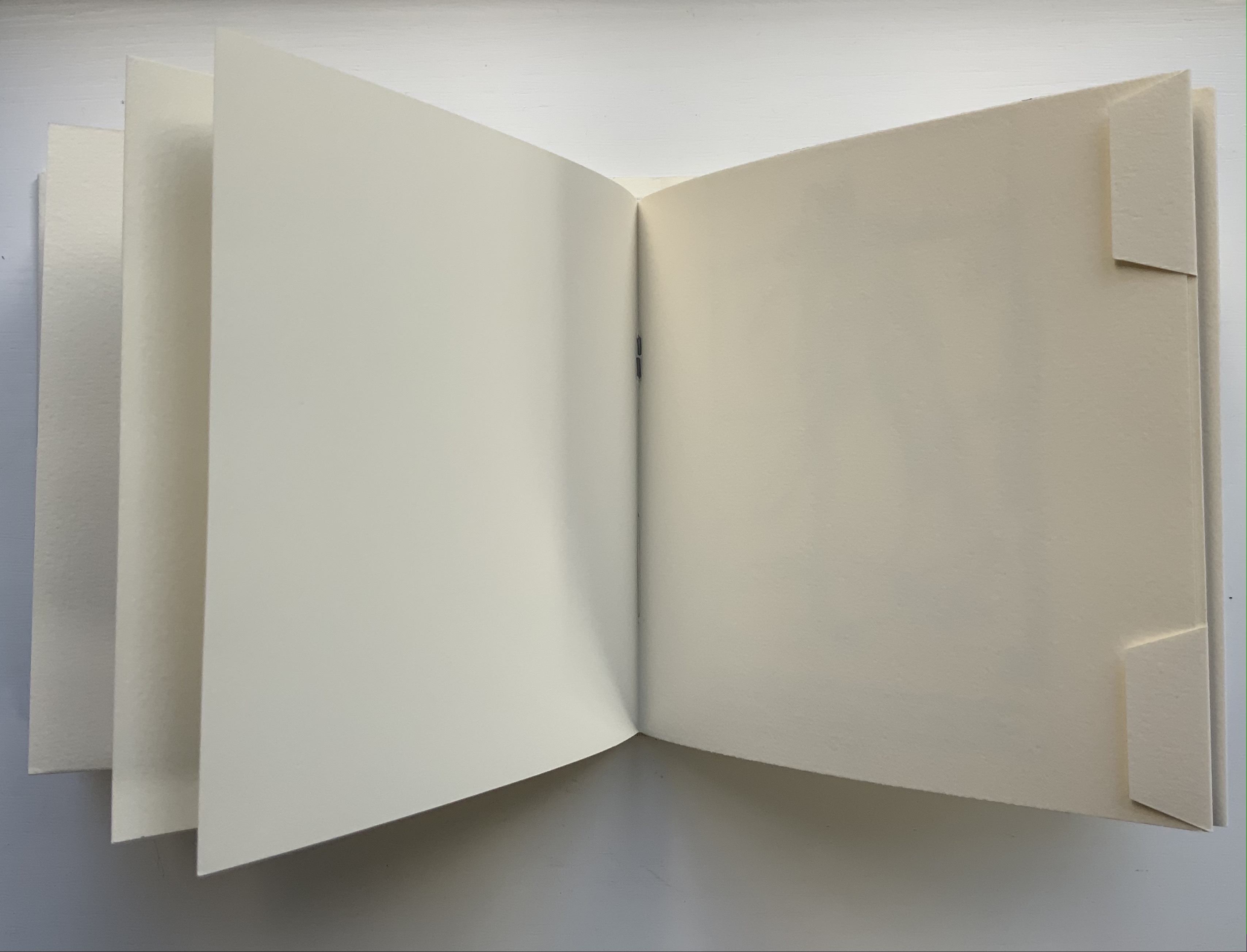
Casebound with dustjacket. H152 x W155 mm, 9 foldouts, 6 leaves (including 1 trimmed short), 2 end leaves. Edition of 30, of which this is #28. Acquired from the artist, 2 September 2021.
Photos of the work: Books On Books Collection. Displayed with artist’s permission.
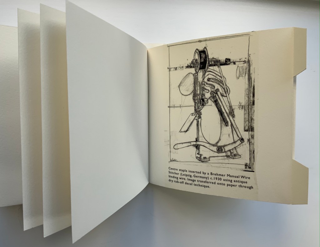
While Chroma Numerica and A-Z use printing processes to count and spell out their subjects, Provenance uses folds and stitching to conceal texts and images that reveal the making of the book itself. More than the other two books, Provenance requires “reading with the hands”. The two sequences below show the result and process — or the effect then cause — of needle perforation and wire stitching. In the first, the perforation can be seen along the right-hand edge, then along the left, and then in the middle of the unfolded image, which is annotated with a description of the printing process and paper. In the second sequence, the wire stitch can be seen in the gutter; then, with the two tabs pushed back, the German stitching machine comes in view, again annotated with a description of the printing process.
Provenance recalls those sets of binding models produced by Gary Frost, Karen Hanmer and others, but it may be too fragile for the constant reading with the hands that it would undergo as a teaching tool. It is more to be carefully and gently admired — a beautiful peacock admiring itself in the mirror of itself.
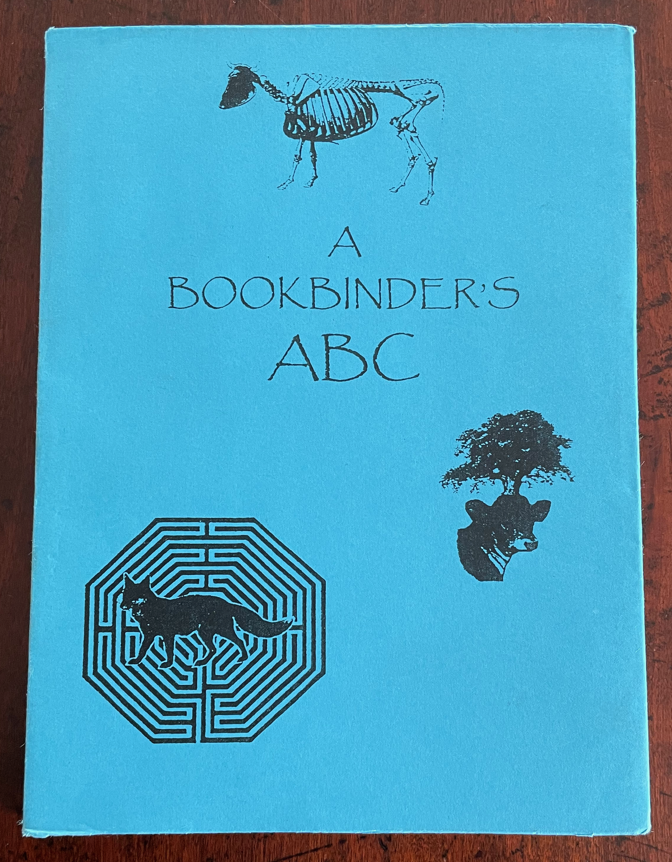
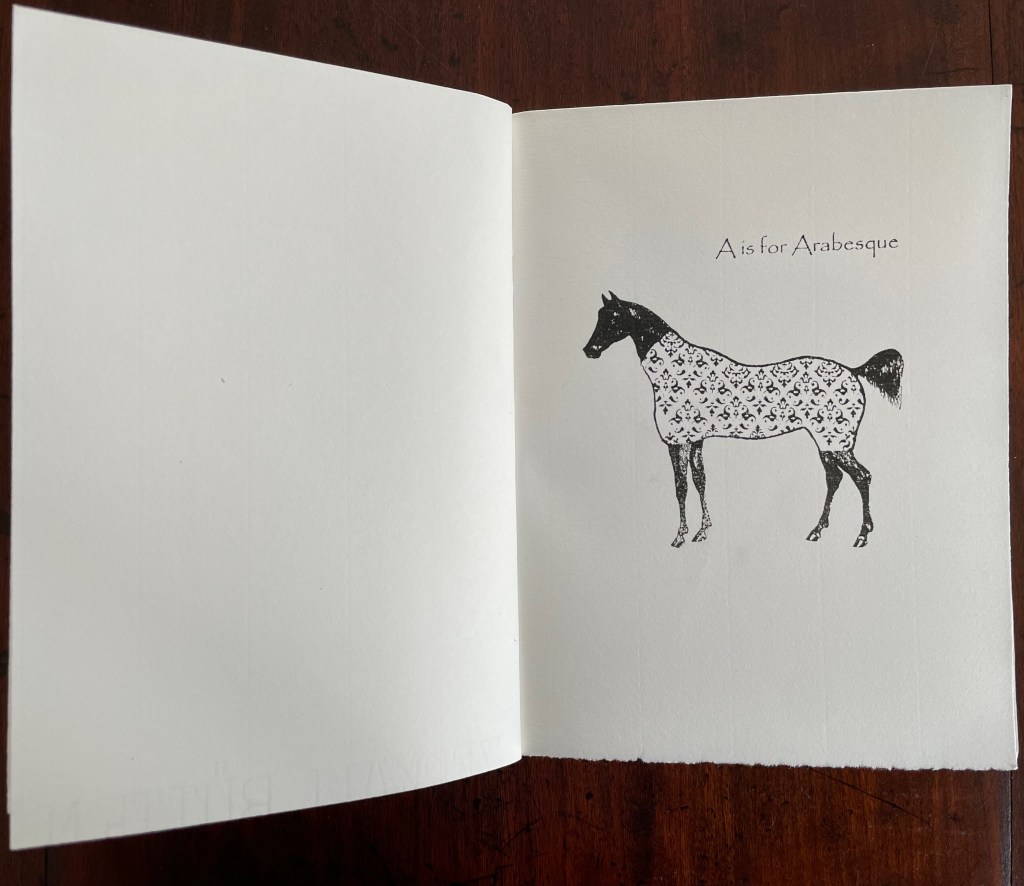
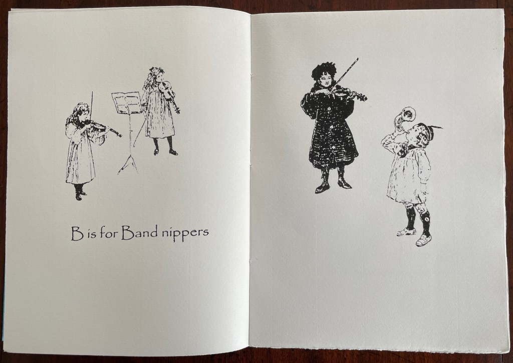
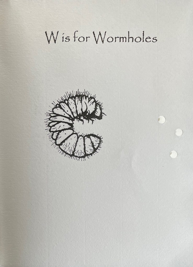
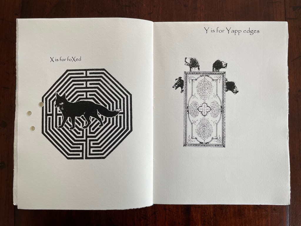
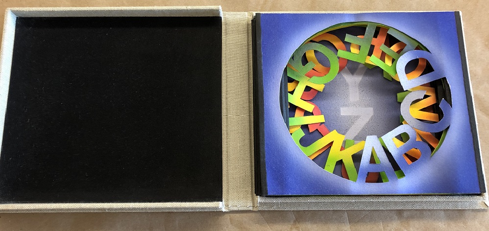
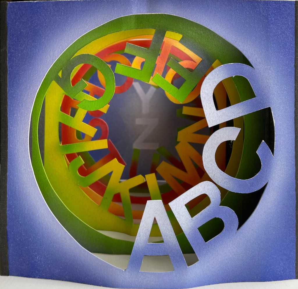
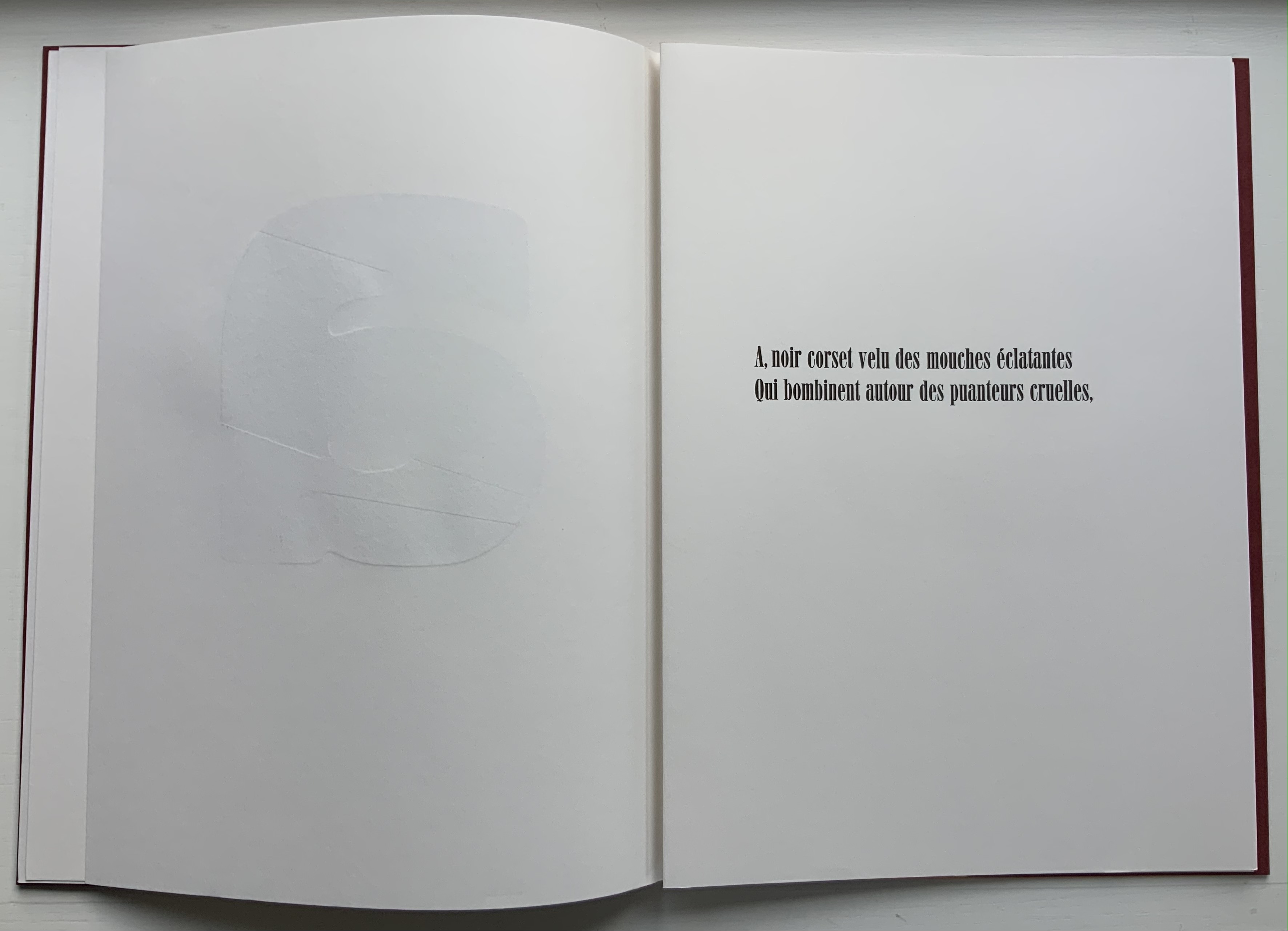
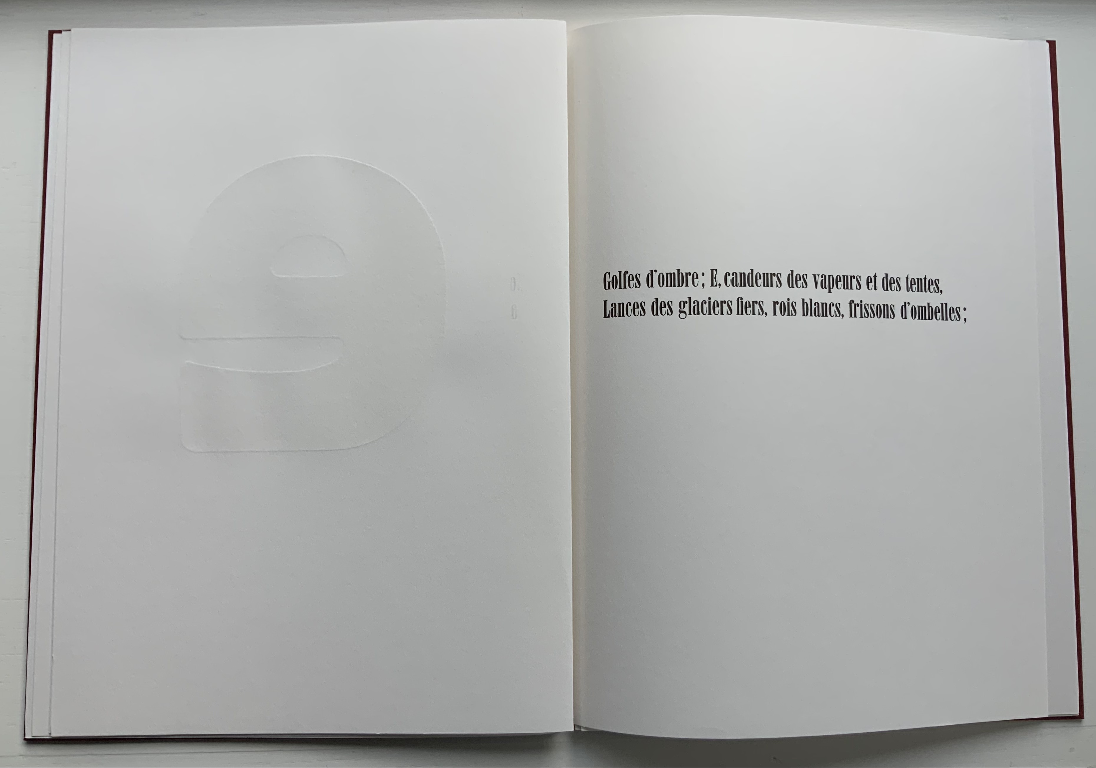
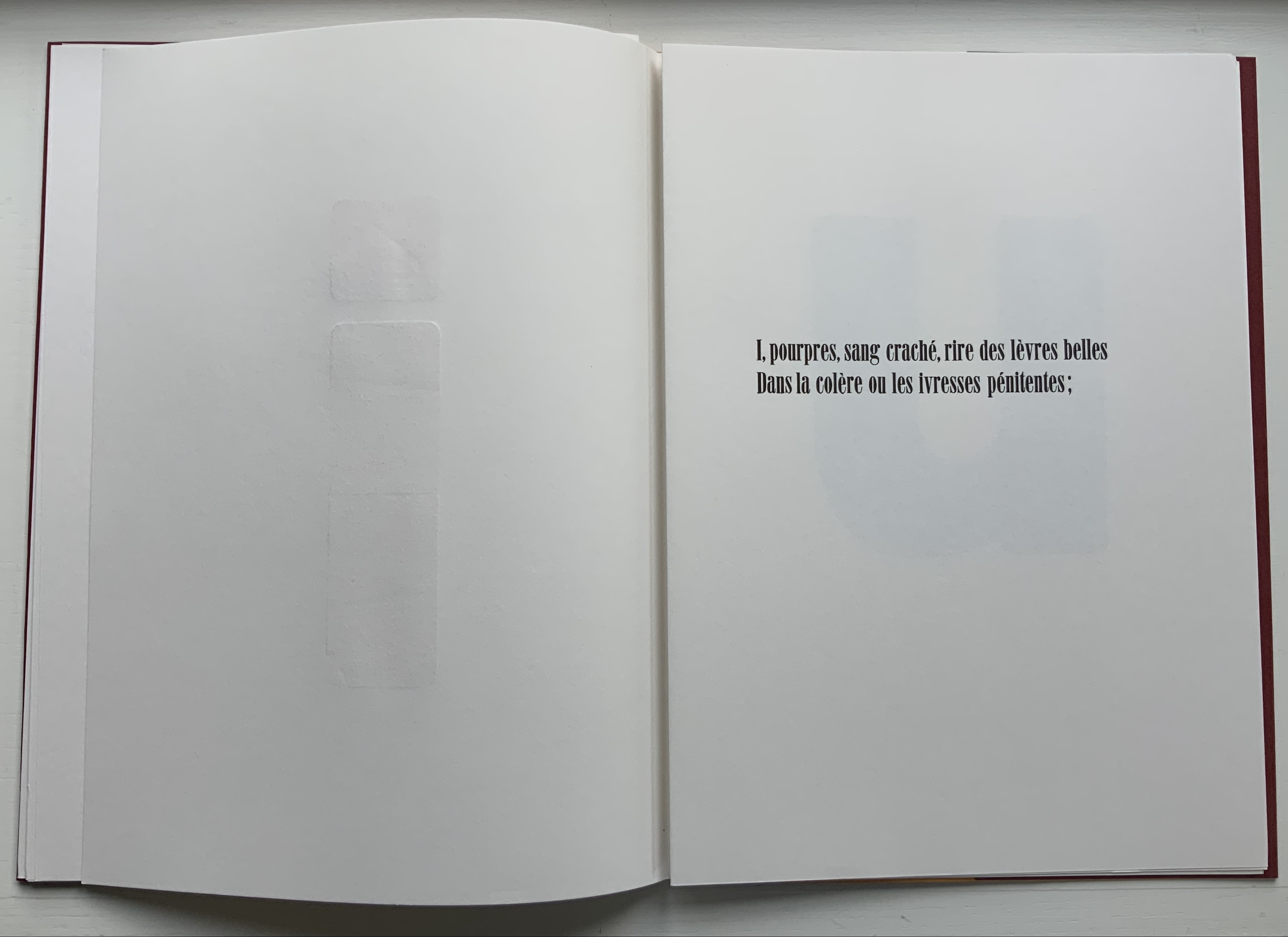
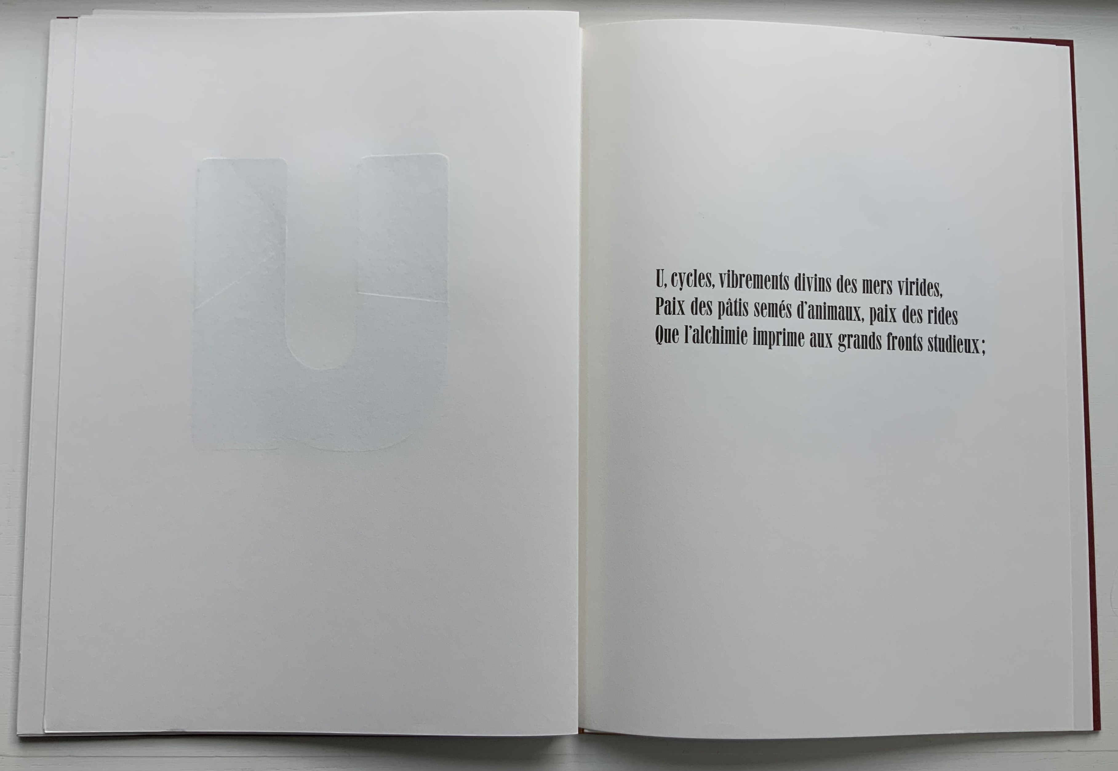
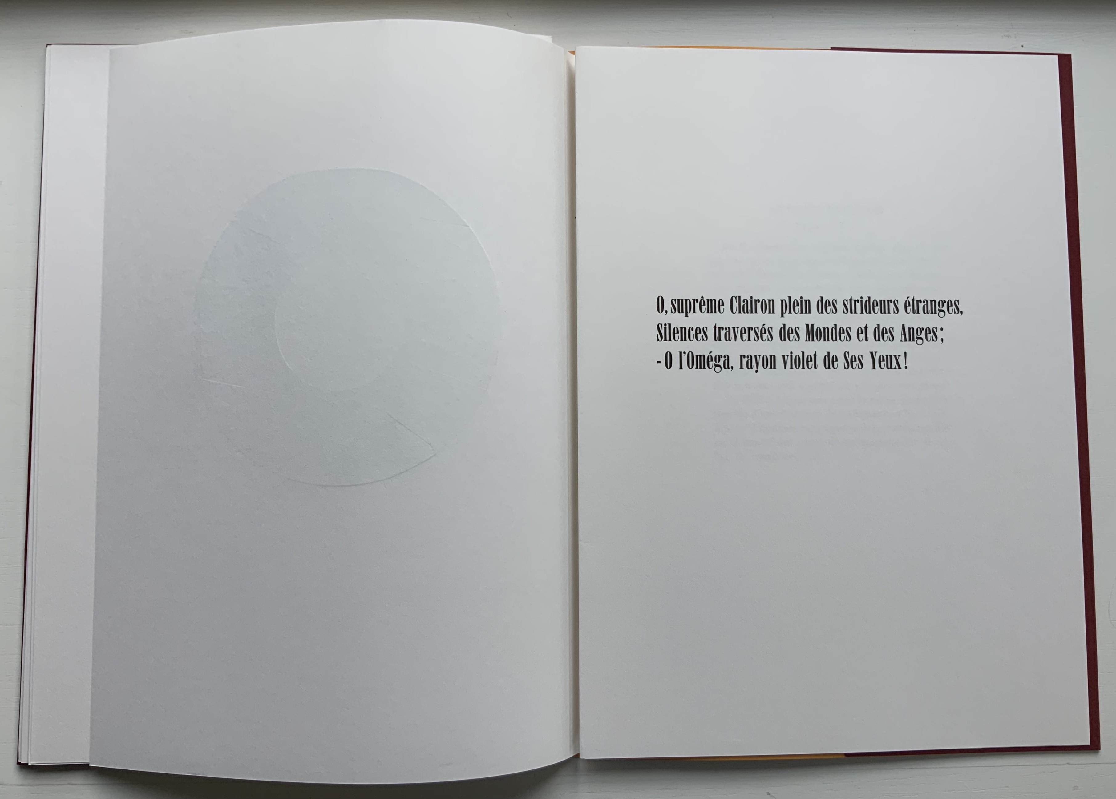
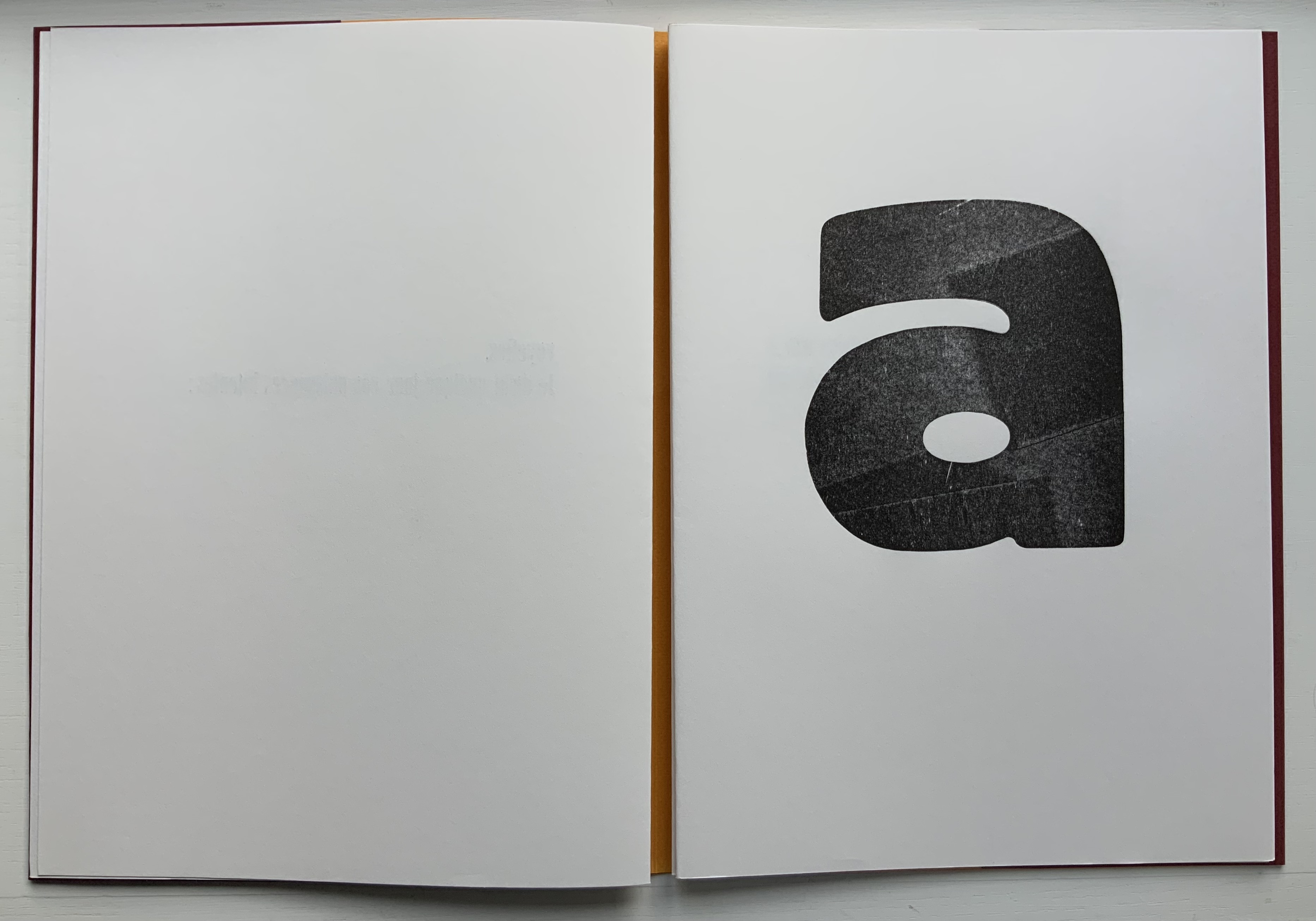
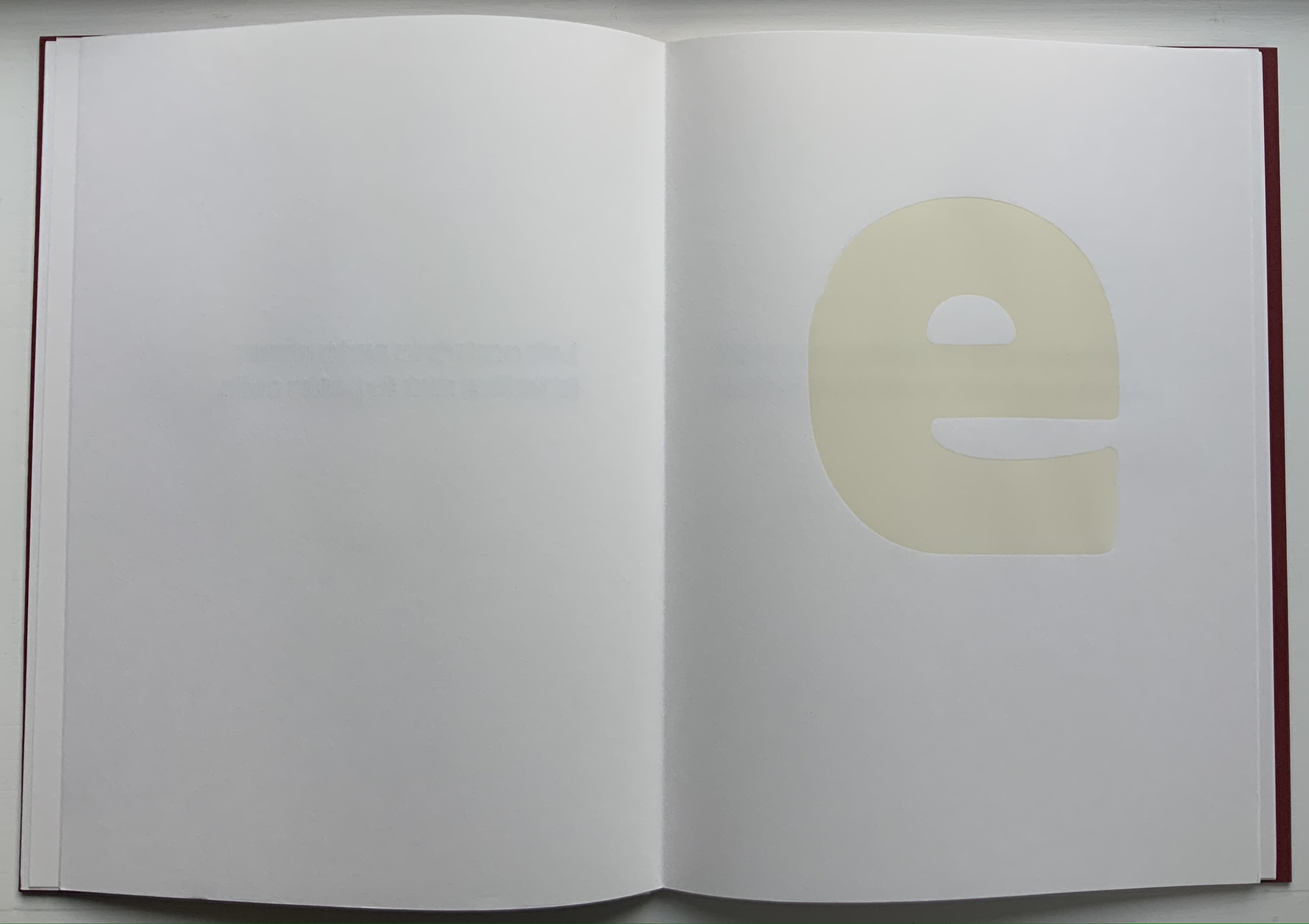
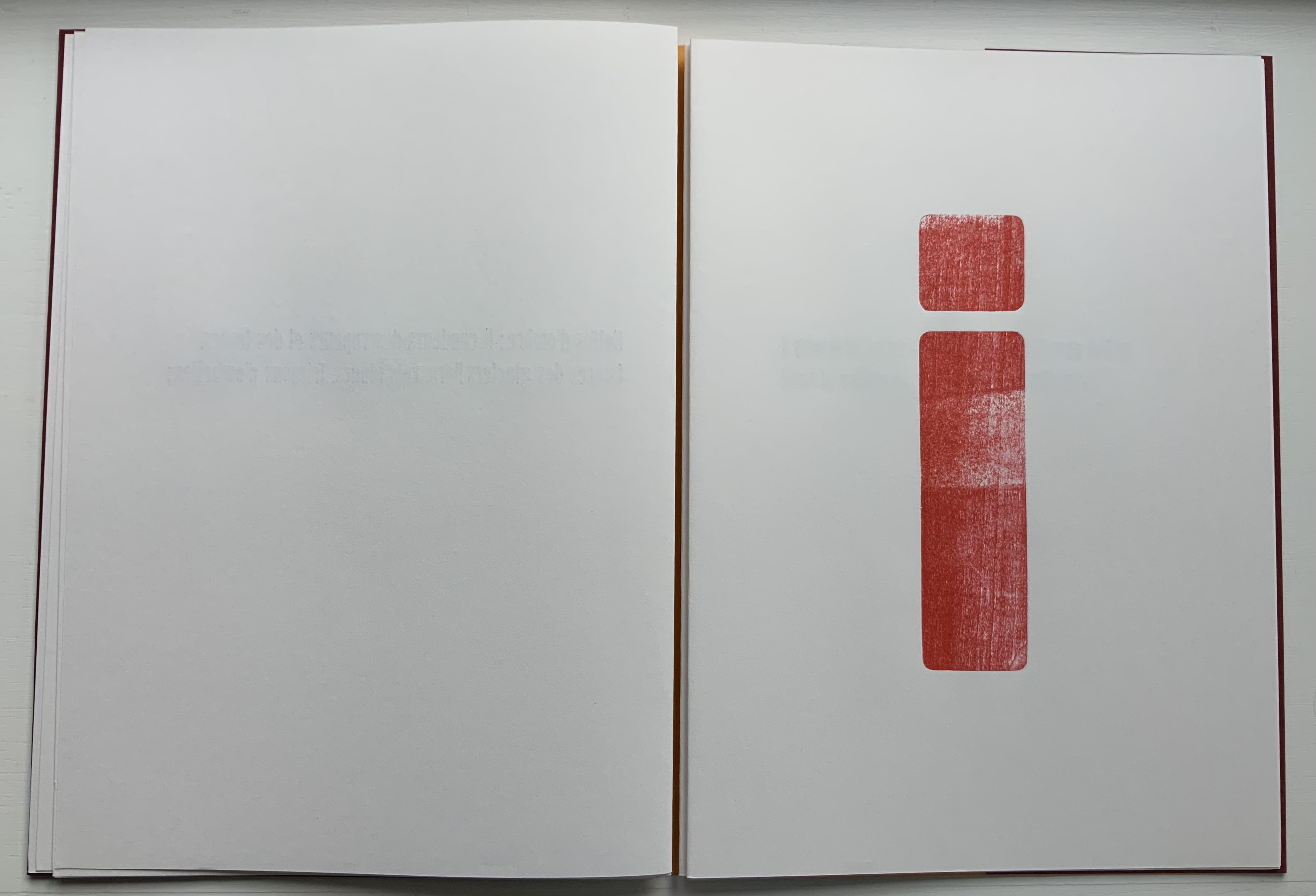
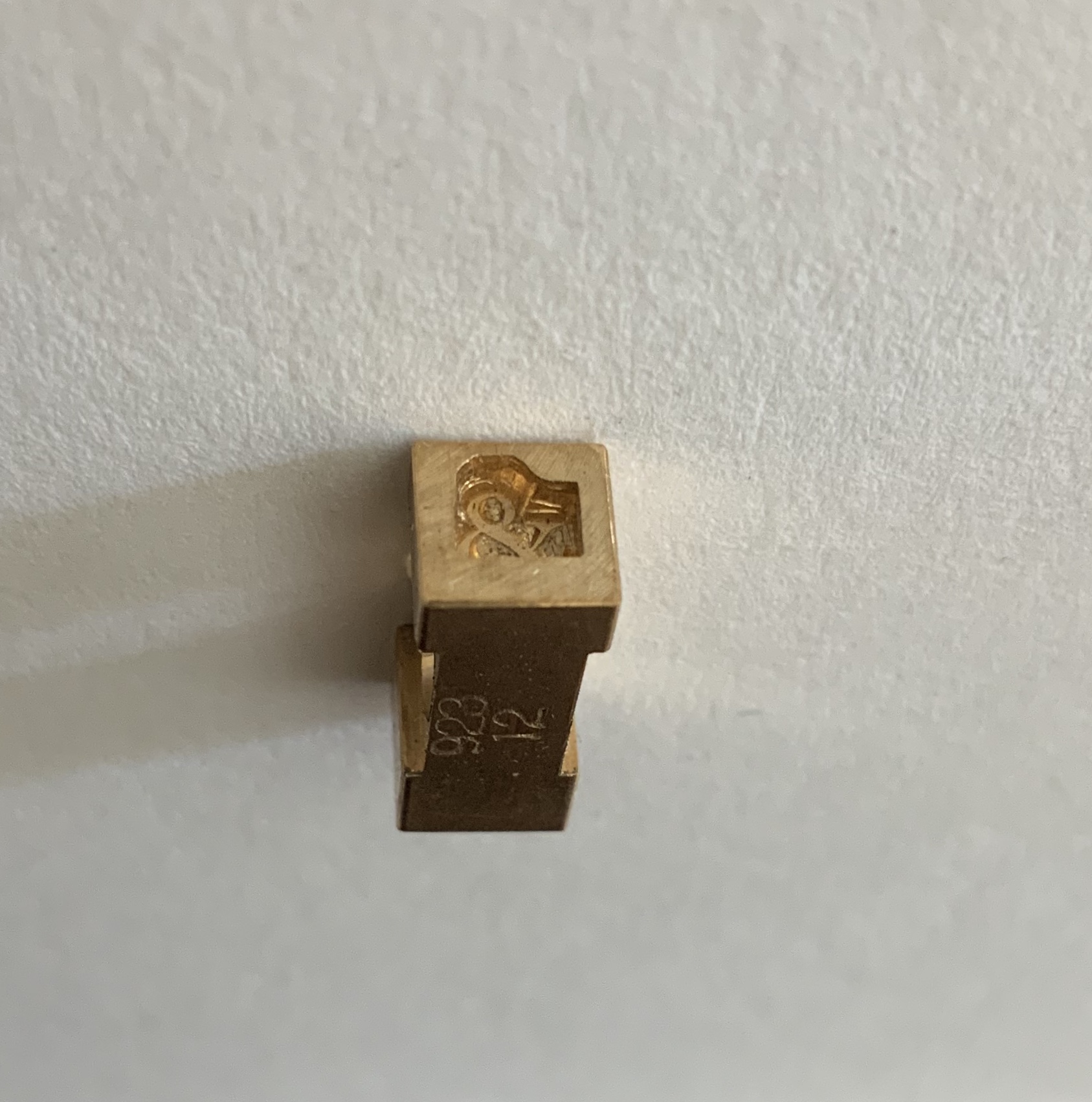
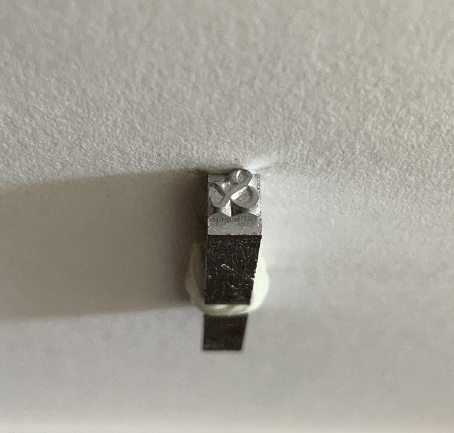
Two Wood Press A-Z (2013)
Two Wood Press A-Z (2013)
Andrew Morrison
Hardcover. Casebound glued. H180 x W155 mm, 56 pages. Edition of 30, of which this is an A/P. Acquired from the artist, 5 May 2020.
Photos: Books On Books Collection. Displayed with artist’s permission.
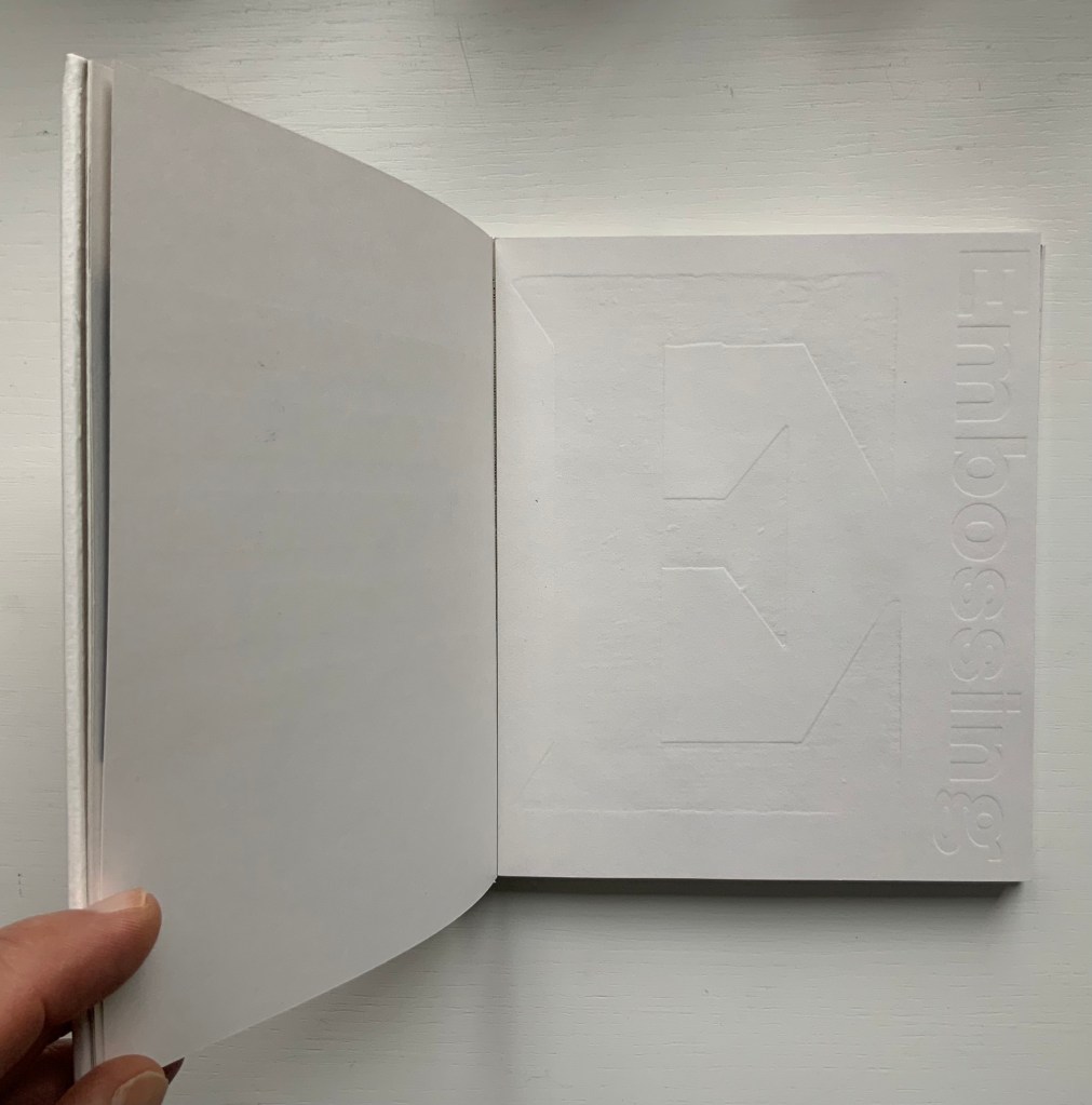
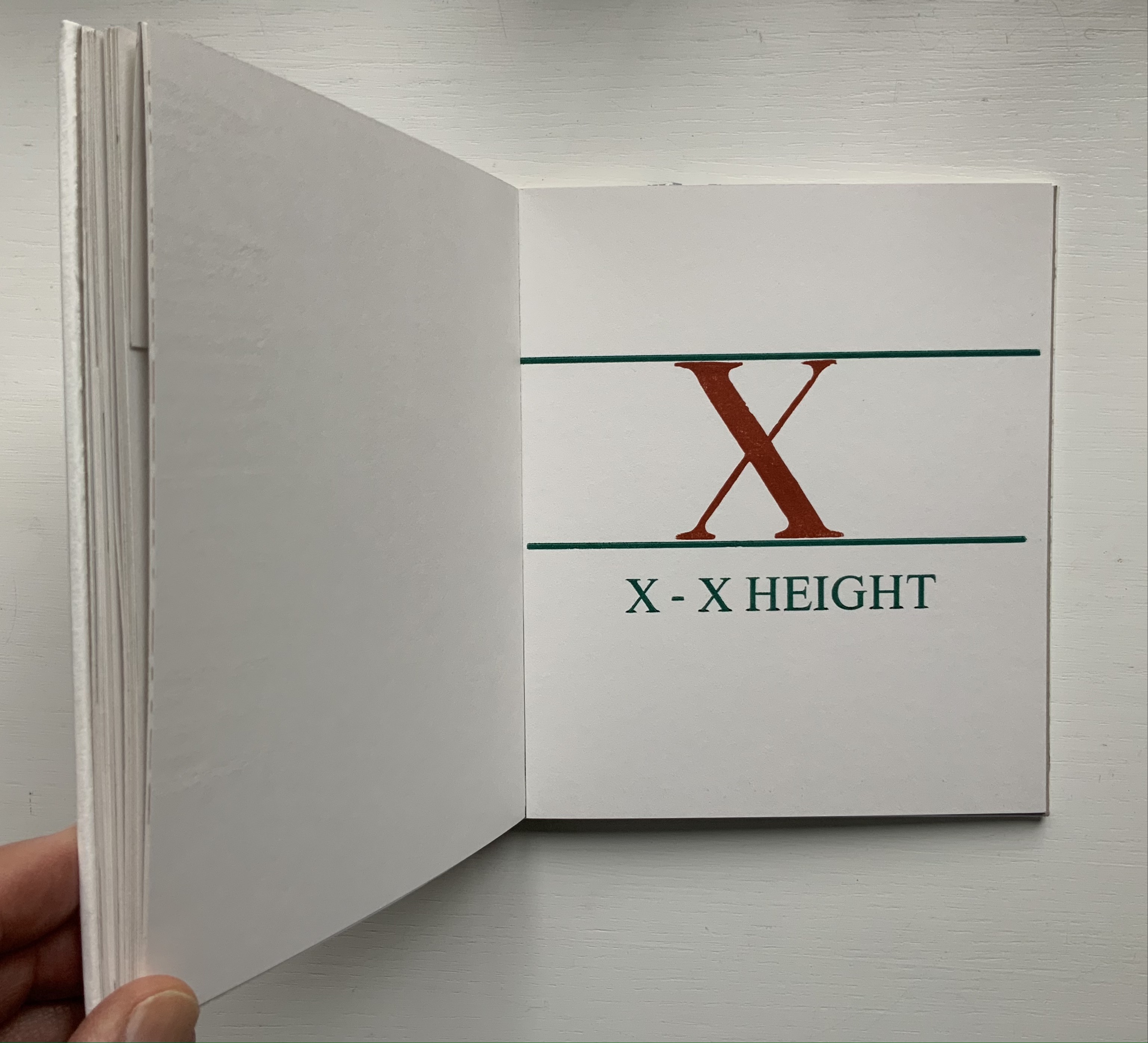
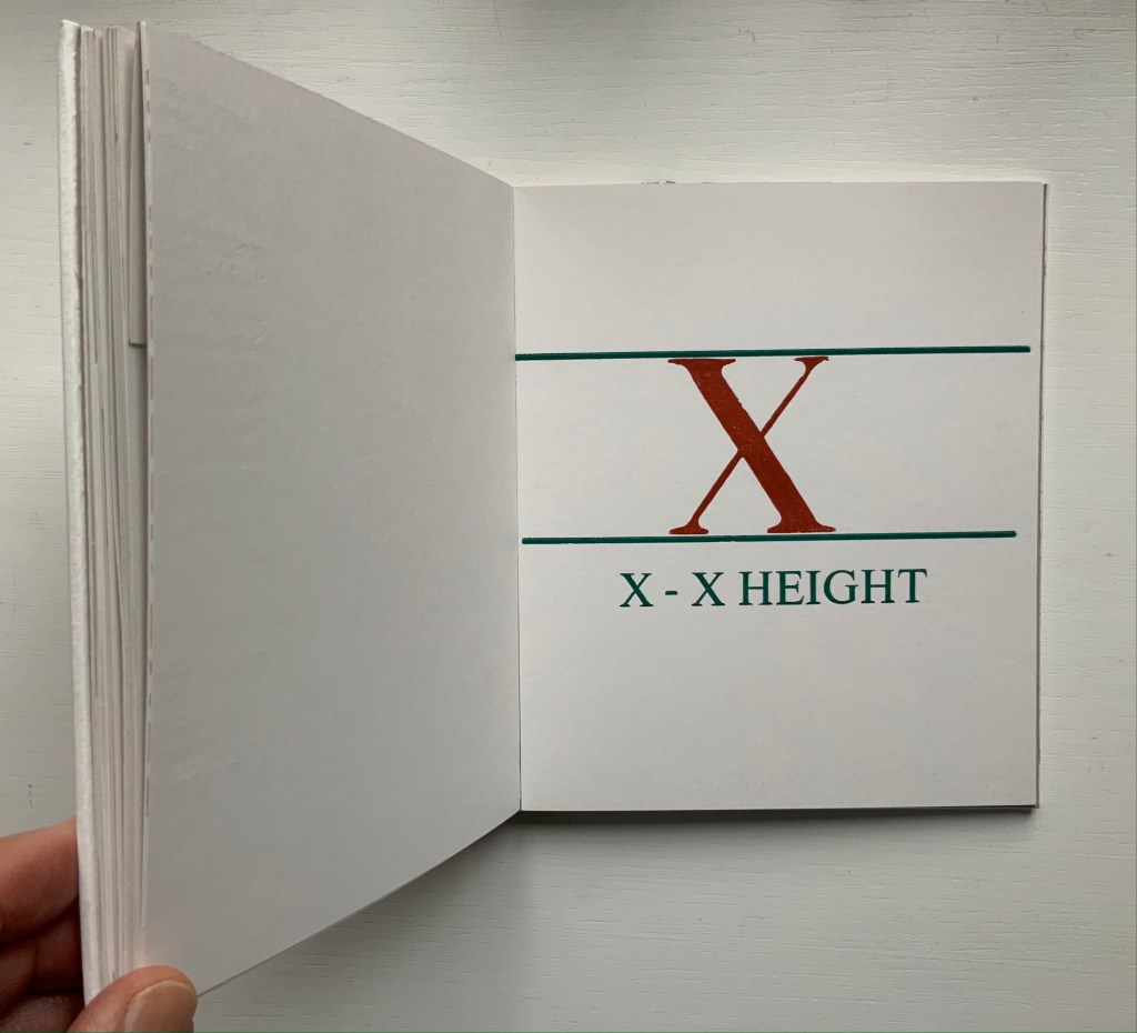
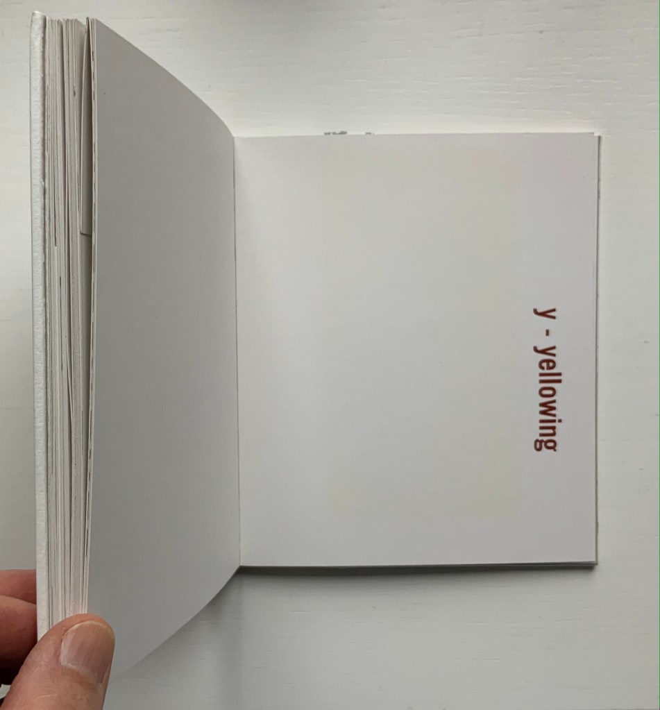
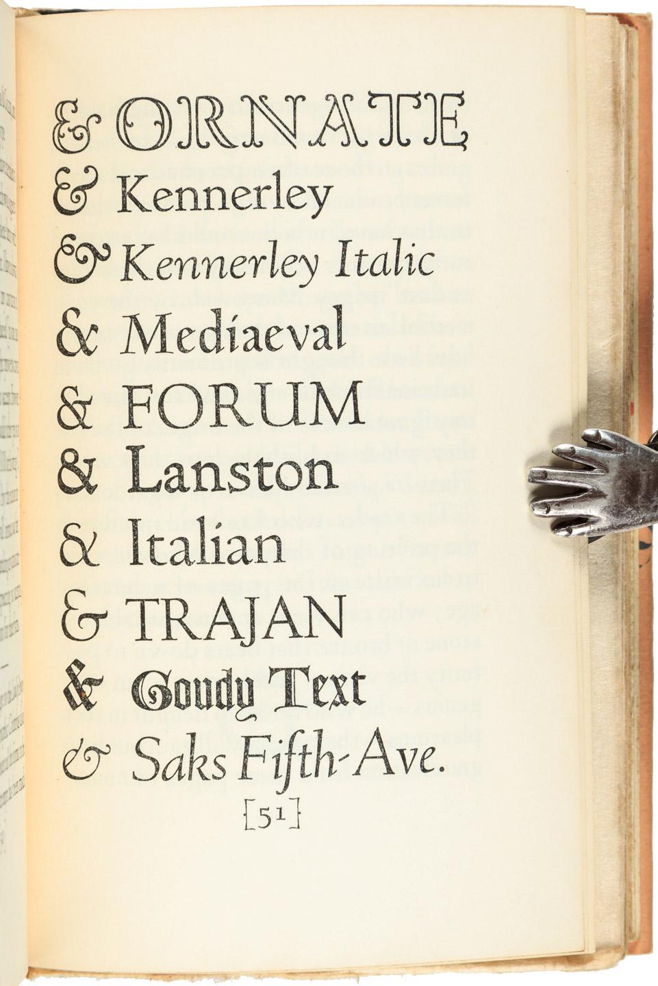
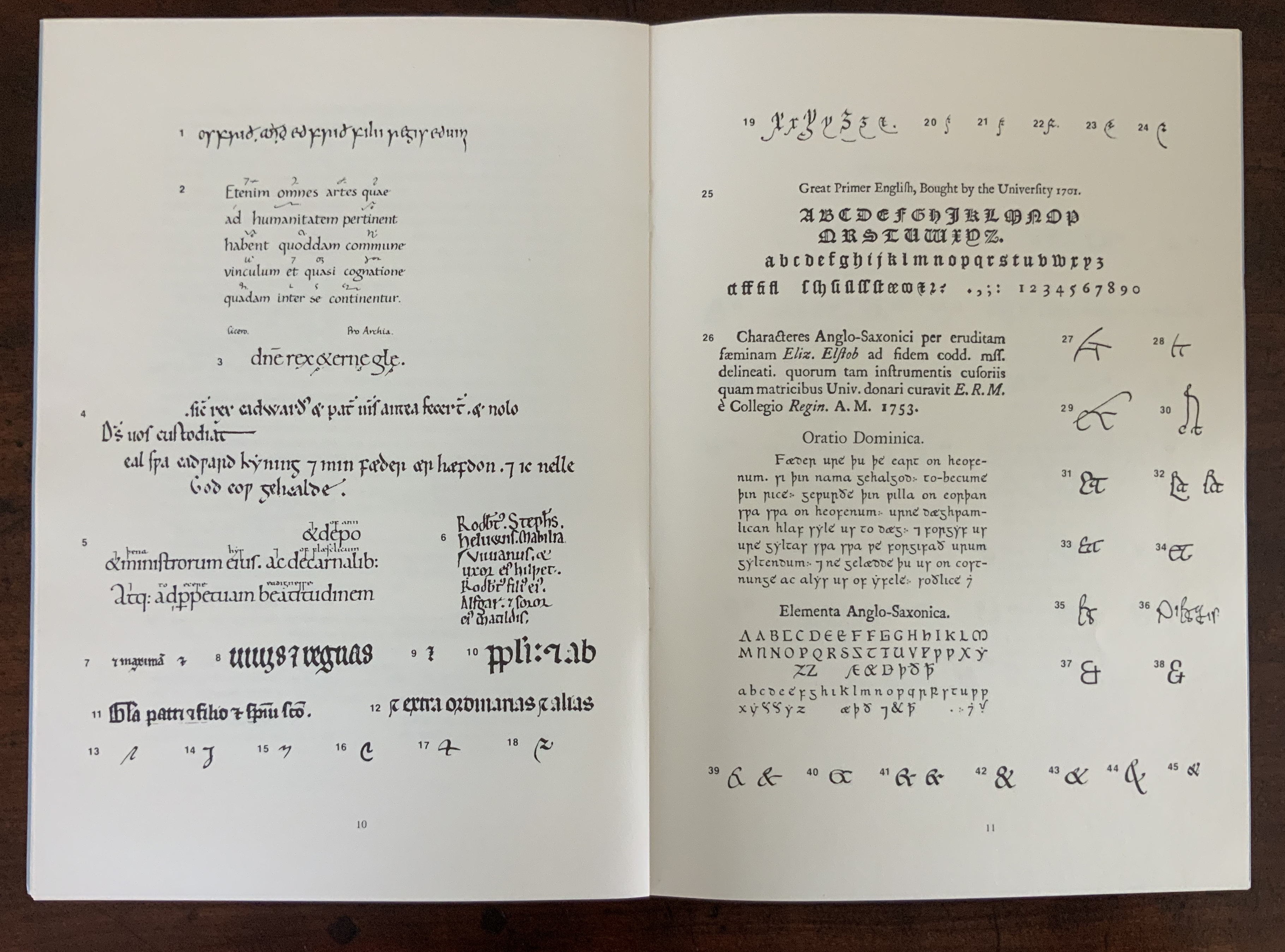
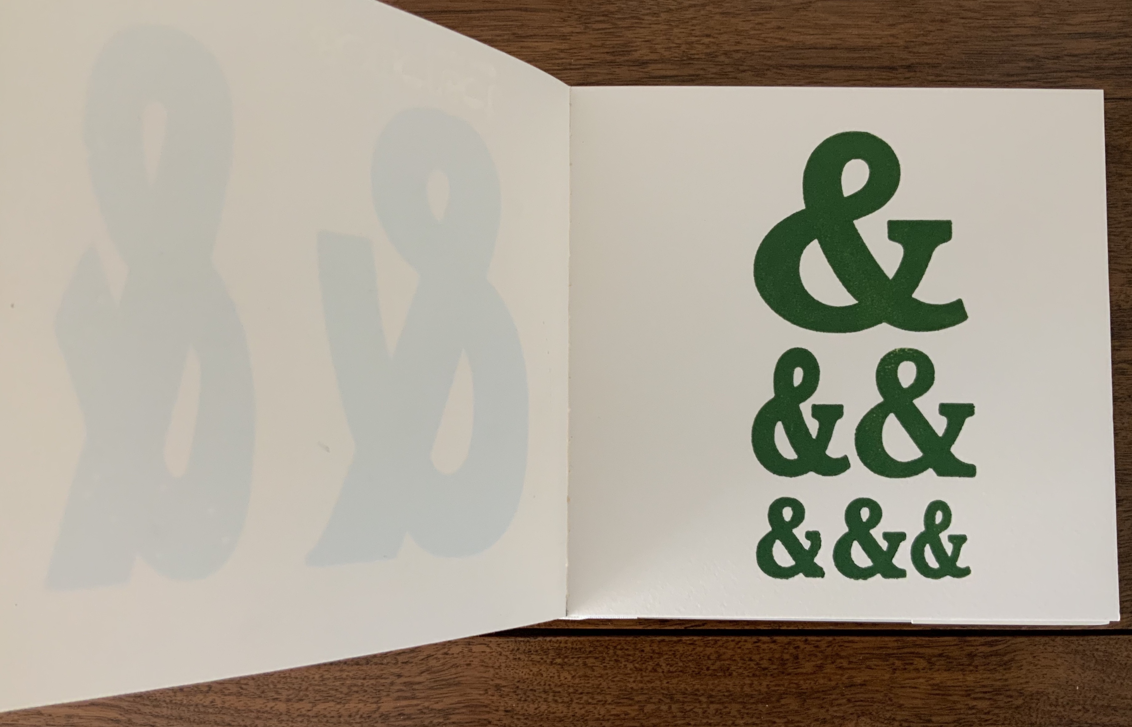
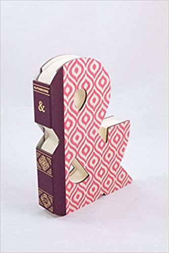
An inspired A-to-Z, with tongue in cheek evident in the material form as well as the text. At first, there seems to be no letter A, but closer inspection reveals the ampersand sneakily placed at the start of the alphabet on a page glued halfway up the pastedown. For the letter C, we have “chase” — the heavy steel frame used to hold type in a letterpress. Of course, the type held in a chase would read as in a mirror, and so “C. WADE.” and “HALIFAX.” do just that in their “paper” chase. E for embossing is, of course, embossed. The usually difficult search for a word or term beginning with X is not a problem for typophile and provides a self-defining demonstration as does “yellowing” for Y. For the letter Z, we have to take it on trust that the images are the result from “an etched letterpress printing plate made of zinc”.
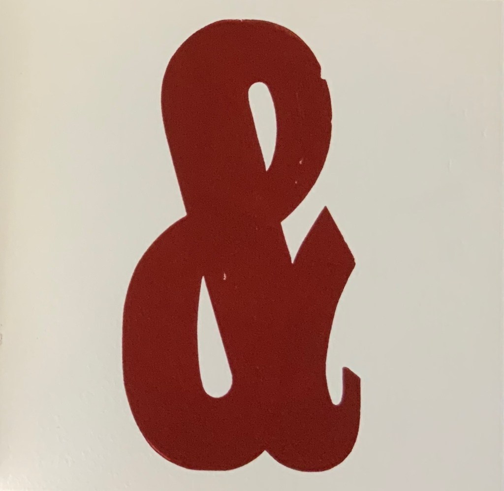
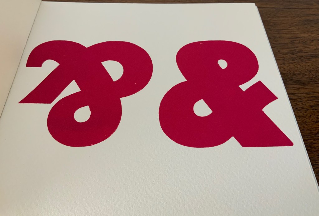
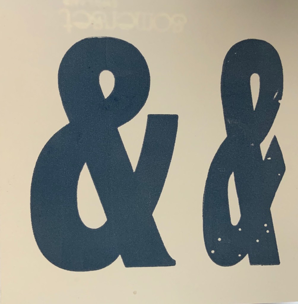
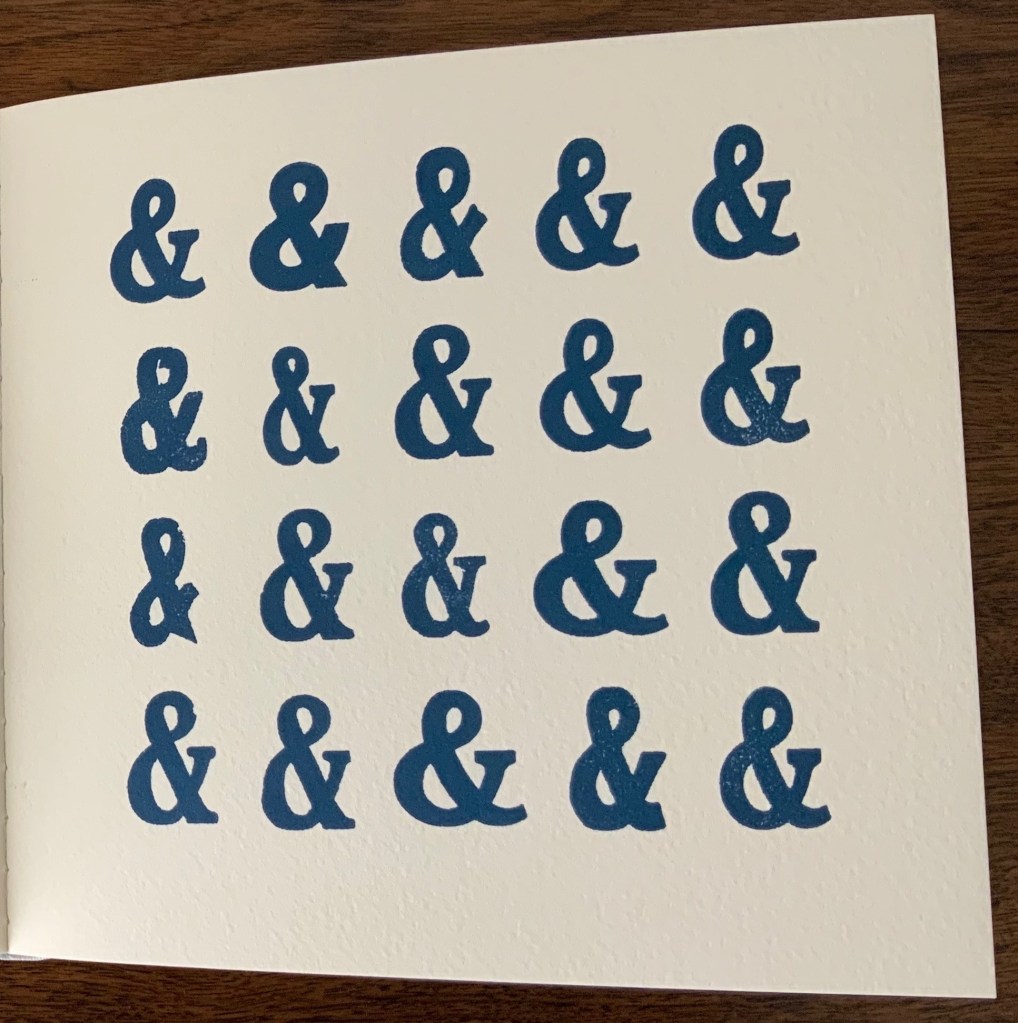
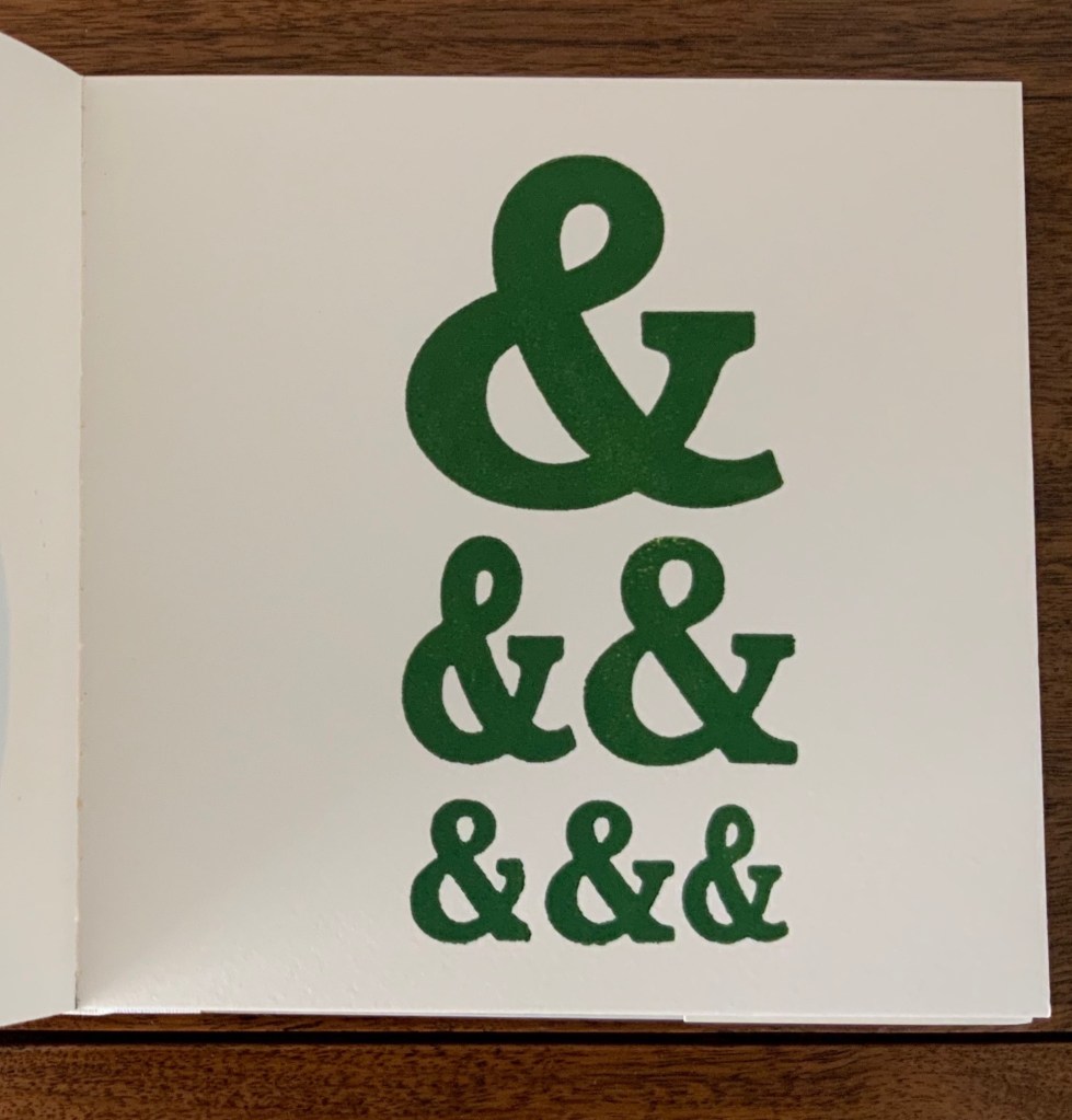
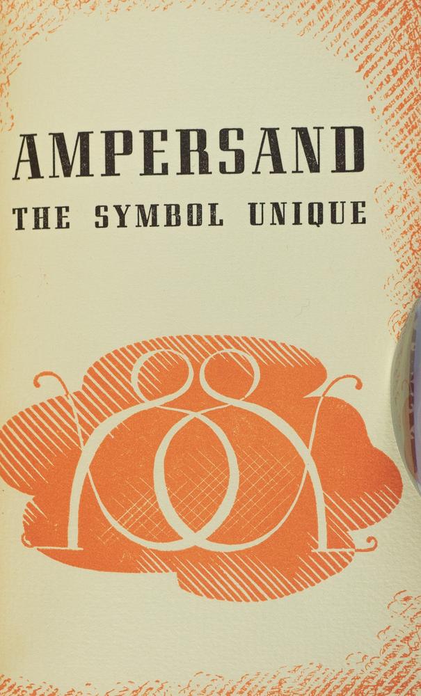
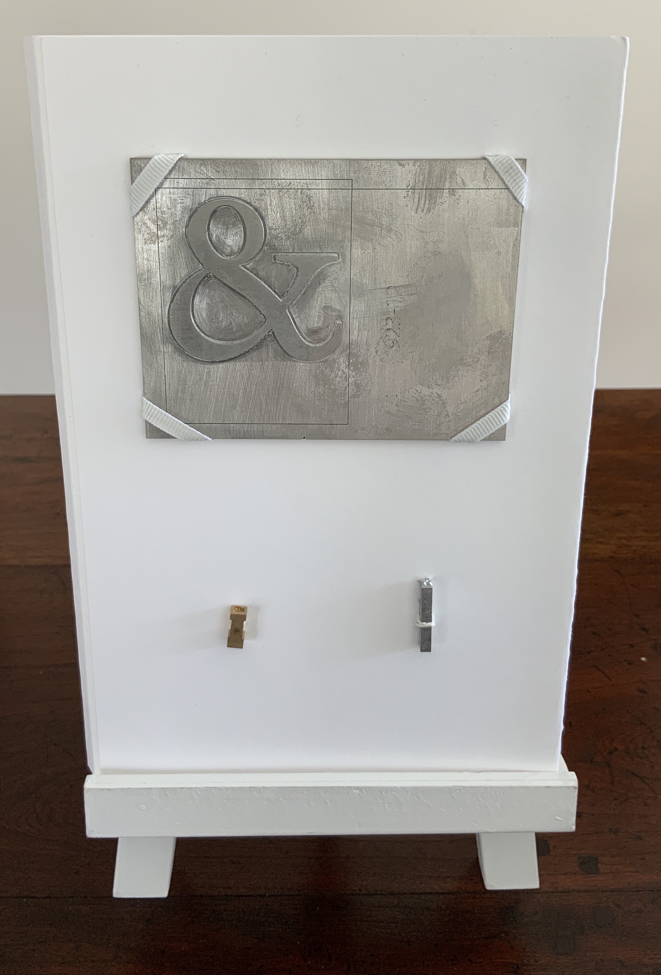
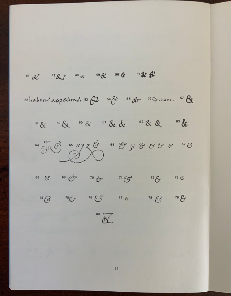
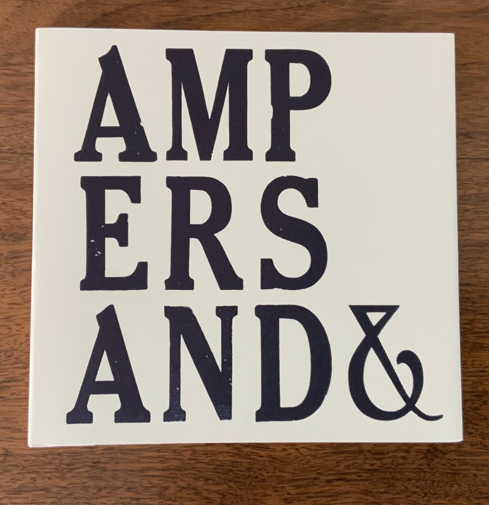
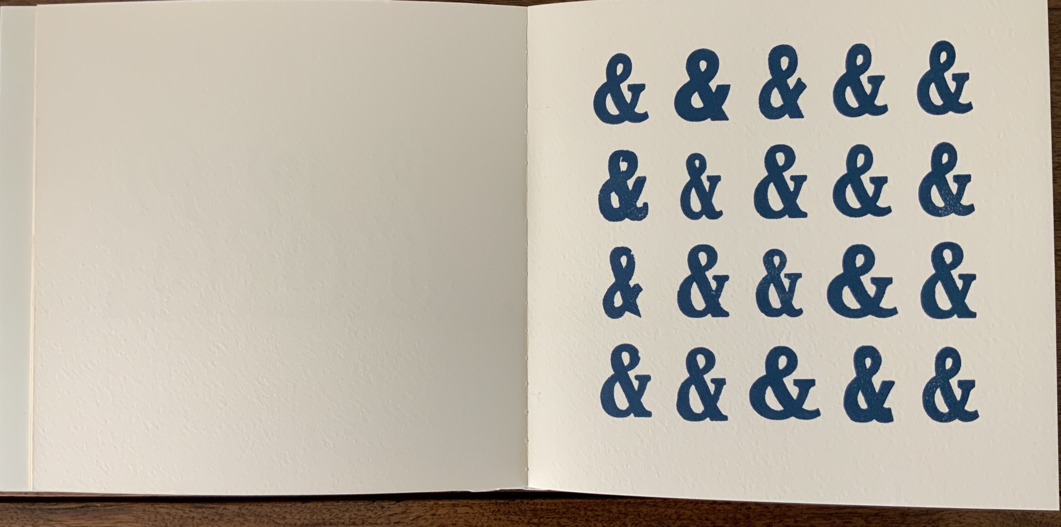
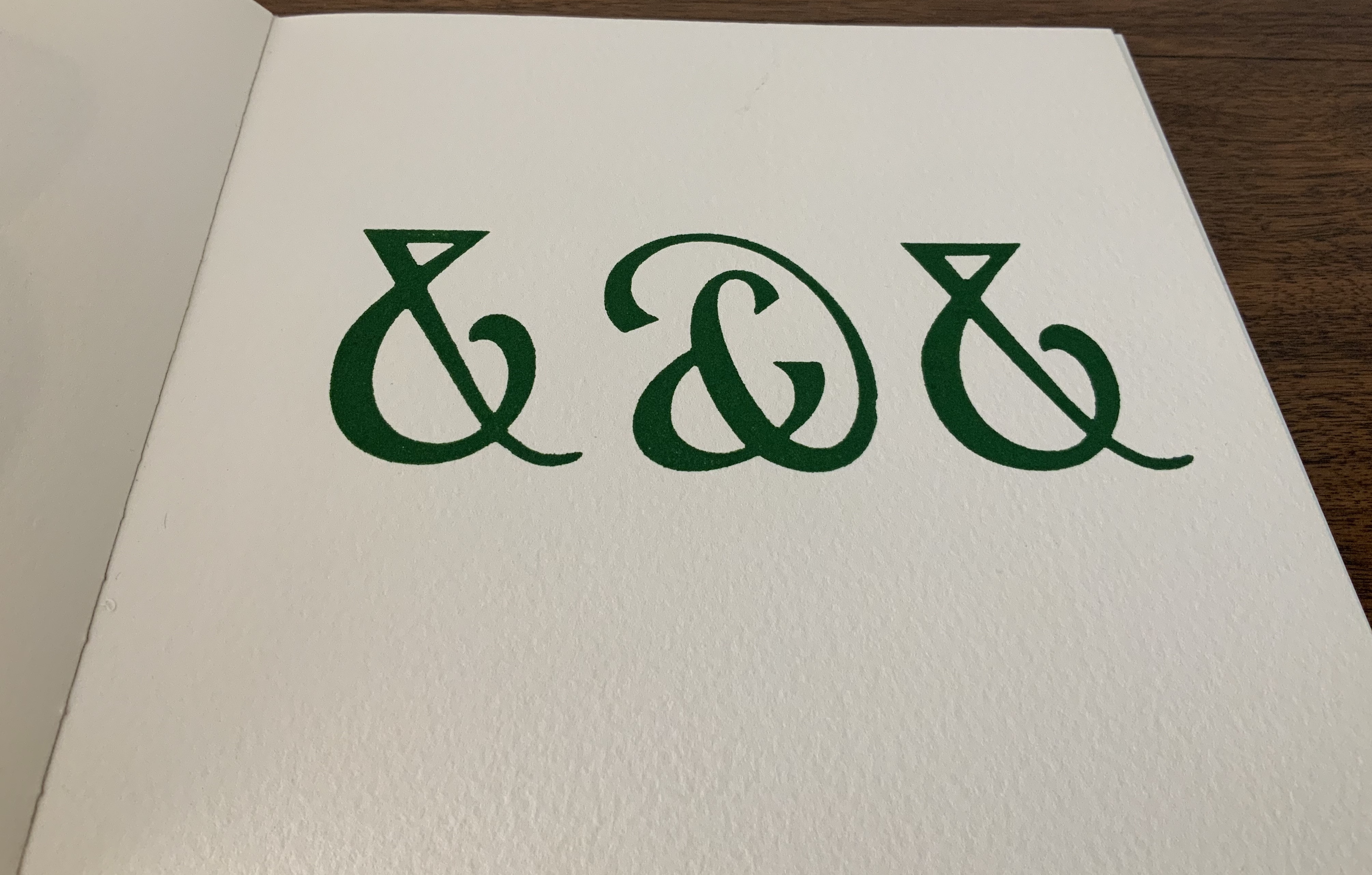
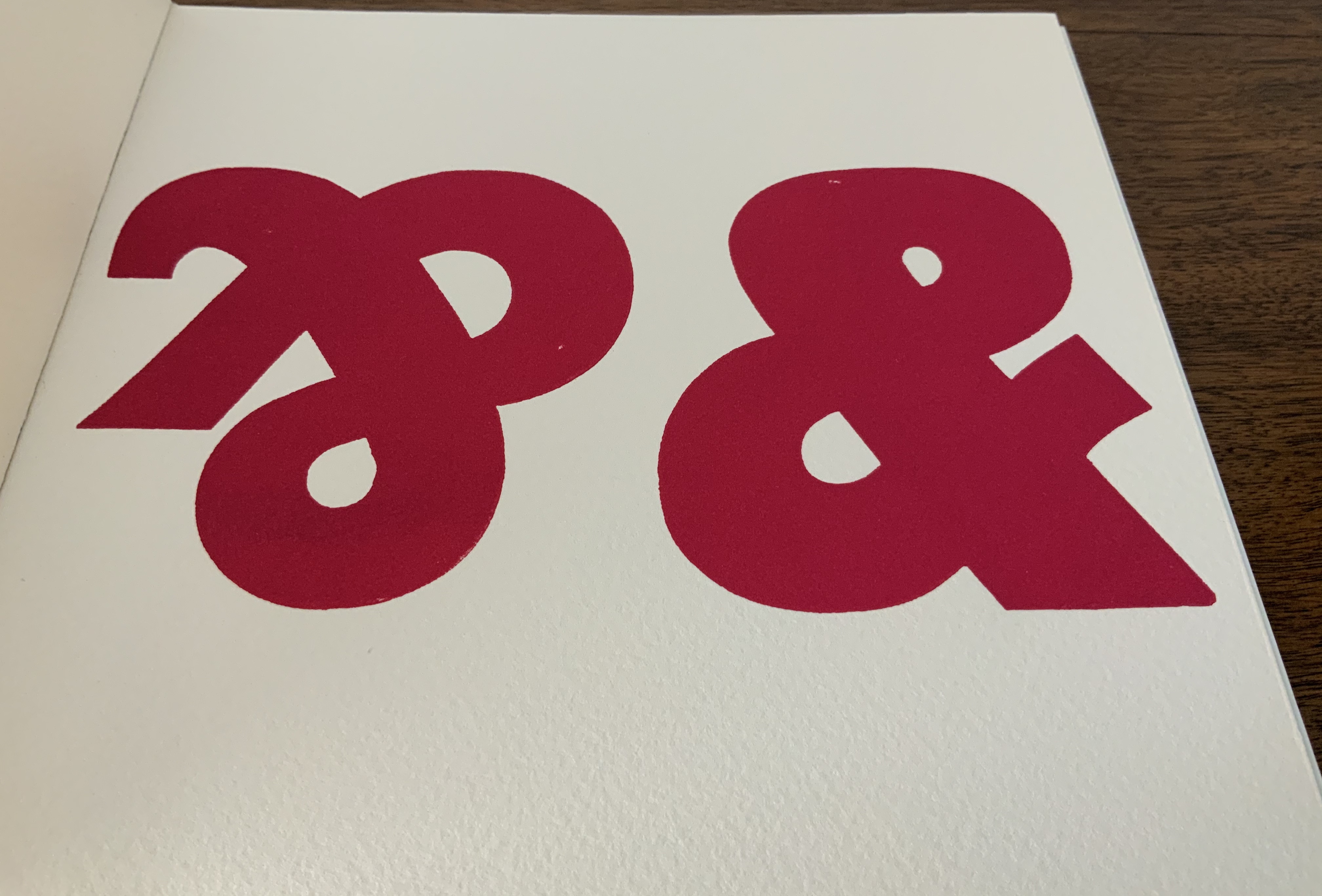
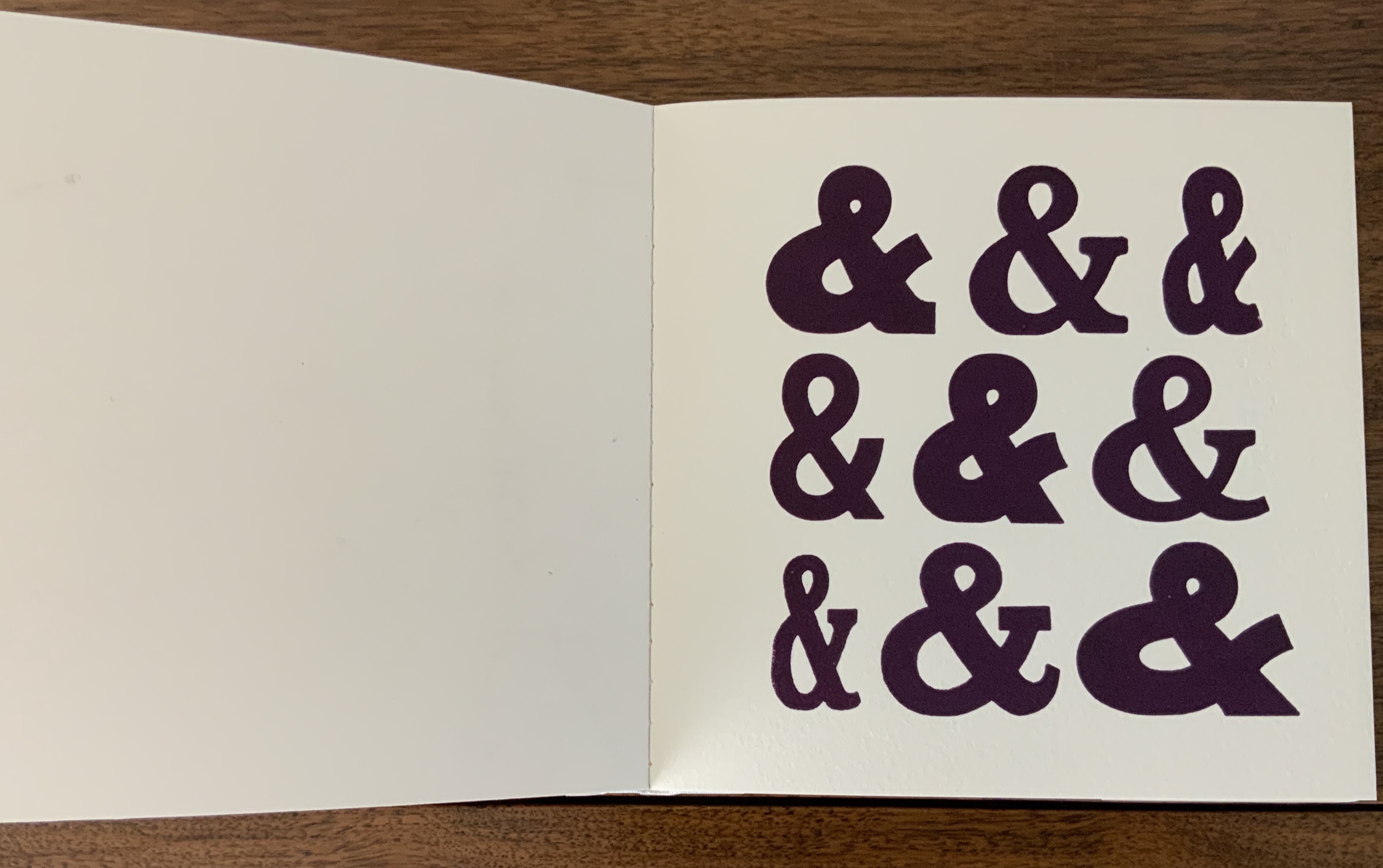
Ampersand& (2007)
Ampersand& (2007)
Andrew Morrison
Board cover, perfect bound. H180 x W180 mm, 22 pages. Acquired from the artist, 5 May 2020.
Photos: Books On Books Collection. Displayed with artist’s permission.
The sneaky ampersand at the beginning of Two Hand Press A-Z may have escaped from Ampersand& — or given the density and evenness of the possible escapee’s color, perhaps not. Any collection of wooden type will have “character”-giving flaws — nicks, nocks and abrasions. So it is with this … what is the collective noun for ampersands? The variation in shape of these ampersands and Morrison’s flaunty display of them deliver even more character. And note the watermark in the Somerset paper peeking through the third image below.
Further Reading
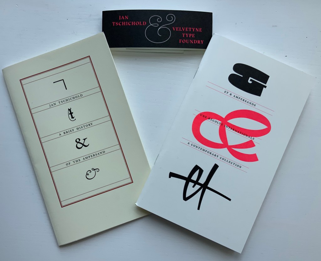
“The Last Word on the Ampersand“. 27 June 2020. Books On Books Collection.
“David Clifford“. 15 September 2021. Books On Books Collection.
Bliss, Douglas Percy. 2013. A history of wood engraving: the original edition. New York: Skyhorse Press. Originally published by J.M. Dent in 1928.
Frost, Gary. 1996. Teaching set of historical bookbindings. Utopia, Tex: Gary Frost, Dry Frio Bindery.
Hanmer, Karen. 2013. Biblio Tech. Glenview, IL: Karen Hanmer Book Arts.