Van Hornbook tot ABC-Prentenboek (2003)
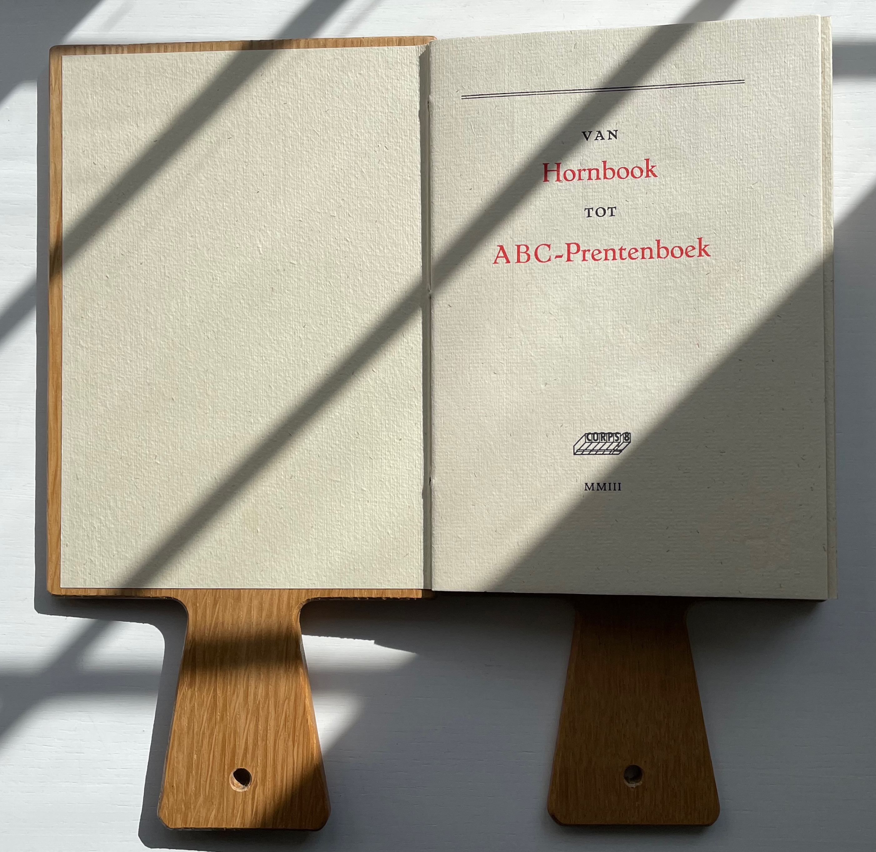
Van Hornbook tot ABC-Prentenboek (2003)
Kees Baart, Dick Berendes, Henk Francino and Gerard Post van der Molen
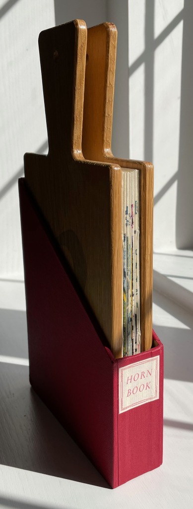
Double-sided leporello between two pamphlet-sewn booklets and bound between two oversized wooden hornbooks, held in an open cardboard box. H295 x W150 x D 30 mm. First booklet, 18 unnumbered pages; second booklet 8 pages; 52 panels. Edition of 135. Acquired from Fokas Holthuis, 13 September 2022.
Photos: Books On Books Collection. Displayed with permission of the artists.
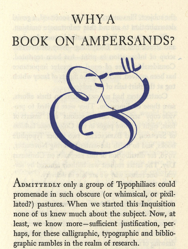
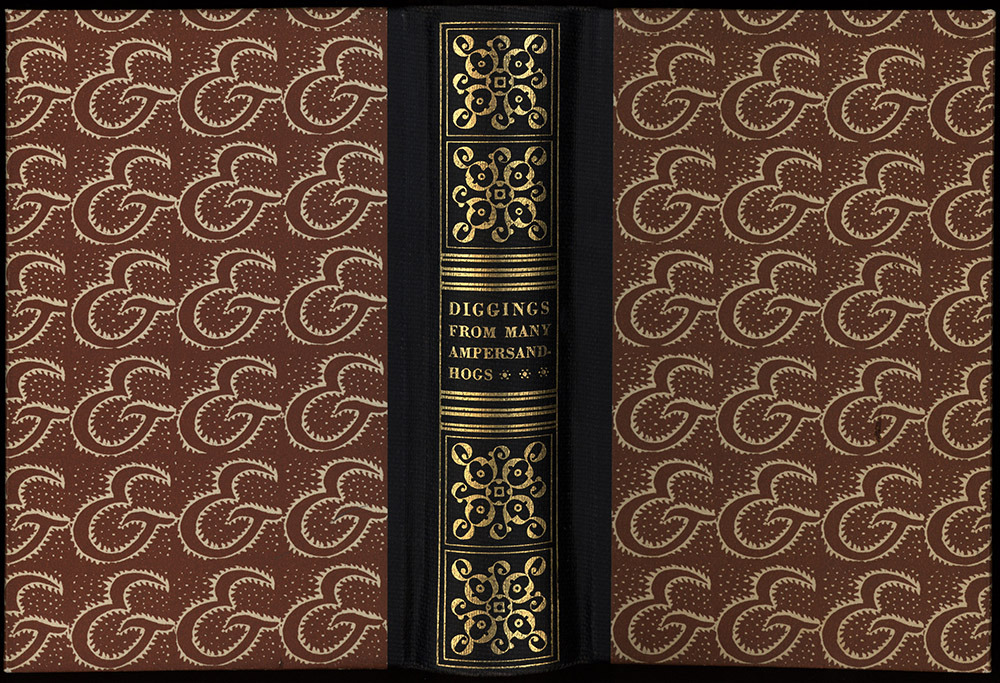
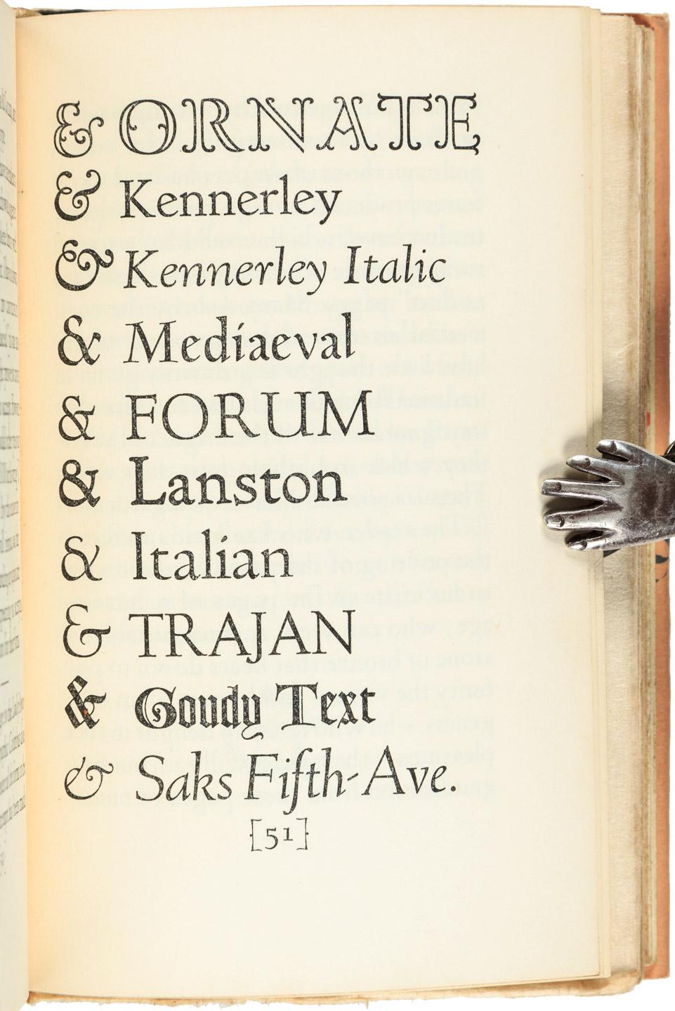
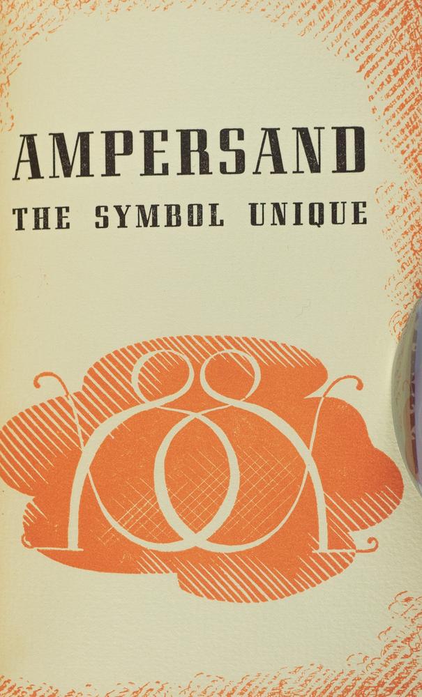
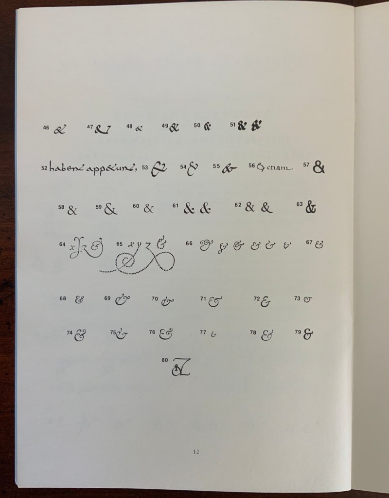
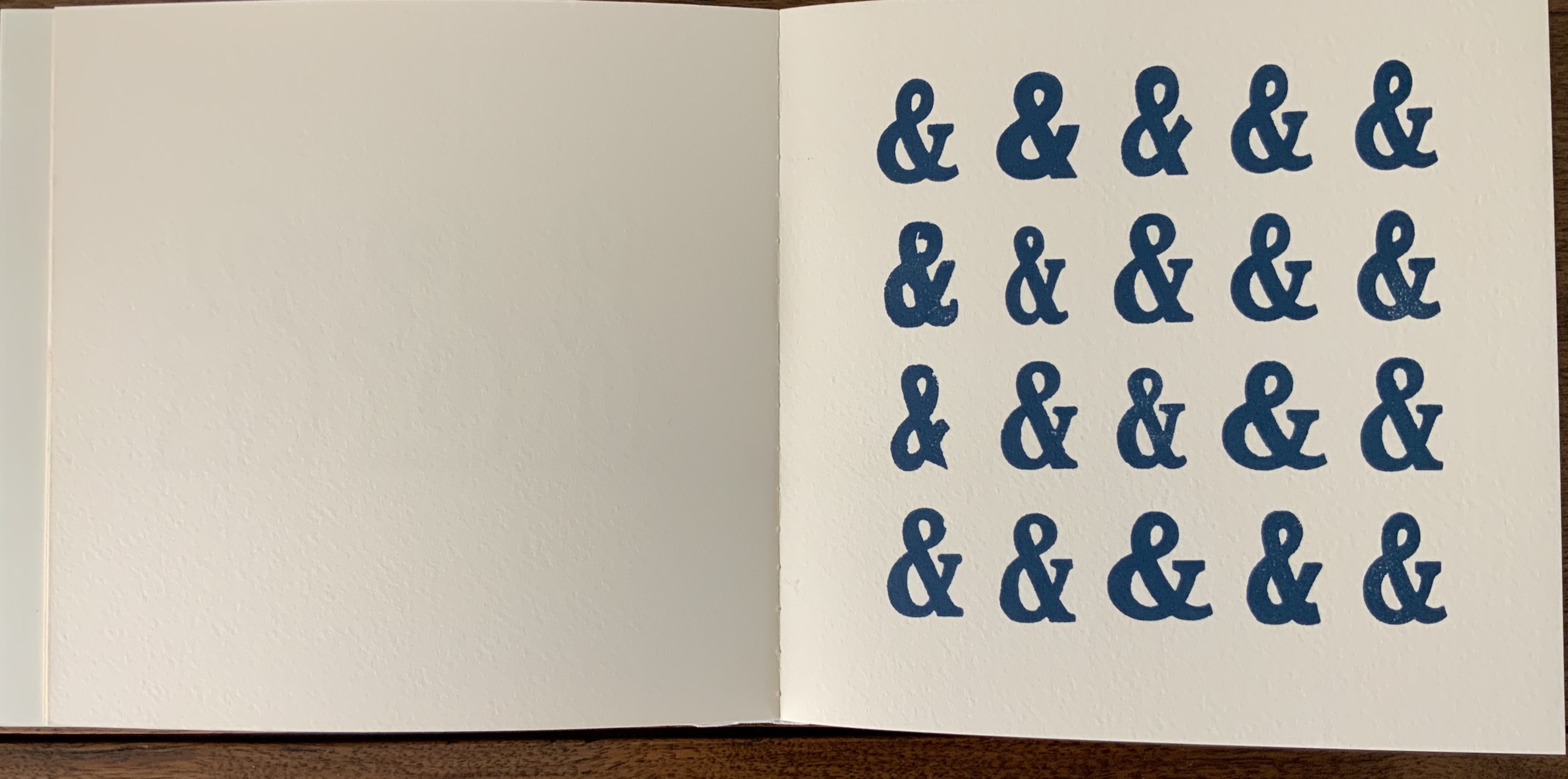
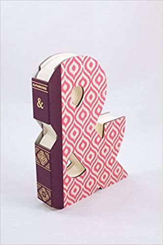
From Hornbook to ABC Picture Book was organized by four members of the Corps 8 collective. They issued it with the financial backing of the Zeeuwse Nederland Bibliotheek and under the auspices of Drukwerk in de Marge (Printing in the Margin), a foundation established in 1975 by likeminded amateur printers and publishers. Drukwerk in de Marge recalls The Typophiles, a similar group founded in the 1930s in New York that attracted great talents like Frederic Goudy, Bruce Rogers and Beatrice Warde. Like Drukwerk in de Marge, The Typophiles stimulated quirky publications. One of them — Diggings of Many Ampersandhogs (almost the last word on the ampersand) — resides in the Books On Books Collection and, until now, lacked an appropriate partner covering the preceding twenty-six characters of the alphabet.
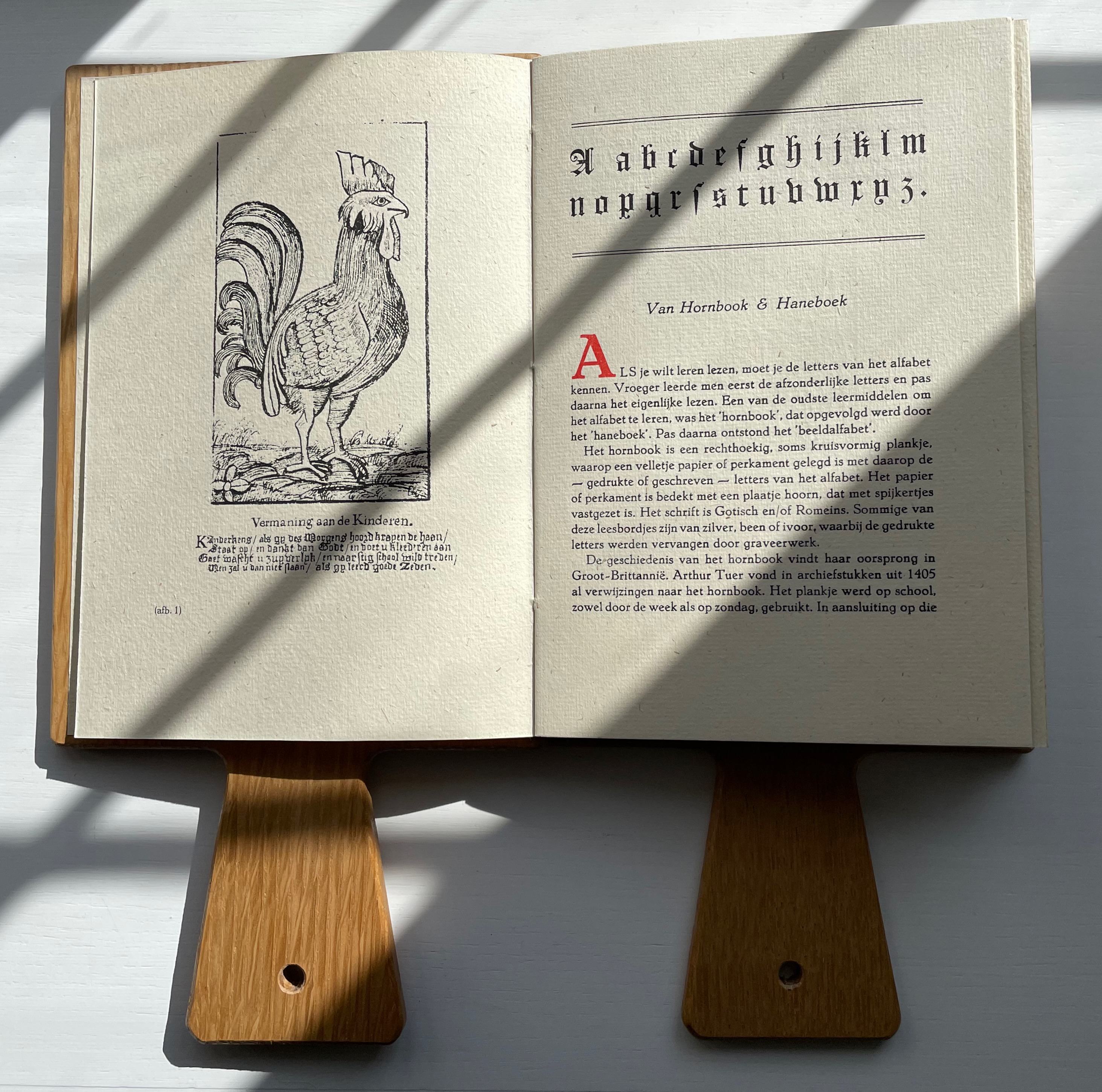
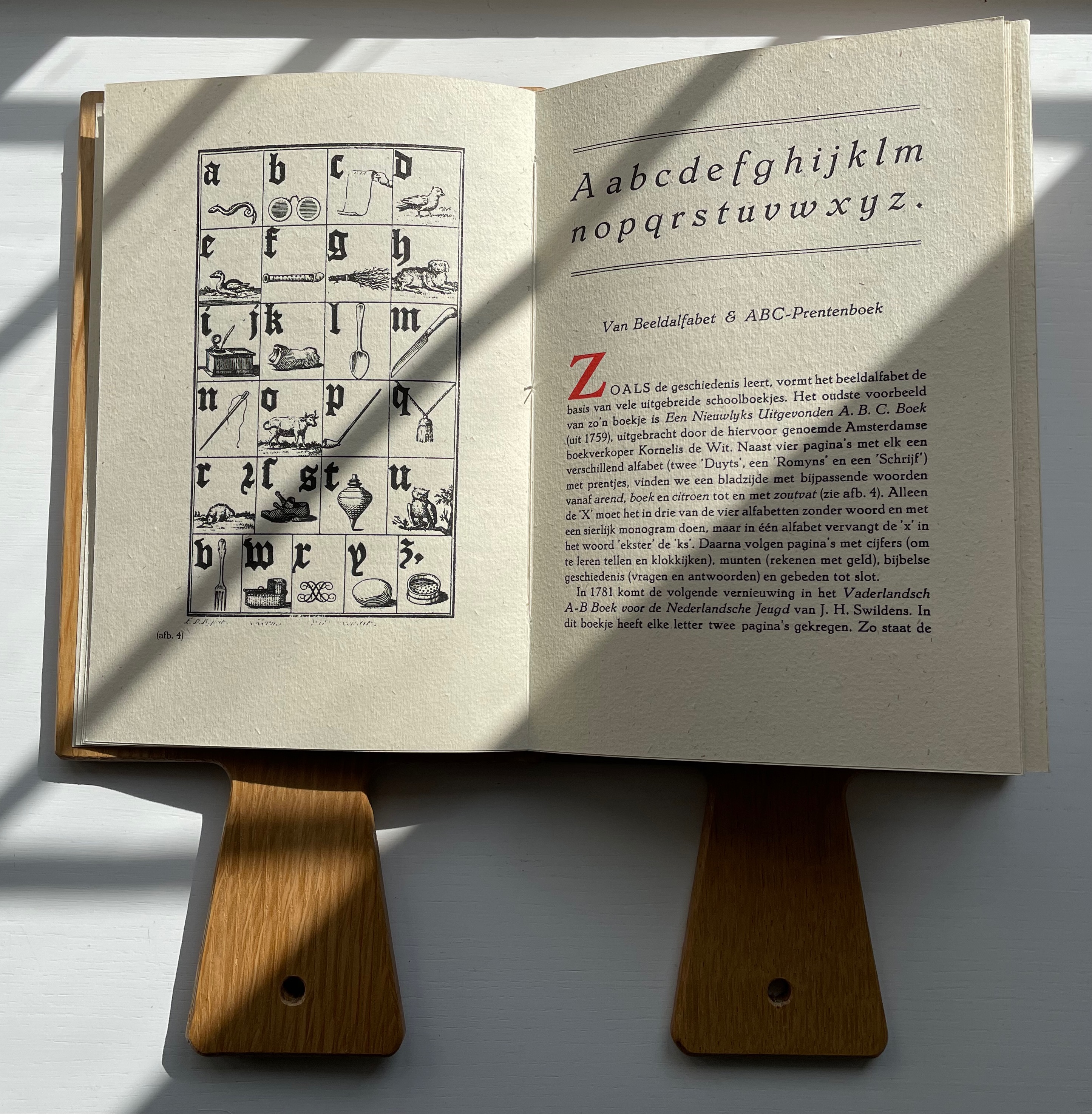
Van Hornbook includes four brief essays. Following in the footsteps of Andrew White Tuer’s History of the Horn-Book, the first two — “Van Hornbook & Haneboek” / “Of Hornbook & Handbook” and “Van Beeldalfabet & ABC-Prentenboek” / “Of Picture Alphabet & ABC Picture Book” –provide historical context for the format and its successors. Only four hornbooks have survived in the Netherlands, dating from the eighteenth century, so like Tuer, Van Hornbook‘s essayists rely on images from popular historical prints to show the hornbook’s appearance and handling. To the three hundred illustrations of History of the Horn-Book, the Nederlanders add this:
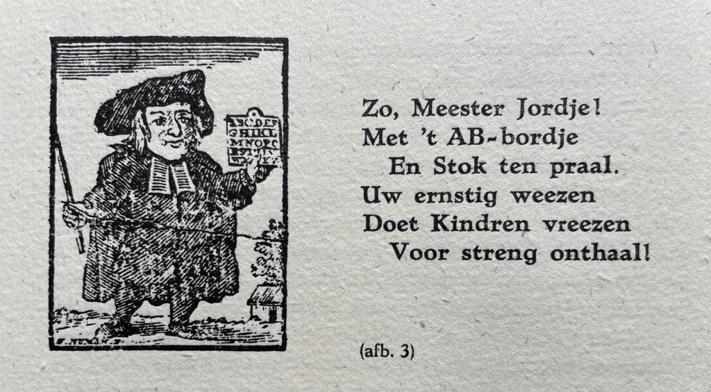
So, Master Jordje!
With AB boardje
And cane on high.
Your earnest weening
Leaves children keening
As school draws nigh!
The print dates to 1785. The Dutch collective’s undertaking and their contributors’ offerings for the leporello are all the more notable for such a narrow historical margin on which to build.
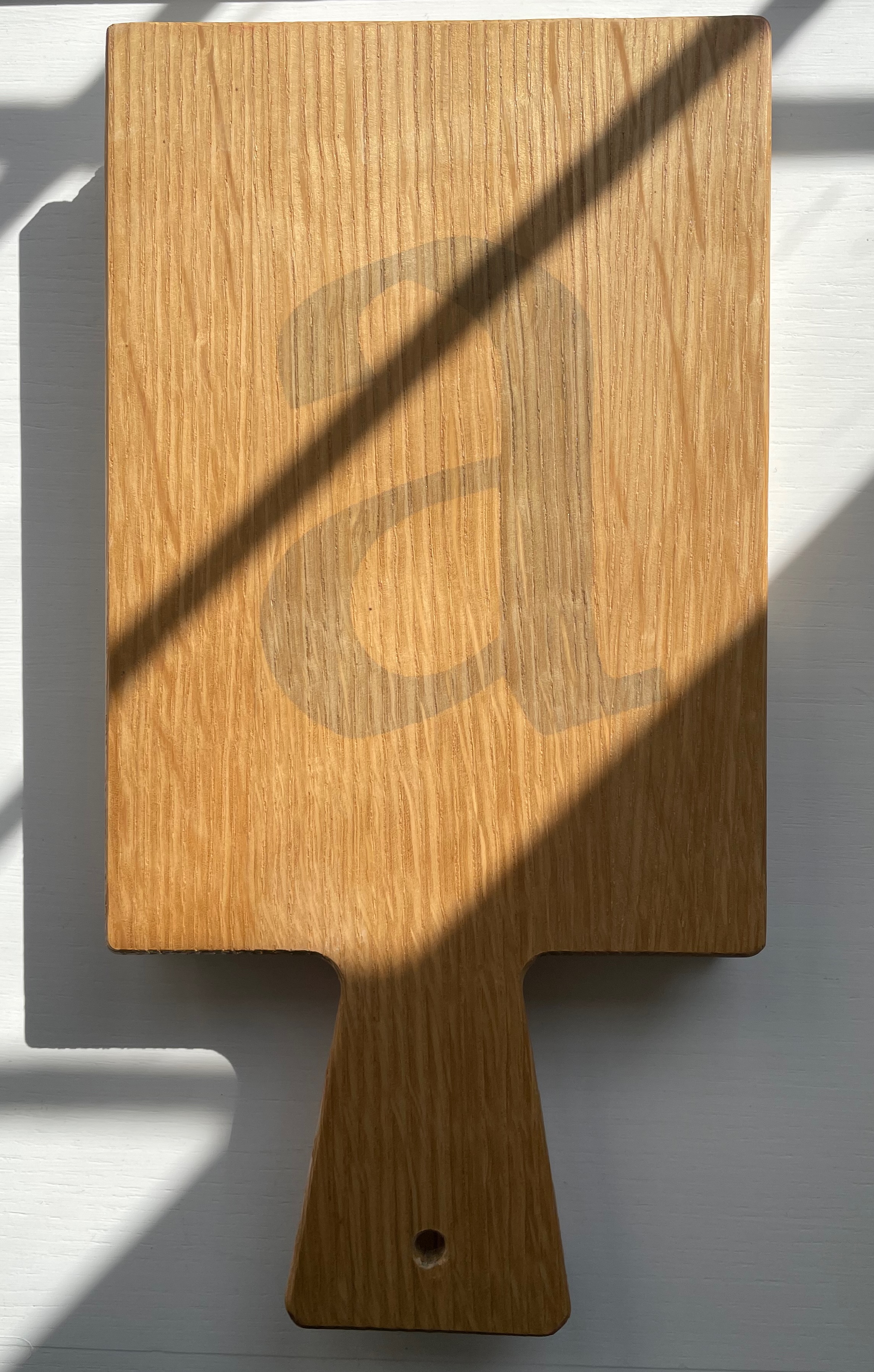
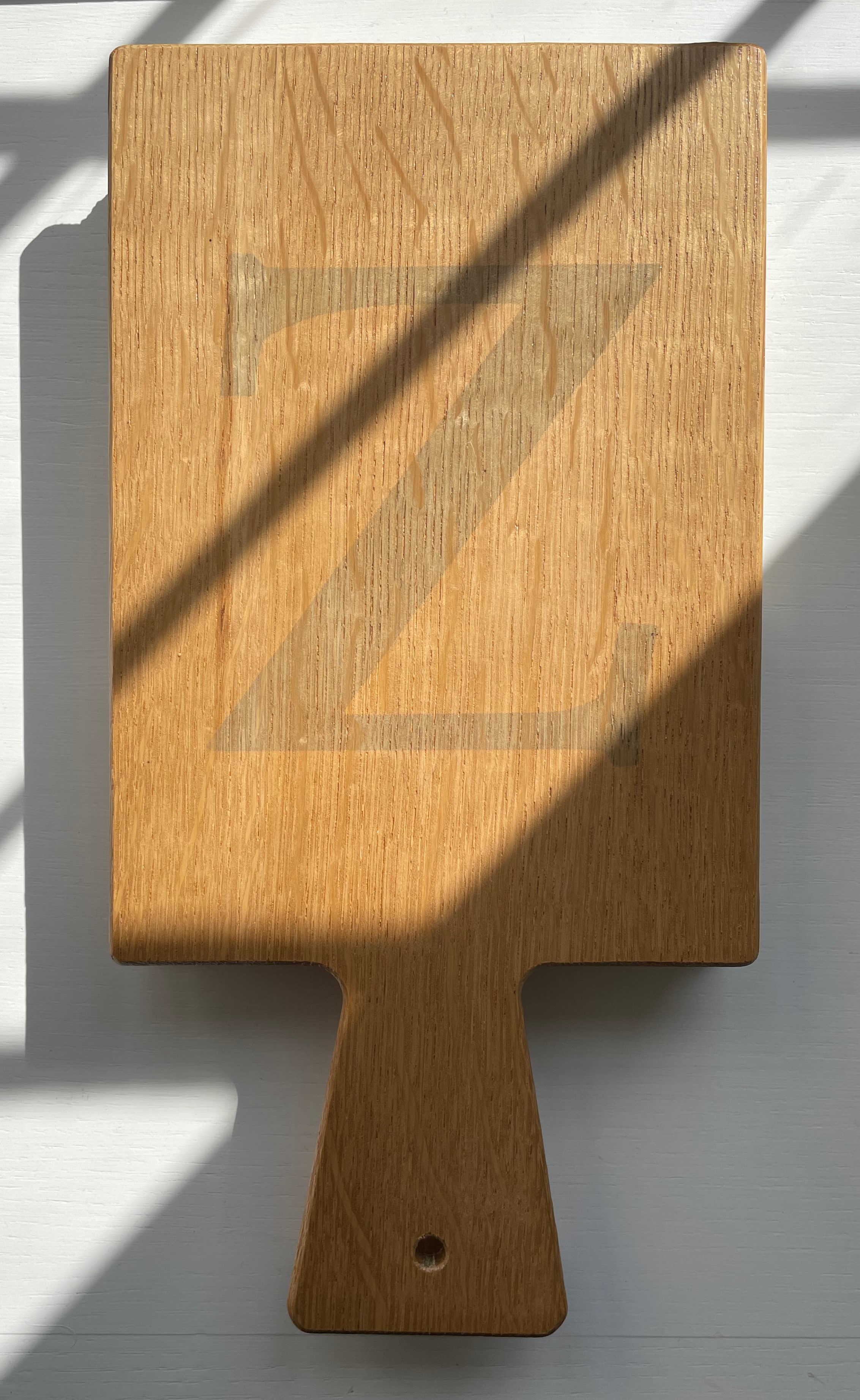
The work’s four editors have the last say with “Verantwoording” / “Explanation”, which is an extended run-up to the colophon. The leporello is printed on 180 gms Antik Gerippt Bütten by Hahnemühle, and the essays are on 130 gms. The heavier weight of the leporello’s panels must have been an open invitation for the contributors to show off. Aside from the constraint of print area, the “Hornbook preparation group” seems to have imposed only one other layout requirement: that each double-panel spread display the same horn-book shape on its left-hand panel. As the images below show, this was just the right touch of uniformity to spark rather than impede the contributors’ creativity and individuality.
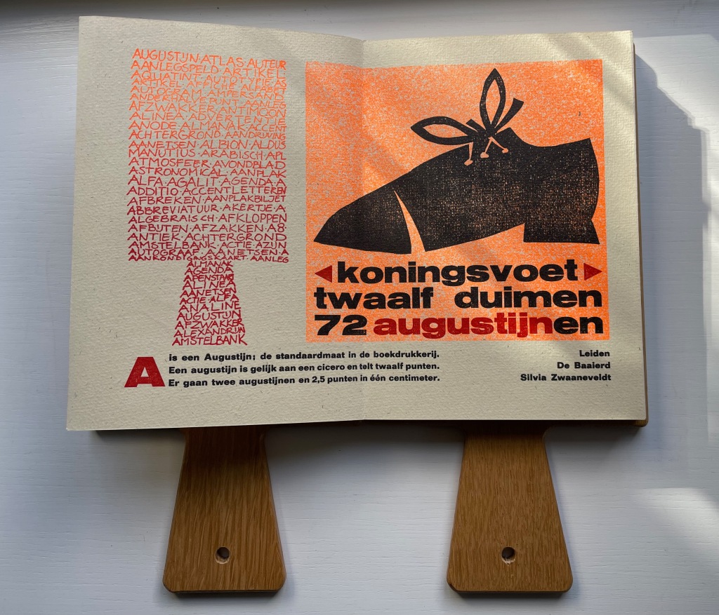
In English, the text beneath the two images here reads “A is an Augustin, the standard size in letterpress. An Augustin is equal to a cicero and has twelve points. Two Augustins and 2.5 points equal one centimeter.” Under the image of the shoe, Silvia Zwaaneveldt (De Baaierd, Leiden) converts into points the traditional measure for the “foot”: a foot would equal the size of the king’s foot, which eventually was standardized to twelve inches, which — to save us from chasing after Willem-Alexander or Charles III with a pica stick — is 72 Augustins.
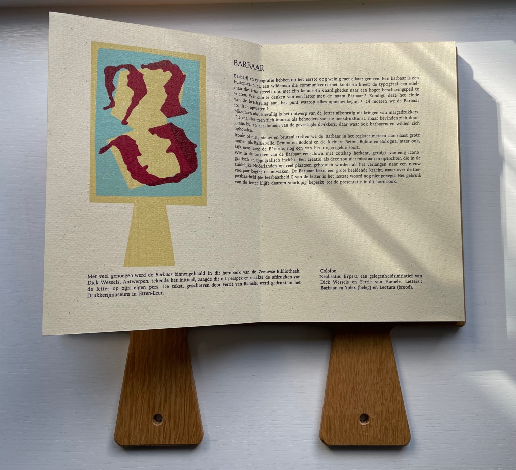
In their contribution for the letter B, Dick Wessels and Ferrie van Ramele invent a fictitious typeface Barbaar, named to allow them an extended joke about the outsider (or barbarian) status of Margedrukkers among traditional printers. If the Dutch reader misses the tongue-in-cheekiness of the entry, the colophon gives away the game:
Realisatie: BYpers, een gelegenheidsinitiatief van Dick Wessels en Ferrie van Ramele. Letters: Barbaar en Yplex (beleg) en Lectura (brood). / “Realization: BYpers, an occasional initiative of Dick Wessels and Ferrie van Ramble. Letters: Barbaar and Yplex (icing) and Lectura (cake).”
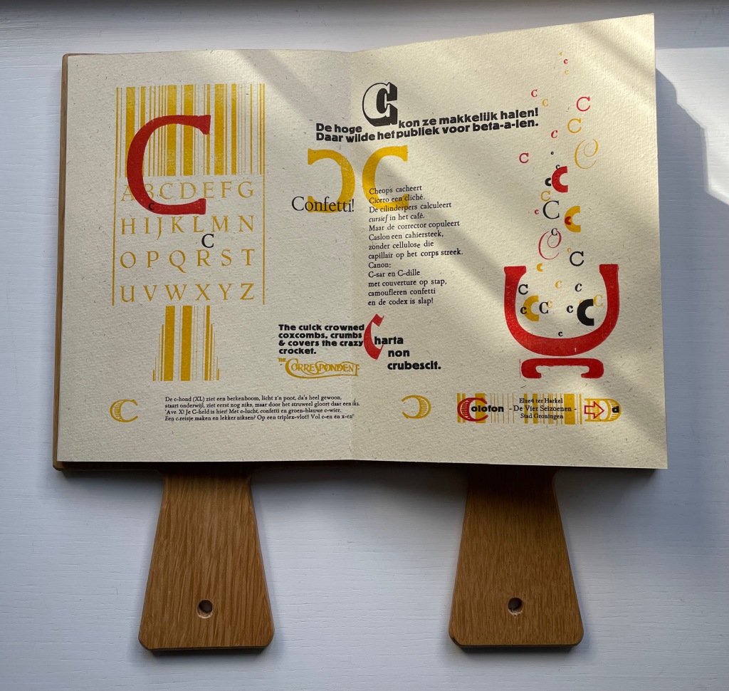
Elze ter Harkel (De Vier Seizoenen, Groningen) concocts two panels of verbal and visual puns on the letter C. The alliterative wordplay in the doggerel of “Confetti” is too Dutch and deliberately nonsensical for a satisfactory replica in English, but its reference to cellulose is a clue to the visual papermaking pun in the C’s bubbling up from the pulp vat next to it. Also referring to paper, the panels’ best pun hides in the last altered word of Cicero’s saying “Charta non erubescit“. This is usually translated as “Documents don’t blush”, meaning you can express opinions in print you might blush to express in person, but charta also means “paper”. With the “e” changed to a “c” in the last word, the Latin now means “crumble”. So, it’s “Paper doesn’t crumble”, which ought to make the winking punster blush a little.
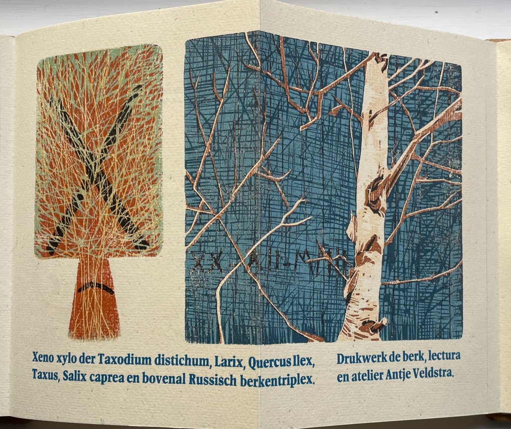
Antje Veldstra (Antje Veldstra Grafiek, Groningen) is an award-winning woodcut artist. Almost all of the X-words in her couplet are the Latin names for trees: Taxodium distichum (Bald Cypress), Larix (Larch), Quercus Ilex (Holm Oak), Taxus (Yew) and Salix caprea (Goat Willow). The first two words, however, — xeno and xylo — are prefixes. The first means “alien,” “strange” or “guest” as in xenophobia (“fear of foreigners”). The second means “wood” as in xylography (“the art of engraving on wood or of printing from woodblocks”). But what is so strange or alien about these trees? The clue is in the background (lower left) of the birch print. Those are runes, the ancient marks of mystery and secret language. The most easily distinguished are ᚷ (called Gebo, associated with gift and fortuitous outcome) and ᛖ (called Ehwaz, associated with horse and movement). In her craft, Veldstra, however, does not leave us with the ancients. The last entry — en bovenal Russisch berkentriplex — is Russian birch plywood, commonly used for engraving.
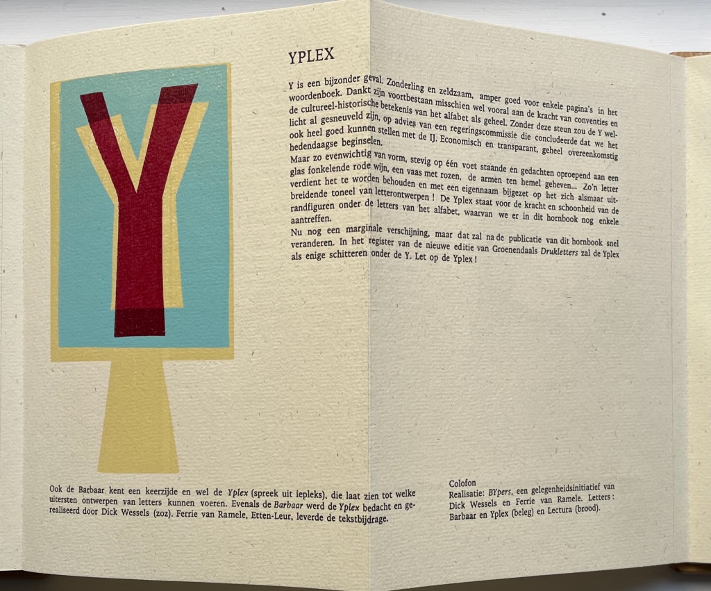
If there remains any doubt about the tone of the entry for B by Dick Wessels and Ferrie van Ramele, consider their entry for Y.
Y is a special case. Eccentric and rare, barely good for a few pages in the dictionary: it owes its survival perhaps mainly to the strength of conventions and the cultural-historical significance of the alphabet as a whole. Without this support, the Y might have already been killed off, on the advice of a government committee that concluded that we could very well make do with the IJ. Economical and transparent, entirely in keeping with contemporary principles.
But so balanced in form, standing firmly on one foot and evoking thoughts of a glass of sparkling red wine, a vase of roses, arms raised to heaven…. Such a letter deserves to be preserved and added with its own name to the ever-expanding stage of letter designs! The Yplex represents the strength and beauty of the marginal figures among the letters of the alphabet, a few of which we still find in this hornbook.
Although still a marginal appearance, that will soon change after the publication of this hornbook. In the register of the new edition of Groenendaal’s Printing Letters, the Yplex will be the only one shining under the Y. Stand by for the Yplex!”
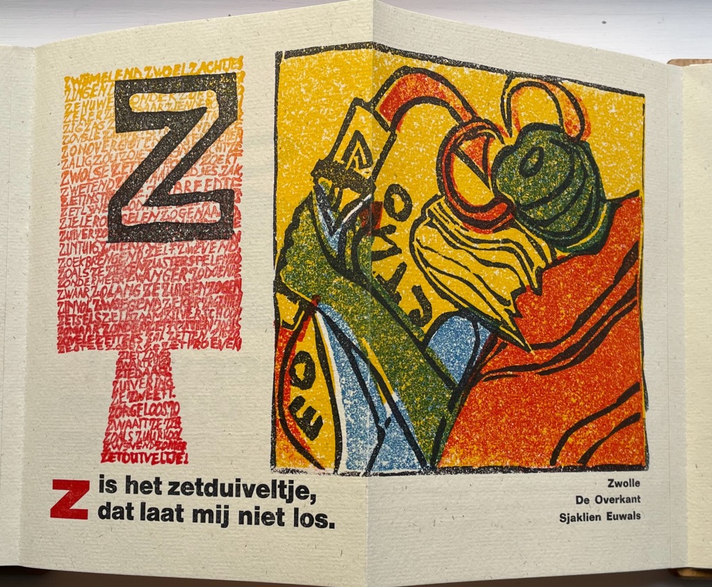
The last letter of the alphabet bedevils abecedarians in every language. Sjaklien Euwals settles on zetduiveltje: “typesetter’s or printer’s little devil”. Word for word in English, the caption reads “Z is the typesetter’s little devil that will not let me loose”. The image rules out the English expression “printer’s devil”, which refers to the printshop apprentice. Euwals’ little devil is the green and red gremlin who leans over her shoulder, grabs her wrist and makes her drop letters from her composing stick. In other words, the imp on whom to blame typographical errors. To capture Sjaklien Euwals’ humor in translation, we might have to go with “Z iz the typezetter’z gremlin that won’t let looze.”
Given the affinity between artists’ books and children’s books (particularly alphabet books), it is surprising how few works of book art pay homage to the form of the horn-book. Van Hornbook tot ABC-Prentenboek sets a high bar. Perhaps increased awareness of it will prime the pump for primers.
Further Reading/Viewing
“Elder Futhark“. Last edited 11 August 2022. Wikipedia. Accessed 27 October 2022.
Tuer, Andrew White. 1897. History of the Horn-Book. London: Leadenhall Press.