Colour — Based on Nature (2012)
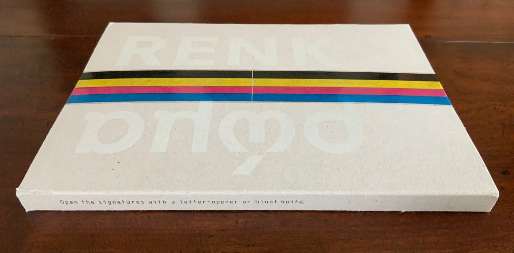
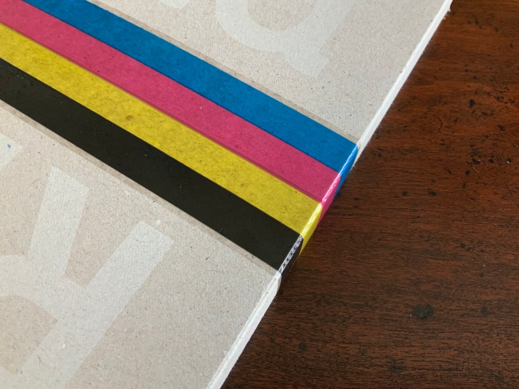
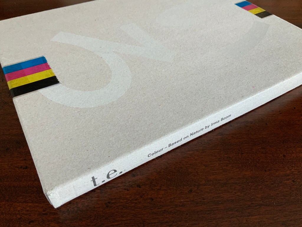
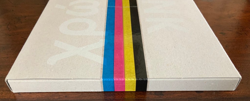

Colour — Based on Nature (2012)
Irma Boom
Box holding softcover. H320 x W240 mm, 170 pages. Acquired from Ursus Books & Gallery, 16 November 2020.
Photos: Books On Books Collection.
This work of art in the form of a book explores and associates colors with 80 UNESCO World Heritage sites across the globe. On the exterior of each folio, all of them uncut, a single, solid color appears. As the folio is cut, the interior reveals striated variations on the exterior color.
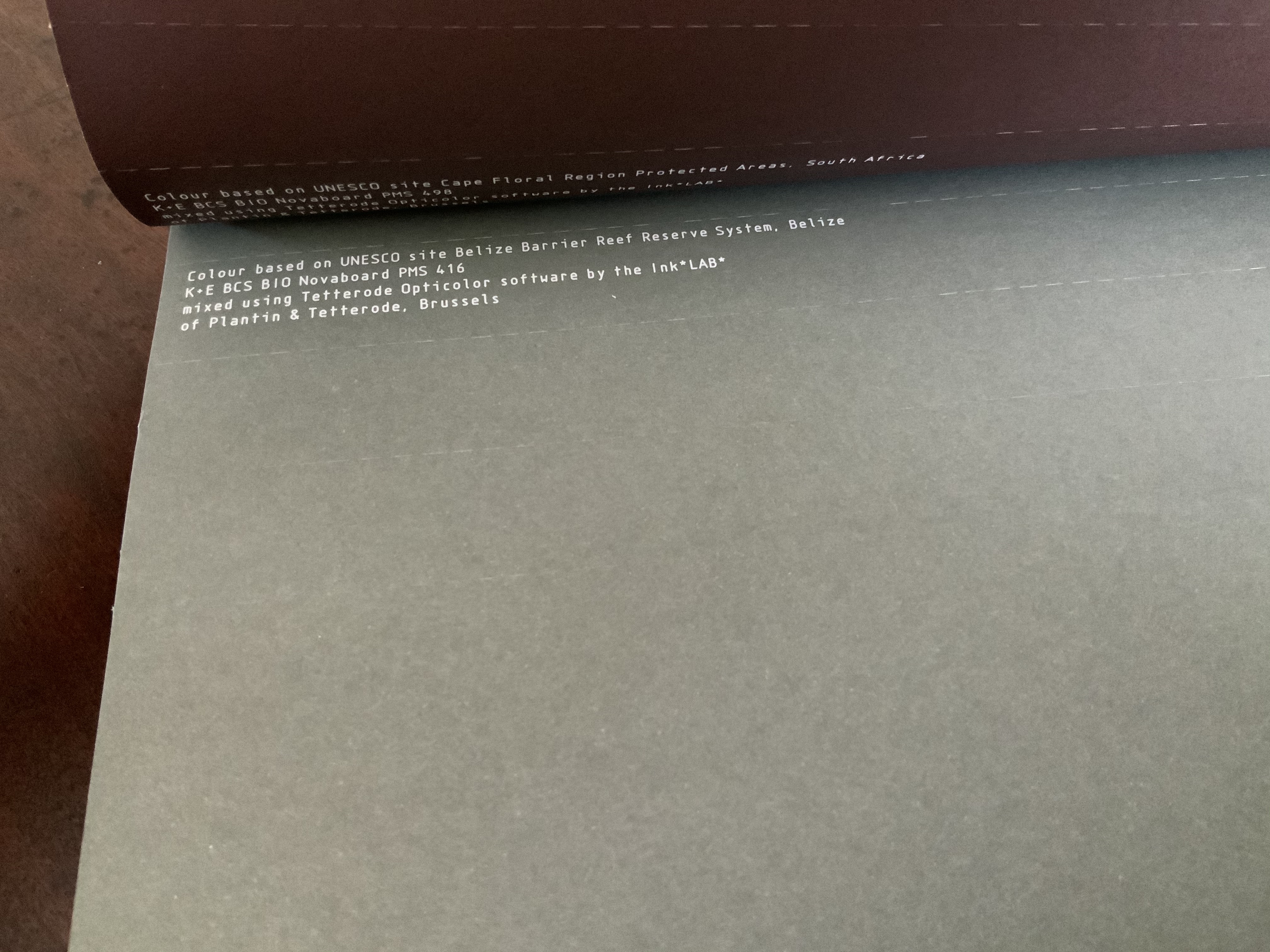
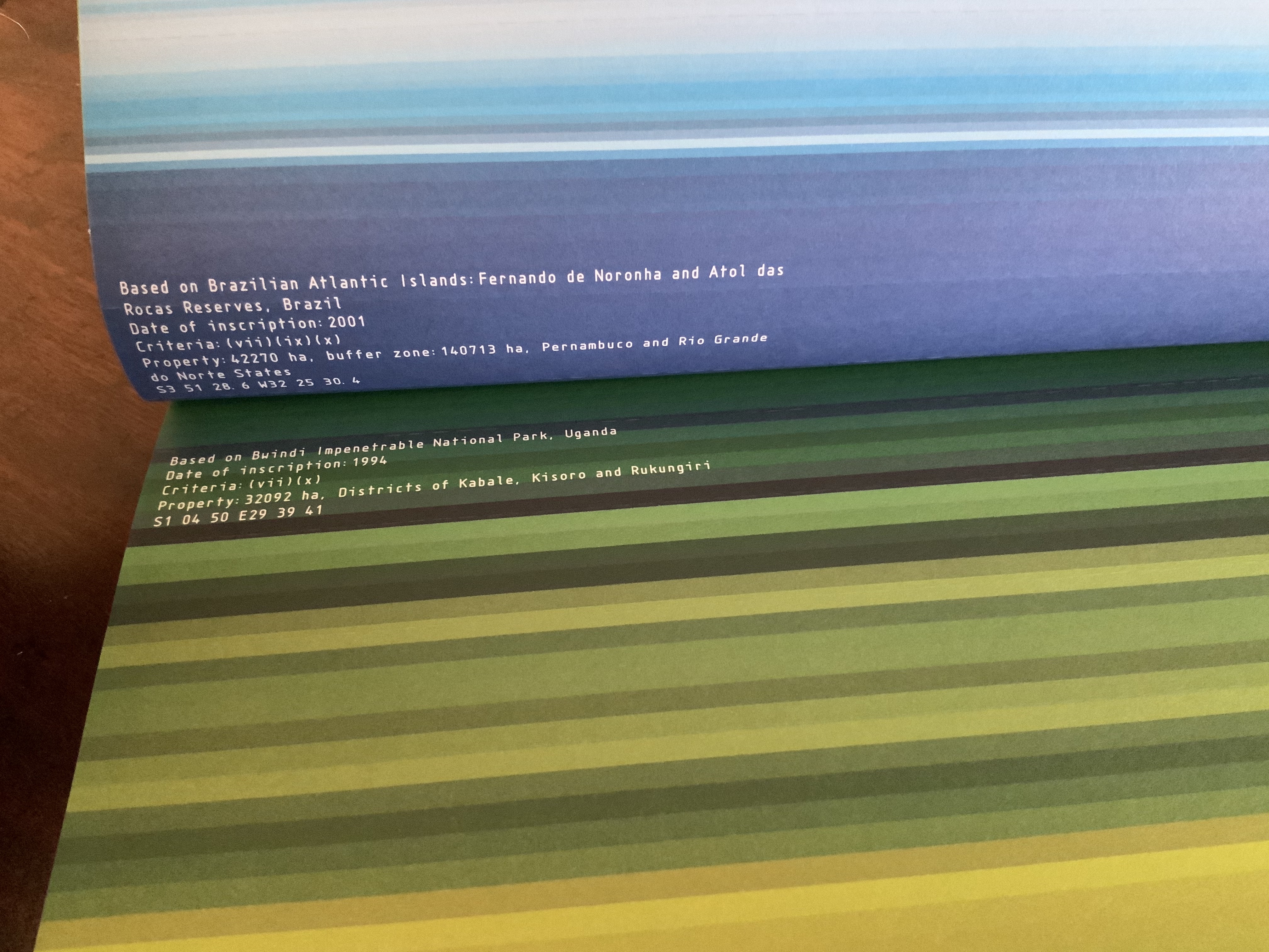
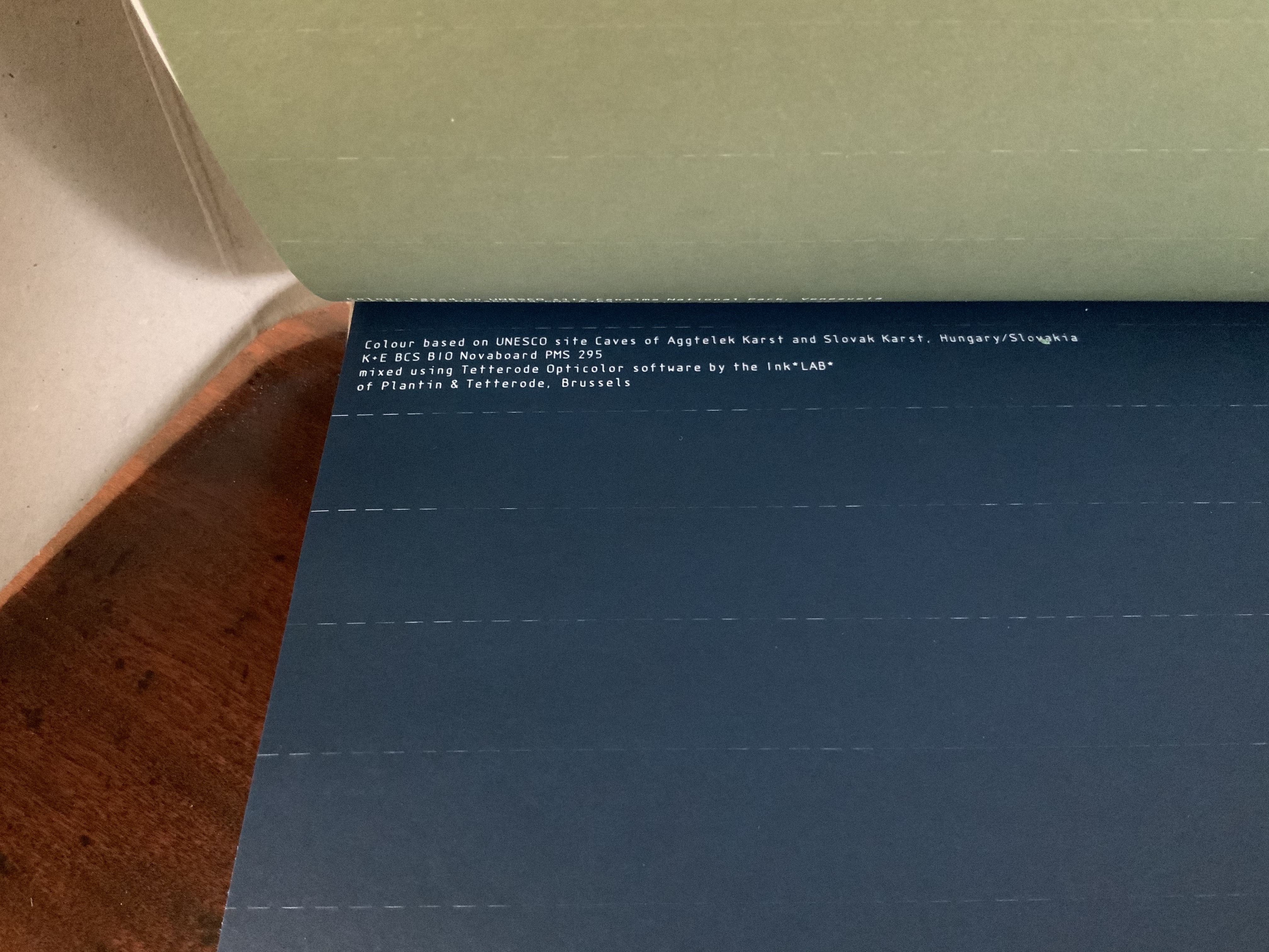
The striations act like lines of rhymed and unrhymed verse. The whole volume could serve as a textbook on theory of colors, the destructive act needed to access the color reminding student and teacher of the fragility of the heritage sites being celebrated.
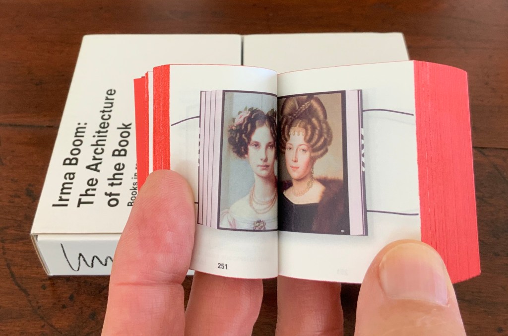
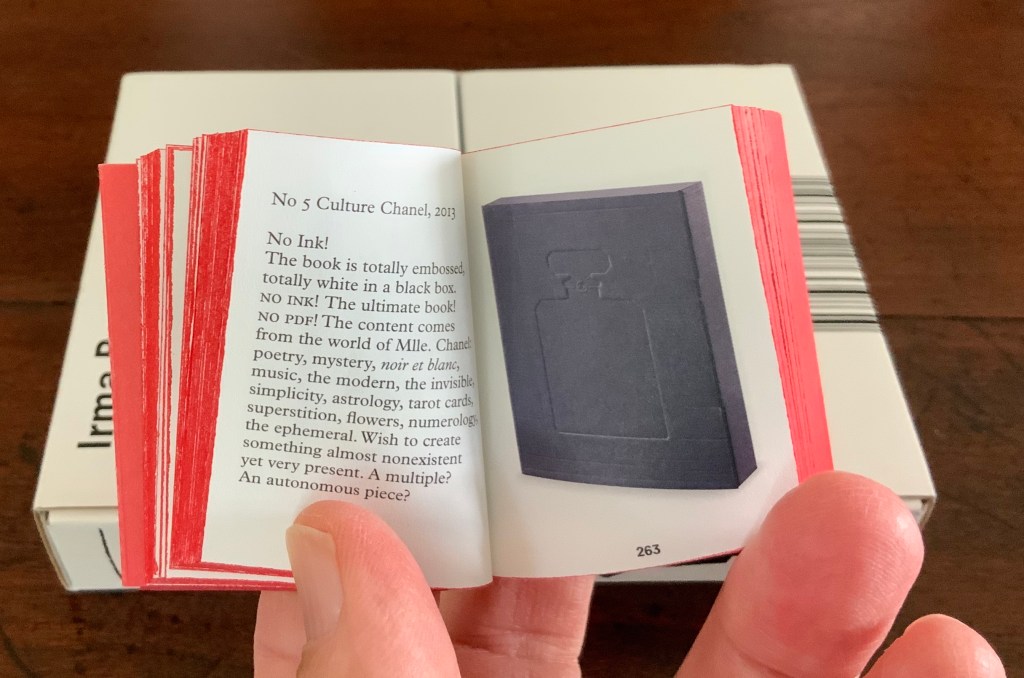
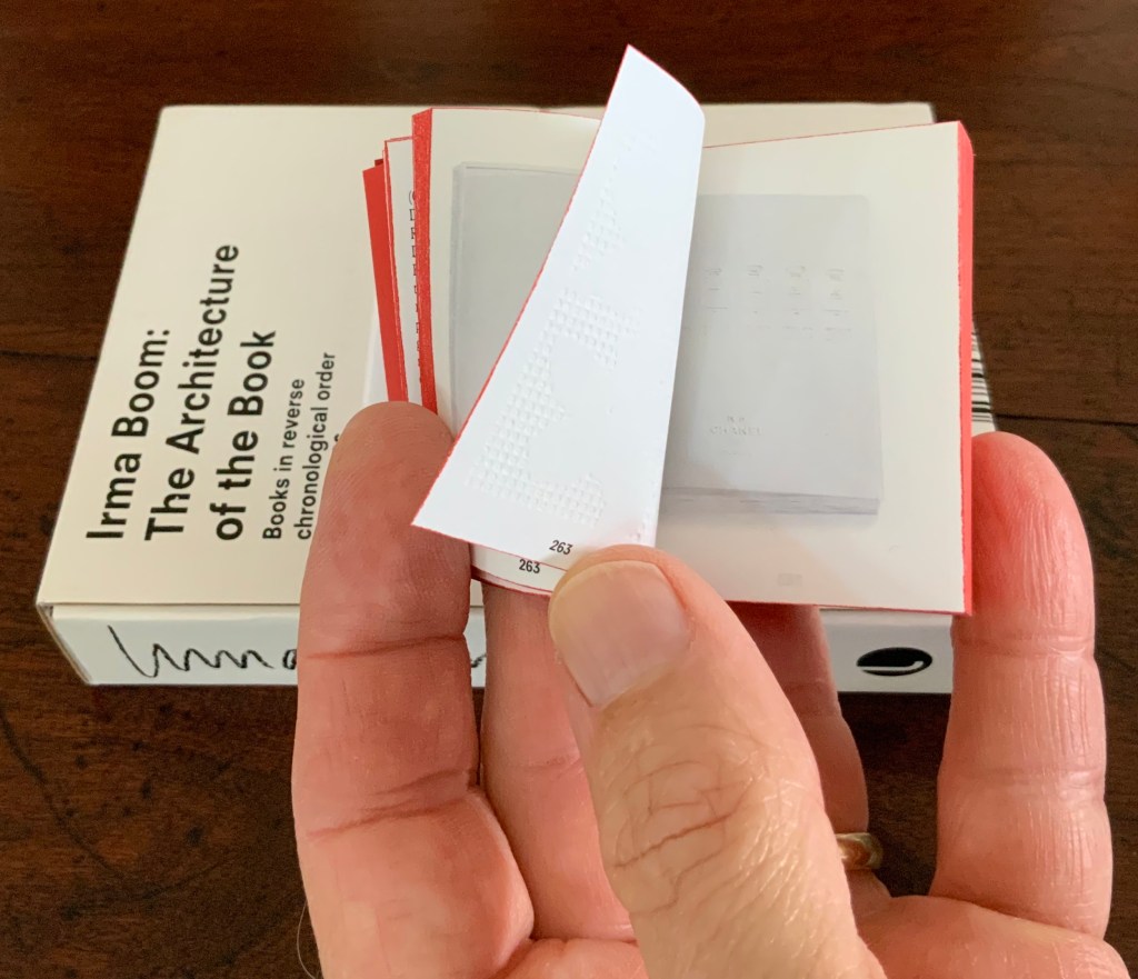
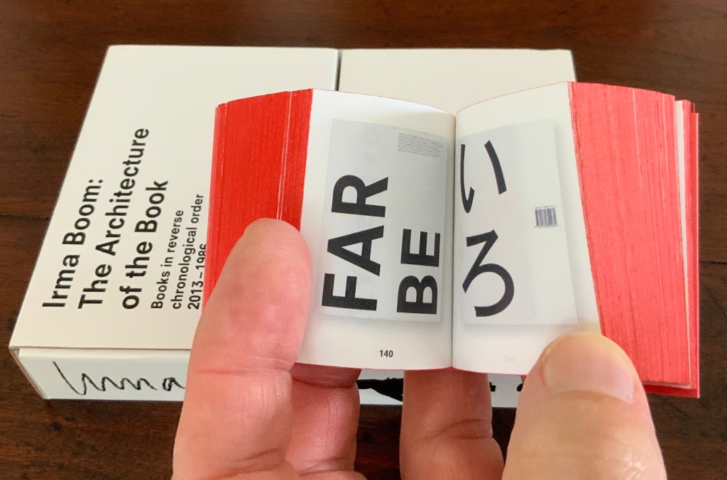
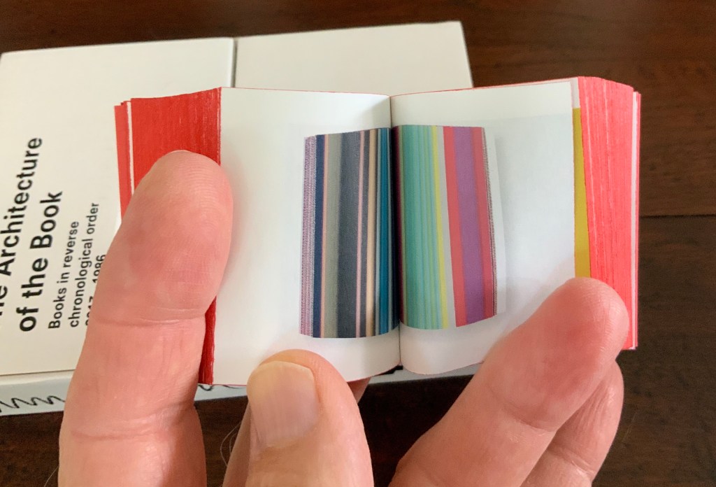
Irma Boom: The Architecture of the Book (2013)

Irma Boom: The Architecture of the Book (2013)
Irma Boom
Box holding miniature softcover. Box: H153 x W118 x D31 mm; Book: H55 x W44 x D30 mm; 800 pages. Acquired from Amazon, 3 June 2015.
Photos: Books On Books Collection.
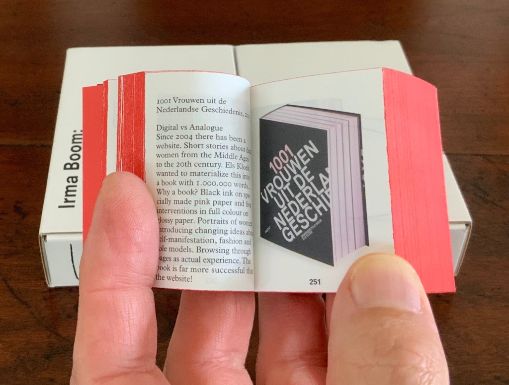
In and of itself, a legible miniature book astounds. Add to it the design genius of Irma Boom and the astounding becomes book art. Recording her books in reverse chronological order 2013-1986 (with reverse pagination as well), Irma Boom: The Architecture of the Book uses its structure and contents to make us think again and again about the reach of the book’s technology.
de Rijksmuseum (2012)
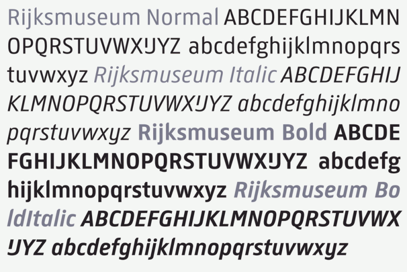
In 2013 the newly renovated Rijksmuseum opened with a new logo, new typeface design and publications design — all by Irma Boom and her studio. The new typeface — de Rijksmuseum — was developed by Paul van de Laan of Blue Monday under Boom’s artistic direction and appeared in museum signage and publications. The new typeface marks an interesting shift from DTL Documenta, the previous corporate font, designed by Frank E. Blokland. Blokland had studied with Gerrit Noordzij and later succeeded him at the Dutch Royal Academy of the Arts (The Hague). He founded the Dutch Type Library in the 1990s.
The previous style sheet leads with the serif version of DTL Documenta, while the de Rijksmuseum style sheet leads with the sans serif. Having applied to intern at Total Design in Amsterdam and been rejected by Wim Crouwel’s colleagues for her experimentalism, Boom must have especially enjoyed winning this commission. Just as much as the typographic differences, though, it is Boom’s roots in book design that differentiates the new from the old.
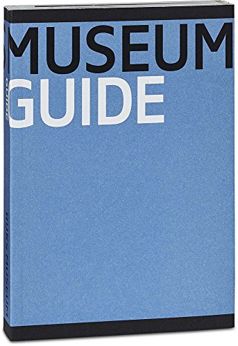

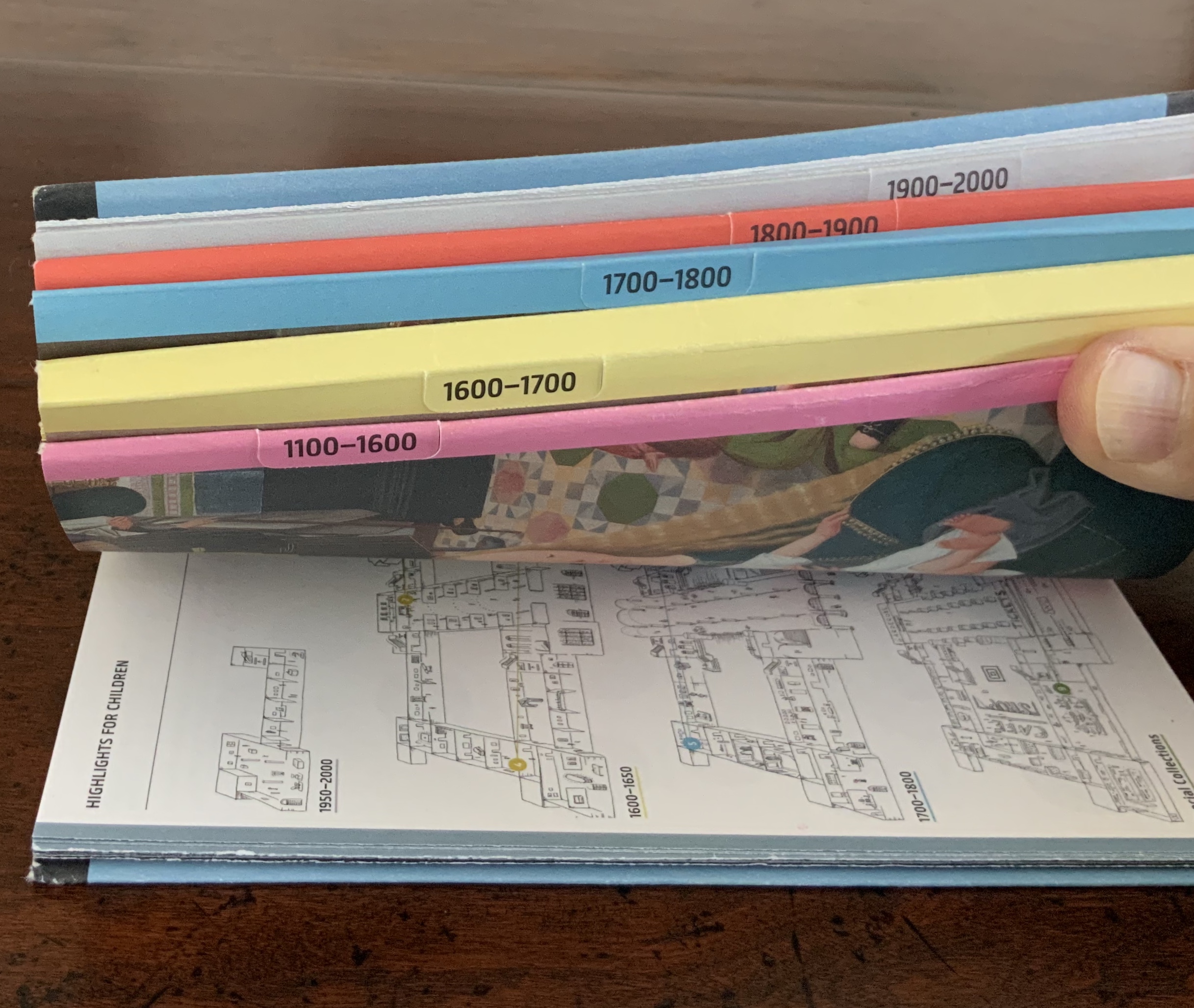
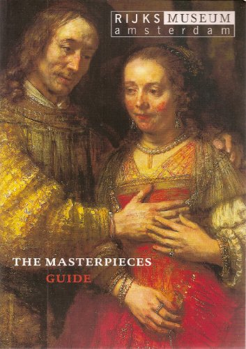
Guide Rijksmuseum (2013)
Eric Spaans (text), Irma Boom (design)
Softcover with multiple foldout maps. Acquired at the Rijksmuseum.
Photos of the work: Books On Books Collection.
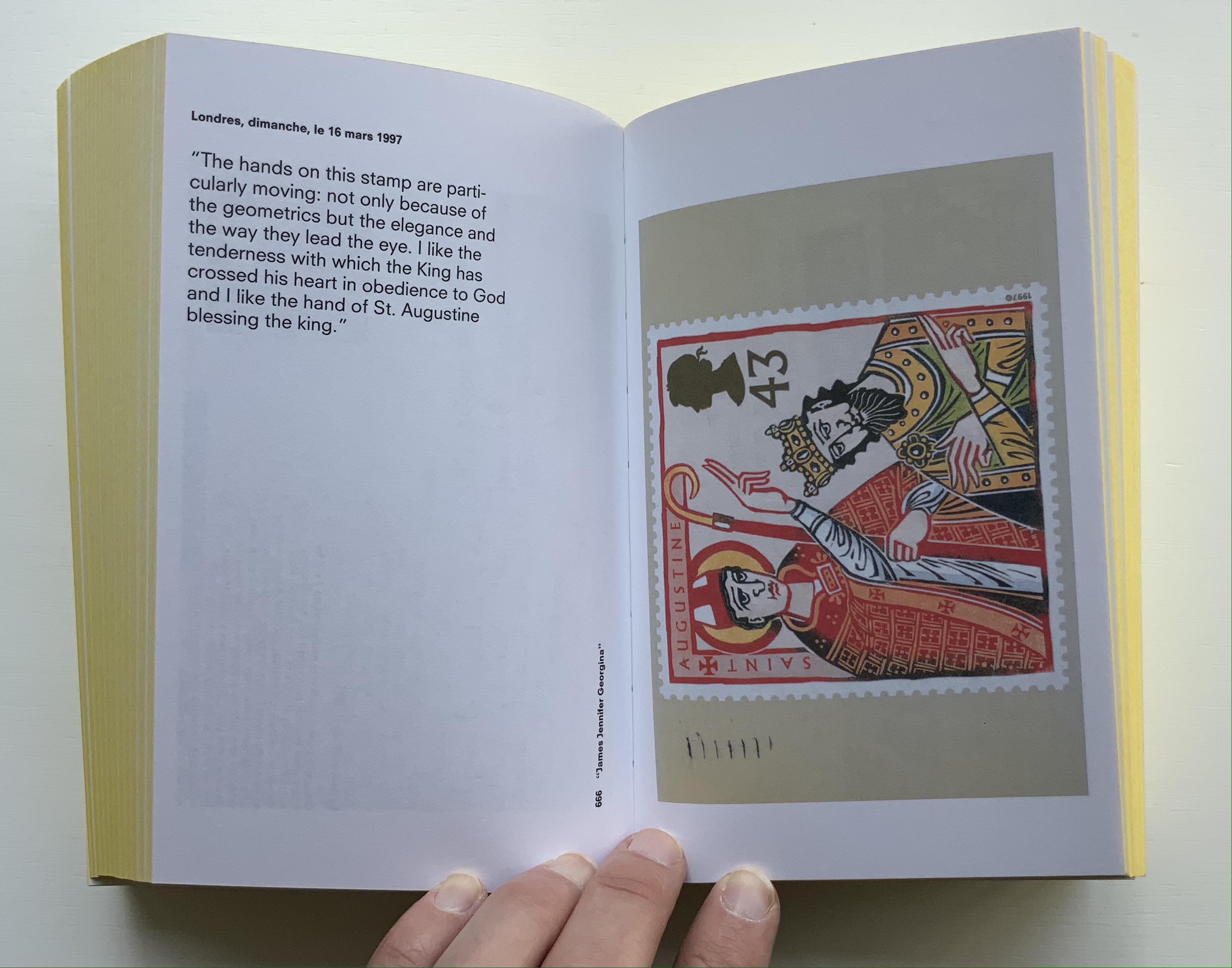
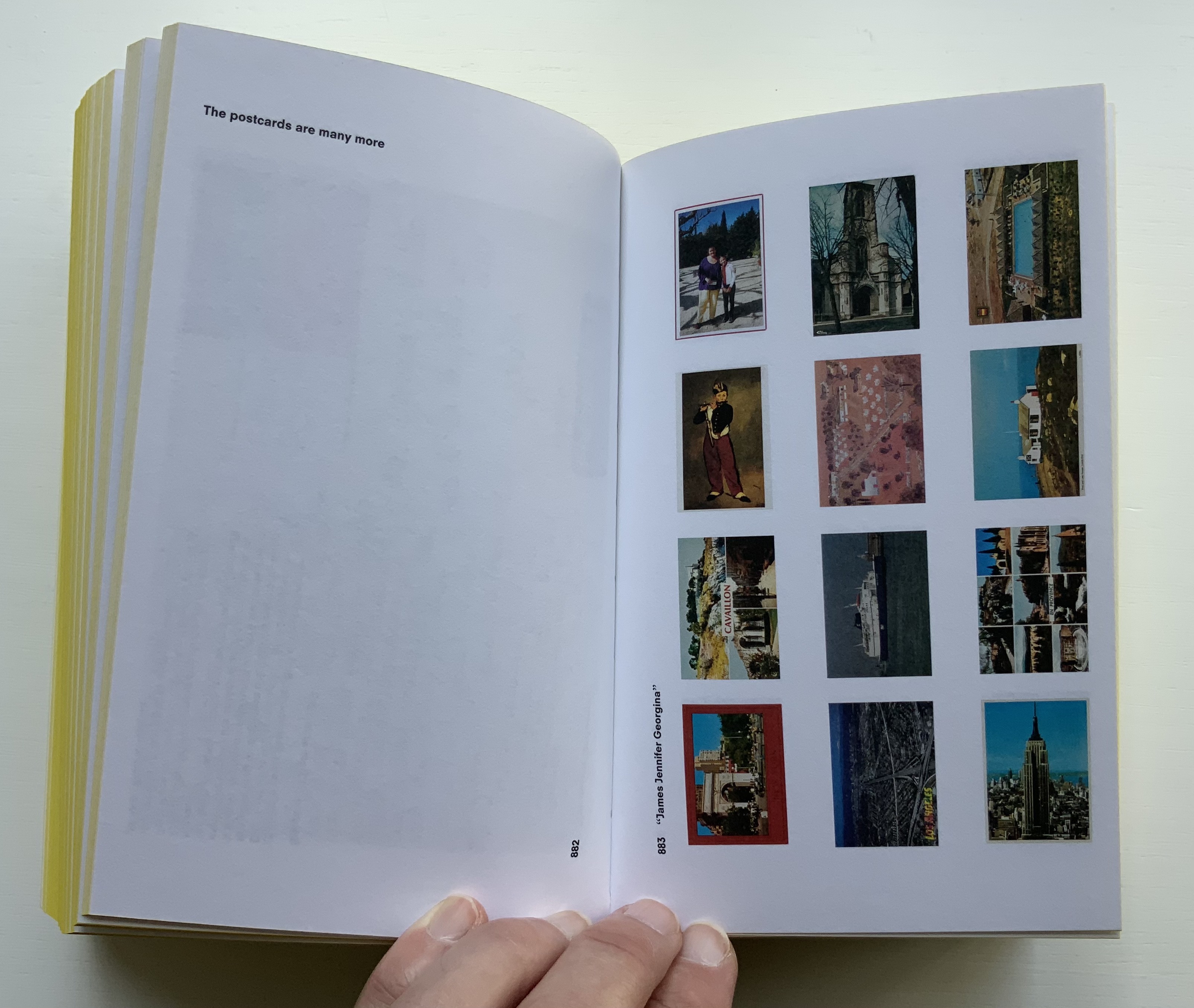
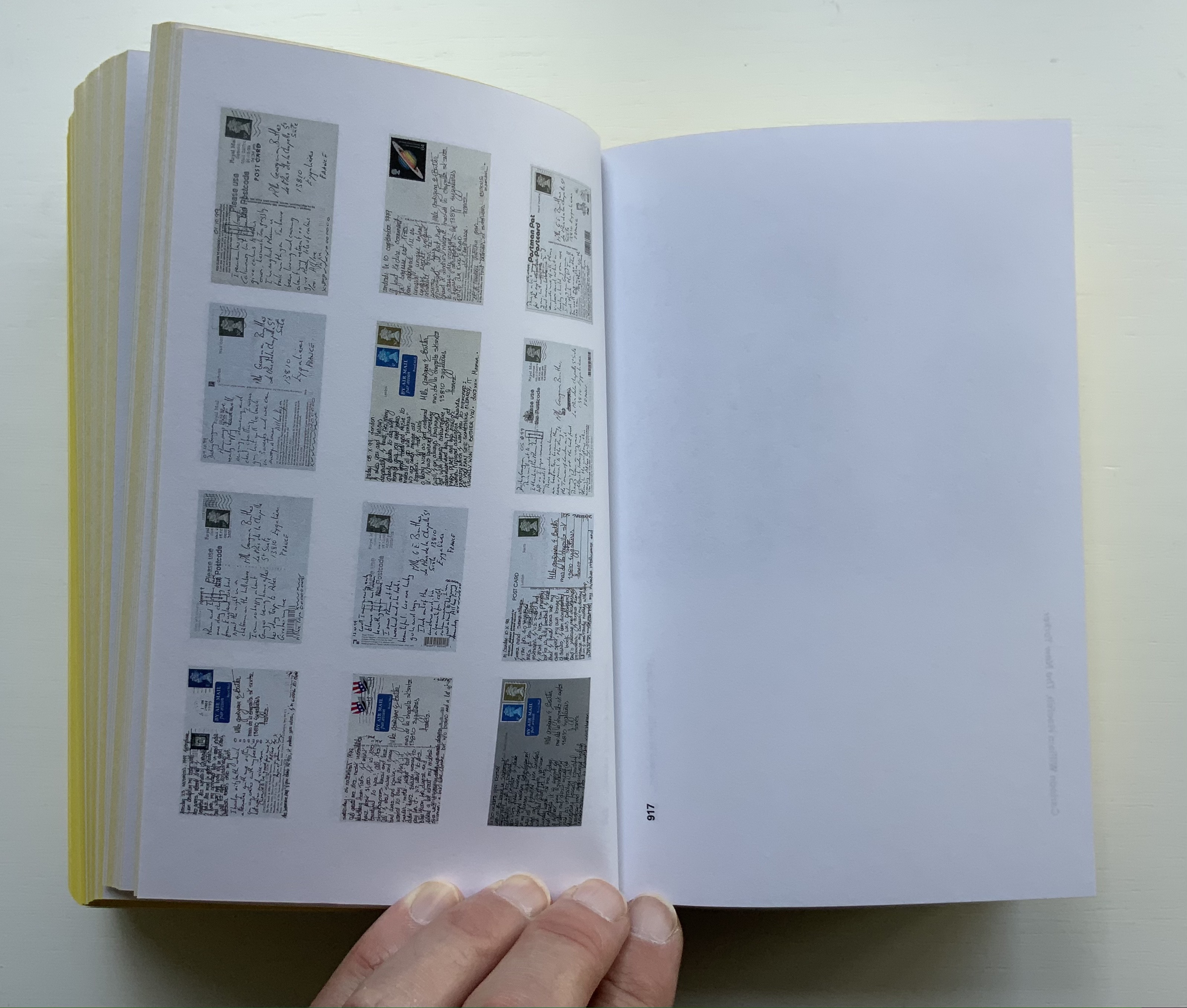
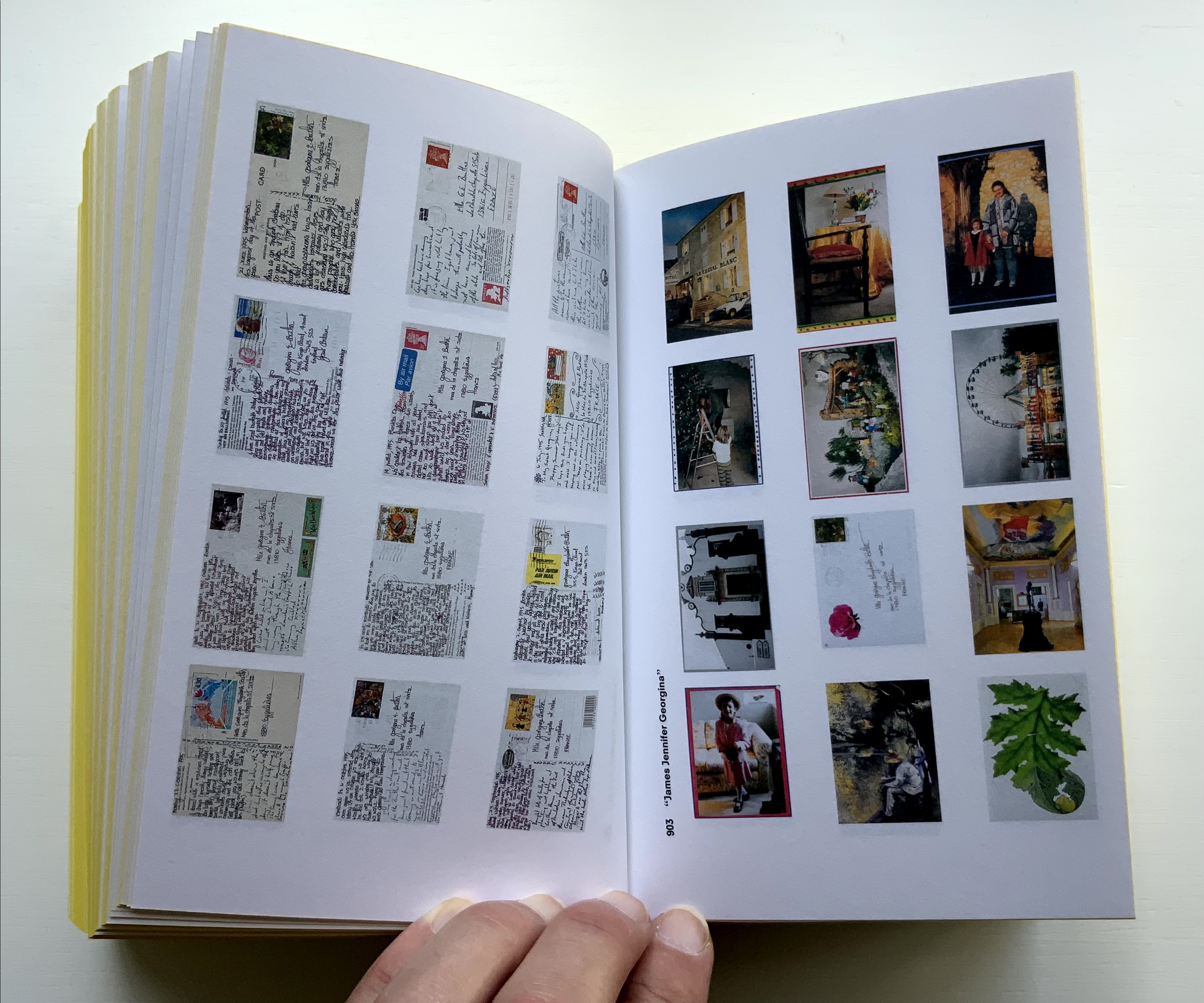
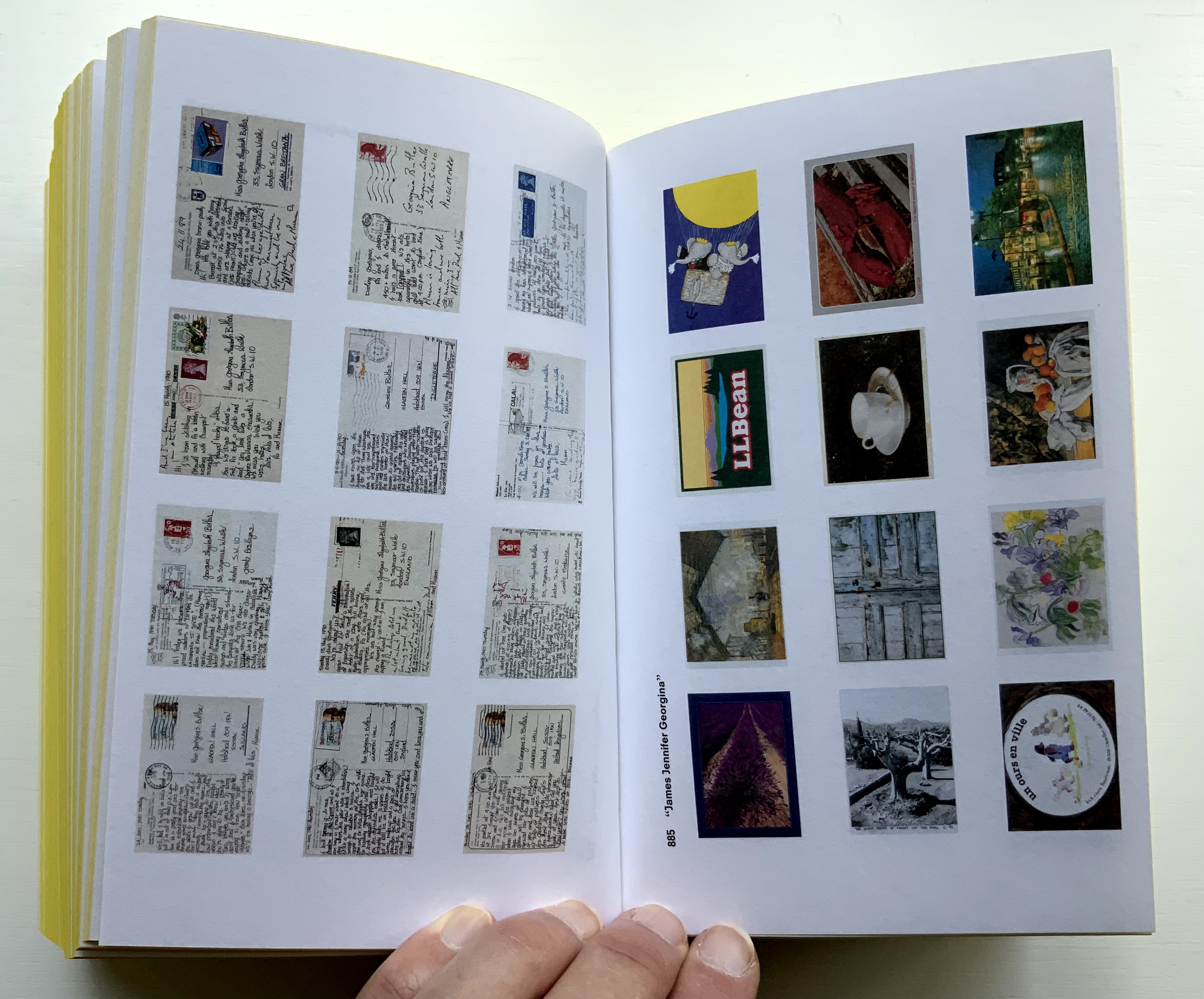
James Jennifer Georgina (2010)
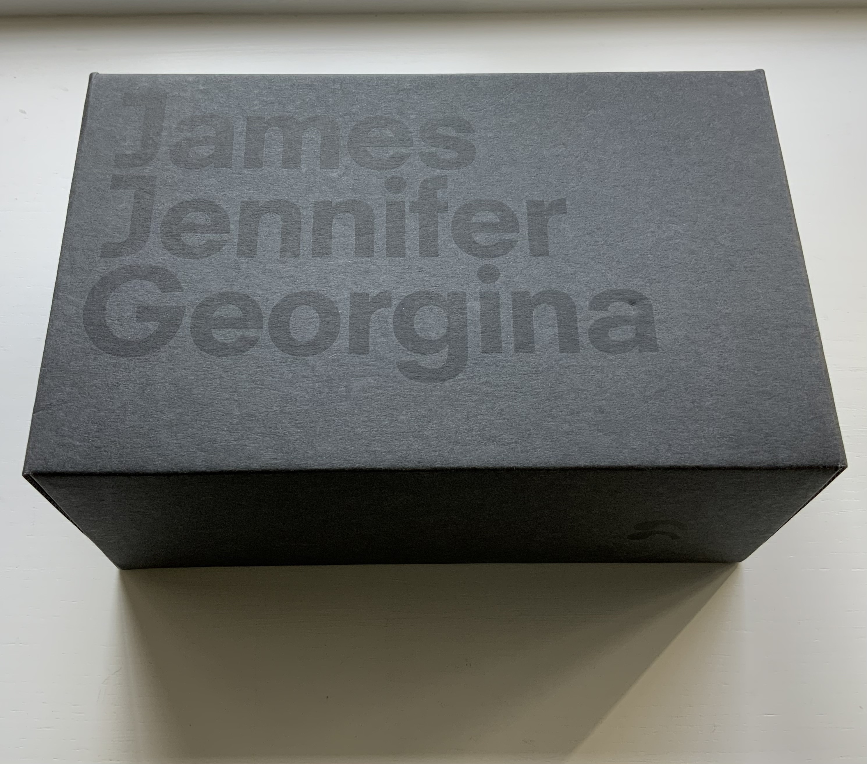
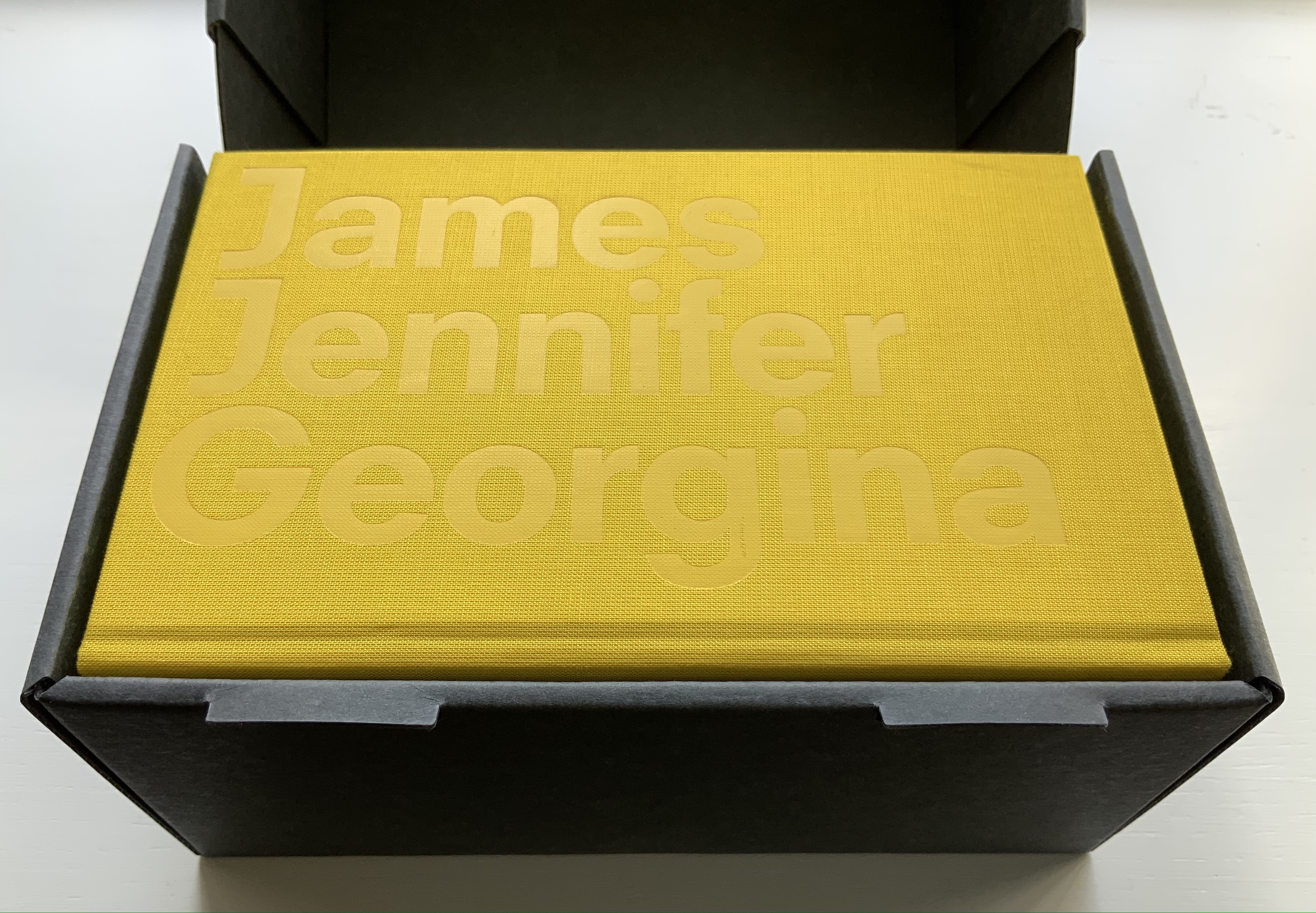
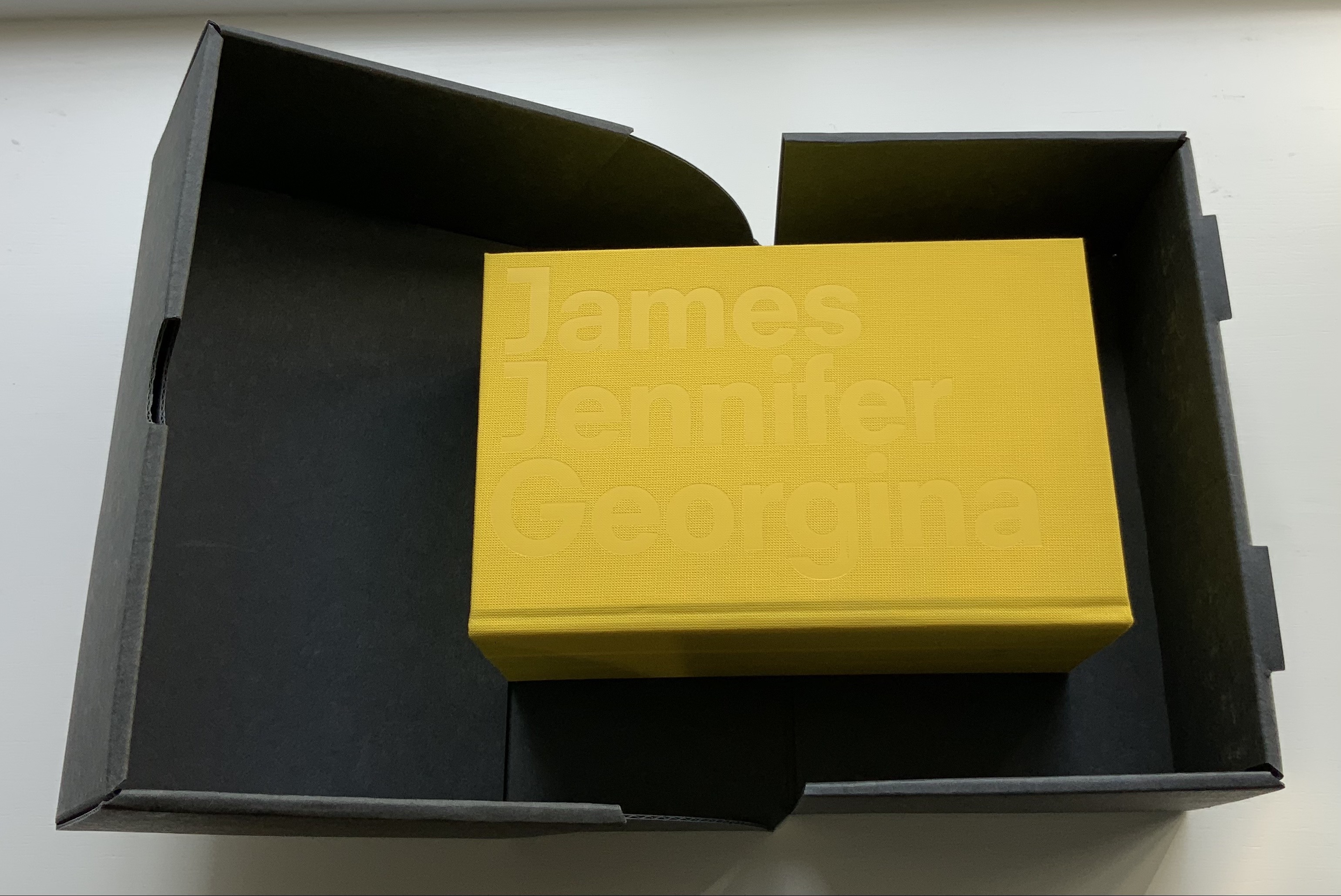
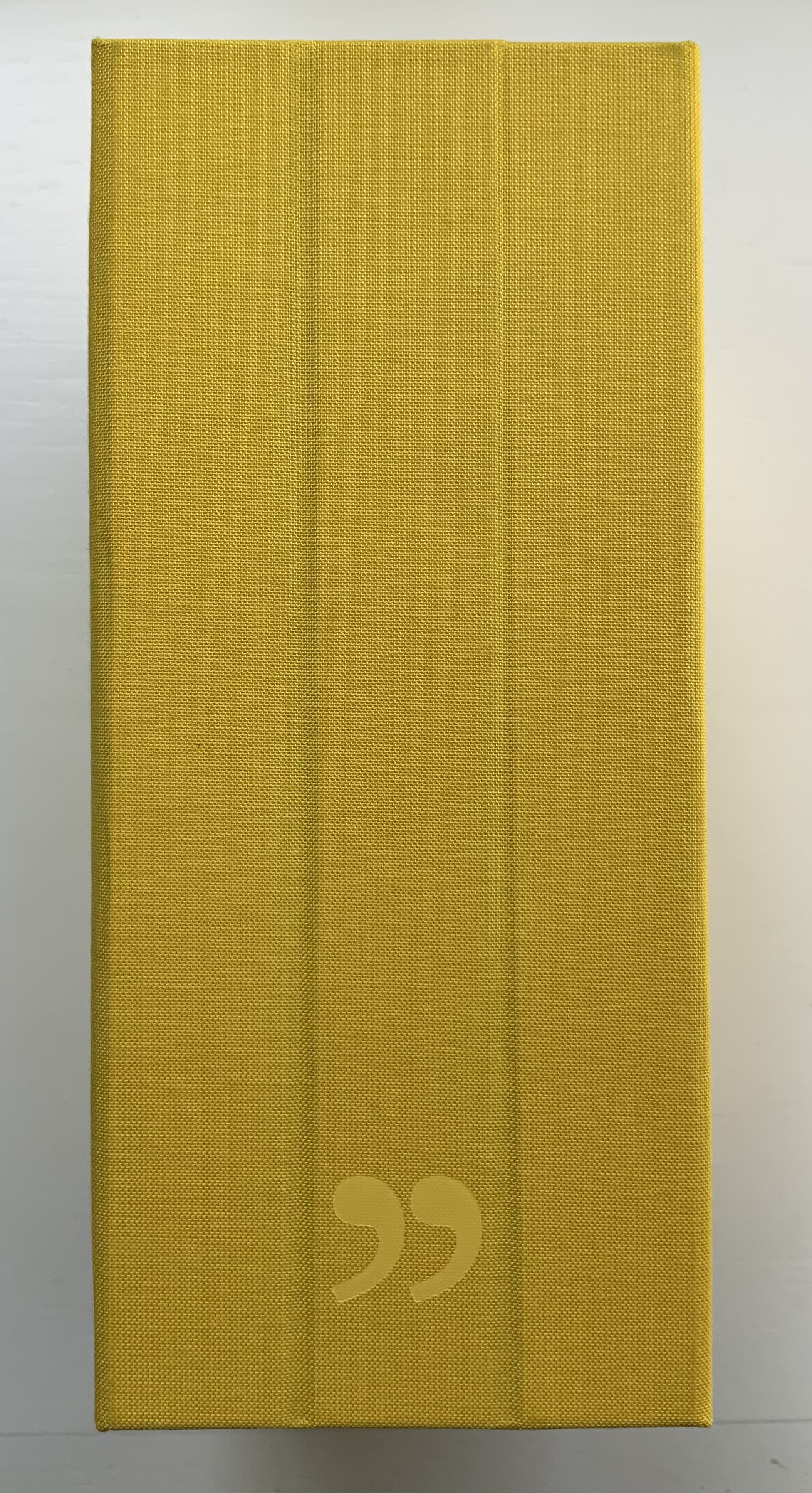
James Jennifer Georgina (2010)
Irma Boom
Box holding casebound book. Box: H220 x W140 x D100 mm. Book: H194 X W126 X D90 mm; 1198 pages. Edition of 999, of which this is #699. Acquired from Bubb Kuyper, 28 May 2021.
Photos: Books On Books Collection.
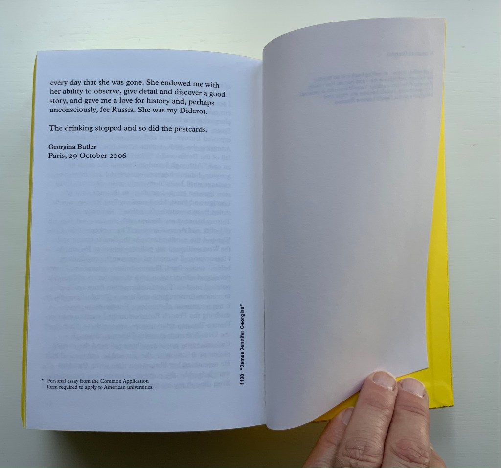
James Jennifer Georgina is book art as epic family portrait, created with the fronts and backs of 1136 postcards, spanning ten years of travel by the Butler family. At 1198 pages, it comes close to War and Peace, and in one theme, it comes close to Anna Karenina. Tolstoy writes at the beginning of the latter, “All happy families are alike; each unhappy family is unhappy in its own way.” After poring over JJG, I wonder if that should have been “each unhappy family thinks it is unhappy in its own way”. In the end, the family portrait is one of considerable privilege, culture, shame, pain and love. What distinguishes the Butler family’s unhappiness besides that context of privilege is its form of documentation and, above all, Boom’s transformation of it into this monument of book design. Its three-part spine especially developed to allow this nine centimeters-thick book to open effortlessly to any page .
Boom’s other outstandingly designed hefty works include SHV (1996) commissioned by Steenkolen Handelsvereeniging (SHV), Sheila Hicks: Weaving as Metaphor (2006) and Artist, Work, Lisson (2017) commissioned by the Lisson Gallery. They can be viewed here, here and here, respectively.
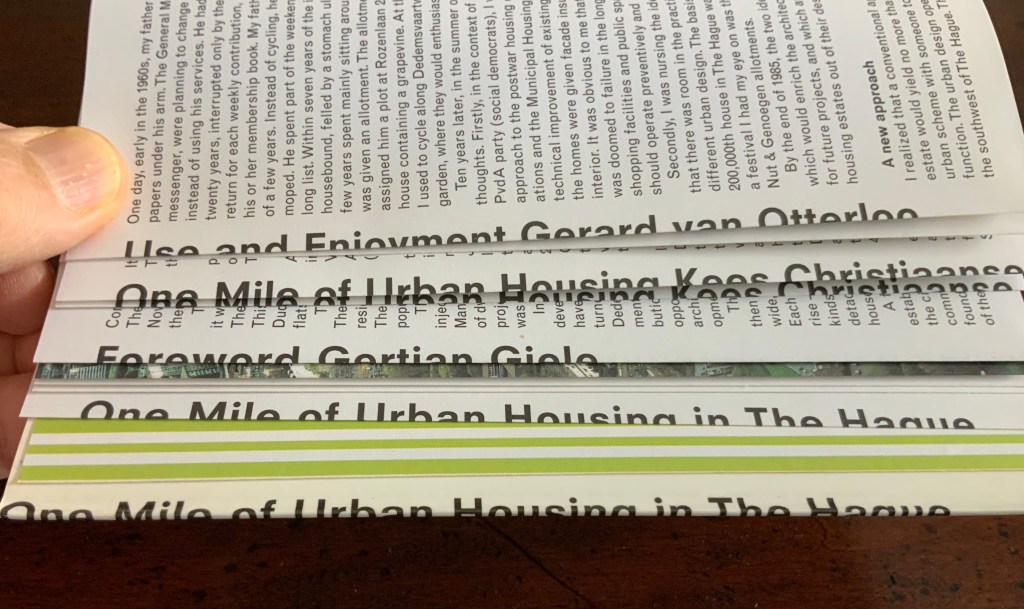
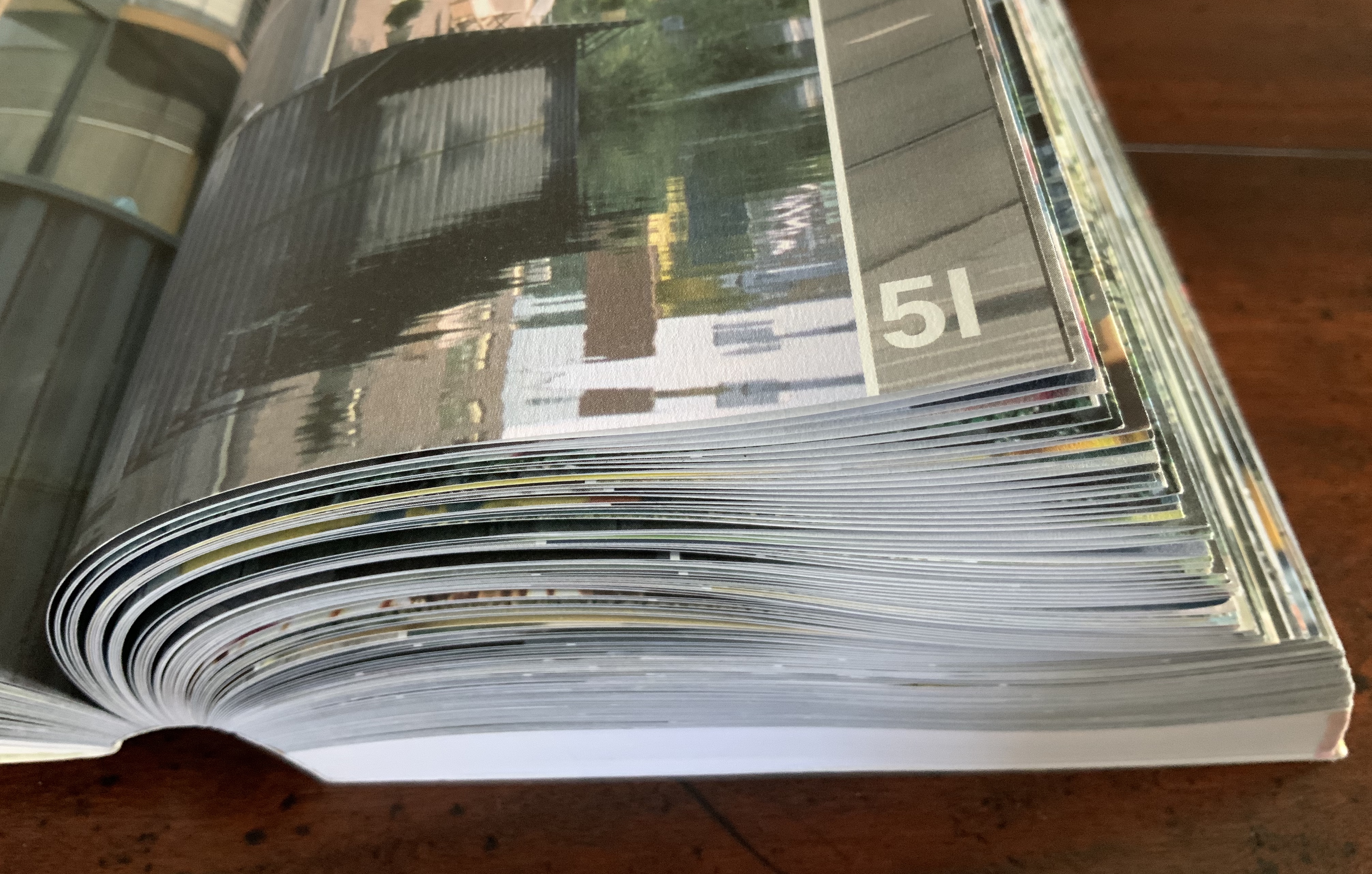
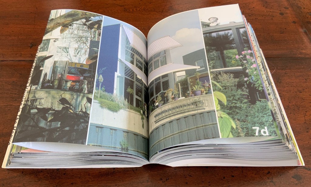
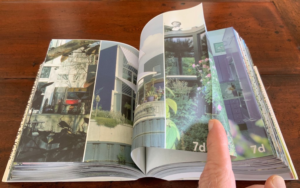
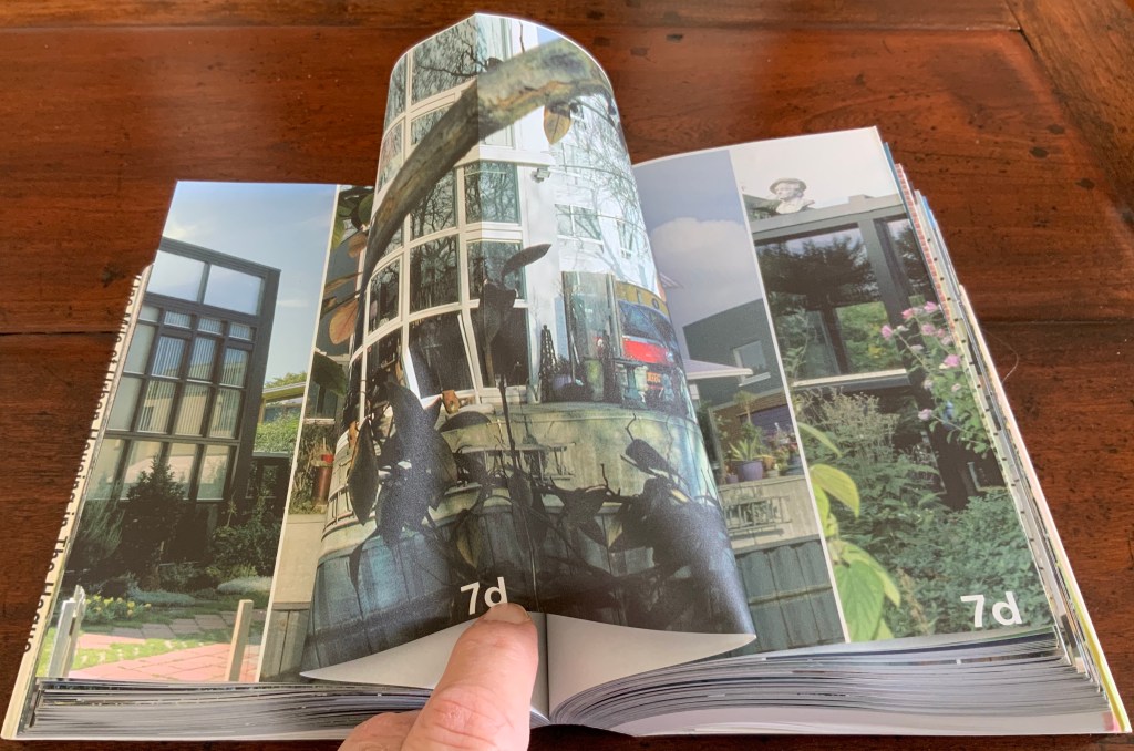
Strip: One Mile of Urban Housing in The Hague (2003)
Strip: One Mile of Urban Housing in The Hague (2003)
Marja van der Burgh, Kees Christiaanse, Gertjan Giele and Gerard van Otterloo (eds.); Design by Irma Boom and Sanne Beeren; Photography by Hans Werleman.
Paperback, perfect bound, H175 x W142 x D40 (spine) and D48 (fore edge)mm. 256 uncut folios. Acquired from Galileo Alby, 28 September 2020.
Photos: Books On Books Collection.
The primary purpose of Strip could not be further from that of Ed Ruscha’s Every Building on the Sunset Strip; nevertheless, its title and design pay a sort of homage to that accordion book with one side of the Sunset Strip at the top and other at the bottom. With its Chinese-fold pages, Strip has the same problem with thickness that any single-sided accordion has. Of course the Chinese fold offers the same advantage offered by the accordion fold: note how the section titles and photos wrap over the uncut folios, foreshadowing the treatment of the Rijksmuseum Guide above. Also like the Guide but unlike Every Building, Boom’s book is a form of information sculpture.
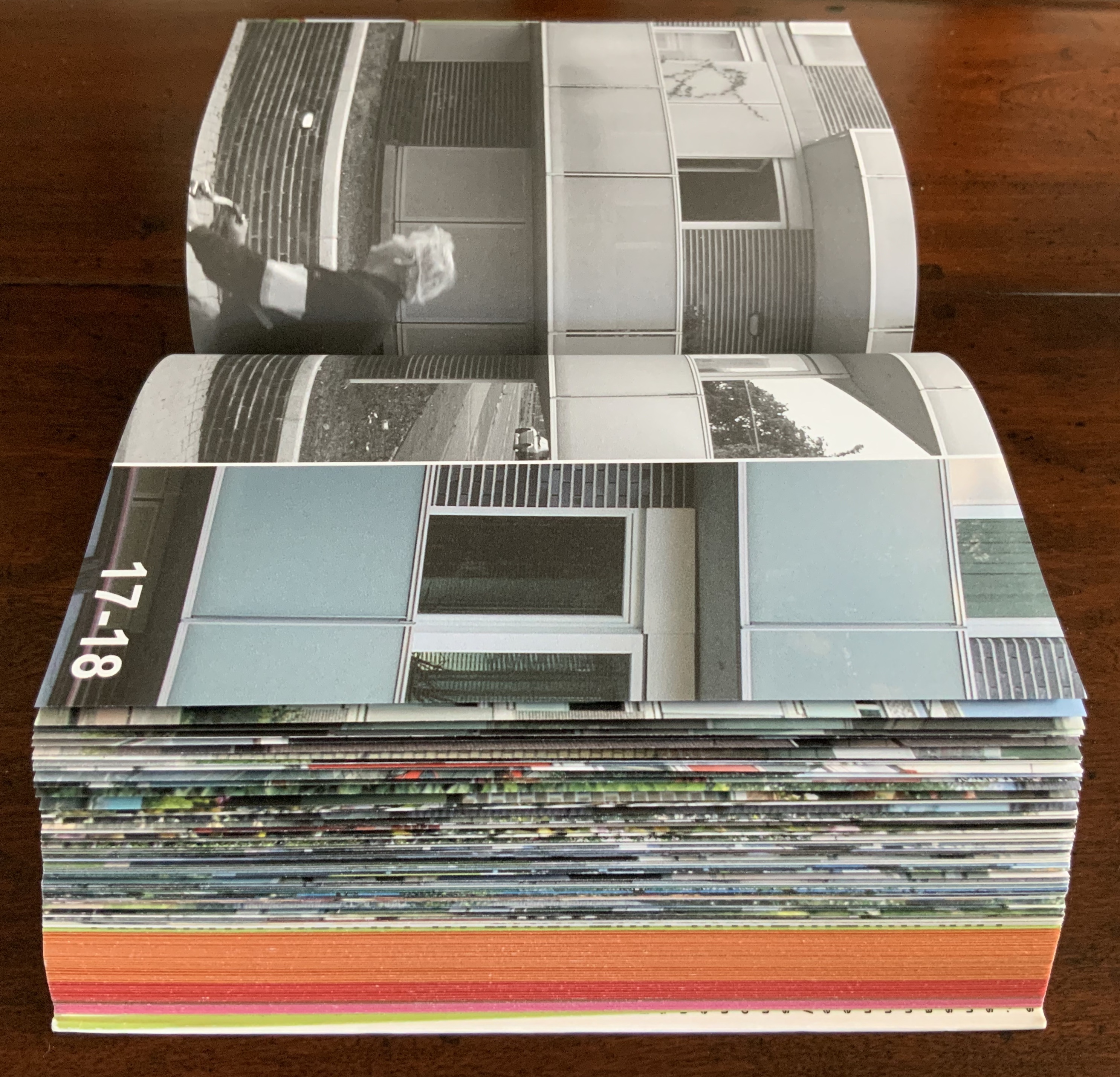
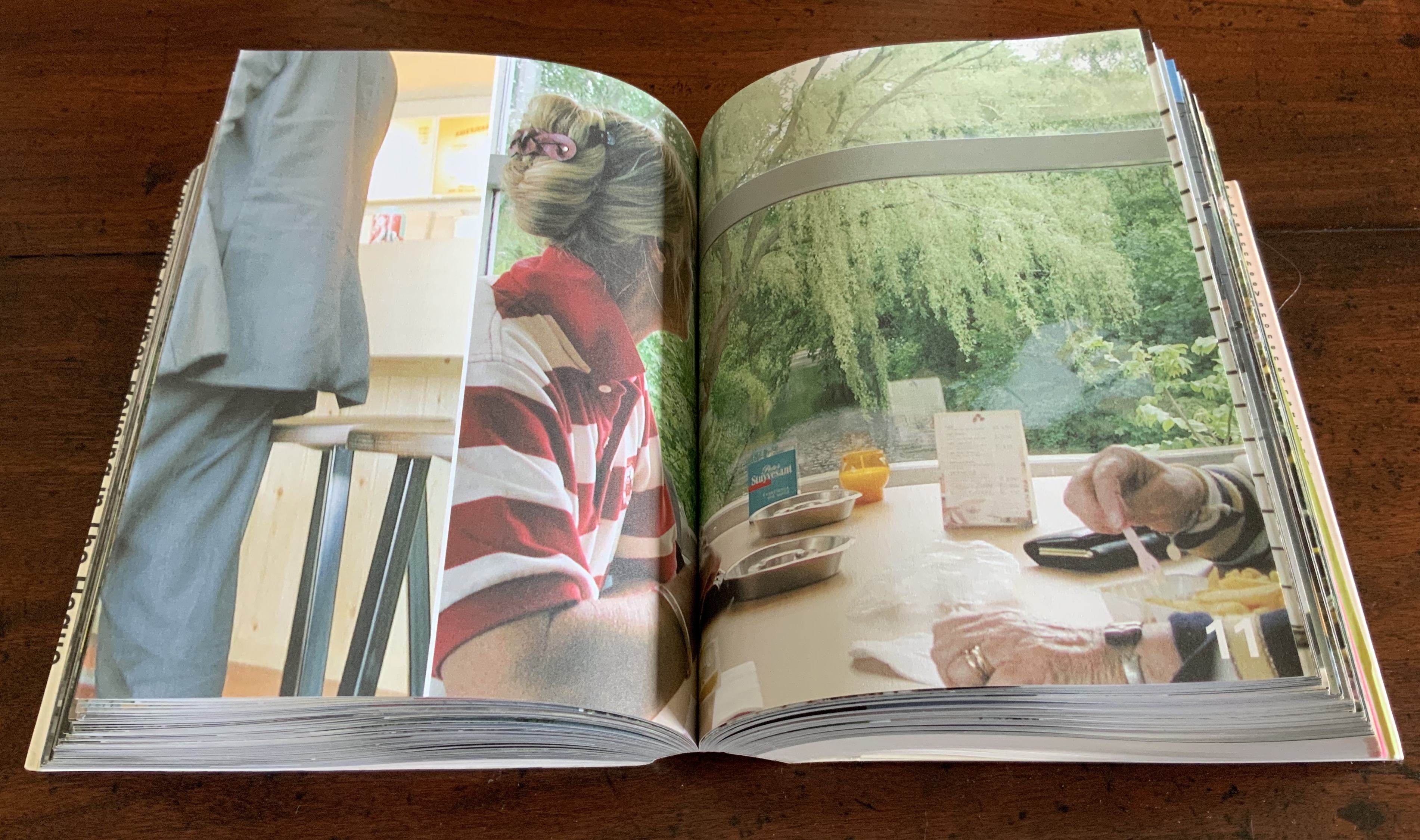
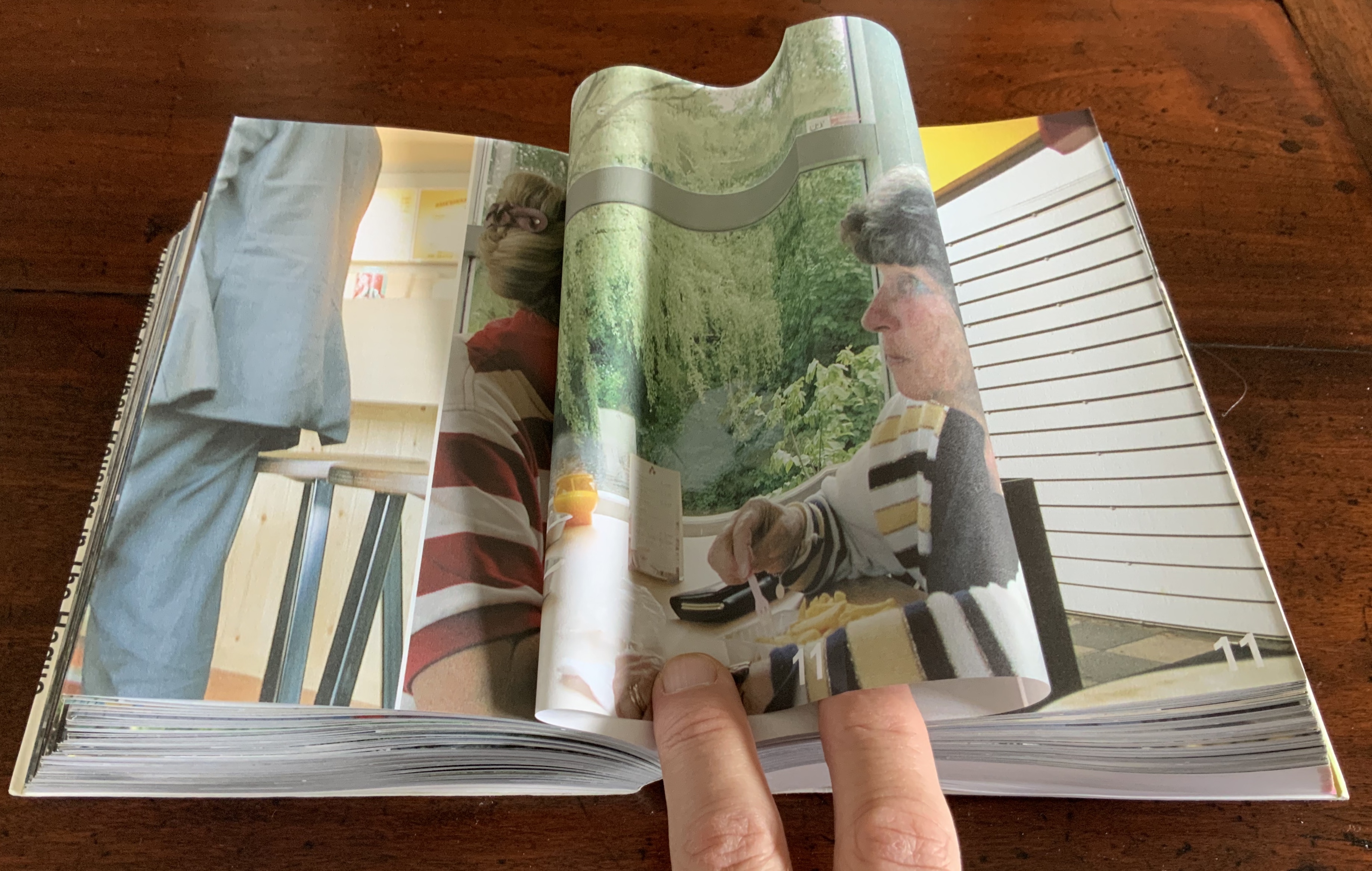
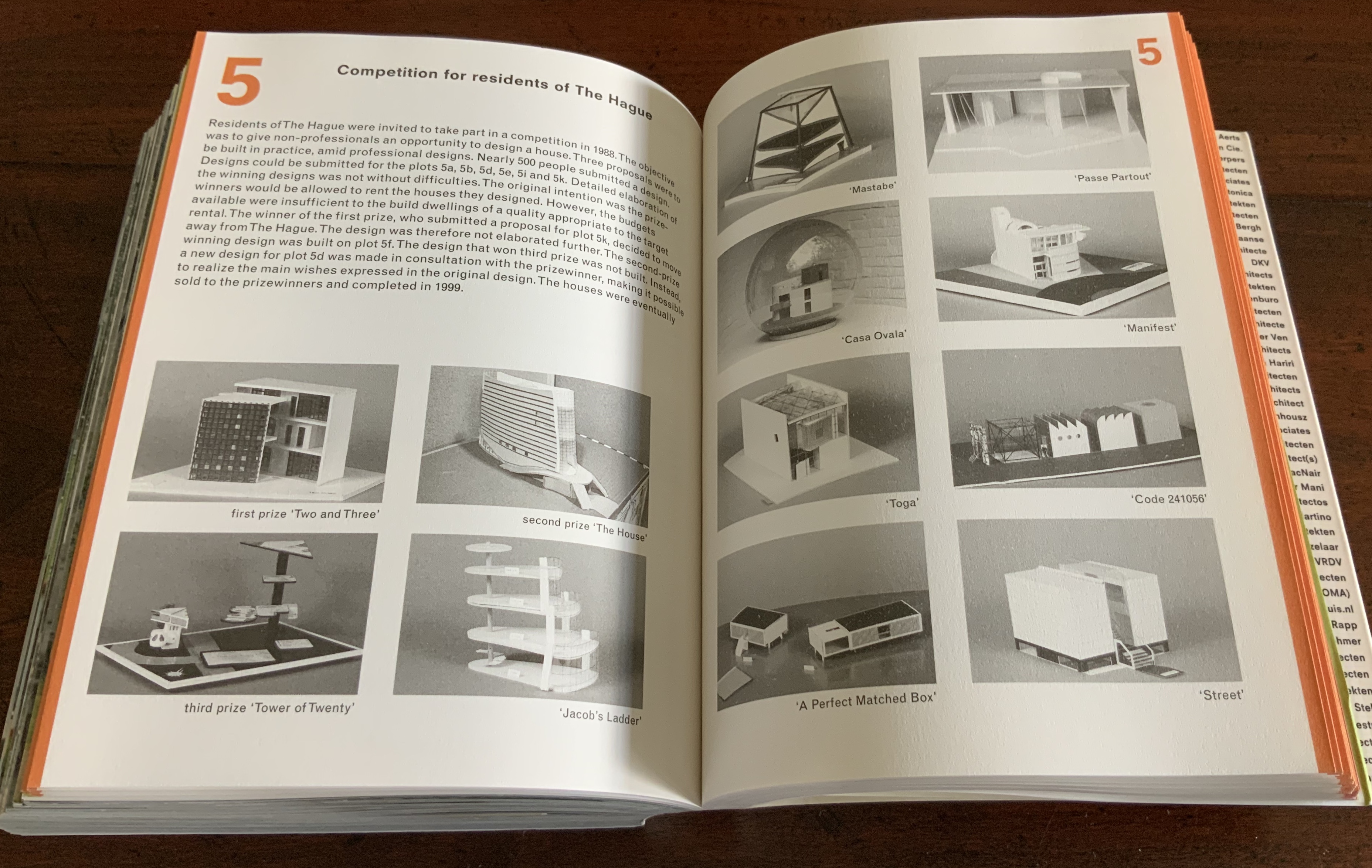
In some ways, Strip has more in common with the first edition of Robert Venturi’s Learning from Las Vegas, designed by Muriel Cooper at MIT Press, than with Ruscha’s Every Building on the Sunset Strip. Just as Learning from Las Vegas is intent on architectural and urban design theory, so too is Strip. Just as Cooper’s monumental design swamped the textual content (so much so that the authors successfully pressed for a reduced-size paperback), Boom’s design almost does the same to Strip‘s content. Almost, but not quite. Strip‘s blockiness, its rubbernecking around the corner of pages and its jumps in perspective match up with the authors’ intent — to document an environment and its residents.
Nederlandse Postzegels, Poststempels 87/88
(1988)
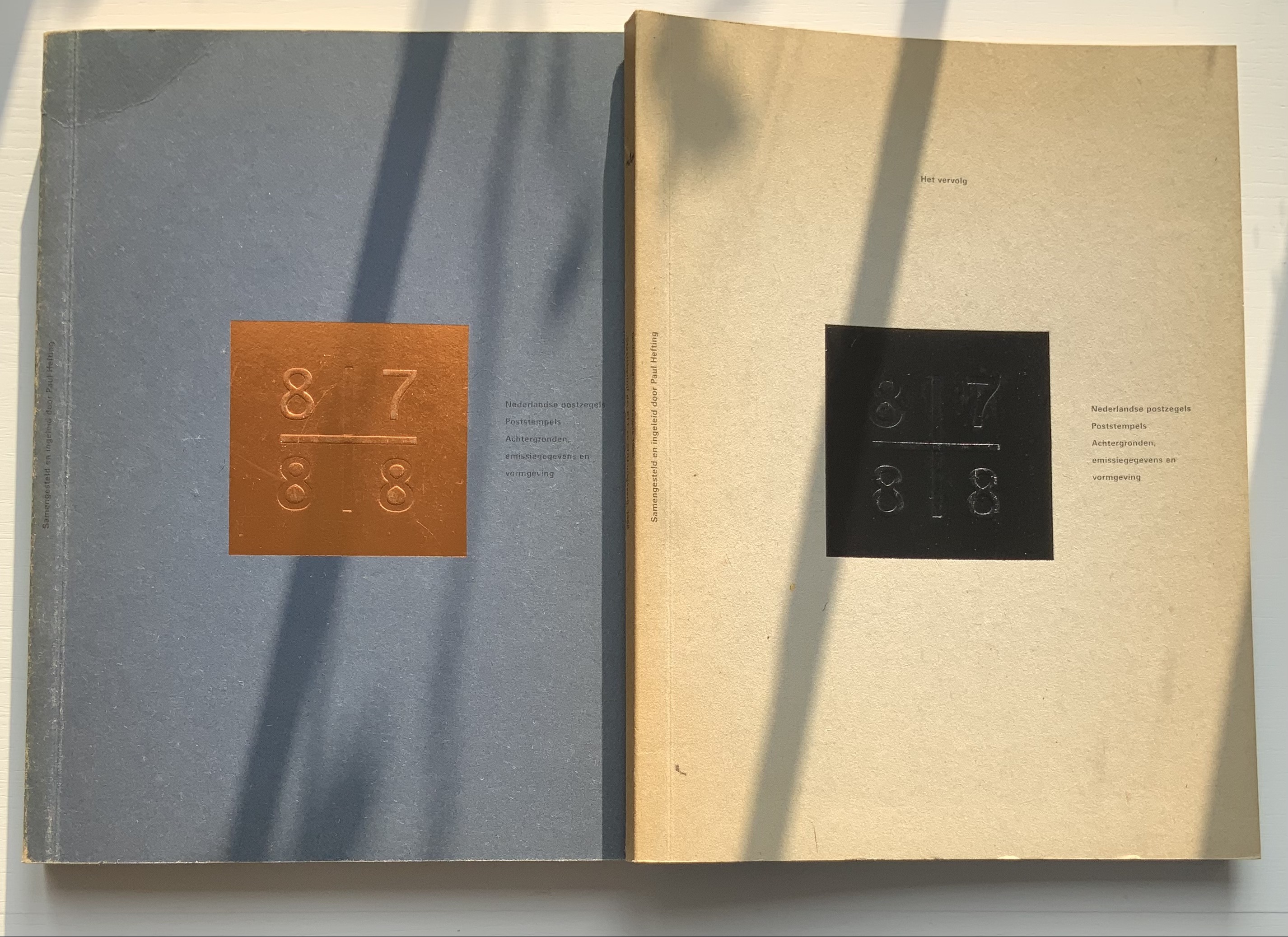
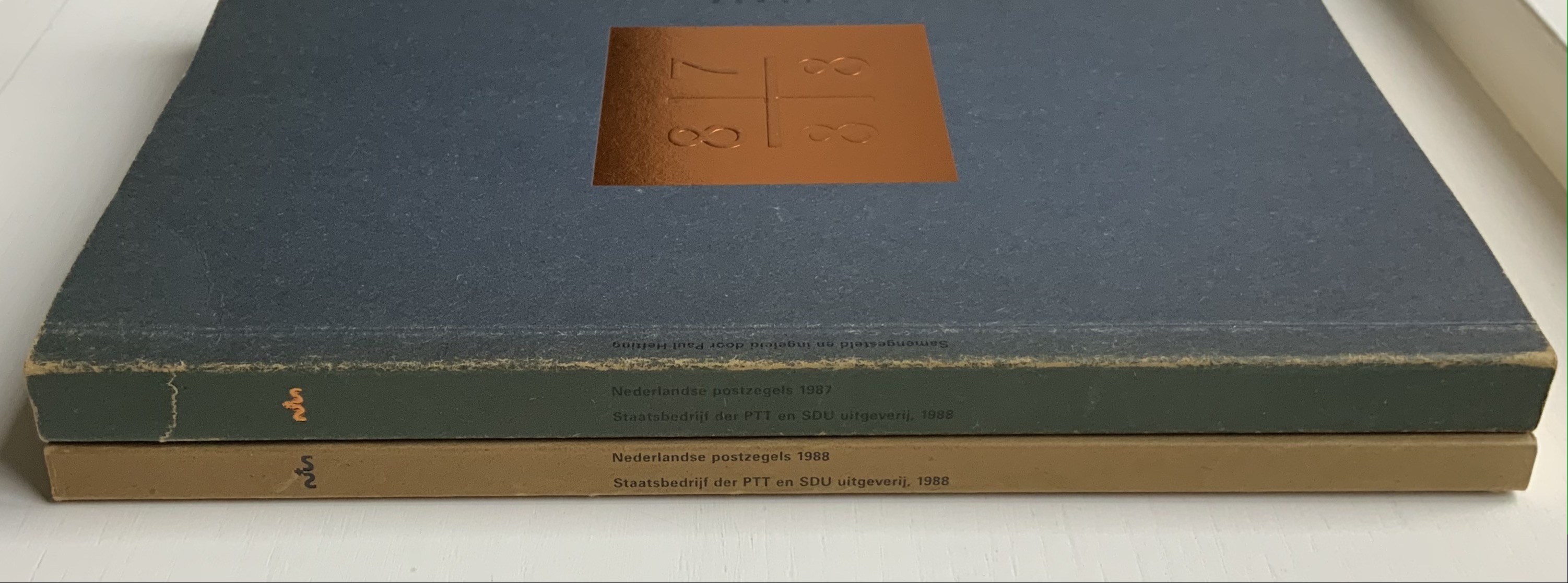
Nederlandse Postzegels, Poststempels 87/88: Achtergronden, Emissiegegevens en Vormgeving (1988)
[“Dutch stamps, postmarks 87/88: background, issuance data and design”]
Irma Boom (design), Paul Hefting (text) and Piet Janmaat (photography)
Two softcover volumes. H250 x W188 mm, 228 pages combined. Acquired from Cornelis Verheij, 9 January 2022.
Photos of the work: Books On Books Collection.
This two-volume set accounts for Boom’s first published book design and her first book design award. It celebrates the special edition stamp designs commissioned by the Dutch PTT during 1987 and 1988 and features an index of the different postal cancellations used during those years.
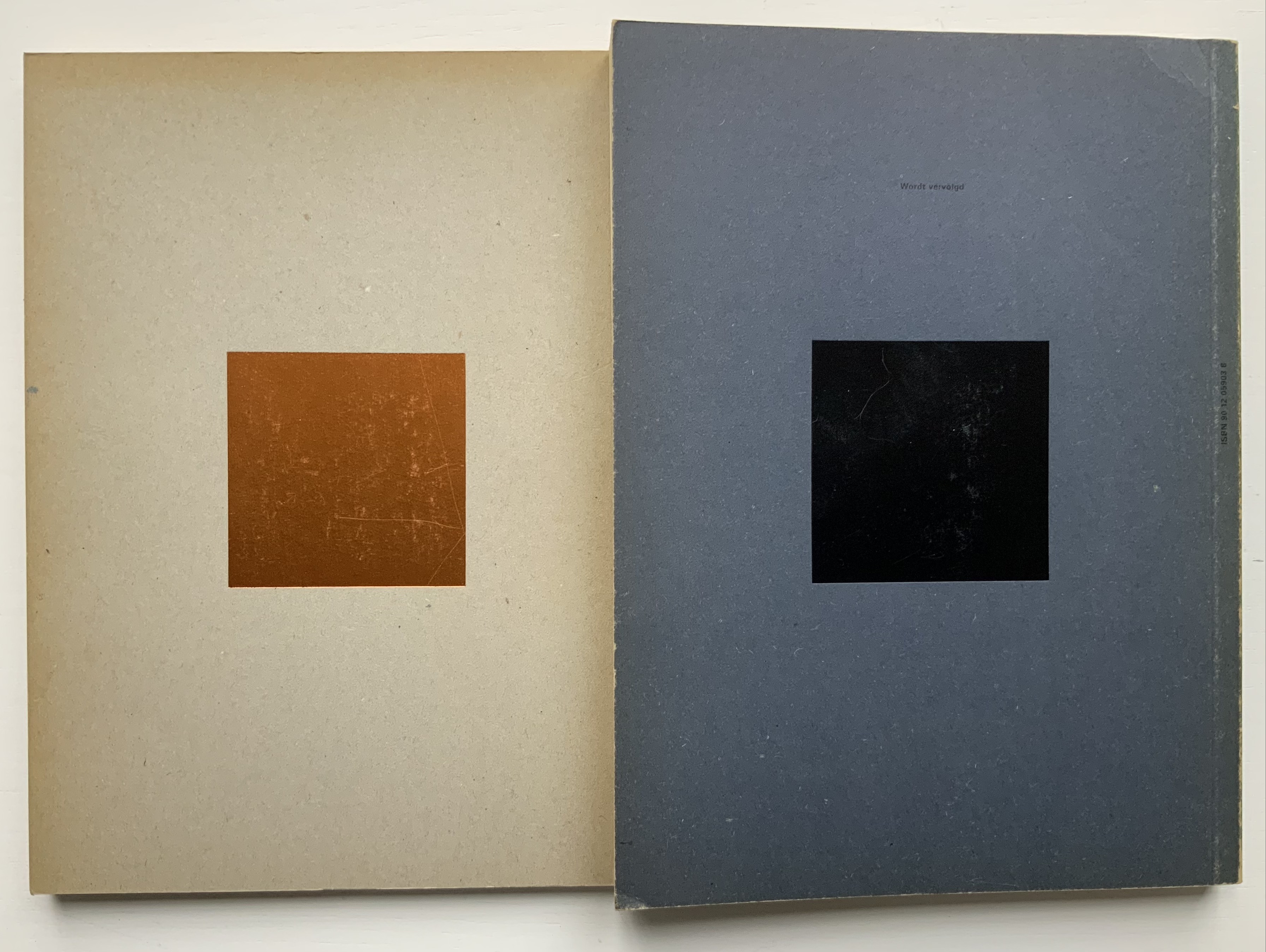
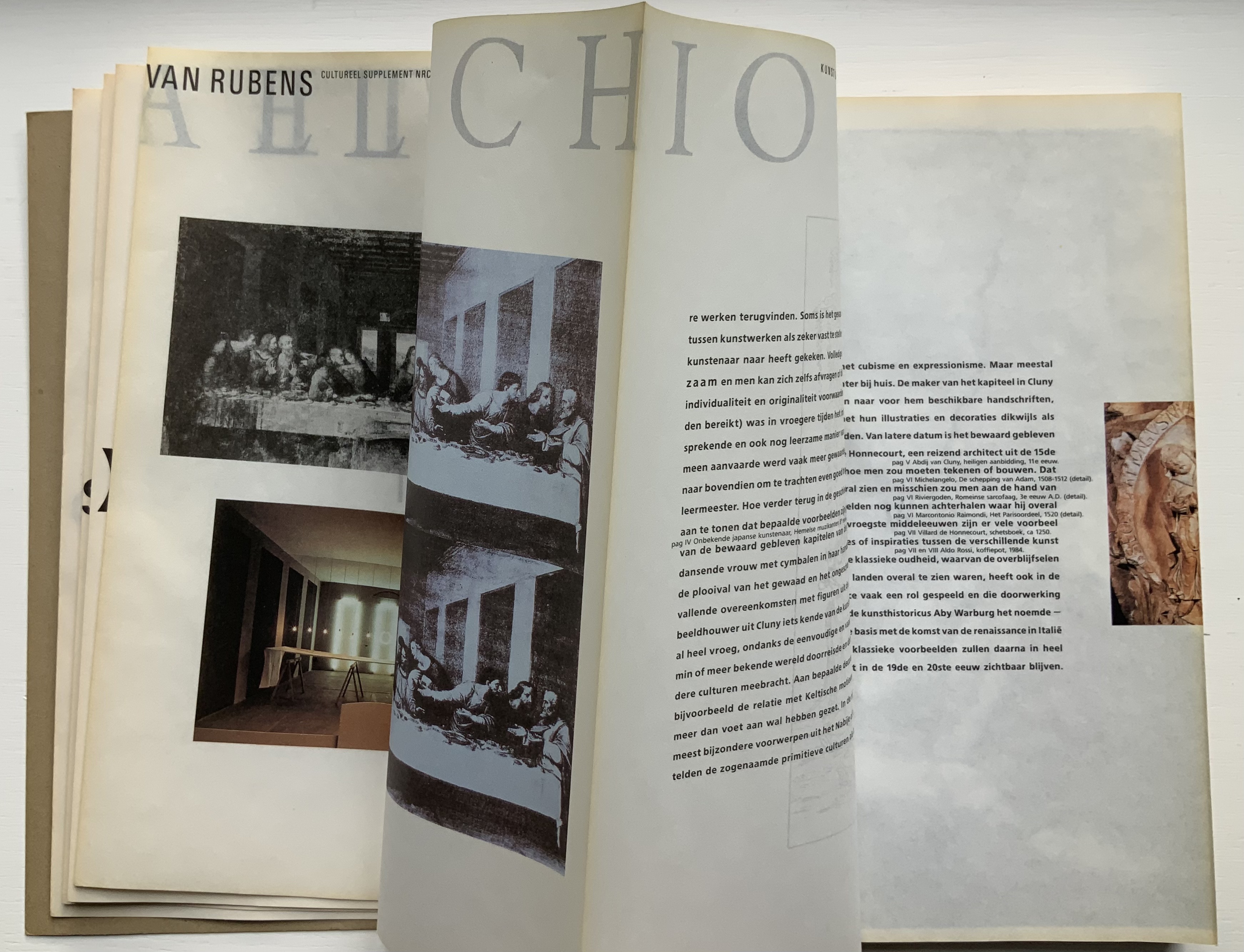
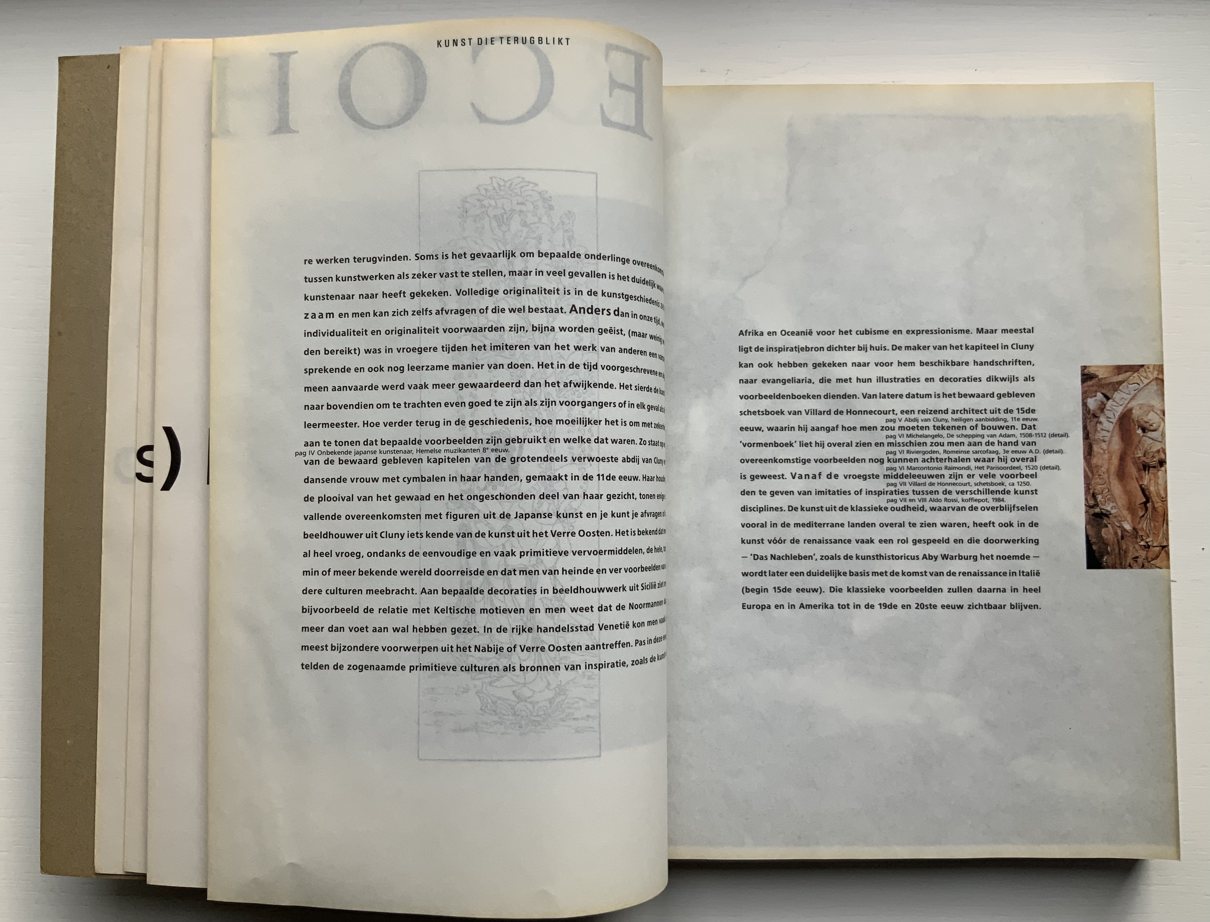
Foreshadowing Strip, the interior pages are created in the Oriental style of single-fold folios bound with the fold at the fore edge. In Nederlandse Postzegels, however, printing occurs on both sides of the folios. The outer sides are printed with 4-color offset lithography, presenting images and text sometimes in portfolio and sometimes in landscape layout. Whether in portfolio or landscape, images will often run from the recto to verso page, wrapping around the fold. In the section on the designers and their designs, the main text shows in landscape and, like the images, runs over the fold at the fore edge.
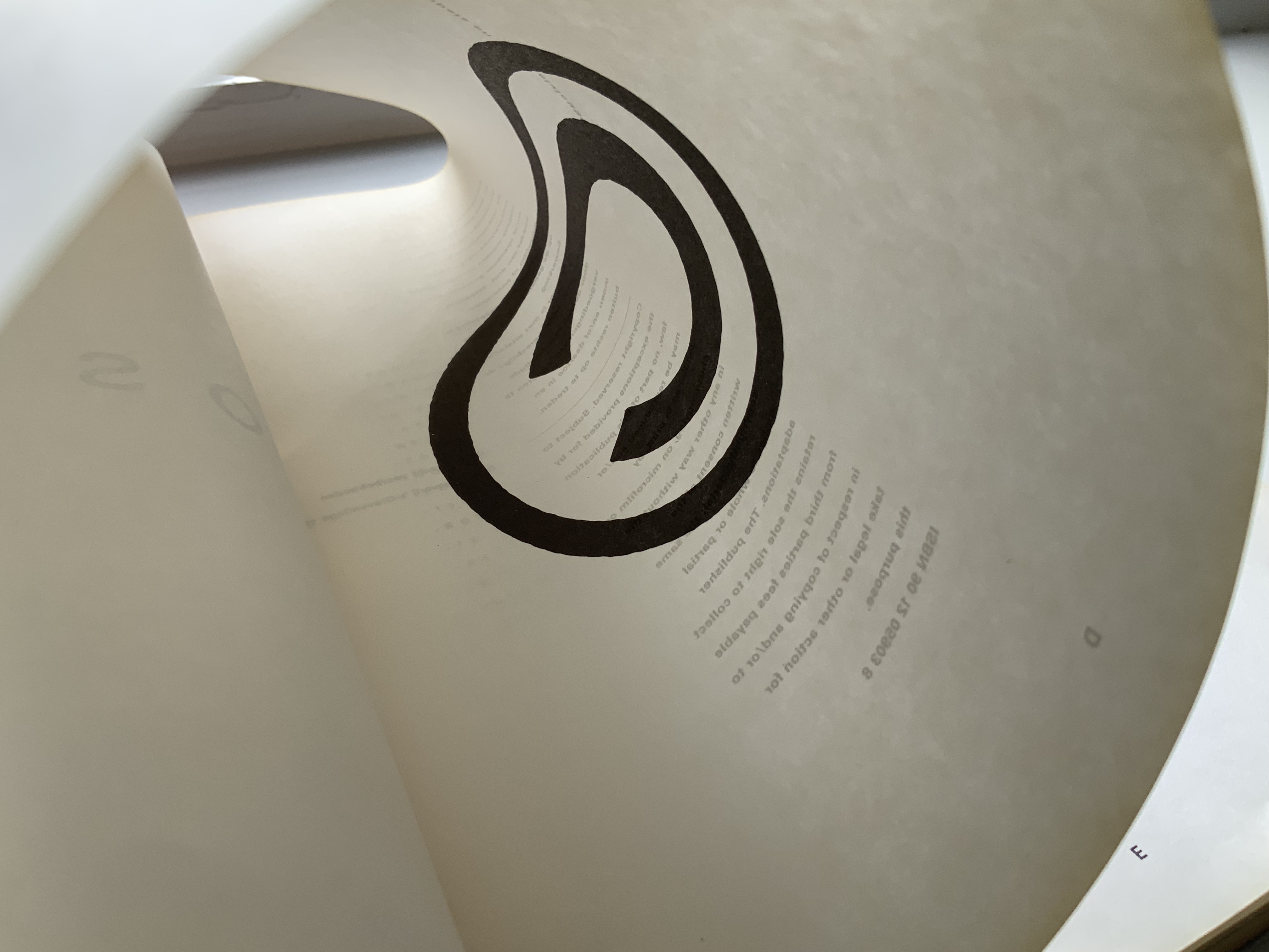
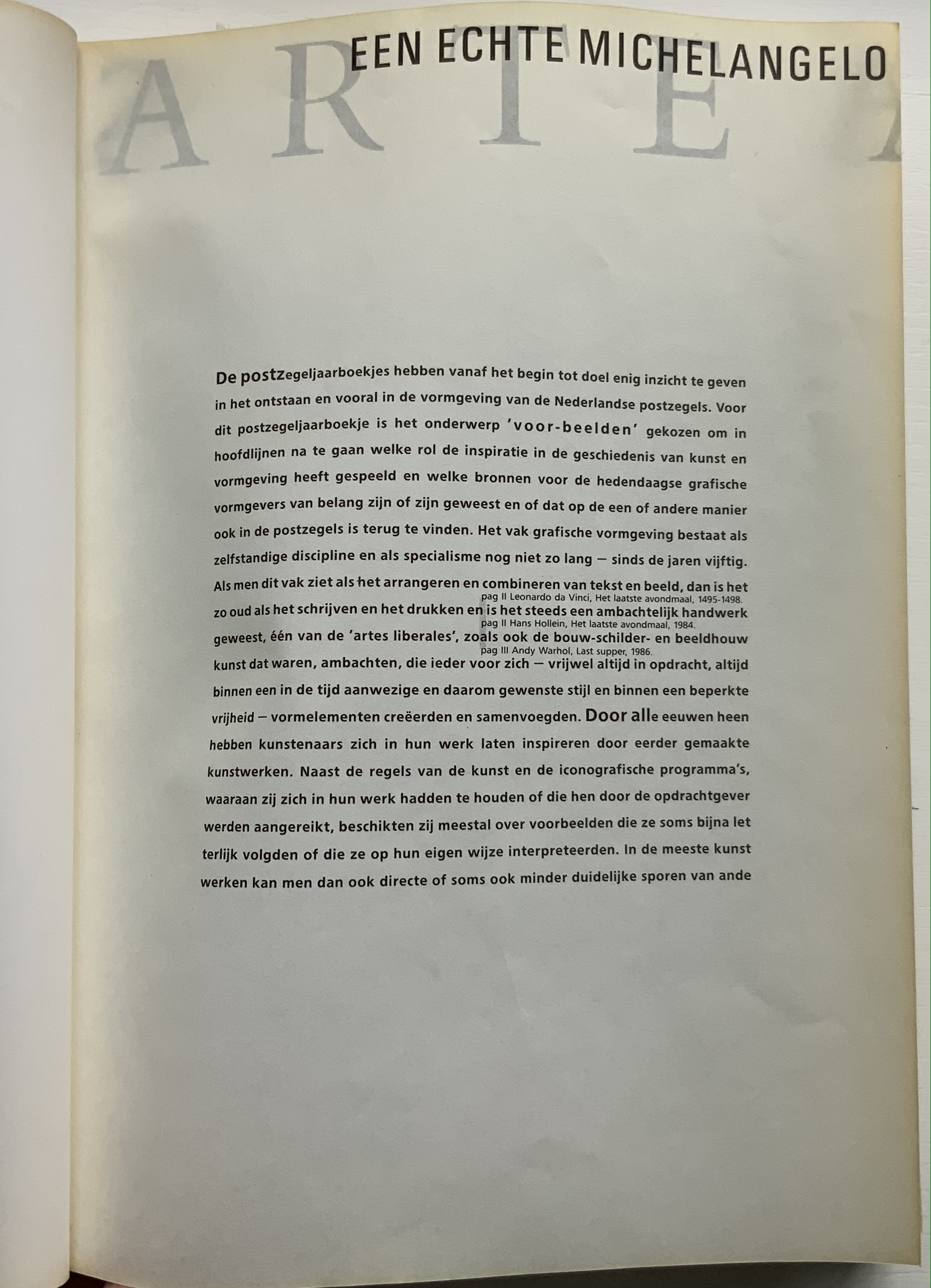
The inner sides are printed single color — black — creating shadow images on the outer side. Only by cutting through each fold (as encouraged by the perforations in Colour Based on Nature) can the inner-side images be examined closely, but this would destroy the work and the intent. With the shadows from the inner side, the outer side takes on a collage-like appearance. The print on the inner side also often serves for communication. For example, in the illustrated historical survey of design with which the first volume opens, the roman numerals for numbering plates appear on the reverse side of the plates to which they are assigned. Of course, the roman numeral has to be printed in reverse on the inner side so that it reads aright on the outer side, which is especially appropriate for this section labelled — from behind, of course — ARTE ALLO SPECCHIO (“art in the mirror”).

Copyright page and Table of Contents (pages D and E); inner side of page D.
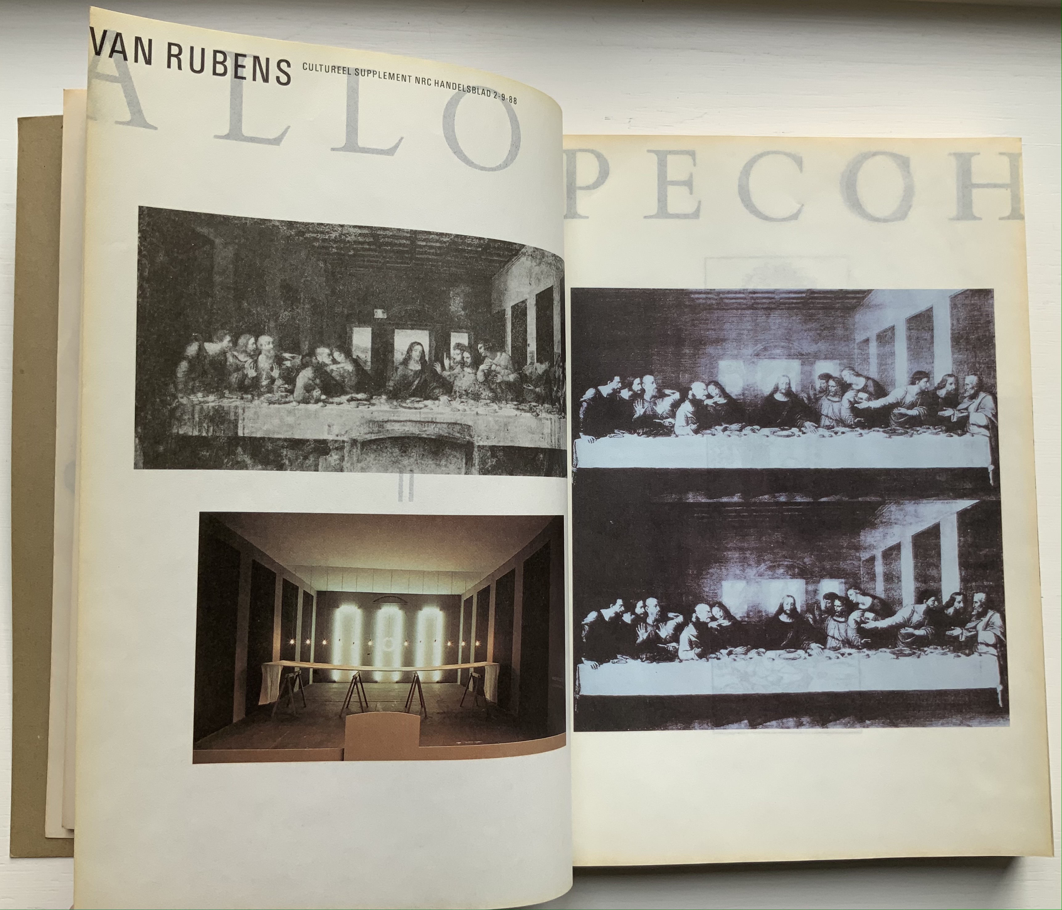
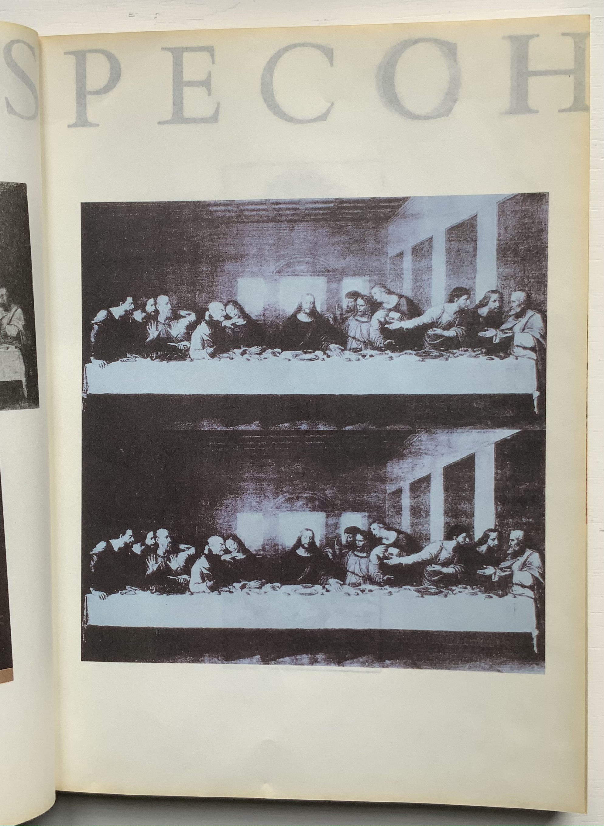
ARTE ALLO SPECCHIO (“Art in the Mirror”) printed on the inner sides of unpaginated pages I, J, K and L, with specchio running over the fold between K and L.
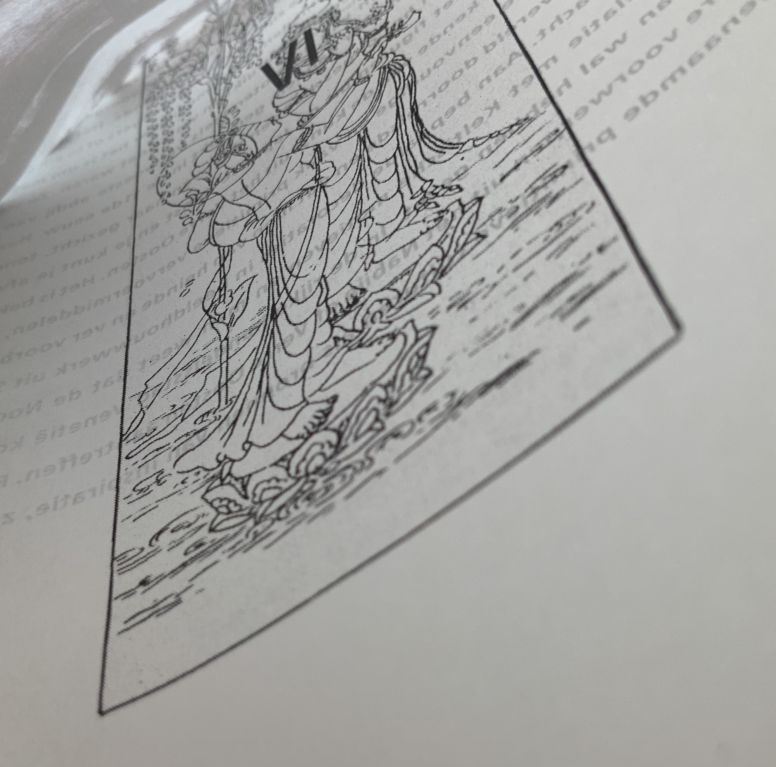
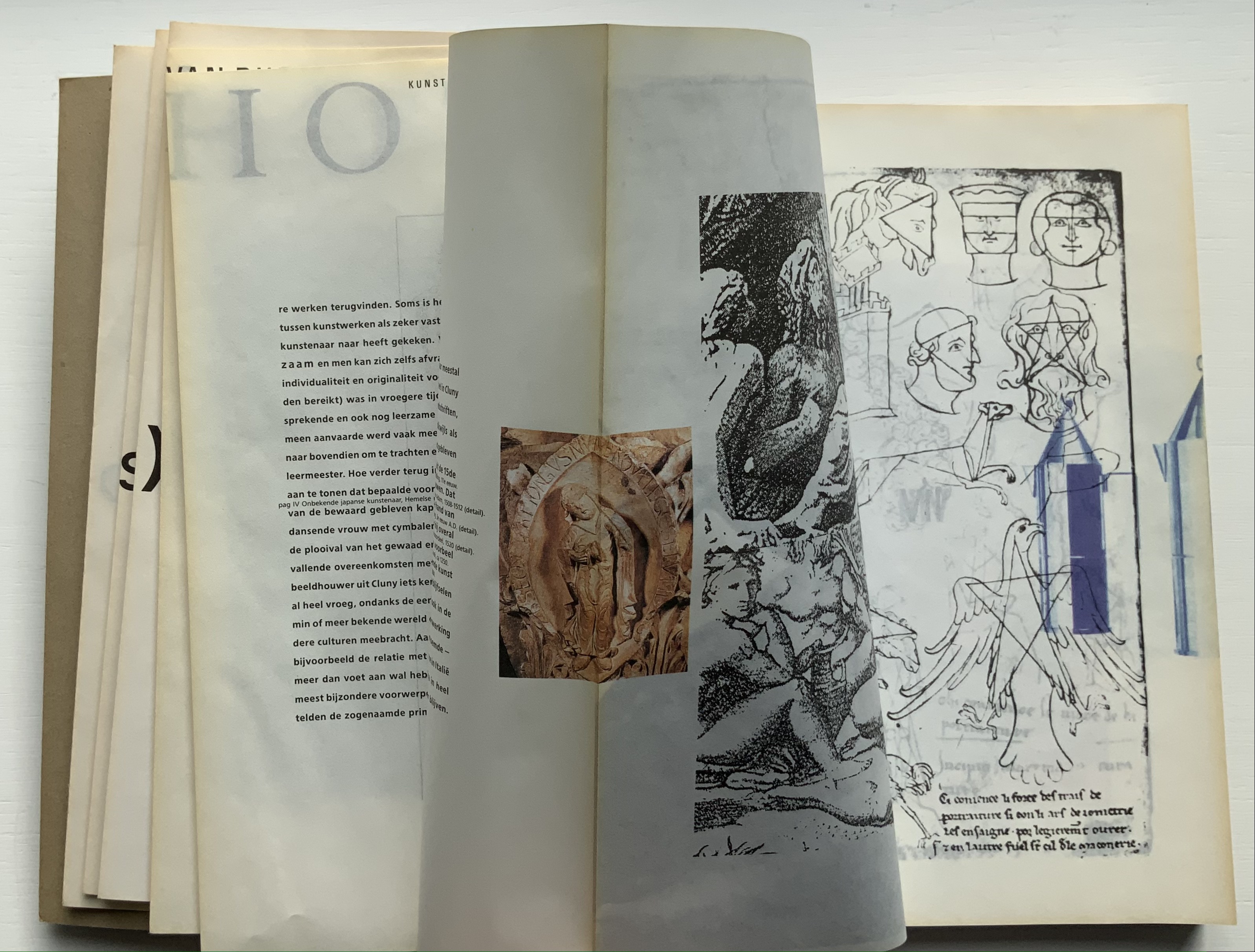
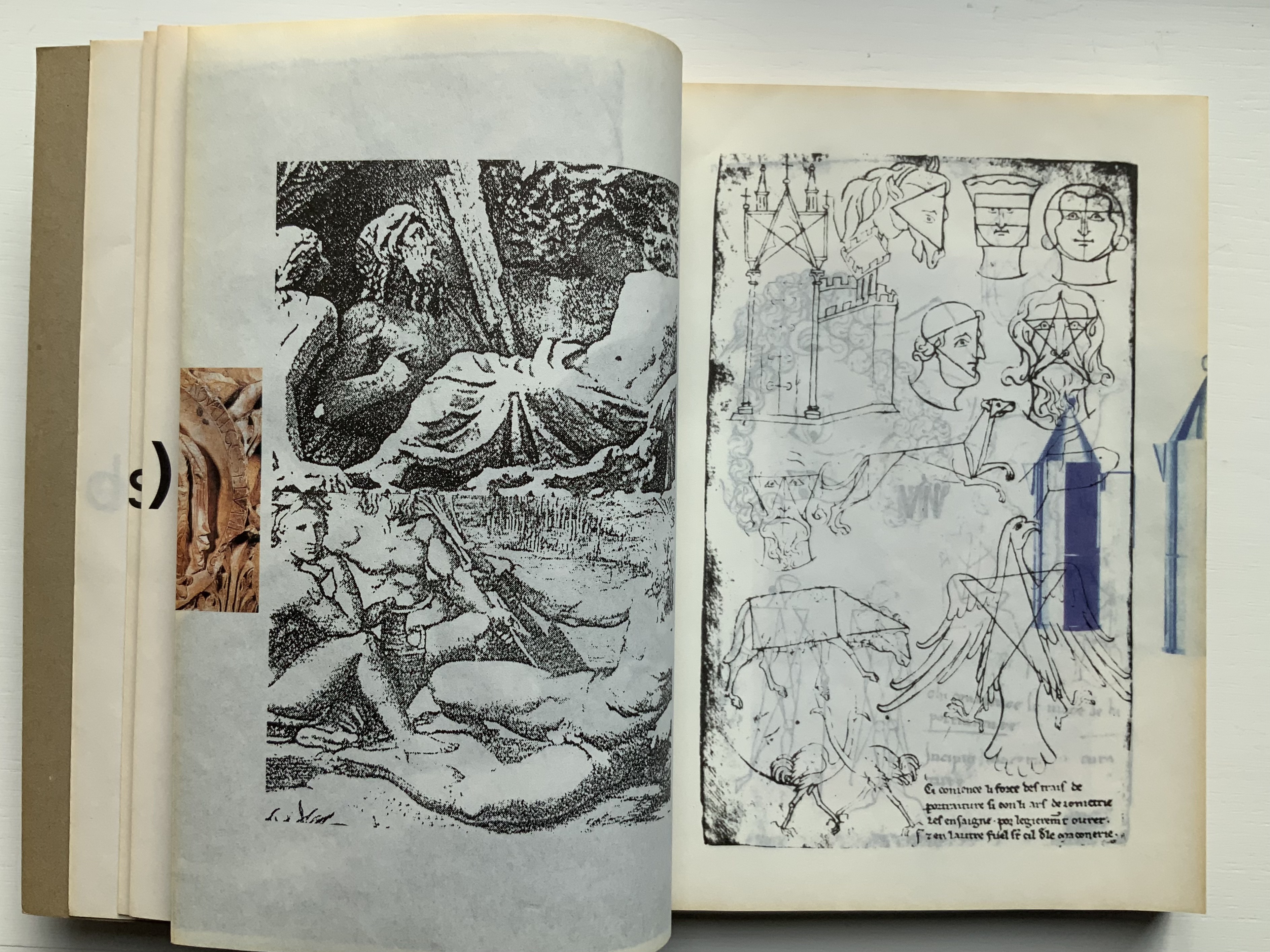
Clockwise: Unpaginated pages L and M; plate IV printed in reverse on inner side of page L (note on page L the interlinear caption for plate IV — pag IV Onbekende japanse kunstenaar, Hemelse muzikanten 8 eeuw [“plate IV, Unknown Japanese artist, Heavenly musicians 8th century”]); note image running over the fold between pages M and N; pages N and O.
Like all of Boom’s other works in this collection, Nederlandse Postzegels is not a quick read or easily navigated reference work. Its design demands from the reader an awareness that should translate into thoughtfulness about the accomplished designers and their designs, among whom are Anton Beeke, Henk Cornelissen, Wim Crouwel, Reynoud Homan, Cees de Jong, Frans van Lieshout, Karel Martens, Rick Vermeulen, Tessa van der Waals, Piet Zwart and many others.
The selected pages and their “inside surfaces” recount the separate efforts of Karel Martens and Reynoud Homan to design the Dutch stamp commemorating Australia’s bicentennial in 1988. Martens’ design conflicted with PTT requirements, so Homan stepped in. The descriptive text follows a landscape layout and reads over the fore edge fold, but page numbers and some of the illustrations follow a portfolio layout.
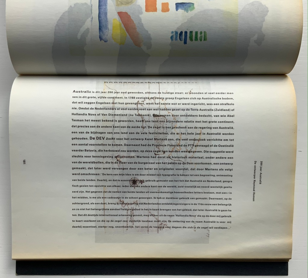
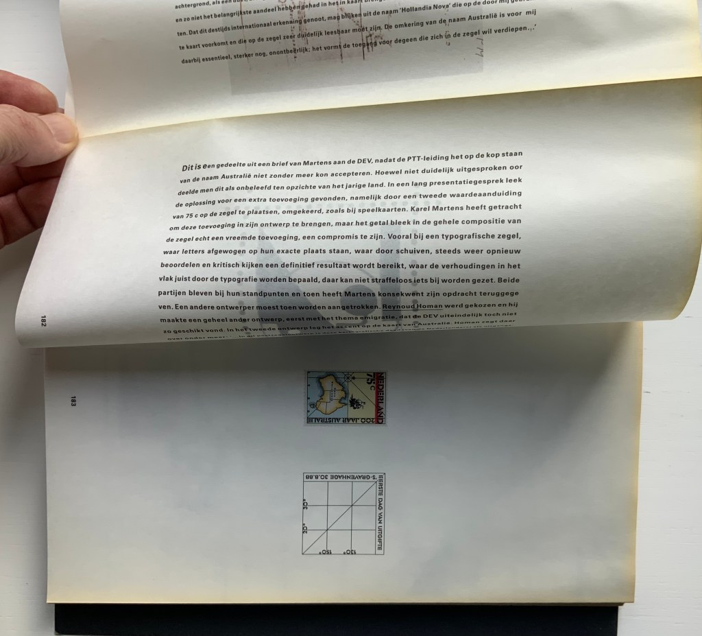
Pages 181-83.
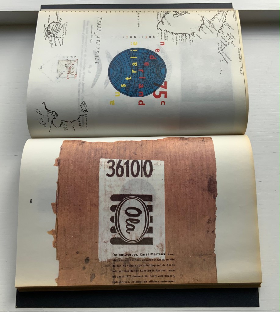
Pages 186-87.
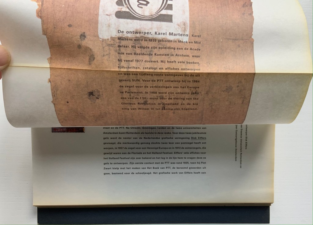
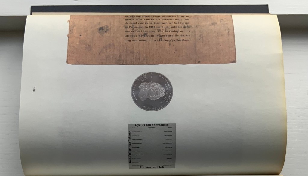
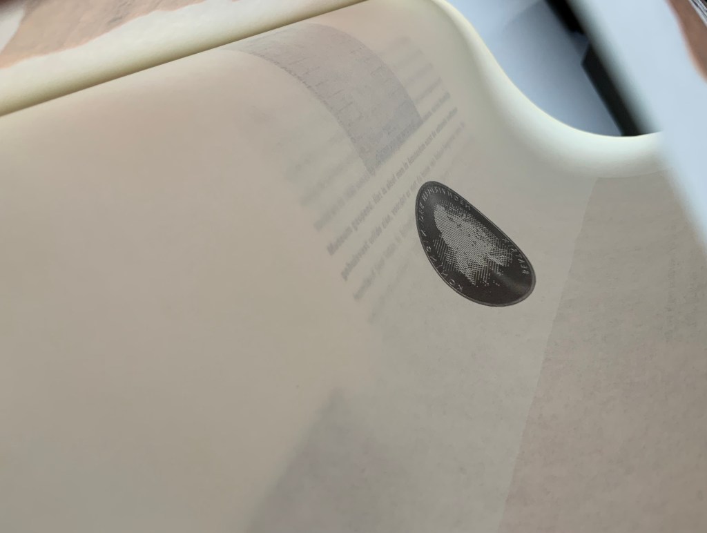
Top to bottom: Page 187’s text running over the fold to page 188; page 188 showing Karel Martens’ design of the coin commemorating William & Mary’s 300th anniversary of accession; inner side of page 188 cheekily showing the reverse side of the Martens coin.
Comparing herself to the kind of architect who produces social housing, Boom asserts, “books are industrially made and they need to be made very well. I am all for industrial production. I hate one-offs. On one book you can do anything, but if you do a print run, that is a challenge. It’s never art. Never, never, never.” But no less an institution than the Museum of Modern Art holds a copy of Nederlandse Postzegels. Display the book alongside the other five works above and the temptation to take Boom’s stance to be just as arch as that of Marcel Duchamp (“It’s art if I say so.”) is hard to resist. Nevertheless, ending with Nederlandse Postzegels, this entry defers to Boom and gives her the last word — at least on how the work came to be:
Since 1920, the PTT Art & Design Department had commissioned artists, architects and designers to design its services and products. To me, the whole idea of Dutch design comes from the design policy of PTT, especially in the 1970s and 80s when Ootje Oxenaar was head of the department.
Working at the Staatsdrukkerij meant enormous creative freedom. Those were the heydays of art-book publishing. If you made a book cover, they would encourage you to use foil or special printing techniques. The department was a springboard for young designers who would work there for one or two years and go on to something more exciting. After my internship, I went to Dumbar and the Dutch television (NOS) design department. After I graduated I went back to the Staatsdrukkerij, and ended up staying for five-and-a-half years. I learned a lot. In retrospect, it was a very productive and super-creative time.
I did jobs nobody else wanted, like the advertisements for the publishing department, which was – thinking of it now – a smart thing to do because I could experiment. Those assignments were completely under the radar but they were seen by Oxenaar. He invited the designer of the ‘crazy ads’ to do one of the most prestigious book jobs: the annual Dutch postage-stamp books.
Places like the Staatsdrukkerij don’t exist any more. When I started working there after graduation, I was immediately a designer (not a junior), and I quickly became a team leader. At that time I was very naive and fearless. I was not aware of an audience, and certainly not a critical audience! This vacuum is no longer possible for designers starting out today. I only became aware of the outside world after the prestigious postage-stamp yearbooks were published: hate mail from stamp collectors and design colleagues started to come in. But there was also fan mail.
The books polarised the design community. They won all the awards and a Best Book Award, my first one. In the jury report they mentioned ‘a brilliant failure’. Suddenly people knew who I was. I realised negative publicity has an enormous impact, more than positive publicity.” — Miltenburg, “Reputations: Irma Boom“.
Further Reading & Viewing
“Olafur Eliasson“. 17 May 2021. Books On Books Collection. Irma Boom designed the Eliasson catalogue called Contact, which is shown in that entry.
“Irma Boom“. 2020. Dutch Artists’ Books Then and Now, Virtual Art Book Fair, Tokyo Art Book Fair. Video.
“Irma Boom“. N.d. John M. Flaxman Library Resource Guide. Accessed 1 October 2018.
Boom, Irma. 26 November 2011. “Manifesto for the Book“. TEDxDelft. Accessed 2 October 2018. See especially for her comments on the two-volume Nederlandse Postzegels (1988), which foreshadows the Chinese-fold element of Strip, and also for Grafisch Nederland 2005: Kleur = Colour (2005), which foreshadows Colour — Based on Nature.
Boom, Irma, Julia Blume, and Günter Karl Bose. 2002. Irma Boom. Leipzig : Institut für Buchkunst.
Lehkoživová, Irena. 23 November 2016 –14 January 2017. “Irma Boom“. Vi Per Gallery, Prague, Czech Republic. Well-illustrated with photos by Peter Fabo.
Miltenburg, Anne. 2014. “Reputations: Irma Boom“. Eye, no. 88, vol. 22. Interview.
Nochlin, Linda. 30 May 2015. “From 1971: Why Have There Been No Great Women Artists?” ArtNews. Accessed 2 July 2021.
Rawsthorn, Alice. 14 March 2013. “Influences/Life in Design“. Frieze. Accessed 1 October 2018.
Zaborov, Victoria. “Reinventing the Book | Case Study: Irma Boom”. Medium. Accessed 2 July 2020.
Zaborov, Victoria. 2013. “The History of the Book | Case study: Irma Boom“. Thesis, Leiden University. Accessed 2 July 2020.

2 thoughts on “Books On Books Collection – Irma Boom”