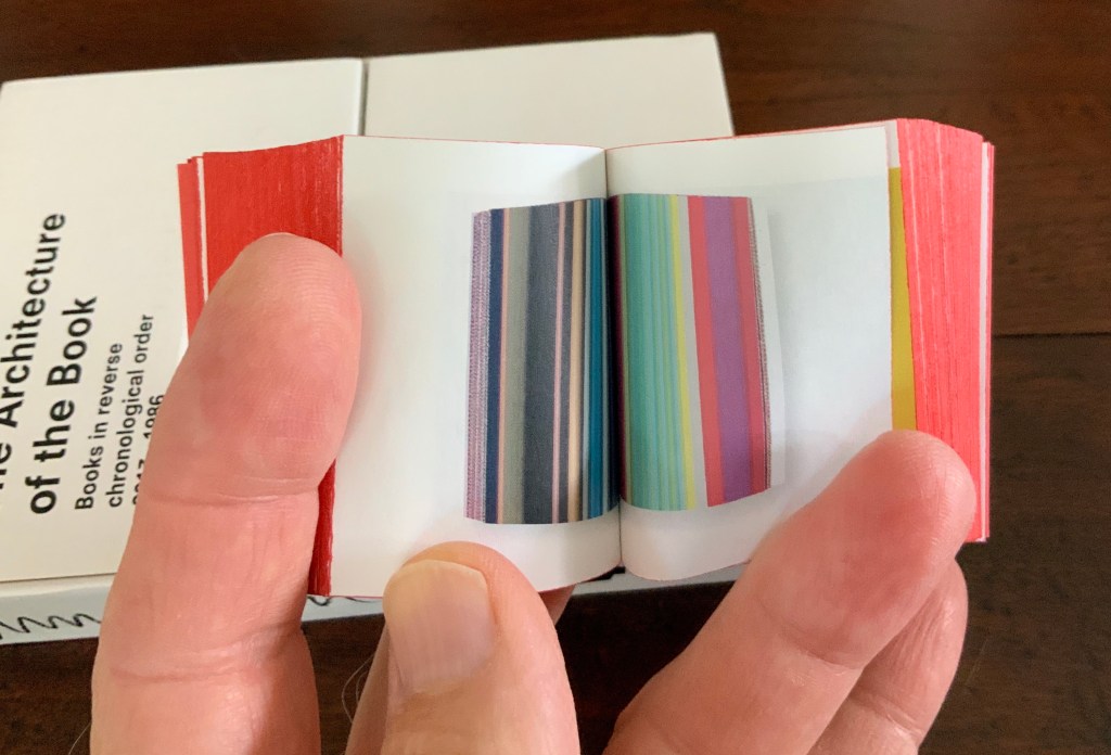
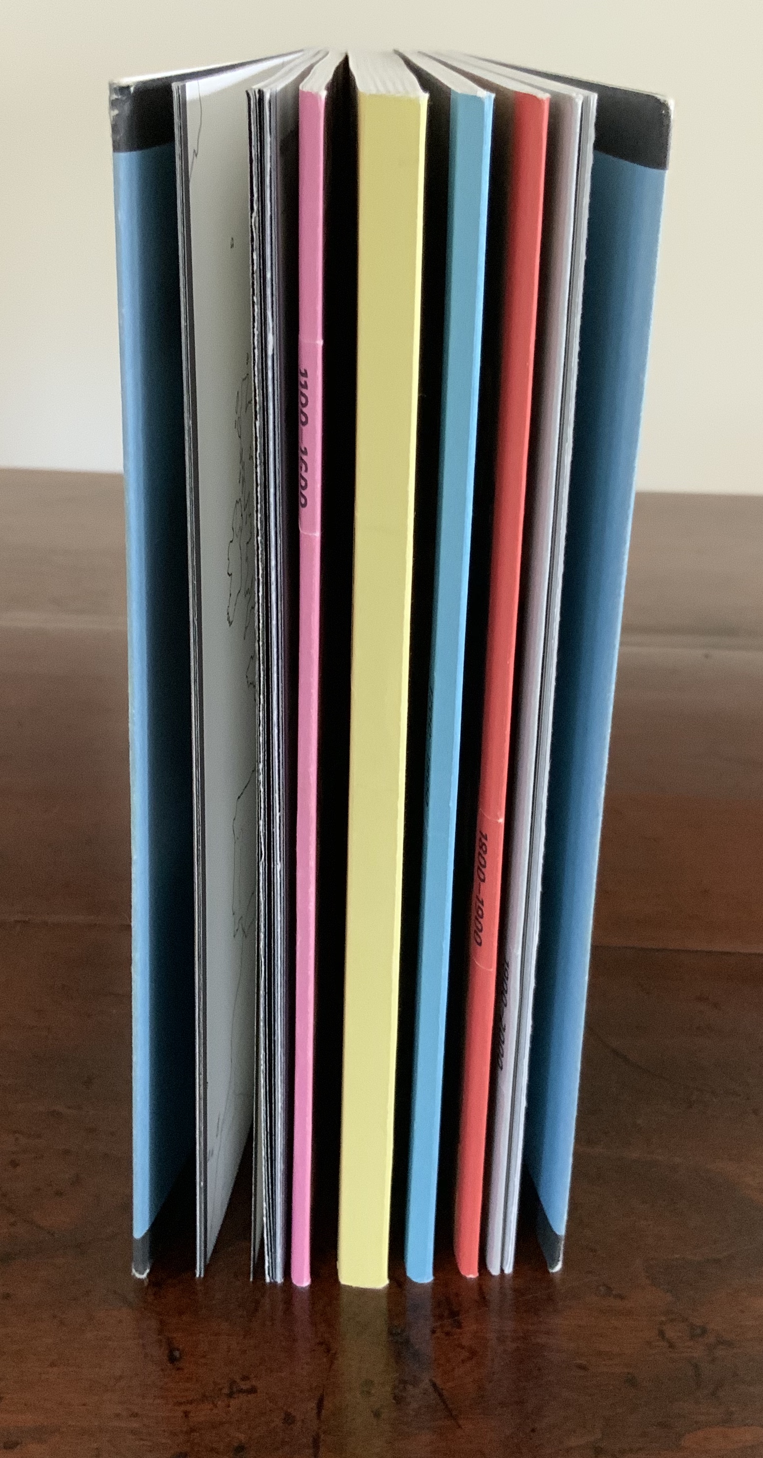
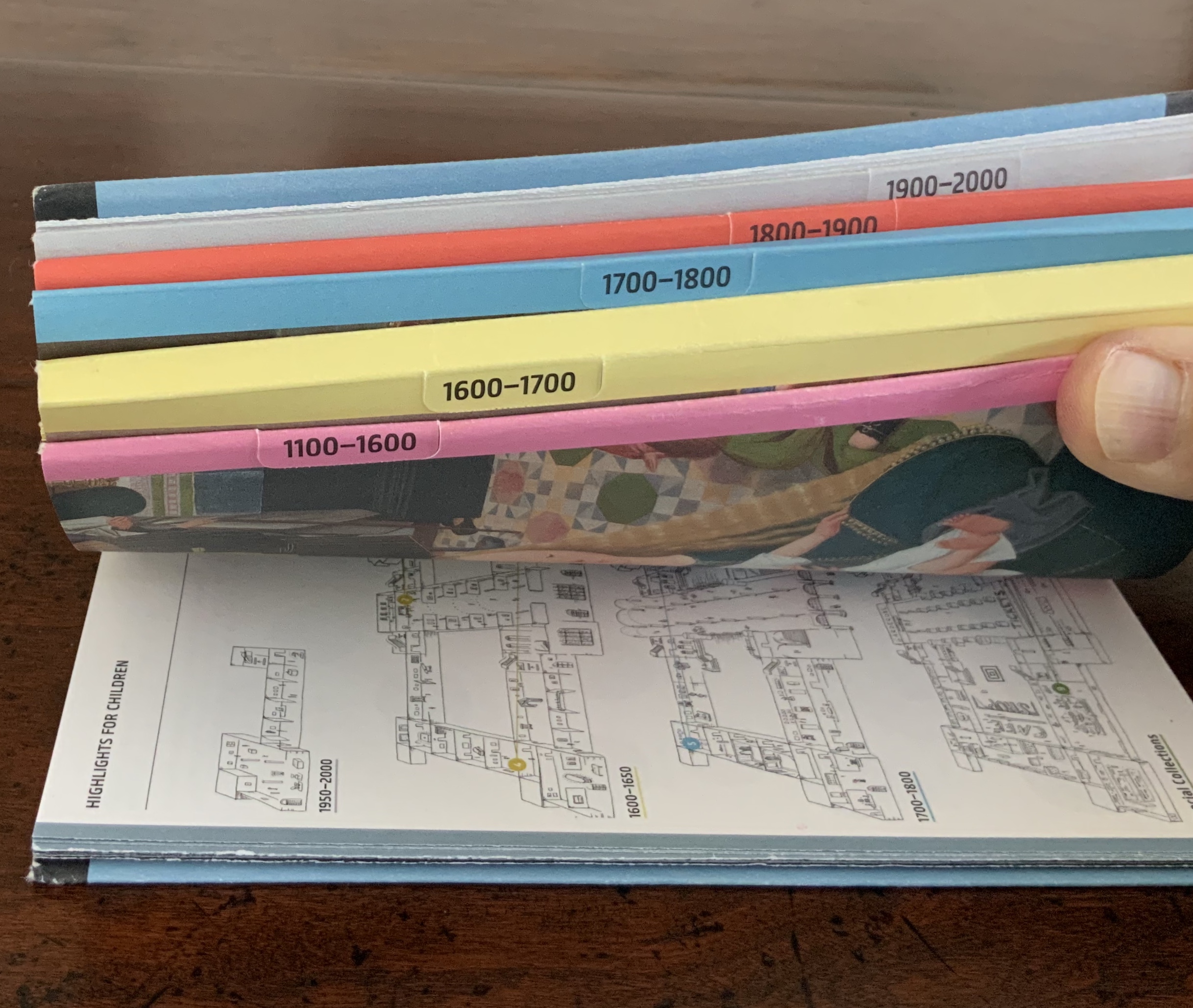
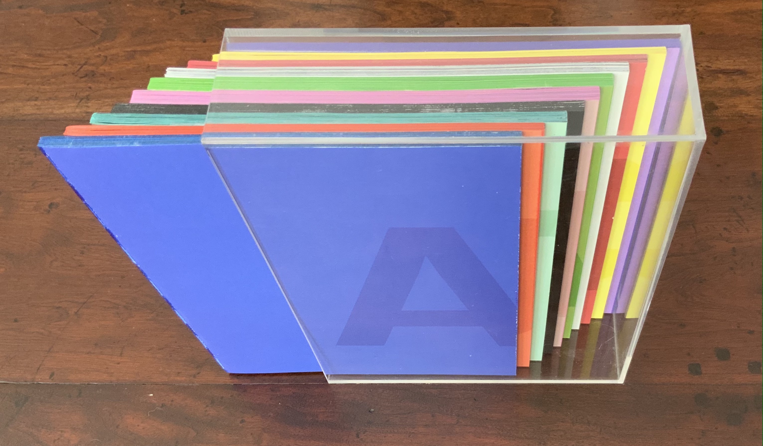
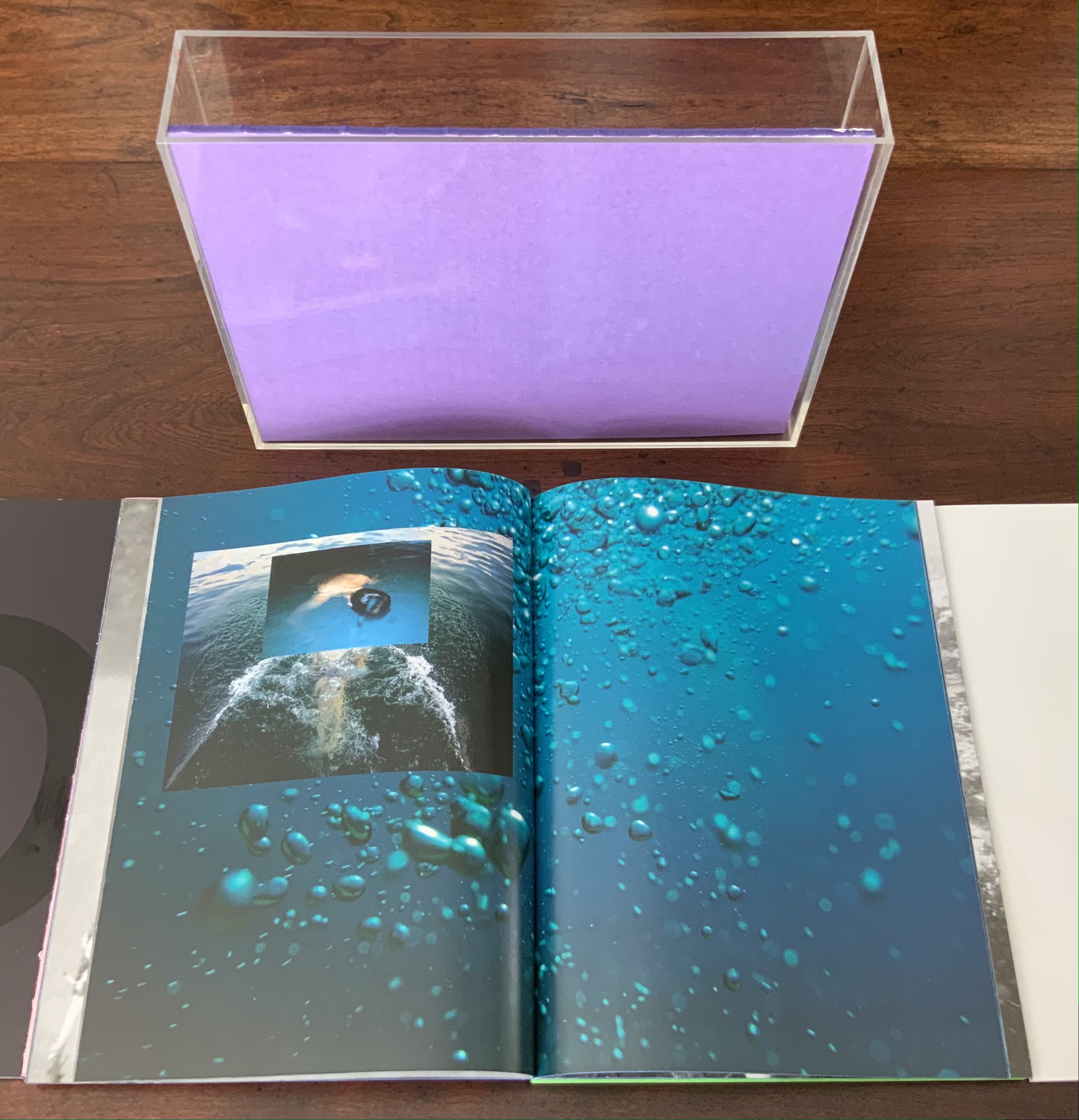
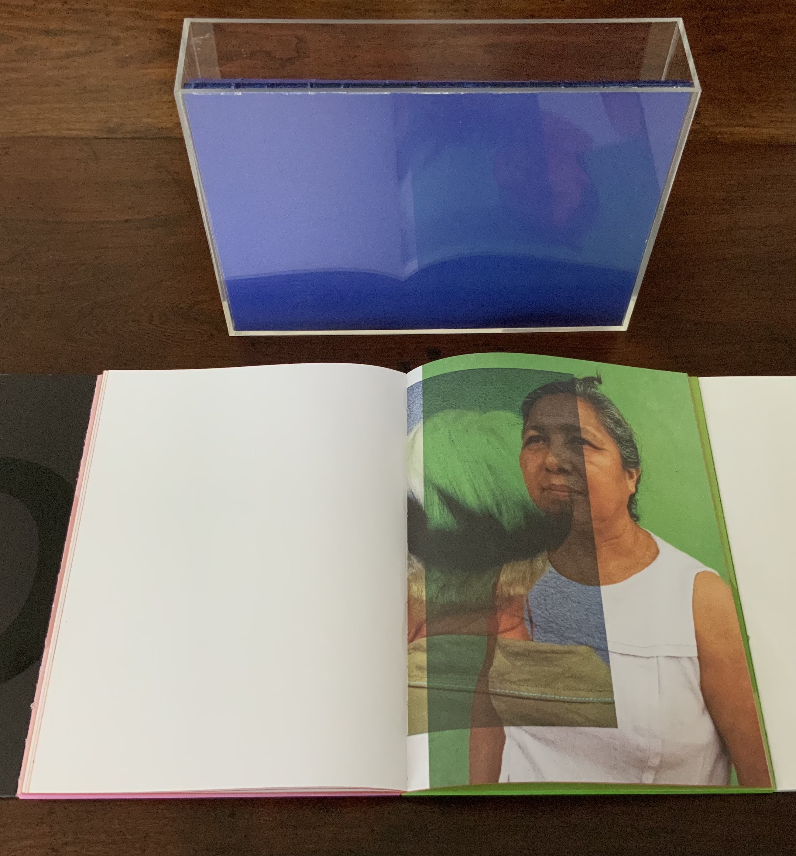
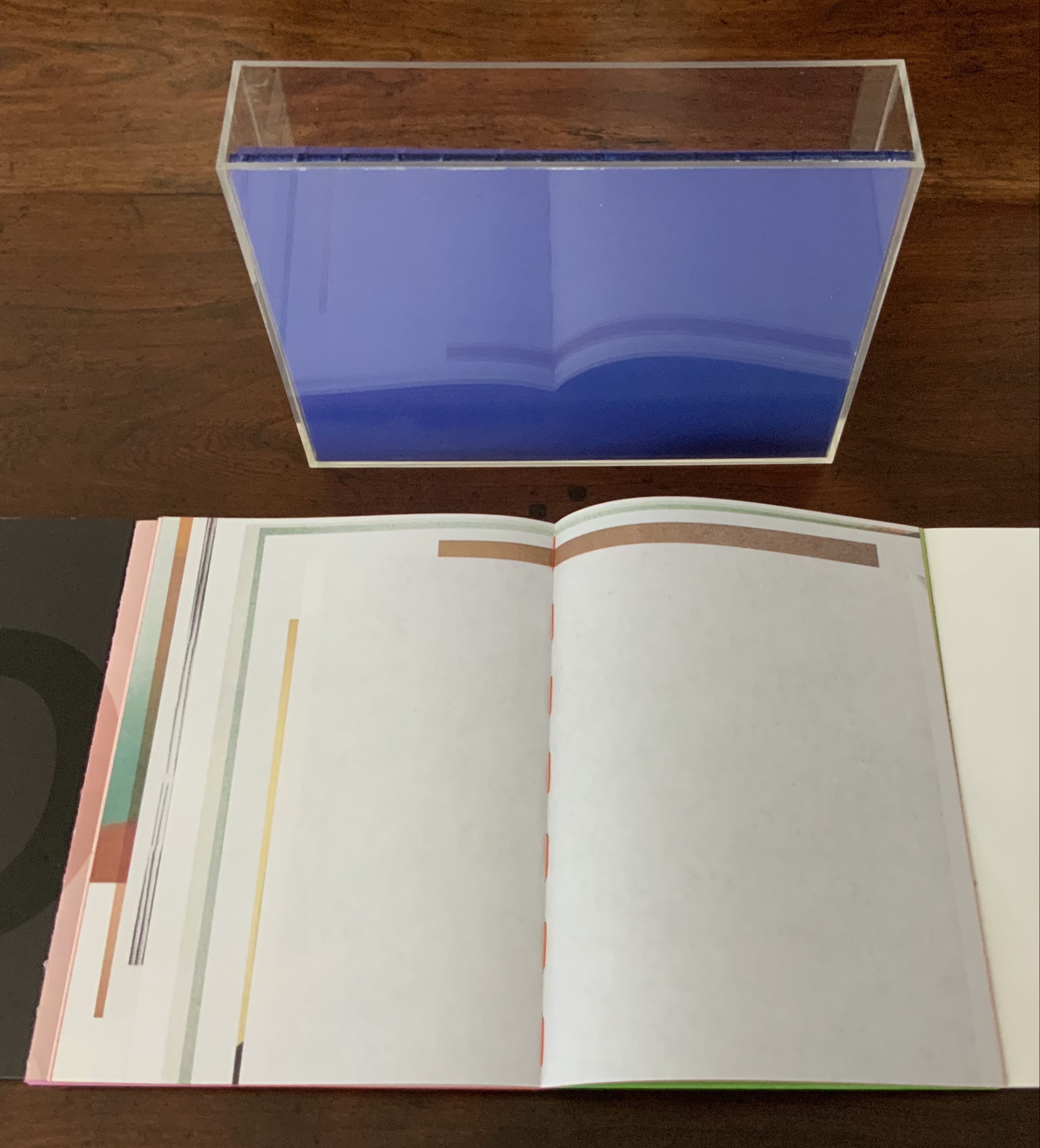
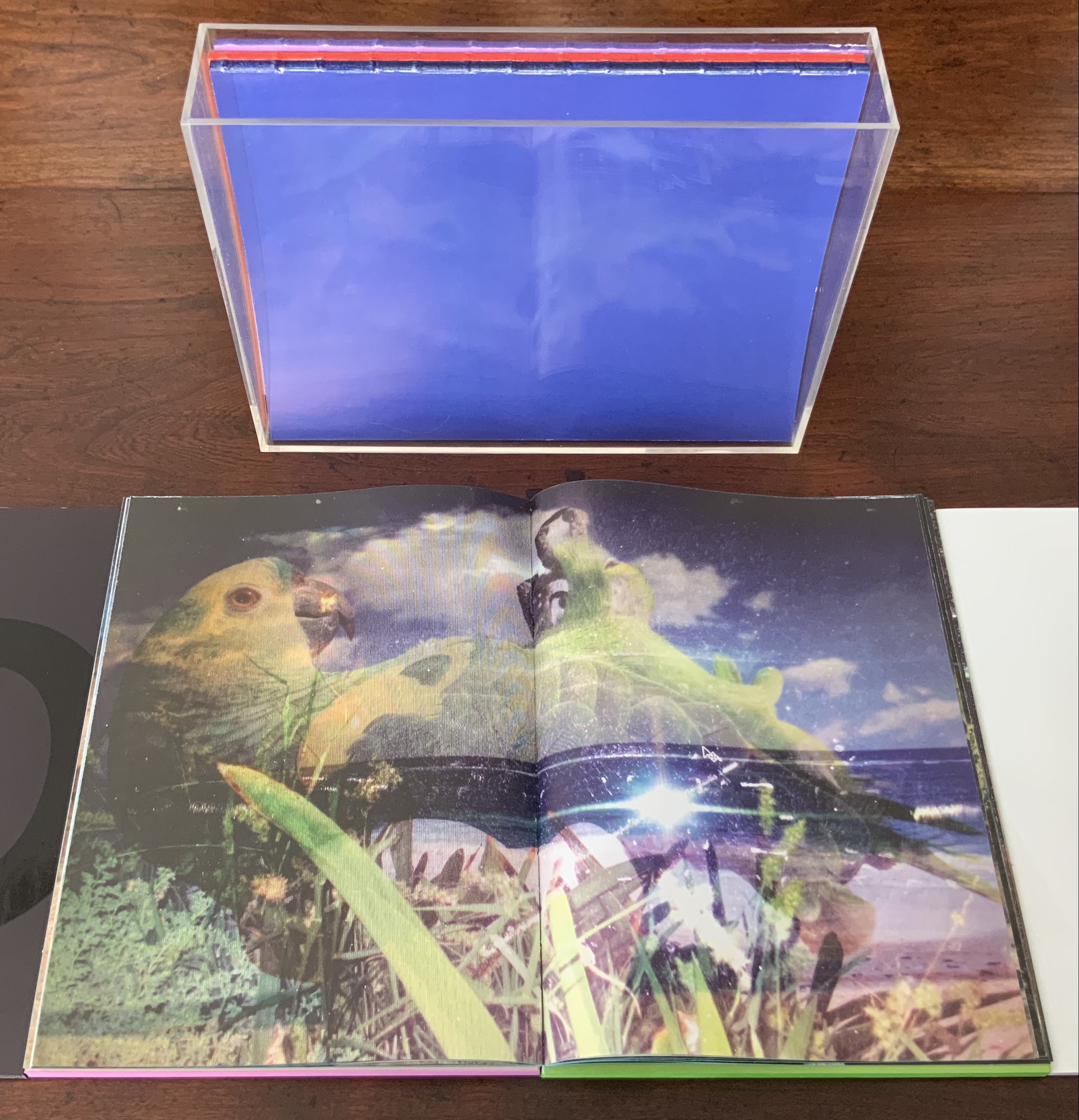
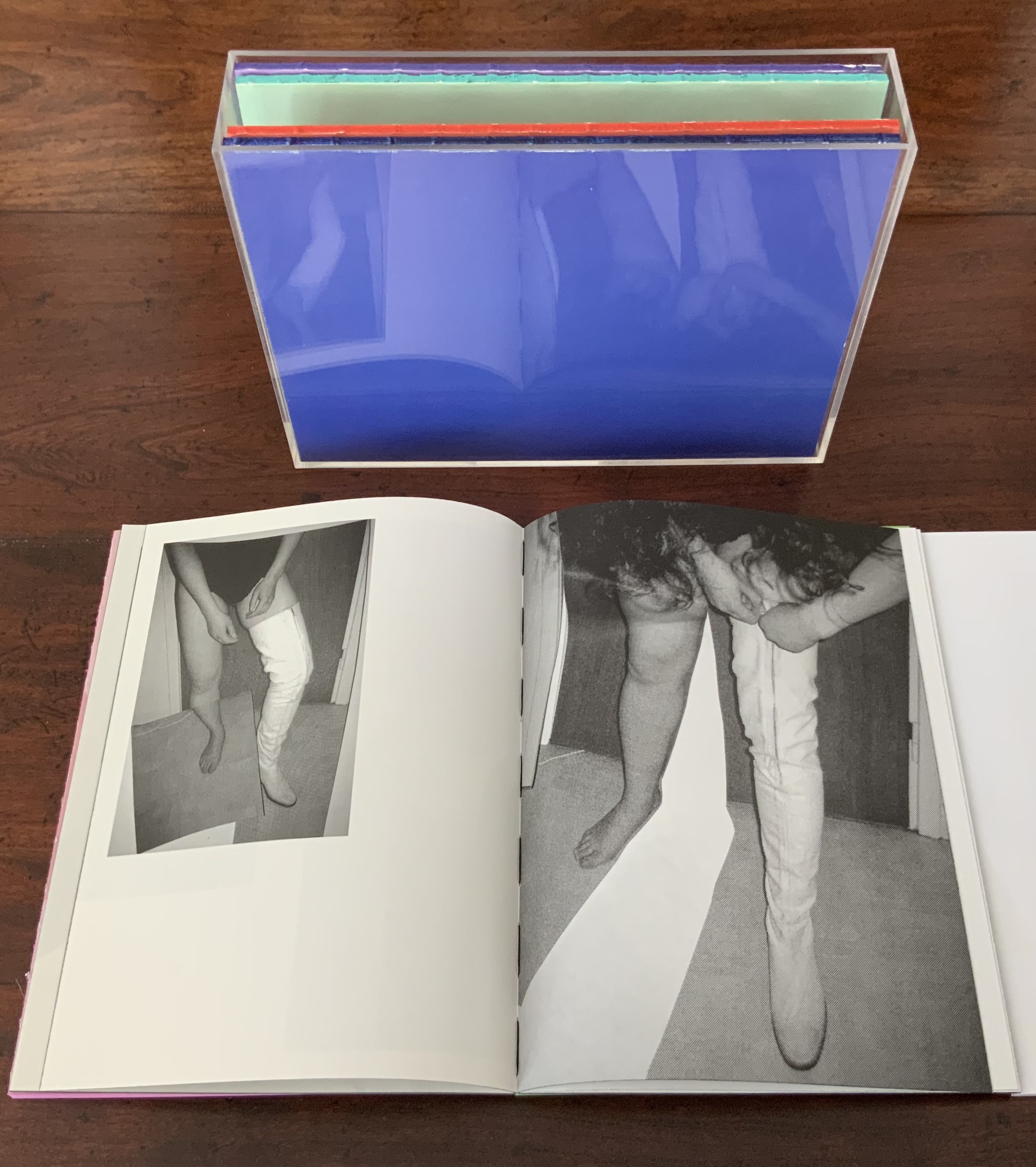
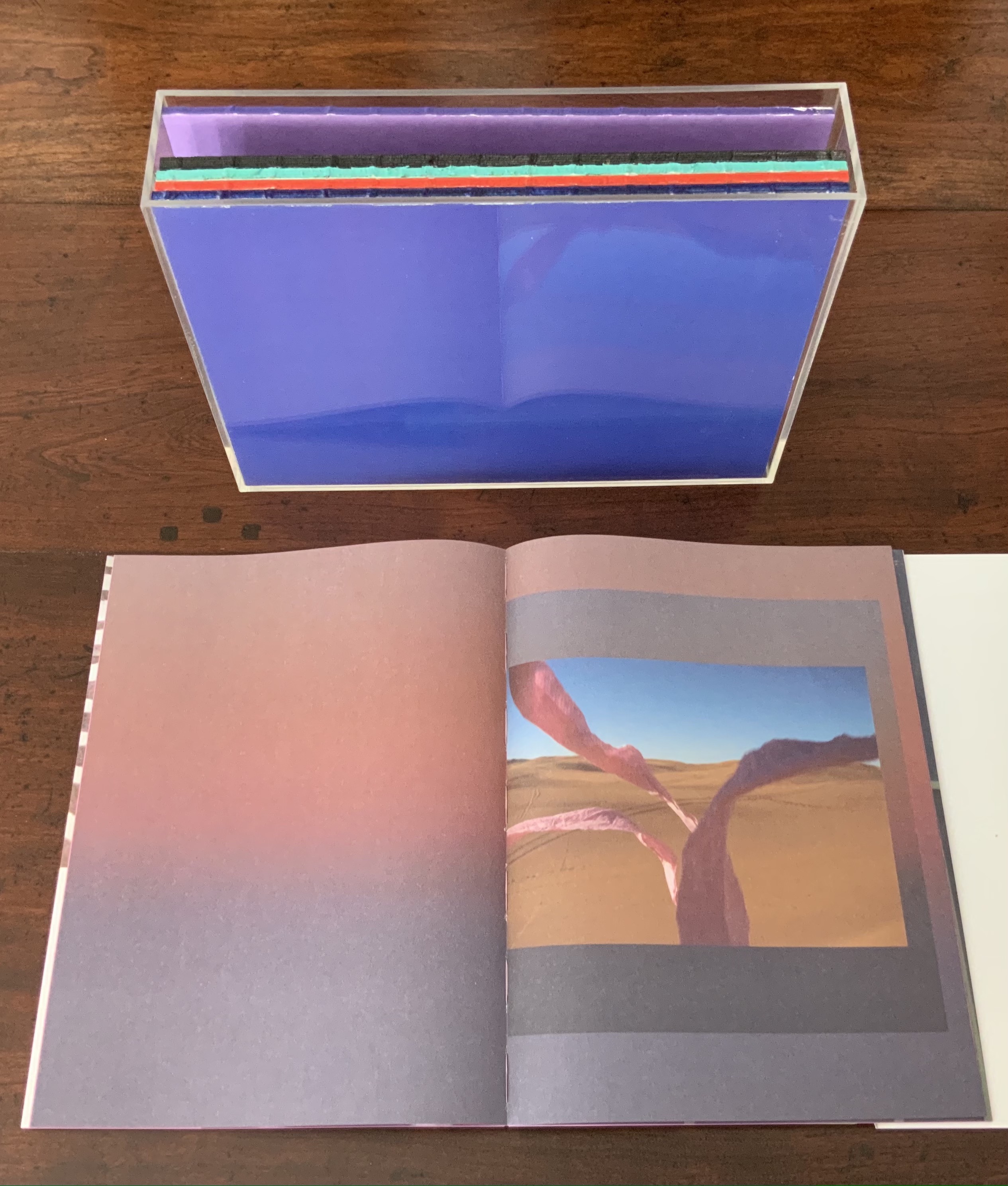
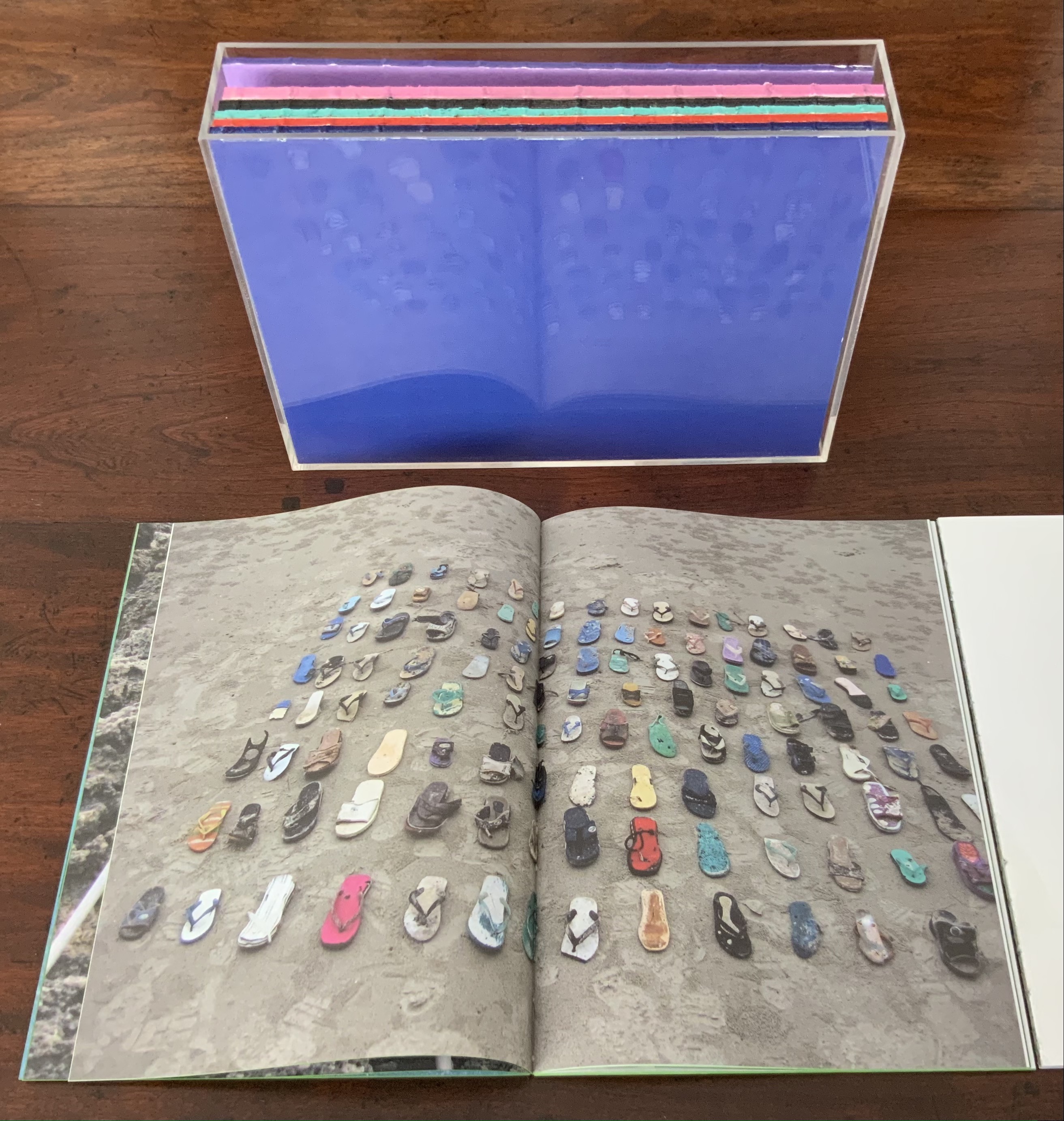
With the permission of the author and The Book & Paper Gathering, this essay by Paula Steere is being reposted at Books On Books because Steere’s observations about bookbinding lead to a closer look at works in the Books On Books Collection. Keep Steere’s essay open in this window, then open another window for one of the entries in this baker’s dozen to start:
- Cor Aerssens
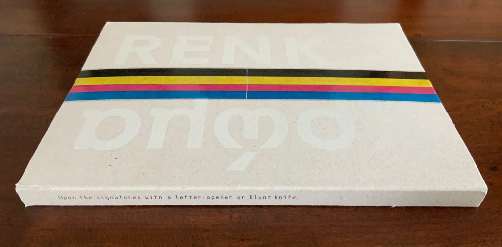
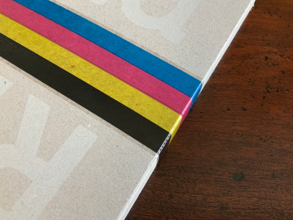
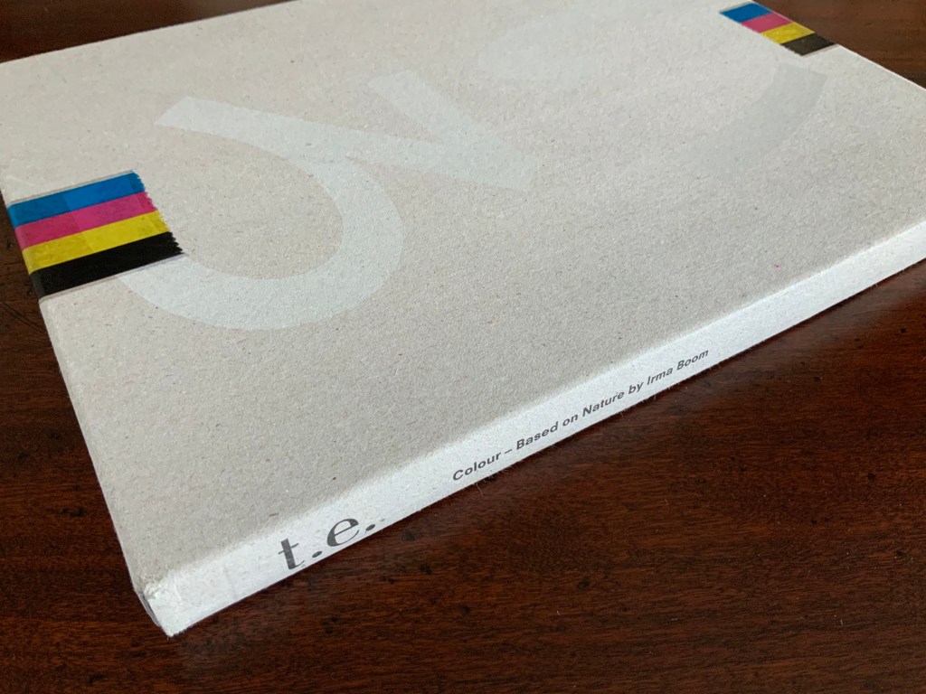
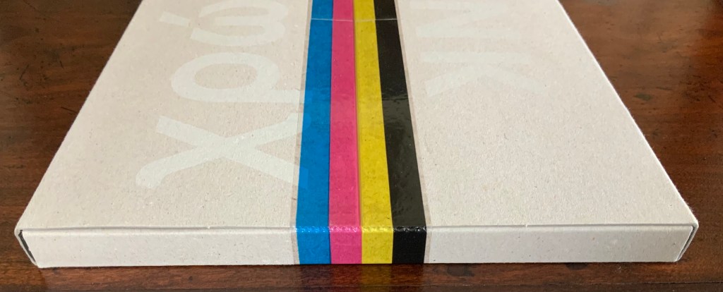
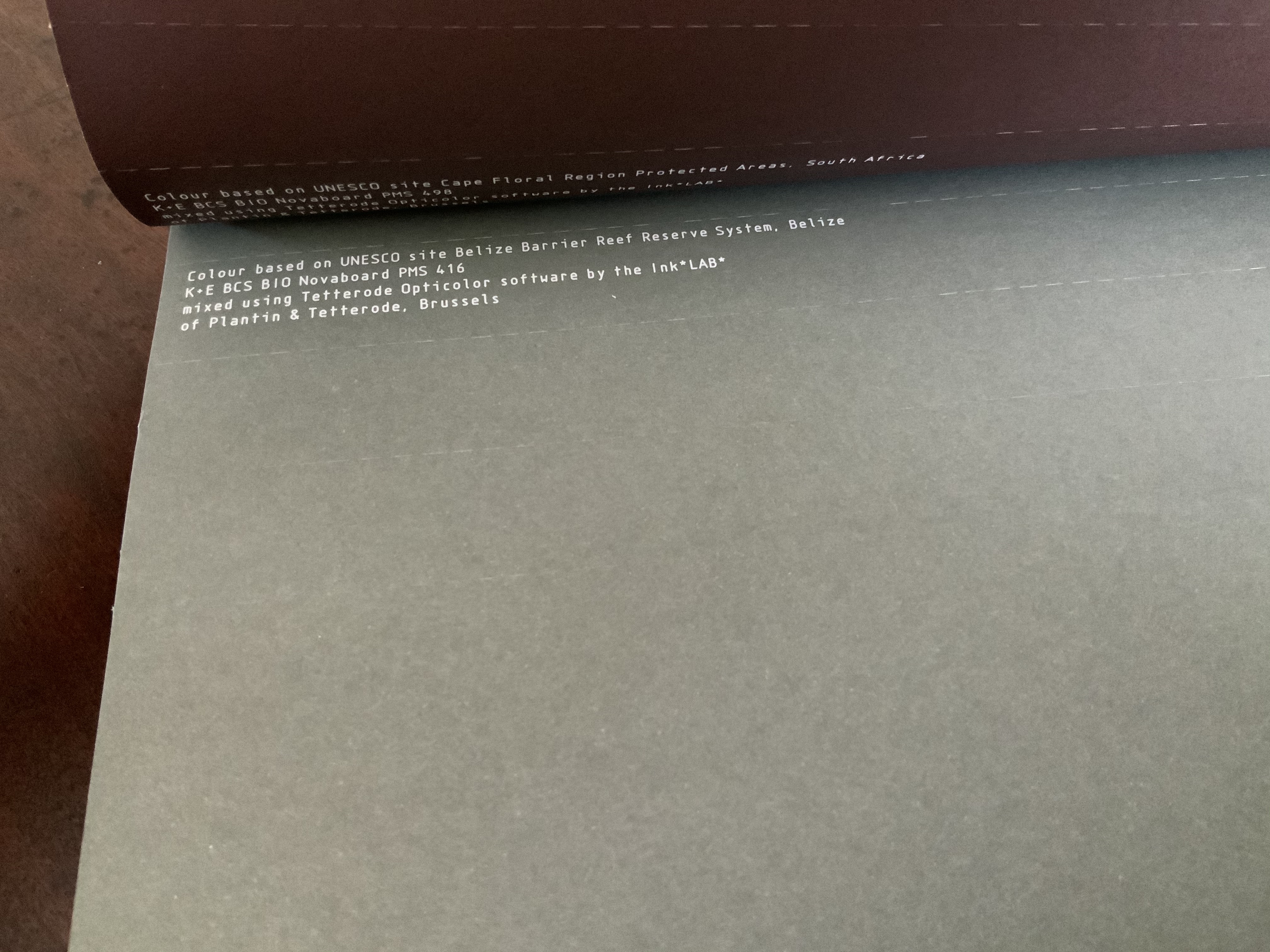
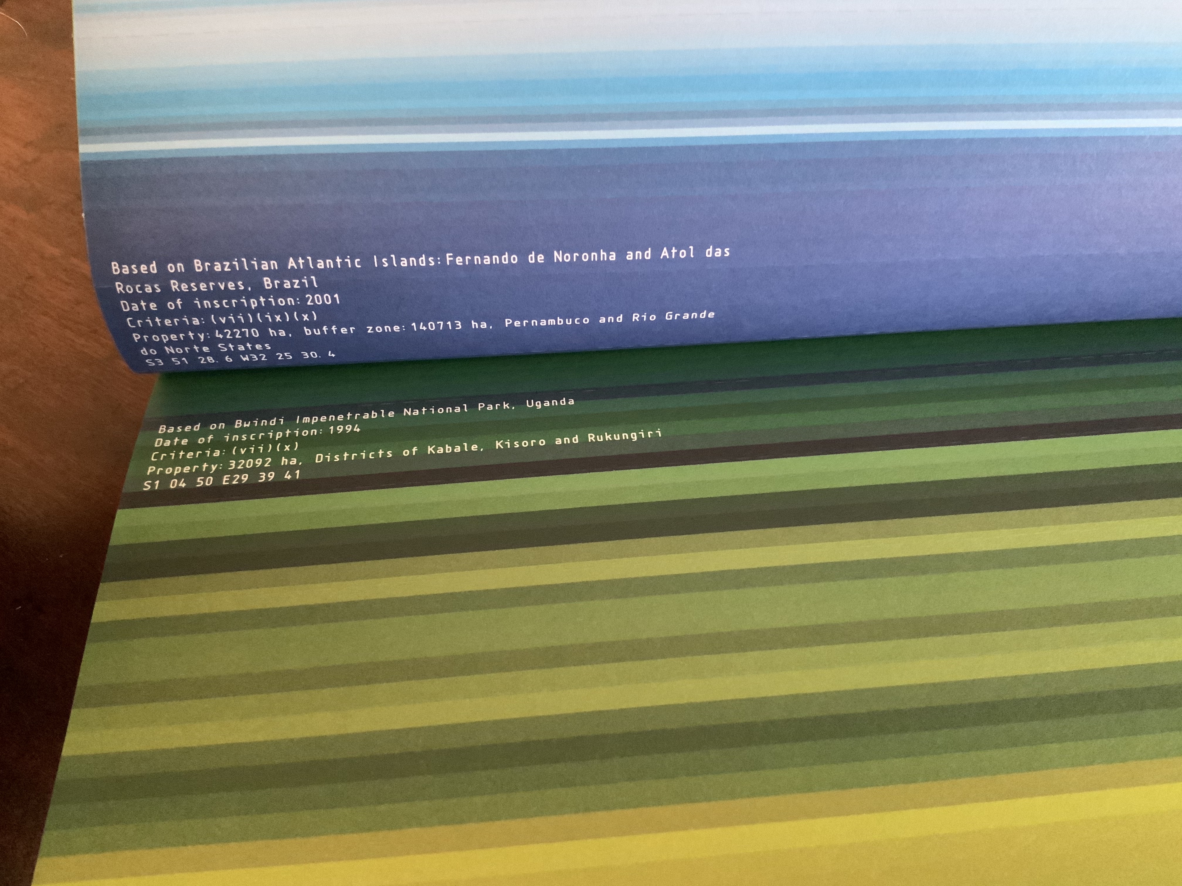
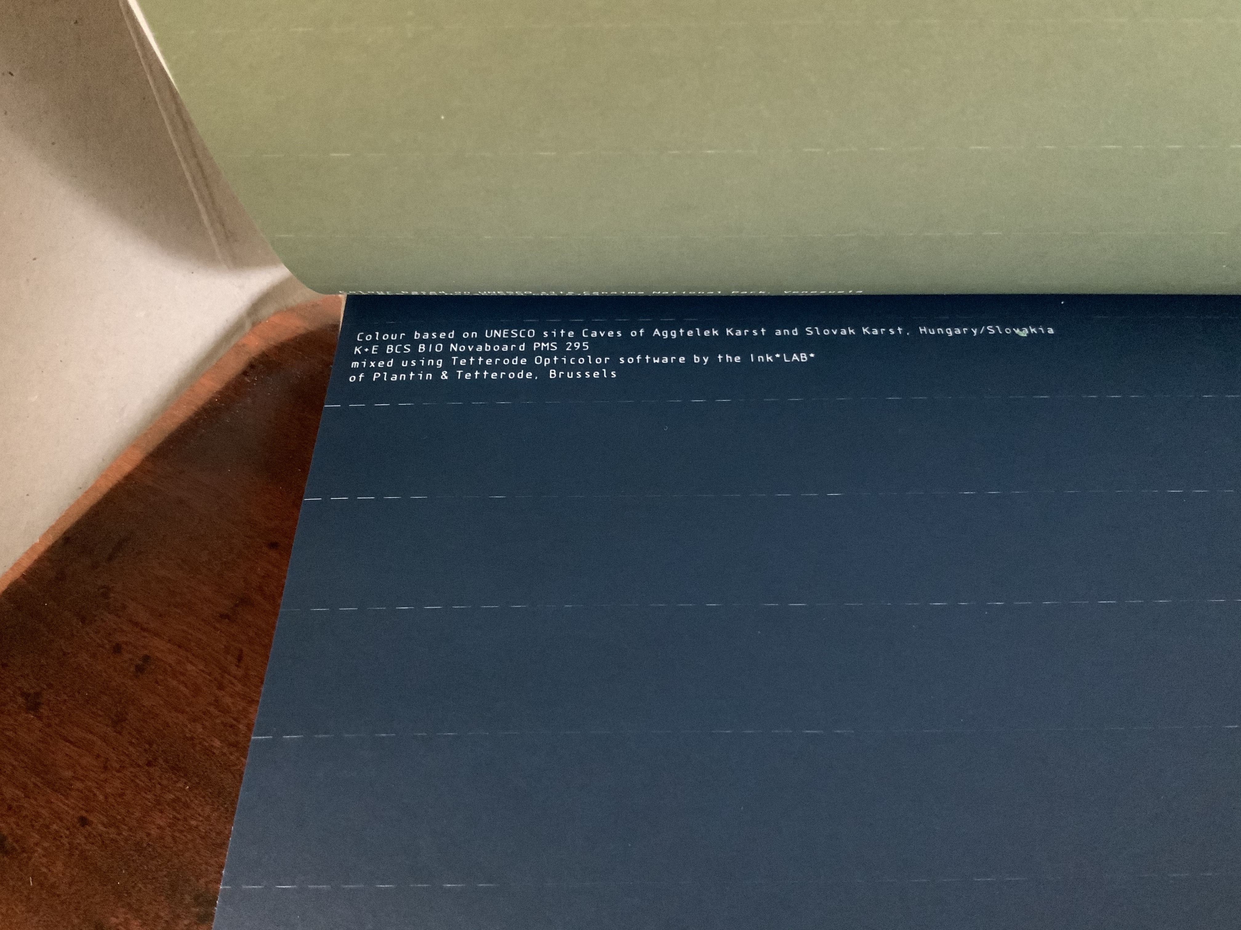
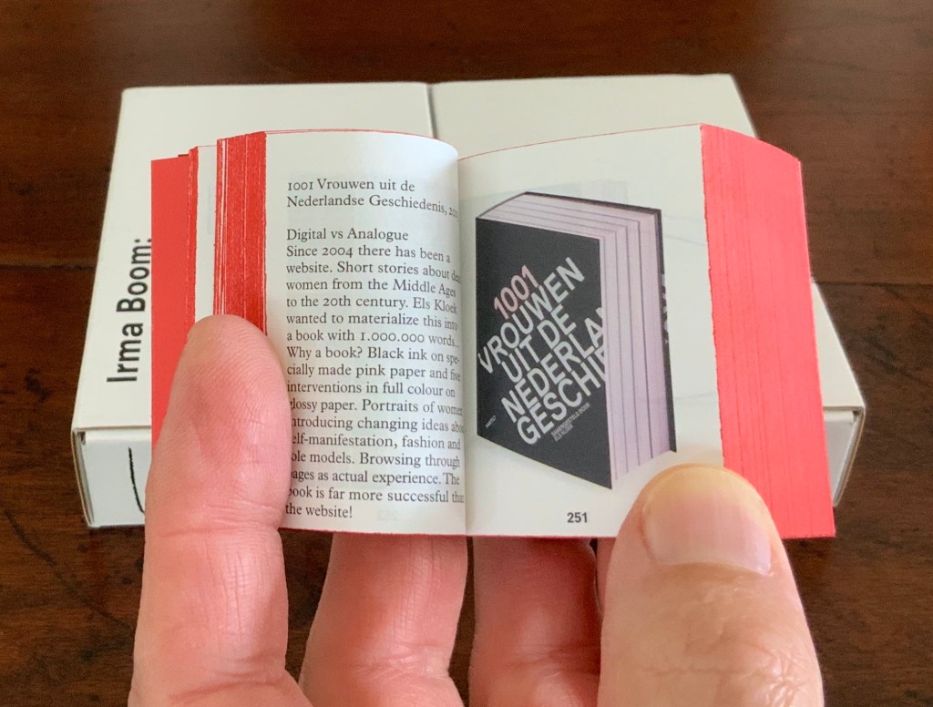
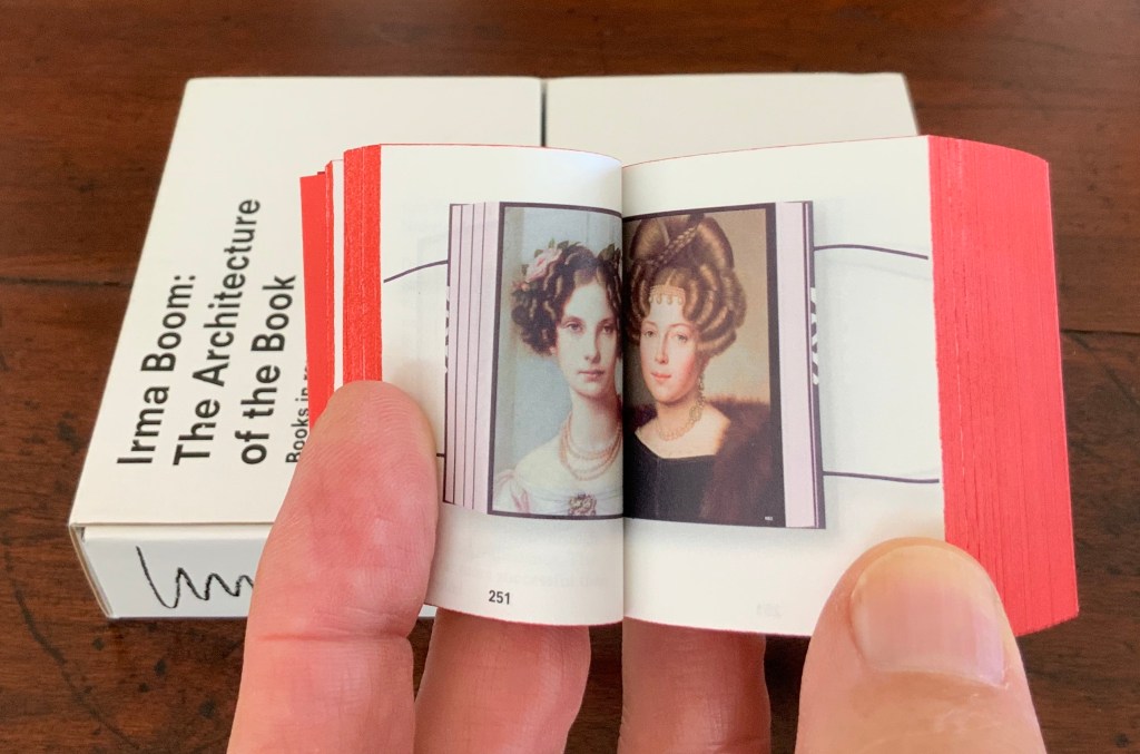
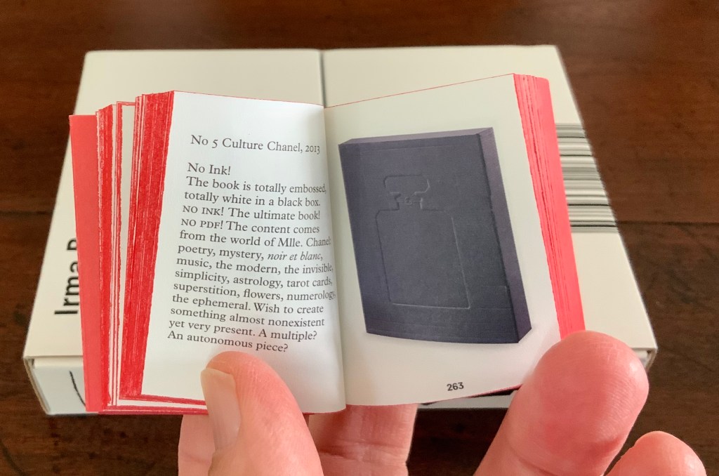
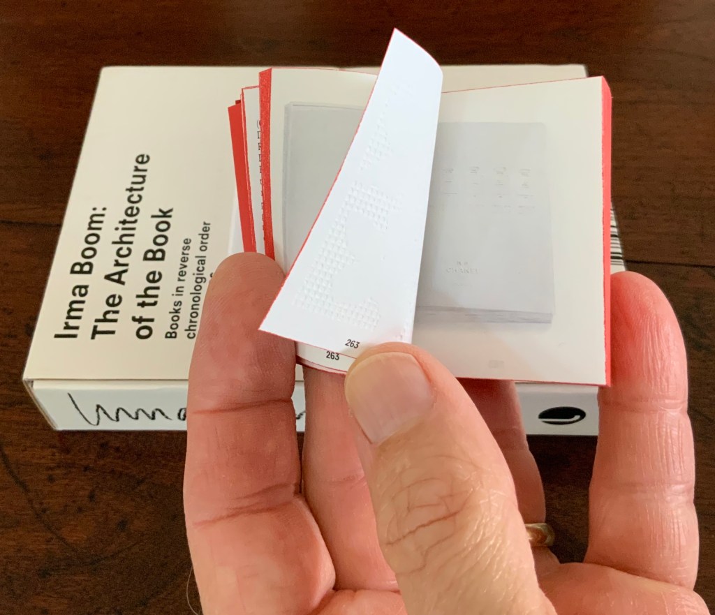
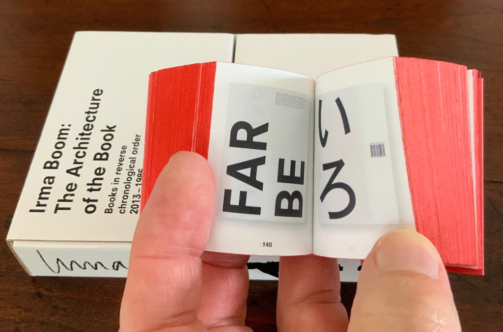
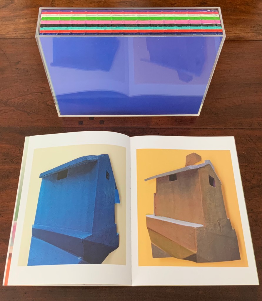
- Irma Boom
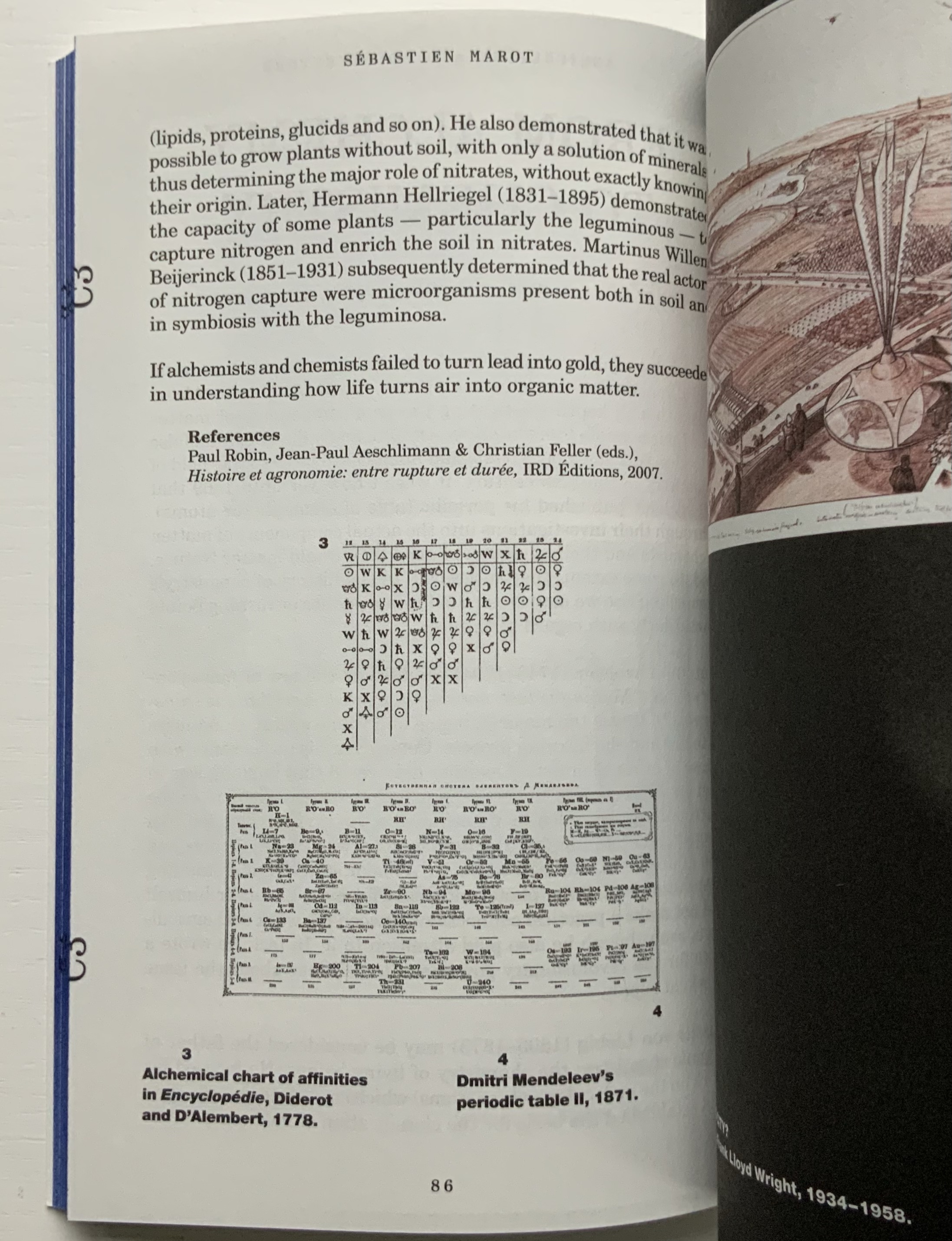
- Ken Botnick
- David Clifford
- Mark Cockram
- Joyce Cutler-Shaw
- Gary Frost
- Klaus Groh & Hermann Havekost
- Daniel E. Kelm
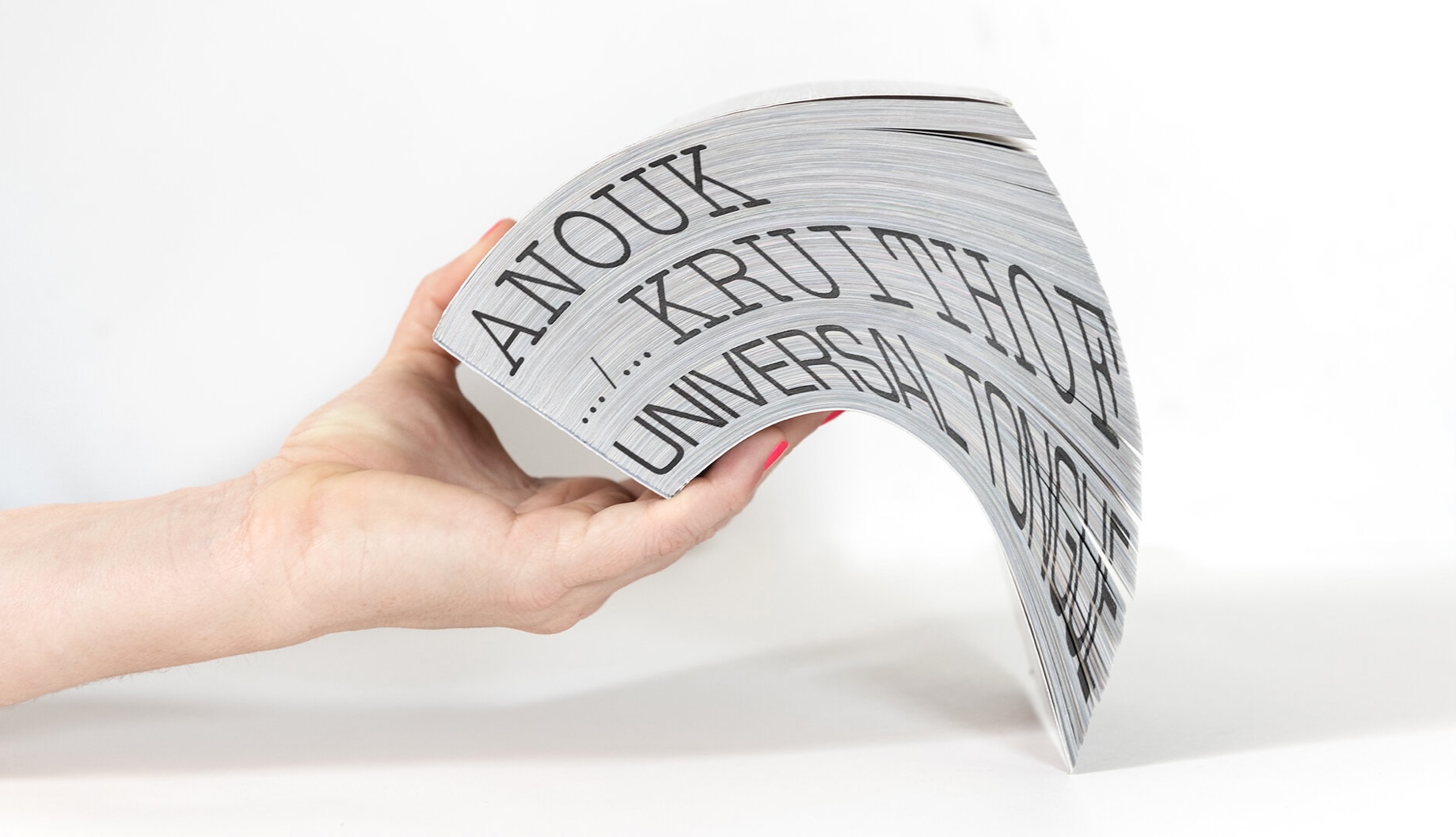
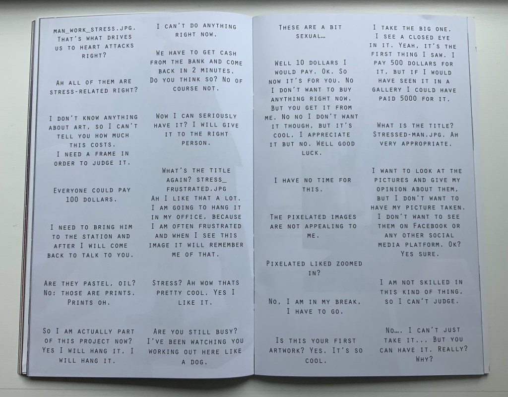
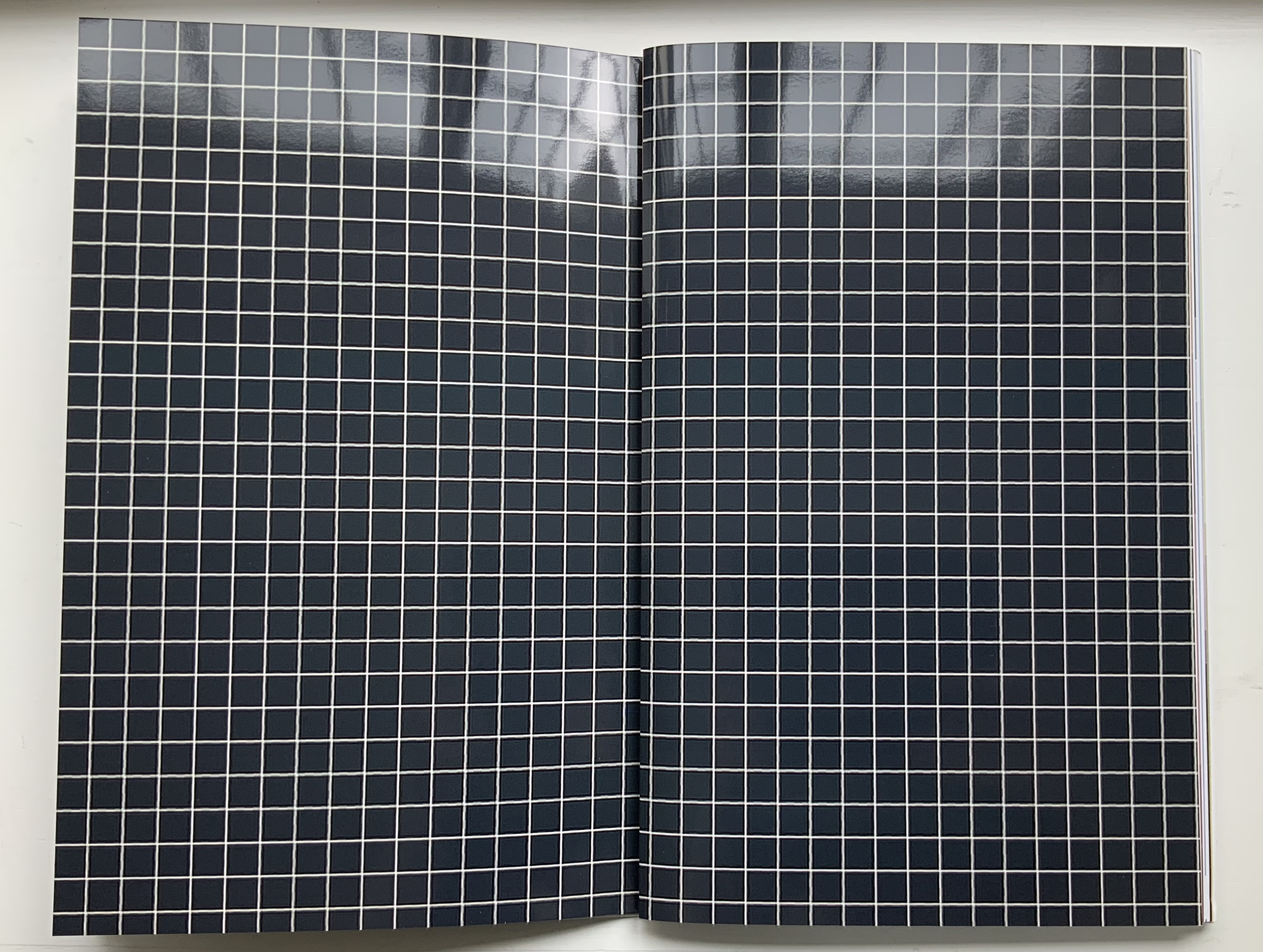
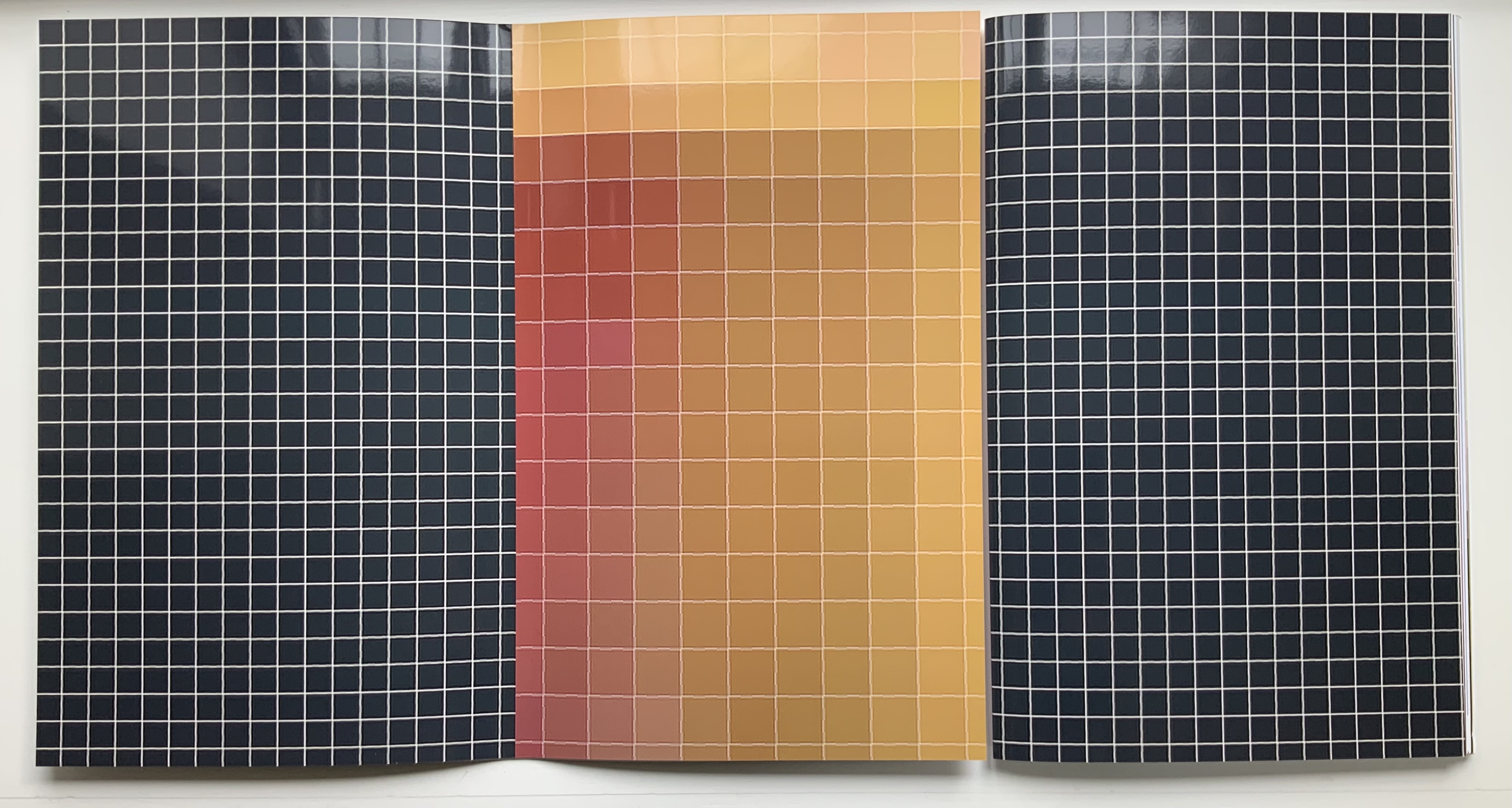
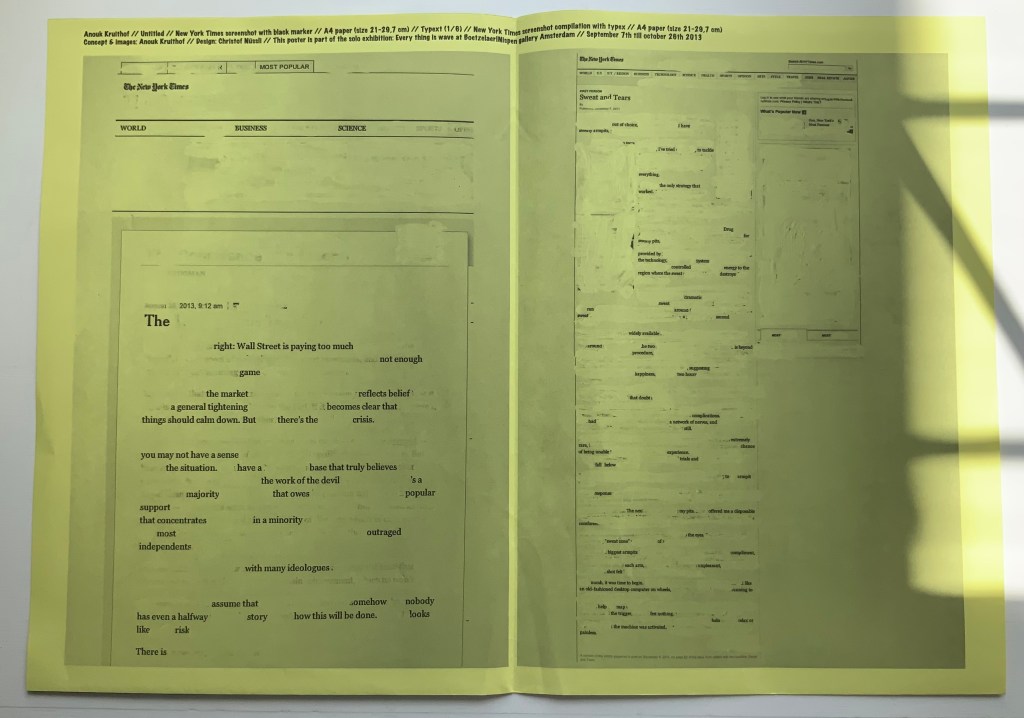
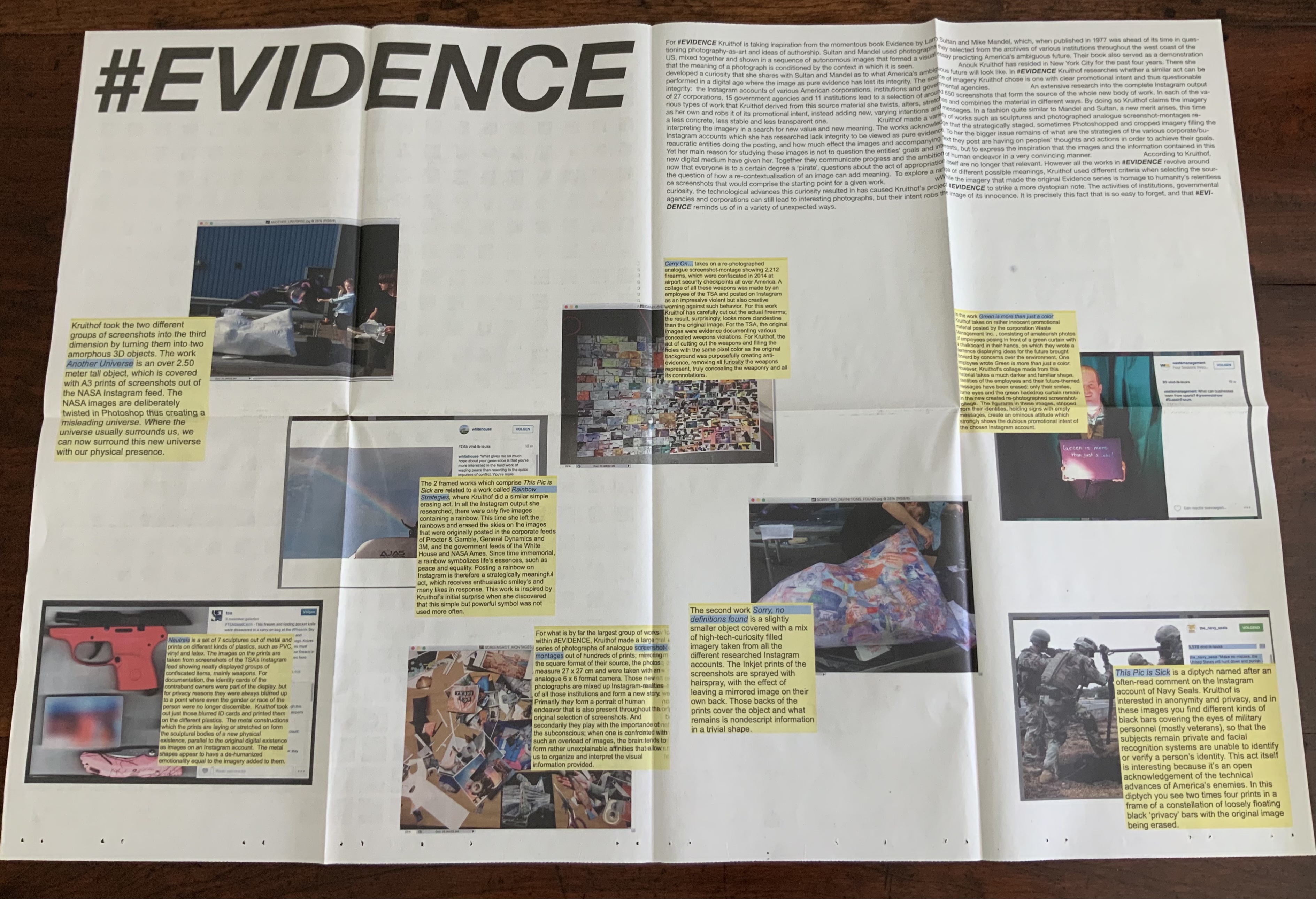
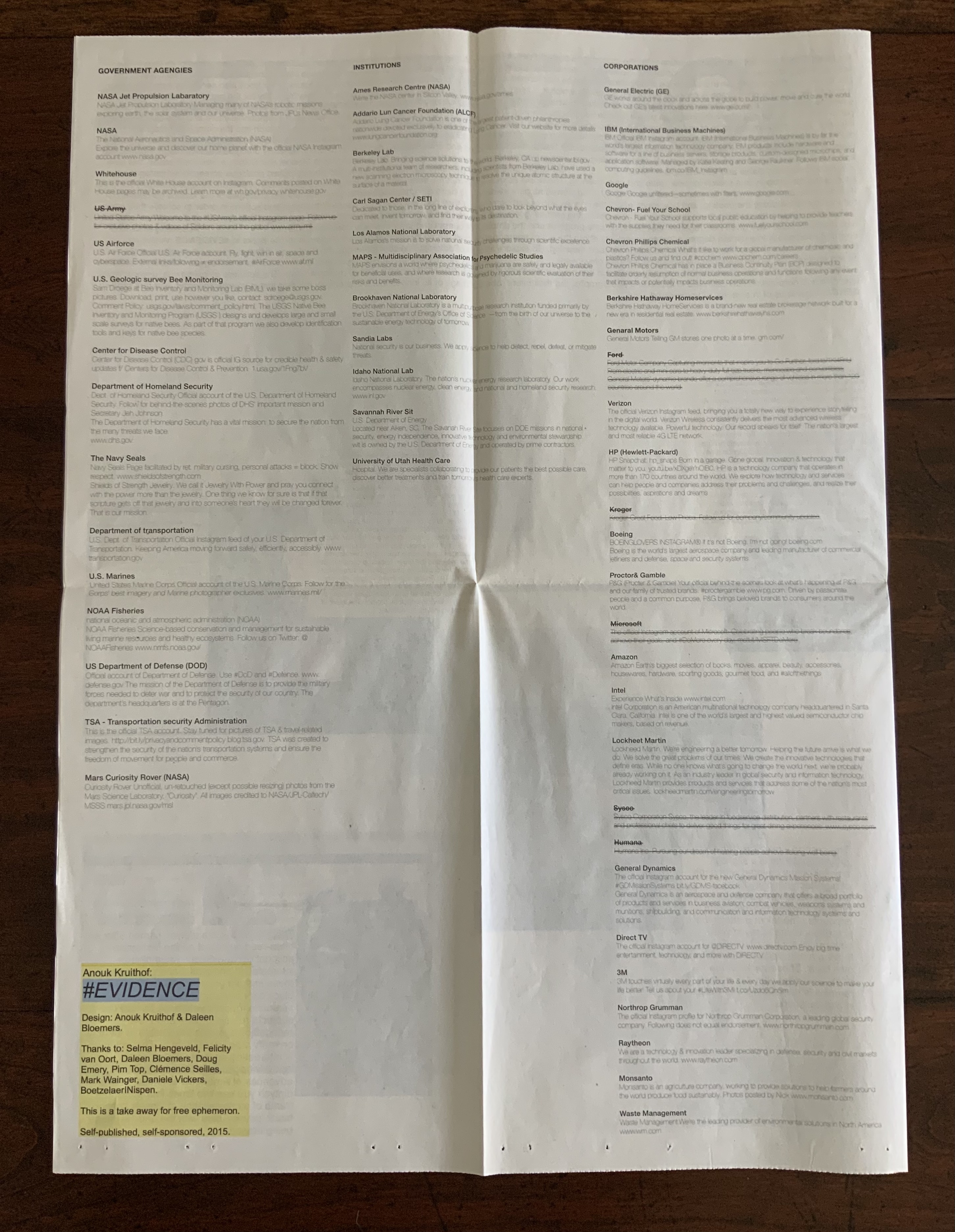
- Anouk Kruithof
- Monique Lallier
- Gaylord Schanilec
- Claire Van Vliet
Compare images in the open windows. Just as Gary Frost’s conservation work shed light on book art, Steere’s descriptions and explanations can lead to a greater appreciation of these artists’ works and others.
Thanks are extended to Paula Steere and The Book & Paper Gathering. Note that the essay is under copyright (©www.thebookandpapergathering.org, 2022) and that any use and/or duplication of this material requires express and written permission from the author Paula Steere and the site The Book & Paper Gathering.
Materials and mechanics for book conservation: Part I. Engineering concepts for spine lining design
Posted on Thursday 9th June, 2022 by thebookandpapergathering. Accessed 13 June 2022.
What stresses occur when we open a book? How do spine materials affect them? What are we really doing when we stick things on a book spine, sand them back, and then stick more things on? On what are we basing these decisions? As a book conservation student, keen to learn, I looked for spine structure information in popular conservation and bookbinding literature, but I found no satisfactory answers to my questions. So I did what I always do when I want to find out how things work: I talked to a mechanical engineer. This article is based on my MA Conservation dissertation research at Camberwell College of Arts, London. I realised early in the research process that I needed the knowledge of an engineer, and conveniently, there happened to be one in my family. Lee McIlvaine lives and works in the United States, has 30 years of mechanical engineering experience and specialises in mechanism and structural design. Five years later, we are still talking about book mechanics.
Spine lining materials are fundamental to the action of a book spine. Yet, a review of over 250 technical statements about book structure, lining materials or lining techniques from historical and contemporary conservation and bookbinding literature1 revealed that many statements are unqualified or unquantified. For example, Middleton (1998) advises that ‘when enough layers [of paper linings] have been applied, the end of the paper is trimmed off’, but he does not specify how many ‘enough’ would be. Technical information can also be contradictory between authors. For example, Szirmai (2001, p. 275) partially attributes the functional longevity of existing gothic bindings to the ‘restrained’ use of adhesive on the spine. However, Douglas Cockerell (1901, p. 152) advocates giving the spine ‘a thick coat of glue’ when lining heavy books. Diehl (1980 Vol. 1, p. 190) states that the hollow back is ‘one of the most commonest [sic] faults of construction’, but does not explain why. On the other hand, Middleton (1963) simply reports the historical use of recessed thongs with a hollow back to enable more throwup; he does not indicate whether this was a good or bad practice. Advice in the literature requires some level of experience to interpret it, and some statements in the literature reviewed are even technically incorrect2, all of which makes the advice unhelpful for learners. I felt an immediate kinship with an anonymous author who wrote in The British Bookmaker that
Vague generalities may always be used by theorists in describing a process of work, and they may suffice for those who know how to do it, and are consequently able to fill in the omissions of the unpractised and merely theoretical exponent of the craft, but for those who desire to learn, or for those who, being practised workmen, desire to extend their knowledge, vague generalities will not suffice. (1892-3, no page)
Clear and reliable information about linings is greatly needed. As Miller (2010, p. 100) rightly points out, ‘linings can sometimes be extremely damaging’. With that in mind, the starting point for my research was the well-known article by Conroy, ‘The Movement of the Book Spine’ (1987), in which he describes a fundamental engineering principle important for bindings – the tension and compression principle.
Mechanics of the book spine
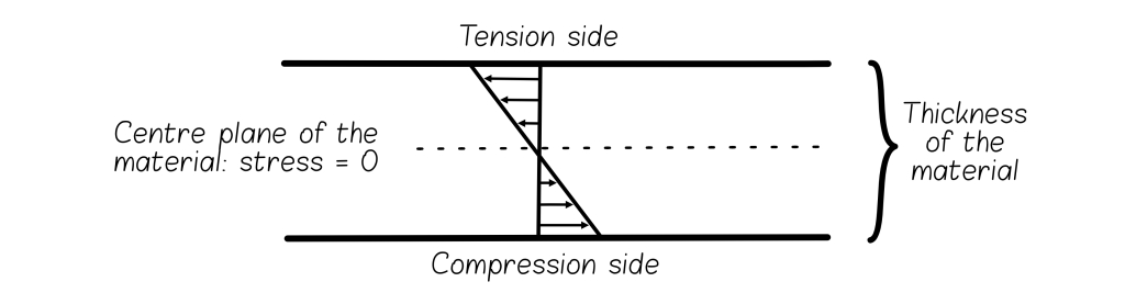
When any material bends, it has a tension side and a compression side (Fig. 1). Material in the tension layer will spread apart, while material in the compression layer will, as the name suggests, compress. This principle applies when a book is opened (Figs. 2, 3). A book spine has a tension and a compression layer. The tension layer consists of the spine folds of the text block (the folded edges of the text sections) and the material adhered directly to them. All materials placed on top of this layer are in compression.
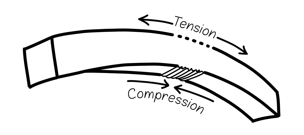
Fig. 1 – The action of a bending object, demonstrating the tension and compression principle. Original drawing by Paula Steere; graphic rendering by The Book & Paper Gathering
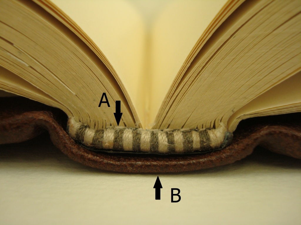
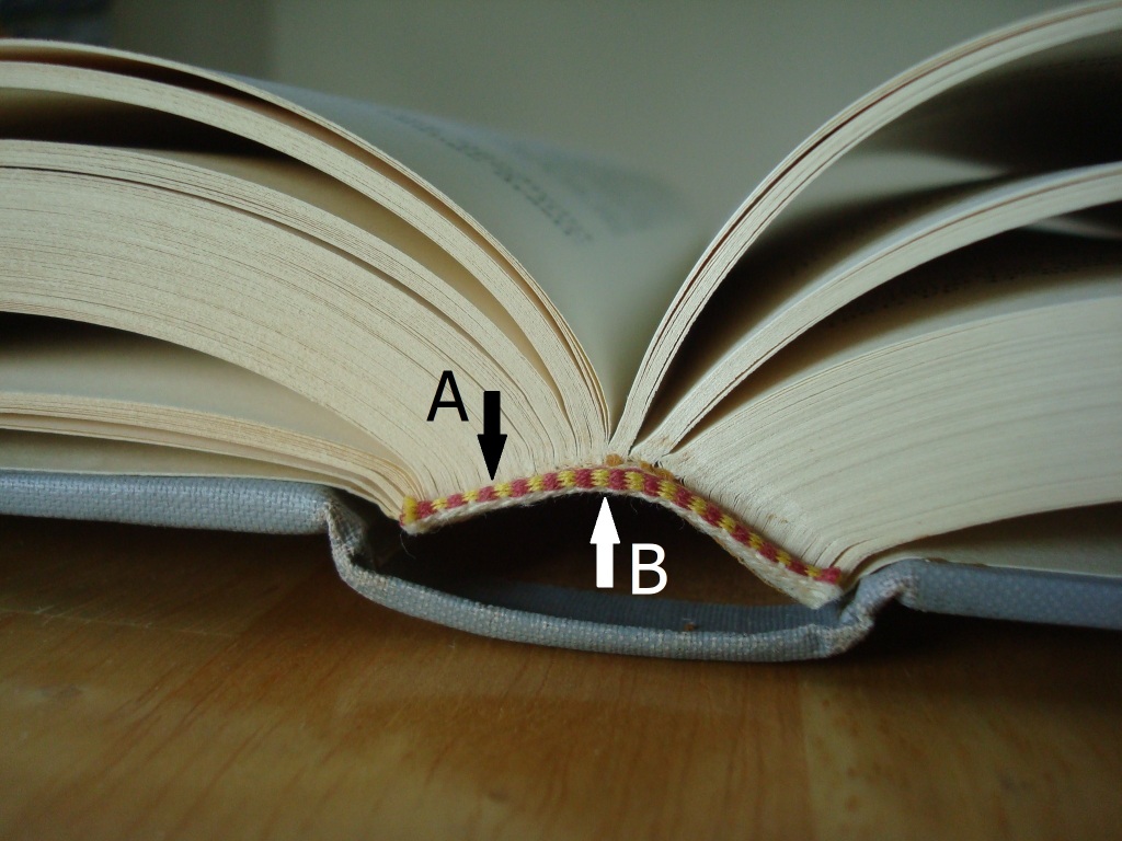
Figs. 2, 3 – Tension (A) and compression (B) layers: the tension and compression principle applies to any open book, regardless of the binding type. Photography by Paula Steere
When a book is opened, the movement at the spine folds is largely imperceptible, but its importance should not be underestimated. Too much movement could contribute to poor opening and structural failure. Each of the spine folds moves with some degree of independence. This localised movement can be thought of as a series of flexible mini-bends (McIlvaine 2017a), as illustrated in Figure 4. These mini-bends have different radii and are affected by adhesives and sewing. (Sewing structure will be discussed in Part II.) They create localised strain (deformation) (Fig. 5), and it is this localised strain that causes the spine to fail.

Fig. 4 – Imperceptible movement of the spine folds in an opened book. Original drawing by Paula Steere; graphic rendering by The Book & Paper Gathering
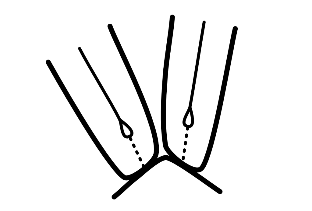
Fig. 5 – Localised bending at each spine fold increases strain. Sewing and adhesives also create non-uniform stiffness; for example, adhesive shrinkage pulls paper down and flattens. Original drawing by Paula Steere; graphic rendering by The Book & Paper Gathering
Linings also move, and these shearing forces contribute to the deformation of the spine folds. The choice of lining materials affects the extent of the deformation. Miller (2010, p. 100) defines linings as a support that allows the spine to flex ‘without the sewn sections parting’. While in reality we cannot eliminate deformation entirely, informed choices can minimise it.
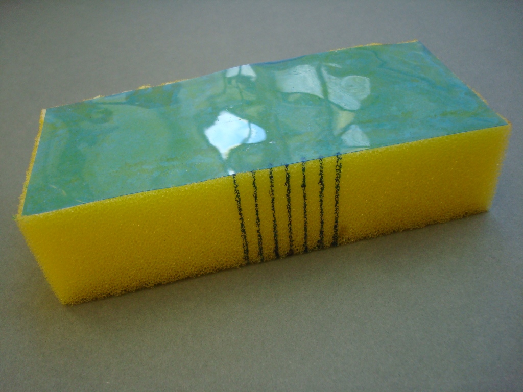
A fundamental aim of spine linings, therefore, is to minimise deformation at the interface between the text block and the first layer (the spine folds and first lining). We can achieve this by minimising the spreading apart (deformation) of the spine folds in the tension layer. Based on principles of mechanical engineering, the first step is to place a stiff and thin first lining against the text block to minimise movement. All subsequent materials, including further linings, adhesive layers and covering material, should ideally be less stiff than this first lining. This is not always an easy task. The model in Figures 6, 7 and 8 shows how adhering a stiff material to a flexible material affects the strain distribution in a composite material. Acetate, a thin and relatively stiff material, is adhered to a sponge (Fig. 6, 7). When the sponge is bent, the stiffness of the acetate minimises movement at the acetate/sponge interface (Fig. 8A). This interface is in the tension layer, and the higher stiffness of this layer drives deformation into the less stiff outer sponge (compression layer), as shown in Figure 8B. This is a simplified model of a book spine, which is also essentially a composite of several materials.
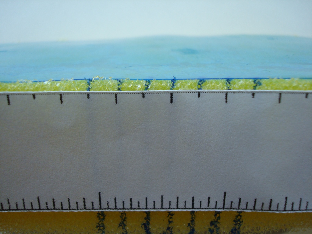
Figs. 6, 7 – A stiff material (acetate) adhered to a less stiff material (a sponge). Photography by Paula Steere
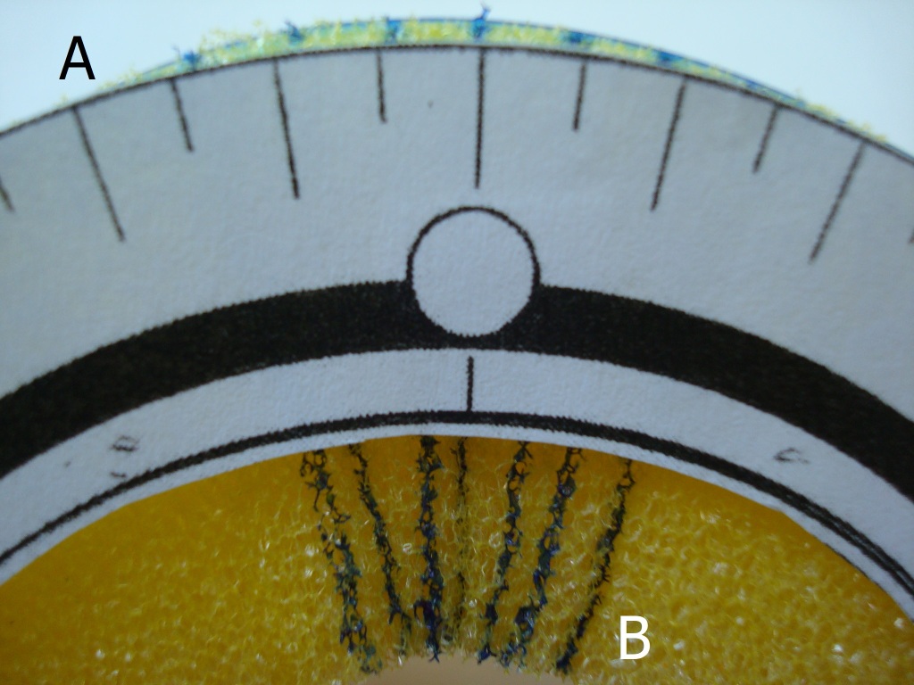
Fig. 8 – The stiffness of the acetate reduces (but does not eliminate) the spreading apart (tension) of the sponge at A. This can be a model of the spine fold – first lining interface. When the tension layer is stiffer, the deformation is driven into the compression layer at B, which represents the exterior book spine and covering material. Photography by Paula Steere
Of course, driving deformation to the outer spine layers could potentially damage the spine leather and tooling of a tight back (Franck 1941, p. 7). We also do not want to prevent movement entirely, as the spine needs to flex to some degree for the book to open well. The required degree of spine stiffness is also affected by other variables, such as the thickness of the sewing supports and type of sewing structure. Nevertheless, the tension and compression principle applies equally to all books and offers tangible criteria on which to base spine lining decisions. However, this is only the first part of the story. We must also understand the performance mechanics of the conservation spine lining materials themselves – paper, linen, cotton and adhesives.
The mechanical properties of spine lining materials determine their use
Research indicates that paper lining materials are not robust enough for book spine linings. In 1708, Zeidler wrote in his book on the philosophy of bookbinding that ‘The French do not care to glue anything on the spine. Some glue only paper strips on, putting everything slovenly over and believing they have come just as far [as putting parchment or linen cloth on neatly and exactly]’3 (p. 78). Szirmai (2001, p. 196) interprets these sentiments by saying that Zeidler ‘castigates’ French bookbinders for using paper linings in gothic books.
Conroy (1987, p. 4) supports the case against placing paper on the spine. He warns that paper is prone to breaking when stretched (due to tension) and buckles easily when compressed. McIlvaine (2017a) concurs, saying that while paper is a stiff material, it is not strong enough and is susceptible to tearing. Any imperfection would propagate easily. Paper has an irregular and random structure, which determines its physical properties (Corte and Kallmes 1961, p. 14–15; see Fig. 9). Its relative weakness could be attributed in part to this formation.
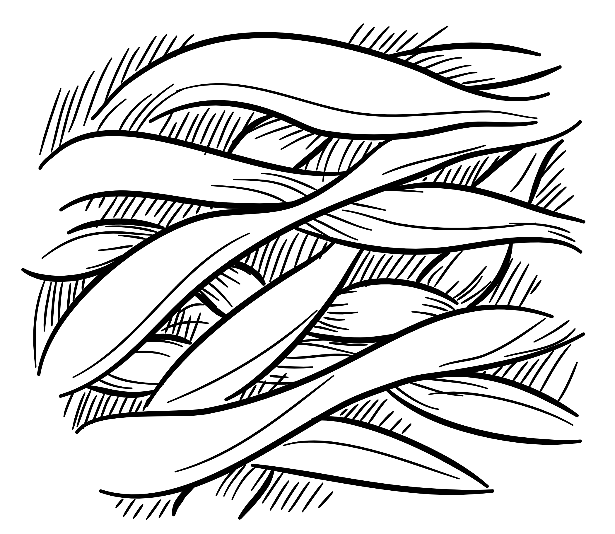
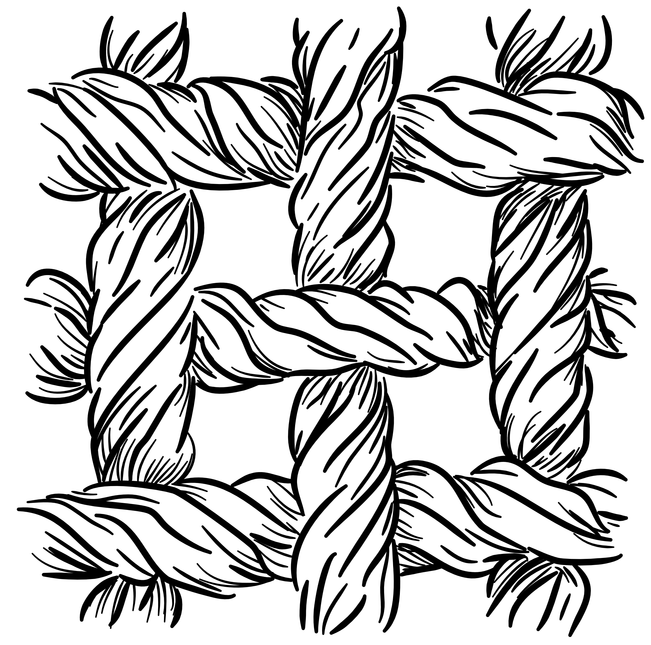
Fig. 9 (left) – Paper consists of randomly arranged separate fibres. Fig. 10 (right) – Fabric consists of twisted, woven and secure threads. Drawings by The Book & Paper Gathering
Fabrics tend to have a stronger base material and structure than paper (Fig. 10). For spine linings, the important properties of fabrics are tenacity (stress at break), extensibility (degree of stretch before breaking) and modulus (resistance to stretch). Tenacity is the term used to describe fibre strength; extensibility contributes to fold endurance; and modulus contributes to stiffness. These properties are determined by the fibre structure of the raw material. Linen is made from the bast stem fibres of Linum usitatissimum. The thick-walled, tube-like cells with small lumens or canals (hollow spaces) (Landi 1998, p. 22) are arranged in bundles, as shown in Figure 11a. Cotton, meanwhile, is made from the seed hair of Gossypium herbaceum and Gossypium hirsutum. Cotton fibres are very different from linen, forming single hollow and flat cells with a large lumen (Landi 1998, p. 21; Fig. 11b).
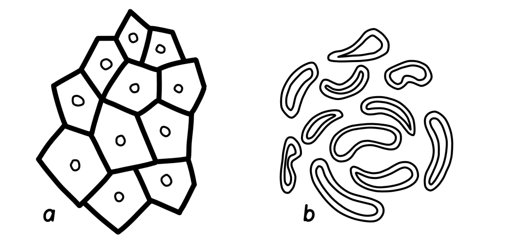
Fig. 11 – a: A cross-section of thick-walled linen cells arranged in bundles. b: Cross-sections of thinner, flatter cotton cells. Original drawing by Paula Steere; graphic rendering by The Book & Paper Gathering
The thick walls and bundle arrangement of linen cells make linen a stiff and strong material. However, the thick cell walls lower its fold endurance and make it prone to breaking when repeatedly folded in the same place (UAL, no date), because thicker walls undergo more strain when bent. This is analogous to bending a piece of cardboard versus a piece of paper – there will be more damage (deformation) to the cardboard because of its thickness. The thicker a material, the stiffer it becomes when bent due to the neutral axis principle (McIlvaine 2017c), illustrated in Figure 12. This principle states that when a material is bent, there is no tension or compression at the centre line, but deformation increases with distance from this central plane.
Linen also has less extensibility than cotton and will break more easily when stretched. Cotton has higher fold endurance than linen due to its structure: thin walls and a large lumen enable it to collapse on itself, reducing thickness locally and decreasing strain when folded (as per the neutral axis principle). These properties have been confirmed with data from fold endurance and mechanical strength tests published in the well-known books Conservation of Leather and Related Materials and The Textile Conservator’s Manual (Tables 1 and 2).

The data in Table 2 shows that linen is, on average, stronger than cotton because of its higher tenacity. Linen also has a much higher initial modulus (resistance to extension) than cotton, making it the stiffer fabric and a good candidate for a thin, stiff first lining. The less stiff cotton is a good second lining because of its higher fold endurance, and can be used to reattach boards if needed (more on that shortly).
In addition to fibre composition, the orientation of the yarns also affects the mechanical properties of fabric that are relevant to this spine lining design. Warp yarns (lengthwise grain, parallel to the selvage edge) stretch less (are stiffer) because they have a higher modulus than weft yarns (crosswise grain, perpendicular to the selvage edge). Warp yarns are more tightly twisted, and hence stronger (Hackler 2006), than weft yarns. They are tightly stretched during the weaving process (The Taunton Press, no date) to allow the more loosely wound weft yarns to be woven between them. I confirmed the higher stiffness of warp yarns by pulling the fabrics the same distance in both directions. Under tension, weft yarns stretched visibly more than warp yarns. Therefore, additional stiffness in the first lining can be gained by positioning the linen with the warp yarns across the spine width, which minimises the spreading apart of the spine folds. It is worth noting that the bias grain direction has been considered the strongest because the most fibres are available; however, in this orientation, the fabric also deforms easily, and therefore, could be susceptible to damage (Fig. 13).
The properties of adhesives should also be considered. Conroy (1987, p. 4) says that an adhesive does not need to be flexible; flexibility is required only if too much adhesive is used. McIlvaine (2017b) further reminds us of the neutral axis principle (Fig. 12) – thin layers of adhesive are desirable because thin materials strain less when bent.
However, the adhesive must still be thick enough to be effective. I carried out adhesion tests on aero linen and aero cotton swatches to find the smallest amount of adhesive that still yielded strong adhesion between the two fabrics. A 1:1 mix of Evacon R and wheat starch paste (1:3 wheat starch to water v/v) was used for additional strength. A thin, medium and thick layer of adhesive was applied with a brush to clear acetate to serve as a quantity guide. The adhesive was then applied by brush to both cotton and linen swatches to be adhered together. The linen was positioned on the cotton swatches so that both the warp and weft orientations were tested in the direction of the shearing force. The cotton was not used in the bias direction. The fabrics were pressed with a bone folder and air-dried for a minimum of two hours (Fig. 14). There was no adhesive failure or obvious strength difference between the thin, medium and thick coats of adhesive mix when pulling them apart with my hands under maximum manual shearing force (Fig. 15). Therefore, the thinnest coat of adhesive could safely be used to minimise deformation and cumulative stiffness without compromising adhesion strength.
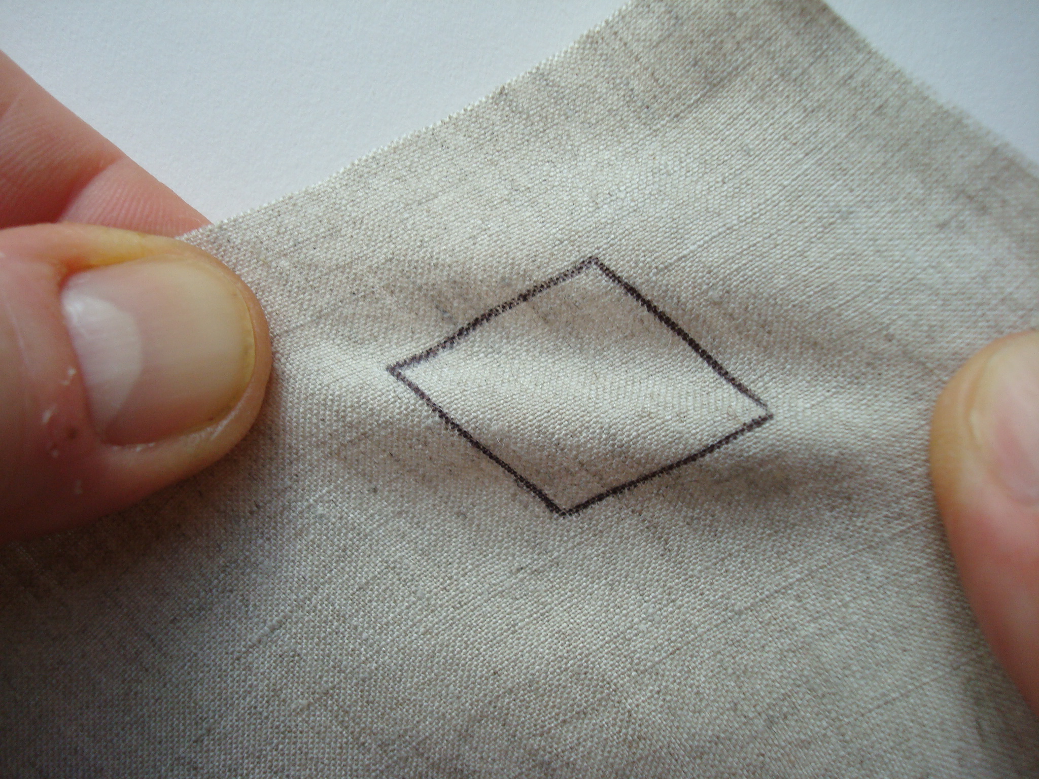
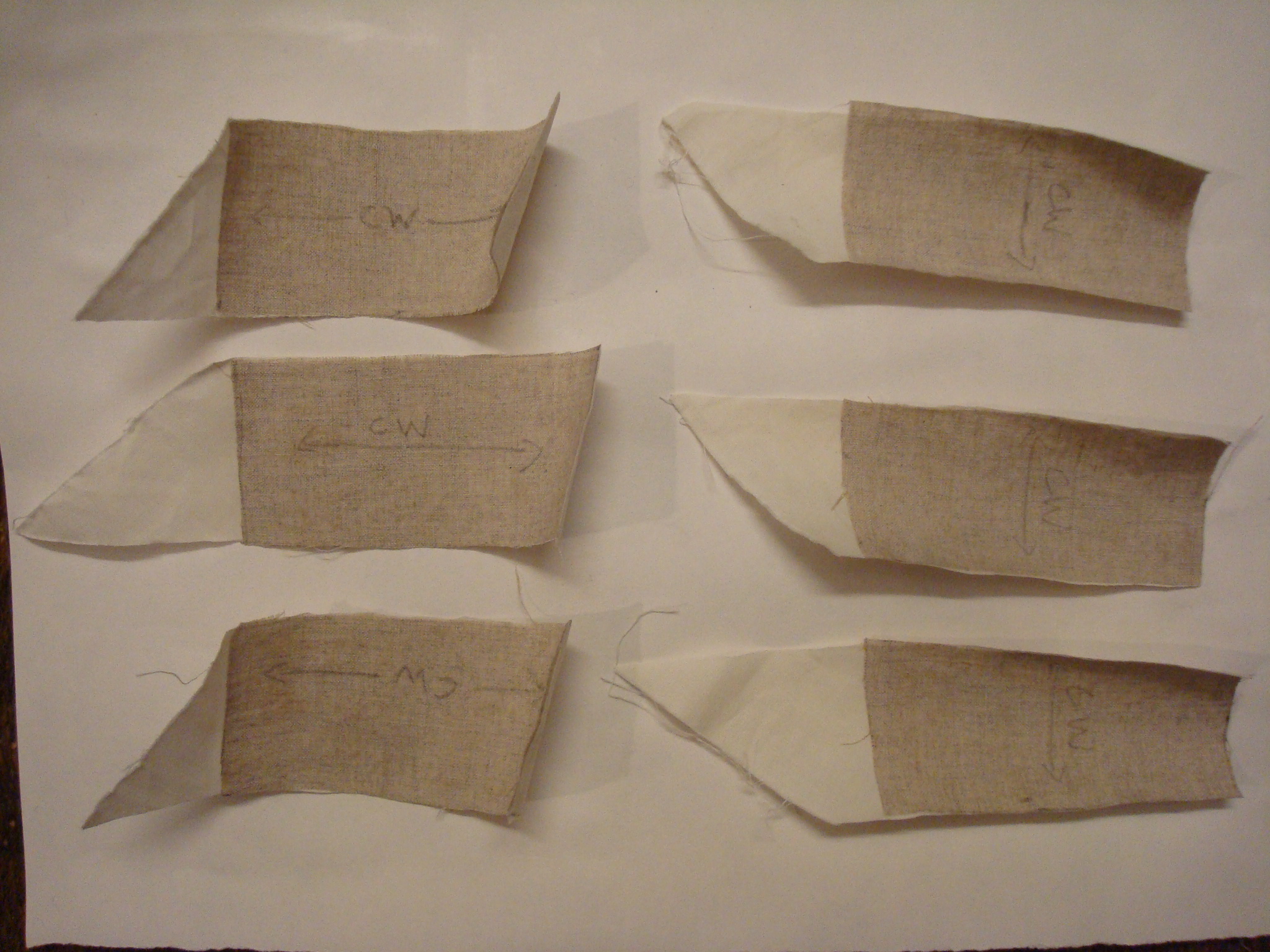
Fig. 13 (left) – Bias grain under tension deforms easily. Fig. 14 (right) – Lining design adhesion test swatches: linen and cotton adhered together with thin, medium and thick layers of adhesive. Pencil arrows show the weft (crosswise) direction. Photography by Paula Steere
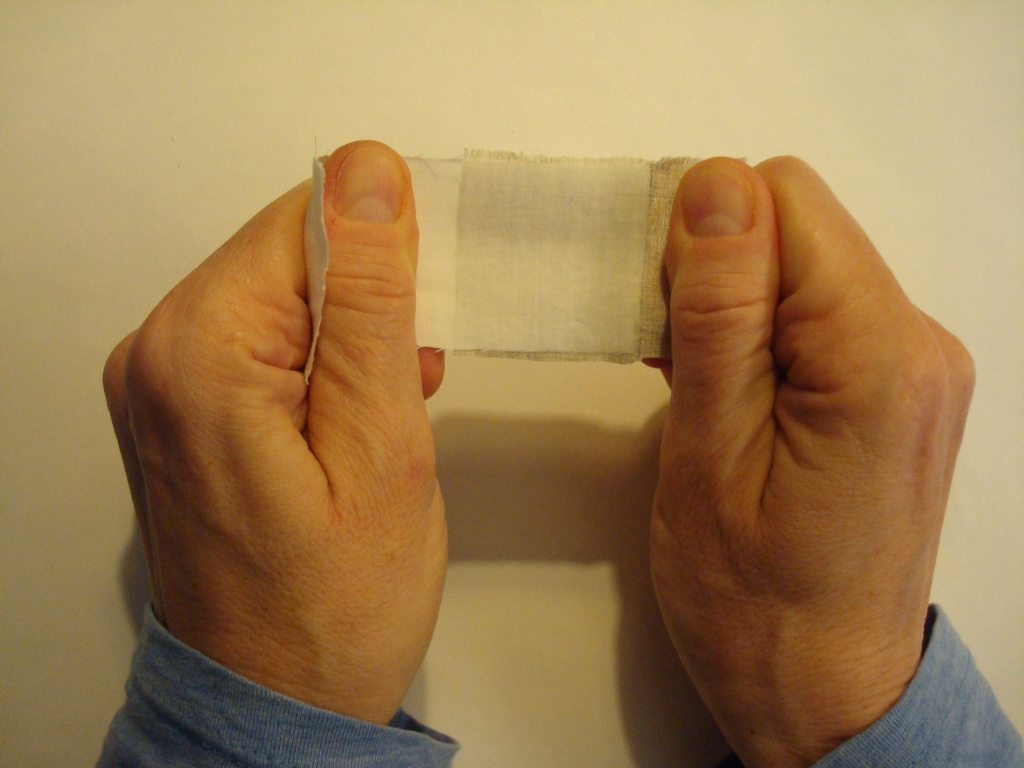
Fig. 15 – Manual adhesive strength test: pulling fabrics to mimic shearing forces experienced by spine linings when a book is opened. Photography by Paula Steere
Putting the principles into practice: spine lining design
To review, for optimum functionality and durability, spine linings should minimise deformation at the interface between the spine folds and first lining material. We can achieve this by placing a stiff and thin first lining against the text block to minimise movement and keep the spine folds from spreading apart. All subsequent materials, including further linings, adhesives and covering material, should ideally be less stiff than this first lining.
For the spine lining design based on this research, aero linen should be used as the first lining, with the stronger, stiffer warp yarns placed across the spine width from shoulder to shoulder (Figs. 16, 17). Thinner, less stiff aero cotton, with its greater fold endurance, should be used as a second lining to reattach the boards. (If the boards are still attached, a second lining may not be necessary at all.) To minimise cumulative stiffness in the outer (compression) layer, positioning cotton in the bias direction could be a good choice, since this is the least stiff of the yarn orientations. Additionally, all subsequent linings, such as the paper used to smooth an uneven tight back spine, should be kept to an absolute minimum, with thin adhesive layers throughout. For heavy text blocks, I use WSP and ethyl vinyl acetate (EVA) mix (1:1) to adhere the linen to the spine folds, and I use wheat starch paste alone, without EVA, for materials in the compression layer (to reduce cumulative stiffness). For standard-sized books that are not very heavy, I use wheat starch paste on its own throughout the process; however, I have not tested swatches of wheat starch paste without EVA.
When adding more linings after the linen (and cotton, if reattaching boards), check opening characteristics after each lining has dried thoroughly. Paper linings can be omitted altogether in some instances; for example, if the tight back spine is even, in a case binding, or in a situation where throwup does not require additional control. Keep in mind the engineering principles discussed in this article when deciding on the number of additional linings and the choice of lining material: the compression layer (everything after the first linen lining) should ideally be less stiff than the tension layer. Thinly pared leather, discussed below, can be used instead of paper for additional linings to reduce stiffness.

Fig. 16 – Spine lining design based on the tension and compression engineering principle and the mechanical properties of spine lining materials. Original drawing by Paula Steere; graphic rendering by The Book & Paper Gathering

The quarter leather tight back in Figure 18 has a heavy parchment text block, and I wanted to experiment with traditional leather linings because the mechanical properties of leather are excellent for the compression layer of my spine lining design: it is strong, but not stiff, because of the structure of its main component, the protein collagen. The linings in this image are made of thinly pared leather. I have used a graduated lining technique, which I was delighted to discover during my research, to further minimise stiffness in the compression layer. The graduated lining structure is attributed to Francis Bedford, a nineteenth-century bookbinder acclaimed for the ‘even strain’ (Anonymous author 1893, p. 58) of his bindings. The rationale for the graduated lining structure is that the stiffness needed for a book to open well at any given place varies. The centre of the spine takes the greatest strain and should be the stiffest, while less stiffness is required near the beginning and end sections of the text block (McIlvaine 2017b). Subsequent linings after the first one are ‘a little further in’ (Anonymous author 1893, p. 58), stopping a little short of the shoulders, as illustrated in Figure 18.
I also adapted the graduated lining technique to the leather covering material to reduce overall stiffness. The leather over the centre spine folds is thicker than that over the beginning and end spine folds. This was achieved through tapered paring, as shown in Figures 19 and 20. A comparison of opening characteristics before and after treatment can be seen in Figures 21 and 22.


In conclusion, exploring the forces present in a book spine and the mechanical properties of familiar book conservation materials has helped me to overcome the ‘vague generalities’ found in the literature. Understanding mechanics and materials enables the conservator to take advantage of engineering concepts that offer tangible criteria on which to base spine lining decisions. I discovered several hidden gems along the way, such as Zeidler’s ire, Bedford’s famed workshop, and, of course, that anonymous kindred spirit from The British Bookmaker for whom vague generalities would not suffice.
Special thanks to my colleagues at the College of Arms, Becky Tabram and Christopher Harvey, head of conservation, who encouraged and allowed me to explore these ideas while I was a conservator there. Their experience and knowledge of books and our ongoing conversations and practical experiments in the workshop were invaluable.
Footnotes
1. I reviewed approximately 36 books and articles, spanning the years 1658 (in a 1977 translation) to 2017.
2. Technical statements in the literature were cross-referenced with a mechanical engineer, Lee McILvaine, for scientific accuracy. This research document is available upon request.
3. Translation by Isana Skeete (2017). No published English translation of this book could be found.
Bibliography
Anonymous author (1892–3) ‘Editorial’, The British Bookmaker, 6, no page number.
Anonymous author (1893) ‘On forwarding’, The British Bookmaker, 7(75), p. 58.
Cockerell, D. (1901) Bookbinding: The classic Arts and Crafts manual. New York: Dover Publications.
Conroy, T. (1987) ‘The movement of the book spine’, The Book and Paper Group Annual, 6, pp. 1–22.
Corte, H. and Kallmes, O.J. (1961) Statistical geometry of a fibrous network. New York: Regis Paper Company.
Diehl, E. (1980) Bookbinding: Its background and technique (2 vols). Rev. edn. New York: Dover Publications.
Franck, P. (1941) A lost link in the technique of bookbinding and how I found it. Gaylordsville, Connecticut: The author.
Hackler, N. (2006) Understanding fabric grain. Rev. edn. Gainesville: University of Florida.
Landi, S. (1998) The textile conservator’s manual. Butterworth-Heinemann: Oxford.
McIlvaine, L. (2017a) Email to Paula Steere, 8 April.
McIlvaine, L. (2017b) Conversation with Paula Steere, 13 April.
McIlvaine, L. (2017c) Email to Paula Steere, 26 April.
Middleton, B.C. (1963) A history of English craft bookbinding technique. Hafner Publishing: London.
Middleton, B.C. (1998) The restoration of leather bindings. Rev. Ed. Delaware, London: Oak Knoll Press, The British Library.
Miller, J. (2010) Books will speak plain – A handbook for identifying and describing historical bindings. Michigan: Legacy Press.
Silverman, R., Cains, A., Ruzika, G., Zyats, P., Reidell, S., Primanis, O., Puglia, A., Anderson, P., Etherington, D., Minter, B., Brock, D., Zimmern, F. (2006) ‘Conservation of leather bookbindings: a mosaic of contemporary techniques’, in Kite, M. and Thomson, R. Conservation of leather and related materials. Oxford: Butterworth-Heinemann, pp. 225–243.
Skeete, I. (2017) Translation of passage in Zeidler, J. (1708), 17 May.
Szirmai, J.A. (2001) The archaeology of medieval bookbinding. Burlington, Vermont: Ashgate.
The Taunton Press (no date) ‘Grainline’. Available at: http://www.taunton.com/threads/pdf/grainline.pdf (Accessed: 16 April 2017).
University of the Arts London (no date) Sustainable fibres and fabrics: the first steps towards considered design. Available at: http://sff.arts.ac.uk/Fibre%20Introduction/linenintro.html (Accessed: 5 February 2017).
Zeidler, J.G. (1708) Buchbinder-Philosophie oder Einleitung in die Buchbinder-Kunst. Hall im Magdeburgschen: in Rengerischer Buchhandlung.
Paula Steere has an education background and was head of Art and Design in a secondary school in London before retraining in book and archival conservation at Camberwell College of Arts from 2015 to 2017. She has worked at the College of Arms, the Wellcome Collection, the Senate House Library, the London College of Fashion Archive, the Victoria and Albert Museum and UCL Special Collections. Currently she is a preventive conservator, volunteer coordinator and grant writer at the Hershey History Centre, a nonprofit museum in Pennsylvania, US. She is also a book conservator in private practice.