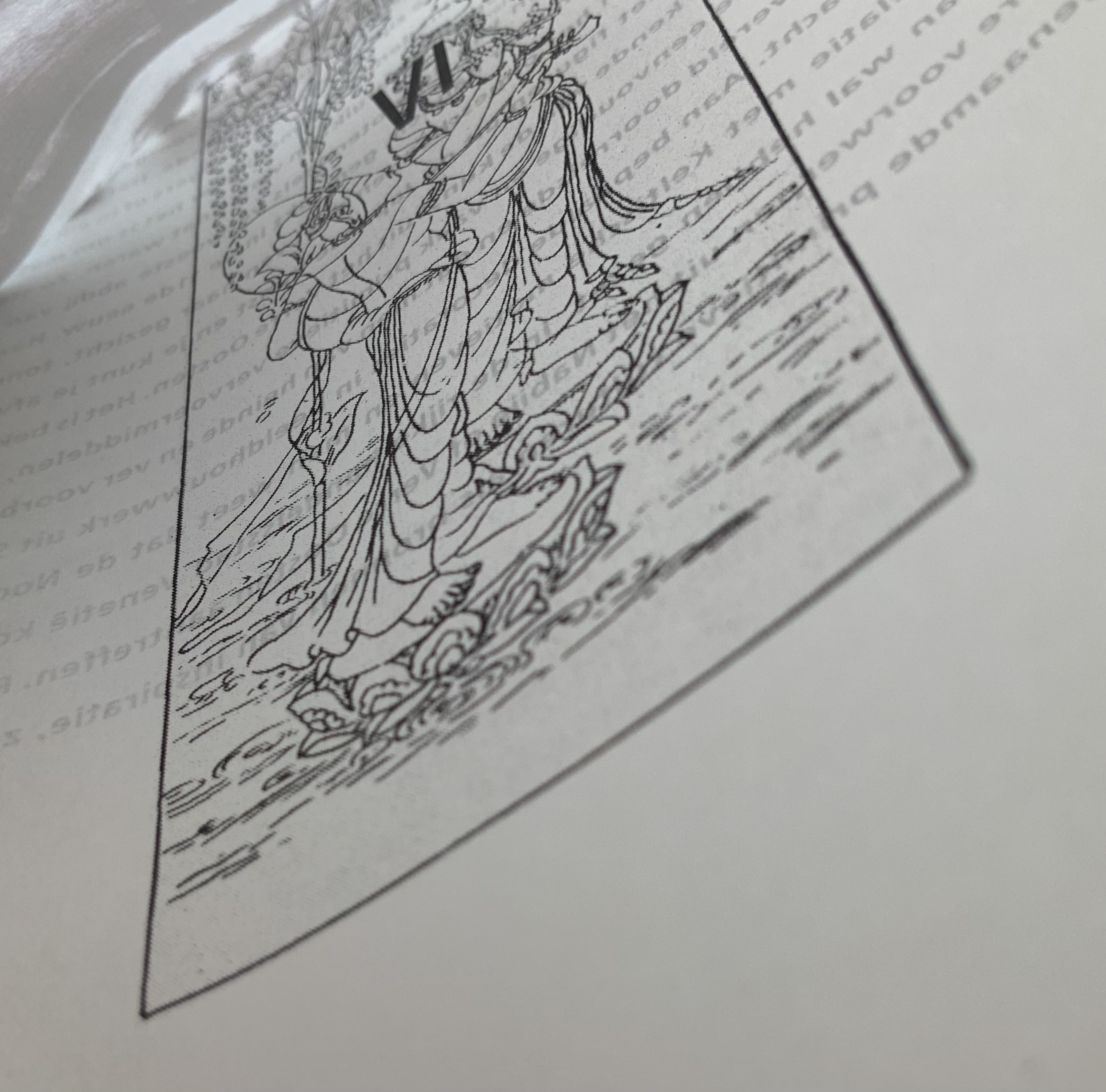
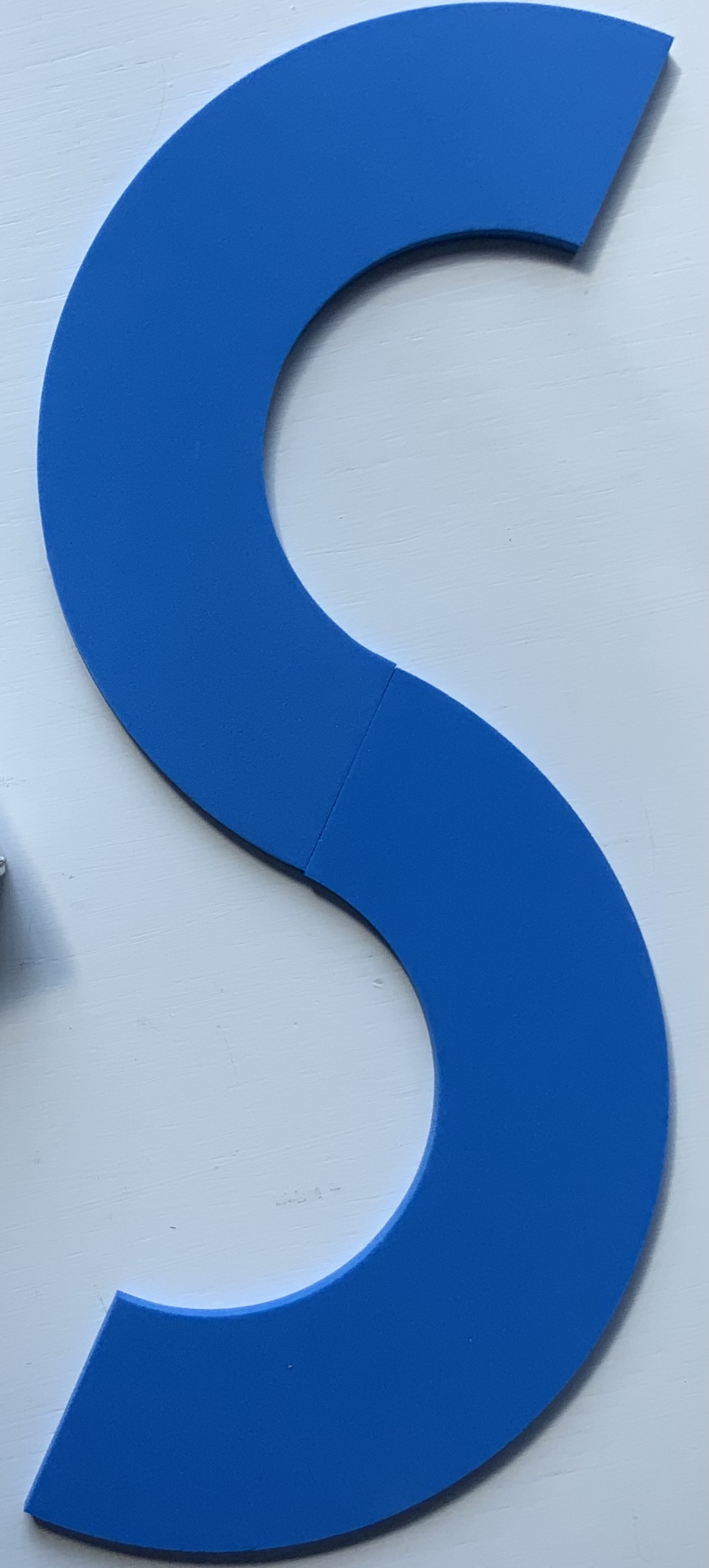
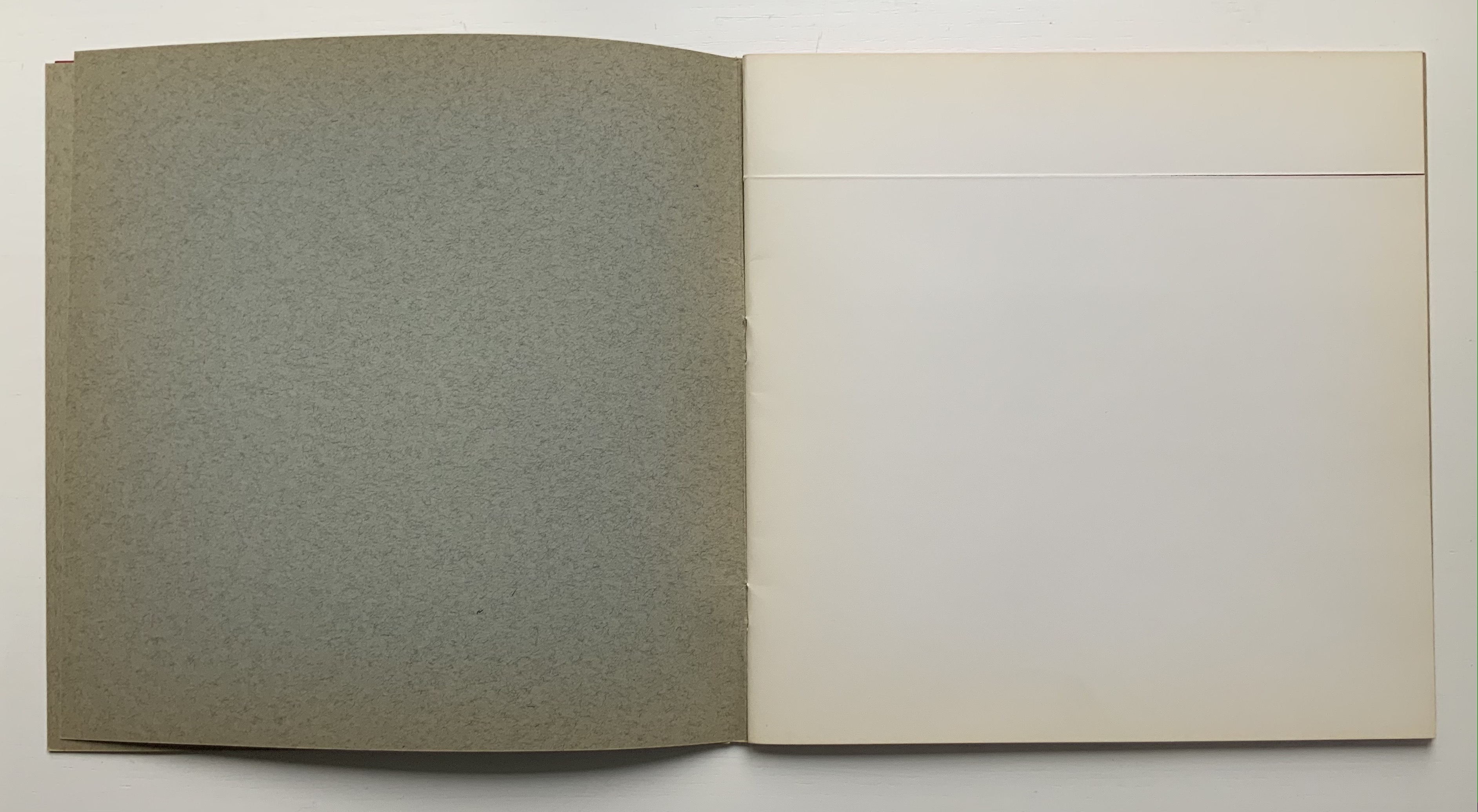
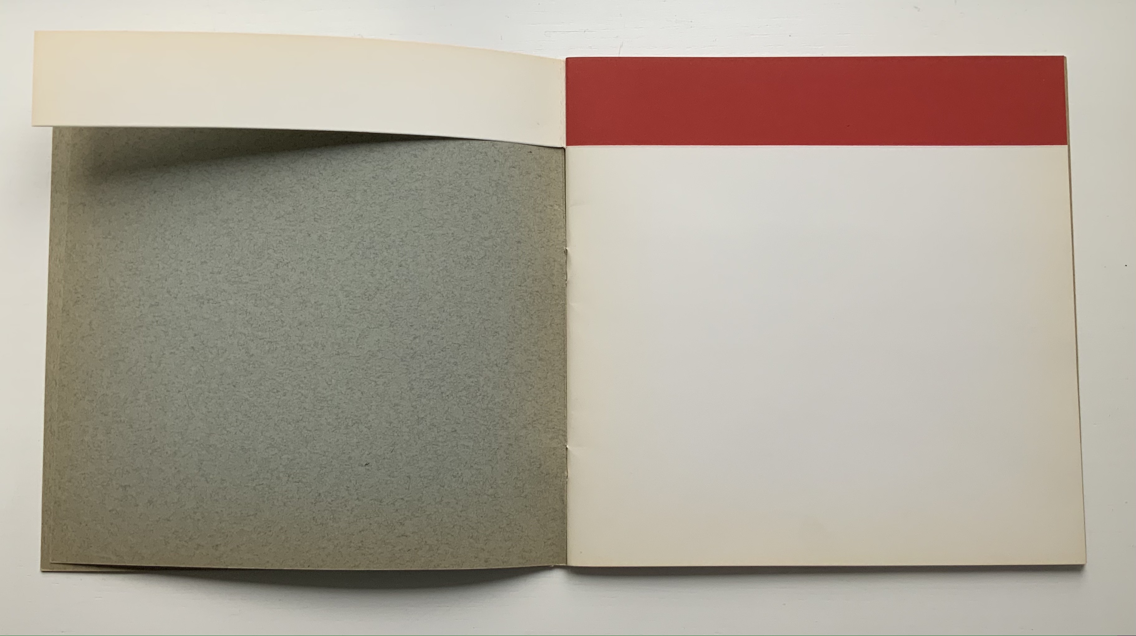
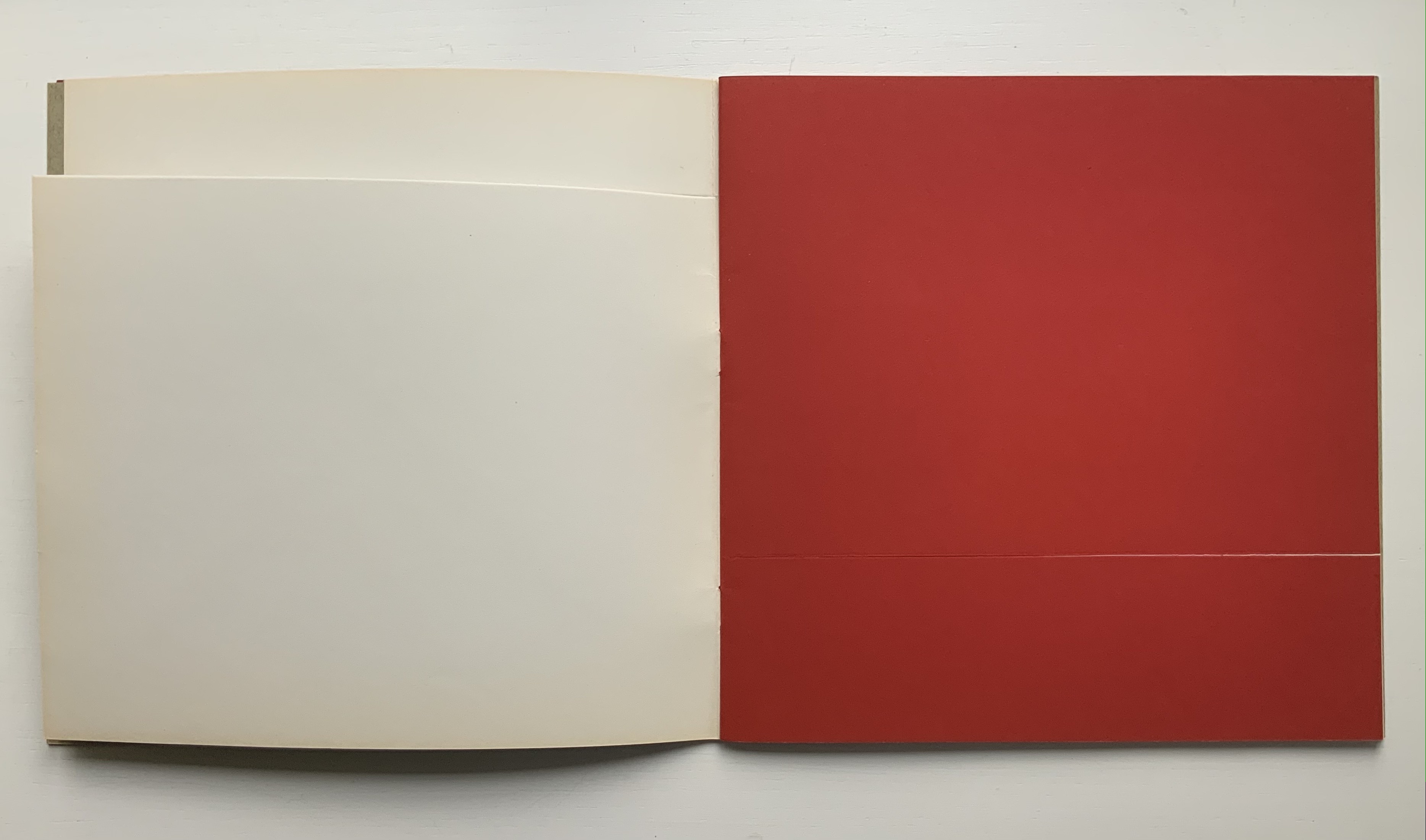
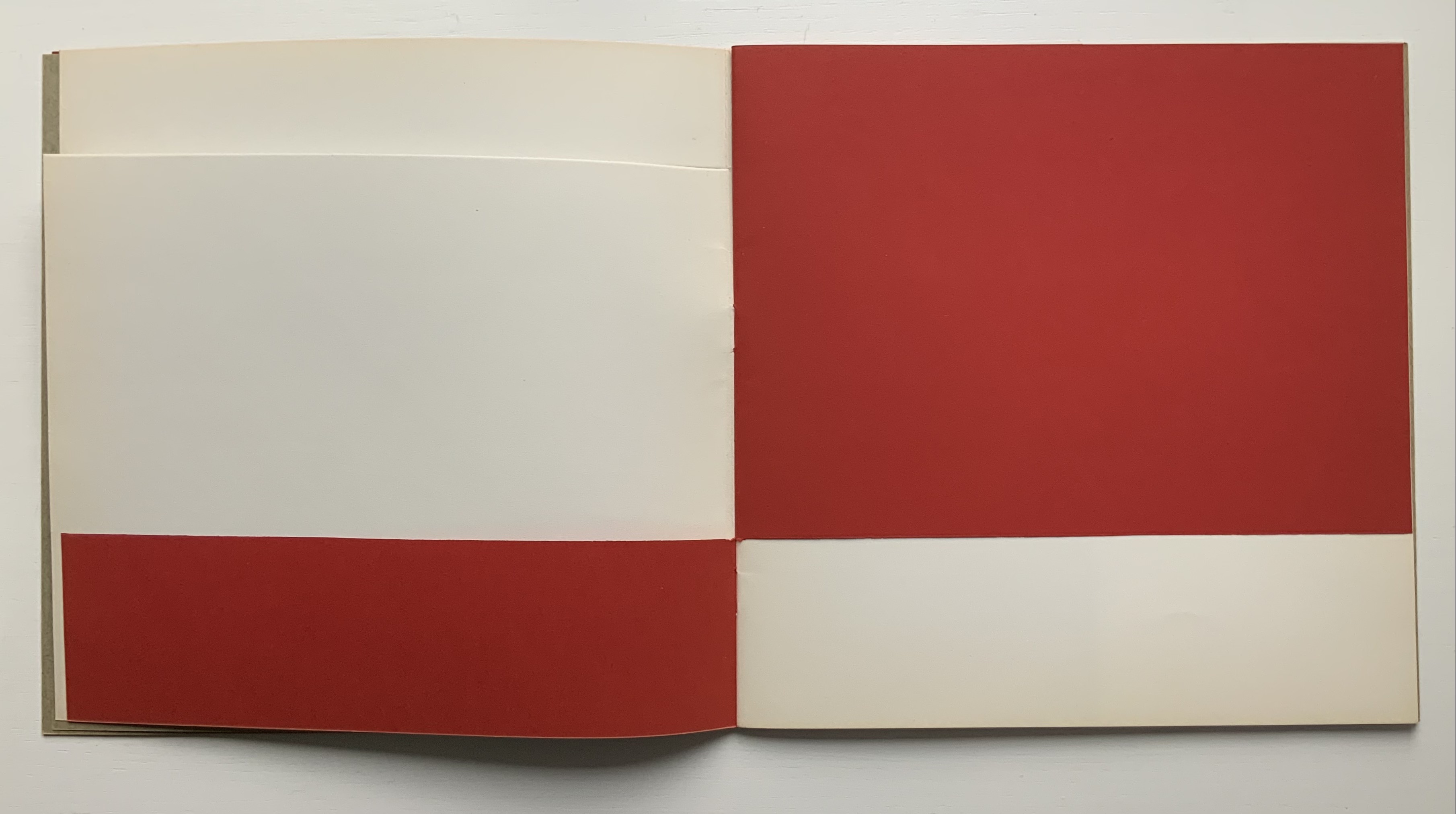
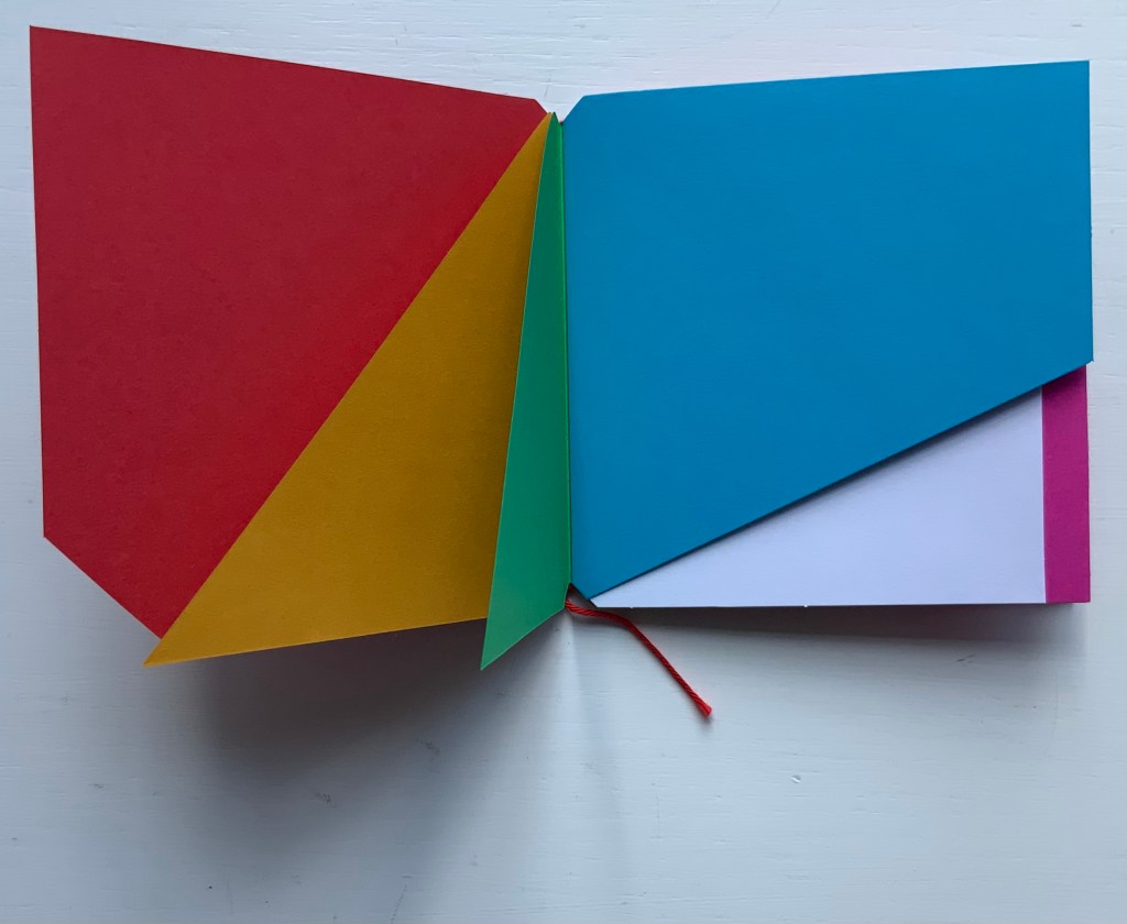
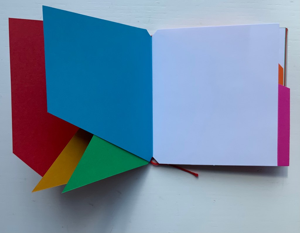
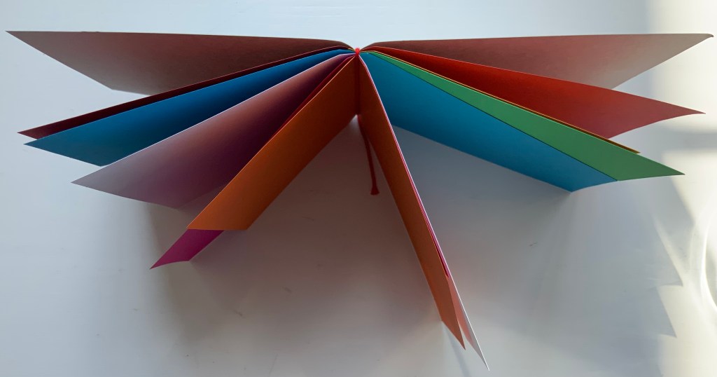
Letters(1971) Abe Kuipers Self-covered set of folios. H257 x W190 closed, W380 open. 8 folios. Edition of 80. Acquired from Bubb Kuypers Auction, 22 November 2022.
In the late 1960s and early ’70s, Pieter Brattinga‘s 250×250 mm Kwadraat Blad series championed the innovative typographic designs of Wim Crouwel, Gerard Unger, Timothy Epps and Christopher Evans. Theirs were radical explorations of the letterform. Even “bad boy” Anthon Beeke‘s cheeky Alphabet was based on the Baskerville typeface — at least as far as the nude female models could be posed to approximate it. At the same time, further north in The Netherlands, Abe Kuipers was pursuing a very different kind of offbeat presentation of the alphabet.
As far back as the ’40s and ’50s, Kuipers had been interested in the alphabet’s origins. In 1951, he had organized the Fifty Years of ABC for the Prinsenhof in Groningen and years later published a book based on it with Wolters-Noordhoff (Groningen). In 1971, drawing on that activity, he participated in the “Létteretét projekt”, aimed at educating the people of Groningen about letters and their origins. Like the enterprise and its manifestations, the name Létteretét is an offbeat construction. Office rooms in high rises were lit to form letters at night. A poster illustrating the origin of letters (and promoting his 1968 book) was posted on billboards, in shop windows and in schools and libraries.
Image removed. Fair use not accepted.
The bottom right corner panel reads: this history of the letter was written and drawn by abe kuipers in may 1971. printed in silkscreen by De Ark this print is part of the Létteretét project in Groningen.
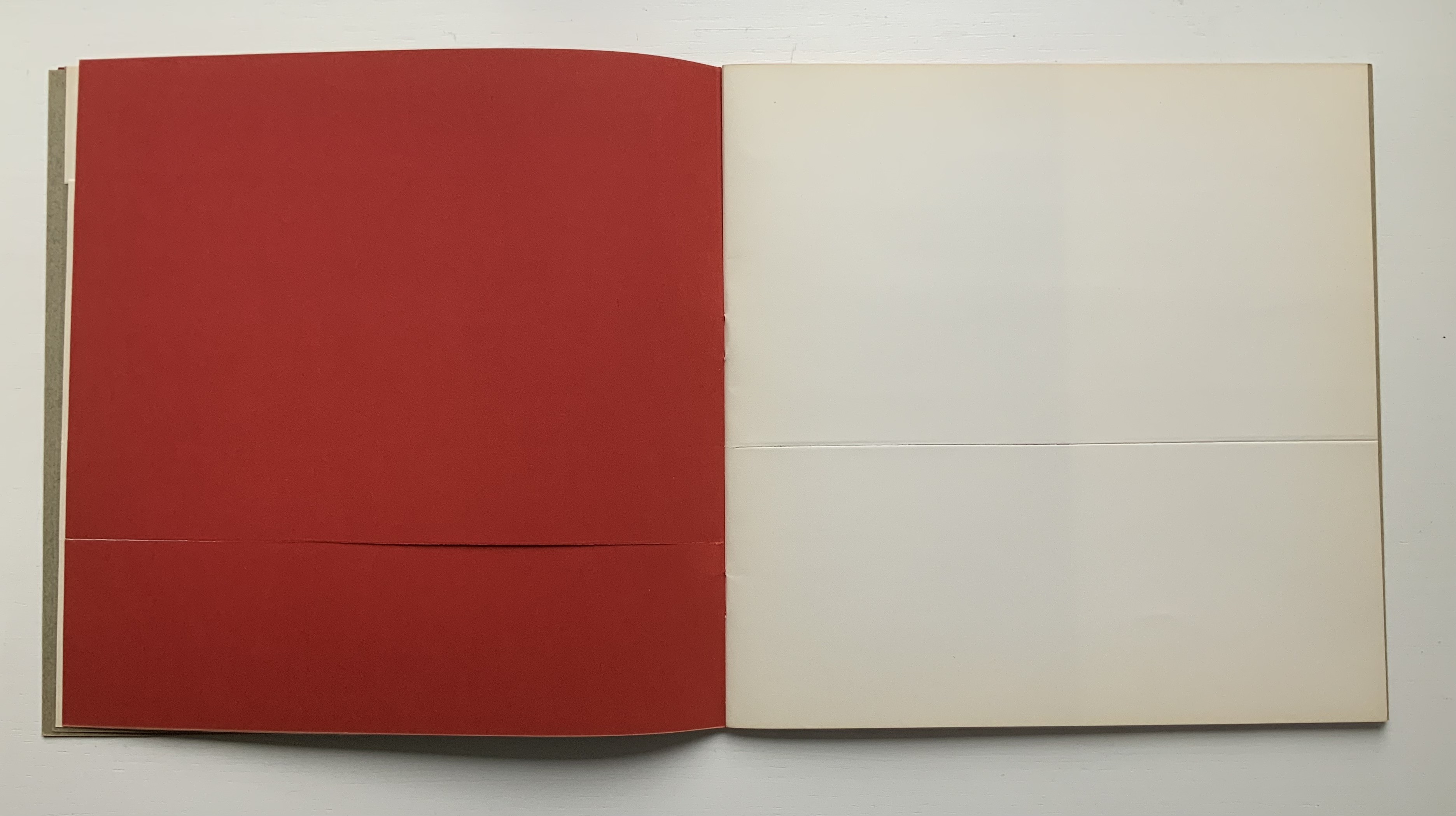
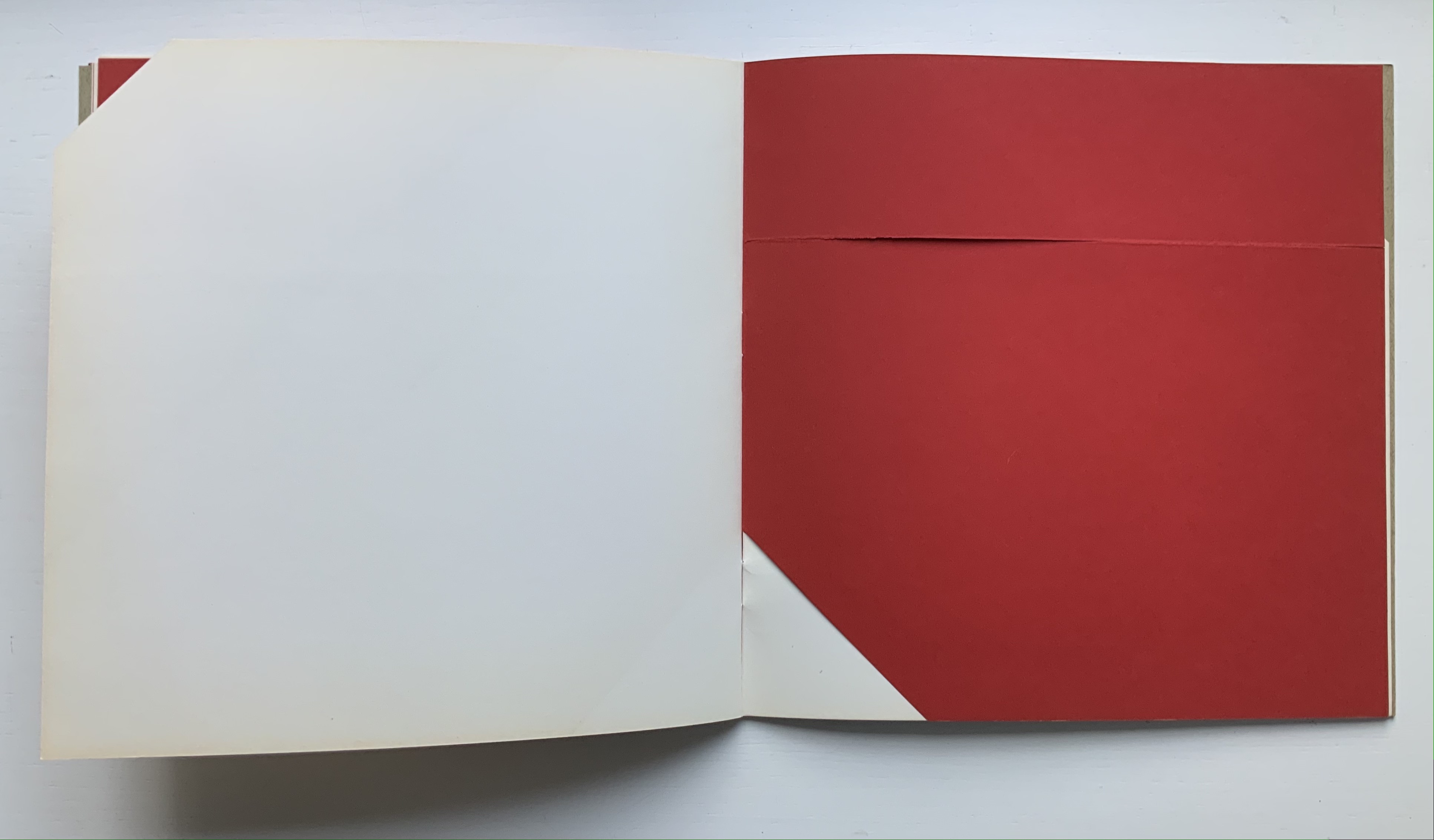
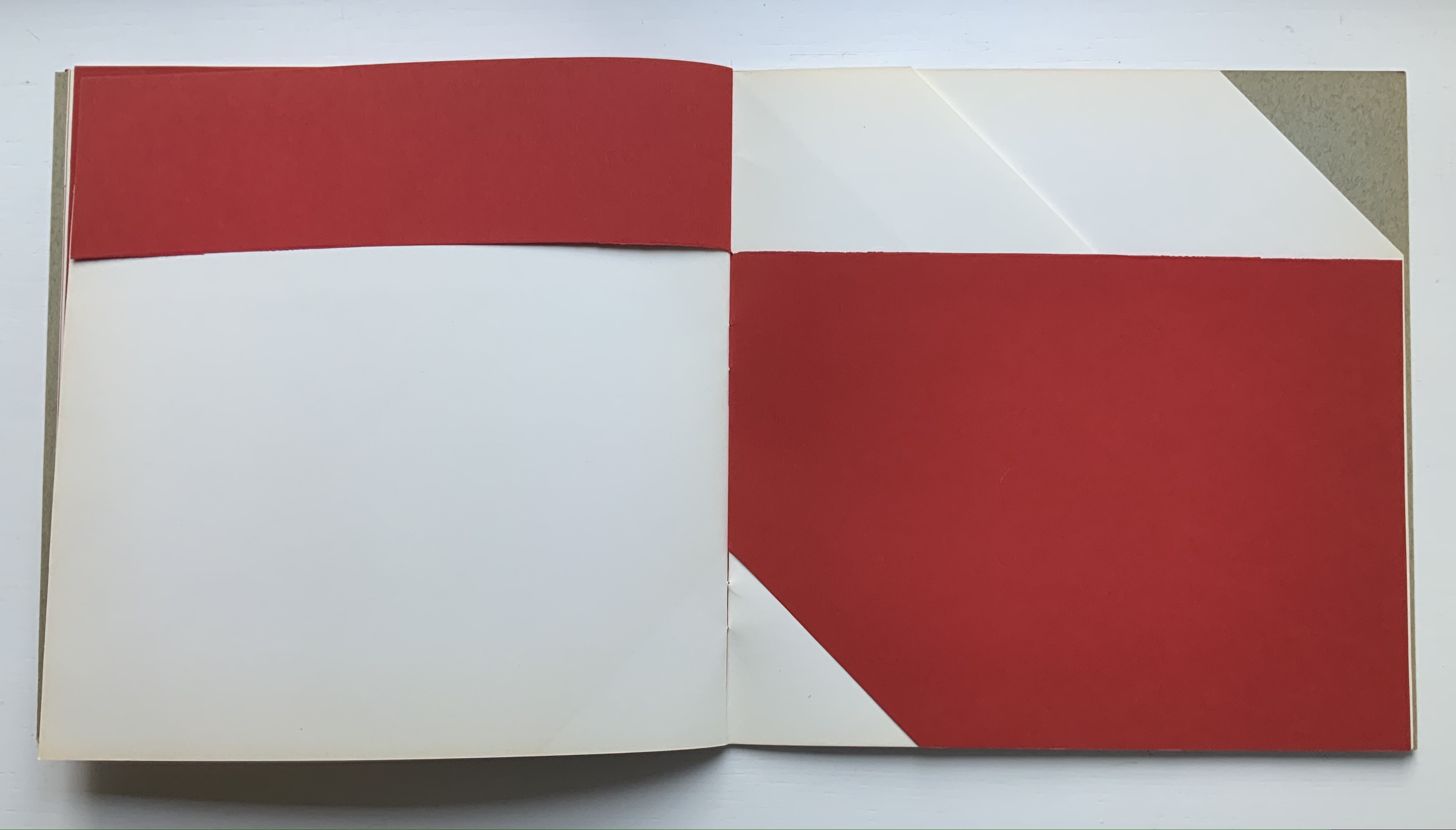
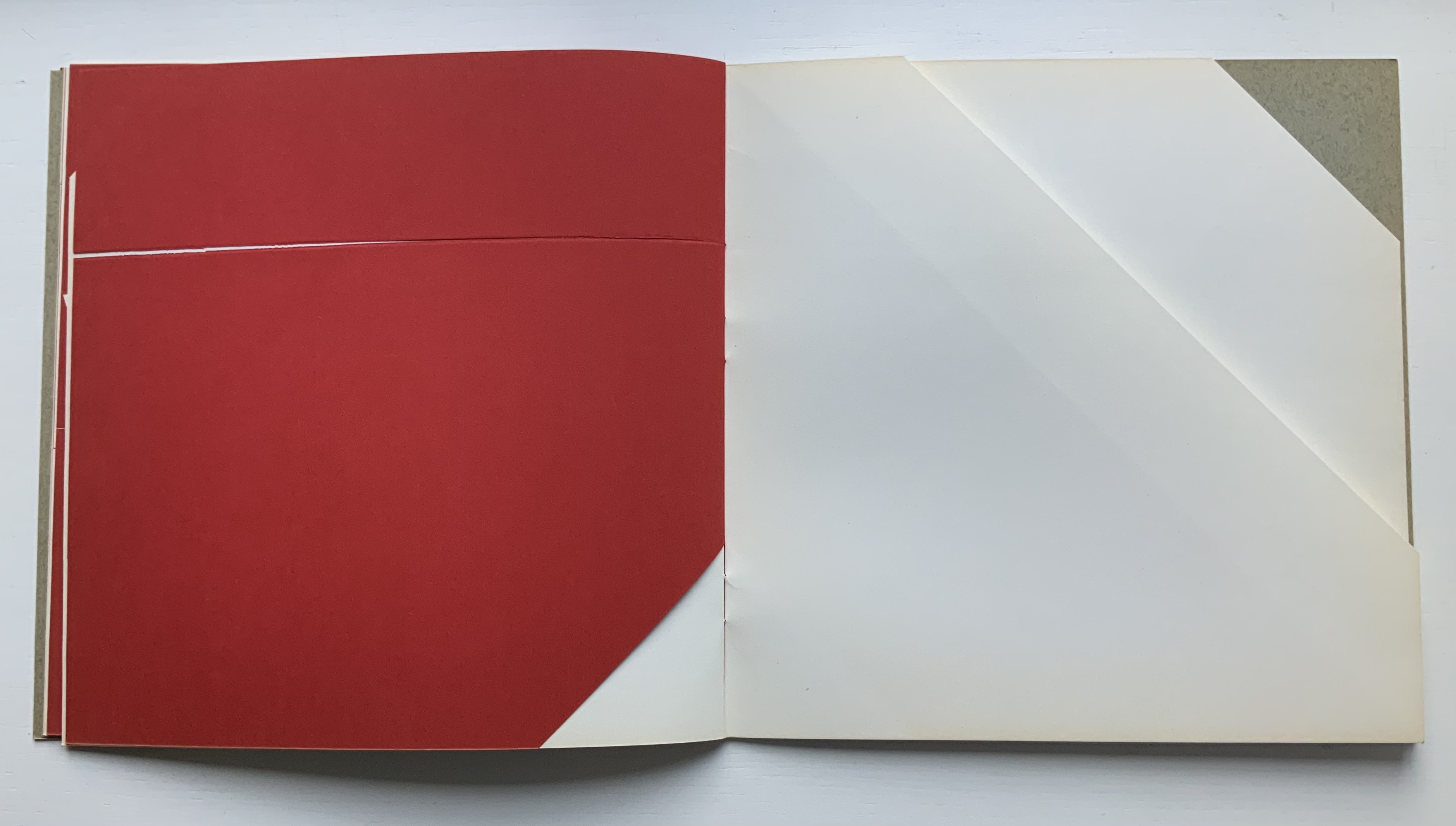
Kuipers reconfigured this poster into an artist’s book of 80 copies. Its bright colors, ad-like images, cartoonish drawings, photos, typewriter lettering and hand-scrawled text pull the ancestors of A, B, C and D (aleph, beth, gimel and daleth) into the present in folios folded in half and loosely held by a folio formed from the poster’s title panel. Articulating aleph into the face of a cow, a cartoon businessman re-enacts the ancient Semitic sound’s naming of the animal, which wears an inverted A bridle recalling the letter’s first discovered shape. The be-suited cartoon character alludes to paleographical theory that the alphabet had its roots in signs for accounting and inventories. The letter B receives similar treatment in the vacation postcard. The character in desert clothing says beth at the pair of pup tents forming the letter B on its side, the swimsuited man explains that “tent” equals “house”, which beth designated, and, having drawn the development of the sign into its modern form, the swimsuited woman articulates the letter. And so on for all the letters of the alphabet.
Certainly Kuipers knew that there were books and exhibitions for educating the general populace about the origins of the alphabet. He had been there and done that. But it is a wonderful proposition that art and design should confront the general populace with it and that they should be aware of it in everyday life.
Diringer, David, and Reinhold Regensburger. 1968. The alphabet: a key to the history of mankind. London: Hutchinson. A standard, beginning to be challenged by late 20th and early 21st century archaeological findings and palaeographical studies.
Van Genderen, Ans. 2022. “Abe Kuipers“. Dutch Graphic Roots. Eindhoven: [Z]OO producties. Accessed 20 November 2022. Also available in print from [Z]OO producties.
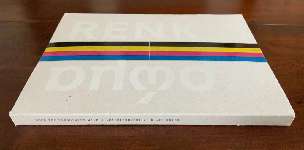
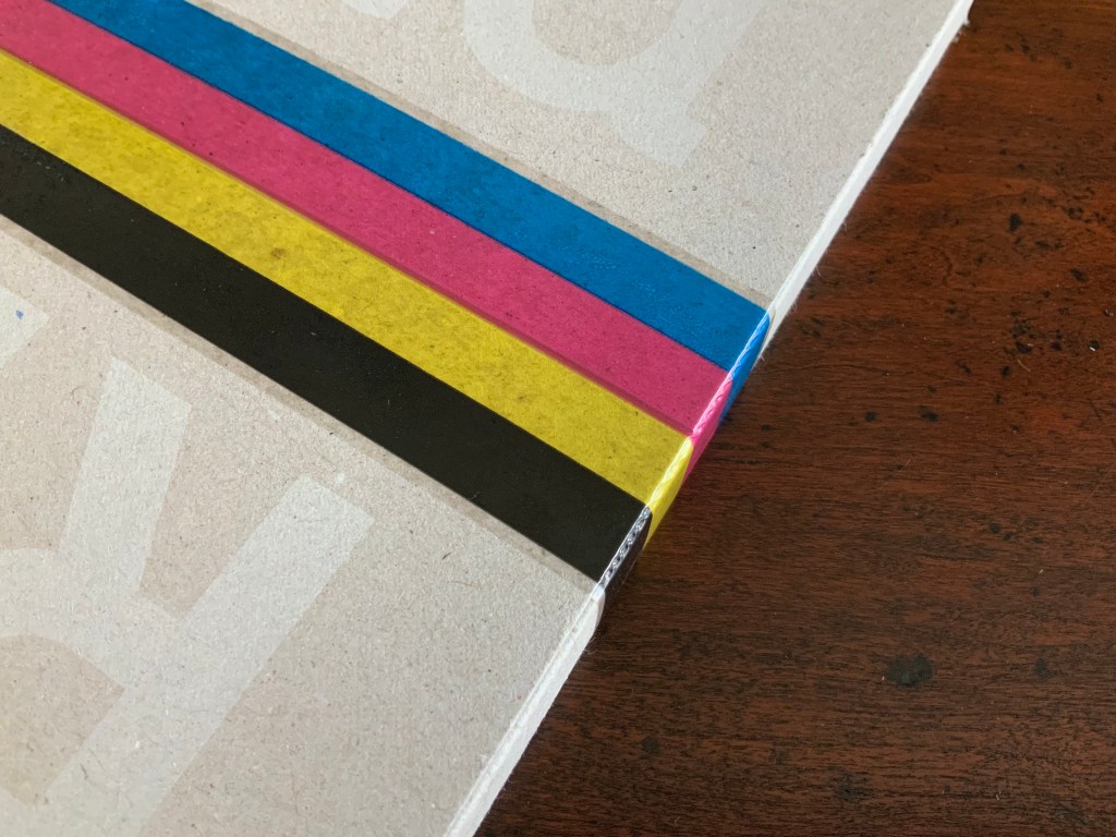
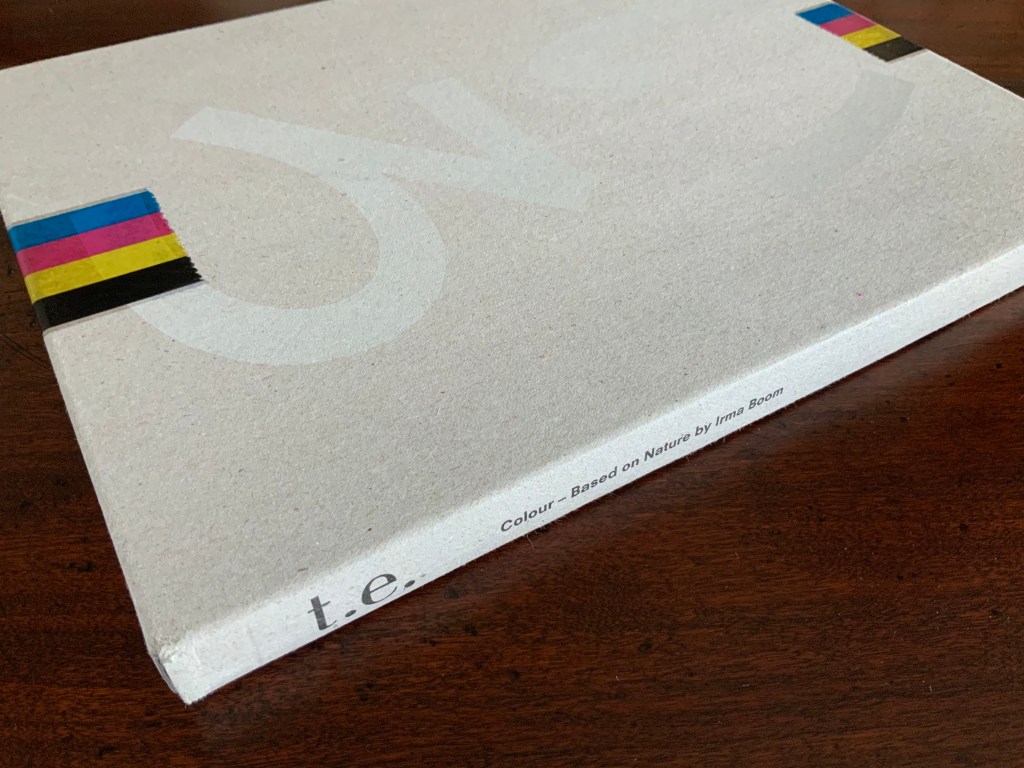
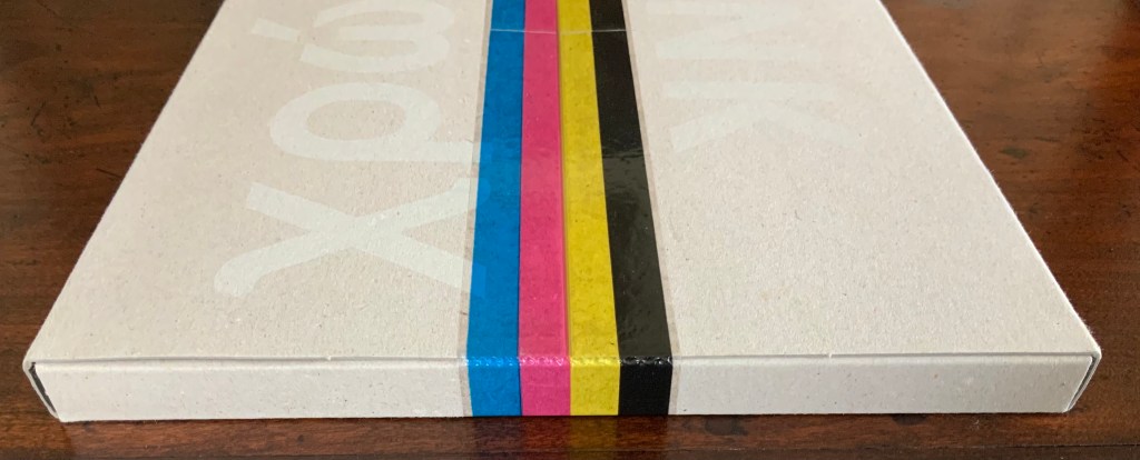
Colour — Based on Nature (2012) Irma Boom Box holding softcover. H320 x W240 mm, 170 pages. Acquired from Ursus Books & Gallery, 16 November 2020. Photos: Books On Books Collection.
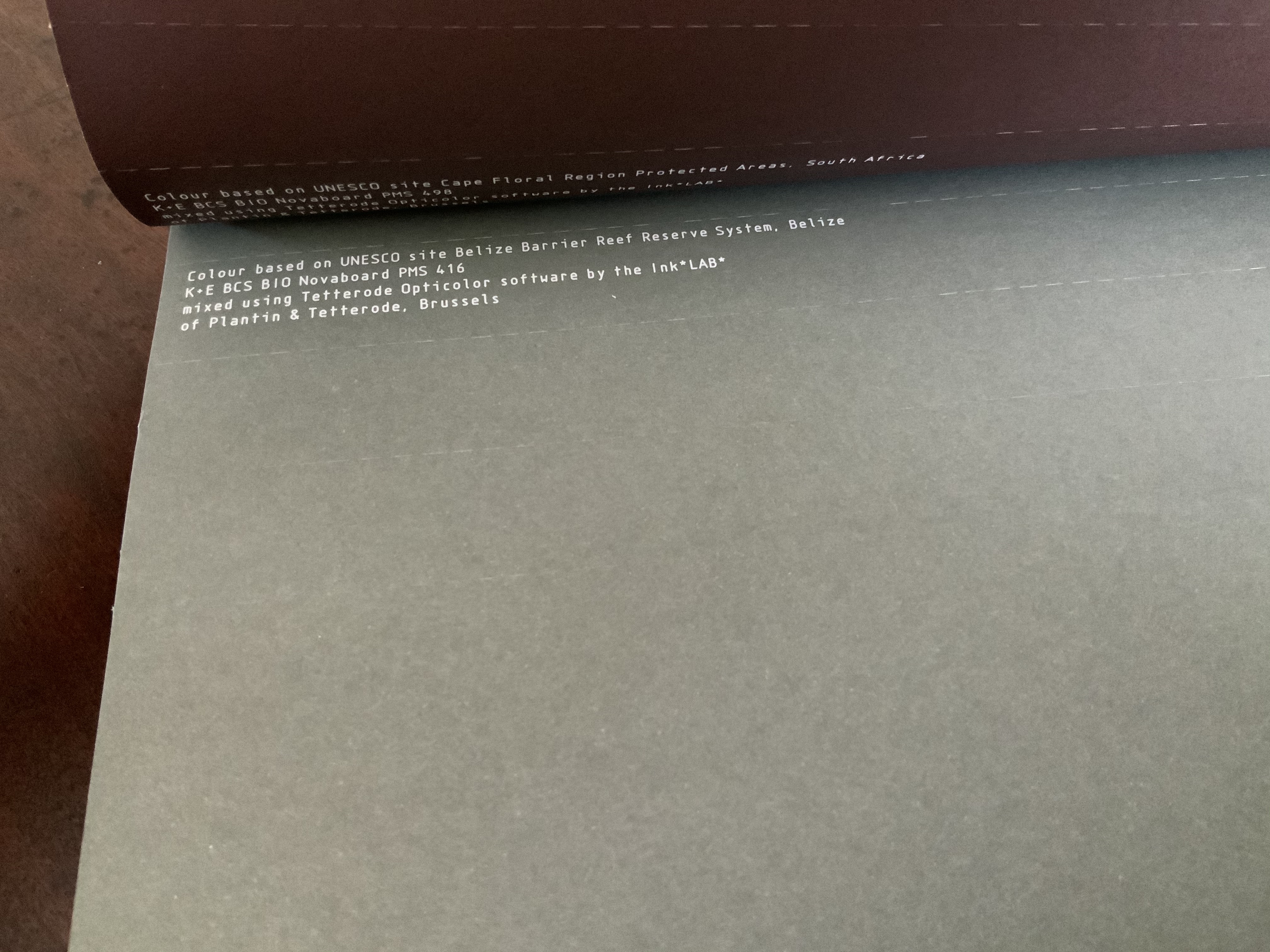
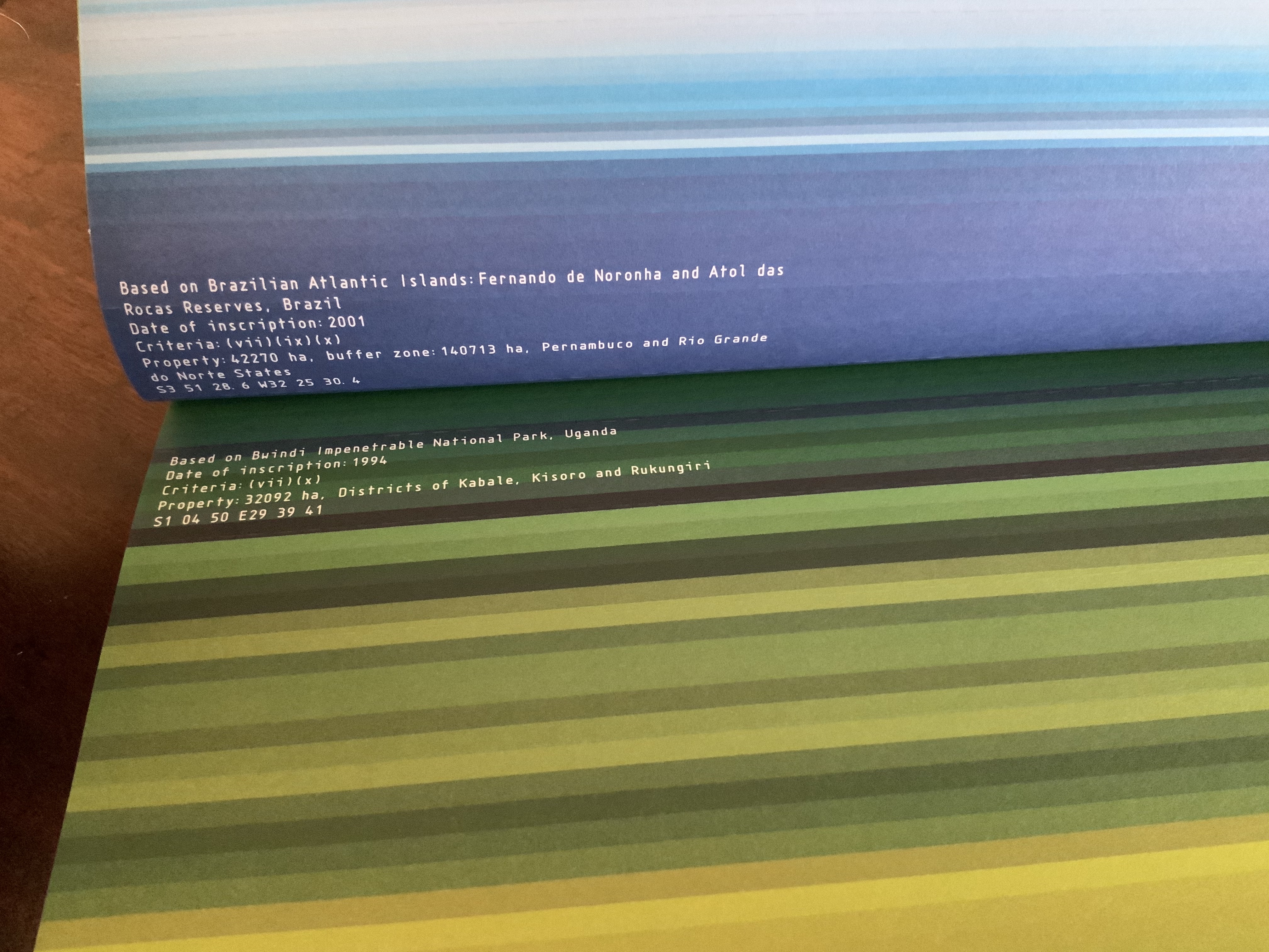
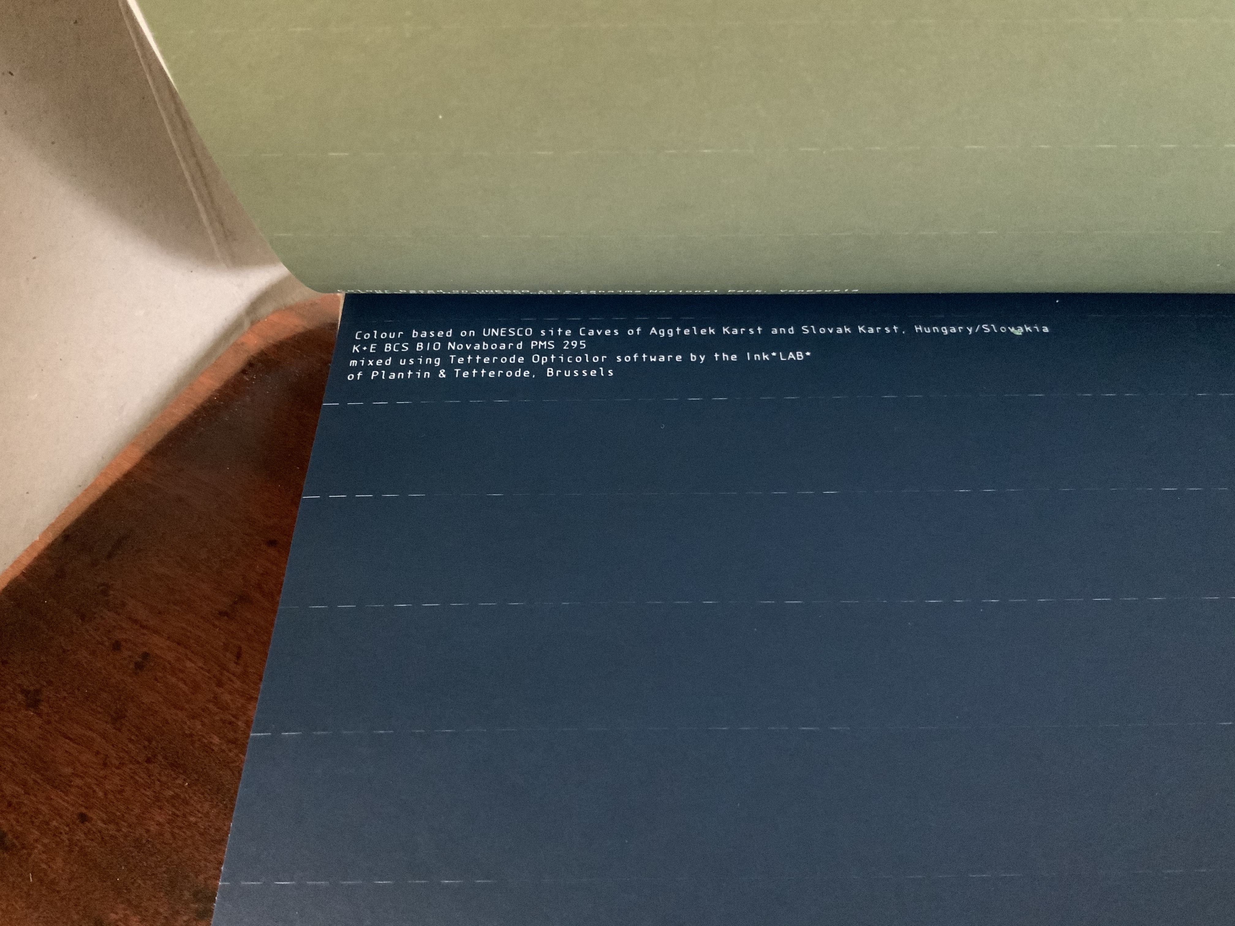
This work of art in the form of a book explores and associates colors with 80 UNESCO World Heritage sites across the globe. On the exterior of each folio, all of them uncut, a single, solid color appears. As the folio is cut, the interior reveals striated variations on the exterior color.
The striations act like lines of rhymed and unrhymed verse. The whole volume could serve as a textbook on theory of colors, the destructive act needed to access the color reminding student and teacher of the fragility of the heritage sites being celebrated.
Irma Boom: The Architecture of the Book (2013)
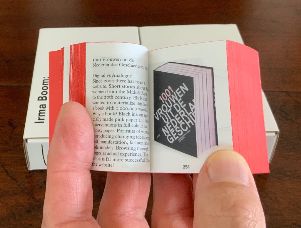
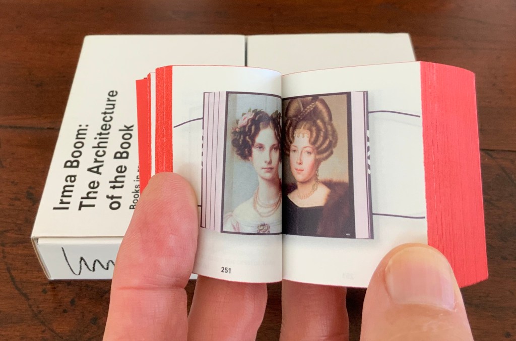
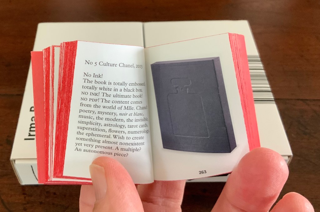
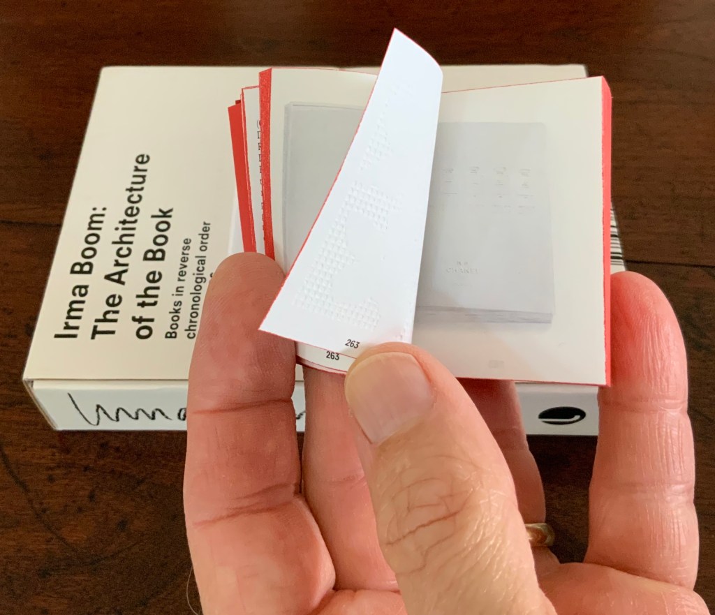
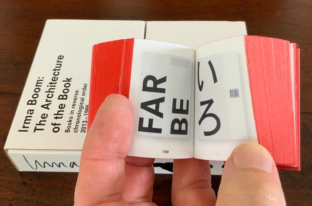
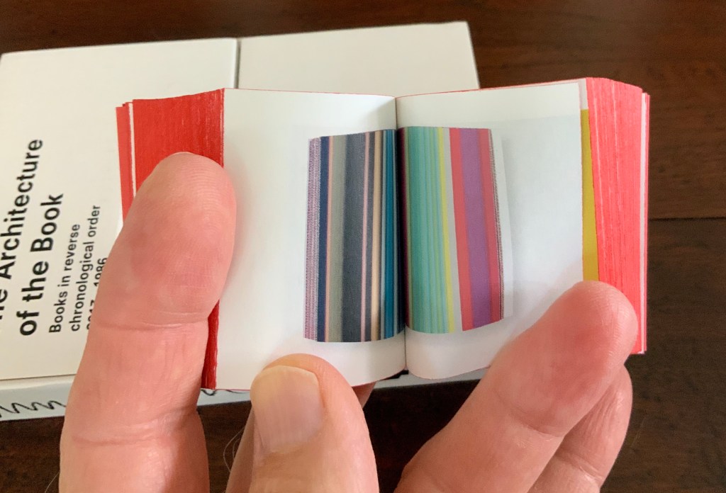
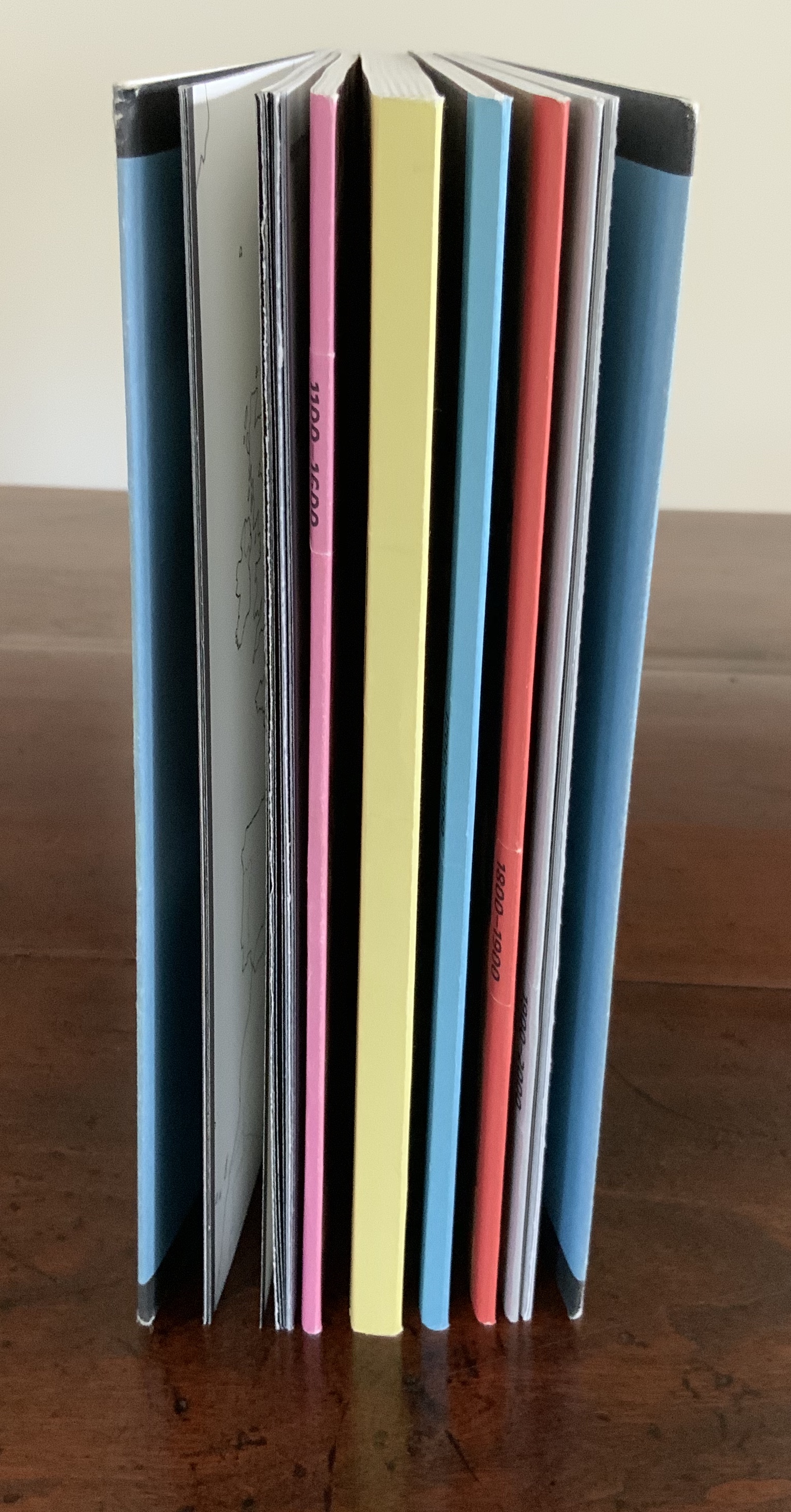
Irma Boom: The Architecture of the Book (2013) Irma Boom Box holding miniature softcover. Box: H153 x W118 x D31 mm; Book: H55 x W44 x D30 mm; 800 pages. Acquired from Amazon, 3 June 2015. Photos: Books On Books Collection.
In and of itself, a legible miniature book astounds. Add to it the design genius of Irma Boom and the astounding becomes book art. Recording her books in reverse chronological order 2013-1986 (with reverse pagination as well), Irma Boom: The Architecture of the Book uses its structure and contents to make us think again and again about the reach of the book’s technology.
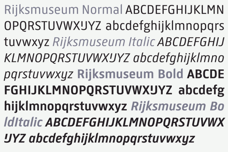
In 2013 the newly renovated Rijksmuseum opened with a new logo, new typeface design and publications design — all by Irma Boom and her studio. The new typeface — de Rijksmuseum — was developed by Paul van de Laan of Blue Monday under Boom’s artistic direction and appeared in museum signage and publications. The new typeface marks an interesting shift from DTL Documenta, the previous corporate font, designed by Frank E. Blokland. Blokland had studied with Gerrit Noordzij and later succeeded him at the Dutch Royal Academy of the Arts (The Hague). He founded the Dutch Type Library in the 1990s.
The previous style sheet leads with the serif version of DTL Documenta, while the de Rijksmuseum style sheet leads with the sans serif. Having applied to intern at Total Design in Amsterdam and been rejected by Wim Crouwel’s colleagues for her experimentalism, Boom must have especially enjoyed winning this commission. Just as much as the typographic differences, though, it is Boom’s roots in book design that differentiates the new from the old.
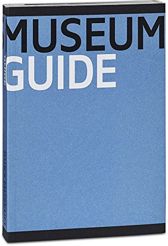
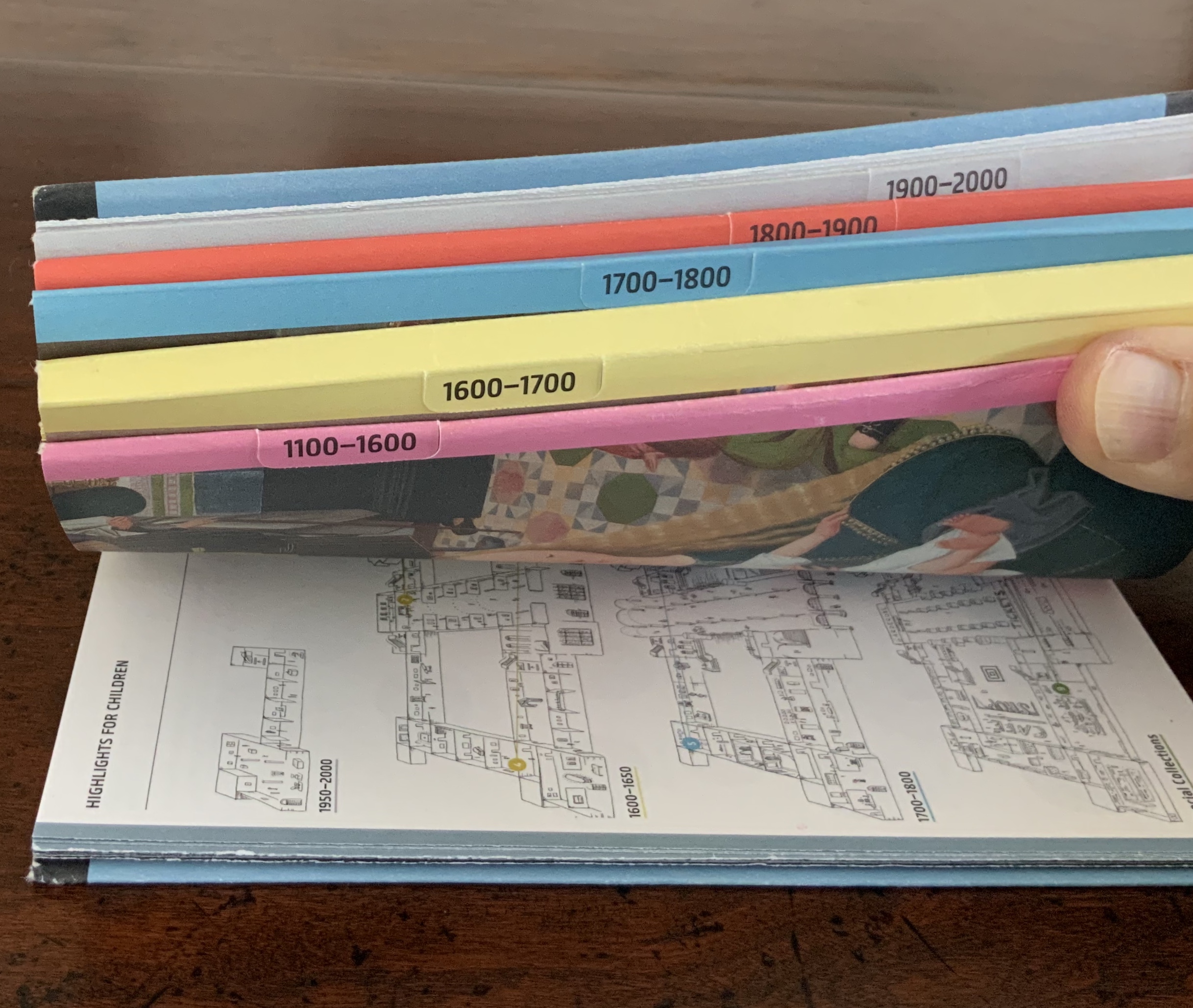
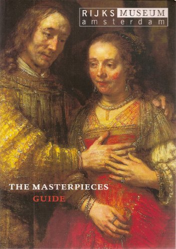
Guide Rijksmuseum (2013) Eric Spaans (text),Irma Boom (design) Softcover with multiple foldout maps. Acquired at the Rijksmuseum. Photos of the work: Books On Books Collection.
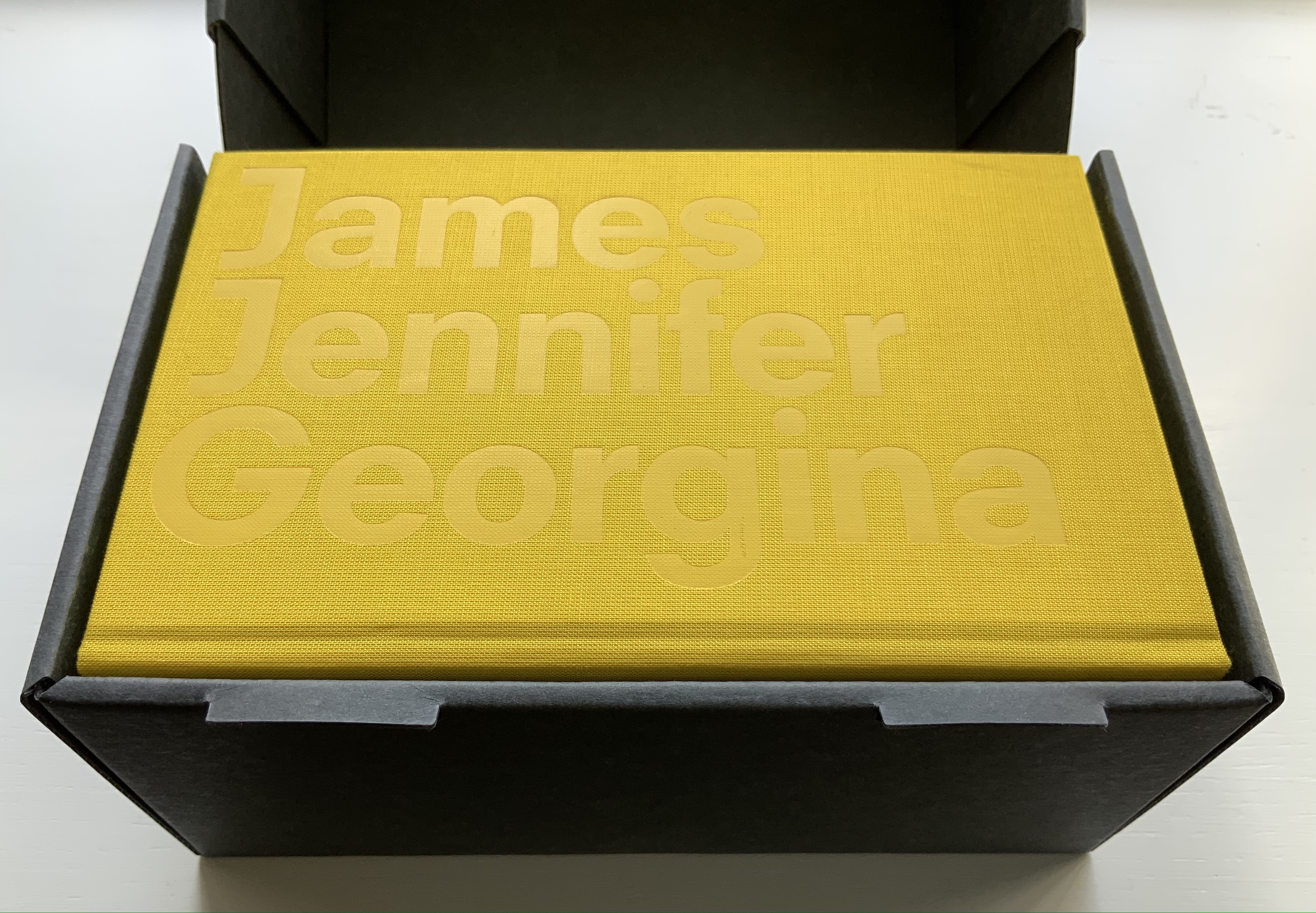
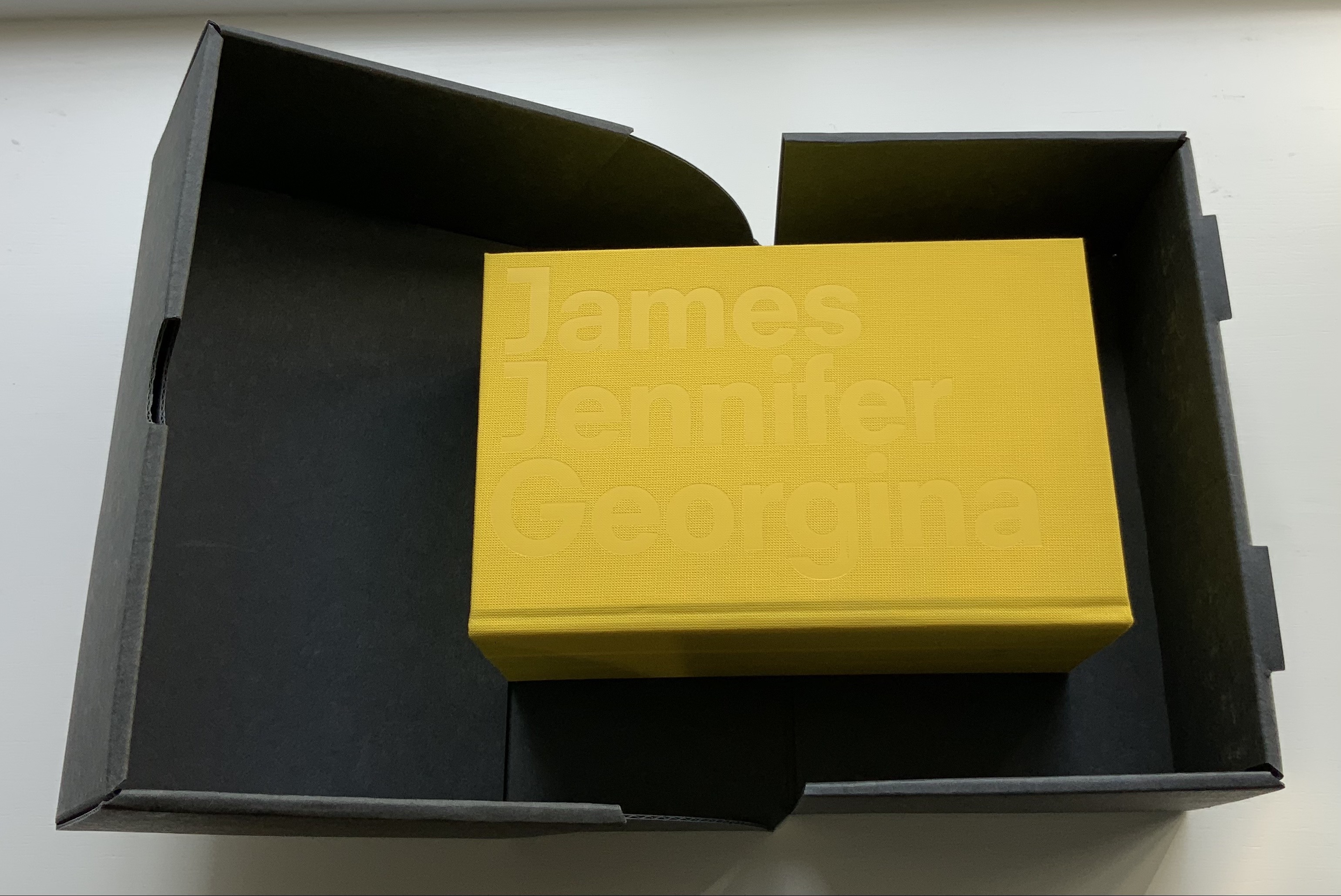
James Jennifer Georgina (2010)
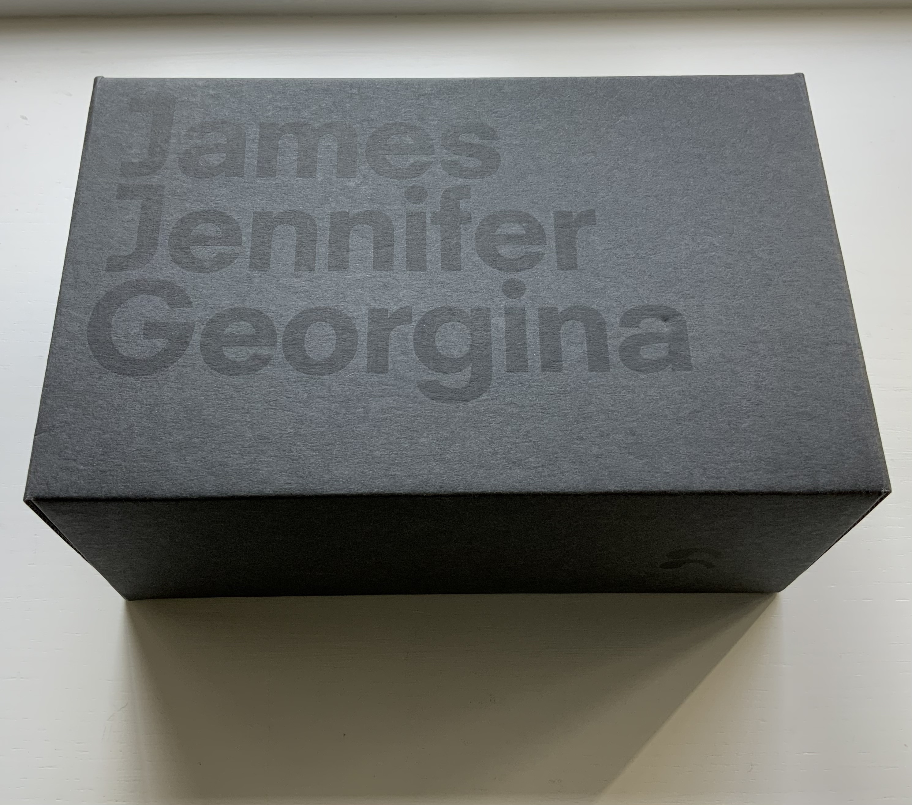
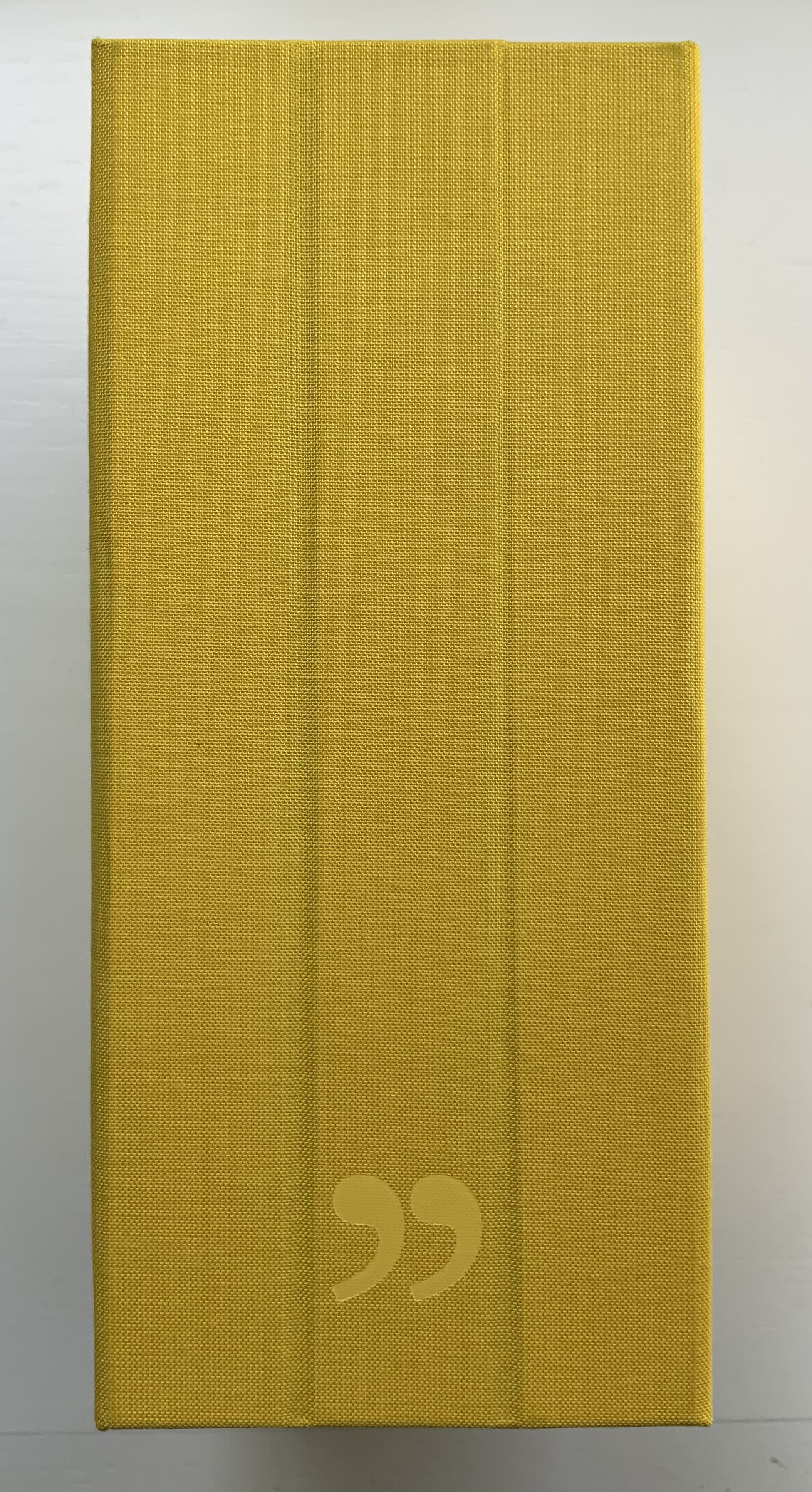
James Jennifer Georgina(2010) Irma Boom Box holding casebound book. Box: H220 x W140 x D100 mm. Book: H194 X W126 X D90 mm; 1198 pages. Edition of 999, of which this is #699. Acquired from Bubb Kuyper, 28 May 2021. Photos: Books On Books Collection.
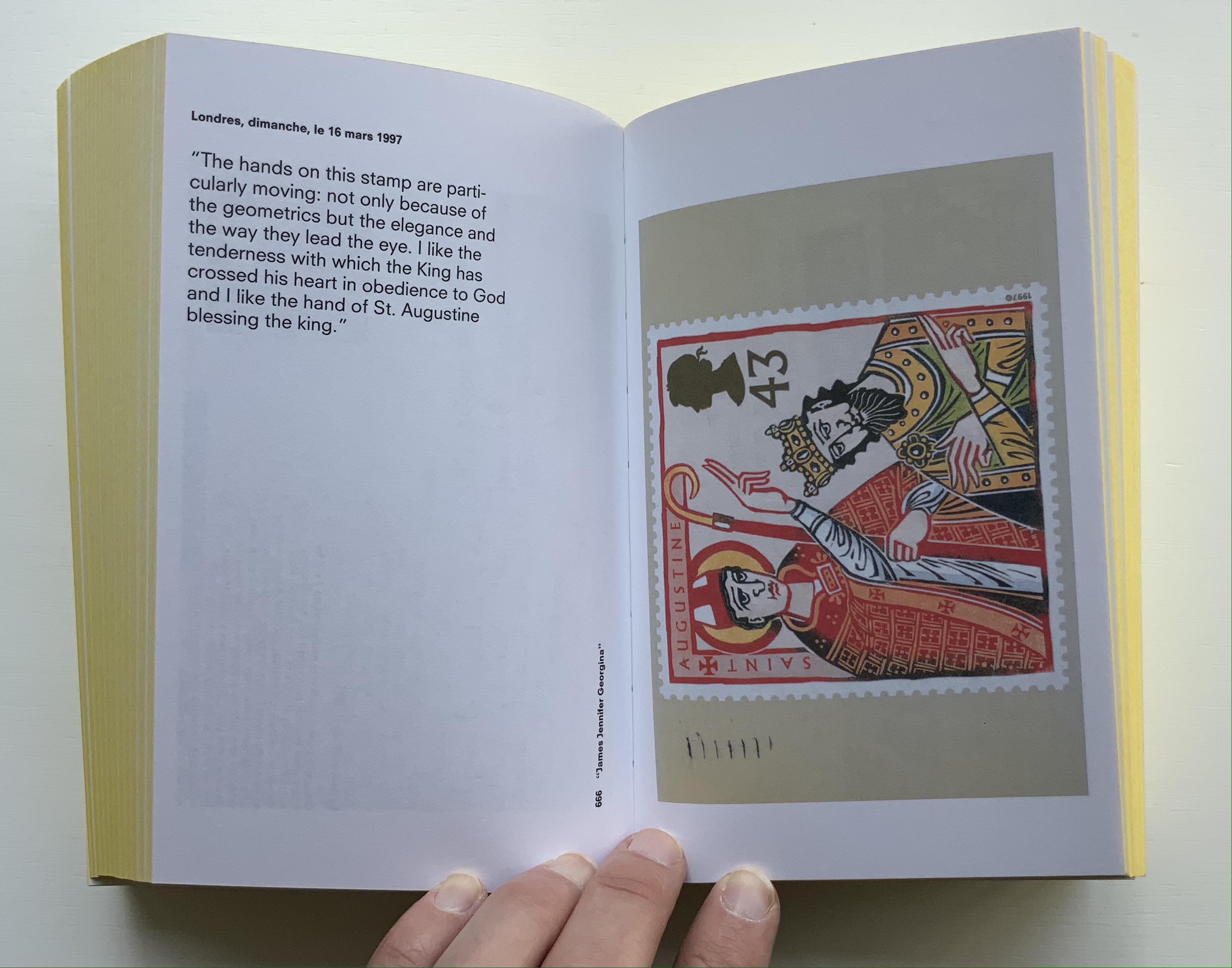
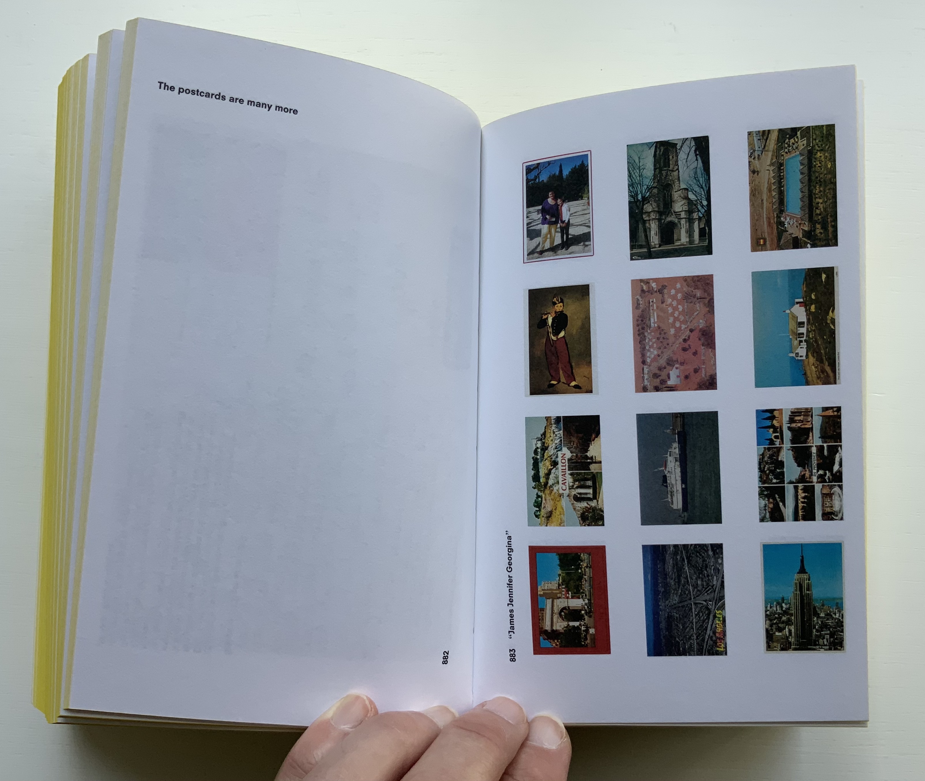
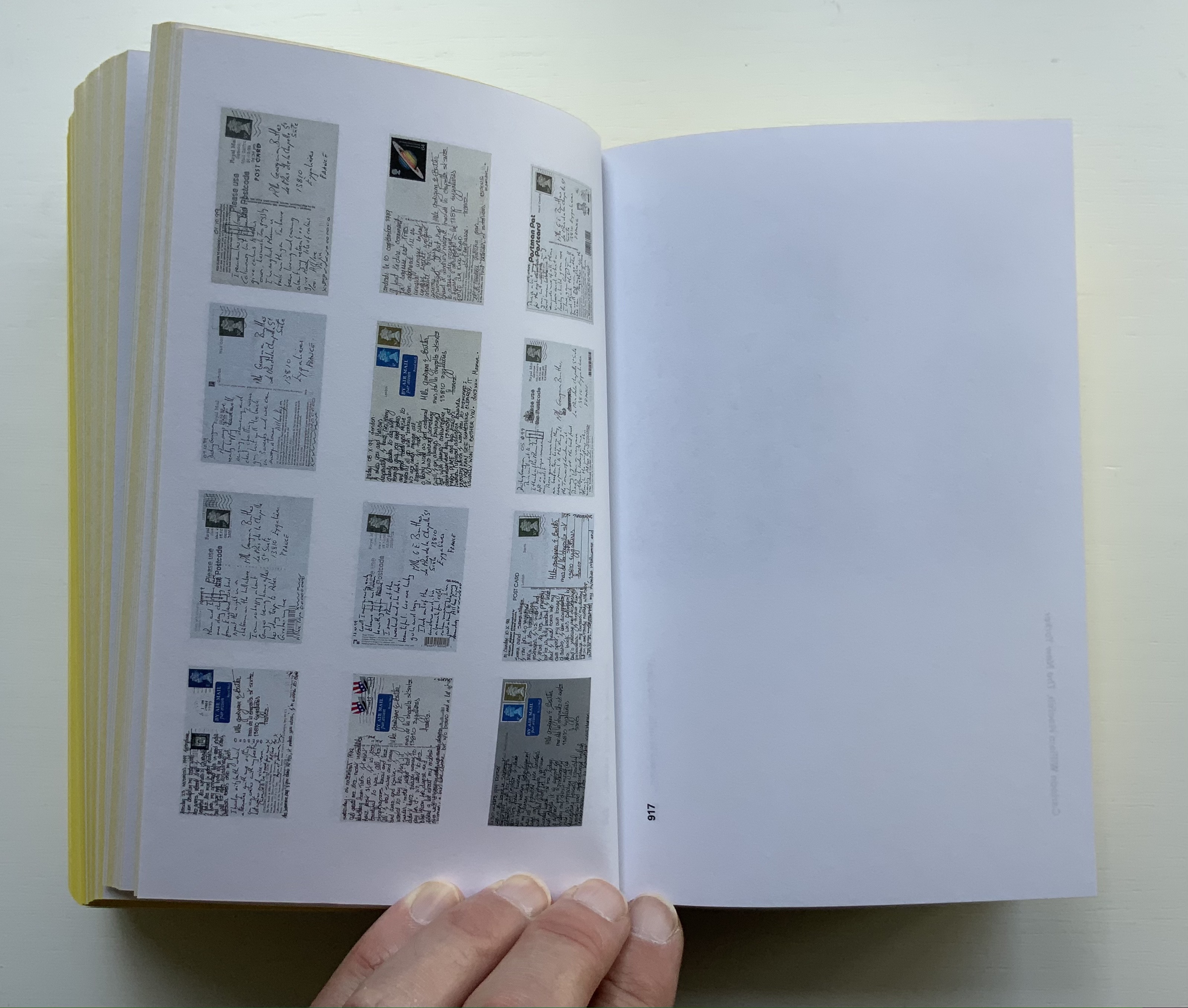
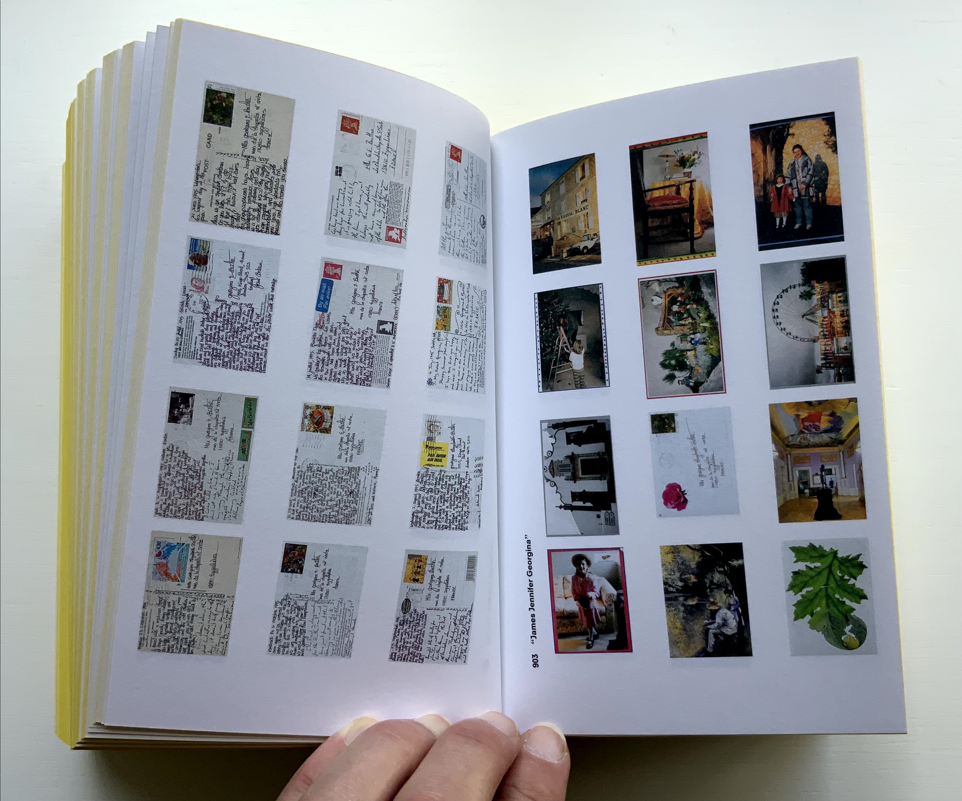
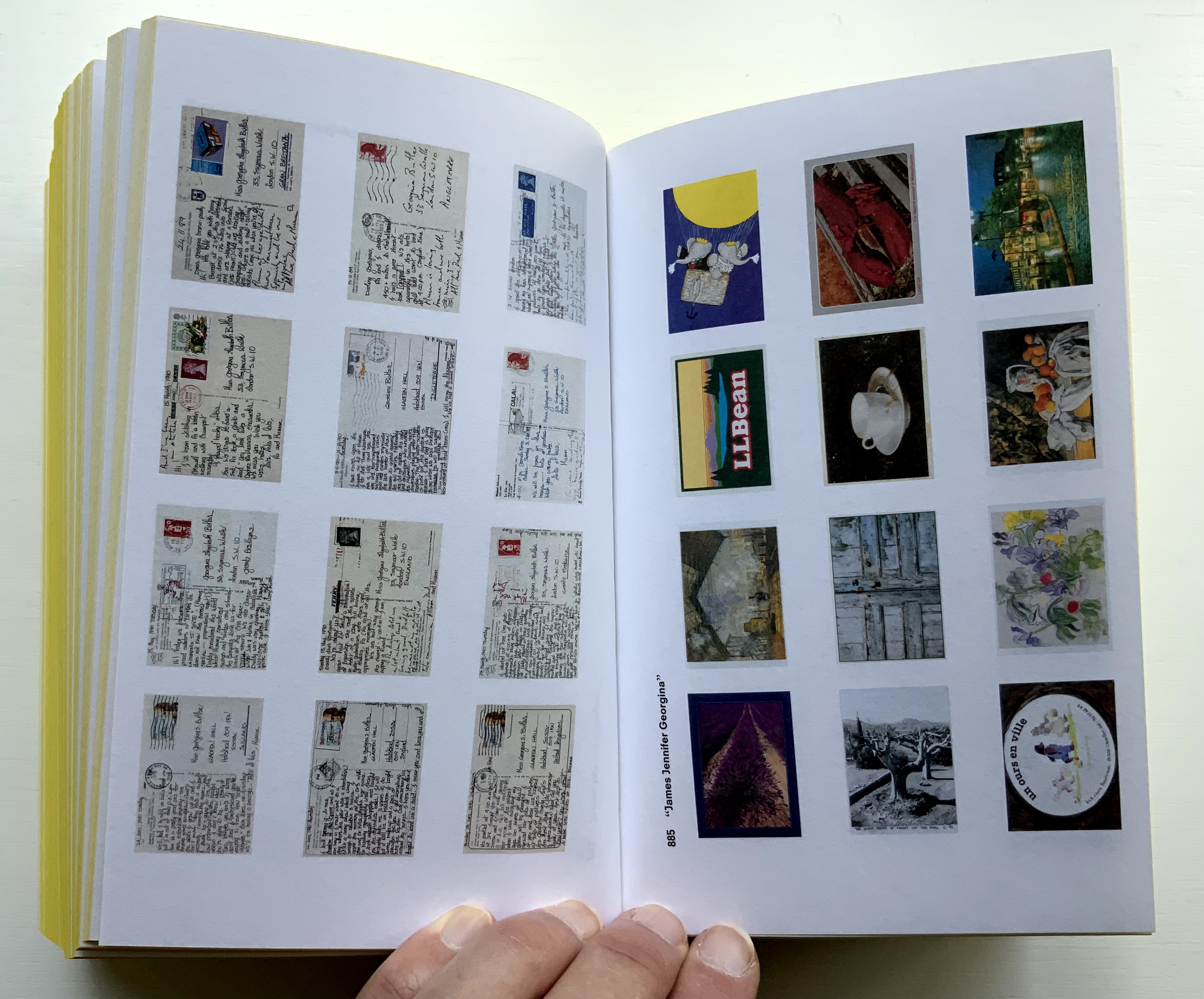
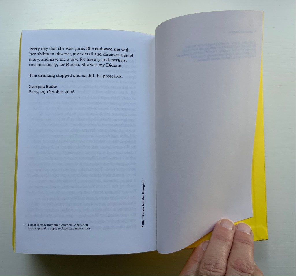
James Jennifer Georgina is book art as epic family portrait, created with the fronts and backs of 1136 postcards, spanning ten years of travel by the Butler family. At 1198 pages, it comes close to War and Peace, and in one theme, it comes close to Anna Karenina. Tolstoy writes at the beginning of the latter, “All happy families are alike; each unhappy family is unhappy in its own way.” After poring over JJG, I wonder if that should have been “each unhappy family thinks it is unhappy in its own way”. In the end, the family portrait is one of considerable privilege, culture, shame, pain and love. What distinguishes the Butler family’s unhappiness besides that context of privilege is its form of documentation and, above all, Boom’s transformation of it into this monument of book design. Its three-part spine especially developed to allow this nine centimeters-thick book to open effortlessly to any page .
Boom’s other outstandingly designed hefty works include SHV (1996) commissioned by Steenkolen Handelsvereeniging (SHV), Sheila Hicks: Weaving as Metaphor (2006) and Artist, Work, Lisson (2017) commissioned by the Lisson Gallery. They can be viewed here, here and here, respectively.
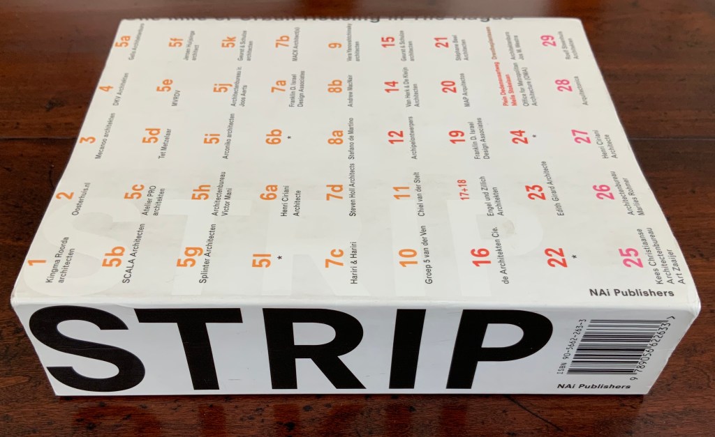
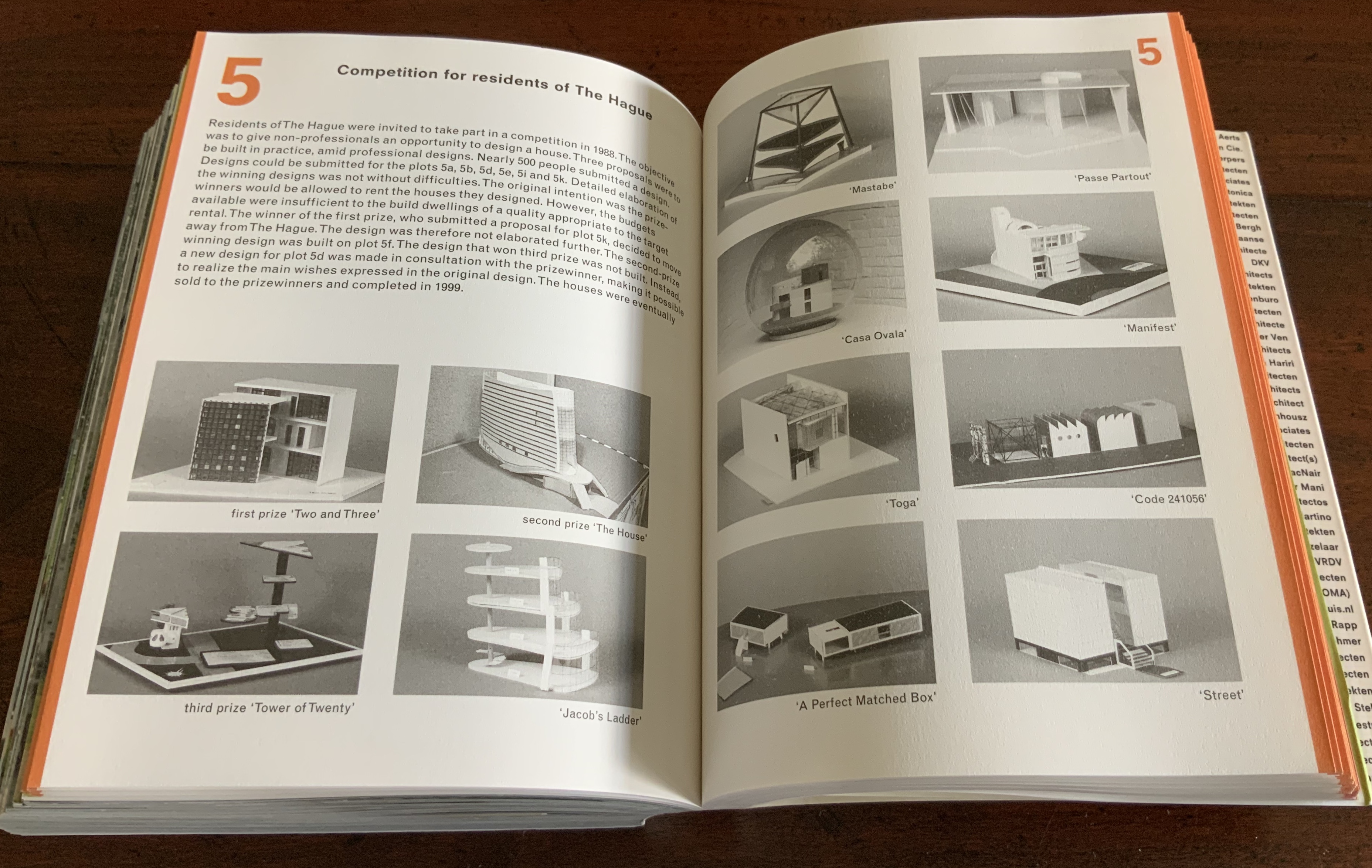
Strip: One Mile of Urban Housing in The Hague (2003)
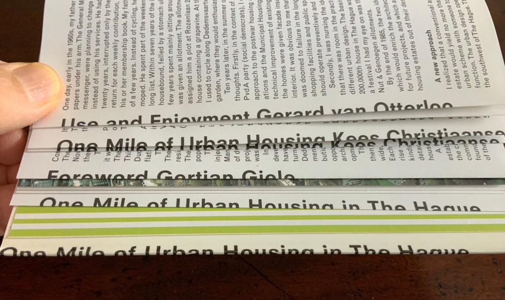
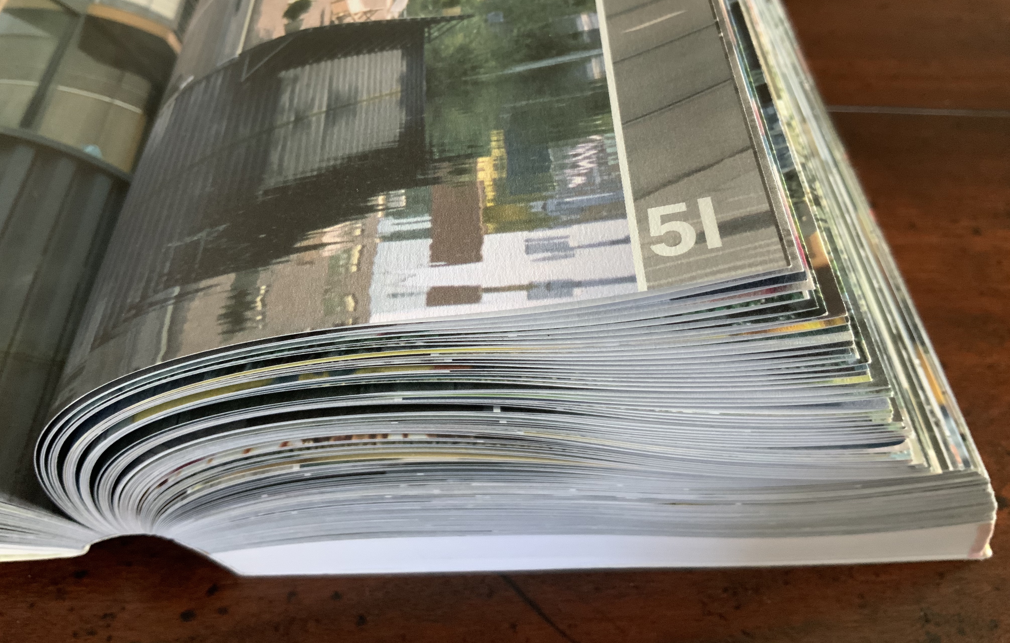
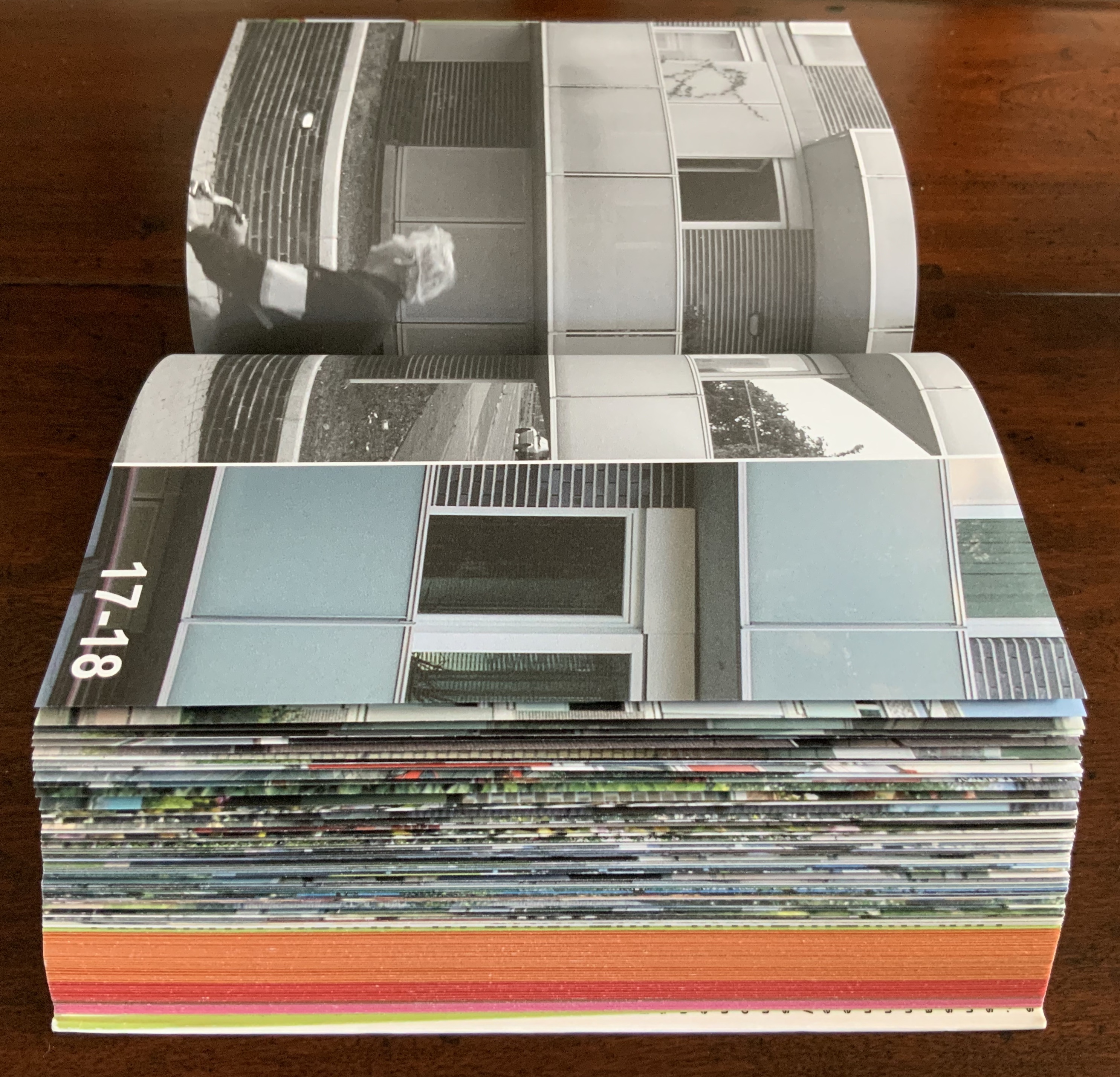
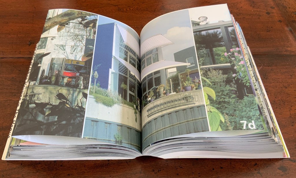
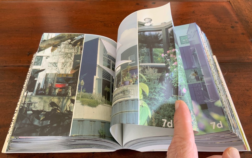
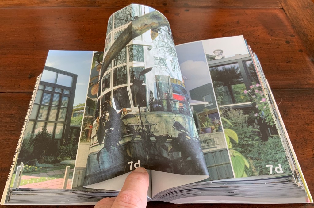
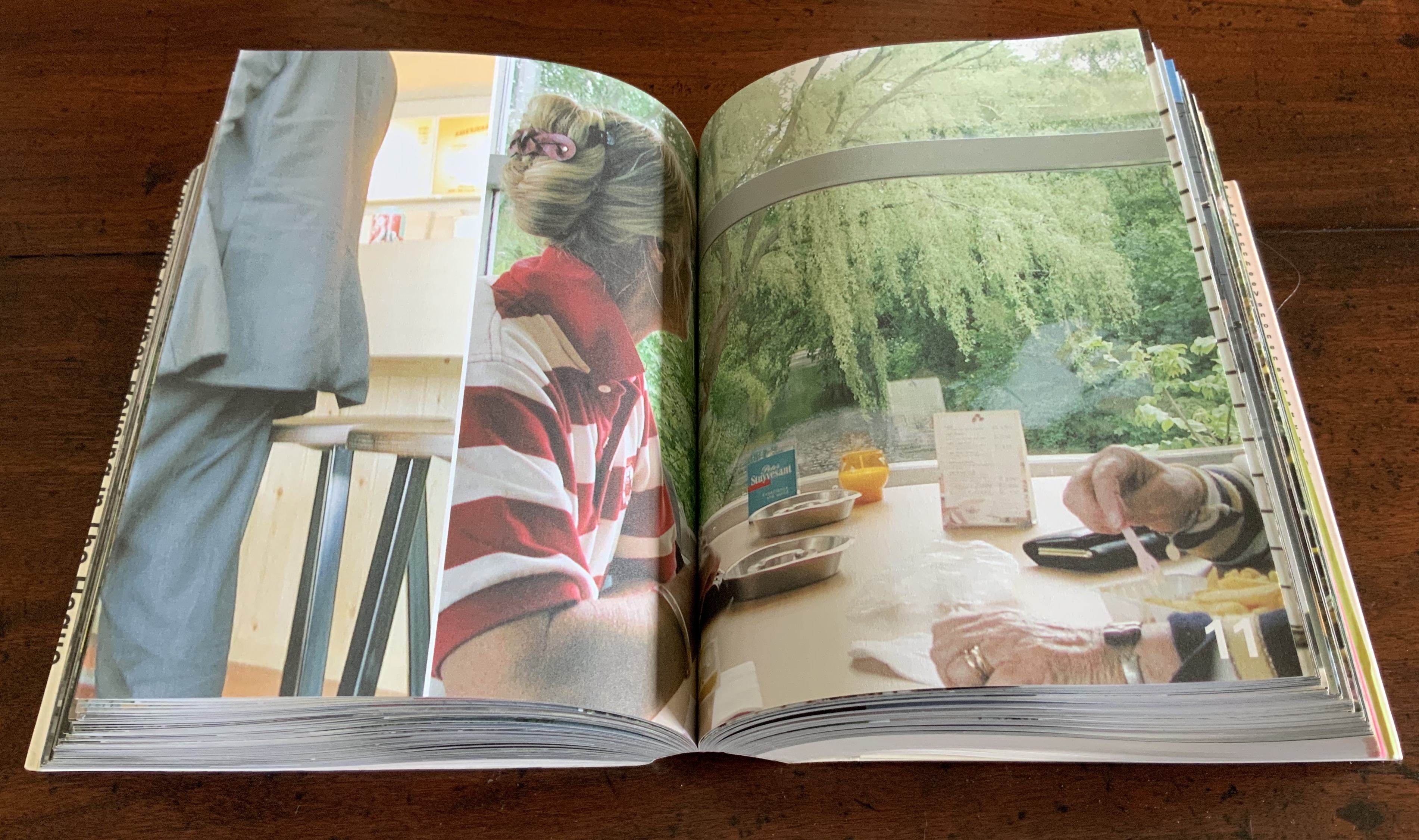
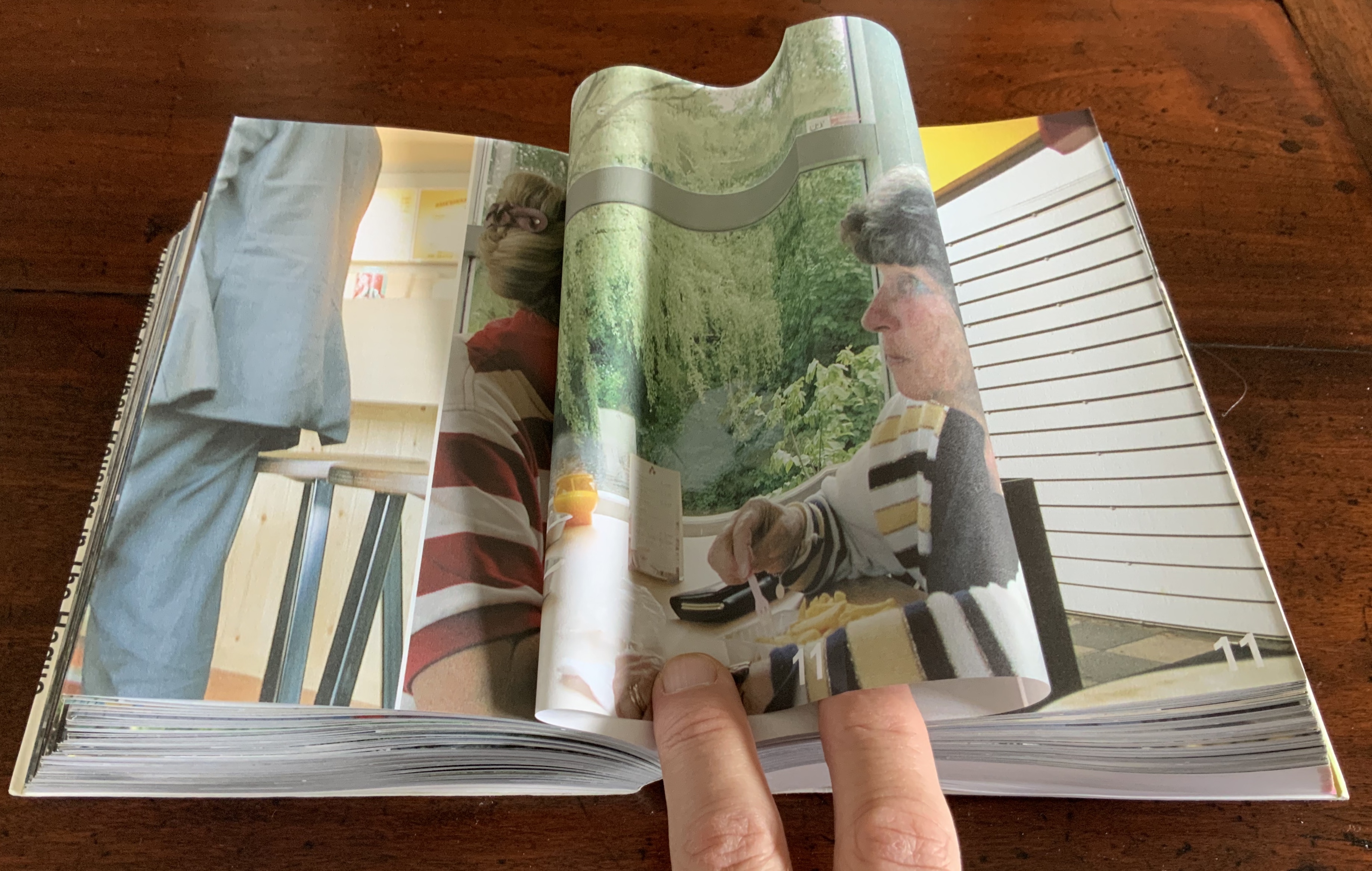
Strip: One Mile of Urban Housing in The Hague (2003) Marja van der Burgh, Kees Christiaanse, Gertjan Giele and Gerard van Otterloo (eds.); Design by Irma Boom and Sanne Beeren; Photography by Hans Werleman. Paperback, perfect bound, H175 x W142 x D40 (spine) and D48 (fore edge)mm. 256 uncut folios. Acquired from Galileo Alby, 28 September 2020. Photos: Books On Books Collection.
The primary purpose of Strip could not be further from that of Ed Ruscha’s Every Building on the Sunset Strip; nevertheless, its title and design pay a sort of homage to that accordion book with one side of the Sunset Strip at the top and other at the bottom. With its Chinese-fold pages, Strip has the same problem with thickness that any single-sided accordion has. Of course the Chinese fold offers the same advantage offered by the accordion fold: note how the section titles and photos wrap over the uncut folios, foreshadowing the treatment of the Rijksmuseum Guide above. Also like the Guide but unlike Every Building, Boom’s book is a form of information sculpture.
In some ways, Strip has more in common with the first edition of Robert Venturi’s Learning from Las Vegas, designed by Muriel Cooper at MIT Press, than with Ruscha’s Every Building on the Sunset Strip. Just as Learning from Las Vegas is intent on architectural and urban design theory, so too is Strip. Just as Cooper’s monumental design swamped the textual content (so much so that the authors successfully pressed for a reduced-size paperback), Boom’s design almost does the same to Strip‘s content. Almost, but not quite. Strip‘s blockiness, its rubbernecking around the corner of pages and its jumps in perspective match up with the authors’ intent — to document an environment and its residents.
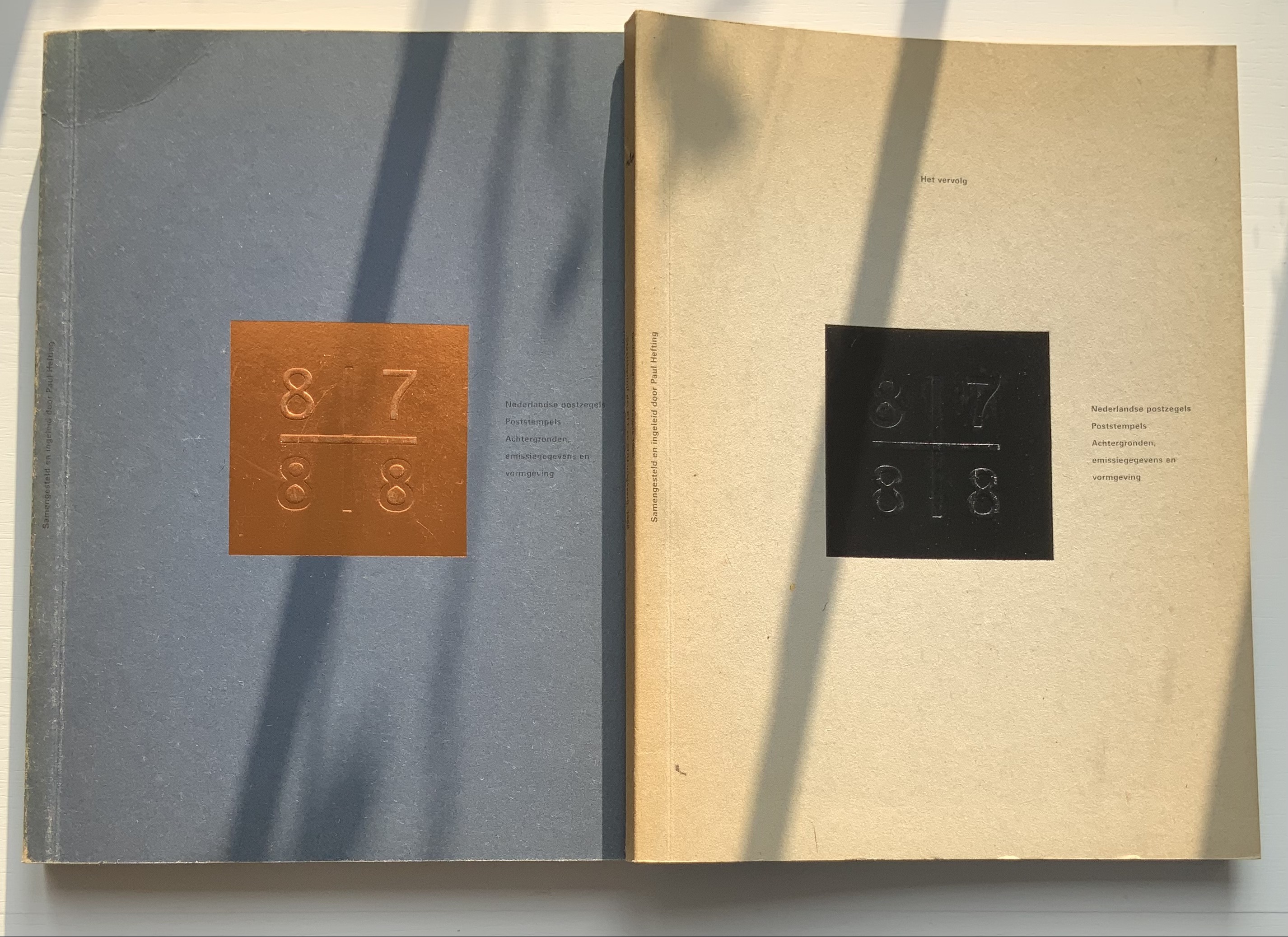
Nederlandse Postzegels, Poststempels 87/88 (1988)
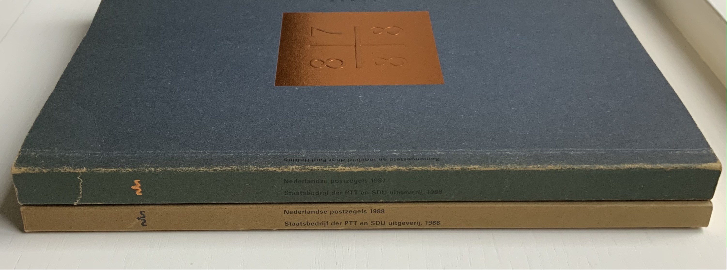
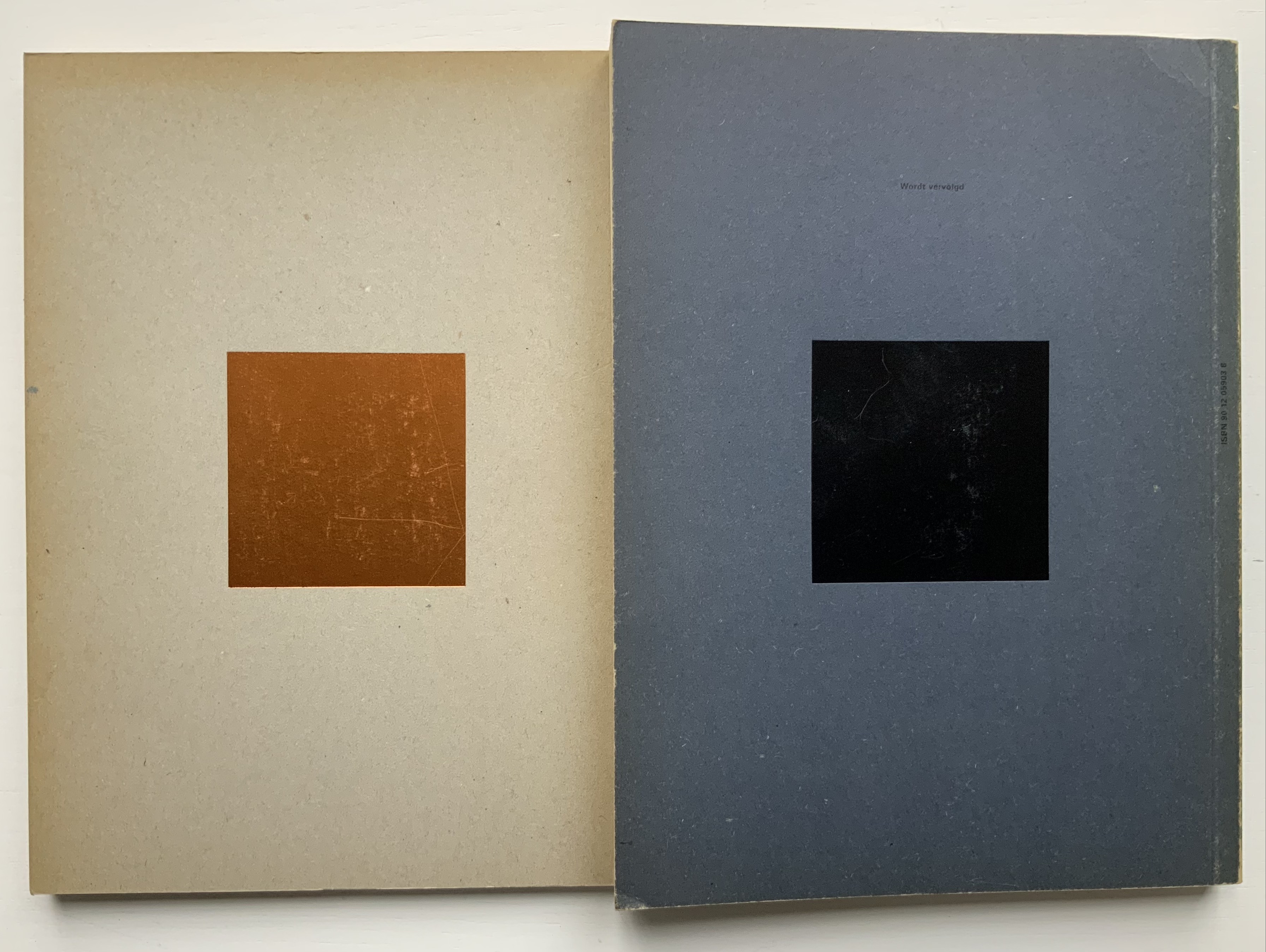
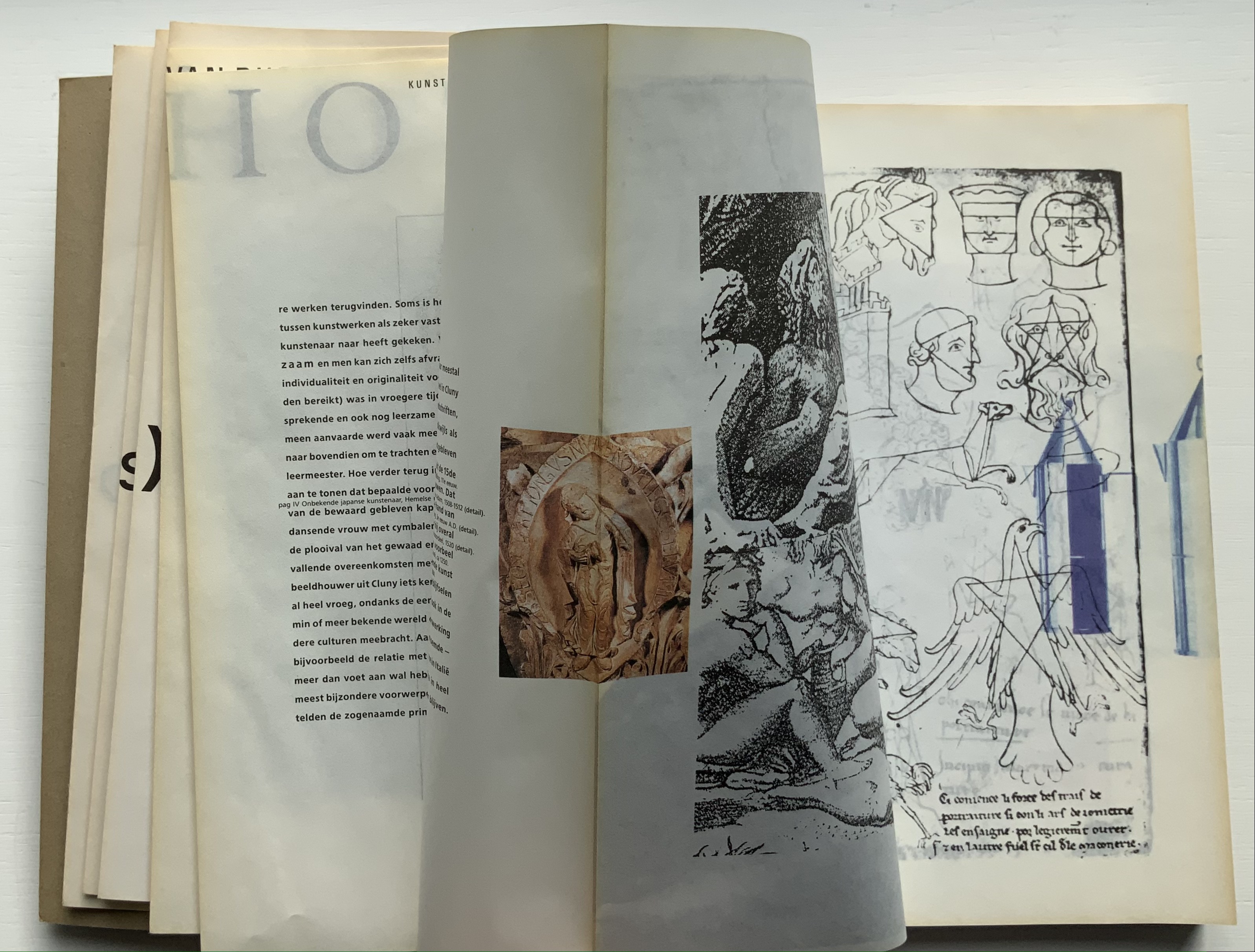
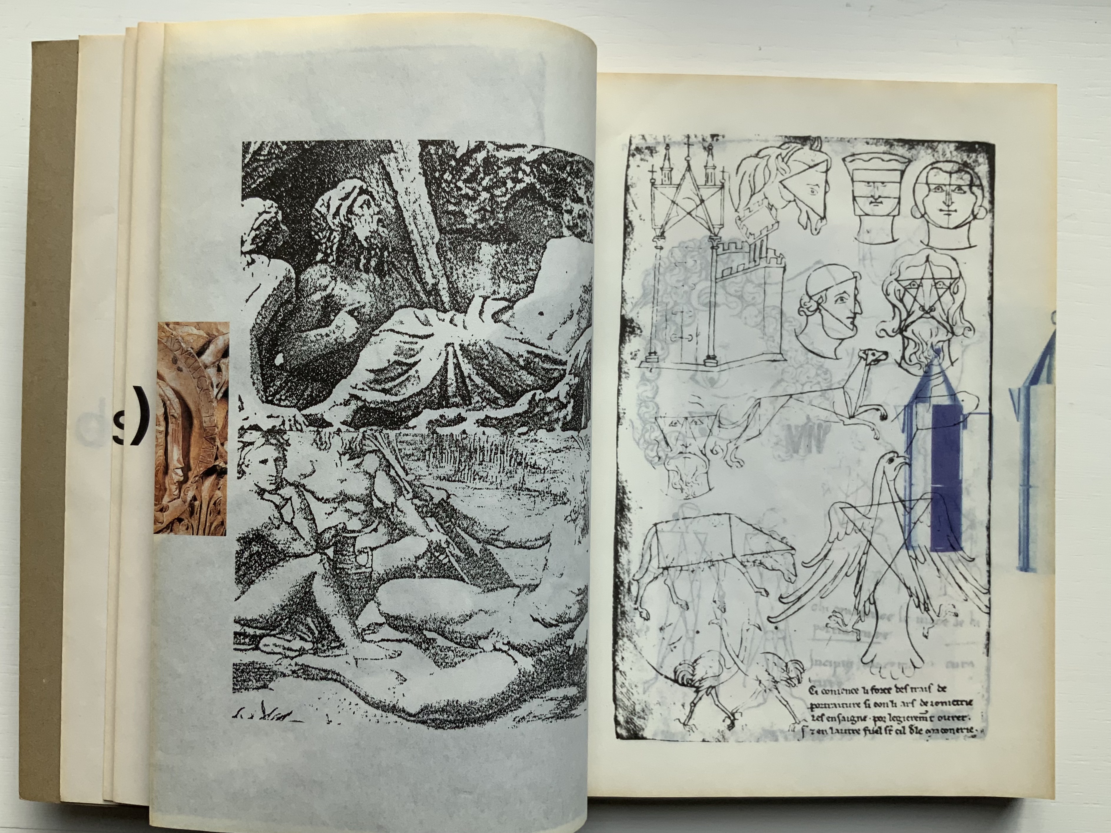
Nederlandse Postzegels, Poststempels87/88: Achtergronden, Emissiegegevens en Vormgeving (1988) [“Dutch stamps, postmarks 87/88: background, issuance data and design”] Irma Boom (design), Paul Hefting (text) and Piet Janmaat (photography) Two softcover volumes. H250 x W188 mm, 228 pages combined. Acquired from Cornelis Verheij, 9 January 2022. Photos of the work: Books On Books Collection.
This two-volume set accounts for Boom’s first published book design and her first book design award. It celebrates the special edition stamp designs commissioned by the Dutch PTT during 1987 and 1988 and features an index of the different postal cancellations used during those years.
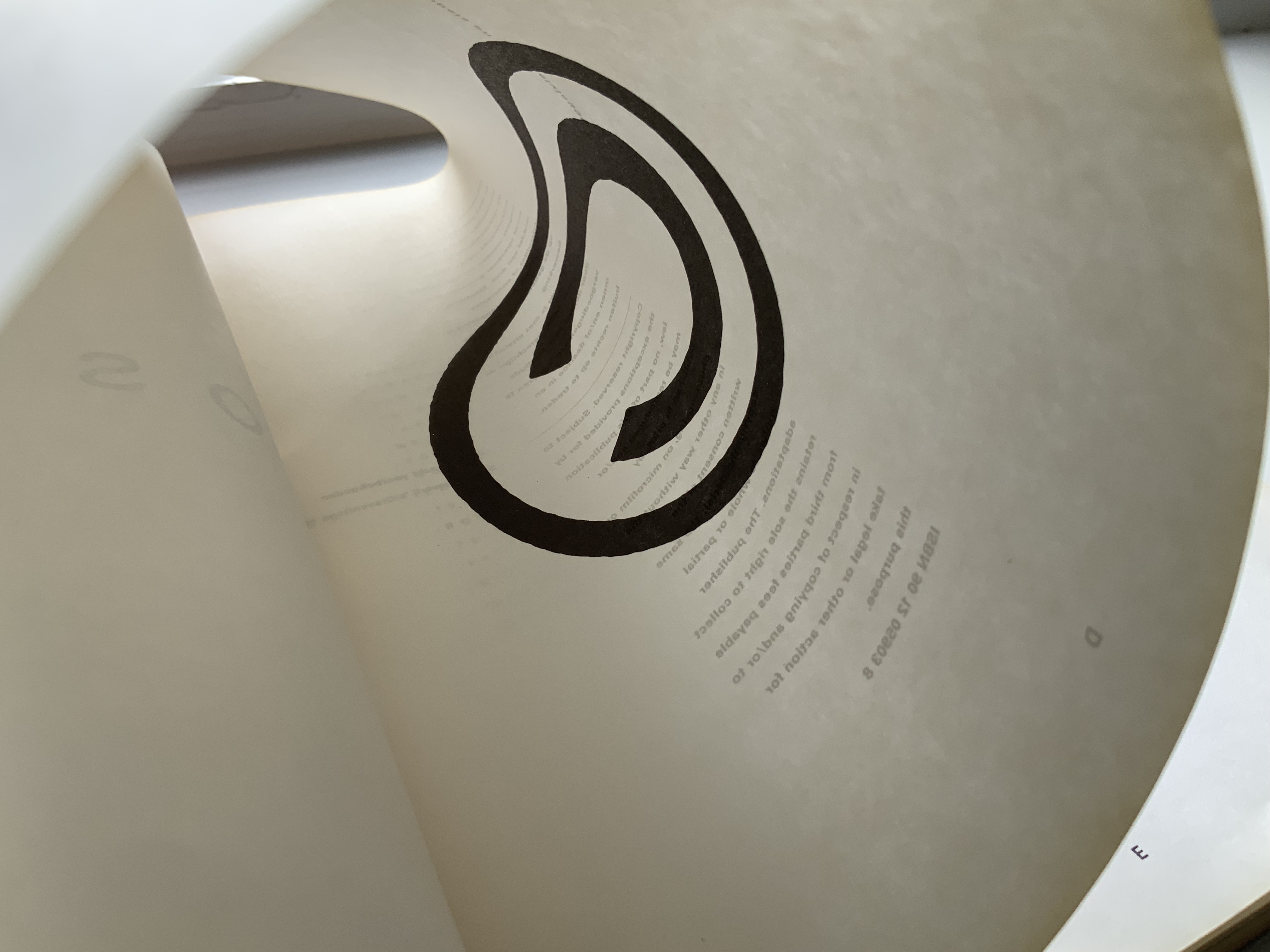
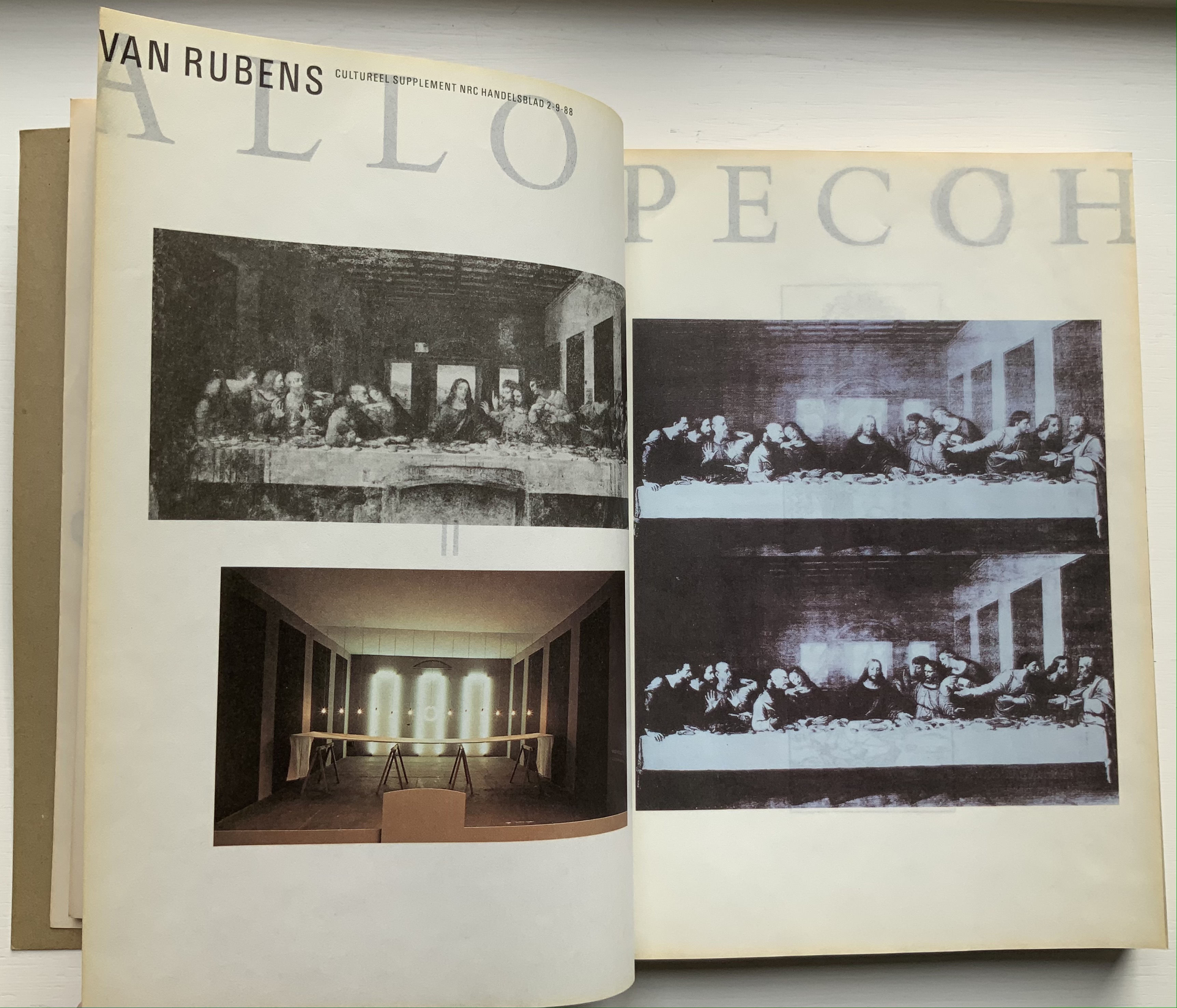
Foreshadowing Strip, the interior pages are created in the Oriental style of single-fold folios bound with the fold at the fore edge. In Nederlandse Postzegels, however, printing occurs on both sides of the folios. The outer sides are printed with 4-color offset lithography, presenting images and text sometimes in portfolio and sometimes in landscape layout. Whether in portfolio or landscape, images will often run from the recto to verso page, wrapping around the fold. In the section on the designers and their designs, the main text shows in landscape and, like the images, runs over the fold at the fore edge.
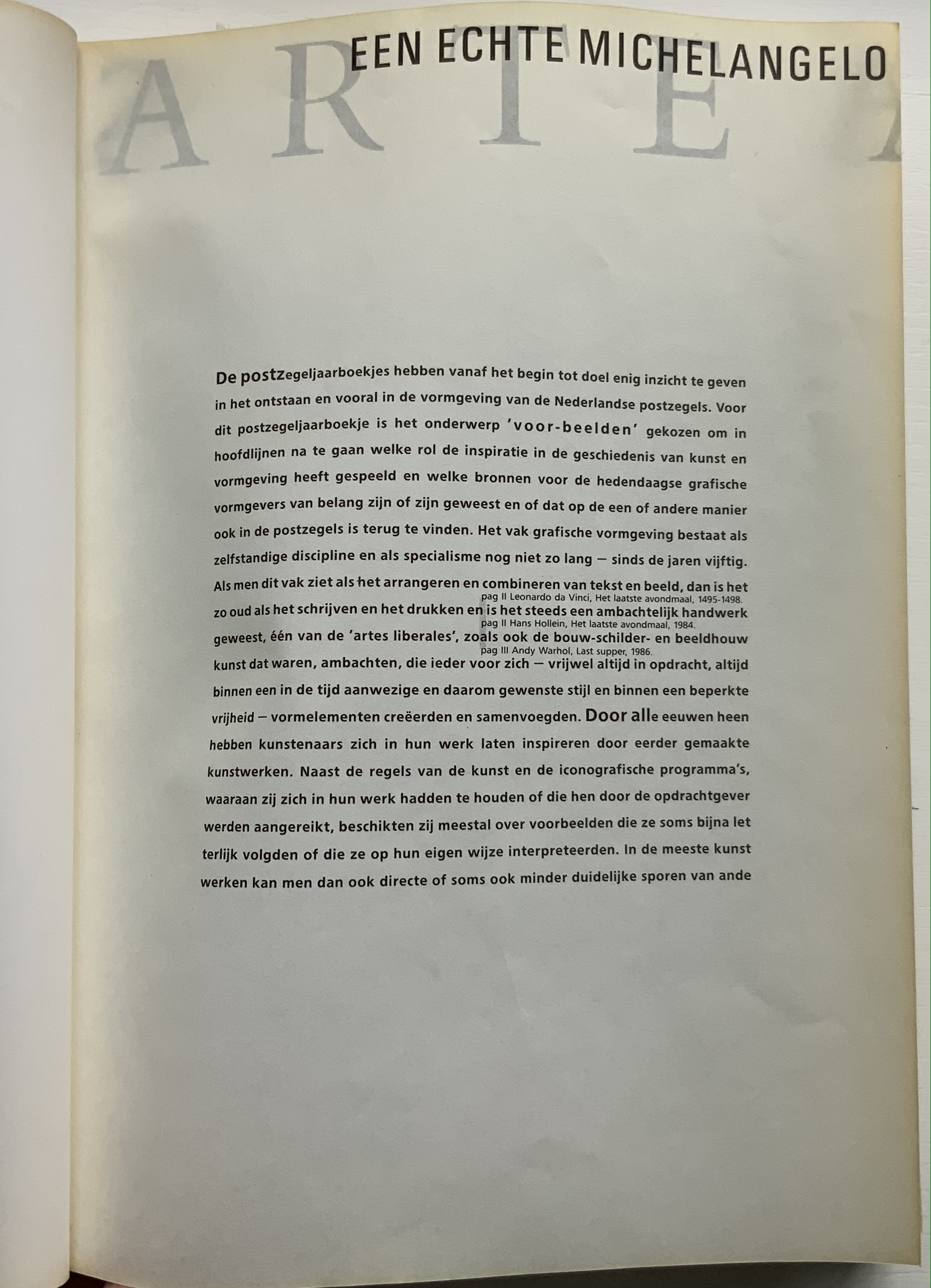
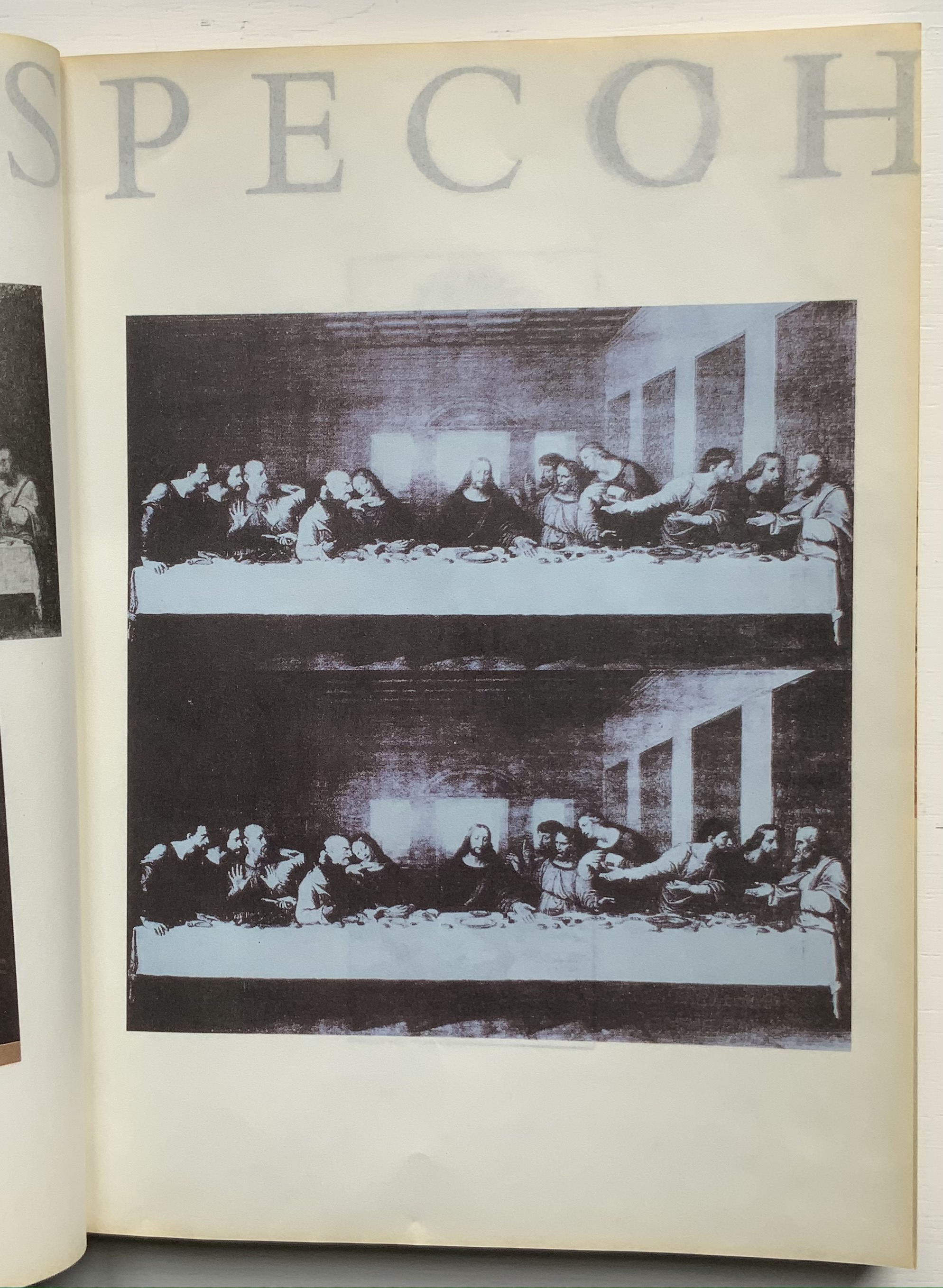
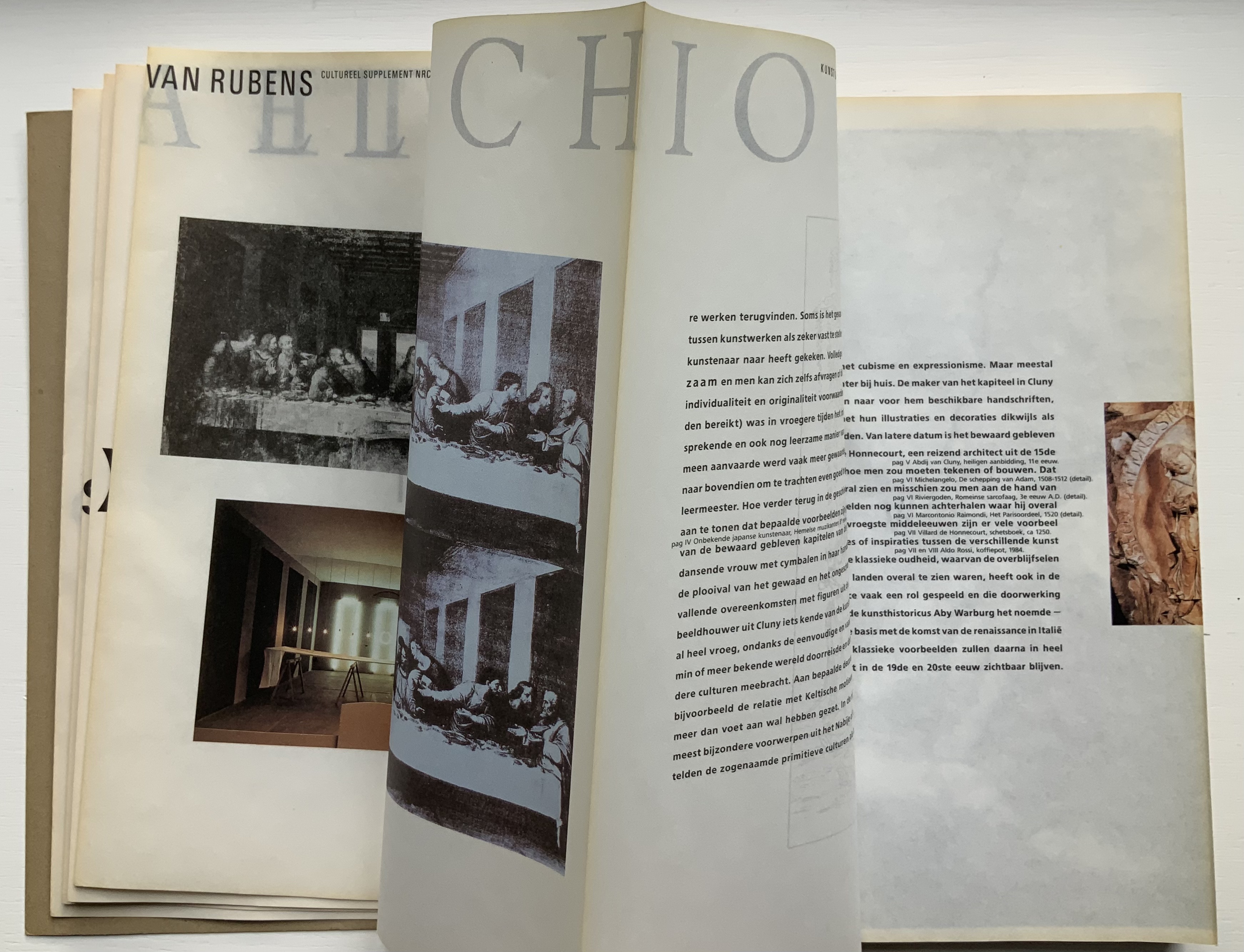
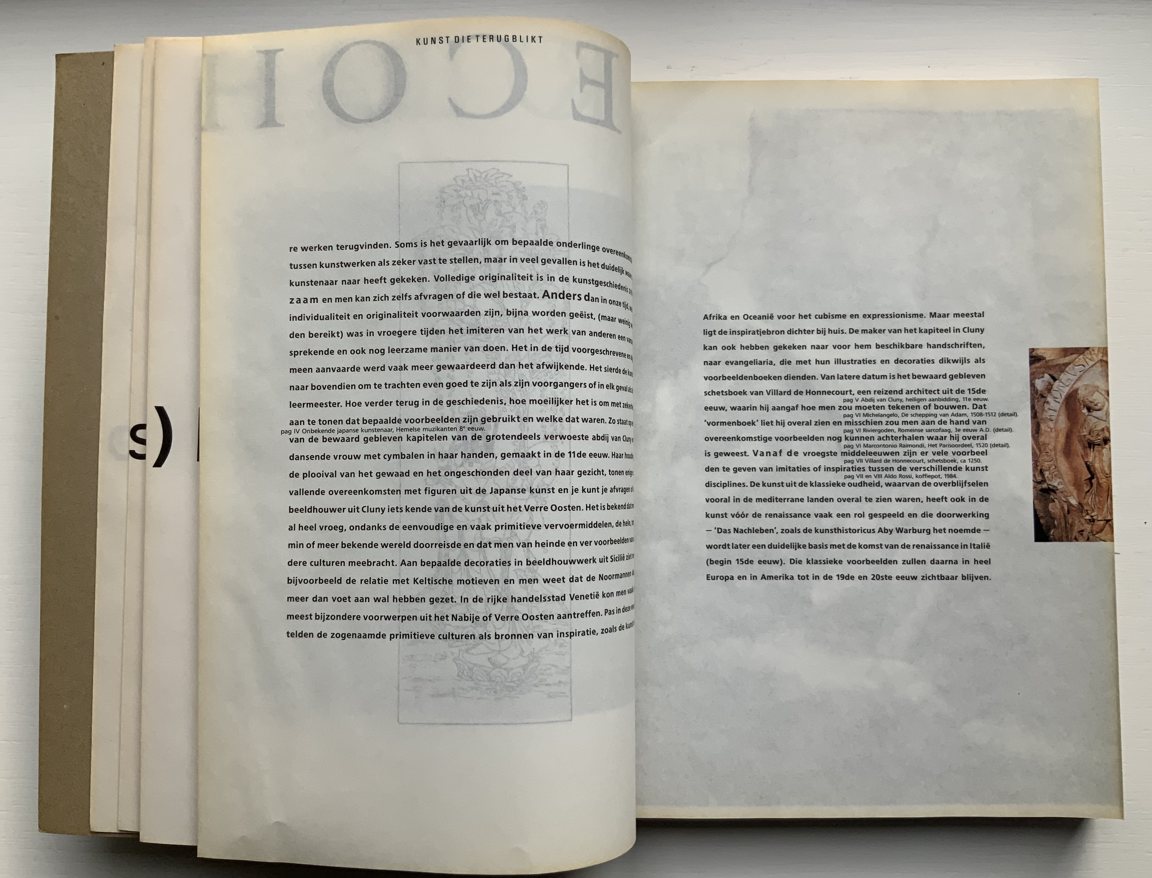
The inner sides are printed single color — black — creating shadow images on the outer side. Only by cutting through each fold (as encouraged by the perforations in Colour Based on Nature) can the inner-side images be examined closely, but this would destroy the work and the intent. With the shadows from the inner side, the outer side takes on a collage-like appearance. The print on the inner side also often serves for communication. For example, in the illustrated historical survey of design with which the first volume opens, the roman numerals for numbering plates appear on the reverse side of the plates to which they are assigned. Of course, the roman numeral has to be printed in reverse on the inner side so that it reads aright on the outer side, which is especially appropriate for this section labelled — from behind, of course — ARTE ALLO SPECCHIO (“art in the mirror”).
Copyright page and Table of Contents (pages D and E); inner side of page D.
ARTE ALLO SPECCHIO (“Art in the Mirror”) printed on the inner sides of unpaginated pages I, J, K and L, with specchio running over the fold between K and L.
Clockwise: Unpaginated pages L and M; plate IV printed in reverse on inner side of page L (note on page L the interlinear caption for plate IV — pag IV Onbekende japanse kunstenaar, Hemelse muzikanten 8 eeuw [“plate IV, Unknown Japanese artist, Heavenly musicians 8th century”]); note image running over the fold between pages M and N; pages N and O.
Like all of Boom’s other works in this collection, Nederlandse Postzegels is not a quick read or easily navigated reference work. Its design demands from the reader an awareness that should translate into thoughtfulness about the accomplished designers and their designs, among whom are Anton Beeke, Henk Cornelissen, Wim Crouwel, Reynoud Homan, Cees de Jong, Frans van Lieshout, Karel Martens, Rick Vermeulen, Tessa van der Waals, Piet Zwart and many others.
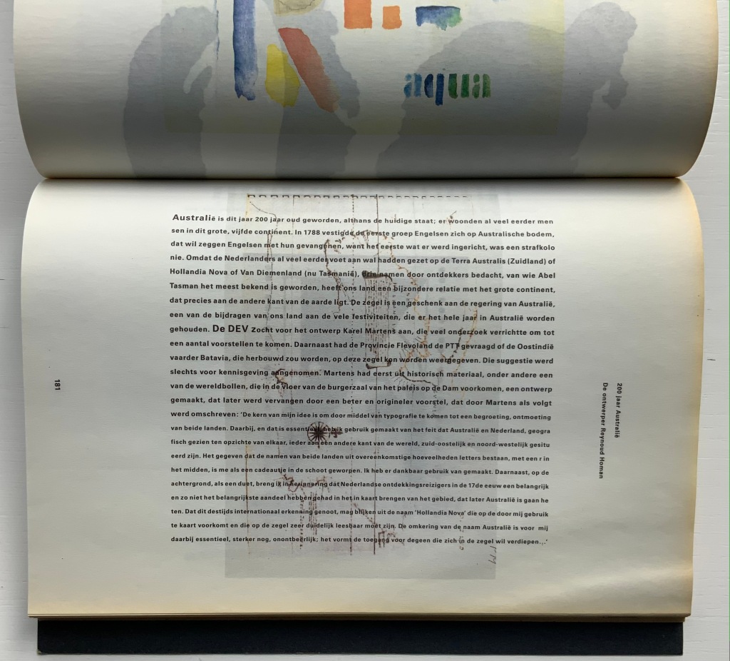
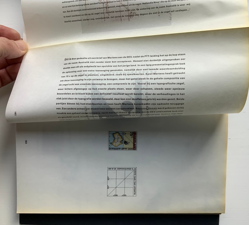
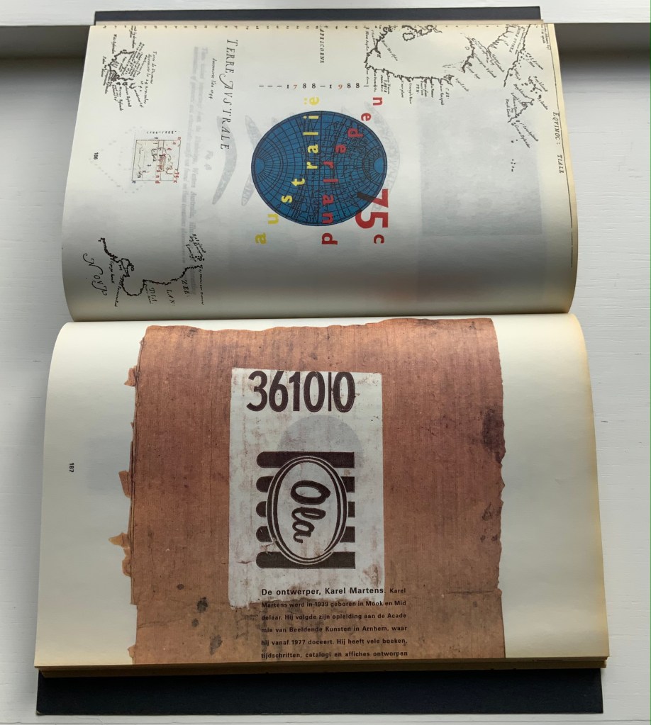
The selected pages and their “inside surfaces” recount the separate efforts of Karel Martens and Reynoud Homan to design the Dutch stamp commemorating Australia’s bicentennial in 1988. Martens’ design conflicted with PTT requirements, so Homan stepped in. The descriptive text follows a landscape layout and reads over the fore edge fold, but page numbers and some of the illustrations follow a portfolio layout.
Pages 181-83.
Pages 186-87.
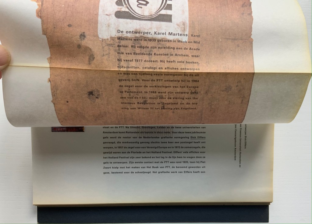
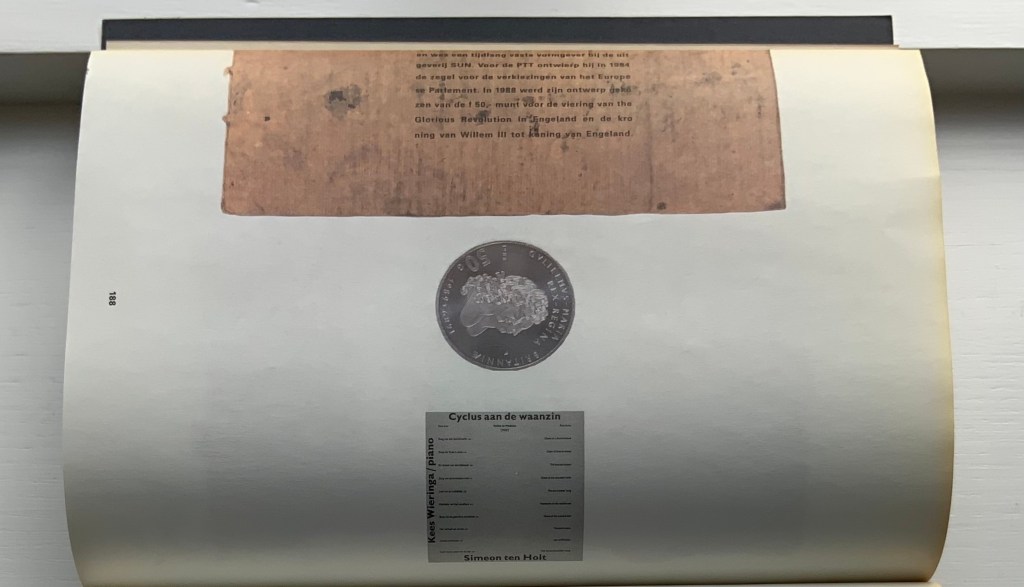
Top to bottom: Page 187’s text running over the fold to page 188; page 188 showing Karel Martens’ design of the coin commemorating William & Mary’s 300th anniversary of accession; inner side of page 188 cheekily showing the reverse side of the Martens coin.
Comparing herself to the kind of architect who produces social housing, Boom asserts, “books are industrially made and they need to be made very well. I am all for industrial production. I hate one-offs. On one book you can do anything, but if you do a print run, that is a challenge. It’s never art. Never, never, never.” But no less an institution than the Museum of Modern Art holds a copy of Nederlandse Postzegels. Display the book alongside the other five works above and the temptation to take Boom’s stance to be just as arch as that of Marcel Duchamp (“It’s art if I say so.”) is hard to resist. Nevertheless, ending with Nederlandse Postzegels, this entry defers to Boom and gives her the last word — at least on how the work came to be:
Since 1920, the PTT Art & Design Department had commissioned artists, architects and designers to design its services and products. To me, the whole idea of Dutch design comes from the design policy of PTT, especially in the 1970s and 80s when Ootje Oxenaar was head of the department.
Working at the Staatsdrukkerij meant enormous creative freedom. Those were the heydays of art-book publishing. If you made a book cover, they would encourage you to use foil or special printing techniques. The department was a springboard for young designers who would work there for one or two years and go on to something more exciting. After my internship, I went to Dumbar and the Dutch television (NOS) design department. After I graduated I went back to the Staatsdrukkerij, and ended up staying for five-and-a-half years. I learned a lot. In retrospect, it was a very productive and super-creative time.
I did jobs nobody else wanted, like the advertisements for the publishing department, which was – thinking of it now – a smart thing to do because I could experiment. Those assignments were completely under the radar but they were seen by Oxenaar. He invited the designer of the ‘crazy ads’ to do one of the most prestigious book jobs: the annual Dutch postage-stamp books.
Places like the Staatsdrukkerij don’t exist any more. When I started working there after graduation, I was immediately a designer (not a junior), and I quickly became a team leader. At that time I was very naive and fearless. I was not aware of an audience, and certainly not a critical audience! This vacuum is no longer possible for designers starting out today. I only became aware of the outside world after the prestigious postage-stamp yearbooks were published: hate mail from stamp collectors and design colleagues started to come in. But there was also fan mail.
The books polarised the design community. They won all the awards and a Best Book Award, my first one. In the jury report they mentioned ‘a brilliant failure’. Suddenly people knew who I was. I realised negative publicity has an enormous impact, more than positive publicity.” — Miltenburg, “Reputations: Irma Boom“.
Further Reading & Viewing
“Olafur Eliasson“. 17 May 2021. Books On Books Collection. Irma Boom designed the Eliasson catalogue called Contact, which is shown in that entry.
Boom, Irma, Julia Blume, and Günter Karl Bose. 2002. Irma Boom. Leipzig : Institut für Buchkunst.
Lehkoživová, Irena. 23 November 2016 –14 January 2017. “Irma Boom“. Vi Per Gallery, Prague, Czech Republic. Well-illustrated with photos by Peter Fabo.
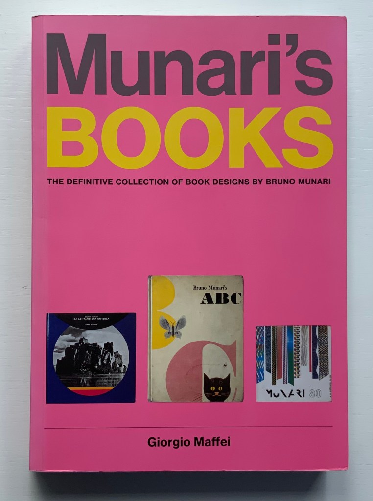
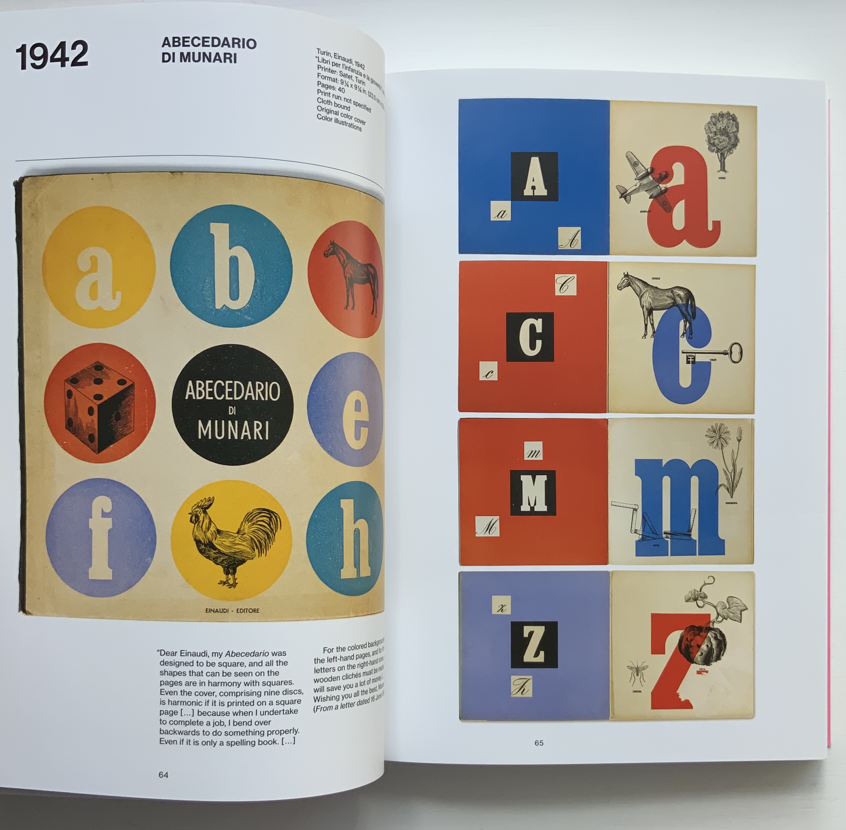
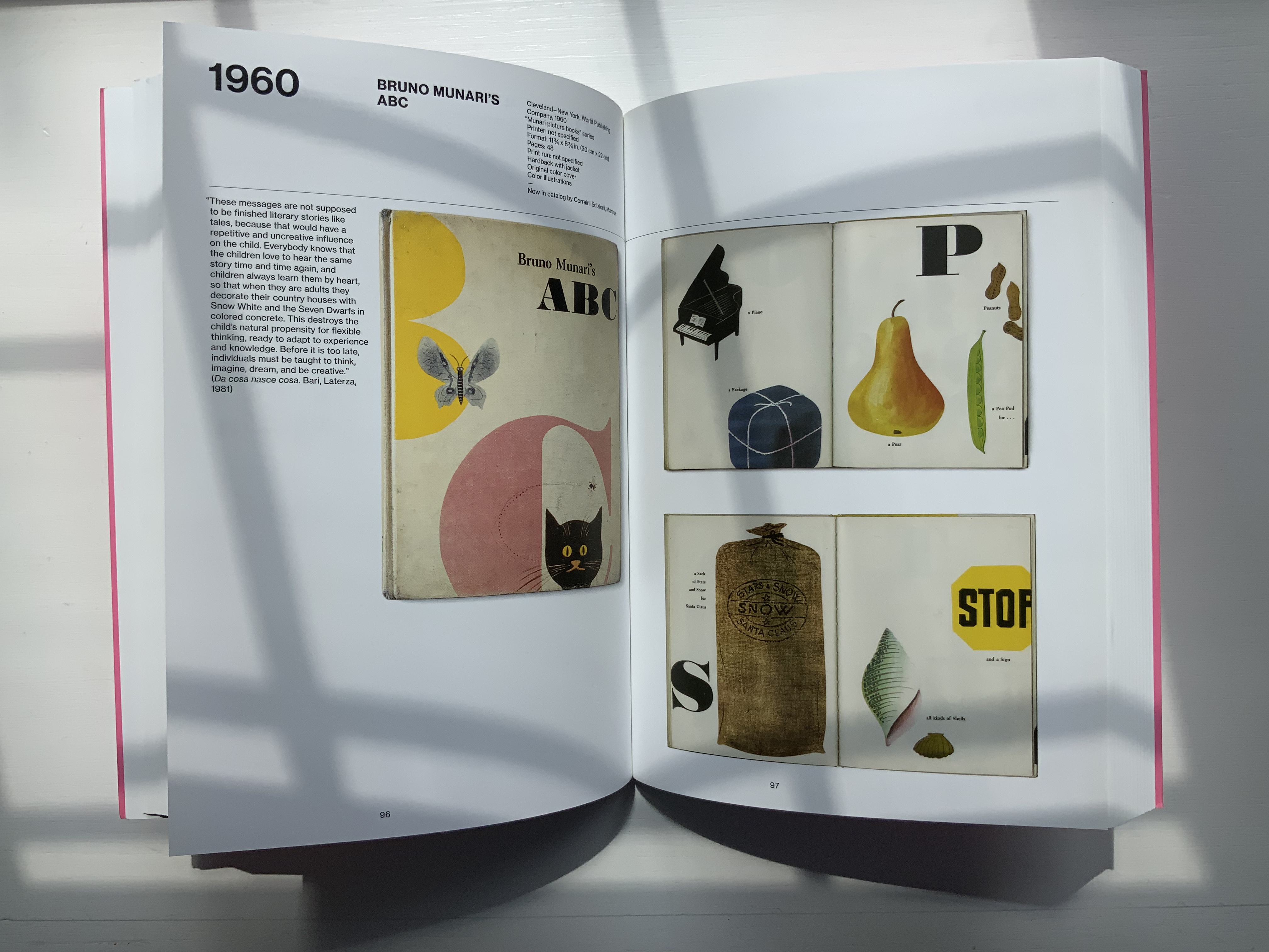
Giorgio Maffei’s 2008 definitive collection of book designs by Bruno Munari brings together two of Italy’s renowned book artists. Giorgio Maffei’s own work, his writing and gallery/bookshop (highlighted by his son Giulio Maffei’s extraordinary video catalogues Le vite dei libri) warrant a catalogue raisonné in their own right. The Italian edition published by Munari’s long-time publisher Maurizio Corraini was followed up in 2015 by this translation by Martin John Anderson and Thomas Marshall in 2015. For the Books On Books Collection, one of the great pleasures of Munari’s works is its attention to the alphabet, which this book documents.
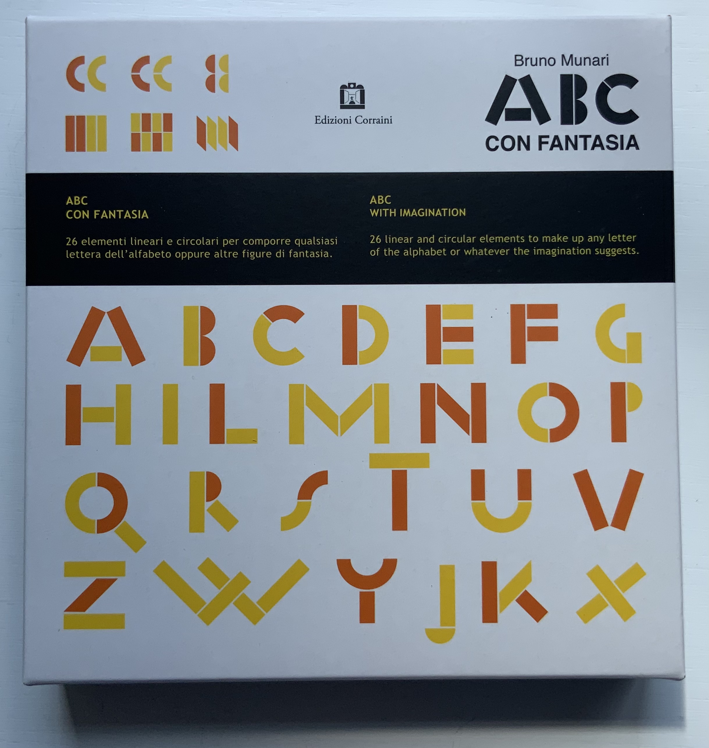
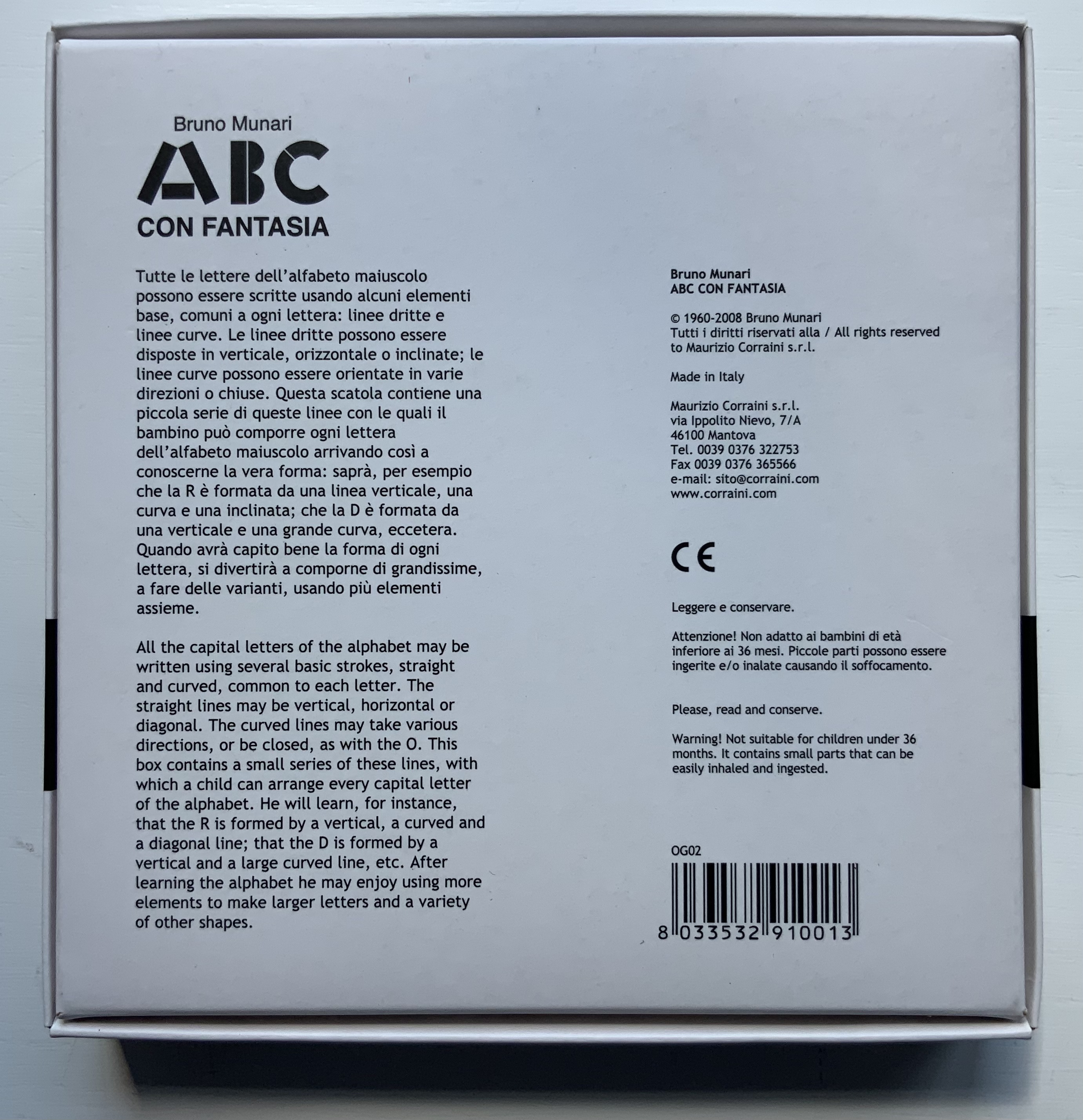
Although not shown in Munari’s Books, an alphabet-related work that underscores Picasso’s calling Munari “our Leonardo” is ABC con fantasia (1973/2000). If we are to believe Fra Luca Pacioli, it was Leonardo da Vinci who inspired his “straight lines and curves” exposition for creating letters. Following in their footsteps, Munari provides the linear and curvilinear basics for the collector and offspring to join the game.
Another pleasure is how Munari’s works lead to other works in the collection. Just by preceding them in Pieter Brattinga’s Kwadraatblad/Quadrat-prints series, Munari’s An Unreadable Quadrat-Print (1953), below, conjures up Wim Crouwel‘s, Gerard Unger‘s, Timothy Epps and Christopher Evans‘, and Anthon Beeke‘s more alphabetical contributions.
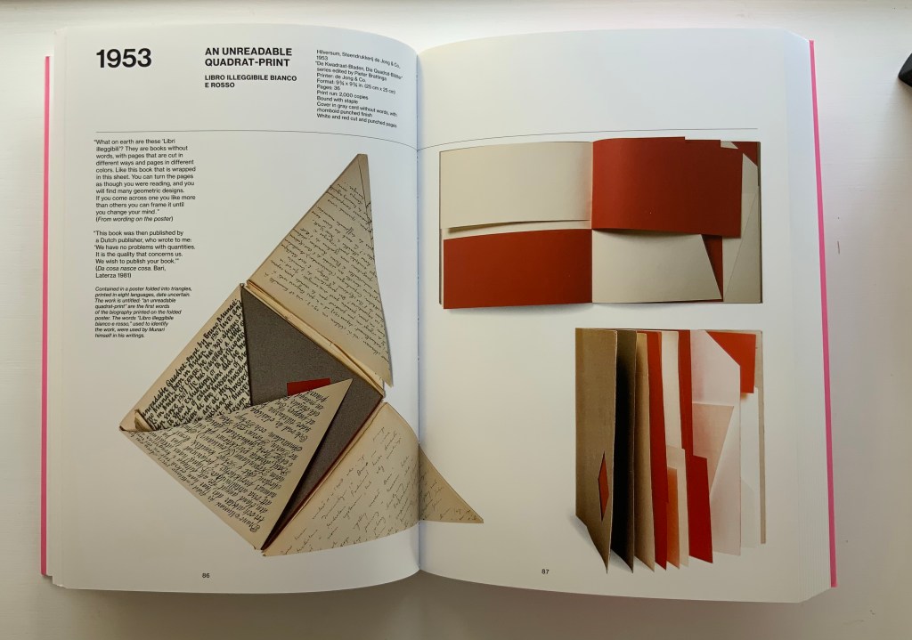
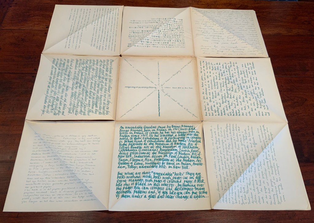
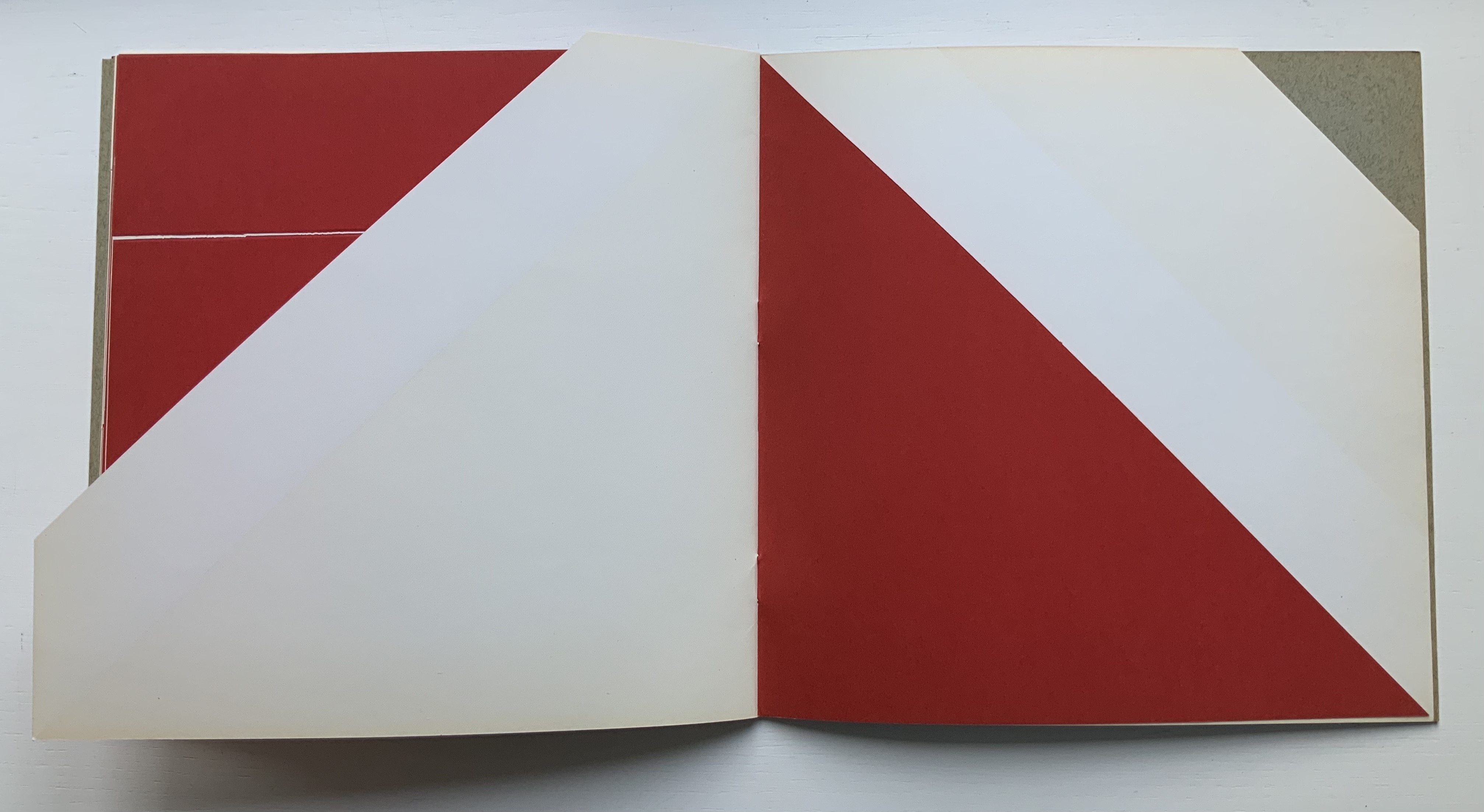
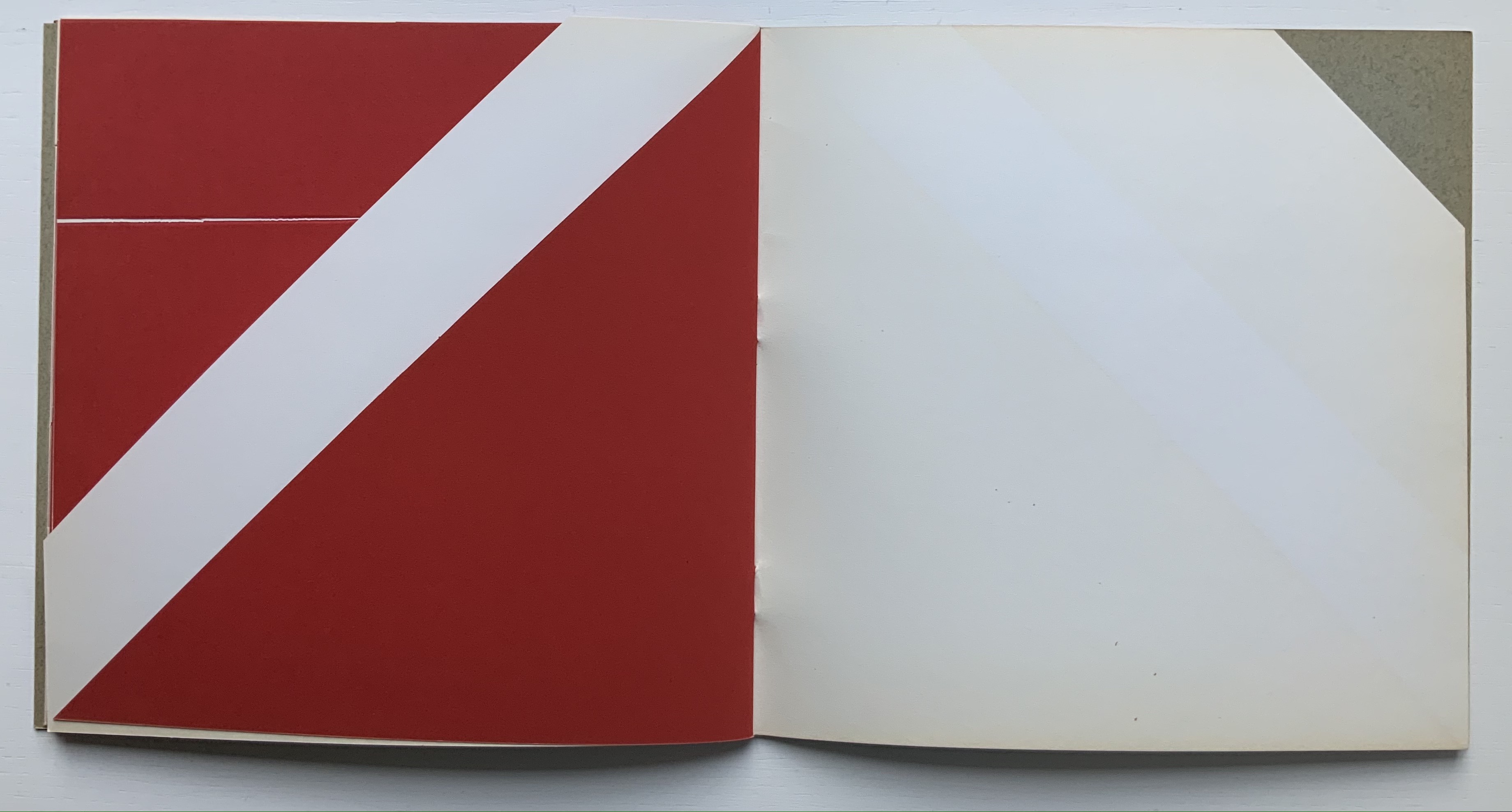
Libro illeggibile bianco e rosso / An unreadable Quadrat-Print / Een onleesbaar kwadraat blad / Ein unlesbares Quadrat-Blatt (1953)
Although there are no words on numbered pages that have to fall in the right order, An Unreadable Quadrat-Print still presents the author/printer/binder with a challenge in imposition. White and red alternate, which is easy enough, but to cut or not cut a folio on the left and right, how to cut it, how to place the differently cut folios in the right order to achieve the variation in images when the pages turn, how to ensure a sewable area down the center for each folio whether it has a horizontal cut extending into the spine or a diagonal one extending from some point along the spine — that is impressive. It speaks to the sculptural process and result in making books, as well as the sculptural process of reading them.
The following sequences — the book’s first five double-page spreads and then its last six — take a normal page-turning approach, always turning from the upper right corner of whatever shape/page is available. Note how, in the last six double-page spreads, the pages and shapes become more complex.
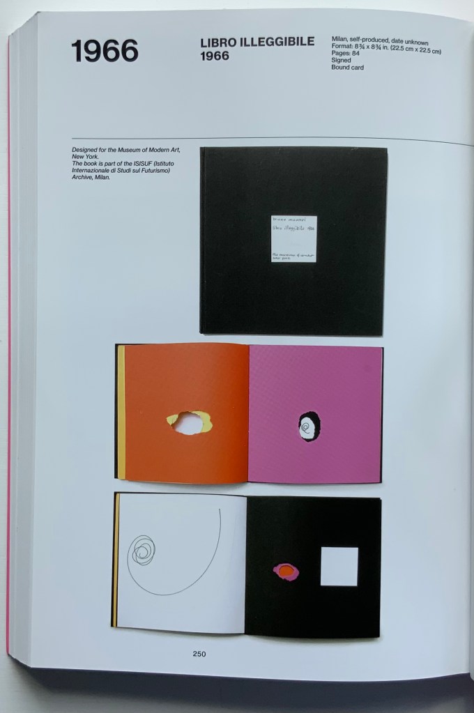
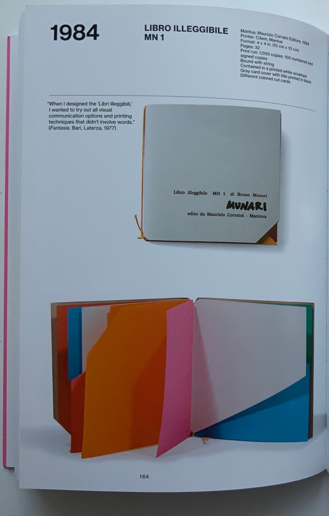
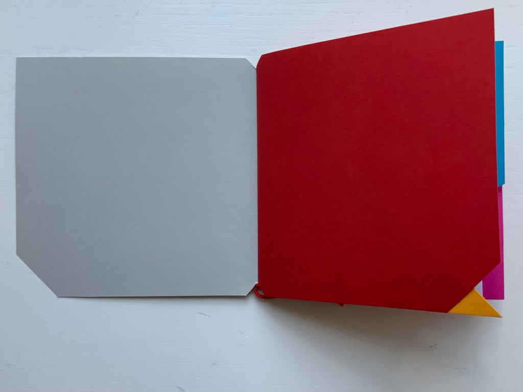
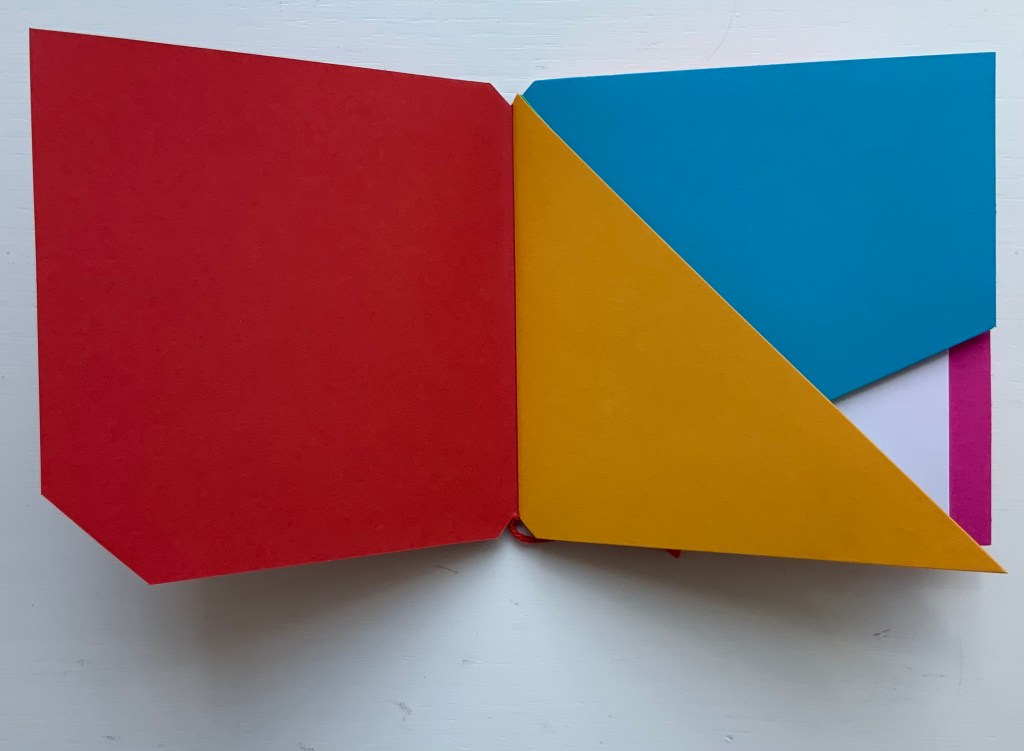
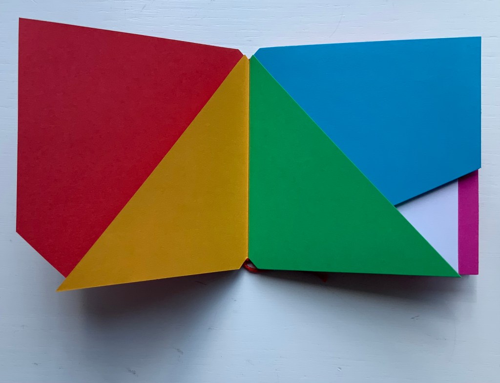
Libro illeggibile (1966), below left, calls to mind Katsumi Komagata’s A Cloud (2007), and the one in the middle foreshadows Eleonora Cumer’s subtle artistry with transparent paper in Circoscrivere lo spazio No. 3 (2021). While Munari’s rare works press modest budgets, some of it — in its simplicity and popular appeal — has led Corraini Edizionito put it within easier reach. Numerous reissues of the 1984 Libro illeggibile MN 1 have pushed its price to €5. Short of the artist’s signature (which would likely obstruct the aesthetic intention), a copy from the latest 5000-copy print run will “perform” and deliver the same experiential value as one from the earliest run.
Munari’s many series of illegible books tap into book artists’ longstanding and ongoing preoccupation with whether a book without words can communicate information, narrative, sensations or feelings through material, shape or color and their permutations. The colors, shape, feel and binding of Libro illeggibile MN 1 evoke simple and sophisticated pleasure in their juxtaposition and sequence. The unchanging straightness of the top edge and the anchoring red thread of the binding set off the changeability of shapes and colors.
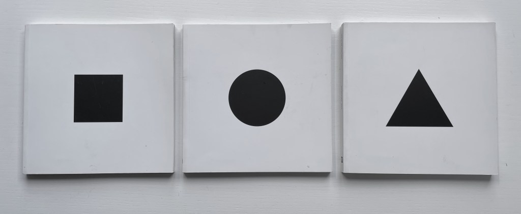
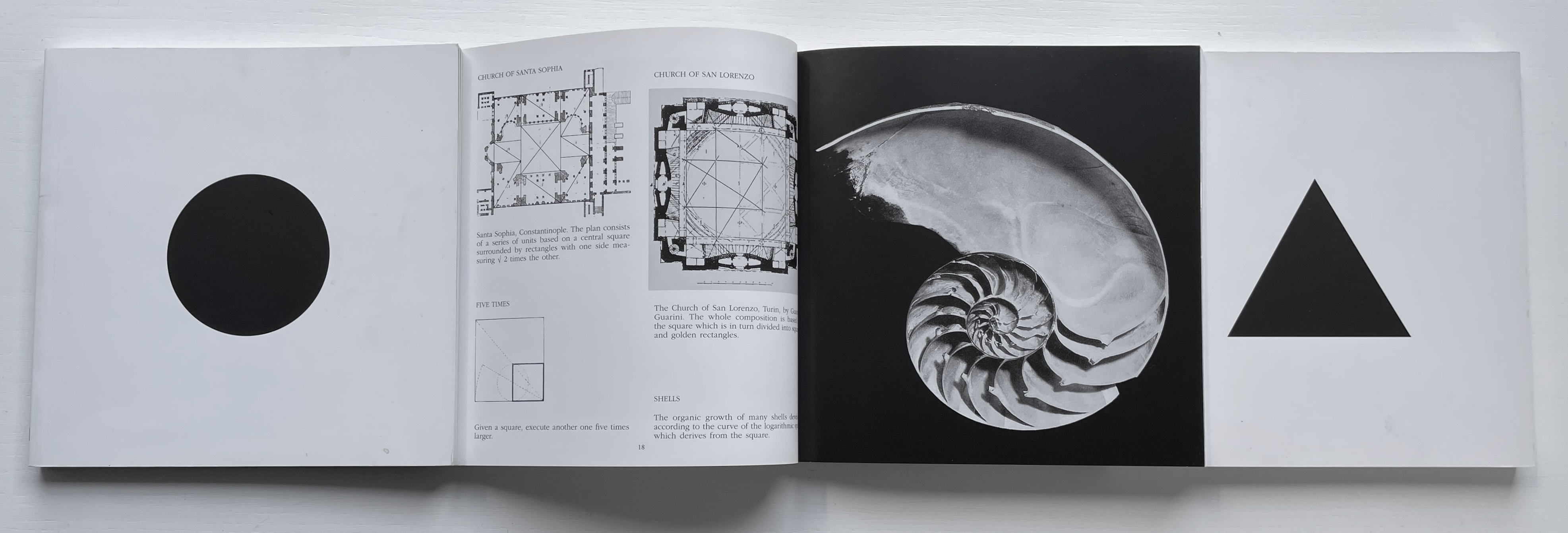
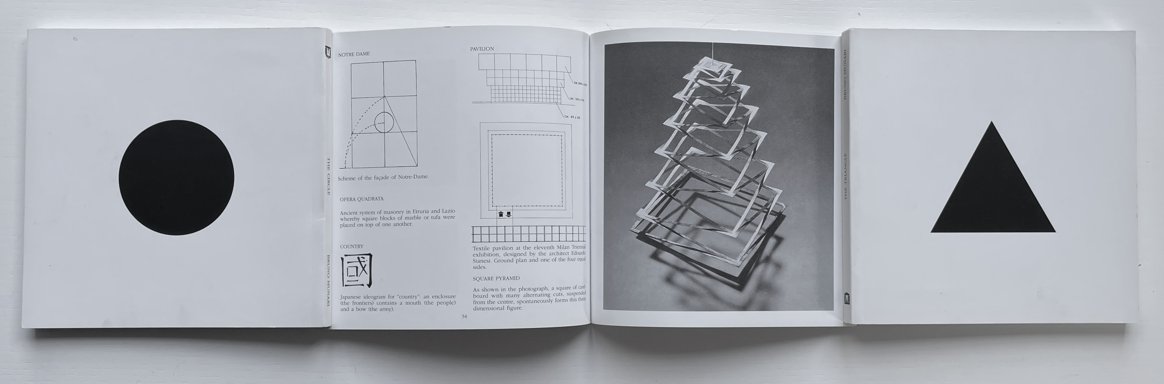
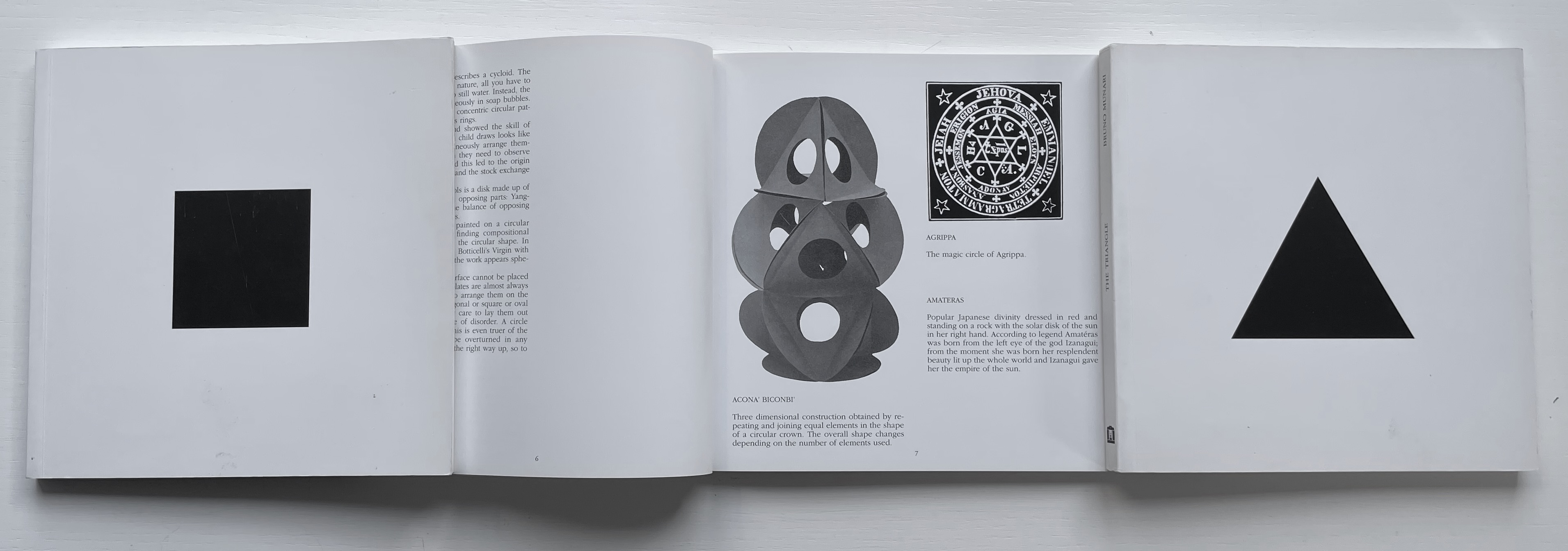
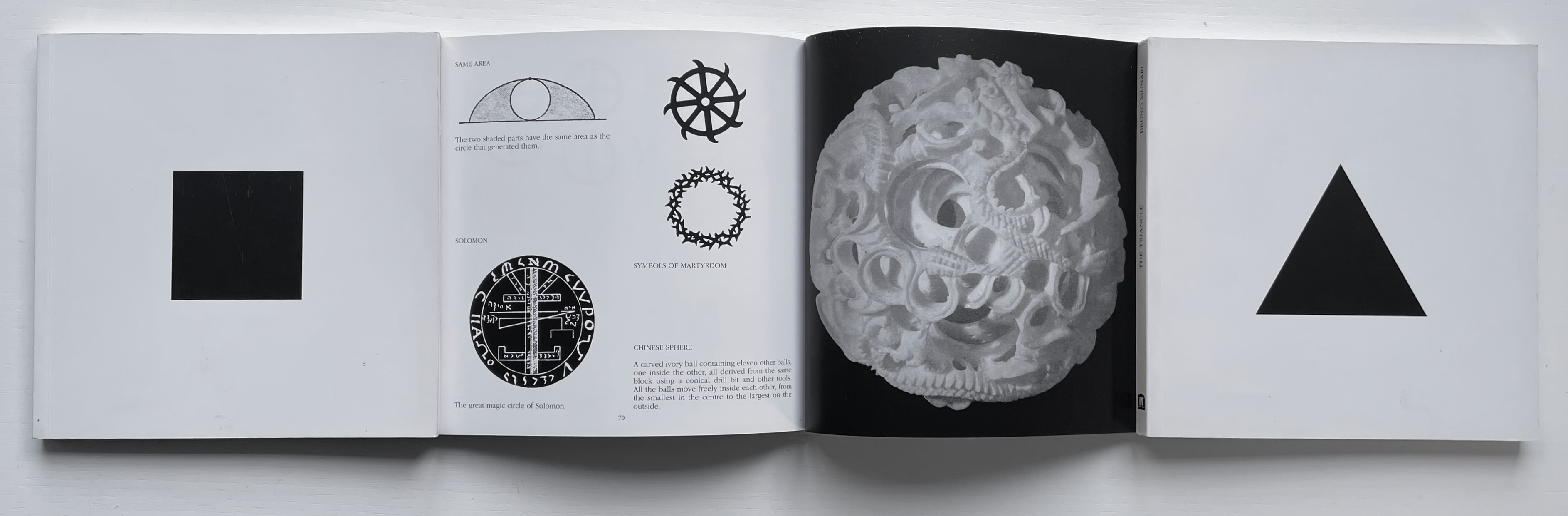
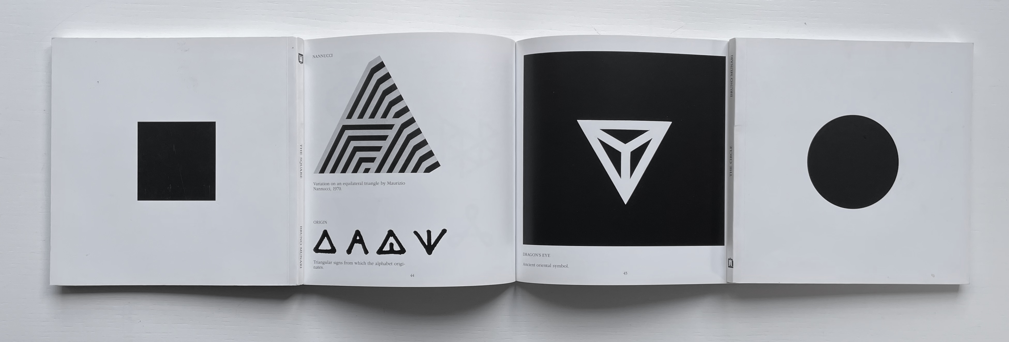
The Square (1960), The Circle (1964) and The Triangle (1976)
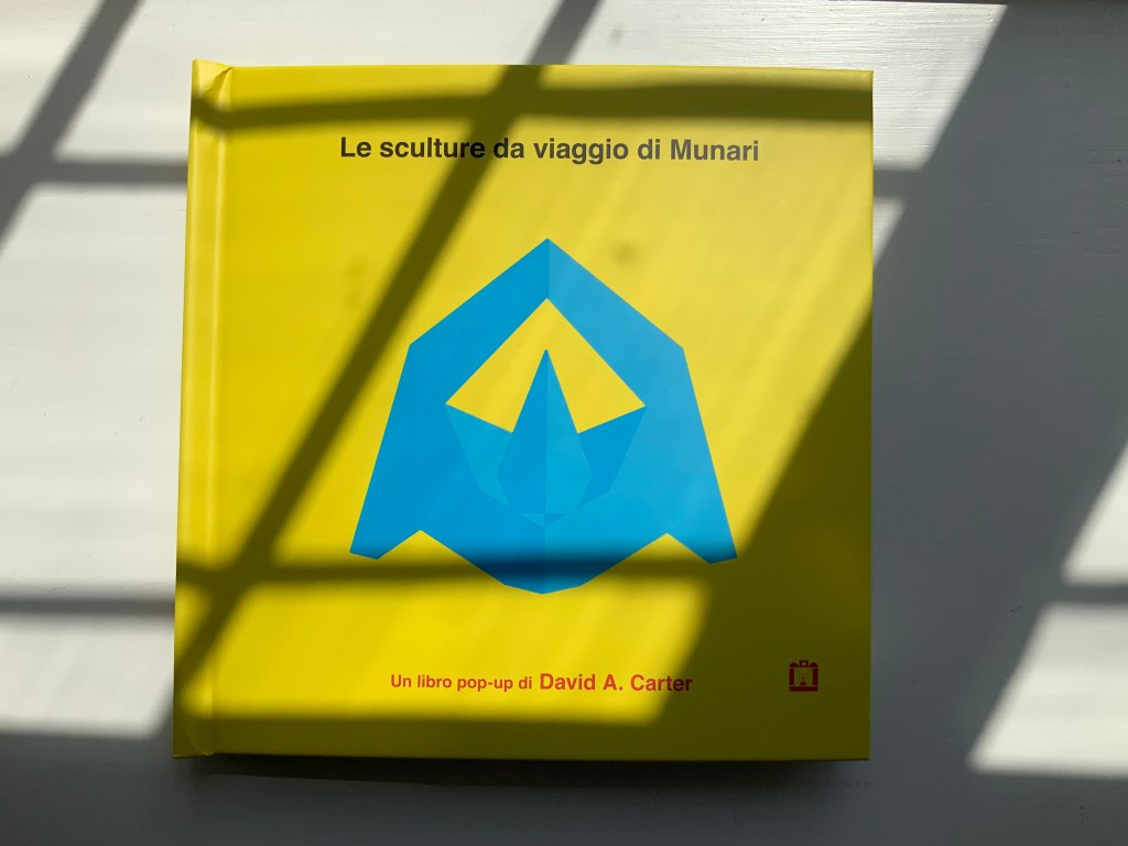
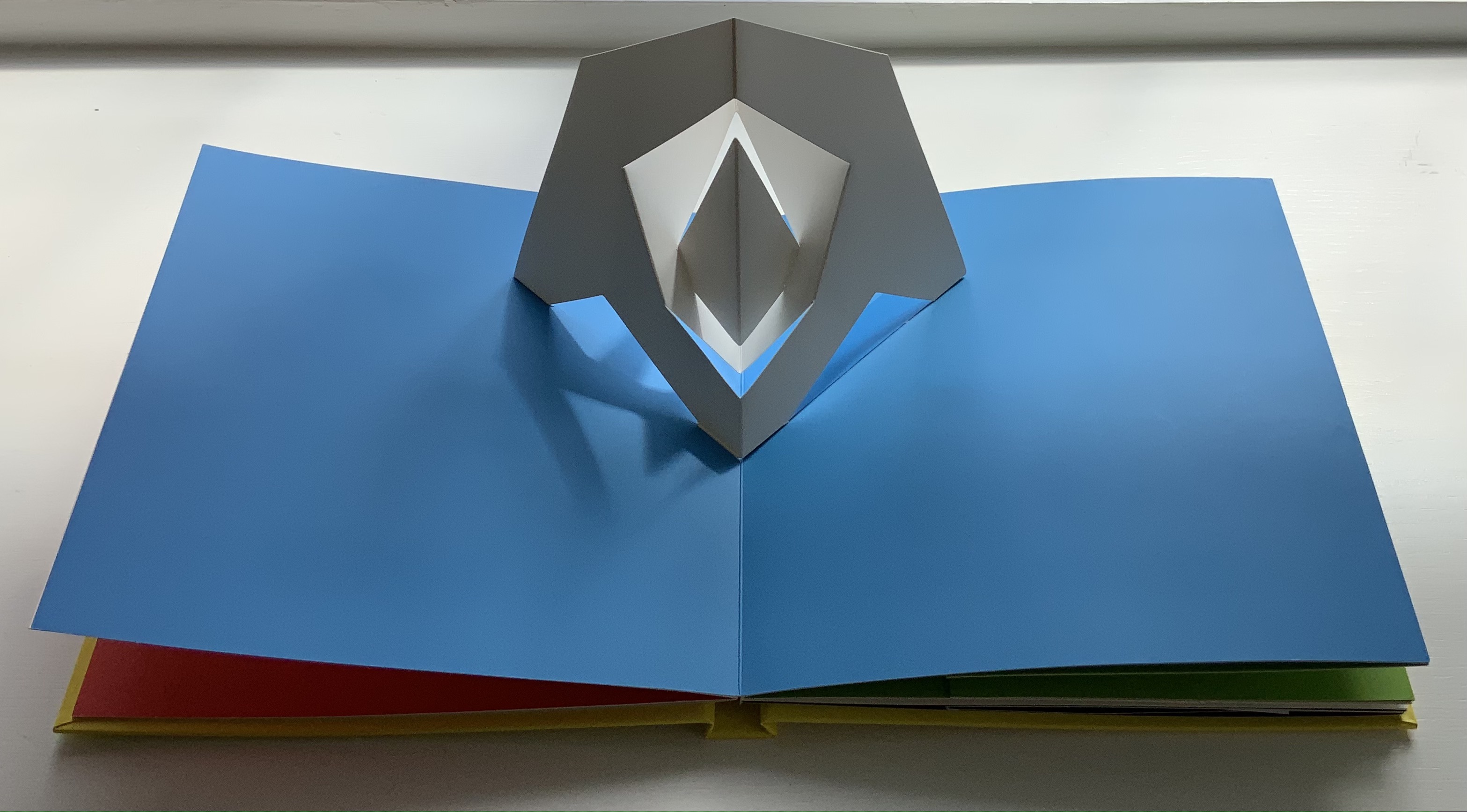
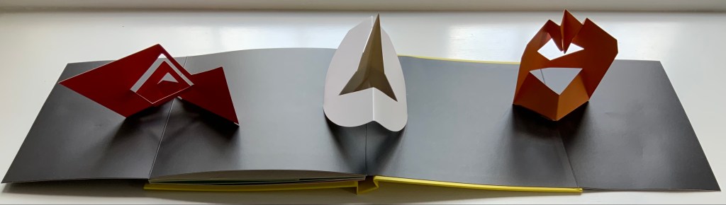
Although not a book of Munari’s making, David A. Carter’s Le sculture da viaggio di Munari is one way of bringing the spirit of Munari’s “travel sculptures” into the collection. Carter’s homage carries the blessing of Corraini Edizioni, further justifying its inclusion.
Travel sculptures started off as small sculptures (some even pocket-sized) to carry with you, so you could take part of your own culture to an anonymous hotel room. Later they were turned into ‘travel sculptures’, five or six metres tall and made of steel. One of these was seen for a few months in Cesenatico, another one in Naples. Others are sleeping among huge trees in the Alto Adige region.’ This is how Italian designer Bruno Munari (1907-1998) described his ‘travel sculptures’, which in turn inspired American illustrator and designer David A. Carter for this pop-up book. –Corraini Edizioni website. Accessed 3 August 2021.
Munari’s travel sculptures also recall works in the collection like Cumer’s scultura da viaggio dipinta n.2(2017), Komagata’s「Ichigu」(2015) and, albeit less portable, Ioana Stoian’s Nous Sommes (2015).
The art of the alphabet seems to be a rite of passage for graphic artists. Perhaps it is that art and the alphabet find common ground in the urge to make sense of the world. Perhaps it’s that the alphabet’s invention, development and artistic treatment present a rich tradition for artists to follow or challenge. Perhaps it’s that letterforms and the alphabet offer raw material, subject and organizing principle all in one. Semic or asemic. Calligraphic, typographic or even plastic. Representational or abstract. All are options. But most often, something bookish results. From Islam Aly’s 28 Letters(2013) to Ludwig Zeller’s Alphacollage (1979), a significant part of the Books On Books Collection is taken up with artists’ books based on the ABCs and letterforms. The Collection’s two facsimiles of Geofroy Tory’s Champ Fleury provide a useful historical backdrop that throws into relief several of the Collection’s works and their performance of this rite of passage.
It should be no surprise that Geofroy Tory de Bourges (c.1480-1533) serves up such an exemplar. In her Playful Letters, Erika Boeckler writes
An accomplished designer, typographer, printer, poet, author, translator, calligrapher, illustrator, woodcutter, and engraver, he received his education in Italy and ultimately settled in Paris, setting up a bookstore, writing his own works, running a press, and collaborating with or working for Simone de Colines, director of one of the most influential and experimental fine publishing houses of the time. Personally writing the text, designing the woodcuts, and cutting some of them, organizing the layout, perhaps even setting the type, Tory created Champ Fleury as what we might call today an artist’s book. (p. 29)
Tory straddles the letters of the late Middle Ages and Renaissance. Appointed by François I in 1530 as his printer, Tory operated on the Petit Pont under the sign of le Pot cassé (“the broken pot”) and was known for his workshop’s handwritten Book of Hours (1524). Rooted in the horae tradition reaching back to the 13th century, Tory’s Book of Hours is an early-to-mid-Renaissance version of its predecessors. As beautiful as his Book of Hours is, Champ Fleury (1529) became his best known work. Authored and designed by Tory, it was produced by hand typesetting and letterpress printing in Paris with Giles Gourmont. Printed less than 100 years after Gutenberg’s innovation, Champ Fleury represents the printed book toddling out of its incunabula period.
Book of Hours Geofroy Tory (1524) Bound in the 18th century, 113 leaves of vellum. Lessing J. Rosenwald Collection (Library of Congress). Accessed 30 May 2021.
According to Jeremy Norman’sHistory of Informationsite, the first separate printed title page appeared in 1463. Subject indices date back to the 13th century, originating at the University of Paris, and the first printed indices, to 1470. Champ Fleury‘s front matter boasts a title page, two prefaces to the reader, a statement of the King’s Privilege awarded for the book for ten years (a forerunner to the copyright page), a name index without location references and a subject index with folio references. Champ Fleury’s back matter consists of a colophon preceded by a lengthy appendix illustrating various forms of the alphabet (Hebrew, Greek, Latin, etc.).
Tory’s placement of the indices in the front matter rather than the back matter reflects the gradual development of the anatomy of the book towards the structure that would ultimately be codified in reference works like the Chicago Manual of Style. Paratextual elements like the title page, table of contents, page numbers, etc., did not spring up overnight. If, as Eric Havelock and others assert, society, the arts and culture are a superstructure erected on the foundation of the alphabet (see below), Champ Fleury and its “letterology” make for a particularly fitting exemplar of the book as an element of the superstructure arising from the alphabet.
Perhaps book artists sense this, which again leads to that alphabet art rite of passage and the elaborate variations on it. The illustration of various forms of the alphabet in the appendix also draws on another developing tradition: the typesetter/printer’s sample book advertising the firm’s fonts. Abecedaries and artist books have sprung from that tradition, too.
Tory was not the first to propose an art and science behind the letterforms of the alphabet. Predating his efforts were Giovanninno de’ Grassi (1390-1405), Felice Feliciano (1463), the Anonymous Chicagoensis and Anonymous Monachensis (1468?), Damianus Moyllus (1480), Fra Luca Pacioli (1509), Sigismondo Fanti (1514), Francesco Torniello (1517), Ludovico Arrighi (1522), Albrecht Dürer (1525) and Giovanni Battista Verini (1527). Leading up to Champ Fleury, these earlier efforts track the development of humanism. Arguably, Tory’s effort is a capstone, combining myth, allegory, metaphysics, geometry, linguistics, calligraphy, typography and cryptography.
Book One, concerned with the mythical origins of the French language, also addresses the fabled origins of the alphabet: the story of Jove, Io and Mercury behind the letters I and O and their claim to being the first letters and also the tale of Apollo’s accidental murder of Hyacinth explaining the letters A and Y and their similar claim. Two works in the Collection built on alphabet origin stories are Francisca Prieto’s Printed Matter series (2002-2008) William Joyce’s The Numberlys (2014), but many more follow in Champ Fleury’s art and science footsteps.
Tory’s late medieval/early Renaissance perspective gives way to 20th and 21st century poetics and phenomenology in most works of the Collection. Aaron Cohick’s The New Manifesto of the NewLights Press (third iteration) (2017) offers a good example. Another — closer to Tory’s moral and geometric perspective but of a more modern spirituality — is Jeffrey Morin and Steven Ferlauto’s Sacred Space (2003).
Compile all the abecedaries ever created and it would approximate the result of Adam and Eve’s task of naming all the creatures and things of the world. Leonard Baskin echoes that innocence in Hosie’s Alphabet(1972) with its words and animals supplied by his children. If Adam and Eve had had an alphabet, they might have been tempted into pareidolia, which is represented in the Collection by VUES/LUES: Un Abécédaire de Marion Bataille (2018) and Typographic Universe (2014) by Steven Heller and Gail Anderson. Heller and Anderson’s compendium extends to letters formed of natural and drawn objects from the real world, which Champ Fleury’s appendix foreshadows with its floral and fantastic alphabets.
Of course, Tory’s work is not an abecedary. In Books Two and Three, it develops into a full-blown treatise on letterforms whose meaning and appearance are explained allegorically and driven by the compass, rule and geometry expressed within a 10x10x10 cell cube. It would overstate the case to call it “typographic design”. As drawn, Tory’s diagrams would serve poorly for cutting and forming punches or matrices (although it has been done). Nevertheless, his geometric approach foreshadows the grids and algorithms of Wim Crouwel’s New Alphabet (1967), Timothy Epps and Christopher Evans’ Alphabet(1970) and Ji Lee’s Univers Revolved: A Three-Dimensional Alphabet (2004).
Before the age of computers and algorithms, though, the artist and designer Bruce Rogers did bring typographic design to bear on Champ Fleury. The Grolier Club sponsored the printing of George B. Ives’ English translation. Rogers’ design “translates” Champ Fleury just as much as Ives does, perhaps more so. The Grolier Club edition is one of only ten books to be set completely in the Centaur typeface designed by Rogers.
Of course, the translation entails a complete resetting of the text, and Centaur naturally delivers crisper letters. Also, in redesigning with Centaur, Rogers alters the original’s layout and, therefore, the reader’s experience of it. Notice in the OAHK pages above and in the three double-page spreads below how Rogers changes Tory’s flow or jumpiness to something fixed or stately. Attention to the page and its layout offers book artists as well as book designers yet another creative avenue. For proof of that, compare the Collection’s entries for Angel, Baskin and de Cumptich.
Architecture is another of Tory’s well-developed analogies and explanations of the ancients’ thinking behind the letterforms. In his drawings below, he aligns the letters AHKOIS with the parts of a building and letters IL with floor plans. He connects the circularity of the Coliseum’s exterior and the ovalness of its arena with the proper shape of the letter O. In the Collection, the analogy reappears fantastically in Johann David Steingruber’s Architectural Alphabet (1773/1972), Antonio Basoli’s Alfabeto Pittorico (1839/1998) Antonio and Giovanni Battista de Pian’s efforts in 1839 and 1842.
The architectural analogy provides Tory with his segue from plane to solid geometry in aligning the shapes of letters with human anatomy and virtues. His three-dimensional analysis of letterforms also finds contemporary analogues in two of Pieter Brattinga’s Kwadraat Blad series: Crouwel’s, mentioned above, and Anthon Beeke’s Alphabet (1970). Tory’s three-dimensional letterforms foreshadow Crouwel’s investigation of units based on the assembly of organic cells and his later musings on a laser-generated four-dimensional typography (Elliman, 62). And it is hard to evoke anything more humanoid and three-dimensional — albeit far less analytical or prudish — than Beeke’s alphabet formed with naked female models. (Tory comments that in a correctly drawn A, the crossbar will virtuously cover the genitals of Vitruvian man inscribed in the 10×10 grid. Modesty seems to extend to H as well but not so much to O and K.)
The calligraphic impulse that underlies Champ Fleury‘s typographic representations shows itself clearest in the woodcuts for the Cadeaulx alphabet in the appendix. The Books On Books Collection has its share of calligraphic abecedaries such as Marie Angel’s An Animated Alphabet (1996) and Andrew Zega and Bernd Dam’s An Architectural Alphabet (2008) as well as more purely calligraphic alphabets such as Islam Aly’s, mentioned above, and Suzanne Moore’s A Blind Alphabet (1986) .
Two artists whose abecedaries blend the calligraphic and typographic are Robert de Vicq de Cumptich and Cathryn Miller. In de Cumptich’s Bembo’s Zoo (2000), letters and punctuation marks from the Bembo typeface form calligraphic animal shapes. Miller’s L is for Lettering(2011) joins up the alphabetic rite of passage, calligraphy and typography by allying each of her hand-drawn letters with the name of a typeface from “A is for Arial” to “Z is for Zapfino”.
The last page of Tory’s illustration of additional alphabets is not the end of his work. The colophon plays that role. Curiously, Tory misses out the character that plays that role for the alphabet itself: the ampersand. “Curiously” because the character & appears throughout Champ Fleury — even at the end of the colophon’s fourth line in French — and it is after all the most flowery of the alphabet’s characters. Perhaps some book artist will follow Bruce Rogers’ example in his joking Depression-era homage to Tory on the back of Champ Rosé and create an homage to Tory and Rogers of three-dimensional ampersands.
Gelb, Ignace J. 1974. A Study of Writing. Chicago: University of Chicago Press.
Golec, Michael. 2015. “Champ Fleury in the Machine Age”, lecture at the School of Visual Arts, NYC. Uploaded 4 June 2015. Accessed 12 May 2021. Good slides and a comparative look at Tory’s original and Rogers’ resetting.
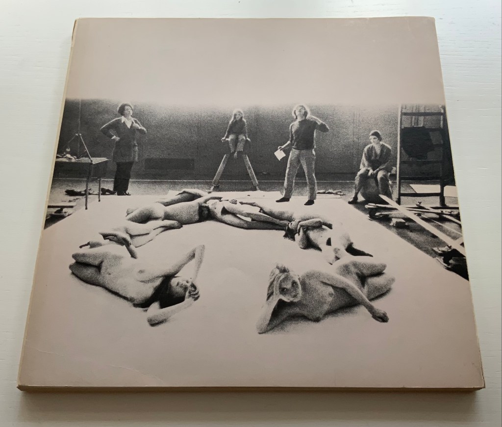
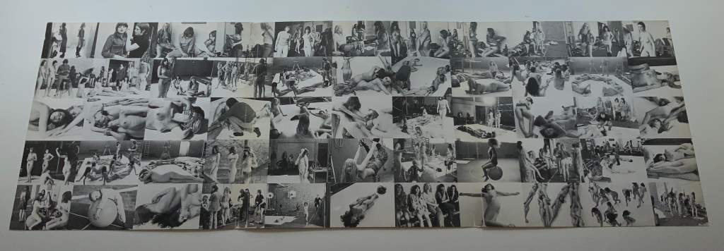
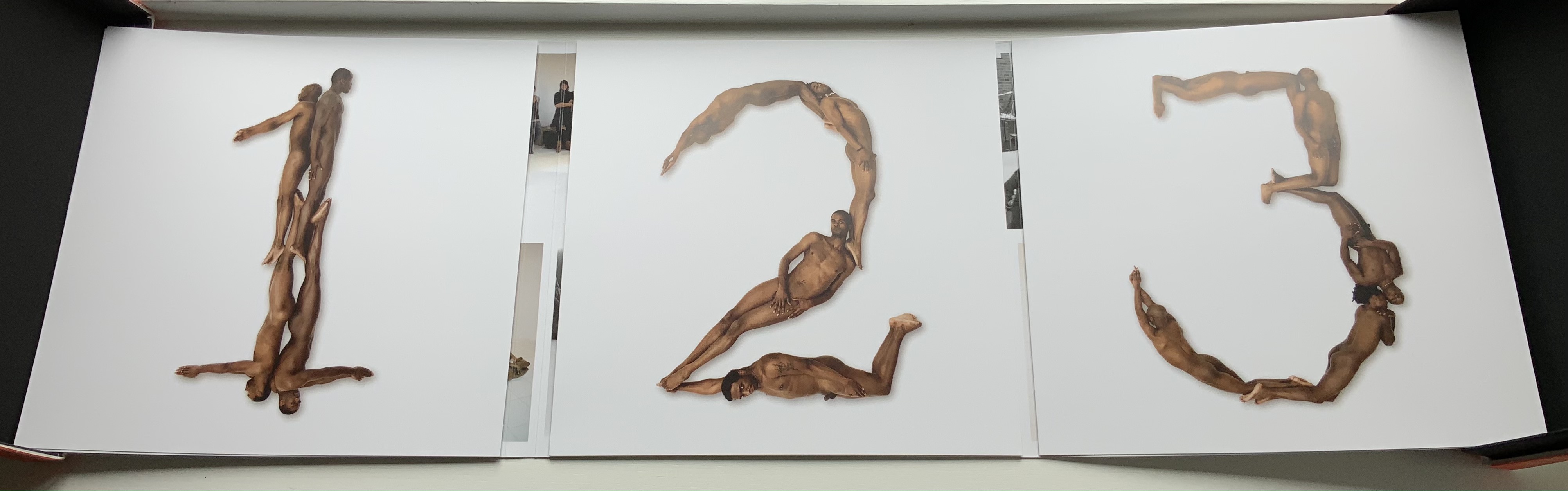
Beeke devised “The Body Alphabet” around 1968/69. It came in response to the “sexual revolution” of the 1960s and in reaction to functional typography. The designer Pieter Brattinga had published Wim Crouwel’s New Alphabet (1967) in the Kwadraatblad series and followed that up with Gerard Unger’s A Counter-proposal (1967) and Timothy Epps and Christopher Evans’ Alphabet (1970). Brattinga must have felt that “bad boy” Beeke’s tongue-in-cheek response modelled on Baskerville fit the bill as a final coda.
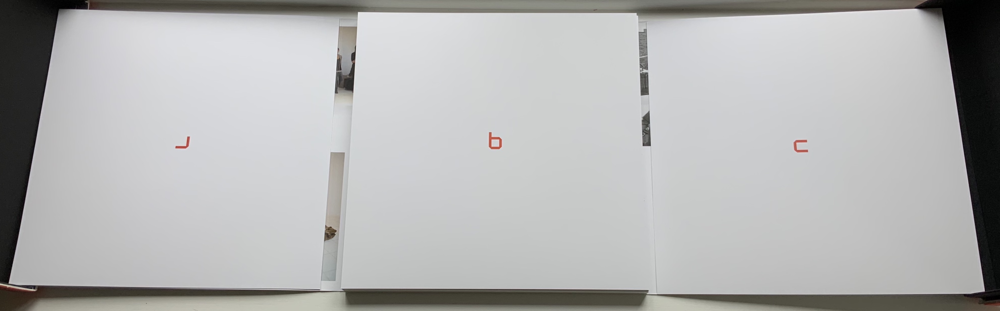
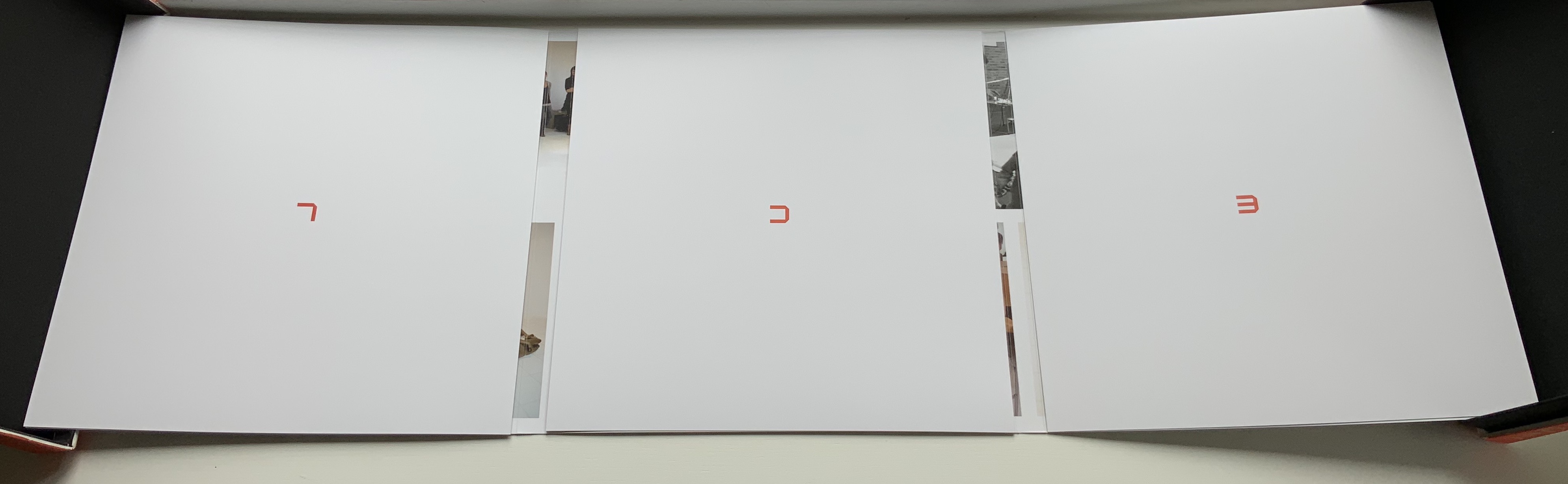
The portfolio’s cover has three panels that fold and overlap around the folios. The exterior is shown above. The interior below displays a spread of 55 small photographs from the photo shoot, showing the models standing around waiting to be directed into position for the relevant letter. Once the models were in place, the shot wad taken from above. Some letters like M required as many as 12 models.
Baskerville may have been Beeke’s template, but the letters G and Q stray far from it. The serifs in the G’s lower right stroke are misdirected. The Q is too oval, and its swash is missing the left-hand stroke characteristic of all the Baskervilles. In fact, a hunt through Rookledge’s Classic International Typefinder for similar Q’s suggests Century as a closer template. Nevertheless, the intention is winning and a challenge to subsequent pursuers of the naked alphabet. And there have been a few, such as Olivia Brookes and Anastasia Mastrakouli as well as “digital” alphabetists such asAmandine Alessandra, Tien-mien Liao, Lucas Neumann andJosé ErnestoRodríguez.
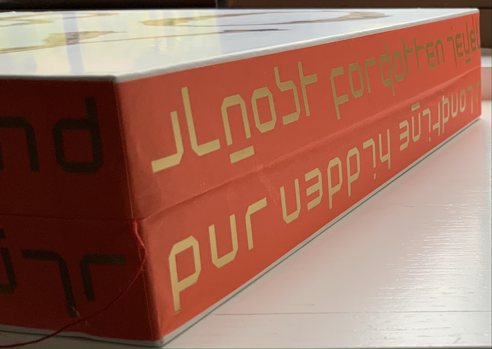
“The Body Alphabet” shoot has the air of a live-model art class, and the result is not prurient or exploitative, even with the child to form the smallest points of punctuation (Tinelou van der Elsken, the daughter of Ed van der Elsken, is the model for the ‘comma type’ in the alphabet). Sexist? Non-diverse? For near-perfect balance, the Books On Books Collection should have an artist’s book or portfolio available from self-partnering Tomaso Binga (something like the self-portraiture in Living Writing), but Beeke, René Knip and Spinhex & Industrie Drukkerij have more than addressed the issues with the following remarkable work.
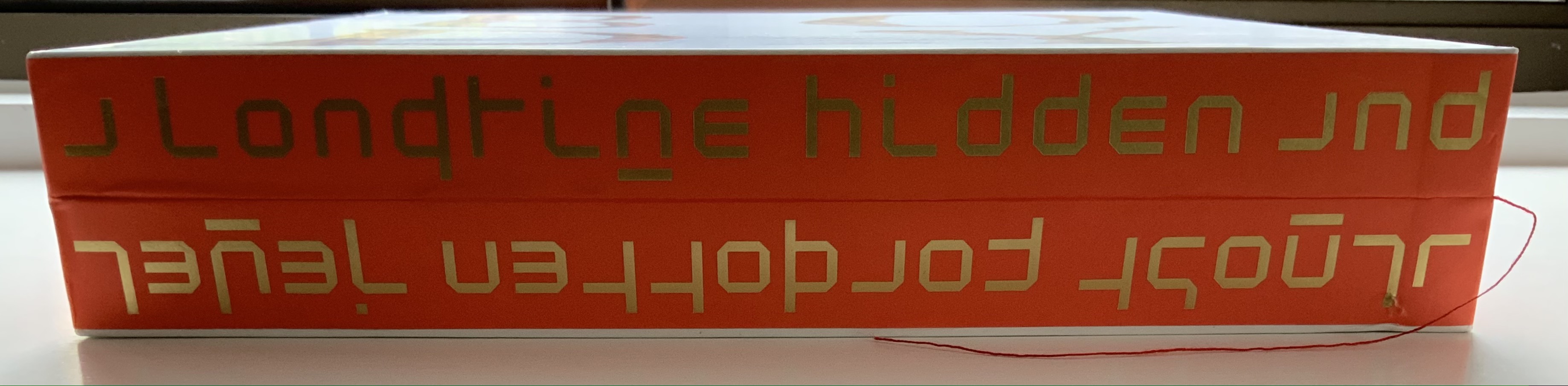
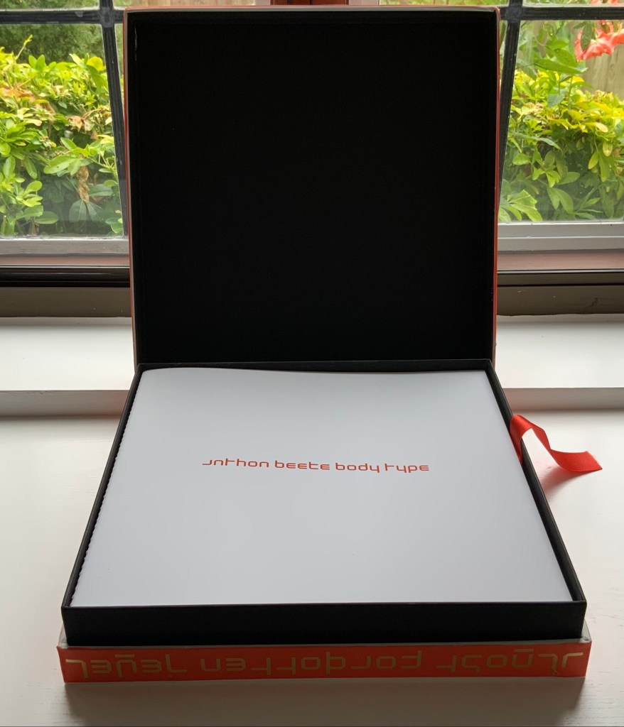
Designer René Knip and Spinhex & Industrie Drukkerij have preserved two important artifacts in typographic and design history and brought them to renewed artistic life. In a way, the collector gets to participate. Body Type arrives as a sealed time capsule requiring a razor to open it and let out the past. Inside are three glossy works lying atop a ribbon pull. The first work is a softcover book, its spine sewn with red thread to match the title on the front cover. Announcing the renaming of Beeke’s Alphabet (1969) as Body Type, it is cheekily set in Crouwel’s New Alphabet (1967) to which Beeke’s original “naked ladies alphabet” had responded. These are the two artifacts preserved, in Crouwel’s case, by use of his alphabet for the titles and section headings and, in Beeke’s case, by extension of his typeface and recreation of the photoshoot that originally realized it. Given their deaths at the end of the last decade (Beeke in 2018, Crouwel in 2019), Body Type provides a valuable juxtaposition of their reflections (Crouwel’s preface and Beeke’s essay).
In addition to his narration of the old and new shoots, Beeke shares an insight about an influence beyond the foil that was the New Alphabet. As Beeke puts it, “If Wim Crouwel pointed to the future, then I was going to perfect the past,….” What he found in the past was a Folies-Bergère-inspired alphabet by Erté (Romain Petrovitch Tirov).
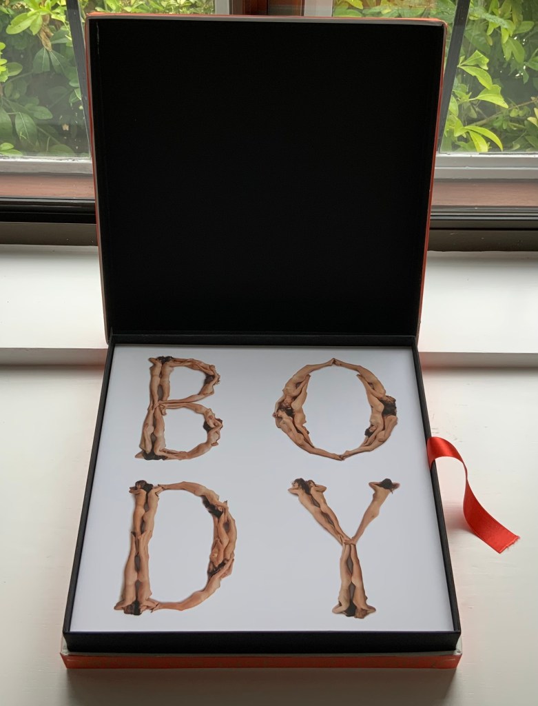
The second work in the box is a portfolio containing a full-color recreation of the original 1969 alphabet and punctuation marks with the addition of Naked Numbers. On the inner side of the portfolio’s wraparound, Ed van der Elsken’s black-and-white production shots sit side by side with the new color production shots. The full color folios themselves present on one side the character constructed with human bodies and on the other side the corresponding character from Crouwel’s New Alphabet.
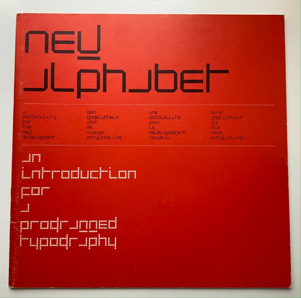
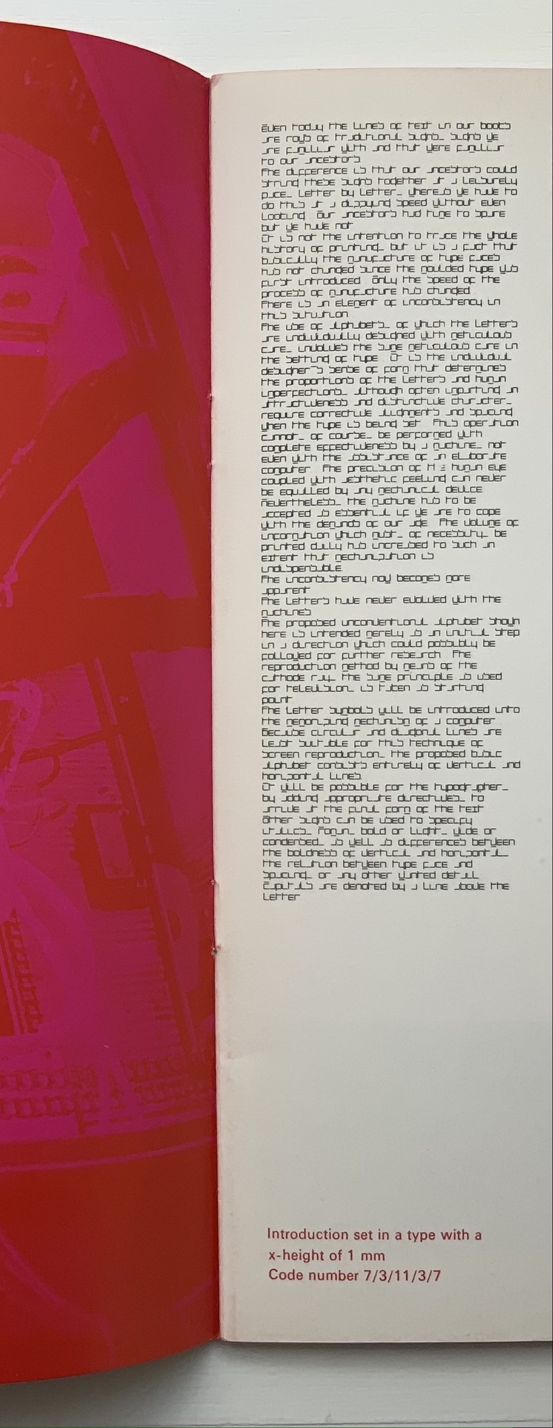
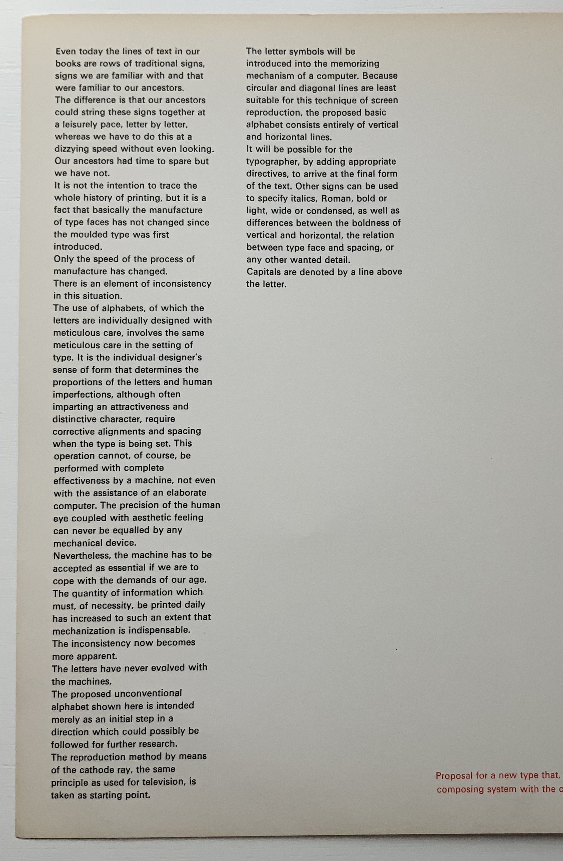
Shocked by the very low resolution output of electronic type-setting machines and sparked by the challenge to define a type that, more than traditional types, would be suited for the speed of machine output (particularly composing systems with CRT — cathode-ray tubes) and still be readable by humans, Crouwel came up with the New Alphabet.
On the left, Crouwel’s introduction in New Alphabet; on the right, in Univers.
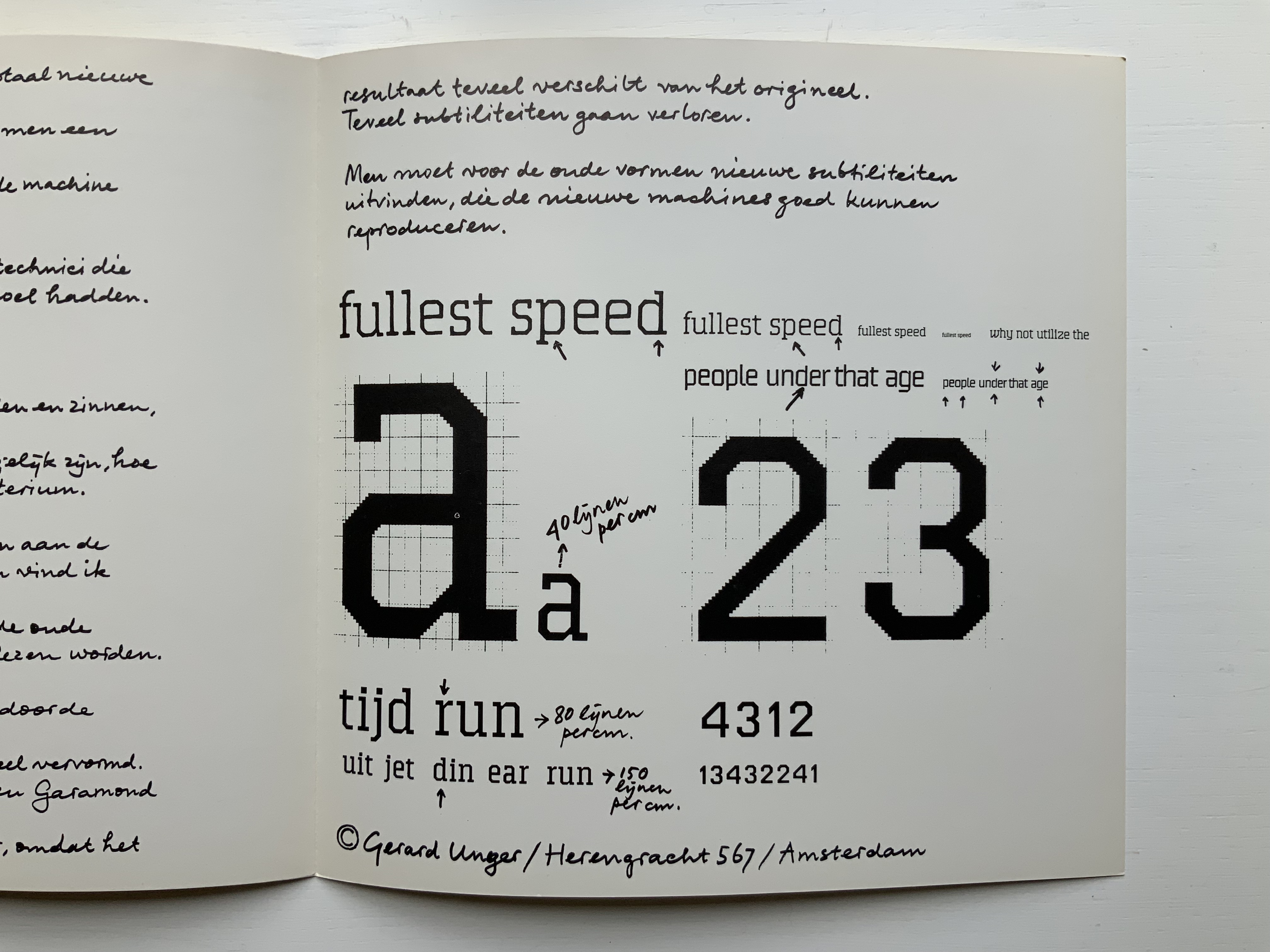
A double-page spread (not shown) explains the variables and rules for coding and resizing the letters. Clearly, from the side-by-side view of Crouwel’s introduction (above), humans would need to learn some new conventions (e.g., majuscules are designated by bars over miniscules) for the font to be readable. Some letters, such as “a” (below), would require recognition of an utterly different shape. Despite — or because of — that, the font appealed to album and magazine cover designers in the digital ’80s.
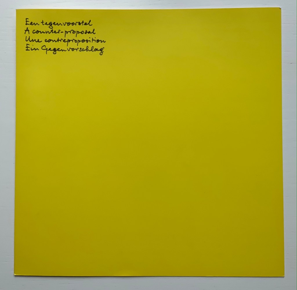
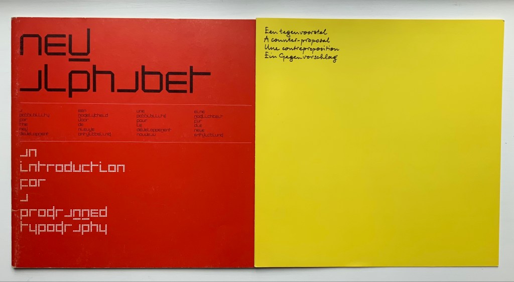
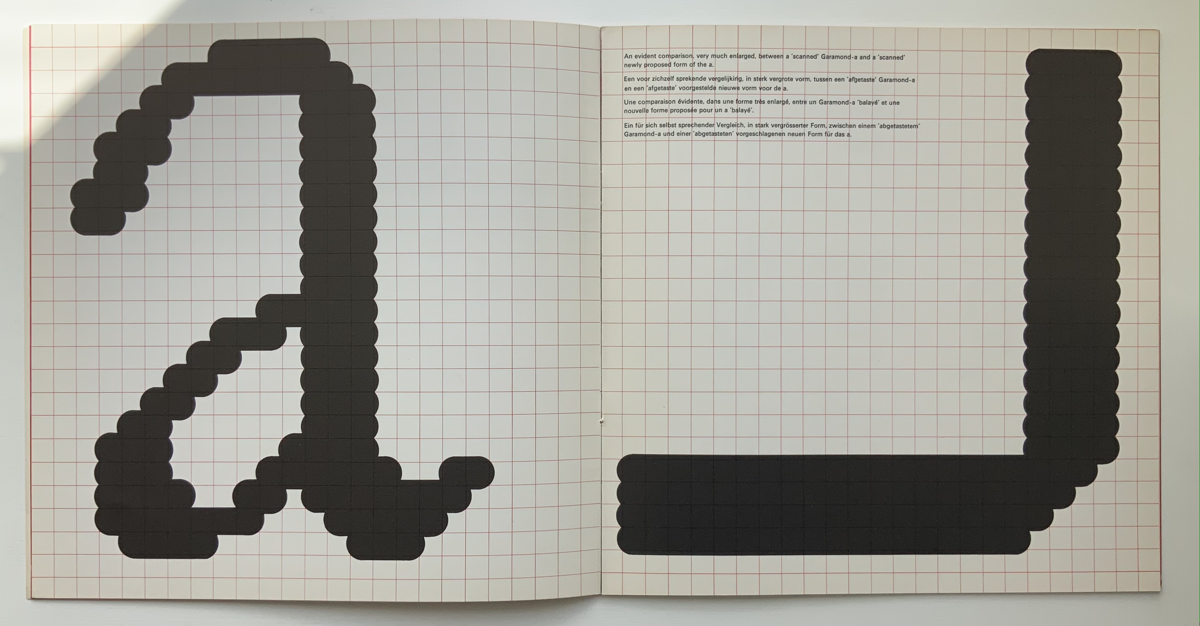
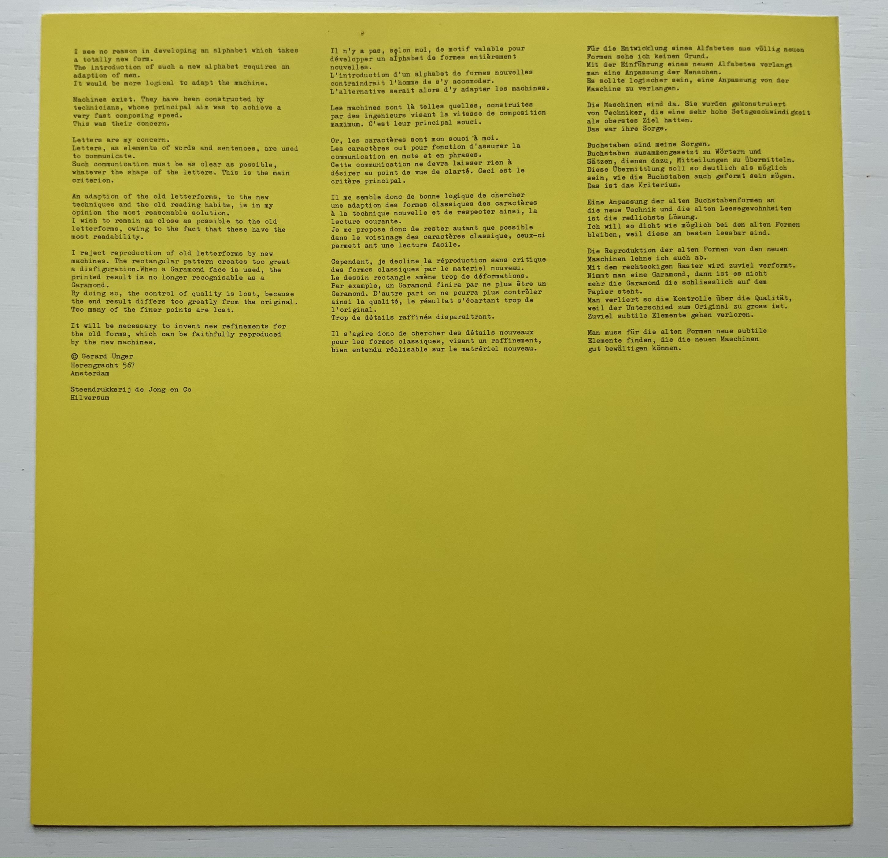
Disturbed by letting machines take precedence over the human eye, Gerard Unger, one of Crouwel’s colleagues, submitted a “counter proposal” — tellingly in handwriting. Juxtaposition of their lowercase “a’s” with Geofroy Tory’s majestic majuscules offers a counter-counter historic perspective on the art of the alphabet.
A few months after Pieter Brattinga issued Wim Crouwel‘s New Alphabet (below left), he followed up with this single-fold riposte from Gerard Unger, invited in fact by Crouwel.
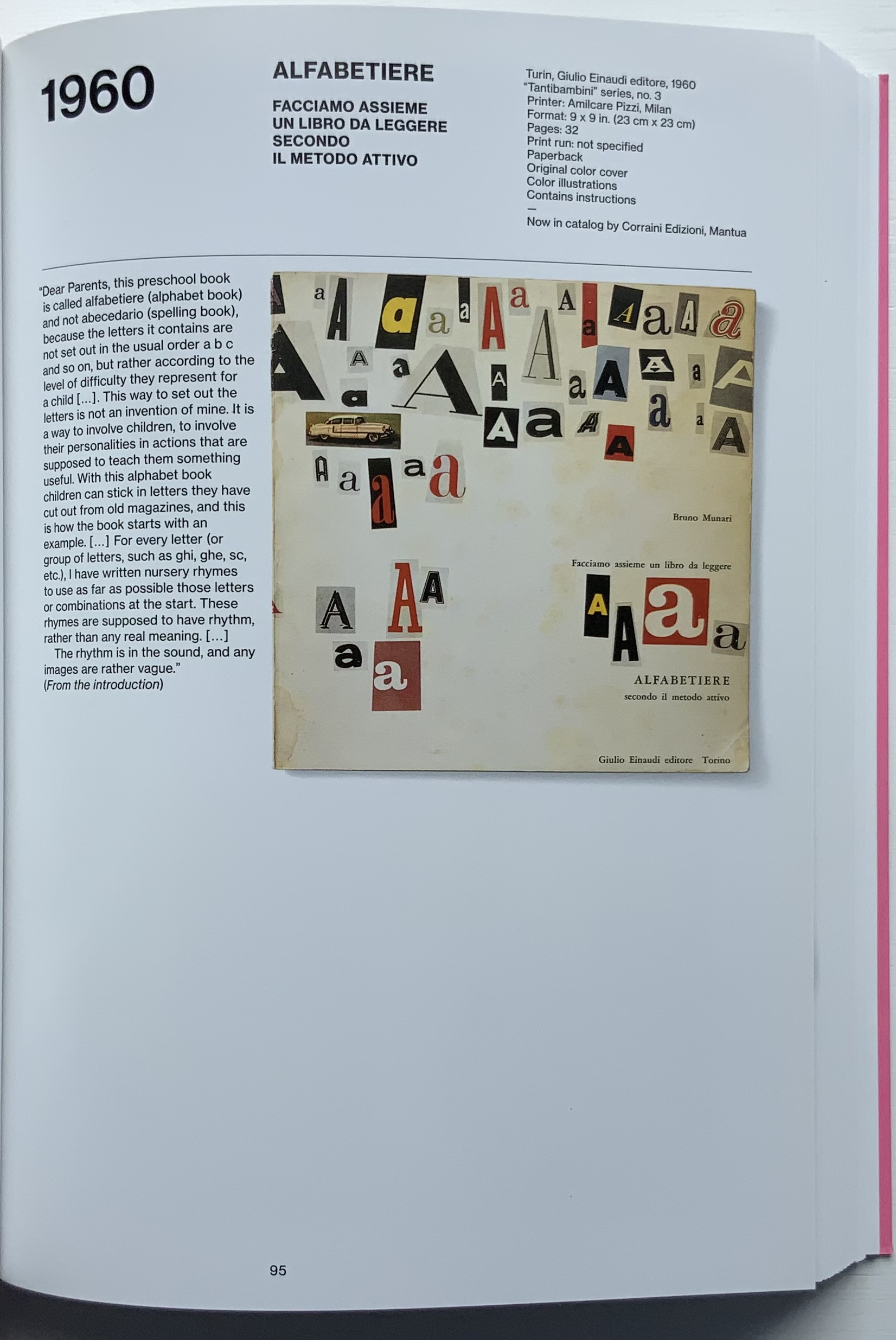
Left: Crouwel. Right: Unger.
Unger urges designing or teaching machines to accommodate “human-readable” letterforms rather than inventing new fonts for machines. Given advances in digital type and artificial intelligence, Unger’s point may have been prescient, but there is still something to be said for the artistic stimulus of machine constraints.
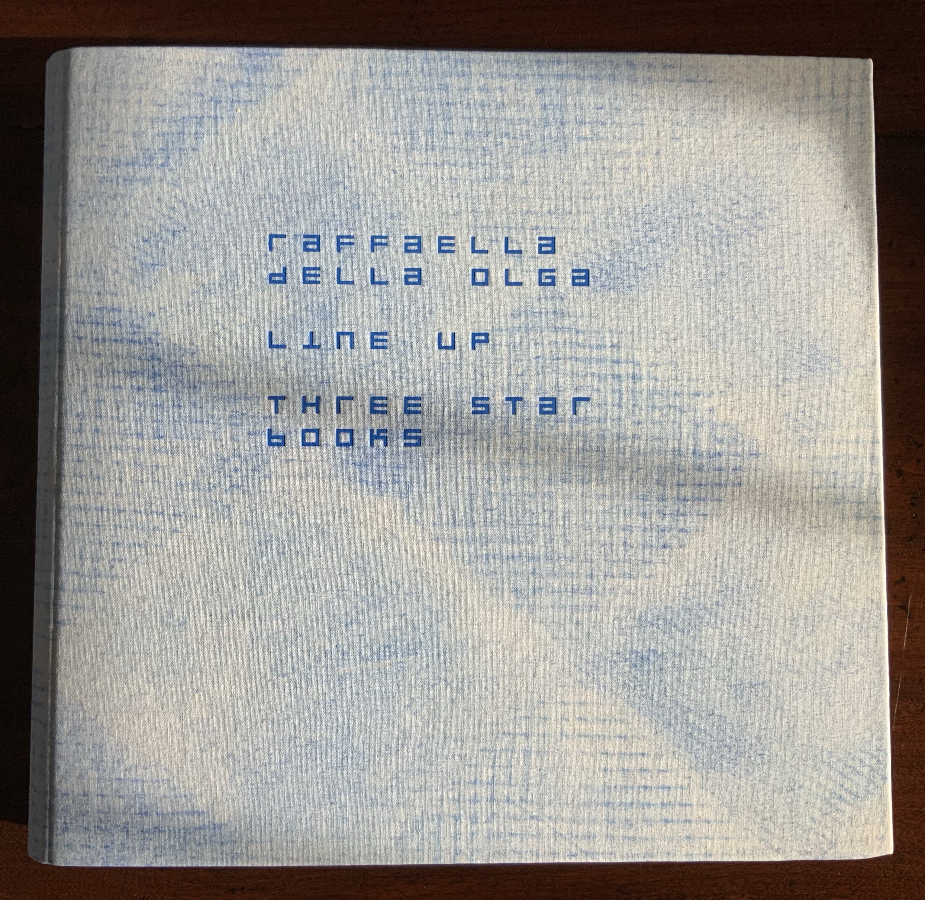
Brattinga extended the dialogue later to include Timothy Epps and Christopher Evans in 1970. If, as it did, the Epps/Evans alphabet led to LINE UP by Raffaella della Olga and Three Star Press, what other works of art have benefited from similar alphabetic and typographical dialogues?
Alphabet (1970), Timothy Epps and Christopher Evans; LINE UP (2020) Raffaella della Olga
Jeffrey Morin and Steven Ferlauto‘s Sacred Space (2003) has its roots in Ferlauto’s historical research into Roman capitals. Jennifer Farrell‘s The Well-Travelled Ampersand (2019) has its roots in the letterform and design thinking of Adrian Frutiger, Frederic Goudy, Dard Hunter, Edward Johnston and Russell Maret, among several others. Inclusion of source material like that by Crouwel, Epps and Evans, and Unger in the Collection offers paths to increased appreciation of those works of art inspired by them. Something for the future history of book art.