From a body of work that goes back to 1982 and covers subjects as wide ranging as Soviet Russia’s White Sea-Baltic Canal, New Orleans’ 19th century cotton industry, the Dutch Golden Age’s roots in slavery, life in Tibet’s remote Ganze Autonomous Prefecture, the west coast of Newfoundland, and an Appalachian farm-turned-museum, the four works below are by no means sufficient to represent the geographical breadth of Clifton Meador’s art. They do present his particular combination of social conscience and experimental printing. It would seem axiomatic that visual narrative (or argument) proceeds by sequential illustration or tableaux. These four works illustrate how Meador moves his narrative and argument by manipulating the printing process and the structure and material of the book.
Acheiropoieta or Not Made by Hands and Concerning Archeiropoieta (2020)
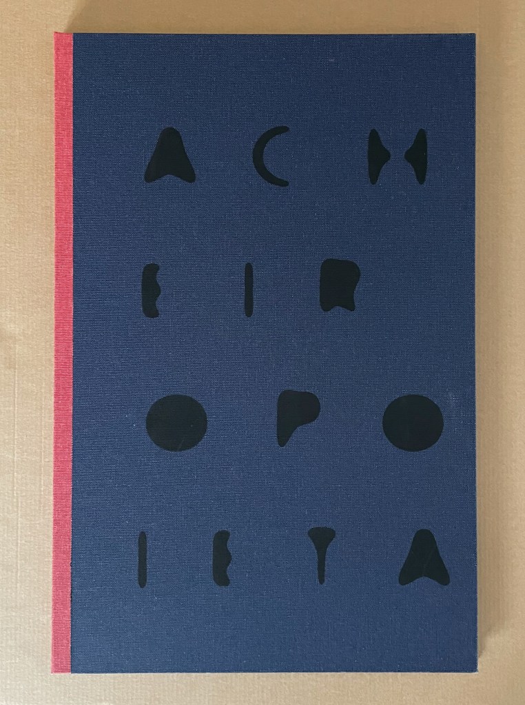
Acheiropoieta or Not Made by Hands and Concerning Acheiropoieta (2020)
A Book in Two Volumes
Clifton Meador
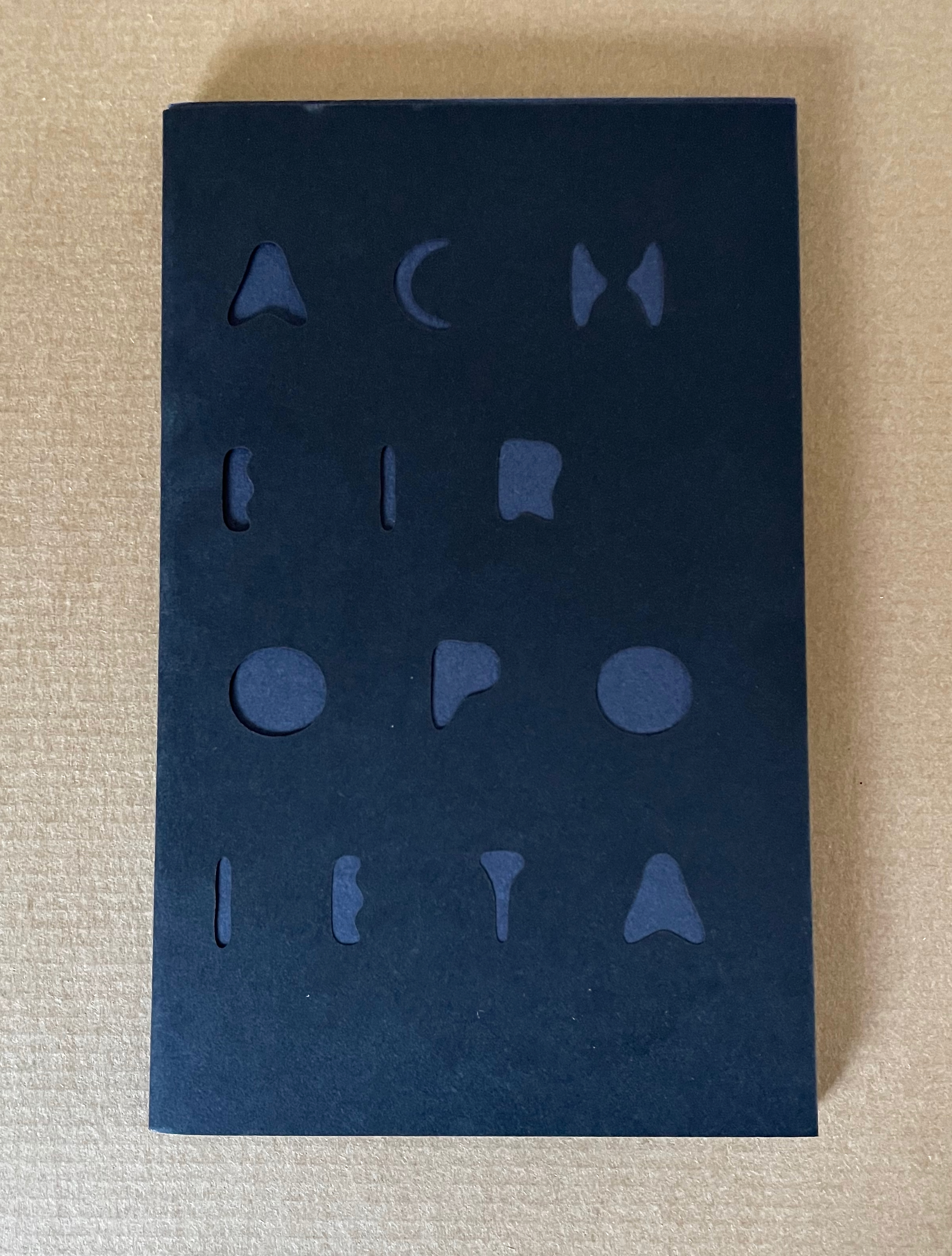
First volume: Softcover, hand sewn binding, black dust jacket with title die-cut, held in a portfolio made of cloth over boards with the title in black on front cover. Book: H482 x W319 x D10 mm. [36] pages. Portfolio: H486 x W322 x D16mm.
Second volume: Softcover, hand sewn binding, in stiff black dust jacket with title die-cut. H203 x W128 mm. [36] pages.
Edition of 115, of which this is #42. Acquired from the artist, 21 June 2024.
Photos: Books On Books Collection.
The Greek word acheiropoieta means “not made by hands” and names a class of religious icons purportedly created by miracle. The Shroud of Turin, Veil of Veronica, and Mandylion (or “Image of Edessa”) are the most famous Western examples. At times, believers have accepted them as unmediated objects of divine truth.
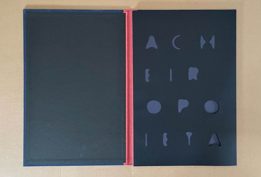
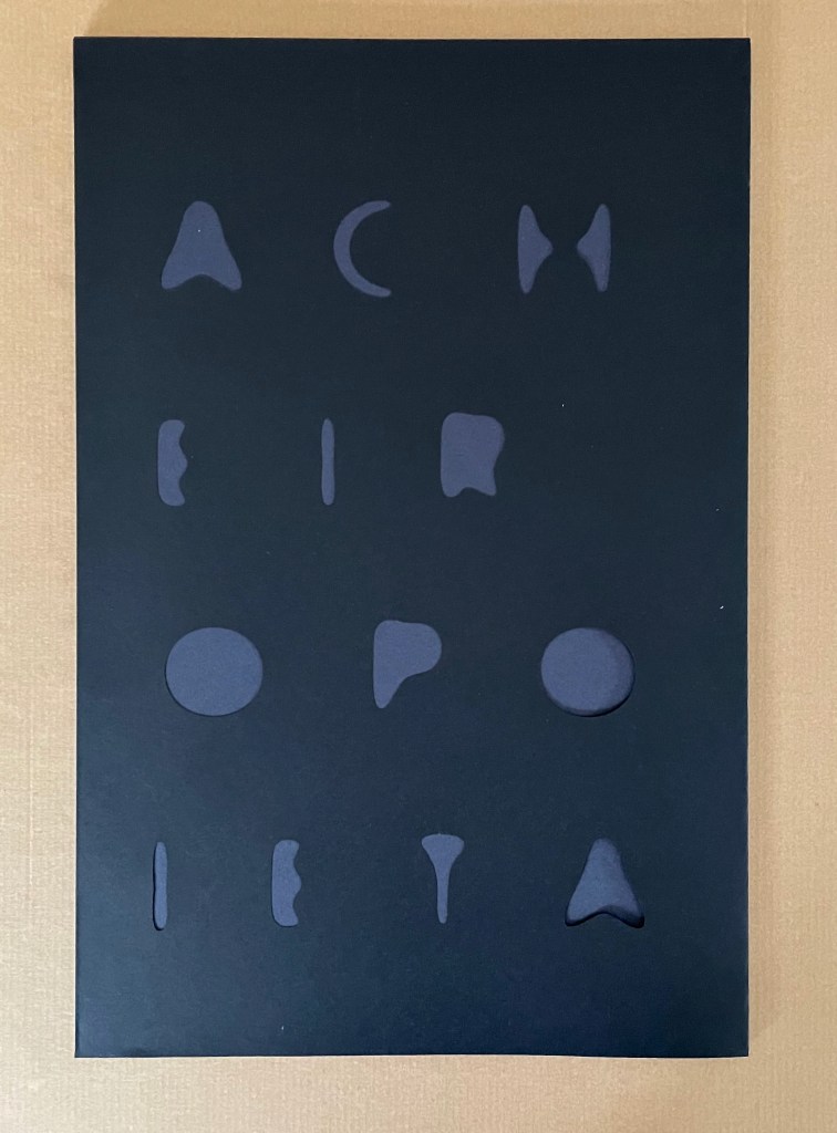
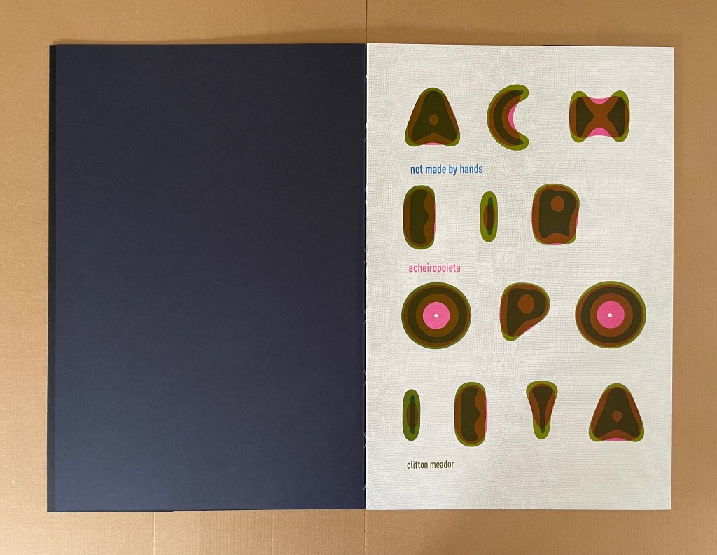
Other than the cover, title page, and colophon, there is no text in Clifton Meador’s Acheiropoieta. It has to be read by its images. The idea of the divine and unmediated image gives Meador a springboard for exploring whether, in light of photography’s fall from unmediated truth, authority, and trust — and, with digital photography, even from physicality — “images might be made to seem unmediated, [and] … made to revert to a kind of solidity”. There begins his search for a metaphor, and he turns to the substrate of those religious icons for it.
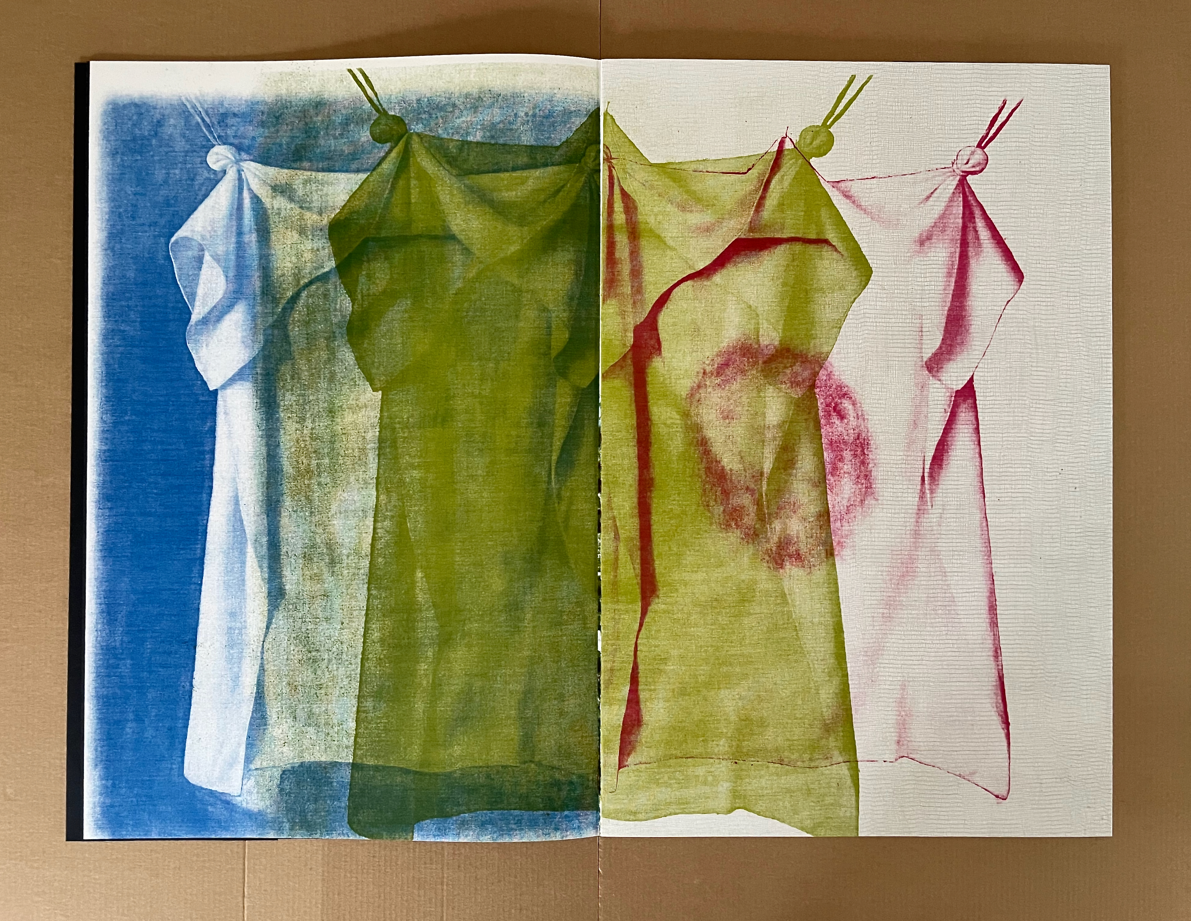
As Meador explains:
Woven cloth forms a raster, a grid of threads that forms a fabric. When seen by transmitted light, the warp and weft of the cloth forms a variable density grid-which calls to mind a halftone contact screen, a predigital piece of technology that translated continuous tone images into fields of halftone dots in order to simulate tonality. In this project, I created color separations of images, print them through dye sublimation technology onto cotton cloth, and use those pieces of cloth to directly expose offset lithographic printing plates, which would then be used to print three-color images. The weave of the cloth itself would break down the continuous tone image into dots of varying size. In a very literal way, I wanted to create a material metaphor to elaborate the idea of an acheiropoieton- where the lithographic shadows of the cloth images were multiplied into a book.
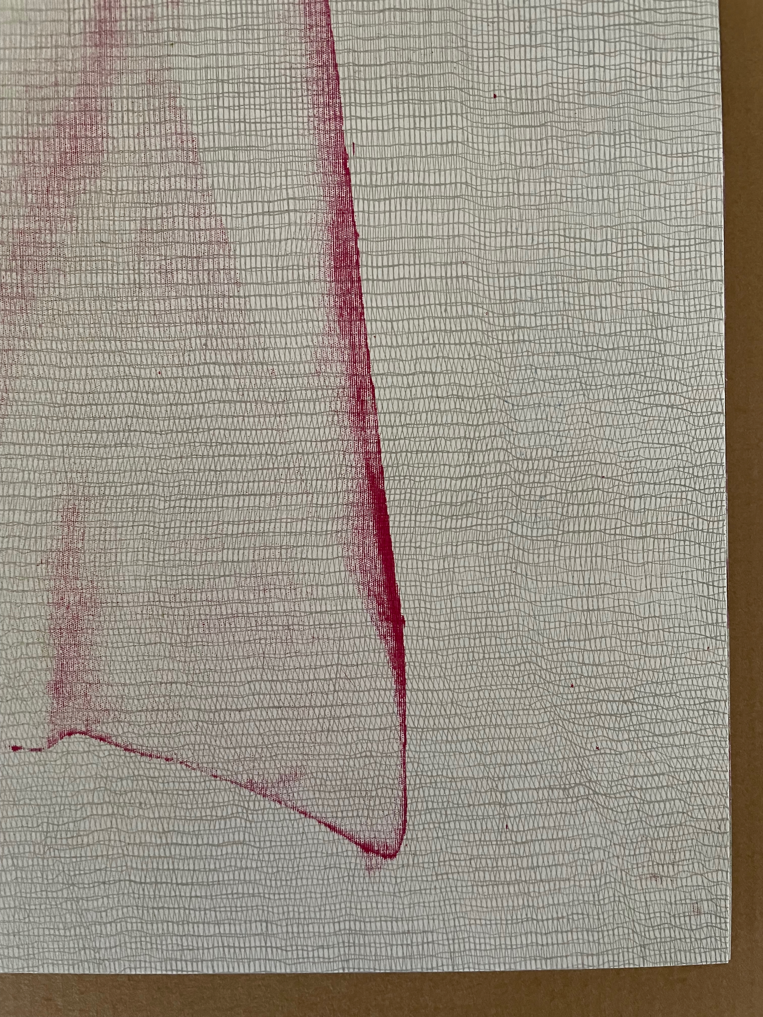
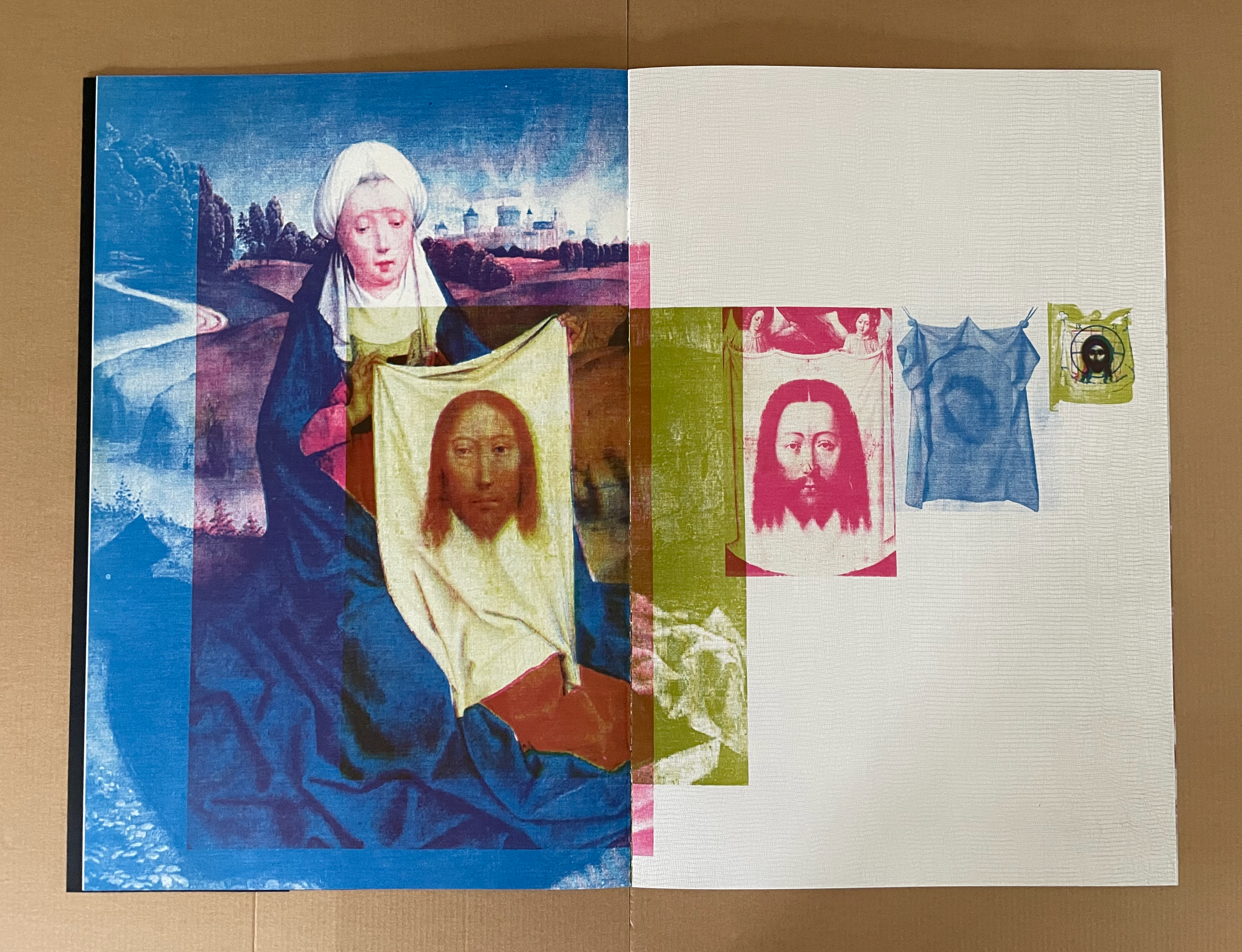
Left: woven-cloth raster. Right: Veronica’s Veil, an image of an image of an image of an image of an unseen acheiropoieton.
It is a mind-twisting metaphor. Is god the digital image that is about to be color-separated? Is god the piece of cloth from which the image will transfer to the offset lithographic plates? Is god the plate from which the image will transfer to the book? In the end, we are holding and looking at something solid that, by a process effected and affected by something solid, has sprung from something not solid.
Along with the metaphorical and metaphysical challenge, Meador weaves another challenge: one to our social consciences.
But there is a problem inherent in cotton cloth: Cotton production has a long and horrible history. Sven Beckert’s great book, Empire of Cotton, details not only the development of chattel slavery in the New World in response to the growing demand of the textile mills in England, but also the troubling history of cotton in the Old World. Cotton cloth-comfortable, easily dyed, beautiful-comes with a long, miserable history of human suffering and exploitation.
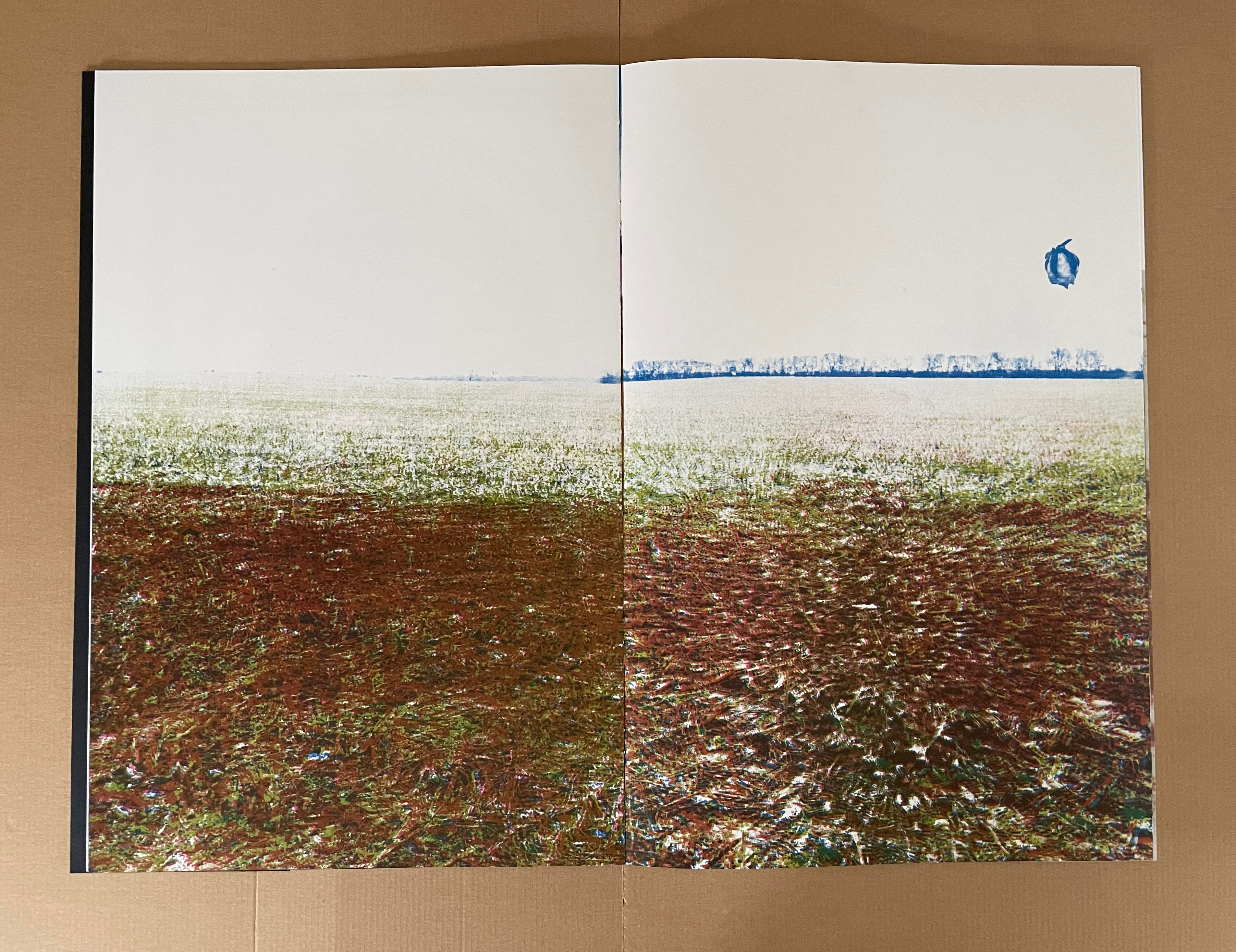
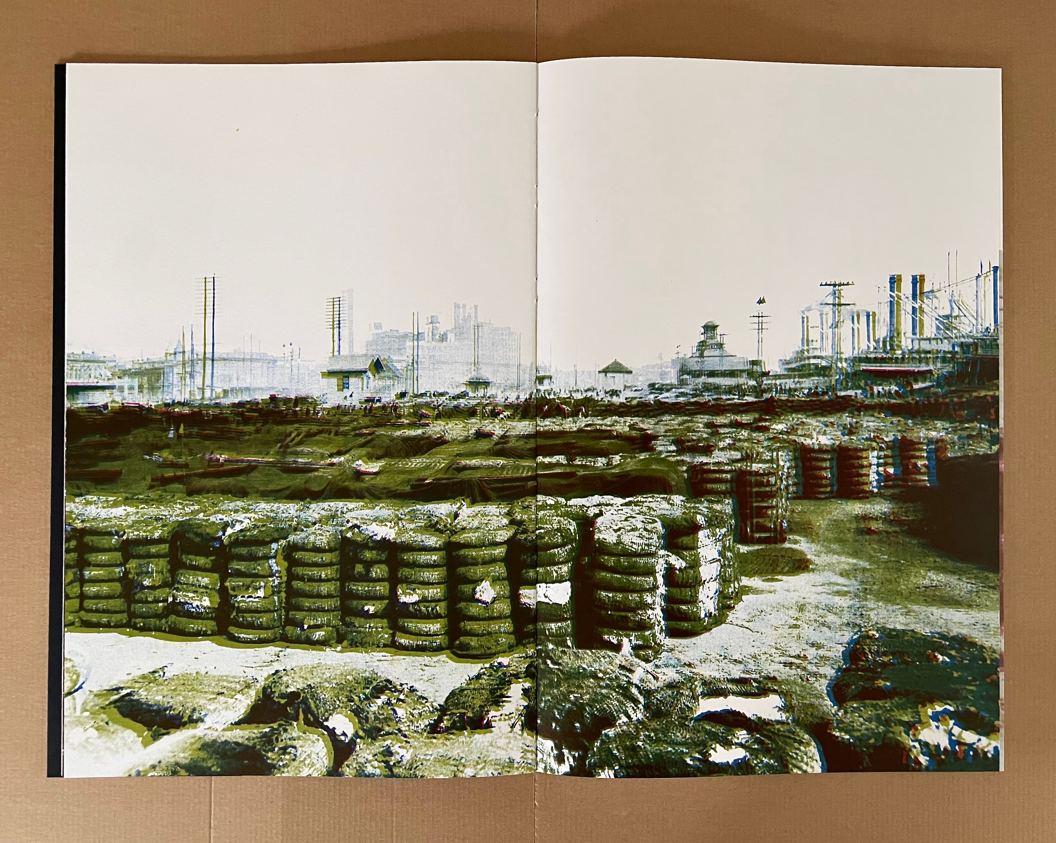
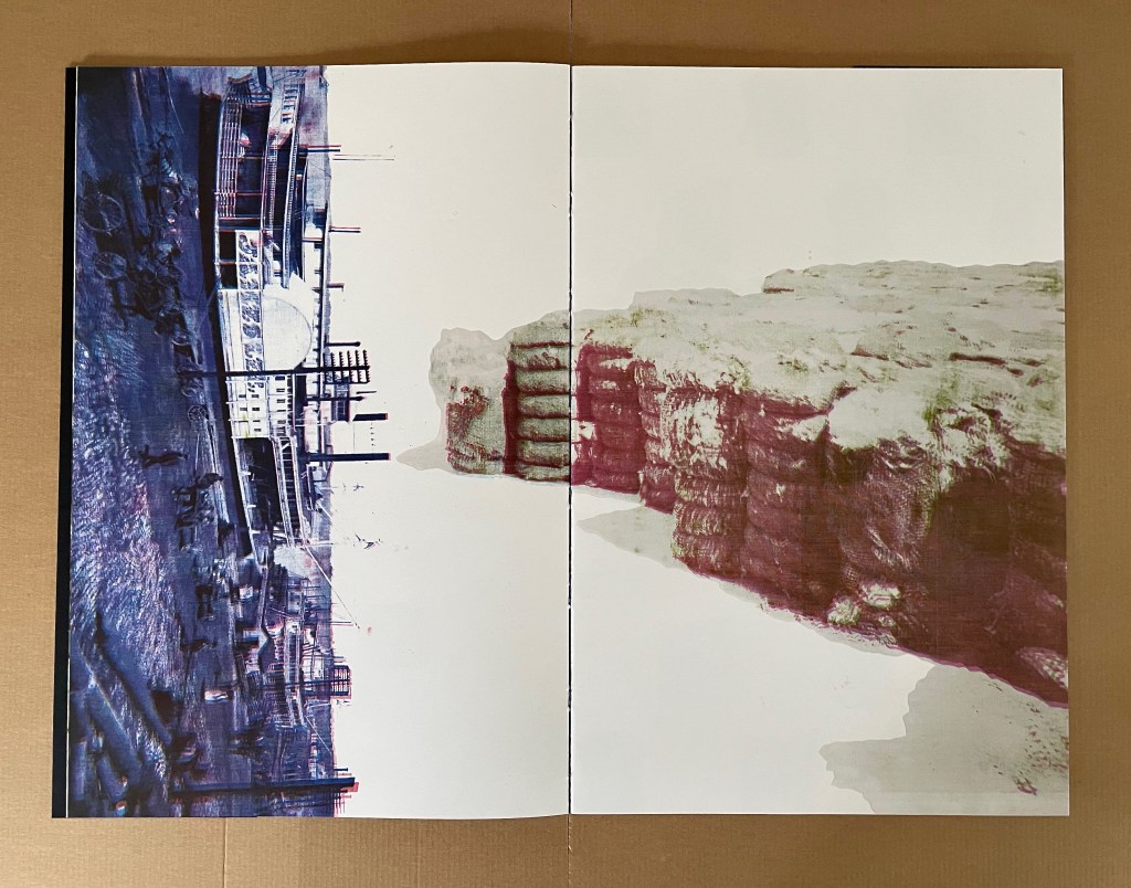
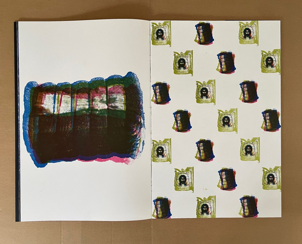
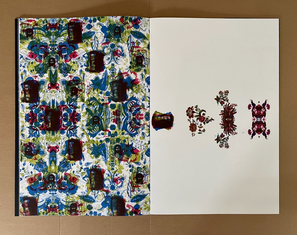
After the images of the stripped field and waiting bales of cotton, the artist asserts page layout to develop the overlapping themes. In the first double-page spread below, when turned 90º, the steamboat in portrait issues bales of cotton as steam. That which drives the boat and economy clouds the air. In the second spread, the bale of cotton as acheiropoieton proliferates and equates with the acheiropoieton of Veronica’s Veil. With the repeating bales and veils interspersed across the wallpaper-patterned cloth, the third spread below drives home the metaphor of the icon borne on its own substrate to the extent that it extrudes only the cotton icons emblems on the recto page.
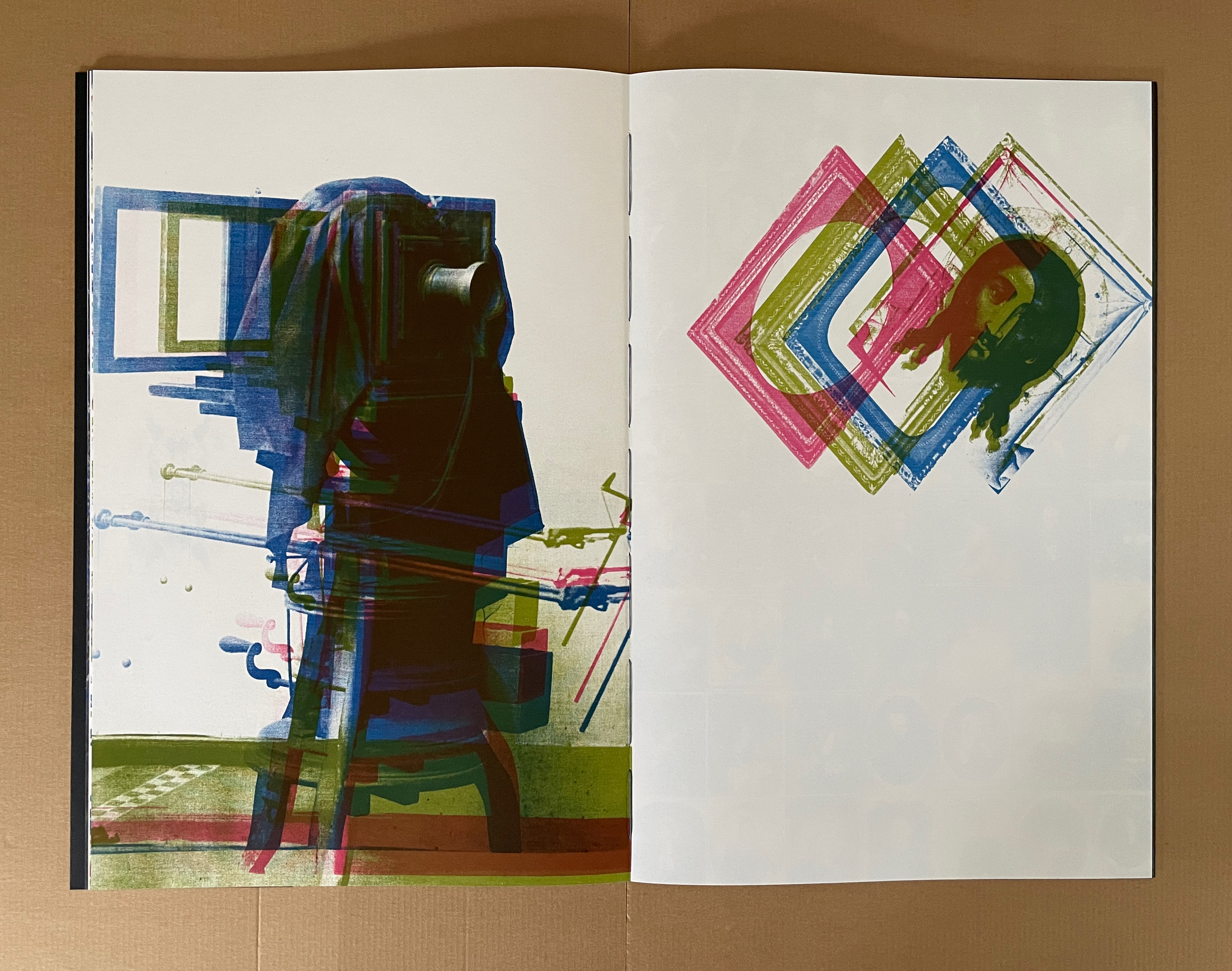
In the center of the book, the mechanics of the acheiropoietic process takes center stage. The metaphors of predigital photography, digital color separation, the printing process, and the acheiropoietic result roll across the spread.
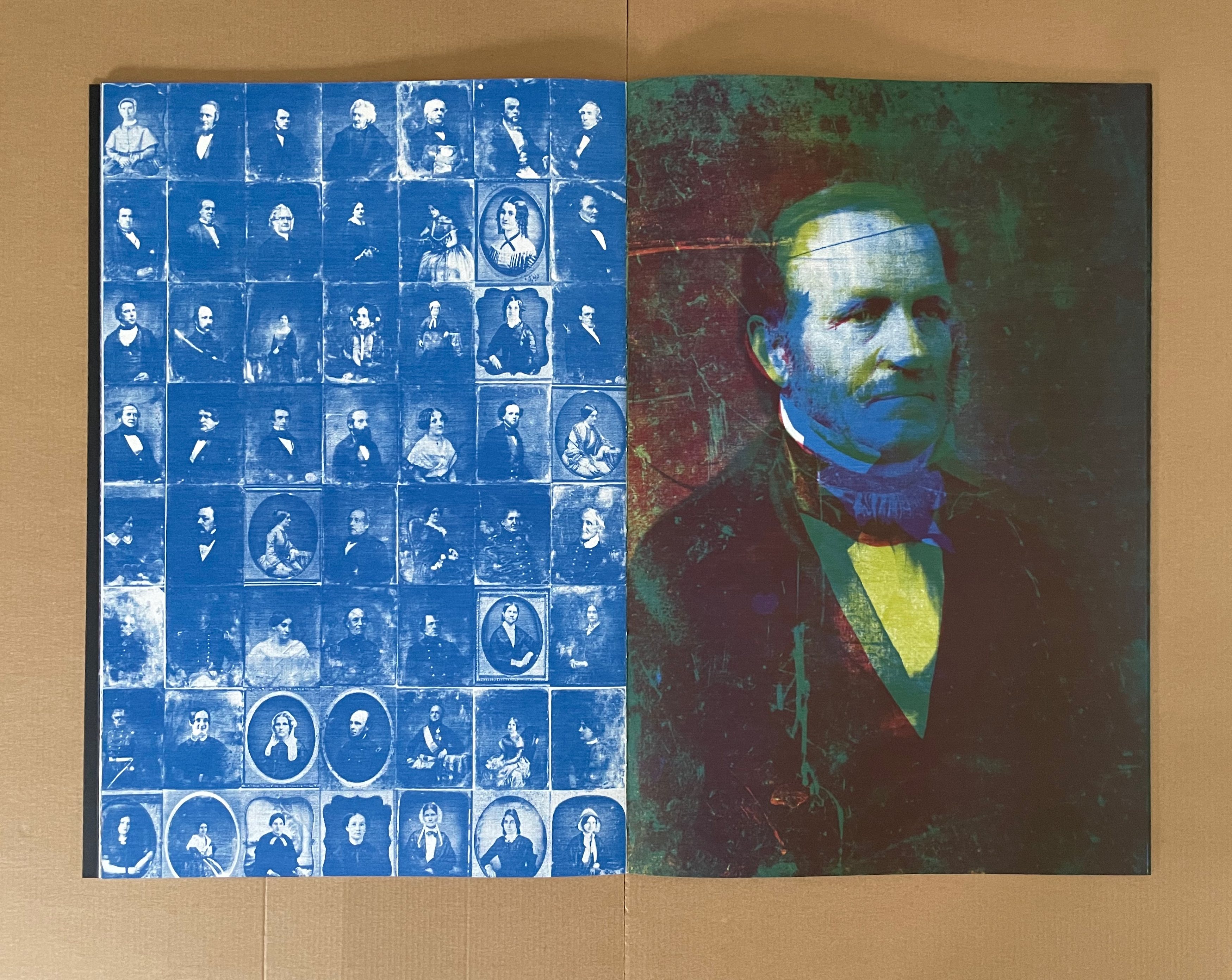
From here on — until the final image — the historical social implications of the new technology dominate. The portraits come from the Library of Congress’ collection of daguerrotypes. They are the privileged and celebrities who could afford an appointment with the new technology and have their likenesses captured without human hands. As Meador puts it in the companion volume Concerning Acheiropoieta, “”we have evolved from seeking the divine to staring at ourselves”.
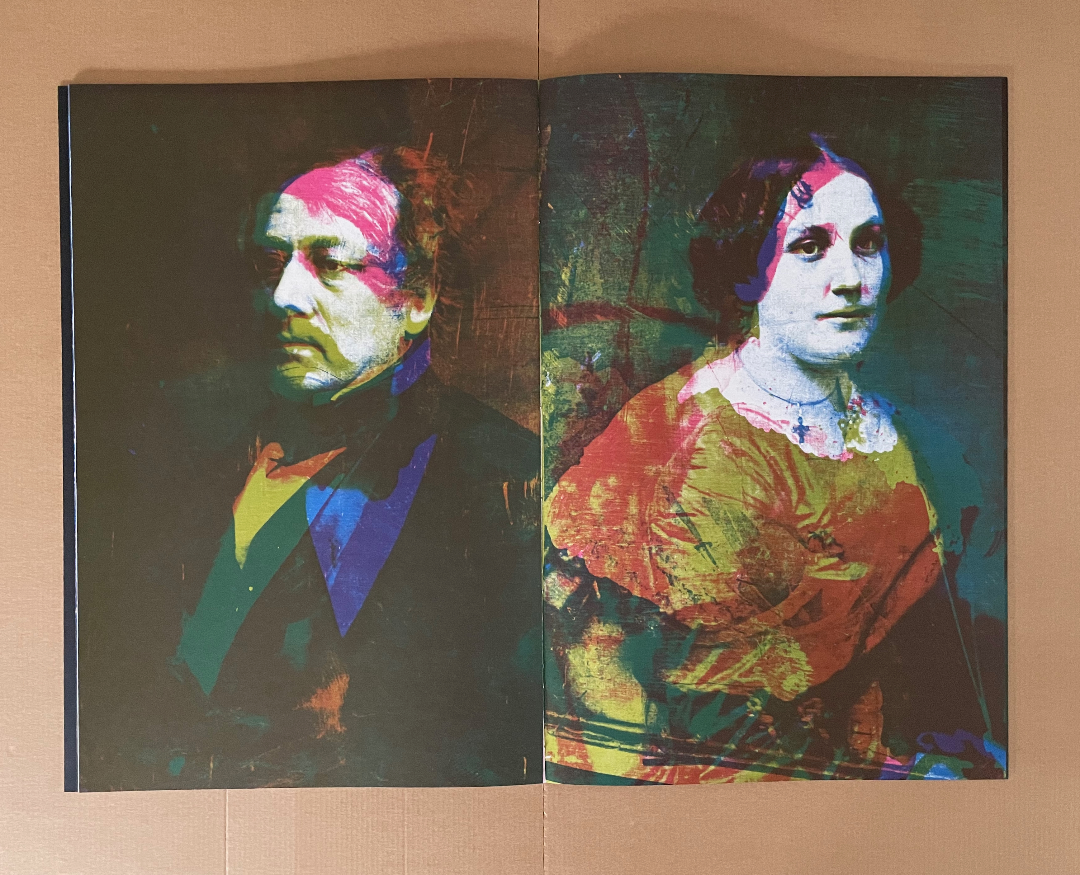
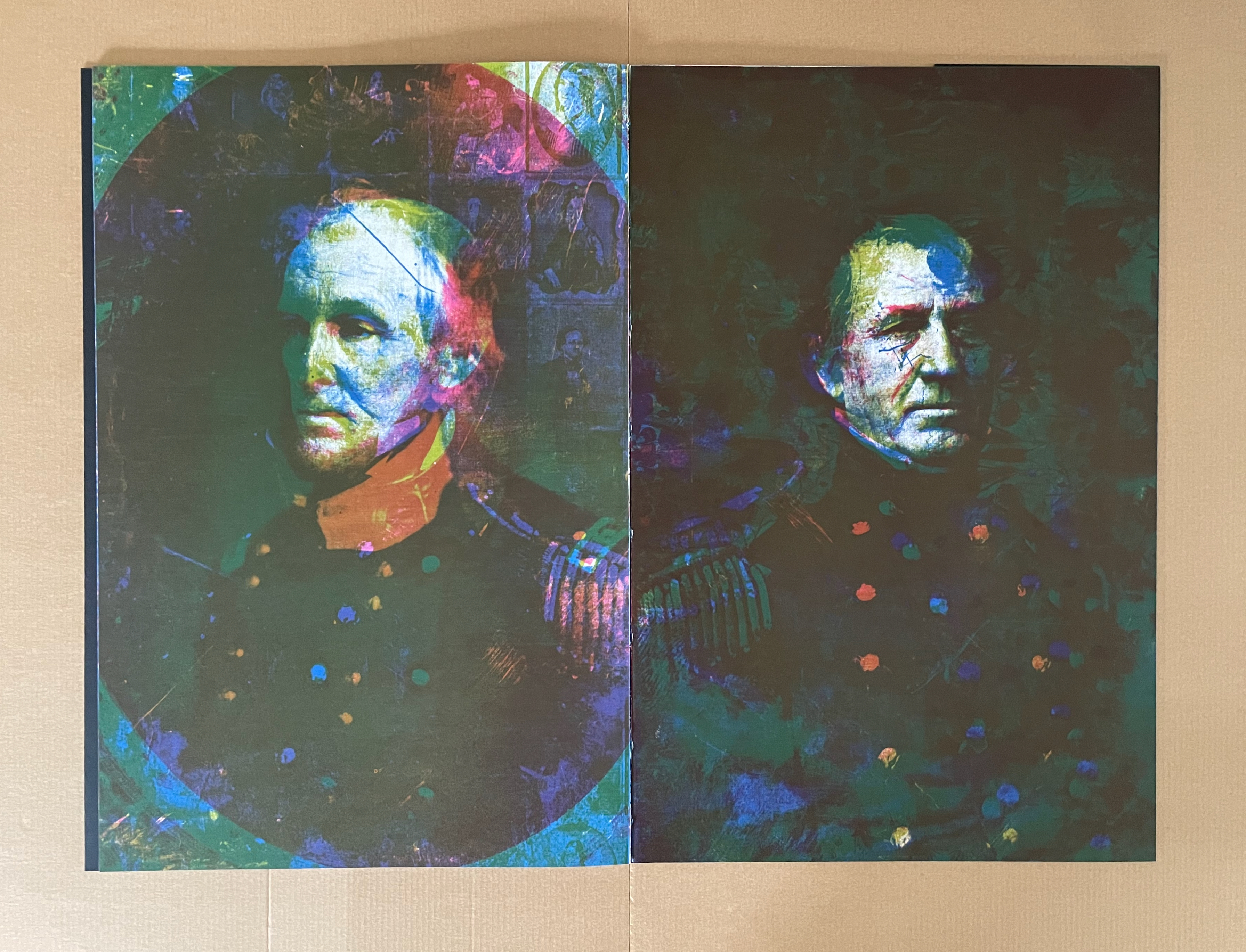
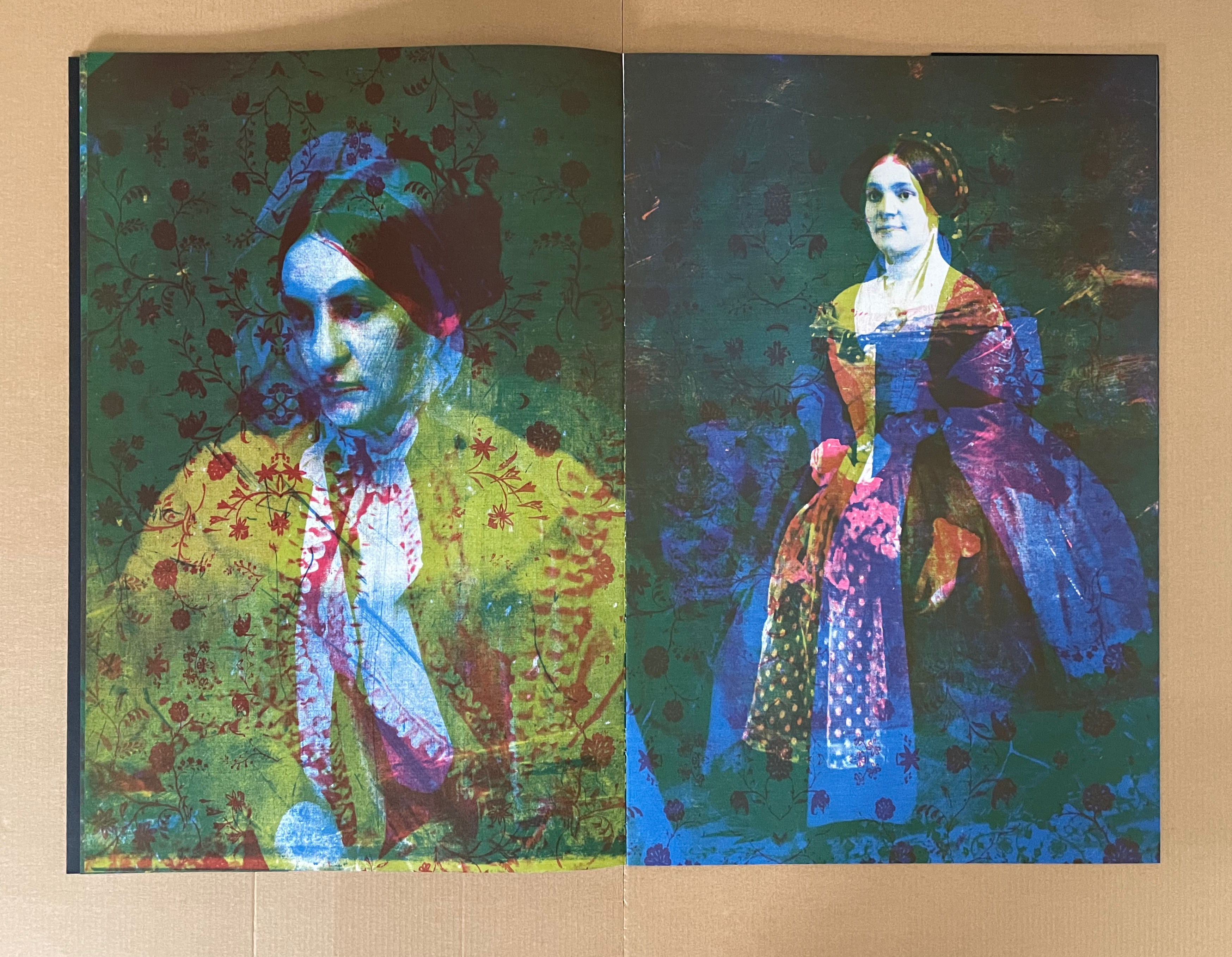
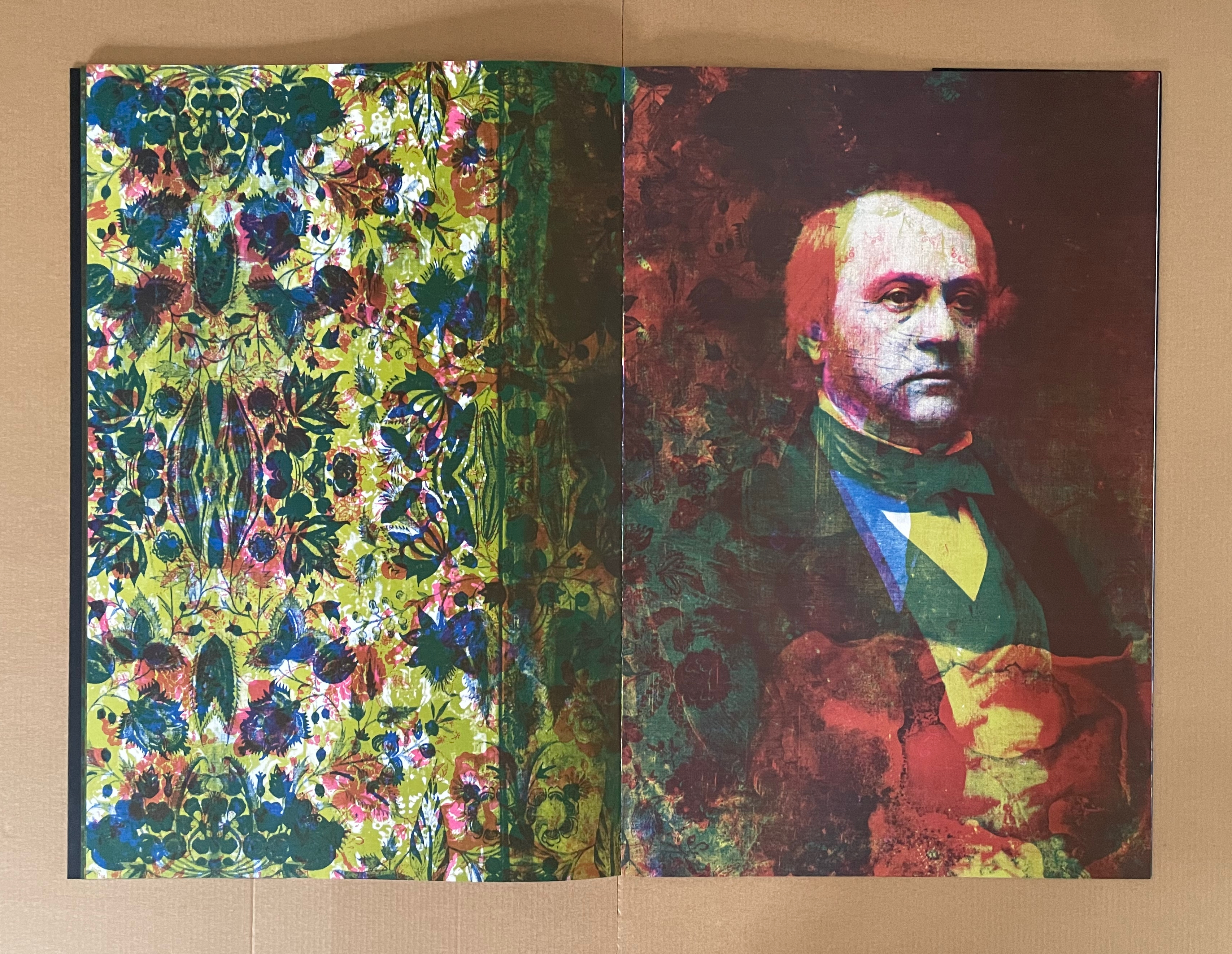
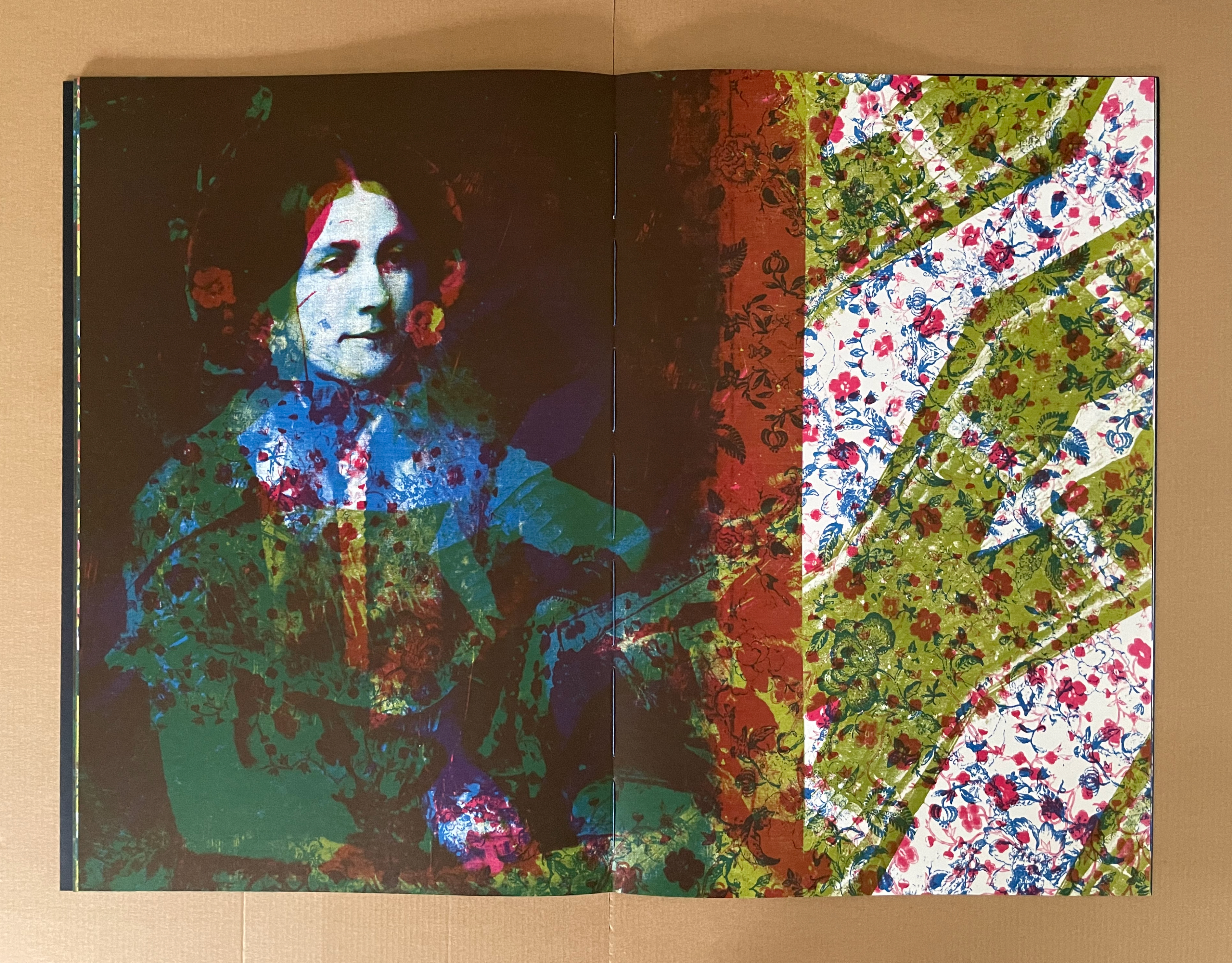
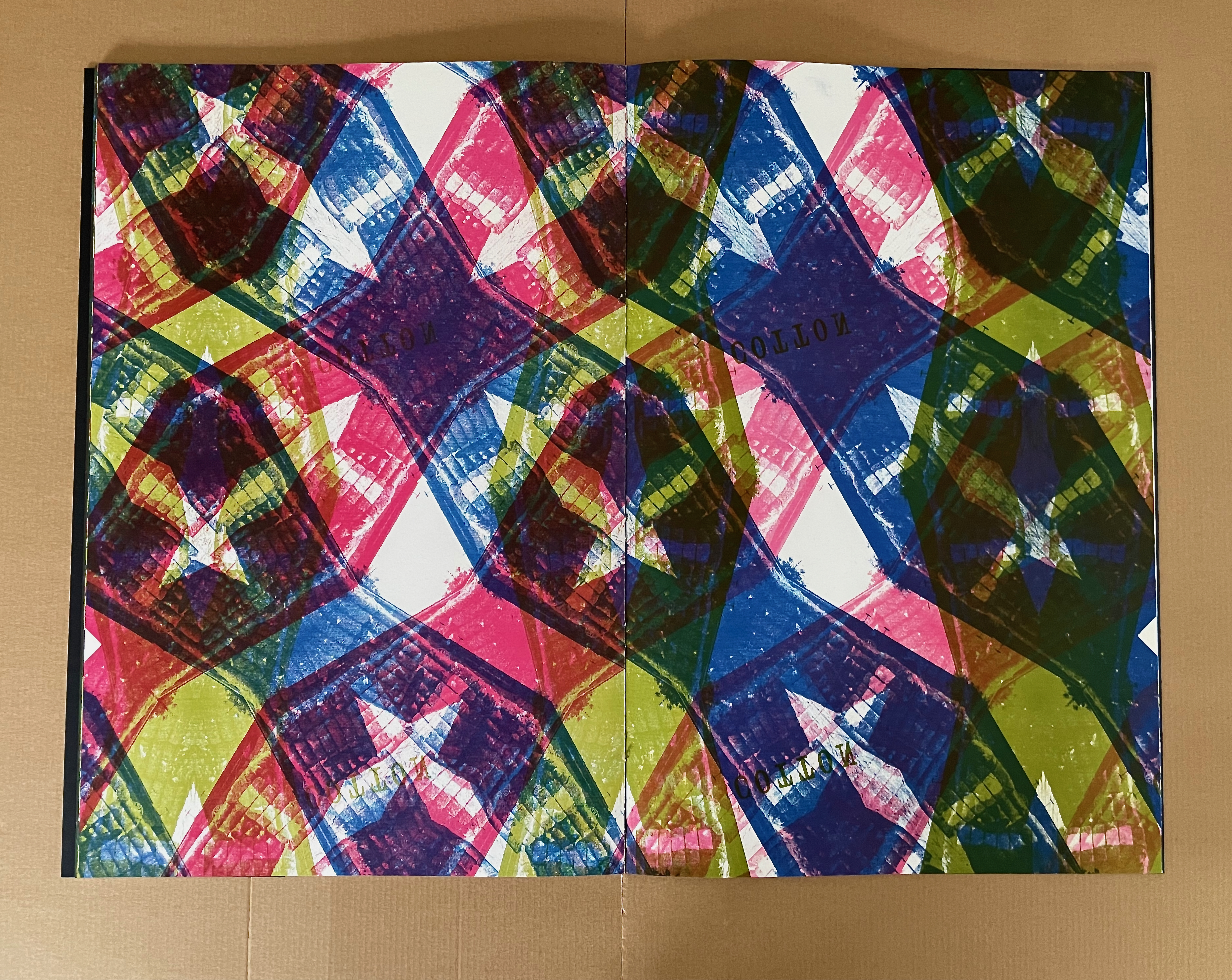
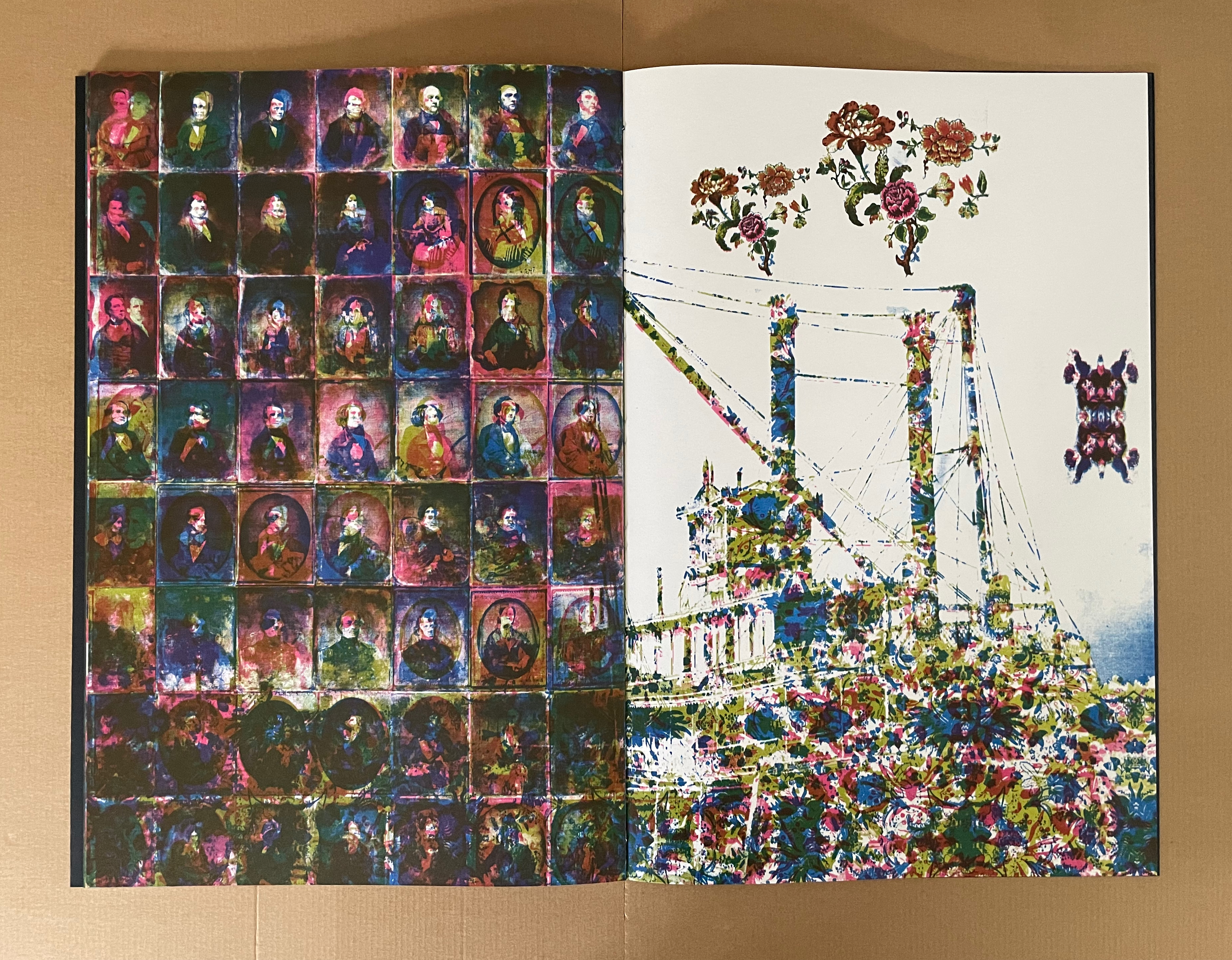
As the portrait sequence comes to an end, the overlaid images and separations obscure the faces. The pattern of colors and the floral figures take over the steamboat and its spouts of smoke. The book’s final image is the tool that brought us here — a daguerreotype camera box. It is so overlaid with a blue and red cotton print that it is almost unrecognizable. The image pushes the mind-twisting metaphor even further. The tool that creates “unmediated” images has its own likeness obscured by a pattern emblematic of the original substrate for acheiropoieta.
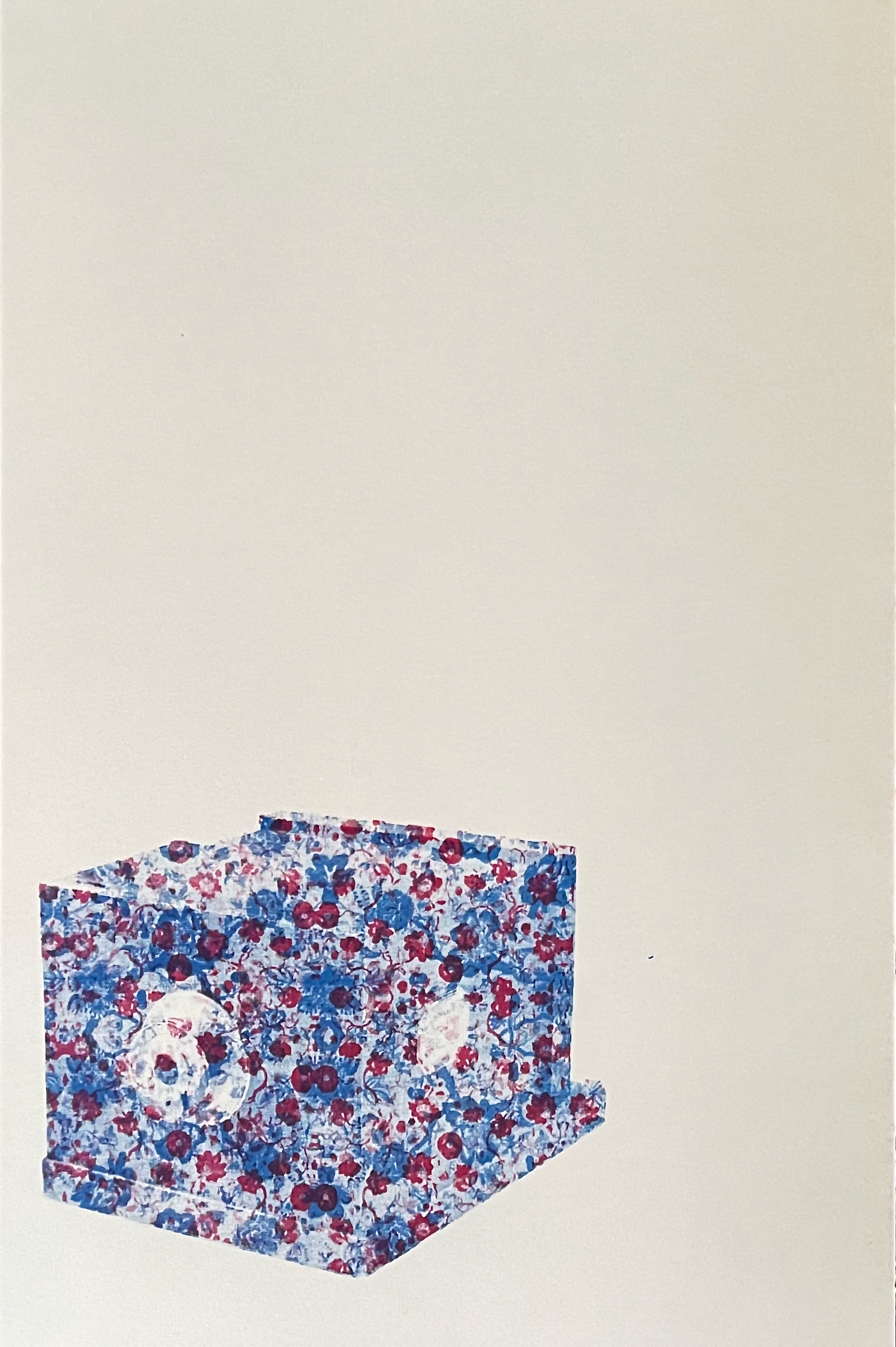
The camera overlaid with cotton fabric.
The die-cut cover of Concerning Acheiropoieta, the smaller volume, announces its companion relationship to the larger volume. Unlike its partner, though, it is printed on chartreuse paper and contains text. Text and image in the companion also begin with the grid of cotton cloth and icons not made by human hands and proceed to the fallow December cotton field, over which the text spells out the links with England’s industrial revolution, empire, and slave trade.
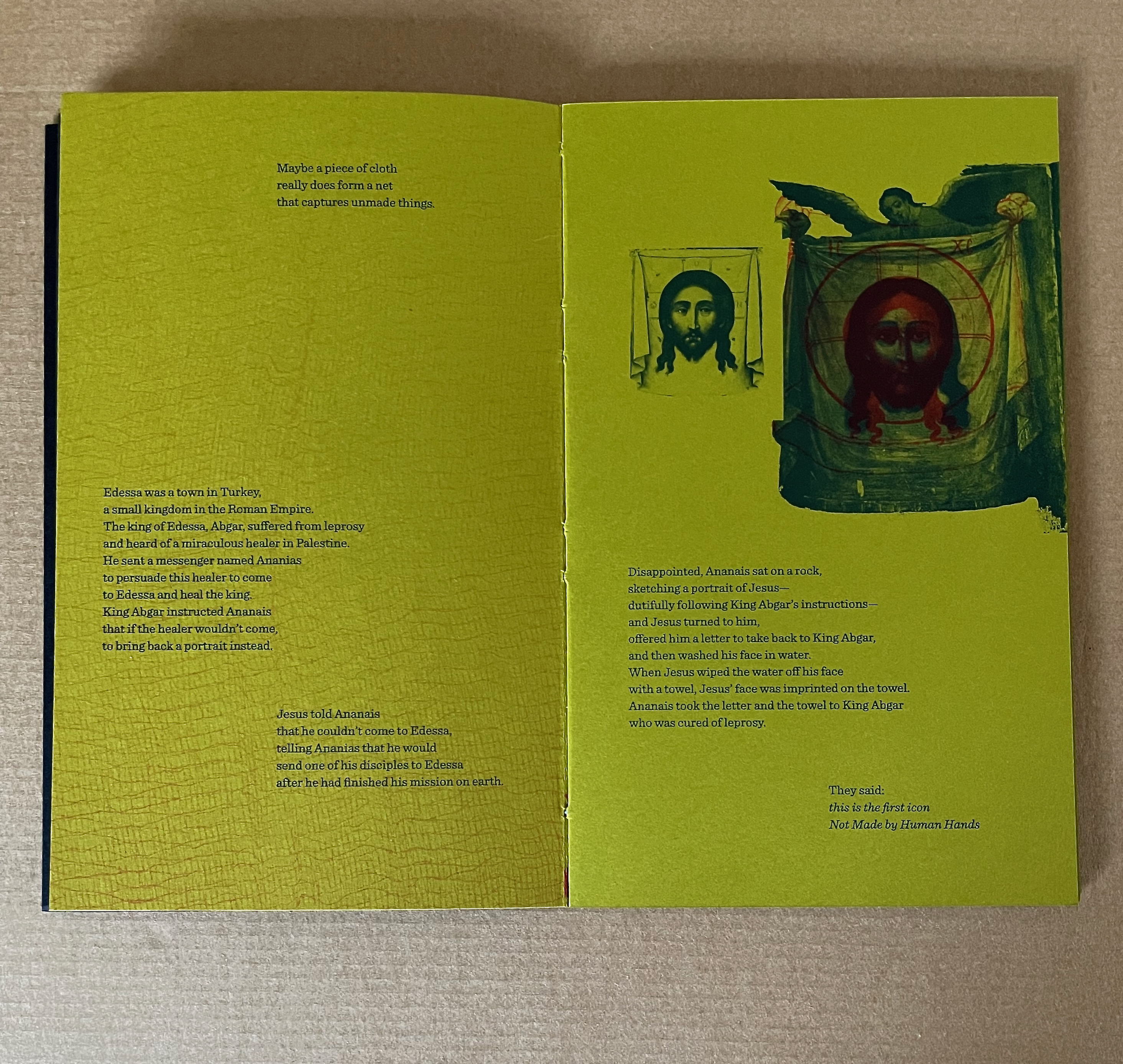
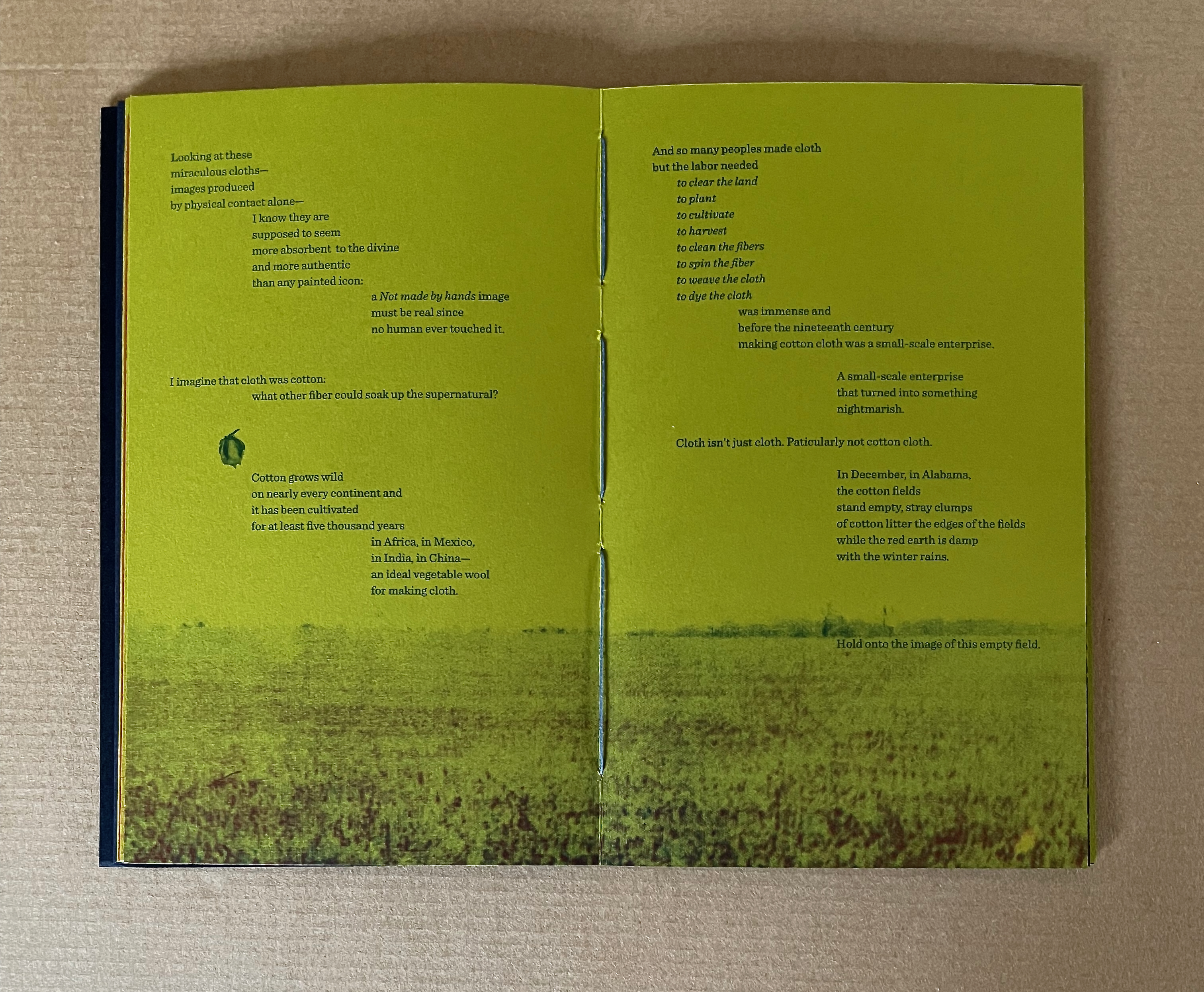
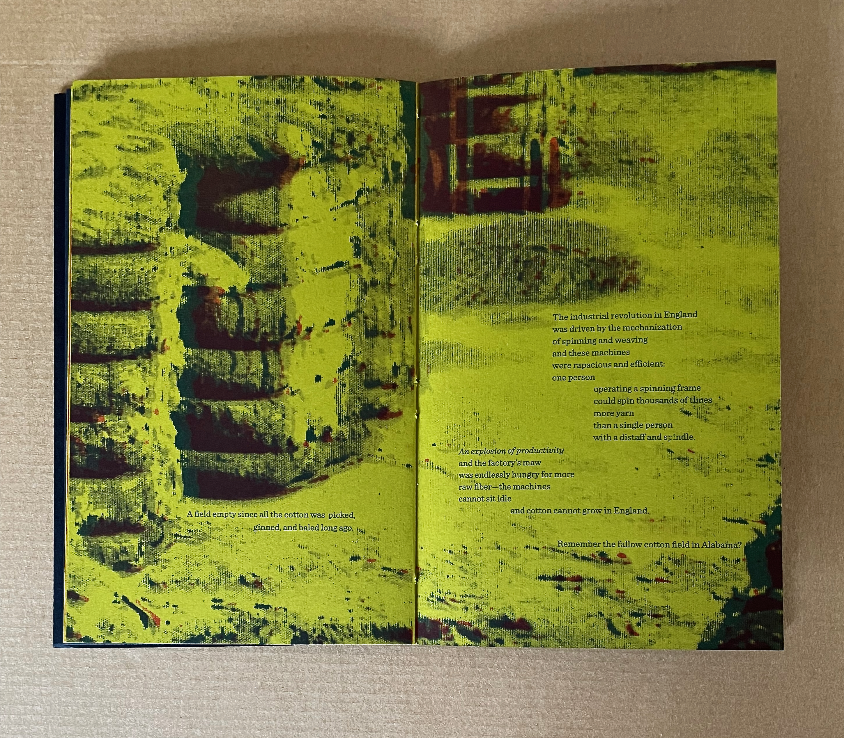
The text then knots those threads to the explosion of demand for cotton cloth (in particular, printed cotton cloth), the spread of cheap mirrors, and invention of photography.
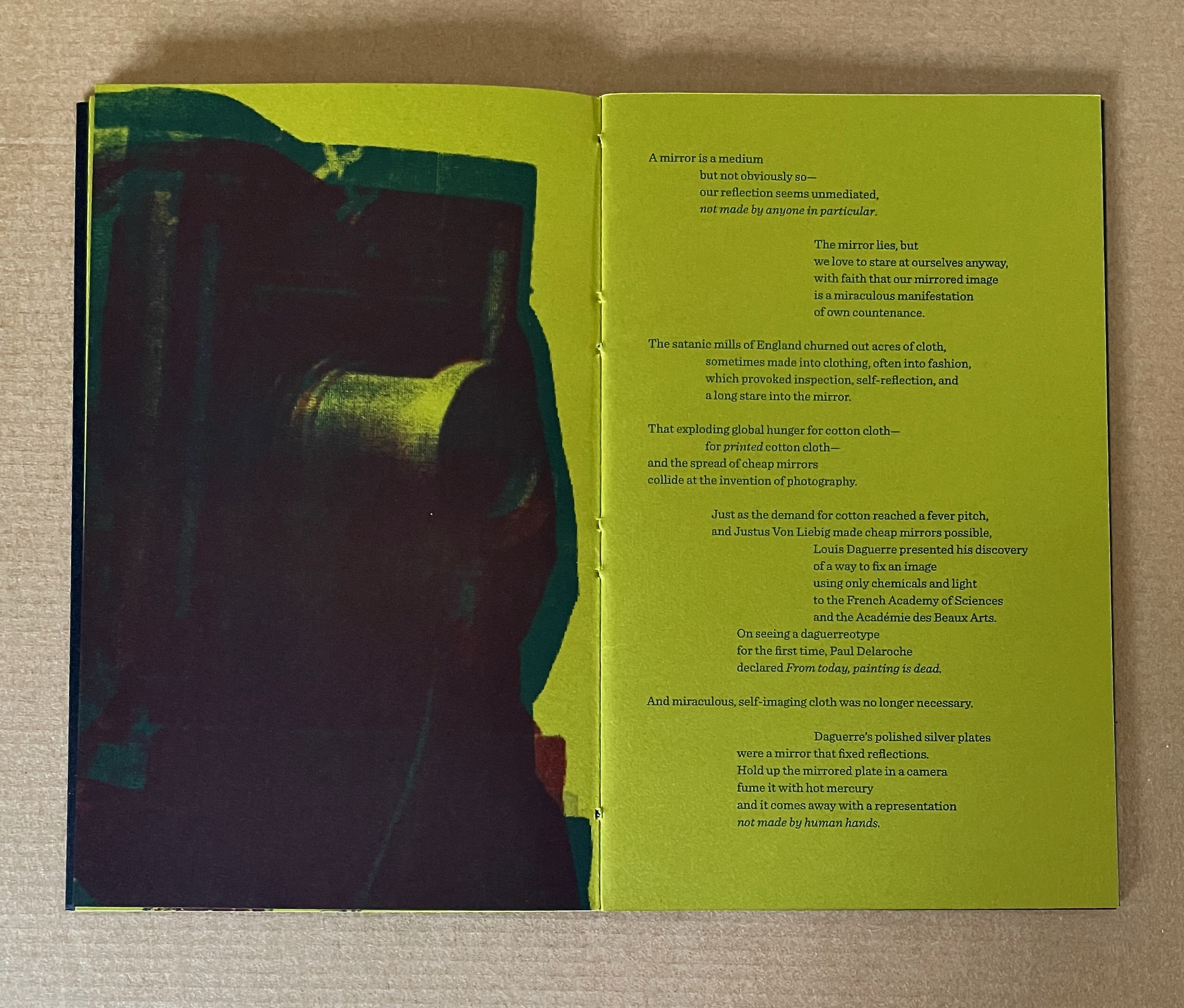
The text also unpicks the structure of the daguerreotype camera. In doing so, it adds another layer to the theme of self-regard. Fitted with an achromatic lens, the wooden box held at its rear a copper sheet plated with mirror-polished silver and sensitized to light. Removing the lens cap projected the image of whatever was in front of the camera to the plate inside.
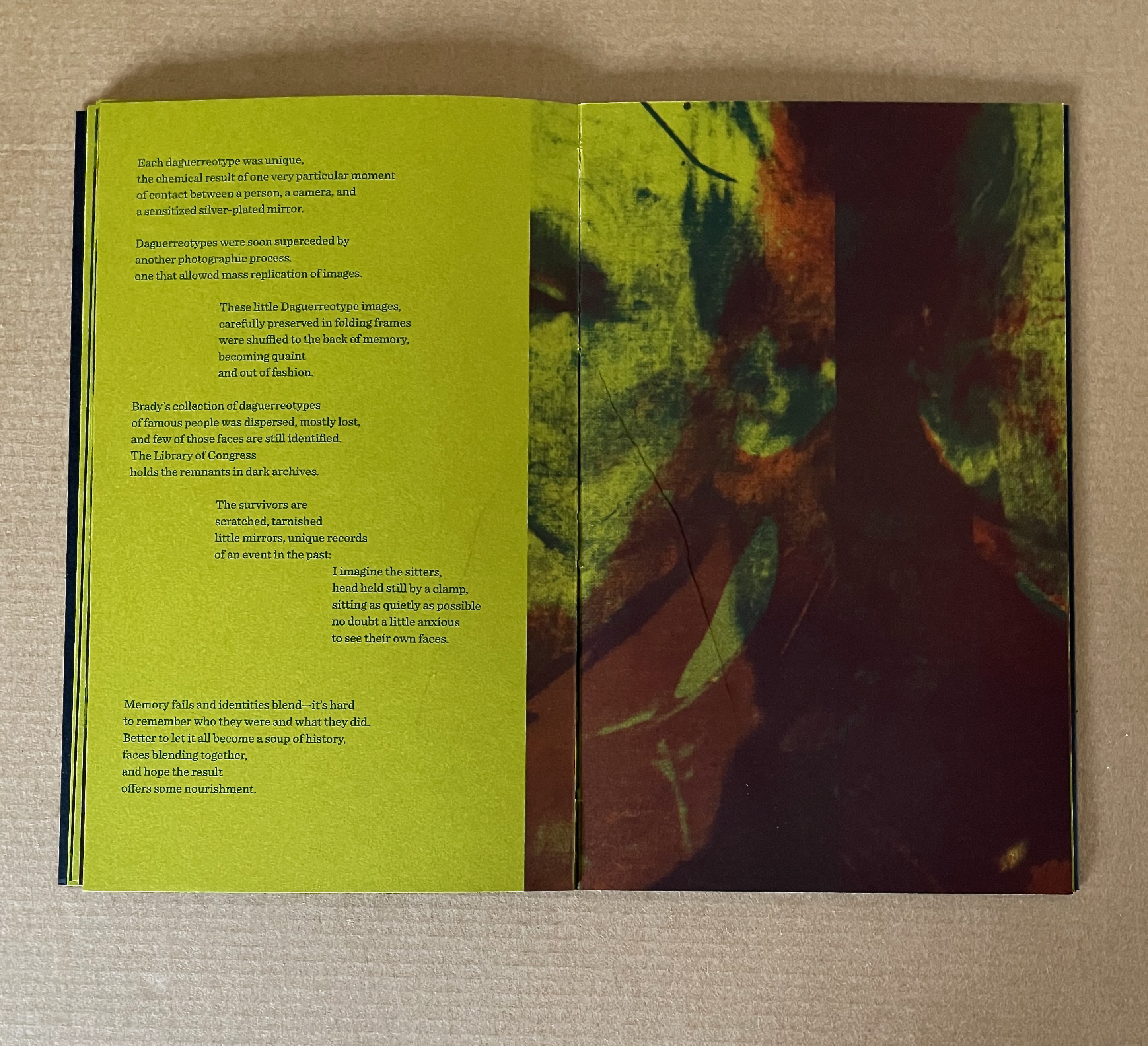
Although the text expands on the human cost of the demand, its primary focus and the entire focus of the images remain on the portrait sitters — despite their receding into “the soup of history”. The images are versions and details of those appearing in the larger volume most of whom are difficult to identify. It is at this point in the companion volume that the text’s typographical presentation begins to enact itself and gloss the images alongside which it appears. Notice how Meador jumbles the descriptions of the sitters on the verso page below.
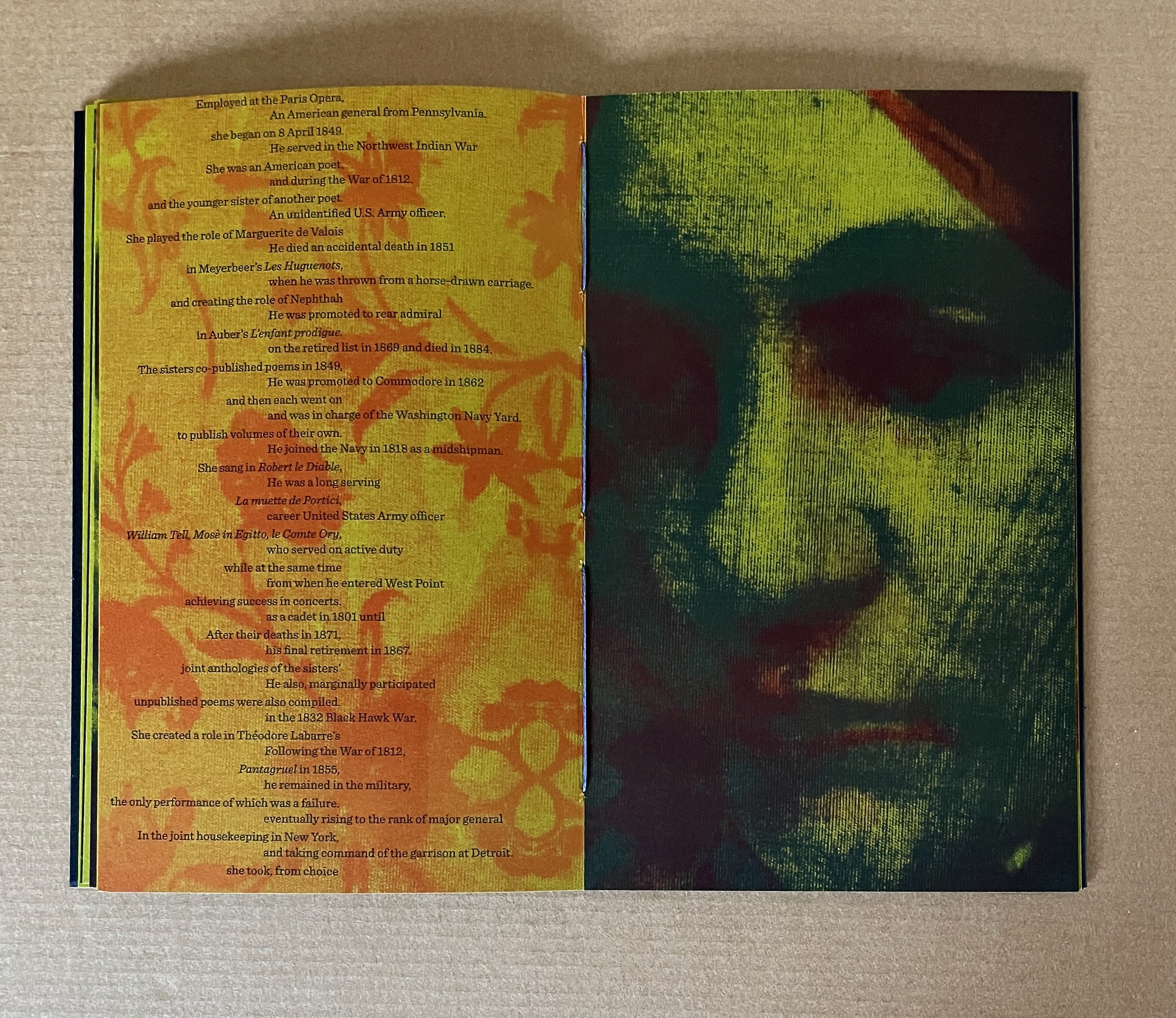
Notice also how, with the label “Unidentified woman” and names of the portrait sitters typeset perpendicularly to the image below, the typography enacts the metaphor of “the warp and weft of the cloth”. Meador is comparing the cloth and “technology” of the acheiropoieton with the page and technology we hold in our hands.
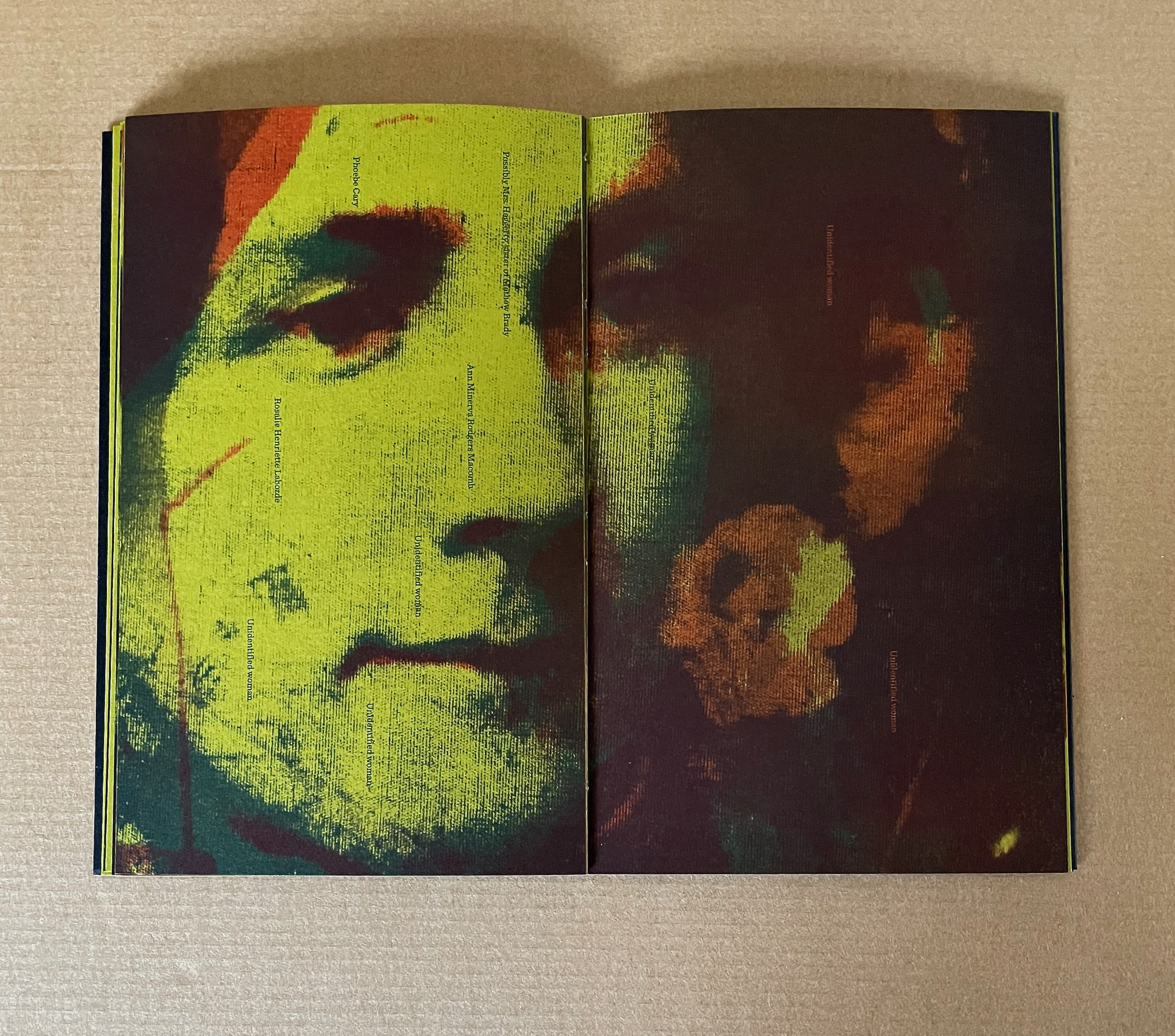
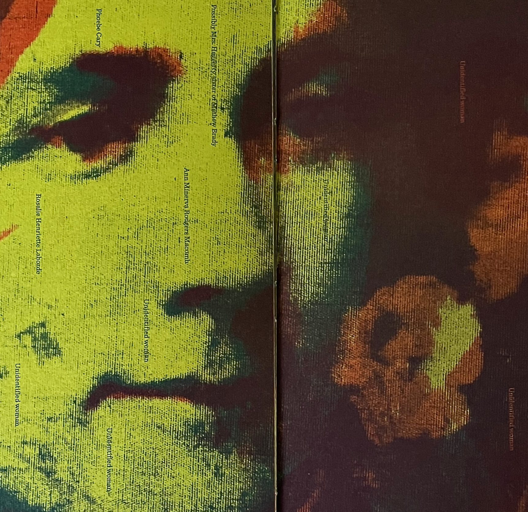
Text, image, and their interaction become the message in the smaller volume and also facilitate closer reading and appreciation of the larger volume. In fact, just the abundant presence of text in the smaller volume sends us back to the larger volume to check the impression that it has no text. In fact, there is one spread in the larger volume that does contain text. Faintly, behind the calico-like pattern composed of color-separated bales of cotton, the reverse image of the word COTTON appears.
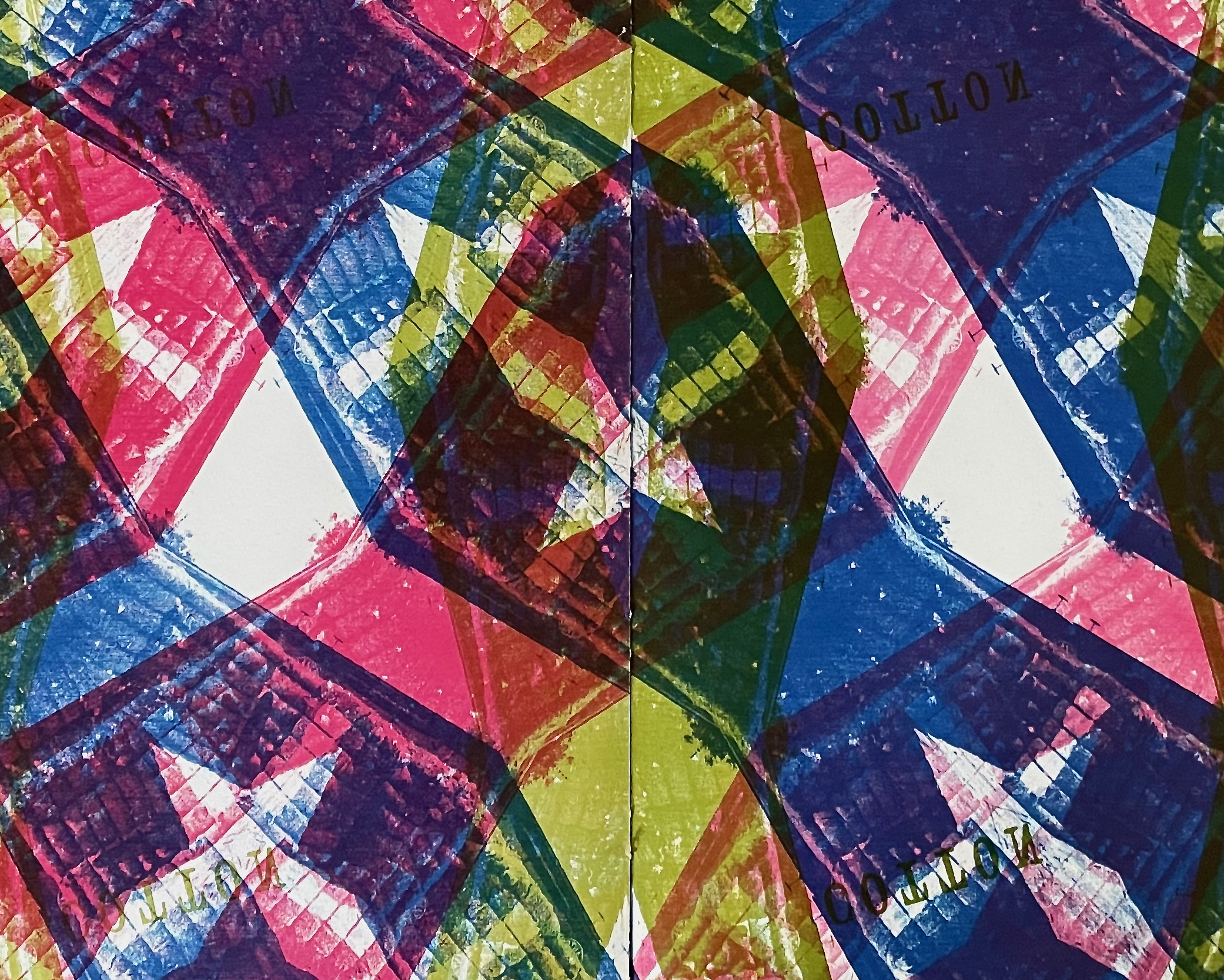
The image above from Acheiropoieta echoes the following text in its companion volume:
What if an entire book
could be printed from cotton cloth
                 exposed onto printing plates?

                 Would that be a miraculous indictment
                 or a demonstration of the ineffable?
Acheiropoieta is that entire book printed from cotton cloth, and with the companion’s text on the human cost, they lead to the next work in the collection.
Cotton Curtain (2018)
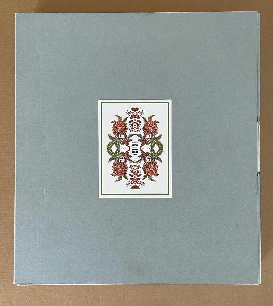
Cotton Curtain (2018)
Clifton Meador
Archival box: H300 x W270 x D40 mm. In slipcase: H295 x W260 x D27 mm. Out of slipcase: H295 x W255 x D27 mm. [96] pages. Edition of 10, of which this is #10. Acquired from artist, 21 June 2024.
Photos: Books On Books Collection.
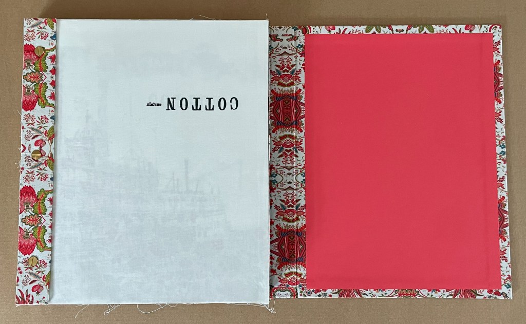
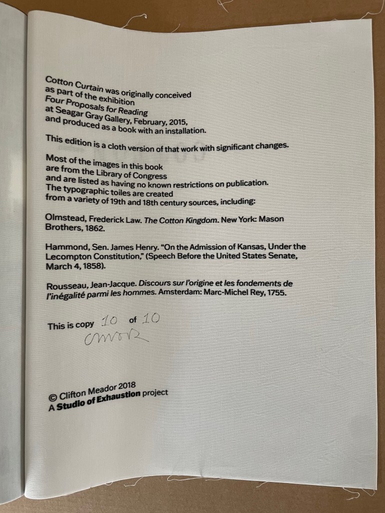
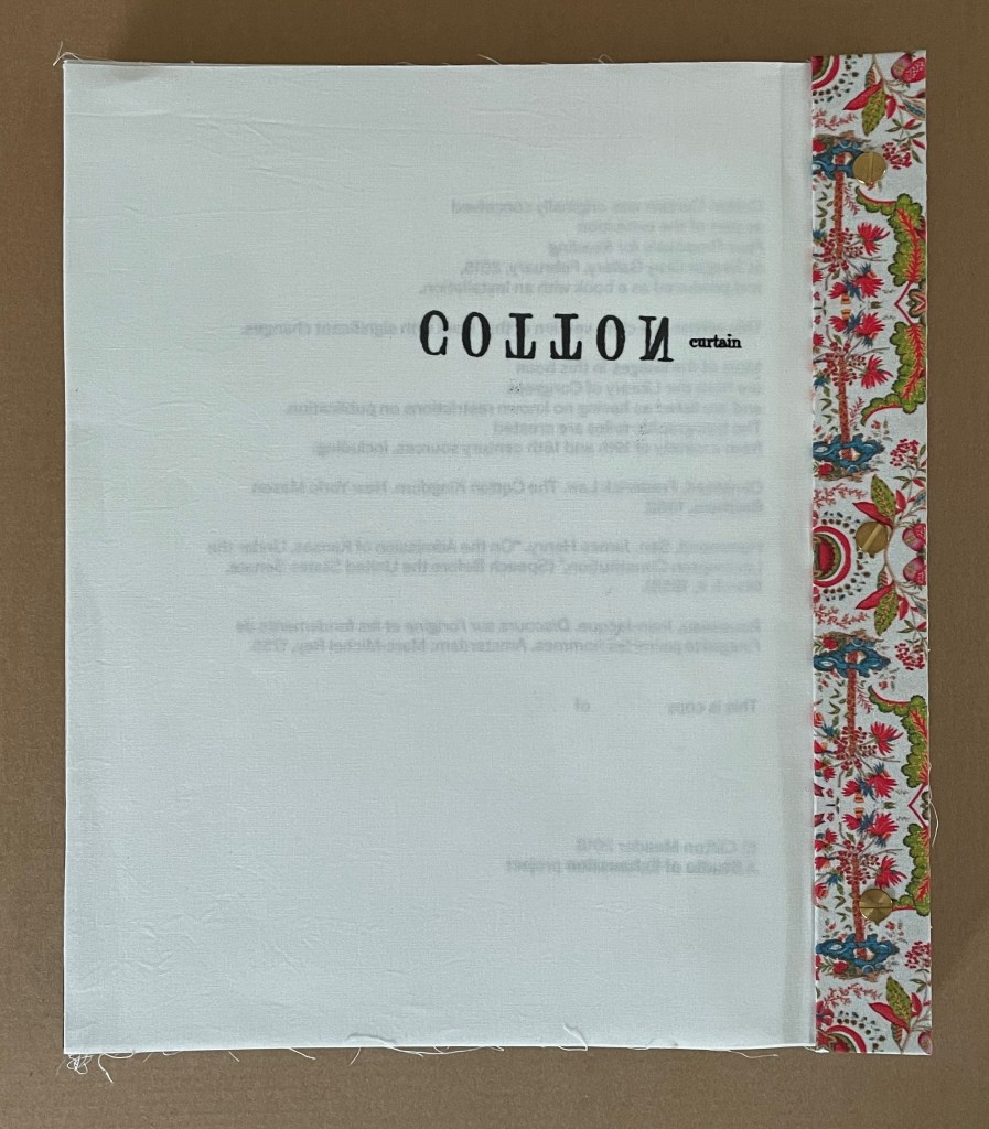
A version of Cotton Curtain and related installation first appeared in the exhibition “Four Proposals for Reading” at Seagar Gray Gallery in February 2015, which was well reviewed by David M. Roth (see below). Cotton Curtain (2018), a version with significant changes, performs its task through a remarkable integration of structure, material, sequence, pattern, text, typography, and image. On opening the archival box, we see a portfolio-style cover whose stunning printed muslin aligns perfectly with the same pattern over the book’s bolted wrapped-back binding, which places the folds at the fore edge.
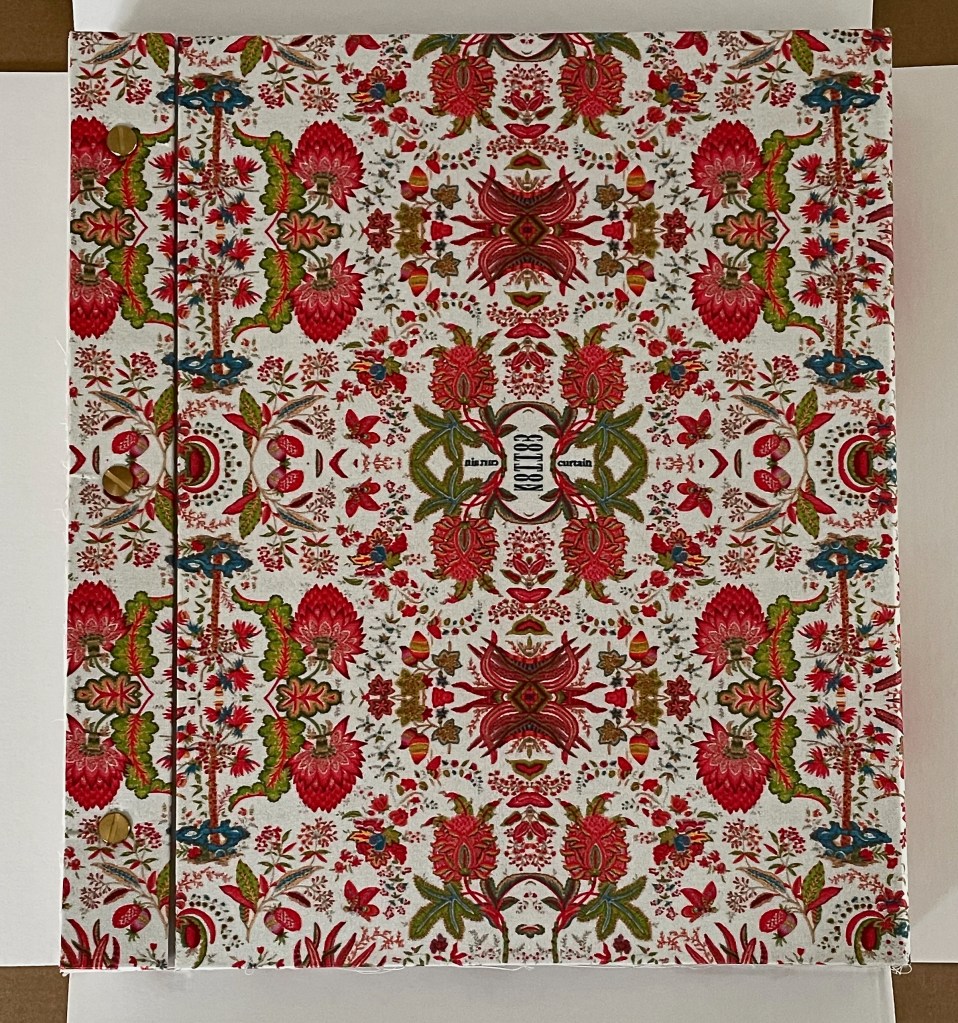
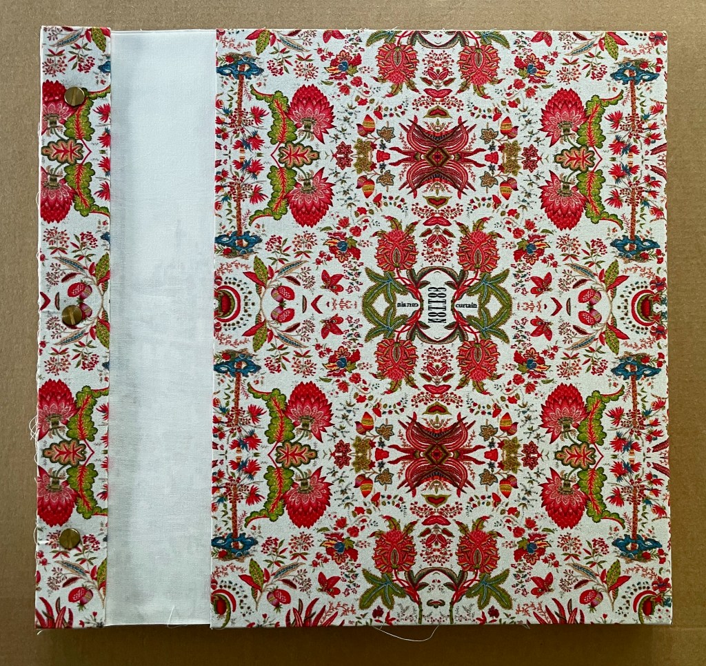
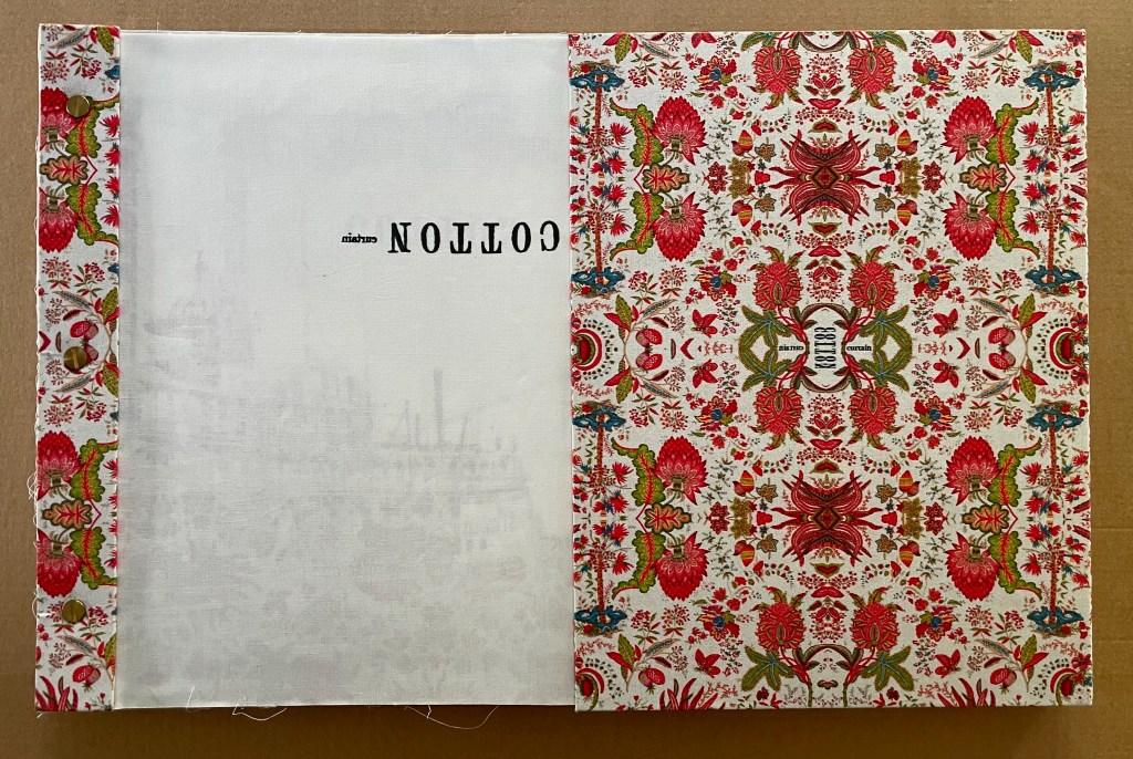
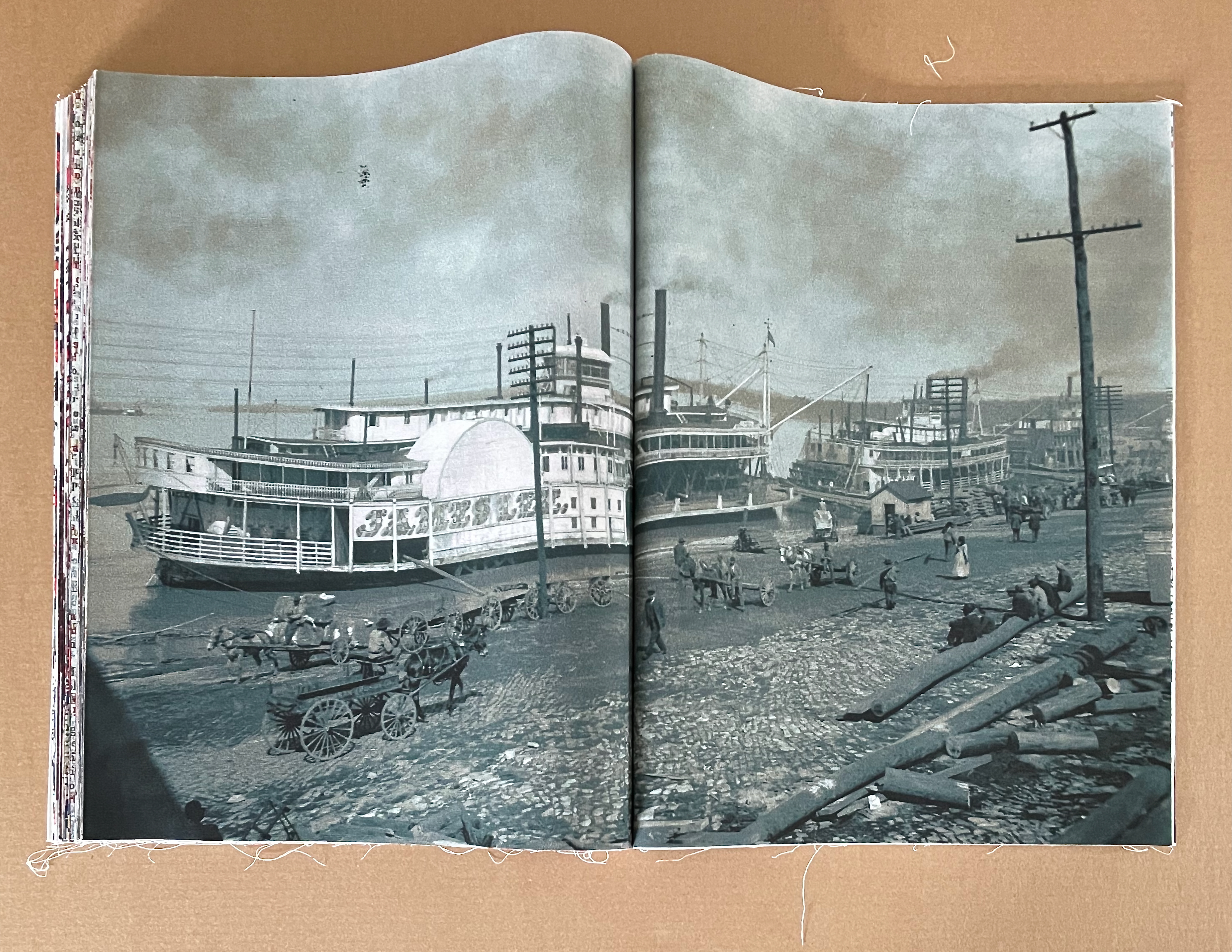
Lifted by its spine, the book’s pages flow downwards like the samples in a cloth or carpet sampler because they are cotton cloth. Loose threads trail from their edges. Together the wrapped-back binding and cotton cloth cause the half-title to billow as it turns to reveal a steamboat, streams of smoke, and river surface bearing the same print pattern.
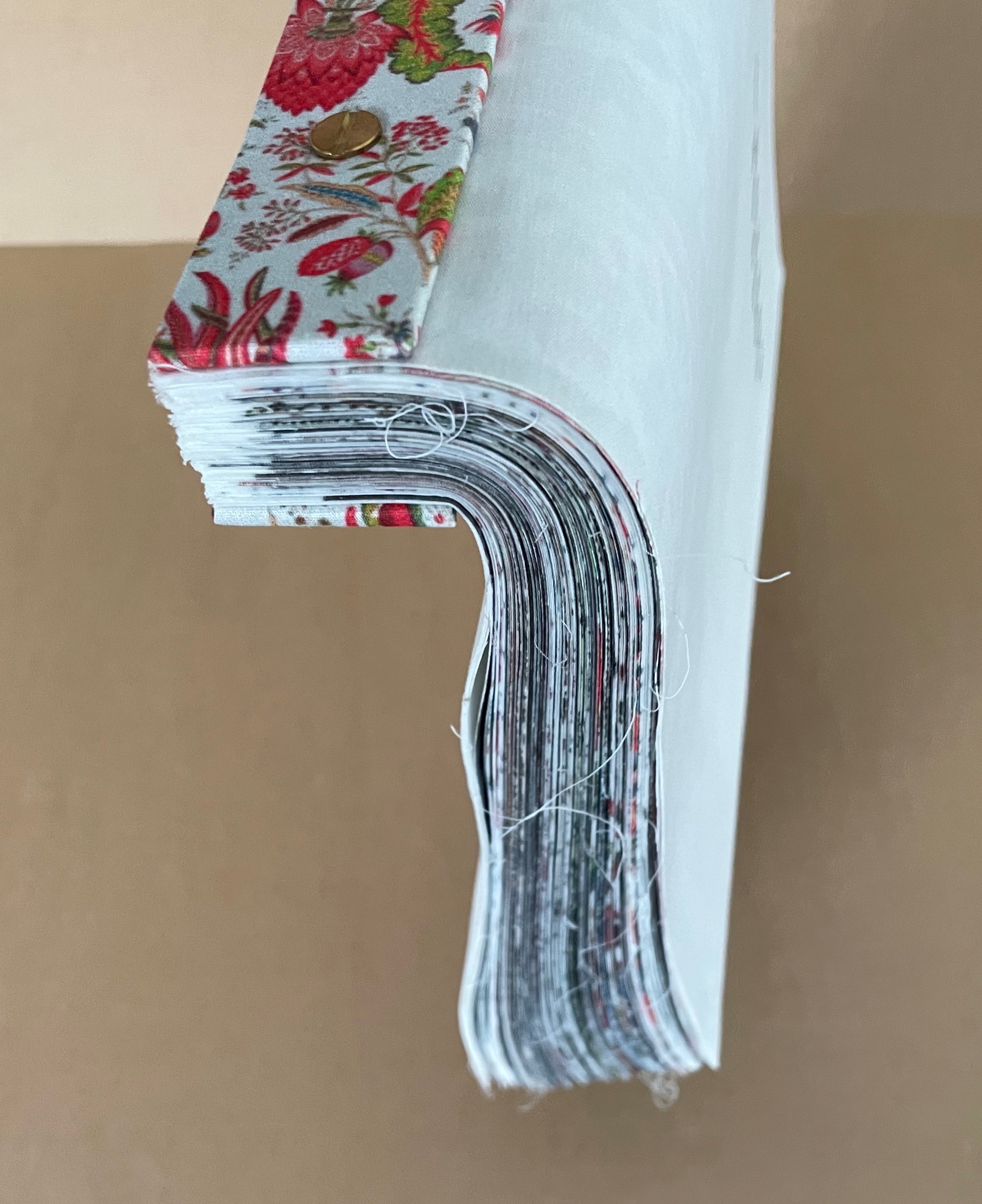
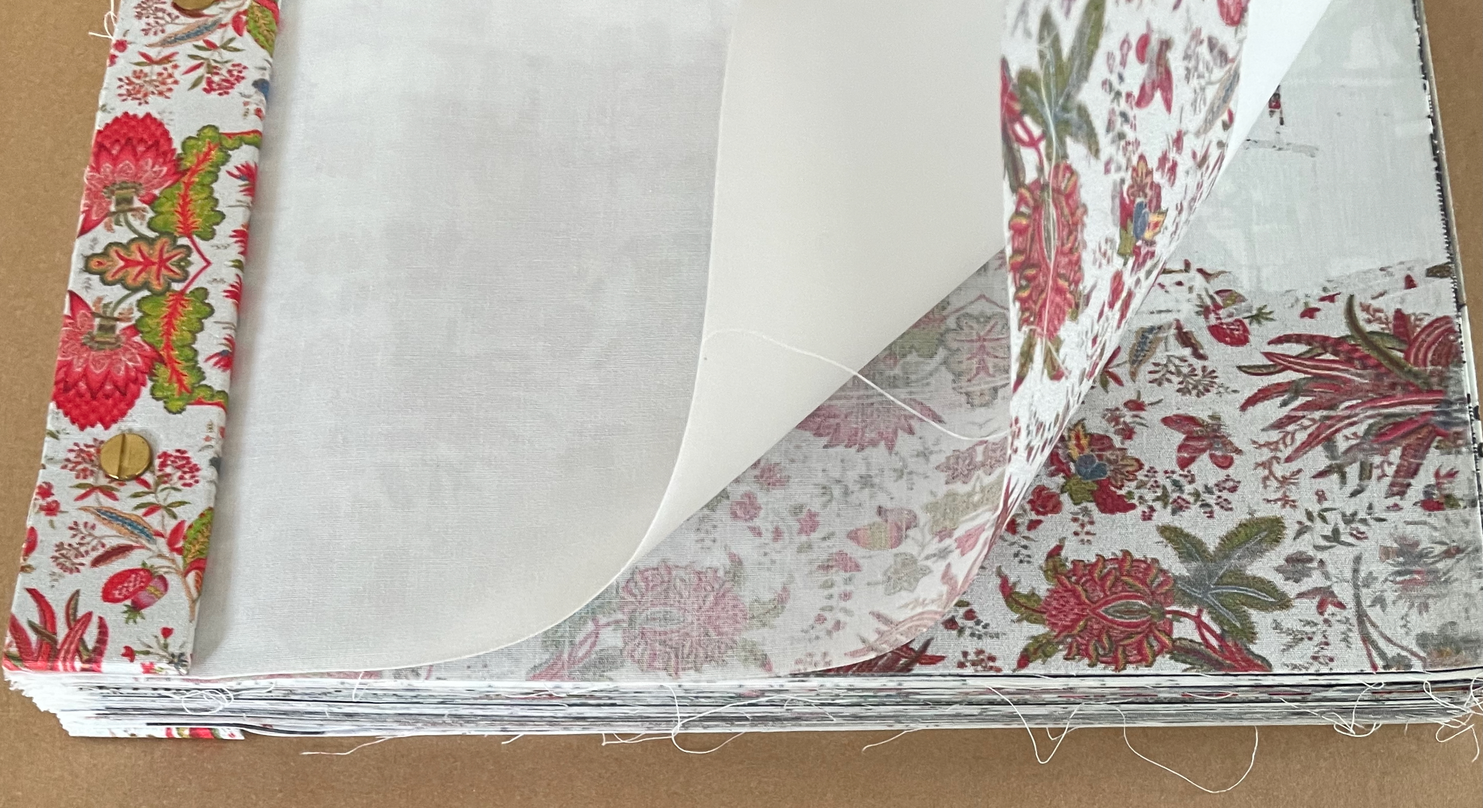
Left: the “drape” of the book. Right: half-title folio “gapping” as it turns.
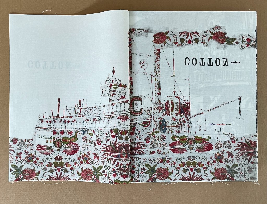
Title-page spread.
The double-page spread is the functional unit of the book, and the title-page spread is but the first that stops readers/viewers in their tracks. Drawing on the Detroit Publishing Collection archives in the Library of Congress, Frederick Law Olmstead’s The Cotton Kingdom, and other 19th and 18th century sources, the 44 spreads that follow display black and white etchings, tinted photographs, traditional Toile de Jouy with its muted single color patterns, toile with bright multicolors, typographic toile patterns, typographic mimicry of stitches and quilt patches, typographic mimicry of weave and weft, and slave inventories in script arranged to mimick decorative patterns.
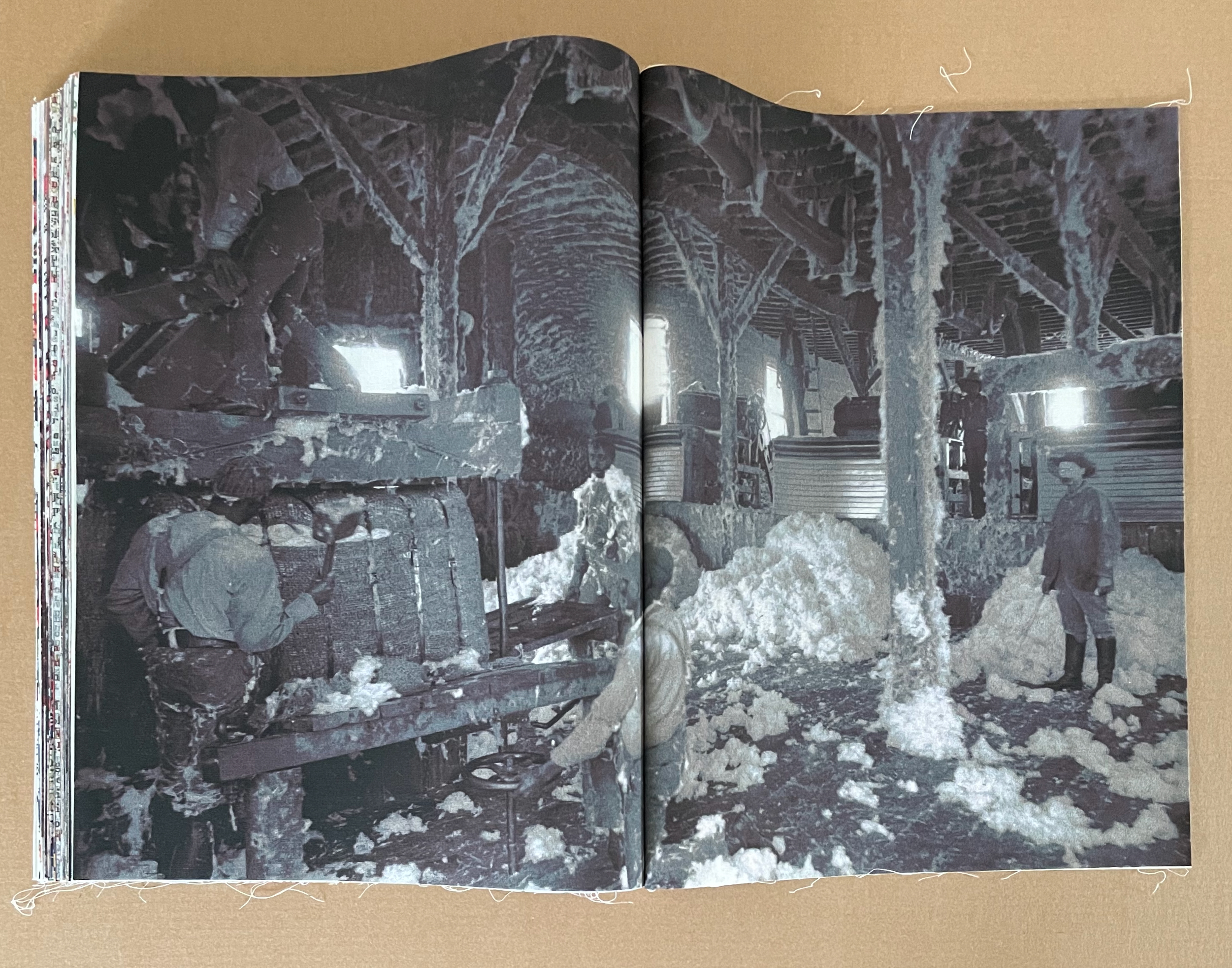
The sequencing of the spreads builds toward a run of the photographic images depicting cotton bales on loading docks, in warehouses, and riverboats with the black labor and white management engaged. Other than the opening pair of etchings showing similar earlier scenes, the photos are the only type of image that appears in back-to-back groups. There are 21 of them, 9 in the first half and 12 in the second.
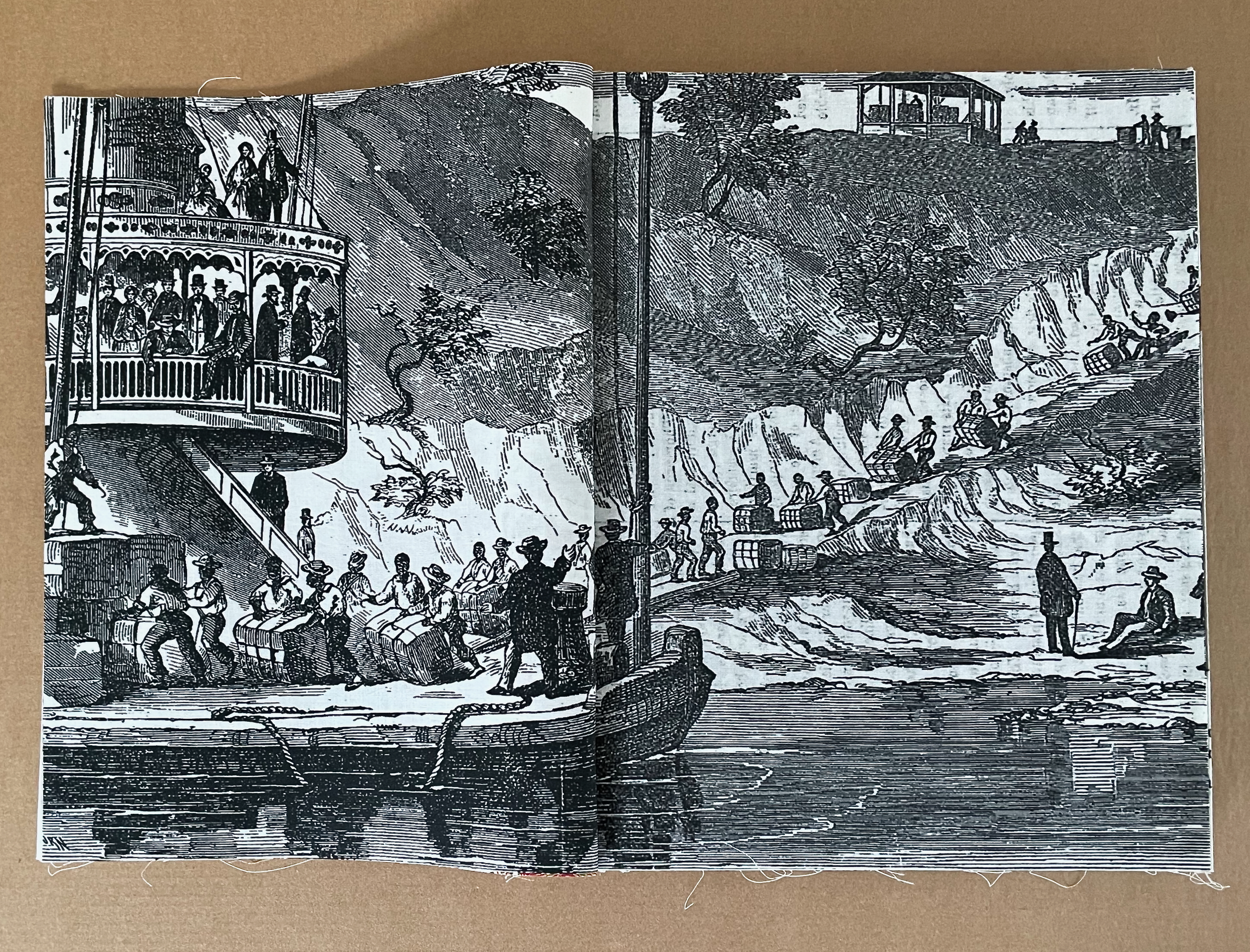
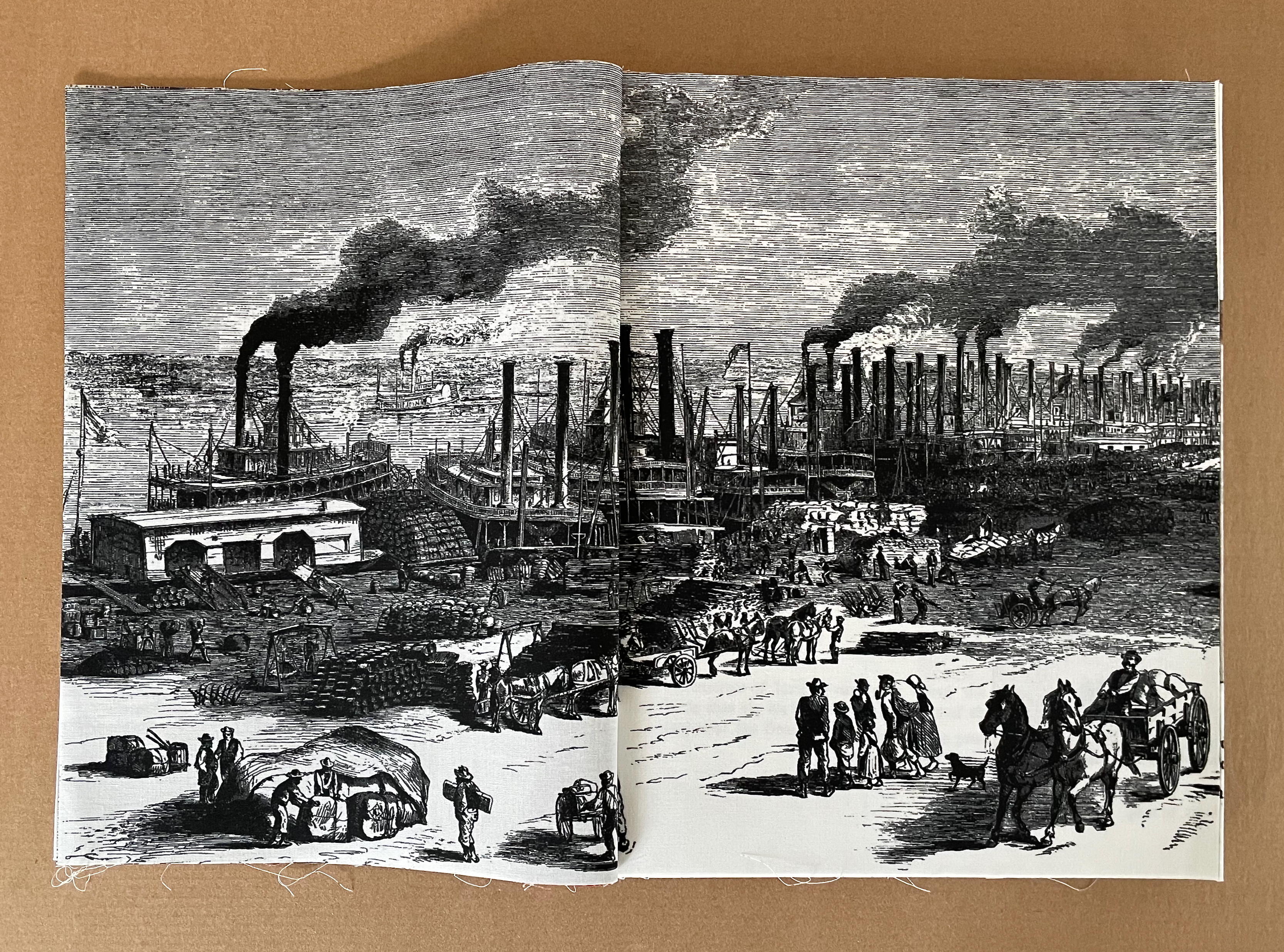
Paired etchings introducing the book.
In the first half of the book, the images of the docks are mostly separated by toile images.
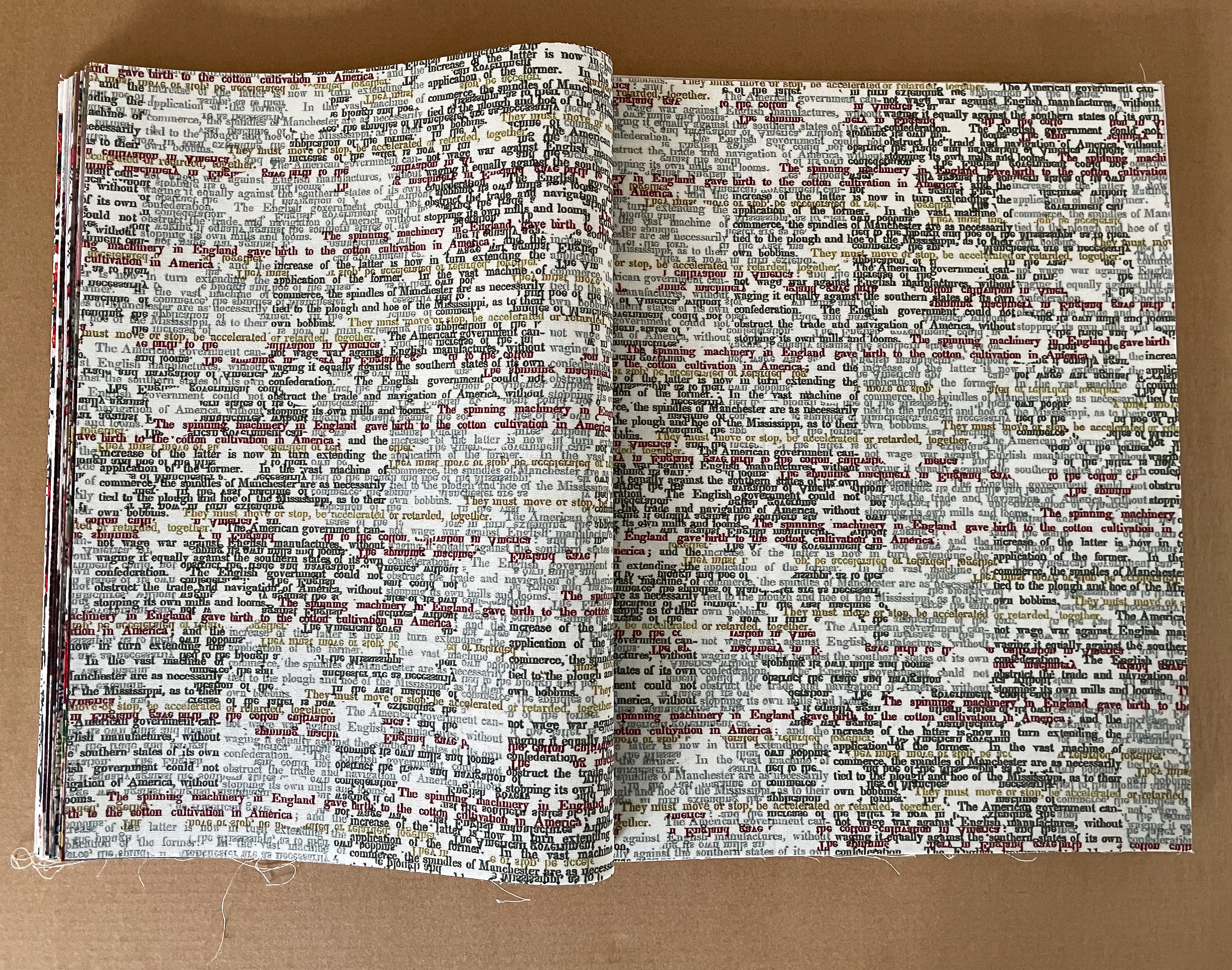
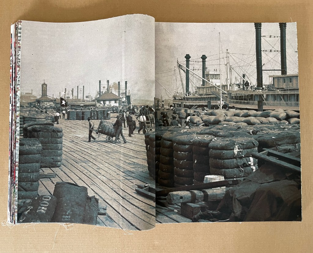
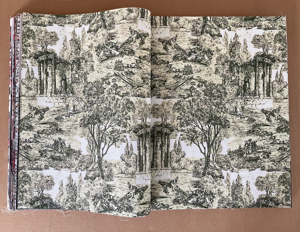
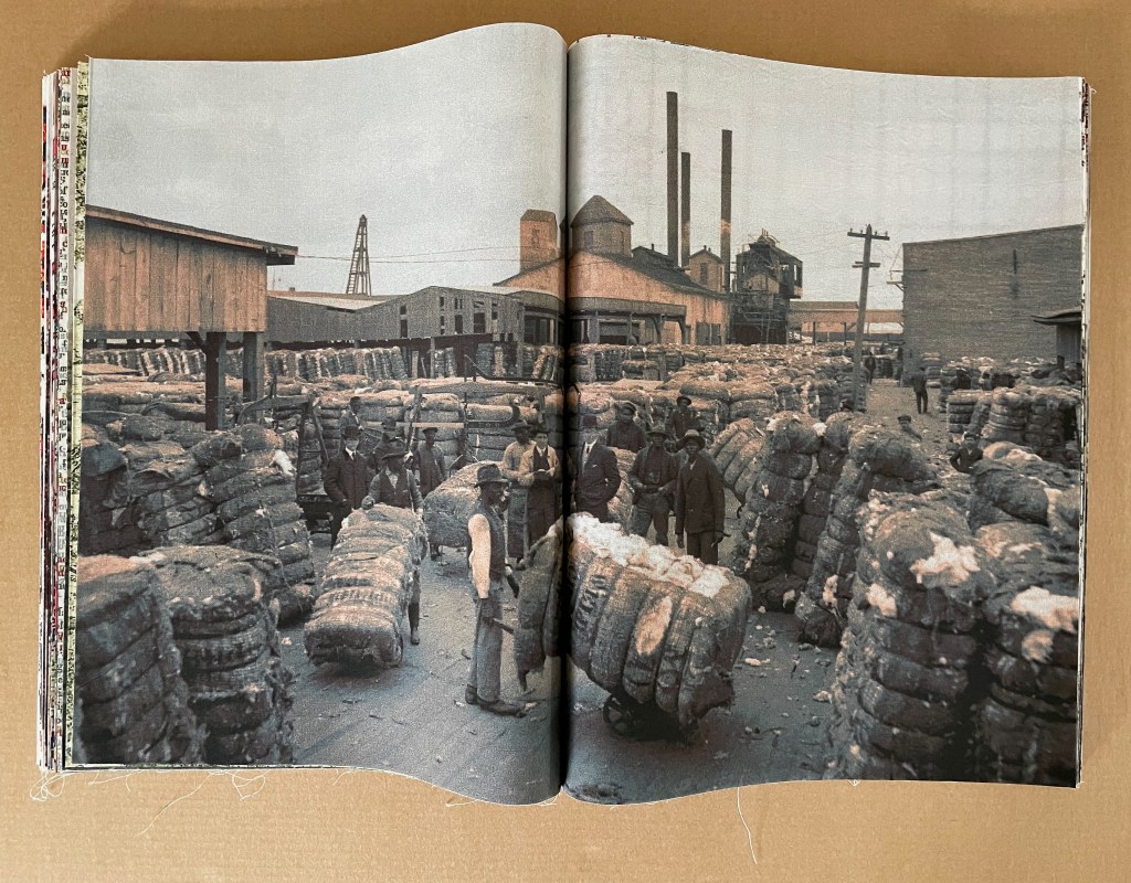
From first half of the book: typographic toile followed by photo, followed by Toile de Jouy, followed by photo.
In the second half, the dock and work images come in groups of 2, 3, and 4 (as in the following sequence).
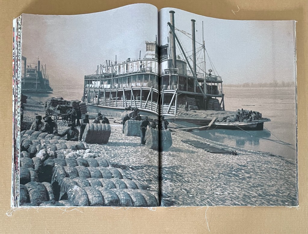
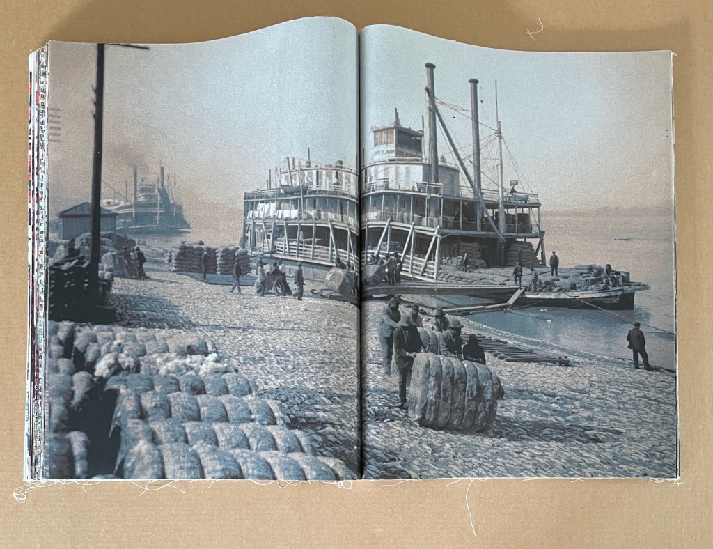
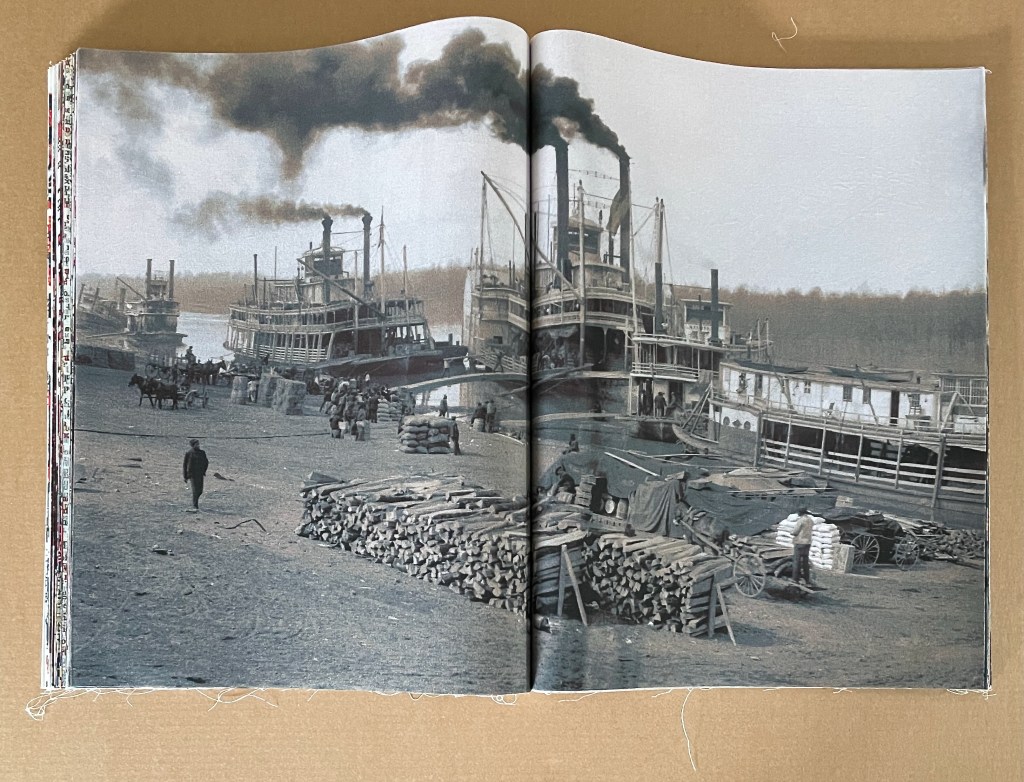
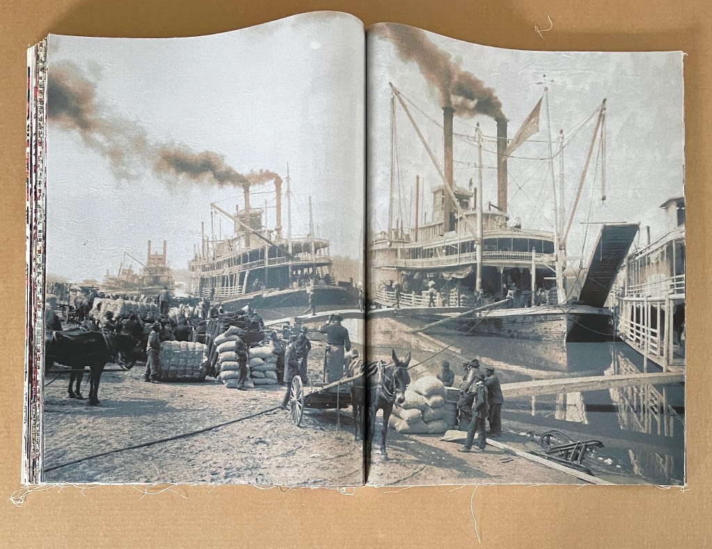
From the second half of the book: grouping of photos of cotton bales, riverboats and work scenes.
All of the brightly colored toile spreads occur before the mid point of the book. There are 4 of them (or 5 if you count the title-page spread). They deceptively lighten the impact of the tinted photographs.
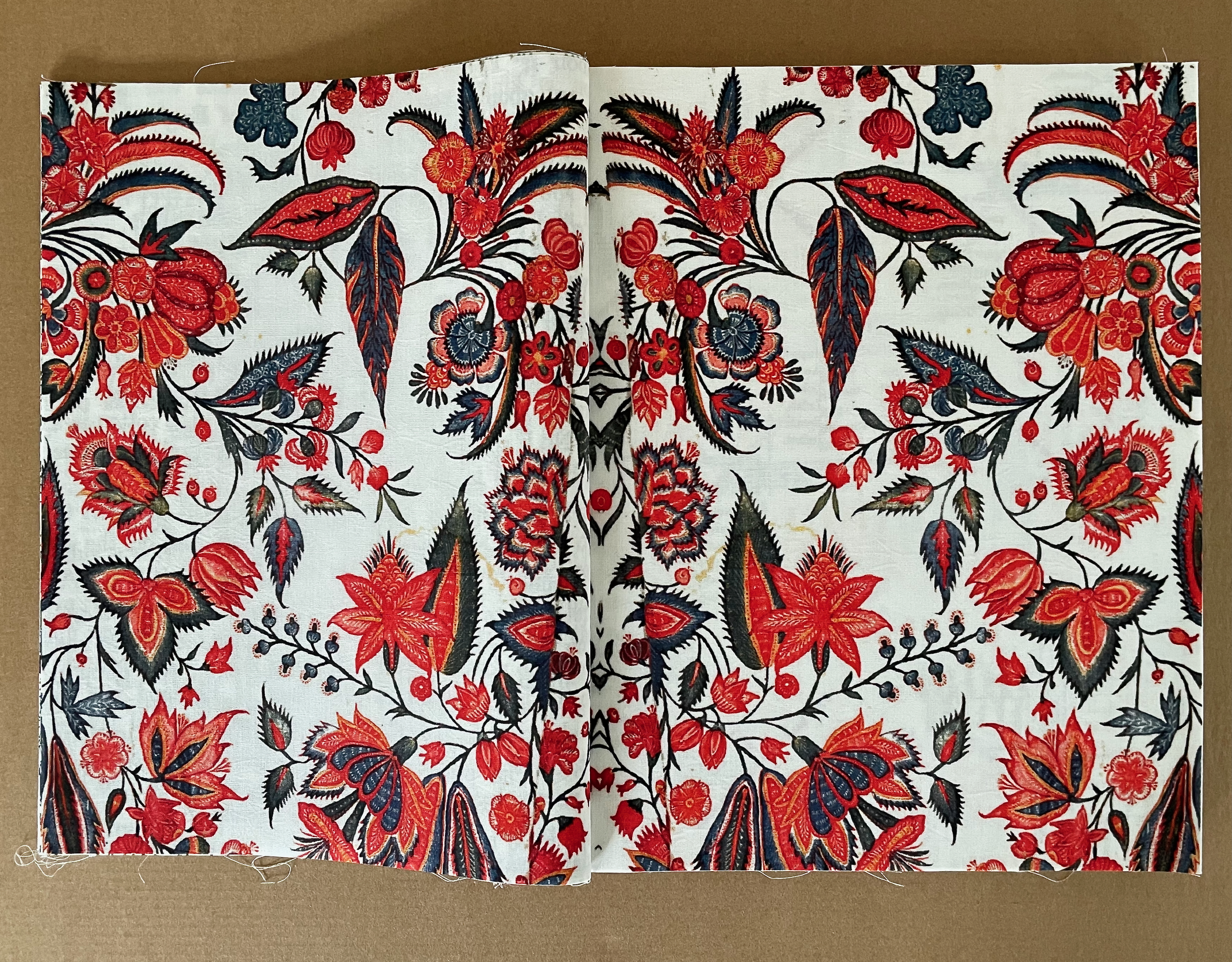
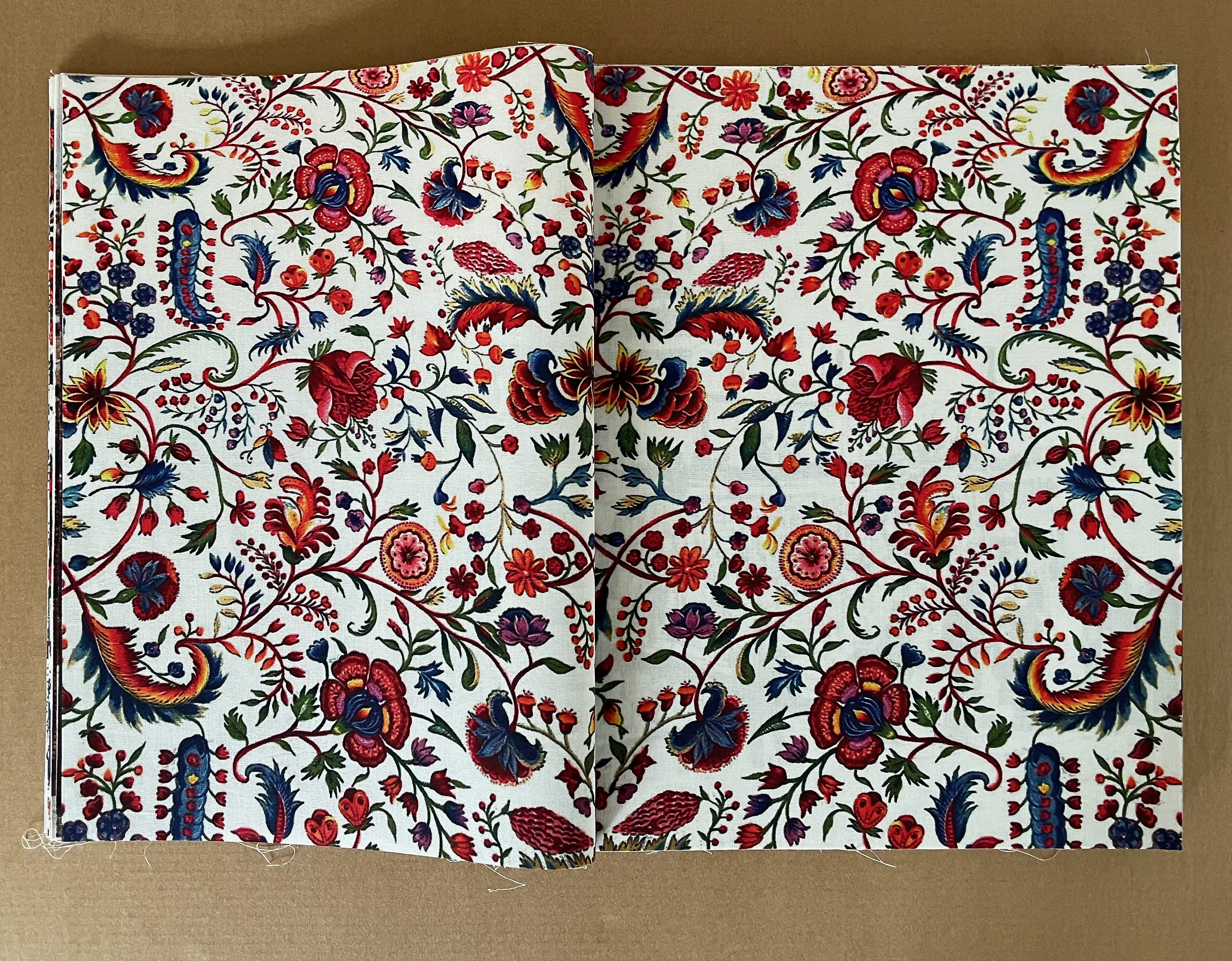
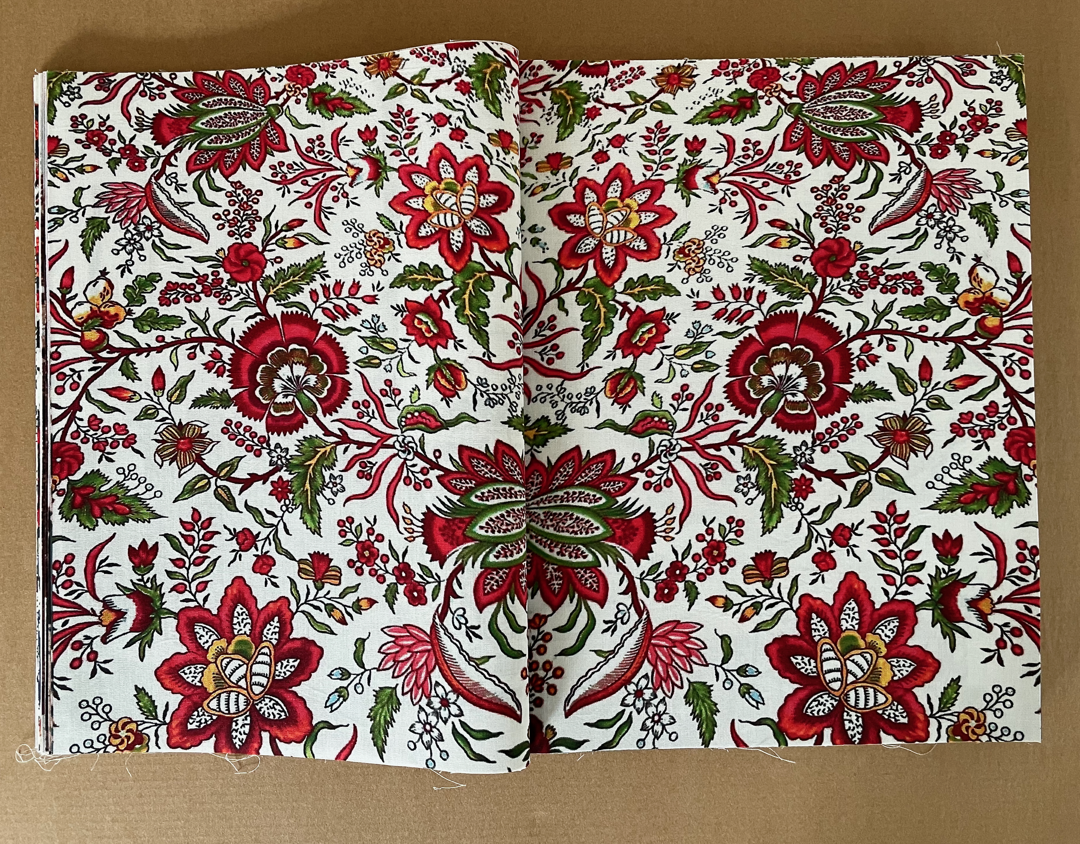
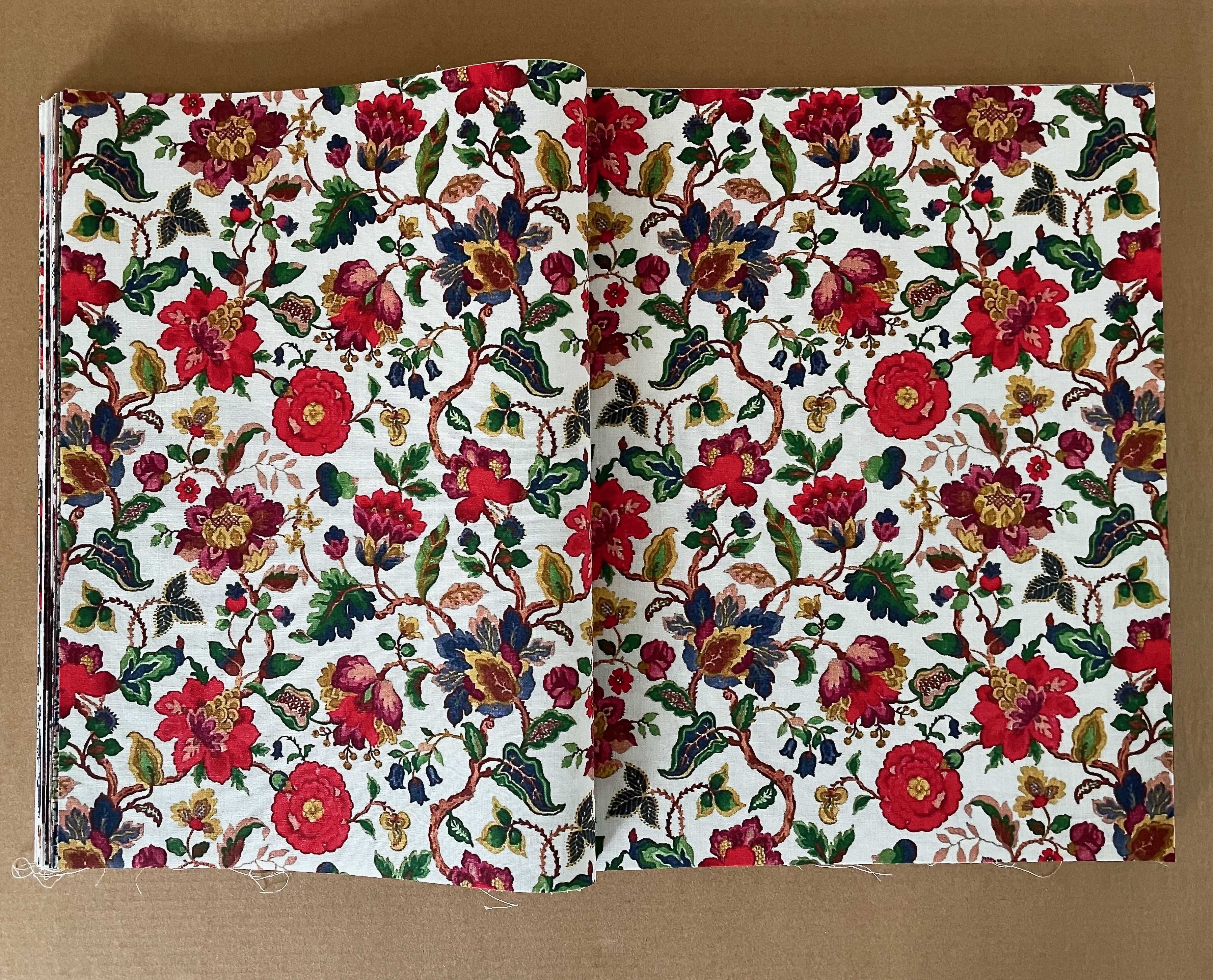
Multicolored toile.
The first of 8 traditional Toile de Jouy in the book comes just before the mid point. It shows the expected bucolic scene — again, deceptively lightening. The second Toile de Jouy is a different matter. It gives us plantation scenes, dancing natives, and slave capture. A third depicts slave trading in Africa. A fourth displays a patriotic scene complete with a ribbon ironically proclaiming “Where Liberty Dwells, There Is My Country”. The fifth reverts to a bucolic theme, only to be followed by a slave raid in the sixth. The seventh and eighth come back to more traditional scenery, but the eighth and last Toile du Jouy is reproduced as a torn fragment.
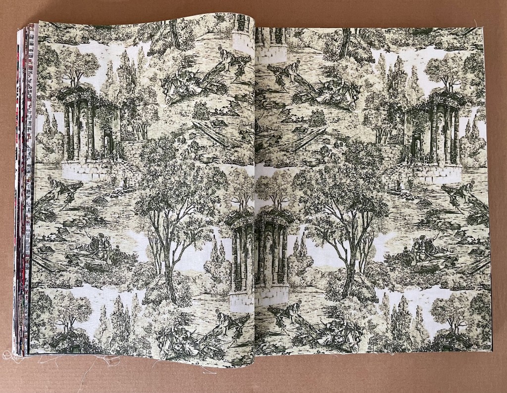
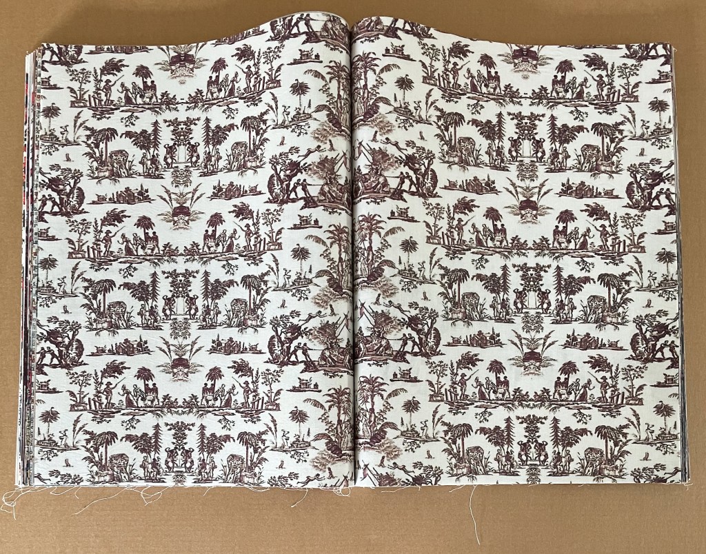
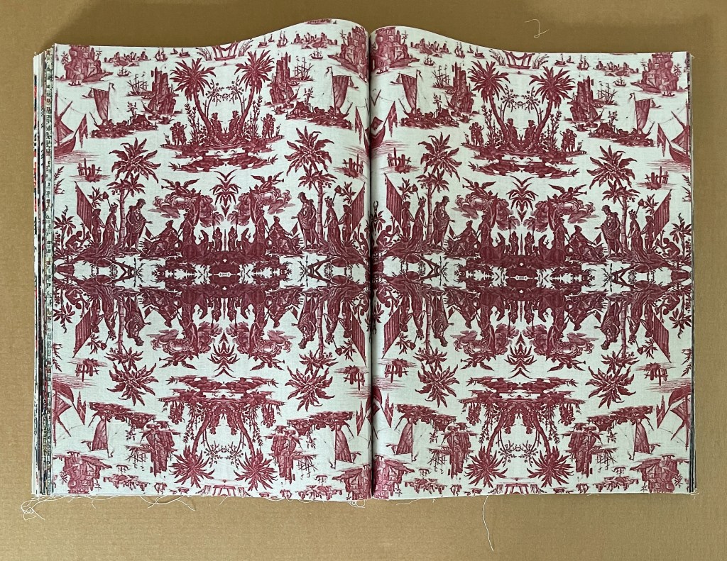
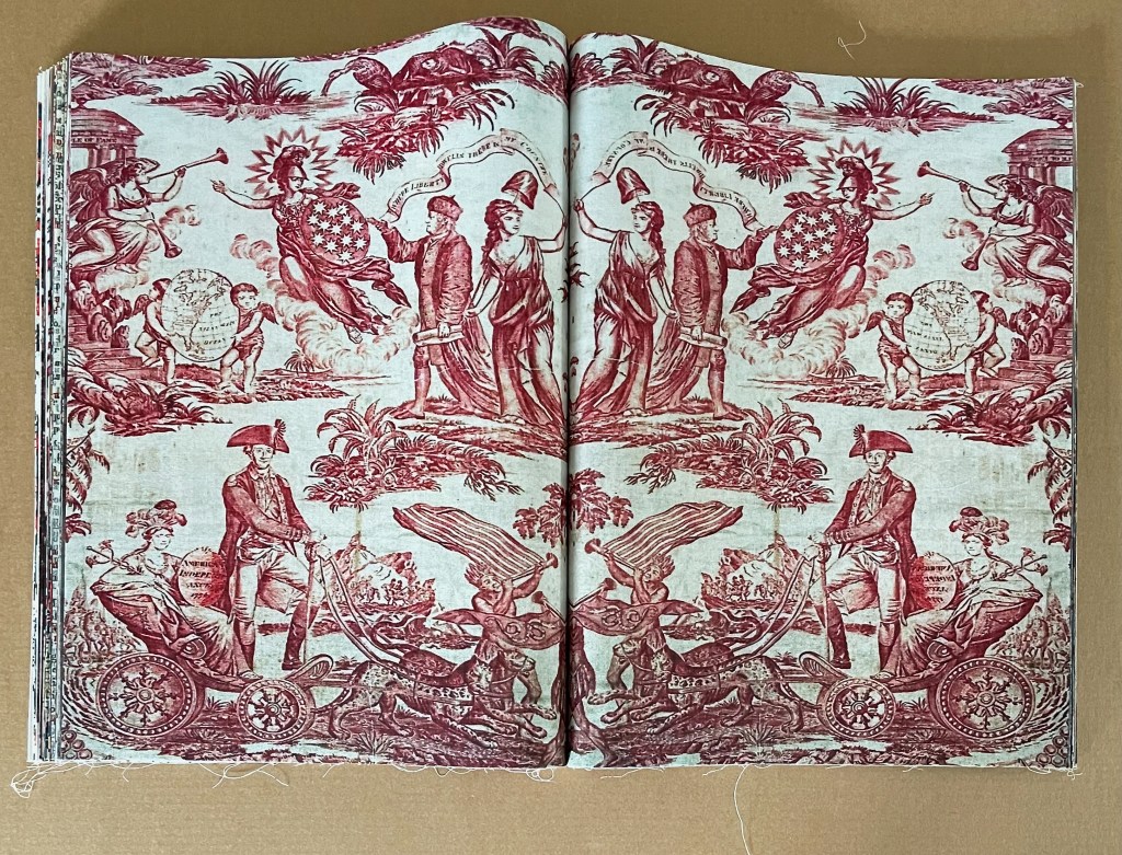
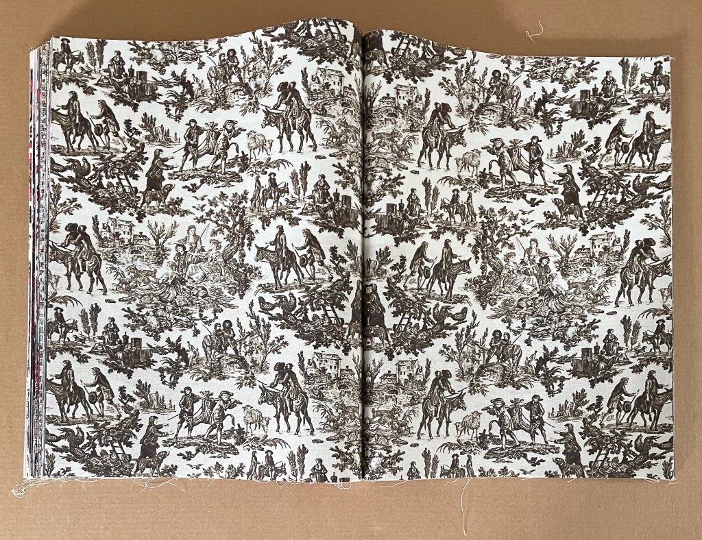
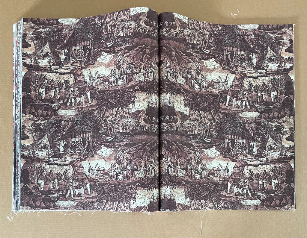
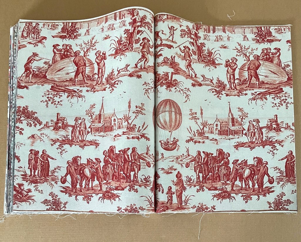
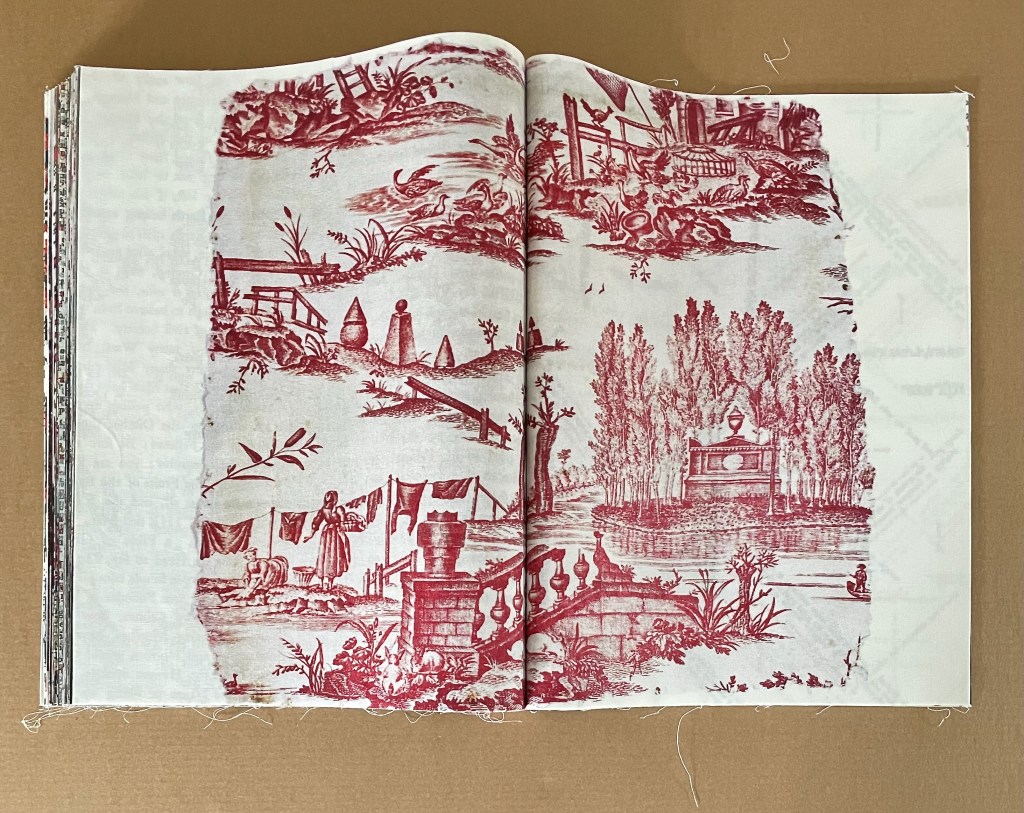
Toile de Jouy.
The text in the 4 typographic toiles comes from a variety of 19th and 18th century sources. The first 3 appear before the mid point of the book. Their multicolors contribute to the brightening effect of the multicolored toiles in the first half of the book, but their text does not. Almost illegible from the overlapping, some phrases can still be picked out from the fabric: notably those from Senator James Henry Hammond’s infamous “Cotton is King” sppech such as “No! you dare not make war upon cotton”, “the system of slavery is a necessary evil”, “The spinning machinery of England gave birth to the cotton cultivation in America”, which are ironically offset with Jean-Jacques Rousseau’s words “the Fruits of the Earth belong equally to us all, and the Earth to nobody!”
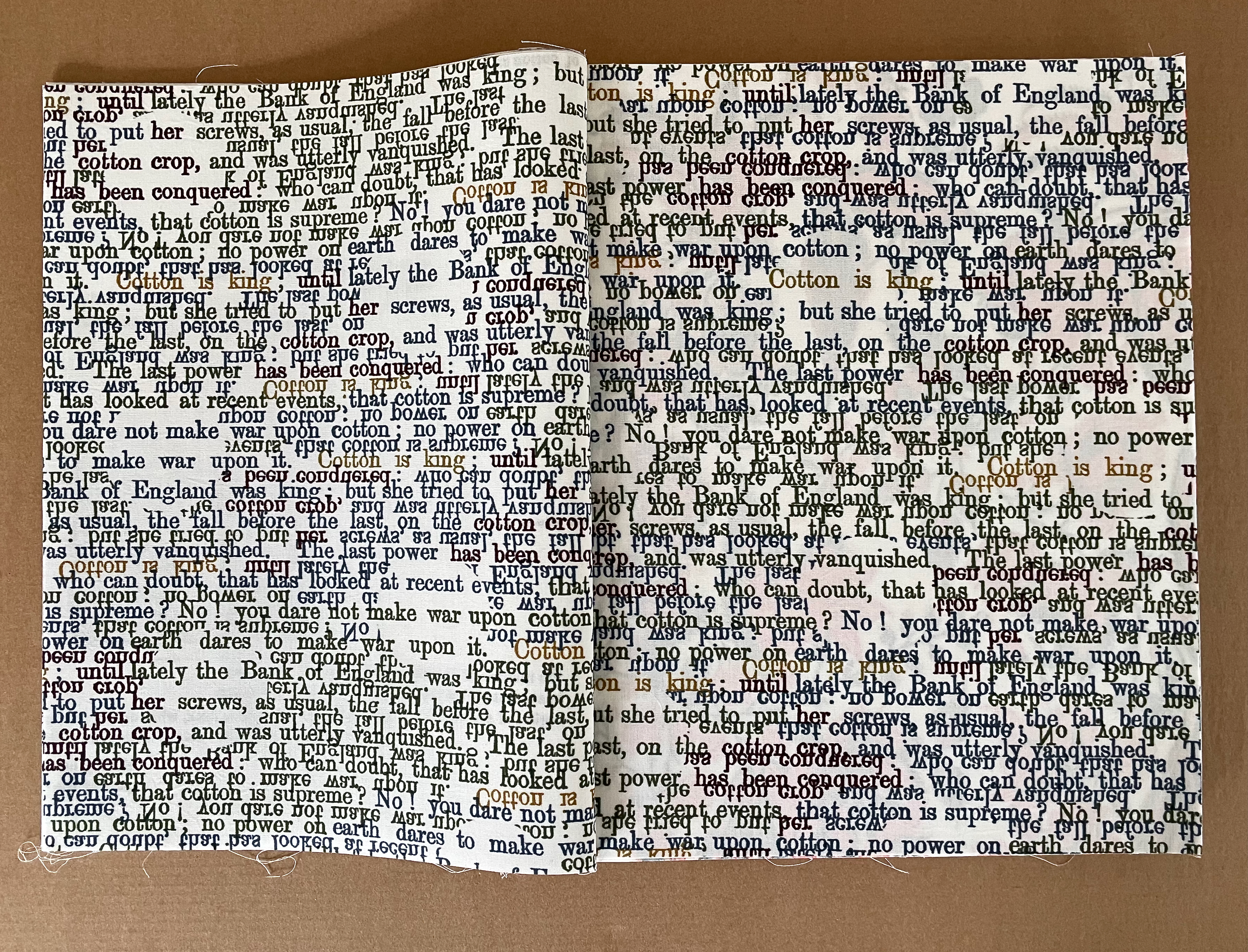
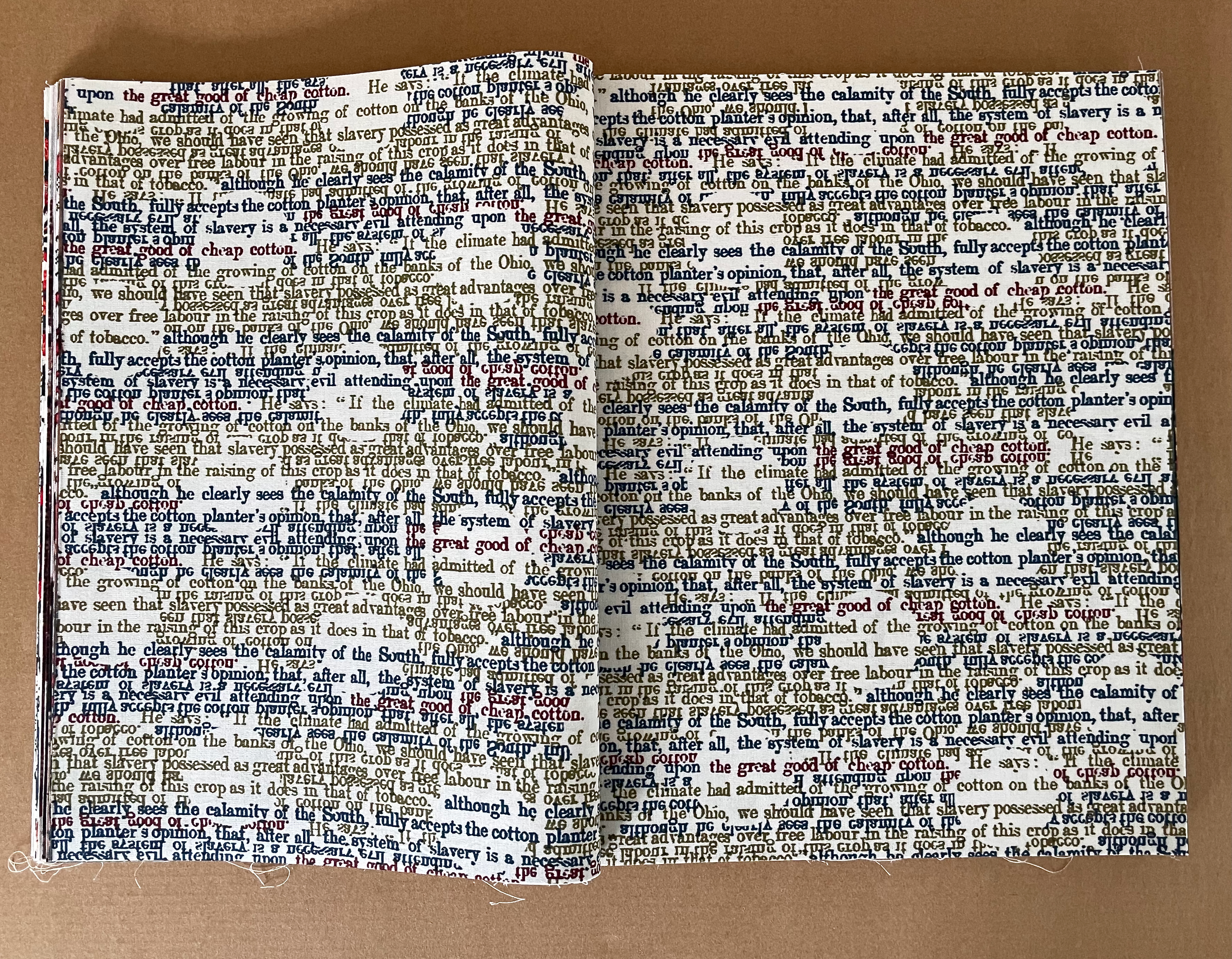
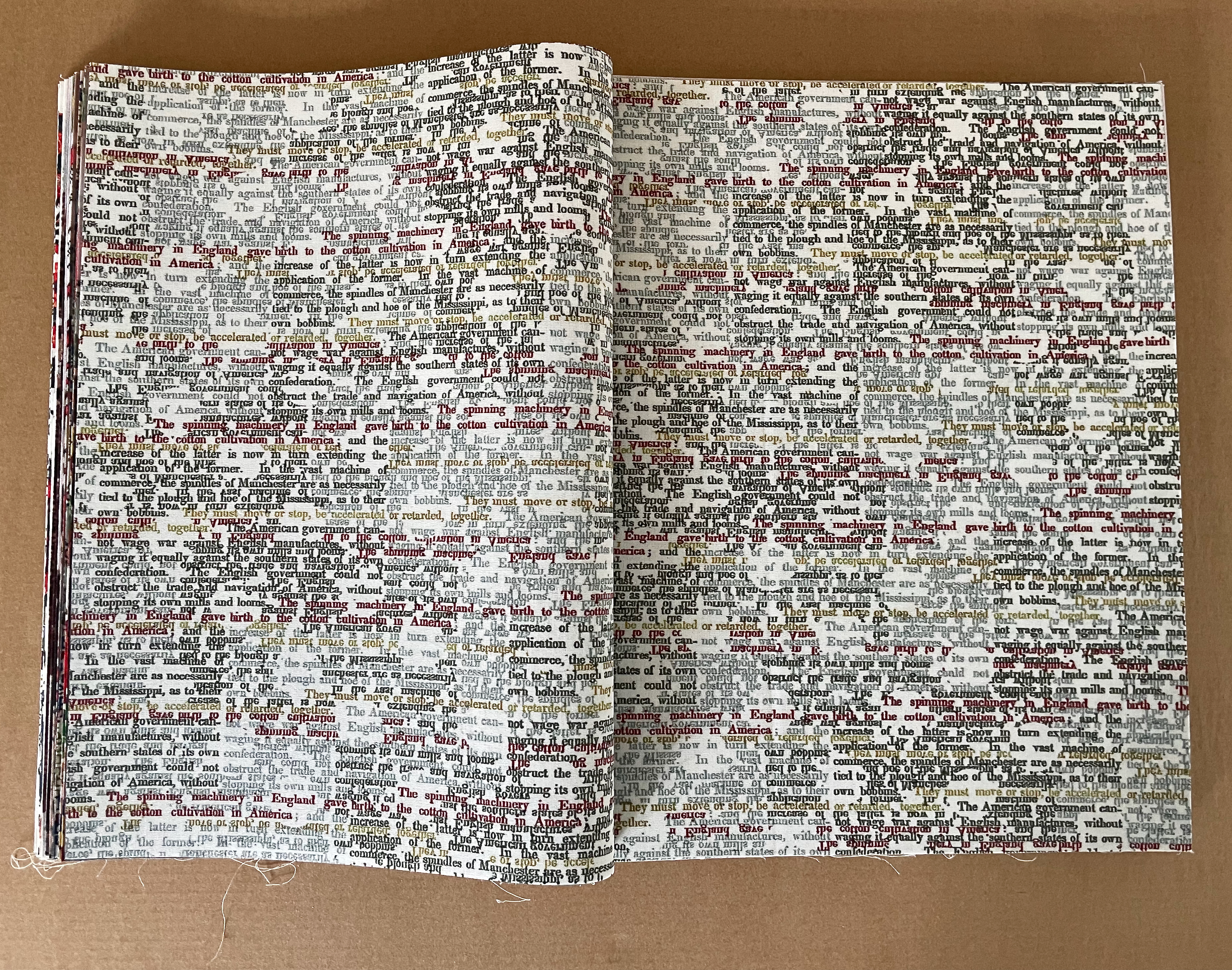
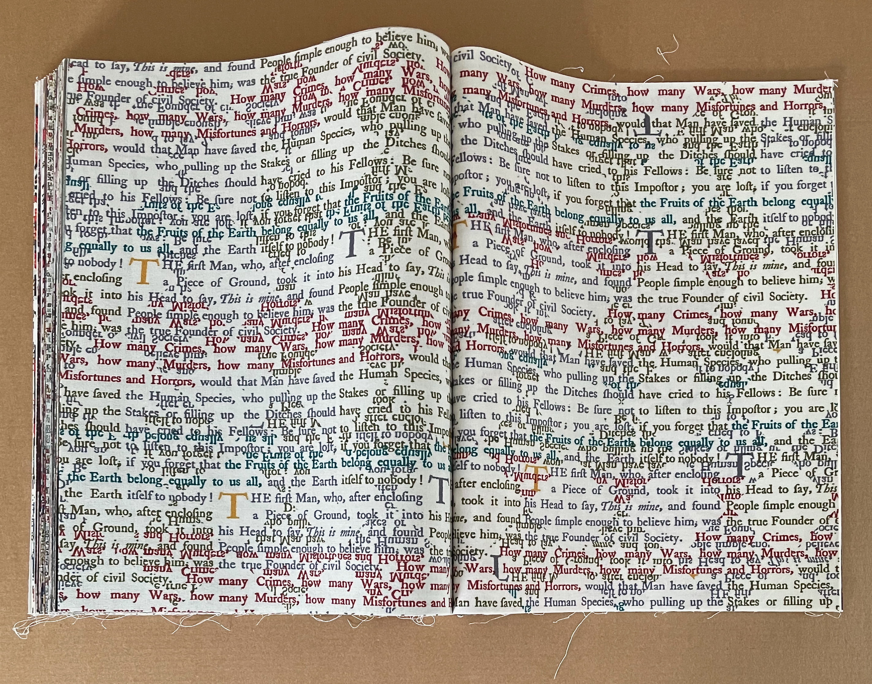
Typographic toiles.
The 4 spreads that mimick stitches, quilting patches, threads, and the weave and weft of fabric include the book’s mid point spread. Like the typographic toiles, they provide color that offsets the photographs, but their text darkens the tone. The first 3 list the names and capacities of the human beings from slave inventories: “Lucy”, “Polly”, “Simon”, “Henry”, “Cook and Washer”, “Field hand and jobbing carpenter”, “Infant”. The last repeats text from Hammond’s “Cotton is King” speech.
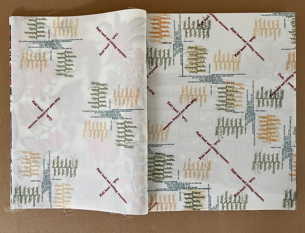
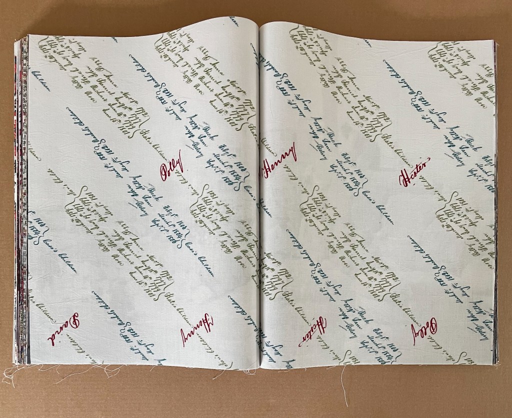
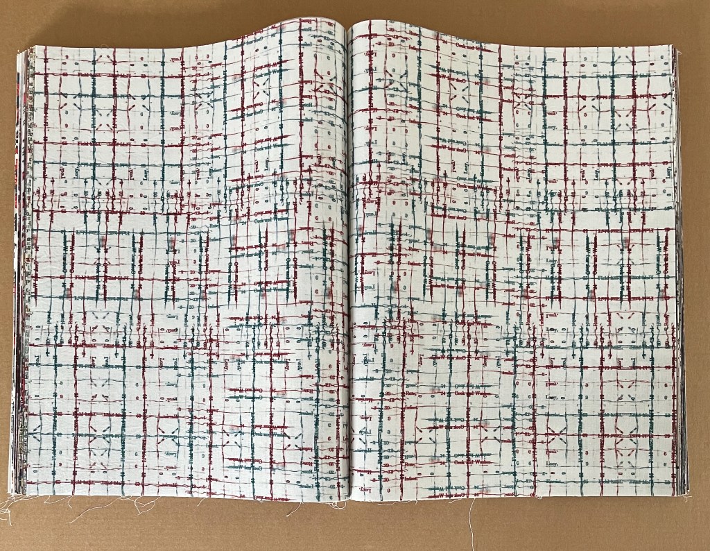
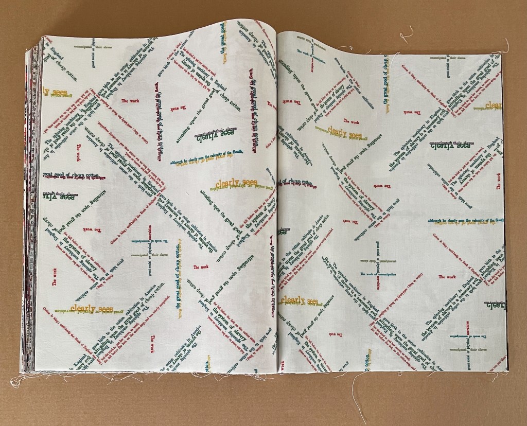
Spreads mimicking stitchery, quilting, and sewing with type and script.
It is telling that the most intricate of these spreads typographically mimicking cross stitch and the weave and weft of cloth occupies the mid point of the book. The type bleeds red and blue ink as it threads down and across the white muslin. The names, roles, and numbers of slaves are its text — including a nameless infant. The evil of King Cotton is stitched and woven into the heart of this book.
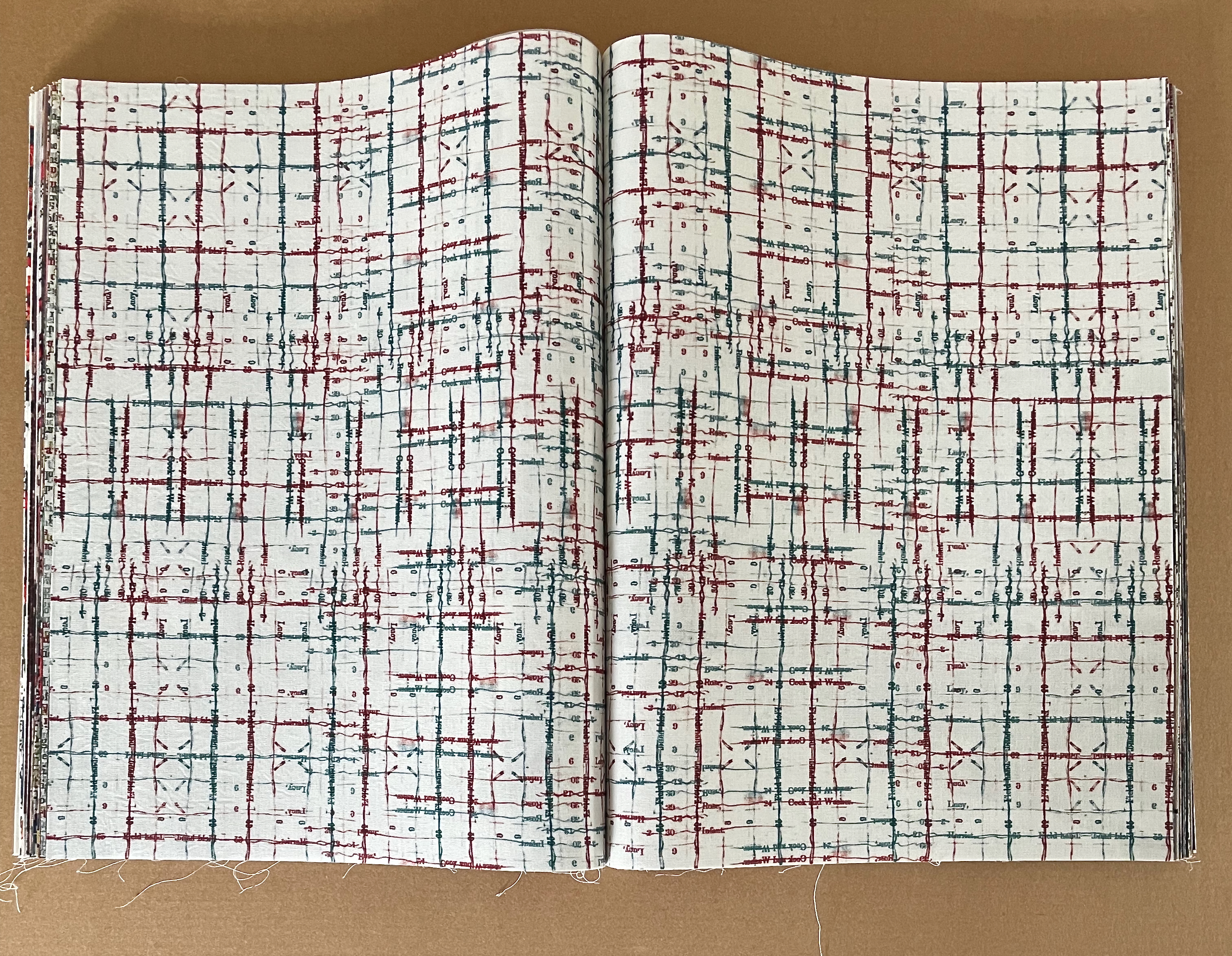
Mid point spread of the book.
The book’s last 3 work scene photos are preceded by the Toile de Jouy depicting a slave raid, then separated by a bucolic Toile de Jouy, and paused for the run of the Rousseauvian typographic toile, the torn Toile de Jouy, and the stitchery-mimicking spread with phrases from Hammond’s “Cotton is King” speech. Hammond gets the last typeset word, and the image of the baling warehouse — a photograph taken between 1890 and 1910 — gets the last visual word.
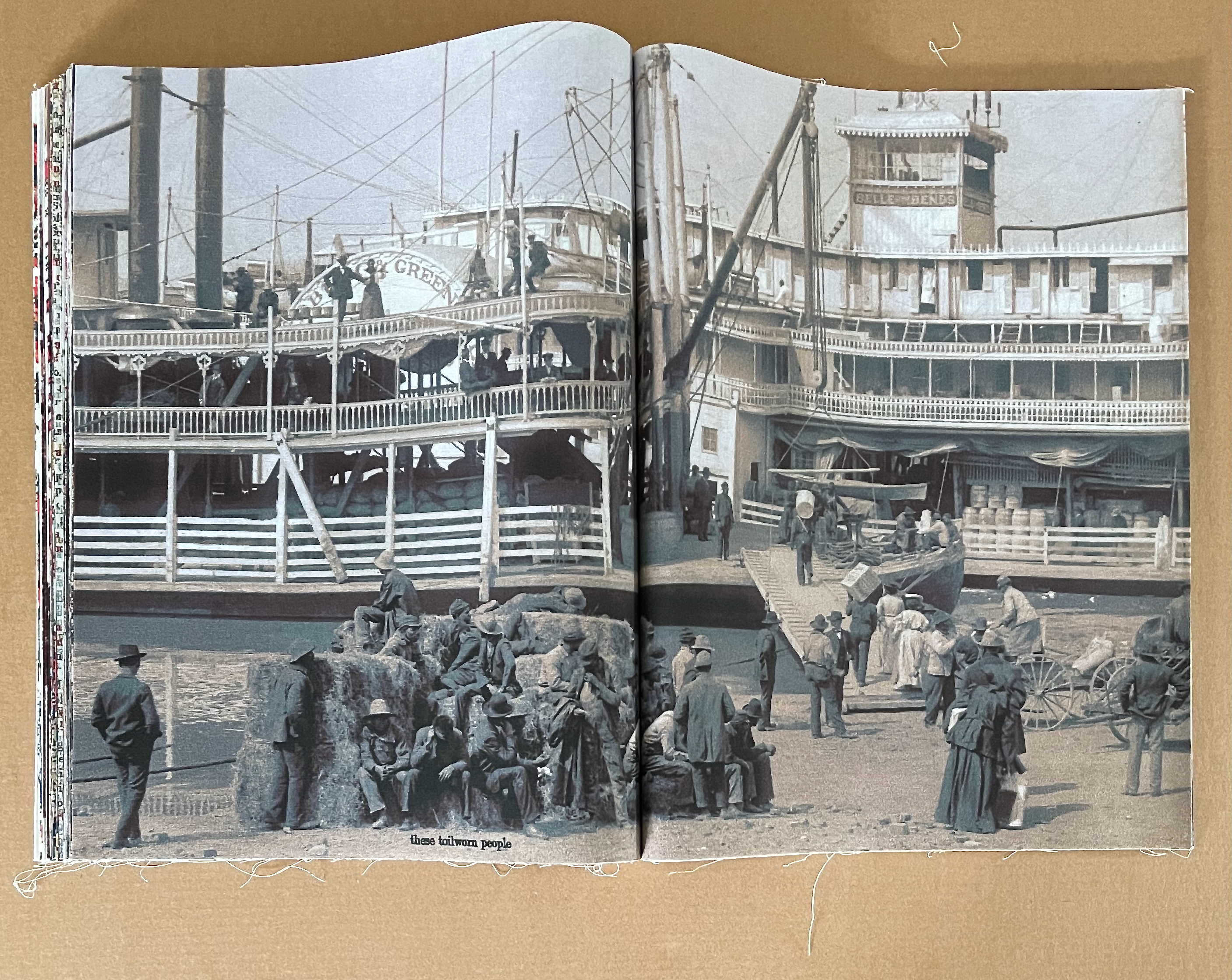
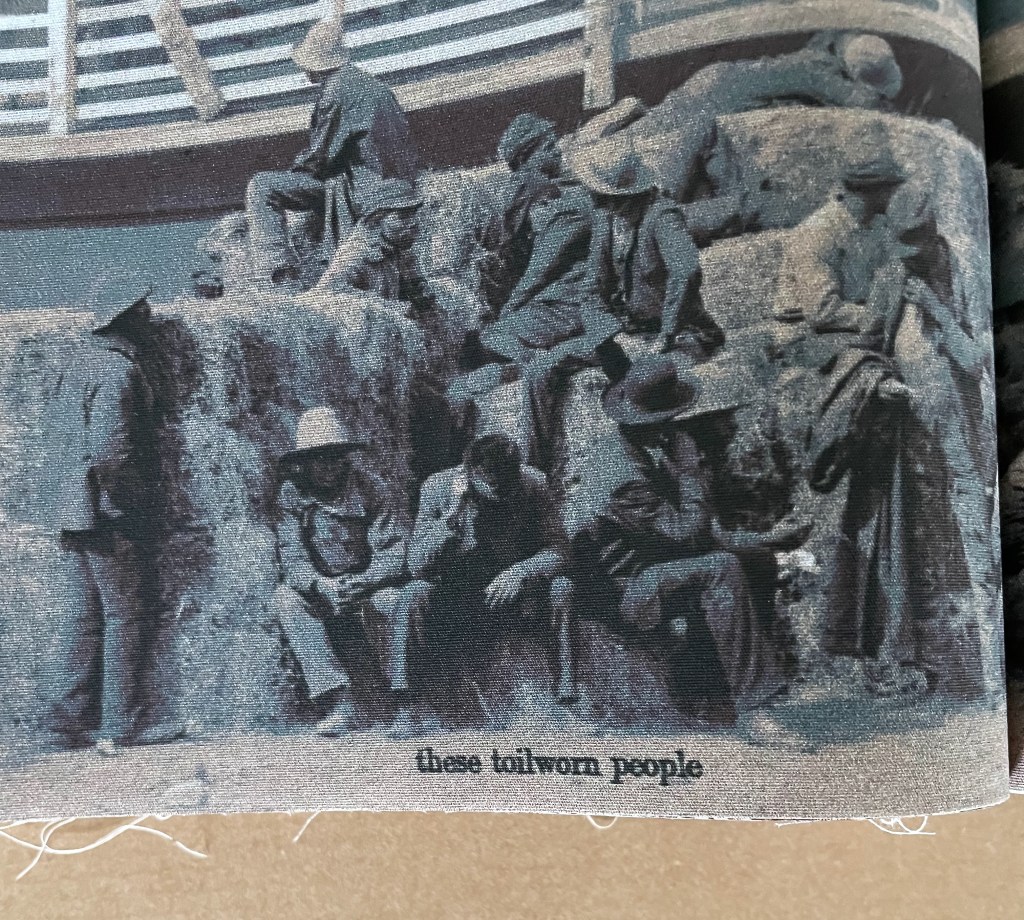
Detail from image on the left in the row above.
VOC (2022)
VOC (2022)
Clifton Meador
Hardcover, casebound. H371 x W155 mm. [96] pages. Edition of 100. Acquired from the artist, 4 February 2024.
Photos: Books On Books Collection.
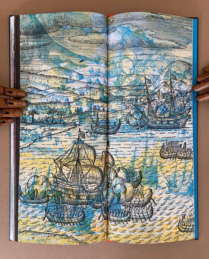
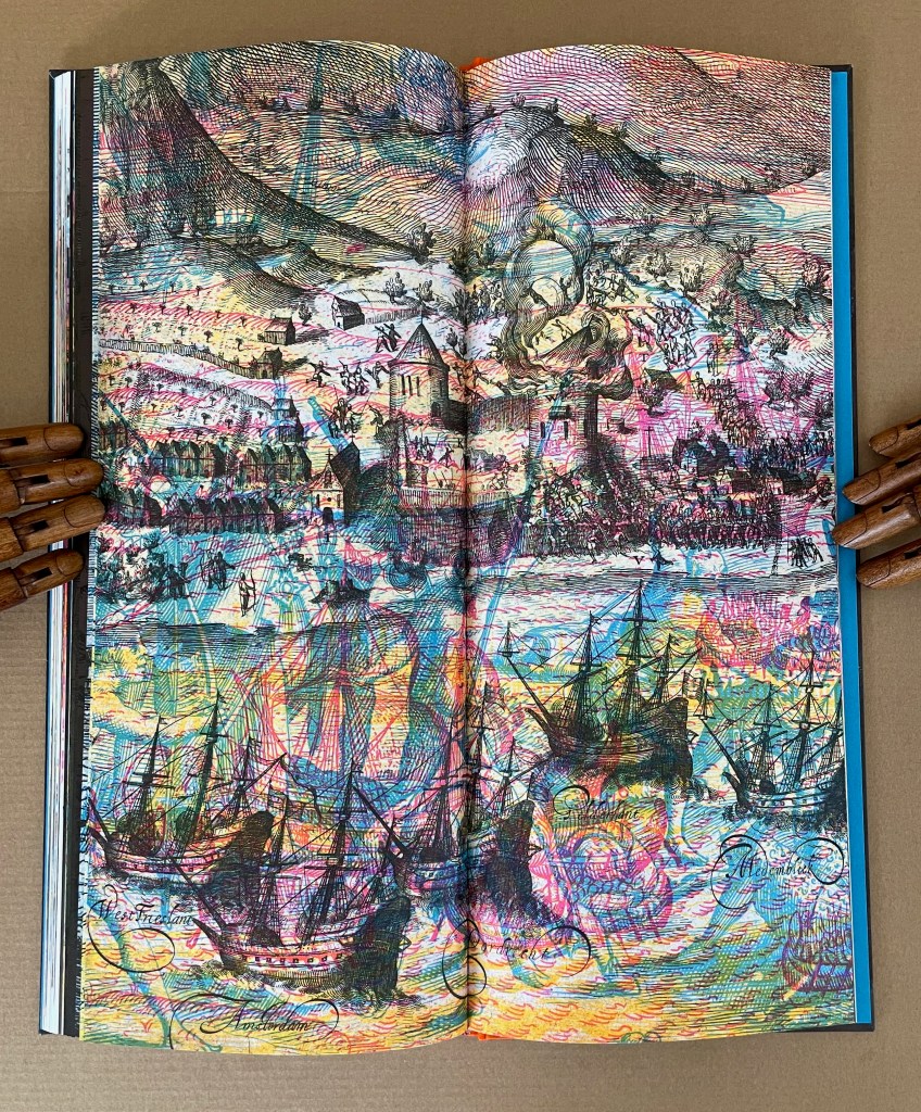
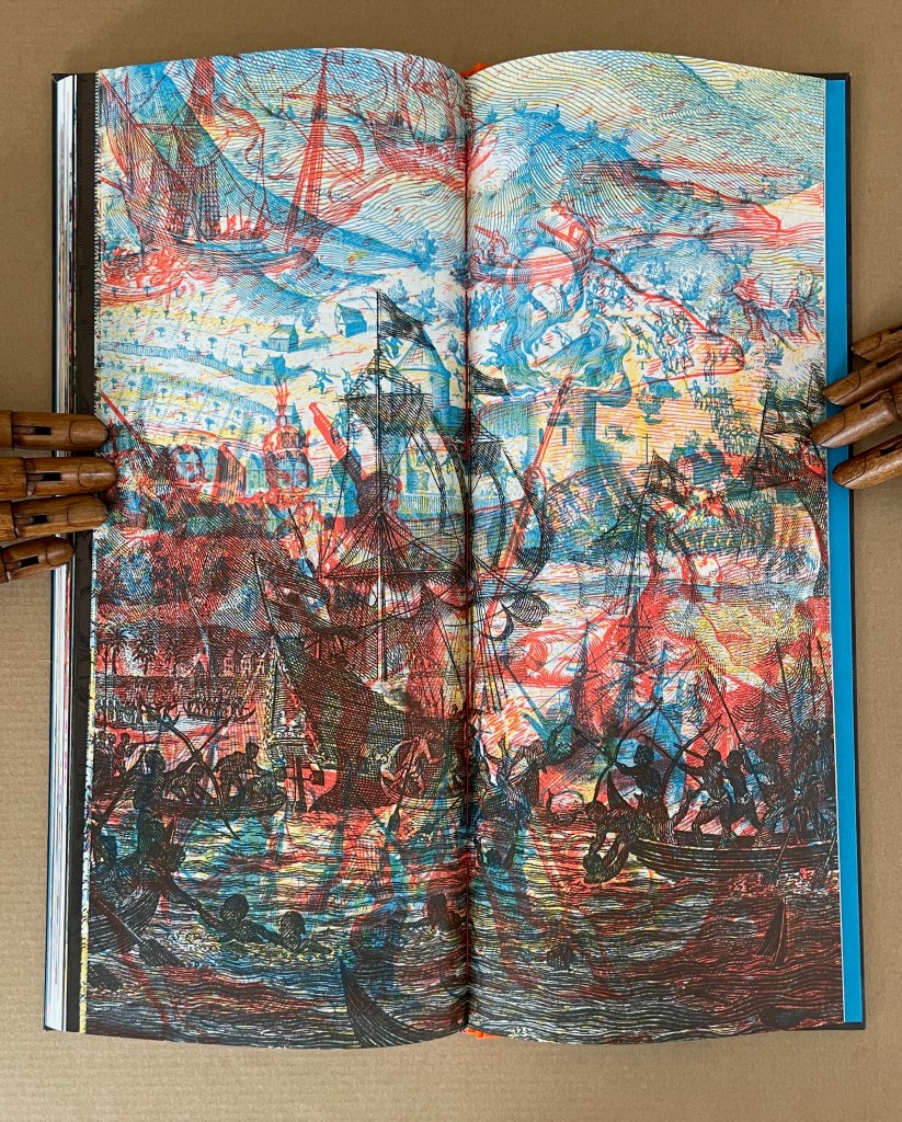
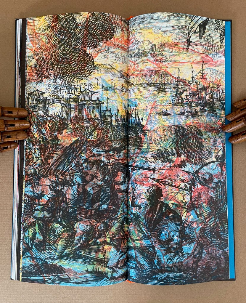
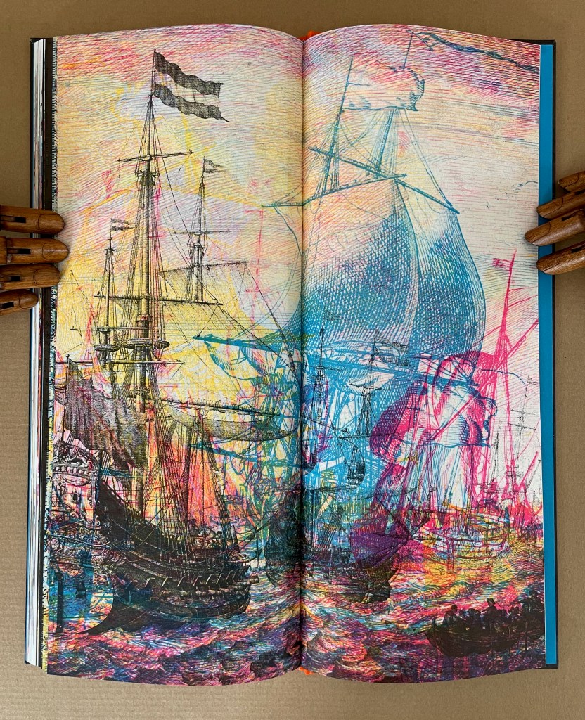
The Vereenigde Oost Indische Compagnie (Dutch East India Company), referred to as the VOC, was the first publicly-traded corporation in the world. Chartered in 1602, the VOC could “independently wage war, coin money, negotiate treaties, establish colonies, enslave people, massacre indigenous populations, and create spice monopolies by burning entire islands they did not control clear of spice plants”. (VOC, colophon) The resulting “embarassment of riches”, as Simon Schama entitled his history of the Dutch Golden Age, led to much of the art and objects now housed at the Rijksmuseum in Amsterdam. Clifton Meador’s social conscience and imagination saw the Rijksmuseum’s ongoing project to digitize and post its holdings as a creative opportunity too great to pass up.
On his site, Meador offers this project statement about VOC:
I imagined this project as a museum catalog gone completely wrong: reproductions mangled, images misregistered, odd fragments recombined from wildly different sources, cropped badly, with colors transformed into something from a hallucination. I imagined that in this catalog all text—including the vitally important informative, contextualizing captions for the images—would be removed. Gone would be the gallant, abridged histories provided by any museum, normally present in the image descriptions, but now entirely absent. The reader would be left to construct their own narrative from this unreal evidence.
And my hope is that the evidence of this museum catalog is so unreliable, so tainted by its own distorted agenda, that the reader is left with nothing other than a vague impression of a horrific cataclysm swimming around illusory objects of great beauty, virtue, and price.
Marlene MacCallum and Ruth Rogers have both registered insights into Meador’s blend of experimental printing, metaphor, and art that confirm his hope.
Central to Cliff Meador’s process in making VOC is a willfully disruptive strategy. … In text and music, we are accustomed to the suspension of comprehension, but in visual forms, we expect the coalesced image, and when this is withheld, we are challenged. We experience incomprehension. We lose our place. And in a piece where the artist wonders “about the real cost of wealth”, this is fitting. VOC is a work of dreadful beauty. The images are alluring, shimmering, and horrible. This parallel the difficult-to-reconcile reality that, quoting from the colofon, “At the same time the VOC was becoming a force for terror …, the Dutch Republic was a haven for liberal thinking”. (MacCallum, 2024)
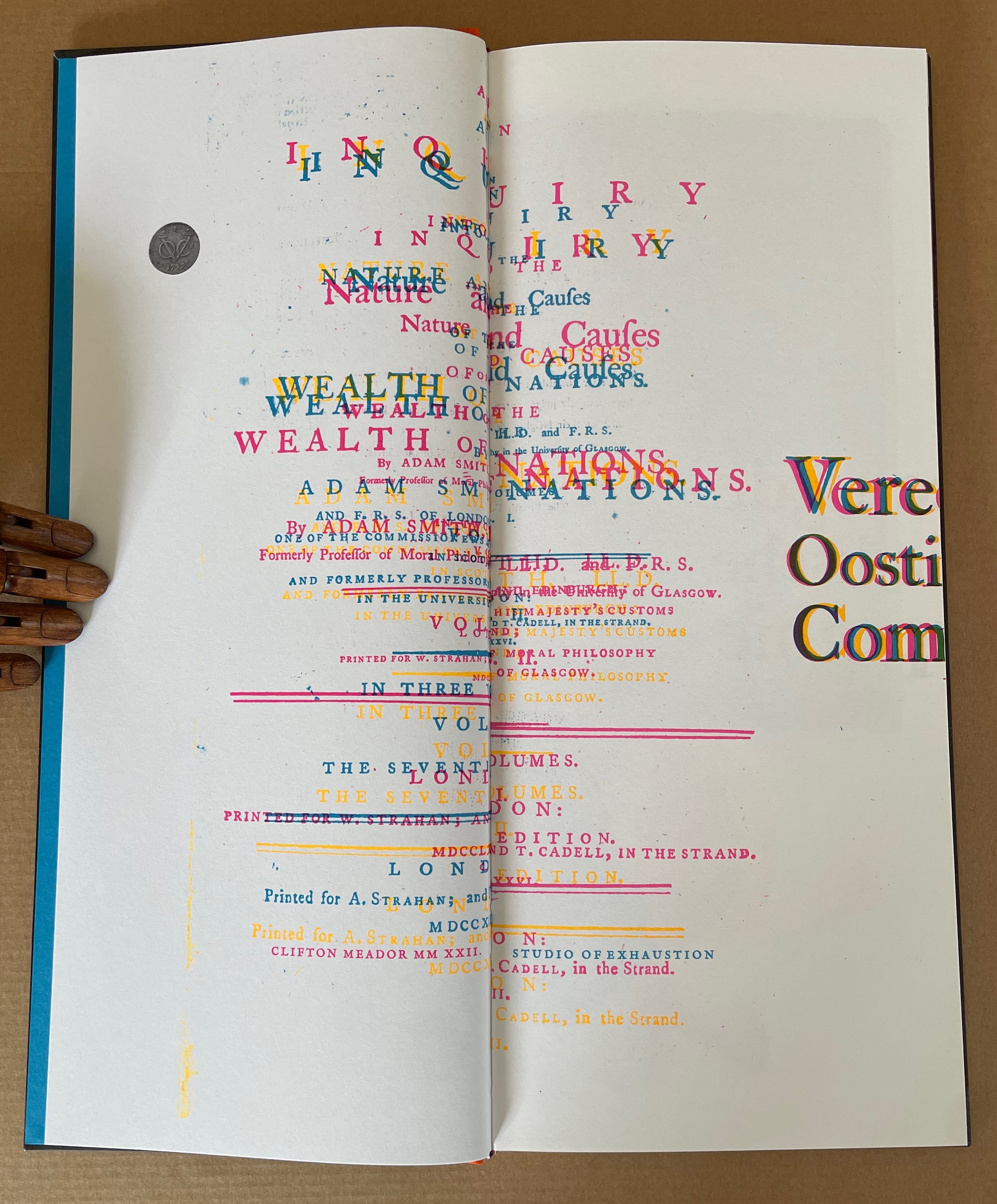
The first page spread of the book is the title page of Adam Smith’s The Wealth of Nations printed opposite the official manuscript charter of the VOC, with lead seals attached. But the words are sliding off the page, the colors are wrong, and everything is out of focus. Could this distorted mise-en-page be a reference to the corruption of wealth and power? … In this unreliable museum catalogue, richly made objects that represent the vast wealth of the Dutch golden age are combined and deformed. … There are no captions, and the reader must find the narrative within seemingly disparate images. Enlarged engravings from early printed books that chronicle colonial domination are layered over photos of domestic objects and people with kaleidoscopic effect. … In his book, the luxury goods, paintings, exotic spices, and weapons are the spoils of an extractive colonialism. But there is no text. Instead, Meador uses dissonant color and layered, dislocated imagery to provoke the reader’s complacency with the historical narrative. — (Rogers, 2025)
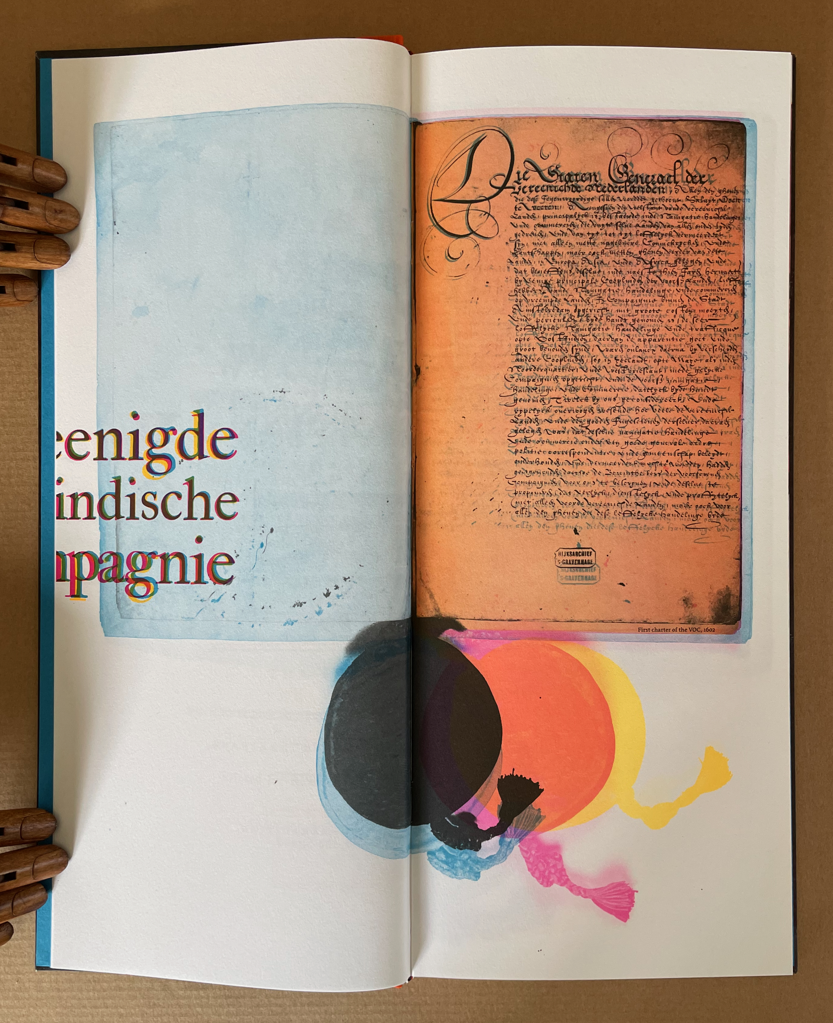
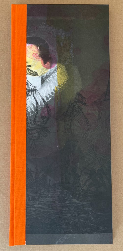
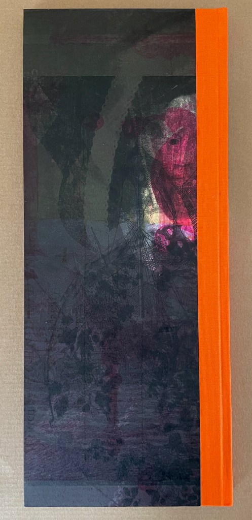
The book’s front and back covers certainly promise disruption, dislocation, and dissonance. The artist has achieved this by color-separating the high-resolution files from the Rijks, recombining the images of documents, fine possessions, portraits, paintings of battles, and engravings with each other, and skewing the registration of the separations when printing.

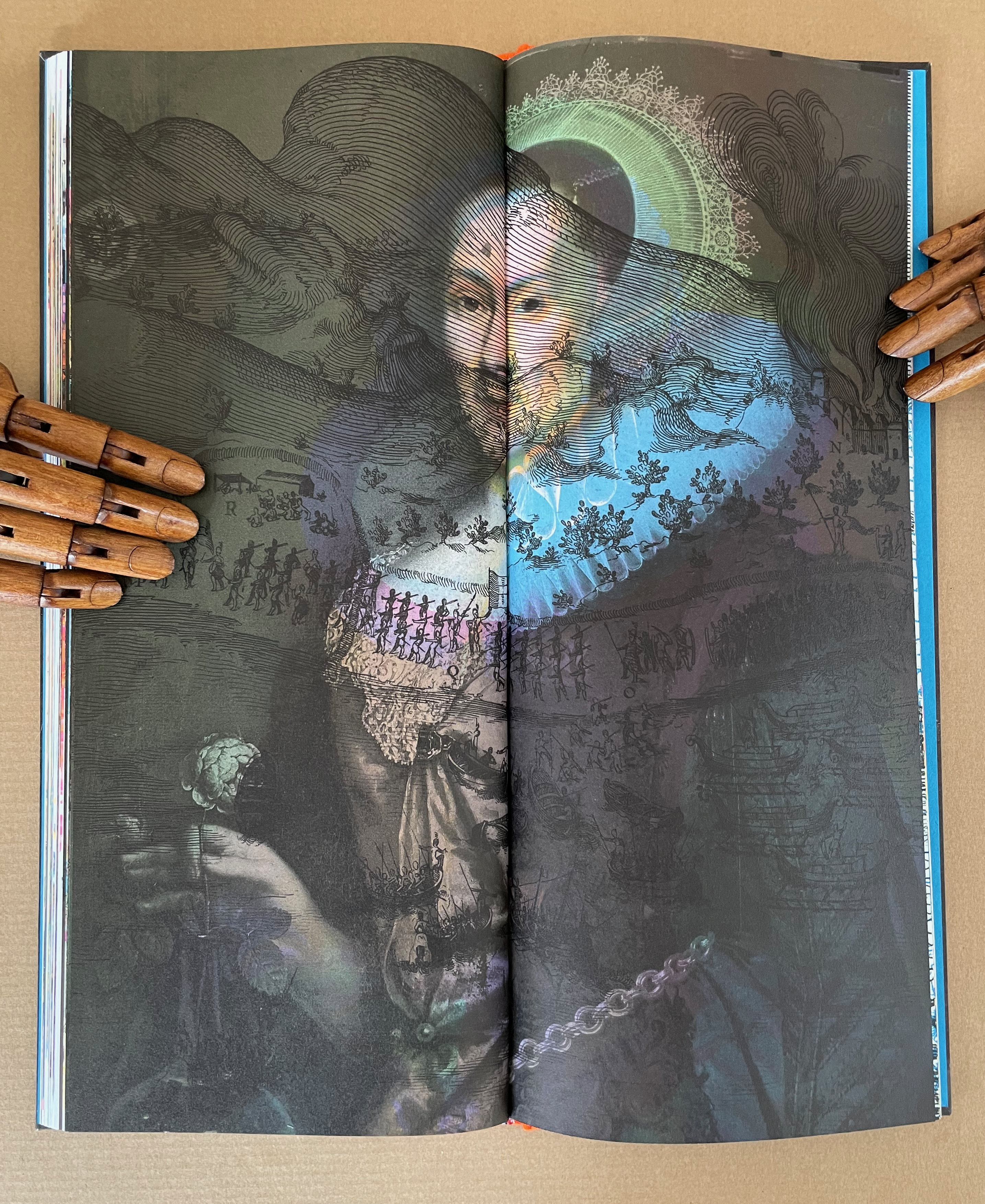
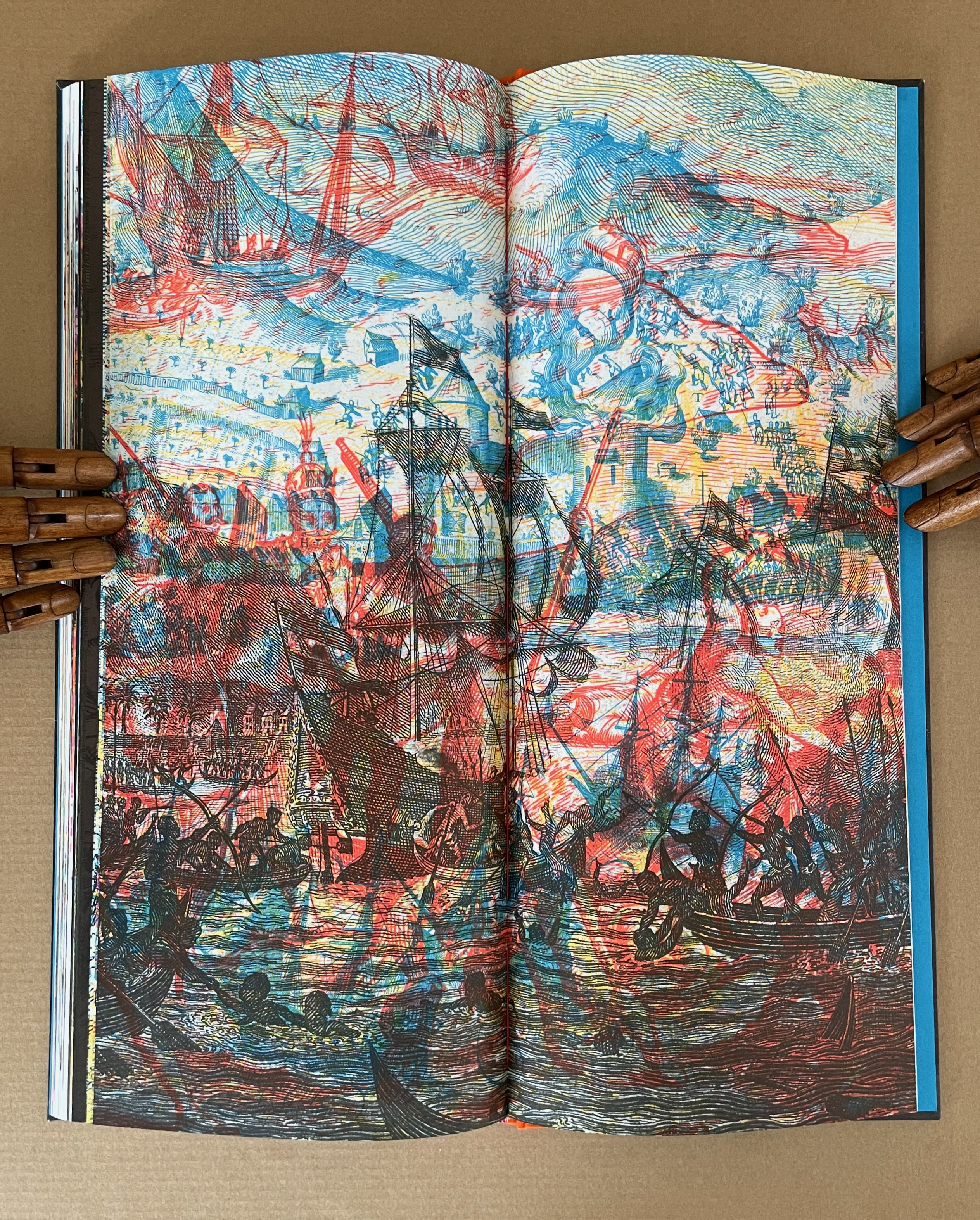
The book has three unnamed sections: objects, portraits, and scenes of travel and battle.
As MacCallum points out, the book’s tall narrow shape and tight binding also make it an awkward customer. Overly tight bindings are not usually intentional, but given the strange combinations in the centers of the double-page spread, there is not much doubt here. Not only do images disappear into the gutter because of the binding, they slip over the fore edges and onto the next page.
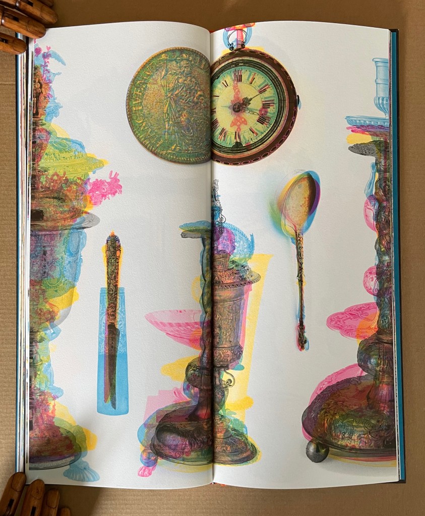
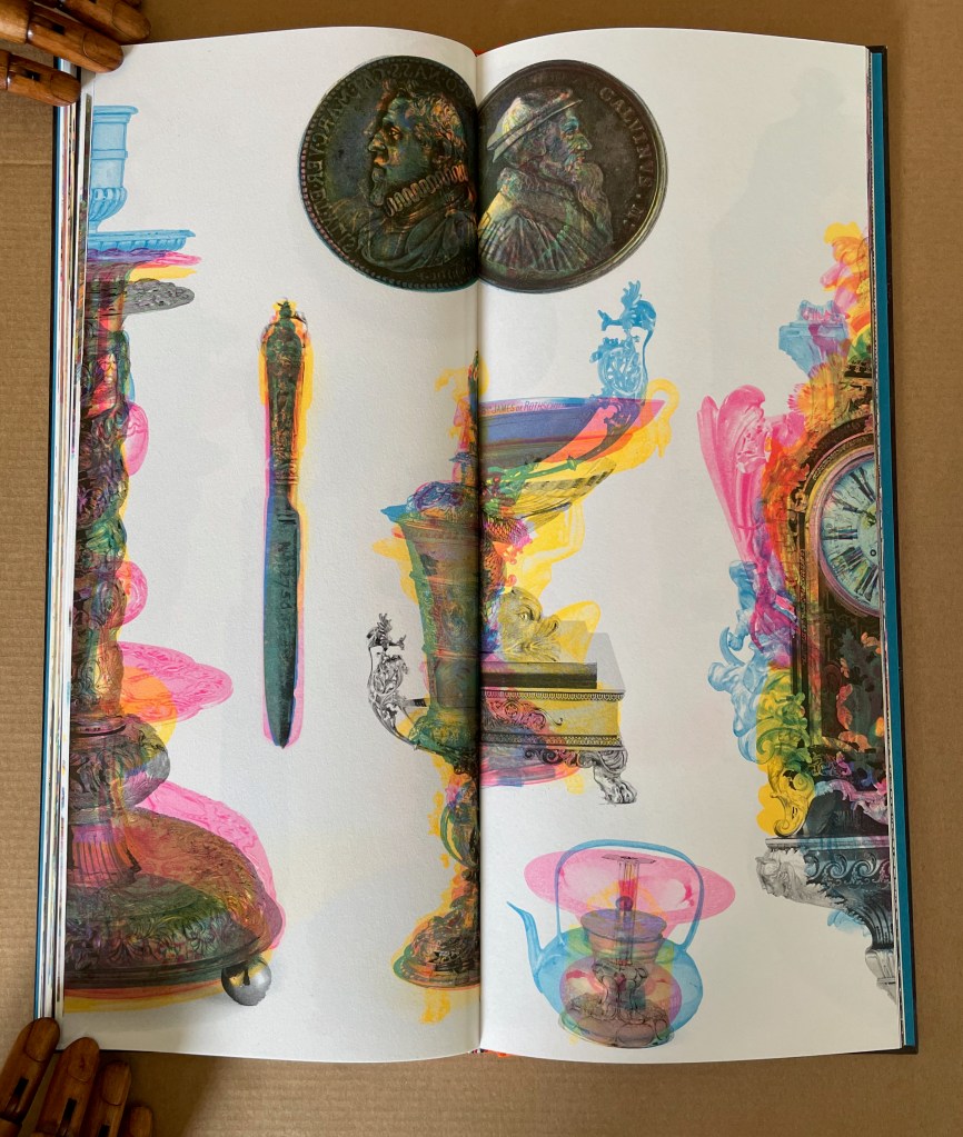
But not always. The artist frequently misfoots that expectation and many others as with forks having tines on both ends, chairs suspended from the top of a page, and folio stuck in the middle of a chandelier.
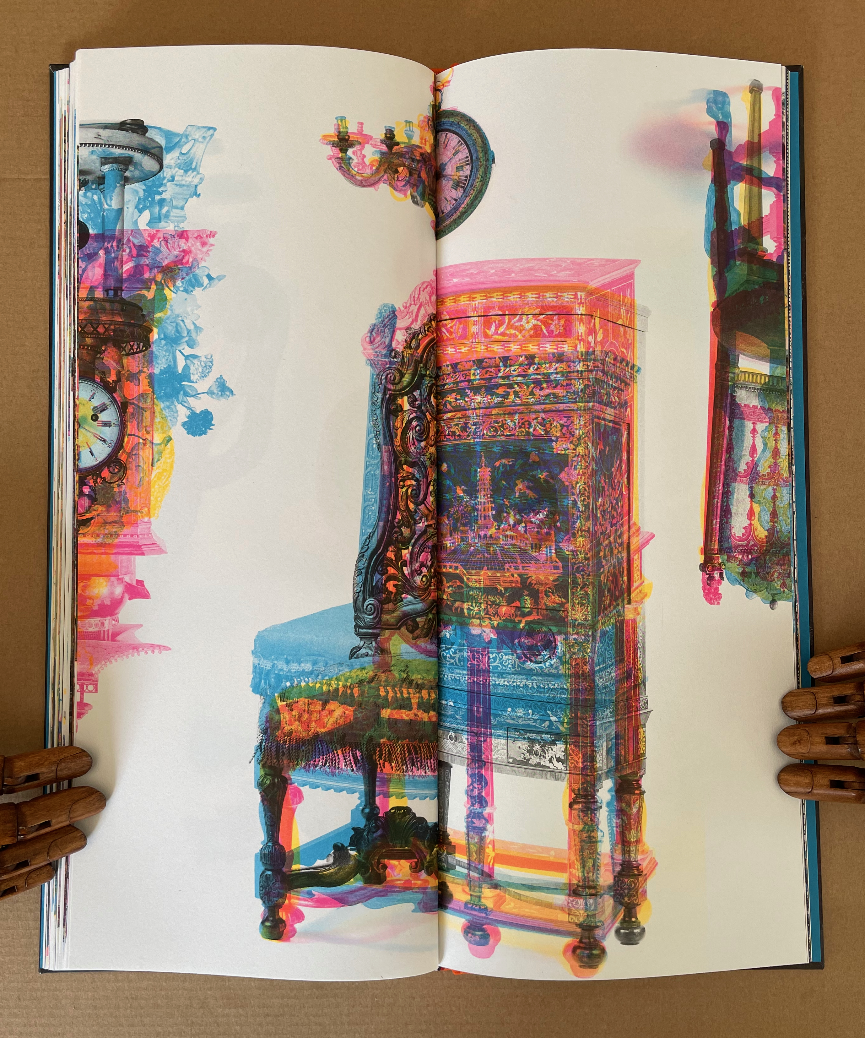
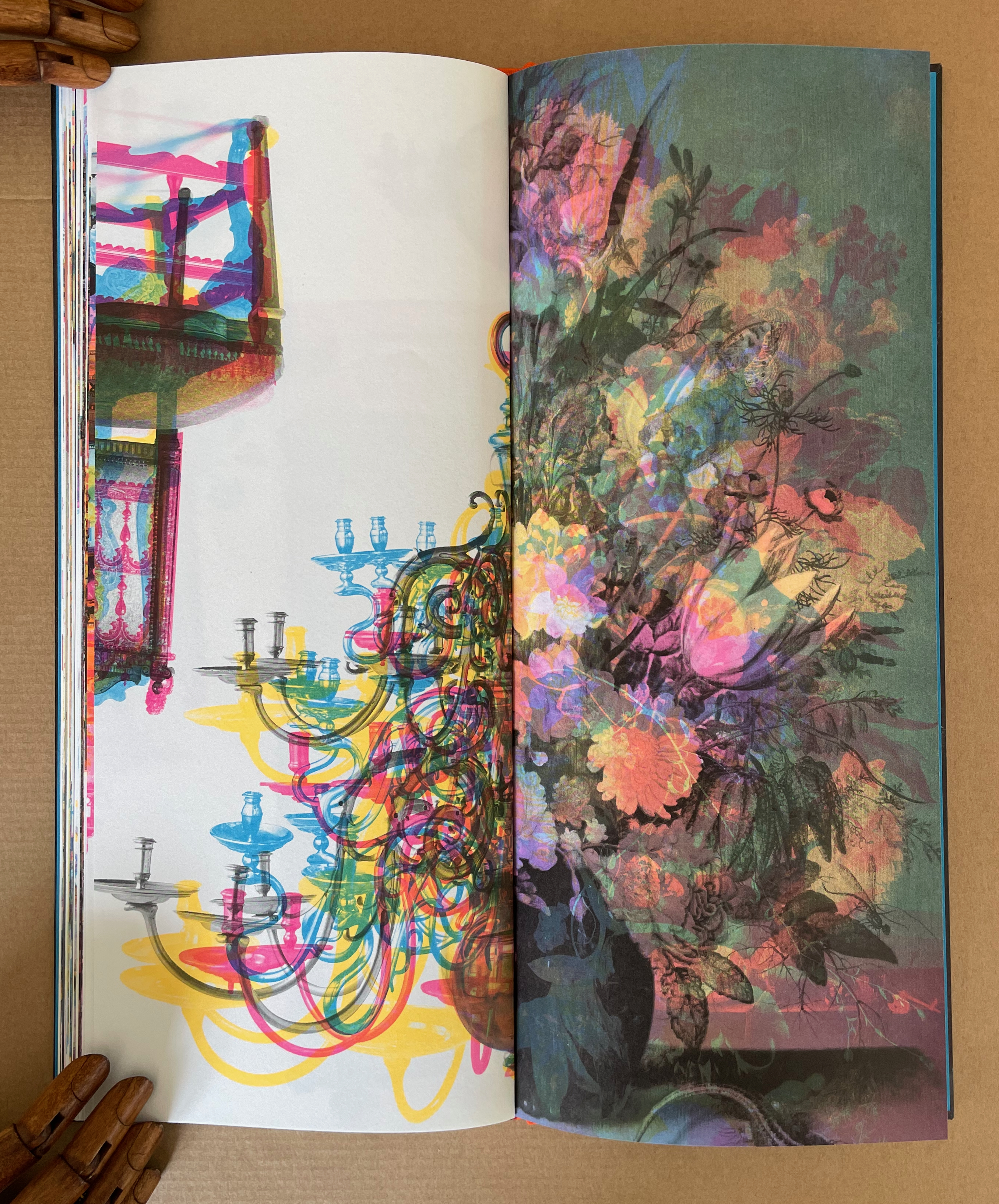
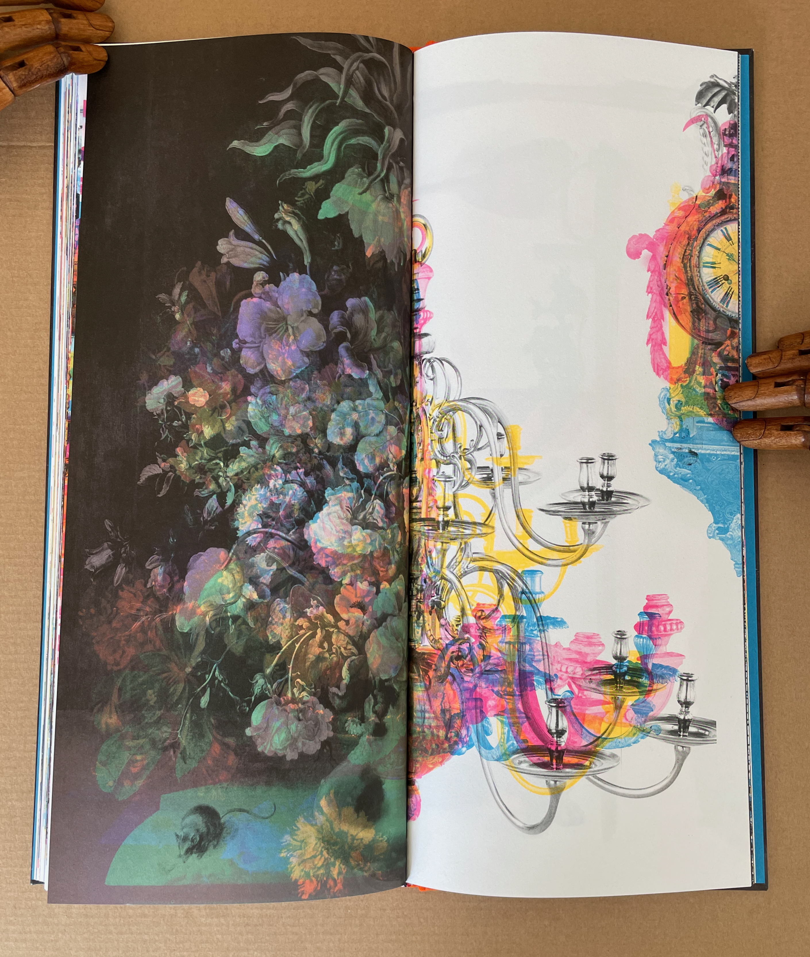
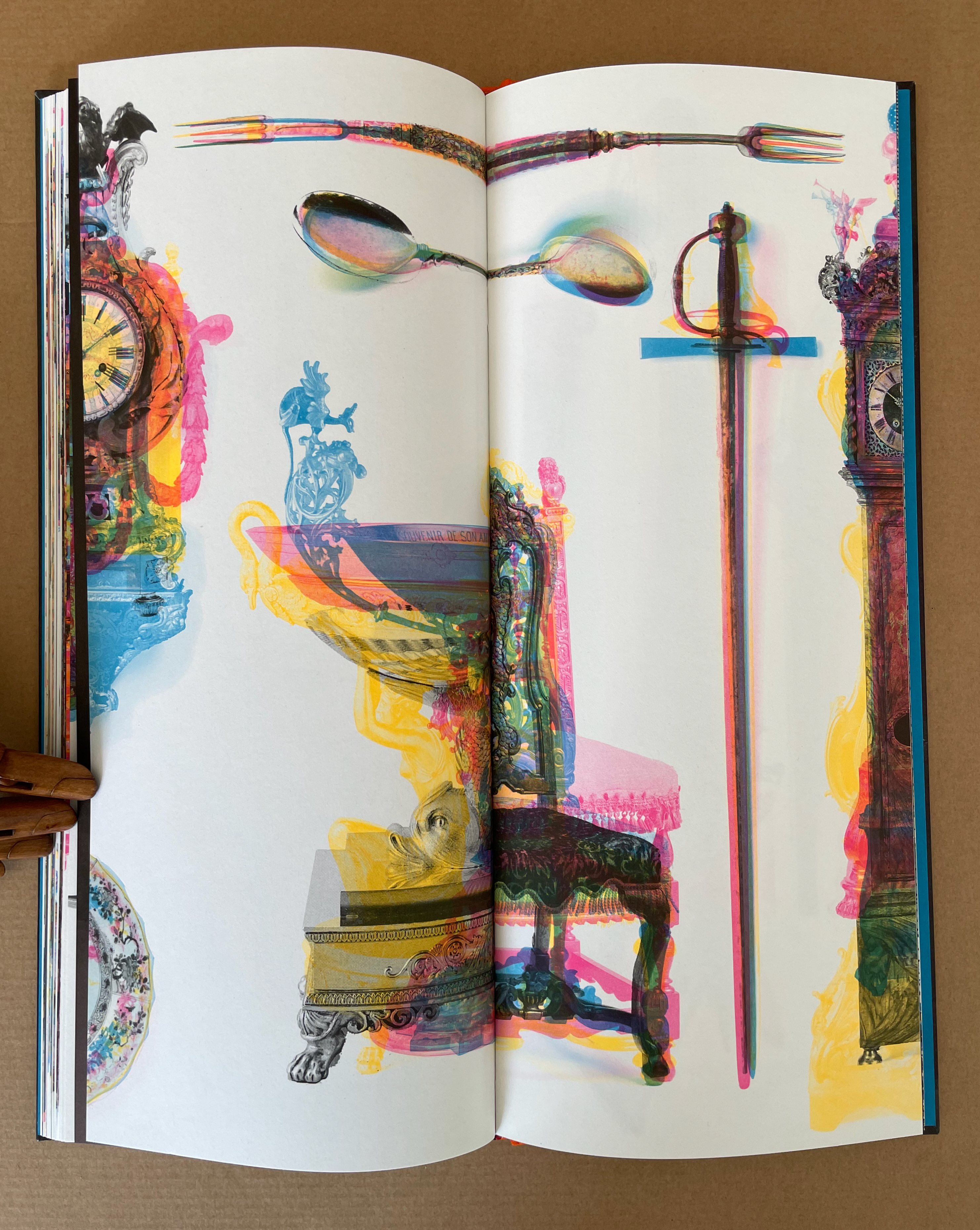
For the curious, the project statement shows the process as applied to the portraits section of the book, which follows the objects section.
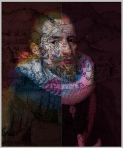
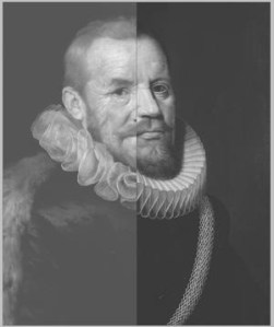
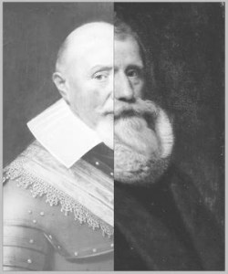
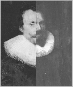
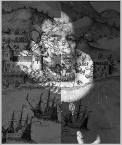
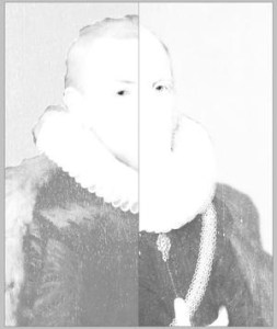
Project statement: “Unseparated images from pages 76-77. This spread was printed in Pantone 801, Pantone 806, Pantone 810, and two different black inks.”
In the portraits section, we can detect scenes from images of travel and battle faintly layered over some of the faces. In the last section of the book, however, focused entirely on travel and battle scenes, the technical fireworks build at a furious pace, ending with a depiction of an Anglo-Dutch sea battle.
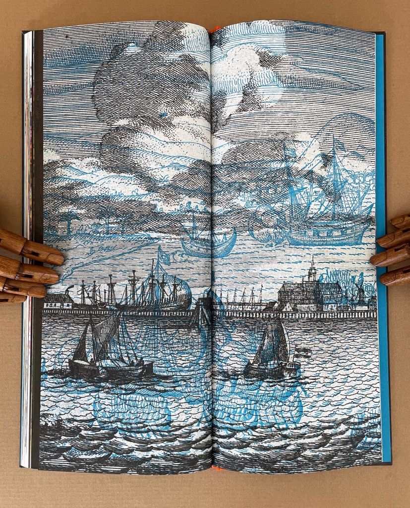
Just within these four works, Meador’s art evolves. How it has developed across his incredibly broad historical and geographical interests since the 1980s awaits a catalogue raisonnée of his prolific output. In the meantime, exploration of VOC, Cotton, Acheiropoieta and its companion volume yields an embarrassment of riches to enjoy, however uneasily.
Further Reading
Chen, Julie. 2013. 500 Handmade Books. Volume 2. New York: Lark. See pp. 166 and 170 for A Repeated Misunderstanding of Nature (2012) and Grove (2011).
MacCallum, Marlene. 18 January 2024. “The Photomechanical Process as a Poetic Craft“. Presentation. Washington, DC: National Gallery of Art.
Roth, David M. 24 February 2015. “Material Matters @ Seager Gray“. Squarecylinder.com.
Rogers, Ruth R. 2025. “Mutable Form and Engimatic Meaning“. New York: Center for Book Arts. Expanded version of a talk delivered at the “Luminous Books Symposium”, Boston Athenaeum, 10–11 March 2023.
Schama, Simon. 1987. The Embarrassment of Riches : An Interpretation of Dutch Culture in the Golden Age. First edition. New York: Alfred A. Knopf.


Wonderful, incisive reading of Clif’s work, Robert. Thank you.
LikeLike