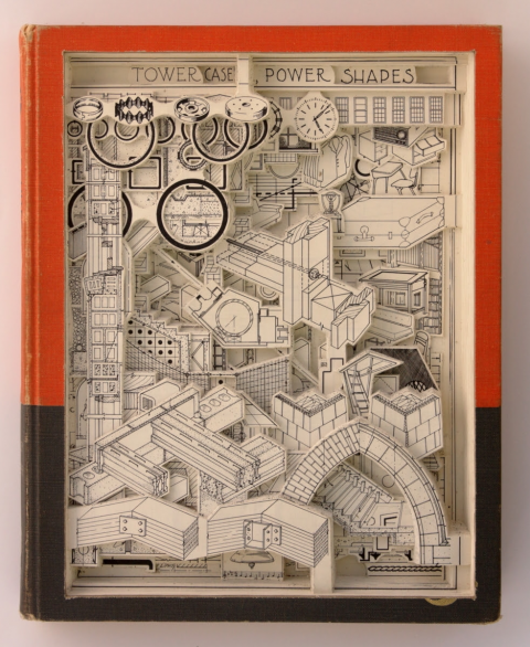
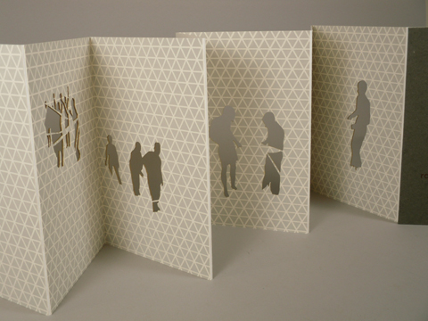
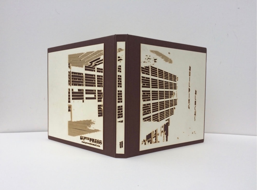
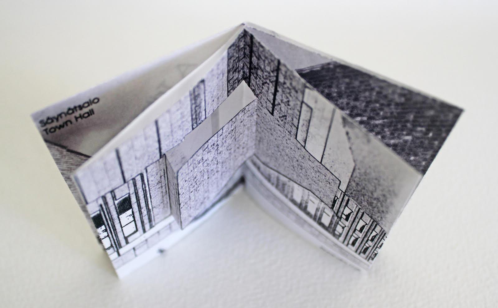
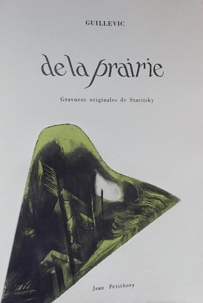
Codex Aeroscriptus Ehrenbergensis: A Visual Score of Iconotropisms (1990) Felipe Ehrenberg Casebound stiff cover, fly leaves around bifolios (fore-edge folded folios). H420 x W295 mm. 20 pages (10 bifolios, 9 with prints, 1 for title page and copyright page).Edition of 500. Acquired from Monograph Werks, 17 January 2024. Photos: Books On Books Collection.
In his introduction, Felipe Ehrenberg variously recommends that we read Codex Aeroscriptus Ehrenbergensis “like a detective novel” for its “various clues that you may unravel the wondrous and dramatic events surrounding the life of this artist, another witness to the end of a century” or “as a musical score, perhaps to be composed by someone wishing to recreate the background music of our daily histories” or a “formulation of hieroglyphs”. The book’s subtitle succinctly rolls up these metaphors: “a visual score of iconotropisms”.
Stephen Perkins calls it “a mini-retrospective of his explorations in this medium” — stencils.
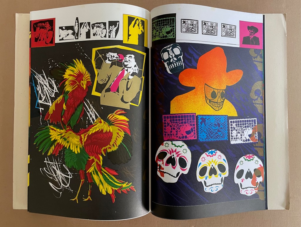
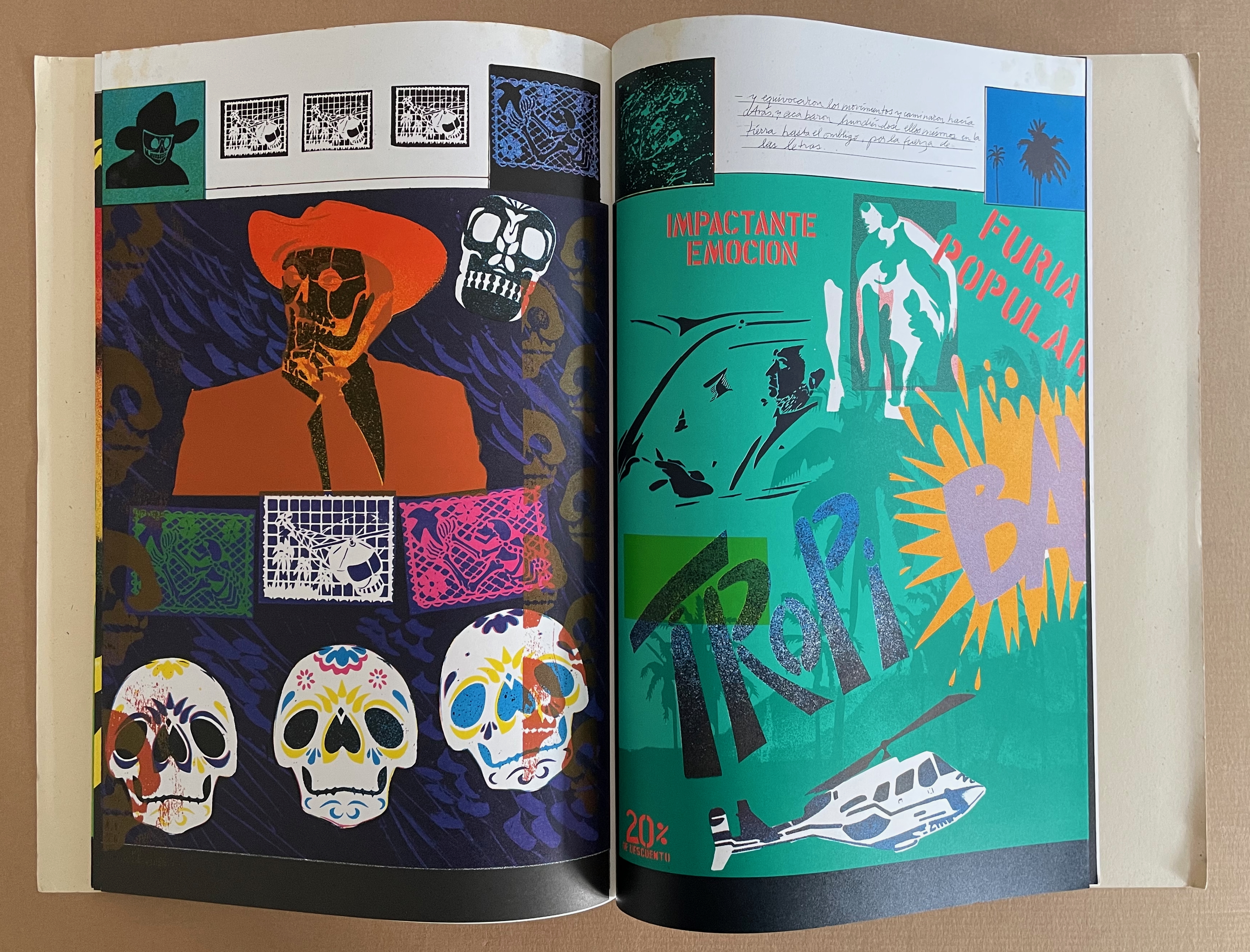
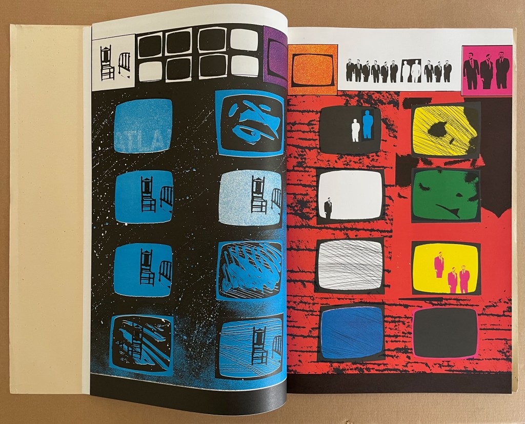
This work came out of a residency Ehrenberg completed at Atlanta’s Nexus Press. The images for the works came from what he called his Visual Information Bank which was a box with all sorts of ephemera that he would dip into for images for his stencils. In contrast to the frenetic energy of the stencils, the inside of the publication has a bucolic and calm feeling that is mirrored in the original stencil work Ehrenberg created across the front pages of each book. (Perkins, 2024)
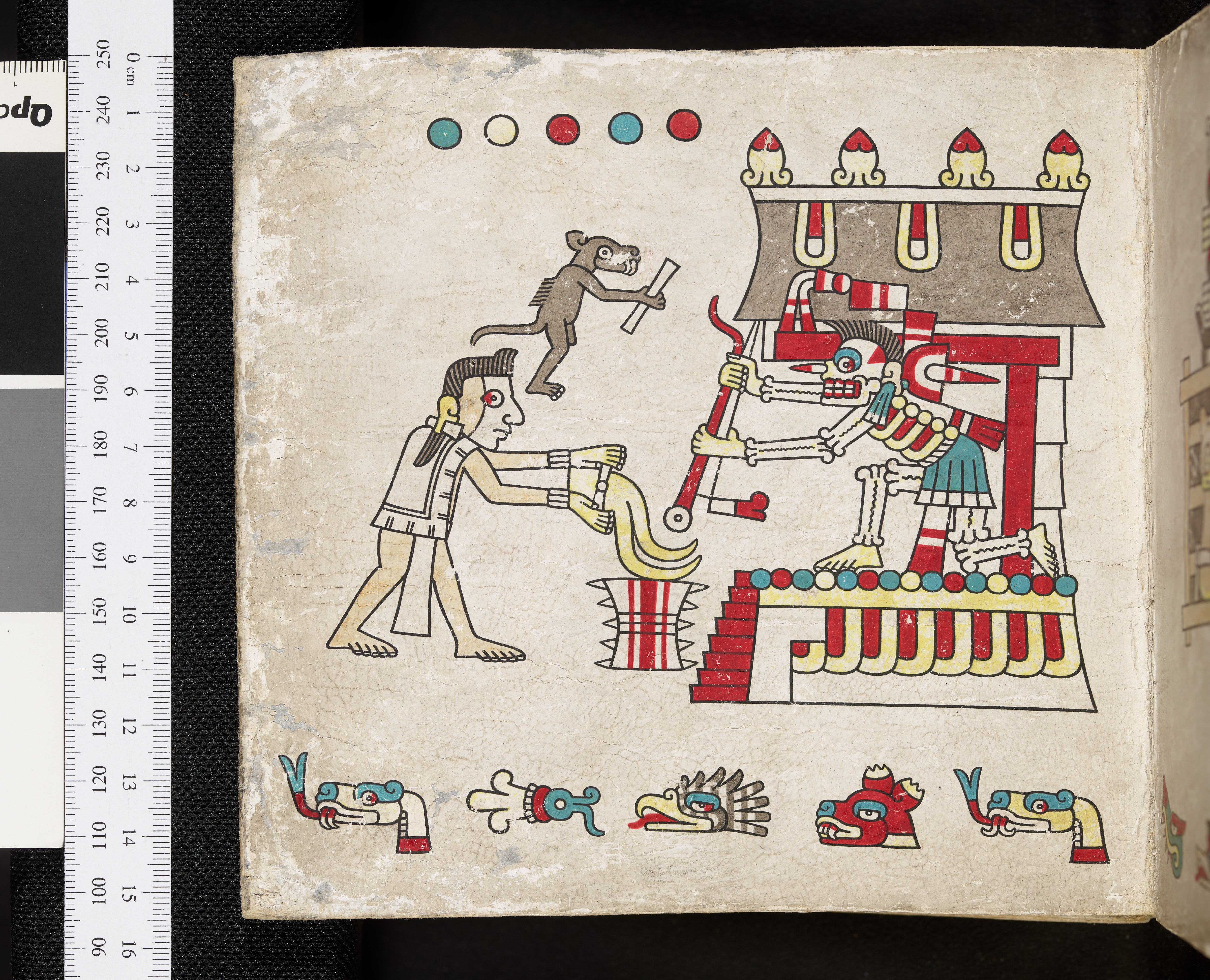
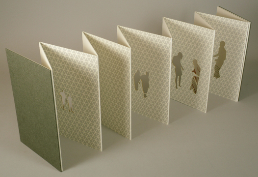
The accordion, concertina, or leporello structure adopted by so many 20th and 21st century book artists has its Aztec analogue called a screenfold format. Ellen Baird and Cristián Roa-de-la-Carrera included Codex Aeroscriptus Ehrenbergensis in the Newberry Library’s 2006-07 exhibition “The Aztecs and the Making of Colonial Mexico”.
… Aztec heritage has become a vital component of Mexican and Mexican-American identity, influencing the work of many contemporary writers, artists, and scholars. The inherent flexibility of traditional indigenous creativity facilitates combination with contemporary artistic practices. Traditional screenfold books are layered with contemporary collage and print techniques, and indigenous images are juxtaposed with colonial scenes and pop icons. Contemporary Mexican and Mexican-American artists use traditional Aztec images and techniques to explore both contemporary life and Mexican cultural heritage. The screenfold format is an emblem of ancient Mesoamerican culture, and has become charged with historical and political meaning. Contemporary artists combine this format with humorous and provocative imagery to explore the cultural and political dynamics of preconquest identity, the colonization of Mexico and current relations between Mexico, Europe, and the United States. (Baird and Roa-de-la-Carrera, 2006)
Ehrenberg’s title is dipped in sarcasm. Most of the barely surviving screenfold Mesoamerican works reside in Anglo-European institutions under names like Codex Borbonicus at the Bibliothèque de l’Assemblée Nationale in Paris, Codex Borgianusat the Vatican, and Codex Mictlan at the Bodleian Libraries in Oxford. Ehrenberg’s modern version reflects their pictorial style and even the layout of their repetitive serialized images. But in doing so, his images speak to the continuing impact of colonialism.
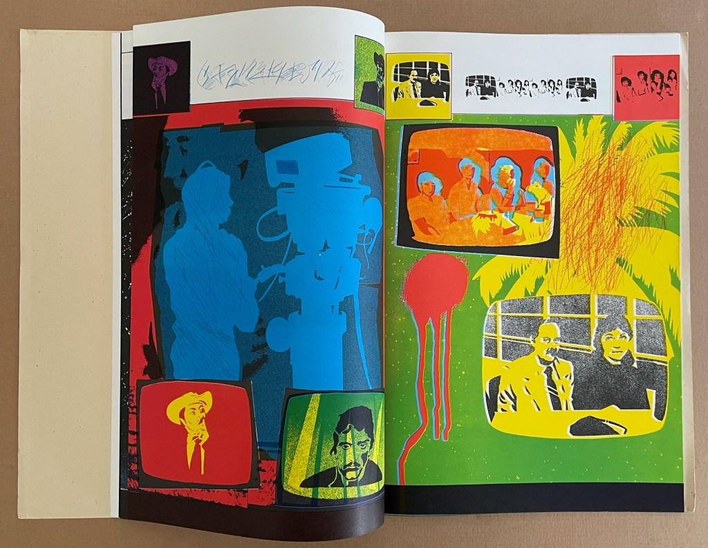
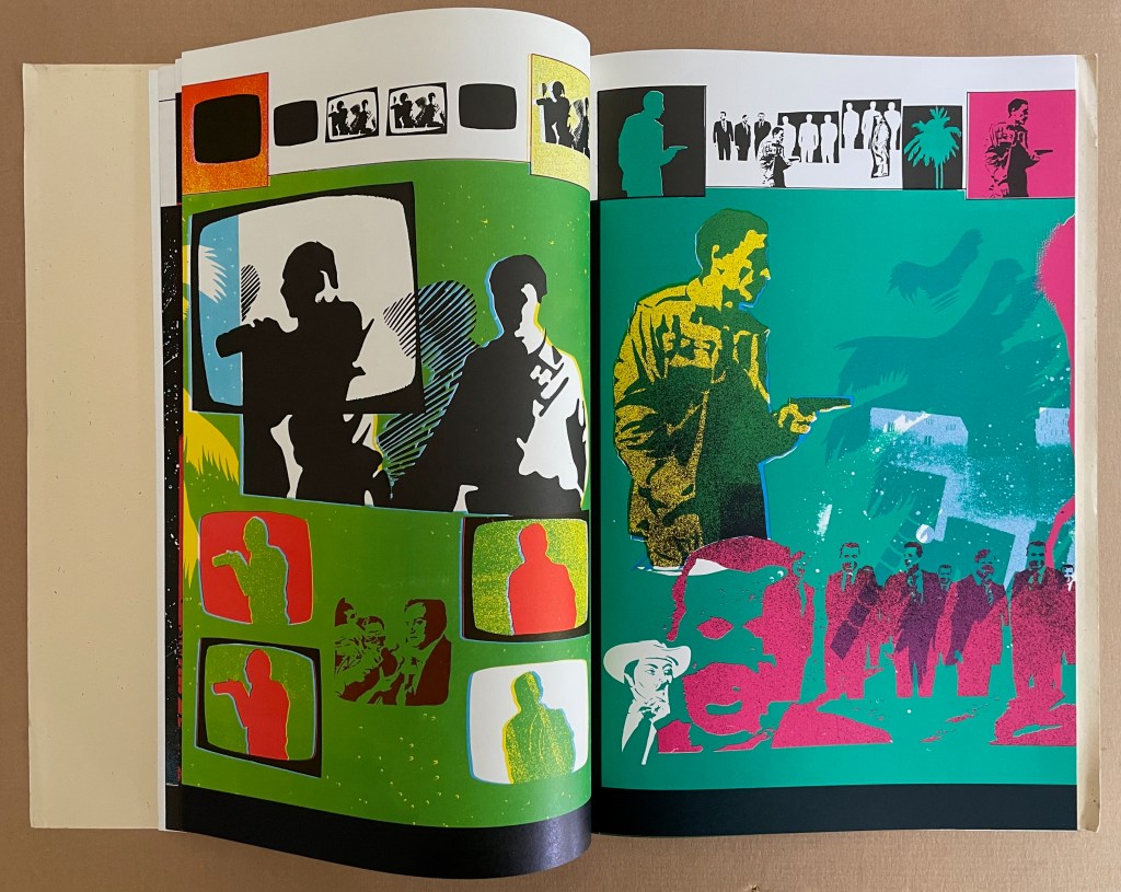
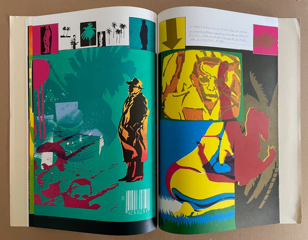
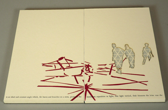
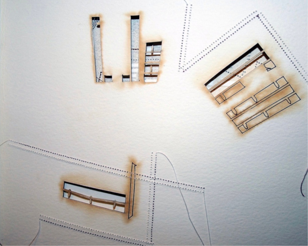
Still, Ehrenberg’s book art went beyond any reductive anti-colonial message. His “Visual Information Bank”, as he called it, held a wealth of contemporary cultural iconography. Its main sections included:
The Crashed Car Department Sports’ Frozen Moments Department Men in Suits & Ties Department Police File Photo Department Jet Set Department Women: Dream & Desire Department Masked Wrestlers Department Motel Room Drawings Department The Rubber Stamp Division
And he drew on this — especially from the televisual world — to create his glyphic stencils and rubber stamps.
The leporello edition of Codex Aeroscriptus Ehrenbergensis is rare, but fortunately the wrap-back bound edition shown in this entry is a little less so. The wrap-back format is a traditional Chinese/Japanese book format. Takako Saito, who joined Ehrenberg at Beau Geste Press in 1973, may have been an influence in this regard, but as she left in 1975, an influence from others at Nexus in Atlanta, GA, where Ehrenberg completed this work, seems more likely.
The double-sided leporello edition of Codex Aeroscriptus Ehrenbergensis is not a folded continuous sheet. Viewable on Stephen Perkins’ site, it appears to have been formed from the codex edition’s double-page spreads glued together at the fore edge. Ehrenberg’s residency at Atlanta’s Nexus Press would have overlapped with Clifton Meador’s presence, and Meador’s works frequently use the wrap-back format.
Reed, Marcia. 2022. “Codex Espangliensis: From Columbus to the Border Patrol“, in Materialia Lumina : Contemporary Artists’ Books from the CODEX International Book Fair. Edited by Elizabeth Fischbach and Nann Parrett. Berkeley, California: The Codex Foundation.
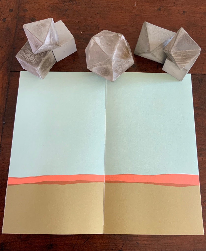
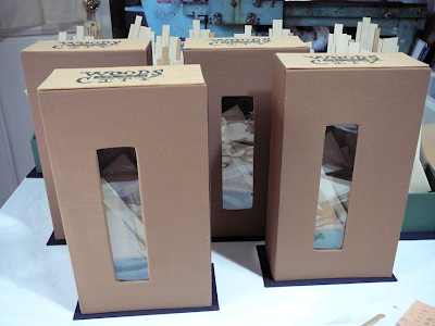
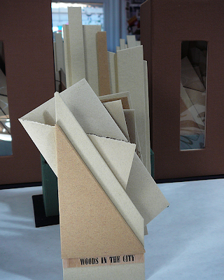
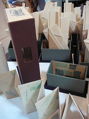
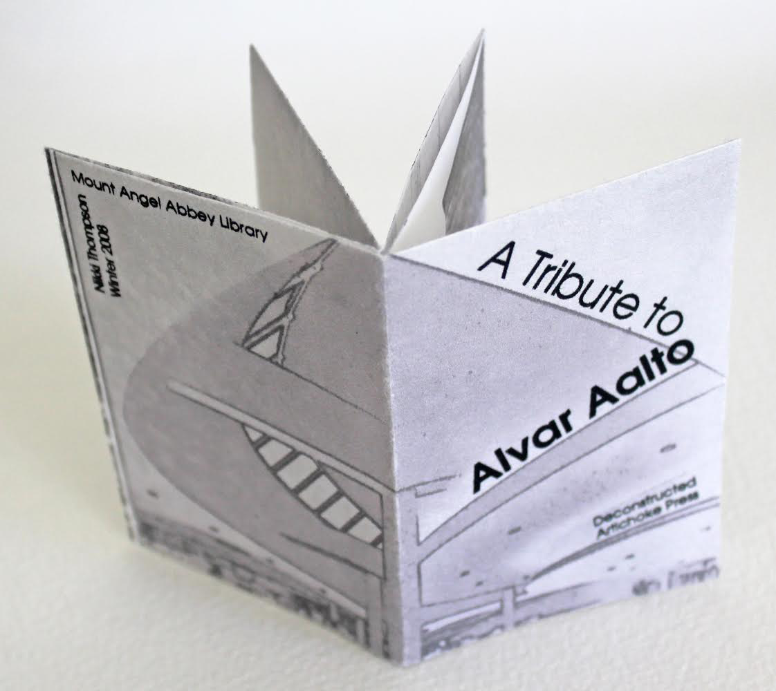
Theme and Permutation (2012) Marlene MacCallum Hand sewn pamphlet, images custom-printed in offset lithography on Mohawk Superfine, text printed in inkjet, covers inkjet printed on translucent Glama. H235 × W216 mm Edition of 100, of which this is #54. Acquired 5 October 2018.
Photos: Books On Books Collection.
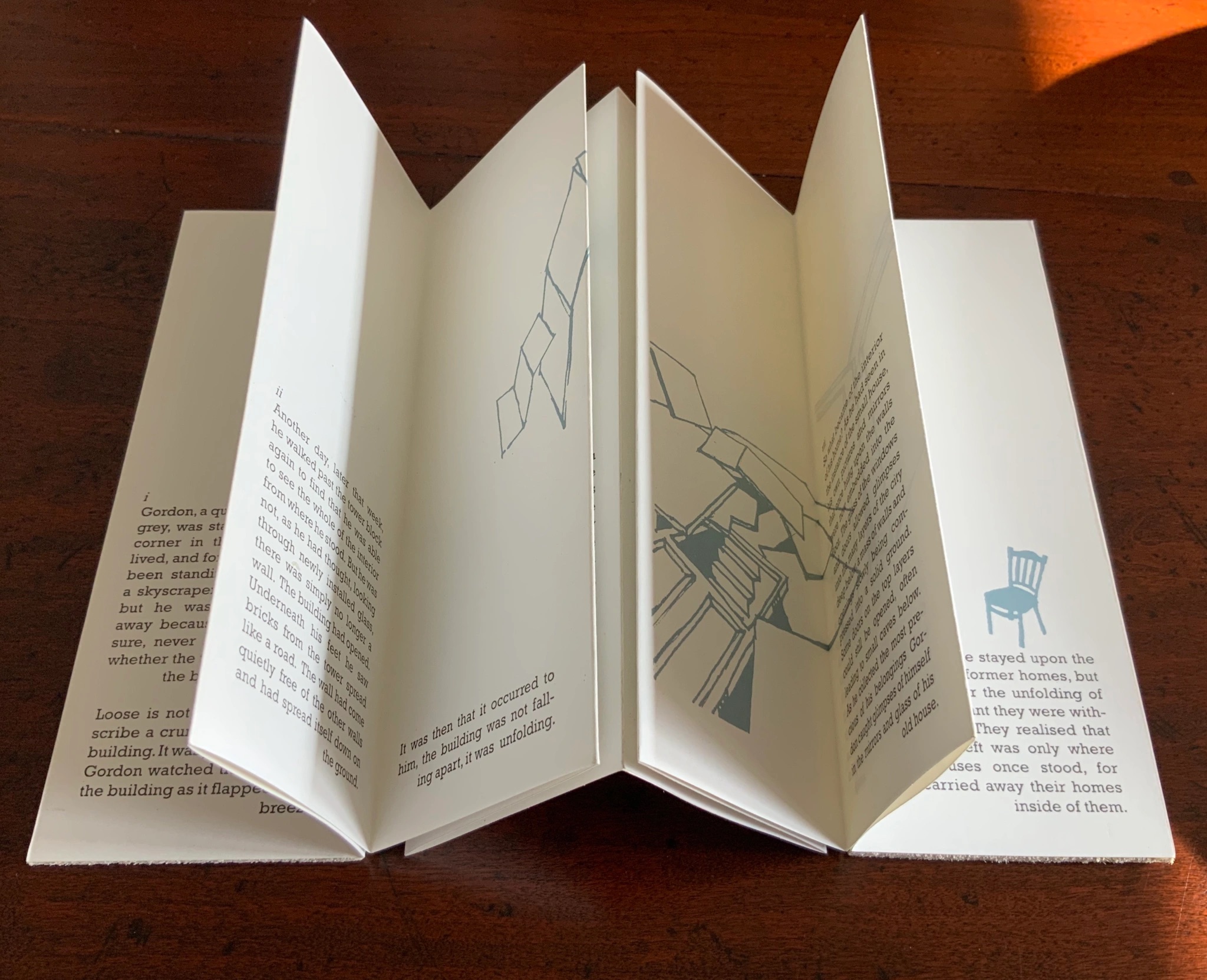
Theme and Permutationis one of a series of artist’s books inspired by the experience of living in Corner Brook’s Townsite area on the west coast of the island of Newfoundland. Between 1924-34 the pulp mill built 150 homes to house the mill management and skilled labourers. Over a period of 10 years, I have photographed in several homes, all the same type-4 model as the one I live in. These homes vary in condition from close to original in design and décor to highly renovated. This project gave me the rare opportunity to record the evolution of interior aspects of these homes. It has been the context to explore the paradoxical phenomena of conformity and individualization that occurs in a company town. Having grown up in a suburban housing development, my earliest memories of home is that of living in a space that is reminiscent of my neighbors’. Each artist’s book explores a distinct facet of image memory, multiplicity, sequence and offers the viewer a visual equivalence of the uncanny. Theme and Permutation is a response to the permutations and variations of the type-4 Townsite House. Digital tools were used to translate the original film source of eight different window images from five houses. The sixteen offset lithographic plates were custom printed in twenty-nine separate press runs. Each image is the result of a different combination of plates. The structure is a sewn pamphlet with translucent covers. The viewer enters the body of the book with a tritone image of a single Townsite window. As one moves into the piece, new window images appear and layer over each other. The images become darker and more heavily layered towards the mid-point. The center spread has an inkjet layer of two text blocks printed over the offset litho images. The text speaks of the history of the homes, the architectural permutations and economic shifts within the Townsite area. The ensuing pages continue to provide new combinations of window layers, gradually lightening in tonality and allowing the individual windows to become more distinct. A third text block provides a personal narrative. The piece concludes with a tritone image of one of the Townsite windows in original condition.(From artist’s website. Accessed 1 September 2019.)
*From the artist’s description of Wall Stories (2014).
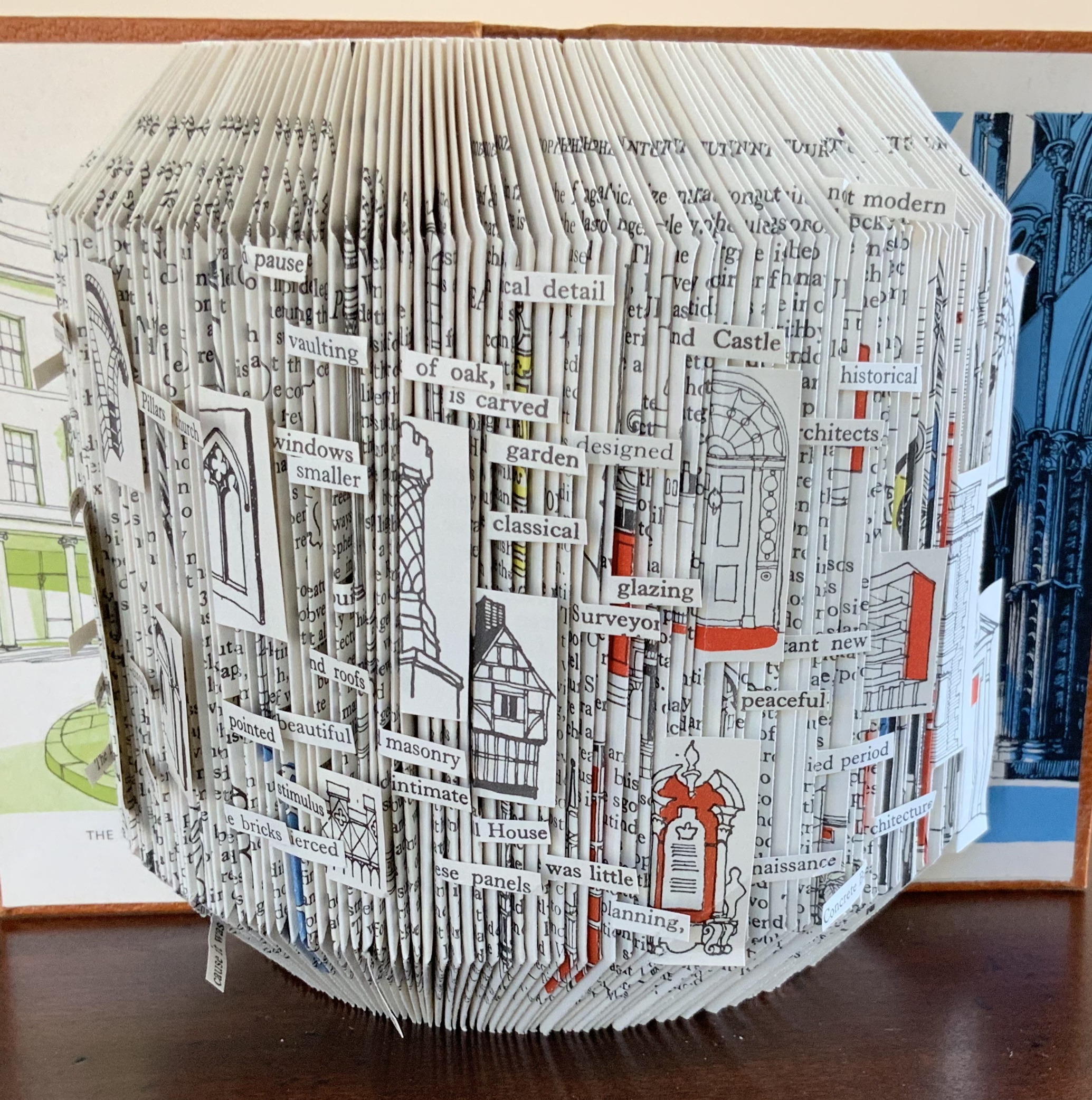
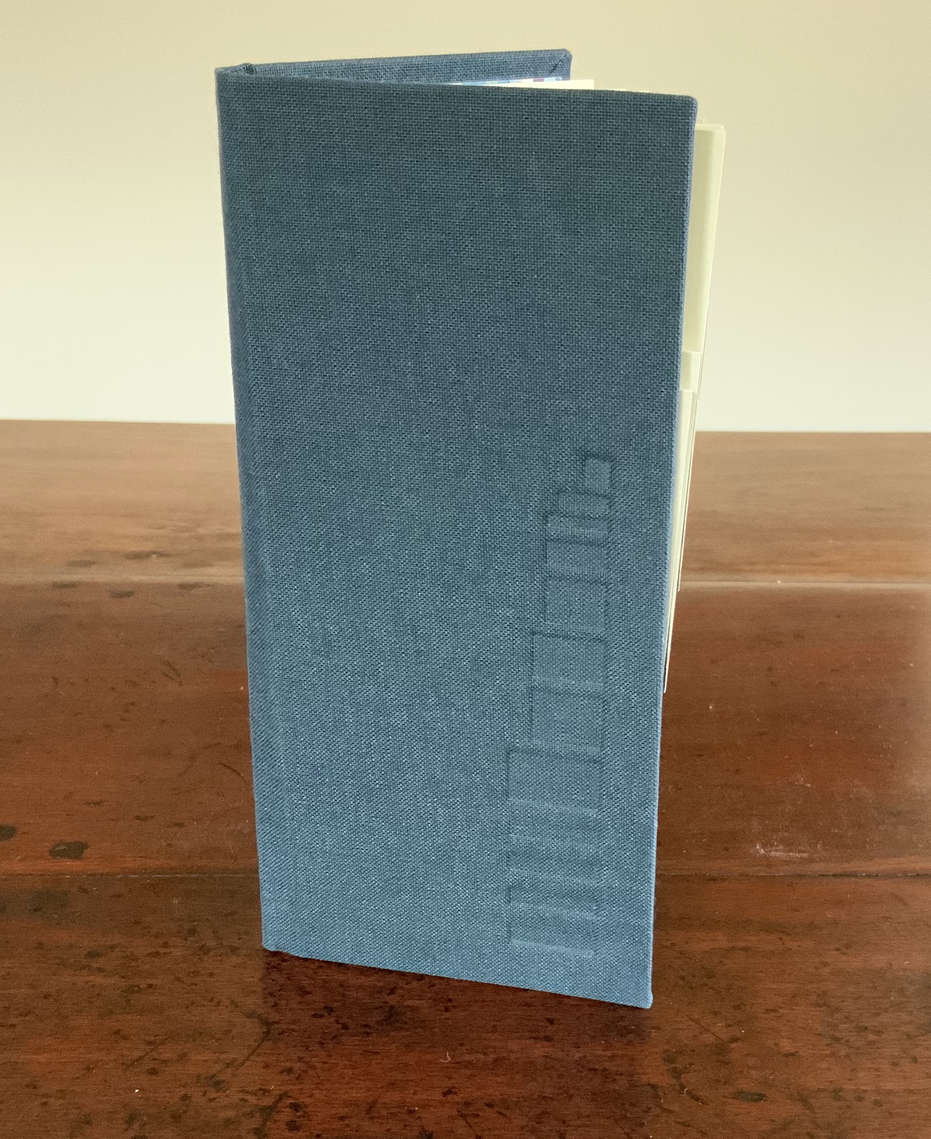
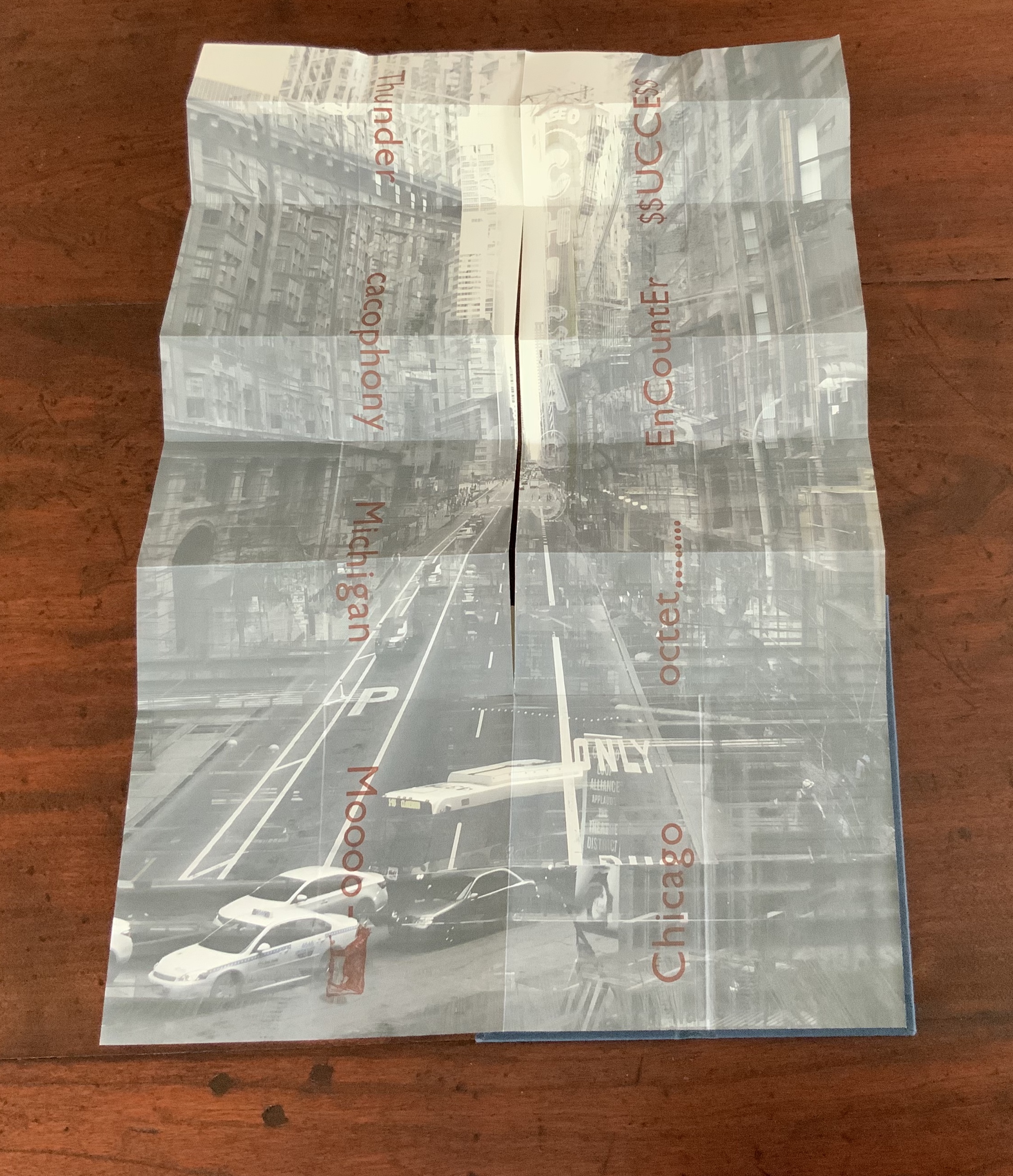
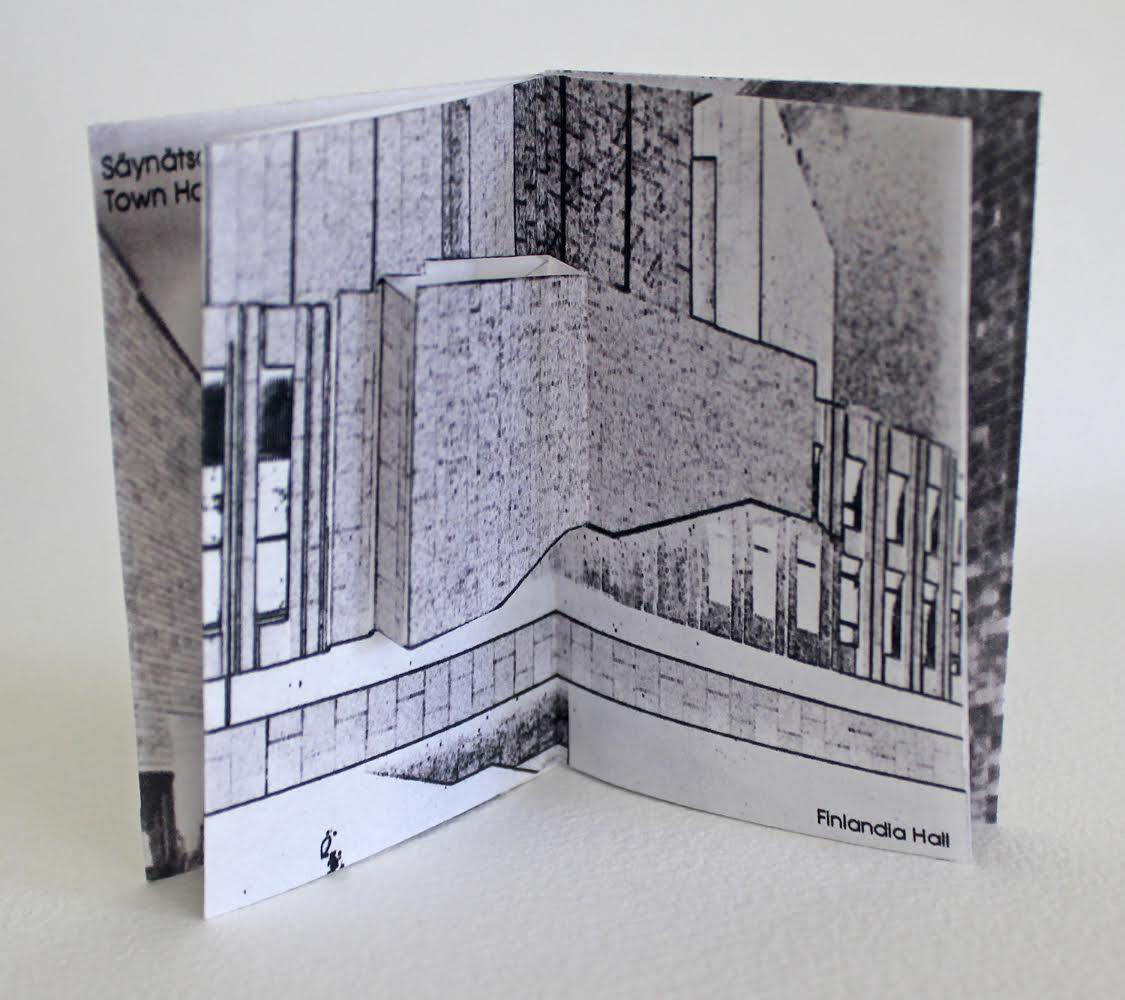
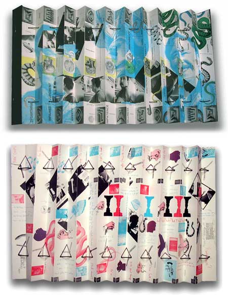
Chicago Octet (2014)
Chicago Octet (2014) Marlene MacCallum Hand bound artist’s book with folded paper structure, letterpress and inkjet printing, H166 × W78 mm closed, H443 x W293 mm open Unique. Acquired 5 October 2018.
Photos: Books On Books Collection
Chicago Octet is a work of visual poetry by eight masters of book art. If they were performing music (and you can almost hear the music of Michigan Avenue), MacCallum would be their performing conductor.
The piece I created, Chicago Octet, had several collaborative components. The letterpress printing consisted of a word selected by each participant printed on one of Scott [McCarney]’s folded structures. The images were a digital layering of every cityscape photograph that I made and then inkjet printed on top of the letterpress. The final folded structure was designed by Mary Clare Butler. The case was designed and built by Scott McCarney, the front cover embossment was by David Morrish and Clifton Meador. (From artist’s website. Accessed 31 August 2017.)
Update: With funding from the Canada Council for the Arts Digital Originals Grant and assistance of Matthew Hollett and David Morrish during the Covid pandemic, the artist created Shadows Cast and Present, a digital re-imagining of her three most recent book works. The three cantos into which the work is divided also enrich one’s appreciation of Theme and Permutation and Chicago Octet. MacCallum orchestrates the various media — text; sound from music, voice and the noise of city and nature; video — with a touch as light as paper and light.
Further Reading
Books On Books. “Architecture”. Books On Books, 12 November 2018.
MacCallum, Marlene. 2014. Wall Stories. Website. For the text cited in the epigraph for this entry, go to the last linked image in the series of thumbnails displayed.
Otis Artist Book Collection. “Conrad Gleber ‘Chicago Sky Line’”, 27 January 2014. Gleber’s work is an interesting one to compare with Chicago Octet. Chicago Sky Line (1977) is a fan book of photographs secured at a single point by the binding and, when spread clockwise, reveals the sky above Chicago and, when spread counterclockwise, shows the Chicago “skyline” below clouds and sky.
Architecture — be it theory, principles, practices or instances — inspires book art. Lay the book flat; you have a foundation. Open and turn it on its fore-edge; you have a roof beam or arcade. Stand it upright; you have a column or tower. Turn the front cover; you open a door. Put the text and types under a microscope; you have a cityscape. As the examples in this virtual exhibition show, architecture-inspired book art goes beyond these simple analogies.
There are seemingly unrelated texts that help considerably in going there. The Eyes of the Skin (2005) and The Embodied Image (2010) by Juhani Pallasmaa, architect, teacher and critic, are two of them. He writes as if he were an artist preparing an artist’s statement or descriptions of the book art below. The title of his earlier book gives away his alignment with the visual and tactile nature of book art. Pallasmaa’s two books will enrich anyone’s enjoyment of the works shown and mentioned here.
“Book. Space. House. Space of Movement“. Exhibition curated by Susanne Padberg, 7 May – 26 June 2026. Padberg, Susan (curator). 7 May – 26 June 2026. at Galerie Druck & Buch, Vienna, Austria. Accessed 22 May 2026. “The artist’s book as a three-dimensional space: forming a house, outlining, remembering, mimicking—thinking the human being within space. Between object and narrative, books unfold as architectural structures, as inhabitable thought-spaces, as reflections of individual and collective experience. The exhibition brings together artistic positions that expand the book as a spatial body.”
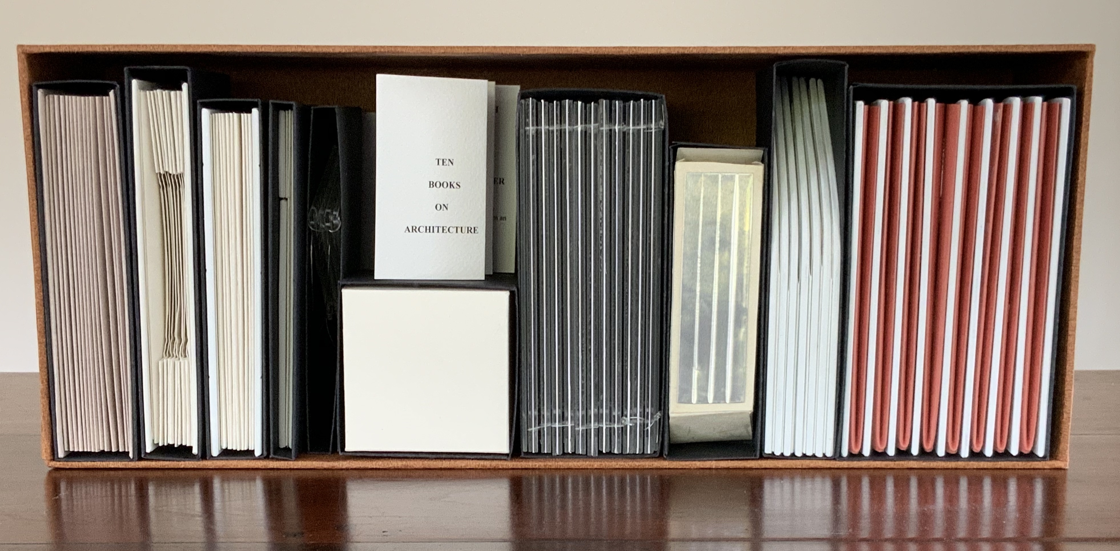
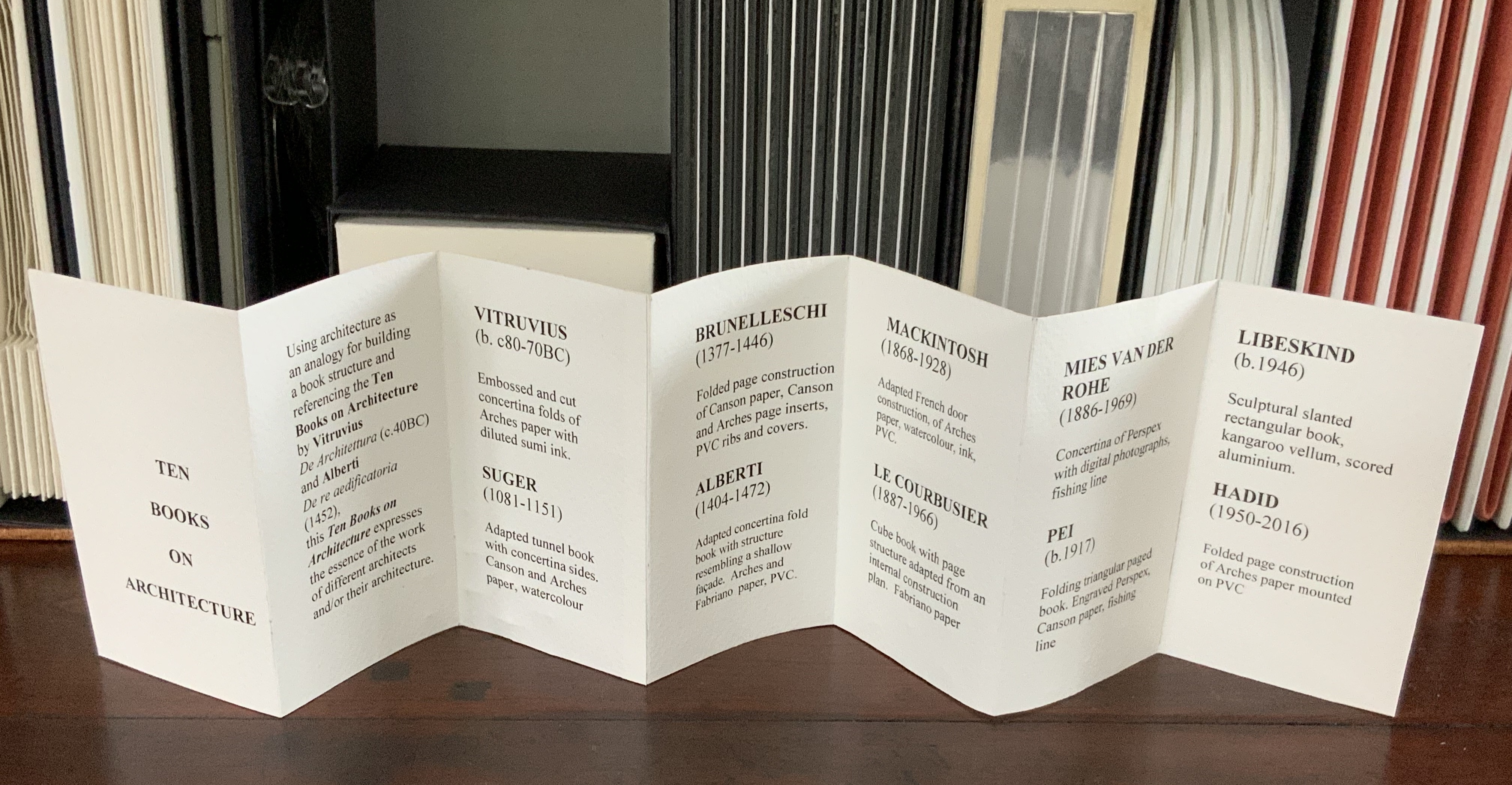
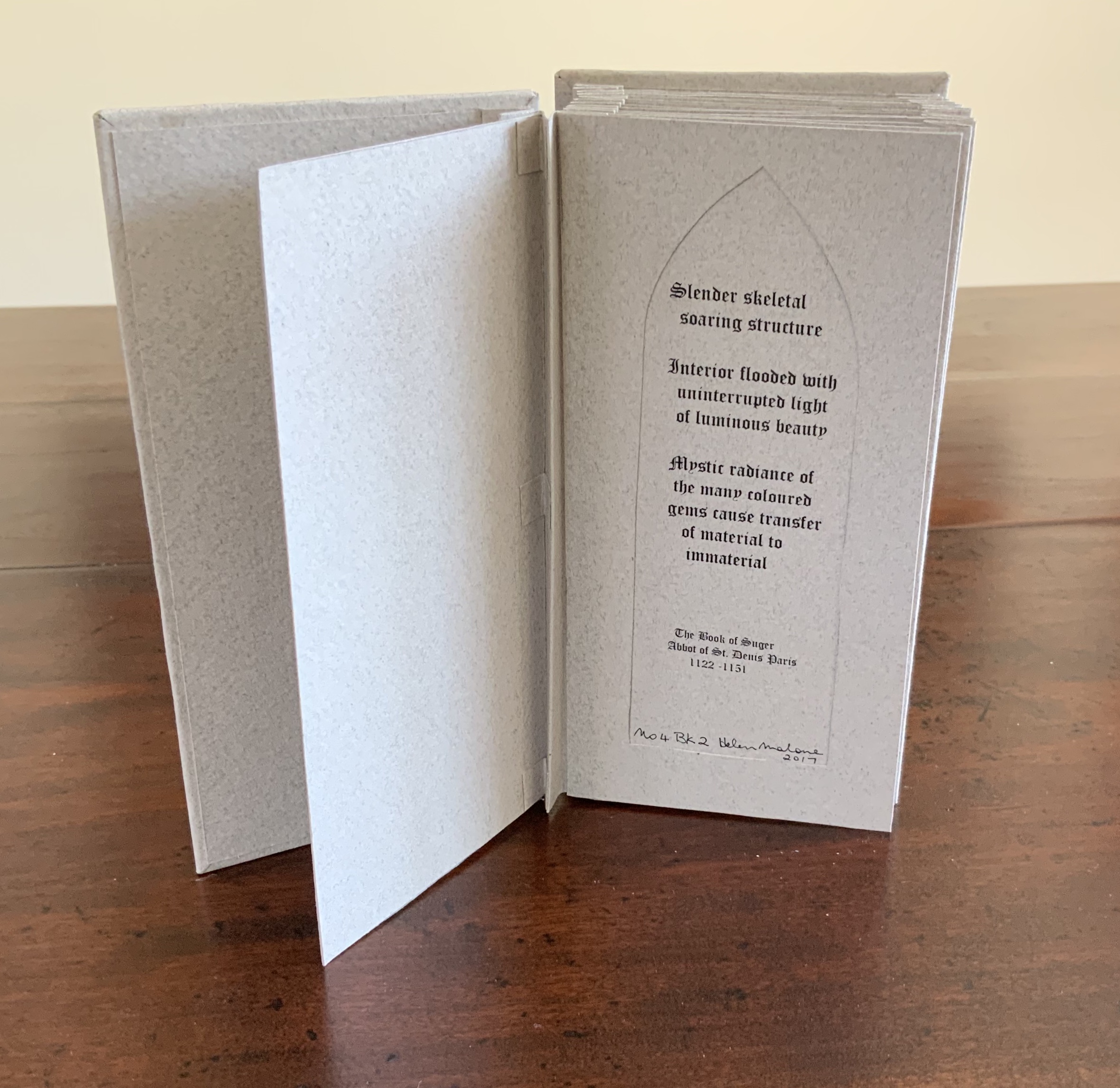
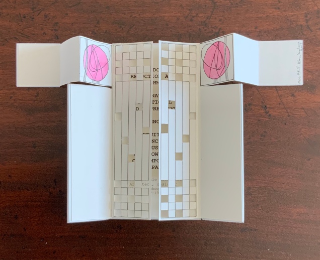
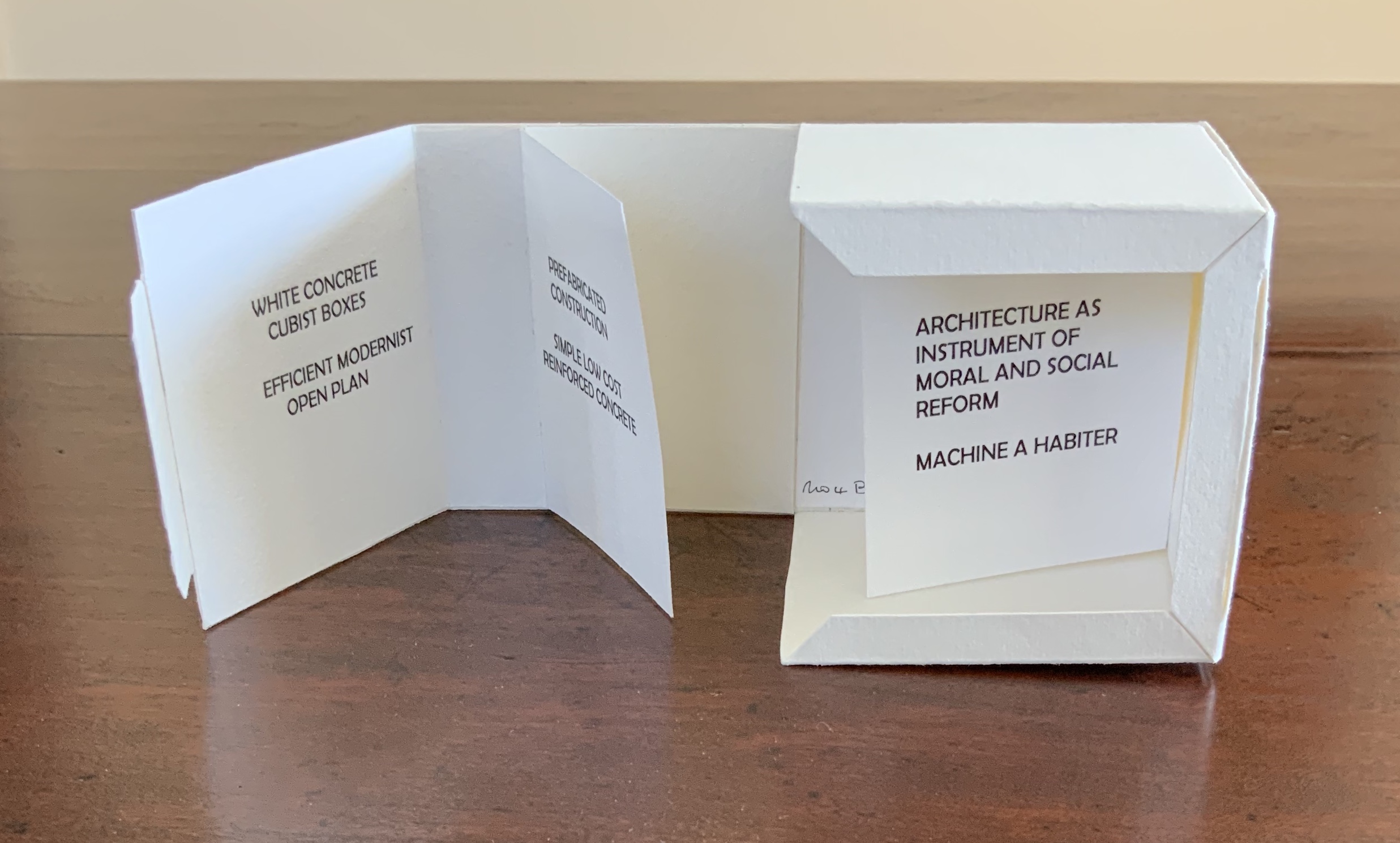
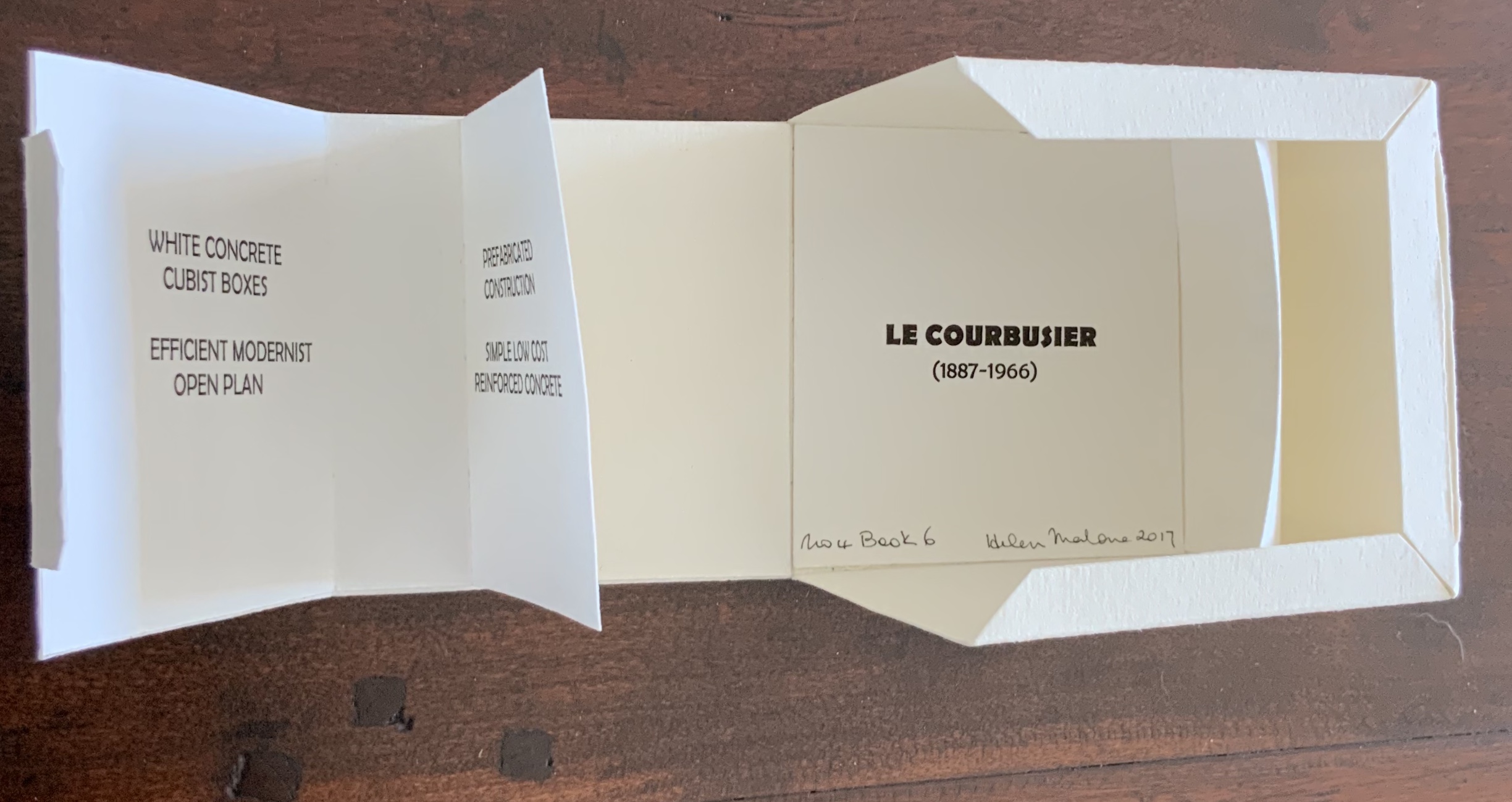
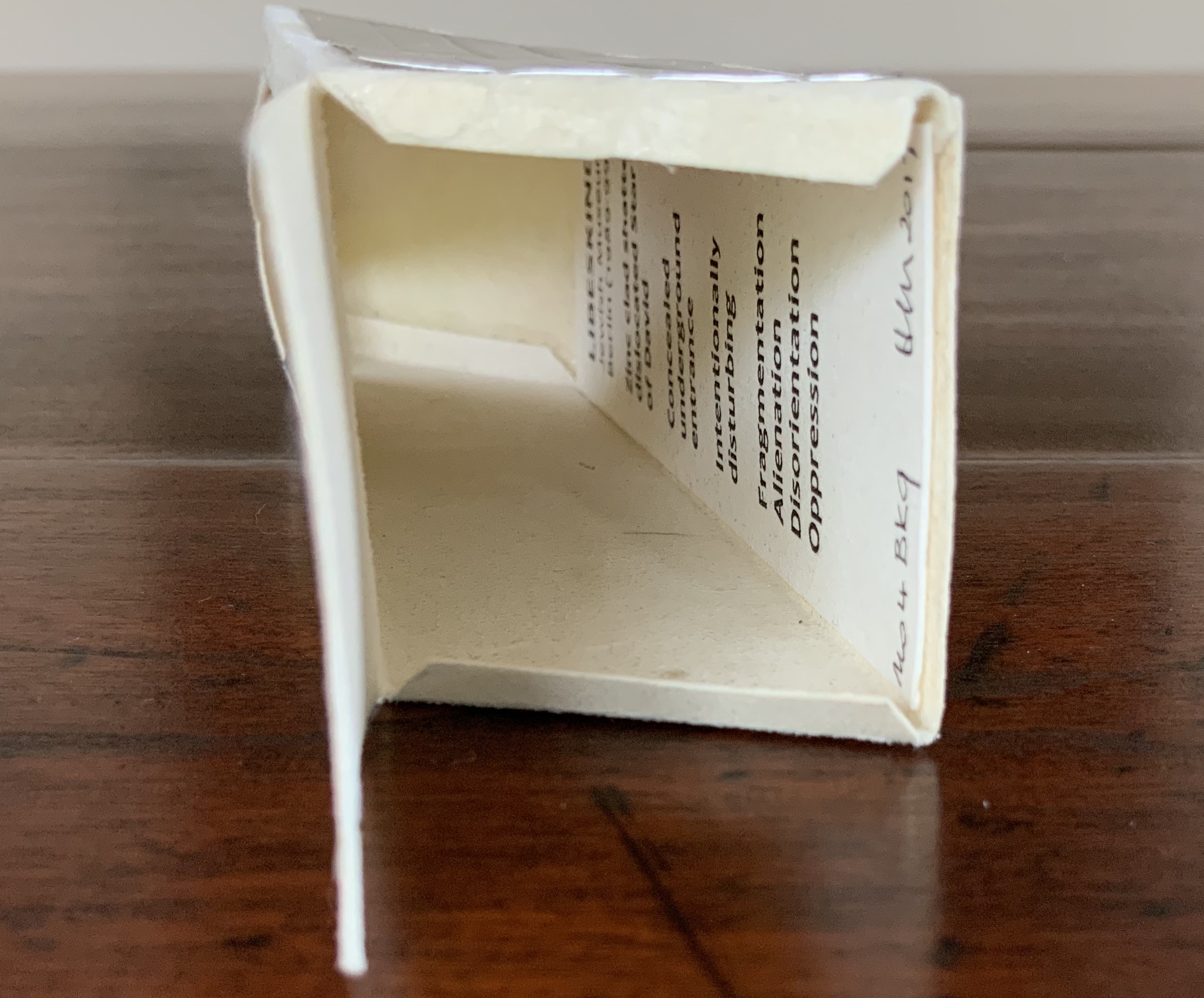
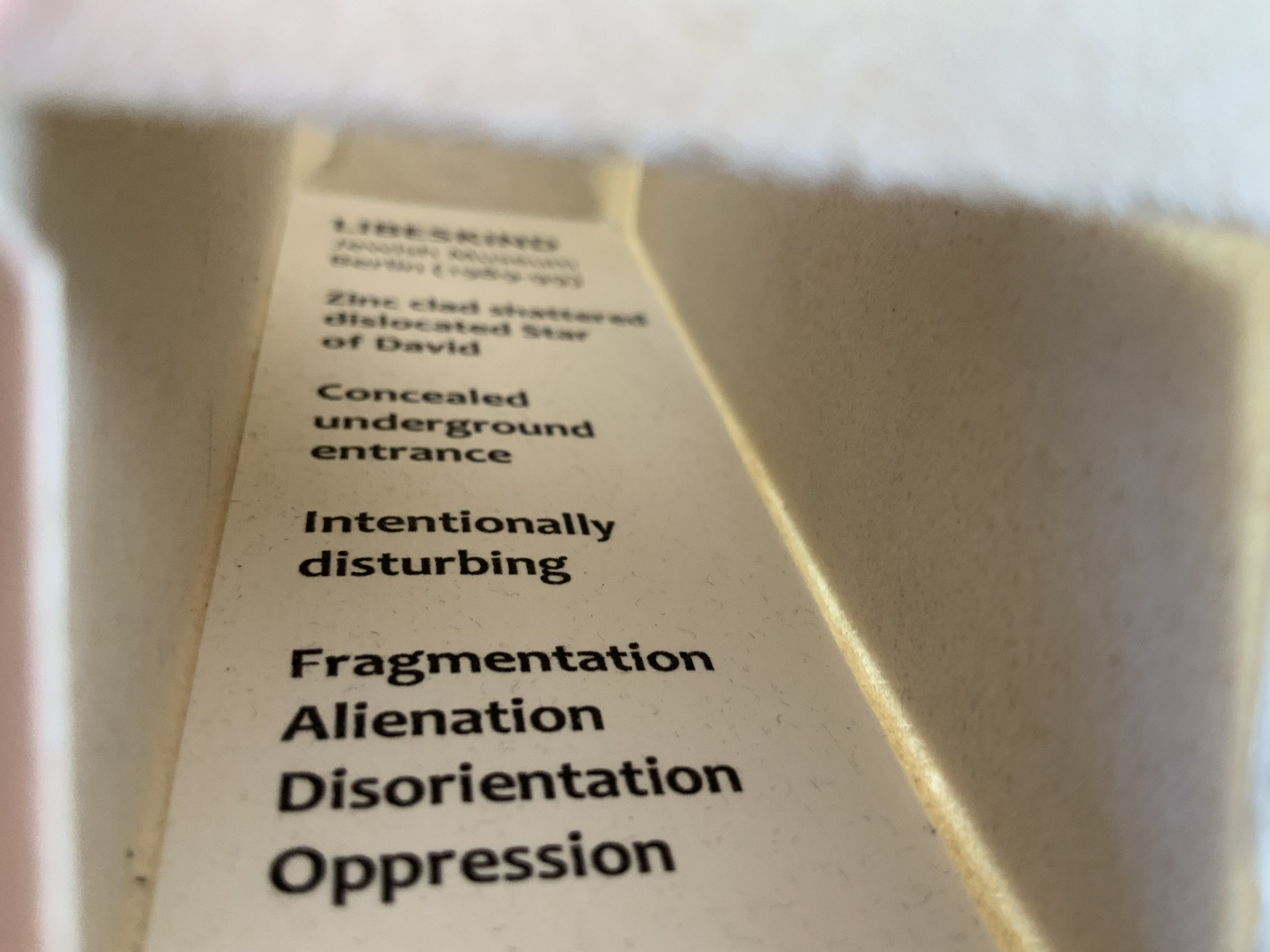
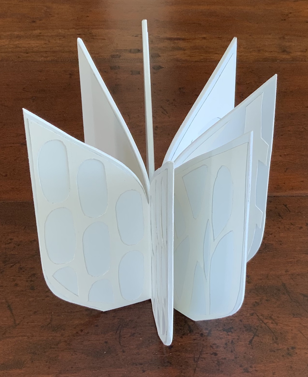
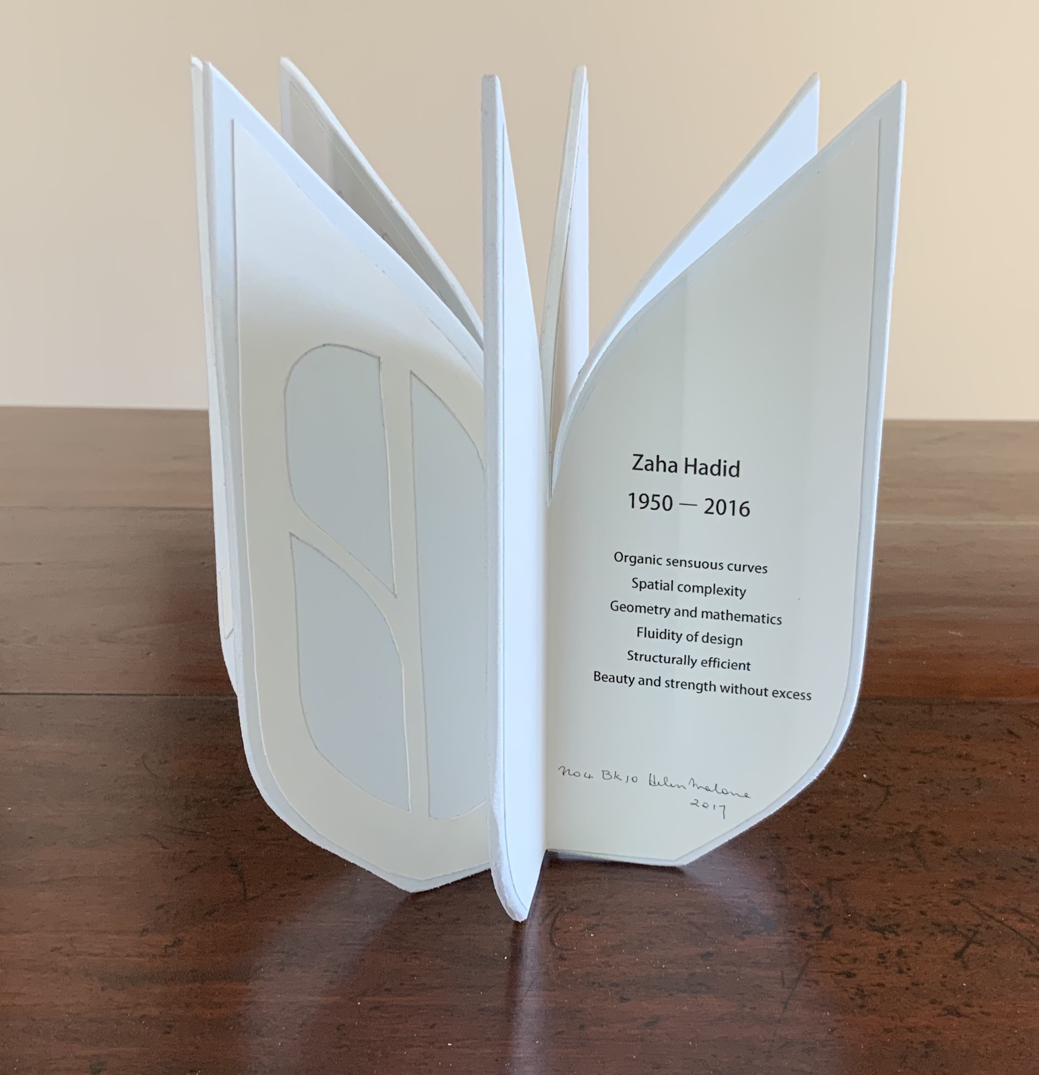
Malone’s Ten Books of Architecture is a good place to start in the collection. Like Pallasmaa, Malone takes a broad historical and, most important, haptic view of architecture from Vitruvius to Hadid. Each of the ten books is a bookwork that exemplifies its subject.
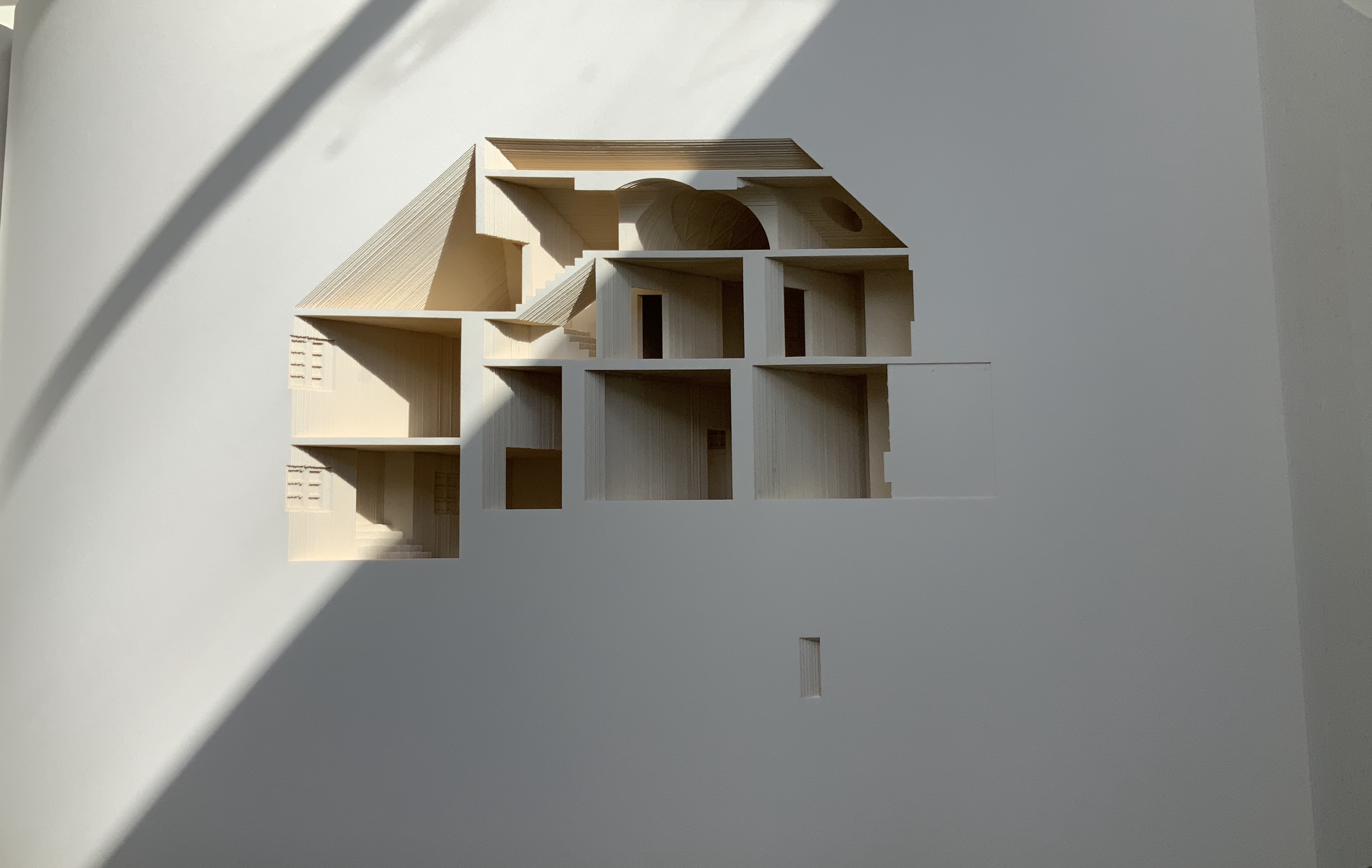
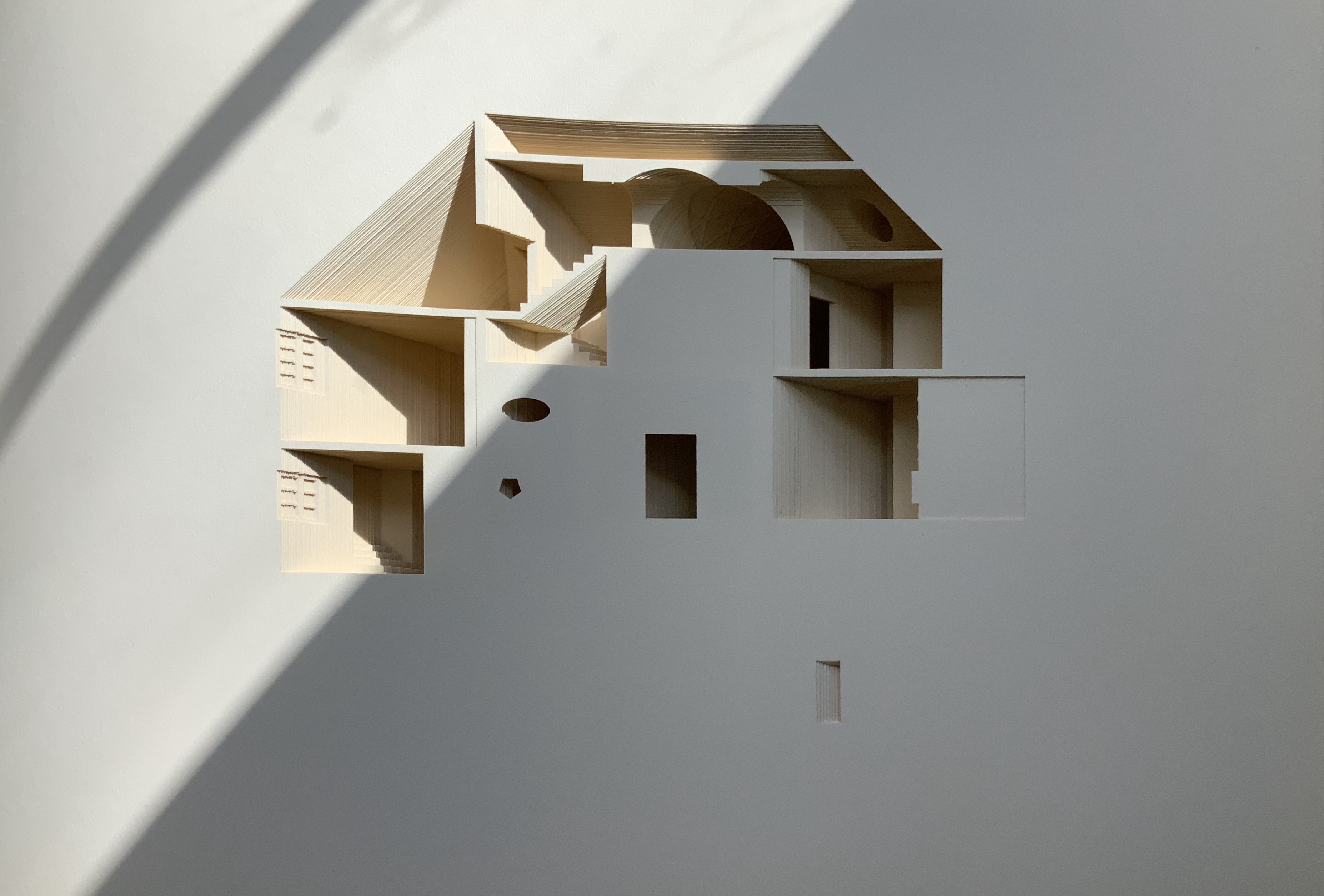
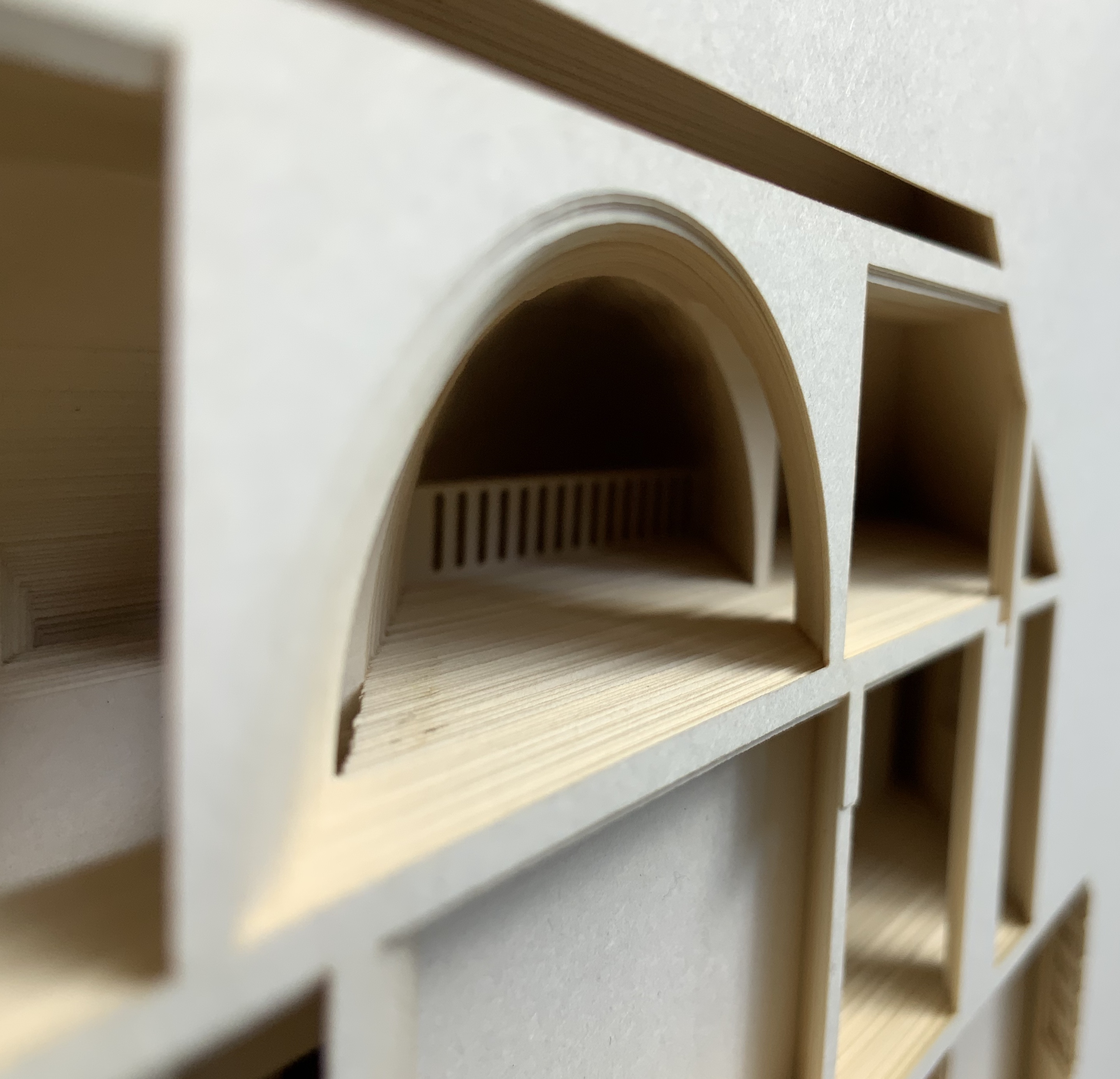
Adapted tunnel book with accordion sides Photo: Books On Books Collection
A watercolour at the tunnel’s end to evoke the stained glass clerestory windows in the Basilique Saint-Denis, Paris Photo: Books On Books Collection
The aspiration to fuse the cosmic and the human, divine and mortal, spiritual and material, combined with the systems of proportion and measure deriving simultaneously from the cosmic order and human figure, gave architectural geometries their meaning and deep sense of spiritual life.The Embodied Image, p. 23.
And further apropos the link between the book and architecture, consider the connection that Vasari drew between Gutenberg and Alberti:
In the year 1457 [sic], when the very useful method of printing books was discovered by Johann Gutenberg the German, Leon Batista [sic], working on similar lines, discovered a way of tracing natural perspectives and of effecting the diminution of figures by means of an instrument, and likewise the method of enlarging small things and reproducing them on a greater scale; all ingenious inventions, useful to art and very beautiful. Lives of the Most Eminent Painters, Sculptors and Architects, vol. 1, trans. Gaston Du C. de Vere (London: Medici Society/ Philip Lee Warner, 1912-1914), 494.
In “An Architectural Confession”, Pallasmaa writes:
One’s most important teacher may have died half a millennium ago; one’s true mentor could well be Filippo Brunelleschi or Piero della Francesca. I believe that every serious artist — at the edge of his/her consciousness — addresses and offers his/her work to a superior colleague for approval.The Eyes of the Skin, p. 82.
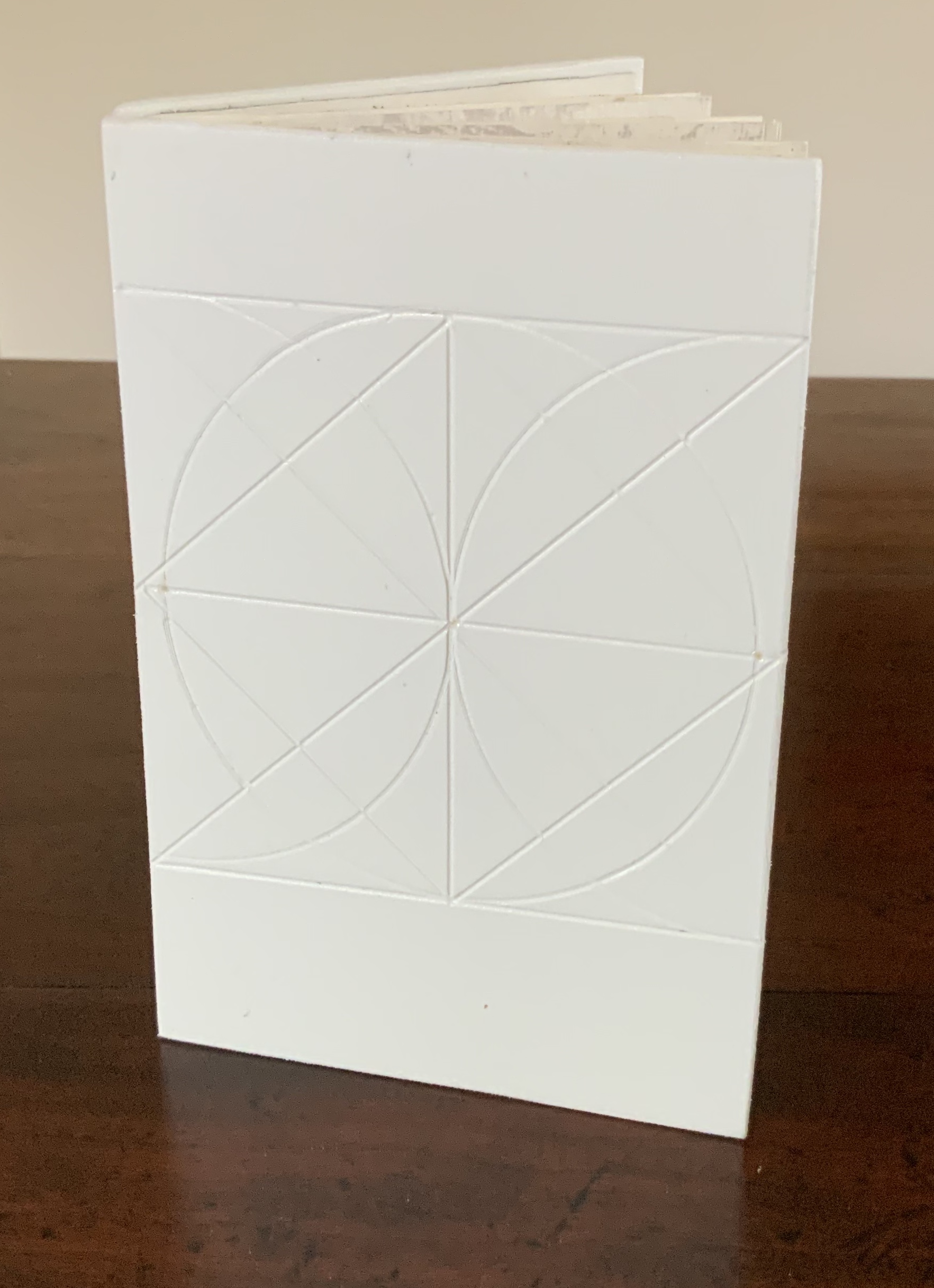
This curiously textured cube sits perfectly alongside Pallasmaa’s observation: “The basic geometric shapes have their symbolic connotations, but more important than their conventional meanings are their conceptual and visual organising powers” (The Embodied Image, p. 58).
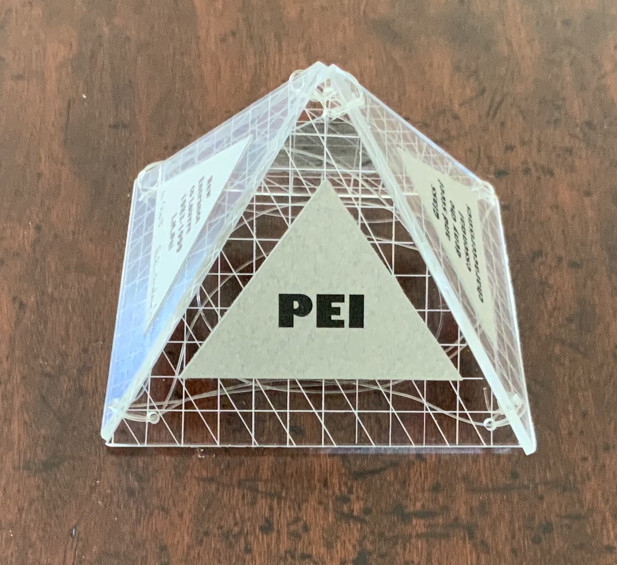
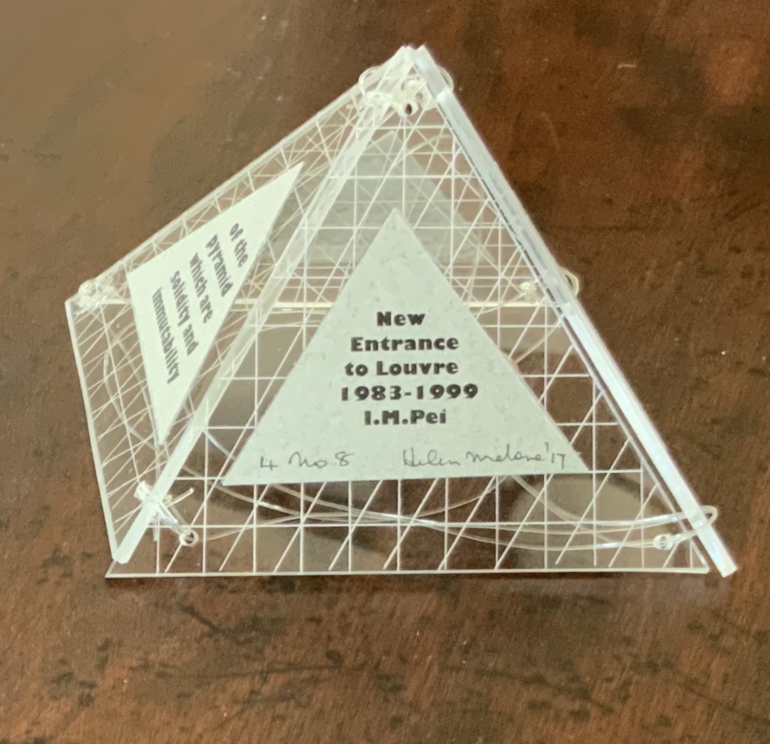
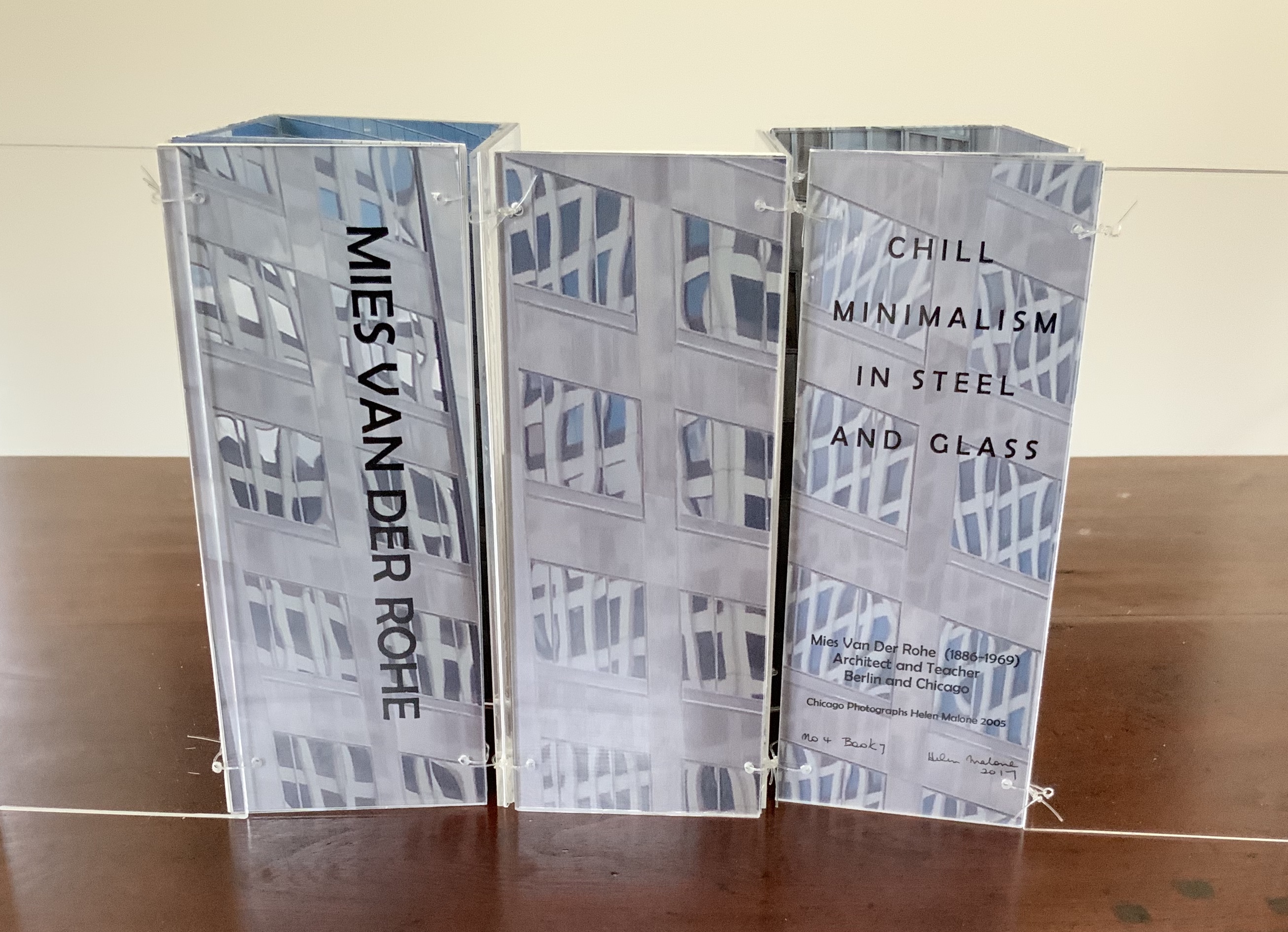
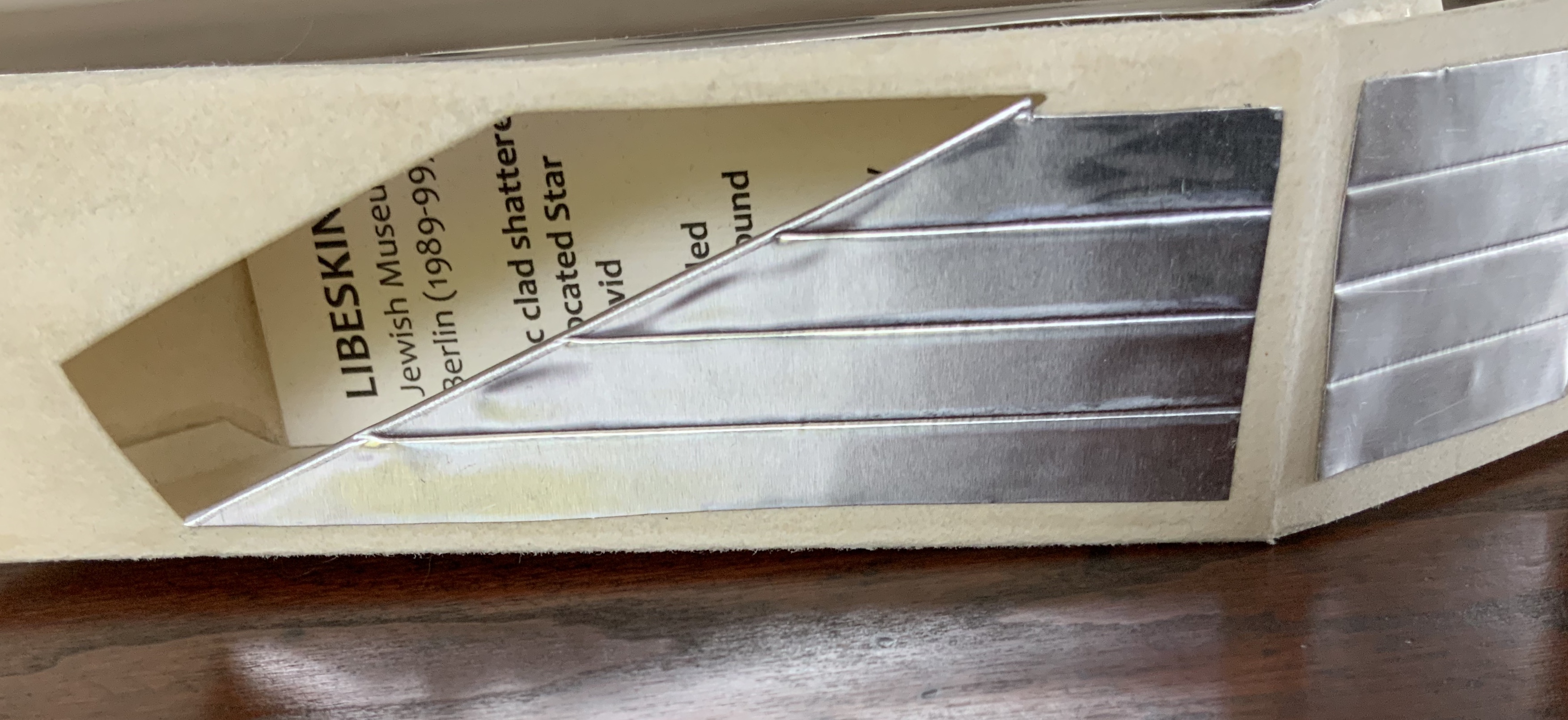
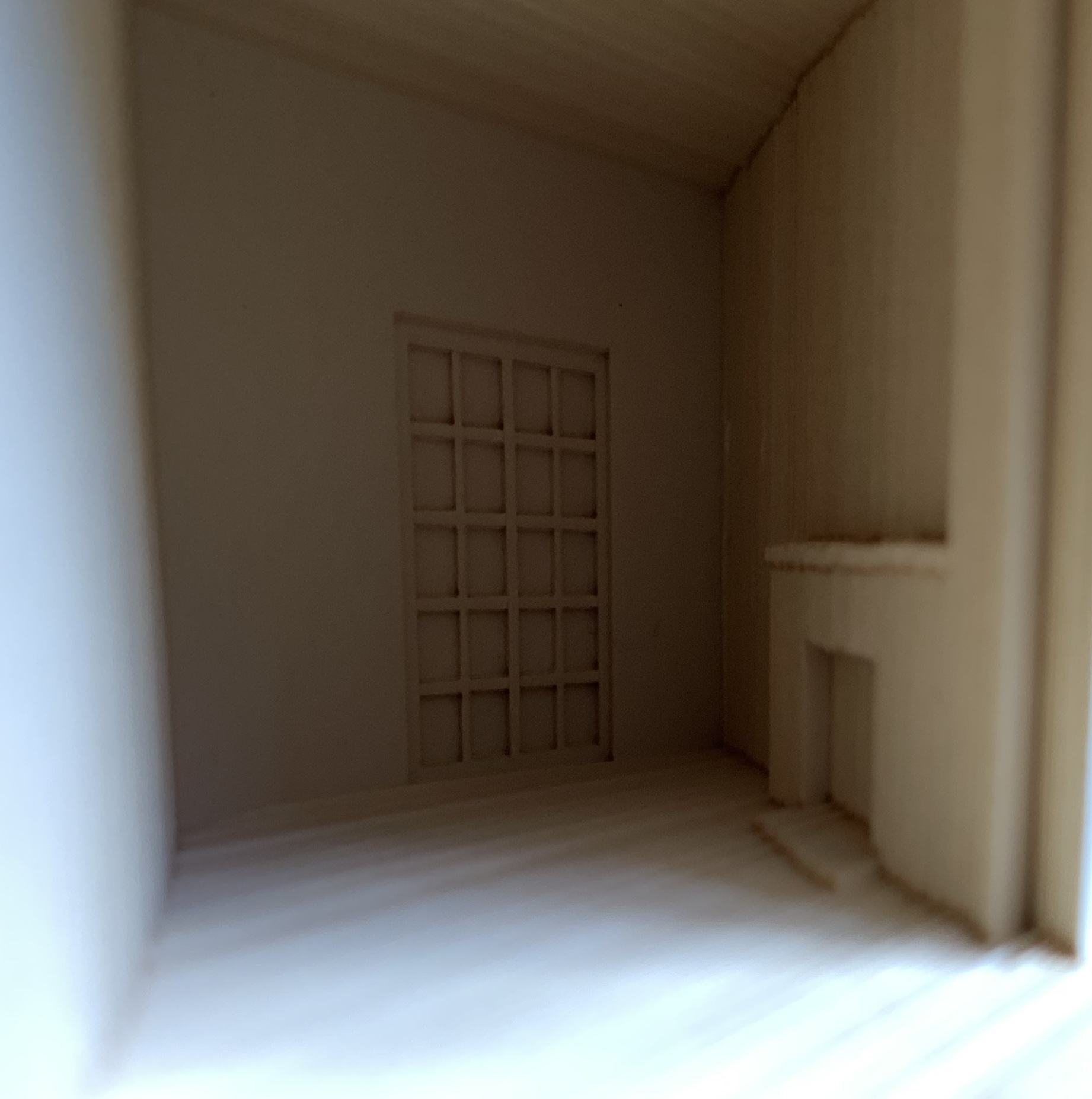
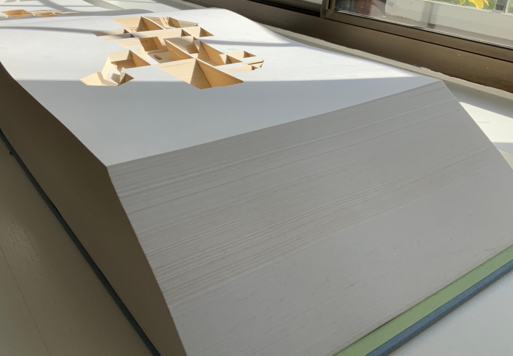
A short trip around this small pyramid as a reminder of the entrances that were always on the far side of museums you visited Photos: Books On Books Collection
This edition of Malone’s Ten Books is unique in its inclusion of Hadid, who is not mentioned in either of Pallasmaa’s books but whose artistry and turn to the organic and curves of nature certainly fit with their spirit. Photo: Books On Books Collection
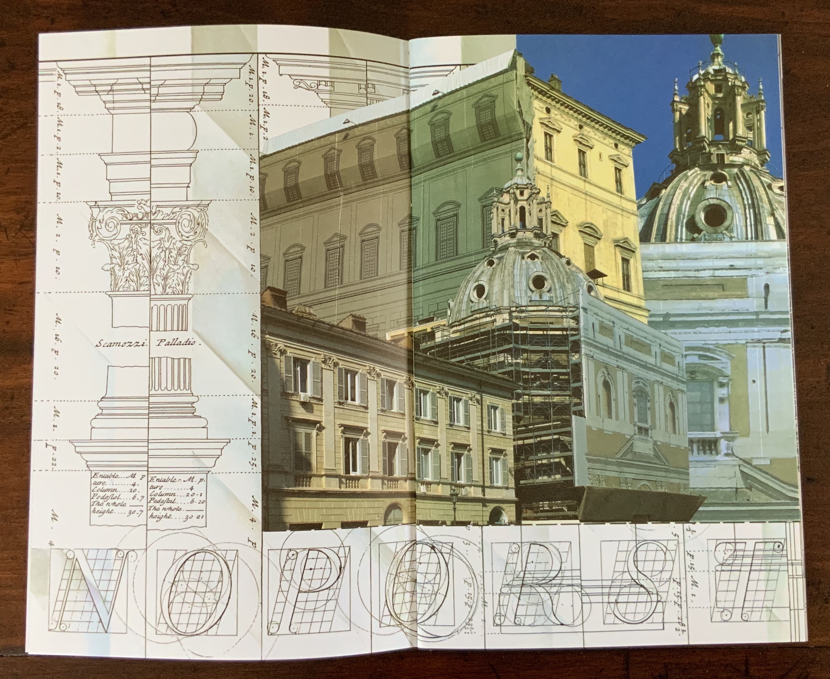
Malone’s Ten Books has a predecessor in Laura Davidson’s contribution to the 1994 Smithsonian show on book art inspired by its collection of rare science books (see section below). Although there is also Karen Wirth’s sculptural take on the Ten Books as well as Ron Keller’s take (see section below) on Palladio’s Fours Books of Architecture, which is Palladio’s take on Vitruvius, I have not found any other Vitruvian-inspired works of book art. (Pointers welcome.)
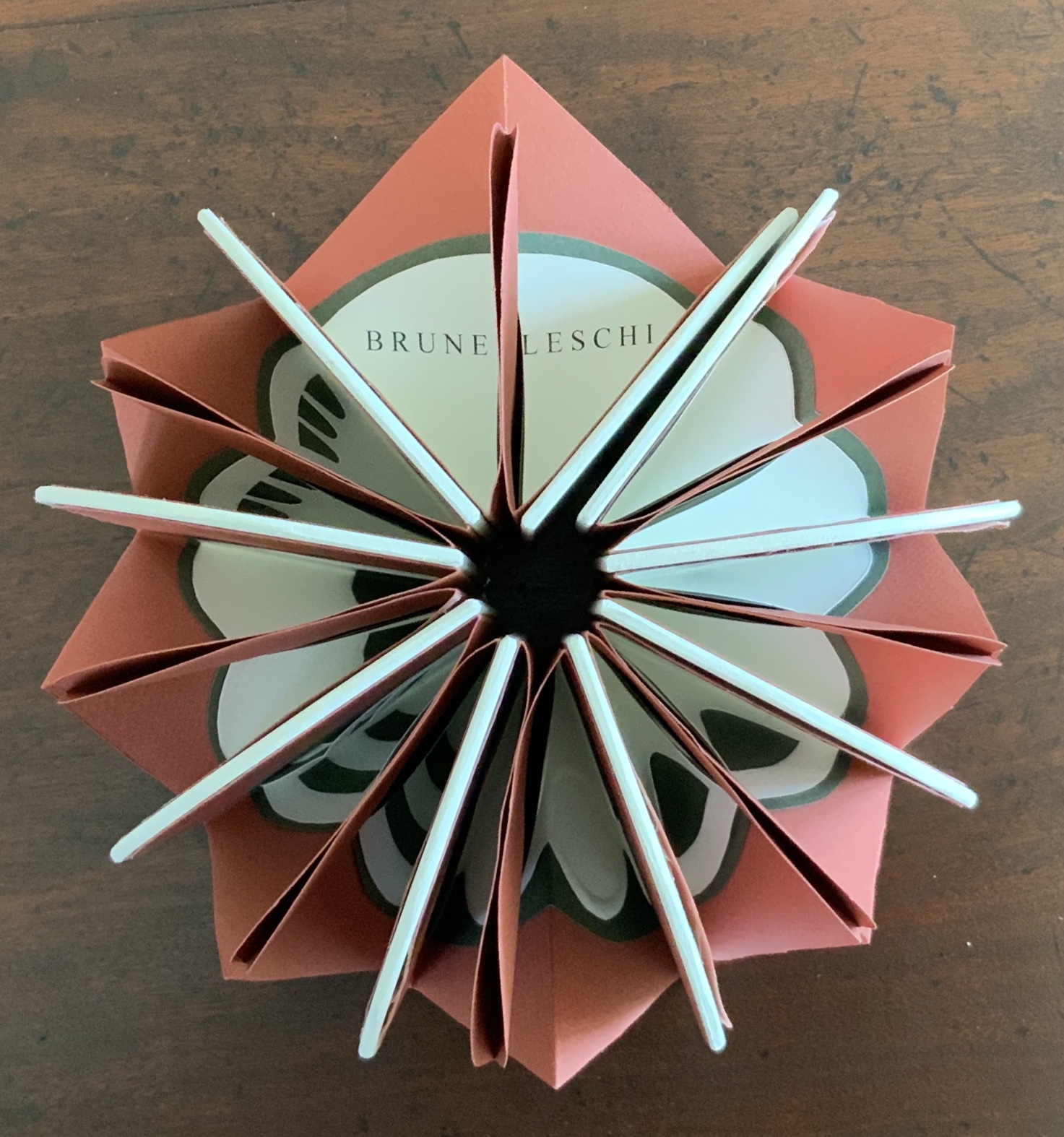
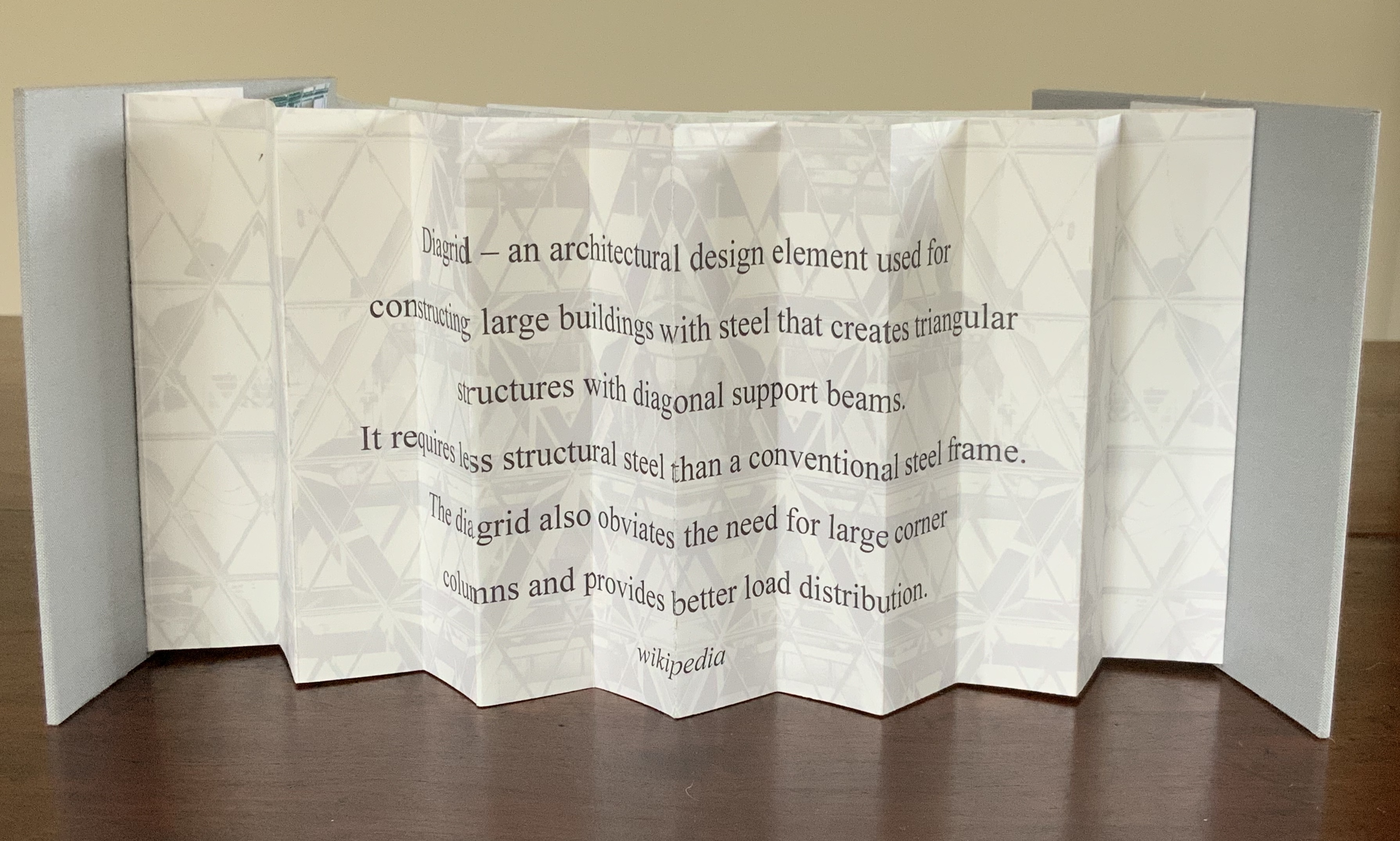
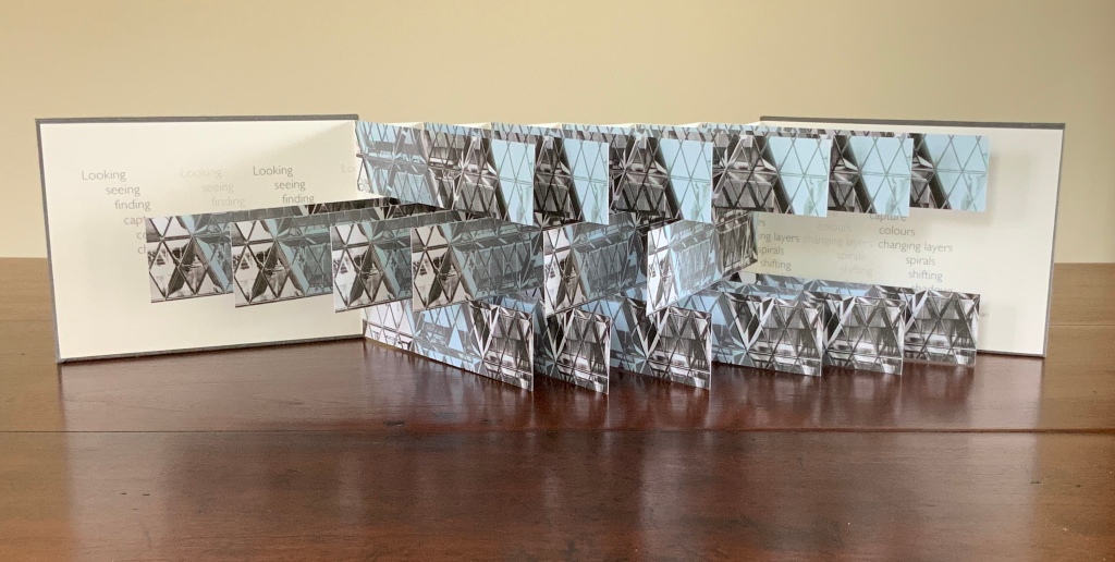
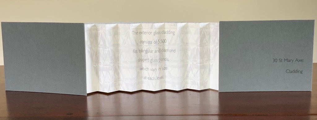
These two works — 30 St Mary Axe: Diagrid (2009) and 30 St. Mary Axe: Cladding(2009) — are among several architecture-inspired works of book art that Brannan has created. The text in one of those several — Situated — could have come straight from Pallasmaa, Bachelard or Merleau-Ponty:
Being situated is generally considered to be part of being embodied, but it is useful to consider each perspective individually. The situated perspective emphasizes that intelligent behaviour derives from the environment and the agent’s interactions with it.
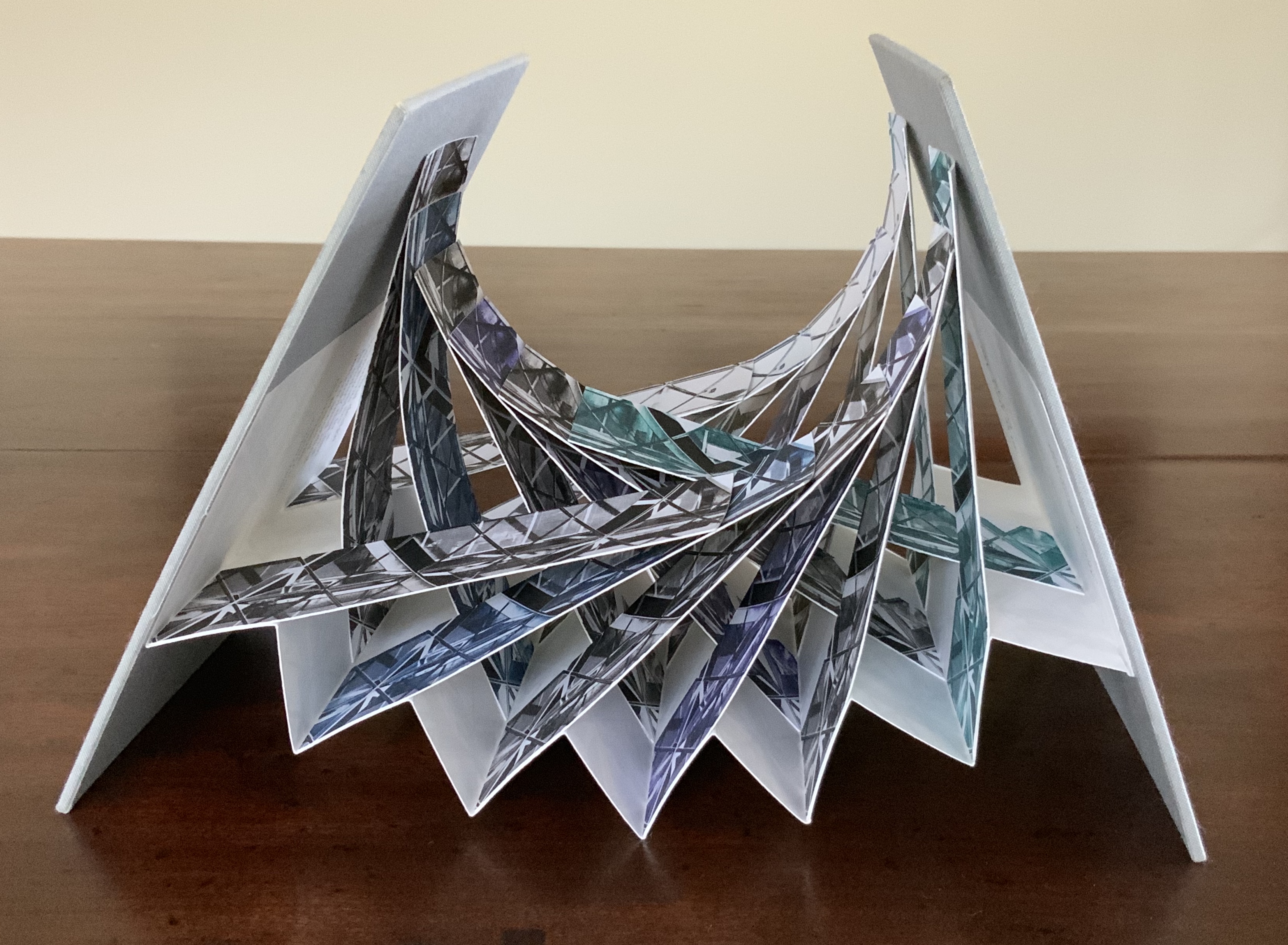
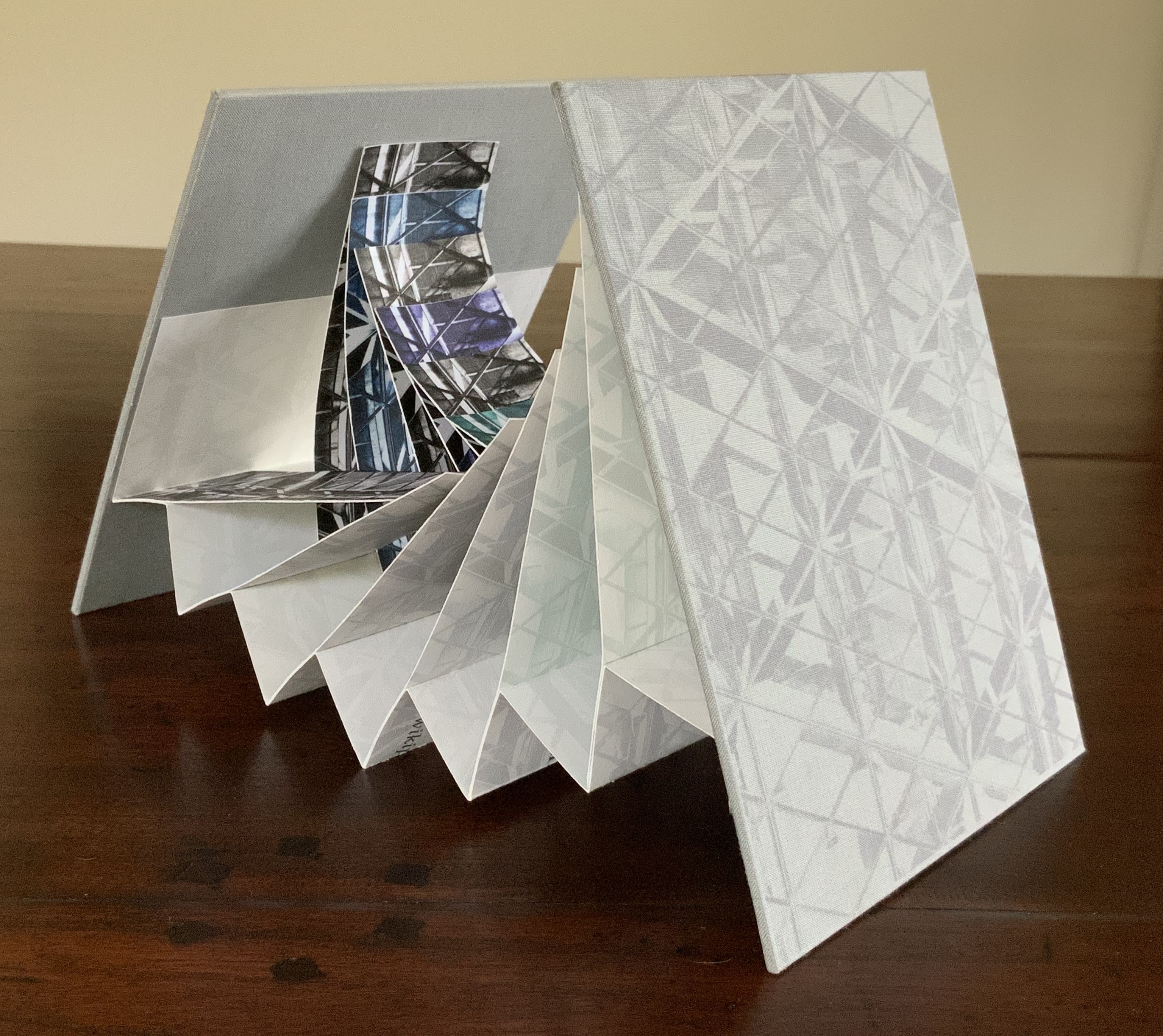
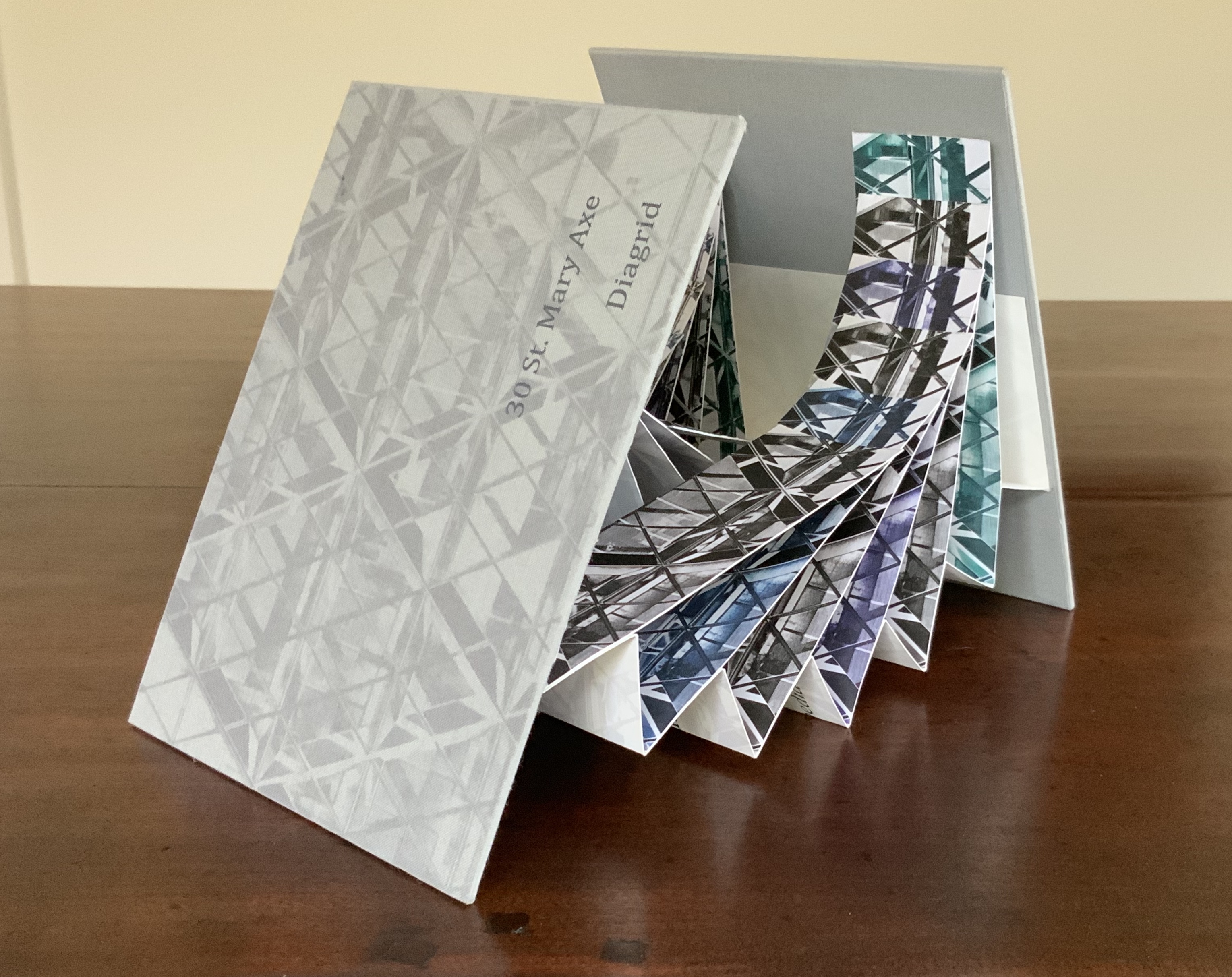
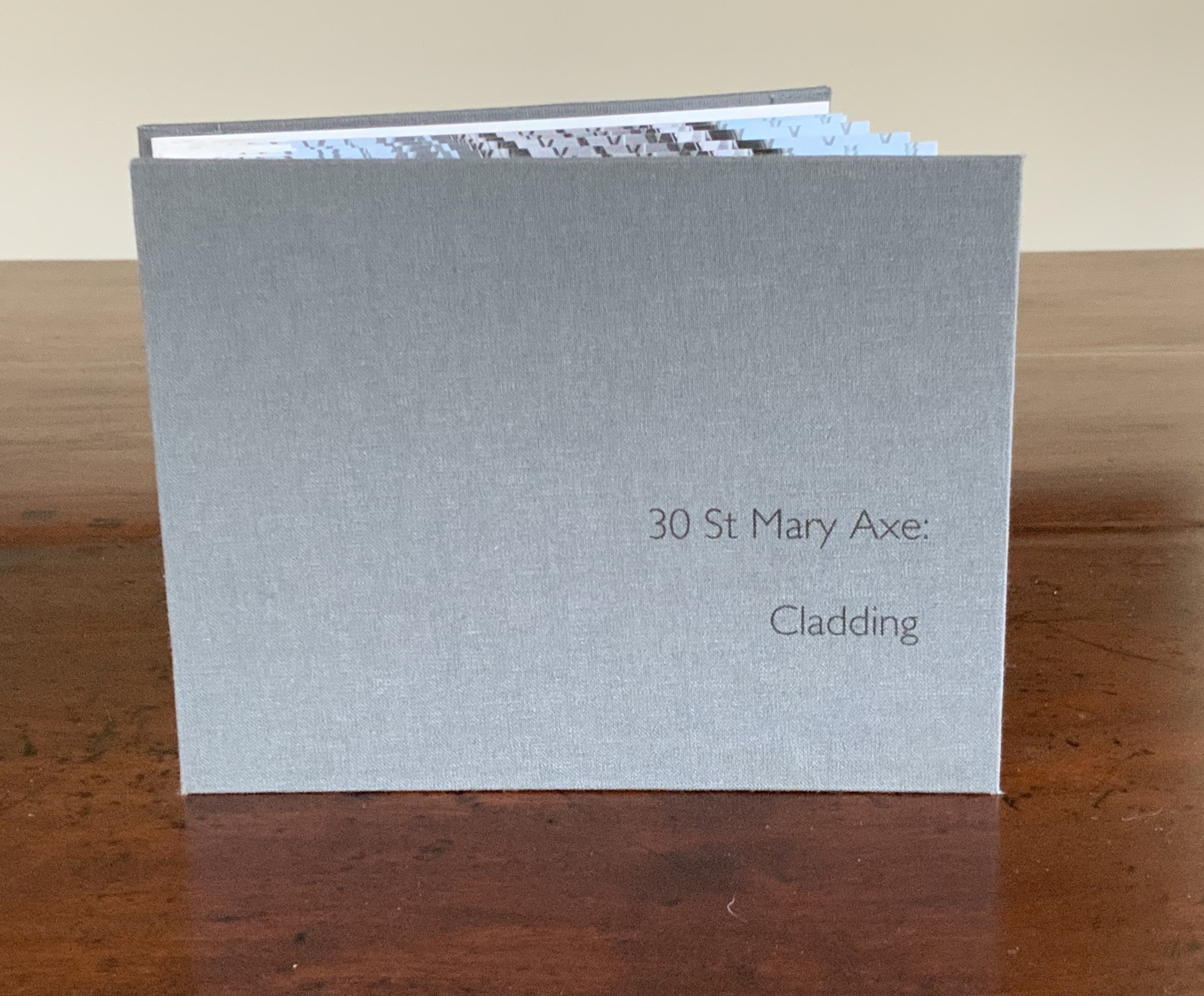
30 St Mary Axe: Diagrid(2009) Mandy Brannan London has nicknamed the building at 30 St. Mary Axe “the Gherkin”. Photo: Books On Books Collection
In the The Radiant Republic (2019), Sarah Bryant (Big Jump Press) brings together concrete, wood, glass, paper, ink and embossed printing, sewn binding, box container and texts from Plato and Le Corbusier.
Note the embossed text on the verso. Across the five volumes, the embossed text is the same as that printed in ink, but it runs in fragments backwards from this last page of the last volume to the last page of the first volume. Photo: Books On Books Collection
Bryant’s insightful integration of Plato’s and Le Corbusier’s texts and ideas and her setting them in the physicality of the blond wood, linen cover, embossed type and sewn papers could easily be a response to Pallasmaa’s comment in The Eyes of the Skin: “The current overemphasis on the intellectual and conceptual dimensions of architecture contributes to the disappearance of its physical, sensual and embodied essence.” (p. 35)
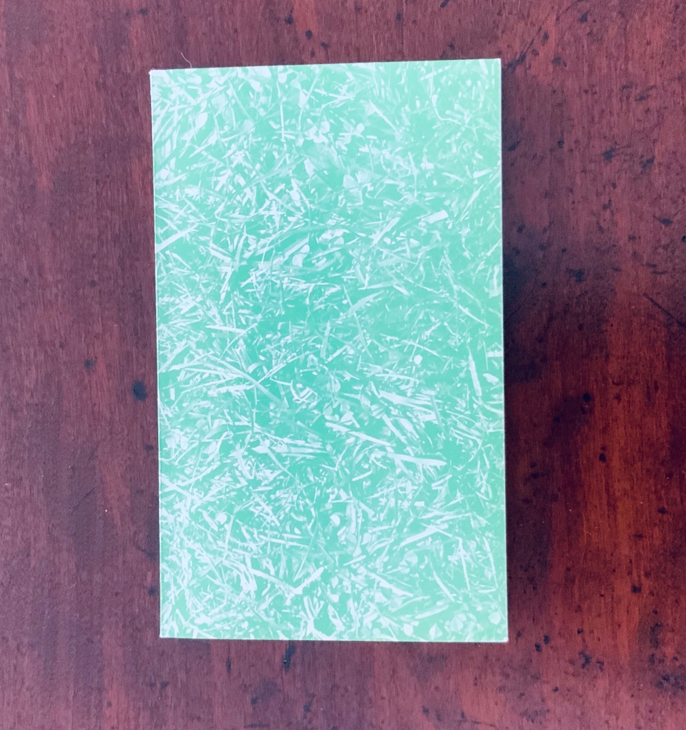
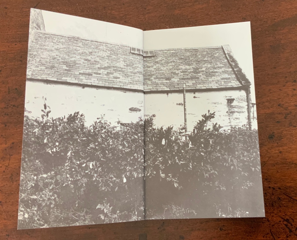
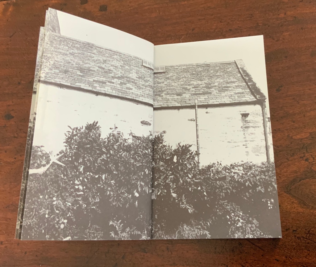
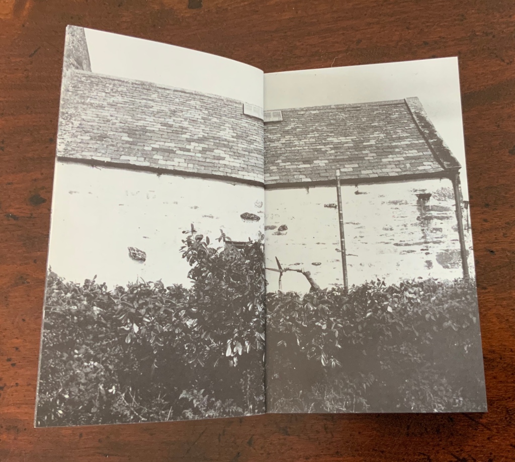
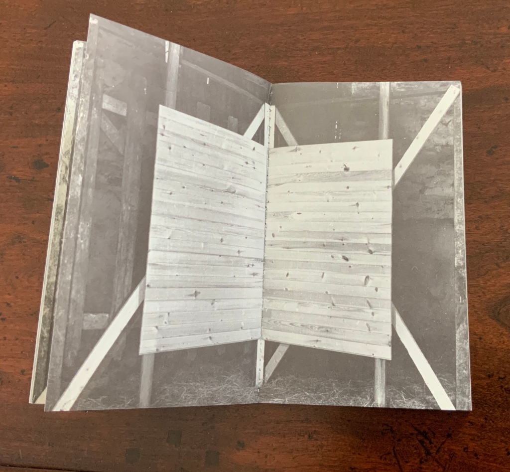
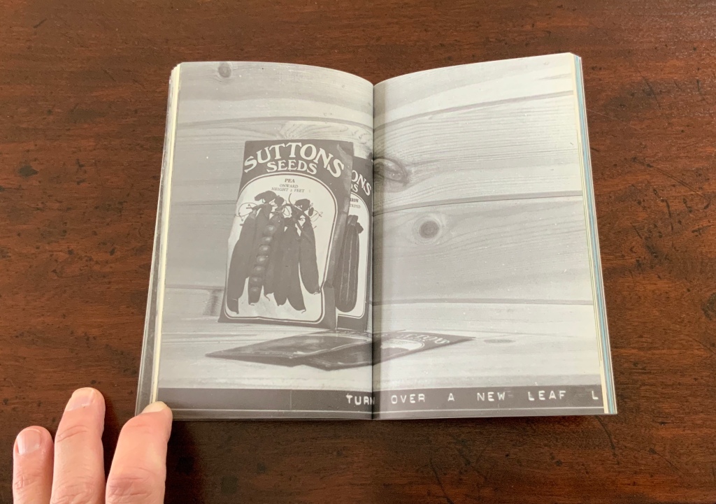
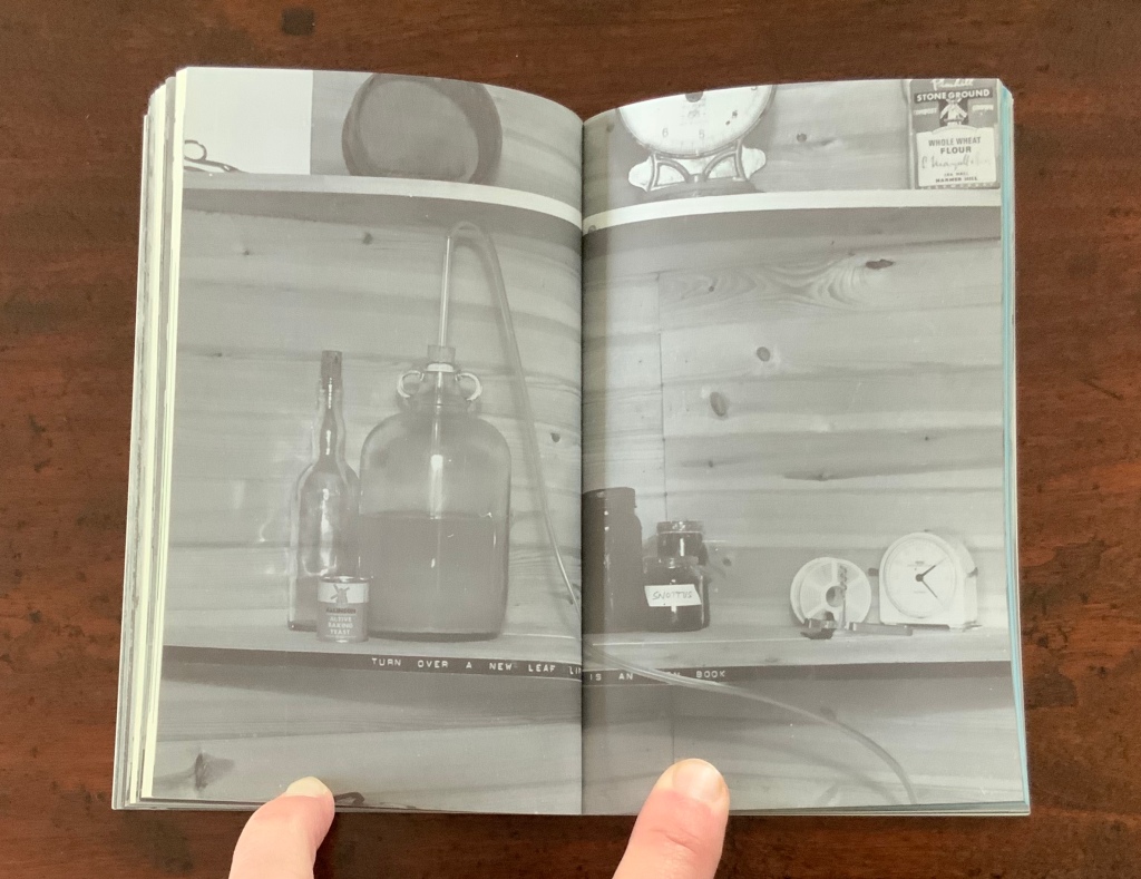
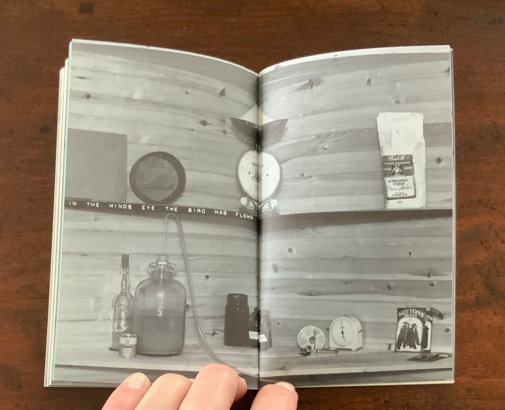
Chinese Whispers (1975) is conceptual, visual and spatial narrative that takes the reader into a “game of embedded games”: a game of Chinese Whispers used by the artists to combine the process of making a book with the process of recovering an old cottage, making a corner cupboard, making jam, making ideas and making an exit.
Chinese Whispers(1975) Helen Douglas and Telfer Stokes Photo: Books On Books Collection
The selection of images above begins with the front cover’s photo of a patch of grass outside an abandoned farm building and ends with the back cover’s photo of the underside of the patch of grass. In between, the pages take the viewer through the trimmed hedge and the doorway into the room, through the building, the stocking of the shelves, using of the stock and closing of the shed cupboard, and so back to the other side of the patch of grass. As Stokes explained in the Journal of Artist’s Books (Vol. 12, 1999):
We started with the corner cupboard, that was the part that occupied our thinking most, that and the two colour vignettes (as we called them) printed on different stock. But then we started to think backward to what might be before the cupboard’s construction. To the thing before that, and the thing before that, and the thing before that which was cutting of the hedge and before that which was the boot brush which we called the hedgehog- that was where the book started. Then we started to photograph from that point forward, through the book.
The work blends the features of book structure, collage and montage to create something that resonates uncannily with Pallasmaa’s approving citations of Bachelard’s central idea of the hearth and domicile as central to our time-bound “being-in-the-world”.
Your House is a laser-cut model of Olafur Eliasson’s residence in Copenhagen at a scale of 1:85, which means that each page equates to a 220 mm section of the actual house. How do you read a work like this — physically? At the 22″ mark in this video, the pages fall in a cascade like a flipbook, but for the most part, their size, accumulated bulk and weight — and delicacy — defy that handling. As in the video below, they must be turned slowly and carefully. Your House heeds the task of the arts as posed by the architect Juhani Pallasmaa, “in our age of speed, …to defend the comprehensibility of time, its experiential plasticity, tactility and slowness” (The Embodied Image, p. 78).
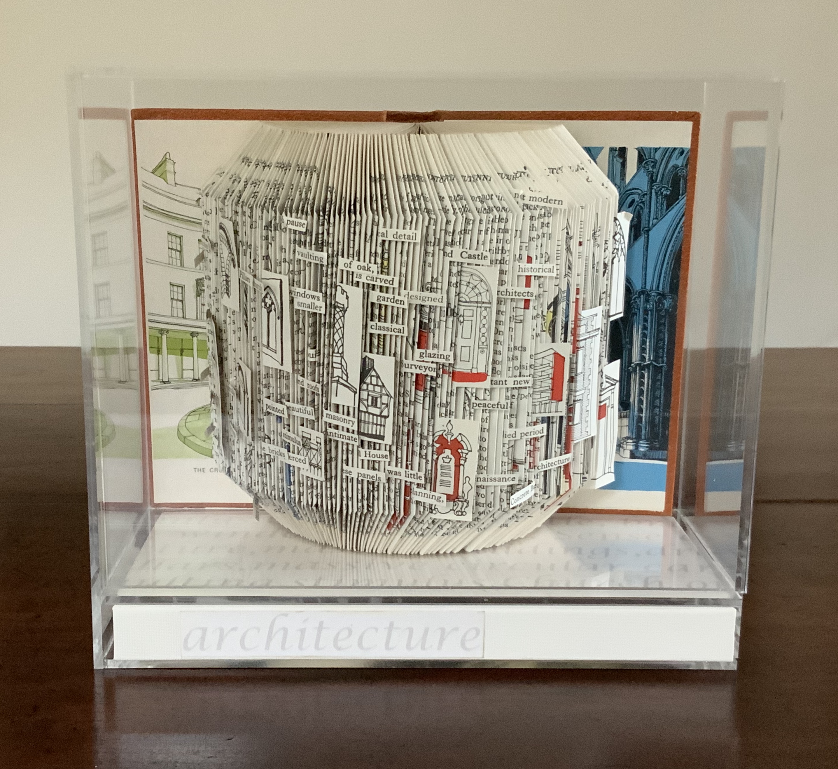
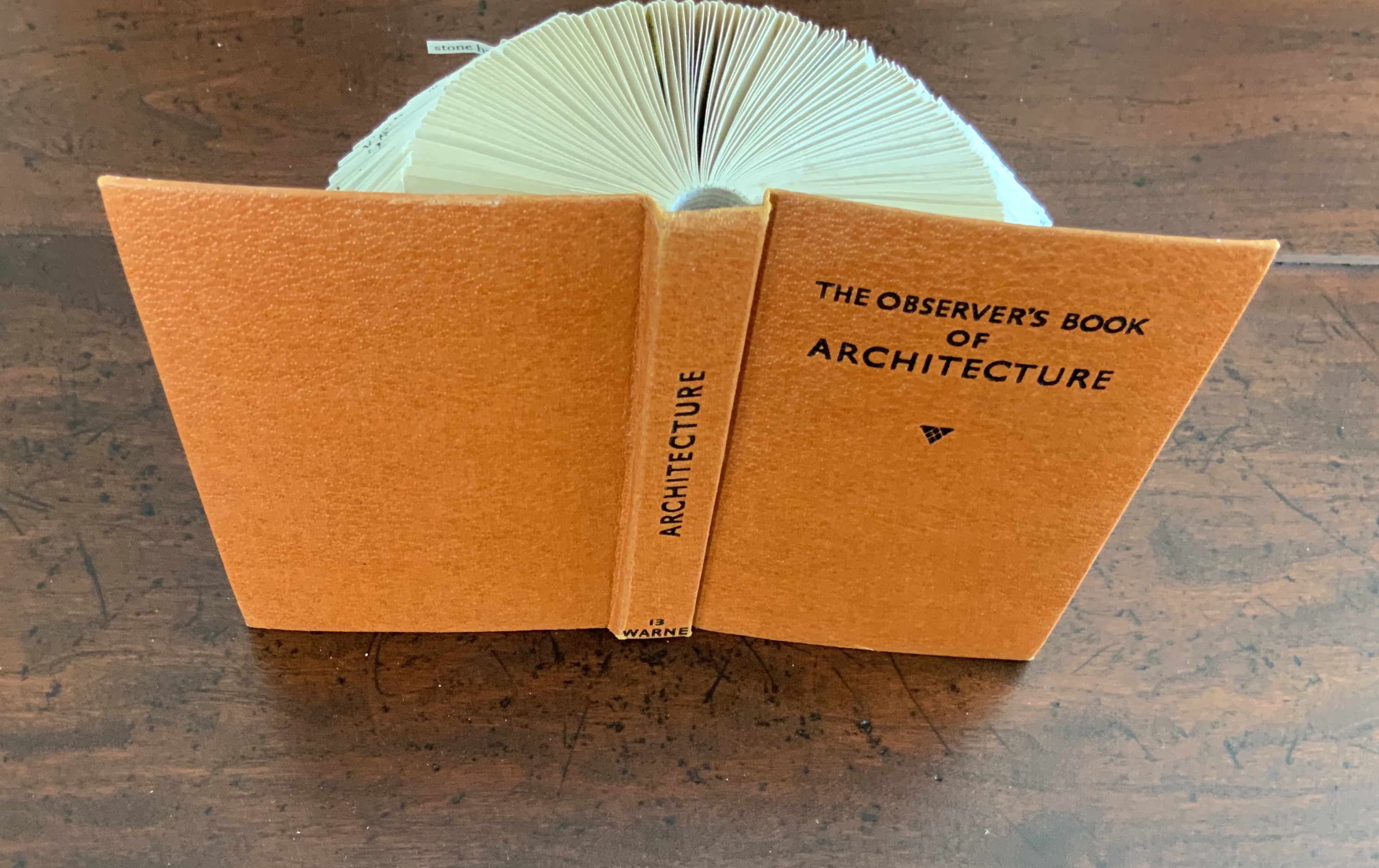
Folded book pages rarely generate a work that rises above mere craft. Heather Hunter’s Observer Series: Architecture (2009) achieves the necessary height. It combines the altered book with an accordion book that incorporates a found poem composed of the words excised and folded outwards from the folded pages of The Observer’s Book of Architecture.
The very fact of a found poem made of excised words that happen to fall at the folds shaping a column from a book on architecture chimes with the title of Bachelard’s The Poetics of Space.
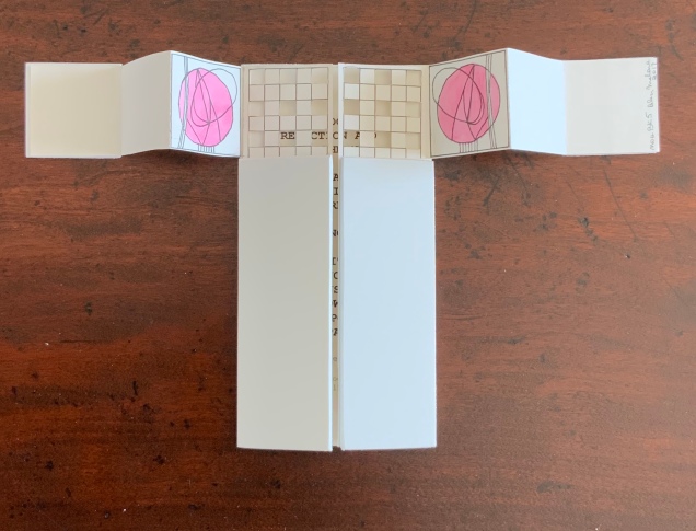
Chicago Octet (2014) byMarlene MacCallum embodies the collaborative creative approach often taken in architects’ practices. Collaborative working arises almost as frequently in book art. Think of Blaise Cendrars and Sonia Delaunay, Helen Malone and Jack Oudyn, Julie Chen and Clifton Meador, Robin Price and Daniel Kelm. Many more can be added. As described by MacCallum:
From May 19 – 26, 2014 a group of eight gathered at the Columbia College Center for Book and Paper Arts for a final collaborative project. This event was organized by Clifton Meador and myself and included David Morrish, Scott McCarney, and four Grenfell Campus BFA (Visual Arts) grads, Stephen Evans, Maria Mercer, Virginia Mitford, and Meagan Musseau…. The letterpress printing consisted of a word selected by each participant printed on one of Scott’s folded structures. The images were a digital layering of every cityscape photograph that I made and then inkjet printed on top of the letterpress. The final folded structure was designed by Mary Clare Butler. The case was designed and built by Scott McCarney, the front cover embossment was by David Morrish and Clifton Meador.
Chicago Octet(2014) Marlene MacCallum Hand bound artist’s book with folded paper structure, letterpress and inkjet printing, 6.5 × 3 × 0.5 inches (closed dimension). Photo: Books On Books Collection
Photo: Books On Books Collection
Chicago Octet fully unfolded, 17.5 × 11.5 inches Photo: Books On Books Collection
Can you hear the traffic and sense the layers of experience? What Pallasmaa writes here of rock art in Africa and Australia reminds me of Chicago Octet (or is it vice versa?): “
At the same time that great works of art make us aware of time and the layering of culture, they halt time in images that are eternally new. … Regardless of the fact that these images may have been painted 50,000 years ago, … we can … hear the excited racket of the hunt.The Embodied Image, p. 109.
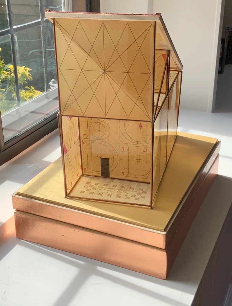
Sacred Space(2003) is an intimate monument of book art. Made intimate by the content and texture of its book, made more intimate by the viewer’s having to construct the chapel. Made monumental by the echo of typographic history, made more monumental in Galileo Galilei’s echo from its floor: Mathematics is the alphabet with which God has created the universe.
Sacred Space (2003) Jeffrey Morin and Steven Ferlauto Book: Reduction linoleum prints with typographic illustrations using overprinting of letterforms; open spine sewn with brown cord binding; brown cloth-covered boards; title and design on front board; endpapers of handmade paper from Nepal. Book: 6 x 14.25″; 17 leaves. Chapel kit: Six walls, roof, base. Walls: copper rod skeleton with Okawara rice paper skin covered with a casting resin. Book and kit housed in wooden box. Roof copper-leafed Davey board. Roof forms the tray in which the book rests. Base: Box lid becomes the base for the chapel. Brass holes in the base allow the rods to fit exactly. Print pattern on the base becomes the floor pattern. Box painted with copper leaf. Sculpture base 15.75 x 11.5″, height 12″. Edition of 35, of which this is #23. Photo: Books On Books Collection.
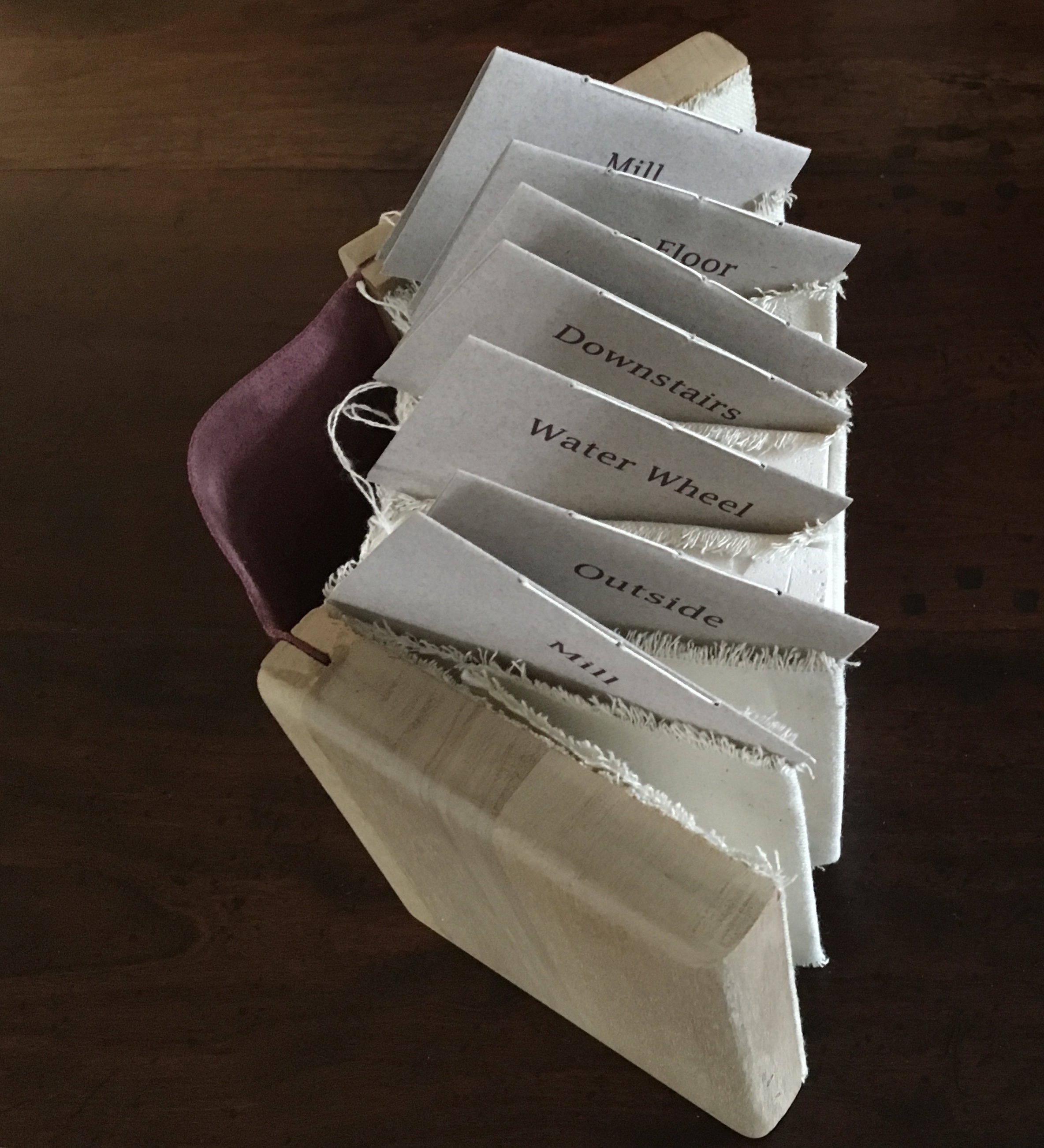
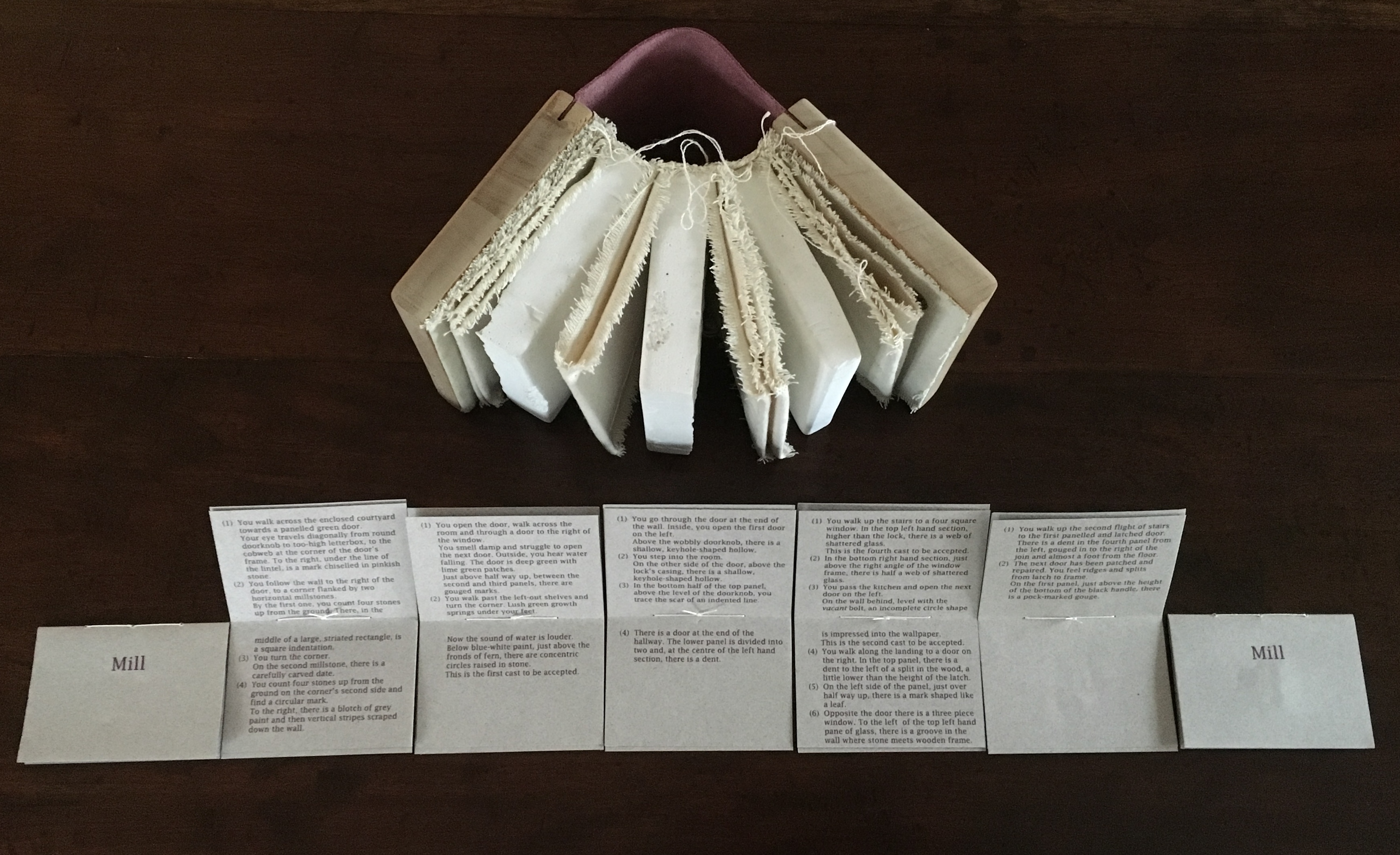
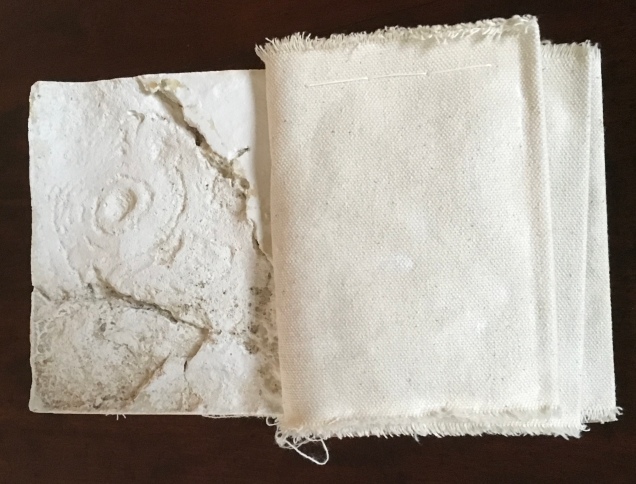
Mill: A journey around Cromford Mill, Derbyshire (2006) is the result of the artists’ exploration of Cromford Mill in Derbyshire, the first water-powered, cotton-spinning mill developed by Richard Arkwright in 1771. Solid, plaster cast blocks are held softly between calico pages containing hidden texts, bound in recycled wooden library shelf covers that indicate there is history to be found within.
Mill: A journey around Cromford Mill, Derbyshire (2006) Salt + Shaw (Paul Salt and Susan Shaw) Photo: Books On Books Collection
Having Mill is like having the building inside your house.
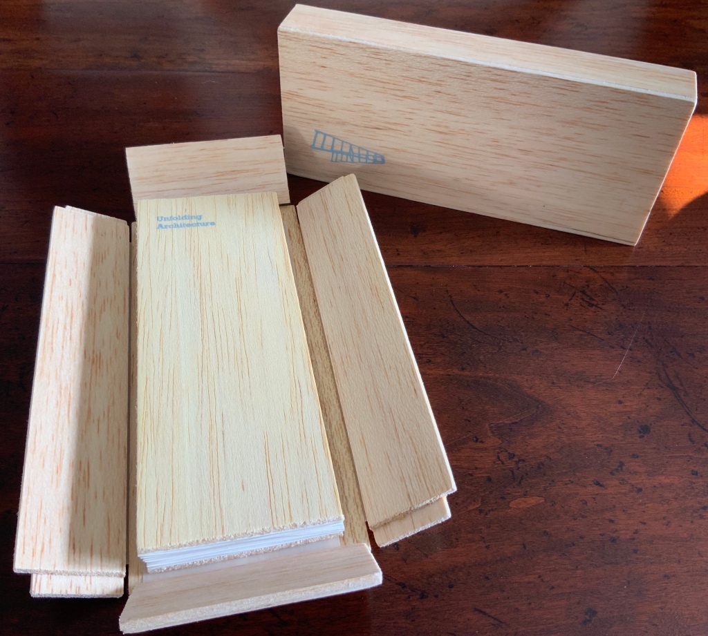
When Emily Speed is not creating architectural costumes for architectural performative art, she creates artist’s books to express her inner edifices. Unfolding Architecture (2007) coheres title, metaphor, narrative, image, technique of silk-screening, letterpress, texture of paper and wood, the workings of the accordion and box enclosure — all — into an artwork about un-cohering.
Unfolding Architecture(2007) Emily Speed Double-sided accordion book, attached to balsa wood covers, housed in a hinged, covered box of balsa wood. Book – H190 x W70 x D18 mm (closed), H190 x ~W2280 (open); Box – H203 x W88 x D63 mm; 24 panels, including cover panels. Edition of 90, of which this is #7. Acquired from the artist, 24 October 2020.
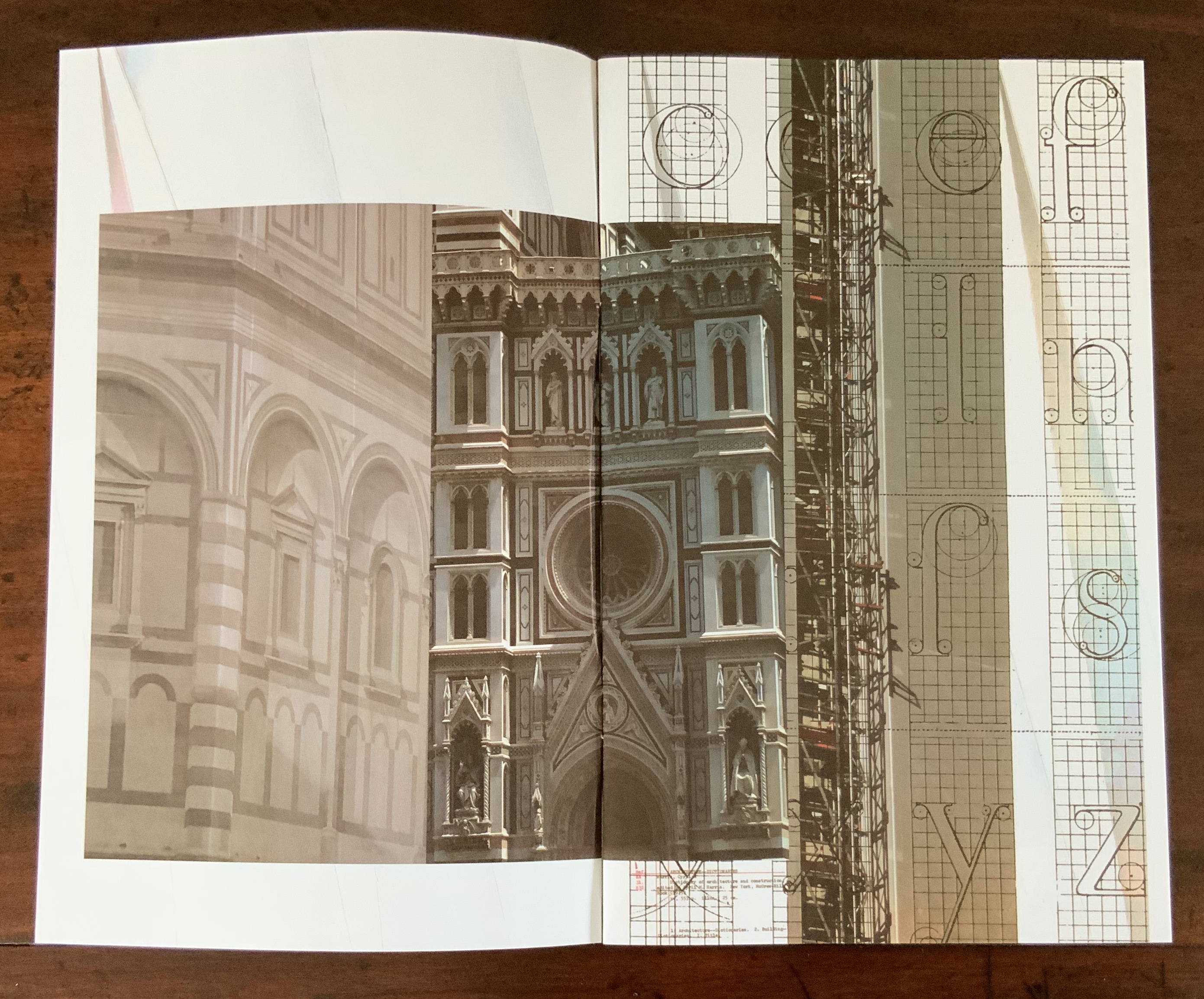
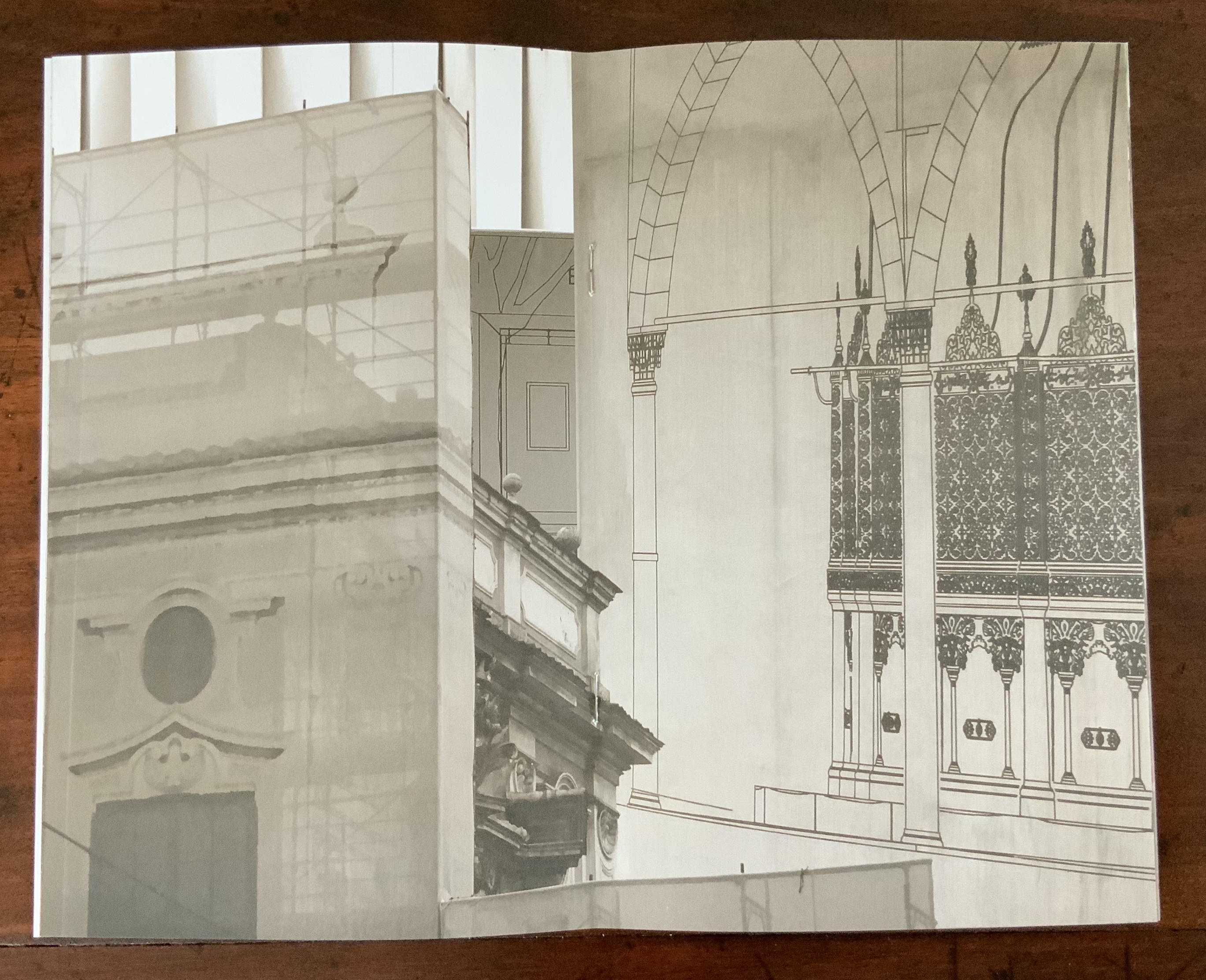
Architecture plays more than an inspirational role in Karen Wirth’s portfolio. As mentioned above, she has created her own take on Vitruvius’ Ten Books. She designed the Gail See Staircase at Open Book and the Hiawatha Light Rail Station, both in Minneapolis. The collage work Paper Architecture is based on an architectural installation at the Minnesota Center for Arts Design and draws on Wirth’s photos of Ayvalik, Amsterdam, Florence, Istanbul, New York City, Rome, San Diego and Venice.
In The Embodied Image, Pallasmaa singles out “the collaged image” as creating “a dense non-linear and associative narrative field through initially unrelated aggregates, as the fragments obtain new roles and significations through the context and dialogue with other image fragments” (pp.71-72). The materially disparate words in the title of Wirth’s work imply the dialogues she creates among paper, designs of letters and architecture, buildings across time and the globe, and photos tinted, four-colour, and black-and-white in palimpsest.
For Wirth’s own comments about the intersection of book art and architecture, see her interview with Betty Bright.
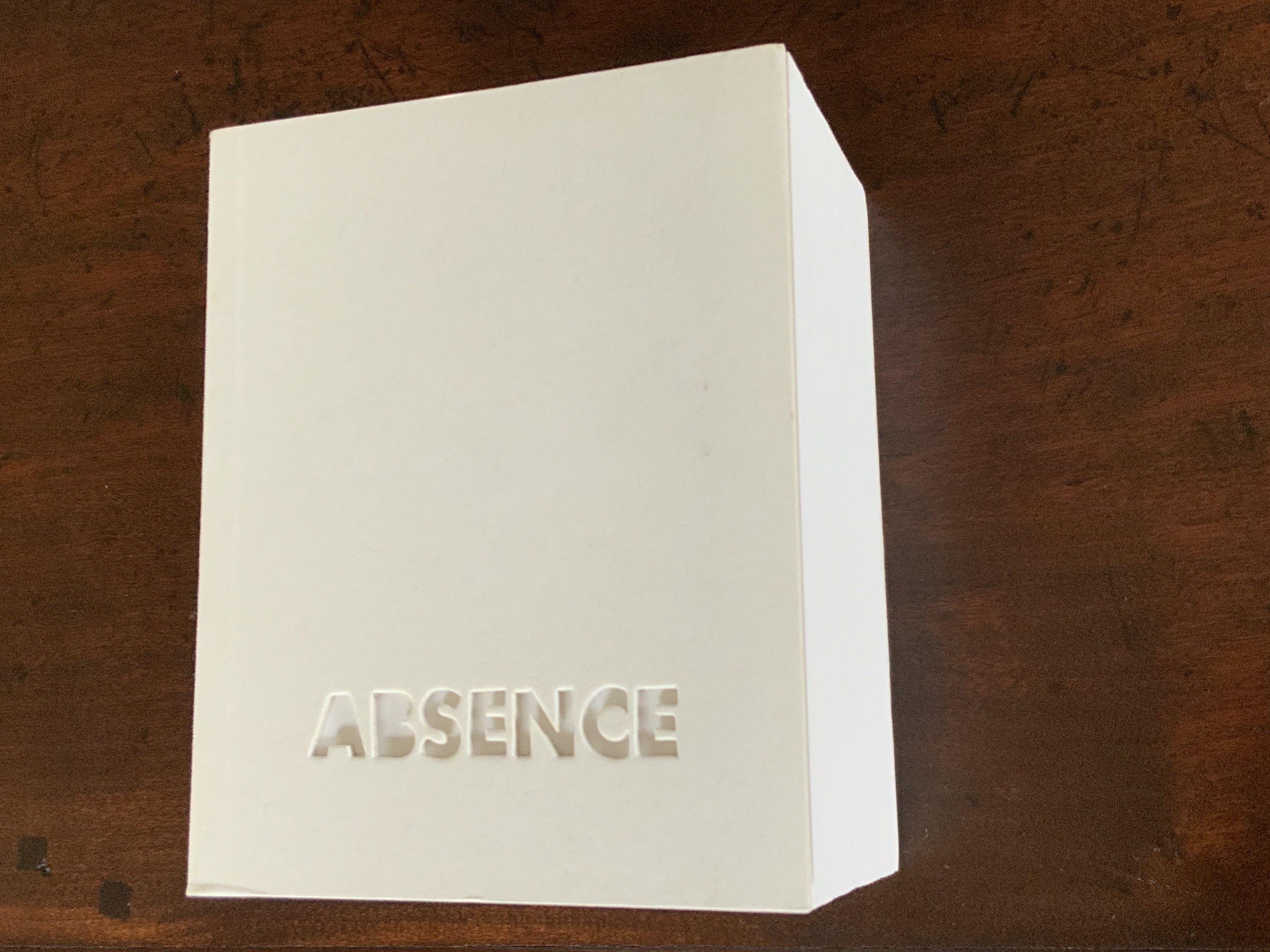
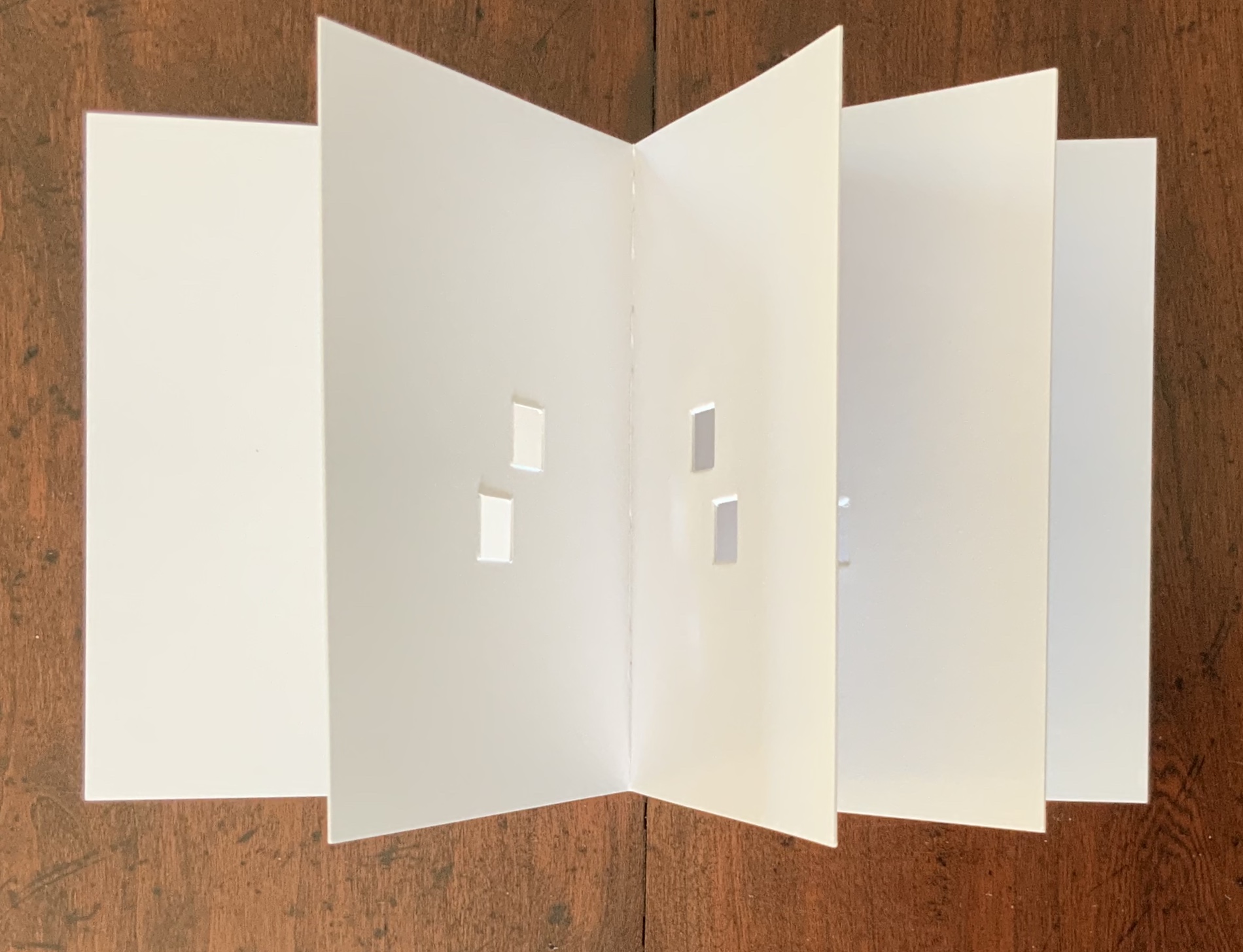
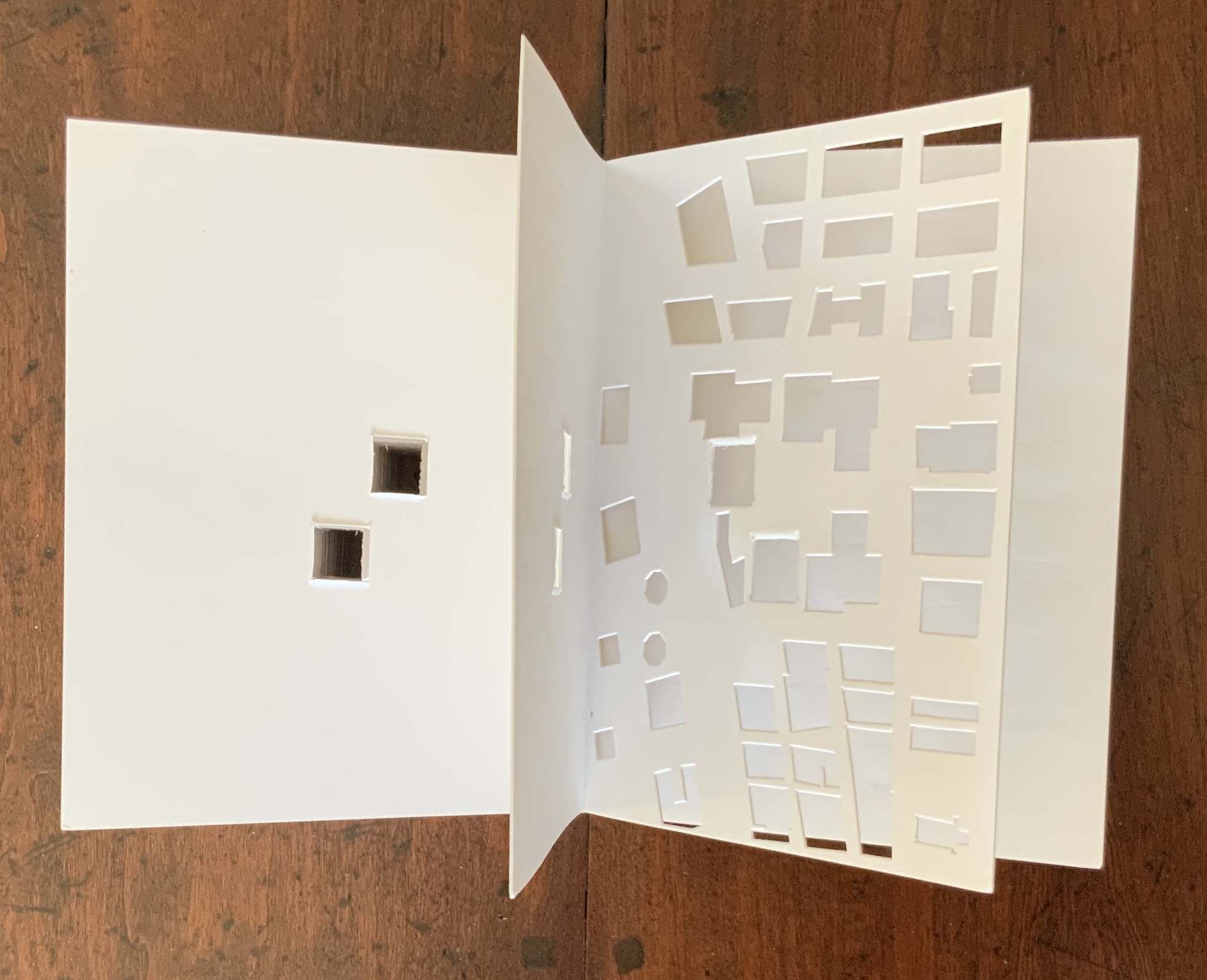
Former professor and head of the Department of Architecture at MIT’s School of Architecture and Planning, Yoon is now Gale and Ira Drukier Dean of the College of Architecture, Art and Planning at Cornell University. She is also cofounder of Höweler + Yoon, a design-driven architecture practice. Absence appears to be her only work of book art so far.
When you hold this small white brick of paper and turn its thick pages, a small pinhole appears on the page. Then two larger square holes emerge, one of which falls over the pinhole. Page after page, the two square holes repeat, creating two small dark wells in the field of white, until on the last page they take their place in the cut-out schematic footprint of the city blocks and buildings surrounding the Twin Towers of New York City. What you hold in your hands at the end is an object of art and book of memorial prayer.
Absence (2003) J. Meejin Yoon Photo: Books On Books
Other sites, other works
Twice a semester, the Environmental Design Library at the University of California, Berkeley hosts “Hands On: An Evening with Artists’ Books”. In 2017, one evening’s theme was “Building on the Built”, illustrated by 25 works of book art. Organised by 23 Sandy Gallery in the same year, “BUILT“ was an international juried exhibition featuring 66 artist books by 51 artists examining the relationship between contemporary book art practices and architecture, engineering, landscape and construction.
Arranged alphabetically by artist’s name, this section provides links to works from these two exhibitions as well as other collections, exhibitions, installations and recommendations from the Book-Arts listserv members.
A Crisis Ethicist’s Directions for Use: Or How to be at Home in a Residence-cum-Laboratory (2003) Inge Bruggeman Photos: Courtesy of the artist
On her site, Bruggeman writes, “This book/box project is built around excerpts from Architectural Body by Madeline Gins and Arakawa…. incorporates a blueprint of their Bioscleave House as part of the imagery….”. Somewhat like A Clockwork Orange or perhaps more like Heideigger’s tomes, the Gins and Arakawa book is a challenge to the reader’s expectations of diction and syntax.
Richard Minsky: Model of Buckminster Fuller’s Tetrascroll (1979). See also Polly Lada-Mocarski, Richard Minsky and Peter Seidler, “Book of the Century: Fuller’s Tetrascroll“, Craft Horizons, October 1977 (Vol. 7, No. 35). For one (very helpful) reading of Tetrascroll see Jessica Prinz’s “The ‘Non-Book’: New Dimensions in the Contemporary Artist’s Book” in The Artist’s Book: The Text and its Rivals, a special two-issue volume of Visible Language, Vol. 25, Nos. 2/3, edited by Renée Riese Hubert (Providence, RI: Rhode Island School of Design, 1991), pp. 286-89.
Building Blocks Book XVII (2017) Sumi Perera Photos by artist’s permission
Going against the usual structure of the book, that of a beginning, a middle and an end, Perera provides a space for infinite possibilities and multiple authors, creating “modules that can be re-sequenced and re-aligned to develop variable permutations and encourage participatory involvement, to share the final editorial control with the viewer to transform the ever-evolving work”.These possibilities for variable permutations are no more evident than in her constantly evolving project, Building Blocks Book, and its numerous subsequent iterations including The Negative Space of Architecture and The House That Jack Never Built (2008). Once again we find Perera exploring human interaction, not only with the concepts and her quizzical ideas surrounding architectural and public spaces and how we build between and move within, but also the physical interaction with the artists’ books she produces – the rearrangement and reinsertion of pages which allow the audience and participants new opportunities and pathways to proceed. Through the positive and negative space of the page or the type font, the Underground versus over ground, the artist takes us on journeys that are at once fluid and at other times obstructive. In these cityscapes, the U-turn is as common as the page turn – a necessary rupture in a free-flowing narrative. Chris Taylor, From Book to Book (Leeds: Wild Pansy Press, 2008).
Robbin Ami Silverberg: Home Sweet Home (2006). Artist’s description — “an architectural album of an imaginary middle-class suburban house, … its plans and layout [filled] with the many proverbs I’ve found about women in the home. The book was printed to look like the almost obsolete technique of Diazo printing (blue-printing), but in fact, it is archival inkjet.”
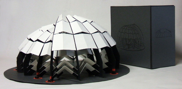
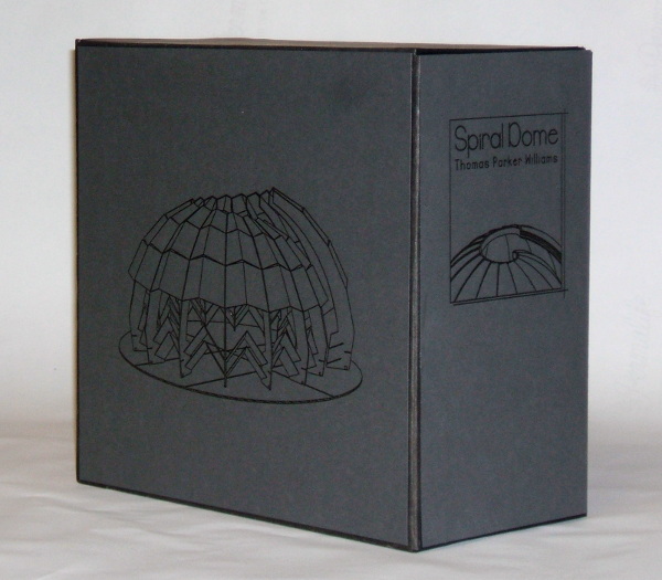
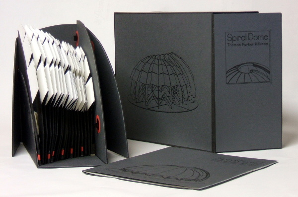
Spiral Dome: Sculptures in Paper and Steel (2016) Thomas Parker Williams Photos: Courtesy of the artist
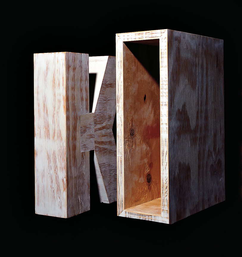
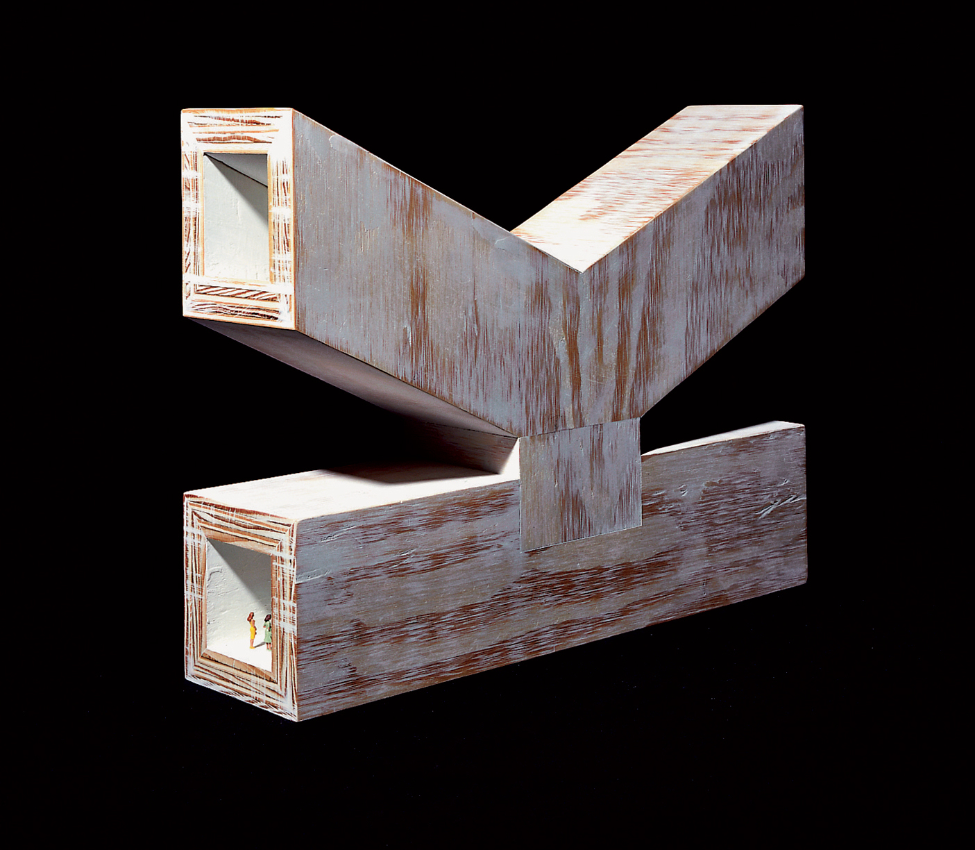
Update: With the addition of Marian Macken’s book Binding Space, mentioned above, comes the Vedute Foundation, a collection of objects/manuscripts by artists/designers/architects created within the constraint that each work has the proportion of the Gutenberg Bible and the relationship of ‘Text’ and ‘Form’ as its subject. For this essay in Books On Books and for the Books On Books Collection’s acquisition of the Merrion edition of Johann David Steingruber’s Architectural Alphabet, the most apropos and favorite work in the Vedute collection is K (1996) by Peter Wilson.
K(1996) Peter Wilson “This contribution (a double volume) is based on the letter ‘K’ (an atom of language), materialised within the Gutenberg proportions in sturdy plywood. It is the responsibility of an architect not only to ‘give form’ but also to explore latent interiorities, potential spatialities. Here the ‘K’ interior has its own inherent geometric agenda − a tunnel, a tube, an inverting telescope (apex mirror). Object becomes instrument (a window to the antipodes even), a trigger for multiple ‘K’ vectors (textural and spatial).” Bolles+Wilson
23 Sandy Gallery. 2017. Built: an international exhibition of contemporary artist books, April 7-May 27, 2017. Portland, Oregon: 23 Sandy Gallery. “… examining the relationship between contemporary book art practices and architecture, engineering, landscape and construction as form, function and structure. Book artists took this opportunity to re-image the ways we as designers, of either books or buildings can inhabit and shape the world around us. Our disciplines have a natural synergy. After all, books and buildings are both kinetic, sequential, structural and time based. BUILT examines the relationship between the built and the book. BUILT features 66 artist books by 51 artists from across the country and as far away as Canada, United Kingdom and Australia.” Publisher’s website.
Sophia Kramer, “Variations of Vitruvius: Four Centuries of Bookbinding and Design”, The Met, 22 August 2018. This essay reviews and illustrates the conservation and rehousing of ninety-five copies of De Architectura libri decem (The Ten Books of Architecture) by Marcus Pollio in the collection of the Department of Drawings and Prints. They are part of a donation of 356 publications from the architect William Gedney Beatty (1869–1941). For book artists, the section on a 1556 edition with double volvelles to display a theater design should be of interest.
Marian Macken, Binding Space: The Book as Spatial Practice (London: Taylor and Francis, 2018). A trained architect and book artist, Macken articulates and illustrates the how and why of the overlap between architecture and book art.
David Sume, The architectural nature of the illustrated books of Iliazd : (Ilia Zdanevich, 1894-1975, University of Montreal, 2019. This dissertation is a reminder that the importance of architecture to book art reaches back to the avant-garde and modernists of the early 20th century — and more important, that its importance may lie beneath the surface.
Elizabeth Williams, “Architects Books: An Investigation in Binding and Building”, The Guild of Book Workers Journal, Volume 27, Number 2, Fall 1989. This essay not only pursues the topic of architecture-inspired book art but turns it on its head. An adjunct professor at the time, Williams set her students the task of reading Ulises Carrión’s The New Art of Making Books (Nicosia: Aegean Editions, 2001) then, after touring a bindery, “to design the studio and dwelling spaces for a hand bookbinder on an urban site in Ann Arbor, Michigan”. But before producing the design, the students were asked “to assemble the pages [of the design brief and project statement] in a way that explored or challenged the concept of binding”. In other words, they had to create bookworks and then, inspired by that, create their building designs. Williams illustrates the essay with photos of the students’ bookworks. [Special thanks to Peter Verheyen for this reference.]
Renée Riese Hubert and Judd D. Hubert’s The Cutting Edge of Reading: Artists’ Books (Granary Books, 1999) is a signal work of appreciation and analysis of book art. Nearly twenty years on, it can be read and appreciated itself more vibrantly with a web browser open alongside it.
To facilitate that for others, here follows a linked version of the bibliography in The Cutting Edge of Reading — a “webliography”. Because web links do break, multiple, alternative links per entry and permanent links from libraries, repositories and collections have been used wherever possible. These appear in the captions as well as the text entries. Also included are links to videos relating to the works or the artists. At the end of the webliography, links for finding copies of The Cutting Edge (now out of print) are provided.
Based in Chicago, Meador writes, photographs, prints, designs and teaches. His interest in the “narratives of culture, history, and place … the basis for identity” finds its expression best in the artist’s book, the ideal vehicle for “countless ways to create complex, engaging narratives.” Meador’s artist’s statement — “Human identity is not monolithic, nor is it a simple linear narrative, and I use the book as a strategy to present this complexity. Who we are depends on who is asking ….” — shows a profound grasp of the nature of the book. A grasp epitomized by his collaborative work with Julie Chen, How Books Work, 2010.
How Books Work, 2010 Clifton Meador and Julie Chen


