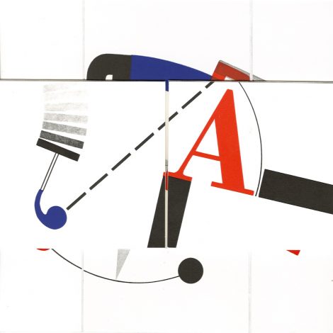
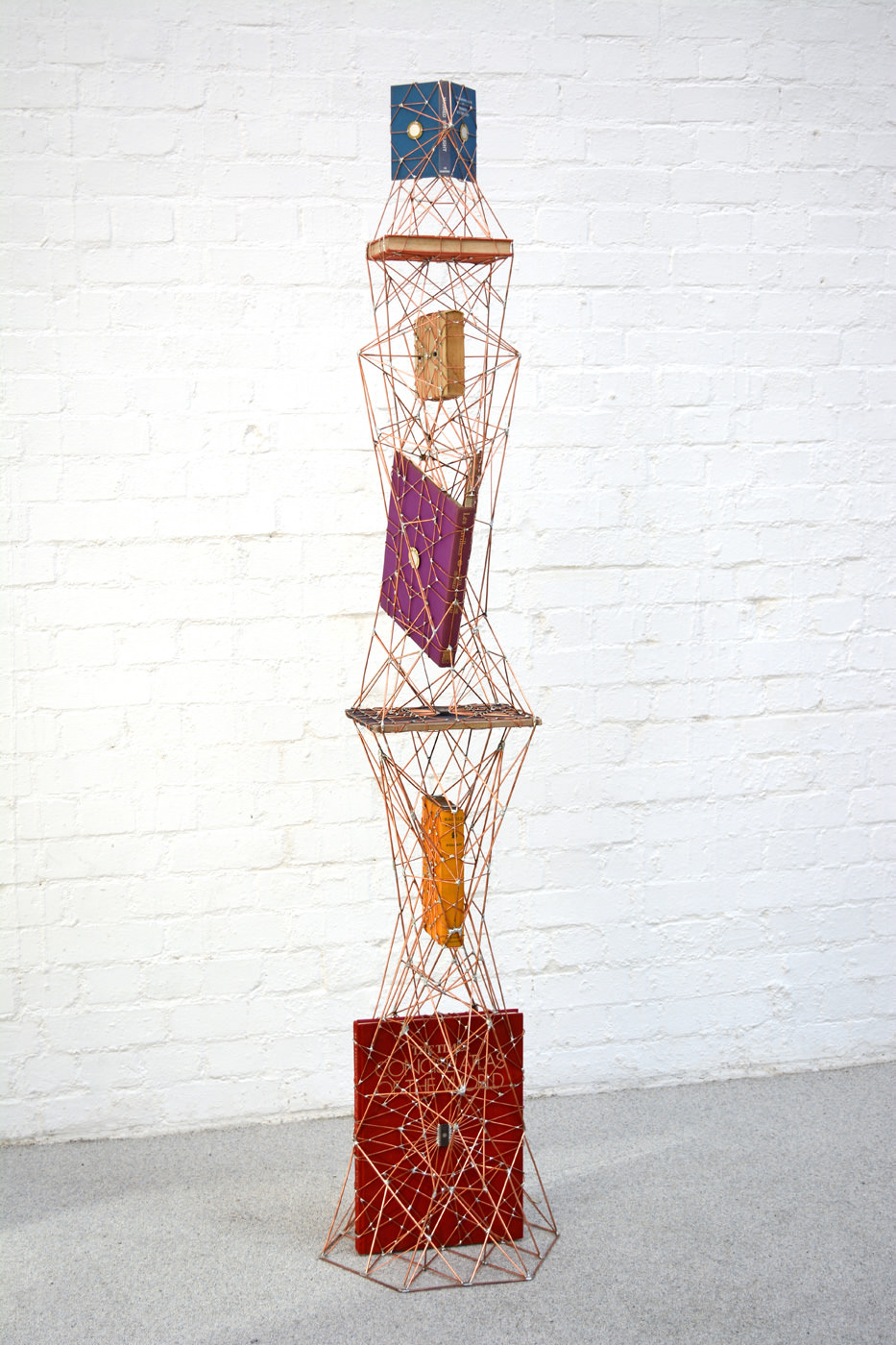
At the base of this sculpture is The Times Concise Atlas of the World, and at its top, The Observer’s Book of Manned Space Flight (No. 48). These two elements of the piece resonate with its rocket-like thrust, metallic gantry-like frame and micro-chip nodes, as does the textbook on projective geometry. Euclidean geometry describes shapes “as they are” while projective geometry describes them “as they appear”.
It is hard to suss what Walter Starkie’s picaresque travelogue about life with the Roma (Raggle Taggle) or Cyril Connolly and Jerome Zerbe’s picture book on 18th century French “pavillons” or Yehiel Dinur’s autobiographical novel of his post-holocaust life in Israel (Ka-Tzetnik 135633, House of Love) have to do with the rest of it.
Art composed of found elements is like that, I suppose. Just enough connectedness to suggest order and intentionality, just enough disconnectedness to suggest disorder and randomness. Ulian’s other works, incorporating electronic parts soldered together in “microchip synapses” and “technological mandalas”, however, imply other tensions — between technology and the human, the digital and the spiritual. Or in the case of his Contrived Objects (wooden tennis rackets, microchips and copper wire), between the physical and the artificially cerebral.
Ulian’s more recent work has changed from that of 2010-11 (A fragile forest and From zero to one). Even though some of the themes, materials and techniques are the same, the more recent works (those noted above) are more focused, self-contained, polished, static and perhaps decorative. I suspect there may be another cycle and even more engaging art coming from this artist.
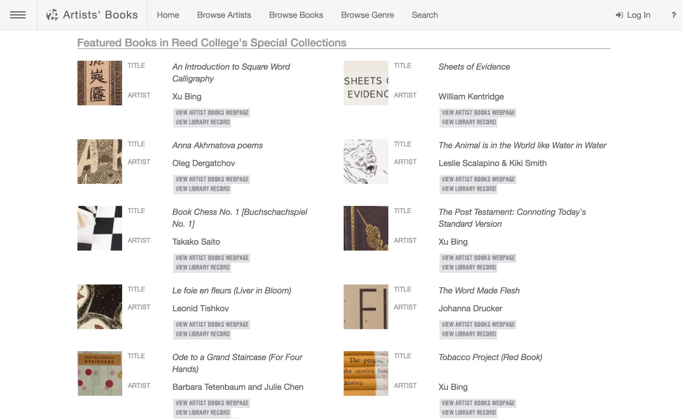
The spectrum of modern and contemporary Artists’ Books in Reed College’s Special Collections and collected on this website include traditional letterpress printed books of poetry, conceptual book works, sculptural and visual works, concrete poetry, and magazine works. This unique collection, which holds significant 20th century and contemporary artists’ books, gives students and the broader population insight into the significant role artist’s books have played among the avant-garde of Eastern and Western Europe, Asia and the United States, from the turn of the last century to the present. This includes livre d’artiste works by David Hockney, avant-garde works by Sonia Delaunay, conceptualist works by Sol LeWitt, and contemporary works by Xu Bing.
A search of the general library catalog with the term “artists’ books collection” yields over 1700 items, not all of which are in the Special Collection. This website offers visitors an organized way to browse the collection and enjoy access to individual sites for select items as shown here:
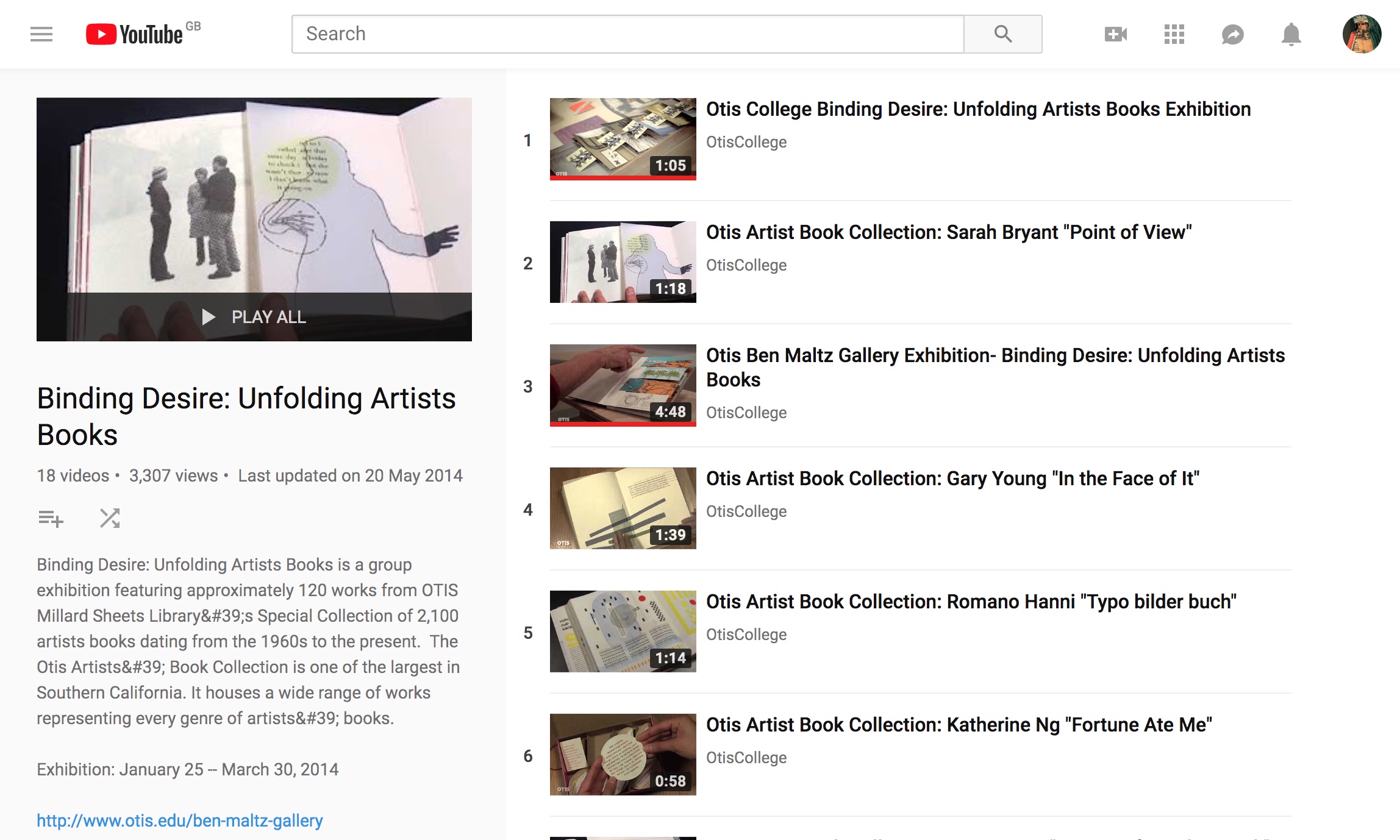
This 18-video playlist at the Otis College of Art and Design covers a 2014 exhibition highlighting around 120 works in the Artists Book Collection. The playlist contributes to the collection’s goal:
The goal of the Otis Artists’ Book Collection is not to create a comprehensive archive, but rather to provide a valuable teaching resource available to artists and students. Since the collection is available on only a limited basis, providing access to the books via an online image database is a continuing project, one that we hope will assist those with interest in researching our collection as well as the medium in general.
Some videos are better than others, and all benefit from viewing without the background music. Having handled both Susan E. King’s Lessons from the South and J. Meejin Moon’s Absence, I can vouch for the corresponding videos’ effectiveness.
The Lessons video could be closer to the experience of handling the work if the transitional zooming were replaced with a 360 circumferential shot or angled stills to reveal more of the work’s intricacies — for example, this overhead shot taken at the old Corcoran Gallery in Washington, DC:
The Absence video comes much closer to a hands-on experience, but the exchange in the Comments section highlights how inclusion of some description by voiceover or bibliographic entry would aid viewers’ appreciation.
Vesper Von Lichtenstein 10 months ago It’s a memorial to 9/11, and the cut out parts are the Two Towers going from the top down…at the end of the book you see the placement of the two towers within the context of the rest of the buildings on a city block. The music seems a bit… upbeat for such a somber book.
Critiques aside, the playlist and site warrant multiple revisits and a thanks to Otis College.
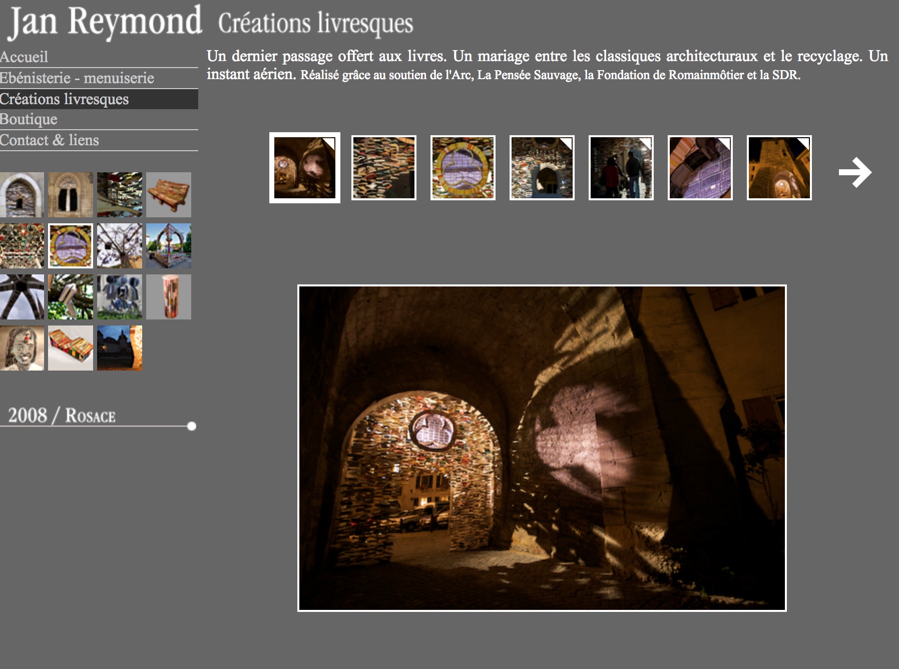
Since 2005 Reymond has created book art installations associated with the annual used book fair held in Romainmôtier, Switzerland.
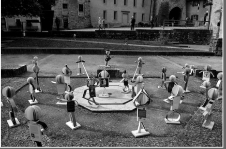
The installation Rosace, highlighted above, enhances the architectural features of the village. (For commentary to accompany your visit to Rosace, see My Modern Met.) Another, more surreal installation Livritins populates the village with book-citizens (the “livritins”) engaged in exercise, descending from the church spire by umbrella gondolas, listening to a sermon, fishing, dancing and much more. That year, tourists would be forgiven for believing that all of the bookstore and library bookshelves in the village and canton stood empty.
An easily searchable source. The carousel of images in the home page‘s lower right-hand corner highlights some of the favorite artists at Books on Books:
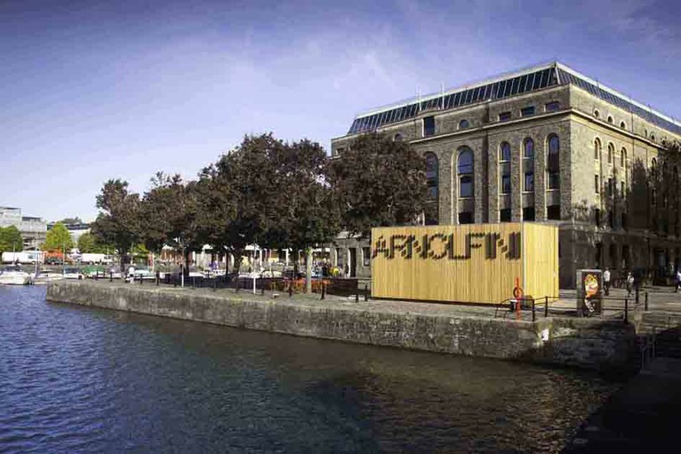
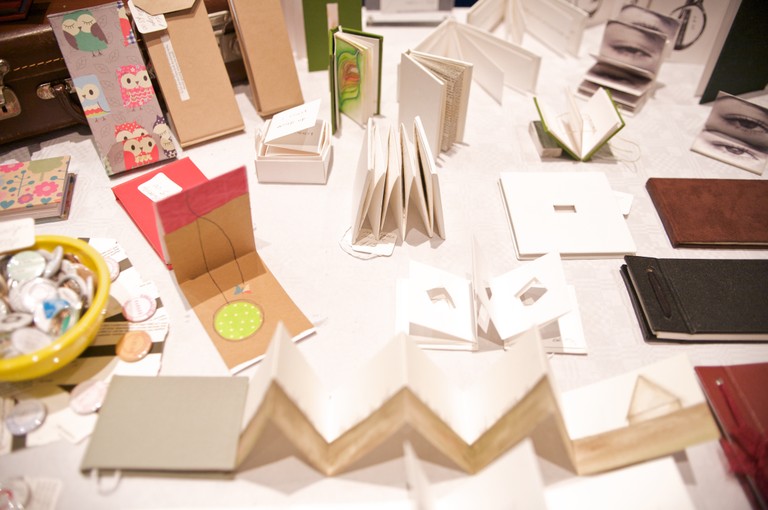
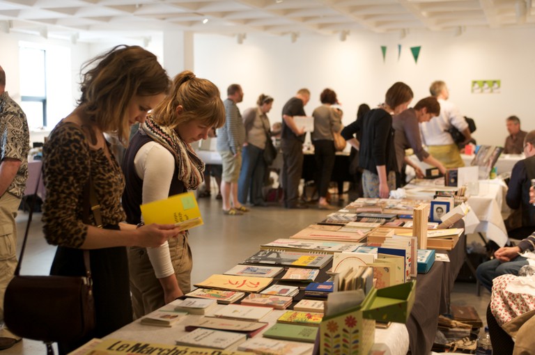
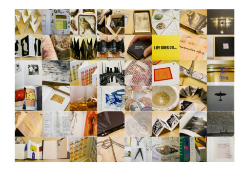
Containing over 700 items, the Arnolfini artists’ book collection is one of the largest UK collections of contemporary book art. It leans toward the 1970s and 1980s. The US-based Franklin Furnace Archive Artists Book Bibliography is representative, as are European works such as those of Vito Acconci, Marcel Broodthaers, Stanley Brouwn, Hanne Darboven, Jan Dibbetts, Helen Douglas, Dieter Roth and Telfer Stokes.
Franklin Furnace Archive Artists Book Bibliography (1977) Unbound notecards of artists’ books catalogues 3 v. ; 430 cards ; 11 x 16cm
The collection is not without later representative works such as those by SooMin Leong, Jonathan Monk and Grayson Perry, but there seem to be no works after 2012. The Arnolfini, Bristol’s center for contemporary art, also hosts the biennial Bristol Artists Book Event.
A search of Lafayette College’s Artists’ Books Collection on the genre yields 1284 entries, including works by Alicia Bailey, Julie Chen, Maureen Cummins, Steven Daiber, Karen Hanmer, Margaret Kaufman, Clifton Meador, Lois Morrison, Werner Pfeiffer, Gerhard Richter, Maryann Riker, Edward Ruscha, Buzz Spector, Barbara Tetenbaum, Erica Van Horn and Sam Winston.
Check out the archives for the Werner Pfeiffer exhibition.
Worth a visit to the Skillman Library if you’re in Easton, PA.
Stimulating offers of paper art and book art abound in The Hague in June and July 2018.
Museum Rijswijk celebrates its twelfth Paper Biennial (12 June – 7 October). The Pulchri Studio hosts a major exhibition (1-22 July) for the founders of the Paper Biennial — Peter and Pat Gentenaar-Torley. In advance of the latter exhibition, I visited the Biennial and then the Gentenaar-Torleys in their studio as they were preparing for the show and, as it turned out, rushing to fill last-minute orders from the Middle East.
The Twelfth Paper Biennial
As you enter the Museum Rijswijk, the large paper chess set in the courtyard elicits a smile and, with the overcast, a cocked eyebrow — a good combination for this exhibition and museum. The building neatly combines contemporary and 18th century Dutch interior features that deceive the visitor into thinking it small then being surprised by the number of rooms. Cheerful (or somber) deception combined with delightful (or startled) surprise are a common thread in book art and paper art. So is looking back and forward. The 12th Paper Biennial is no exception in its fitting environment.
Eighteen artists are each represented by multiple works, enough in most cases to appreciate style and technique and to compare and contrast within each display as well as across the artists’ displays. While many items in the Paper Biennial 2018 are of the “stop you in your tracks” variety, perhaps my planned visit to the Gentenaar-Torley studio or the museum shop’s selection of the Genetenaar-Torley books from the first seven biennials had primed my eyes for the particular works below. Large but airy paper fabrications floating from the ceiling or wall. Abstraction melded with the figurative. Vegetal and handmade paper. Saturation of colors. Innovativeness. Although, missing was an example of Pat Gentenaar-Torley’s hallmark technique of painting with thin layers of colored pulp.
Double-page spread illustrating Pat Gentenaar-Torley’s technique, from Puur Papier/Pure Paper (2008) for the seventh Paper Biennial
On entering the most spacious room, my eye was caught by Mathilde van Wijnen’s Ruimte. In English, “ruimte” translates variously as space, room, area, place, capacity, location, aerospace, range, wideness, spot, compass and largeness. Under Van Wijnen’s hand and tools, it also translates into rhythms of light and shadow, evoking an expanse of dunes.
Ruimte (2017) 315 gsm, acid-free drawing paper Mathilde van Wijnen from the twelfth Paper Biennial
Detail of Ruimte (2017)
Another of Van Wijnen’s work in the same room plays with light in a different way: Helios.
Helios (2014) Paper, pastel and graphite Mathilde van Wijnen
The shifting metallic sheen and trompe l’oeil effect of Mathilde van Wijnen’s Helios (2014) and, in different rooms, of Lei (2016) and Bouten (2016) are mesmerizing and made me retrace my steps more than twice.
I like it that the technique is not very obvious and it remains mysterious. I also like to hear about my black works that people think it is made of a different material than paper, sometimes leather or fabric. (Correspondence from Mathilde van Wijnen, 20 June 2018)
Another artist in the show capable of making the abstract tangible is Annita Smit. Her piece called Frivool is a good example. In English, “frivool” means frivolous, light-hearted, flighty, shallow and flippant. In Smit’s hands, calque or tracing paper becomes all of that and more — a feathery embodiment of those Dutch winds that swirl every which way.
Frivool (2017) Calque paper Annita Smit from the twelfth Paper Biennial
Detail of upper right of Frivool
Middernacht (2016) Bible paper, ink Annita Smit from the twelfth Paper Biennial
Like the colors in Van Gogh’s Starry Night, those in Middernacht shift with texture and perspective, but the shaping and folding substitute for the palette knife and brush handle.
Detail upper right of Middernacht
Smit’s material and colorful works reminded me of Beate Hoffmeister’s similar use of telephone directories (featured in the second Paper Biennial book put together by the Gentenaar-Torleys) and the textural effects achieved by Pavlos (featured in the sixth Paper Biennial book).
Beate Hoffmeister‘s paper sample covering the book-in-a-book from Papier en Vuur/Fire and Paper (1998) for the second Paper Biennial
Champs (“Field”) (1989) 200 x 300 cm, snippets of paper Pavlos (Dionyssopoulos) from Papier op de Vlucht/Paper Takes Flight (2006) for the sixth Paper Biennial
Comparing/contrasting this earlier work with that of Smit is like comparing the techniques and palettes of the Impressionists with that of Hundertwasser.
Andy Singleton sticks to white for all of his pieces in the show.
Silk (falling) (2018) 190 gsm Watercolour paper (100% cotton rag) Andy Singleton from the twelfth Paper Biennial
Detail upwards of Silk (falling)
What is special about this paper is its ability to absorb water without damaging the paper. … The process I use to create the forms is called wet folding. I cut each piece of paper to the shape I want, this spray the paper with water to dampen the material. This allows me to manipulate the paper in ways that would be difficult when dry without damaging it. I then dry the paper rapidly with a heater (hair dryer or electric fan heater) to hold it on position. The paper is now set in its new form. (Correspondence from Andy Singleton, 22 June 2018)
As with many of the artists’ works in the show, Andy Singleton’s are clustered in different rooms. While this curatorial approach might irritate some, I found that it worked to lead me back and forth to spend more time with the individual works. The smaller wraith-like productions by Singleton on the floor above sent me back downstairs for another look at the large Silk series, where I was reminded of Katrin Zutter’s Tranquillity from the third Paper Biennial book (2000).
Tranquillity (1996) 55 x 55 x 40 cm, Nepalese paper Katrin Zutter from Papier en Water/Paper and Water (2000) for the third Paper Biennial
Sample Nepalese paper Katrin Zutter from Papier en Water/Paper and Water (2000) for the third Paper Biennial, which elicited paper samples as well as artwork and essays
Throughout the exhibition, works draw attention to their material in differing degrees and with differing intentions. Angelique van der Valk’s is one of the more organic, almost raw in degree, and takes us back to the origin of paper and, by extension, culture: vegetable papyrus.
Groente Abstract, serie 7 #3 Paper from peeled asparagus, rhubarb Angelique van der Valk from the twelfth Paper Biennial Photo credit: courtesy of the artist
The Groente Abstract (Vegetable and Abstract) series are a result of many experiments. Every kind of vegetable has its own intrinsic qualities and the way of treating each material differs….The tension between abstraction on one side and the organic forms of this material on the other hand, is what I find most interesting. It reflects, to my mind, the way we live: culture on the one hand, nature on the other. I strive for harmony between these two, or to make their tension and friction visible. (Correspondence from Angelique van der Valk, 21 June 2018)
Fittingly entitled Tijdloos Papier/Timeless Paper, the fourth Paper Biennial book (2002) carried a guide to making vegetable papyrus. Gentenaar’s inclusion of such an article follows naturally from his own early sculptures’ borrowing from plant shapes.
Double-page spread from Maureen Richardson‘s ” Vegetable Papyrus” in Tijdloos Papier/Timeless Paper (2002) for the fourth Paper Biennial
My inspiration is a plant bud, which, in spring, unfolds into a leaf. A compact folded form feeds itself with water and turns into a great spacious form. In autumn, this leaf falls off of the tree, the water evaporates and a small web of fibers curling around the spine is the new form.
Peter’s leanings toward nature/abstraction and Pat’s, as seen in the 2017 Suzhou exhibition, would certainly lead them to cheer on Jocelyn Châteauvert’s process and her contributions to the Paper Biennial 2018.
Flamingo (2015) Handmade abaca paper, pigment Jocelyn Châteauvert from the twelfth Paper Biennial Photo credit: courtesy of the artist
As to the process, understand that I am the papermaker and thus determine a number of aspects such as fiber, sheet thickness, translucency and color. I also have to anticipate shrinkage. As the paper for this had fiber beaten for 4 hours, there is at least 30% shrinkage. I use this aspect to create structural integrity in the piece without having to introduce other materials for support. So all the necks of the birds actually hold the piece up. (Correspondence from Jocelyn Châteauvert, 21 June 2018)
Update: See Châteauvert’s interview with Helen Hiebert on Paper Talk, 30 May 2019.
Double-page spread of Nepalese lokta paper made at the Manohar Upreti mill, from Geist van Papier/Spirit of Paper (2004) produced for the fifth Paper Biennial
Only on exiting through the museum’s shop did I notice how the early Paper Biennials’ books explicitly and ingeniously showcased paper samples such as Nepalese lokta paper (as above), handmade abaca, Japanese washi paper and many other varieties of handcrafted paper. Later on, I learned that from the start in 1996 with Voelbaar Papier/Tactile Paper (1996), all seven books included “papier monsters” (paper samples).
Paper sample from Loes Schepens, included in Voelbaar Papier/Tactile Paper (1996)
Perhaps the Gentenaar-Torleys’ books made it possible for the twelfth Paper Biennial to assume its viewers would appreciate implicitly or simply take in stride the variety of paper types used by the exhibition’s eighteen artists. But for this viewer, that assumption just gives reason for another revisit, and the Paper Biennial 2018 does reward a lingering visit.
In my case, however, the lingering made me late for my visit to the Gentenaar-Torley studio.
A Visit with the Founders
Bicycle path to the Gentenaar-Torley Studios
Footbridge to the studio
The “front house” and a welcome from Pat Gentenaar-Torley
Despite the size of The Netherlands, each locale seems more spacious than possible. Like the country and Museum Rijswijk, the Gentenaar-Torley studio seems to hold more space than it should contain. From the quiet of the “front house”, as Pat calls it, she led me to noise of saws, drills and industrial-size fans whirring. Shaking her head at the noise and activity, she explained that the Address Downtown Hotel, Dubai, which reopened in early June, had placed a rush order for 10 sculptures, reduced it to 5, then ordered 12 more, and just as those had been dispatched, a Qatari order delayed a year due to the blockade was reactivated — all in the midst of preparing for the Pulchri Studio exhibition. A workman with saw and drill was preparing the crates for the shipment to Doha. Peter drying a piece for the retrospective was the source of the whirring fan’s noise. Suspended by twine, the piece could have been a cloud or massive version of Pat’s koi caught in a net over the large custom-built vacuum table.
Crates readied to leave the studio for Doha, Qatar (June 2018) Photo credit: courtesy of the artists
Peter and Pat Gentenaar-Torley in the studio Rijswik (June 2018)
Backwall of the studio (June 2018) The appeal of Gentenaar’s work to the Middle East is clear in this three-dimensional swirling, calligraphic effect.
As Water (2013) 61 x 92 cm, in studio Patricia Gentenaar-Torley
This is the constant state of affairs at the Gentenaar-Torley studio. Consider these events from May 2017 through June 2018:
Exhibition at the Suzhou Jinji Lake Museum (April-June 2017)
Installation at Stefanuskerk Westerbork (May 2017)
Installation at the Galerie de Minéralogie et de Géologie, in Paris for the Iris van Herpen Couture Collection (January 2018)
Installation at 1355 Peachtree, a building with mixed businesses in Atlanta, Georgia (March 2018)
Inclusion in the Jinji Lake Biennale, Suzhou China (May-June 2018)
The Pulchri Studio exhibition — “Is beauty only skin deep” (July 2018) — will include older and newer works. That title is equally appropriate to each artist although in different ways. Starting with layers of dyed paper pulp clinging to large frameworks of bamboo or raffia palm, Peter coaxes a two-dimensional sheet into a three-dimensional object.
From the Suzhou Exhibition Book Photo credit: courtesy of the artist
From the Suzhou Exhibition Book Photo credit: courtesy of the artist
From the Gentenaar-Torley studio (June 2018)
Pat, on the other hand, coaxes a sense of three dimensionality from layers of dyed pulp, applying them wet on wet and, literally, working backwards, up from what will be the top layer of the painting to the next layer, then the next without disturbing the fibers that she has nudged into the shapes she wants in each layer. Think of it as the reversal of the steps in oils or frescoes in which first comes the background, then layering upwards and ending at the top.
Detail of Fair Chance showing use of kozo fibers and gilt-infused pulp
In those different ways, surface breeds depth from within which beauty rises.
I made my second visit to the studio on the day Peter, Trude (daughter) and Pim (son-in-law) were loading a truck with the works for the Pulchri Studio. Pat had the task of preparing the price list but took a break to allow for photos of the “well-ordered chaos” of the works remaining for transport.
Pulp paintings waiting for the truck (June 2018)
An unusual combination of textures in this piece for the Pulchri Studio show
Two more for the Pulchri Studio Photo credit: courtesy of the artists
Koi and still life lined up and ready to go
Among the items readied for the Pulchri Studio were other items destined for different locations. This one scheduled for installation in one of the Holland America Line cruise ships reminded me how lucky one might have to be to see the works from the Gentenaar-Torley studio. Other installations have been commissioned by the TUI cruise line, the top-floor restaurant in Disney World’s Hotel Four Seasons and Yas Mall in Abu Dhabi. If you live in Atlanta, Georgia, you can see Ruby Takes Flight at 1355 Peachtree Street, NE.
A second commission from the Holland America Line (June 2018)
Ruby Takes Flight (2018) Peter Gentenaar Photo credit: courtesy of the artist
Better luck still if you are within striking distance of The Hague. Along the linden-lined Lange Voorhout, the Pulchri Studio stands at number 15, and in its large Mesdagzaal, the exhibition runs from 1 July through 22 July. Art sometimes requires that you make your own luck.
Installation day in the Mesdagzaal at Pulchri Studio Photo credit: courtesy of the artists
Installation day in the Mesdagzaal at Pulchri Studio Photo credit: courtesy of the artists

 An easily searchable source. The carousel of images in the