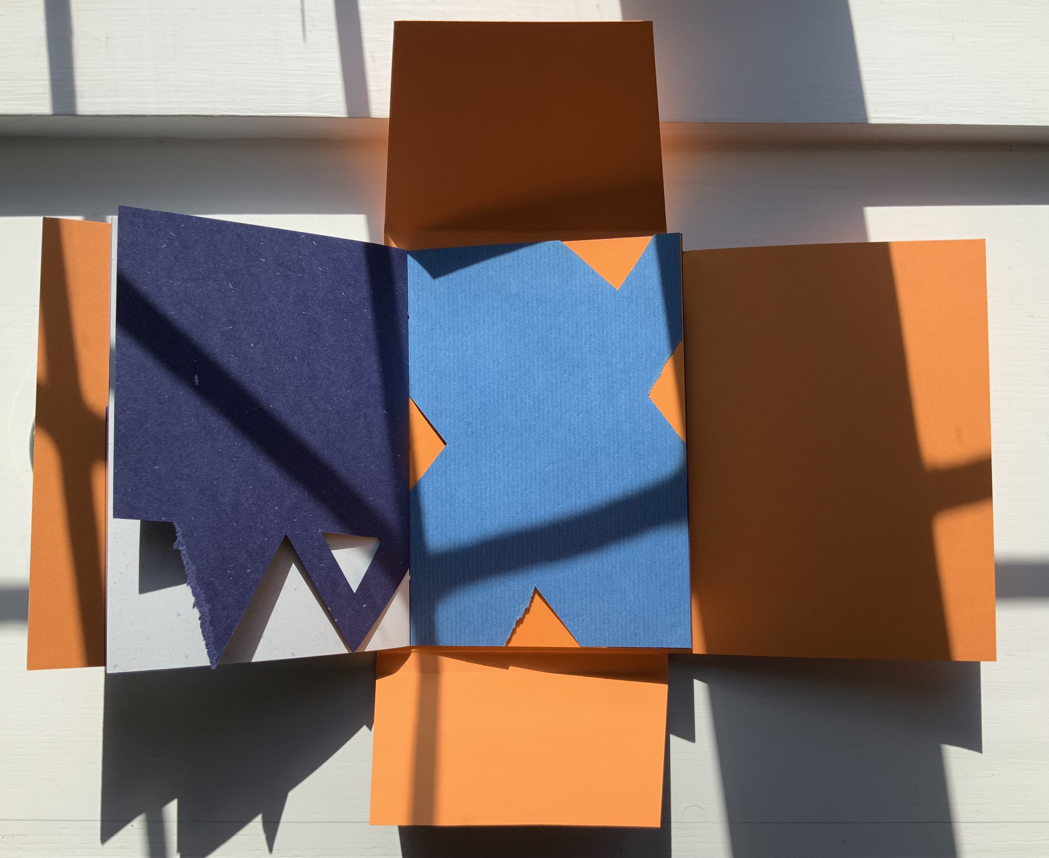
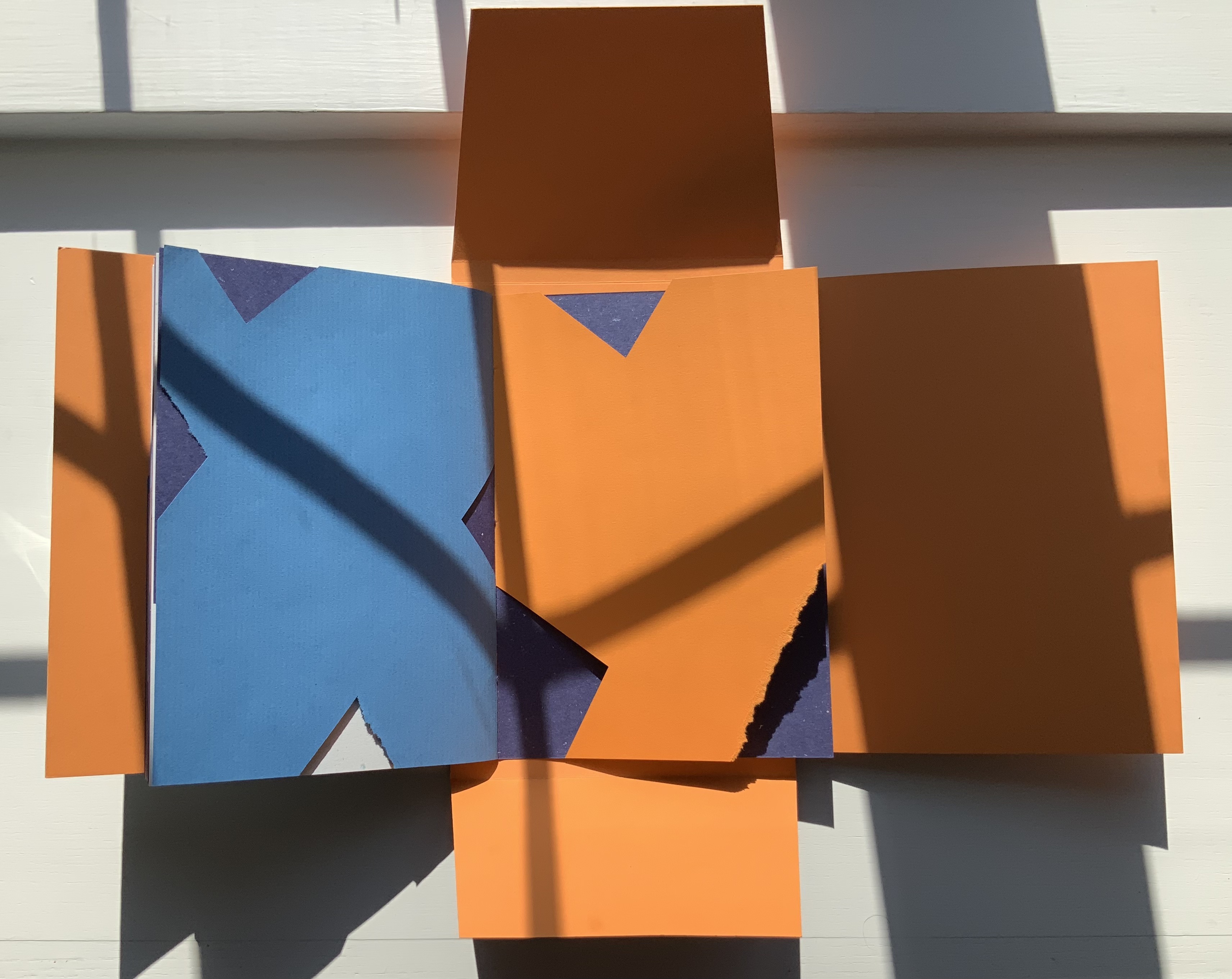
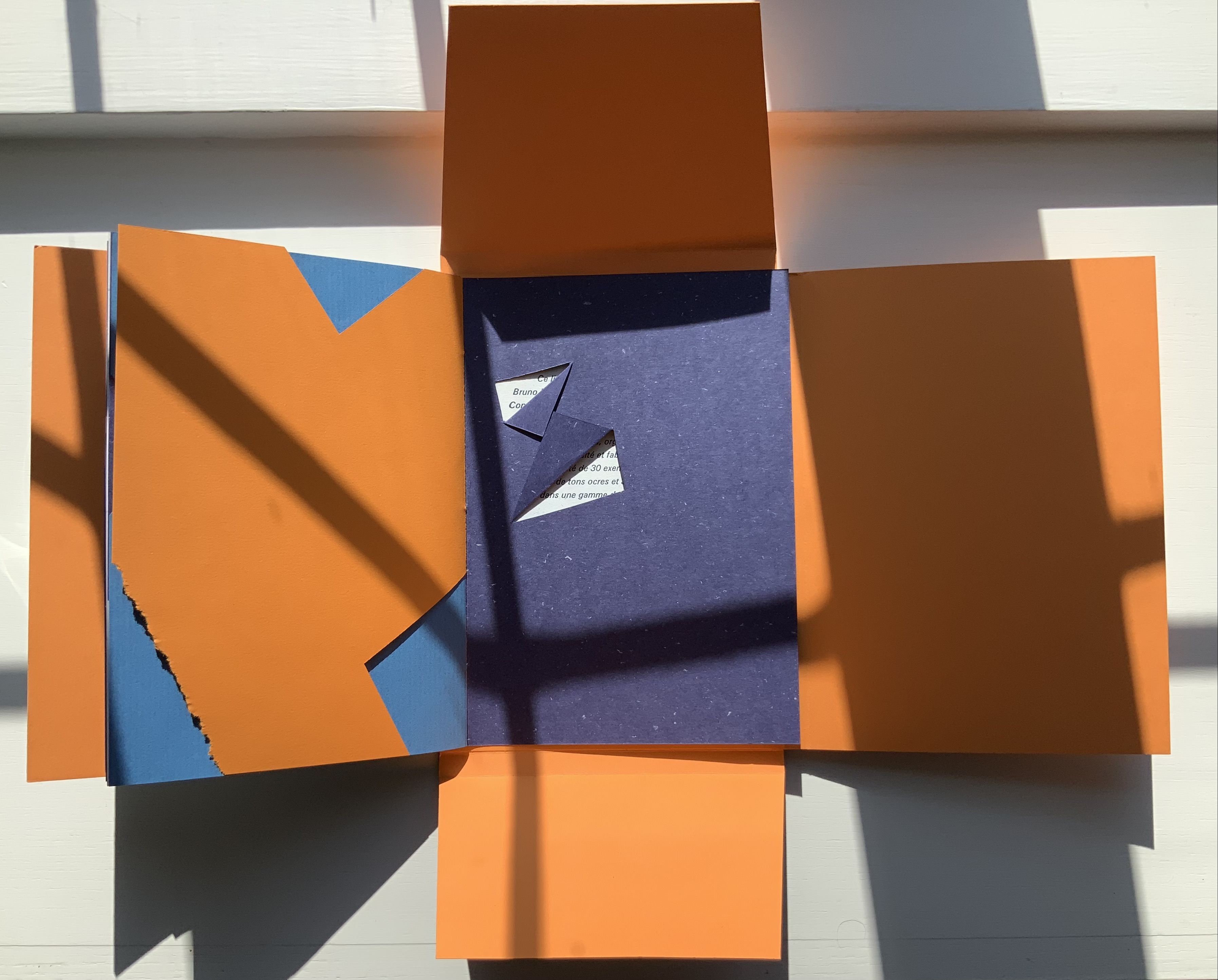
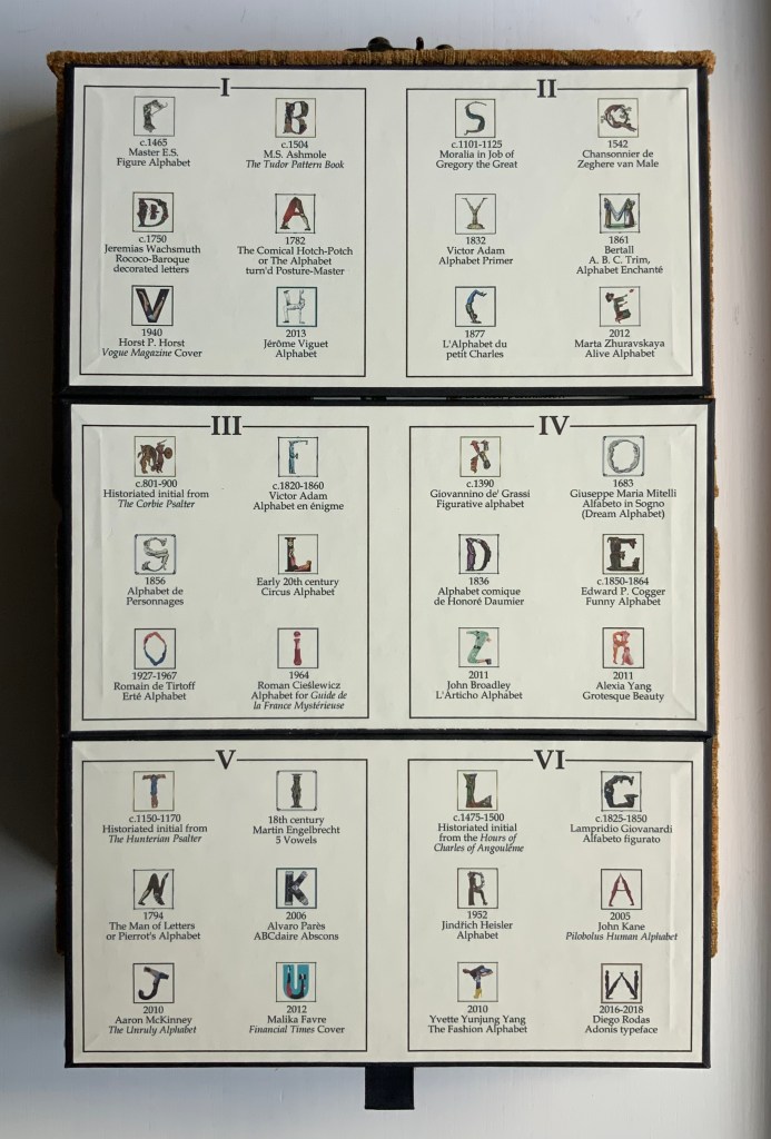
Books On Books Collection – Bård Ionson

Battledore (2019)

Battledore (2019)
Bård Ionson
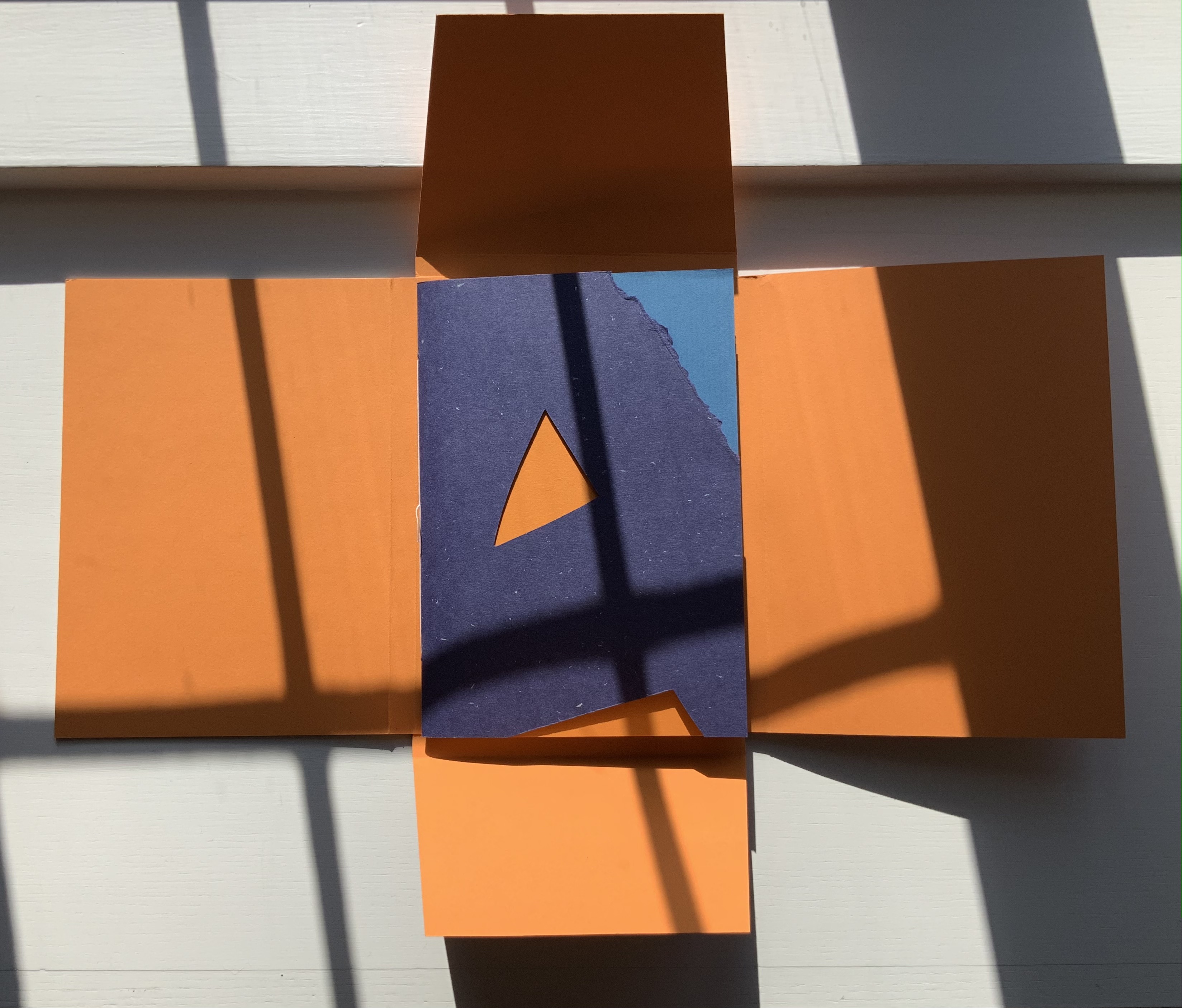
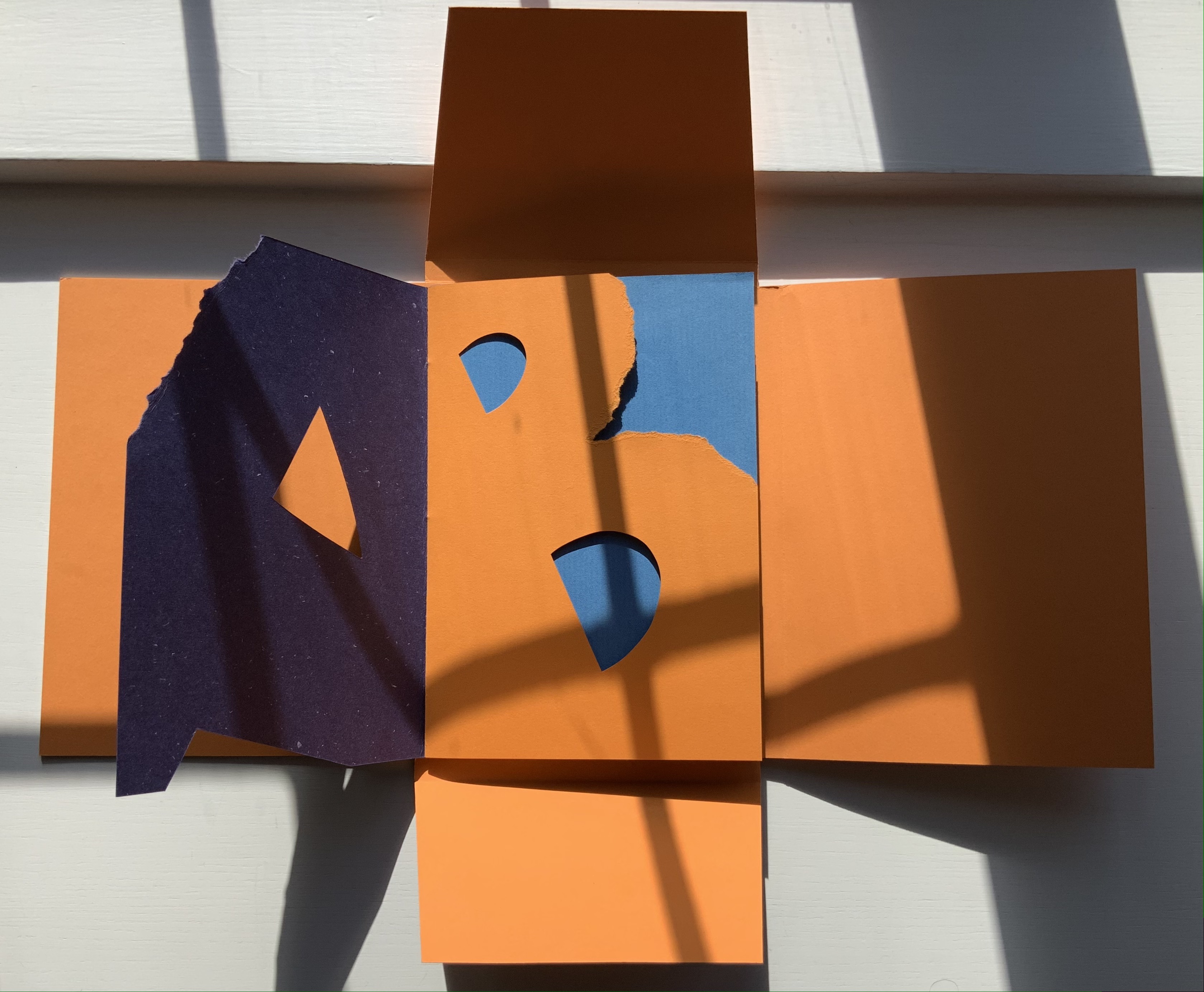
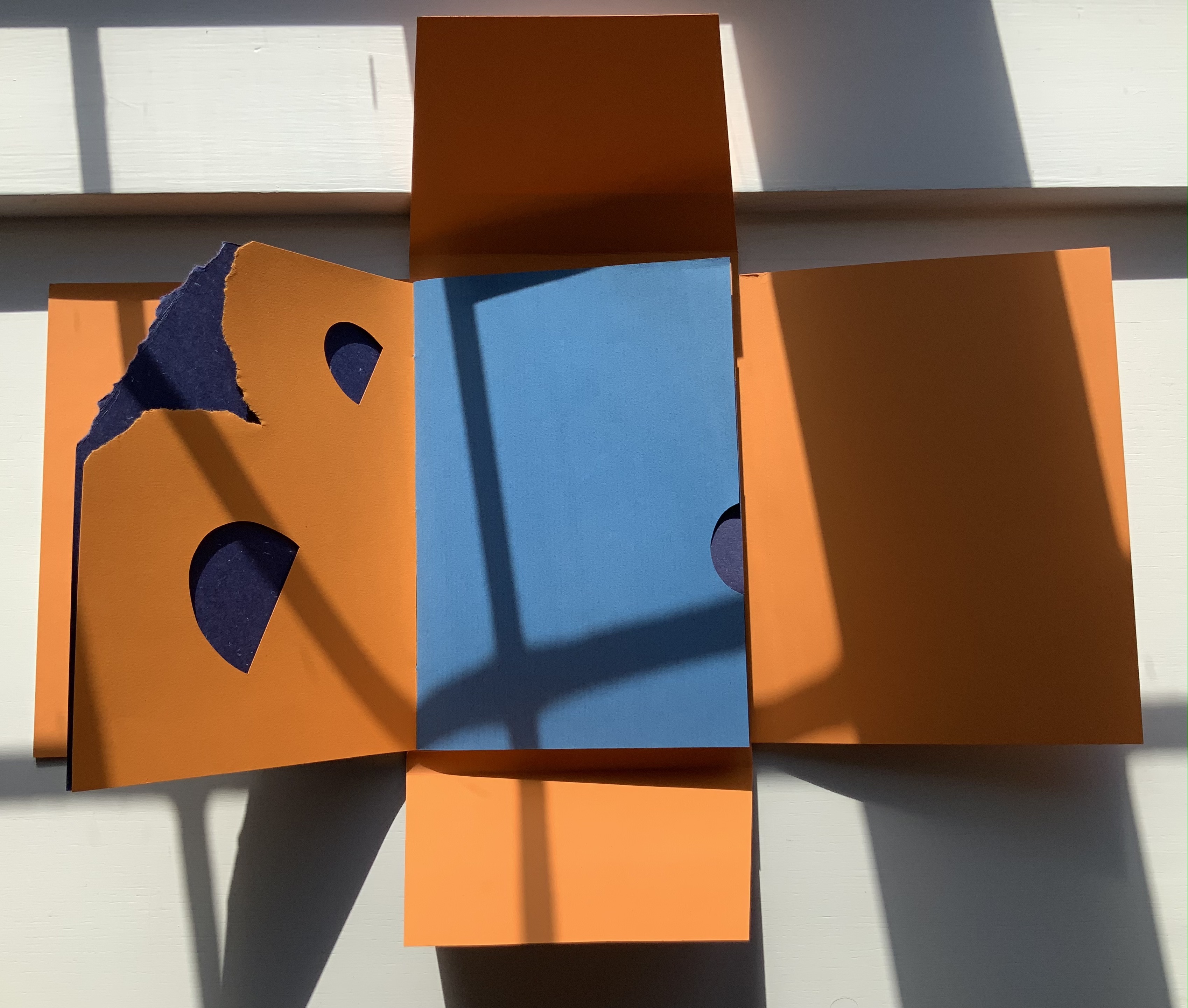
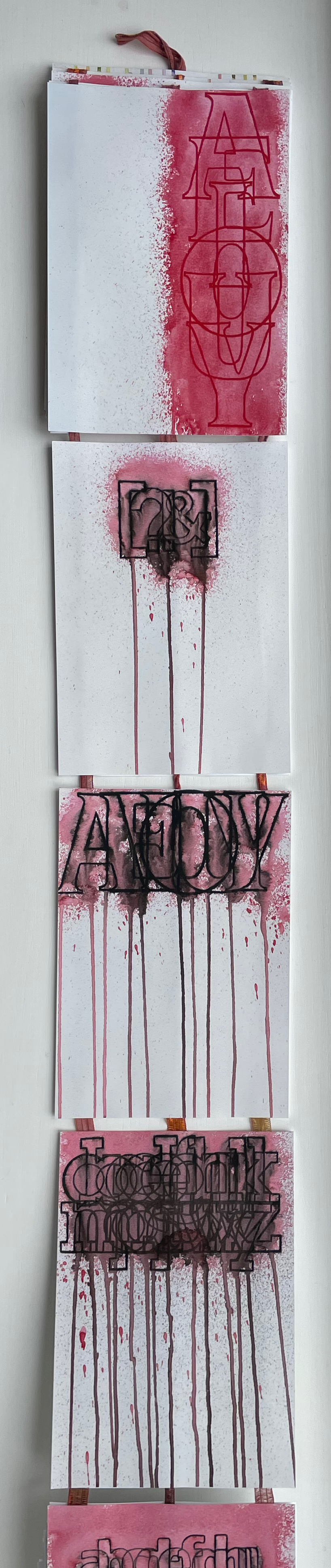
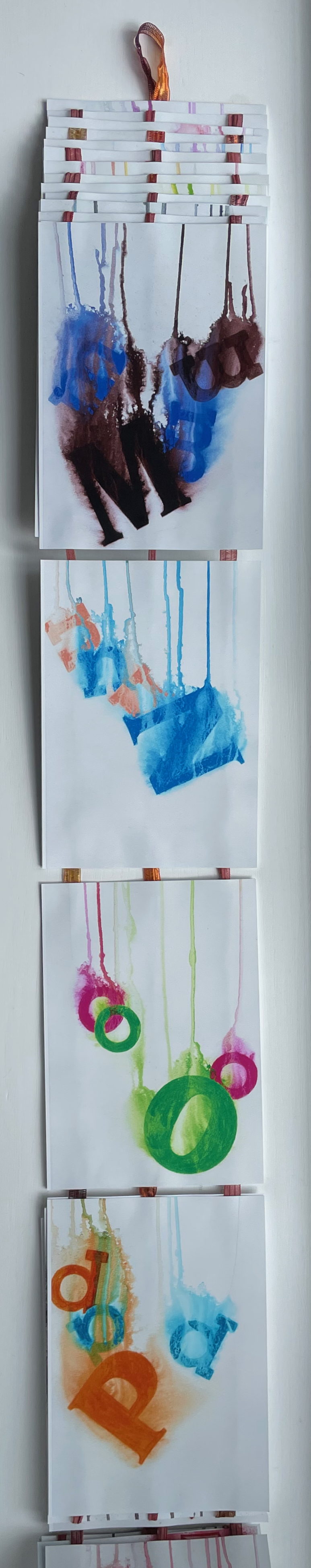
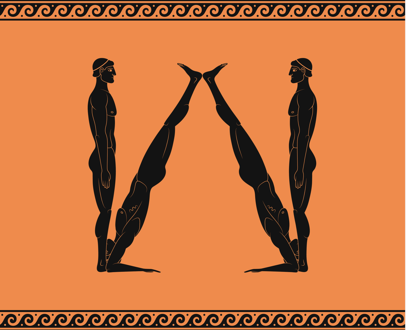
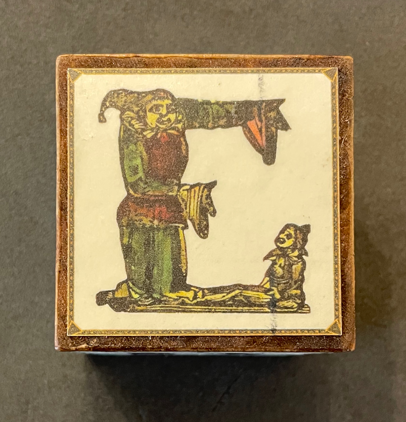
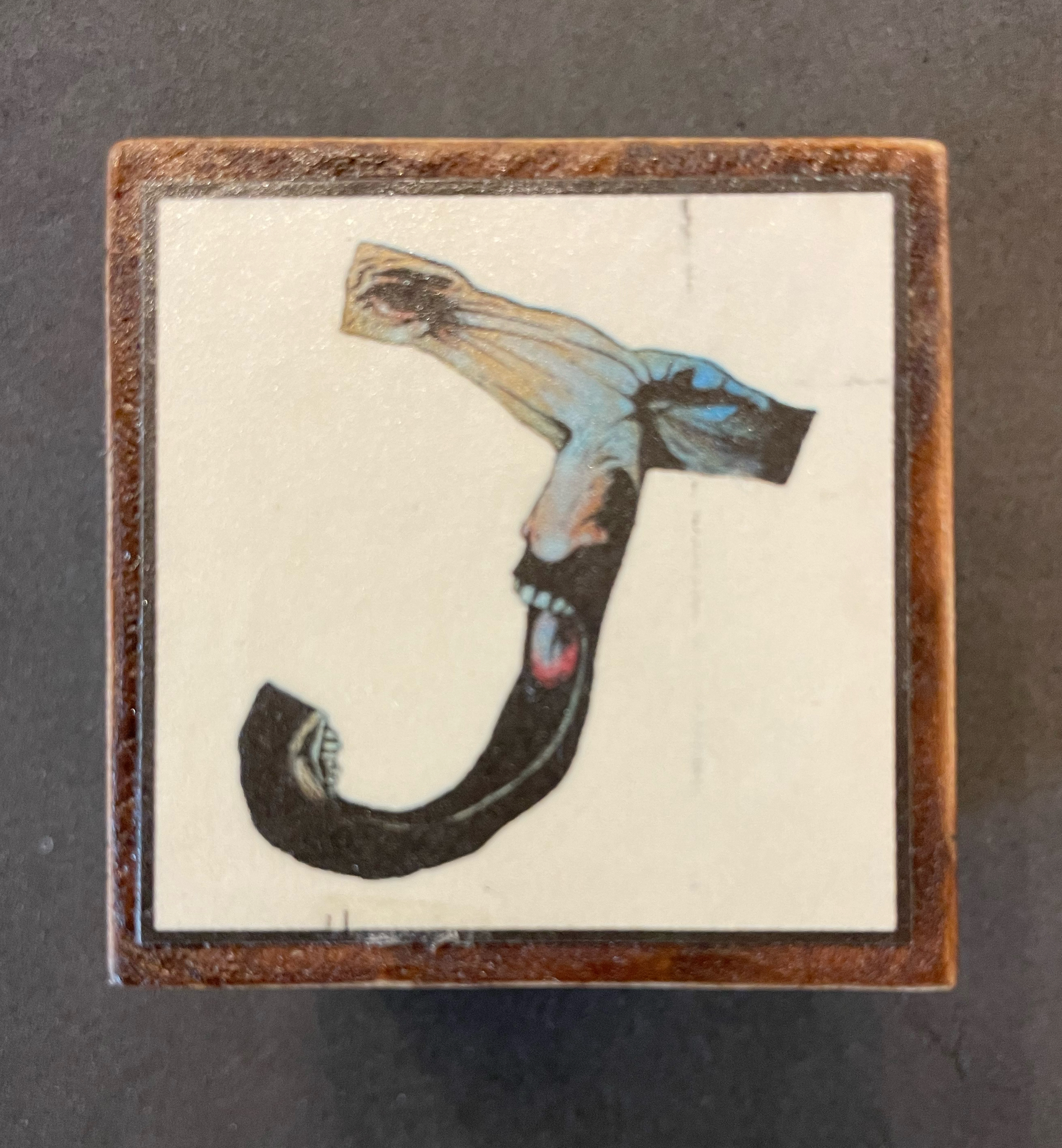
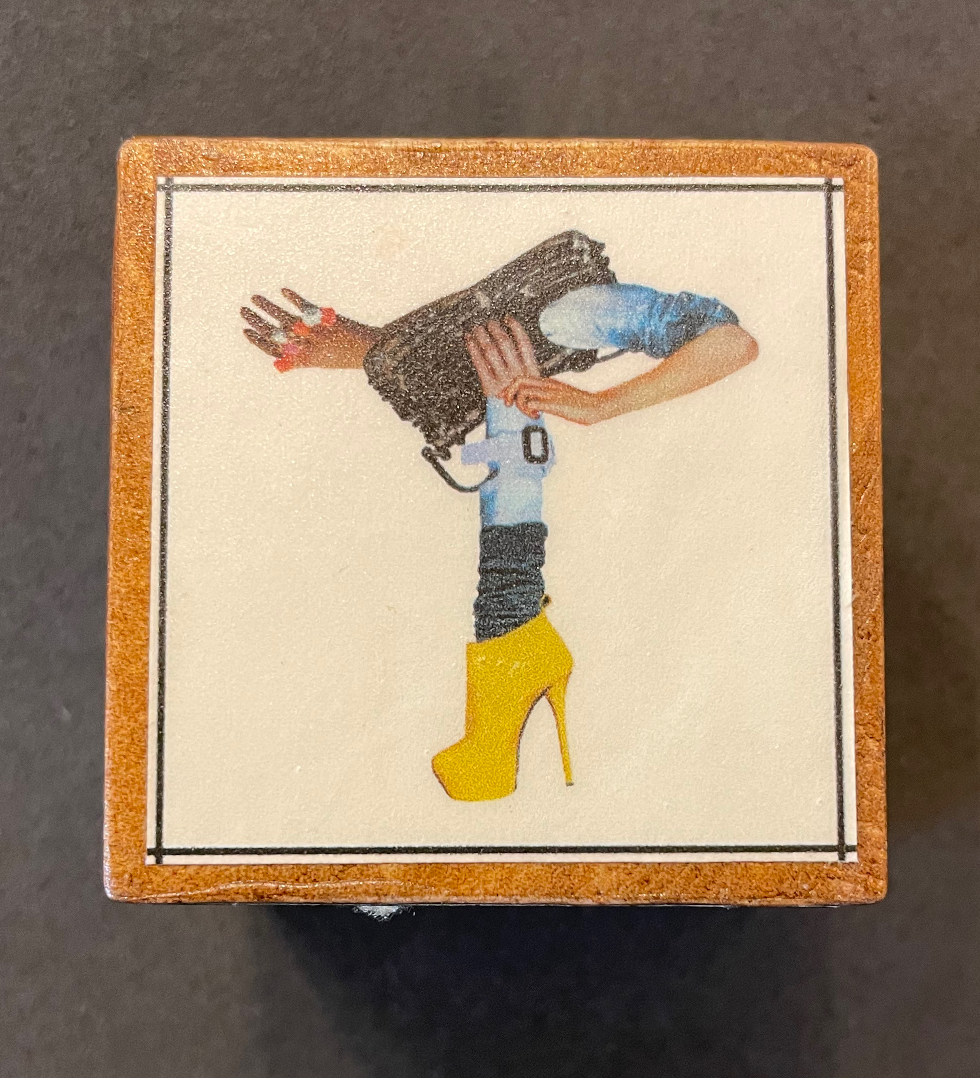
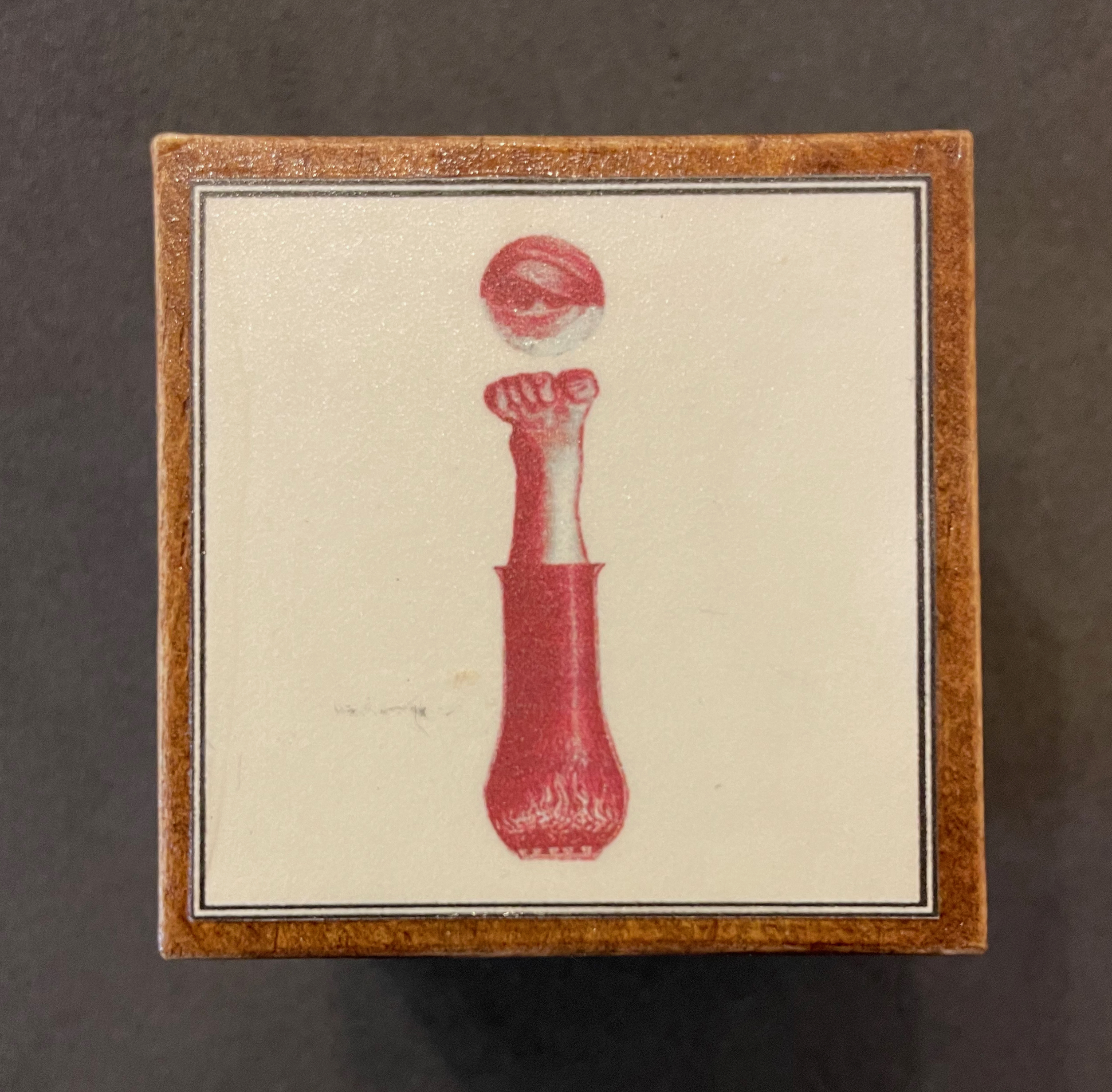
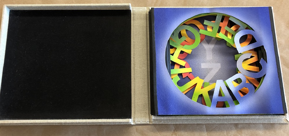
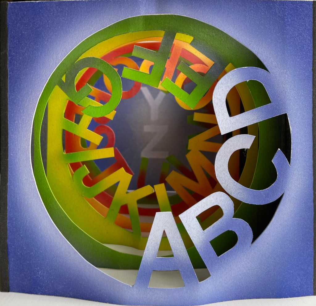
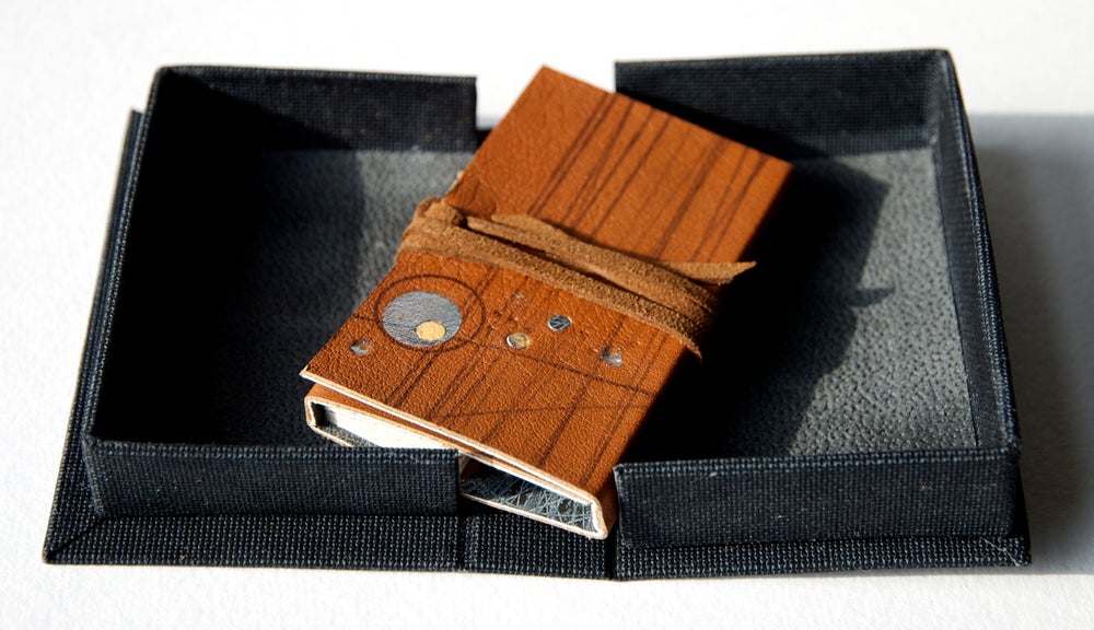
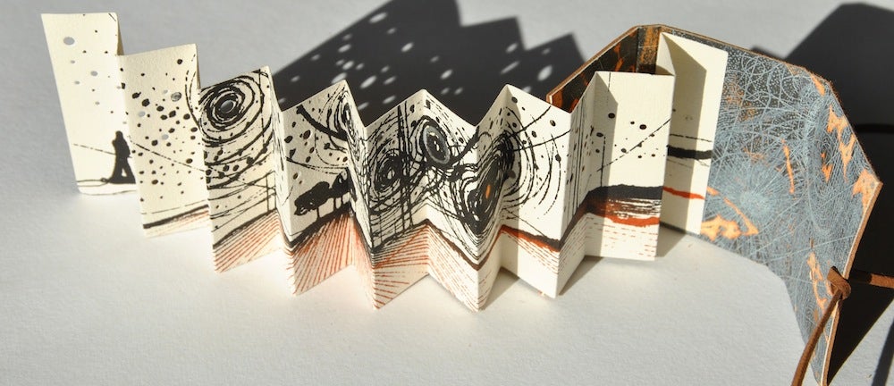
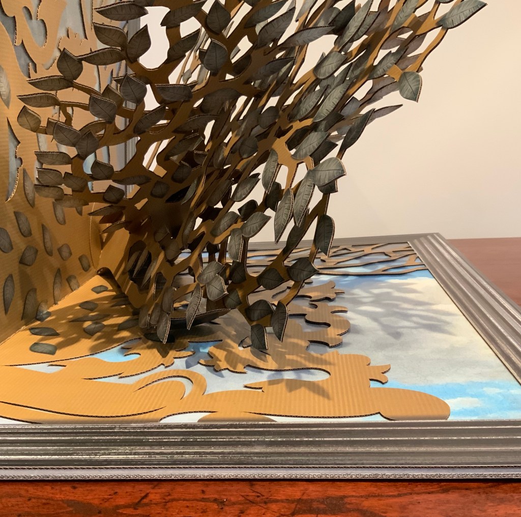
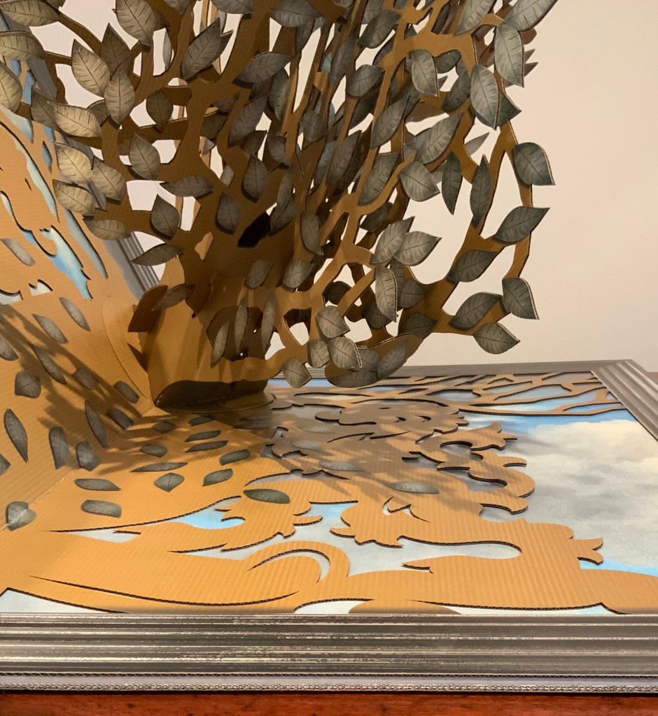
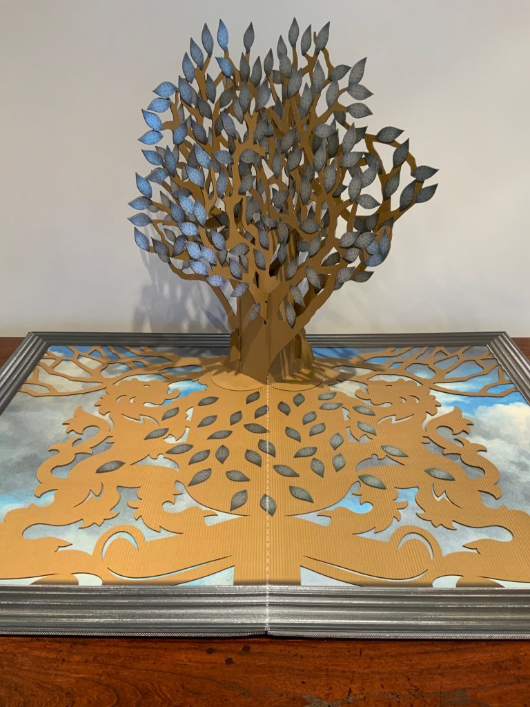
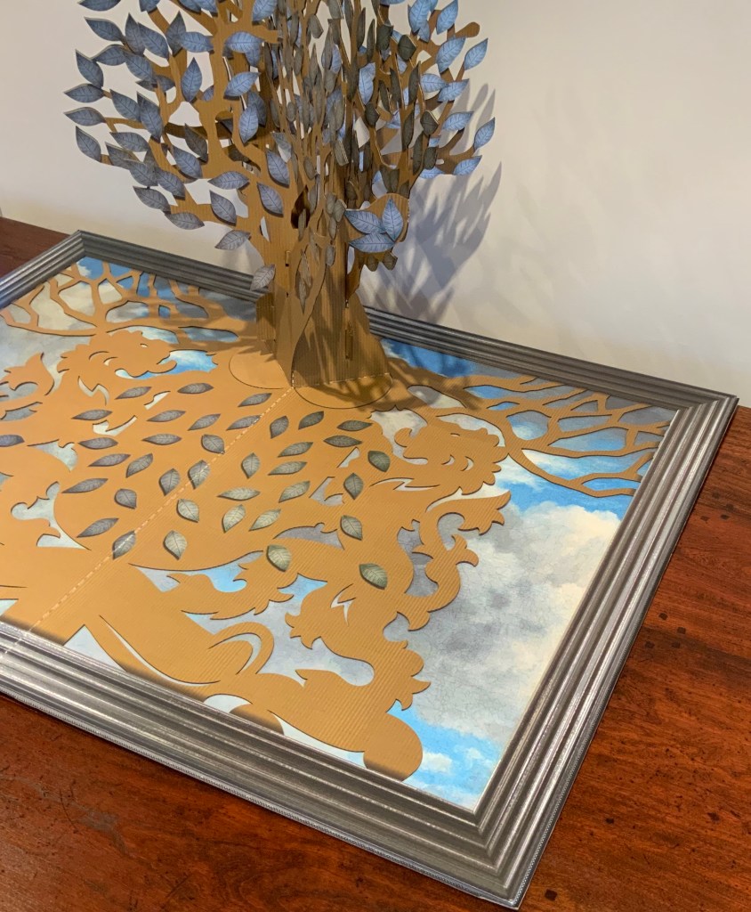
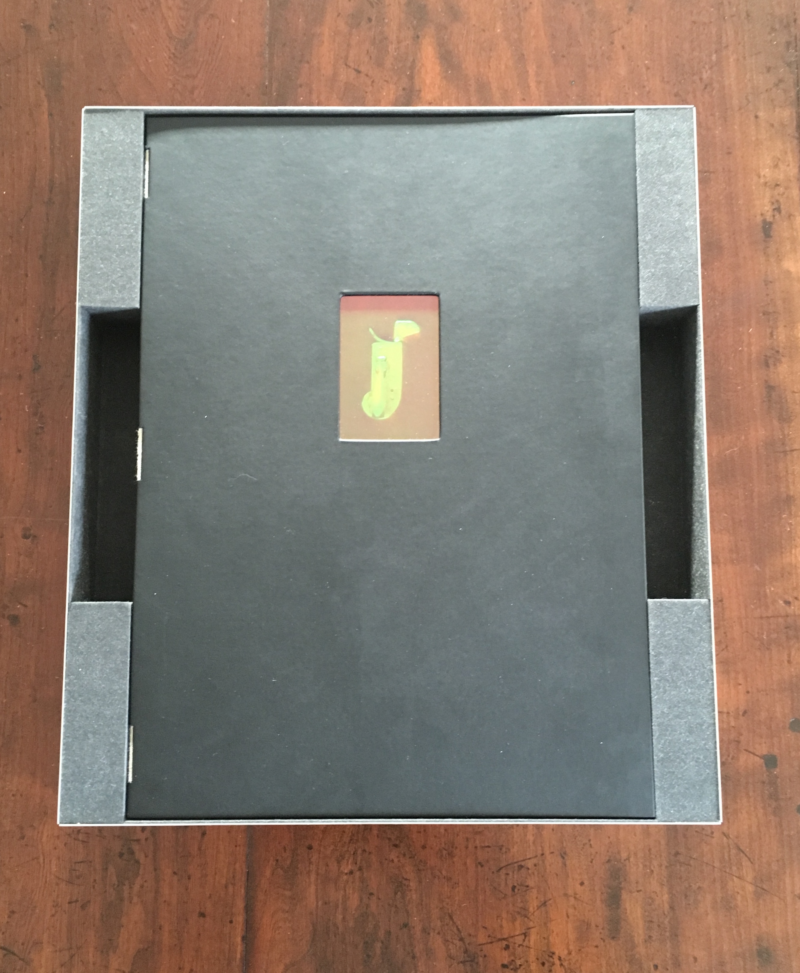
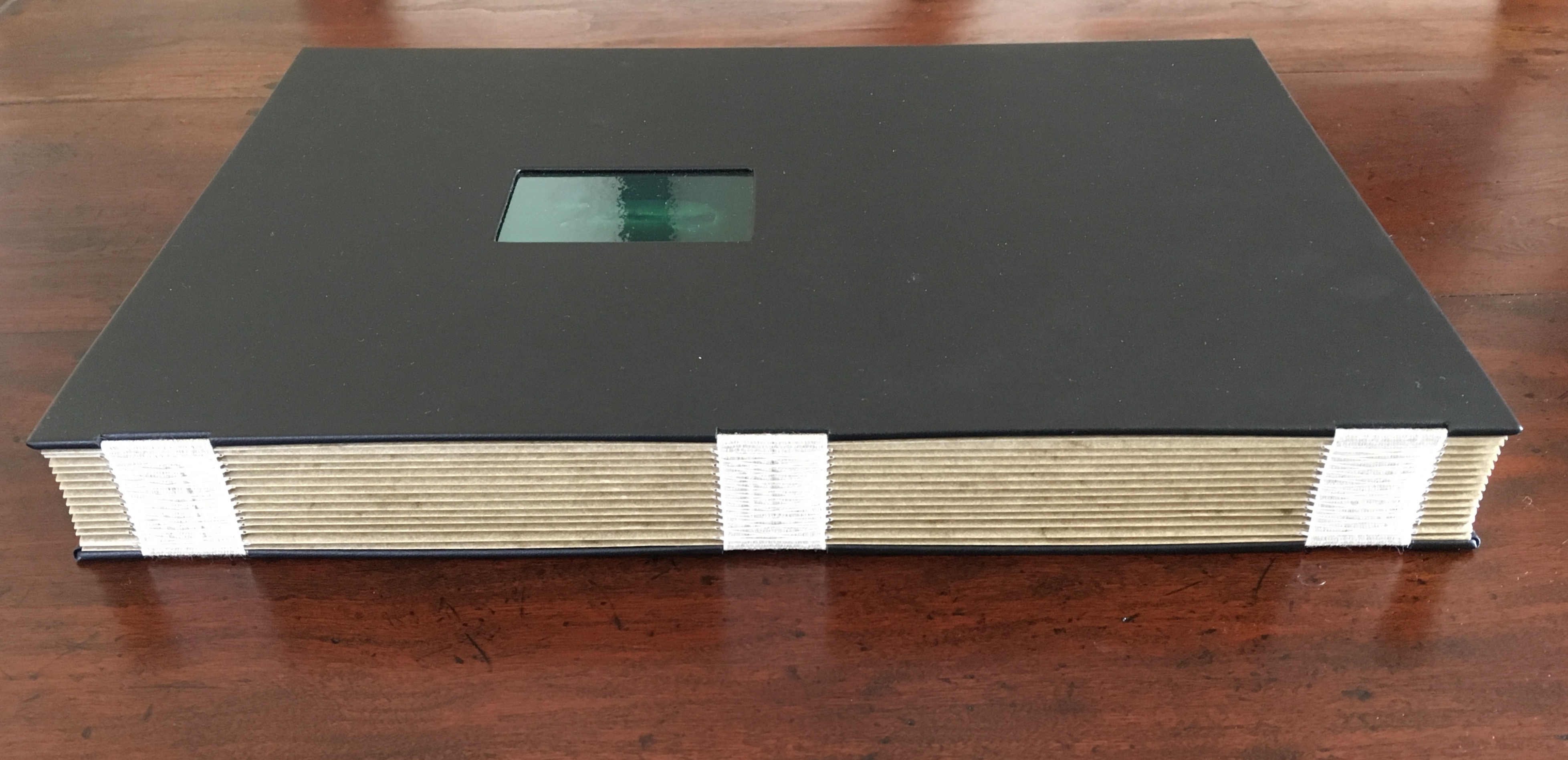
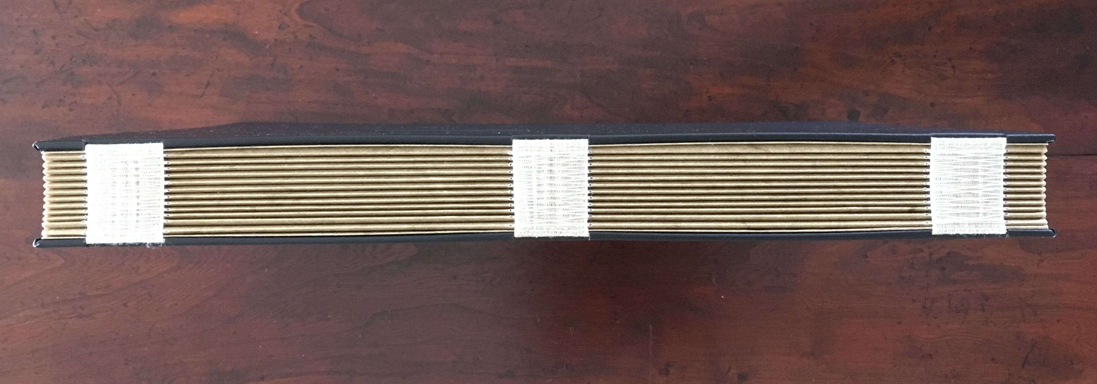
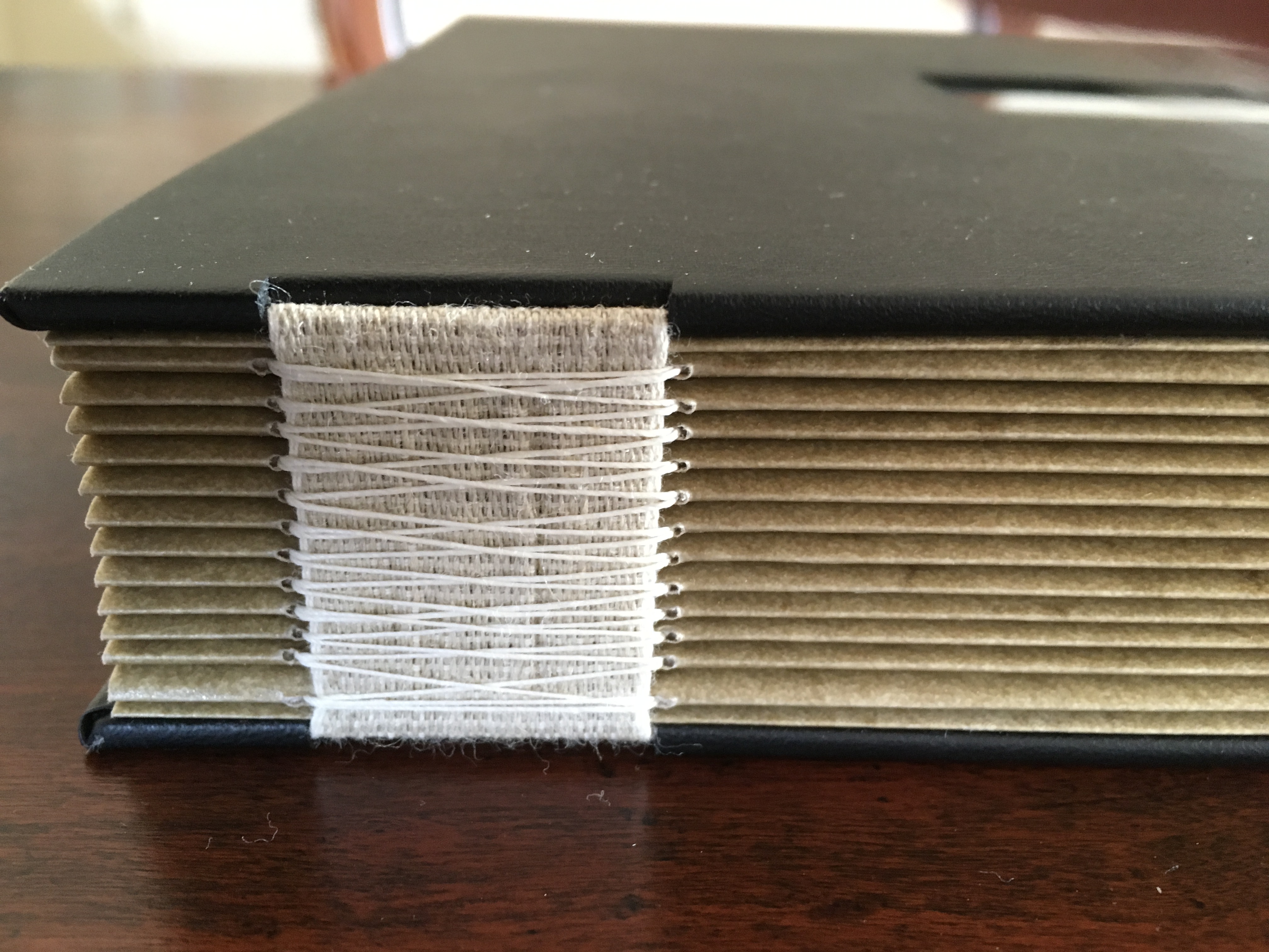
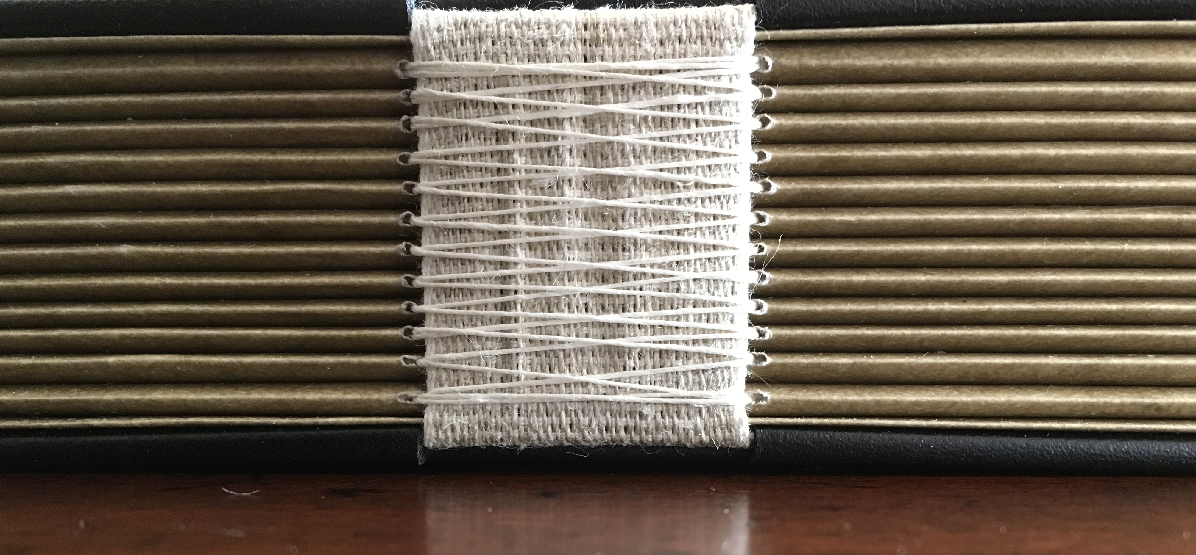
Digital photo of oscilloscope art on walnut, with leather straps & tacks. H229 x W127 mm. Animation of oscilloscope art with Artivive. Resolution: 3840 × 2160 px. File format: mp4. Duration: 1’0″ sec. File Size: 74.1 MB. Acquired from the artist, 1 March 2019.
Photos: Books On Books Collection. Displayed with permission of the artist.

The artifact displayed here is a vehicle for a digital artwork in which oscilloscope drawings are animated in augmented reality and which exists as an NFT (Non-Fungible Token). To view the digital artwork, open the camera on a smartphone, point it at the QR code below, and download the Artivive app. Open the Artivive app and position the phone’s camera over the artifact or even its image above.

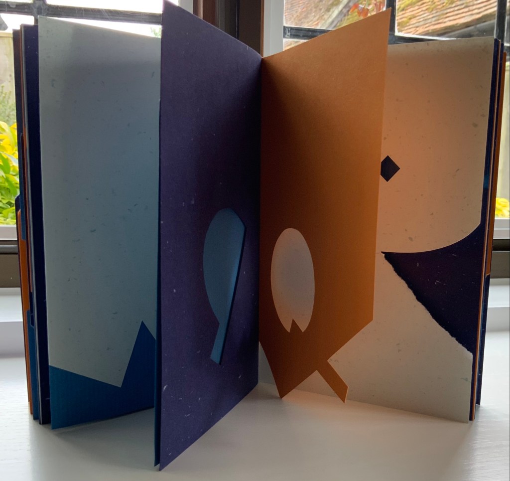
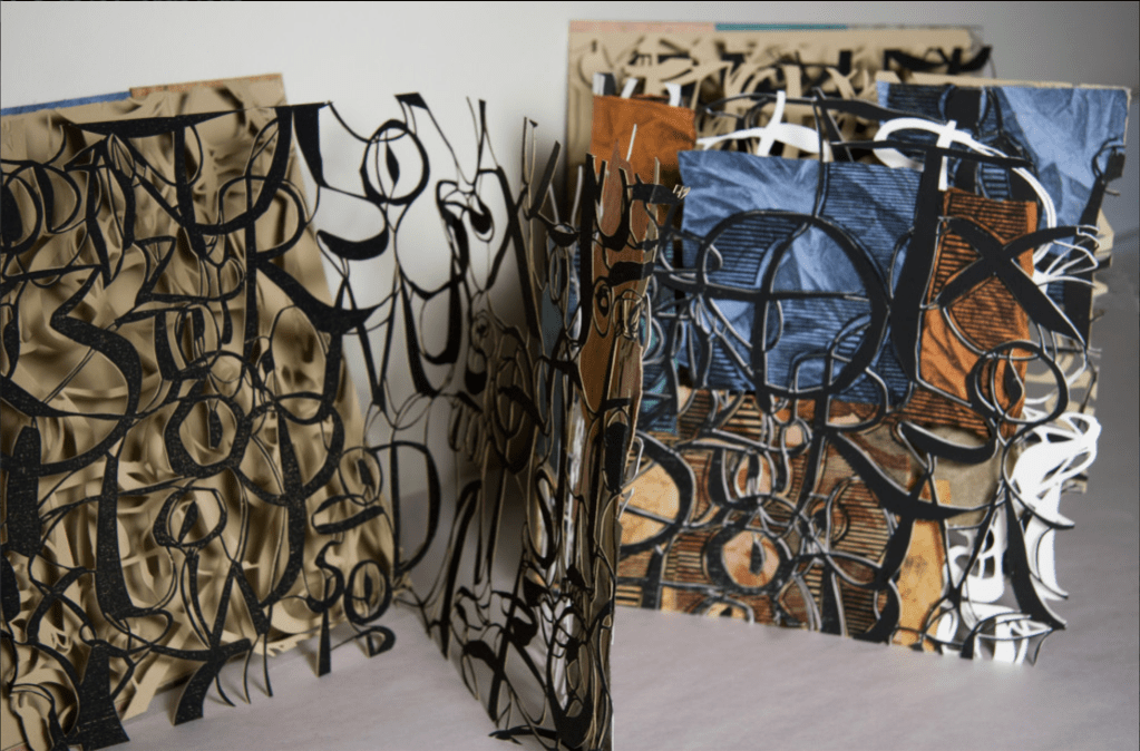
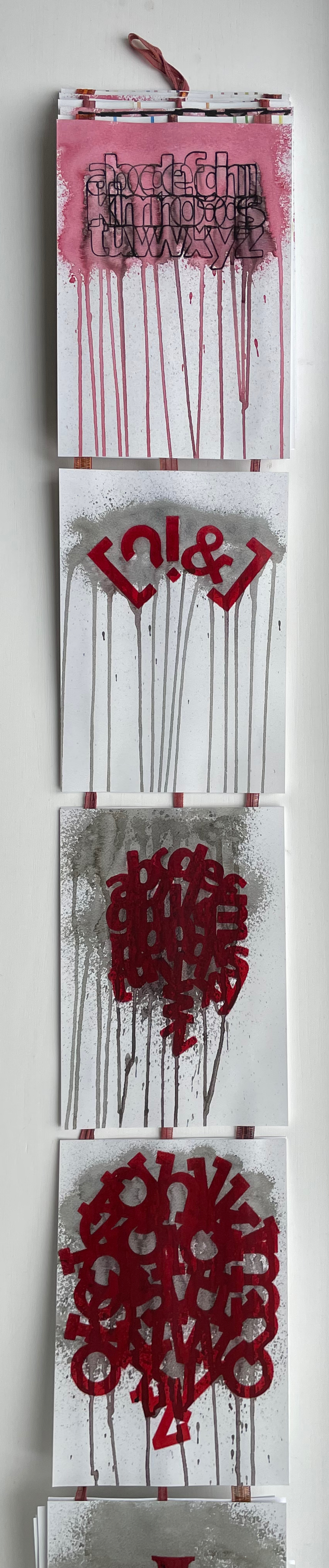
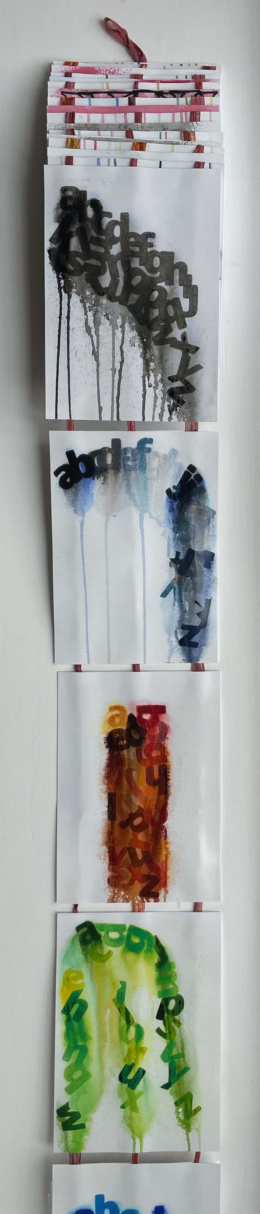
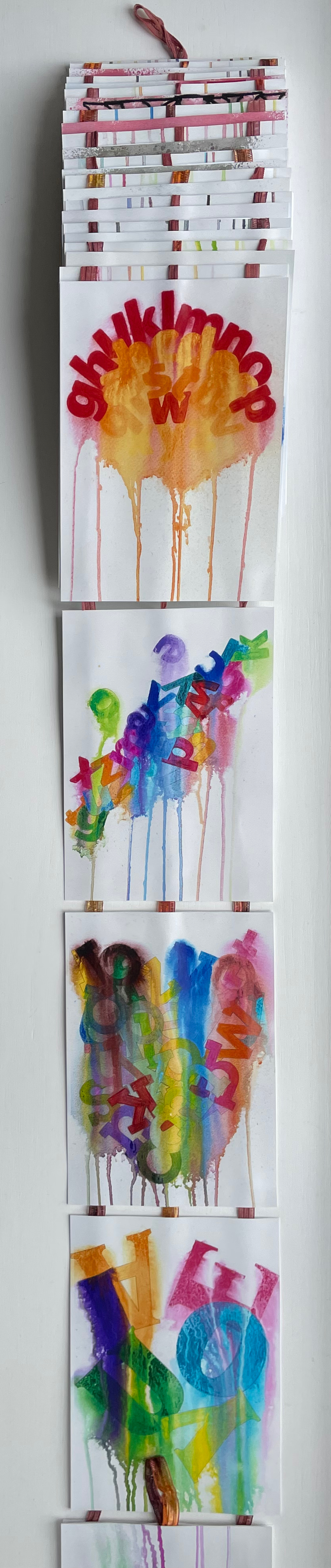
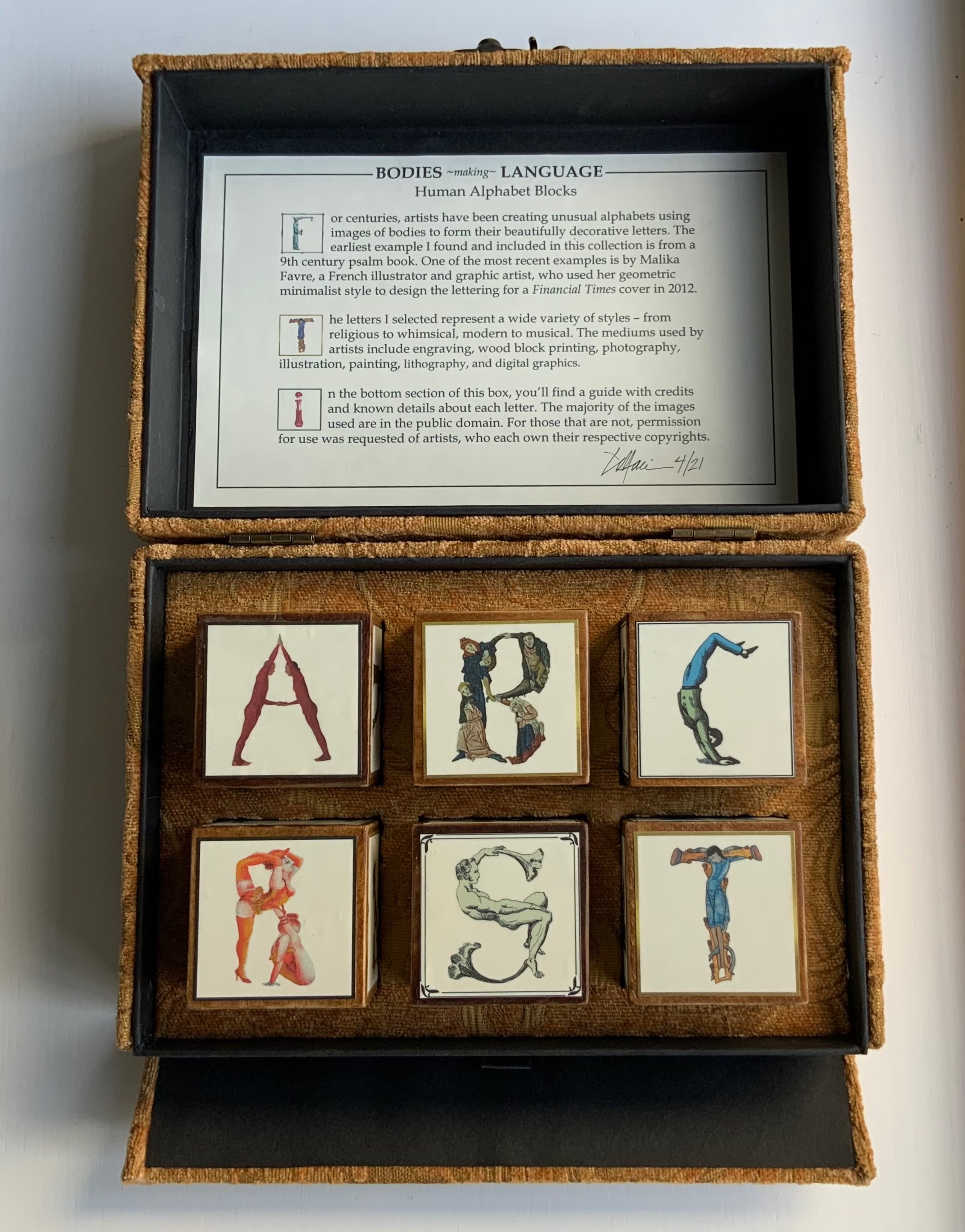
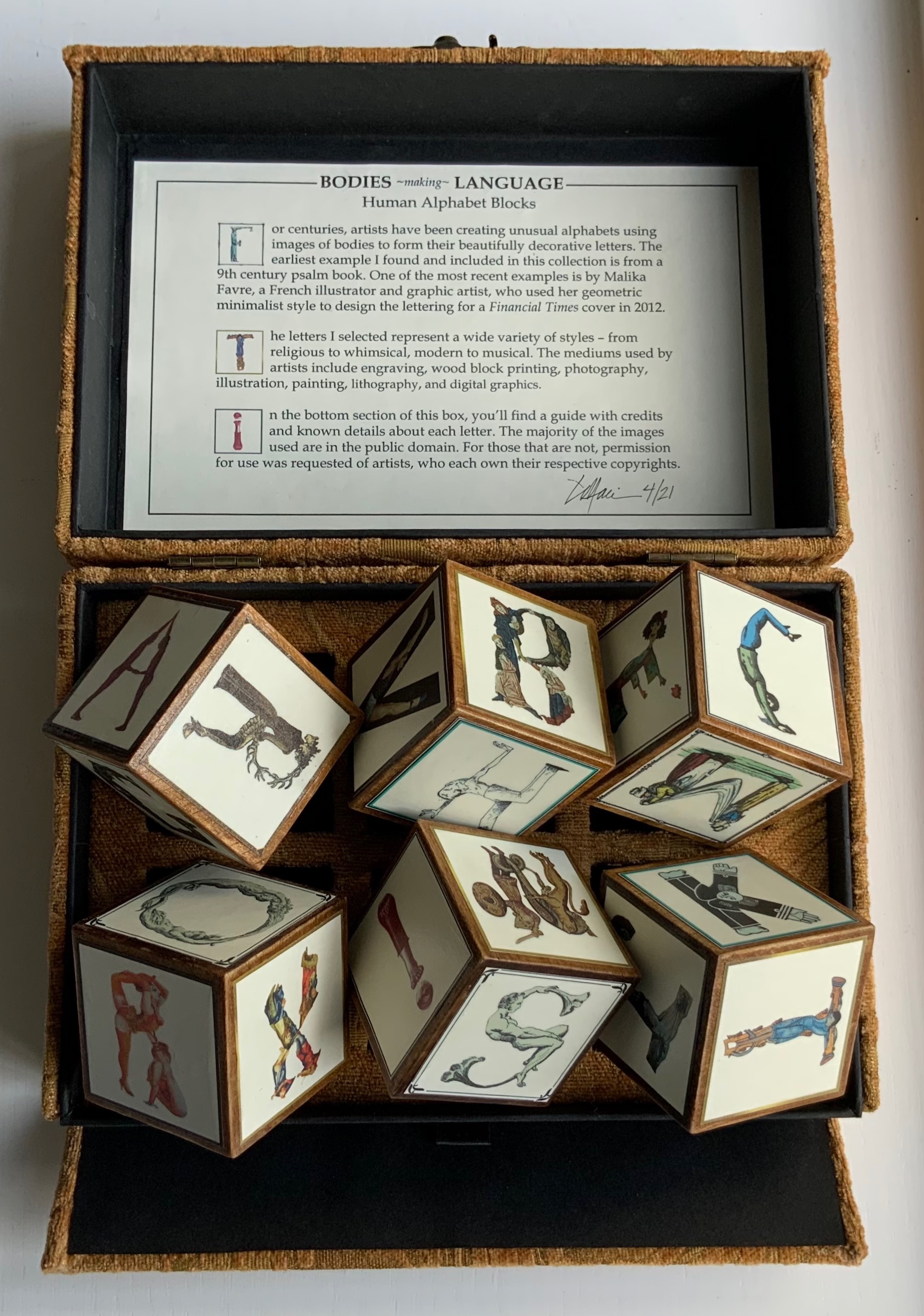
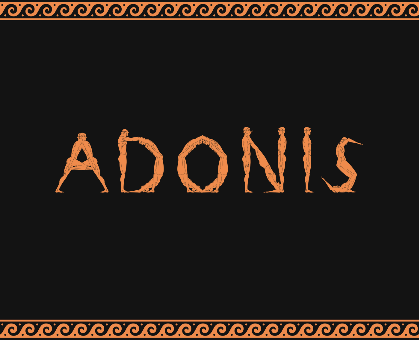
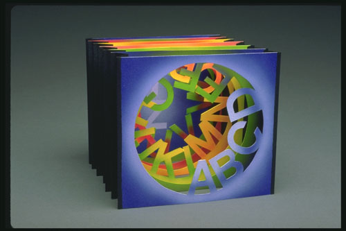
Each of the alphabet characters transforms into a logo (or image of a product associated with the company behind the logo). The letters represent Apple, Boeing, Comcast, Disney, Exxon, Ford, Google, HBSC, ING, JP Morgan Chase, Koch, Lockheed Martin, Microsoft, Nestle, Orbital, Phiser, QinetiQ, Raytheon, SkullCandy, TiVO, Unilever, Volume Integration, Winchester, Xerox, Yandex and Zinga.

Now that A is for Apple Inc. rather than the fruit, Ionson wonders, “What are our children learning as they navigate digital devices vs. when children used wooden tablets with narrow ideas presented with pictograms.” He goes on about the entities behind Battledore‘s letters, “Many of these are companies that manufacture weapons of war or are players in an information war. Many countries and organizations are using the information space of social media and news in a disinformation war. It is a digital battle now.”

To drive this home with several layers of irony, Battledore is offered as the learning tool needed to

Train your children for the battles of the 21st Century. Where brands, countries and organized crime compete for your allegiance. Using art, history, finance, education, news, war, social media and religion they fight to keep a hold on your mind. Learn to fight back by subverting the tools they wield.

At one layer of irony, the physical artifact shown above lies dormant just as it did until the teacher “activated” it with classroom recitation of the letters. But now, in augmented reality, the letters seem to come to life revealing hidden entities associated with them. Now, the reader/viewer has to engage in a digital transaction, point a digital handheld device at the letters, and peer to see and learn, letter by letter, what the letters “really” stand for — all while a looping track of electronic battle-game sounds plays on. Viewed on a laptop or desktop, these video clips at Elementum, Patreon and ARTificial show the transformations without the need of a smartphone. Caveat: whether phone or laptop, lower the speakers’ volume before activating!

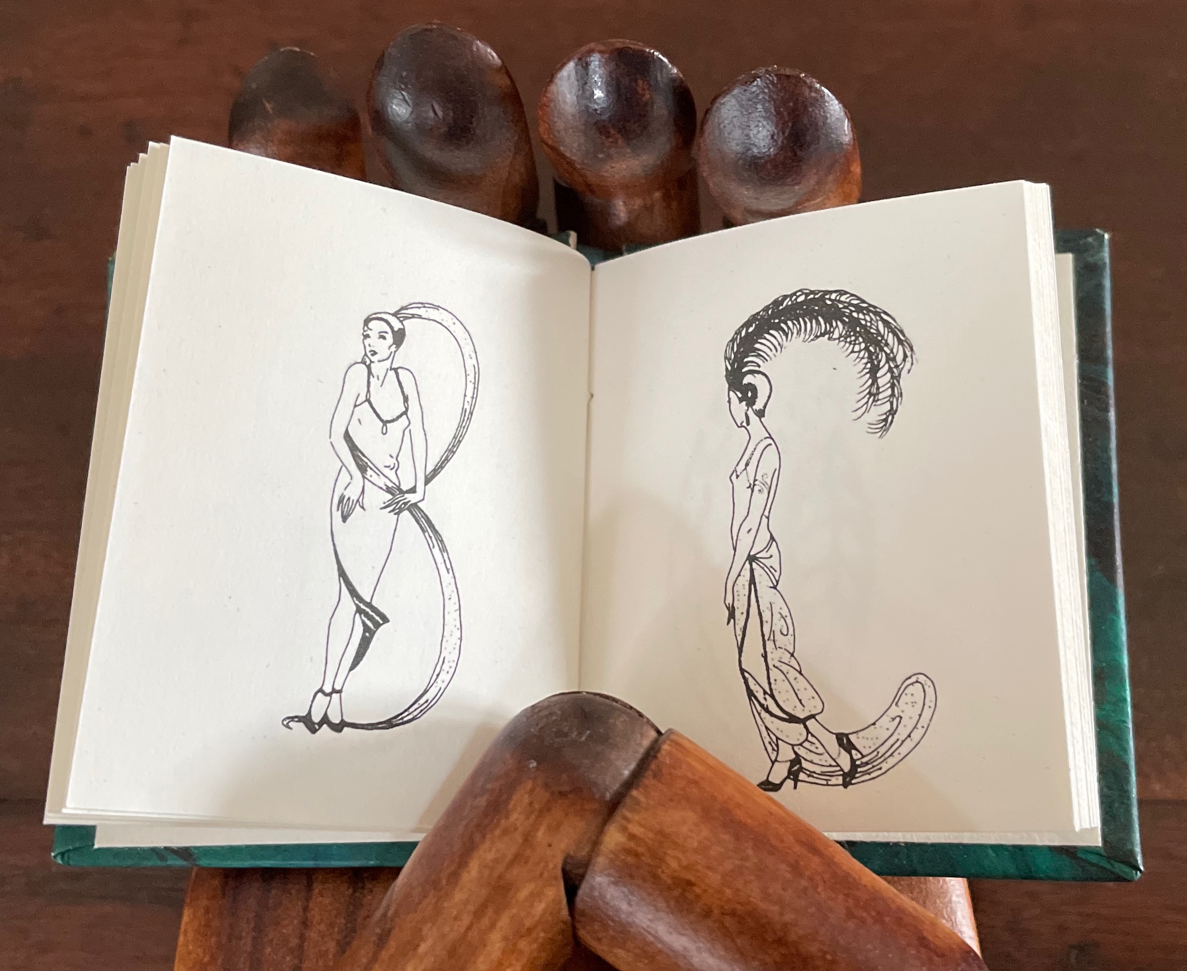
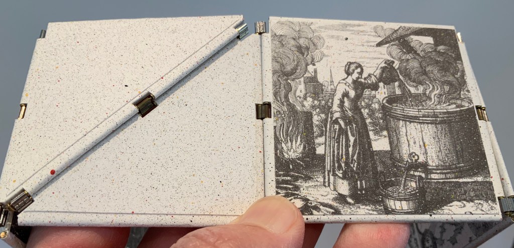
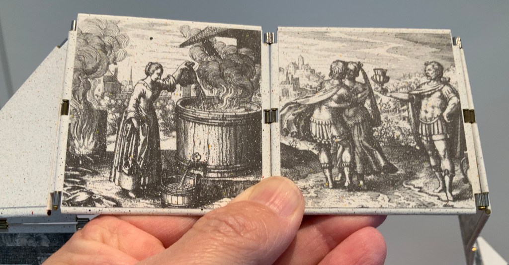
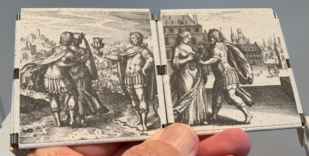
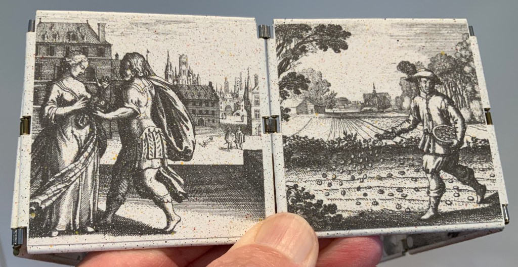
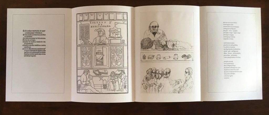
While the word “battledore” serves the artist’s metaphoric purpose, it introduces another layer of irony (unintentional according to the artist) in that the physical artifact is a horn-book, not a battledore, which was the later paper version of the horn-book. An additional unintentional irony is that, as illustrated by Andrew White Tuer, the “dean” of horn-book history, the old artifact itself was often wielded as a weapon.

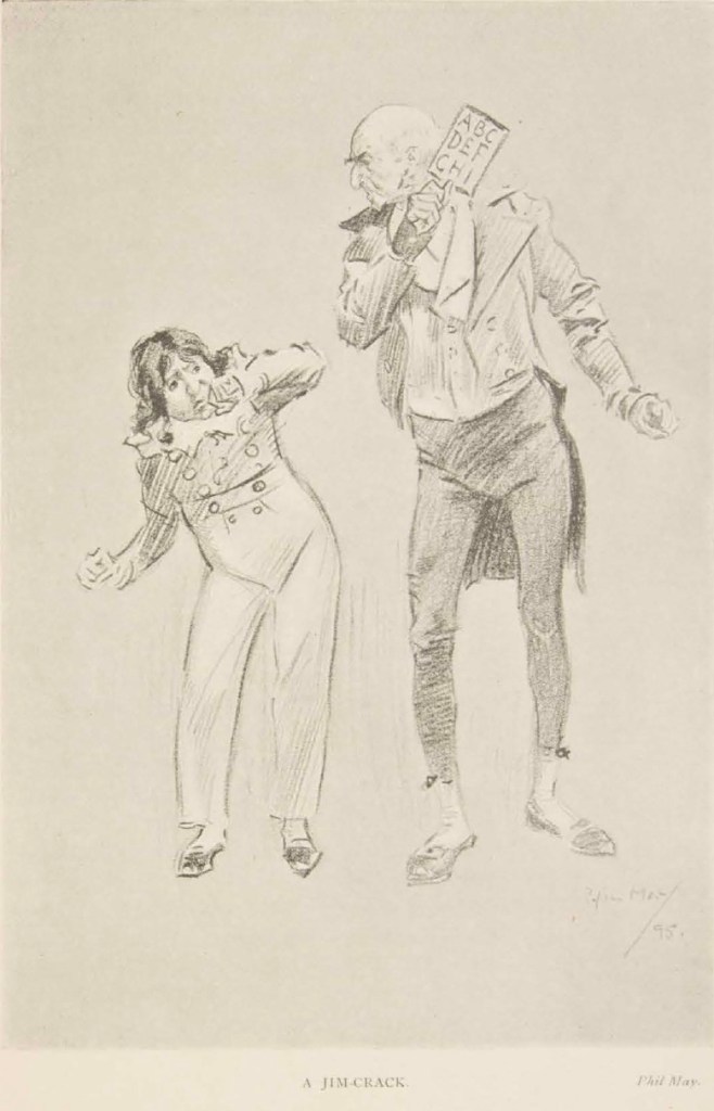
From Andrew White Tuer’s History of the Horn-Book (1897)

Some transformations are easy to follow and connect with a corporate entity. Others — such as the Q becoming a missile launcher because Q is for QinetiQ — require a bit of digging (online, of course). The original teaching device was not without its “corporate” — or rather religious, economic and patriotic — associations, but they were more obvious in the text, emblem and images on both front and back of the artifact.

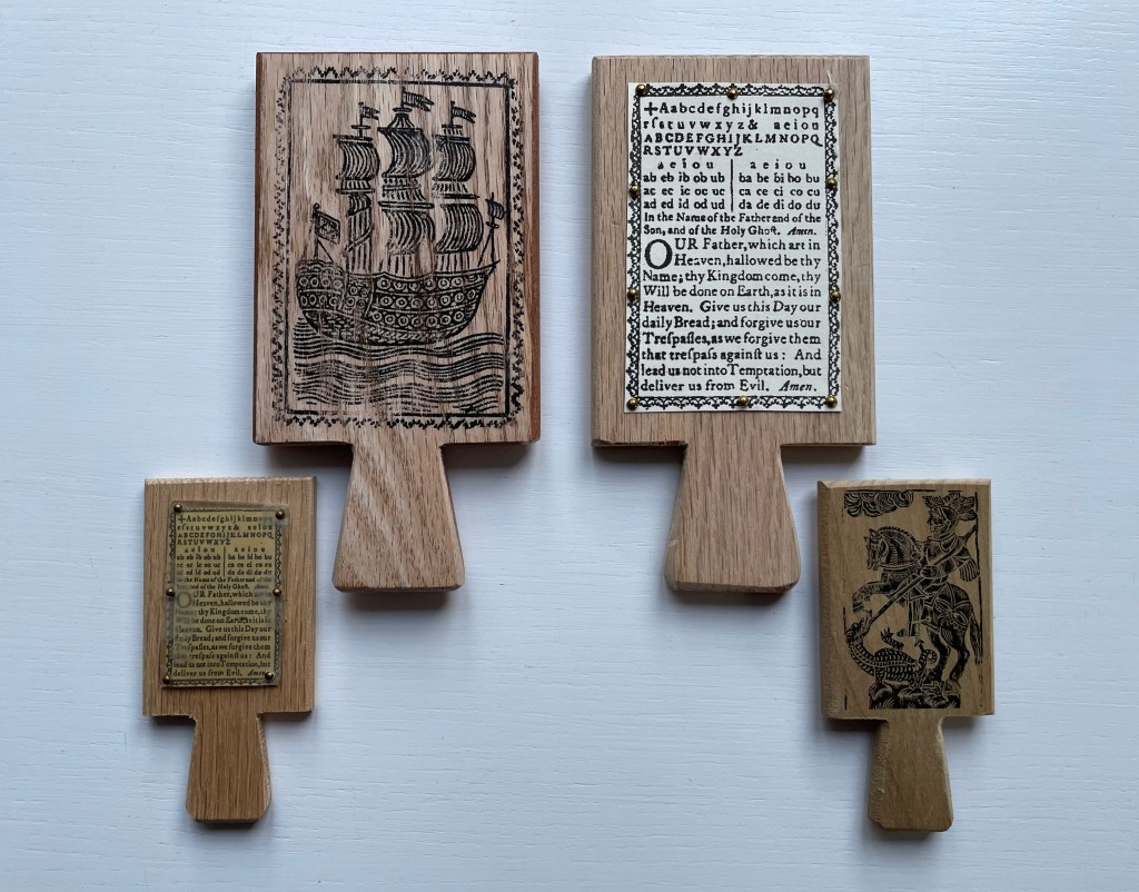
Facsimile horn-books. Real cow horn is used for the cover of the horn-book at the lower left.
Gene Wilson

The NFT element of this work is yet another level of irony. It begins with a paradox and a pair of causes. The paradox is ownership in the digital age. Most digital objects — downloadable music or book files — are not owned securely. Whether subject to the supplier’s whims or errors (like Amazon’s now infamous overnight removal of Orwell’s 1984 from its customers’ Kindles) or to obsolescence (by operating system upgrades or by outright abandonment of file formats such as Adobe Flash), we do not so much own digital assets as lease them with fingers crossed for luck while the vendors’ fingers are crossed behind their backs.

The irony raised by Battledore‘s NFT status is the underpinning technology’s claim of redefining and securing unique ownership in a digital work of art. A long explanatory article in The Verge provides an amusing and clear explanation of non-fungible tokens and blockchain technology. Although a digital artwork can be copied many times by many viewers even if it’s included with an NFT,

… NFTs are designed to give you something that can’t be copied: ownership of the work (though the artist can still retain the copyright and reproduction rights, just like with physical artwork). To put it in terms of physical art collecting: anyone can buy a Monet print. But only one person can own the original.

A metaphysical or aesthetic precursor to all this can be found in Walter Benjamin’s seminal essay “The Work of Art in the Age of Mechanical Reproduction”. He writes,

The presence of the original is the prerequisite to the concept of authenticity. And

that which withers in the age of mechanical reproduction is the aura of the work of art.

So in Benjamin’s terms, the Monet original has authenticity, it has aura. NFTs and blockchain technology aim/claim to replace the “presence of the original”, its “unique presence”, its “aura” with “ownership of the work” as the “prerequisite to authenticity”. By associating a piece of wood, leather, metal tacks and inscribed plastic with the digital asset, Ionson physically and ironically underscores the paradox of digital ownership.

The NFT feature of Battledore also carries with it a pair of causes. The first cause has an analogue in the late 20th-century theories about book art: that this new form of art arose as a means of bypassing art galleries and gatekeeping authorities of art. Likewise, NFTs and blockchain technology have their roots in peer-to-peer (P2P) networks in which data resides in whole or distributed state across a network of distributed servers. The purpose of P2P is to protect data from the threat and vulnerabilities of centralized control. Battledore leverages its digital format and that anti-authoritarian tradition of NFTs to subvert the corporate enemy on the digital battlefield.

The second cause, related to the first, is economic and financial and linked to copyright. In the physical world, authors’ and artists’ ability to be remunerated from the sale and re-sale of copies or original works is attenuated. They might receive royalties from copies sold by the intermediary publisher or a percentage from an original sold by the gallery or to a collector, but there is no economic framework for remuneration from subsequent transactions. NFTs and blockchain technology provide the digital artist an option for ongoing remuneration. Whenever the NFT is exchanged, a new block in the chain arises, and the whole chain is aware of it. So the digital artist can set financial terms not only for the initial financial transaction but also for subsequent ones.

When the Books On Books Collection is donated to the Bodleian Libraries, the chain of digital ownership will extend by one more block. The wallet in which the Battledore NFT and financial terms, if any, reside will transfer to the Bodleian with a digitally secure chain of custody and provenance. Of course, with the accompanying transfer of the physical artifact associated with the NFT, the artist and collector will be giving an ironic wink of the eye to the amusement and relief of the Keeper of Rare Books at the Bodleian.

Further Reading

Abecedaries I (in progress)“. Books On Books Collection.

Kees Baart, Dick Berendes, Henk Francino and Gerard Post van der Molen“. 2 November 2022. Books On Books Collection.

Margo Klass“. 9 July 2023. Books On Books Collection.

Karen Roehr“. 26 December 2022. Books On Books Collection.

Connie Stricks“. 9 July 20223. Books On Books Collection.

Ashley Thayer“. 26 December 2022. Books On Books Collection.

Andrew White Tuer“. 26 December 2022. Books On Books Collection.

Benjamin, Walter. 1969. “The Work of Art in the Age of Mechanical Reproduction“. Illuminations, edited by Hannah Arendt, translated by Harry Zohn, from the 1935 essay. New York: Schocken Books. Accessed 7 July 2023.

Bodleian Libraries. 7 July 2023. “Alphabets Alive! 19 July 2023 – 21 January 2024, Treasury, Weston Library“. Accessed 7 July 2023.

Chen, Min. 5 July 2023. “Digital Art Organization Rhizome’s New Blockchain Program Is an NFT-Dotted Journey Through the History of Generative Art“. Artnet News. Accessed 7 July 2023.

Clark, Mitchell. “NFTs, explained“. The Verge. Accessed 7 July 2023.

Books On Books Collection – Bruno Riboulot and Marjon Mudde

ABC d’Air (2005)

ABCD’Air (2005)
Bruno Riboulot and Marjon Mudde
Greyboard covers on four-flap paper case, handsewn booklet. Case: H212 x W153 mm; Booklet H210 x W145 mm. 26 folios. Edition of 60, of which this is #30. Acquired from Abecedarian Gallery, 10 March 2022.
Photos: Books On Books Collection.

The shape of a letter depends on the “air” — the space — within and around it. Bruno Riboulot’s concept, executed here by Marjon Mudde, demonstrates how those spaces can be formed by cuts, tears, folds, “reveals” and contrasting colors. Truly an abecedary of space. (Thanks to Colin Cohen of Missing Portraits for the reminder of the title’s pun on abécédaire.)

A revealing B revealing C

The book consists of thirteen leaves sewn together with linen thread. Each leaf is divided in half, and each half is dedicated to a letter of the alphabet.

Standing, the open book takes on the air of an abstract sculpture.

W revealing X revealing Y revealing Z.

The “reveals” evoke the harlequinade (“flap-book”, “turn-up”, “metamorphosis” or “lift-the-flap”) structure invented in 17th century, in which the book’s narrative unfolds as each flap is lifted. To appreciate how differently this structure can be used with the alphabet, compare it with Scott McCarney’s Alphabook 10 (2015) and Thomas Ockerse’s The A-Z Book (1969/2014).

About the artists:

French calligrapher Bruno Riboulot works with traditional watercolors, pen and ink but also experiments widely with paper (as above), stone, stop motion animation, light and calligraphy performed to music. Visual artist Marjon Mudde currently works as an engraver, printmaker, ceramicist, book artist and editor of handmade artists’ books.

Further Reading

Abecedaries I (in progress)“. Books On Books Collection.

Scott McCarney“. 26 February 2020. Books On Books Collection.

Thomas Ockerse“. Books On Books Collection. In progress.

Livres d’artistes : « ABCD’Air »“. 8 August 2019. Accessed 10 March 2022.

Books On Books Collection – Merrill Shatzman

Calligrafitti #3 (2011)

Calligrafitti #3 (2011)
Merrill Shatzman
Leporello. Closed: 235 x235 mm. Open: W282 cm. 10 panels.Unique. Acquired from the artist, 6 October 2017.
Photos: Courtesy of the artist.

An extraordinarily fragile and rich work of print and sculpture, Calligrafitti #3 displays the inspiration that alphabets can provide for artists’ books. There are, of course, more inspirations or influence at work here.

One artist mentioned by Merrill Shatzman as an influence on her art is Friedensreich Hundertwasser. The book’s three dimensionality, its colors throughout and the background striations echo the Hundertwasser House as well as the pattern of striations in several of the Hundertwasser paintings that can be found here. Certainly like Hundertwasser, Schatzman fuses the static and dynamic. In Calligrafitti #3, there’s something vegetative, almost animistic, and still architectural as carved letters can be.

Hundertwasser House, Greece

The fluidity and structure in Calligrafitti #3 recall another influence: Zaha Hadid.

Total Fluidity: Studio Zaha Hadid, Projects 2000 – 2010 University of Applied Arts Vienna
Studio Zaha Hadid Institute of Architecture and Patrik Schumacher (editors). Vienna: Springer, 2011

Two other visual influences that shine through — although disparate in time and dimensionality — are Rachid Koraïchi and Stuart Davis. The influences are more visual and formal than substantive, and the works below are emblematic selections.

Rachid Koraichi, Les sept dormants. Paris: Actes Sud, 2004.

Stuart Davis, Swing Landscape. 1938. Sidney and Lois Eskenazi Museum of Art, Indiana University. 863.75 x 173.125 inches (224.8 × 443.9 × 8.9 cm).

Further Reading

Reflections Within the Transitioning Grid: An exhibition by Merrill Shatzman and libi rose“. 15 September 15 – 22 November 2017. Power Plant Gallery. Accessed 6 October 2017.

Ephemera

Books On Books Collection – Helen Hajnoczky

alpha seltzer (2023)

alpha seltzer (2023)
Helen Hajnoczky
Canada balsa wood, hinged and clasped box, double-sided accordion structure attached to multicolored ribbons for vertical display. Box: H240 x W155 x D80 mm. Leporello panel: H178 x W126 mm. Open: 1041 cm. 56 panels. Acquired from the artist, 10 April 2023.
Photos: Books On Books Collection.

Letters and punctuation marks fall and rise and tumble in alpha seltzer like so many tablets of Alka-Seltzer. With her use of color, technique and orientation of the images, Hajnoczky holds to and takes the concept far beyond a one-trick visual metaphor. Anyone who has observed those dissolving heart-burn relief tablets closely will recognize how the colorless effervescing bubbles spin off each tablet in upwards and downwards directions. So, on the box cover’s title plate and on the first panel, colored drips surrounded by spatters rise from the title and fall from the artist’s name.

But what is it that the characters are dissolving in, and what are they dissolving into? Of course it’s just paper, but the Kodak Moment matte photo paper has a glossy shine suggesting a solution of water. As the accordion emerges from the box, a spattered and dripping red column made of overlapping characters (brackets, question mark, exclamation mark and ampersand) appears on the first panel; then with a shift to the left, the red column widens into one made of all the lowercase letters of the alphabet; then shifting back to the center, the column widens and comes closer; and then shifting to the right, it becomes a column of all the uppercase vowels overlapping. What is going on?

Now, the originally vertical column of brackets, question mark, exclamation point and ampersand goes horizontal and black, dripping pink and gray into the next panel of horizontal uppercase vowels in black, dripping gray, pink and black into a horizontal jumble of lowercase letters.

Then the characters bend into a deep red curve spattered and dripping in gray, eventually morphing into a ball of red vowels. Beneath that, the palette goes entirely black and gray, and the characters begin to angle down the panel into a heap of letters sliding downwards from right to left across the panel and squeezed at the bottom …

… until they have to cascade down from left to right, which is when a riot of color breaks out. At the end of the accordion, you realize there’s another loop; which side is up, which is down?

On the other side of the accordion, the riot of colors continues, but each panel presents a single-color uppercase letter that seems to be dissolving like an Alka-Seltzer tablet into multicolor lowercase versions of itself.

With layout, color, technique and metaphor, Hajnockzky has coaxed an element of abstraction from the alphabet that differs from the semiotic abstraction by which letters have come to be what they are. But in the end, it’s not a confusion from which relief is wanted. Rather it’s one in which to fall, be immersed and enjoy. And to have a laugh at the expense of the Dr. Miles Medicine Company of Elkhart, Indiana and its subsequent owner Bayer AG for missing a marketing trick for Alka-Seltzer tablets.

Magyarázni (2016)

Magyarázni (2016)
Helen Hajnoczky
Perfect bound paperback. H210 x W140 mm. 104 pages. Acquired from the author, 14 December 2021. Photos: Books On Books Collection.

With all its diacritics and dipthongs, if there is an alphabet song in Hungarian, it must be operatic in length. It is fortunate, though, that it is as long as it is; otherwise we would have fewer poems in this volume by Helen Hajnoczky.

Hajnoczky is second-generation Hungarian-Canadian. These poems use the two languages to reflect on her dual roots of culture and the roots of memory. And for both, what better vehicle than an alphabet book. Even though there are 44 letters in Hungarian compared to 26 in English, Hajnoczky is a greedy poet, and taking her title literally — Magyarázni means “make it Hungarian” — she includes poems for the letters Q, W, X and Y even though Hungarian has no need of the phonemes behind them except for borrowed words.

Hajnoczky does not shy away from growing up in the English-language poetic tradition. In the poem below, she appropriates Robert Frost’s “The Road Not Taken”, turning and twisting its metaphor into one for her experience of growing up with two languages, making the letter Y and Robert Frost Hungarian.

Some of the poems might remind readers of Seamus Heaney. For the letter í (for Írástudatlanság/”ignorance, illiteracy”), Hajnoczky delves into the metaphor of the pen in a way that surely would have brought a smile to Heaney as a nod to his “Digging”; or he might have heard an echo of “Clearances” in Lyuk/”hole”) for the dipthong Ly when she hears a relative commenting on her needle-wielding: “you are/ Never going to sew anything/ as good as your grandmother”.

Hajnoczky calls the images facing the text “visual poems”. To create them, she has drawn from a difficult-to-find spiral bound book put together by Péter Czink and Lorraine Weideman. As with Alphaseltzer, the results are visually striking. Coach House Books has nicely complemented the images and type with vegetable-based ink and Zephyr Antique Laid paper.

Further Reading

Abecedaries I (in progress)“. Books On Books Collection.

Hajnoczky, Helen. 2021. Frost & Pollen. Halifax: Invisible.

Books On Books Collection – Lisa Merkin

Bodies Making Language (2021)

Bodies Making Language (2021)
Lisa Merkin
Brocade-covered box containing six blocks and compartment with three cards. Box: H95 x W225 x D155 mm. Blocks: cube 50 mm. Cards: H105 x W205 mm. Unique work. Acquired from the artist, 20 September 2021.
Photos: Books On Books Collection. Displayed with permission of artist.

In a play known from fragments as the Alphabet Tragedy (although it sounds more of a comedy), the ancient Greek playwright Kallias had his chorus and actors mime and dance the letters of alphabet. Lisa Merkin’s book of blocks in a box shows that bending bodies to make letters has never grown old. Appropriately, her most recent image comes from Diego Rodas Feroni’s typeface Adonis (2018), which seems to recall the Greek playwright’s actors. Also in the Books On Books Collection, Vítězslav Nezval & Karl Teige’s Abeceda (1926), Pilobolus Dance Company’s Human Alphabet (2010) and Marie Lancelin, Gestes Alphabétiques (2014) have carried on the tradition of the alphabet dance.

© Diego Feroni 2018. Displayed with permission of Diego Rodas Feroni.

Block 6: During his studies at UFRJ Universidade Federal do Rio de Janeiro, Diego Rodas Feroni designed the Greek God figurine typeface Adonis (2017).

Many of Merkin’s choices celebrate the more comic aspects of anthropomorphic letters: Carington Bowles’ The Comical Hotch-Potch (1782), Bowles & Carver’s The Man of Letters, or Pierrot’s Alphabet (1794), Honoré Daumier’s Alphabet comique (1836), Edward P. Cogger’s Funny Alphabet (c. 1850-64), Aaron McKinney’s The Unruly Alphabet (2010) and Jérôme Viguet’s caricatures Alphabet (2013).

Block 4: Funny Alphabet (c.1850 – 1864) by illustrator and engraver Edward P. Cogger. McLoughlin Brothers Publishing, NY.
Block 5: The Unruly Alphabet is a “lively and haunting abecedary“ book created in 2010 by the English illustrator Aaron McKinney, who sets the alphabet against a backdrop of rebellious behavior showcasing human nature. 

Maybe the human body and the perfect letter have something in common. Geofroy Tory (1529) and Anthon Beeke (1970) certainly thought so — the former in a neo-Platonic, religious way and the latter in a more secular way. Although Beeke is not represented among Merkin’s blocks, she does not neglect celebrations of the female form. Most of them come from the realm of fashion: Erté’s Alphabet (1927-67), Horst P. Horst’s Vogue cover (1940), Yvette Yang’s The Fashion Alphabet (2010) and Alexia Yang’s Grotesque Beauty (2011). From the collection, Rebecca Bingham’s miniature Lady Letters (1986) could qualify for the catwalk.

Champ Fleury by Geofroy Tory Translated into English and Annotated by George B. Ives, Designed and printed by Bruce Rogers (1529)[1927]
Alphabet by Anthon Beeke, Geert Kooiman and Ed van der Elsken (1970).

Block 6: The Fashion Alphabet by Korean-born, Dutch-educated, and Paris-based artist, Yvette Yang. In 2007, Yang began creating her font fashion series with bits and pieces from the runways and magazines. This T is from her interpretation of Spring/Summer 2010.
Lady Letters (1986) by June Sidwell and Rebecca Bingham. The miniature book captures Sidwell’s designs and poses.

Historiated and figurative letters from the 6th to 15th centuries so well represent the Latin alphabet in Merkin’s box of blocks it would be greedy and thematically problematic to wish for one of the Hebrew letters from the Kennicott Bible. If there is ever a second Merkin volume to celebrate anthropomorphic letters, though, another range of languages beckons. For Ukrainian, there are the letters of Tatyana Mavrina. For Arabic, there are Mahmoud Tammam’s inventions, but then the volume would have to admit the zoomorphic, which suggests perhaps a third Merkin volume of animal alphabets.

Block 6: Horae ad usum Parisiensem (Hours of Charles of Angoulême) (ca. 1475-1500) by the French illuminator and painter Robinet Testard (fl. 1470–1531). Bibliothèque nationale de France, Paris.
Block 2: Moralia in Job by Pope Gregory the Great (590-604). The Abbaye Notre-Dame, Cîteaux, France.

Hebrew Bible with David Kimhi’s Sefer Mikhlol (“Kennicott Bible“) (1476). Neubauer 2322. Bodleian Libraries, Oxford.
Сказочная Азбука / Skazochnaia Azbuka / A Fairy Tale Alphabet (1969) by Tatyana Mavrina.
In his Arabic letters project, Mahmoud Tammam manipulates the Arabic script ضفدع meaning “frog” to illustrate its meaning.

As shown with the Adonis letter W, Merkin’s blocks remind us of the influence of past art on the alphabets of 20th- and 21st-century designers and artists. Among the modern alphabetic variants, Dada and Surrealism make a strong showing of influence on Yvette Yang’s letter T (above) and Roman Cieślewicz’s letter i (below), and who knows, perhaps Giuseppe Maria Mitelli’s letter O influenced the Dadaists and Surrealists themselves. More than a strong showing, these styles highlight something fundamental about the alphabet and art. Both the alphabet and art ask, Are we discovering meaning or making meaning?

Block 4: Alfabeto in Sogno (1683), etchings by Giuseppe Maria Mitelli (1634-1718).
Block 3: From the fantastical alphabet created by Roman Cieślewicz (1930 -1996) for Guide de la France Mystérieuse” (1964).

Every history of letters or script begins with the figuratively pictographic. Someone somewhere at some time scrawled a shape tied to a sound tied to an object — A is for Ox — and some other(s) in the same place and time recognized and accepted the discovery that this handmade shape could conjure up that object in the mind. It would have seemed magical, and they imagined that somehow meaning and reality inhered in that shape or sound waiting to be discovered.

Yet, the shapes of characters — whether Latin or Chinese or Arabic or any language — and their relationship to the sound or meaning they represent is arbitrary, a prehistorical and historical function of social convention, a collective making by individuals. That arbitrariness provides the opening for artists to use the alphabet to question our meaning-seeking behavior and our assumptions about reality, and modern artists’ anthropomorphizing the alphabet pokes fun at that behavior and those assumptions. Perhaps a fourth Merkin box — one for bodies making “asemic alphabets”?

Further Reading

Abecedaries I (in progress)“. Books On Books Collection.

Anthon Beeke“. 21 June 2021. Books On Books Collection.

Rebecca Bingham“. 30 December 2022. Books On Books Collection.

Lyn Davies“. 7 August 2022. Books On Books Collection. Reference and fine print.

Marie Lancelin“. 4 January 2023. Books On Books Collection.

Tatyana Mavrina“. 24 February 2023. Books On Books Collection.

Vítězslav Nezval“. 16 July 2021. Books On Books Collection.

Geofroy Tory“. 21 June 2021. Books On Books Collection.

Rudyard Kipling and Chloë Cheese“. 15 February 2023. Books On Books Collection. Illustrated children’s book. [In progress]

Abe Kuipers“. 15 February 2023. Books On Books Collection. Artist’s book. [In progress]

Don Robb and Anne Smith“. 26 March 20223. Books On Books Collection. Illustrated children’s book.

James Rumford. 21 November 2022. Books On Books Collection. Illustrated children’s book.

Tiphaine Samoyault“. 10 July 2023. Books On Books Collection. Illustrated children’s book.

Tommy Thompson“. 21 August 2022. Books On Books Collection. Reference.

Boeckeler, Erika Mary. 2017. Playful Letters : A Study in Early Modern Alphabetics. Iowa City: University of Iowa Press.

Clodd, Edward. 1913. The Story of the Alphabet. London: Hodder and Stoughton. 1913. Superseded by several later works, but is freely available online with line illustrations and some black and white photos.

Davies, Lyn. 2006. A Is for Ox : A Short History of the Alphabet. London: Folio Society.

Demeude, Hugues. 1996. The animated alphabet. London: Thames and Hudson.

Diringer, David, and Reinhold Regensburger. 1968. The alphabet: a key to the history of mankind. London: Hutchinson. A standard, beginning to be challenged by late 20th and early 21st century archaeological findings and palaeographical studies.

Drucker, Johanna. 1999. The alphabetic labyrinth: the letters in history and imagination. New York, N.Y.: Thames and Hudson.

Dukes, Hunter. 27 April 2023. “Punctuation Personified (1824)“. The Public Domain Review. Not only could letters be formed with the human body, so could quotation marks and square brackets.

Ege, Otto. 1921/1998. The Story of the Alphabet, Its Evolution and Development… Embellished Typographically with Printer’s Flowers Arranged by Richard J. Hoffman. Van Nuys, CA: Richard J. Hoffman. A miniature. The type ornaments chosen by Hoffman are arranged chronologically by designer (Garamond, Granjon, Rogers) and printed in color.

Firmage, Richard A. 2001. The alphabet. London: Bloomsbury.

Fischer, Steven Roger. 2008. A history of writing. London: Reaktion Books.

Gagné, Renaud. 2013. “Dancing Letters: The Alphabetic Tragedy of Kallias”. In Choral Mediations in Greek Tragedy, ed. R. Gagné and M. Hopman, Cambridge University Press 282-307.

Goetz, Sair. 11 June 2020. “Letterforms / Humanforms“. Letterform Archive News. Accessed 30 January 2022.

Goldman, David. 1994. A is for ox: the story of the alphabet. New York: Silver Moon Press.

Heller Steven and Gail Anderson. 2014. The Typographic Universe : Letterforms Found in Nature the Built World and Human Imagination. New York New York: Thames & Hudson.

Jackson, Donald. 1997. The story of writing. Monmouth, England: Calligraphy Centre.

Jacquillat, Agathe, and Tomi Vollauschek. 2011. The 3d Type Book. London: Laurence King.

Pflughaupt, Laurent. 2008. Letter by letter: an alphabetical miscellany. New York: Princeton Architectural Press.

Public Domain Review. “The Human Alphabet“. 3 November 2016. The Public Domain Review. Accessed 10 February 2023.

Robinson, Andrew. 1995. The story of writing. London: Thames and Hudson.

Rosen, Michael. 2014. Alphabetical: how every letter tells a story. London: John Murray.

Raptis, Sotirios. 18 February 2011. “Human Alphabets 2“. Slideshare.net. Accessed 10 February 2023.

Raptis, Sotirios. 18 February 2011. “Human Alphabets 1“. Slideshare.net. Accessed 10 February 2023.

Raptis, Sotirios. 13 August 2016. “Human Alphabets 3“. Slideshare.net. Accessed 10 February 2023.

Raptis, Sotirios. 13 August 2016. “Human Alphabets 4“. Slideshare.net. Accessed 10 February 2023.

Sacks, David. 2003. Language visible unraveling the mystery of the alphabet from A to Z. New York: Broadway Books.

Wise, Jennifer. 1998. Dionysus Writes : The Invention of Theatre in Ancient Greece. Ithaca ; London: Cornell UP.

Zimmermann, Ingo. Menschenalphabet / Human Alphabet. Ingofonts. Accessed 10 February 2023.

Books On Books Collection – Amy Lapidow

Spiralbet (1998)

Spiralbet (1998)
Amy Lapidow
Tunnel book. Cloth bound and lined archival box. Closed:H165 x W185 x D5 mm. Open: D220 Acquired from the artist, 9 September 2022.
Photo: James Prinz

This work was first spotted in the online catalogue for Abecedarium: An Exhibition of Alphabet Books (1998) from the Guild of Bookworkers. Being a small thumbnail on the second screen or page and accessed only by clicking on the artist’s name, its discovery was serendipitous. Its still being available was pure luck.

Photo: Books On Books Collection.

Photo: Amy Lapidow.

The structure and binding are the work of Amy Lapidow, who has taught bookbinding at the North Bennett Street School in Boston, MA. The airbrush coloring was executed by student Nancy Ames.

Photo: Books On Books Collection.

Other tunnel books with which compare and enjoy Lapidow’s are Borje Svensson & James Diaz’s Letters and Animals (1982), Karen Hanmer’s The Spectrum A-Z (2003) and Helen Malone & Jack Oudyn’s The Future of an Illusion (2017).

Along with Lapidow’s and Hanmer’s explorations of color and the alphabet, Jean Holabird’s Vladimir Nabokov: AlphaBet in Color (2005), Carol DuBosch’s Rainbow Alphabet Snowflake (2013) and Rebecca Bingham’s Defining the Rainbow (2018) offer a range of variations to compare and contrast. Andrew Morrison’s Chroma Numerica (2019) offers a similar exploration of colors but with numbers.

Further Reading

Annesas Appel“. Books On Books Collection.

Rebecca Bingham“. Books On Books Collection.

Carol DuBosch“. 13 December 2022. Books On Books Collection.

Karen Hanmer“. 25 October 2021. Books On Books Collection.

Jean Holabird“. 8 February 2022. Books On Books Collection.

Helen Malone and Jack Oudyn“. 5 December 2017. Books On Books Collection.

Andrew Morrison“. 15 September 2021. Books On Books Collection.

Borje Svensson & James Diaz“. 9 September 2021. Books On Books Collection.

Metz, Barbara Lazarus (chair). 1998/99. AbeCedarium: An Exhibit of Alphabet Books. Guild of Bookworkers. Multiple locations.

Bookmarking Book Art – Richard Nash

UN COUP DE DÉS JAMAIS N’ABOLIRA LE HASARD — ESPACE (2012)

UN COUP DE DÉS JAMAIS N’ABOLIRA LE HASARD — ESPACE (2012)
Richard Nash
Hand-cut concertina with inkjet printed turn-in cover. Closed: H286 x W204 mm; Open: W 11.2m. Unique. Acquired from the artist for donation to the Bodleian Library, 2 April 2022. Photos: Courtesy of Richard Nash; Books On Books Collection. Permission to display from the artist.

Credit goes to Rafaella della Olga’s Constellation (2009) for being the first homage to Un Coup de Dés to remind us that constellations appear against the blackness of space, not the whiteness of paper. But the first to apply this reminder in 180gsm Jet Black Canford paper to a double homage to Mallarmé’s poem and Marcel Broodthaers‘ version is Richard Nash’s Un Coup de Dés Jamais N’Abolira le Hasard — Espace (2012).

The preface

The opening pages

COMME SI … COMME SI spread

Additional photos courtesy of Richard Nash.

On the flyleaf, Nash has added his own verse entitled “Espace”, which set in Didot Regular is equally a typographic and poetic . Espace has a monumentality to it that encourages imagining it at a larger scale in different material; for example, a sculpture of cut steel painted black, installed along a seaside strand and backlit at night. In that evocative physical characteristic, Nash’s homage evokes the oracular and vatic tone of

RIEN / N’AURA EU LIEU / QUE LE LIEU / EXCEPTÉ / PEUT-ÊTRE / UNE CONSTELLATION (“Nothing will have taken place but the place except perhaps a constellation”)

and

Toute pensée émet un Coup de Dés (“All thought emits a throw of the dice”).

On Innards (2015)

On Innards (2015)
Amanda Couch, Mindy Lee, Andrew Hladky and Richard Nash
Limited edition publication individually stamped and numbered, digitally printed and cut, folded, bound and finished by hand. H260 x W205 mm, 200 pages of various intersecting formats and custom binding. Limited edition of 200, of which this is #74. Acquired from Richard Nash, 2 April 2022.
Photos: Courtesy of Richard Nash; Books On Books Collection. Permission to display from Richard Nash.

On Innards began as a multidisciplinary project to explore how the way we think of guts and digestion has changed, how that might drive the creative process, and how it affects our sense of self. Book art and the human body (interior and exterior) are no strangers. Carolee Schneemann’s Parts of a Body House Book (1972/2020), Ron King’s Turn Over Darling (1994) and Matisse’s Model (1996), Joyce Cutler Shaw’s The Anatomy Lesson: Unveiling the Fasciculus Medicinae (2004) and Casey Gardner’s Body of Inquiry: A Triptych Opening to a Corporeal Codex (2011) among others come to mind. On Innards introduces a very different level of intimacy though — one not for the squeamish or scatologically averse.

Artists Amanda Couch, Mindy Lee and Andrew Hladky initiated the the project and presented initial results in a panel held at the interdisciplinary conference “Body Horror” in Athens, in 2013. Subsequently, Richard Nash joined the project to curate an exhibition and event in 2014, which included text by Carlo Comanducci, Giskin Day, Dr. Simon Gabe, Nathaniel Storey, and Jamie Sutcliffe; performance by Kerry Gallagher; and illustration by Jenny Pengilly. Drawing together the output and record of the project, Nash created this hybrid research journal and artists’ book, launched at the Whitechapel London Art Book Fair in 2015.

Like Espace, this work displays Nash’s sculptural approach to text, graphics, ideas and the book as raw material for an artistic creation. The bookwork interweaves, concertinas, folds out, pops up, gate-folds, roll-folds and unwinds. Used to reveal reflections on the project, recalled events, artefacts, images, and stories from the conference, these various “book innards” become an embodiment of digestion. It also somewhat resembles an expandable file folder, its contents secured by a long looping slip-knotted red thread sewn through a heavy card spine pasted to red endpapers that are pasted to brown cover papers. Despite the resemblance to a landscape portfolio, the contents proceed in portrait codex fashion with the tabbed half-title “page” below. The half-title, however, is the first panel of a double-sided accordion that extends from that tabbed half-title page all the way to the last (also tabbed) page of the book (also below). When the half-title turns, it reveals a description of the contents (also below) printed on the double-sided accordion.

Landscape view of the spine and external thread binding.

Portfolio view of endpaper and half-title page. Note the glimpse in the center of the spine’s interior.

Left: The verso page or panel gives a description of the contents of the double-sided accordion.
Right: last panel of the double-sided accordion.

The valleys of the double-sided accordion hold the various other parts of the book, some of which are secured in their valleys by the red thread’s looping over and down their centers, and some of which are secured by being folded around or over the thread-secured parts. The dimensions of those parts vary, and other parts lie loose. This can lead to the guts of the book spilling out, surely not an accident! Nor is it necessarily a bad thing, for reading the other side of the accordion requires removing all of the contents from the binding.

The first interleaved artefacts and images come from Amanda Couch and Mindy Lee. Couch’s first item is a passe-partout construction displaying at the start “Organ-Offal Caecum Andouillette” (2015) and at the end “Organ-Offal Stomach-Tripe” (2015). The passe-partouts combine black-and-white photos of anatomical engravings with color photos of the gut (see above), and between them is a photo of an annotated recipe for beginner’s tripe or chitterlings. Her second item (see below) is a pamphlet entitled “Reflection on Digestion: The Mouth” (2013), recounting and illustrating a presentation/performance/tasting of a serving of tongue that Couch gave during the “Body Horror” conference.

Lee’s contributions appear (also below) on the larger pages embraced by and interleaved with Couch’s two items. The images display photographs of works entitled Better Out than In: Venus VI, IV & X (2012) and Splatter Platter (2009). In Better Out, Lee’s “canvasses” are paper plates, but the perspective from which Venus is perceived suggests the underside of a closed, soiled toilet seat.

Couch’s “Reflection on Digestion” pamphlet interleaved with photos of Lee’s Better Out than In series.

Detail from photo of Lee’s Splatter-Platter; enclosing page from Couch’s annotated and illustrated recipe for tripe.

Andrew Hladky’s contributions are prints of three-dimensional works made of oil and bamboo sticks on wood panels ranging from 3 inches to 10 inches in depth. To capture this, On Innards delivers the print of It ain’t us yet its in us. Its looking out thru our eye hoals (2015) as a pop-up box (see below), and the prints of Well, This is Goodbye (2007-15) and The Clearing (2011-14) are cut and folded such that they spill out well beyond the trim size of the portfolio (also below).

Hladky’s It ain’t us yet its in us. Its looking out thru our eye hoals (original work 12 x 18 x 10 inches). The other side of this box also bears a print of a detail view of the work.

Haldky’s Well, This is Goodbye (original work 8.5 x 10.5 x 3 inches)

Hladky’s The Clearing unfolded (original work 61.5 x 43.5 x 6.5 inches), with Giskin Day’s “End Notes” interleaved.

As mentioned, some works are loose inserts, but some of the loose inserts are folded over a panel of the core double-sided accordion. Nash uses that structural feature to emphasize one of the hallmarks of book art: self-reflexivity. Below, straddling a mountain fold in the core double-sided accordion is another double-sided accordion. On one side, there is a photo of Couch’s Entrail Troyen (2014), a three-dimensional tube knitted from leftover cured saucisson sec shredded into ribbon-like thread. The title is derived from the French sausage Andouillette de Troyes, which harks back to the pamphlet “Reflection on Digestion: The Mouth” (2013) and its andouillette and chitterlings.

In case the reader misses the connection to the earlier item, the other side of this double-sided accordion presents a condensed photo of Couch’s nine-meter long accordion book entitled Reflection on Digestion (2012), a continuous line of handwriting looping back and coiling like the villi of intestines (see the cover of On Innards), relief printed from photo polymer plates on 410 gsm white Somerset satin paper. Couch uses this work in her reading performances of the same name. (Did I mention self-reflexivity?)

Loose double-sided accordion fold item displaying Couch’s Entrail Troyen on one side and Reflection on Digestion on the other.

Continued commentary on and illustration of this addition to the Books On Books Collection would be to regurgitate the whole work, which is certainly the opposite direction the work takes and which would be unfair to the work’s artists and contributors. After all, On Innards is a limited edition, and as many copies as possible should be ingested by as many institutions possible that are intent on improving their clientele’s digestion of book art.

Signature page concluding the “bibliographical” brochure summarizing the project, sponsors, conference, Blyth Gallery event and the artists’ book in hand, providing its colophon and listing sources and works displayed; penultimate page of the core double-sided accordion.

The “fast food” version?

Further Reading

Cerith Wyn Evans“. 16 April 2020. Books On Books Collection.

Michalis Pichler“. 19 August 2020. Books On Books Collection.

Michel Lorand“. 22 December 2021. Books On Books Collection.

Chen, Julie. 2013. 500 Handmade Books. Volume 2. New York: Lark. P. 28 (see Casey Gardner’s Body of Inquiry (2011) for comparison).

Books On Books Collection – Louisa Boyd

Stardust (2013)

Stardust (2013) Louisa Boyd 
Leather bound, oil-based ink, Somerset paper, micro-fibre suede, Magnani handmade ivory wove paper, metal leaf, pencil crayon; 16 panels.
Closed – H70 x W45cm x D10 mm; Open – H70 x W420 mm. Edition of 20, of which this is #10. Acquired from the artist, 28 May 2017. Photos: Courtesy of the artist.

Other works, not in collection

Flare
2013
Magnani handmade white wove paper
12cm x 12cm x 8cm
© Louisa Boyd, reproduced with permission of the artist

Through abstraction and symbol, Louisa Boyd‘s art focuses on sense of place and our intrinsic connection to nature. The titles of three of her artist’s book series – Infinity, Landscape, and Mapping – and those of the book art in them – Aether (2013), A Walk (2001), and Cartography I (2014)  – reflect that focus. How she manages abstract imagery and symbol across her range of material and techniques – paper (including hand-marbled paper), book structure, printmaking (block, screen, letterpress), watercolor, metalwork, leatherwork – adds to that unifying focus through a rightness of choice but also introduces a breadth of originality and variety.

In Aether, the crayon work, cutting and metalwork are applied with a three-dimensional sense wedded to an obvious understanding of the possibilities of the page and double-page spread. The stop-motion animation video tour of Aether (click on the image below) makes you wonder if Boyd conceived the work as a flipbook in the first place. There is no wondering, however, about the place of human existence in relation to the aether. In the video, look at the lower righthand fore-edge of the book.

Aether
2013
Leather handbound artist’s book with box. Cover in leather and paper onlay. Edge coloring.
© Louisa Boyd, reproduced with permission of the artist
For a video tour of Aether, click on the image.

A Walk illustrates Boyd’s skill with freestanding three-dimensional sculpture, a skill that has grown in The Flight Series (more later on two of its works from 2009) and The Paper Manipulation Series, from which the work Flare above comes.

A Walk 
2001
Handbound artists book, torn and cut with each page individually painted to depict the different views of a walk through the landscape. Watercolour on paper.
© Louisa Boyd, reproduced with permission of the artist
For a video tour of A Walk, click on the image. (Caveat: The title of the work in the video varies from that here, which is taken from Boyd’s website.)

Her use of abstract markings and the Turkish map folding technique in Cartography I demonstrates again her careful marriage of abstraction, symbol and technique.

Cartography I
2014
Turkish map-fold book with etched pages and collagraph end papers. Somerset paper. Blind tooled leather cover.
Edition of 3
Dimensions open: H 5” x W 10”x D 4”
Dimensions closed: diameter 5”, depth 1”
© Louisa Boyd, reproduced with permission of the artist

The etching printed on each of the three internal folded pages is an abstract that nevertheless evokes mapping, which the form and fold of the pages reinforces. Each Turkish fold page can lay flat to be viewed individually, or as pictured above and below, the book may be viewed as a sculpture.

Cartography I from above
© Louisa Boyd, reproduced with permission of the artist

The video tours (links embedded the images of Aether and A Walk above) represent Boyd’s search for what she calls “a bridge between traditional and contemporary media”. So far, that exploration reflects the artist’s rootedness in the book arts and traditional skills and processes of drawing, printing and painting. It is intriguing to think what effect a bit of influence from Helen Douglas or Amaranth Borsuk might have on Boyd’s bridge. The use of stop-action video for Aether hints at an instinct for what Douglas calls “visual narrative”.

A professed recurrent theme in Boyd’s book art is “restriction and freedom”. Although it arises from periods of city dwelling and lack of access to the countryside, imposed by the UK’s 2001 “foot and mouth” epidemic, it manifests itself in the more “traditional” spur of constraint of form and structure that goads an artist’s imagination. Flock (2009) and A Walk bear close resemblance, but note the difference in invention whereby the former plays with the book form by placing the bird imagery at the edges, spirals the paper tearing upwards and gradates the watercolor from dark to light (like a flock dispersing) and the latter deals with the “restricted” walk by blending the watercolor with tearing and tunneling.

Flock
2009
Artist’s book with watercolour
© Louisa Boyd, reproduced with permission of the artist

Take Flight (2009) frees its bird imagery even more fully from the structure of the book and occupies space as a fully three-dimensional work.

Take Flight
2009
Artist’s book with watercolour
© Louisa Boyd, reproduced with permission of the artist

Detail
Take Flight
2009
Artist’s book with watercolour
© Louisa Boyd, reproduced with permission of the artist
Multifaceted
2014
edition of 4
Dimensions closed 4” x 2” x 1/2” (10cm x 5cm x 1cm) open 4” x 21 1/2” (9cm x 51cm)
Leather, oil-based ink, Somerset and Magnani paper
© Louisa Boyd, reproduced with permission of the artist

Although Multifaceted returns to the theme of different views that was the intent in A Walk, it tilts the theme more toward the abstract side of Boyd’s work. In this, Multifaceted is more akin to the works in The Paper Manipulation Series: Flare (2013), Whorl (2013), and Pleat (2013). It almost purely plays with the concept of differing perspectives. Again, techniques and form express concept with a simple rightness. This double-sided leporello is designed to be viewed from four different angles. The display of photos here cannot offer the intended perspective (pun intended): the viewer needs to circle the piece to view its facets. That word “facet” is tooled on the interior pages four times, the clue as to how the book should be read.

Multifaceted I from above
© Louisa Boyd, reproduced with permission of the artist
Multifaceted II collage view
© Louisa Boyd, reproduced with permission of the artist

The abstract imagery evoking landscape or skyscape – whether juxtaposed vertically or horizontally – plays with viewpoint. Even the print technique on the interior pages plays with viewpoint: they are prints of an etching inked up both in relief and intaglio.  Breaking free of the ultimate restriction of the book, the pages are not attached to the cover, allowing the piece to be read in four different directions. These features of the work and the seeming absence of that human figure from Aether throw it back on the viewer’s necessary engagement to establish fully the human connection: by engaging with Multifaceted – “reading” it –  the viewer enacts the human place in the aether around the work.

Since graduating from Manchester Metropolitan University in 2001 and winning the Paperchase Future of Design Award (2001) and receiving a high commendation from the judges of the New Designer of the Year (2001), Boyd has exhibited in 46 venues. Her 47th is the most significant so far: inclusion in the John Ruskin Prize Shortlist Exhibition at Millennium Gallery in Sheffield, UK (21 June – 8 October, 2017). If this book artist manages to continue her sure-handed forging of concept, material and method, the Ruskin Prize Shortlist Exhibition will not be her last significant exhibition.

Further Reading

Chen, Julie. 2013. 500 Handmade Books. Volume 2. New York: Lark. Pp. 15 (Flock), 414 (Tower of Babel).

Miller, Steve. 2008. 500 Handmade Books : Inspiring Interpretations of a Timeless Form. Edited by Suzanne J. E. Tourtillott. New York: Lark Crafts.

Books On Books Collection – Kees Moerbeek

No Nonsense (2020)

No Nonsense (2020)
Kees Moerbeek
Pop-up construction: corrugated cardboard, 1.5 mm thick; printed four-color/four-color with an additional print with silver Coldfoil.
Cover: Greyboard four-color/no-color, 3 mm, with an additional layer of unprinted and laser cut courrugated cardboard 1.5 mm thick.
Closed: H700 x W500 x D20 mm. Open: H700 x W1000 x D560 mm.
Published by OptArt in an edition of 100, of which this is #56.
Acquired from OptArt, 20 January 2020.

Artist’s description: The two lions holding the coat of arms function as a connecting hinge for the two separate base plates.

From the place where the crown belongs, a impressive tree arises, with roots, branches and countless shiny leaves.

The base for this entire construction is a simple corrugated cardboard, an unpretentious material that reflects the typical no-nonsense mentality of the Dutch.

The tree trunk, branches and its roots represent the cultural values of all of Dutch people and the silver leaves symbolize the true assets of the Netherlands: the Dutch people. All parts of this artwork are interlocked representing the fact that all elements in a society are also interconnected. The cloudy sky visible through the base of the pop-up represents fantasy and the unreachable….

The silver printing on the cardboard is a cold-foil printing technique and in combination with the oversized dimensions, this pop-up can be considered as a one-of-a-kind publication.

This is the largest pop-up in the Books On Books Collection.

Further Viewing

A video of the work in motion can be found here.

Books On Books Collection – Daniel E. Kelm

Neo Emblemata Nova (2005)

Neo Emblemata Nova (2005)
Daniel E. Kelm
Box: H96 x W109 x D102 mm closed.
Booklet cover: H72 x W79 mm closed, H72 x W224 mm open.
Booklet: H72 x W78 mm.
Möbius strip: each tile is H70 x W70 mm; the strip extended is 1000 mm.
Edition of twenty-one, of which this is #18.
Acquired from the artist, 20 October 2018.

Opening the work.

Booklet about the work and its creation.

Inside the top of the box.

View of Neo Emblemata Nova and case

Closing and returning the Möbius strip to its box requires considerably more dexterity than reading; so much so that the booklet included provides instructions.

The Anatomy Lesson (2004)

The Anatomy Lesson (2004)
Joyce Cutler-Shaw
Middletown, CT: Robin Price, Publisher, 2004)
Limited edition of 50, of which this signed copy is the binder’s copy (Daniel E. Kelm). Acquired from the binder, 20 October 2018.

Top of case removed to show book with embedded hologram on cover

Twelve signatures of handmade cotton text paper, the central ten signatures each made up of one sheet H356 x W514 mm and one sheet H356 x W500 mm glued to the 14 mm margin of the first sheet, for a total of ninety-six pages, each measuring H356 x W253 mm.
Binding of leather covered boards (a hologram embedded in front cover) with an open spine, taped and sewn into a reinforcing concertina structure: H361 X W259 mm.
Contained in engraved steel box: H370 x W326 x D44 mm.

Book removed from case, viewed horizontally, spine showing

Detail of sewing and internal view of reinforcing accordion structure. For a description of this type of structure, see Hedi Kyle’s The Art of the Fold (London: Laurence King, 2018), pp. 82-85.

View of the doublure, which is part of the reinforcing concertina structure.

Frontispiece double page spread

Cover page of second signature.

French fold of the frontispiece

Second signature open to double-page spread.

Second signature open to four-page spread.

Further Reading

“Bieler Press”, in Book Art Object, ed. David Jury (Berkeley, CA: Codex Foundation, 2008), pp. 116-17.

Chizhov, Stepan. “Daniel Kelm and Book Arts: Asking Questions, Playing, and Having Fun“. iBookBinding, 3 June 2022. Accessed 4 June 2022. Kelm offers a useful distinction between “sculptural books” and “book sculptures”.

Exhibition: Getting Physical: the Significance of Making Books by Hand, October-December 2015”, Smith College Libraries, 28 October 2015. Accessed 6 September 2019.

“Indulgence Press”, in Book Art Object, ed. David Jury (Berkeley, CA: Codex Foundation, 2008), pp. 198-99.

Poetic Science: Bookworks by Daniel E. Kelm, 12 October 2007 – 10 February 2008“, Smith College Museum of Art. Accessed 6 September 2019. One of the few book art exhibitions that makes an effort to demonstrate the movement and articulation of the works. (Requires Adobe Flash Player)

Miller, Steve. “Daniel Kelm”, Book Arts Podcasts, School of Library and Information Studies, University of Alabama, 22 July 2012. Accessed 6 September 2019.

Reed, Marcia. “Handling a Cosmic Book Object”, The Irish 15 October 2018. Accessed 6 September 2019.