With Vico’s Spiral, Robbin Ami Silverberg, Carole Naggar, and Kinohi Nishikawa have made a significant contribution to how we can better appreciate artists’ books. The publication accompanied the exhibition by the same name celebrating the 50th anniversary of New York’s Center of Book Arts from 26 September through 14 December 2024.
The exhibition’s curators — Silverberg and Naggar — chose their organizing metaphor well. The 16th century philosopher Giambattista Vico proposed that history did not proceed in a straight line but instead spiraled, with patterns of events recurring with near similarity in different periods and even different regions. Naggar writes, As in Vico’s Spiral, artists’ books disregard linear chronology and geographies. Based on recurrent concepts and forms, they “meet” in vastly different time-spaces.
To prove the aptness of Vico’s model of history for book art, the curators paired art works from different times and places. For example, New York-born Warren Lehrer’s French Fries (1984) is paired with Israeli-born Uriel Cidor’s Greetings from America (2018).
Lehrer’s satiric take on “what is America” aims to visualize the text of a ten-part play set in a DREAM QUEEN restaurant with its “core of regulars: four faithful customers, three employees and one mobile juke-box on wheels”. He calls it a “psycho-acoustic” translation in which “each character is typecast into a distinct color and typographic arrangement”. On the pages, “an array of images and marks accompany the text, evoking an appropriate ambiance, and further serving to chart the cacophony of shifting internal projections that make up the characters’ collective consciousness”.
If the satiric target of French Fries isn’t clear, consider the A assembled on the double-page spread by the text’s layout and the stars-bars-and-stripes.
Cidor’s abecedary is populated with words that are the artist’s answers to the question “what is America?”. Each letter of the Hebrew alphabet appears on a recto page, and a word beginning with that letter is worked into an abstract image on the facing verso page. At a further level of abstraction, all the letters are formed with Cidor’s stylized Hebrew font Octavk’tav.
From right to left, the Octavk’tav version letter ayin (ע) is for shem’at ha’omes (שְׁעַת הַעוֹמֶס) or “rush hour”. The words’ letters sprawl in brown across an intersection gridlocked with ayins.
As Lehrer does in French Fries, Cidor uses the arbitrary abstraction of letters and page order along with not-so-arbitrary typographical layout and words in translation (for example, Resh for the Hebrew for Rocknroll and Ronald Reagan, Tsade for Extra large Cheezburger with fries and a soda) to capture his satirical target: the big Aleph (New York and America).
Above or beside each work displayed, a vertical time scale showing the exhibition’s span (1964-2024) was repeated on the walls. A red pin designated the nearby item’s year of publication, and a red thread ran from pin to pin around the room. Along with the spiral of tables displaying past exhibition catalogues, this fluctuating red line evoked Vico’s Spiral for visitors.
“Vico’s Spiral” at the Center for Book Arts, New York. Photo: Daniel Wang.
“Vico’s Spiral” at the Center for Book Arts, New York. Photo: Daniel Wang.
The exhibition’s catalogue emulates some of this design across pages 17-120, and what can be seen more clearly is how the curators daisy-chain their pairs with the headings used on the exhibition walls. Below are the two pairs that follow Lehrer, whose heading is “Challenging typography … to comment on America”, and Cid0r, whose heading is “Using American culture … to transform letterforms”. Foxcroft’s Square Route picks up the chain …
Pages 66-69. Photos: Books On Books Collection.
Pages 70-73. Photos: Books On Books Collection.
Kinohi Nishikawa’s essay “Strange Loops” brings a related metaphor to the party. He begins with another anniversary: the 2oth anniversary edition of Douglas R. Hofstadter’s Gödel, Escher, Bach: The Eternal Golden Braid (1979/1999).
At the heart of GEB, as devoted readers call it, is an exploration of how selfhood emerges from repeating patterns of cognition that mirror repeating patterns of the natural world, only for the cognitive patterns to turn inward and mirror themselves. GEB’s thesis is derived from Austrian mathematician Kurt Gödel’s incompleteness theorem, which contends, “All consistent axiomatic formulations of number theory include undecidable propositions.” Gödel’s theorem defines the constitutive externality of any set and, in so doing, identifies the minimal gap within a system for self-awareness to emerge. Crucially, Hofstadter does not limit his account of selfhood to the operation of cognitive processes. The metaphor of strange loops suggests how patterns that fold on themselves are perceived, felt, and, indeed, experienced by an embodied being. (p. 175)
Nishikawa’s immediate task in Vico’s Spiral is to survey the CBA’s previous half century of exhibitions, and he uses the strange loops metaphor to understand the CBA through the “set” of its exhibitions. All well and good, it is a brilliantly written and insightful essay. But if only he had also been asked to apply the metaphor to the set of artists’ books in the CBA’s archive or the set selected by Silberberg and Naggar!
In The Century of Artists’ Books, Johanna Drucker highlighted the self-interrogatory nature of the artist’s book as its defining characteristic. The application of these metaphors of Vico’s Spiral and strange loops to the history of artists’ books adds a new sense to that. The self-interrogatory nature of the artist’s book is a pattern recurring similarly but differently across time and space in those works of art created by artists who play with the book whether as material object as a whole or in its parts, as vehicle, as site of performance, as a tool-made and tool-making technology, or as concept. As each of those aspects yield fresh artists’ books with differences, we have new opportunities to perceive, feel, and experience an artwork’s pursuit of its self, the artists’ pursuit of their selves and our pursuit of our selves.
Nishikawa comes tantalizingly close to applying the strange loops metaphor to the domain of artists’ books when he writes, “Book arts is about discovering the self at the edge (fold, seam, spine) of insight and creation” and, when he writes, “… the essential question of selfhood isn’t What? or Why? but How? How do these patterns work, how do I know myself better through them?”
Indeed, “how?” is the question to be brought to each artist’s book. How do I encounter this artwork? How is it manifesting its patterns? And then to bring ourselves full circle back to Vico’s Spiral, How are those patterns manifest in other works in other times and other places?
Nishikawa’s approach to the CBA’s catalogues also offers a baton that we can hope others will carry forward. The CBA’s exhibitions provided not only a way into understanding the CBA itself but one into researching the world of artists’ books. Aware of this opportunity, Silberberg concludes the volume with a listing of artists’ books exhibitions from around the world. Who will grasp this baton next in the race along Vico’s Spiral?
What is it about artists’ books and architecture that they intersect so often? Architectural interiors and exteriors, ideas, themes, styles, landmark dwellings and edifices have found their metaphorical expression and embodiment in book art with such regularity that they make up a genre within the genre. Perhaps it is that, as Victor Hugo expresses it in Nôtre Dame de Paris (1831/1902),
… the human race has two books, two registers, two testaments: masonry and printing; the Bible of stone and the Bible of paper. … The past must be reread upon these pages of marble. This book, written by architecture, must be admired and perused incessantly; but the grandeur of the edifice which printing erects in its turn must not be denied. (Book V, Chapter 2, p. 187)
Or perhaps it is even more fundamental. As Hugo asserts in his posthumous The Alps and the Pyrenees (1890/1895):
All letters were signs at first, and all signs were images at first…. Human society, the world, man as a whole, is in the alphabet….A is the roof, the gable with its cross-beam, the arch, arx; … Z is the lightning, it is God. (pp. 64-65)
Beneath the mysticism and pareidolia, Hugo is on to something. Maybe the affinity of books and architecture lies in the origin of the raw material of books — the alphabet — whose second letter comes from a mark signifying shelter or house.
This wondering and wandering about the intersection of architecture and the artist’s book is prompted by the 250th anniversary of the publication of Johann David Steingruber’s Architectonisches Alphabeth(1773). This postcard-famous volume of print folios depicts architectural elevations and plans for residences in the shape of the letters of the alphabet. It is dedicated to Christian Friedrich Carl Alexander, Margrave of Brandenburg-Ansbach, not to be confused with the paying dedicatee of Bach’s Brandenburg Concertos, the Margrave of Brandenburg-Schwedt. By a baroque coincidence, however, the first Brandenburg concertos, the ones composed by Giuseppe Torelli and influencing Bach, are dedicated to the Margrave of Brandenburg-Ansbach, then George Friedrich II, Alexander’s great-uncle who employed Torelli as court composer. Unlike Bach, however, Torelli received no direct payment for his composition. Steingruber too had to be satisfied with his payment as an appointee (court and public surveyor, and later principal architect of the board of works).
Steingruber may have felt he had good reason to be miffed. After all he had published the volume in installments at his own expense and made sure that the Margrave’s monogram (and that of Carolina Frederica, his wife) in building form appeared in the span above the roman arch on the title page. His elevations and plans draw attention to the heating, kitchen, toilet and servants’ arrangements as if conferring with a prospective client ready to commission one of these typographic palaces. Perhaps he was thinking, Who would not want a serif with a view? Or conduct guests on a tour of the bowl, capline, crossbar, stem, stroke and tail of the property? In a flourish that illustrates the intersection of book and architecture, the title page presents the title and subtitle inside an arch and serves double duty as a Table of Contents with thumbnail images of the letter-shaped buildings to come inscribed on the columns.
Munich, Bavarian State Library
To celebrate the Architectural Alphabet‘s 250th anniversary, this online essay/exhibition explores sixteen propositions about the affinity of architecture and artists’ books. Examples supporting each proposition include works from within and without the Books On Books Collection, and each example includes a link or links for additional views of the work. Every effort has been made to provide bibliographical (or webliographical?) links from WorldCat and the Internet Archive. The former will allow the reader to find local libraries that hold a copy of the exhibited work to be viewed in person; the latter will partly address the problem of broken links. Where broken links (or factual errors) do appear, readers are encouraged to alert the curator in the Comments section at the end of the essay/exhibition.
Proposition #1: The affinity of architecture and artists’ books lies in the alphabet.
Architectonisches Alphabeth (1773/1995) Prepared by Joseph Kiermeier-Debre and Fritz Franz Vogel for Ravensburger Verlag.
Of course the first exhibit would be Steingruber’s Architectural Alphabet, but related works — before and after, published or built — will clamor for admission: Geofroy Tory’s Champ Fleury (1529/1927/1998), Antonio Basoli’sAlfabeto Pittorico(1839/1998), Giovanni Battista de Pian’s Alphabetto Pittoresque (1842), and Daniel Libeskind’s Contemporary Jewish Museum (2000), whose form within the walls of a former power substation is composed of two Hebrew letters — the Yud and the Chet — which make up the word Chai (“Life”).
Left to right: Tory/Rogers, Basoli, Battista de Pian (Photos by Books On Books Collection), Libeskind (The Yud Gallery, Photo by Paul Dyer).
Lanore Cady’s Houses & Letters(1977) is another work supporting the proposition, in this case with calligraphy, watercolor and verse.
More than the novel inventions and historical associations above, though, the space within and around a letter, a building and the artist’s book suggests the real root of the affinity. As cultural historian Fiona MacCarthy put it: “‘the Italians knew by instinct what we are slowly grasping, that the meaning of the city is not so much a matter of the buildings as the spaces in between.’” To which John Ryder added: “‘This is exactly how typography works.’” (From David Esslemont’s Inside the Book, 2002). And it is exactly how book art works.
Proposition #2: The affinity of architecture and artists’ books lies in telling stories.
As Daniel Libeskind has said, “For me, a building is a medium to tell a story.” Emily Speed’s Unfolding Architecture (2007) tells the tale of Gordon, a city dweller who witnesses the collapse of public buildings and, ultimately, his own home as the urban fabric begins to unfold around him — a story replicated by the housing’s structure and the book’s accordion fold.
But Ulises Carrión denied that books are about narrative. Instead they are about space and time, which leads to the next proposition.
Proposition #3: The affinity of architecture and artists’ books lies in space and time.
Olafur Eliasson’s Your House (2006) is a laser-cut model of his residence in Copenhagen at a scale of 1:85, which means that each page equates to a 220 mm section of the actual house. In the film Russian Ark (2003), Aleksandr Sokurov made cinematic history with his one continuous shot in 90 minutes, depicting a 17th century time traveller moving through different periods of history as he moves through the rooms of St. Petersburg’s Winter Palace. The film inspired Johan Hybschmann’sBook of Space (2009).
How do you read works like this? The size, weight and delicacy of Eliasson’s book and the fragility of Hybschmann’s book and its need for an armature to freeze-frame it defy a simple turning of pages. They must be turned slowly and carefully. Both works heed the task of the arts as posed by architect Juhani Pallasmaa for our age of speed: to defend the comprehensibility of time, its experiential plasticity, tactility and slowness (The Embodied Image, p. 78).
Proposition #4: The affinity of architecture and artists’ books lies in process.
A trained architect and book artist, Marian Macken articulates and illustrates in her book Binding Space why and how the artist’s book can serve as an important tool for design, documentation and critique of architecture. Macken’s perceptive descriptions show how to observe materiality and its functioning and understand how they contribute to the making of art.
Investigating bookness results in the book becoming a highly productive intervening medium with which one can imagine, investigate, analyze, represent and exhibit particular qualities — haptically, and with narrative and ambiguity — of a built environment and the design process. Through the book, we read spatial practice anew (p. 163).
Reading Macken’s book will sharpen the ability of any reader or viewer to appreciate book art, especially her Ise Jingū: Beginning Repeated. Ise Jingū is a Shinto shrine complex in the Mie Prefecture, Japan. “Once every 20 years, since … the seventh century, every fence and building is completely rebuilt on an identical adjoining site, a practice of transposition known as shikinen-zōkan” (Binding Space, p. 101). For Macken, this ritualistic rebuilding poses architecture as performative process rather than as inert object; it “manifests the replication of a beginning, of a process” (p. 100).
Macken’s artwork consists of 61 loose sheets with a watermarked image within each, the number reflecting the 61 iterations of the shrine up until the making of this work of book art. The watermark is a perspective image based on Yoshio Watanabe’s photograph of the Inner Shrine, taken in 1953 on the occasion of the 59th rebuilding. The contrast of the watermark in kozo and the movement of its placement from one sheet to the next entice reflection on the phenomenon of representation and the architectural process of shikinen-zōkan.
Proposition #5: The affinity of architecture and artists’ books lies in phenomenology.
Architects such as Alfredo Muñoz and his firm ABIBOO, Juhani Pallasmaa and Peter Zumthor are among those often associated with architectural phenomenology, concerned with perception psychology, focused on the primacy of sensory and experiential qualities. Norman Foster and phenomenology are not so often yoked, but 30 St Mary Axe: Diagrid (2009) and 30 St. Mary Axe: Cladding(2009)– Mandy Brannan’s treatments of his iconic London office tower (aka “the Gherkin”) that refocus the perception and experience of it — might prompt reconsideration.
Proposition #6: The affinity of architecture and artists’ books lies in geometry.
Sarah Bryant’s The Radiant Republic(2019) insightfully integrates Plato’s and Le Corbusier’s texts and ideas. The very physicality of the blond wood, linen cover, glass window, concrete representations of Platonic solids, embossed type and sewn papers could easily be a response to Juhani Pallasmaa’s comment: “The current overemphasis on the intellectual and conceptual dimensions of architecture contributes to the disappearance of its physical, sensual and embodied essence” (The Eyes of the Skin, p. 35).
Proposition #7: The affinity of architecture and artists’ books lies in modelling.
Helen Malone’s Ten Books of Architecture (2017) takes a broad historical and, most important, haptic view of architecture from Vitruvius to Hadid. Each of the ten books is a bookwork that models its architectural subject.
Proposition #8: The affinity of architecture and artists’ books lies in folding.
At the end of the 20th century, architects like Peter Eisenman, Jeffrey Kipnis and Greg Lynn latched on to computer-aided design and Gilles Deleuze’s Le pli: Leibniz et le baroque (1988) / The Fold: Leibniz and the Baroque (1993). This led to real constructions such as Eisenman’s Rebstock Park in Frankfurt as well as to the seminal books Folding in Architecture (1993), edited by Lynn, and Folding Architecture 92003) by Sophia Vyzoviti.
Folded book pages rarely generate a work that rises above mere craft. Heather Hunter’s Observer Series: Architecture(2009) achieves the necessary height. It combines the altered book with an accordion book that incorporates a found poem composed of the words excised and folded outwards from the folded pages of The Observer’s Book of Architecture.
Proposition #9: The affinity of architecture and artists’ books lies in light.
Marlene MacCallum’sTheme and Permutation(2012) is a response to the permutations and variations over time in five houses built to a common plan in Townsite area of Corner Brook, Newfoundland. MacCallum used digital tools to translate the original film source of eight different window images from the houses. A tritone image of a single Townsite window under translucent pages opens the book. As the pages turn, new window images appear and layer over each other, darkening up to the book’s mid-point. In the center spread, two text blocks appear speaking to the history, architectural permutations and economic shifts of the Townsite area. The tonality begins to lighten over the ensuing new combinations of window layers. A third text block of personal narrative is introduced, and a tritone image of one of the Townsite windows in its original condition concludes the work.
Proposition #10: The affinity of architecture and artists’ books lies in perspective.
Cees Nagelkerke’s Piranesian Window (1996) resides in the Vedute Foundation’s collection of “spatial manuscripts”, invited works that must conform to the dimensions of the Gutenberg Bible. Piranesian Window‘s form and title capture multiple meanings of vedute (“views”). Views are things seen — which this spatial manuscript is. Views are prospects from which to see — which a window offers. Views are perspectives — for which Giambattista Piranesi’s etchings are famous. Views are thoughts held — which “Piranesian” implies (the work’s title could be that of a manuscript on art history and philosophy). Piranesi’s mid-eighteenth century etchings Vedute di Roma(“Views of Rome”) and Carceri d’invenzione (“Imaginary Prisons”) are the obvious sources of inspiration, but Nagelkerke provides an interview describing the dream source of the work:
– … Please, continue relating your dream … – I wandered through vast ruins … along wrecked bridges … feeling remarkably at ease. – How did you find the window in this windowless world? – When a cool breeze wafted inside, I suddenly saw it. It showed a landscape, within the distance a city. There was complete tranquillity and harmony there, like in a painting by Piero della Francesca … I stood there for some considerable time and I became increasingly saddened, because I discovered that I was looking at something that had vanished forever. – But how did you manage to take the window? – I wanted to touch it … as a result, I immediately fell down. The gap left in the wall closed by itself … I picked it up and continued on my way, meeting people who spoke to me saying that I should leave the Carceri. I was taken to a gateway. No one looked at, or said anything about, the window… In the square where I found myself, there was an intense, chaotic commotion. The window still reflected something of the vast space I had left. The exterior showed traces of the wall in which it had been mounted. I looked through it and saw everyday life …
Proposition #11: The affinity of architecture and artists’ books lies in archaeology.
Mill: A journey around Cromford Mill, Derbyshire (2006) by Salt + Shaw (Paul Salt and Susan Shaw) is the result of the artists’ exploration of Cromford Mill in Derbyshire, the first water-powered, cotton-spinning mill developed by Richard Arkwright in 1771. Bound in a cover of recycled wooden library shelves, three plaster cast blocks and seven calico pocket pages containing hidden texts imply the hidden archaeological history to be found. The forensic-like casts are taken from interior surfaces, and the texts walk the reader step by step through each area of the mill.
Proposition #12: The affinity of architecture and artists’ books lies in assemblage and collage.
Based on an architectural installation at the Minnesota College for Art and Design and drawing on her photos of Ayvalik, Amsterdam, Florence, Istanbul, New York City, Rome, San Diego and Venice, Karen Wirth’sPaper Architecture (2017) certainly prompts a revisit to MoMA’s “Cut ’n’ Paste: From Architectural Assemblage to Collage City“, 10 July 2013 – 5 January 2015, to prove this proposition.
Proposition #13: The affinity of architecture and artists’ books lies in luxe.
Early theorists, critics and artists of book art expended great effort to exclude livres d’artiste and deluxe productions from the definition of a form of art that struggled to find a name: artist’s book, artists’ books, bookworks, book art, etc. The spectrum from objects of conspicuous consumption to democratic multiples characterizes both architecture and book art. Antoni Gaudí’s architectural efforts easily span that spectrum — from his Casa Milà to his tiles found underfoot in Barcelona’s Passeig de Gràcia. Under the guidance of Juan José Lahuerta (chief curator at the National Museum of Art of Catalonia), the publisher Artika produced Gaudí Up Close(2020), enclosed in a wooden case with marble sculpture finished in paint, cement powder and anti-graffiti varnishes and lined with Naturlinnen fabric.
Gaudí Up Close(2020) Published by Artika. Photos: Books On Books Collection.
Proposition #14: The affinity of architecture and artists’ books lies in the memorial.
As you turn the corner into Judenplatz in Vienna, Rachel Whiteread’s great cube appears showing only the fore edge of book after book. As you hold J. Meejin Yoon’s small white brick of paper and turn its thick pages, a small pinhole appears on the page. Then two larger square holes emerge, one of which falls over the pinhole. Page after page, the two square holes repeat, creating two small dark wells in the field of white, until on the last page they take their place in the cut-out schematic footprint of the city blocks and buildings surrounding the Twin Towers. Whiteread’sNameless Library (2000) and Yoon’sAbsence (2004) surely underscore this proposition of memorial.
Proposition #15: The affinity of architecture and artists’ books lies in the sacred.
Jeffrey Morin and Steven Ferlauto’s Sacred Space (2003) is an intimate monument of book art. Made intimate by the content and texture of its book, made more intimate by the viewer’s having to construct the chapel. Made monumental by the echo of typographic history, made more monumental in Galileo Galilei’s echo from its floor: Mathematics is the alphabet with which God has created the universe.
Proposition #16: The affinity of architecture and artists’ books lies in collaboration.
In Victor Hugo’s Nôtre-Dame de Paris (1831), Archdeacon Claude Frollo points to the book in his hand and then to the cathedral and says, “This will kill that”. It is ironic that Hugo’s book (popularly known now by its English title The Hunchback of Nôtre-Dame) was written in large part to save the then-decaying cathedral (post-Revolution, it served as a warehouse), and it succeeded. It is also ironic that, while the fictional character’s metaphor has a point about the book’s permanence of replicability outlasting the building’s permanence of stone, it misses the collaborative foundations of both.
Created by ten students at Scripps College under the direction of Kitty Maryatt, Arch (2010) reminds us that the creation of a book — even a work of book art — is a collaborative effort.
Arch (2010) Kitty Maryatt, Jenny Karin Morrill, Ali Standish, Alycia Lang, Jennifer Wineke, Mandesha Marcus, Catherine Wang, Kathryn Hunt, Ilse Wogau, Jennifer Cohen, Winnie Ding Photos: Books On Books Collection
Maryatt’s preface to Arch is entitled “Blueprint” and is brief enough to warrant citing in full:
Books are inherently architectonic. Studying architecture would naturally be profitable to students building their own books.
On January 17, 2010, just days before class was to start, the Los Angeles Times published a fascinating article on contemporary women architects, highlighting a striking building by Jeannie Gang.
Earlier this year, the brand-new President of Scripps College chose The Genius of Women as her inaugural theme. What serendipity! This gave us the perfect inspiration for our artist book: the genius of women architects.
After extensive research and class discussion, a mission statement for the book evolved:
Architecture, like books, is a delicate balancing act between stability and motion, interior and exterior, aesthetic values and structural practicalities.
Books, like building, are fundamentally inhabited spaces. They are incomplete without human interaction.
The first portals were built of post and lintel construction. A curved arch is more difficult: the keystone is needed at the apex to lock the other pieces into position. Building a book is a similarly difficult feat. — Professor Kitty Maryatt
Conclusion: The affinity of architecture and artists’ books lies in our attraction to the beauty of form.
No doubt the proximity of the need for shelter and the need for oral and written language have played some gravitational role of mutual attraction for architecture and books (and latterly artists’ books). But equally, both architecture and artists’ books speak to our attraction to the beauty of form. All of the examples above are re-offered here in support of this proposition. Look at them again.
“Architecture”, “art” and “the book” are all fluid concepts. So it should be no surprise that we arrive at the equally fluid similes: architecture is like book art, book art is like architecture.
An earlier version of this essay appeared in The Blue Notebook, Volume 16 No 2, Spring – Summer 2022.
Further Reading
“Architecture“. 12 November 2018. Bookmarking Book Art.
Lynn, Greg. 2004. Folding in Architecture Rev. ed. Chichester, West Sussex: Wiley-Academy. See for references to Mario Carpo, Gilles Deleuze and Peter Eisenman.
Book of Space (2009) Johan Hybschmann A4 sketchbook, laser cut watercolor paper, spray paint. brass and string. Perspex display case made by Hamar Acrylics with a sprayed mdf base, H360mm x W330 x D330 mm; Attachable brass frame and white thread for display. One of two. Acquired from the artist, 22 August 2021. Photos: Books On Books Collection.
If you are familiar with Olafur Eliasson’s Your House (2006) or J. Meejin Yoon’s Absence (2004), you will applaud Johan Hybschmann’s Book ofSpace not only for its complexity and beauty but its audacious overcoming of any anxiety of influence. Inspired by Aleksandr Sokurov’s film Russian Ark, Hybschmann made Book of Space while at the Bartlett School of Architecture, University College London. UCL. The film is famous for being made in one continuous shot with a SteadiCam. It begins with a silent black screen then the voice of an unseen narrator wondering where he is and how he got there, remembering vaguely some accident. Sounds of laughter swell, and a scene of party goers in early 19th century finery decamping from a coach onto a street outside the Hermitage bursts into our view and the narrator’s. They cannot see or hear the narrator. Following the party goers through a basement entrance, we come across another time traveller, Astolphe, the Marquis de Custine (1790-1857), who apparently can see and converse with the narrator and most of the other characters as he and the narrator move through the rooms of the gallery and Winter Palace and a jumble of centuries from one room to another featuring Peter the Great, Catherine the Great and even the 2002 directors of the Hermitage.
While the viewer’s primary sensory experience is the temporal surreality, Hybschmann’s interest lies
in the way that the camera never looks back. Even though the viewer never sees the full dimensions of these spaces, we are still left with a sense of coherence and wholeness. But what if the back of the room was mindblowingly different? It’s as if we constantly use the previous space to create an understanding of what should be behind us. The book is an attempt to spatially prolong that perceptual idea. (From interview with Geoff Manaugh)
Selecting two different spaces from the film sequence, Hybschmann drew layered silhouettes in constructed perspectives for each. Using an A4 watercolor sketchbook, he attached one space’s first silhouette to a page and laser-cut it into the leaf; then, turning to the next leaf, he attached the next silhouette layer, laser-cut it; and so on through the first half of the sketchbook’s leaves. The process was repeated in the second half of the book for the second selected space.
With age and travel, some pages have acquired a foxing-like “patina” of ash marks from the edges of the laser cuts. Previously incomplete cutouts, along with thin bars defining columns, windows, etc., have fallen into the gutter.
Further Reading
Deryabin, Andrey, Jens Meurer, Karsten Stöter, Anatoly Nikiforov, Aleksandr Sokurov, Sergeĭ Dontsov, Mariia Kuznetsova, et al. 2003. Russian ark. New York: Wellspring Media. Viewable here.
I Can’t Breathe (2015) Antoine Lefebvre Éditions Saddle-stitched with staples. Digital print. 16 pages. H218 x W178 mm. Edition of 100 copies. Acquired from the artist, 29 August 2020. Photos: Books On Books Collection. Displayed with permission of the artist.
I Can’t Breathe is the first publication made under Lefebvre’s imprint. He labels it a “zine” and calls it a “gut reaction” to the murder of Eric Garner. Lefebvre is one of several book artists who have lifted up Garner’s last words or his name since 17 July 2014. The work makes its simple but powerful statement by bordering the cover’s monumental black square with white and enveloping the eleven utterances of Garner’s last words in a field of white.
Monument to the Third International (2015)
Monument to the Third International (2015) Antoine Lefebvre Éditions Book object, 200 x 150 x 50 mm (closed), 350 mm diameter (open). Edition of 12 + 4 AP, of which this is #4. Acquired from the artist, 29 August 2020. Photos: Books On Books Collection. Displayed with permission of the artist.
The second work under his own imprint, this sculptural artist’s book pays homage to Vladimir Tatlin’s Constructivist tower design for a monument to the Communist International, known as the Comintern or Third International, which lasted from 1919 to 1943.
When opened along its horizontal axis, the work echoes the shape of Tatin’s tower design. Also, when closed, the book’s fore-edge mimics the 1964 version of Dan Flavin’s “Monument” For V. Tatlin, bringing it into the category of “homage to an homage”, such as Michalis Pichler’s homage to Marcel Broodthaers’ homage to Stéphane Mallarmé or, from genres other than book art, Johan Karlsson’s homage to Vera Molnár’s homage to Albrecht Durer or, to stretch a point, Nam June Paik’s homage to Albers’ Homage to the Square or Andrew Wenrick’s homage to the same.
Lefebvre’s Monument is a ludic masterpiece to be read with the hands as well as the eyes. Its physicality and whiteness might remind the viewer of “The White Heat”, organized by Marc Straus. Held, or looked at, in its closed state, it might recall the more somber Absence by J. Meejin Yoo.
Opening the work.
Closing the work.
本 (2016)
木 (2016) Antoine Lefebvre Éditions H209 x W209 mm, 12 pages. Unnumbered edition of 250. Acquired from the artist, 2 October 2020. Photos: Books On Books Collection. Displayed with permission of the artist.
The kanji sign 本 on its own means “book”. During his residency at the Palais de Paris in Takasaki, Japan, Lefebvre became obsessed with the character and photographed it whenever he could. Eventually he not only created this work, influenced by Sol LeWitt’s PhotoGrids (1977), but used it to name his bookshop in Paris.
Photos: Books On Books Collection. Displayed with permission of the artist.
Lefebvre thinks of himself not as an artist and publisher but rather as an “artist publisher” — artiste éditeur — which is the title of the book based on his dissertation. Lefebvre not only expounds his thesis in the pages of the book, he demonstrates — or rather realizes — it in La Bibliothèque Fantastique (LBF).
Artiste Éditeur (2018) Antoine Lefebvre Éditions H297 x W210 mm, 176 pages.
The works in LBF appropriate covers, titles, images and arguments in a way to enacts conversations among the appropriated, with Lefebvre and with the reader. The works draw on a wide variety of artists and writers: Roland Barthes, Walter Benjamin, Joseph Beuys, Jorge Luis Borges, Ulises Carrión, Noam Chomsky, August von Cieszkowski, Guy Debord, Jacques Derrida, Marcel Duchamp, Michel Foucault, Ernst Gombrich, Georg Wilhelm Hegel, Joseph Kosuth, Jacques Lacan, Marshall McLuhan, Stéphane Mallarmé, A. Mœglin-Delcroix, Jean-Luc Nancy, Jean Paul Sartre, Ferdinand de Saussure, Ludwig Wittgenstein and many others.
Photos of book: Books On Books Collection. Displayed with permission of the artist.
More than “drawing on” the appropriated, LBF draws their thoughts into the digital twentieth and twenty-first centuries conversation about artists’ books and book art. Two of Lefebvre’s more discursive contributions to LBF constitute an “artist publisher” statement and a manifesto for LBF and himself:
… the books of LBF have no predetermined physical existence, they exist in a state of potentiality on the web, awaiting to become. They cost nothing, you can get them without spending a penny. They have no ISBN either, because they are works of art. They have no color, so that they can be printed in any printer. That’s what LBF books don’t have, which is almost more important than what they do, because our approach is conceived as a negative of that which is habitually proposed by the market spectacle society. The idea is to show various poetic singularities as opposed to the flashy commodities which our society feeds us.
What the LBF books do have is above all a great freedom of content, revealing a very large and global conception of art. They contain all forms of expression usually found in print, i.e., drawing and photographs, as well as essays, novels, journalistic investigations etc.
The covers of LBF books are invariably appropriated from existing sources, the published artists just select one and use it as a cover for their book. The author’s name is deleted and replaced by the name of the artist, the name of the original publisher is also cleared since the new book is no longer its property. The artist can also change the title of the book to enhance it. The content of the book is completely open, the artist develops it through the pages to meet his or her project. The books are produced with bits and pieces from other books, developing a discourse on the ontology of the book. This project seeks to examine the nature of the book by submitting it to the approaches similar to those used by minimalist artists to test the limits of painting and art. The purpose of LBF is to explore the boundaries of what is a book and and what is not.
In 2015, Lefebvre chose Antoine Lefebvre Éditions as the name of his imprint and his artist name, but 2018 must have felt like his true annus natalis if not mirabilis. Not only did LBF appear in the Vienna exhibition and Artiste Éditeur arrive, he opened a shop in Paris and called it 本 \hon\ books. Even in his entrepreneurship, Lefebvre is an appropriator/hommageur. The name 本 \hon\ books pays homage to Japanese second-hand bookstores but also, and not surprisingly, to Joseph Kosuth’s One and Three Chairs (1965). Like Kosuth’s work, the shop’s name provides the same information in three formats: an ideogram, its Japanese pronunciation, and its translation (本 = book).
Perhaps it is because he works, thinks and creates with equal comfort in the digital and physical worlds or that he is international in outlook and language or that he happily inhabits the multiple roles of artist publisher, collaborator, appropriator, impresario and entrepreneur — for whatever reason, Antoine Lefebvre and his work bring a welcome élan to book art and this collection.
Architecture — be it theory, principles, practices or instances — inspires book art. Lay the book flat; you have a foundation. Open and turn it on its fore-edge; you have a roof beam or arcade. Stand it upright; you have a column or tower. Turn the front cover; you open a door. Put the text and types under a microscope; you have a cityscape. As the examples in this virtual exhibition show, architecture-inspired book art goes beyond these simple analogies.
There are seemingly unrelated texts that help considerably in going there. The Eyes of the Skin (2005) and The Embodied Image (2010) by Juhani Pallasmaa, architect, teacher and critic, are two of them. He writes as if he were an artist preparing an artist’s statement or descriptions of the book art below. The title of his earlier book gives away his alignment with the visual and tactile nature of book art. Pallasmaa’s two books will enrich anyone’s enjoyment of the works shown and mentioned here.
“Book. Space. House. Space of Movement“. Exhibition curated by Susanne Padberg, 7 May – 26 June 2026. Padberg, Susan (curator). 7 May – 26 June 2026. at Galerie Druck & Buch, Vienna, Austria. Accessed 22 May 2026. “The artist’s book as a three-dimensional space: forming a house, outlining, remembering, mimicking—thinking the human being within space. Between object and narrative, books unfold as architectural structures, as inhabitable thought-spaces, as reflections of individual and collective experience. The exhibition brings together artistic positions that expand the book as a spatial body.”
Malone’s Ten Books of Architecture is a good place to start in the collection. Like Pallasmaa, Malone takes a broad historical and, most important, haptic view of architecture from Vitruvius to Hadid. Each of the ten books is a bookwork that exemplifies its subject.
Adapted tunnel book with accordion sides Photo: Books On Books Collection
A watercolour at the tunnel’s end to evoke the stained glass clerestory windows in the Basilique Saint-Denis, Paris Photo: Books On Books Collection
The aspiration to fuse the cosmic and the human, divine and mortal, spiritual and material, combined with the systems of proportion and measure deriving simultaneously from the cosmic order and human figure, gave architectural geometries their meaning and deep sense of spiritual life.The Embodied Image, p. 23.
And further apropos the link between the book and architecture, consider the connection that Vasari drew between Gutenberg and Alberti:
In the year 1457 [sic], when the very useful method of printing books was discovered by Johann Gutenberg the German, Leon Batista [sic], working on similar lines, discovered a way of tracing natural perspectives and of effecting the diminution of figures by means of an instrument, and likewise the method of enlarging small things and reproducing them on a greater scale; all ingenious inventions, useful to art and very beautiful. Lives of the Most Eminent Painters, Sculptors and Architects, vol. 1, trans. Gaston Du C. de Vere (London: Medici Society/ Philip Lee Warner, 1912-1914), 494.
In “An Architectural Confession”, Pallasmaa writes:
One’s most important teacher may have died half a millennium ago; one’s true mentor could well be Filippo Brunelleschi or Piero della Francesca. I believe that every serious artist — at the edge of his/her consciousness — addresses and offers his/her work to a superior colleague for approval.The Eyes of the Skin, p. 82.
This curiously textured cube sits perfectly alongside Pallasmaa’s observation: “The basic geometric shapes have their symbolic connotations, but more important than their conventional meanings are their conceptual and visual organising powers” (The Embodied Image, p. 58).
A short trip around this small pyramid as a reminder of the entrances that were always on the far side of museums you visited Photos: Books On Books Collection
This edition of Malone’s Ten Books is unique in its inclusion of Hadid, who is not mentioned in either of Pallasmaa’s books but whose artistry and turn to the organic and curves of nature certainly fit with their spirit. Photo: Books On Books Collection
Malone’s Ten Books has a predecessor in Laura Davidson’s contribution to the 1994 Smithsonian show on book art inspired by its collection of rare science books (see section below). Although there is also Karen Wirth’s sculptural take on the Ten Books as well as Ron Keller’s take (see section below) on Palladio’s Fours Books of Architecture, which is Palladio’s take on Vitruvius, I have not found any other Vitruvian-inspired works of book art. (Pointers welcome.)
These two works — 30 St Mary Axe: Diagrid (2009) and 30 St. Mary Axe: Cladding(2009) — are among several architecture-inspired works of book art that Brannan has created. The text in one of those several — Situated — could have come straight from Pallasmaa, Bachelard or Merleau-Ponty:
Being situated is generally considered to be part of being embodied, but it is useful to consider each perspective individually. The situated perspective emphasizes that intelligent behaviour derives from the environment and the agent’s interactions with it.
30 St Mary Axe: Diagrid(2009) Mandy Brannan London has nicknamed the building at 30 St. Mary Axe “the Gherkin”. Photo: Books On Books Collection
In the The Radiant Republic (2019), Sarah Bryant (Big Jump Press) brings together concrete, wood, glass, paper, ink and embossed printing, sewn binding, box container and texts from Plato and Le Corbusier.
Note the embossed text on the verso. Across the five volumes, the embossed text is the same as that printed in ink, but it runs in fragments backwards from this last page of the last volume to the last page of the first volume. Photo: Books On Books Collection
Bryant’s insightful integration of Plato’s and Le Corbusier’s texts and ideas and her setting them in the physicality of the blond wood, linen cover, embossed type and sewn papers could easily be a response to Pallasmaa’s comment in The Eyes of the Skin: “The current overemphasis on the intellectual and conceptual dimensions of architecture contributes to the disappearance of its physical, sensual and embodied essence.” (p. 35)
Chinese Whispers (1975) is conceptual, visual and spatial narrative that takes the reader into a “game of embedded games”: a game of Chinese Whispers used by the artists to combine the process of making a book with the process of recovering an old cottage, making a corner cupboard, making jam, making ideas and making an exit.
Chinese Whispers(1975) Helen Douglas and Telfer Stokes Photo: Books On Books Collection
The selection of images above begins with the front cover’s photo of a patch of grass outside an abandoned farm building and ends with the back cover’s photo of the underside of the patch of grass. In between, the pages take the viewer through the trimmed hedge and the doorway into the room, through the building, the stocking of the shelves, using of the stock and closing of the shed cupboard, and so back to the other side of the patch of grass. As Stokes explained in the Journal of Artist’s Books (Vol. 12, 1999):
We started with the corner cupboard, that was the part that occupied our thinking most, that and the two colour vignettes (as we called them) printed on different stock. But then we started to think backward to what might be before the cupboard’s construction. To the thing before that, and the thing before that, and the thing before that which was cutting of the hedge and before that which was the boot brush which we called the hedgehog- that was where the book started. Then we started to photograph from that point forward, through the book.
The work blends the features of book structure, collage and montage to create something that resonates uncannily with Pallasmaa’s approving citations of Bachelard’s central idea of the hearth and domicile as central to our time-bound “being-in-the-world”.
Your House is a laser-cut model of Olafur Eliasson’s residence in Copenhagen at a scale of 1:85, which means that each page equates to a 220 mm section of the actual house. How do you read a work like this — physically? At the 22″ mark in this video, the pages fall in a cascade like a flipbook, but for the most part, their size, accumulated bulk and weight — and delicacy — defy that handling. As in the video below, they must be turned slowly and carefully. Your House heeds the task of the arts as posed by the architect Juhani Pallasmaa, “in our age of speed, …to defend the comprehensibility of time, its experiential plasticity, tactility and slowness” (The Embodied Image, p. 78).
Folded book pages rarely generate a work that rises above mere craft. Heather Hunter’s Observer Series: Architecture (2009) achieves the necessary height. It combines the altered book with an accordion book that incorporates a found poem composed of the words excised and folded outwards from the folded pages of The Observer’s Book of Architecture.
The very fact of a found poem made of excised words that happen to fall at the folds shaping a column from a book on architecture chimes with the title of Bachelard’s The Poetics of Space.
Chicago Octet (2014) byMarlene MacCallum embodies the collaborative creative approach often taken in architects’ practices. Collaborative working arises almost as frequently in book art. Think of Blaise Cendrars and Sonia Delaunay, Helen Malone and Jack Oudyn, Julie Chen and Clifton Meador, Robin Price and Daniel Kelm. Many more can be added. As described by MacCallum:
From May 19 – 26, 2014 a group of eight gathered at the Columbia College Center for Book and Paper Arts for a final collaborative project. This event was organized by Clifton Meador and myself and included David Morrish, Scott McCarney, and four Grenfell Campus BFA (Visual Arts) grads, Stephen Evans, Maria Mercer, Virginia Mitford, and Meagan Musseau…. The letterpress printing consisted of a word selected by each participant printed on one of Scott’s folded structures. The images were a digital layering of every cityscape photograph that I made and then inkjet printed on top of the letterpress. The final folded structure was designed by Mary Clare Butler. The case was designed and built by Scott McCarney, the front cover embossment was by David Morrish and Clifton Meador.
Chicago Octet(2014) Marlene MacCallum Hand bound artist’s book with folded paper structure, letterpress and inkjet printing, 6.5 × 3 × 0.5 inches (closed dimension). Photo: Books On Books Collection
Photo: Books On Books Collection
Chicago Octet fully unfolded, 17.5 × 11.5 inches Photo: Books On Books Collection
Can you hear the traffic and sense the layers of experience? What Pallasmaa writes here of rock art in Africa and Australia reminds me of Chicago Octet (or is it vice versa?): “
At the same time that great works of art make us aware of time and the layering of culture, they halt time in images that are eternally new. … Regardless of the fact that these images may have been painted 50,000 years ago, … we can … hear the excited racket of the hunt.The Embodied Image, p. 109.
Sacred Space(2003) is an intimate monument of book art. Made intimate by the content and texture of its book, made more intimate by the viewer’s having to construct the chapel. Made monumental by the echo of typographic history, made more monumental in Galileo Galilei’s echo from its floor: Mathematics is the alphabet with which God has created the universe.
Sacred Space (2003) Jeffrey Morin and Steven Ferlauto Book: Reduction linoleum prints with typographic illustrations using overprinting of letterforms; open spine sewn with brown cord binding; brown cloth-covered boards; title and design on front board; endpapers of handmade paper from Nepal. Book: 6 x 14.25″; 17 leaves. Chapel kit: Six walls, roof, base. Walls: copper rod skeleton with Okawara rice paper skin covered with a casting resin. Book and kit housed in wooden box. Roof copper-leafed Davey board. Roof forms the tray in which the book rests. Base: Box lid becomes the base for the chapel. Brass holes in the base allow the rods to fit exactly. Print pattern on the base becomes the floor pattern. Box painted with copper leaf. Sculpture base 15.75 x 11.5″, height 12″. Edition of 35, of which this is #23. Photo: Books On Books Collection.
Mill: A journey around Cromford Mill, Derbyshire (2006) is the result of the artists’ exploration of Cromford Mill in Derbyshire, the first water-powered, cotton-spinning mill developed by Richard Arkwright in 1771. Solid, plaster cast blocks are held softly between calico pages containing hidden texts, bound in recycled wooden library shelf covers that indicate there is history to be found within.
Mill: A journey around Cromford Mill, Derbyshire (2006) Salt + Shaw (Paul Salt and Susan Shaw) Photo: Books On Books Collection
Having Mill is like having the building inside your house.
When Emily Speed is not creating architectural costumes for architectural performative art, she creates artist’s books to express her inner edifices. Unfolding Architecture (2007) coheres title, metaphor, narrative, image, technique of silk-screening, letterpress, texture of paper and wood, the workings of the accordion and box enclosure — all — into an artwork about un-cohering.
Unfolding Architecture(2007) Emily Speed Double-sided accordion book, attached to balsa wood covers, housed in a hinged, covered box of balsa wood. Book – H190 x W70 x D18 mm (closed), H190 x ~W2280 (open); Box – H203 x W88 x D63 mm; 24 panels, including cover panels. Edition of 90, of which this is #7. Acquired from the artist, 24 October 2020.
Architecture plays more than an inspirational role in Karen Wirth’s portfolio. As mentioned above, she has created her own take on Vitruvius’ Ten Books. She designed the Gail See Staircase at Open Book and the Hiawatha Light Rail Station, both in Minneapolis. The collage work Paper Architecture is based on an architectural installation at the Minnesota Center for Arts Design and draws on Wirth’s photos of Ayvalik, Amsterdam, Florence, Istanbul, New York City, Rome, San Diego and Venice.
In The Embodied Image, Pallasmaa singles out “the collaged image” as creating “a dense non-linear and associative narrative field through initially unrelated aggregates, as the fragments obtain new roles and significations through the context and dialogue with other image fragments” (pp.71-72). The materially disparate words in the title of Wirth’s work imply the dialogues she creates among paper, designs of letters and architecture, buildings across time and the globe, and photos tinted, four-colour, and black-and-white in palimpsest.
For Wirth’s own comments about the intersection of book art and architecture, see her interview with Betty Bright.
Former professor and head of the Department of Architecture at MIT’s School of Architecture and Planning, Yoon is now Gale and Ira Drukier Dean of the College of Architecture, Art and Planning at Cornell University. She is also cofounder of Höweler + Yoon, a design-driven architecture practice. Absence appears to be her only work of book art so far.
When you hold this small white brick of paper and turn its thick pages, a small pinhole appears on the page. Then two larger square holes emerge, one of which falls over the pinhole. Page after page, the two square holes repeat, creating two small dark wells in the field of white, until on the last page they take their place in the cut-out schematic footprint of the city blocks and buildings surrounding the Twin Towers of New York City. What you hold in your hands at the end is an object of art and book of memorial prayer.
Absence (2003) J. Meejin Yoon Photo: Books On Books
Other sites, other works
Twice a semester, the Environmental Design Library at the University of California, Berkeley hosts “Hands On: An Evening with Artists’ Books”. In 2017, one evening’s theme was “Building on the Built”, illustrated by 25 works of book art. Organised by 23 Sandy Gallery in the same year, “BUILT“ was an international juried exhibition featuring 66 artist books by 51 artists examining the relationship between contemporary book art practices and architecture, engineering, landscape and construction.
Arranged alphabetically by artist’s name, this section provides links to works from these two exhibitions as well as other collections, exhibitions, installations and recommendations from the Book-Arts listserv members.
A Crisis Ethicist’s Directions for Use: Or How to be at Home in a Residence-cum-Laboratory (2003) Inge Bruggeman Photos: Courtesy of the artist
On her site, Bruggeman writes, “This book/box project is built around excerpts from Architectural Body by Madeline Gins and Arakawa…. incorporates a blueprint of their Bioscleave House as part of the imagery….”. Somewhat like A Clockwork Orange or perhaps more like Heideigger’s tomes, the Gins and Arakawa book is a challenge to the reader’s expectations of diction and syntax.
Richard Minsky: Model of Buckminster Fuller’s Tetrascroll (1979). See also Polly Lada-Mocarski, Richard Minsky and Peter Seidler, “Book of the Century: Fuller’s Tetrascroll“, Craft Horizons, October 1977 (Vol. 7, No. 35). For one (very helpful) reading of Tetrascroll see Jessica Prinz’s “The ‘Non-Book’: New Dimensions in the Contemporary Artist’s Book” in The Artist’s Book: The Text and its Rivals, a special two-issue volume of Visible Language, Vol. 25, Nos. 2/3, edited by Renée Riese Hubert (Providence, RI: Rhode Island School of Design, 1991), pp. 286-89.
Building Blocks Book XVII (2017) Sumi Perera Photos by artist’s permission
Going against the usual structure of the book, that of a beginning, a middle and an end, Perera provides a space for infinite possibilities and multiple authors, creating “modules that can be re-sequenced and re-aligned to develop variable permutations and encourage participatory involvement, to share the final editorial control with the viewer to transform the ever-evolving work”.These possibilities for variable permutations are no more evident than in her constantly evolving project, Building Blocks Book, and its numerous subsequent iterations including The Negative Space of Architecture and The House That Jack Never Built (2008). Once again we find Perera exploring human interaction, not only with the concepts and her quizzical ideas surrounding architectural and public spaces and how we build between and move within, but also the physical interaction with the artists’ books she produces – the rearrangement and reinsertion of pages which allow the audience and participants new opportunities and pathways to proceed. Through the positive and negative space of the page or the type font, the Underground versus over ground, the artist takes us on journeys that are at once fluid and at other times obstructive. In these cityscapes, the U-turn is as common as the page turn – a necessary rupture in a free-flowing narrative. Chris Taylor, From Book to Book (Leeds: Wild Pansy Press, 2008).
Robbin Ami Silverberg: Home Sweet Home (2006). Artist’s description — “an architectural album of an imaginary middle-class suburban house, … its plans and layout [filled] with the many proverbs I’ve found about women in the home. The book was printed to look like the almost obsolete technique of Diazo printing (blue-printing), but in fact, it is archival inkjet.”
Spiral Dome: Sculptures in Paper and Steel (2016) Thomas Parker Williams Photos: Courtesy of the artist
Update: With the addition of Marian Macken’s book Binding Space, mentioned above, comes the Vedute Foundation, a collection of objects/manuscripts by artists/designers/architects created within the constraint that each work has the proportion of the Gutenberg Bible and the relationship of ‘Text’ and ‘Form’ as its subject. For this essay in Books On Books and for the Books On Books Collection’s acquisition of the Merrion edition of Johann David Steingruber’s Architectural Alphabet, the most apropos and favorite work in the Vedute collection is K (1996) by Peter Wilson.
K(1996) Peter Wilson “This contribution (a double volume) is based on the letter ‘K’ (an atom of language), materialised within the Gutenberg proportions in sturdy plywood. It is the responsibility of an architect not only to ‘give form’ but also to explore latent interiorities, potential spatialities. Here the ‘K’ interior has its own inherent geometric agenda − a tunnel, a tube, an inverting telescope (apex mirror). Object becomes instrument (a window to the antipodes even), a trigger for multiple ‘K’ vectors (textural and spatial).” Bolles+Wilson
23 Sandy Gallery. 2017. Built: an international exhibition of contemporary artist books, April 7-May 27, 2017. Portland, Oregon: 23 Sandy Gallery. “… examining the relationship between contemporary book art practices and architecture, engineering, landscape and construction as form, function and structure. Book artists took this opportunity to re-image the ways we as designers, of either books or buildings can inhabit and shape the world around us. Our disciplines have a natural synergy. After all, books and buildings are both kinetic, sequential, structural and time based. BUILT examines the relationship between the built and the book. BUILT features 66 artist books by 51 artists from across the country and as far away as Canada, United Kingdom and Australia.” Publisher’s website.
Sophia Kramer, “Variations of Vitruvius: Four Centuries of Bookbinding and Design”, The Met, 22 August 2018. This essay reviews and illustrates the conservation and rehousing of ninety-five copies of De Architectura libri decem (The Ten Books of Architecture) by Marcus Pollio in the collection of the Department of Drawings and Prints. They are part of a donation of 356 publications from the architect William Gedney Beatty (1869–1941). For book artists, the section on a 1556 edition with double volvelles to display a theater design should be of interest.
Marian Macken, Binding Space: The Book as Spatial Practice (London: Taylor and Francis, 2018). A trained architect and book artist, Macken articulates and illustrates the how and why of the overlap between architecture and book art.
David Sume, The architectural nature of the illustrated books of Iliazd : (Ilia Zdanevich, 1894-1975, University of Montreal, 2019. This dissertation is a reminder that the importance of architecture to book art reaches back to the avant-garde and modernists of the early 20th century — and more important, that its importance may lie beneath the surface.
Elizabeth Williams, “Architects Books: An Investigation in Binding and Building”, The Guild of Book Workers Journal, Volume 27, Number 2, Fall 1989. This essay not only pursues the topic of architecture-inspired book art but turns it on its head. An adjunct professor at the time, Williams set her students the task of reading Ulises Carrión’s The New Art of Making Books (Nicosia: Aegean Editions, 2001) then, after touring a bindery, “to design the studio and dwelling spaces for a hand bookbinder on an urban site in Ann Arbor, Michigan”. But before producing the design, the students were asked “to assemble the pages [of the design brief and project statement] in a way that explored or challenged the concept of binding”. In other words, they had to create bookworks and then, inspired by that, create their building designs. Williams illustrates the essay with photos of the students’ bookworks. [Special thanks to Peter Verheyen for this reference.]
This 18-video playlist at the Otis College of Art and Design covers a 2014 exhibition highlighting around 120 works in the Artists Book Collection. The playlist contributes to the collection’s goal:
The goal of the Otis Artists’ Book Collection is not to create a comprehensive archive, but rather to provide a valuable teaching resource available to artists and students. Since the collection is available on only a limited basis, providing access to the books via an online image database is a continuing project, one that we hope will assist those with interest in researching our collection as well as the medium in general.
Some videos are better than others, and all benefit from viewing without the background music. Having handled both Susan E. King’s Lessons from the South and J. Meejin Moon’s Absence, I can vouch for the corresponding videos’ effectiveness.
The Lessons video could be closer to the experience of handling the work if the transitional zooming were replaced with a 360 circumferential shot or angled stills to reveal more of the work’s intricacies — for example, this overhead shot taken at the old Corcoran Gallery in Washington, DC:
The Absence video comes much closer to a hands-on experience, but the exchange in the Comments section highlights how inclusion of some description by voiceover or bibliographic entry would aid viewers’ appreciation.
Vesper Von Lichtenstein 10 months ago It’s a memorial to 9/11, and the cut out parts are the Two Towers going from the top down…at the end of the book you see the placement of the two towers within the context of the rest of the buildings on a city block. The music seems a bit… upbeat for such a somber book.
Critiques aside, the playlist and site warrant multiple revisits and a thanks to Otis College.
Where to go to compare and contrast the book art in Germano Celant’s pioneering “catalogue” of the Nigel Greenwood Gallery exhibition in London (1972) with that of the last half century?
Being a sort of small and portable catalogue and curator’s explanation for the gallery’s exhibition of ca. 300 works, Celant’s Book as Artwork is arranged chronologically and then alphabetically by artist. Presumably it was organized to match the exhibition’s organization (note the year 1967 in upper left of the photograph below and the distinctive Hidalgo cover, fifth from the left). With no photographs of the works, Book as Artwork gives no easily accessible visual sense of the 300 works in that exhibition. If we had that starting visual touchpoint, it would be easier to “place” the period or individual works in relation to book art from the 80’s onward.
Book as Artwork 1960 – 1972 – Exhibition Nigel Greenwood Gallery B, 1972.
Stephen Bury’s Artists’ Books: The Book as a Work of Art, 1963 – 2000 (2015) includes, by design, only a handful of the artists and works selected for the Celano/Greenwood exhibition.
Lucy Lippard’s Six Years: The dematerialization of the art object from 1966 to 1972 (1973, 1997) — a “bibliography into which are inserted a fragmented text, art works, documents, interviews, and symposia, arranged chronologically” — comes as close as one might hope in black-and-white print for a starting visual touchpoint. Lippard’s scope, however, ranges beyond book art, so the number illustrated limits systematic visual comparison and contrast with the book art of the ensuing decades.
Phaidon’s Artists Who Make Books(2017) provides good coverage and bridges the 1960s to the 21st century. The essays and descriptions bring the book art off the page and into the mind’s hands.
Best of all is Lynda Morris’s mini-memoir of her role in organizing the Celant/Greenwood exhibition.
Germano had sent Nigel [Greenwood] a wonderful, arty handwritten letter in pink capitals … on December 22, 1970:
DEAR PUBLISHER I AM PREPARING FOR A NEW INTERNATIONAL MAGAZINE A COMPLETE ANTHOLOGY OF BOOKS MADE DIRECTLY BY ARTISTS.
…Nigel had met Germano and had his telephone number in Genoa. I was sitting beside him when he phoned and proposed Book as Artwork exhibition for September 1972. Germano immediately agreed.
For sources of book art since the close of the Celant/Greenwood exhibition, we are spoilt for choice. Print and digital, image-rich aggregations of book art abound. We can return to the Phaidon and Bury books. We can turn to the well-illustrated print and online publications from the Centre for Fine Print Research at the University of Western England, online library collections such as the MassArt Library or Chicago’s School of the Art Institute, the websites of dealers such as Zucker Art Books displaying their wares, the dozens of websites for recurring book art fairs such as International Artist’s Books Triennial Vilnius (1997 – present) and CODEX International Book Fair (2007 – present) and community sites suchas Artist Books 3.0. In the future, the Getty Research Institute‘s processing of the Steven Leiber Basement archive should also yield a rich source of images of works by the artists selected for the Celant/Greenwood exhibition.
Present-day online access challenges Mallarmé’s dictum: ”Everything in the world exists to end up in a book.” Now it seems:
Everything in the world exists to end up on the web.
As far as that premise holds, this annotation and rearrangement of Celant’s bibliography — a “webliography” — offers an online starting point for connecting the book as artwork 1960/1972 with the book as artwork since. In providing some images of the works and links to images, the webliography offers anyone interested in book art the means to gain a more colored impression of the period’s book art. That the primary impression is still black and white underscores the impact of xerographic technology on artists then as well as that of conceptualism driven by text or photograph. A webliographic approach also offers the opportunity to link the book art of the Celant exhibition with book-oriented Web-art or Net-art such as that of Amaranth Borsuk, Taeyoon Choi, Gunnar Green, Johannes Heldén, Bernhard Hopfengärtner and many others referenced below.
The reorganization here of Celant’s and Morris’s list — by artist alphabetically then chronologically — makes it easier to see the curators’ tendencies in selection as well as the influence of practical factors. The curators’ selection is obviously more Western, less Eastern European and even less Middle Eastern and Asian. Individuals’ prodigality surely played a role in whom and what was included. As Morris’s essay in the Phaidon book reveals, the geographical proximity of works available to be chosen played a role; so, too, the influence of the then-contemporary art network played a role (Atkinson, Beuys, Celant, Dwan,Greenwood, Hansjorg Mayer, Walther König, Maenz, Siegelaub, Sperone and the many other personalities of the Art-Language, Arte Povera, Conceptualist and Fluxus movements); and even the size of suitcases and availability of transport for bringing the artwork into the UK played a role.
Generally the online links for the artists’/authors’ names lead to biographies, either in their official websites, Wikipedia or other news sources. Where an artist/author is listed multiple times, the links vary from instance to instance to provide a wider range of information about the individual and, in some cases (such as Dieter Rot’s), more images. The links behind the publishers’ names go to publishers’ websites or Wikipedia entries about them. The links that follow each entry resolve to images of the work, videos, audio, interviews or essays relevant to the work. For selected entries in Celant’s list, a compare/contrast takes the user to websites or works whose juxtaposition might shed light on the similarities or differences between the item in Celant’s list and book art of the subsequent decades.
The webliography also supports the haptically as well as digitally inclined. The links behind the titles of the works provide information on the nearest library location of the work (although not all titles could be located). Be sure to enter your own location and refresh the results.
Bochner, Mel. The Singer Notes. New York: Self-published, 1968. [Images] [Compare/contrast Bochner’s notes and drawings resulting from conversations with scientists and engineers at Singer Labs in New Jersey with the Smithsonian Libraries’ online exhibition Science and the Artist’s Book, 1995]
Gregory, Kathe; Landis, Marilyn; Lewis, Russell; Crane, David; Kahn, Scott. Stolen. New York: Colorcraft Lithographers/Dwan Gallery, 1970. [Images] [Compare/contrast with Andrew Savage’s Stolen White Goods, 2006, and then Cristina Garrido’s intervention White Goods, 2011]
Lole, Kevin; Smith, Paul. Handbook on Models. Coventry: Self-published, 1972. [Unable to locate a work of this title in WorldCat, but one with the title The Relativism of Emotion Handbook to the Model and same date of publication is described in Paul Robertson‘s “A Collection of Rare Art+ Language Books and Internal Documents – Many Unknown in Literature”, Gorebridge, Midlothian: Unoriginal Sins/Heart Fine Art, n.d.]
30 x 21cm, 50pp (printed recto only) plus printed card covers. Xerox inner pages as issued. The first and only edition of this theoretical work based on a physical model (electro-shock, photo beams and electronic buzzers) acting as metaphor for analogue, theoretical and representative models. Cover is very minority marked on the front and back cover has a faint diagonal crease else VG++. From the archive of David Rushton who believes only 10 or fewer of this book was published.
Display of Ed Ruscha’s Various Small Fires and Milk, 1964, at Pliure: La Part du Feu, 2 February – 12 April 2015, Paris. Photo by Robert Bolick. Reflected in the lower left hand corner is the display of Bruce Nauman’s Burning Small Fires; in the upper right corner, the film clip of Truffaut’s 1966 Fahrenheit 451; and in the upper left, Maria Helena Vieira da Silva’s La bibliotheque en feu, 1974.
Pilkington, Philip; Rushton, David; Lole, Kevin; Smith, Paul. Concerning the Paradigm of Art. Zurich: Editions Bischofberger, 1971. [Last author’s name corrected from “Paul” to “Peter”] [From Paul Robertson, “A Collection of Rare Art+ Language Books and Internal Documents – Many Unknown in Literature”, Gorebridge, Midlothian: Unoriginal Sins/Heart Fine Art, n.d.
“30 x 21cm, 16pp (recto only). White card covers – with offset title. A text published by Bischofberger from a theoretical document written by Kevin Lole, Philip Pilkington, David Rushton and Peter Smith (formerly Analytical Art and by this time fully regarded as members of Art & Language) which applied Thomas Kuhn’s theory of paradigm shift to art (the original theory by Kuhn being a view that revolutions in scientific thought only occurred when sufficient contrary evidence to the prevailing orthodoxy had mounted up and the original hypothesis could no longer explain the physical evidence emerging from empirical studies). It is worth noting that at this time Bischofberger bought a great deal of Art + Language material from the group and published other documents by them including some of the group’s rarest publications – storing many of the more three-dimensional works for later resale. Bischofberger did not print the books himself – rather Art and Language arranged design and publication in Coventry (for free using the University’s resources) and David Rushton drove the books over in a camper van to Switzerland (breaking down just on the edge of the city due to running out of petrol and having little money left, Rushton coasted the last mile down hill on an empty tank).
The limitations of these series of books are usually placed at c. 200 but Rushton remembers taking far fewer than that with him and this Analytical Art book was in fact only produced in 50 copies taken to Zurich plus a few retained by the artists in the UK.
That said this is one of ONLY 5 copies which were numbered in roman numerals (this one being III/V) and signed by ALL of the four writers in pencil on the first title page.”]
Pilkington, Philip; Rushton, David. Sample from a Topological Notebook. Coventry: Self-published, 1972. [Video] [From Paul Robertson, “A Collection of Rare Art+ Language Books and Internal Documents – Many Unknown in Literature”, Gorebridge, Midlothian: Unoriginal Sins/Heart Fine Art, n.d.
“30 x 21cm, 28pp carbon copy pages and printed cover. This was one of ONLY four copies made and published by the group – two copies being signed by David Rushton and Peter [sic] Pilkington and created from original typed sheets and two copies remaining unsigned and created (as here) using the carbon copies from the originals. These latter two examples were regarded by the group as artist’s proofs of the book. This is the only copy of this book available for sale anywhere as from the original four prices: one is in Paul Maenz’s archive and another two copies are in the hands of private collectors (who purchased them from ourselves). This copy is signed by David Rushton and Philip Pilkington and has been stamped on the inside front cover with the official Art & Language Stamp and also designated in blue ink “Second Copy”. Fine estate and clearly rare.”]
Magnet / Photo Series / Group 2000 / September 1968 / (4 Phase) / Continuous Photographic Photographs Continuously Photographs Up to 20,000 Shots / Run Time work / 10 years / annual series of 20,000 elements / technique / black and white photography / leafs / 3 M / K 203 3 / each 30 x 40 / constant time setting diaphragm / fixed tilt stand / 1969 / camera used maintains the original value and adds to the artistic market.
Ramsden, Mel. The Black Book. [Unable to find a work under this title in WorldCat]
Ramsden, Mel. Abstract Relations. New York: Art-Language, 1968. Edition of 5. [Unable to find a work under this title in WorldCat; the 5 images on the left in this photograph from the Philippe Méaille private collection at MACBA come closest.]
Rot, Dieter. Icelandic Leather. Reykjavik: Self-published, 1970. [Unable to locate by this title; may be referring to Volume 5, Bok 3 of the Collected Works]
Display of Ed Ruscha’s Various Small Fires and Milk, 1964, at Pliure: La Part du Feu, 2 February – 12 April 2015, Paris. Photo by Robert Bolick. Reflected in the lower left hand corner is the display of Bruce Nauman’s Burning Small Fires; in the upper right corner, the film clip of Truffaut’s 1966 Fahrenheit 451; and in the upper left, Maria Helena Vieira da Silva’s La bibliotheque en feu, 1974.
Cardboard Box (White) for Invisible Text, “Called Back,” Epitaph for Emily Dickinson Jeanne Silverthorne, 2017 Platinum silicone rubber, acid free paper, archival invisible ink 9 x 17 x 13 inches / 23 x 43 x 33 cm Edition 1/3 with 1 A.P
Dare you see a soul at the white heat? Then crouch within the door. Red is the fire’s common tint; But when the vivid ore Has sated flame’s conditions, Its quivering substance plays Without a color but the light Of unanointed blaze. Least village boasts its blacksmith, Whose anvil’s even din Stands symbol for the finer forge That soundless tugs within, Refining these impatient ores With hammer and with blaze, Until the designated light Repudiate the forge. – Emily Dickinson, Part One, Life, XXXIII
MARC STRAUS, the contemporary art gallery in the Lower East Side of New York, opened “an exhibition of white paintings and sculptures by an international selection of artists” on 3 June 2017. It runs through 3 July, and its title The White Heat comes from the first line of Dickinson’s poem above.
Books on Books offers this “white book report” on book art not included to put attendees in the mood for their experience of the works in white by artists such as
Damien Hirst
Nicole Eisenman
Enrico Castellani
Robert Barry
Fernanda Gomes
Antonio Santin
Jeanne Silverthorne
Joan Levison and others.
Book Faced Down – Embedded in Plaster, 1999 Found cook book and plaster block Irwin Susskind, born 1935 34.6 x 20.9 x 6.5 cm (13 5/8 x 8 1/4 x 2 9/16 in.) The Allan Chasanoff, B.A. 1961, Book Art Collection, curated with Doug Beube
Irwin Susskind‘s “Book Faced Down” is an example of the technique of mixed media – a stark white plaster block facing down the objectified cookbook – to create book art. A piece of sheet cake, a cutting board?
Zurbarán’s Color Plates, 2011 Jonathan Callan Chiseled book in perspex 46.4 × 71.1 × 5.7 cm
Jonathan Callan‘s piece denies viewers the colorful still lifes of Francisco de Zurbarán and leaves them with this drained-of-color, chiselled double-page spread of a book on the artist.
Work of Linear – Actions, 2000 Noriko Ambe
Where Callan chisels away from the edges inward, Noriko Ambe carves from the inside almost to the edges in her work above.
Absence, 2004 J. Meejin Yoon
As the Straus exhibition notes, “In Chinese cultures, White is associated with Death.” In J. Meejin Yoon’s book Absence, the absence of color in a solid white block of thick stock cardboard pages and the “text” of one pinhole and two identical squares die-cut into each of its 120 pages – one for each story of New York’s Twin Towers including the antenna mast – lead the reader down through the missing buildings to the final page where the footprint of the absent structures ends in a die cut of the entire site of the World Trade Center.
Your House, 2006 Olafur Eliasson Teixeira de Freitas, Lisboa, Portugal
Your House, 2006 Olafur Eliasson
Olafur Eliasson seems to have followed Yoon’s technical approach in Your House, 2006, although the effects are far more intricate.
Coral Colony, 2017 in progress Julie K. Dodd
Untitled Julie K. Dodd
Echoing Yoon’s somber note, Julie K. Dodd‘s paper and book art often dwell on environmental issues, such as the death of a coral colony above and the contours of the natural landscape versus manmade as shown in Untitled.
The Great Gathering, VII The Time is Now, 2016 Chris Ruston Photo credit: Chris Matthews
A more hopeful note is struck in the whiteness of Chris Ruston’s final “ammonite” book in the series The Great Gathering, inspired by Darwin’s On the Origin of Species. The mirror under the maker’s tools and the made thing implicate the viewer here and now in an optimistic ongoing evolutionary process of making and remaking.
Michael Mandiberg, Print Wikipedia, 2015 Exhibition “From Aaaaa! to ZZZap!” by the Denny Gallery, 261 Broome Street in New York City, 18 June through 11 July, 2015.
Where the white of Yoon’s and Dodd’s works evokes absence and the white of Ruston’s work evokes the blank invitation to singular creativity, Michael Mandiberg‘s installation of multiples, Print Wikipedia, evokes the plenitude of white noise that is our online lives.
Swiss Army Book, 1990 M. L. Van Nice Gift of Lois Pollard Price National Museum of Women in the Arts
And just as technologically allusive, M.L. Van Nice‘s Swiss Army Book poses (tongue in cheek?) the single volume as somehow able to capture, store and transmit knowledge in ways it need not, albeit the meaning of the whiteness here is a bit elusive.
Legal Process Narrative, 1996 Werner Pfeiffer Law Library, University of Connecticut at Storrs
Werner Pfeiffer’s works constitute an extensive treatment in white. The installation at UConn Storrs represents a small proportion of the works shown in retrospectives in the last ten years at Bucknell, Cornell and the Toledo (Ohio) Museum of Art. Pfeiffer’s works touch on censorship, and from his Cornell exhibition, he explains:
The objects I create are made with real books. They are not casts, nor are they sculpted imitations. At its core each piece has bound, printed pages. Glued together and painstakingly covered with gesso, they are silenced and sealed for good. I practice this destruction, this obvious censorship, simply as metaphor. It is to visualize, to demonstrate, to provoke. For these acts of violence are not about the damage done to stacks of paper, to books. The objects are about the harm inflicted on the human spirit. The ropes, the nails, the clamps, the hooks and knifes are real as well. They are symbols of pain, of torture, of suppression which are inevitably brought on by the censor’s act.
Knotty Story Werner Pfeiffer
Difficult to Fit Werner Pfeiffer
With the advent of ebooks, Pfeiffer celebrates the tangibility of the book with his white gessoed book objects and their punning titles as well as origami-like works such as Zig-Zag.
But back to the white works of art at the MARC STRAUSS gallery. Book art is not entirely neglected. Following in their tradition since 1984, Tim Rollins and K.O.S. (“Kids of Survival”) pondered, discussed and “jammed” on 1895 novella by H.G. Wells to produce THE TIME MACHINE (after H.G.Wells), which is included in the exhibition.
THE TIME MACHINE (after H.G. Wells) Tim Rollins and K.O.S., 2013 Matte acrylic, pencil, book pages on canvas 4 parts, each: 12 x 12 inches / 30.5 x 30.5 cm Overall: 24 x 24 inches / 61 x 61 cm Courtesy Studio K.O.S. and Lehmann Maupin, New York and Hong Kong.
According to the artists, “We believe that every total work of art is a time machine – a synthesis of a living past and present located in an object that can only be completed by the social experience of a viewer in the future. The total work of art exists in the invisible fourth dimension of space/time and it is this notion that unites the works in the exhibition. We paint on historic texts in the present so that they can haunt our futures.”
Suitably prepared? Jump in your time machine and head over to 299 Grand Street, on the Lower East Side in New York, and immerse yourself in “The White Heat“.
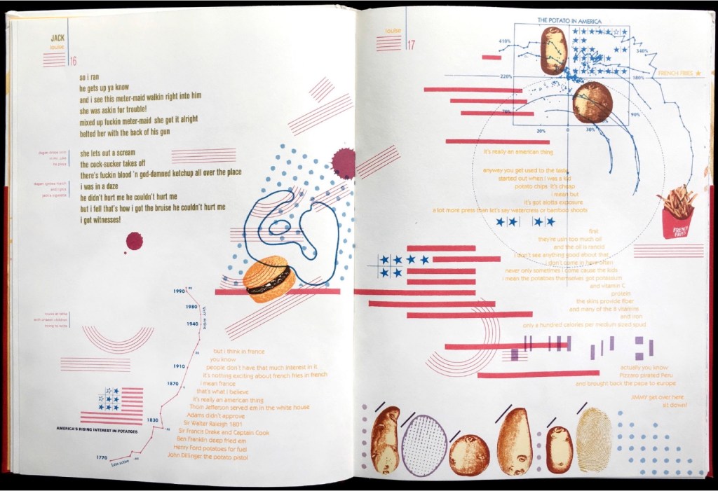
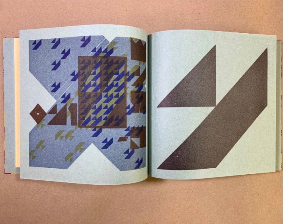
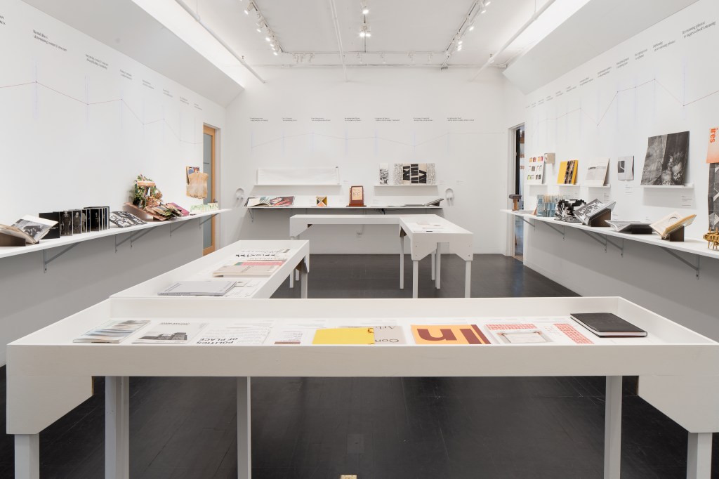
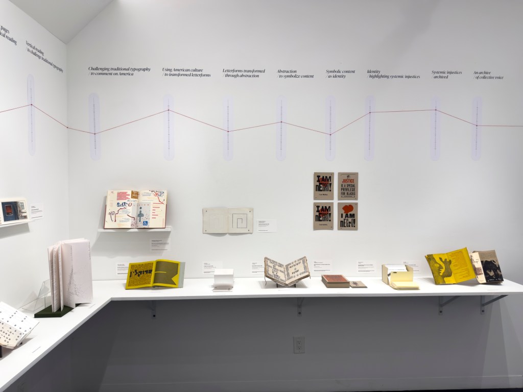
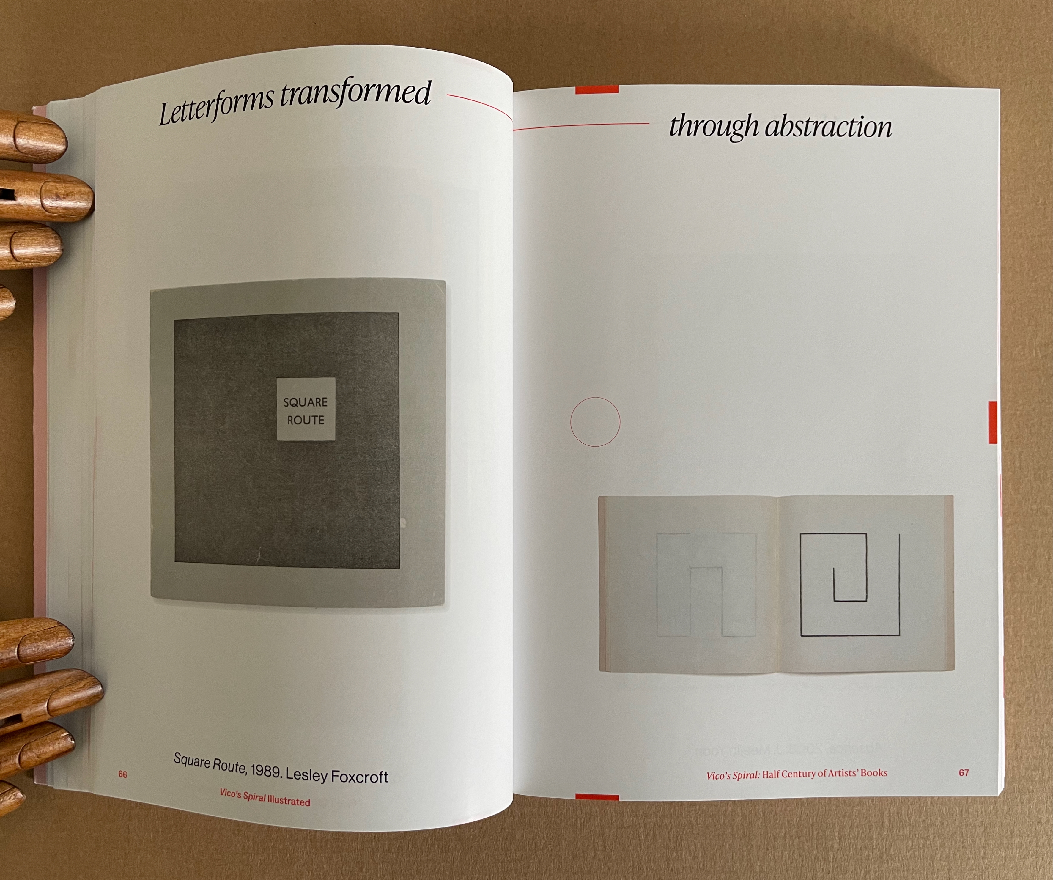
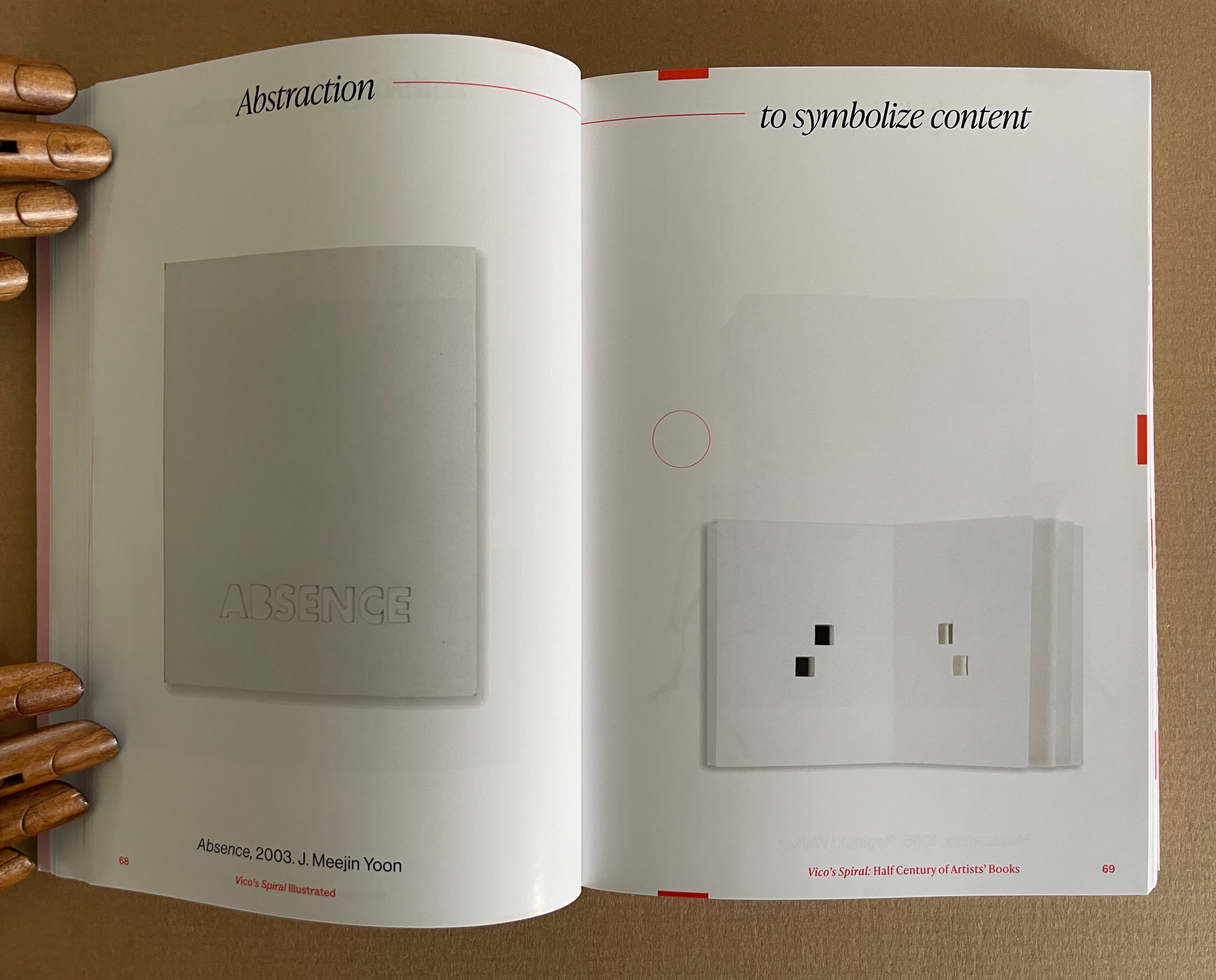
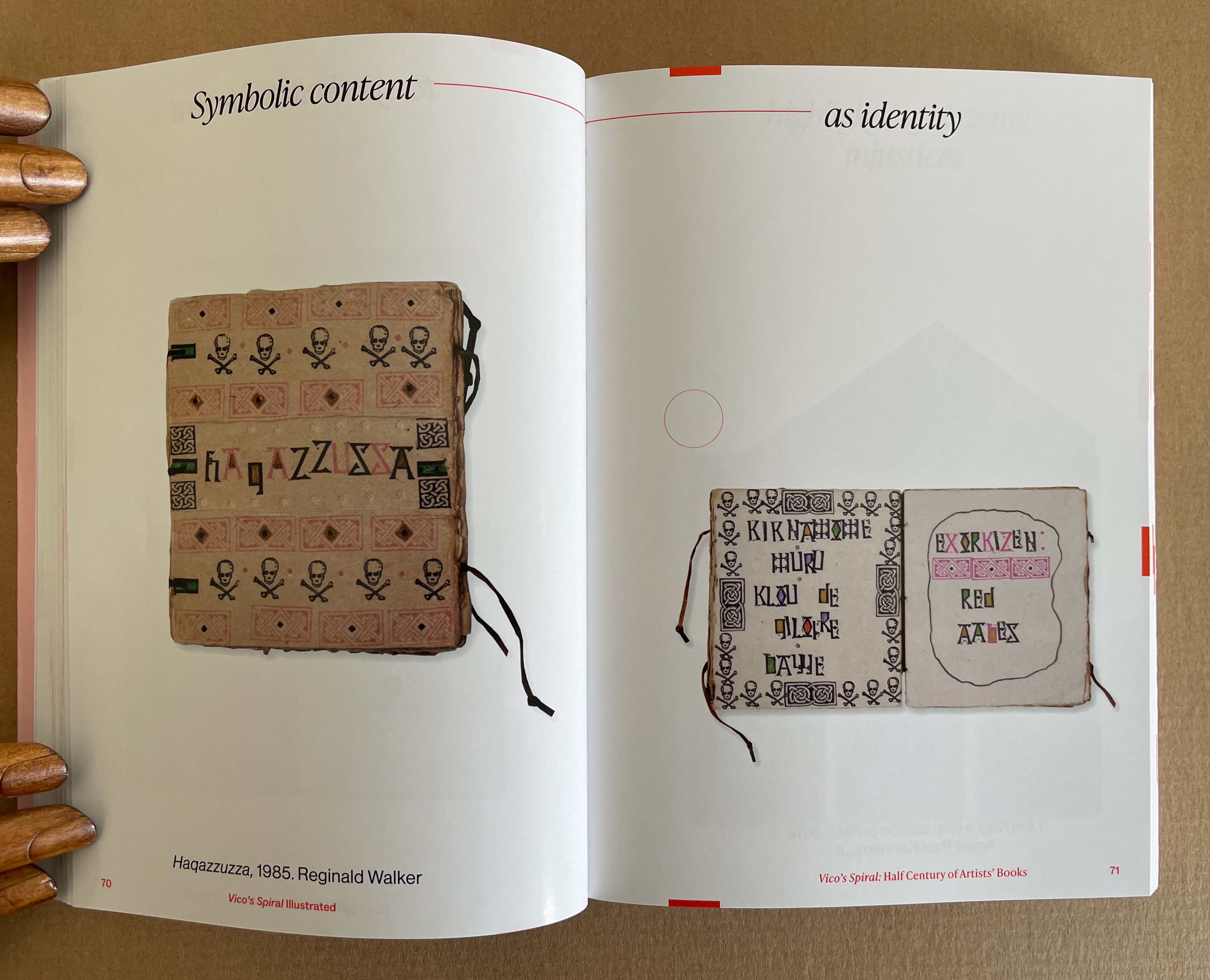
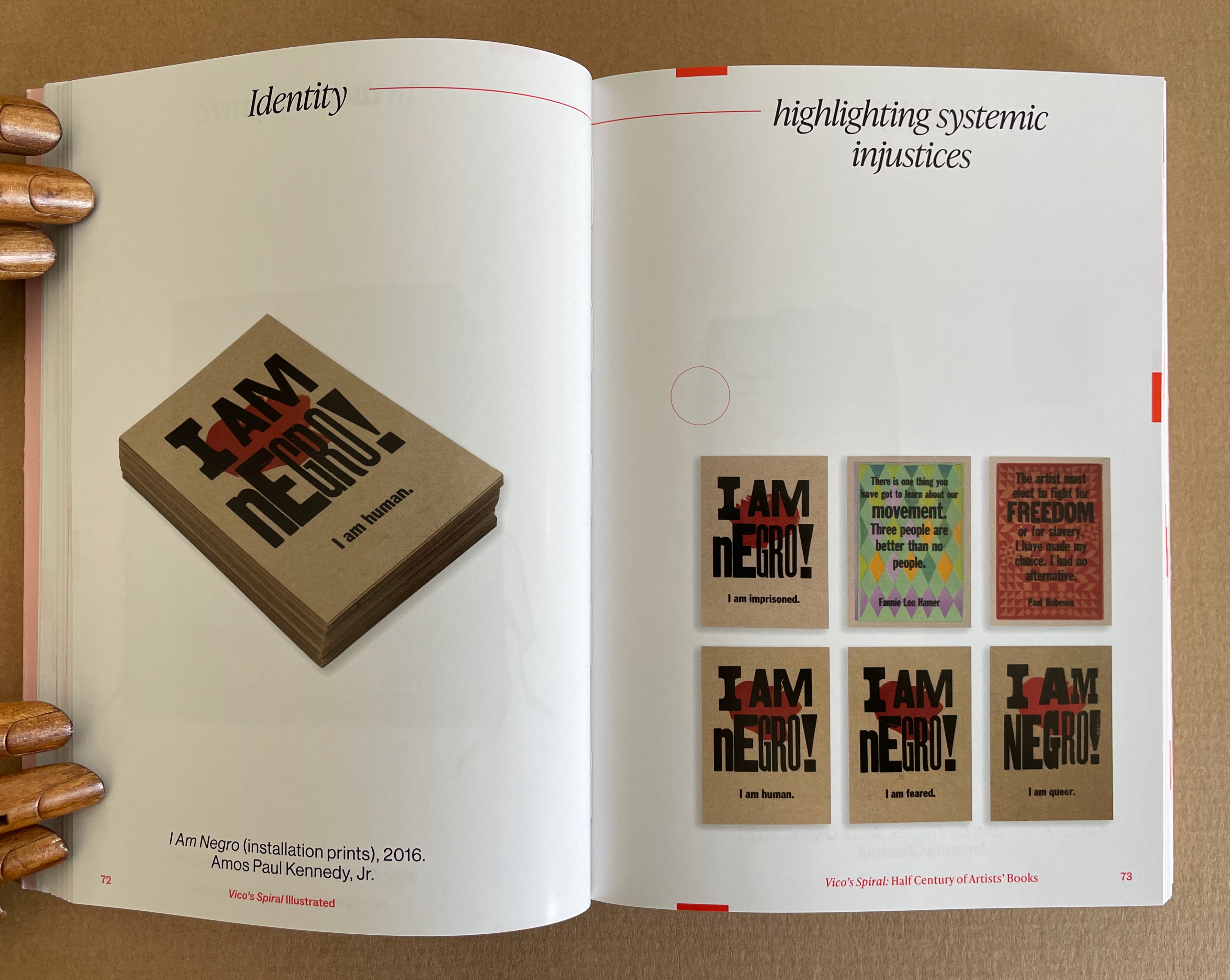
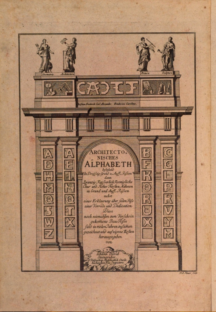
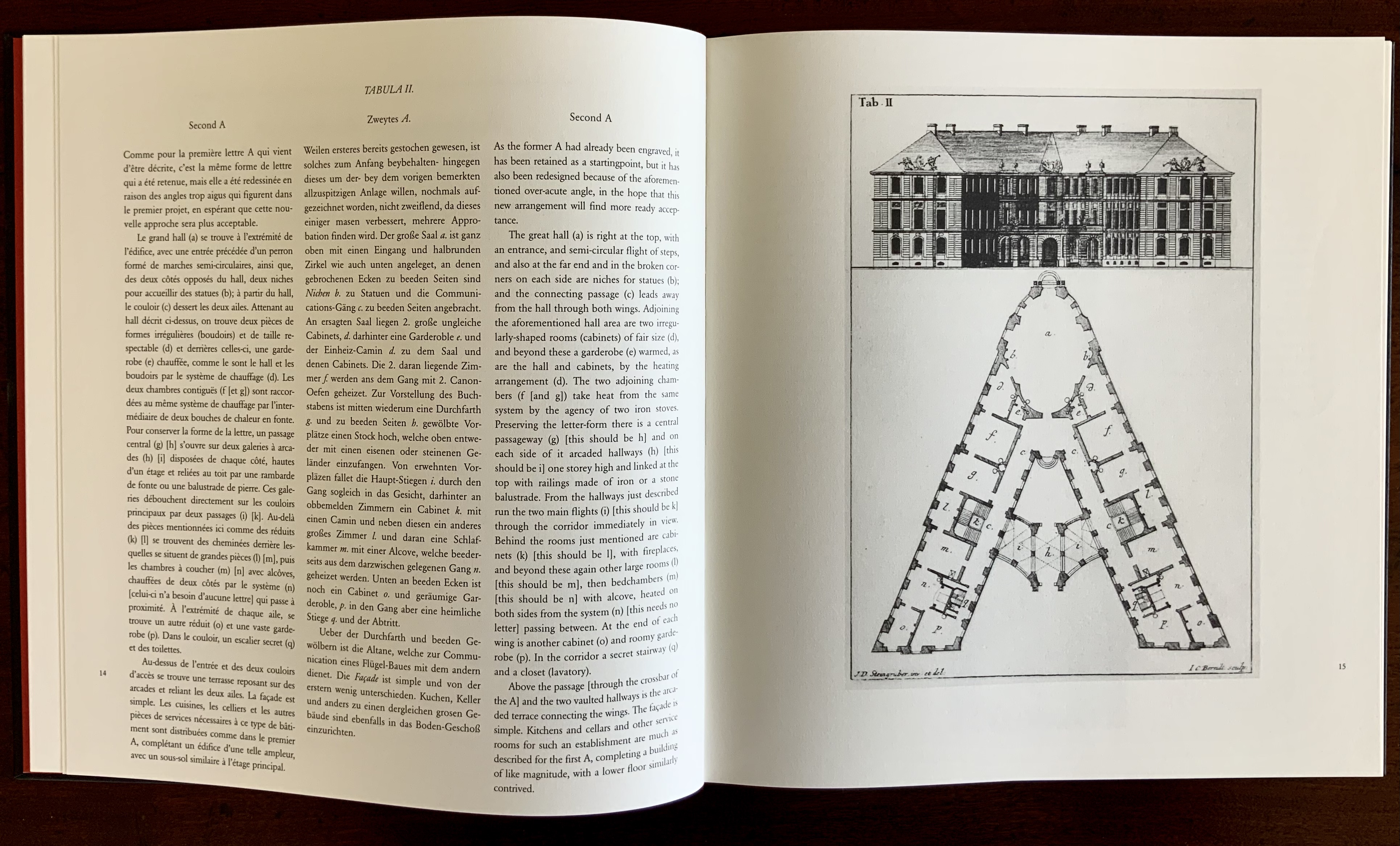
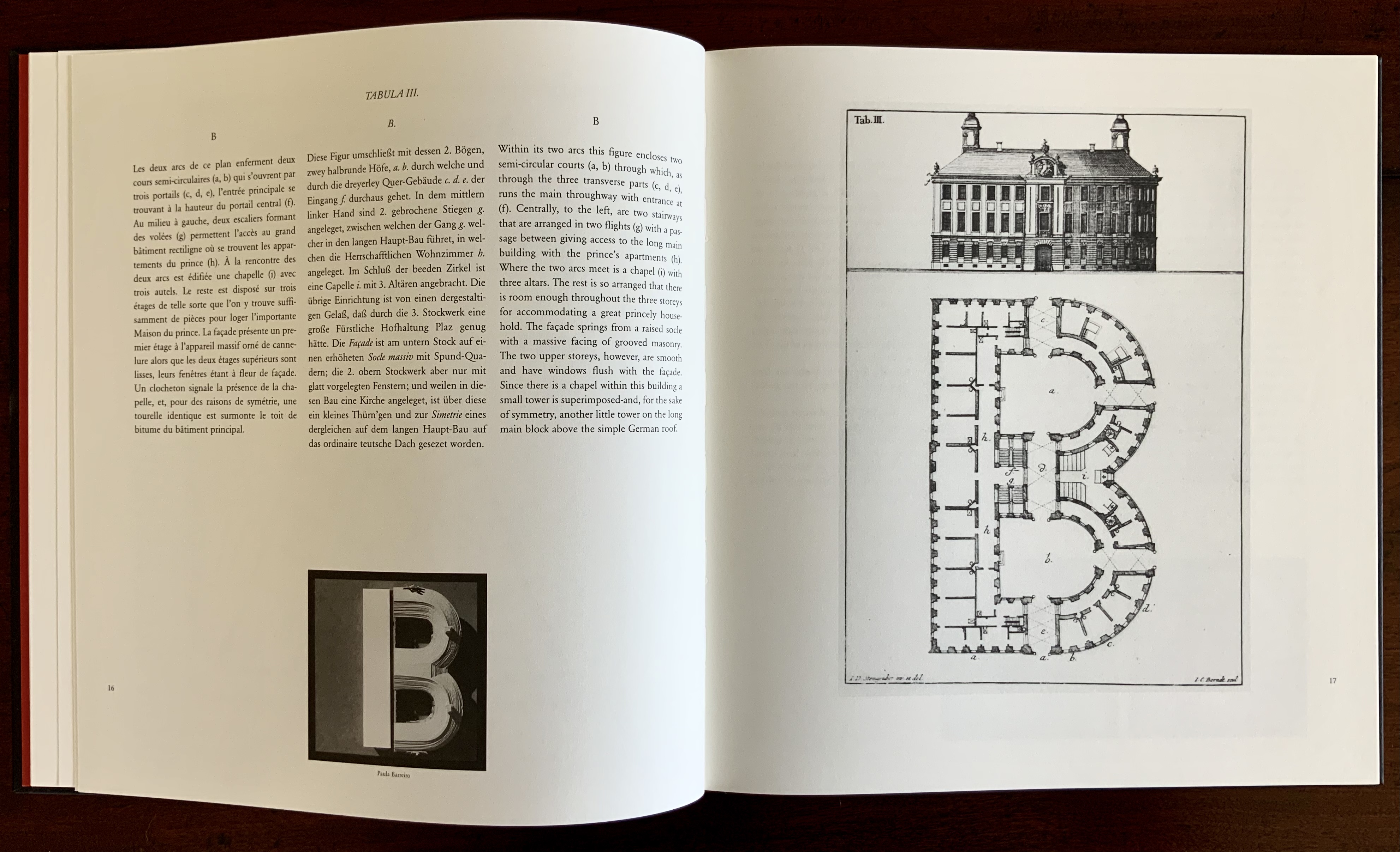
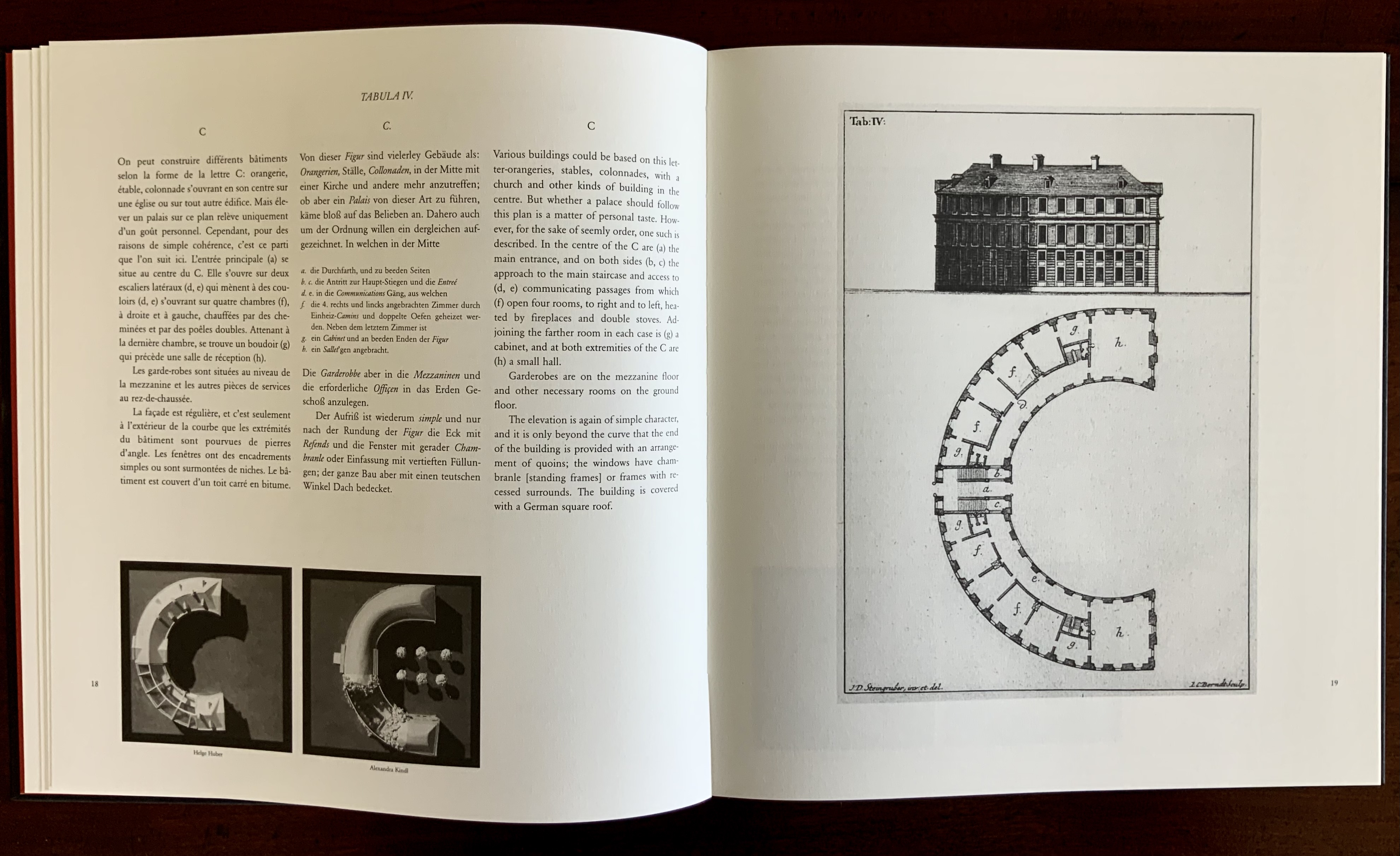
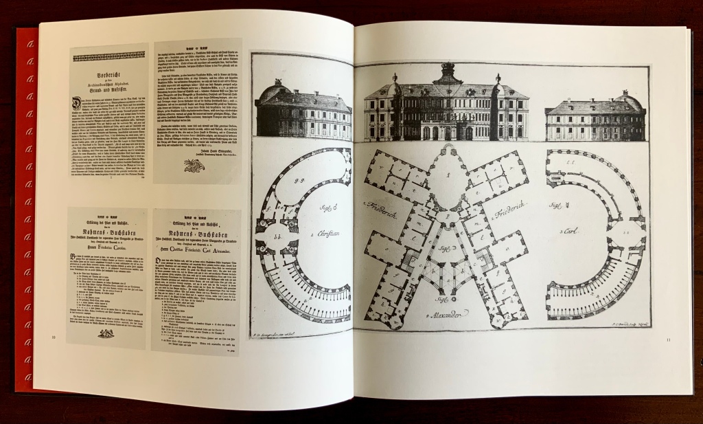
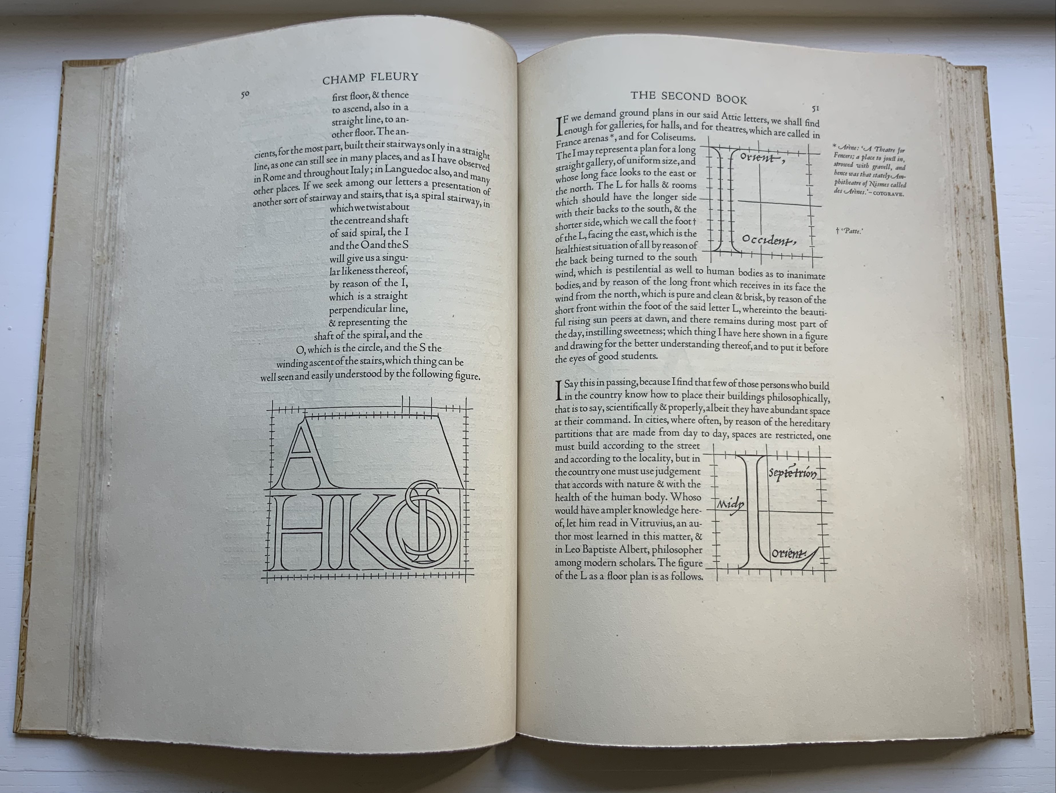


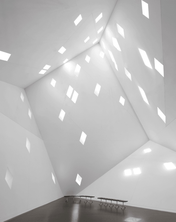
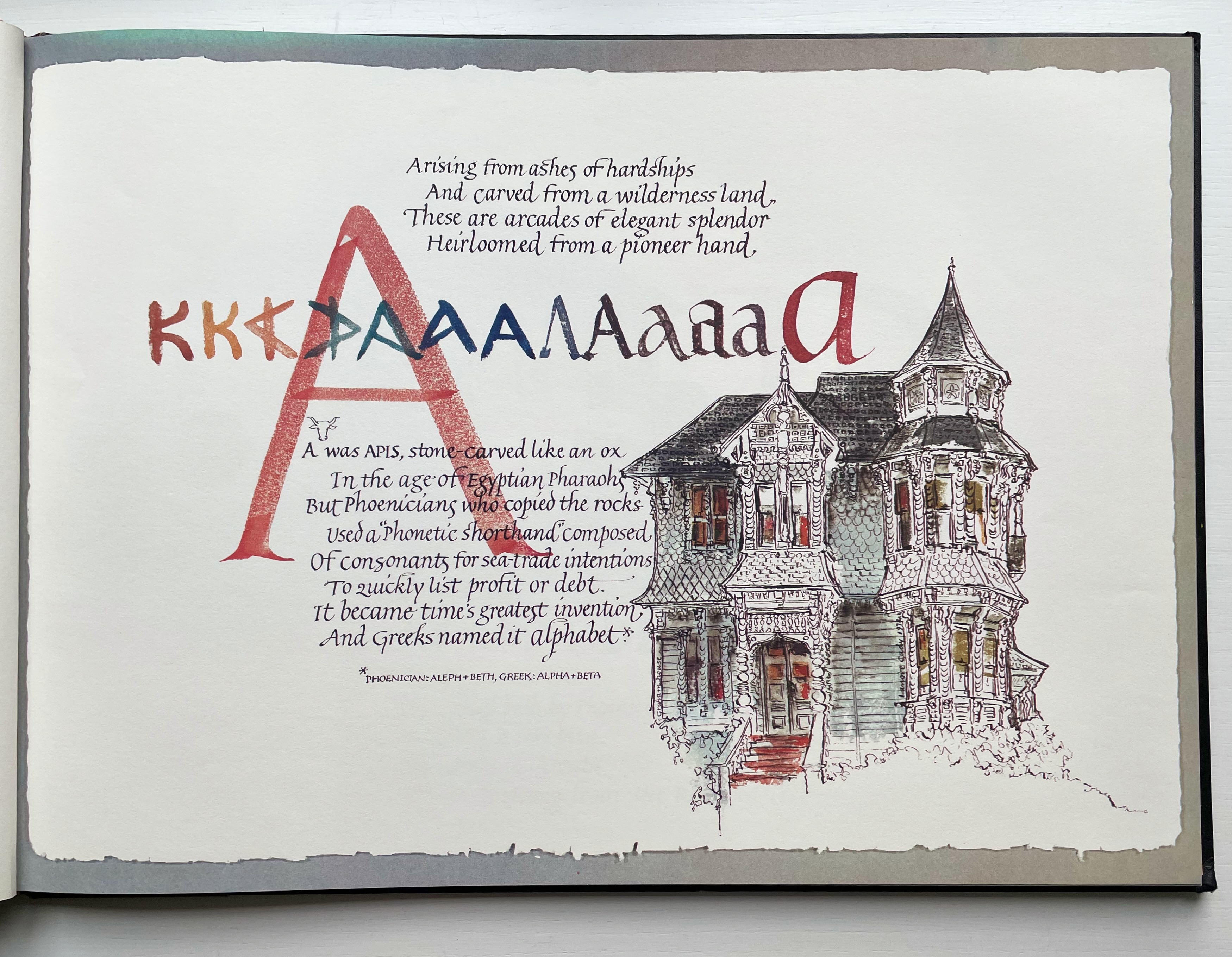

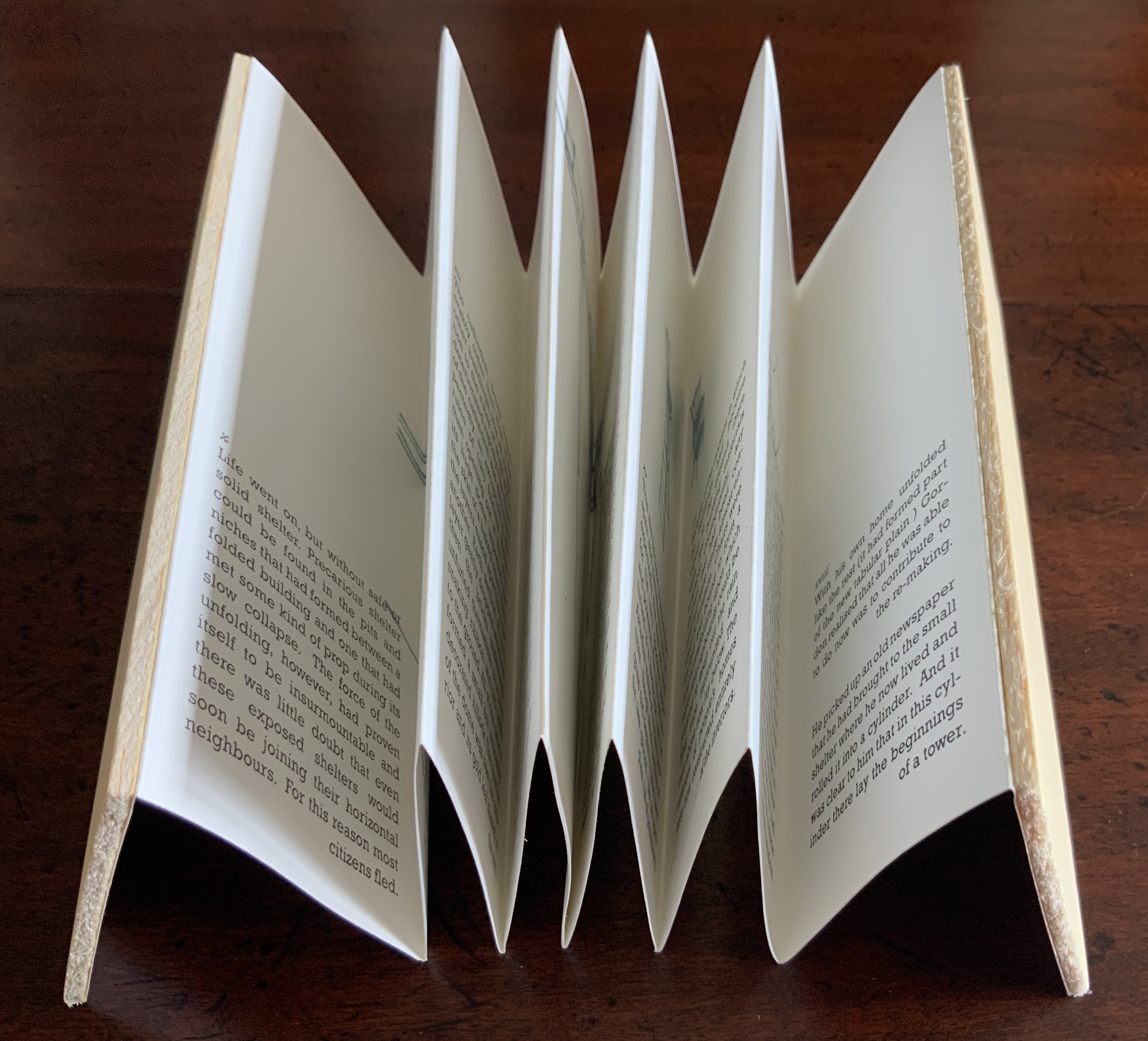
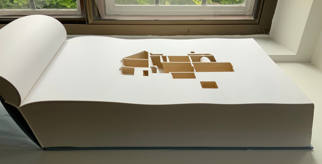


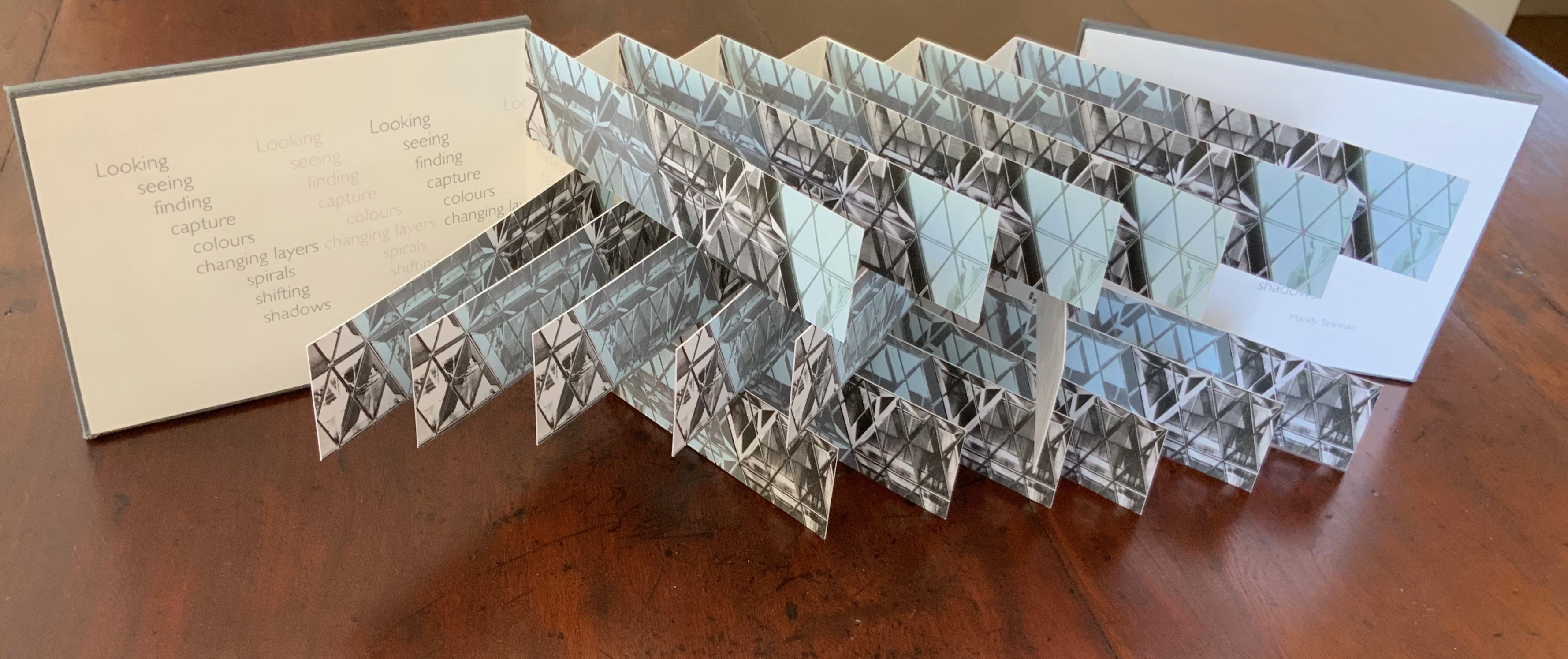
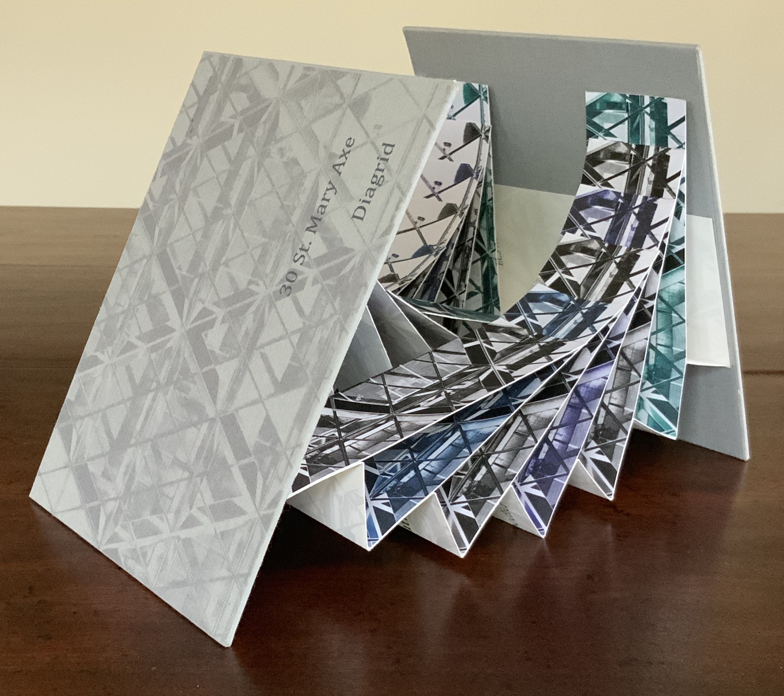
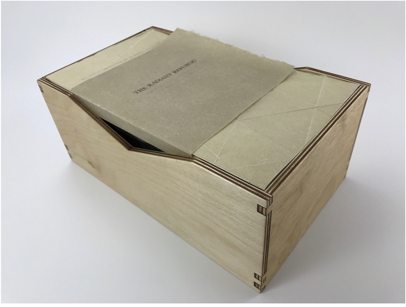
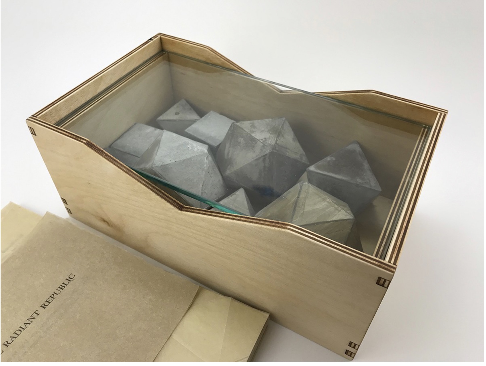


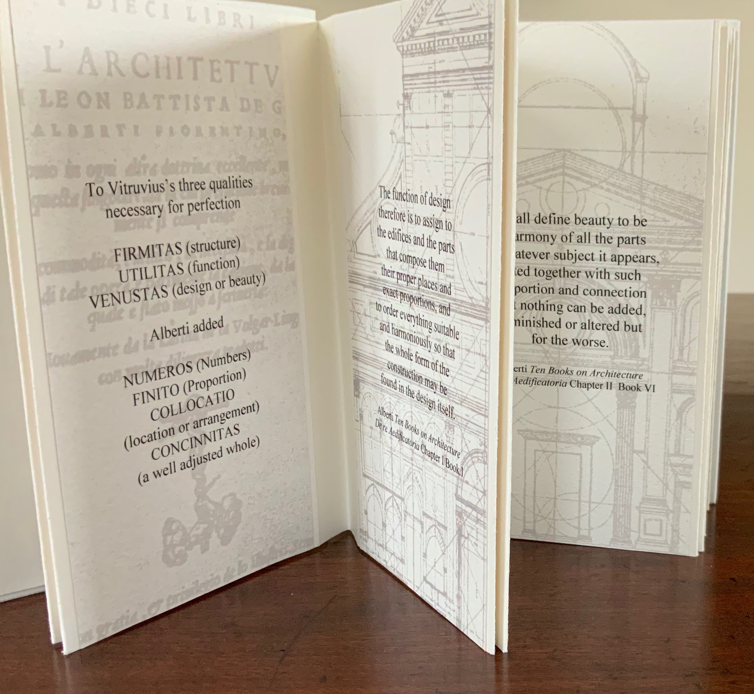


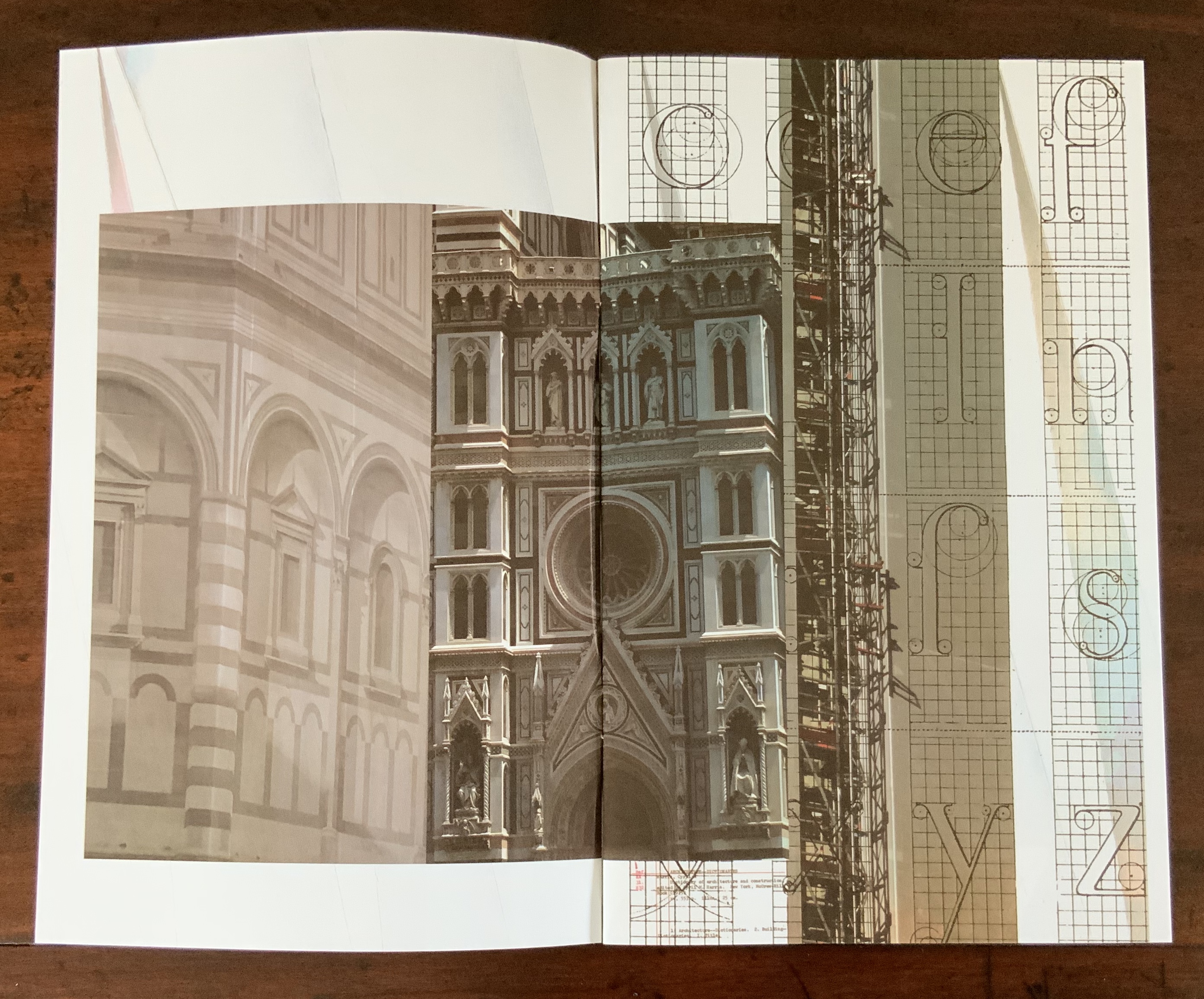

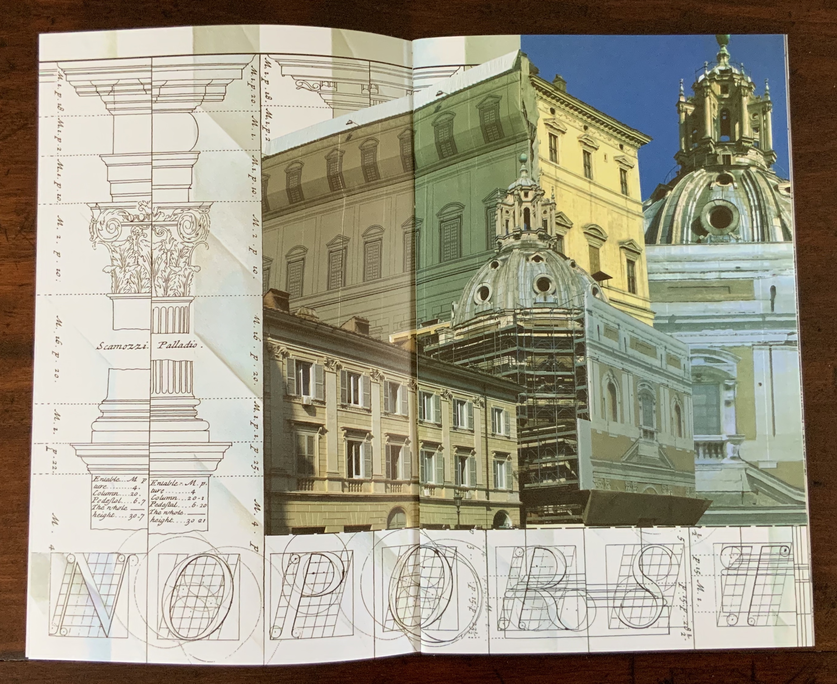
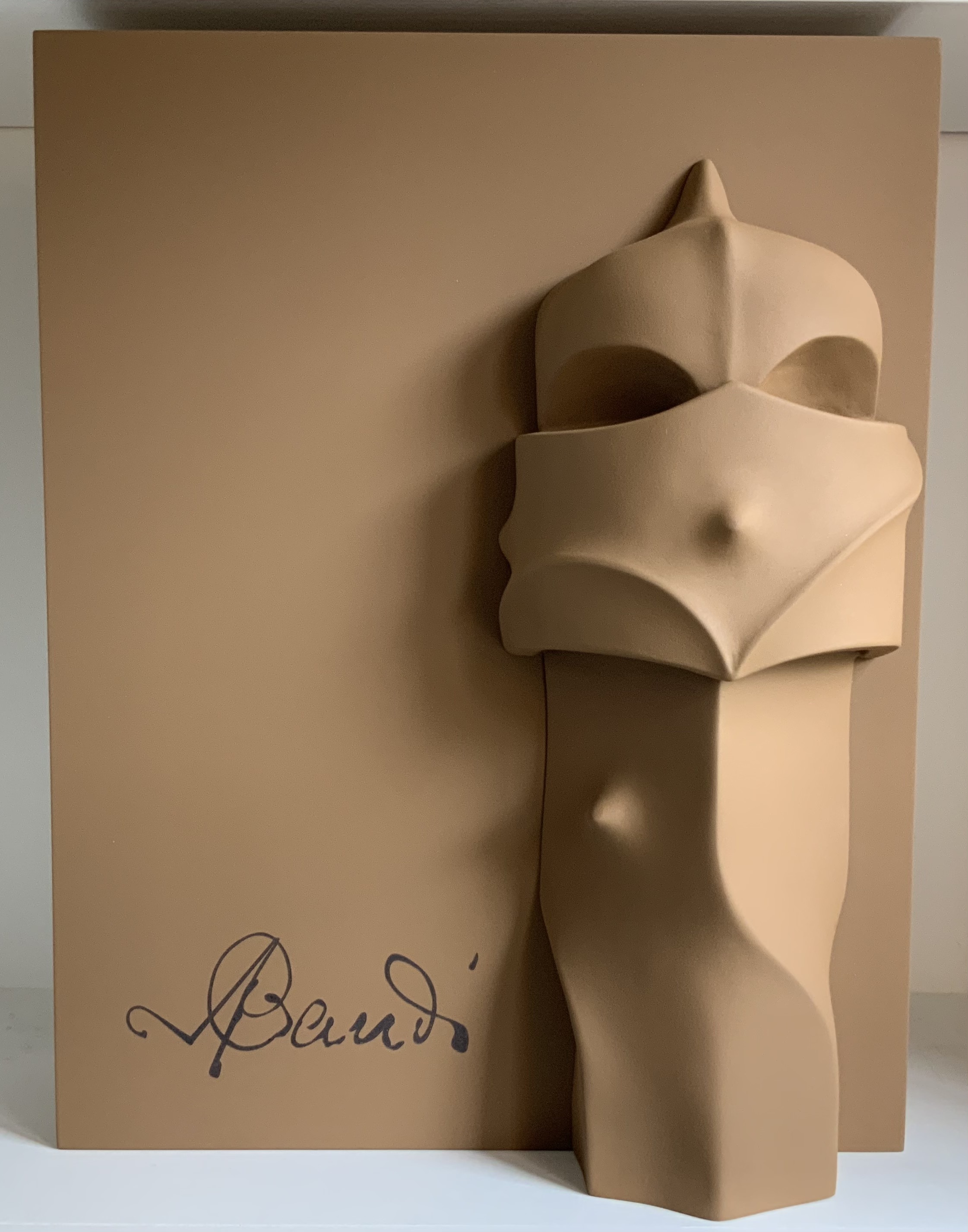
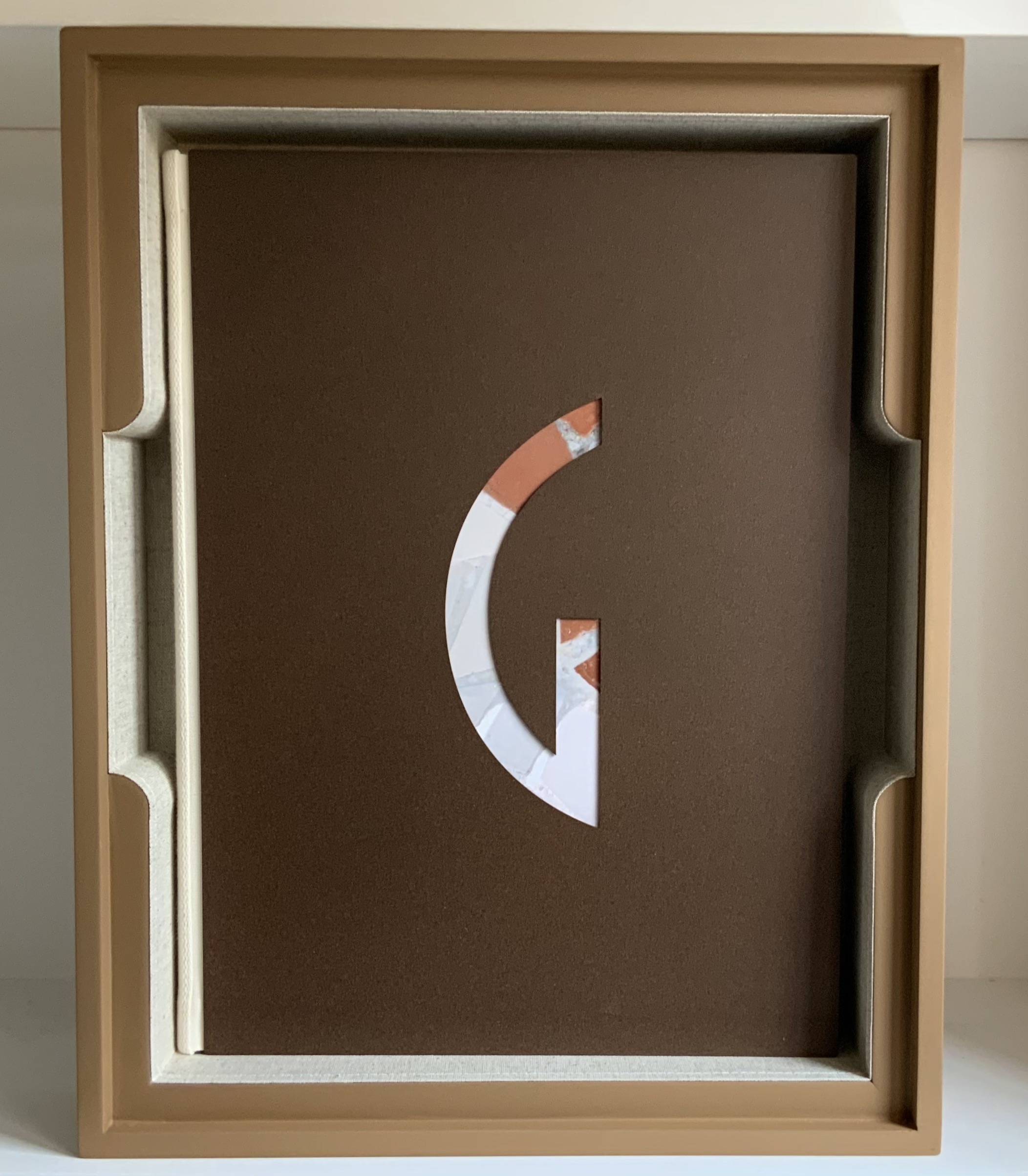
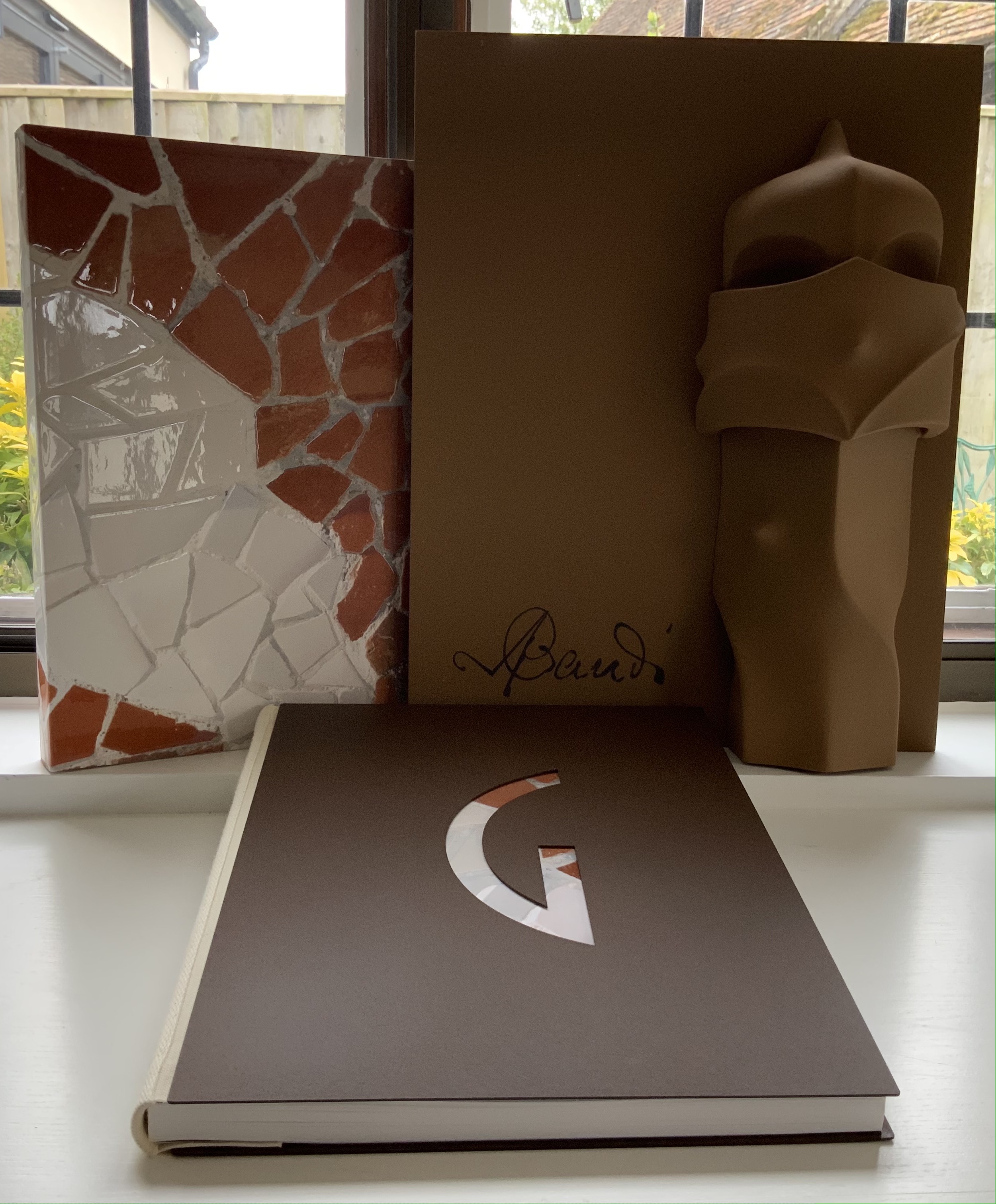
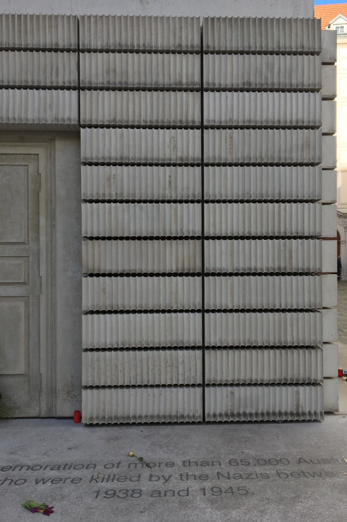
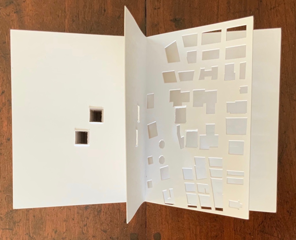
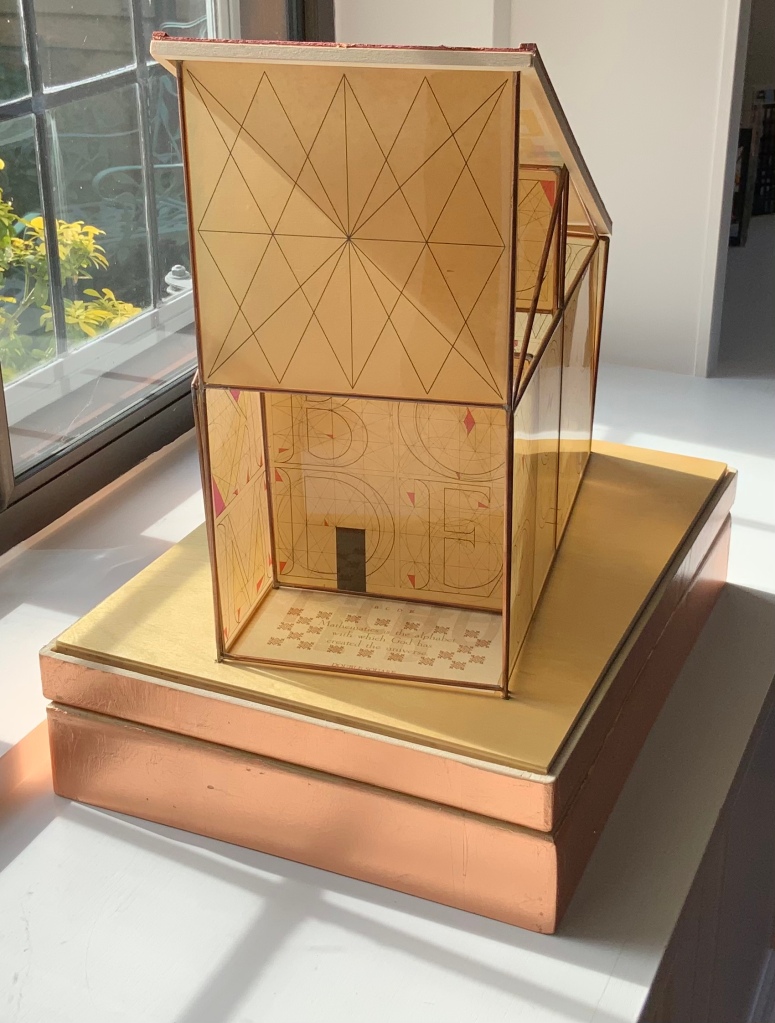
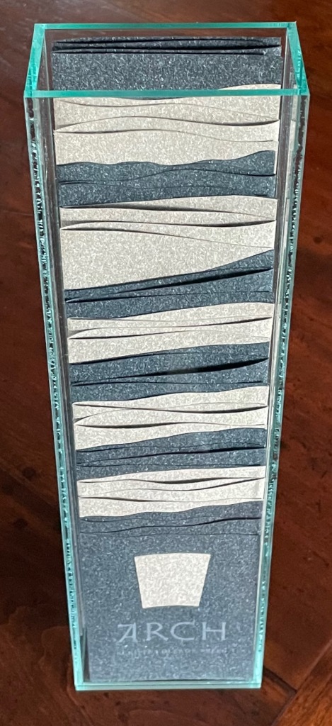

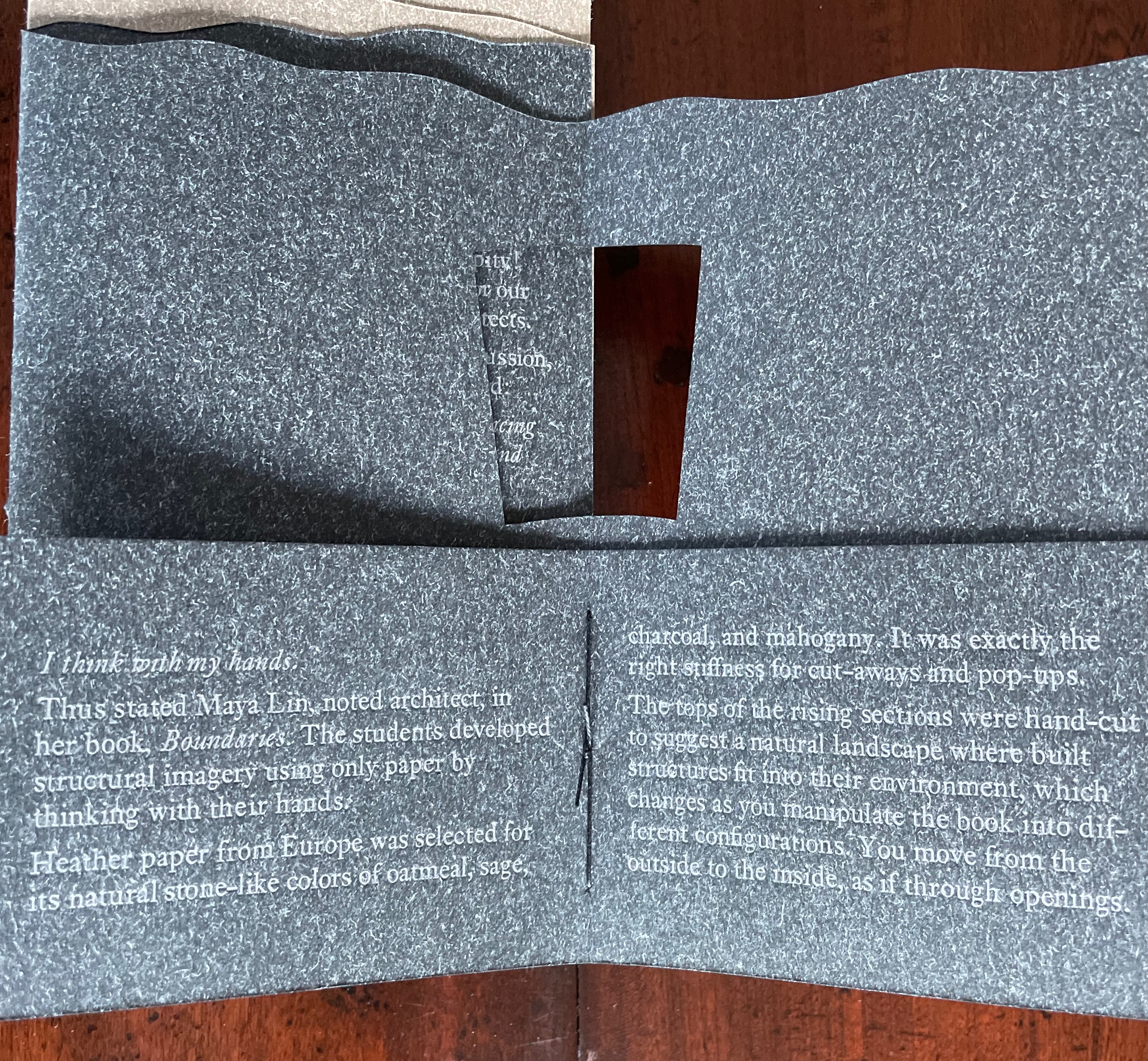

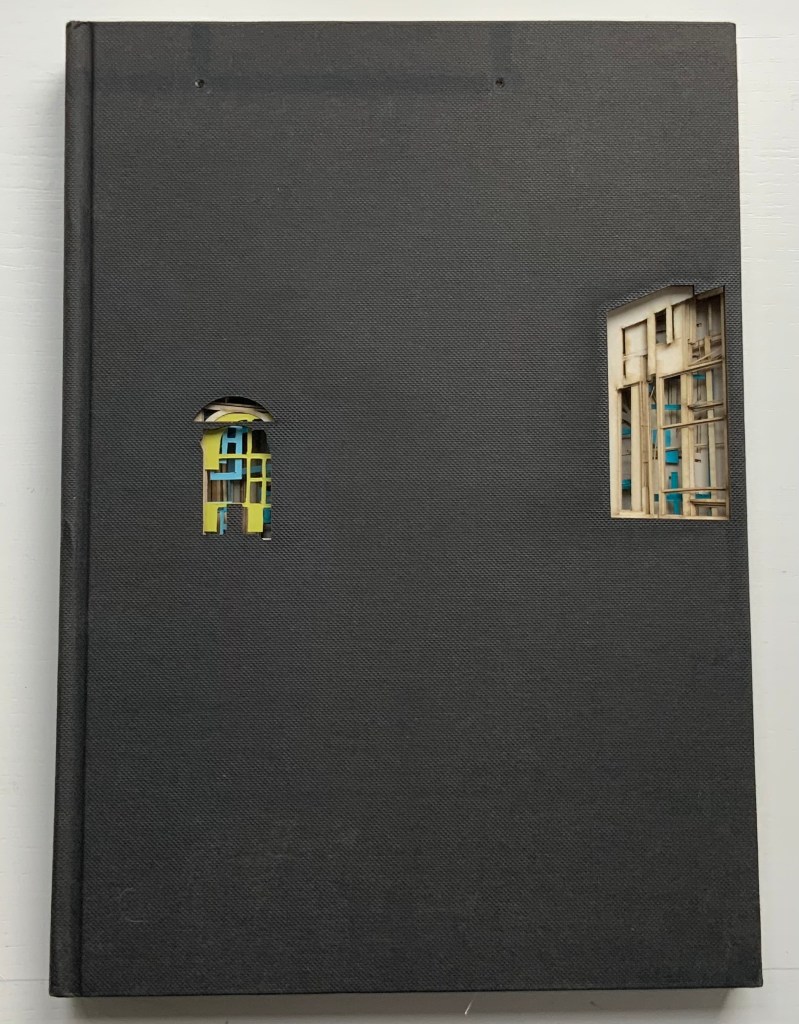
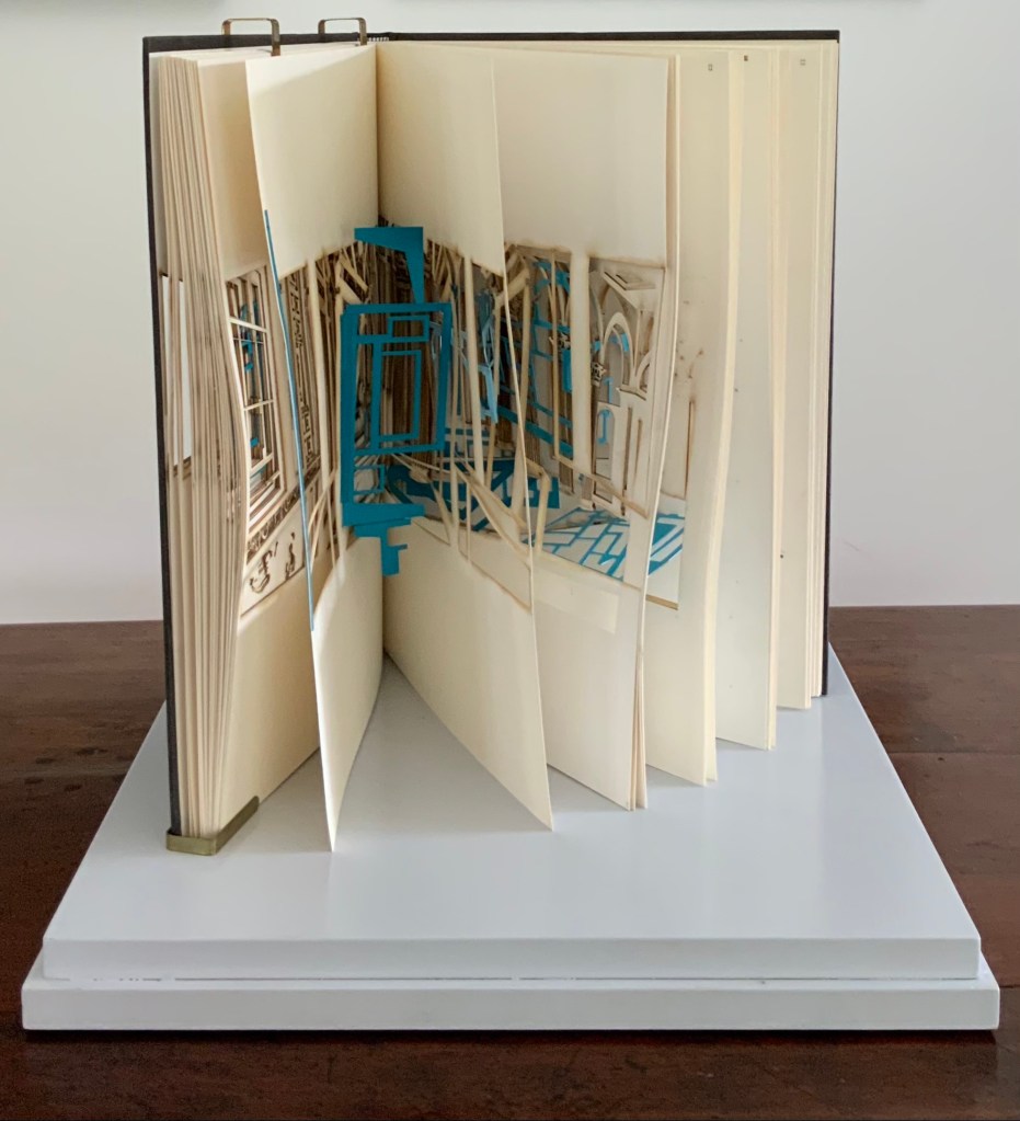
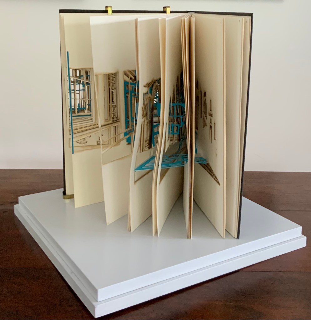
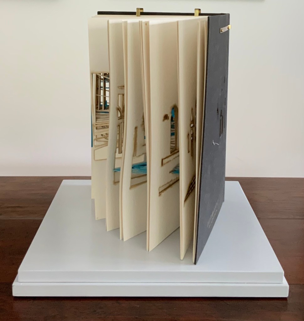
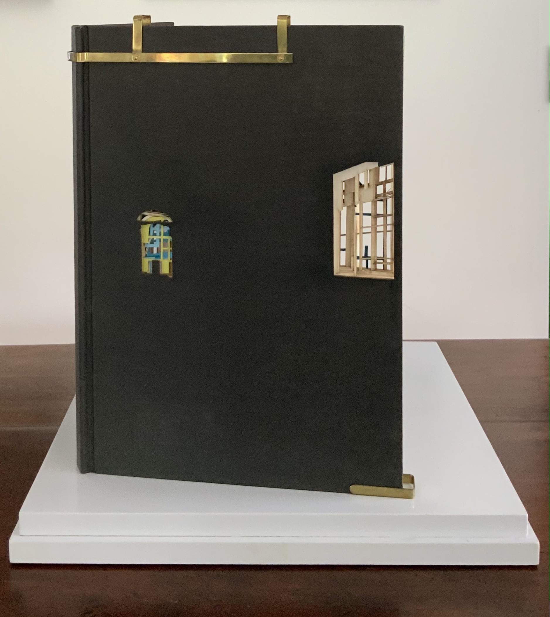
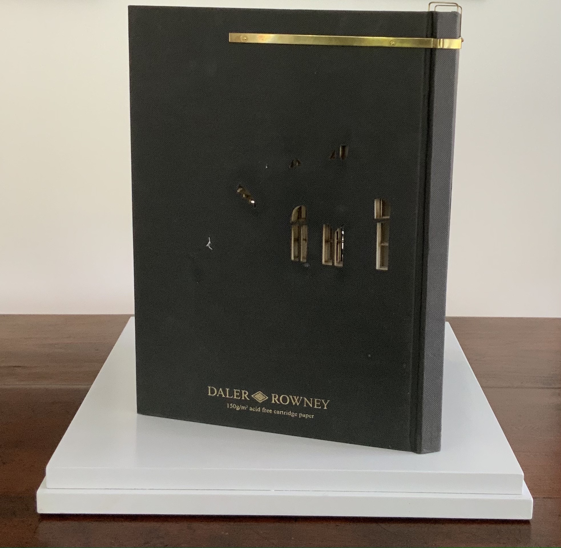
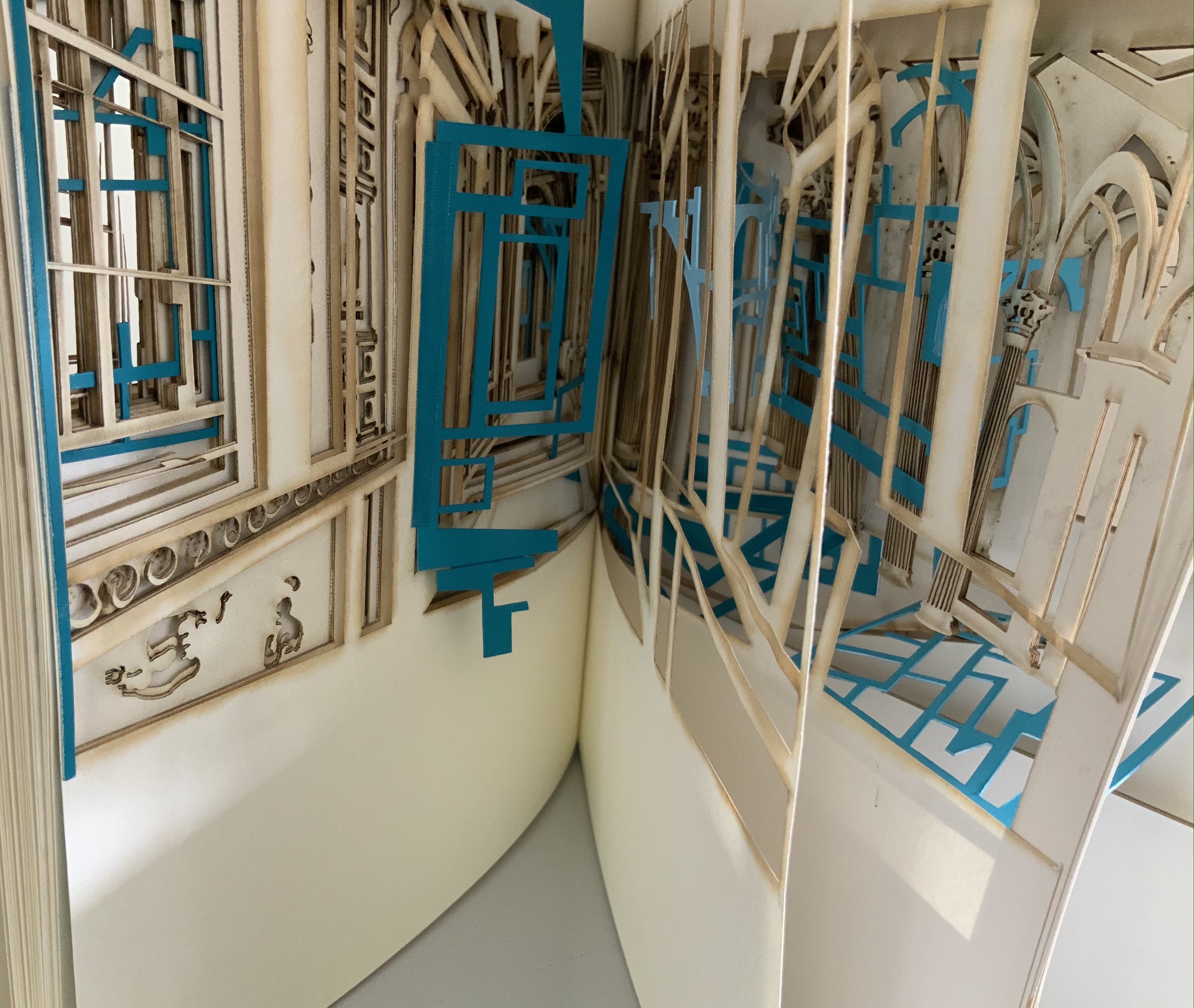
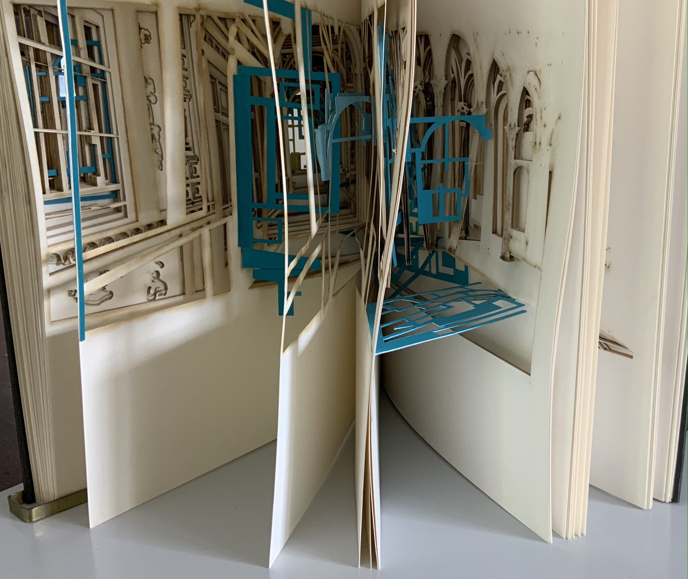
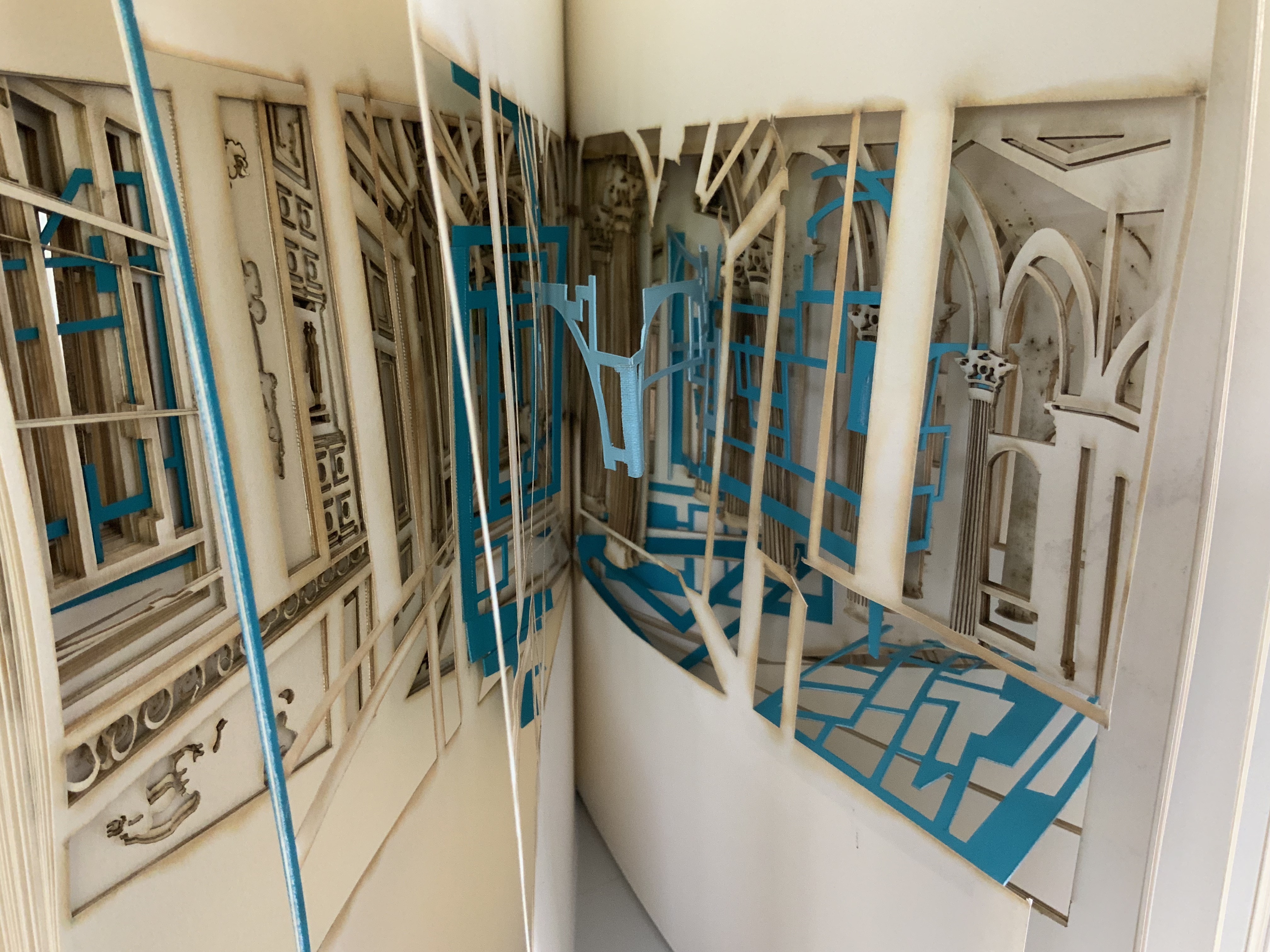
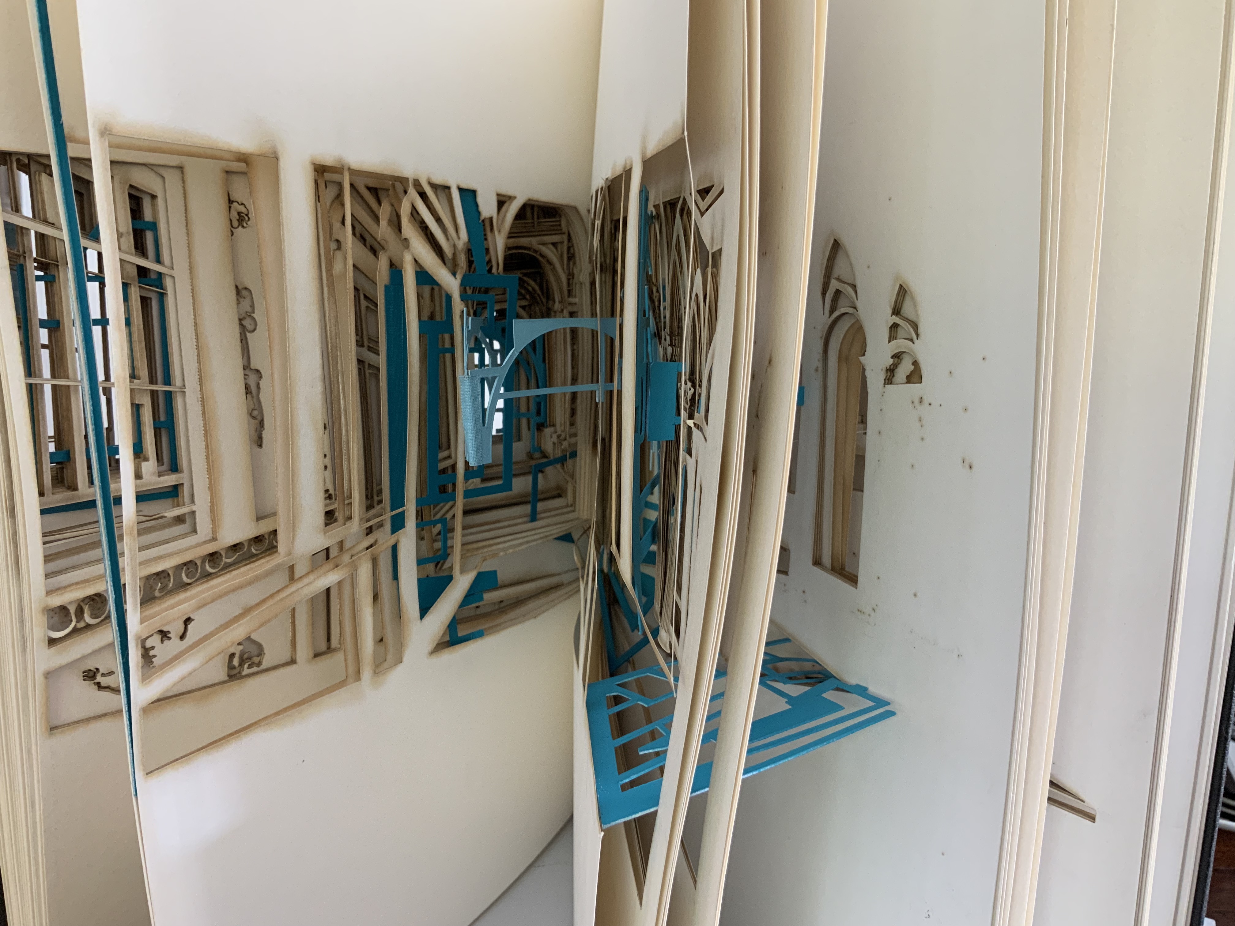
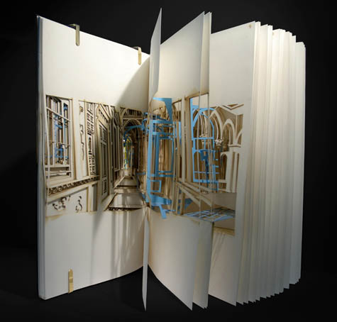
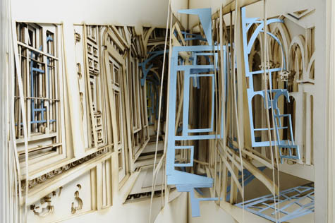

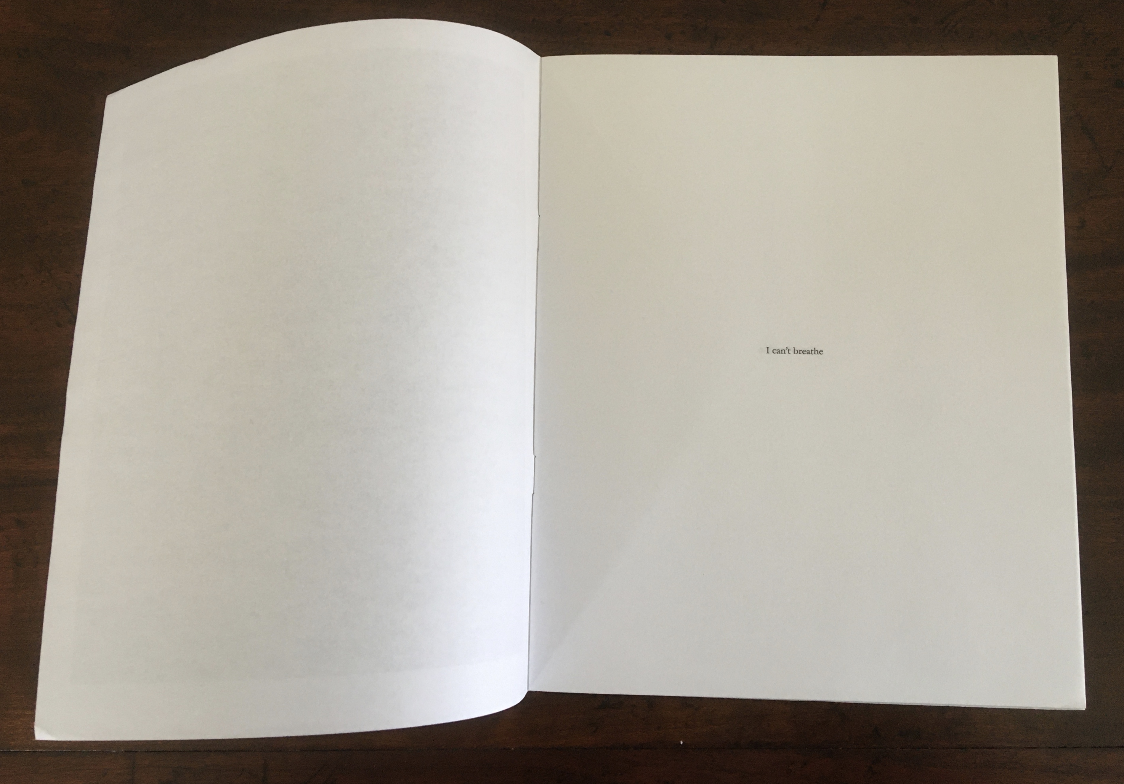

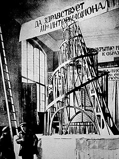
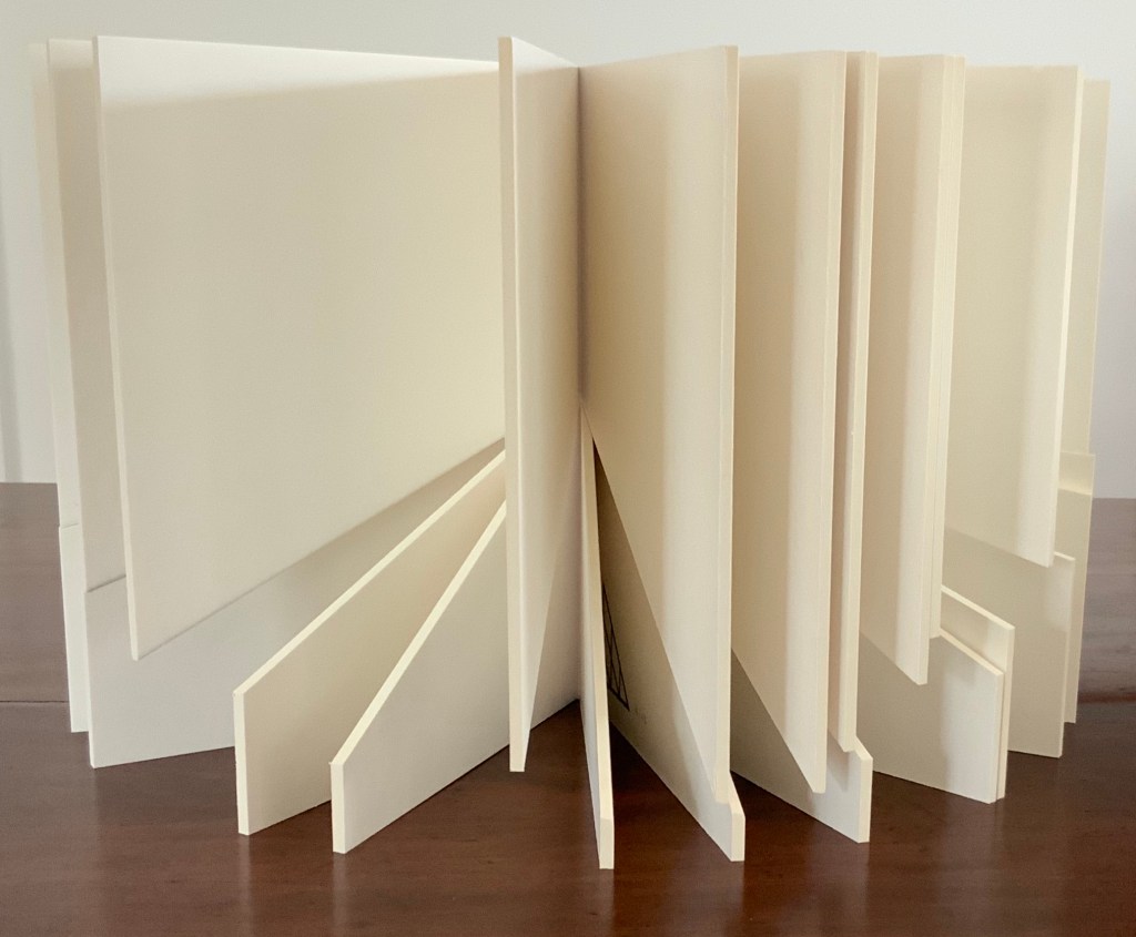
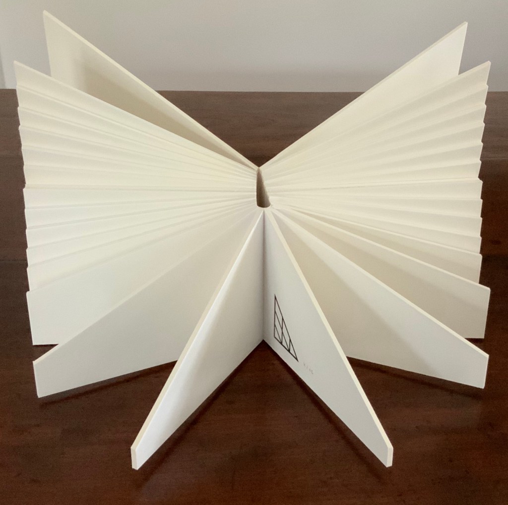
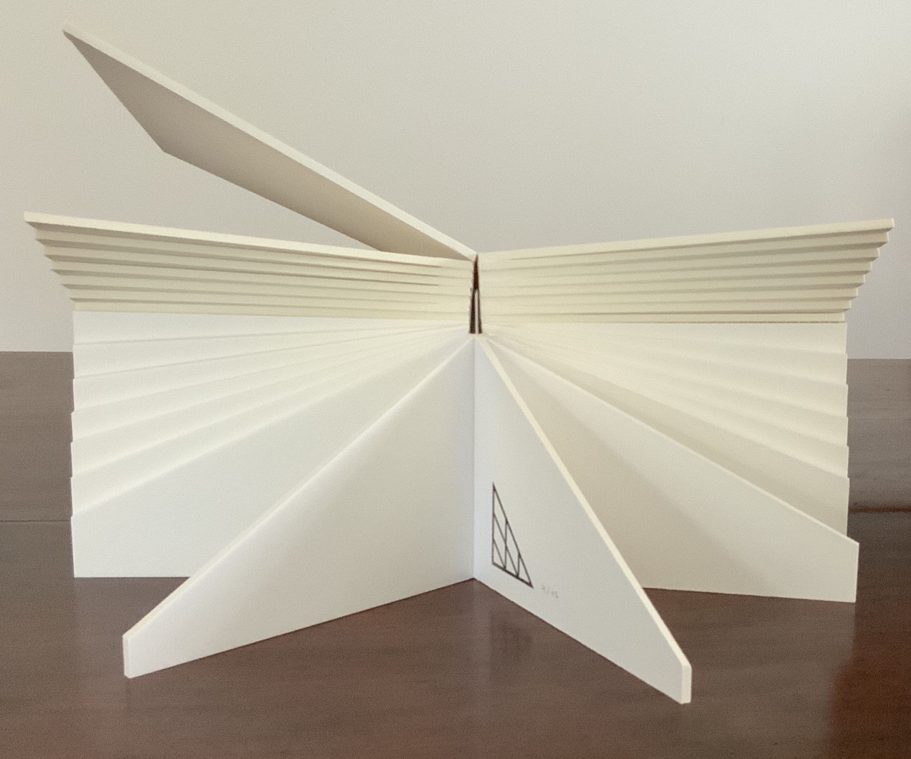
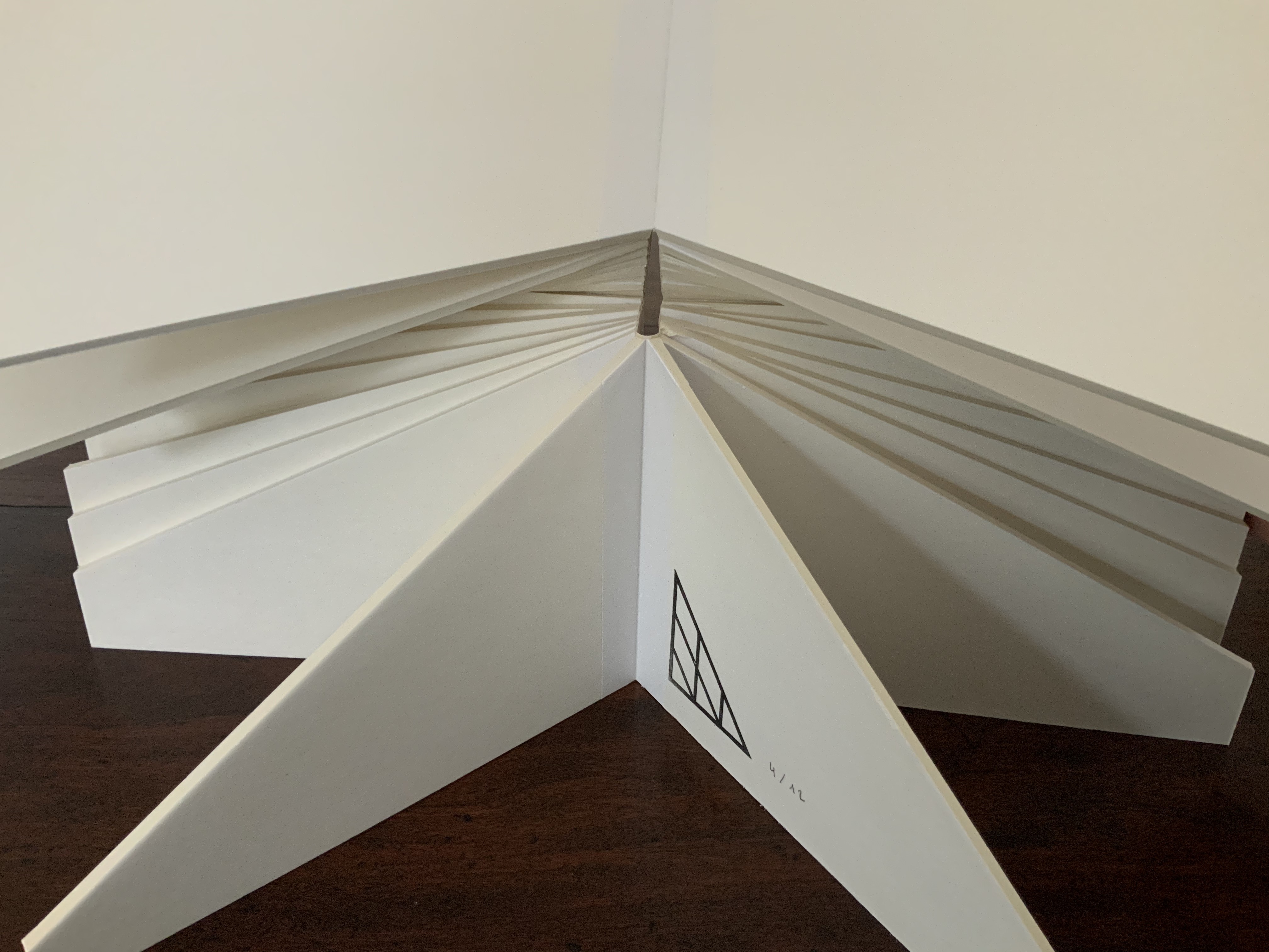
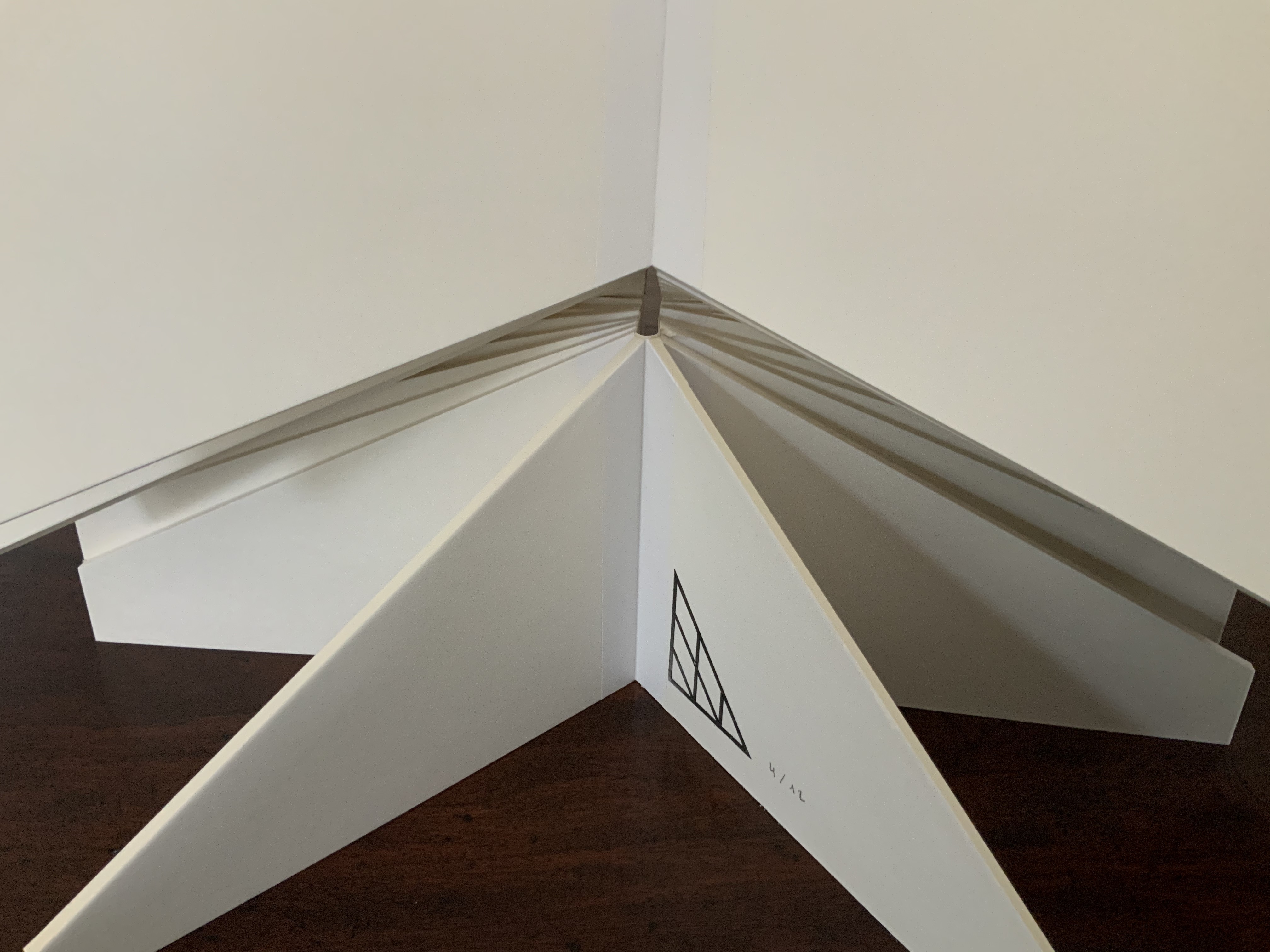
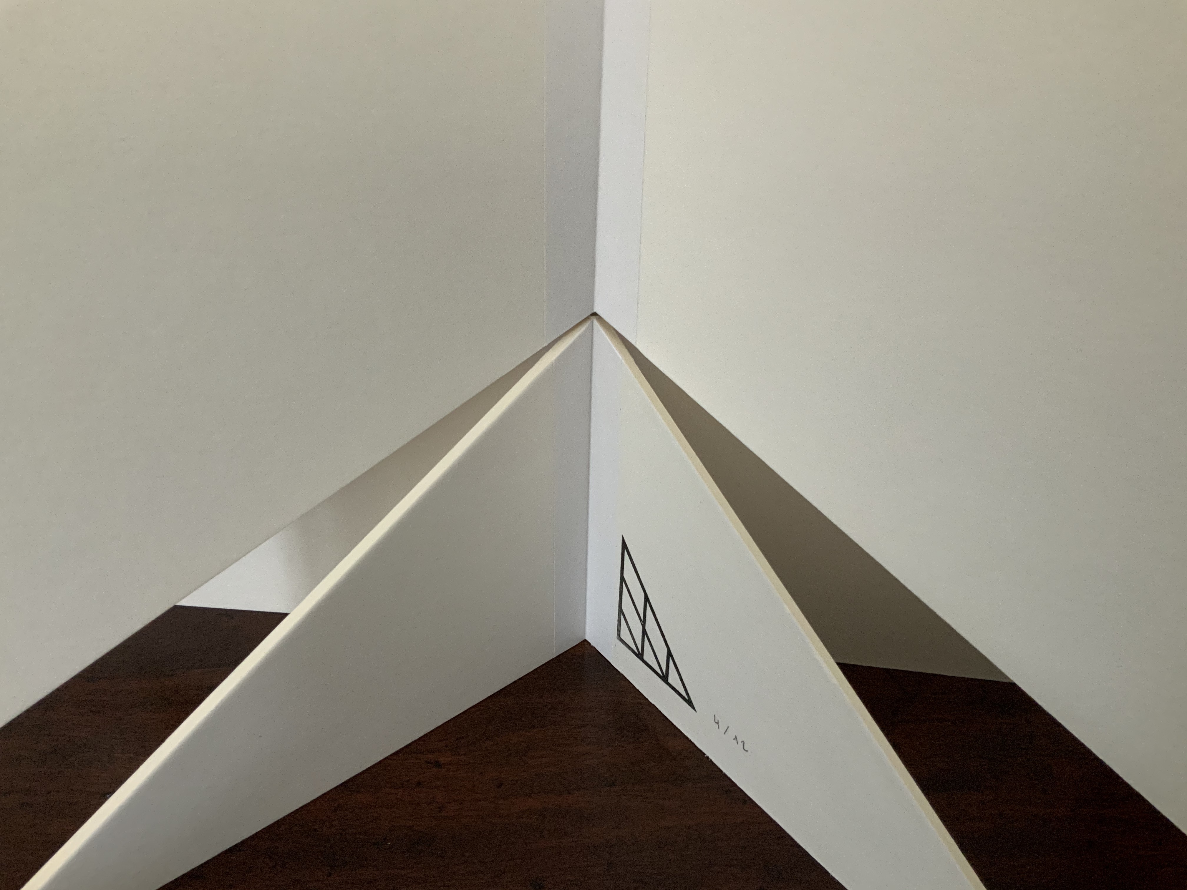
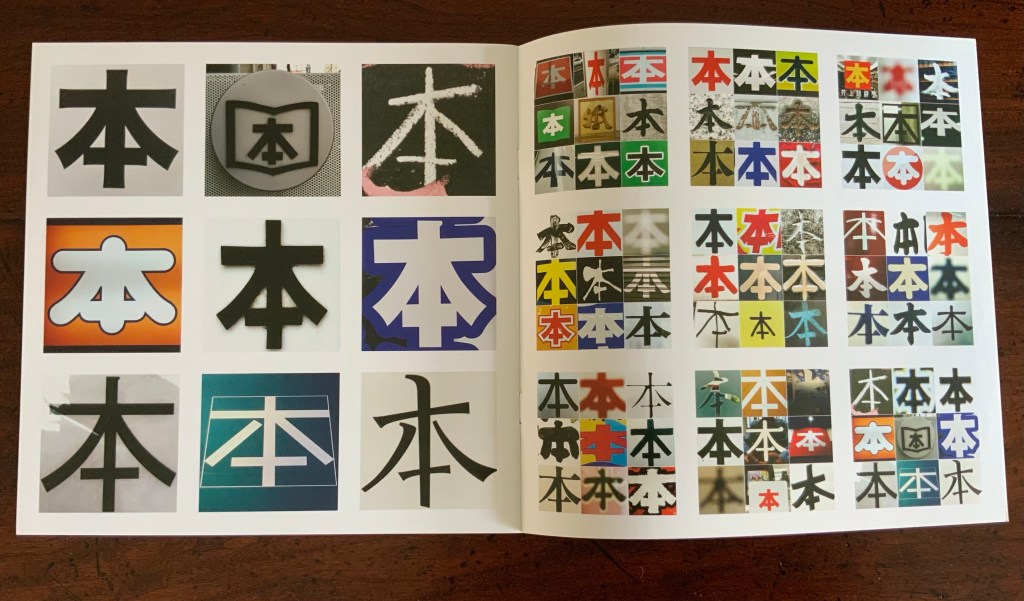
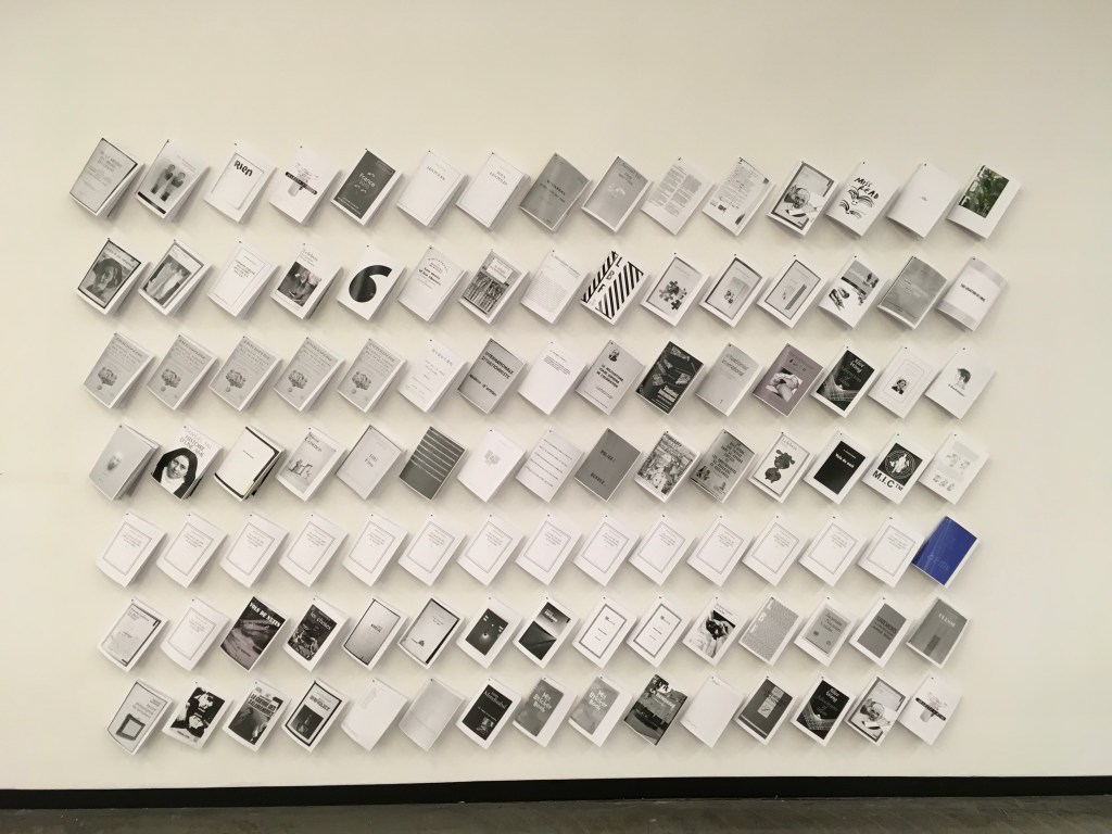
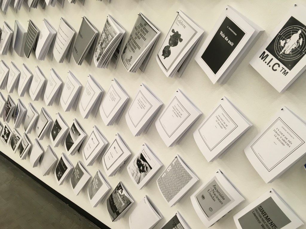
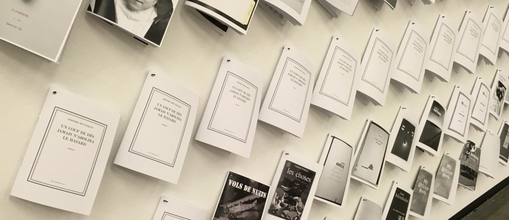
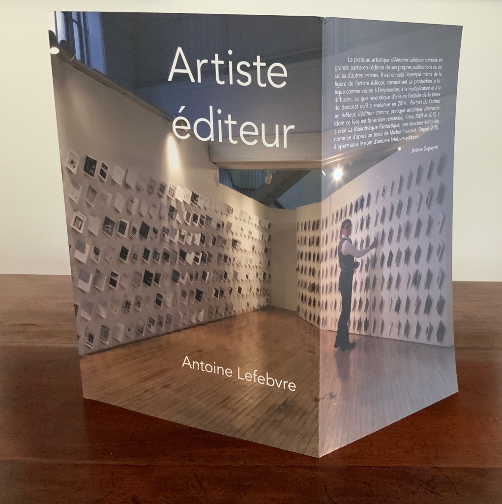
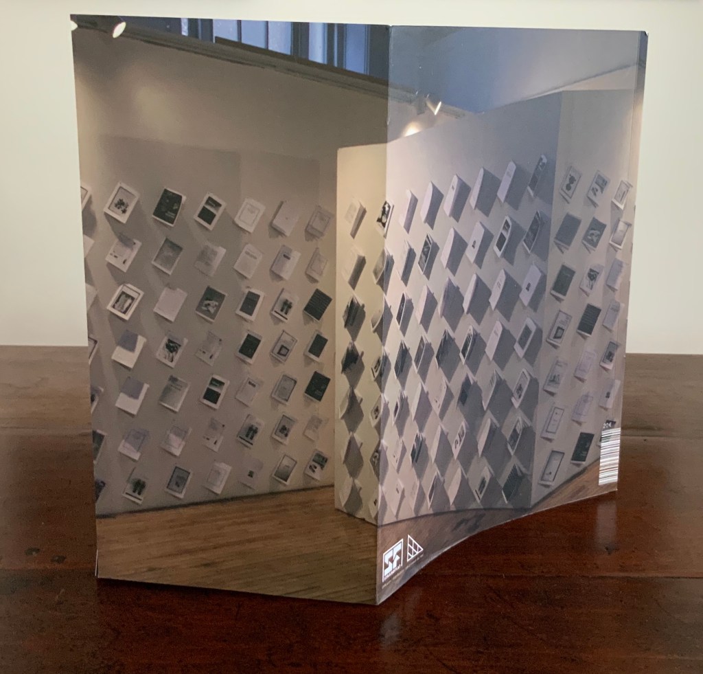
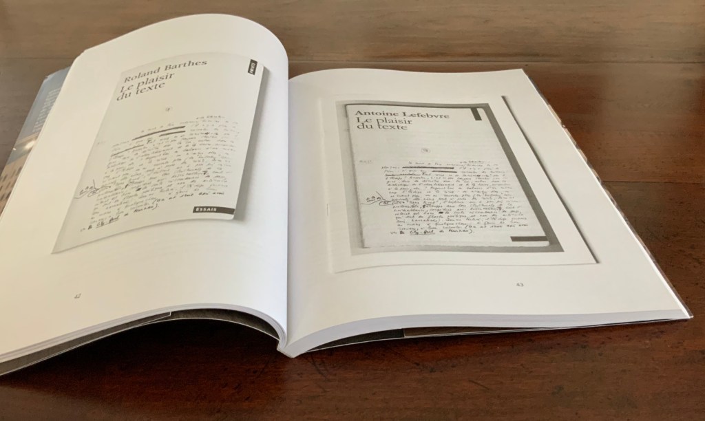
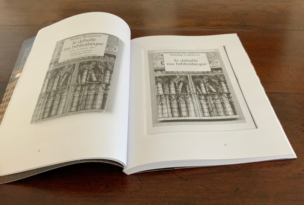
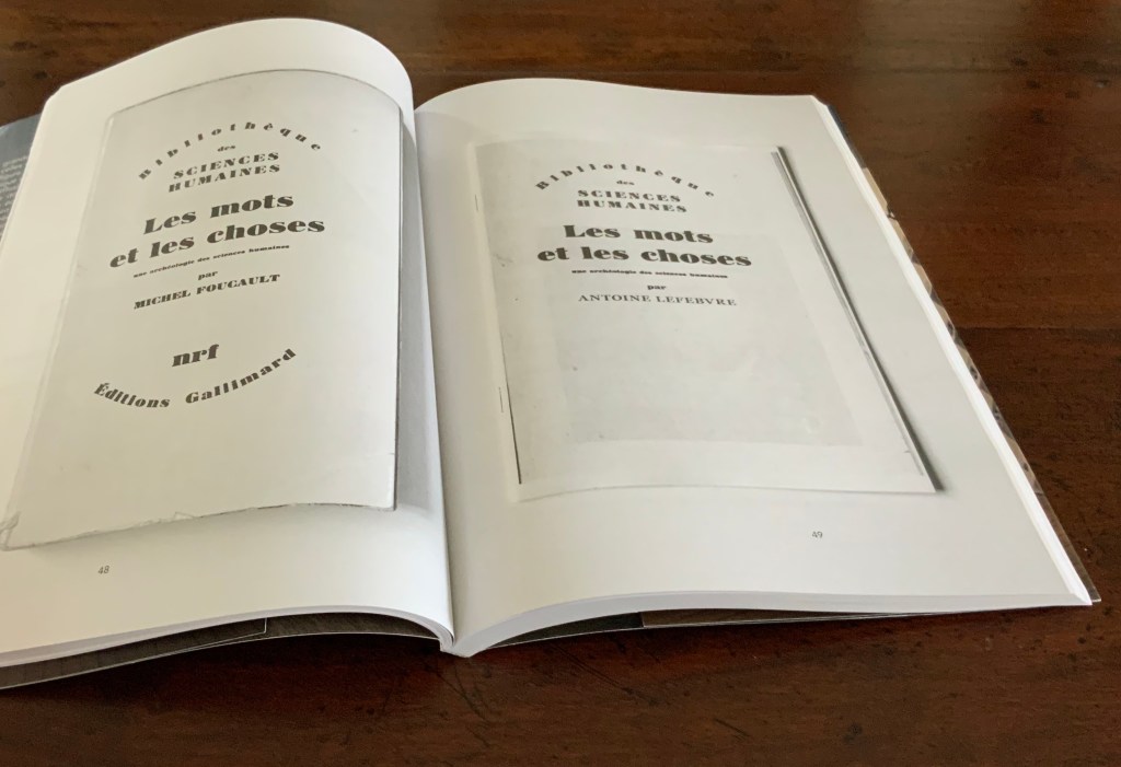
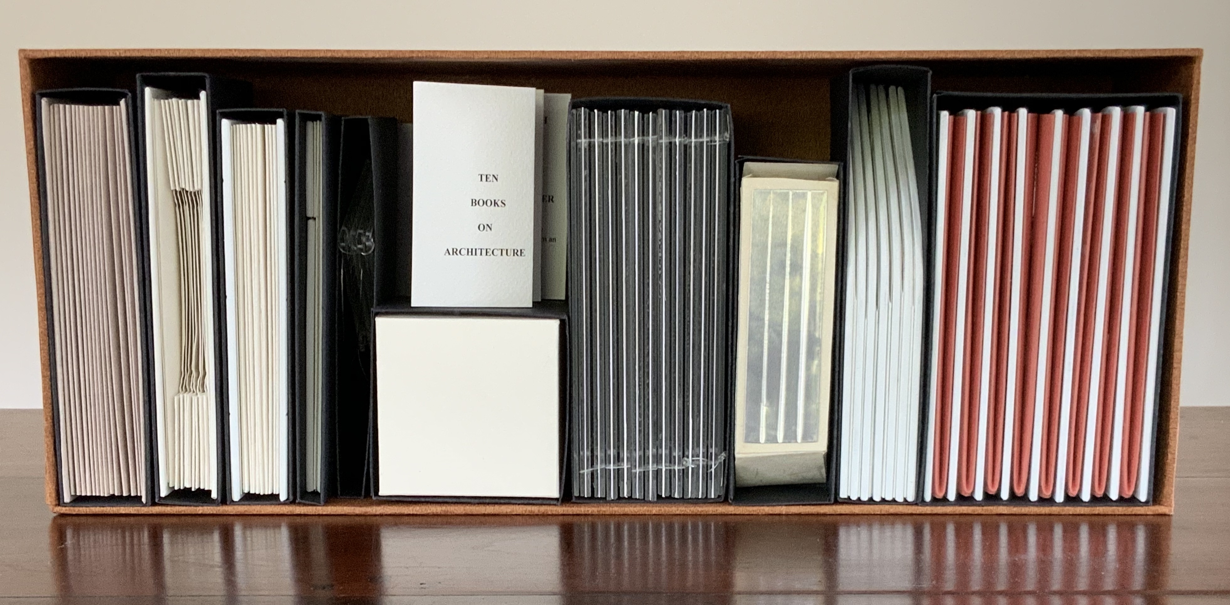
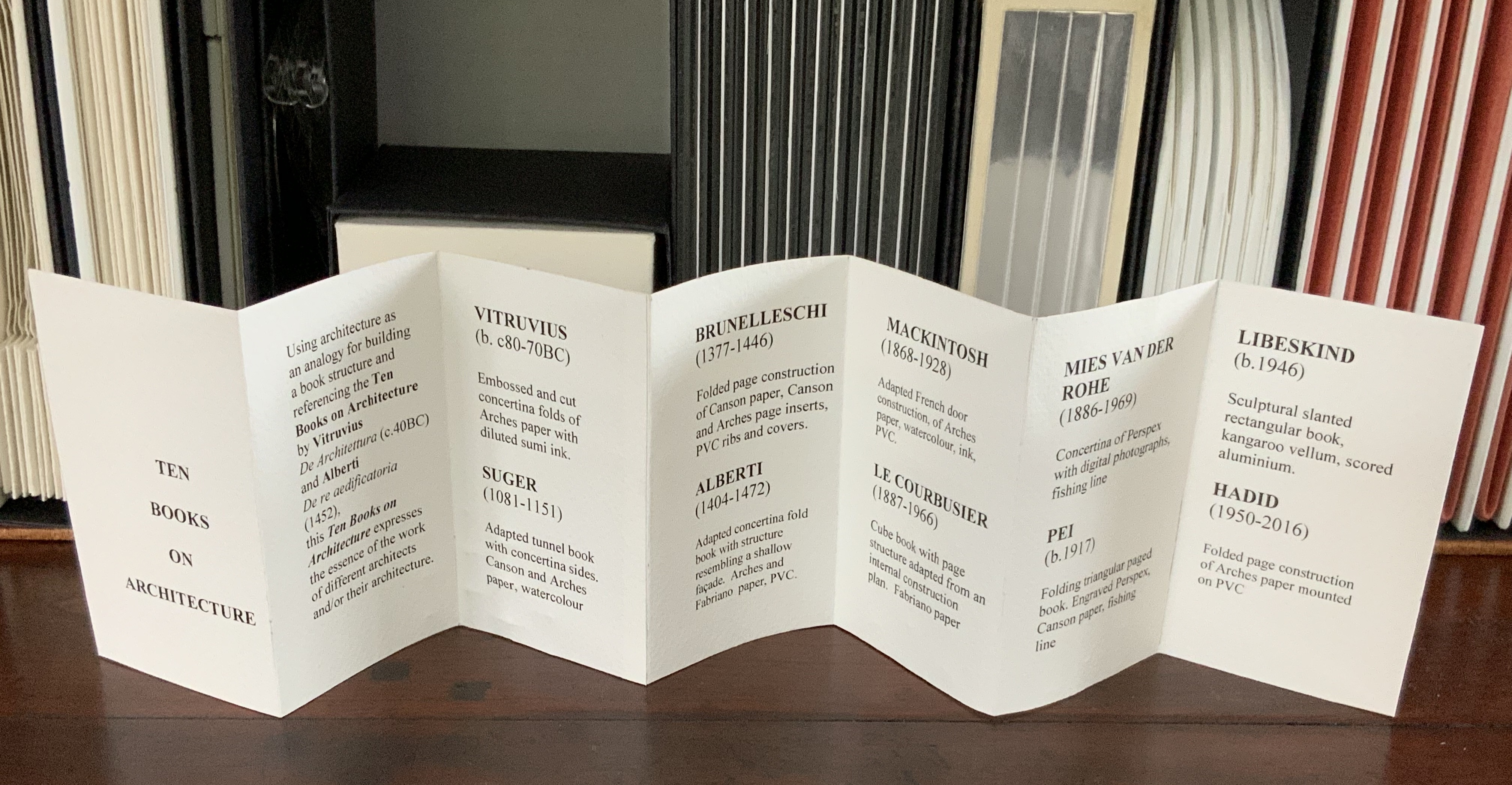
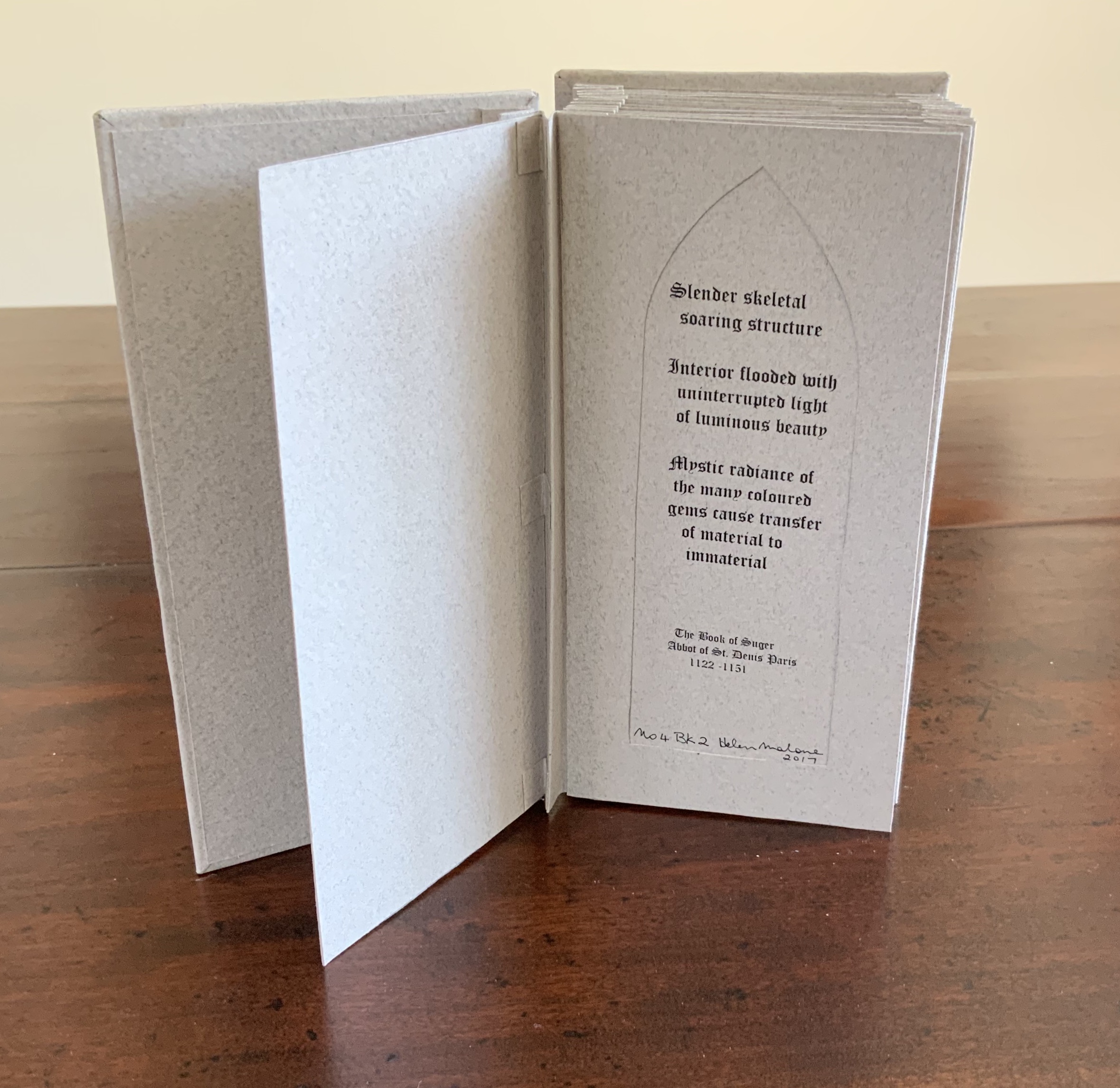
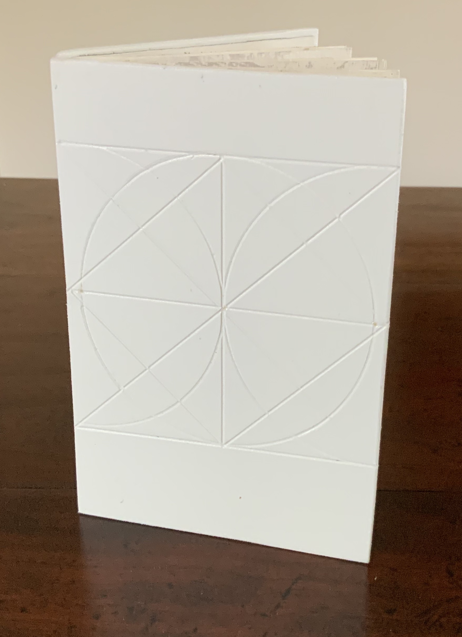

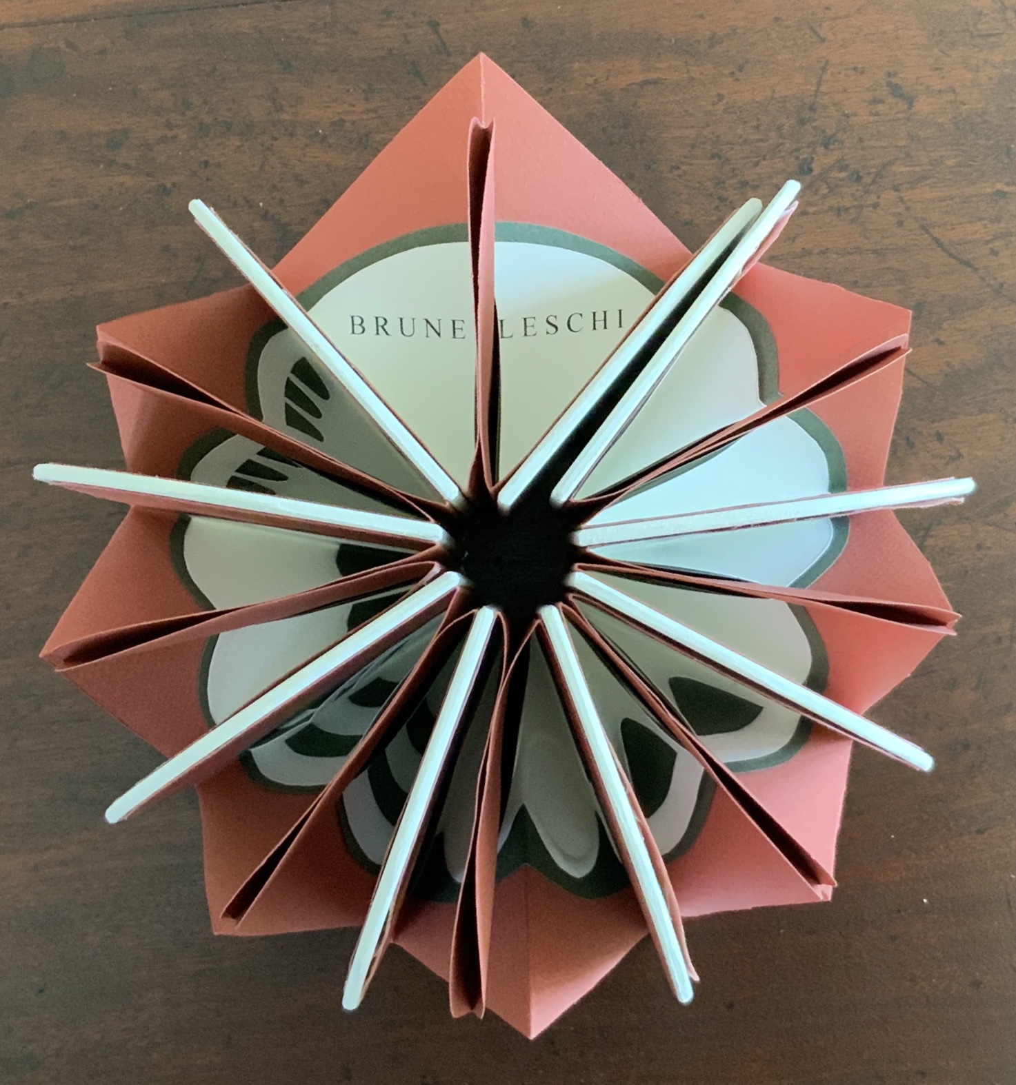

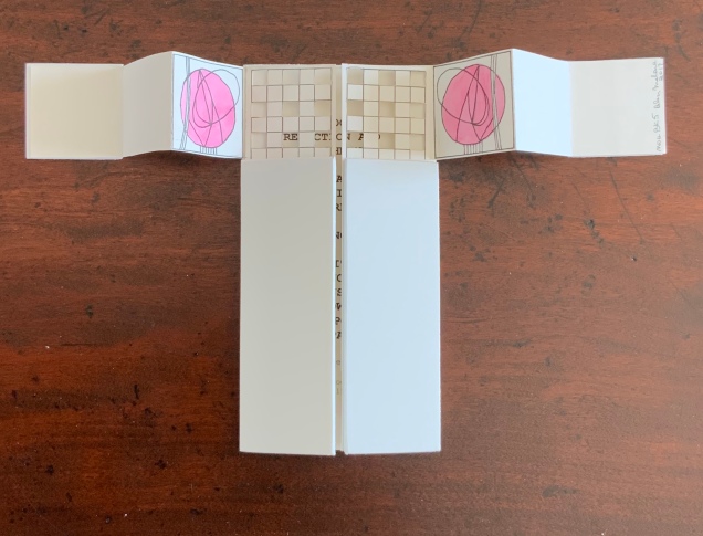
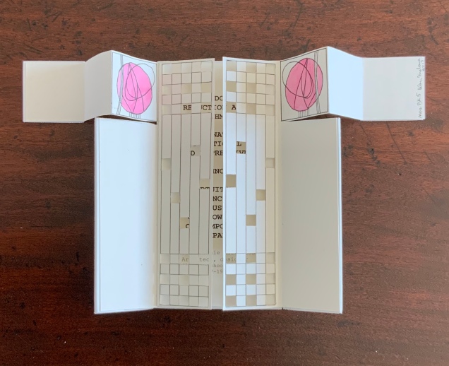

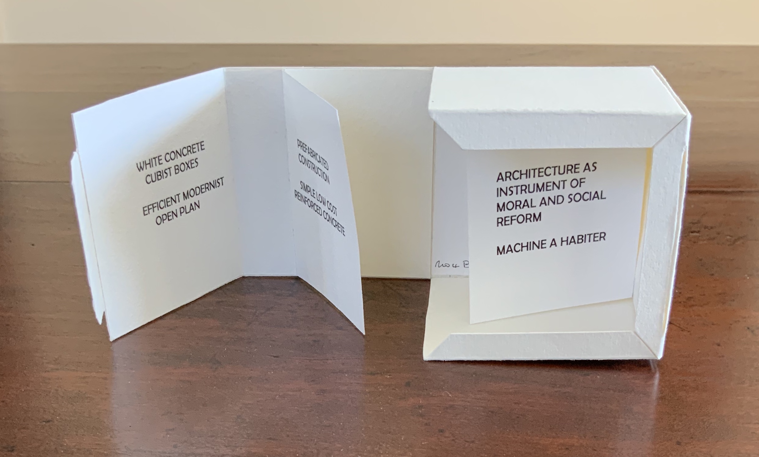
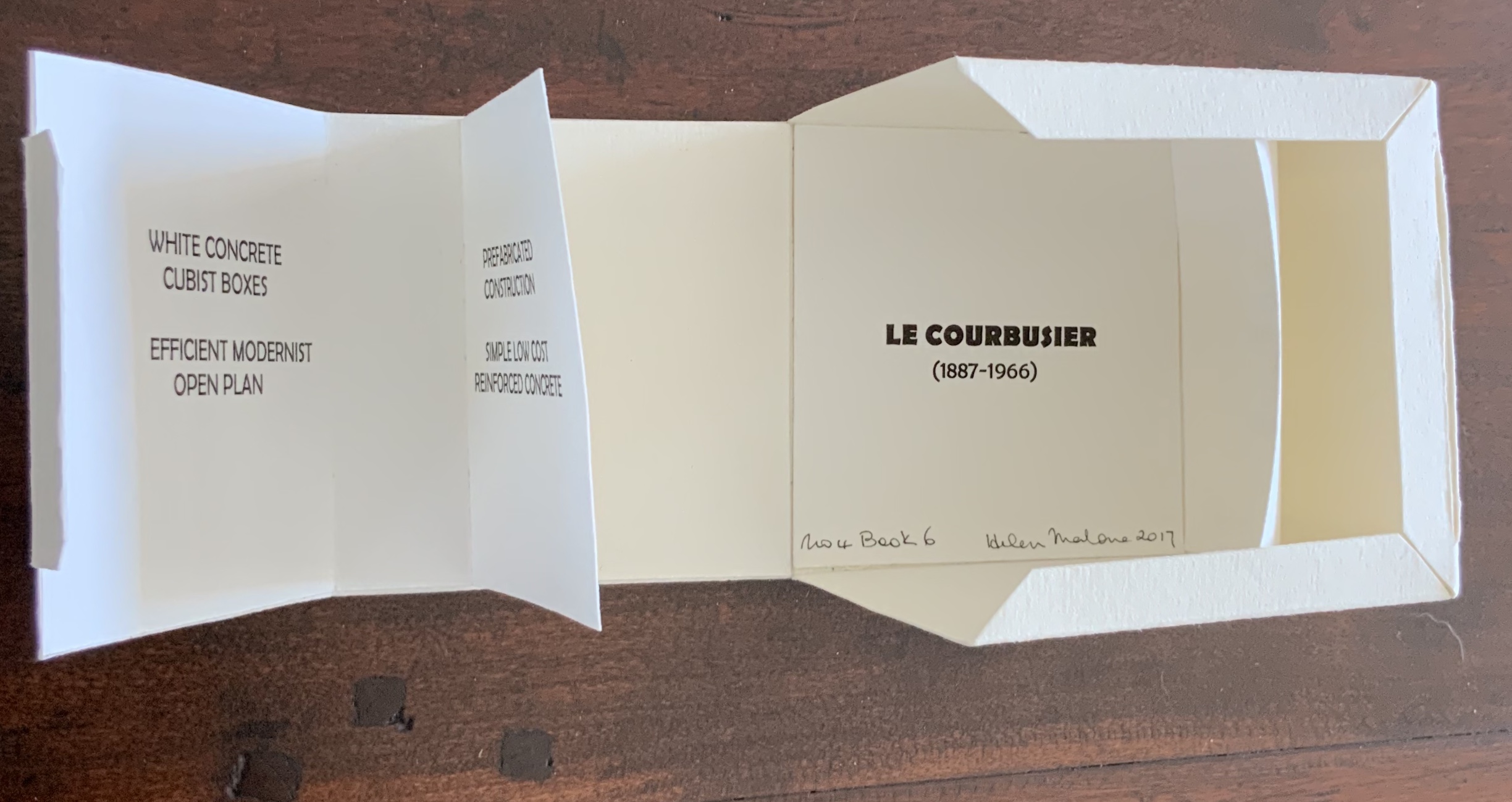
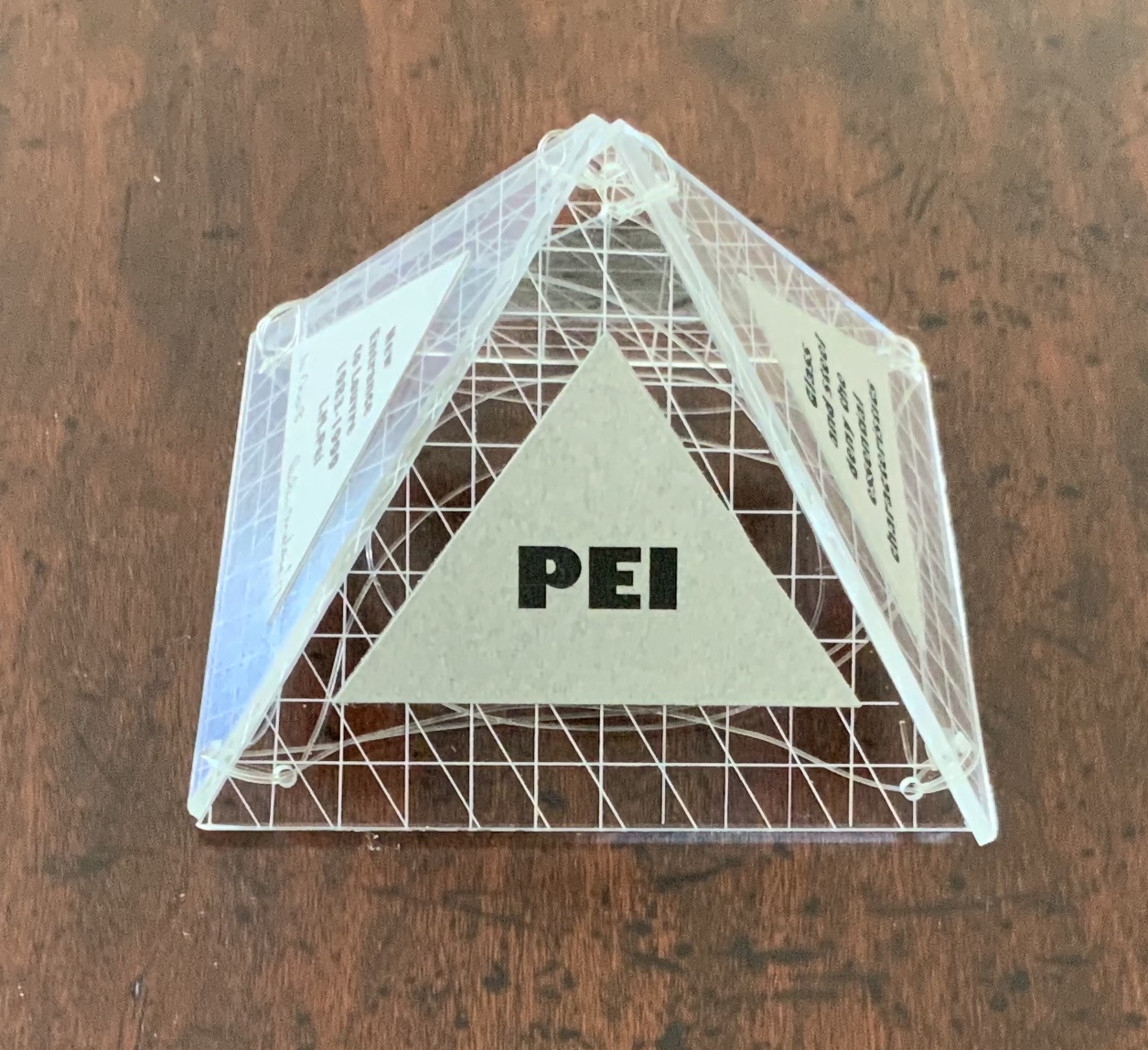


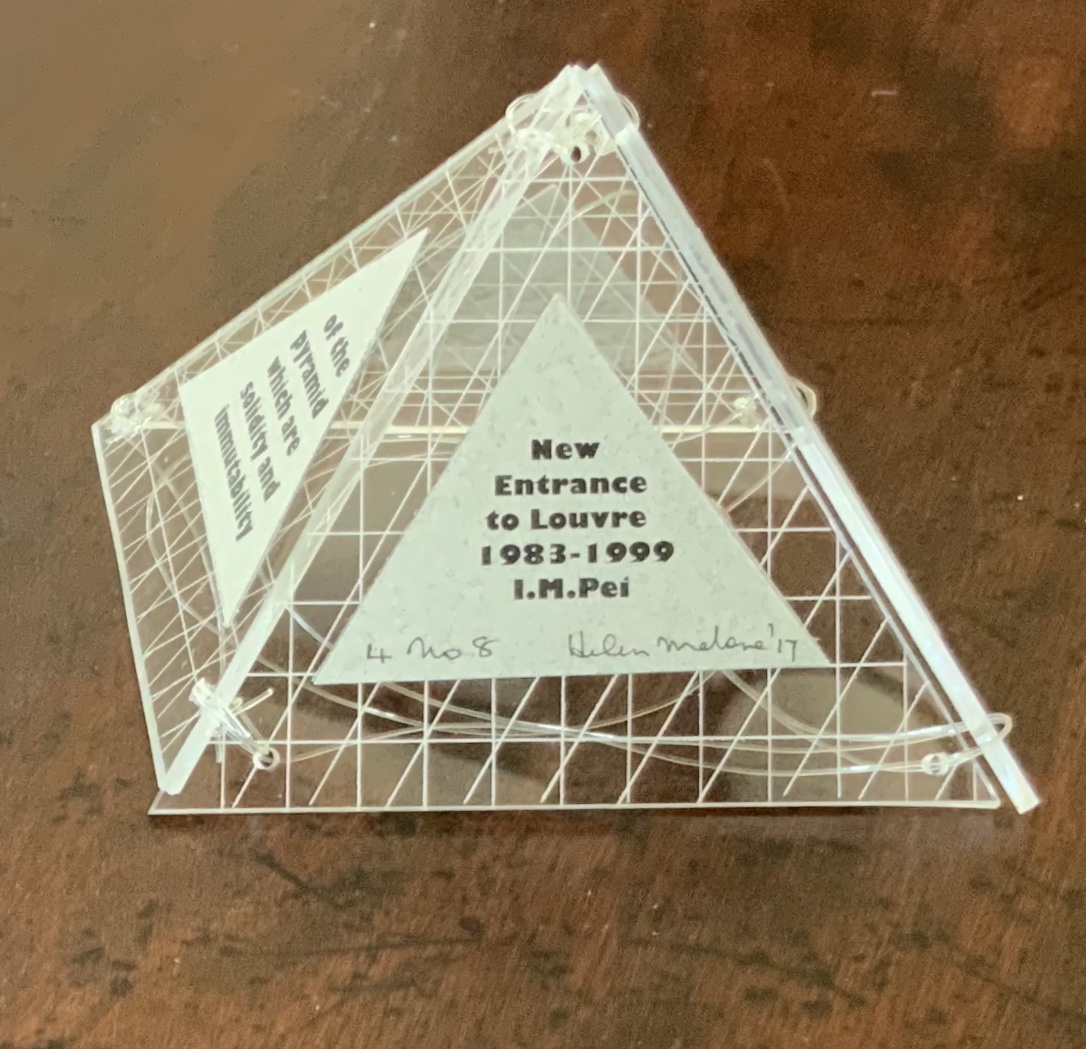
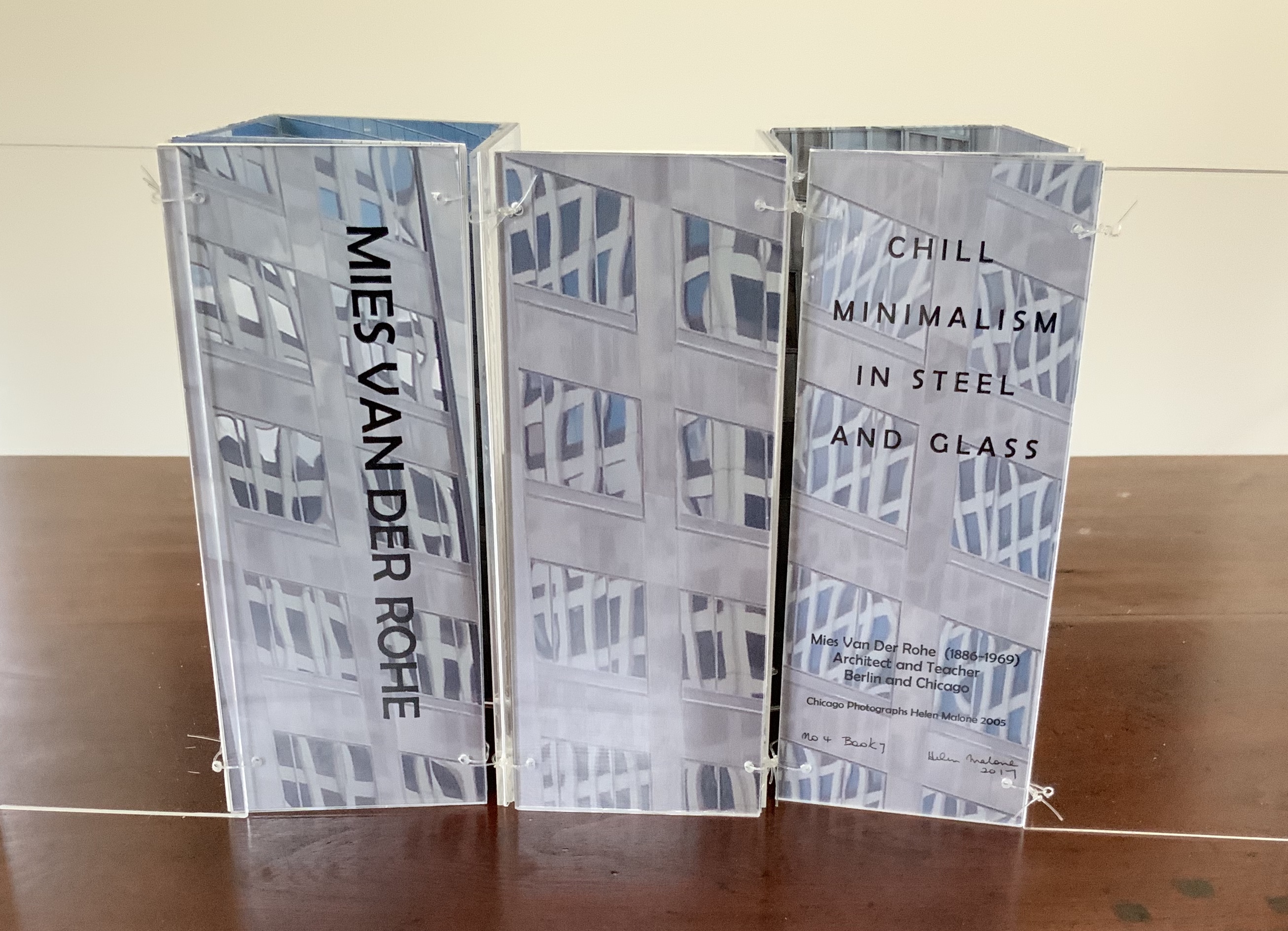
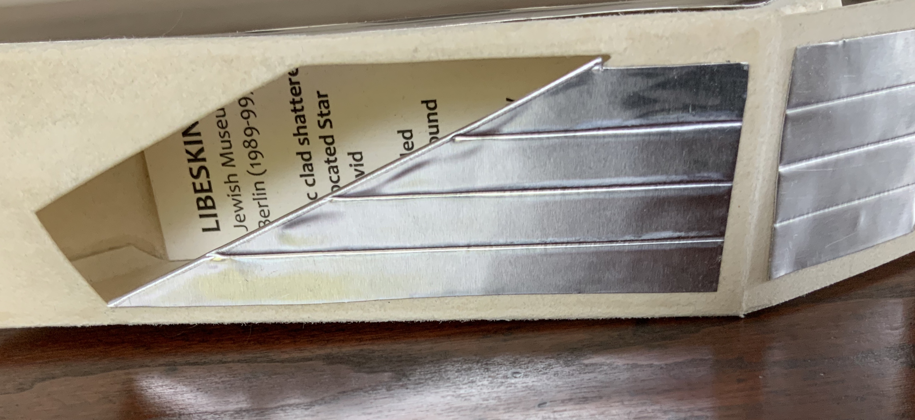
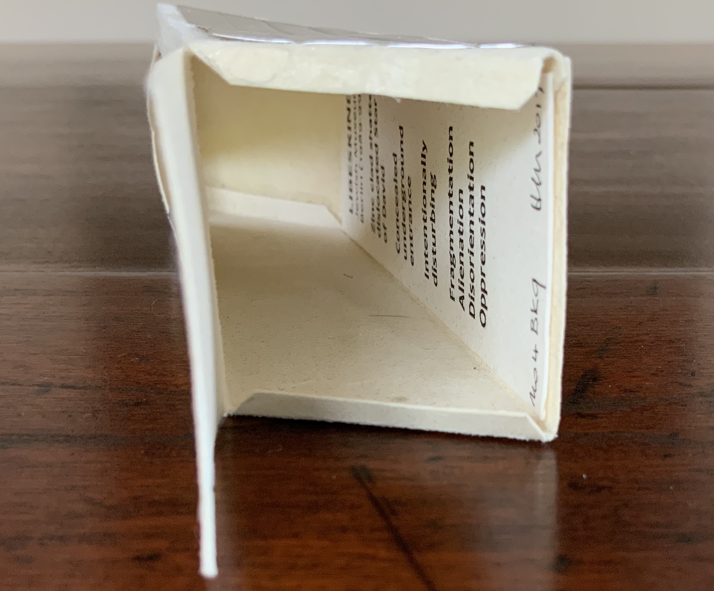
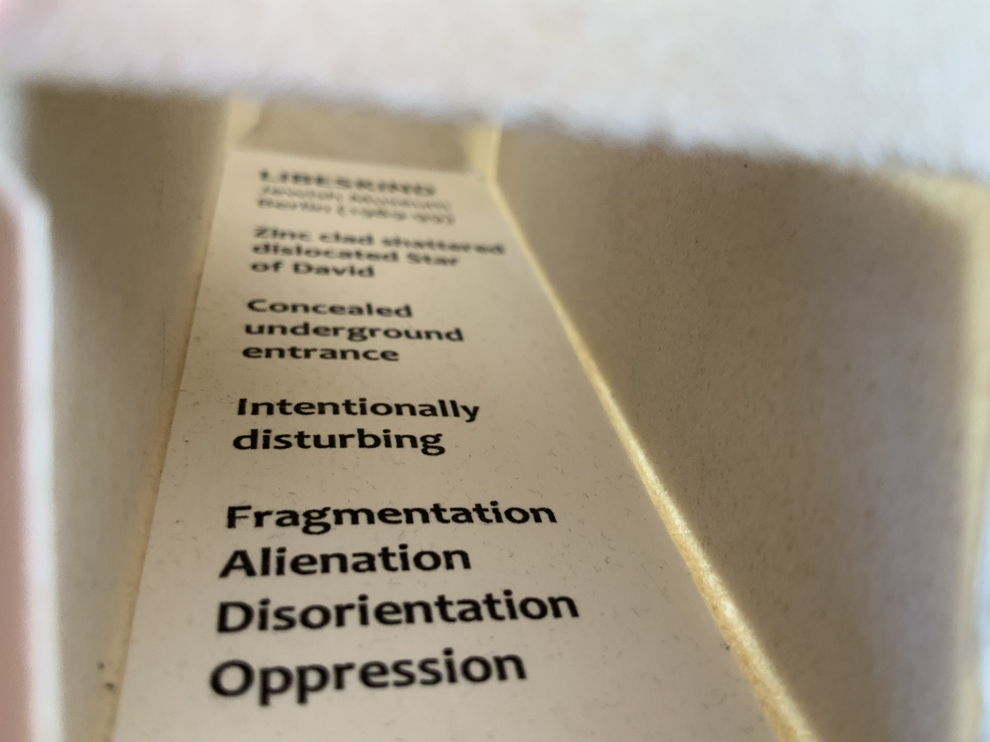

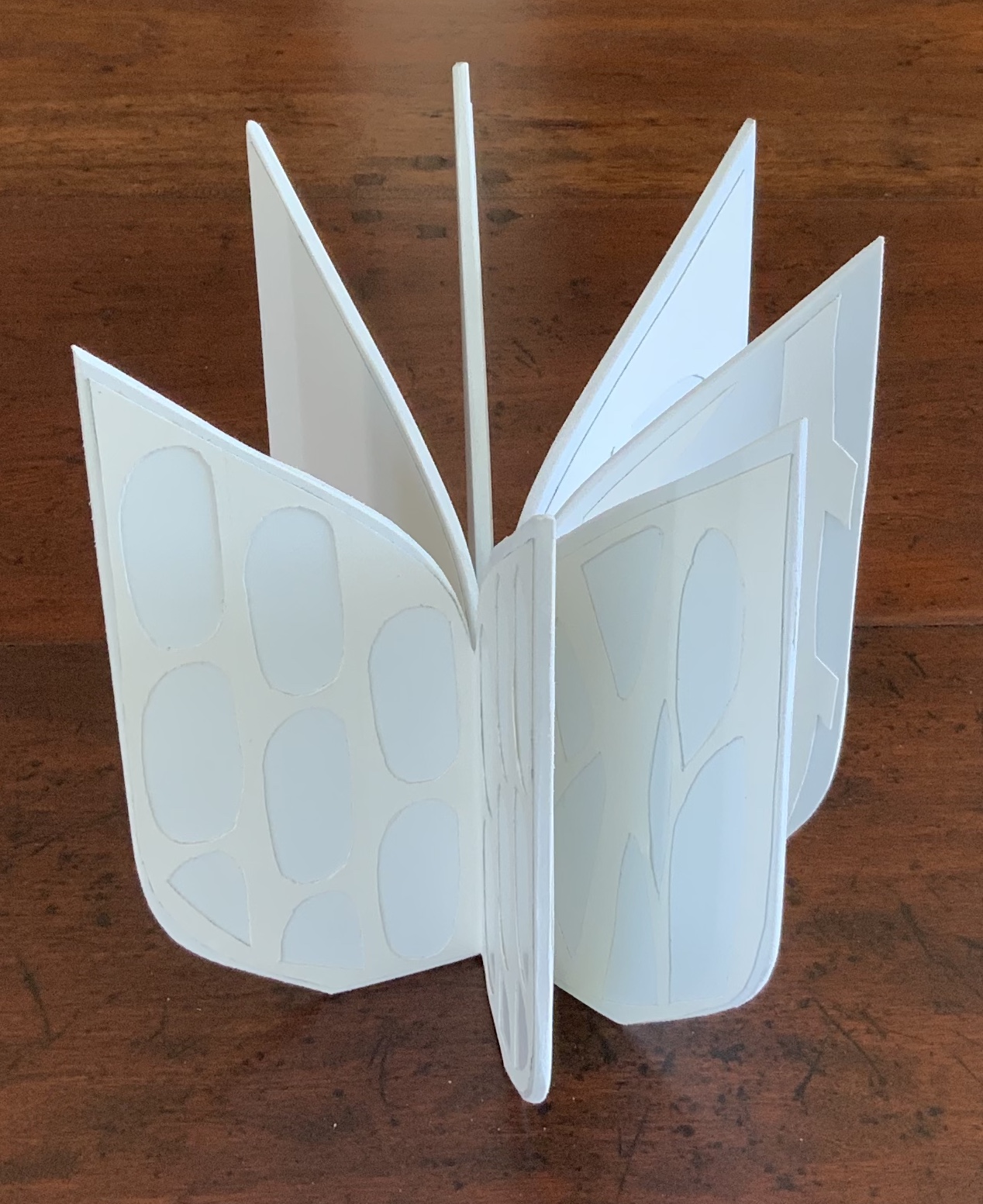
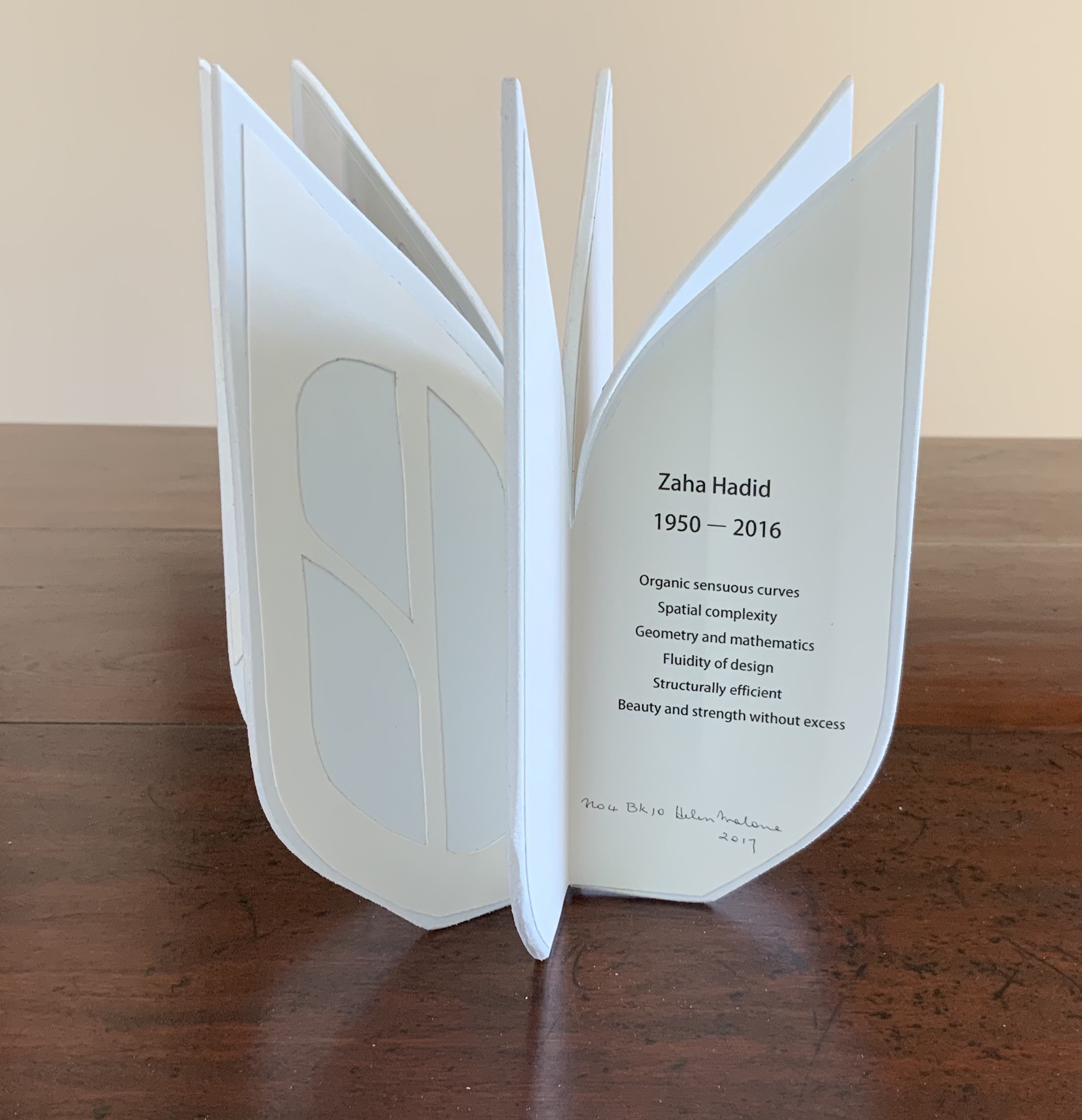

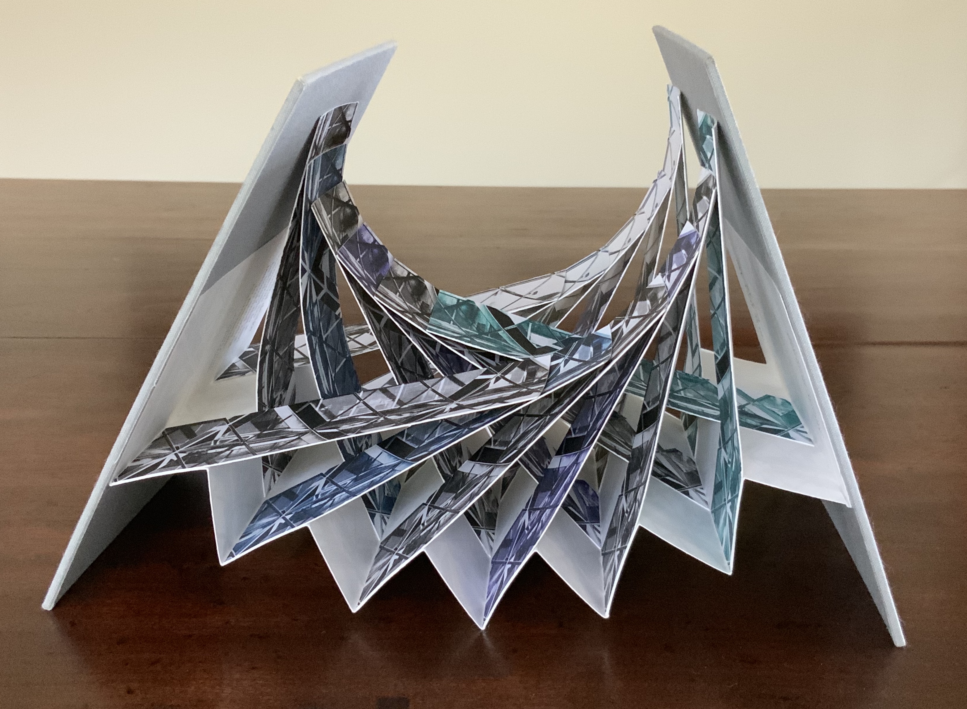
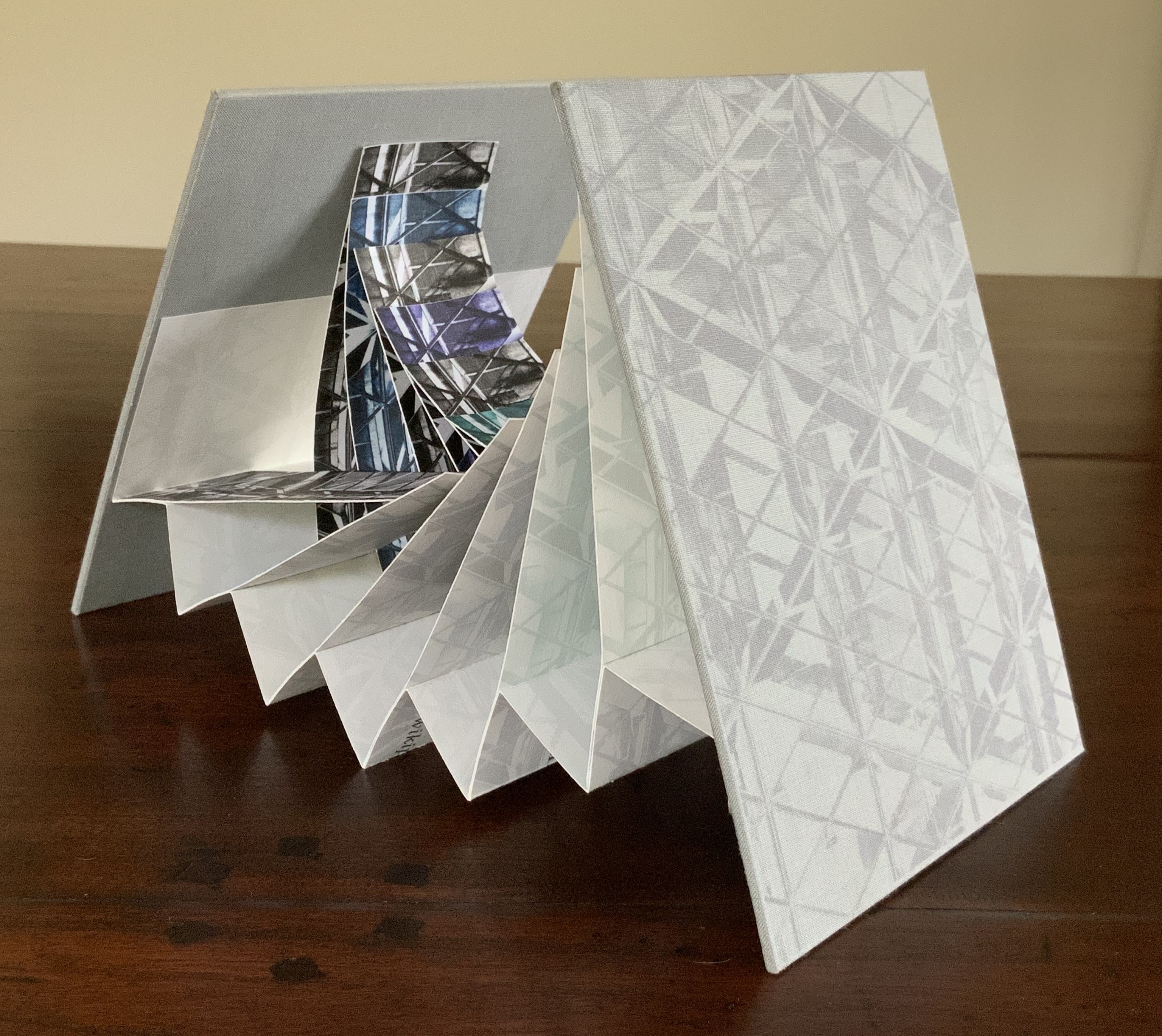
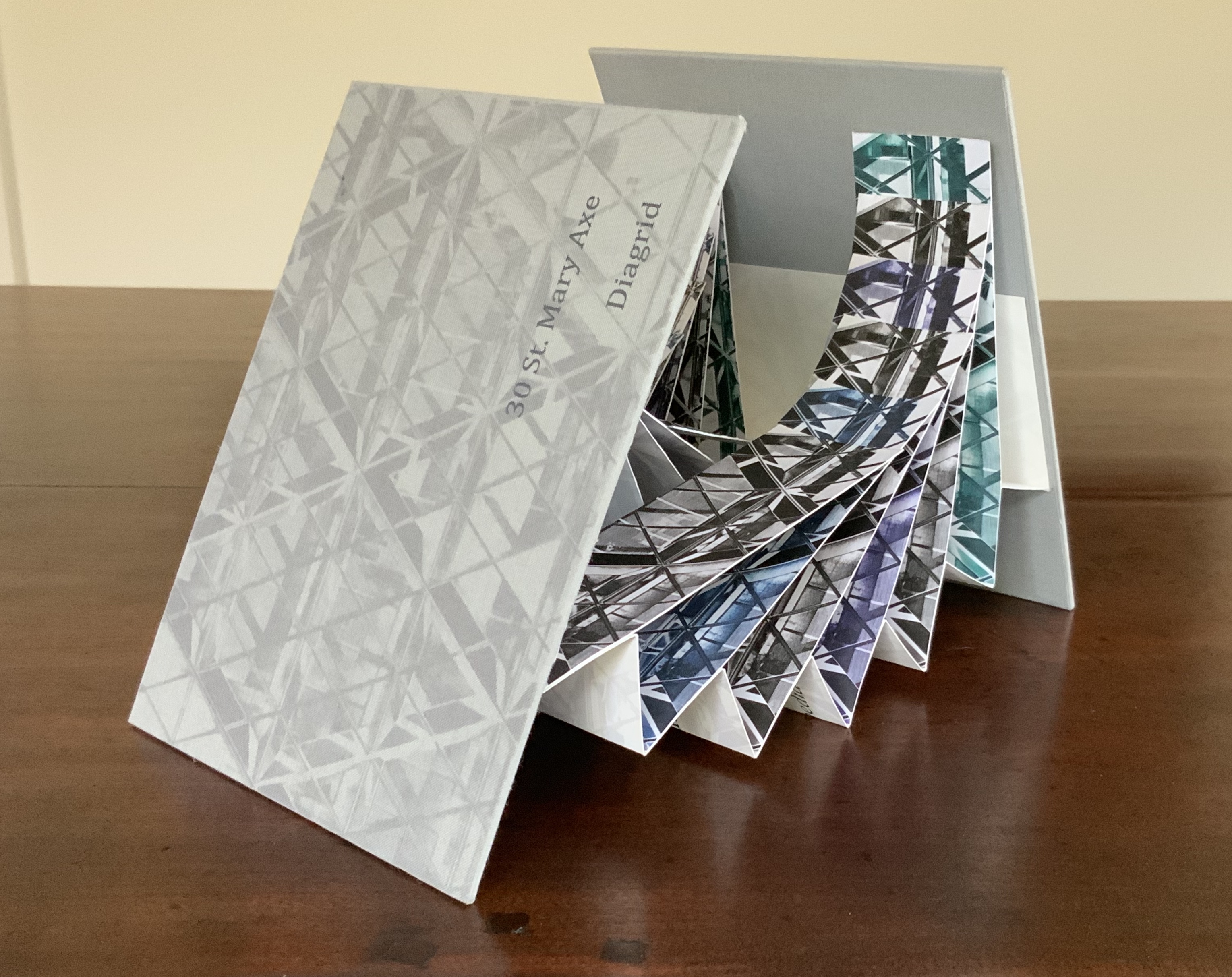
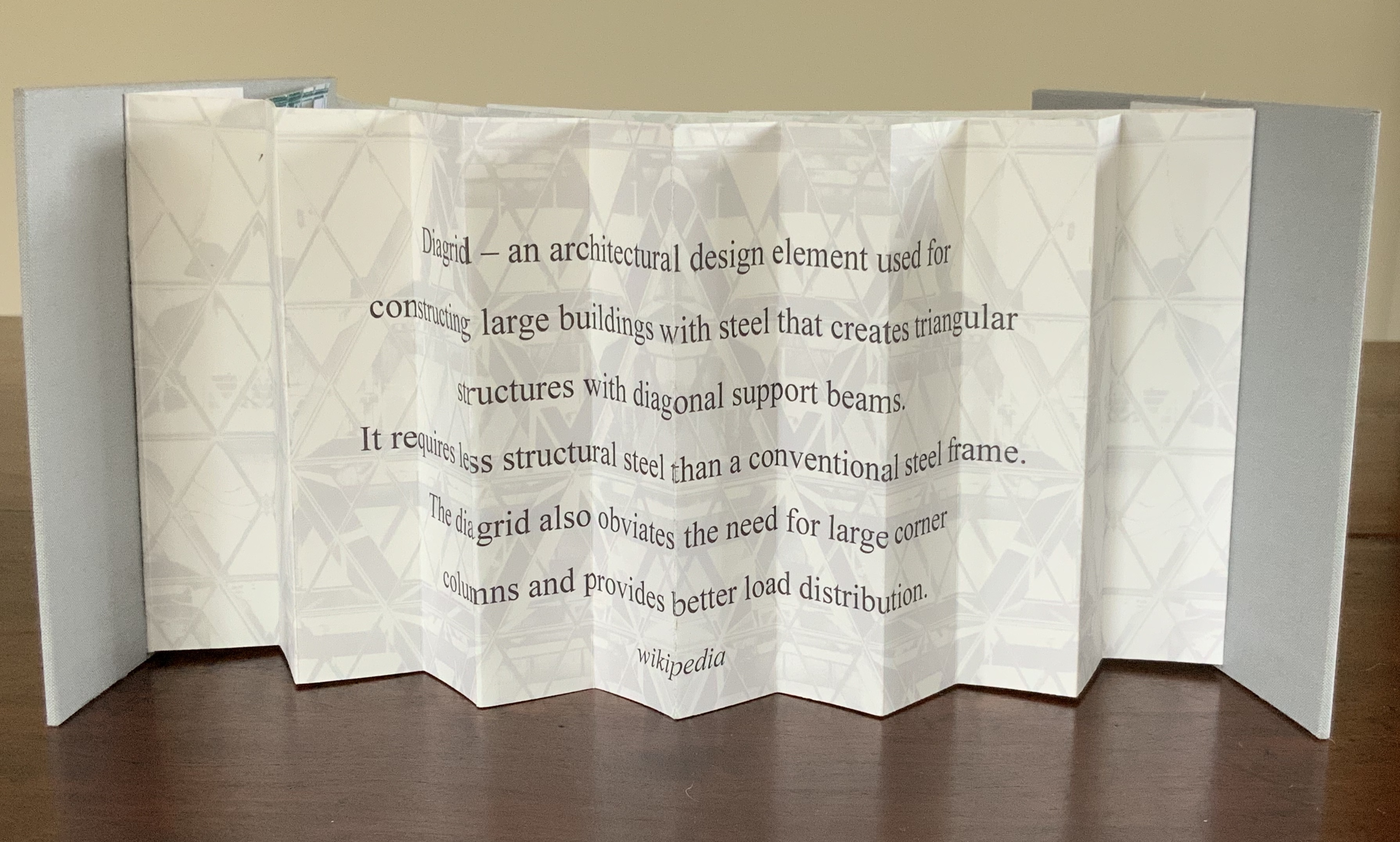
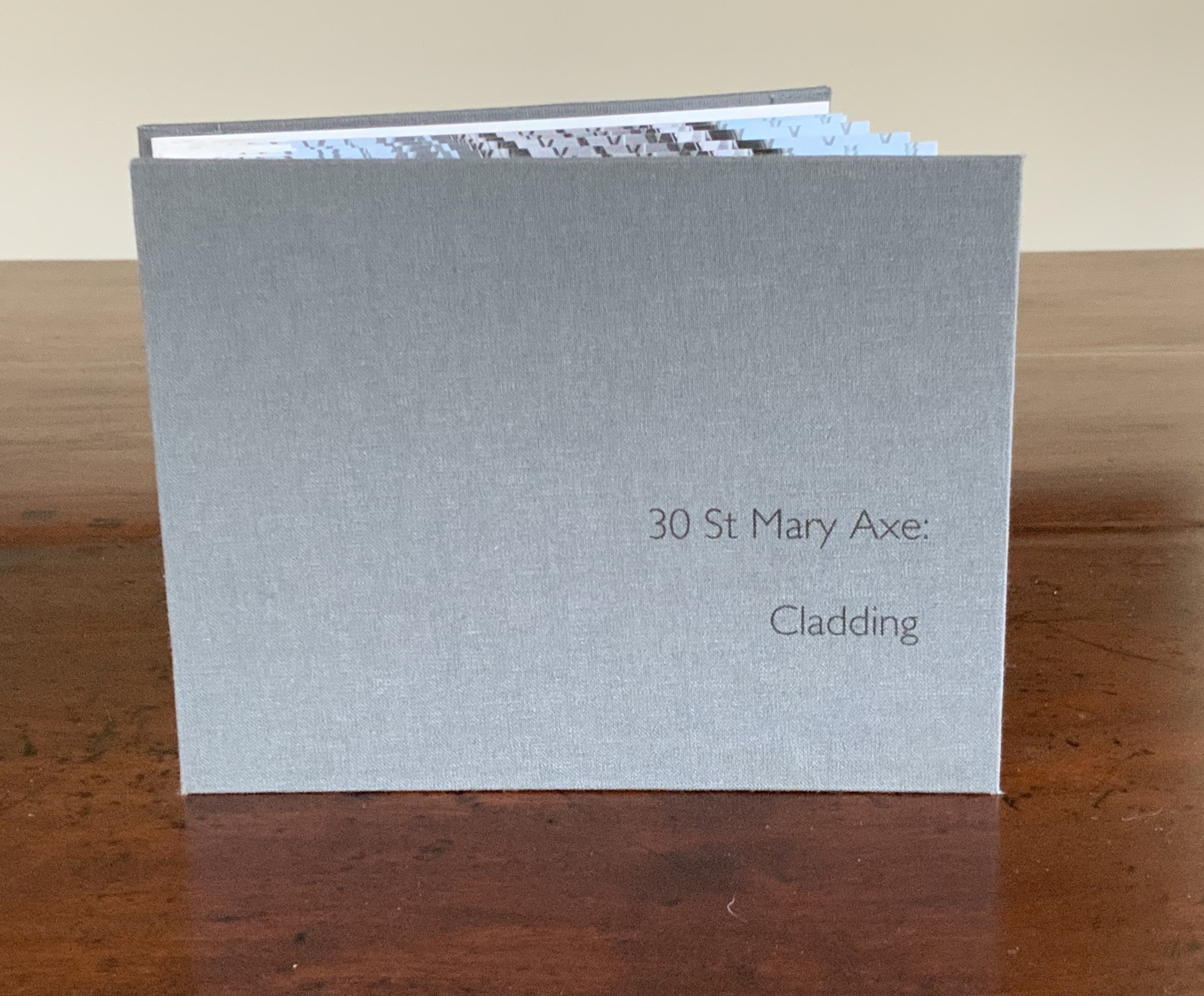
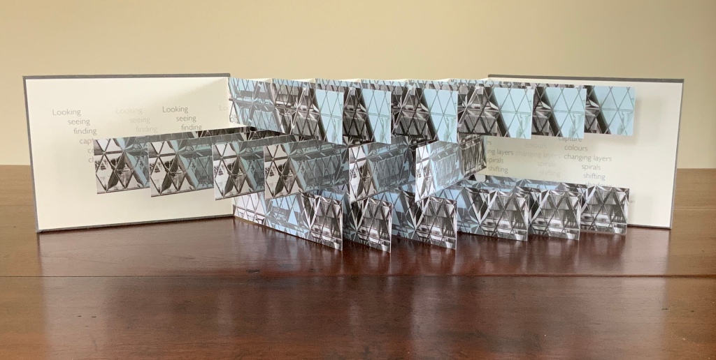
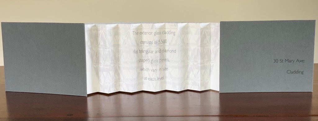

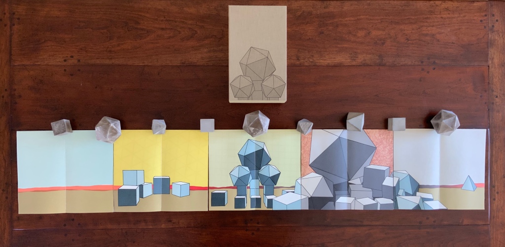
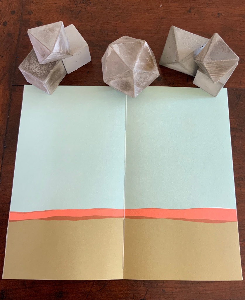
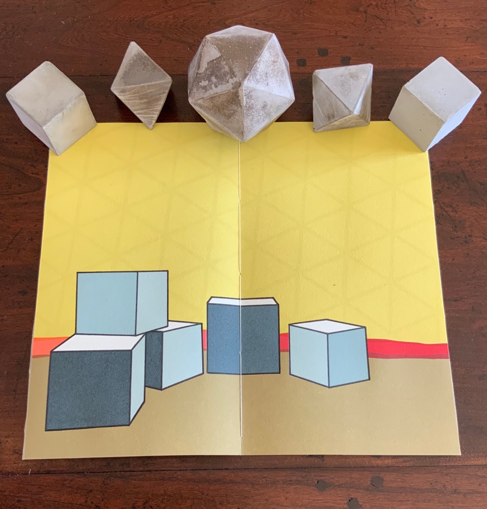
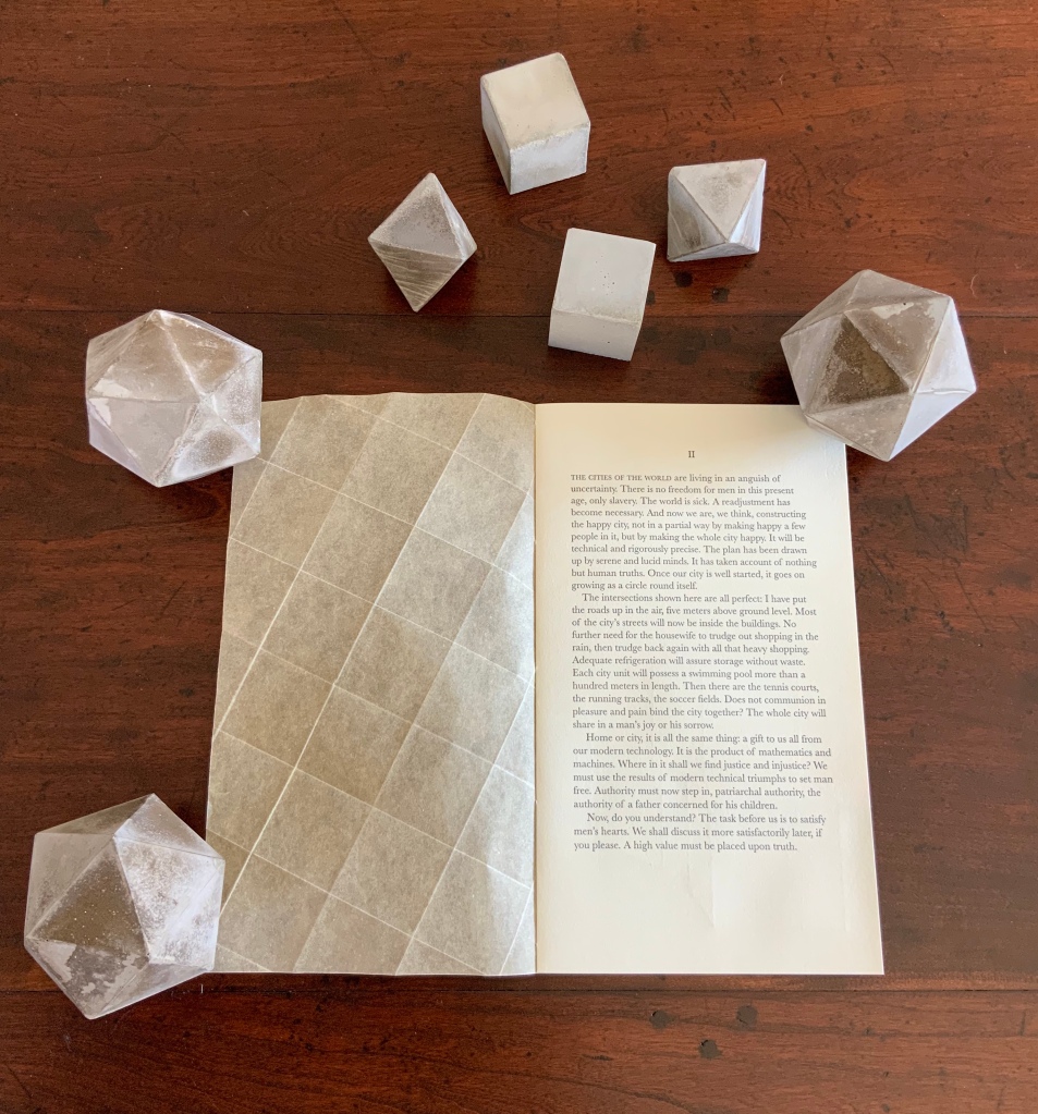
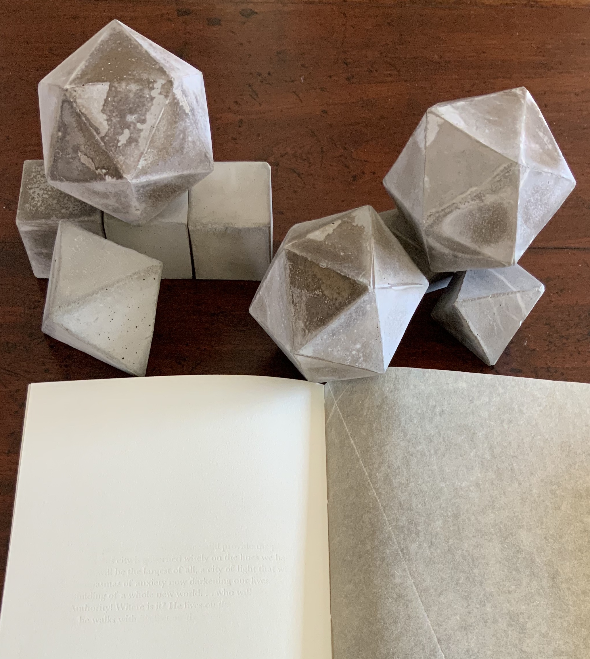
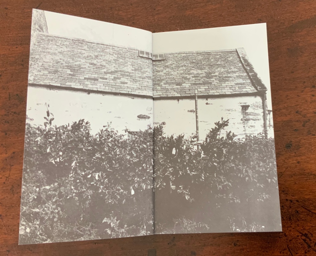
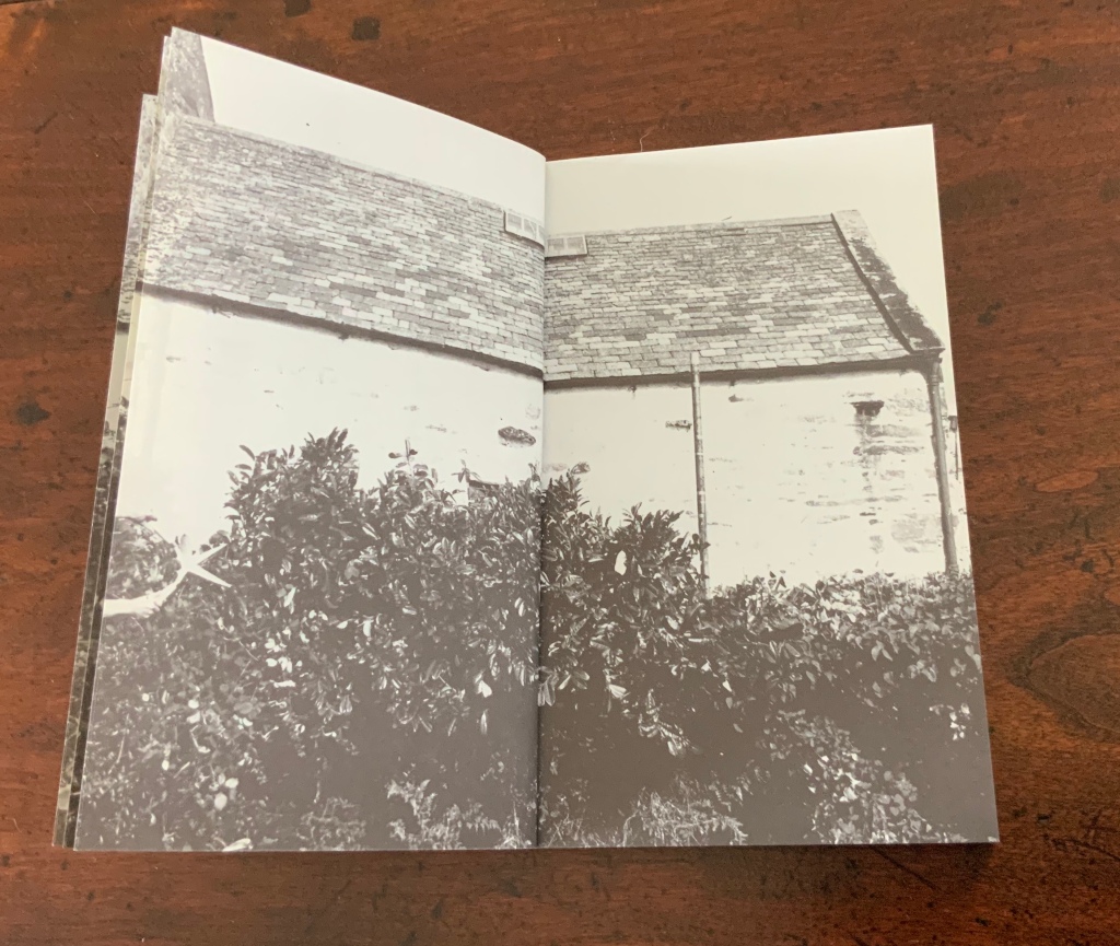
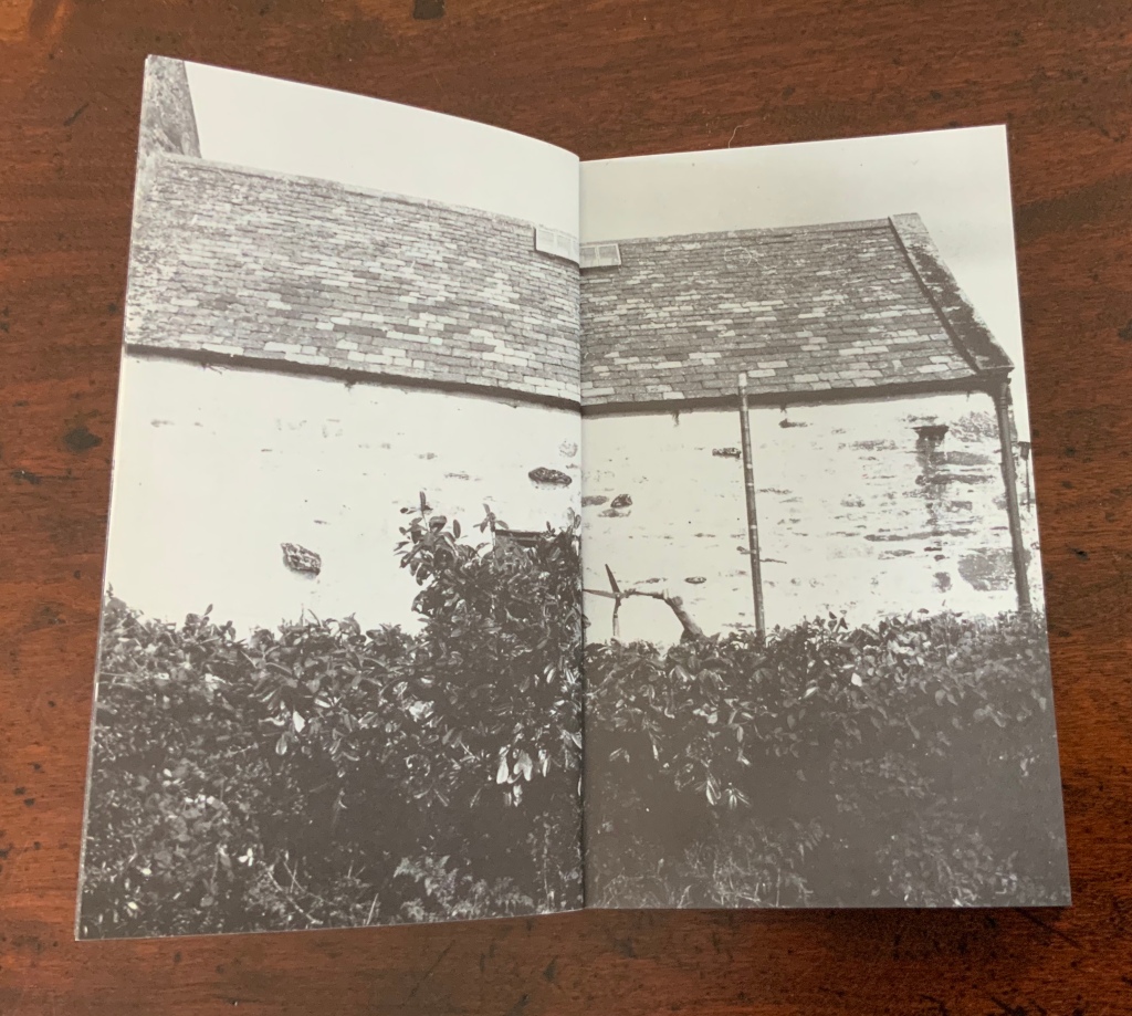
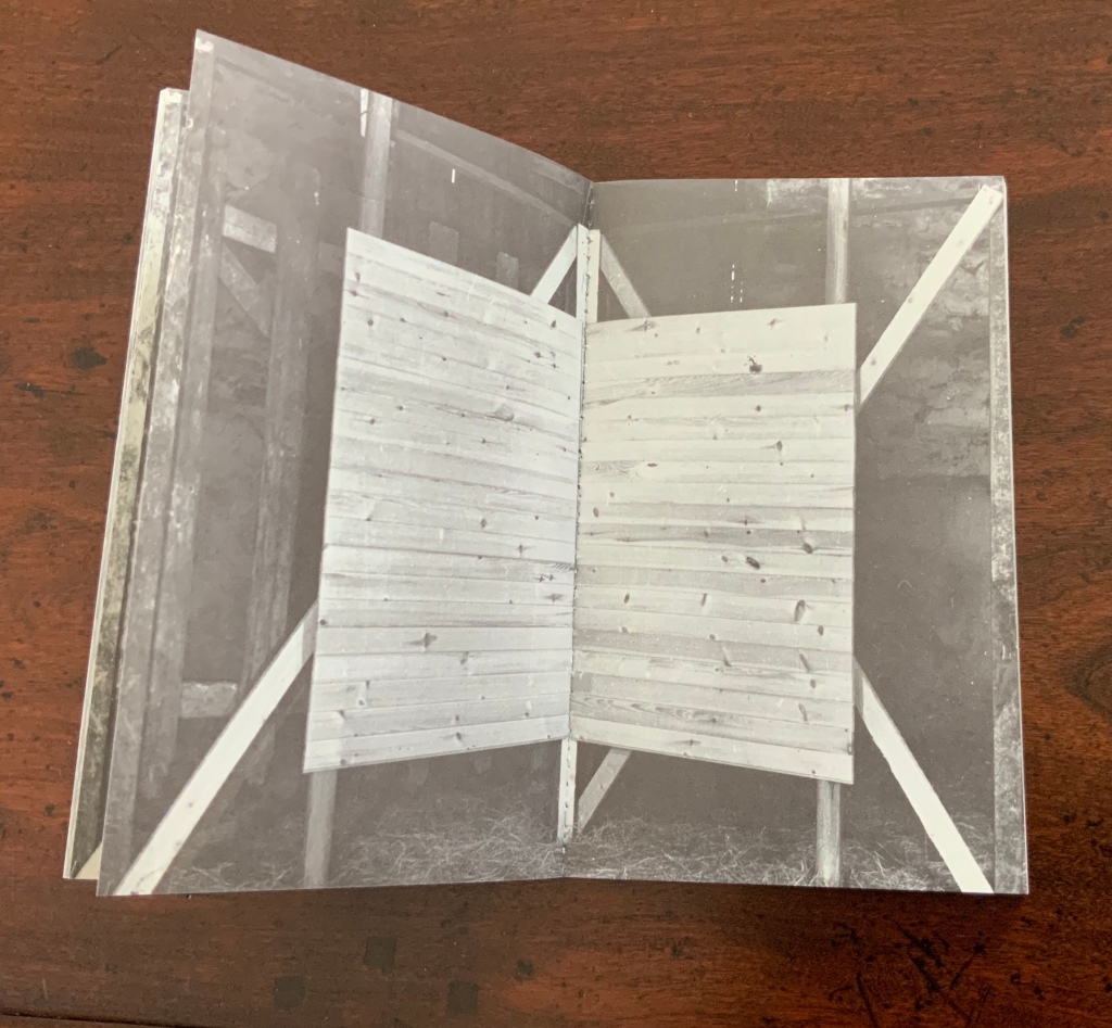
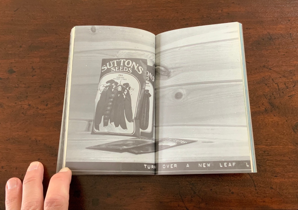
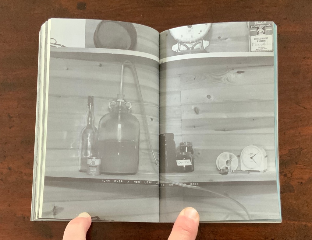
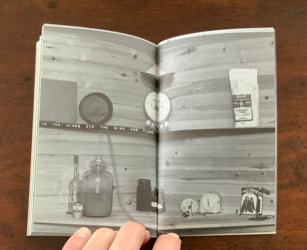
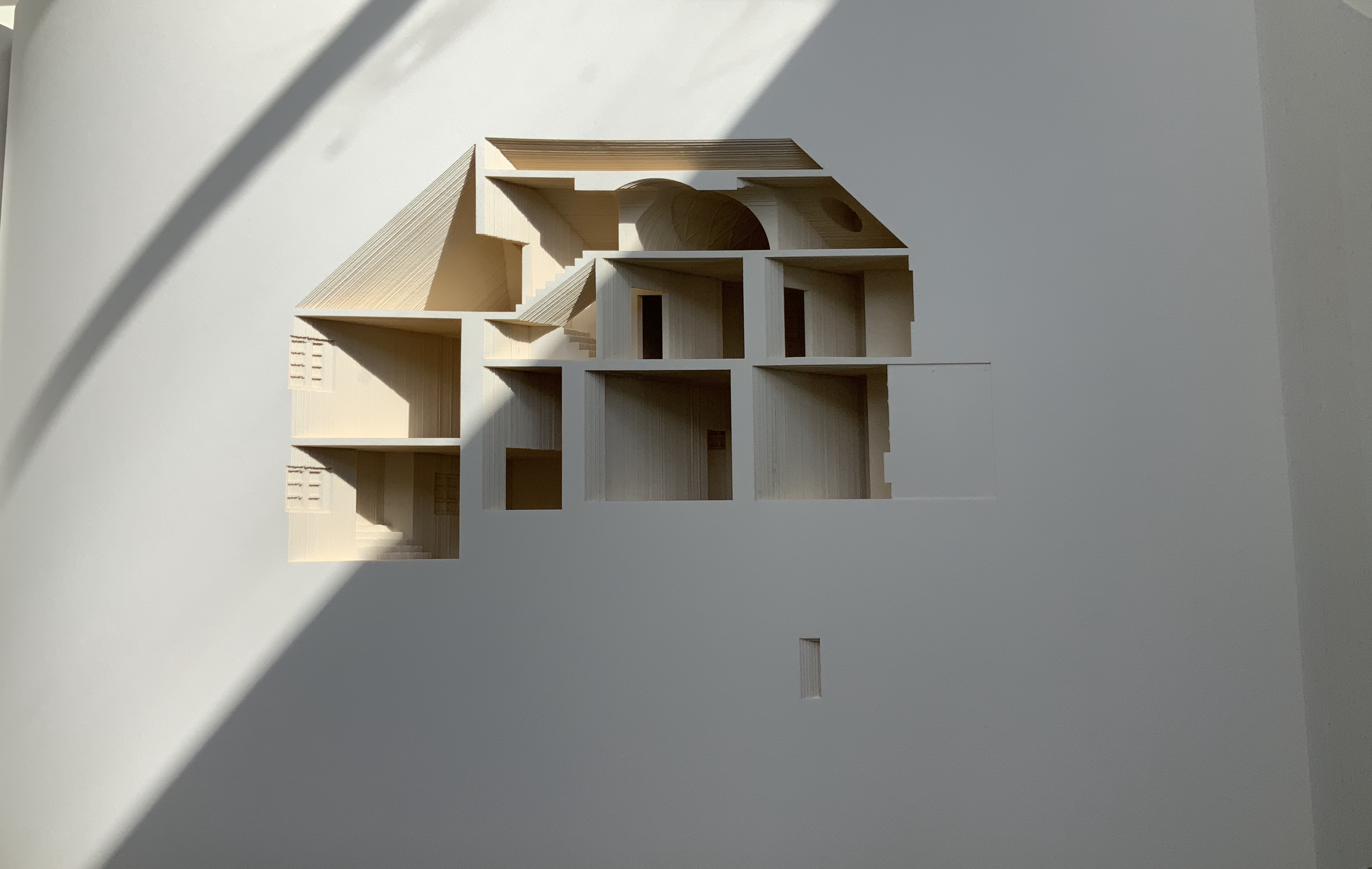
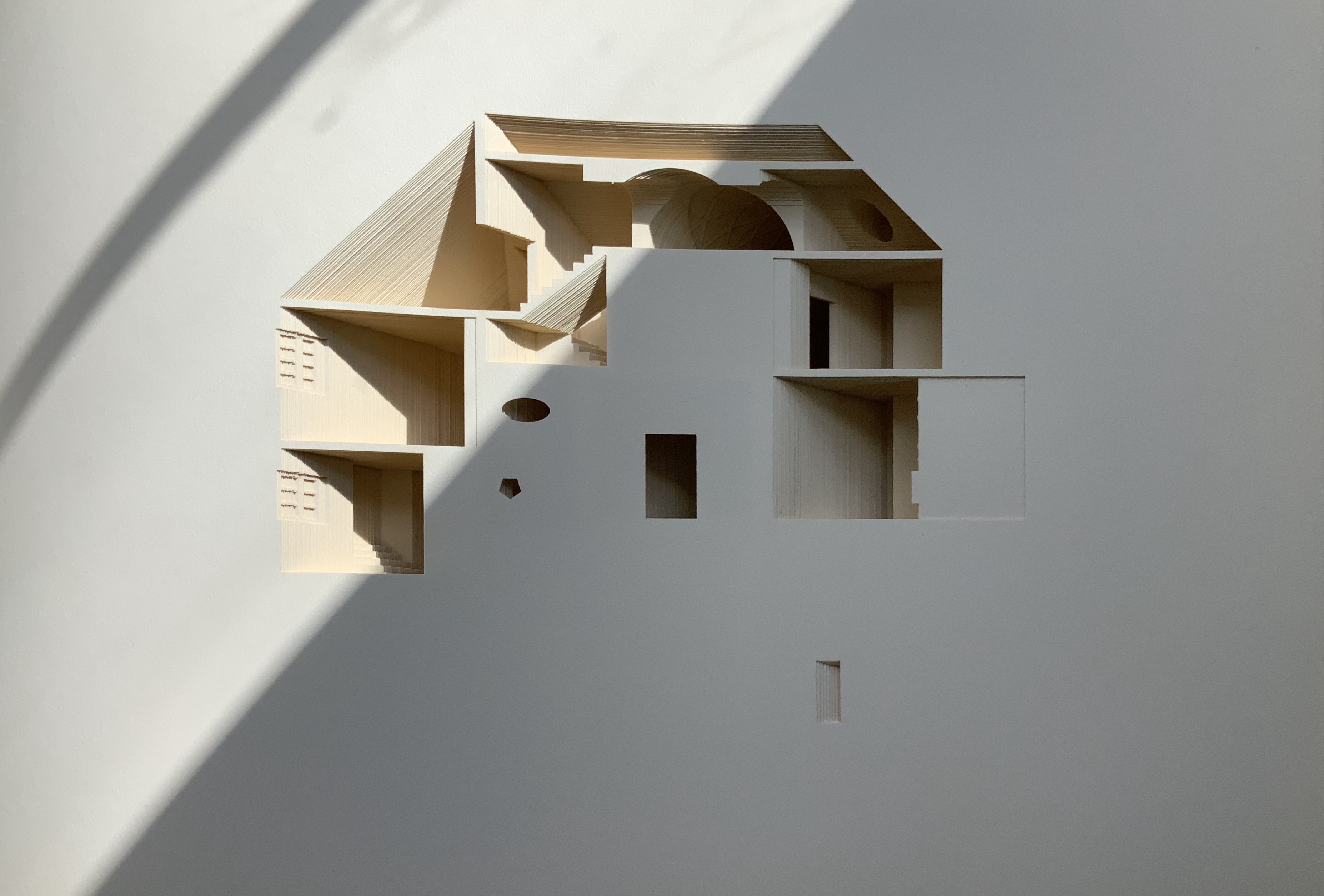
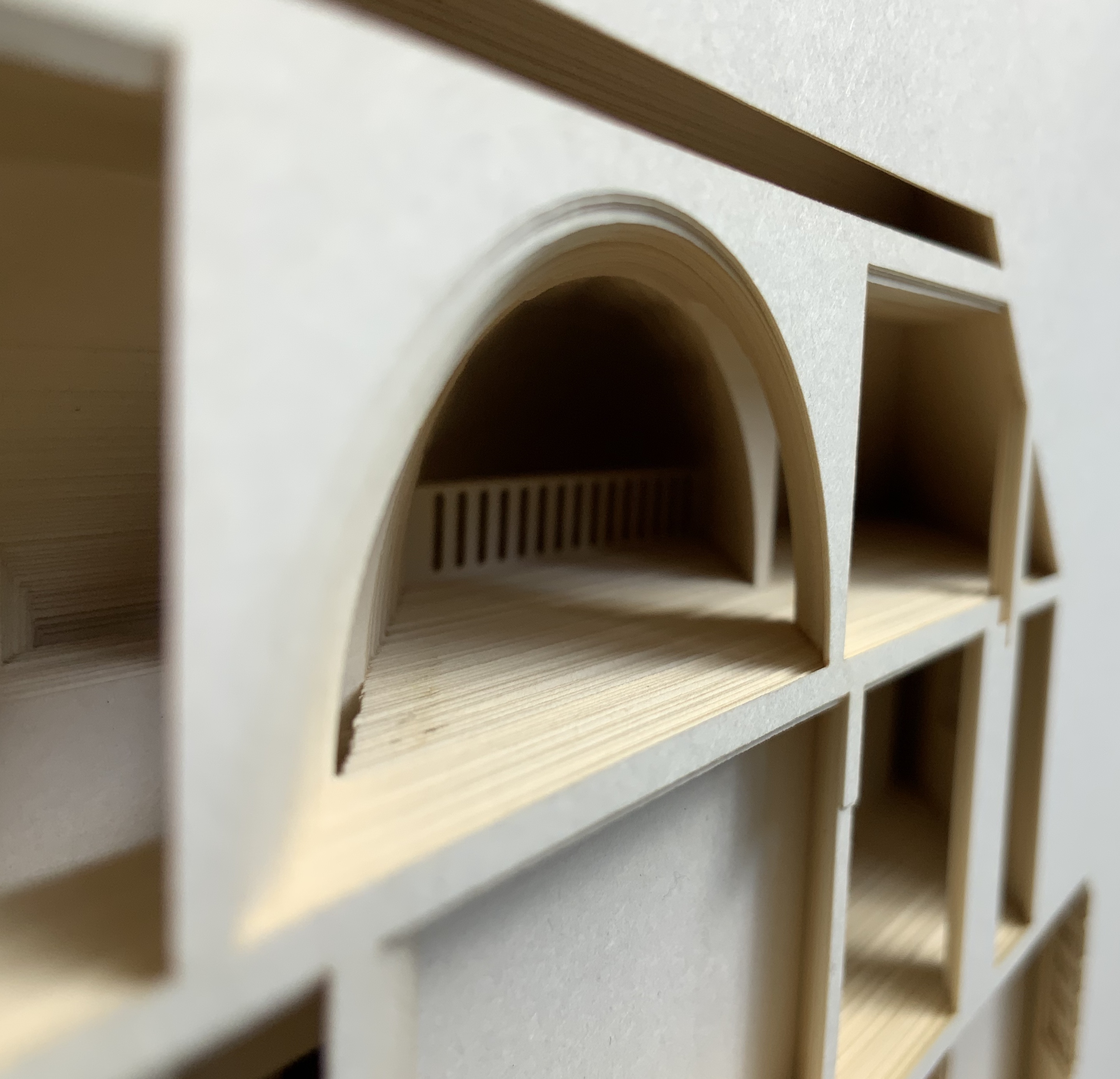
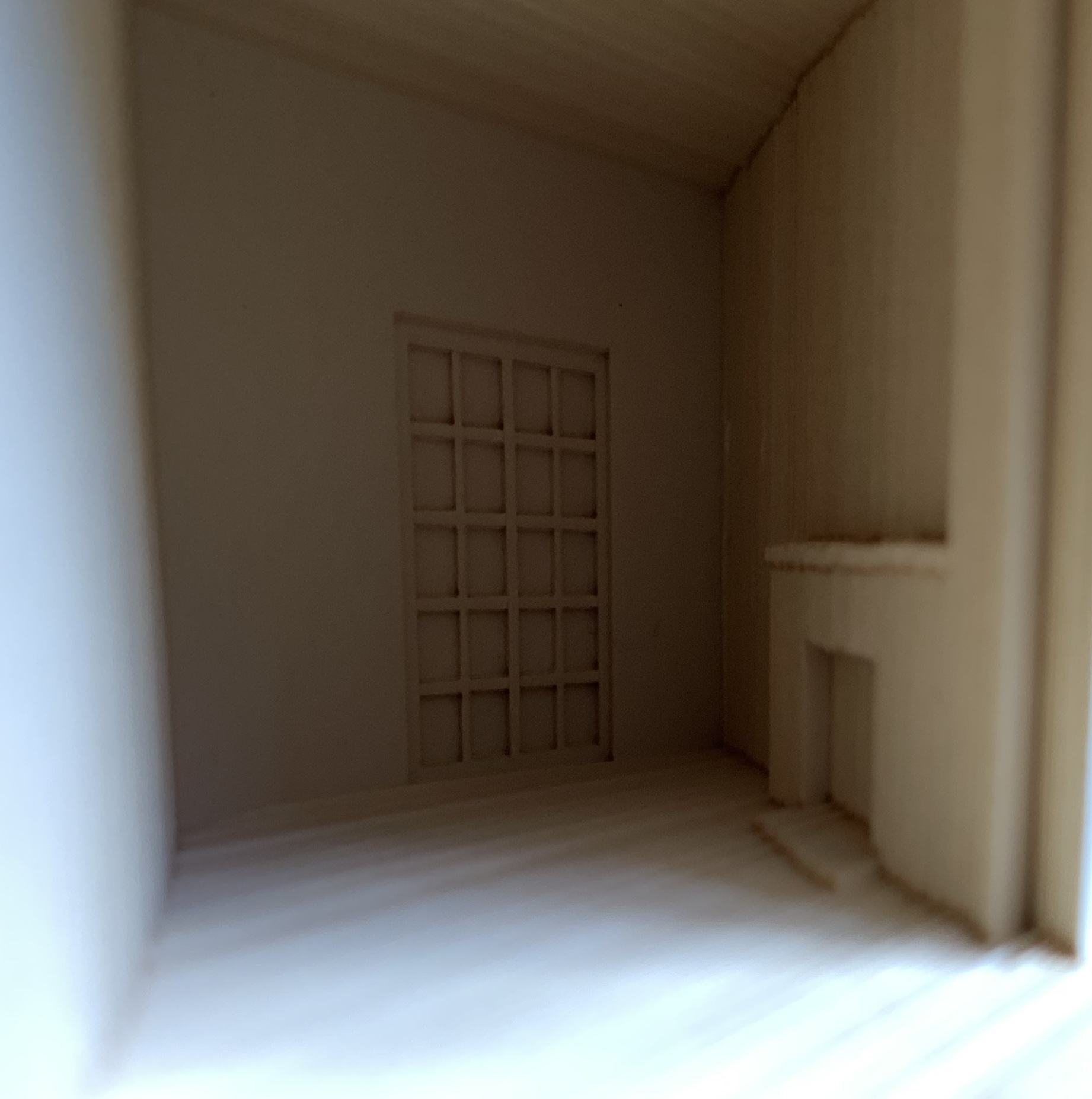
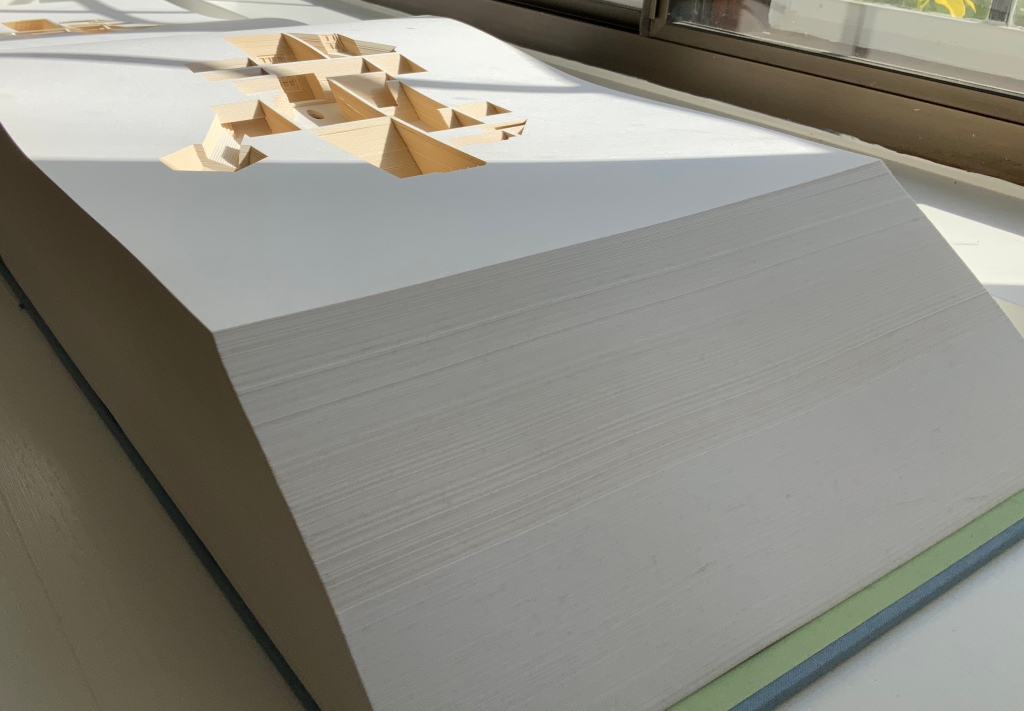
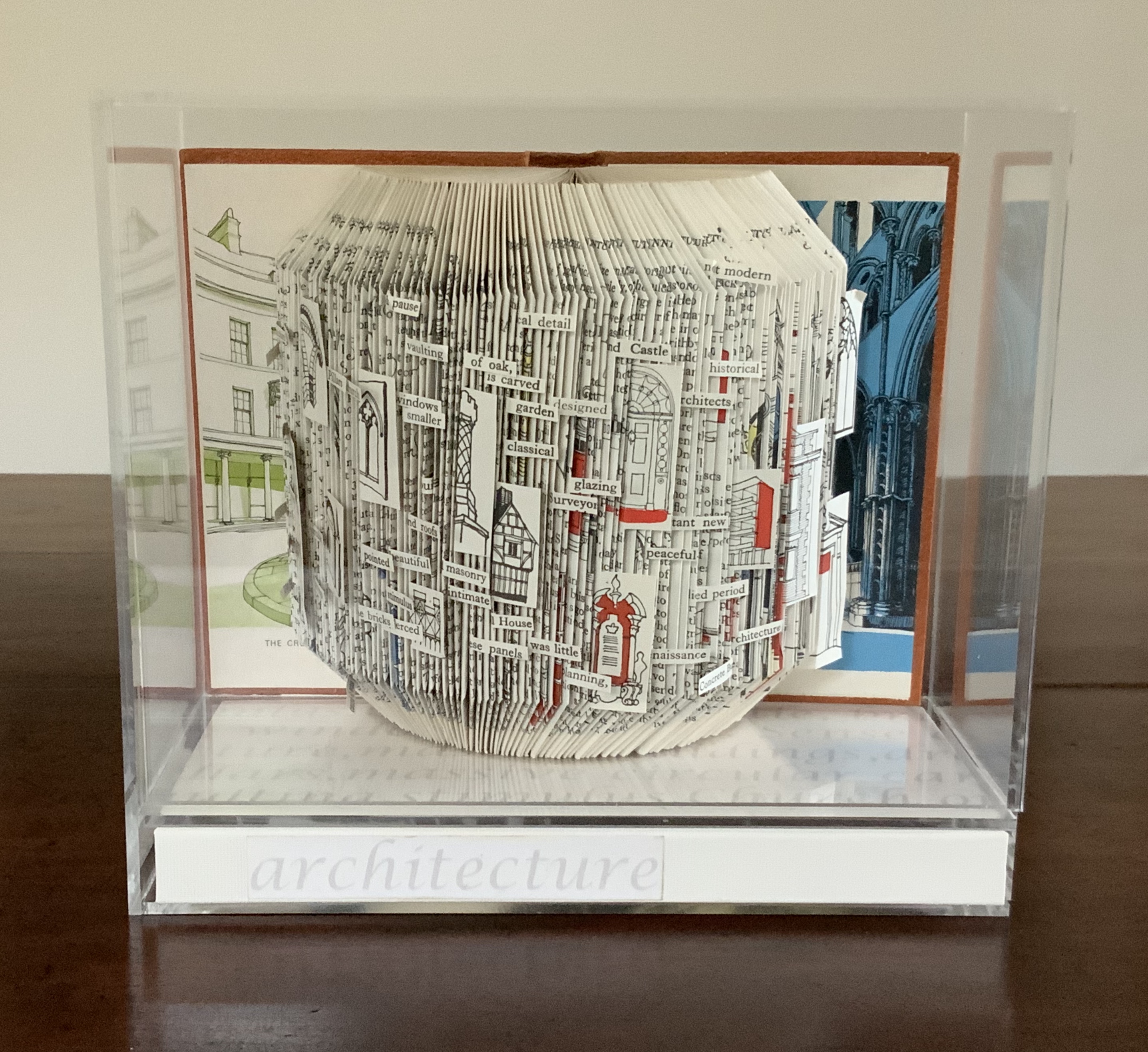
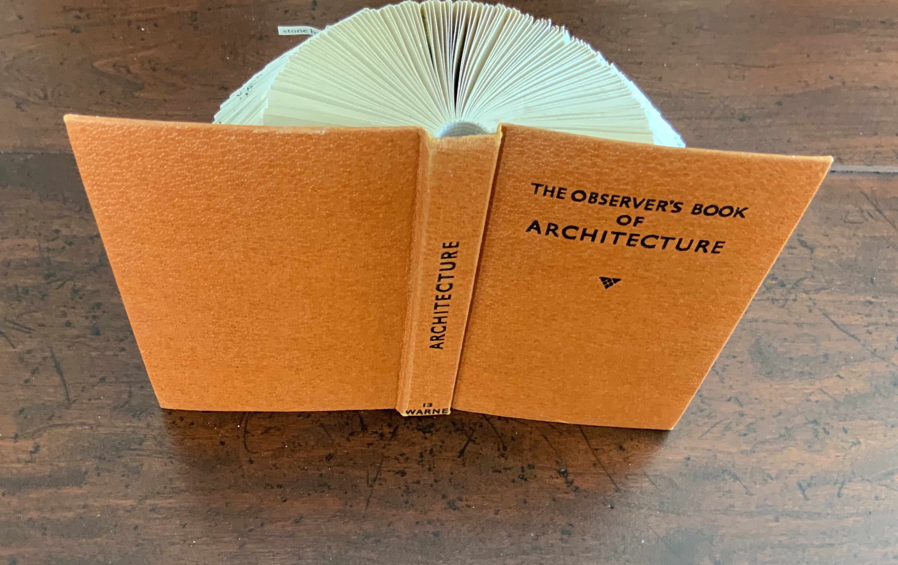
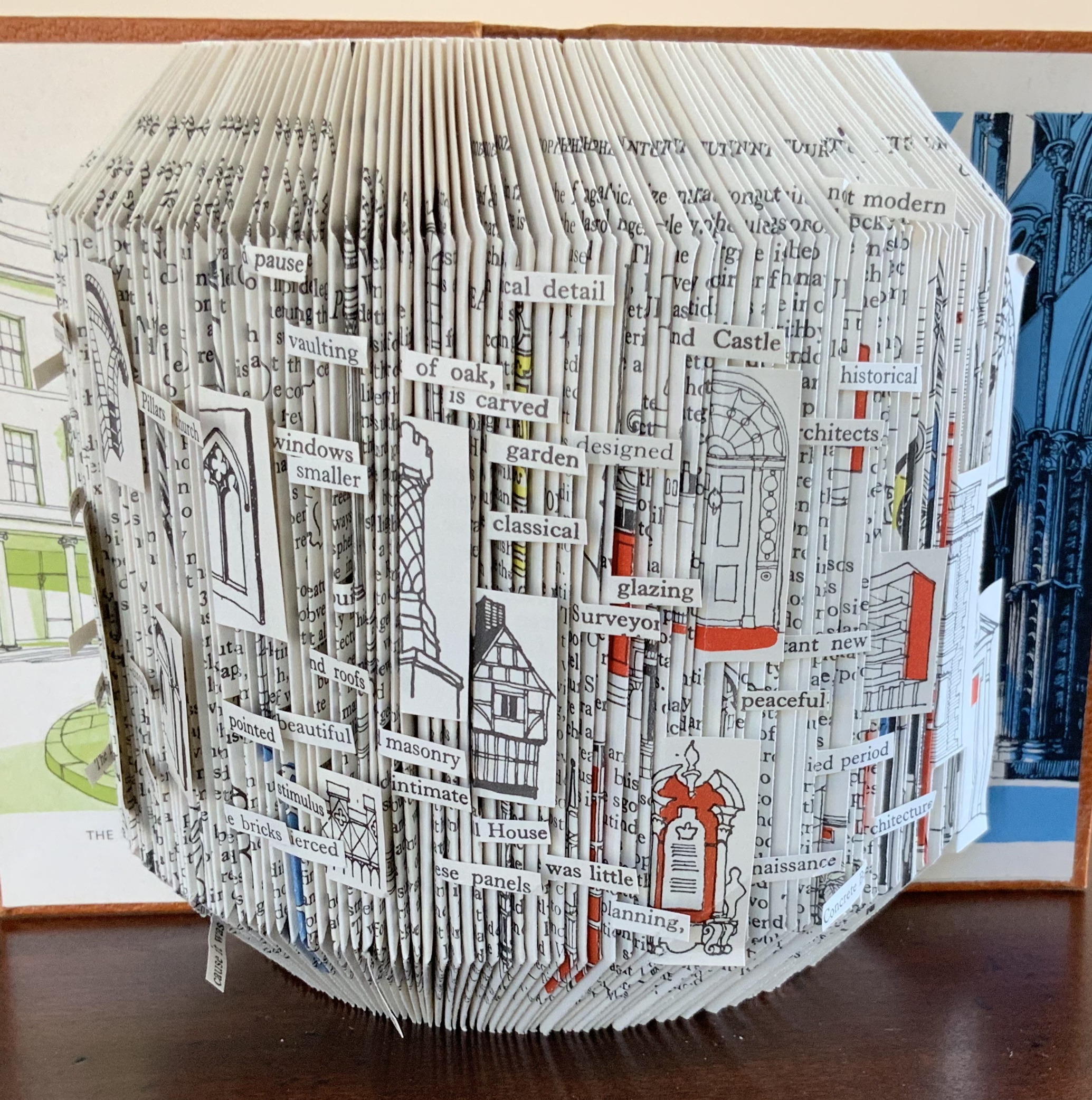
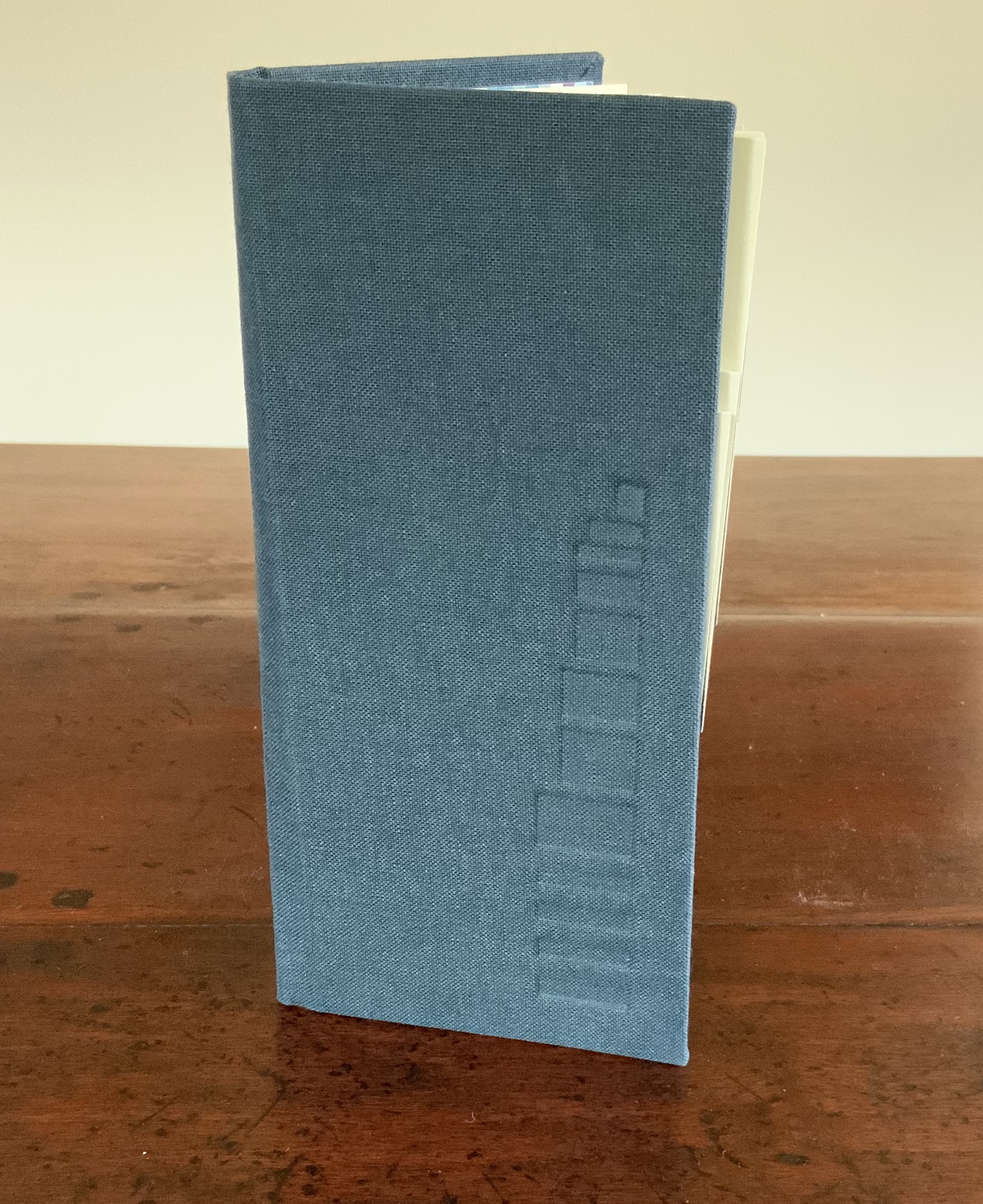


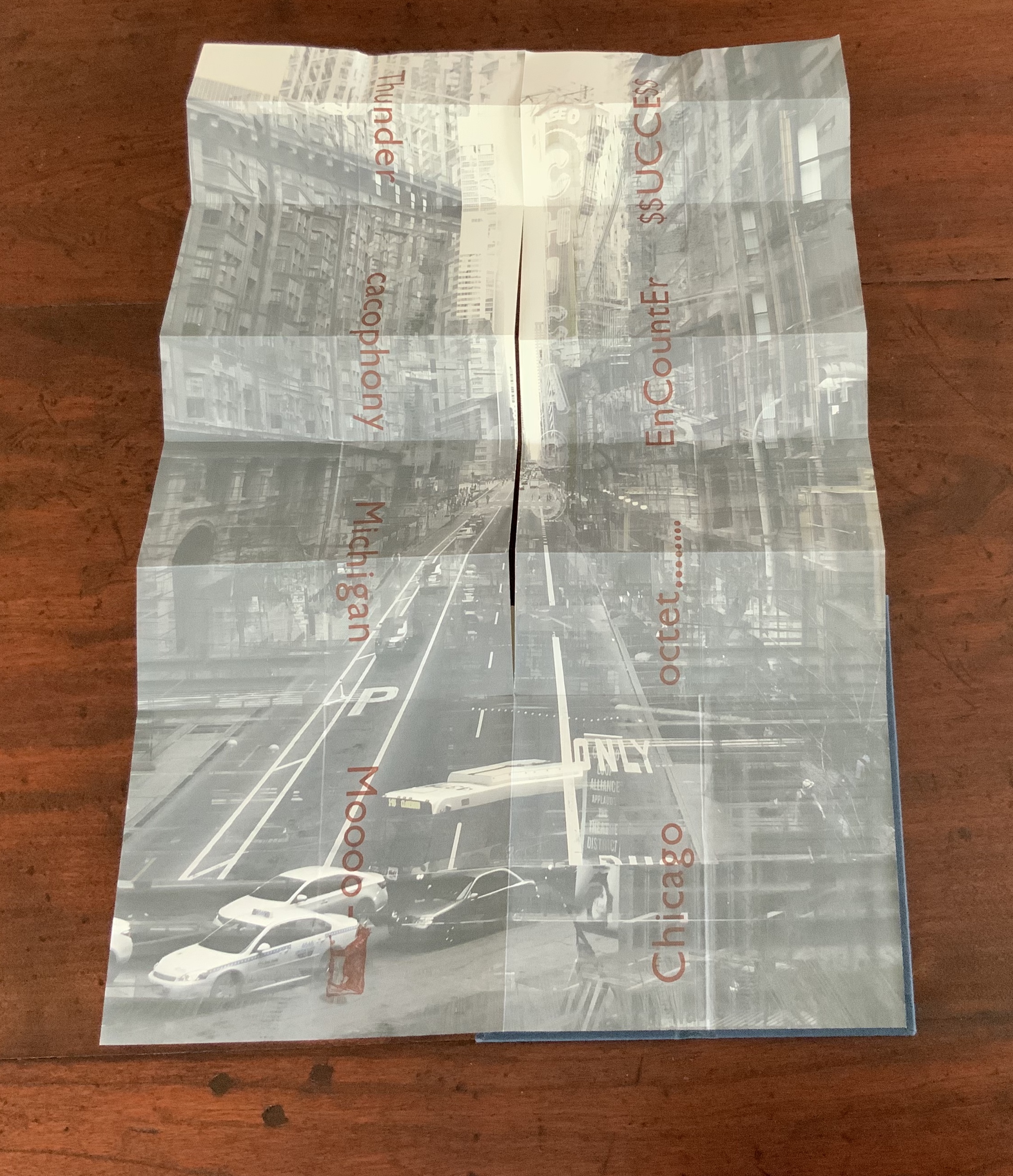

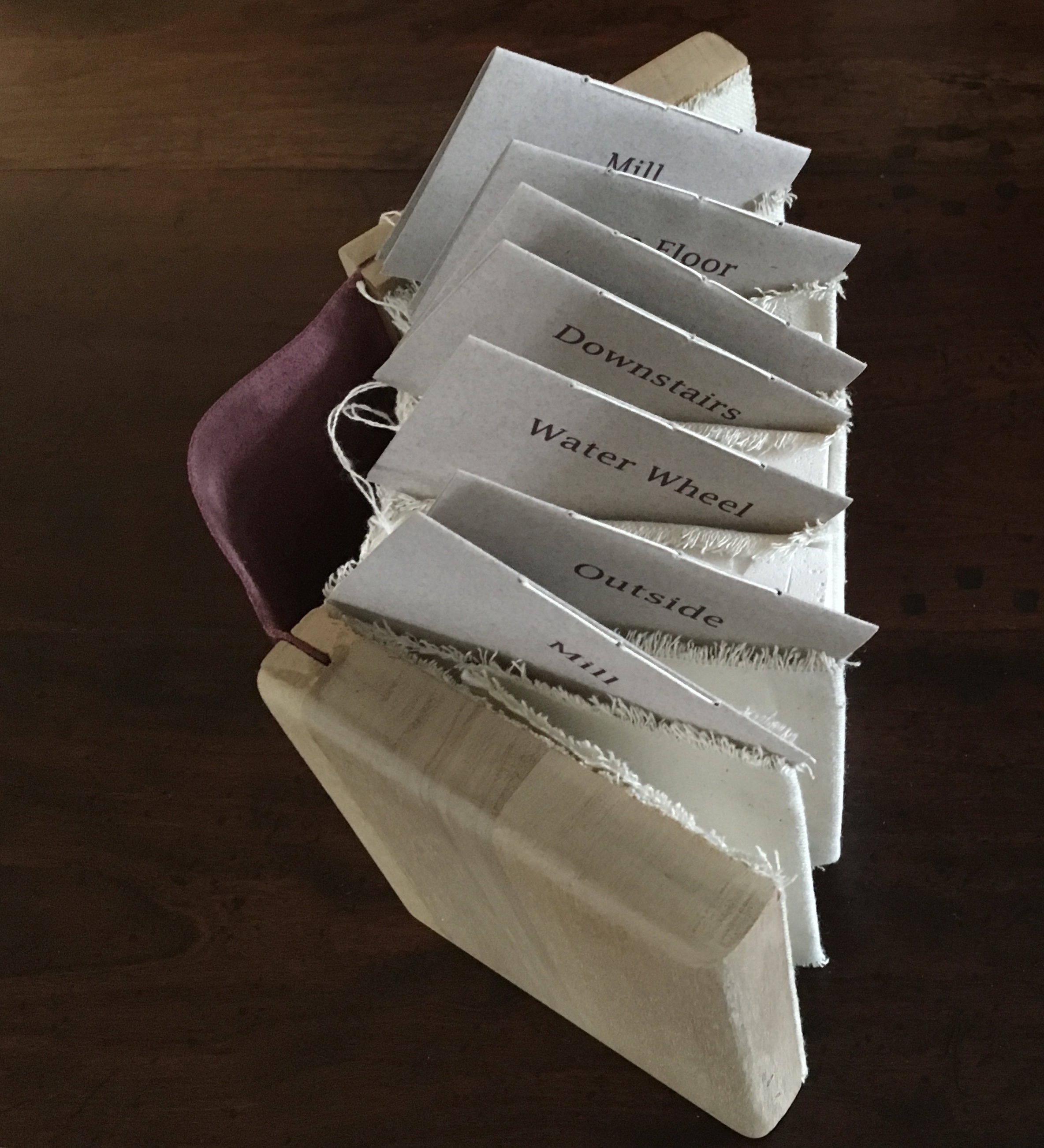
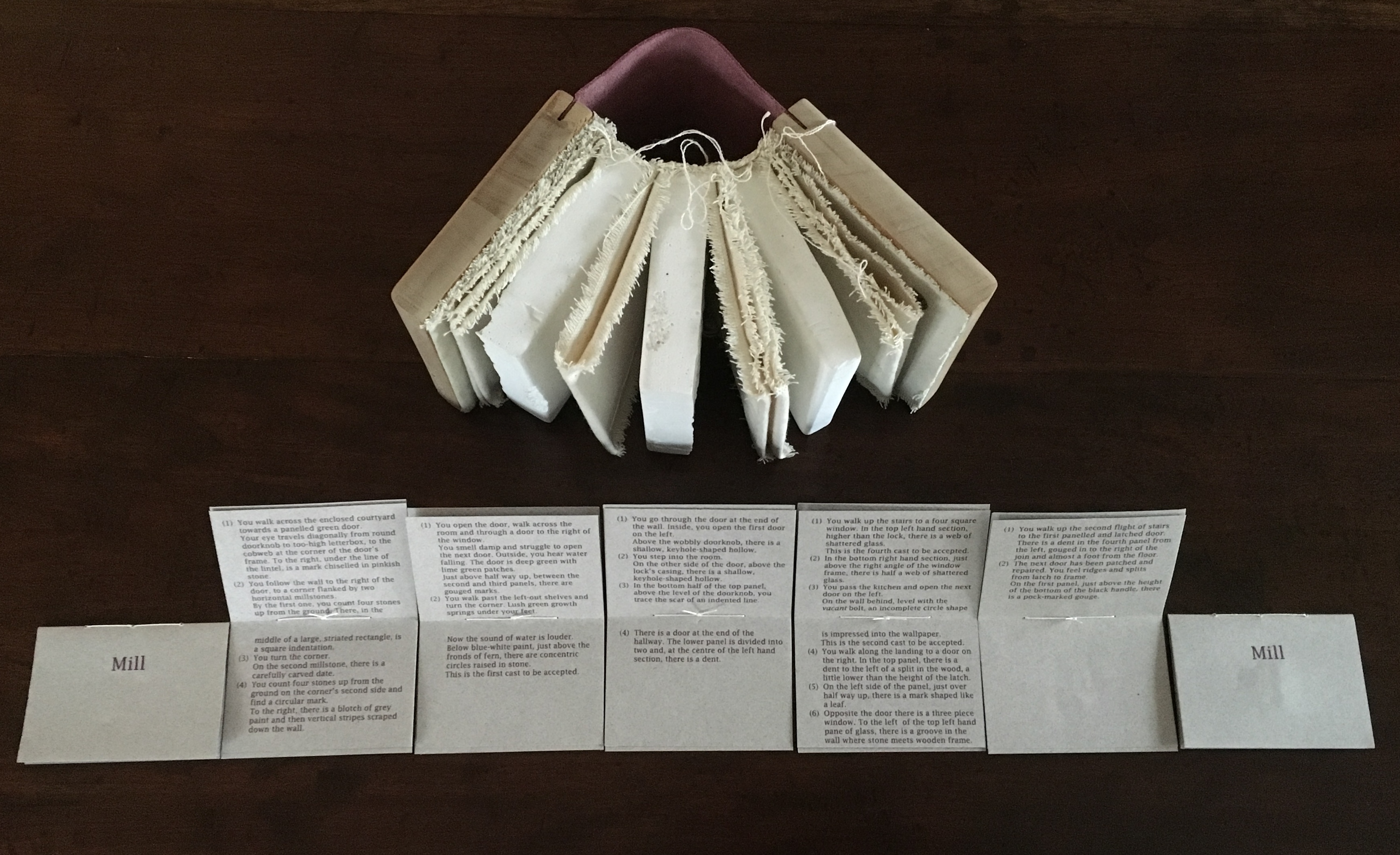
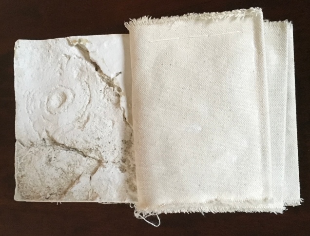
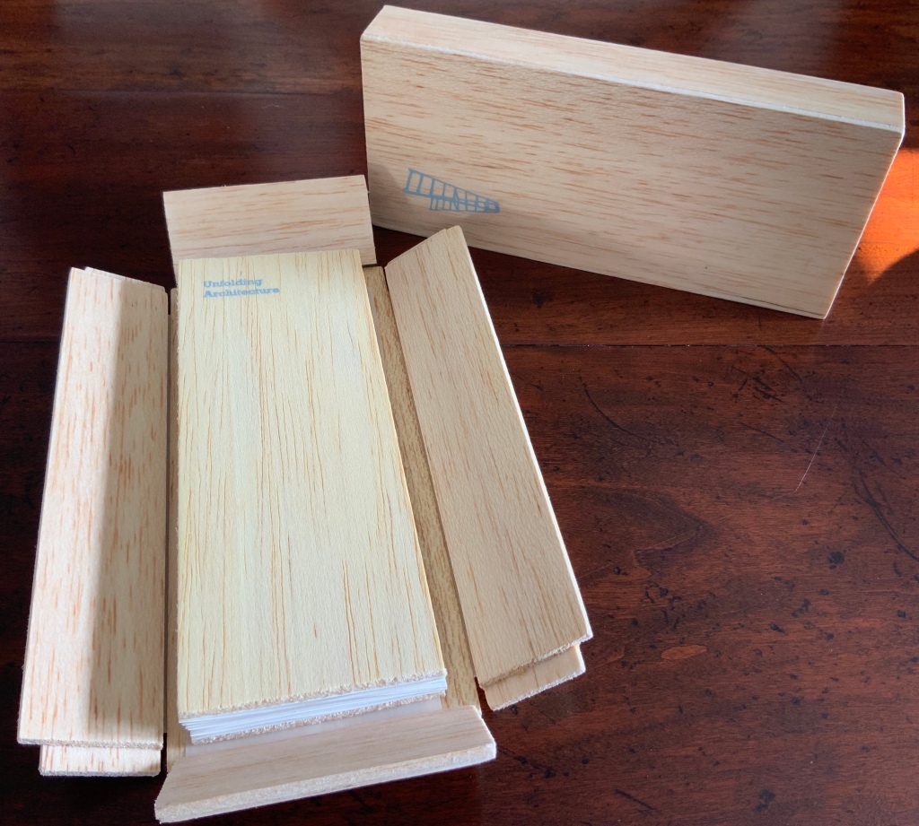
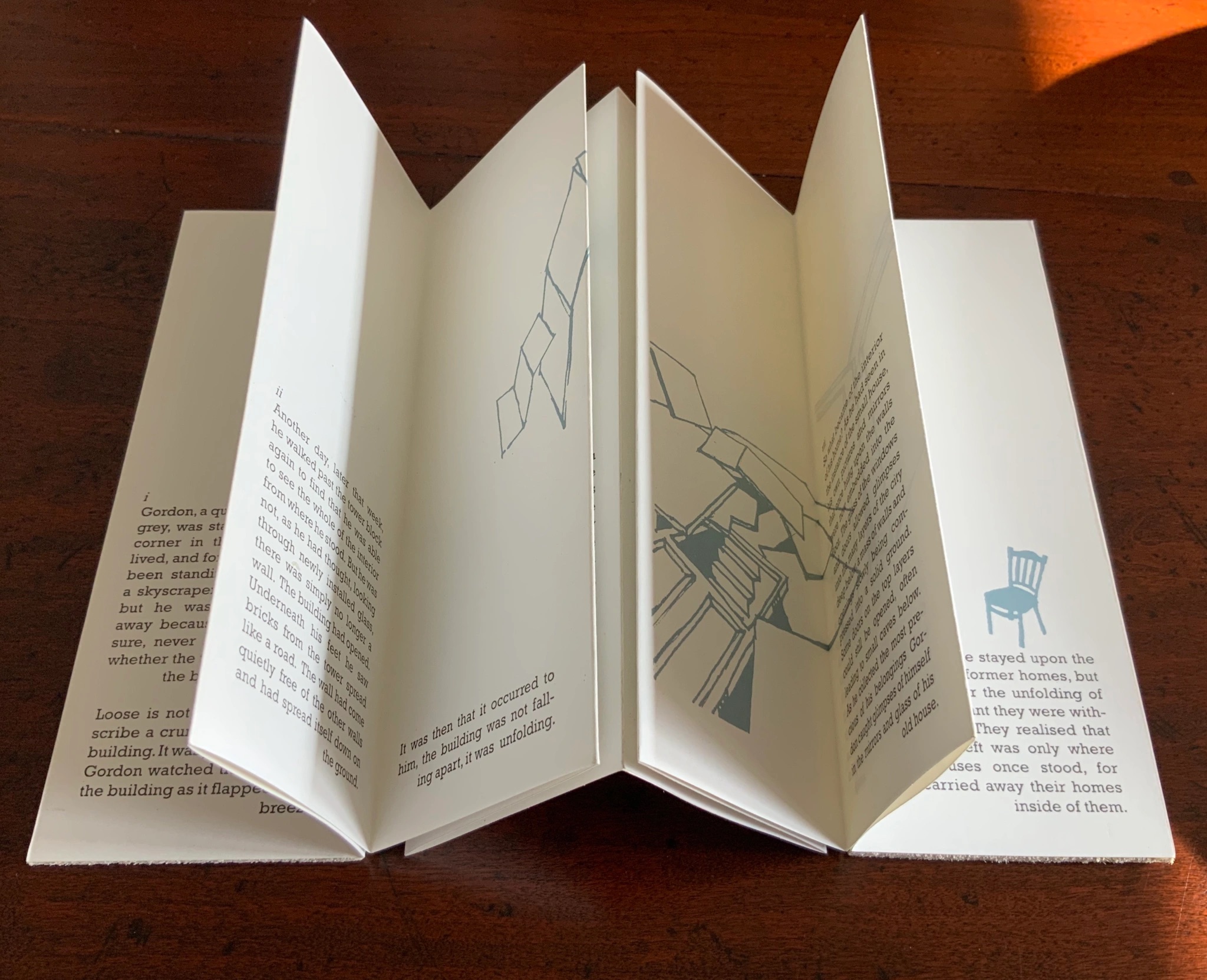
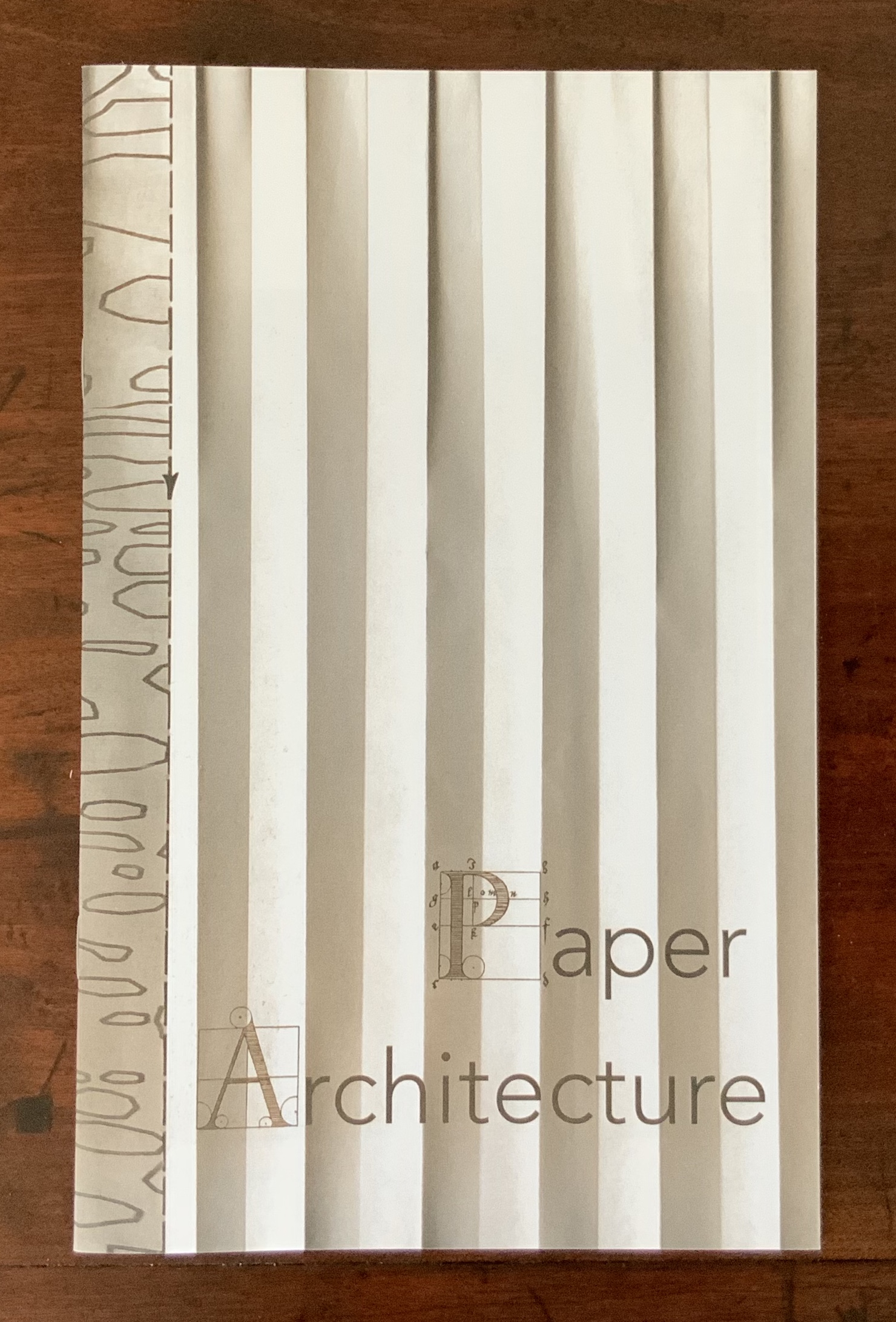

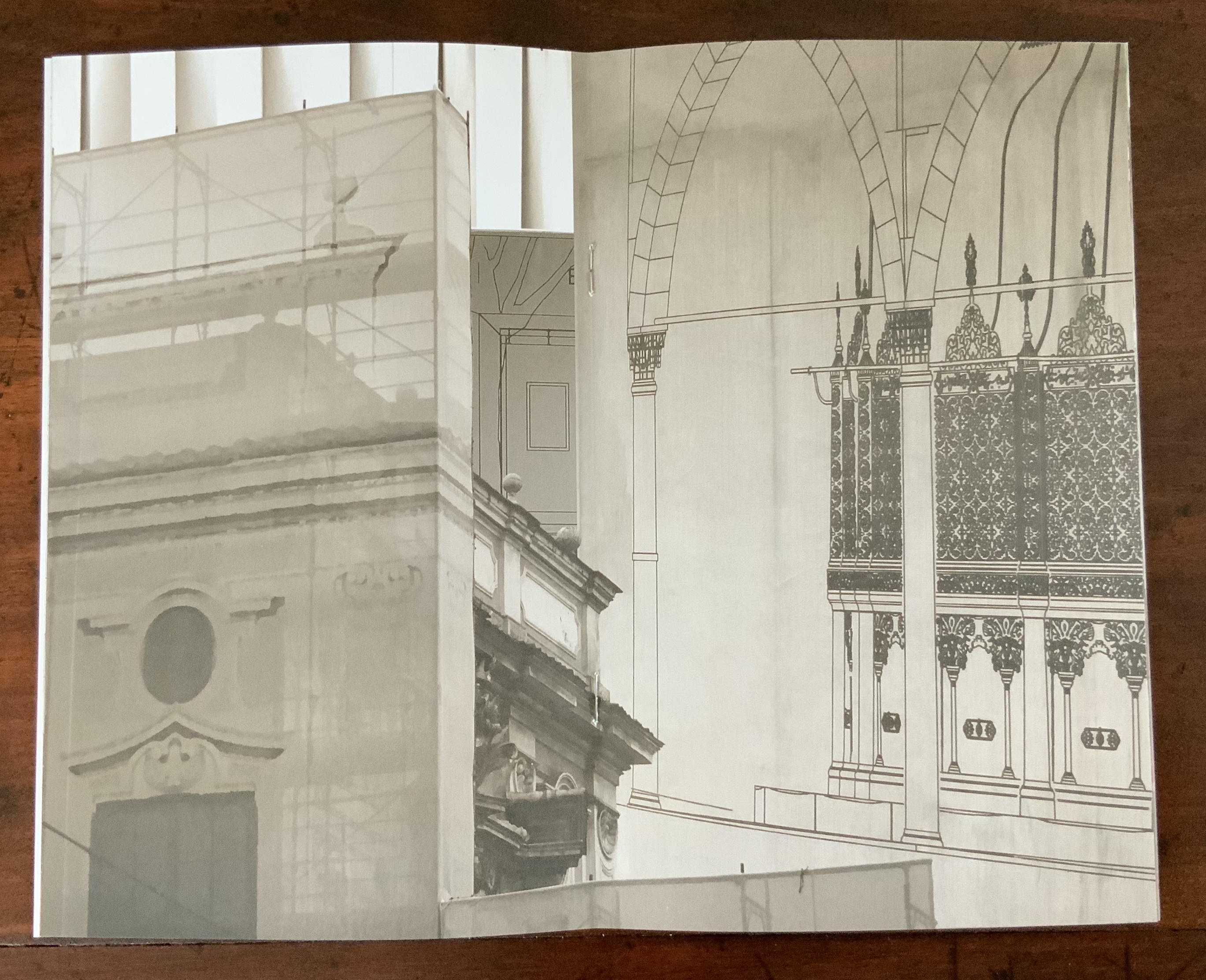

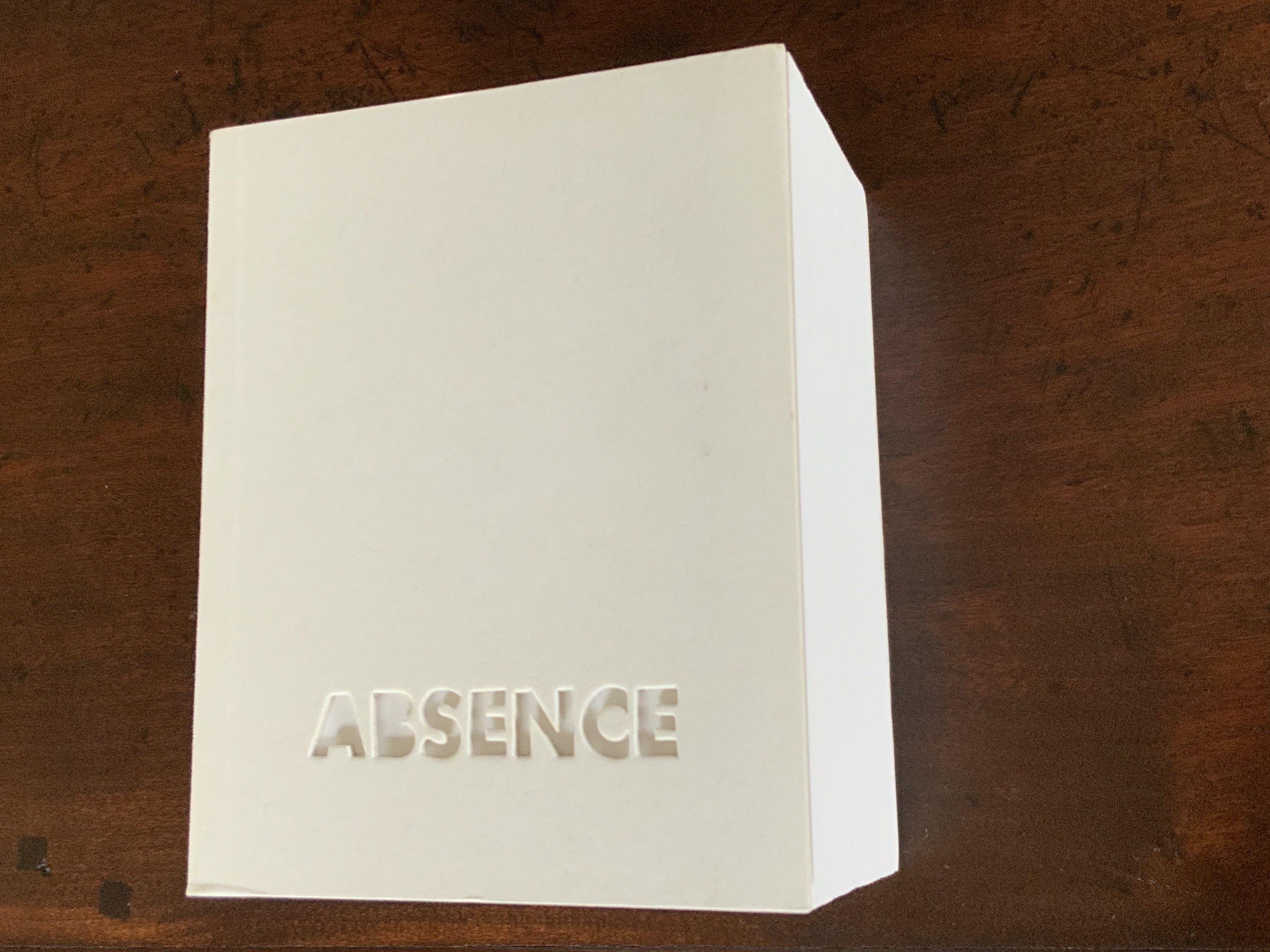
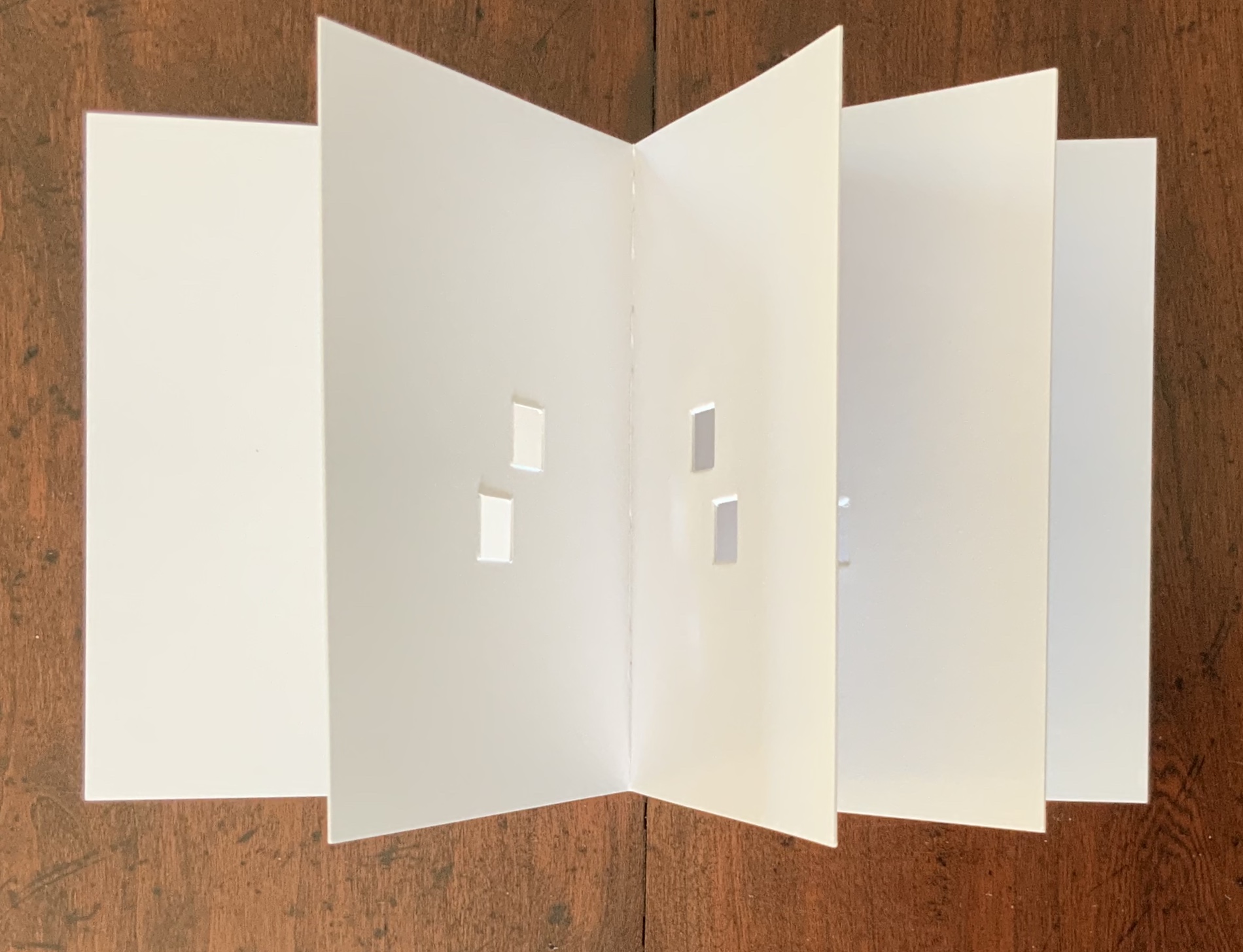
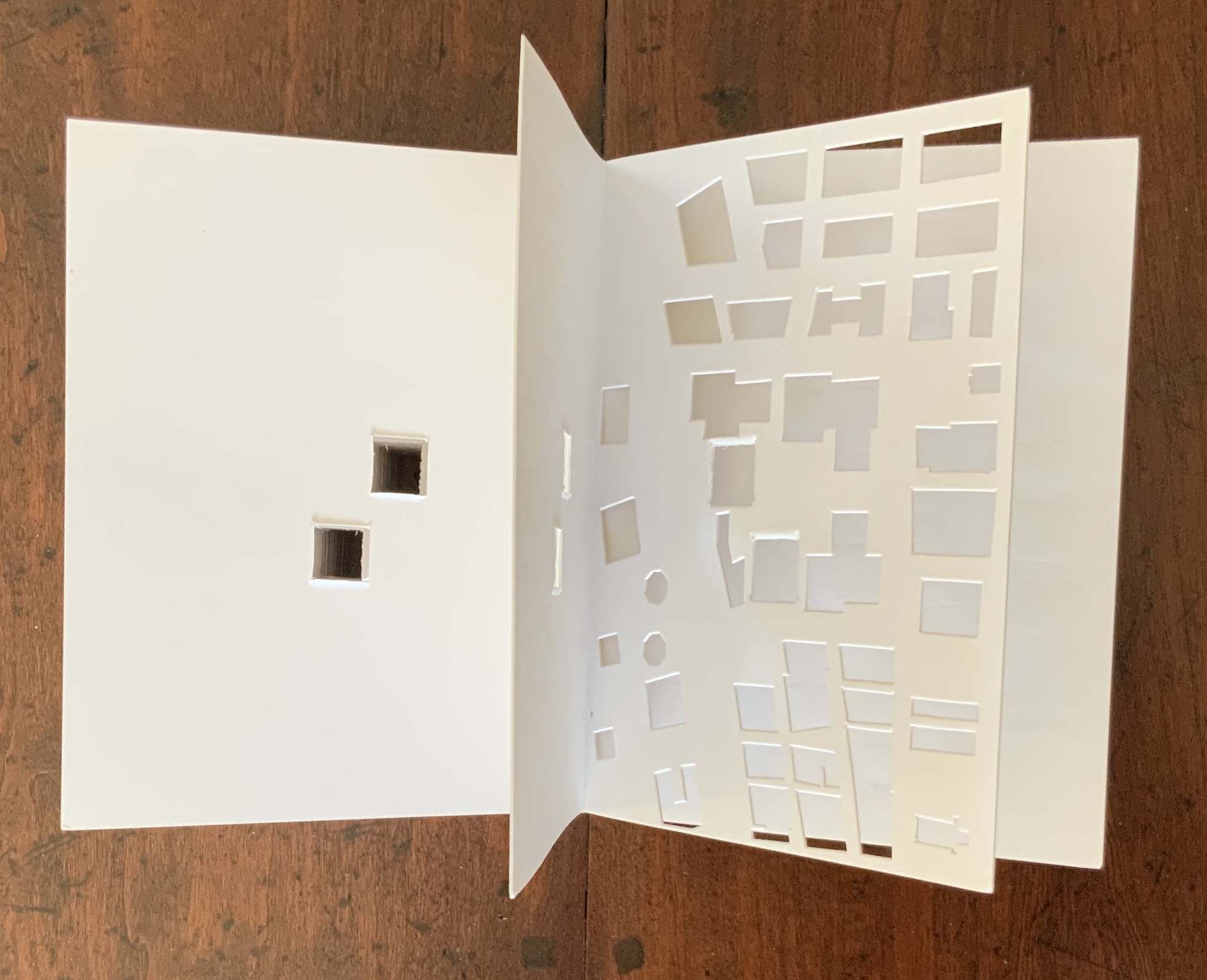
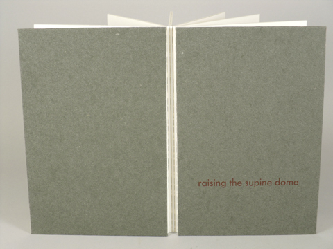
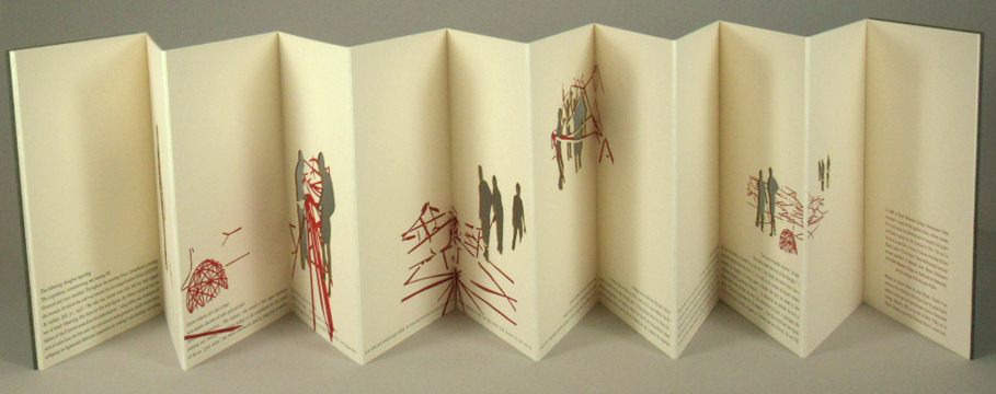
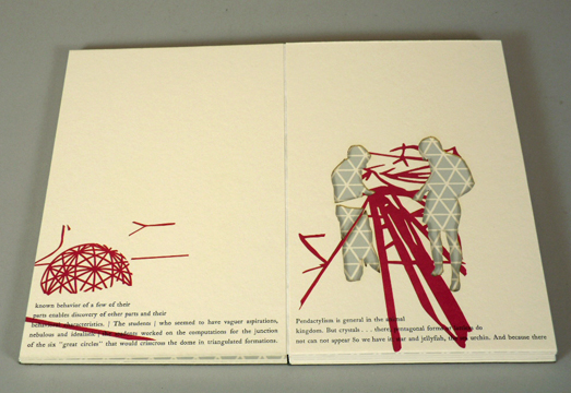
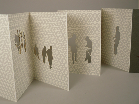
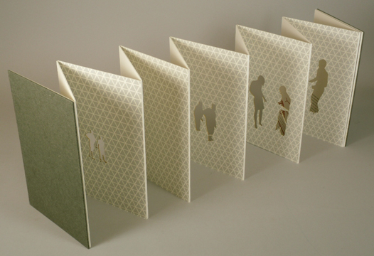
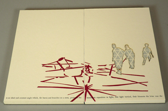

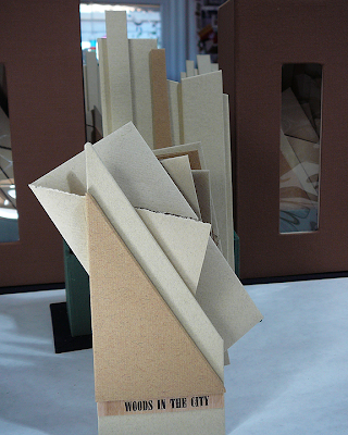
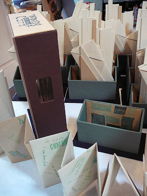


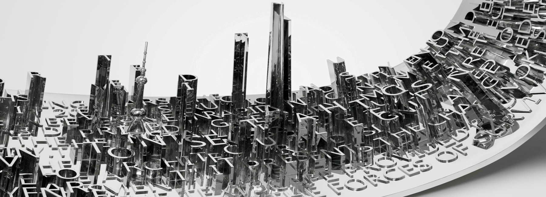


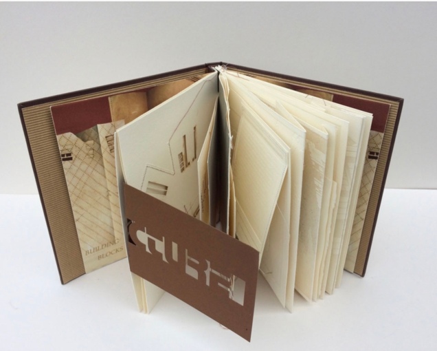
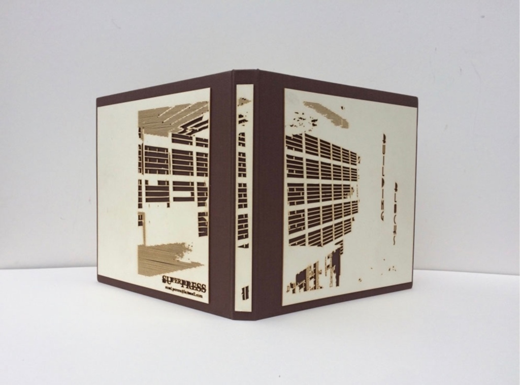
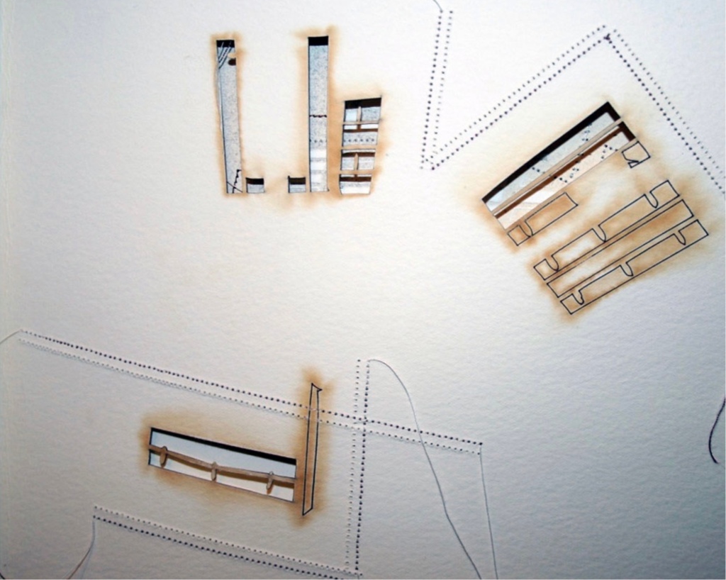
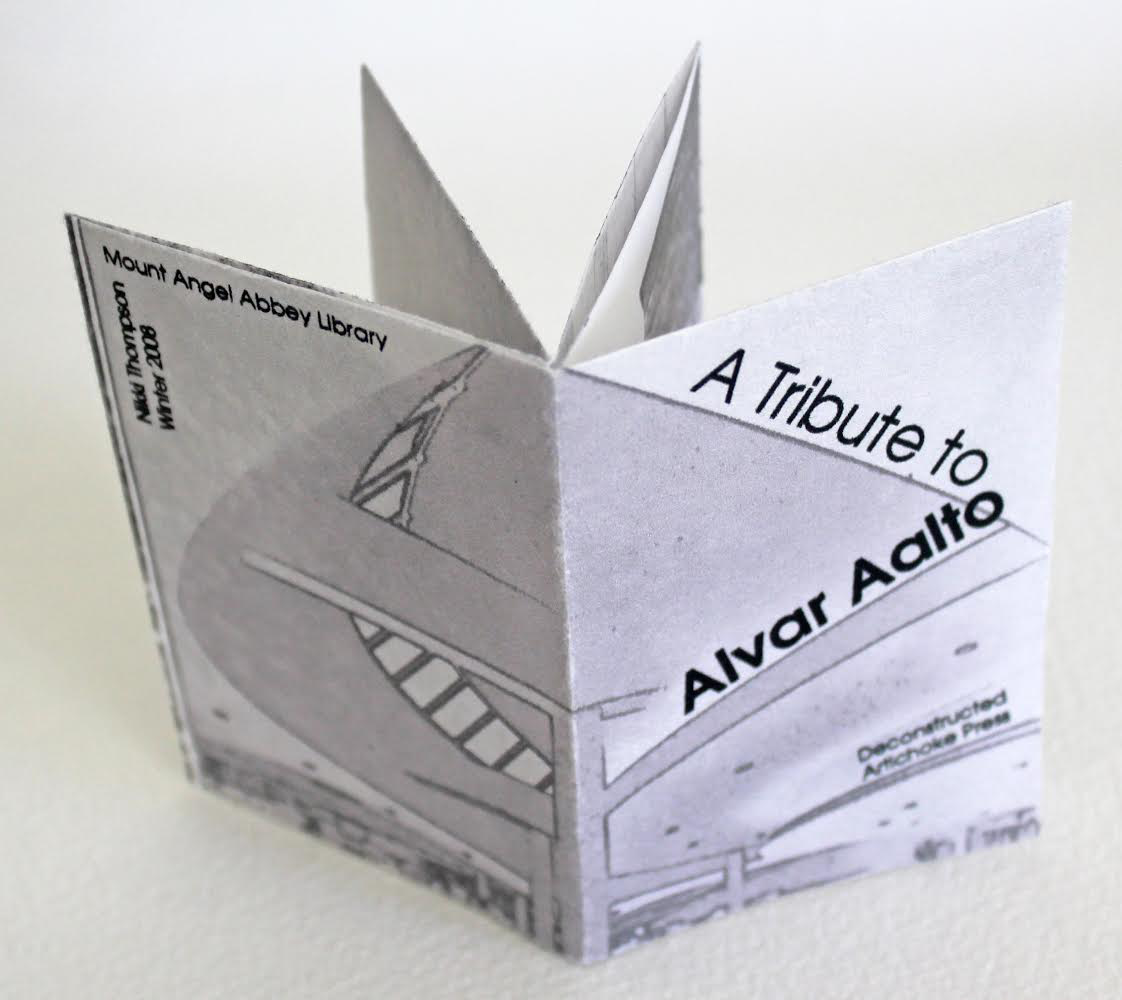
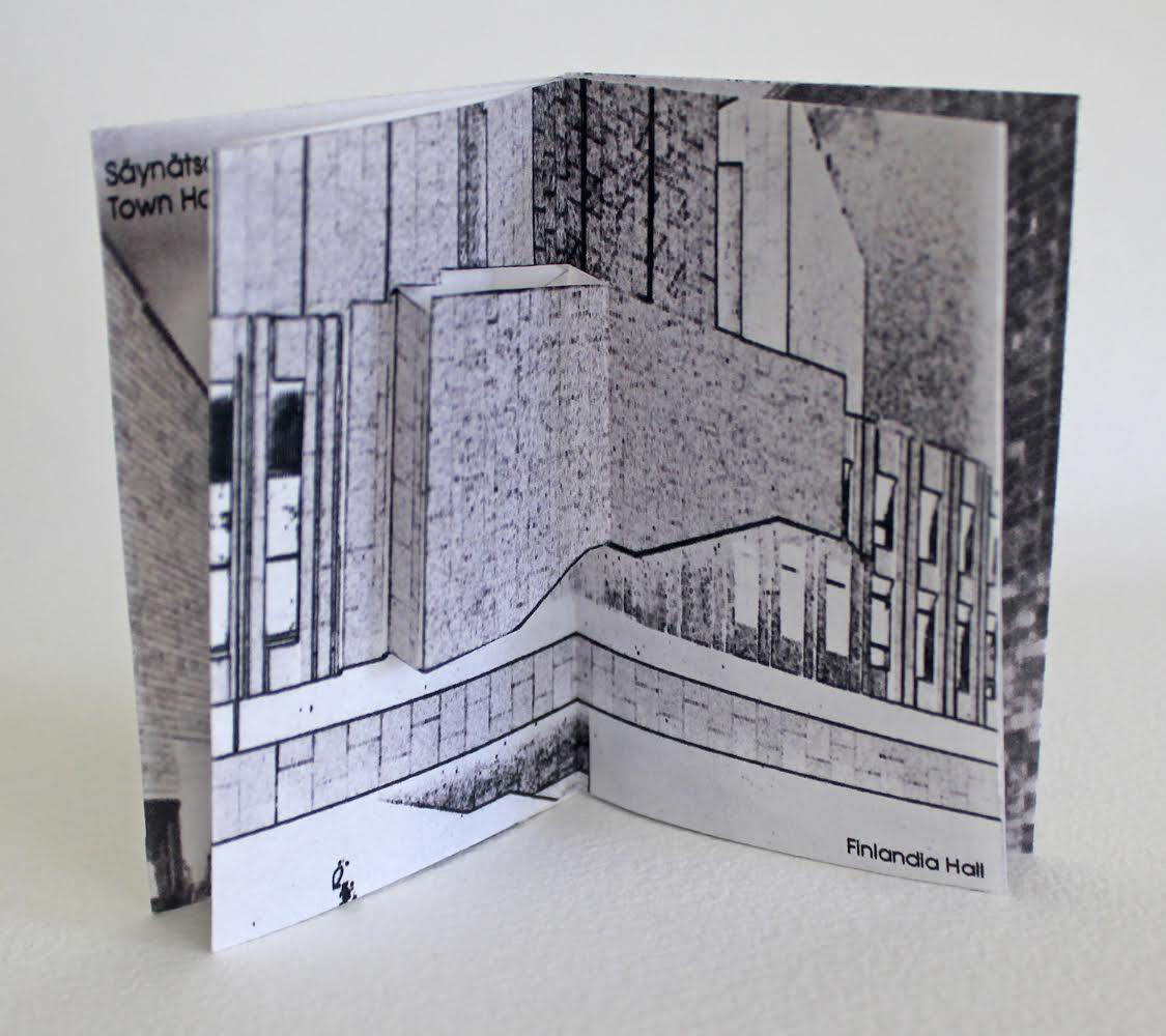
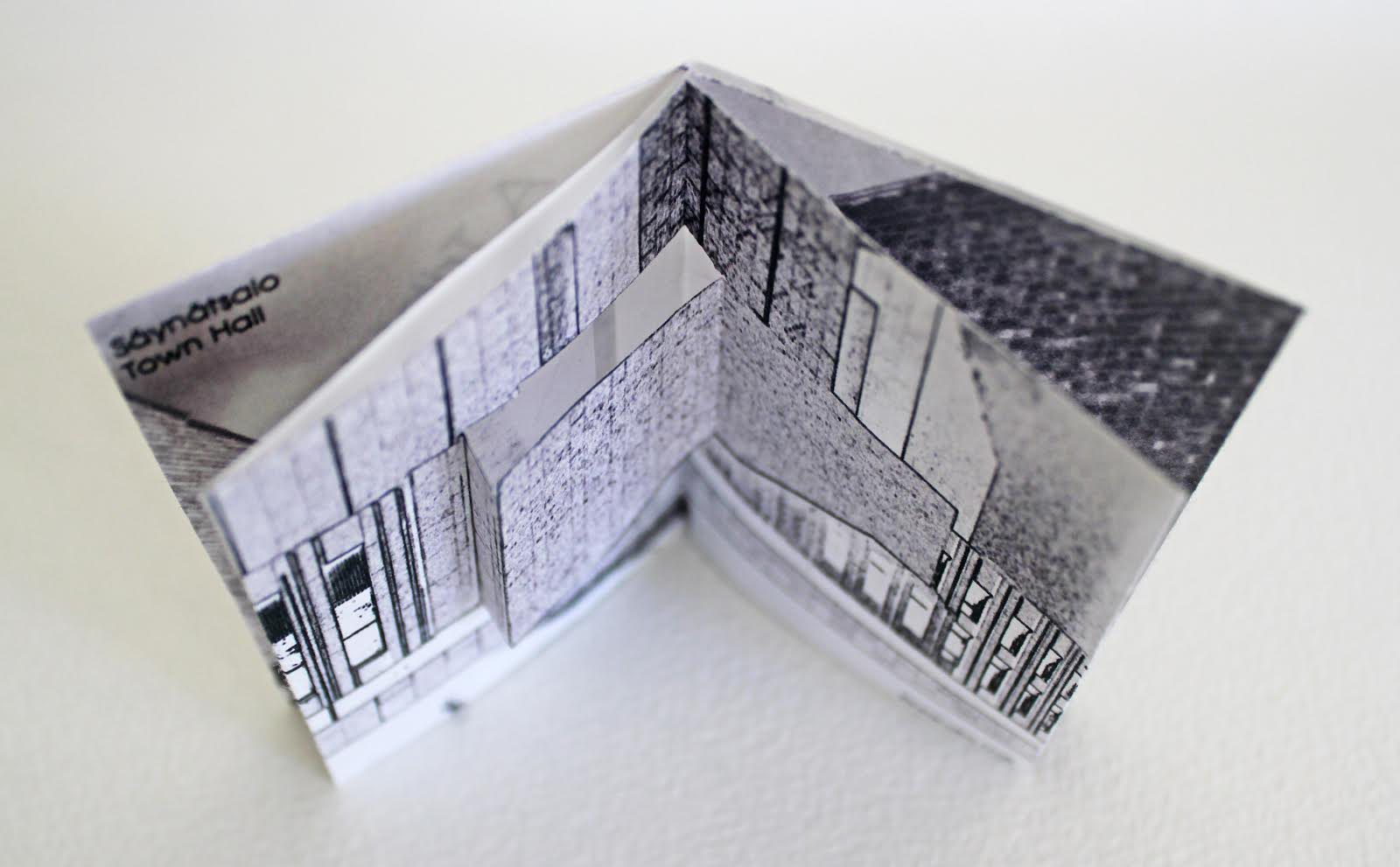

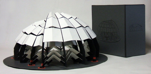
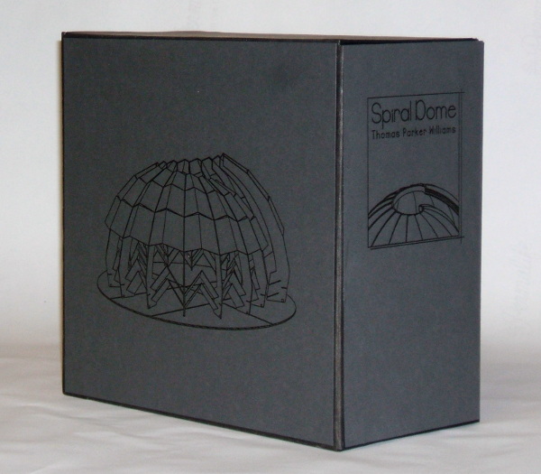
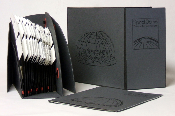
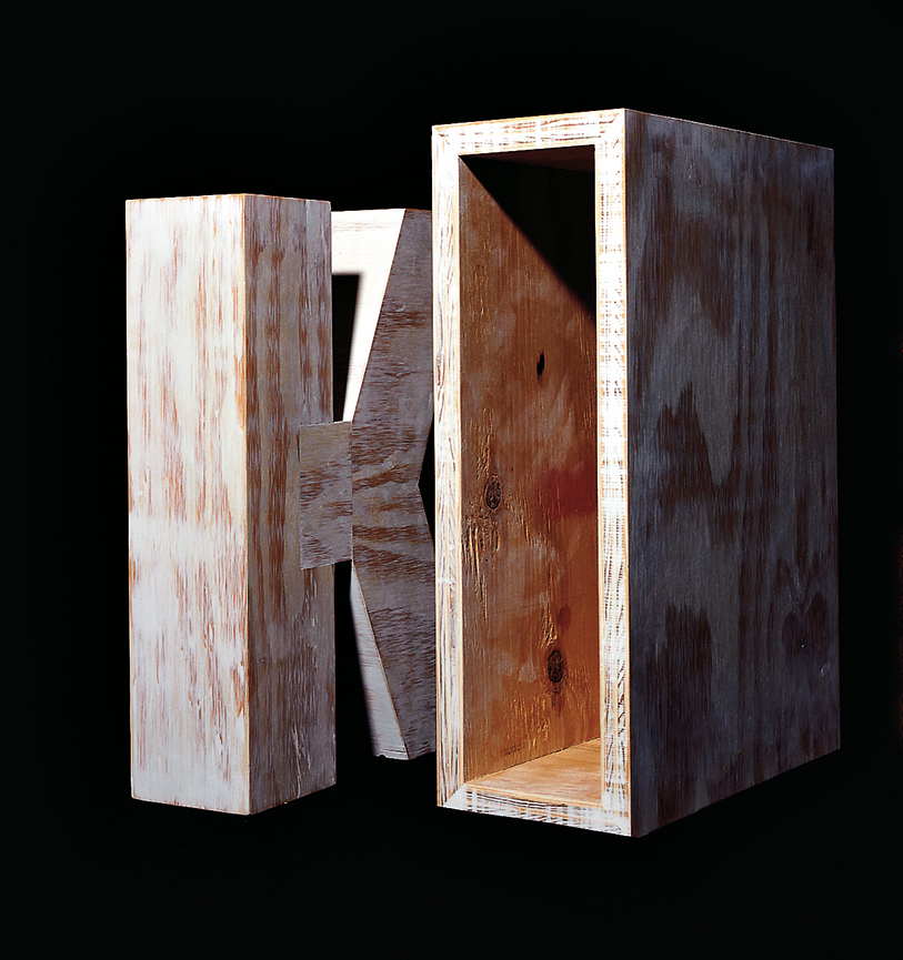

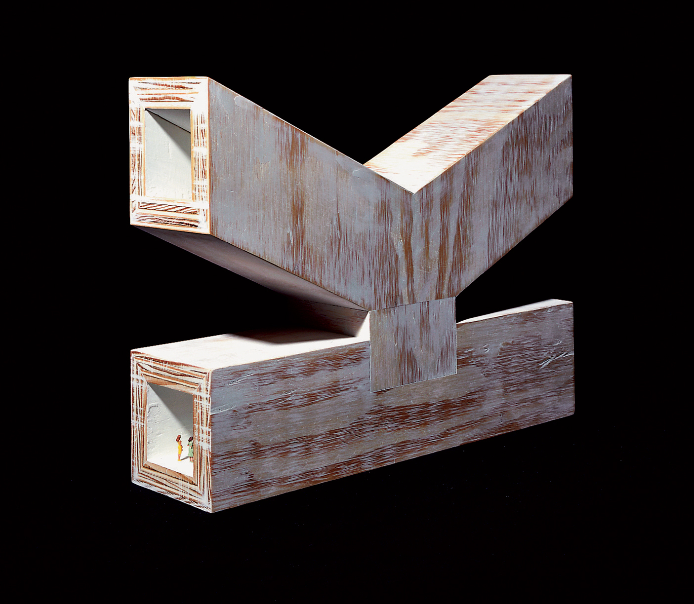

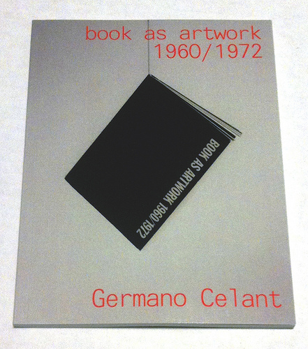

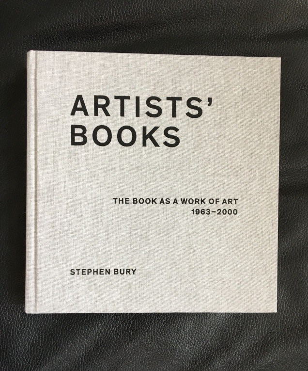
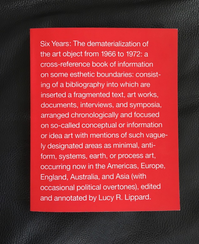


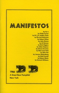
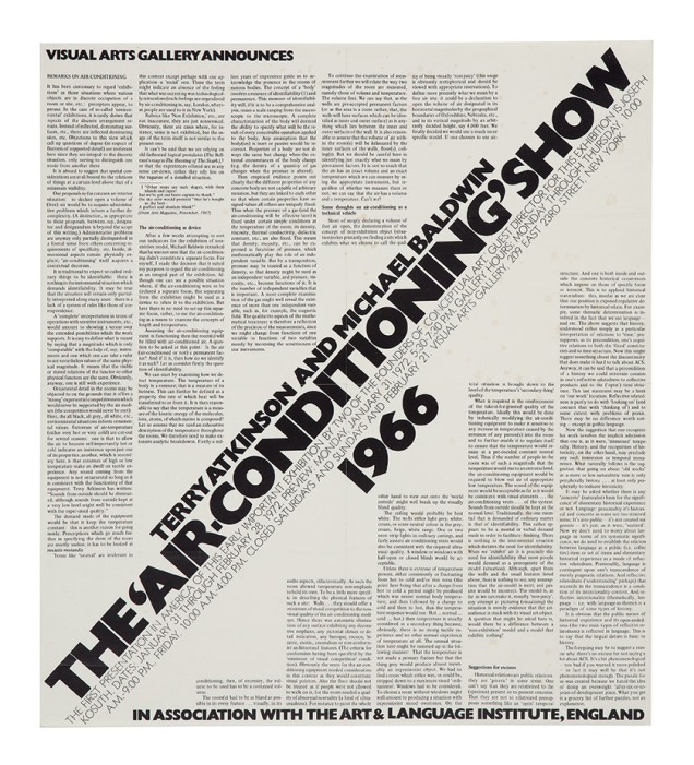
![Image result for art & language: texte zum phänomen kunst und sprache [book]](http://igem.adlibsoft.com/wwwopacx/wwwopac.ashx?command=getcontent&server=images&value=coda%5CAB00318.jpg)
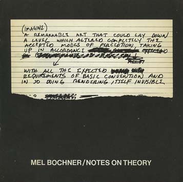

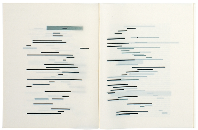

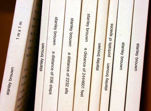
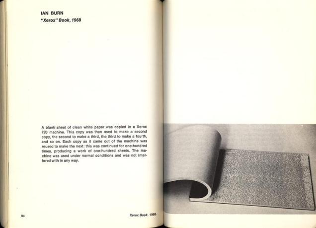


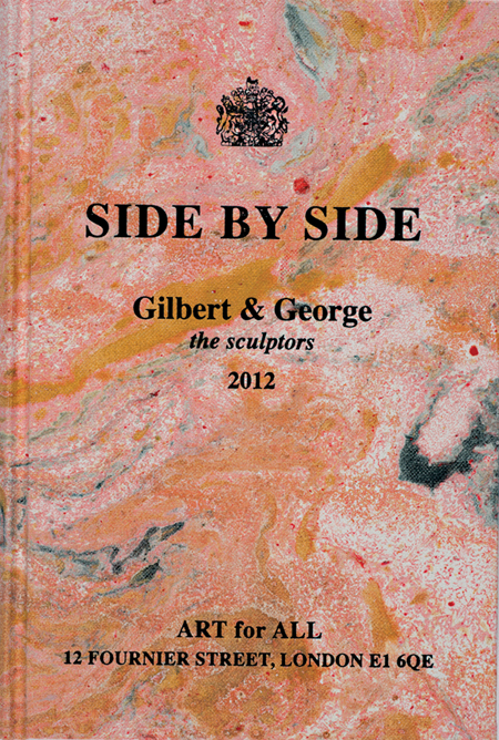
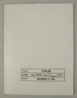


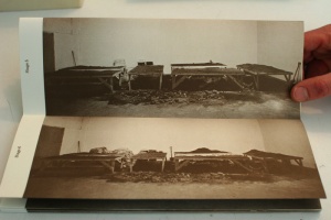
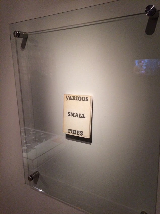
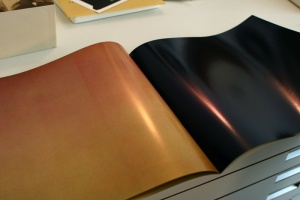
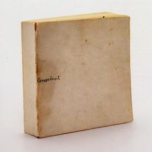


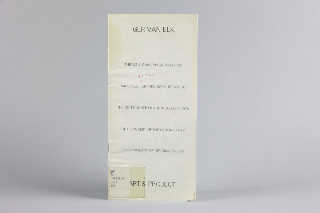
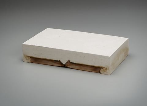
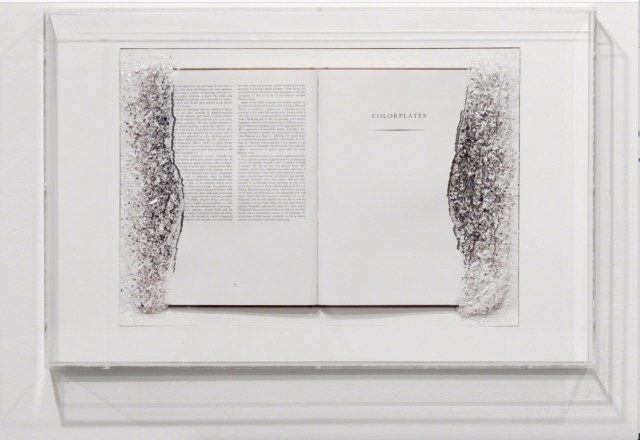
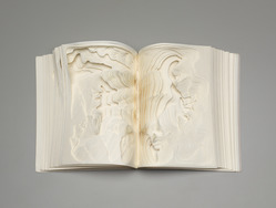

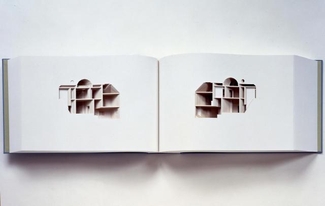
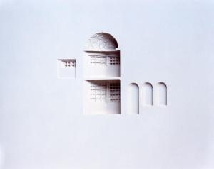


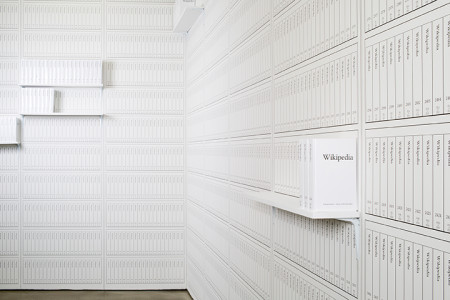
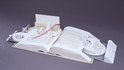
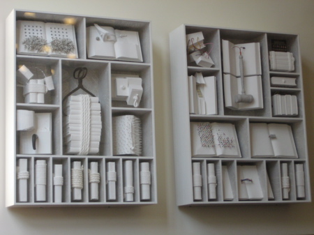
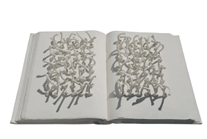

