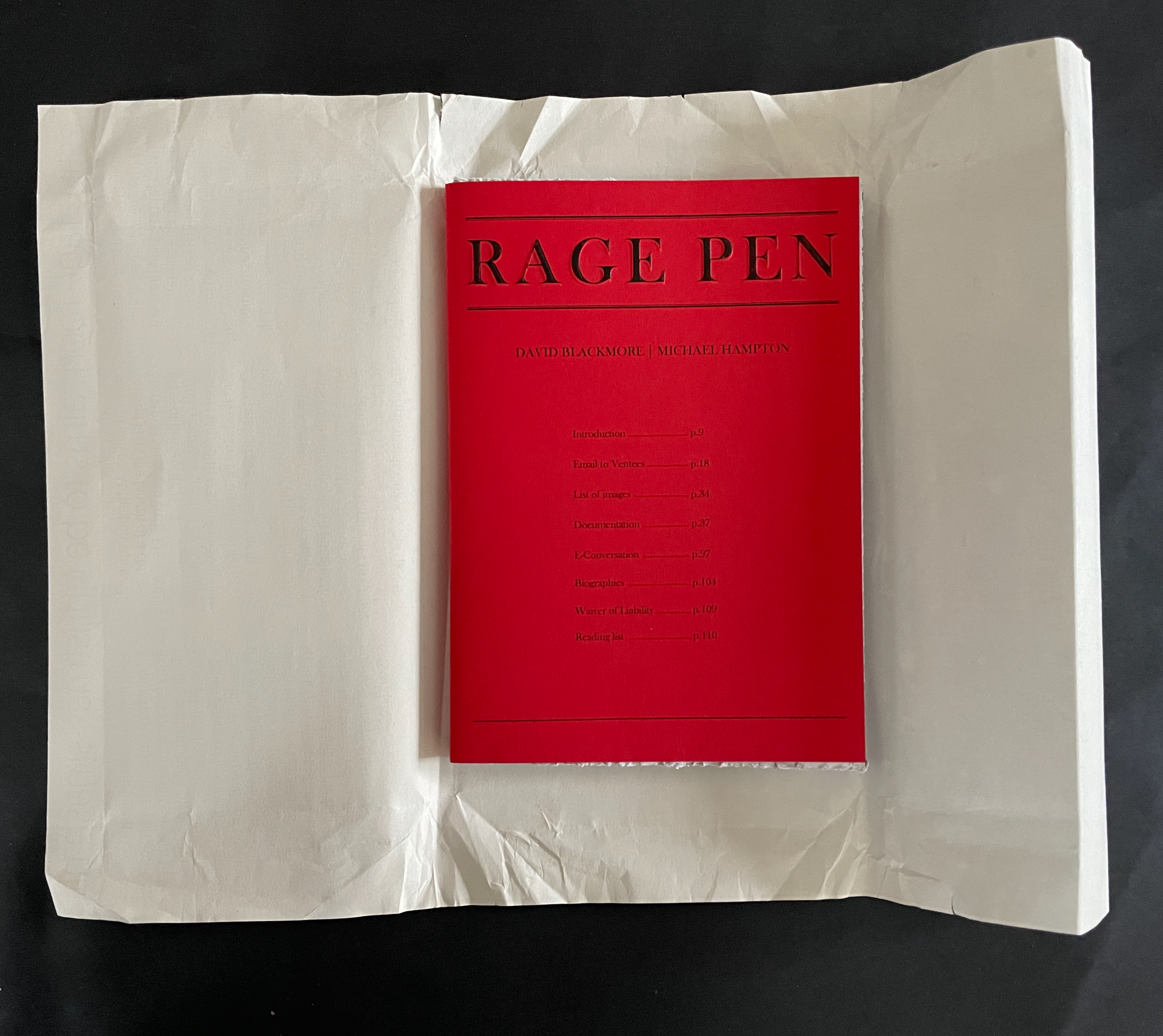
RAGE PEN (2025) David Blackmore and Michael Hampton Soft cover, mitre sawn head and foot, perforated fore-edge. H210 x W148 mm. [108] pages. Edition of 100. Acquired from Folium, 13 November 2025. Photos: Books On Books Collection.
Folium, the publisher, describes RAGE PEN as “developed from a relational piece of the same name held at Chisenhale Studios 2017/18”. Per the Museum of Modern Art, relational aesthetics is
A mode of art practice that establishes spaces, situations, or environments for a variety of social interactions. In essence, the social space or interaction becomes the work of art itself. The term was popularized by French critic and curator Nicholas Bourriaud in 1998.
RAGE PEN‘s environment was a safe rage room equipped with a variety of handheld tools. Anonymous members of the public, or “ventees”, were invited to name an object that had caused them frustration, don protective equipment, and enter the shuttered room to smash said objects. The interactions filmed and photographed by David Blackmore formed the images in RAGE PEN the book. Holding the book with its mitre-sawn top and bottom edges and its perforated, still-sealed fore-edges, we might suspect that we are being invited into our very own private relational aesthetic piece.
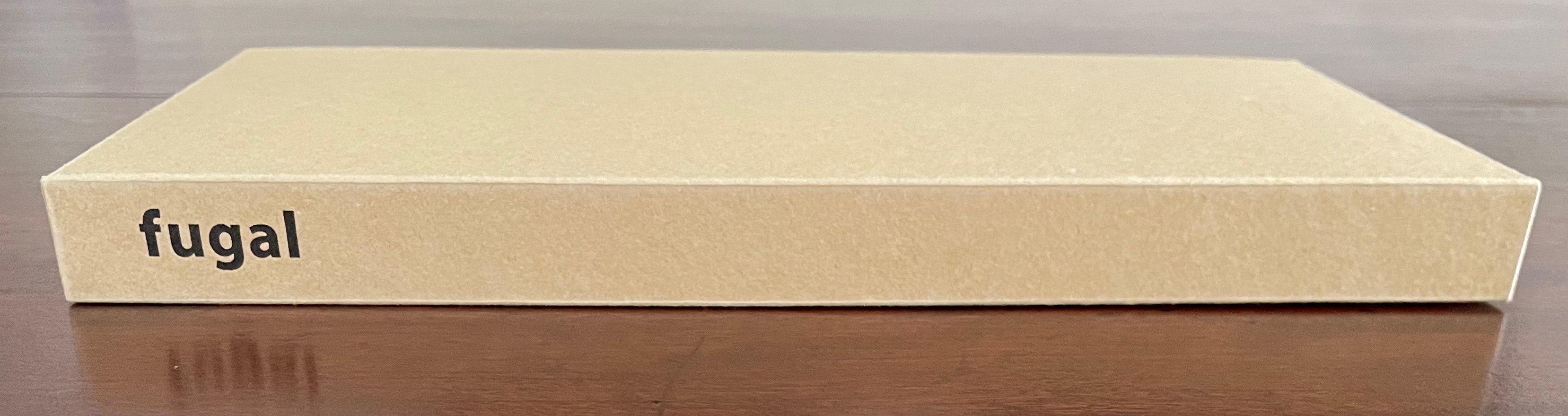
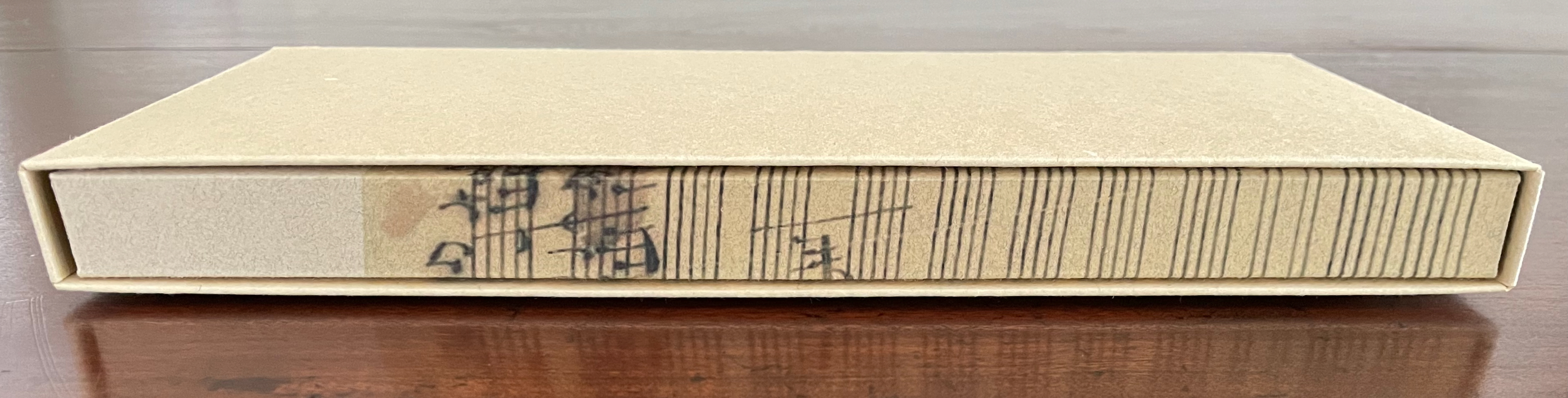
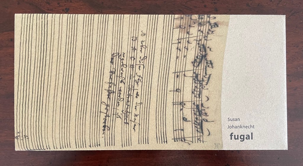
Fugal (2025) Susan Johanknecht , Claire Van Vliet, and Andrew Miller-Brown Vertical double-sided accordion book bound in “Landscape with Cows In It” structure designed by Claire Van Vliet, cover in calendered Barcham Green India Office, interior in handmade Japanese Kozo Natural fixed to Monadnock Dulcet; slipcase of handmade paper. Slipcase: H123 x W248 x D22 mm. Book: H120 x W240 x D18 mm. [6] double-sided panels. Edition of 100, of which this is #8. Acquired from Susan Johanknecht, 26 September 2025. Photos: Books On Books Collection
In the hands of multiple readers, this collaboration among Susan Johanknecht’s Gefn Press, Claire Van Vliet’s Janus Press, and Andrew Miller-Brown’s Plowboy Press becomes the “book as performance” and “book as musical score”. Fugal is an artwork that works best with several simultaneous readers/voices/viewers.
A fugue generally has a “subject” (or main theme), an “exposition” in which voices or instruments each play out the subject, then an “episode” (or connecting passages) that builds on the previous material, then further alternating “entries” in which the subject is heard in related keys until a final entry that returns to the opening key. The subject of Fugal is the generative process of vocal changes due to aging. The phrases of the poem have been drawn from an unidentified speech and language textbook.
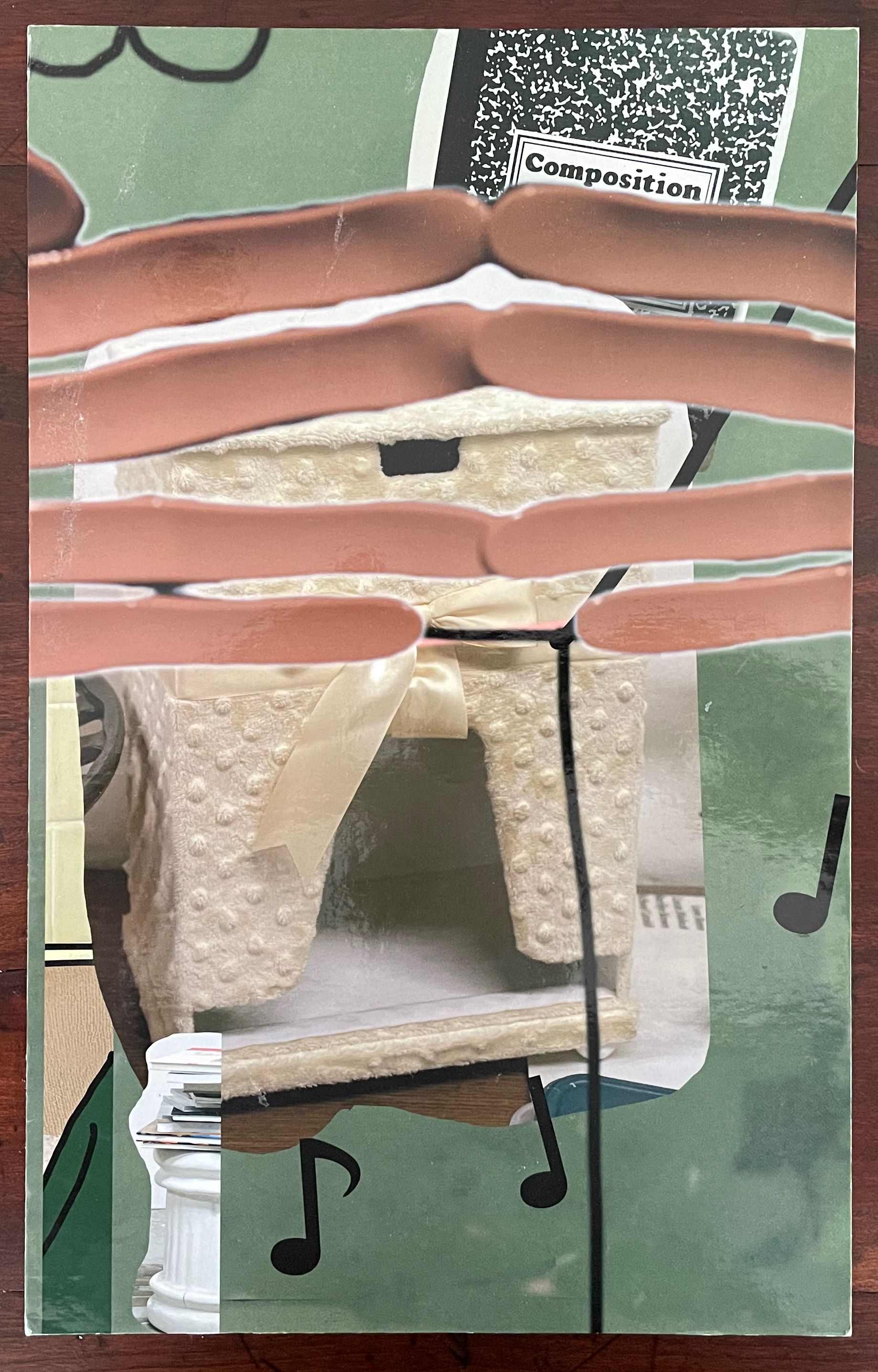
Making Memeries (2016) Lucas Blalock Board book consisting of nine 3mm thick card leaves with 8 double-page large colour photos, all of which interact with a down-loadable app. H330 x W210 x D28 mm. [18] pages. Edition of 500. Acquired from David Bunnett Books, 31 July 2023. Photos of the work: Books On Books Collection.
How do we respond to an artwork of collage or assemblage that is missing a piece — assuming that we can tell ? And if all of the elements are ephemera, does it matter to our appreciation of it? Do we keep returning in annoyance to the gap — like a tongue to a missing tooth? Do we give up on it — like the purchaser of a secondhand jigsaw puzzle missing a piece or two? Or do we sigh and suppose appreciatively that the disappearance of an element of ephemera from a collage or assemblage of ephemera proves the artwork’s point?
Lucas Blalock is an artist of augmented realities. With the right device and app pointed at his artwork, we should be able to see images floating and moving over its surface or seemingly in the surface among its images or transforming them. According to the back cover, we can download this app from the iTunes App Store to interact with the book’s images. The app, however, was removed from the App Store in July 2023. Using the WayBack Machine, we can find the publisher’s announcement of the Making Memeries installation with Blalock in the Tate Modern’s Turbine Hall:
The London-based curatorial project Self Publish, Be Happy presents a programme of events that explore the blurring boundaries surrounding on/offline existence and distribution of photographs. The event, titled Making Memeries, will take place at Tate Modern during this year’s Offprint London art book fair from 20-22 May.
Artist Lucas Blalock has created an installation for the middle of the Tate Modern’s Turbine Hall that functions as a staging area for workshops and performances. The installation consists of a set of eight movable panels that display a new suite of photographs by Blalock. The elements of the installation, conceived of specifically for this project, can be further activated via this app, Making Memeries.
The audience will be able to immerse themselves in, and interact with the work through the app, which uses your camera to produce a digitally augmented reality. Blalock’s work has long been interested in the cohabitation of the worldly and the virtual behind the photographic surface, and this project has allowed the artist to picture this cohabitation on both sides of that plane. Blalock has collaborated with REIFY, the augmented reality (AR) creative studio, to build an experience that blurs traditional boundaries and challenges one’s expectations of viewership.
Photos from old website of Self Publish, Be Happy. Accessed 26 October 2025.
Among the performances facilitated by the installation was Anouk Kruithof’s Connection, which also contributed to the aim of blurring the boundaries of the physical and digital.
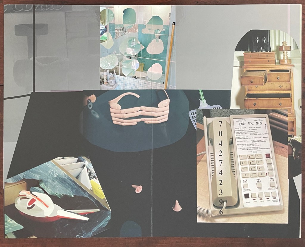
But without the app or memory of the installation, we have a gap like that missing tooth. We can bridge the gap somewhat with online links and the book’s collaged imagery of mixed media and photographs to recognize that Making Memeries is also about how we perceive surfaces and what lies beneath — and what might come between. Consider the earplugs alongside the telephone below. Then there’s the pair of spectacles in the shape of fingers that would cover the wearer’s eyes. Now look back to the cover, and we find the view from behind those finger-spectacles.
Photo of the work: Books On Books Collection.
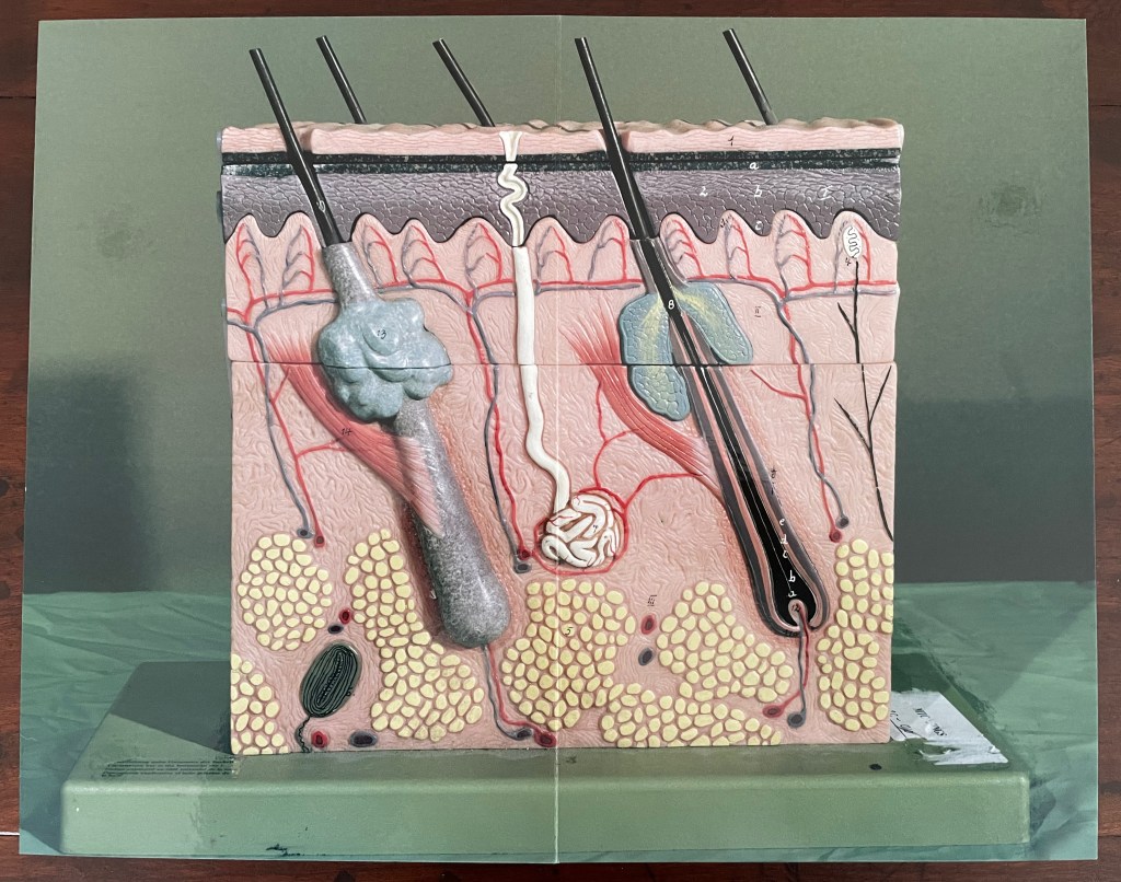
Or consider the images of the model of the epidermis with which the book opens and closes. ortunately, we have a YouTube link and Olga Yatskevich’s review to let us know that the “augmented reality radically changes the experience, making the image active rather than static – the app brings rounded depth to the model, shows blood running through the vessels, and allows us to explore the space around the object, its sides and the top”.
First and last double-page spreads. Photos: Books On Books Collection.
There’s something childlike, playful but serious conveyed in all this. Physically Making Memeries presents itself as an oversized children’s board book (or perhaps a board book for undersized adults). The use of the board book to make this cross-over can also be found in other artists’ books — Colleen (Ellis) Comerford’s ABCing and Phil Zimmermann’s Sonorensis, for example.
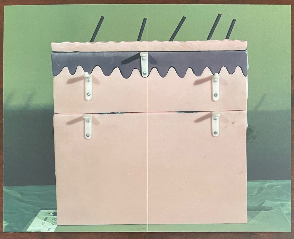
Fore edge of Making Memeries.
What the board book only partially conveys with the Connection link in hand, so to speak, is the intent expressed on the back cover and in the Tate’s announcement:
Making Memeries is set in a time when everyone has become a lifestyle photographer. It is still your life but the image production is decidedly public; and in that case temporary, verging on fleeting, because these public channels have so many content providers and, along with our attention spans, are in a perpetual state of refresh. [back cover]
Before the advent of the Internet the act of taking a photo was often intended to make memories; to store and preserve our past in still, printed images. In today’s digital age the act of taking photos can be enough for the photograph-taker. The act is exhausted by the process. This can be seen in the way a mobile phone camera offers immediate satisfaction — producing a file that may never be looked at again. Today a photo has a different claim to time, being much more in the “now” than in the “this has been” of its 19th and 20th century pre-internet forbearers. We, in turn, live in a culture of the perpetual present, in a meme-driven world where photos can effortlessly be shared, but where they most often disappear into digital oblivion. [Tate Modern announcement]
It feels ironic that Making Memeries‘s “missing tooth” is digital. The same year of Blalock’s installation at the Tate, Pokémon Go arrived, and people began wandering into traffic to capture Pokémon figures that their cameras projected onto the streets around them. Nine years later, the company owning the app has sold for $3.5 billion, and the world’s richest country is governed by meme. Is art miming life, or life miming art?
Further Reading
“Colleen Ellis“. 7 March 2024. Books On Books Collection.
“Anouk Kruithof“. 19 July 2021. Books On Books Collection.
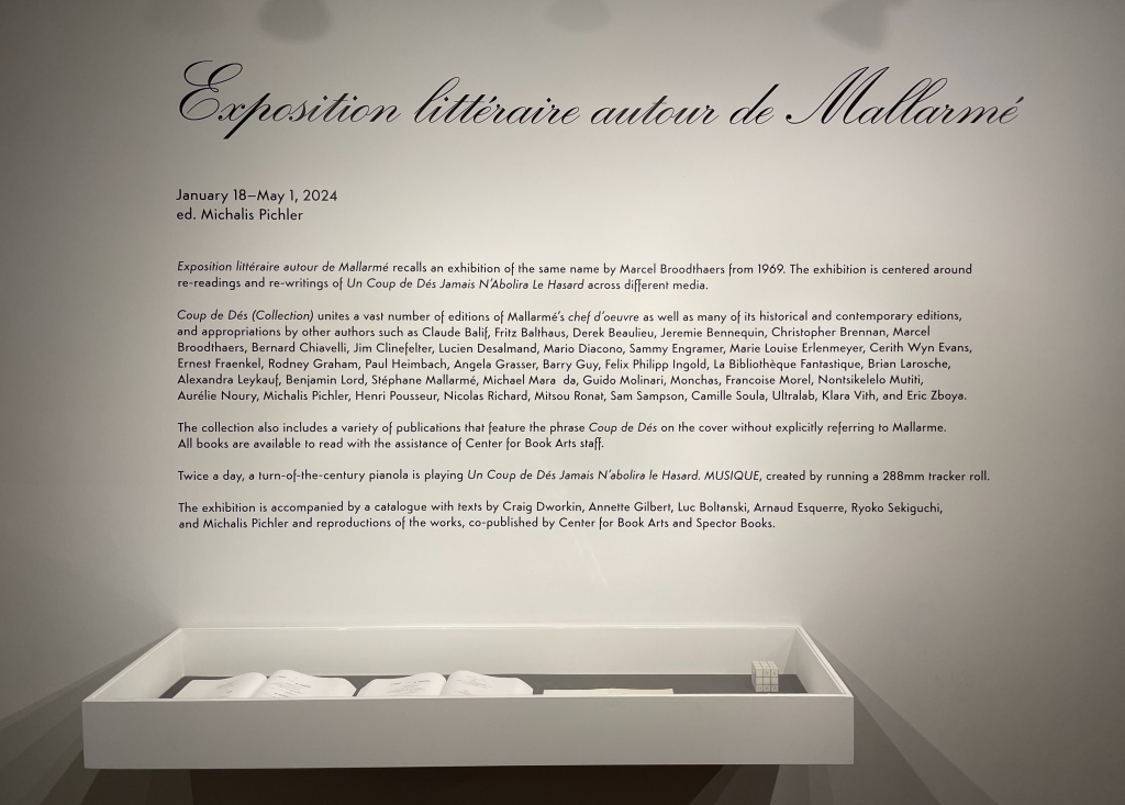
Why should an obscure poem like Stéphane Mallarmé’s groundbreaking Un Coup de Dés Jamais N’Abolira le Hasard: Poème (1897) have become the cornerstone of an art-industrial complex of literary, critical and artistic responses ranging from essays, books, edited collections, countless editions, and appropriations in the form of fine press livres d’artiste, book art and sculptures, films and theater, ballets and fado, musical compositions, digital programs and installations, and even pavement art?
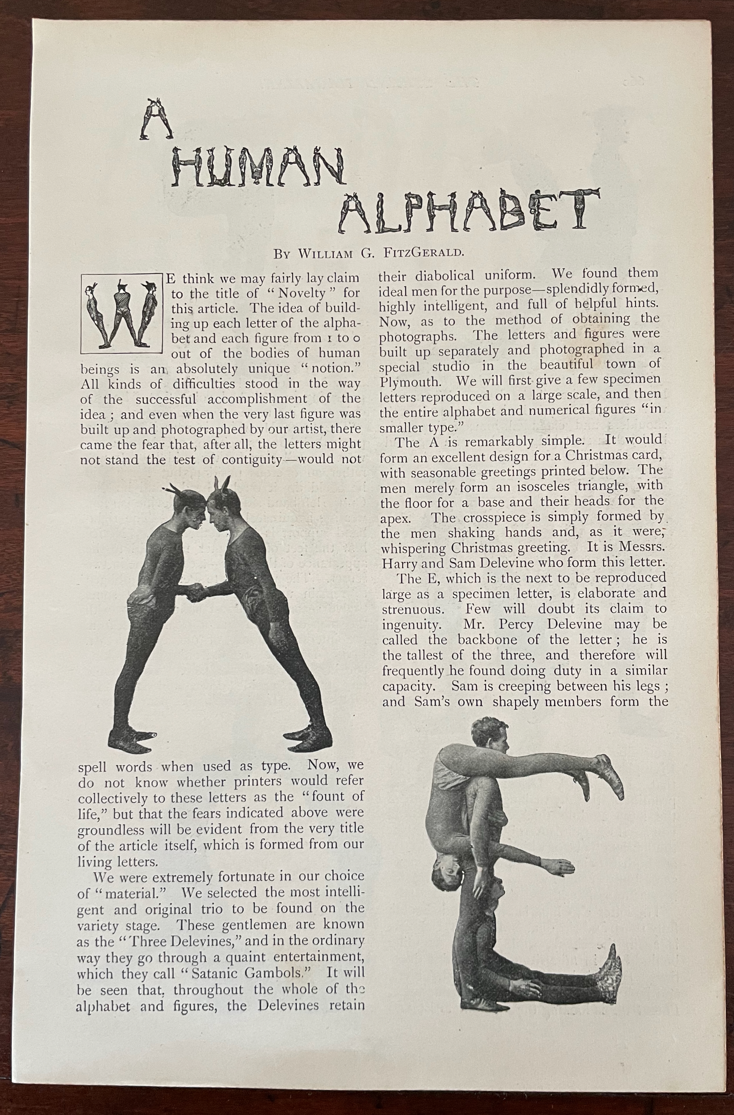
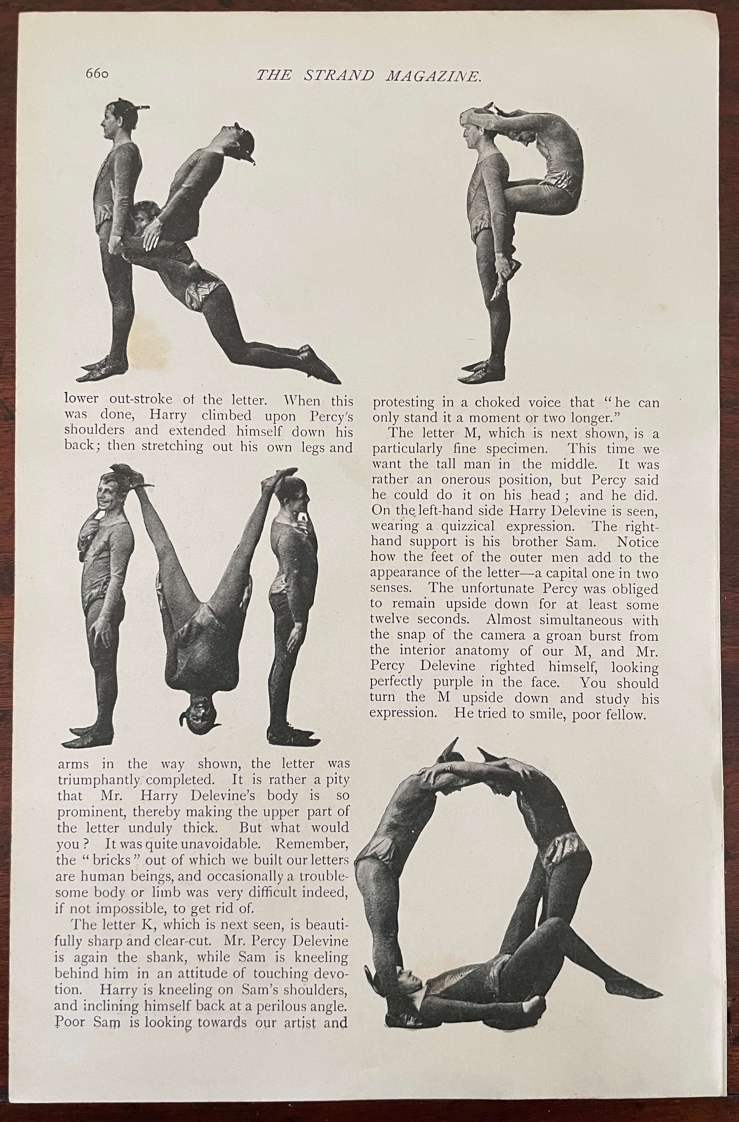
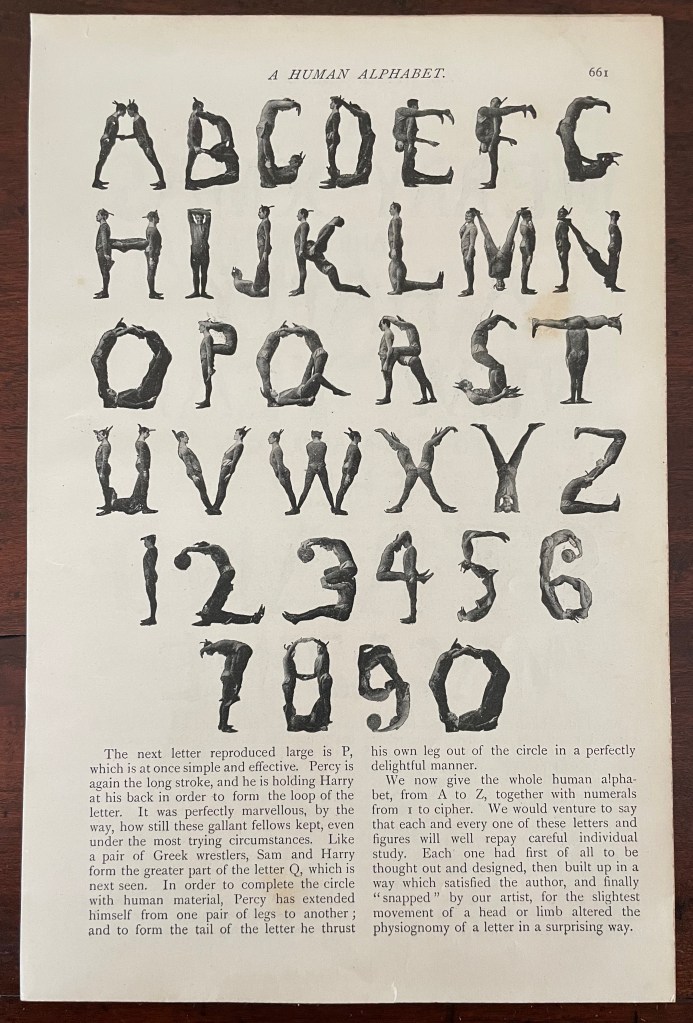
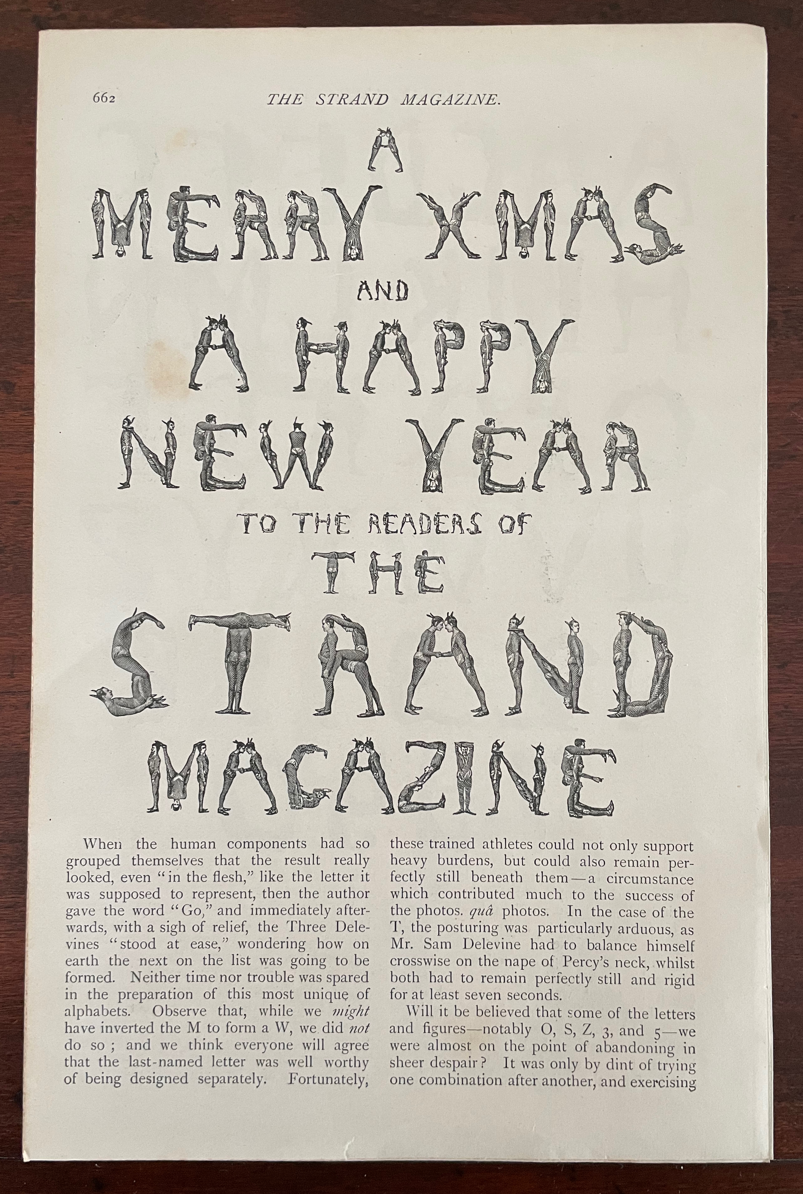
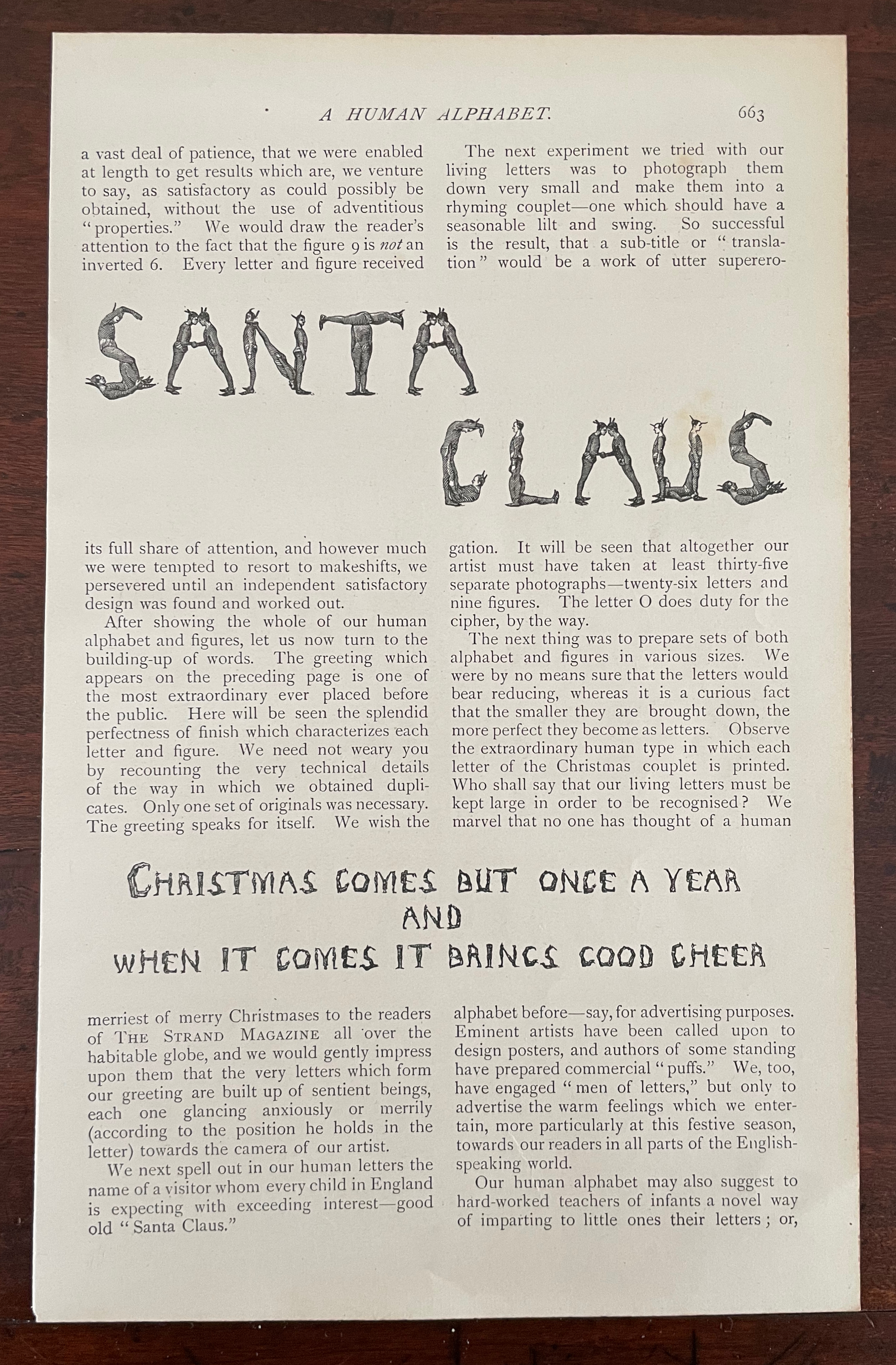
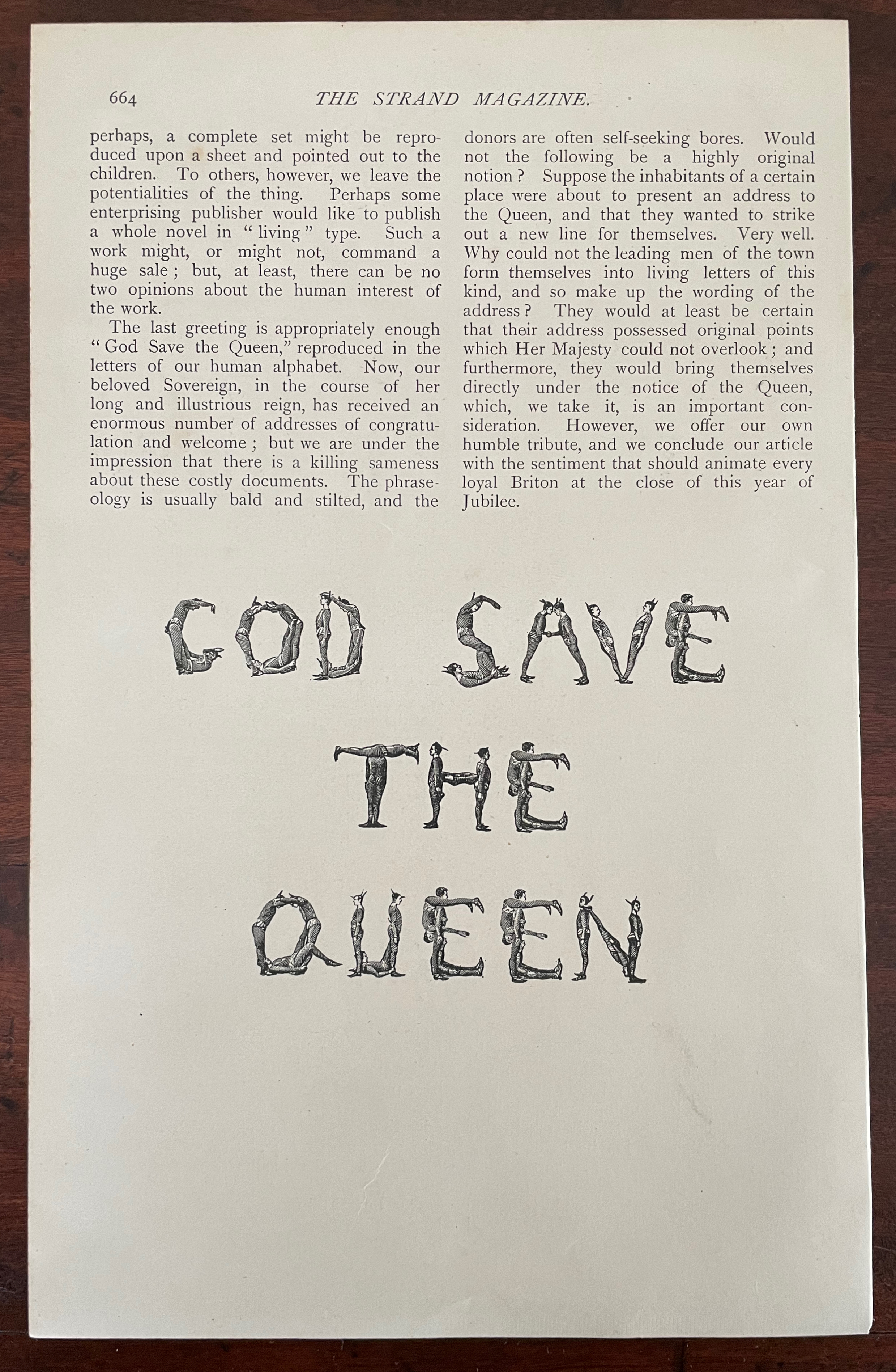
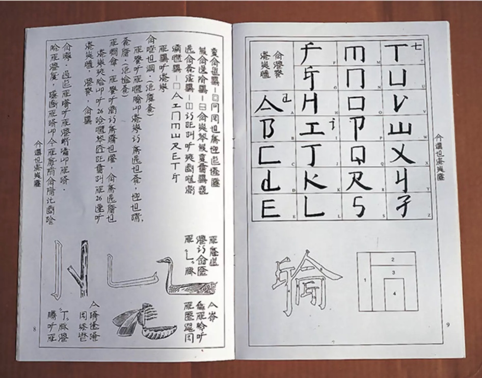
A Human Alphabet (1897) The Three Delevines Loose folios, William G. Shepherd’s article in The Strand Magazine, Vol. XIV, December, pages 660-64.H230 x W160 mm. Acquired from Cosmo Books, 26 August 2023. Photos: Books On Books Collection.
Only remembered after the Alphabets Alive! exhibition opened at the Bodleian in July 2023, The Three Delevines and W.G. Shepherd (their impresario on the occasion in 1897) have nevertheless demanded an appearance online among the other embodied alphabets (or lettered bodies) included in the “B for Bodies” display.
Shepherd is not merely the author of the Strand article but asserts his authorship of the alphabet performed by The Three Delevines. Although generous in his praise of the Australian brothers Sam, Harry and Percy for holding each of their poses for at least seven seconds and, in some uppercases, for twelve, Shepherd does not identify the Strand’s photographer by name or acknowledge his skill beyond “snapping”. At least, he refers to him as “our artist”.
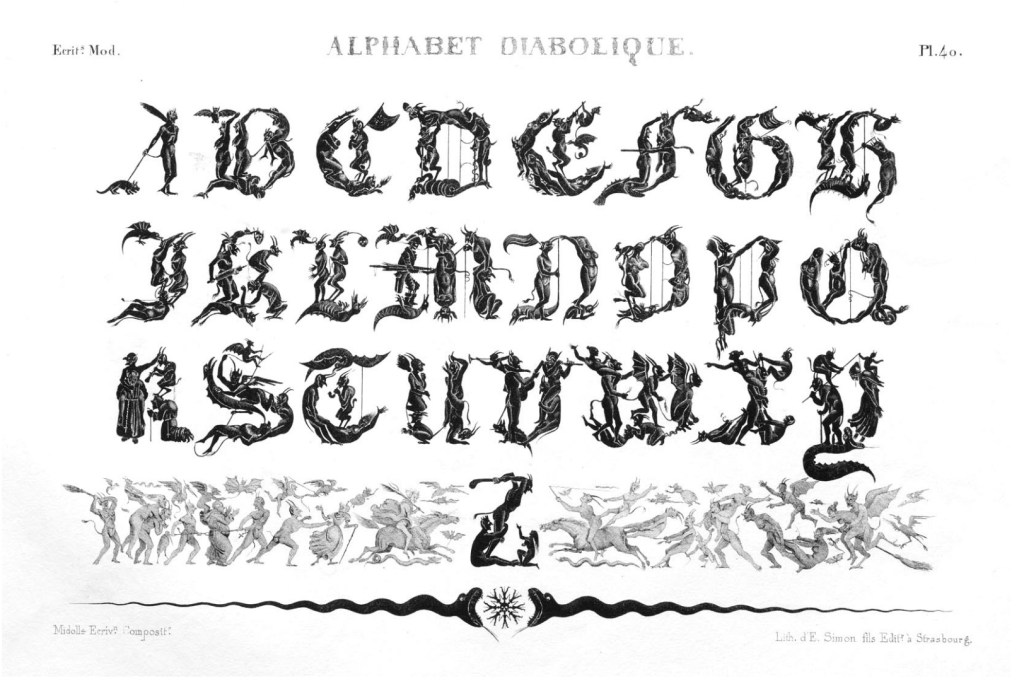
So much of his effort went into discovering the music hall troupe and its performance called the “Satanic gambols”, and congratulating himself on his sculptural instruction, and then describing superfluously what his “artist” and the Delevines rendered, Shepherd neglected to do the research at the British Museum (before the Library was hived off) to realize that his claim to “Novelty” had been superseded several times over. Even right back to the diabolical calligraphy of the — oh the shame of it — French graphic artist Jean Midolle (b. 1794). Blame the oversight on the combination of Christmas and the Jubilee.
Devroye, Luc. 2022. “Jean Midolle“. On Snots and Fonts. McGill University, Montreal. Accessed 6 September 2023.
Dukes, Hunter. 27 April 2023. “Punctuation Personified (1824)“. The Public Domain Review. Not only could letters be formed with the human body, so could quotation marks and square brackets.
FitzGerald, William G. December 1897. “A Human Alphabet”. The Strand Magazine. Vol. XIV. London.
Goetz, Sair. 11 June 2020. “Letterforms / Humanforms“. Letterform Archive News. Accessed 30 January 2022.
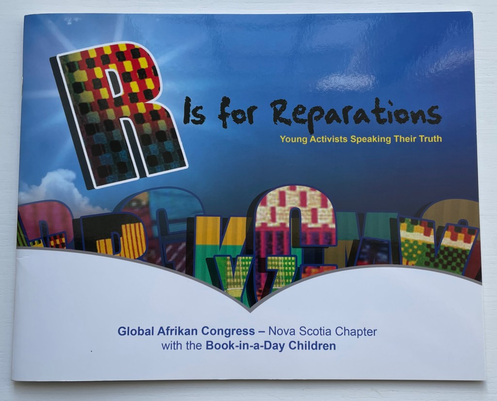
R is for Reparations (2019) Global Afrikan Congress (Nova Scotia Chapter) Denise Gillard, ed. Paperback saddlestitched with staples. H260 x W210 mm. 40 pages. Acquired from the Book Depository, 1 March 2023. Photos of the book: Books On Books Collection.
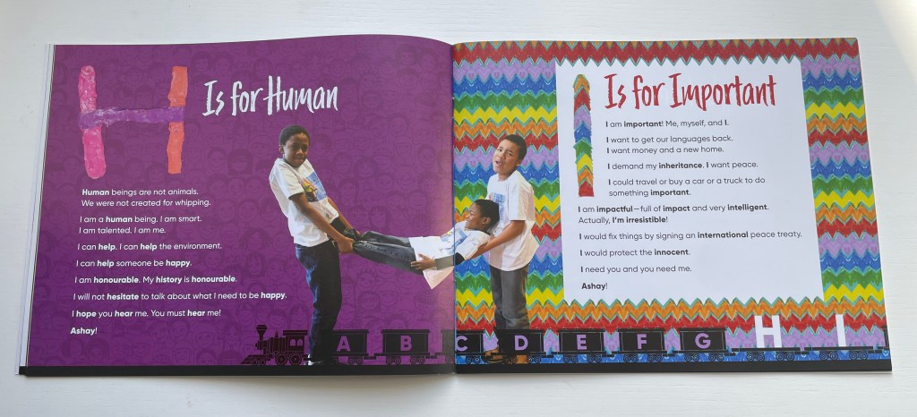
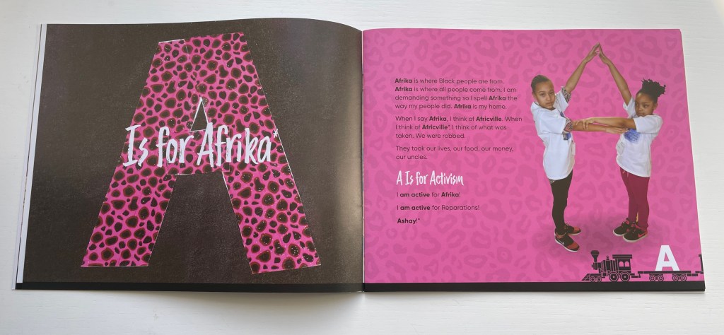
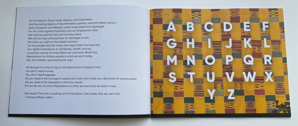
If all alphabets have a world view, can an alphabet be bent and arranged into a new world view? In 2018, the Nova Scotia Chapter of the Global Afrikan Congress facilitated a “book-in-a-day” event to help the children of Halifax create an alphabet book that answers that question. Bending and arranging the human body to make letters has a long tradition in book illustration. Drawing on that tradition, the participating children gave voice and body to create R is for Reparations, an alphabet book calling for a new world view on reparations for the damage and legacy of the Atlantic Slave Trade.
The Reparations Movement has a long history, and Halifax, Nova Scotia has played a part. In 2010, the City of Halifax issued a formal apology and $5 million in general compensation for the razing of the Black community Africville in the 1960s (see Further Reading).
Anticipating it final report in July 2023 to the state legislature, the Californian Task Force to Study and Develop Reparation Proposals for African Americans called for significant financial compensation. The governor issued a tepid if not cool response, which may be unsurprising even in the wake of his earlier signing and endorsing of legislation returning Bruce’s Beach to the Black family from whom the government appropriated it in 1924 (see Further Reading). It is an emotionally and politically complicated issue for some.
The foreword by Denise Gillard takes a less complicated view as might be expected in a children’s book, and as R is for Reparations addresses primarily Afrikans and Afrikan Descendants both on the Afrikan Continent and in the Diaspora, that view is strong and forceful. It is the sort of children’s book that would be banned in some US school libraries, but as the voices and bodies of its multi-racial cast of participants imply, it is the sort of book that those schools’ children could fearlessly manage.
Not every page is as strong as the next, but the influence of Amos Paul Kennedy Jr., Master Printer, who attended to support the children in making posters for the book launch, is evident in the colors, collage and overprinting. The book deserves comparison and contrast with the Books On Books Collection’s related holdings (see Further Reading).
Task Force to Study and Develop Reparation Proposals for African Americans. 1 June 2022. Reparations Report. State of California Department of Justice. Accessed 1 May 2023.
Xu Bing: Thought and Method Ullens Center for Contemporary Art (UCCA) (尤伦斯当代艺术中心) 21 July through 18 October 2018, Beijing
For most of us, the only glimpse of the 2018 Beijing exhibition Xu Bing: Thought and Method will have come from online articles, screen shots and a short film or two. By noting commentaries contemporaneous with the exhibition and linking them to older related articles and books, Books On Books aims to enhance appreciation of the exhibition and Xu’s work as well as findability of the latter. Throughout, where known, links to institutions holding Xu’s works are provided.
May 2018 saw the first announcement of the Xu Bing retrospective, his “most comprehensive institutional exhibition” to date, according to Sue Wang writing for CAFA Art Info.
July 2018, just before the exhibition’s opening, Helena Poole’s article arrived to guide the reader on what to expect from the exhibition. One of its useful observations is the influence of the printmaking tradition of Lu Xun on Xu’s early prints. Although not a printmaker himself, Lu stimulated the tradition with his activist writing and encouragement of woodcut printmaking in the journals of the Morning Flower Society (朝花社) founded in 1929. In Art in Print (May-June 2016), the reader can find a useful background on Lu Xun and a selection of images from the New Woodcut Movement that will deepen Poole’s guidance.
Also helpful to a better appreciation of the prints are two online displays of images (more than offered by Wang and Poole): ArtThat eLite and RADII China’s “Photo of the Day”. Both displays enable us to see that, while Xu’s early prints — for example, The End of a Village (1982) — reflect the New Woodcut Movement style, his later work is at once more subtle and abstract than that of the early revolutionary periods and yet still evocative of the figurative, the diurnal and strife. The subtlety lies in the shift from the depiction of workers’ strife to the strife between sense and nonsense or language and concept, between cultures and their languages, and between the individual and polity.
Just after the exhibition’s opening, two excellent overviews of Xu’s career and art appeared in July. Sue Wang followed up her May announcement with a translation of an essay by Lin Jiabin expanding on the exhibition’s title Xu Bing: Thought and Method. Rather than focus on any one work, Lin Jiabin digs into the artist’s thought and method. Among Lin’s several useful insights are these:
Xu Bing adheres to the essence of simplicity and wisdom of eastern culture, and also faces the world in a broader sense. His works are forward-looking and vigilant; at the same time, his works under the guise of dislocation, multi-level social issues and cultural thinking sway and excite each other. [Emphasis added]
… the new work is an excavation and extension of something that is valuable in the past and that was not fully realized. It actually has a “cue” effect. Xu Bing said, “As long as you are sincere, no matter what form these works are, big or small, no matter how early or late, actually the final relationship between them is like constructing a closed system.” [Emphasis added]
Through the transformation of old artistic languages and the creation of new languages, the artist provides the audience with a variety of channels for entry and exploration. [Emphasis added]
The second overview — Grace Ignacia See’s “UCCA Presents …” in The Artling — takes a more descriptive and linearly developmental view following the exhibition’s division into three sections, “a direct reflection of the turning points in [Xu’s] artistic context and processes”.
The first section:
Book from the Sky (1987-1991), Ghosts Pounding on the Wall (1990-1991), and Background Story (2004-present) allow viewers to observe the means in which Xu’s meditations on signification, textuality, and linguistic aporia have been evoked;
The second section:
A, B, C… (1991), Art for the People (1999) and Square Word Calligraphy (1994-present) project his explorations of hybridity, difference, and translingual practice through his works;
The third section:
his more recent works Tobacco Project (2000-present), Phoenix (2008-2013), Book from the Ground (2003-present) and his first feature length film Dragonfly Eyes (2017), exist as commentaries on economic and geopolitical changes that have contributed towards China’s societal evolution and the world’s in the last hundred years.
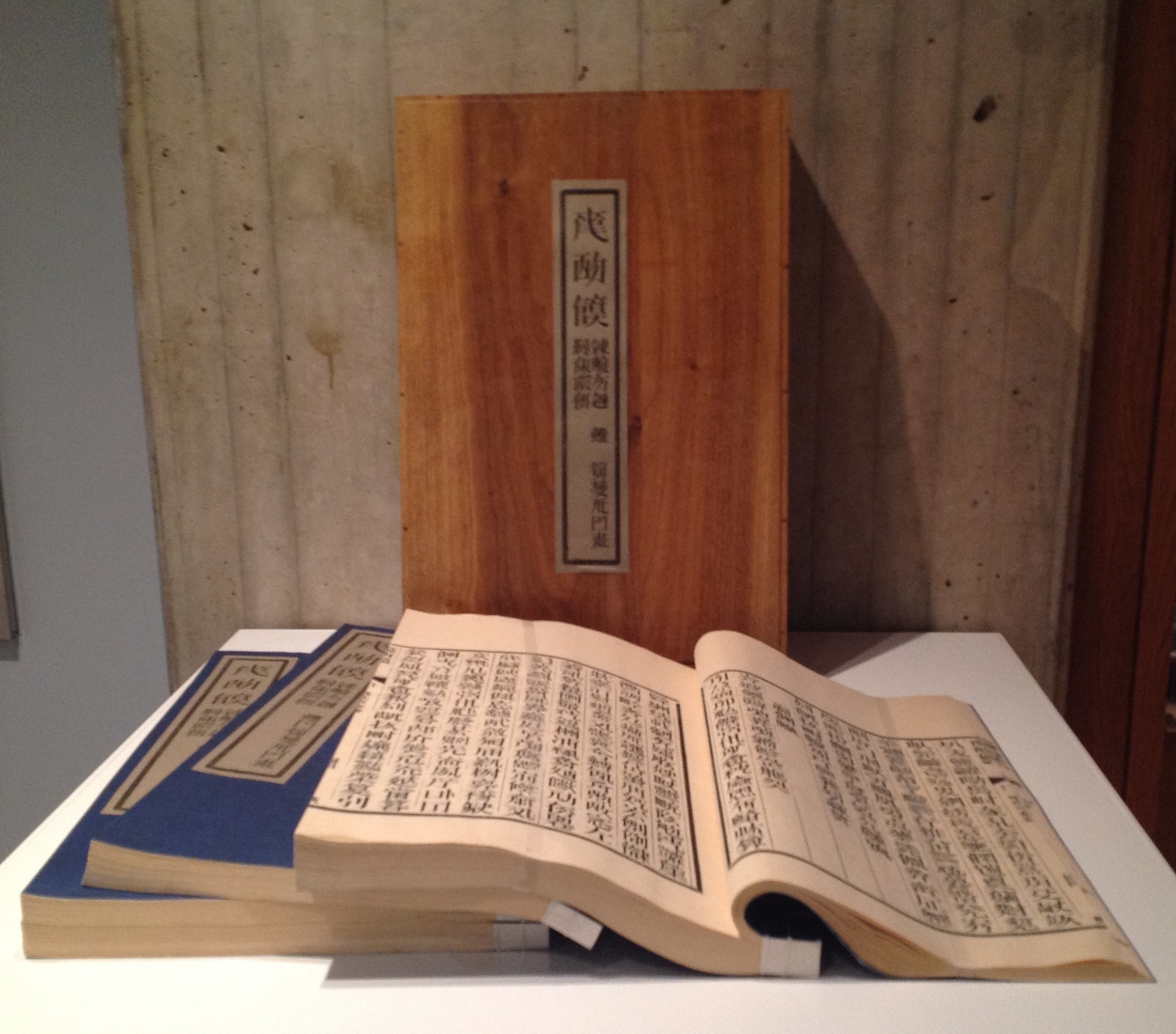
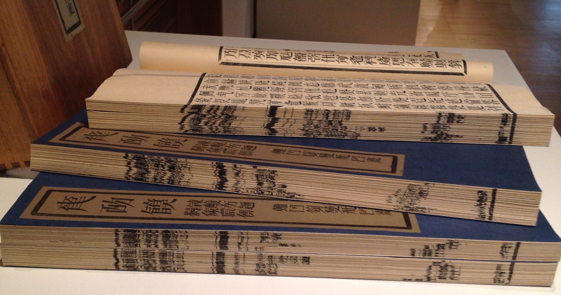
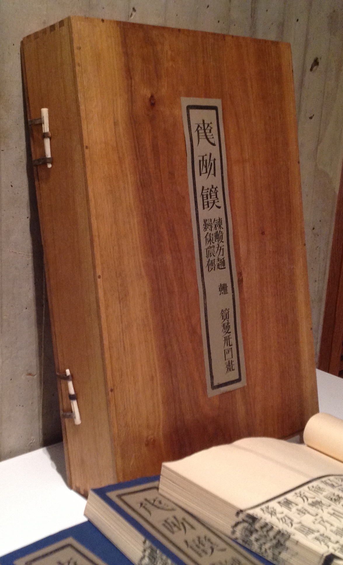
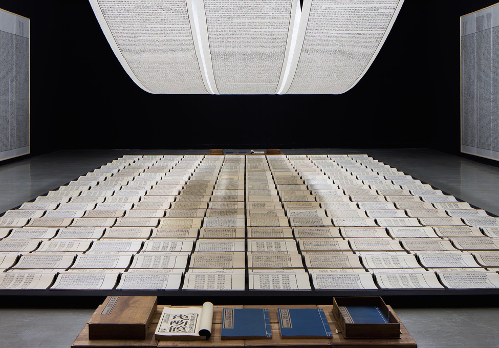
Tianshu or Book from the Sky, consisting of four volumes enclosed in a fastened wooden box, is a challenge to find, almost as much a challenge as being in the right place to see its installation version. The greatest challenge for a Westerner, however viewing the work, is grasping a Chinese viewer’s perception of it. How to imagine markings that, at first, look like the characters of the roman alphabet and even seem to form combinations that look like words and sentences but, on closer inspection, are not any letter, word or sentence known or knowable to the Western eye. Xu carved 4000 wooden stamps for characters that look like Chinese characters but are not and proceeded to have the four volumes printed under his instruction — as well as scrolls and wall hangings for installations.
Tianshu/Book from the Sky (1991) Xu Bing From the Allan Chasanoff Collection, Yale University Art GalleryFore edges of the four volumesClose-up of the container and its catch mechanism, which is repeated on the other edge.
Book from the Sky (1991) Xu Bing View of installation
For a lengthier description and appreciation of Tianshu, John Cayley’s commentary and lecture are only surpassed by his book, where he writes:
[Tianshu is] not an object. It’s not a painting or a sculpture or even a book as such. It’s a configuration of objects and materials that represent a concept and provide some evidence or record of the development of the concept and the making of its constituent elements. You can’t possess it. You either have to find some elaborate way to acquire a personal record of the work or you have to take part in a process that allows the installation to remove itself into a museum or major gallery where this representation, beyond an individual’s acquisitive capacities, can be preserved for collective curated culture. In a sense, I’m helping you to ‘own’ the Tianshu by writing this.
Given the challenge of tracking down locations to visit where Tianshu has been acquired, Cayley’s “help” is welcome. The Beijing exhibition’s installation can be seen at the 4’04” mark in the UCCA video.
Although nicely illustrated in See’s article, Ghosts Pounding the Wall (1990) needs a bit more commentary for a fuller appreciation. According to Julia F. Andrews and Kuiyi Shen in The Art of Modern China (2012), the work was Xu’s response to the criticism that Book from the Sky demonstrated he had lost his way “like ghosts pounding the wall” (p. 258). It’s also worth noting that these two works have in common the process of turning one form of work into another.
Just as Book from the Sky consists of the four volumes in a wooden box yet is also an installation with scrolls and wall panels repeated in multiple venues, Ghosts Pounding the Wall began as the performance by Xu and his students wearing bright yellow jackets, stenciled with characters from Book from the Sky, and rubbing ink on rice paper fastened piece by piece across a one-kilometer stretch of the Great Wall and also is the installation. The latter is nicely shown in See’s article and can also be seen in the UCCA video at the 5’20” mark. Xu’s performance was one of “ghosts pounding the wall”; the installation, one of the ghostly impressions from that pounding of the wall. This characteristic or method in Xu’s art is one to watch for in almost all of his work.
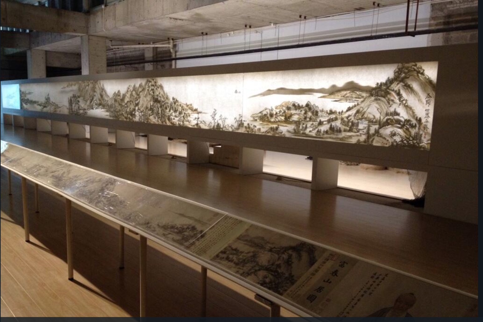
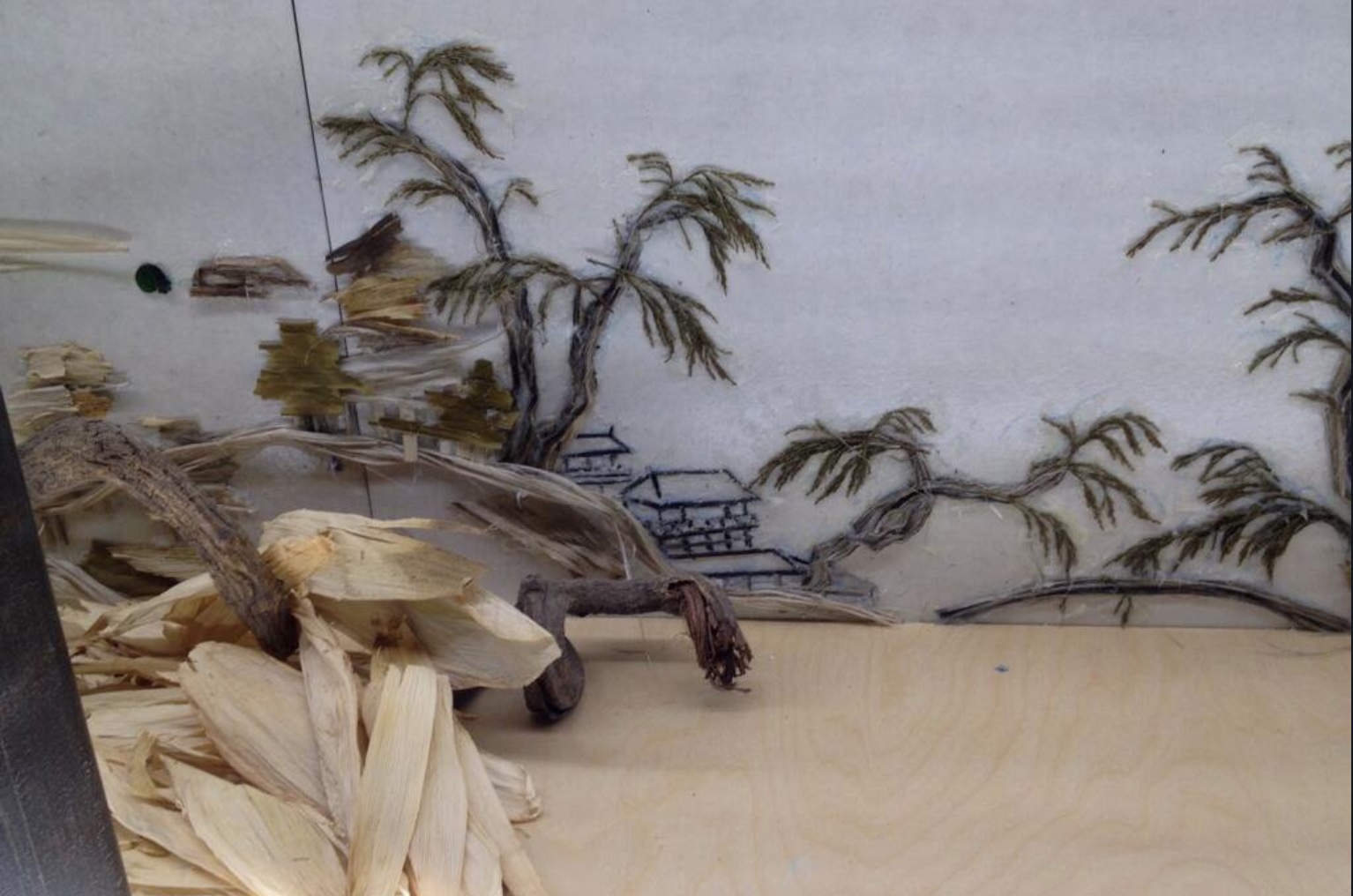
Background Story, the third work in this section, is an installation and as such only fully accessible when in situ like Ghosts and later works. It first appeared in 2004. What appears to be a Chinese landscape printed on rice paper secured in a long row of joined-up lightboxes extending across the space of the host gallery is actually formed of shadows cast by objects on the other side of the lightboxes, which are open to view. Over time, the installation has developed as a series, with each version being based on a different ancient Chinese landscape painting. Usually the painting belongs to the institution where the work is installed. Four of the versions can be found at these links to videos and a slide show: 2011, 2012, 2014, 2015. The 2018 version can be found in the UCCA video at the 6’16“ mark.
In the meantime, another earlier essay from Sue Wang provides useful insights on experiencing the version based on the painting “Dwelling in Fuchun Mountains” by the Yuan dynasty painter Huang Gongwang. This version appeared in 2014 in Beijing as jointly organized by the Inside-Out Art Museum, Jing & Kai, the Rose Goldsen Archive of New Media at Cornell University, Life Bookstore and SDX Joint Publishing Company.
Front and back of Background Story: Dwelling in Fuchun Mountains (2014) Xu Bing Photo credit: Joy Lidu Yi
Wang also includes an interview with Xu about the process and intent of Background. The work marks a departure from Xu’s traditional materials: ink, paper, print, characters and language, but as Xu points out to Wang:
… whether using ink or not isn’t the issue at the core, while the most important thing is what the artist wants to express. It is necessary to think of what material does well in the presentation of the expected effect and the words of the artist. It may be a new language that no one speaks, it is a new language of the time, so it is in need of finding a new way of speaking ….
The second section of the 2018 Beijing exhibition brought into focus Xu’s deepening thought about language and culture when confronted with English and the art scene in the US and elsewhere in the West. See’s article highlights A, B, C… (1991) and Square Word Calligraphy (1994-present) as examples of Xu’s “explorations of hybridity, difference, and translingual practice through his works”. One of those works is An Introduction to Square Word Calligraphy (2000), a woodblock hand-printed accordion book with ink rubbings and wood cover. It is a textbook written by Xu Bing for users to learn the square word calligraphy writing system invented by the artist himself. The “installation version” consists of a classroom set up for learning and practicing the system.
An Introduction to Square Word Calligraphy (2000) Xu Bing
Columbia University has produced a video of one such installation, which demonstrates the fun of interacting with art. For most of us, though, an easier means of interacting with square word calligraphy and owning a bit of Xu’s art is to purchase the children’s songbook shown below.
Another book by Xu, related to this third section of the Beijing exhibition and available for purchase, is Book from the Ground(2014), telling a day in the life of Mr. Black, an office worker — told completely in the symbols, icons, and logos of modern life. Xu’s playful but serious, to-and-fro treatment of language, meaning and cultures is another recurrent characteristic of his work.
Book from the Ground (2000) Xu Bing From the Hanes Library, University of North Carolina – Chapel Hill Notice the difference in size. On the left is the “Chinese” edition; on the right, the “English”. Why the quotation marks? There are no differences in the icons in which the narrative is written! Of course, the book trade being what it is, the traditional trim sizes are one cultural difference Xu could not erase.
Full appreciation of Xu’s signature interest in language — text and art, culture and meaning — would have sent the attendee in Beijing back from section two or three to section one to look at Book from the Sky again.
Serendipitously, another Xu exhibition was running nearby at INK Studio in Beijing at the same time: Xu Bing: Language and Nature. That show’s curator, Dr. Britta Erickson, is also the author of The Art of Xu Bing: Words without Meaning, Meaning without Words (2001). Her book covers many of the works in sections one and two and delivers insightful, plain-language readings of them that add considerably to the appreciation of Xu’s art. Again, as with the UCCA retrospective, Radii China delivers some outstanding photos from the INK Studio exhibition, and its briefest description makes the reader hunger for more as well as an actual visit:
… a selection from his The Living Word series in which the Pinyin Chinese word for bird, niao, transforms over a series of serial sculptures into the simplified character 鸟, then the traditional character 鳥, then, finally, into a small flock of birds soaring toward the gallery’s skylight.
A visitor could have hardly hoped to take in the UCCA and INK exhibitions in less than several days.
Xu’s conceptualism, genius for planning and meaningful attention to the detail of material recurs again and again in his work. He has a deft wittiness and patient, opportunistic eye, ear and even nose for enriching his artwork after the fact. Section three’s strong odor of tobacco must have underscored that to visitors.
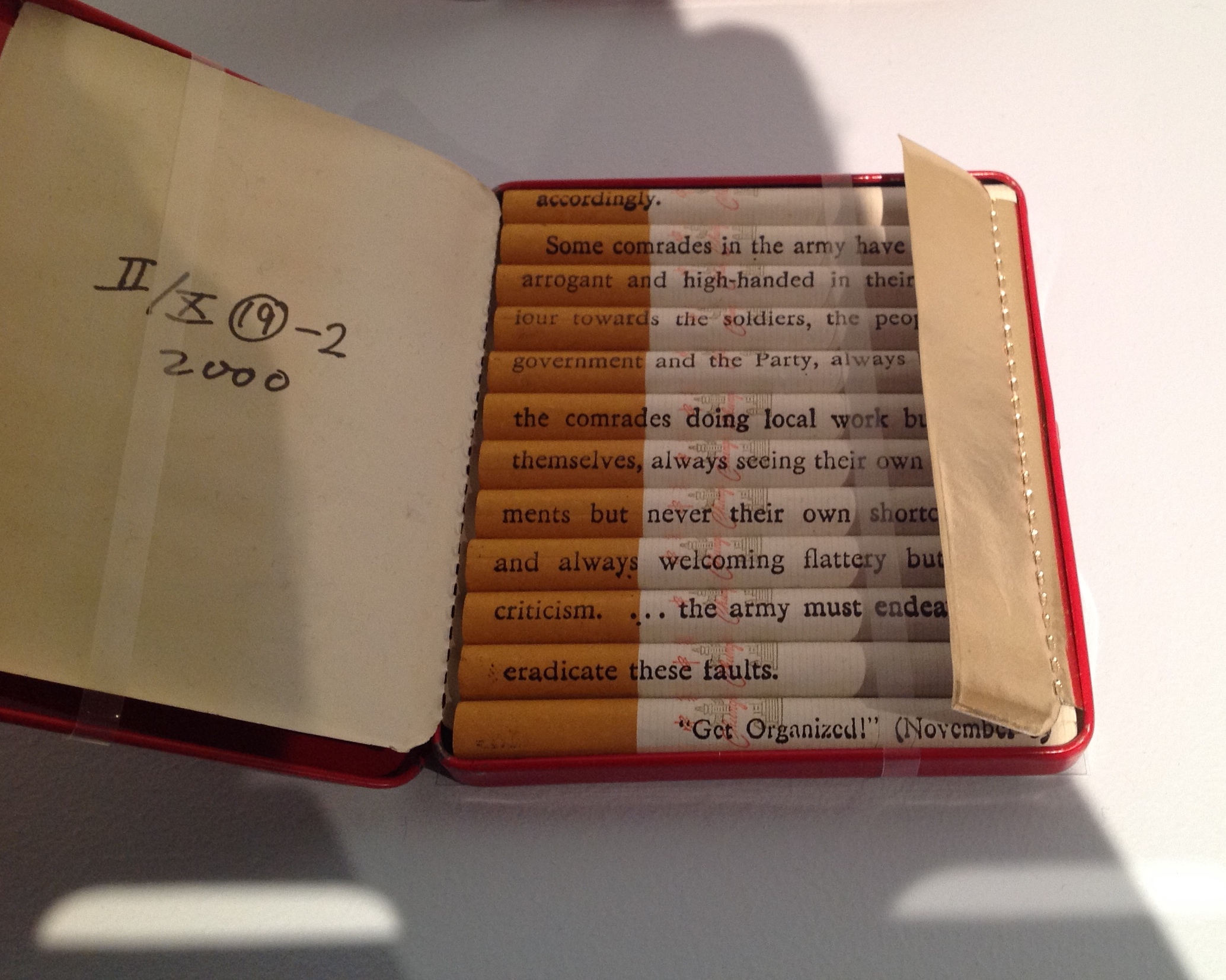
Xu’s Tobacco Project trilogy, which began in 1999, incorporates Red Book (with Chinese and English inscriptions on each cigarette from Mao’s little Red Book), the floor sculpture Honor and Splendor (composed of 660,000 Fu Gui cigarettes) and several other related works. For an earlier in-depth piece on the Tobacco Project (and extensive illustrations), the reader can go to John Ravenal’s description in Blackbird (Fall 2011, Vol 10, No. 2). As the curator who organized the Tobacco Project exhibition in 2011, Ravenal’s perspective is unique. Like John Cayley, Ravenal also produced a book — Tobacco Project, Duke/ Shanghai/ Virginia, 1999–2011 (2011).
Introducing another of Xu’s major works — Phoenix (2008-13), not in the exhibition — See argues, contrary to Lin Jiabin, that Xu has been on a path to a shift in focus:
Phoenix (2008-13) and Dragonfly Eyes (2017) further highlight Xu’s … shift towards the economic and geo-political, where the first comments on China’s breakneck development and the latter dramatizes the role of individuals within the framework of an ever-expanding surveillance network.
See’s comments on these works closing section three of the Beijing exhibition miss the presence of a tension in them — or rather tensions present in all of Xu’s works from the very beginning. In a way, those ongoing tensions support the analysis of Lin Jiabin and how Xu’s works “sway and excite each other”.
August 2018. Enid Tsui surfaced the primary tension a few weeks later — worth the wait for the artful weaving of her own observations with Xu’s comments — in a “long read” in the South China Morning Post Magazine. That tension is between, on the one hand, the exquisite and, on the other, the cynical, the pessimistic, the ugly and anger. For Tsui, the anger is most evident in “Xu’s latest, and most bizarre, work … Dragonfly Eyes (2017)”:
His team edited 10,000 hours of surveillance footage into an 80-minute feature film loosely structured around the story of a man running after the woman he loves. There are no actors or cameramen. … Xu used only clips that were never meant to be seen in public. Film critics were baffled. Xu says the work is, once again, about how we are shaped by culture. The scenes in Dragonfly Eyes hardly fill you with joy: beauty parlours selling cosmetic surgery packages; aggressive customers in a shop; drab, anonymous streets. Scenes of terrible natural catastrophes or accidents add to the general atmosphere of doom. There is an uncustomary fury here about the state of the world, beyond the film’s obvious reference to how we are all being surveilled by invisible, all-seeing eyes.
“The exquisite” shows in the attention to detail and exactitude of execution. There are other tensions at play within and across Xu’s works: cynicism vs idealism, pessimism vs optimism, tranquillity vs anger, sense vs nonsense, meaning vs meaninglessness, beauty vs ugliness. But if The Beijinger‘s regular arts columnist, G.J. Cabrera, is right in his August article extolling the accessibility of Xu’s art,
… the exhibition is rife with examples of how Xu’s witty thought processes can find technically challenging ways to address questions about linguistic processes or historical circumstance, which resonate not only in his homeland but also worldwide. The content is surprisingly accessible and not at all obscured by the dense narrative which could easily hijack the content when dealing with such deep themes.
G.J. Cabrera,”State of the Arts“, The Beijinger, 29 August 2018. Accessed 2 September 2018
then shouldn’t those tensions be able to shape our appreciation of the works without explanations from articles and essays like this one and those above? If we are attentive enough, yes. Xu’s works are clever and beautiful enough, sometimes appalling and shocking enough, almost always playful and serious enough to make the viewer pause and attend — to hear Xu’s works say, “Language, the things of our cultures and their differences are not always what they seem”.
Daniel Knorr’s Expiration Movement (2017), an installation work for Documenta 14 held in Kassel, Germany and Athens, Greece, received good coverage in The Art Newspaper:
Knorr’s work in Greece, meanwhile, entails collecting discarded objects from the streets of Athens, then inserting and pressing them into books. They will be sold during the show and will finance the production of the smoke in the Fridericianum in Kassel.
Romanian Knorr is known for his eyebrow-raising political installations such as STASI Stones (made of Stasi documents pulped à la Dieter Roth, mixed with water and oil, and then displayed in Berlin). Those “litter press” books sold to finance the smoke machine atop the Fridericianum, built in 1779, one of the oldest public museums in the world, and host to documenta since 1955) further secure the added accolade “book artist”.
Like the many layers of meaning that book art can convey, smoke billowing from a chimney in Europe, in particular Germany, evokes several responses: concentration camps, book burning, a pope’s election. Also, books incorporating Athens’ litter allude to the protracted socioeconomic difficulties Greece has had in its relationship with the EU, again in particular Germany (both the debt and refugee crises). Knorr’s work has much in common with the atmospherics of the work of another eyebrow-raising artist, Anselm Kiefer, well-known for his book art.
Daniel Knorr: Materialization / Documenta 14 Athens. Installation and performance with found objects and video at Athens Conservatoire (Odeion), Athens (Greece). April 6, 2017. In his performance, Daniel Knorr pastes pieces of scrap materials to the pages of his artist book, which he sells at EUR 80 a piece, to fund his work Expiration Movement Manifest.
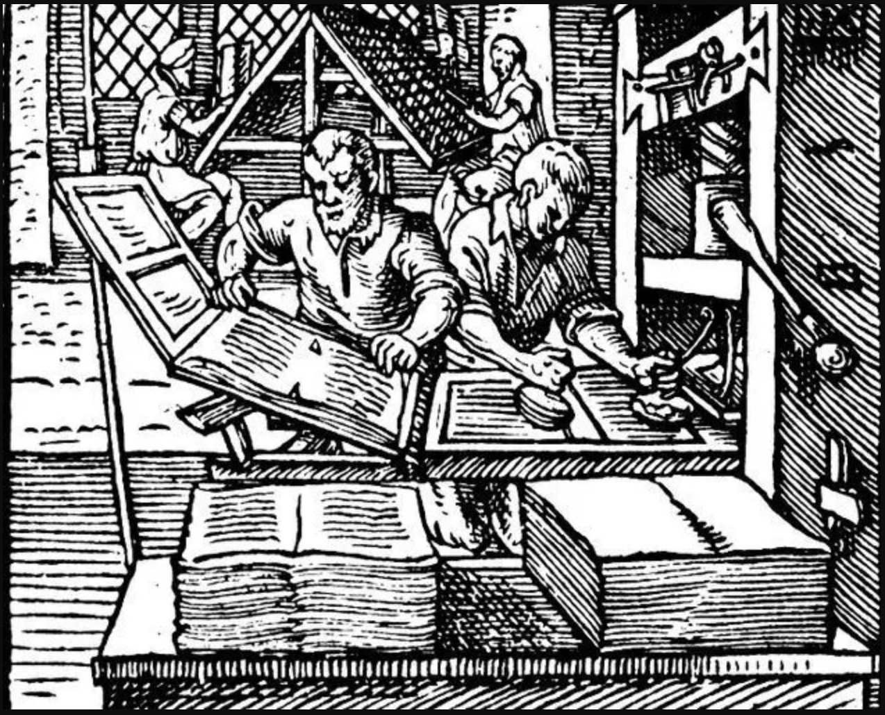
Knorr’s production line creating the “litter press” books makes for quite a contrast with that over 500 years ago.
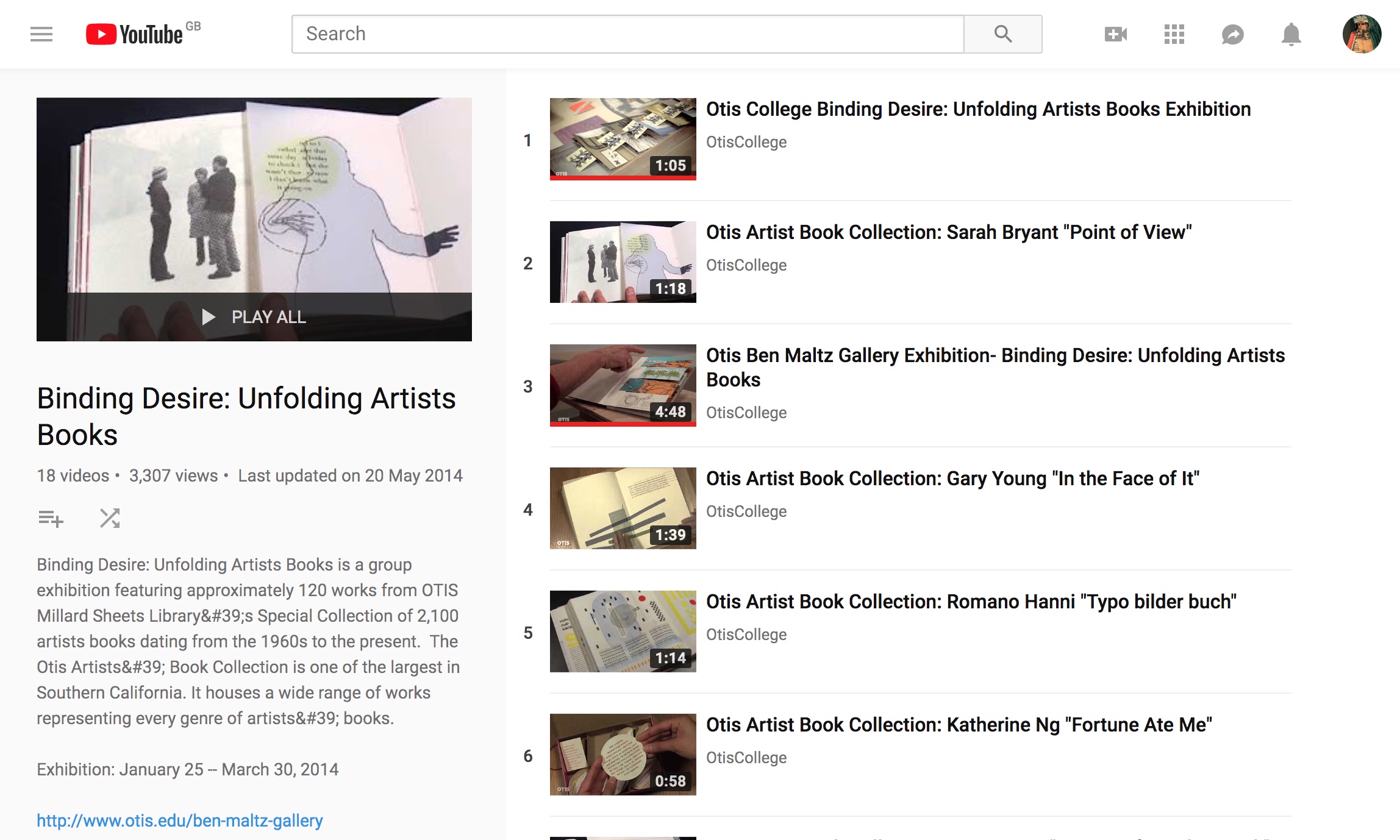
This 18-video playlist at the Otis College of Art and Design covers a 2014 exhibition highlighting around 120 works in the Artists Book Collection. The playlist contributes to the collection’s goal:
The goal of the Otis Artists’ Book Collection is not to create a comprehensive archive, but rather to provide a valuable teaching resource available to artists and students. Since the collection is available on only a limited basis, providing access to the books via an online image database is a continuing project, one that we hope will assist those with interest in researching our collection as well as the medium in general.
Some videos are better than others, and all benefit from viewing without the background music. Having handled both Susan E. King’s Lessons from the South and J. Meejin Moon’s Absence, I can vouch for the corresponding videos’ effectiveness.
The Lessons video could be closer to the experience of handling the work if the transitional zooming were replaced with a 360 circumferential shot or angled stills to reveal more of the work’s intricacies — for example, this overhead shot taken at the old Corcoran Gallery in Washington, DC:
The Absence video comes much closer to a hands-on experience, but the exchange in the Comments section highlights how inclusion of some description by voiceover or bibliographic entry would aid viewers’ appreciation.
Vesper Von Lichtenstein 10 months ago It’s a memorial to 9/11, and the cut out parts are the Two Towers going from the top down…at the end of the book you see the placement of the two towers within the context of the rest of the buildings on a city block. The music seems a bit… upbeat for such a somber book.
Critiques aside, the playlist and site warrant multiple revisits and a thanks to Otis College.
“UCCA announces Xu Bing’s most comprehensive institutional exhibition opening July 21 in Beijing” by Sue Wang on May 18, 2018 • 7:06 pm from CAFA ART INFO.