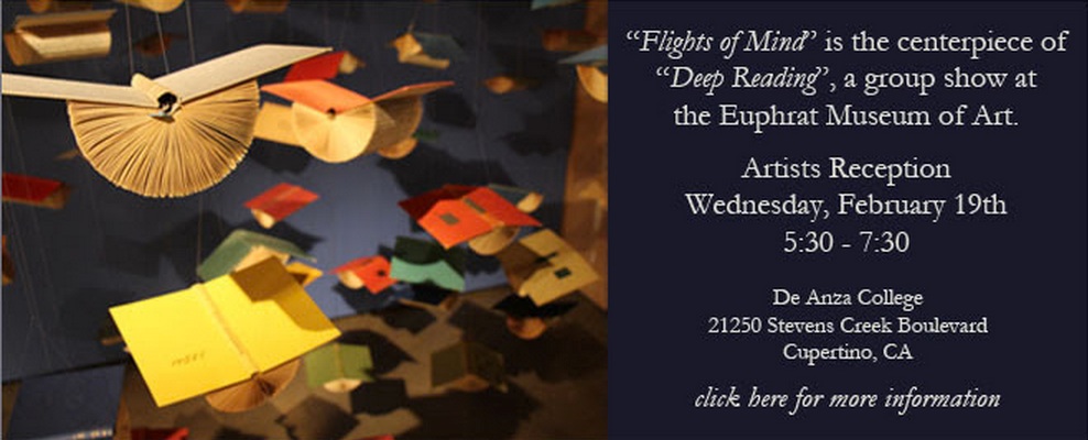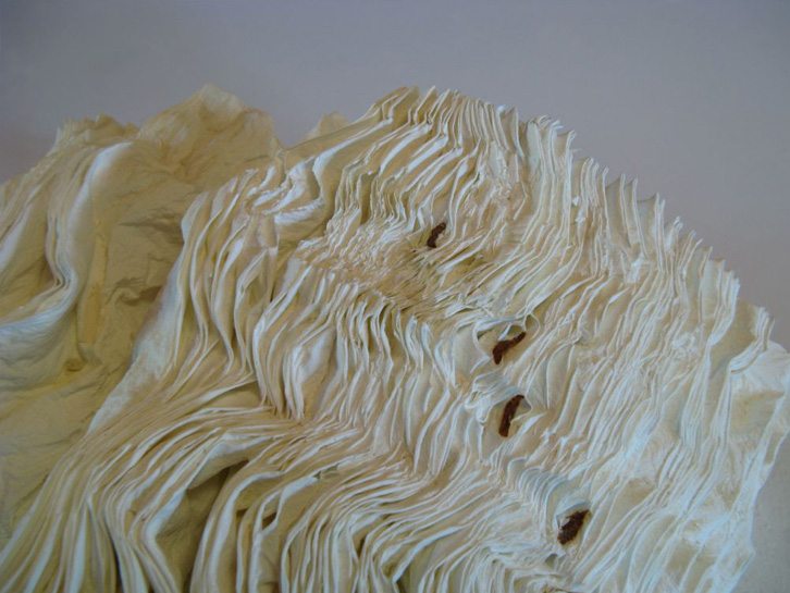
Petrified Book (High-fired Book in Kiln)
H 7” x W 15” x D7”
H18 x W38 x D18cm
Jacqueline has been working with books for fifteen years and is recognized for working with the book form. Her artworks are featured in blogs, magazines, books and international press. Selected bibliography include: BOOK ART: Iconic Sculptures and Installations Made from Books; PAPERCRAFT: Design and Art with Paper and PLAYING WITH BOOKS: The Art of Up cycling, Deconstructing, and Reimagining the Book. Jacqueline’s work will also be featured in Art Made from Books, Chronicle Press, 2013 by Laura Heyenga. … She exhibits her artwork nationally and internationally and her work is in private and public collections, including the Allan Chasanoff Book Under Pressure Collection, NY.
The Chasanoff collection connects Lee with Doug Beube, whose work has been noted here. Beube was the curator of the Chasanoff Collection from 1993 to 2011. In his interview with Judith Hoffberg in Umbrella, Vol 25, No 3-4 (2002), he comments on the purposes of Allan Chasanoff, a book artist in his own right, in putting together the collection “The Book Under Pressure”:
There are a number of ideas that meets Allan’s criteria in acquiring work, of which I’ll try to convey a couple. The first is; the problem of the book to perpetuate information is inefficient, it’s an obsolete technology due to the advent of the computer. Another premise is; at the latter part of the 20th century the book is being used for purposes other than its utilitarian design. Allan has been working extensively with computers and digital imaging since 1985 and understands that the book is as “an outdated modality”, he’s fond of saying. He’s not interested in the book decaying or in its destruction, nor is he referring to the content of books, artist’s books, production costs, mass appeal or where they get exhibited. His interest is in the book as an antiquated technology.
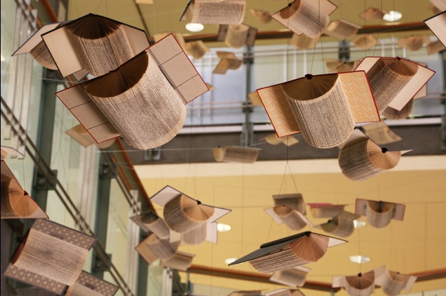
Lee’s process of kiln firing to transform individual books, as with the dictionary above, strikes a harmonious chord. The kiln does not reduce the book to ash but rather petrifies it. Another way of exploring “the book under pressure.” Lee’s and Beube’s work are brought together again by Paul Forte at the Hera Gallery for an exhibition entitled Transformed Volumes.