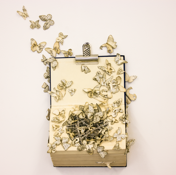
Made of book pages, shredded and woven, cut and collaged, the bookwork pictured is part of “an ongoing investigation between TEXT and TEXTILES.” Gunn comments, “Text is usually explicit and obvious; textiles are understood in a more cultural, unstated way. By making Text into a Textile where only minute pieces of text render any meaning unmeaningful the boundaries between the two become blurred and the viewer has to look at the work differently.” (http://zoneonearts.com.au/2013-02-11-mandy-gunn.htm; accessed 12 May 2013).
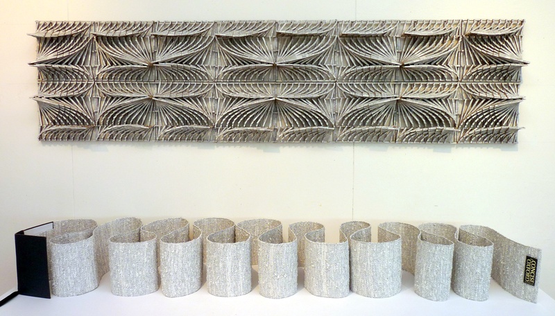
Advancing in its investigation, Gunn’s work seems to be moving backwards in biographical time — the Oxford Dictionary (hailing from her UK roots) to the Melbourne Yellow Pages (from her chosen new roots in Australia).
A work from 2010 called “Scroll” was made of hand shredded and woven Melbourne Yellow Pages. The scroll is 10 metres in length and 60 cm wide draped over horizontal Perspex rods hung from the ceiling and cascades like a waterfall coming to rest on the floor. The now meaningless text mingles with the colored inks of the ads and paper in a pixellated effect, blending the allusion to the pixellation of the computer screen with that to medium preceding the codex.
As with most book art (and almost all sculpture), Jody Alexander’s works celebrate the haptic so warmly that I wonder how an owner or viewer resists handling them. And celebrating the book arts (Alexander makes her own paper in the Eastern style), surely these bookworks on display should be touched —like the books on the shelves of public libraries — until they take on the wear and patina of fine books. Imagine the installation — call it “Touch This” — and what viewers would see and feel decades from now. A visit to her studio WishiWashi might come closest to this imagined event.
Alexander teaches at the San Francisco Center for the Book and blogs at Jalex Books Blog . As of this posting (12 May 2013), however, the most recent entry for information on exhibits, classes and new artwork is 5 July 2012.
Update:
Erin Fletcher at Flash of the Hand has tracked down Jody Alexander for an interview (2 August 2013).
While reading the interview, you will begin to understand the depth of Jody’s commitment to her materials and characters. This exclusive connection is the cause for such a well-rounded body of work. Her dedication to teaching is just as exceptional, offering her skills to several venues both online and in person. Read the interview after the jump and come back each Monday during the month of August for more posts on Jody Alexander.
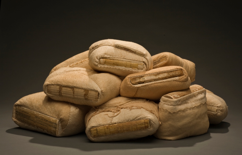
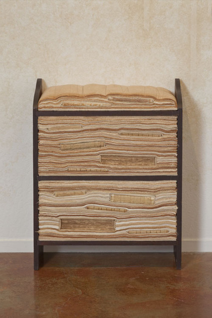
The photo above comes from Alexander’s series Sedimentals. This series, which “takes the form of tea staining cotton to replicate the colors of aged and browned bookspines and swaddling or layering them to create a safe haven for these beautiful objects, enshrining them”, is an interesting instance of book art to which Garrett Stewart’s Bookwork: Medium to Object to Concept to Art applies. Check out Alexander’s site, read Stewart’s book and see if you agree.
Flint, Kate. “The Aesthetics of Book Destruction” in Smyth, Adam, and Gillian Partington, eds. 2015. Book destruction from the medieval to the contemporary. Basingstoke: Palgrave Macmillan. P. 183. This essay also resonates with Kat Buckley‘s essay on “ruin porn”.
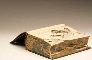
“Not long ago I visited the limestone and chalk cliffs on the North Norfolk coast. As I walked below them I remember constantly looking up to the top of the cliffs, overwhelmed and cautious of the overbearing layers of rock that towered above me. Placing myself in relation to the cliffs made me feel so insignificant, so small, and so fragile. I was unable to understand both their overwhelming scale and materiality….
Whilst drawn to natural landscape formations I am both overwhelmed and cautious in their presence. I find myself shrinking, hesitant to interact fully. I feel dwarfed, unable to understand the immense scale and materiality before me. My practice is an attempt to make sense of the natural landscape around me, to create my ideal. I understand and resolve through making, responding to forms and growths found in the natural world. I interpret by shrinking and condensing, implying forms by combining materials.” Statement, Kyle Kirkpatrick
Kirkpatrick’s imagined landscape works by being carved from an archetypal monumental man-made object — a visual encyclopedia — taken out of context and populated with human figurines dwarfed by the swirling, layered cutaway text. What is he pushing us to see beyond what he presents before us? That this human work of attempting to understand and make sense of the great world around us by capturing it in words and illustrated plates is a shrinking and condensing, an implication of forms by artifice? That even though the landscape is man-made, it overwhelms us?
The Fine Press Book Association’s inaugural Student Type Design Competition sprang from the hope that by building bridges between printers and young type designers we might end up creating new material resources for the fine press community.
What might be remarkable — or book-markable — is whether the surge in objectifying the book through sumptuous illumination, miniaturization or the creation of book art occurs at definitive moments of shifting media. One-off illuminated manuscripts preceded the invention of moveable type, but was there a definable surge of them in the decades either side of 1450?
The Audubon double elephant folio books appeared in 1820 about the time of Frederick Koenig‘s invention of the steam-driven letterpress.
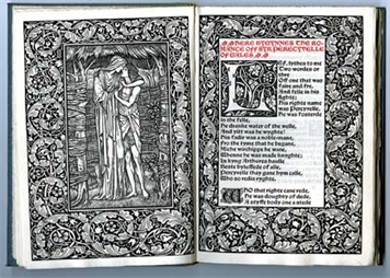
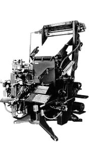
Are William Morris’s fine editions from Kelmscott Press in 1890 a datum in a surge of book objectification either side of Mergenthaler‘s invention of linotype in 1884?
A Visual Odyssey across the Last Himalayan Kingdom, the world’s largest book according to Guinness.
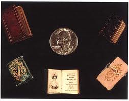
Last week, the New York Times ran an article about Neale Albert‘s collection of miniature books. Is this popular interest in unreadable books and the surge in altered and sculpted books an anxious reflection of another shift in media?
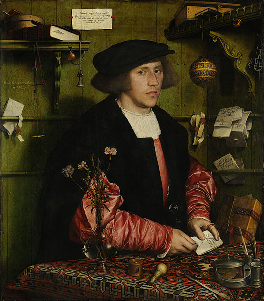
The Merchant Georg Gisze (1532) by Hans Holbein the Younger.
Author of The Things Things Say, Jonathan Lamb has trawled the Internet Archive to link us to 18th and early 19th century examples of the “it-narrative,” stories told from the perspective of a thing such as a watch, a coin or a mouse and generally comic and all-too human in the telling. And yet, Lamb observes,
… for a number of reasons this is seldom how [the it-narrative] deserves to be read. Whether it is owing to its origin and terminus in the narratives of slaves, or to its coincidence with the financial revolution and the growing unaccountability of mass human behaviour, or to the growing appetite for print ephemera, or to the end of feudal tenures and the resulting anomalies of personal portable property, or to the irreversible metamorphoses precipitated by the holocaust, ordinary things situated in banal circumstances develop a salience that has nothing to do with symbolism or hidden meaning. They are just there, eying their human adversaries, implacable and meditating affronts.
Lamb might have added another reason: the growth of the Internet, book art or bookwork and prediction of the printed book’s demise. Until that demise, will our books, just there on their shelves above the lampshade late at night, sit “implacable and meditating affronts”?
Ferris Jabr’s article “The Reading Brain in the Digital Age: The Science of Paper versus Screens” in Scientific American (April 11, 2013) revisits the themes raised in Maryanne Wolf’s Proust and the Squid mentioned in the previous posting. Jabr highlights much insightful writing on the neuroscience of reading, on which more in a bit. He begins, however, with a “haptic” anecdote that will resonate with parents and grandparents of children who are learning to read now or have learned in the last 3-5 years.
In a viral YouTube video from October 2011 a one-year-old girl sweeps her fingers across an iPad’s touchscreen, shuffling groups of icons. In the following scenes she appears to pinch, swipe and prod the pages of paper magazines as though they too were screens. When nothing happens, she pushes against her leg, confirming that her finger works just fine—or so a title card would have us believe.
Earlier the same year, I was lying in bed with an iPad reading Death and the Penguin by Andrey Kurkov. As the story drew me in and admittedly as the hour grew late, I found myself repeatedly reaching into the upper right-hand corner of the screen with my left forefinger and thumb to pick up and “turn the page.” I had not developed the habit of “sweeping” or “tapping” to move through the book. These real-life mirror images of the haptic habits of a young soon-to-be reading brain and an old reading brain bring Wolf’s speculations alive.
Numerous studies cited by Jabr suggest different areas of the brain at work in screen reading vs print reading and connect that to poorer retention and comprehension in screen reading than print reading. But one of the more recent ones (“Metacognitive regulation of text learning: On screen versus on paper,” by Ackerman and Goldsmith) shows that where readers
studied expository texts of 1000–1200 words in one of the two media and for each text […] provided metacognitive prediction-of-performance judgments with respect to a subsequent multiple-choice test[,] [u]nder fixed study time (Experiment 1), test performance did not differ between the two media, but when study time was self-regulated (Experiment 2) worse performance was observed on screen than on paper. The results suggest that the primary differences between the two study media are not cognitive but rather metacognitive—less accurate prediction of performance and more erratic study-time regulation on screen than on paper.
So the reading brain may not be rewiring itself, but print and screen do demand different strategies of reading and study. Might the “haptic habits” of physically turning the page or recalling three dimensionally the place in the book and on the page where a sentence occurs (or pinching, swiping and prodding) be clues to how we learn to learn what we read? What we may be seeing in the one-year old are the beginnings of the metacognitive cues that will raise the performance of tomorrow’s screen reading brains, and in Ackerman’s and Goldsmith’s subjects, the familiarity of today’s reading brains with the metacognitive cues so key to studying from print that the students print out the relevant ebook chapter.
As Jabr concludes, “When it comes to intensively reading long pieces of plain text, paper and ink may still have the advantage. But text is not the only way to read.”
Which harks back to the conclusion of the previous post and Jerome Bruner’s apt observation of Vygotsky’s fondness for Bacon’s epigram, “Nec manus, nisi intellectus, sibi permissus, multum valent” (Neither hand nor intellect left each to itself is worth much)” (247). Perhaps neither print nor digital left each to itself is sufficient.
If it’s didactic, is it art? By his own words, Thomas Wightman’s bookworks are intended as a vehicle for a message.
This project was to describe aspects of my final year project theme and primary research made so far as a ‘vehicle’. … My major project theme is Addiction, primarily looking at obsessive driven addictions. … The book firstly is closed hiding the addiction from view in the same manner as those who hide these addictions from loved ones and friends. … when the book is opened it reveals the chaotic emotions felt. Panic attacks are … associated with Obsessive Compulsive disorder and I … convey this through the metaphor of a sinking ship in a vortex …. Also the symptoms of a panic attack include loss of breath in the same way as drowning in water. … a tethered anchor and a typographic rope show these problems can be solved and the ship can be salvaged in the same way as those who suffer from OCD when they receive proper treatment.
His next work continues the message with different metaphors. Its title “Plagued by Doubt” is a phrase repeated by an OCD sufferer, and Wightman has created a spiraling cutout of the repeated phrase and positioned it over the moth-eaten hole in the book.
This work is simultaneously delicate and ominous, perhaps more so than the first effort. Wightman’s skill is on a par with that of the mystery sculptress of Edinburgh, but are these message-bearing works of book art as deeply artistic? Once the metaphoric lock has been unpicked, is there an urge to unpick it again? Like Joseph Cornell’s boxes, do the works warrant revisiting again and again?
If didacticism in art is in resurgence, these two bookworks make an impressive contribution, but just perhaps, they are more than that.
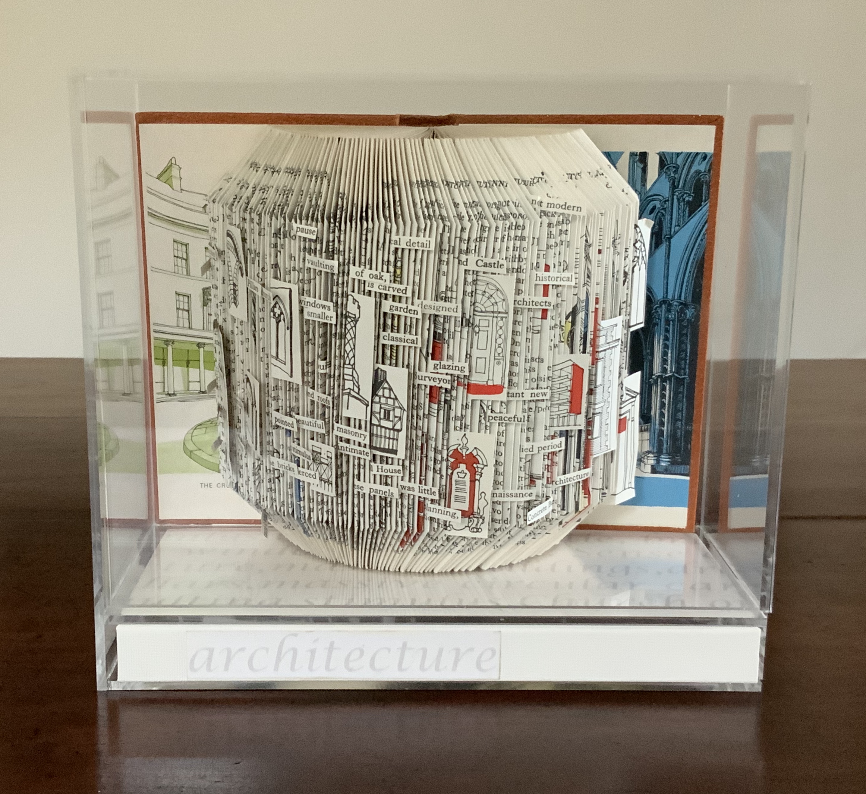
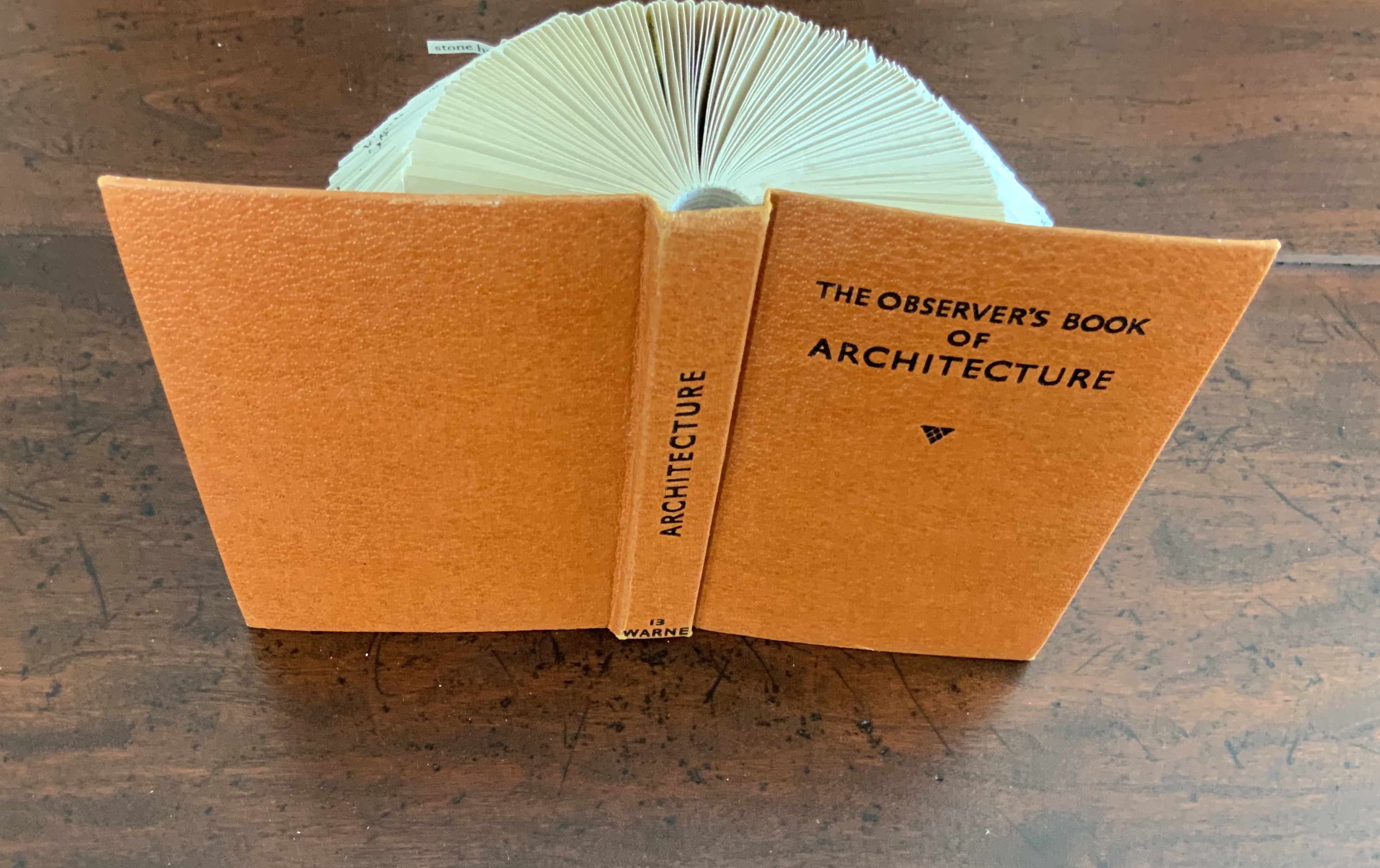
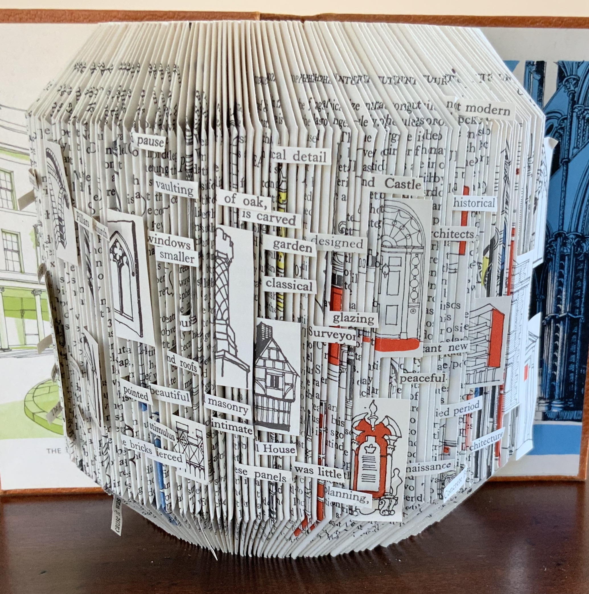
Folded book pages rarely generate a work that rises above mere craft. Heather Hunter’s Observer Series: Architecture (2009) achieves the necessary height. It combines the altered book with an accordion book that incorporates a found poem composed of the words excised and folded outwards from the folded pages of The Observer’s Book of Architecture.
The very fact of a found poem made of excised words that happen to fall at the folds shaping a column from a book on architecture chimes with the title of Bachelard’s The Poetics of Space.
Another work in the collection is Foldable Sculpture No. 1.
“Environmental memories,” not just of places but of cherished objects held in the hand, are Hunter’s chief inspiration, and the design of her bookworks is intended through touch, reading and exploration to evoke in the reader “unique feelings that become the reader’s own environmental memory.” Her artistic and literary influences and inspirations are an interesting blend of the 20th century Neo-Concrete and the 19th century Romantic movements. Links to illustrations of those sources of influence are embedded in the caption to Snowdrop.
Snowdrop ()
Hunter has regularly exhibited and demonstrated her work at Turn End Studios in Haddenham, Buckinghamshire.