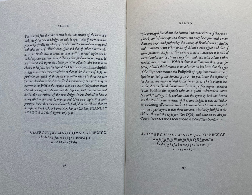
Baabaa Aab Daad (Father Gave Water) (2020)

Baabaa Aab Daad (Father Gave Water) (2020)
Golnar Adili
Wood, felt, board and cloth, 5 x 7 x 1.5 inches (closed). Edition of 25. Acquired from the artist, 1 July 2022
Photos: Books On Books Collection unless indicated otherwise. Displayed with artist’s permission.
Helpfully for a Western audience, the box cover of this homage to the traditional Persian sentence for first-year readers links the right-to-left-reading words with their roman alphabet transcription and English translation. Beyond that, understanding just these few characters and appreciating the artistry involved require some research.

Close-up of box cover.
The character called ‘alef and making an aa sound is آ. From the transcription, we know that the sound should appear four times — twice in “Baabaa” and once in each of “Aab” and “Daad”. The character called be and eliciting a b sound is ب . The transcription indicates it should appear three times — twice in “Baabaa” and once at the end of “Aab”. The character named daal and making a d sound is د . The transcription calls for it to appear twice — at the beginning and end of “Daad”.
As in Arabic, from which Persian adopts most of its characters, some characters’ appearance changes depending on their position in a word or syllable. If a word begins with ‘alef (آ) and is the aa vowel (as opposed to the “o” or “é” vowel), the character for it has a “roof” — as in the word “Aab” — but if the sound falls in the middle of a word — as in “Daad” — the “roof” comes off: (ا). Also as in Arabic script, Persian letters can be linked with one another, altering their appearance. In “Baabaa”, ‘alef (ا) links up with be (ب); so not only does its “roof” disappear, but it squeezes the width of ب and shifts its diacritic (the dot underneath): با. To Western eyes, the linked characters look like one character. In some typefaces, we have the similar phenomenon of ligatures, in which, for example, the letter f and the letter i will join into the single character fi.

Spine of the box.
Even if Gutenberg’s type mimicked scribal lettering, roman type was not cursive script, which explains in part the hard work by Francesco Griffo da Bologna and Aldus Manutius to come up with italic. For Arabic and Persian or any calligraphically represented language with characters changing shape with position and linkage, with diacritics and a slantable baseline to allow stacking of letter combinations, the development of movable type would be and has been even harder — if not impossible as designers Rana Abou Rjeily and Bahman Eslami explain (see references below).


All of this preamble helps in appreciating the linguistic and cultural bridging that Adili’s artwork performs. The miniaturized shape of traditional alphabet blocks meets pixellated and sculpted Persian in Adili’s modular wooden cubes and recessed felt base. Her invented typography mostly skirts the calligraphic concerns by leaping into the third dimension. Language becomes tactile and three-dimensional not only in this work but in almost all of the work emanating from her studio.

Colophon.

Larger set of letter modules. Photo: Courtesy of the artist.
The Jasmine Scented Ones is a particularly good example. This series of works uses the pixellated shapes from Father Gave Water to screenprint Persian characters and words this time taken from a Hafez poem and exploits the play of light through superimposed sheets of Japanese Rayon Lens paper and across 3D resin prints to embody the tension in the poem’s wordplay with the verbs to sit and to settle. For touch that would see and sight that would touch, Adili offers highly expressive works.
Many thanks from Books On Books — or Ketab bar Ketab (کتاب برکتاب) — to Golnar Adili and friend for assistance with the crash course in Persian characters. Any errors rest with Books On Books.
Further Reading
“Abecedaries I (in progress)“. Books On Books Collection.
“Rana Abou Rjeily“. 21 December 2022. Books On Books Collection.
Burney, Sarah. n.d. “One Piece by Golnar Adili, Baabaa Aab Daad (Father Gave Water)“. Kajal. Accessed 6 June 2022.
Center for Book Arts. 14 January – 26 March 2022. “Father Gave Water/Baabaa Aab Daad: An Homage to Childhood, Persian, and Process“. Exhibition. New York: Center for Books Arts Gallery. Accessed 1 March 2022. Center for Book Arts’s description of the work: “Adili drew inspiration from her own childhood education in Iran, where all first graders learn the phrase “Baabaa Aab Daad” (translates to “Father Gave Water”) as a foundational example of the elemental letter and sound composition in the Persian language. As a mother to a multilingual toddler, Adili was further inspired to employ a system of blocks and puzzles within her artist book as a reference to her daughter’s tactile style of play. In conducting research for this project, Adili learned of Iranian educator Seyyed Abbas Sayyahi, who drafted the country’s first-grade curriculum and co-founded a system of schools to serve the nomadic population. Adili could not find any formal recognition of Seyyed Abbas Sayyahi’s immense contributions by Iran’s education department, Sazman é Aamoozesh va Parvaresh, so she decided to celebrate his important work by including him in her book. Ultimately, Adili views her artist’s book as a didactic tool for English readers to fully understand the Persian sentence “Baabaa Aaab Daad.” The book includes an English phonetic key for the Persian alphabet and color-coded diagrams that break the sentence down word-by-word. A bilingual speaker and reader herself, Adili is fascinated by the connections between English and Persian, which are both Indo-European languages, and pursues new formal and visual translations through her art practice.”
Eslami, Bahman. 25 September 2013. “Harir—Reducing Noise in Arabic Script“. I Love Typography. Accessed 21 November 2022.
Rjeily, Rana Abou. 2011. Cultural Connectives = تواصل الثقافات / Cultural connectives = Tawaṣṣul al-thaqāfāt. New York London: Mark Batty Publisher.