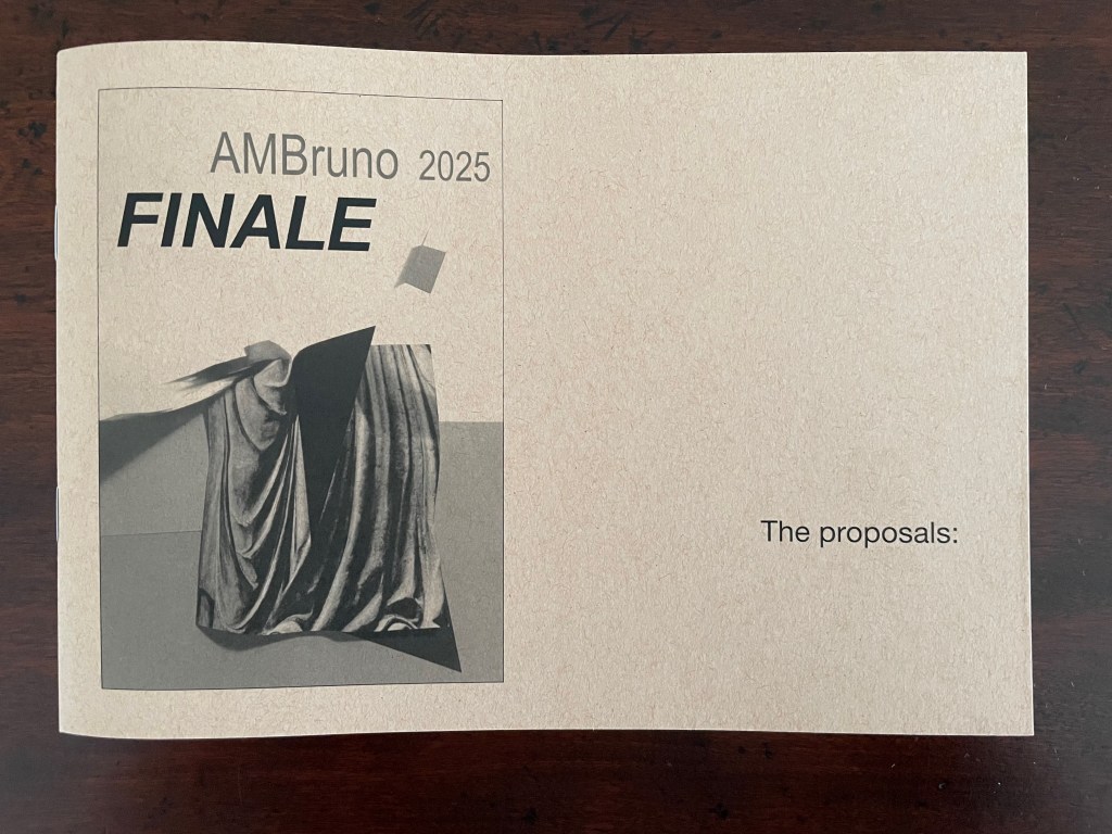
Bookmarking Book Art – AMBruno “Finale”

A promotional booklet cover featuring the text 'AMBruno 2025 FINALE' and an abstract image of draped fabric with a geometric shape, along with the phrase 'The proposals:'.

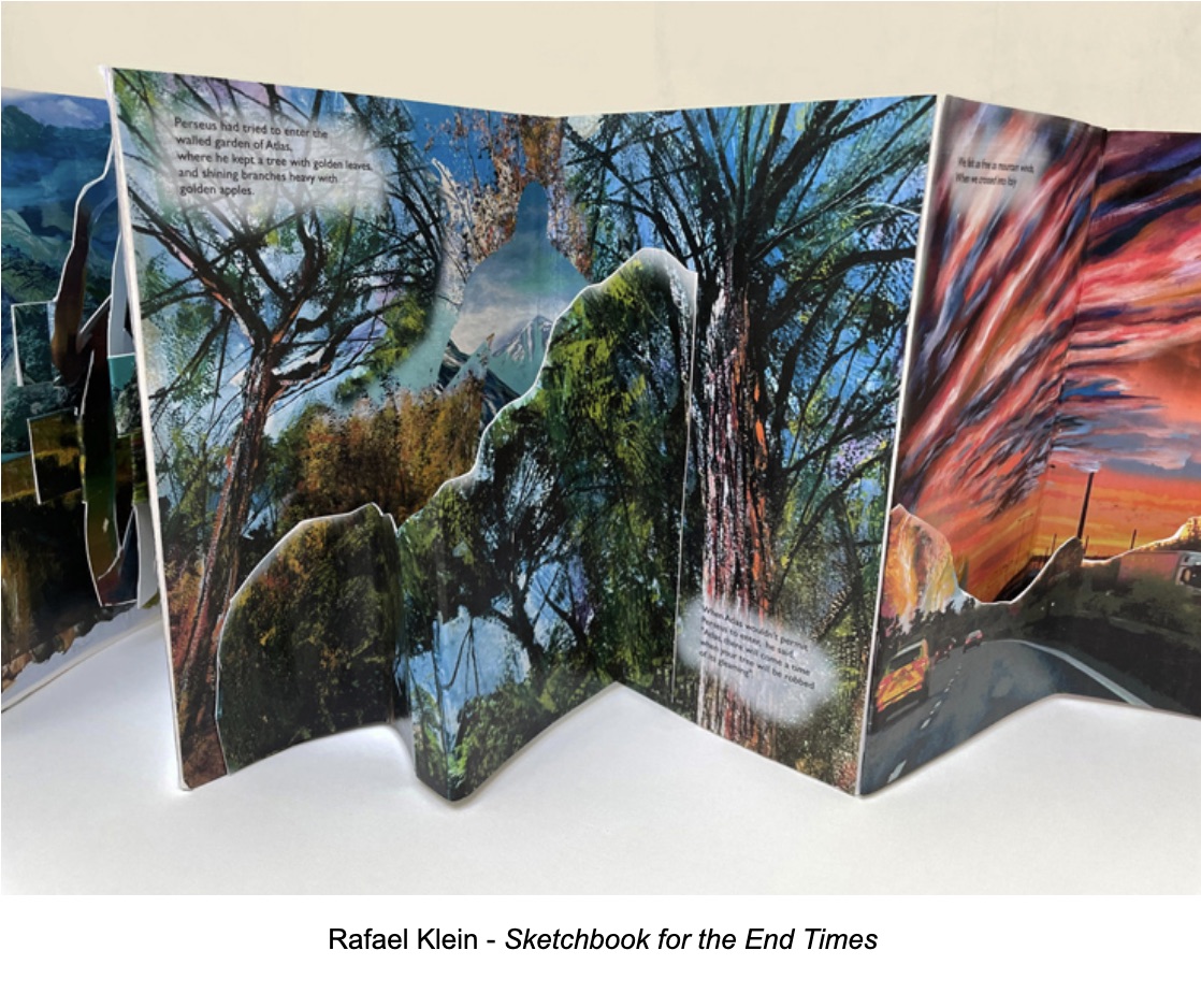
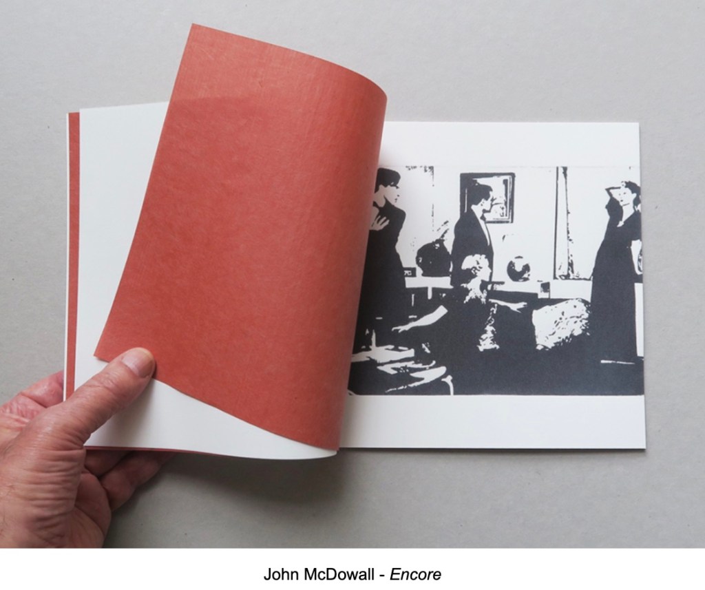
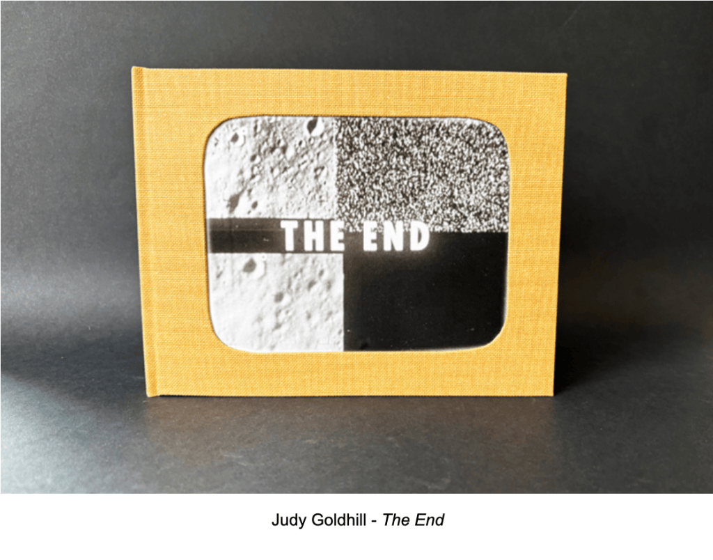
AMBruno’s last project Finale proved to be a fertile prompt for 19 artists and their 18 works. I thank Sophie Loss and John MacDowall for the fun and honor of reviewing the entries.

When I consider an artist’s book for acquisition or inclusion in an exhibit, I want it to make me read with my eyes, hands, and mind. Following the text is not enough. It should demand that I see the shapes of letters, words, images, pages, and the entire work itself. Turning a page is not enough. It should demand that I handle, unfold, rotate, manipulate – feel it. Mentally deciphering the work’s signs is not enough. I want it to make me think – about how the shape, material, and making work together – about how artists’ books before this one may be present – about how other literary, visual, sculptural, architectural, performative, or even digital art may be present.

So, you can appreciate what a challenge it was to select works on the basis of a few sentences or paragraphs describing what the artists planned to submit.
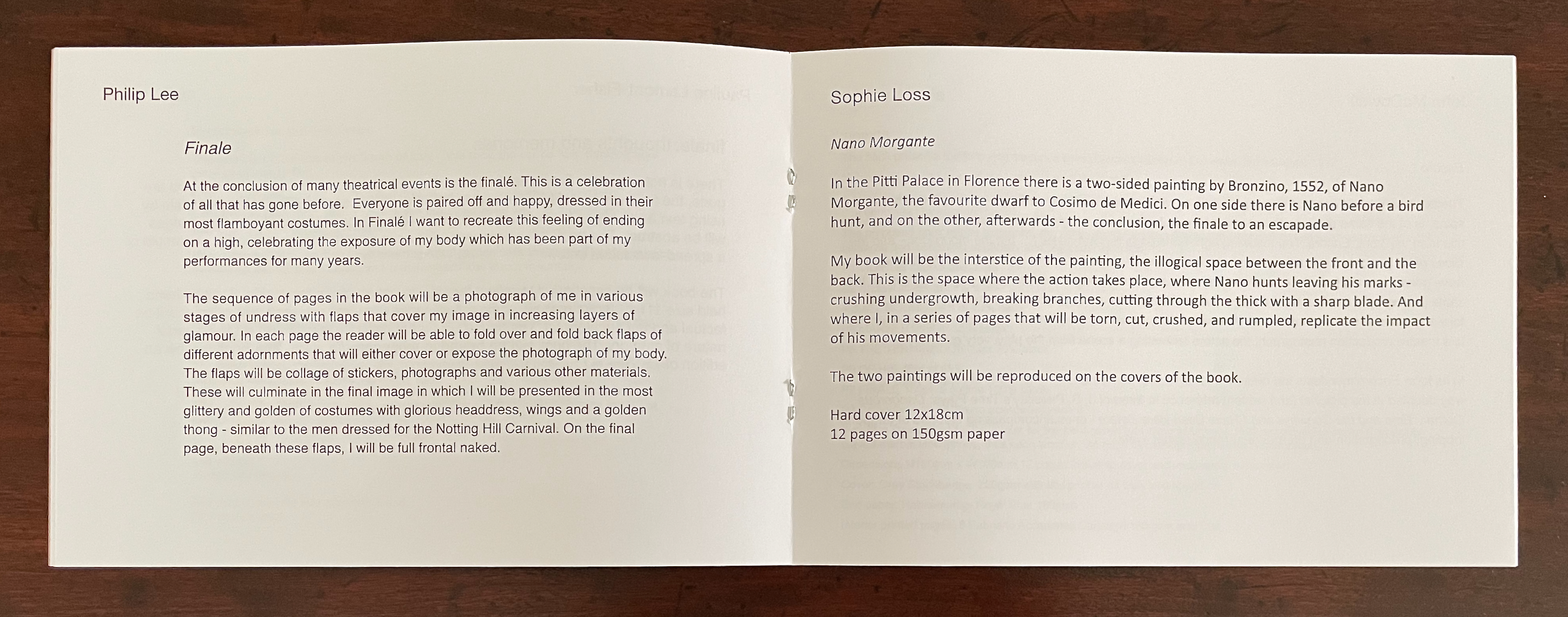
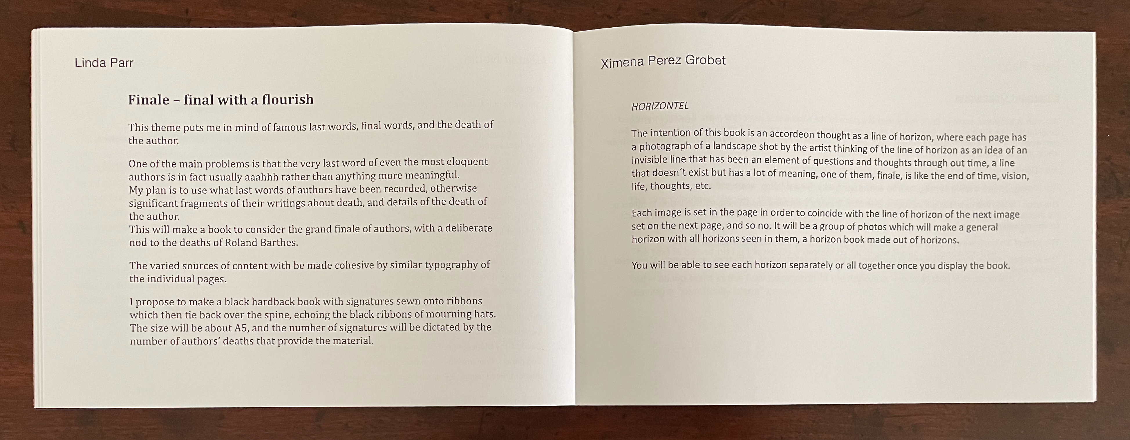
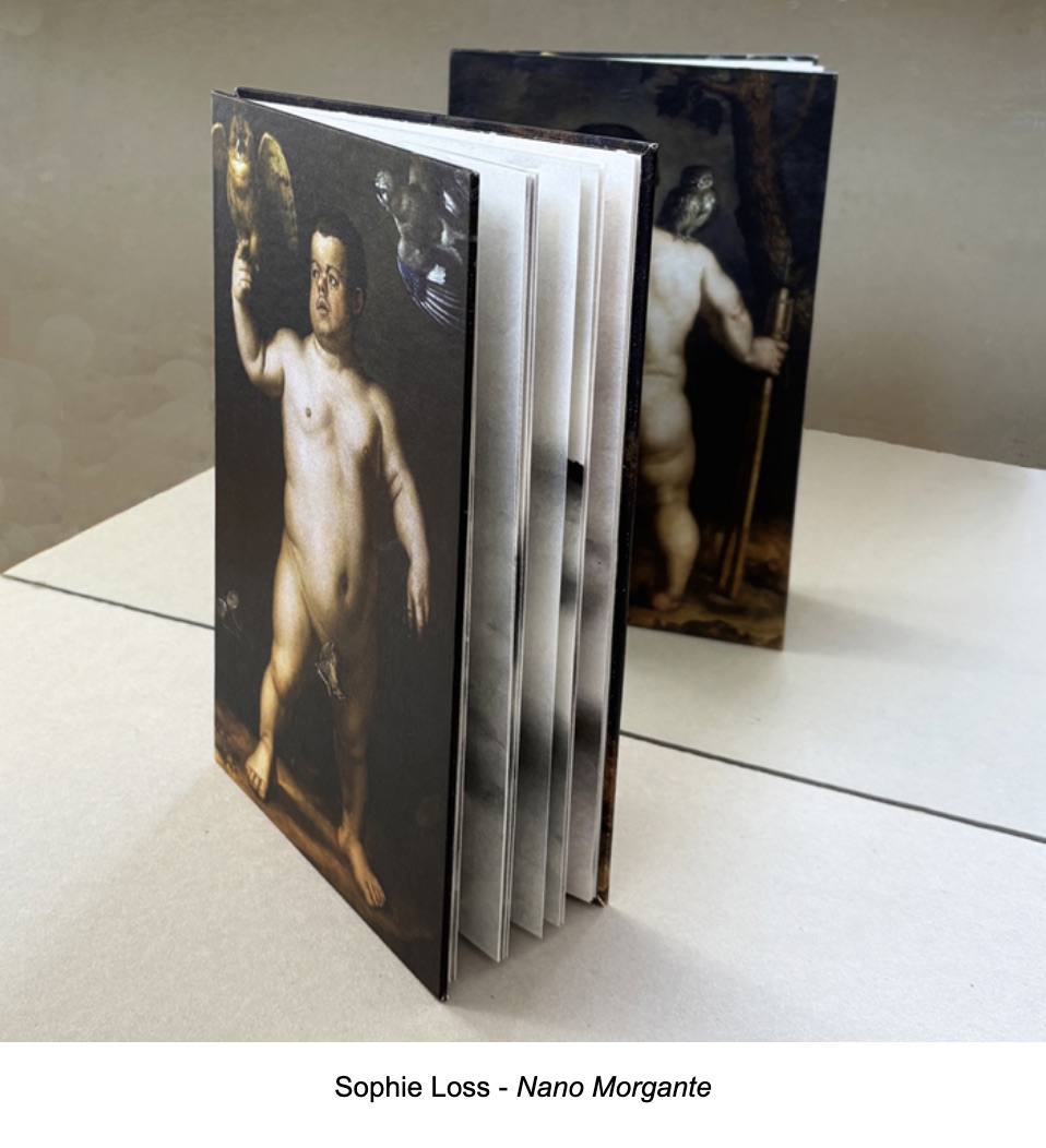
Now add that the proposals’ ranged from simple pamphlet fold to intricate concertina pop-up and to piano-hinged sculpture, from relief prints to photographic prints, from a Renaissance nude to a carnivalesque Full Monte, from entirely text to entirely blank, and from celebration to lamentation and back.
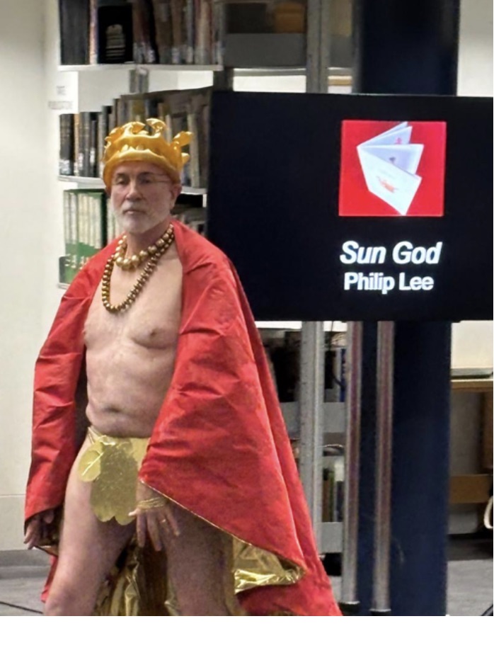
Now add their settings from fireworks displays, theatrical productions, the Book of Common Prayer’s Order for the Burial of the Dead, book burnings, a mythic road trip, and a televised lunar crash.
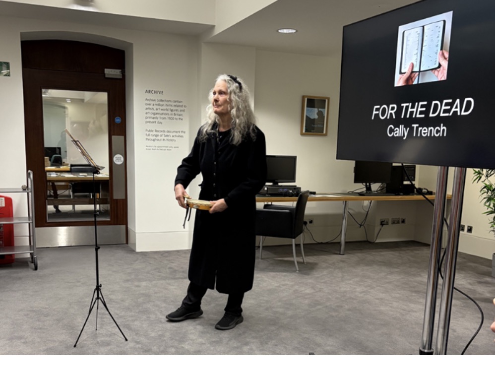
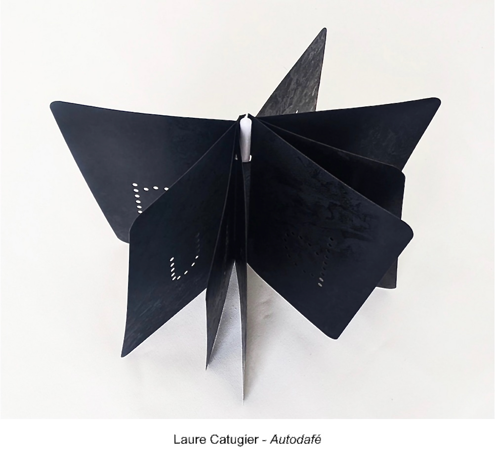
And then add the range of literary and other media influences – from the Greek myths, Bronzino, John Donne, James Joyce, Heinrich Heine, Georges Perec, J.B. Priestley, to the evening television news.
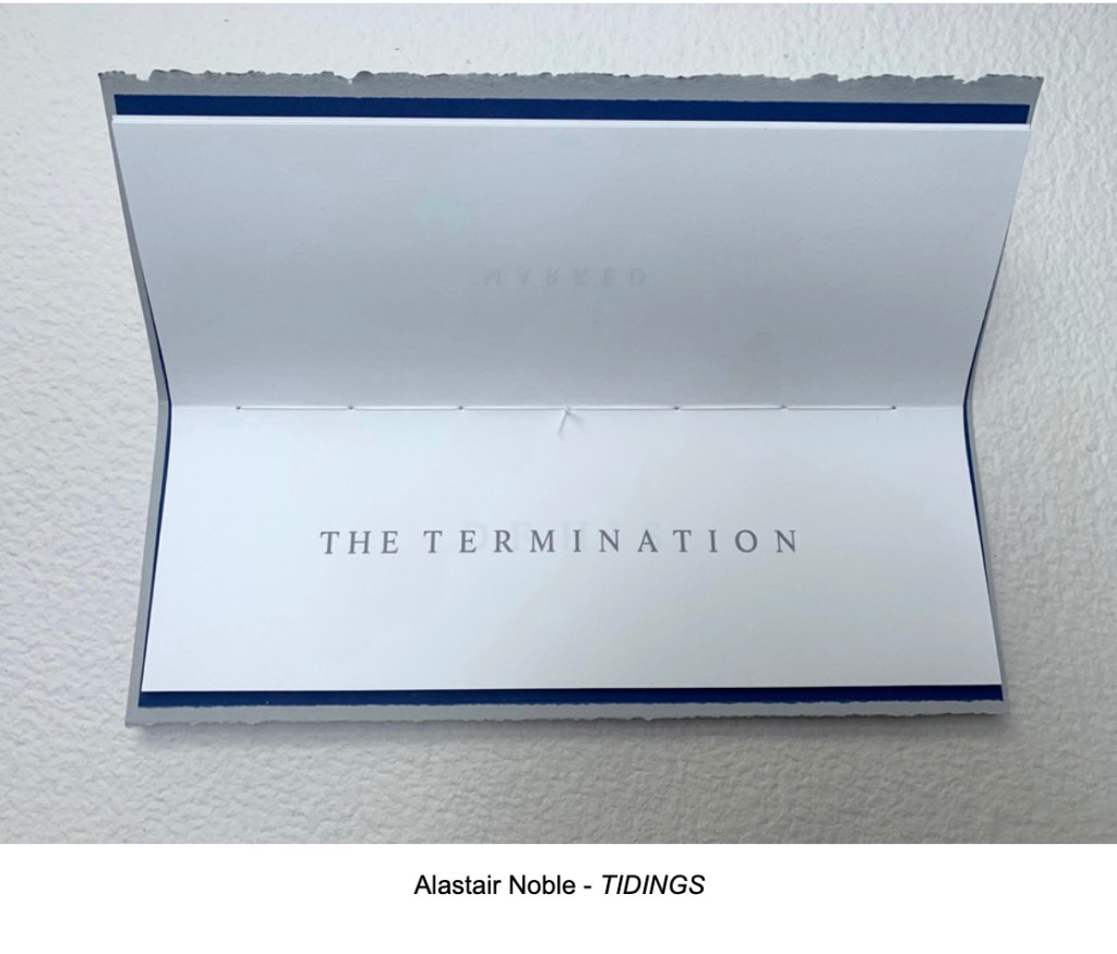
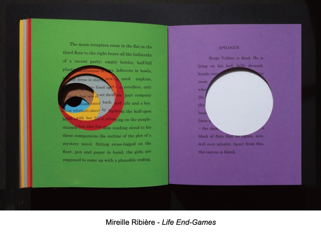
As I mentioned, it was an honor to be tortured with the challenge of imagining what the artists intended. On seeing the final results with Sophie and John via Zoom, my imagination was much relieved and delighted.

As I watched the artists present their works and the audience inspect the Finale selections, look hard and long, touch them, and think slowly, I was convinced of their delight as well.

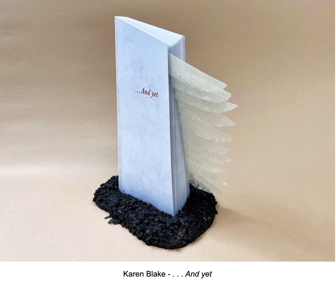
As a group, the entries represented almost every variety of artist’s book I have encountered. One form missing though was the un-openable book. I feared that someone might propose a tombstone carved in the shape of a book which would weigh like a lump on the proceedings. There was, however, a book that took on the shape of a tombstone but seemed to take flight when opened. And although among the entries there were mourners for the final AMBruno project, there were celebratory memorializers as well. In fact, as Sophie and John reviewed the arrivals alphabetically for me by Zoom, I laughed that chance ended our session with Roy Willingham’s Touch Paper, a wonderfully structured diamond-shaped concertina whose folios each burst open to name a traditional English firework and combine to make a larger diamond.
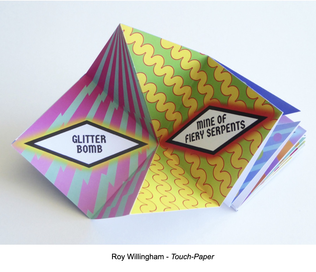
How fitting that the finale of AMBruno’s Finale turns out to be a firework display that should prompt not only oohs and aahs but also a round of applause for Sophie Loss and friends for the 16 AMBruno projects over the past 14 years.
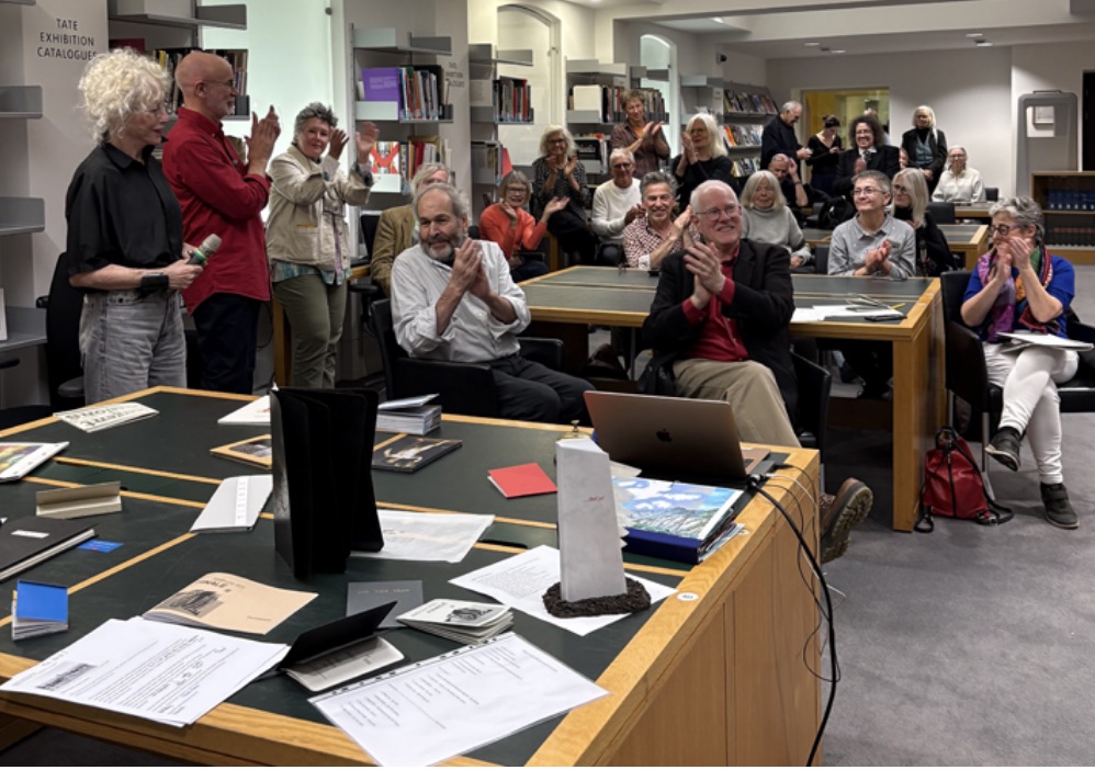
A group of people applauding in a library setting, with several tables displaying books and materials. The audience shows diverse reactions, and a few individuals are standing while others are seated.

The nineteen Finale artists were: Karen Blake, Laure Catugier, Claudia de la Torre, Judy Goldhill, Susan Johanknecht & Katharine Meynell, Rafael Klein, Pauline Lamont-Fisher, Philip Lee, Sophie Loss, John McDowall, Alastair Noble, Linda Parr, Ximena Pérez Grobet, Peter Rapp, Mireille Ribière, Cally Trench, Maria White, and Roy Willingham. Visit the AMBruno site and shop for additional views of the works.

Photography: Books On Books Collection, Sophie Loss, Judy Goldhill, Philip Lee, DDK, Julie Jones, Julia Davy-Brown, and Steve Davy-Brown.
Bookmarking Book Art – The British Library’s “Artists’ Books Now” series

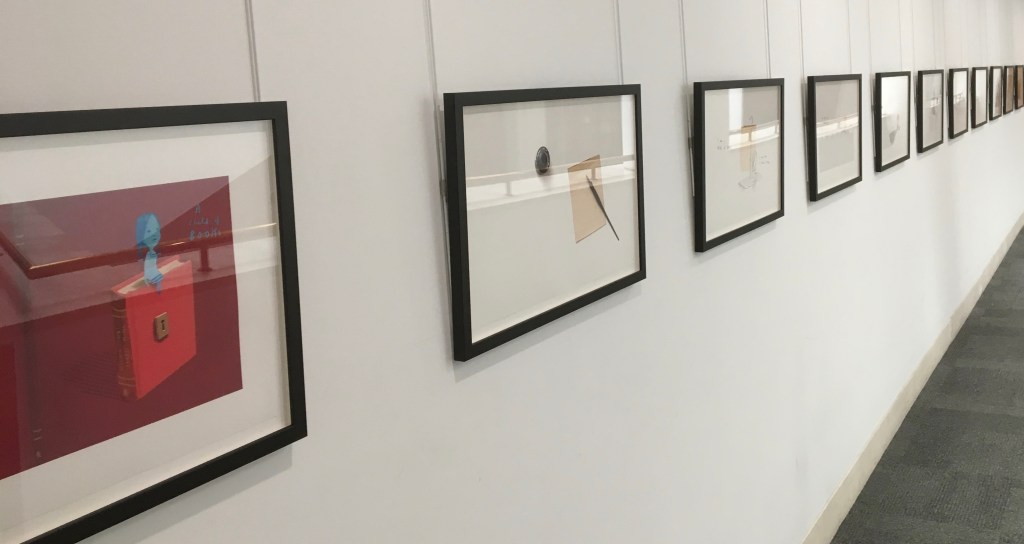
Recent exhibition of art from Oliver Jeffers’ and Sam Winston’s A Child of Books. The British Library.

Richard Price and his team at The British Library just concluded their fifth event in this series of “show and tell” talks by book artists. Most of the events have staked a claim to some relationship with a British Library event or exhibition current at the time — World Book Night, Writing: Making your Mark, and Buddhism — but the title of this fifth event punningly encapsulates the real point of the entire series: “Contemplating: Artist’s Books Now”.

When picturing an artist’s book what do you imagine?  Intricate design, ornate bindings, blank space, fold outs and pop-up rinsed through with vibrancy of text and colour. Is it something more unearthly and harder to describe? An air of peace in the topsy-turvy hullabaloo of our modern world.  A pause of contemplation as a work speaks to you? Or, on the contrary, is it a space of immense energy, of ‘thought-provocation’, where contemplation is something you feel compelled to do to make sense of the sensations and ideas the book stimulates? “Contemplating: Artists’ Books Now”

Whether the organizing theme has been “here and now” “place”, “Latin America“, “writing” or “contemplation”, the evening inevitably turns to reflecting on the nature of book art, bookworks, the artist’s book, the book arts, bookness and even art itself. Even with 50-60 in the audience and four to six presentations, Price and team have arranged the agenda to allow for hands-on “viewing” of the works, conversations with the artists and question time that evolves into a room-wide conversation, not just Q&A.

So far, the team — consisting of book artists and researchers Egidija Čiricaitė and Sophie Loss and the librarians Jeremy Jenkins and Richard Price — has attracted a consistently eclectic, talented and insightful set of artists, collectors, curators, librarians, academics and moderators for each event. To name but a few: Danny Aldred, Lucy Bell, Tracey Bush, Nancy Campbell, Maria Fusco, John McDowall, Gill Partington, Caroline Penn, Clive Phillpot, Francisca Prieto, Chris Taylor, Michael Wellen, Maria White and Sam Winston.

One wishes for Artists’ Books Now once a month! Not to detract from the efforts and energy of the team, but how hard and wonderful would it be to coordinate a future series of Artists’ Books Now to coincide the weeks before or after Bristol’s Book Artists Event, Edinburgh’s Artists’ BookMarket, Liverpool’s Artists’ Book Fair, Leeds‘ International Contemporary Artists’ Book Fair, Norwich’s Turn the Page and Sheffield’s revived Artists’ Book Fair?

Bookmarking Book Art – Bristol Artist’s Book Event, 2019

A day’s visit with one hundred exhibitors hosted at the Arnolfini in Bristol leaves me reeling like a drunken sailor — drunk on colour, texture, light, line, shapes, words and artistry. Appropriate given the Arnolfini’s location on Narrow Quay in Bristol’s floating harbour.

Colour

Lucy May Schofield talked to me about her “search for the indigo that is infinity”. The Distance of Us is only one of several pieces demonstrating how close she is coming. The Longest Day on her site is one among many by which to enjoy her progress.

The Distance of Us
Lucy May Schofield
Photo: Books On Books

Mick Welbourn took time to explain how his search among inks, paper and geometric shapes kept leading him from a unique work (oil-based) to multiples and back to uniques. These colours reminded me of the work of Sonia Delaunay.

Mick Welbourn
Photo: Books On Books

Texture

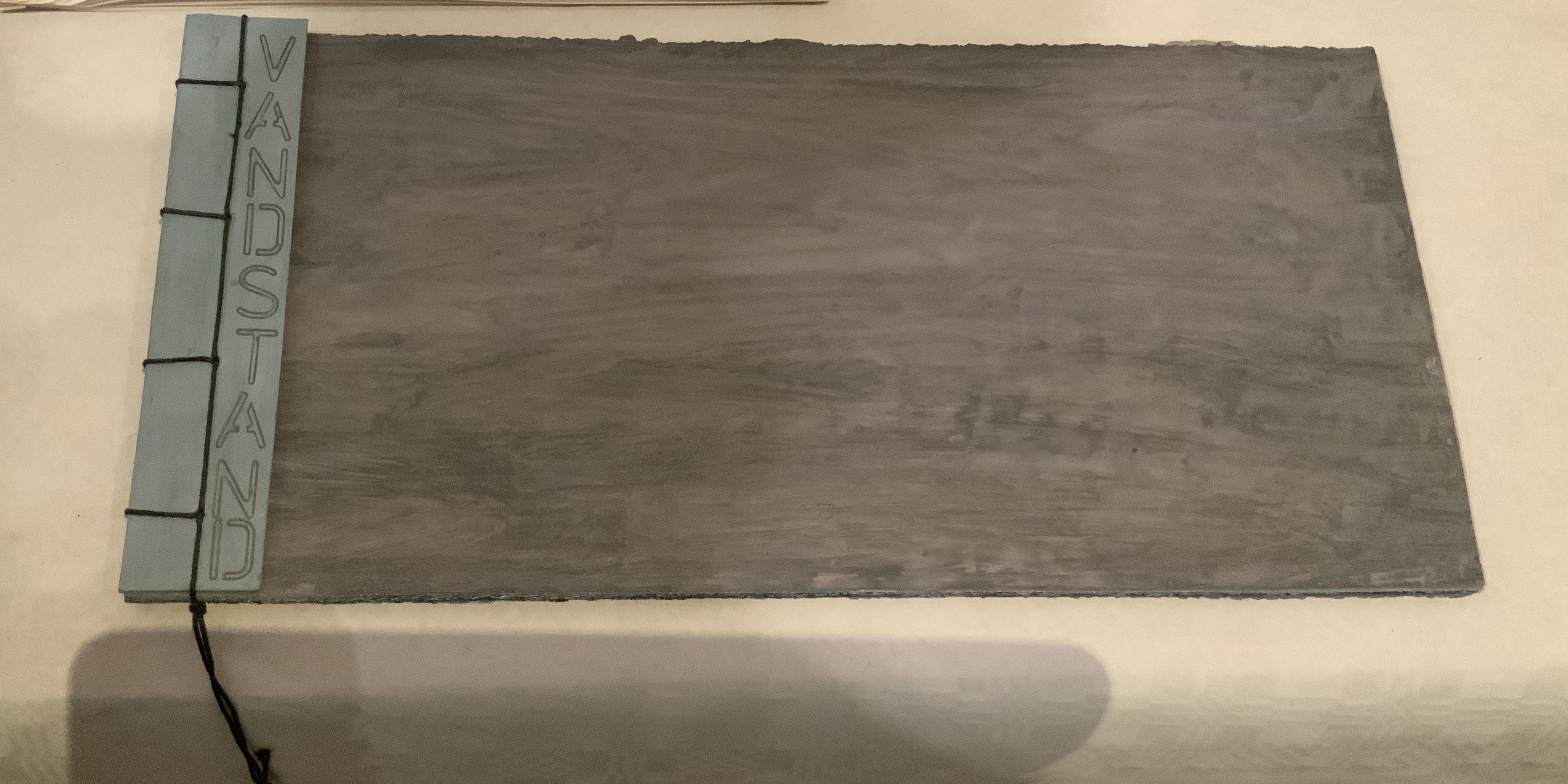
Bodil Rosenberg, a member of the Danish collective CNG (Anna Lindgren, Bertine Knudsen, Birgit Dalum, Pia Fonnesbech, Susanne Helweg), appeared delighted that I was surprised by the colour and texture of Vandstand (“water level”). Somehow after the saturation of the paper with layer upon layer of paint, each page has a supple leather- or cloth-like feel — a coolness to the touch. I think Ken Campbell would relish Vandstand.

Vandstand
Bodil Rosenberg
Photo: Books On Books
Vandstand
Bodil Rosenberg
Photo: Books On Books

Caroline Penn’s works comprised by Notes from Chesil Beach made me reach out to pick up one of the pebbles on the page. The trompe l’oeil effect of turnable pages in the photos is enhanced in one variation by inclusion of an actual small gathering of pages. The role of trompe l’oeil in book art is one worth investigating.

Notes from Chesil Beach
Caroline Penn
Photo: Books On Books

Light

Eileen White’s Haptic Narratives and her lumen prints for Printed Matter made a nice segue from texture to ghostly light. Printed Matter also looks forward to the “artistry” section here as book’s images are un-fixed and eventually fade away. To use the book form — the traditional form of permanent record — to present a language and reminder of material ephemerality: that is artistry.

Eileen White
Photo: Books On Books

Haptic Narratives
Eileen White
Photo: Eileen White
Printed Matter
Eileen White
Photo: Eileen White

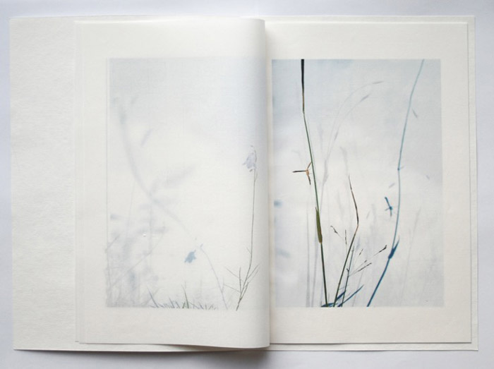
Helen Douglas (Weproductions), fresh from exhibitions at Printed Matter in New York and Fruitmarket Gallery in Edinburgh, was displaying her 2017/2018 series Field Works as well as a new book Summer Alight. The photographic effects, the visual narrative and structure achieved in Douglas’s works define artistry.

Meadow
Helen Douglas
Photo: Weproductions

Line

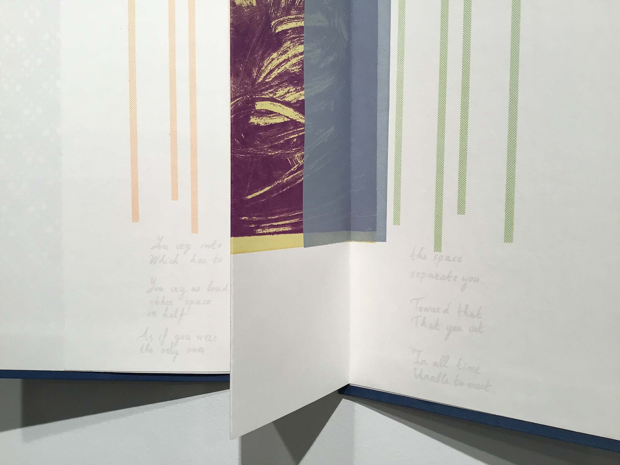
Elena Zeppou’s Parallels first caught my eye because of its size, but closer inspection yielded appreciation of line — vertical as well as horizontal — and its union with text and form. Note how the lines of poetry read across the accordion.

Parallels
Elena Zeppou
Photo: Books On Books
Parallels
Elena Zeppou
Photo: Zitrone Printmaking
Parallels
Elena Zeppou
Photo: Zitrone Printmaking

Shapes

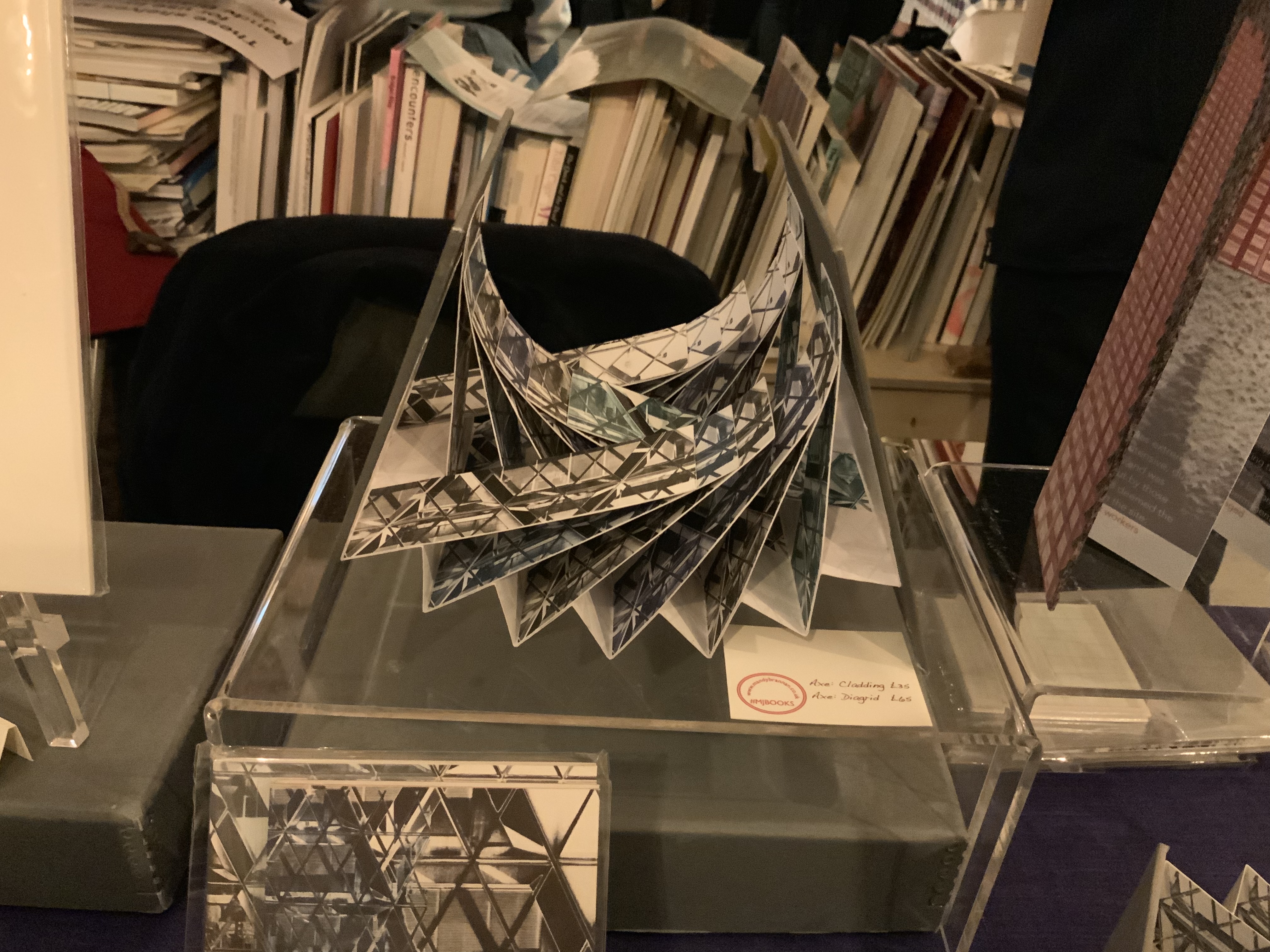
Listening to Mandy Brannan talk about custom papers, French fold books and modified flag books is almost as good as handling them. The work 30 St Marys Axe (inspired by the building fondly known as the “Gherkin”) was what first drew me to her table. It has two variations — Diagrid and Cladding — which reward repeated handling as well as regarding.

Silk tie fibre pulp
Photo: Mandy Brannan
30 St Marys Axe: Diagrid
Mandy Brannan
Photo: Books On Books

At the ArtistBooksOnline table, the shape-changer Inside/Outside by Susie Wilson kept me as busy as if it were a Rubik’s cube or paper puzzle with a medical mystery inside — or outside.

Inside/Outside
Susie Wilson
Photo: Books On Books
Inside/Outside
Susie Wilson
Photo: Books On Books

Words

Puns, slippery words and slipperier concepts seemed to explode from Guy Bigland‘s table.

My inner metaphysician of Structuralism, Post-Structuralism, Deconstruction and Post-Deconstruction found its element(s) at the Atlas Press.

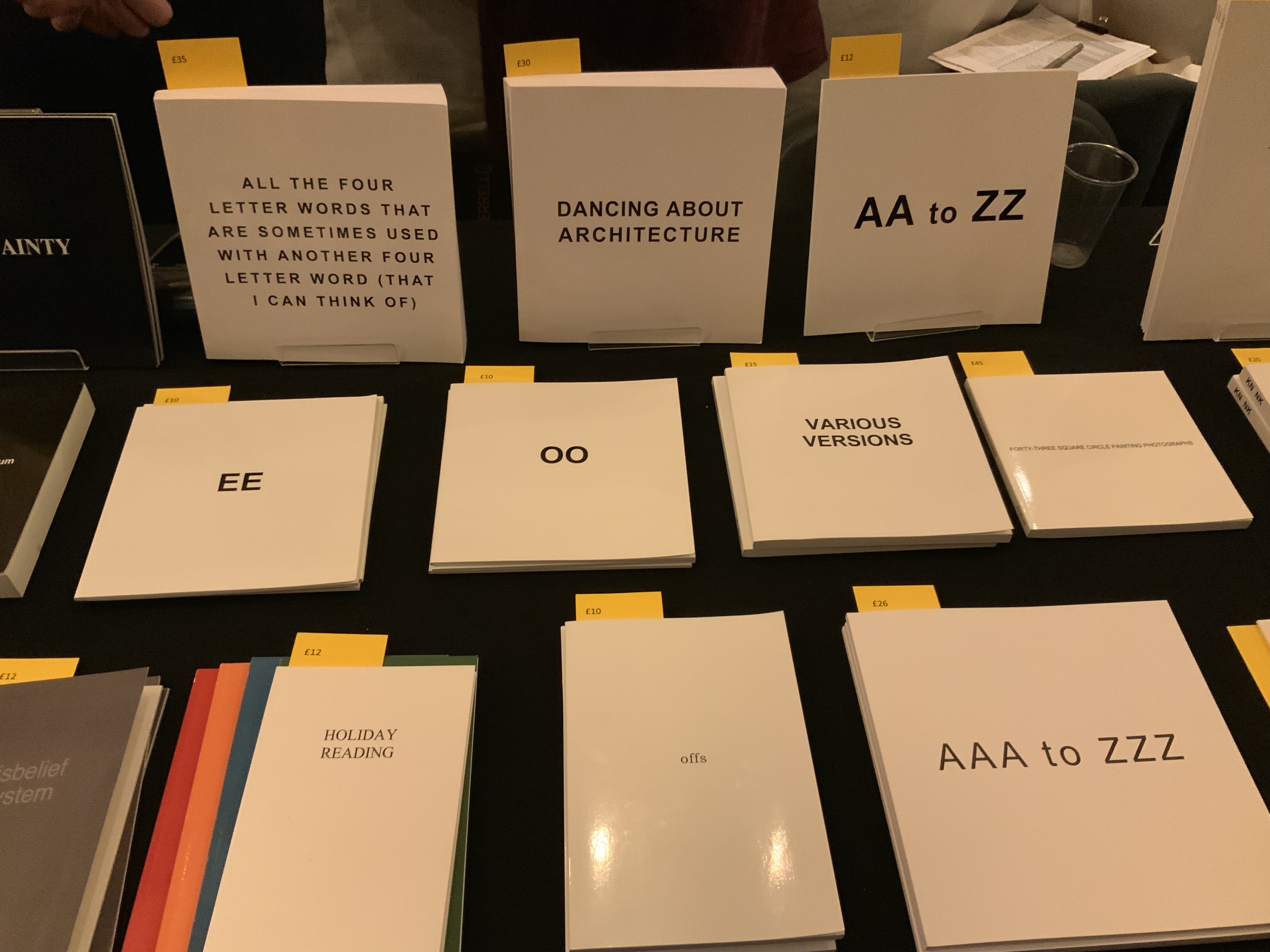
Uniformbooks offered a new selection of essays by Colin Sackett, who cheerfully discussed with me Michael Hampton’s eclectic and insightful abecedarian Unshelfmarked: Reconceiving the artists’ book.

Artistry

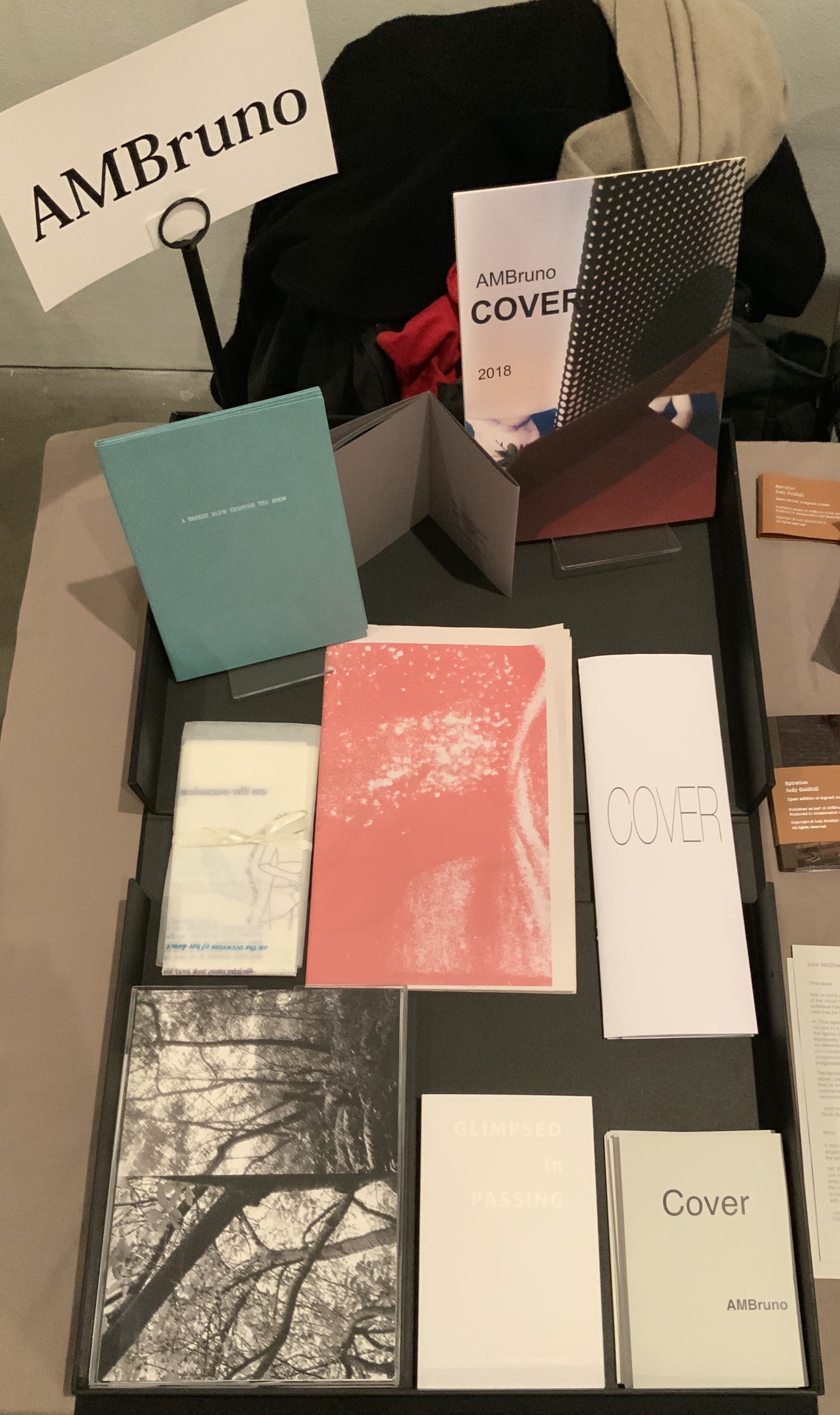
AM Bruno, run by Sophie Loss, and of which John McDowall is a founding member, is always a rich vein of artistry. The works from the 2018 theme-driven project, Cover, appear in the box below but warrant a closer inspection at the link behind the word. John McDowall had a new book on hand: Time-lapses. As I turned the brilliantly white pages, each segmented into squares like a comic-book page but only one square in each page holding an old black-and-white photo, the title began to sink home. And then came the idea that all the meaning that could possibly explain any one photo, its relation to the other squares or to other photos or to the author or to the reader/viewer — all of it — has to take place in the empty spaces between.

Janet Allsebrook displayed a Duchampian box with the Delaunay-esque title Nichoir. Although the drift of this work (“waste time making your own useless nest box”) is echoed in her other works, the echo reverberates with a deeper tone — often political or philosophical. The variety of book forms is impressive.

Nichoir
Janet Allsebrook
Photo: Books On Books

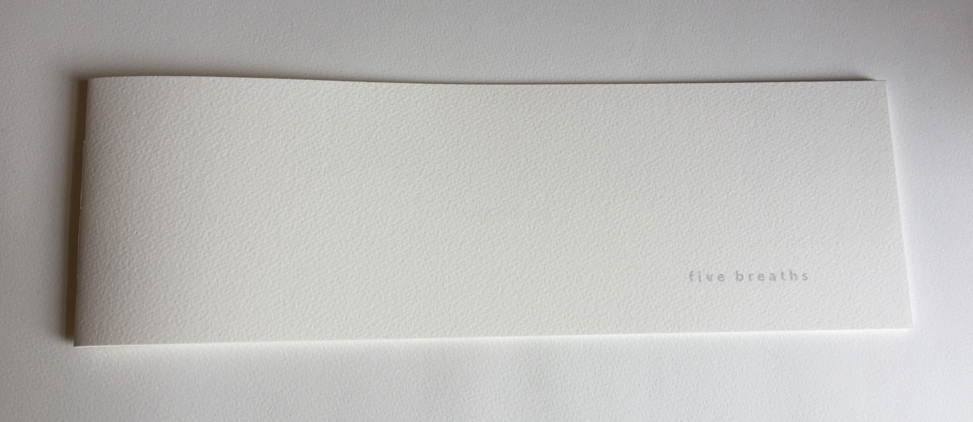
Next door was the artist of Zen book art — Julie Johnstone – Essence Press. In addition to extensions of her percentage tint series, she had on hand several explorations of breath, print and paper: each breath, a page; quietly breathing; five breaths; and ten breaths. Wherever they are, her books make a Zen garden.

Sarah Bodman and Arnolfini brought together a rich collection of talent and should be thanked for doing so and encouraged to repeat it in 2021. And to the artists mentioned — and those not — who took the time to share their thoughts on colour, texture, light, line, shapes, words and artistry: Encore!