The most beautiful and perfect book in the world is a book with only blank pages, in the same way that the most complete language is that which lies beyond all that the words of a man can say. Every book of the new art is searching after that book of absolute whiteness, in the same way that every poem searches for silence. — Ulises Carrión: “The New Art of Making Books” Kontexts no. 6-7, 1975.
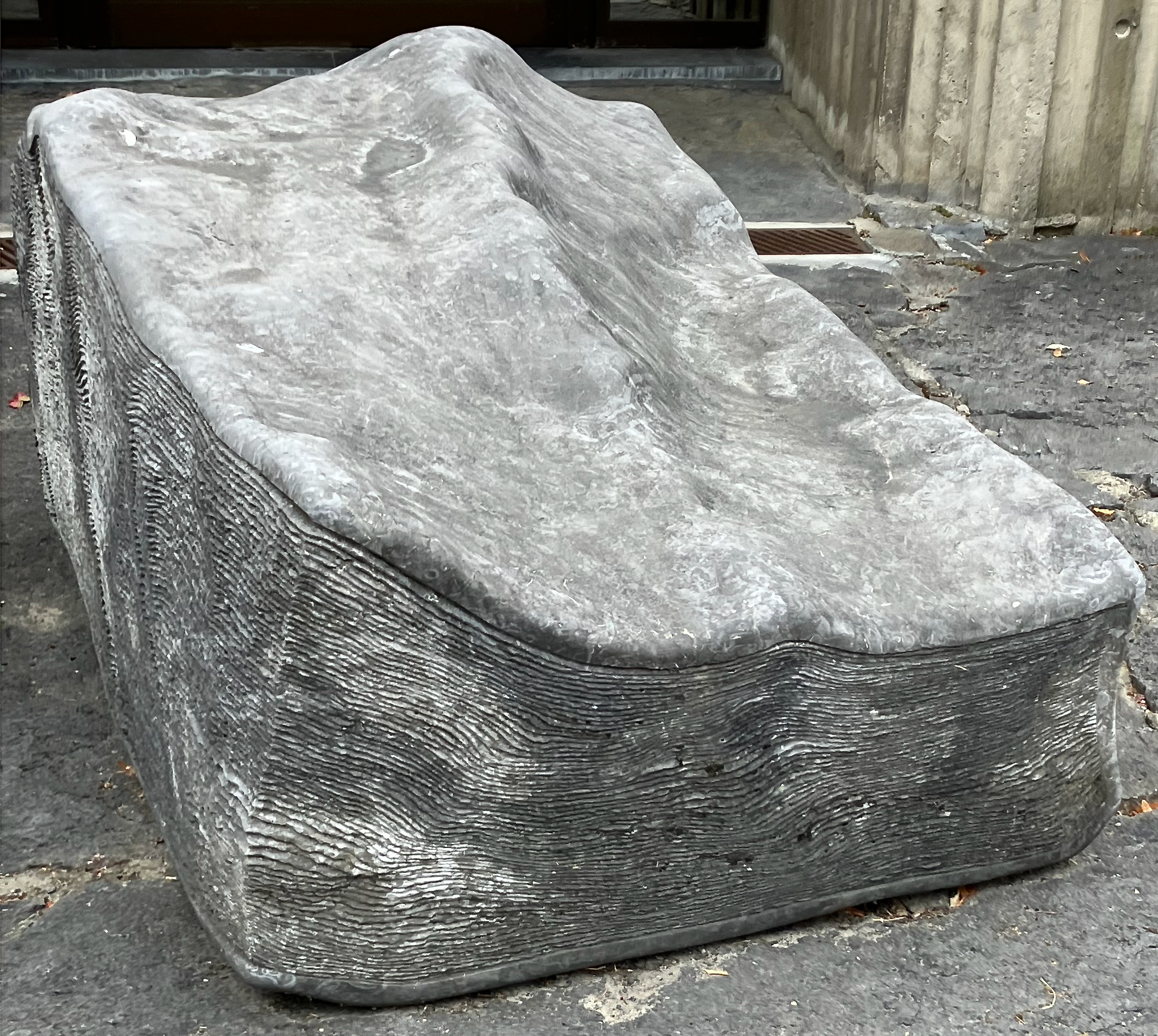
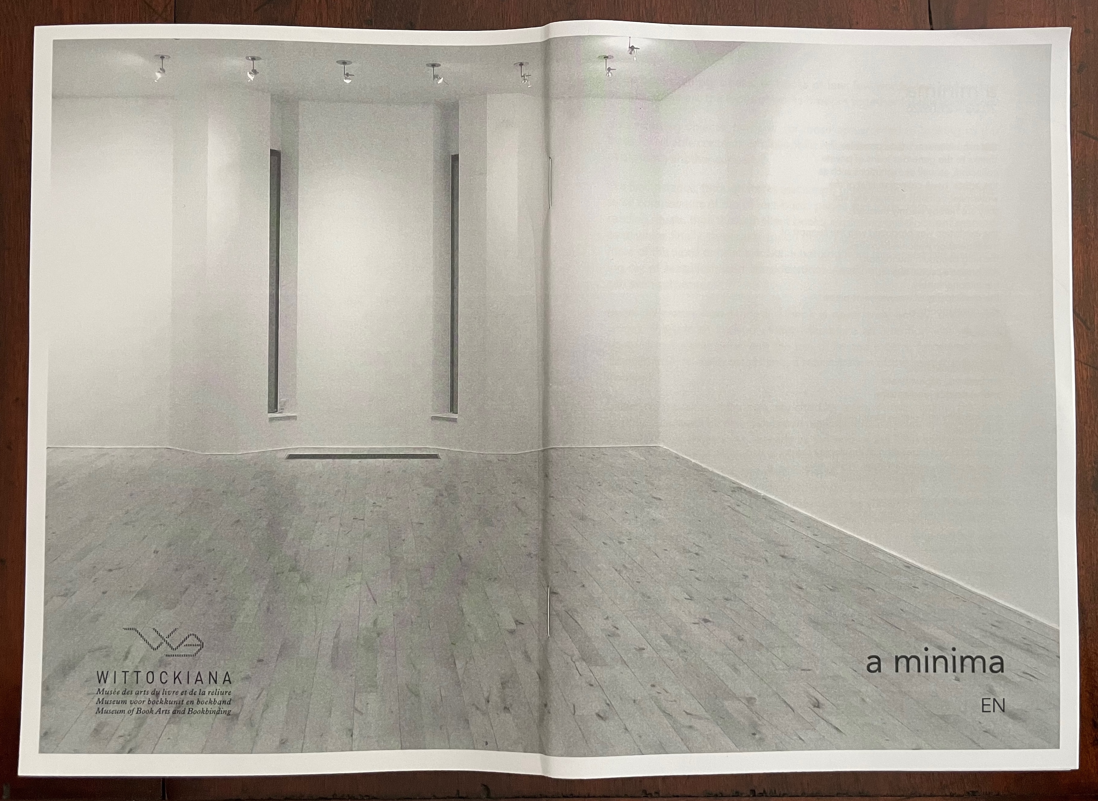
At the entrance to The Wittockiana. Back and front cover of the a minima catalogue.
If, as I did, you missed Moritz Küng‘s exhibition Blank. Raw. Illegible… Artists’ Books as Statements, 1960-2022 at the Leopold-Hoesch-Museum in Düren, Germany, in 2023, Didier Decoux‘s a minima presents an equally well-thought-out gathering of artists’ books that stretches out over 150 years (1876 – 2026). With 4 spacious rooms, 25 vitrines, 2 videos, and over 180 works, a minima requires several hours at a minimum to peruse and enjoy. Information on getting there is available here.
The comments and links below are in no way a substitute for visiting this exhibition, and keep in mind that Wittockiana also has permanent displays of presses, rare fonts, and books that should not be missed.
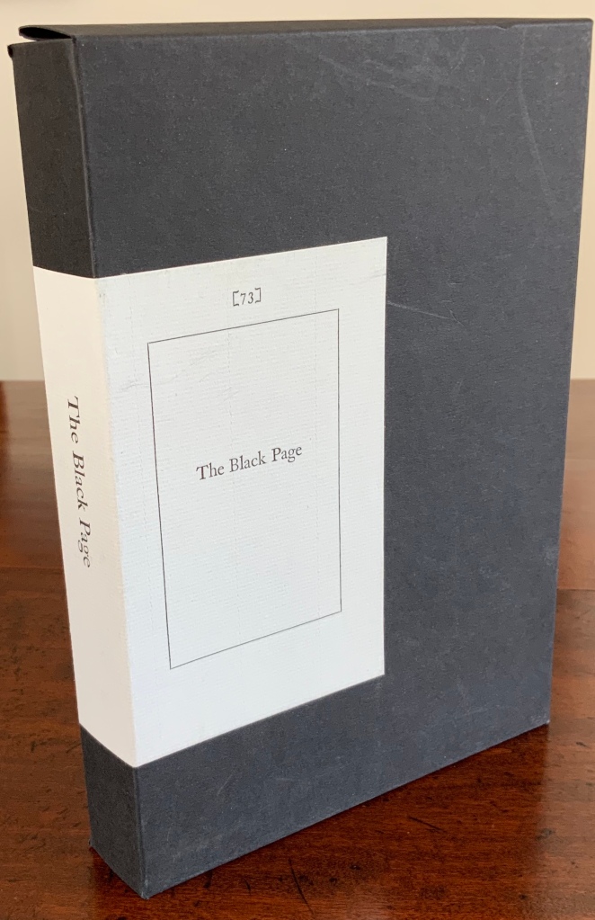
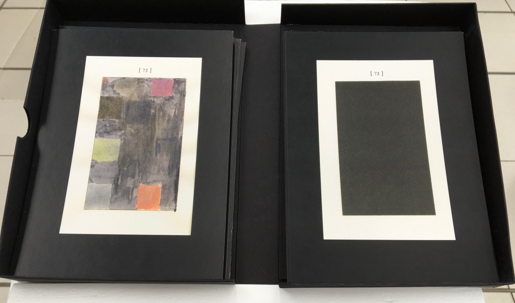
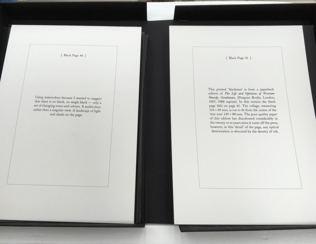
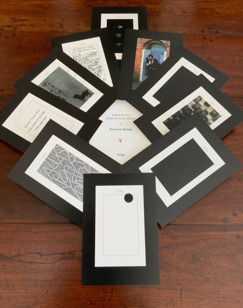
The Black Page Catalogue(2010) Coxwold, UK: Printed by Graham Moss (Incline Press) for The Laurence Sterne Trust. Contains 73 numbered leaves in a matte black card box (H235 x W168 mm). The leaves are glossy cards (210 x 148 mm) on which contributed texts and illustrations (chiefly colour) are printed; the reverse of each provides the contributor’s comments on the text or illustration and the “page” number. Also enclosed are a single-sheet folded pamphlet (“Printing the Black Page” by Graham Moss, Incline Press) and two cards, one of which is the invitation to the exhibition inspired by the ‘black page’, p. 73 of the first edition of The Life and Opinions of Tristram Shandy, Gentleman, held at Shandy Hall, Coxwold, North Yorkshire, 5 Sept.-31 Oct. 2009, and the other, sealed in an envelope, being the index of the contributors and their page numbers. Edition of 73. Acquired from the Trust. Photos: Books On Books Collection.
Collectors come up with the most ingenious reasons for acquiring things. In this case — along with astrological, numerological and other rational rationale — Rebecca Romney’s reminder that The Life and Opinions of Tristram Shandy, Gentleman is one of the earlier instances of book art led inevitably to my acquiring Shandy Hall’s The Black Page Catalogue. But it took time.
Several months after enjoying the Romney essay, I met Brian Dettmer in February 2015 by happenstance at a book art exhibition in New Haven, CT. As we chatted about past inspirations of book art, Tristram Shandy came up, so he told me of an upcoming event called “Turn the Page” in Norwich, UK, where I could more easily see some of his work — and one in particular having to do with Tristram Shandy. So in May 2015, I went.
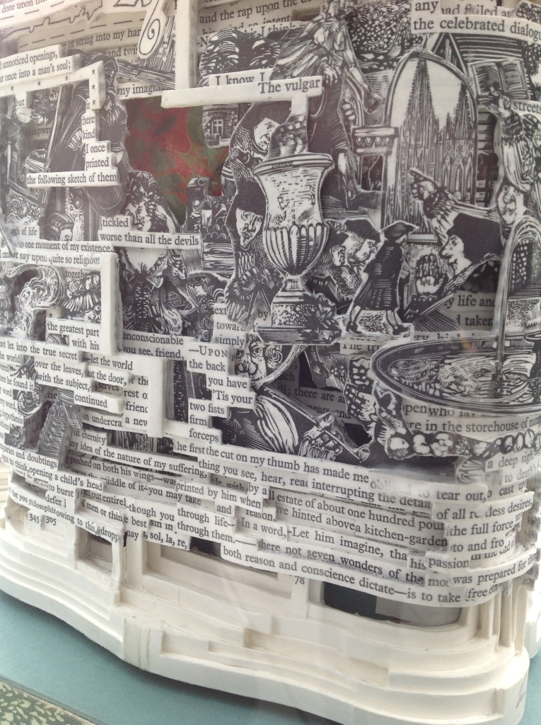
Tristram Shandy (2014) Brian Dettmer Carved and varnished, two copies of the 2005 Folio Society edition of Tristram Shandy. H230 x W190 mm Commissioned by The Laurence Sterne Trust, Coxwold, UK. Photos: Books On Books Collection.
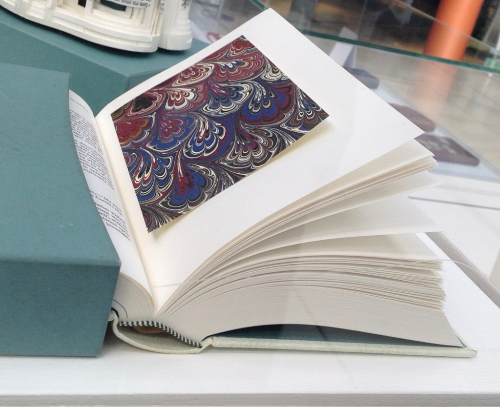
The marbled page, an “emblem of my work”, p. 169. The Life and Opinions of Tristram Shandy, Gentleman (1759) by Laurence Sterne Illustrated with wood engravings by John Lawrence. Set in ‘Monotype’ Plantin, printed by Cambridge University Press on Caxton Wove Paper. New York: Folio Society, 2005.
So a year passed. Another visit to “Turn the Page” was made. And as I was leaving, lo, a sign and small display came unto me:
Only a negligent collector would ignore such clear signs.
Parson-Yoricks-to-be can select their own favorites here.
Emblem of My Work (2013)
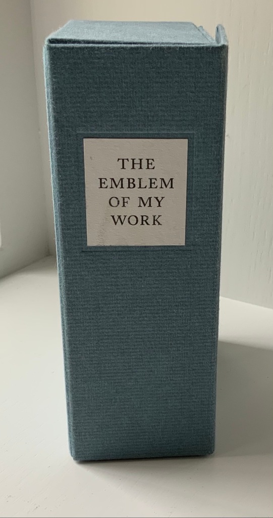
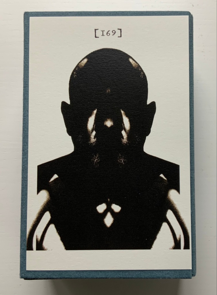
Emblem of My Work (2013) Coxwold, UK: The Laurence Sterne Trust. Consists of a 24-page booklet and 170 numbered cards in a hinged blue paper-covered box (H160 x W105 x D60 mm. The leaves of this catalogue are bright white cards (152 x 92 mm) on which the artwork is printed; the reverse of each provides the “page” number and the contributor’s comments on the art. The booklet provides alphabetical and numerically ordered indexes listing the contributors and their page numbers. Edition of 225, of which this is #79. Acquired from Shandy Hall, 1 October 2019. Photos: Books On Books Collection.
Volume III of Sterne’s work was the first to be handled by a publisher. Presumably the famous success of the first two self-published volumes helps to explain James Dodsley’s agreement to printing copies in which each page 169 and each page 170 showed uniquely marbled squares. Images from an original copy held at the British Library can be seen here. As Patrick Wildgust, director of Shandy Hall, explains in the booklet:
The central section of p. 169 was laid upon the marbled mixture in order that a coloured impression could be taken as cleanly as possible. This was left to dry and then reverse-folded so the other side of the paper could also receive its marbled impression. This side of the paper became page [170]. As a result, the marbled page in every copy of Vol. III is different — each impression being a unique handmade image. In the text opposite on p. 168, Sterne tells the reader that the marbled page is the “motly emblem of my work” — the page communicating visually that his work is endlessly variable, endlessly open to chance.
Two favorites — one for page [169], one for [170] — artists with other works in the Books On Books Collection. Left: Ken Campbell. Right: Eric Zboya.
Paint Her To Your Own Mind (2018) Coxwold, UK: The Laurence Sterne Trust. Contains 147 numbered leaves in a brown paper-covered box (174 x 124 mm). The leaves are bright white cards (145 x 105 mm) on which contributed texts and illustrations (chiefly colour) are printed; the reverse of each provides the contributor’s comments on the text or illustration and the “page” number. Also enclosed are a “title page” and “index leaf” listing the contributors and their page numbers. Edition of 200. Acquired from Shady Hall, 6 June 2018. Photos: Books On Books Collection.
Page 147 of Sterne’s sixth volume of Tristram Shandy is blank. On the preceding page, he metaphorically throws up his hands over any attempt to describe the most beautiful woman who has ever existed and exhorts the reader: “To conceive this right, —call for pen and ink—here’s paper ready to your hand, —Sit down, Sir, paint her to your own mind—as like your mistress as you can—as unlike your wife as your conscience will let you—‘tis all one to me—please your own fancy in it.” So, accordingly, Shandy Hall invited 147 artists/writers/composers to follow Sterne’s instruction to fill the blank page 147. From the 9th through 30th of September 2016, their efforts were displayed in the Shandy Hall Gallery, Coxwold, York.
The curious reader can choose his or her own favorites here.
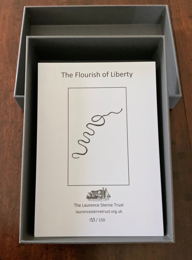
The Flourish of Liberty (2019)
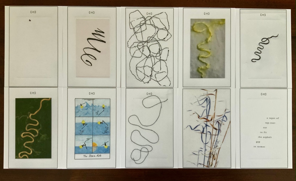
In Volume IX on p. 17, the reader reads Corporal Trim’s advice to Uncle Toby, who stands at the Widow Wadman’s threshold about to propose marriage:
Nothing, continued the Corporal, can be so sad as confinement for life — or so sweet, an’ please your honour, as liberty. Nothing, Trim — said my Uncle Toby, musing — Whil’st a man is free — cried the corporal, giving a flourish with his stick thus —
The Flourish of Liberty (2019) Coxwold, UK: The Laurence Sterne Trust. Contains 103 numbered leaves in a gray paper-covered box (174 x 124 mm). The leaves are bright white cards (148 x 105 mm) on which contributed texts and illustrations (black and white, several in colour) are printed; the reverse of each provides the contributor’s comments on the text or illustration and the “page” number. Also enclosed are a “title page” and “index leaf” listing the contributors and their page numbers. Edition of 150, of which this is #133. Acquired from Shandy Hall, 26 October 2020. Photos: Books On Books Collection.
The rest of Corporal Trim’s flourishes flourish here.
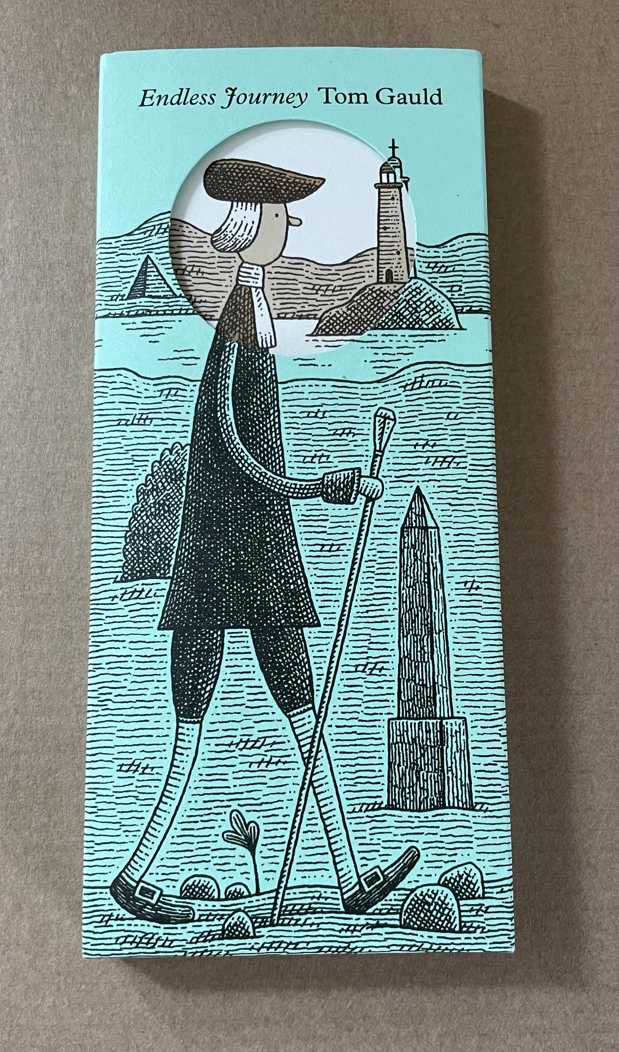
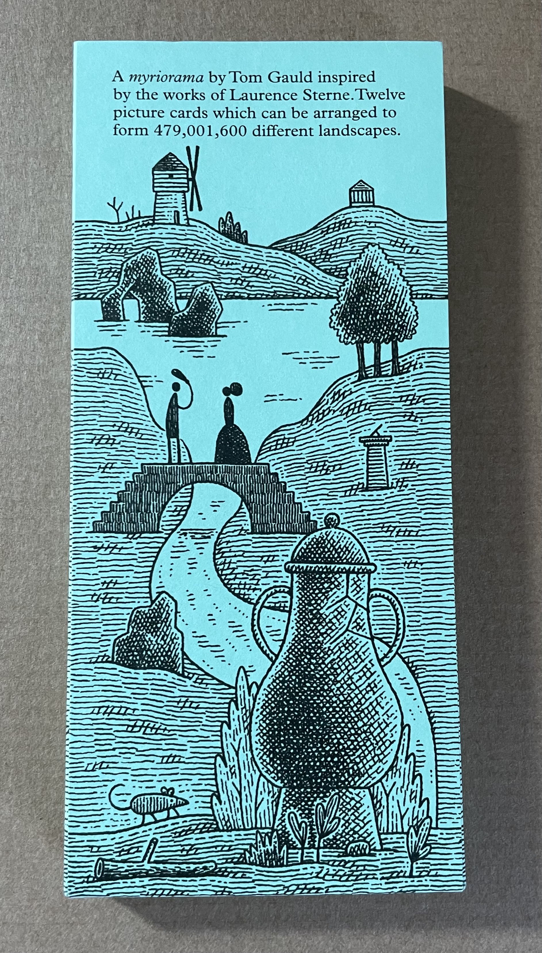
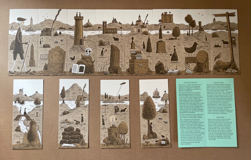
Endless Journey (2015)
Endless Journey (2015) Tom Gauld Printed slipcase, twelve cards, leaflet. H165 x W73 mm. Acquired from the Laurence Sterne Trust. Photos: Books On Books Collection.
A day’s visit with one hundred exhibitors hosted at the Arnolfini in Bristol leaves me reeling like a drunken sailor — drunk on colour, texture, light, line, shapes, words and artistry. Appropriate given the Arnolfini’s location on Narrow Quay in Bristol’s floating harbour.
Colour
Lucy May Schofield talked to me about her “search for the indigo that is infinity”. The Distance of Us is only one of several pieces demonstrating how close she is coming. The Longest Day on her site is one among many by which to enjoy her progress.
The Distance of Us Lucy May Schofield Photo: Books On Books
Mick Welbourn took time to explain how his search among inks, paper and geometric shapes kept leading him from a unique work (oil-based) to multiples and back to uniques. These colours reminded me of the work of Sonia Delaunay.
Mick Welbourn Photo: Books On Books
Texture
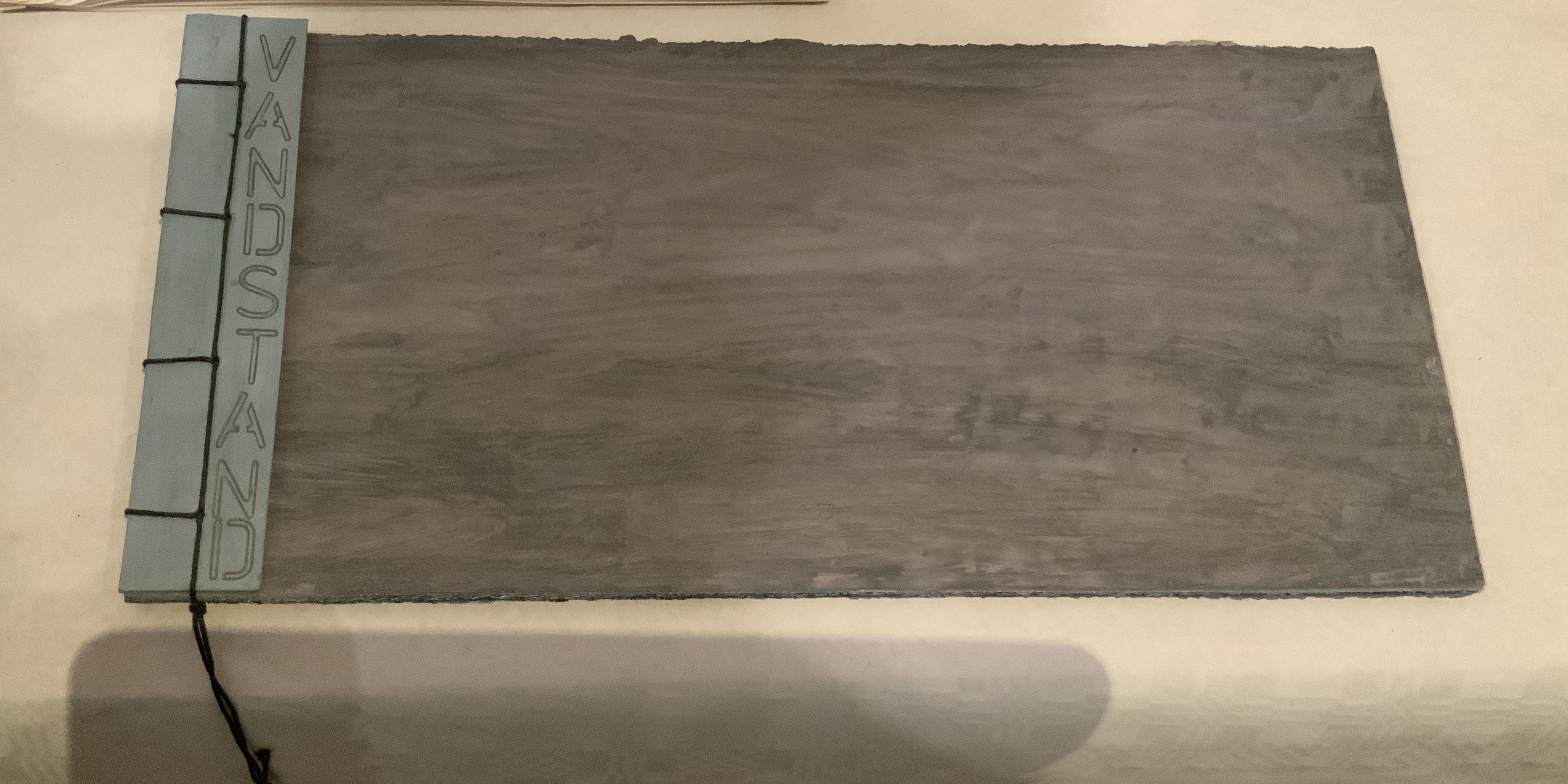
Bodil Rosenberg, a member of the Danish collective CNG (Anna Lindgren, Bertine Knudsen, Birgit Dalum, Pia Fonnesbech, Susanne Helweg), appeared delighted that I was surprised by the colour and texture of Vandstand (“water level”). Somehow after the saturation of the paper with layer upon layer of paint, each page has a supple leather- or cloth-like feel — a coolness to the touch. I think Ken Campbell would relish Vandstand.
Vandstand Bodil Rosenberg Photo: Books On Books
Vandstand Bodil Rosenberg Photo: Books On Books
Caroline Penn’s works comprised by Notes from Chesil Beach made me reach out to pick up one of the pebbles on the page. The trompe l’oeil effect of turnable pages in the photos is enhanced in one variation by inclusion of an actual small gathering of pages. The role of trompe l’oeil in book art is one worth investigating.
Notes from Chesil Beach Caroline Penn Photo: Books On Books
Light
Eileen White’s Haptic Narratives and her lumen prints for Printed Matter made a nice segue from texture to ghostly light. Printed Matter also looks forward to the “artistry” section here as book’s images are un-fixed and eventually fade away. To use the book form — the traditional form of permanent record — to present a language and reminder of material ephemerality: that is artistry.
Eileen White Photo: Books On Books
Haptic Narratives Eileen White Photo: Eileen White
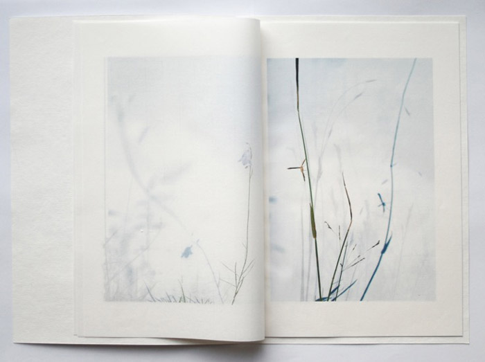
Helen Douglas (Weproductions), fresh from exhibitions at Printed Matter in New York and Fruitmarket Gallery in Edinburgh, was displaying her 2017/2018 series Field Works as well as a new book Summer Alight. The photographic effects, the visual narrative and structure achieved in Douglas’s works define artistry.
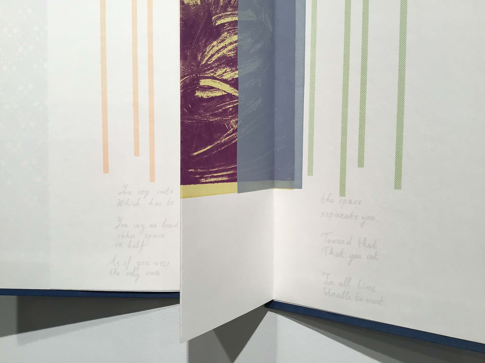
Elena Zeppou’s Parallels first caught my eye because of its size, but closer inspection yielded appreciation of line — vertical as well as horizontal — and its union with text and form. Note how the lines of poetry read across the accordion.
Parallels Elena Zeppou Photo: Books On BooksParallels Elena Zeppou Photo: Zitrone PrintmakingParallels Elena Zeppou Photo: Zitrone Printmaking
Shapes
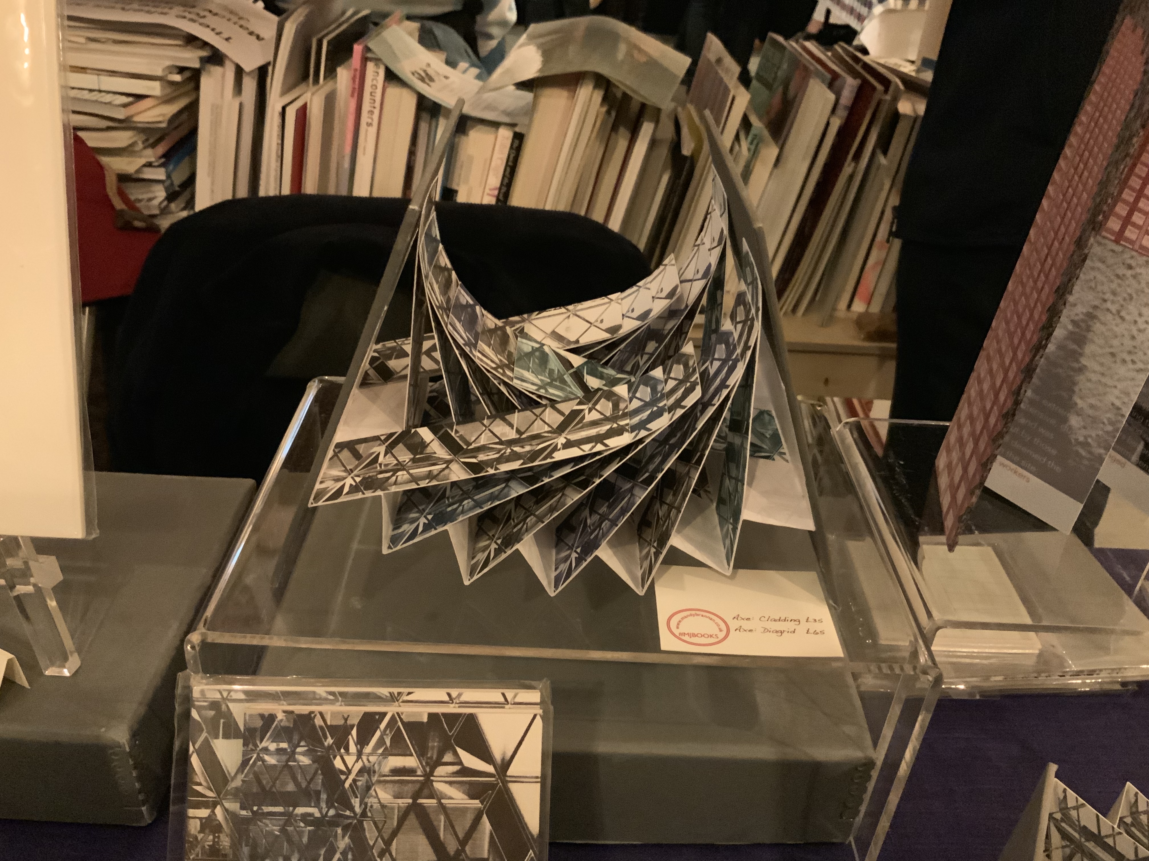
Listening to Mandy Brannan talk about custom papers, French fold books and modified flag books is almost as good as handling them. The work30 St Marys Axe (inspired by the building fondly known as the “Gherkin”) was what first drew me to her table. It has two variations — Diagrid and Cladding — which reward repeated handling as well as regarding.
30 St Marys Axe: Diagrid Mandy Brannan Photo: Books On Books
At the ArtistBooksOnline table, the shape-changer Inside/Outside by Susie Wilson kept me as busy as if it were a Rubik’s cube or paper puzzle with a medical mystery inside — or outside.
Inside/Outside Susie Wilson Photo: Books On BooksInside/Outside Susie Wilson Photo: Books On Books
Words
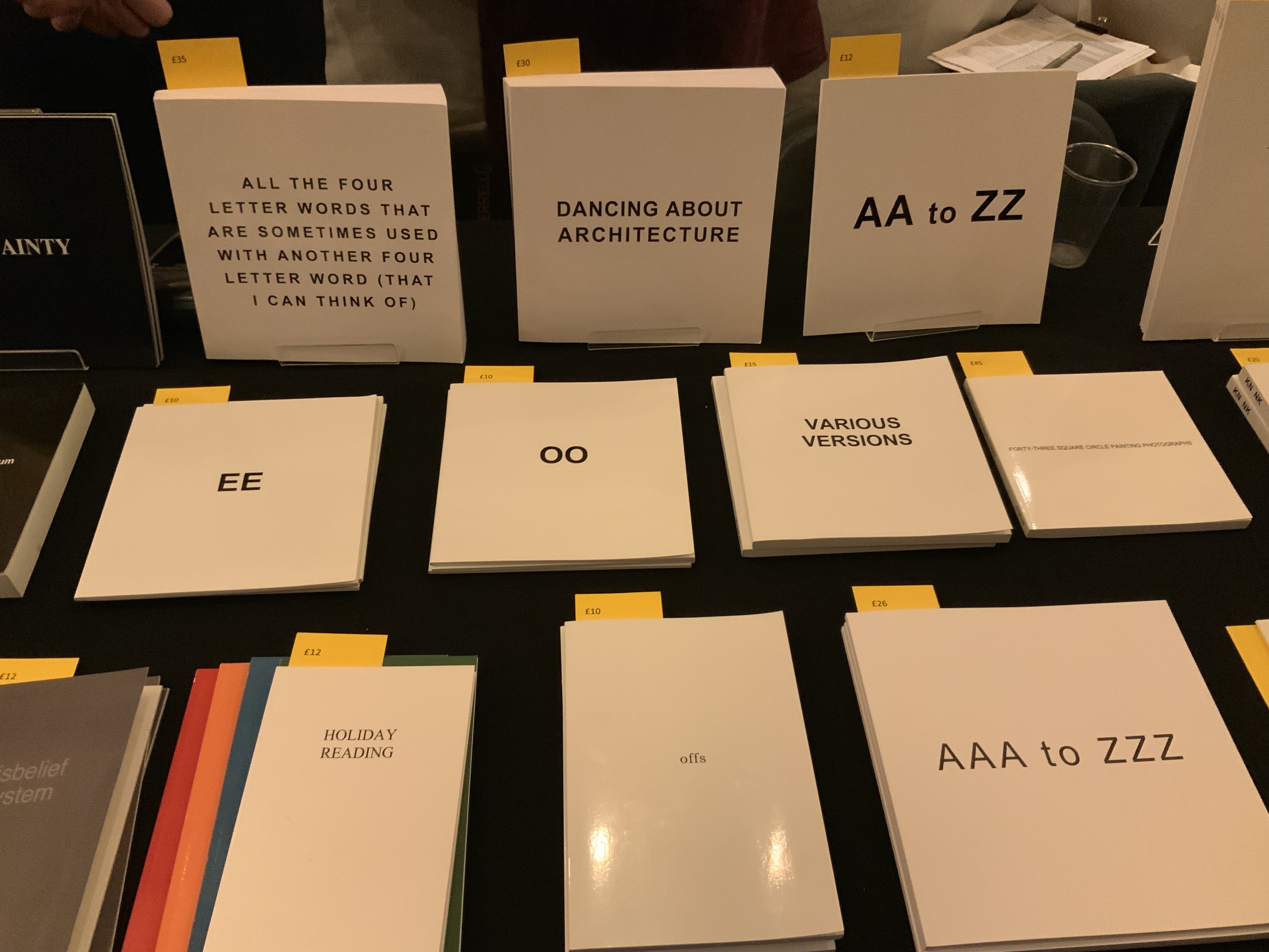
Puns, slippery words and slipperier concepts seemed to explode from Guy Bigland‘s table.
My inner metaphysician of Structuralism, Post-Structuralism, Deconstruction and Post-Deconstruction found its element(s) at the Atlas Press.
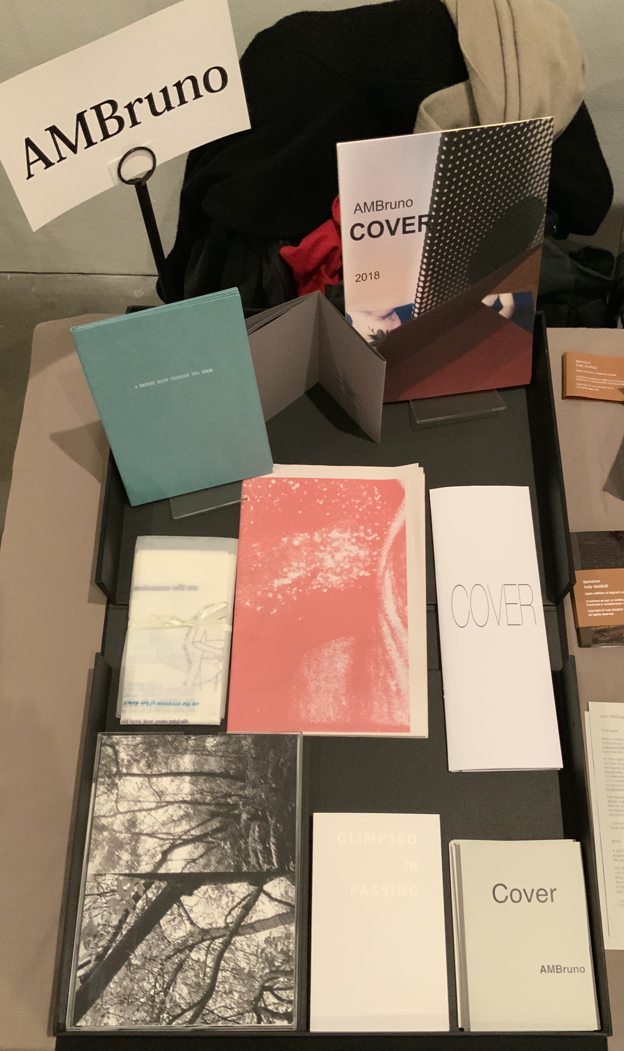
AM Bruno, run by Sophie Loss, and of which John McDowall is a founding member, is always a rich vein of artistry. The works from the 2018 theme-driven project, Cover, appear in the box below but warrant a closer inspection at the link behind the word. John McDowall had a new book on hand: Time-lapses. As I turned the brilliantly white pages, each segmented into squares like a comic-book page but only one square in each page holding an old black-and-white photo, the title began to sink home. And then came the idea that all the meaning that could possibly explain any one photo, its relation to the other squares or to other photos or to the author or to the reader/viewer — all of it — has to take place in the empty spaces between.
Janet Allsebrook displayed a Duchampian box with the Delaunay-esque title Nichoir. Although the drift of this work (“waste time making your own useless nest box”) is echoed in her other works, the echo reverberates with a deeper tone — often political or philosophical. The variety of book forms is impressive.
Nichoir Janet Allsebrook Photo: Books On Books
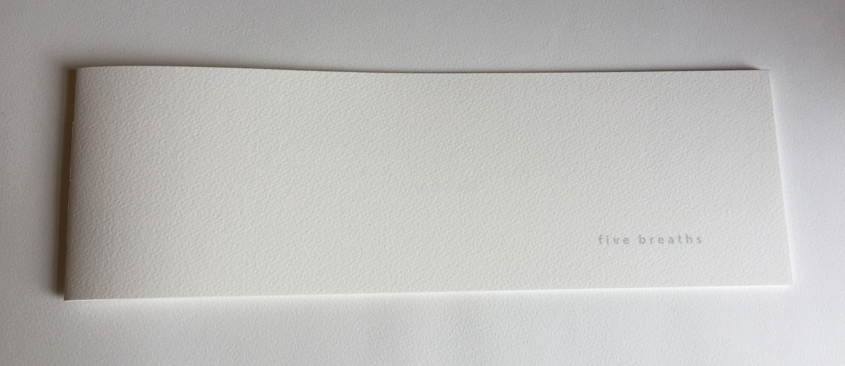
Next door was the artist of Zen book art — Julie Johnstone – Essence Press. In addition to extensions of her percentage tint series, she had on hand several explorations of breath, print and paper: each breath, a page; quietly breathing; five breaths; and ten breaths. Wherever they are, her books make a Zen garden.
Sarah Bodman and Arnolfini brought together a rich collection of talent and should be thanked for doing so and encouraged to repeat it in 2021. And to the artists mentioned — and those not — who took the time to share their thoughts on colour, texture, light, line, shapes, words and artistry: Encore!