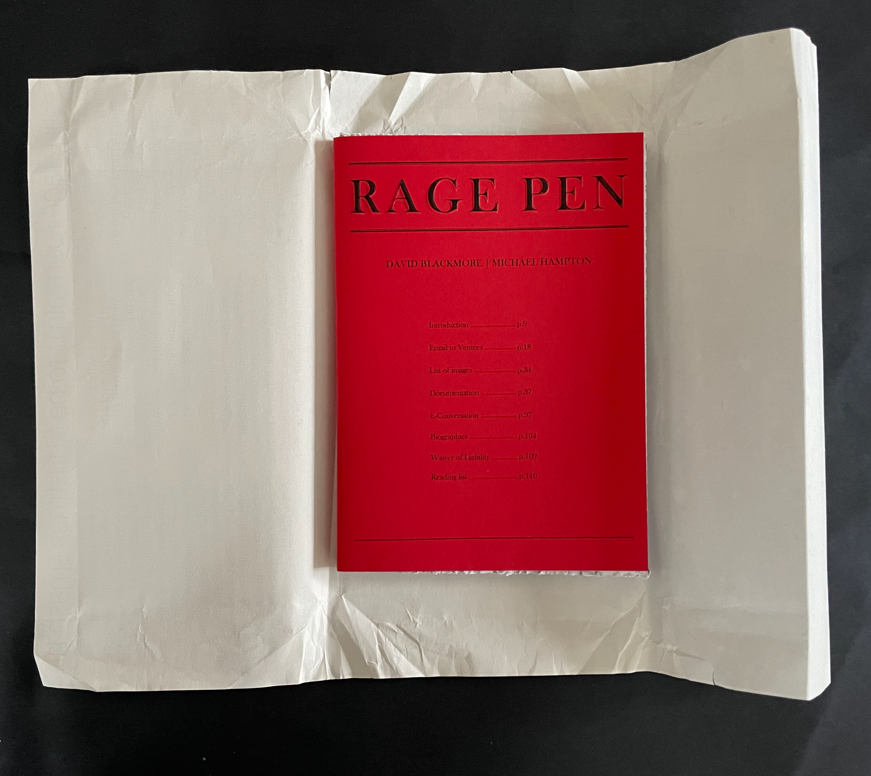
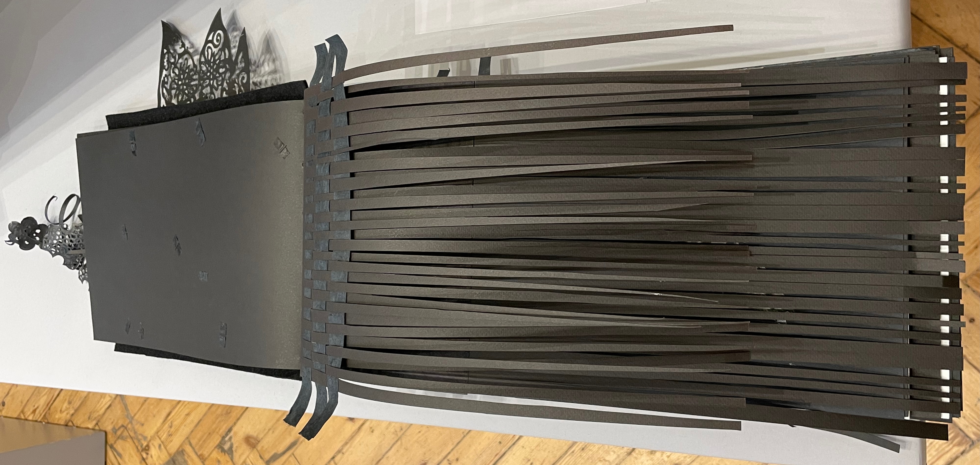
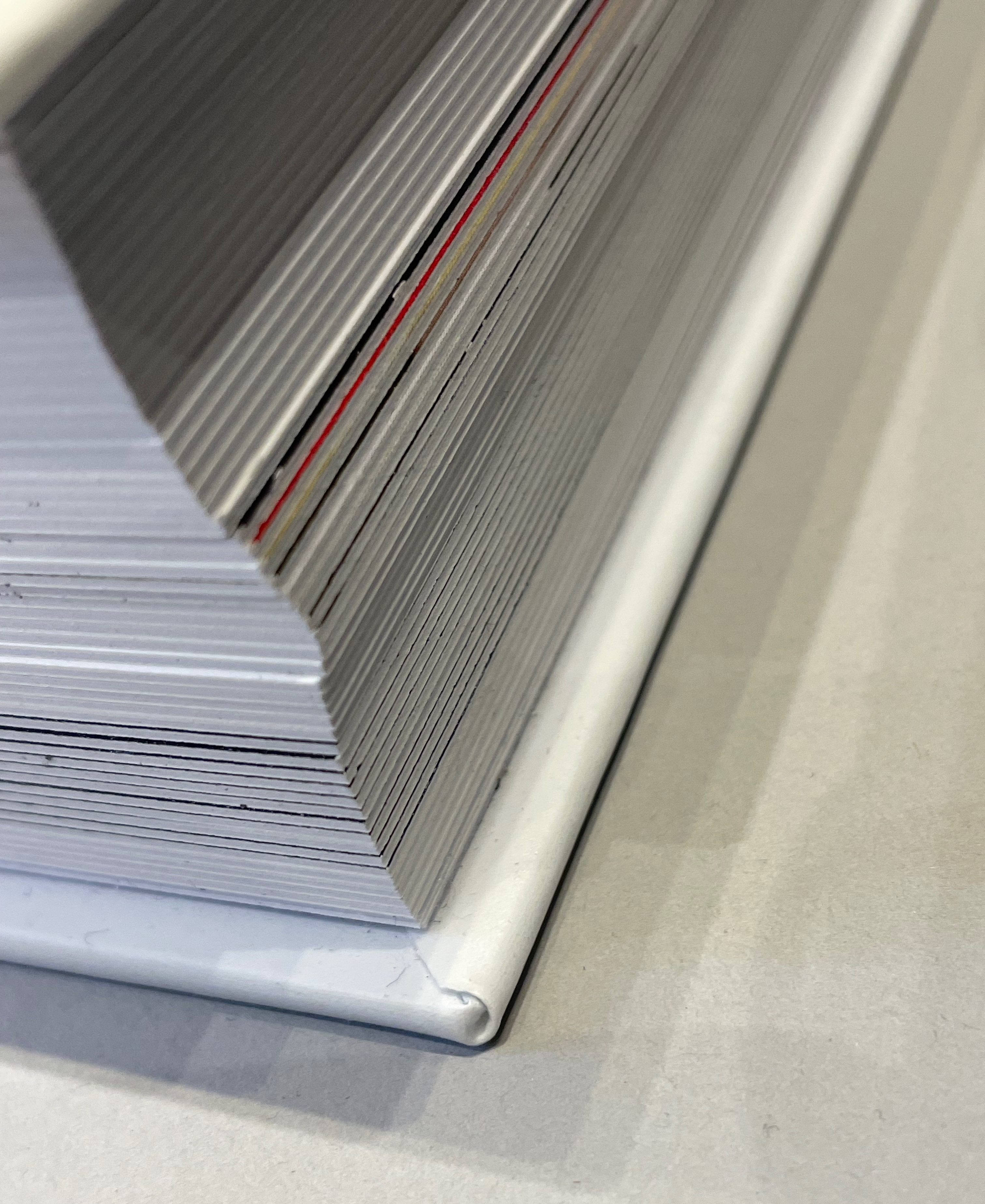
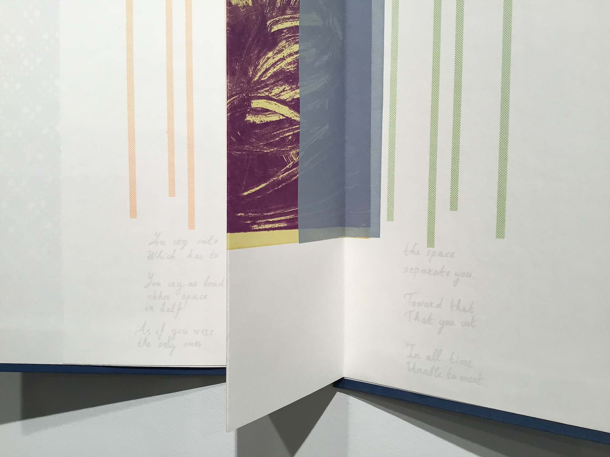
RAGE PEN (2025) David Blackmore and Michael Hampton Soft cover, mitre sawn head and foot, perforated fore-edge. H210 x W148 mm. [108] pages. Edition of 100. Acquired from Folium, 13 November 2025. Photos: Books On Books Collection.
Folium, the publisher, describes RAGE PEN as “developed from a relational piece of the same name held at Chisenhale Studios 2017/18”. Per the Museum of Modern Art, relational aesthetics is
A mode of art practice that establishes spaces, situations, or environments for a variety of social interactions. In essence, the social space or interaction becomes the work of art itself. The term was popularized by French critic and curator Nicholas Bourriaud in 1998.
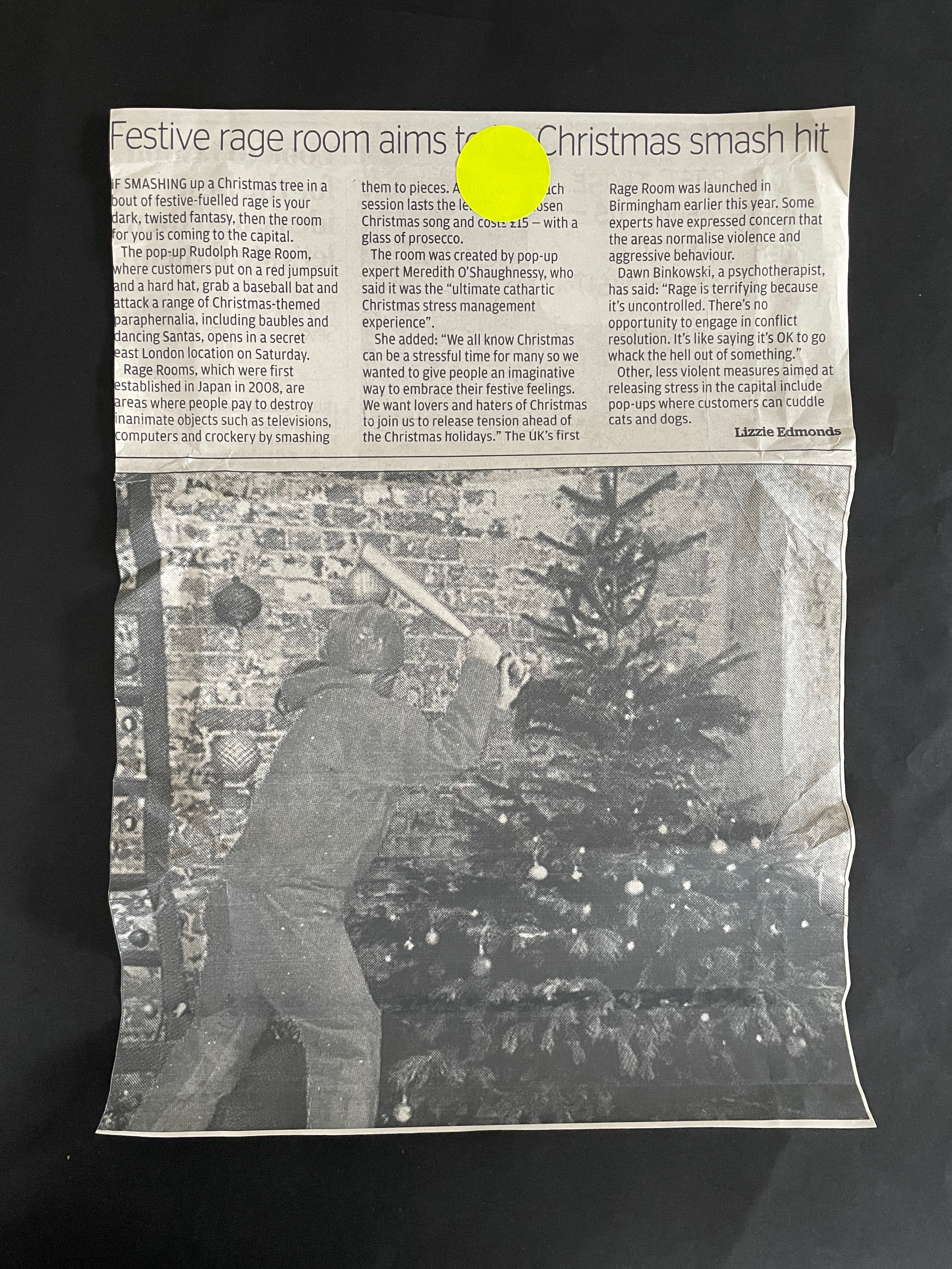
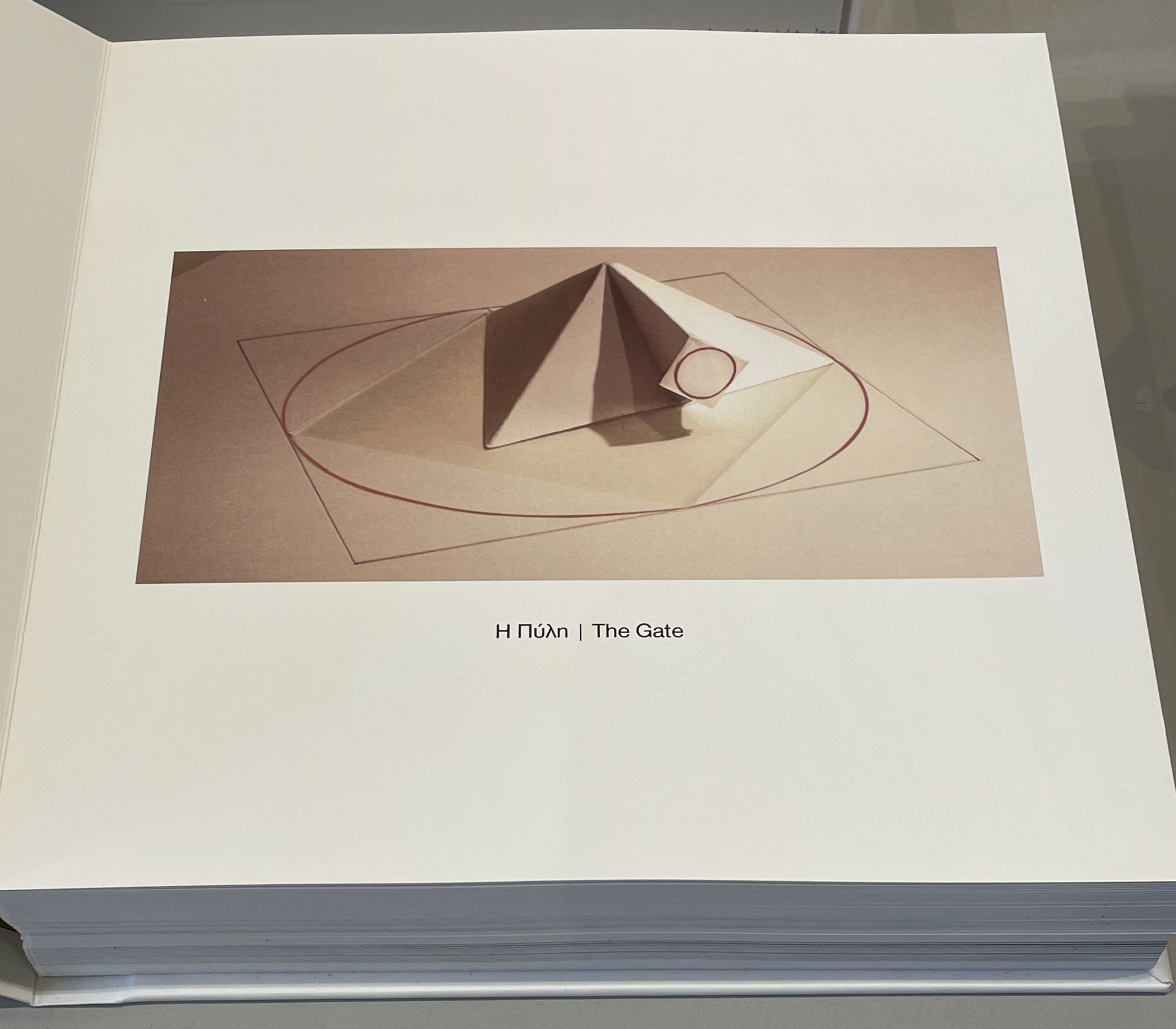
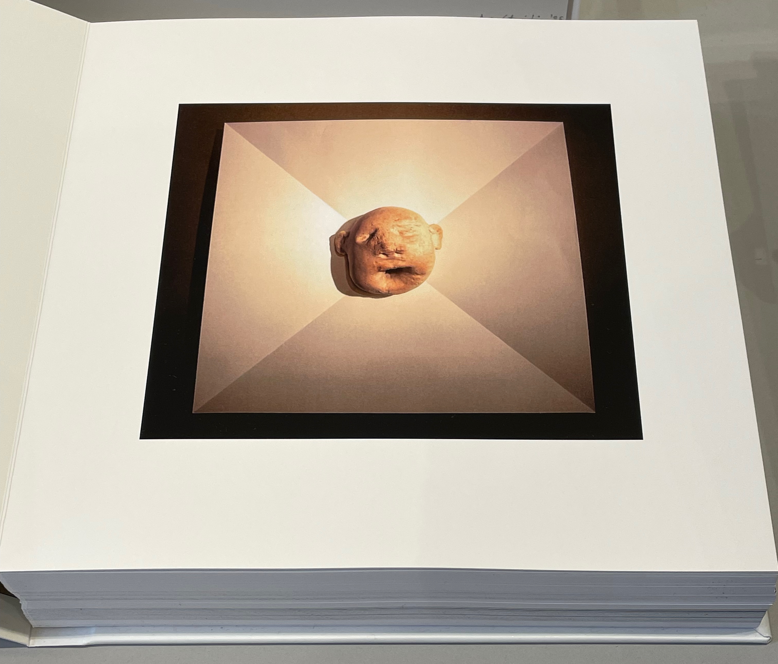
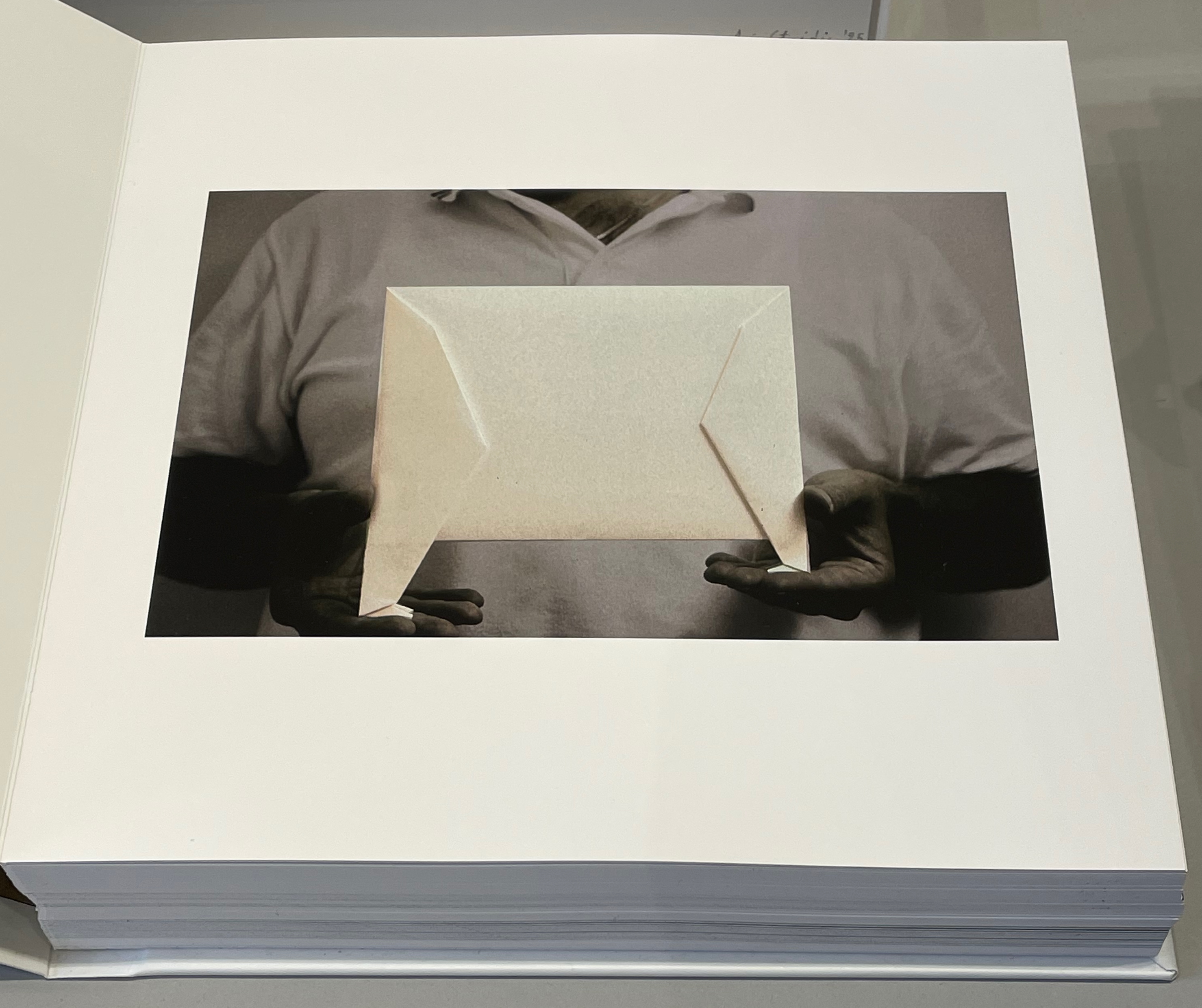
RAGE PEN‘s environment was a safe rage room equipped with a variety of handheld tools. Anonymous members of the public, or “ventees”, were invited to name an object that had caused them frustration, don protective equipment, and enter the shuttered room to smash said objects. The interactions filmed and photographed by David Blackmore formed the images in RAGE PEN the book. Holding the book with its mitre-sawn top and bottom edges and its perforated, still-sealed fore-edges, we might suspect that we are being invited into our very own private relational aesthetic piece.
Bookmorph n. (bōk+μoρφ): a portmanteau word referring to casebound books which have been modified; an emergent branch of sculpture in which textual content is often downgraded; treatments include chewing, cutting, drilling, entombing, pulping, ripping, shooting (with a firearm), siliconising, etc; any codex fundamentally altered or warped by an artist; a site of entropic processes designed to return pages to cellulose fibre, and/or the creation of a fungal landscape; a bibliographic montrosity.Michael Hampton, arts writer, May 2025
The curators’ choice of title and epigram for this exhibition is somewhat daring. Although they have included plenty of bibliographical montrosities that fit Hampton’s definition, there are plenty of bibliographical beauties, too — even among the “monstrosities”. A strong attraction of this exhibition is that it presents so many recent works from Greek book artists. Even more attractive is its hands-on display of most of the works.
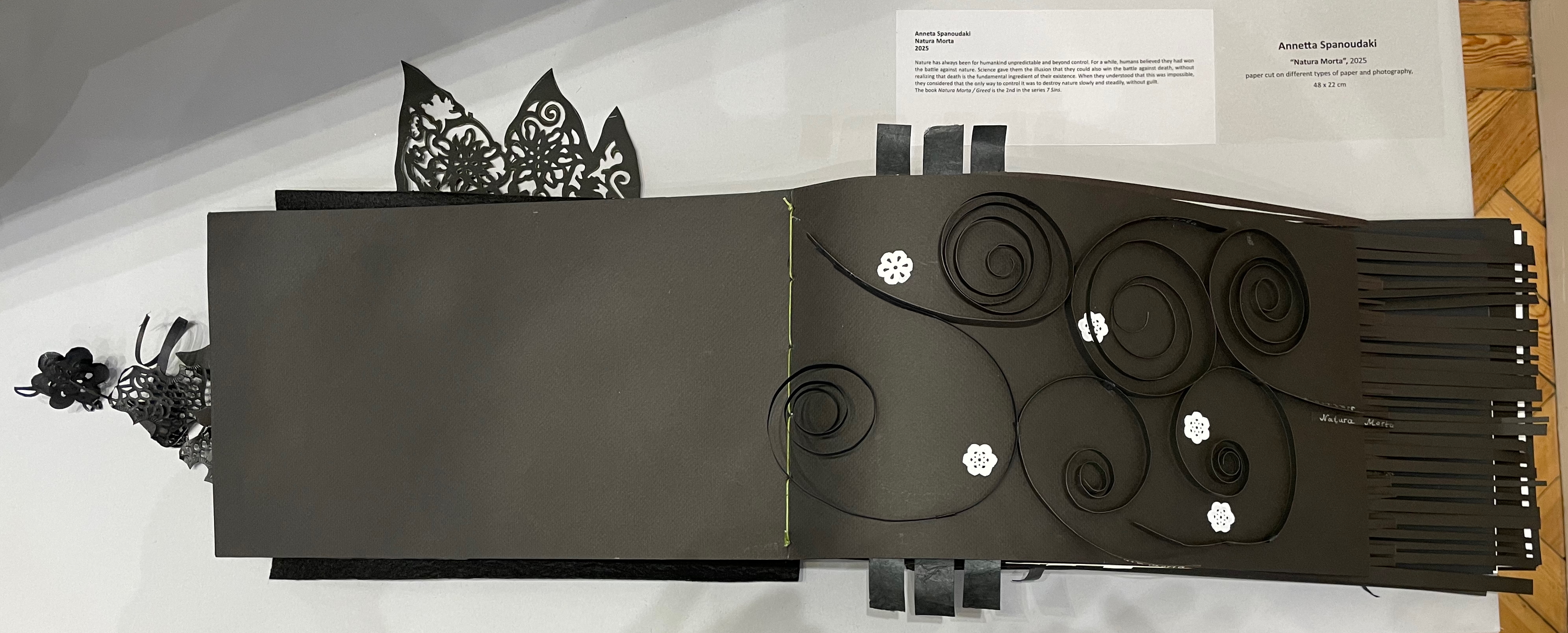
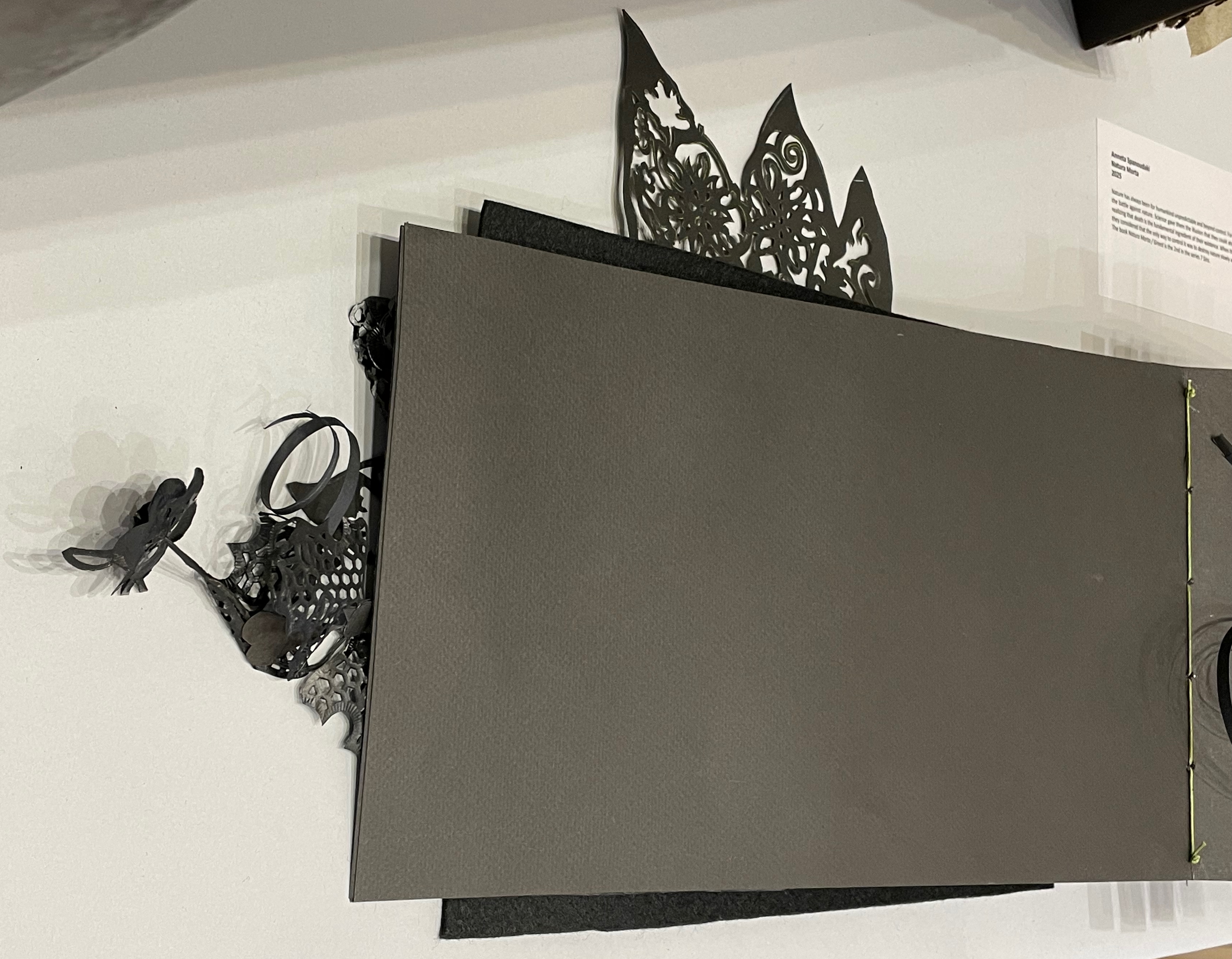
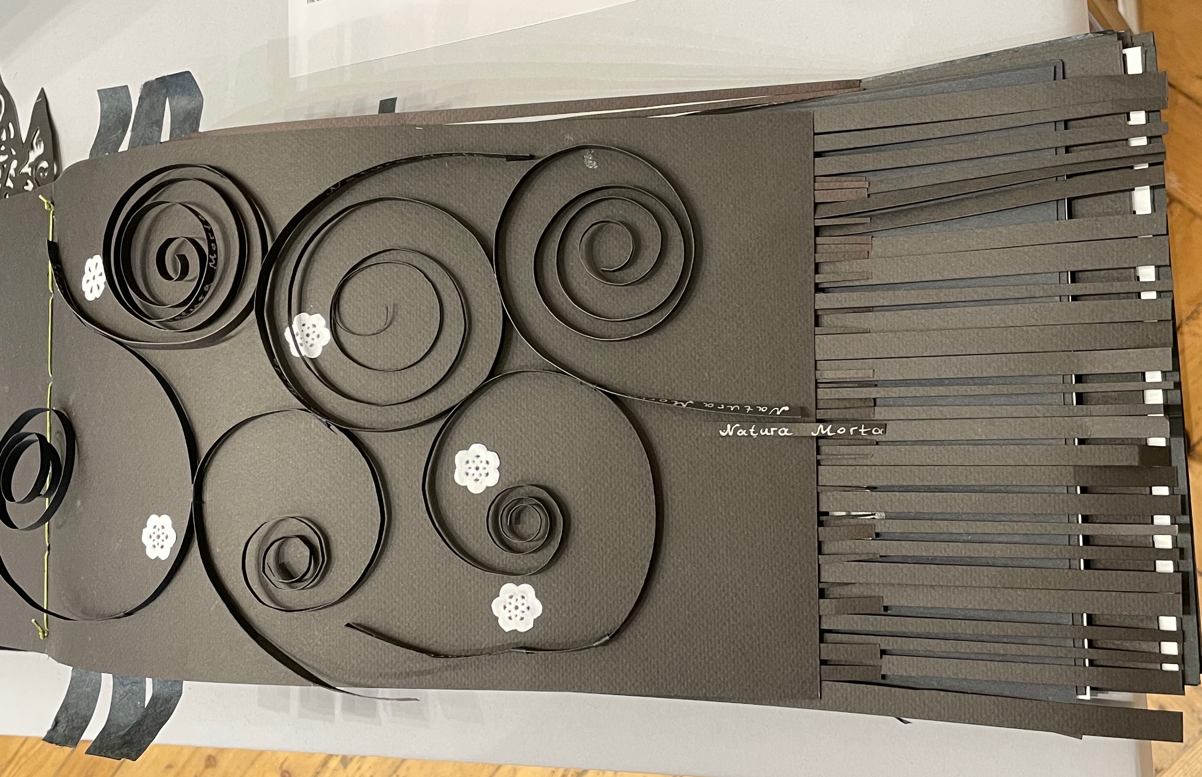
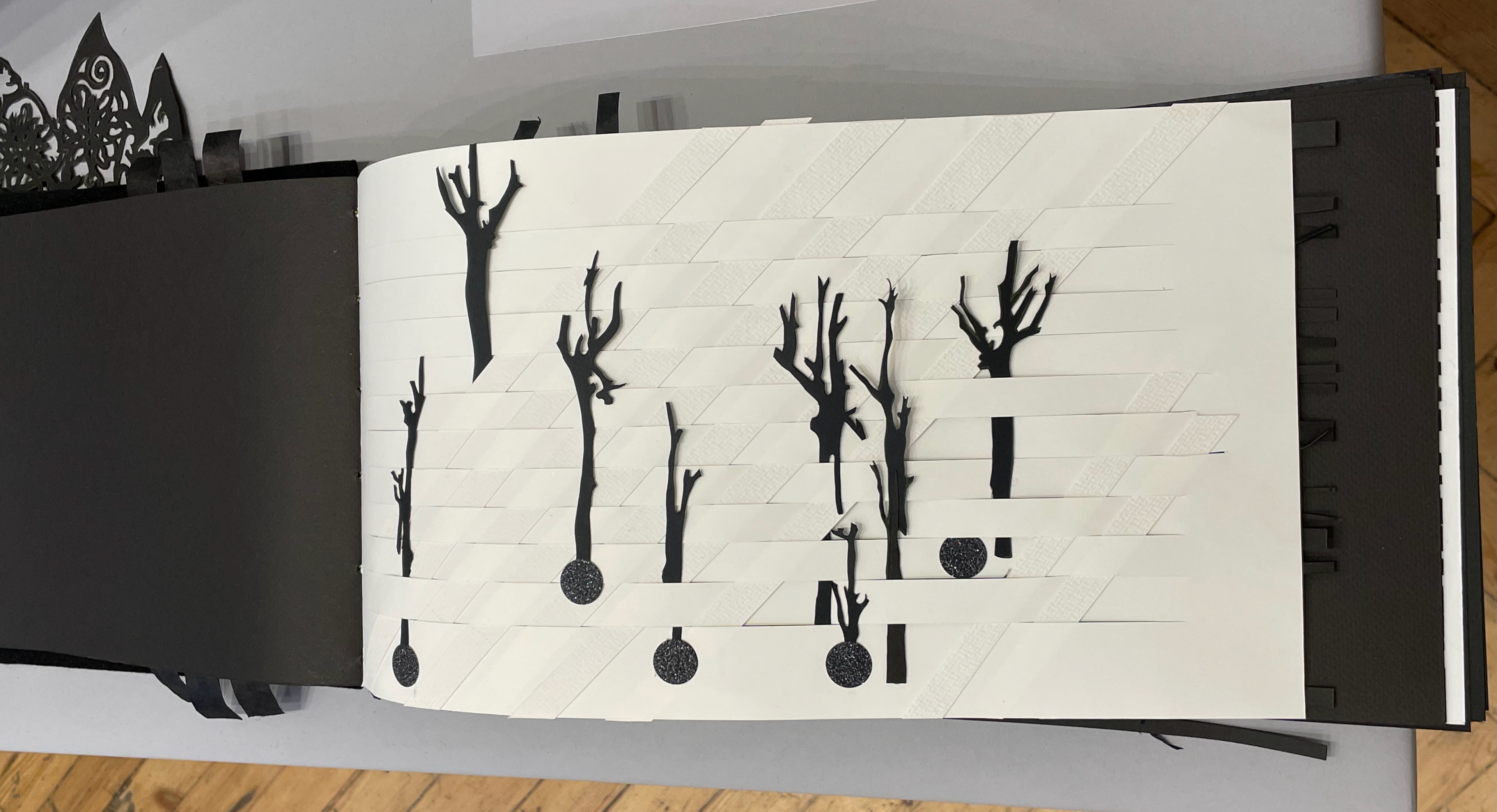
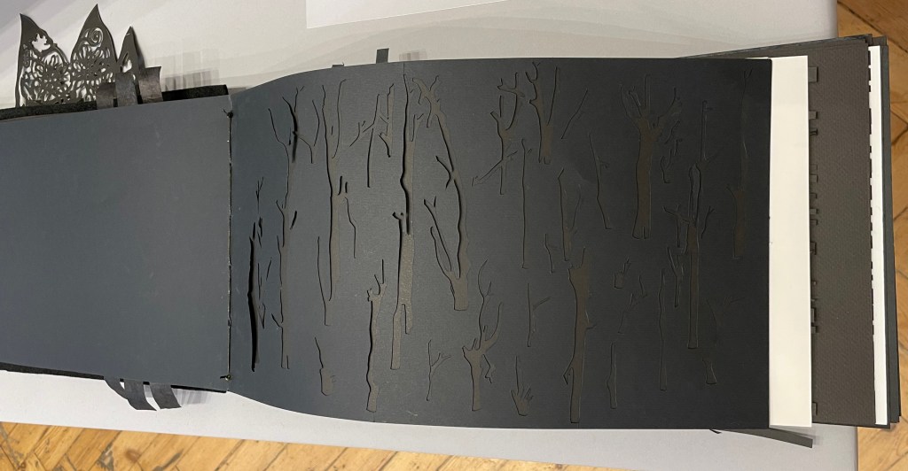
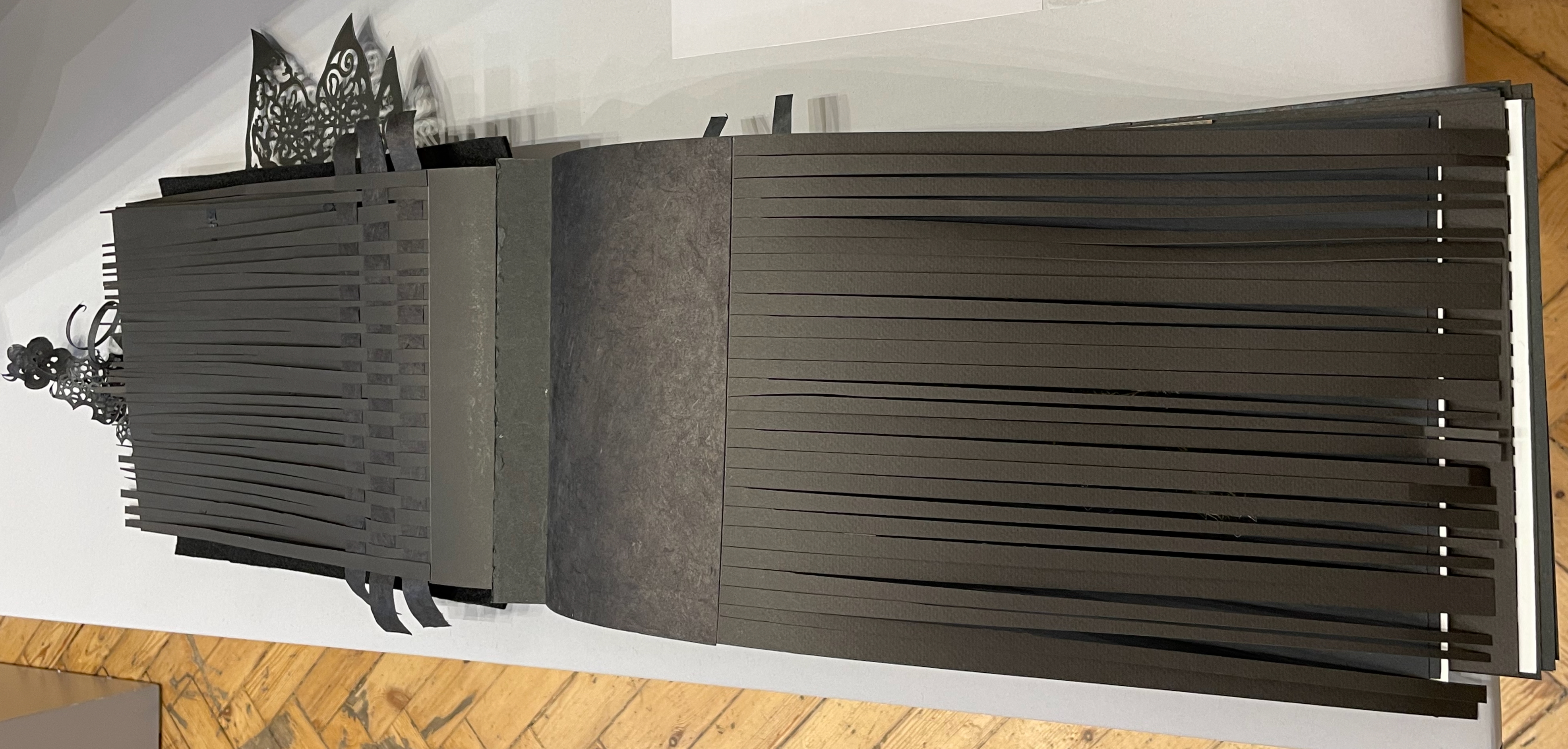
Anneta Spanoudaki’s Natura Morta (2025) is a striking case in point:
Natura Morta (2025) Anneta Spanoudaki Paper cut on different types of paper and photography. 480 × 220 mm. Photos: Books On Books.
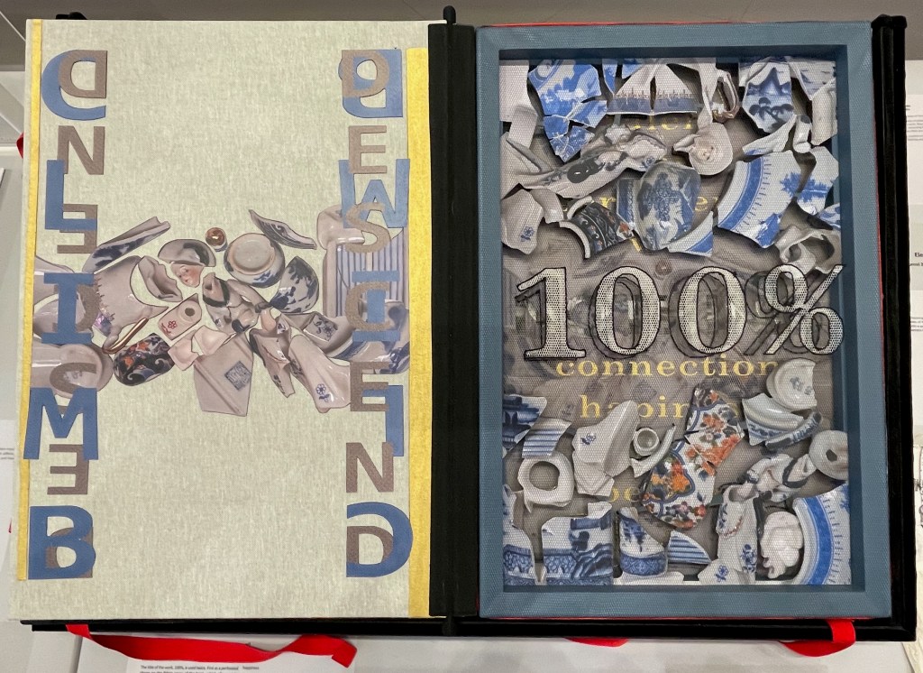
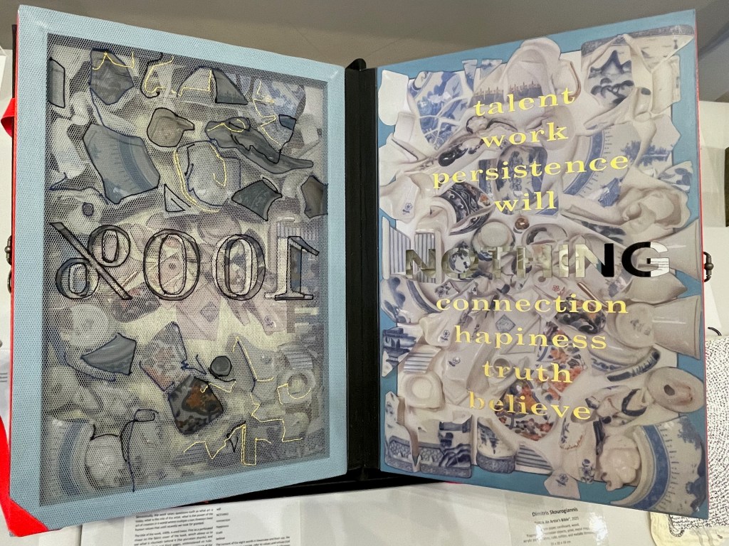
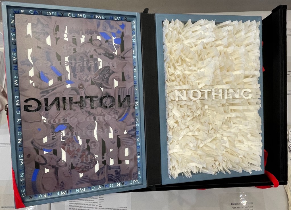
Another case in point is Dimitris Skourogiannis’ 100% An Artist’s Bible (2025). To be turned, its large “leaves” require metal rings on the fore-edge.
100% An Artist’s Bible (2025) Dimitris Skourogiannis Japanese paper, cardboard, wood, fragments of porcelain objects, print, metal rings, acrylic pains, fabris, tulle, and metallic threads. 500 x 350 x 140 mm. Photos: Books On Books.
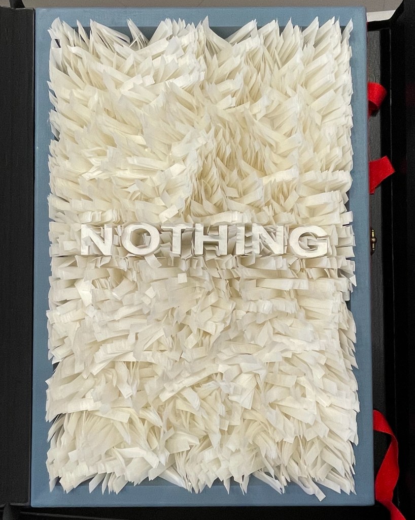
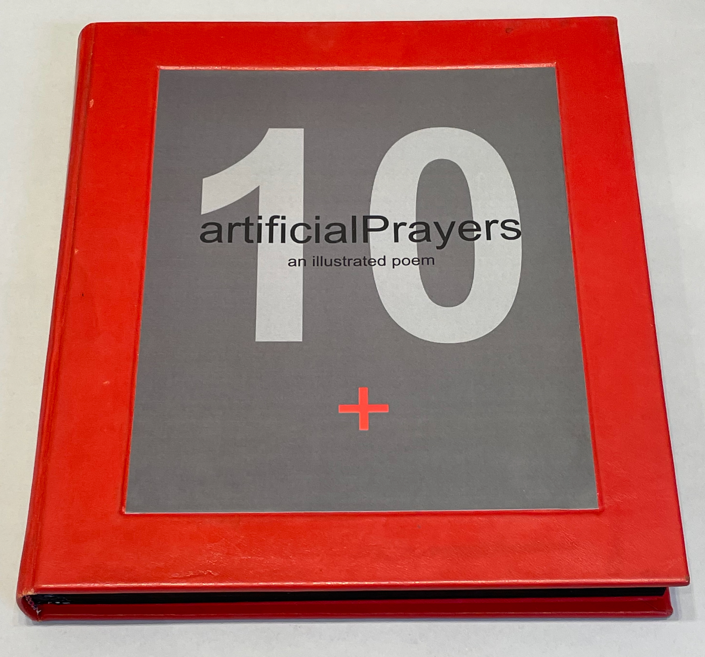
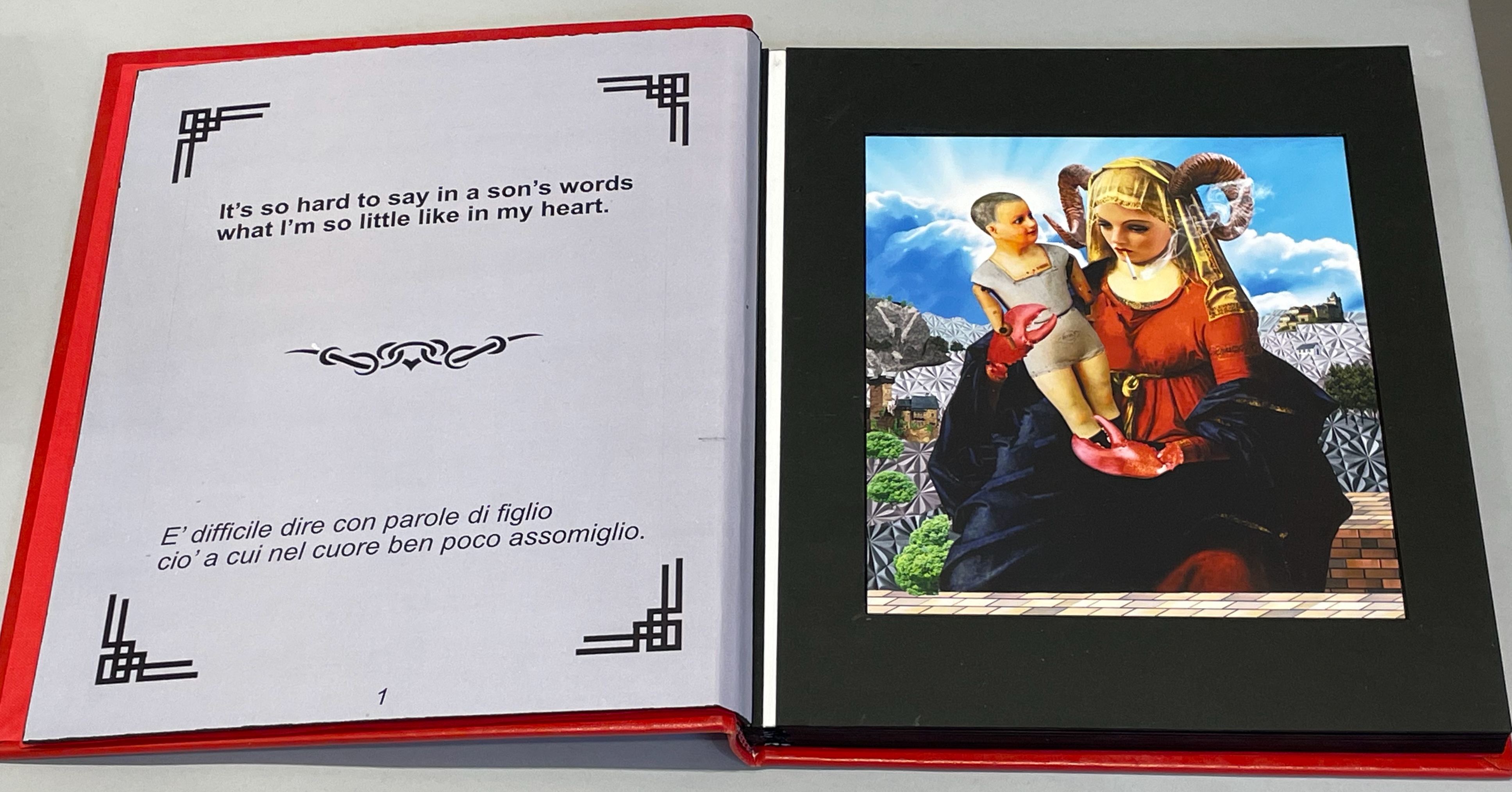
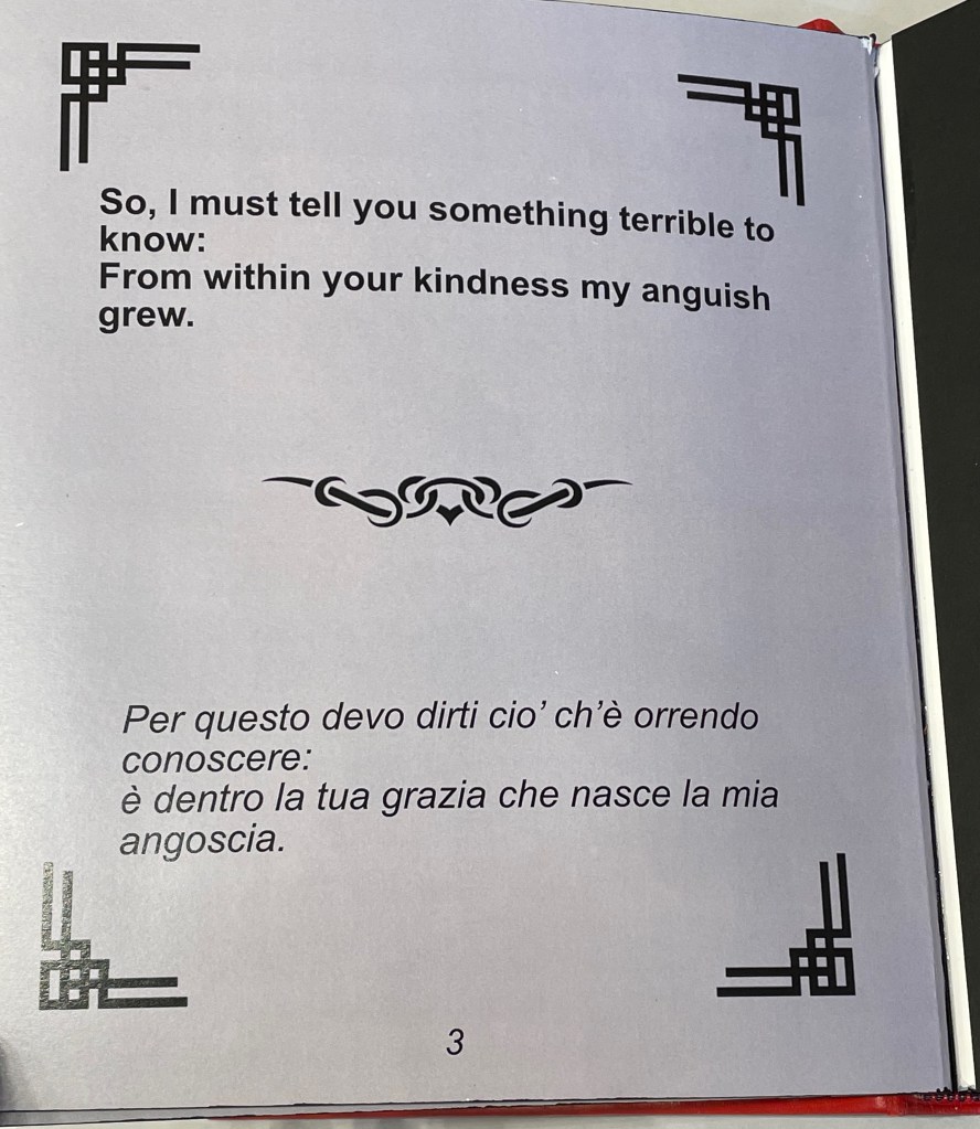
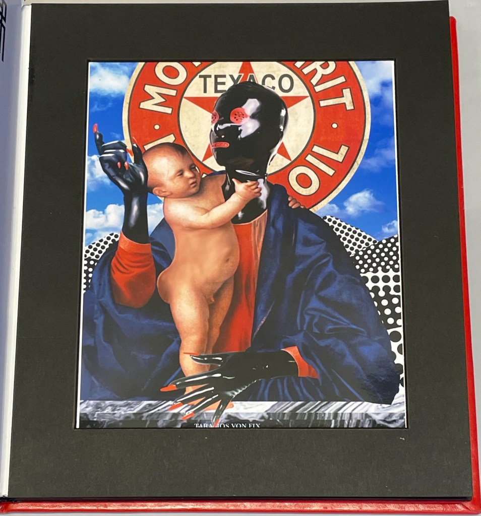
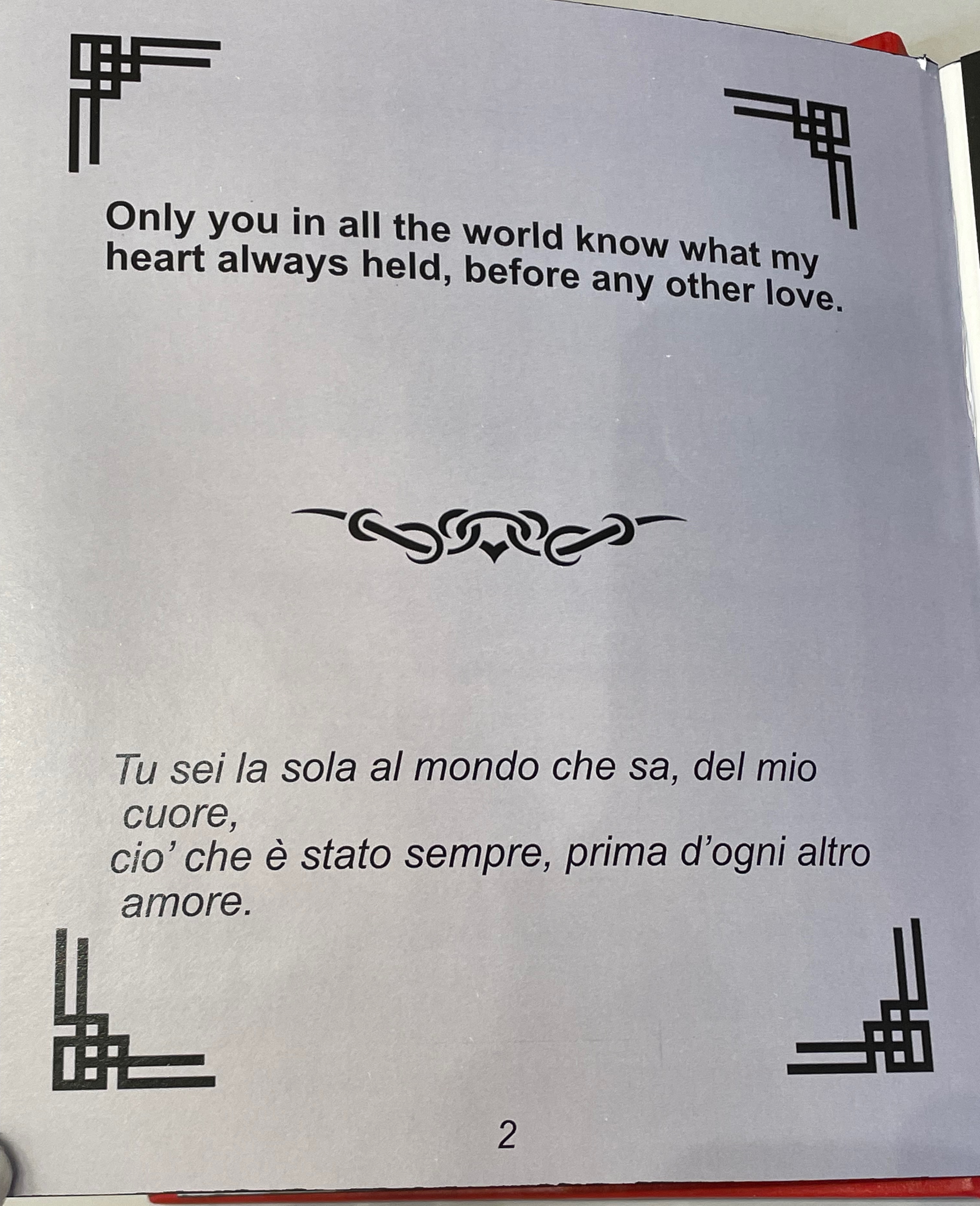
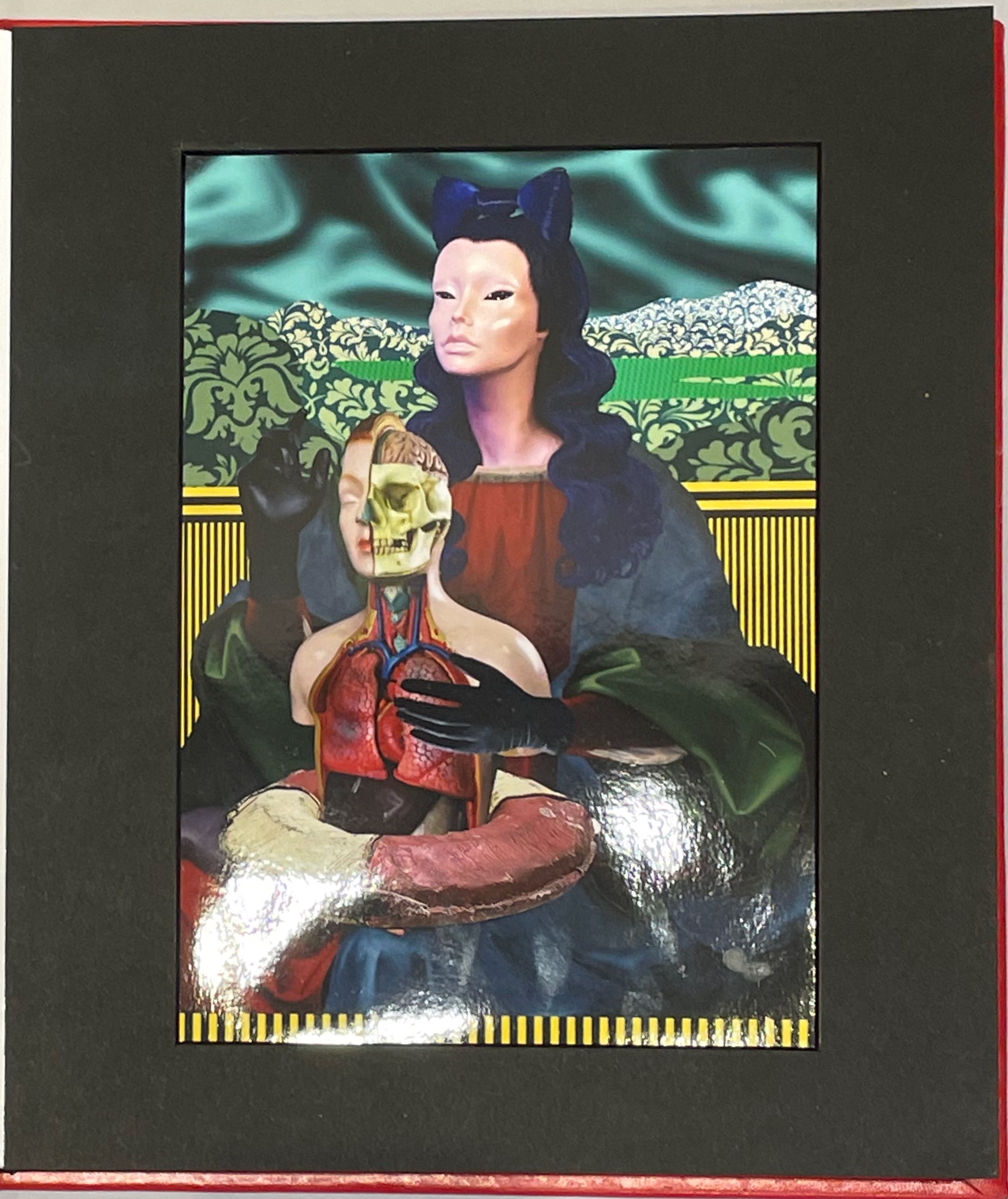
Thick leaves seemed to be the order of the day. On heavy black card, Thodoros Brouskomatis’ 10 Artificial Prayers (2025) presents surreal collages challenging the theme of “Madonna and Child” and couplets from Pier Paolo Pasolini’s “supplica a mia madre”.
10 Artificial Prayers(2025) Thodoros Brouskomatis Printed digital artworks on photographic paper, cardboard, and leather. 300 x 250 mm. Photos: Books On Books.
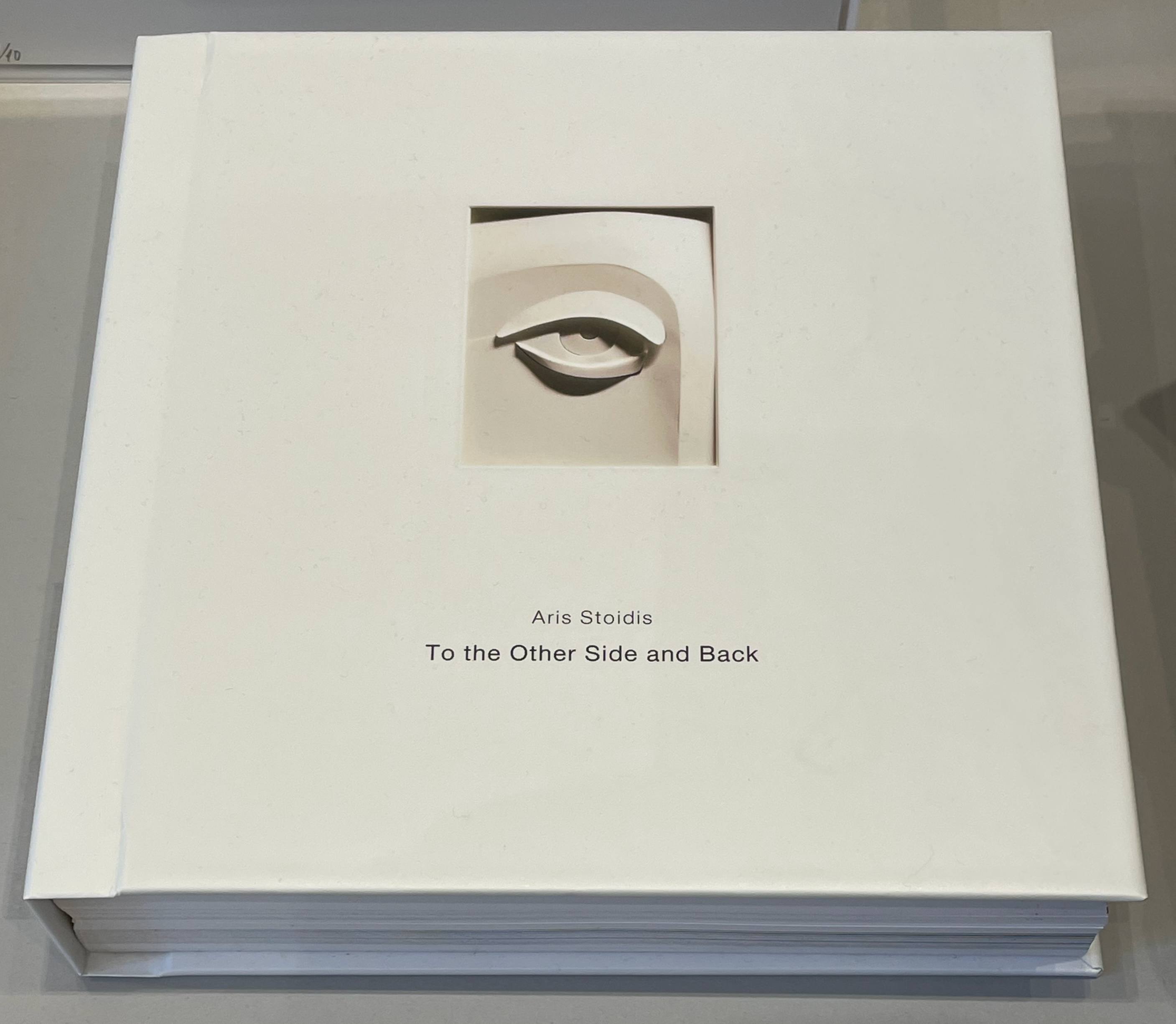
On slightly thinner card, Aris Stoidis’ To the other side and back (2025) carries a sculptural image on every page. The work straddles the borders of sculpture, photobook, and artist’s book. Stoidis writes, “Ever since my first pieces, I have been “receiving” images that I’ve materialized without really comprehending them myself. They simply exerted an inexplicable power on me.” The book comes in a plexiglas box with a papercut sculpture (not pictured here).
To the other side and back (2025) Aris Stoidis Photographic prints on card. 270 x 270 x 20 mm. Photos: Books On Books.
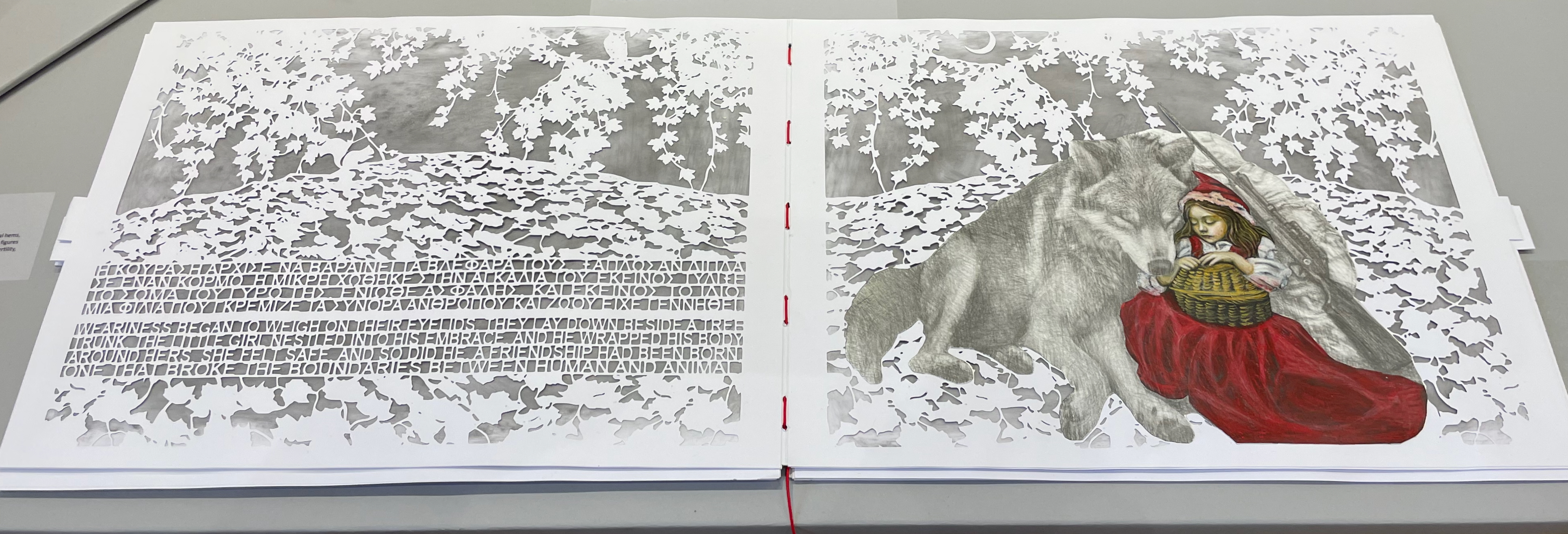
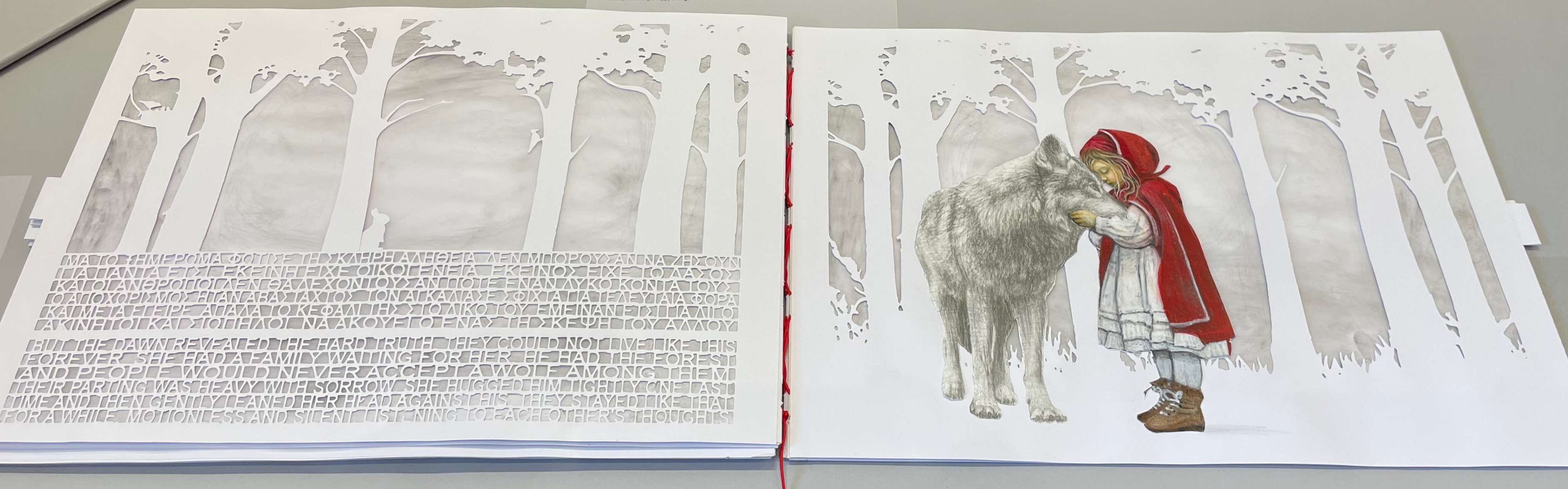
On still thinner leaves, Ismini Bonatsou’s Little Red Riding Hood (2025) nevertheless projects striking depth with its montage of papercut pages, acrylics, and pencil. Just as striking is the contemporary reversioning of the fairy tale.
Little Red Riding Hood (2025) Ismini Bonatsou Acrylics, pencil, and papercuts. 450 x 300 mm. Photos: Books On Books.
Given that the portmanteau term “bookmorph” comes from Michael Hampton, it seems appropriate that he has two works on display. Although one of them is under glass, 12 Chairs (bookmorph) (2012), the other is not. RAGE PEN by Hampton and David Blackmore is the UK contingent’s only work produced in 2025. Others from the UK contingent include Sarah Bodman, BOOKEND, Jonathan Callan, Joe Devlin, Stephen Emmerson, SJ Fowler, Rowena Hughes, and the Inscription Journal editors (Gill Partington, Simon Morris, Adam Smyth). RAGE PEN is also particularly appropriate because it requires a ruler to separate its perforated fore-edges. The exhibition provides one along with multiple pairs of white gloves. Really hands-on.
The participating Greek artists also include Eleni Angelou, Nikos Arvanitis, Rania Bellou, Maria Bourbou, Natassa Chelioti-Naga, Ioanna Delfino, Anna Dimitriou, Antonia Iroidou, Eleni Kastrinogianni, Peggy Kliafa, Alexia Kokkinou, Georgia Kotretsos, Nikos Kryonidis, Vasiliki Lefkaditi, Eleni Maragaki, Kyriaki Mavrogeorgi, Despina Meimaroglou, Christina Mitrentse, Fiona Mouzakitis, Kiki Perivolari, Stamatis Schizakis, Ifigeneia Sdoukou, Christina Sgouromiti, Danai Simou, Nectarios Stamatopoulos, Despina Stavrou, Evangelos Tasios, Yannis Tzortzis, and Leonie Yagdjoglou.
Congratulations and thanks to the curators — Christina Mitrentse, Fiona Mouzakitis, and Despina Stavrou — for bringing together this selection of outstanding works.
The Hellenic Centre opens at 11:00 and closes at 17:00, Tueday through Friday, so the chances to visit by the 28th of November are limited. The brief catalogue that documents the exhibition and these few photos cannot substitute for tactile engagement with the works on display. An hour and a half passed in a flicker.
A day’s visit with one hundred exhibitors hosted at the Arnolfini in Bristol leaves me reeling like a drunken sailor — drunk on colour, texture, light, line, shapes, words and artistry. Appropriate given the Arnolfini’s location on Narrow Quay in Bristol’s floating harbour.
Colour
Lucy May Schofield talked to me about her “search for the indigo that is infinity”. The Distance of Us is only one of several pieces demonstrating how close she is coming. The Longest Day on her site is one among many by which to enjoy her progress.
The Distance of Us Lucy May Schofield Photo: Books On Books
Mick Welbourn took time to explain how his search among inks, paper and geometric shapes kept leading him from a unique work (oil-based) to multiples and back to uniques. These colours reminded me of the work of Sonia Delaunay.
Mick Welbourn Photo: Books On Books
Texture
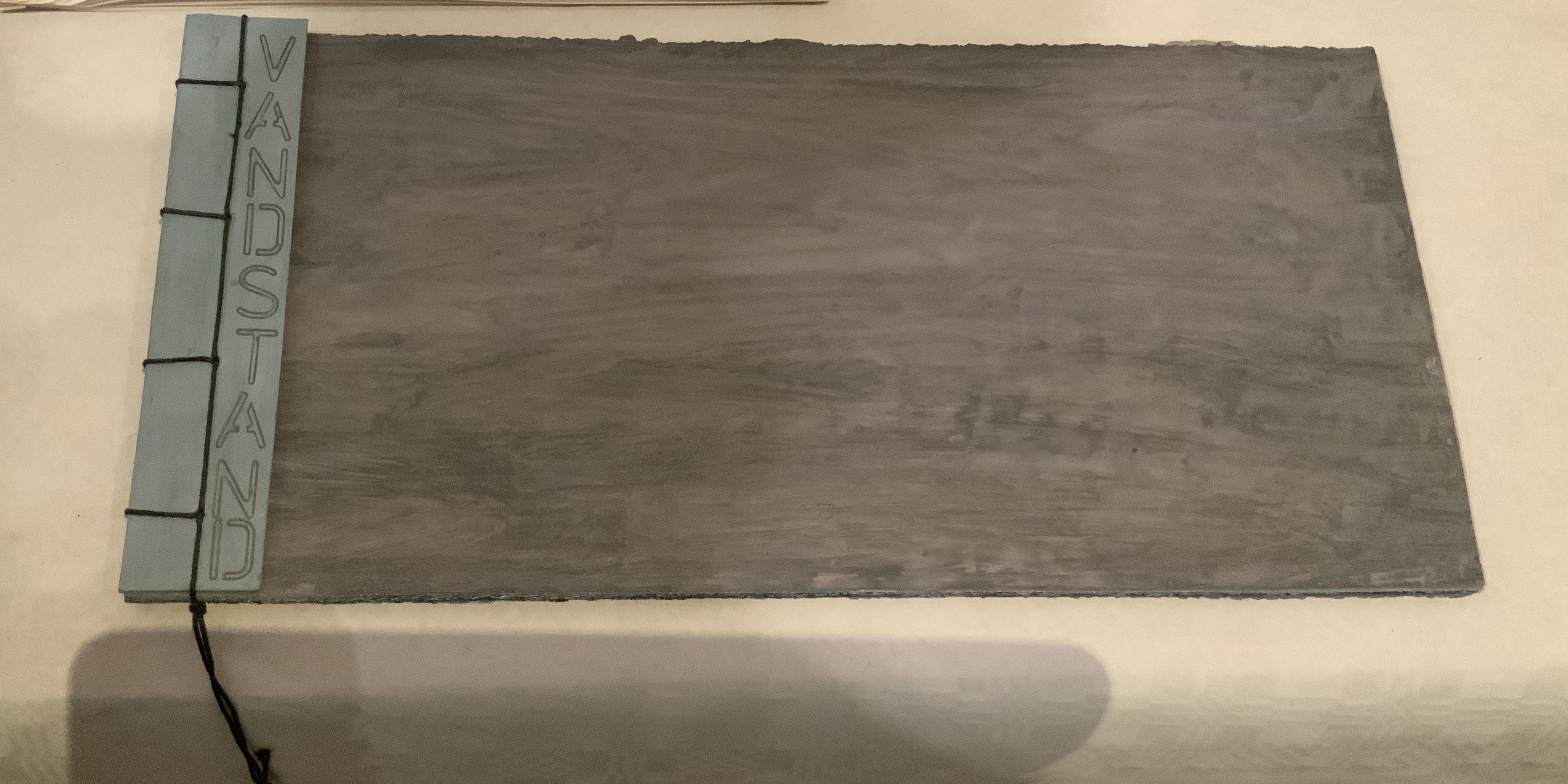
Bodil Rosenberg, a member of the Danish collective CNG (Anna Lindgren, Bertine Knudsen, Birgit Dalum, Pia Fonnesbech, Susanne Helweg), appeared delighted that I was surprised by the colour and texture of Vandstand (“water level”). Somehow after the saturation of the paper with layer upon layer of paint, each page has a supple leather- or cloth-like feel — a coolness to the touch. I think Ken Campbell would relish Vandstand.
Vandstand Bodil Rosenberg Photo: Books On Books
Vandstand Bodil Rosenberg Photo: Books On Books
Caroline Penn’s works comprised by Notes from Chesil Beach made me reach out to pick up one of the pebbles on the page. The trompe l’oeil effect of turnable pages in the photos is enhanced in one variation by inclusion of an actual small gathering of pages. The role of trompe l’oeil in book art is one worth investigating.
Notes from Chesil Beach Caroline Penn Photo: Books On Books
Light
Eileen White’s Haptic Narratives and her lumen prints for Printed Matter made a nice segue from texture to ghostly light. Printed Matter also looks forward to the “artistry” section here as book’s images are un-fixed and eventually fade away. To use the book form — the traditional form of permanent record — to present a language and reminder of material ephemerality: that is artistry.
Eileen White Photo: Books On Books
Haptic Narratives Eileen White Photo: Eileen White
Helen Douglas (Weproductions), fresh from exhibitions at Printed Matter in New York and Fruitmarket Gallery in Edinburgh, was displaying her 2017/2018 series Field Works as well as a new book Summer Alight. The photographic effects, the visual narrative and structure achieved in Douglas’s works define artistry.
Elena Zeppou’s Parallels first caught my eye because of its size, but closer inspection yielded appreciation of line — vertical as well as horizontal — and its union with text and form. Note how the lines of poetry read across the accordion.
Parallels Elena Zeppou Photo: Books On BooksParallels Elena Zeppou Photo: Zitrone PrintmakingParallels Elena Zeppou Photo: Zitrone Printmaking
Shapes
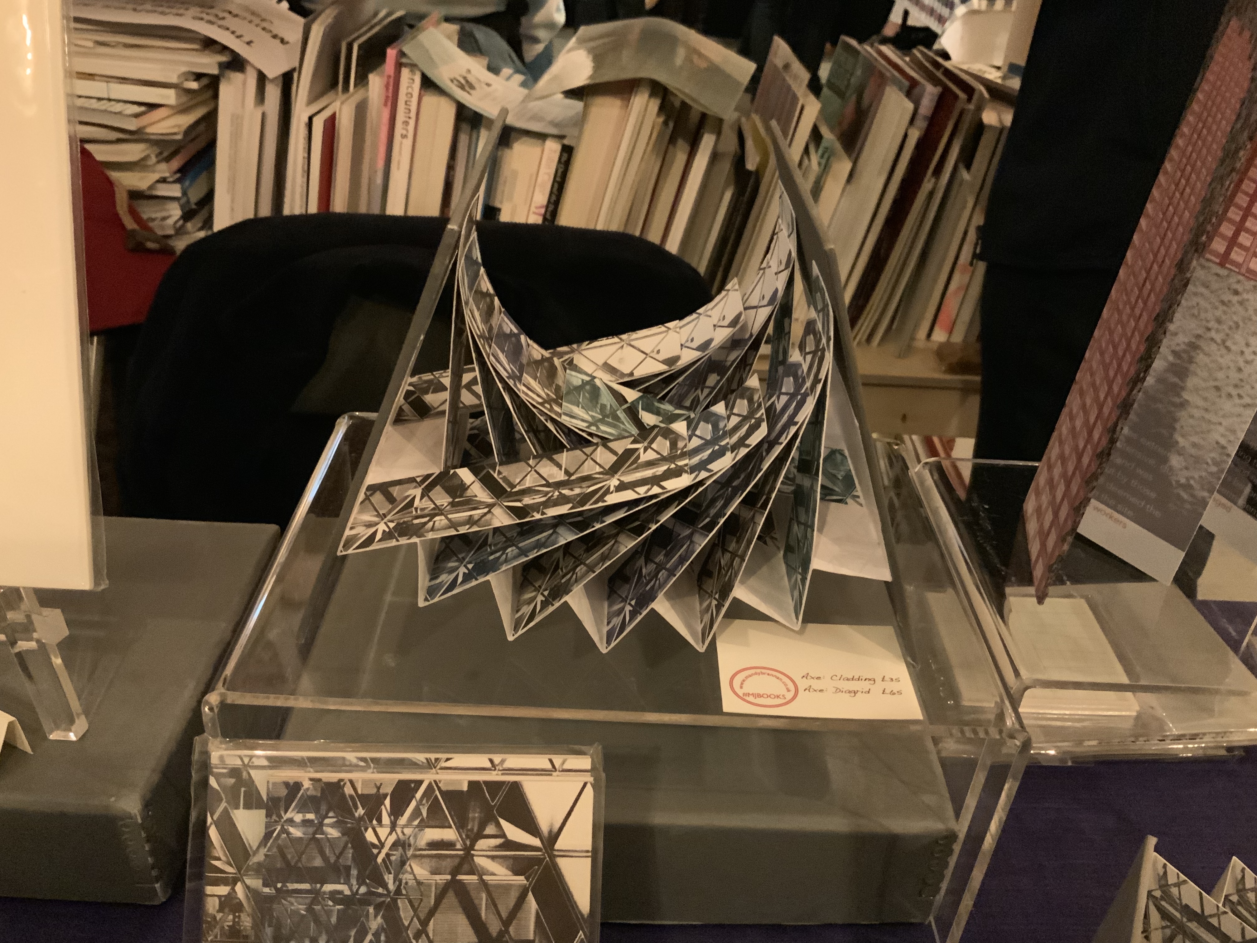
Listening to Mandy Brannan talk about custom papers, French fold books and modified flag books is almost as good as handling them. The work30 St Marys Axe (inspired by the building fondly known as the “Gherkin”) was what first drew me to her table. It has two variations — Diagrid and Cladding — which reward repeated handling as well as regarding.
30 St Marys Axe: Diagrid Mandy Brannan Photo: Books On Books
At the ArtistBooksOnline table, the shape-changer Inside/Outside by Susie Wilson kept me as busy as if it were a Rubik’s cube or paper puzzle with a medical mystery inside — or outside.
Inside/Outside Susie Wilson Photo: Books On BooksInside/Outside Susie Wilson Photo: Books On Books
Words
Puns, slippery words and slipperier concepts seemed to explode from Guy Bigland‘s table.
My inner metaphysician of Structuralism, Post-Structuralism, Deconstruction and Post-Deconstruction found its element(s) at the Atlas Press.
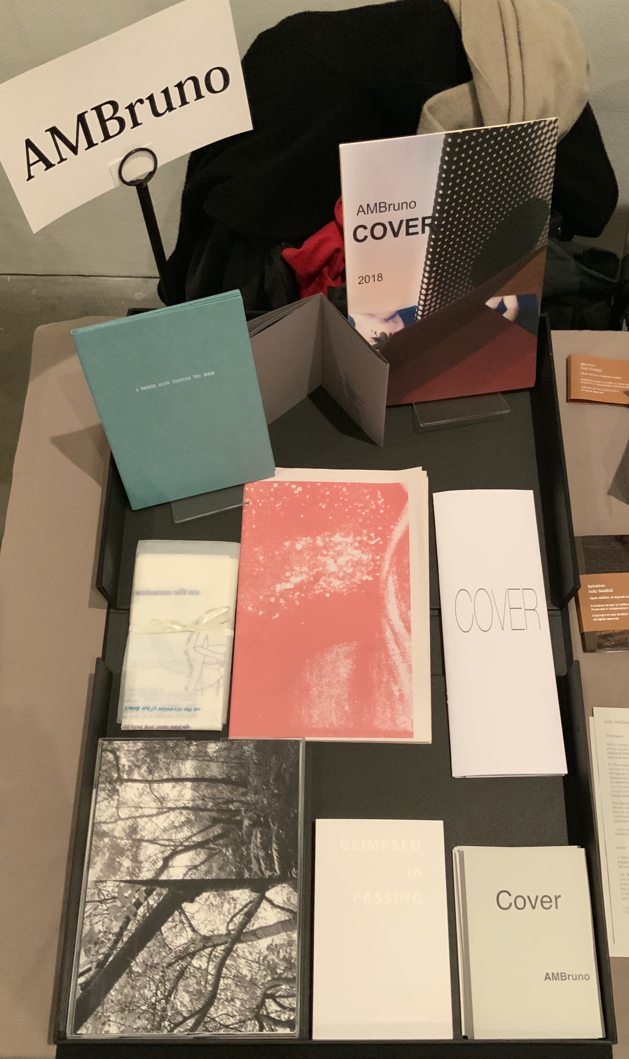
AM Bruno, run by Sophie Loss, and of which John McDowall is a founding member, is always a rich vein of artistry. The works from the 2018 theme-driven project, Cover, appear in the box below but warrant a closer inspection at the link behind the word. John McDowall had a new book on hand: Time-lapses. As I turned the brilliantly white pages, each segmented into squares like a comic-book page but only one square in each page holding an old black-and-white photo, the title began to sink home. And then came the idea that all the meaning that could possibly explain any one photo, its relation to the other squares or to other photos or to the author or to the reader/viewer — all of it — has to take place in the empty spaces between.
Janet Allsebrook displayed a Duchampian box with the Delaunay-esque title Nichoir. Although the drift of this work (“waste time making your own useless nest box”) is echoed in her other works, the echo reverberates with a deeper tone — often political or philosophical. The variety of book forms is impressive.
Nichoir Janet Allsebrook Photo: Books On Books
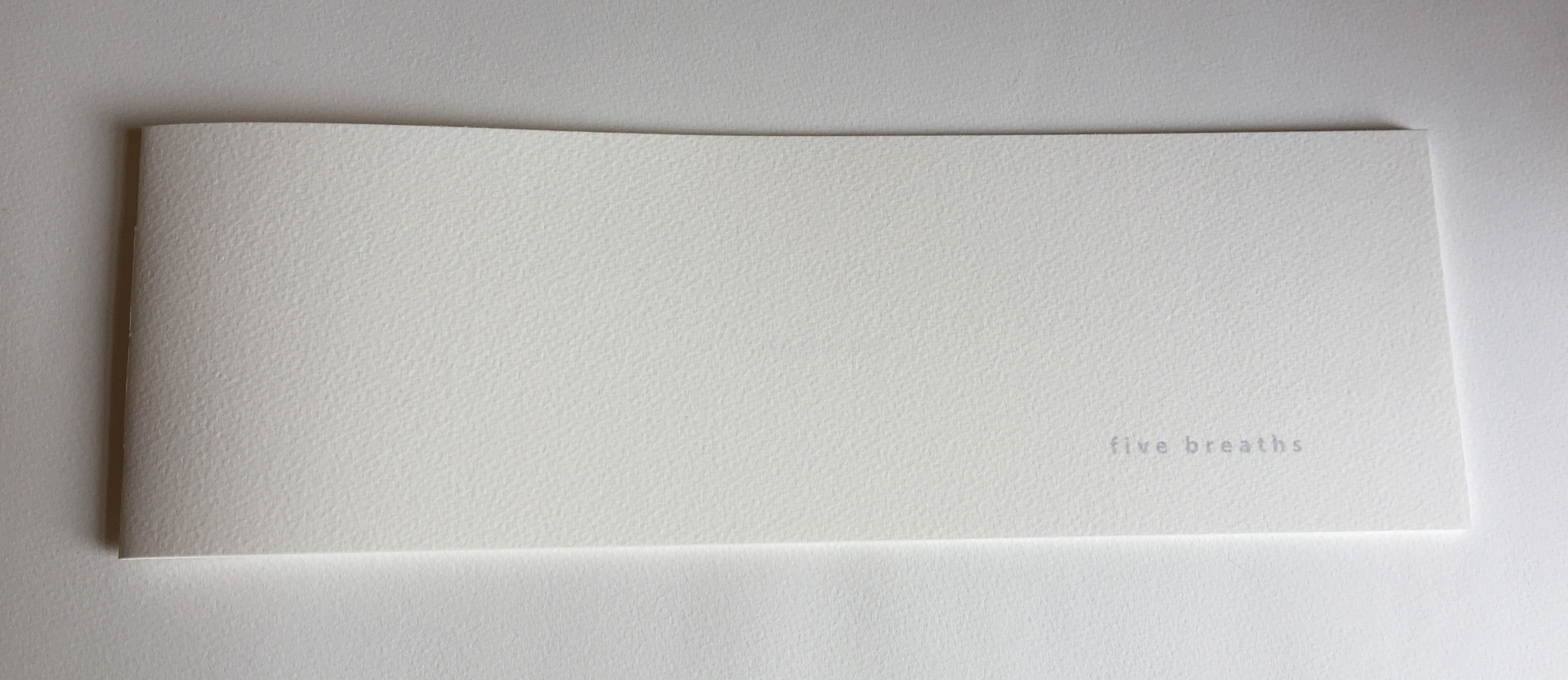
Next door was the artist of Zen book art — Julie Johnstone – Essence Press. In addition to extensions of her percentage tint series, she had on hand several explorations of breath, print and paper: each breath, a page; quietly breathing; five breaths; and ten breaths. Wherever they are, her books make a Zen garden.
Sarah Bodman and Arnolfini brought together a rich collection of talent and should be thanked for doing so and encouraged to repeat it in 2021. And to the artists mentioned — and those not — who took the time to share their thoughts on colour, texture, light, line, shapes, words and artistry: Encore!