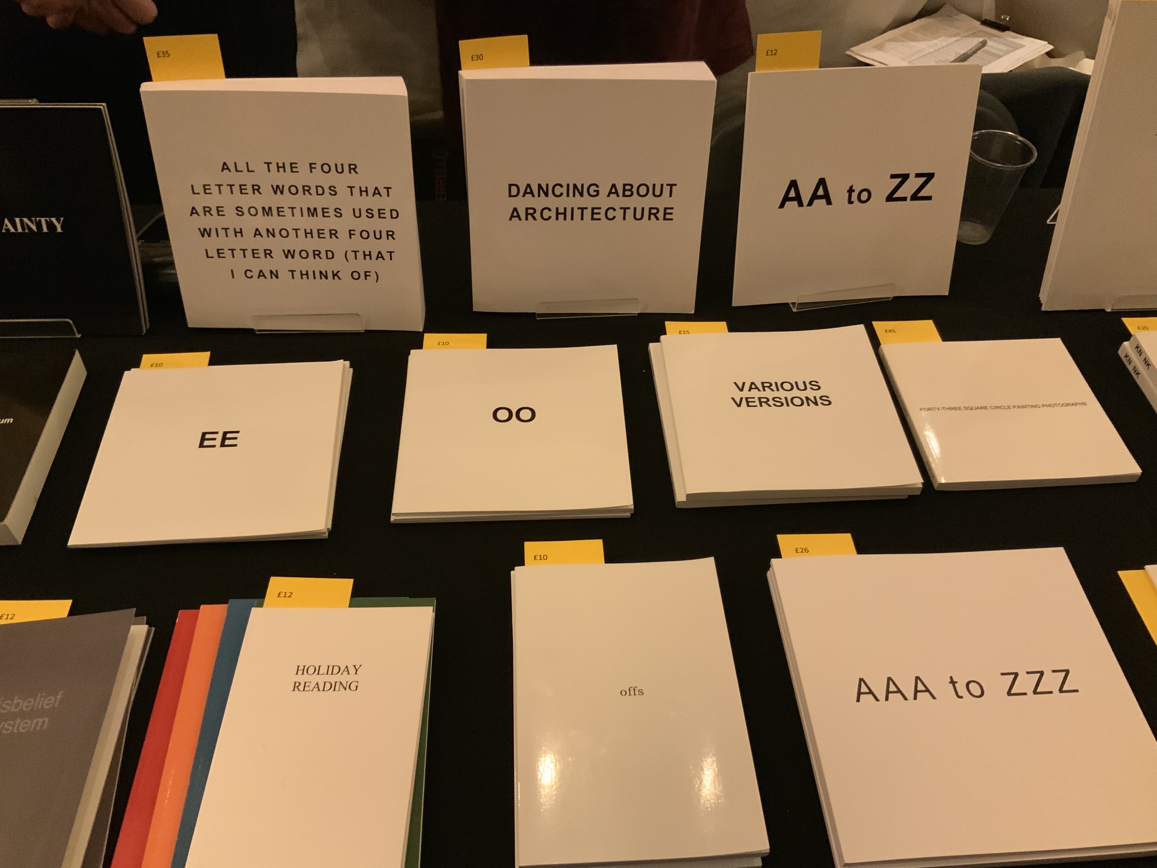
the lists (2020)
the lists (2020)
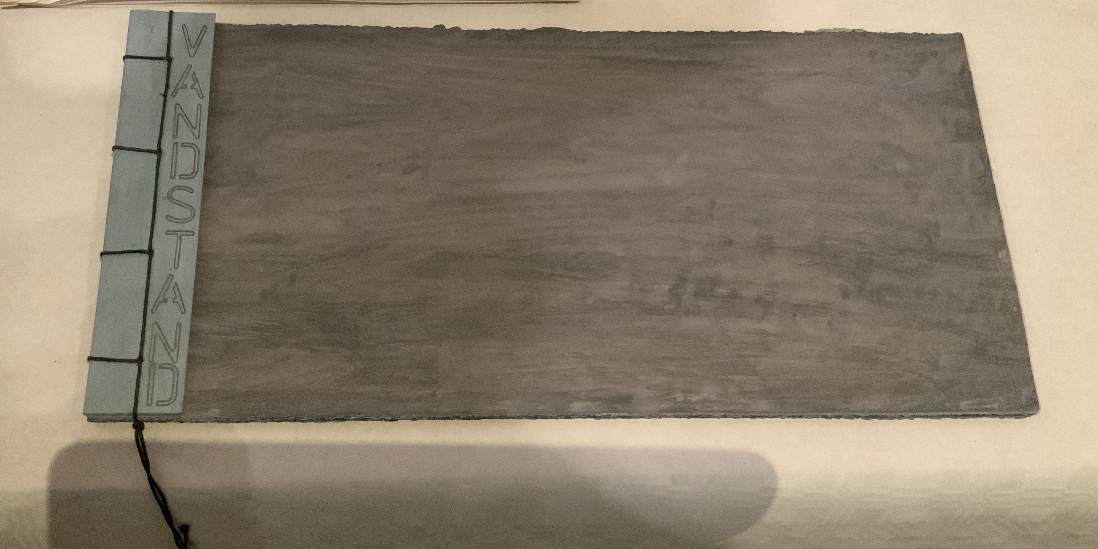
Maria Welch
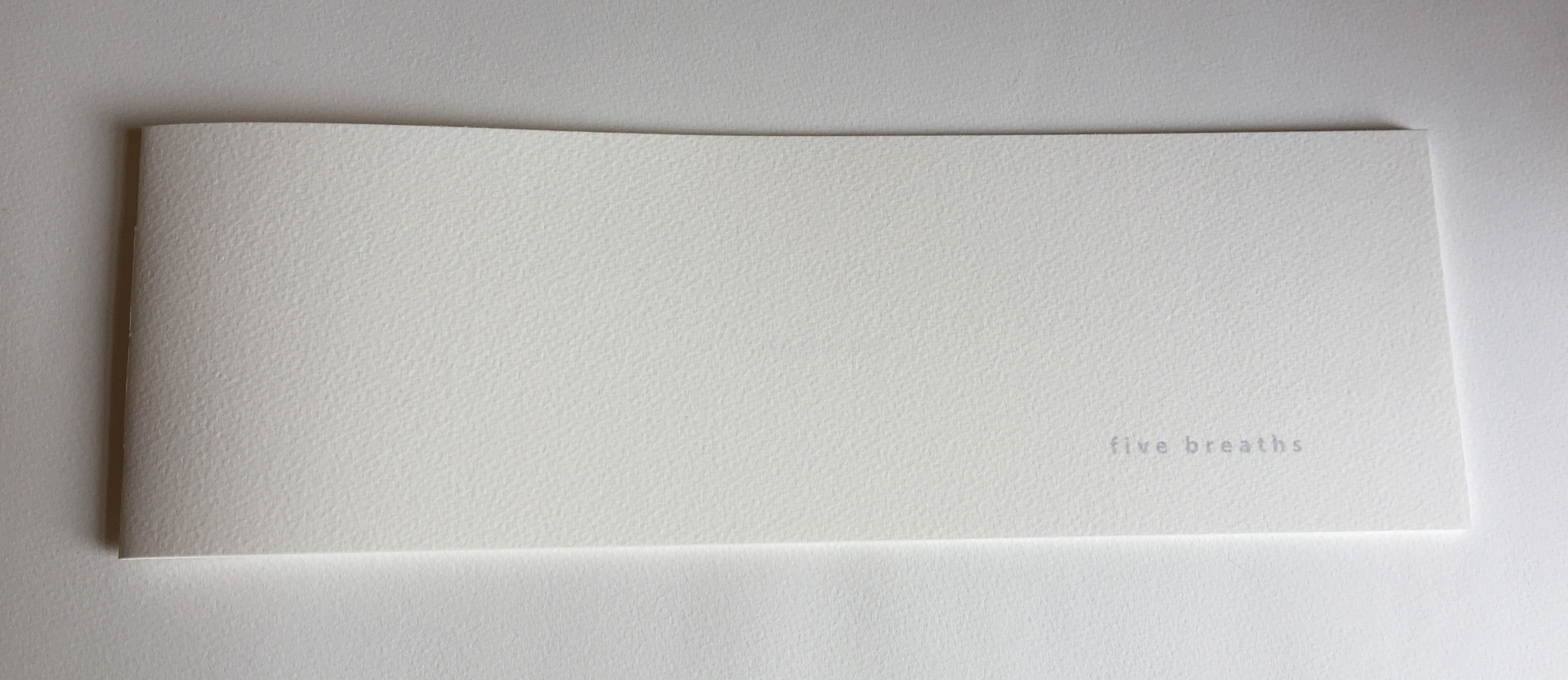
Chapbook, handmade paper covers, risograph printed on French Paper. H180 x W78 mm, 16 unnumbered pages. Edition of 200, of which this is #8. Acquired from the artist, 20 August 2020.
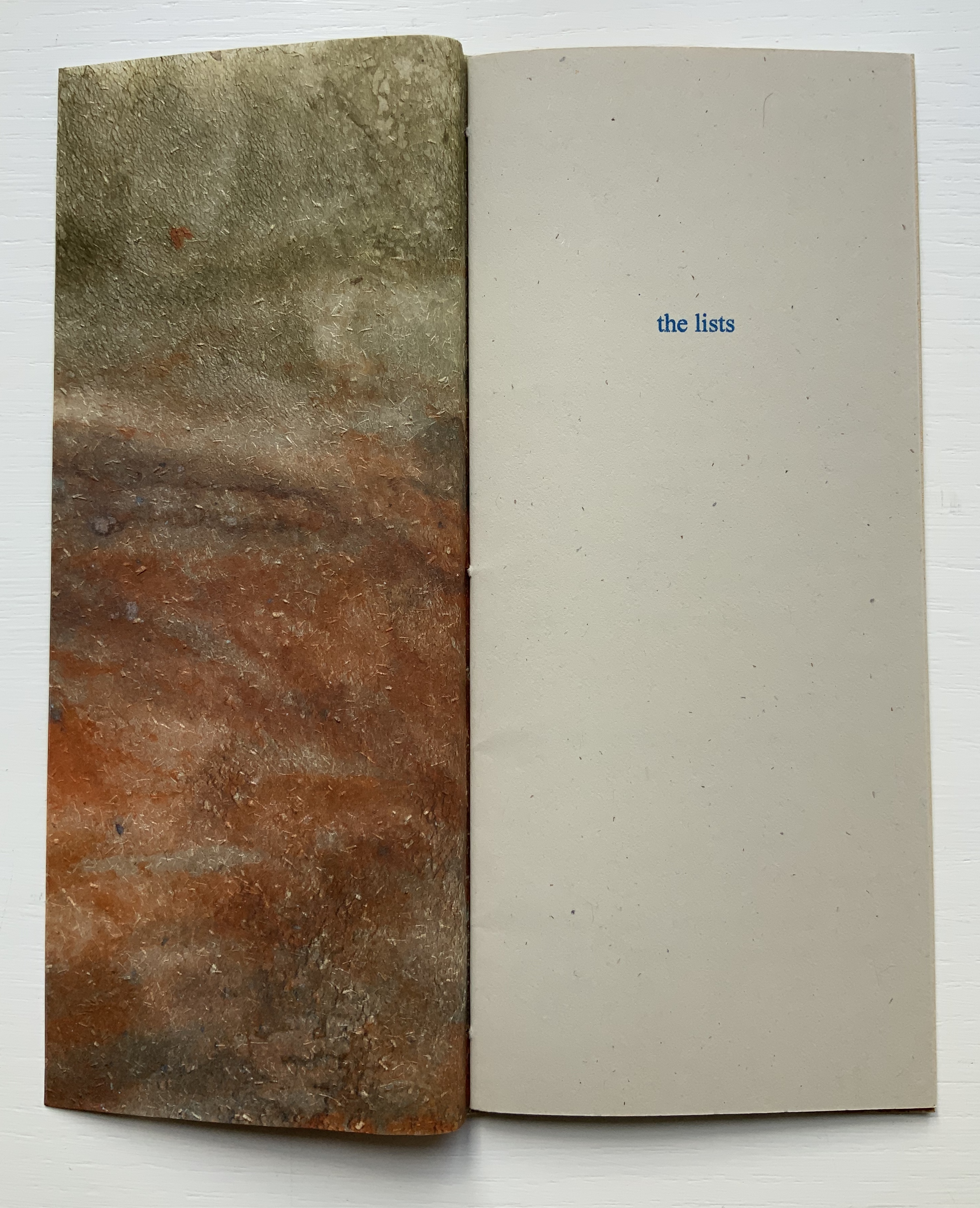
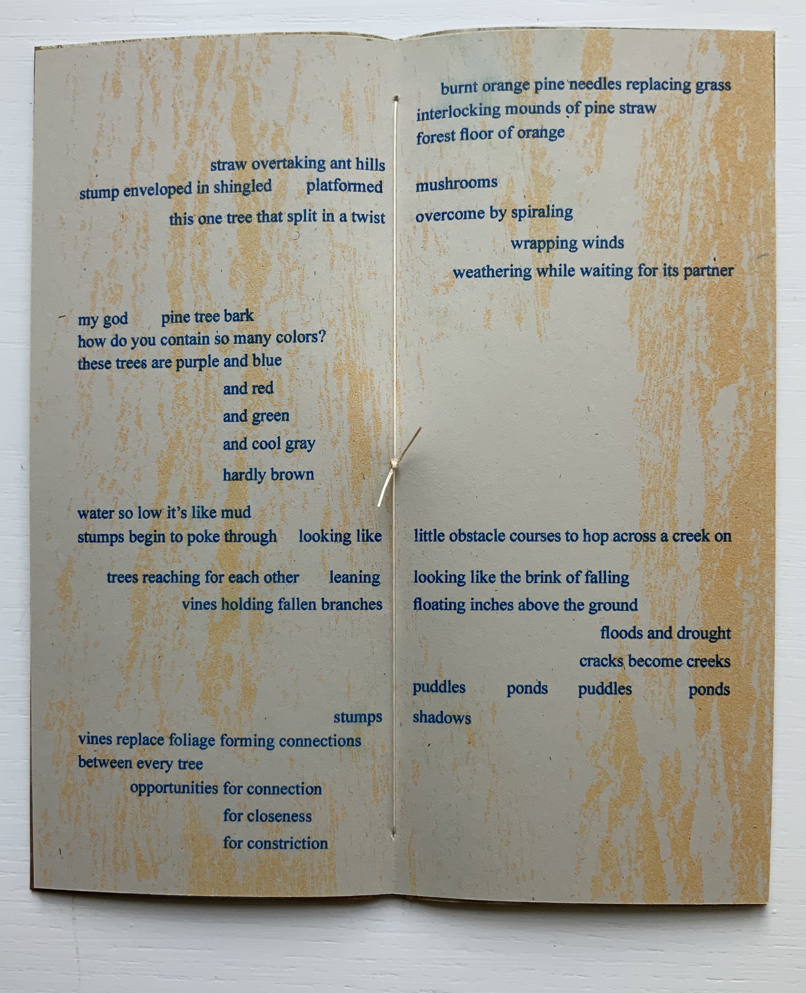
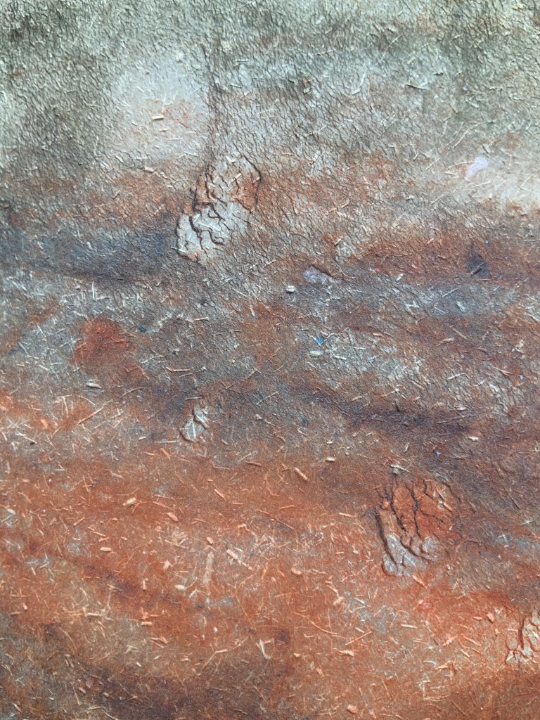
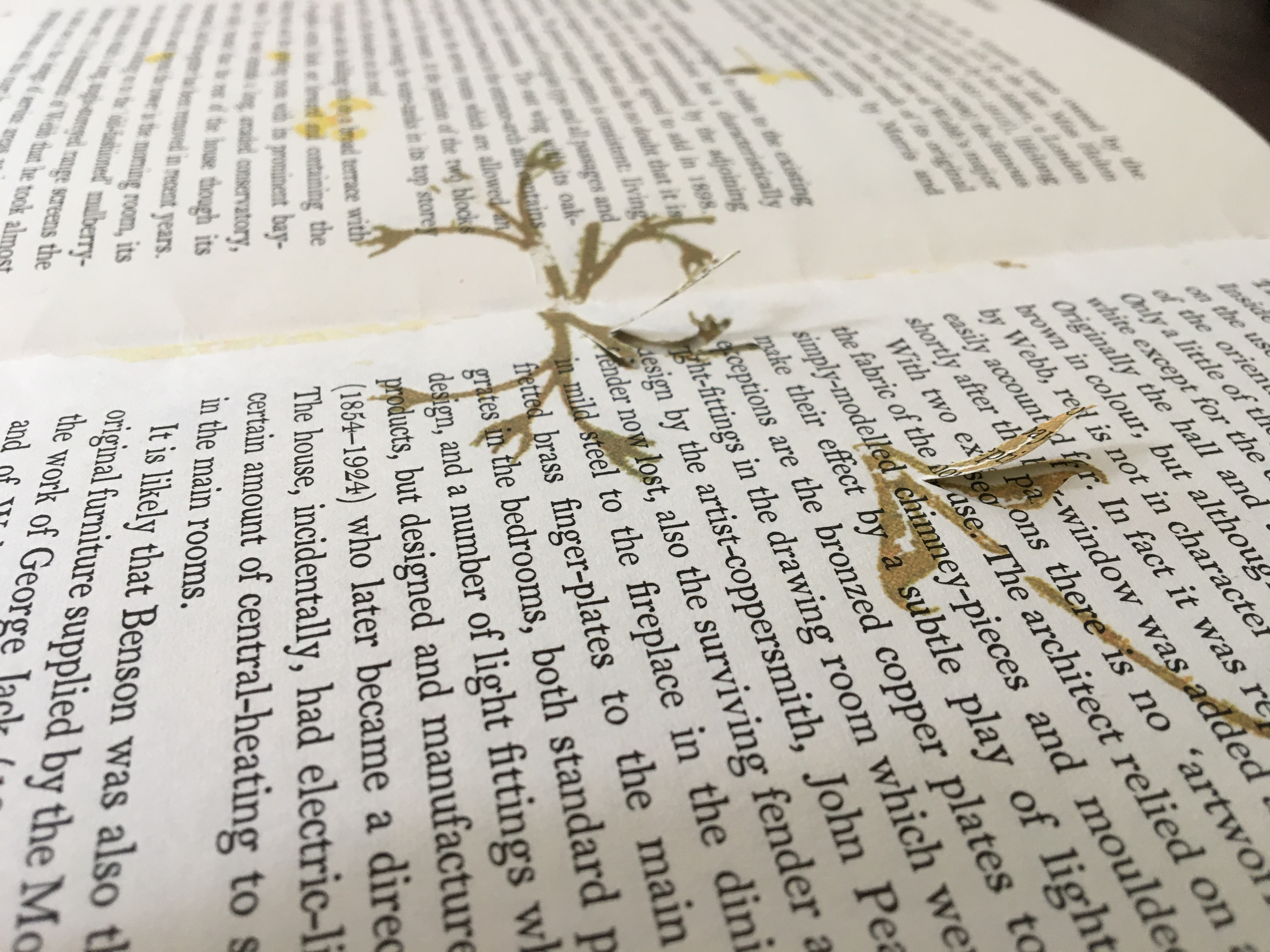
Created as a handout for an exhibition, this small chapbook delivers a powerful haptic effect with its pulp-painted handmade paper cover and risograph printing on French paper. The cover feels like bark, the paper like dry leaves. The tree-branch layout of lines echoes the sensation, and the content recalls “Silent Poem” by Robert Francis, which itself begs for a book artist’s interpretation.
This work of pulp painting that sits so well with that of Pat Gentenaar-Torley and Claire Van Vliet deploying the same technique came into the collection because of Welch’s contribution below to the tenth Artists’ Book Cornucopia, organized by Alicia Bailey.
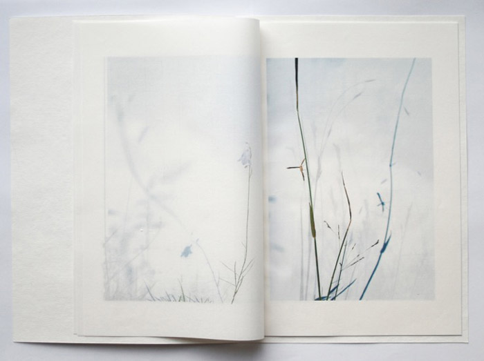
Erratic Obsession (2019)
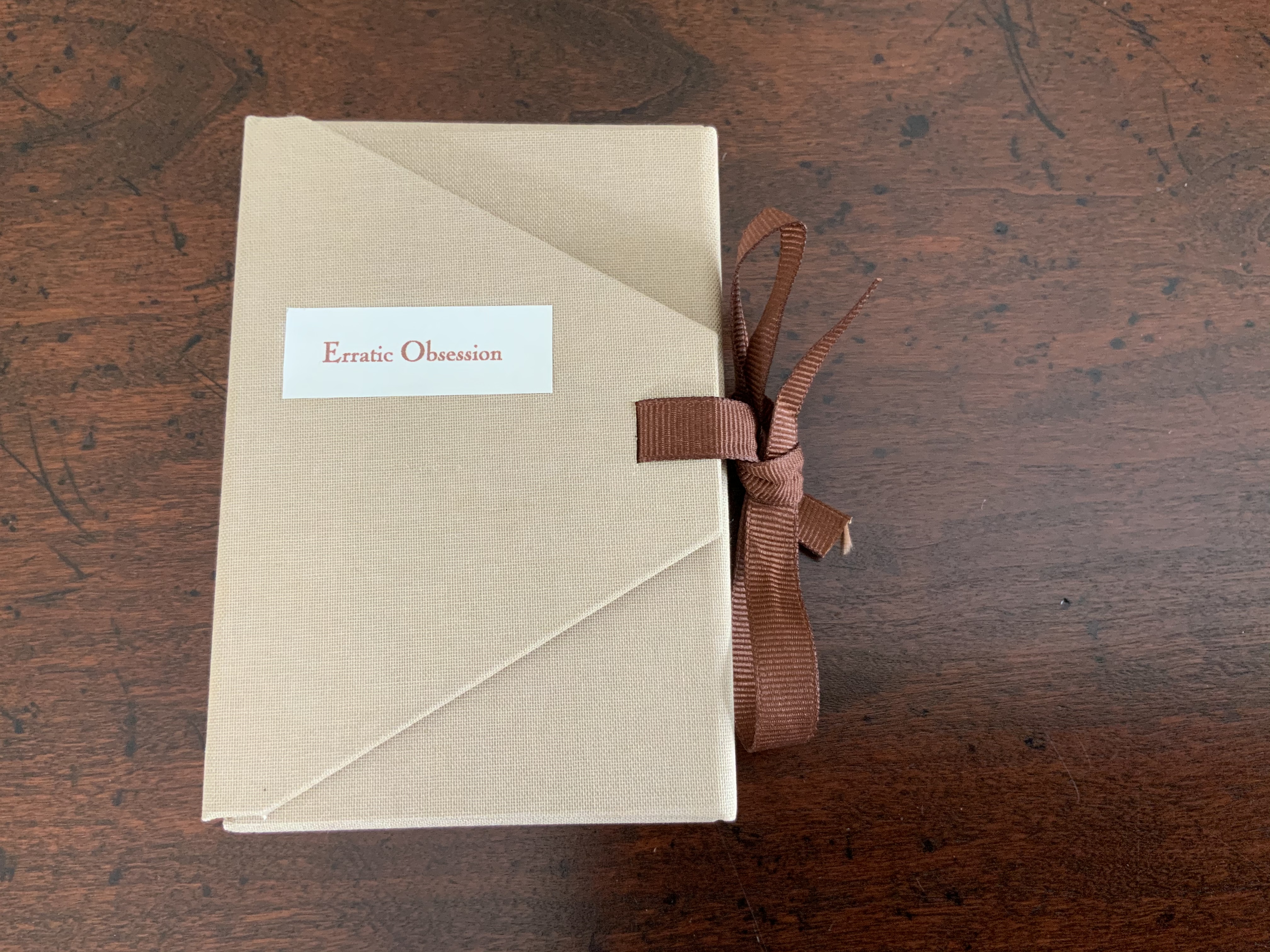
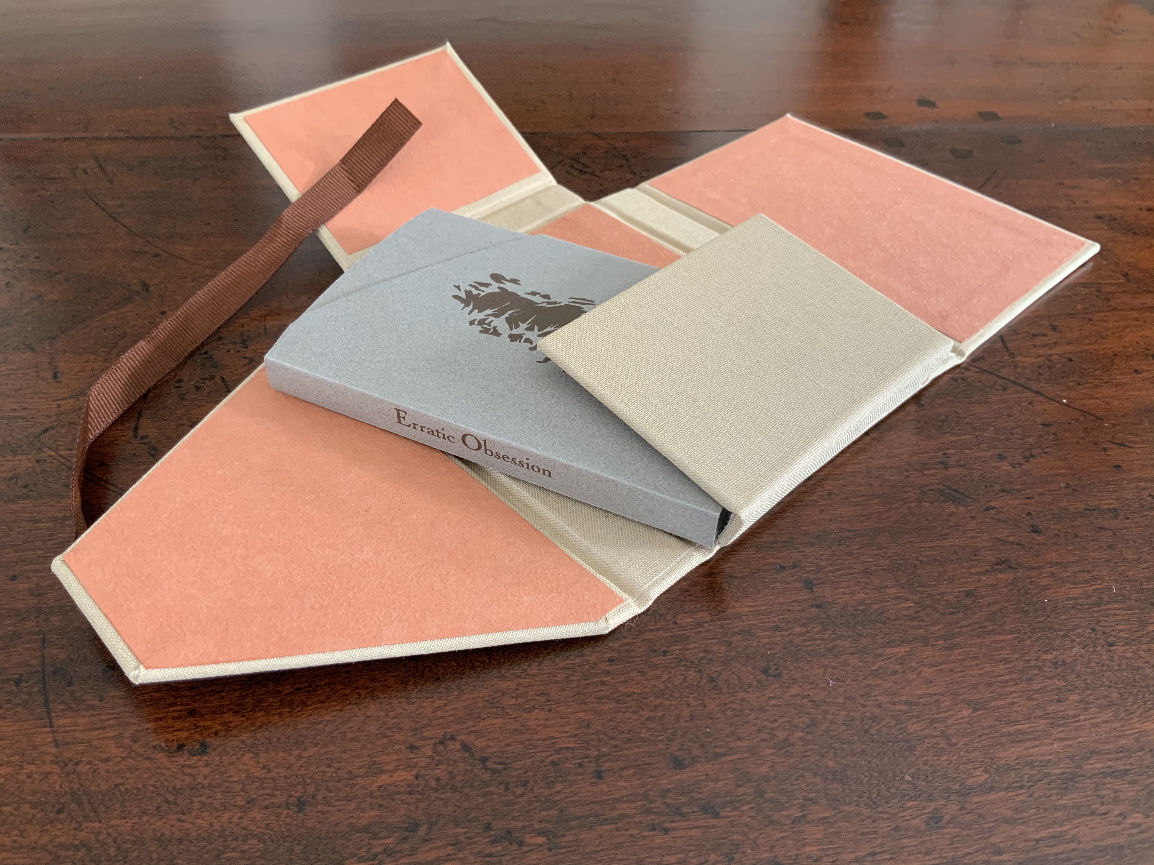
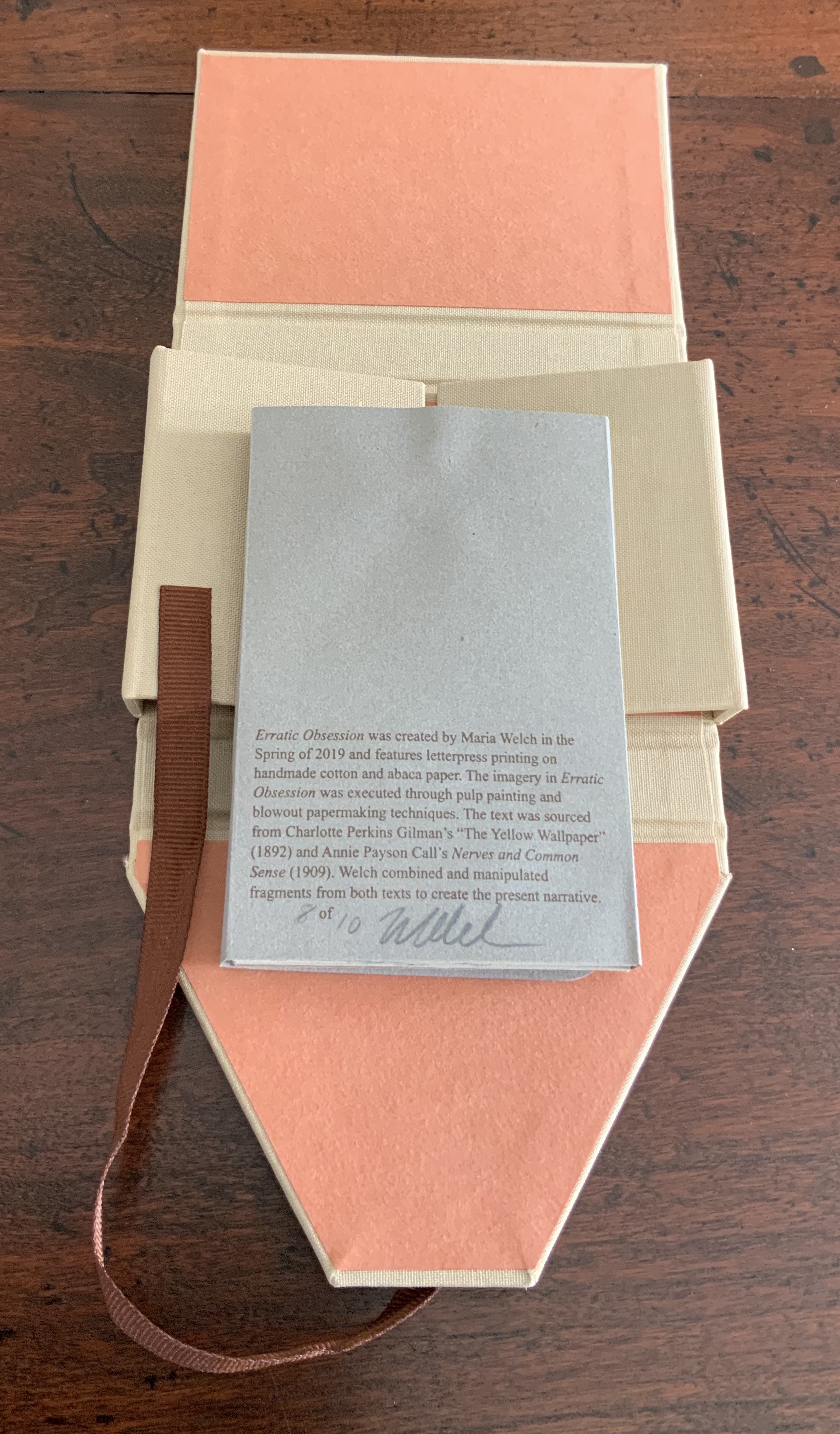

Erratic Obsession (2019)
Maria Welch
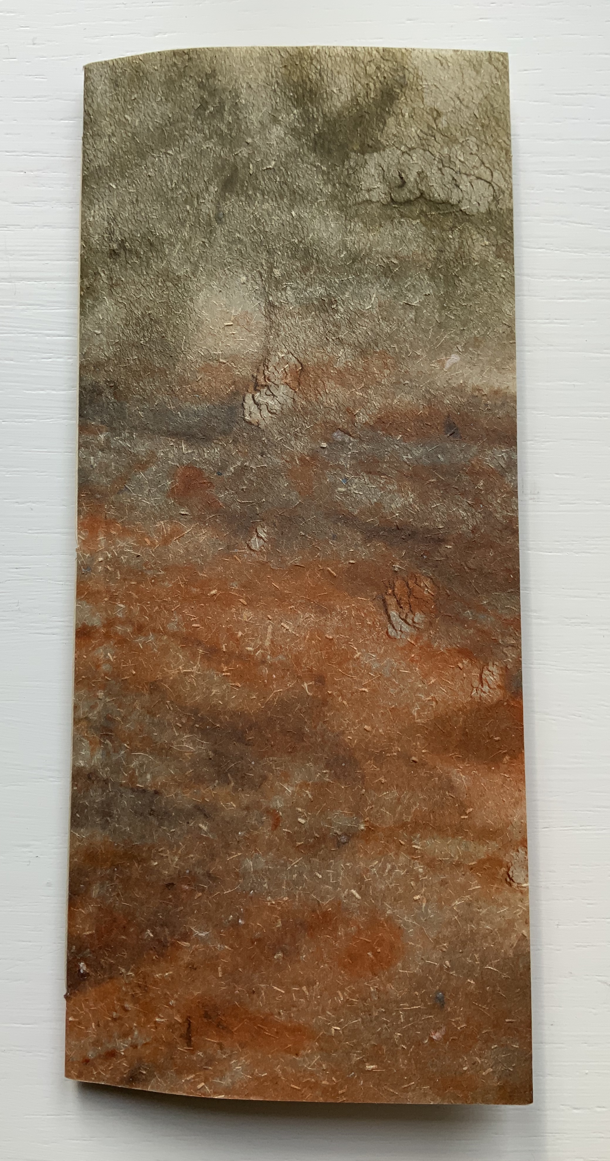
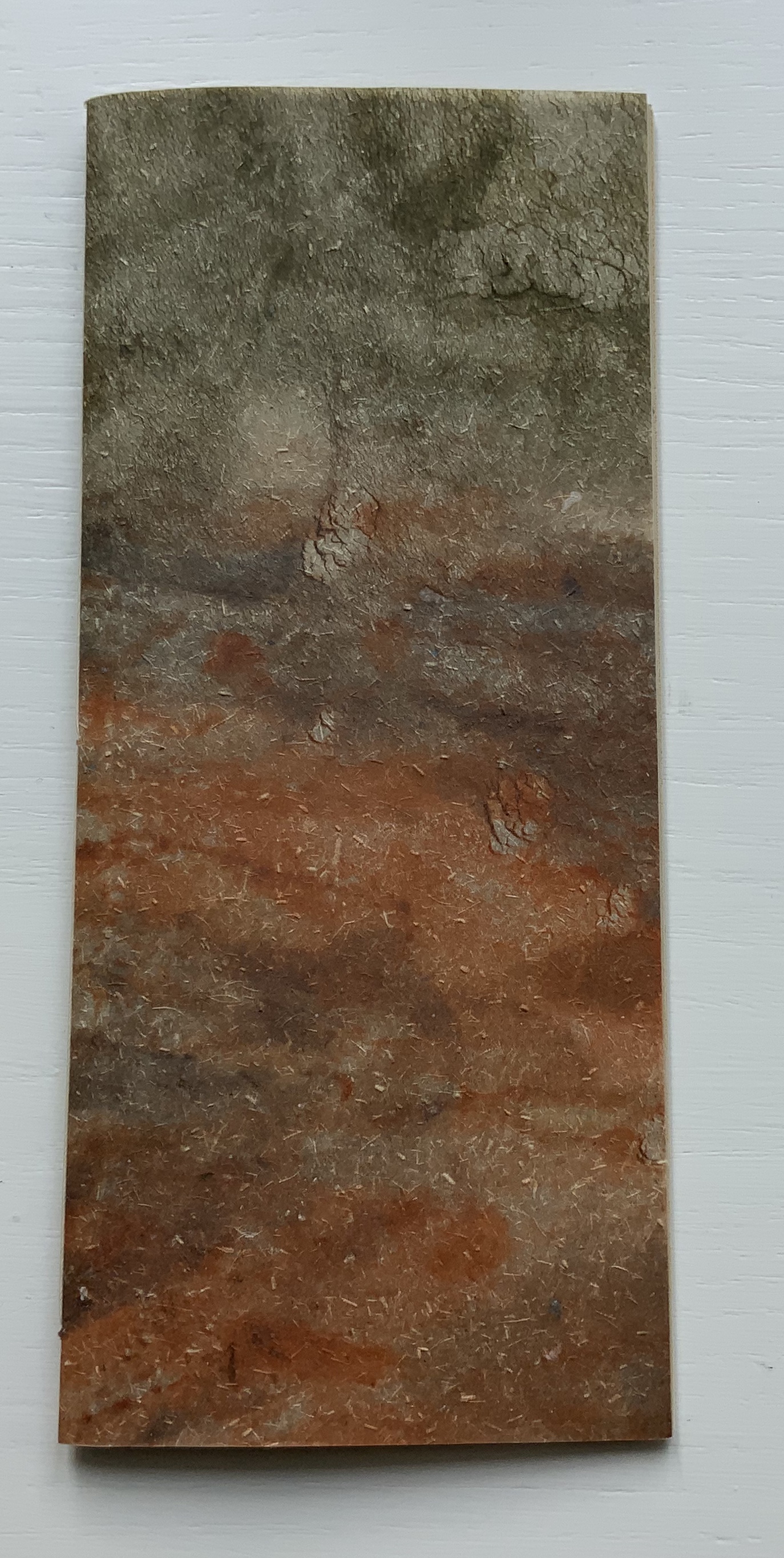
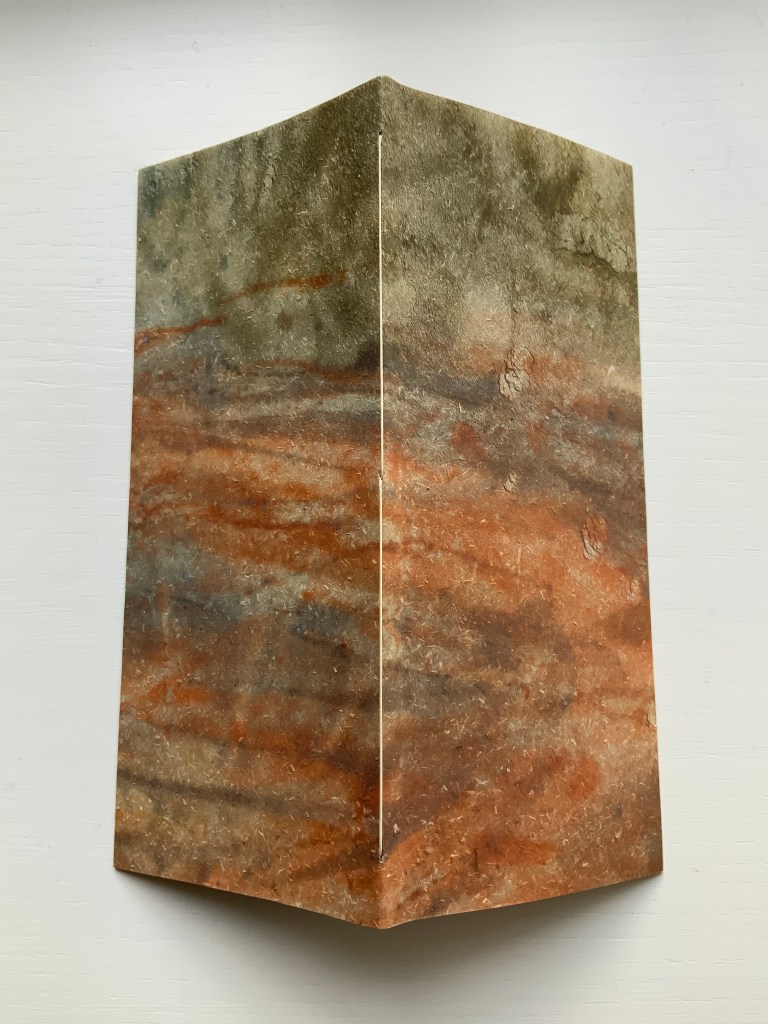
Single sheet cut in meander fold. H106 x W 71 mm (closed), H424 x W568 (open). Wrapped in sleeve with slot-and-tab closure, housed in four-flap linen box with ribbon tie. Edition of 10, of which this is #8. Acquired from the artist, 20 August 2020.
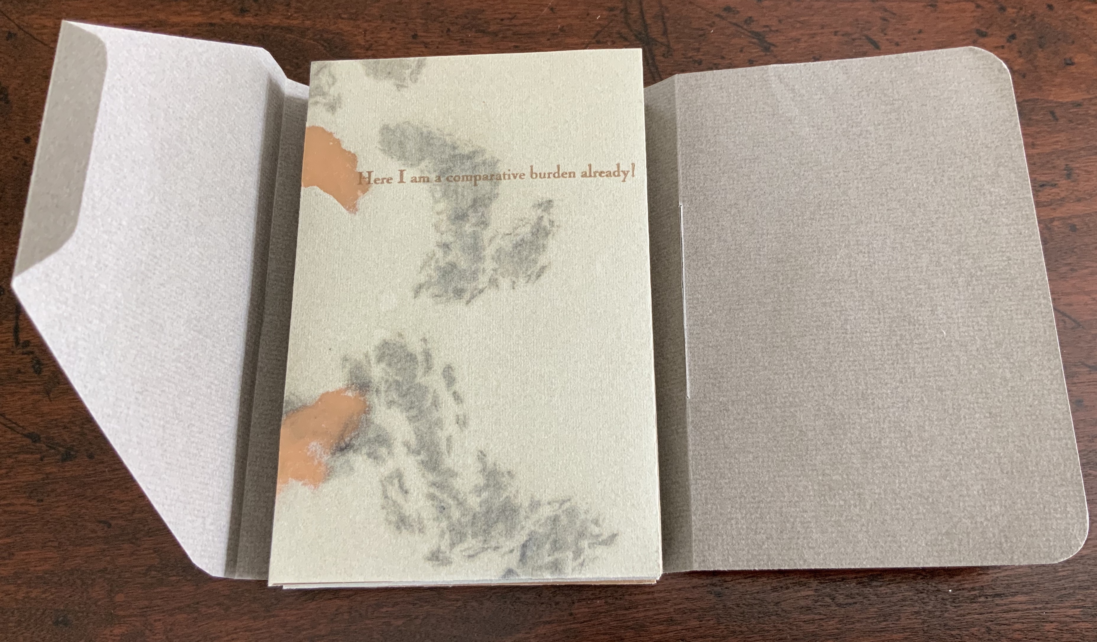
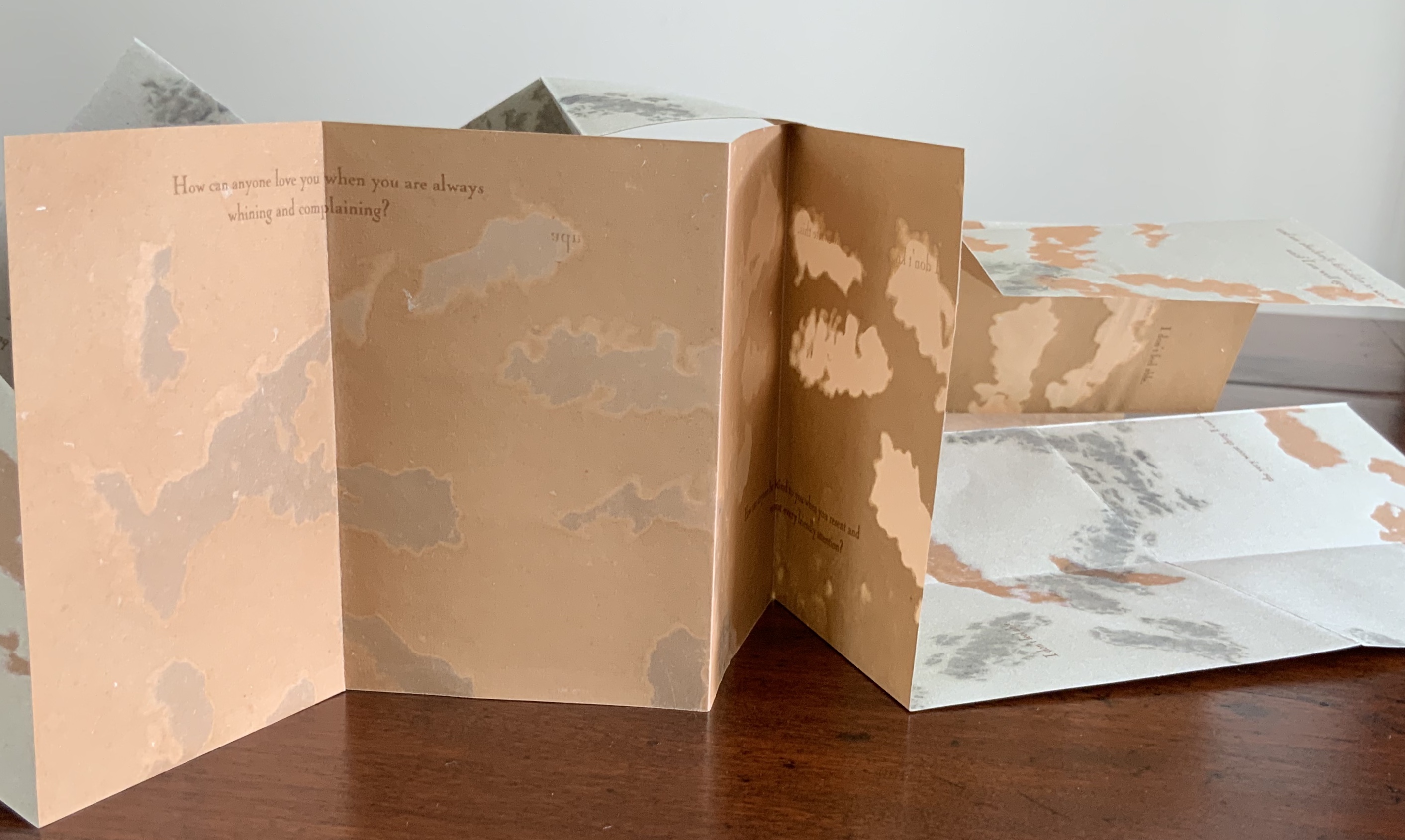
Erratic Obsession speaks to several obsessions in the Books On Books Collection. The first is one with the short story “The Yellow Wallpaper” (1892) by Charlotte Perkins Gilman (Stetson), an obsession provoked by book art from Harriet Bart and Caroline Penn (and teaching a class in Philadelphia on American fiction). The text in Erratic Obsession comes in part from the Gilman short story about a woman driven mad by social and marital pressures, and in part from Annie Payson Call’s Nerves and Commonsense (1909). The latter is a collection of Call’s self-help articles in the Ladies’ Home Journal and runs contrary to the subversive early feminism of Gilman’s story.
What Maria Welch has done with a single piece of paper speaks to a second obsession: the fusion of structure and content.
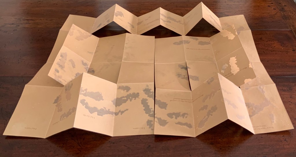
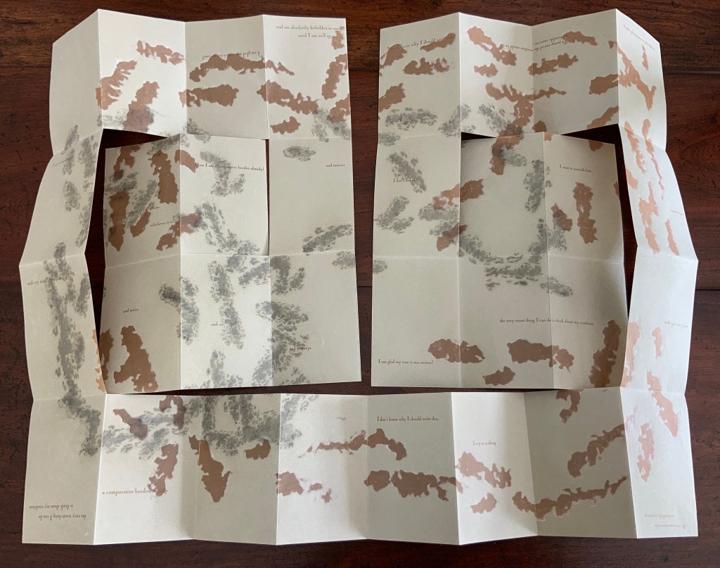
Unfolding this spiral-cut, single-sheet meander-fold booklet feels like pulling strips of wallpaper from the wall, as the main character does in “The Yellow Wallpaper”. By printing on both sides of the single sheet, Welch has doubled down on the structure. By going dark on one side and light on the other, she has tripled down on it. All of these structural choices echo the oxymoronic face-off of the title — the erratic vs the obsession — which in turn echoes the themes of Gilman’s story: a wife’s freedom vs a husband’s control, the individual’s mind and self vs society’s expected behavior. Welch’s structural tensions are also responding to the tension between Gilman’s and Call’s perspectives.
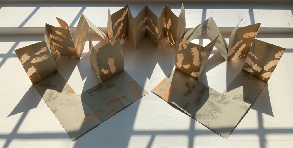
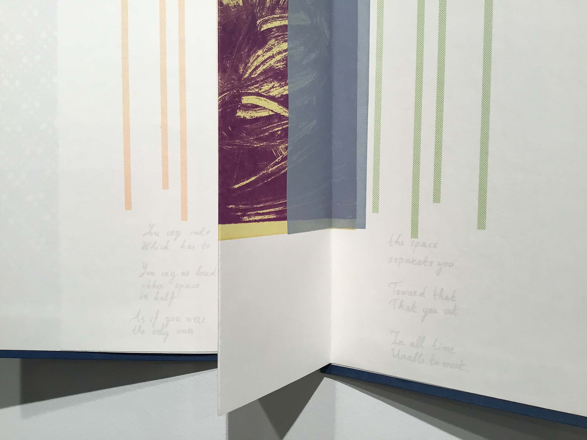
Interesting that the artist provides instructions on how the work should be displayed. Preferably in the round. Preferably that folds 1 and 31 (the first and last) stand upright, that folds 2-6 and 26-30 lay flat, that folds 7-9 and 23-25 stand upright, that folds 10-12 and 20-22 create mountain peaks, and that folds 13-19 form the central upright accordion. But the work displays equally well in an erratic spill. Again, a fusion of structure and content.
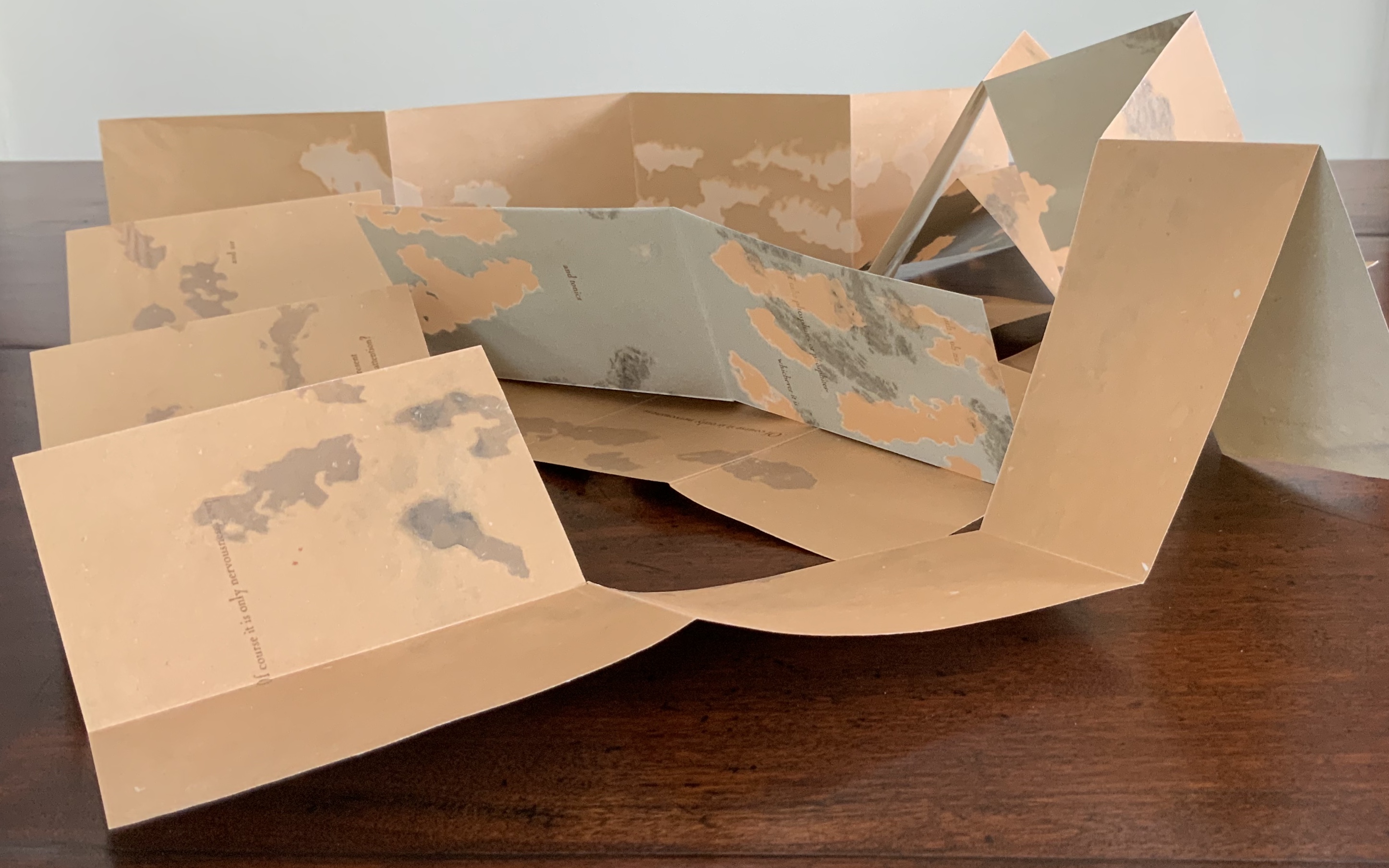
In its techniques of pulp painting, blow-out papermaking, kirigami (paper cutting) and origami (paper folding), Erratic Obsession rings a third obsession in the collection: the fusion of technique with content. With pulp painting and blow-out papermaking, the image or patterns are intrinsic to the paper, just as a character might think its personality and will are intrinsic to its self. With paper folding and cutting, the techniques are external to the paper, just as societal and marital pressures bend and sever the character’s self. Of course, Call would likely have it the other way round: socialization and commonsense provide the wholesome; willful personality cuts and bends it. No wonder: another of Call’s books was How to Live Quietly (1918).
Further Reading
“Wallpaper: An Altered Book Experiment“, Bookmarking Book Art, 10 June 2018.
“Claire Van Vliet”, Books On Books Collection, 8 August 2019.
“First Seven Books of the Rijswijk Paper Biennial (1996 – 2008)”, Books On Books Collection, 10 October 2019.
“Alicia Bailey and the Artists’ Book Cornucopia”, Bookmarking Book Art, 12 November 2019.
“Caroline Penn”, Books On Books Collection, 11 June 2020.
Call, Annie Payson. Nerves and Commonsense (Boston: Little, Brown, 1909).