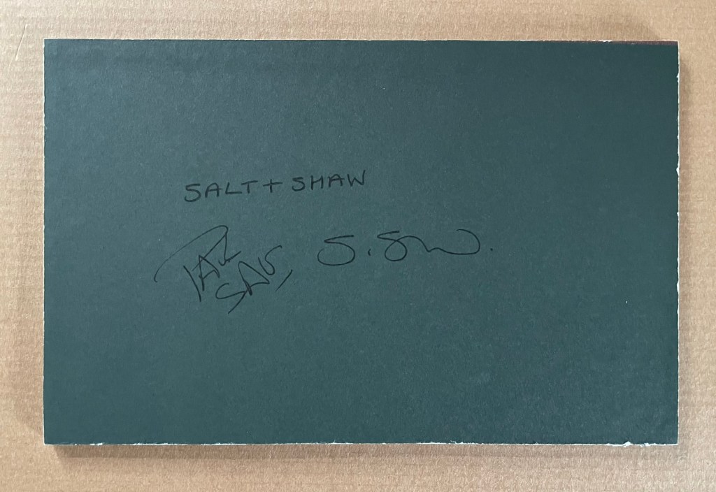
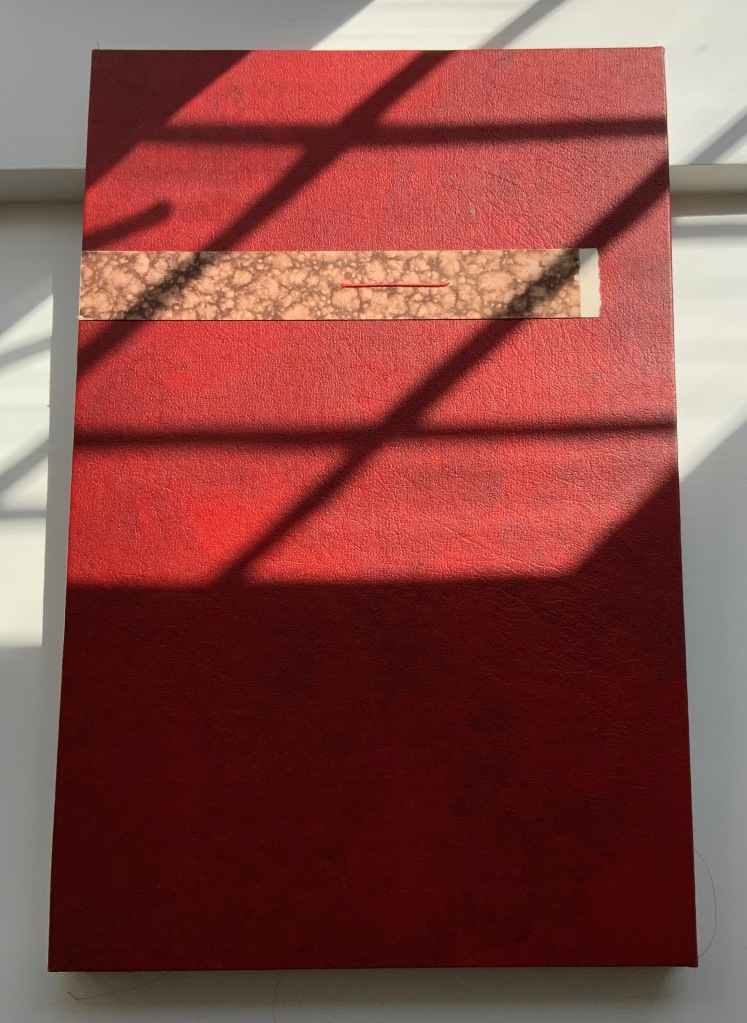
Paul Salt and Susan Shaw collaborate under the name Salt+Shaw. Individually and together, they present a wide range of book art. Much of it finds its most striking expressions in unusual bindings, sometimes to the extent that the binding absorbs the content — as is the case with a spent bullet in Forest Beach Garden.
FOREST GARDEN BEACH (2005)
FOREST GARDEN BEACH (2005)
Salt + Shaw
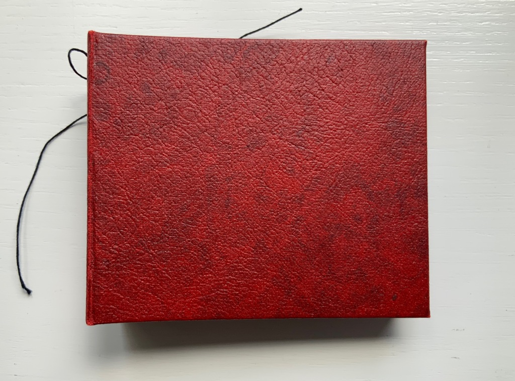
Hardcover. H90 x W110 x 30 mm. Edition of 15, of which this is #7. Acquired from the artist, 13 December 2021.
Photos: Books On Books Collection. Displayed with permission of the artist.
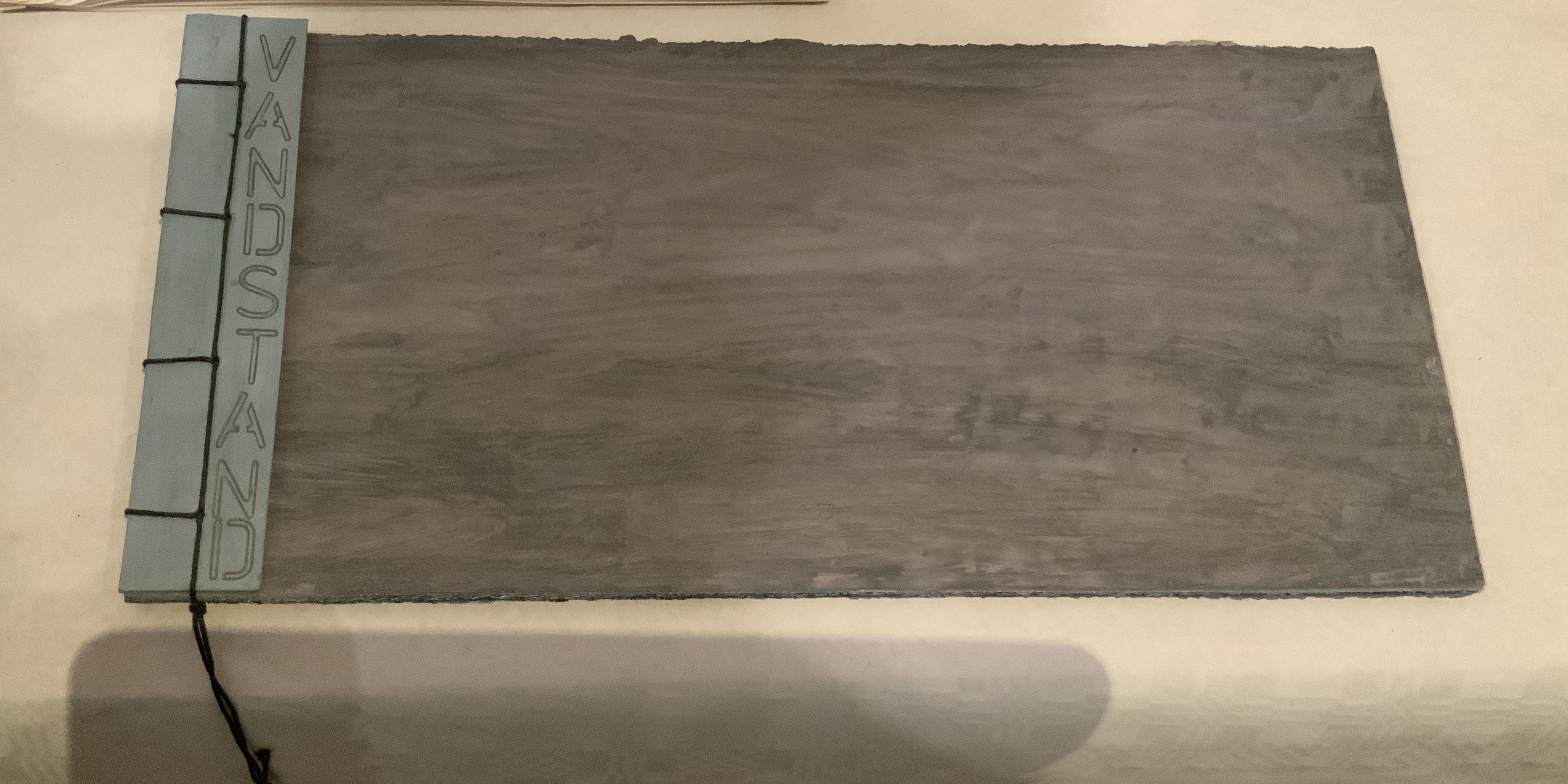
The book block between the covers here is not a book block of pages. The only text in Forest Garden Beach is found on the tag attached to the work. On one side is the title, artists’ names, date and edition. On the other are UK National Grid Reference coordinates for locations in Scotland, South Yorkshire and East Yorkshire. The coordinates’ suggestion of precision, however, run into visual, tactile and textual ambiguities. This book shape opens on something concealed. The red leather case binding holds and withholds.
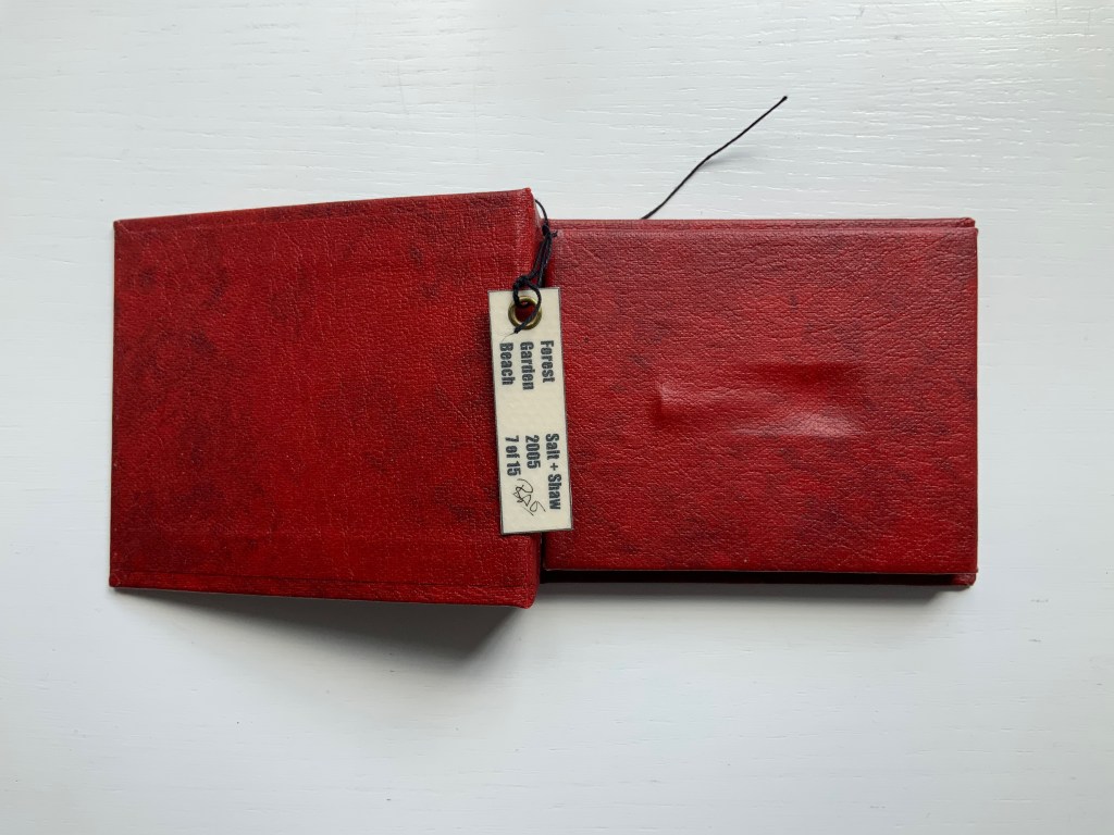
The shape seen and felt beneath it seems to be that of a bullet’s shell casing. There is an indentation, almost like a rifle chamber from which the casing is being ejected. According to the artists’ online description, it is a spent bullet “found in a forest, on a beach or in the garden”. But that is information apart, or evidence external to the work and its tag. Even if it were squeezed onto the tag somehow, the information leaves ambiguities: from which of the three locations did this single found object, now covered by leather, come; and why the precision of the coordinates if the source is uncertain?
Fusing location with the element(s) of the book form that they have chosen to exploit is another frequent characteristic of Salt+Shaw’s combined work. The next item is one of their most effective works of “local color”.
Mill (2006)
Mill (2006)
Salt+Shaw
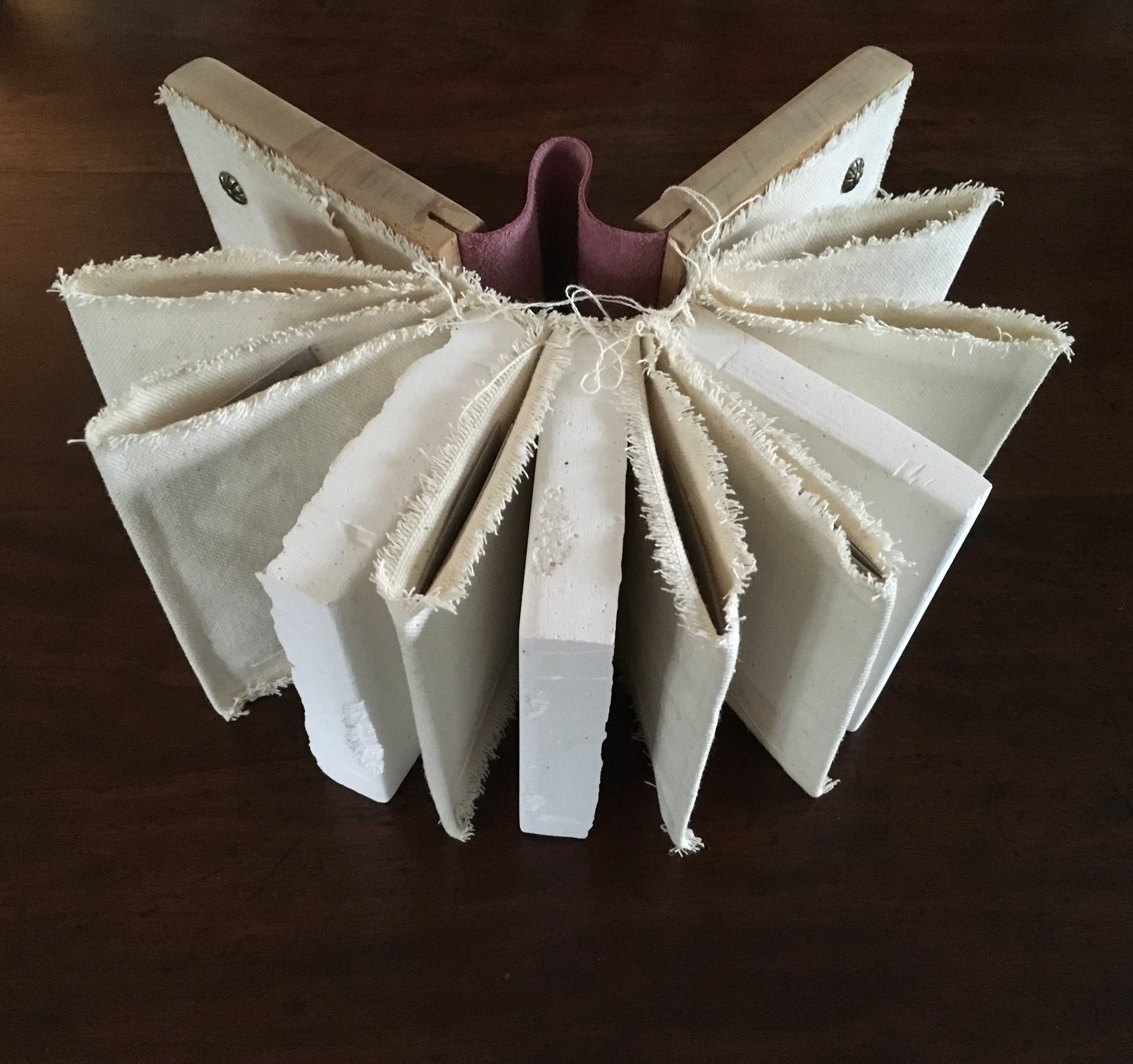
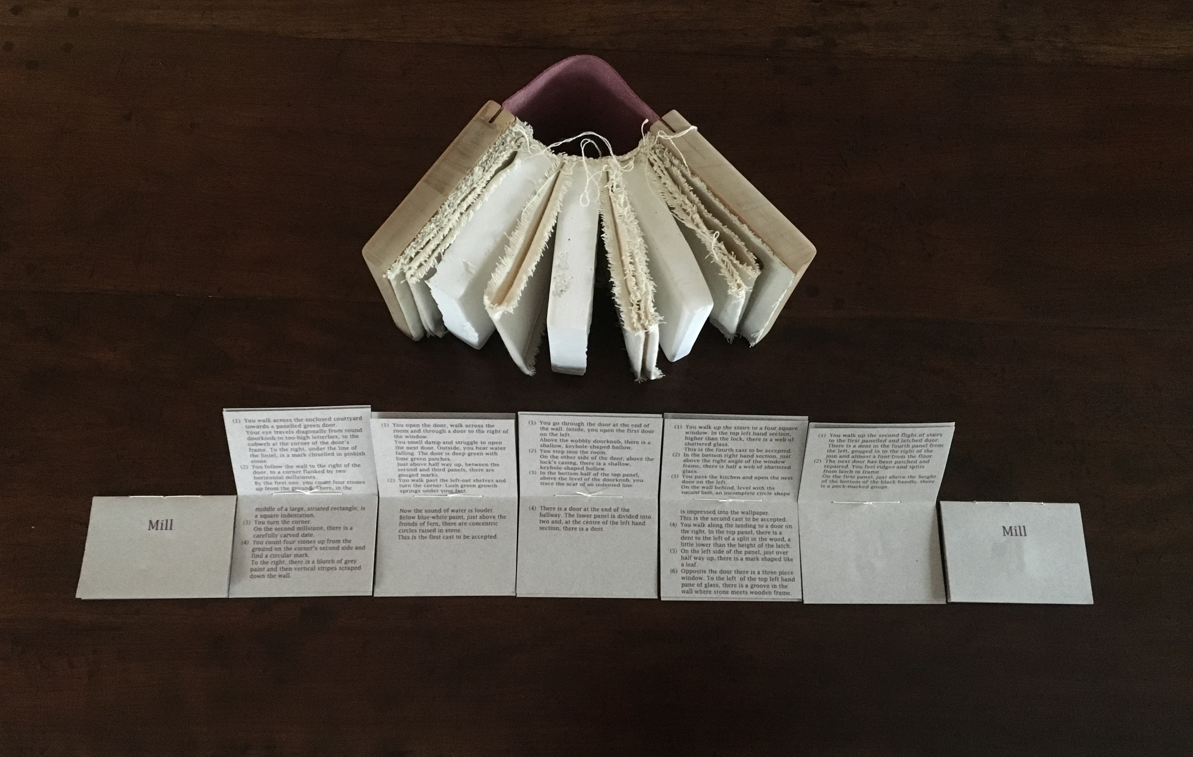
Wood and leather binding, using discarded library shelves, canvas and upholstery nails. Plaster cast and canvas pages with individual pamphlet book text inserts printed on Canson paper. Casts made using water extracted in dehumidifying the building.
H143 x W114 mm closed, H143 x W310 mm open.
Edition of 24, of which this is #2. Acquired from the artists, 25 November 2018.

The work is a tactile exploration of the interior and exterior space of a corn mill in Cromford, built c.1780 to grind grain for workers at Arkwright’s cotton mill.A journey around Cromford Mill, Derbyshire.

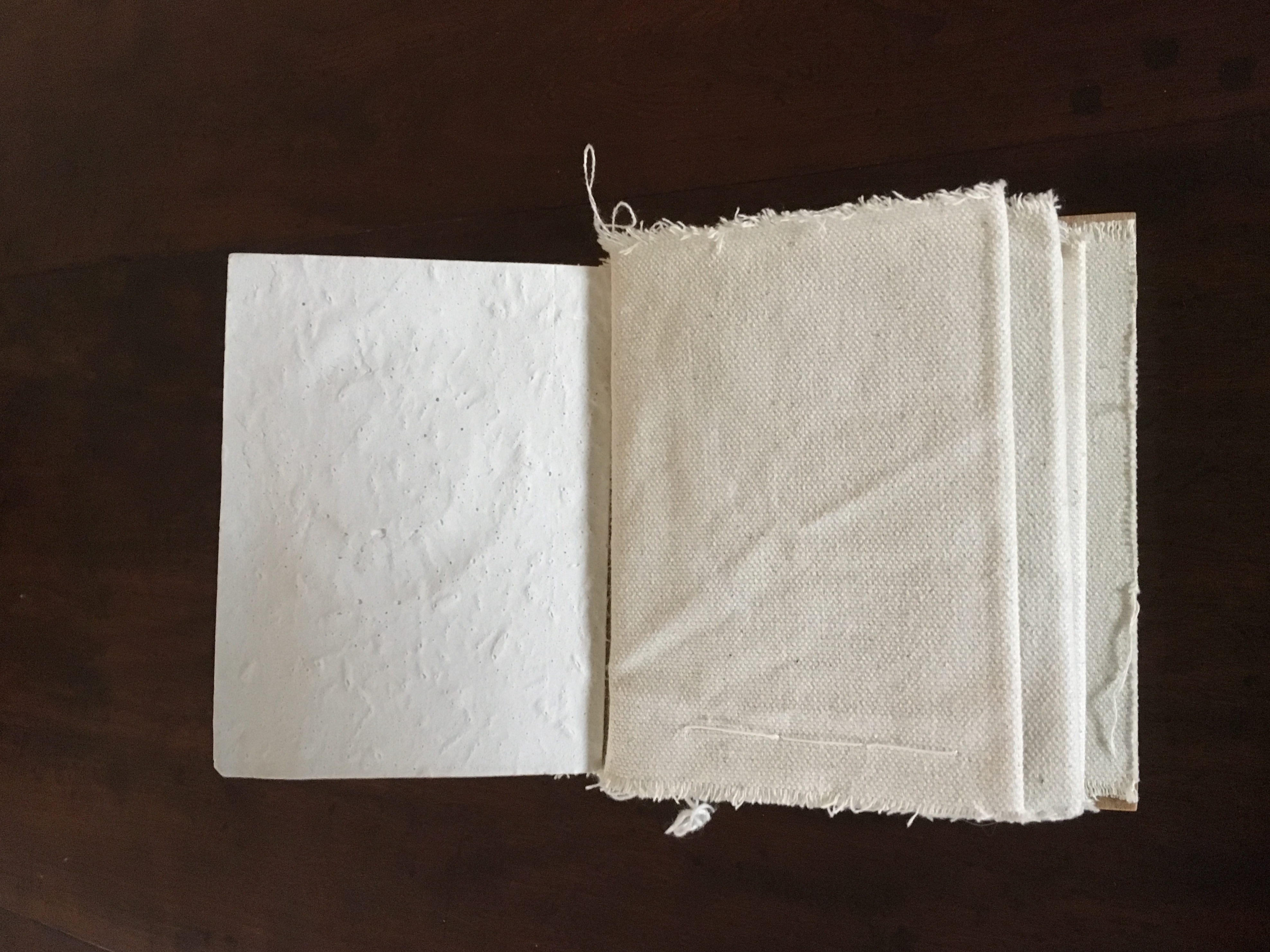
Mill is an investigation of the marks of passage, which have become part of the fabric of the space and reveal time, energy, endeavour and change:
(i) recording the interaction of the human body with the building
(ii) recording the impact of natural forces upon the built environment
(iii) locating the marks that reveal a momentary connection or repetitious action
(iv) examining clues and ephemera.
Silicone moulds were taken from marks of usage around the mill, including the spotwhere a door handle impressed upon a wall and the shape of a break in a pane of glass. Plaster casts were then produced, using water from a dehumidifier within the building to make the plaster. A text piece, contained within canvas pocket pages, creates a unique map of the mill and takes a journey through the building – both to experience the environment and locate the plaster casts. [Correspondence from the artists, 5 December 2018.]
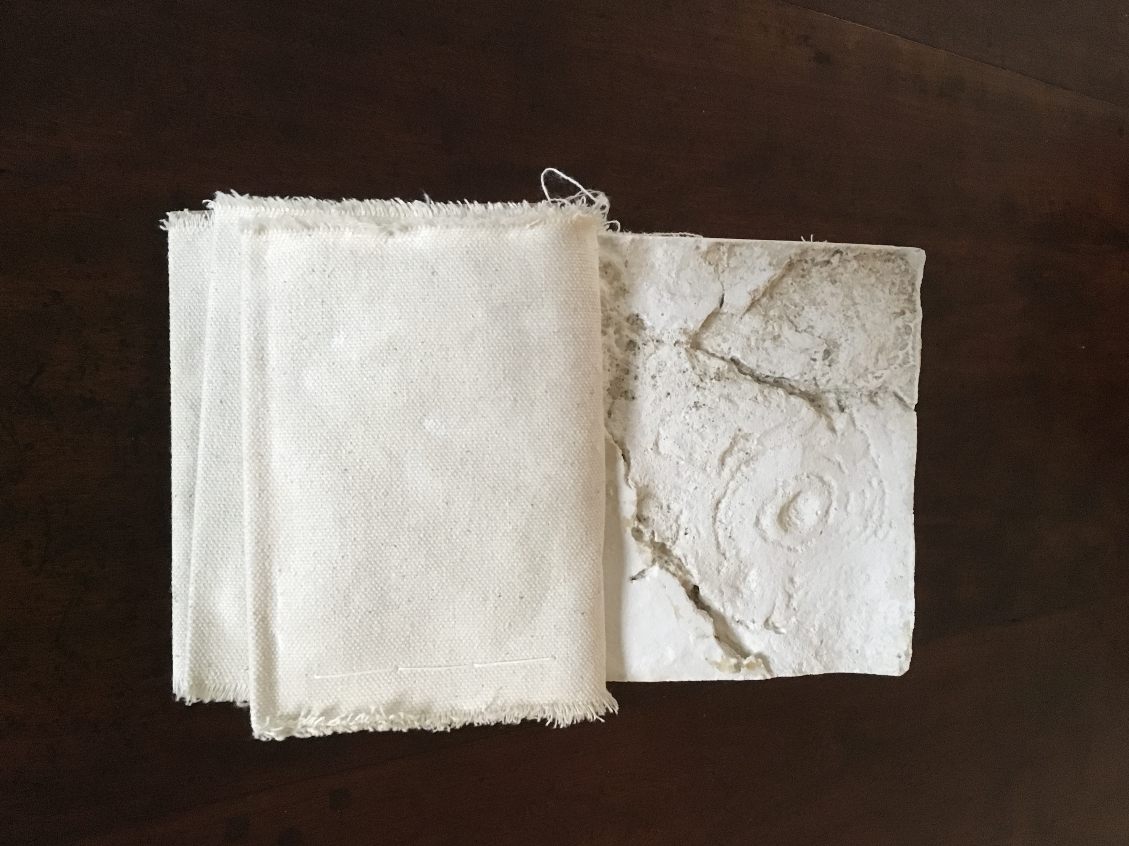
Just as the spent object in Forest Garden Beach lies buried or hidden but still tangible beneath the cover of the work, the spent object of Mill is plain to the touch but only through plaster impressions of it. Where the text related to Forest Garden Beach plays a game with precision and ambiguity, the text of Mill plays a game of hide-and-seek or blind man’s bluff.
FOLD (2008-2015)
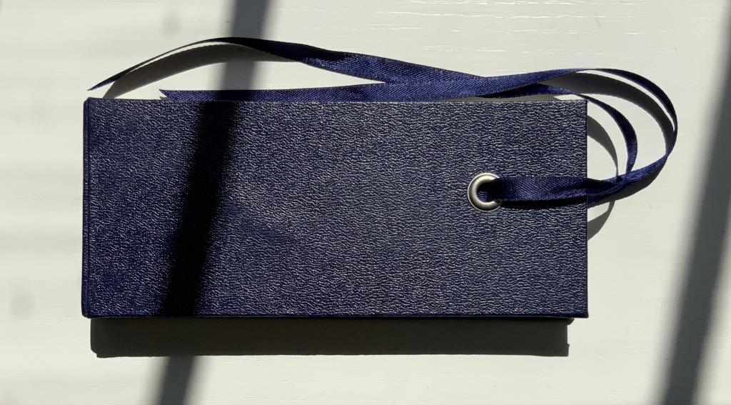
FOLD (2015)
Salt + Shaw
Cloth over board with eye-and-ribbon closing. H60 x W140 x D1.5 mm. Edition of 35, of which this is #19. Acquired from the artists, 13 December 2021.
Photos: Provided by the artists and Books On Books Collection. Displayed with artists’ permission.
The cloth-over-board binding opens to reveal a single-fold title page on the inside front cover and a small book tucked into a receptacle on the inside back cover. Bolted to the inside front cover, a found miniature pair of Sheffield scissors. Glued to the inside spine, a small rock. And imprinted on the inside back cover, a rust-transferred reverse image of the scissors.
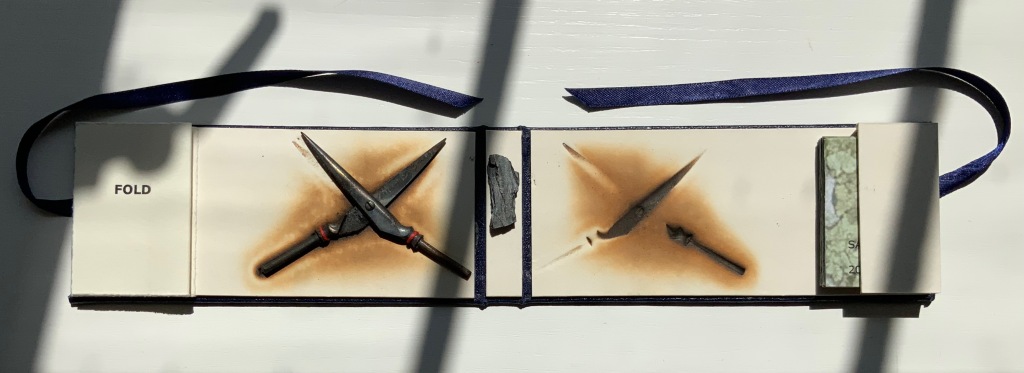
On removal and opening, the small book turns out to be a single sheet of paper in a “meander” fold.
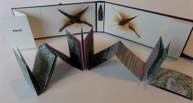
On one side, it displays a close-up photograph of a beached whale’s skin lying in folds over rocks and shingle. On the other side is a close-up of human skin resting on a similar bed.
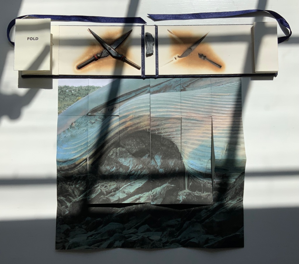
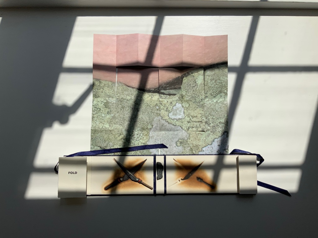
So here is a fourth option in the game of Rock-Paper-Scissors, but the game is one rather of Risk in which, whatever the craft, whatever the objects found and whatever the strategy played in rock-paper-scissors, the environment enfolds and binds.
This sort of implicit visual/verbal play becomes more explicit in the next work.
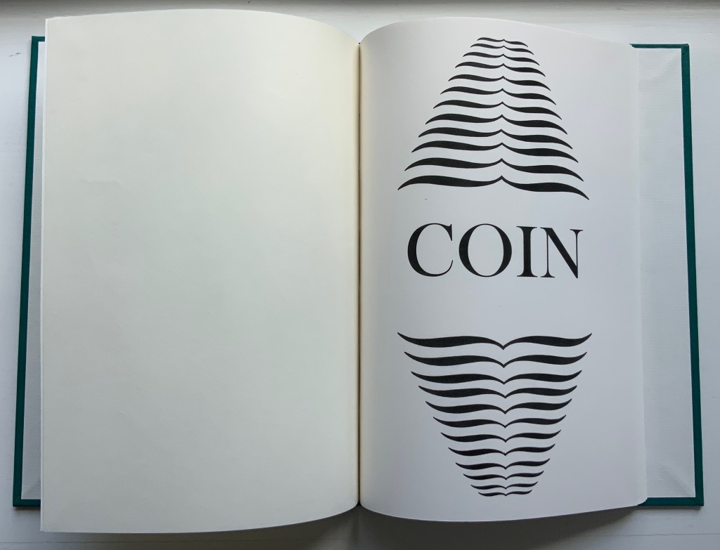
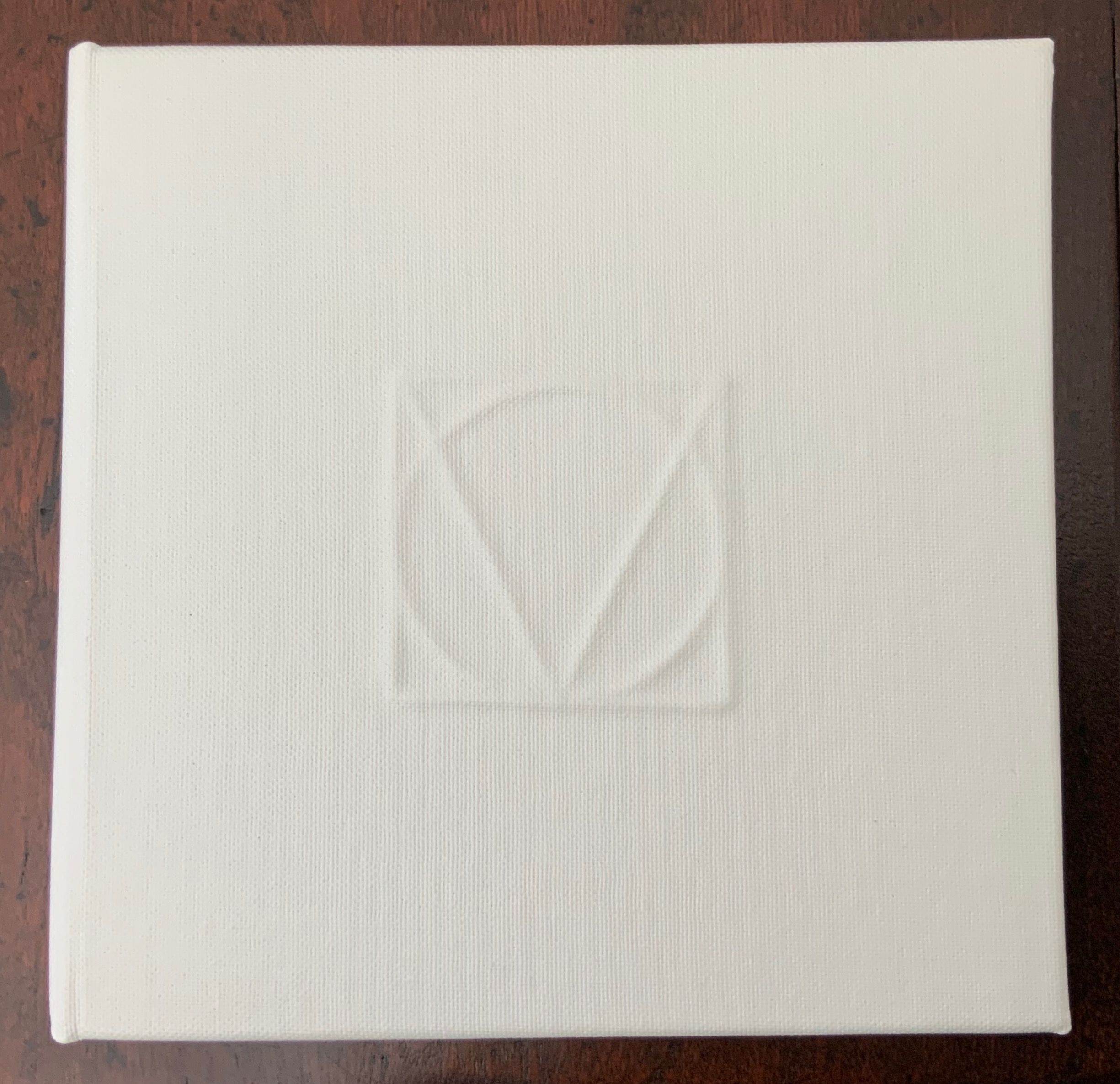
COIN (2017)
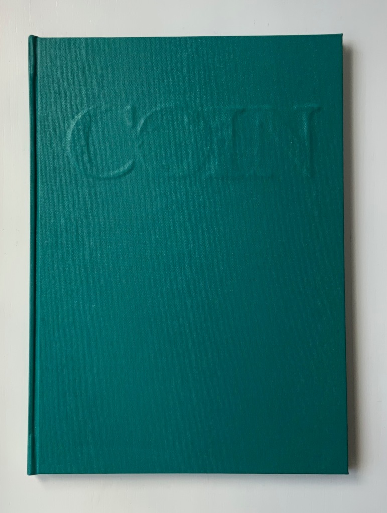
COIN (2017)
Salt + Shaw
Hardcover. H300 x W215 mm, 44 unnumbered pages. Edition of 9, of which this is #2. Acquired from the artists, 13 December 2021.
Photos: Books On Books Collection. Displayed with permission of the artists.
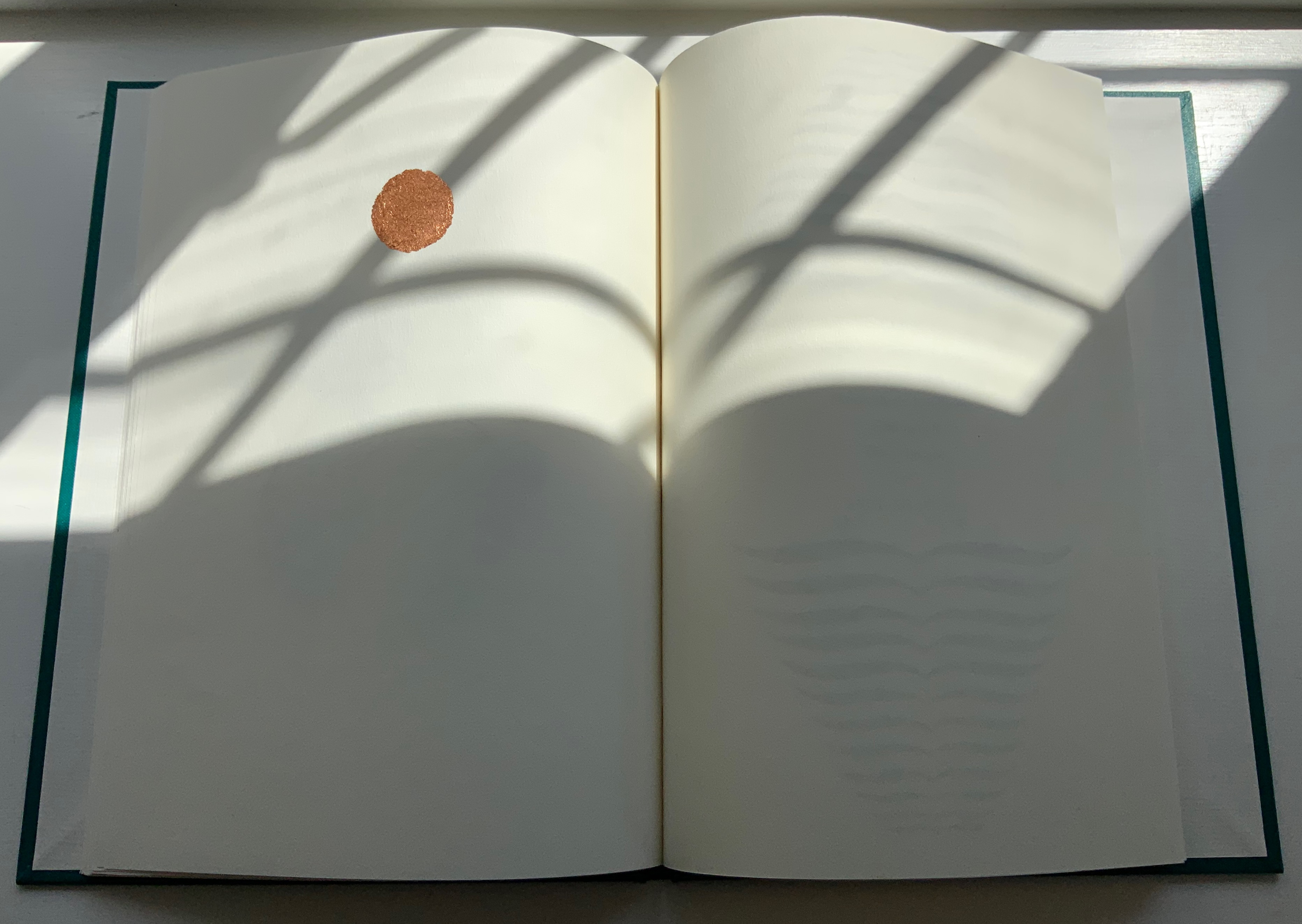
Faint handprints from nine individuals. Light imprints from an ampersand and a series of words all prefixed with “de”. A gradually disappearing profile of Queen Victoria. A hand-worn 1860-1894 penny coin fixed to a splatter of copper leaf. Along with the front cover’s embossed, eroded letters, this progression of letterpress and stencil work toward that coin echoes the archaeological aura of Forest Garden Beach, Mill and Fold, but through its progression, COIN enacts the strange movement through time that such found objects take.
The brackets on either side of the word on the title page might suggest a coin dropped in a pool of time, except that the brackets narrow rather than widen outwards. So, maybe the coin is rising through time. Or, look again at the title page and the coin on the last page, and maybe the brackets should be seen as “leaking” from the word just as the copper leaf can be seen as “leaking” from the coin.

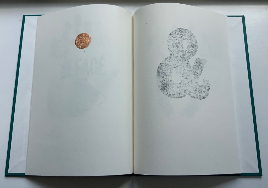
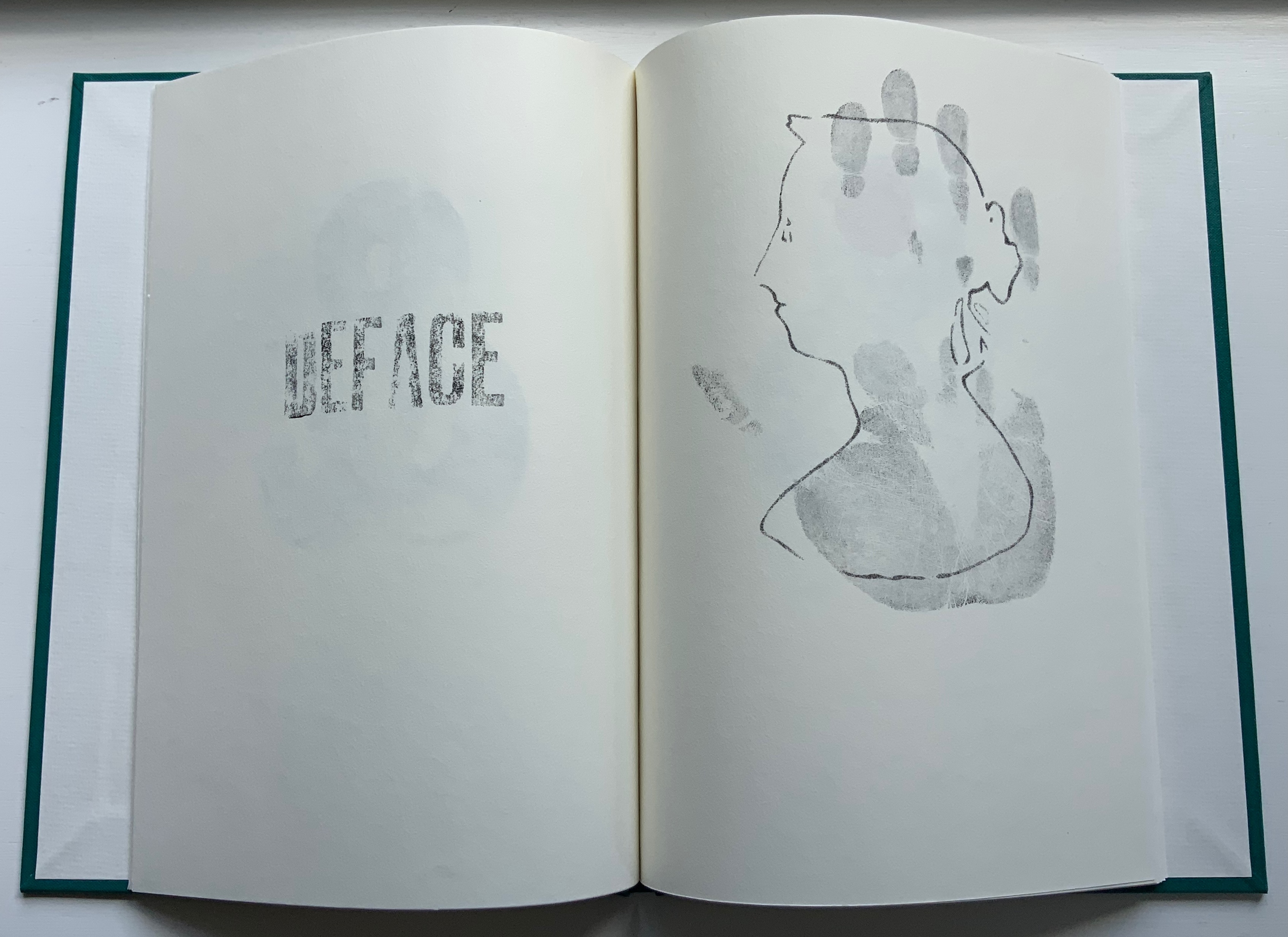
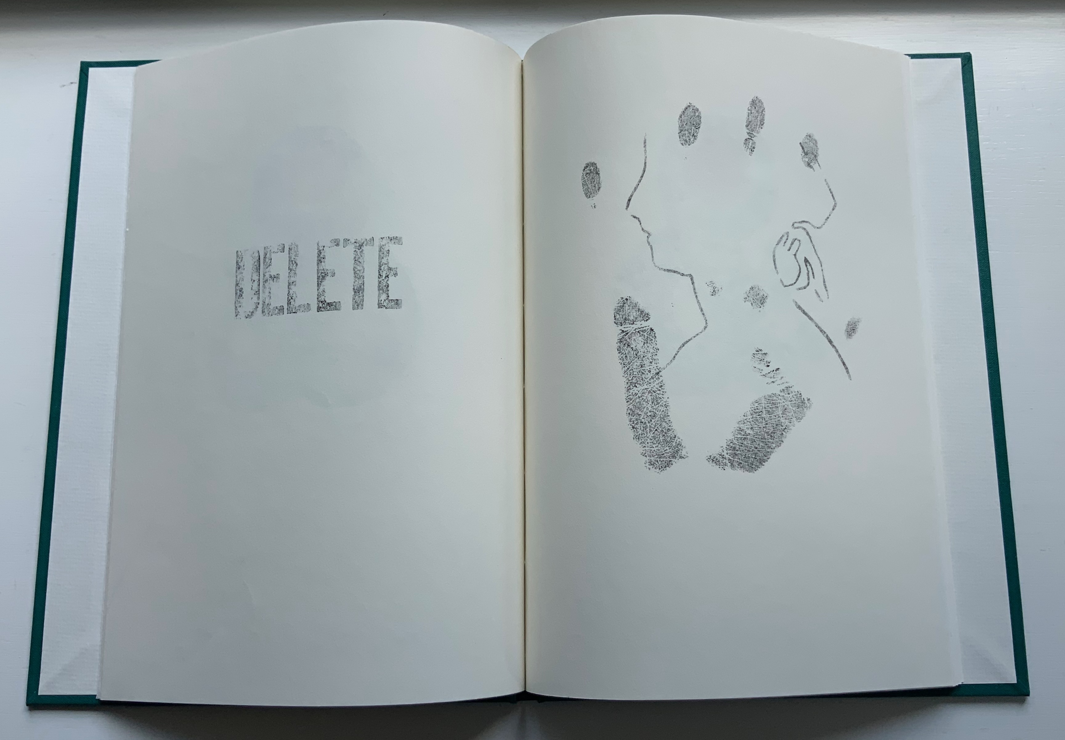
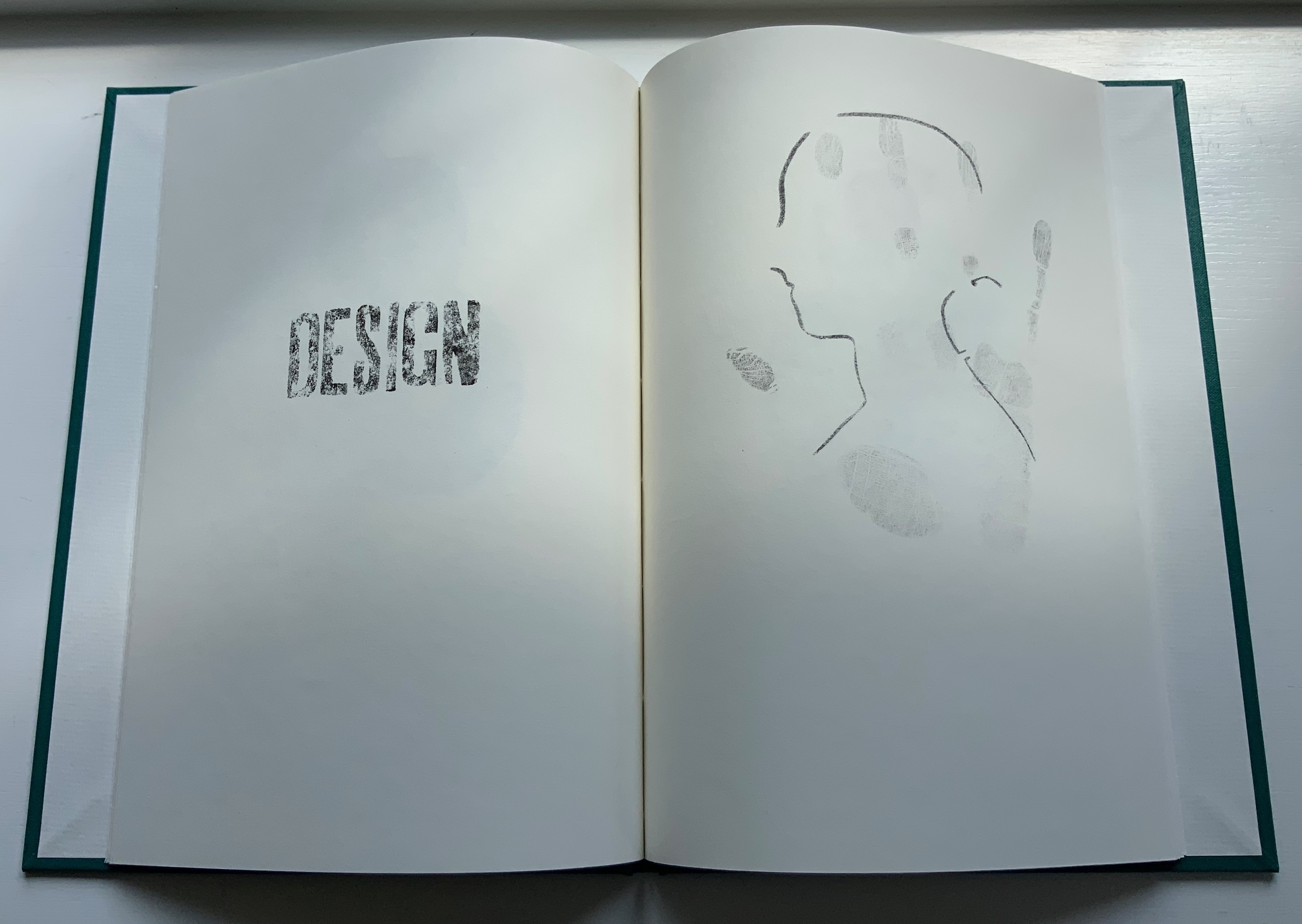
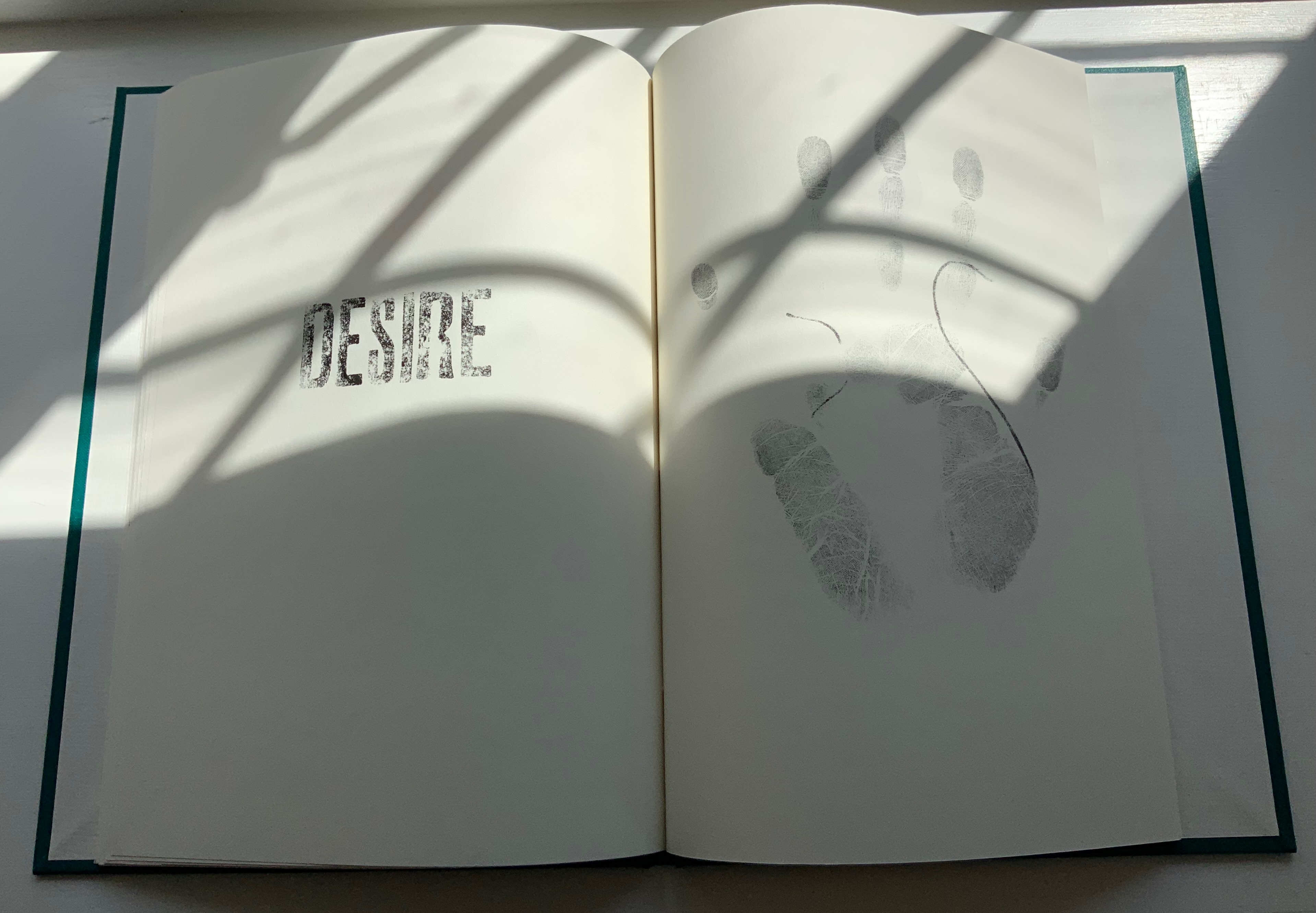
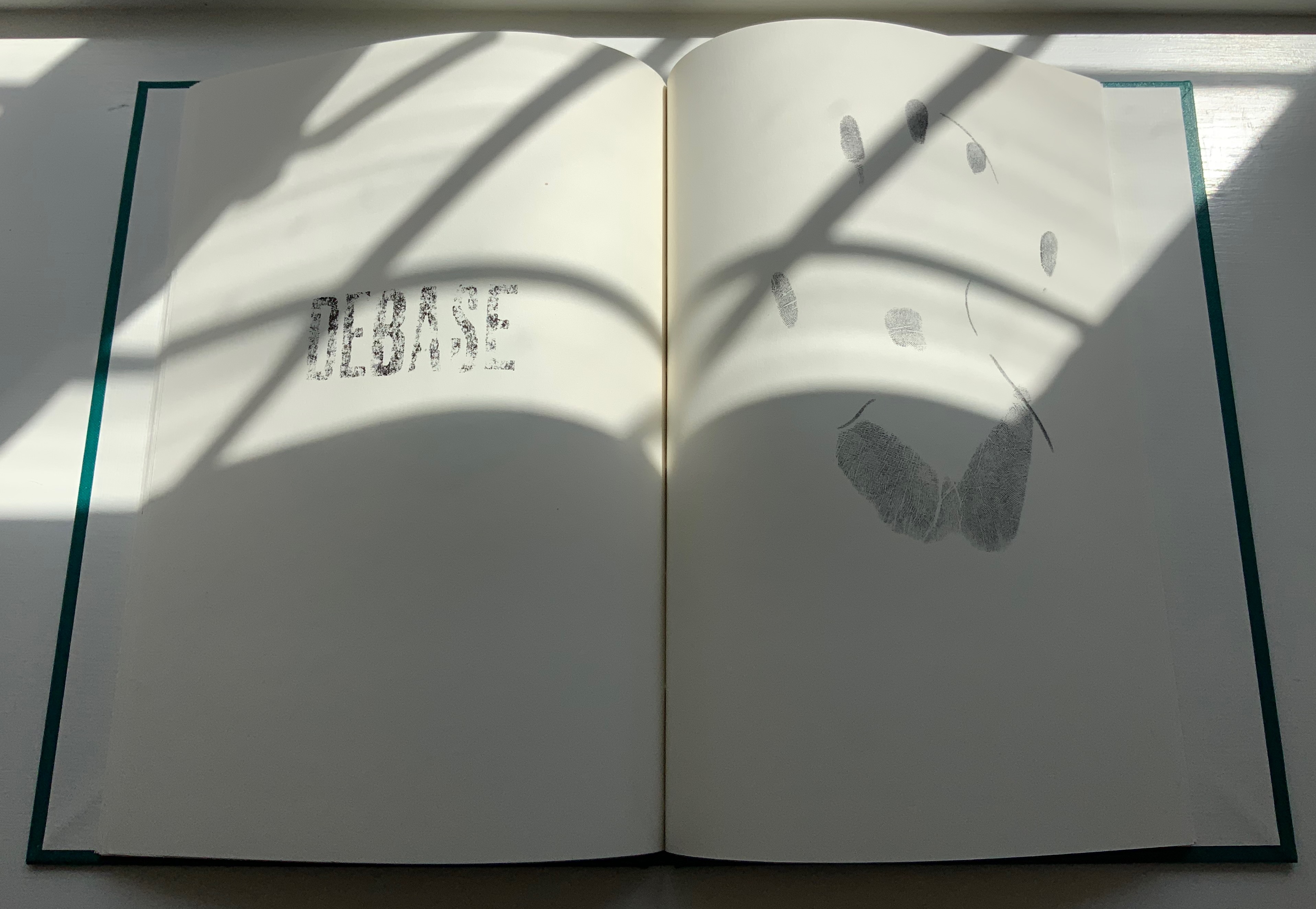
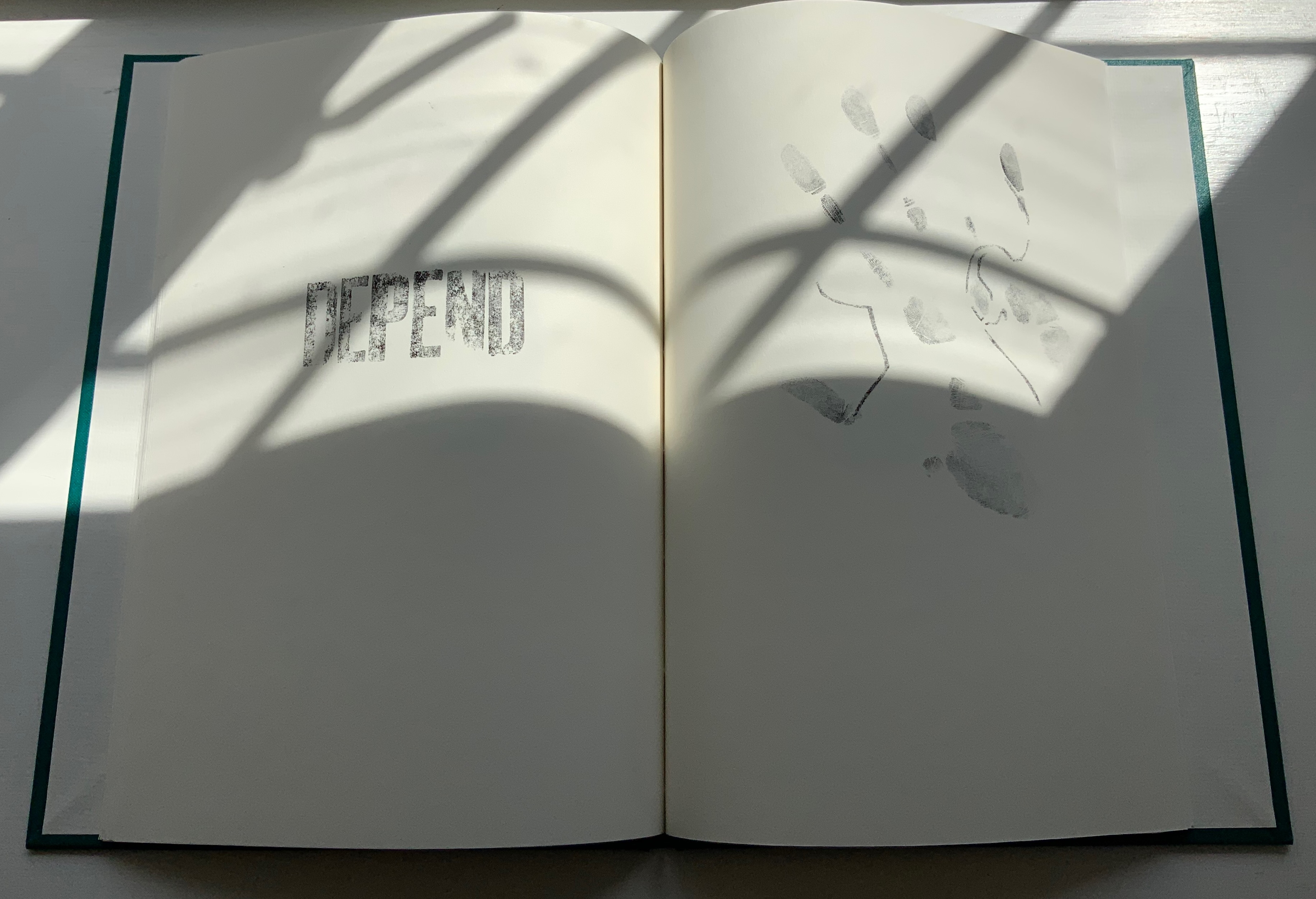
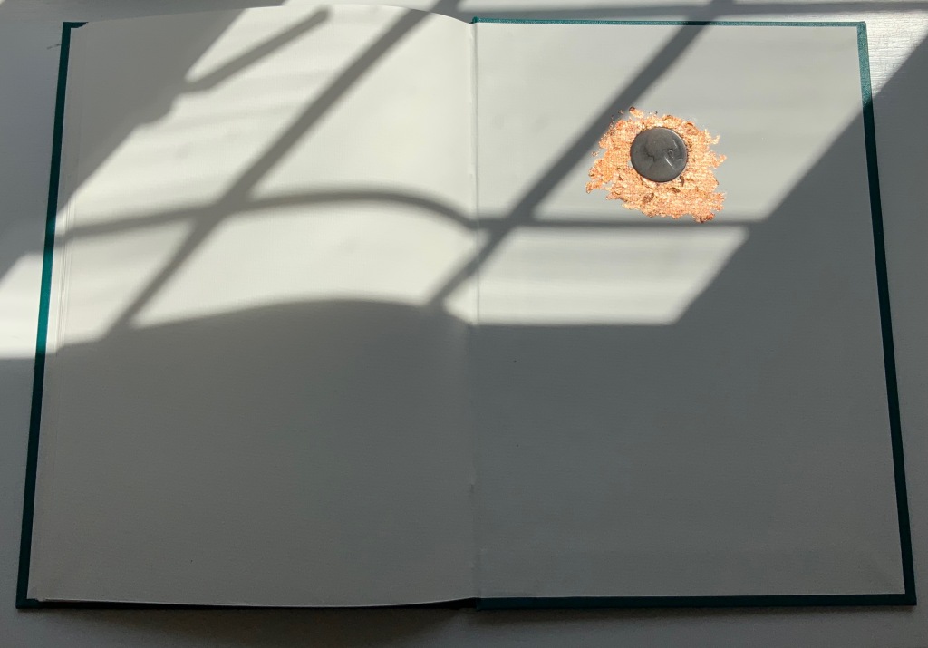
Like the tangible shell casing in Forest Garden Beach beneath the leather, the letters of the word “COIN” rise beneath the front cover cloth. Take another look at those letters, and it becomes clear that their forms beneath the cloth are eroded, just as the bullet is spent and just as the copper coin has been worn. The mix of “de” words and the handprints over the queen’s deteriorating profile add the kind of irony to be found in Shelley’s sonnet “Ozymandias“.
ITHACA (2015)
ITHACA (2015)
Salt + Shaw
Hardcover. 140 x 140 mm, 9 sheets of architectural tracing paper with hand-cut lines. Edition of 9, of which this is #7. Acquired from the artists, 13 December 2021.
Photos: Books On Books Collection. Displayed with permission of the artists.
Ithaca gives a few twists both to the theme of the present’s interaction with the past and to the artists’ affection for blind printing. As the colophon indicates, the first copy of the edition of nine was left on the island of Ithaca and performs the act of an offering, much as objects left as offerings to the gods. “Journeys” and the work’s title, of course, suggest the most famous of journeying heroes — Odysseus; however,
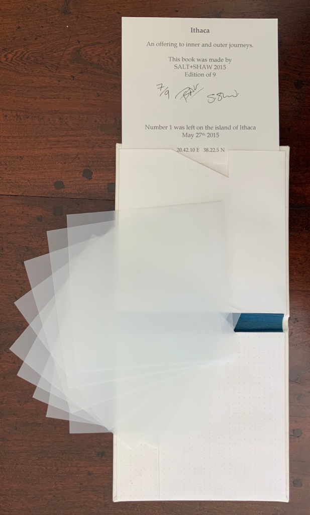
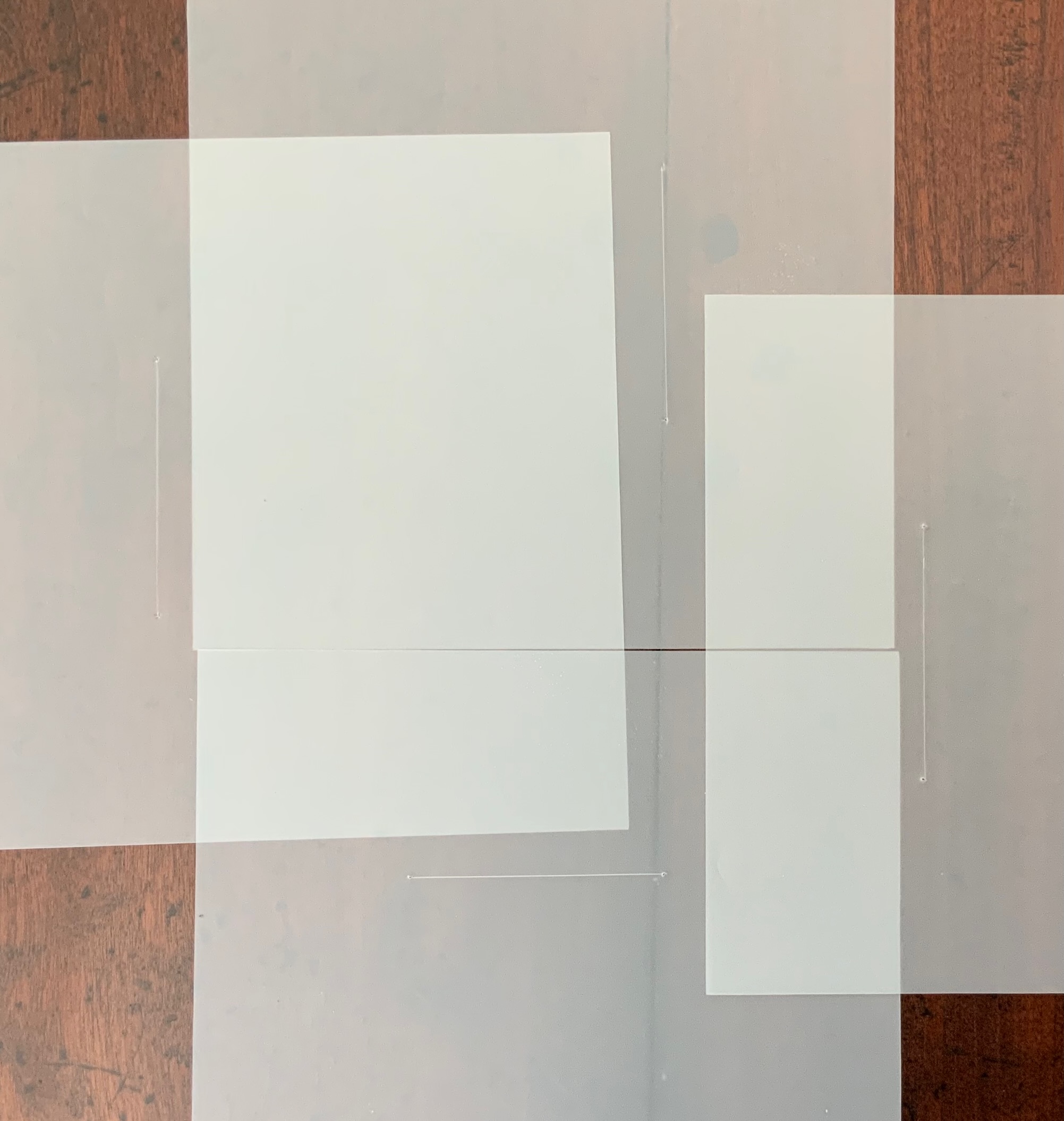
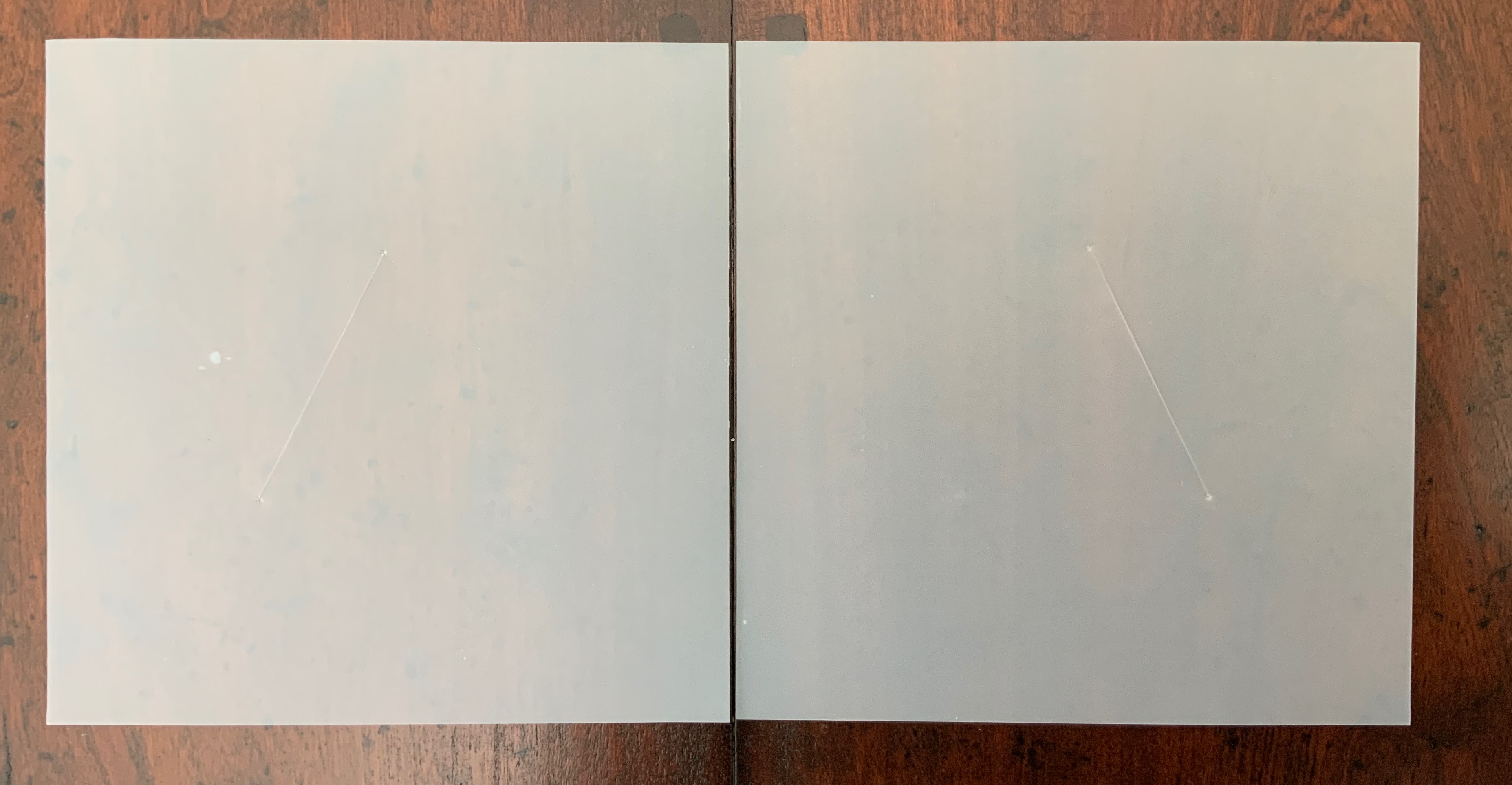
the journeys to which the offering is dedicated are “inner and outer”, suggesting an allusion beyond the hero. The nine translucent sheets of architecture paper bear cuts whose shapes are each replicated by an embossed printing on the back (or front) cover of the work. If the sheets are rightly arranged, they will replicate the image of the circle and triangle embedded in the square on the front (or back cover).
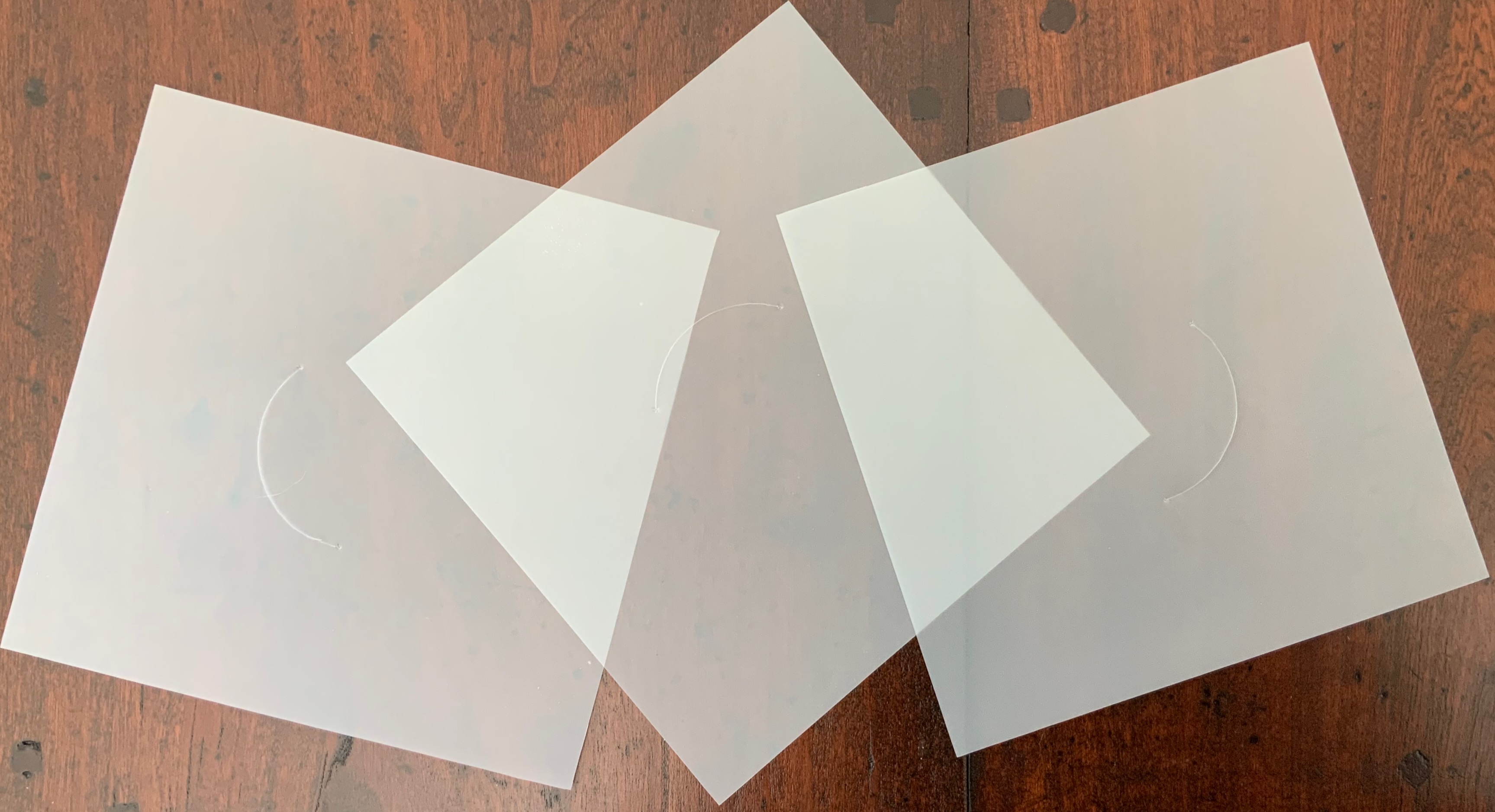
The combined images of square, circle and triangle and the reference to inner and outer journeys suggest associations with sacred geometry (reflected elsewhere in the Books On Books Collection: Bruno Munari’s compendia on the square, circle and triangle and Jeffrey Morin’s and Steven Ferlauto’s two works) and with Zen (also reflected elsewhere in the collection: Julie Johnstone’s works).
The playing with the sheets of paper — a kind of inner and outer journey itself — to which Ithaca invites us highlights a growing insistence on audience interaction in all the works so far and especially so in the next.
LIMINAL KEEPSAKE (2015)
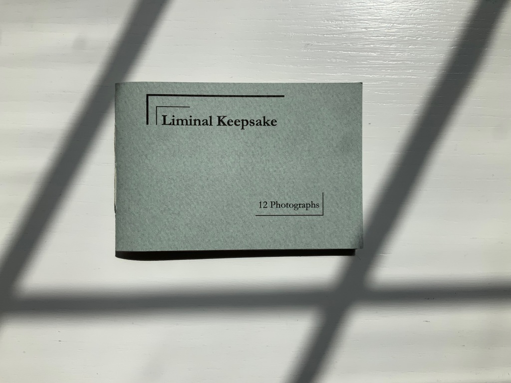
LIMINAL KEEPSAKE (2015)
Salt + Shaw
Pamphlet book. H70 x W105 mm, 12 unnumbered pages, half-sheet insert. Edition of 15, of which this is #11. Acquired from the artists, 13 December 2021.
Photos: Books On Books Collection. Displayed with permission of the artists.
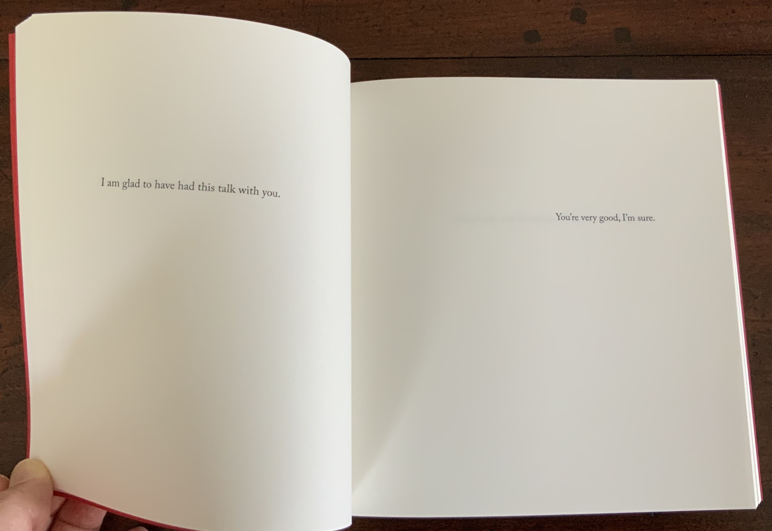
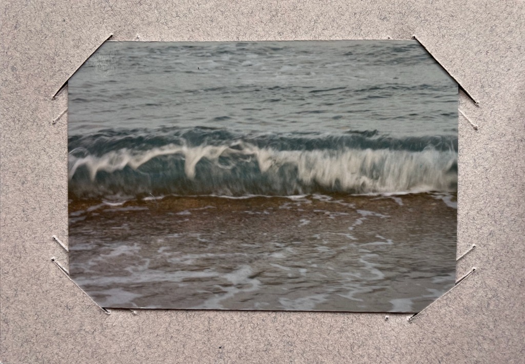
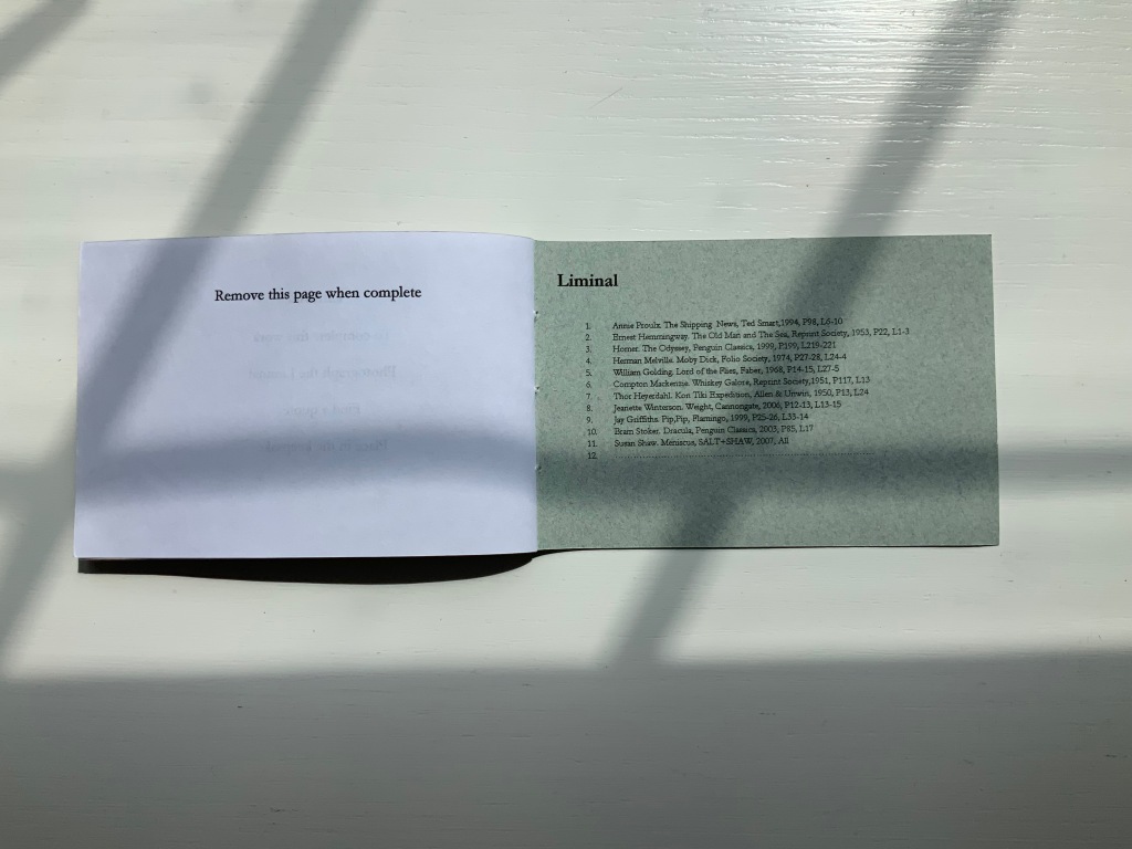
Liminal Keepsake realizes the sea:land allusion of Ithaca‘s title by presenting its audience with eleven photographs of sea and land meeting. The photos, unique to each copy in the edition, are held in hand-cut mounts. “Liminal” refers to “a space between” or “where edges meet”. The photos in Liminal Keepsake seem to be a collection of memories about where the edges of the sea and land meet.
But on the inside back cover is a list of references to literary works, each of which has a passage that aligns with the photo matching in the sequence. Here is another space between — the space between the images and the passages — a space into which any curious viewer is thrust. If the viewer expects to enjoy this work fully, the viewer has to seek out the passages in that list to see how the text matches the photo. Not that easy a task since each text is specific to a specific edition of the cited literary work. The For instance, the tenth photo in the sequence is aligned to a passage from Bram Stoker’s Dracula — specifically from page 85, line 17 of the 2003 Penguin edition. Fortunately, that edition can be easily found online. Here’s the passage (the 17th line is in bold):
… The day / was unusually fine till the afternoon, when some of the gossips / who frequent the East Cliff churchyard, and from that com- / manding eminence watch the wide sweep of sea visible to the / north and east, called attention to a sudden show of ‘mares’- / ‘tails’ high in the sky to the north-west. …
And here is the relevant photo in the collection’s copy of Liminal Keepsake.
So the viewer has to become researcher and reader to experience Liminal Keepsake fully, and the viewer/researcher/reader has to become something even more to finish Liminal Keepsake. Just as Ithaca invites its audience to arrange its translucent sheets to form the symbol on its cover, Liminal Keepsake invites its completion by the viewer/researcher/reader-cum-artist’s taking a photo of “the Liminal” and a bibliographical reference that echoes the photo.
In pondering completion of the work, would-be artists come across across other “spaces between” — the space between the visual and textual imaginations and the space between concept and execution. Apparently the artists took their photos, then found the texts to match. To hold an image in mind and be constantly on the lookout for matching text in whatever literary work happens to be in hand seems a tall order. To start the other way around — to have some sea:land text in hand and then seek a setting in which an appropriate image is likely to be found — looks easier to the more textual imagination. On top of this are the artist-manqué’s anxiety of crossing that space between concept and execution and the curator’s anxiety of sacrificing the object as-was and the aura of possibilities for perhaps a lesser object and one definitely without the aura of possibilities.
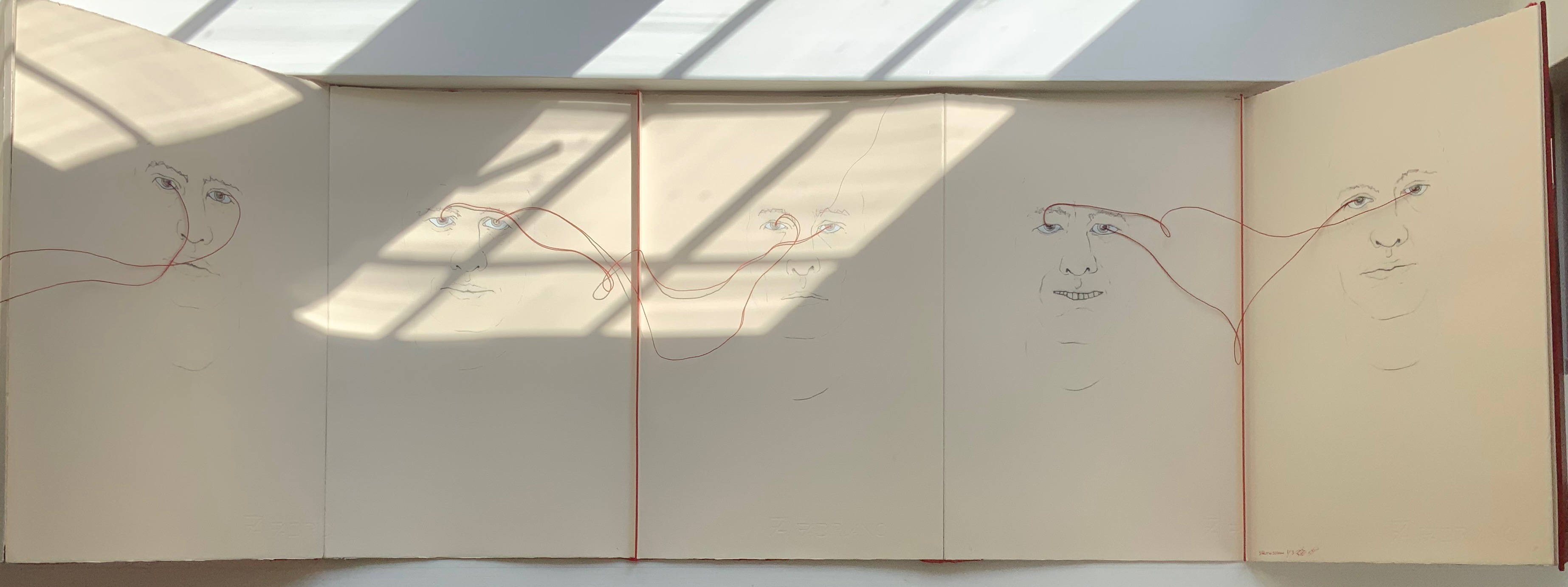
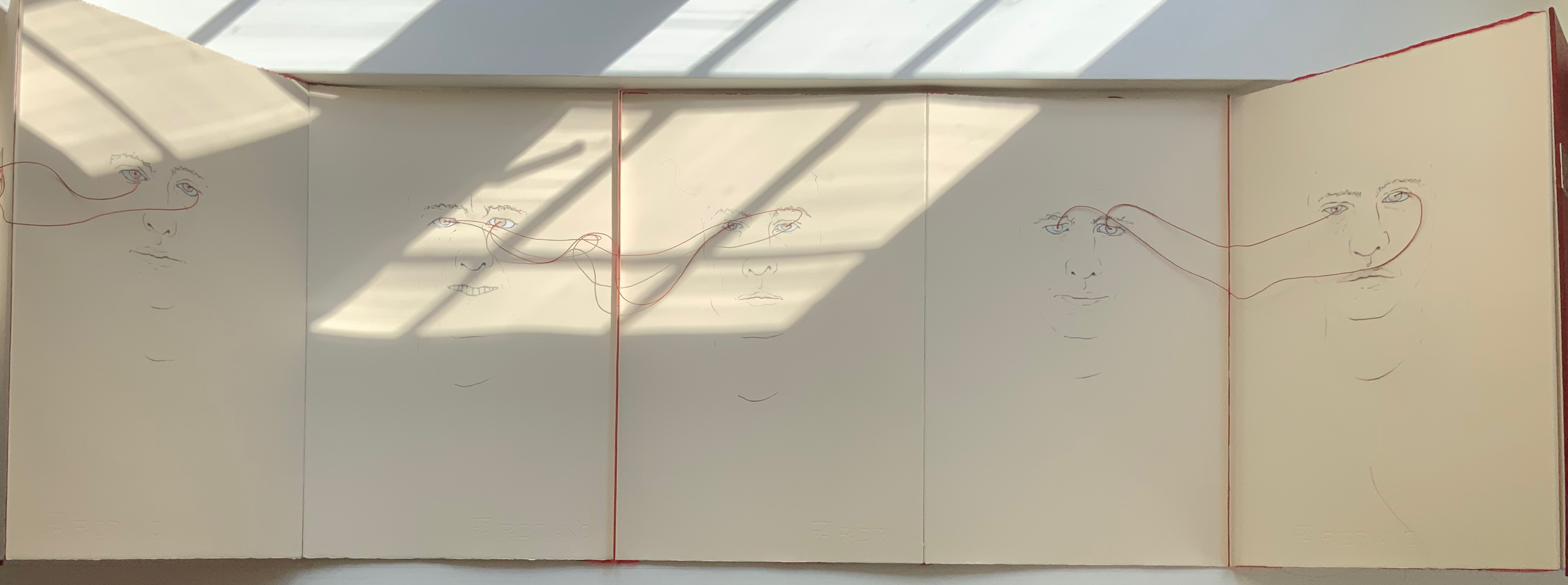
LOOK (2021)
LOOK (2021)
Salt + Shaw
Hardcover, double-sided concertina book. H350 x W230 mm, 10 unnumbered panels. Edition of 3, of which this is #1. Acquired from the artists, 13 December 2021.
Photos: Books On Books Collection. Displayed with permission of the artists.
The core features of two individuals’ faces head-on have been drawn on both sides of this concertina book — “core” meaning no delimitation by hair, ears or other details at the edges of the visages. The red thread connecting the pairs of eyes with one another draws attention back to the title: Is it an instruction for the viewer to look? Is it a noun referring to appearance, the look of the faces? Or to expression, the look in the faces? Is it a noun referring to an action occurring between the depicted faces — if only via the thread connecting the pairs of eyes? Only when the concertina is closed do the faces face one another. Yet the color red, echoed between the cover and thread, suggests an intensity connecting these looks, these gazes.
A more textual predecessor to Look is Whorl (2007).
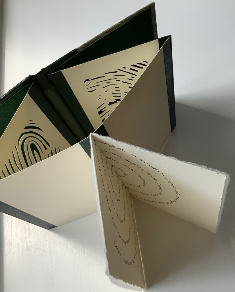
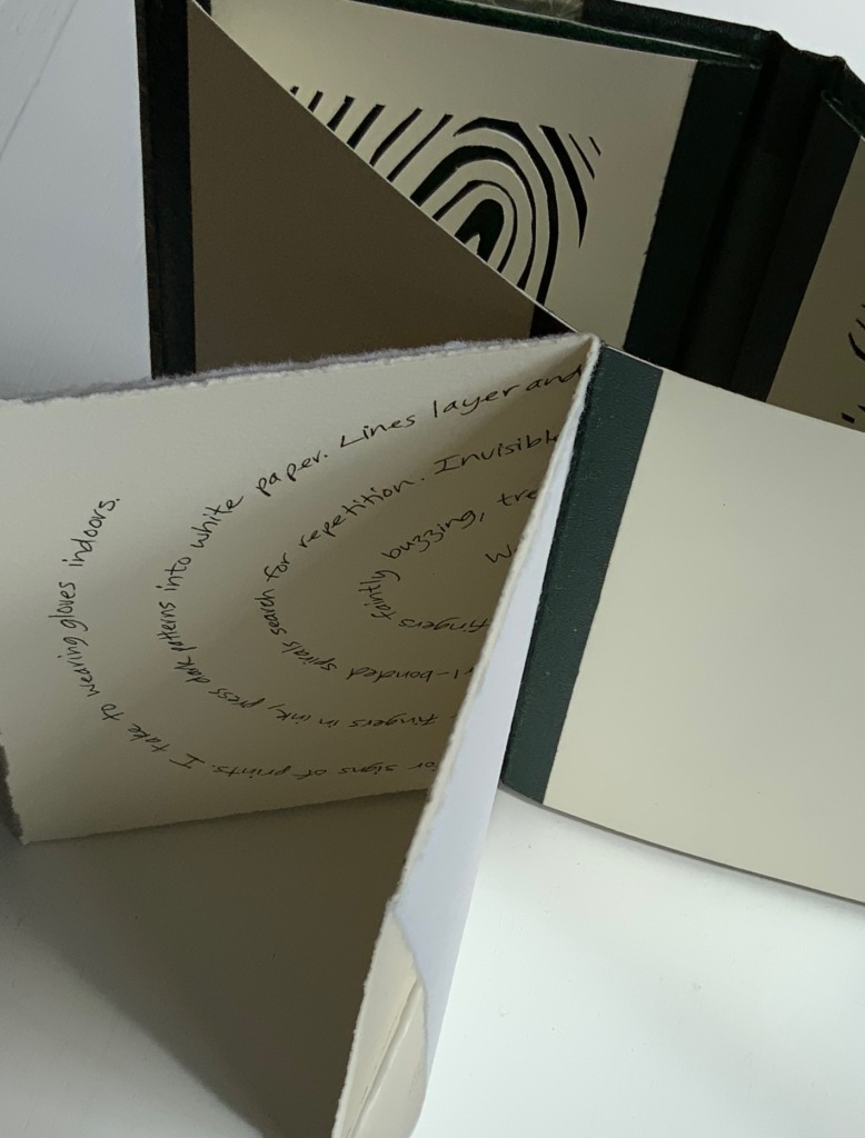
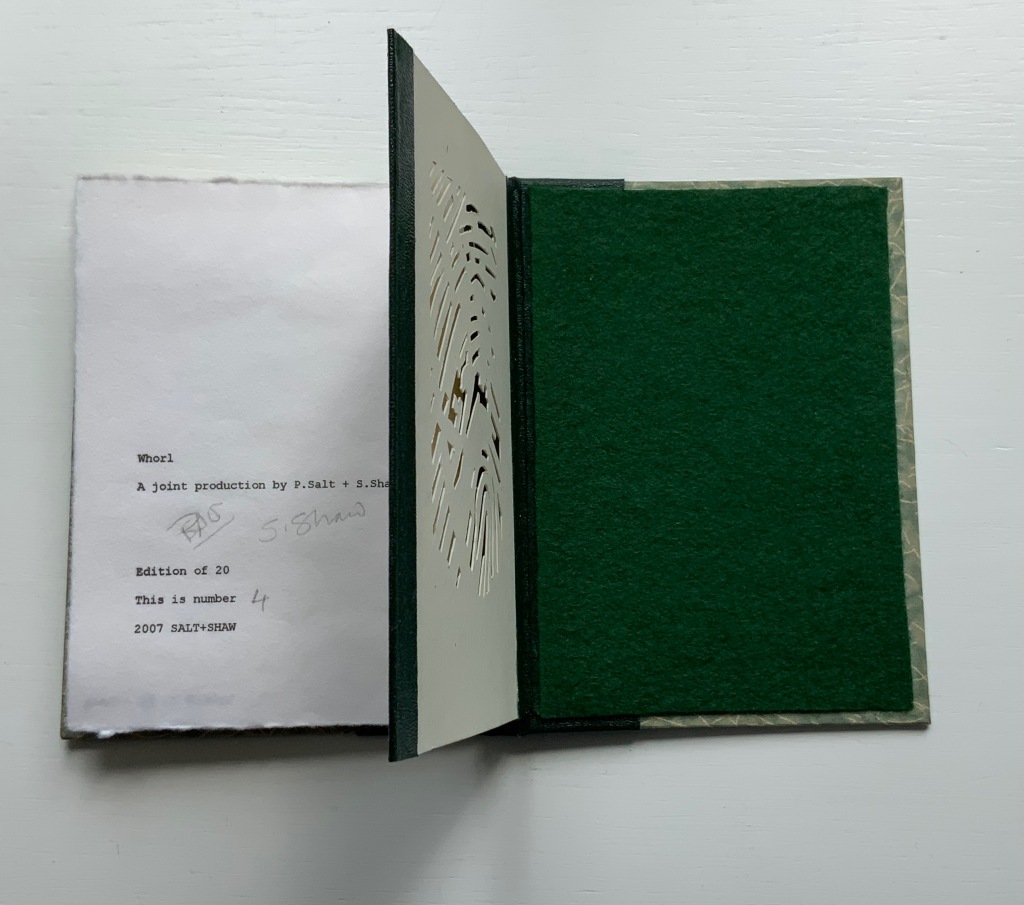
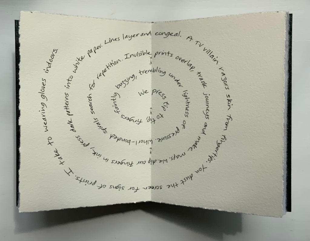
WHORL (2007)
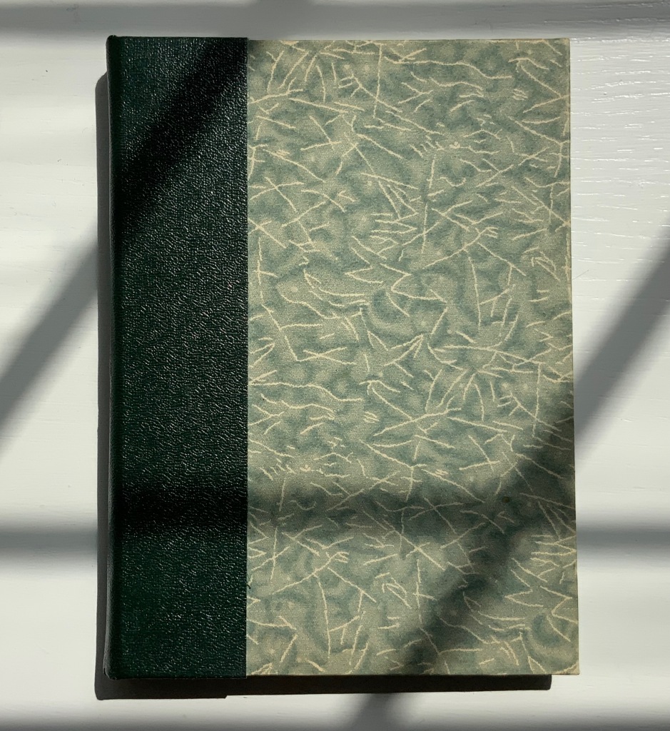
WHORL (2007)
Salt + Shaw
Hardcover, modified concertina and pamphlet book, H115 x W155 mm, 4 unnumbered panels, 2 unnumbered central sheets. Edition of 20, of which this is #4. Acquired from the artists, 13 December 2021.
Photos: Books On Books Collection. Displayed with permission of the artists.
Here is a rare instance of a poem’s metaphysicality being physically enacted by the surface and structure on which the poem is inscribed. On a double-page spread at the work’s center, a poem begins at the center of its spiral, or whorl, with the words “We press tip to tip fingers ….” Pull the double-page spread outwards away from the spine. Because the spread’s centerfold serves to bind four panels into a diamond shape, two hand-cut stencils of two different fingerprints approach (“tremblingly” as the poem describes) to touch one another when the double-page spread is pulled completely outwards and away from the spine. If this does not renind the reader of John Donne’s poetry, nothing will.
The following works are individual to Susan Shaw and Paul Salt, respectively. Shaw’s individual works also deliver complete textual works — short stories or a poem — that fuse with their containers.
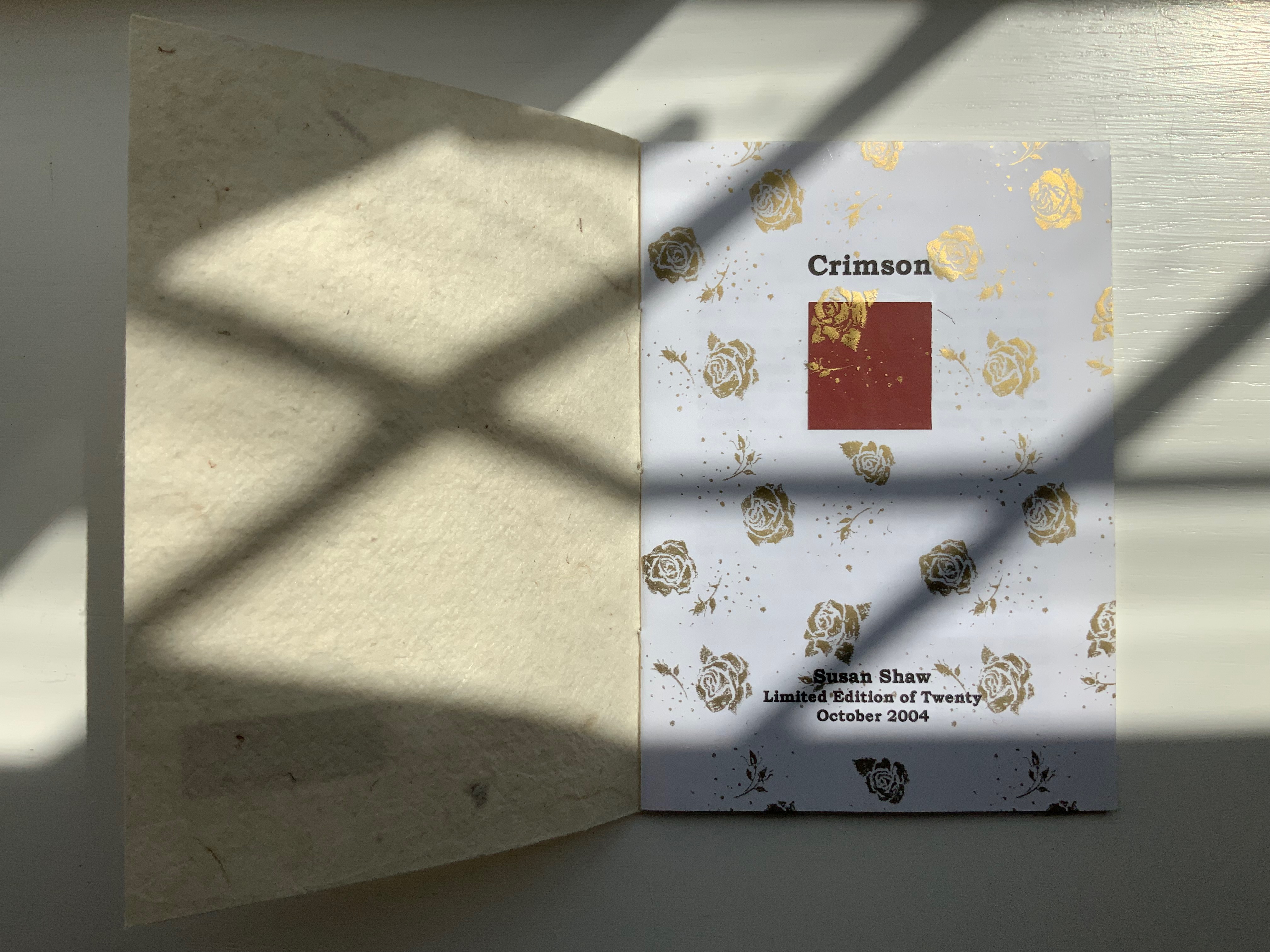
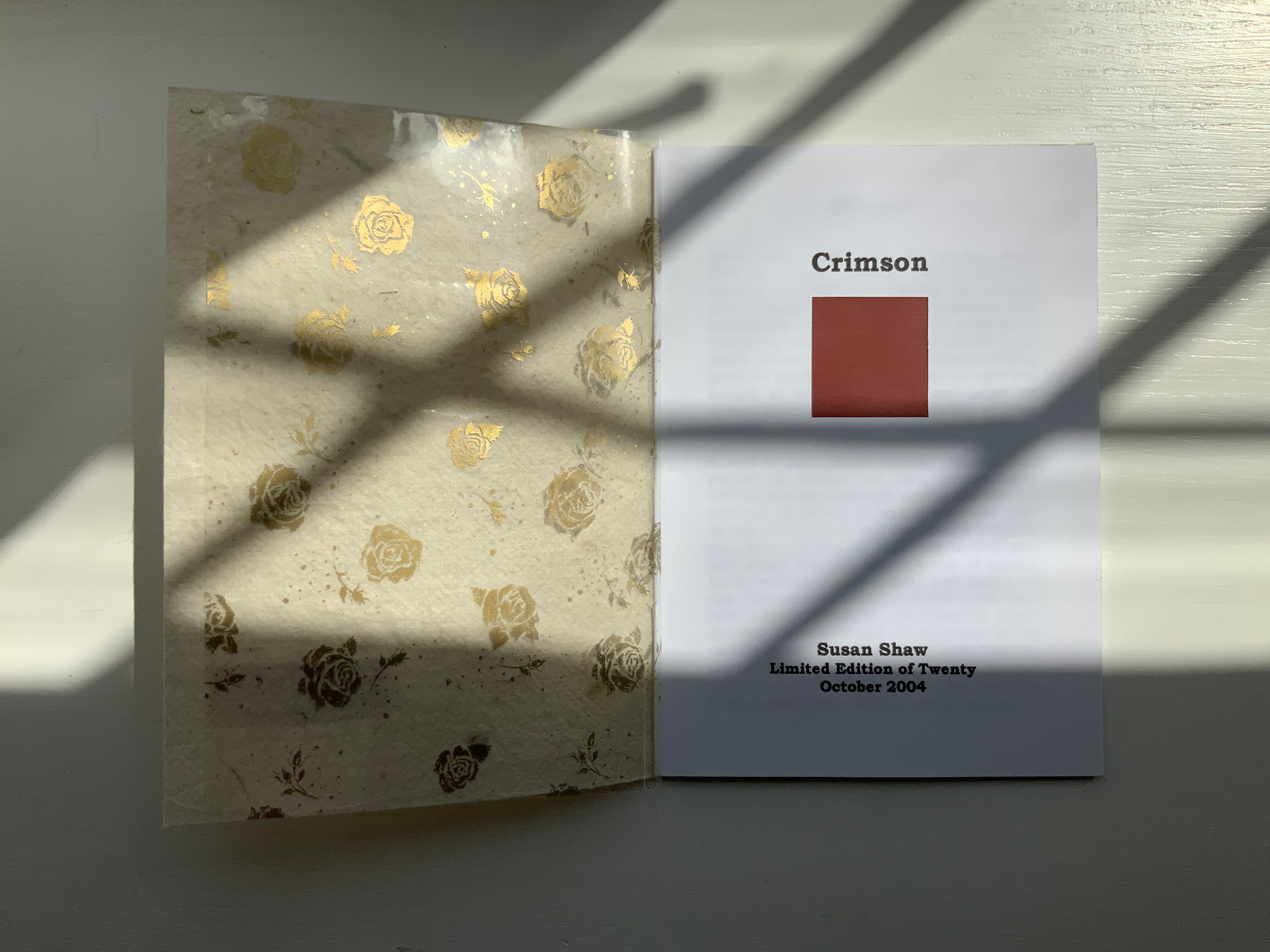
CRIMSON (2004)
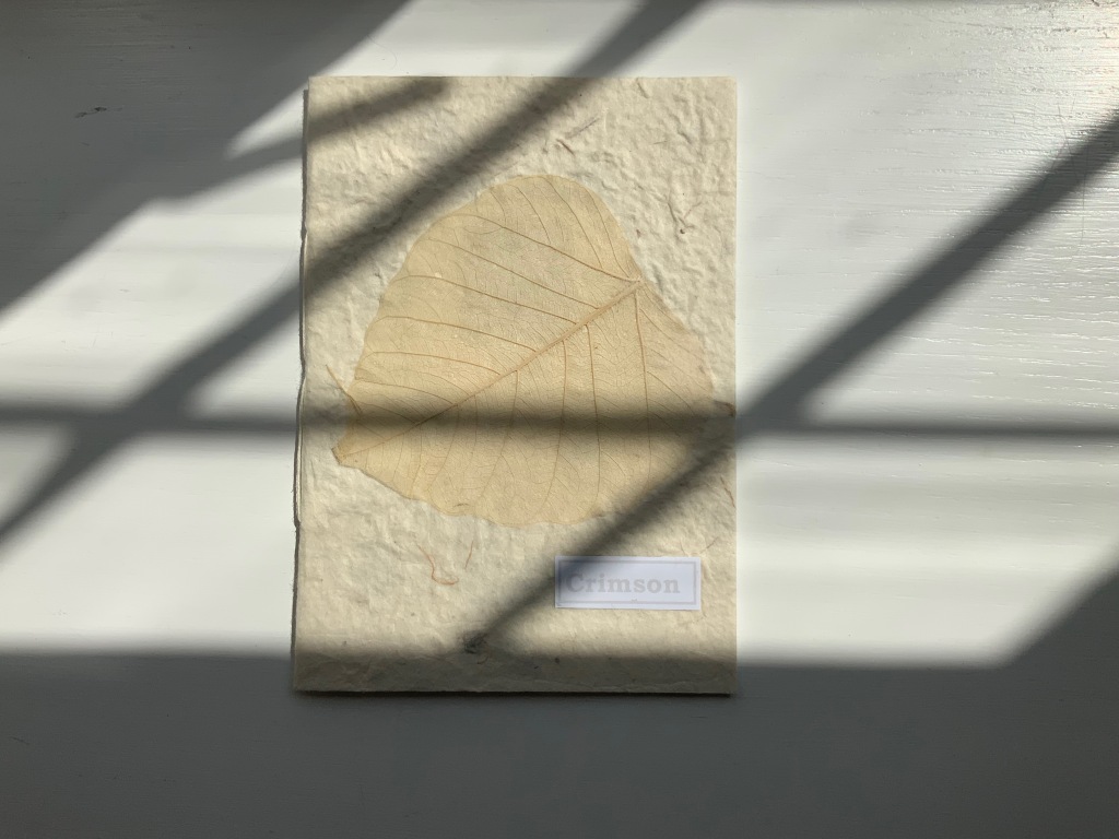
Crimson (2004)
Susan Shaw
Hand-made paper cover. H155 x W110 mm, 8 unnumbered pages. Edition of 10, of which this is #2. Acquired from the artist, 13 December 2021.
Photos:Books On Books Collection. Displayed with permission of the artist.
The washed-out cover, pressed fallen leaf and faded title signal the conclusion of the short story Crimson, in which a couple seemingly argue incessantly about choice of colors, both indoors and out in their garden.
Shaw’s attraction to fiction narrative perspective flutters recurs in the next work, but its leporello structure and photos add a different otherworldly touch.
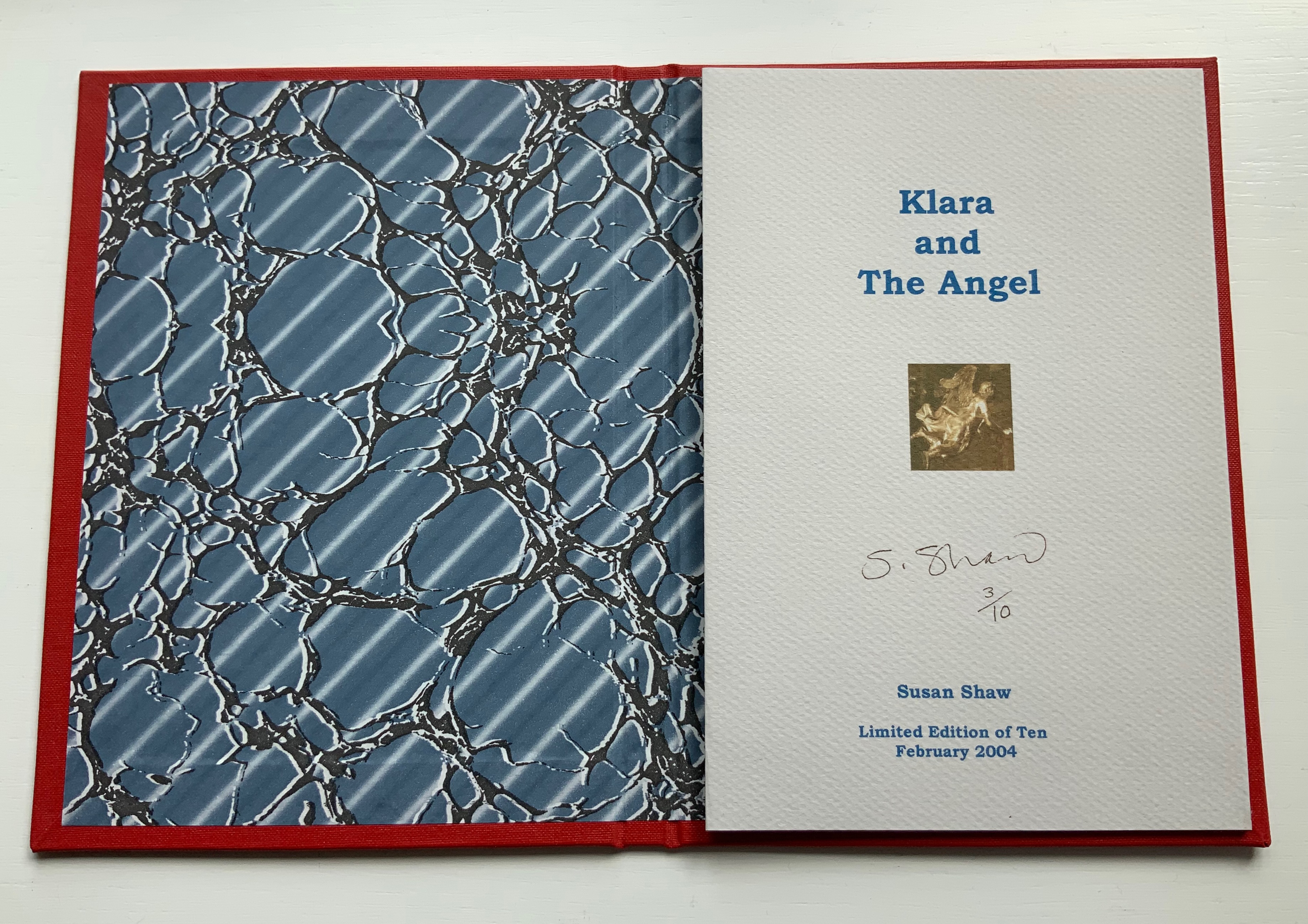
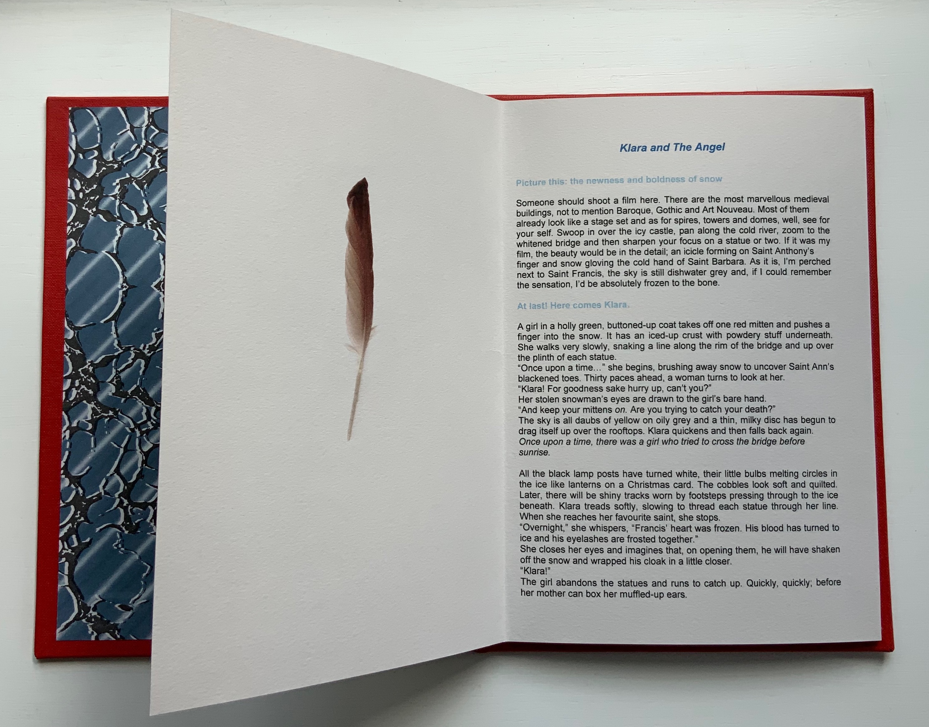
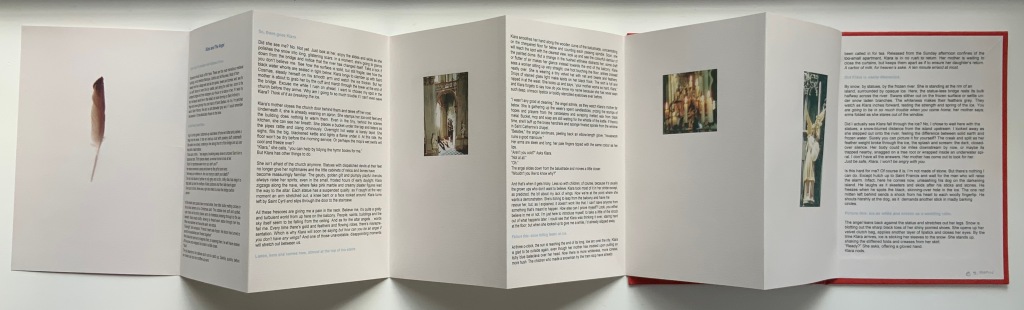
KLARA AND THE ANGEL (2004)
KLARA AND THE ANGEL (2004)
Susan Shaw
Hardcover, double-sided concertina book. H220 x W160 mm, 15 unnumbered panels. Edition of 10, of which this is #3. Acquired from the artists, 13 December 2021.
Photos: Books On Books Collection. Displayed with permission of the artists.
The story begins in a Prague cemetery covered in snow, to which the reader’s attention is directed by the narrator’s direct address in light blue type. As the type shifts into black, the narrator continues to address the reader, and with the reference to being perched on St. Francis’s shoulder, the narrator gives some of the game but then deflects with the introduction in blue of Klara’s arrival. As the leporello unfolds, so does Klara’s story and the narrator’s identity as the angel with whom Klara has an appointment.
Snow and evocative photos feature in the next work but with less drama.
SNOW DROPS FROM PETALS (2008)
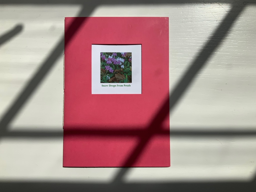
SNOW DROPS FROM PETALS (2008)
Susan Shaw
Pamphlet book. H150 x W105 mm, 12 unnumbered pages. Edition of 17, of which this is #4. Acquired from the artist, 13 December 2021.
Photos: Books On Books Collection. Displayed with permission of the artist.
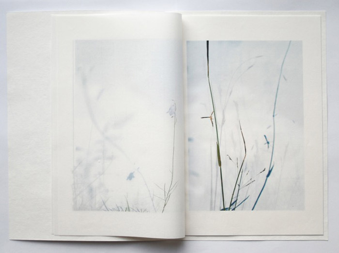
The front cover wraps around to overlap the back cover, which is rather like the way in which words often play multiple roles in poems. Here, the subject snow and its verb drops coincide with the flower’s name and its two photos that appear later. The center of the work presents the entire haiku, but more interesting and curious, the haiku’s traditional structure (lines of 5, 7 and 5 syllables) breaks up into four segments (5, 6, 3, 3) to appear on verso pages facing a photo.
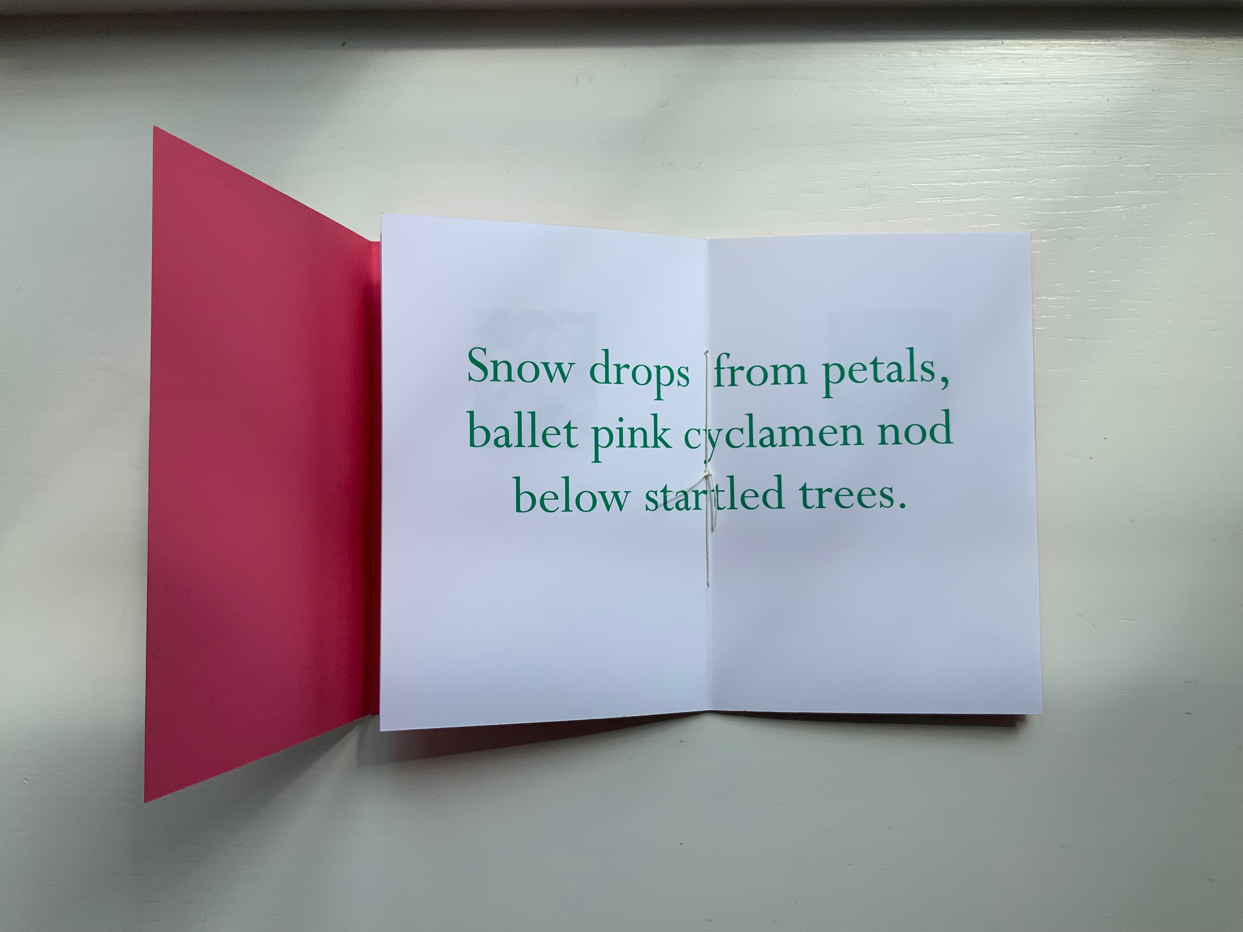
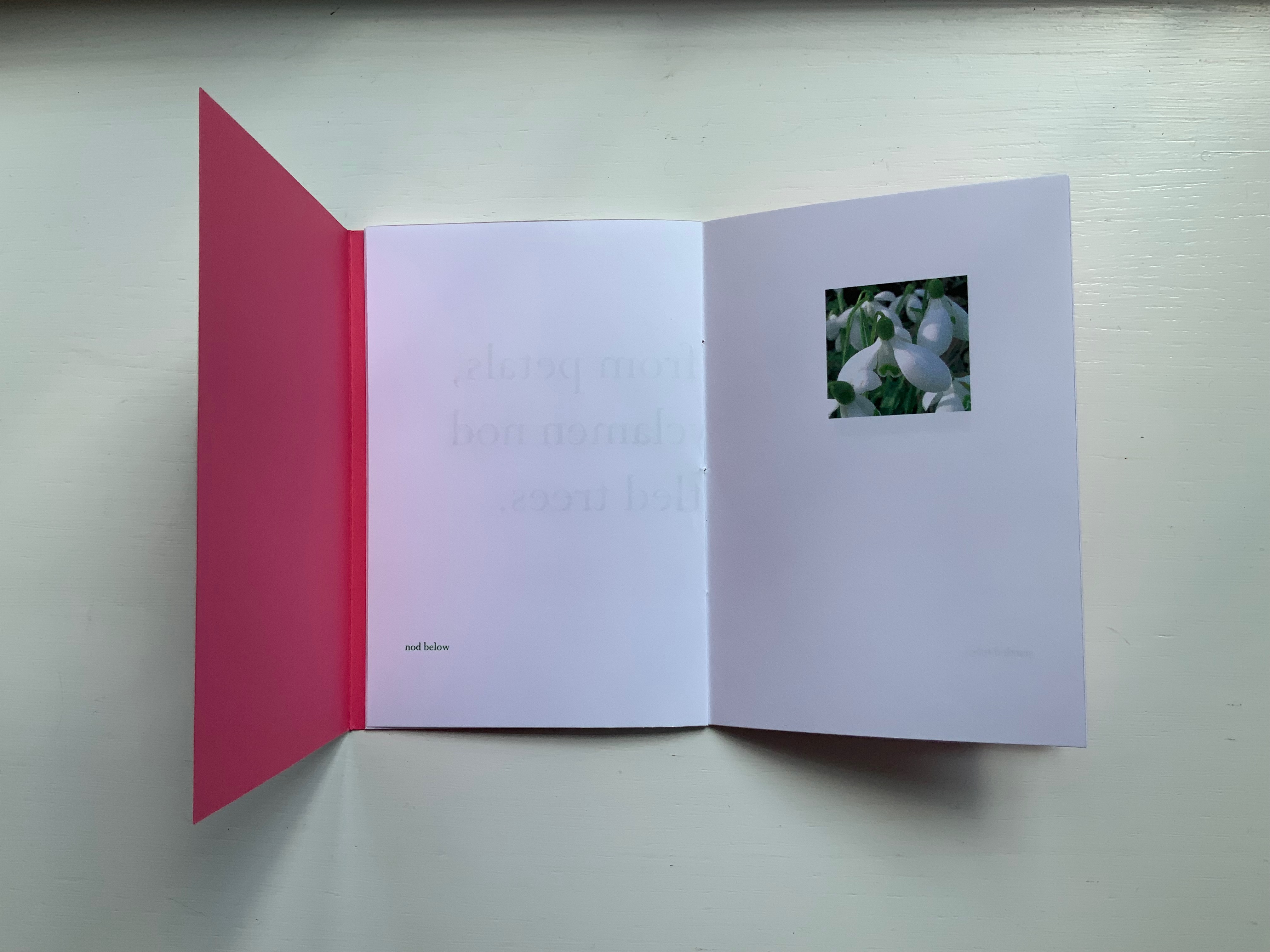
Daffodils face the first line. Snow drops face the words “ballet pink cyclamens”. More snow drops face the words “nod below”. A bee perched on a blossom faces the words “startled trees”. The effect is to send the reader back and forth across these spreads and page turns like a bee moving from flower to flower.
Paul Salt’s individual works in the collection take a more sculptural expression. Even though this next work is garden-inspired like Snow Drops, its physical presentation reflects the more sculptural garden that inspired it.
BROTHERS IN ARMS (2008)
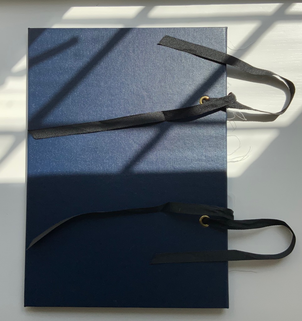
BROTHERS IN ARMS (2008)
Paul Salt
Hardcover, folio. H300 x W220 mm close, W655 open. Edition of 24, of which this is #2. Acquired from the artist, 13 December 2021.
Photos: Books On Books Collection. Displayed with permission of the artist.
The garden in question here is the more severe but still playful Little Sparta, created by Ian Hamilton Finlay. On a visit there, Salt found a pair of wings at the base of one of the sculptures.
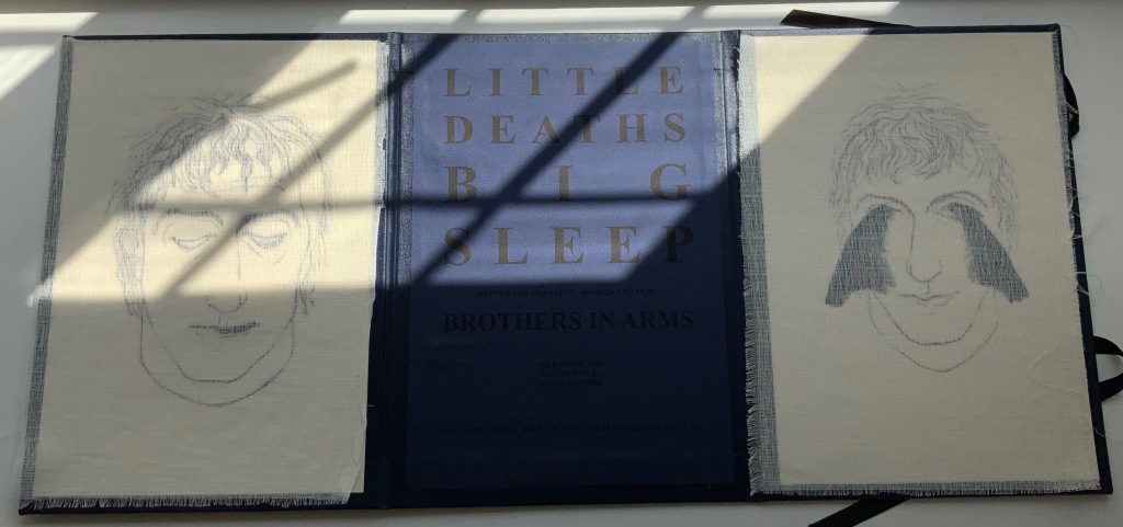
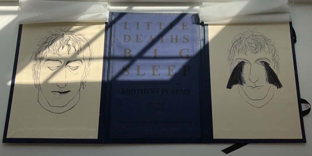
In its imagery and structure, the final work by Salt reflects the physicality and preoccupations found in many of the works above: especially Mill, Coin and Fold. Although it has less whimsy than Coin or Fold, its abrupt title recalls Ed Ruscha’s humorous rule of thumb for distinguishing between bad and good art: Bad art makes you say ‘Wow! Huh?’ Good art makes you say ‘Huh? Wow!’
What …? (2018)
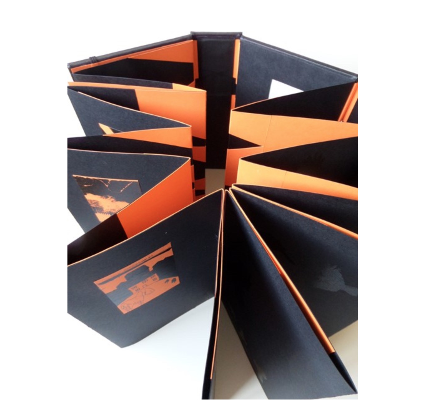
What …? (2018)
Salt+Shaw
Hardback, boxed-bound, black book cloth, concertina book with magnetised and elasticated fastening. Drawings and collages printed on black and orange Canson card. Letterpress. Hinges engineered in Canson card to create a spring in the turning of the pages.
H213 x W80 mm closed, H213 x W830 mm open
Edition of 5, of which this is #2. Acquired from the artists, 25 November 2018.
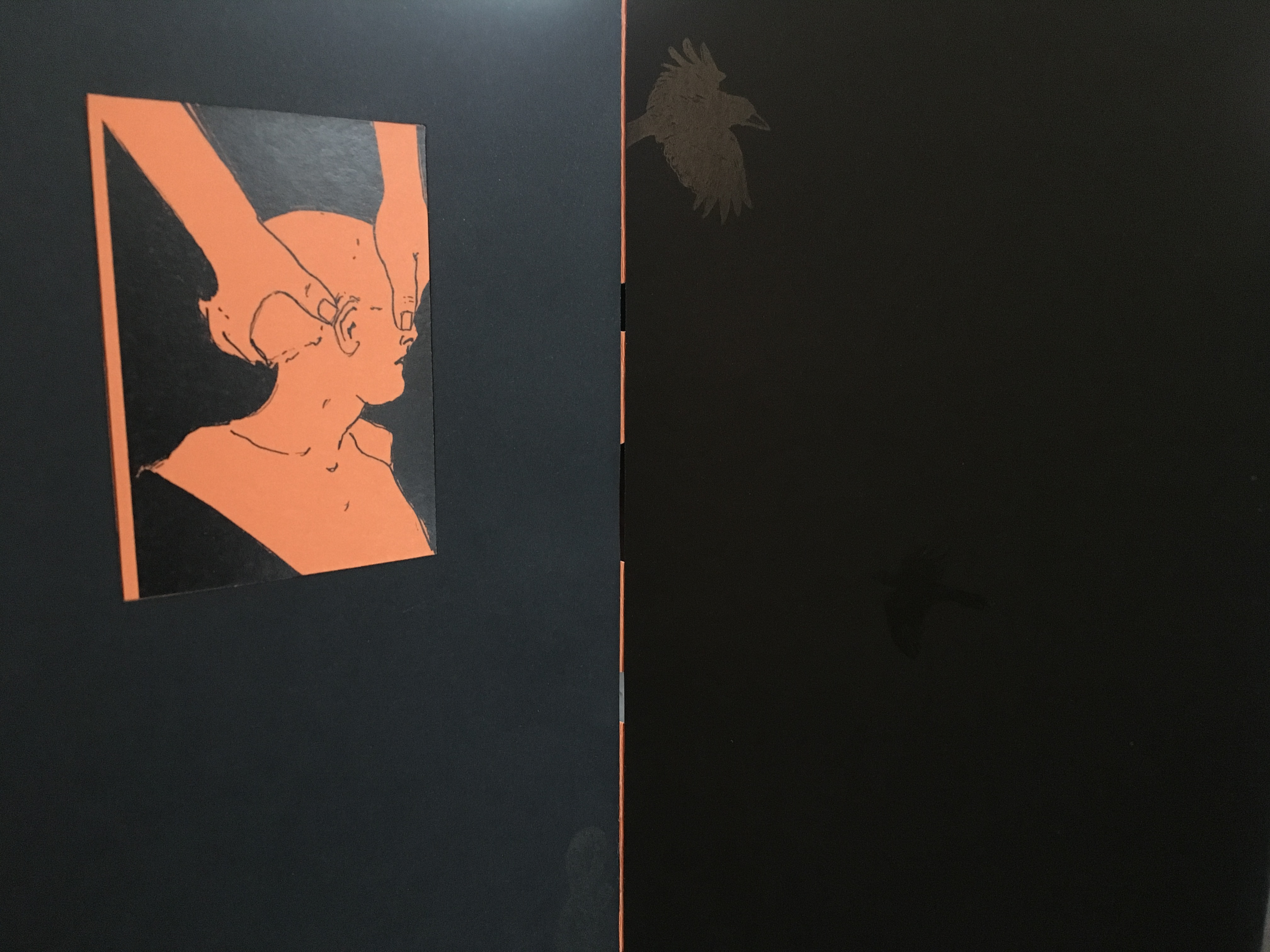
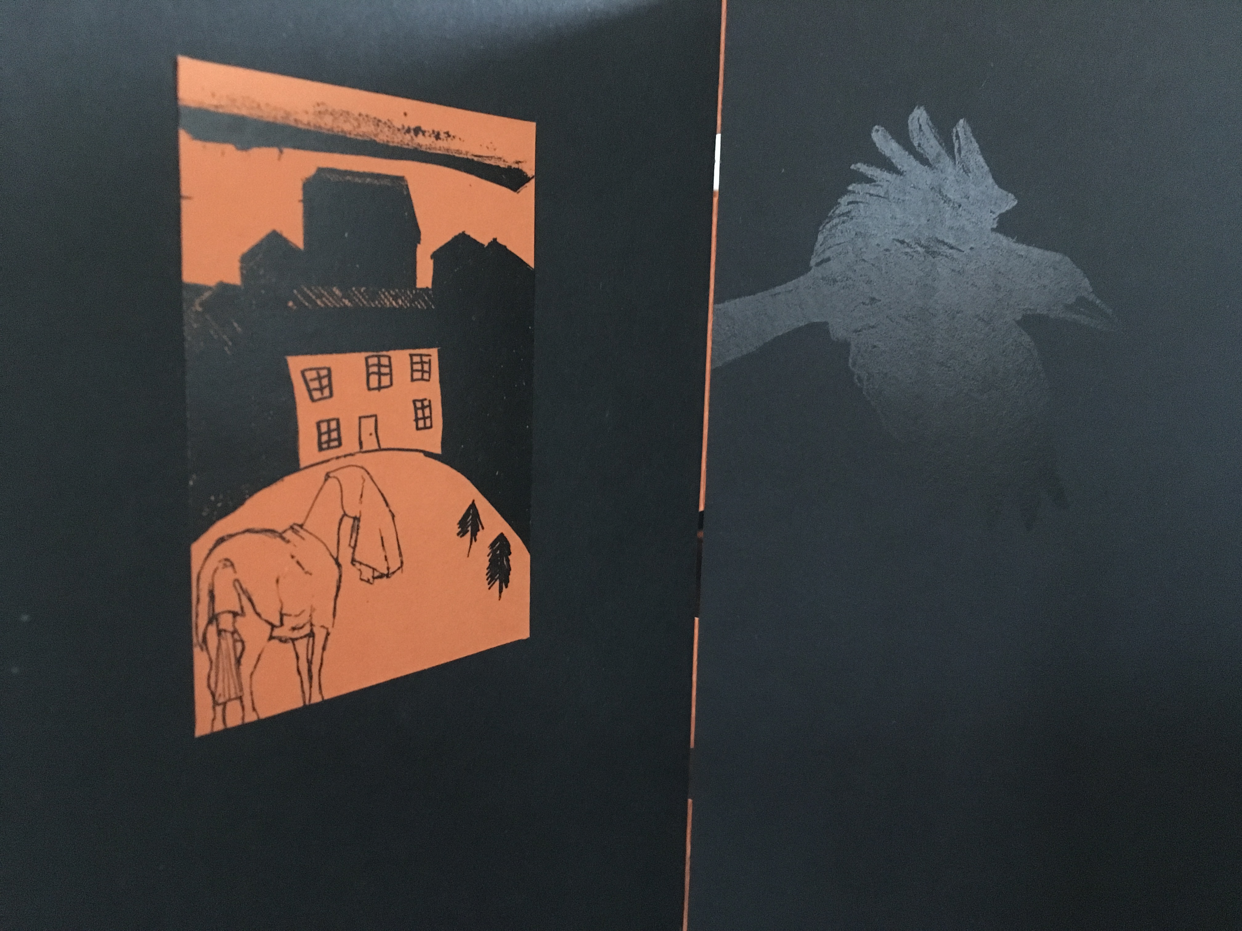
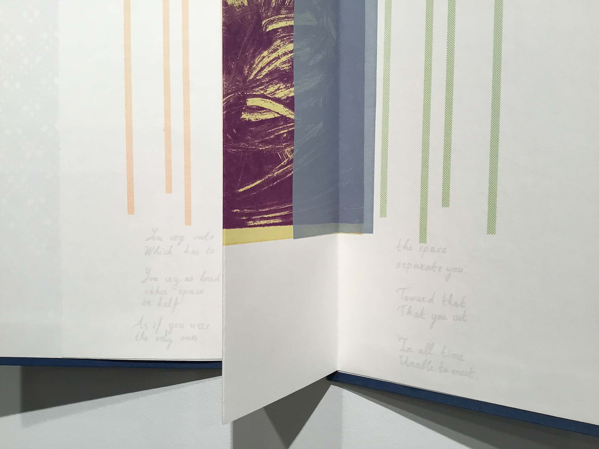
What? is a book about finding solutions, both in its construction and content. Made over a period of several years, from the first drawing to the final binding, it prefers to raise questions, rather than provide answers. Hence the title. The relationship between What? and viewer therefore depends upon response, perception and making connections. Clues could include: • William Blake • harbingers • manipulation • dislocation • loss • finding a way out • George Orwell. [Correspondence with artists, 5 December 2018.]
What? … Wow!
Further Reading
Sarah Bodman (University of Western England) has highlighted their work in a-n News with some outstanding photos:
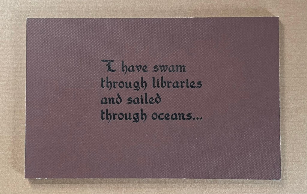
“At the recent 21st International Contemporary Artists’ Book Fair in Leeds, they launched Ocean Bestiary, a unique book of strange and miraculous Medieval-inspired sea creatures that features a concertina construction, letterpress text, acrylic paint, gold foil, whale bone and a leather inlay.” Sarah Bodman, “Artists’ Books #28: Salt+Shaw, collaborative book makers“, a-n News, 6 March 2018.
Ephemera