A Typographic Abecedarium (2015)
A Typographic Abecedarium (2015)
Ornan Rotem
Perfect bound in a softcover case. H174 x W176 mm. 136 pages 1 poster (64 x 48 cm, folded to 16 x 16 cm). Acquired from Devils in the Detail Ltd, 14 March 2023.
Photos of the book: Books On Books Collection. Displayed with permission of the artist.
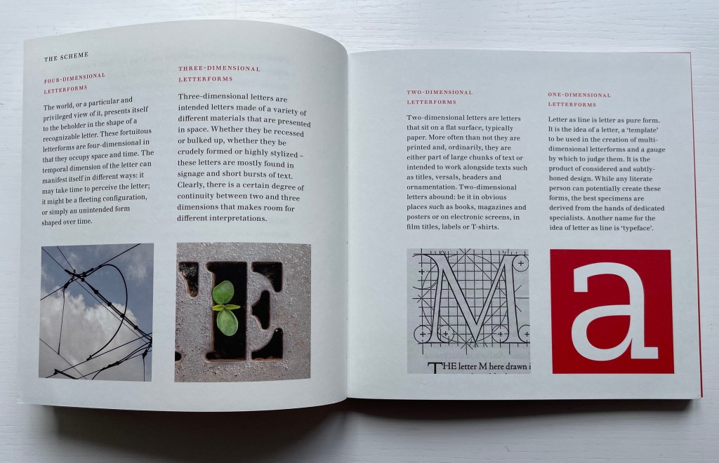
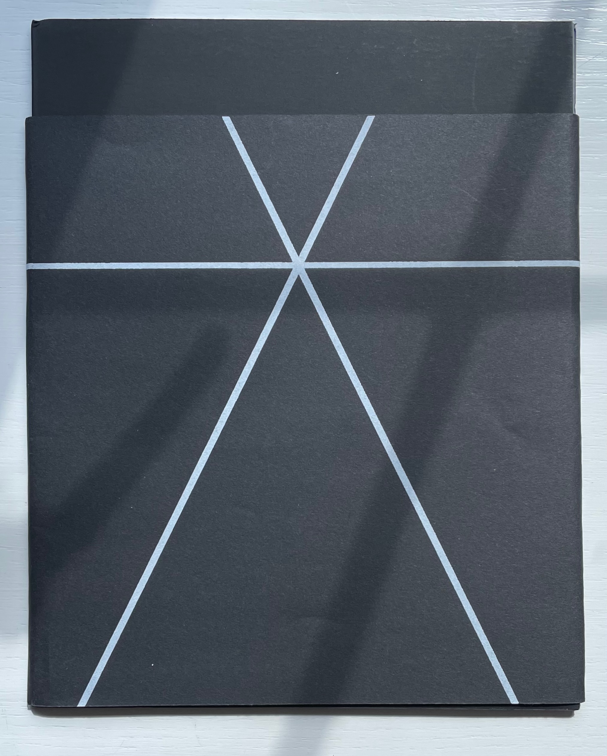
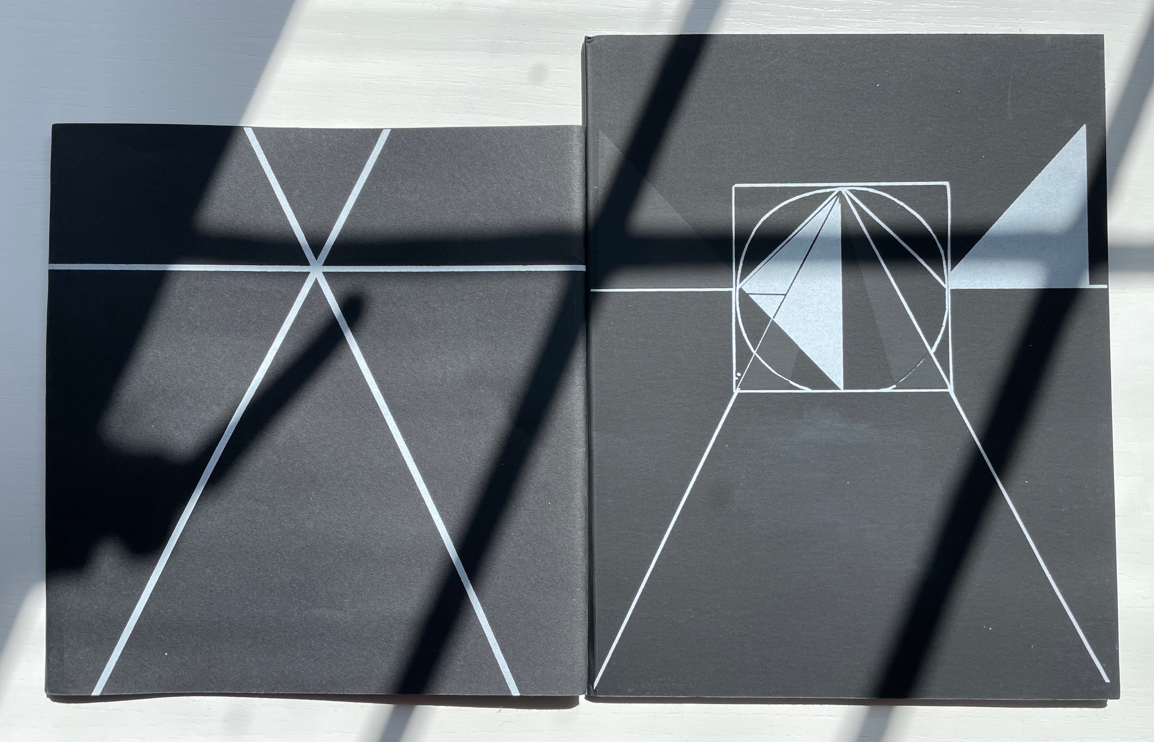
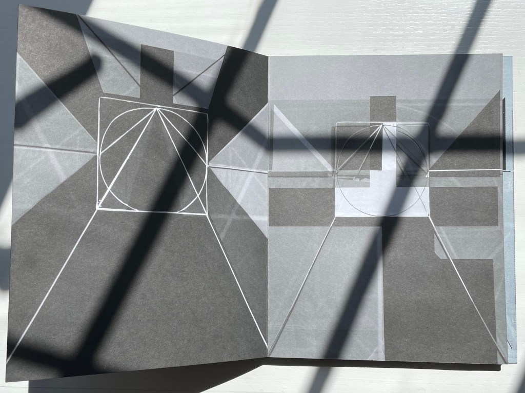
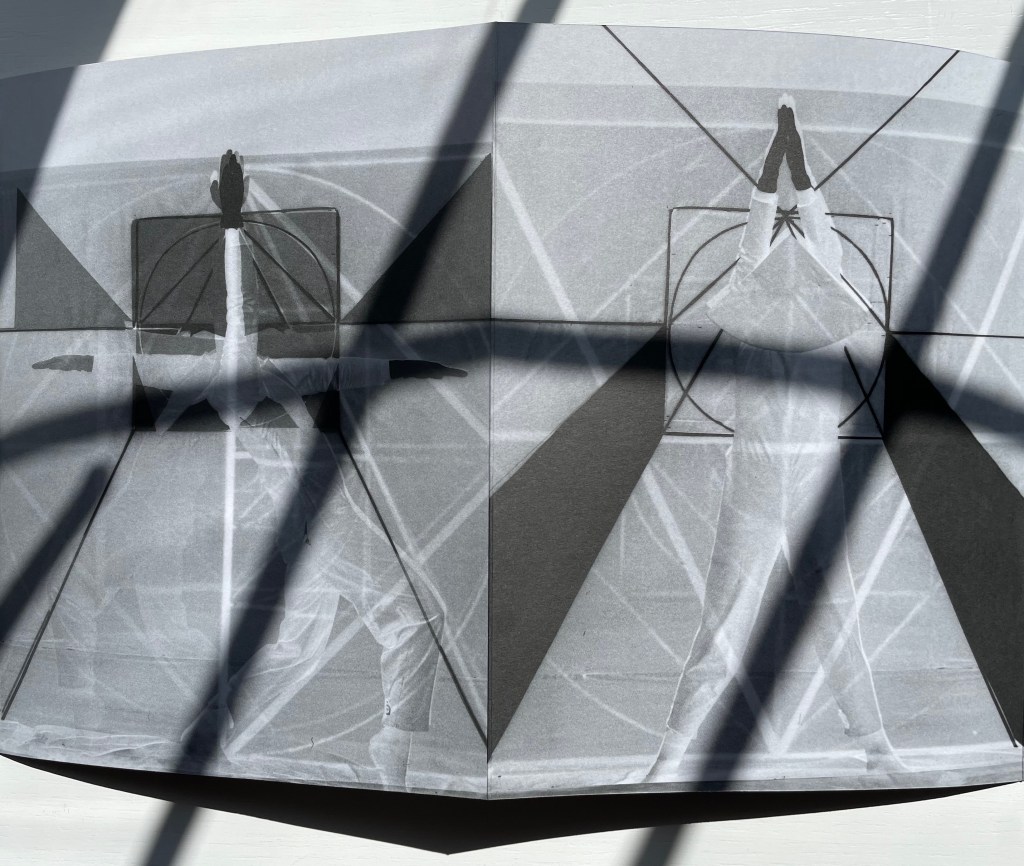
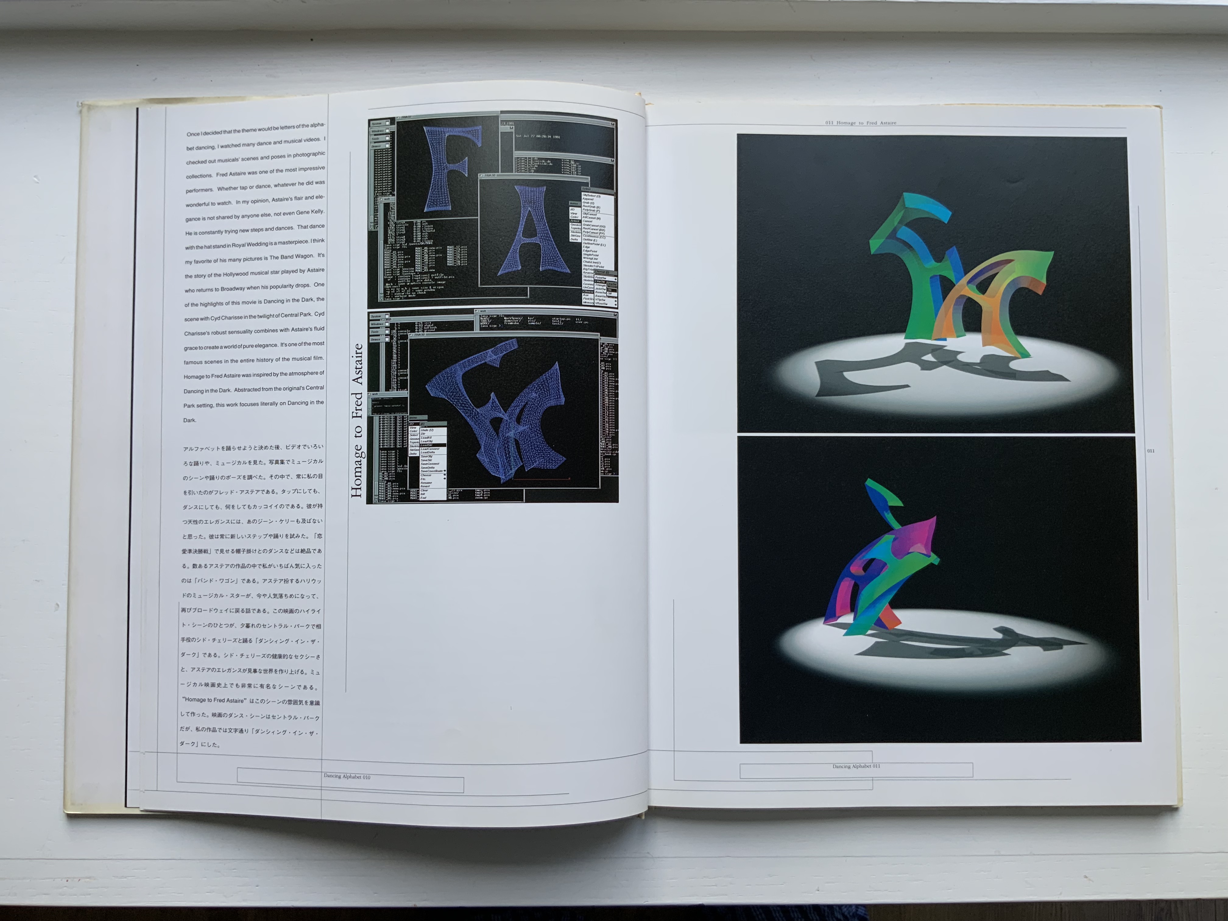
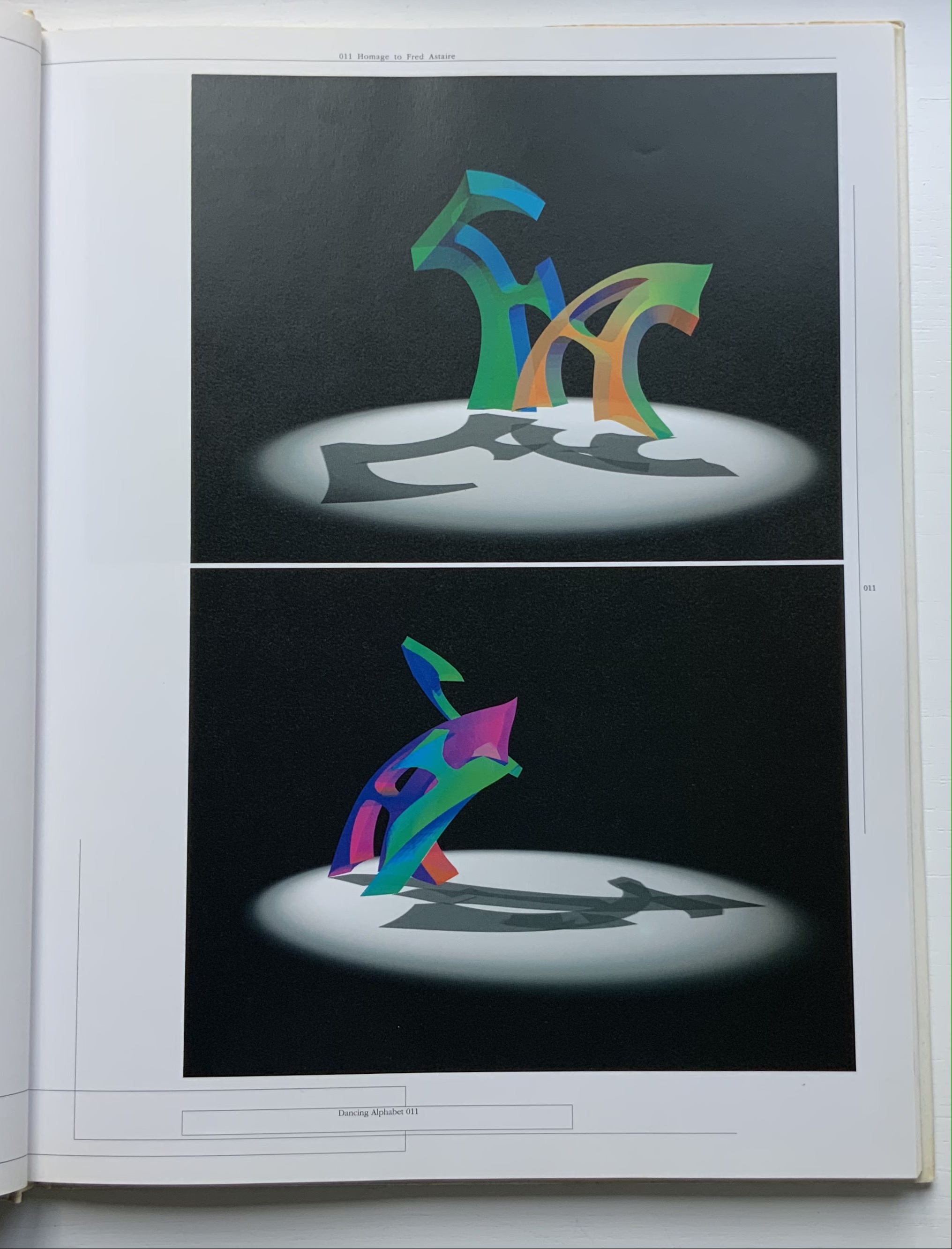
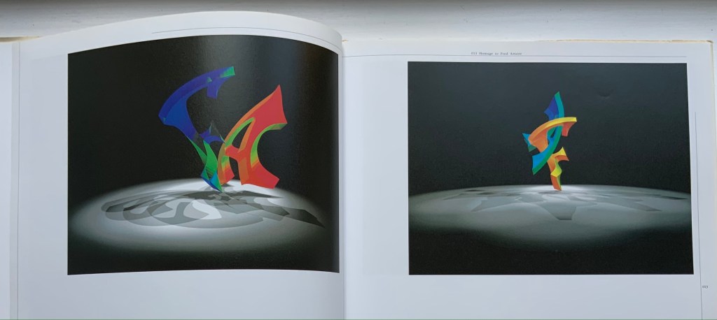
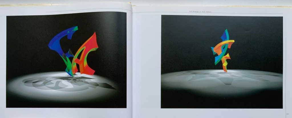
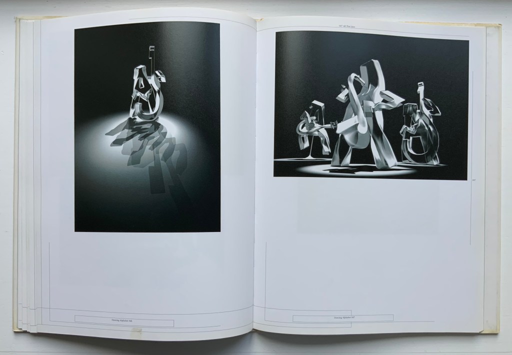
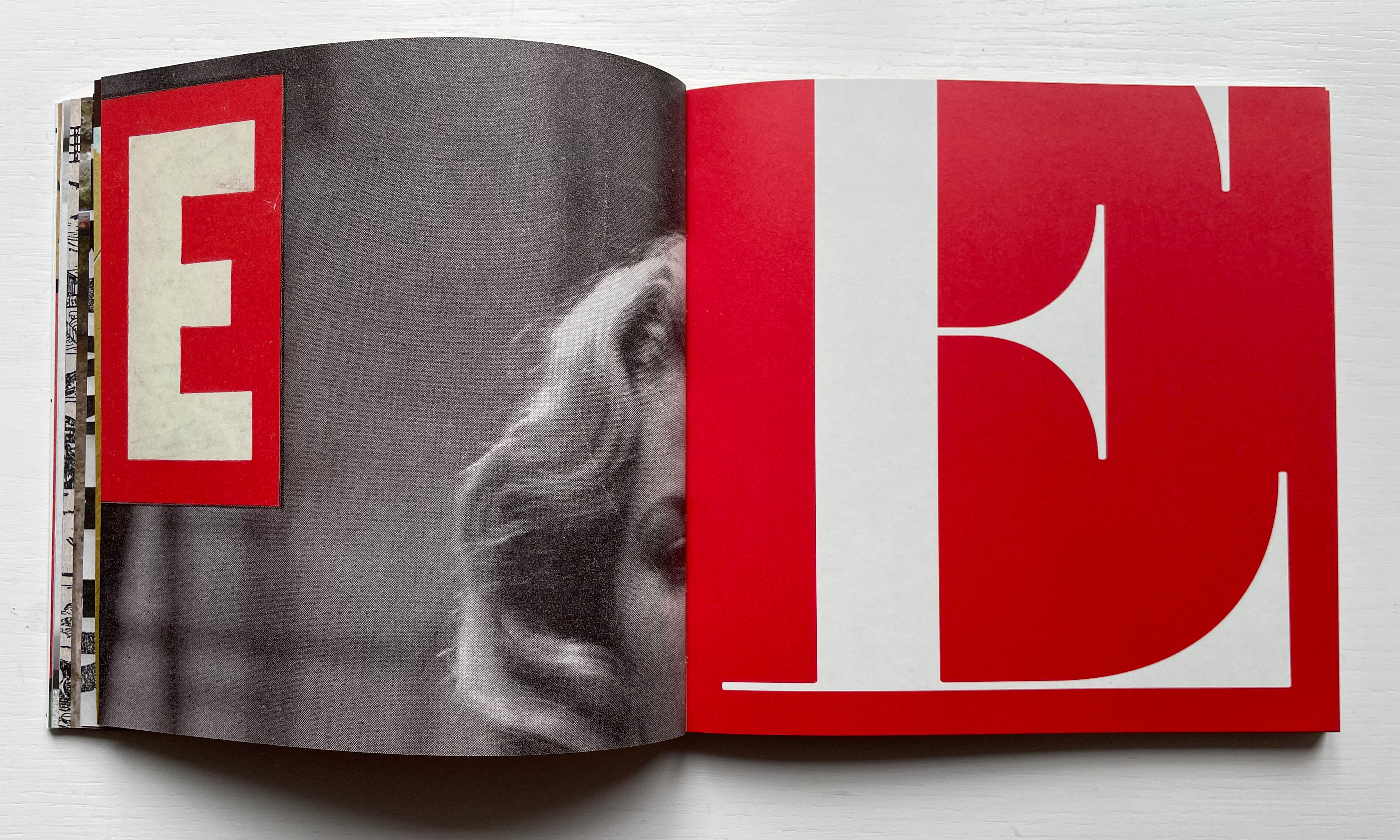
Ornan Rotem calls his book a “photo-typographic essay … a meditation … [e]xploring the relationship between typography and the visual world around us ….” As shown in the double-page spread below, his meditation is shaped across a four dimensional views of the letterform: the four-dimensional, three-dimensional, two-dimensional and the one-dimensional. At the end of the essay, there are 26 miniature essays that will send the reader back to enjoy each letter’s four dimensional entries again.
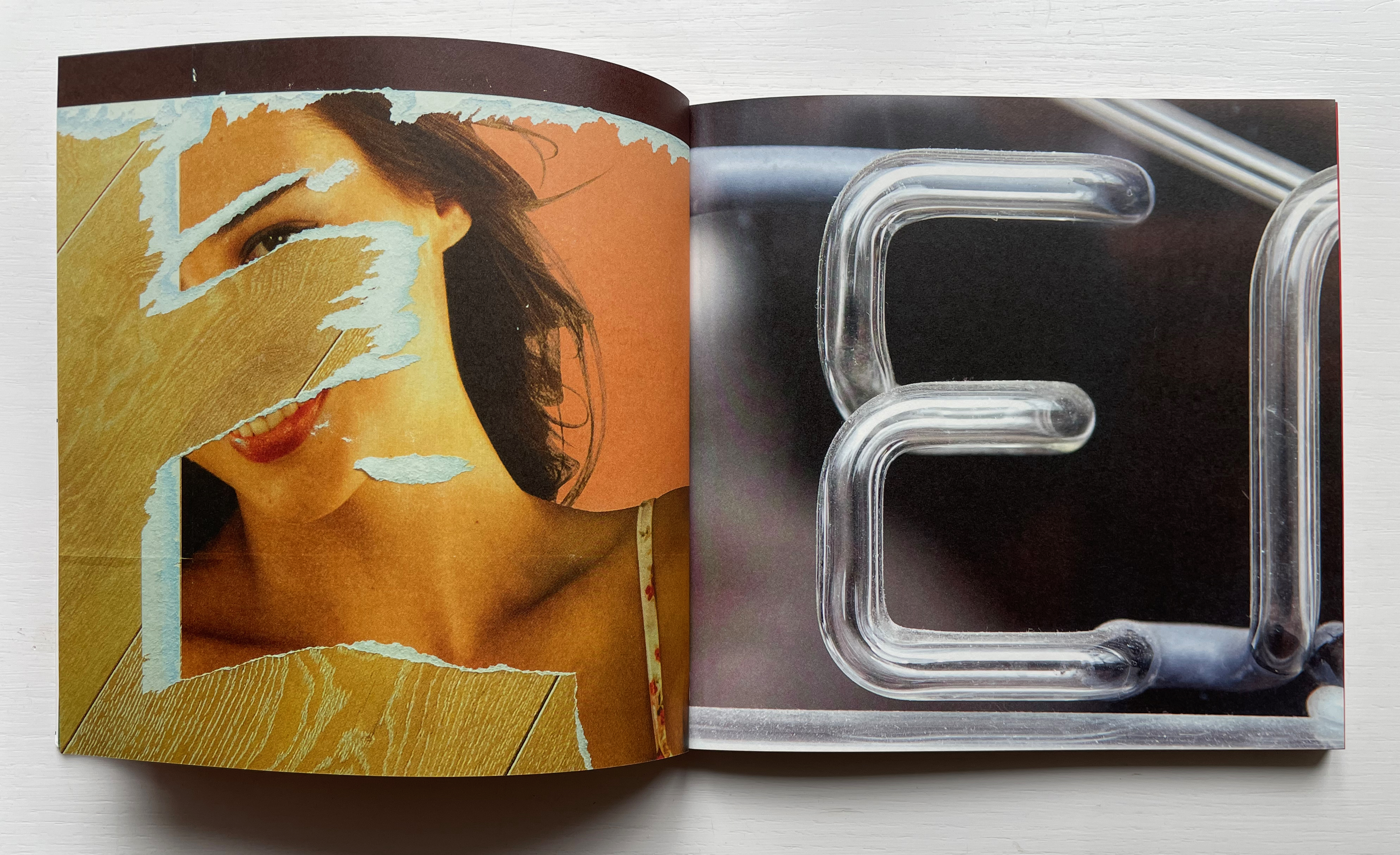
Everywhere you look you can see an E smiling at you (just saying it induces a smile). In 1969, Georges Perec, whose own name has four Es, tried exorcising the E by writing an esoteric 300-page novel, La disparition, without ever using one. I wonder how he would have felt had he come across this E — which was shot in Paris — when he was writing the novel. ¶ If you want to endow letters with character, then I suppose E would be the lively sort, hence the printed form comes from a 1948 cover of LIFE magazine.
Much is packed into these miniature essays. Naturally for an artist’s book celebrating type, there are the necessary self-referential typographic puns in the one above: character and sort. In all, there is the evidence of the long, multi-place, multi-source contemplative gestation of the work. In the example above, the allusion to Perec’s novel leads to the 1969 photo in Paris (or was it vice versa?). The typographic puns lead to a search for an E from a LIFE cover (again, or was it vice versa?). This circular connectedness over time, text and image highlights the self-referentiality of the genre of the artist’s book.
While the dense allusiveness might suggest that this is a work limited to an adult audience, A Typographic Abecedarium does find favor with a younger audience — no doubt because it speaks to the phenomenon of seeing letters everywhere and in multiple dimensions.
Physical Poetry Alphabet (2018)
Physical Poetry Alphabet (2018)
Douglas & Françoise Kirkland and designed by Ornan Rotem
Casebound, illustrated paper over boards. Acquired from Sylph Editions, 18 March 2023. Photos: Screenshots displayed with permission of the publisher.
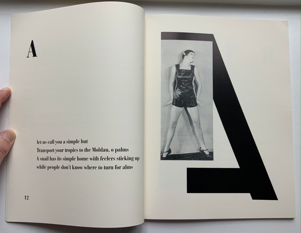
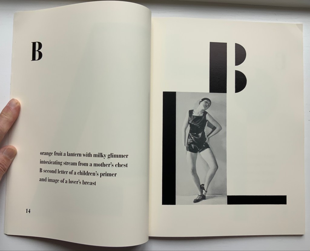
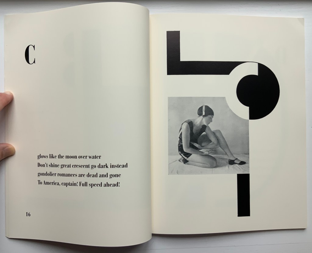
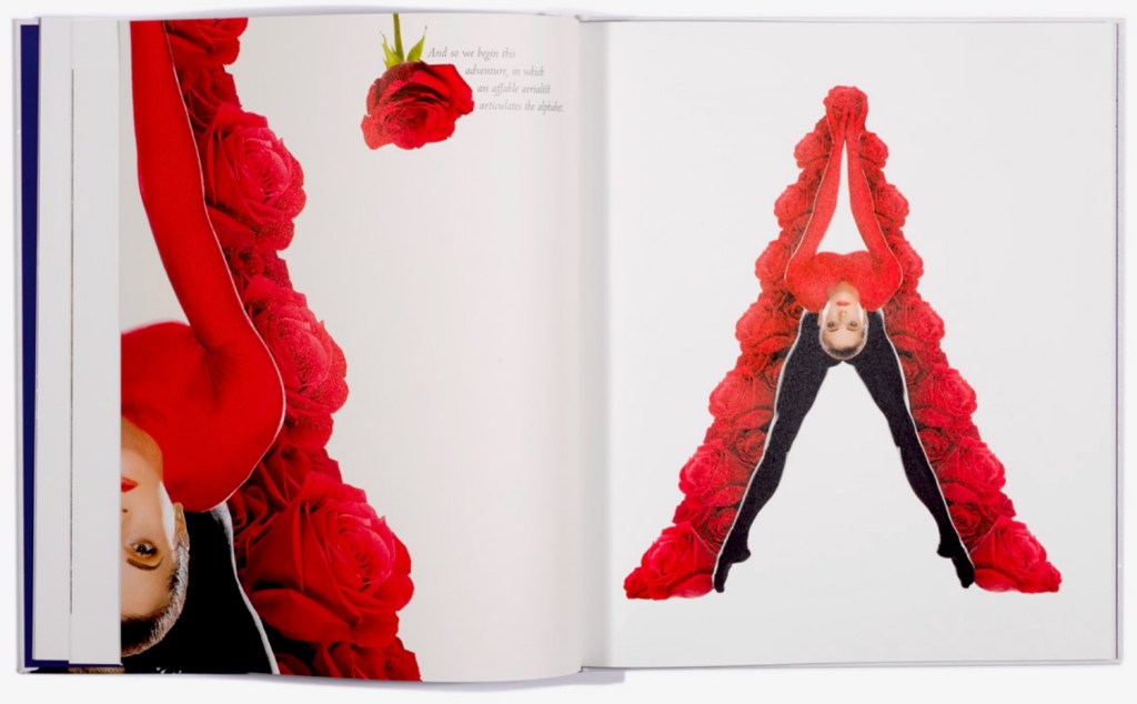
Physical Poetry Alphabet (2018) is a curious work. The Thames & Hudson-style production values combined with the knowledgeable essay in it by Ornan Rotem makes one think of Andrew Robinson’s The Story of Writing, an actual Thames & Hudson book. While the acrobatics of Erika Lemay echo the longstanding tradition of modeling the letters with the human body, followed by Erté, Vítězslav Nezval, Anthon Beeke and Rowland Scherman and so ingeniously summarized by Lisa Merkin, Lemay’s elaborate costumes and the scene design echo the traditions of Hollywood, Las Vegas and the fashion industry, which is not surprising given the involvement of Douglas Kirkland, portrait photographer to the stars. A Typographic Abecedarium strikes its singular target of “photo-typographic essay”. Having too many targets, Physical Poetry Alphabet perhaps misses its several bull’s eyes, but to follow along with its mixed metaphors, it undeniably delivers a shop full of eye candy.
Further Reading
“Abecedaries I (in progress)“. Books On Books Collection.
“Alphabets Alive! – Body“. 19 July 2023. Books On Books Collection.
Meier, Allison. 14 January 2016. “A Visual Essays Recalls the Alphabet’s Pictorial Past“. Hyperallergic. Accessed 18 March 2023.