Abeceda/Alphabet (1926/2001)
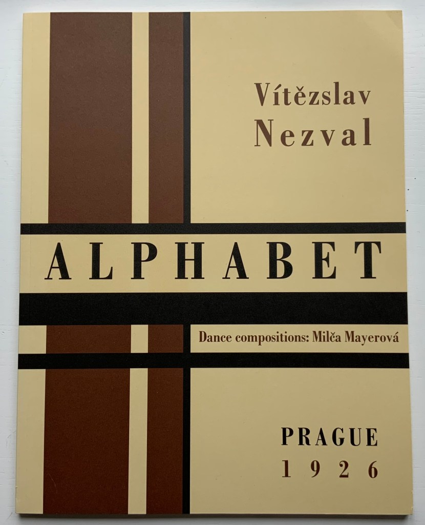
Alphabet (1926/2001)
Karel Teige & Vítězslav Nezval / translated by Jindřich Toman and Matthew S. Witkovsky
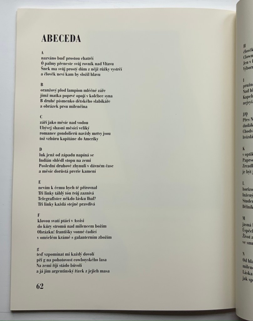
Facsimile and translation of Abeceda. Perfect bound paperback, H305 xW235 mm, 72 pages. Acquired from Ergode Books, 1 July 2021. Photos: Books On Books Collection.
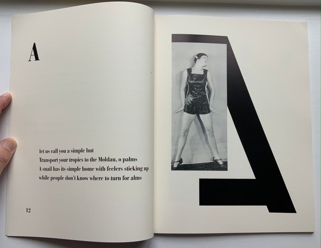
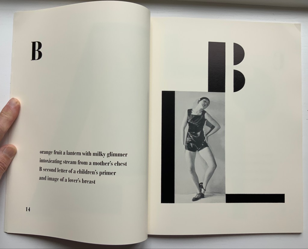
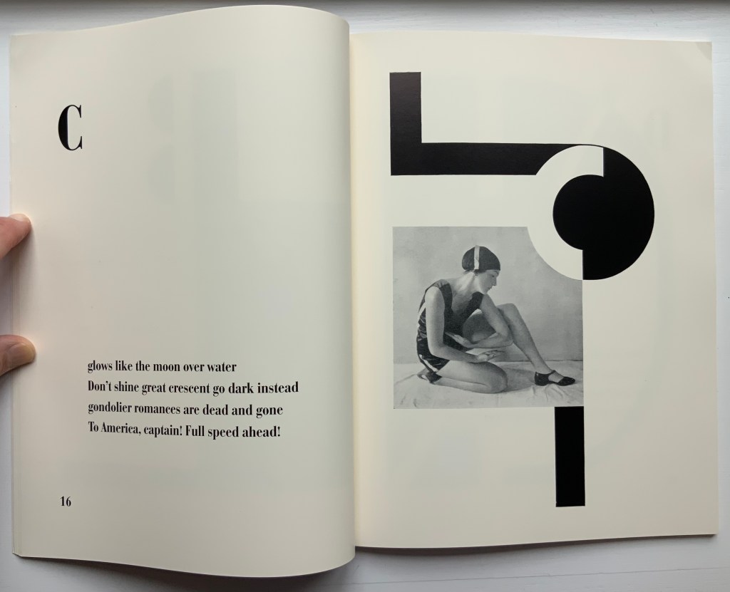
From the Afterword:
The 1926 book Alphabet (Abeceda) is a landmark achievement in European modernism. Its frequent reproduction in exhibition catalogues and scholarly articles has made it a key symbol of Devětsil (1920-ca. 1931), the Czech artists’ collective within whose ranks the book was conceived, and its importance is increasingly measured in international terms as well. The book consists of a series of rhymed quatrains by Devětsil poet Vítězslav Nezval, titled and ordered according to the letters of the Latin alphabet. Facing each set of verses is a Constructivist photomontage layout by Karel Teige, a painter turned typographer who was also Devětsil’s spokesperson and leading theorist. Teige developed his graphic design around photographs of dancer and choreographer Milada (Milča) Mayerová, a recent affiliate of the group, who had performed a stage version of “Alphabet” to accompany a recitation of the poem at a theatrical evening in Nezval’s honor in April 1926… The project to create a new alphabet epitomizes the proselytizing attitude of avant-gardists in various fields in the years after World War I. From Dada poetry to Constructivist architecture and design, from calls to overhaul theater to revolutions in literary theory, a panoply of experiments took the alphabet as their model or target and disclosed the potency of this elementary linguistic structure as a trope for creative renewal and social revolution.
Full scan of original Czech edition here.
The Afterword mistakenly asserts that there was no precedent for Mayerová’s choreography and performance of the alphabet. In fact, the Athenian dramatist Kallias (late 5th century BCE?) wrote Grammatike Theoria, sometimes called “a spectacle of letters”, the ABC Show or ABC Tragedy, in which actors and a chorus sang and danced the twenty-four characters of the new-fangled Ionian alphabet. What does seem to be without precedent is the collaboration across poetry, dance, typography, photography and bookmaking.
Carrying on the collaborative tradition and more emphatically challenging gender stereotyping, here is Paulina Olowska dancing Abeceda at the Simon Lee Gallery’s 2019 exhibition of Tomaso Binga/Bianca Menna‘s works, which included Alfabetière Pop (1976), his/her nude alphabet portfolio. If only Tomaso/Bianca or Paulina would find a book artist to reprise the codex part of the collaborative tradition.
Further Reading
“Anthon Beeke“. 21 June 2021. Books On Books Collection.
Culture.pl. n.d. “Paulina Ołowska“. Accessed for update, 31 January 2023.
Gagné, Renaud. 2013. “Dancing Letters: The Alphabetic Tragedy of Kallias”. In Choral Mediations in Greek Tragedy, ed. R. Gagné and M. Hopman, Cambridge University Press 282-307.
Lawler, Lillian. April, 1941. “The Dance of the Alphabet”. The Classical Outlook, 18: 7, pp. 69-71.
Wikipedia. 1 July 2021. “Paulina Olowska“. Accessed 8 July 2021.
Another key performance in Paulina Olowska oeuvre was the Alphabet, which was inspired by the book ABECEDA by Karel Teige, a key figure in the Czech avant-garde who in 1926, in collaboration with Milca Mayerova, created an experimental “mobile alphabet”. Referring to Teige’s project, Olowska combines rhythmicity with a constructivist fascination with typography and points to the rhetorical function of dance: three performers arrange their bodies into 26 letters, from A to Z, confronting the alphabet of written language with the “alphabet” of gestures and movements, creating a new system for expressing meaning. Alphabet was first shown in Berlin in 2005 (Galerie Meerrettich). In 2012 it was exhibited at the Museum of Modern Art in New York, and in early 2014 it was presented at the Museum of Modern Art in Warsaw.” Wikipedia.
Wise, Jennifer. 1998. Dionysus Writes : The Invention of Theatre in Ancient Greece. Ithaca ; London: Cornell UP.
