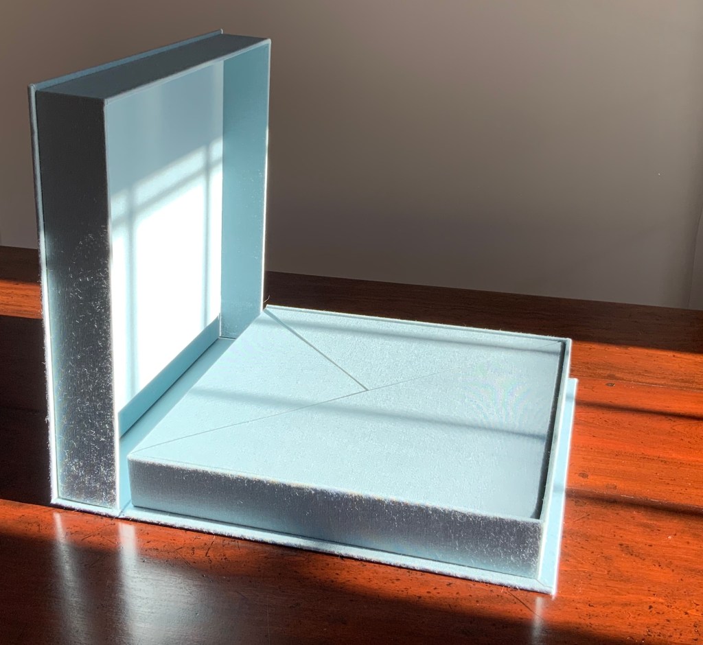
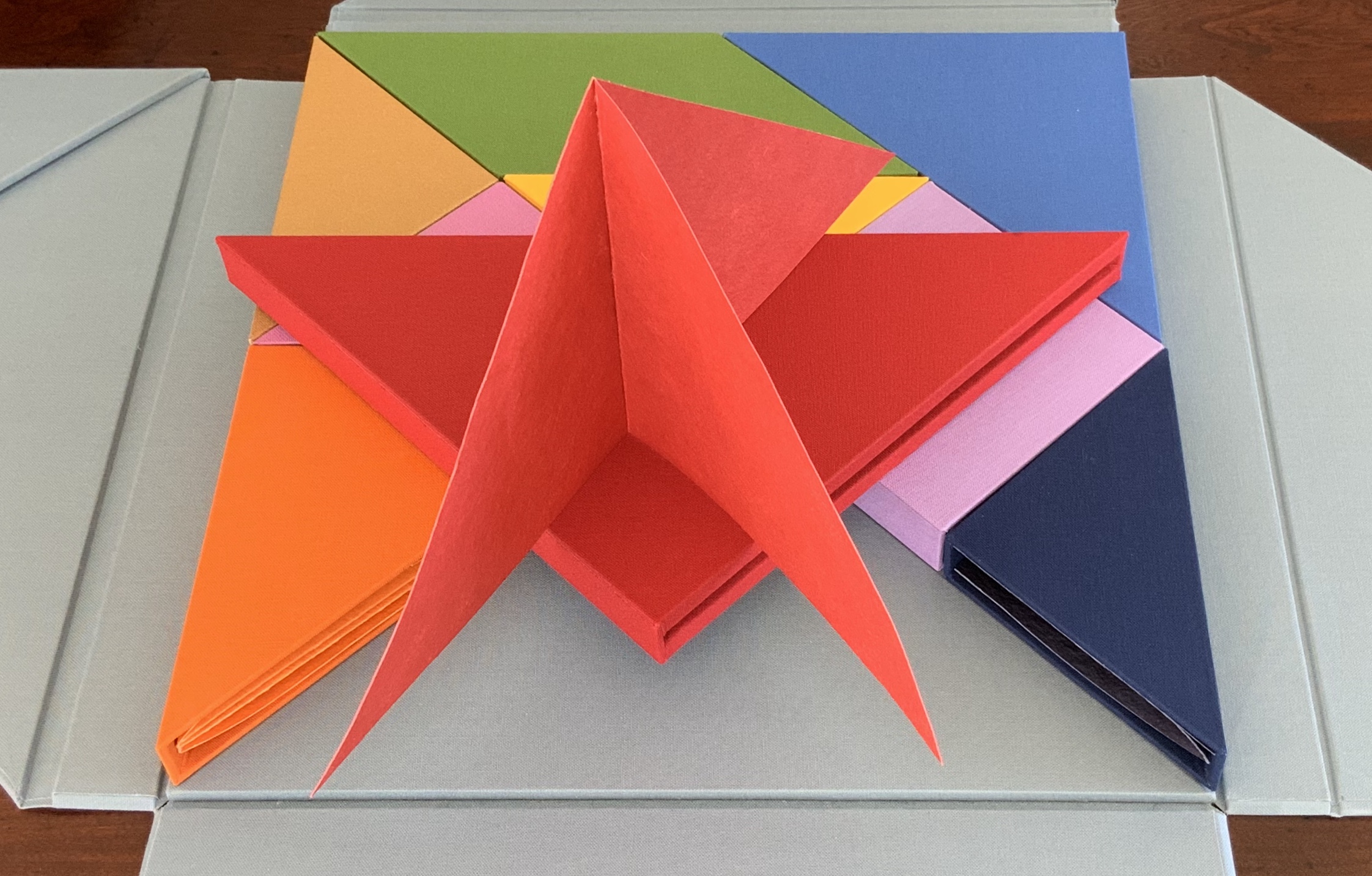
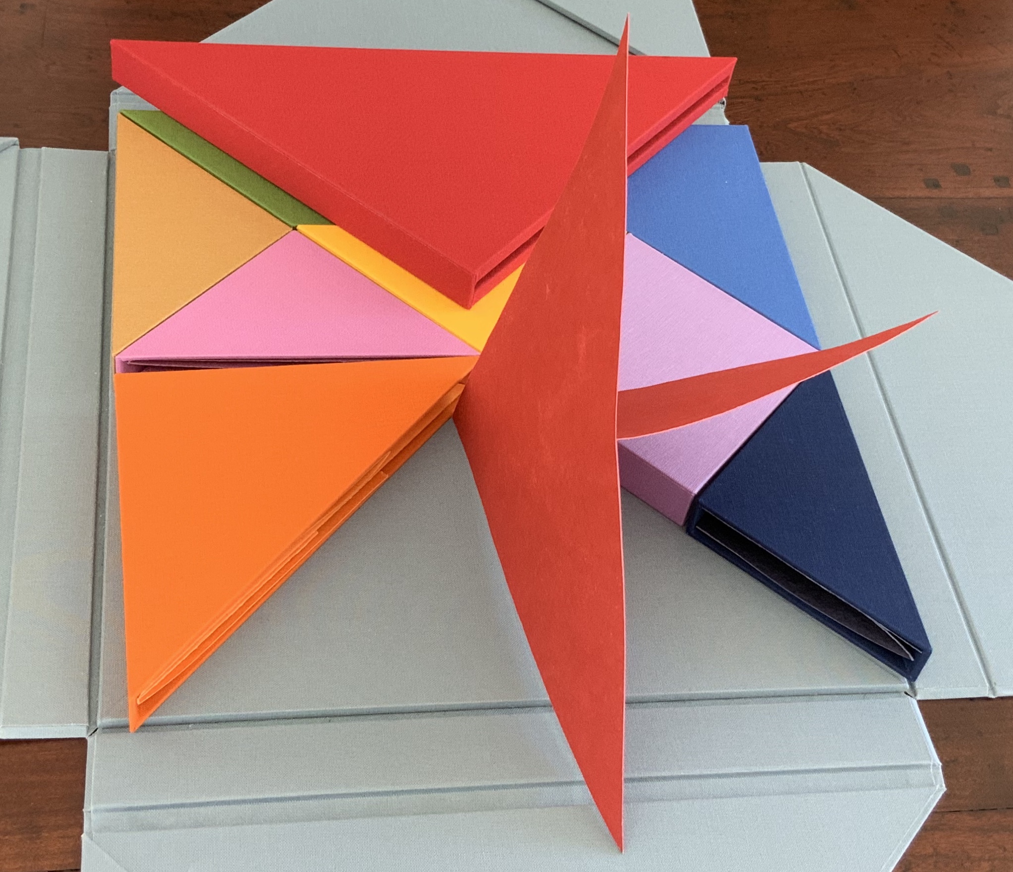
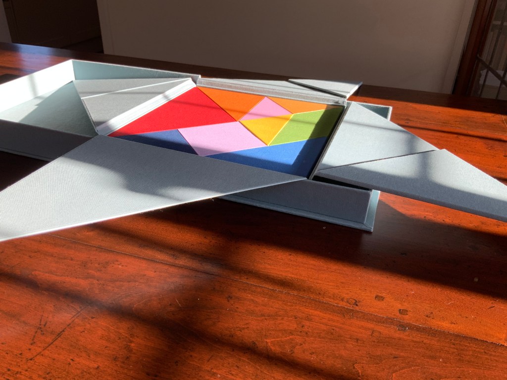
Nous Sommes (2015) Ioana Stoian Nine handmade-paper forms in handmade cloth-covered boxes, fitted to flapped container with magnetic seals, enclosed in cloth-covered Solander box. H310 x W305 x D54 mm. Acquired from the artist, 4 July 2017. Photos: Books On Books.
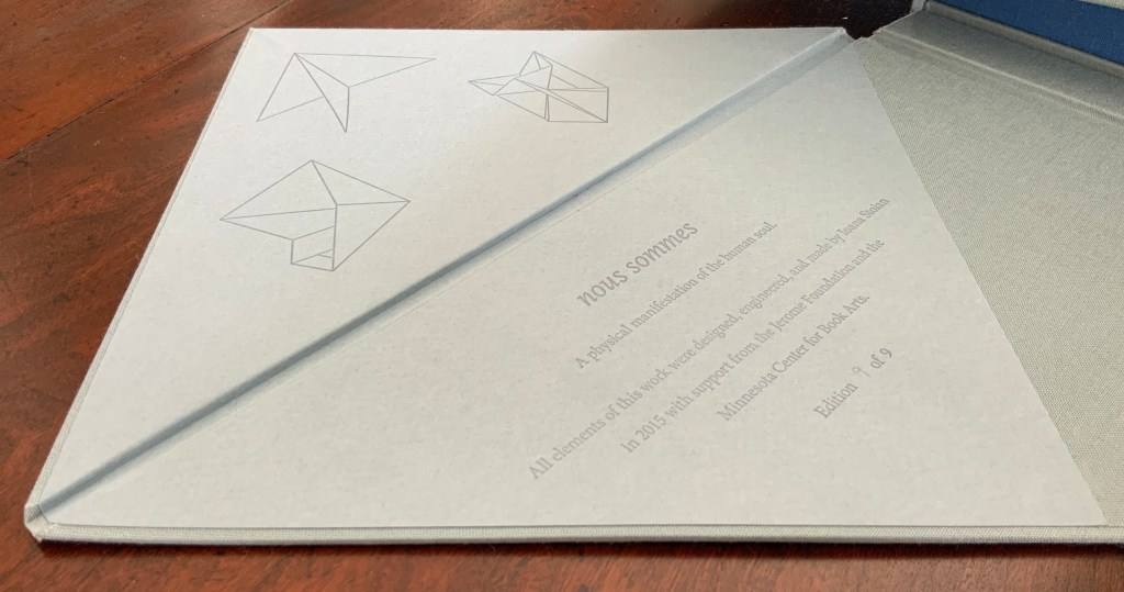
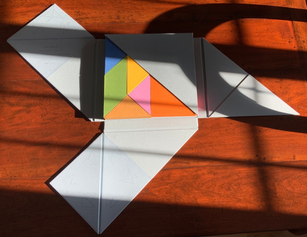
“Nous sommes”, the French for “we are”. But who is “we” here? Opening the first two flaps inside the blue-grey Solander box, I see that my first question should have been: What is Nous Sommes? The answer on the title page: “A physical manifestation of the human soul”. So, a book or sculpture then.
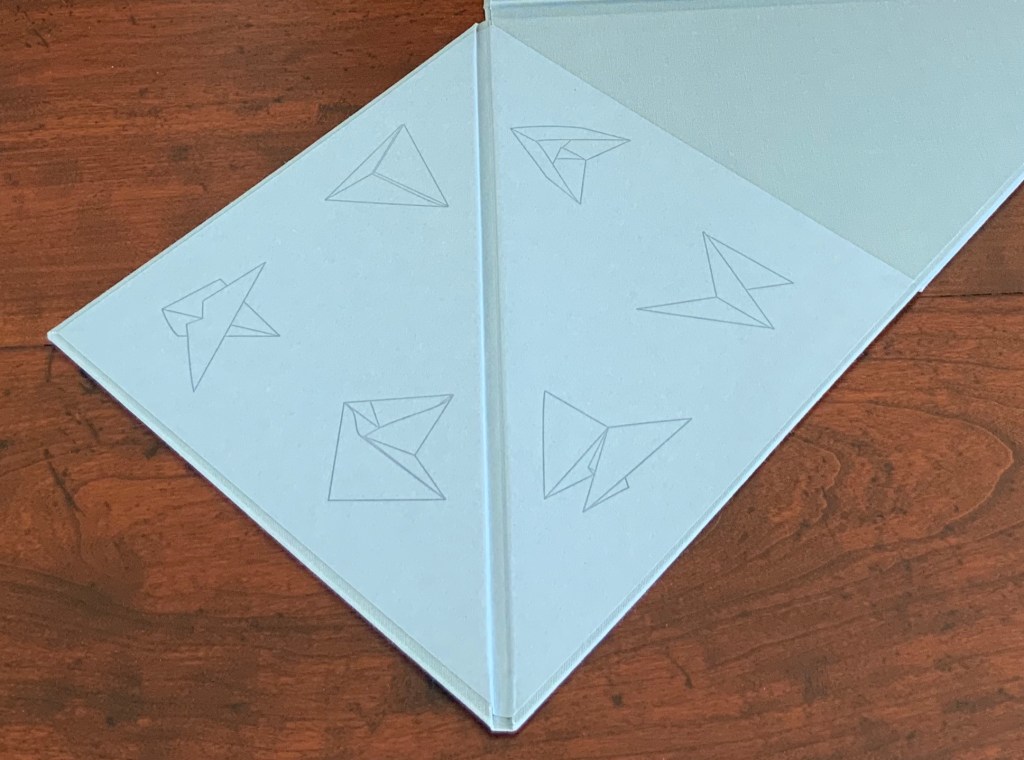
The third and fourth flaps reveal six diagrams to add to the three above the title page: a table of contents?
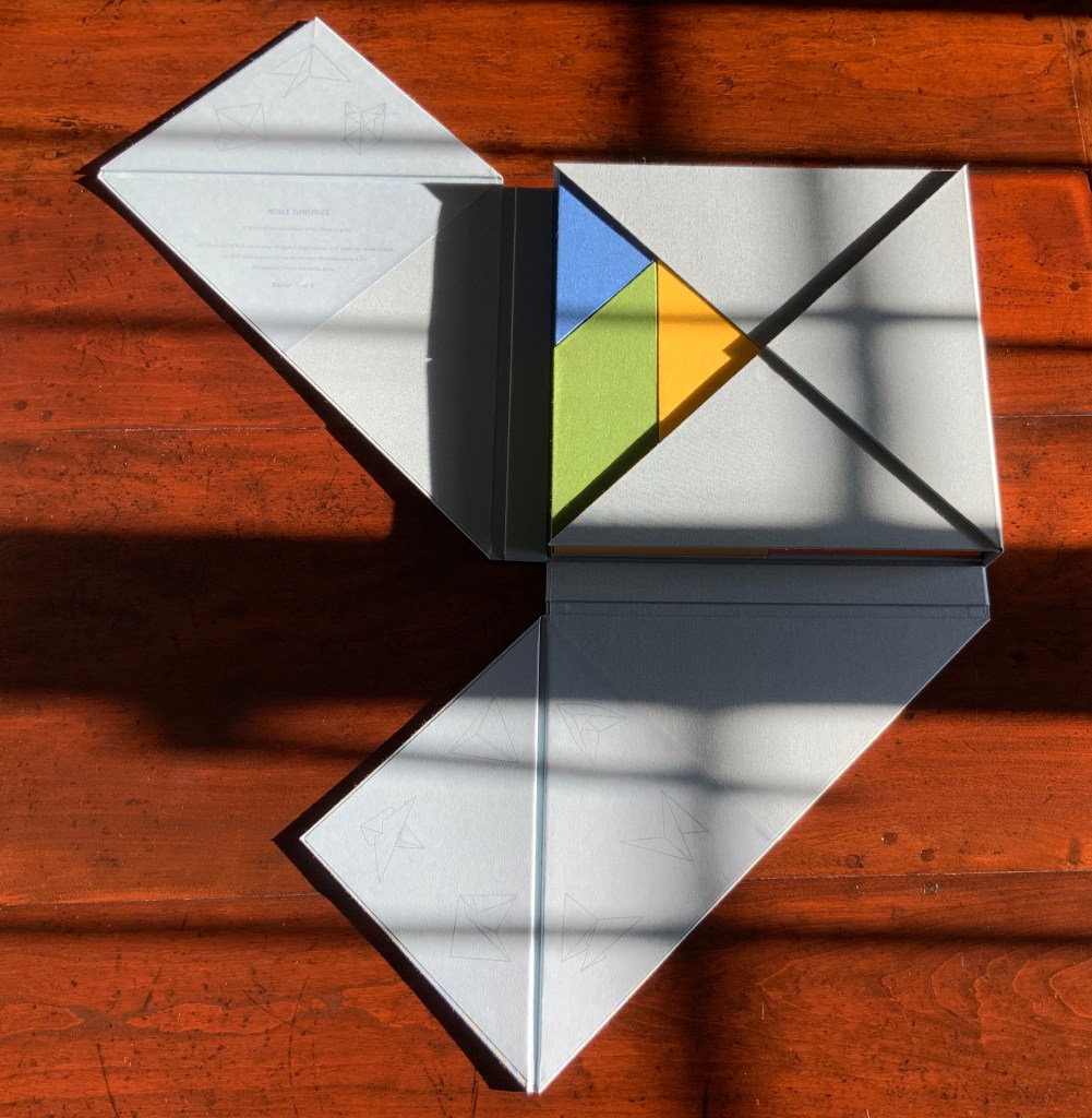
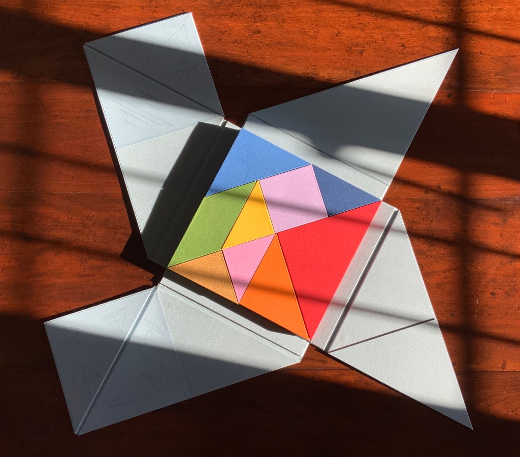
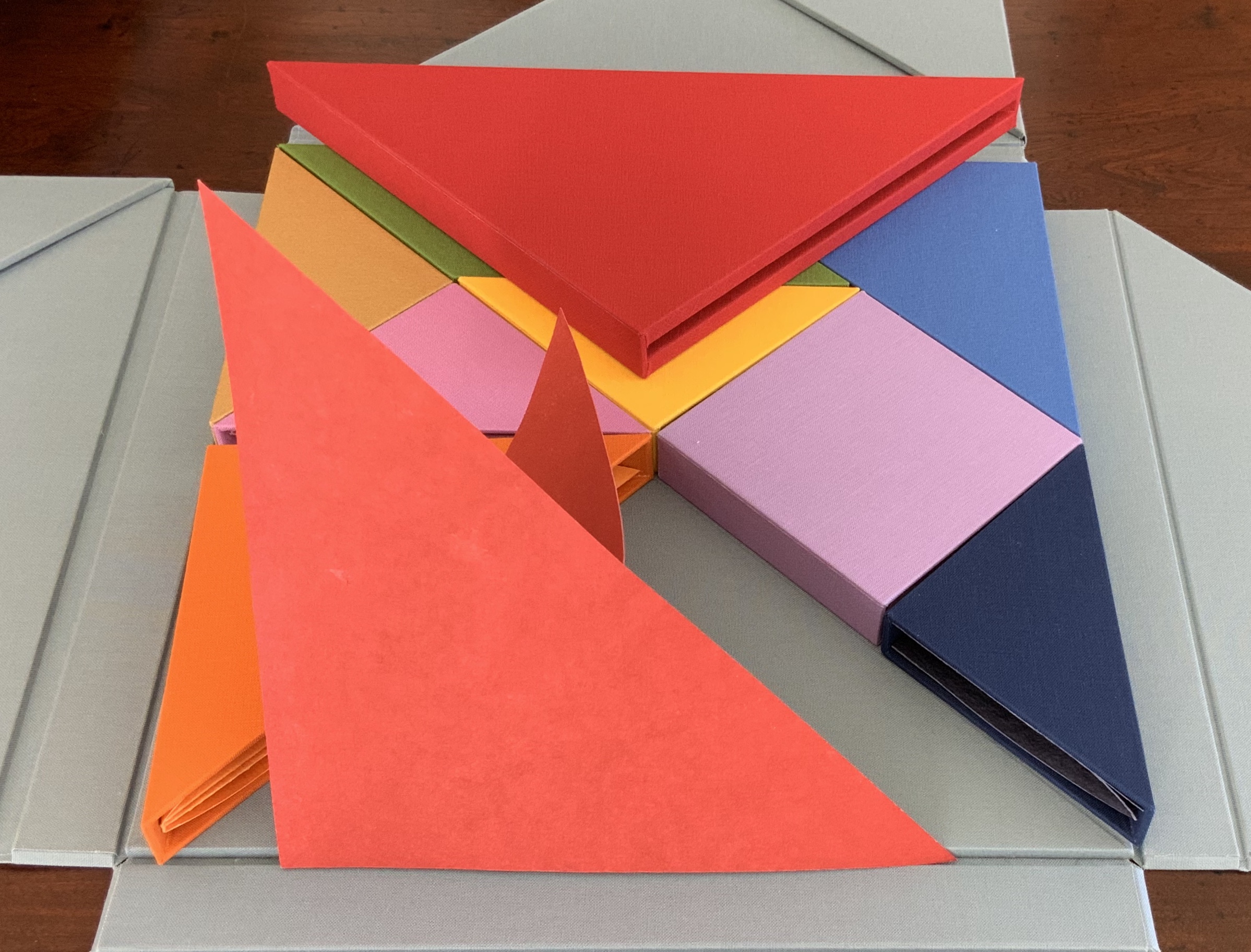
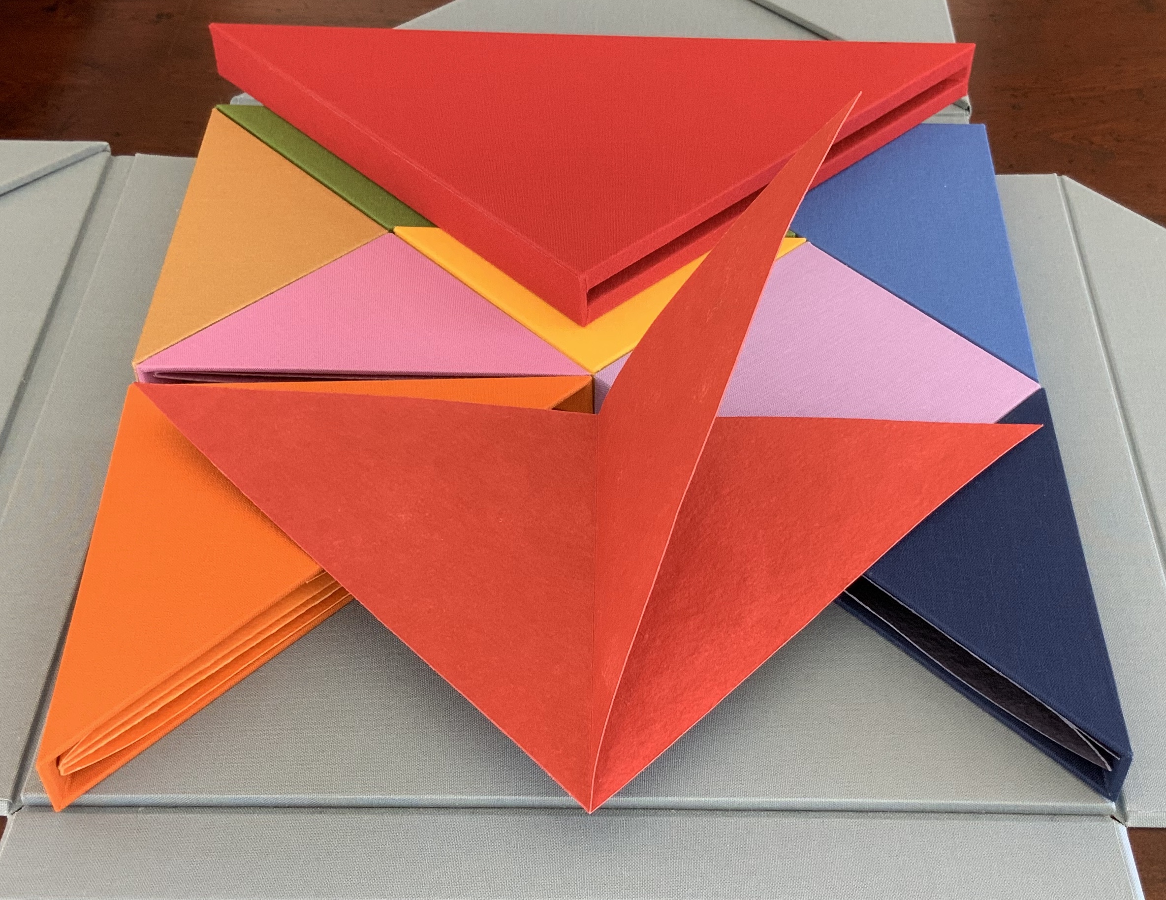
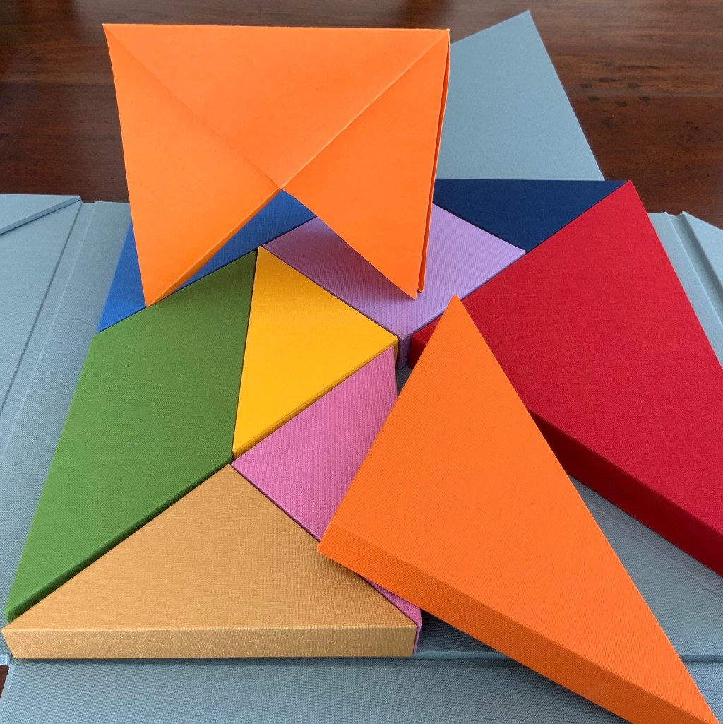
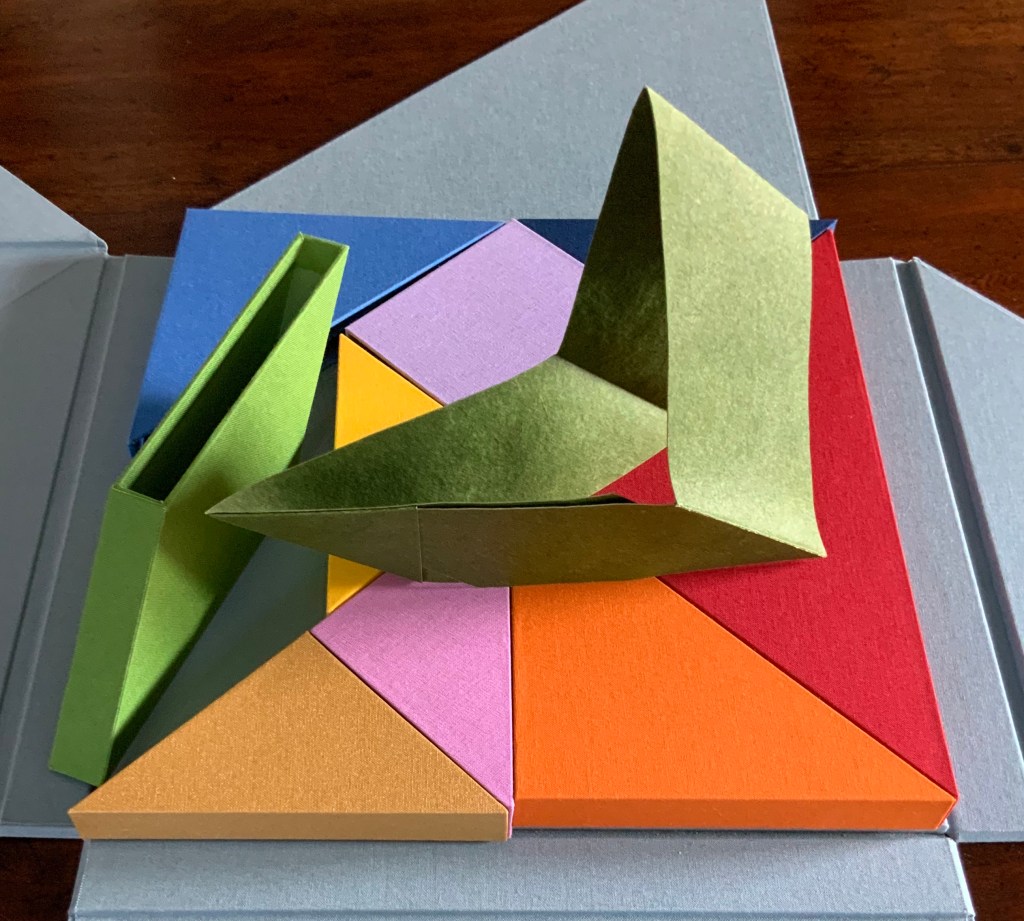
There are three brightly coloured boxes showing and fitting snugly together: the first three chapters or objects? Two are triangular, one is a parallelogram.
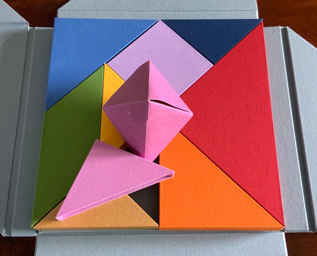
The next flap up gives another three boxes, all triangular and each a different color; and under the final flap, three more boxes, three more colors and a square among the triangles. Nine boxes making a tightly fitted square; six of them easily grasped because each has an edge at the perimeter.
The diagrammed shapes on the “table of contents” don’t correspond to the shapes of the nine boxes. The diagrammed shapes must be inside the boxes.
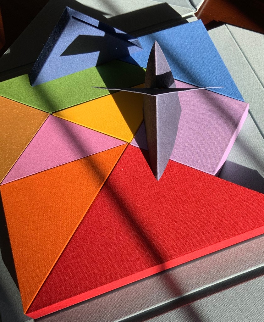
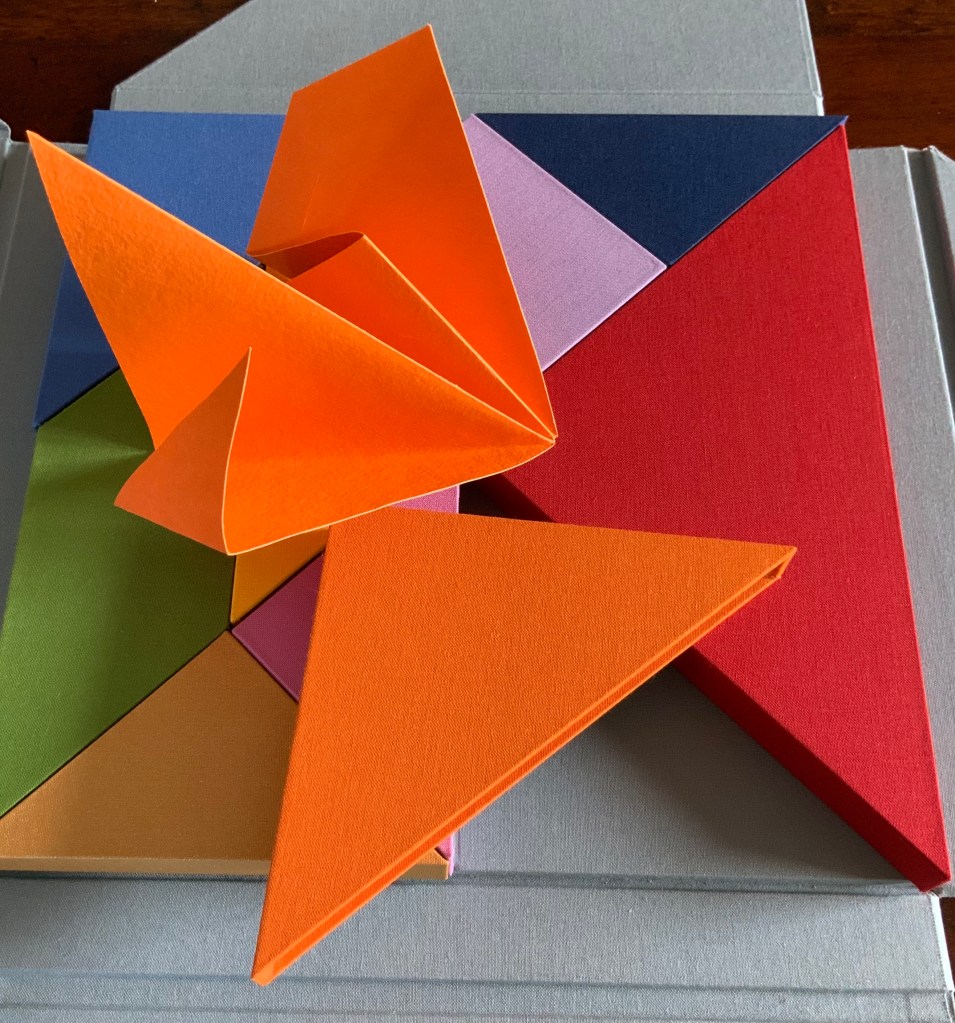
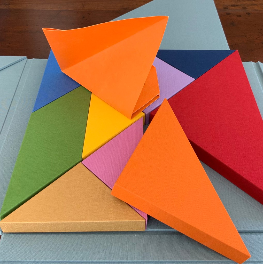
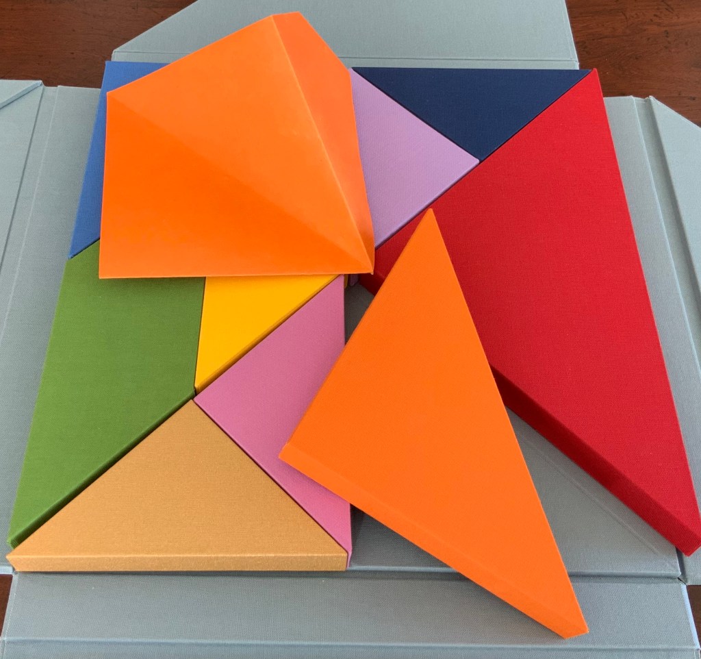
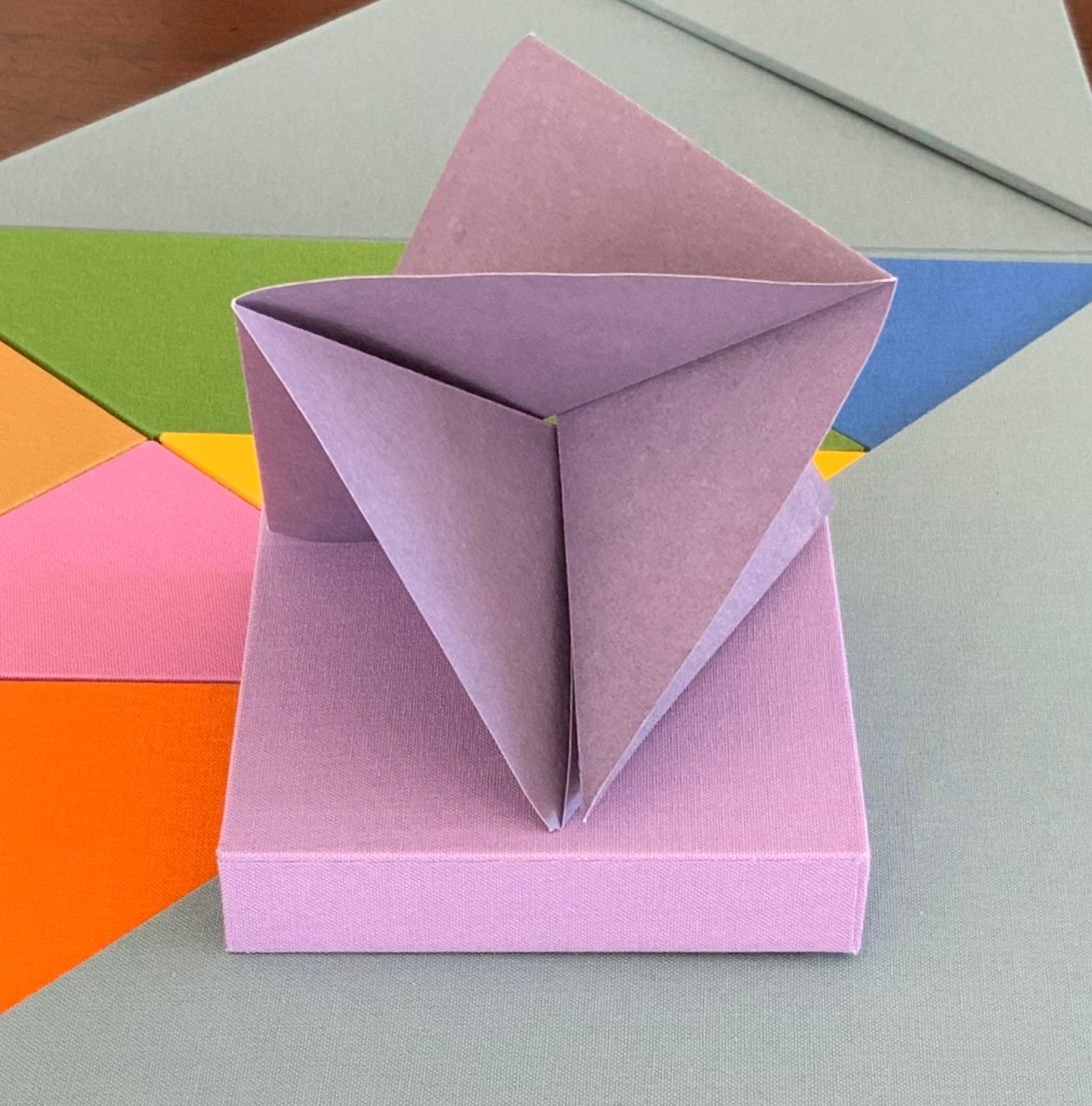
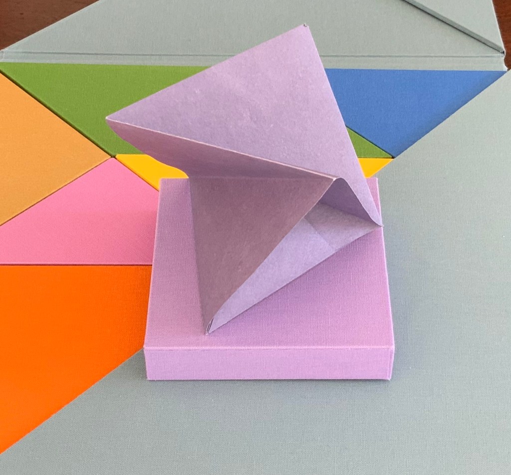
So I begin with the larger, lighter blue box. A sharp tap on the box, and a stiff, folded paper the same color as the box emerges. No words, no glyphs, but this is one of the shapes printed on the “table of contents”. It invites manipulation: stand me this way, now that, now this. With each turn, the light brings out different shades from the form’s valleys and mountains, and the form throws different shadows. Next the smaller, darker blue box houses a two-piece “chapter”, one piece to slot into the other. Again, different shades, different shadows.
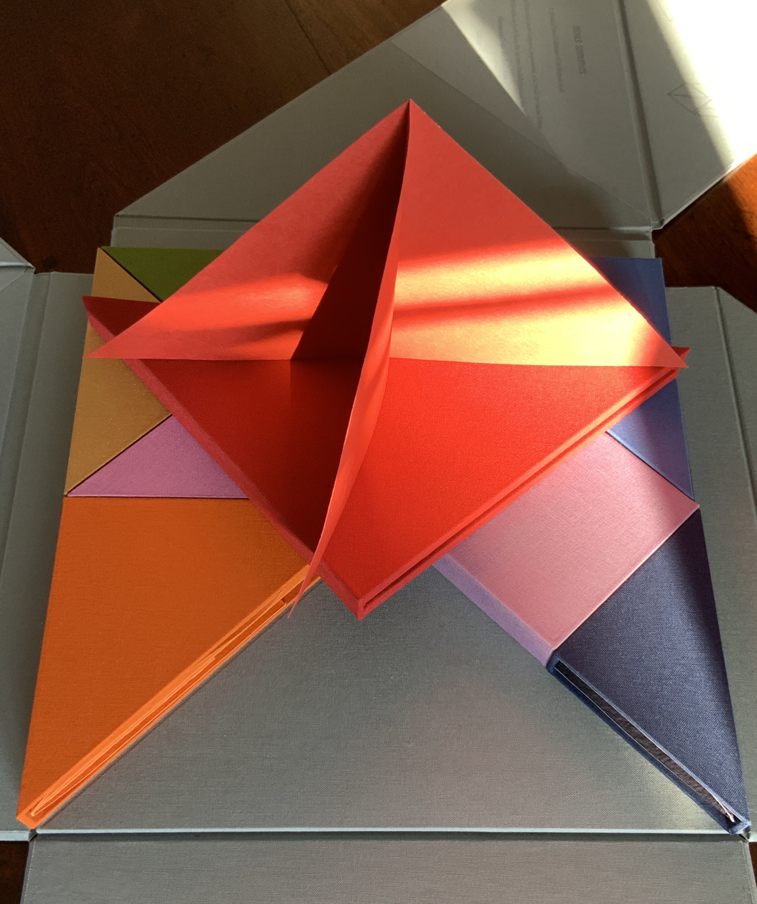
The red box also offers up a two-piece chapter, but the pieces are glued together. So much larger a shape than the one before, but so much simpler.
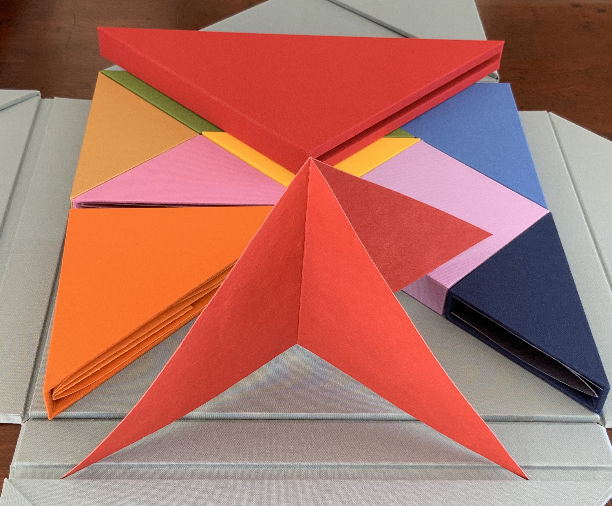
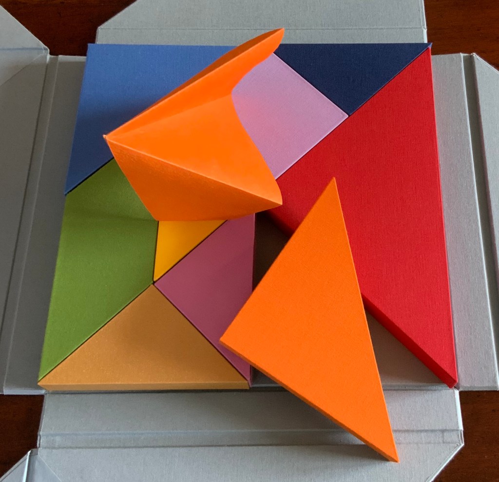
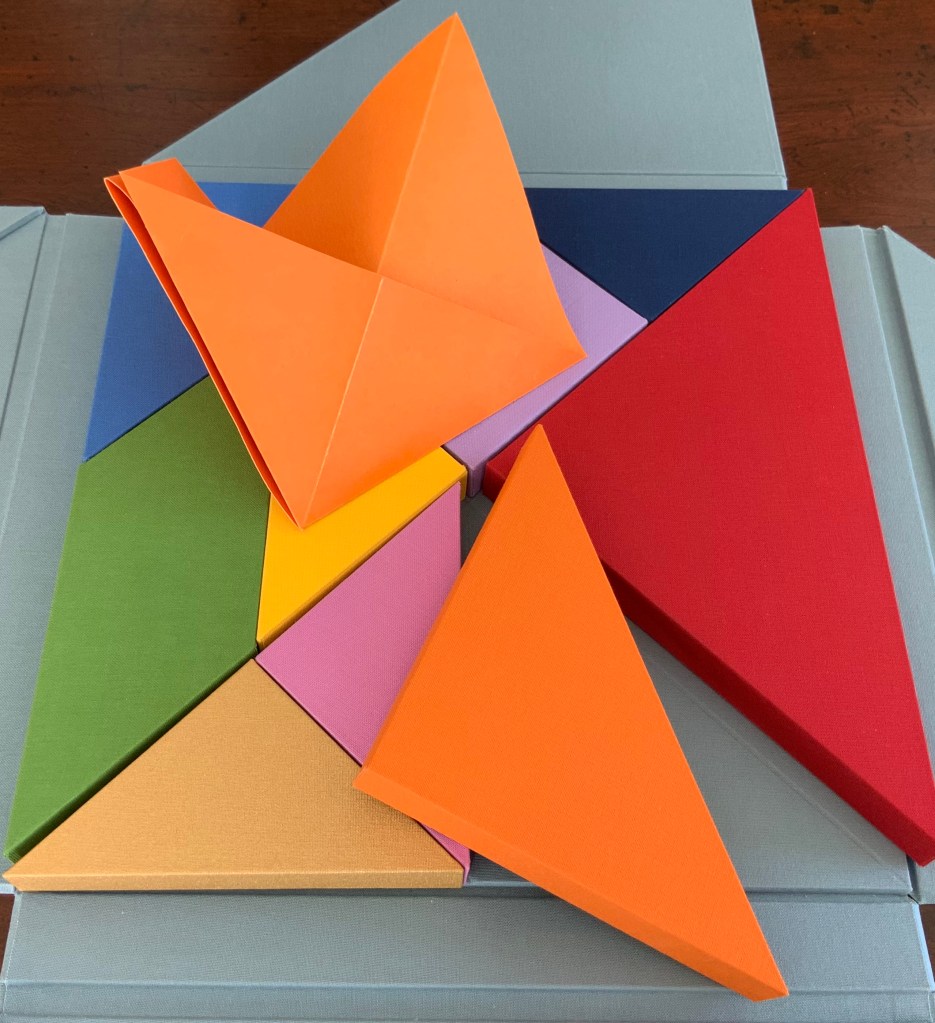
The single piece from the orange box asks to be unfolded and one tip to be slipped into an awaiting slot; the resulting object is strange.
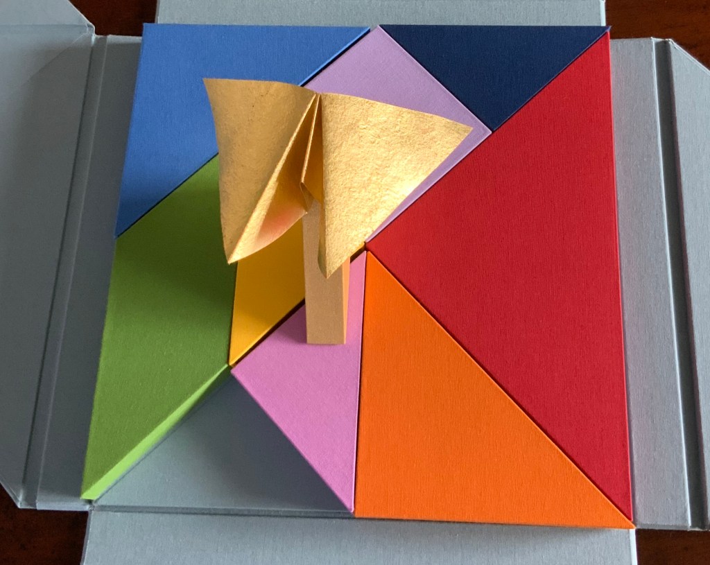
From the gold box, a butterfly emerges. The light glints off the gilt ink, and the upright box seems the perfect perch. From the green box, a glued and folded strip of paper unfolds into a hat, a collar, an open-mouthed bird or frog?
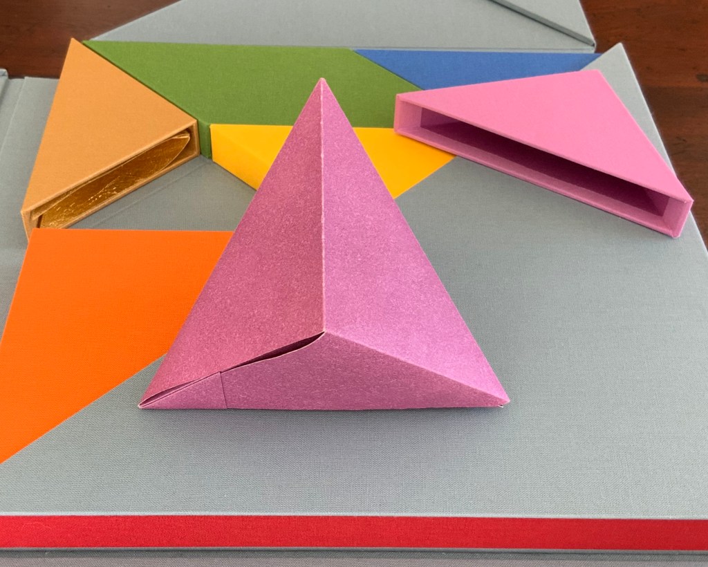
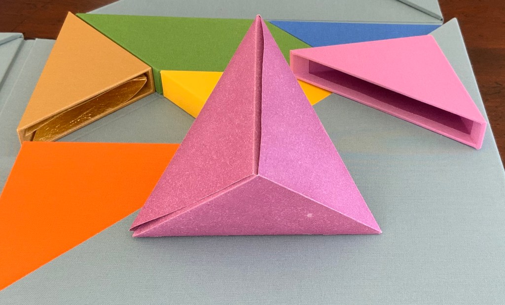
Inside the inner pink triangular box is the only solid — an irregular hexahedron. The contents of the violet square box unfolds and slots into itself to form a flower, the head of a mace?
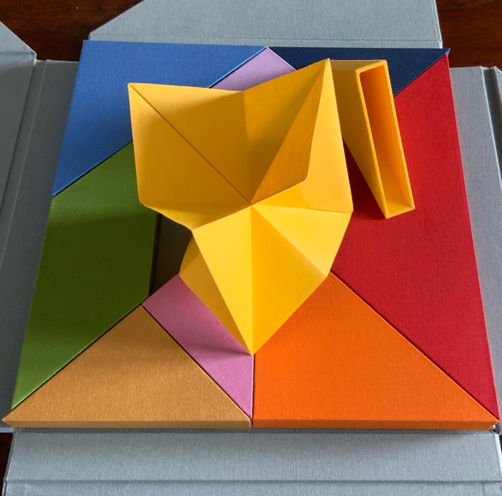
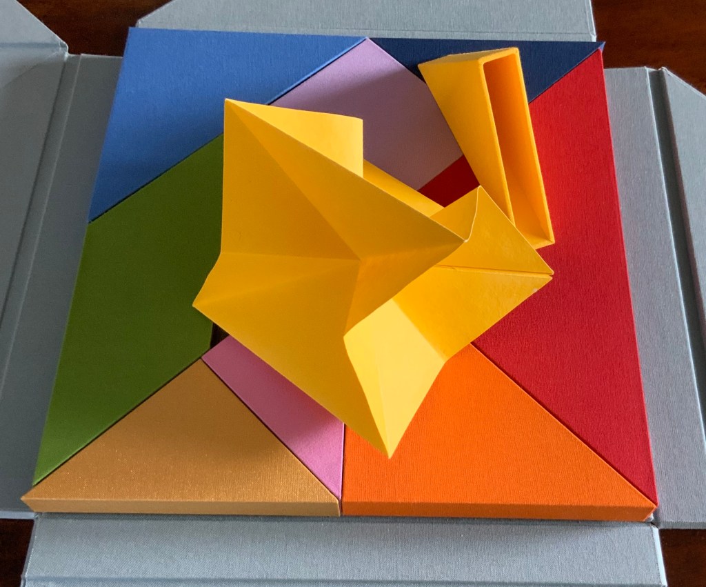
The form that emerges from the small yellow box seems the most multi-faceted of all.
But where is the human soul manifest among these colors and forms?According to Neo-Pythagorean philosophers numbers, string vibrations, musical notes, colours and form have fundamental, metaphysical relationships. Pythagoras himself is thought to have said “colour is form, and form is colour”. Then there is Pythagorean Numerology that holds that a person’s date of birth can be distilled into one number (a root number) between 1-9, that each number is associated to a colour, and that each colour aligns with certain inner traits and life purposes. So within a box of grey (the color of universality), there are the nine colours of humanity: We are, making Nous Sommes a startling integration of book art, Pythagoras, numerology, tangrams, origami, papermaking, boxmaking, binding and printing.
On the title page, the work is designated as “Edition 9 of 9“. Yet, as of this writing, the work is unique. Of course, 9/9 = 1. And the chapter with which I started was blue, the colour associated with the number 5, the root number of my birth date. So many coincidences of sums, Nous Sommes must have been bound for the Books On Books Collection.
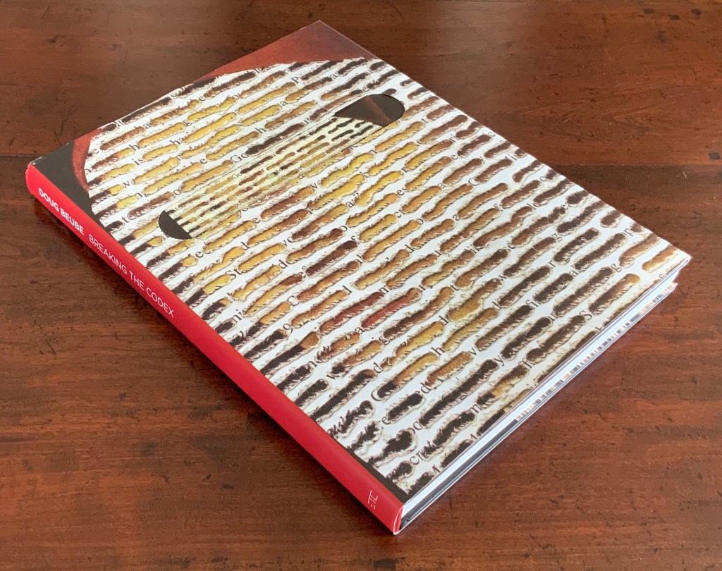
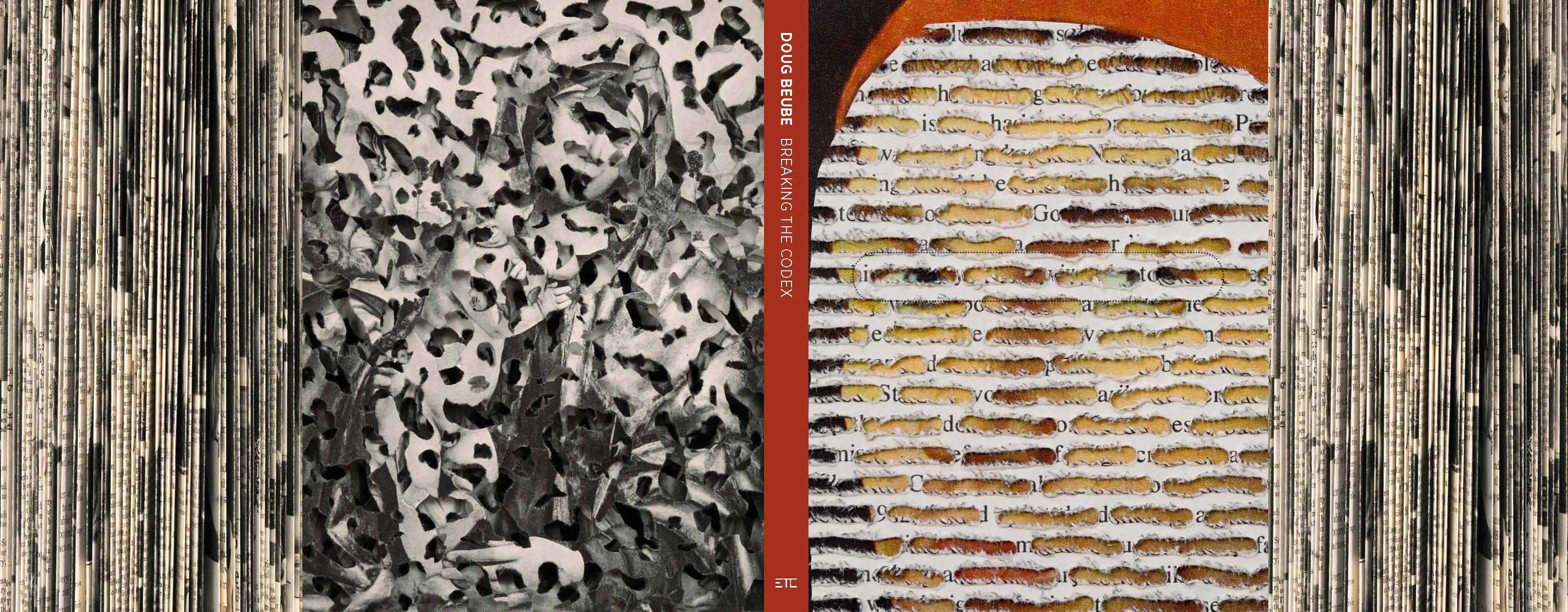
Doug Beube: Breaking the Codex Marian Cohn, ed. (New York: Etc. Etc. The Iconoclastic Museum Press, 2011). Acquired from the artist, 15 February 2014. Photo: Books On Books Collection
Jacket, outer and inner. Photos: Courtesy of the artist.
Back and front covers. Photo: Courtesy of the artist.
In an interview with Judith Hoffberg, Doug Beube spoke of experiencing
the whole book as an entity in itself, which can’t be done by reading line by line. The book’s not made to do that. Readers experience the totality of the book by building up linear movement, word by word, sentence by sentence, etc. and I’m interested in the book as a simultaneous experience. —Umbrella, Vol 25, No 3-4 (2002)
Doug Beube: Breaking the Codex (2011) documents the impression that, in pursuit of that experience, Beube has foreshadowed and/or echoed nearly every variation of book art in play from the 1980s to the early twenty-first century. Beube has been extraordinarily inventive with the book as raw artistic material but not only for the sake of that experience. Beube is a biblioclast and an ideoclast. His works have altered the codex form and deployed its “syntax” and its metaphoric identities to address recurring political, social and philosophical themes. The two small works in the Books On Books Collection lean more toward the aesthetic and philosophical themes, but the presence of Doug Beube:Breaking the Codex makes a handy reminder of the artist’s substantial body of larger ideoclastic works.
Empty Talk (2016)
Empty Talk (2016) Doug Beube Altered book, plexi glass, acrylic box, wood. Framed, H286 x W232 x D51 mm. Acquired from Kaller Fine Arts, 20 July 2017. Photo: Books On Books Collection.
Views of Empty Talk. Photos: Courtesy of the artist.
Empty Talk is part of the Speechless series, which derives from the work Cut ‘Shortcomings’ (2015). Beube describes the origin of the works:
‘Shortcomings’ is the original title of the graphic novel by cartoonist Adrian Tomine. It was published by Drawn and Quarterly in Montreal, Canada in 2007. The genre of this art form with seven to nine cells per page, in a gridded format, is drawn in black and white with ‘speech bubbles’ floating overhead of the characters in the book. In the Speechless series, an ongoing collage project, is the removal and outlining of the drawings and speech bubbles using an surgeon’s knife. Reducing the content to line drawings, the pages become veiled layers, a dissected essence of the story that the brain comprehends as both linear and abstract. Between the two, narrative and abstraction, it invites the viewer to literally read between the lines and pages. The final artwork is presented as four pages deep separated by 3/16th inch foam core. The backing of the meticulously cut mash-up of the collage is another version of ‘Shortcomings’ that is sliced into strips then stacked on top of one another. — Dougbeube.com. Accessed 16 April 2020.
Photo: Books On Books Collection.
Hanging on a wall in the collection, Empty Talk mesmerizes. It balances an abstract figure resulting from excision and collage against its pun and linguistic/visual jigsaw puzzle. That tension between abstraction and linearity harks back to Beube’s stated pursuit of “the book as a simultaneous experience” in tension with the reader’s linear experience of it. A kind of cross-eyed, twisted brain state.
Red Infinity #4 (2017)
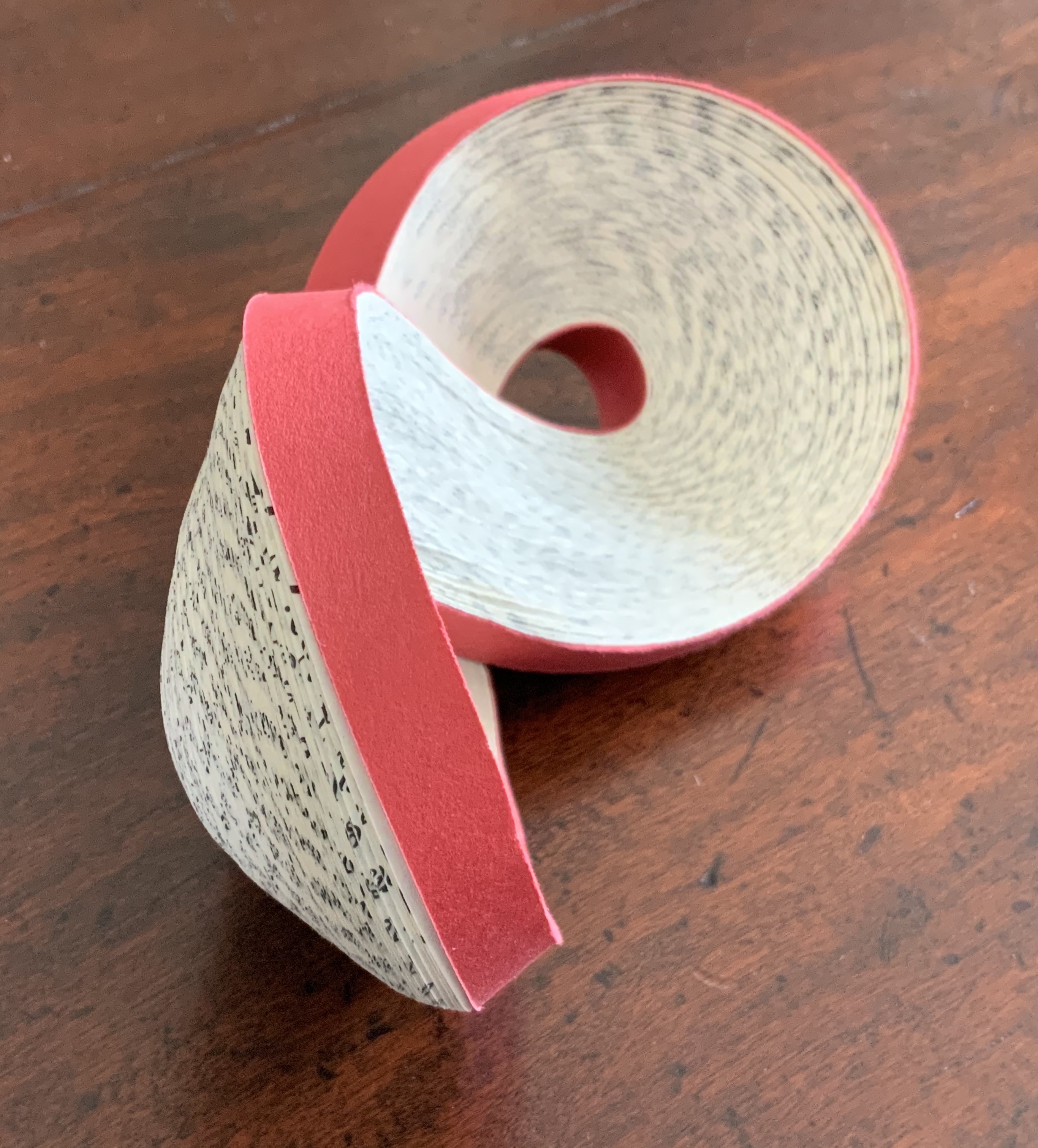
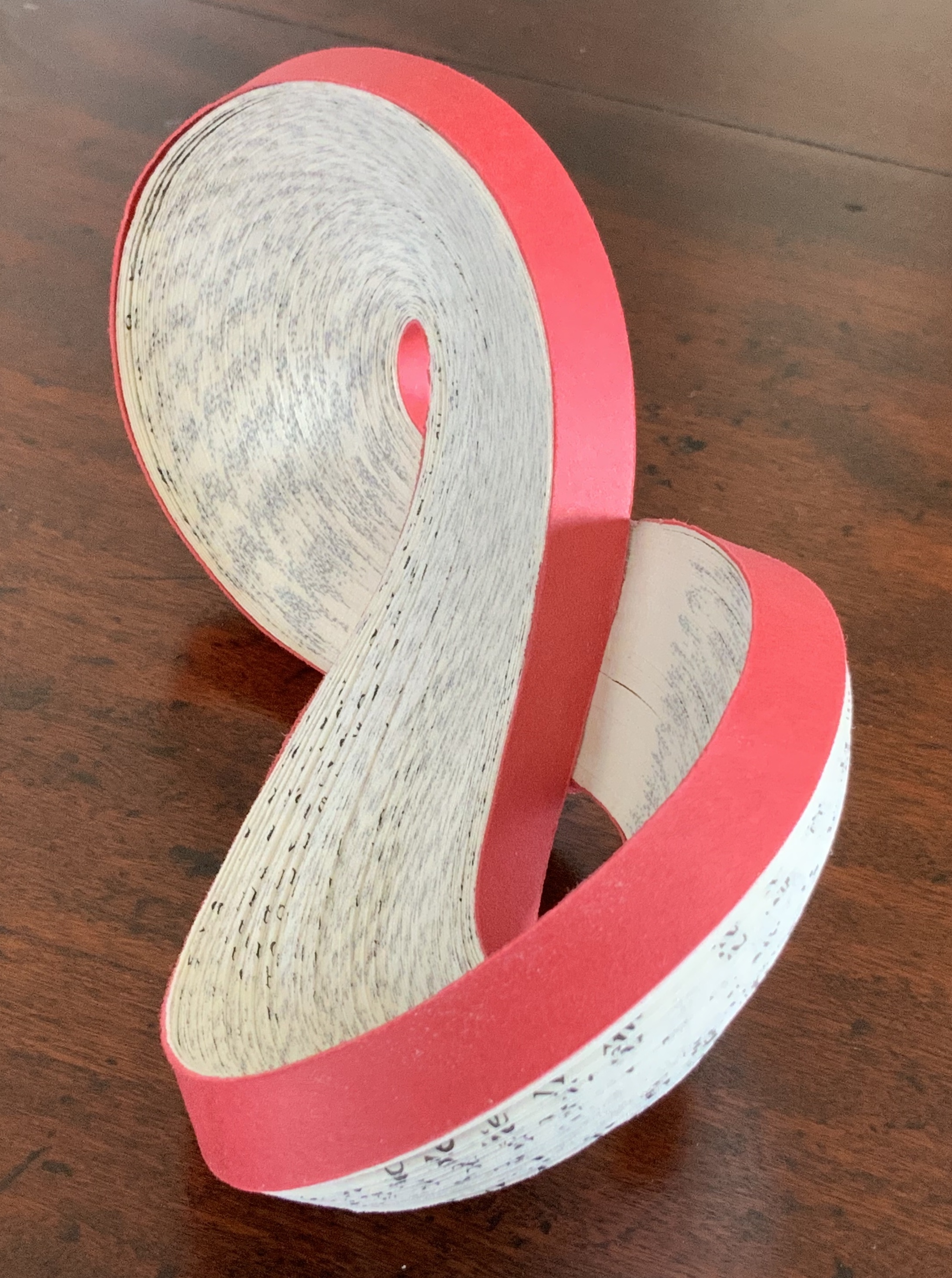
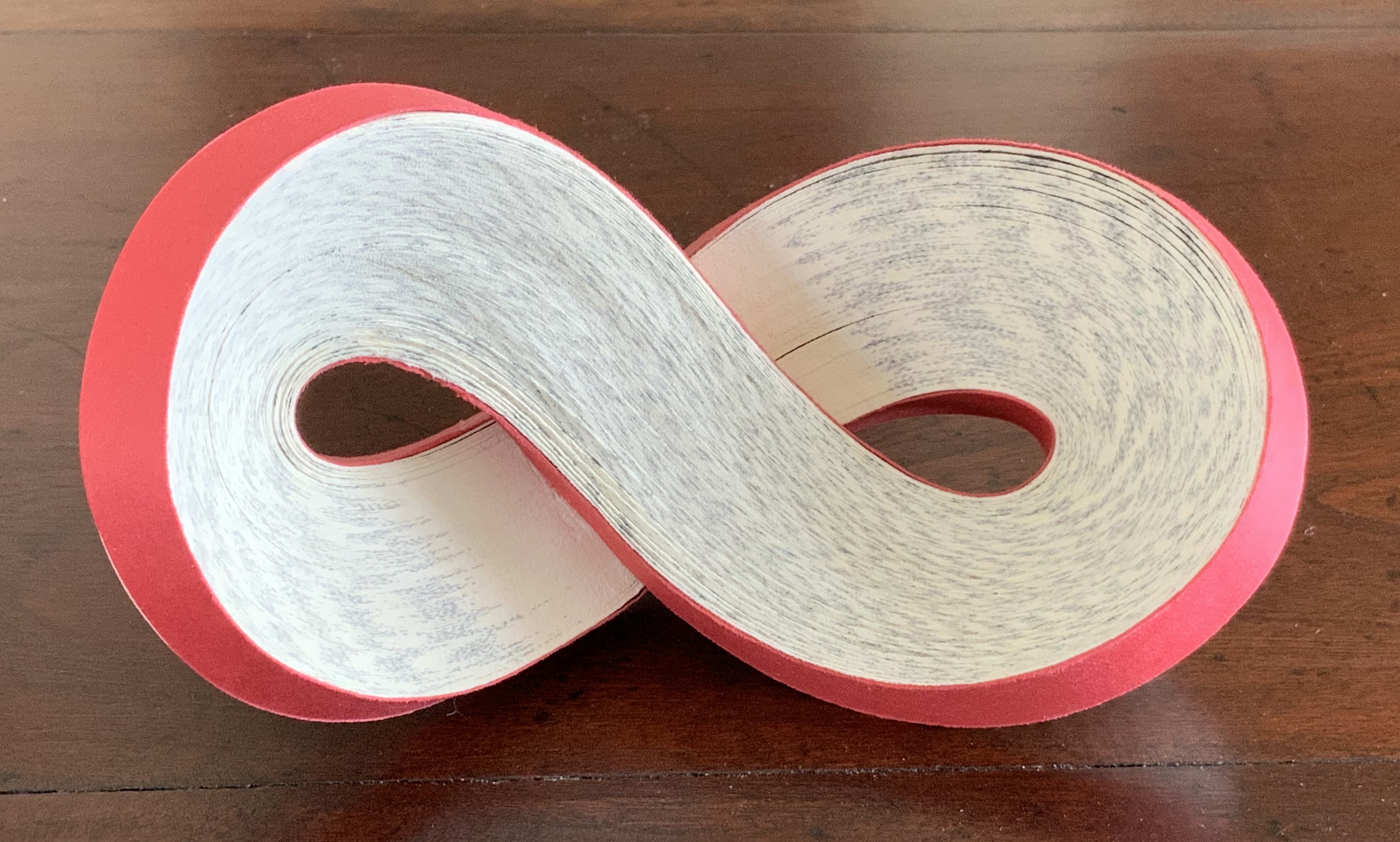
Red Infinity #4 (2017) Doug Beube Altered book. 152 x 83 x 57 mm. Acquired from SeagerGray Gallery, 7 April 2020. Photo: Books On Books Collection.
Photos: Books On Books Collection.
Red Infinity #4. Photo: Courtesy of the artist.
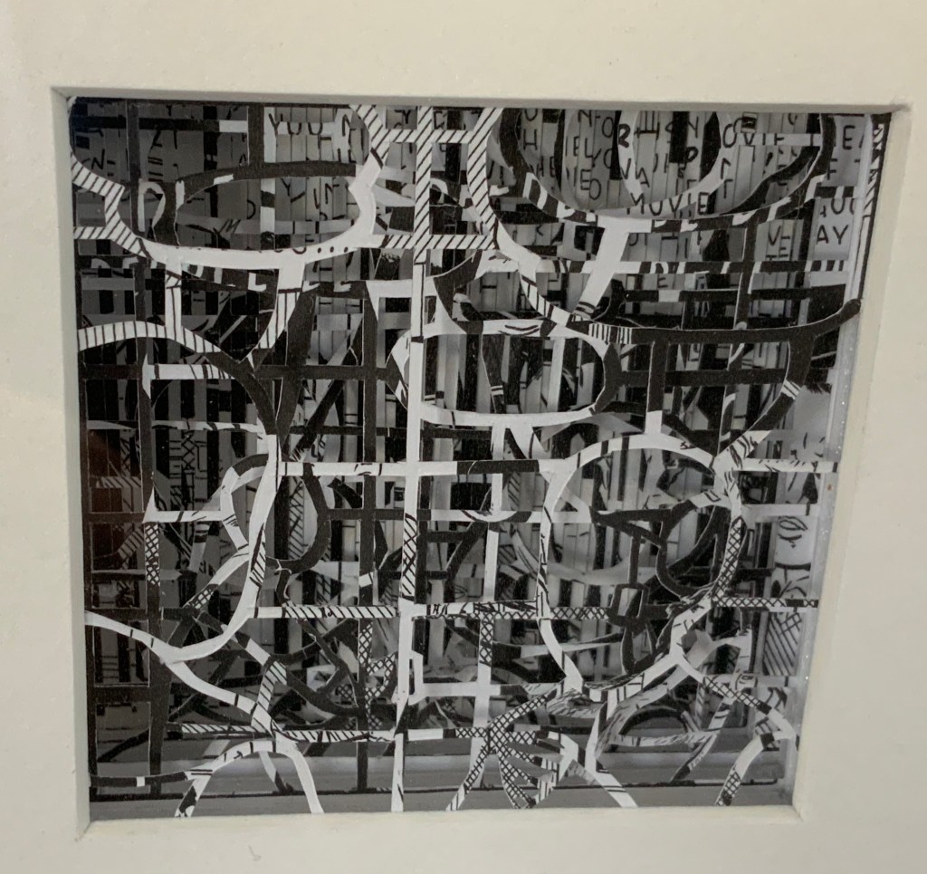
The book from which Red Infinity is formed is The Word: A Look at the Vocabulary of English by Charlton Laird (New York: Simon and Schuster, 1981). At play are at least three interlocking puns: “in the beginning was The Word”; the Möbius strip, a secular never-ending Alpha and Omega; and the symbol of infinity, a secular “world without end”. And the bonus fourth: take The Word as “red/read”. The surfaces of Red Infinity invite touch, but its fragility forbids it. Its weight less than a small bird’s nest, RedInfinity belies its weighty allusions. Here is infinity from the finite.
Looking Outside the Collection
Since Doug Beube: Breaking the Codex (2011), the artist has continued to create large numbers of individual bookworks, but another type of work has come to the fore: large dynamic multimedia installations: Melt (2014), Dis/Solve (2018) and Wash (2020). The first two still incorporate the book as artistic material, but the third moves away from it. Variously requiring participation or observation in the moment as with a performance, these works ironically remind us of Beube’s observation that
The codex is intractable as a technology; restricted from interacting with it by not altering its inevitable course, you read linearly from beginning to end. It is essentially inflexible. That is its built-in personality flaw; that is its elegance. — Dougbeube.com. Accessed 18 April 2020.
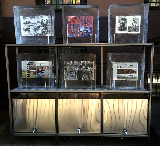
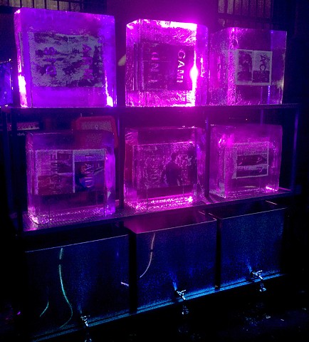
Melt(2104) Doug Beube “… an environmentally sensitive sculpture that involves six selected books physically carved according to their theme. Once frozen, the ice functions to animate messages for social and political conditions, cultures of power or violence both physical and psychological, and those structures existing to support the inverse of the latter. Because Melt is subject to the weather, the anachronistic technology of the book is leveraged into the environment directly.” Photos: Courtesy of artist.
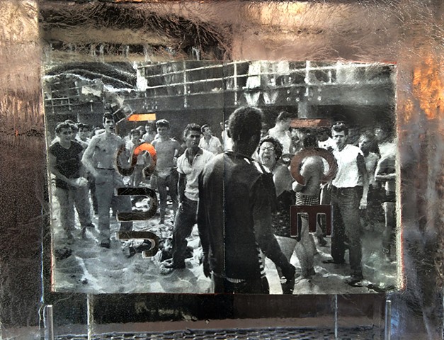
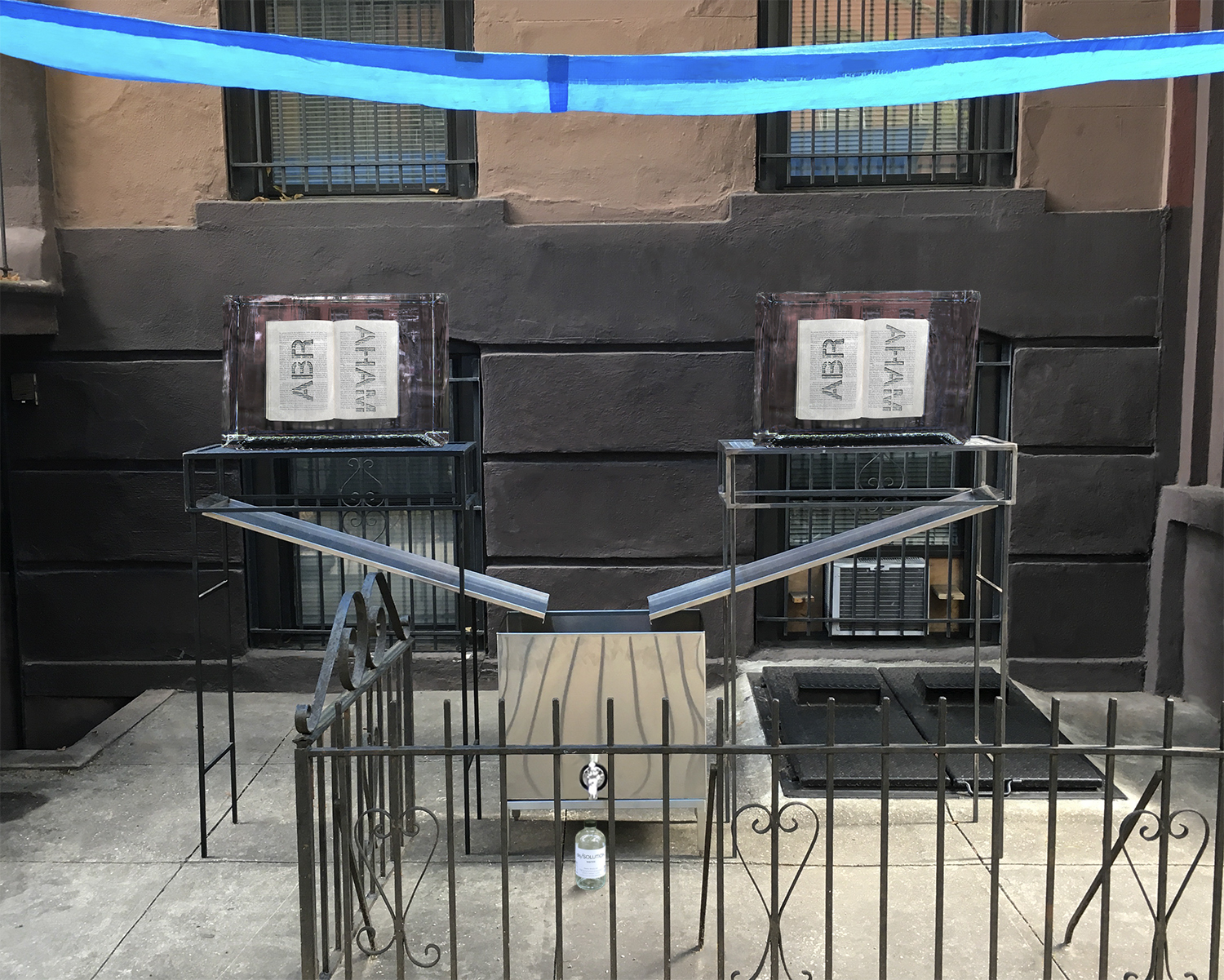
Dis/Solve (2018) Doug Beube “… an environmentally sensitive sculpture that presents two books that have been physically carved and frozen into blocks of ice. …One book is Arab and Jew; Wounded Spirits in a Promised Land by David K. Shipler and the other is The High Walls of Jerusalem by Roland Sanders. The word ABRAHAM is carved into the books A-B-R on the left side and A-H-A-M, on the other. As the ice melts, the water is captured by two steel plinths that drain into one tank. The water is dispensed into bottles with labels that read dis/SOLUTION.” Photos: Courtesy of artist.
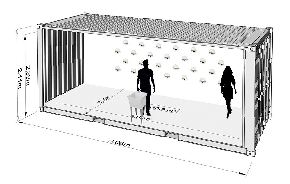
Wash (2020) Doug Beube “…a collection of specially crafted soap bars etched with racial slurs and epithets. Carefully set onto a wall of soap dishes, this arrangement invites participants to wash their hands with a bar, letting the ink flow from the letters and mix with the white suds and lather.” Photos: Courtesy of artist.
Fully experiencing either his dynamic or interactive installations re-enacts this linearity, this “built-in personality flaw” of the codex. Even accessing them by still image (online or offline in a book) or by moving image reminds us secondhand of this flaw. Perhaps the flaw belongs not only to the codex technology (there is no book present in Wash) but to any work of art “bound” by linear process and time. Whether caught by the experiencing, the image or merely the concept, we stand then to be implicated in what these three installations address: religious, environmental and political conflict and “othering” slurs — things of which we cannot wash our hands.
Cohn, Marian (ed.). Doug Beube: Breaking the Codex (New York: Etc. Etc. The Iconoclastic Museum Press, 2011). “Etc. Etc. The Iconoclastic Museum” is a fictional mueseum invented by Beube in 1981 and curated by the equally fictional Art Gossip. This additional bit of evidence of Beube’s wide-ranging creativity is mentioned in the interview with Judith Hoffberg, entitled “A Cut Up and a Book Artist”, originally published in the journal Umbrella and included as a chapter in this book.
Frost, Gary. The Future of the Book (2000-2009). Available through the Wayback Machine. Accessed 19 April 2020.
In the Hoffberg interview, Beube mentions Gary Frost’s influence via his deep-seated knowledge of the history of the book. There is that, but there is also Frost’s ongoing exploration of the haptic nature of the book. Both strands of influence can be seen throughout Doug Beube: Breaking the Codex. But where Frost would seek the possibility of an ongoing link between the print and the digital — “In place of simplistic displacements a complex interaction of book formats surrounds us and continues to challenge our reading skills” (February 2006) — Beube finds a more sardonic and acerbic humorous split. A twisted phonebook dangled before his face in the photo entitledFacebook to create a self-portrait “both acknowledges and satirizes the intended community of computer users.”
Roalf, Peggy. “Doug Beube on Reading Art“, DART: Design Arts Daily, 8 July 2015. Accessed 19 April 2020. Interview in which Beube discusses the larger work Cut “Shortcomings” from which Empty Talk is derived.
Beube’s aim at an experience of the wholeness of the book plays off a major theme in Smith’s two books: “Composing the book, as well as the pictures it contains, creates pacing in turning pages. Just as poetry and cinema are conceived in time, so is a book.” Both Smith and Beube are interested in the structure of the book, “the mechanical aspects of the book as a technology, and how it functions as a container of information,”as Beube puts it. But where Smith pushes the traditional form of the book to enhance the book experience that “Events depicted in writing unfold through time in space, alongside the physical act of turning pages,” Beube is “trying to solve the problem of experiencing the content of the book as a visual phenomenon, layering it and transforming it into a visual object.”
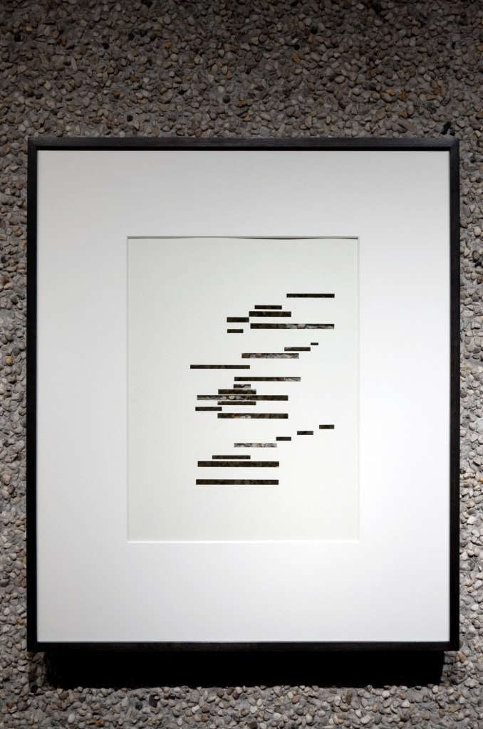
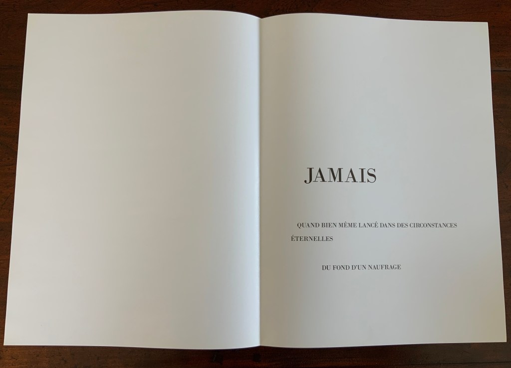
As many bookworks do, Wyn Evans’ “…” offers a puzzle. In this case: What has been omitted? What is coming after the pause or delay?
In his brief essay at the end of the book, Moritz Küng describes this work as a catalogue for Wyn Evans’ exhibition (15 October 2009 – 10 January 2010, deSingel, International arts campus, Antwerp) and characterizes it as “a reciprocate hypertext”, recalling the “trilogy of Un coup de dés by Mallarmé [1914], Broodthaers [1969] and Wyn Evans [2008]”.
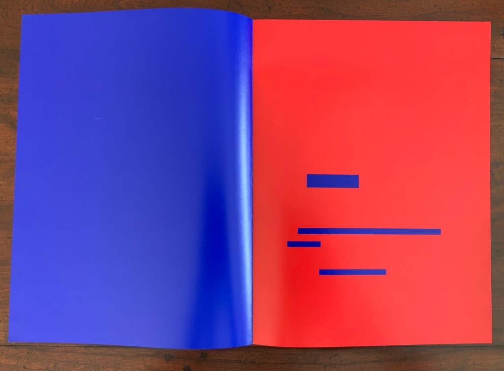
The work “…” (2009) alludes to those other three works by form and materiality, not actual text. It uses the same trim size of the 1914, 1969 and 2008 works. The 2009’s laser cut text is positioned in a way to imply the placement of text in the 1914 work, the placement of black strips in the 1969 work and the positioning of excised blocks in the 2008 work. The 2009 work’s subtitle — DELAY — is even positioned exactly where the subtitle is displayed in the three earlier works. Of course, the title page and subtitle in Wyn Evans’ 2008 version of Un Coup de Dés went along with the rest of his variation on Broodthaers’ 1969 work: the pages are framed and hung, allowing the pebbled wall behind the excisions to show through.
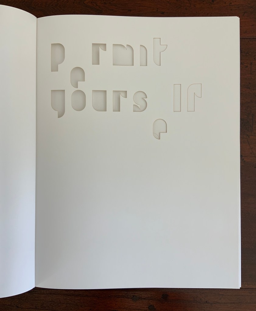
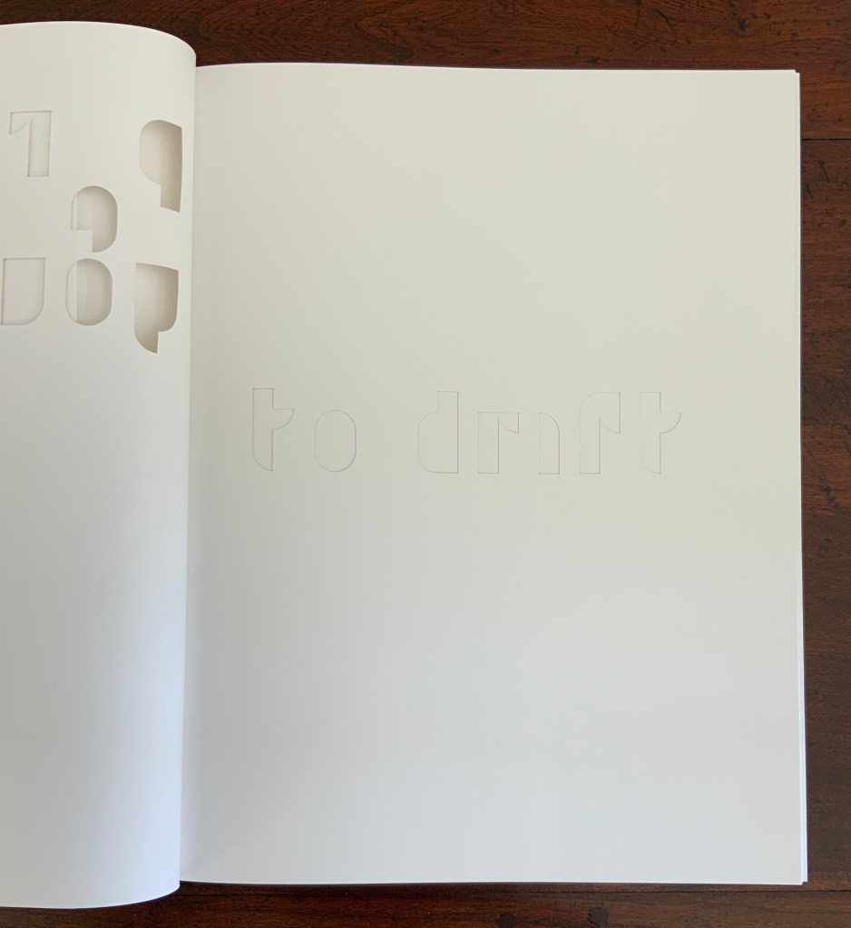
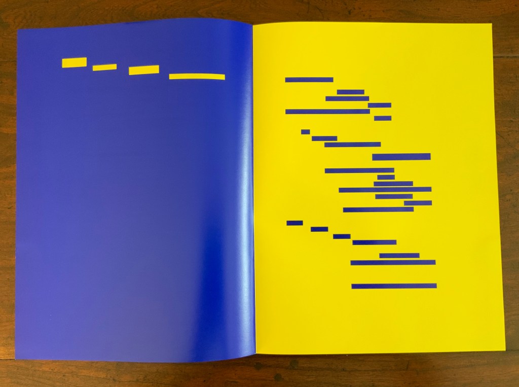
But where the 2008 work excises text, “…” excises paper to create text. The actual text in “…” comes from Stephan Pfohl’s review of Guy Debord’s filmscript In Girum Imus Nocte Et Consumimur Igni: A Film (1991). (The Latin is a palindrome — reads the same backwards as forwards — written by Terenziano Màuro, a grammarian and poet of the late second century CE.)
Permit yourself to drift from what you are reading at this very moment into another situation … Imagine a situation that, in all likelihood, you’ve never been in.
Photos: Books On Books Collection
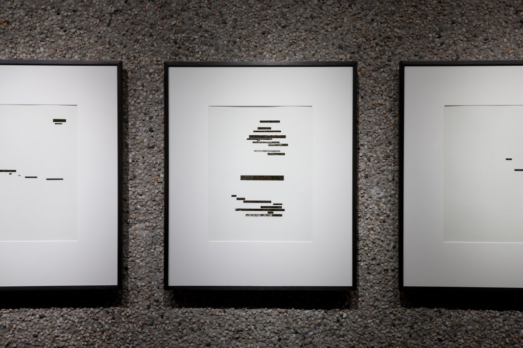
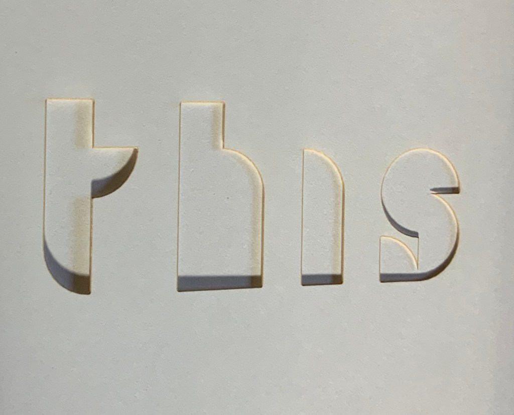
Without knowing the text in question, deciphering the laser cut is a bit difficult, especially also until it becomes apparent that the letter “e” systematically falls below the line. Notice how this happens with “permit” and “yourself” above. Is it a reference to George Perec’s novel LaDisparution (1969), written entirely without the letter “e”? Is it an interruption to delay the reader in following an instruction not yet deciphered and read? There is something more going on here than meets the eye — which is, of course, what an omission or pause implies.
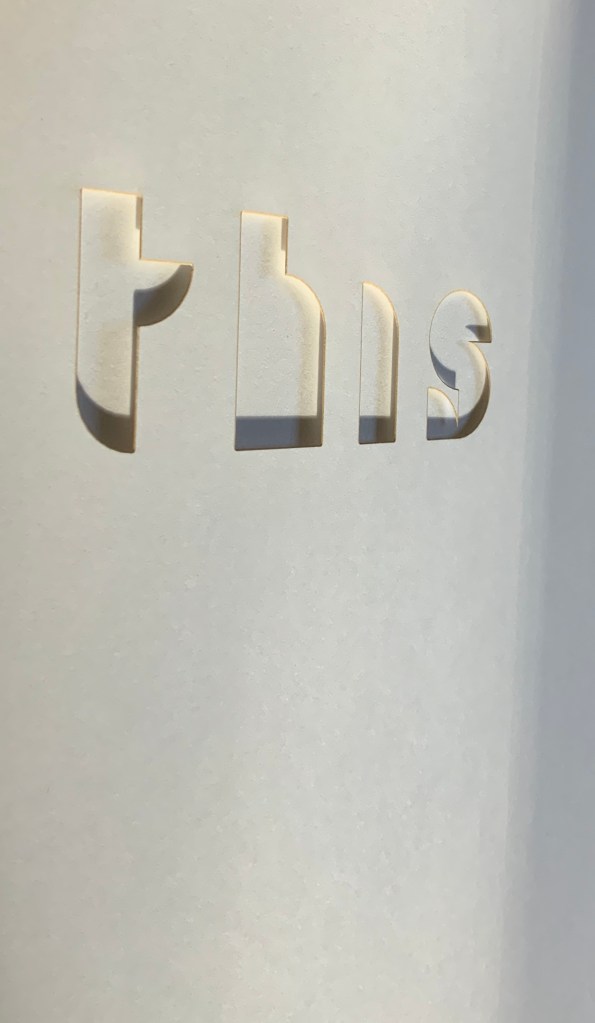
If another display in Wyn Evans’ 2009 deSingel exhibition is taken into account, and if Pfohl’s review is explored further, the laser cutting of the letters offers something else not immediately obvious to the eye. Wyn Evans could have chosen die cutting for the letters but chose (or at least approved) laser cutting instead. The signature singeing from the laser comes with the choice. To what is the choice alluding?
Details of “…” Photos: Books On Books Collection
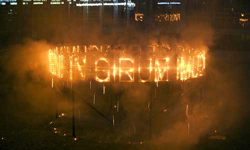
Is it alluding to the firework display that spelled out Debord’s 1978 film title, which translates “We go round and round at night and are consumed by fire”? As Pfohl explicates the filmscript and highlights Debord’s anti-consumerist, anti-capitalist and near-nihilist point of view informing it, he quips, “Look out for the flames”. Is the singeing alluding to that?
How does the reader/viewer of “…” know to make these connections, to fill in the omissions? Well, after the pause/delay of “ellipsis” come Küng’s essay and the colophon, which provide many but not all of the clues with which to make the connections.
Knowledge of — or the presence of — the 1914 edition of Un coup de Dés, Broodthaers’ 1969 version and Wyn Evans’ 2008 re-version seems essential. Attendance at the fireworks display — or finding the images in the deSingel archive — would seem necessary to make sense of Küng’s reference to the artist’s “fireworks texts”. For the reader/viewer ignorant of Debord’s last and autobiographical film, access to Pfohl’s essay is essential to connect that particular film with Küng’s reference. Also, access to Pfohl’s essay is essential to see the context of the sentences Wyn Evans extracts, essential to find the Latin title of Debord’s film, and essential to pick up Pfohl’s quip.
Does the burden of the elusive, multi-layered allusiveness and self-referencing placed on the reader/viewer diminish and interfere with the work or enhance and help it? Depends on the reader/viewer. Or as Terenziano put it, Pro captu lectoris habent sua fata libelli (The fate of books lies in the capability of their readers).
The colophon also provides a set of details that can shape the reader/viewer’s appreciation of “…” — DELAY. It assigns the concept to Wyn Evans, Armand Mevis and Moritz Küng, the overall graphic design to Mevis & van Deursen and the layout design to Paul Elliman, whose Albernaut font was used for the excised text. Collaboration as recorded in a colophon grounds this work in a lineage that extends far beyond Mallarmé and Vollard. Even before the printed codex, the colophon, or finishing touch, to a scroll or manuscript book recorded how collaborative the effort to make a book actually is. Although book art is leavened with Blakean works of individual creation, the works of artists such as Cerith Wyn Evans remind us how this object is so often the result of multiple talents going round and round and catching fire.
Further Reading, Viewing and Listening
“Cerith Wyn Evans”, desingel.be. Accessed 15 March 2020.
In the first three minutes of this extract from the film Molinari: la couleur chante (2005), Molinari walks through an exhibition of Équivalence, discussing it with Roald Nasgaard and commenting on Un coup de Dés, its visual musicality and his transformation of it into his colourful geometric abstractions. The opportunity to see all of the poem ranged along one wall and all of Molinari’s abstractions along a facing wall is a pleasure. A pleasure enhanced by leafing through the portfolio and juxtaposing each double-page spread of the poem with Molinari’s “equivalent” abstraction.
Update
At the Guido Molinari Foundation’s exhibition Sophie Lanctôt, Mallarmé, Molinari: Mots Croisés (6 June – 25 August 2024), a previously undiscovered artist’s book by Molinari appeared for the first time in thirty years:
Continuum pour Mallarmé (1994)
Images courtesy of Fondation Guido Molinari. Photos: Michael Patten. Especial thanks to artist Sophie Lanctôt and curator Monic Robillard.
Note in this earlier work how the text is integrated with artwork, omitting the later work’s intermediate homage to Broodthaers.
Continuum pour Mallarmé was created for a group show of 47 books by renowned artists such as Louise Robert, Michel Goulet, Irene F. Whittome and Rober Racine, presented at AXENÉO-7 in Gatineau from March 27 to April 24, 1994, under the title De causis et tractatibus. Each artist was free to choose his or her subject. Molinari chose Mallarmé’s poem.
“The idea of a fictional encyclopedic project arose during a conversation between Marie-Jeanne Musiol and Richard Gagnier about the creation of artist’s books. Each of the artists received an identically crafted book with a closed dimension of 33.8 x 26.5 x 1.4 cm (13 ¼ x 10 ½ x ½ in.). The interior consists of six sheets of white BFK Reeves paper folded in quarters and sewn together. (…) The title of the encyclopedia and the volume’s serial number, in Roman numerals, are pressed into the cover and repeated in the same way on the inside title page,” writes Richard Gagnier in 3 manières d’instruire l’inventaire, published by Le Sabord in 1998. Continuum pour Mallarmé by Guido Molinari is number 44. — Exhibition notes provided by Monic Robillard.
Further Reading
Molinari, Guido, Gilles Daigneault, Patrick Lafontaine. Nul mot: les livres d’artiste de Guido Molinari (Montréal, Québec: Éditions du Noroît, 2017).
Nasgaard, Roald. Abstract Painting in Canada (D&M Publishers Inc., 2008).