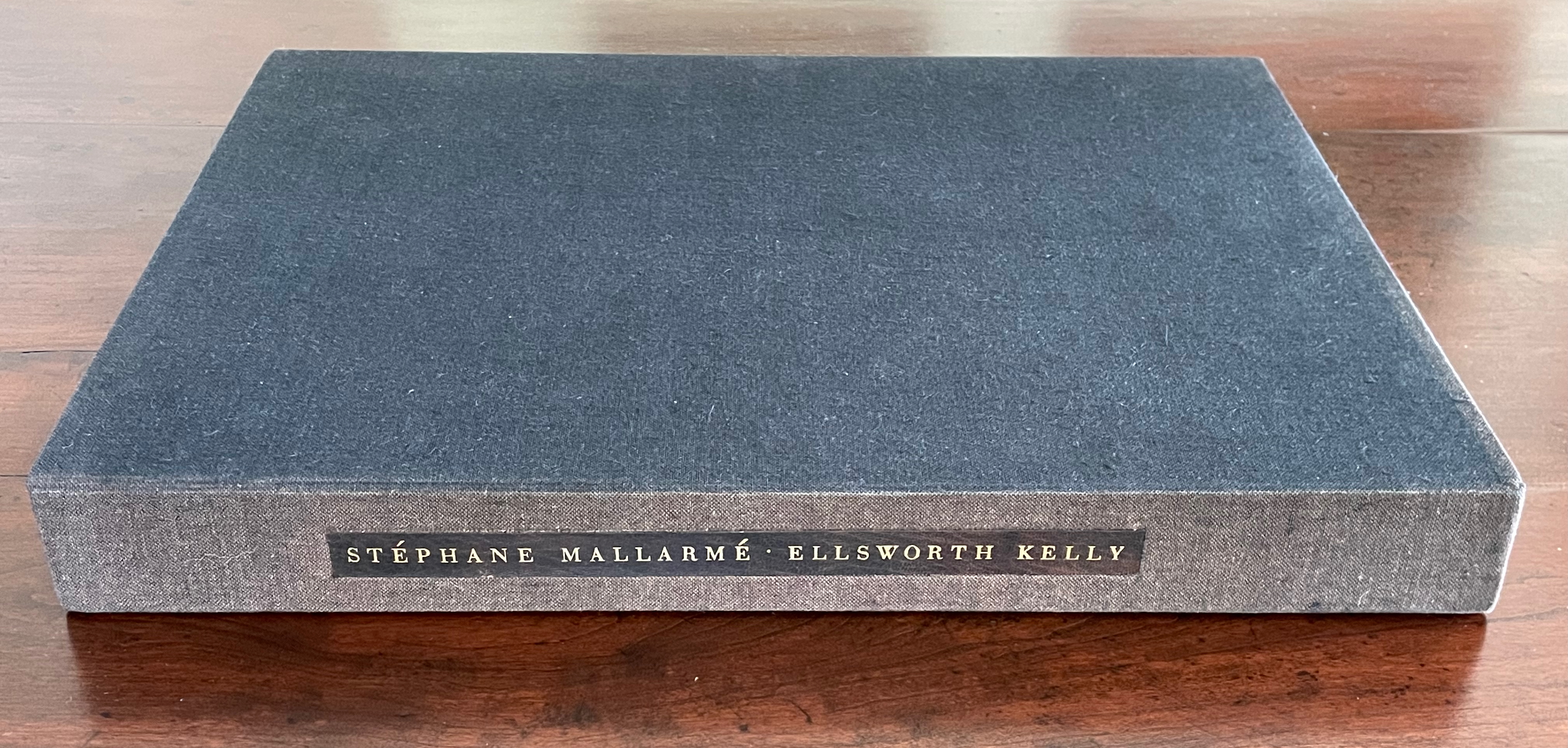
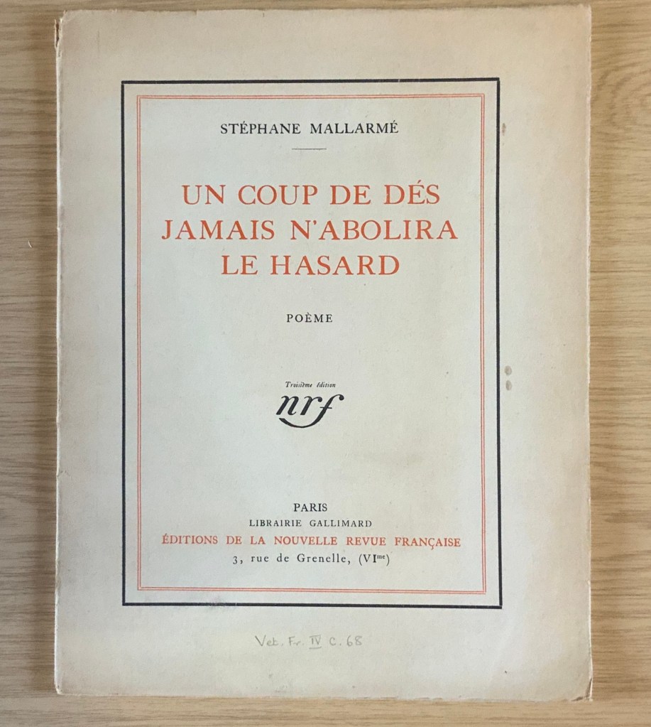
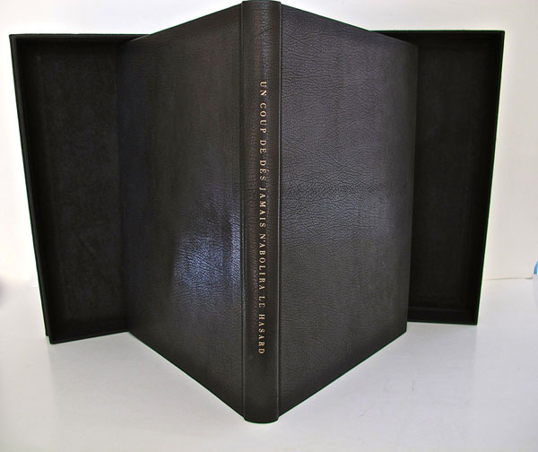
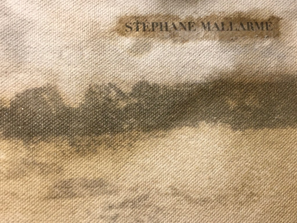
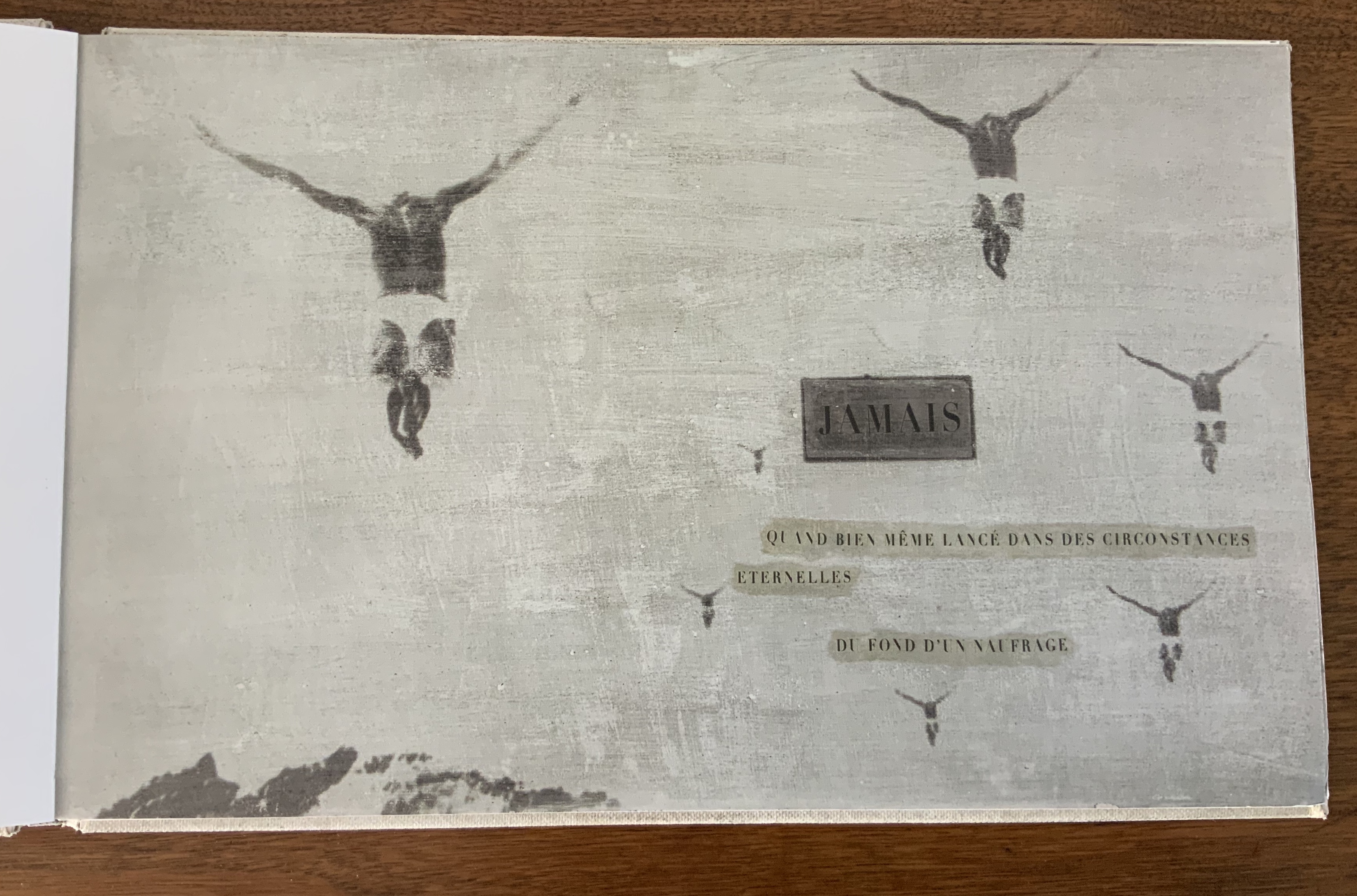
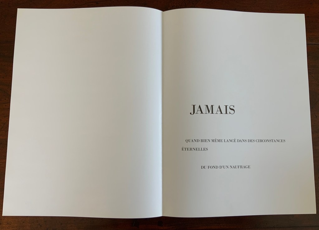
Un Coup de Dés Jamais N’Abolira le Hasard (1992) Ellsworth Kelly and Stéphane Mallarmé Hardback, case bound in full black morocco, spine gilt-lettered. 17 x 12 1/2 in Edition of 300, of which this is #204. Acquired at Swann Auctions, 24 October 2024. Photos: Books On Books Collection. Permission to display, courtesy of Limited Editions.
Is Ellsworth Kelly’s homage to Stéphane Mallarmé’s Un Coup de Dés Jamais N’Abolira Le Hasard an illustrated book, a livre d’artiste, or an artist’s book? It certainly resonates with and intensifies the poem’s design and imagery, but without being a spread-for-spread illustration. It is akin to the tributes paid by André Masson (1961), Jean Lecoultre (1975), Ian Tyson & Neil Crawford (1985), Jacques Vernière (1987), Christiane Vielle (1989), Ofer Lellouche (1997), Robert Bononno & Jeff Clark (2015), and Eric Zboya (2018). Some of these kindred spirits like Masson, Vielle, and Bononno & Clark intersperse artwork within the poem that evoke if not illustrate the setting and action of the sea and shipwreck. Some, like Masson, Lecoultre, Vernière, and Lellouche display images that have less to do with the poem’s imagery. Some, like Tyson & Crawford and Zboya, show more interest in capturing the poem’s numerological esotericism (LE NOMBRE). More than the others, though, Kelly builds on Mallarmé’s double-page spread principle and its structural importance for the poem.
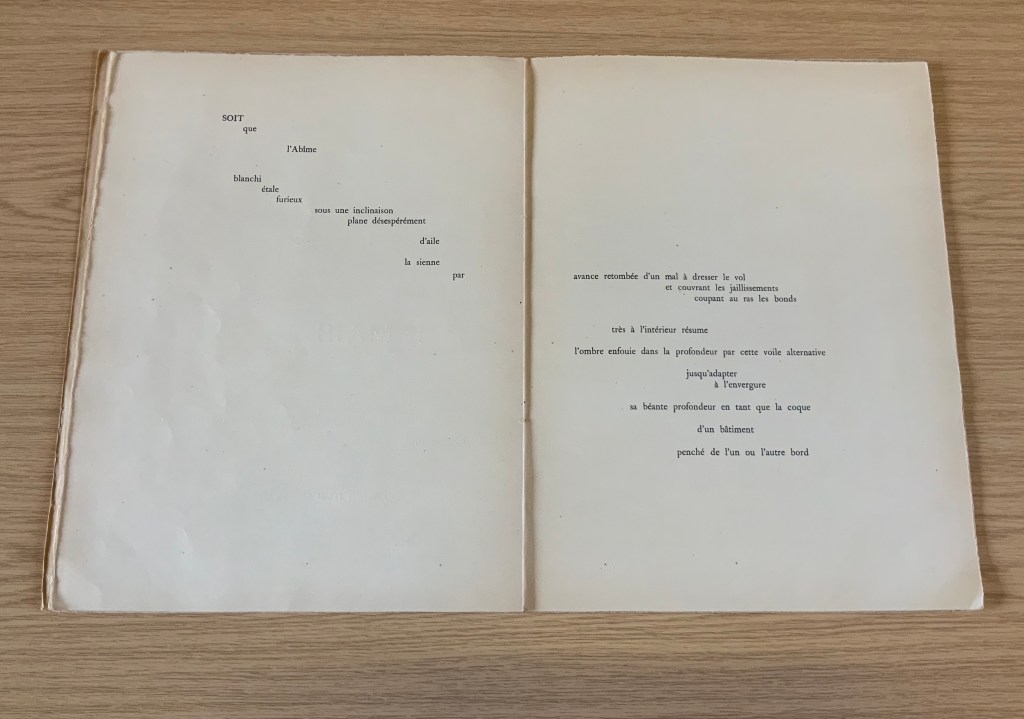
The double-page spread is the chief design structure in Mallarmé’s poem and is essential to its workings. We know this from the differences in layouts between its first publication in Cosmopolis in 1897, its marked-up proofs Mallarmé left behind after his death, and his son-in-law’s effort with Gallimard in 1913 to reflect the poet’s plan. Just before his death, Mallarmé had been working on the volume with Ambroise Vollard, who had commissioned etchings from Odilon Redon to bring it to the status and price of the livre d’artiste, a genre he was shaping. Mallarmé was amenable to this as long as the etchings were grouped at the end of the book. He did not want the artwork to distract the reader from his careful arrangement of the text on and across eleven double-page spreads.
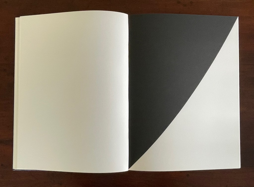
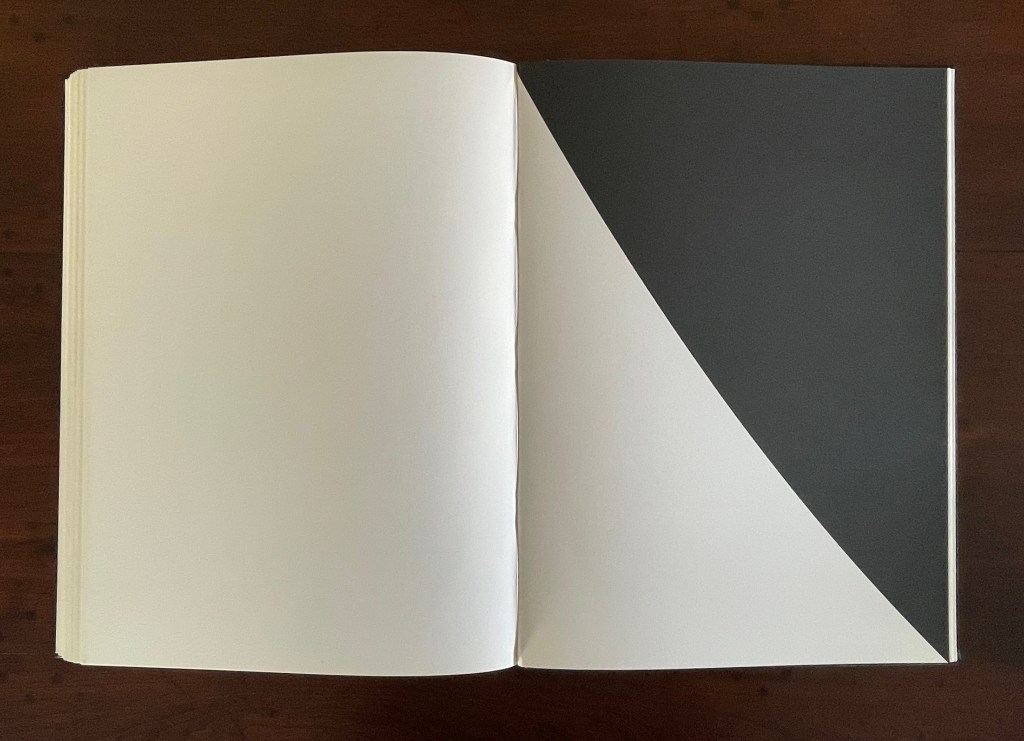
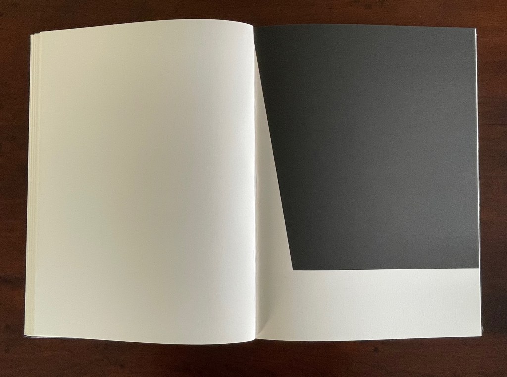
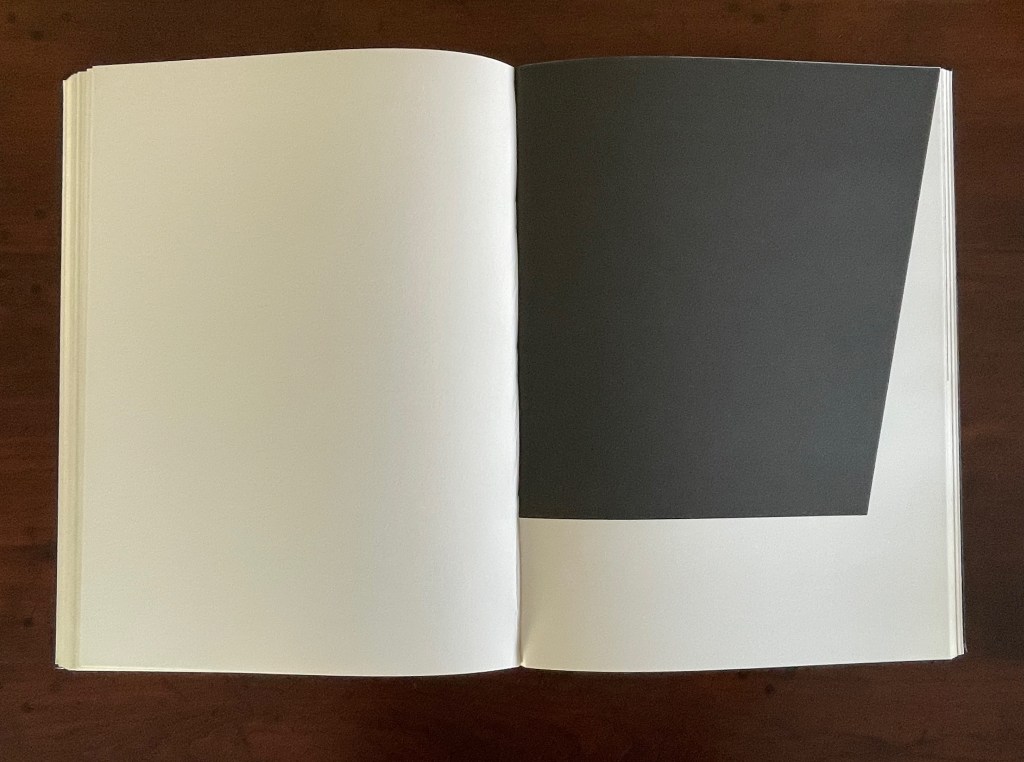
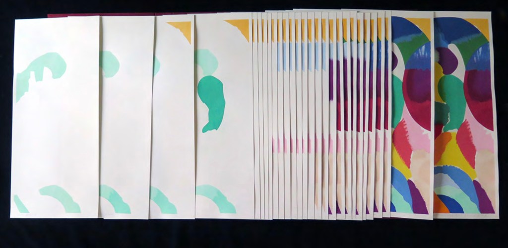
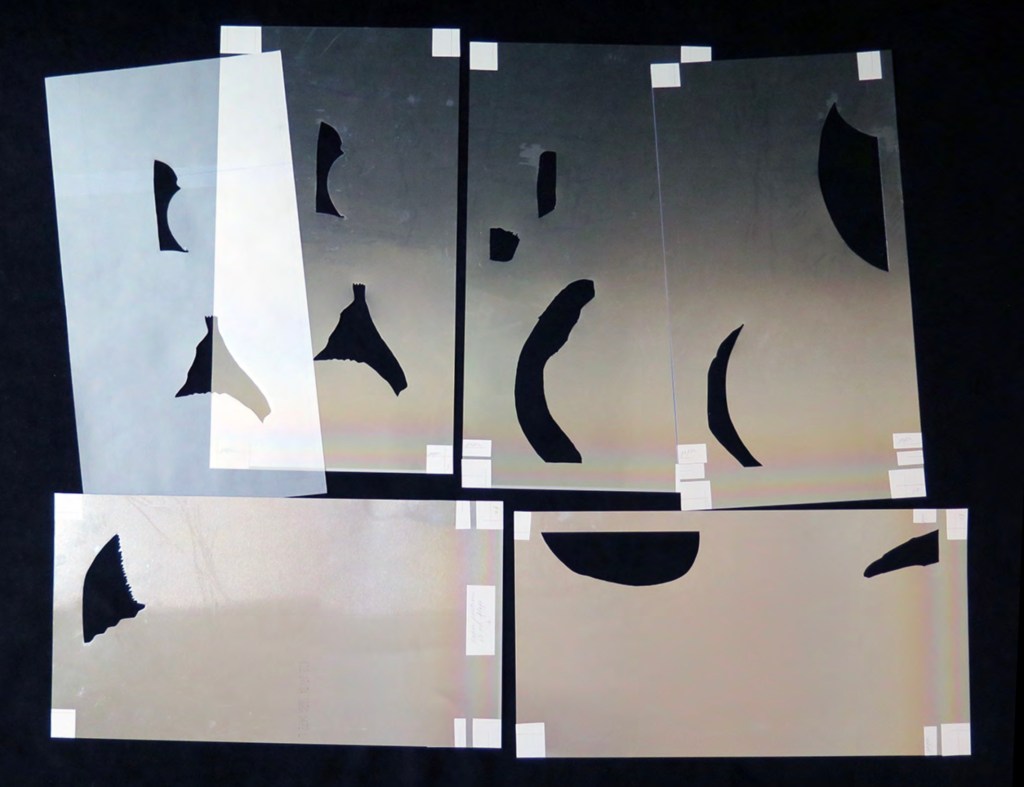
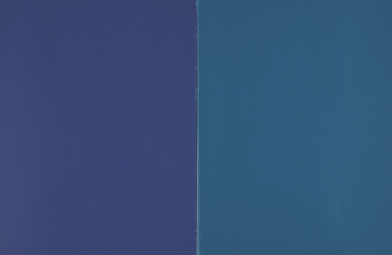
The fact of Ellsworth Kelly’s eleven lithographs aligns with Mallarmé’s plan for eleven double-page spreads of text, but the interweaving of the two sets of spreads runs contrary to Mallarmé’s wishes. To follow the poet’s wishes, Kelly and the book designer hired for The Limited Editions Club’s production could have been grouped at the end of the book, but they didn’t. To double down on the contravention, they added a blank double-page spread after each of the eleven spreads of text and after each of the eleven spreads of lithographs. Someone also decided to begin and end the volume with sets of four blank flyleaves. This is not mere padding to justify a deluxe price. The effect signals and enhances the importance of the double-page spread for Mallarmé’s poem. It underlines the importance of what Mallarmé called “les blancs”. More than underline it, those punctuations of blank space after each spread of text and then after each spread of image add a pace to the sequence and place an additional demand on the memory as it juggles Mallarmé’s interweaving of text in its different sizes, styles, and position across the double-page spread. The lithographs’ nature, their pattern, and their spatial relationship to everything in the book’s structure match Mallarmé’s architectural plans far more than Vollard’s impresario interventions.
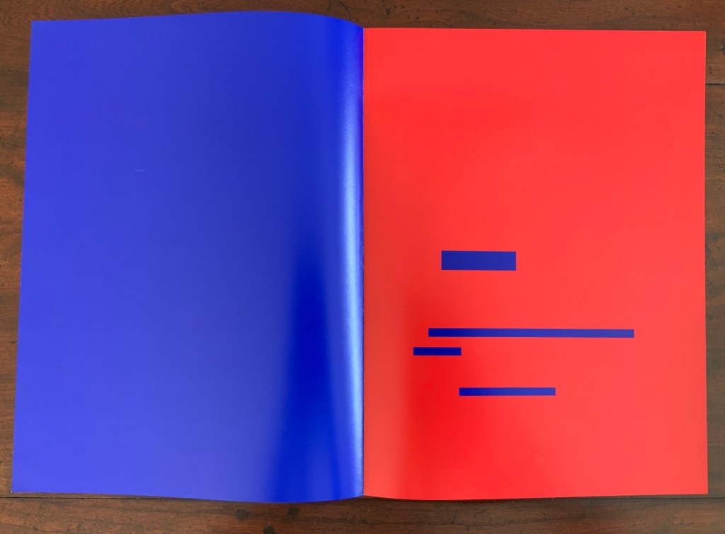
Abstract as they are, Kelly’s lithographs subtly mirror the structure and content of Mallarmé’s poem. Just as Mallarmé’s first sentence begins and his last sentence ends with “un coup de dés”, Kelly reverses the image in his first lithograph to make the image in his last.
Just as inversions are recurrent in the poem, so they recur in Kelly’s lithographs.
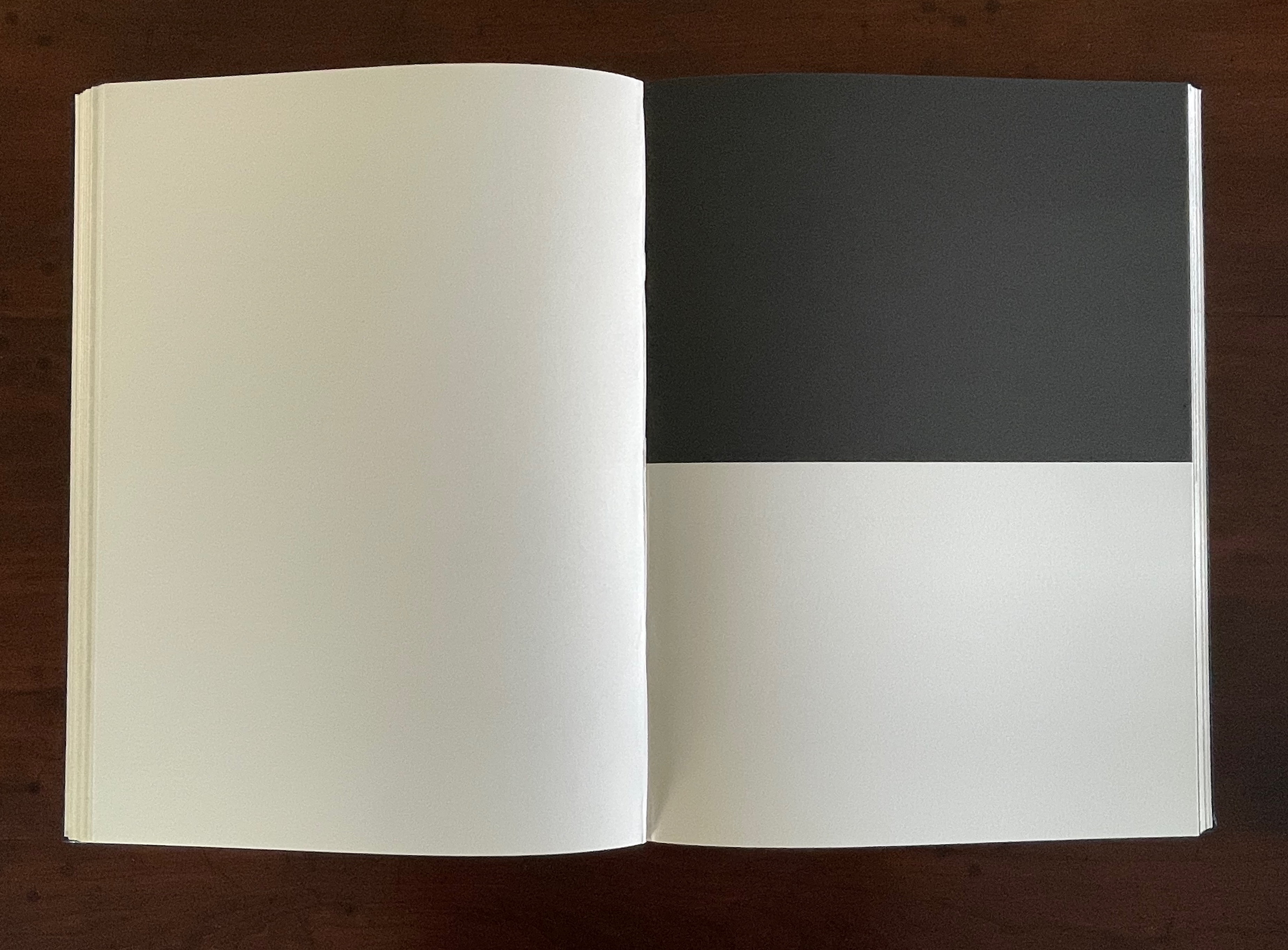
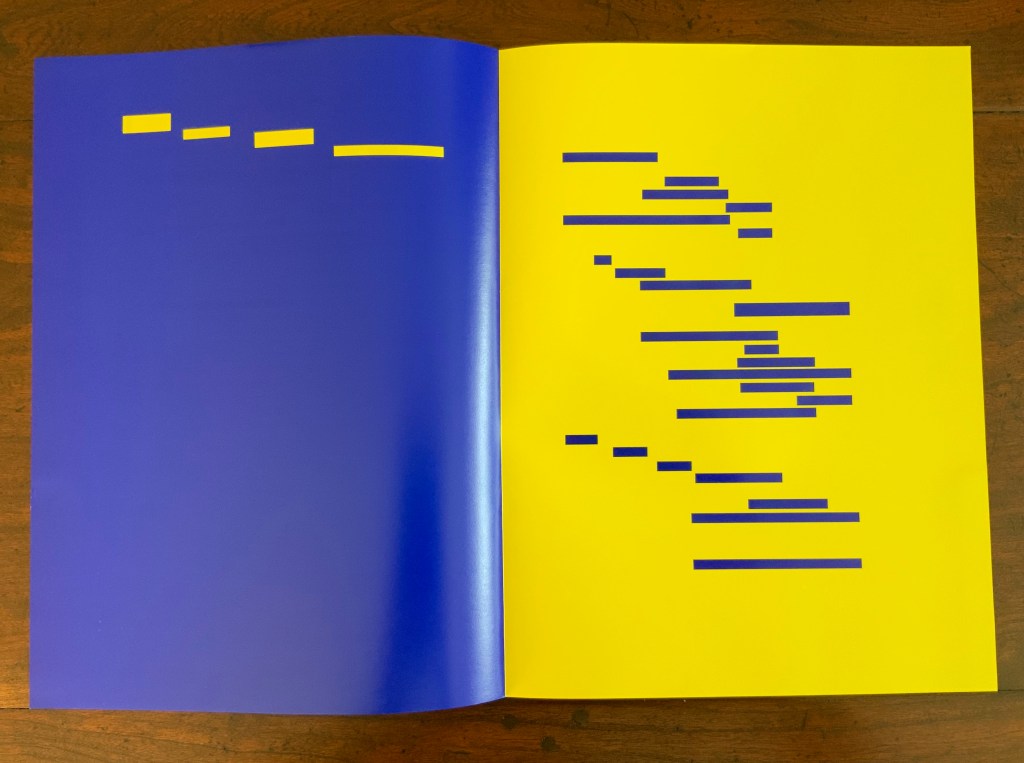
The poem’s spread beginning and ending COMME SI [“AS IF“] is central to the poem physically and thematically. The sixth of the eleven spreads, it is the only one showing this spatial, syntactic, and typographic pattern. Likewise, Kelly’s sixth lithograph splits its page equally. No other lithograph depicts this equilibrium.
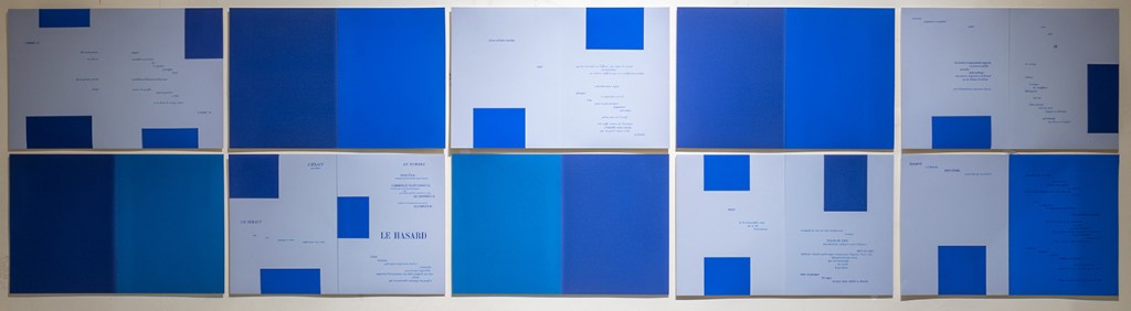
Kelly created a separate portfolio of four lithographs: The Mallarmé Suite. This work is meant to be displayed on a wall and arranged precisely according to Kelly ‘s instructions. Despite the four shapes’ replication from the book, the portfolio stands quite apart in its introduction of color and positioning of the shapes (see Bonfitto’s essay). Its mere conjunction with the book does not imbue it with what happens in the book, and that underscores the fact that Kelly’s eleven black-and-white lithographs are not in mere conjunction with Mallarmé’s poem. The reader/viewer can imagine billowing sails, overwhelming waves, or tilting masts in the lithographs, but what matters is how Kelly makes his distinctive shapes play with one another and all the book’s double-page spreads to mirror how Mallarmé makes his words, typography, and double-page spreads play with one another. If self-reflexiveness is one of the key markers for distinguishing an artist’s book from a livre d’artiste, we have here a self-reflexive poem and a self-reflexive visual artwork punctuated by blanks within the canvas of the book structure to create a self-reflexive artist’s book.
As Mitsou Ronat and Tibor Papp were preparing their mise-en-page edition of Mallarmé’s Un Coup de Dés Jamais N’Abolira le Hasard(1897/1980) following Mallarmé’s corrected proofs, Neil Crawford came across a copy of Robert Cohn’s Mallarmé’s Masterwork and was struck by its reproduction of the set of proofs sold by Pierre Berès to an American collector – the so-called Lahure proofs. Crawford, too, was determined to prepare a “typographic translation” of the proofs — but in English. In an essay providing a rich background to the poem, his meeting with Tyson and the publishing of their homage, Crawford explains how he went about his typographic translation.
First, using Cohn’s reference to the original’s size, he enlarged the reproductions photographically and then began puzzling over how to squeeze an English version taking up 10% more space than the French into Mallarmé’s careful layout. Compromising on the use of Bodoni in place of Didot as the typeface (the latter was not available to English typesetters when the poem was first pubIished anyway), it would take Crawford seven years of evenings in tracing letters, translation, transcription, adjustment, retranslation and retranscription to generate hand-crafted layouts that could be stored away until the day that photocomposition would be sufficiently advanced to accommodate the word and character spacing necessary to follow them. The original of Crawford’s typographic layout resides at the University of San Diego. Below are iterations toward the double-page spread that completes the appearance of the poem’s title within the poem.
Courtesy of Neil Crawford.
When Crawford and Tyson met in the early Eighties, Tyson had already established Tetrad Press and was planning his own livre d’artiste version of the poem. His aquatints in a separate folio cover would occupy the position Mallarmé expected for Odilon Redon’s prints in the abortive limited edition in train at the time of his death in 1898. In an ironic reversal of Mallarmé’s concern that the Redon prints might undermine the typography, Tyson and Crawford were concerned that anything less than letterpress printing would not ensure the density of black on the page that would complement Tyson’s aquatints. This led to phototypesetting output as patch setting, then hand pasting according to Crawford’s layouts, and then creation of process line blocks for the relief printing in letterpress.
At a glance, Tyson’s aquatints present a puzzling juxtaposition with the poem, but we can thank Crawford’s essay for a clue to the puzzle.
The poem’s reference to LE NOMBRE (“THE NUMBER”) has sent plenty of scholars on the hunt for its identity. Mitsou Ronat had argued that the magical number has to be 12. After all the classic Alexandrine line of French poetry numbers 12 syllables, and the larger type sizes that Mallarmé chose for the poem are 36, 48 and 60. Unconvinced “typographically”, Crawford points out that “at the time of composition – faces above 24 point were cut in multiples of twelve as standard”. Nevertheless, he also writes, “It would appear that the number 12 (the number of feet in the classic Alexandrine verse form) had great symbolism for Mallarmé” and notes that Tyson’s images
reflect the undertones of the Poème’s symbolism with a composition based on a duodecic permutation corresponding to the measures within the Alexandrine metre, referring in an oblique way to Mallarmé’s recurring imagery ….
Duodecic refers to the Base 12 system, which has the arithmetic advantage over Base 10 of making fractions easier as can be seen from the following image. To apply that image’s Base 12 grid to Tyson’s permutations, however, requires modifying it from 3×4 to 4×6. In other words, there are 24 small squares underlying Tyson’s images, not 12. Mallarmé intended the double-page spread, not the single page, to be the unit for page layout. So perhaps Tyson’s oblique reference to the Alexandrine is also “doubly oblique” (2×12), referring to Mallarmé’s preferred canvas.
It was 1913. Stravinsky’s ballet “The Rite of Spring” debuted. The Cubists, Constructivists, Suprematists, Futurists all bound onto the art scene, many of them showcased in the Armory Show in New York that year. The Nouvelle revue française (NRF) attempted the first book form of Stéphane Mallarmé’s Un Coup de Dés Jamais N’Abolira le Hasard, which revived that 1897 typographic disruption of the page and prepared the ground for dozens of works of book art since. And Blaise Cendrars and Sonia Delaunay-Terk announced and published what they called le premier livre simultané. It was La Prose du Transsibérien et de la petite Jehanne de France.
From the Bodleian Library collection Photos: Books On Books
From the National Art Library, Victoria & Albert Photo: Books On Books
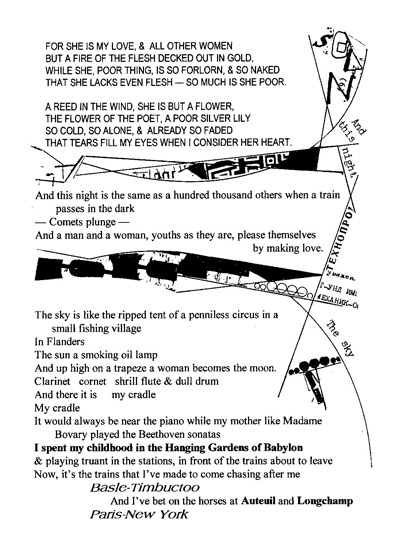
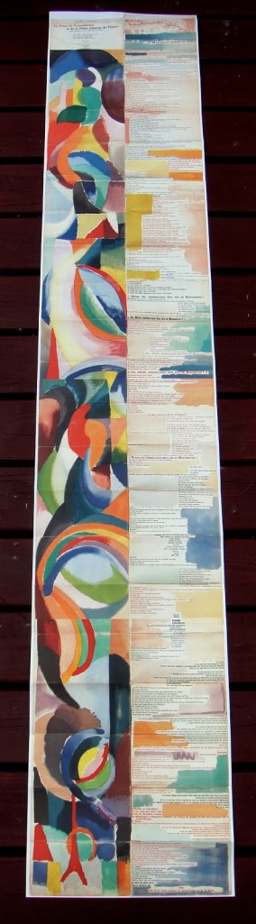
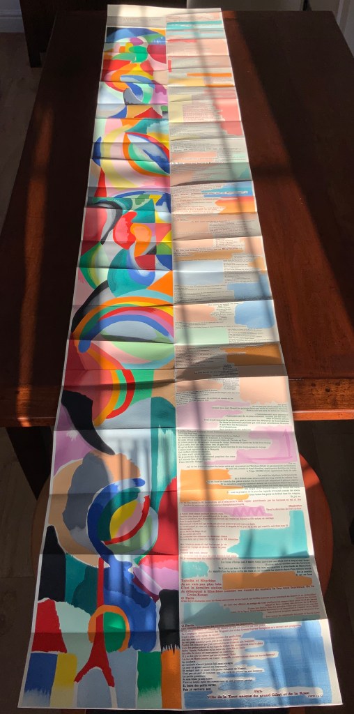
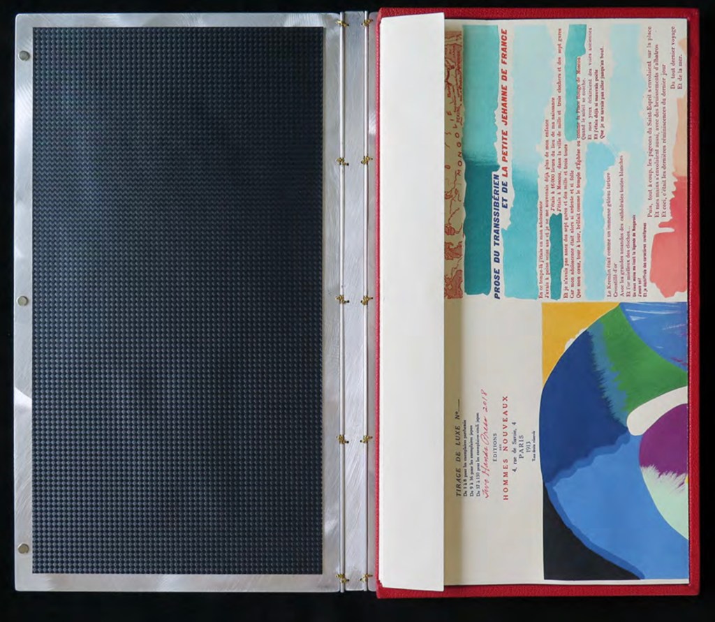
Like Mallarmé, Cendrars disrupts the page with multiple typefaces (thirty distinct ones in his case) and scattered placement of lines and stanzas. But La Prose presents an even more physical and structural disruption of the page and book than Un Coup de Dés. Unlike the latter, La Prose unfolds — twice — in an accordion format to over two metres in length or rather height since the text descends on the right and ends alongside the interlinked images of the Eiffel Tower and a Ferris wheel at the foot of the accordion. Cendrars and Delaunay had aimed to produce 150 copies of La Prose because, placed end to end, that would have equalled the Eiffel Tower’s height.
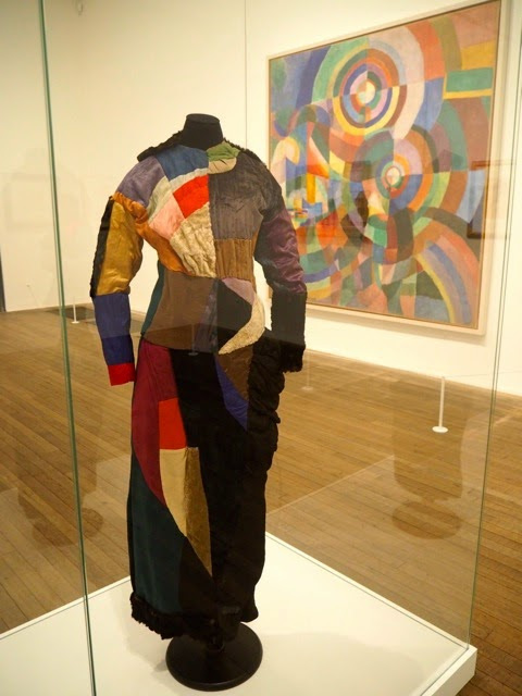
More than this monumental, sculptural, typographic and physical disruption of page and book, La Prose presents a temporal disruption. By le premier livre simultané, Cendrars meant a simultaneity of the verbal and visual — the way that text and image appear all at once — en un éclair. Early Bohemian that he was, Cendrars was co-opting a fair bit of artistic and literary theorising by the Cubists, Futurists and others. Most important and of the moment was his co-opting of Robert and Sonia Delaunay’s colour theory of simultanéisme. The “couleurs simultanées de Mme Delaunay-Terk” had also appeared in her 1913 robe simultanée and paintings. Building on a French scientist’s exposition on how perception of colours changes depending on the colours around them, the Delaunays claimed that rhythmic, musical and spatial synaesthetic elements were also at play. Sonia Delaunay asserted that the artwork produced for La Prose was not in response to reading the poem but hearing it from Cendrars. (Listen to it for yourself here.)
In presenting the adolescent Cendrars travelling physically eastward on the Transsibérien, travelling mentally to Flanders-Basle-Timbuctoo-Auteuil-Longchamps-Paris-New York while still registering the landscape outside, seeing the maimed and wounded returning from the front of the Russo-Japanese war, conversing with a prostitute named after Joan of Arc, doubting himself as a poet, and so on until a sudden transposition back to Paris, the process poem juxtaposes the sacred and profane, past/present/future, stationary and dynamic, national and international in outlook and locale. In short, simultaneously. In a format that is bound and unbound, the poem mirrors the swirling, interacting shapes and colours beside and in which it moves — and vice versa.
However more disruptive of the page and book La Prose may have been, it did not inspire the profusion of direct re-interpretations (or appropriations) that Un Coup de Dés prompted from artists such as Jérémie Bennequin, Ellsworth Kelly, Man Ray, Didier Mutel, Michel Pichler, Eric Zboya and dozens of others.
Not until 2001 did a re-versioning of La Prose appear. Tony Baker and Alan Halsey published an English translation and codex re-formatting. Its black on white imagery is reminiscent of the Russian Futurists, the type is monochromatic, and the typefaces, fonts and weights vary but not as much as in La Prose.
Baker and Halsey note in their colophon:
So far as we’re aware no translation of the poem into English has ever been attempted to give a sense of Cendrars and Delaunay’s original conception, not the least reason for which may have been the difficulty until recently of seeing the first edition, even in reproduction. — Prose of the Trans-Siberian and of the Little Jeanne de France (Sheffield: West House Books, 2001)
A well-founded lament — at least for the book art community. Not until 2000 had there been a reduced-scale reproduction of La Prose. It appeared in Granary Books’ A Book of the Book by Jerome Rothenberg and Steven Clay across a four-page foldout in the embrace of Ron Padgett’s English translation. Only in 2008 was there a full-scale, full-colour offset facsimile, produced by Yale University Press with an appended translation. It is now out of print.
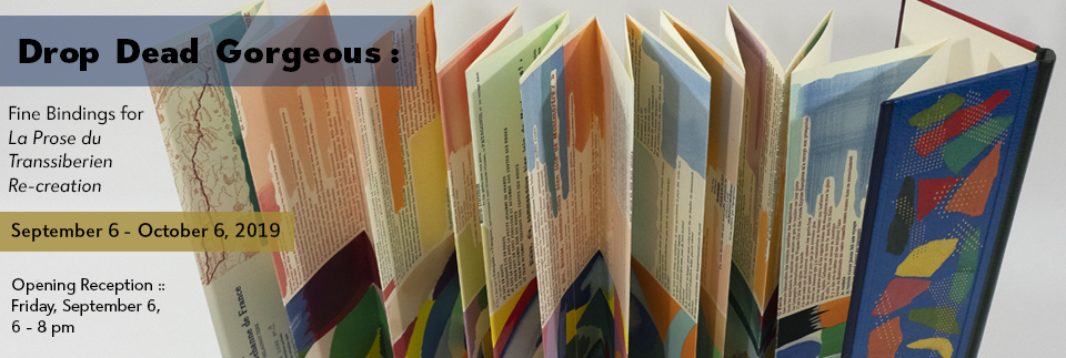
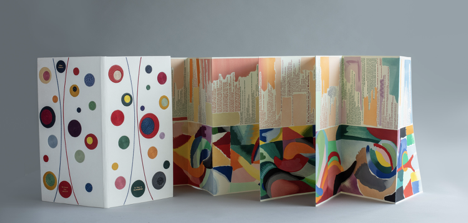
With her work La Prose du Transsibérien Re-creation (2019), Kitty Maryatt has changed all that. With this deuxième livre simultané, she has more than caught the echo of Cendrars/Delaunay’s original and its arrival. As scholar, artist and veritable impresaria, she has reinvigorated the book art/arts community with the legacy of La Prose.
Her blogspot documents the research and production with rich details about sourcing the type, learning about stencil-cutting from Atelier Coloris (one of the few remaining businesses devoted to pochoir), determining the recipes for the ink colours, testing papers (Zerkall Crème, Biblio, and Rives HW), creating a census of the existing 1913/14 originals and their locations — all that and more, including the use of bacon fat and a wine bottle filled with lead shot. She also organized a documentary by Rosylyn Rhee: “The Pochoir Re-creation of La Prose du Transsibérien”. It brings the importance of the original and this re-creation to life in the expressions and voices of prominent collectors, librarians and scholars, artists, rare book dealers and the project’s funders.
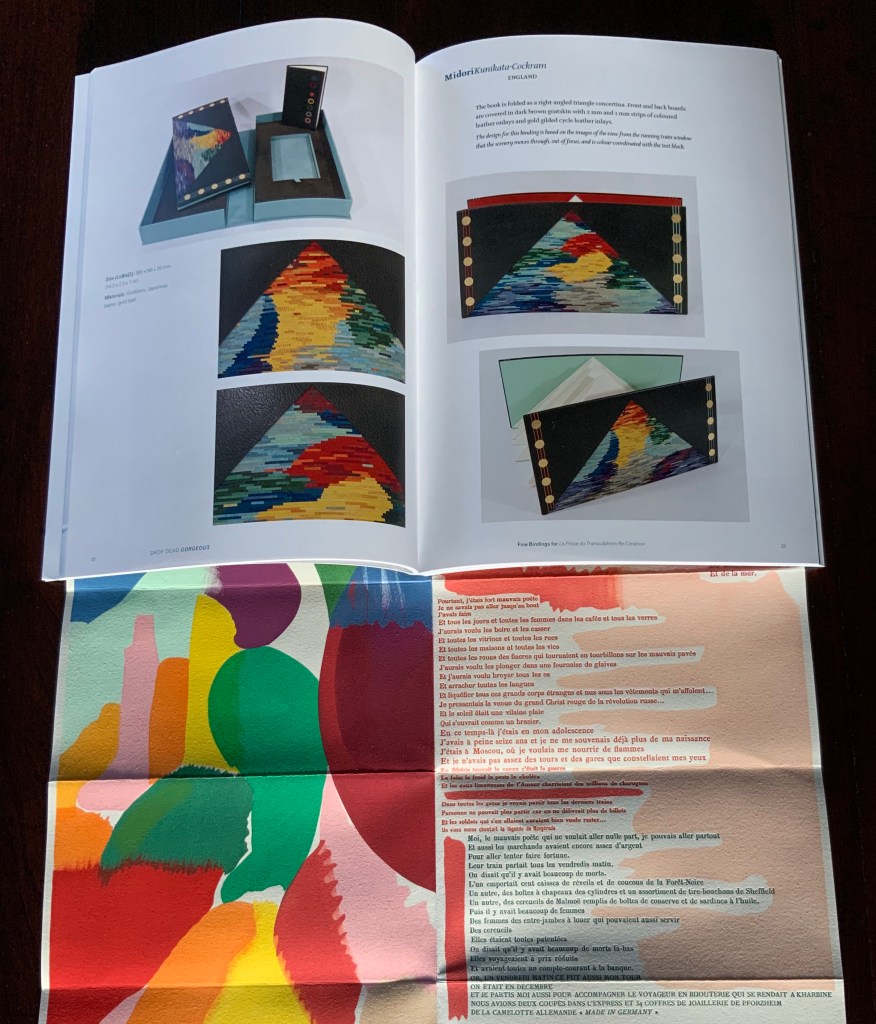
In addition, Maryatt has been either a contributor to, or the motivating force behind, several symposia and exhibitions such as “Paris 1913: Reinventing the Artist’s Book” (at the Legion of Honor Museum in San Francisco, 2018) and “Drop Dead Gorgeous”. The latter is a travelling exhibition resulting from invitations to twenty-four book artists and designer bookbinders to design and create bound copies of La Prose du Transsibérien Re-creation. For the San Francisco venue, Maryatt prepared a workshop on traditional French pochoir and provided text for the exhibition catalogue (available from the online store of the San Francisco Center for Books).
Monique Lallier’s fine binding of La Prose du Transsibérien Re-creation Photos: Courtesy of Monique Lallier
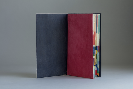
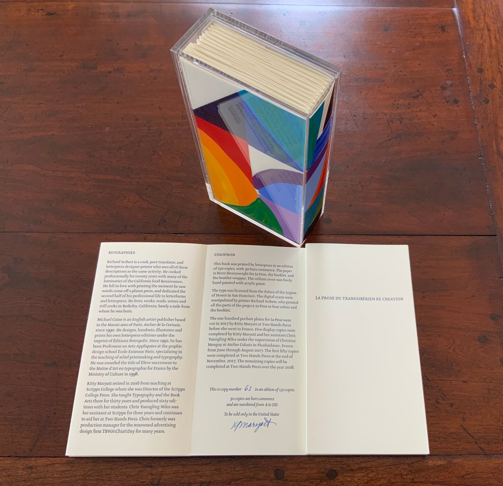
The pinnacle of Maryatt’s efforts, of course, is the standard and deluxe editions of La Prose. Both editions consist of 4 pages, glued together to create the tall single page. For the standard edition, the page is folded into 21 sections and loosely placed in a painted vellum cover with a booklet describing the project and production. An acrylic slipcase houses the covered bundle.
The standard edition Slipcase: H195 x W108 x D45 mm. Wrapper: H182 x W97 x D35 mm. Leporello: H81 x W95 mm (closed). H1954 x W160 mm (open). Booklet: H81 x W94 mm (closed), W1055 mm (open). Photo: Books On Books
Photo: Books On Books
Photos: Books On Books
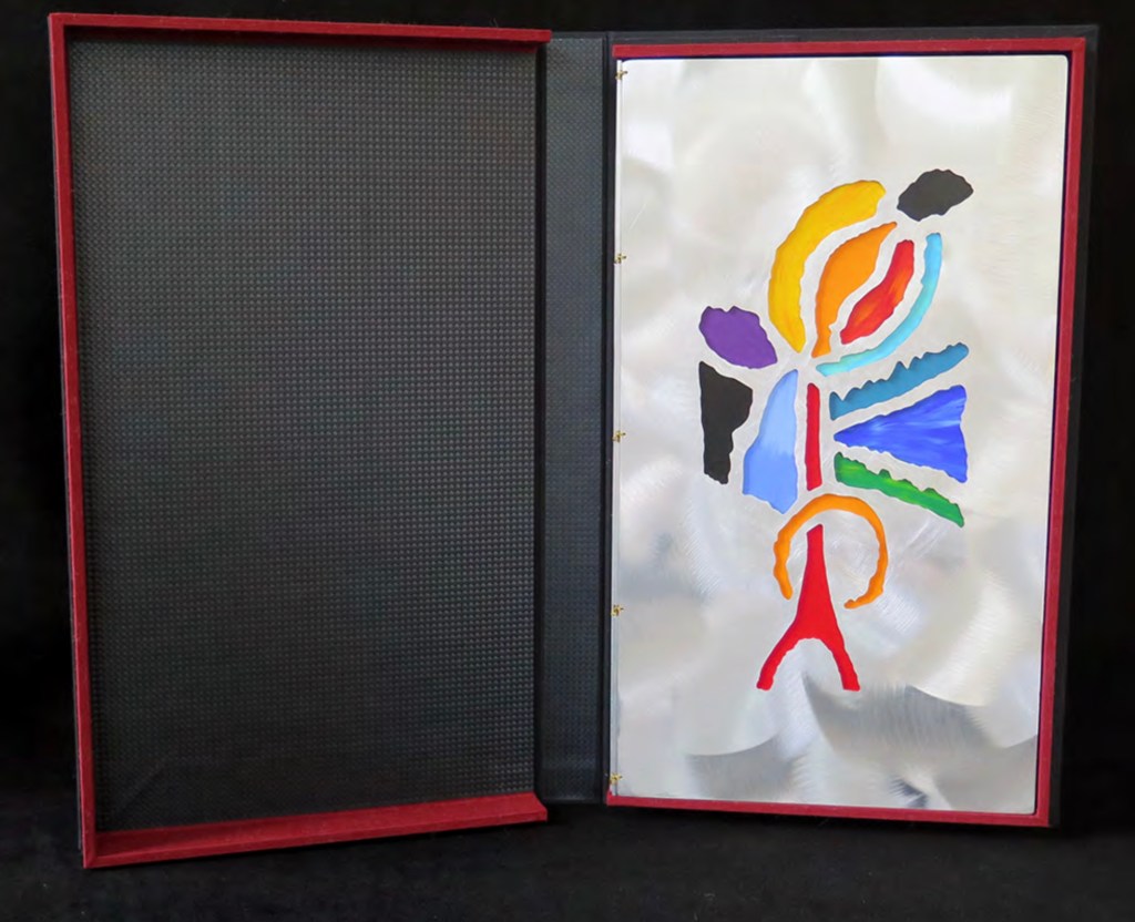
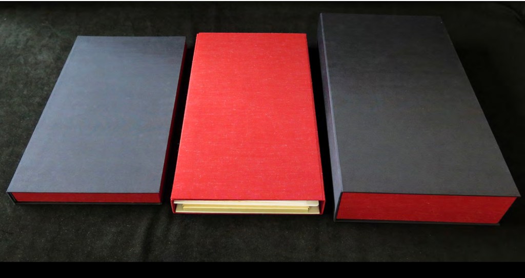
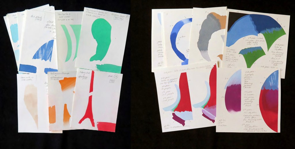
For the deluxe edition, the single page is left double-wide, accordion-folded double-tall between aluminum covers and housed in a clamshell box. A separate case holds the painted vellum cover, colour cards, Sonia’s visual vocabulary, 27 progressives for page one, 5 pochoir plates with tracing paper and registration system, the booklet with introduction and colophon, and the list of 30 typefaces Cendrars used. A large clamshell box houses this separate case and the boxed book. The colour cards include the recipe for mixing the gouache, and Sonia’s visual vocabulary shows the numbered steps of operations. The progressives for page one show the steps for doing the pochoir stencils and handwork.
The deluxe edition Photos: Courtesy of Kitty Maryatt
Any institution with a focus on book art or the graphic arts should seek out the standard edition of La Prose du Transsibérien Re-creation. Any institution with a focus on teaching and practice in those domains should seek out the deluxe edition. As indefatigable as Cendrars and as productive as Delaunay, Kitty Maryatt has provided the basis of master classes for generations. Now it is up to the book art community to respond as it has to Un Coup de Dés.
A shorter version of this essay appears in Parenthesis 39, Fall Issue, 2020.
Further Reading
Ashton, Doré. “On Blaise Cendrars. . . But I Digress.” Raritan 31, no. 2 (2011): 1-42,164. An entertaining extended anecdote sketching Cendrars and his milieu.
Gage, John. Colour and Meaning : Art, Science and Symbolism(Berkeley, CA: University of California Press, 1999). Despite her works’ better quality and representation of simultanéisme, Gage focuses on Robert and mentions Sonia only in passing or footnotes. (Telling that the Tate chose Sonia not Robert for a retrospective in 2015.) Nevertheless, there are passages that place her work in context.
P.198: Chevreul’s “privileging of the harmony of complementaries was essentially in the context of ‘painting in flat tints’, a method developed largely in the decorative arts, but which was increasingly integrated into many branches of French painting in the second half of the nineteenth century …”.
P.254 “When, probably early in 1912, Delaunay wrote to Kandinsky outlining his theories, he had shifted to a rather different approach, claiming: ‘the laws I discovered … are based on researches into the transparency of colour, that can be compared with musical tones. This has obliged me to discover the movement of colours.’ …
P.256 [Delaunay’s] Essay on Light, which was composed in the summer of 1912, attributed the movement of colours less to transparency than to the qualities of hue: ‘Movement is given by the relationship of unequal measures, of contrasts of colours among themselves which constitute Reality. The reality has depth (we see as far as the stars), and thus becomes rhythmic Simultaneity.’”
P.257 “For Chevreul in 1839 such painting [in flat tints] had only a decorative, accessory function, but the Delaunays did not feel the distinction, and Sonia had recently been experimenting with flat colours in appliqué textiles and in bookbindings decorated with collage.”
Maryatt, Kitty. “A Bookmaker’s Analysis of Blaise Cendrar’s and Sonia Delaunay’s La Prose du Transsibérien et de la Petite Jehanne de France”, The Quarterly Newsletter(Fall 2016), The Book Club of California. Online version available here.
Maryatt, Kitty. Interview with Steve Miller, Book Arts Podcasts, School of Library Information and Sciences, University of Alabama, 13 January 2006.
Rothenberg, Jerome; Clay, Steven. A Book of the Book: Some Works & Projections about the Book & Writing (New York City: Granary Books, 2000). Contains an excerpt from Perloff’s book above, Ron Padgett’s translation of La Prose and a four-page foldout showing a full-color photo-reduction of the 1913 original.
Shingler, Katherine. “Visual-verbal encounters in Cendrars and Delaunay‘s La Prose du Transsibérien“, e-France: an on-line Journal of French Studies, Vol. 3, 2012, pp. 1-28. Accessed 15 November 2019. Along with Perloff’s book, this is the best explication of the work and its lineage with Mallarmé’s Un Coup de Dés.
Woodall, Stephen. “La Prose du Transsibérien et de la Petite Jehanne de France”, Insights from the de Young and Legion of Honor (San Francisco: Fine Arts Museums of San Francisco, 2020. A spectacular website presenting the original work in its context and its influences on subsequent book art. The work can be viewed panel by panel, and its overall structure is presented in an animation of its unfolding and refolding.
POÉME: UN COUP DE DÉS JAMAIS N’ABOLIRA LE HASARD par STÉPHANE MALLARMÉ (2019)
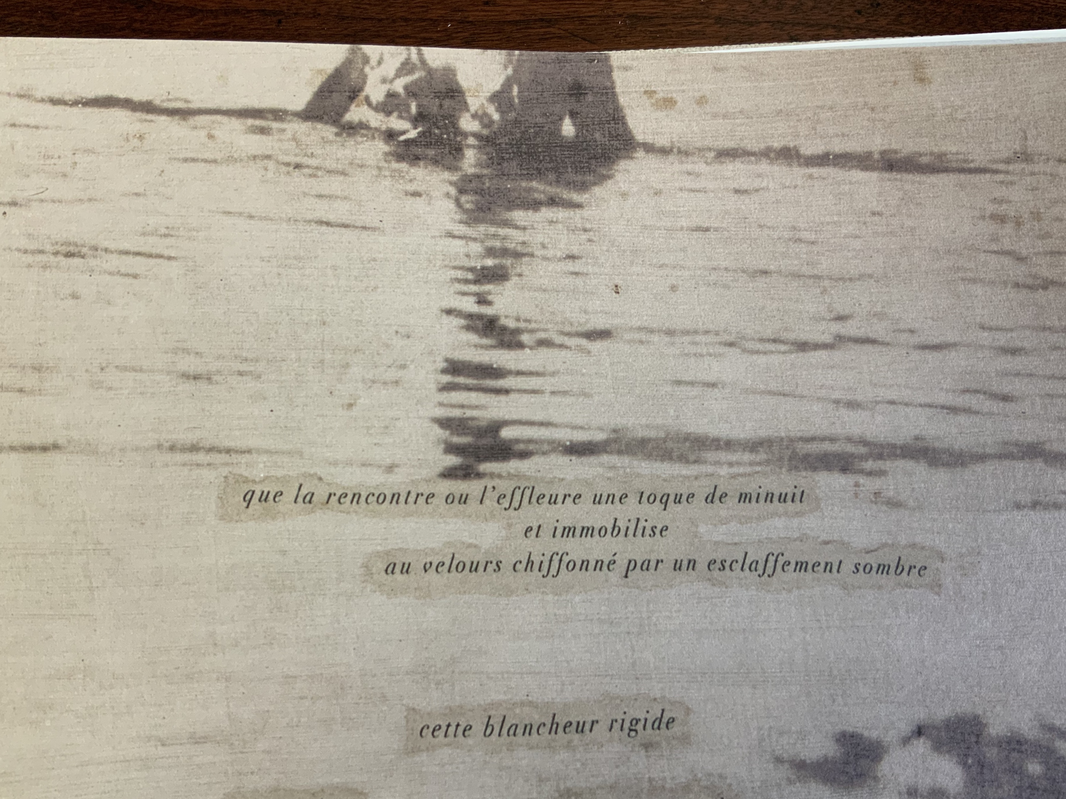
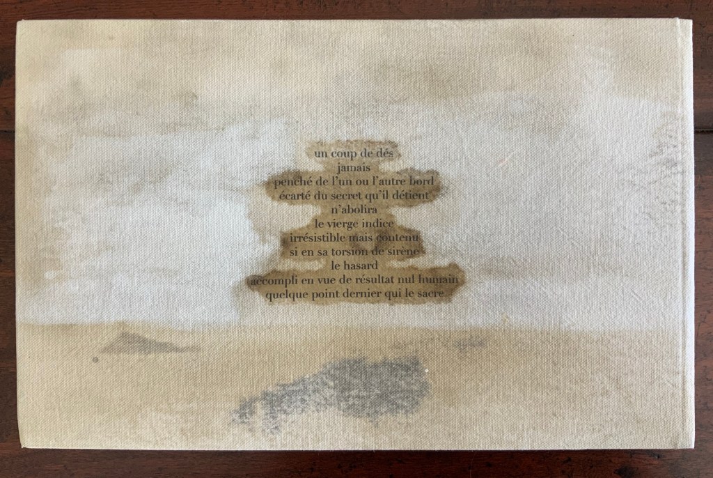
Poème: Un coup dés jamais n’abolira le hasard(2019) Nicolas Guyot Unique cover with silver bromide printed image on Wenzhou paper mounted on handcrafted canvas. H150 x W200 mm, 16 leaves, 11 pages of text with silver bromide printed images on 160 gm drawing paper. Edition of 76, of which this is #16 and signed by the artist.
Guyot’s livre d’artiste sits self-assuredly in a long line of works inspired by Stéphane Mallarmé’s seminal 1897 poem Un Coup de Dés. Unlike Ellsworth Kelly (1992) but like Christiane Vielle (1989) and others, Guyot integrates his images with the text. In print technique, his silver bromide echoes the silver gelatine of Ian Wallace(1979), but Guyot’s unique cover prints and hand binding distinguish his work from any other in the long line. His technique and layout evoke a feeling of the late 19th century, the contemporary images respond creatively to the original poem’s own cryptic imagery, and altogether the effect is a simultaneity across time, poet and artist.
Guyot writes that Alain Badiou’s Petit manuel d’inethéstique (Éditions du Seuil, 1998) and Quentin Mellaissoux’s Le nombre et la siréne (Éditions Fayard, 2014) were particularly inspiring for this work (correspondence, 21 April 2020). In addition to the artist’s book, Guyot created several paintings (H39 x W65 cm) inspired by the poem and these philosophical reflections.
In the first three minutes of this extract from the film Molinari: la couleur chante (2005), Molinari walks through an exhibition of Équivalence, discussing it with Roald Nasgaard and commenting on Un coup de Dés, its visual musicality and his transformation of it into his colourful geometric abstractions. The opportunity to see all of the poem ranged along one wall and all of Molinari’s abstractions along a facing wall is a pleasure. A pleasure enhanced by leafing through the portfolio and juxtaposing each double-page spread of the poem with Molinari’s “equivalent” abstraction.
Update
At the Guido Molinari Foundation’s exhibition Sophie Lanctôt, Mallarmé, Molinari: Mots Croisés (6 June – 25 August 2024), a previously undiscovered artist’s book by Molinari appeared for the first time in thirty years:
Continuum pour Mallarmé (1994)
Images courtesy of Fondation Guido Molinari. Photos: Michael Patten. Especial thanks to artist Sophie Lanctôt and curator Monic Robillard.
Note in this earlier work how the text is integrated with artwork, omitting the later work’s intermediate homage to Broodthaers.
Continuum pour Mallarmé was created for a group show of 47 books by renowned artists such as Louise Robert, Michel Goulet, Irene F. Whittome and Rober Racine, presented at AXENÉO-7 in Gatineau from March 27 to April 24, 1994, under the title De causis et tractatibus. Each artist was free to choose his or her subject. Molinari chose Mallarmé’s poem.
“The idea of a fictional encyclopedic project arose during a conversation between Marie-Jeanne Musiol and Richard Gagnier about the creation of artist’s books. Each of the artists received an identically crafted book with a closed dimension of 33.8 x 26.5 x 1.4 cm (13 ¼ x 10 ½ x ½ in.). The interior consists of six sheets of white BFK Reeves paper folded in quarters and sewn together. (…) The title of the encyclopedia and the volume’s serial number, in Roman numerals, are pressed into the cover and repeated in the same way on the inside title page,” writes Richard Gagnier in 3 manières d’instruire l’inventaire, published by Le Sabord in 1998. Continuum pour Mallarmé by Guido Molinari is number 44. — Exhibition notes provided by Monic Robillard.
Further Reading
Molinari, Guido, Gilles Daigneault, Patrick Lafontaine. Nul mot: les livres d’artiste de Guido Molinari (Montréal, Québec: Éditions du Noroît, 2017).
Nasgaard, Roald. Abstract Painting in Canada (D&M Publishers Inc., 2008).