Books On Books Collection – Ian Tyson and Neil Crawford

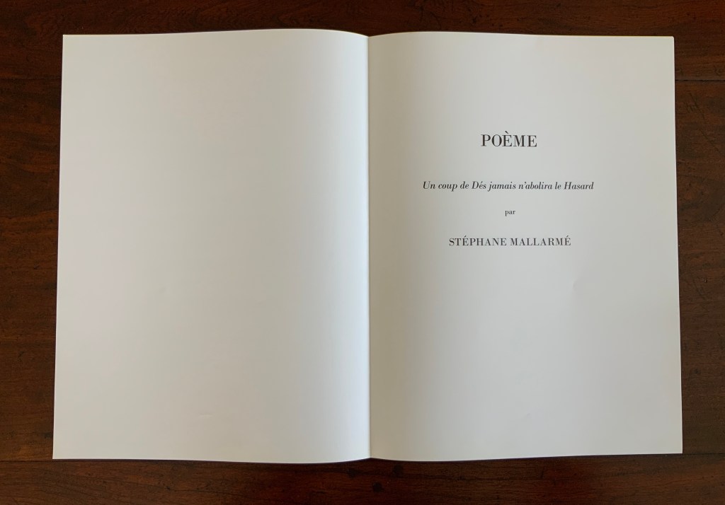
Poème: Un Coup de Dés Jamais N’Abolira le Hasard (1897)
Poem: A cast of Dice never can annul Chance (1985)

Un Coup de Dés Jamais N’Abolira le Hasard (1897)/A cast of Dice never can annul Chance (1985)
Ian Tyson and Neil Crawford
Embossed cloth-covered clamshell box enclosing two set of folios, each in a blue folio folder. Edition of 40, consisting of 30 numbered copies, of which this is #7, and 10 copies marked I-IX. Acquired from Roseberys, 2 November 2021.
© Ian Tyson and Neil Crawford. Photos: Books On Books Collection. Permission to display from Neil Crawford.

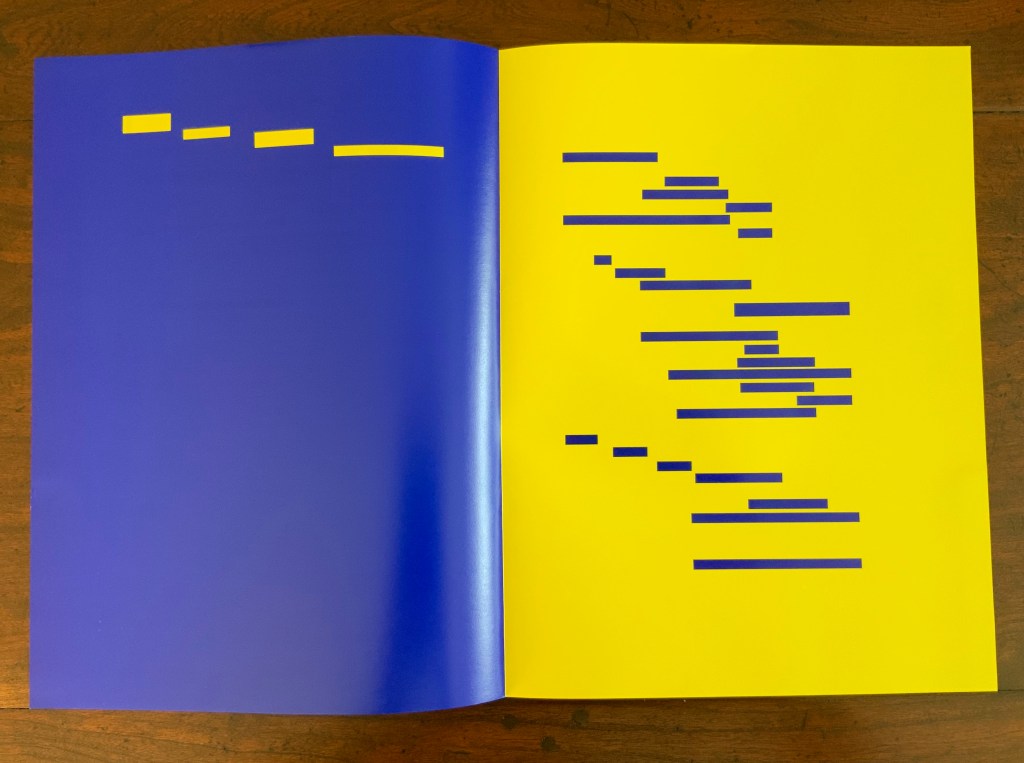
As Mitsou Ronat and Tibor Papp were preparing their mise-en-page edition of Mallarmé’s Un Coup de Dés Jamais N’Abolira le Hasard(1897/1980) following Mallarmé’s corrected proofs, Neil Crawford came across a copy of Robert Cohn’s Mallarmé’s Masterwork and was struck by its reproduction of the set of proofs sold by Pierre Berès to an American collector – the so-called Lahure proofs. Crawford, too, was determined to prepare a “typographic translation” of the proofs — but in English. In an essay providing a rich background to the poem, his meeting with Tyson and the publishing of their homage, Crawford explains how he went about his typographic translation.

First, using Cohn’s reference to the original’s size, he enlarged the reproductions photographically and then began puzzling over how to squeeze an English version taking up 10% more space than the French into Mallarmé’s careful layout. Compromising on the use of Bodoni in place of Didot as the typeface (the latter was not available to English typesetters when the poem was first pubIished anyway), it would take Crawford seven years of evenings in tracing letters, translation, transcription, adjustment, retranslation and retranscription to generate hand-crafted layouts that could be stored away until the day that photocomposition would be sufficiently advanced to accommodate the word and character spacing necessary to follow them. The original of Crawford’s typographic layout resides at the University of San Diego. Below are iterations toward the double-page spread that completes the appearance of the poem’s title within the poem.

Courtesy of Neil Crawford.

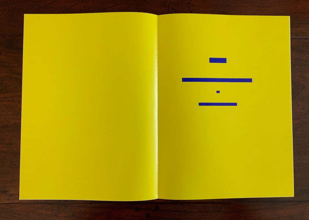
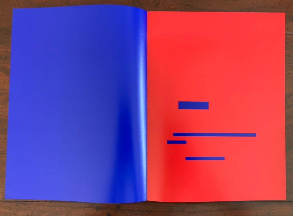
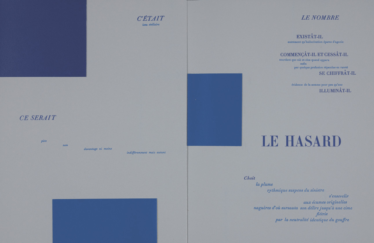
When Crawford and Tyson met in the early Eighties, Tyson had already established Tetrad Press and was planning his own livre d’artiste version of the poem. His aquatints in a separate folio cover would occupy the position Mallarmé expected for Odilon Redon’s prints in the abortive limited edition in train at the time of his death in 1898. In an ironic reversal of Mallarmé’s concern that the Redon prints might undermine the typography, Tyson and Crawford were concerned that anything less than letterpress printing would not ensure the density of black on the page that would complement Tyson’s aquatints. This led to phototypesetting output as patch setting, then hand pasting according to Crawford’s layouts, and then creation of process line blocks for the relief printing in letterpress.

At a glance, Tyson’s aquatints present a puzzling juxtaposition with the poem, but we can thank Crawford’s essay for a clue to the puzzle.

© Ian Tyson. Permission to display from Neil Crawford.

The poem’s reference to LE NOMBRE (“THE NUMBER”) has sent plenty of scholars on the hunt for its identity. Mitsou Ronat had argued that the magical number has to be 12. After all the classic Alexandrine line of French poetry numbers 12 syllables, and the larger type sizes that Mallarmé chose for the poem are 36, 48 and 60. Unconvinced “typographically”, Crawford points out that “at the time of composition – faces above 24 point were cut in multiples of twelve as standard”. Nevertheless, he also writes, “It would appear that the number 12 (the number of feet in the classic Alexandrine verse form) had great symbolism for Mallarmé” and notes that Tyson’s images

reflect the undertones of the Poème’s symbolism with a composition based on a duodecic permutation corresponding to the measures within the Alexandrine metre, referring in an oblique way to Mallarmé’s recurring imagery ….

Duodecic refers to the Base 12 system, which has the arithmetic advantage over Base 10 of making fractions easier as can be seen from the following image. To apply that image’s Base 12 grid to Tyson’s permutations, however, requires modifying it from 3×4 to 4×6. In other words, there are 24 small squares underlying Tyson’s images, not 12. Mallarmé intended the double-page spread, not the single page, to be the unit for page layout. So perhaps Tyson’s oblique reference to the Alexandrine is also “doubly oblique” (2×12), referring to Mallarmé’s preferred canvas.

“The Curious Case for Base 12 …” Steemit.

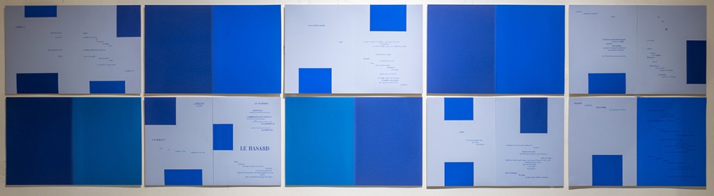
Tyson’s geometric approach would be echoed in later works of homage such as Michael Lechner‘s Les Ondes de sable; Un coup de dés / d’ordinateur (1986), Geraldo de BarrosJogos de Dados (1986), Ellsworth Kelly‘s livre d’artiste (1992) and Michael Graeve‘s Hexagram 12: Heaven and Earth Shall not Meet (1998). Neil Crawford has kindly shared the following image of Tyson’s preliminary study for the print suite. Ian Tyson passed away in France on 2 October 2021.

© Ian Tyson. Photo: Neil Crawford.

Further Reading

Cohn, Robert Greer. 1966. Mallarmé’s Masterwork: New Findings. The Hague: Mouton.

Crawford, Neil. December 1997. “A typographic translation of Stéphane Mallarmé’s Un coup de Dés”. Unpublished.

Dave __. 2017. “The Curious Case For Base 12 (Why Dozens Are Easier For Everyday Maths Than Tens)“. Steemit. Accessed 28 December 2021. (Base 10 has 1, 2, 5 and 10 as factors; Base 12 as 1, 2, 3, 4, 6 and 12).

Meillassoux, Quentin, and Robin Mackay. 2012. The Number and the Siren: A Decipherment of Mallarmé’s Coup de Dés. Falmouth: Urbanomic.

Books On Books Collection – Ernest Fraenkel

Les Dessins Trans-conscients de Stéphane Mallarmé
à propos de la Typographie de Un Coup de Dés (1960)

Les Dessins Trans-conscients de Stéphane Mallarmé, à propos de la Typographie de Un Coup de Dés (1960)
Ernest Fraenkel
Paperback, stapled to fold-in sleeve. , 44 pages bound with 68 pages on 8.5 uncut folded and gathered sheets. Acquired from À la Page, 12 October 2021.
Photos: Books On Books Collection.

Ernest Fraenkel should have left it at visually mapping Un Coup de Dés and offered it up as simply an artistic response to the poem. Even if it is a mapping of the condensed single-paged Cosmopolis (1897) version of the poem, think of the various renderings in handset chapbook form printed on letterpress or as lithographs, or etchings on glass, or even sculptures. It could have been the “Prometheus bound” to the “Prometheus unbound” of those who paid homage by appropriating the more expansive double-page spread book version (1914) that Mallarmé intended. Instead, it lies tucked away with 44 pages de l’explication. Professor David W. Seaman (Georgia Southern University), who has engaged with Fraenkel’s analysis, puts it well:

It must be said in [Fraenkel’s] defense that the idea is tempting: to make wordless patterns of the pages of the poem in order to see the ideogrammatic shapes more clearly. In addition, Fraenkel has contributed some worthwhile insights into the use of space and text in the poem, … However, there are three major objections to his project. First, he used, for most of his research, the text of the Cosmopolis edition of the poem, an edition which nearly everyone agrees is far from the author’s intentions, especially insofar as the ideograms are concerned; the preface to that edition gives ample warning of this. … / The second objection is that Fraenkel strays too far from the text, preferring to keep in mind a general idea of the meaning of the poem, and then go off according to the feelings the designs give him. … In fact,  sometimes Fraenkel recommends turning the design on its side or upside-down to see what image may present itself! / The third objection is that these designs are then used more or less like Rohrschach ink blots. (Seaman, pp. 142-43)

In his nine sets of single-sided uncut sheets, Fraenkel offers seven different diagrammatic approaches to the poem as it appeared in Cosmopolis, whose editors could not allow the poem’s lines to cross over the gutter to the next page as Mallarmé imagined the layout. The opening pages of Fraenkel’s seven approaches are laid out below in sunlight and paired with the textual opening page.

Seven different diagrammatic renderings. The one at the lower right shows Fraenkel’s sideways view.

The first rendering (above, upper left) is closest to what Mario Diacono and Marcel Broodthaers would create later in the decade.

Left: a METRICA n’aboolira (1968) by Mario Diacono (1968). Right: Image: Un coup de dés jamais n’abolira le hasard (1969) by Marcel Broodthaers (1969).

Fraenkel’s nine sets of sheets break down into eight of 8 pages and one of 4 pages. Below is the first set opened out.

The first set of eight pages

Compared with Diacono’s, Broodthaers’ and all the other works of homage to date, Fraenkel’s renderings retain a distinction and suggest other new directions not yet taken physically or digitally. Given the sculptural interpretations by Geraldo de Barros, Jorge Méndez Blake and Kathy Bruce, doesn’t Fraenkel’s first rendering call for a three-dimensional cantilevered homage constructed of slabs of blackened flotsam connected with brushed steel rods?

From the series Jogos de Dados (1986)
Geraldo de Barros
Photo: Julia Parpulov. Permission from Fabiana de Barros.

Biblioteca Mallarmé/Mallarmé Library (2011)
Jorge Méndez Blake
Photo: Courtesy of the artist.

Navigating the Abyss (2014)
Kathy Bruce
Photo: Courtesy of the artist.

Given the video created by Giulio Maffei transforming the 1914 book version into Broodthaers’ and the digital legerdemain of Karen ann Donnachie and Andy Simionato and Tayyib Yavuz, why not an animated digital transformation of the Cosmopolis version into the 1914 book version?

Le Vite dei Libri 26 – Un coup de dés jamais n’abolira le hasard (2016)
Giulio Maffei
Permission from the artist.


Mallarmé’s Self-replicating Machine: A Throw of the Dice Will Never Abolish Chance” (2018)
Karen ann Donnachie and Andy Simionato
Permission from the artists.

Experiment Book: “Un Coup de Dés”
Tayyib Yavuz
Permission from the artist.

And Professor Jed Rasula (University of Georgia), who has also explored Fraenkel’s work, suggests yet another medium:

Fraenkel’s sixty-eight seismographic and astral diagrams (or “stylizations”) practice a truly graphic mode of literary analysis. It was Fraenkel’s conviction that “a plastic text rests hidden in the extra-conscious layers of the poet, paralleling the verbal text of the poem” (9). … In their accentuation of the visual character of Un Coup de dés, Fraenkel’s designs are like watching a movie with the sound turned off, forced to rely on gesture rather than dialogue in order to follow the action.”

Except for the sound part, that could describe Man Ray’s Les Mystères du Château de Dés (1929).

Further Reading

Derek Beaulieu“. Books On Books Collection. 19 June 2020.

Raffaella della Olga“. Books On Books Collection. 8 December 2020.

Klaus Detjen“. Books On Books Collection. 9 September 2020.

Sammy Engramer“. Books On Books Collection. 1 June 2020.

Michalis Pichler“. Books On Books Collection. 19 August 2020.

Cerith Wyn Evans“. Books On Books Collection. 16 April 2020.

Eric Zboya“. Books On Books Collection. 1 June 2020.

Donnachie, Karen Ann, and Andy Siminiato. “Mallarmé’s Self-replicating Machine: A Throw of the Dice Will Never Abolish Chance”. MATLIT: Materialities of Literature, [S.l.], v. 6, n. 1, p. 37-49, Aug. 2018. Date accessed: 23 March 2019.

Rasula, Jed. Modernism and Poetic Inspiration: The Shadow Mouth (London: Palgrave, 2009). Accessed via Electronic Poetry Center, University of Pennsylvania, n.d. Accessed 14 June 2020.

Samson, Anna, and Serge Chamchinov. 2022. “Les Dessins trans-conscients de Stéphane Mallarmé par Ernest Fraenkel : une méthode originale“. Continent Manuscrits. No. 18. Accessed 10 June 2022. A superb analysis of Fraenkel’s book and method.

Seaman, David W.  Concrete poetry in France (Ann Arbor: Umi Research Press, 1981).

Bookmarking Book Art – Jorge Méndez Blake

Mallarmé’s Library (2011)

Biblioteca Mallarmé (2011)

Jorge Méndez Blake

Metal, wood, mirror, resin, plexiglass + drawing. 95x180x150 cm (table) 50×70 cm (drawing). Photos: Courtesy of Estudio Jorge Méndez Blake.

Silvia Ortiz, founder of the gallery Travesía Cuatro in Madrid, writes

In this exhibition entitled Biblioteca Mallarmé, the artist establishes once again the link between his artwork, literature and architecture. On this occasion Jorge Méndez Blake reformulates the concept of library, this time to a library-shipwreck, a library stranded on the coast, as a wreck. 4 November 2011 – 1is 6 February 2012. Accessed 4 September 2020.

Photo: Courtesy of Estudio Jorge Méndez Blake.

Photo: Courtesy of Estudio Jorge Méndez Blake.

All of the works making up the exhibition pay homage to Un Coup de Dés. In keeping with the sub-genre of the homage to an homage, though, this work eponymous with the exhibition draws on Marcel Broodthaers’ homage to the same poem. With its colorfulness, it might also be drawing on Mario Diacono’s JCT 1, a MeTrica n’ABOOlira (1968), Ian Wallace’s Image/Text (1979) or Klaus Detjen’s Ein Würfelwurf niemals tilgt den Zufall (1995). With its three-dimensionality, also perhaps on Geraldo de Barros’s Jogos de Dados (1980s), Albert Dupont’s Désir-Hasard-Dés (2000), or Kathy Bruce’s Navigating the Abyss (2008). Probably not, but this gathering of artists attests to how much Mallarmé’s poem has permeated the genre of book art and its permutations.

Méndez Blake’s originality here arrives in the juxtaposition of the poem’s shipwreck in the form of resinous burnt detritus on the table and flotsam in the print on the wall with the mixed-media blocks on the table recalling books on library display as well as Broodthaers’ rectangular black redactions in his homage or appropriation. Appropriation is very much a theme in this work and the exhibition.

Exhibition view, Travesía Cuatro, Madrid, Spain.

Du fond d’un naufrage (2011)

Du fond d’un naufrage (2011)

Jorge Méndez Blake

Bricks and book. 1.61×1.20×1.06 cm. Photo: Courtesy of Estudio Jorge Méndez Blake.

Another work in the exhibition, Du fond d’un naufrage (2011), differs in material and shape from any previous homage to the poem. The work’s title (“from the bottom of a shipwreck”) comes from a line in Mallarmé’s poem, and cheekily, the volume at the bottom of the gap between the bricks is Mallarmé’s Collected Poems and Other Verse (Oxford University Press).

Toute Pensée Émet un Coup de Dés (2012-2019)

Toute Pensée Émet un Coup de Dés (2012-2019)

Jorge Méndez Blake

Photo: Courtesy of Estudio Jorge Méndez Blake.

Not in the exhibition but continuing the association with Un Coup de Dés and the theme of appropriation, Toute Pensée Émet un Coup de Dés (2012-2019) is a series of nine drawings that

reproduces classic shipwreck paintings using colored pencil. Classic painters used often the strategy of bending the mast, as a way to show the instability of the ship in the storm. These drawings go through an editing process, in which an image of the original painting is cropped and rotated X degrees to achieve the mast verticality and to make the scene look as if the ships were avoiding the fatal destiny. But by “fixing” the mast, the whole landscape loses its horizontality. Correspondence, Estudio Jorge Méndez Blake, 4 August 2020.

Further Reading

Large-Scale Installations (Updated 3 August 2020)”, Bookmarking Book Art, 3 August 2020.

Peden, Georgia. “Denver’s MCA exhibits adapted literary illustrations”, DU Clarion 9 October 2017. Accessed 23 August 2020.

Books On Books Collection – Guido Molinari

Équivalence : un coup de dés jamais n’abolira le hasard (1981)

Équivalence: Un coup de Dés jamais n’abolira le Hasard (1981)
Stéphane Mallarmé, Guido Molinari; preface, Jocelyne Légaré; interview, Julia Duchastel.
Portfolio of 26 loose folded leaves. Portfolio: H339 x W256 mm. Leaves: H336 x W250 mm.
Les Éditions du Passage, Montréal. Acquired from Reynaud-Bray, March 2019. © Guido Molinari. Photos: Books On Books Collection. Displayed with permission of Fondation Guido Molinari.

Molinari’s rendition of Un coup de Dés sings among the versions by Marcel Broodthaers (1969), Geraldo de Barros (1986) and Ellsworth Kelly (1992).

In the first three minutes of this extract from the film Molinari: la couleur chante (2005), Molinari walks through an exhibition of Équivalence, discussing it with Roald Nasgaard and commenting on Un coup de Dés, its visual musicality and his transformation of it into his colourful geometric abstractions. The opportunity to see all of the poem ranged along one wall and all of Molinari’s abstractions along a facing wall is a pleasure. A pleasure enhanced by leafing through the portfolio and juxtaposing each double-page spread of the poem with Molinari’s “equivalent” abstraction.

Further Reading

Molinari, Guido, Gilles Daigneault, Patrick Lafontaine. Nul mot: les livres d’artiste de Guido Molinari (Montréal, Québec: Éditions du Noroît, 2017).

Nasgaard, Roald. Abstract Painting in Canada (D&M Publishers Inc., 2008).