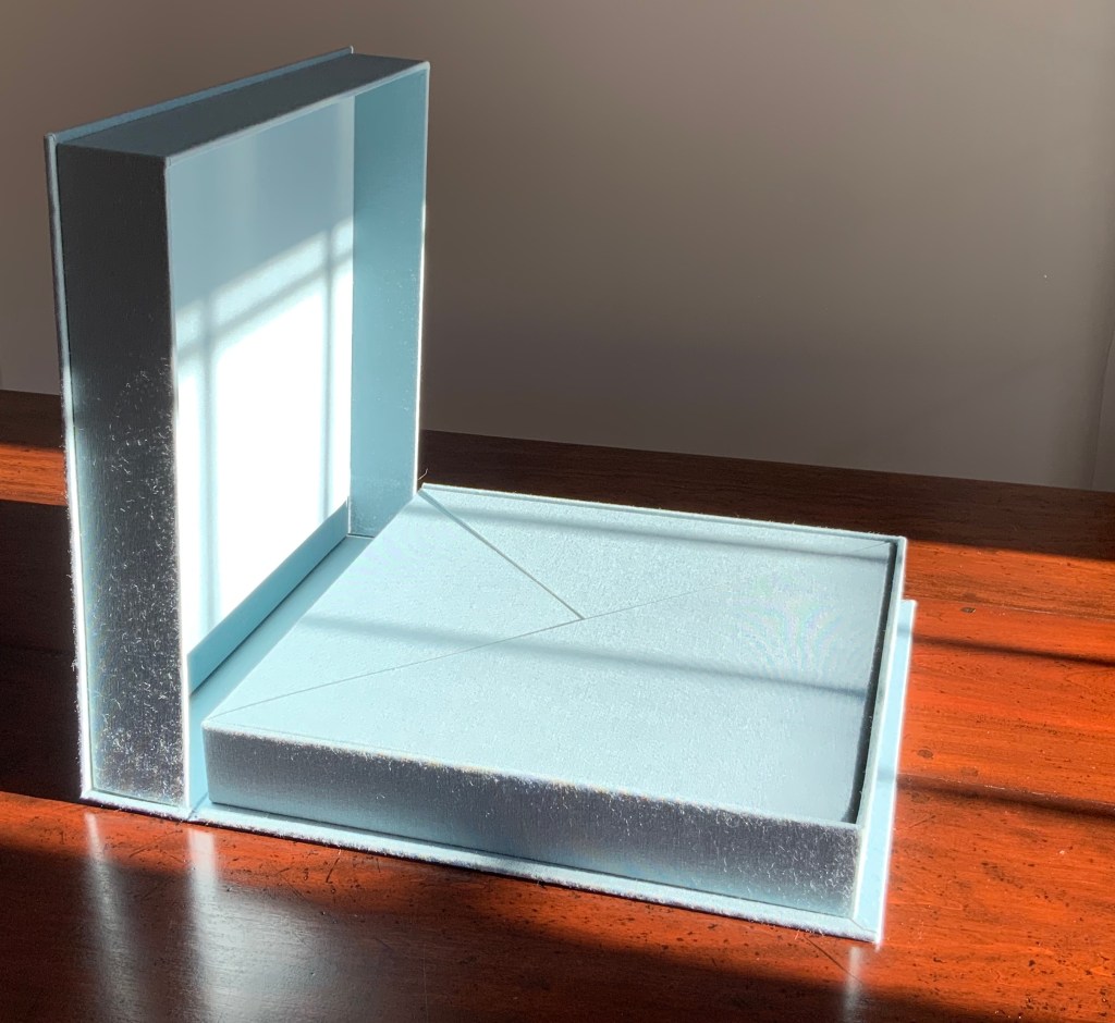
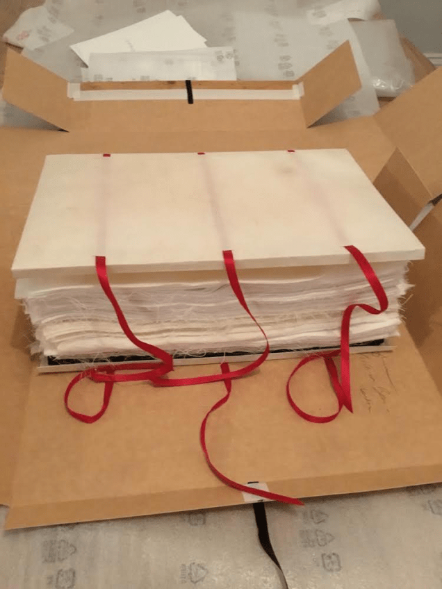
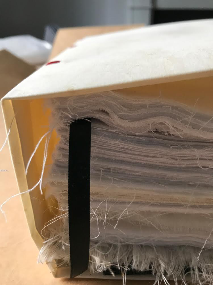
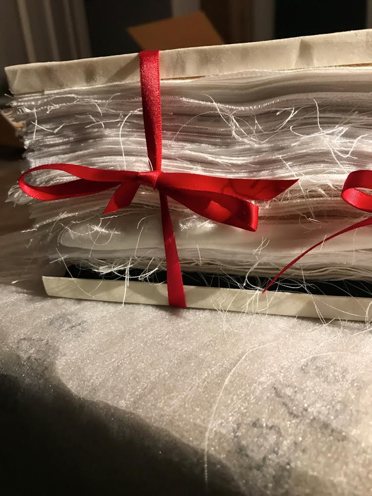
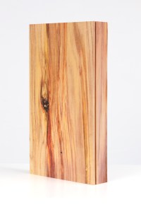
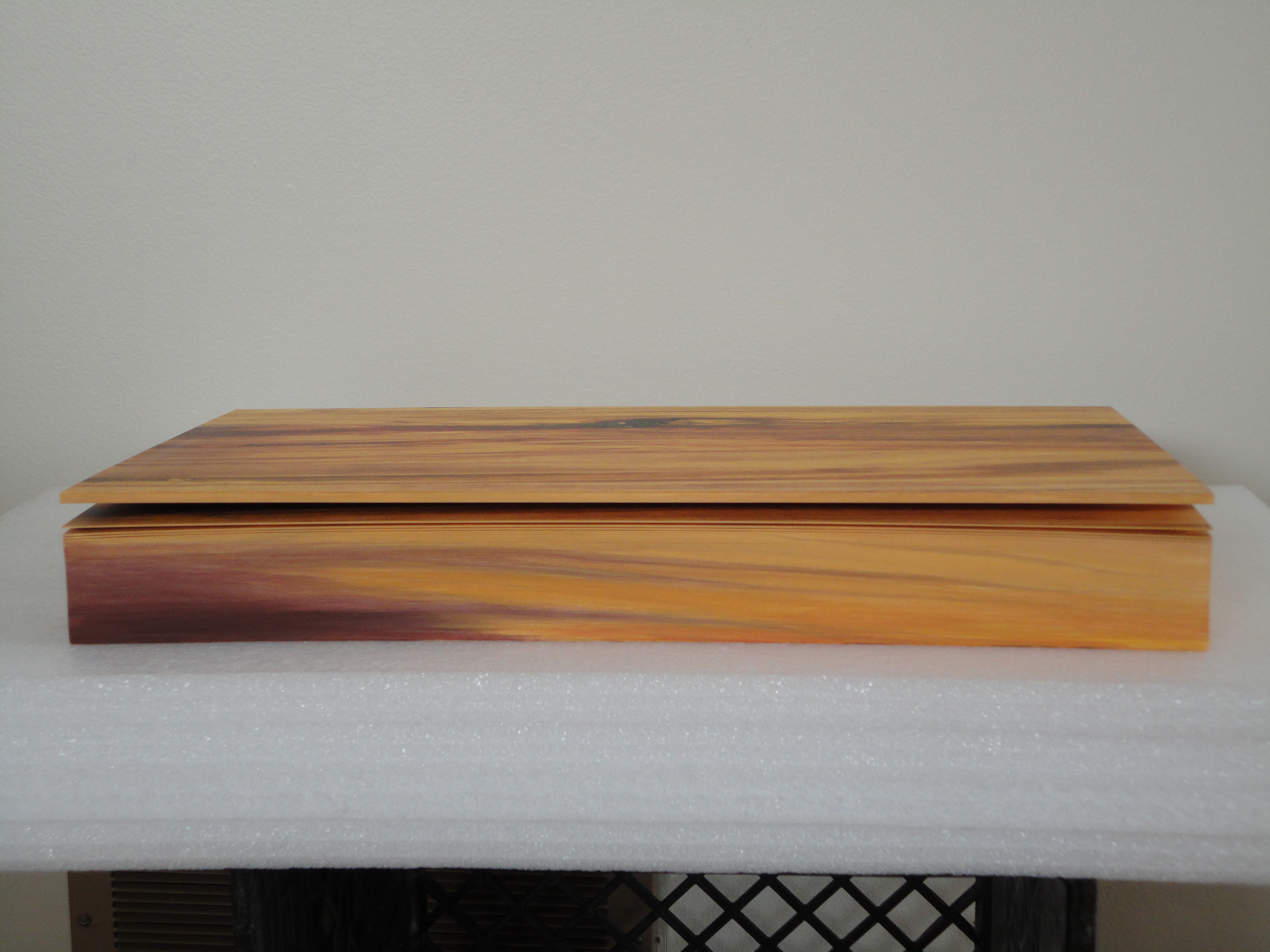
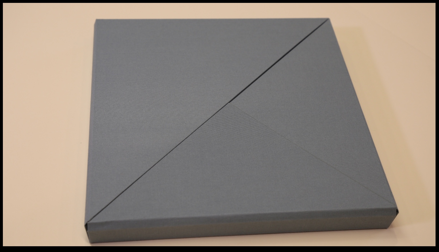
Nous Sommes (2015) Ioana Stoian Nine handmade-paper forms in handmade cloth-covered boxes, fitted to flapped container with magnetic seals, enclosed in cloth-covered Solander box. H310 x W305 x D54 mm. Acquired from the artist, 4 July 2017. Photos: Books On Books.
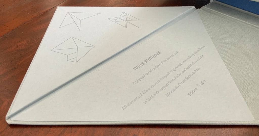
“Nous sommes”, the French for “we are”. But who is “we” here? Opening the first two flaps inside the blue-grey Solander box, I see that my first question should have been: What is Nous Sommes? The answer on the title page: “A physical manifestation of the human soul”. So, a book or sculpture then.
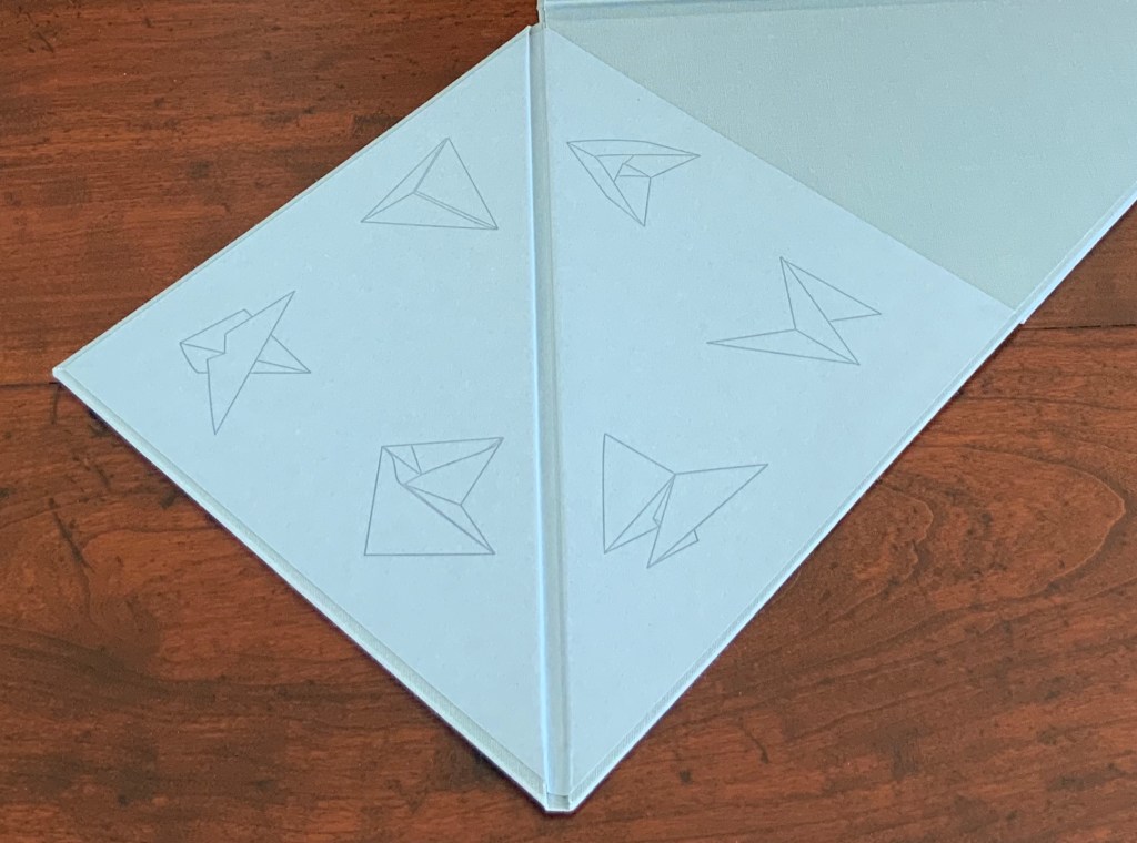
The third and fourth flaps reveal six diagrams to add to the three above the title page: a table of contents?
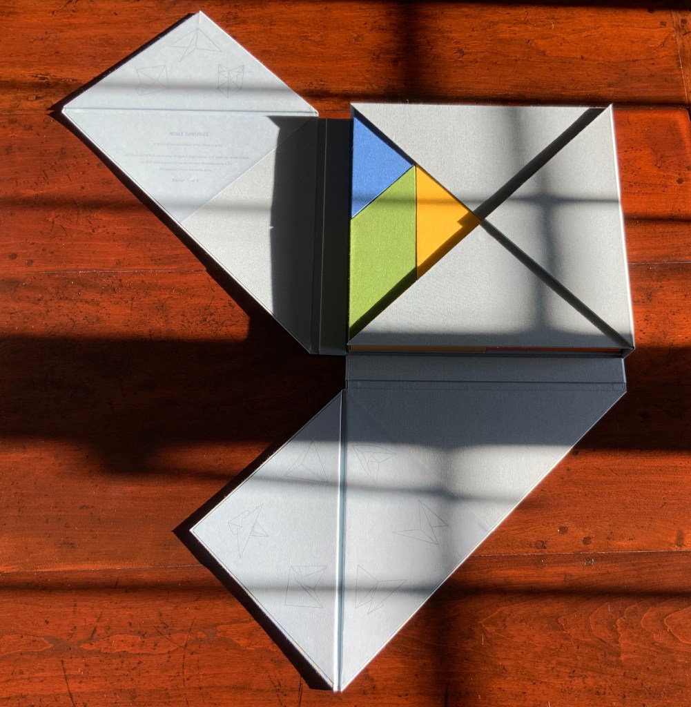
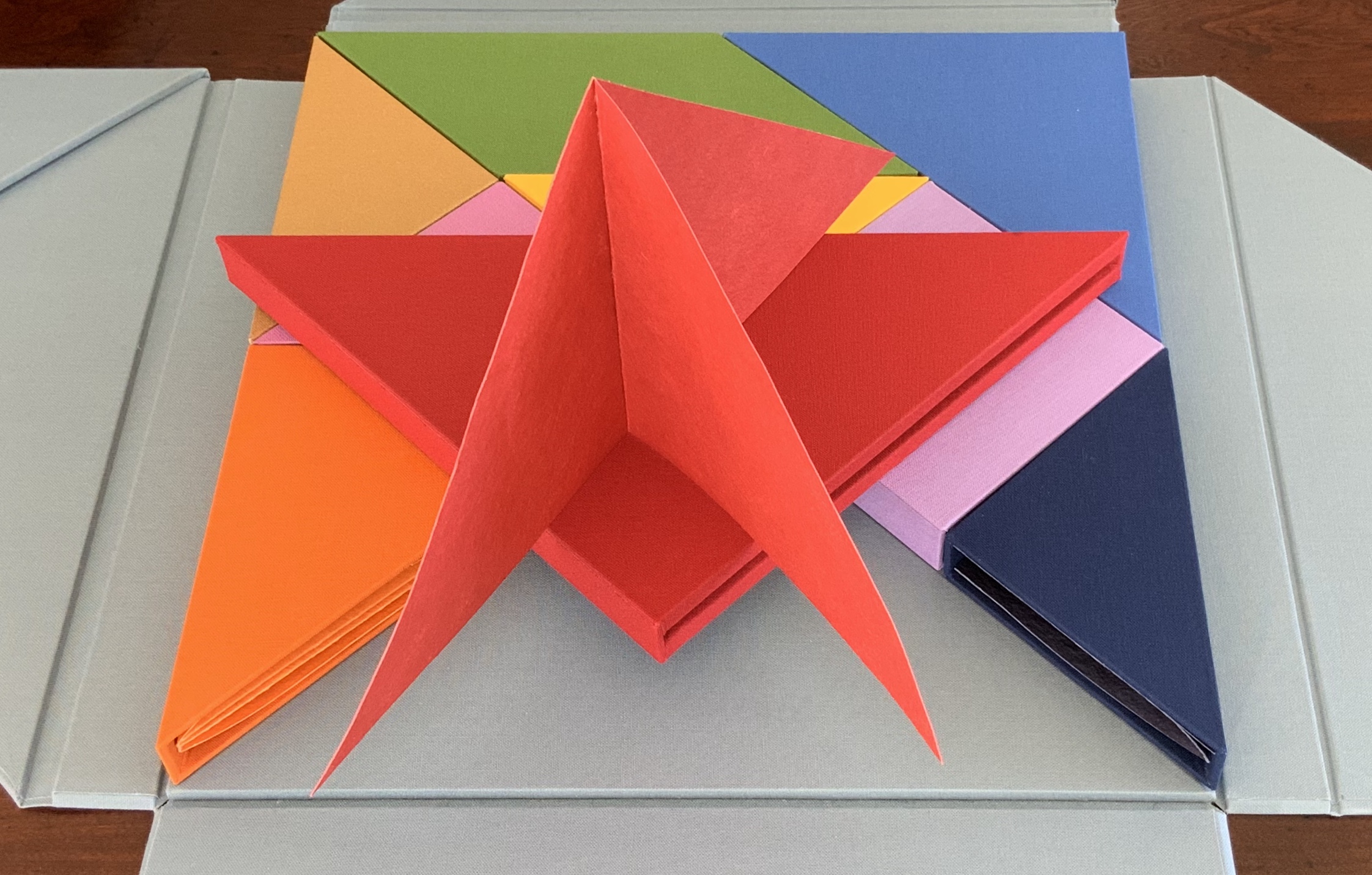
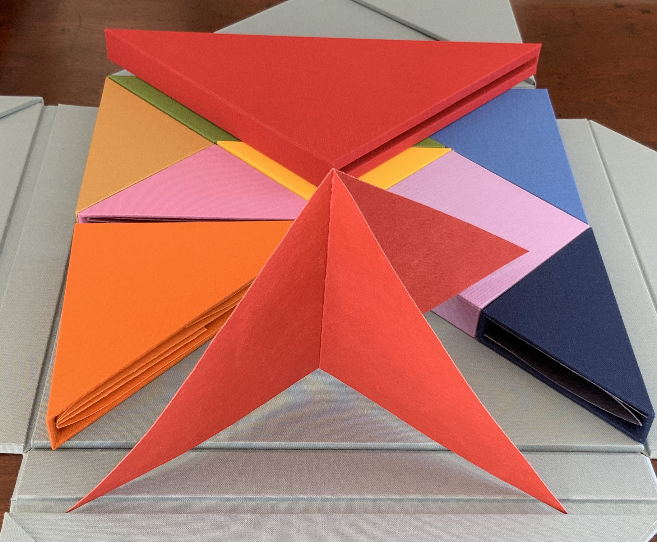
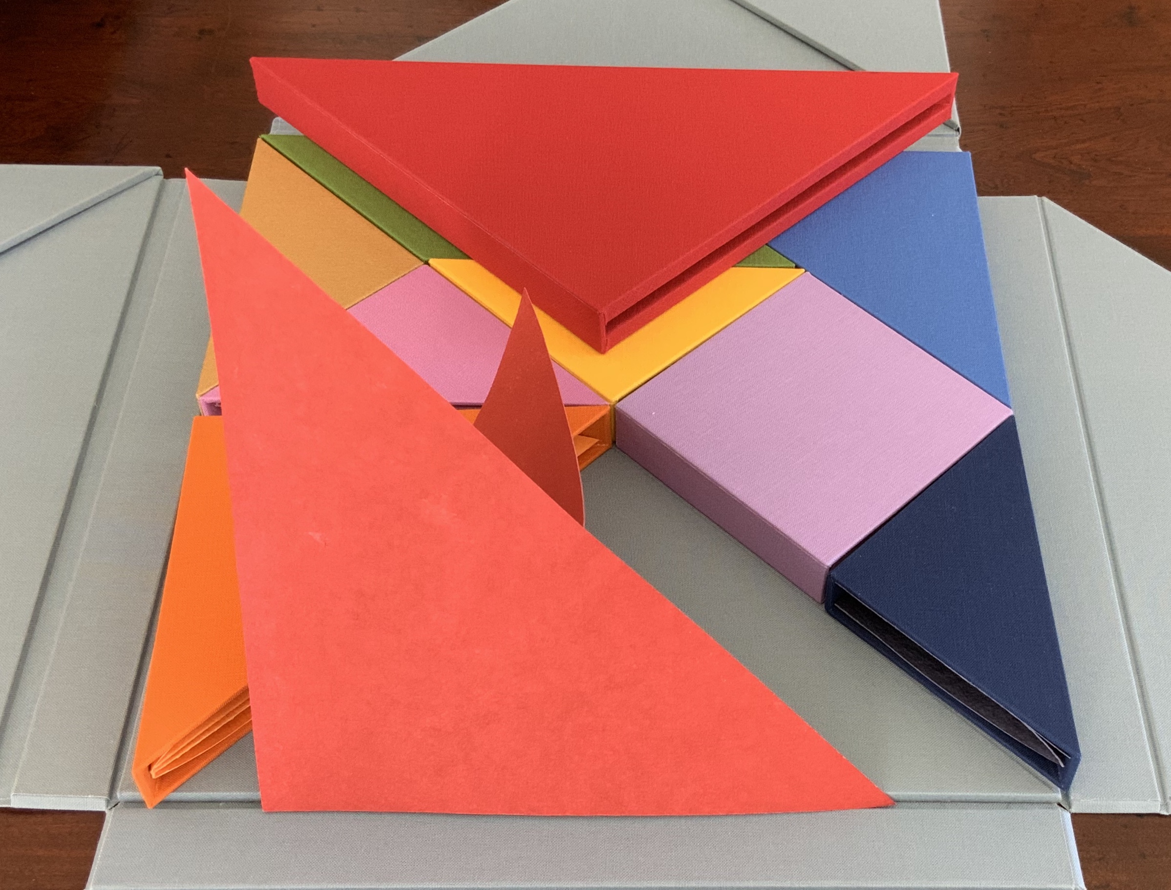
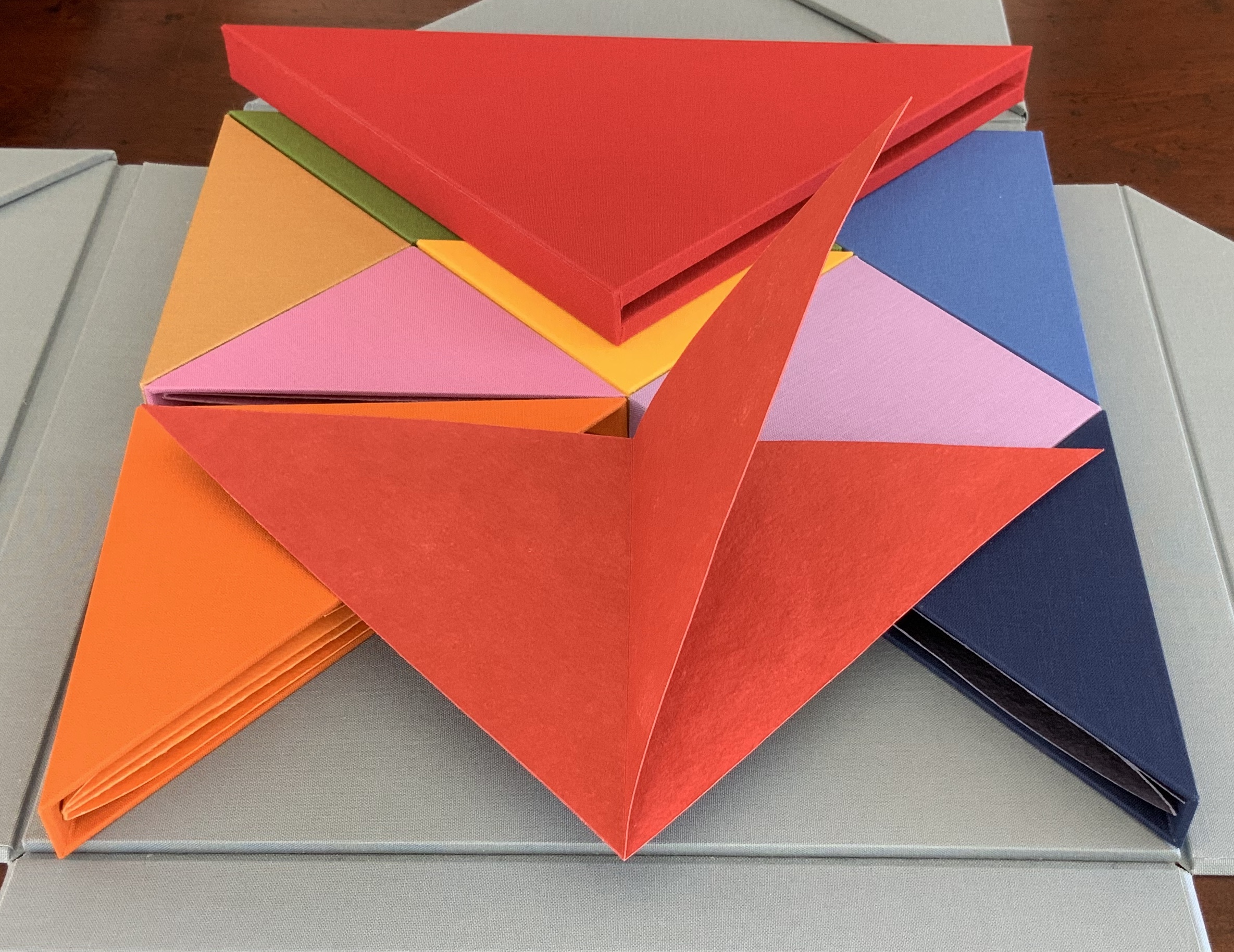
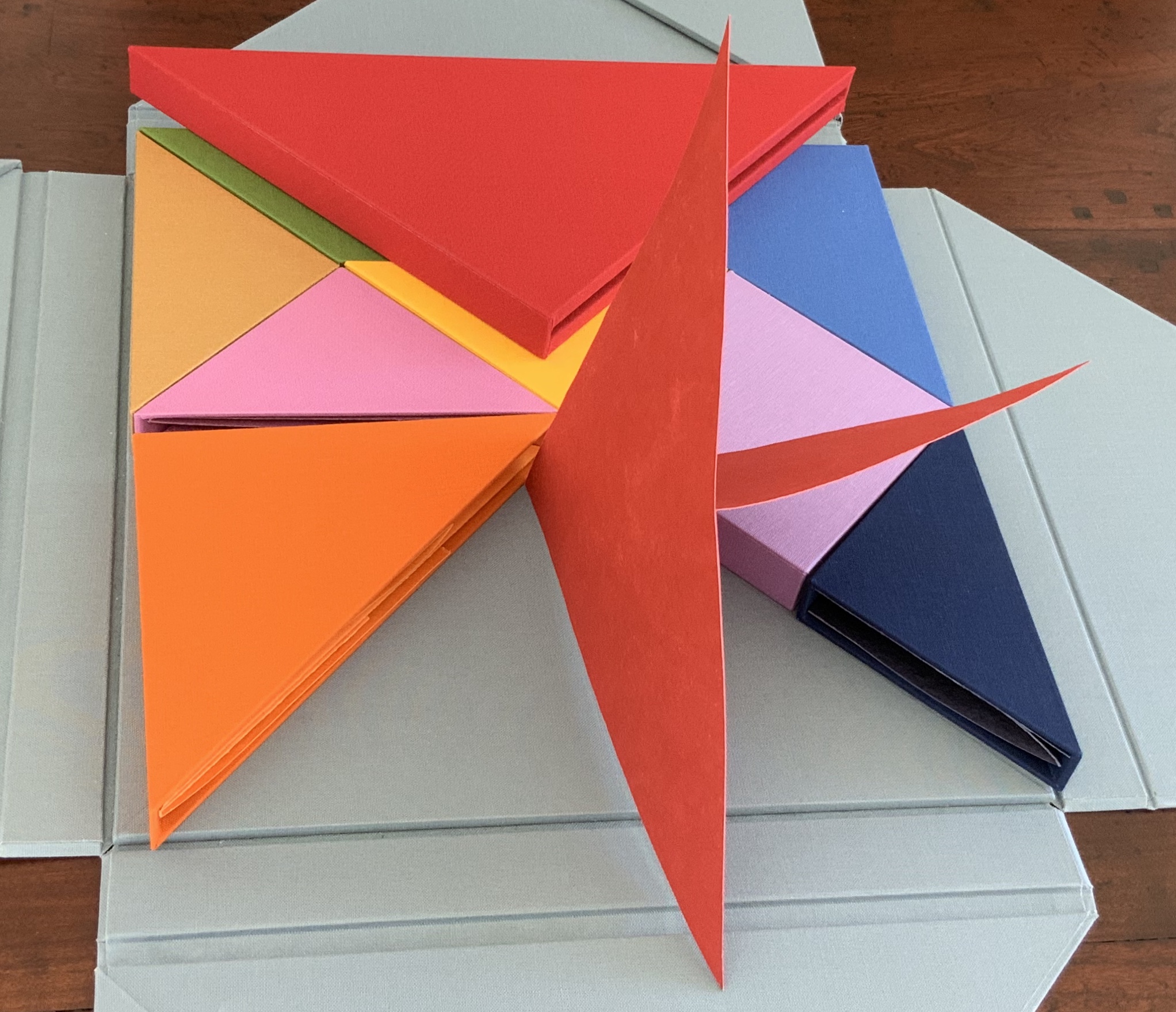
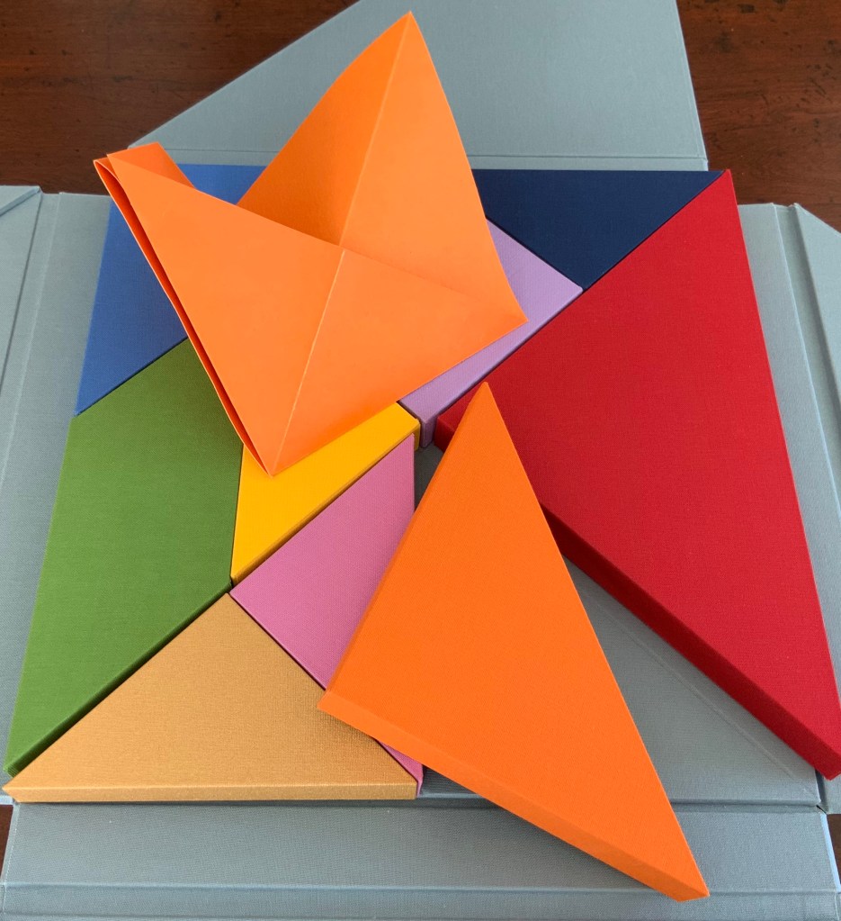
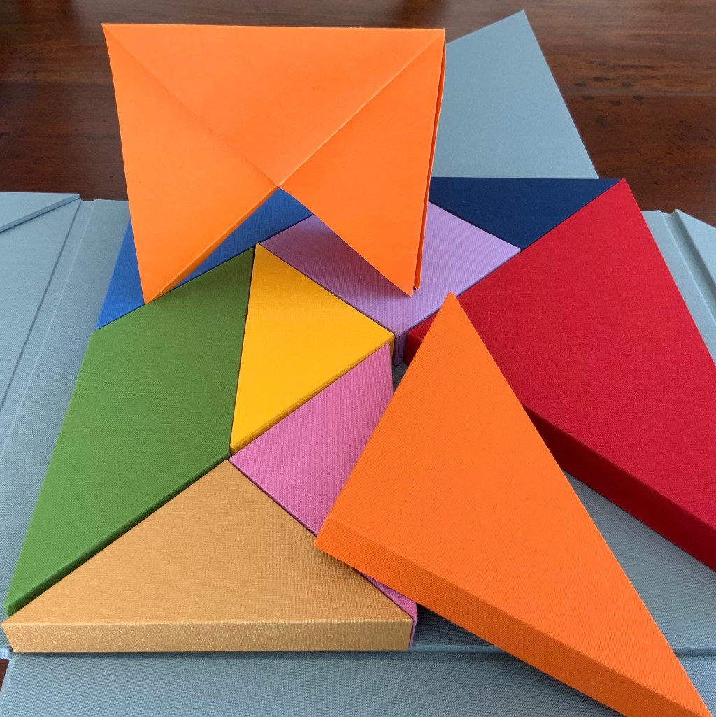
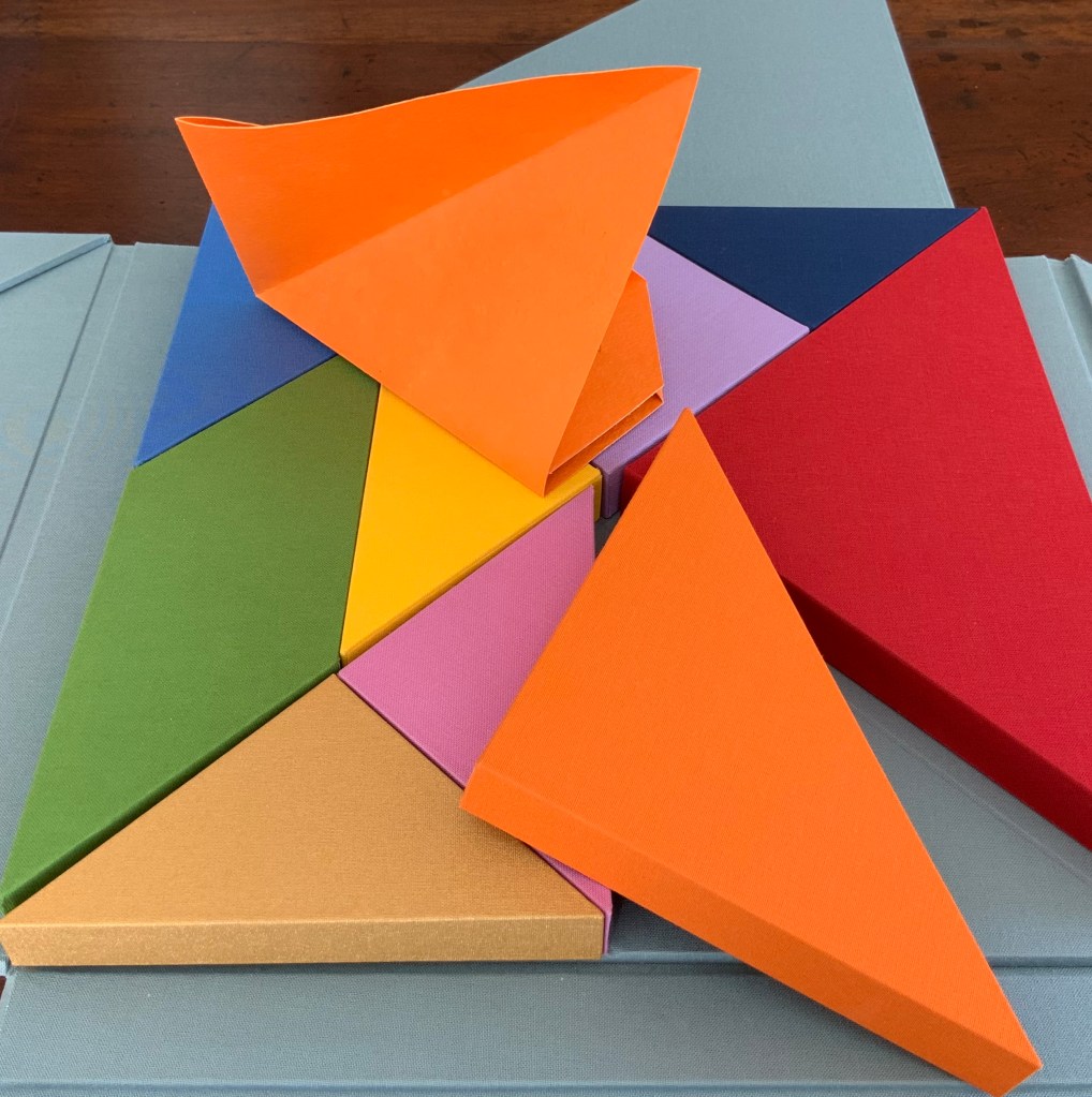
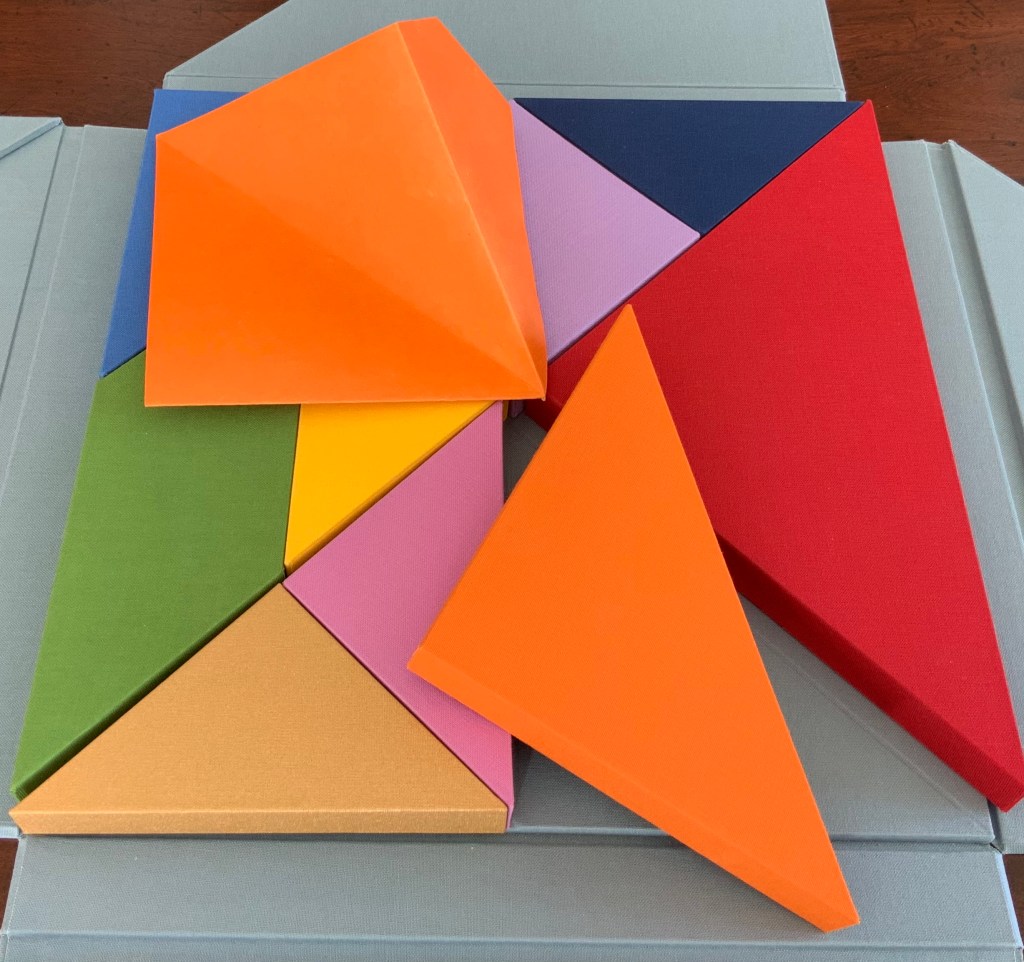
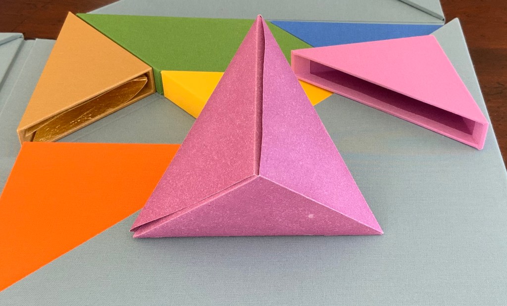
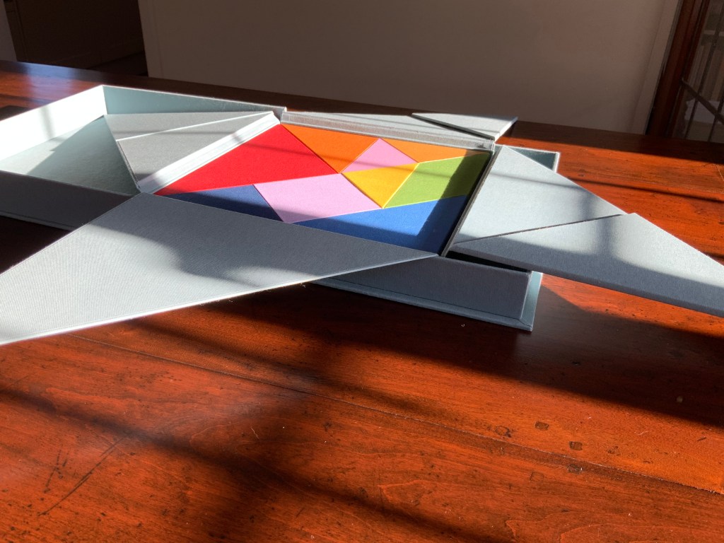
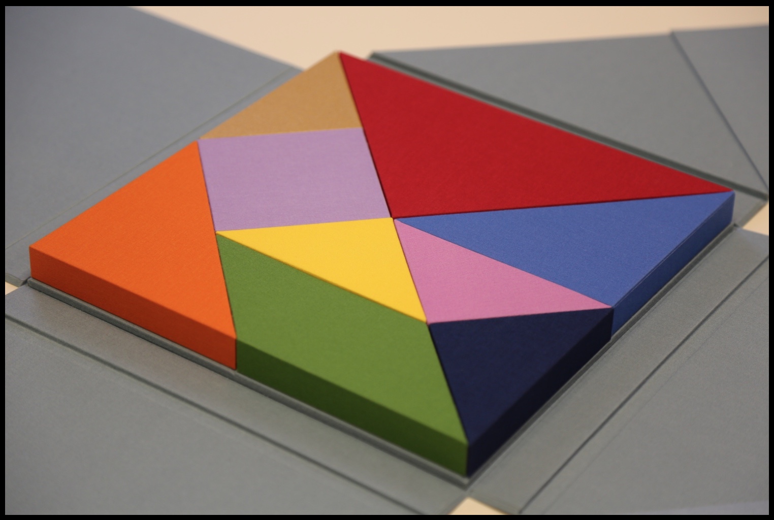
There are three brightly coloured boxes showing and fitting snugly together: the first three chapters or objects? Two are triangular, one is a parallelogram.
The next flap up gives another three boxes, all triangular and each a different color; and under the final flap, three more boxes, three more colors and a square among the triangles. Nine boxes making a tightly fitted square; six of them easily grasped because each has an edge at the perimeter.
The diagrammed shapes on the “table of contents” don’t correspond to the shapes of the nine boxes. The diagrammed shapes must be inside the boxes.
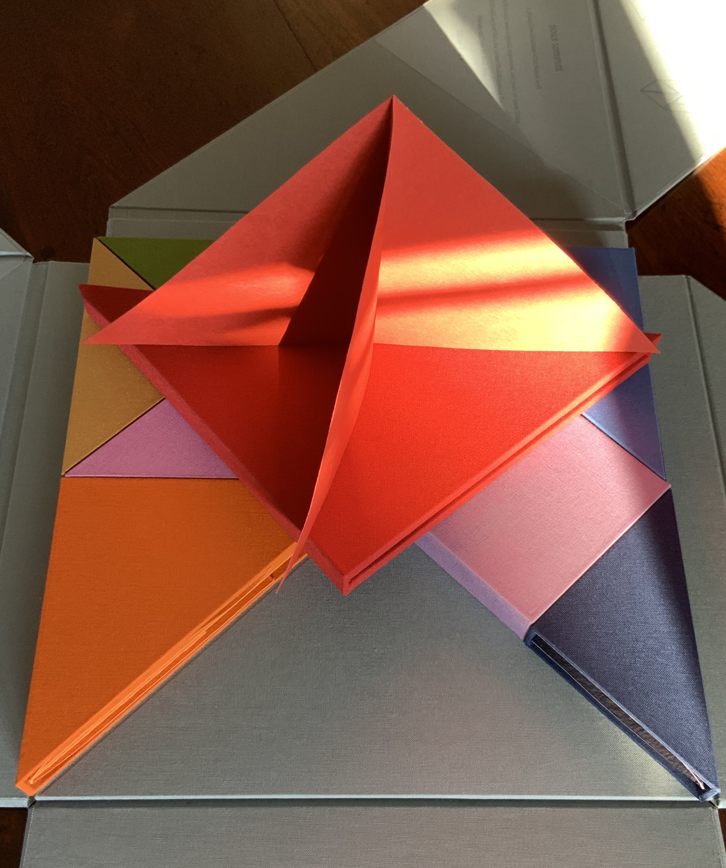
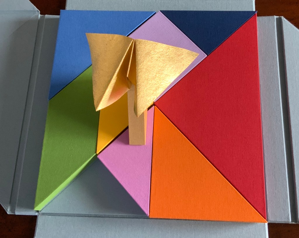
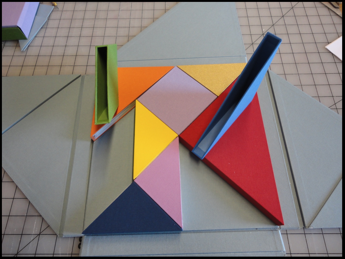
So I begin with the larger, lighter blue box. A sharp tap on the box, and a stiff, folded paper the same color as the box emerges. No words, no glyphs, but this is one of the shapes printed on the “table of contents”. It invites manipulation: stand me this way, now that, now this. With each turn, the light brings out different shades from the form’s valleys and mountains, and the form throws different shadows. Next the smaller, darker blue box houses a two-piece “chapter”, one piece to slot into the other. Again, different shades, different shadows.
The red box also offers up a two-piece chapter, but the pieces are glued together. So much larger a shape than the one before, but so much simpler.
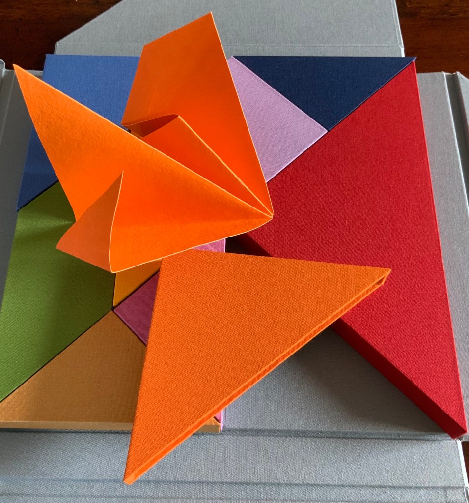
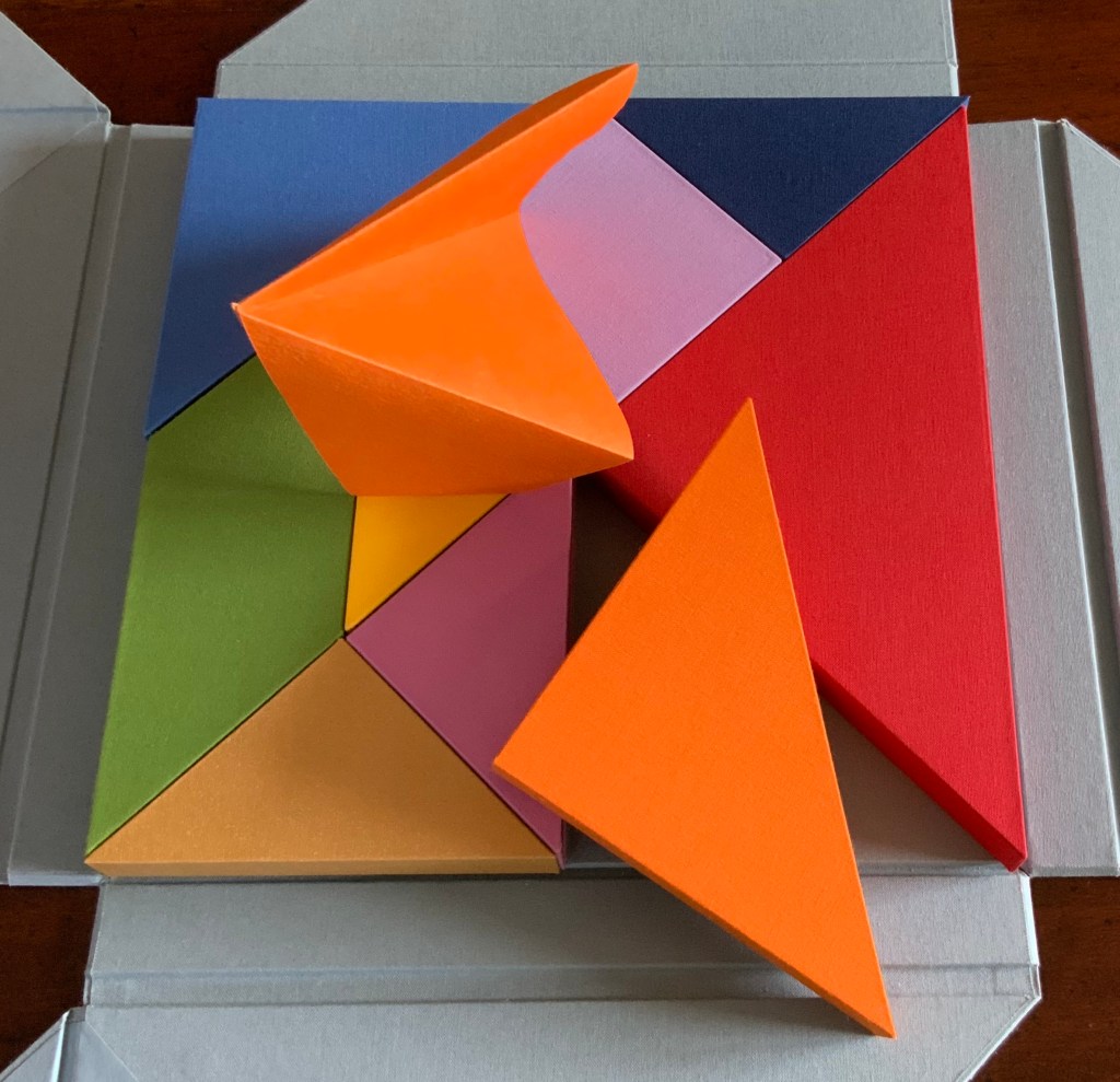
The single piece from the orange box asks to be unfolded and one tip to be slipped into an awaiting slot; the resulting object is strange.
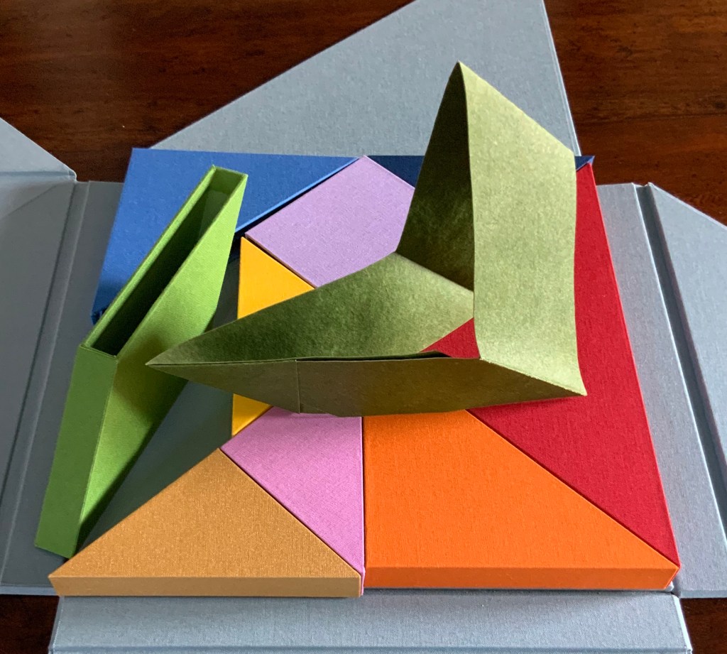
From the gold box, a butterfly emerges. The light glints off the gilt ink, and the upright box seems the perfect perch. From the green box, a glued and folded strip of paper unfolds into a hat, a collar, an open-mouthed bird or frog?
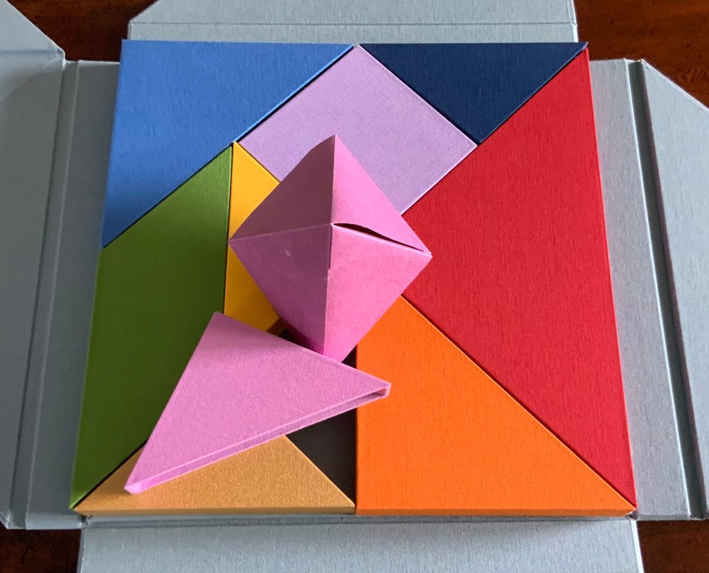
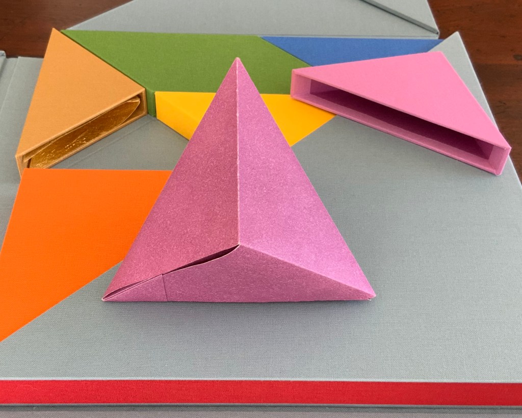
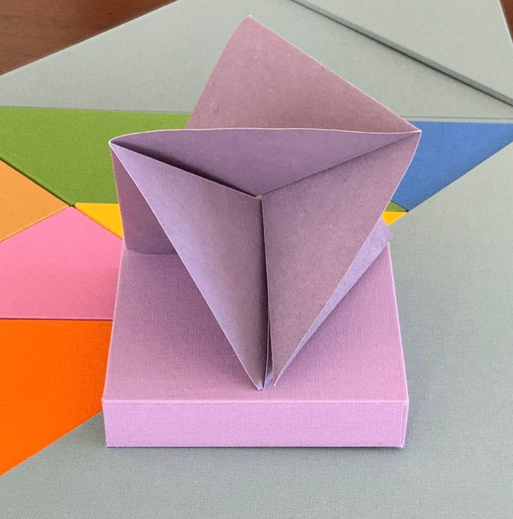
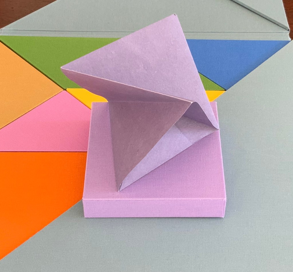
Inside the inner pink triangular box is the only solid — an irregular hexahedron. The contents of the violet square box unfolds and slots into itself to form a flower, the head of a mace?
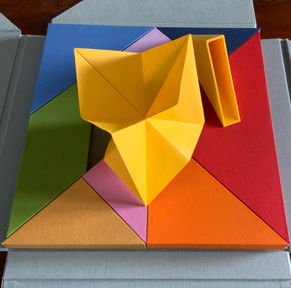
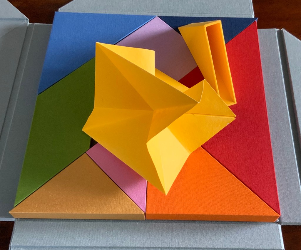
The form that emerges from the small yellow box seems the most multi-faceted of all.
But where is the human soul manifest among these colors and forms?According to Neo-Pythagorean philosophers numbers, string vibrations, musical notes, colours and form have fundamental, metaphysical relationships. Pythagoras himself is thought to have said “colour is form, and form is colour”. Then there is Pythagorean Numerology that holds that a person’s date of birth can be distilled into one number (a root number) between 1-9, that each number is associated to a colour, and that each colour aligns with certain inner traits and life purposes. So within a box of grey (the color of universality), there are the nine colours of humanity: We are, making Nous Sommes a startling integration of book art, Pythagoras, numerology, tangrams, origami, papermaking, boxmaking, binding and printing.
On the title page, the work is designated as “Edition 9 of 9“. Yet, as of this writing, the work is unique. Of course, 9/9 = 1. And the chapter with which I started was blue, the colour associated with the number 5, the root number of my birth date. So many coincidences of sums, Nous Sommes must have been bound for the Books On Books Collection.
The seventh biennial Codex book fair and symposium in Berkeley and Richmond, California have come to a close. Of what use it is now to explain how to enjoy them, you be the judge. Your first step is to read the story in Mark Twain’s Roughing It of “Jim Blaine and His Grandfather’s Ram”. Being the story of a story — book art being so self-reflexive and all — it is the best way to commence:
Every now and then, in these days, the boys used to tell me I ought to get one Jim Blaine to tell me the stirring story of his grandfather’s old ram—but they always added that I must not mention the matter unless Jim was drunk at the time—just comfortably and sociably drunk.
Not to advise drink before the fair.
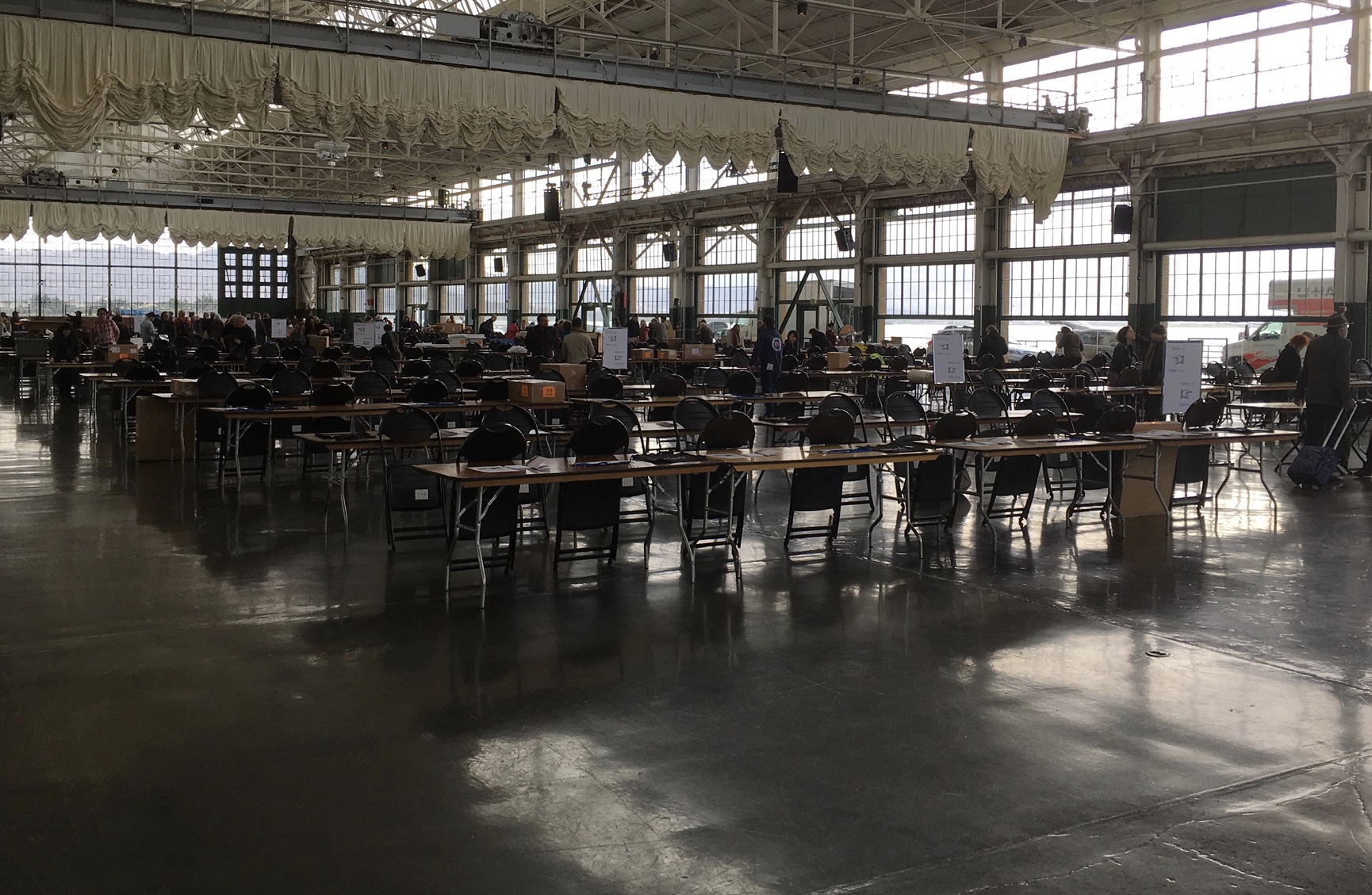
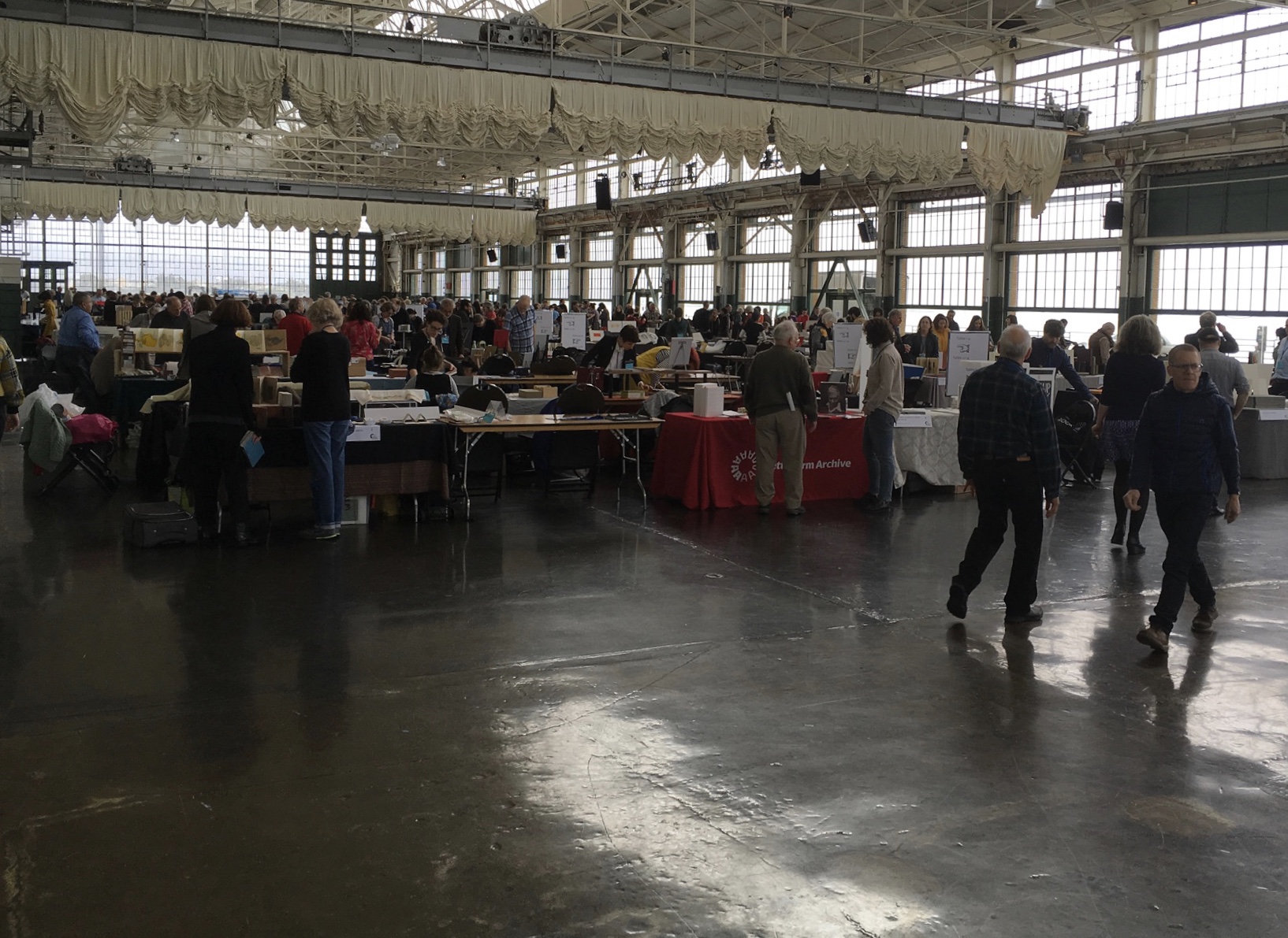
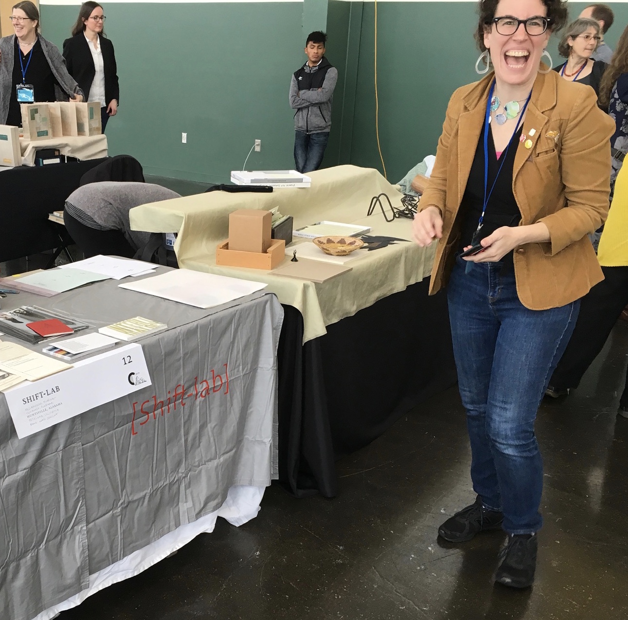
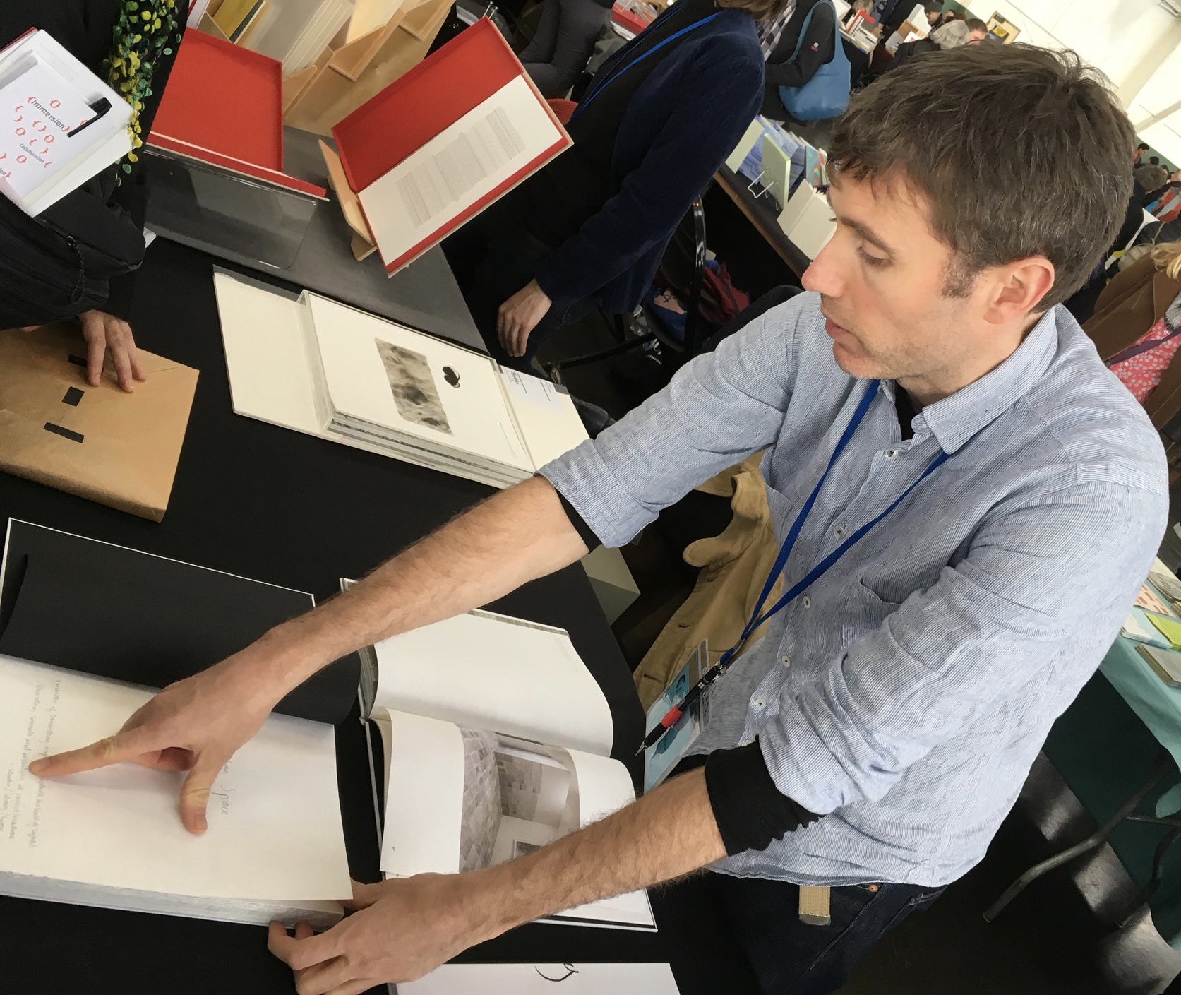
For the start of this Codex, rain and mist hover outside the hangar. The polished concrete floor looks wet but isn’t — so first-time visitors step to avoid slips that won’t really occur. The old-timers though stride from table to table arms wide, bussing each other on the cheek or humping crates around and placing and re-placing their works for the right effect. Arriving early to watch adds a certain enjoyment.
At last, one evening I hurried to his cabin, for I learned that this time his situation was such that … he was tranquilly, serenely, symmetrically drunk—not a hiccup to mar his voice, not a cloud upon his brain thick enough to obscure his memory. As I entered, he was sitting upon an empty powder- keg, with a clay pipe in one hand and the other raised to command silence. … On the pine table stood a candle, and its dim light revealed “the boys” sitting here and there on bunks, candle-boxes, powder-kegs, etc. They said: “Sh—! Don’t speak—he’s going to commence.”
‘I don’t reckon them times will ever come again. There never was a more bullier old ram than what he was. Grandfather fetched him from Illinois—got him of a man by the name of Yates—Bill Yates—maybe you might have heard of him; his father was a deacon—Baptist—and he was a rustler, too; a man had to get up ruther early to get the start of old Thankful Yates; it was him that put the Greens up to jining teams with my grandfather when he moved west.
‘Seth Green was prob’ly the pick of the flock; he married a Wilkerson—Sarah Wilkerson—good cretur, she was—one of the likeliest heifers that was ever raised in old Stoddard, everybody said that knowed her. She could heft a bar’l of flour as easy as I can flirt a flapjack. And spin? Don’t mention it! Independent? Humph! When Sile Hawkins come a browsing around her, she let him know that for all his tin he couldn’t trot in harness alongside of her. You see, Sile Hawkins was—no, it warn’t Sile Hawkins, after all—it was a galoot by the name of Filkins—I disremember his first name; but he was a stump—come into pra’r meeting drunk, one night, hooraying for Nixon, becuz he thought it was a primary …
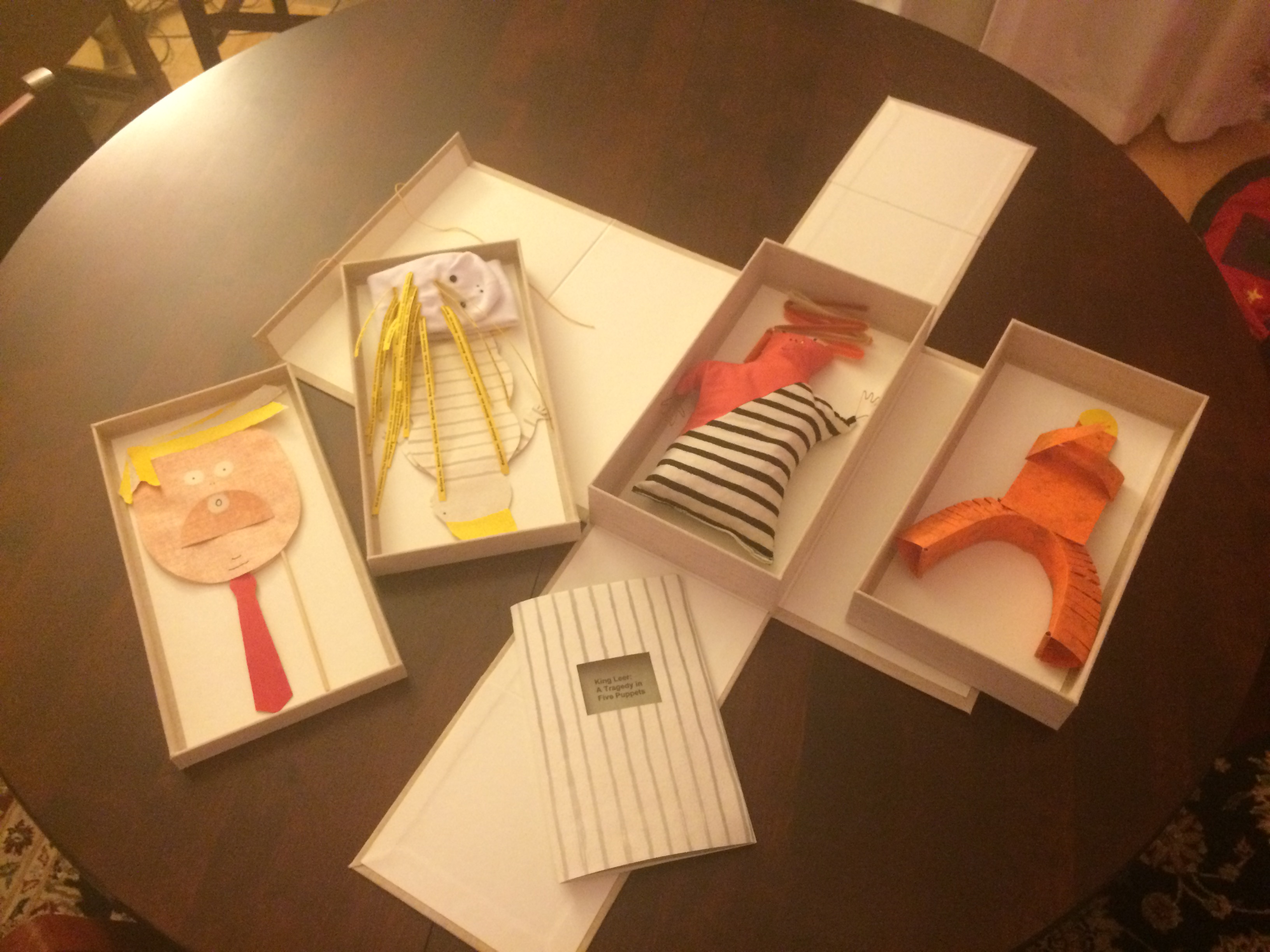
Which reminds me of Emily Martin and her politically biting King Leer —
King Leer: A Tragedy in Five Puppets (2018) Emily Martin
There is plenty more somber work to go around: Lorena Velázquez from Mexico has followed up her powerful Cuarenta y tres with Exit, her hope in our turbulent times;
Barcelona’s Ximena Perez Grobet has 2.10.1968-2018on display, commemorating the 50th anniversary of the Tlatelolco massacre in Mexico City; Sue Anderson and Gwen Harrison from Australia offer Phantomwise Flew the Black Cockatoo, an indictment of a cruel welfare system; and there is Islam Aly from Egypt with Inception, Bedaya, inspired by stories and journeys of refugees. Book art everywhere wears its heart on its cover.
Still, book artists are a convivial bunch and cheerful in their internationality. On Monday evening, Mary Heebner (Simplemente Maria Press) and her husband photographer Macduff Everton are in the Berkeley City Club’s off-limits members’ room settling down to a bottle of Santa Barbara red, and here come upstate New Yorker Leonard Seastone (Tidelines Press), Anglo-German Caroline Saltzwedel (Hirundo Press), Irishman Jamie Murphy (The Salvage Press) and Geordie David Esslemont (Solmentes Press). Macduff is launched on a tale about running into Queen Elizabeth on her horse-riding visit to Ronald Reagan’s ranch, when David remembers rounding down a path in the Lake District during an art residency to find Prince Charles legging it up the same — by which time Macduff has just returned from his room with a bottle of single malt — which reminds Caroline of a stormy weather hike along Hadrian’s Wall, where Macduff diverts onto a tale of nearly being blown off the same and making his shaky, near-death way back to a bed-and-breakfast for a hot bath and terrible food from the grumpy owners, which launches Leonard onto the story about his local Russian butcher/grocer/refugee who refuses to sell him salad but insists on providing chiropractic services one day and adopts Leonard as his only friend in the US with whom he can have true political debate. Jamie still wants to know why the Russian wouldn’t sell Leonard any salad.
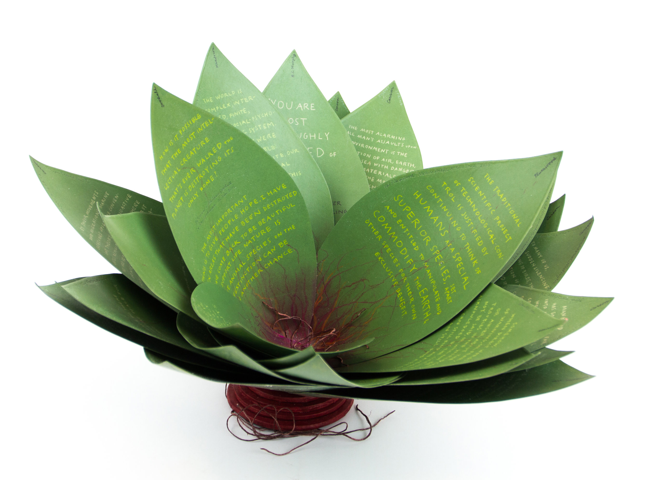
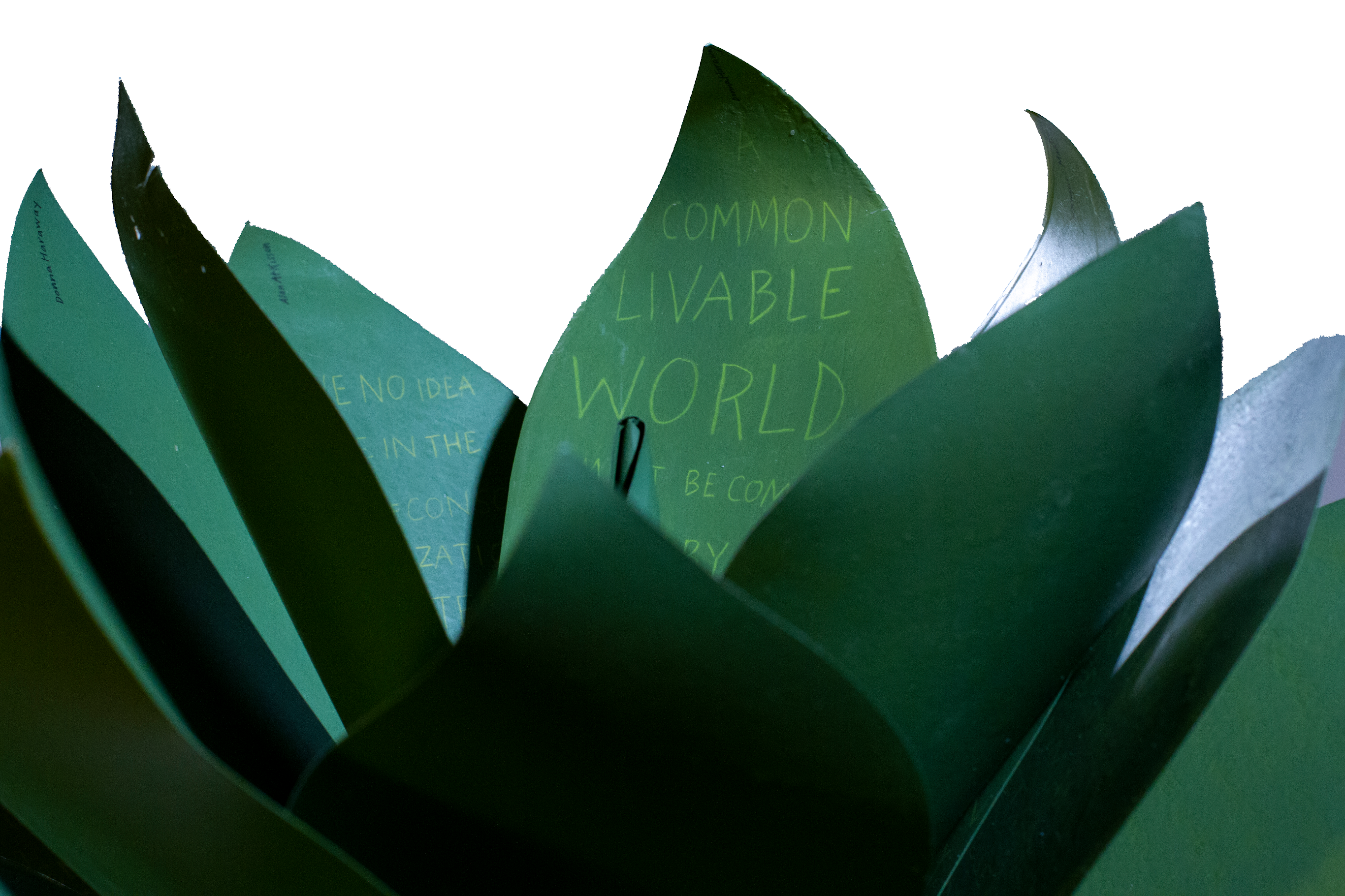
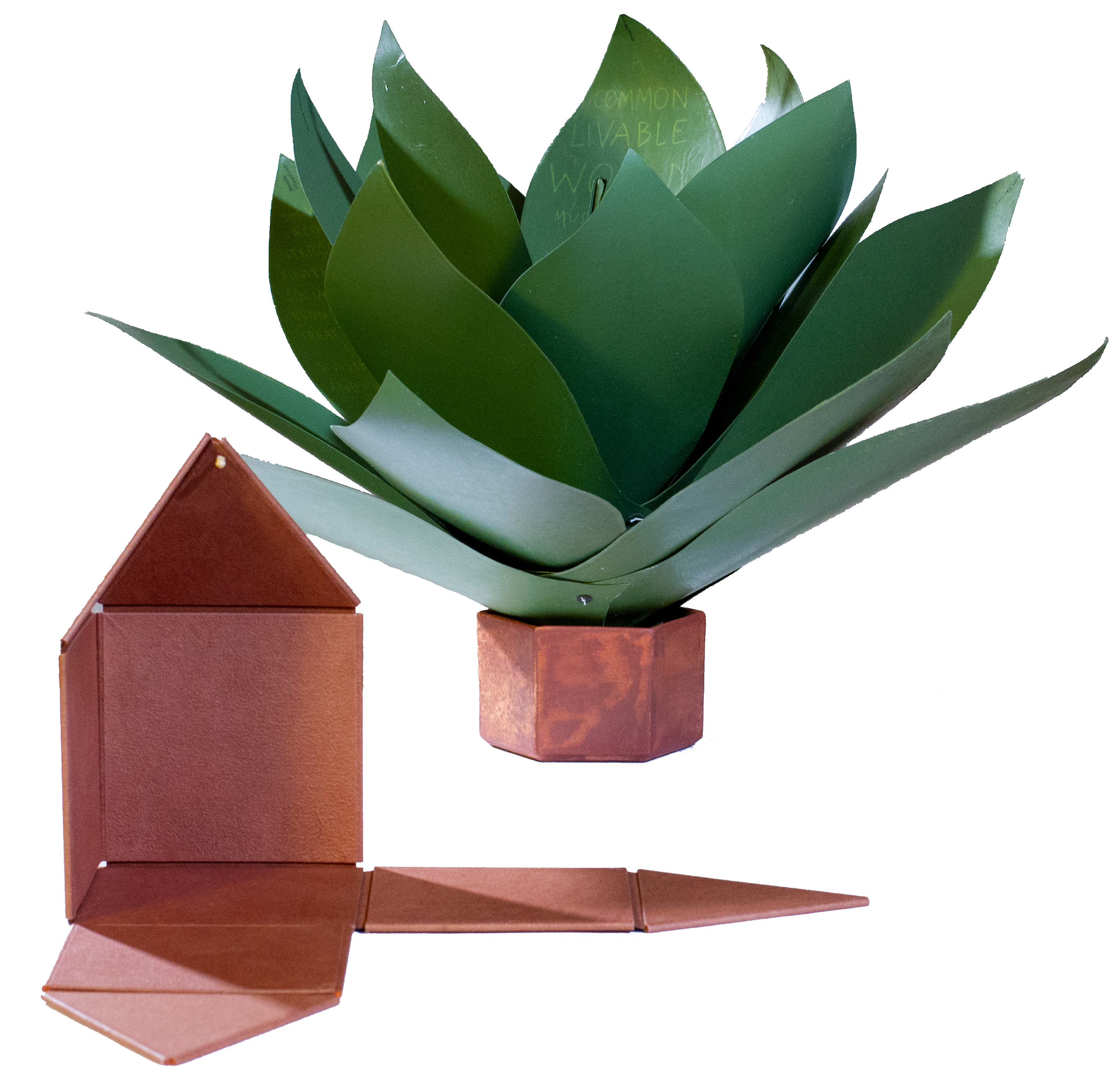
Speaking of greens — Robin Price’s prototype for Witnessing Ecology: the agave plant book again displays that thread of social concern, but this work and Price herself draw attention to another thread of enjoyment to pursue: the recurrence of collaboration among book artists. One artist leads to another.
Witnessing Ecology: the agave plant book (2019) Robin Price Photo: Mike Rhodes
As with the now-famous The Anatomy Lesson by Joyce Cutler-Shaw, Price has joined forces again with Daniel Kelm on the agave plant book, Kelm also collaborated with Ken Botnick on the long-gestating Diderot Project on display here just a few tables away, Botnick collaborated with the novelist and translator William Gass on A Defense of the Book, who in turn with the photographer Michael Eastman — who lives over in Oakland — created the digital-only book Abstractions Arrive: Having Been There All the Time. Whatever the medium, the book just naturally encourages collaboration — and chance. As Price’s book Counting on Chance implies and as so many book artists echo — as does Jim Blaine —
‘… There ain’t no such a thing as an accident. When my uncle Lem was leaning up agin a scaffolding once, sick, or drunk, or suthin, an Irishman with a hod full of bricks fell on him out of the third story and broke the old man’s back in two places. People said it was an accident. Much accident there was about that. He didn’t know what he was there for, but he was there for a good object. If he hadn’t been there the Irishman would have been killed. Nobody can ever make me believe anything different from that. Uncle Lem’s dog was there. Why didn’t the Irishman fall on the dog? Becuz the dog would a seen him a coming and stood from under. That’s the reason the dog warn’t appinted. A dog can’t be depended on to carry out a special providence. Mark my words it was a put-up thing. Accidents don’t happen, boys. Uncle Lem’s dog—I wish you could a seen that dog. He was a reglar shepherd—or ruther he was part bull and part shepherd—splendid animal; belonged to parson Hagar before Uncle Lem got him.’
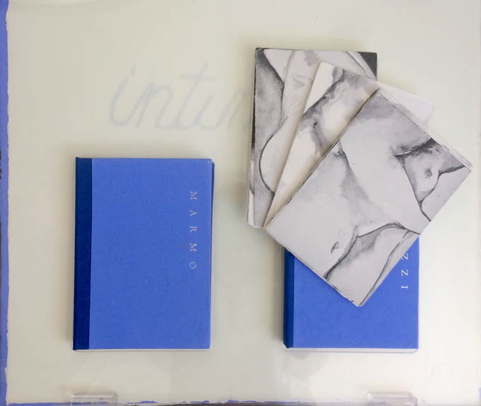
Chance, luck or accident — if you are to enjoy this book fair, you need to count on them, not just allow for them. How likely was it that in pursuit of Mary Heebner’s Intimacy: Drawing with light, Drawn from stone, I would be caught up with that crew in the off-limits members’ club?
Intimacy: Drawing with light, Drawn from Stone (2017) Mary Heebner
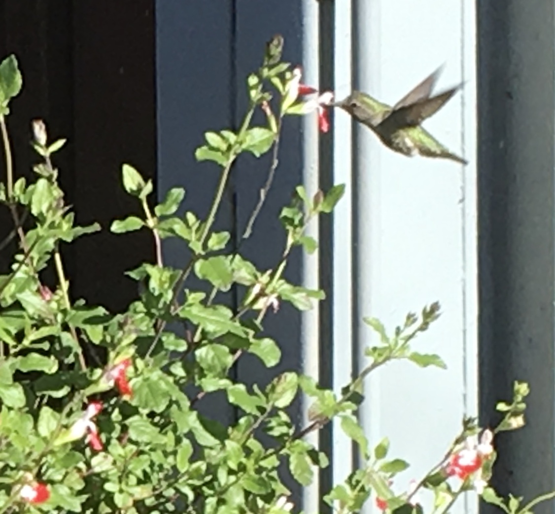
Or if I weren’t staying a good walking distance from the symposium, how would I have come across a hummingbird in the cold of February after being delighted with Sue Leopard’s Hummingbird?
Hagar is a common Nordic name. But how likely was it that Twain would use that particular name in his California mining-camp story and that Codex VII is hosting “Codex Nordica”? Mark my words it was a put-up thing.
That not one of the symposium presenters introducing us to “Codex Nordica” is named Hagar should not be held against the organizers. Their choices — Åse Eg Jørgensen (co-editor of Pist Protta, Denmark’s longest running contemporary artists’ journal), Tatjana Bergelt (multilingual, of German-Russian-Jewish culture and settled in Finland), Thomas Millroth (art historian from Malmö) — are entertaining, informative and good humoured (proof at least for the Danes that they can’t all be Hamlet or Søren Kierkegaard). What they have to say and show speaks to book art’s uncanny rhyming across geographies and times.
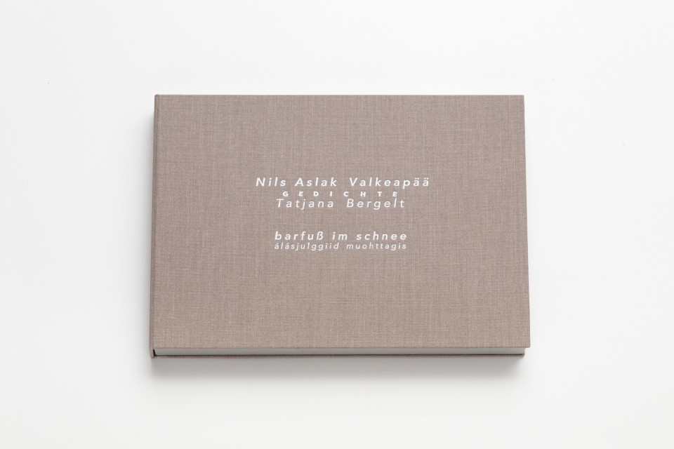
With every issue the outcome of guest editing, artists’ contributions and a mandate to be unlike any previous issue, Pist Protta is a cross between Other Books and So, the collaborative, gallery-challenging venture of Ulises Carrión in the last century, and Brad Freeman’s US-based Journal of Artists’ Books.Printed Matter has faithfully carried every issue of Pist Protta, so there is little excuse to be unaware of it and its liveliness. Fitting for someone who thinks of herself as a collage of cultures, Tatjana Bergelt’s barfuß im Schnee-álásjulggiid muohttagis (“Barefoot in the Snow”) is a photo-collage of old maps, satellite maps, poetic texts, landscapes and portraits of the Sámi, the dwindling inhabitants of the northern parts of Norway, Sweden, Finland and the Murmansk Oblast. It reminds me of UK-based Nancy Campbell’s Vantar/Missing.
Vantar/Missing (2014) Nancy Campbell Digitally printed on Munken Polar, hand-sewn binding with hand-incised design, edition of 300
Both works delve into the vulnerable and disappearance — be it culture, gender or environment. Vantar‘s cold diptychs recording the mountain snow cover and barely perceptible signs of life in the ghost town Siglufjörður chime with Bergelt’s final slide:
“From Finland barefoot in snow”, Codex VII, 4 February 2019 Tatjana Bergelt
barfuß im Schnee-álásjulggiid muohttagis (2015) Tatjana Bergelt 2 books in linen cassette, edition of 4, in each book 6 poems by Nils Aslak Valkeapää in Sámi, Finnish and German languages, translations P.Sammallahti, C.Schlosser
The bus from the symposium in Berkeley to the fair itself in Richmond is another chance for chance to play its role. One day I’m sitting next to Amanda Degener (Cave Paper), who delights in our common acquaintance with Ioana Stoian and Eric Gjerde; the next, it’s Jeanne Drewes (Library of Congress), who introduces me to Mark Dimunation (Library of Congress), who regales us and the collector Duke Collier with tales of the British artist Ken Campbell. But the terrible thing about chance is that it takes up so much time and, at the same time, shows you what you wish you had more time for.
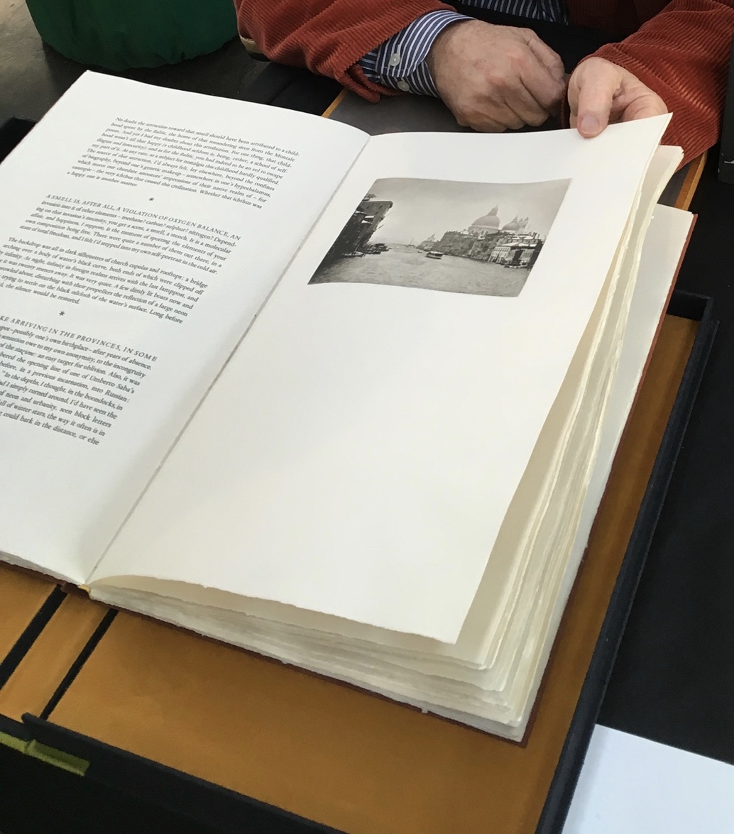
Recto: note the vaporetto in the image.Verso: think of the registration magic.The conclusion to Watermark and Koch’s homage to Aldus Manutius
Or to Russell Maret discussing his work Character Traits and Geoffroy Tory’s Champ Fleury: The Art and Science of the Proportion of the Attic or Ancient Roman Letters, According to the Human Body and Face (1529):
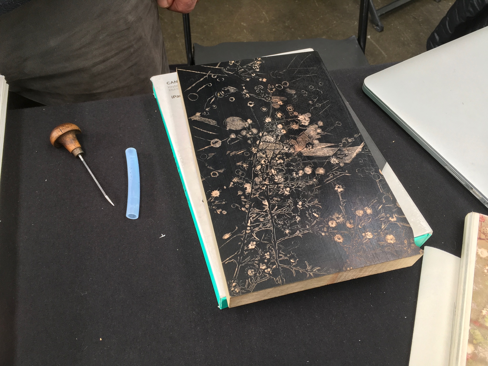
Or to Gaylord Schanilec (Midnight Paper Sales) enjoying his work on a woodblock:
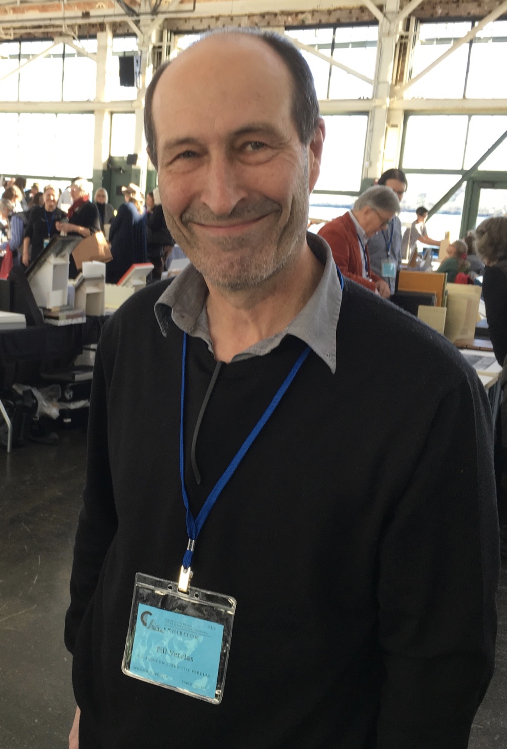
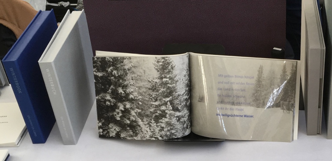
Or to Till Verclas (Un Anno Un Libro) explaining how his children helped achieve the effect of snow falling over Friedrich Hölderlin‘s words in Winterbuch:
Or to Sam Winston (ARC Editions) sharing his Reading Closed Books, which like Darkness Visible, sprang from his 7 Days performance in a blacked-out studio:
Sam is kind enough to introduce me to his colleagues at ARC Editions (Victoria Bean, Rick Myers and Haein Song). Individually and together, they are forces to watch. Myers’ An Excavation, which I’d had the pleasure to see previously in The Hague, can be partly experienced in these videos, and Song’s fine bindings and artist’s books must be seen. Bean’s symposium talk is on Check, her portfolio of typewriter prints featuring fifty writers, from Oscar Wilde to Joan Didion, and the checks they wore, and on Flag, the follow-up series of artist’s books that takes a writer from Check and uses colour, cloth and typewriter prints to explore an individual work by that writer.
Slide from “Flag”, Codex VII, 5 February 2019 Victoria Bean
Typewriter prints from Check by Victoria Bean
Tess (2019) Victoria Bean The red and black ribbons and white linen are drawn from images in Hardy’s Tess of the D’Urbervilles symbolizing Tess and critical events of her life and death.
Detail of Tess Victoria Bean
Detail of Tess Victoria Bean
Check and Flag illustrate that bright enjoyable thread that shows up again and again at Codex and book art at its prime — the integration of letter, image, material, form, process and subject in a way that self-consciously calls attention to them yet yields a work of art that simply is — on its own terms.
Which, if you have read “Jim Blaine and His Grandfather’s Ram”, ought to remind you that
… Parson Hagar belonged to the Western Reserve Hagars; prime family; his mother was a Watson; one of his sisters married a Wheeler; they settled in Morgan county, and he got nipped by the machinery in a carpet factory and went through in less than a quarter of a minute; his widder bought the piece of carpet that had his remains wove in, and people come a hundred mile to ‘tend the funeral. There was fourteen yards in the piece.
‘She wouldn’t let them roll him up, but planted him just so—full length. The church was middling small where they preached the funeral, and they had to let one end of the coffin stick out of the window. They didn’t bury him—they planted one end, and let him stand up, same as a monument.
With its 222 exhibitors here weaving the threads of book art and the book arts, Codex VII is a monument to enjoy. As for that old ram, you will have to read the story — and prepare for Codex VIII.
It took a long look at the development of Ioana Stoian’s work to show me the relationship of trompe l’oeil to book art — and to appreciate how an artist can invent herself.
Stoian’s apprenticeship as an artist began with the decorative arts in 2004 in Lower Normandy, France, and has taken her to New York (MoMA), Cologne, Vienna, Salzburg, Minneapolis, Ostende (Belgium), Kadoide (Japan), Amsterdam (the Stedlijk) and, as of 2015, back to Minneapolis, where she is a Jerome Foundation fellow at the Minnesota Center for the Book Arts.
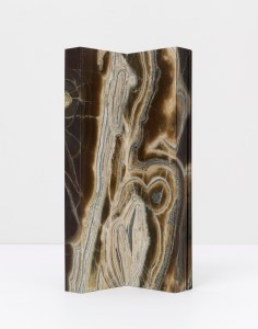
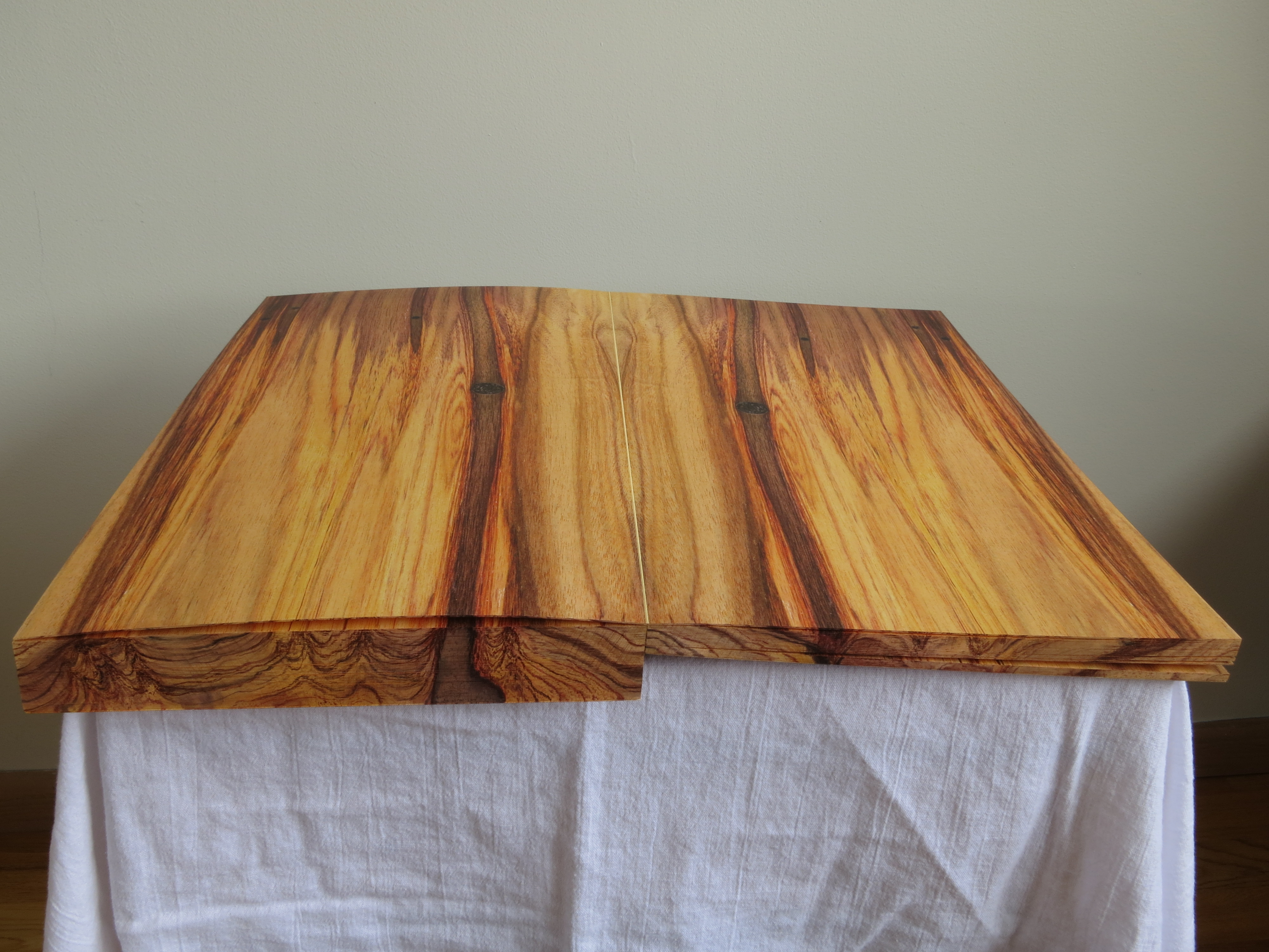
Stoian’s time as an assistant artist with the Scottish painter Lucy McKenzie, starting in 2008, honed her skills in deceiving the eye with faux woodgrain and faux marbling. For example, see McKenzie’s 2008 installation at MoMA, 2009 installation at the Ludwig (Cologne), 2011 installation at the Galerie Buchholz and 2013 installation at the Stedelijk. One may wonder whether Daniel Buchholz’s roots in antiquarian books or the Stedelijk’s in artists’ books prepared the ground for Stoian’s artistic direction toward book art and paper art, but book art and trompe l’oeil joined spectacularly in 2014 when Stoian had the chance to work with Tauba Auerbach in 2014 on the completion of Auerbach’s Wood and Bent Onyx. Stoian handpainted the fore, top and bottom edges of the book blocks in watercolor pencil and paints to match the color and grain of the prints of wood and marble digitally offset on pages of Mohawk superfine paper. As a technique, fore edge painting dates to the 16th century, and the “vanishing” variety, where the painting appears only when the pages are pressed and fanned out, dates to the 17th century. Over time, a standard type of press developed to hold the “canvas” of page edges evenly fanned to accept the painting.
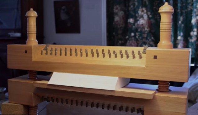
Stephen Bowers’ fore-edge painting on a copy of A Narrative of a Survey of the Inter-tropical and Western Coasts of Australia by Phillip Parker King, son of the third governor of New South Wales Still from “Fantastically Fast Fore-edge Painting by Stephen Bowers“ Friends of the State Library of Australia, 18 February 2013
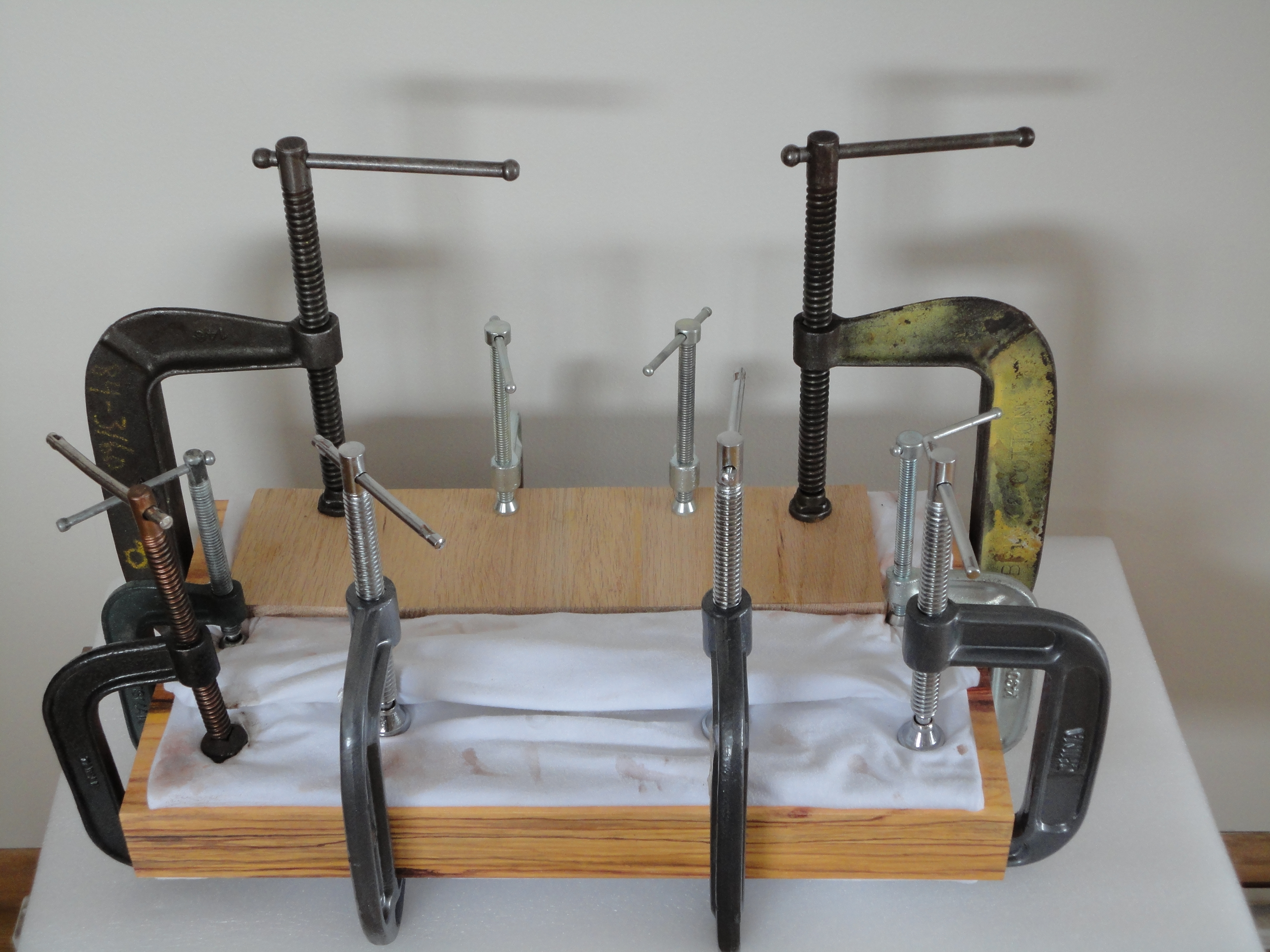
Despite this established history of fore-edge painting, Stoian had to fall back on a mastery and technique that come from her apprenticeship work, inventiveness and meticulousness. These books were very heavy and the pages were very thick …. There was absolutely no way to fan the pages. I went through the book, page by page, and made marks of where the wood/ marble veins were located.
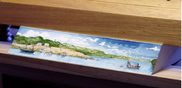
Before Stoian started work on Wood
Then I clamped the book so that water wouldn’t seep in and using my ‘map’, I recreated the wood/ marble. As you can imagine, it was challenging to match the inside spreads. I had to constantly unclamp, verify that I was matching the spreads, re-clamp, paint, wait…
I used both watercolour pencils and paints. Needless to say, it’s very hard to erase watercolour without using lots of water and saturating the page. I had to be careful with every single brush stroke I made.
Finished
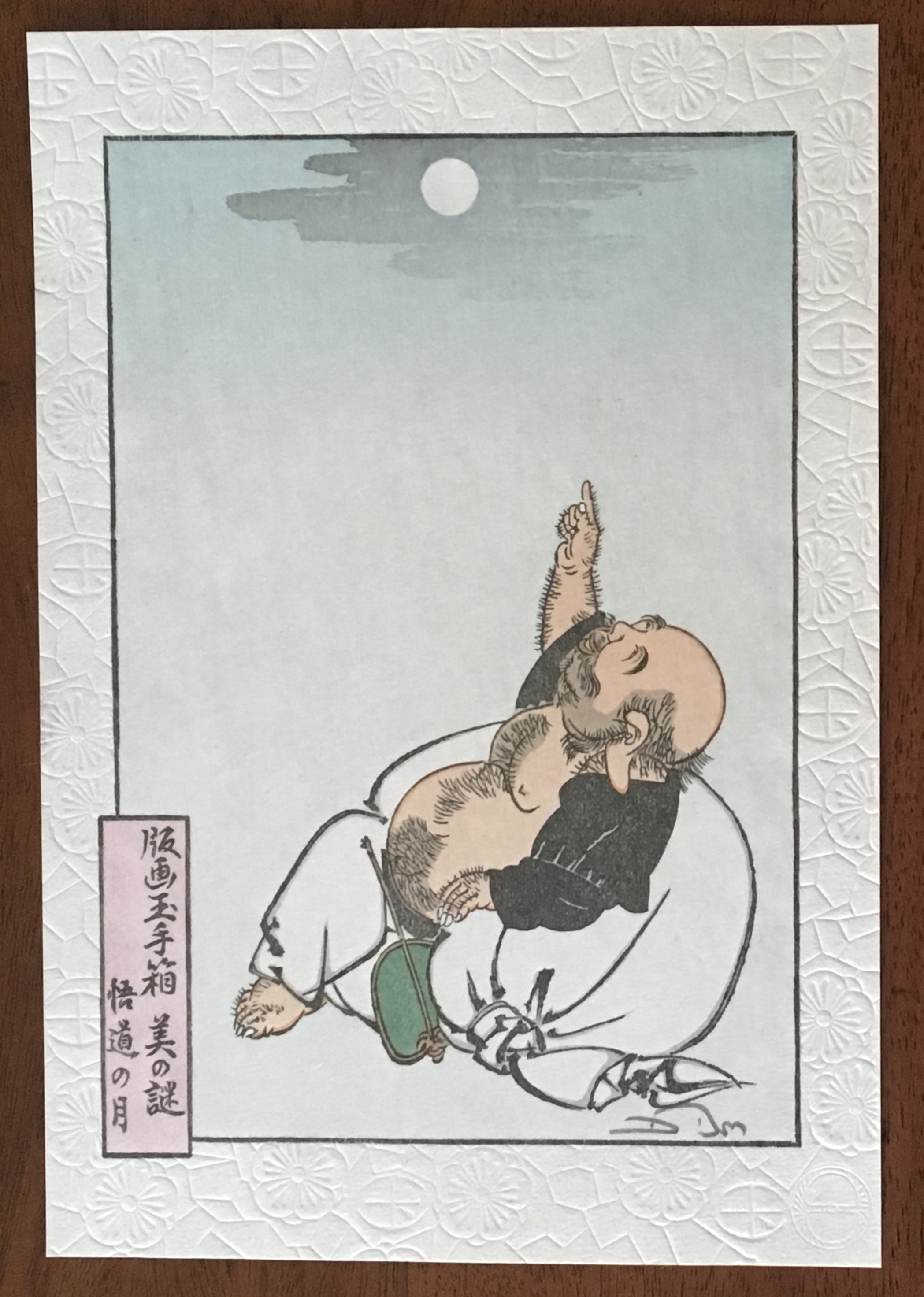
There is something Zen-like about trompe l’oeil in the attentiveness to detail, to material, to execution. But there is more. To mangle a Zen saying: Trompe l’oeil is more than a pointing at the moon; those who gaze only at the pointing will never see beyond — never see the beauty of the moon, never see the beauty of the pointing. With the best of trompe l’oeil, that moment in which the eye is fooled recurs again and again for the attentive viewer. In its recurrence, the work of art alternates between the self-referential (the mind drawn to the pointing) and the mimetic (the mind drawn to the pointed at).
Moon of Enlightenment (2010) David Bull From a design by Tsukioka Yoshitoshi (1839-92) in his series “One Hundred Aspects of the Moon”. The Zen saying is “All instruction is but a finger pointing to the moon; and those whose gaze is fixed upon the pointer will never see beyond. Even let him catch sight of the moon, and still he cannot see its beauty.”
So it is not surprising that Stoian has “always been interested in Japanese art and culture”. As early as 2008, origami appears in her commercial decorative work. She is the author of two books: Origami for All with her partner Eric Gjerde (2013) and The Origami Garden (2016). In reviewing both books for The Fold , Jane Rosemarin commented:
… as I paged through her first book, “Origami for All,” I eventually began to understand that Stoian is an artist who has chosen origami as her medium. Her work is not hard to fold, but it has a consistency of style and a real beauty.
Recognized not only for their origami, Stoian and Gjerde were invited in 2013 to exhibit their paper art at the prestigious Salon des Artisans et Métiers d’Art, held at La Propriété Caillebotte in the village of Yerres outside Paris. While Gjerde’s folds explicitly explore the mathematical (for example, Voronoi tessellations and hyperbolic paraboloids), Stoian’s explore shapes more suggestive of the oriental: cranes and flowers as in Strelizia (2010).
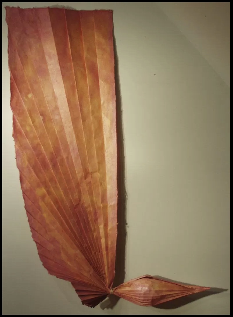
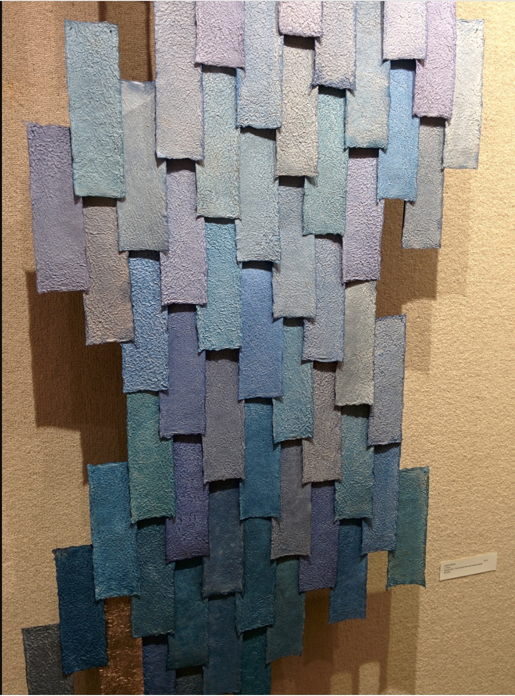
Strelizia (2010) Ioana Stoian Pigment on handmade flax and abaca paper 165cm x 59cm Strelizia (Strelitzia reginae) is a South African plant, known as the “bird of paradise” or “crane” flower.
Where Gjerde’s interest in his material has led him to bio-art (paper grown from bacterial cellulose), Stoian’s has hewed to traditional papermaking, which figures consistently in her work: for example, Hidden Within (2010). In 2012, that interest in traditional
Hidden Within (2010) Ioana Stoian Hand-made flax and abaca paper 1.3m x 1.3m
western papermaking had turned eastward:
After discovering western papermaking, I became fascinated with thin, strong sheets, which obviously led me to washi – the Japanese paper made from mulberry. I naturally had the desire to go to Japan and see how this paper was made.
It so happens that a friend of mine, Tomoko Fuse (a very talented and well-known female origami artist and perhaps the most published origami author in the world), was at a paper folding event in France. I casually mentioned that I wanted to go to Japan to learn papermaking. Next thing I know, she had very kindly organised for me to spend a month with Yasuo Kobayashi, master paper maker and owner of Kadoide Washi – an offer I could not refuse.
I spent a magical month in the mountains, during the Kozo harvest (December) and had an amazing time learning from a great master.
Yasuo Kobayashi is a fifth-generation papermaker but also a writer and philosopher, whose unique views on papermaking warranted his inclusion in the American Folklore Society’s sponsored report on apprenticeship and papermaking. Yasuo Kobayashi told the report’s author, Aimee Lee: “I wanted the kozo to tell me what kind of paper it wants to become, not to force it to be what I want. This is not typical for papermakers. I want kozo to be my teacher.” When asked to elaborate,
… Kobayashi compared bunka (culture) and bunmei (civilization). “Bunka is what you think from your heart.” In contrast, bunmei’s goal is to develop constantly, exemplified by the western desire for progress: people do not want today and tomorrow to be the same—they want things to be less difficult and more convenient. This mindset cannot translate to making real paper. His grandfather’s and father’s lives were not very different. His father’s and his lives were a little different. But his son’s and his lives are so different that it is hard to relate across that rift. He sees two roots for the future of paper: growers and makers. Real kozo goes with the heart but is inconvenient and does not follow progress. Kigami [paper] comes from the root “to be born,” and this word also relates to breathing. When born, paper is like a child: weak, but growing stronger over time until it dies. He knows that his point of view is rare, but also said people must balance bunka and bunmei, rather than to go absolutely one way or another. Today, the balance is too heavy on the professional side, so he tries to balance this by leaning towards the growing side.
Stoian’s jump at the chance to learn from him is consonant with her “journeyman’s” approach to her artistic development. Note that the visit to Kadoide Washi precedes the work on Wood and Bent Onyx for Tauba Auerbach in 2014. The methodical diligence required in making washi and the resulting appreciation of the properties of paper re-present themselves in Stoian’s mapping of the grain and perceiving what the works and the paper “wanted”. The impressive fore-edge work with Wood and Bent Onyx now seems inevitable, rising from a combination of technique and deep appreciation of color, material, form and structure in the service of illusion. In her own work, Stoian strives toward bunka, which is evident in works like Strelizia and Hidden Within, where the form and color her handmade paper takes combine to convey feeling — or “heart” as Kobayashi might put it. Her aim has become even clearer during the Jerome Foundation stage of her “journeyman’s” journey.
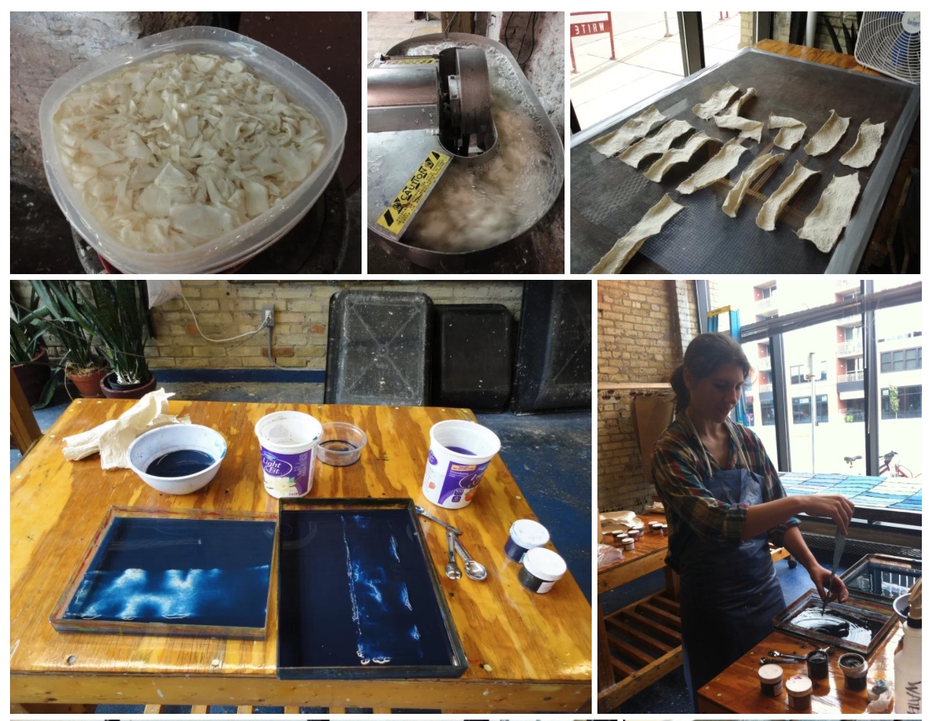
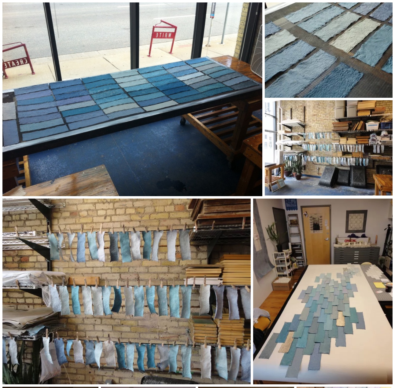
Stoian received the Jerome Foundation Mentorship grant for 2014/15 at the Minnesota Center for Book Arts to create an artist book — an extraordinary artist book. The mentorship program offers emerging artists the resources to create a book, fusing together newly acquired skills with aspects of their own artistic practice. The grant provided one year of 24-hour access to the Center’s facilities, a mentor, and a series of introductory workshops on paper making, letterpress printing, and book binding.
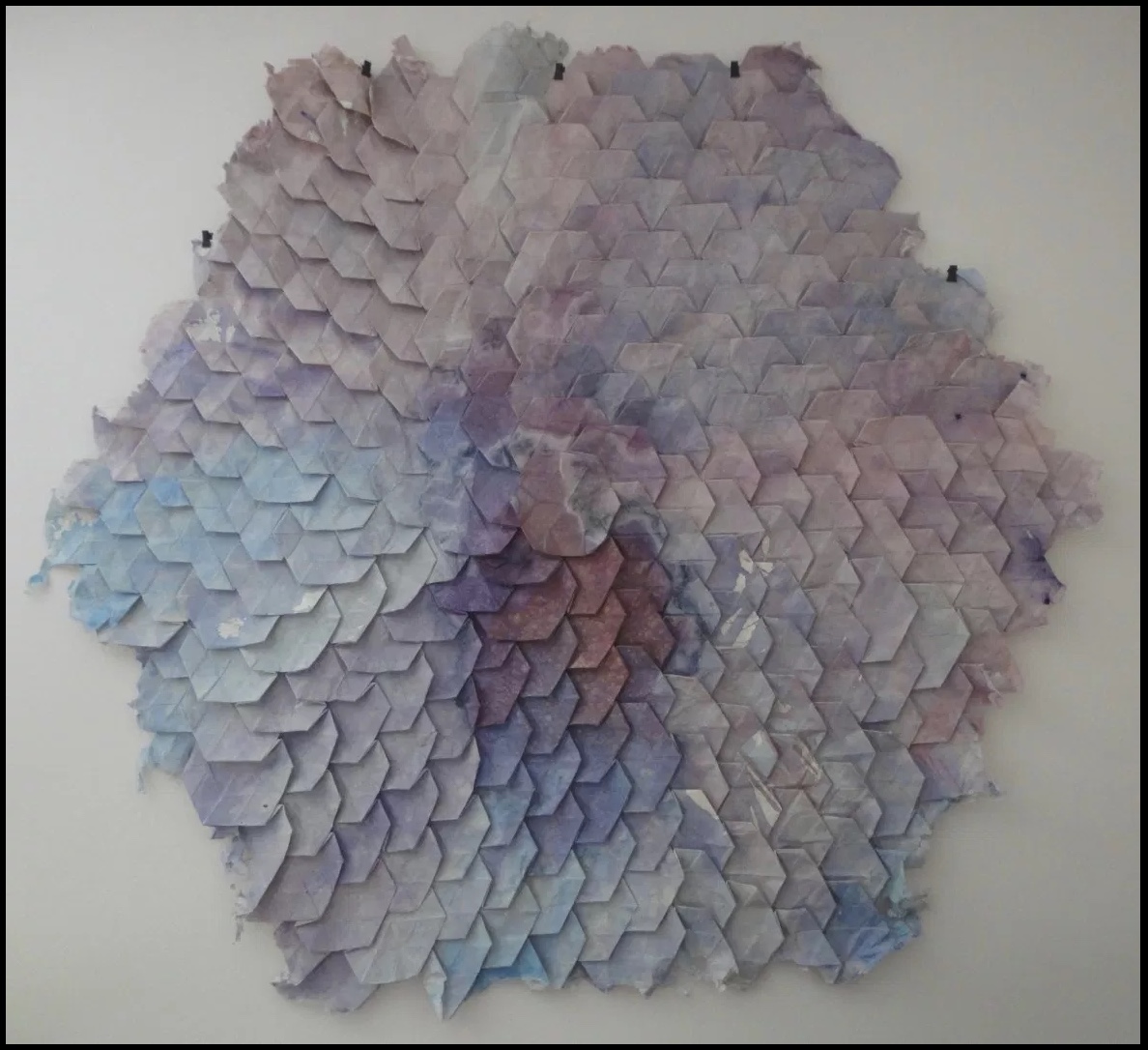
Responding to her new wintry environment, Stoian embarked on l’hiver (2014), a new work consisting of 80+ individually hand-made and dyed pieces of paper. L’hiver is reminiscent of Hidden Within (2010) in its pursuit of a harmony of color, structure, and form. The former is perhaps more open than the latter and lets each part’s snowflake-like uniqueness assert itself.
l’hiver (2104) Ioana Stoian Hand dyed, handmade flax and abaca paper 3m x 1m
The congruence and continuity of those two works do nothing to prepare the viewer for Nous Sommes (2015), the artist’s book that follows them. While Nous Sommes continues Stoian’s aim of harmony among color, structure and form, while its intensity of colors harks back to the stencil work for Lucy McKenzie’s Stedelijk exhibition in 2013, the structure and form Stoian chose marks a bold departure.
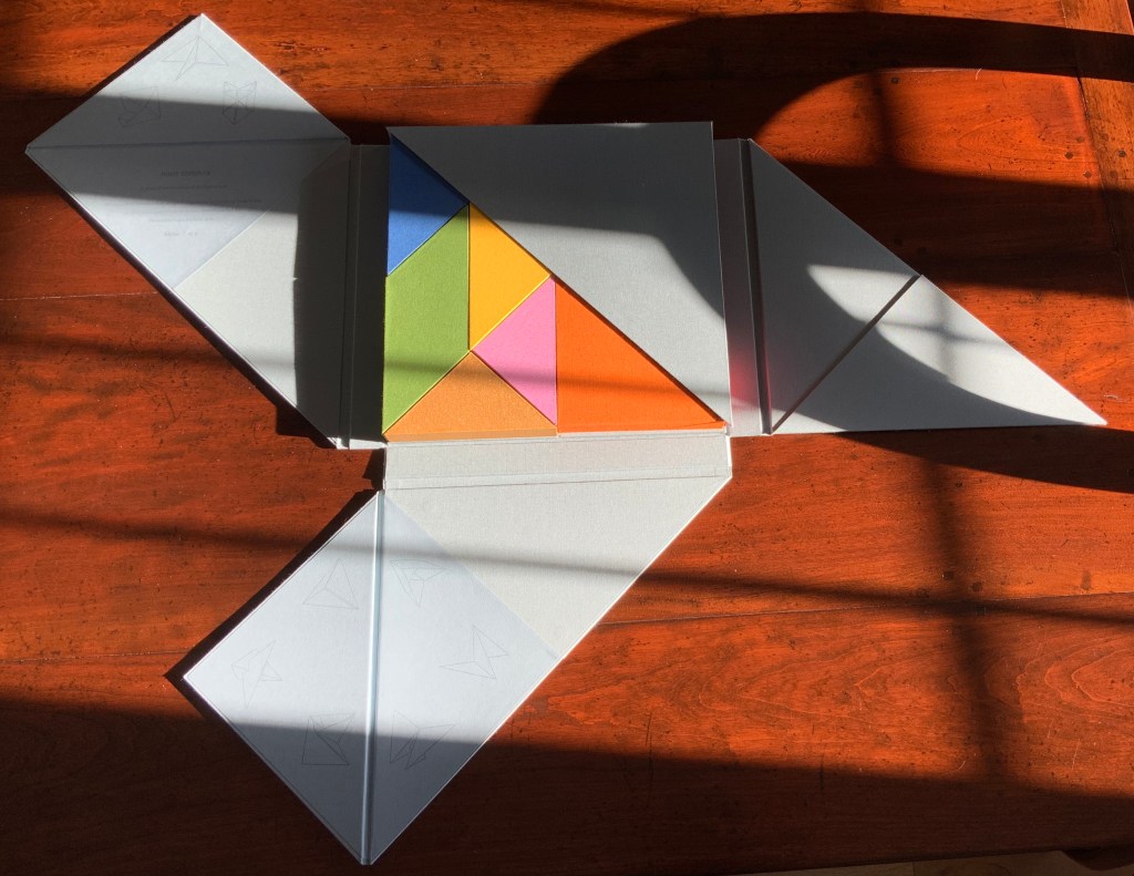
The cover and binding of Nous Sommes has the feel of a Solander box. The book opens in a particular order of lifting the triangular flaps, one of which displays the “Table of Contents” and another the colophon.
Nous Sommes (2015) Ioana Stoian
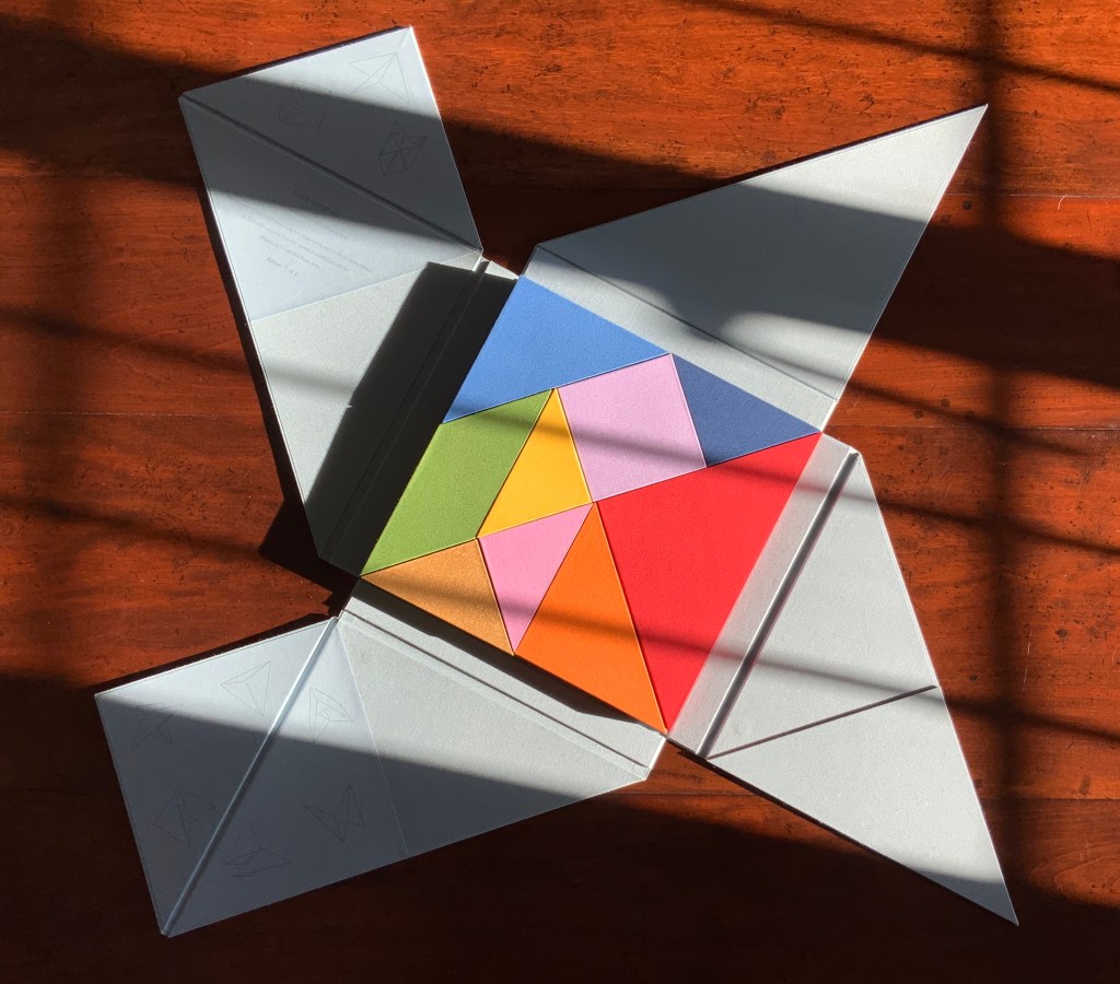
Nous Sommes has nine “chapters” or differently sized, shaped and colored slipcases whose material matches that of the cover and binding. The chapters fit precisely together (tangram-like), but the order of their reading lies with the reader’s choice of color, shape or size. The video provided by Stoian and Gjerde offers one of many readings of the work.
Nous Sommes (2015) Ioana Stoian
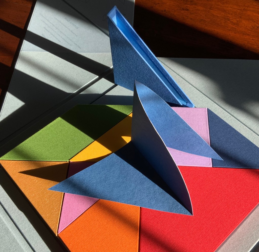
Empty “chapters” Nous Sommes (2015) Ioana Stoian
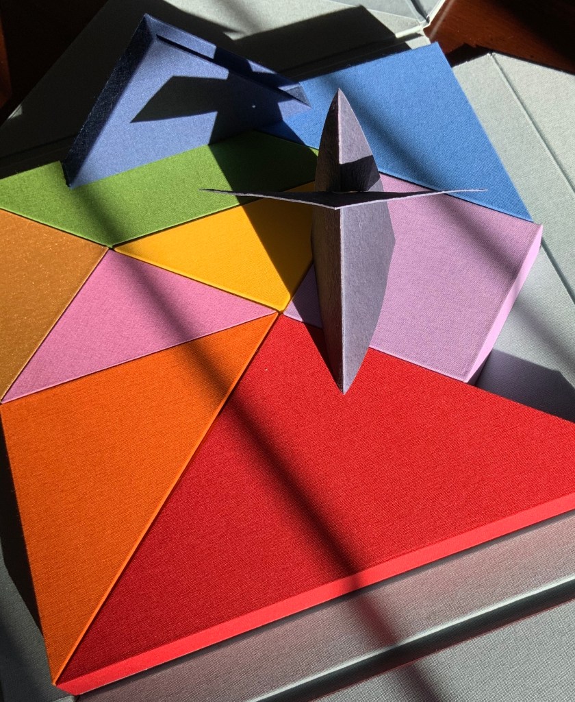
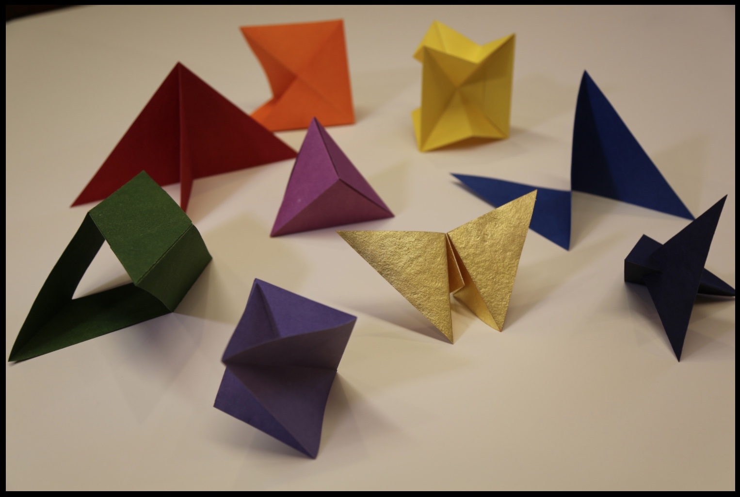
Within each chapter is a precisely fitted paper structure to be “read” by unfolding, positioning, displaying, contemplating and, in conclusion, returning it to its chapter/slipcase.
“Contents” of nine chapters/slipcases Nous Sommes (2015) Ioana Stoian
Commenting on Strelizia, shown earlier, Stoian writes,
I am interested in intuitive color experiments; this work represents the flow from mood to colour, with the final form of the paper manifesting itself from these captured emotions.
In Kandinsky’s footsteps, perhaps, this artist finds and aims to offer the spiritual in art. The title Nous Sommes suggests so. Whether the expression “we are” applies to the art object (self-referentially) or to its audience (individually or collectively), form, structure and colors assert community, inclusion and a fitting together.
We can look forward to Stoian’s next chapter as she has received a follow-on appointment from the Minnesota Center for the Book Arts: the 2017/18 Jerome Foundation Fellowship.