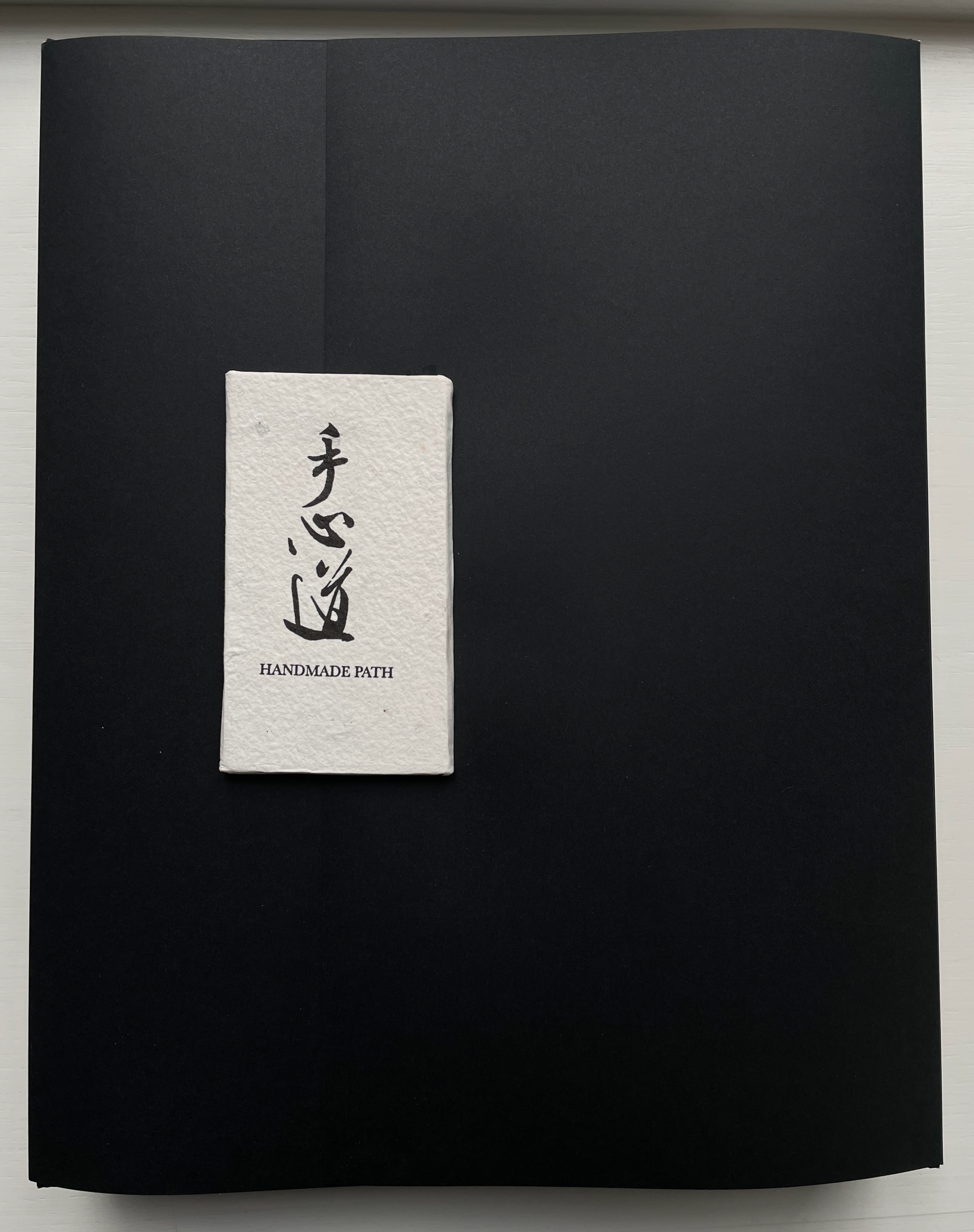
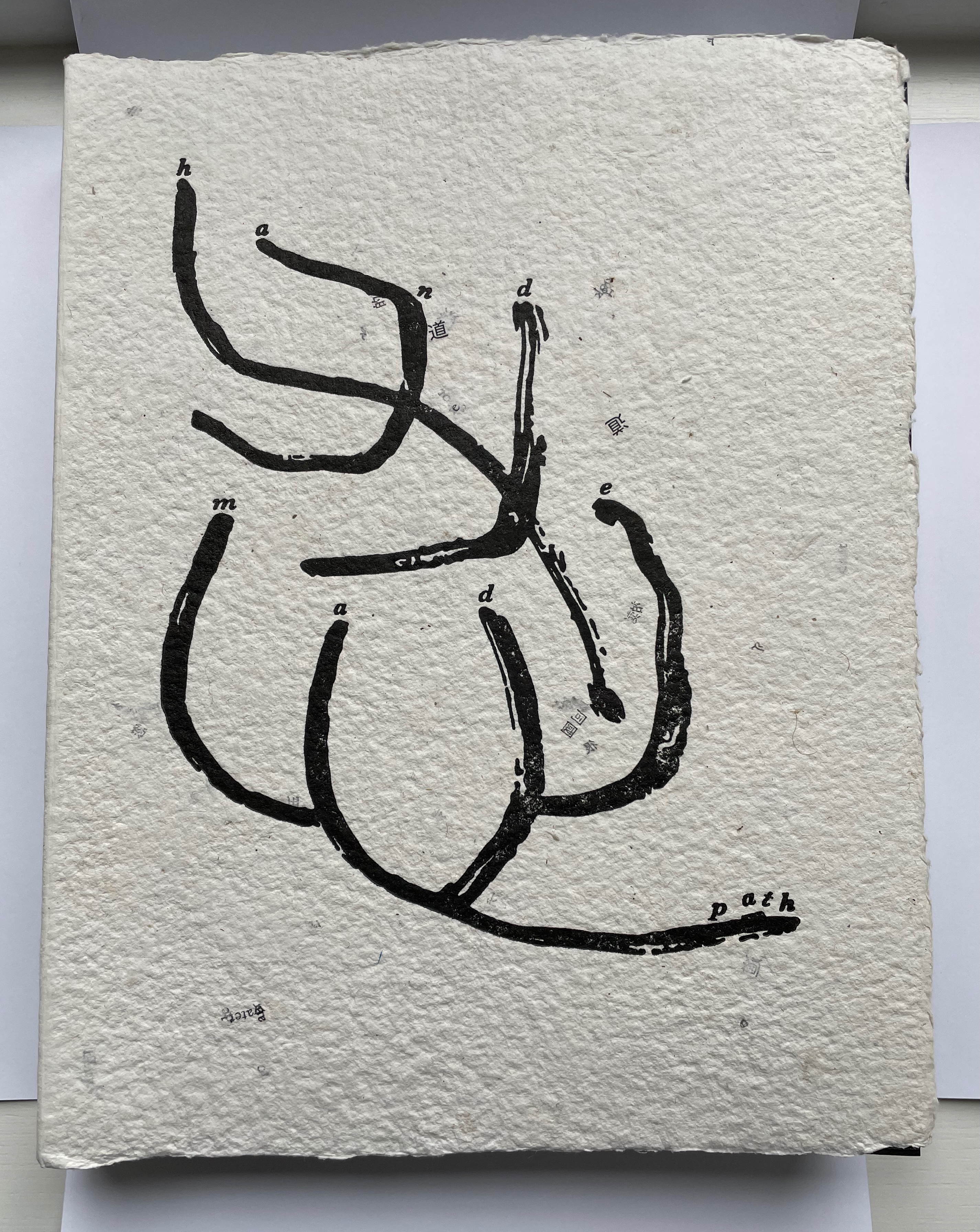
Handmade Path (2021) Lu Jingren, Amanda Degener, and Peng Wu Black-inked card wrapper with magnetic closure. Handbound, handsewn, handmade paper cover book. H285 x W220 x D40 mm. 268pages. Edition of 350, of which this is #152. Acquired from Amanda Degener, 5 December 2022. Photos: Books On Books.
Handmade Path presents 57 artists of paper and book who responded to 6 questions circulated by the editors. The editors asked the artists to provide handwritten replies to the questions as well as images of both their work and of their hands.
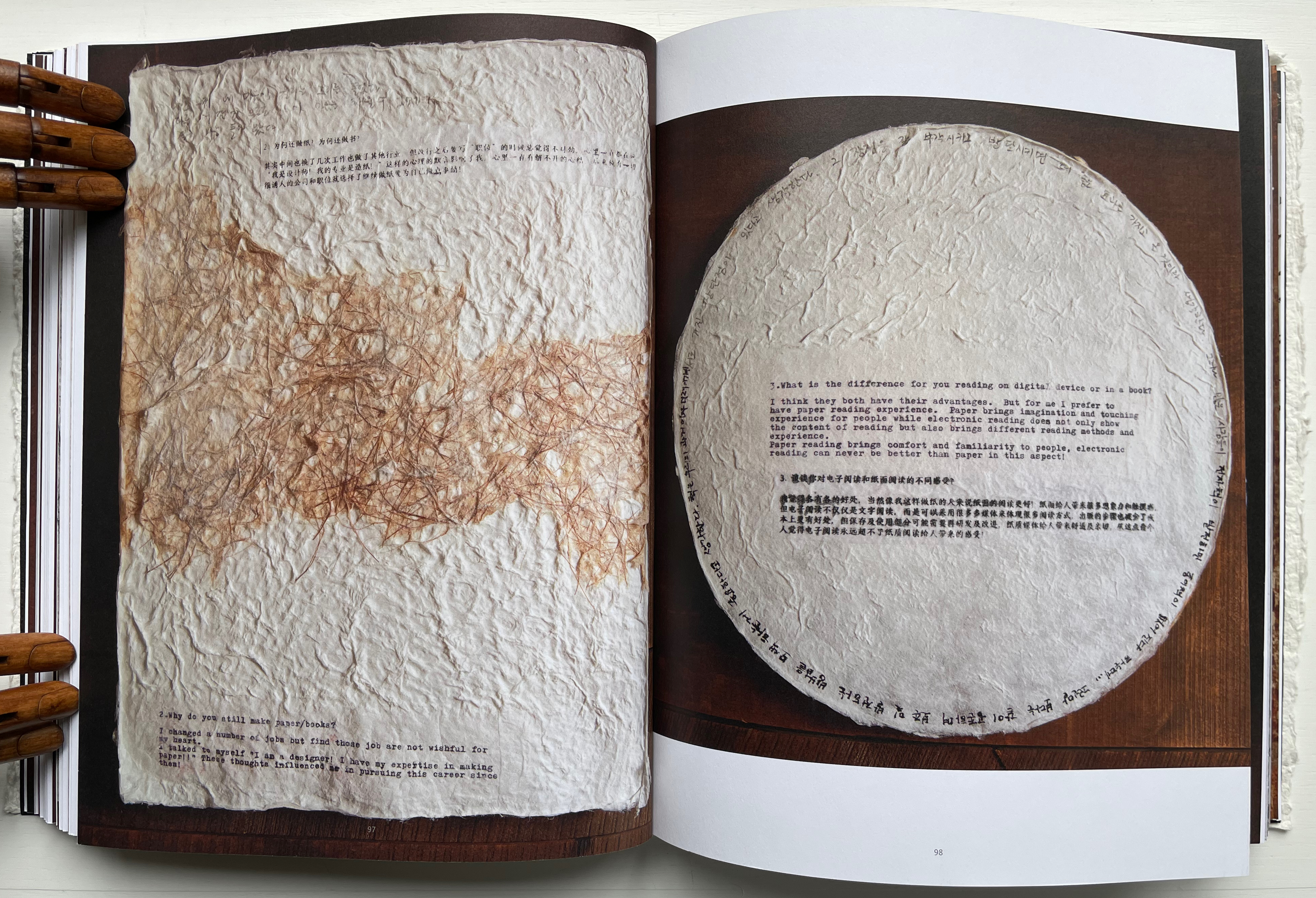
How did you begin your practice?
Why do you still make paper / books?
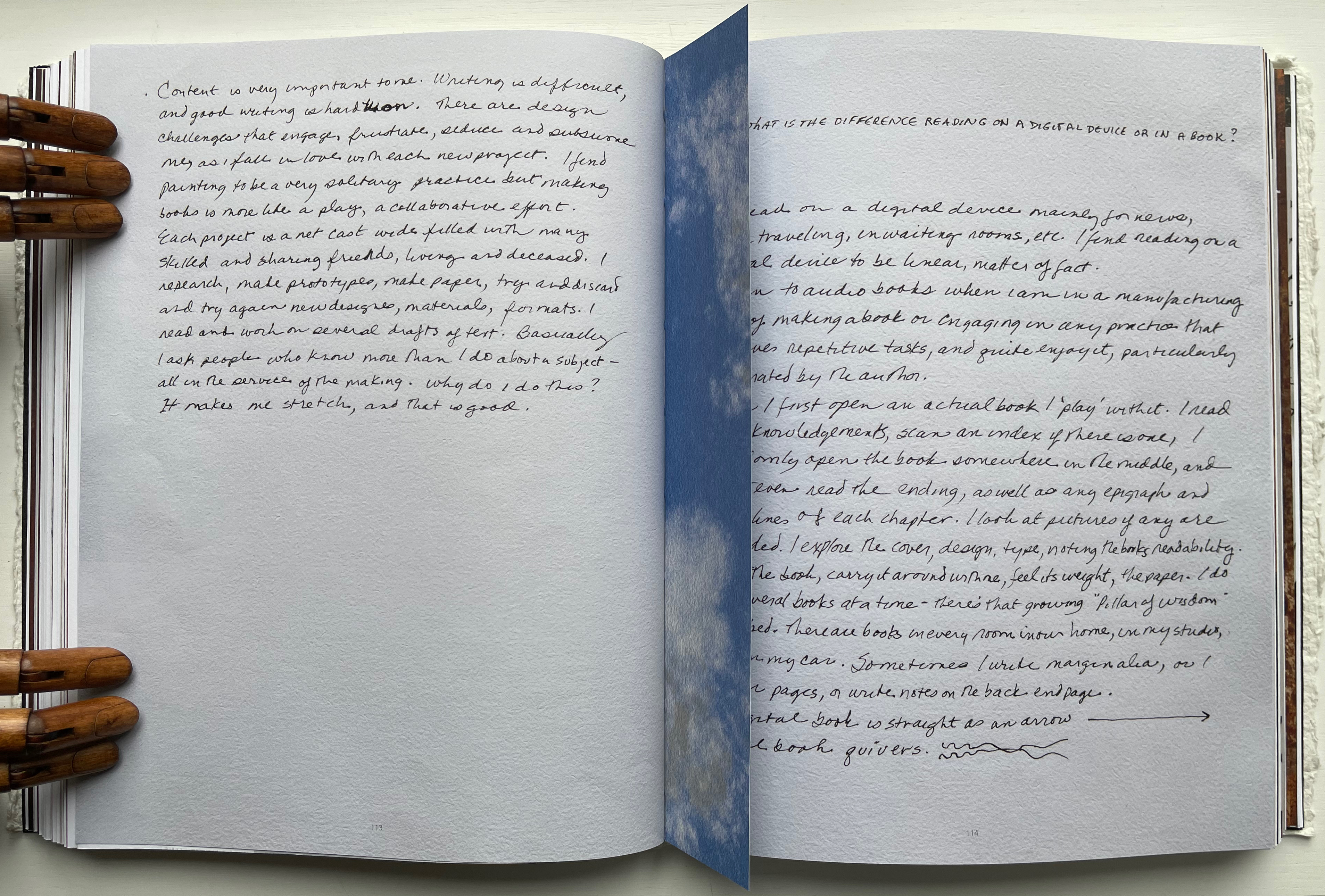
What is the difference for you reading on digital device or in a book?
In what way do you understand the 5 senses of paper/book: vision, touch, hearing, smelling, tasting?
Share with us some moments; eitherbreakthroughs or break downs in your work?
What is your next dream project?
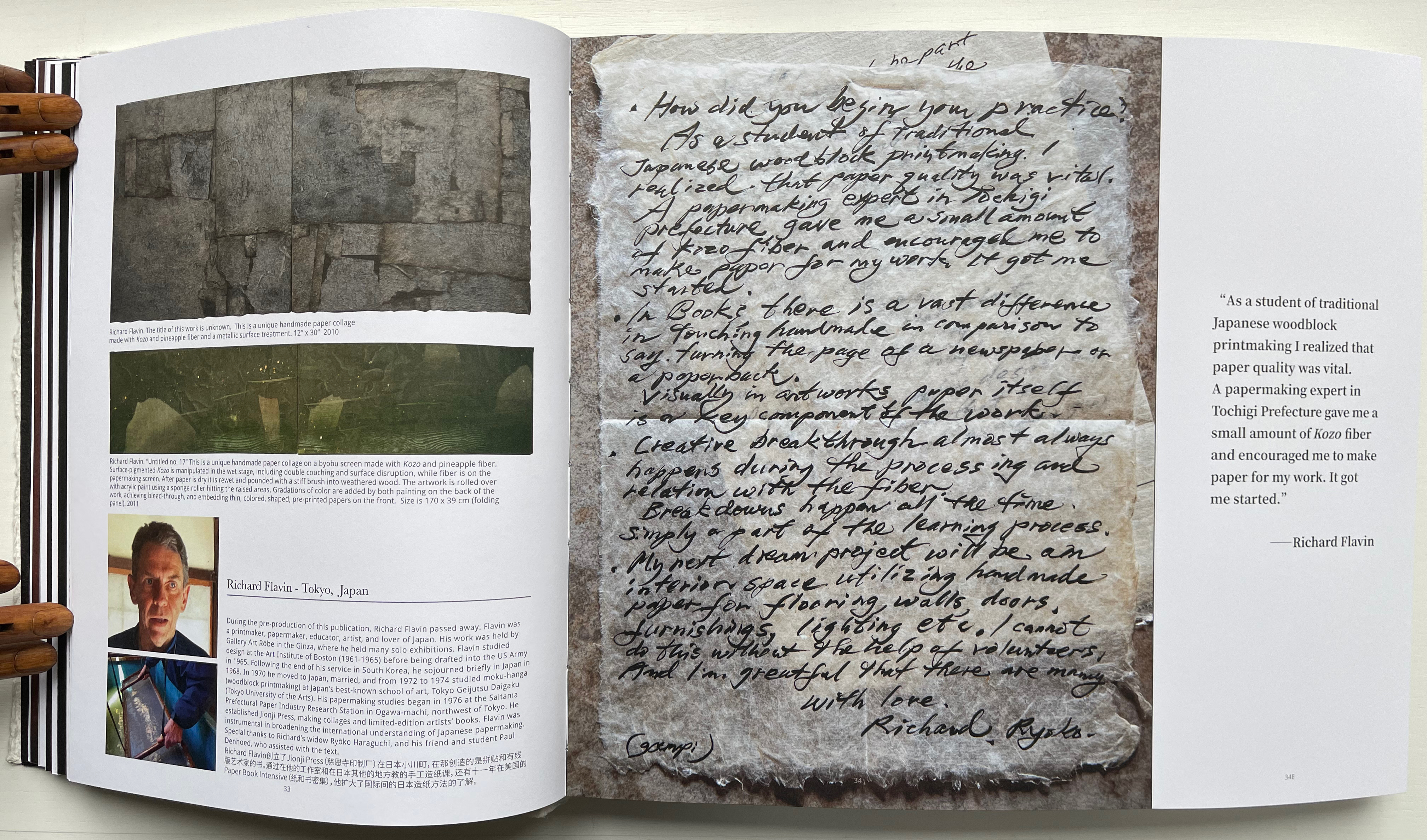
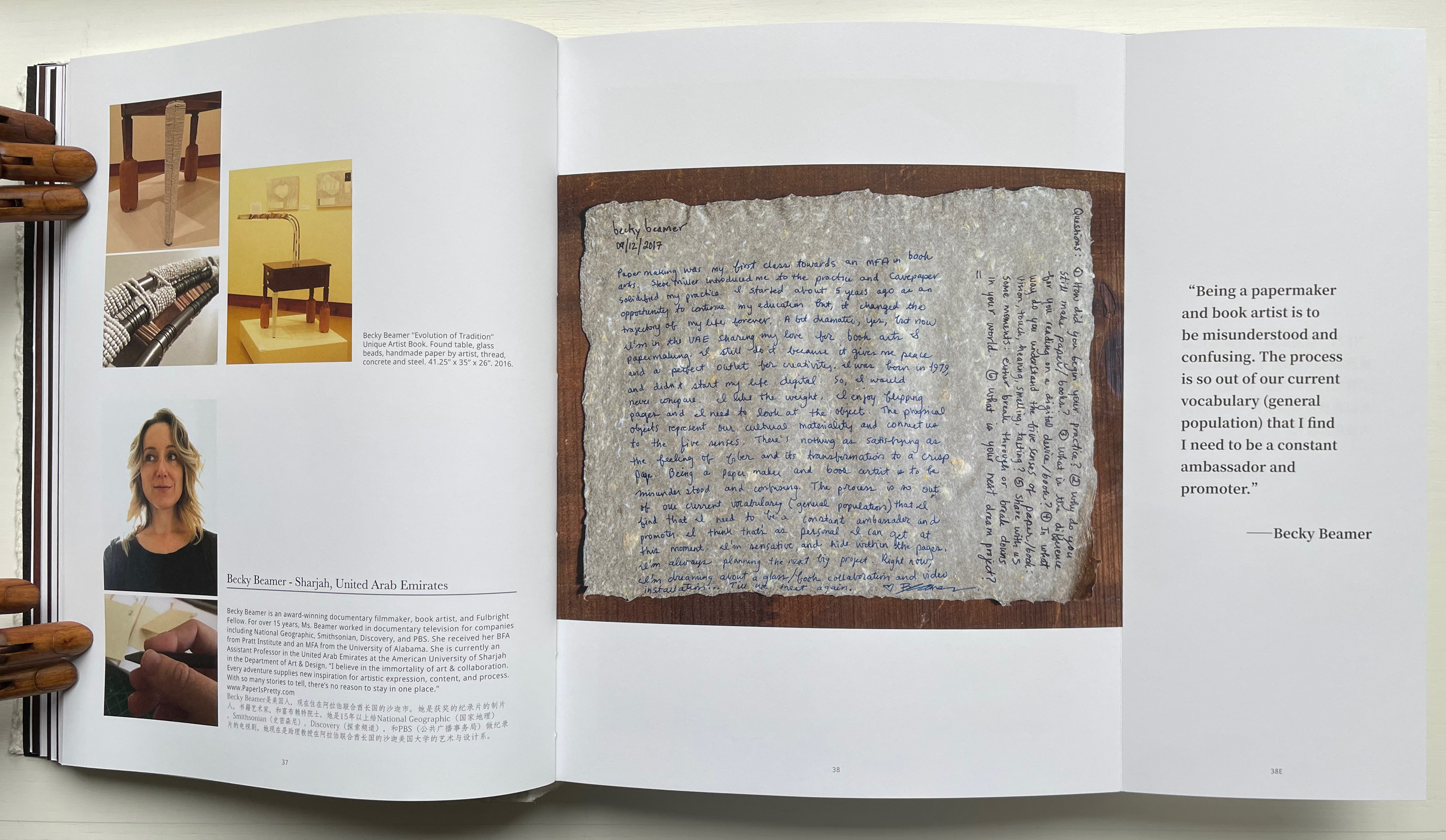
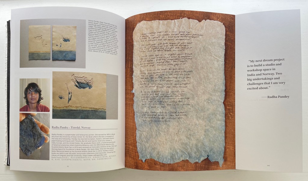
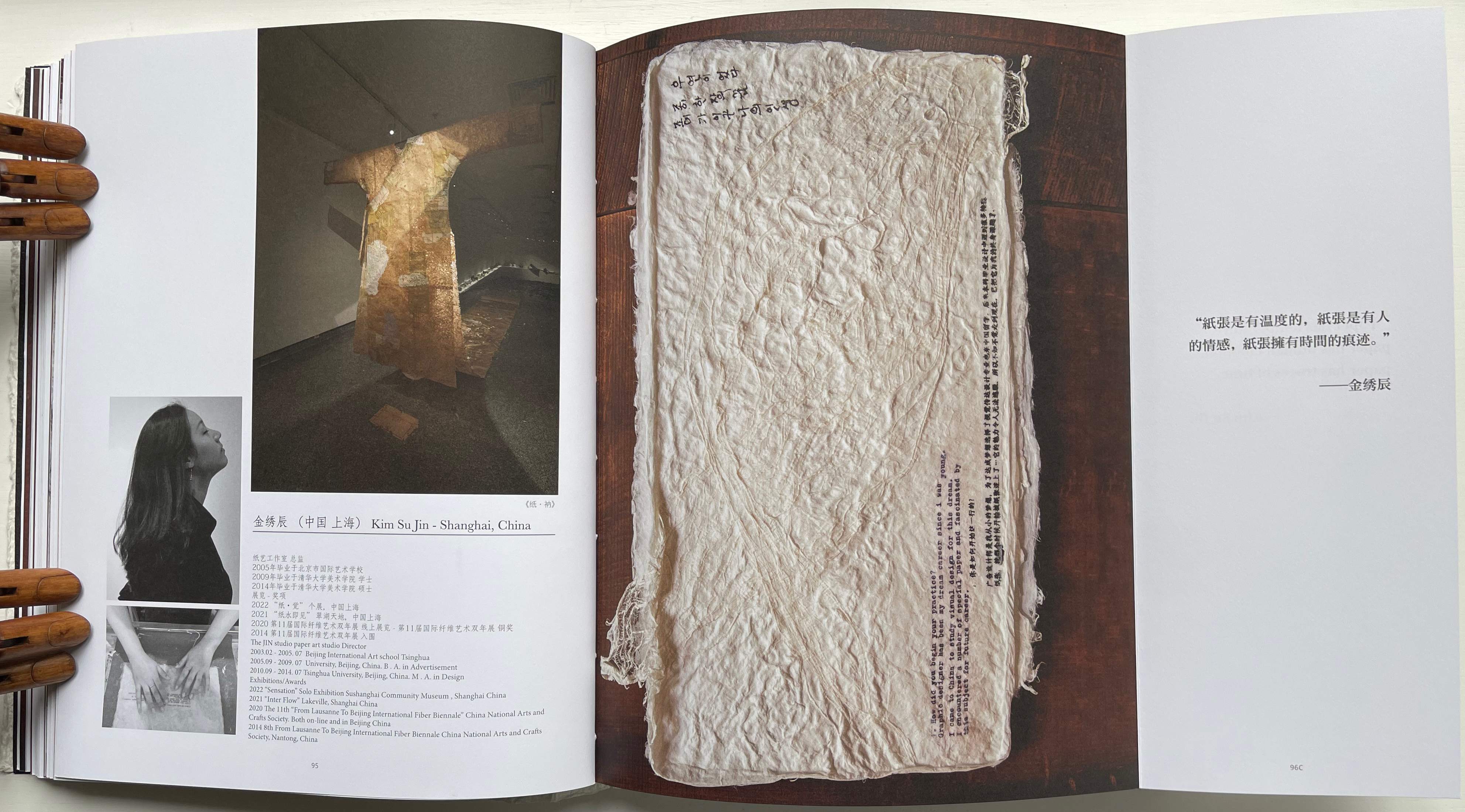
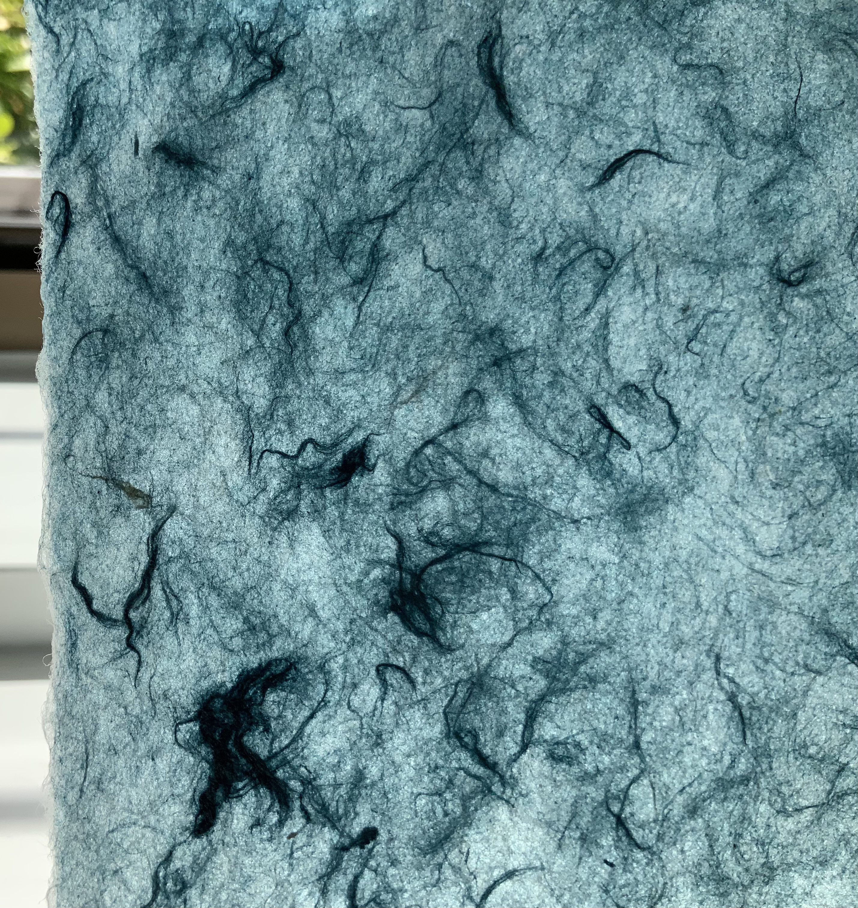
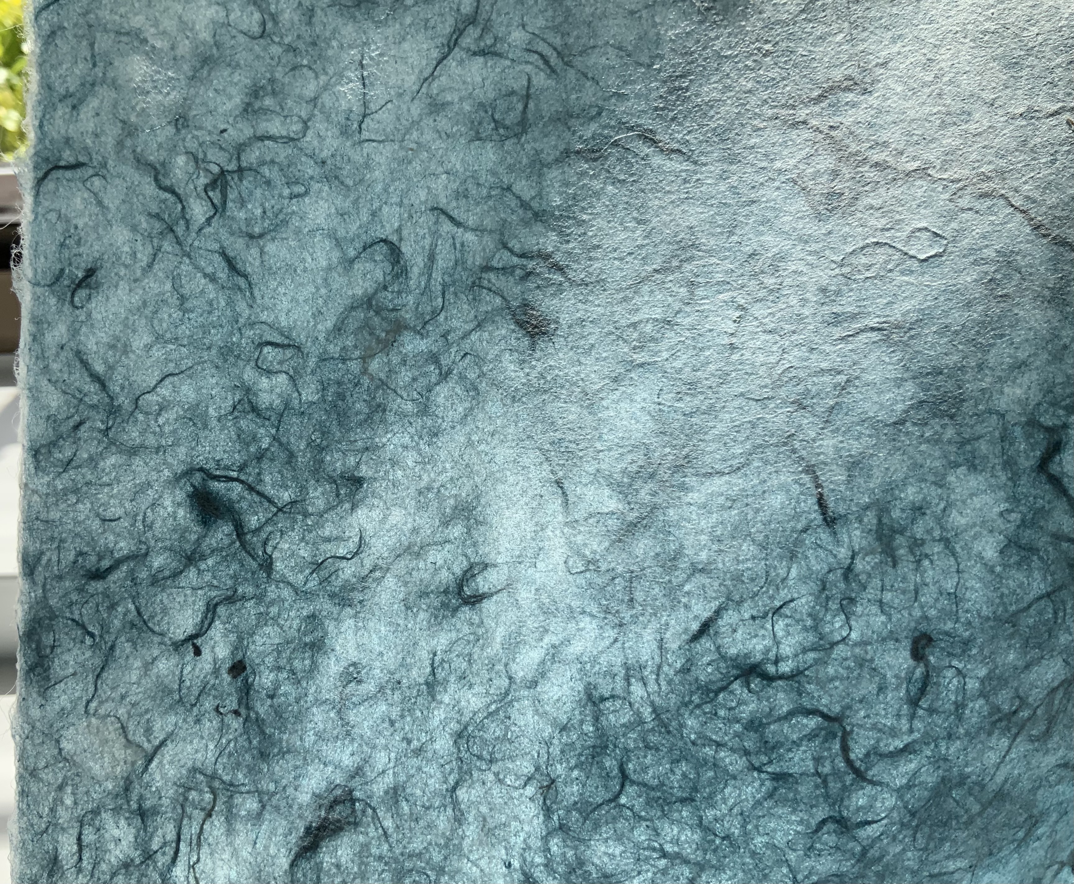
Not all of the respondents replied in handwriting, but many sent their replies on material that reflected their work. The late Richard Flavin’s contribution arrived on gampi paper. Becky Beamer inked her reply on a gray handmade sheet. Radha Pandey’s came on indigo tinted handmade paper.
Richard Flavin
Becky Beamer
Radha Pandey
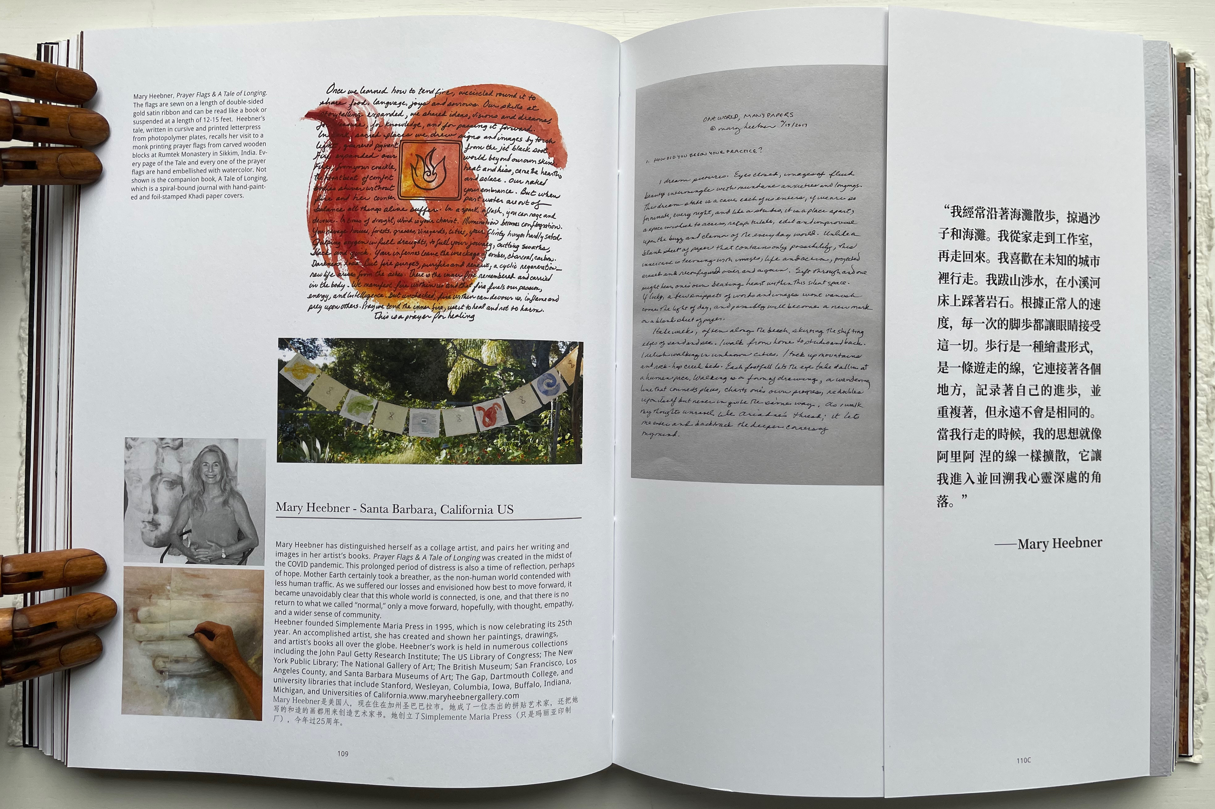
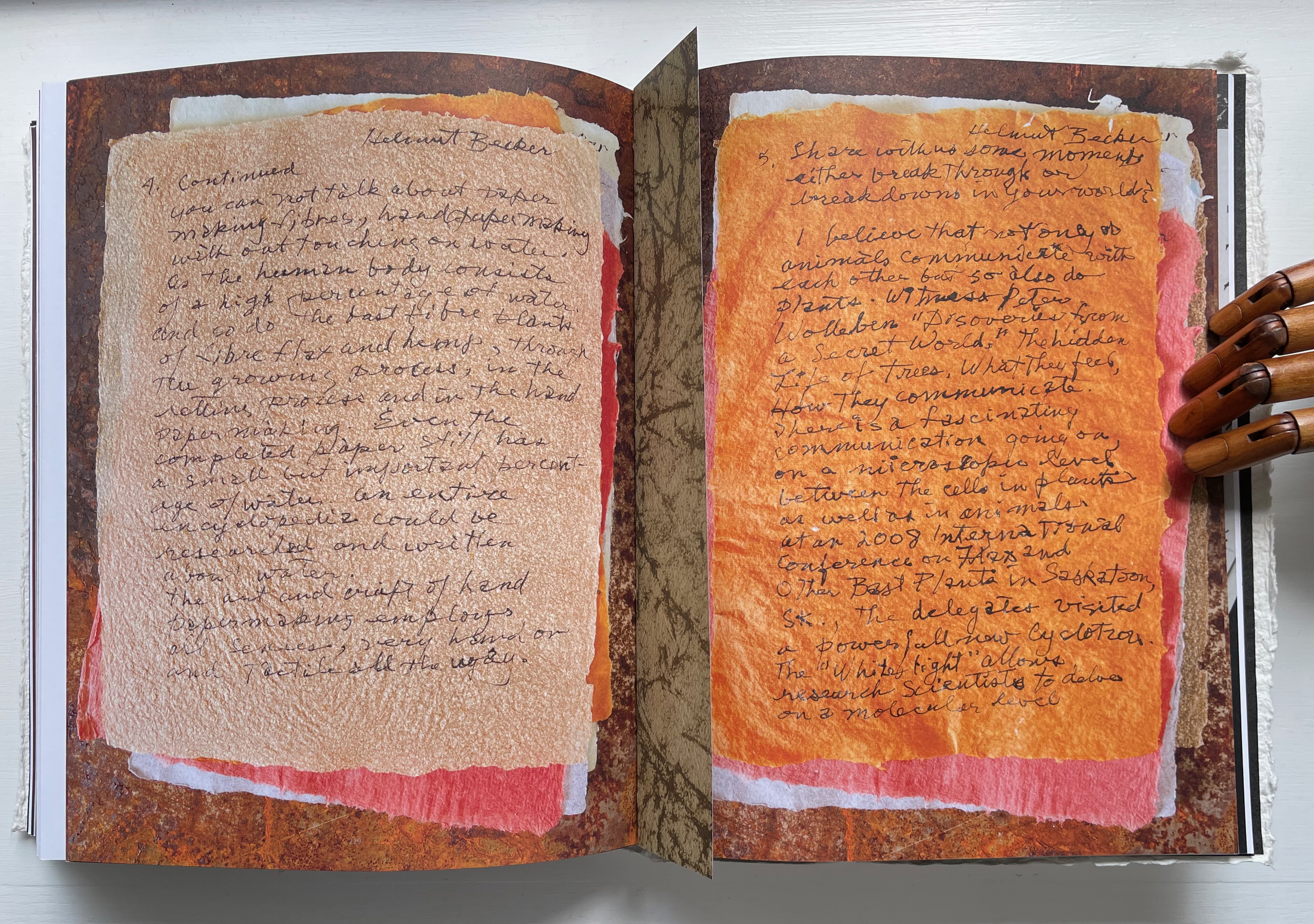
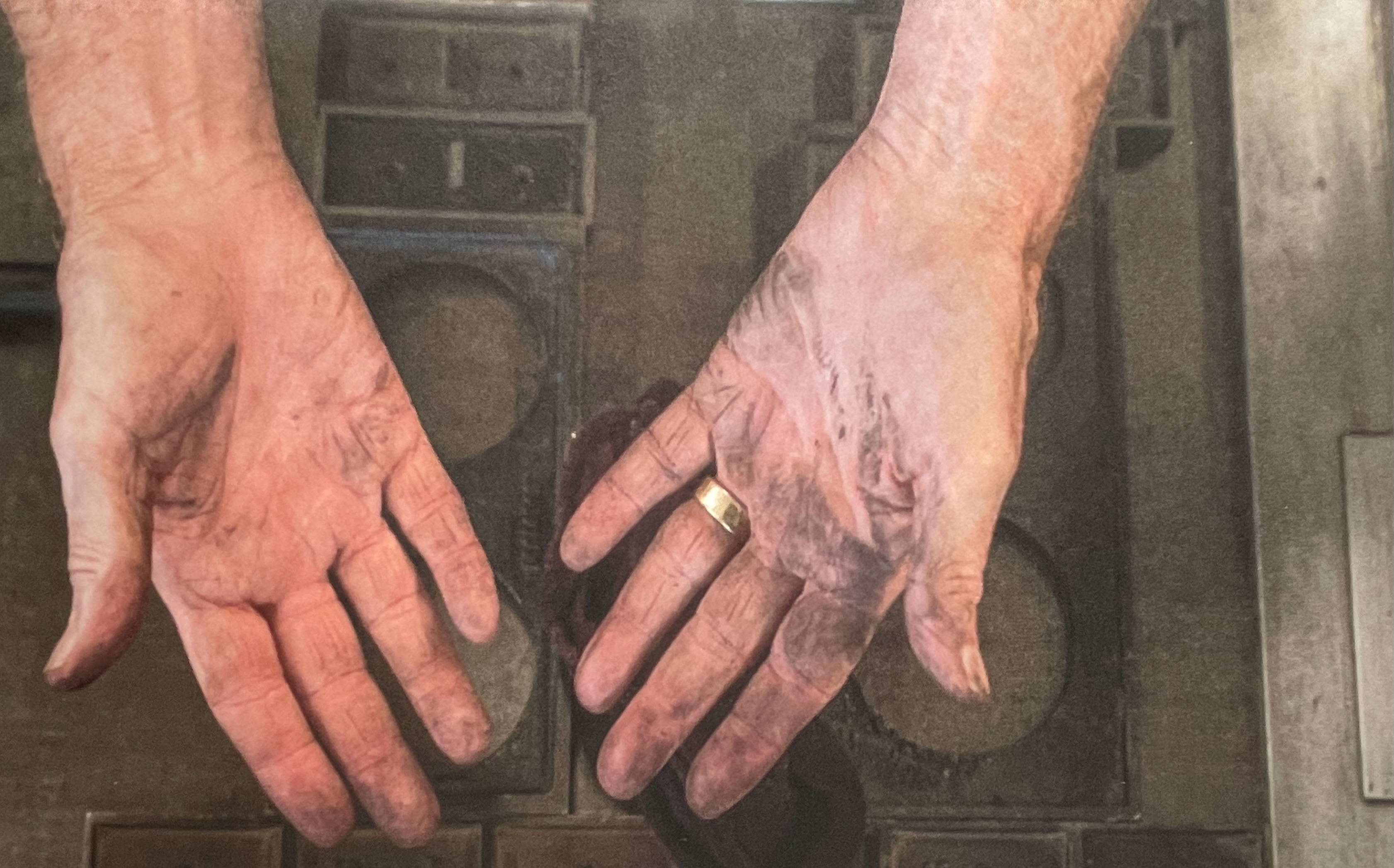
Jack Mader photographed these contributions in ways that render them visually haptic. It places that fourth question — “In what way do you understand the 5 senses of paper / book: vision, touch, hearing, smelling, tasting?” — at the core of the book. You’d swear you can feel the velvet texture of Mary Heebner’s 11 pages. Or the roughness of Helmut Becker’s colored handmade sheets or of Su Jin Kim’s white sculptural responses. The request for images of the artists’ hands naturally added to this sensory effect. There’s the glutinous wetness of pulp between the fingers of Jean Michel Letellier and Helen Hiebert and the imagined smell of the ink on George Roberts’ hands.
Mary Heebner
Helmut Becker
Kim Su Jin
Left: Jean Michel Letellier’s hands. Right: Helen Hiebert’s hands.
George Roberts’ hands.
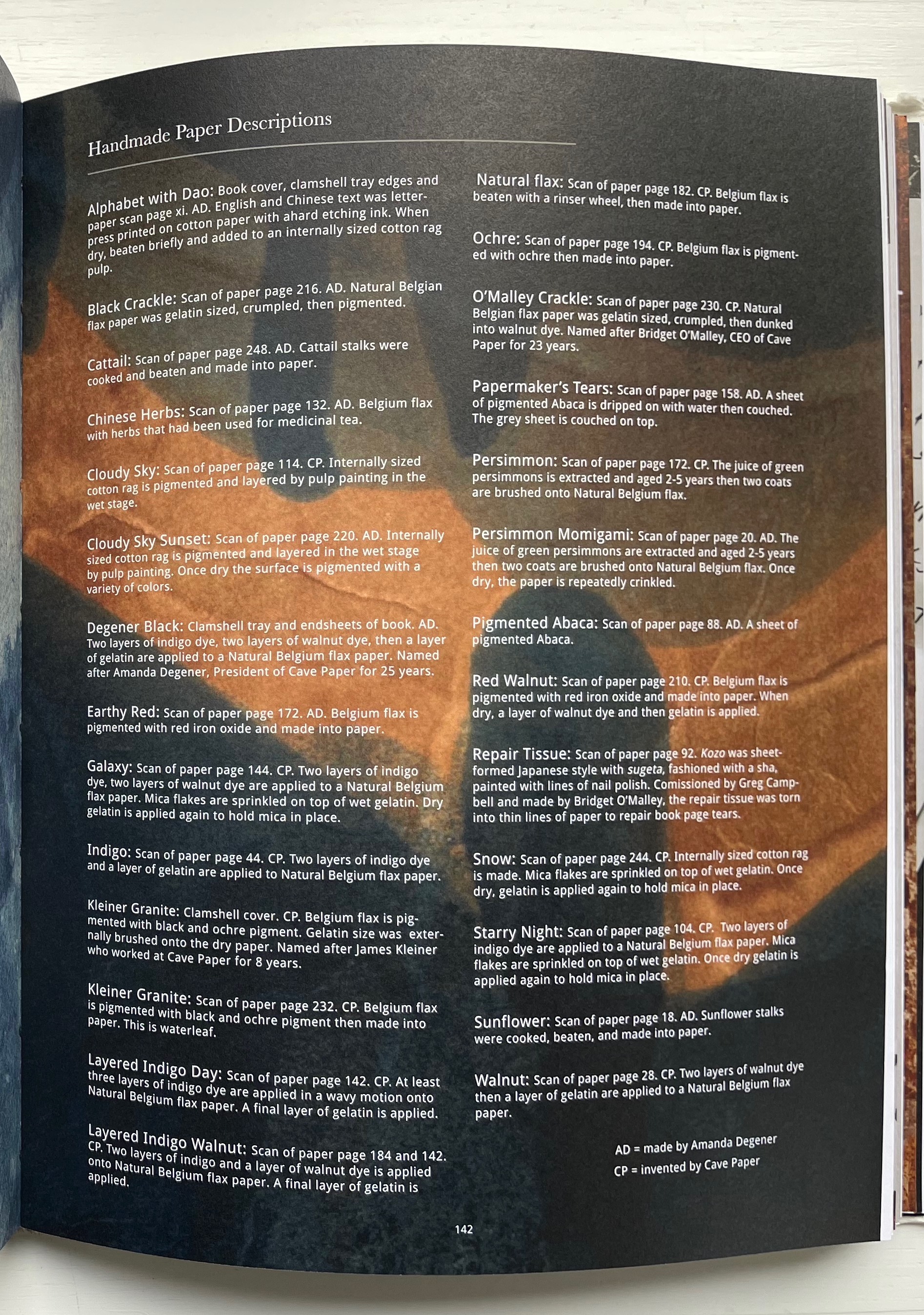
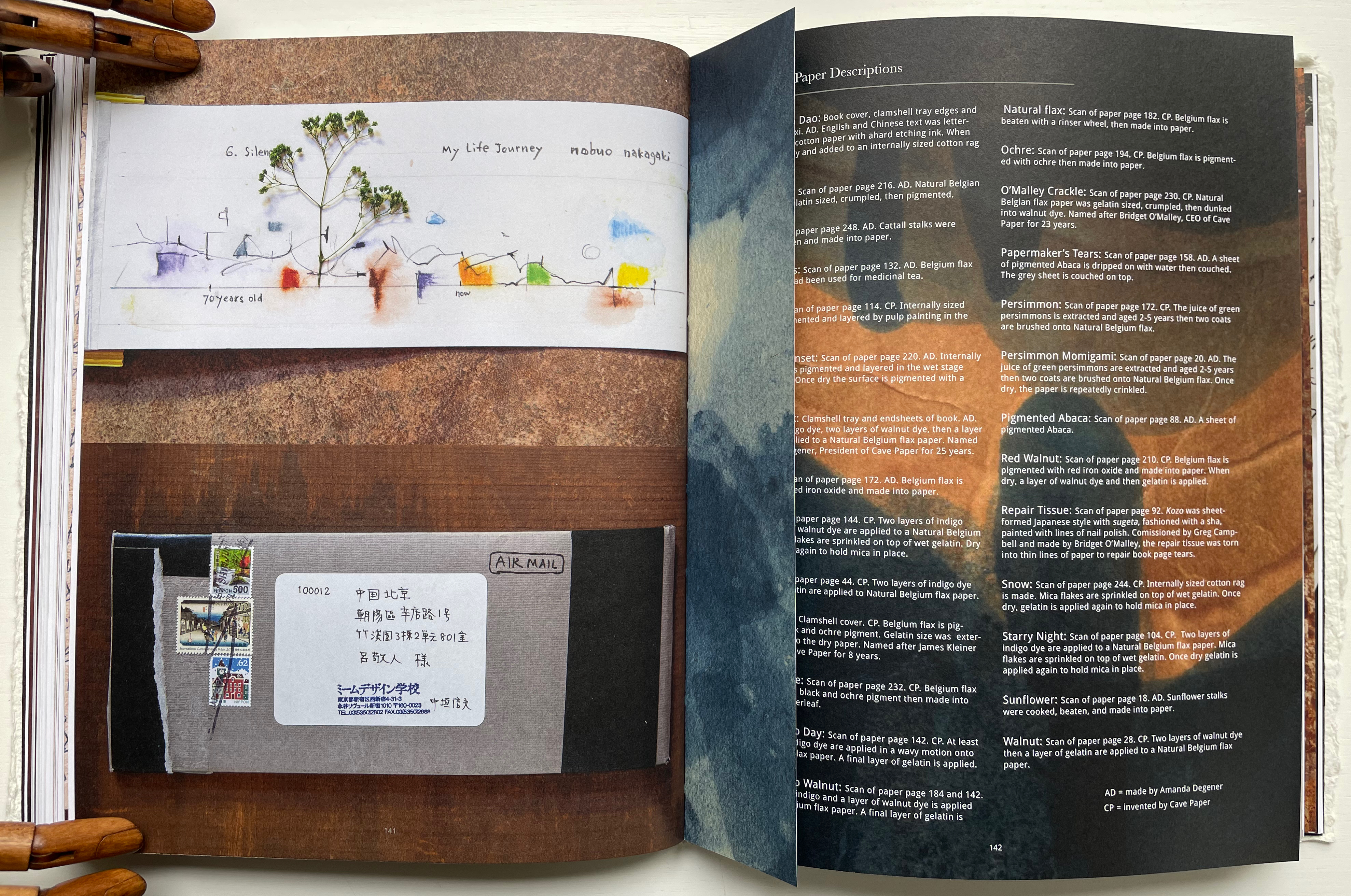
Throughout the book are truncated pages that act almost like bookmarks. Only midway through do we learn that they bear scanned images of handmade paper from Amanda Degener and Cave Paper. Degener provides an index describing the handmade papers, which oddly appears at page 142. Not only does it function as an index, it delivers information expected in a colophon. It even describes the paper used for the book’s cover, endpapers, and the clamshell tray. But nevermind, it’s all part of diving into the artists’ process and practice.
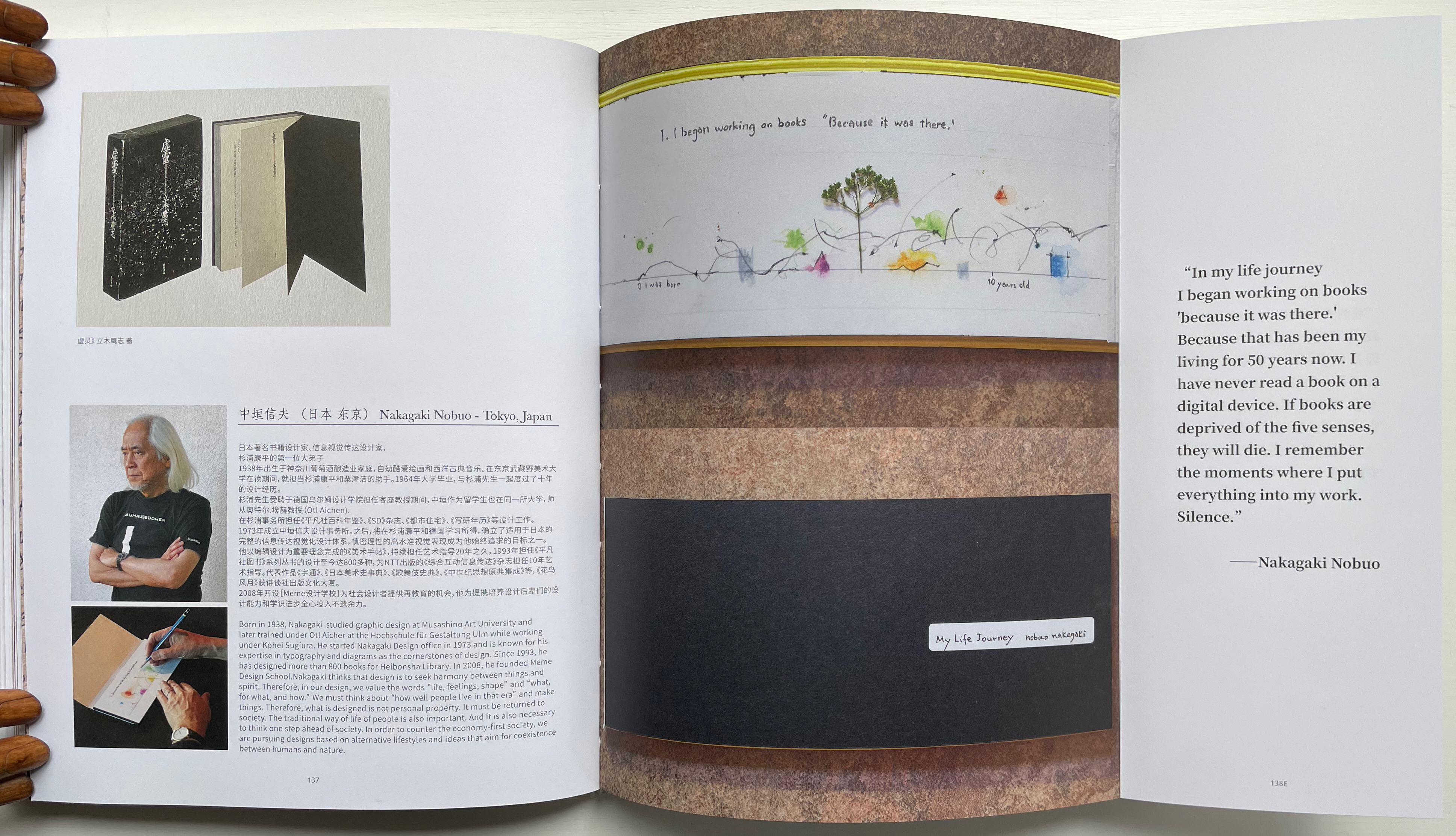
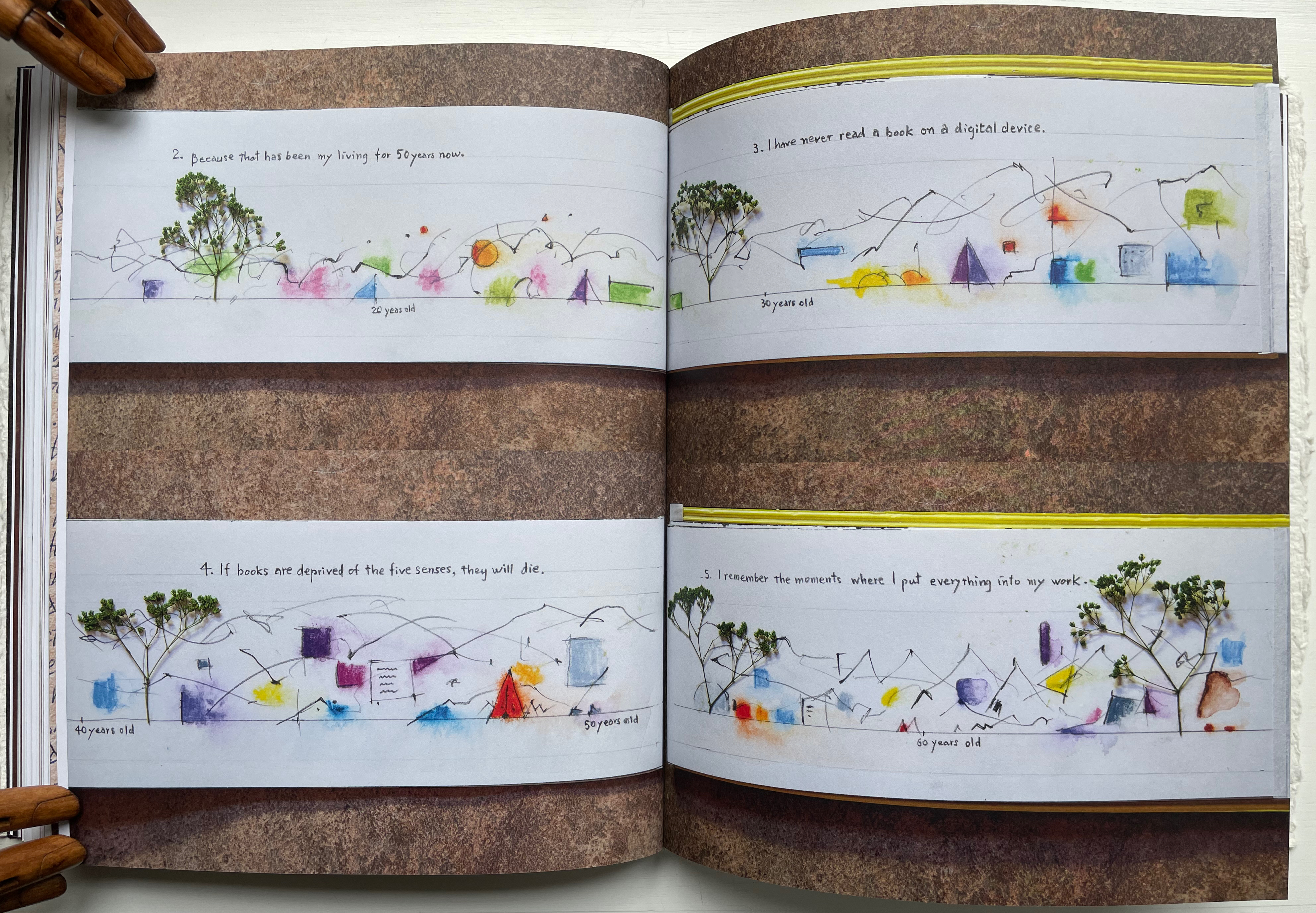
Quite appropriately this midway index appears just after the entry for Nakagaki Nabuo, whose response to the opening question “How did you begin your practice?” comes in the form of an autobiographical handmade artist’s book. In the pages presenting his book, we see the artist, his hands at work on the book, and Mader’s precise photography of the book and its airmail envelope, followed by the bookmark-like stub with its image of Cave Paper’s Layered Indigo Day paper.
Nakagaki Nabuo and his hands at work.
Nakagaki’s My Life Journey
Verso: Nakagaki’s answer to question 6: “What is your next dream project?” Recto: “Handmade Paper Descriptions” index/colophon.
In their preface, the editors write:
Although reading is a private activity we are not alone; we are cooperating with the book, bringing it into ourselves. Reading is not only about transplanting ourselves to the beyond, but we modify ourselves to see the world differently. Our vision or purpose for Handmade Path is for you to participate in this collaboration.
Just holding Handmade Path and constantly feeling its Alphabet Dao cover, navigating its foldouts alternating Chinese with English according to the contributor, being tempted to lift a contributor’s sheet of paper from the photos, hearing the snap and creak of sewn pages turning, and absorbing the contributors’ testaments, we cannot help but be drawn into participating with the book. In doing so, we learn that, as Paulette Myers-Rich puts it, “Paper is not a substrate — it is story” (p. 197).
Hamady, Walter; Samuel Haatoum; and Hermann Zapf. 1982. Papermaking by Hand : A Book of Suspicions. Perry Township, Dane County, Wisconsin, USA: Perishable Press Limited.
Thomas, Peter, and Donna Thomas. 1999. Paper from Plants. Santa Cruz, Calif: Verf. You can find images of this and others by the artists online in the Special Collections website of the University of Wisconsin-Milwaukee Libraries.
Knot theory seems to be having a moment this year. In February 2025, there was the First International On-line Knot Theory Congress. Not to forget the regularly recurring Swiss Knots Conference (held in Geneva in June) and the 11th Sino-Russian Conference on Knot Theory (held in Suzhou, China in June-July). Or the “Danceability of Twisted Virtual Knots” produced by Nancy Scherich and danced by Sol Addison and Lila Snodgrass at the Math-Arts Conference in Eindhoven in July. And then in September the Scientific American and online media picked up two discoveries in knot theory — one by Mark Brittenham and Susan Hermiller and another by Dror Bar-Natan and Roland van der Veen.
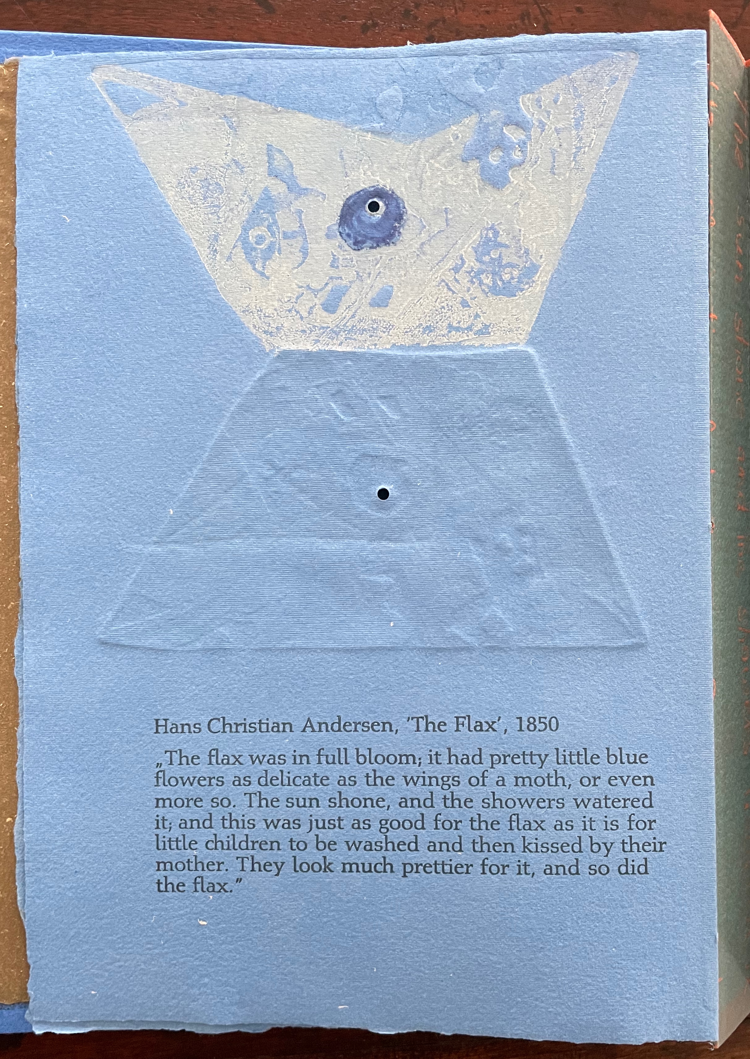
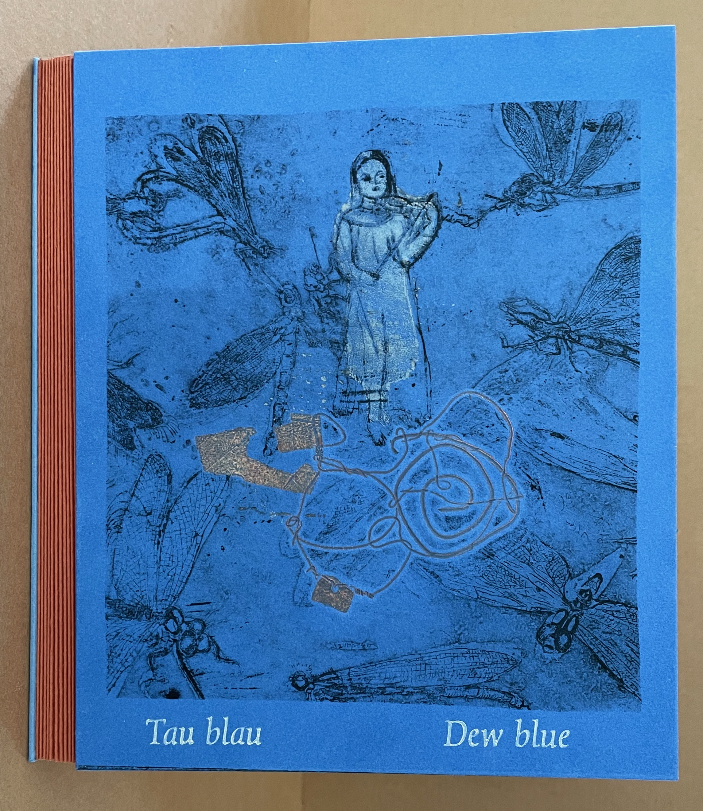
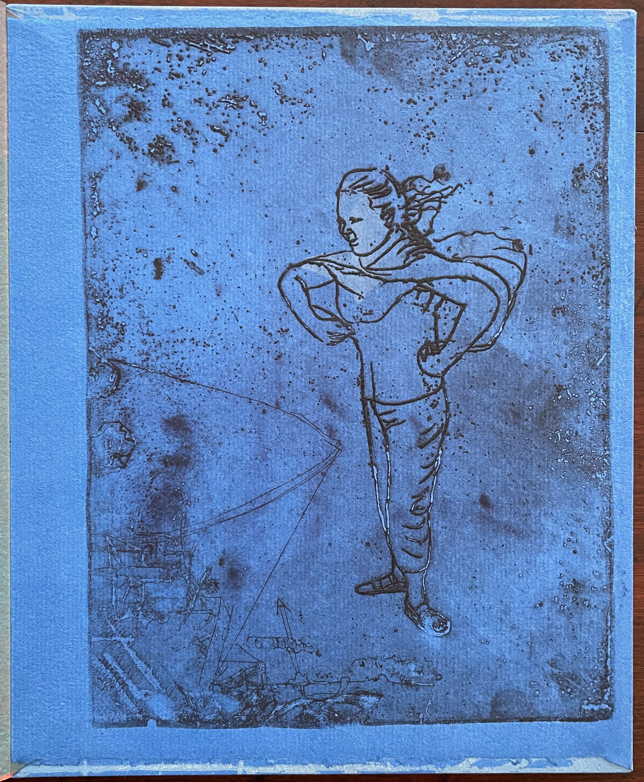
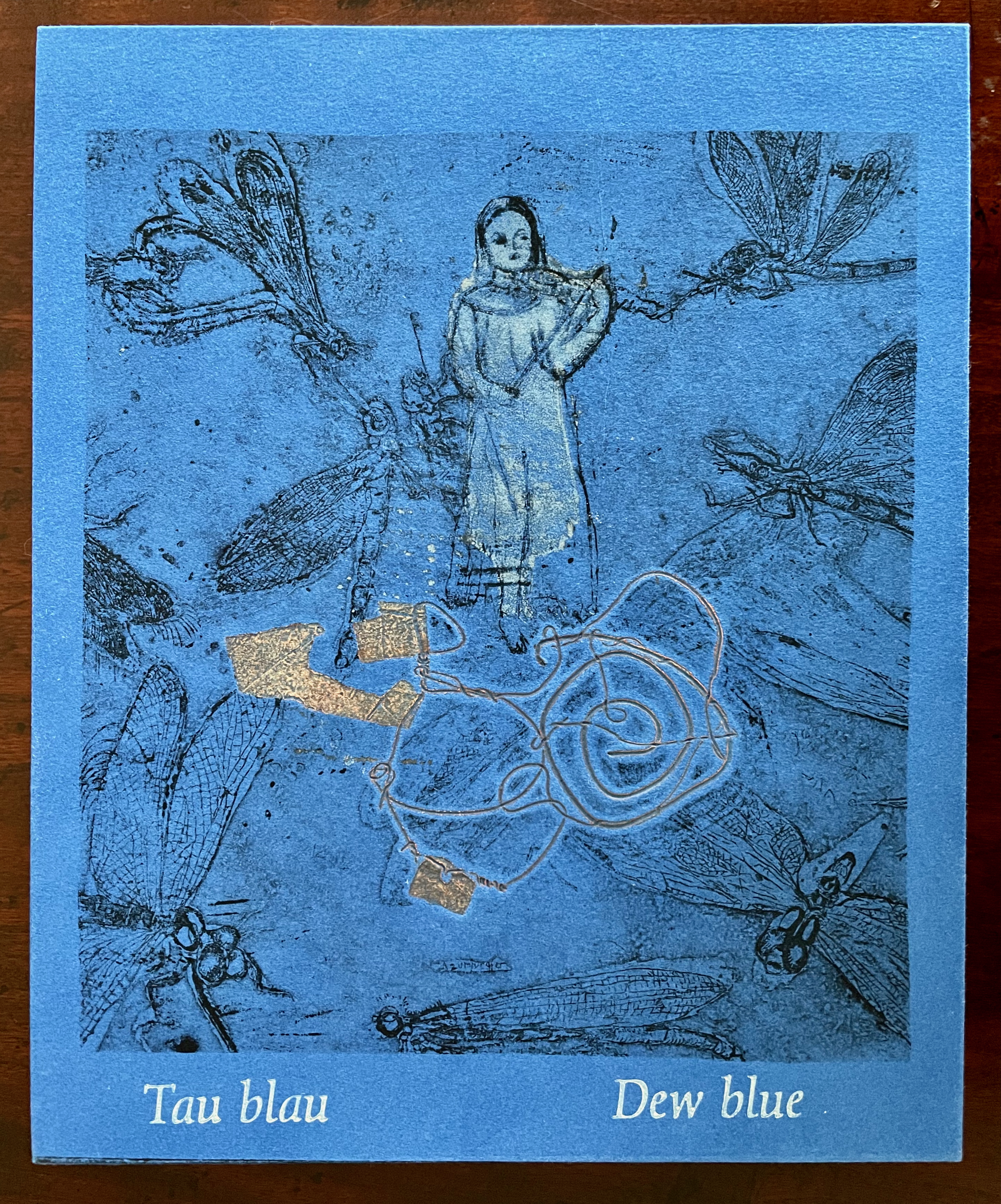
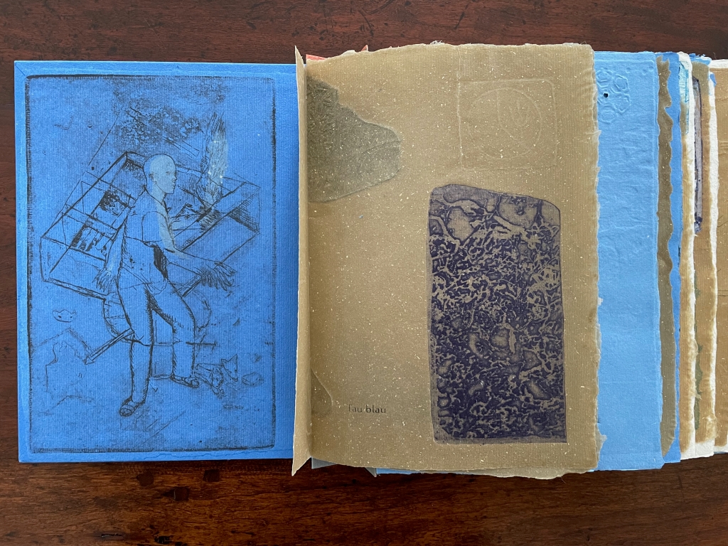
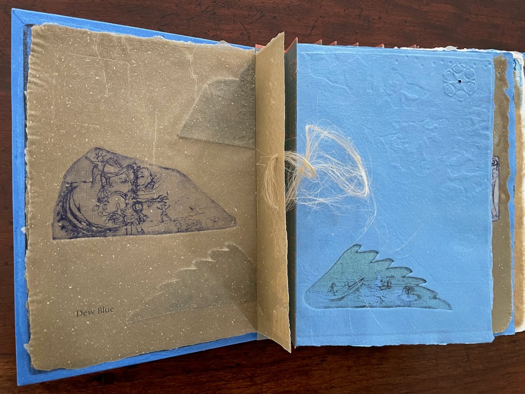
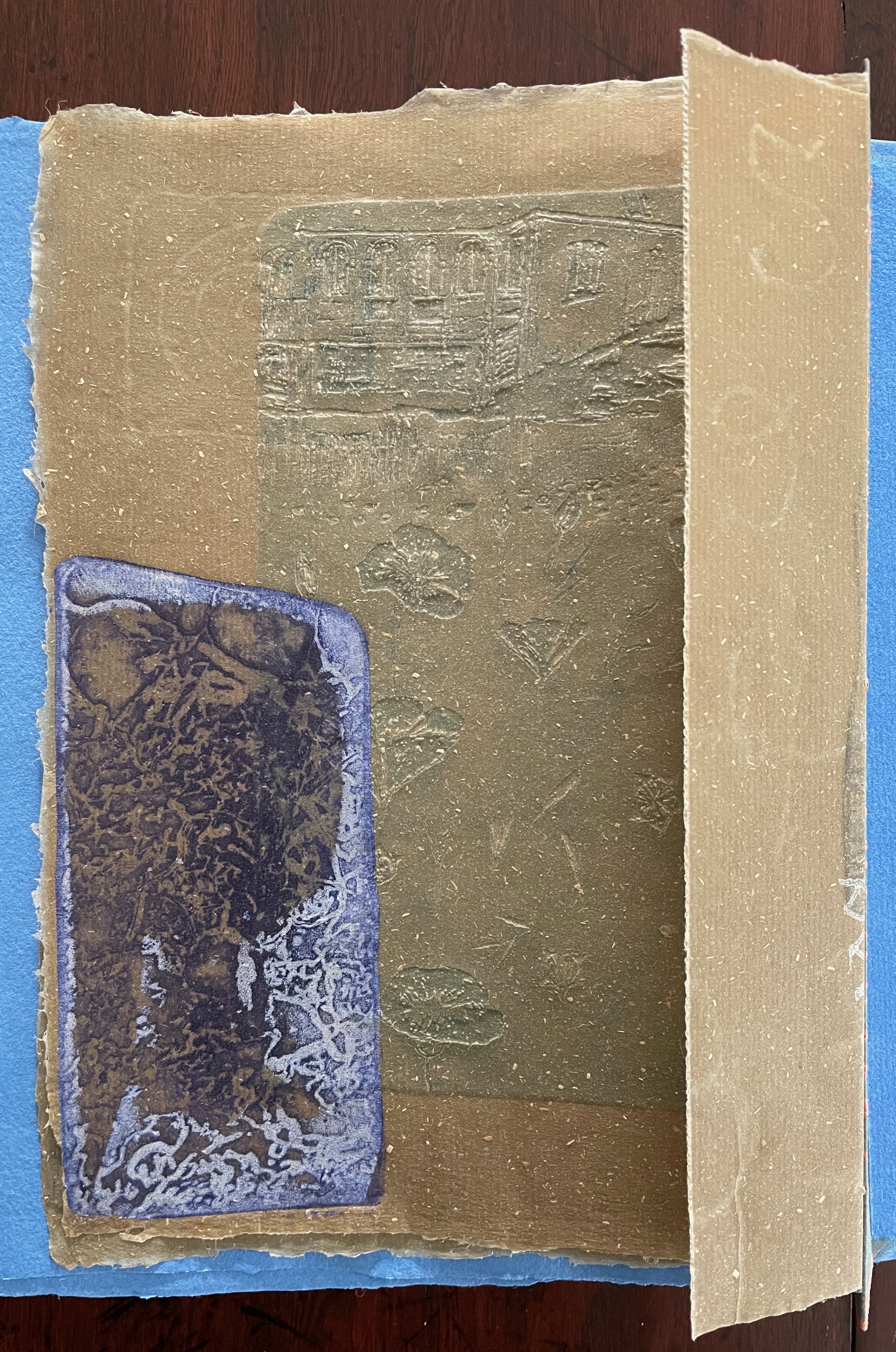
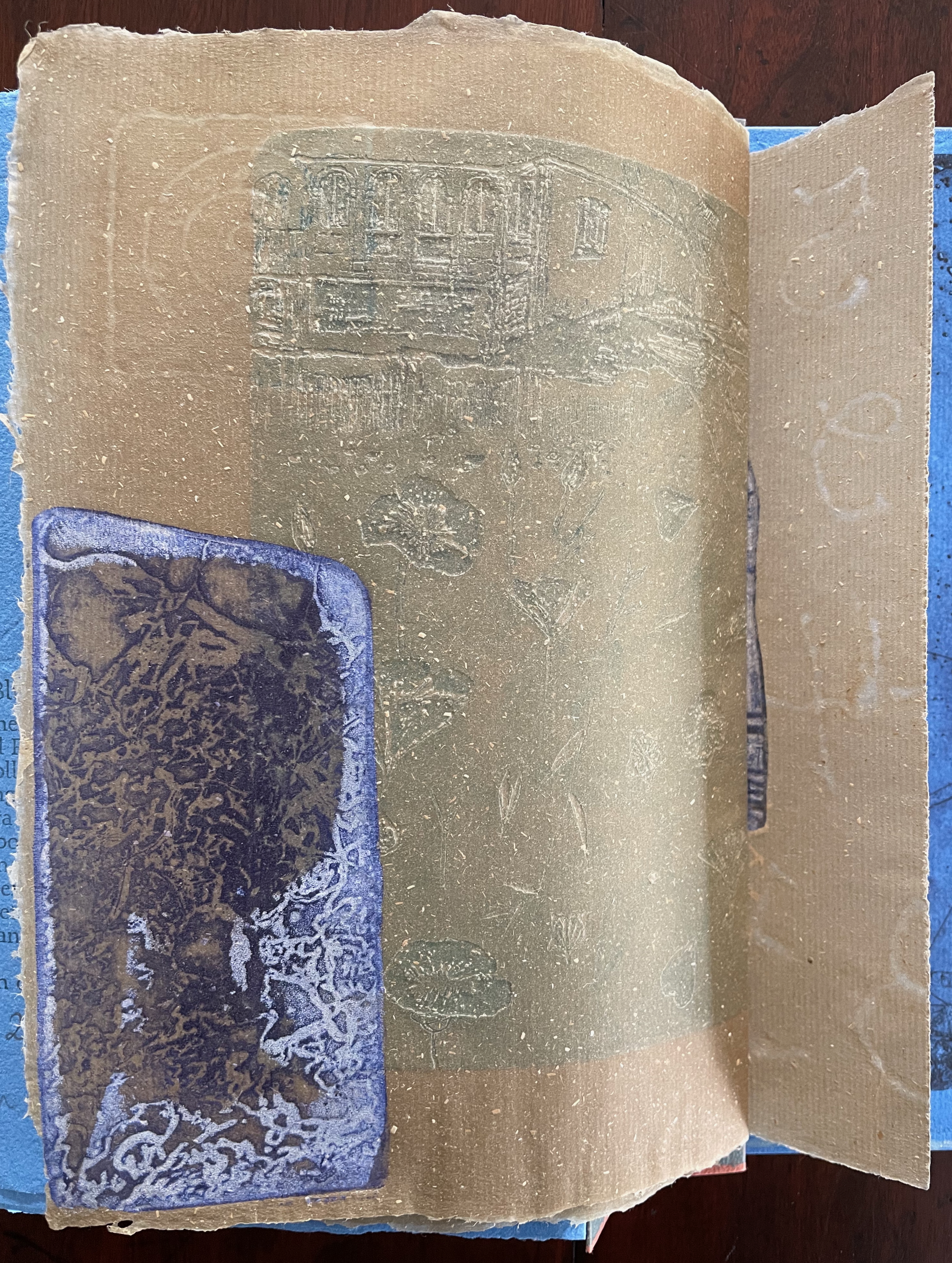
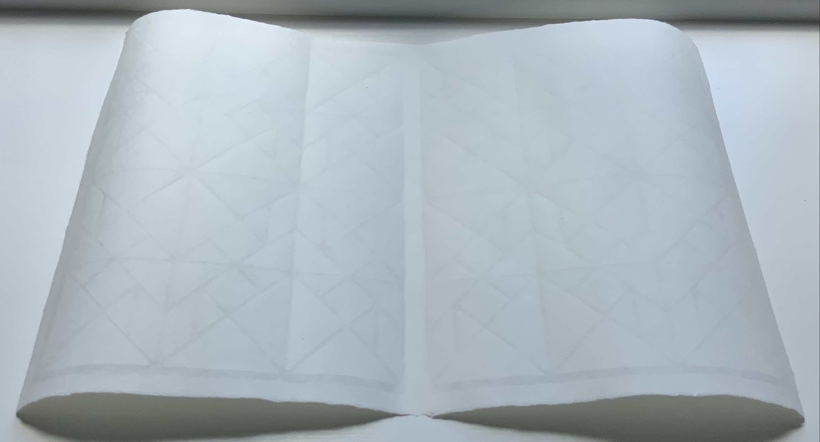
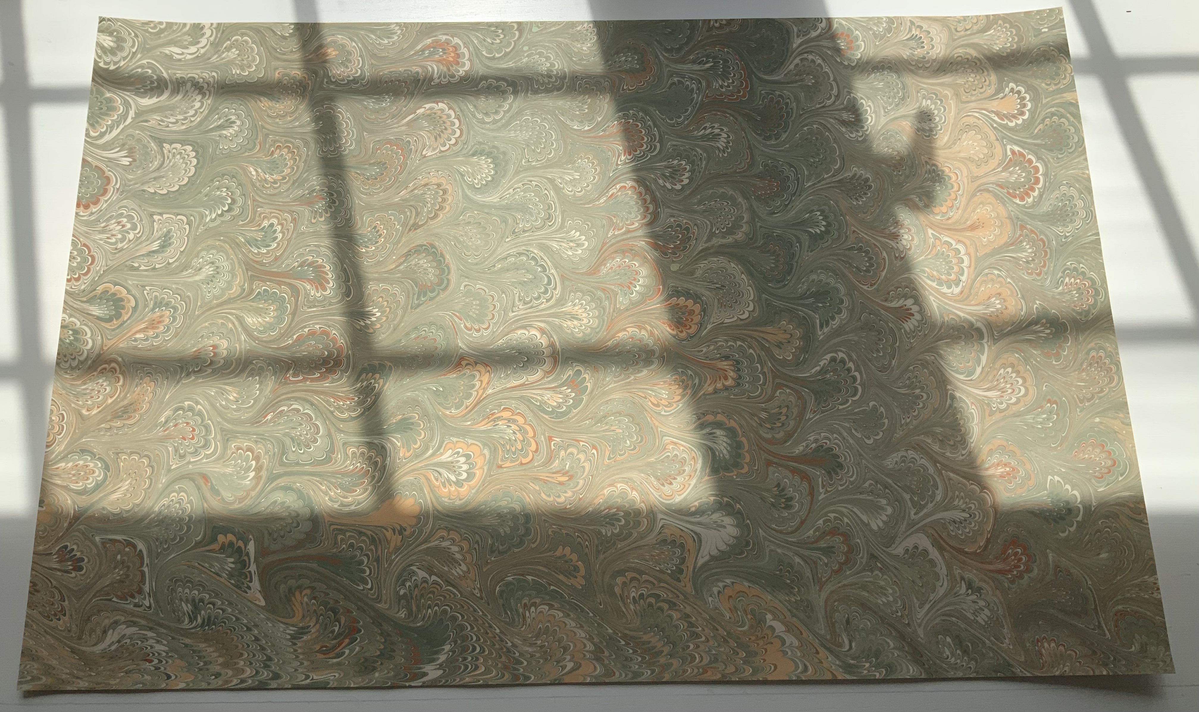
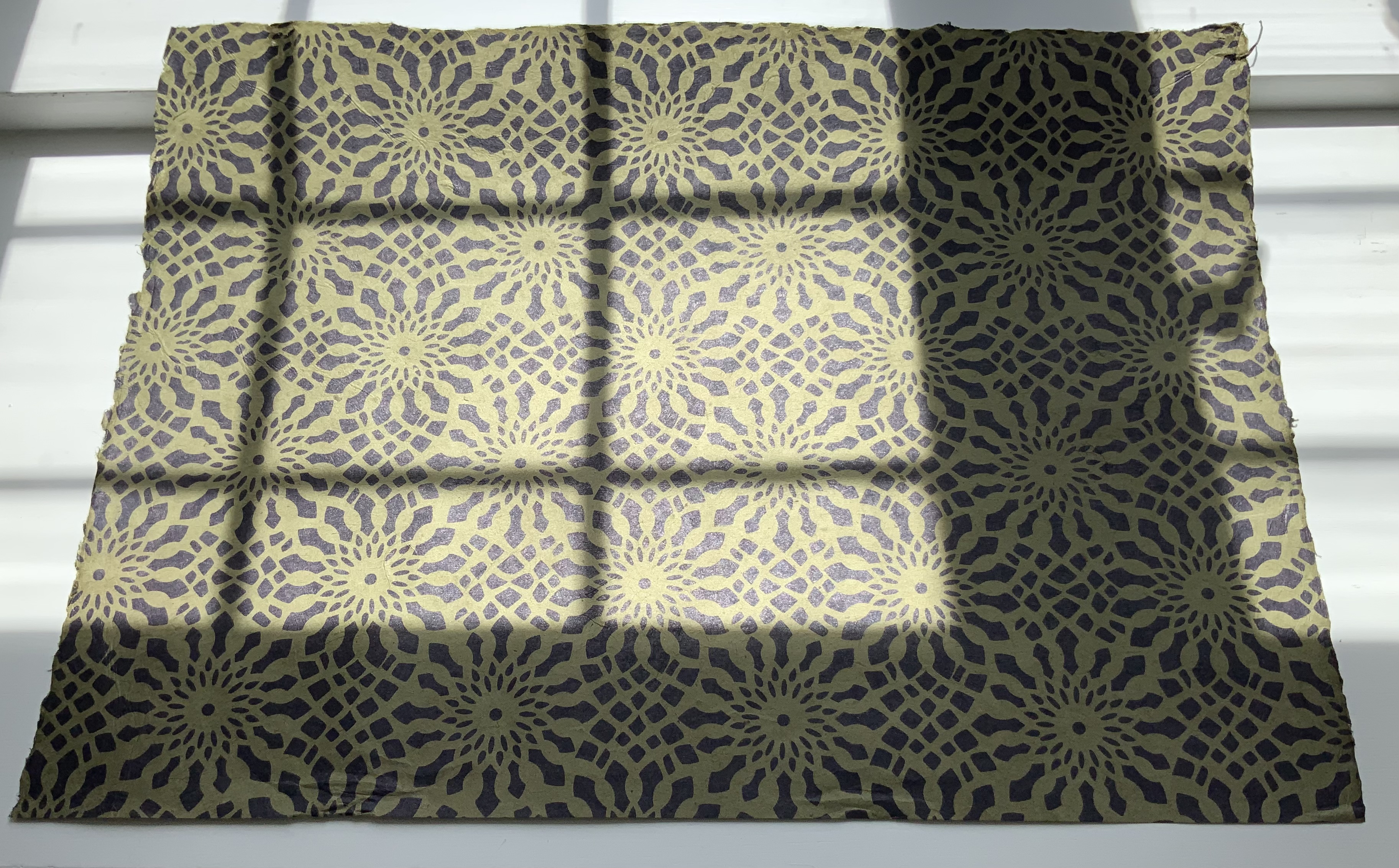
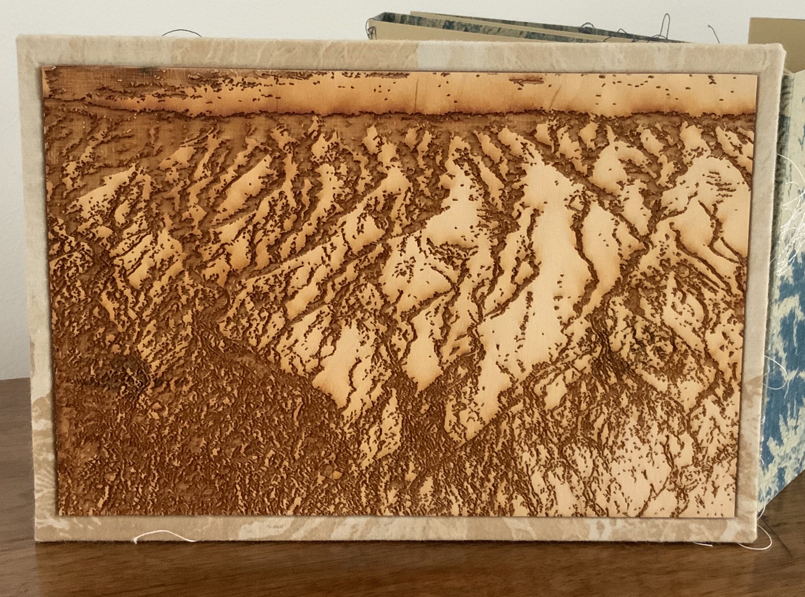
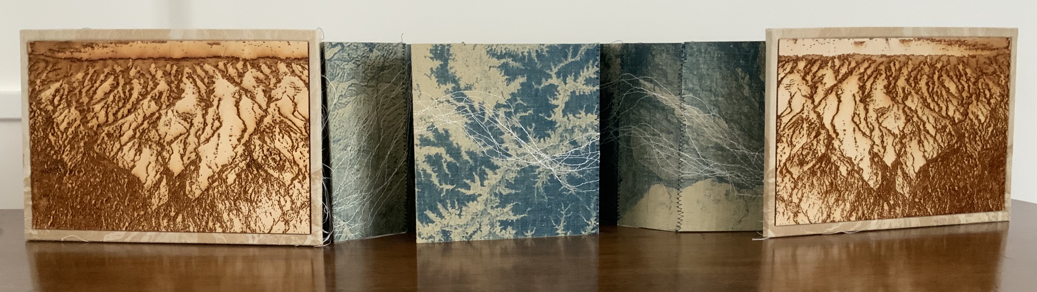
Tau blau / Dew Blue (2013) Barbara Beisinghoff ; Solander box in linen, handbound Vera Schollemann; Flax paper, handmade by John Gerard. Solander box: H240 x W200 x D32 mm. Flagbook: H220 x W180 mm. Edition of 38, of which this is #22. Acquired from the artist, 30 December 2024. Photos: Books On Books Collection.
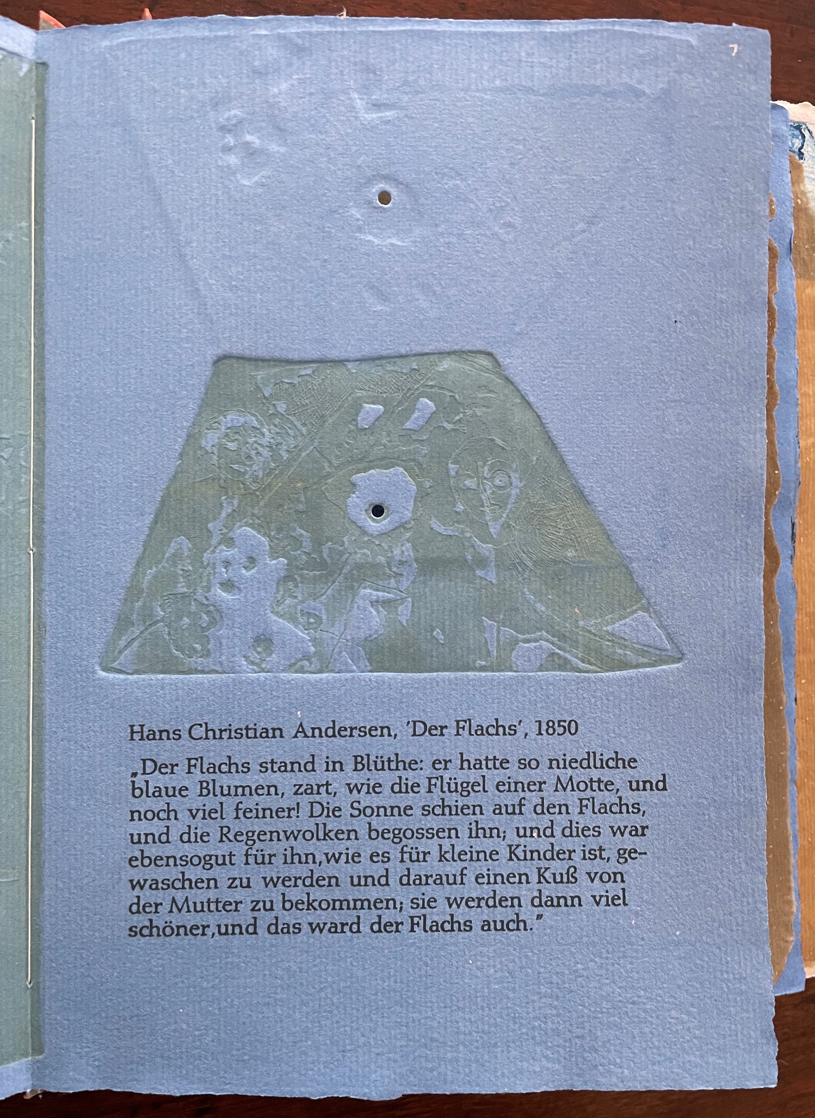
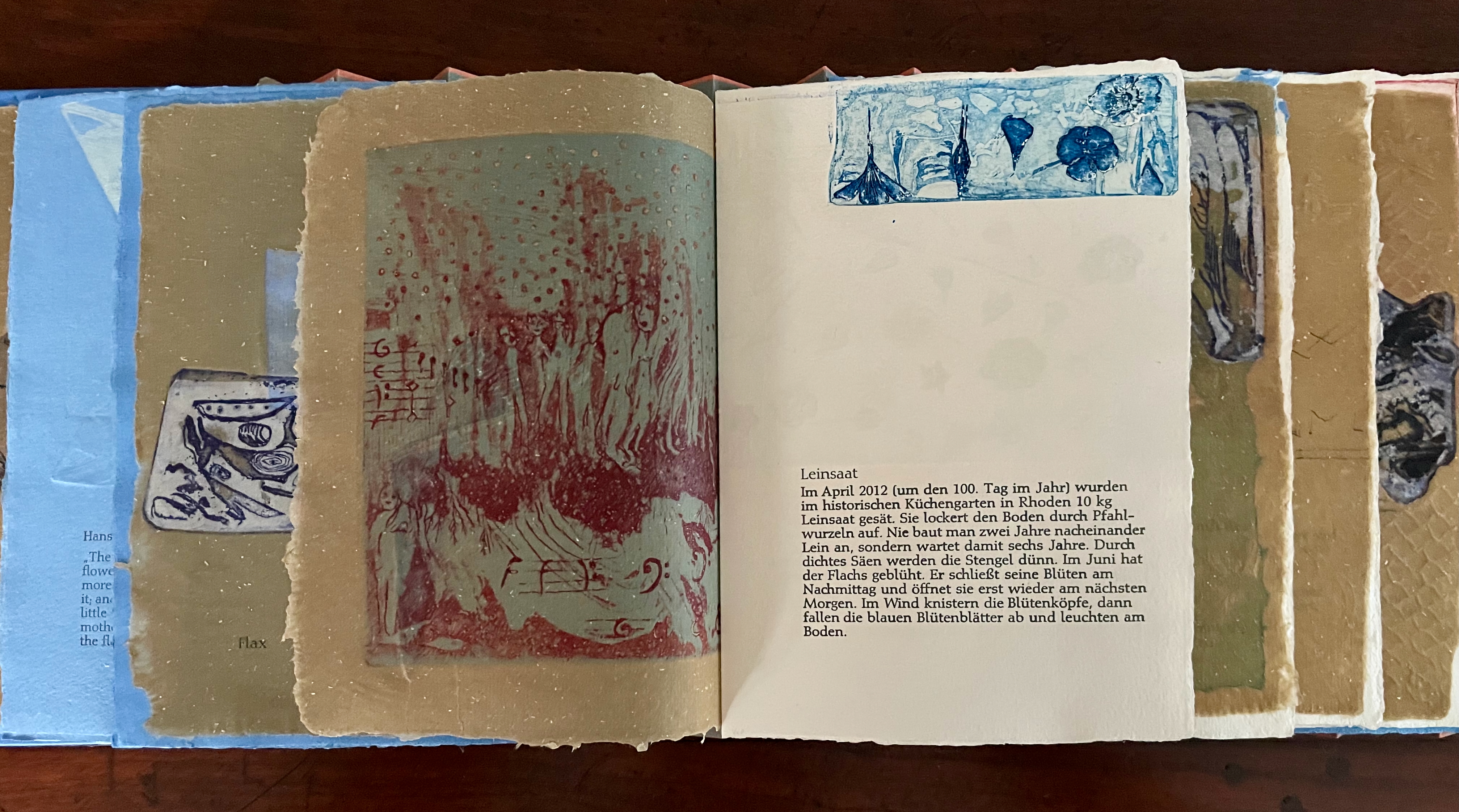
Familiarity with Hans Christian Andersen’s fairy tale Hørren /The Flax enhances appreciation of Barbara Beisinghoff’s Tau blau / Dew Blue. Andersen gives a voice to the plant that expresses its joy, pain, hope and observations at each stage of its blooming, being harvested, turned into linen and clothing then paper, and finally consigned to flames. The H.C. Andersen Centre offers Jean Hersholt’s translation of it here.
Only the opening paragraph of the story appears in Tau blau / Dew Blue, but Beisinghoff documents and illustrates the stages from her own cultivation of flax, observation of its growth and preparation of its processing. And with the etching, drawing, watermarking, handmade papers, linen cloth and thread, and binding structure, Beisinghoff suffuses the spirit of the tale’s metamorphosizing plant throughout the whole of Tau blau / Dew Blue.
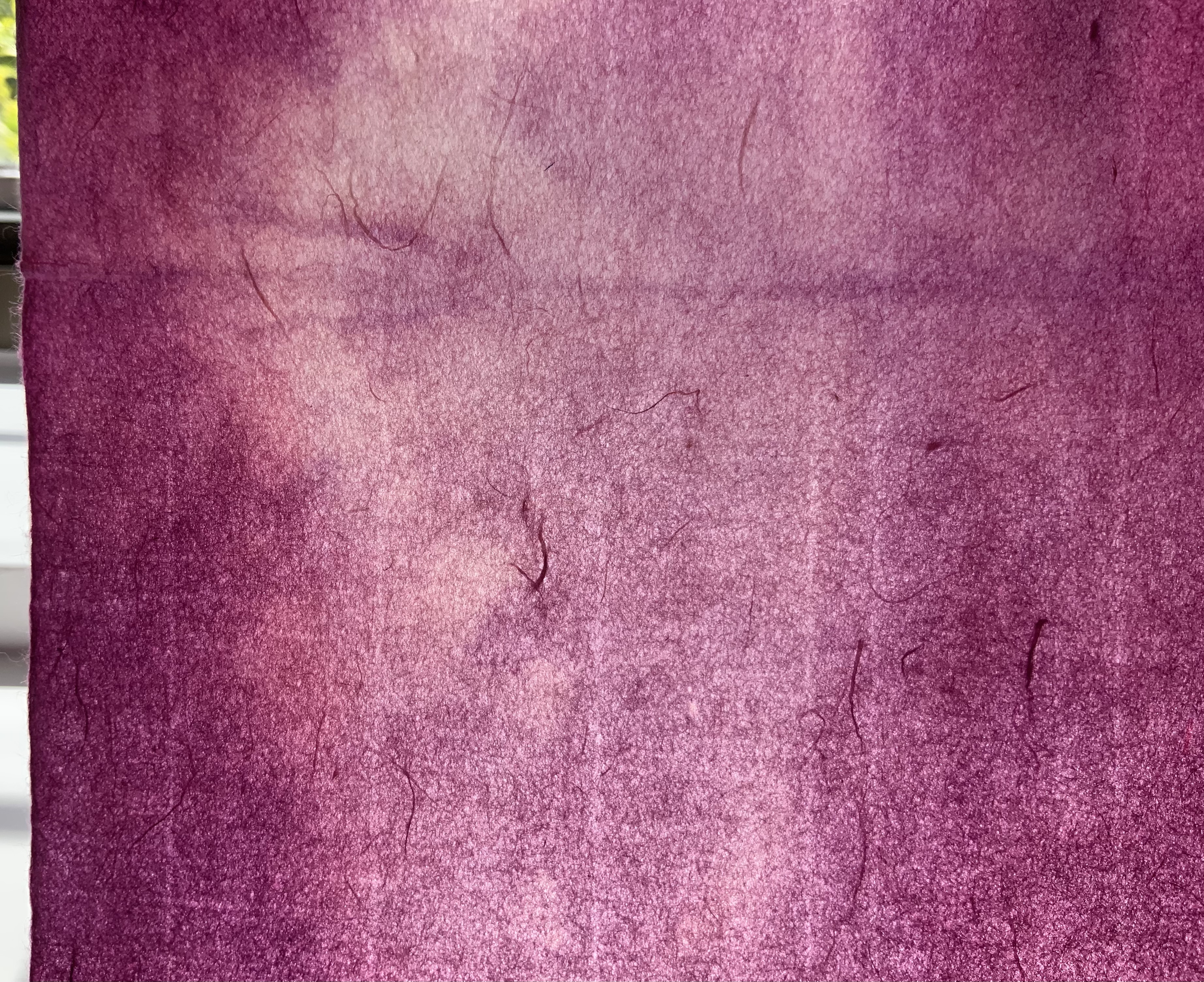
From the blue of the plant’s blossoms to the white of its change into linen and paper to the red, burnt orange and black of its sparks and ash when it is consumed by fire in the end, all of the story’s colors are replayed across Tau blau / Dew Blue from its Solander box to its covers and spine like motives in a Baroque musical piece.
In a concerto, motives play off one another and develop. In Tau blau / Dew Blue, the motif of nature (the plant) plays off the motif of artifice and the manmade (the fairy tale, music, linen, paper, etc.). On the front cover (above), a young girl, surrounded by large damselflies, plays a fiddle or violin and seems to hover above a silver foil image of flax thread and tools for making it. In the spread above alongside the front cover, the specks rising over the staves and musical notes (a recurring motif in itself) recall the tale’s final passage in which the bundle of papers (made from linen rags) is cast into a fire:
“I’m going straight up to the sun!” said a voice in the flame. It was as if a thousand voices cried this together, as the flames burst through the chimney and out at the top. And brighter than the flames, but still invisible to mortal eyes, little tiny beings hovered, just as many as there had been blossoms on the flax long ago. They were lighter even than the flame which gave them birth, and when that flame had died away and nothing was left of the paper but black ashes, they danced over the embers again. Wherever their feet touched, their footprints, the tiny red sparks, could be seen.
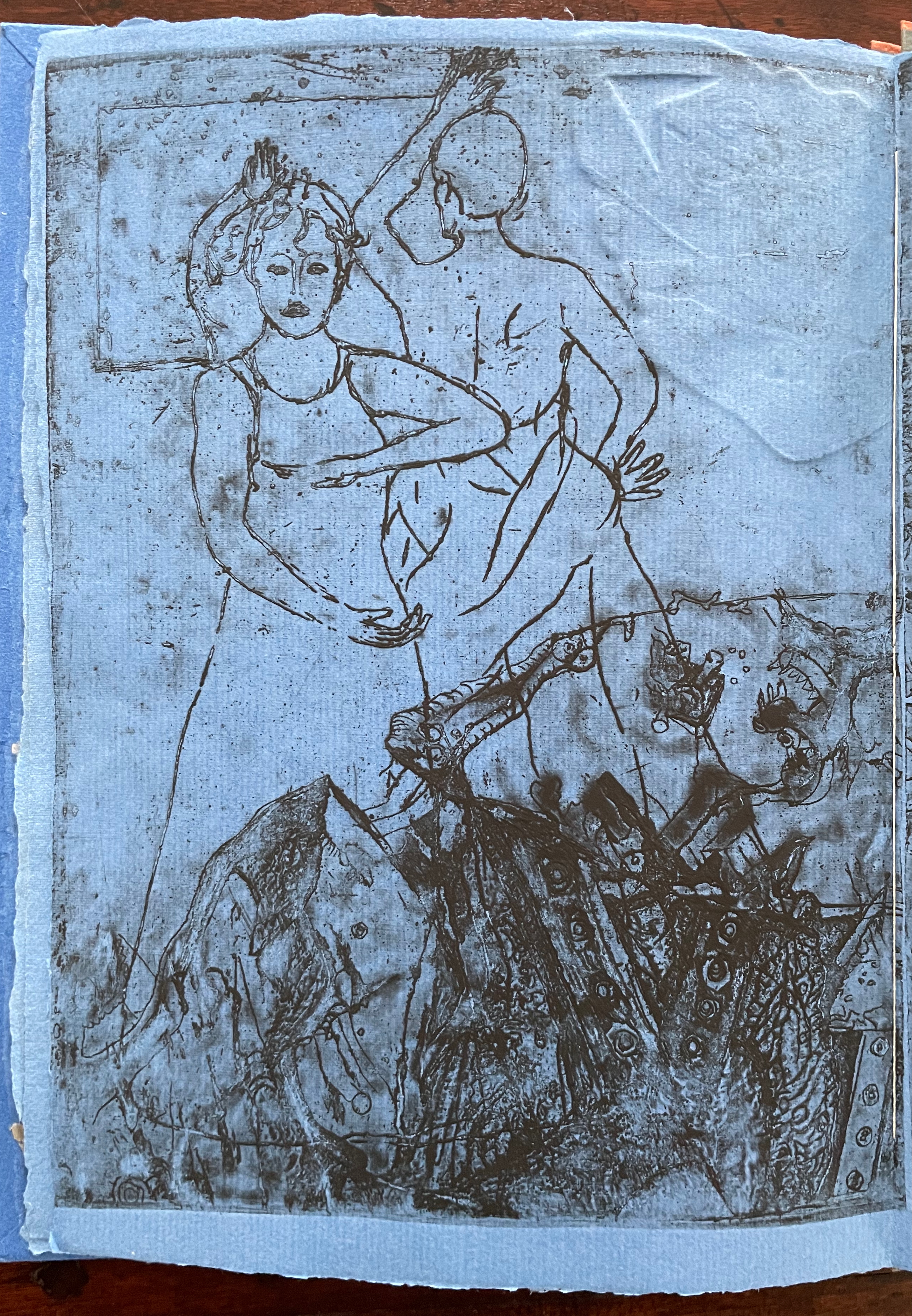
Images of tools — whether for preparing flax or for making the products from it — also recur on the inside of the front and back covers and throughout the book. The human figures alongside the tools, however, appear engaged in more than manufacturing. Elsewhere in the book, they dance, they sit and meditate or write, they row on ponds beside the growing flax. The fairy tale, too, has these Romantic juxtapositions of nature, art and craft. So, again, the spirit of Andersen’s tale finds another way into Tau blau / Dew Blue.
Inside front and inside back covers.
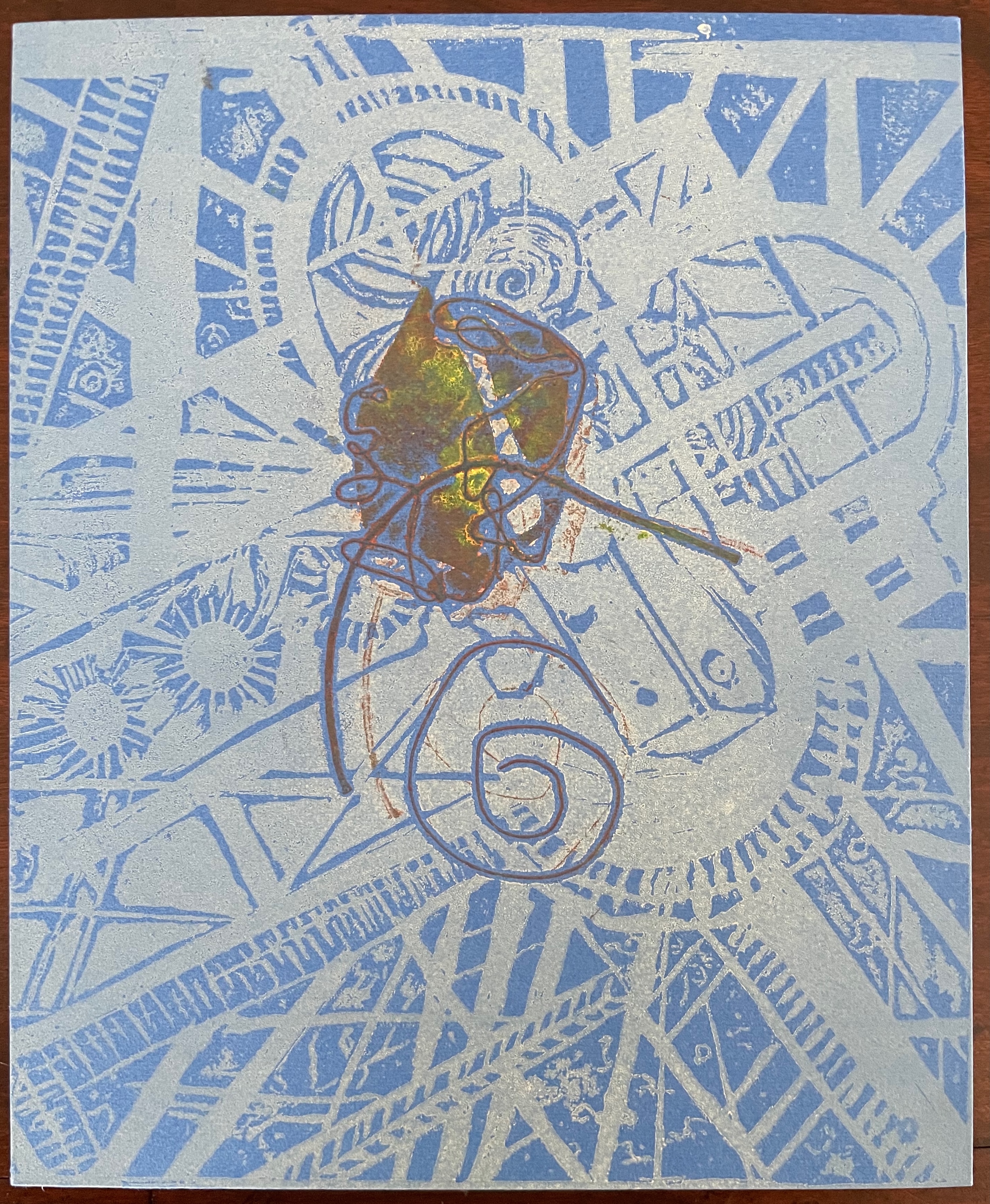
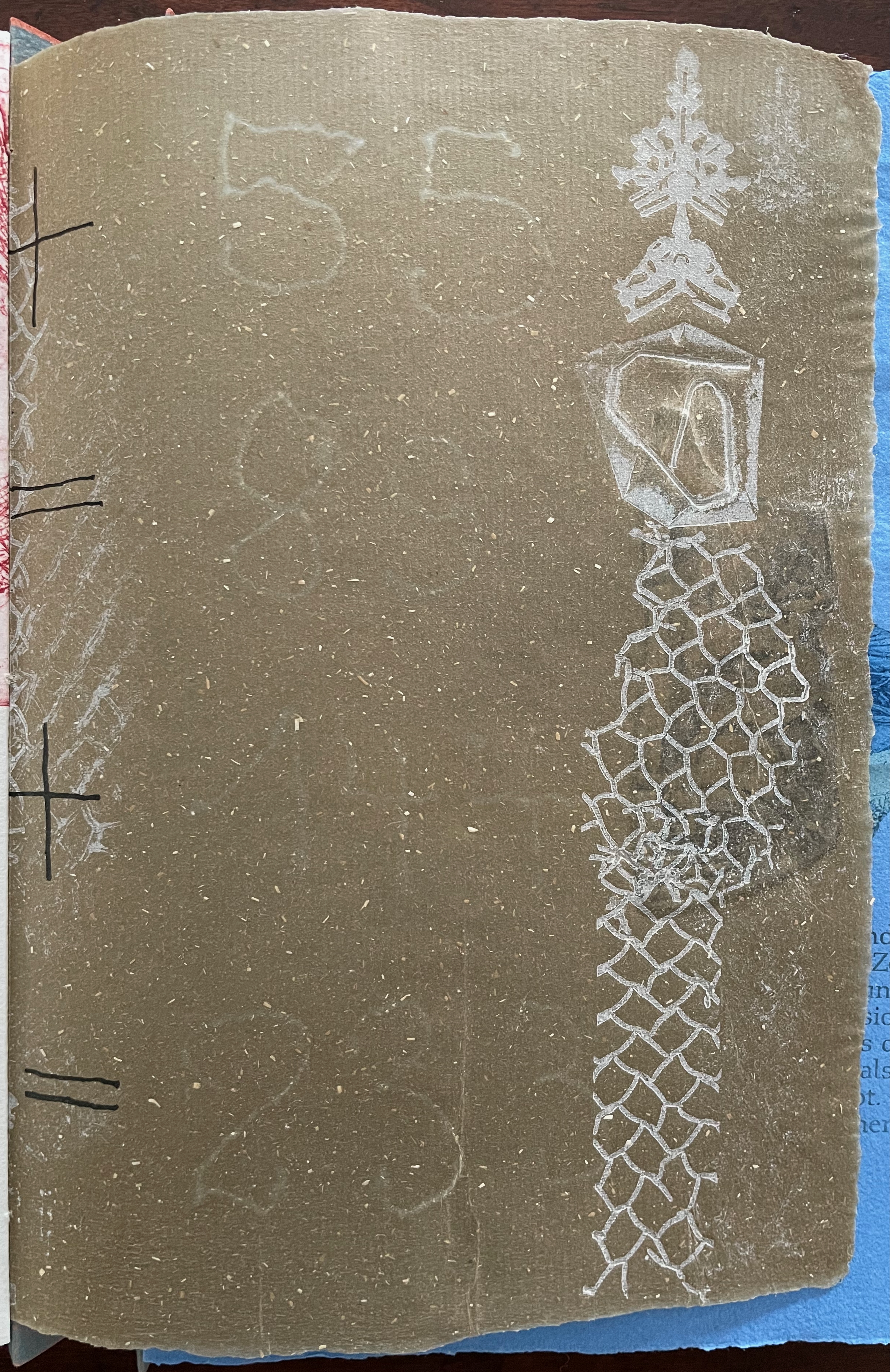
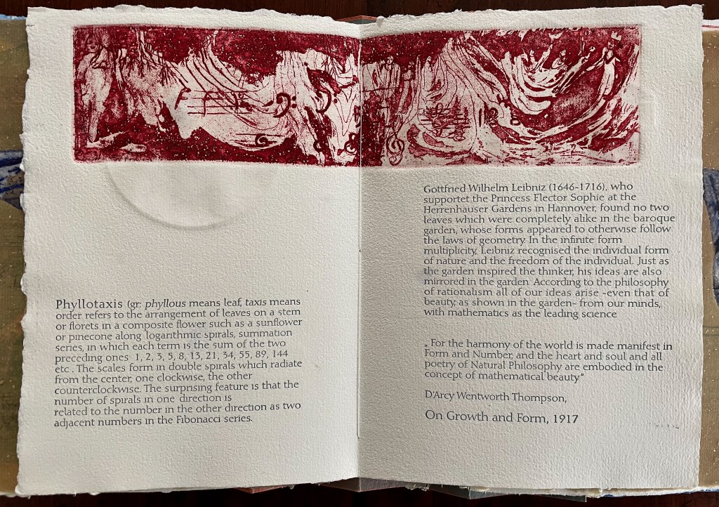
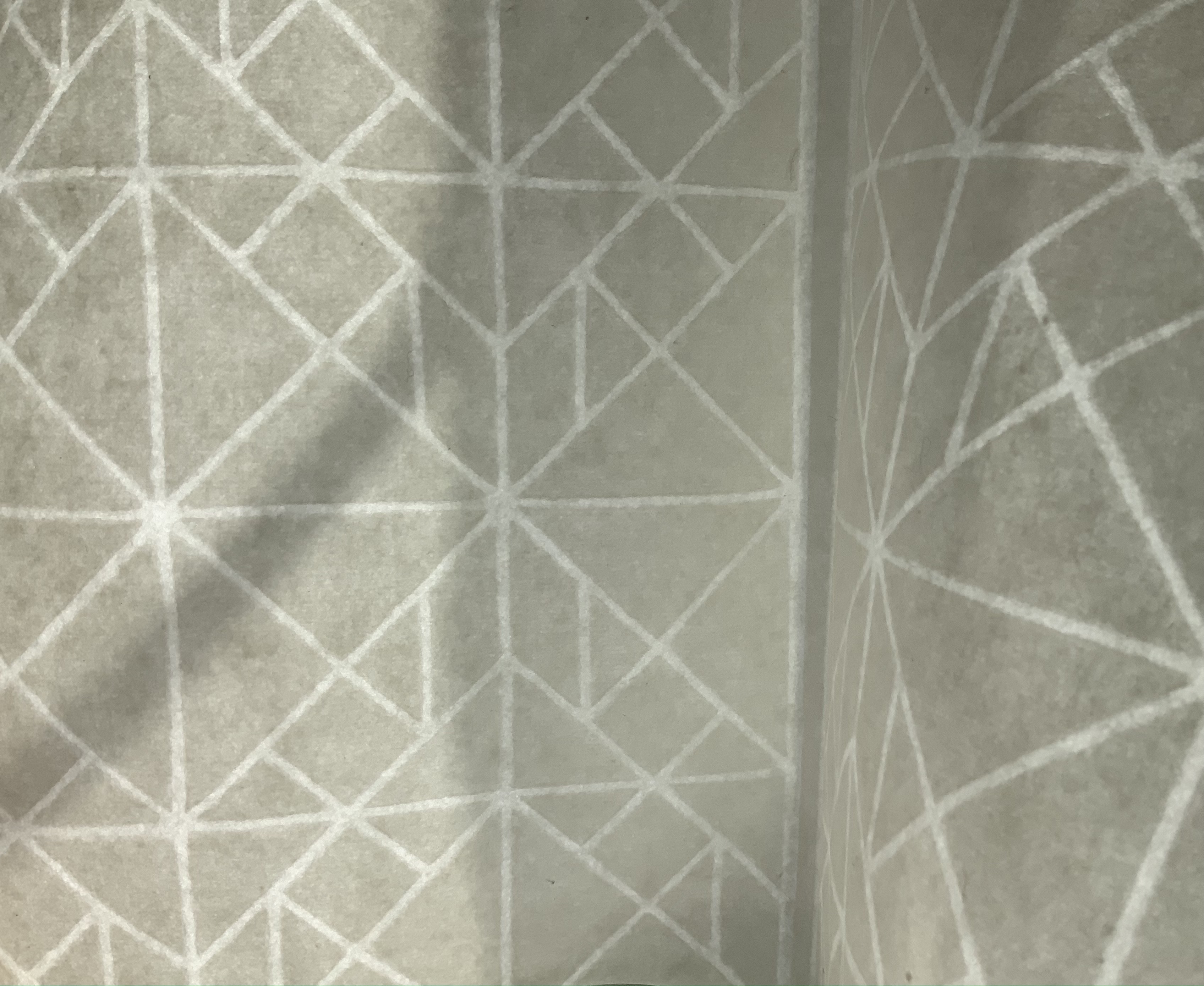
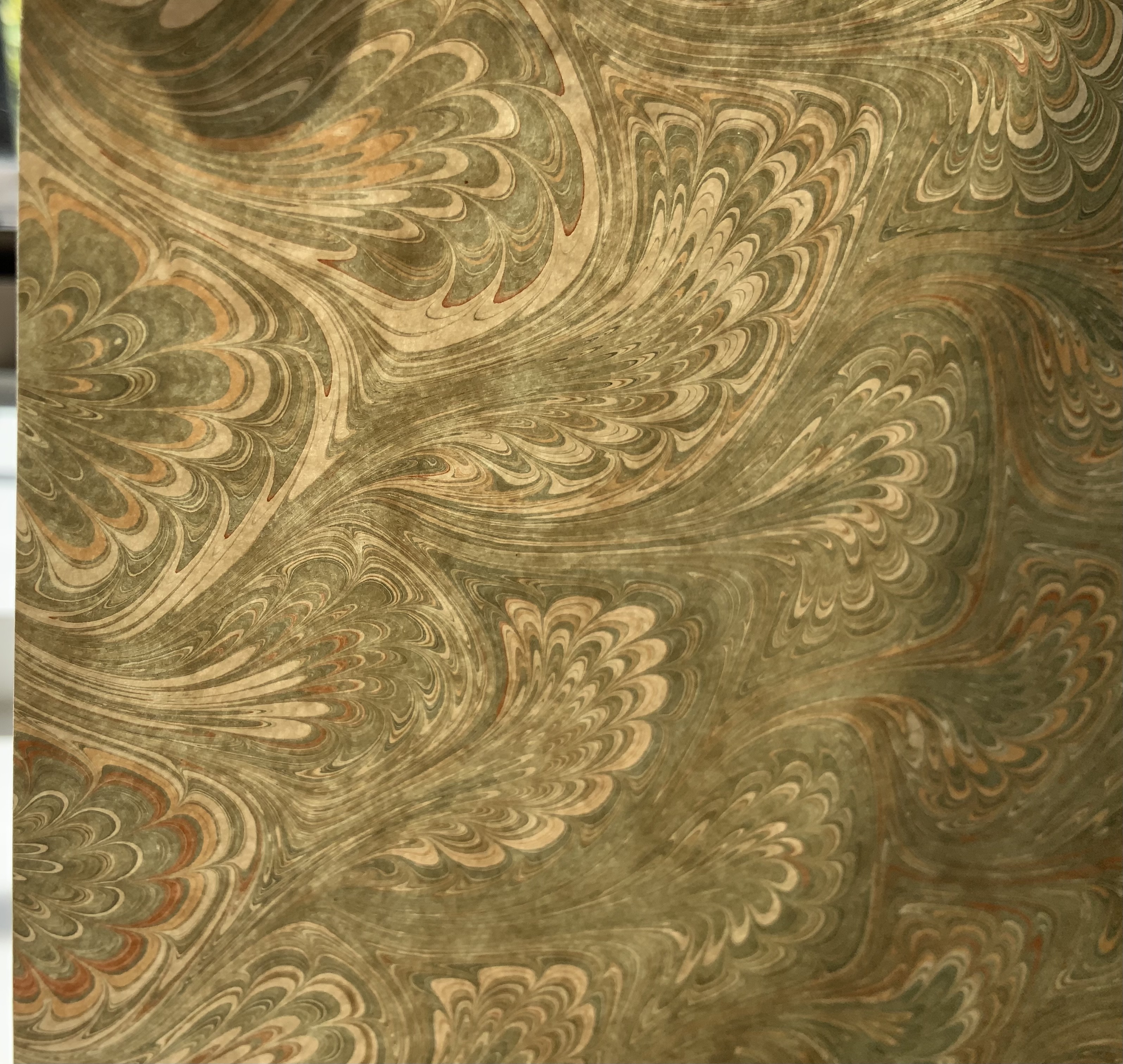
The front cover also announces another motif in those coils of thread below the young girl’s feet. Within the coils is the image of a Fibonacci spiral, which appears on the back cover and throughout the book in different ways. It can be found drawn and printed. It can be found in watermarks in the handmade paper. It can be found in the arrangement of florets in flax. Being a composite flower, flax blossoms display the spiral based on the Fibonacci sequence 1, 2, 3, 5 … 233, and so on. These numbers are waterjet-drawn on the pure flax paper below and explained in an entry printed on the adjacent plain handmade paper folio. By appearing on the book’s front and back covers, the spiral echoes the beginning and ending cycles of birth and rebirth the flax goes through in the folktale.
The Fibonacci spiral on the front and back covers.
The sequence of Fibonacci numbers 1, 2, 3, 5 … 55, 89, 144, 233 … watermarked on handmade flax paper with a water jet.
Description of the Fibonacci spiral side by side with quotation from Thompson’s On Growth and Form (1917), drawing on Leibniz’s Rationalist philosophy.
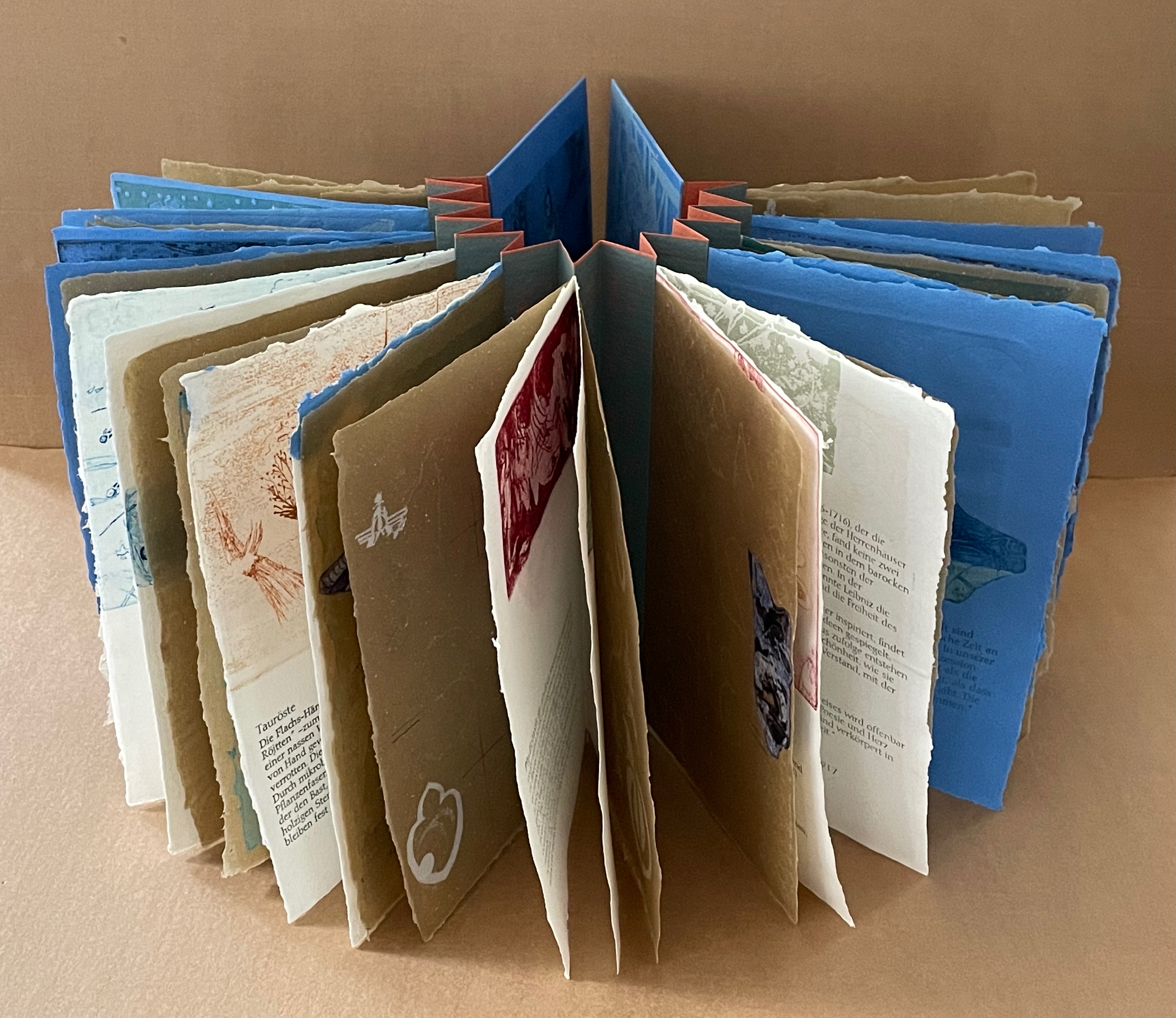
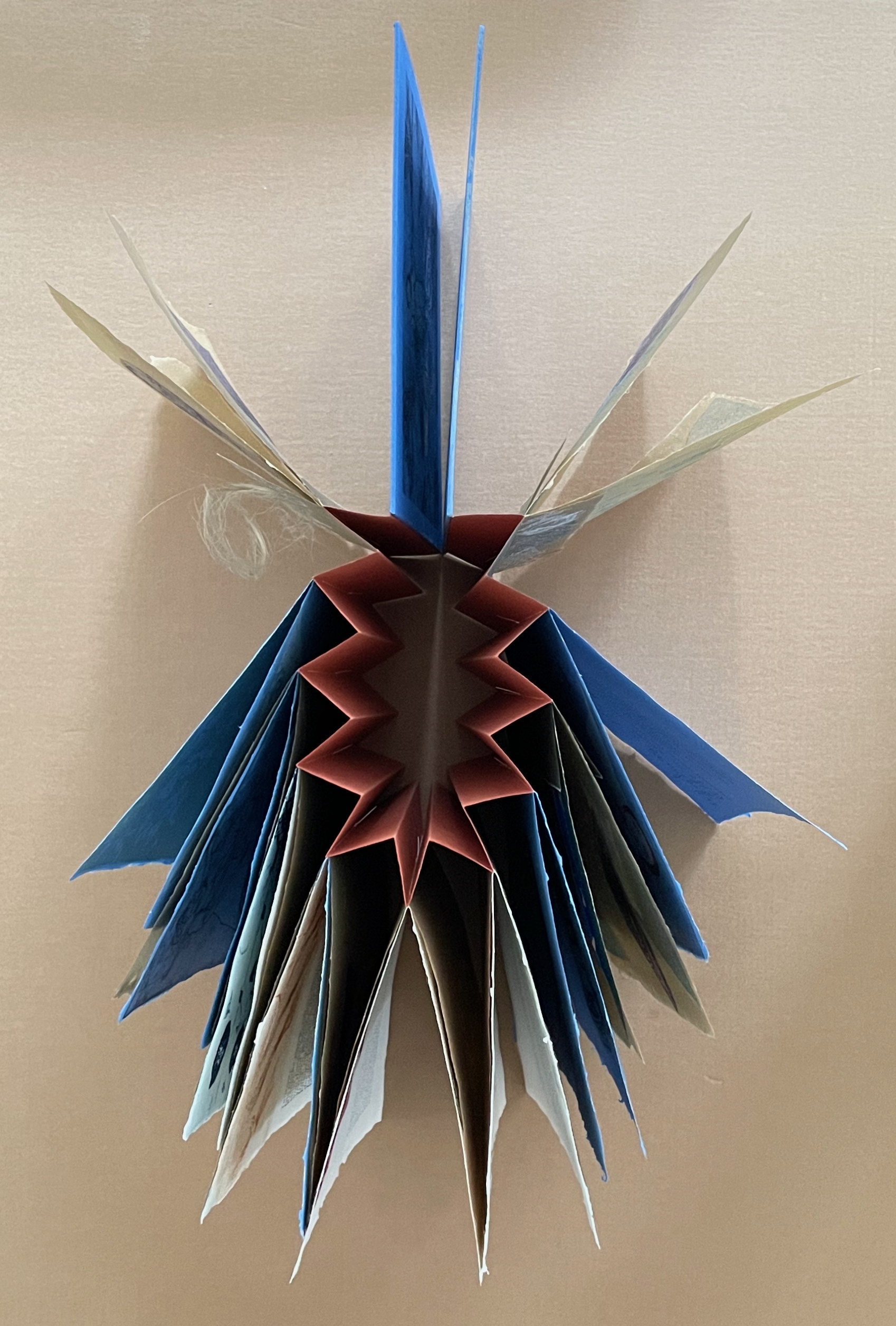
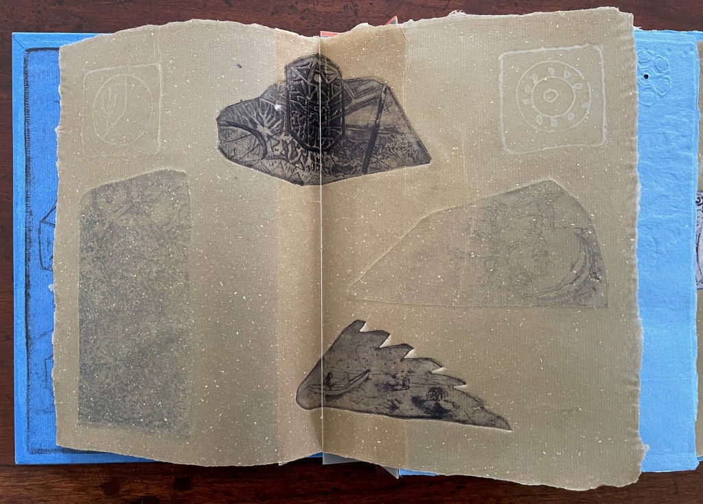
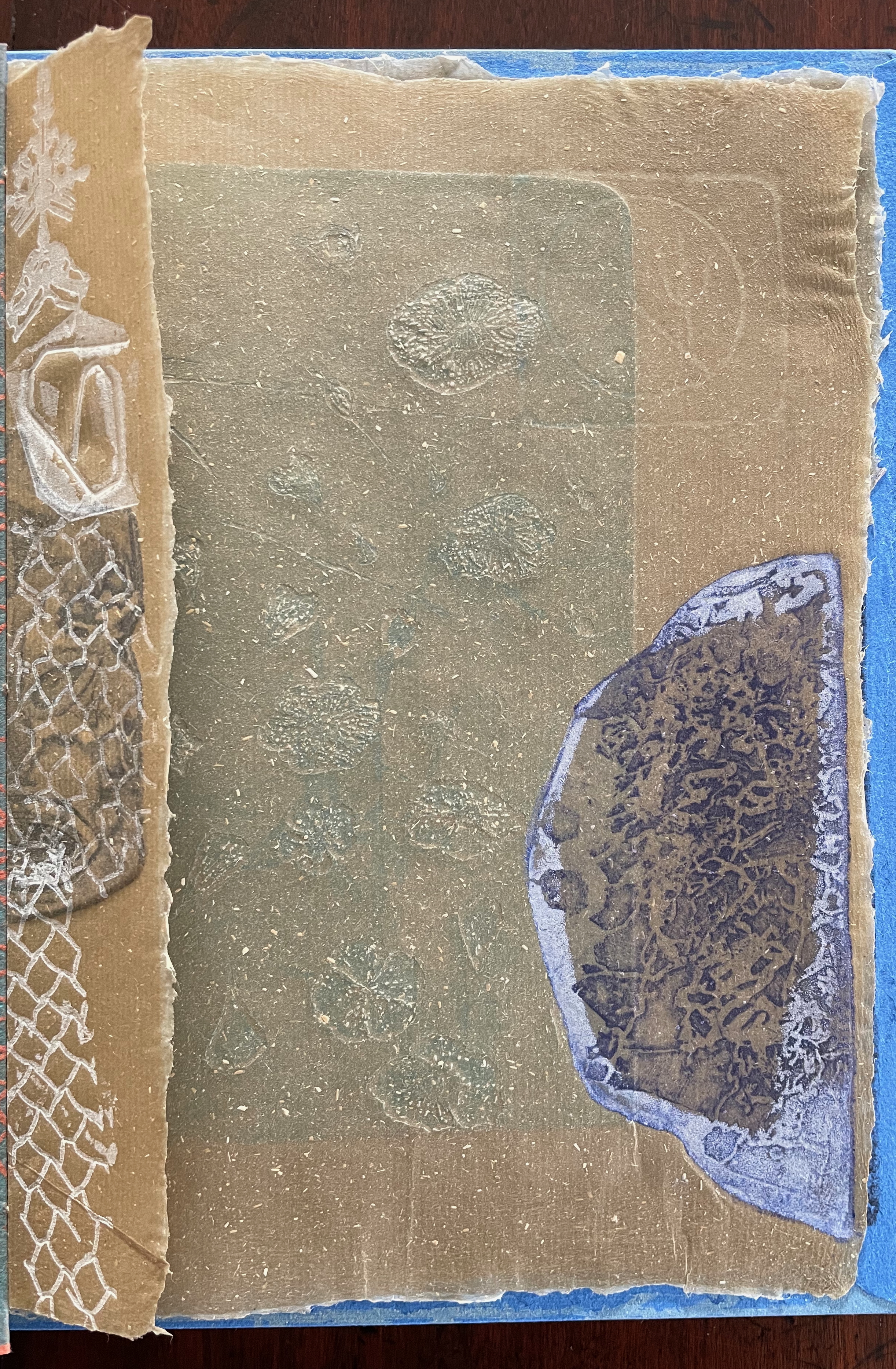
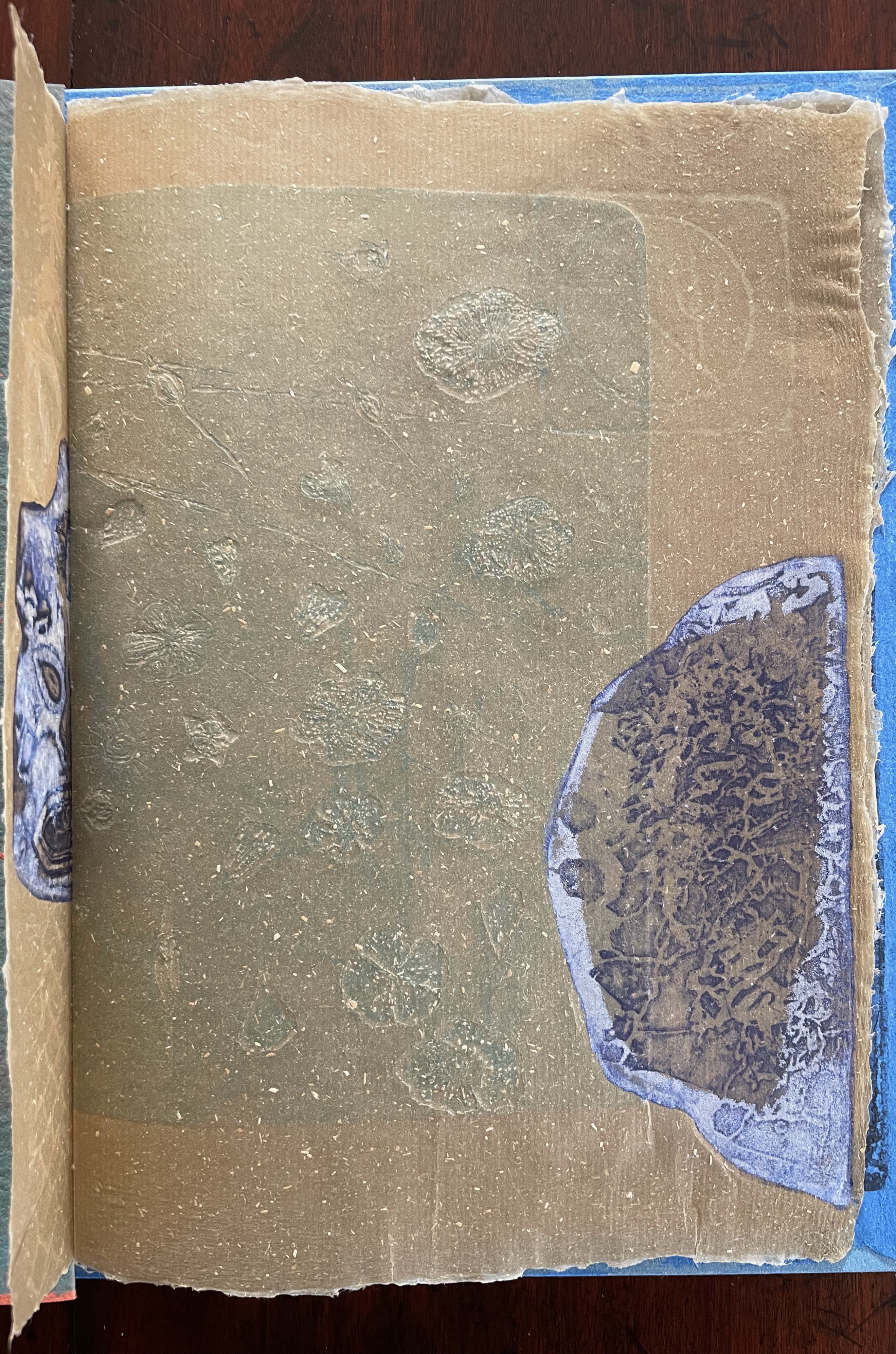
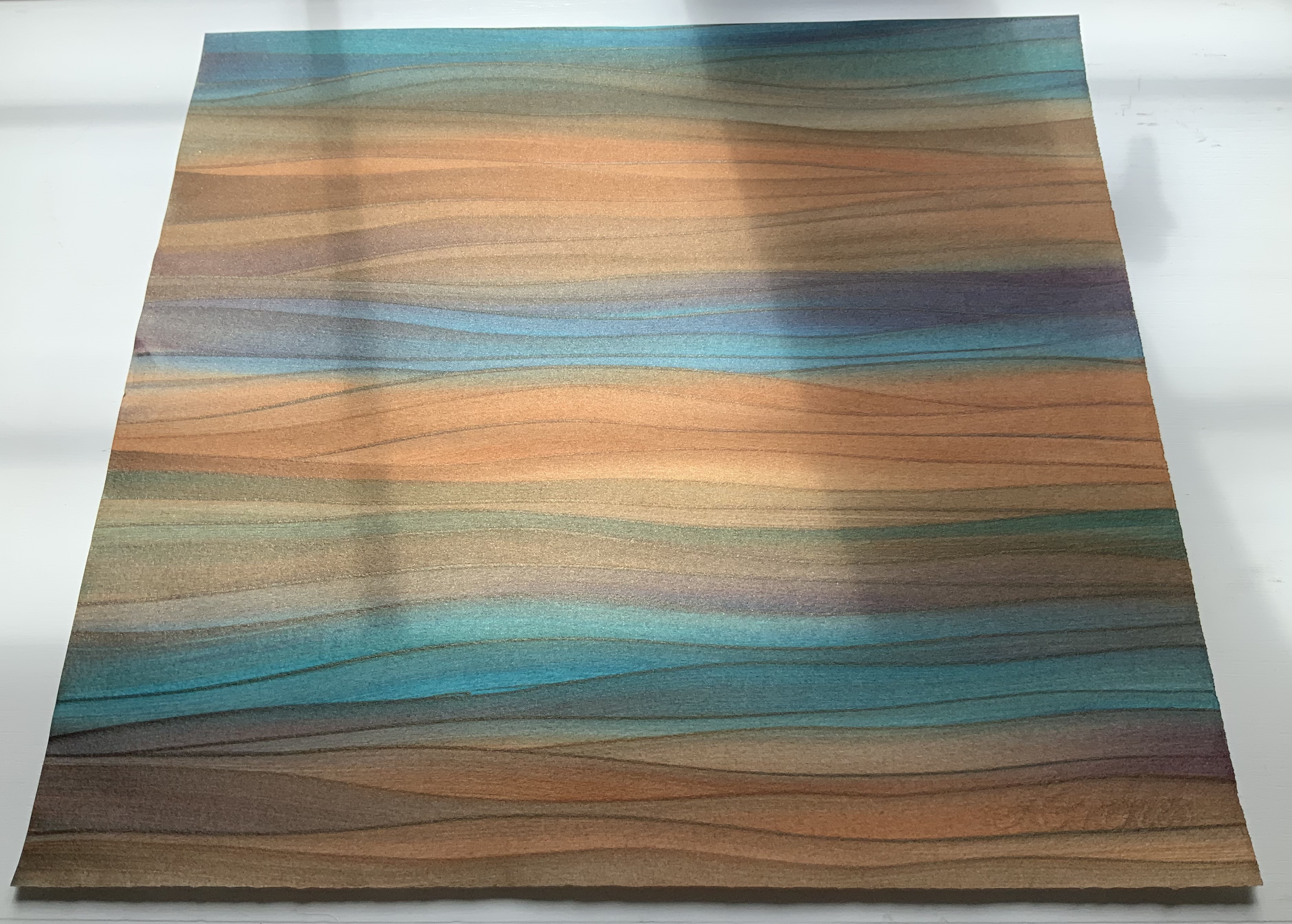
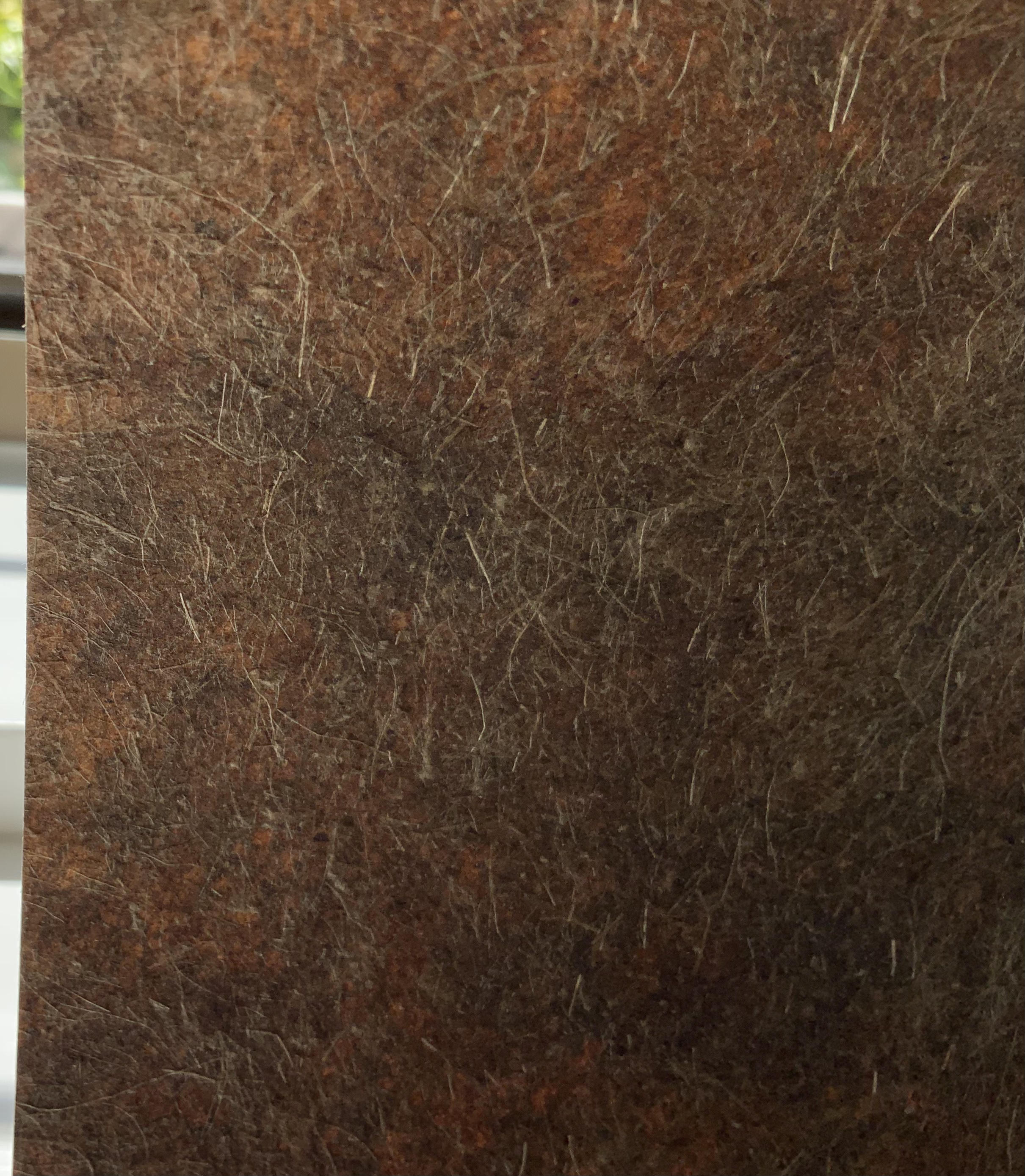
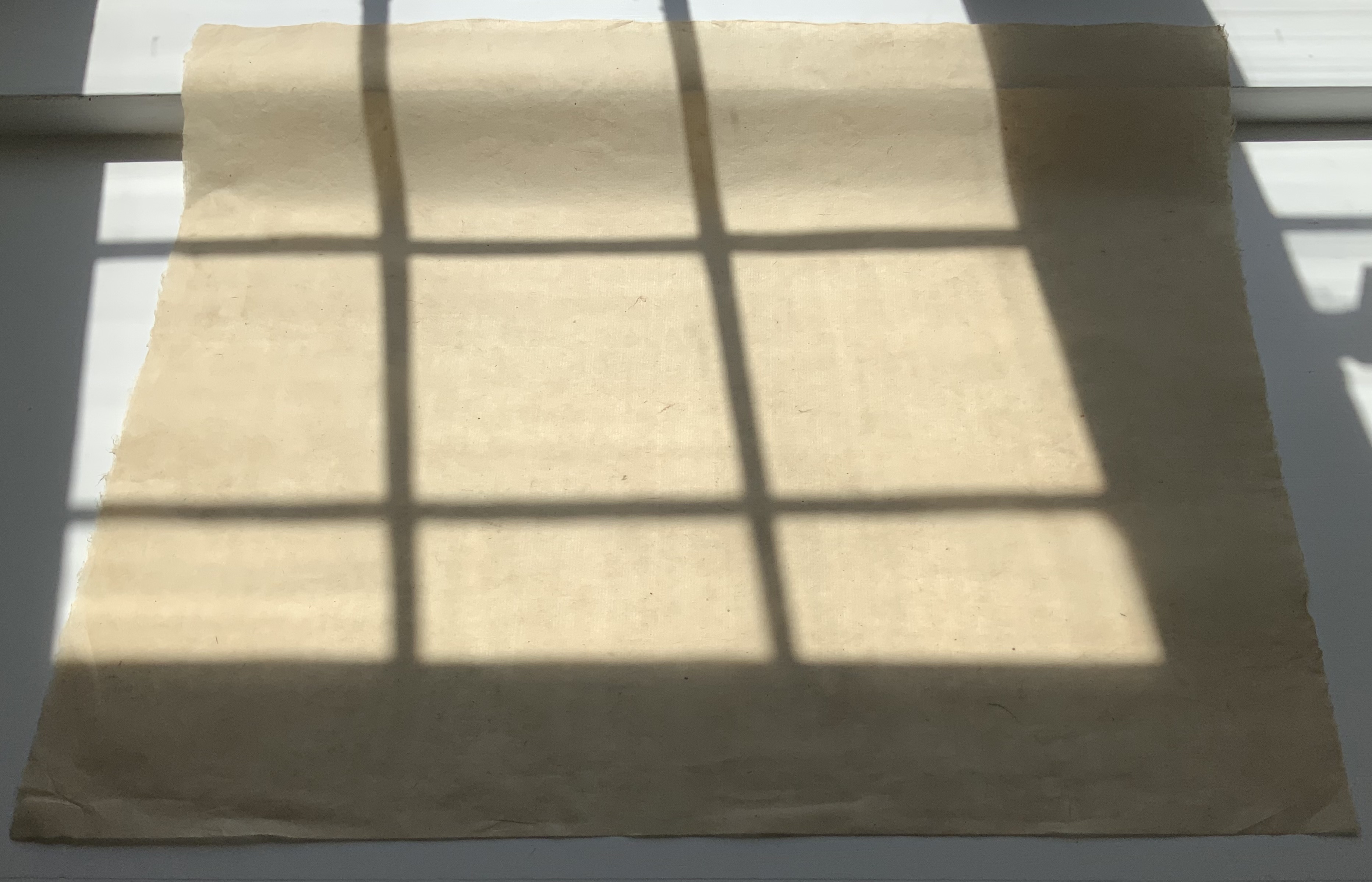
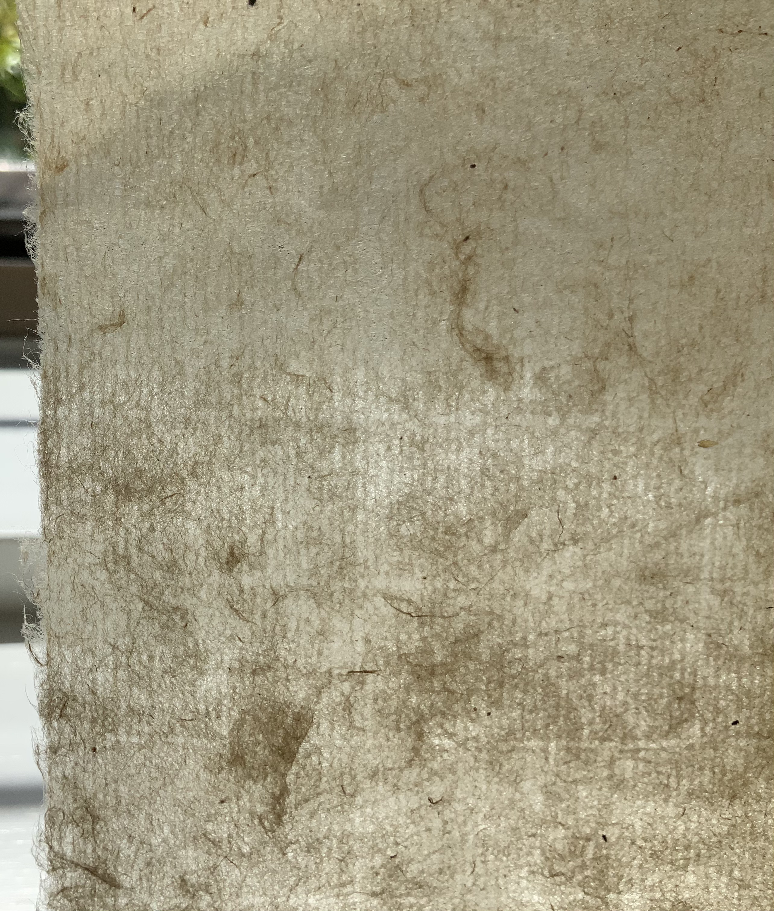
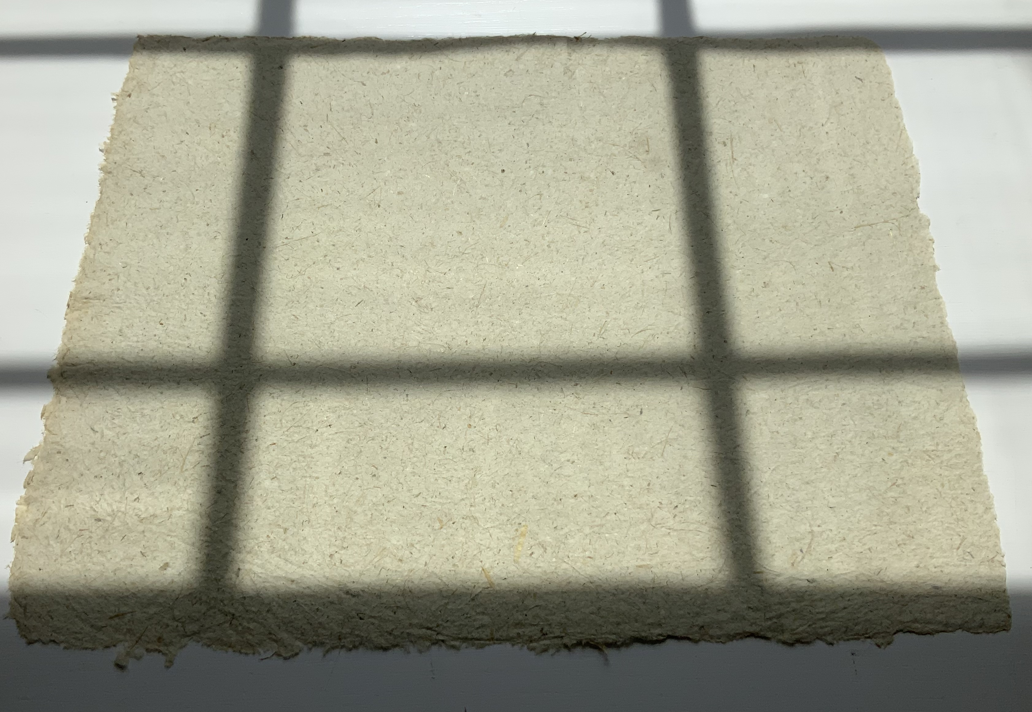
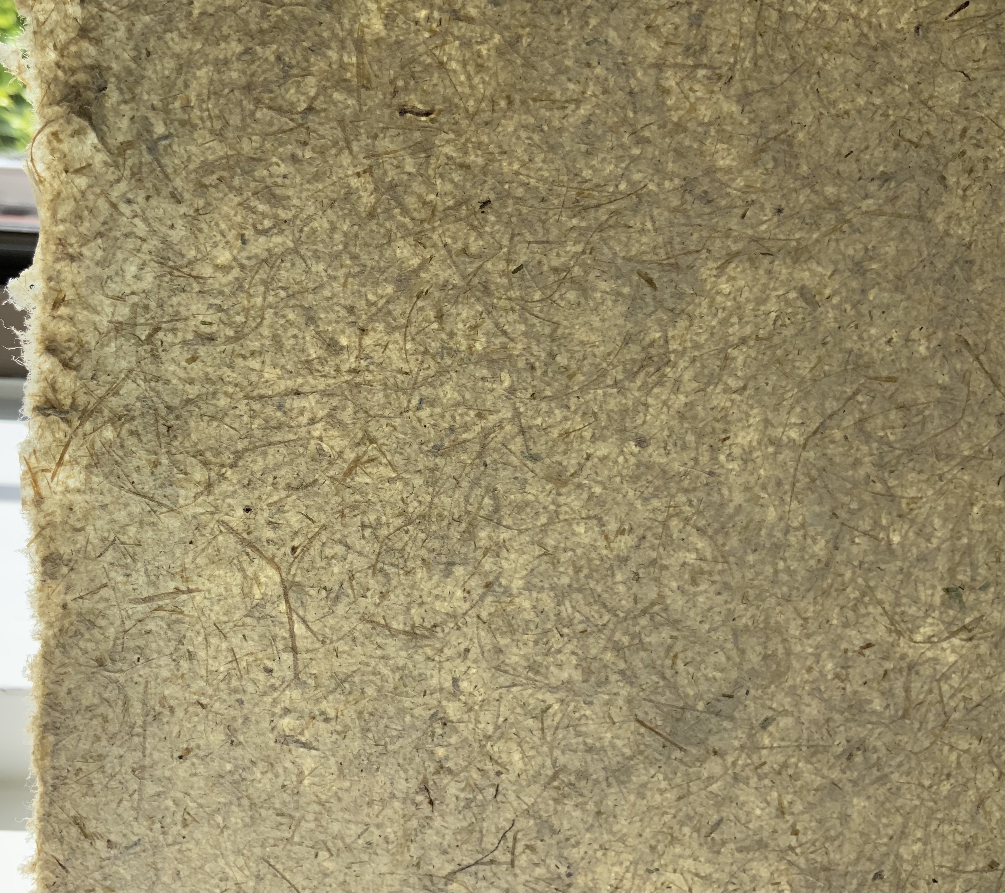
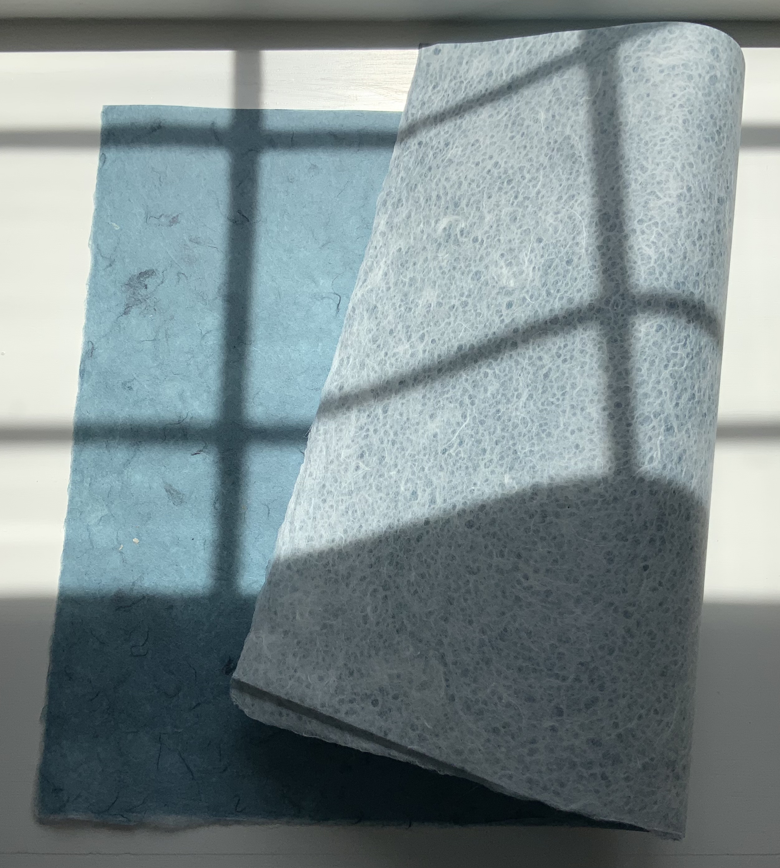
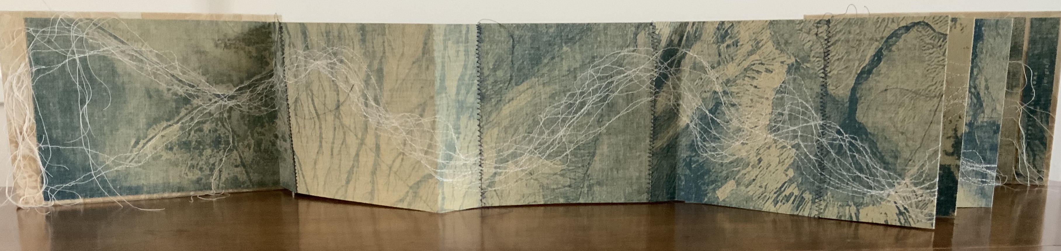
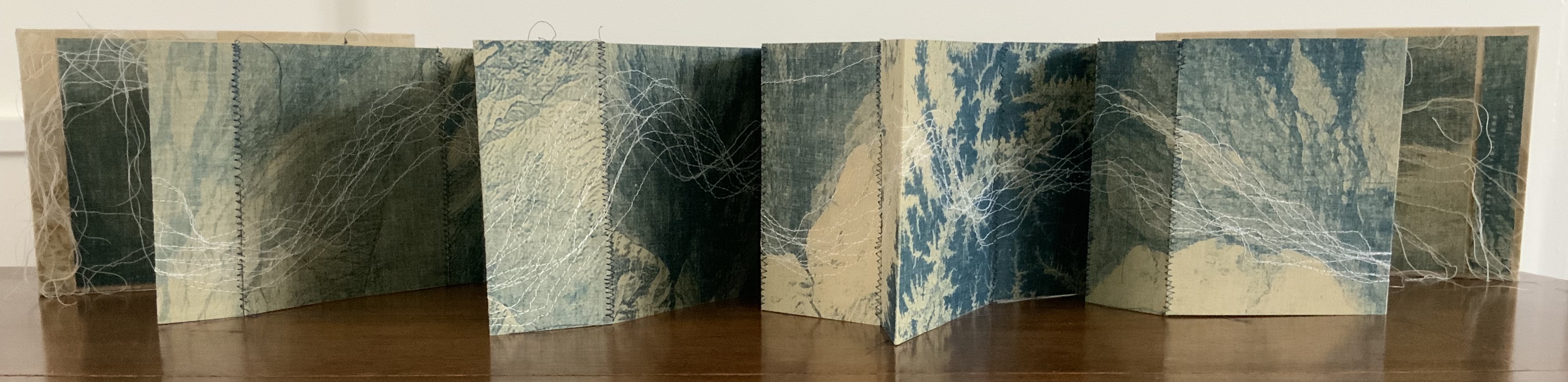
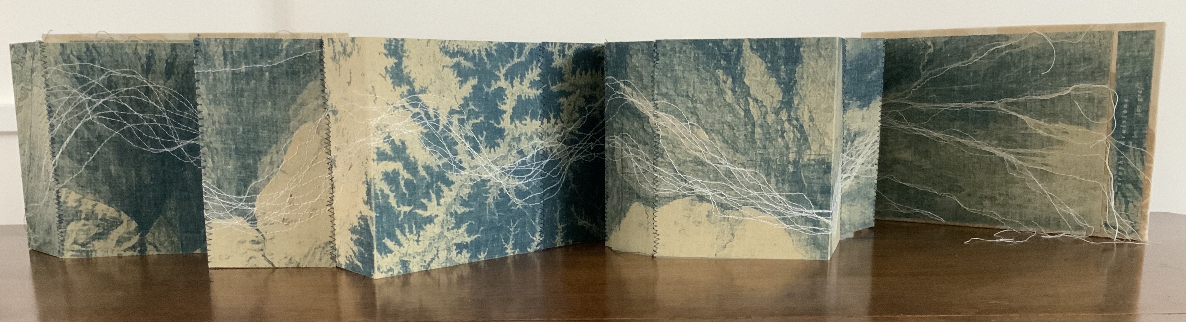
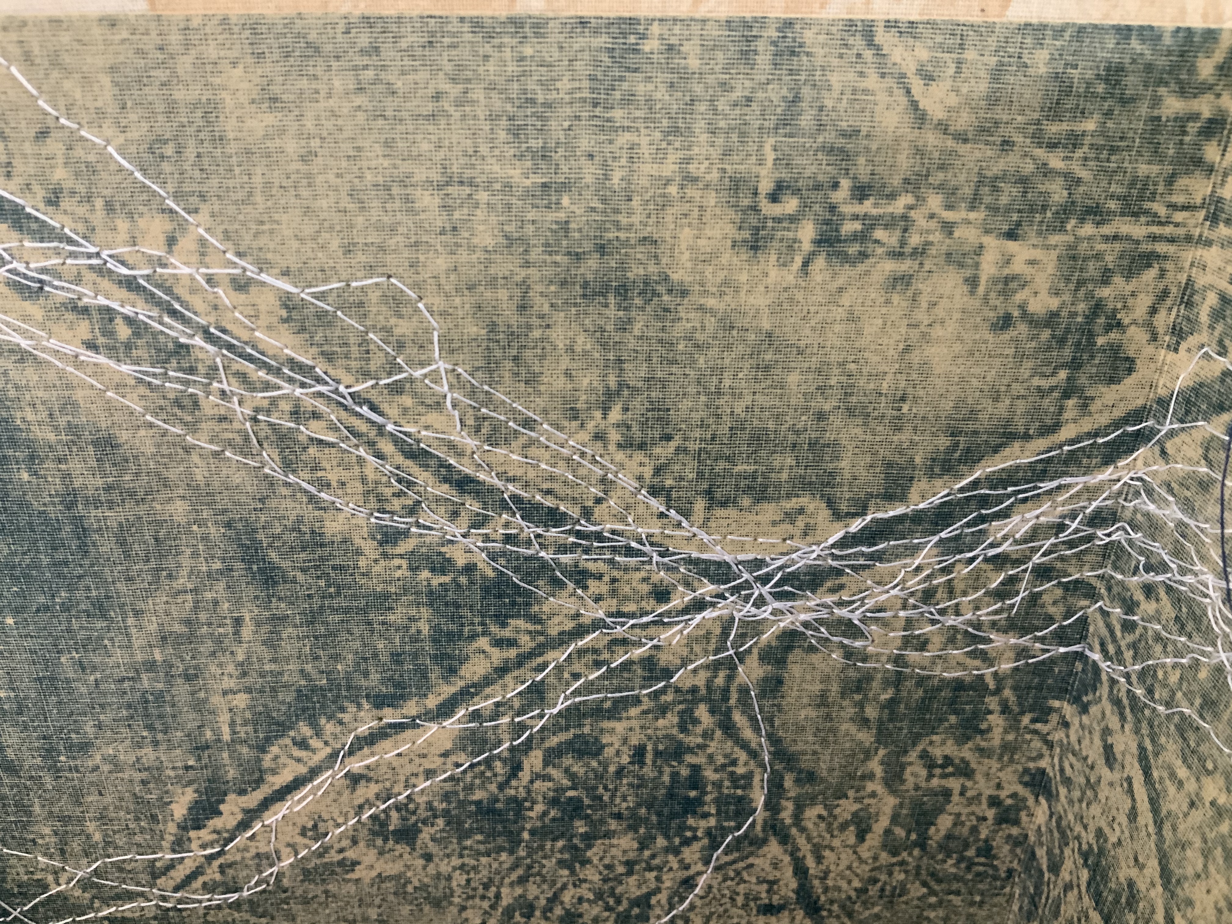
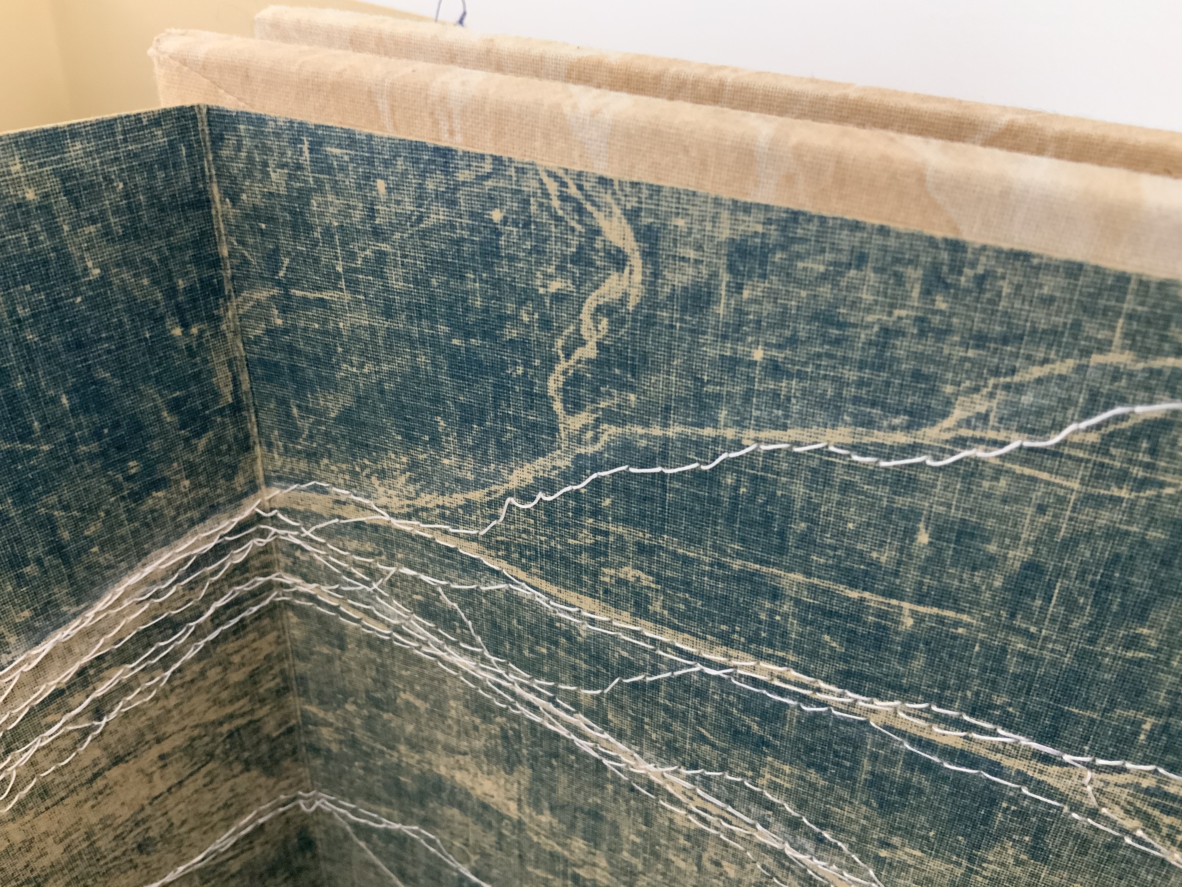
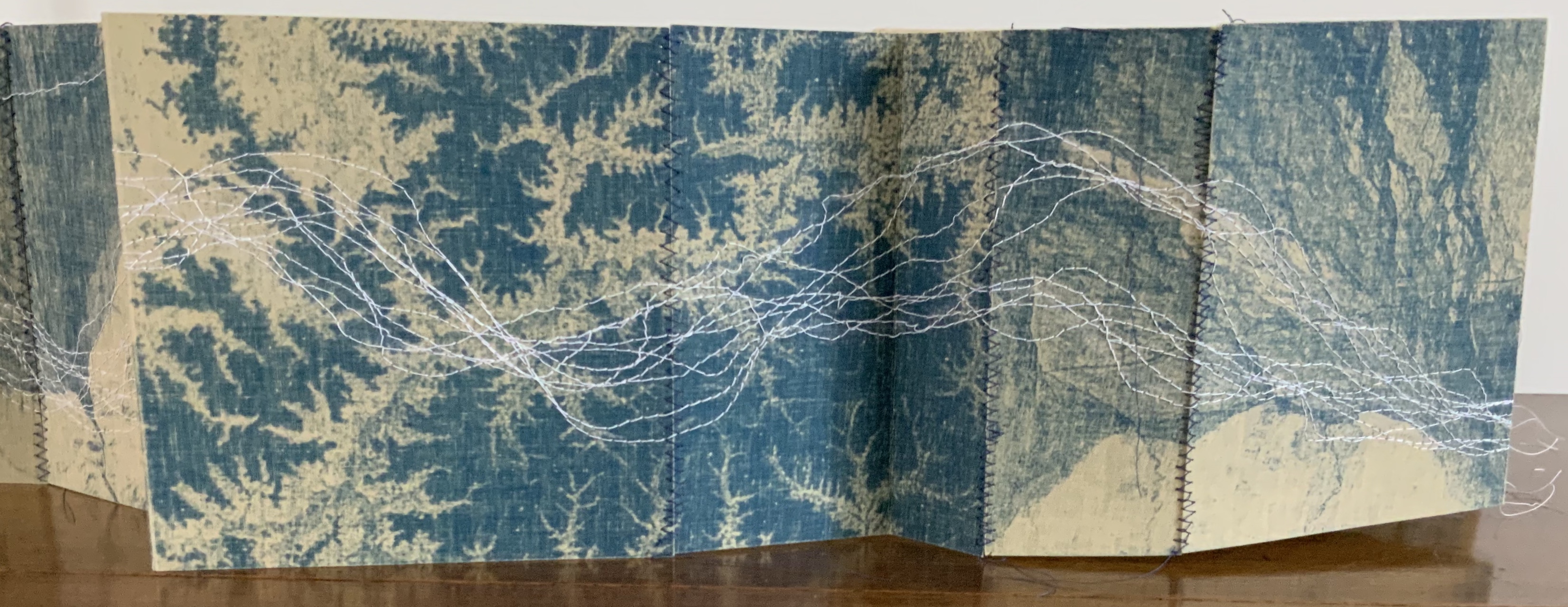
To organize and weave her motives together, Beisinghoff uses an accordion spine to whose peaks eleven sets of folios are sewn with linen thread. Three of the eleven are 4-page folios consisting of blue handmade paper. Another three 4-page folios consist of pure flax paper (handmade by John Gerard). The remaining five gatherings have 8-page folios, each consisting of a pure flax paper folio around a blue or plain one.
Side and top views of the accordion spine.
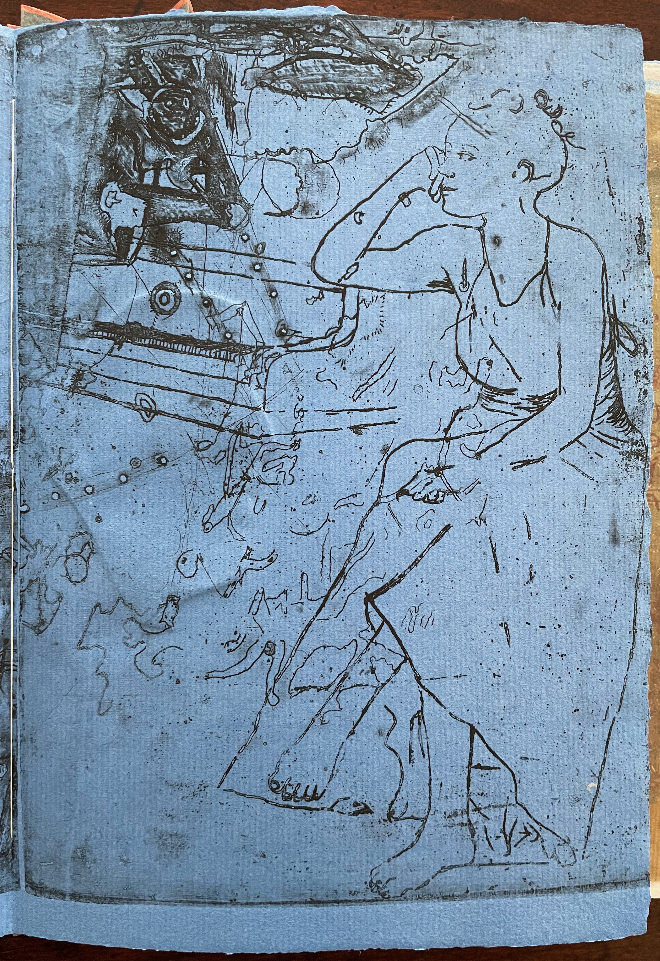
The first pure flax folio begins the book, displaying two title pages (German and English) and two etchings on its first and last pages. In the center spread, two more etchings appear. A watermark symbolizing phyllotaxis shows through in the upper left, balanced by a watermark with a cross section of a flax stalk in the upper right of the center spread. The texture and weight of the flax paper allows the impress and shadow of the etchings to stand out on both sides against the inking and watermarks.
Inside front cover and Tau blau title page and etching.
Center spread of first flax paper folio. Note the watermarks in the upper left and right corners.
Dew Blue title page and etching, loop of flax fibers, first page of blue handmade paper folio; note its boating image repeated from the prior center spread.
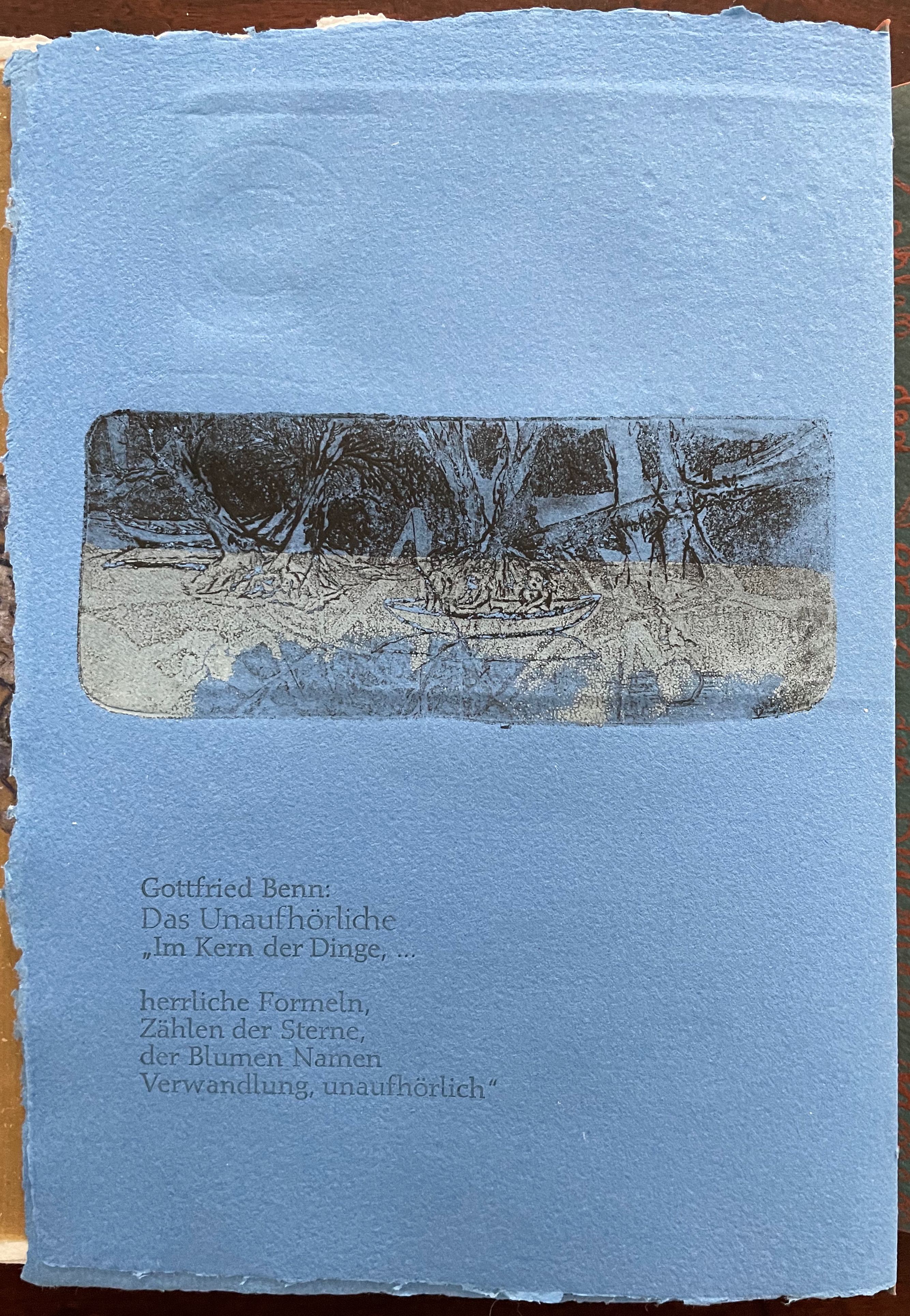
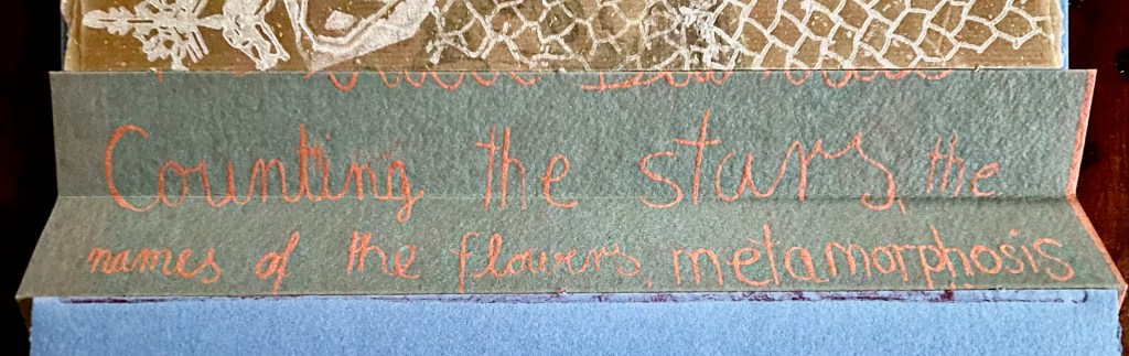
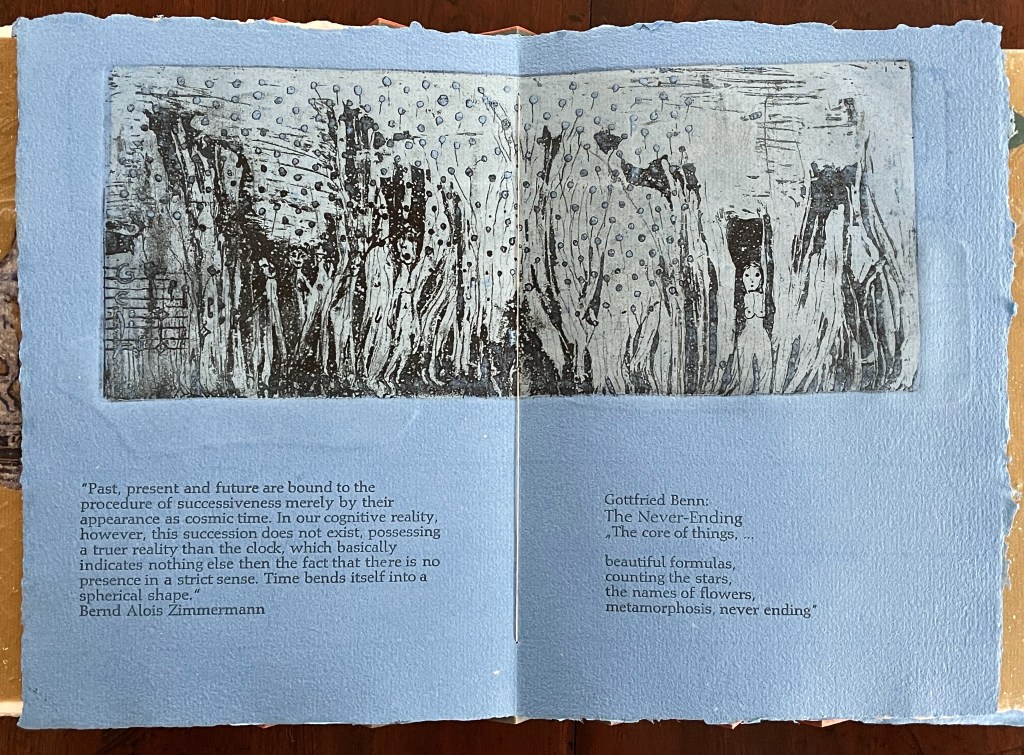
Following the pure flax folio, the first all blue folio gives us that introductory excerpt from Andersen’s fairy tale. Next comes a description of flax comes from Leonhart Fuchs’ Book of Herbs (1543), then the series of planting and harvesting observations from Beisinghoff, then the refrain from Clemens Brentano’s poem “Ich darf wohl von den Sternen singen” (1835), then philosophical observations drawing on G.W. Leibniz from D’Arcy Wentworth Thompson’s On Growth and Form (1917), a much-quoted theorem of musical composition from Bernd Alois Zimmermann’s Intervall und Zeit (1974), and finally (below) a passage of text by Gottfried Benn from the Hindemith oratorio Das Unaufhörliche / The Neverending (1936). In the valleys of the accordion spine, some of the lines from Andersen, Fuchs, Beisinghoff and Been appears handwritten in orange paint.
Translated fragment of Benn’s lyrics for Paul Hindemith’s oratorio Das Unaufhörliche / The Neverending (1936).
Even with these additional texts, Andersen’s fairy tale remains the most central text in Tau blau / Dew Blue, despite the brevity of its excerpt. Brentano’s Romantic/religious expostulations (“O Star and Bloom, Garb and Soul, Love, Hurt and Time for evermore”) sound like those of the plant in the story’s final passage. The occurrence of Fibonacci’s spiral in the plant may be a physical fact, but Beisinghoff turns it into something more mystical by placing the description of phyllotaxis next to Leibniz’ and Thompson’s transcendental view of mathematical science and natural philosophy. Likewise she links the texts from Bernd Alois Zimmermann and Gottfried Benn to the fairy tale by placing them beneath the etching that captures the flax plant’s singing and dancing into its transformation by fire.
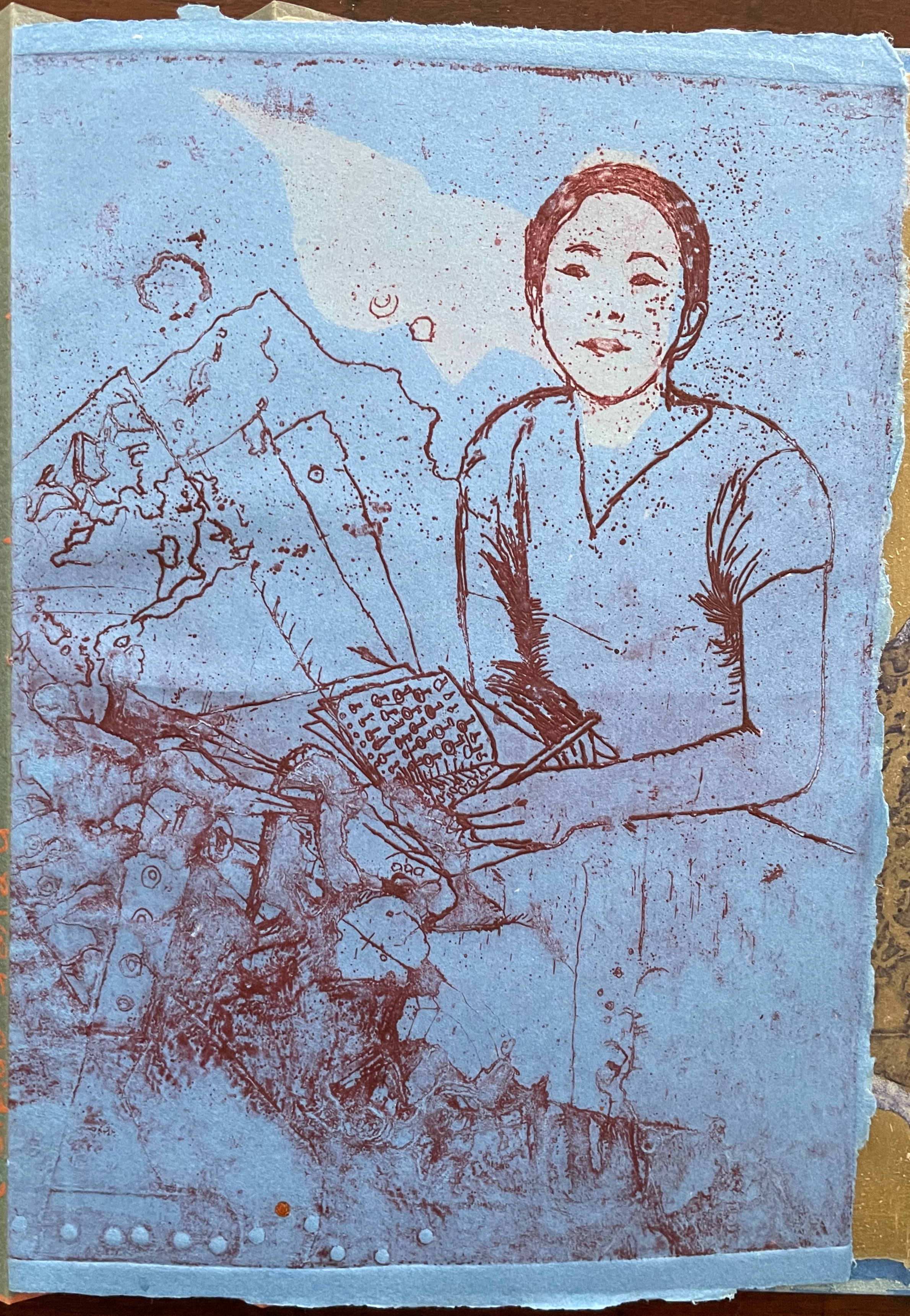
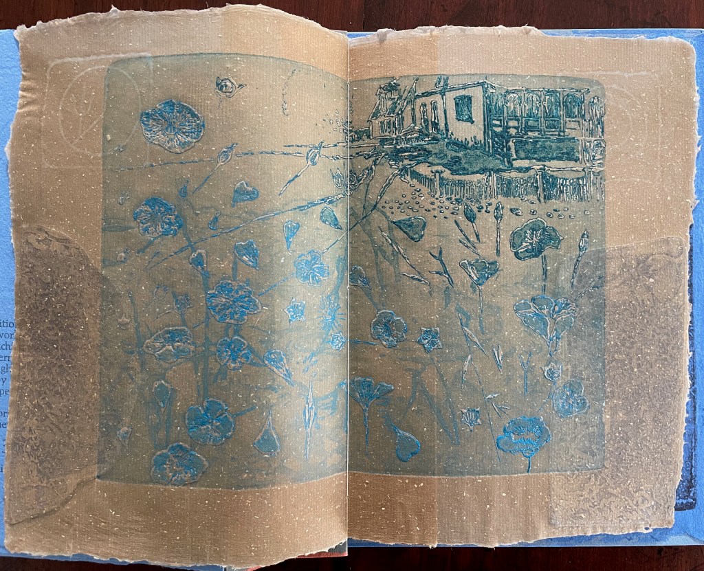
Below is the final folio of the work. Like the first, it is made completely of flax paper, but its center spread offers a fuller image: flax blossoms and stalks float in the foreground, and in the background is a sketch of Beisinghoff’s residence where she grows her flax. Like the Fibonacci spiral on the front and back covers, the first and last flax folios round out the work. But go back and listen for the hidden sound installations accompanying Dew Blue. Noticing Beisinghoff’s abstract musical notation, indulge yourself with recordings of a Swedish folk song (“Today is supposed to be the big flax harvest” here or here) to which the notation and phrases allude, and as the flax papers turn and wave on their accordion peaks, listen carefully for their musical rustle.
The final pure flax paper folio.
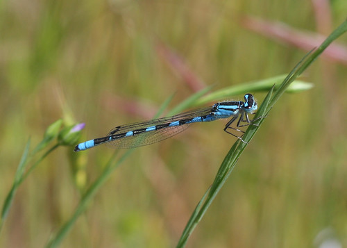
Tule Bluet damselfly perched on flax leaf. Photo: John Riutta, The Well-Read Naturalist (2009). Displayed with permission.
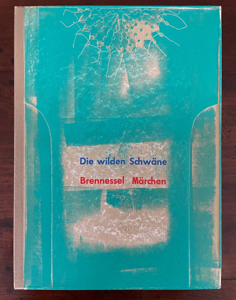
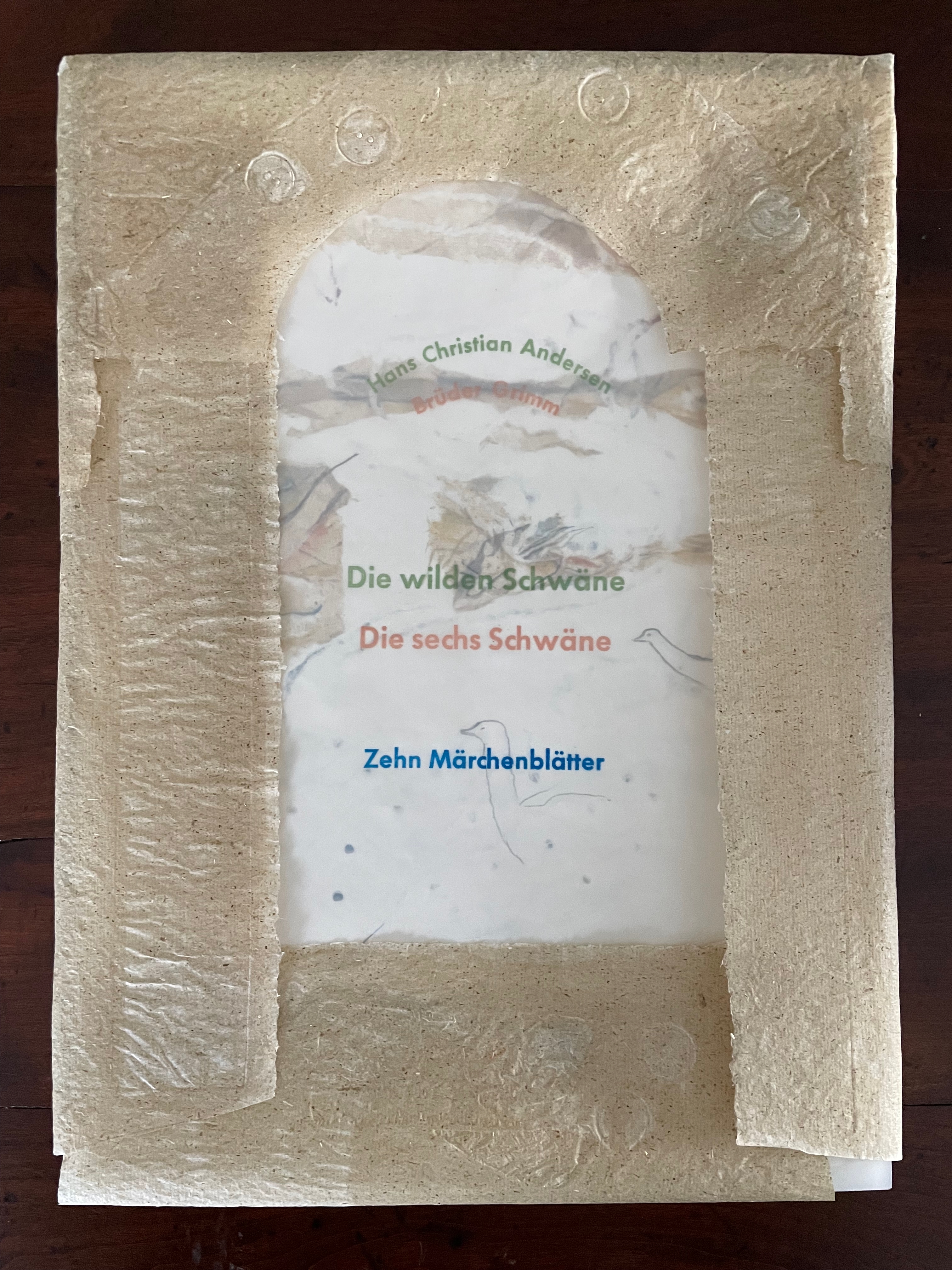
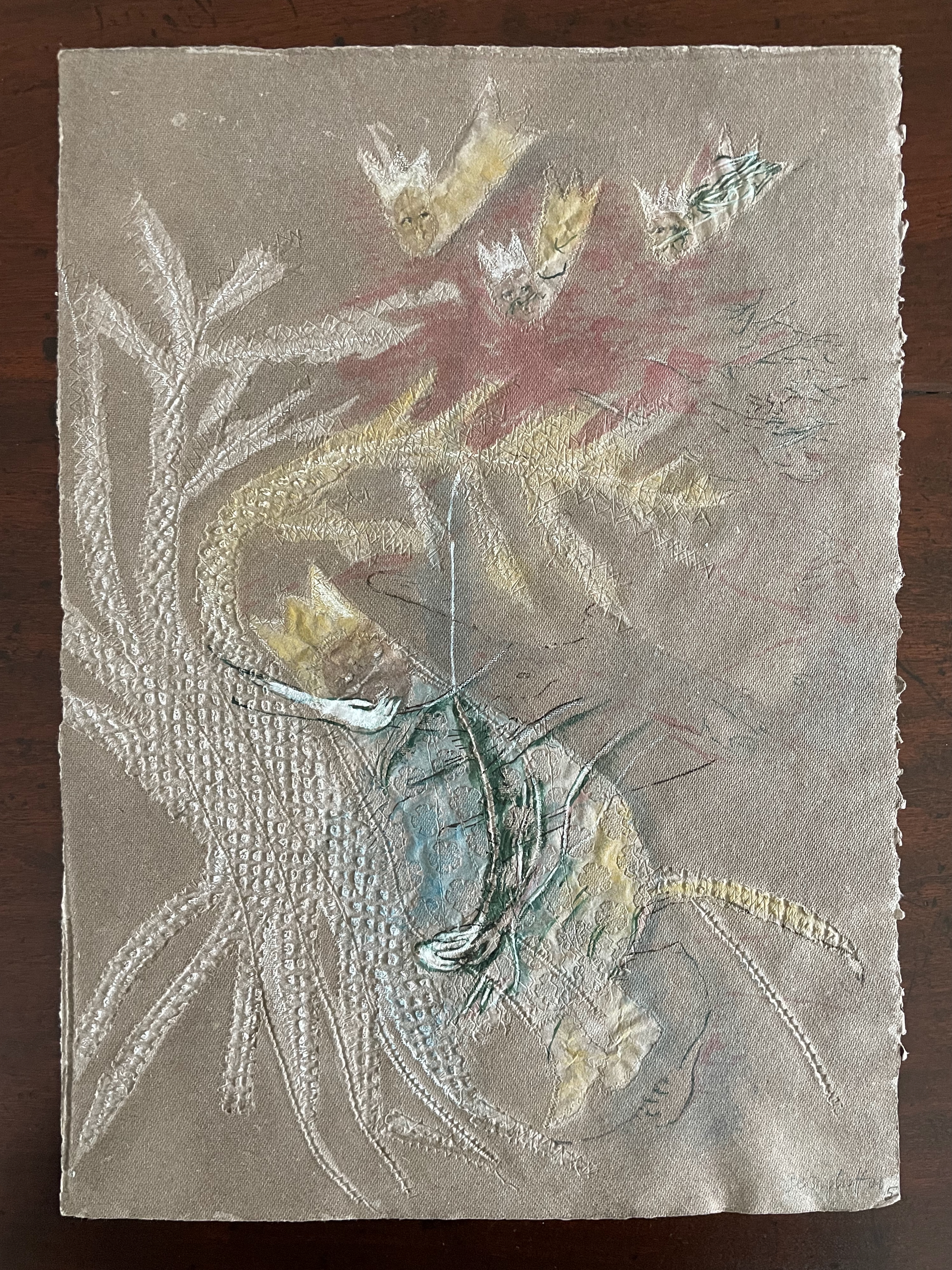
Die wilden Schwäne (2001)
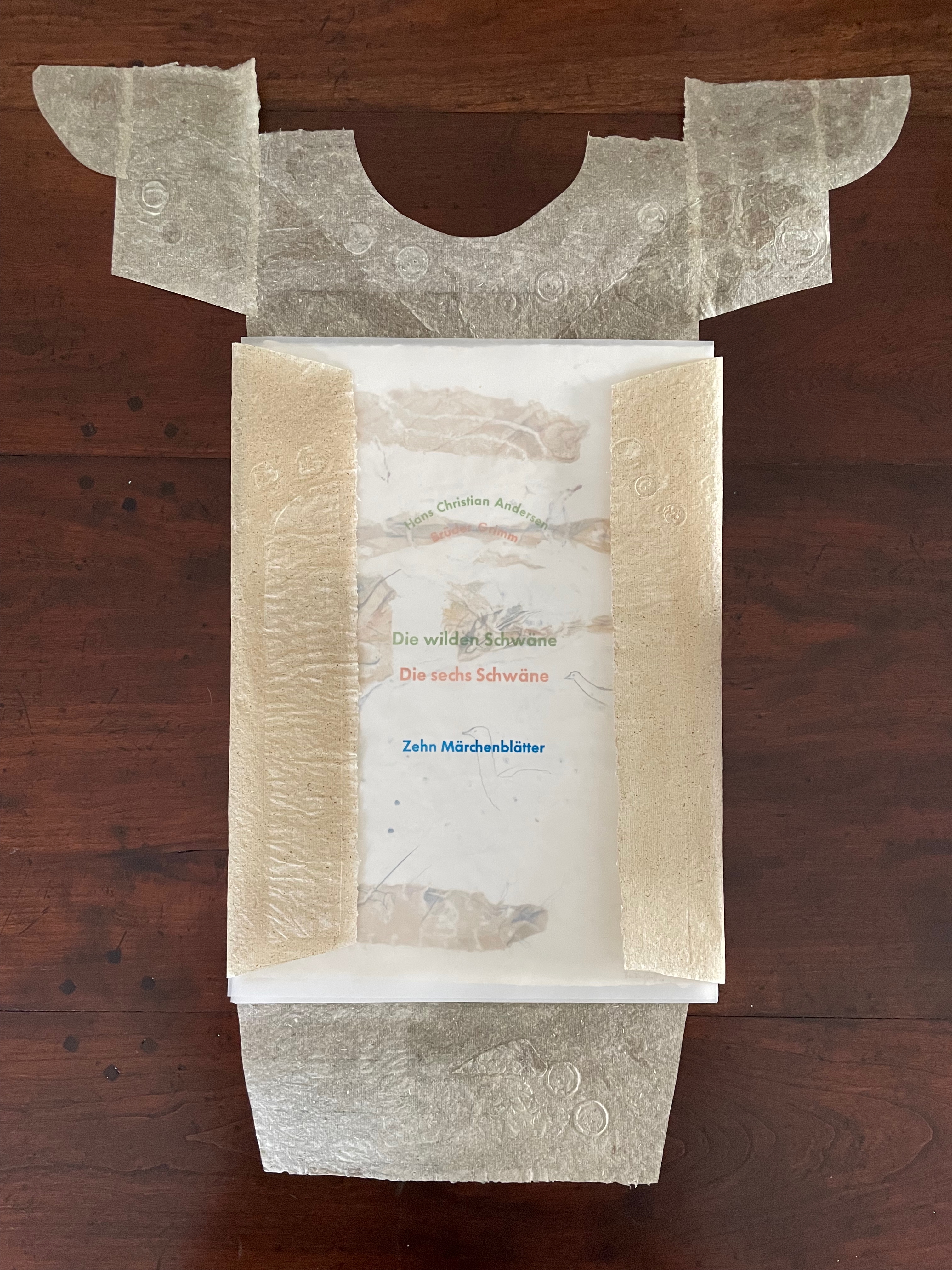
Die wilden Schwäne (2001) Barbara Beisinghoff Box with embossed cover holding folios wrapped in chemise. H35o x W250 mm. 18 folios. Edition of 25, of which this is #6. Acquired from the artist, 20 December 2024. Photos: Books On Books Collection.
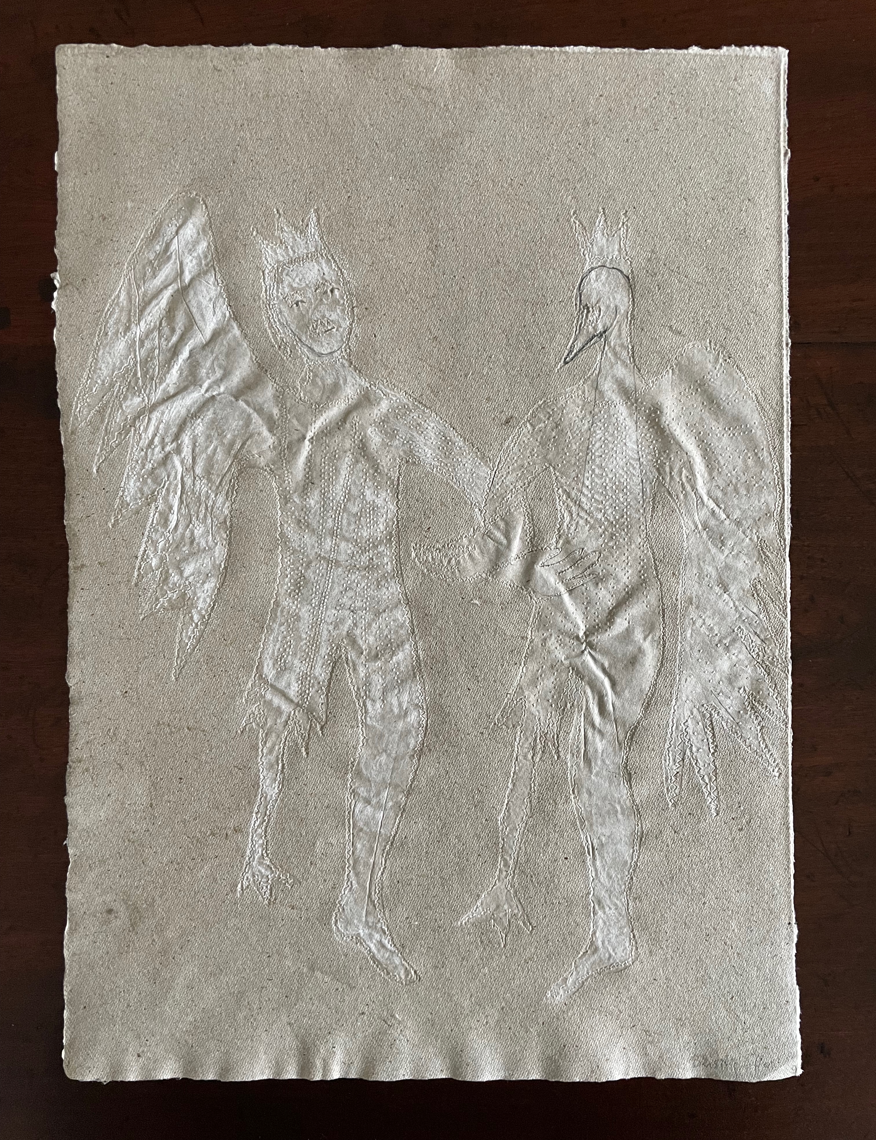
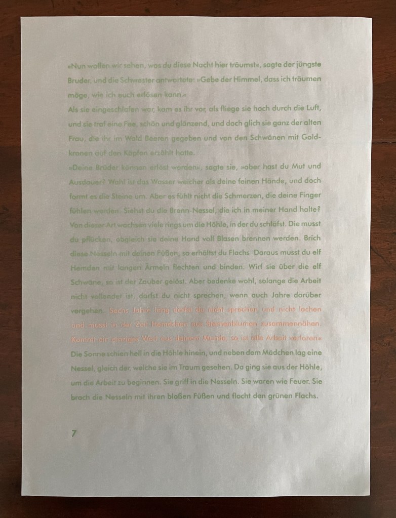
Barbara Beisinghoff’s Die wilden Schwäne is an exemplar of collaboration and craft. In it, she even requires collaboration between Hans Christian Andersen and the Brothers Grimm. Andersen’s Die wilden Schwäne and the Grimms’ Die sechs Schwäne are based on the same tale of brothers turned into swans who are saved by their sister Elisa’s diligent and mute harvesting, pulping, spinning and sewing of stinging nettles into shirts that break the spell when donned. H.C. Andersen, however, is verbose and elaborate in his telling (even including vampires!), and Beisinghoff has done a bit of nipping and tucking with the more succinct Brothers Grimm to create a version more suited to the artist’s book she creates.
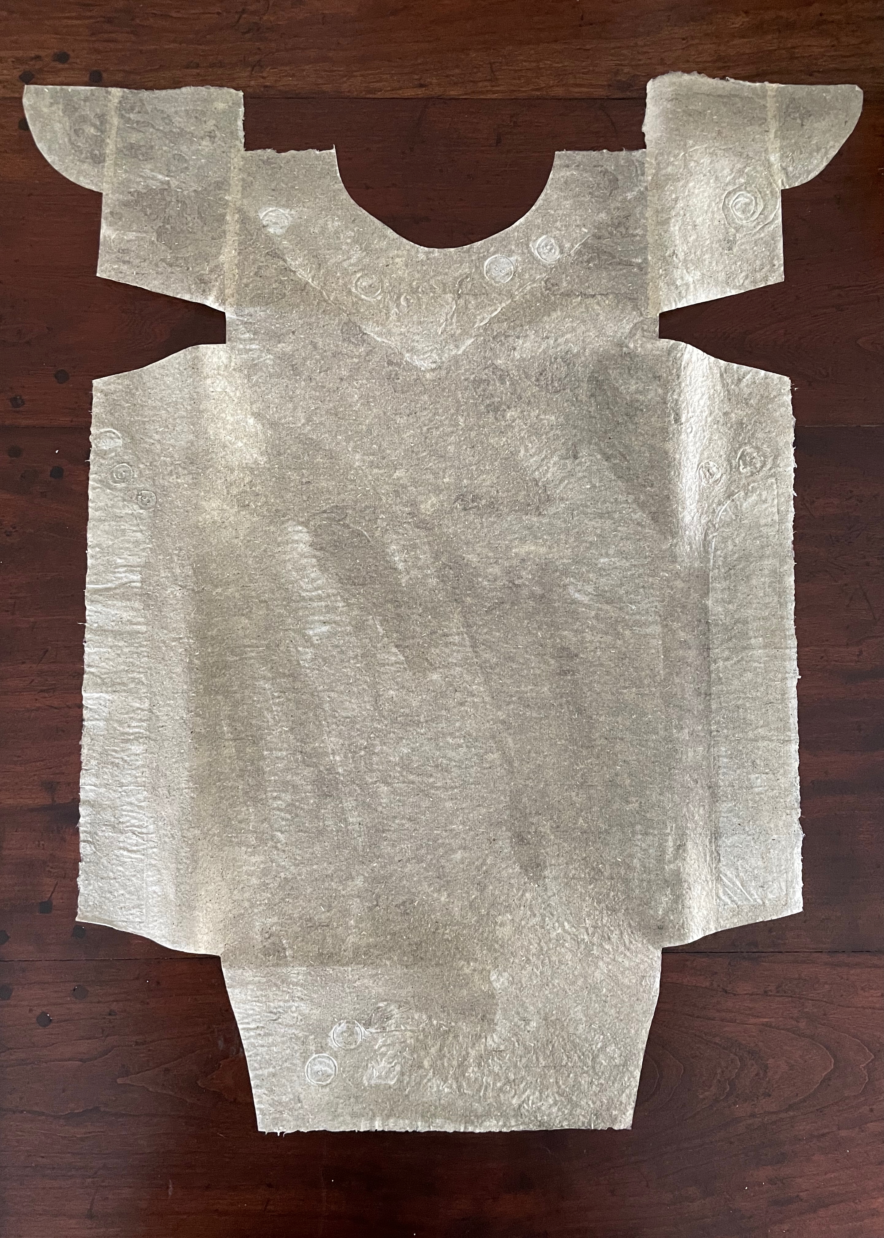
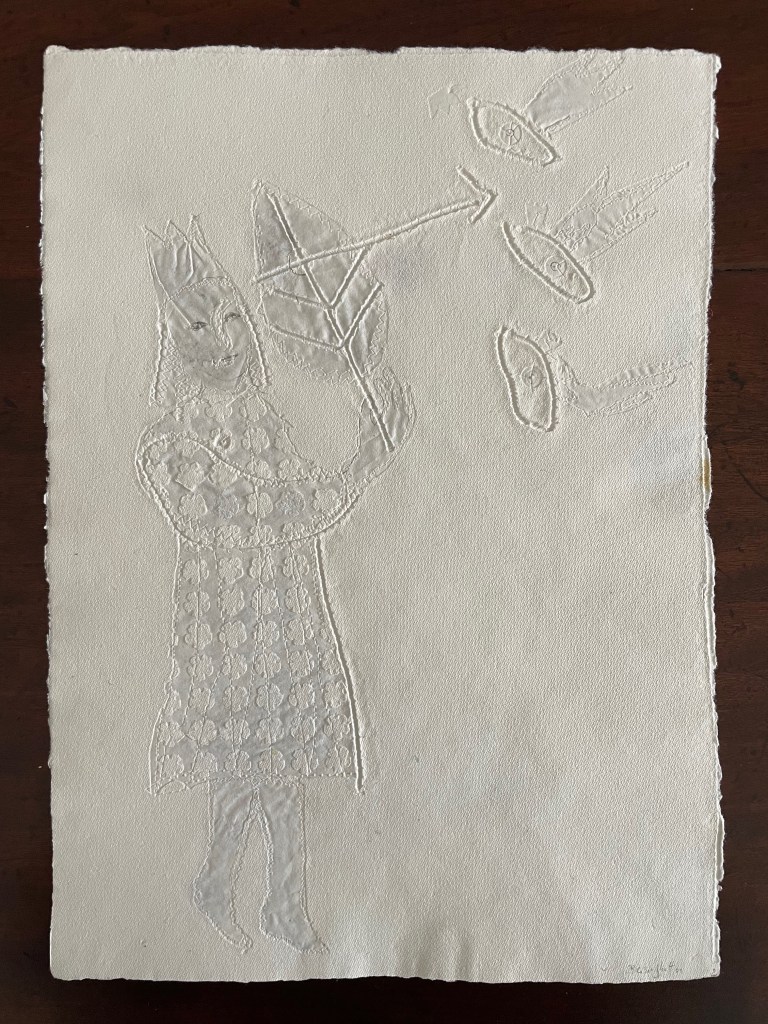
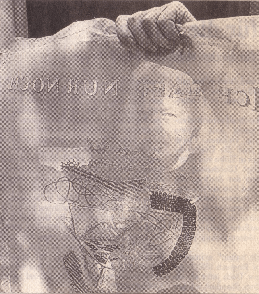
To match Elisa’s effort with stinging nettles, Beisinghoff enlisted the collaboration of Johannes Follmer, the owner of a paper mill. Together they obtained cultivated stinging nettles from the Institute for Applied Botany in Hamburg, cut the fibers, left them to rot, boiled them into a pulp, mixed that with water in a vat, scooped up layers in a sieve embroidered with illustrations, couched the sheets, then pressed and dried them into paper. Beisinghoff applied further drawings with a water jet, watercolor and pencil to the watermark-embossed sheets to illustrate aspects of the tale. To present the Andersen/Grimm “collage”, Beisinghoff had the type set and printed at the Gutenberg Museum. Andersen is printed in light green and Grimm in light red on seven numbered translucent sheets and interleaved with the nine folios of paper art (two more translucent sheets carry the cover page and colophon). To wrap the folios together, Beisinghoff made an embossed chemise or “feather dress” of pure nettle fiber, which could represent Andersen’s description of the brothers’ blowing off each other’s feathers every evening when the sun has set or one of the shirts that their sister makes to break their spell.
The “feather dress” of stinging nettle fiber.
“The King’s little daughter was standing in the cottage room, playing with a green leaf, for she had no other toys. She pricked a hole right through the leaf, looked up at the sun, and there it was, she saw the clear eyes of her brothers, but every time the warm rays of the sun shone on her cheeks, she thought of all their kisses.” Translation with DeepL.
“When she had fallen asleep, it seemed to her as if she were flying high through the air, and she met a fairy, beautiful and radiant, yet she looked very much like the old woman who had given her berries in the forest and told her about the swans with gold crowns on their heads.” Translation with DeepL.
“The swans swooped down to her and lowered themselves so that she could throw the shirts over them: and as she touched them, the swan skins fell off, and her brothers stood before her in the flesh, fresh and beautiful.” Translation with DeepL.
“Barbara Beisinghoff (head in the background) covers the frame with this transparent, embroidered and sewn gauze, which is used to scoop and emboss her nettle papers. This is how her large-format watermark illustrations end up on the sheets.” Translation with DeepL. Peter Holle. 30 August 2001. Frankfurter Rundschau. Photo: Oliver Weiner.
This art by watermarking recalls that of other artists in the collection: Fred Siegenthaler and Gangolf Ulbricht, in particular. The technique of pulp painting also finds other practitioners in the collection: Pat Gentenaar-Torley, John Gerard, Helen Hiebert, Tim Mosely, Maria G. Pisano, Taller Leñateros, Claire Van Vliet and Maria Welch. Beisinghoff’s blend of embroidered watermarks, waterjet marking and pulp painting, however, creates a bas relief effect that is echoed only in the collection’s works by Mosely, Taller Leñateros and Van Vliet, albeit achieved differently. These workings of the substrate — as material, color, surface, and even narrative — with the workings of book structure is one of the more magical locations of book art. It is perfect for Beisinghoff’s metamorphical interpretation of the Andersen/Grimm fairy tale.
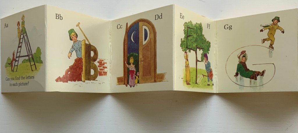
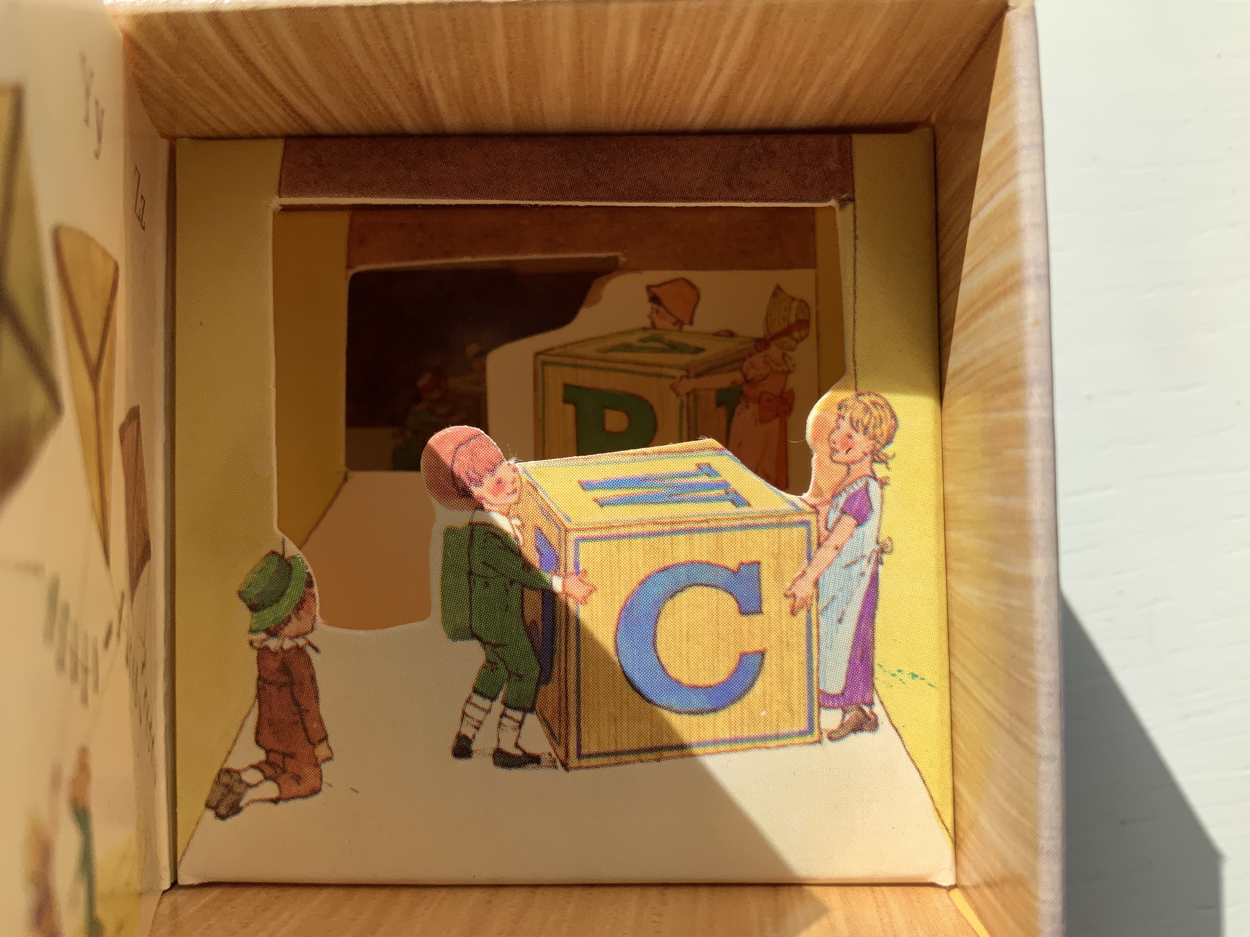
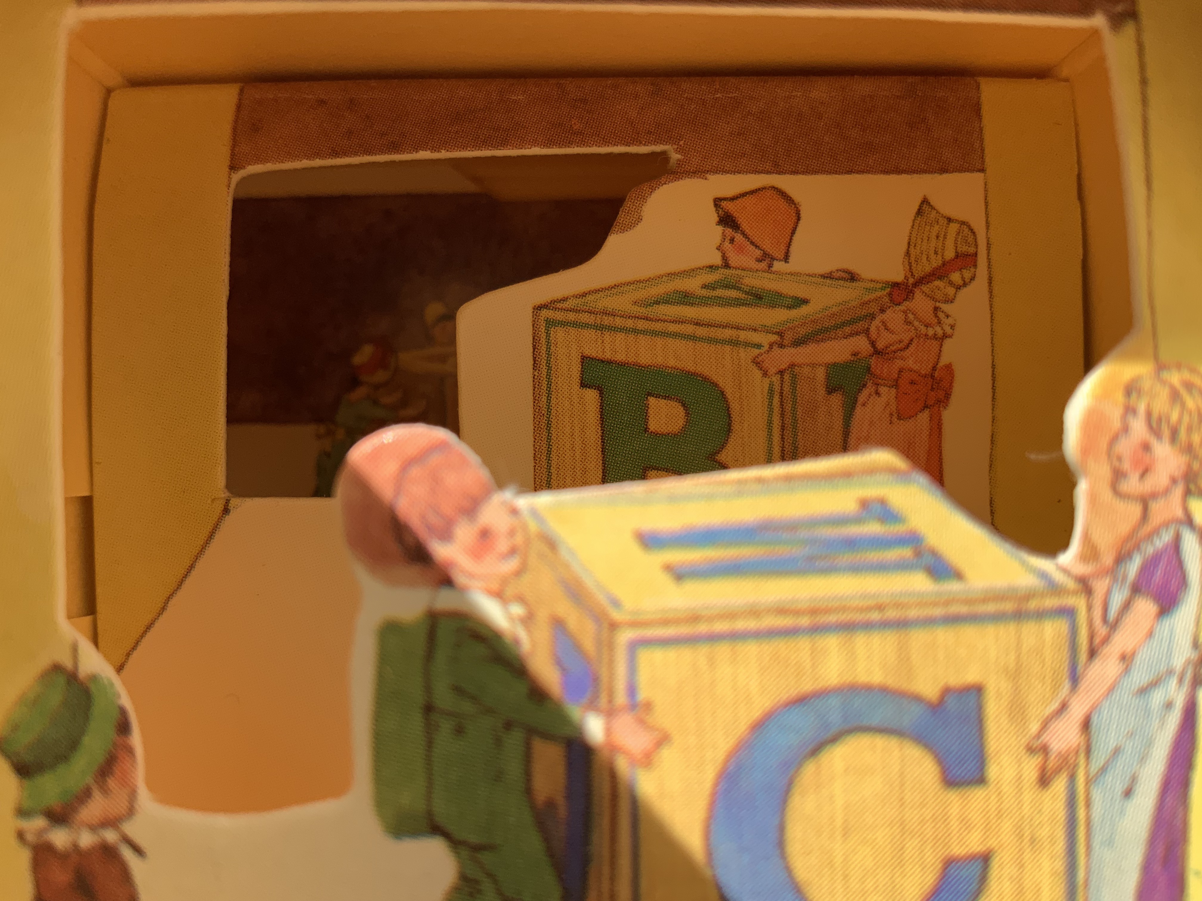
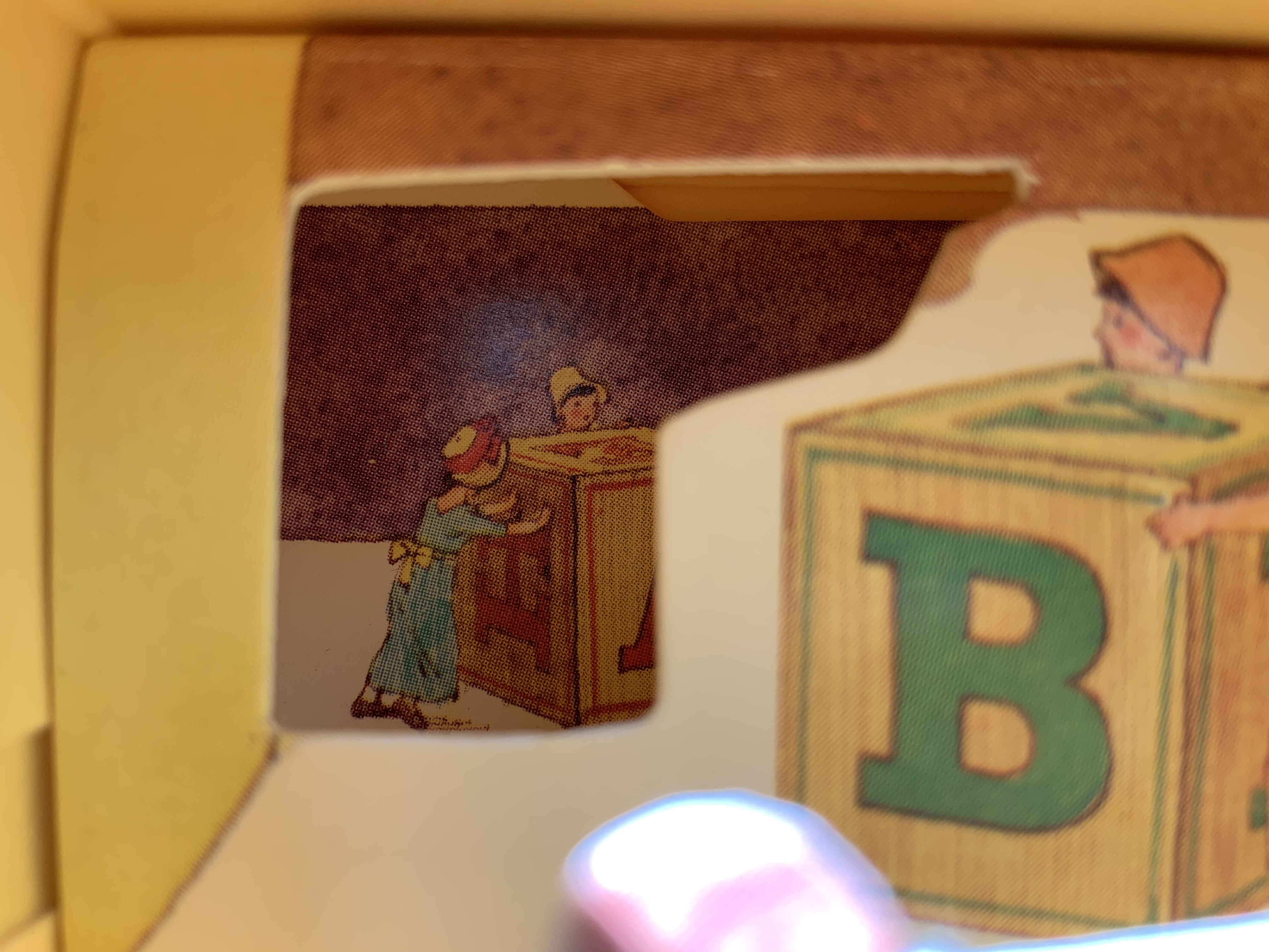
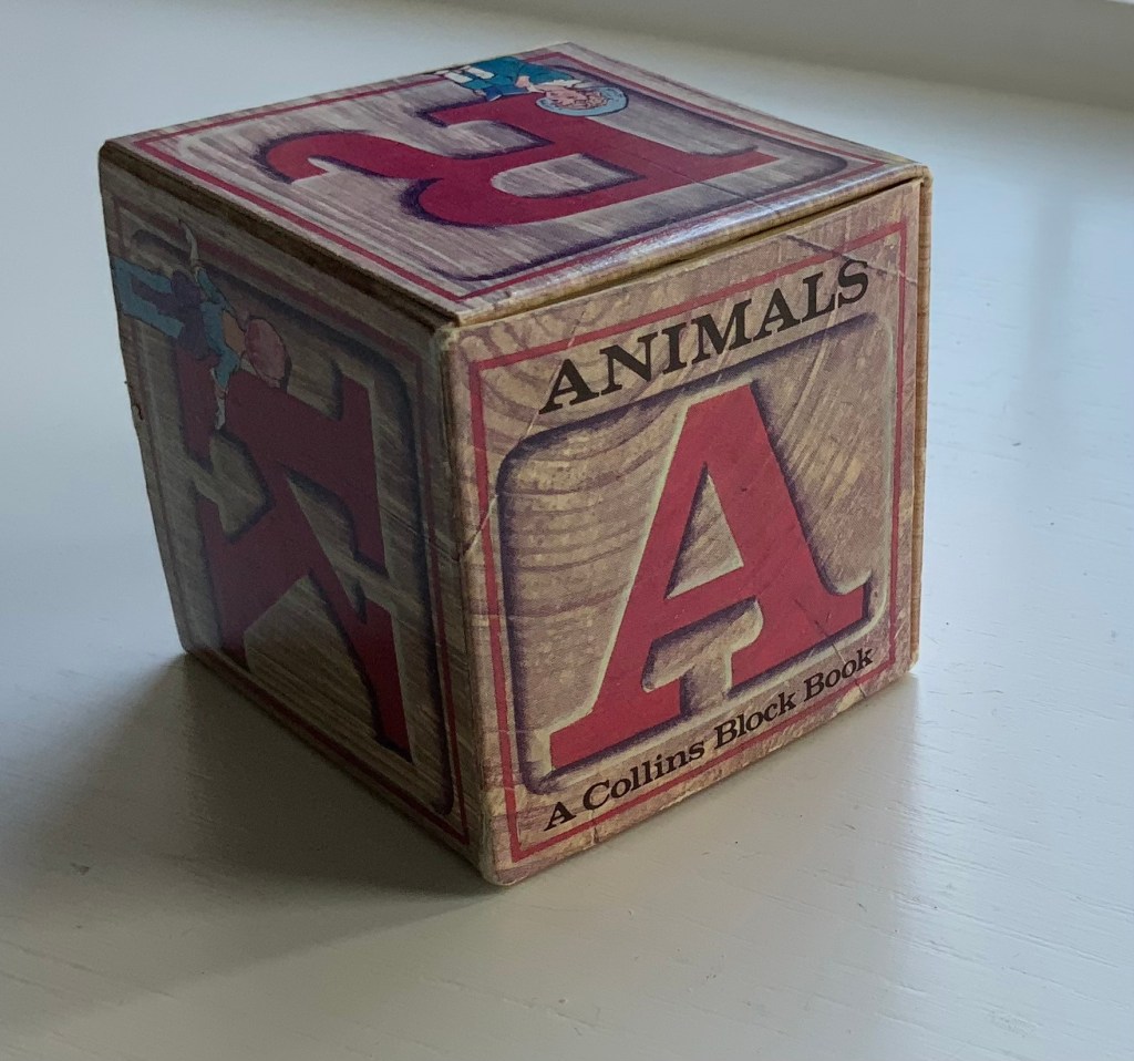
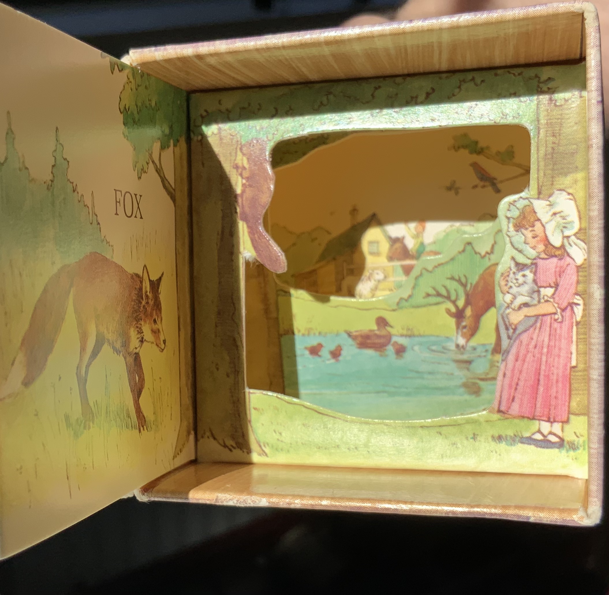
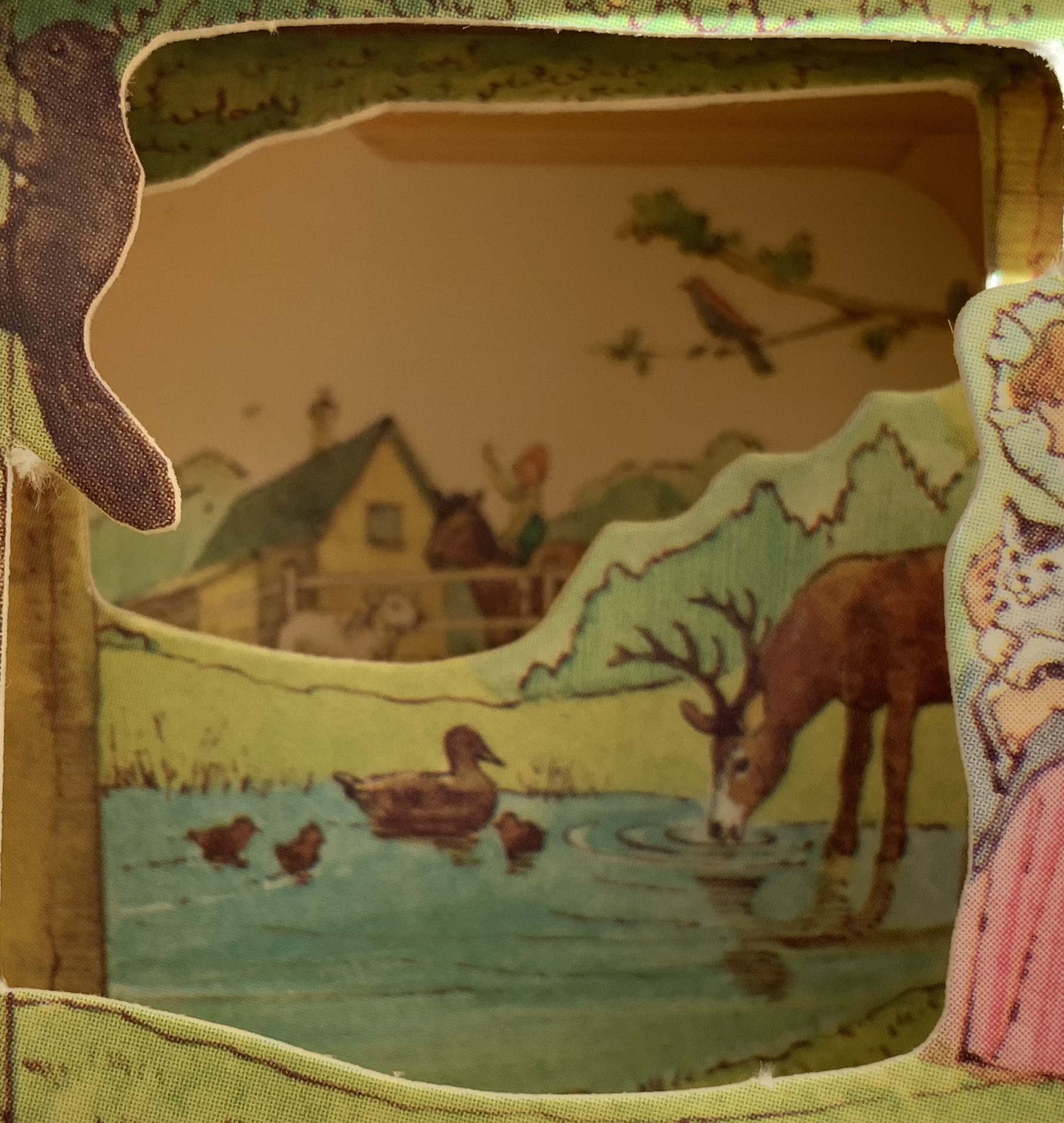
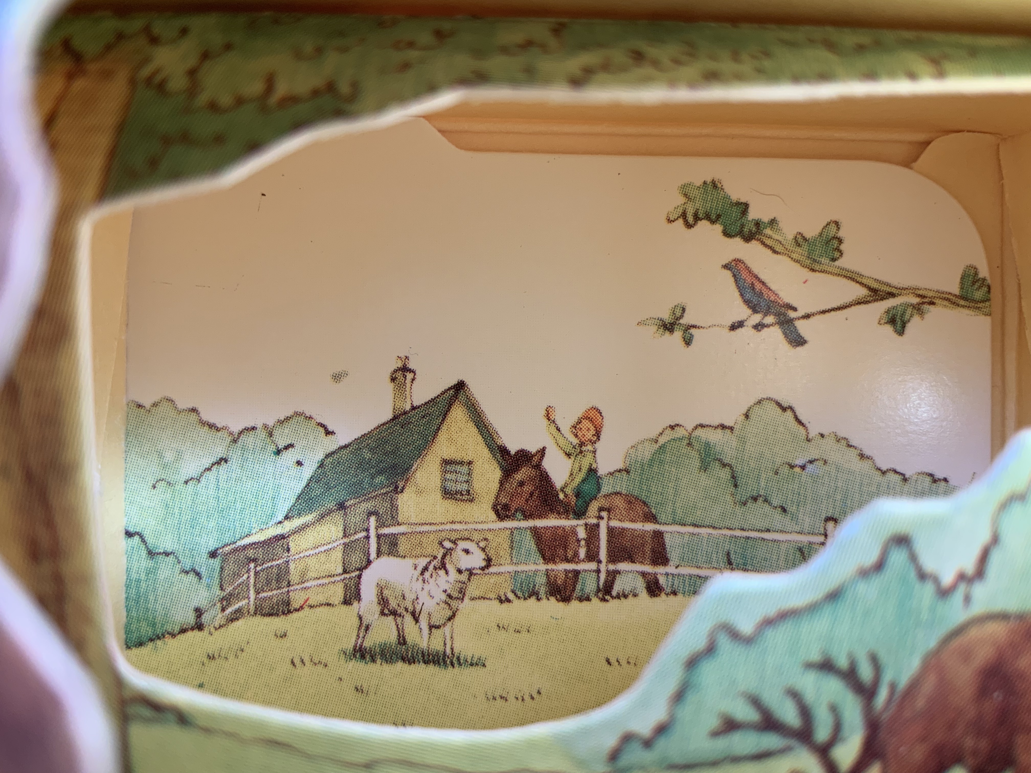
Given the effectiveness of Svensson and Diaz’s Letters alphabet book-in-a-box effort, it is surprising that they did not follow up the alphabetical theme from Animals, especially since animals have made up the most popular category of alphabet books for centuries. Another 24 or 25 books in boxes beckon. Alphabetical cubes of birds, cats, dogs and the zemmi! And what about the ampersand? And what different paper artistry might Diaz have performed if requested to fill out the series with further innovation? Consider Claire Van Vliet’s alphabetical Tumbling Blocks for Pris and Bruce (1996), Helen Hiebert’s Alpha Beta (2010) and Karen Hanmer’s The Spectrum A to Z.
Before its acquisition by Harpers in 1985, William Collins & Sons settled on the less risky venture of four books in boxes: Animals, Letters, Numbers and Colors. First with Elgin Davis Studios, James Diaz was the paper engineer behind all four and later joined David A. Carter (see his tribute to Bruno Munari here) to produce The Elements of Pop Up: A Pop Up Book for Aspiring Paper Engineers (1999), still used as a primary textbook.
Of course, B. S. Johnson and Marc Saporta pioneered boxes containing loose pages or leaves to be read in any order, but to find contemporary books in boxes where the box is not just a storage mechanism but functionally integrated, we have to look to Ed Hutchins, Sue Johnson and Hedi Kyle among others.
The art of the alphabet seems to be a rite of passage for graphic artists. Perhaps it is that art and the alphabet find common ground in the urge to make sense of the world. Perhaps it’s that the alphabet’s invention, development and artistic treatment present a rich tradition for artists to follow or challenge. Perhaps it’s that letterforms and the alphabet offer raw material, subject and organizing principle all in one. Semic or asemic. Calligraphic, typographic or even plastic. Representational or abstract. All are options. But most often, something bookish results. From Islam Aly’s 28 Letters(2013) to Ludwig Zeller’s Alphacollage (1979), a significant part of the Books On Books Collection is taken up with artists’ books based on the ABCs and letterforms. The Collection’s two facsimiles of Geofroy Tory’s Champ Fleury provide a useful historical backdrop that throws into relief several of the Collection’s works and their performance of this rite of passage.
It should be no surprise that Geofroy Tory de Bourges (c.1480-1533) serves up such an exemplar. In her Playful Letters, Erika Boeckler writes
An accomplished designer, typographer, printer, poet, author, translator, calligrapher, illustrator, woodcutter, and engraver, he received his education in Italy and ultimately settled in Paris, setting up a bookstore, writing his own works, running a press, and collaborating with or working for Simone de Colines, director of one of the most influential and experimental fine publishing houses of the time. Personally writing the text, designing the woodcuts, and cutting some of them, organizing the layout, perhaps even setting the type, Tory created Champ Fleury as what we might call today an artist’s book. (p. 29)
Tory straddles the letters of the late Middle Ages and Renaissance. Appointed by François I in 1530 as his printer, Tory operated on the Petit Pont under the sign of le Pot cassé (“the broken pot”) and was known for his workshop’s handwritten Book of Hours (1524). Rooted in the horae tradition reaching back to the 13th century, Tory’s Book of Hours is an early-to-mid-Renaissance version of its predecessors. As beautiful as his Book of Hours is, Champ Fleury (1529) became his best known work. Authored and designed by Tory, it was produced by hand typesetting and letterpress printing in Paris with Giles Gourmont. Printed less than 100 years after Gutenberg’s innovation, Champ Fleury represents the printed book toddling out of its incunabula period.
Book of Hours Geofroy Tory (1524) Bound in the 18th century, 113 leaves of vellum. Lessing J. Rosenwald Collection (Library of Congress). Accessed 30 May 2021.
According to Jeremy Norman’sHistory of Informationsite, the first separate printed title page appeared in 1463. Subject indices date back to the 13th century, originating at the University of Paris, and the first printed indices, to 1470. Champ Fleury‘s front matter boasts a title page, two prefaces to the reader, a statement of the King’s Privilege awarded for the book for ten years (a forerunner to the copyright page), a name index without location references and a subject index with folio references. Champ Fleury’s back matter consists of a colophon preceded by a lengthy appendix illustrating various forms of the alphabet (Hebrew, Greek, Latin, etc.).
Tory’s placement of the indices in the front matter rather than the back matter reflects the gradual development of the anatomy of the book towards the structure that would ultimately be codified in reference works like the Chicago Manual of Style. Paratextual elements like the title page, table of contents, page numbers, etc., did not spring up overnight. If, as Eric Havelock and others assert, society, the arts and culture are a superstructure erected on the foundation of the alphabet (see below), Champ Fleury and its “letterology” make for a particularly fitting exemplar of the book as an element of the superstructure arising from the alphabet.
Perhaps book artists sense this, which again leads to that alphabet art rite of passage and the elaborate variations on it. The illustration of various forms of the alphabet in the appendix also draws on another developing tradition: the typesetter/printer’s sample book advertising the firm’s fonts. Abecedaries and artist books have sprung from that tradition, too.
Tory was not the first to propose an art and science behind the letterforms of the alphabet. Predating his efforts were Giovanninno de’ Grassi (1390-1405), Felice Feliciano (1463), the Anonymous Chicagoensis and Anonymous Monachensis (1468?), Damianus Moyllus (1480), Fra Luca Pacioli (1509), Sigismondo Fanti (1514), Francesco Torniello (1517), Ludovico Arrighi (1522), Albrecht Dürer (1525) and Giovanni Battista Verini (1527). Leading up to Champ Fleury, these earlier efforts track the development of humanism. Arguably, Tory’s effort is a capstone, combining myth, allegory, metaphysics, geometry, linguistics, calligraphy, typography and cryptography.
Book One, concerned with the mythical origins of the French language, also addresses the fabled origins of the alphabet: the story of Jove, Io and Mercury behind the letters I and O and their claim to being the first letters and also the tale of Apollo’s accidental murder of Hyacinth explaining the letters A and Y and their similar claim. Two works in the Collection built on alphabet origin stories are Francisca Prieto’s Printed Matter series (2002-2008) William Joyce’s The Numberlys (2014), but many more follow in Champ Fleury’s art and science footsteps.
Tory’s late medieval/early Renaissance perspective gives way to 20th and 21st century poetics and phenomenology in most works of the Collection. Aaron Cohick’s The New Manifesto of the NewLights Press (third iteration) (2017) offers a good example. Another — closer to Tory’s moral and geometric perspective but of a more modern spirituality — is Jeffrey Morin and Steven Ferlauto’s Sacred Space (2003).
Compile all the abecedaries ever created and it would approximate the result of Adam and Eve’s task of naming all the creatures and things of the world. Leonard Baskin echoes that innocence in Hosie’s Alphabet(1972) with its words and animals supplied by his children. If Adam and Eve had had an alphabet, they might have been tempted into pareidolia, which is represented in the Collection by VUES/LUES: Un Abécédaire de Marion Bataille (2018) and Typographic Universe (2014) by Steven Heller and Gail Anderson. Heller and Anderson’s compendium extends to letters formed of natural and drawn objects from the real world, which Champ Fleury’s appendix foreshadows with its floral and fantastic alphabets.
Of course, Tory’s work is not an abecedary. In Books Two and Three, it develops into a full-blown treatise on letterforms whose meaning and appearance are explained allegorically and driven by the compass, rule and geometry expressed within a 10x10x10 cell cube. It would overstate the case to call it “typographic design”. As drawn, Tory’s diagrams would serve poorly for cutting and forming punches or matrices (although it has been done). Nevertheless, his geometric approach foreshadows the grids and algorithms of Wim Crouwel’s New Alphabet (1967), Timothy Epps and Christopher Evans’ Alphabet(1970) and Ji Lee’s Univers Revolved: A Three-Dimensional Alphabet (2004).
Before the age of computers and algorithms, though, the artist and designer Bruce Rogers did bring typographic design to bear on Champ Fleury. The Grolier Club sponsored the printing of George B. Ives’ English translation. Rogers’ design “translates” Champ Fleury just as much as Ives does, perhaps more so. The Grolier Club edition is one of only ten books to be set completely in the Centaur typeface designed by Rogers.
Of course, the translation entails a complete resetting of the text, and Centaur naturally delivers crisper letters. Also, in redesigning with Centaur, Rogers alters the original’s layout and, therefore, the reader’s experience of it. Notice in the OAHK pages above and in the three double-page spreads below how Rogers changes Tory’s flow or jumpiness to something fixed or stately. Attention to the page and its layout offers book artists as well as book designers yet another creative avenue. For proof of that, compare the Collection’s entries for Angel, Baskin and de Cumptich.
Architecture is another of Tory’s well-developed analogies and explanations of the ancients’ thinking behind the letterforms. In his drawings below, he aligns the letters AHKOIS with the parts of a building and letters IL with floor plans. He connects the circularity of the Coliseum’s exterior and the ovalness of its arena with the proper shape of the letter O. In the Collection, the analogy reappears fantastically in Johann David Steingruber’s Architectural Alphabet (1773/1972), Antonio Basoli’s Alfabeto Pittorico (1839/1998) Antonio and Giovanni Battista de Pian’s efforts in 1839 and 1842.
The architectural analogy provides Tory with his segue from plane to solid geometry in aligning the shapes of letters with human anatomy and virtues. His three-dimensional analysis of letterforms also finds contemporary analogues in two of Pieter Brattinga’s Kwadraat Blad series: Crouwel’s, mentioned above, and Anthon Beeke’s Alphabet (1970). Tory’s three-dimensional letterforms foreshadow Crouwel’s investigation of units based on the assembly of organic cells and his later musings on a laser-generated four-dimensional typography (Elliman, 62). And it is hard to evoke anything more humanoid and three-dimensional — albeit far less analytical or prudish — than Beeke’s alphabet formed with naked female models. (Tory comments that in a correctly drawn A, the crossbar will virtuously cover the genitals of Vitruvian man inscribed in the 10×10 grid. Modesty seems to extend to H as well but not so much to O and K.)
The calligraphic impulse that underlies Champ Fleury‘s typographic representations shows itself clearest in the woodcuts for the Cadeaulx alphabet in the appendix. The Books On Books Collection has its share of calligraphic abecedaries such as Marie Angel’s An Animated Alphabet (1996) and Andrew Zega and Bernd Dam’s An Architectural Alphabet (2008) as well as more purely calligraphic alphabets such as Islam Aly’s, mentioned above, and Suzanne Moore’s A Blind Alphabet (1986) .
Two artists whose abecedaries blend the calligraphic and typographic are Robert de Vicq de Cumptich and Cathryn Miller. In de Cumptich’s Bembo’s Zoo (2000), letters and punctuation marks from the Bembo typeface form calligraphic animal shapes. Miller’s L is for Lettering(2011) joins up the alphabetic rite of passage, calligraphy and typography by allying each of her hand-drawn letters with the name of a typeface from “A is for Arial” to “Z is for Zapfino”.
The last page of Tory’s illustration of additional alphabets is not the end of his work. The colophon plays that role. Curiously, Tory misses out the character that plays that role for the alphabet itself: the ampersand. “Curiously” because the character & appears throughout Champ Fleury — even at the end of the colophon’s fourth line in French — and it is after all the most flowery of the alphabet’s characters. Perhaps some book artist will follow Bruce Rogers’ example in his joking Depression-era homage to Tory on the back of Champ Rosé and create an homage to Tory and Rogers of three-dimensional ampersands.
Gelb, Ignace J. 1974. A Study of Writing. Chicago: University of Chicago Press.
Golec, Michael. 2015. “Champ Fleury in the Machine Age”, lecture at the School of Visual Arts, NYC. Uploaded 4 June 2015. Accessed 12 May 2021. Good slides and a comparative look at Tory’s original and Rogers’ resetting.
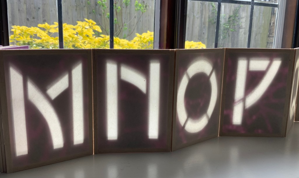
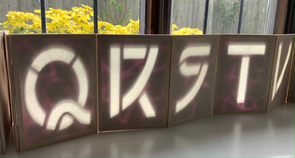
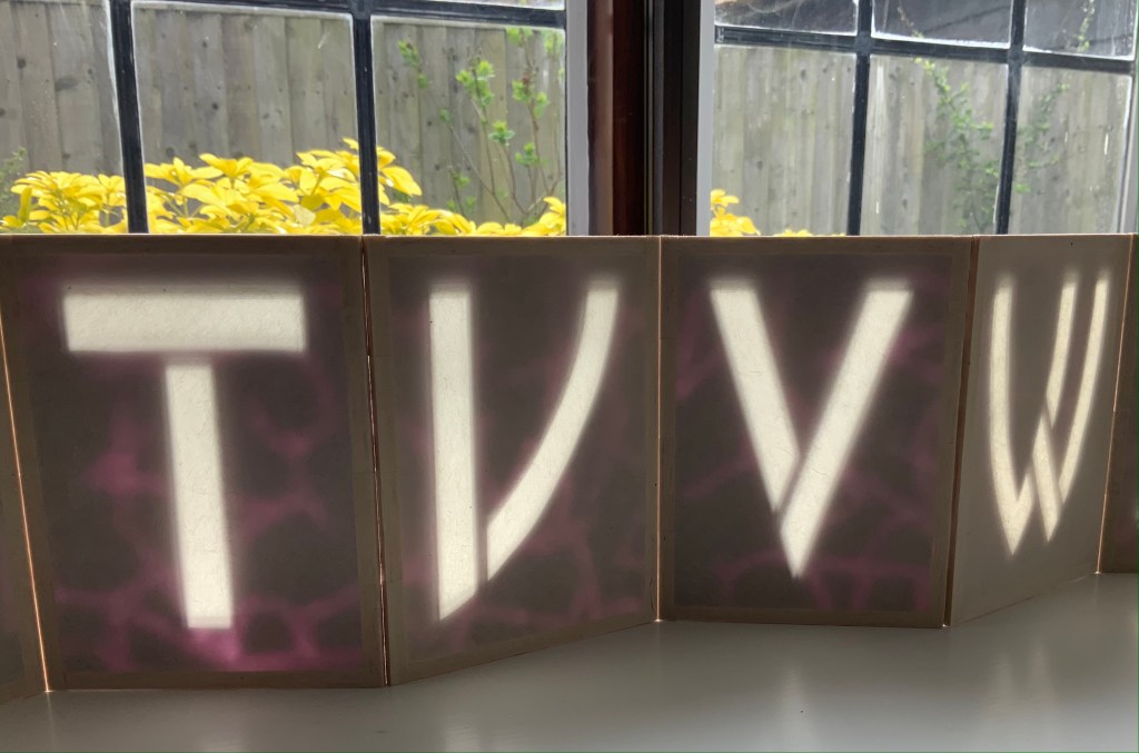
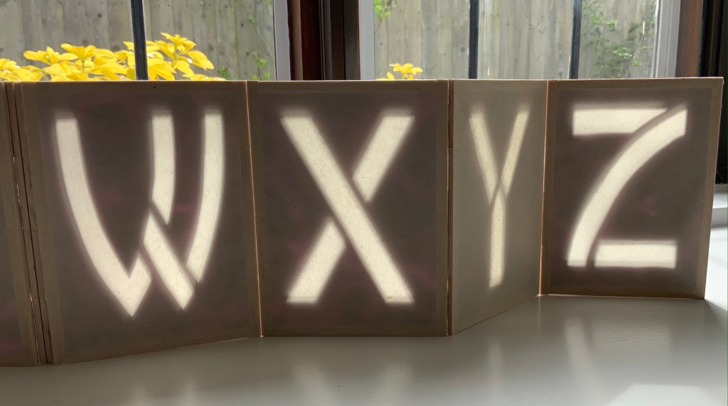
Alpha Beta(2010) Helen Hiebert Lantern-structure book in open-sided box. Closed, H158.75 x W114.3 mm; opens out to 2971.8 mm. Box size: H171.45 x W114.3 x D133.35 mm.Edition of 25, of which this is #22. Acquired from the artist, 17 February 2021.
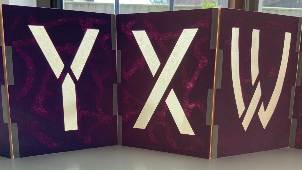
Each panel displays an alphabet letter cutout casting a shadow against a second layer of handmade paper. Appropriately, the letters follow in the Arts and Crafts style font designed by Dard Hunter, “the father of hand papermaking in 20th century America”, renowned scholar and author of Papermaking: The History and Technique of an Ancient Craft.
The book’s flexible hinges between the panels allow it to be set up in a variety of ways. As can be seen above and below, the right-reading alphabet appears on the less colorful side of the structure. When viewed from the more colorful side, the letters show in reverse, which is, of course, more evident with C-B-A than Y-X-W. The swirling strokes that shadow the right-reading letters reveal themselves on the more colorful side as asemic characters watermarked into the handmade paper. A fusion of paper, letters, form and meaning.
On the reverse side: C-B-A and Y-X-W.
The Secret Life of Paper: 25 Years of Works in Paper (2016)
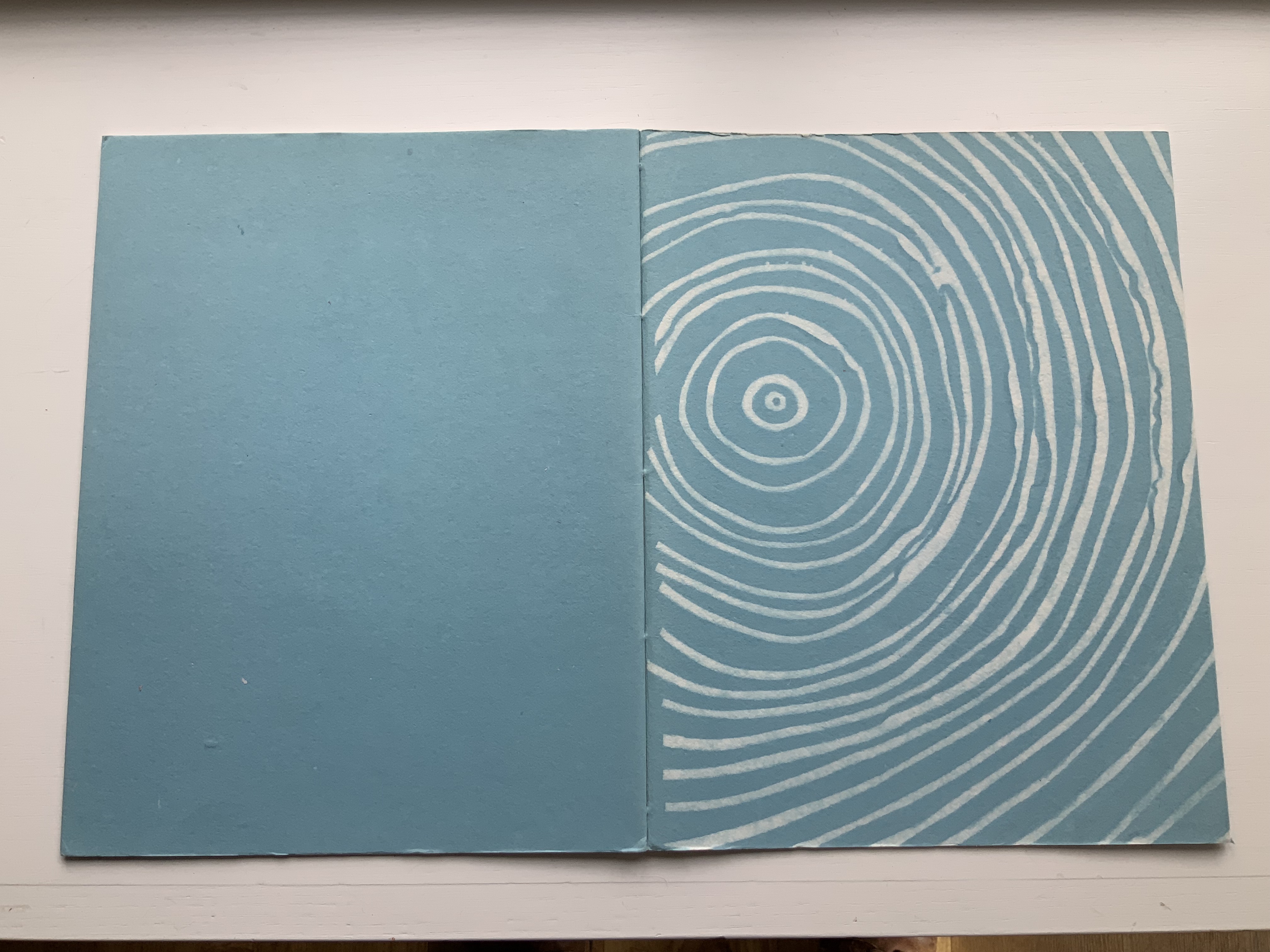
The Secret Life of Paper: 25 Years of Works in Paper (2016) Helen Hiebert Artist-made paper covers sewn over two signatures with an original string drawing in the center. H282 x W218 mm, 22 pages. Acquired from the artist, 4 April 2016. Photos: Books On Books Collection.
Catalogues like this are works of art about works of art. It came about as a result of an exhibition held at the Kalamazoo Book Arts Center and the Waldo Emerson Library at Western Michigan University. The catalogue contains an illustrated chronology of the artist’s art and career up to 2015-16. Not only does it contain that work of string art in its center, its cover is hand bound and features a pulp stenciled handmade paper.
Curated Paper Collection #1 (2021)
Hiebert has begun a series of curated collection of papers from around the world. The first collection contains eleven papers. The largest sheet comes from Laureli Spokes: a handmade recycled rag paper from India (100 gsm), 357 x 502 mm. It features an exclusive retro two color silkscreened design that features a retro two-color silkscreened design. The smallest sheets are ten 200 x 200 mm squares of Kite Paper at 42 gsm in brilliant colors. Similar to waxed paper, it is translucent and folds well.
In material and process, the two most interesting papers are Tangram Watermark (100 gsm with thinner watermarked areas, 310 x 460 mm) and Portugese Cork Paper (140 gsm, 255 x 255 mm). Handmade with 100% bleached flax fiber and deckle-edged on all four sides, the Tangram Watermark comes from the Helen Hiebert Studio. The first image below shows the deep impression left by the watermark design cut out of a thin vinyl material and adhered to the papermaking mould. The second image, created with the sheet held up to the light, shows more clearly the tangram design left as a sheet is pulled. The cork tree sourced is highly renewable and organically grown. Handmade in Portugal from the tree’s outer bark, the naturally water-resistant sheet consists of thin layers of cork laminated to a coated base paper. The cork is acid free, but the backing paper, shown in the last image, is not.
The next two curated papers show similarities and differences arising in the Japanese and Korean traditions. The Nanohana Washi (48 gsm, 315 x 470 mm) is a “nature paper” from Awagami Factory in Tokushima, Japan. The images show the changes under different light and from views of different sides. Traditionally, Japanese washi (like Korean hanji) is made from mulberry plant fibers. Here, Awagami has used the nanohana plant (related to broccoli). It grows along the local Yoshino river, and Awagami collects the florets each Spring to mix into these sheets of washi, resulting in the green and yellow flecks. The lightweight hanji (15-19 gsm, 325 x 490 mm) is made from 100% dak (mulberry) fiber, grown and harvested in Korea by Seongwoo Jang, a fourth generation papermaker at Jangjibang, a hanji mill in Gapyeong, Korea. Hiebert notes, “The sheet was formed using the traditional Korean technique called webal or heulim ddeugi, where the slurry flows onto and off the frame in multiple directions, resulting in a strong sheet without a prominent grain direction”. The images in the middle row aim to show this with the sheet laid atop dark art paper in full sunlight and draped over the hand. The detail of the corner in the last row shows the two-ply of the sheet, where — in another interesting difference between the washi and hanji –two thin layers were couched together to form a single strong hanji sheet.
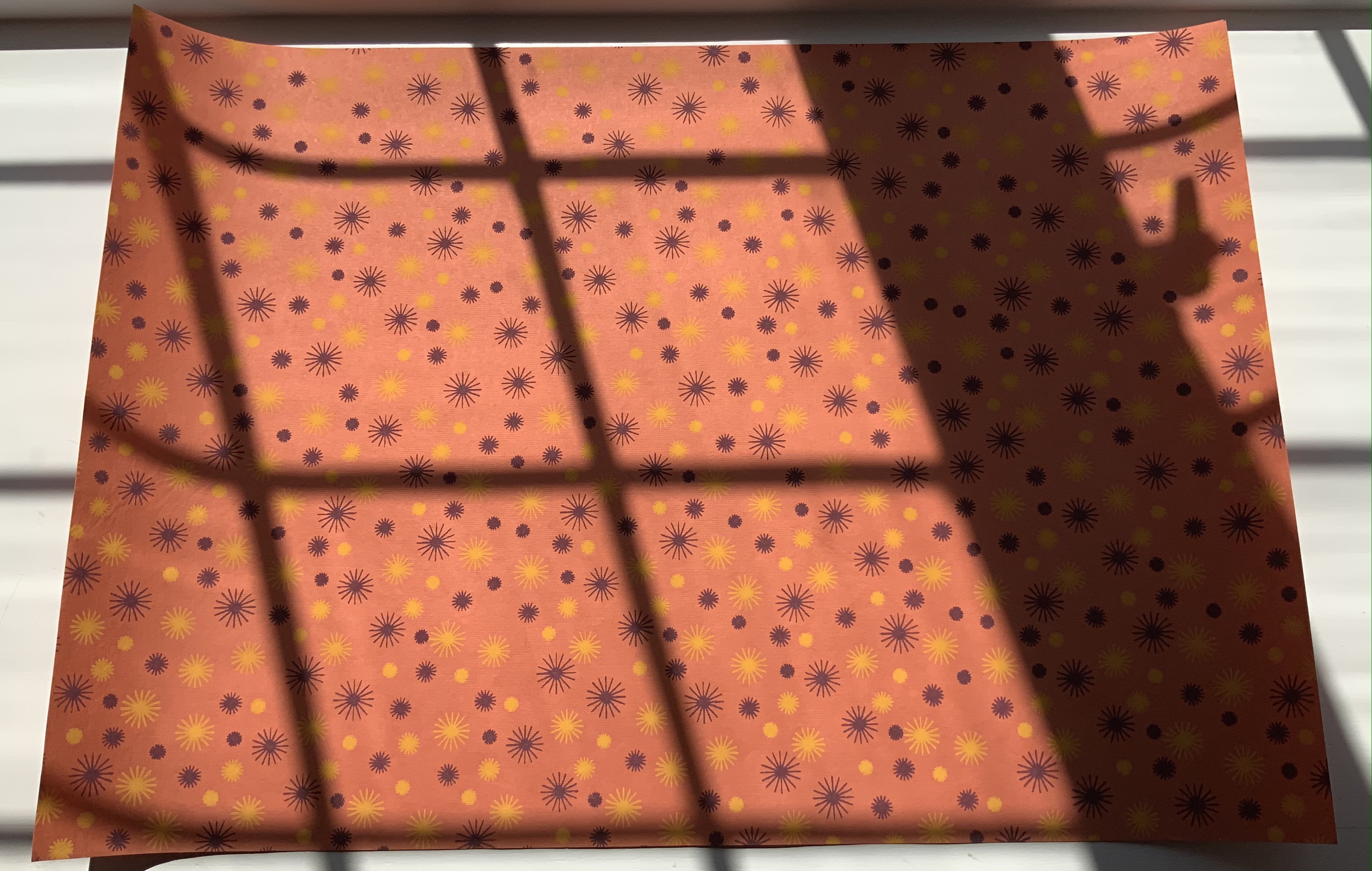
The next two papers are paired for uses and decorativeness. The silk-screened, matte-finish Italian Carta Varese Origami Paper (100 gsm, 350 x 500 mm) is heavier than traditional origami paper, it has a smooth surface and creases well with crisp folds. Smooth-surfaced and creasing well for turned in corners, this sheet with its red scroll pattern would serve well for endpapers. Debra Glanz designed the next set of papers — Paper Assembly (28#-32# text weight, 305 x 305 mm) — with that use, among others, in mind for book and paper artists.
The next two papers demonstrate the curator’s attraction to painterly surfaces. Silkscreen printed by hand with a lacquer-like ink, the Red and Blue Dragonfly Pattern Japanese Lacquered Yuzen Paper (140 gsm, 330 x 485 m) has the depth, texture and glow Japanese lacquer ware, which the first three images attempt to convey. The painting base consists of kozo and wood sulfite. The sheet of paste paper (230 x 305 mm) in the last image comes from the late Louise Lawrence (Larry Lou) Foster. It has an op-art feel to it. More of her unique papers painted with pigmented paste can be found in the limited-edition book The Paste Papers of Louise Lawrence Foster and in the Metropolitan Museum’s Thomas J. Watson Paper Legacy Project.
A blend of abaca fibers and cotton rag, Bistre Mixed Media (150 gsm, 280 x 360 mm) from Kelsey Pike’s Sustainable Papercraft in Kansas City, Kansas, is at once hard, resilient, durable, bulky, thick and soft. The images below attempt to show the sheet’s homogeneous surface and smooth, fine grain texture, intended as the name suggests for all fine art media – pencils, charcoal, conte, pastel, acrylic, watercolor, ink, gouache, etc.
For the Books On Books Collection, Curated Collection #1 presents a challenge for display and storage alongside Fred Siegenthaler’s Strange Papers and the Gentenaar-Torley’s first seven books of the Rijswijk Paper Biennial. Helen Hiebert’s contribution to book and paper art warrants that place.
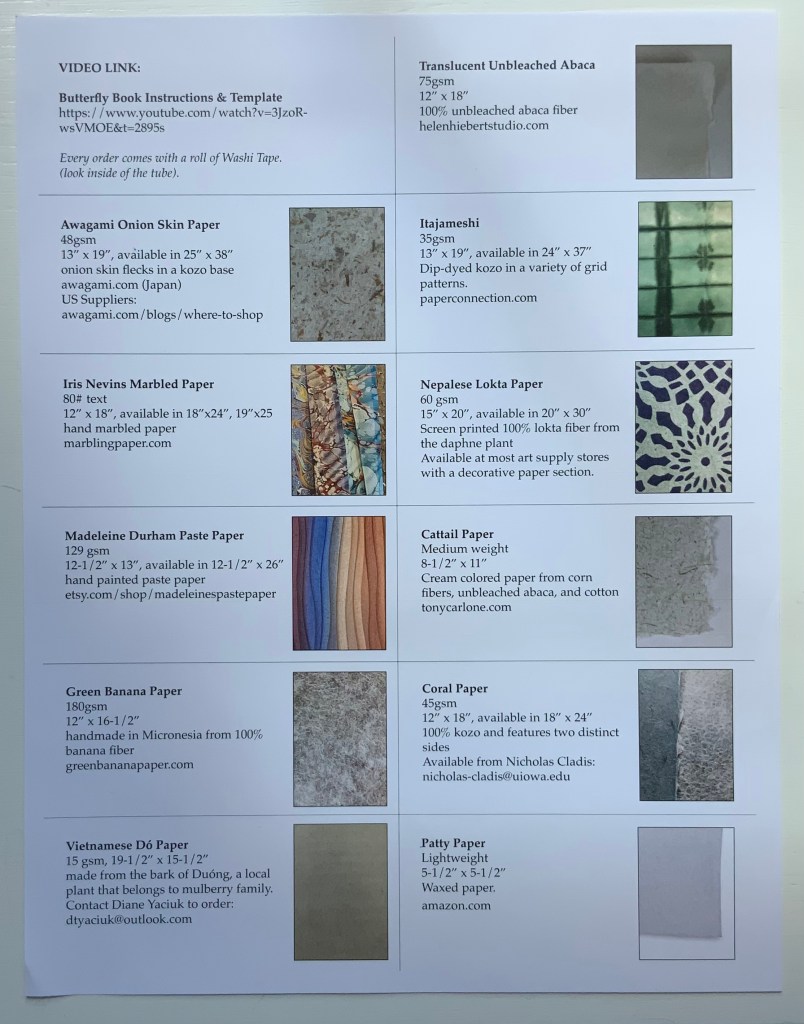
Curated Paper Collection #2 (2021)
Hiebert’s second round of curation comes with a helpful printed cheat sheet (although it was challenging fun to identify the samples in #1 without the initial help). With inclusion of a video link for creating a “butterfly” book, the cheat sheet also recalls Hiebert’s bustling business in lectures and workshops as well as tempts a collector to raid the collection with a ham-handed attempt.
The first paper in the curation comes from the Fujimori family business. According to its website, 6th generation Minoru Fujimori took over in 1945. In 1970, he was designated an “Intangible Cultural Property of Tokushima” in recognition of his skills. In 1976, Awagami washi was designated as a “Traditional Craft Industry”. In 1986, Fujimori-san was further honored as Master Craftsman and awarded the “Sixth Class Order of Merit, Sacred Treasure” by the Emperor.
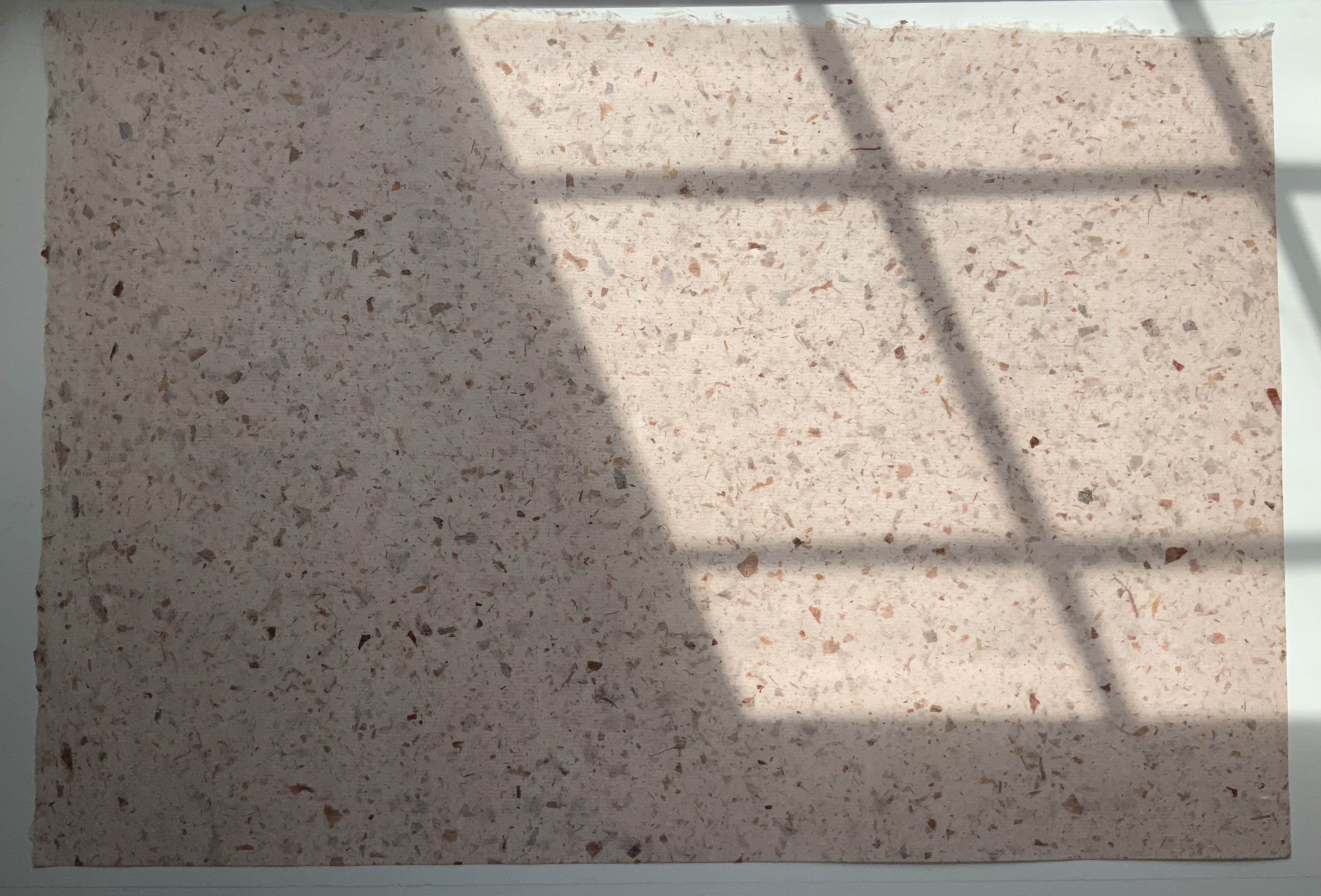
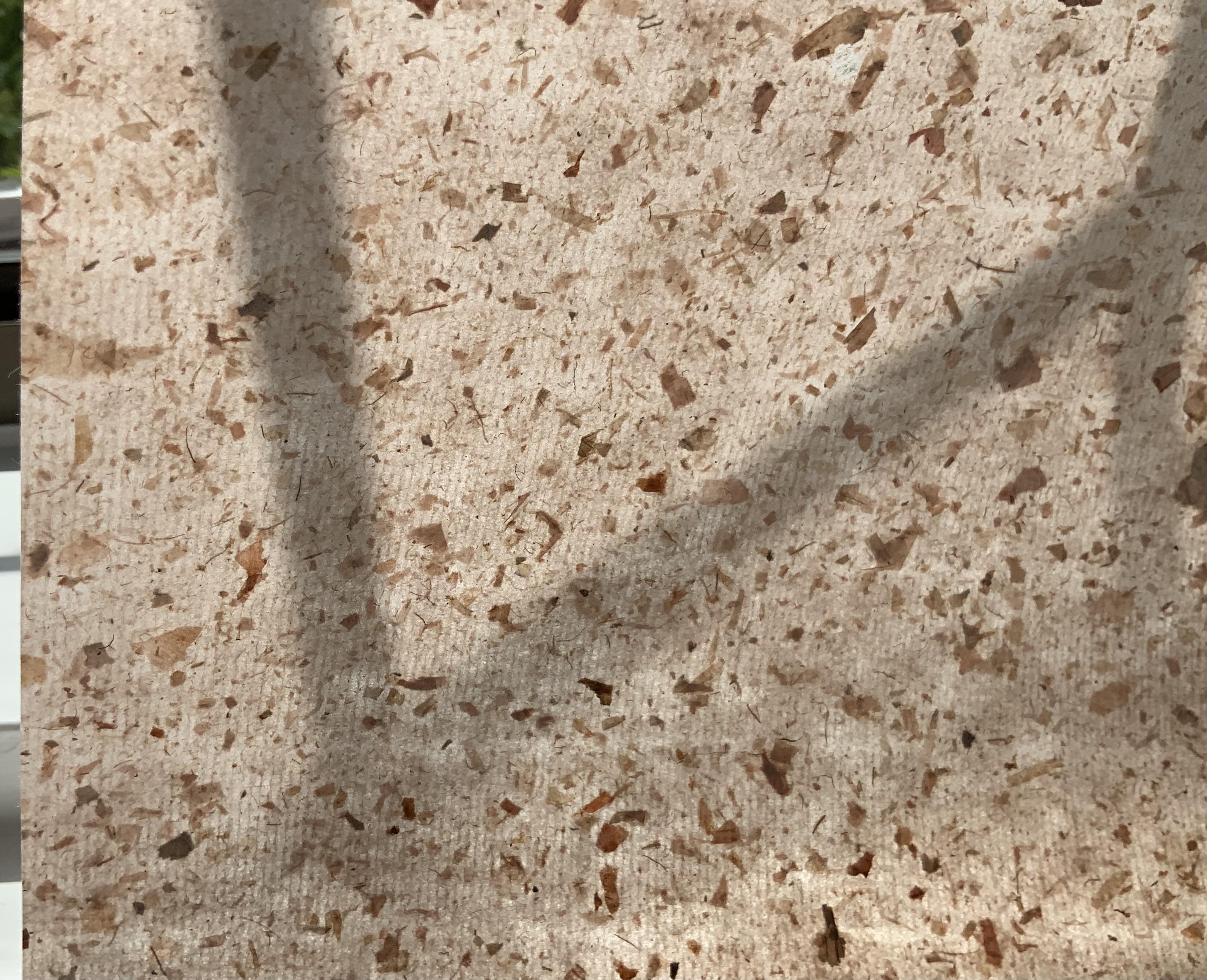
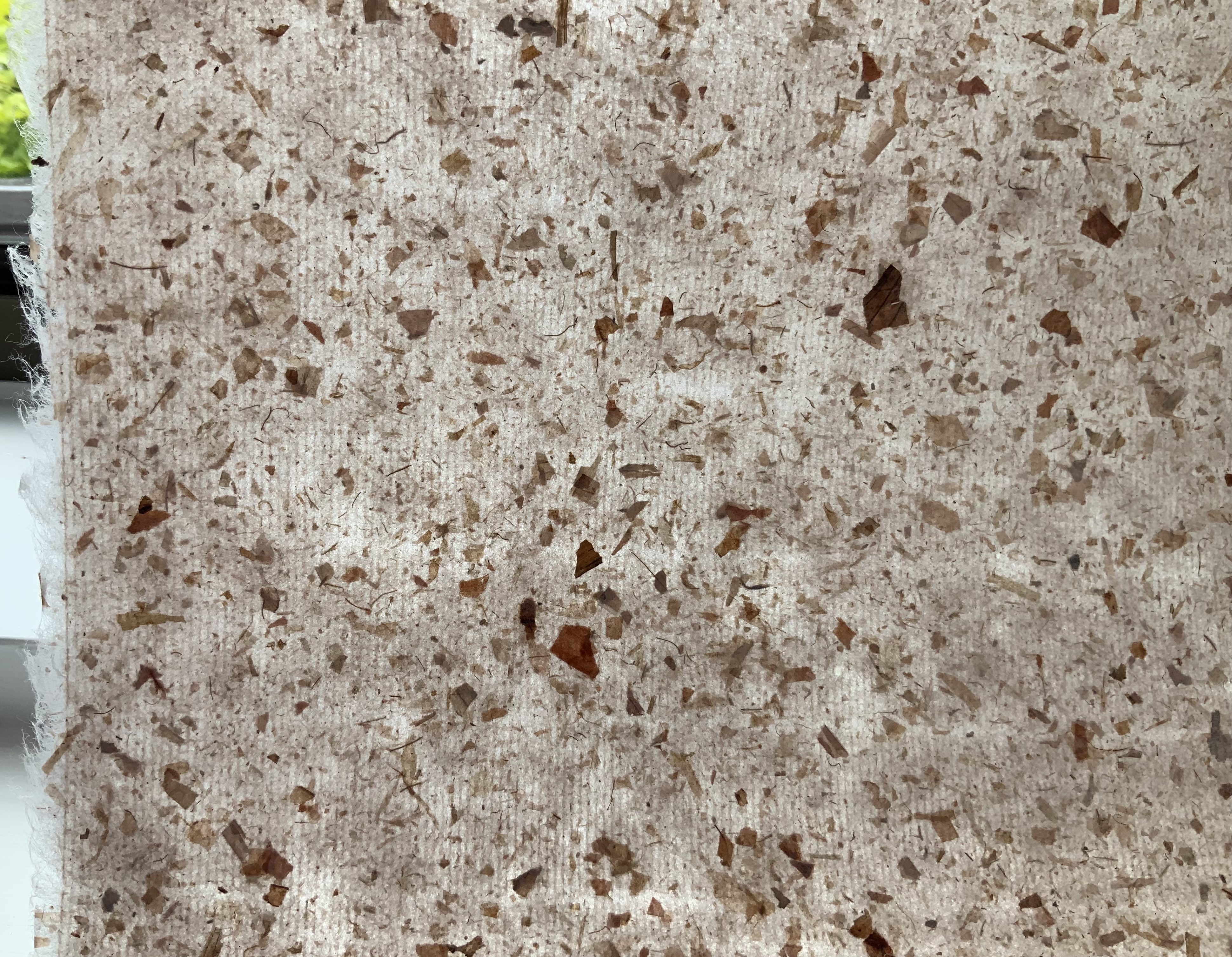
Naturally the flecks of onion skin show up differently on the two sides of the sample, and the density almost completely disguises the lines of the mesh. The way the color varies in the light at different angles accentuates the supple drape of the paper.
Awagami Onion Skin Paper, 48 gsm
Like Minoru Fujimori above, Iris Nevins is a cultural treasure. Specializing in the reproduction of early marbled papers, she has delved into its past prior to the advent of marbling machines during the Victorian era and creates her “own marbling colors using, where possible, the same pigments used during the period”. On what shelves and in what crusty containers do such pigments reside?
As of August 2021, her work is still being accessioned by the Paper Legacy Project, a permanent collection house in the Metropolitain Museum Of Art, in The Thomas J. Watson Library.
Iris Nevins Marbled Paper
Madeleine Durham’s paste paper is also part of the Watson Library Digital Collection. In her artist’s statement, she refers to samples “representative of my landscape artwork”. With the sample that follows, dunescapes and seascapes come to mind.
Madeleine Durham Paste Paper, 129 gsm
This green banana paper comes from a company of the same name based in Kosrae, Micronesia. Among its products is the Green Banana Paper Wallet. The pictures cannot do justice to the toughness and almost slick feel of this paper. A raincoat or wallet made from it would keep a person and valuables dry and safe.
Green Banana Paper, 180 gsm
Dó paper is a traditional Vietnamese hand-made paper dating back to the 3rd century BC. Made from the self-stripping bark of the Rhamnoneuron balansae tree, Dó paper appears to be headed toward the state of papyrus. Urbanization leading to scarcity of the tree, the narrow seasonality of the bark’s availability (between August and October) and incursion of industrial paper production pose sharp challenges to its survival. The sample below may become a rarity.
Vietnamese Dó Paper, 15 gsm
This piece of translucent unbleached abaca is best appreciated alongside Hiebert’s video “Making a sheet of abaca” (15 August 2020).
Translucent Unbleached Abaca, 75 gsm
Like Shibori, this paper below is thin or tissue washi that has been folded and dyed. The dark, irregular lines where the dye has accumulated in the folds create a sharp contrast with the translucence of the laid lines and chain lines imprinted by the mesh in the papermaking frame.
Itajameshi, 35 gsm
Manohir Upreti discusses lokta paper, “the King of Nepalese paper”, in the Geest van papier = Spirit of paper(2004), one of the Rijswijk Biennial volumes put together by Peter and Pat Gentenaar-Torley. Upreti’s sample and this one below from Hiebert’s curation demonstrate the dramatic patterns possible with this paper.
Nepalese Lokta Paper, 60 gsm
Tony Carlone‘s cattail paper reflects his artistic aim to source material “in a proper and sustainable manner”. His output includes sculptural pieces formed by spraying, pouring and casting processes, large-scale pulp paintings, and straightforward flat sheets for print processes. The cattail paper appears heavy but is actually light and supple.
Cattail Paper, medium weight
Nicholas Cladis is an American-born interdisciplinary artist who lives and works in Fukui Prefecture, Japan. An active researcher and practitioner of traditional and non-traditional papermaking processes, he makes the paper elements of his work in Echizen—an area with over 1,500 years of papermaking history—and is also an international liaison for the papermaking community there. The contrast of the Coral paper’s two sides invites standing a window and turning the sheet over and over against the light.
Coral Paper, 45 gsm
Patty paper, as in waxed paper for food patties, makes its way into Curated Paper Collection #2 for its properties of translucence, proportions suited to origami and challenge as a printing surface. While a butterfly book might make result in an interesting use of this paper, a White Ermine Moth book would respond to all three features.
Jury, David, and Peter Rutledge Koch (eds.) 2008. Book Art Object. Edited by David Jury. Berkeley, California: Codex Foundation. Pp. 246 (Sound Blocks), 247 (Alpha, Beta …).
Strange Papers: A Collection of the World’s Rarest Handmade Papers (1987)
Strange Papers(1987) Fred Siegenthaler Wooden, felt-lined briefcase, containing a large box enclosing a book and 101 rare handmade paper samples in individual portfolios. Covering paper for the box and book is two-layer handmade paper from Nepal made with the bast fiber of the Daphne papyracea. Briefcase: H x W x D mm. Box: H x W x D Book: H x W mm, 127 pages. Portfolios: Edition of 200 copies, of which this is #28, signed by Fred Siegenthaler. Acquired from Berkelouw Rare Books, 13 Aug 2020. Romana-Butten cover paper from Papierfabrik August Koehler in Oberkirch, W. Germany. Printed by G. Krebs in Basel, Switzerland.
As Siegenthaler explains in his preface, this is the work that started an international organization: the International Association of Hand Papermakers and Paper Artists (IAPMA). By 1986, Siegenthaler was well positioned to start this international association focused on paper art and the craft and science of papermaking. Since the late 1960s, he had been experimenting with strange material for paper — glass beads, hay, leather waste, stinging nettles, tobacco, wasps’ nests and much more. By the 1970s, he was supplying handmade custom papers to Helen Frankenthaler, Jasper Johns, Marisol, Claes Oldenburg among others. Travelling the world for business reasons (Sandoz), he began collecting paper samples from like-minded artists and papermakers in Mexico, Thailand, Viet Nam and more than 87 other countries. And he was “convinced that [he] had a duty to include these exclusive, beautiful and rare creations in [his] collection and preserve them for posterity”.
So, in November 1985, he began writing (by hand) to his network and, later, new association colleagues telling them of his plan for assembling Strange Papers. With the 200 samples of each paper, each selected contributor also provided a structured description of the raw materials and process used. The resulting book not only delivers a wealth of knowledge on the portfolios of samples but also contains items worth placing alongside the portfolios in an exhibition: a sample of a Taoist sacrificial money note on handmade rice paper with embossed gold leaf, plant drawings by Marilyn Wold and small samples of shifu and kinu-shifu (woven papers).
To hold a piece of papyrus and feel its natural curl toward scrolling, its roughness on one side and its smoothness yet segmentedness on the other, brings the history of paper alive. The differences among all the samples — in touch, appearance and, for some, even smell — is extraordinary. It is hard to choose what is most enjoyable about Strange Papers: reading the entries, holding each sample up to the light to examine it, comparing one sample with another, or deciding which is the strangest raw material.
Sample 33.2 Composed of Cyperus papyrus L.
The text — Browsing and reading the entries yields fascinating tidbits. Hawaii’s Akia plant has poisonous bark, roots and leaves, which are discarded in papermaking, but, according to Pam Barton, Hawaiians pound them, put them in a porous container and sink it in salt water pools to narcotize fish to be caught. Donna Koretsky advises observing the Fancy Manila Hemp paper under varying angles of light to see how the coloring changes. From the region where the Hollander beater was invented, De Zaanse Molen’t Weefhuis cites a letter from the paper scholar Henk Voorn that in large shipbuilding works, Moss Paper “was nailed to wood with so-called paper nails under the copper skin of the hull.” In making Jute Paper, Natan Kaaren in Israel “used old sacks … cut up into shreds and placed to rot in a barrel of water … about a year.” The confluence of patience, planning, sense of tradition, attention to detail, awareness of function with creative exuberance is the chief effect of the entries.
Inspection and comparison — Each of the 101 samples calls for inspection. Holding each one to the light and turning it side to side to see the change in effect is seductive. Photographing each paper backlit through its portfolio’s oval cutout shares some of this pleasure of inspection. To the oval cutout’s left, the number-stamped side is shown; to the right, the reverse side. Each sheet rests on its portfolio folder and is angled for viewing the surface. The six similarly named papers of the twelve composed of some form of grass leap out for comparison.
Sample 1.1 Composed of Poaceae — poa annua, poa trivialis. Netherlands. Not of the same family as the following sample, which goes to show how the same common name does not always identify the same substance. Both Lawn Grass samples were cut by lawn mower, but 1.1 was harvested over a longer period and fermented. Both were cooked for two hours, but 1.1 underwent another half hour of boiling. This sample’s darker color and slightly greater heft may be due to its difference in family or the washing process. Both feel brittle and make a crinkling sound when flexed.
Sample 19.5 Composed of Stenotaphrum secundatum. Israel. With this sample, the pulp was washed for a further two hours after boiling and then strained through a screen under high pressure, which may account for its greater translucence. Sample 19.5’s wrinkles are more shallow than 1.1’s and resembles wax paper. Both samples have a pungent dry grass smell.
Sample 14.2 Composed of Cortaderia selloana. Australia. The color and texture differ greatly from those of the next sample. This one is almost linen-like, not fully apparent from the photo, and is lighter, more flexible and less brittle than the next sample. It has almost no smell. The sample’s description is not extensive, which limits comparison of processing.
Sample 22.1 Also composed of Cortaderia selloana. USA. The darker color may be due to inclusion of stalks and fibrous plumes and possibly the season of harvesting. This sample is far less dense and far more brittle than 14.2. Where 14.2 has that linen-like texture on its number-stamped side, 22.1 is actually more polished between the bits of stalk or leaf. Its smell is slightly metallic.
Sample 15.5 Composed of Phragmites australis. Australia. Cut with a garden shredder before soaking then boiling in a solution of 17% caustic soda (500 gms in 30 liters). Beating occurred by chopping with a Chinese-style vegetable cleaver, then running through a sink garbage disposal unit, then running through a kitchen blender. Its color, lighter than the next sample’s, matches with its weight and stiffness, both less than the next sample’s.
Sample 18.1 Composed of Phragmites communis. USA. Cut into 2-3 inch length. Soaked then boiled in 20% caustic soda. Processed with a Hollander beater. The densest and least translucent of all the grass samples above. It has a huskier smell than the Common Reed sample above.
The strangest raw material — This is truly a contest. Carrots are a strong contender, but so are hemp from old fire brigade hoses, moss, peat and stinging nettles. The following are chosen due to their inorganic, silicate and worrisome nature. Except for the sample made of 100% polyethylene fibers, all others consist of organic material.
Sample 32.1 Composed of 100% asbestos fiber. Light and flimsy, it feels like cloth; seems odorless; but this is not one to handle or sniff too closely. Its white, greyish color and dimpled texture will be familiar to anyone who attended school in the latter half of the twentieth century and looked up the ceilings.
Sample 28.1 Composed of 70% strands of glass, containing about 200 tiny fibers, 20% Kozo and 10% polyvinyl alcohol fibers for binding. The glass strands feel tough and breakable; they shine like satin under glancing light; their pinkness comes from dye. Odorless.
Among the contributors with other works represented in the Books On Books Collection are Winifred Lutz, Maureen Richardson, Raymond Tomasso and Therese Weber. Each also appeared in one of the first seven books published for the Rijswijk Paper Biennial, which along with Siegenthaler’s works here, Helen Hiebert’s The Secret Life of Paper, paper samplers from Velma Bolyard and Maureen Richardson, works from Taller Leñateros, watermark art from Gangolf Ulbricht, and pulp painting works from Pat Gentenaar-Torley, John Gerard, Claire Van Vliet and Maria Welch form the core of the collection’s subset focused on paper. Other references are listed under Further Reading.
The Works and its update (below) are useful and valuable to have alongside Strange Papers. Both illustrate Siegenthaler’s breadth of artistry beyond papermaking, and the former includes a comprehensive essay on that artistry by Nana Badenberg. Along with John Gerard and Gangolf Ulbricht, Siegenthaler is one of the twentieth and twenty-first centuries’ masters at using watermarking to make art. His self-portrait, included in The Works, provides an outstanding example of watermark art, described at length by Badenberg. She records Siegenthaler’s watermark contributions to works by Horst Antes and Meret Oppenheim as well as his papermaking for the artists mentioned in this entry’s introduction. Her commentary on the technical, material and conceptual aspects of Siegenthaler’s work in each of its areas of development — “incorporation” (similar but more subtle than appropriation), “revealments”, book objects, paper castings of the human form, “repulpings” (recycling of precious papers), pulp painting and sculpturing, signage, erotica and religious works — enriches any encounter with his art.
Nachtrag zu: Fred Siegenthaler Das Werk: neue Arbeiten aus den Jahren 2010 bis 2015 / Addendum to: Fred Siegenthaler The Works: New Works from 2010 to 2015 (2016)
This double-page spread provides a snapshot of continuity and development. The cards made from repulping and recalling Siegenthaler’s earlier work with this technique speak to continuity — as does the juxtaposition of the overpaintings from 2000 and 2011 on the next page. The nature of Siegenthaler’s 2010-2015 absorption with color on the verso page contrasts with his earlier handling of color in the Kopfüssler and the facsimile leaf of the Gutenberg Bible on the recto. Like Strange Papers, the Addendum reflects the careful planning and exuberant creativity characteristic of Siegenthaler’s entire career.
“Taller Leñateros“. 19 November 2020. Books on Books Collection.
@incunabula. 7 July 2019. “The German paper artist Fred Siegenthaler’s monumental 1987 ‘Strange Paper’“. Twitter thread. Accessed 4 September 2019. An extended thread of commentary provides close-ups of the samples made with carrot, US dollar bills, eggplant, steel and glass fiber. Some, like the steel sample, are in the special edition of Strange Papers, for which only 20 copies were produced.
Blum, André, and Harry Miller Lydenberg. 1934. On the origin of paper. New York: R.R. Bowker Company.
Hamady, Walter; Samuel Haatoum; and Hermann Zapf. 1982. Papermaking by Hand : A Book of Suspicions. Perry Township, Dane County, Wisconsin, USA: Perishable Press Limited.
Hiebert, Helen. 12 August 2014. “Strange Papers“, Helen Hiebert Studio. Accessed 3 November 2020.
Much has been written on Béatrice Coron‘s works — including “Machines“, the commissioned work below. Her interviews with Helen Hiebert and Steve Miller are excellent accompaniment to her pieces with TED.
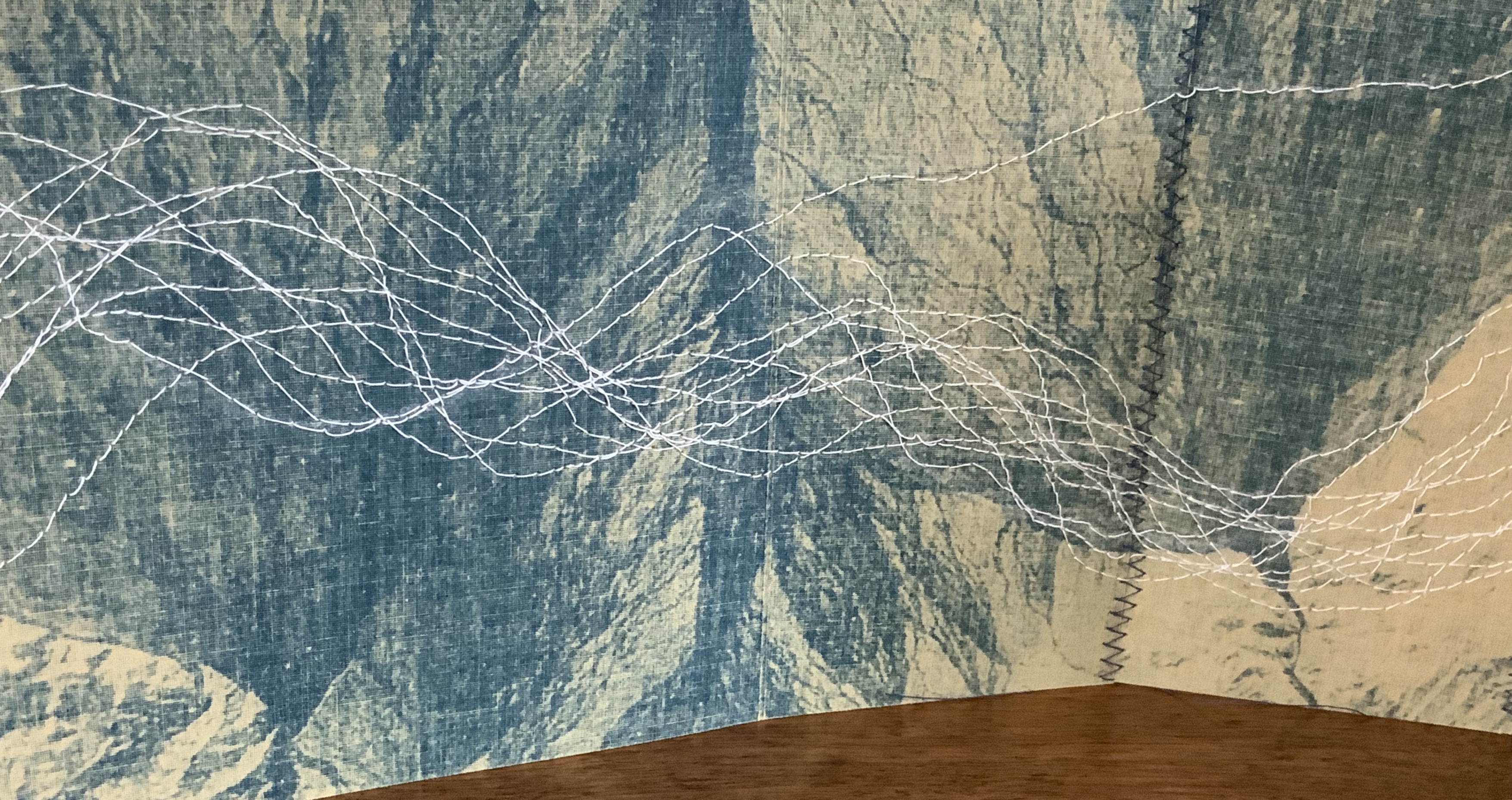
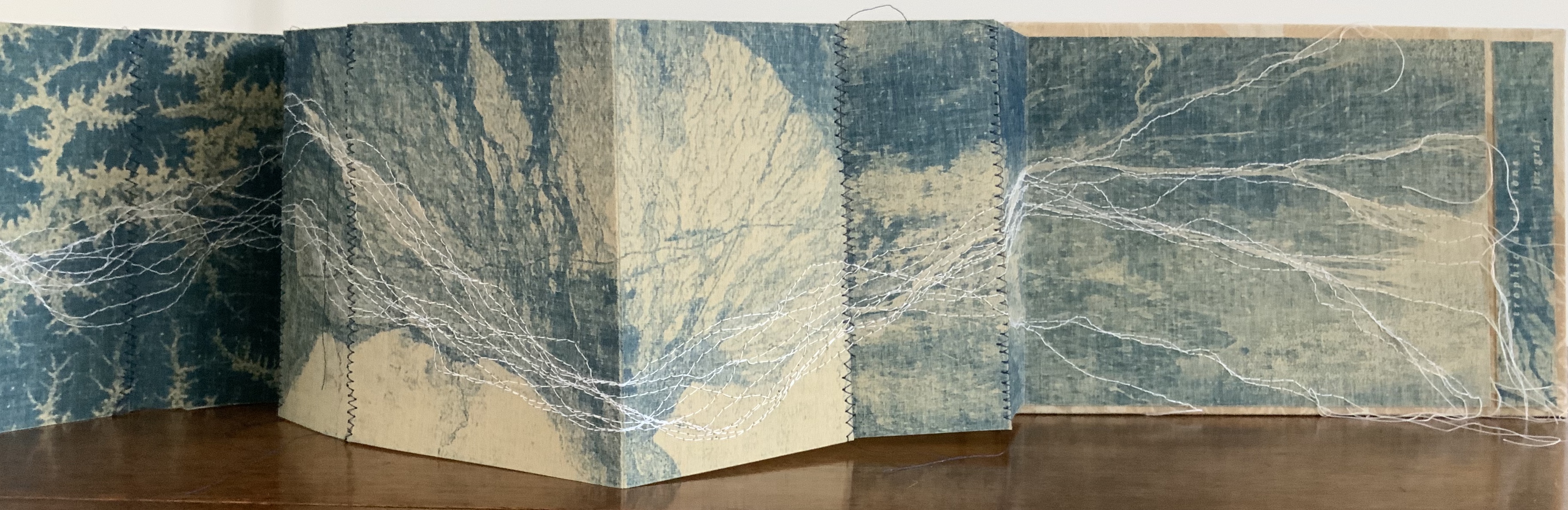
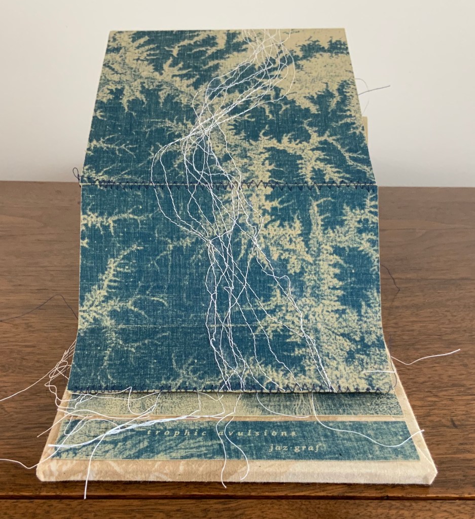
Trophic Avulsions (2016) Jaz Graf Cyanotype accordion book with thread drawing, paper lithography and laser engraving on wood. Closed: H6 x W8.5 x D1.0 inches; Open: W80 inches. Unique. Acquired from the artist, 14 March 2018. Photos: Books On Books Collection.
Graf has used satellite photos of various river deltas around the world to create the cyanotype prints in this work. The patterns from which are exposed come from paper litho prints made on fabric. The result is a blurring, softening yet “nearing” of the otherwise sharp, scientific and remote images normally viewed on digital screens or photographic paper. As Graf points out in her description, the word trophic “relates to an ecological concept of the trophic cascade, in which one action leads to another in an ecosystem, implying ideas of interconnectivity.”
That interconnectivity and the impact we have on “the separation of land from one area and its attachment to another”, which is what avulsion means, is implied by the streams of thread meandering across and off the panels of the accordion form from beginning to end. Even though the panels fold to fit within their laser-engraved birch panels, they vary in width, which breaks up the expected regularity of the accordion when it is extended. The engravings show a delta emptying into a desert and are mounted on wood blocks covered in muslin bearing the printed delta image made with paper lithography.
Thread drawing is a technique common to several outstanding works of book art: Jody Alexander’s Felix’s Notebook (2008), Marion Bataille’s Vues/Lues (2018), Dianna Frid’s Reversal (2009), Candace Hicks’ Composition (2009~), Helen Hiebert‘s Nebulae (2017), Shellie Holden’s Maps (2006), Lisa Kokin’s Partial History of Jewish Life in Modern Times (1997), Ines Seidel’s Changed Constitution (2015) and Mireille Vautier‘s Agenda (2001) among others. Graf’s handling of the technique and its combination with cyanotype printing and lithography in the treatment of her theme, though, make it distinctive and original.
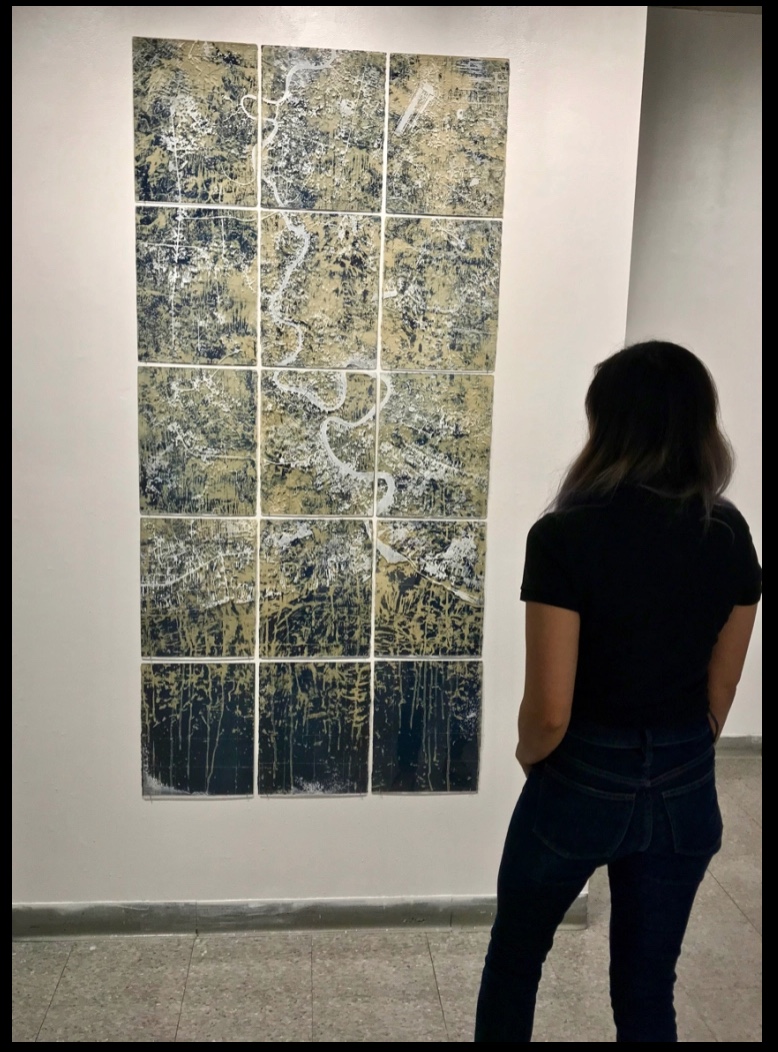
The environmental focus of Trophic Avulsions places it in a well-loved tradition in book art. Other works by Graf, such as Mother Water (2018) below, would be comfortably at home in an exhibition with
Biography (2010) by Sarah Bryant, who creatively connects the human body’s elements with those of the periodic table to bear witness to our impact on the environment and vice versa;
the Ice Books series (2007-17) by Basia Irland, who selects local seeds and embeds them as “text” in a block of frozen river water, carved into the shape of a book to be released into the local river where it melts, releasing the seeds;
the Whorl series (2013- ongoing) by Jacqueline Rush Lee, who returns books to their botanical origins by sculpting books and inserting them into the cavity of a tree to allow time, changing weather conditions and insect activity to rewrite them into the shape of a whorl in a tree hollow;
Batterers (1996) by Denise Levertov, Kathryn Lipke and Claire Van Vliet, who combine Levertov’s powerful poem extending a metaphor of abuse to the earth with Lipke’s clay paperwork set into a wooden tray as the base of this sculptural book, whose pages Van Vliet makes unfold into a fiery landscape; or
Silent Spring Revisited (2016) by Chris Ruston, who uses her frequent visits to natural history museums to inspire works that blend science and art that highlight extinction and the interdependence of humans and nature.
If such an exhibition — a twentieth anniversary of Betty Bright’s 1992 “Completing the Circle: Artists’ Books on the Environment”? — were organized, Trophic Avulsions would be available to loan!
Mother Water (2018) Laser-etched acrylic, cyanotype, porcelain Dimensions variable (15 panels – each 14”x11”) The river featured is Thailand’s Chao Praya. Photo: Courtesy of the artist.
Further Viewing
“Artist of the Week“, Jaffe Center for the Book Arts, Florida State University. 5 January 2020.
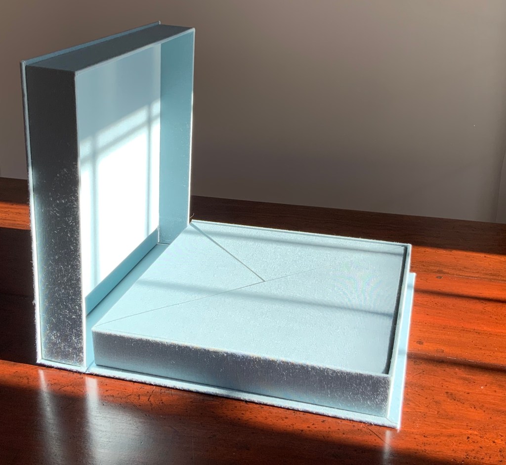
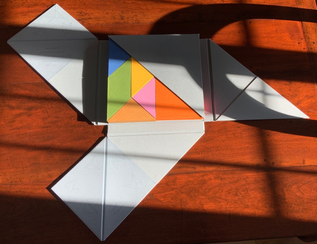
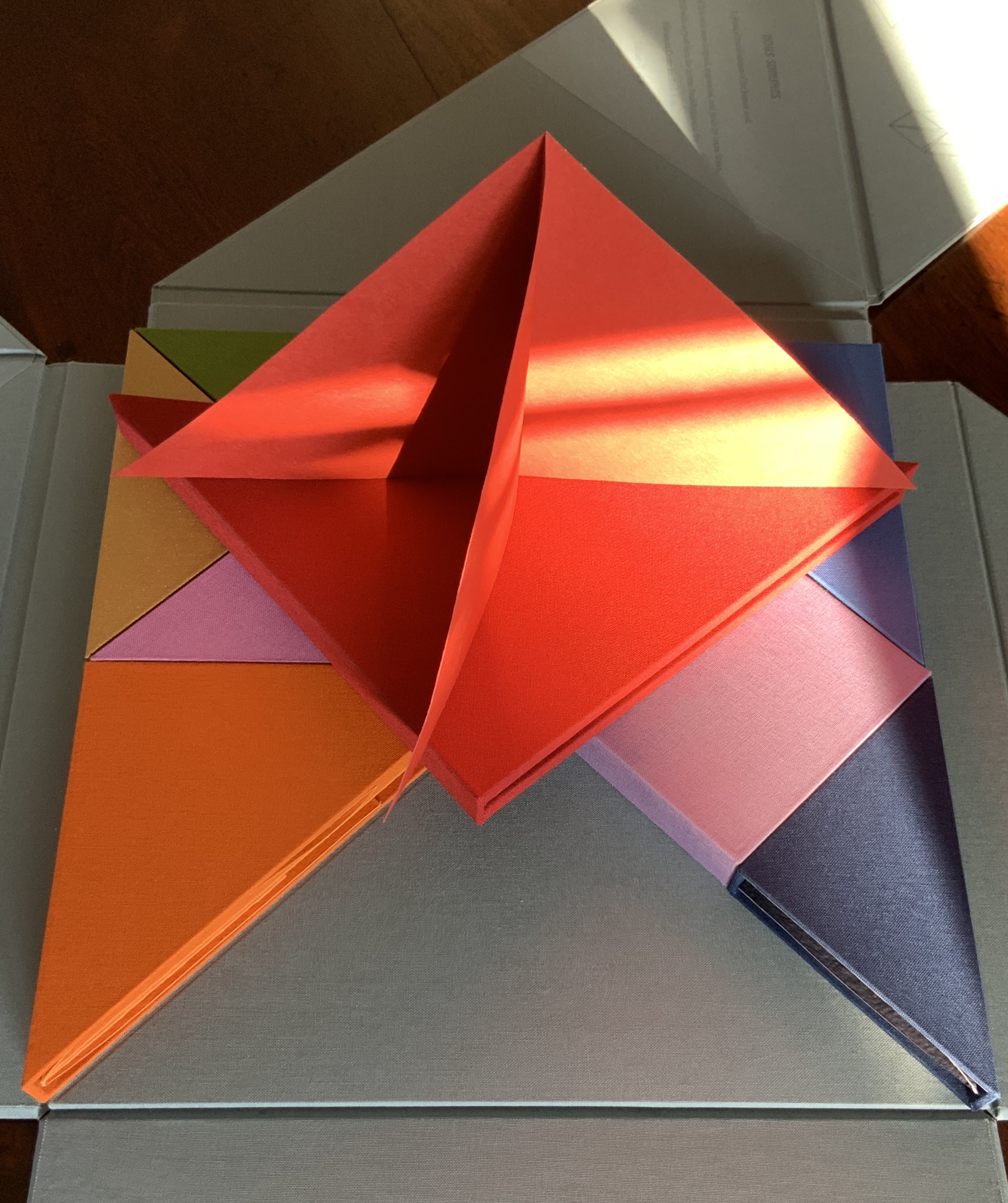
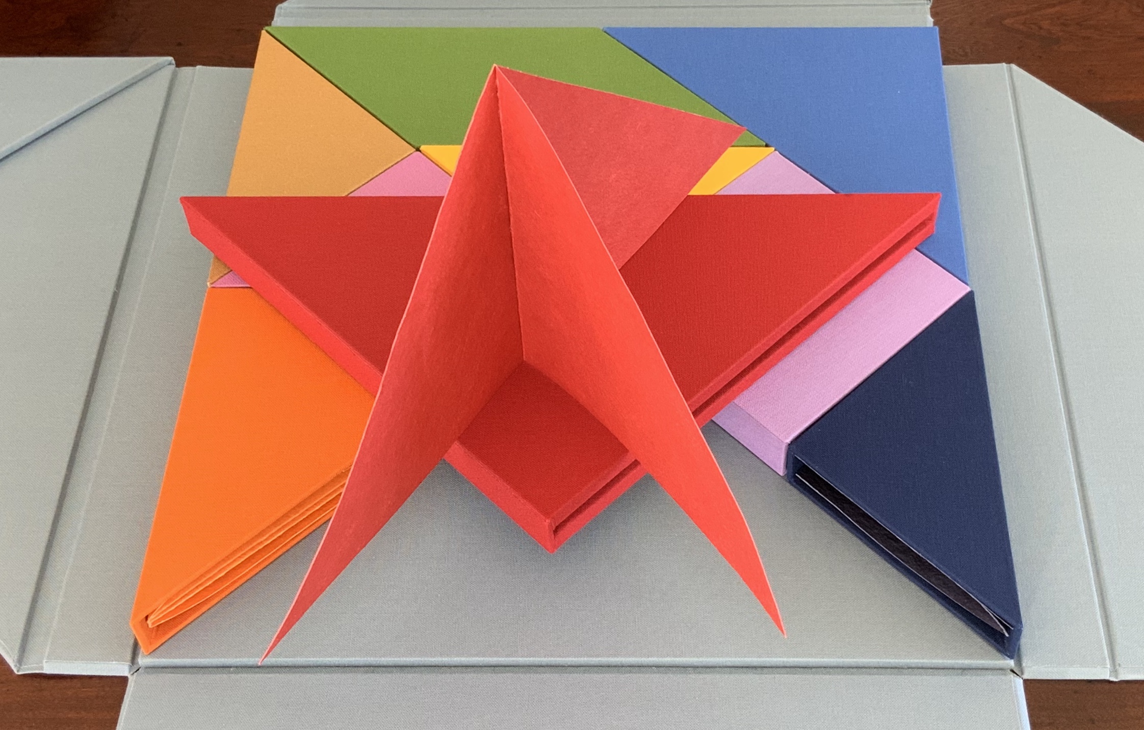
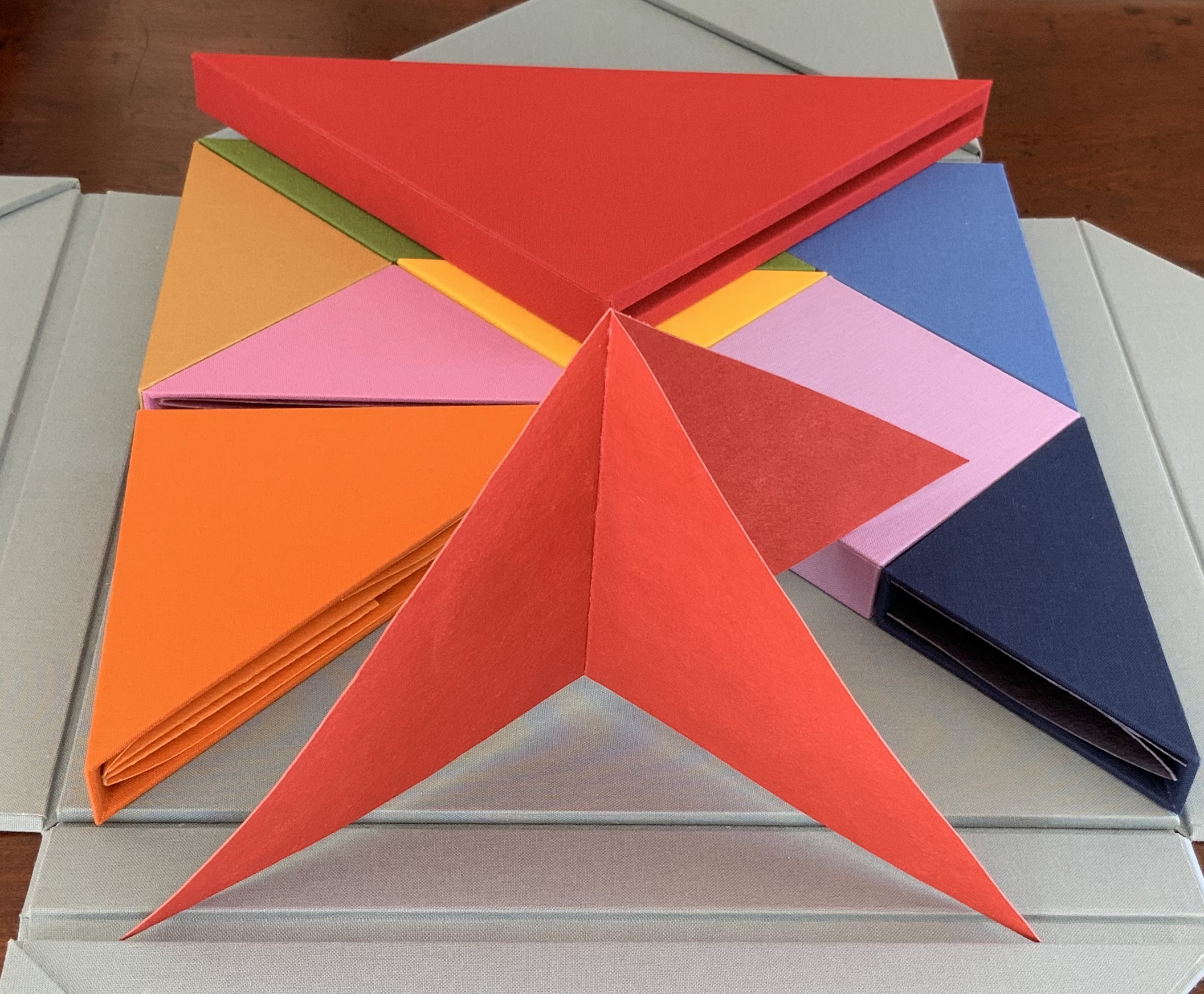
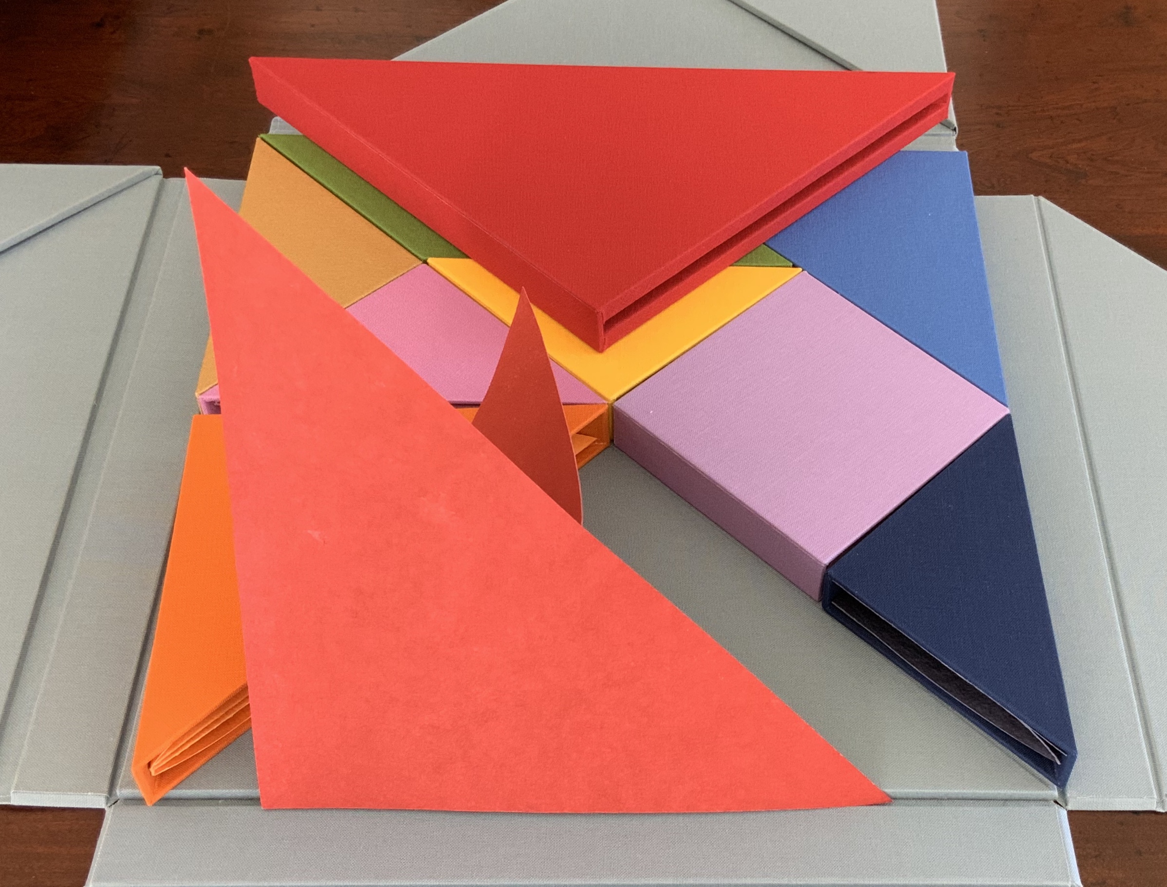
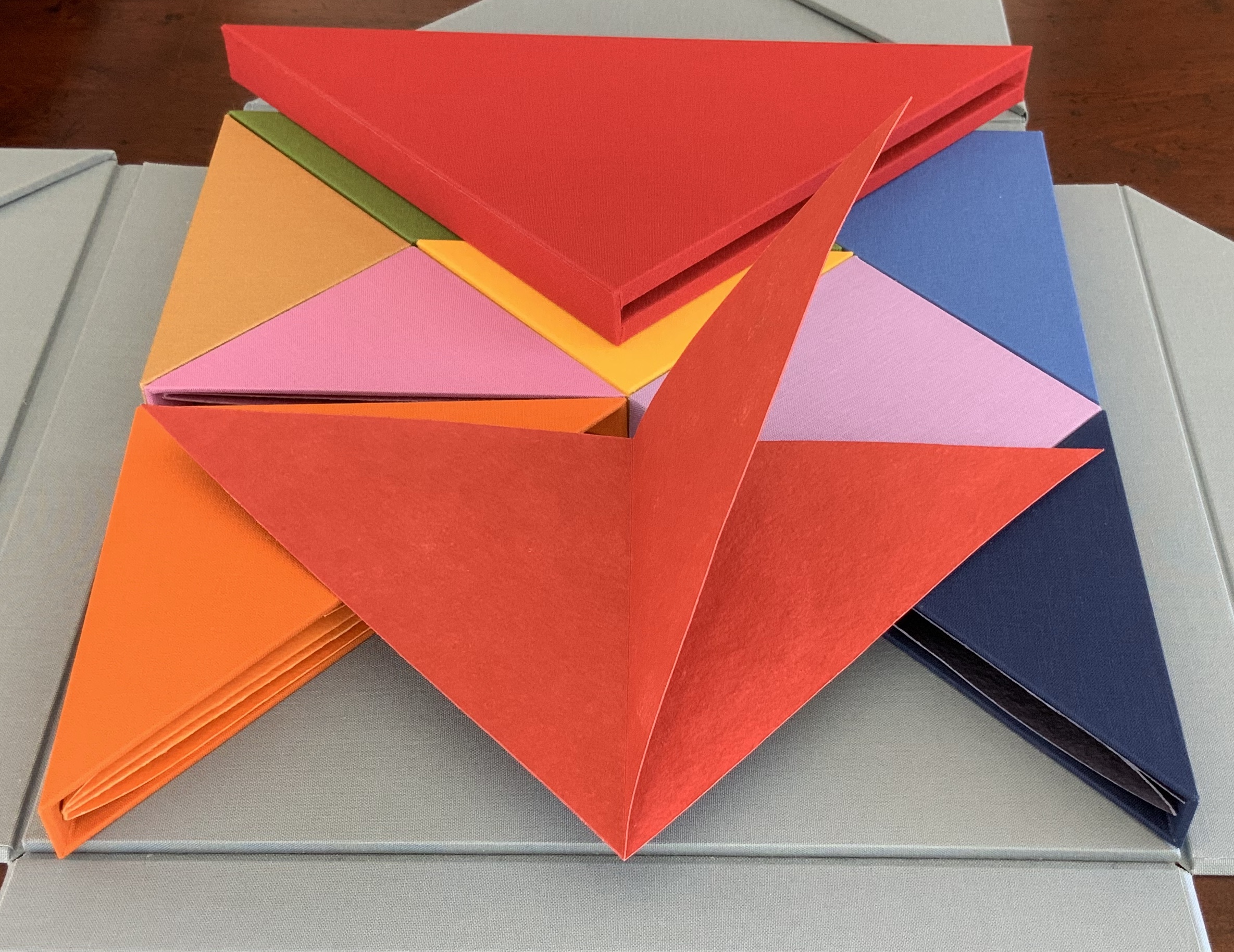
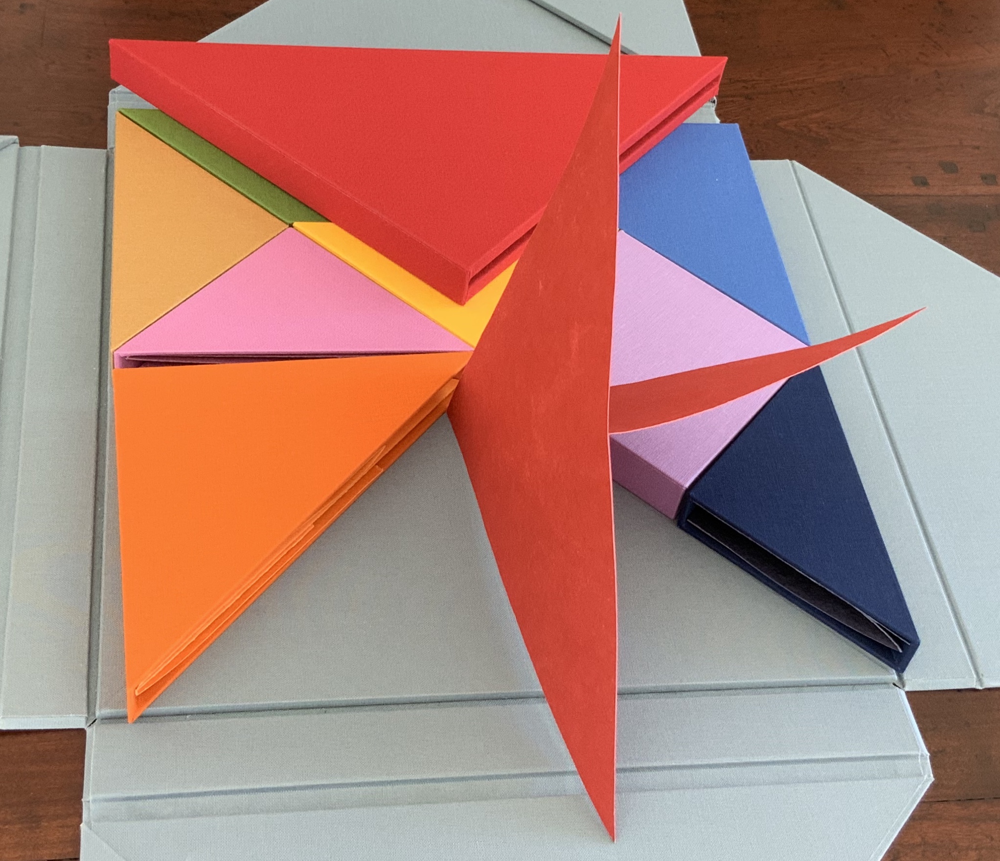
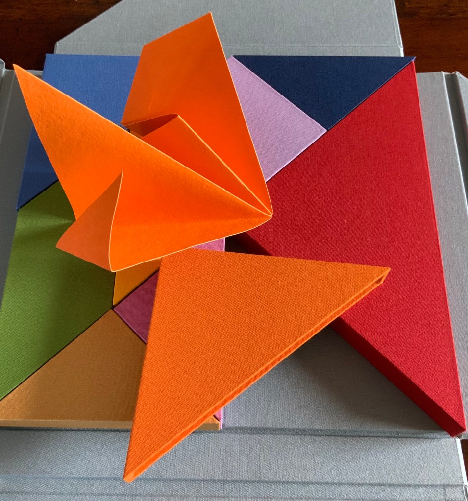
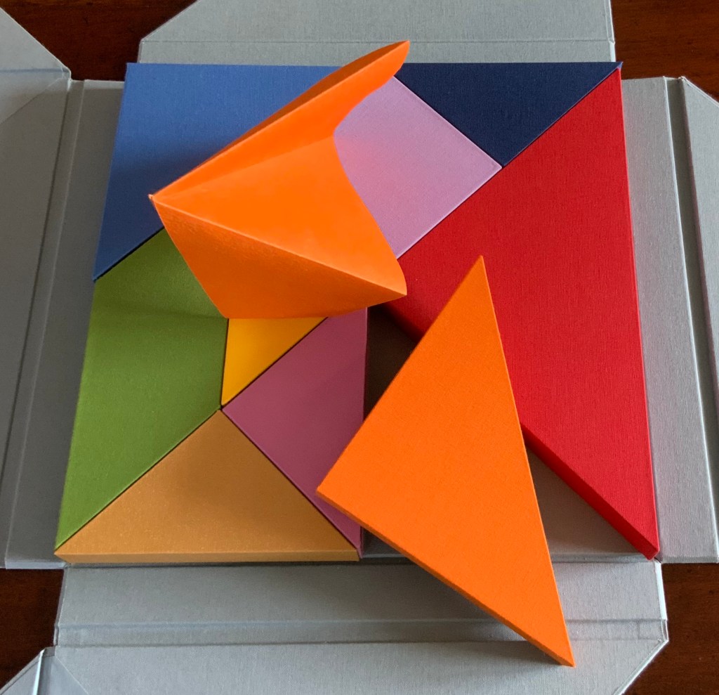
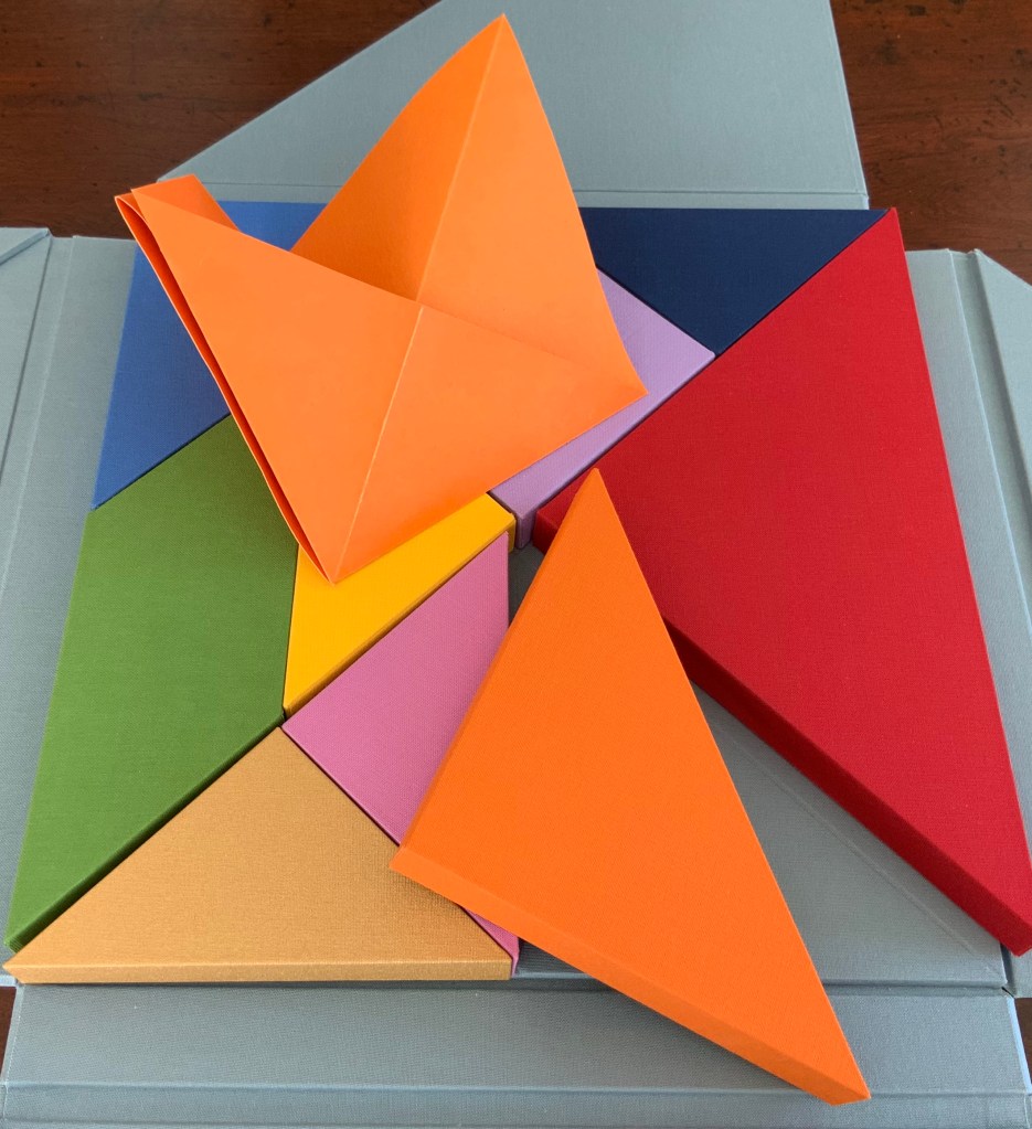
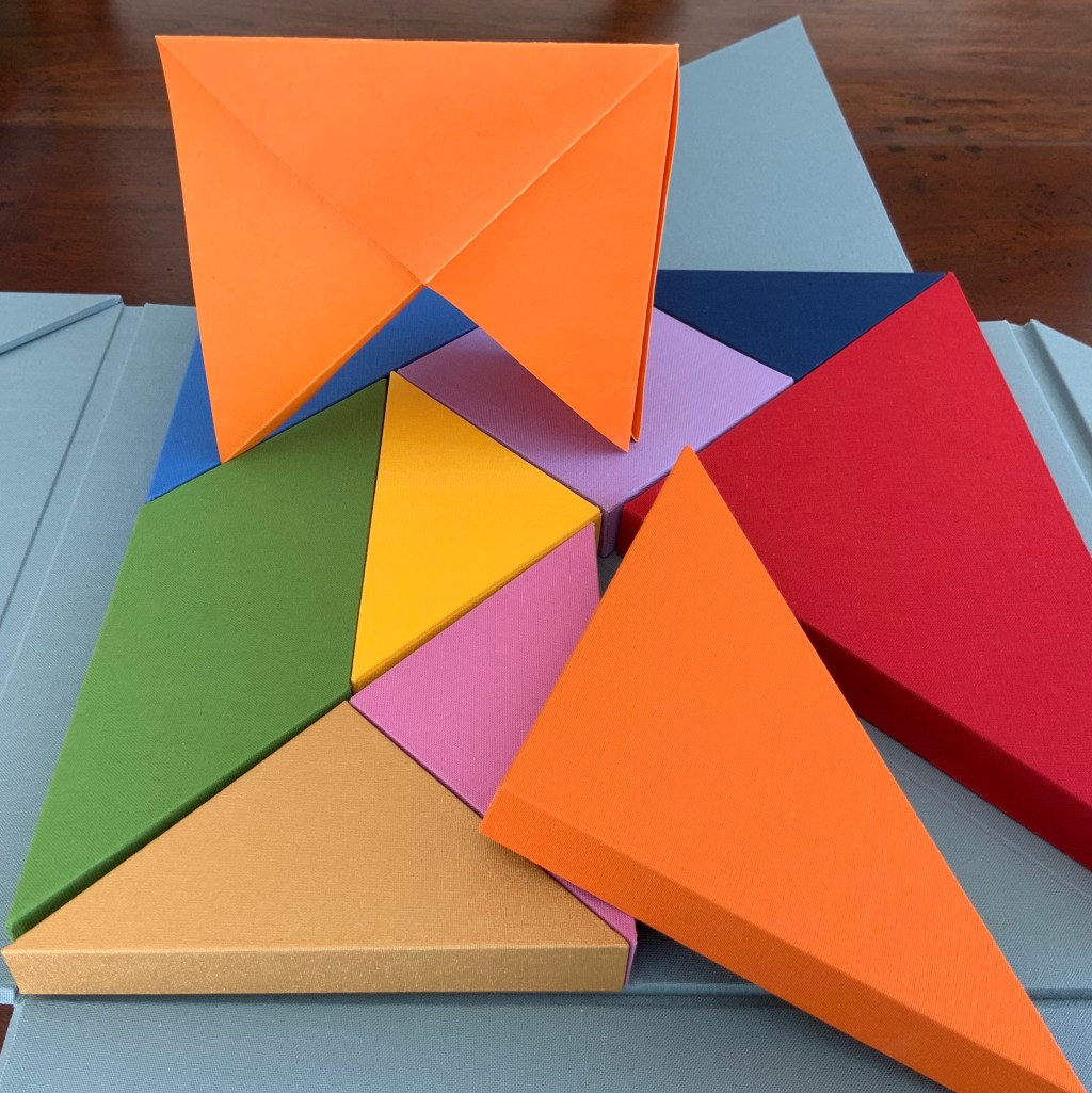
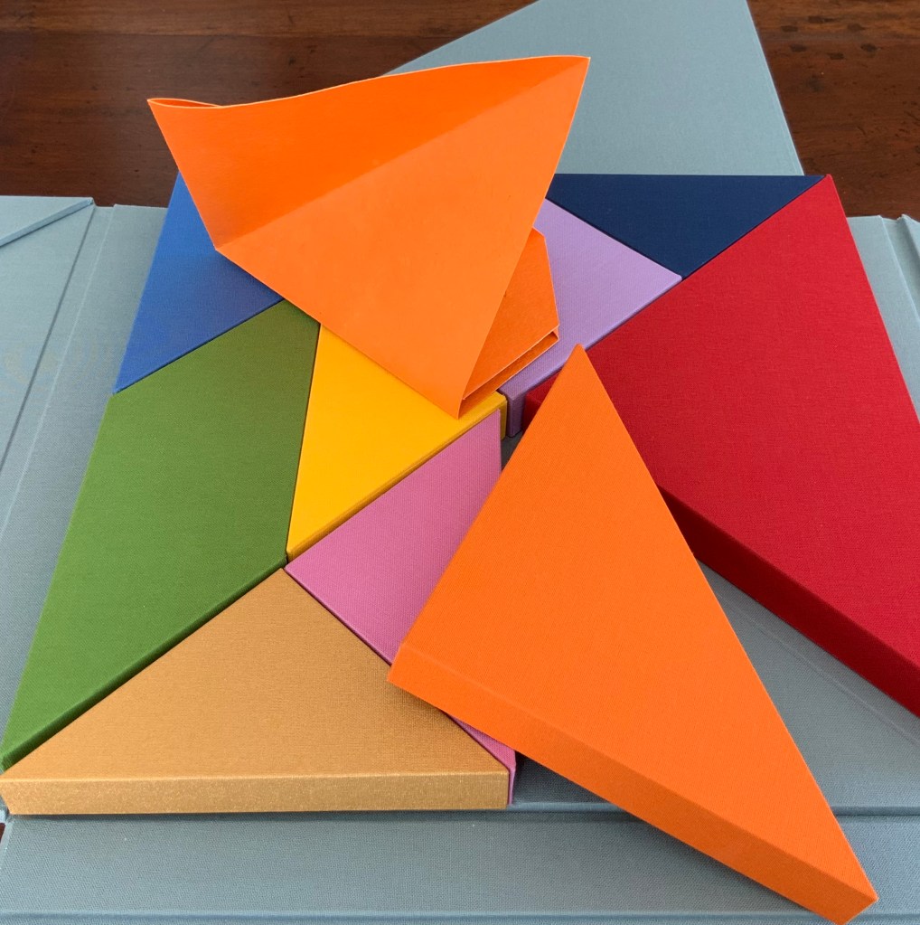
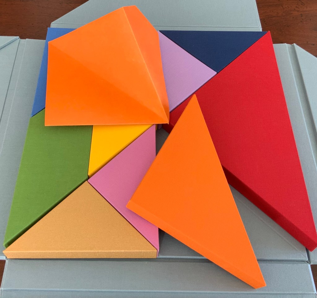
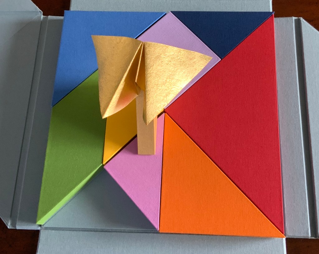
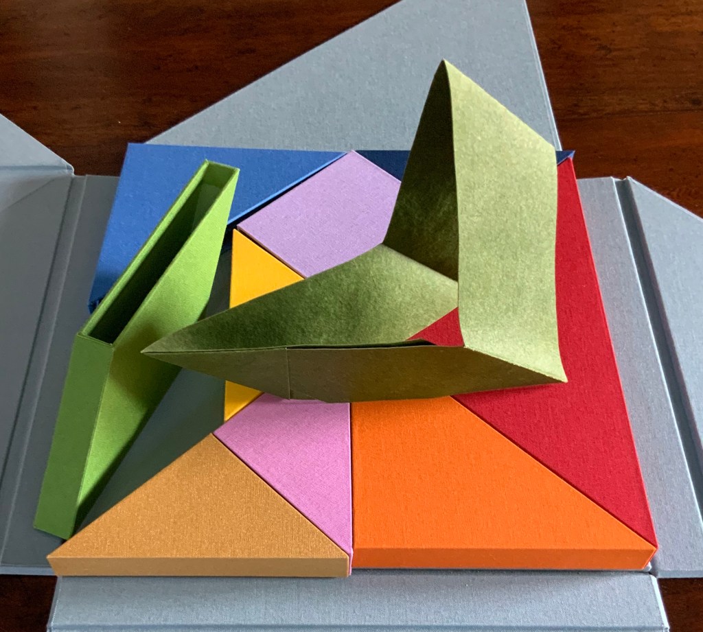
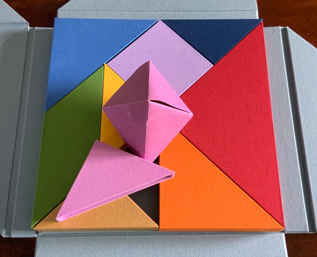
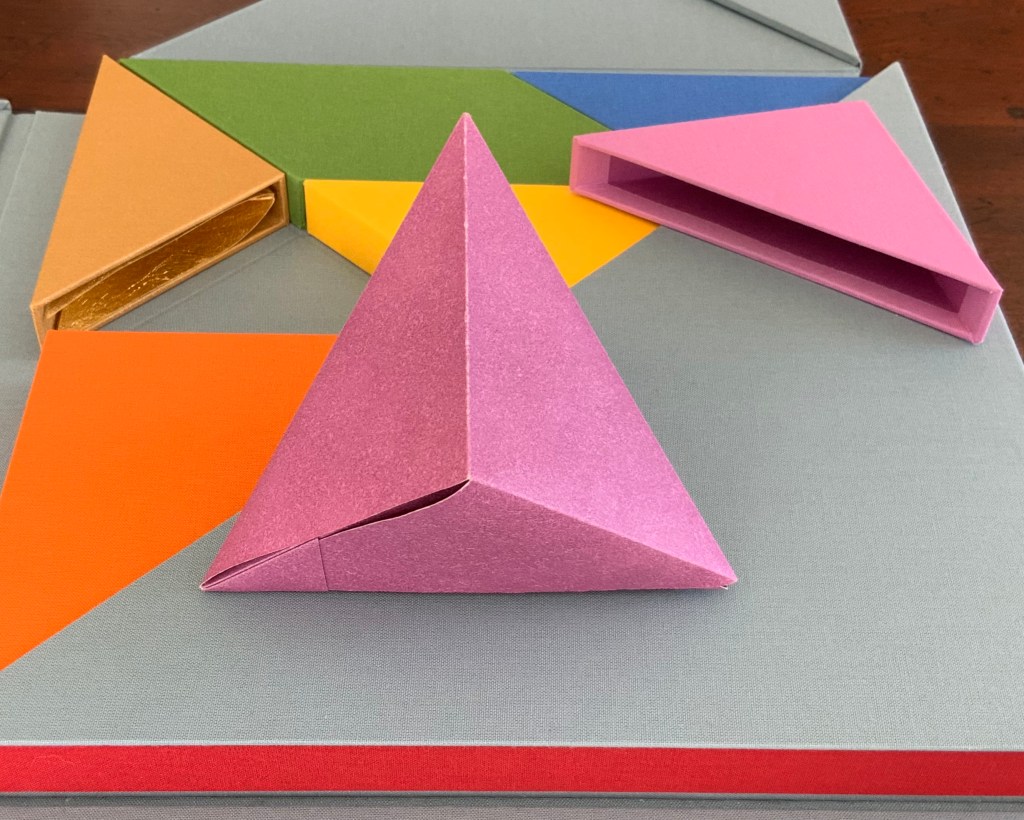
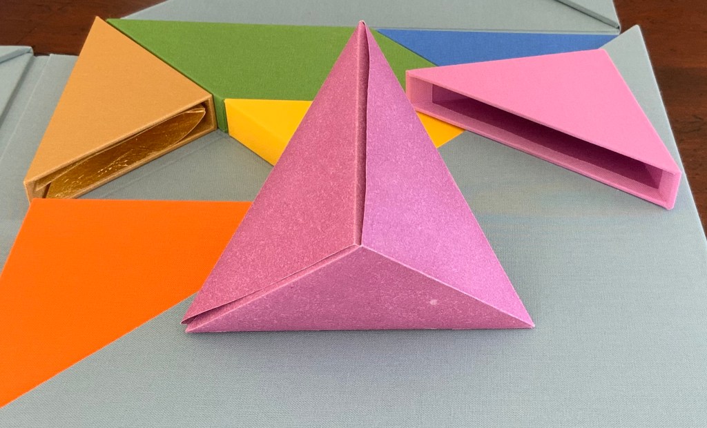
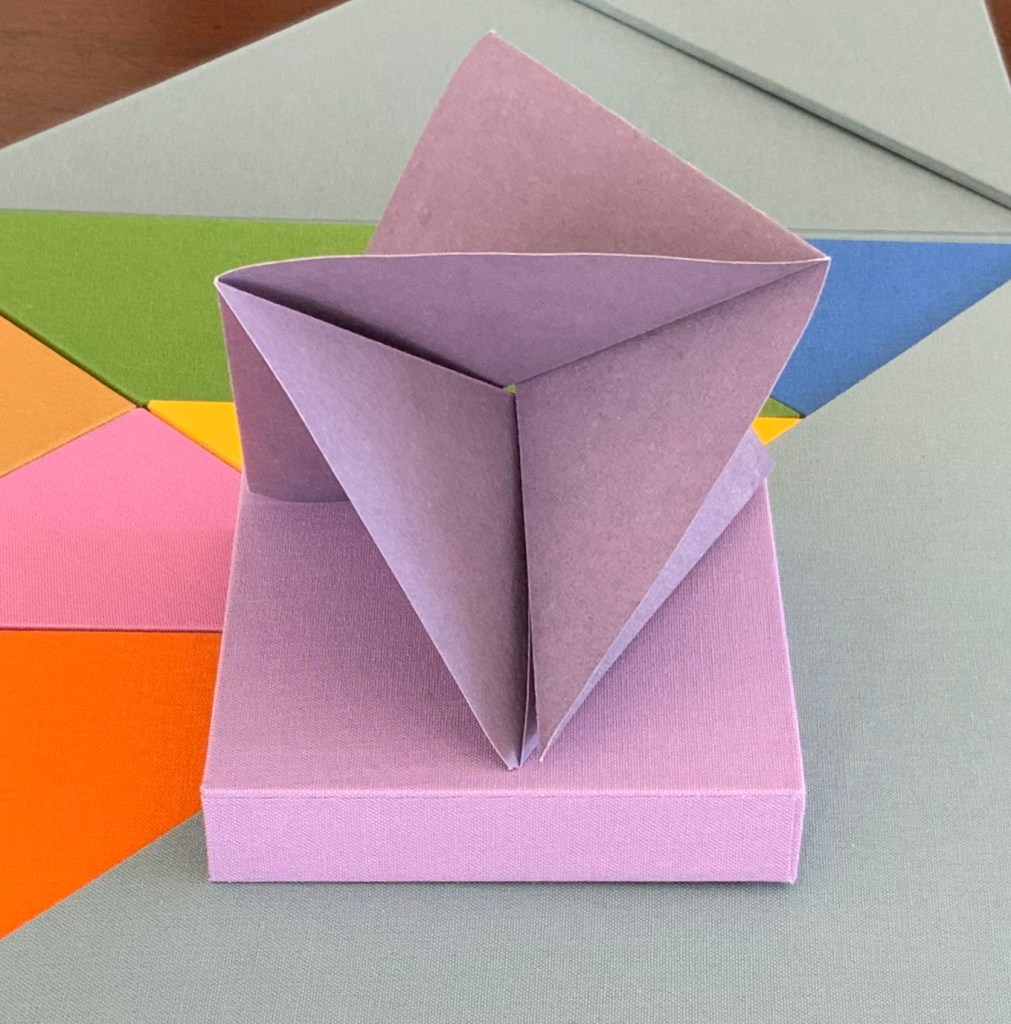
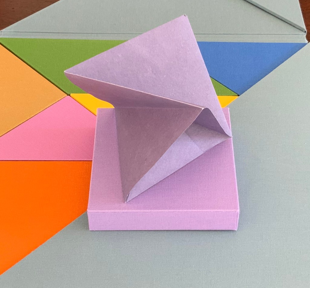
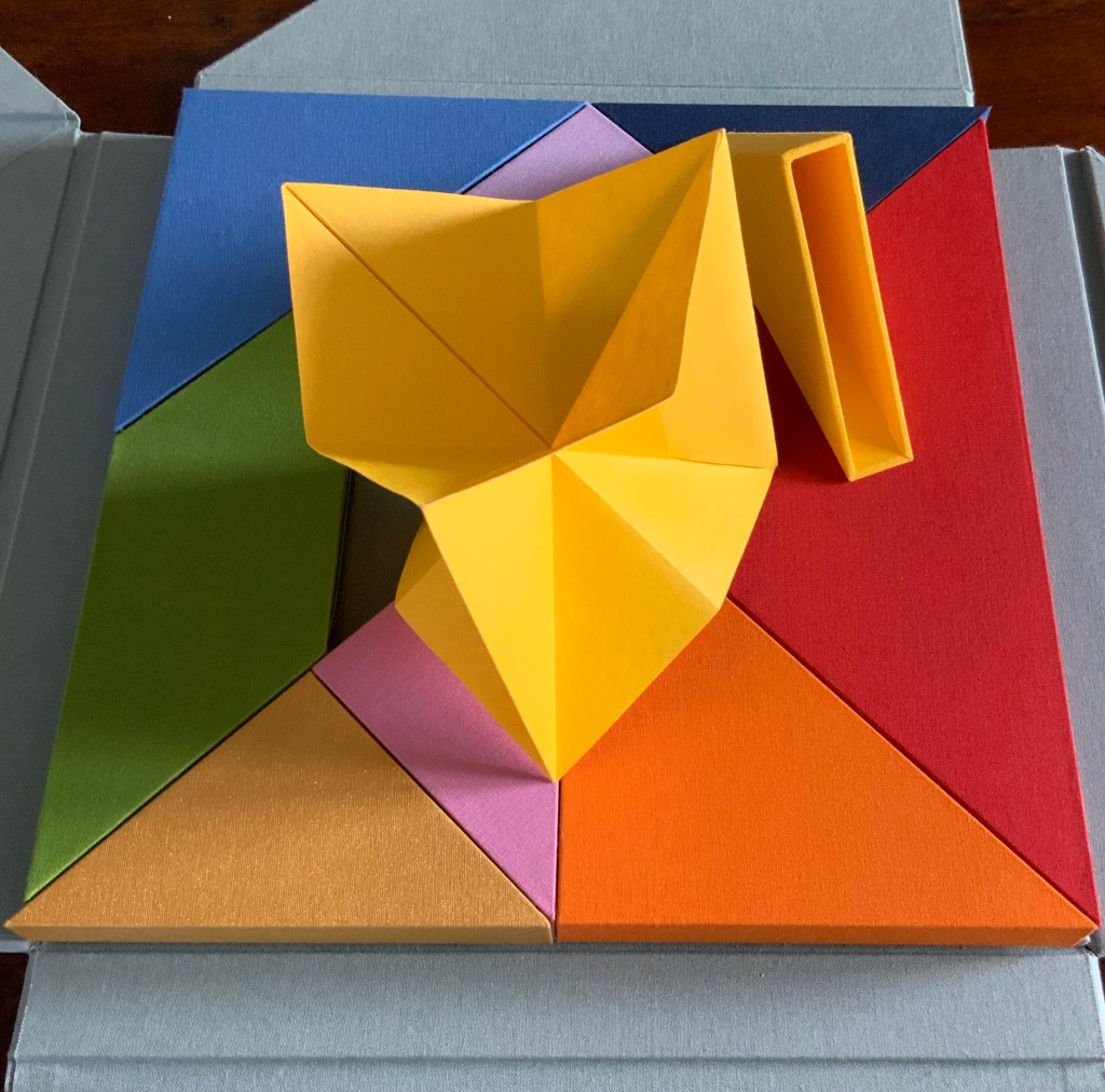
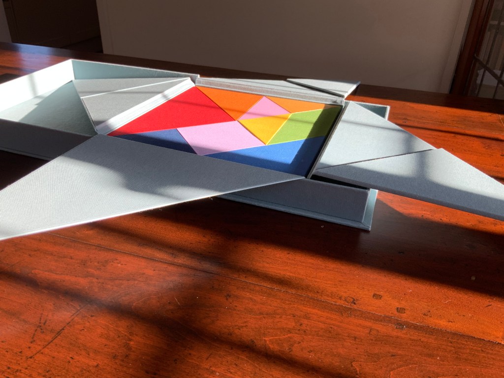
Nous Sommes (2015) Ioana Stoian Nine handmade-paper forms in handmade cloth-covered boxes, fitted to flapped container with magnetic seals, enclosed in cloth-covered Solander box. H310 x W305 x D54 mm. Acquired from the artist, 4 July 2017. Photos: Books On Books.
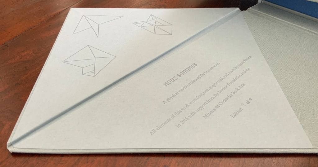
“Nous sommes”, the French for “we are”. But who is “we” here? Opening the first two flaps inside the blue-grey Solander box, I see that my first question should have been: What is Nous Sommes? The answer on the title page: “A physical manifestation of the human soul”. So, a book or sculpture then.
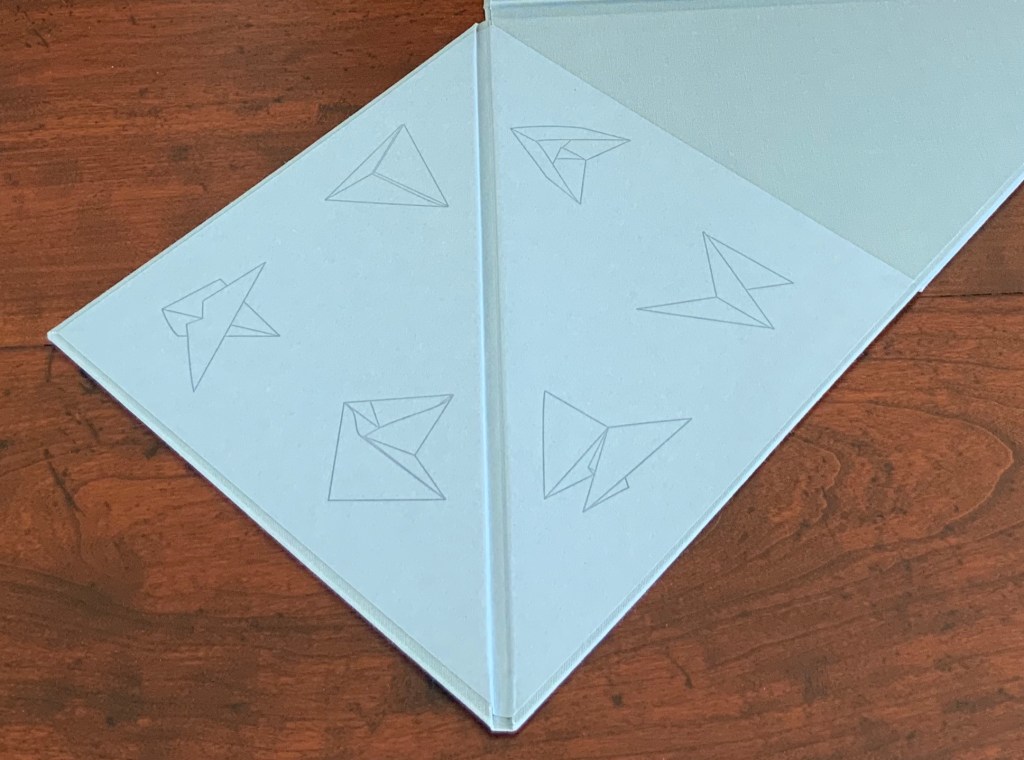
The third and fourth flaps reveal six diagrams to add to the three above the title page: a table of contents?
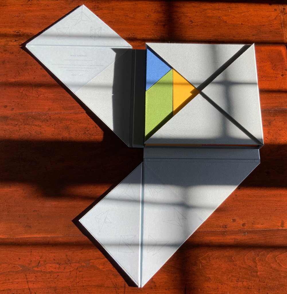
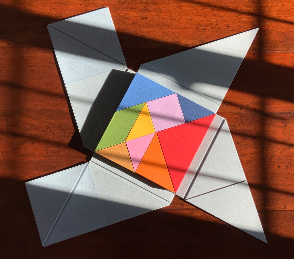
There are three brightly coloured boxes showing and fitting snugly together: the first three chapters or objects? Two are triangular, one is a parallelogram.
The next flap up gives another three boxes, all triangular and each a different color; and under the final flap, three more boxes, three more colors and a square among the triangles. Nine boxes making a tightly fitted square; six of them easily grasped because each has an edge at the perimeter.
The diagrammed shapes on the “table of contents” don’t correspond to the shapes of the nine boxes. The diagrammed shapes must be inside the boxes.
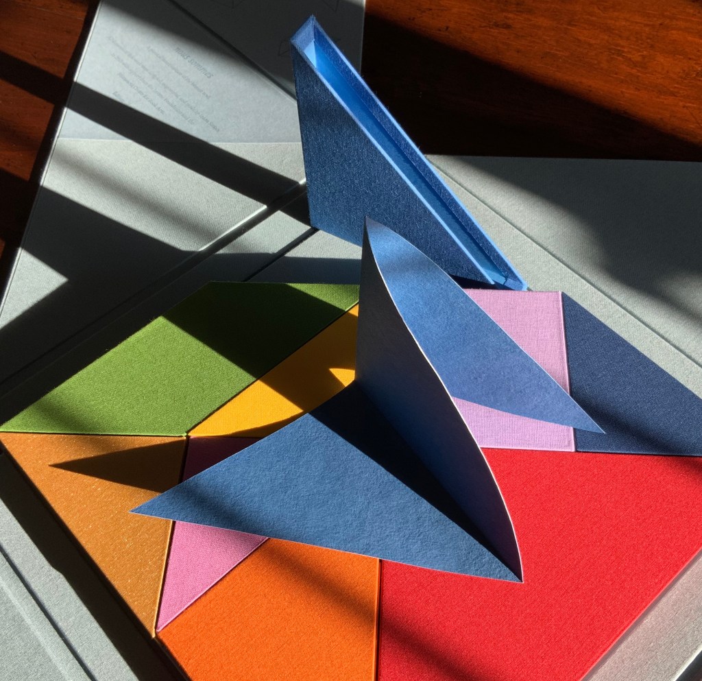
So I begin with the larger, lighter blue box. A sharp tap on the box, and a stiff, folded paper the same color as the box emerges. No words, no glyphs, but this is one of the shapes printed on the “table of contents”. It invites manipulation: stand me this way, now that, now this. With each turn, the light brings out different shades from the form’s valleys and mountains, and the form throws different shadows. Next the smaller, darker blue box houses a two-piece “chapter”, one piece to slot into the other. Again, different shades, different shadows.
The red box also offers up a two-piece chapter, but the pieces are glued together. So much larger a shape than the one before, but so much simpler.
The single piece from the orange box asks to be unfolded and one tip to be slipped into an awaiting slot; the resulting object is strange.
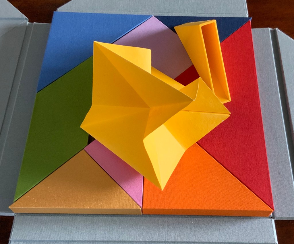
From the gold box, a butterfly emerges. The light glints off the gilt ink, and the upright box seems the perfect perch. From the green box, a glued and folded strip of paper unfolds into a hat, a collar, an open-mouthed bird or frog?
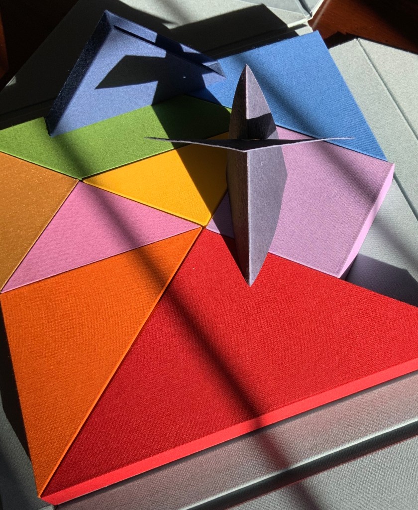
Inside the inner pink triangular box is the only solid — an irregular hexahedron. The contents of the violet square box unfolds and slots into itself to form a flower, the head of a mace?
The form that emerges from the small yellow box seems the most multi-faceted of all.
But where is the human soul manifest among these colors and forms?According to Neo-Pythagorean philosophers numbers, string vibrations, musical notes, colours and form have fundamental, metaphysical relationships. Pythagoras himself is thought to have said “colour is form, and form is colour”. Then there is Pythagorean Numerology that holds that a person’s date of birth can be distilled into one number (a root number) between 1-9, that each number is associated to a colour, and that each colour aligns with certain inner traits and life purposes. So within a box of grey (the color of universality), there are the nine colours of humanity: We are, making Nous Sommes a startling integration of book art, Pythagoras, numerology, tangrams, origami, papermaking, boxmaking, binding and printing.
On the title page, the work is designated as “Edition 9 of 9“. Yet, as of this writing, the work is unique. Of course, 9/9 = 1. And the chapter with which I started was blue, the colour associated with the number 5, the root number of my birth date. So many coincidences of sums, Nous Sommes must have been bound for the Books On Books Collection.