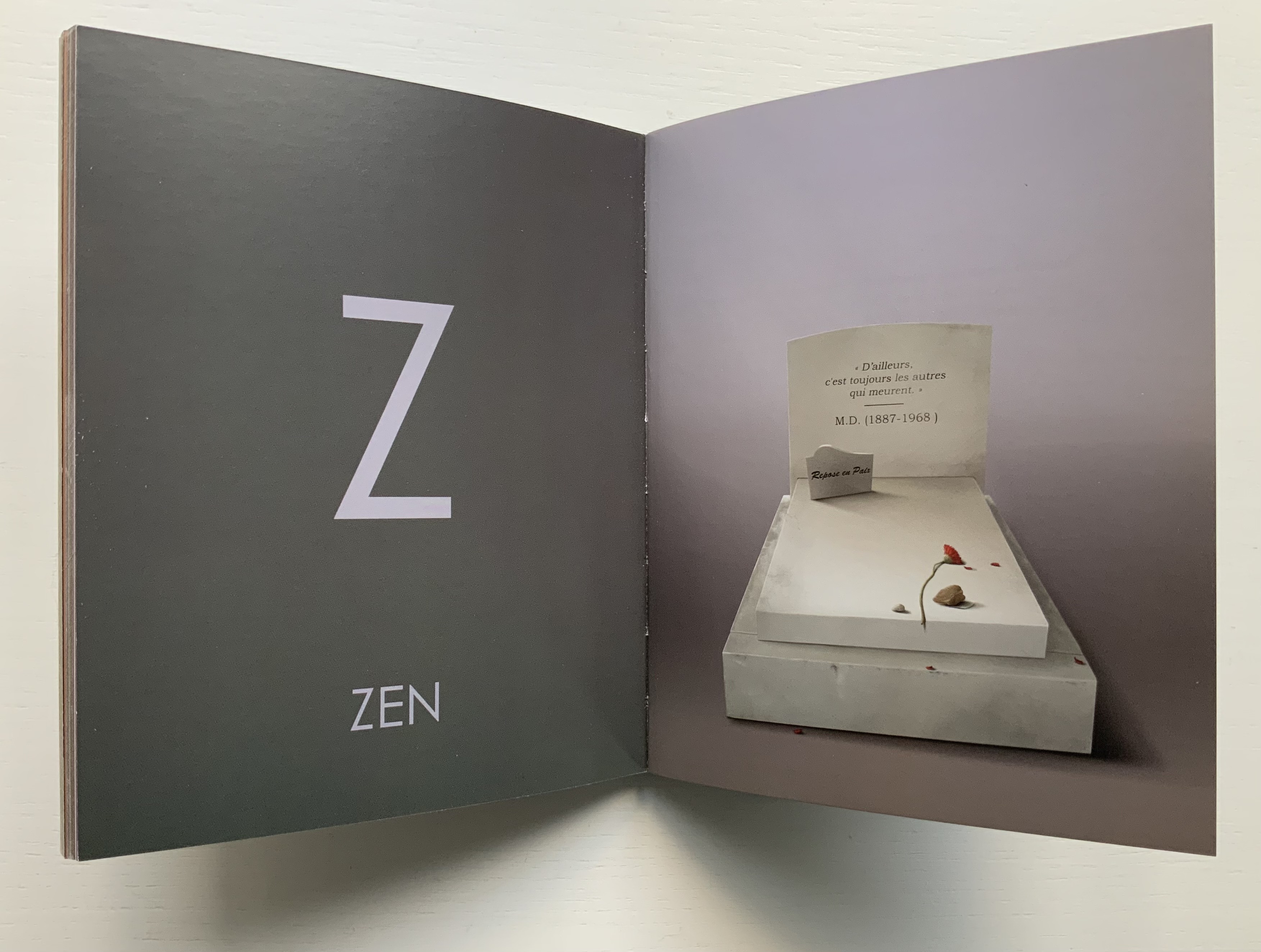
A-Z: Robert Cottingham: An American Alphabet (1997-2012)

A-Z: Robert Cottingham: An American Alphabet (1997-2012)
Robert Cottingham
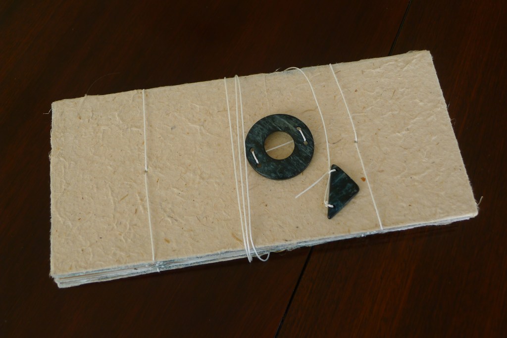
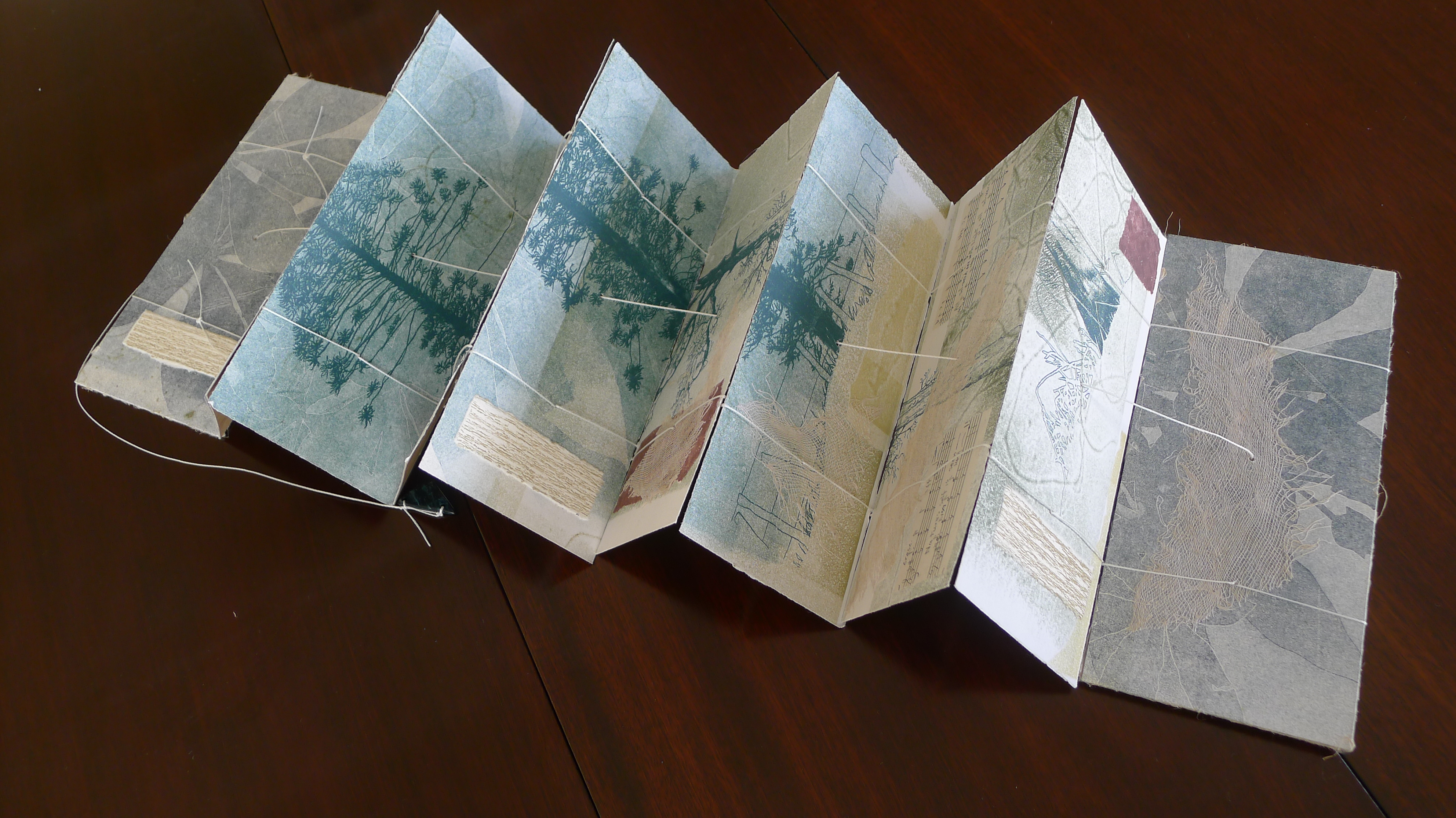
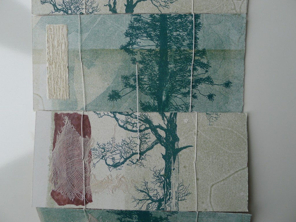
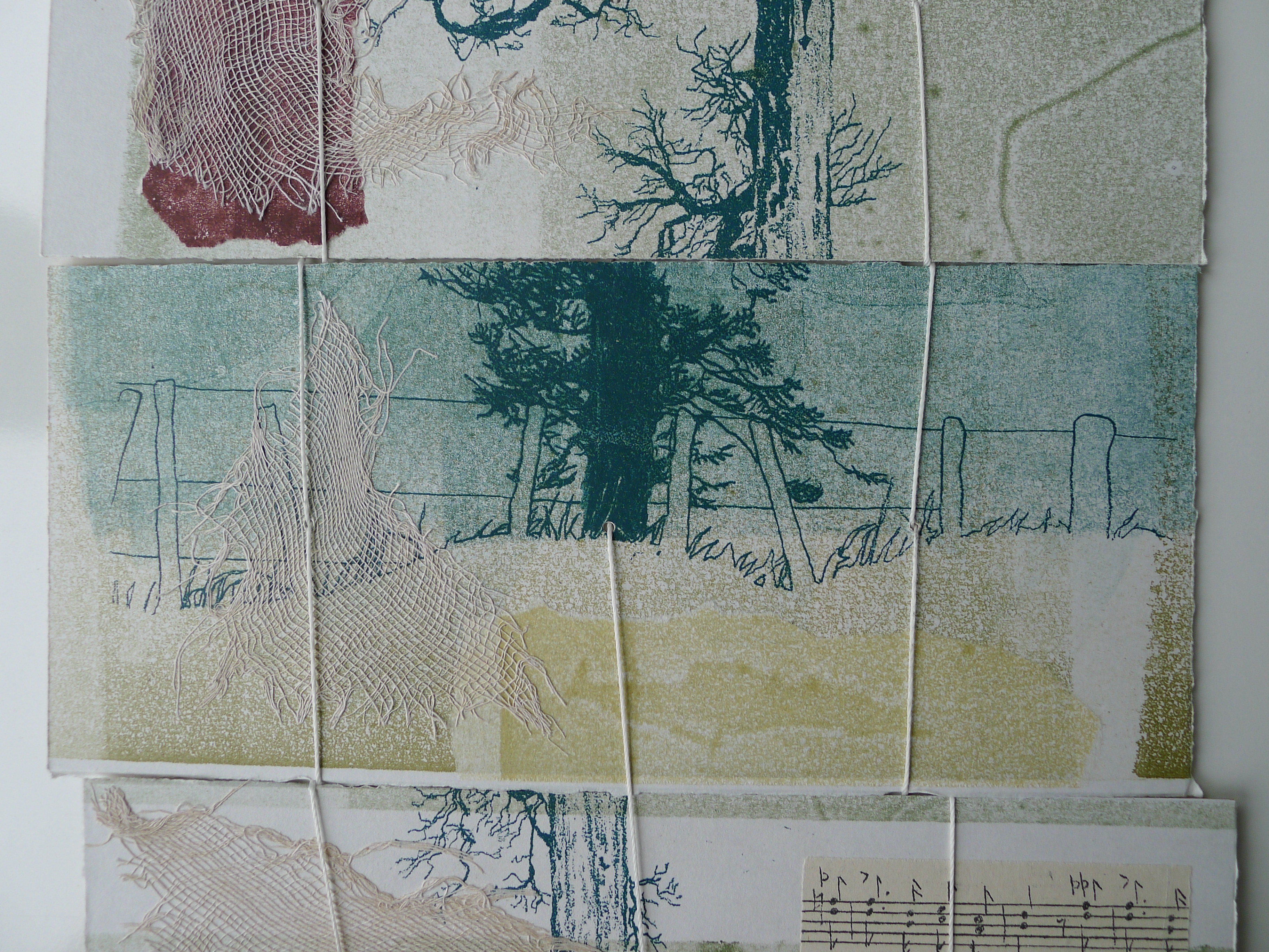
Hardcover. H x W mm, pages. Edition of 100. Acquired from Tandem Press, 10 September 2021.
Photos of the book: Books On Books Collection. Displayed with permission of the artist and Tandem Press.
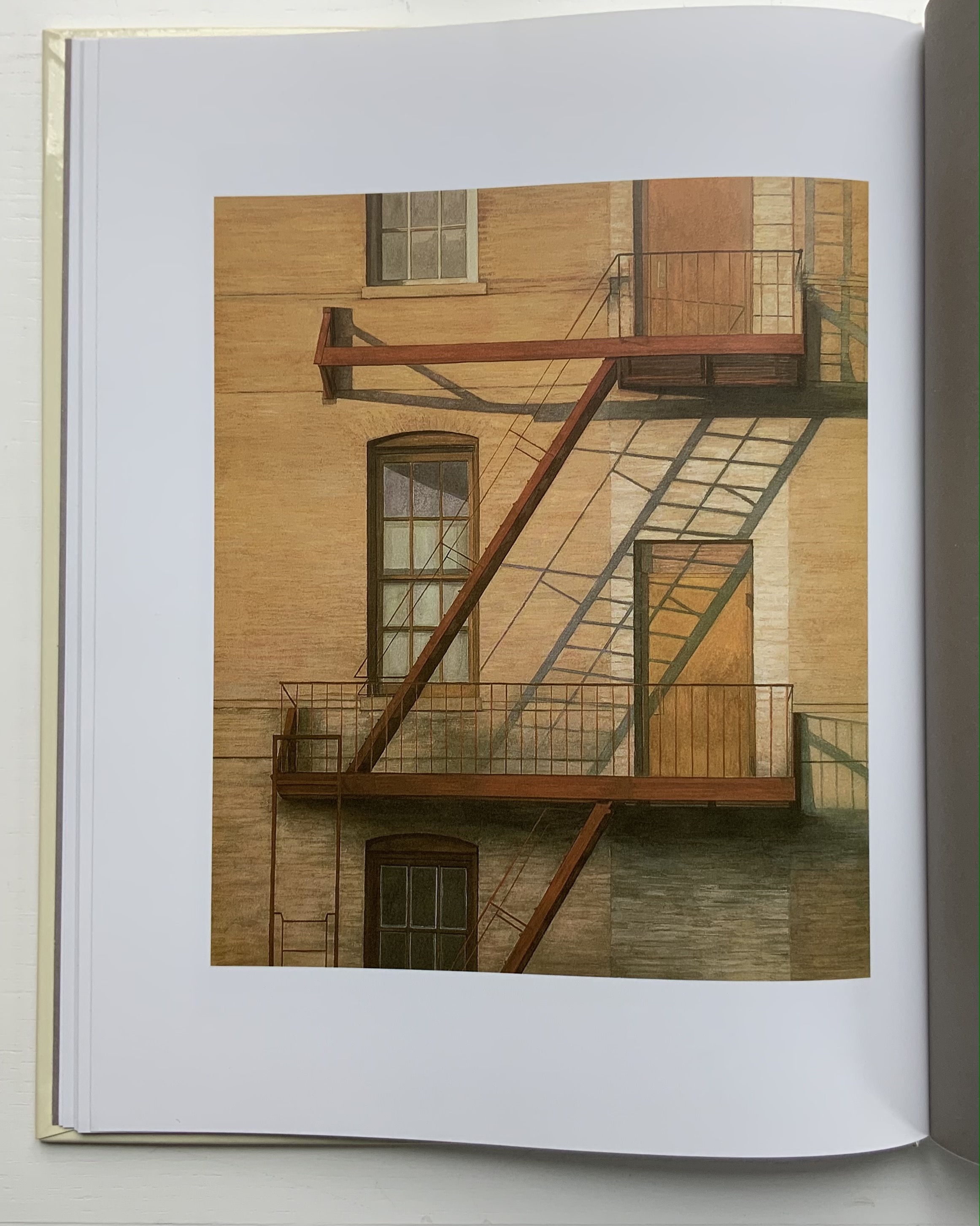
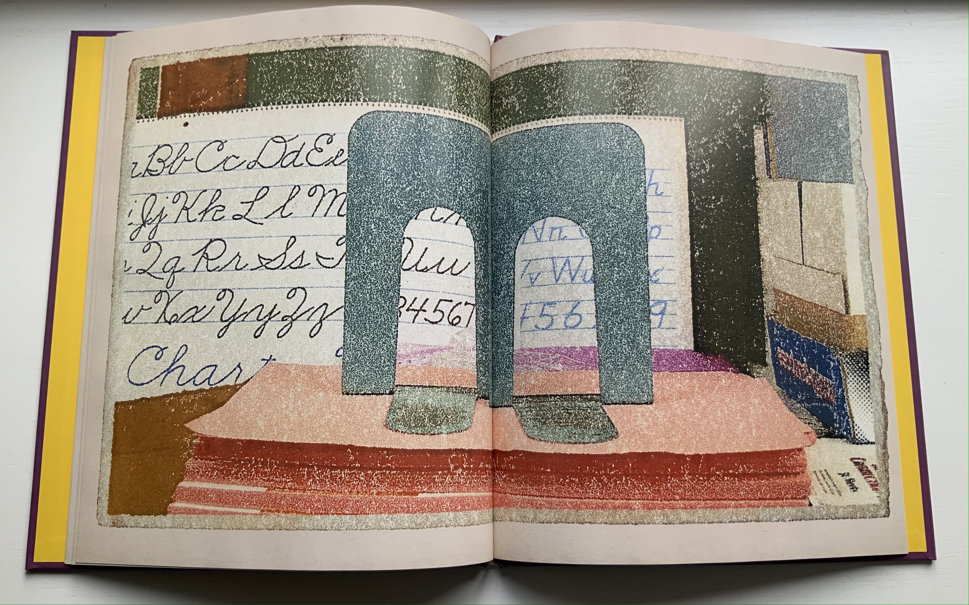
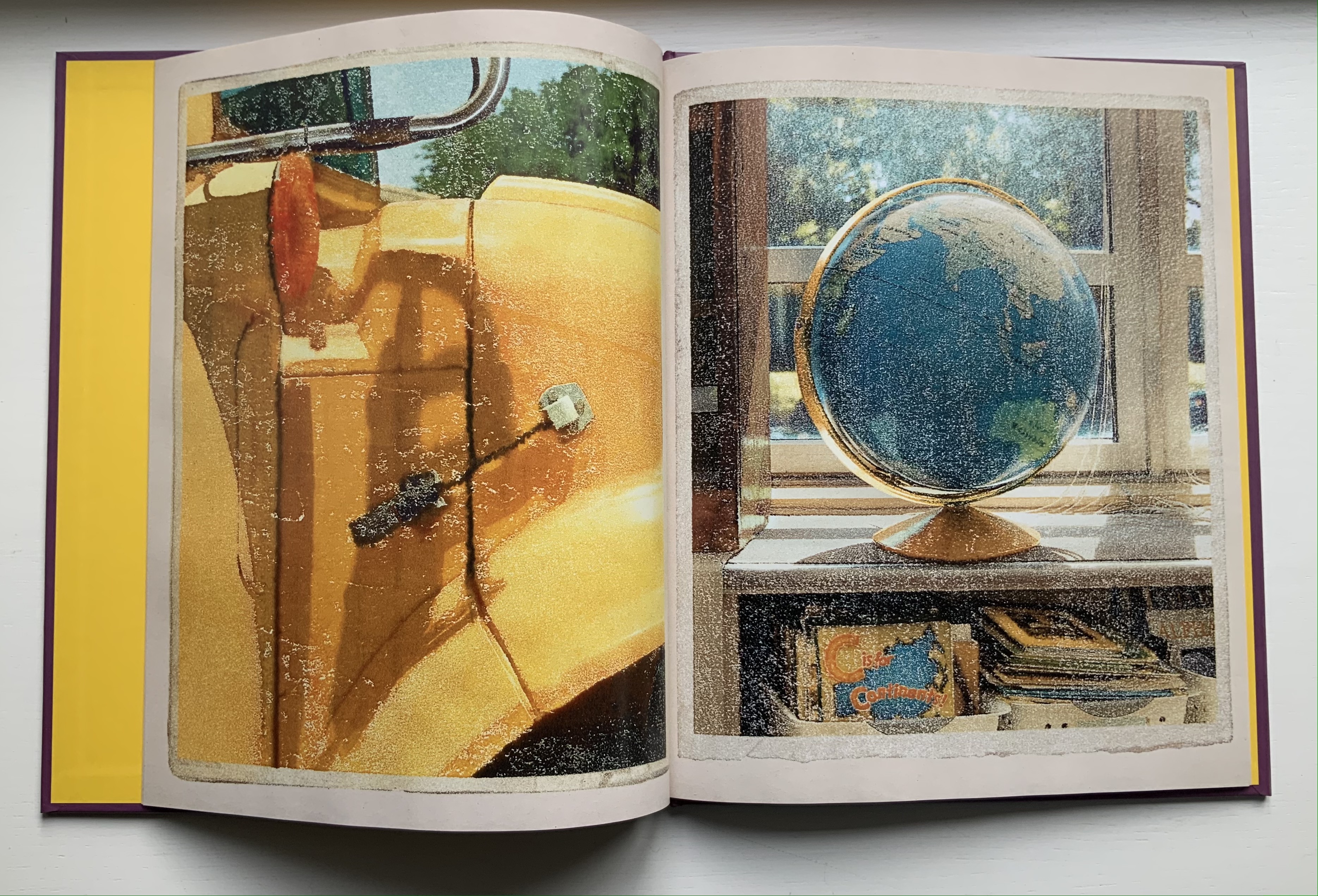
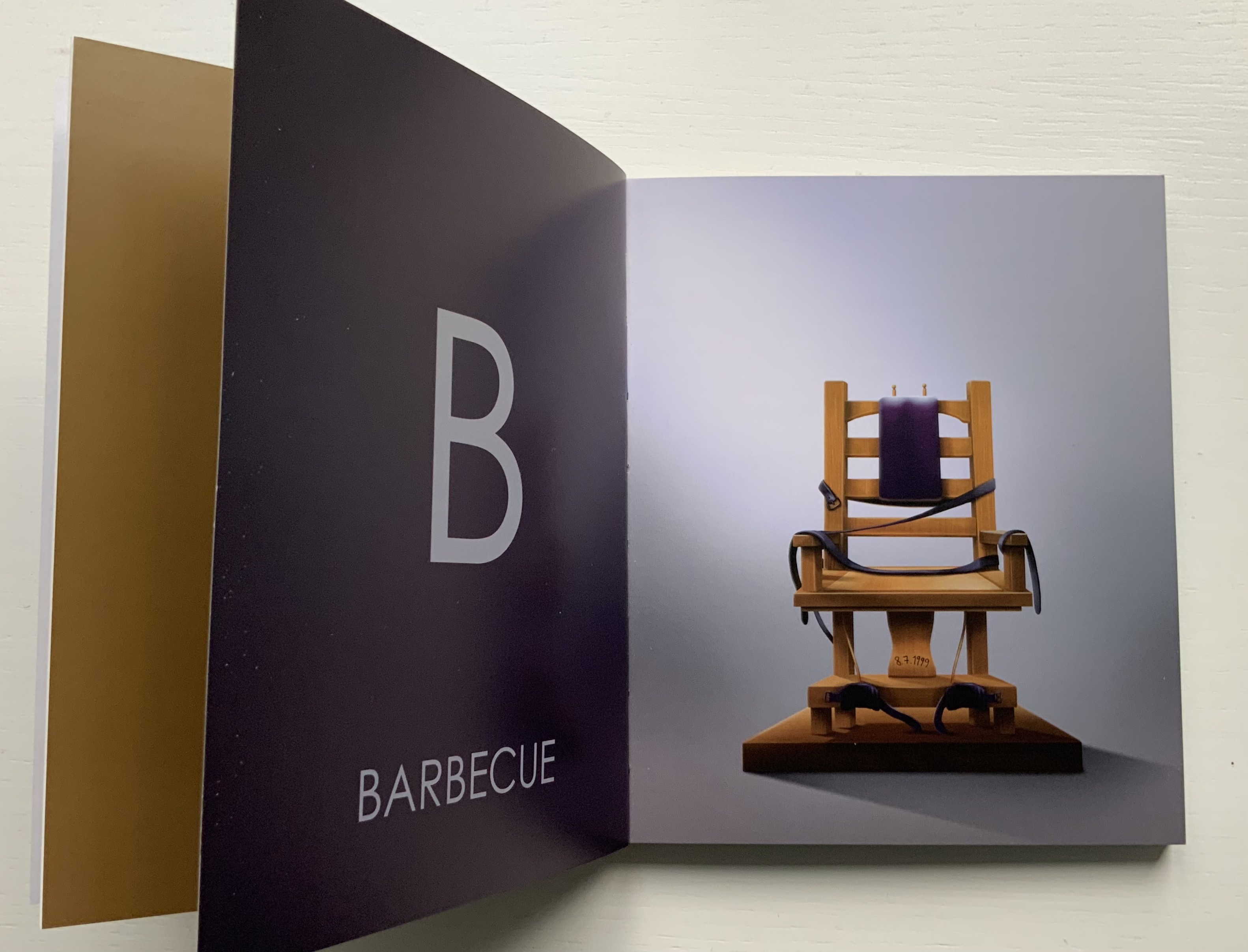
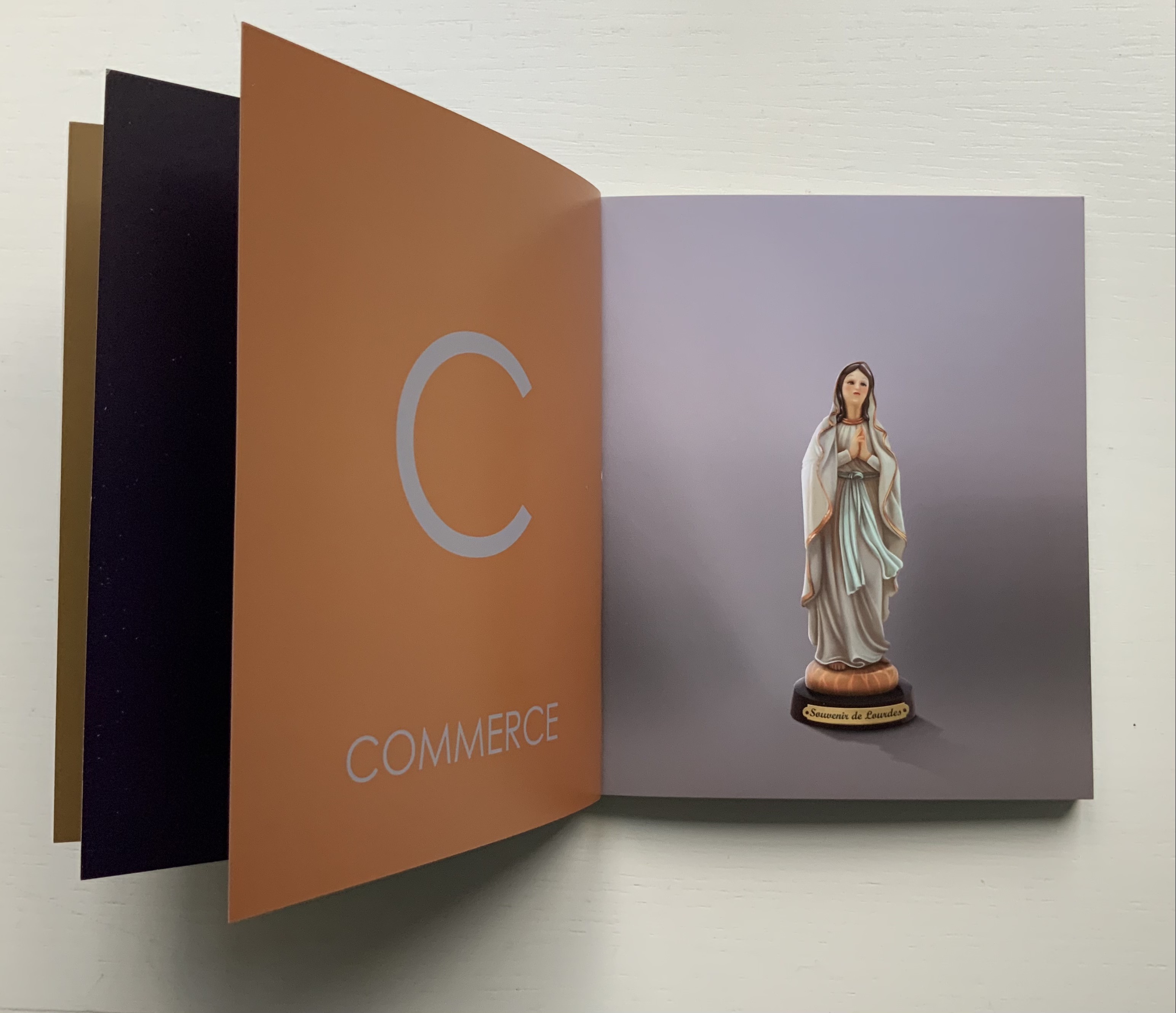
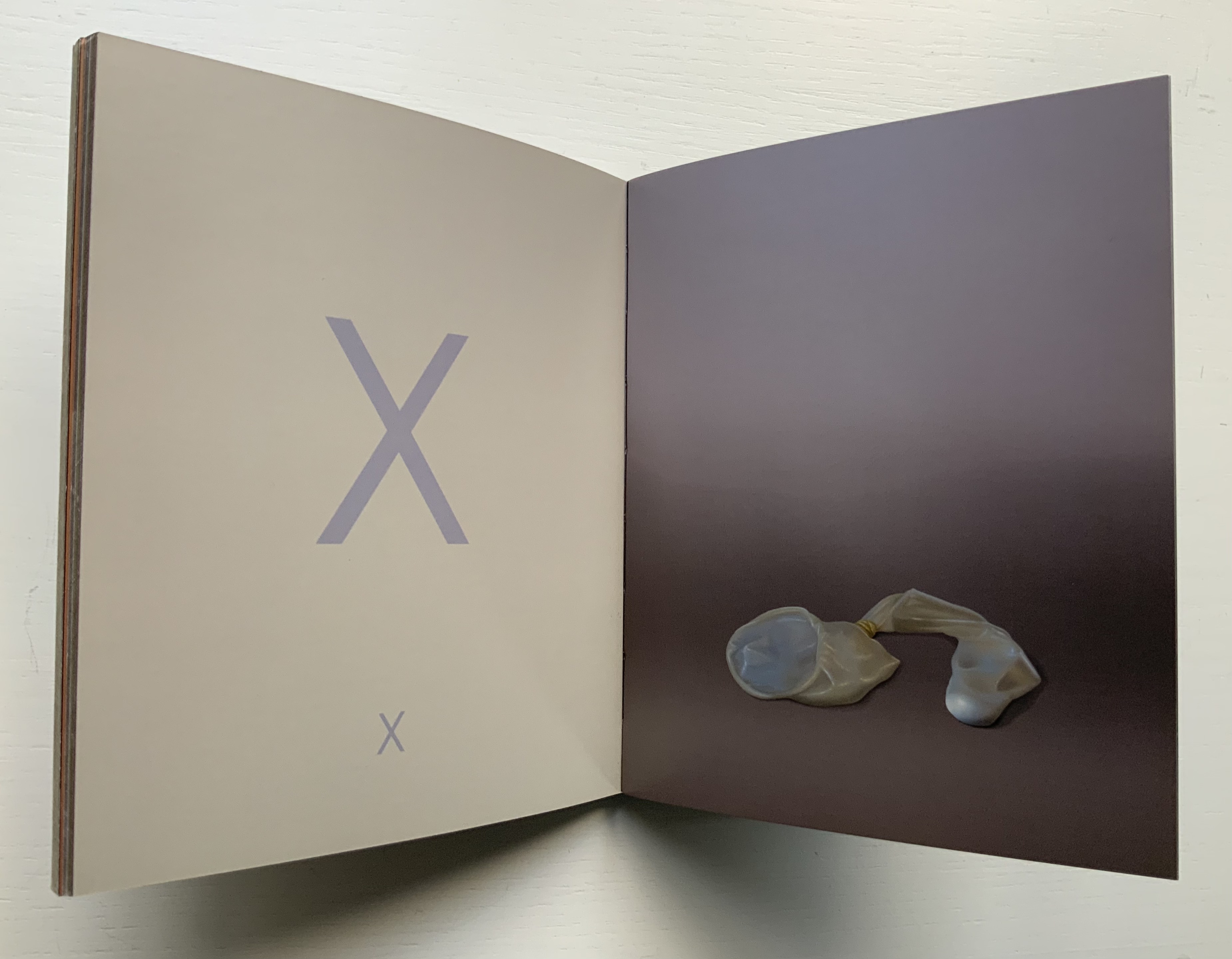
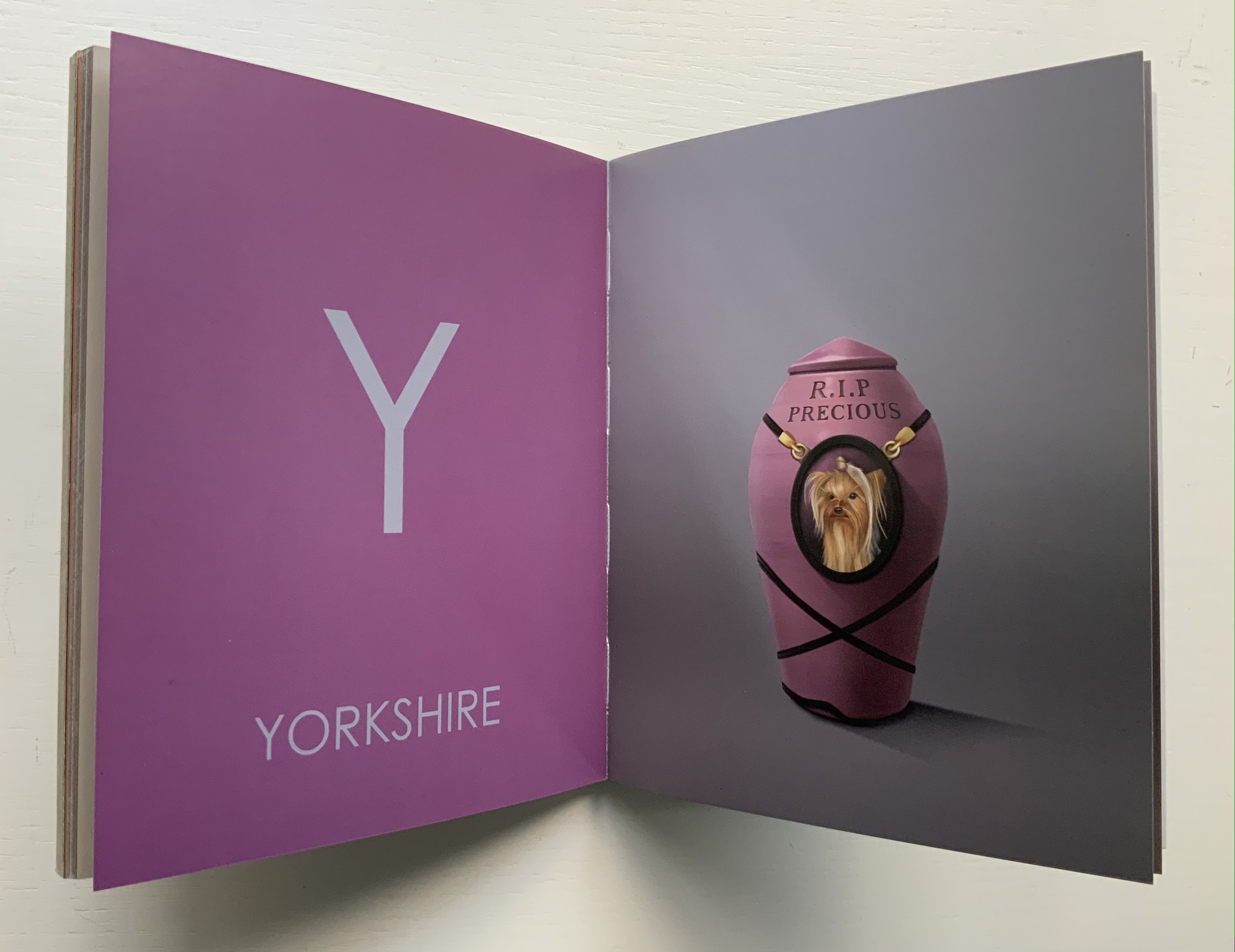
I had completed a number of canvases for AN AMERICAN ALPHABET and began to experience storage problems. The paintings were leaning against all available walls and were in danger of being damaged. For protection, I hung them as a group on one wall, stacking them four high by four across, … sixteen canvases that reached to the ceiling and formed a monumental mosaic of letterforms. This arrangement of tightly packed images created an energy I hadn’t anticipated. As I looked up at it for the first time from my studio floor, I was immediately transported back to those moments when my father and I ascended from the 42nd Street subway station. The sight lines in my studio matched the ones I’d experienced as a child looking up at the signs and lights of Times Square. (Cottingham, A-Z)
Cottingham’s time travel creates a longing in the viewer for travel in time and space. What that wall must have looked like. Those who might have enjoyed the 1996 show at the Forum Gallery in New York or the installation at the New York Print Fair in November 2011 or the Tandem Press exhibition at Madison, WI, in 2018 would have a limited idea (the images were not stacked four high). A-Z: An American Alphabet is as close as the rest of us will come to visualizing it. The artist book does have the advantage of letter by letter commentary from Cottingham.


Another plus in the book is Cottingham’s exploration of his process, tools and material:
The photograph is the starting point. Once I’ve chosen a specific image, I’ll do at least one preliminary sketch in black and white. This drawing familiarizes me with the image and allows me to make the first formal adjustments. The drawing acts as a value study — a sketch that helps determine the tonal range of the image, how dark or light the various elements should be. …/ Next comes the preliminary color study. This may be a watercolor or a gouache, sometimes handled loosely, sometimes treated as a more finished work. …/ I can now move on to the canvas. My preferred medium is oil. … The painting quickly takes on a life of its own, demanding further adjustments to color, tonal value, and form. But the preliminary work, like a map, guides me towards the new and always unexpected version of my original concept./ … / I consider printmaking an important adjunct to my painting. Many times, when I’ve completed a painting, I feel the need to do more work with the image — to dig deeper, exploring other aspects of its structure. Printmaking offers this opportunity. … / … An old world sensibility and craftsmanship is brought to the selection of paper (often hand-made), the mixing of inks, the preparation of plates or lithographic stones, and other steps in the process.
Cottingham also draws out the collaborative nature of printmaking, which in this case involved four Master Printers (Andy Rubin, Bruce Crownover, Joe Freye and, for the digital, Jason Ruhl) and, for the book design and layout, Linda Endlich. Another form of collaboration is influence, and Cottingham is generously open about his debts: Charles Demuth, Edward Hopper, René Magritte, Piet Mondrian and, of course, the design of the signs from which the letters come. Along with his contemporaries such as Chuck Close, Don Eddy, Richard Estes, Audrey Flack and John Salt, Cottingham represents the movement of Photo-Realism.
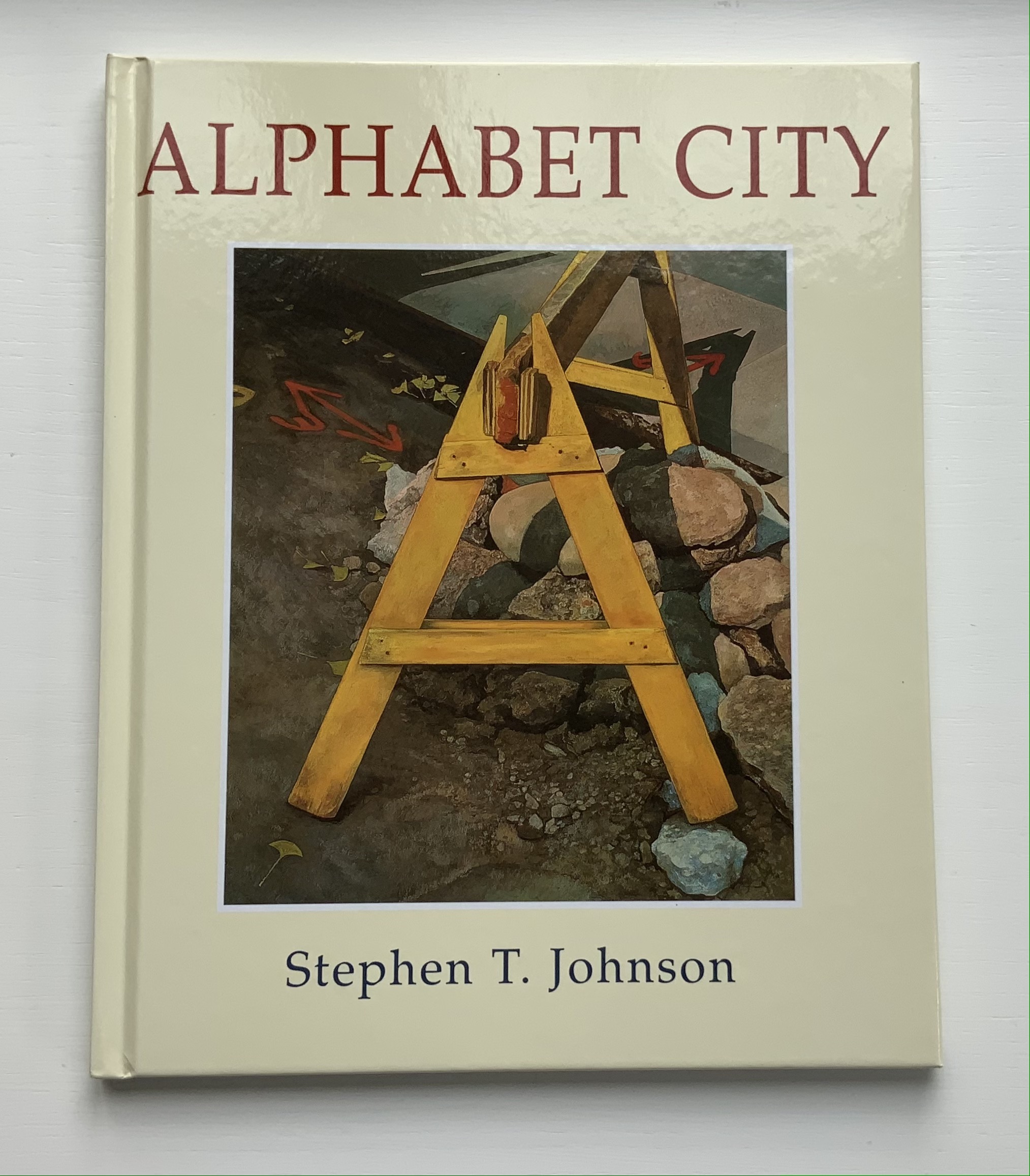
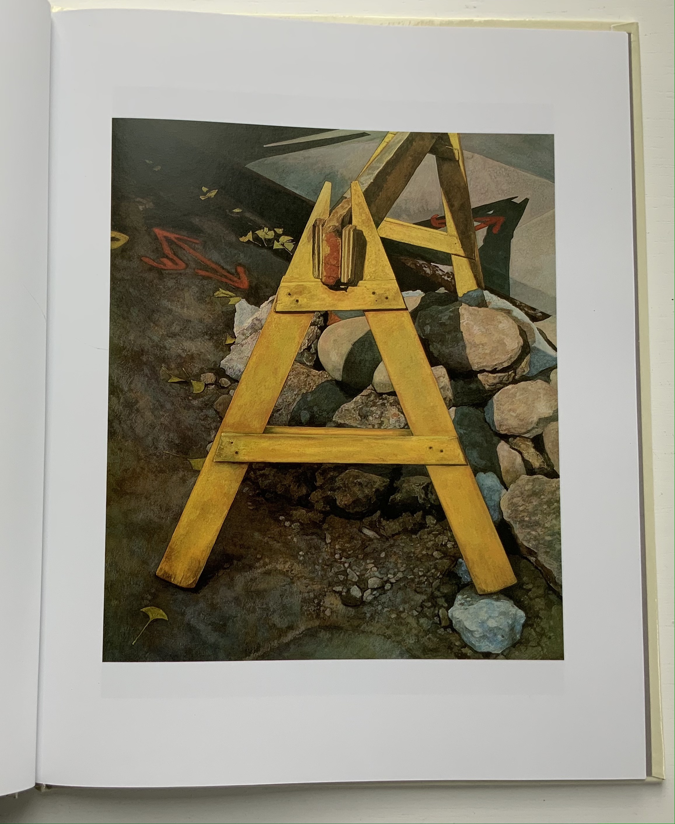
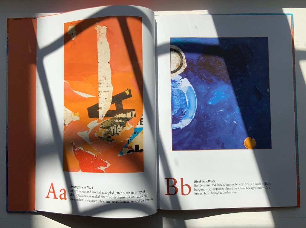
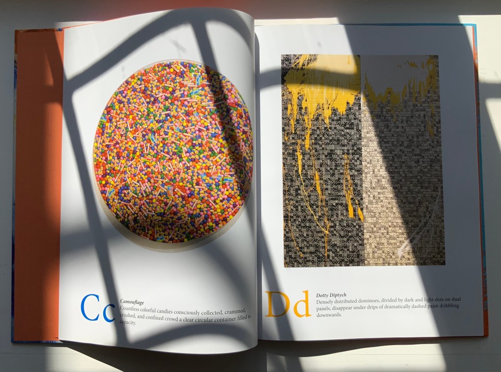
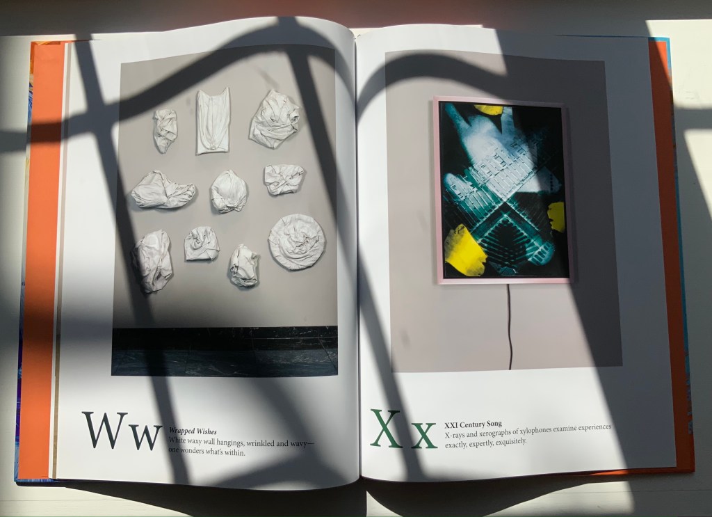
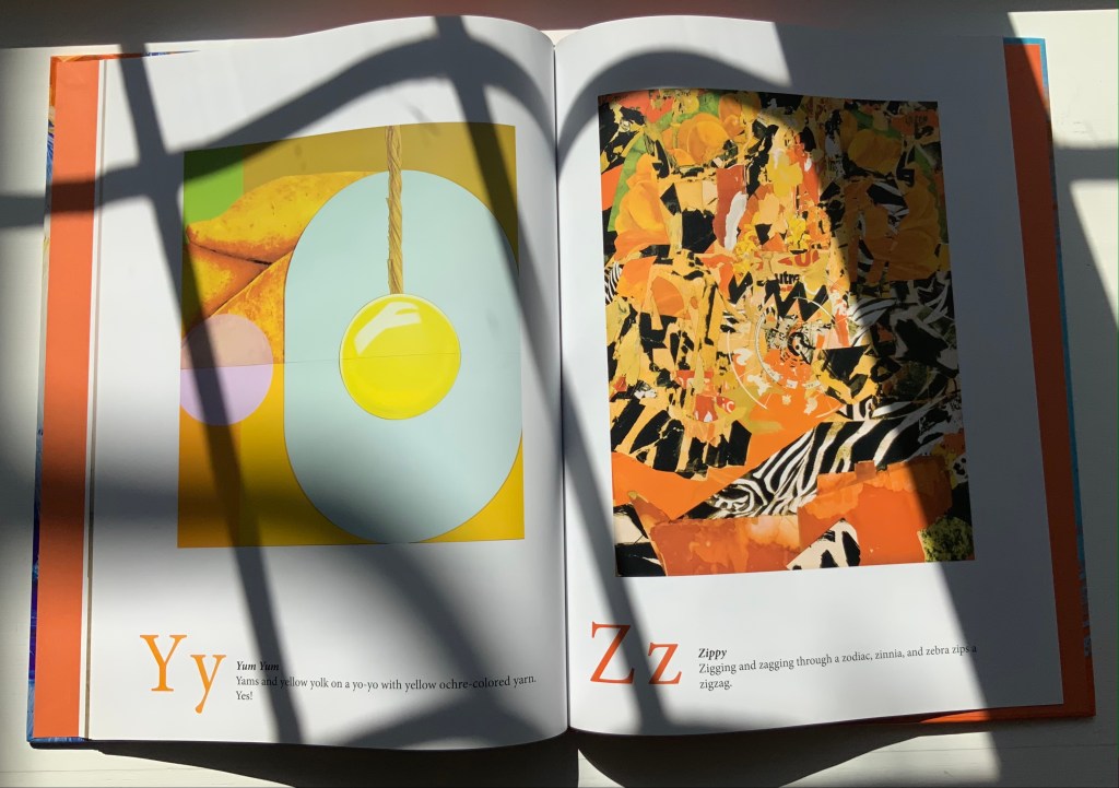
An American Alphabet also finds cousins in the Books On Books Collection. For found letters as objects, there is The Typographic Universe (2014), compiled by Steven Heller and Gail Anderson. For found letters recreated with pastels and watercolor, there is Stephen T. Johnson’s Alphabet City (1995). For color and form (albeit in totally different media), there are Karen Hanmer’s The Spectrum A-Z (2003) and Tara McLeod’s ABC (2015).
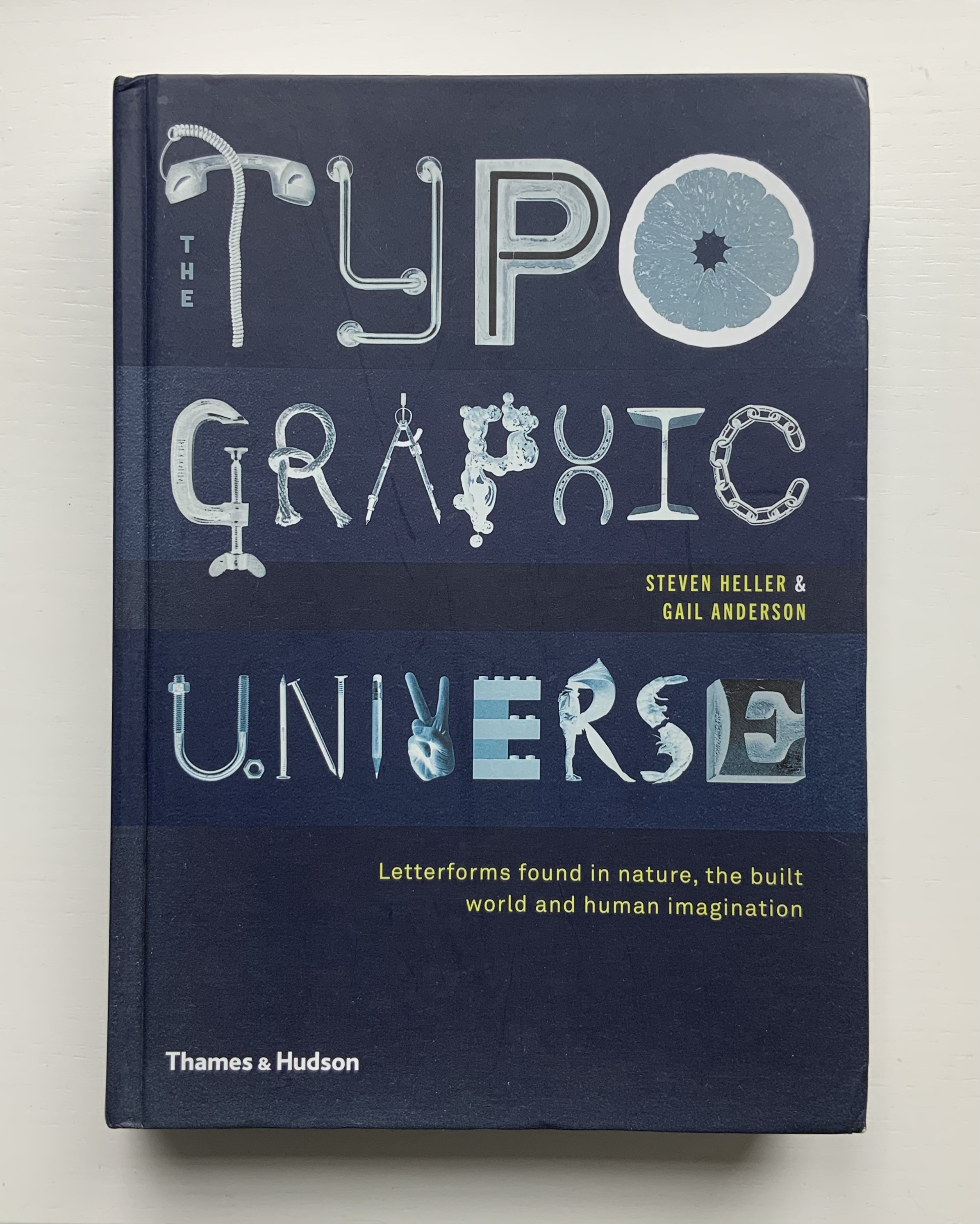

Left: The Typographic Universe (2014) by Steven Heller and Gail Anderson. Right: Alphabet City (1995) by Stephen T. Johnson.
Photos of the works: Books On Books Collection.


Left: The Spectrum A-Z (2003) by Karen Hanmer. Right: ABC (2015) by Tara McLeod.
Photos of the works: Books On Books Collection.
The artist and Tandem Press have been kind enough to provide images of the letters A and Z to compare with those in the book, a comparison that underscores the quality of the book and Cottingham’s art.

An American Alphabet: A (2001)
Robert Cottingham
Lithography, Edition of 40, 32 x 23 inches
Image courtesy of Robert Cottingham and Tandem Press
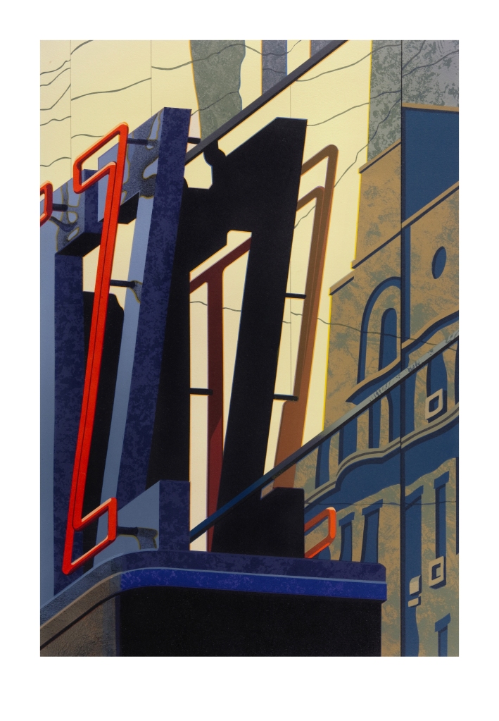
An American Alphabet: Z (2008)
Robert Cottingham
Lithography, Edition of 40, 30 1/2 x 23 inches
Image courtesy of Robert Cottingham and Tandem Press
Further Reading
“Abecedaries I (in progress)“. Books On Books Collection. 31 March 2020.
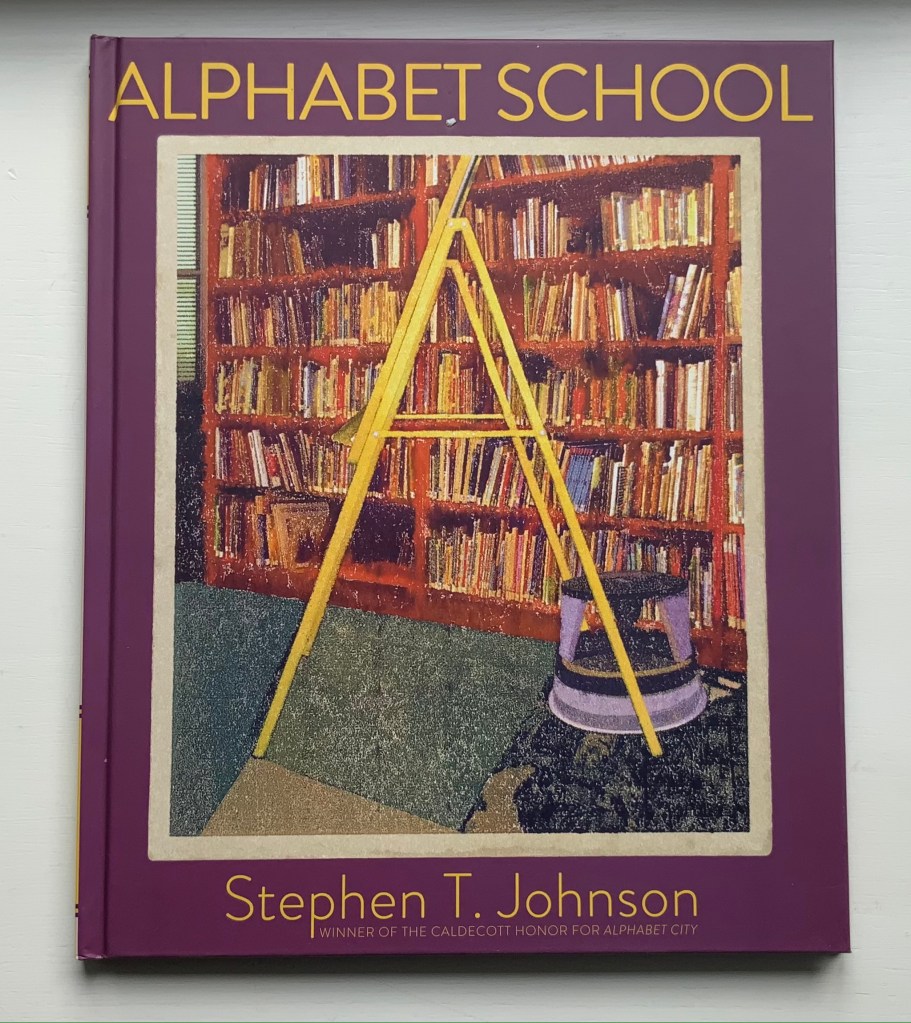
“Stephen T. Johnson“. Books On Books Collection. 30 November 2021.
Meisel, Louis K. 1993. Photorealism since 1980. New York: H.N. Abrams.
Meisel, Louis K., and Helene Zucker Seeman. 1989. Photo-Realism. New York: Abradale Press.