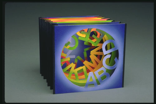
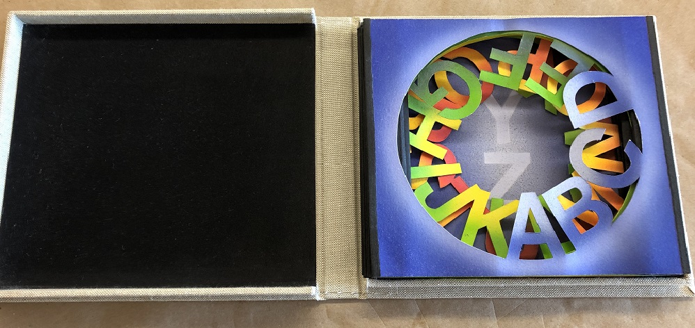
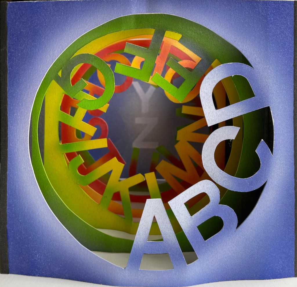
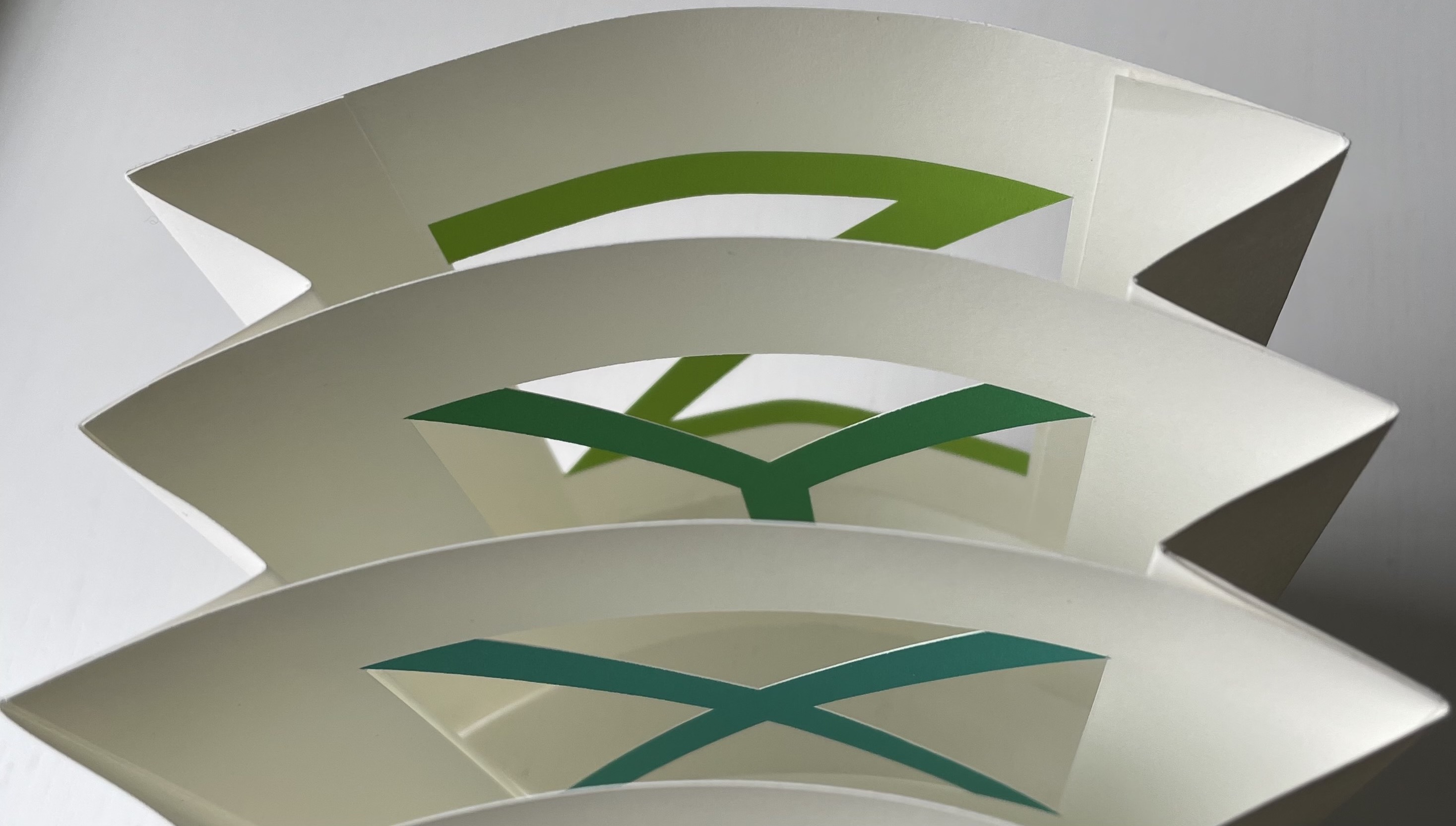
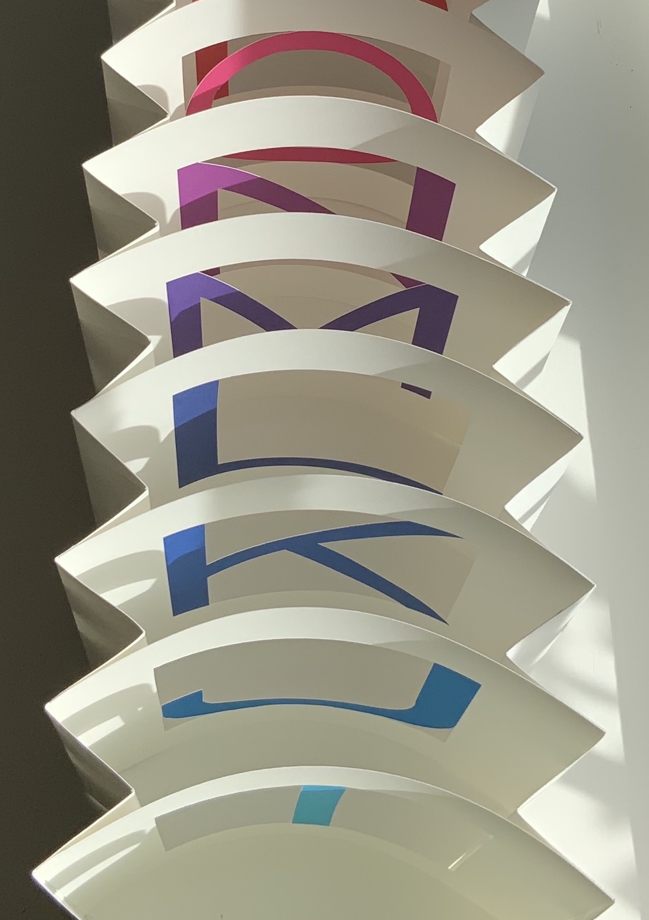
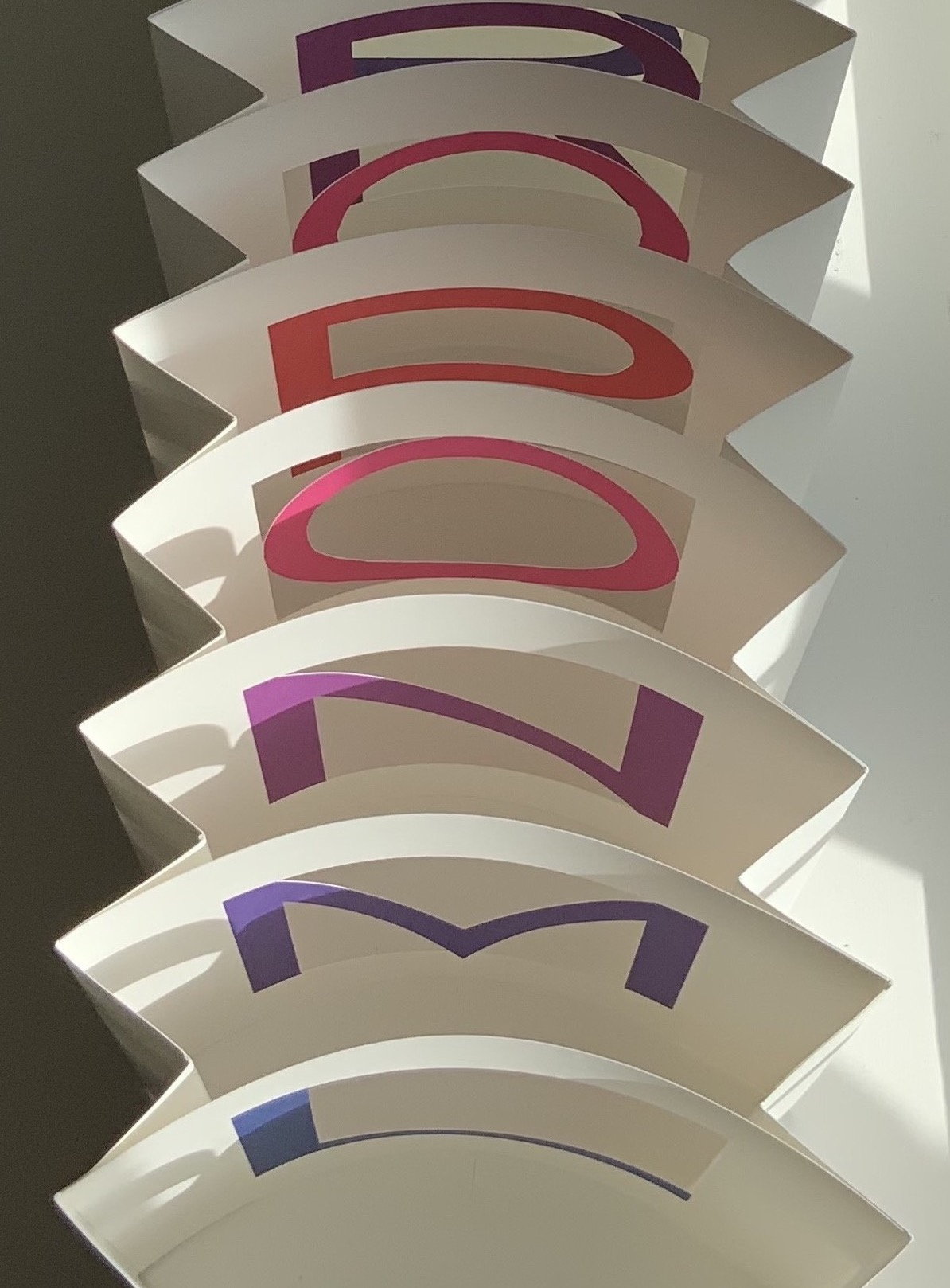
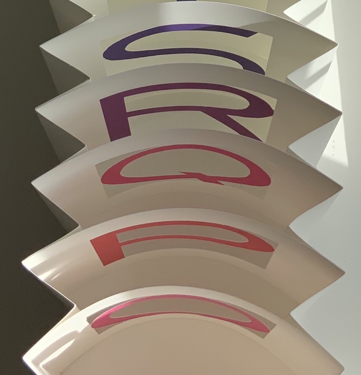
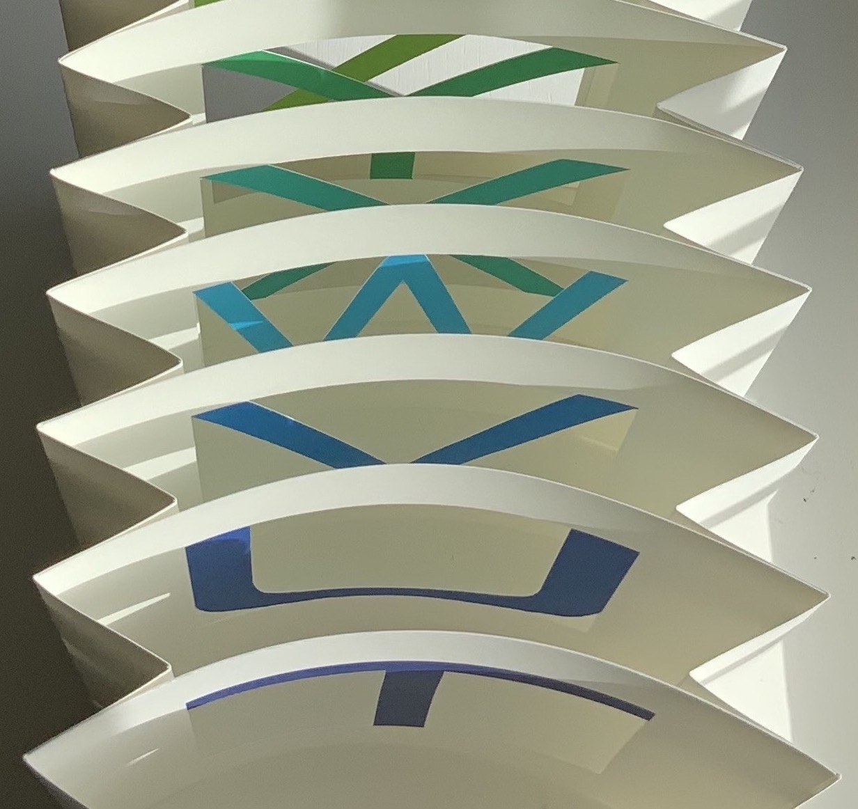
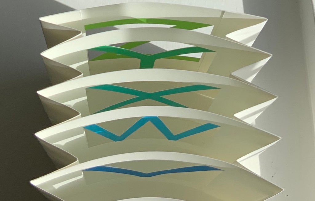
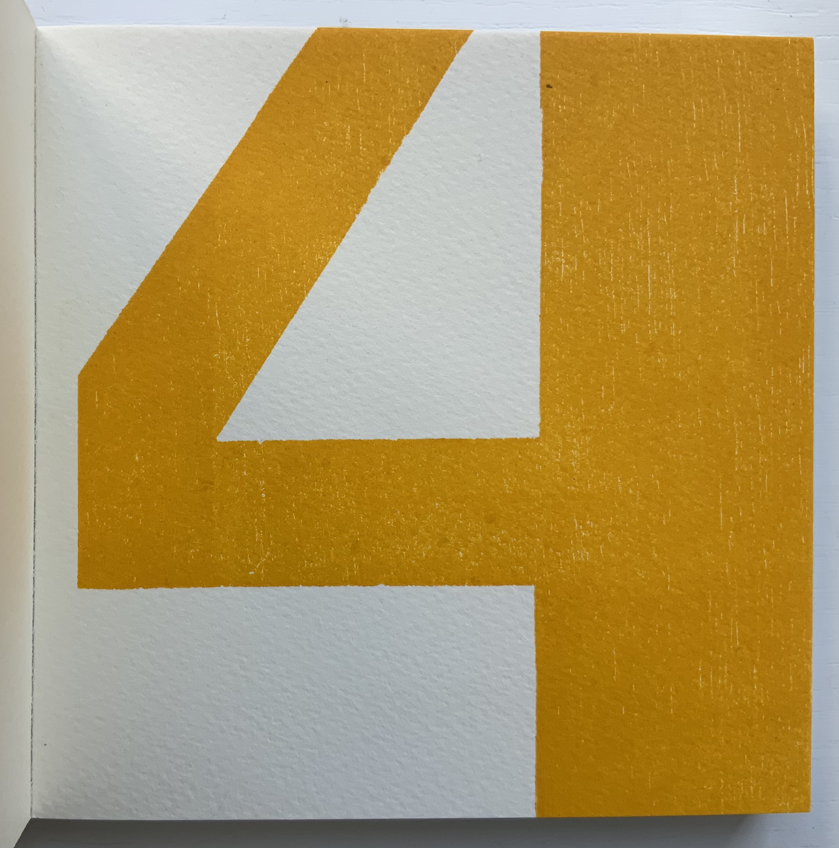
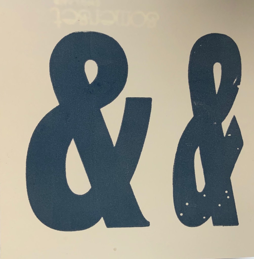
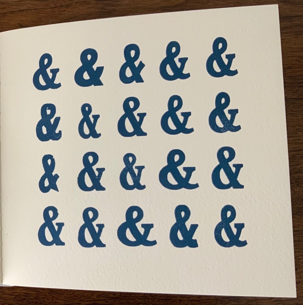
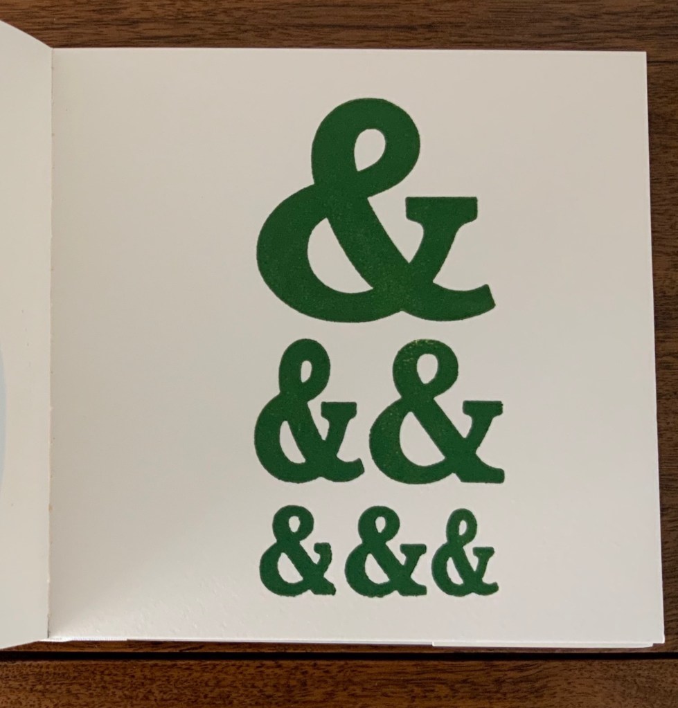
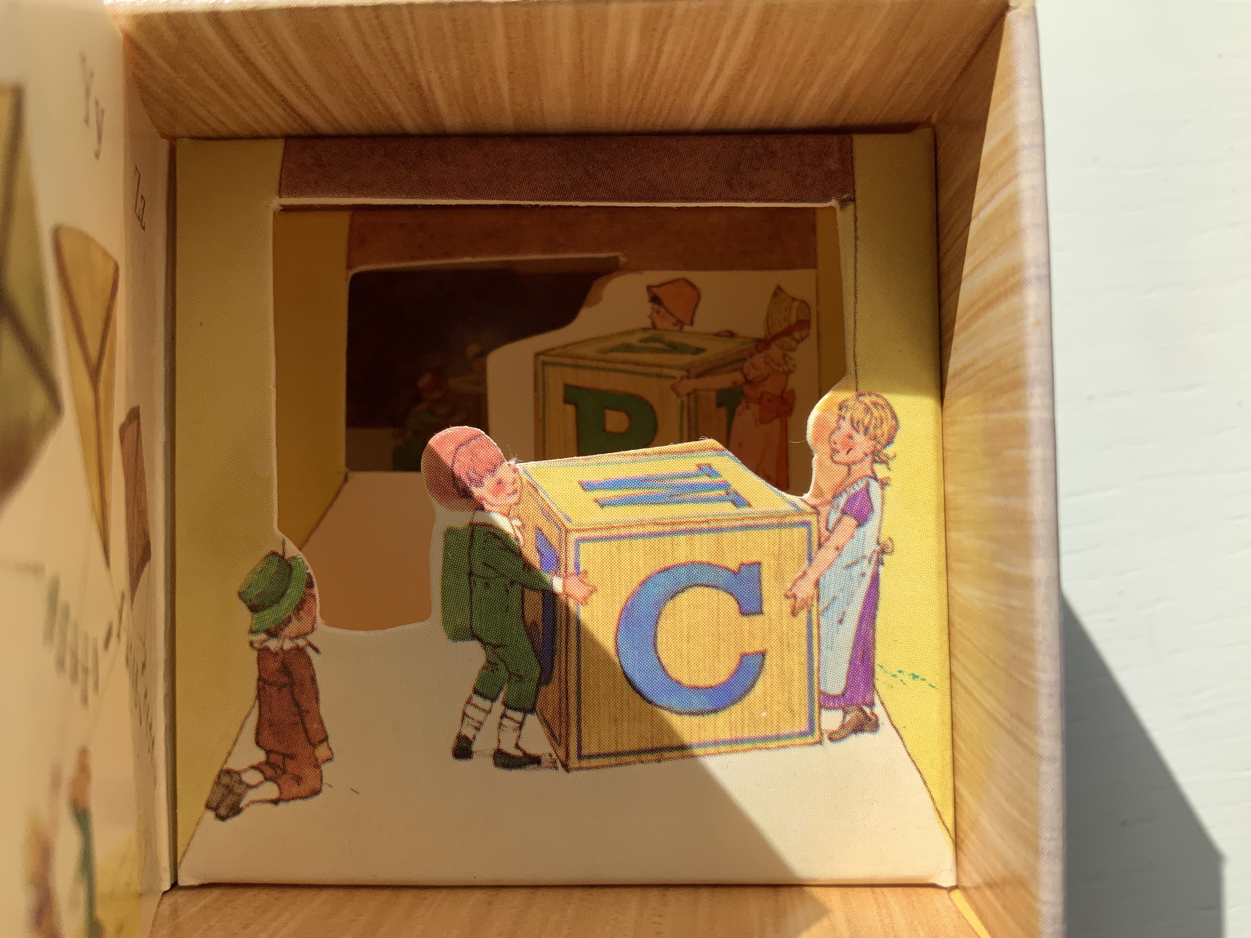
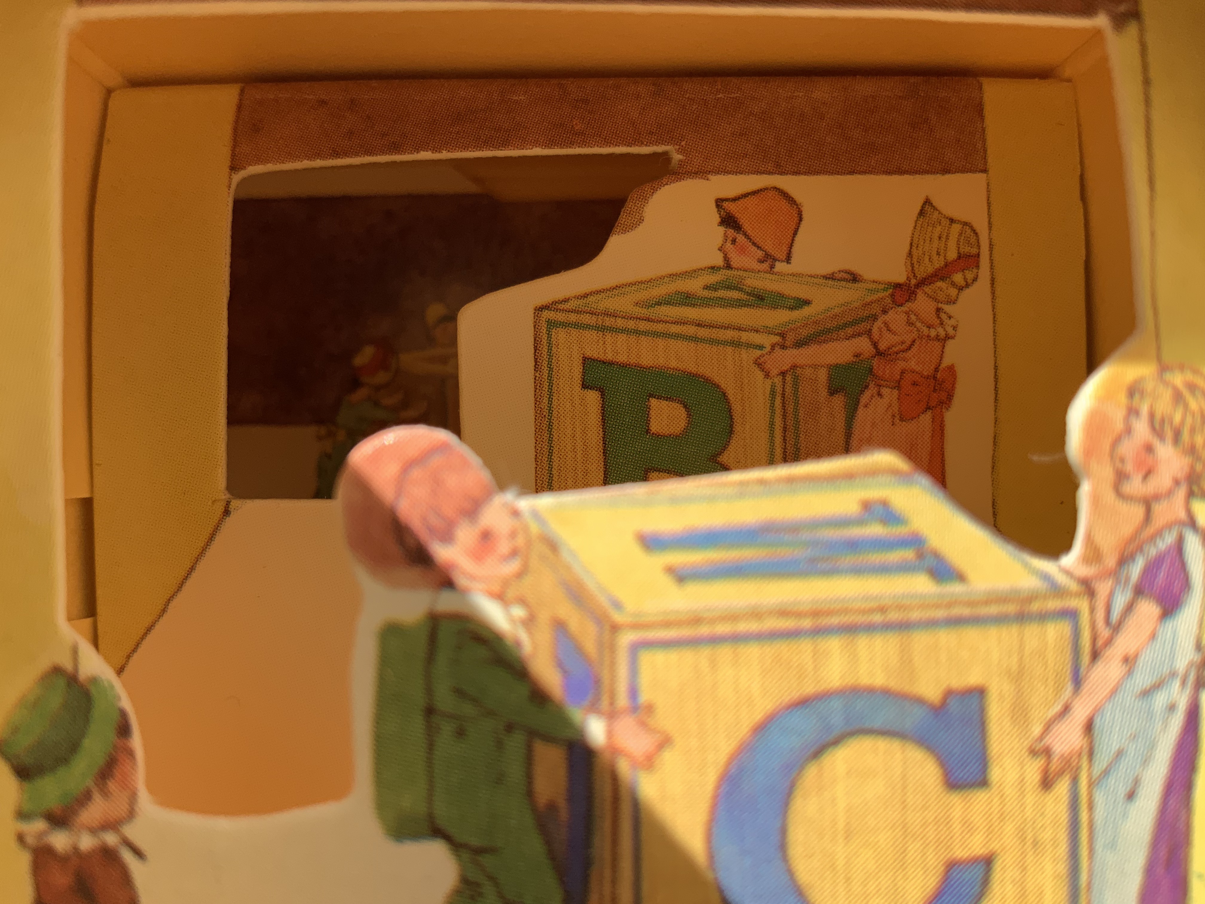
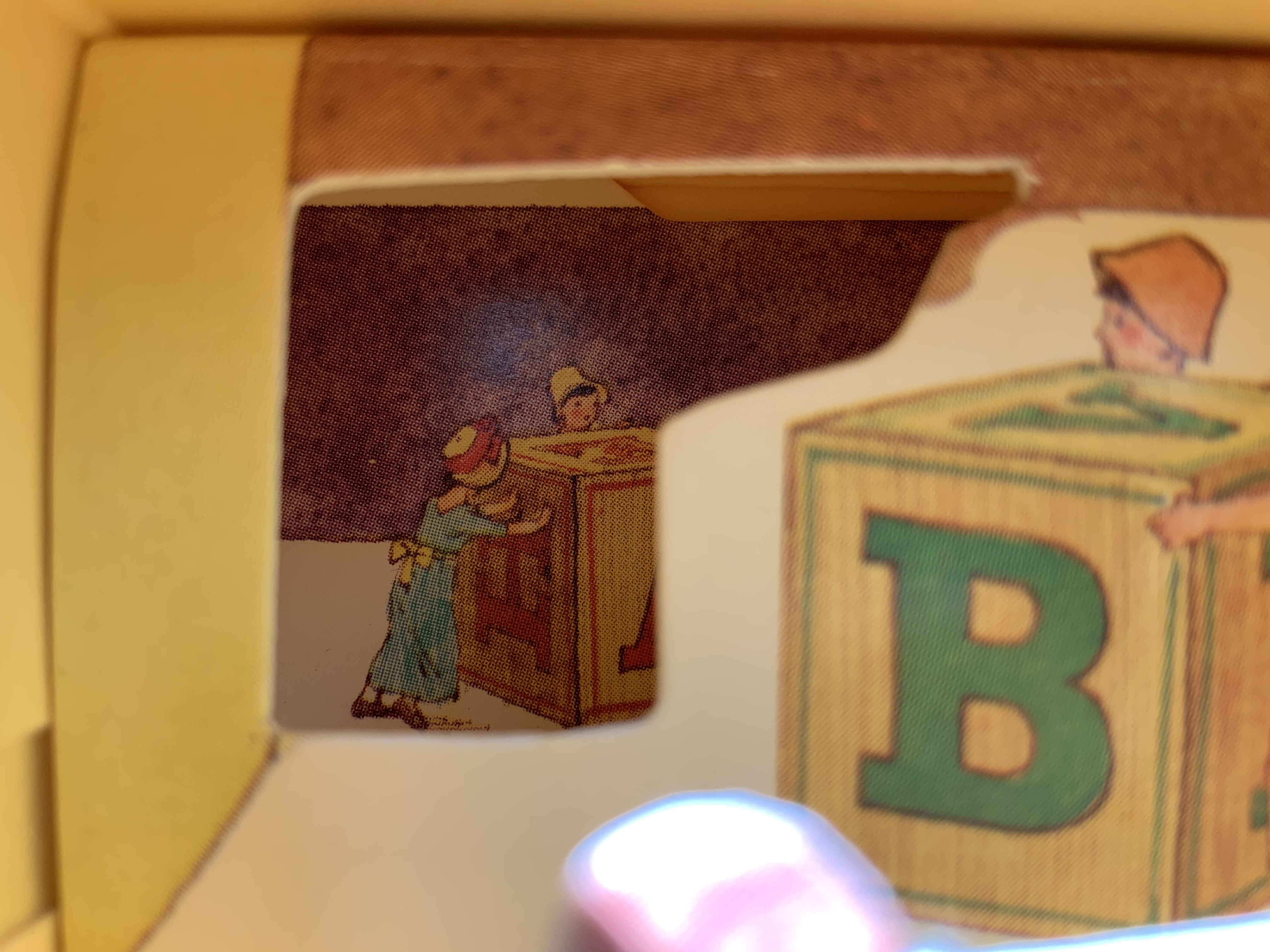
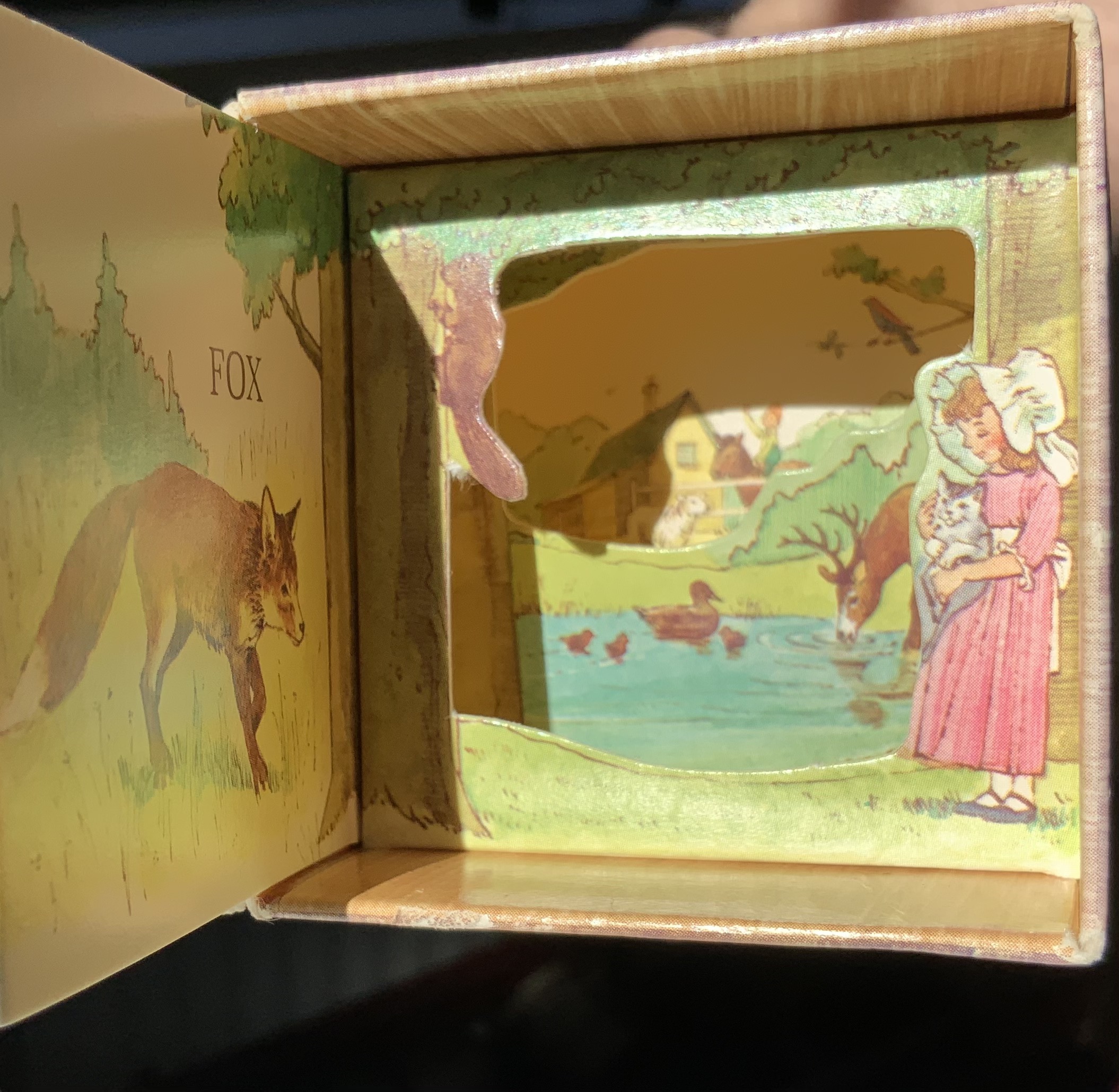
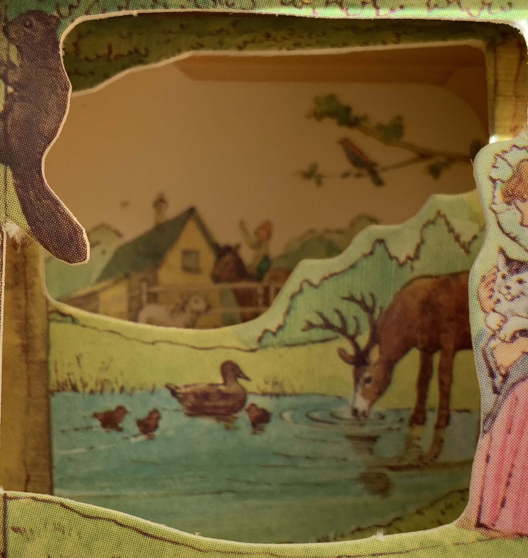
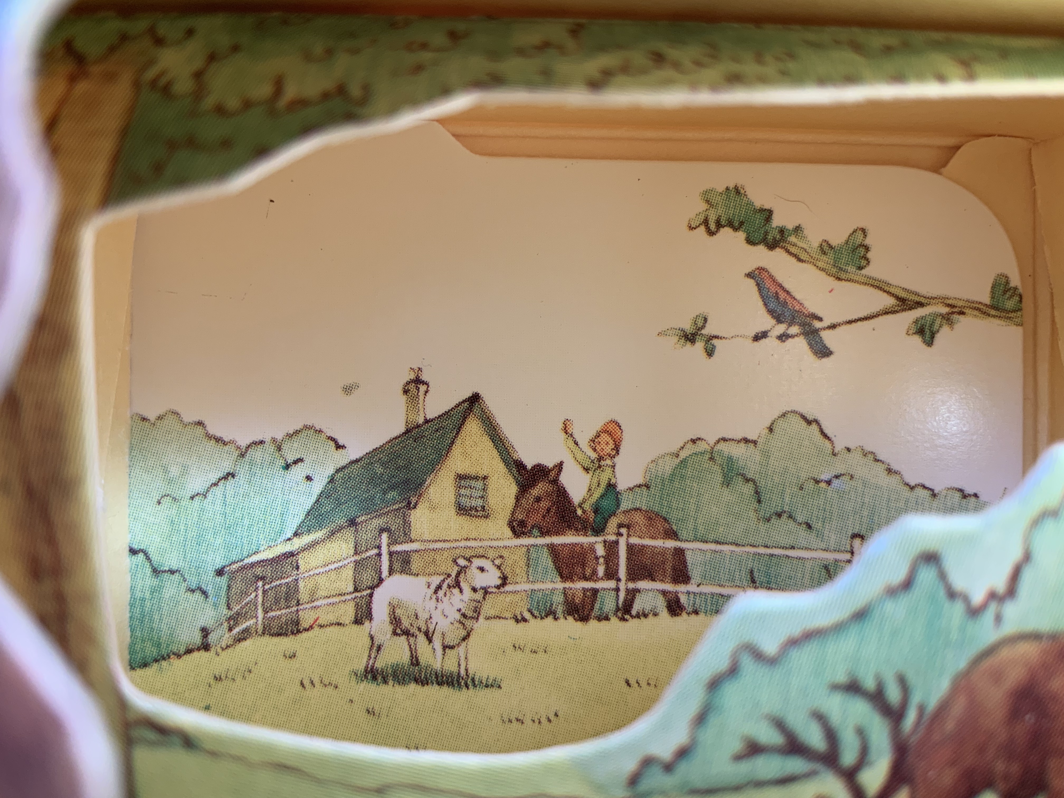
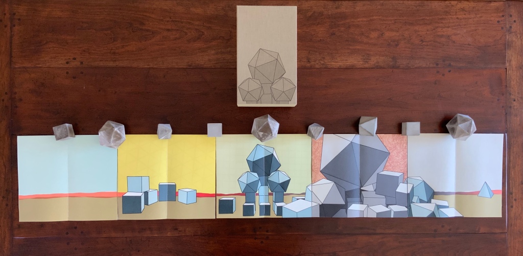
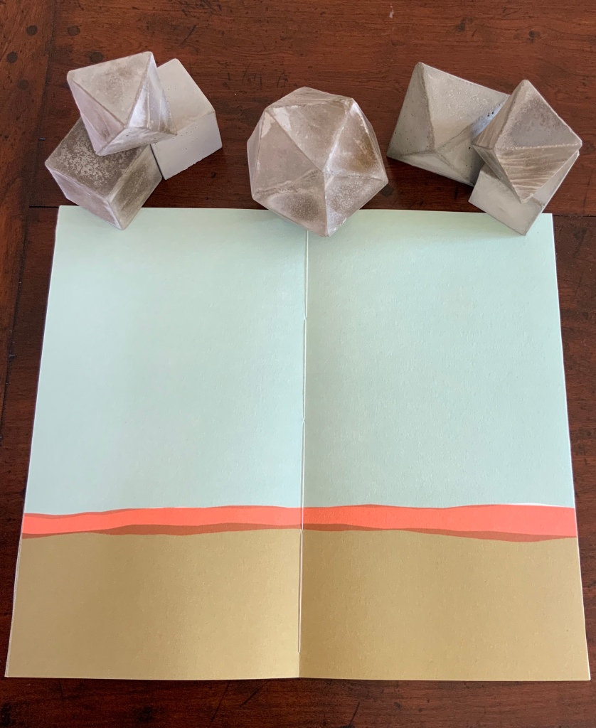
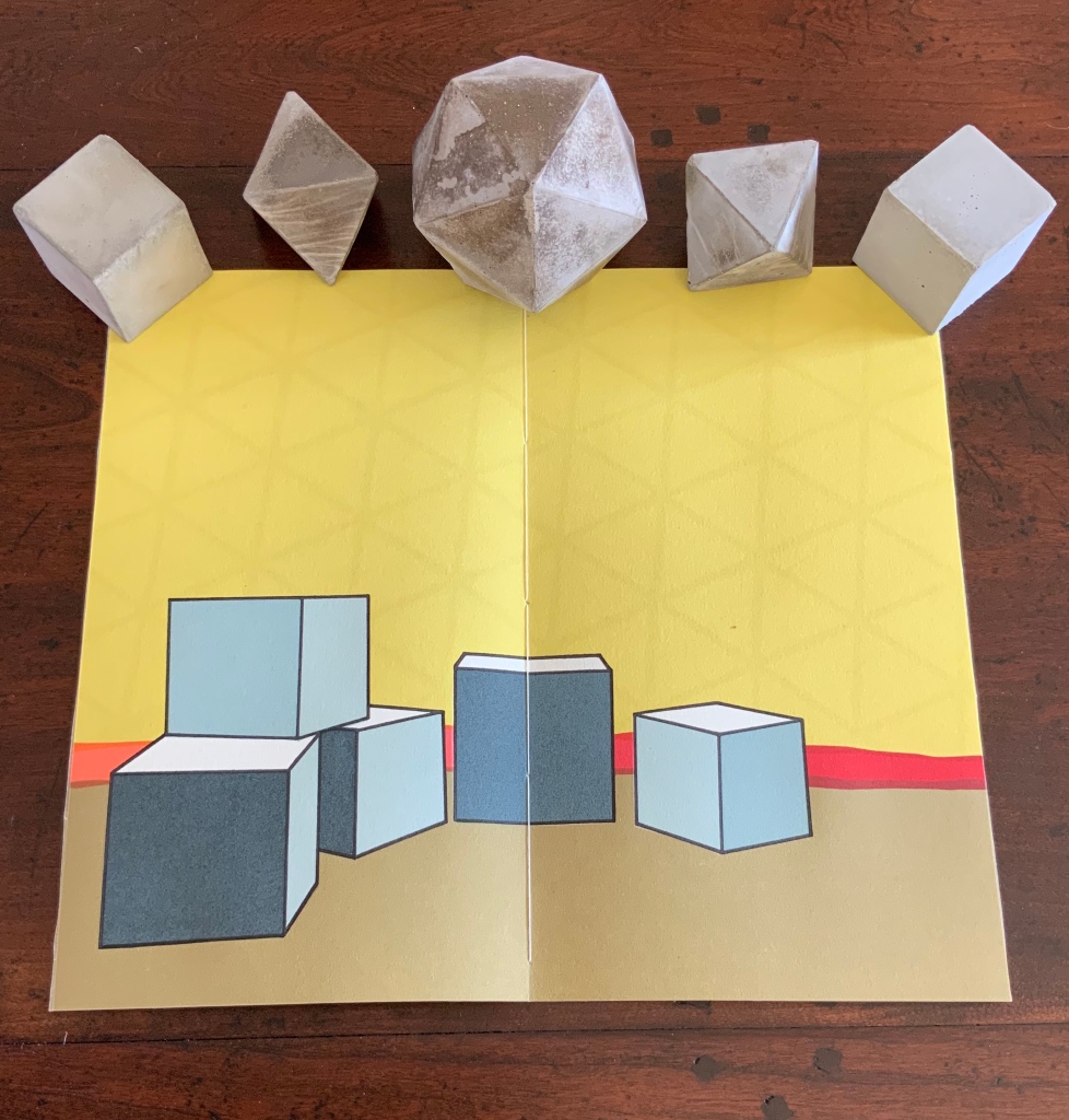
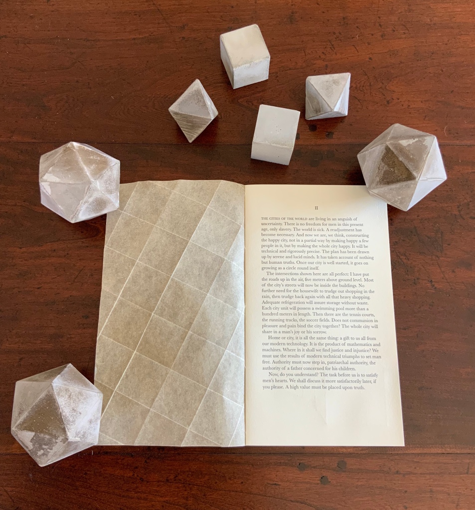
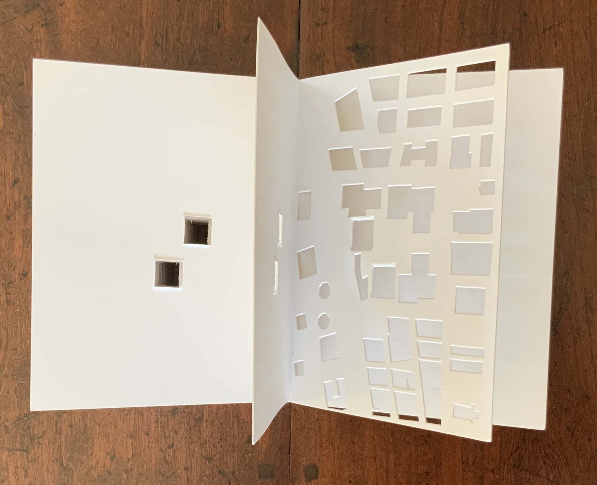
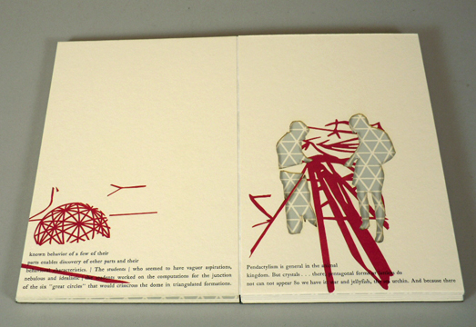
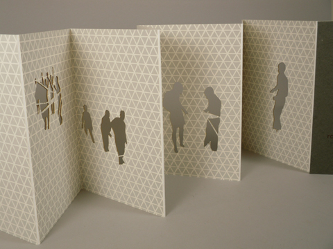
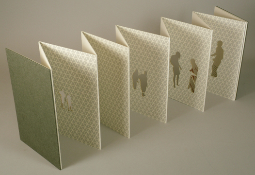
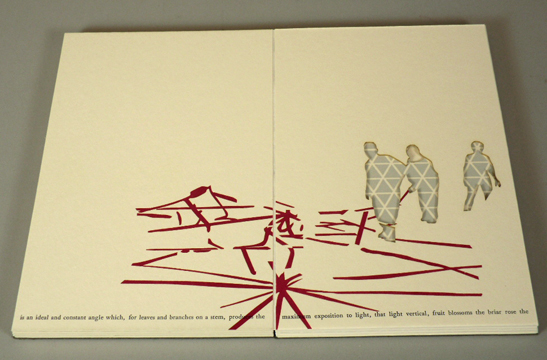
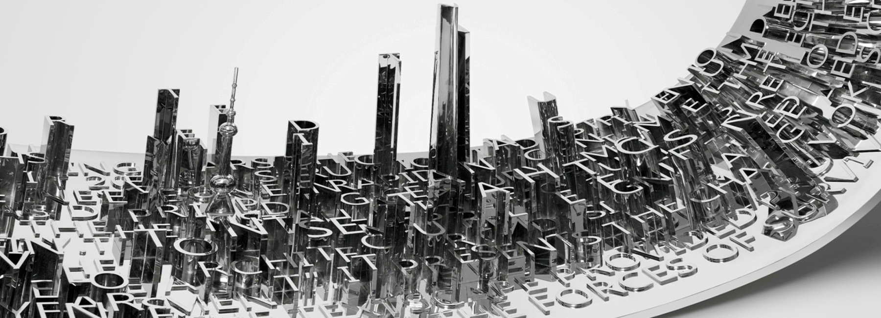
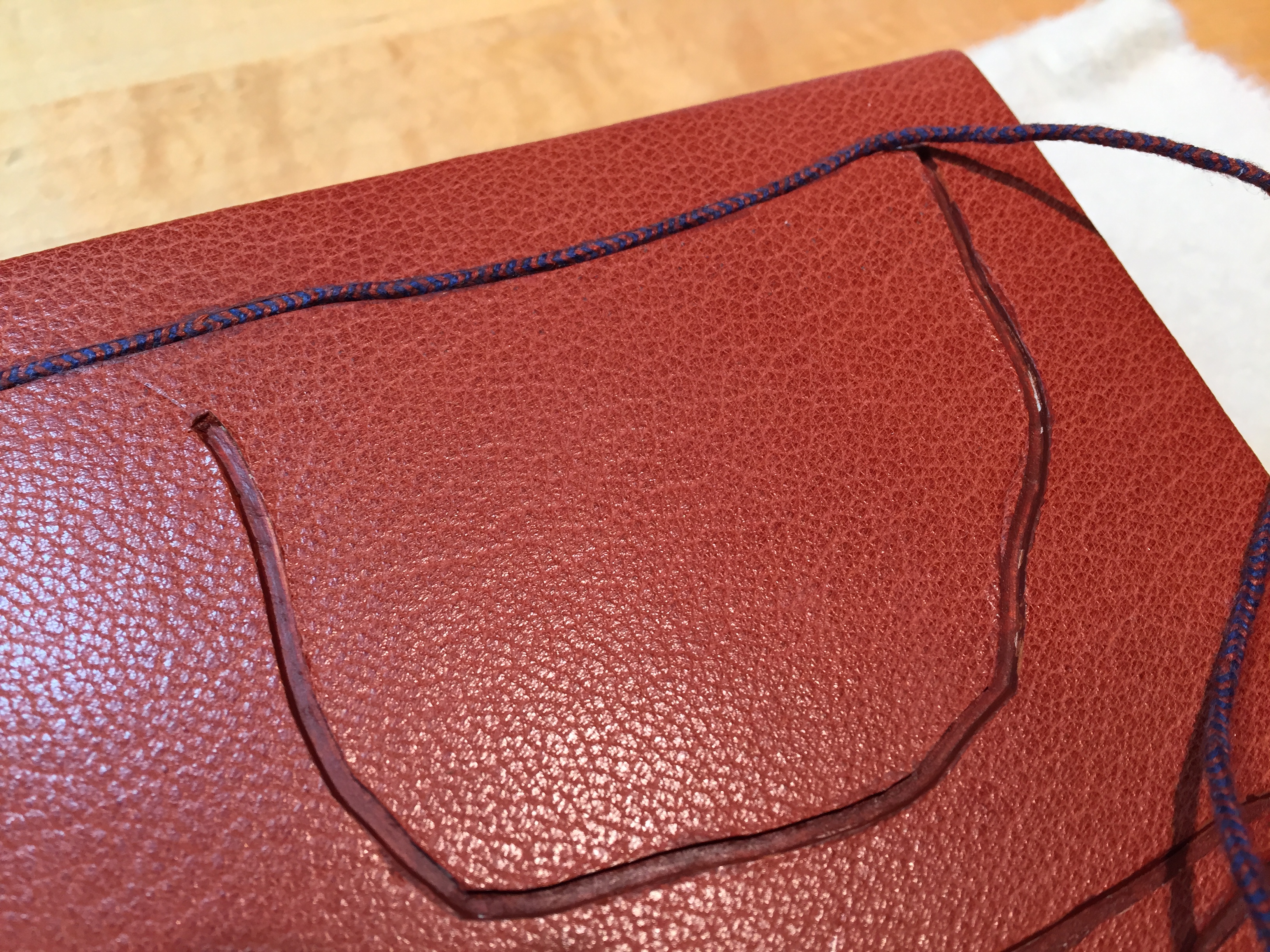
Spiralbet(1998) Amy Lapidow Tunnel book. Cloth bound and lined archival box. Closed:H165 x W185 x D5 mm. Open: D220 Acquired from the artist, 9 September 2022. Photo: James Prinz
This work was first spotted in the online catalogue for Abecedarium: An Exhibition of Alphabet Books (1998) from the Guild of Bookworkers. Being a small thumbnail on the second screen or page and accessed only by clicking on the artist’s name, its discovery was serendipitous. Its still being available was pure luck.
Photo: Books On Books Collection.
Photo: Amy Lapidow.
The structure and binding are the work of Amy Lapidow, who has taught bookbinding at the North Bennett Street School in Boston, MA. The airbrush coloring was executed by student Nancy Ames.
Photo: Books On Books Collection.
Other tunnel books with which compare and enjoy Lapidow’s are Borje Svensson & James Diaz’s Letters and Animals (1982), Karen Hanmer’s The Spectrum A-Z (2003) and Helen Malone & Jack Oudyn’s The Future of an Illusion (2017).
Along with Lapidow’s and Hanmer’s explorations of color and the alphabet, Jean Holabird’s Vladimir Nabokov: AlphaBet in Color (2005), Carol DuBosch’s Rainbow Alphabet Snowflake (2013) and Rebecca Bingham’s Defining the Rainbow (2018) offer a range of variations to compare and contrast. Andrew Morrison’s Chroma Numerica (2019) offers a similar exploration of colors but with numbers.
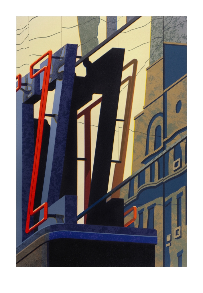
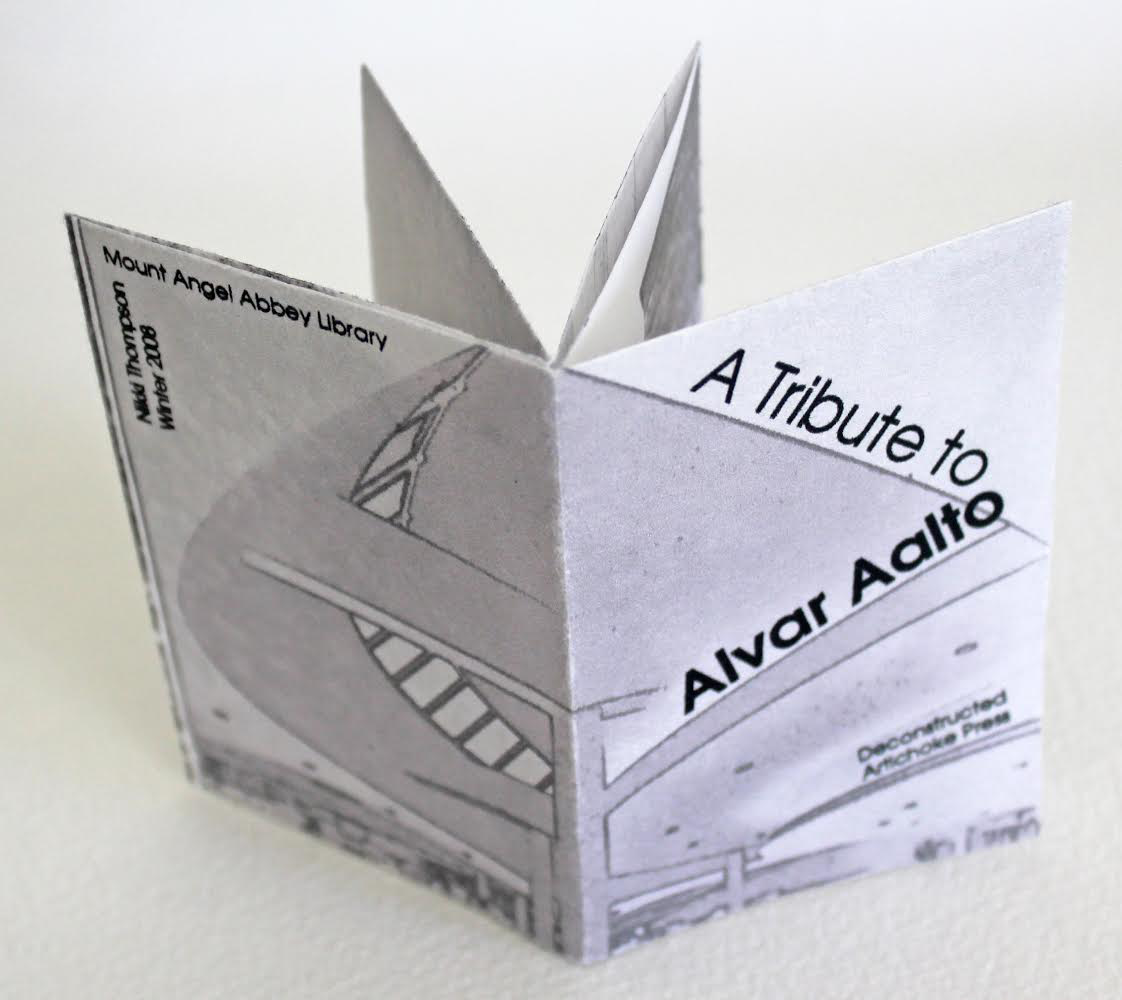
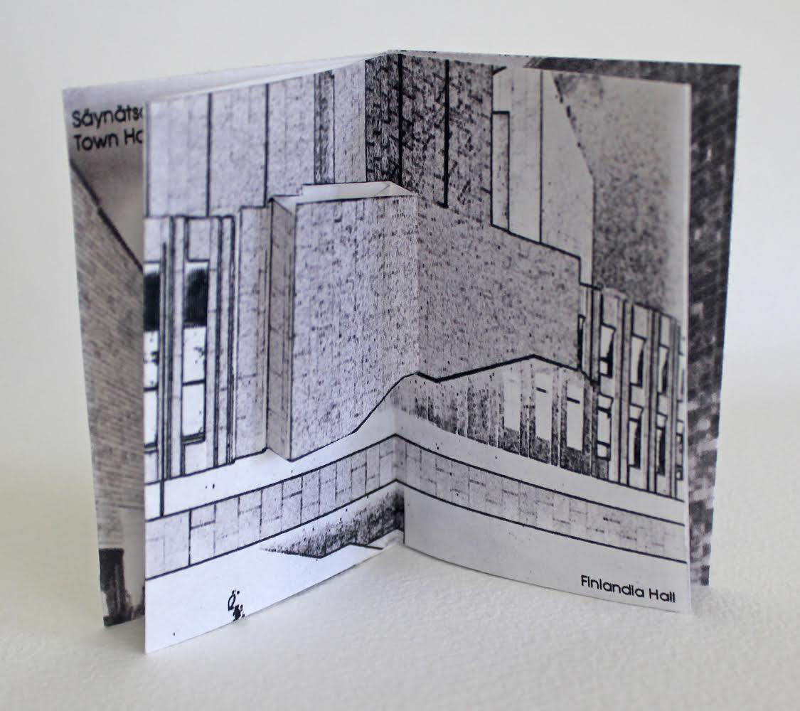
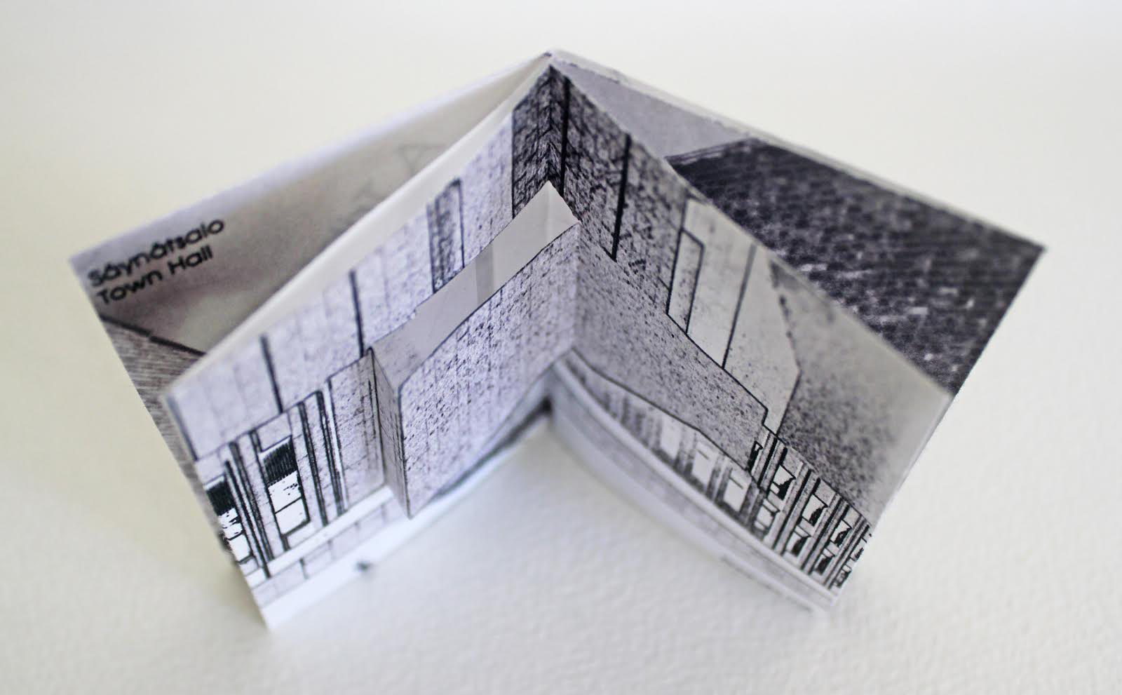
A-Z: Robert Cottingham: An American Alphabet (1997-2012)
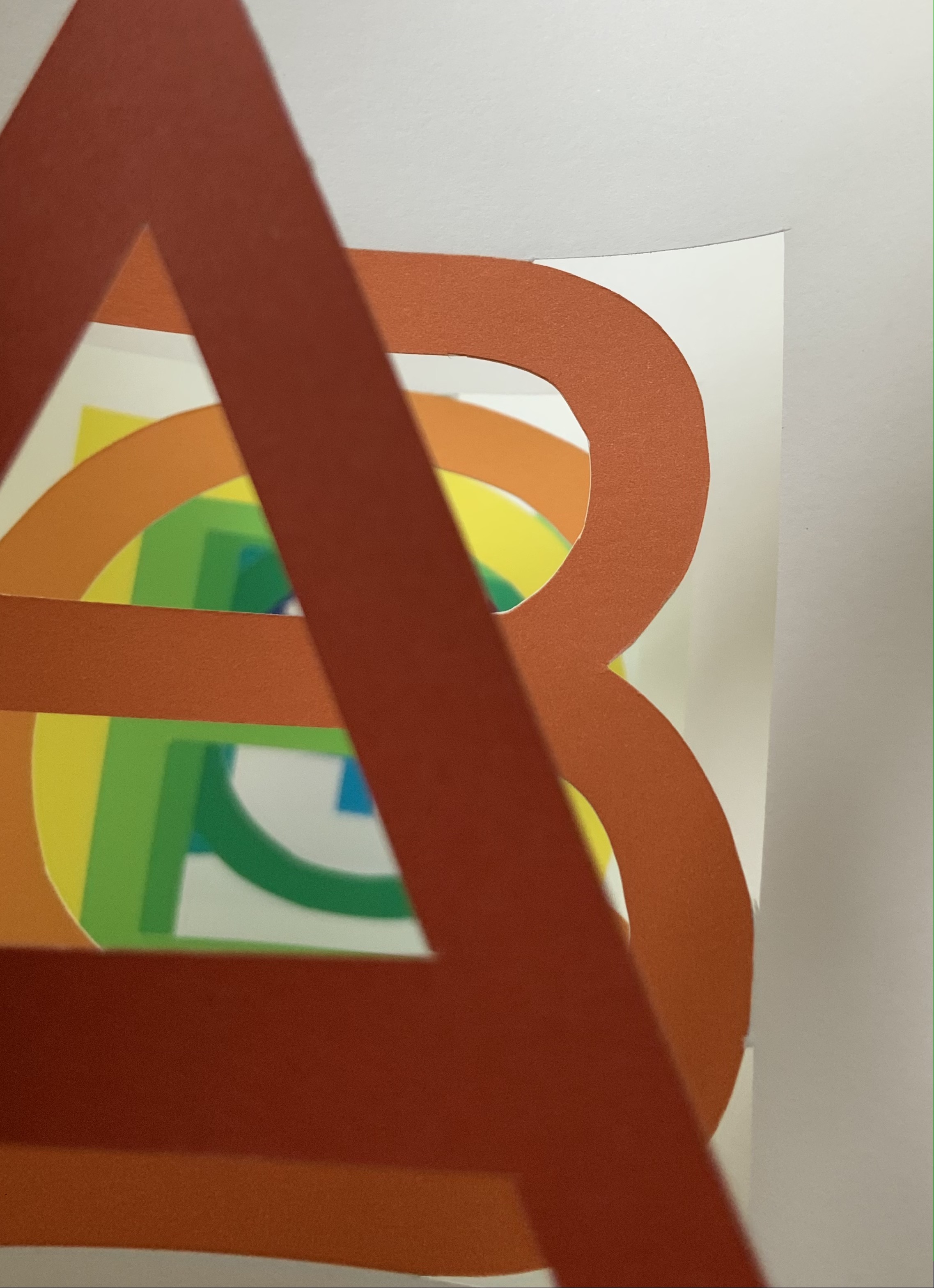
A-Z: Robert Cottingham: An American Alphabet (1997-2012) Robert Cottingham Hardcover. H x W mm, pages. Edition of 100. Acquired from Tandem Press, 10 September 2021. Photos of the book: Books On Books Collection. Displayed with permission of the artist and Tandem Press.
I had completed a number of canvases for AN AMERICAN ALPHABET and began to experience storage problems. The paintings were leaning against all available walls and were in danger of being damaged. For protection, I hung them as a group on one wall, stacking them four high by four across, … sixteen canvases that reached to the ceiling and formed a monumental mosaic of letterforms. This arrangement of tightly packed images created an energy I hadn’t anticipated. As I looked up at it for the first time from my studio floor, I was immediately transported back to those moments when my father and I ascended from the 42nd Street subway station. The sight lines in my studio matched the ones I’d experienced as a child looking up at the signs and lights of Times Square. (Cottingham, A-Z)
Cottingham’s time travel creates a longing in the viewer for travel in time and space. What that wall must have looked like. Those who might have enjoyed the 1996 show at the Forum Gallery in New York or the installation at the New York Print Fair in November 2011 or the Tandem Press exhibition at Madison, WI, in 2018 would have a limited idea (the images were not stacked four high). A-Z: An American Alphabet is as close as the rest of us will come to visualizing it. The artist book does have the advantage of letter by letter commentary from Cottingham.
Another plus in the book is Cottingham’s exploration of his process, tools and material:
The photograph is the starting point. Once I’ve chosen a specific image, I’ll do at least one preliminary sketch in black and white. This drawing familiarizes me with the image and allows me to make the first formal adjustments. The drawing acts as a value study — a sketch that helps determine the tonal range of the image, how dark or light the various elements should be. …/ Next comes the preliminary color study. This may be a watercolor or a gouache, sometimes handled loosely, sometimes treated as a more finished work. …/ I can now move on to the canvas. My preferred medium is oil. … The painting quickly takes on a life of its own, demanding further adjustments to color, tonal value, and form. But the preliminary work, like a map, guides me towards the new and always unexpected version of my original concept./ … / I consider printmaking an important adjunct to my painting. Many times, when I’ve completed a painting, I feel the need to do more work with the image — to dig deeper, exploring other aspects of its structure. Printmaking offers this opportunity. … / … An old world sensibility and craftsmanship is brought to the selection of paper (often hand-made), the mixing of inks, the preparation of plates or lithographic stones, and other steps in the process.
Cottingham also draws out the collaborative nature of printmaking, which in this case involved four Master Printers (Andy Rubin, Bruce Crownover, Joe Freye and, for the digital, Jason Ruhl) and, for the book design and layout, Linda Endlich. Another form of collaboration is influence, and Cottingham is generously open about his debts: Charles Demuth, Edward Hopper, René Magritte, Piet Mondrian and, of course, the design of the signs from which the letters come. Along with his contemporaries such as Chuck Close, Don Eddy, Richard Estes, Audrey Flack and John Salt, Cottingham represents the movement of Photo-Realism.
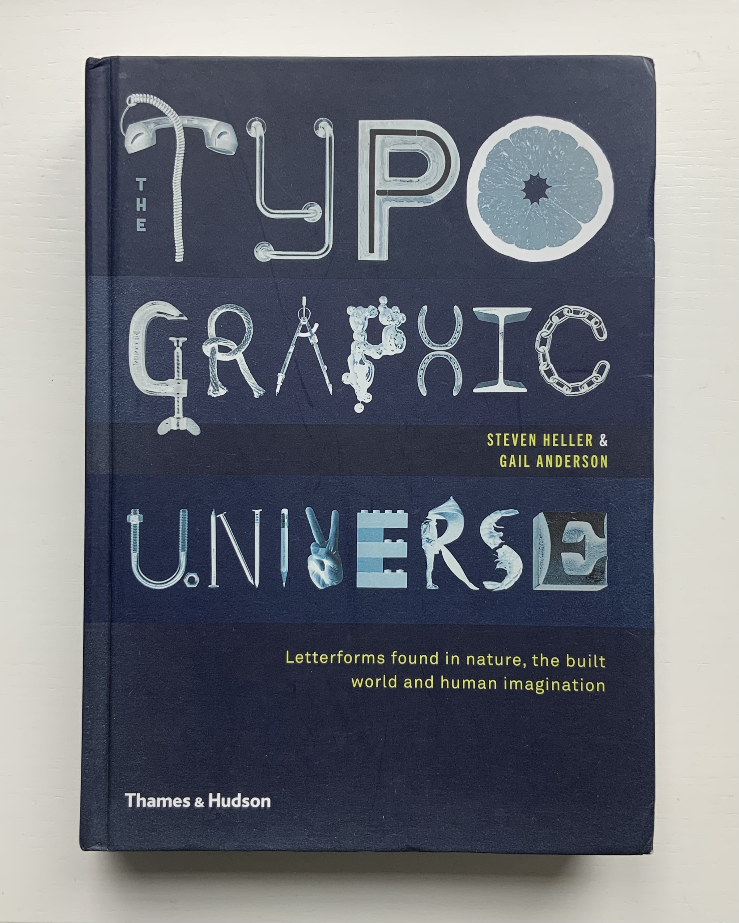
An American Alphabet also finds cousins in the Books On Books Collection. For found letters as objects, there is The Typographic Universe (2014), compiled by Steven Heller and Gail Anderson. For found letters recreated with pastels and watercolor, there is Stephen T. Johnson’s Alphabet City(1995). For color and form (albeit in totally different media), there are Karen Hanmer’s The Spectrum A-Z (2003) and Tara McLeod’s ABC (2015).
Left: The Spectrum A-Z (2003) by Karen Hanmer. Right: ABC (2015) by Tara McLeod. Photos of the works: Books On Books Collection.
The artist and Tandem Press have been kind enough to provide images of the letters A and Z to compare with those in the book, a comparison that underscores the quality of the book and Cottingham’s art.
An American Alphabet: A (2001) Robert Cottingham Lithography, Edition of 40, 32 x 23 inches Image courtesy of Robert Cottingham and Tandem Press
An American Alphabet: Z (2008) Robert Cottingham Lithography, Edition of 40, 30 1/2 x 23 inches Image courtesy of Robert Cottingham and Tandem Press
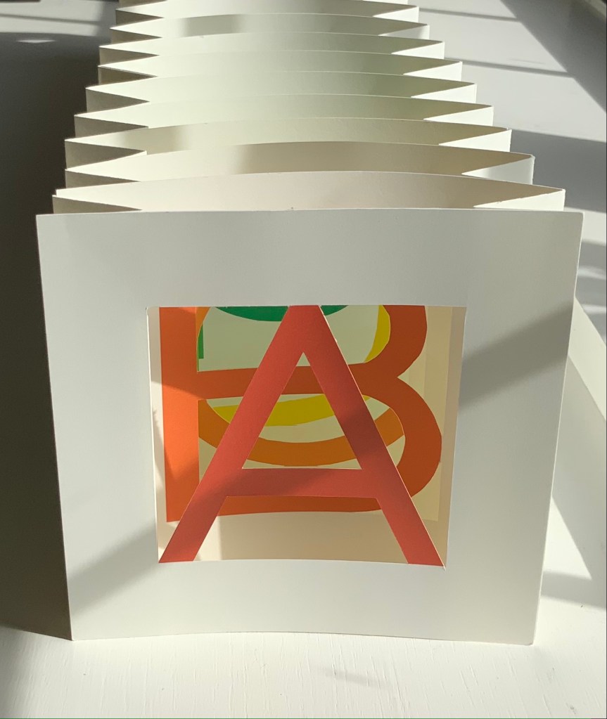
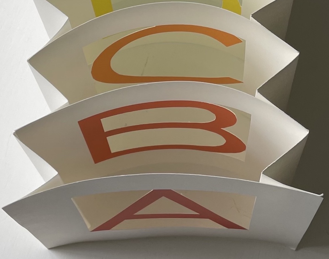
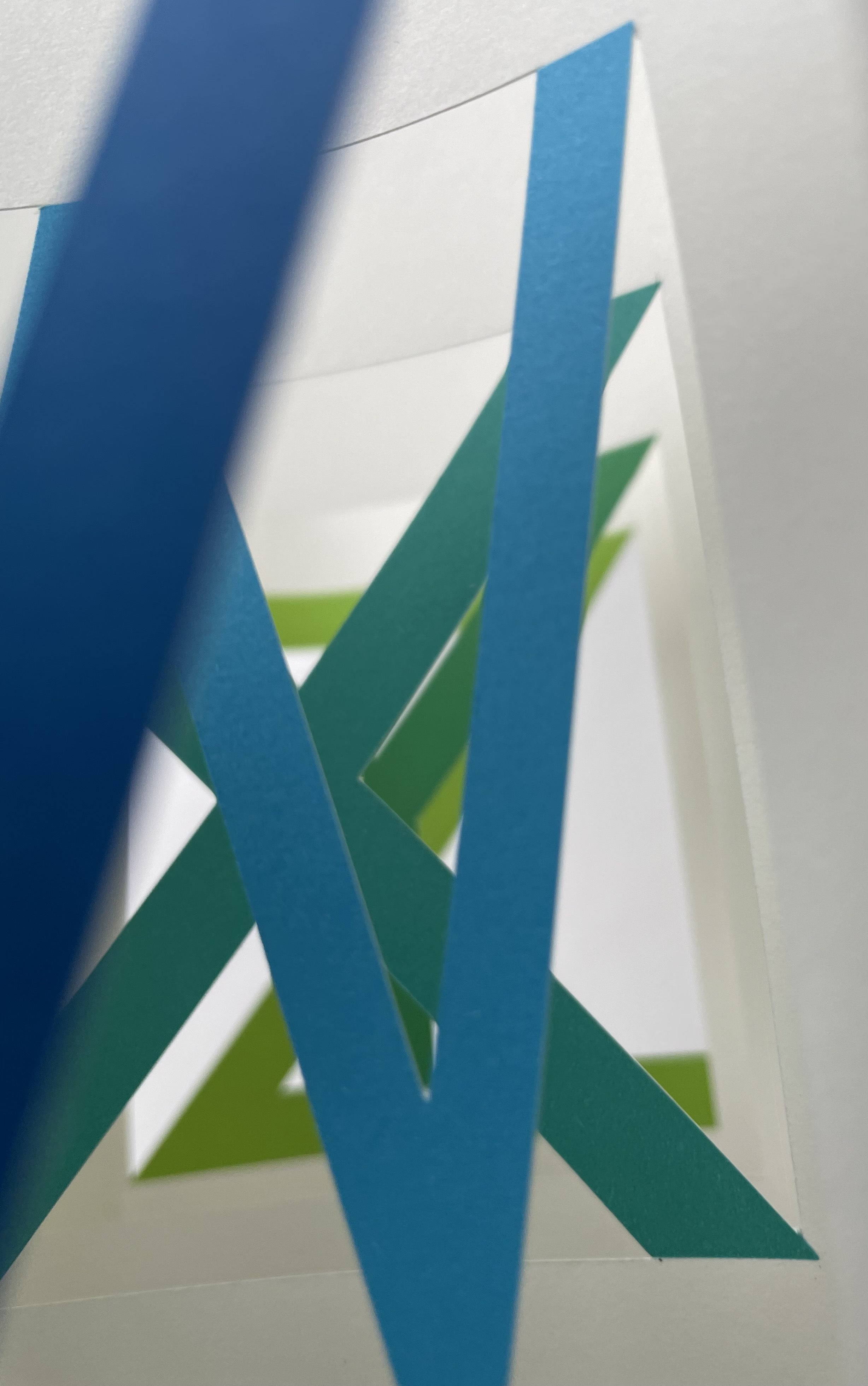
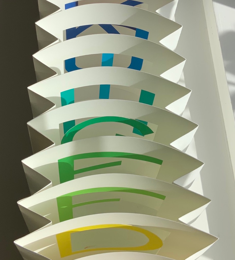
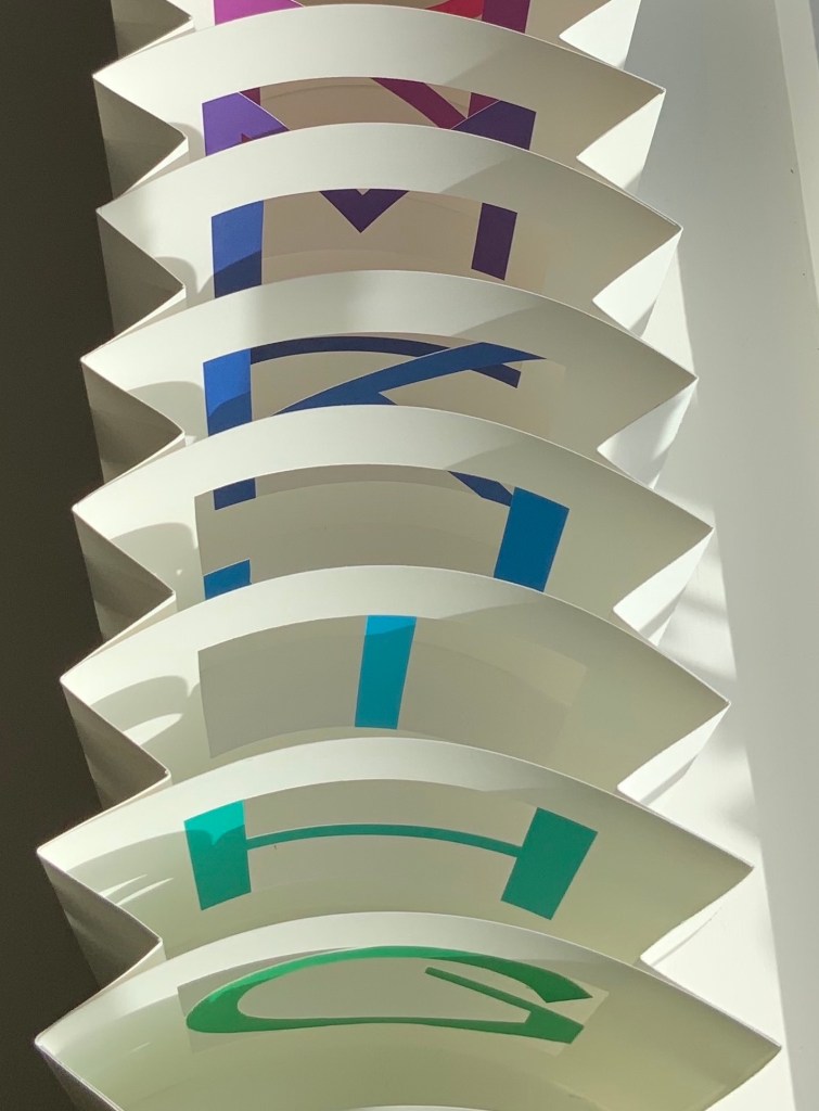
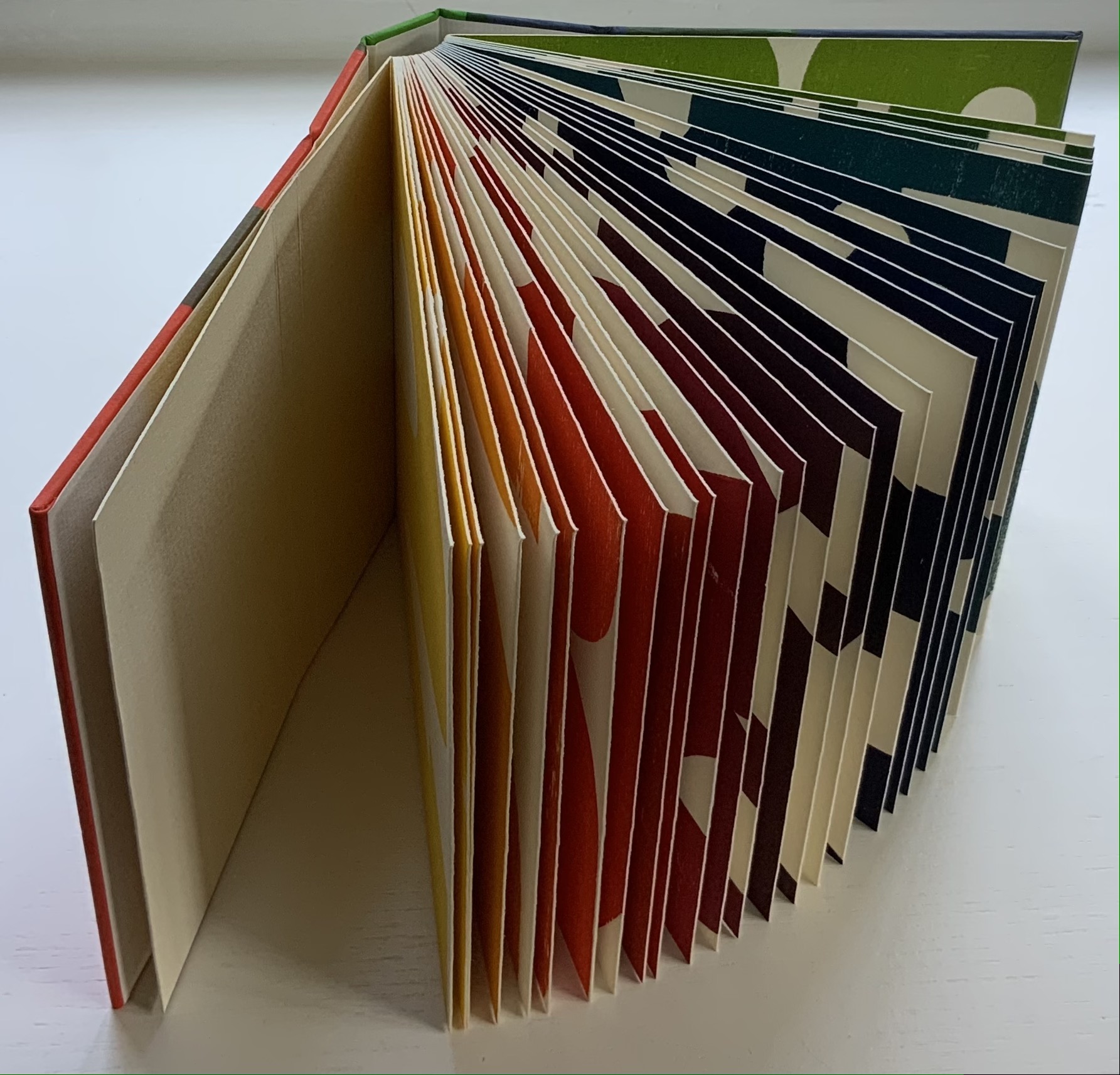
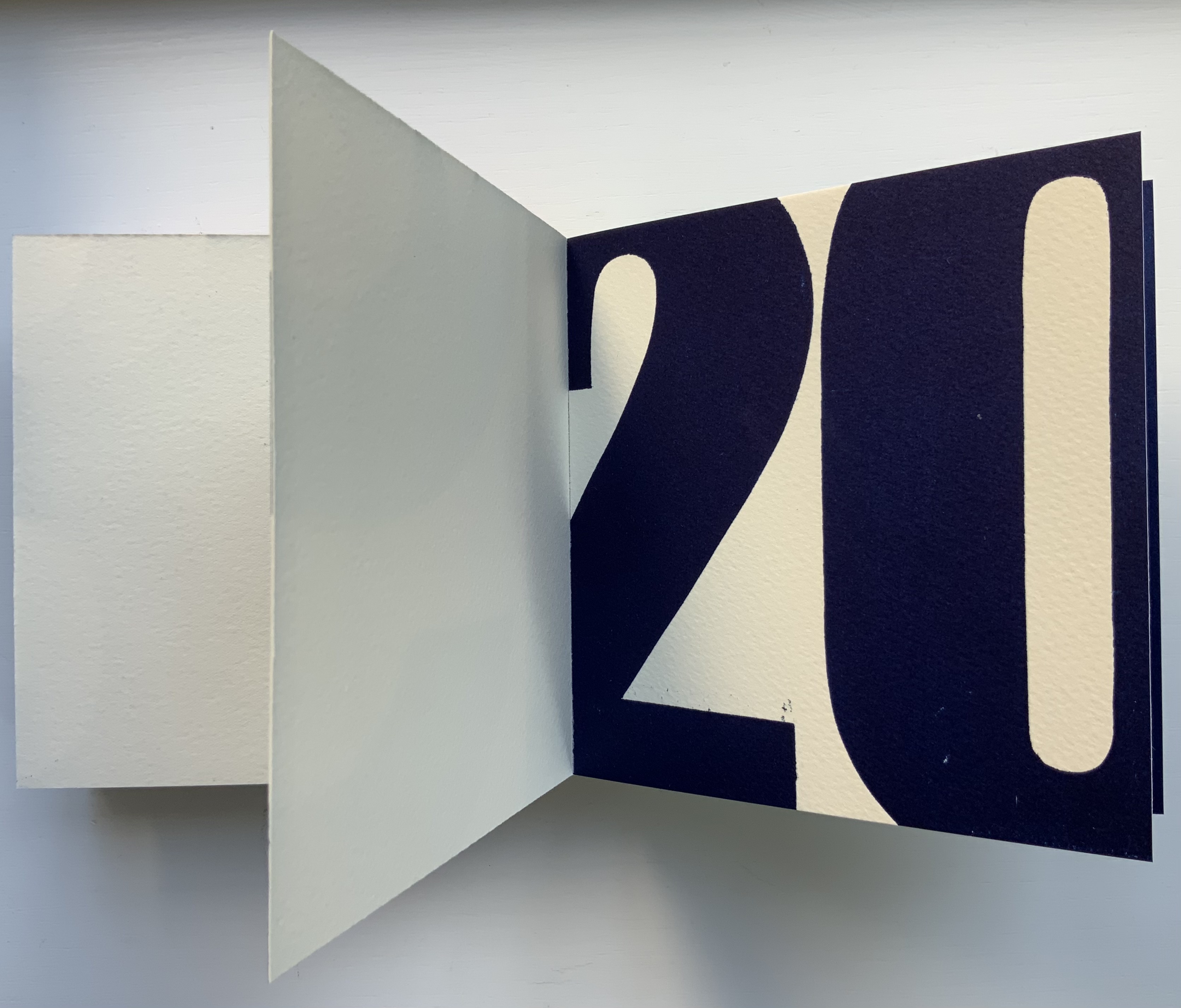
The Spectrum A to Z (2003) Karen Hanmer Tunnel book. 5 x 5 x 18 inches. Pigment inkjet prints. Edition of 20, of which this is #17. Acquired from Vamp & Tramp, 3 September 2021. Photos: Books On Books Collection. Displayed with the artist’s permission.
The Spectrum A-Z is a satisfying addition to the Books On Books Collection for several reasons. Accordion book, flip-book and pop-up book treatments of the alphabet abound, but this may be the only tunnel book treatment. If not, surely the blending of the the alphabet with tunnel book structure and the color spectrum secures its uniqueness. Also, the springiness achieved in this tunnel book makes it alive and special.
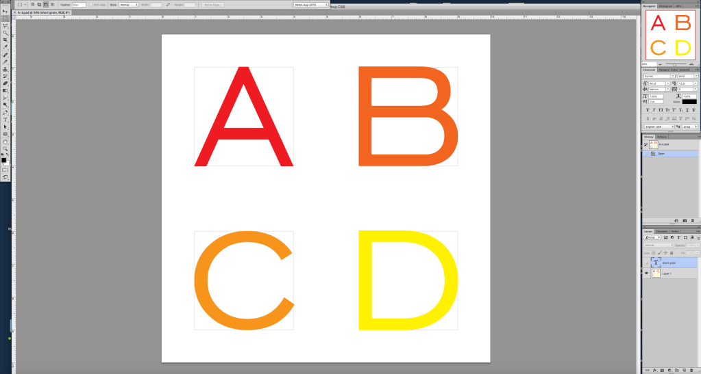
In response to questions about the work, Hanmer commented on the work’s creation and sent along the screen shot below of the Photoshop files from which she printed the letters A-D:
A screen shot of the Photoshop files used for printing. Courtesy of the artist.
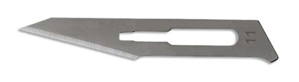
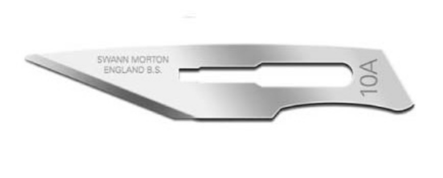
I print them with crop marks, cut the larger thing out and into quarters, and then cut around the individual letters (used to use a Havels #11, now I use a Swann Morton #10A scalpel blade, and a 6” ruler with sandpaper on the back so it does not slip for the straight bits, freehand for the curves). Years go by when I don’t need to make another, so I have a non-printing comment reminding me of the grain direction. If the letters were long grain, the structure would be limp and unsatisfying. … Assembly with 1/4″ 3M 415 tape. PVA would make it wrinkly. Mohawk Superfine Cover, I think 80#. Whatever printer I have at the time, now an Epson SureColor P5000. (Correspondence with Books On Books. 19 October 2021)
The Havels #11 and Swann Morton #10A.
The color spectrum followed out and part way back by the book comes eclectically from the order of the default RGB swatch palette in Adobe’s version of Photoshop prior to Creative Suite in 2003. As for the structure’s springiness, Hanmer comments that she is not wild about it,
but 20 years ago I did not know that I could cut several little tabs with a woodworking gouge out of the accordion for each letter and attach the letters to the tabs to relieve the tension, and 2021 Karen does not feel like adding several more hours to the process of assembling these. She also likes the security of having each panel adhered for its full length. And now that you mention it, the springiness would make it a lot more fun to play with, so maybe it is not so bad after all. (Correspondence with Books On Books. 19 October 2021)
The Spectrum A-Z was made in response to a call from the Chicago Hand Bookbinders, which thrived from 1978/9 through 2009. The Biographical/Historical Note for the CHB archives mentions that, “Among its notable projects was a series of fifteen collaborative artist’s alphabet books in varying formats, created between 1987 and 2004”. Of course, from time to time, other “organizations of the book” have issued calls for artist alphabet books. But with the infinite gradations in Roy G. Biv‘s spectrum and the customizability within Creative Suite, surely now another call is bound to result in a rainbow of followers of Hanmer’s innovation.
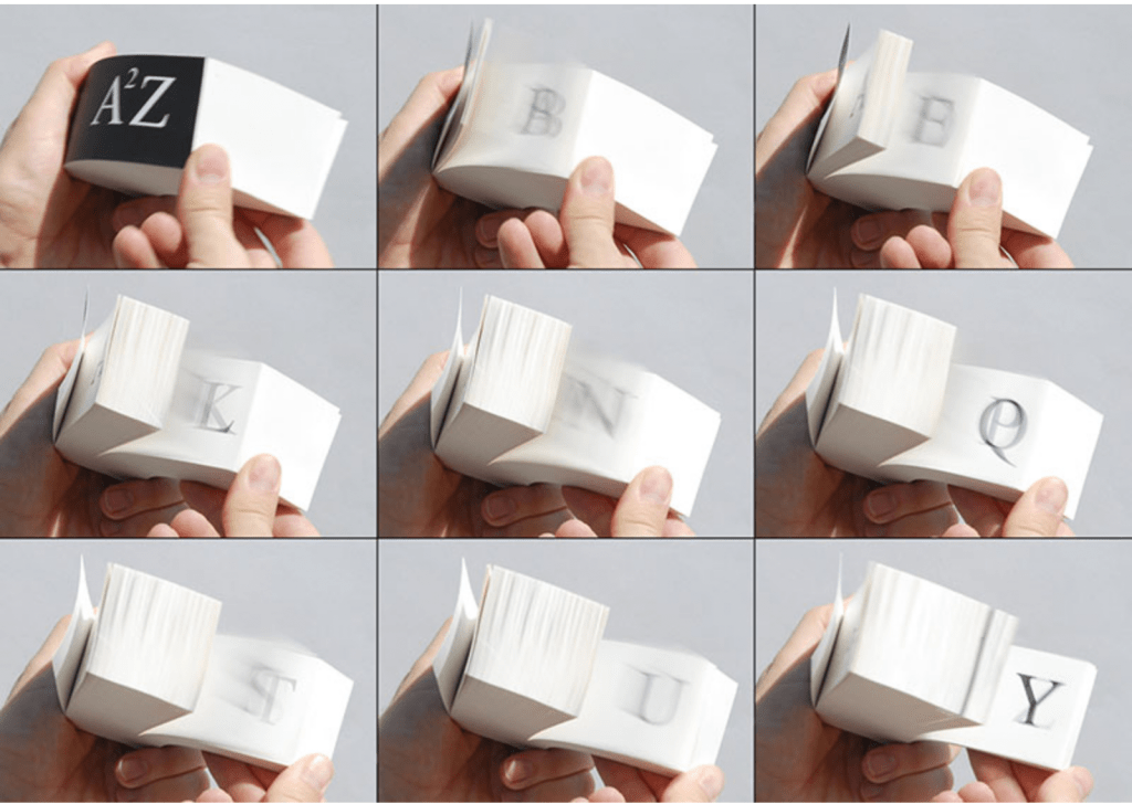
A²Z (2013)
A²Z(2013) Karen Hanmer Flip book: inkjet prints, double-fan adhesive binding. H51 x W121 x D51 mm (2 x 4.75 x 2 in). Acquired from the artist, 30 October 2021. Photo: Courtesy of the artist.
Salamony, Sandra, and Peter and Donna Thomas. 2012. 1,000 Artists’ Books : Exploring the Book as Art. Minneapolis: Quarto Publishing Group USA. Pp. 101 (Over the Edge: Death in the Grand Canyon), 111 (Destination Moon), 206 (Beaut.e Code), 291 (Famopily).
Chroma Numerica (2019) Andrew Morrison Perfect bound cased in quarter-hinged paper-on-board binding. H143 x W145 mm, 60 pages, printed on one side. Edition of 30, of which this is #17. Acquired from the artist, 2 September 2021. Photos of the work: Books On Books Collection. Displayed with artist’s permission.
In the children’s book tradition, counting books and alphabet books often come paired. Chroma Numerica‘s partner appears with the same binding earlier in Andrew Morrison’s work below, and in both cases, the printing process is the real subject — not the learning of numbers or letters. From his wood type, Morrison rolls out oversized numbers 1-30 printed in a chromatic scale on Somerset Book 200gsm paper.
Provenance (2018)
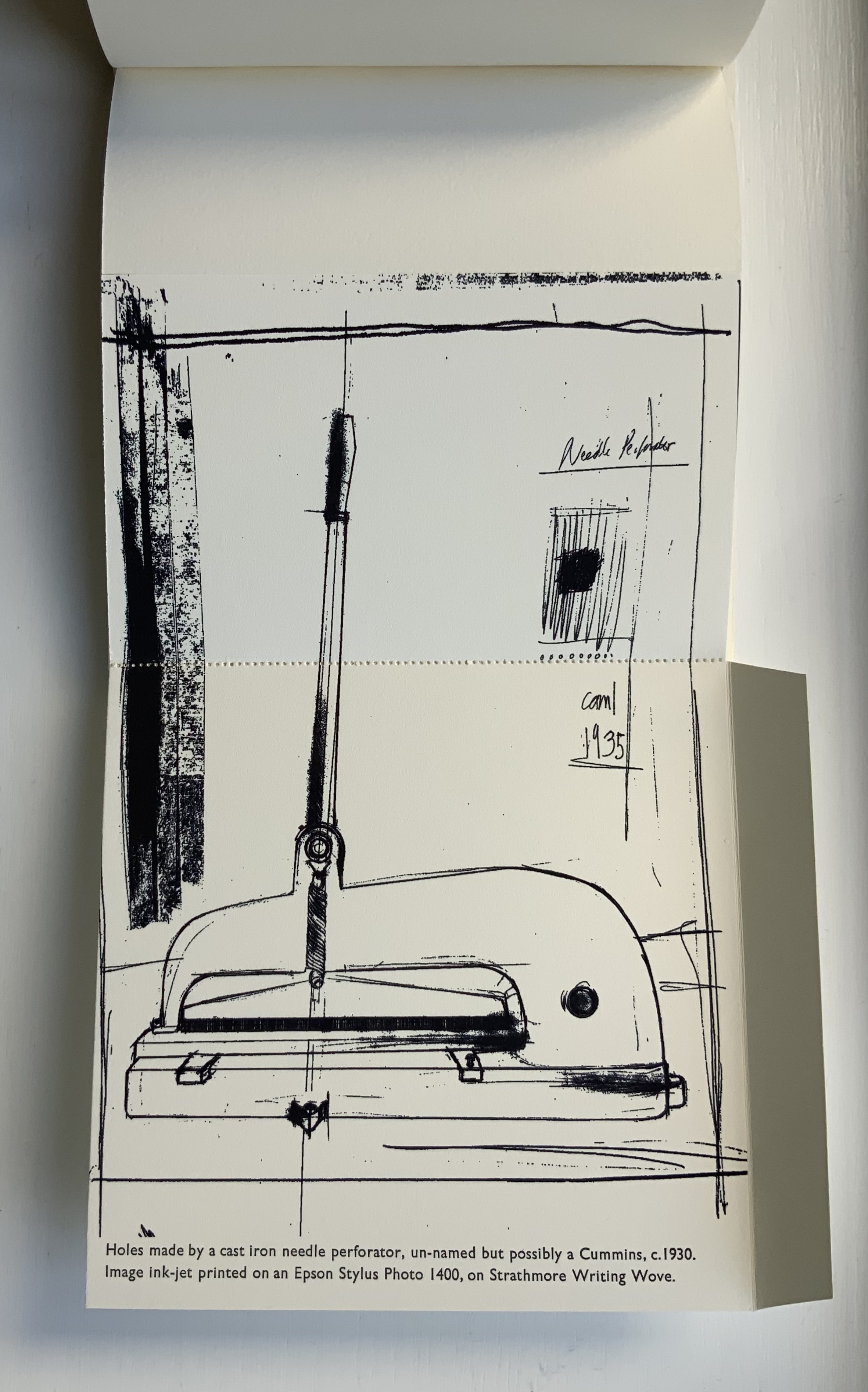
Provenance (2018) Andrew Morrison Casebound with dustjacket. H152 x W155 mm, 9 foldouts, 6 leaves (including 1 trimmed short), 2 end leaves. Edition of 30, of which this is #28. Acquired from the artist, 2 September 2021. Photos of the work: Books On Books Collection. Displayed with artist’s permission.
While Chroma Numerica and A-Z use printing processes to count and spell out their subjects, Provenance uses folds and stitching to conceal texts and images that reveal the making of the book itself. More than the other two books, Provenance requires “reading with the hands”. The two sequences below show the result and process — or the effect then cause — of needle perforation and wire stitching. In the first, the perforation can be seen along the right-hand edge, then along the left, and then in the middle of the unfolded image, which is annotated with a description of the printing process and paper. In the second sequence, the wire stitch can be seen in the gutter; then, with the two tabs pushed back, the German stitching machine comes in view, again annotated with a description of the printing process.
Provenance recalls those sets of binding models produced by Gary Frost, Karen Hanmer and others, but it may be too fragile for the constant reading with the hands that it would undergo as a teaching tool. It is more to be carefully and gently admired — a beautiful peacock admiring itself in the mirror of itself.
Two Wood Press A-Z (2013)
Two Wood Press A-Z (2013) Andrew Morrison Hardcover. Casebound glued. H180 x W155 mm, 56 pages. Edition of 30, of which this is an A/P. Acquired from the artist, 5 May 2020. Photos: Books On Books Collection. Displayed with artist’s permission.
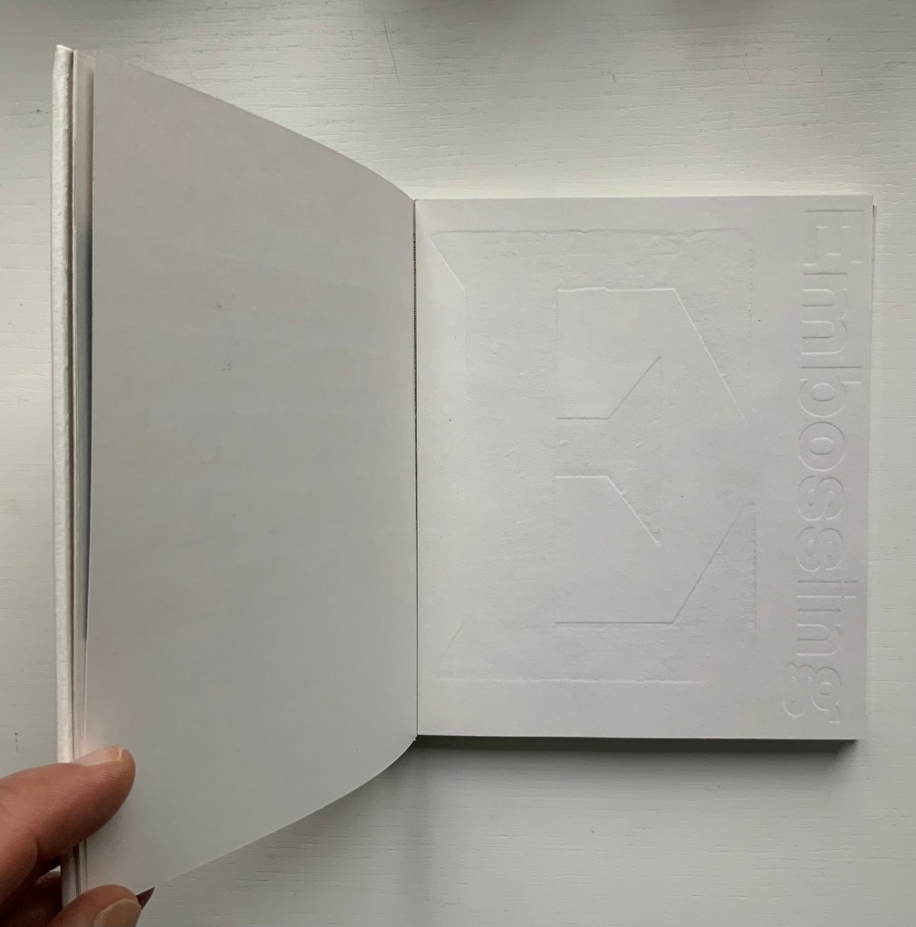
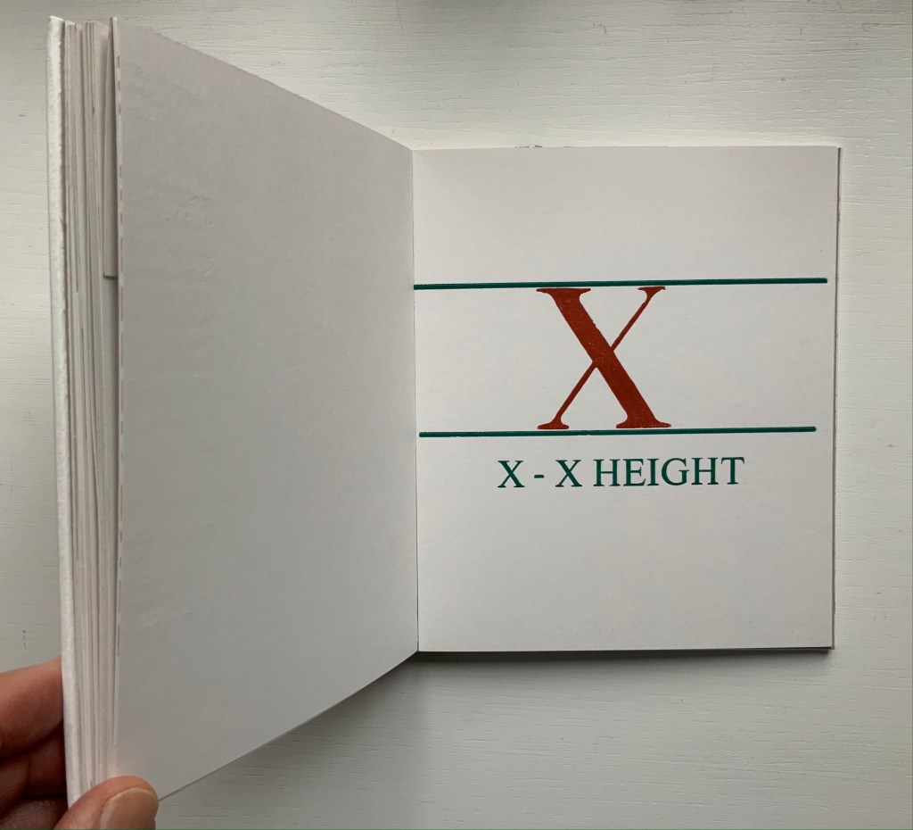
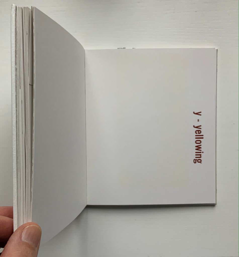
An inspired A-to-Z, with tongue in cheek evident in the material form as well as the text. At first, there seems to be no letter A, but closer inspection reveals the ampersand sneakily placed at the start of the alphabet on a page glued halfway up the pastedown. For the letter C, we have “chase” — the heavy steel frame used to hold type in a letterpress. Of course, the type held in a chase would read as in a mirror, and so “C. WADE.” and “HALIFAX.” do just that in their “paper” chase. E for embossing is, of course, embossed. The usually difficult search for a word or term beginning with X is not a problem for typophile and provides a self-defining demonstration as does “yellowing” for Y. For the letter Z, we have to take it on trust that the images are the result from “an etched letterpress printing plate made of zinc”.
Ampersand& (2007)
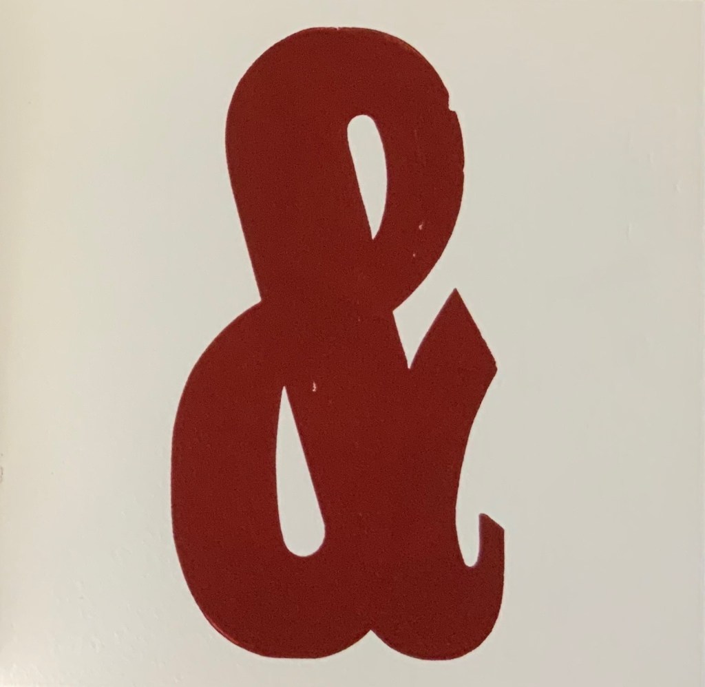
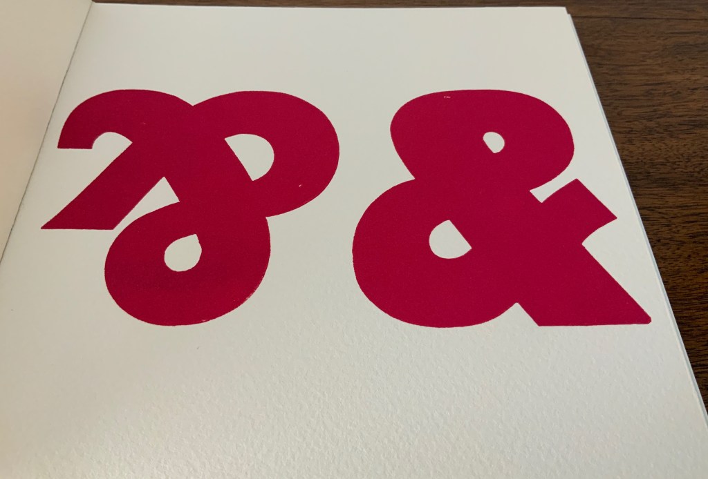
Ampersand& (2007) Andrew Morrison Board cover, perfect bound. H180 x W180 mm, 22 pages. Acquired from the artist, 5 May 2020. Photos: Books On Books Collection. Displayed with artist’s permission.
The sneaky ampersand at the beginning of Two Hand Press A-Z may have escaped from Ampersand& — or given the density and evenness of the possible escapee’s color, perhaps not. Any collection of wooden type will have “character”-giving flaws — nicks, nocks and abrasions. So it is with this … what is the collective noun for ampersands? The variation in shape of these ampersands and Morrison’s flaunty display of them deliver even more character. And note the watermark in the Somerset paper peeking through the third image below.
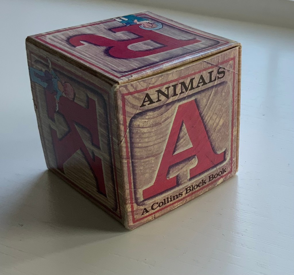
Given the effectiveness of Svensson and Diaz’s Letters alphabet book-in-a-box effort, it is surprising that they did not follow up the alphabetical theme from Animals, especially since animals have made up the most popular category of alphabet books for centuries. Another 24 or 25 books in boxes beckon. Alphabetical cubes of birds, cats, dogs and the zemmi! And what about the ampersand? And what different paper artistry might Diaz have performed if requested to fill out the series with further innovation? Consider Claire Van Vliet’s alphabetical Tumbling Blocks for Pris and Bruce (1996), Helen Hiebert’s Alpha Beta (2010) and Karen Hanmer’s The Spectrum A to Z.
Before its acquisition by Harpers in 1985, William Collins & Sons settled on the less risky venture of four books in boxes: Animals, Letters, Numbers and Colors. First with Elgin Davis Studios, James Diaz was the paper engineer behind all four and later joined David A. Carter (see his tribute to Bruno Munari here) to produce The Elements of Pop Up: A Pop Up Book for Aspiring Paper Engineers (1999), still used as a primary textbook.
Of course, B. S. Johnson and Marc Saporta pioneered boxes containing loose pages or leaves to be read in any order, but to find contemporary books in boxes where the box is not just a storage mechanism but functionally integrated, we have to look to Ed Hutchins, Sue Johnson and Hedi Kyle among others.
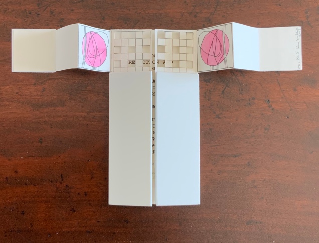
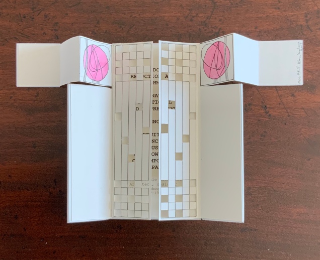
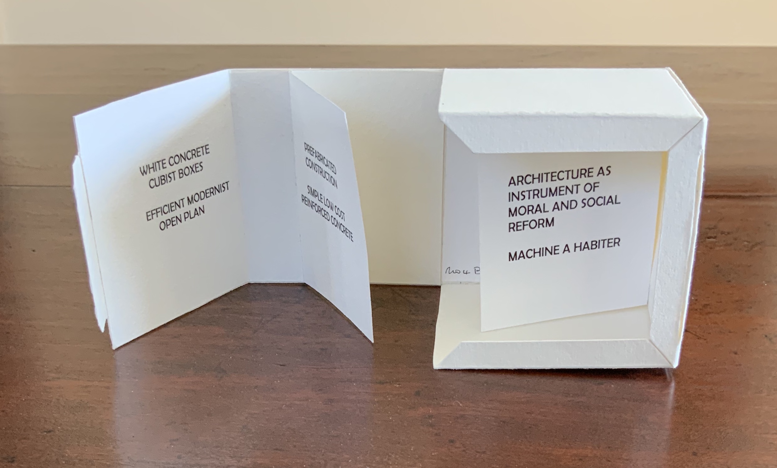
Architecture — be it theory, principles, practices or instances — inspires book art. Lay the book flat; you have a foundation. Open and turn it on its fore-edge; you have a roof beam or arcade. Stand it upright; you have a column or tower. Turn the front cover; you open a door. Put the text and types under a microscope; you have a cityscape. As the examples in this virtual exhibition show, architecture-inspired book art goes beyond these simple analogies.
There are seemingly unrelated texts that help considerably in going there. The Eyes of the Skin (2005) and The Embodied Image (2010) by Juhani Pallasmaa, architect, teacher and critic, are two of them. He writes as if he were an artist preparing an artist’s statement or descriptions of the book art below. The title of his earlier book gives away his alignment with the visual and tactile nature of book art. Pallasmaa’s two books will enrich anyone’s enjoyment of the works shown and mentioned here.
“Book. Space. House. Space of Movement“. Exhibition curated by Susanne Padberg, 7 May – 26 June 2026. Padberg, Susan (curator). 7 May – 26 June 2026. at Galerie Druck & Buch, Vienna, Austria. Accessed 22 May 2026. “The artist’s book as a three-dimensional space: forming a house, outlining, remembering, mimicking—thinking the human being within space. Between object and narrative, books unfold as architectural structures, as inhabitable thought-spaces, as reflections of individual and collective experience. The exhibition brings together artistic positions that expand the book as a spatial body.”
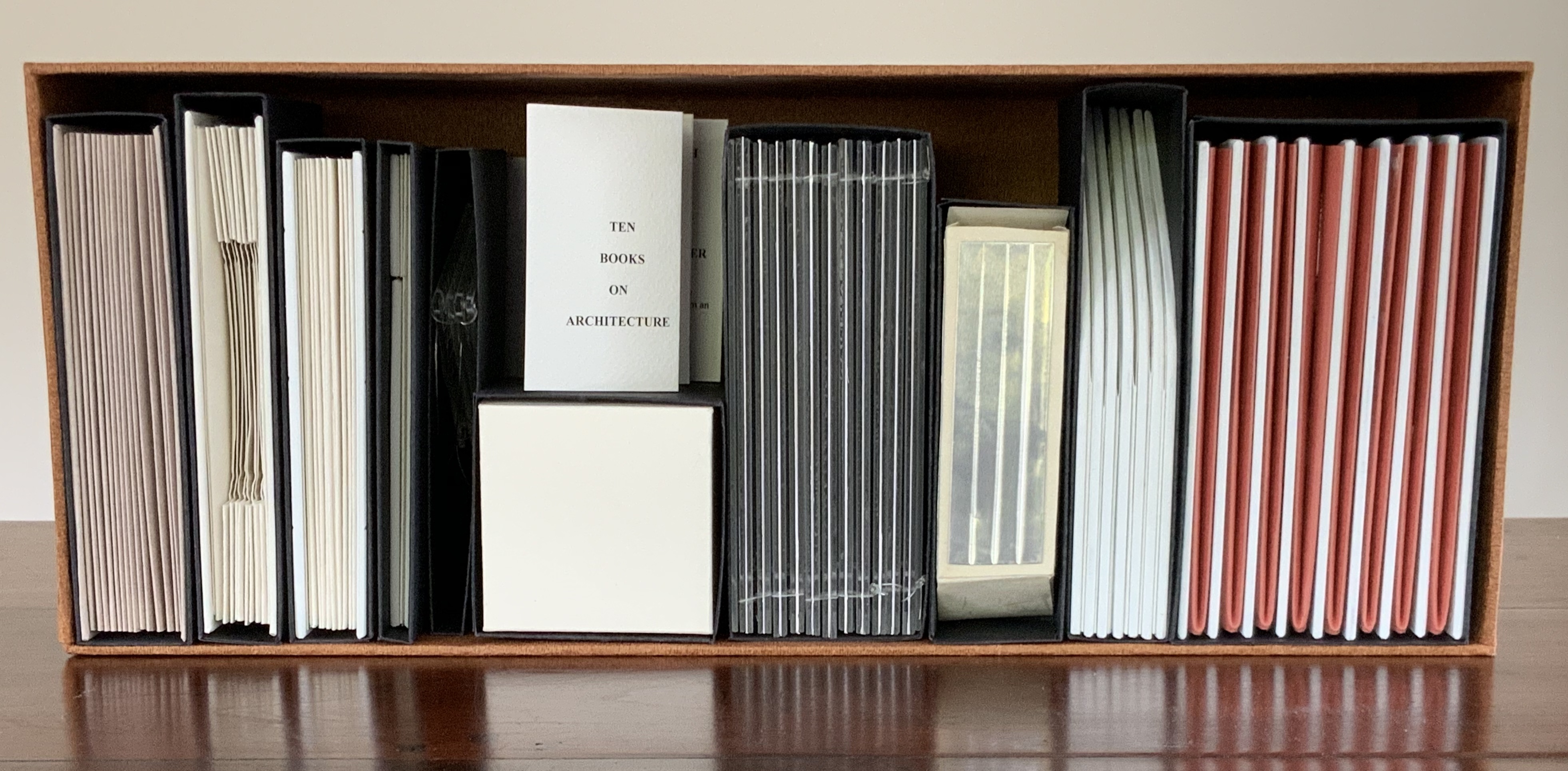
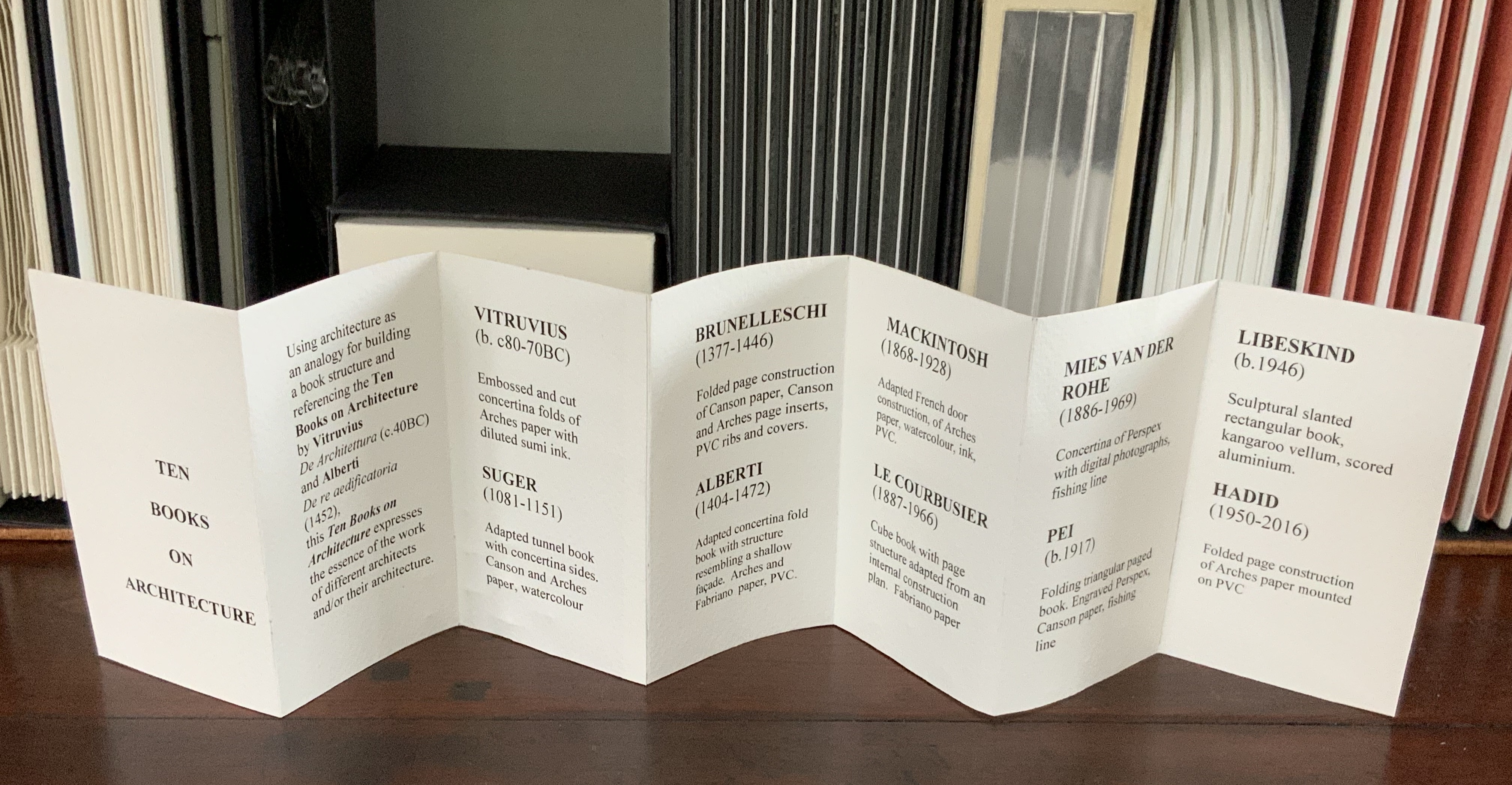
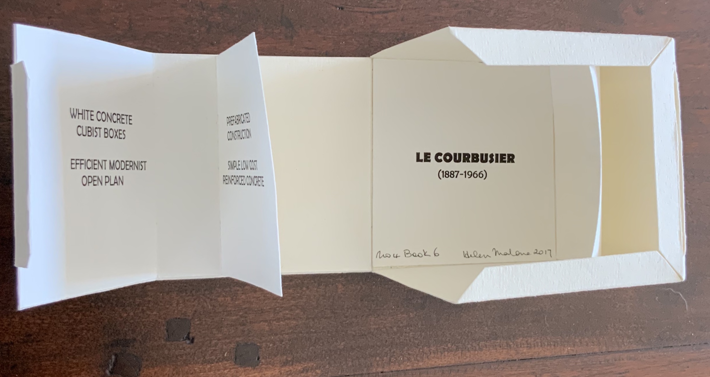
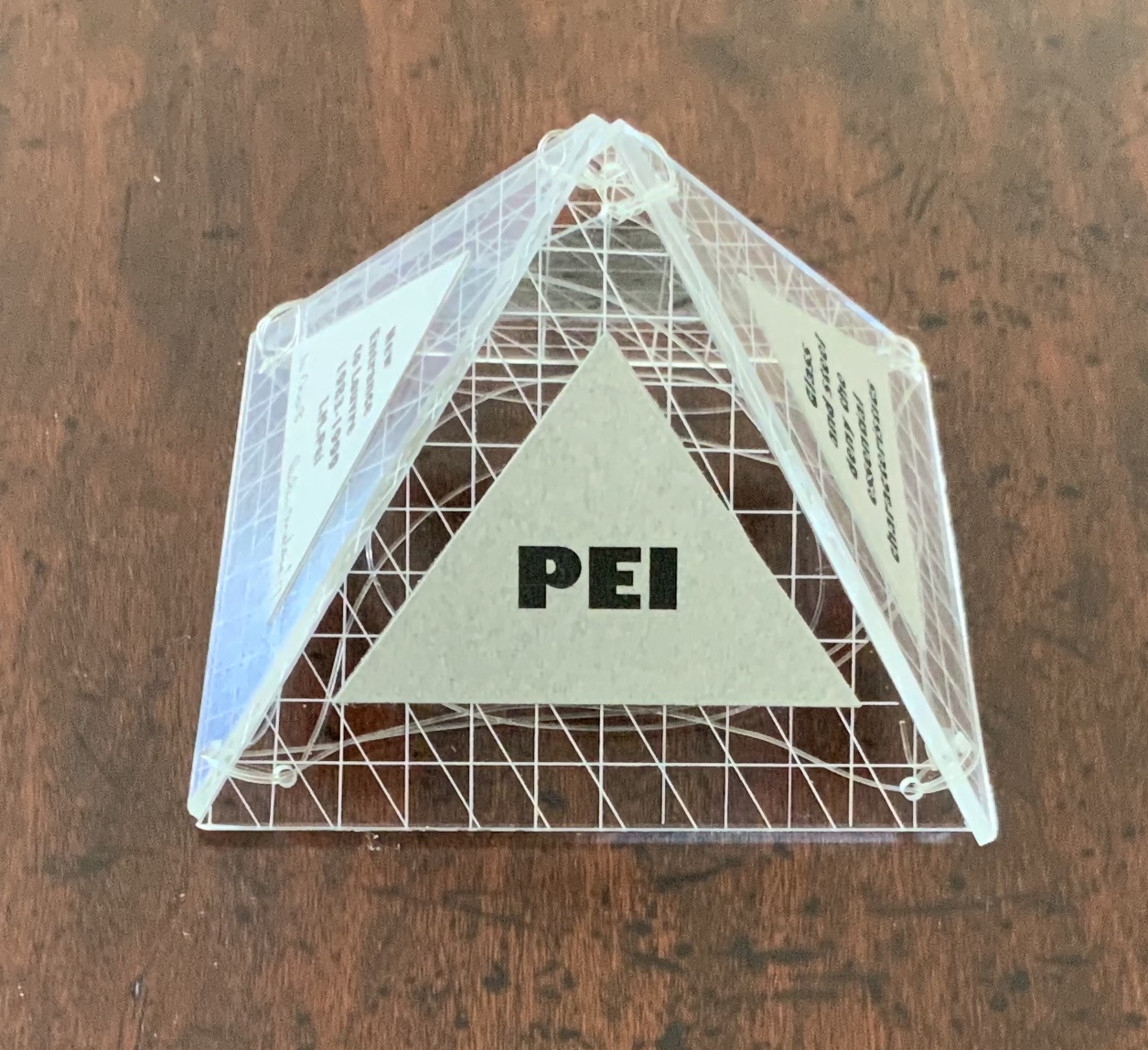
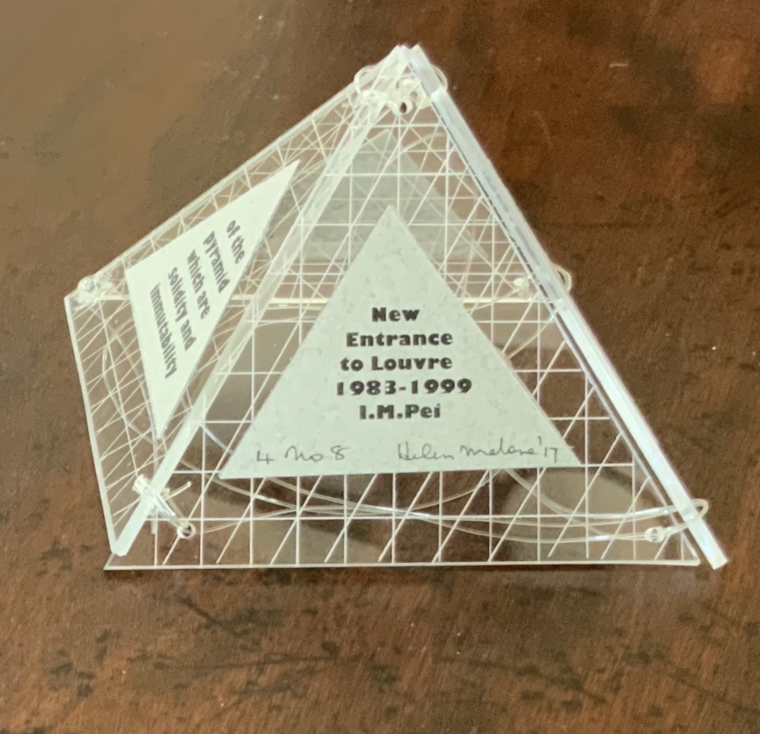
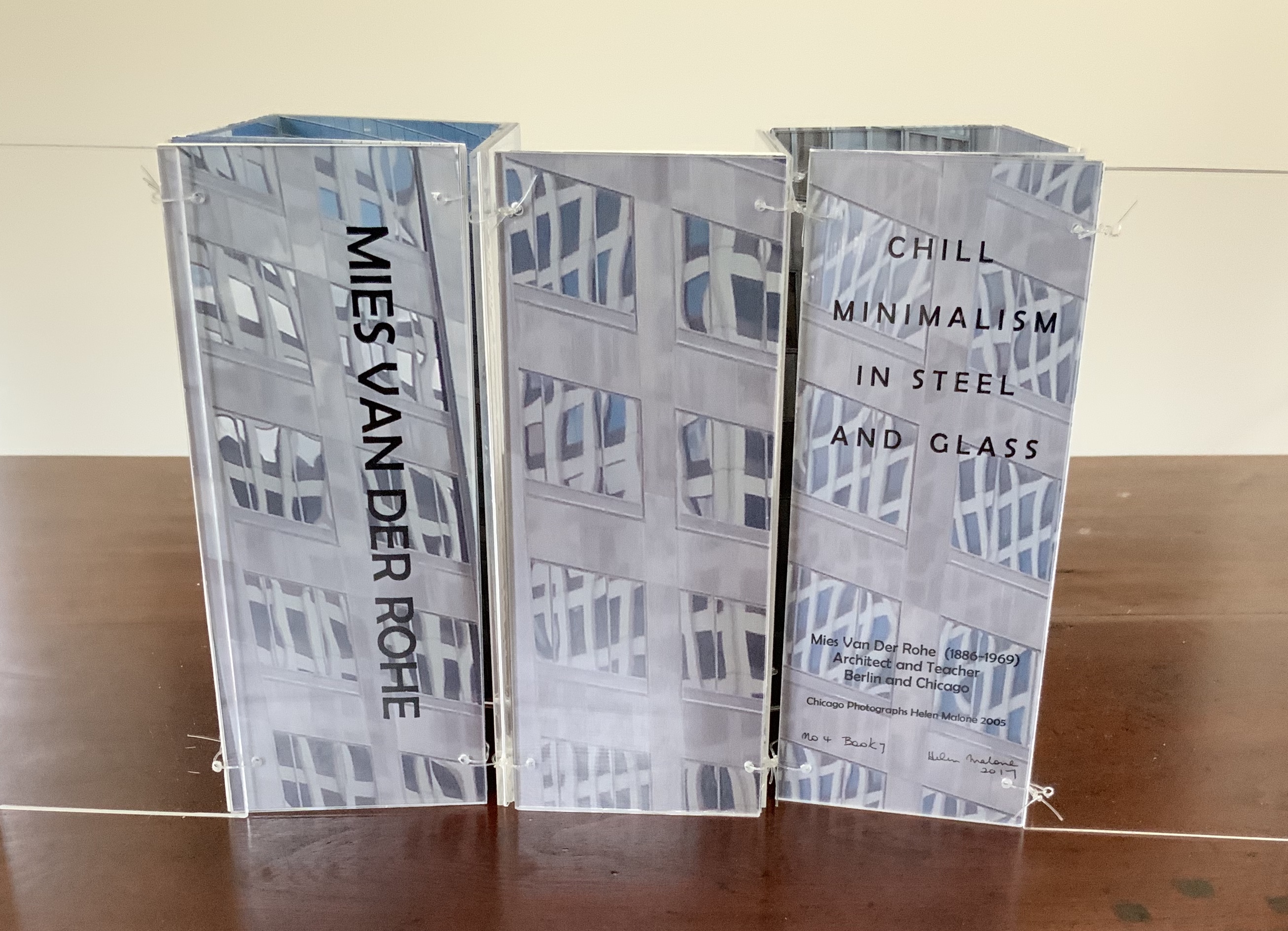
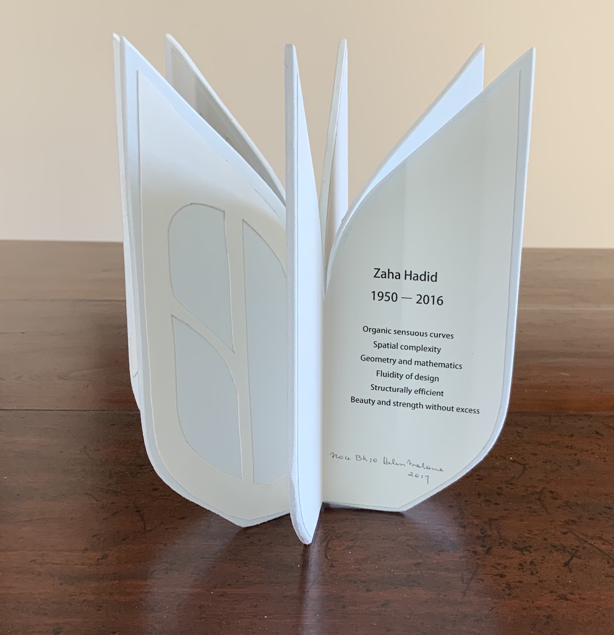
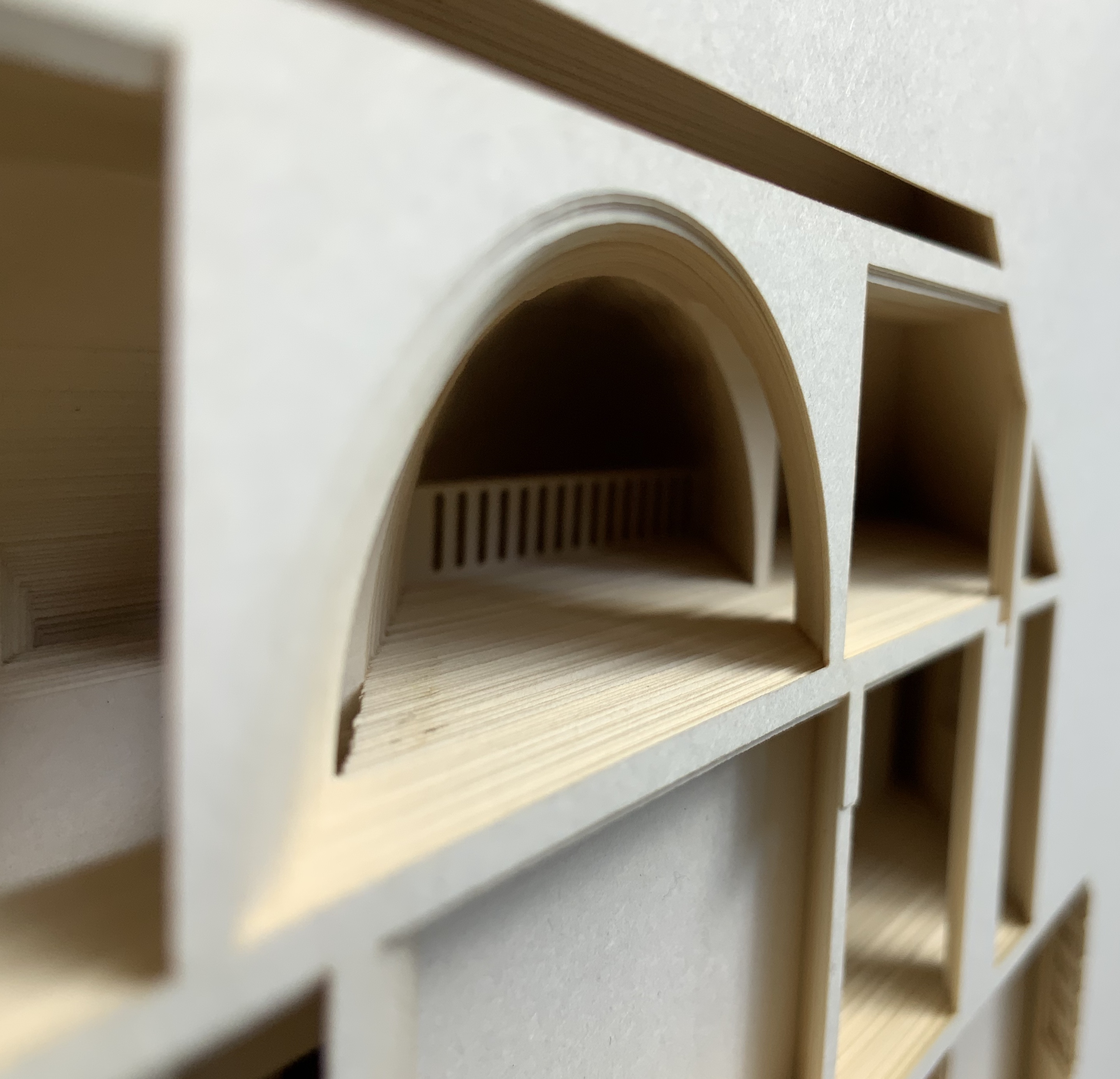
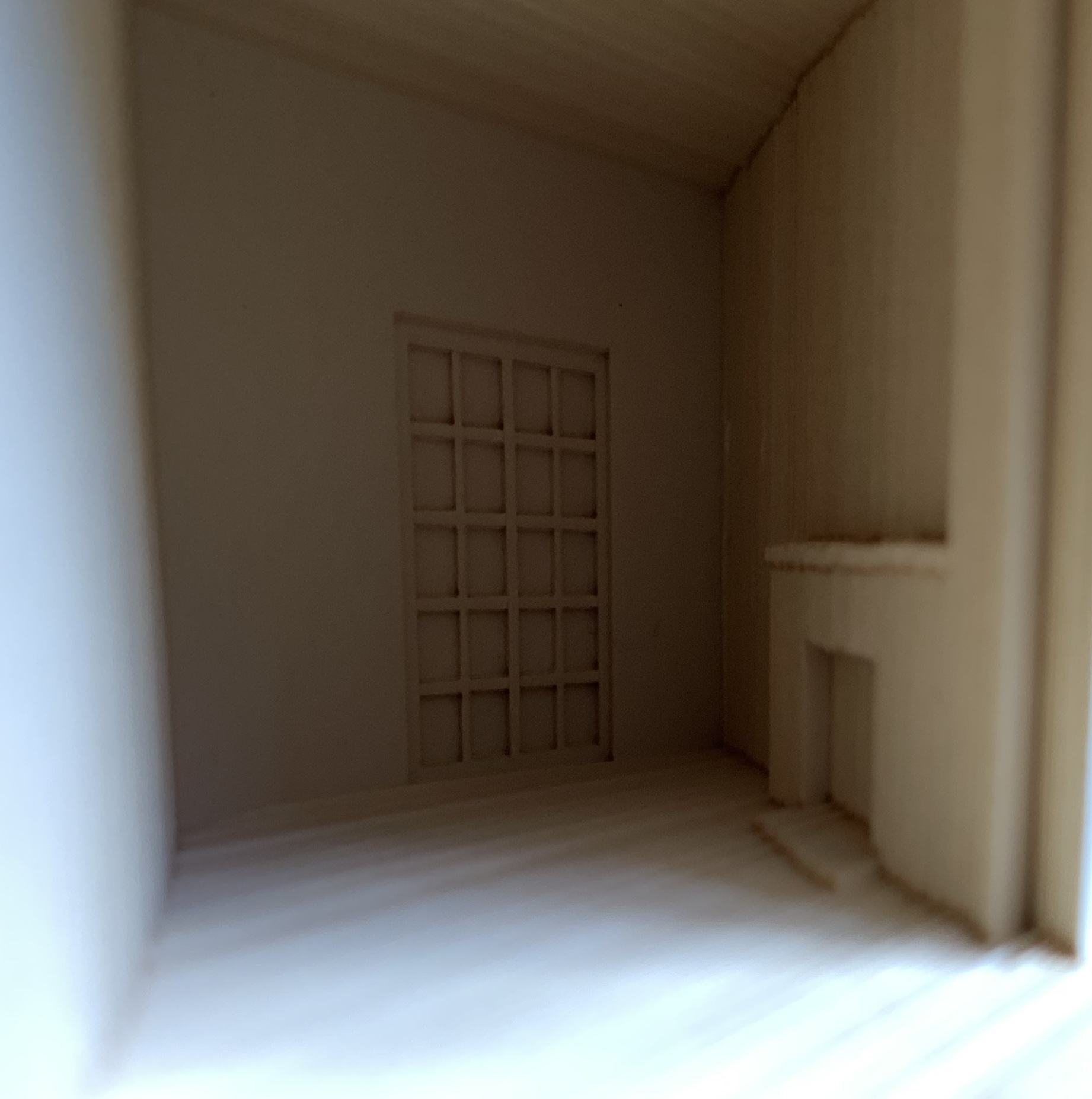
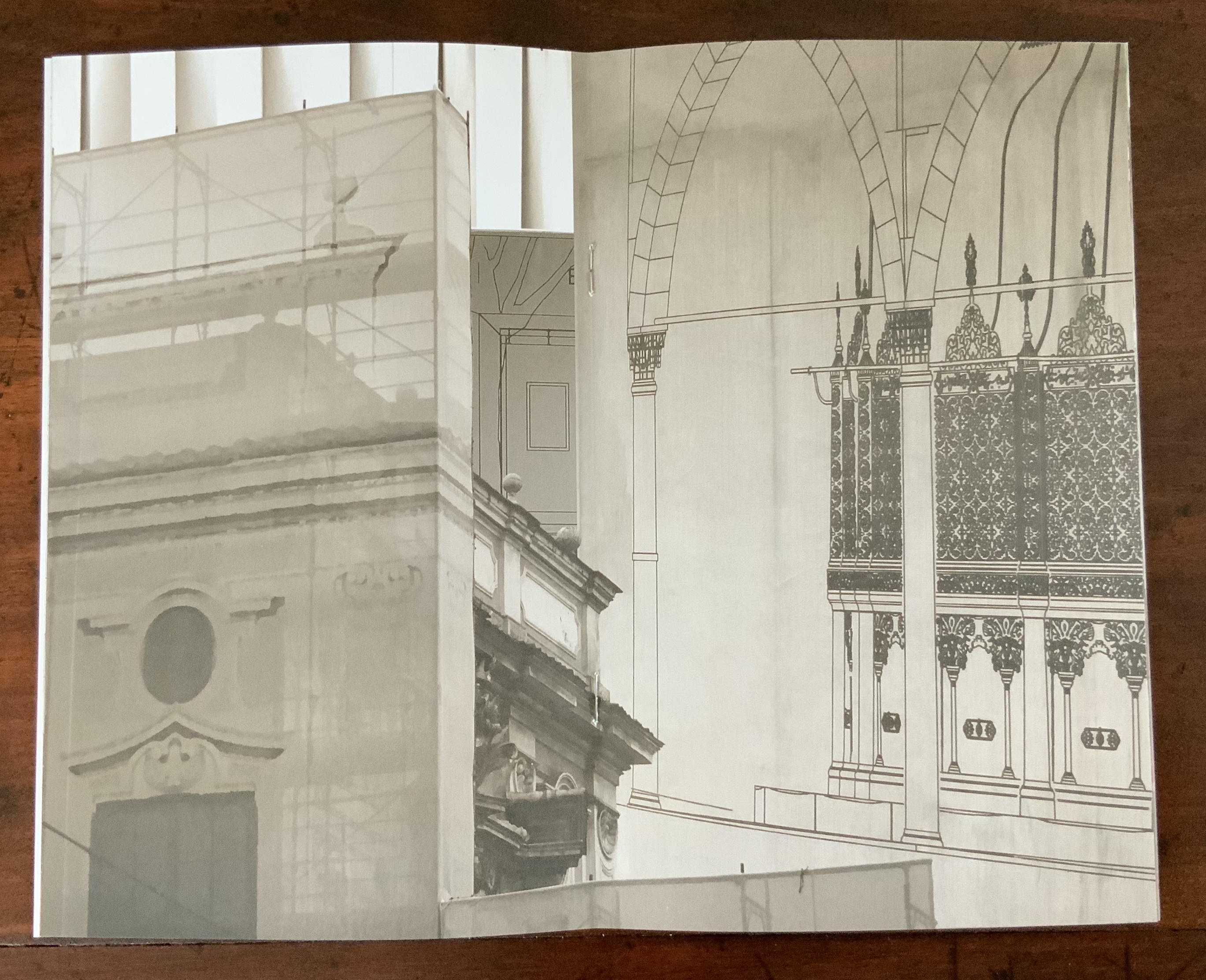
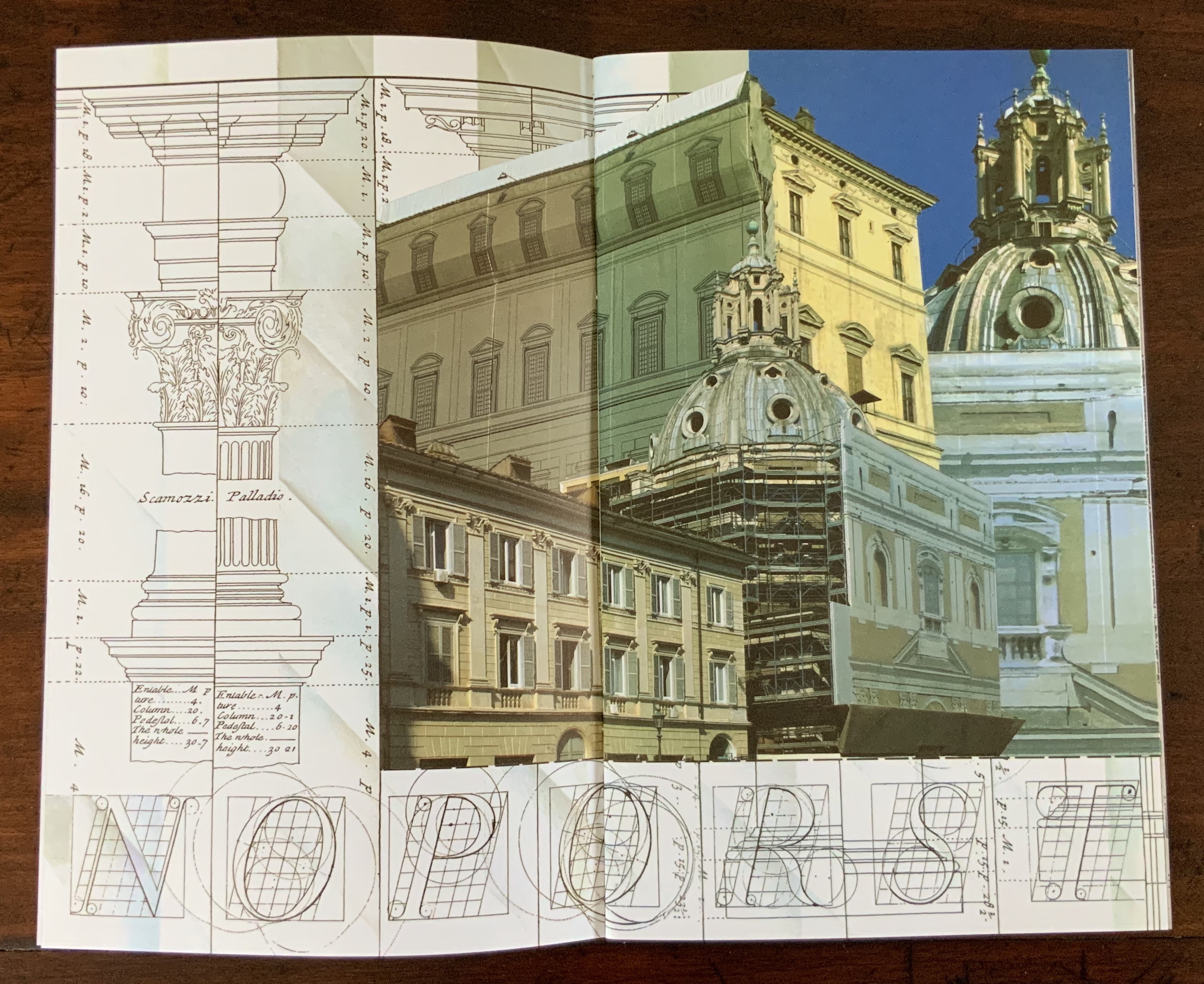
Malone’s Ten Books of Architecture is a good place to start in the collection. Like Pallasmaa, Malone takes a broad historical and, most important, haptic view of architecture from Vitruvius to Hadid. Each of the ten books is a bookwork that exemplifies its subject.
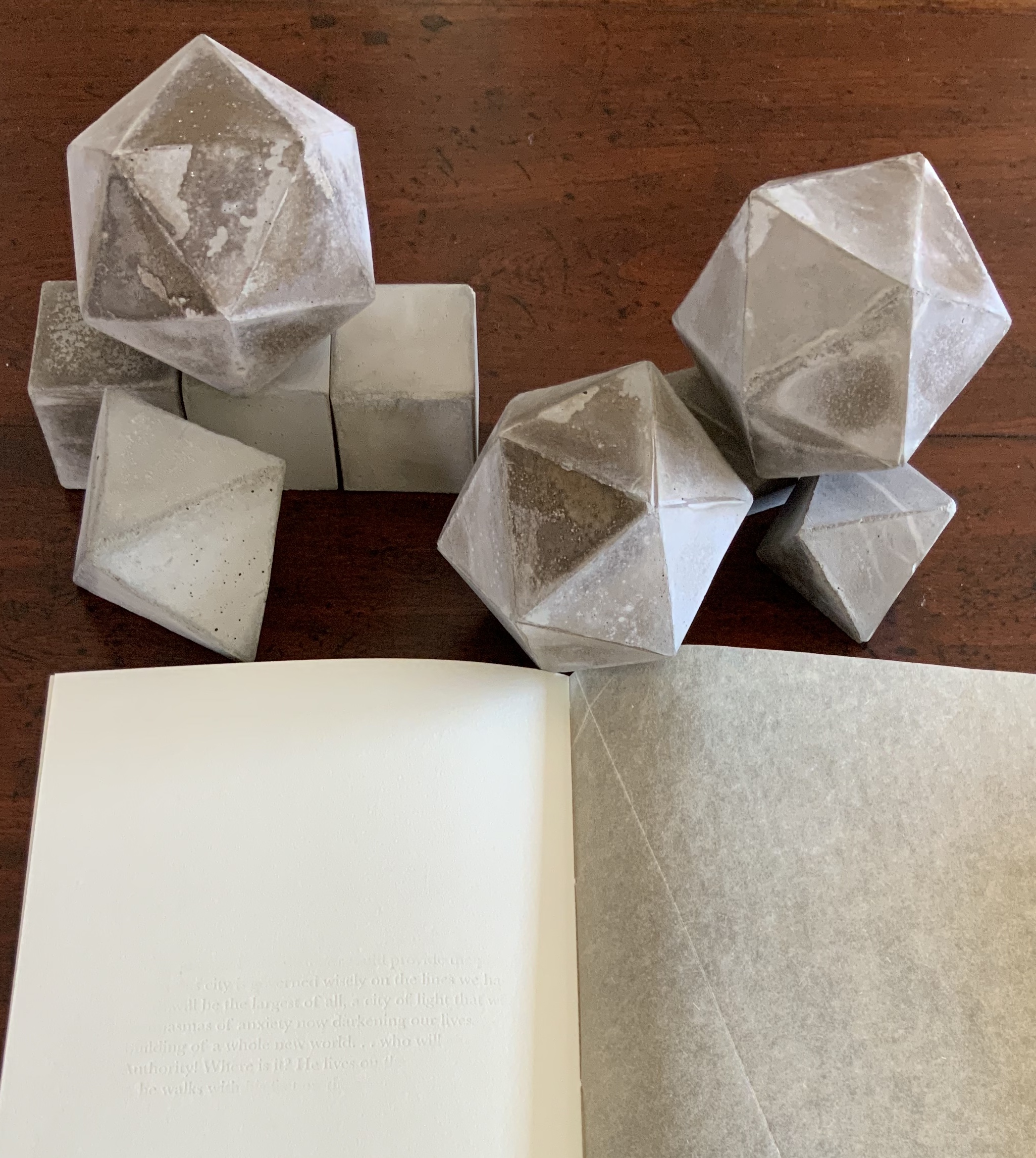
Adapted tunnel book with accordion sides Photo: Books On Books Collection
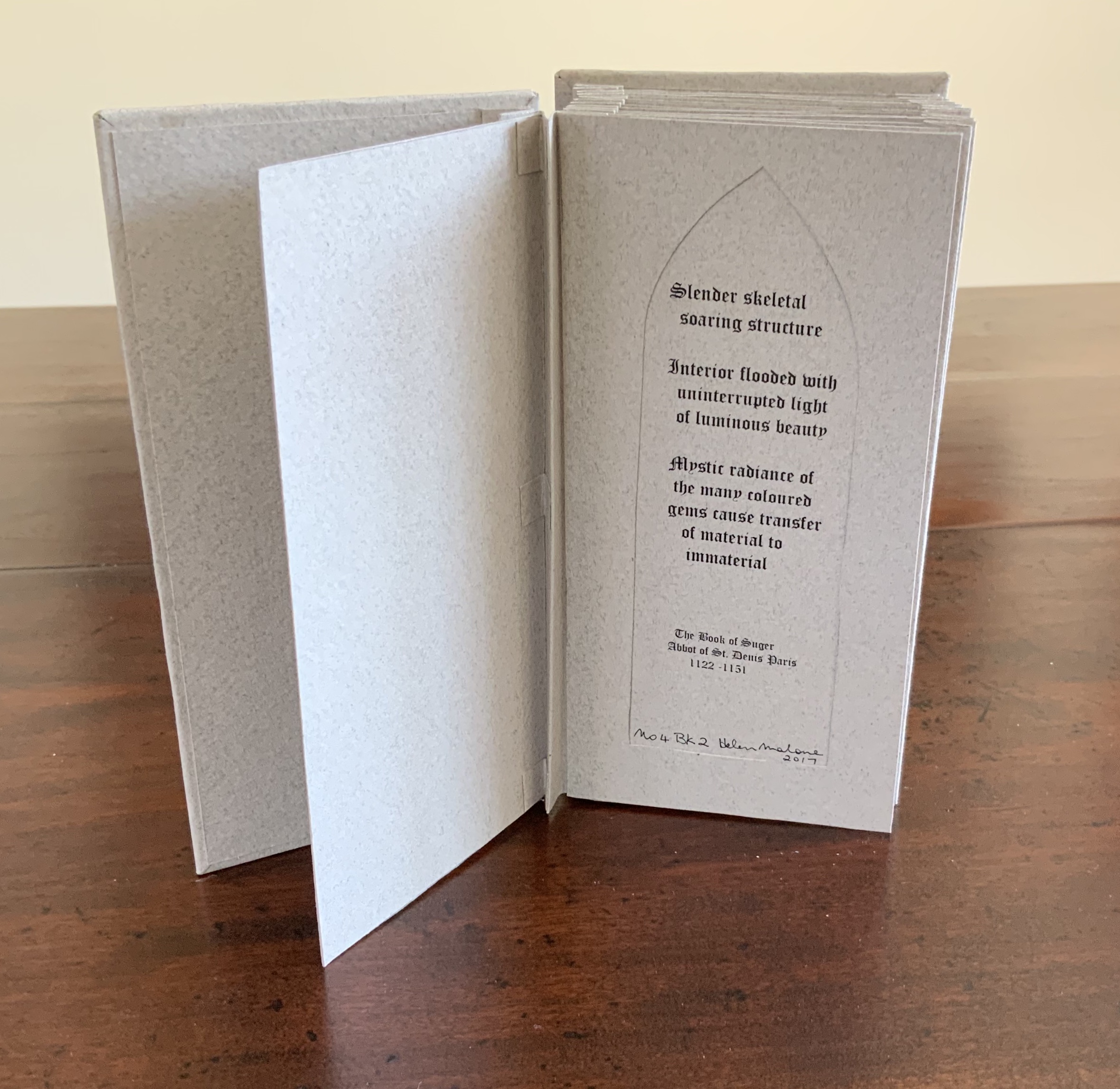
A watercolour at the tunnel’s end to evoke the stained glass clerestory windows in the Basilique Saint-Denis, Paris Photo: Books On Books Collection
The aspiration to fuse the cosmic and the human, divine and mortal, spiritual and material, combined with the systems of proportion and measure deriving simultaneously from the cosmic order and human figure, gave architectural geometries their meaning and deep sense of spiritual life.The Embodied Image, p. 23.
And further apropos the link between the book and architecture, consider the connection that Vasari drew between Gutenberg and Alberti:
In the year 1457 [sic], when the very useful method of printing books was discovered by Johann Gutenberg the German, Leon Batista [sic], working on similar lines, discovered a way of tracing natural perspectives and of effecting the diminution of figures by means of an instrument, and likewise the method of enlarging small things and reproducing them on a greater scale; all ingenious inventions, useful to art and very beautiful. Lives of the Most Eminent Painters, Sculptors and Architects, vol. 1, trans. Gaston Du C. de Vere (London: Medici Society/ Philip Lee Warner, 1912-1914), 494.
In “An Architectural Confession”, Pallasmaa writes:
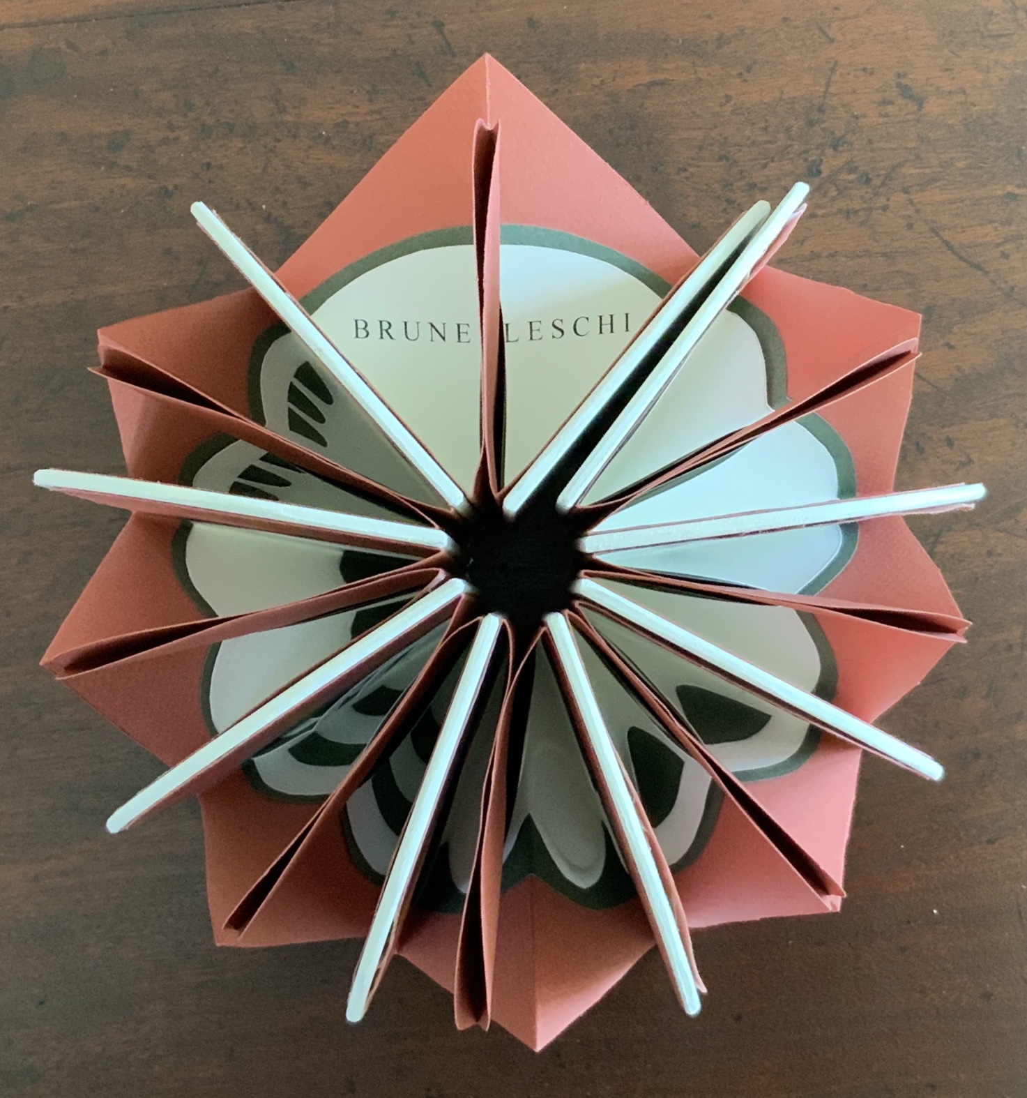
One’s most important teacher may have died half a millennium ago; one’s true mentor could well be Filippo Brunelleschi or Piero della Francesca. I believe that every serious artist — at the edge of his/her consciousness — addresses and offers his/her work to a superior colleague for approval.The Eyes of the Skin, p. 82.
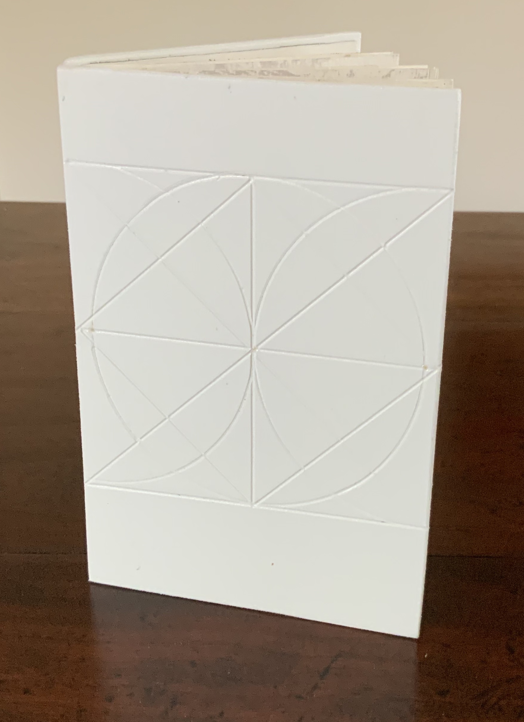
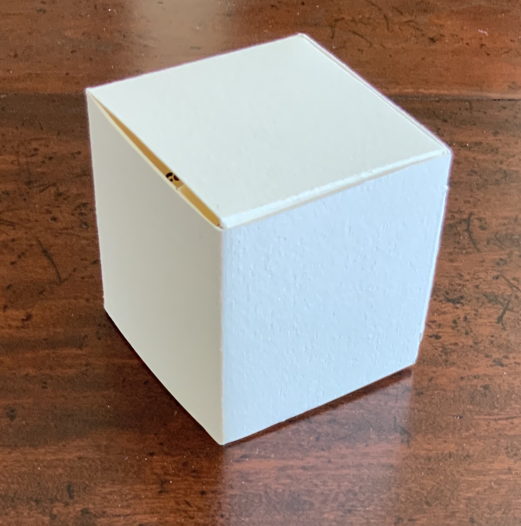
This curiously textured cube sits perfectly alongside Pallasmaa’s observation: “The basic geometric shapes have their symbolic connotations, but more important than their conventional meanings are their conceptual and visual organising powers” (The Embodied Image, p. 58).
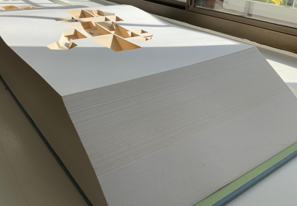
A short trip around this small pyramid as a reminder of the entrances that were always on the far side of museums you visited Photos: Books On Books Collection
This edition of Malone’s Ten Books is unique in its inclusion of Hadid, who is not mentioned in either of Pallasmaa’s books but whose artistry and turn to the organic and curves of nature certainly fit with their spirit. Photo: Books On Books Collection
Malone’s Ten Books has a predecessor in Laura Davidson’s contribution to the 1994 Smithsonian show on book art inspired by its collection of rare science books (see section below). Although there is also Karen Wirth’s sculptural take on the Ten Books as well as Ron Keller’s take (see section below) on Palladio’s Fours Books of Architecture, which is Palladio’s take on Vitruvius, I have not found any other Vitruvian-inspired works of book art. (Pointers welcome.)
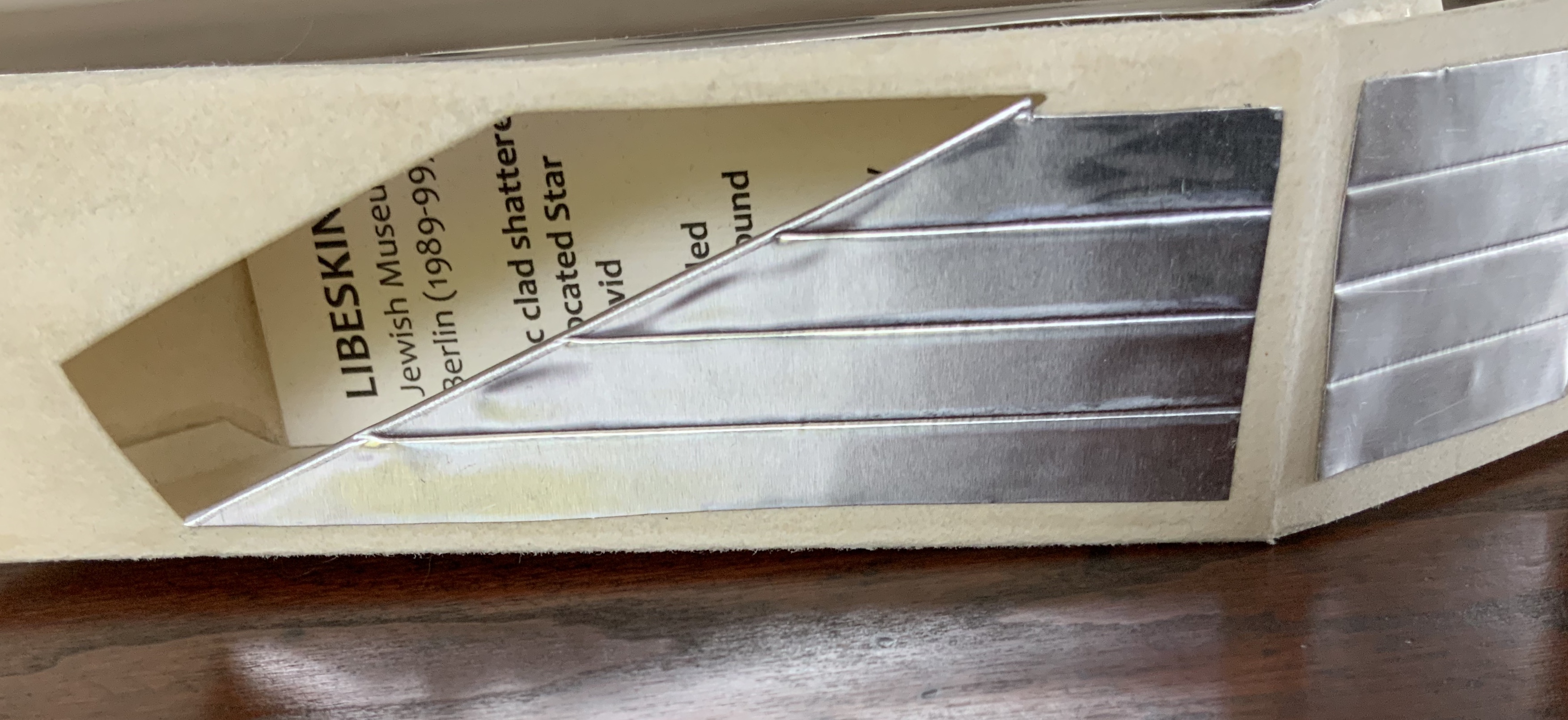
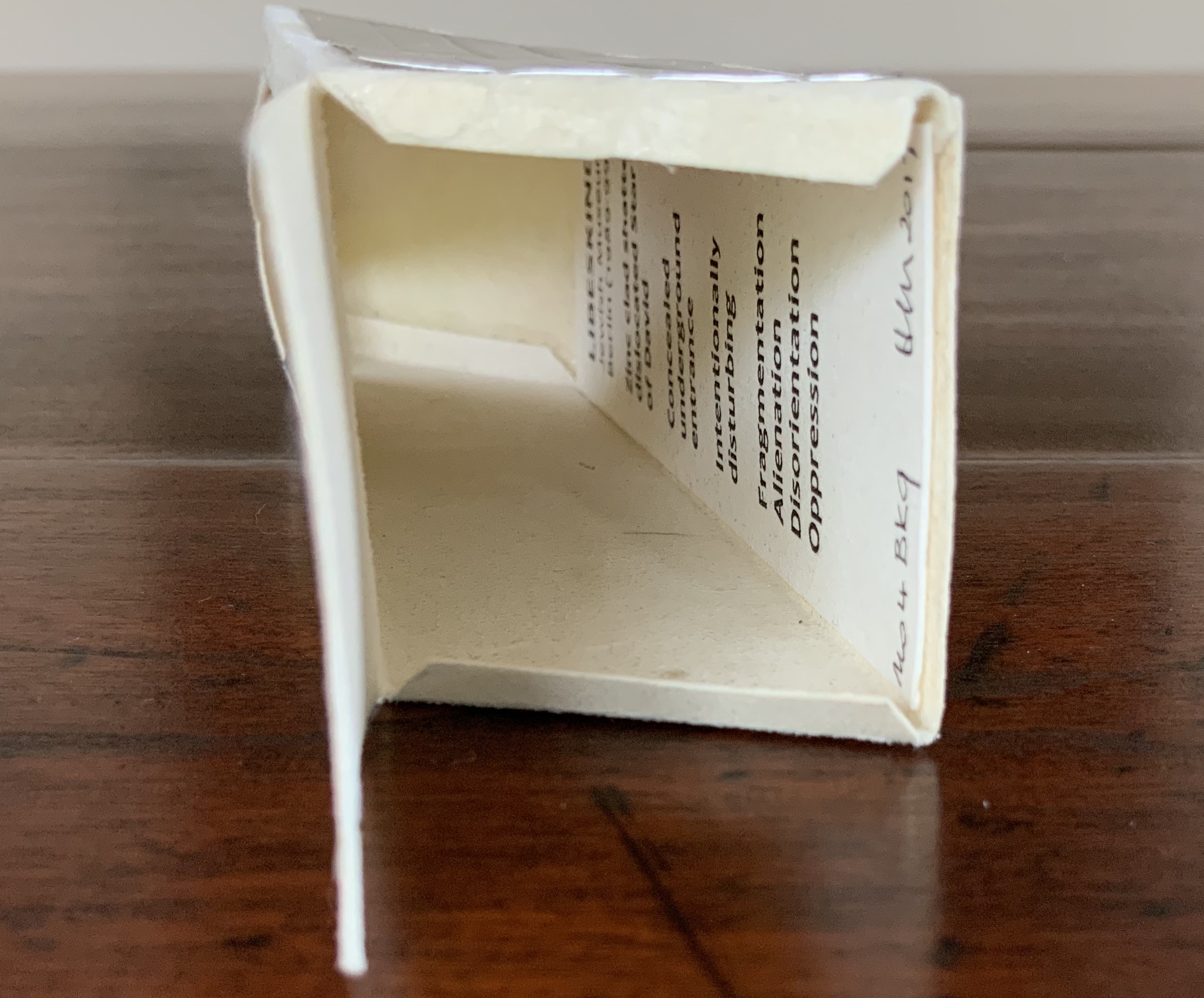
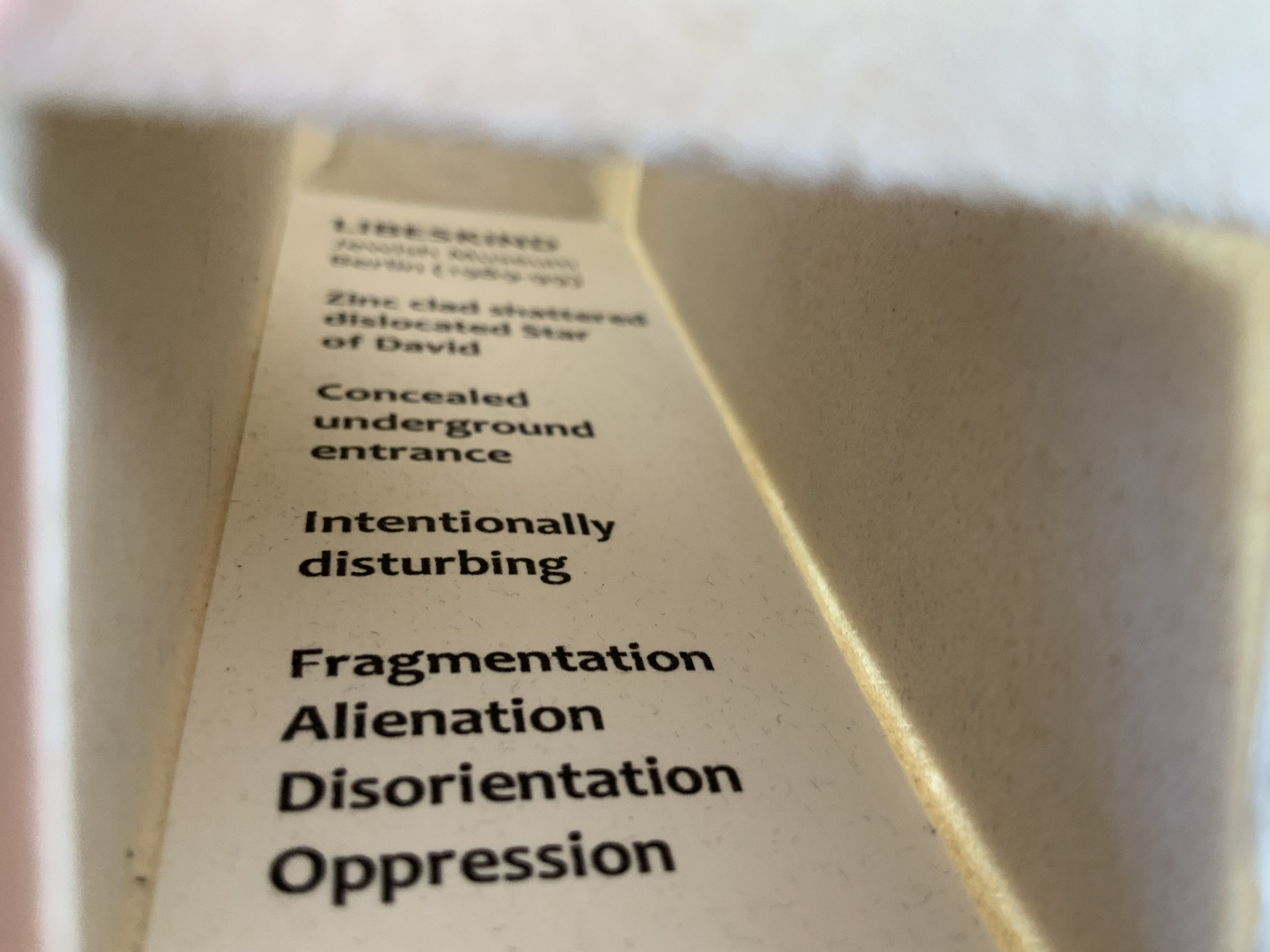
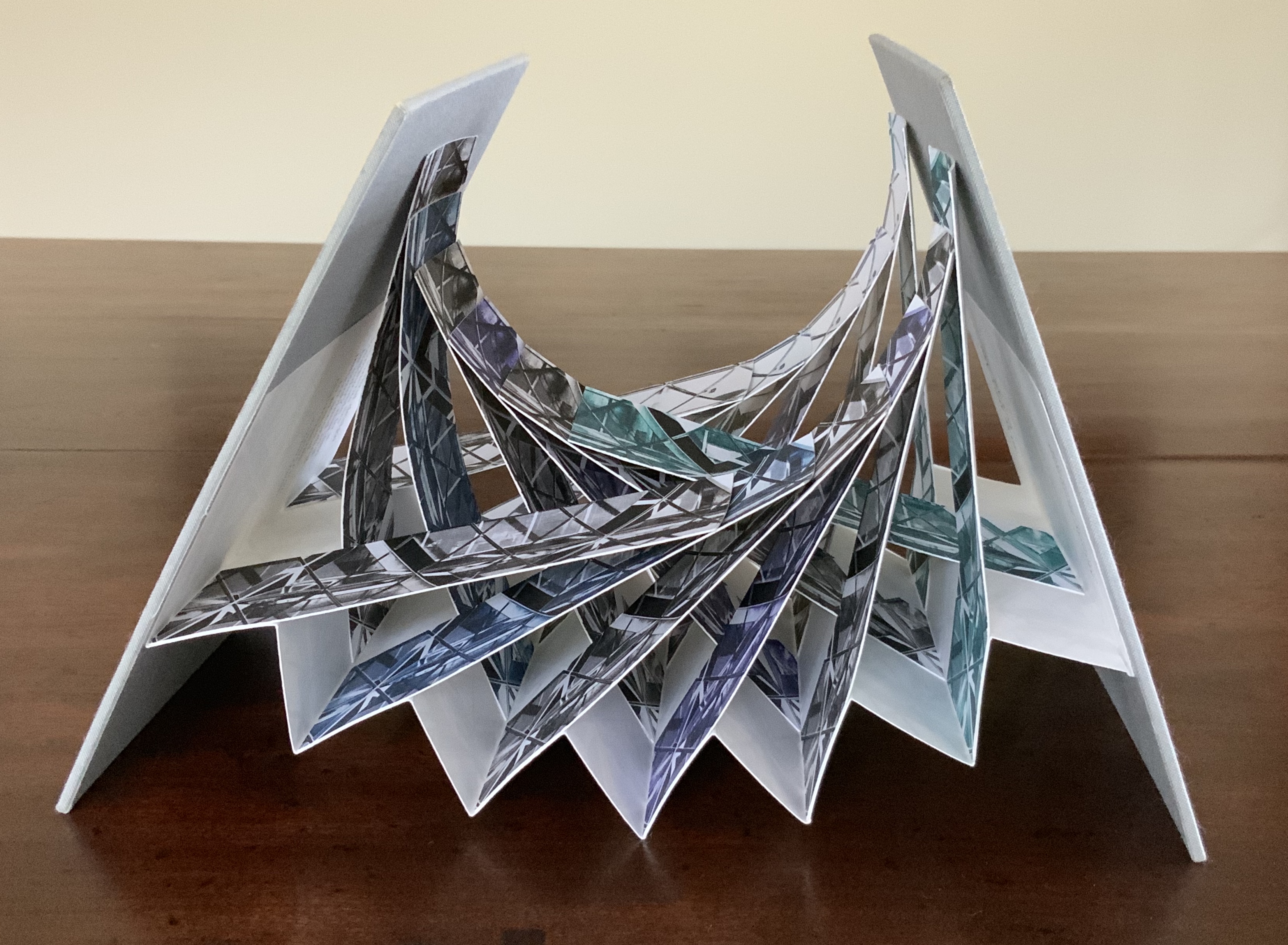
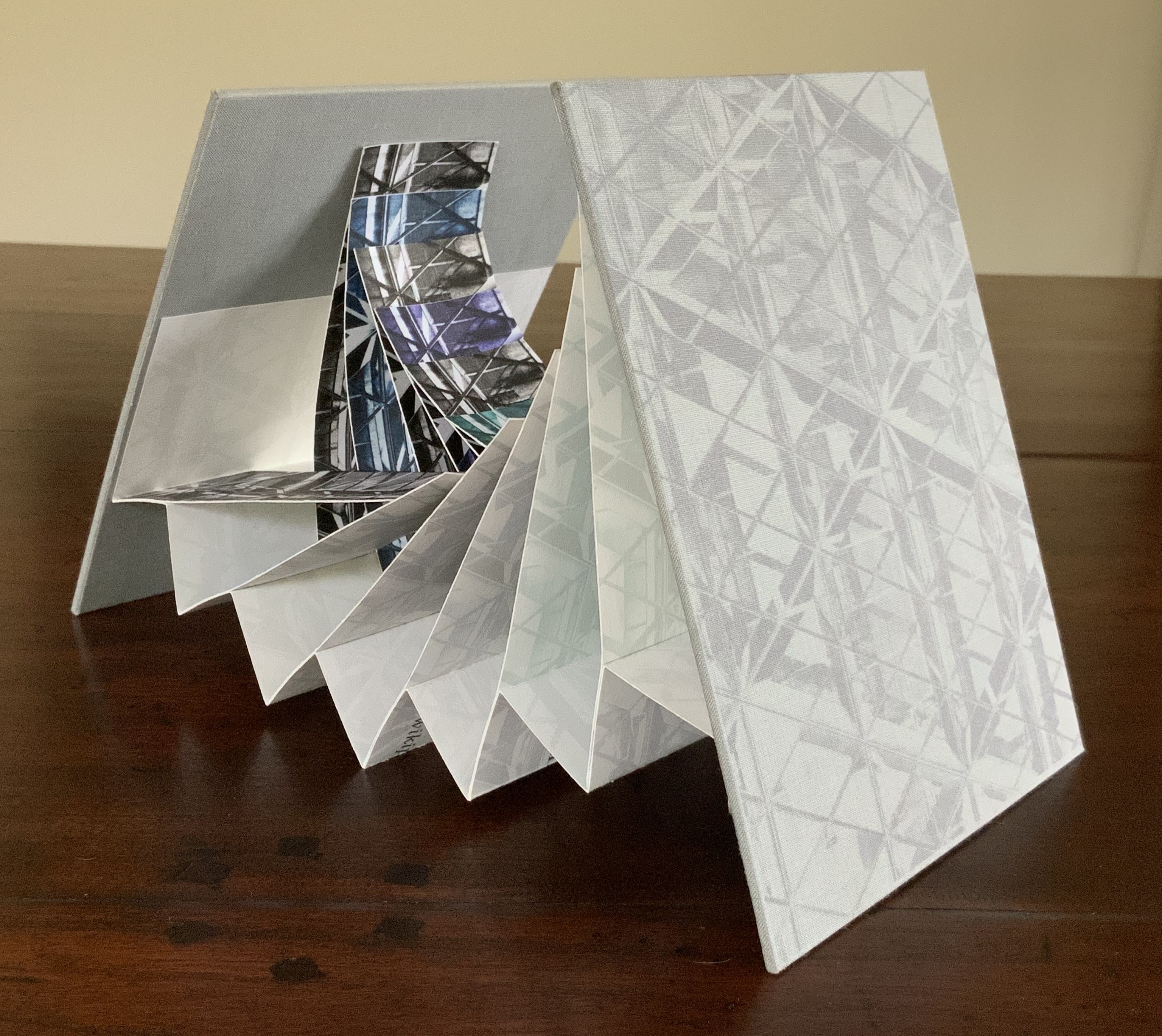
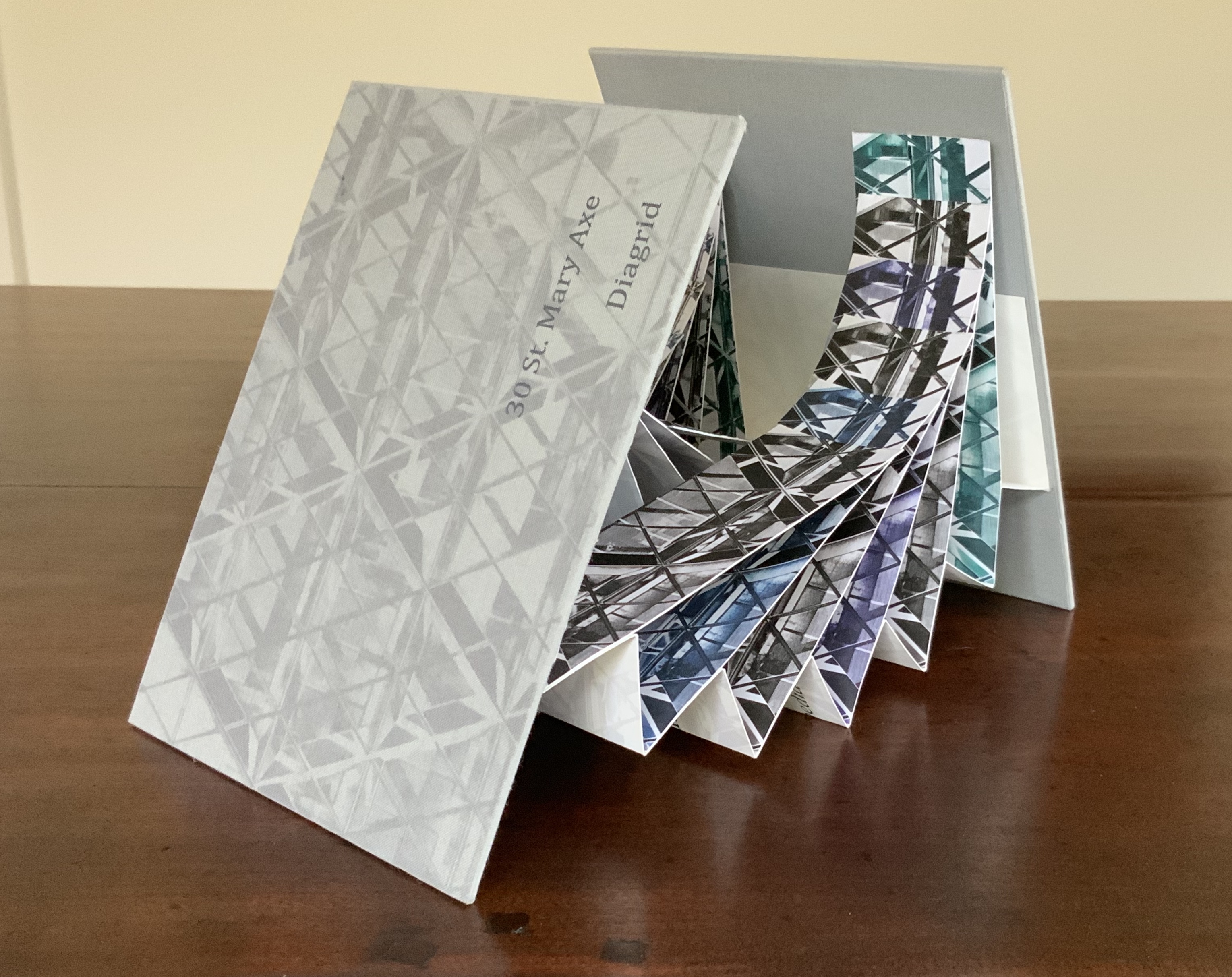
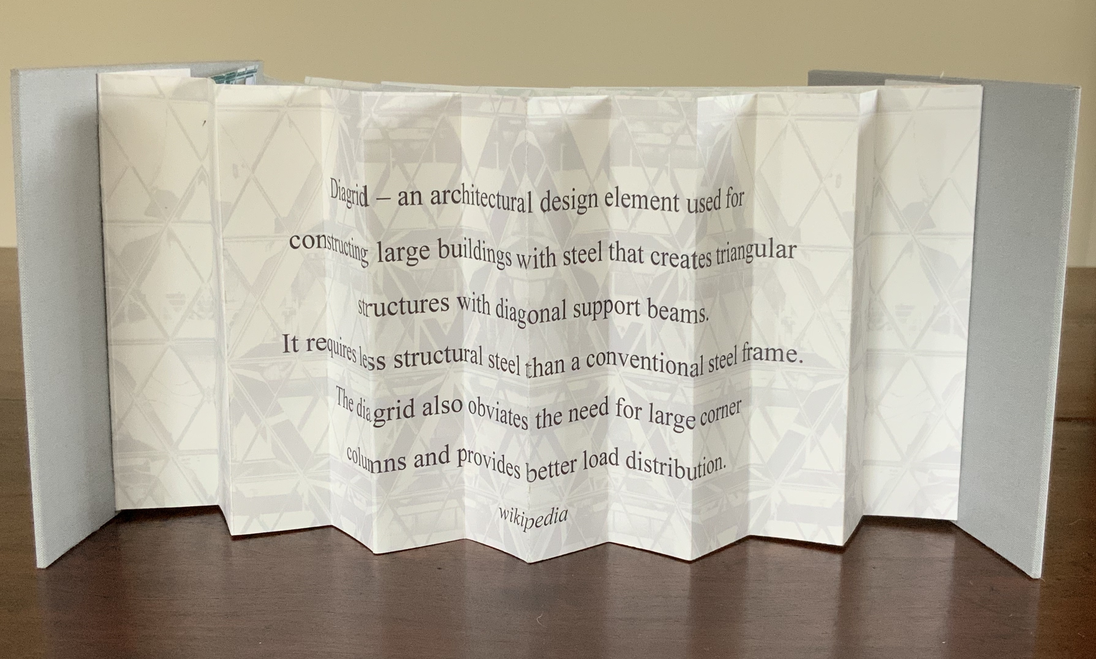
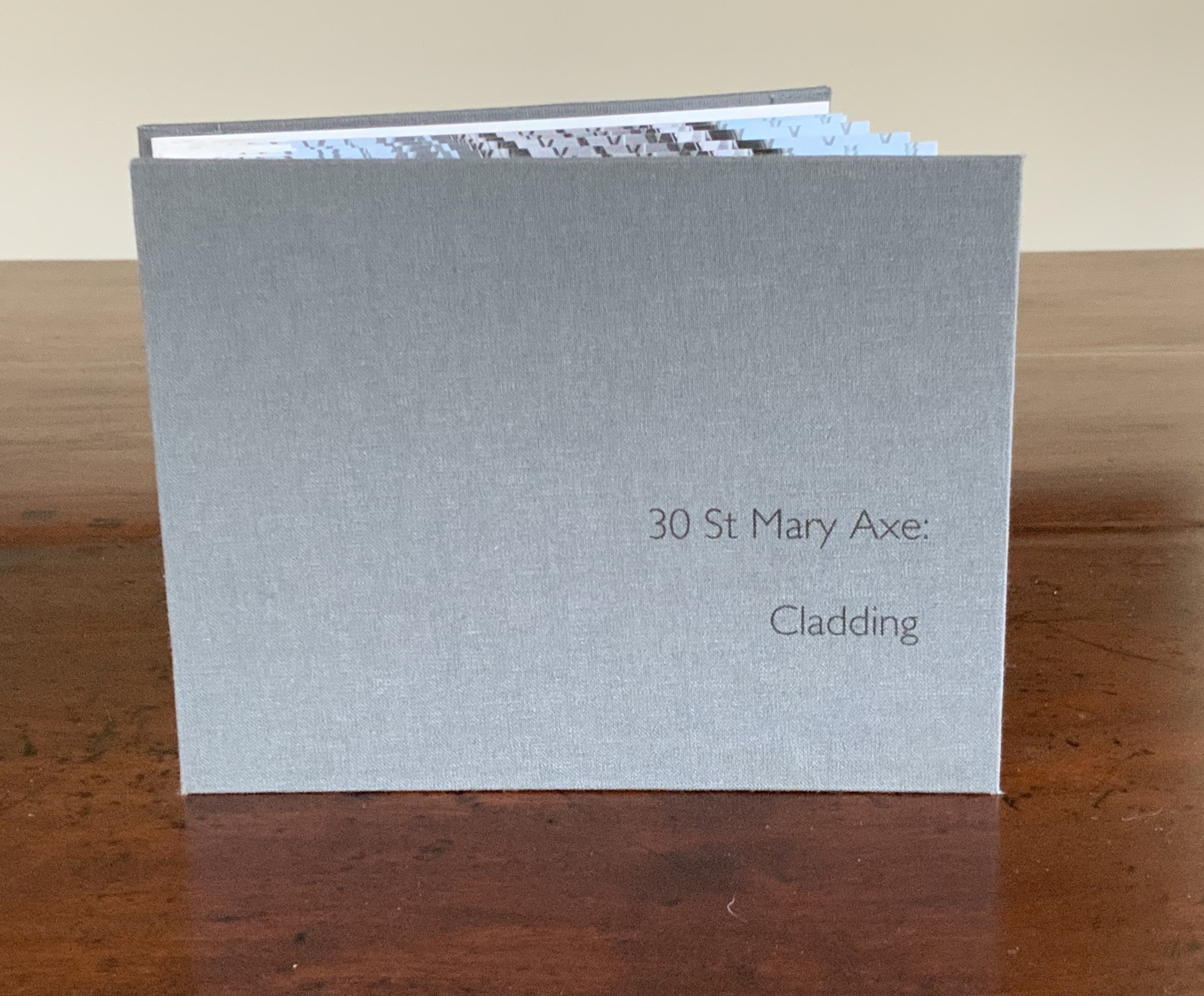
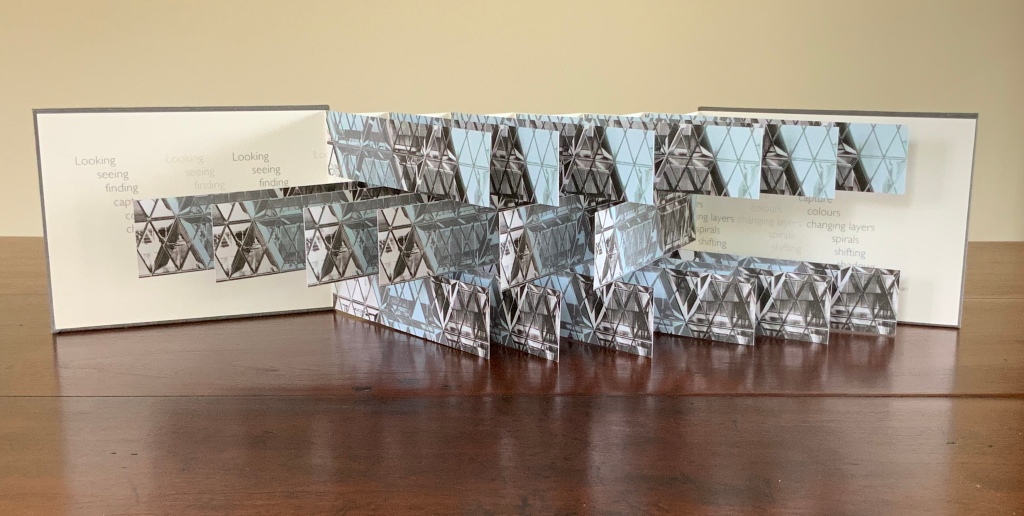
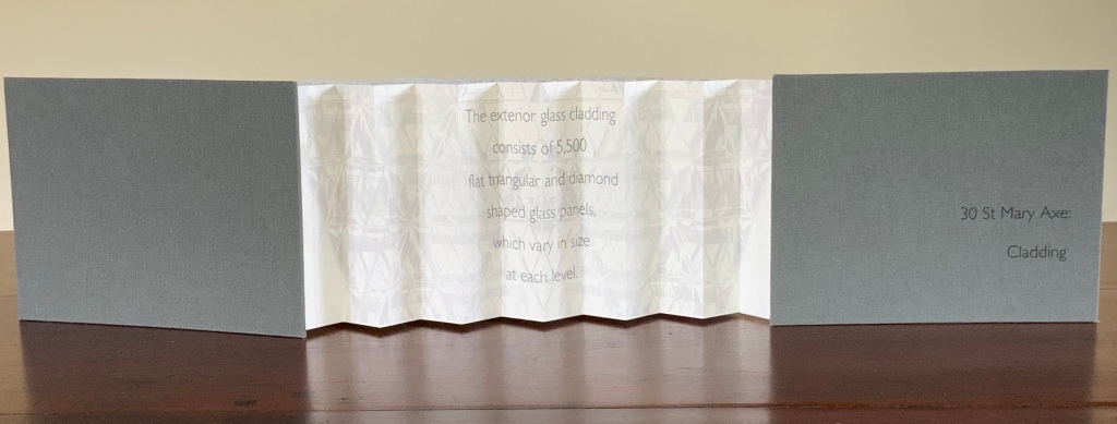
These two works — 30 St Mary Axe: Diagrid (2009) and 30 St. Mary Axe: Cladding(2009) — are among several architecture-inspired works of book art that Brannan has created. The text in one of those several — Situated — could have come straight from Pallasmaa, Bachelard or Merleau-Ponty:
Being situated is generally considered to be part of being embodied, but it is useful to consider each perspective individually. The situated perspective emphasizes that intelligent behaviour derives from the environment and the agent’s interactions with it.
30 St Mary Axe: Diagrid(2009) Mandy Brannan London has nicknamed the building at 30 St. Mary Axe “the Gherkin”. Photo: Books On Books Collection
In the The Radiant Republic (2019), Sarah Bryant (Big Jump Press) brings together concrete, wood, glass, paper, ink and embossed printing, sewn binding, box container and texts from Plato and Le Corbusier.
Note the embossed text on the verso. Across the five volumes, the embossed text is the same as that printed in ink, but it runs in fragments backwards from this last page of the last volume to the last page of the first volume. Photo: Books On Books Collection
Bryant’s insightful integration of Plato’s and Le Corbusier’s texts and ideas and her setting them in the physicality of the blond wood, linen cover, embossed type and sewn papers could easily be a response to Pallasmaa’s comment in The Eyes of the Skin: “The current overemphasis on the intellectual and conceptual dimensions of architecture contributes to the disappearance of its physical, sensual and embodied essence.” (p. 35)
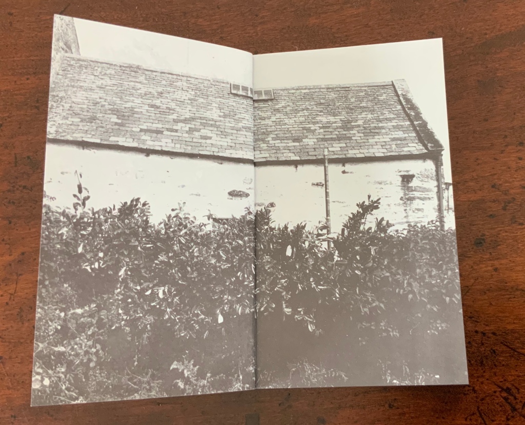
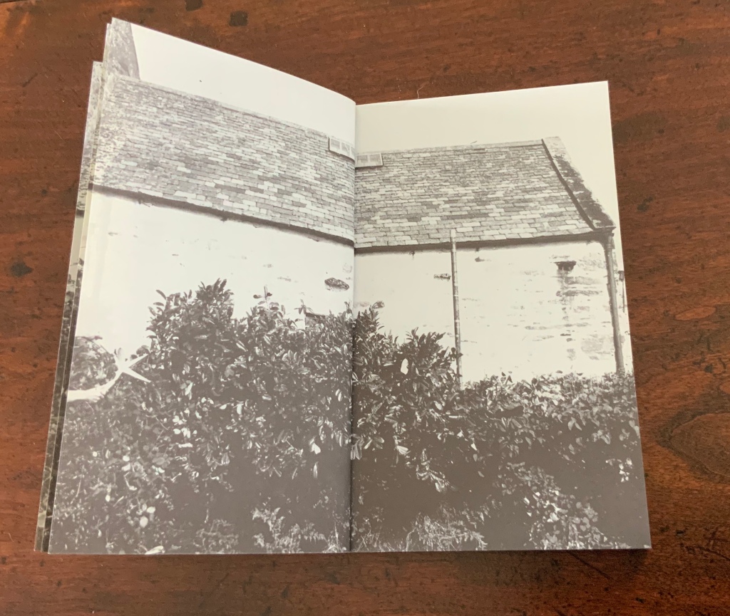
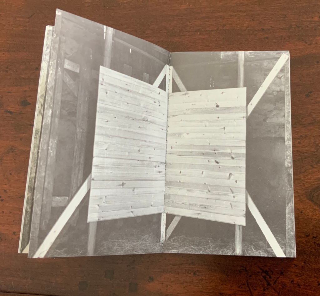
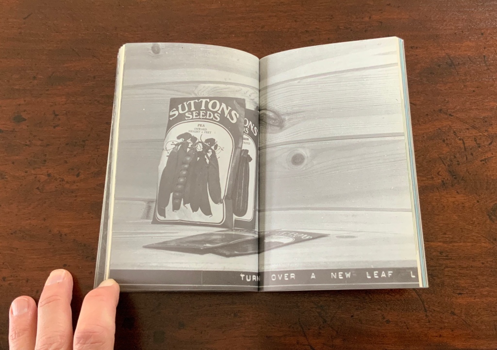
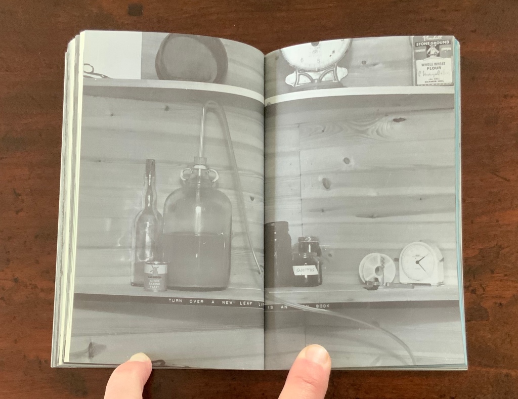
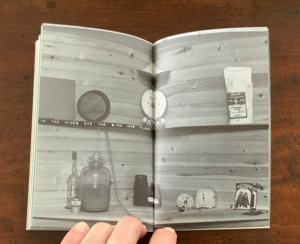
Chinese Whispers (1975) is conceptual, visual and spatial narrative that takes the reader into a “game of embedded games”: a game of Chinese Whispers used by the artists to combine the process of making a book with the process of recovering an old cottage, making a corner cupboard, making jam, making ideas and making an exit.
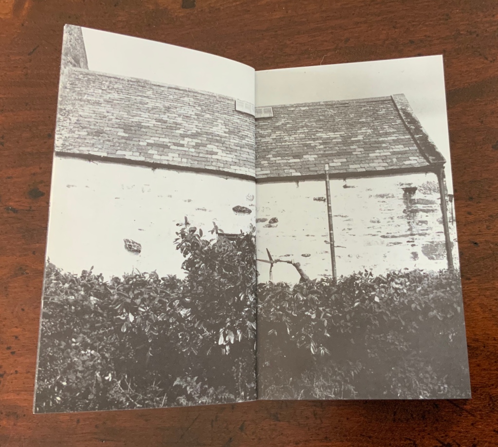
Chinese Whispers(1975) Helen Douglas and Telfer Stokes Photo: Books On Books Collection
The selection of images above begins with the front cover’s photo of a patch of grass outside an abandoned farm building and ends with the back cover’s photo of the underside of the patch of grass. In between, the pages take the viewer through the trimmed hedge and the doorway into the room, through the building, the stocking of the shelves, using of the stock and closing of the shed cupboard, and so back to the other side of the patch of grass. As Stokes explained in the Journal of Artist’s Books (Vol. 12, 1999):
We started with the corner cupboard, that was the part that occupied our thinking most, that and the two colour vignettes (as we called them) printed on different stock. But then we started to think backward to what might be before the cupboard’s construction. To the thing before that, and the thing before that, and the thing before that which was cutting of the hedge and before that which was the boot brush which we called the hedgehog- that was where the book started. Then we started to photograph from that point forward, through the book.
The work blends the features of book structure, collage and montage to create something that resonates uncannily with Pallasmaa’s approving citations of Bachelard’s central idea of the hearth and domicile as central to our time-bound “being-in-the-world”.
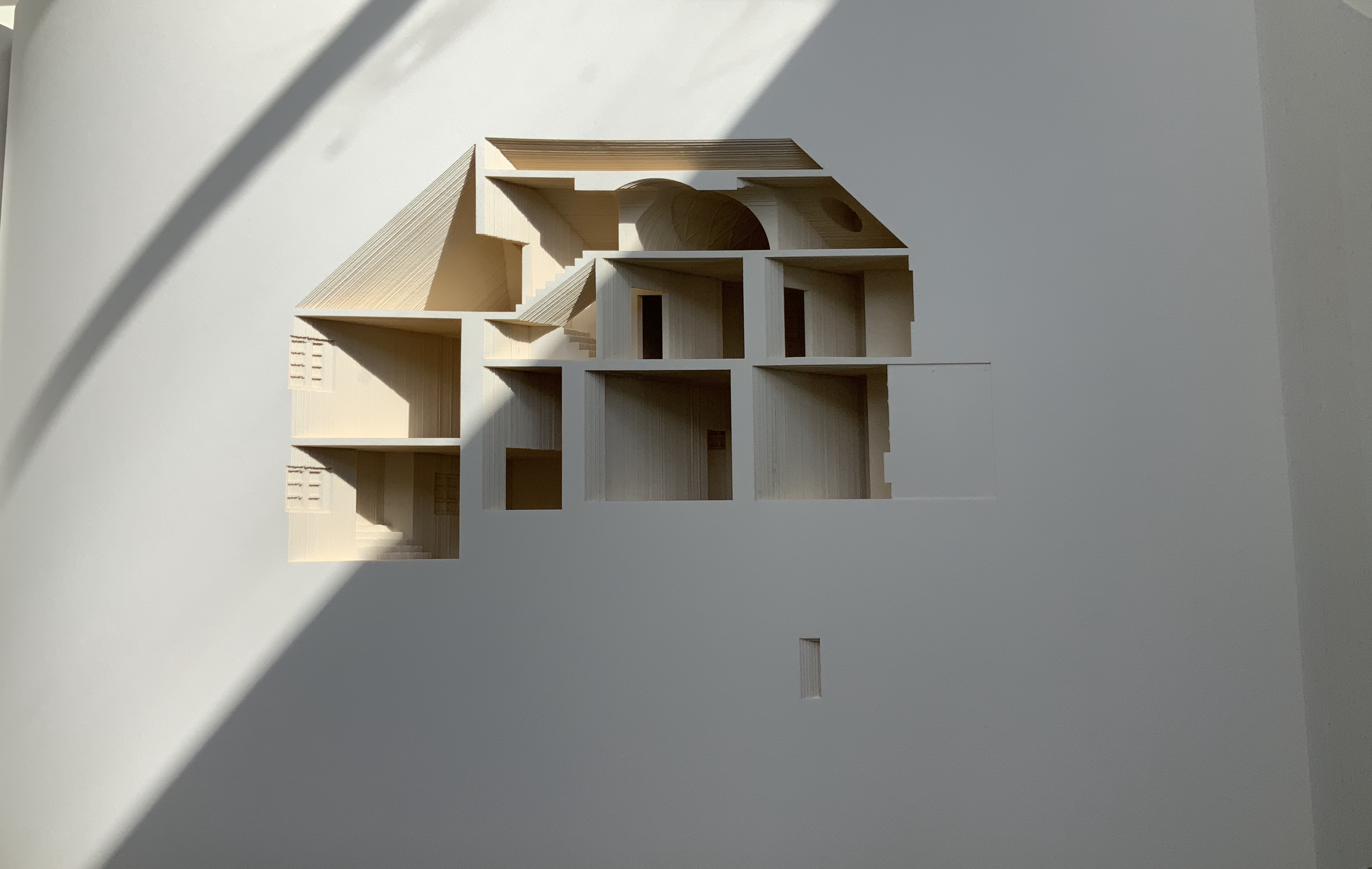
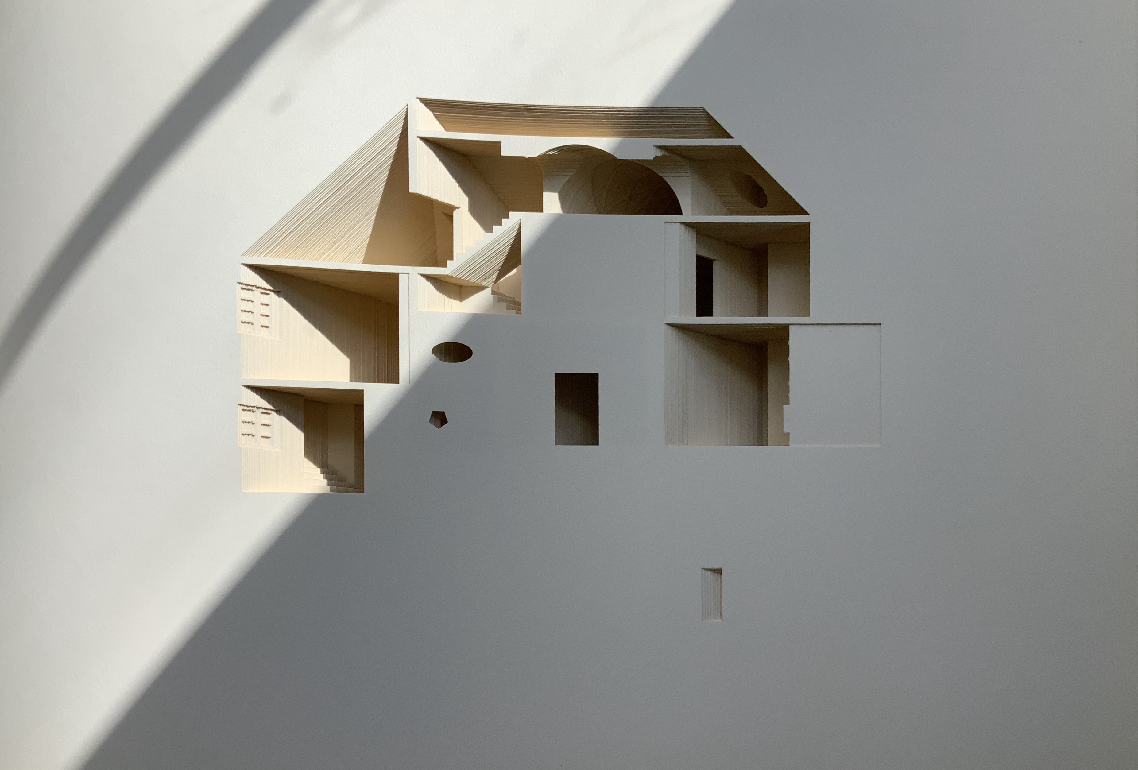
Your House is a laser-cut model of Olafur Eliasson’s residence in Copenhagen at a scale of 1:85, which means that each page equates to a 220 mm section of the actual house. How do you read a work like this — physically? At the 22″ mark in this video, the pages fall in a cascade like a flipbook, but for the most part, their size, accumulated bulk and weight — and delicacy — defy that handling. As in the video below, they must be turned slowly and carefully. Your House heeds the task of the arts as posed by the architect Juhani Pallasmaa, “in our age of speed, …to defend the comprehensibility of time, its experiential plasticity, tactility and slowness” (The Embodied Image, p. 78).
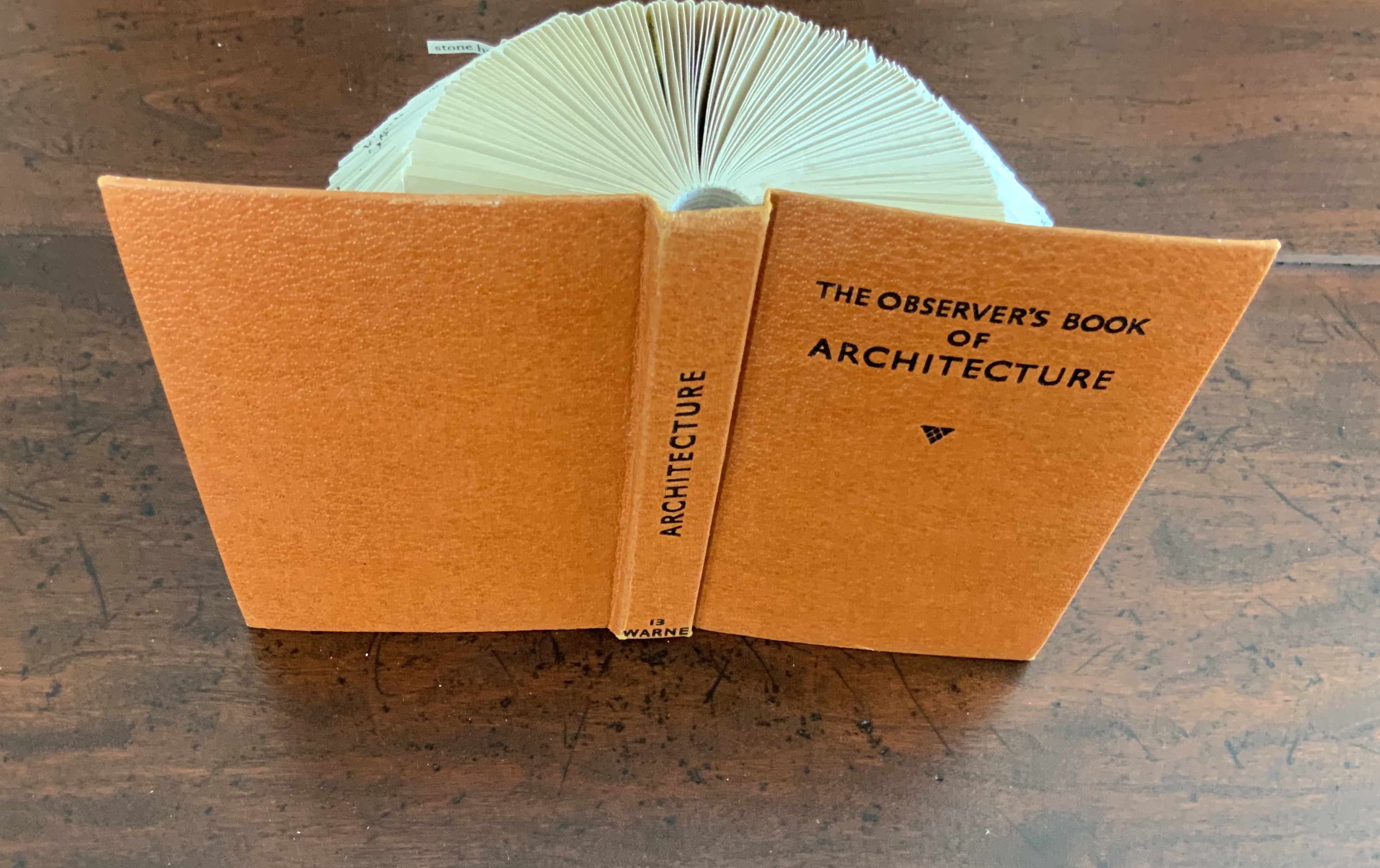
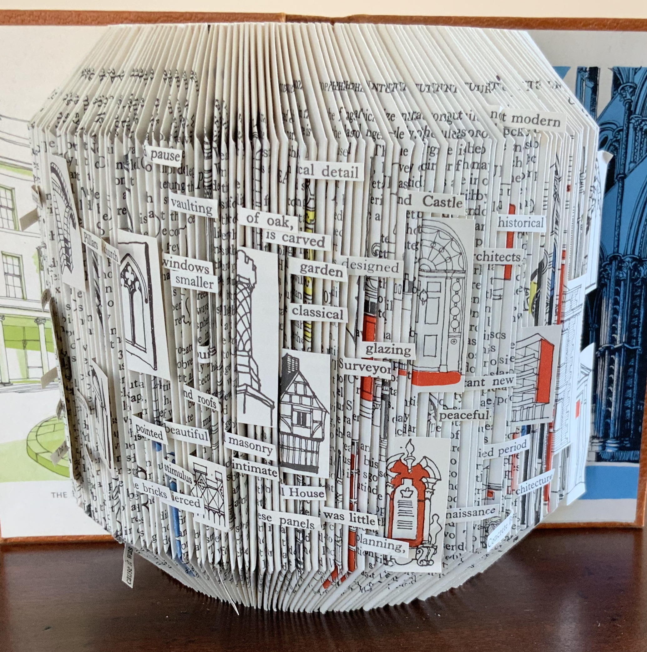
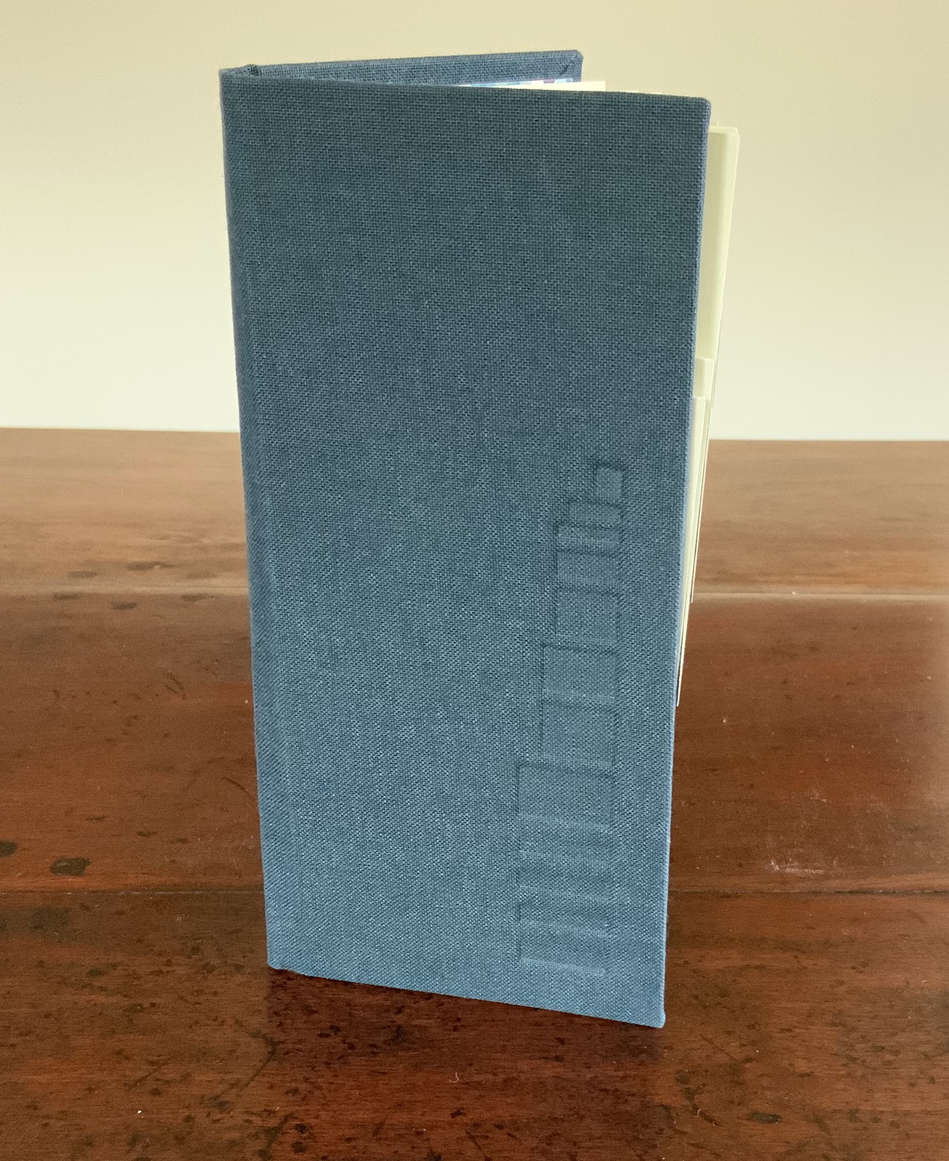
Folded book pages rarely generate a work that rises above mere craft. Heather Hunter’s Observer Series: Architecture (2009) achieves the necessary height. It combines the altered book with an accordion book that incorporates a found poem composed of the words excised and folded outwards from the folded pages of The Observer’s Book of Architecture.
The very fact of a found poem made of excised words that happen to fall at the folds shaping a column from a book on architecture chimes with the title of Bachelard’s The Poetics of Space.
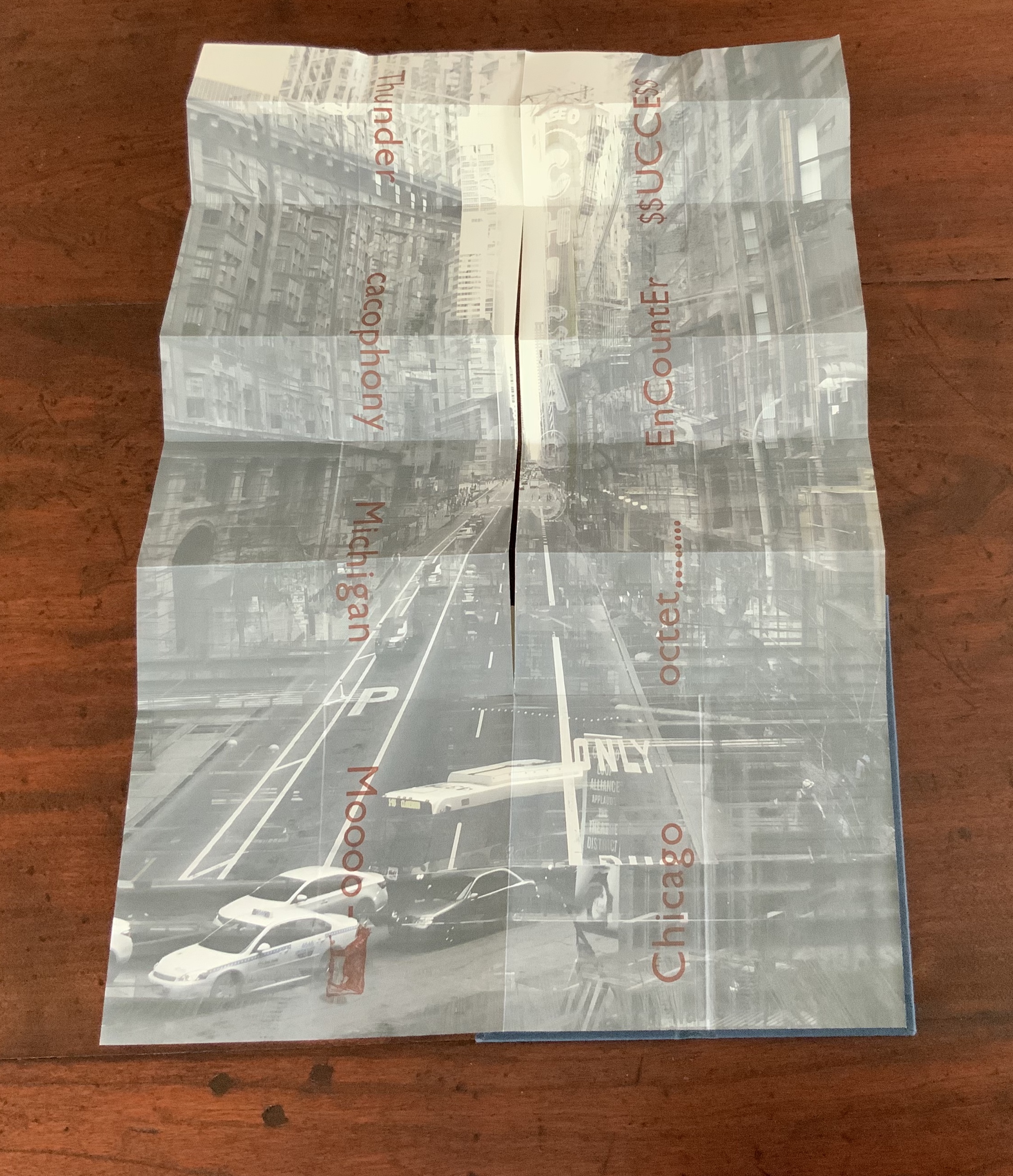
Chicago Octet (2014) byMarlene MacCallum embodies the collaborative creative approach often taken in architects’ practices. Collaborative working arises almost as frequently in book art. Think of Blaise Cendrars and Sonia Delaunay, Helen Malone and Jack Oudyn, Julie Chen and Clifton Meador, Robin Price and Daniel Kelm. Many more can be added. As described by MacCallum:
From May 19 – 26, 2014 a group of eight gathered at the Columbia College Center for Book and Paper Arts for a final collaborative project. This event was organized by Clifton Meador and myself and included David Morrish, Scott McCarney, and four Grenfell Campus BFA (Visual Arts) grads, Stephen Evans, Maria Mercer, Virginia Mitford, and Meagan Musseau…. The letterpress printing consisted of a word selected by each participant printed on one of Scott’s folded structures. The images were a digital layering of every cityscape photograph that I made and then inkjet printed on top of the letterpress. The final folded structure was designed by Mary Clare Butler. The case was designed and built by Scott McCarney, the front cover embossment was by David Morrish and Clifton Meador.
Chicago Octet(2014) Marlene MacCallum Hand bound artist’s book with folded paper structure, letterpress and inkjet printing, 6.5 × 3 × 0.5 inches (closed dimension). Photo: Books On Books Collection
Photo: Books On Books Collection
Chicago Octet fully unfolded, 17.5 × 11.5 inches Photo: Books On Books Collection
Can you hear the traffic and sense the layers of experience? What Pallasmaa writes here of rock art in Africa and Australia reminds me of Chicago Octet (or is it vice versa?): “
At the same time that great works of art make us aware of time and the layering of culture, they halt time in images that are eternally new. … Regardless of the fact that these images may have been painted 50,000 years ago, … we can … hear the excited racket of the hunt.The Embodied Image, p. 109.
Sacred Space(2003) is an intimate monument of book art. Made intimate by the content and texture of its book, made more intimate by the viewer’s having to construct the chapel. Made monumental by the echo of typographic history, made more monumental in Galileo Galilei’s echo from its floor: Mathematics is the alphabet with which God has created the universe.
Sacred Space (2003) Jeffrey Morin and Steven Ferlauto Book: Reduction linoleum prints with typographic illustrations using overprinting of letterforms; open spine sewn with brown cord binding; brown cloth-covered boards; title and design on front board; endpapers of handmade paper from Nepal. Book: 6 x 14.25″; 17 leaves. Chapel kit: Six walls, roof, base. Walls: copper rod skeleton with Okawara rice paper skin covered with a casting resin. Book and kit housed in wooden box. Roof copper-leafed Davey board. Roof forms the tray in which the book rests. Base: Box lid becomes the base for the chapel. Brass holes in the base allow the rods to fit exactly. Print pattern on the base becomes the floor pattern. Box painted with copper leaf. Sculpture base 15.75 x 11.5″, height 12″. Edition of 35, of which this is #23. Photo: Books On Books Collection.
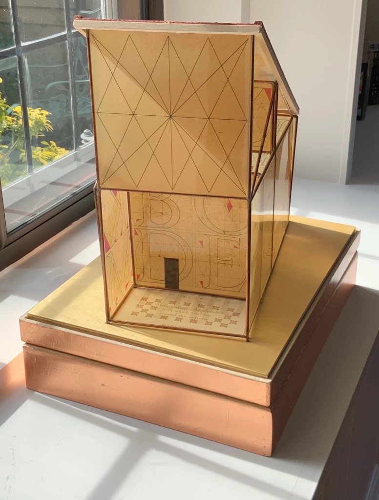
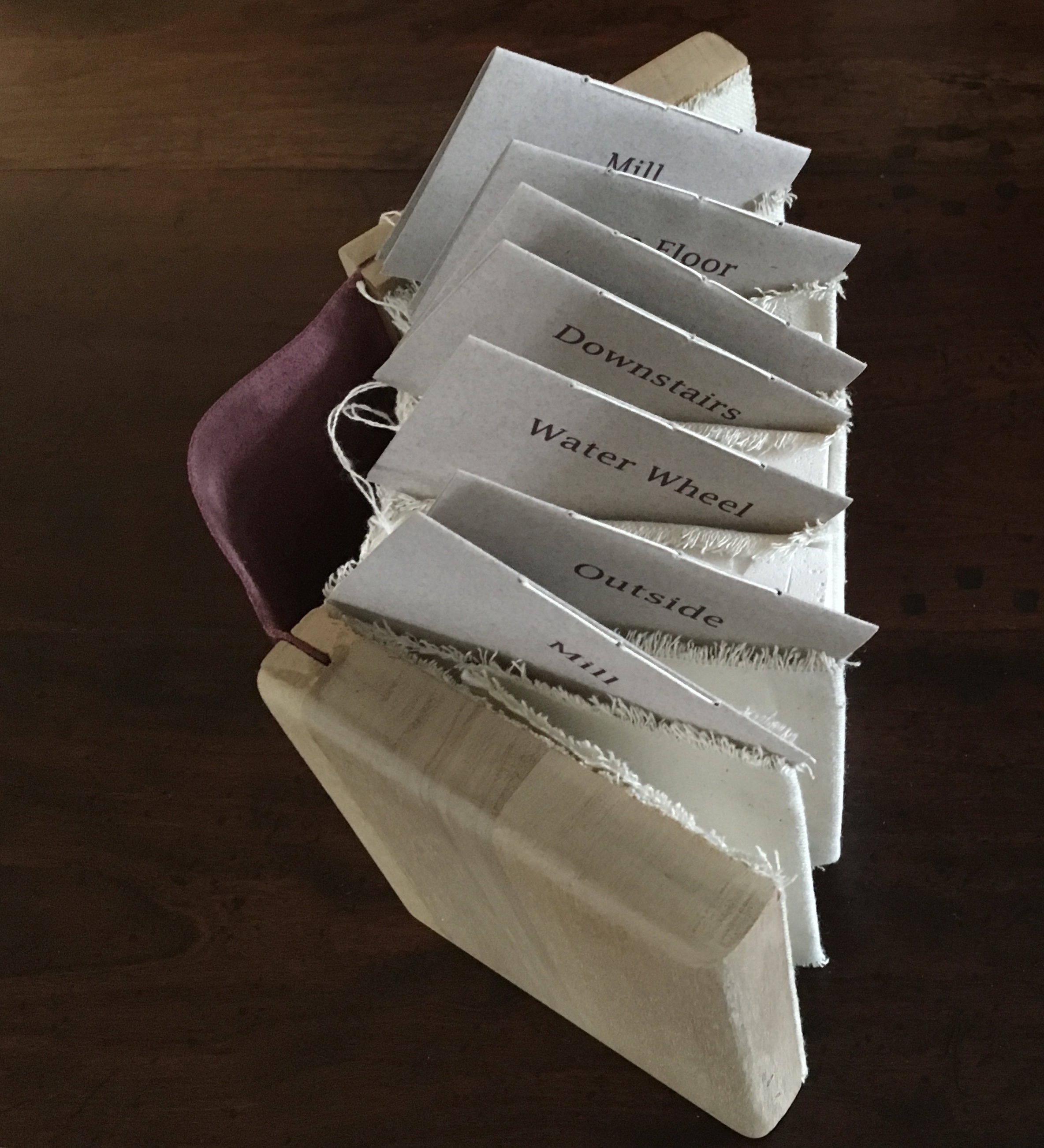
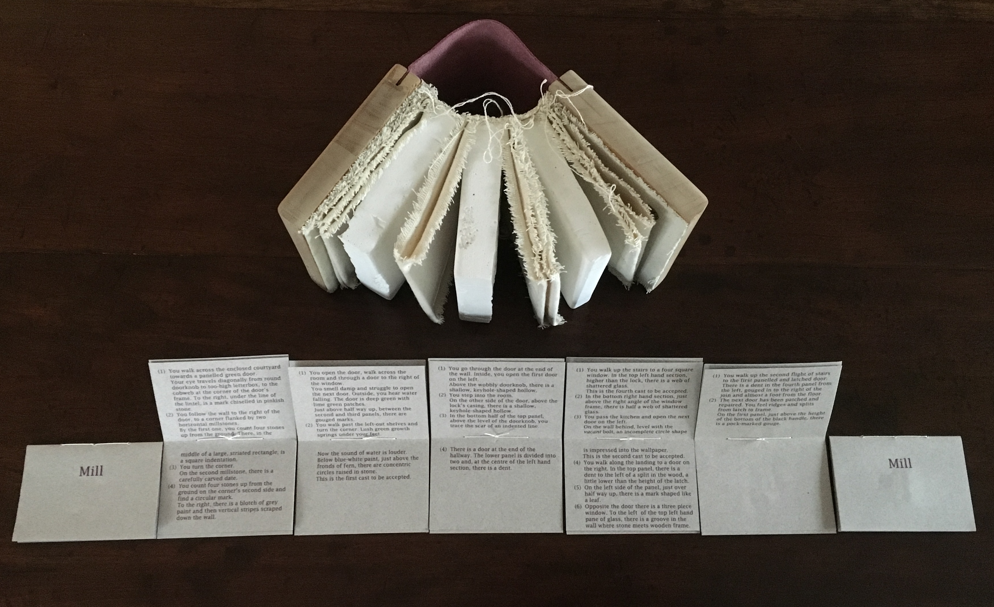
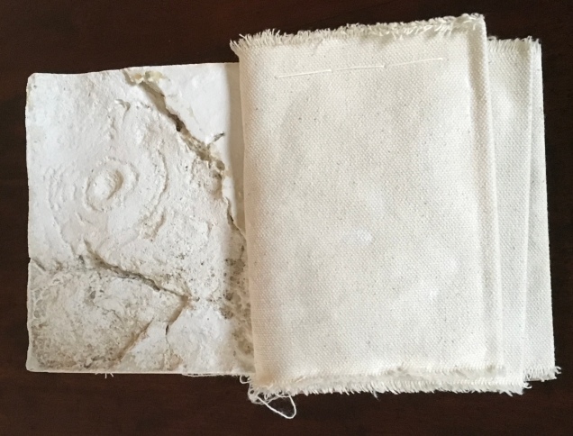
Mill: A journey around Cromford Mill, Derbyshire (2006) is the result of the artists’ exploration of Cromford Mill in Derbyshire, the first water-powered, cotton-spinning mill developed by Richard Arkwright in 1771. Solid, plaster cast blocks are held softly between calico pages containing hidden texts, bound in recycled wooden library shelf covers that indicate there is history to be found within.
Mill: A journey around Cromford Mill, Derbyshire (2006) Salt + Shaw (Paul Salt and Susan Shaw) Photo: Books On Books Collection
Having Mill is like having the building inside your house.
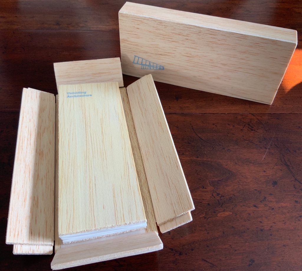
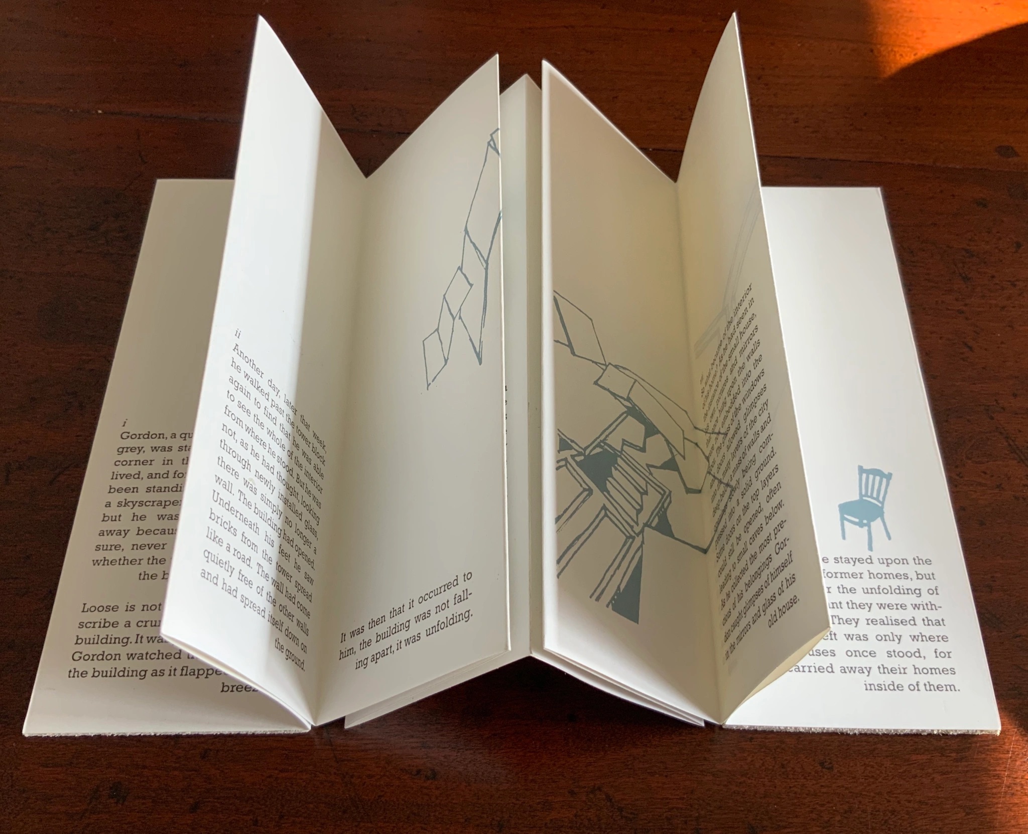
When Emily Speed is not creating architectural costumes for architectural performative art, she creates artist’s books to express her inner edifices. Unfolding Architecture (2007) coheres title, metaphor, narrative, image, technique of silk-screening, letterpress, texture of paper and wood, the workings of the accordion and box enclosure — all — into an artwork about un-cohering.
Unfolding Architecture(2007) Emily Speed Double-sided accordion book, attached to balsa wood covers, housed in a hinged, covered box of balsa wood. Book – H190 x W70 x D18 mm (closed), H190 x ~W2280 (open); Box – H203 x W88 x D63 mm; 24 panels, including cover panels. Edition of 90, of which this is #7. Acquired from the artist, 24 October 2020.
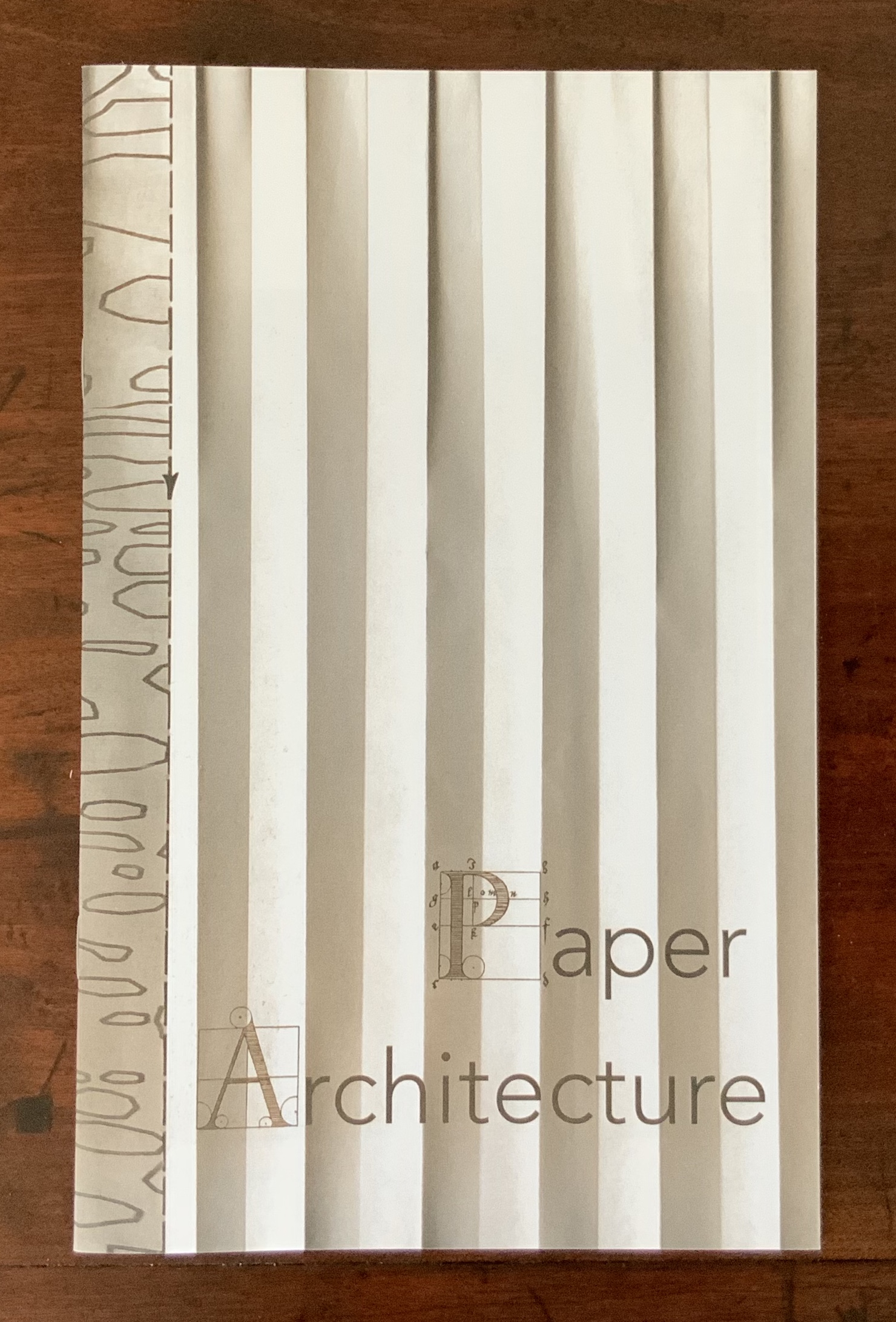
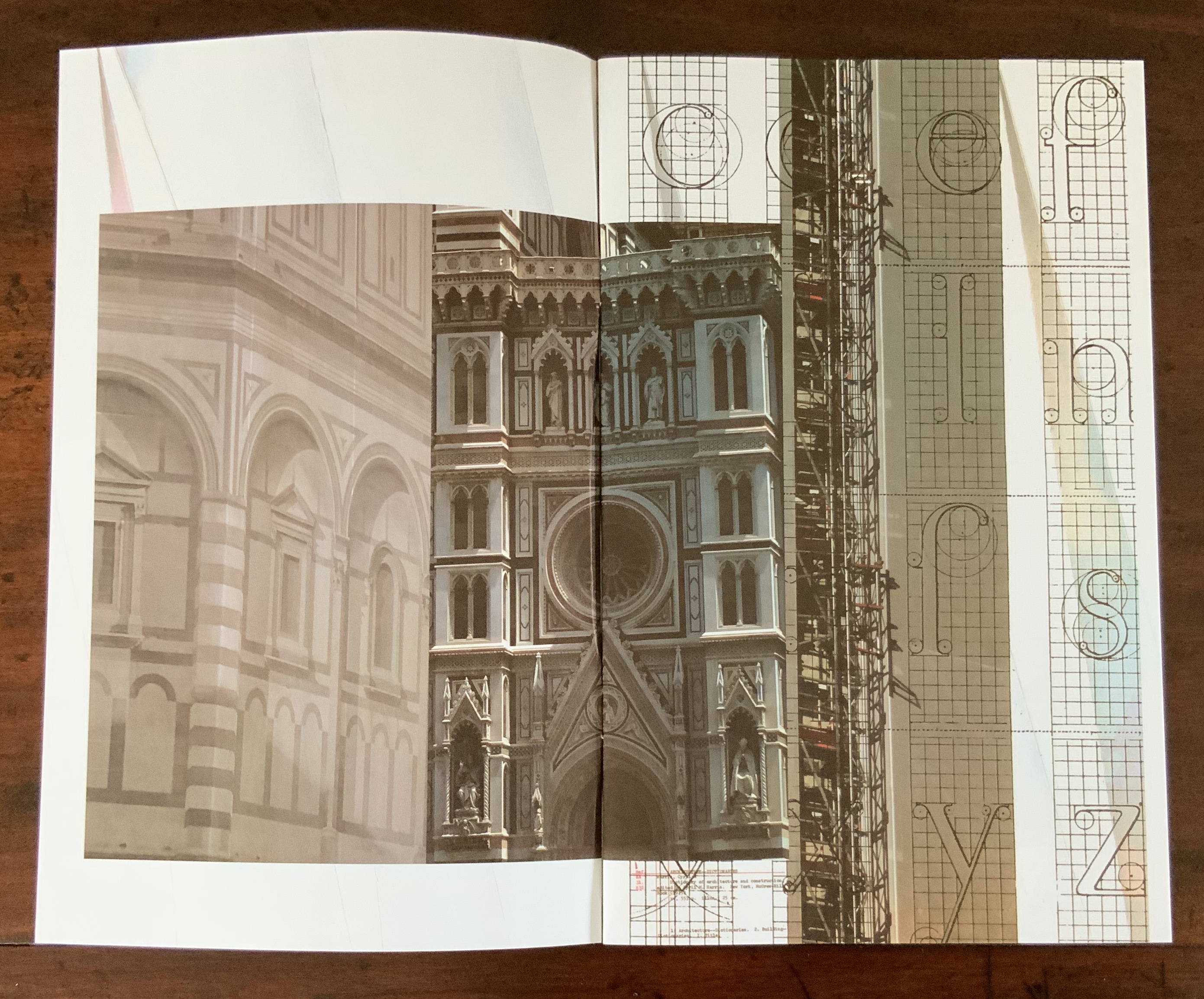
Architecture plays more than an inspirational role in Karen Wirth’s portfolio. As mentioned above, she has created her own take on Vitruvius’ Ten Books. She designed the Gail See Staircase at Open Book and the Hiawatha Light Rail Station, both in Minneapolis. The collage work Paper Architecture is based on an architectural installation at the Minnesota Center for Arts Design and draws on Wirth’s photos of Ayvalik, Amsterdam, Florence, Istanbul, New York City, Rome, San Diego and Venice.
In The Embodied Image, Pallasmaa singles out “the collaged image” as creating “a dense non-linear and associative narrative field through initially unrelated aggregates, as the fragments obtain new roles and significations through the context and dialogue with other image fragments” (pp.71-72). The materially disparate words in the title of Wirth’s work imply the dialogues she creates among paper, designs of letters and architecture, buildings across time and the globe, and photos tinted, four-colour, and black-and-white in palimpsest.
For Wirth’s own comments about the intersection of book art and architecture, see her interview with Betty Bright.
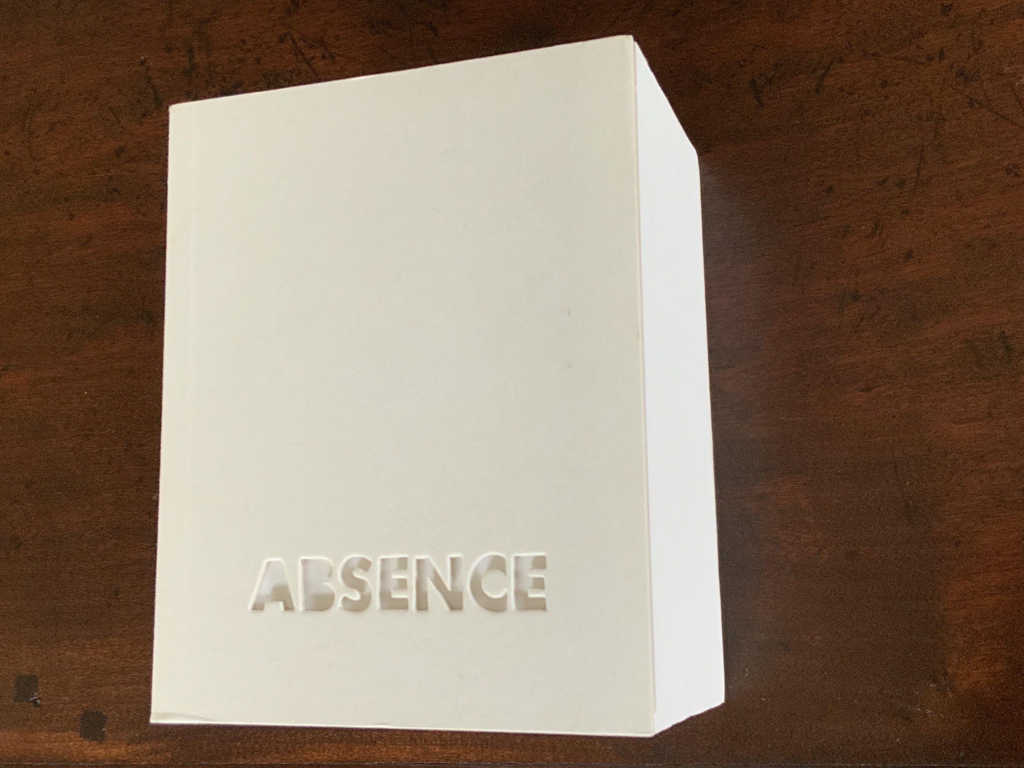
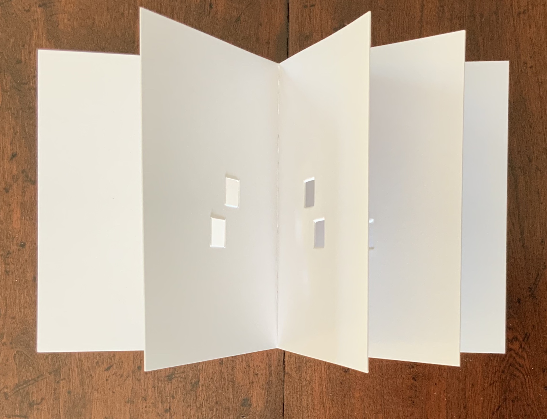
Former professor and head of the Department of Architecture at MIT’s School of Architecture and Planning, Yoon is now Gale and Ira Drukier Dean of the College of Architecture, Art and Planning at Cornell University. She is also cofounder of Höweler + Yoon, a design-driven architecture practice. Absence appears to be her only work of book art so far.
When you hold this small white brick of paper and turn its thick pages, a small pinhole appears on the page. Then two larger square holes emerge, one of which falls over the pinhole. Page after page, the two square holes repeat, creating two small dark wells in the field of white, until on the last page they take their place in the cut-out schematic footprint of the city blocks and buildings surrounding the Twin Towers of New York City. What you hold in your hands at the end is an object of art and book of memorial prayer.
Absence (2003) J. Meejin Yoon Photo: Books On Books
Other sites, other works
Twice a semester, the Environmental Design Library at the University of California, Berkeley hosts “Hands On: An Evening with Artists’ Books”. In 2017, one evening’s theme was “Building on the Built”, illustrated by 25 works of book art. Organised by 23 Sandy Gallery in the same year, “BUILT“ was an international juried exhibition featuring 66 artist books by 51 artists examining the relationship between contemporary book art practices and architecture, engineering, landscape and construction.
Arranged alphabetically by artist’s name, this section provides links to works from these two exhibitions as well as other collections, exhibitions, installations and recommendations from the Book-Arts listserv members.
A Crisis Ethicist’s Directions for Use: Or How to be at Home in a Residence-cum-Laboratory (2003) Inge Bruggeman Photos: Courtesy of the artist
On her site, Bruggeman writes, “This book/box project is built around excerpts from Architectural Body by Madeline Gins and Arakawa…. incorporates a blueprint of their Bioscleave House as part of the imagery….”. Somewhat like A Clockwork Orange or perhaps more like Heideigger’s tomes, the Gins and Arakawa book is a challenge to the reader’s expectations of diction and syntax.
Richard Minsky: Model of Buckminster Fuller’s Tetrascroll (1979). See also Polly Lada-Mocarski, Richard Minsky and Peter Seidler, “Book of the Century: Fuller’s Tetrascroll“, Craft Horizons, October 1977 (Vol. 7, No. 35). For one (very helpful) reading of Tetrascroll see Jessica Prinz’s “The ‘Non-Book’: New Dimensions in the Contemporary Artist’s Book” in The Artist’s Book: The Text and its Rivals, a special two-issue volume of Visible Language, Vol. 25, Nos. 2/3, edited by Renée Riese Hubert (Providence, RI: Rhode Island School of Design, 1991), pp. 286-89.
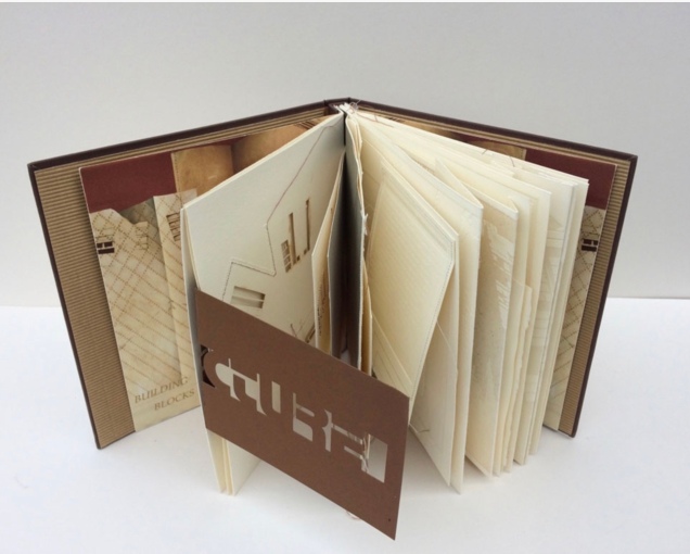
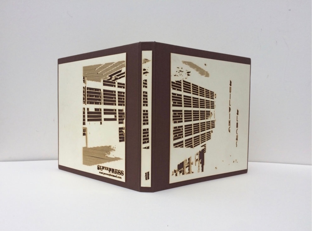
Building Blocks Book XVII (2017) Sumi Perera Photos by artist’s permission
Going against the usual structure of the book, that of a beginning, a middle and an end, Perera provides a space for infinite possibilities and multiple authors, creating “modules that can be re-sequenced and re-aligned to develop variable permutations and encourage participatory involvement, to share the final editorial control with the viewer to transform the ever-evolving work”.These possibilities for variable permutations are no more evident than in her constantly evolving project, Building Blocks Book, and its numerous subsequent iterations including The Negative Space of Architecture and The House That Jack Never Built (2008). Once again we find Perera exploring human interaction, not only with the concepts and her quizzical ideas surrounding architectural and public spaces and how we build between and move within, but also the physical interaction with the artists’ books she produces – the rearrangement and reinsertion of pages which allow the audience and participants new opportunities and pathways to proceed. Through the positive and negative space of the page or the type font, the Underground versus over ground, the artist takes us on journeys that are at once fluid and at other times obstructive. In these cityscapes, the U-turn is as common as the page turn – a necessary rupture in a free-flowing narrative. Chris Taylor, From Book to Book (Leeds: Wild Pansy Press, 2008).
Robbin Ami Silverberg: Home Sweet Home (2006). Artist’s description — “an architectural album of an imaginary middle-class suburban house, … its plans and layout [filled] with the many proverbs I’ve found about women in the home. The book was printed to look like the almost obsolete technique of Diazo printing (blue-printing), but in fact, it is archival inkjet.”
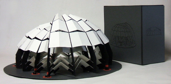
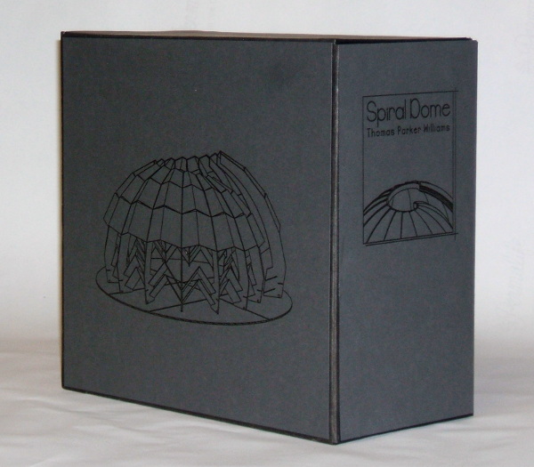
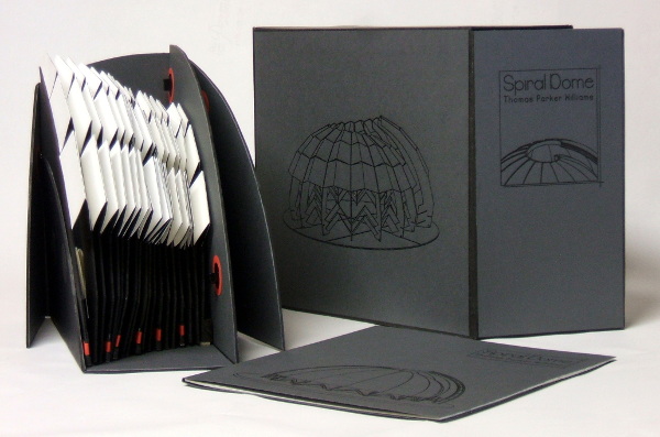
Spiral Dome: Sculptures in Paper and Steel (2016) Thomas Parker Williams Photos: Courtesy of the artist
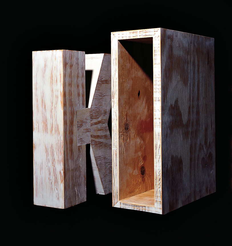
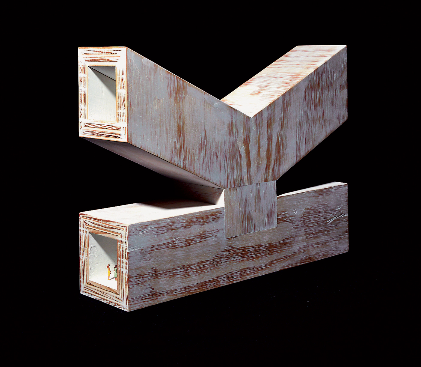
Update: With the addition of Marian Macken’s book Binding Space, mentioned above, comes the Vedute Foundation, a collection of objects/manuscripts by artists/designers/architects created within the constraint that each work has the proportion of the Gutenberg Bible and the relationship of ‘Text’ and ‘Form’ as its subject. For this essay in Books On Books and for the Books On Books Collection’s acquisition of the Merrion edition of Johann David Steingruber’s Architectural Alphabet, the most apropos and favorite work in the Vedute collection is K (1996) by Peter Wilson.
K(1996) Peter Wilson “This contribution (a double volume) is based on the letter ‘K’ (an atom of language), materialised within the Gutenberg proportions in sturdy plywood. It is the responsibility of an architect not only to ‘give form’ but also to explore latent interiorities, potential spatialities. Here the ‘K’ interior has its own inherent geometric agenda − a tunnel, a tube, an inverting telescope (apex mirror). Object becomes instrument (a window to the antipodes even), a trigger for multiple ‘K’ vectors (textural and spatial).” Bolles+Wilson
23 Sandy Gallery. 2017. Built: an international exhibition of contemporary artist books, April 7-May 27, 2017. Portland, Oregon: 23 Sandy Gallery. “… examining the relationship between contemporary book art practices and architecture, engineering, landscape and construction as form, function and structure. Book artists took this opportunity to re-image the ways we as designers, of either books or buildings can inhabit and shape the world around us. Our disciplines have a natural synergy. After all, books and buildings are both kinetic, sequential, structural and time based. BUILT examines the relationship between the built and the book. BUILT features 66 artist books by 51 artists from across the country and as far away as Canada, United Kingdom and Australia.” Publisher’s website.
Sophia Kramer, “Variations of Vitruvius: Four Centuries of Bookbinding and Design”, The Met, 22 August 2018. This essay reviews and illustrates the conservation and rehousing of ninety-five copies of De Architectura libri decem (The Ten Books of Architecture) by Marcus Pollio in the collection of the Department of Drawings and Prints. They are part of a donation of 356 publications from the architect William Gedney Beatty (1869–1941). For book artists, the section on a 1556 edition with double volvelles to display a theater design should be of interest.
Marian Macken, Binding Space: The Book as Spatial Practice (London: Taylor and Francis, 2018). A trained architect and book artist, Macken articulates and illustrates the how and why of the overlap between architecture and book art.
David Sume, The architectural nature of the illustrated books of Iliazd : (Ilia Zdanevich, 1894-1975, University of Montreal, 2019. This dissertation is a reminder that the importance of architecture to book art reaches back to the avant-garde and modernists of the early 20th century — and more important, that its importance may lie beneath the surface.
Elizabeth Williams, “Architects Books: An Investigation in Binding and Building”, The Guild of Book Workers Journal, Volume 27, Number 2, Fall 1989. This essay not only pursues the topic of architecture-inspired book art but turns it on its head. An adjunct professor at the time, Williams set her students the task of reading Ulises Carrión’s The New Art of Making Books (Nicosia: Aegean Editions, 2001) then, after touring a bindery, “to design the studio and dwelling spaces for a hand bookbinder on an urban site in Ann Arbor, Michigan”. But before producing the design, the students were asked “to assemble the pages [of the design brief and project statement] in a way that explored or challenged the concept of binding”. In other words, they had to create bookworks and then, inspired by that, create their building designs. Williams illustrates the essay with photos of the students’ bookworks. [Special thanks to Peter Verheyen for this reference.]
Monique Lallier: A Retrospective Guilford College Art Gallery
North Carolina can be a quiet state of hidden gems. Particularly those of the book arts, book art and publishing variety. The art gallery fronting the library on the Quaker-founded Guilford College campus in Greensboro is one such gem. Within that gem for the next two months is another. The Gallery’s director and curator Theresa N. Hammond has marshaled its collection of Monique Lallier’s bindings and dozens of others from around the world for a retrospective on forty-six years of work by Lallier.
Lallier’s roots are in the tradition of fine French binding, which goes back to the practice of book buyers’ purchasing unbound books and taking them to their favorite specialist binder for customized binding, most often in leather. Lallier has written here about the technique in detail. While it is true to call Lallier a bookbinder, it misses what the displayed works say she is: a sculptor and artist of the book. For anyone lucky enough to visit Guilford College Art Gallery, the comments and photos below offer a handful of pointers to details and background supporting that statement. The exhibition catalogue including an insightful essay by Karen Hanmer as well as multiple views of the works displayed and several outside the exhibition will clinch the argument.
Be sure to take in all angles provided by the mirrors behind many of the works. Theresa N. Hammond, the Gallery’s director and curator, reflected here behind La Lune (1971) and its swiveling “phases of the moon”, rounds coated in eggshells of differing colors.
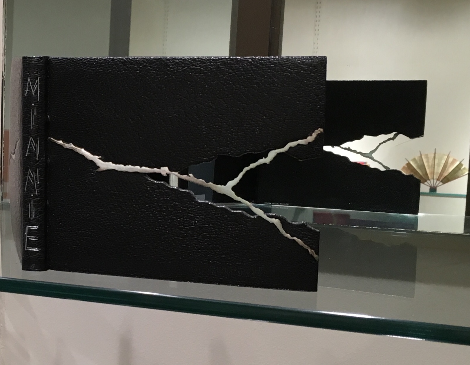
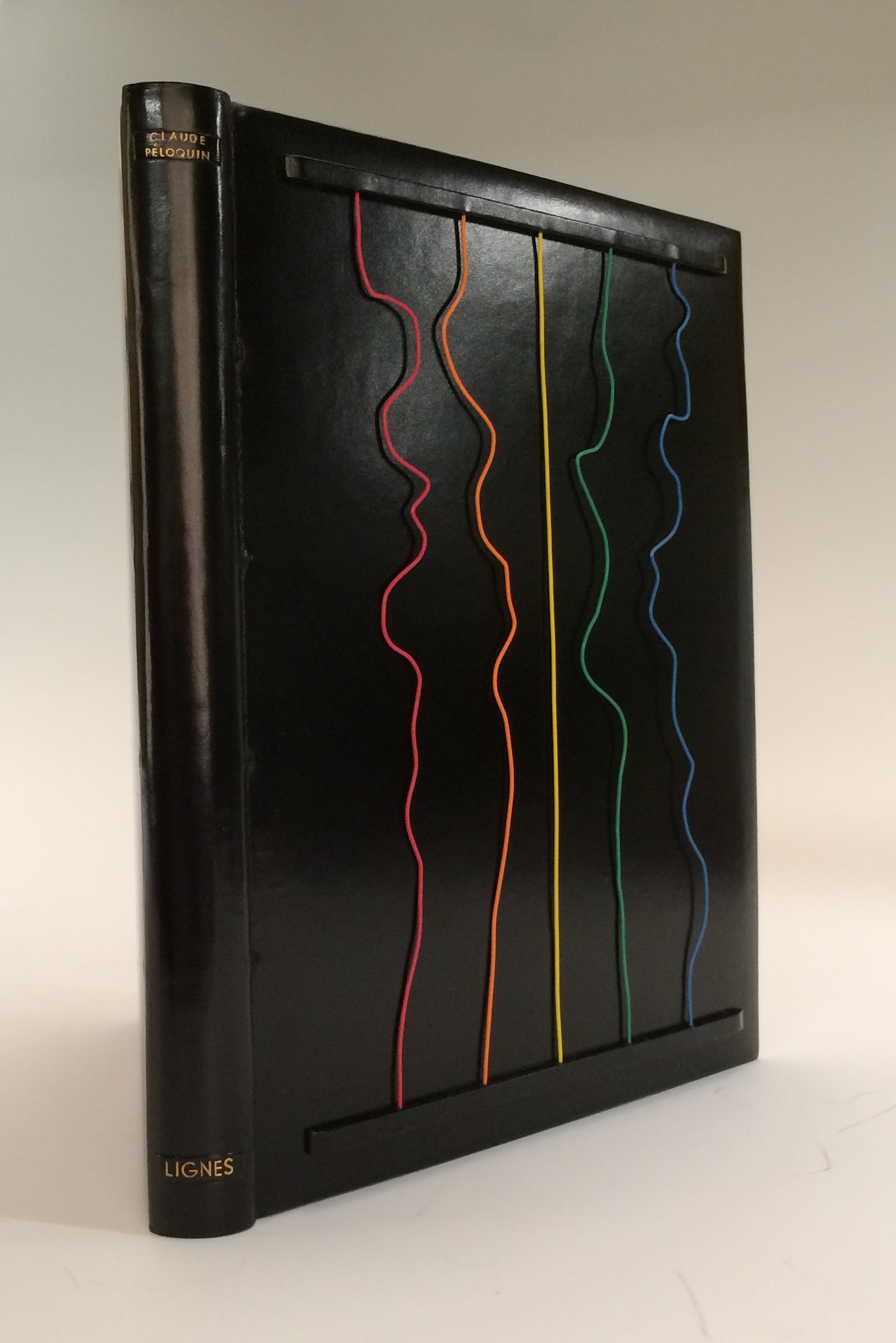
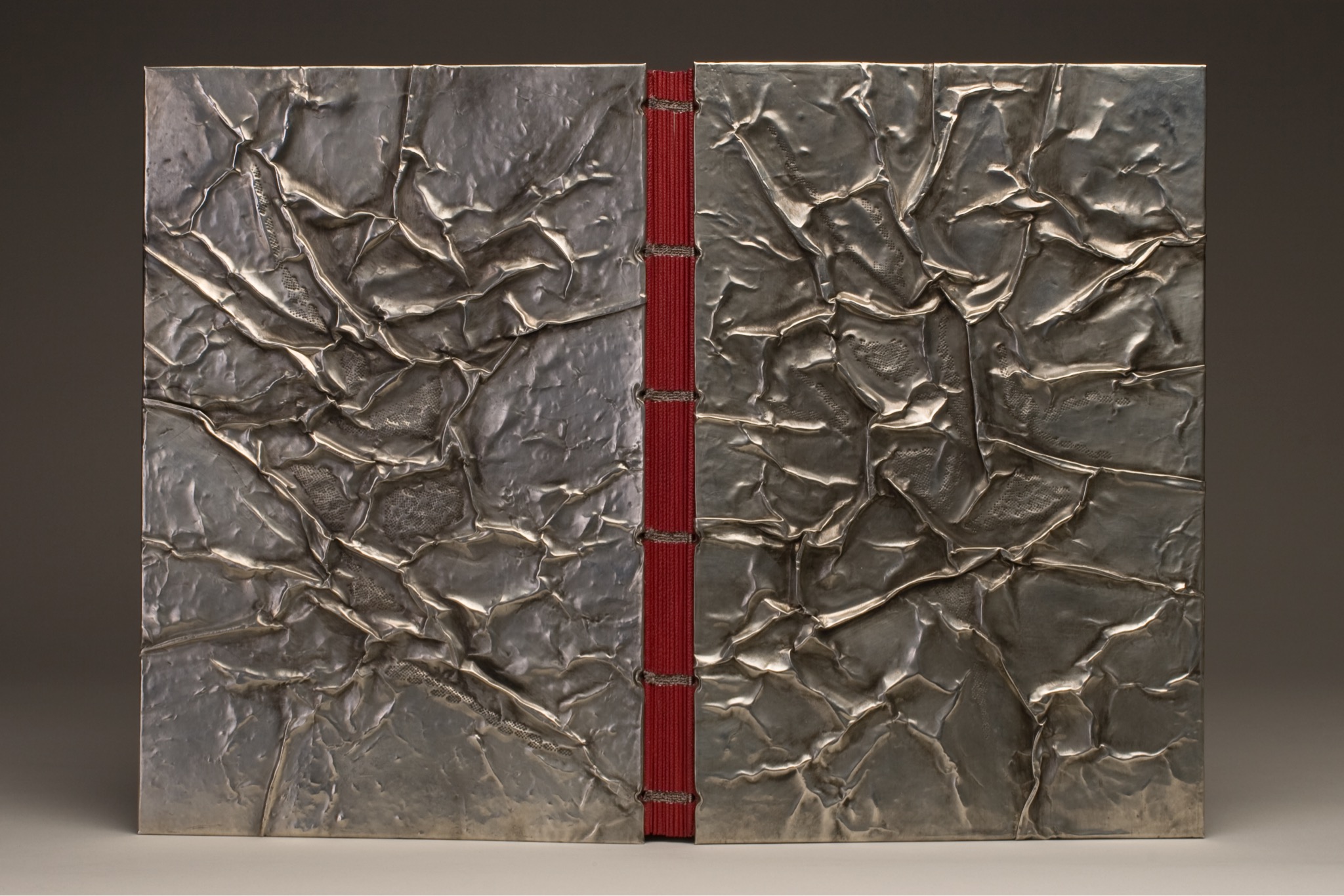
One of the distinguishing characteristics of Lallier’s artistry is her innovative use of materials: eggshells in La Lune (1971), her own hair in L’Eloge de la Folie (1974), translucent agates in Portes Sud (1979), silver in Histoire de Minnie (1982), wires from old telephones in Lignes (1986) and pewter in The Song of Songs, which is Solomon’s (2002).
L’Eloge de la Folie (1974) Rarely does Lallier use on the cover an image from within the book at hand. Here is one of the exceptions. The cavorting monks from Erasmus’ satire come from Albert Dubout’s 1951 illustration of the classic. Lallier, however, couldn’t resist using her own hair to form their tonsures.Portes Sud (1979) Note in the reflection the light coming through the agate embedded in the cover.Histoire de Minnie (1982) In the exhibition, be sure to look at the back cover where Lallier has used the silver piece, embedded in the front cover, to stamp the back cover.Lignes (1986) This is Lallier’s only collaboration from scratch. For a Montréal exhibition whose organizers set the theme of “lignes” or lines, she conceived the cover design. Sharing only blank pages and not the design, she then asked Claude Péloquin to provide text and illustrations on the theme. The “telephone wires” attached to the front cover are loose and manipulable by the reader — a tongue-in-cheek form of interactivity with lines of communication in the pre-Web age. The Song of Songs, which is Solomon’s (2002) Visiting a Parisian builders’ store with a friend selecting decor items, Lallier was entranced by sheets of pewter and its varying thicknesses. She bought some. The inspired result above sits alongside another in the exhibition — The Enchiridion of Epictetus (2003); be sure to look at the reflection of The Enchiridion to spot the use of pewter in the interior.
The odd materials chosen are frequently highly apropos of the book in question. In the catalogue, take a look at Le Papier, Le Livre (2015), which has embedded pieces of a wasp’s nest, entirely in keeping scientifically and historically with the subject. In 1719, the French naturalist René Antoine Ferchault de Réaumur published an essay to the Royal Academy of Sciences on the natural history of North American wasps and hypothesized how man could adopt their natural papermaking industry.
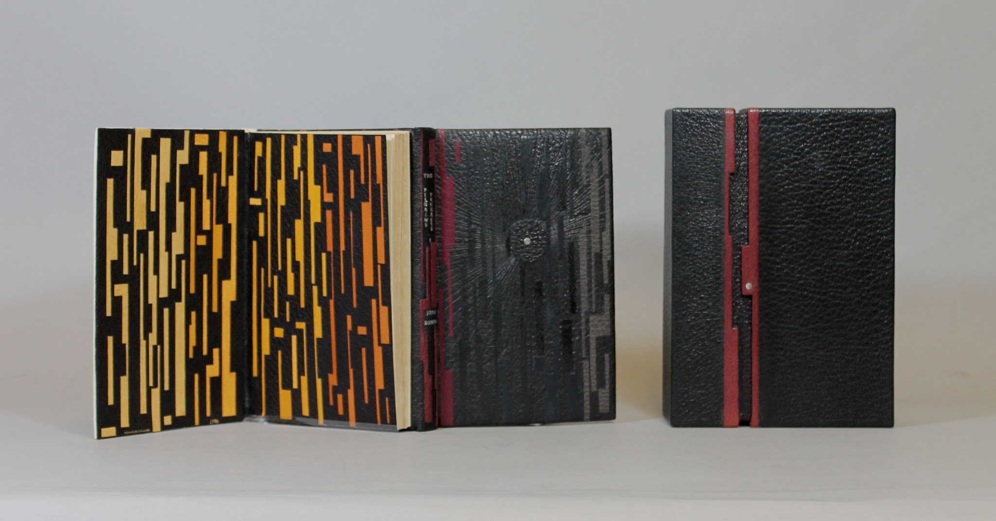
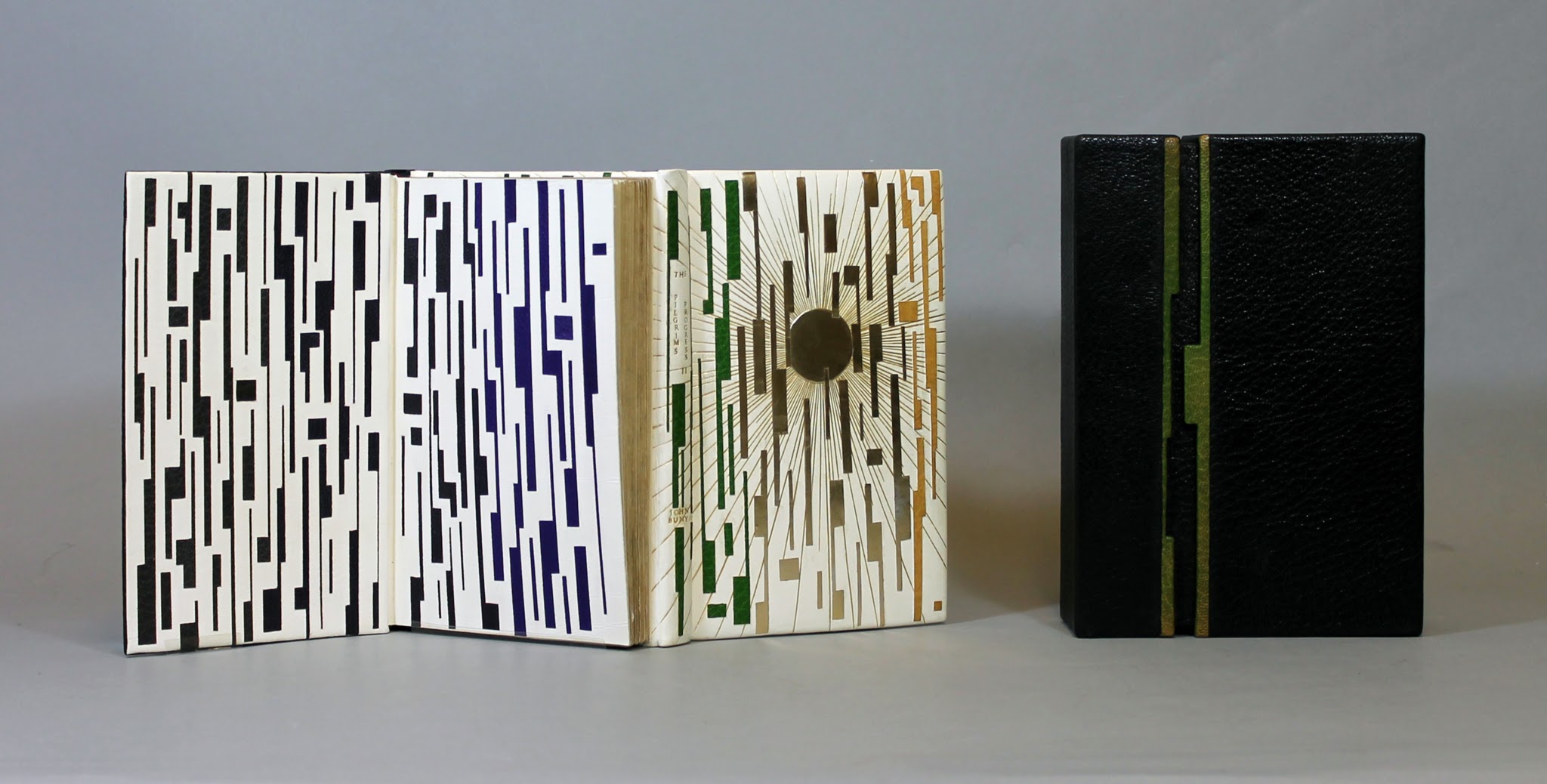
Another element of Lallier’s work to look for is the form of binding — not just the covers but the interior structure. Despite the glass cases protecting these items, it is easy to spot and enjoy the structural features, for example, the book in the form of a distinctively shaped Southern lady’s fan for The Birthday (1990). The catalogue shows a dos-à-dos (back-to-back) binding of the volumes of Pilgrim’s Progress (2003), a daring rebinding of a rare 18th century production. The Friends of the Library at University of Alberta made the courageous right decision.
Pilgrim’s Progress (2003) Dos-à-dos binding, showing the first part of the book, in which Pilgrim sets out on his journey in darkness, which Lallier marks with a black leather circle with a palladium dot at its center. Photo credit: University of Alberta. Pilgrim’s Progress (2003) Dos-à-dos binding, showing the second part of the book, in which Pilgrim arrives at the Celestial City, which Lallier marks with a gold tooling radiating from a gold circle. Photo credit: University of Alberta.
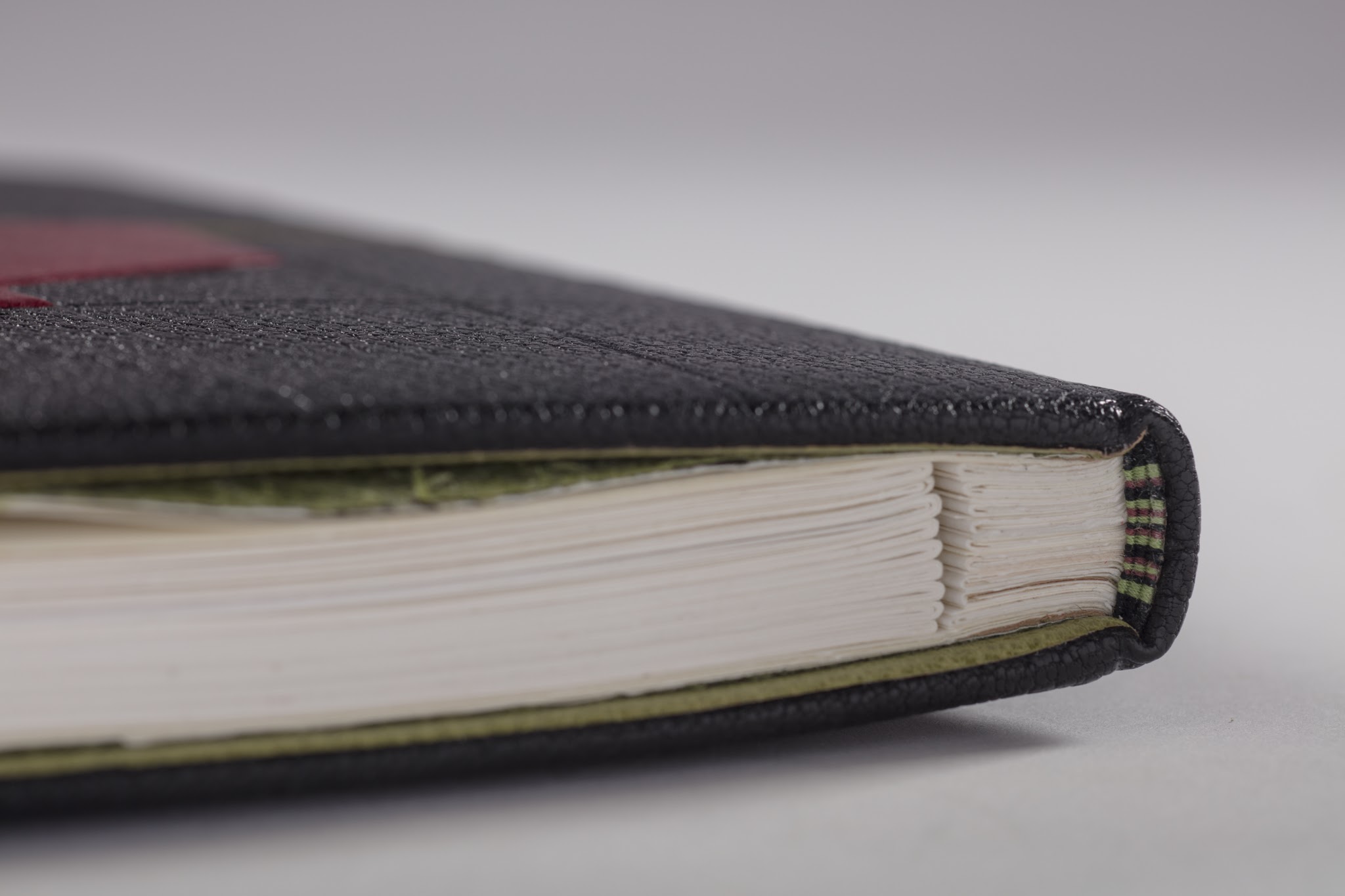
Some of the interior and exterior forms are more subtle. Lallier has made extensive use of the stub binding technique (see below), and there are several examples of cross structure binding (see below).
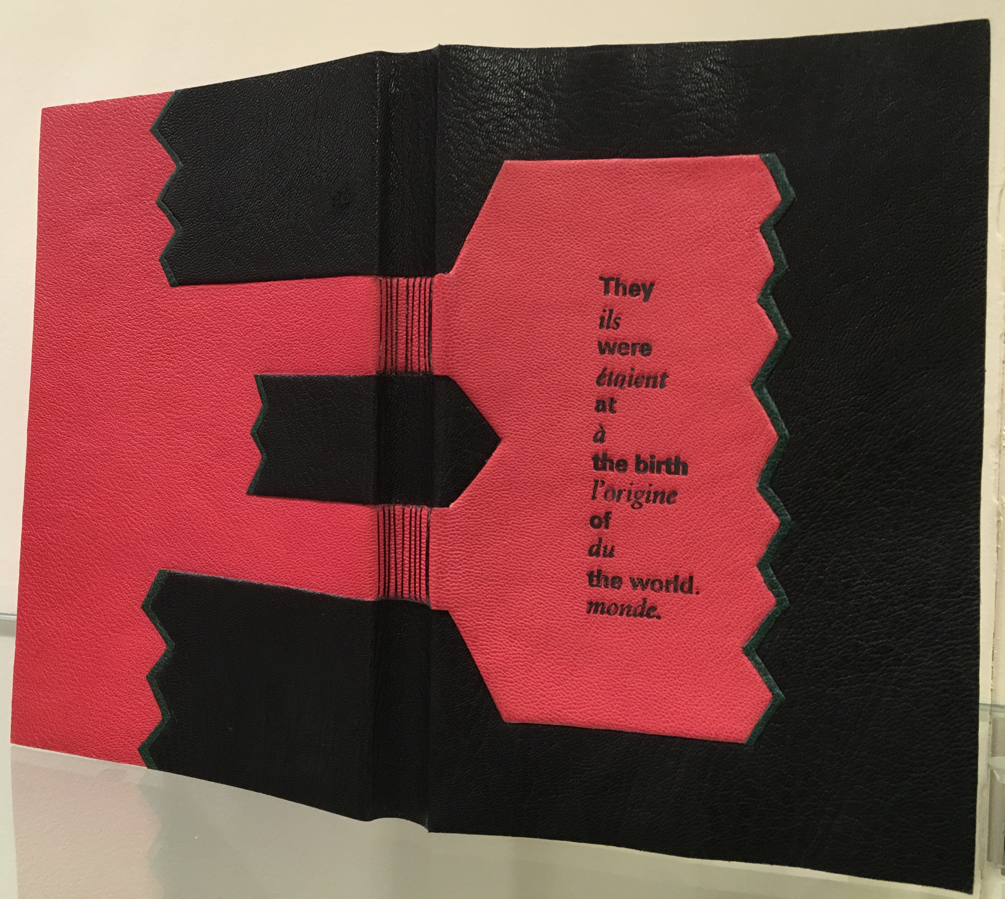
Look for this style of binding called montage sur onglets or stub binding that allows pages to lay flat or even be easily detached. Look for Le Chevalier Troyen (2014) and Inside the Book (2016), displayed side by side in the exhibition and showing this form of binding.Le Livre des Origines / The Book of Origins by André Ricard, 2005 In the exhibition, be sure to look closely at the spine’s deliberately exposed cross-structure binding in full goatskin leather.
Le Livre des Origines is another one of those rareties where Lallier uses on the cover something from within the book. Stamped on the front, the phrase alternating in English and French comes from the text relating the Huron Nation’s creation myth as recorded in French by ethnologist Marius Barbeau, reinterpreted and rewritten by André Ricard. The alternating roman and italic presentation of languages reflects the book’s alternating pages of English and French. Note how the simple design in black and red with the diagonal onlays of green leather captures characteristic elements of the art of the Wyandot tribes, which can be explored here. A design philosophy of using imagination and craftsmanship in service to the book exemplifies itself again and again throughout the exhibition.
Which brings us to another characteristic of Lallier’s art to seek out: the painstaking handwork. For this, Pantagruel (2016) is worth a long look. Lallier once observed a student engaged in kumihimo braiding (the Japanese technique of using a disk to gather multiple threads of different colors into a single strand) and asked to be taught. Inspired by André Derain’s illustrations of Rabelais’ riotous satire, she set out to use braids for the title’s letters, filled and surrounded with the colors from the illustrations. Some of the leather inlays are handpainted; all — even the smallest — are handcut, beveled, tucked in the covering leather and tooled. The series of process photos below — all courtesy of the artist — provide a look behind the scenes.
Pantagruel (2016) Awarded one of 25 Silver Prizes at the International Competition of Designer Bookbinders (2016)
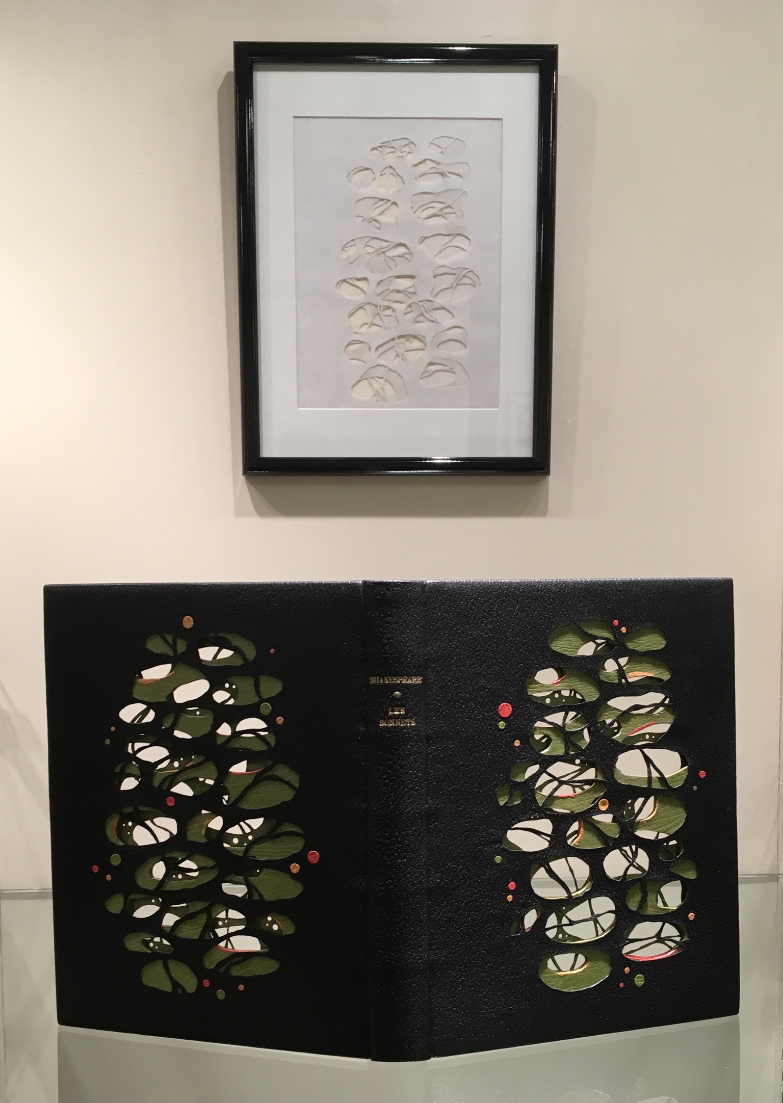
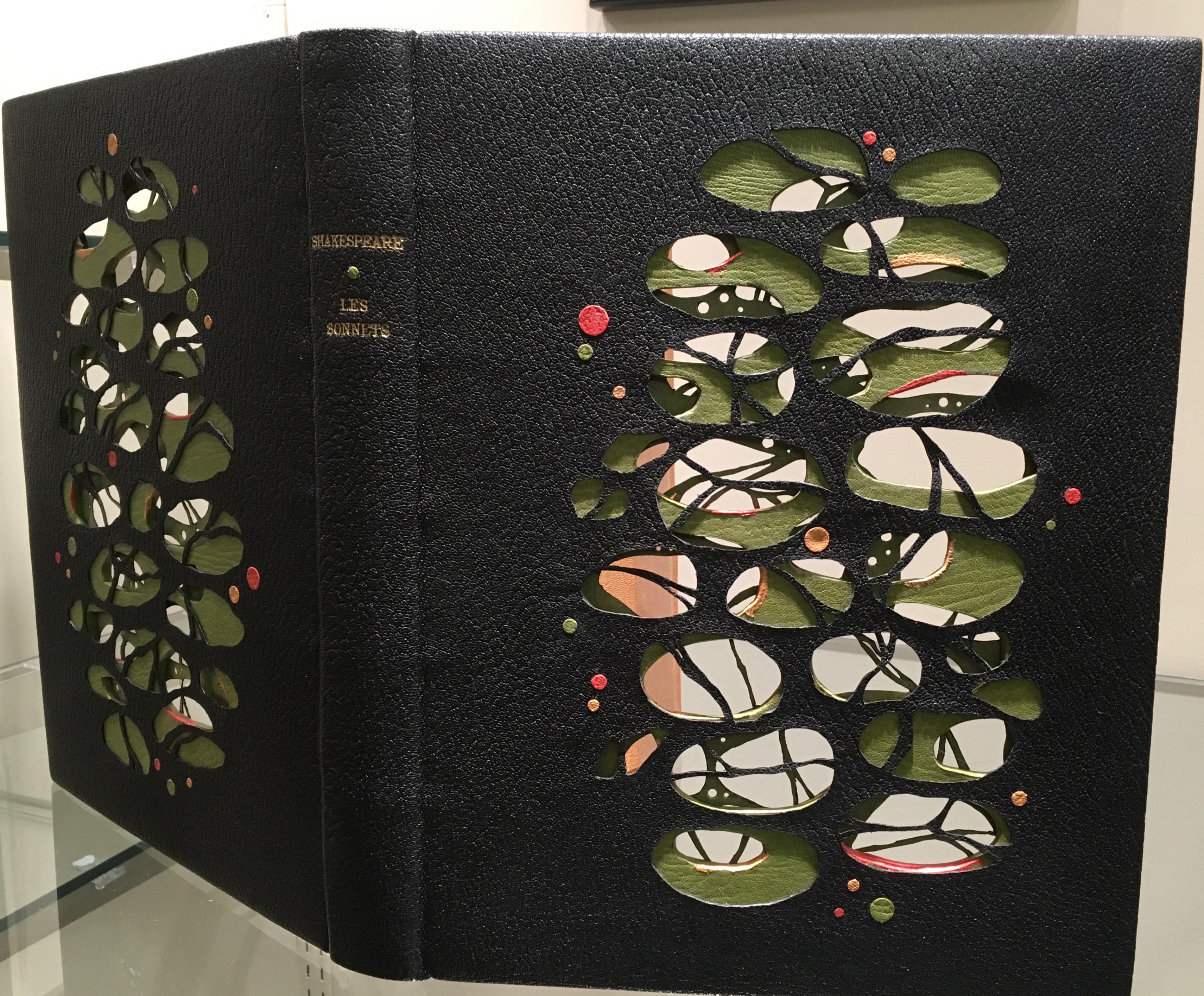
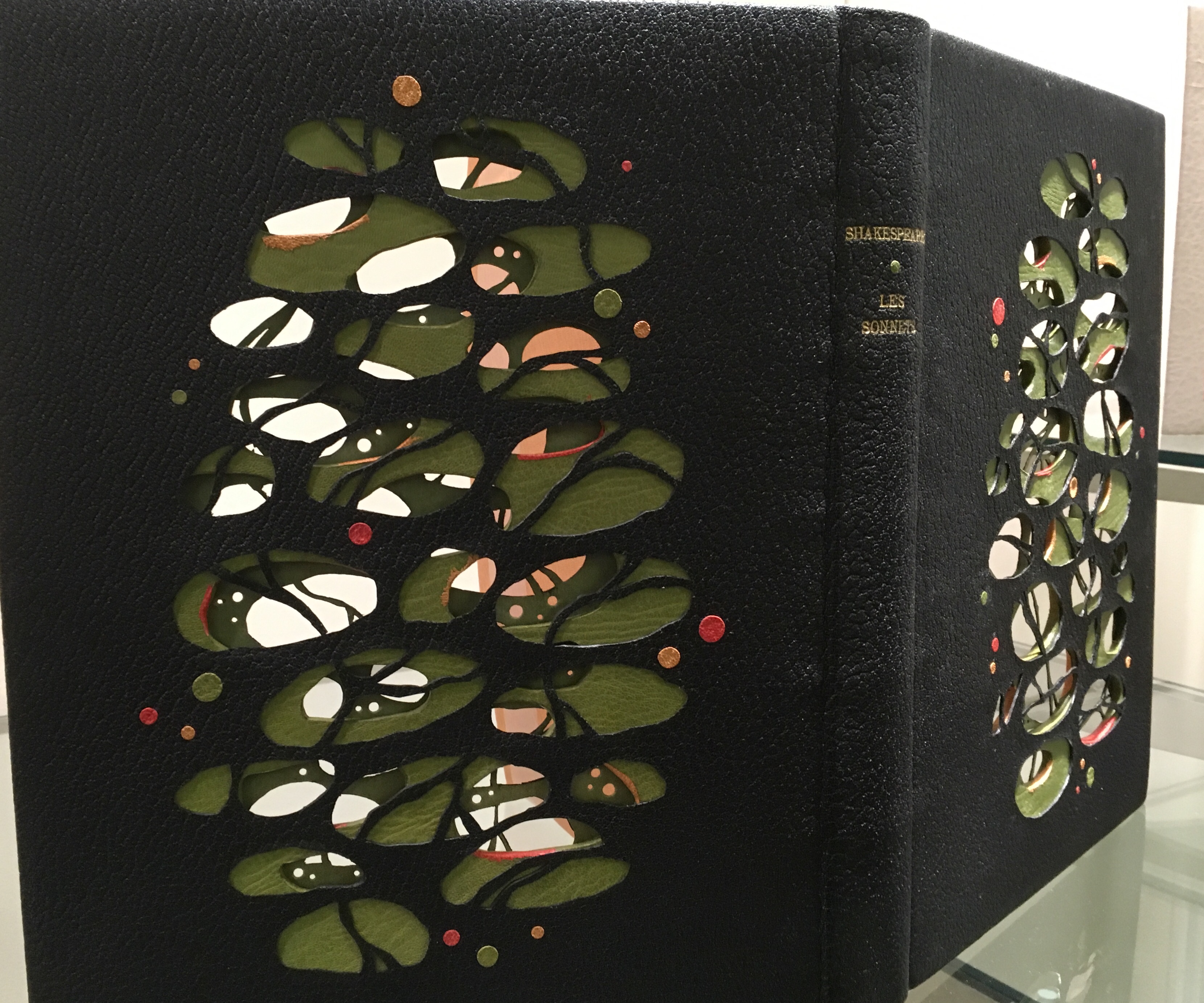
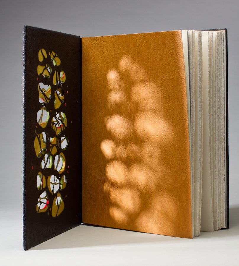
Shakespeare: Les Sonnets (2012) is another case in point of craftsmanship. Creation of this work began with a drawing (shown below) and then a maquette to enable Lallier to visualize the sculptural and aesthetic implications of multiple layers’ surfaces and edges being seen from all angles. The boards were cut out and lined with a green goat skin. The covering leather was also cut out and lined with green Japanese paper before covering. The doublures (linings of the book cover) received the same treatment before being applied to the inner boards.
Shakespeare: Les Sonnets (2012)
There is a sense of movement in this three-dimensional, sculptural treatment of the cover, which brings us to a final pointer for visitors. Lallier’s signature and most original technique — the front cover panel that swings open along the fore-edge to reveal a hidden design.
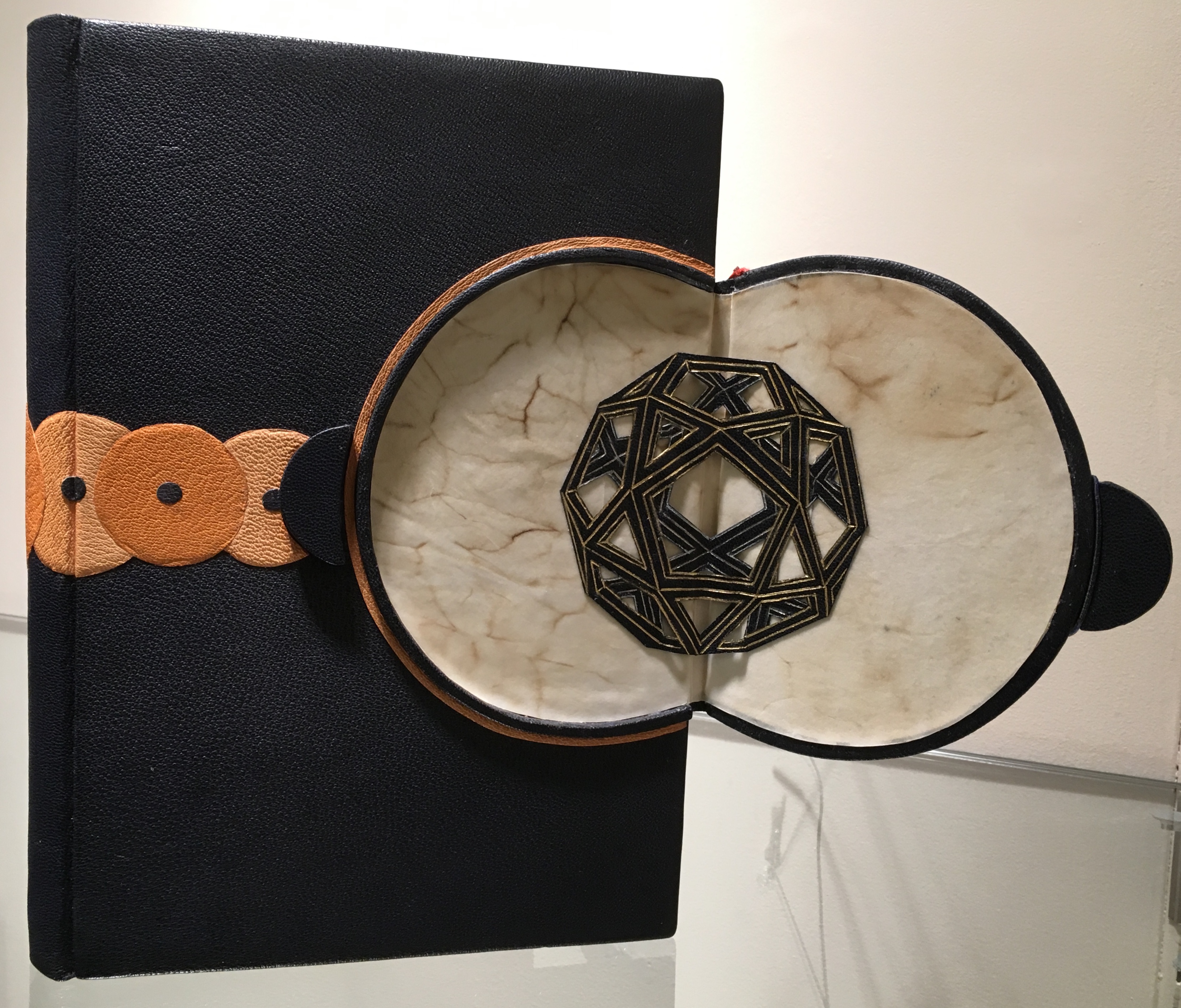
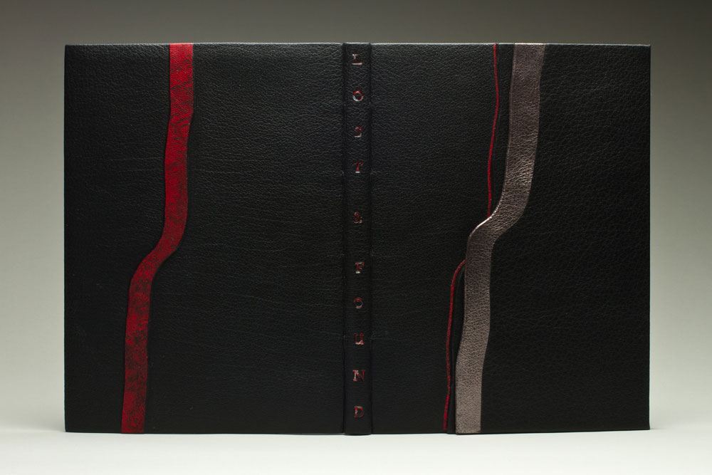
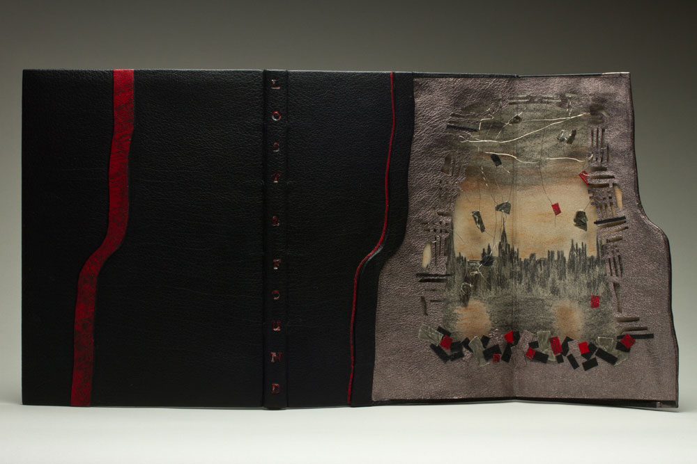
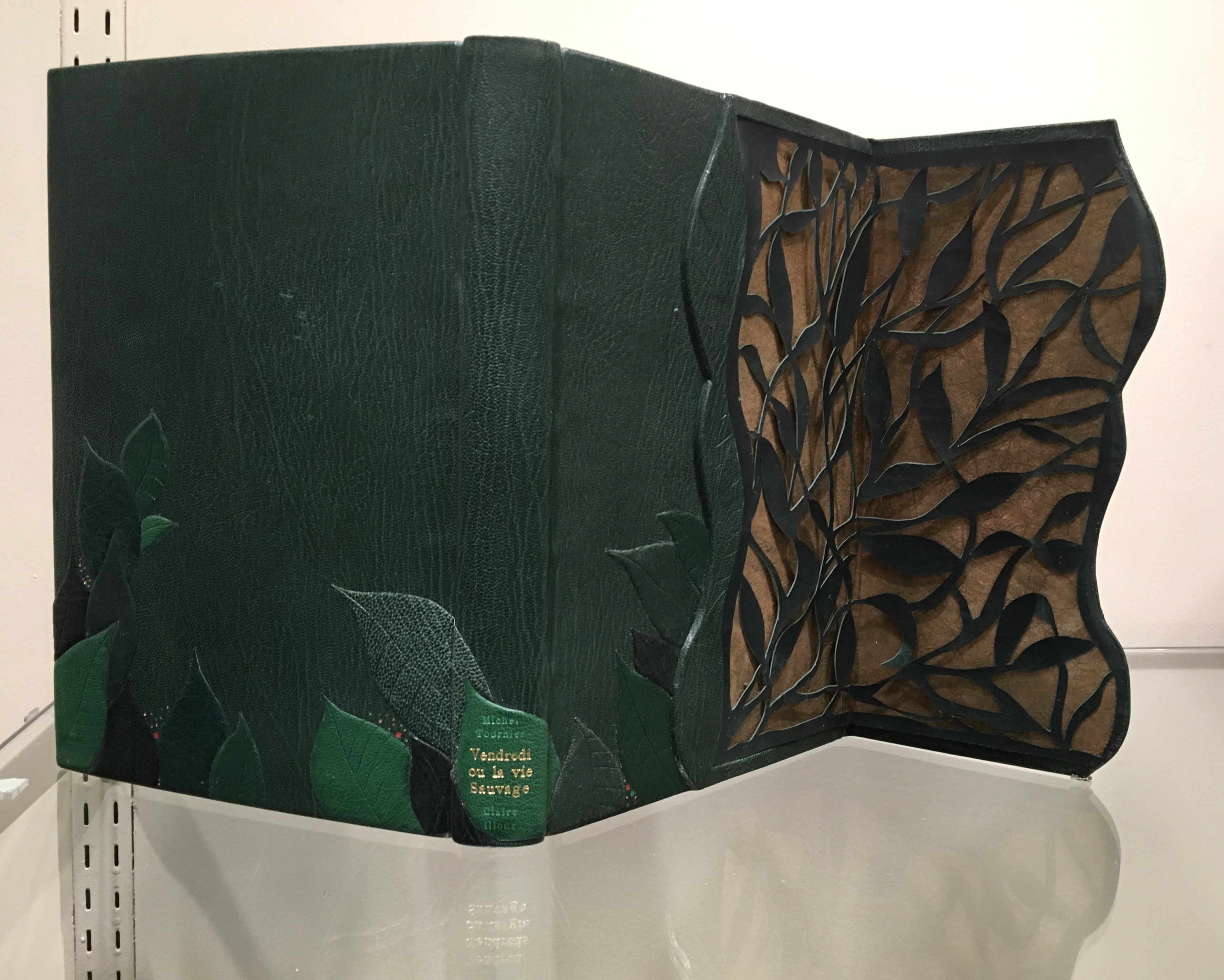
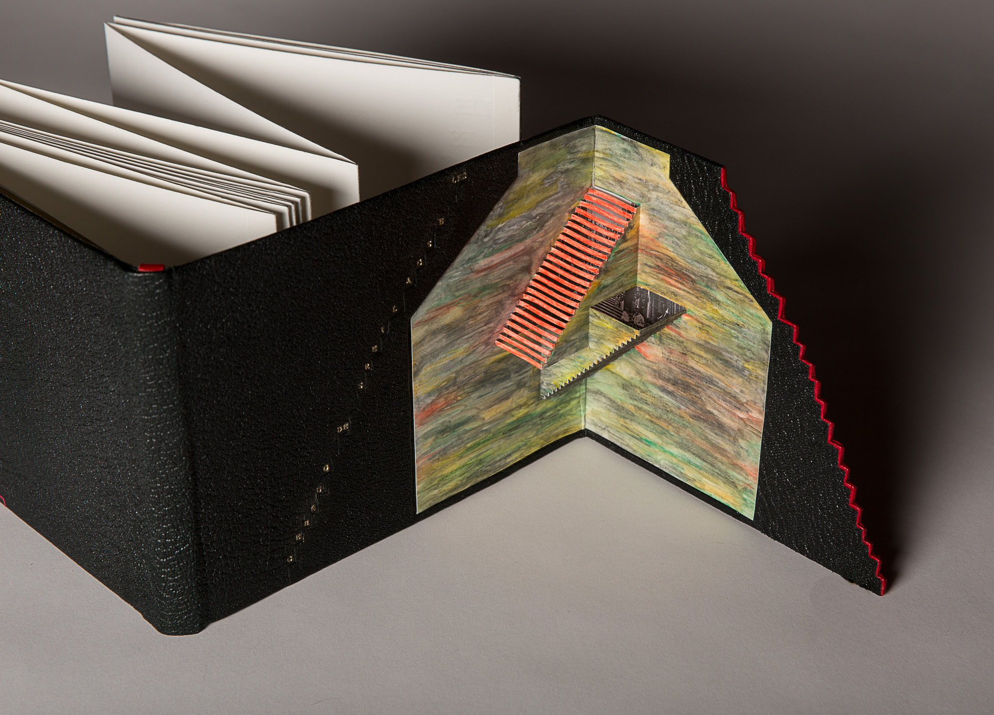
Excerpts from the Humorous Writings of Leonardo da Vinci (1996) The open panel reveals a geodesic dome in leather with gold and palladium tooling. With the panel closed, the front cover’s design echoes a Da Vinci machine.Lost and Found (2014)The illustrations inside the book come from previously lost engravings by Rachel Reckitt, some showing the blitz of London from which Lallier has drawn the inspiration for her hidden panel.Vendredi ou la Vie Sauvage (2015) Opening on layers on layers of carved foliage, the panel evokes the island on which Friday finds himself castaway in Michel Tournier’s version of Defoe’s Robinson Crusoe. In the exhibition, stand on tiptoe or someone’s shoulders to see the top edge’s coloring. Extraordinarily it resembles flower petals submerged in water. Les Escaliers de Québec (2013) Bound in black Morocco leather in the “drop spine” technique, this work unites the stair-stepping accordion form of the text with a gold-tooled title climbing the steps of the front cover panel, which opens on a hand-colored pop-up set of Escher-like stairs.
Lallier’s unity of design with the text by Luc Bureau and illustrations by Ghislaine Bureau celebrating the famous thirty sets of stairs between the upper and lower parts of Québec can hardly be excelled. Except that she does — again and again — with the examples on display. This retrospective resoundingly affirms Lallier’s intention always to serve the book in front of her. Go judge for yourself.
Monique Lallier: A Retrospective runs from 29 October through 6 January 2019 at The Guilford Art Gallery on the campus of Guilford College. For more background on Lallier’s work, there is a series of interviews with Erin Fletcher of Herringbone Bindery here.


