ABC by Geoffrey Chaucer (1934)
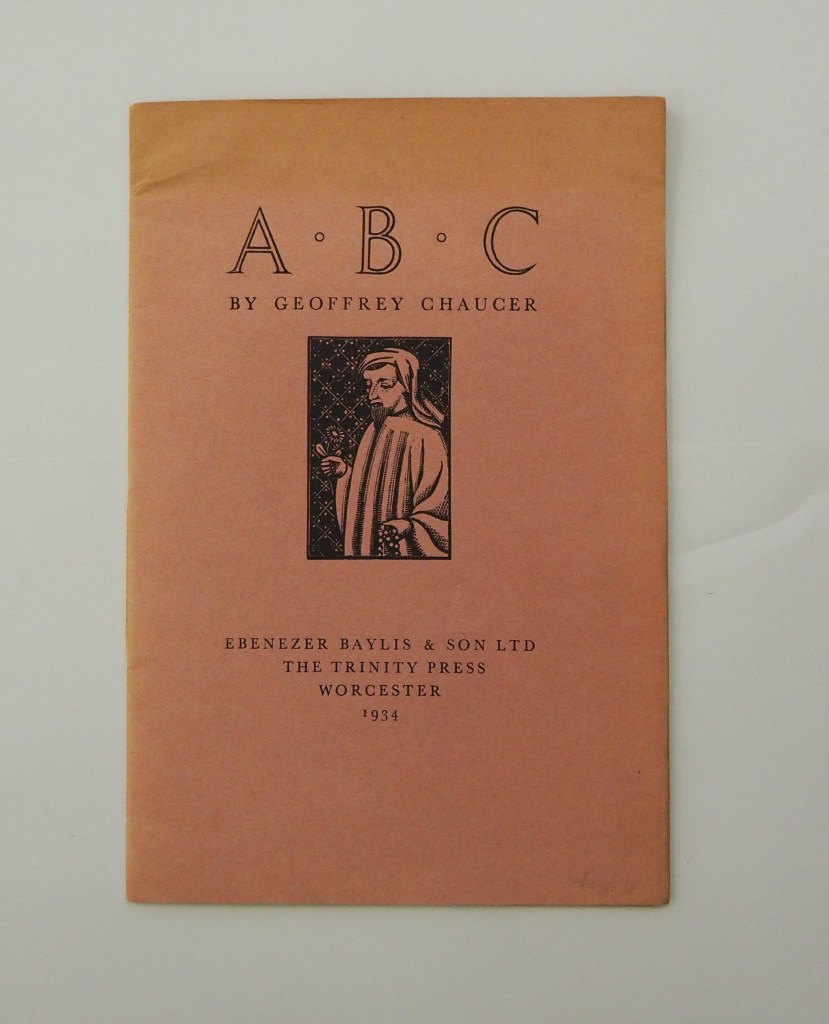
ABC by Geoffrey Chaucer (1934)
[Eleanor] Joyce Francis
Chapbook, softcover sewn. H250 x W170 mm. 16 pages. Edition of 500? Acquired from Antiquariaat Fokas Holthuis, 30 April 2021.
Photos: Emilia Osztafi.*
Chaucer’s ABC (ca. 1369) is an intriguing early work in the history of abecedaries. There are alphabet poems in the Hebrew Bible, but according to the artists’ book collector and scholar Nyr Indictor, this Chaucer lyric seems to be the earliest surviving English “ABC poem” of known authorship. Possibly on commission from Blanche, Duchess of Lancaster, Chaucer cribbed and translated a lyric embedded in Guillaume de Deguilleville’s La pelerinage de vie humaine [“Pilgrimage of Human Life”] (ca. 1330).
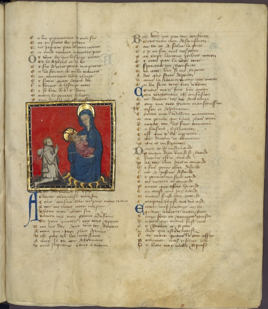
Source: gallica.bnf.fr/ Bibliothèque nationale de France. Bibliothèque de l’Arsenal. Ms-5071 réserve. Folio 69r.
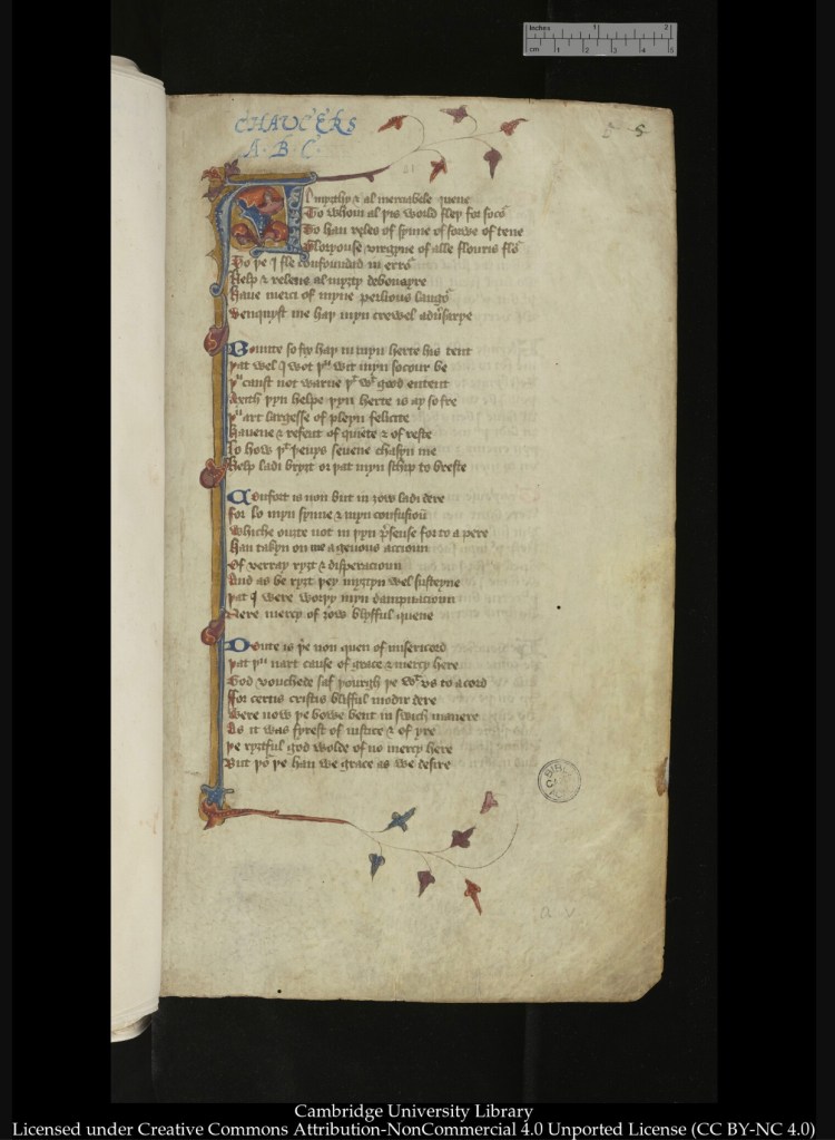
Source: Anthology of Geoffrey Chaucer’s literary works, with other texts (Cambridge, University Library, MS Gg.4.27(1)). Folio 5r.
Chaucer’s original title — La Prière de Nostre Dame — draws attention to what is happening at this point in Deguilleville’s Pilgrimage: the pilgrim is praying to Mary. The word prière does not simply mean “prayer”. It also means “bill of complaint” or “petition” or “litany of praise”, all of which, if to be recited in presentation, would benefit from a mnemonic device like the alphabet. It is amusing that children’s books rely on to the mnemonic power of narrative (A was an apple pie), alliteration, rhyme, and image as a memory aid for the “particulars” of the alphabet itself. Of course, Deguilleville’s Pilgrimage and Chaucer’s ABC are decidedly not children’s books, even if rhymed and illuminated.
ABC by Chaucer appeared as part of a series of twelve promotional booklets or chapbooks produced between 1933 and 1935 by Ebenezer Baylis & Son, Worcester, under the firm’s Director of Typography, Leonard Jay. The first Head of the School of Printing at Birmingham School of Arts and Crafts, Jay was a catch for Baylis & Son as the series’ first booklet Fine Printing notes. Eleanor Joyce Francis, who studied at the School of Arts and Crafts and was closely associated with its School of Printing, illustrated at least five of the twelve Baylis chapbooks, including the wood engraving on the paper cover and title page of ABC by Geoffrey Chaucer.
No.1 – Fine Printing (1933)
No.2 – Christmas by Washington Irving (1933)
No.3 – Baskerville in Letters by Dr. Bockwitz (1934)
No.4 – ABC by Geoffrey Chaucer (1934)
No.5 – Parables taken from the Authorised Version of the Holy Bible (1934)
No.6 – Rubaiyat of Omar Khayyam (1934)
No.7 – The Book of Ruth (1934)
No.8 – Gray’s Elegy (1934)
No.9 – Preface to Milton’s Paradise Lost by John Baskerville (1935)
No.10 – Hymn on the Morning of Christ’s Nativity by John Milton (1935)
No.11 – Christ’s Sermon on the Mount (1935)
No.12 – The Bible in Type by John Stone (1935)
Perhaps Baylis, Francis or Hay somehow saw the illuminated Deguilleville or Chaucer manuscripts to be inspired by their illustration. But centuries after the Renaissance and Reformation and a century after the Industrial Revolution, they were working together on that series of chapbooks in the restrained typographical and design manner promoted by Beatrice Warde. In his booklet Modern Typography (1930), produced at the School of Printing and probably attracting the attention of Baylis & Son, Jay extols this manner and boosts Monotype Baskerville and Beatrice Warde at the same time:
Modernism in the twentieth century means the simplifying of all forms and arrangements, and removing all superfluities and any signs of ‘prettiness’; it is beauty and utility first and last and all the time. Modernism repudiates any vulgar or contorted eccentricities, or coercing materials into doing something for which they were never made: it means reasonableness and right making. There is abundant evidence of this truth in all the arts and applied arts of today: it has been brought about mainly by the widening of trade skill and intellectual vision….
Among the many books that have been written on Baskerville there is one that calls for special mention; it is entitled ‘The Types of John Baskerville,’ written by that enthusiast and authority on the history of fine printing, Mrs. B. L. Warde. This wonderful, scholarly, and valuable essay undoubtedly ranks as one of the finest and most convincing eulogies on Baskerville that has been issued in the twentieth century, and it should be in the possession of all those interested in printing types and all students, as she herself has written, ‘of the strangest, deadliest, and most noble craft which man has yet invented.
The only image in the ABC by Chaucer is Joyce Francis’s wood engraving. Following the pose, dress and background of “The Hoccleve Portrait” (BL MS Harl. 4866, fol. 88), Francis deviates only by “simplifying” the image to suit the material and technique and by giving her Chaucer a flower to hold in his right hand in lieu of his breaking the frame to point at text no longer outside it.

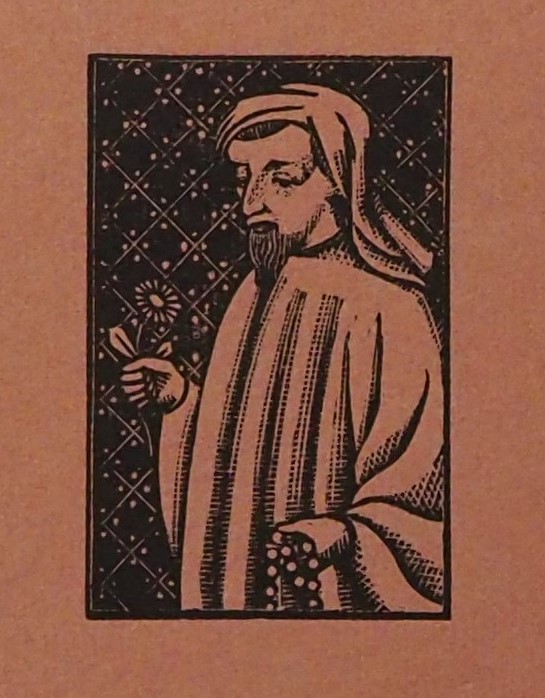
Depicting the poet/translator, not the Virgin Mary or any of the devotional images in the poem, this author-portrait makes the ABC decidedly “about” Chaucer. Likewise, by using the display and small caps of Monotype Baskerville as the sole decorative element on the page, Jay keeps the reader’s focus on Chaucer’s Middle English text in line with Warde’s “crystal goblet” standard for typography.
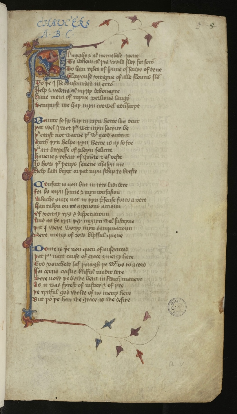
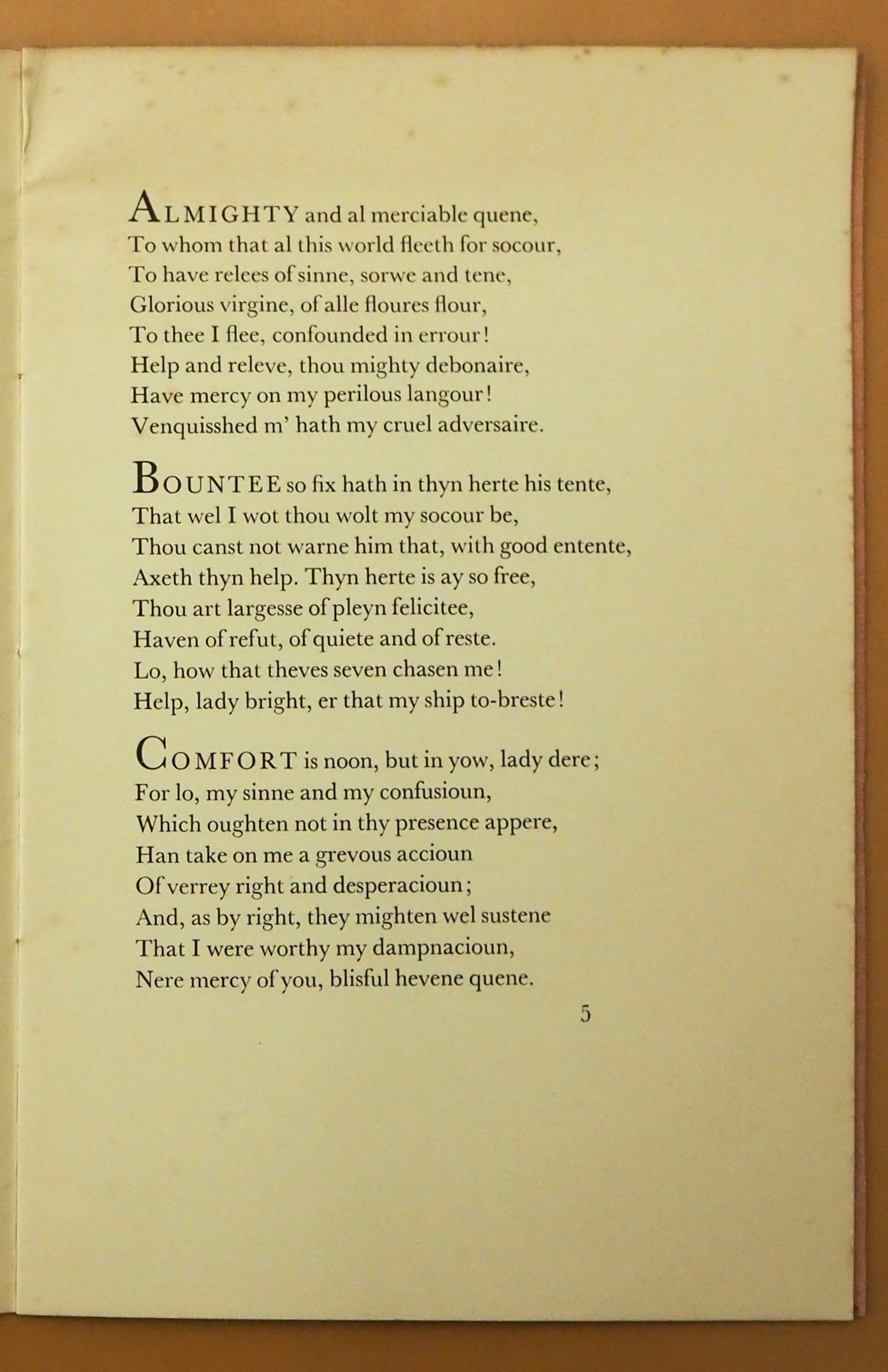
The differences and similarities between the two pages highlight interesting material aspects of “the history of the book”. The two layouts both bear the numeral 5, but the scribed 5 designates the folio (the folded sheet with a recto page followed by the unnumbered verso), and the typeset 5 designates the page. This copy of the Chaucer manuscript sits historically between the early practice of using catchwords at the foot of a page to keep track of page order and the modern practice of full pagination. According to the Cambridge University Library’s notes, the Chaucer manuscript had catchwords at the foot of each quire (the set of folded and gathered leaves to be bound to next set whose text started with the catchwords), but they have been trimmed away.
The two layouts also highlight an historical constant. Despite the different number of stanzas on the two pages, when you strip away the colorful illustration from the manuscript, the relative positions of the text blocks on their pages is the same. They follow the proportional “page canons” for the width:height ratio of text on the page, close to the 0.61 of the Golden Ratio. See Alexander Ross Charchar’s essay “The Secret Law of Page Harmony” for a delightful explanation of the craft and calculations of “page canons” by Villard de Honnecourt (13th century) , J.A. Van de Graaf (1946), Raúl Rosarivo (1947) and Jan Tschichold (1953).
The visual quality of letterforms – hidden beneath their semantic importance, if Beatrice Warde’s strictures are being followed – surfaces nevertheless in Jay’s typographic choice of Monotype Baskerville. The font is well known for its width relative to other fonts, so its display and small caps letters are a good choice for emphasizing the first letter and word of each stanza. Even in this typographically simple edition, where initials are not illuminated or historiated, Monotype Baskerville contributes artistry as well as appropriateness to Chaucer’s words. It shows most obviously where the O-stanza extends its opening word – which is simply “O” – into a sequence of three apostrophic lines:

One scholar suggests that the “three circlets introduce a chordal litany, replete with oxymora and consonance”, praising Mary threefold (Quinn). The wide, upright Baskerville O’s certainly add volume to the praise in this stanza whose notably legalistic words of bille (formal document) and to bede (to petition) underscore Chaucer’s choice of prière for his original title. Although the legal register seems distant from “chordal litany”, it shares an investment in words that are spoken and audibly enacted. If we can sound out individual letters, then we can build words that take action, whether praising or pleading.
Like many abecedaries to come, each stanza begins with the relevant letter of the alphabet. That there are only 23 stanzas in the poem (no U or W, and the French J becomes an English I as the stanza’s first-person pronoun shifts from “Je” to “I”) highlights its linguistic position in the history of abecedaries. In that long line, the earliest “abecedary” so far discovered appears in Ugaritic on an ostracon excavated from the Theban Tombs (recorded in 1995); it dates no earlier than mid- to late- 15th century (BCE) (Haring).
In 1934, this fourteenth-century ABC poem was visually re-presented as a modern typographical work of simplicity, without “vulgar or contorted eccentricities” (as Leonard Jay describes ideal “modernist” art). Perhaps, to us, their design no longer feels neutral, modern, or eternal; “modernism” has become another historical category. The alphabet book is not a timeless form. Some future alphabet might be shaped quite differently, reflecting the future cultures and technologies that are writing with it. But throughout history, abecedaries have a special way of slowing down language, breaking it down into its visual and audible components. Far from stripping away the semantic capacity of letters, making the alphabet into a book reminds us that words are made up of shapes, on the page and in our mouths. In Chaucer’s ABC, these shapes do not transcend their time (the late 14th or early 20th century) but become distinct and specific to the culture of their production.
*Emilia Osztafi (Wadham), coauthor.
Further Reading
“Abecedaries I (in progress)“. 31 March 2020. Books On Books Collection,
Chaucer, Geoffrey, and Larry D. Benson and Fred Norris Robinson (eds.). 2008. The Riverside Chaucer. Third edition., Oxford: Oxford University Press.
Findlay, James A., and Nyr Indictor. 2000. ABC Books and Related Materials : Selections from the Nyr Indictor Collection of the Alphabet. Ft. Lauderdale, FL: Bienes Center for the Literary Arts.
Forrest, Bob. August 2019. “The Rubaiyat of E. Joyce Francis”. Blog post.
Haring, Ben. October 2015. “Halaḥam on an Ostracon of the Early New Kingdom?” Journal of Near Eastern Studies, 74:2: 189-96. See also Netherlands Oranization for Scientific Research (NWO). 22 October 2015. “The earliest known abecedary“. Phys.org.
Hirsch, Rudolf. 1967. Printing, Selling and Reading, 1450-1550. Wiesbaden: Harrassowitz. For the onset of pagination.
Wallis, L. W. 1963. Leonard Jay, Master Printer-Craftsman, First Head of the Birmingham School of Printing, 1925-53 : An Appraisal. Birmingham: Central School of Arts and Crafts, Birmingham School of Printing.
Indictor, Nyr. 1995. “Alphabet Poems: A Brief History.” Word Ways. 28:3: 131-35.
Norman, Jeremy. 2024. “Fasciculus temporum, Probably the Best-Selling 15th Century Printed Book by a Living Author“. HistoryofInformation.com. For the onset of pagination.
Pace, George B. 1968. “Speght’s Chaucer and MS. GG.4.27.” Studies in Bibliography. 21: 225–35.
Quinn, William A. “Chaucer’s Problematic Priere: An ABC as Artifact and Critical Issue.” Studies in the Age of Chaucer 23, no. 1 (2001): 109–41.
Warde, Beatrice. 1955. The Crystal Goblet. London: Sylvan Press. “The book typographer has the job of erecting a window between the reader inside the room and that landscape which is the author’s words. He may put up a stained-glass window of marvellous beauty, but a failure as a window; that is, he may use some rich superb type like text gothic that is something to be looked at, not through. Or he may work in what I call transparent or invisible typography.”
How fascinating. In the 1970s and 1980s I bought a good amount of book printing from Baylis for a major London printing house, and visited them from time to time, but no one ever mentioned their finer printing background or typography. By then typography, for what it was worth, was in the hands of the publishers.
LikeLike