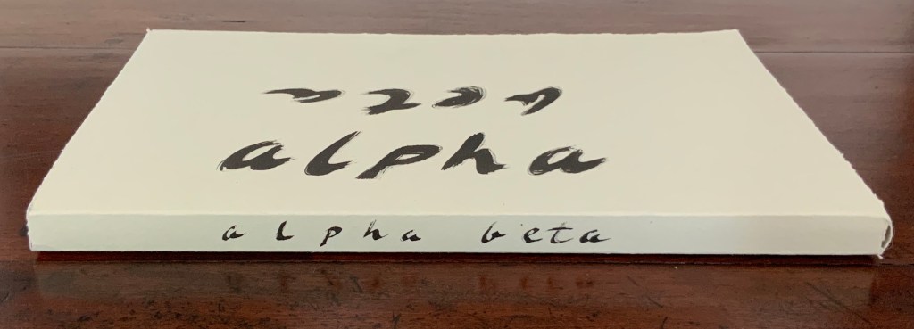
Alpha Beta (2005)
Alpha Beta (2005)
John Gerard
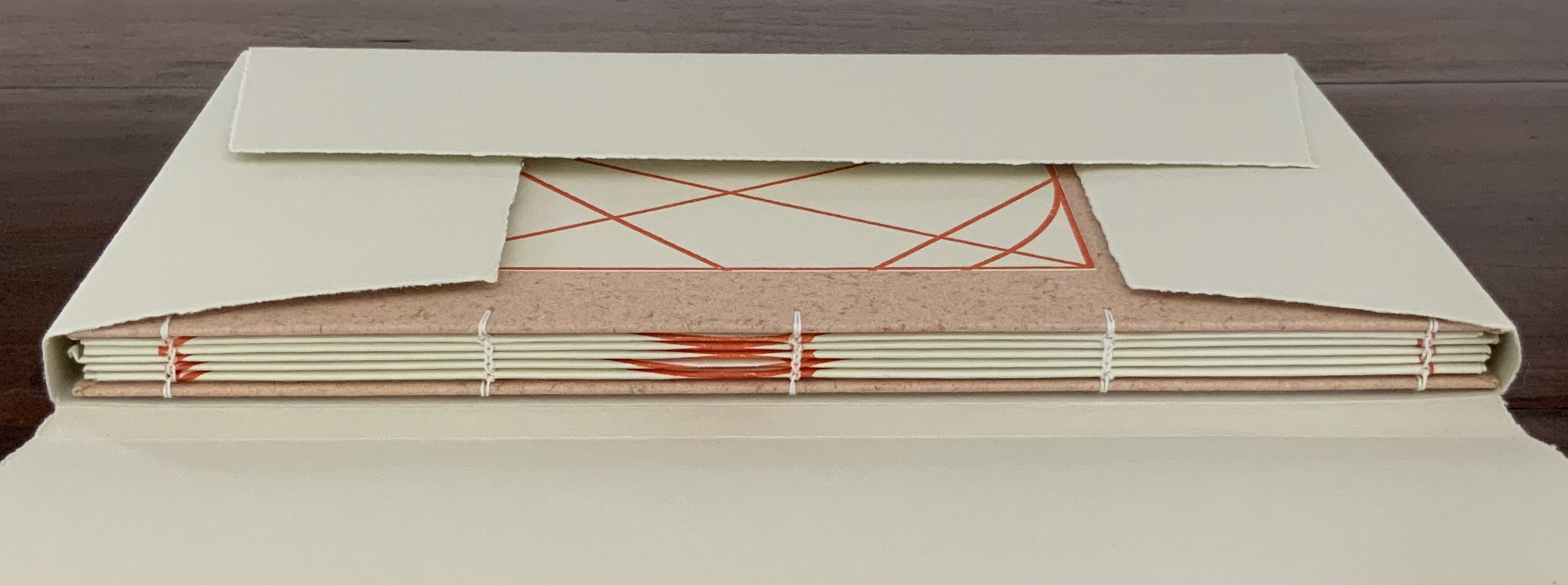
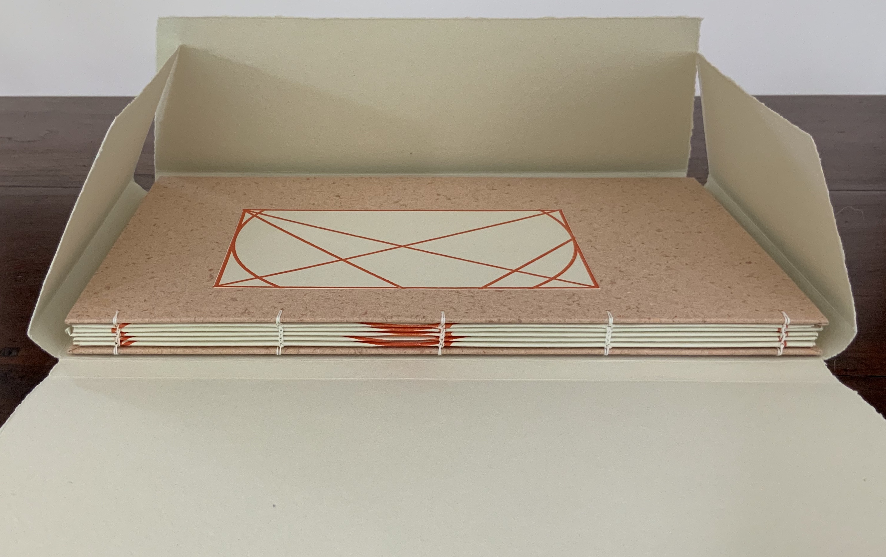
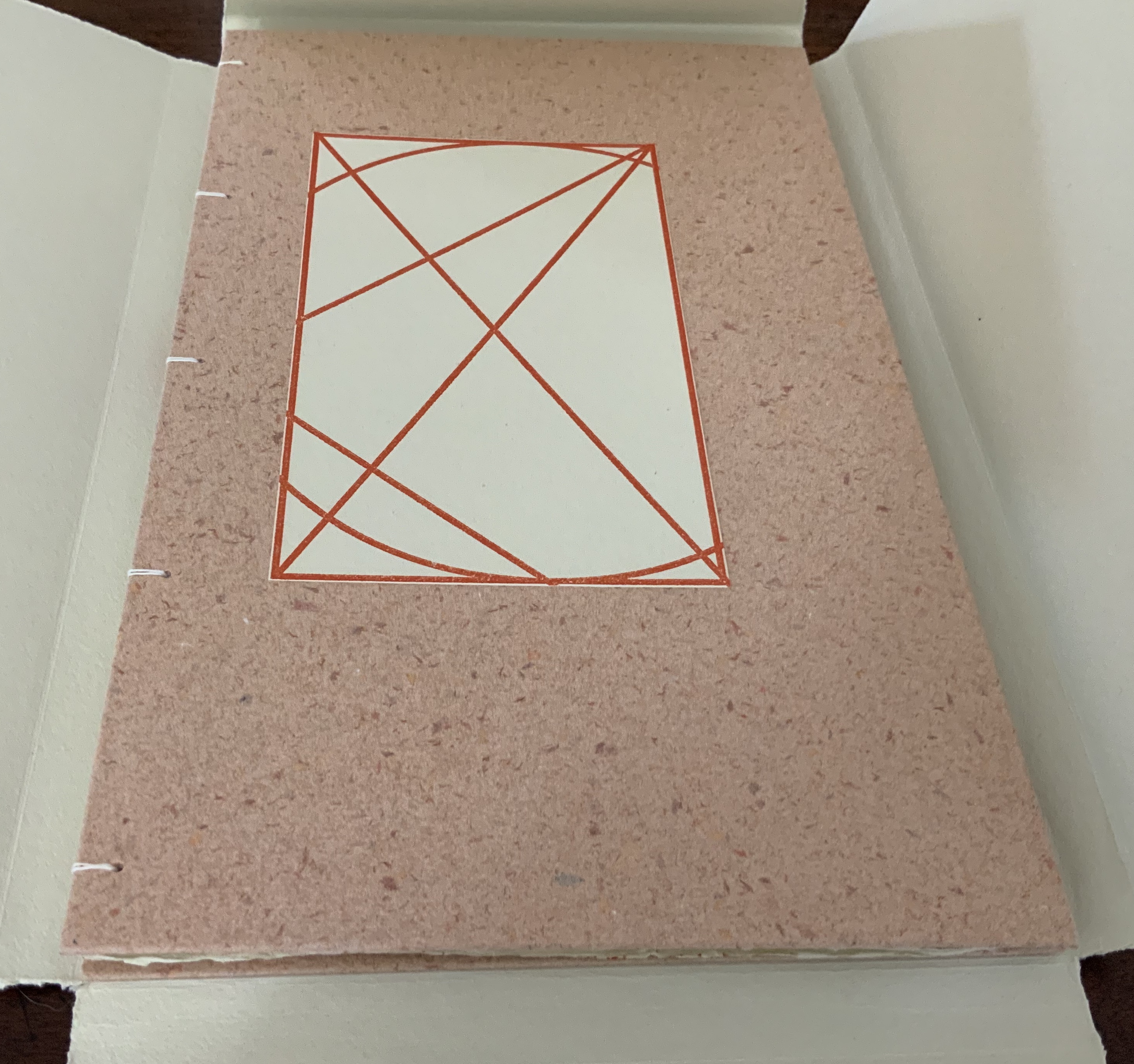
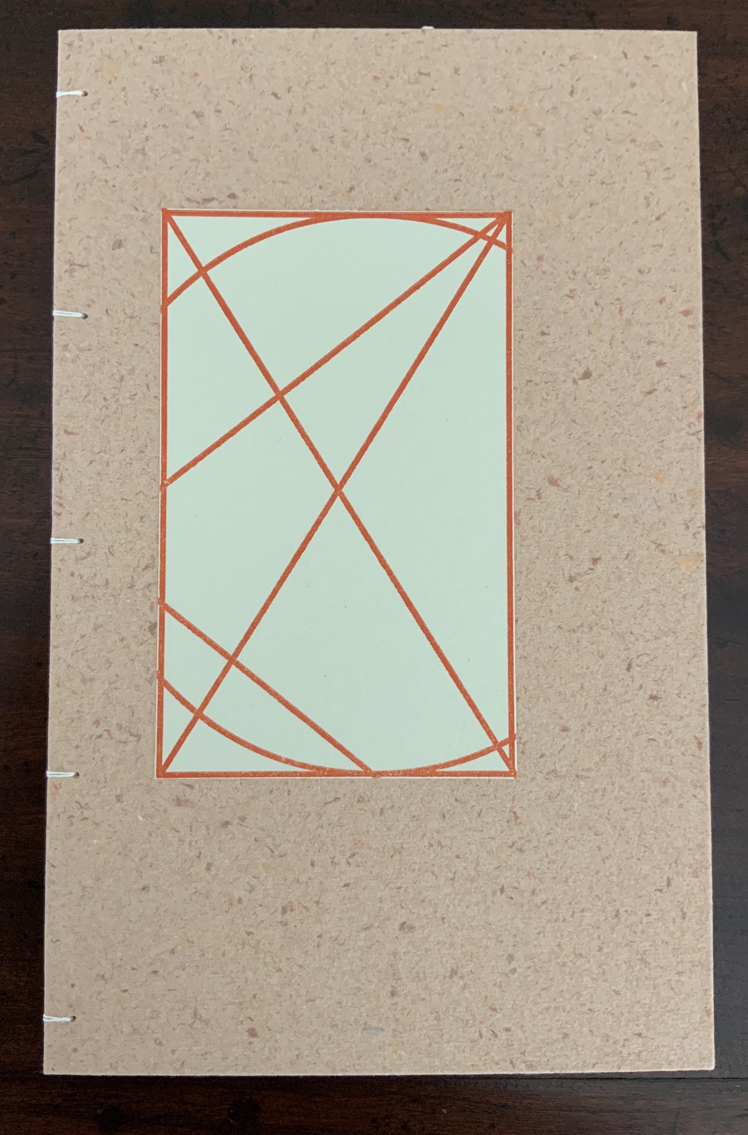
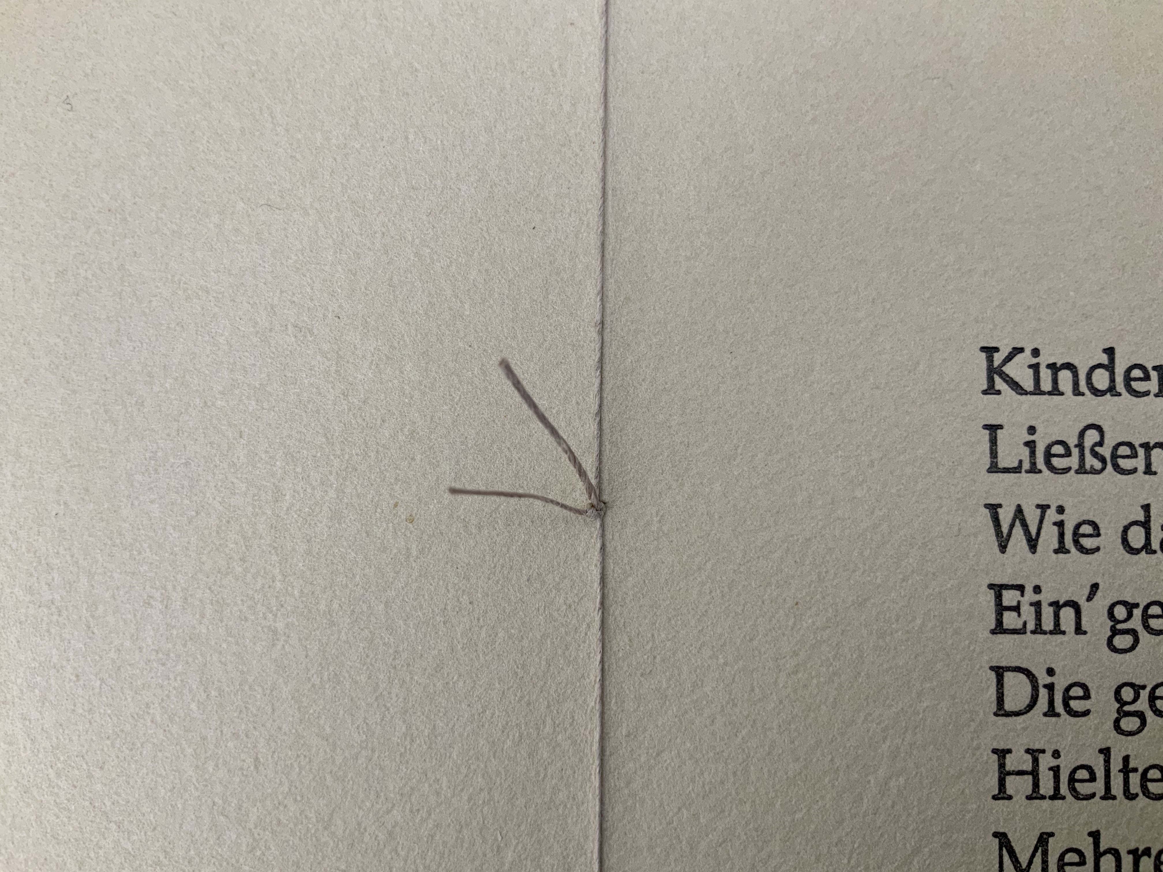
Small quarto book chain-stitched in boards, with a paper label to the upper cover, 40 pages, H275 x W272 x D15 mm, housed in a paper four-flap enclosure H175 x W278 x D16 mm. Signed edition of 20, of which this is #18. Acquired from the artist, 29 July 2020. Photos: Books On Books Collection.
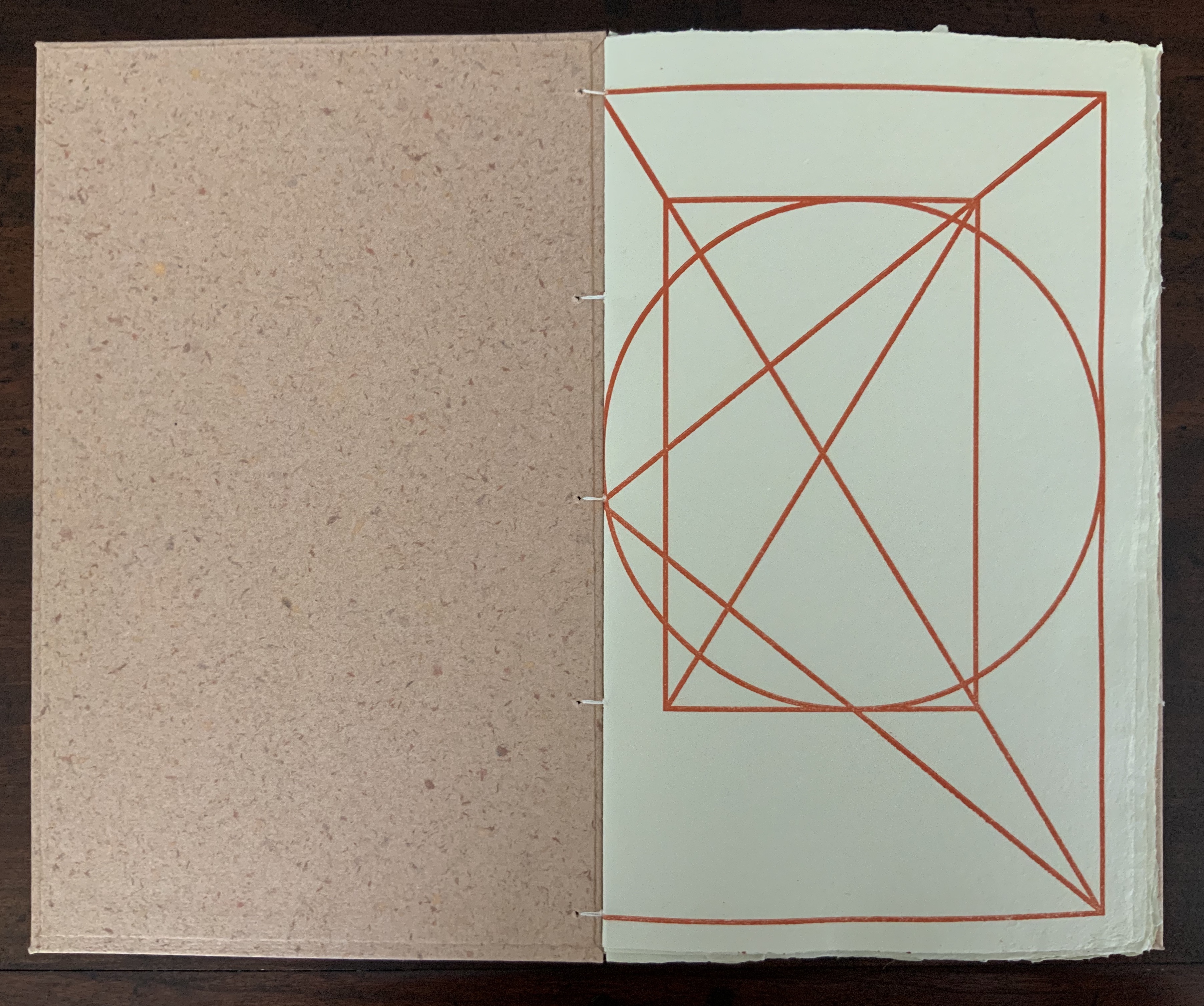
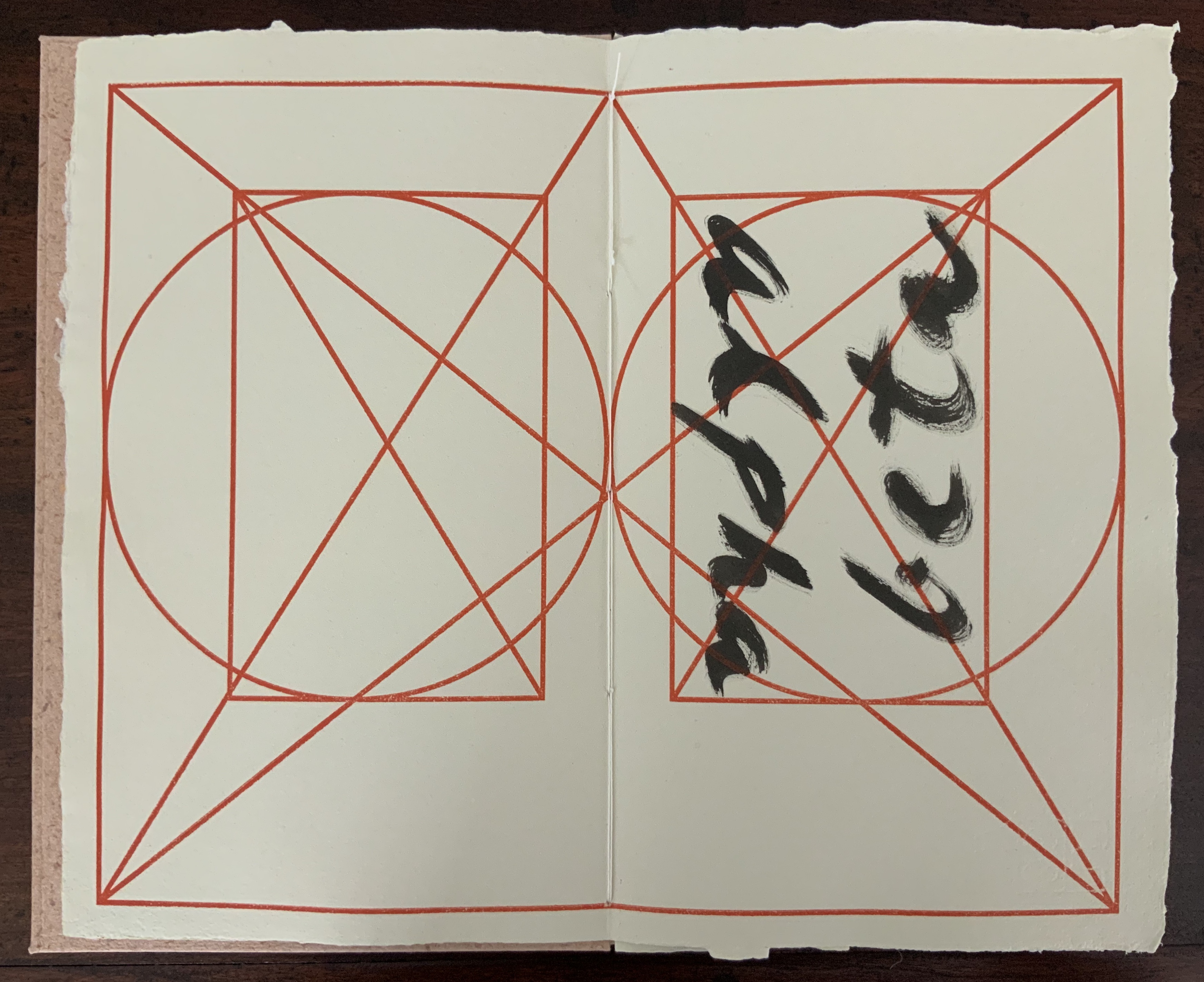
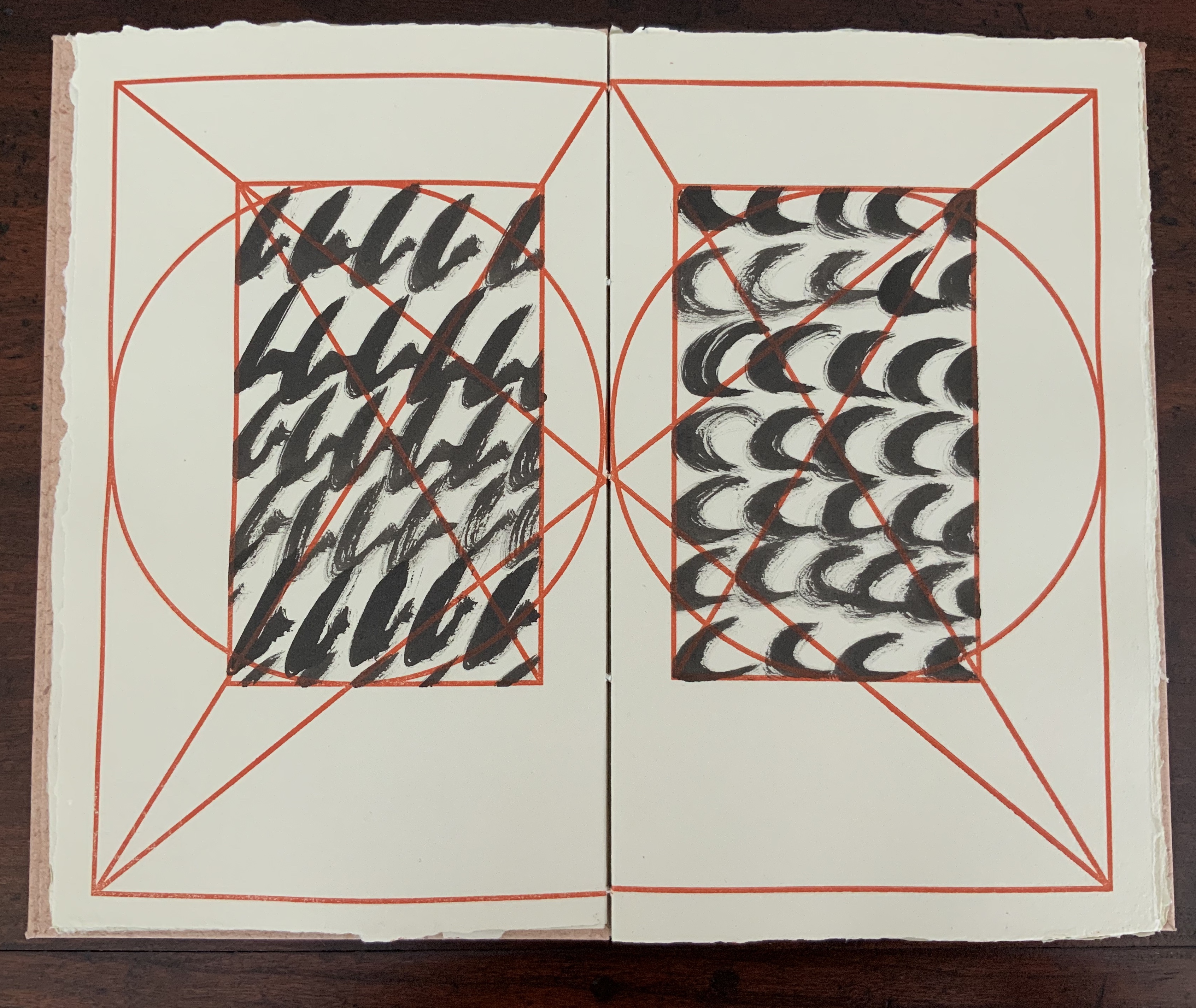
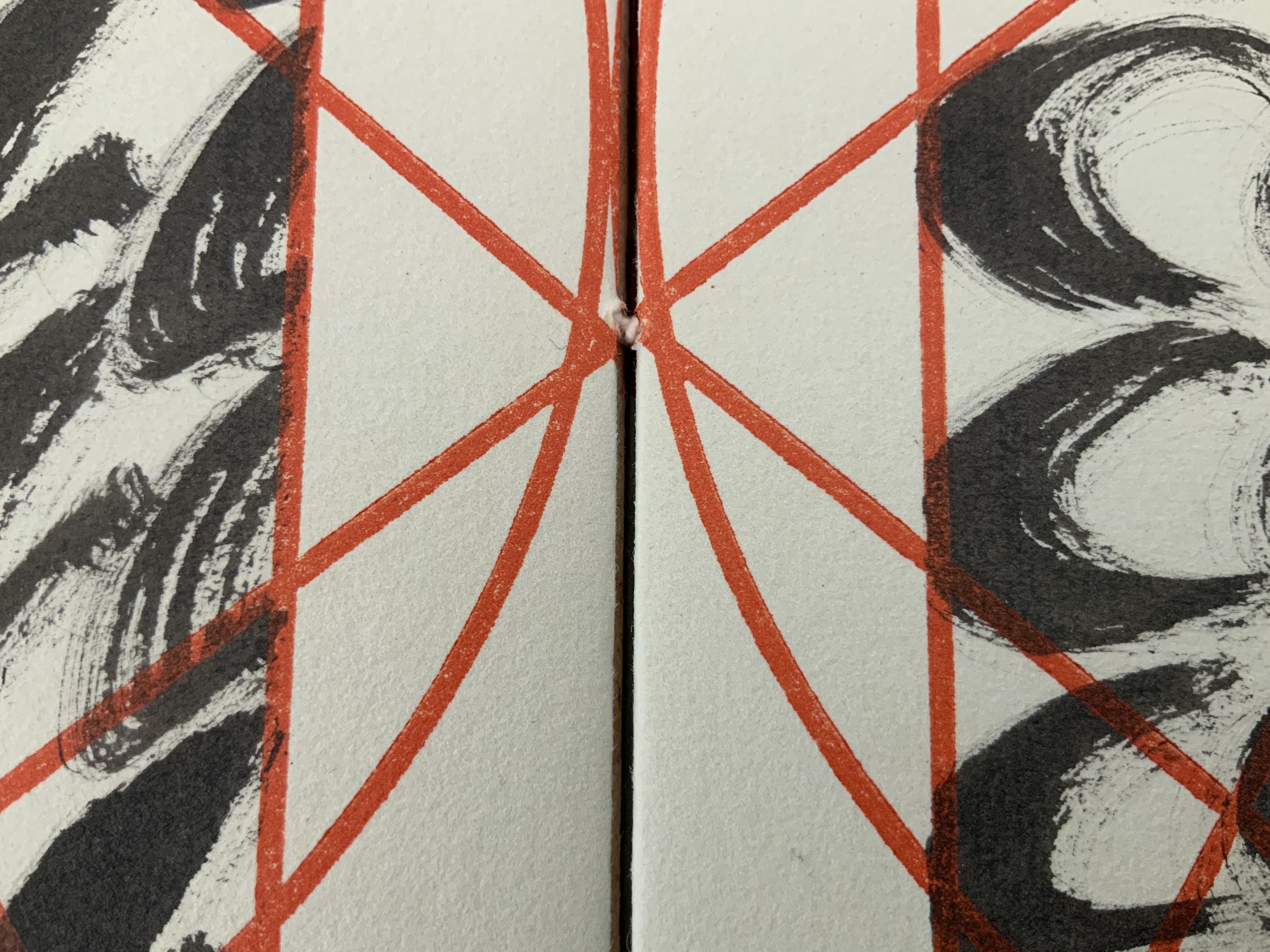
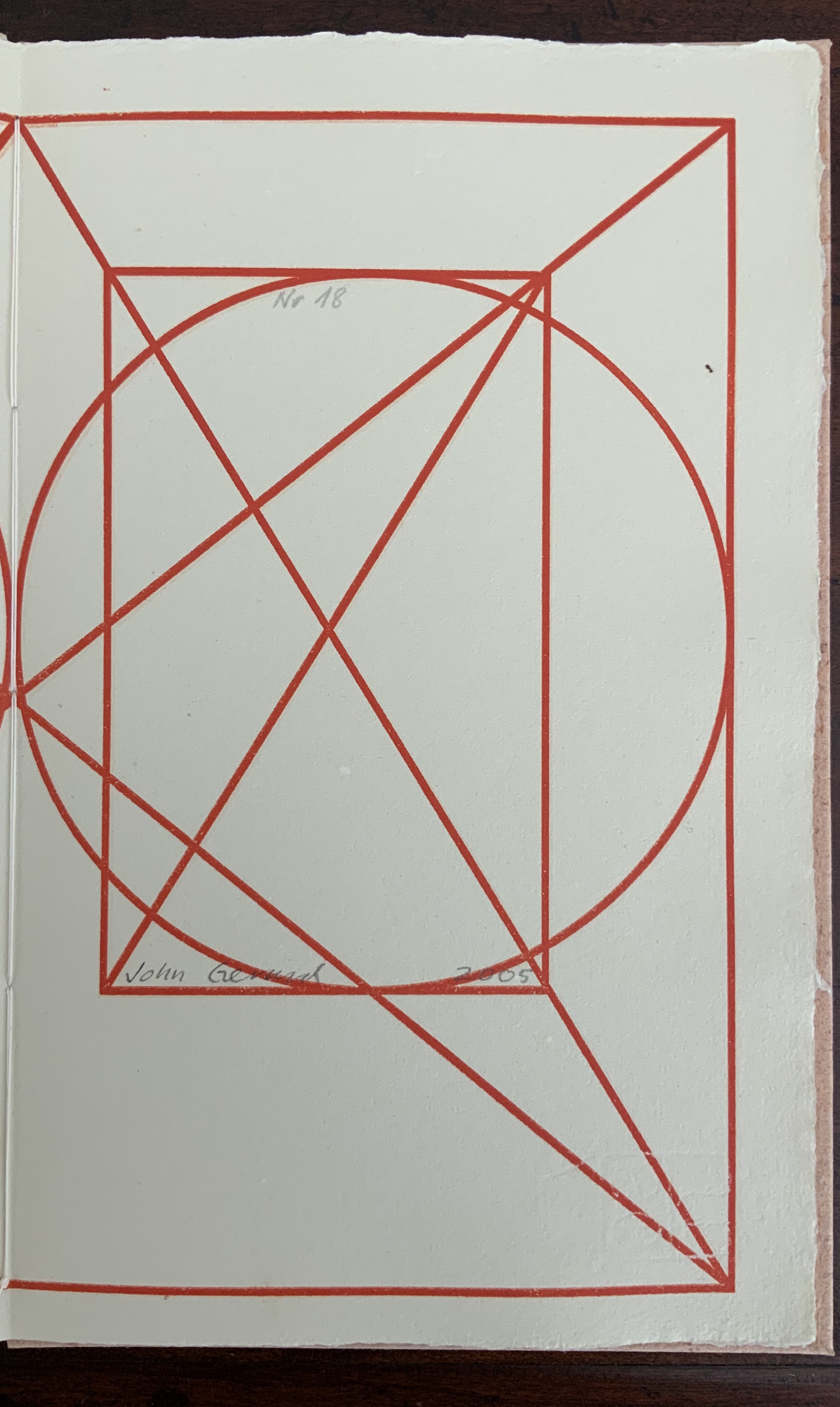
In the playground of the alphabet, papermaking, calligraphy, page design and layout, image and text, printing and binding, John Gerard has created an outstanding and contemplative work of book art and the book arts. Eastern and Western traditions meet on the page and in the material and structure: Coptic-style binding, handmade paper and spirited brushing of the letters right up against the geometric constraints of Jan Tschichold’s diagram for deriving the text block’s ideal space and positioning from the Golden Ratio.
The cover’s paper label shows the image of Jan Tschichold’s canon for page layout, which is reproduced on every page of the work. Each letter of the alphabet is messily brushed in black over and over to fill the mathematically precise text area defined by Tschichold’s canon.
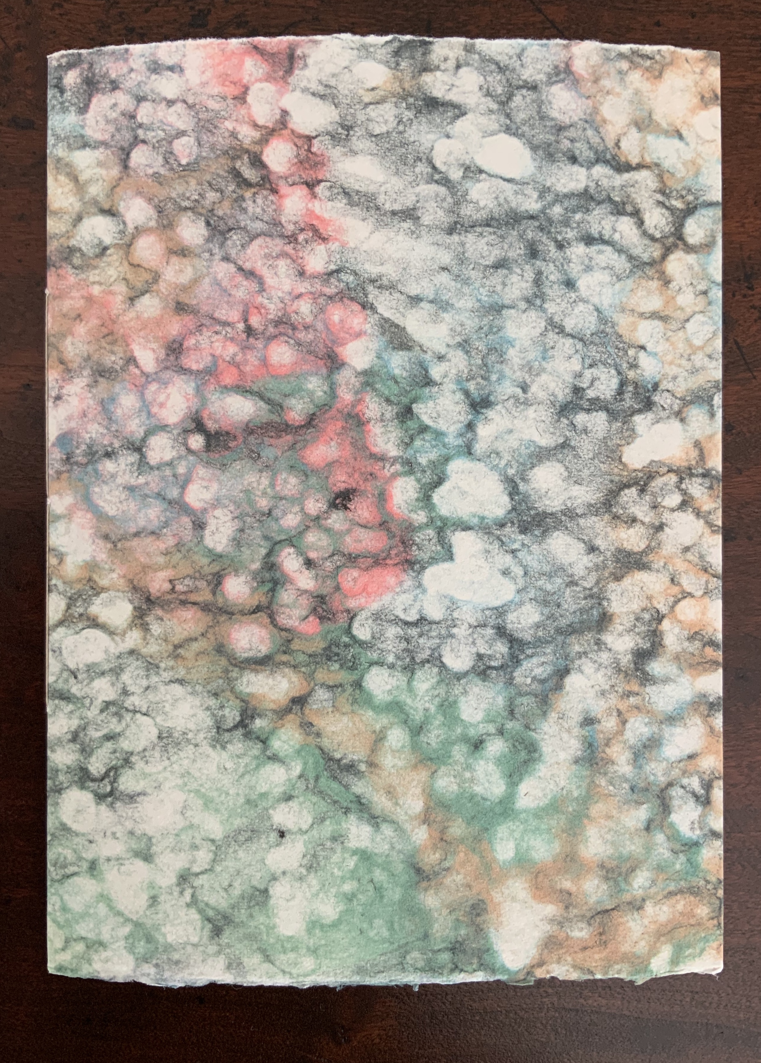
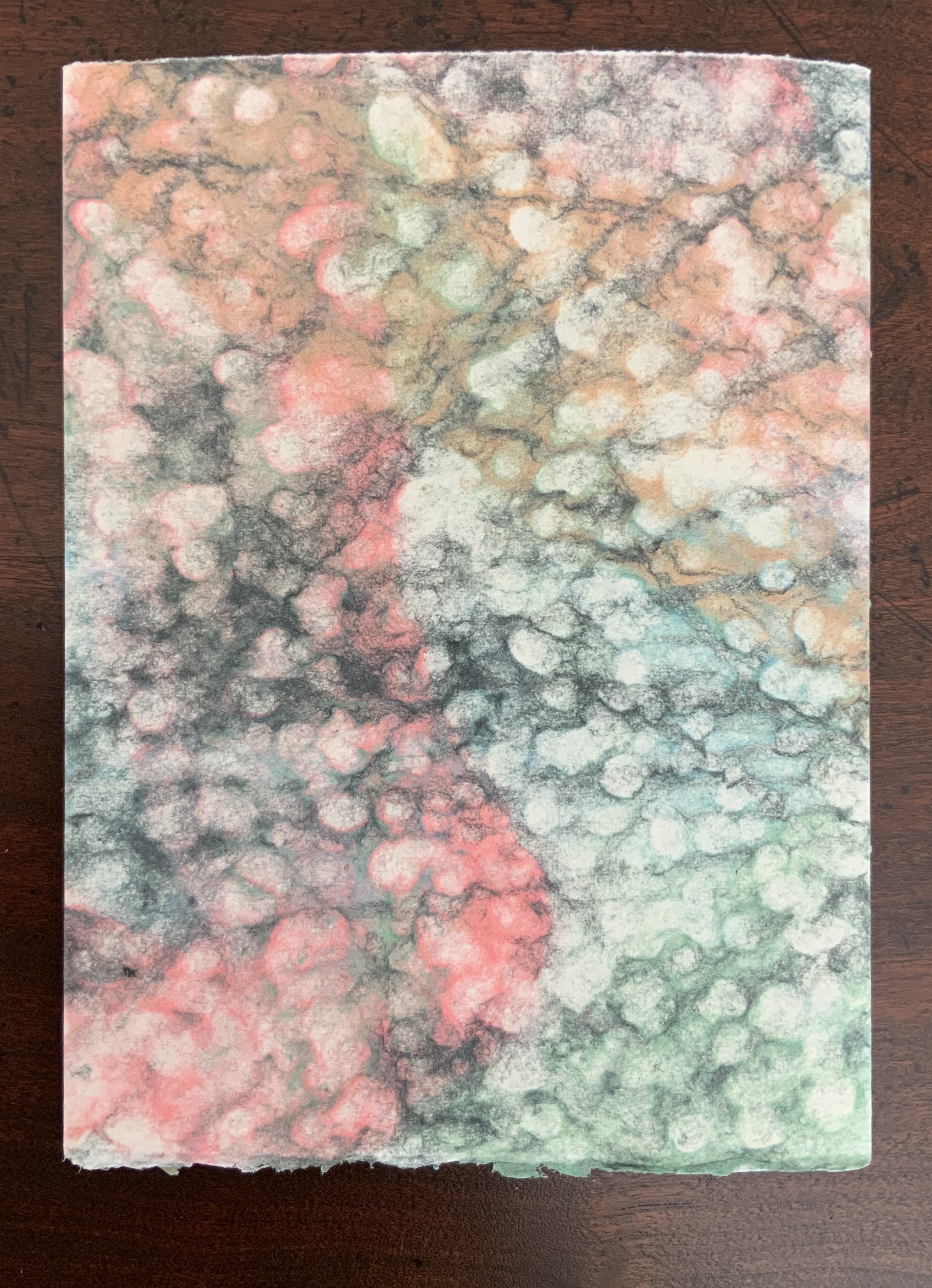
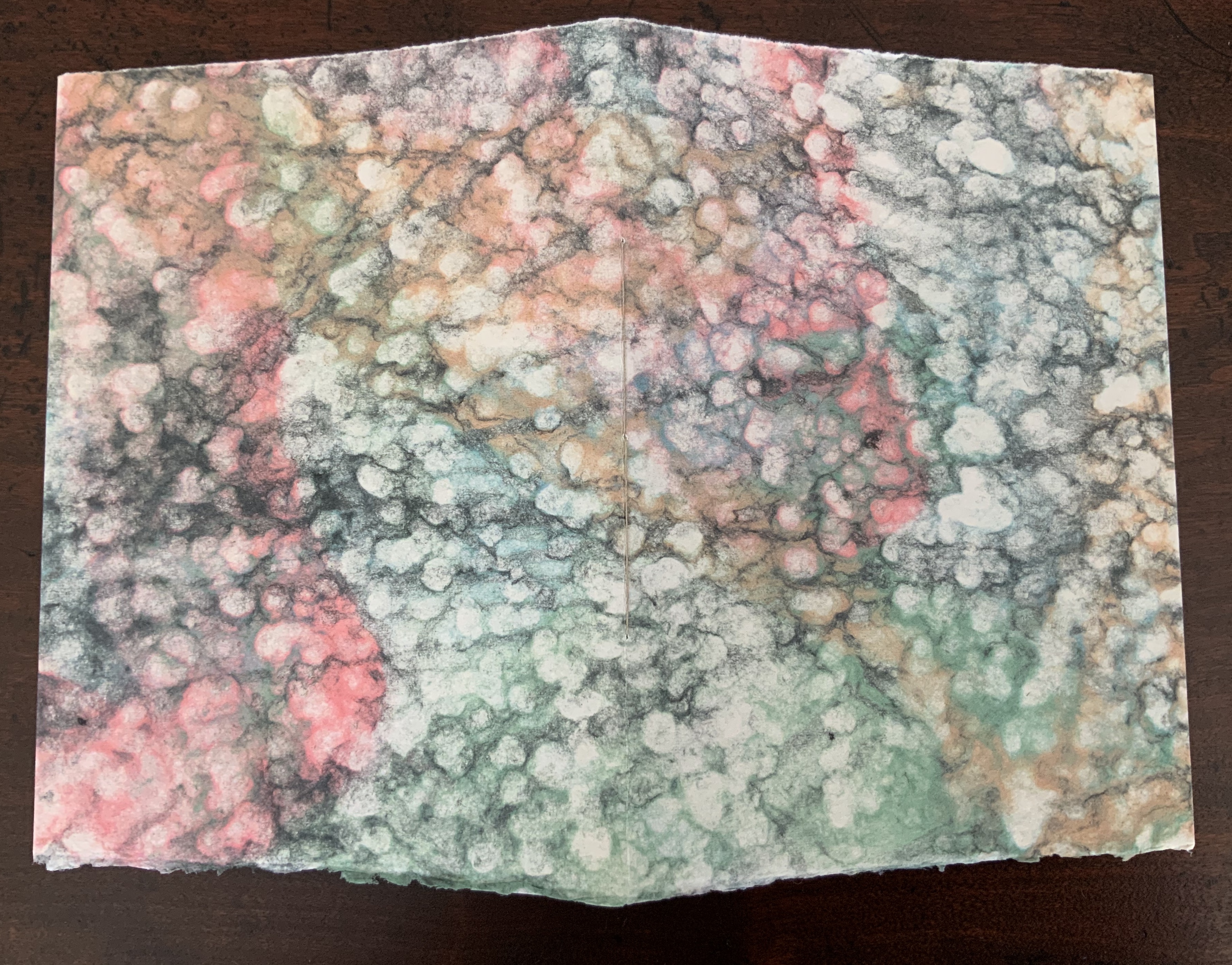
The text and label papers for Alpha Beta are handmade from cotton and hemp using a velin mould with Gerard’s early watermark depicting the Eifeltor Mühle (Eifeltor Mill) and the letters S and G (Studio John Gerard). The weight of the paper is about 150-180gsm. The lettering is done with Indian ink, and the printing of Tschichold’s diagram, with a proofing press using a photo-sensitive nylon plate. The cover papers are also made with cotton and hemp using a coagulant with slightly different pigmented pulps, which creates the decorative speckled look. The sewing thread is linen.
Tschichold’s “canon” is but one among four. The others belong to Villard de Honnecourt, J.A. Van de Graaf and Raúl Rosarivo. Online, Alexander Ross Charchar’s dynamic diagram “The Dance of the Four Canons” delightfully illustrates the development of the Western craft and science of page layout.
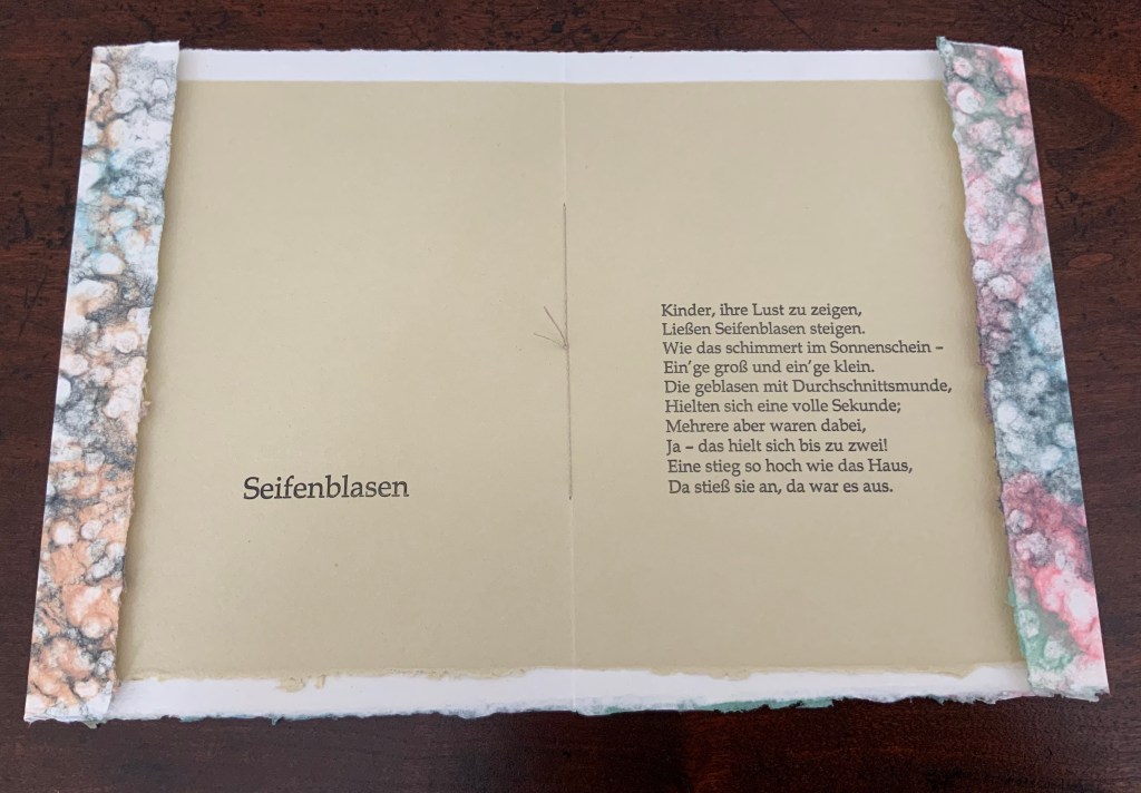
Seifenblasen (2013)
Seifenblasen (2013)
John Gerard
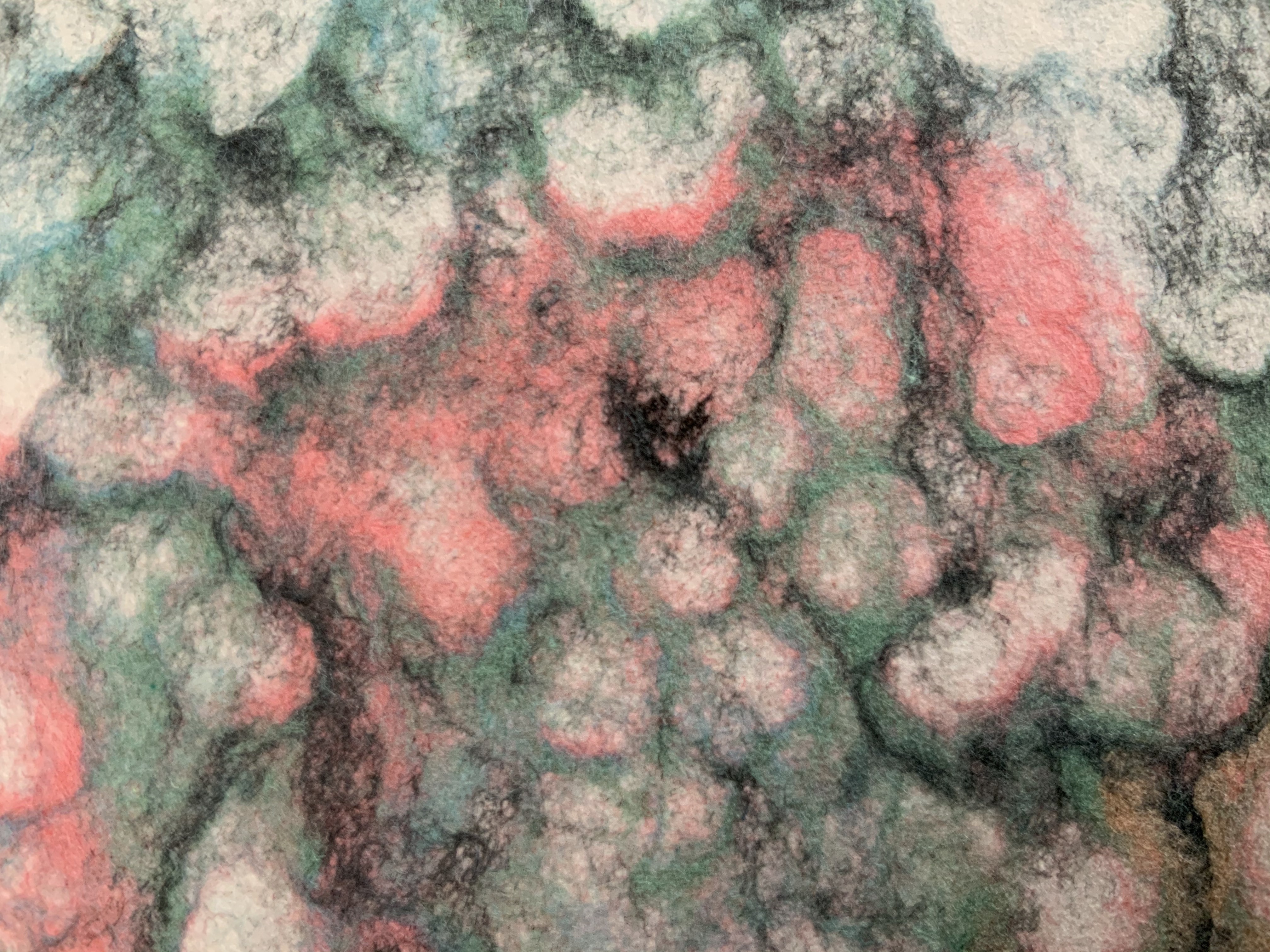
Artist booklet, stitched with linen thread, two sheets hand-made of cotton and abaca fibers, the cover sheet being double couched using a layer of colored pulps, the inner sheet printed in 14p Book Antiqua in relief printing. H200 x W150 mm. Edition of 100 unnumbered copies. Acquired from the artist, 29 July 2020. Photos: Books On Books Collection.
Inspired by the 19th century poem “Seifenblasen” (“Soap Bubbles”) by Theodor Fontane, John Gerard uses pulp painting to create the shifting prismatic colors displayed on the surface of a soap bubble. By layering different colored pulps on a sheet of plain wet pulp, he evokes the same pleasure, color and lightness evoked by the words.Here is a loose translation:
Soap Bubbles

Children to show their delight
Send soap bubbles up to the light.
How they shimmer in the sun —
Some big, some small.
Blown with a mouth just so, some
Hold out a whole second —
But several there —
Yes! — hold on for two.
One rises as high as the house —
Bumps there — then it’s over.
Gerard seems drawn to respond to things displaying a tension between spirit and form, be it the tension of soap bubbles or the tension between repeatedly scrawled letters constrained by a canonical grid.
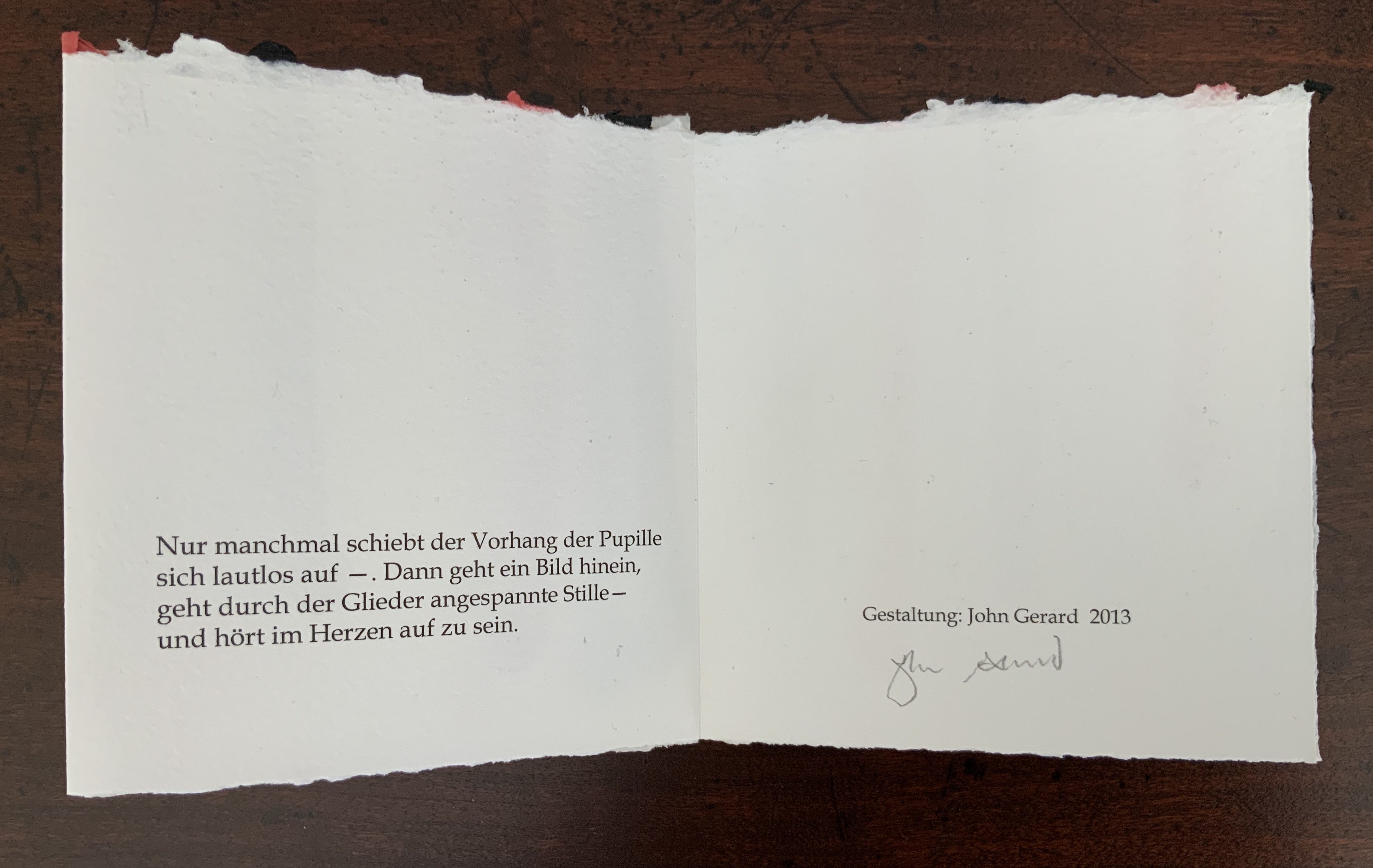
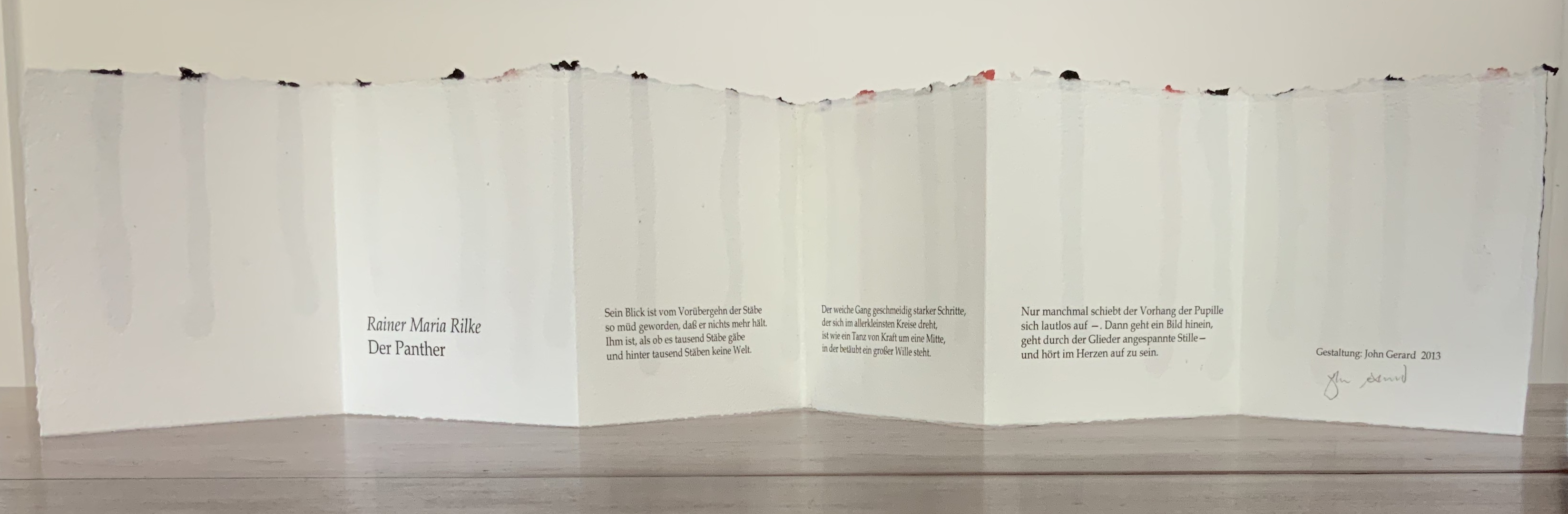
Der Panther (2013)
Der Panther (2013)
John Gerard
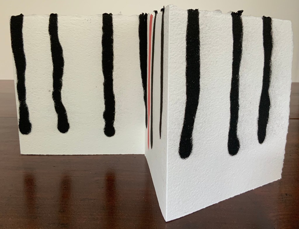
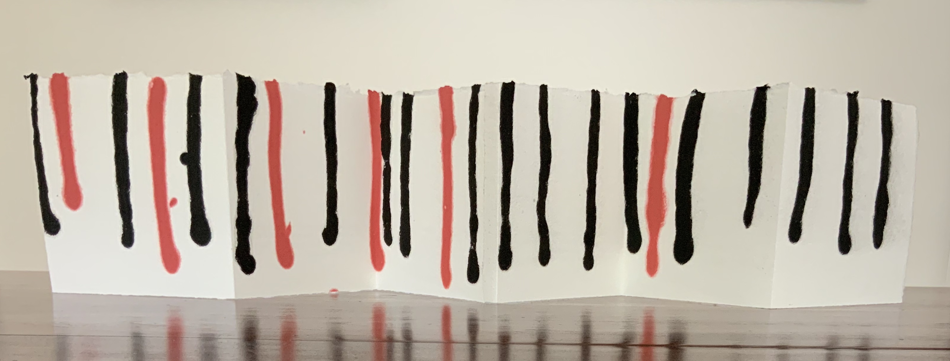
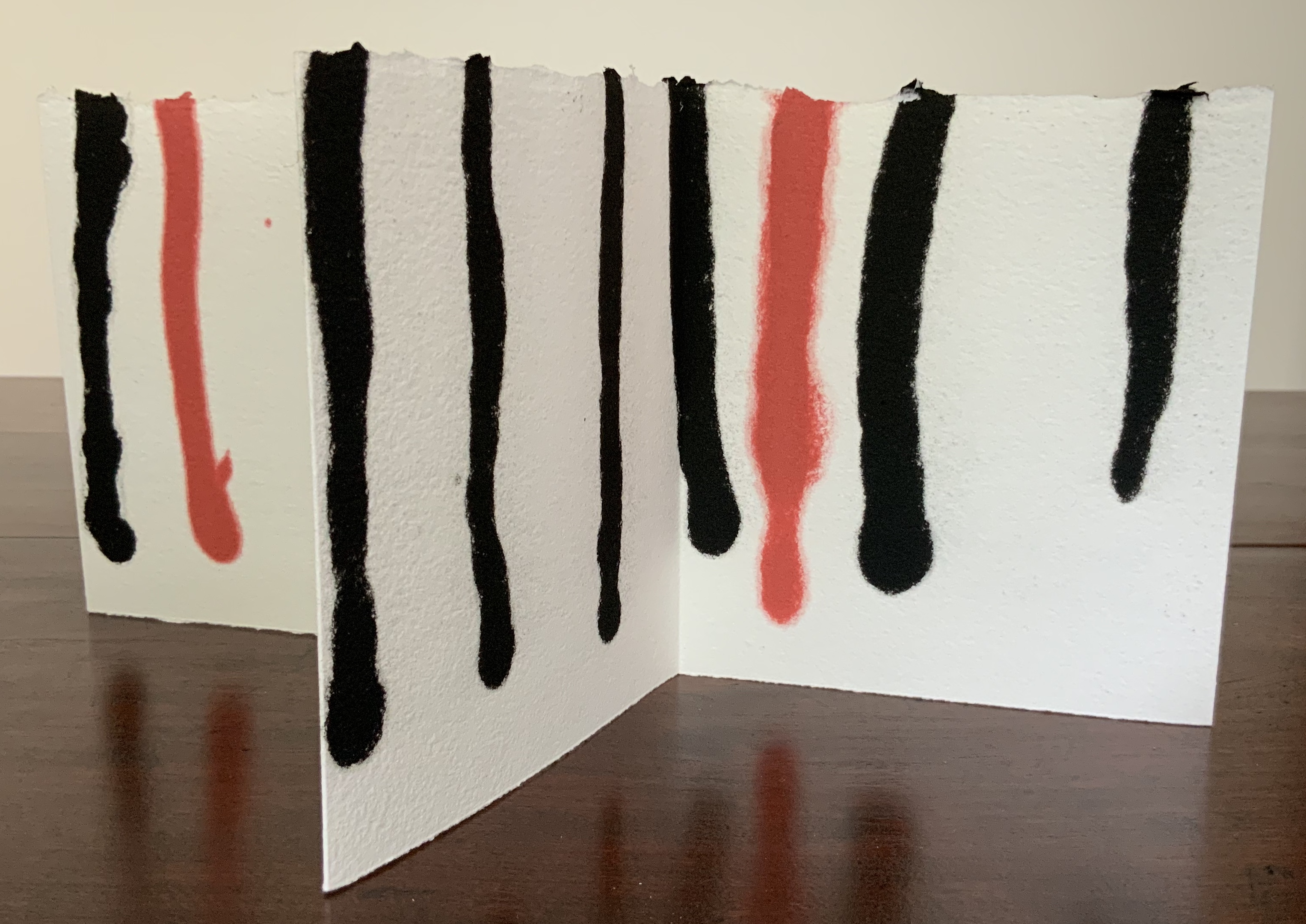
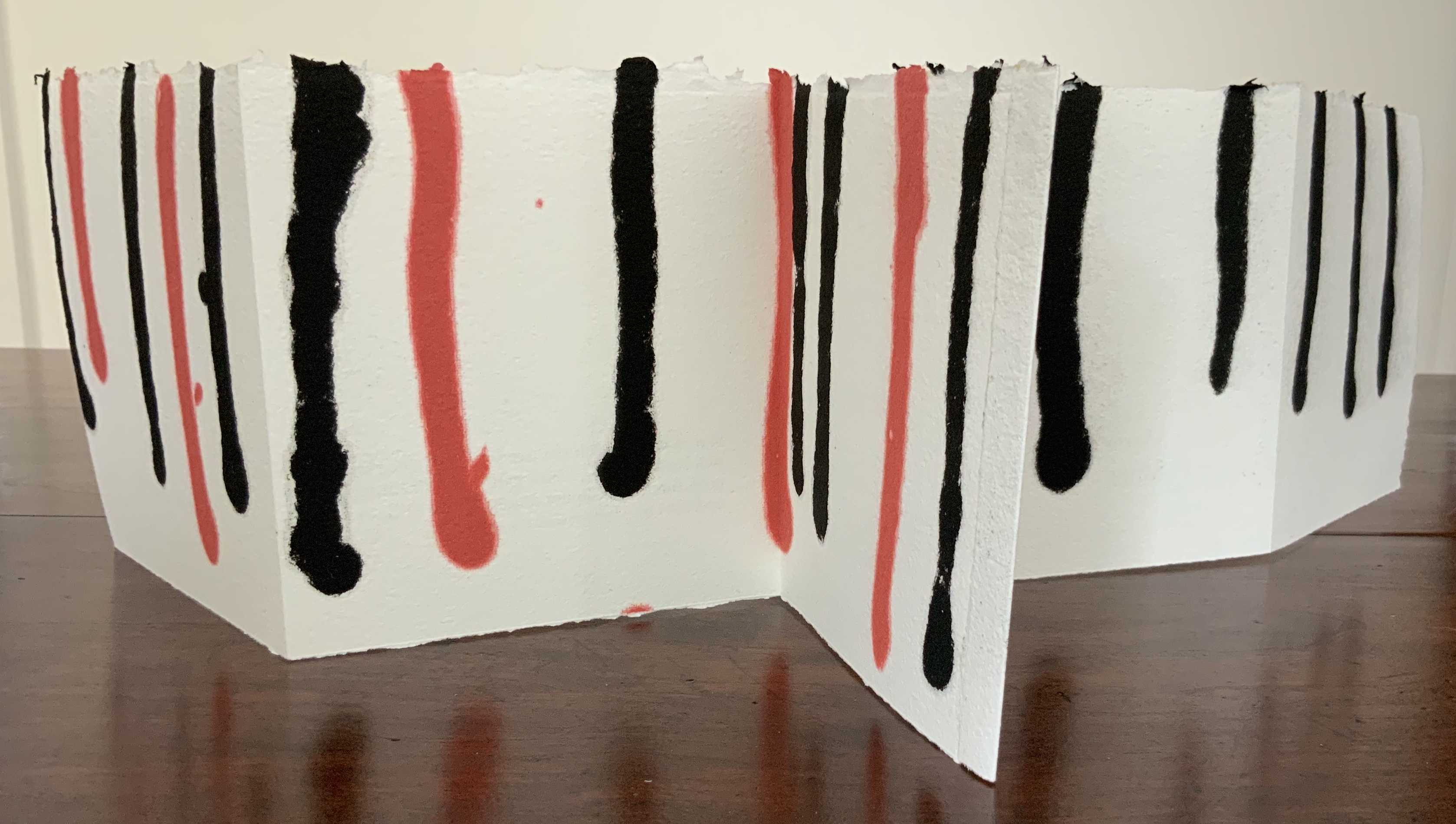
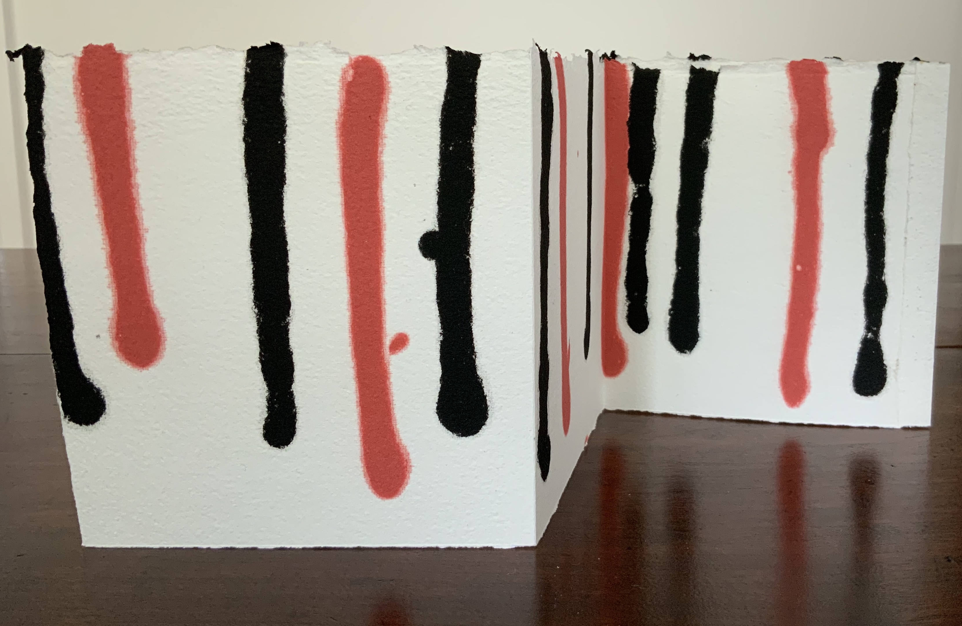
Leporello of two connected sheets of hand-made cotton and hemp paper, pulp-painted with red and black lines. H140 x W130 mm (unfolded approx. 770 mm). Unnumbered, signed edition of 25 copies. Acquired from the artist, 29 July 2020. Photos: Books On Books Collection.
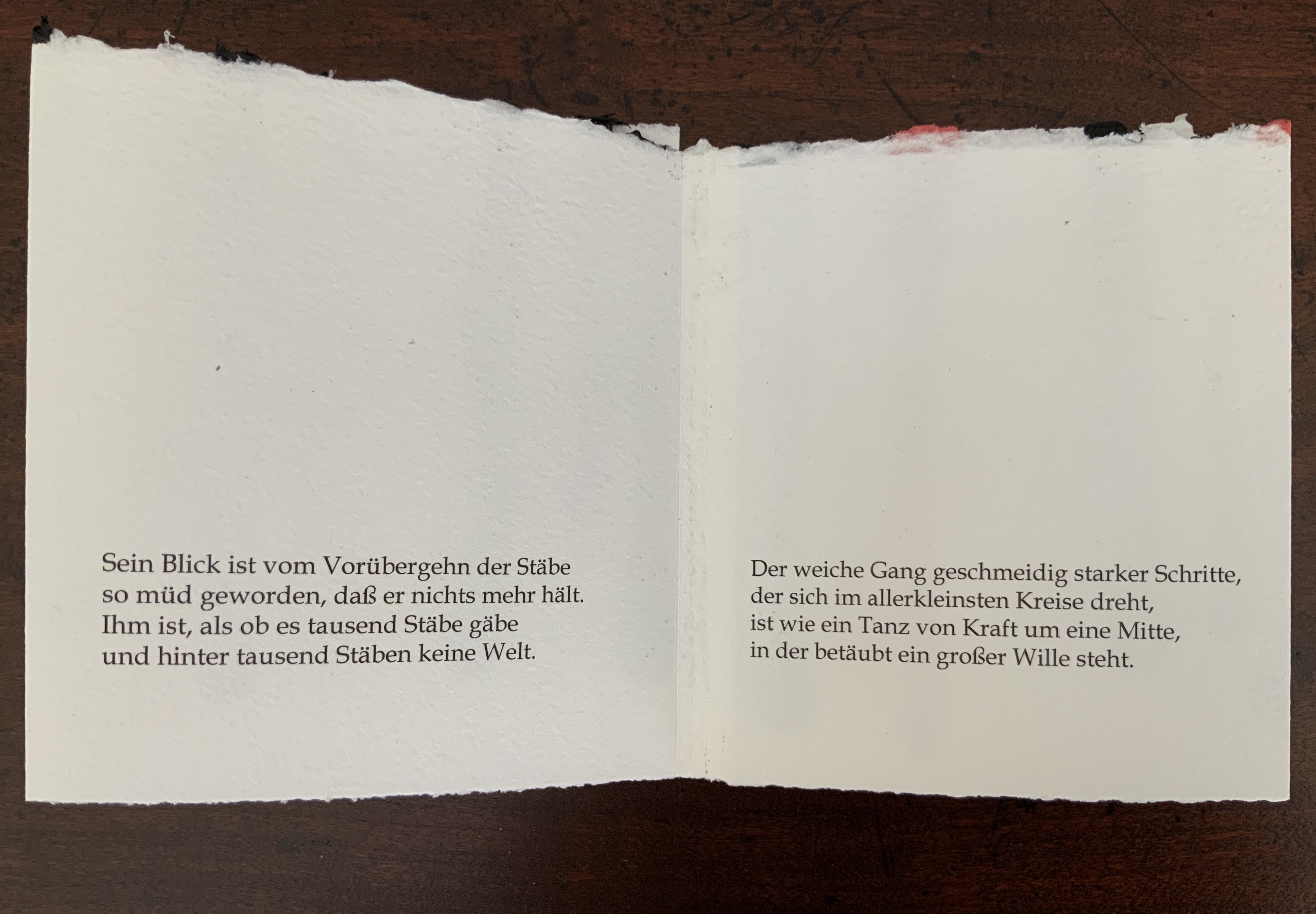
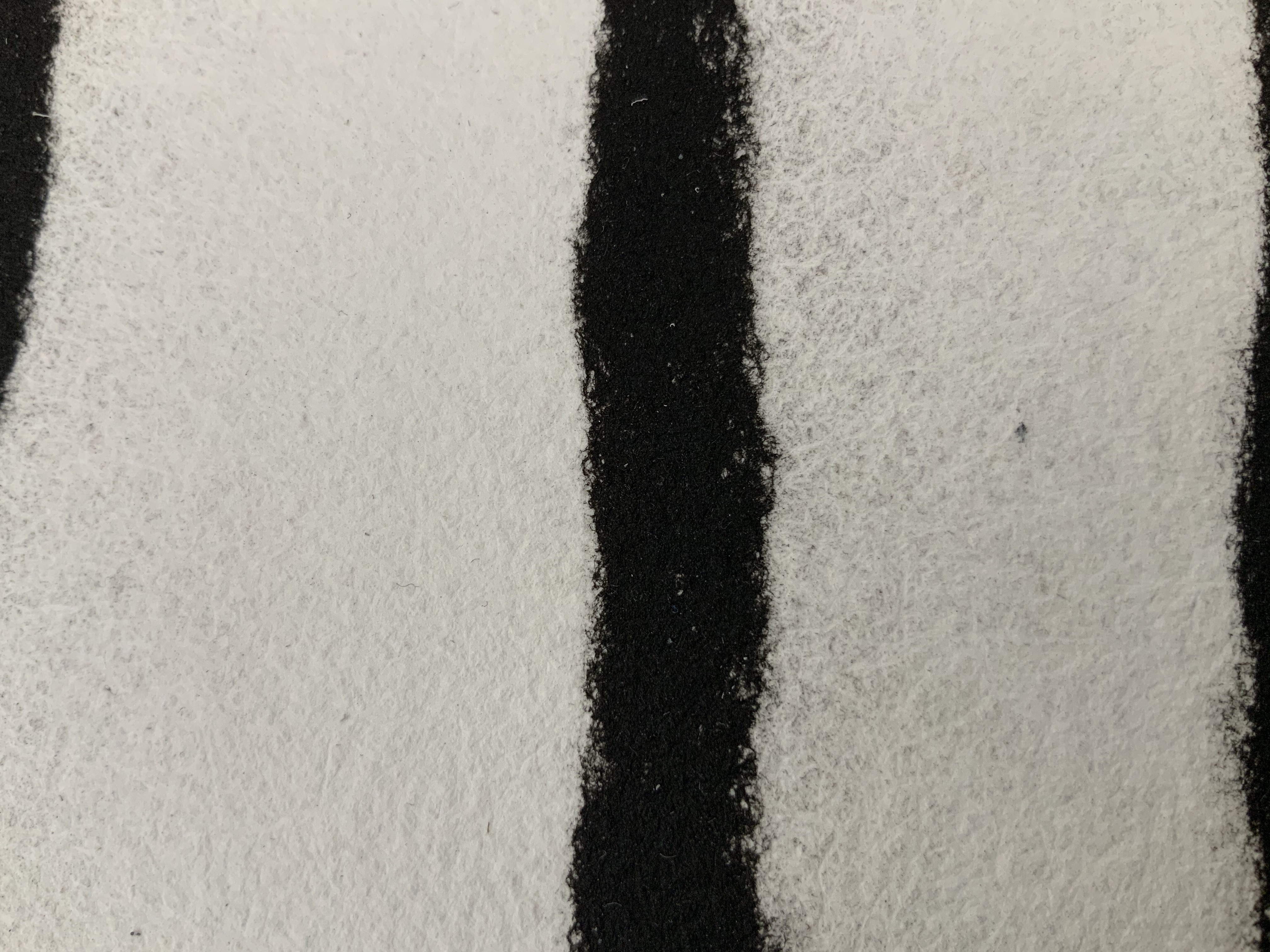
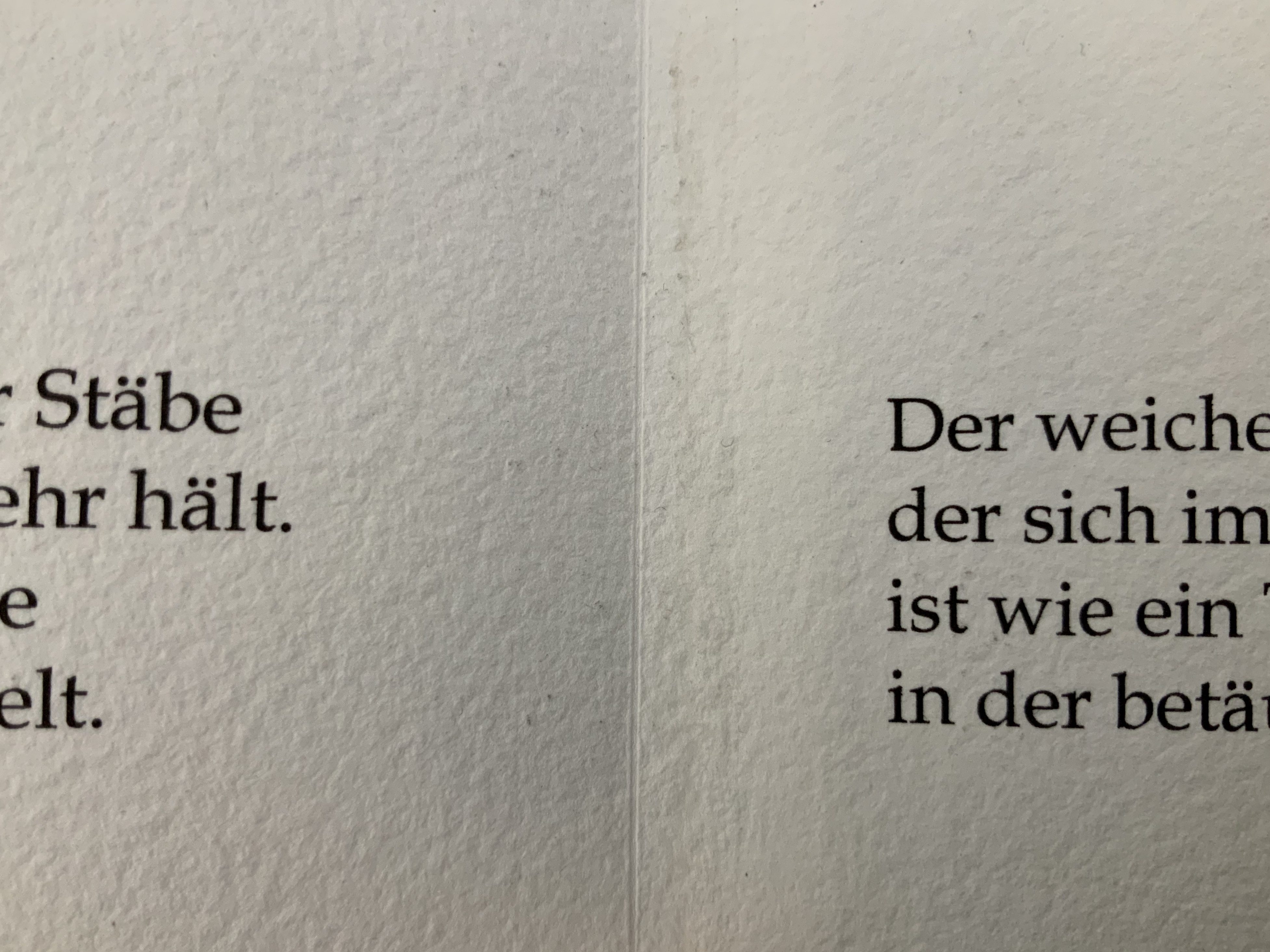
Rainer Maria Rilke’s poem “The Panther” embodies the tension that Gerard seems to love. Three stanzas in black 12 pt Book-Antiqua pace across the leporello like the panther behind what seem to him “a thousand bars”, which Gerard evokes in black and red pulp painting on the reverse of the leporello. Fully open, the torn top edge slopes and rises like the back and shoulders of the panther as it strides and turns in the smallest circle it can make. The bars behind, or in front of it, end above the lower edge in rounded shapes like the panther’s paws, whose texture the soft and rough handmade paper mimics.
The alternation of black and red pulp echoes the tension between the cage and panther’s heart in the poem, and the leporello opens and closes on the panther just as its own pupil’s nictitating membrane slides open, then closes on its world. Reportedly, at Augusta Rodin’s behest, Rilke stood before the animal’s cage in the Jardins des Plantes in Paris for nine hours. At the end of the poem, he has placed the reader/viewer inside the animal, absorbed the reader/viewer through the animal’s movement and gaze. Gerard’s artist booklet — by giving the reader/viewer a chance to see through the panther’s eyes — makes Rilke’s poem just as tangible as Rilke’s poem makes the panther and its world.
Gerard’s three works belong with the Books On Books Collection’s first seven books of the Rijswijk Biennial. His Alpha Beta even features in that series’ Papier op de vlucht = Paper takes flight (2006) and contributes to two of the collection’s sub themes: abecedaries as well as the technique of pulp painting. Seifenblasen and De Panther exemplify the sub theme of “reverse ekphrasis” represented by works such as Barbara Tetenbaum’s version of Michael Donaghy’s poem “Machine” or herman de vries’ argumentstellen 1968 / 2003 (de wittgenstein — tractatus — ) (2003). Gerard’s two works are, in fact, the epitome of transforming a literary text into an artwork.
Further Reading
“Abecedaries I (in progress)”, Books On Books Collection, 31 March 2020.
“The First Seven Books of the Rijswijk Paper Biennial”, Books On Books Collection, 10 October 2019.
“Looking Back and Forward from the Paper Biennial 2018”, Bookmarking Book Art, 24 June 2016
“Margins and making objects that live forever”, Bookmarking Book Art, 20 August 2014.
“Claire Van Vliet”, Books On Books Collection, 8 August 2019.
Corbett, Rachel. “From You Must Change Your Life: The Story of Rainer Maria Rilke and Auguste Rodin”, Poetry Magazine, 31 August 2016. Accessed 11 August 2020.