Here are two works that show how the substrate of the book can be the primary element of making art and meaning. When it comes to paper, the fireworks in most artists’ books focus on printing or structural displays. Susan Mills describes herself as not just a book artist but “a conceptual rural urban bookbinding poet artist working in book form” (Mills, 2025). She does not practice printing or printmaking. She produces her books without the use of a printing press and handbinds them using innovative structures, bindings, and materials. She lets the paper itself shine — as surface and as “paint”.
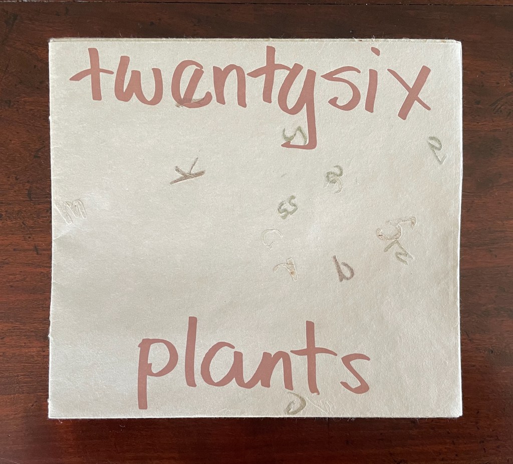
Twentysix Plants (2013)
Susan Mills’ Twentysix Plants puts handmade paper at the center of its artistry as it nods to Ed Ruscha’s Twentysix Gasoline Stations (1963). It consists of twenty-seven different papers. Twenty-six of them were each made from one of twenty-six different plants. A small amount of abaca was added to the different pulps to ease them through the Hollander Beater. After the sheets were couched, dried, and readied for use, Mills “labeled” them by cutting out the name of the constituent plant in distinctive callitomic letters. For the cover paper, the twenty-seventh paper, the twenty-six cut-out scripts went into the vat.
If Twentysix Plants were an abecedarium, it would be arguable that, just as our words are made from the alphabet’s letters, so the cover of Twentysix Plants is made from all the plants used in the book. There they are, embodied in their fragmented names, embedded in the cover. But neither Twentysix Plants nor Twentysix Gasoline Stations is an A-Z.
Twentysix Plants (2013)
Susan Mills
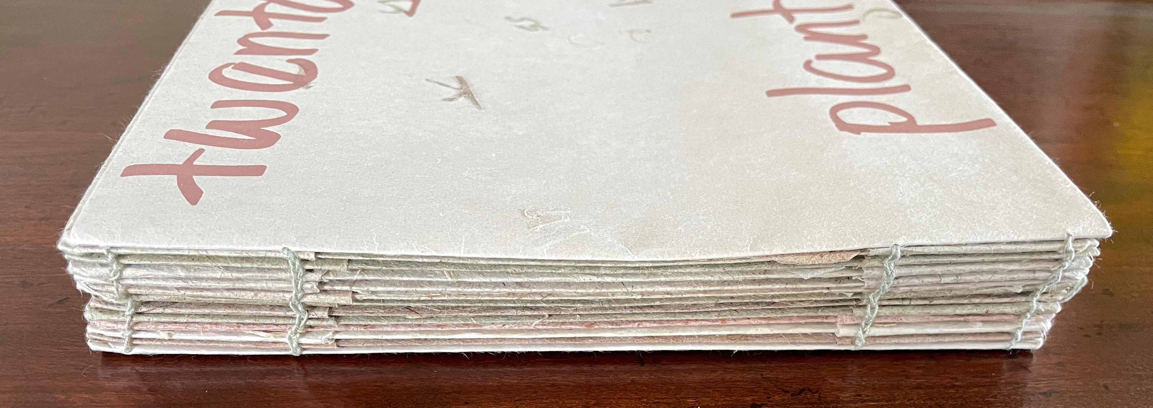
Softcover with exposed spine, link-stitch and kettle-stitch sewn, and non-adhesive interlocking folios. H205 x W225 mm. [26] pages. Edition of 50, of which this is #4. Acquired from the artist, 9 February 2026.
Photos: Books On Books Collection.
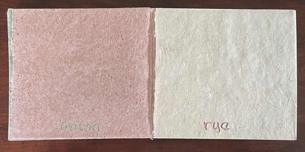
It may be an over-subtle reading, but true to the non-alphabetic and happenstance organization of Ruscha’s Twentysix Gasoline Stations, Mills makes her first two entries myrtle and sumac, and, like Ruscha’s not avoiding duplicate brands of gasoline, she does not shy away from duplicates, even triplicates, of plants beginning with the same letter. We have carrot, cattail, cornhusk, rye, and rhubarb papers, but no agave or zinnia, even though both are ruderal, which is Mills’ preferred choice.
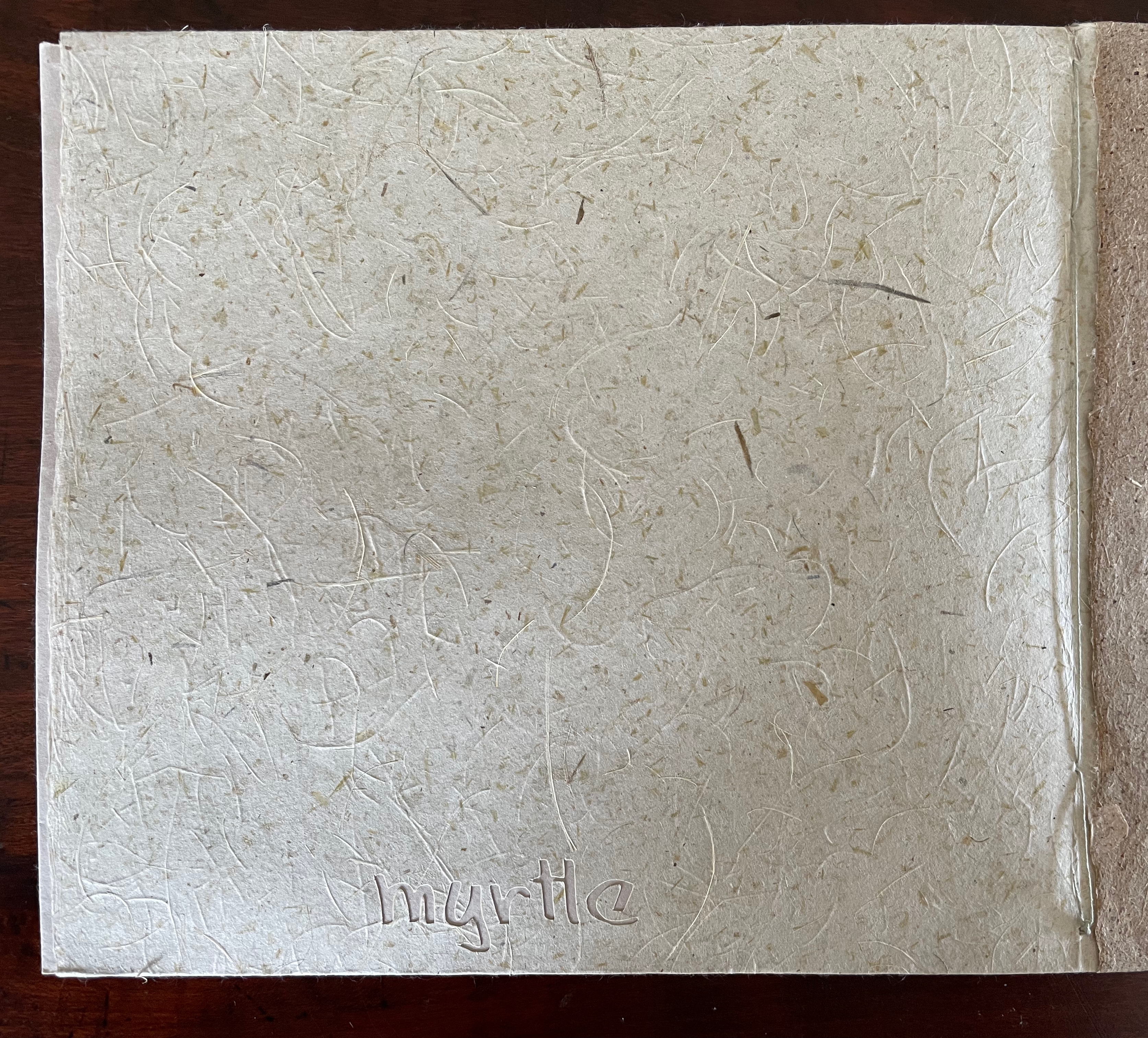
M is for myrtle.
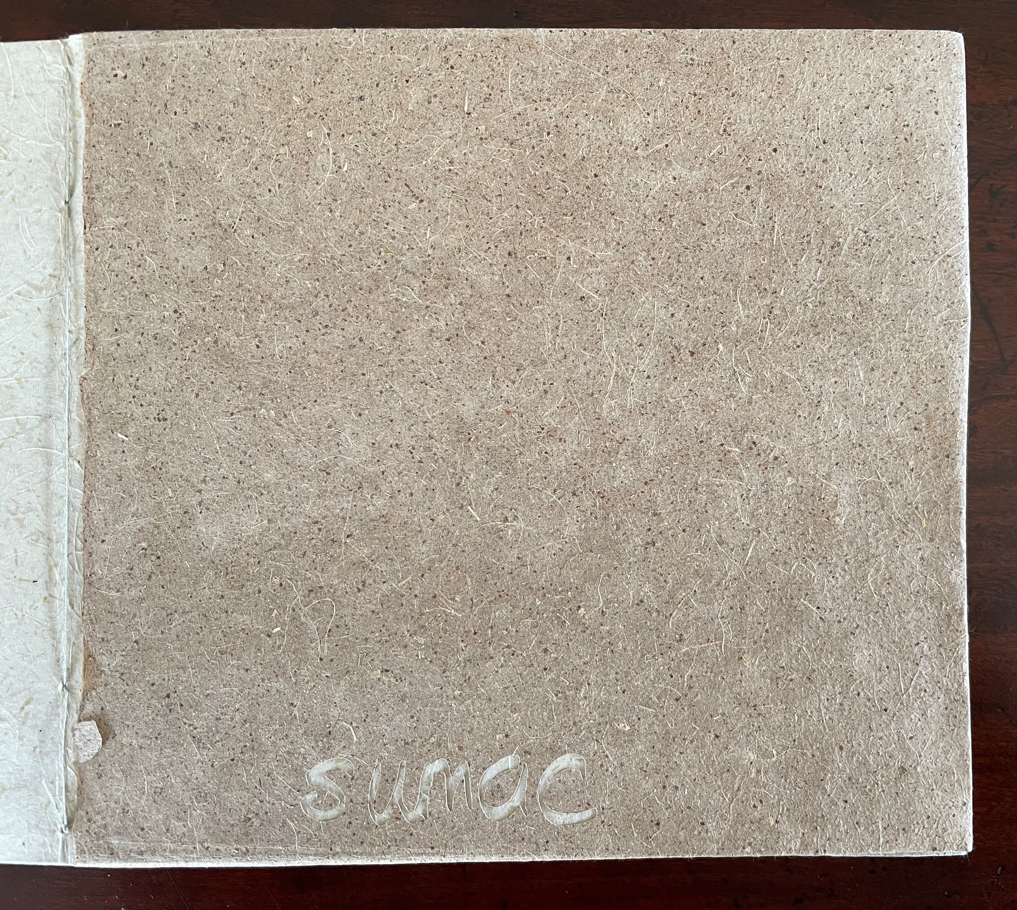
S is for sumac.
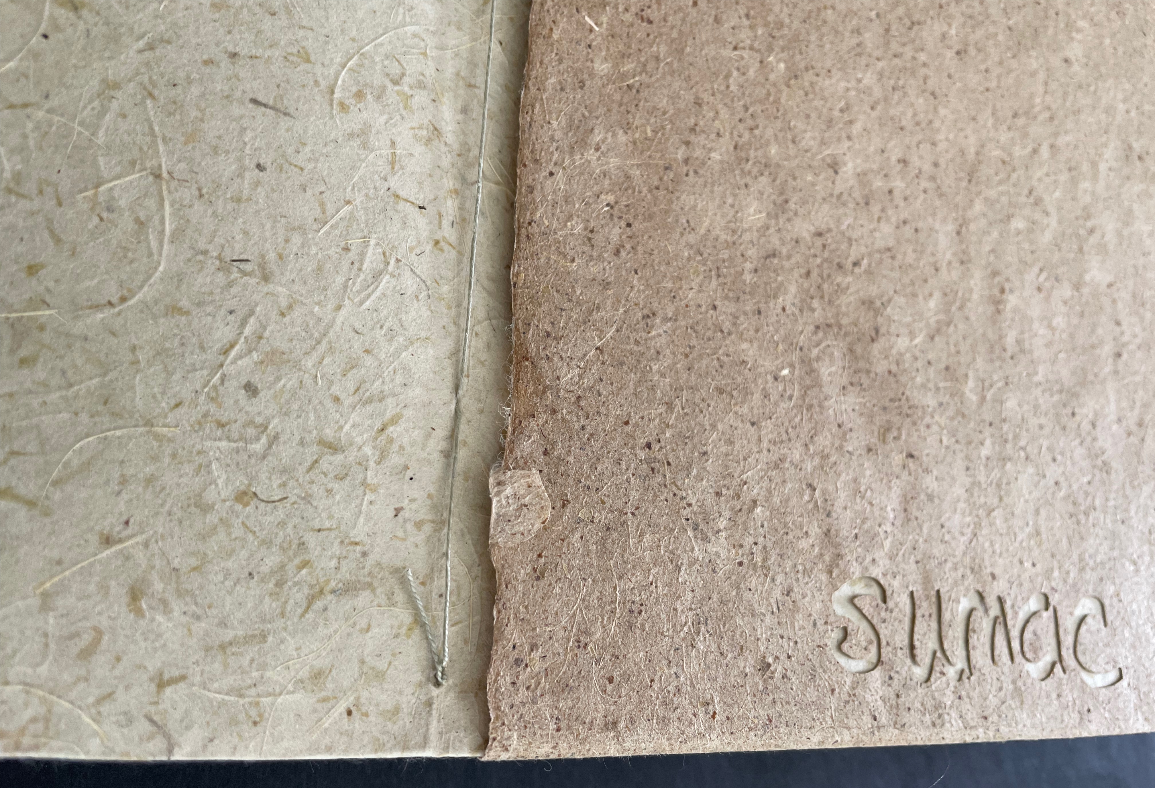
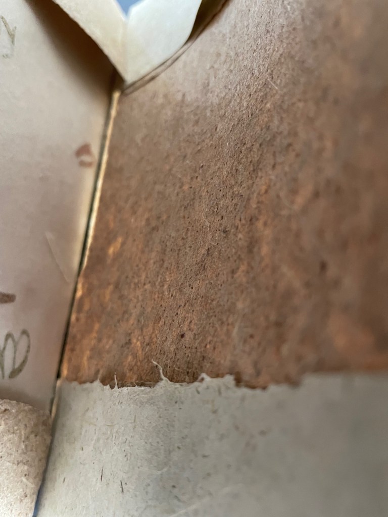
Before we can completely put aside a “letteral” connection, though, Mills’ binding design hints at a subtle link. Its folios are interleaved and enfolded throughout the book. This means that the paper showing through a cut-out name is not the paper named by the cut-out. In the myrtle/sumac spread above, the paper that shows behind the name “sumac” is not sumac paper, but rather the myrtle paper lying underneath as the following images show.
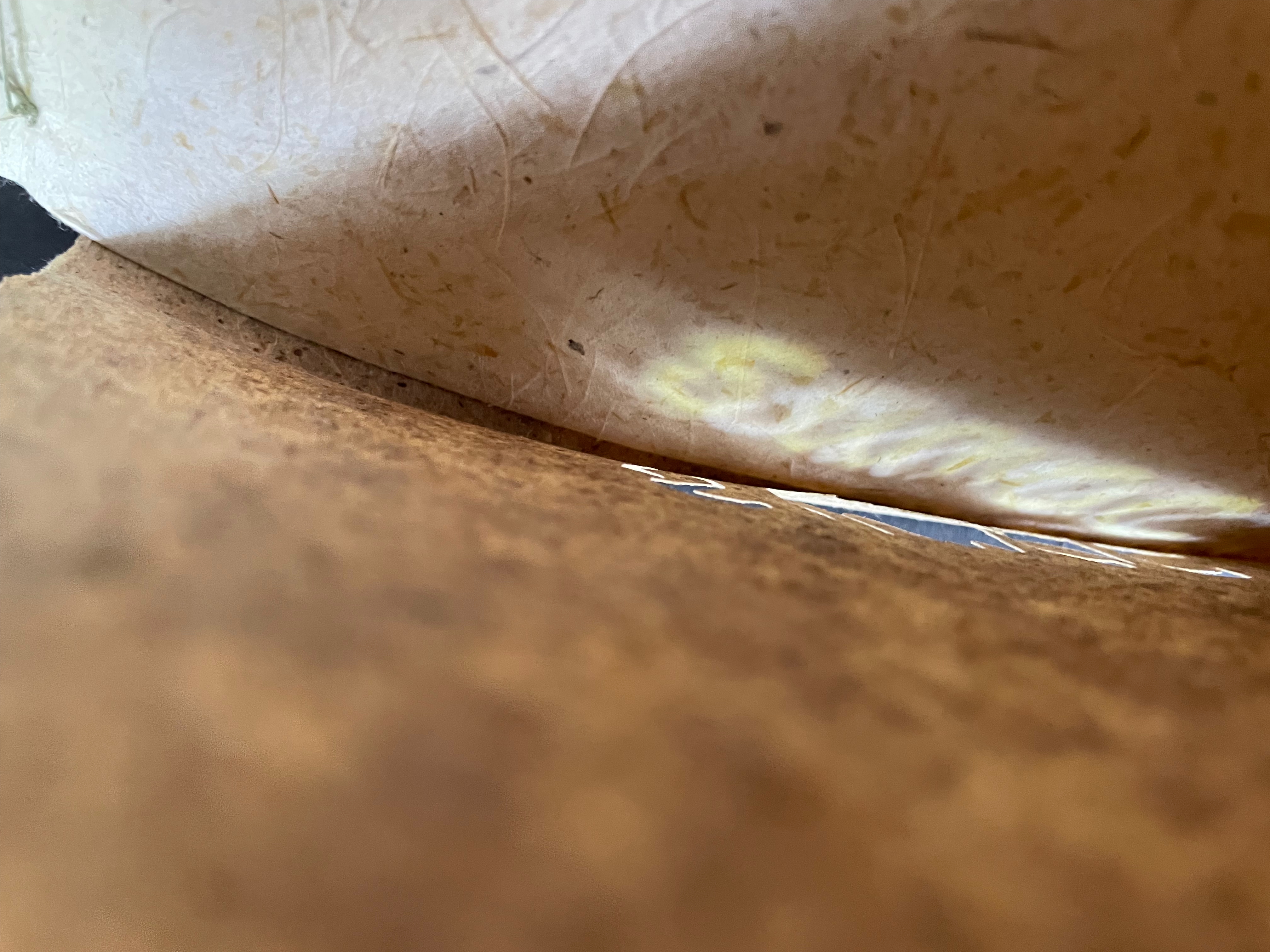
Left: Myrtle paper on verso running under sumac paper. Center: Inner view of enfolded folios. Right: Light casting the name of the sumac paper on myrtle paper.
Likewise, below, the paper that shows behind the name “cornhusk” is not cornhusk paper; it is the sumac paper from the preceding double-page spread. The cornhusk paper is folded over the sumac paper at the book’s top and bottom edges.
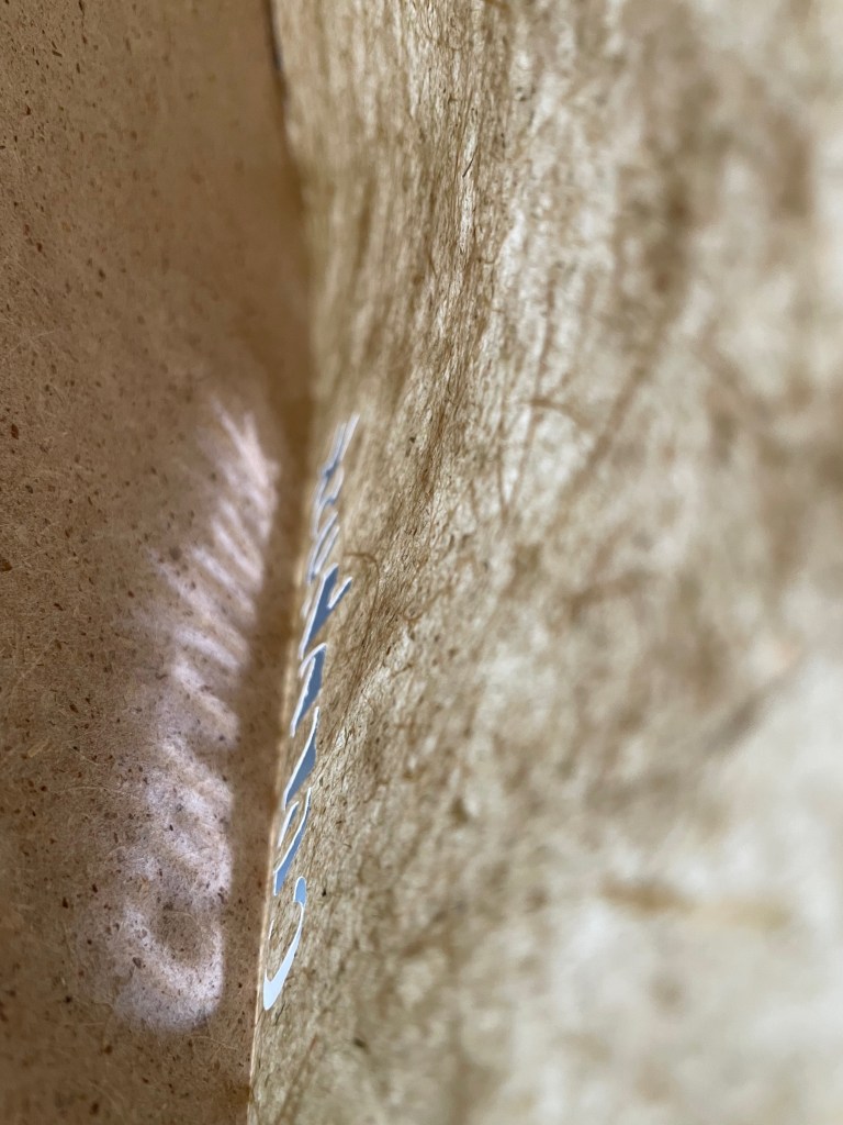
Left: Light casting the name of the cornhusk paper paper on sumac paper.. Right: Cornhusk paper folded over the top and bottom edges of the sumac paper.
So here is the “letteral” connection. Letters consist of strokes and negative space. Yet the outline strokes in Twentysix Plants name one paper, and the spaces “name” another. Twentysix Plants may not be an abecedarium, but this play with outlines and negative space recalls the arbitrariness of the shapes assigned to sounds and meaning assigned to words, key principles of the evolution of alphabets and language. Even if you reject that as over-reading the work, you have to admit that Twentysix Plants has merged text, image, and paper in an ingenious way.
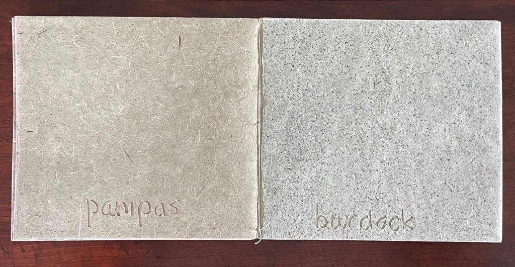
This evidence of Mills’ binding ingenuity also suggests a more likely principle driving the order in which the plants appear. Given the different colors and textures of the papers, doesn’t the order lie in a satisfaction with the contrasts in color and texture? Some contrasts are sharp, some diffuse. Consider those in the sequence from pampas to burdock to onion to rye.
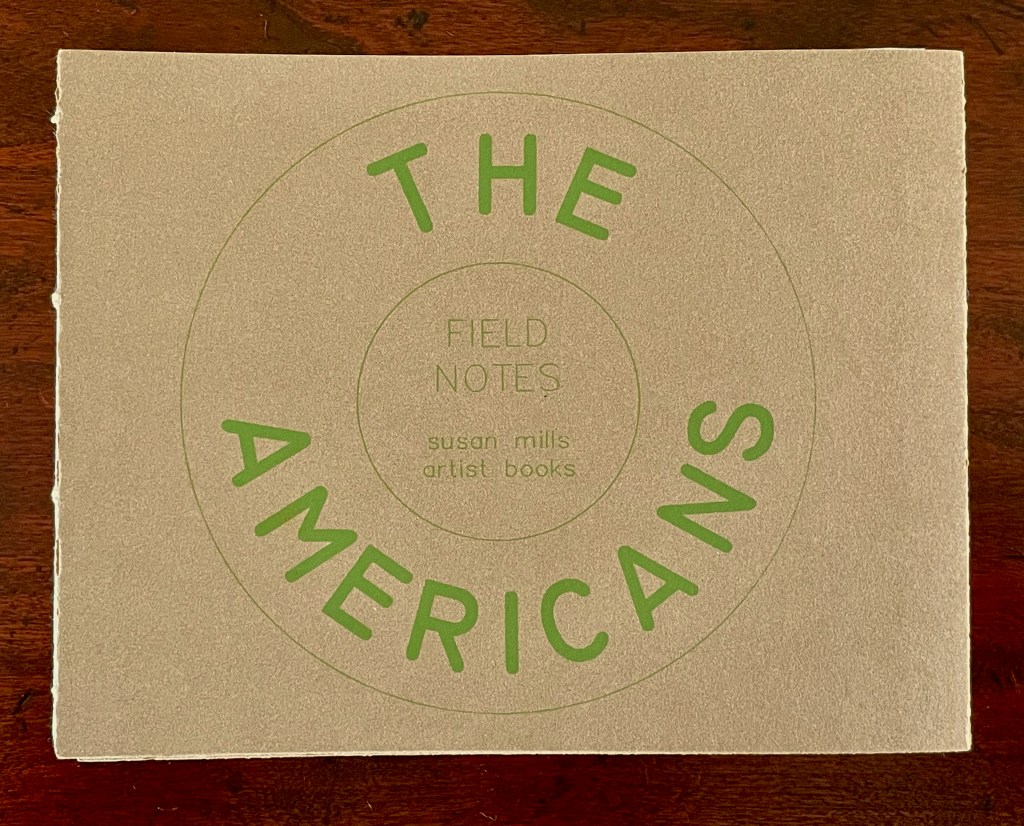
While Mills followed Ruscha’s much-invoked title, she foraged her twenty-six plants from the immediate environs of one location: the Women’s Studio Workshop (WSW) in Rosendale, New York. And although Mills self-publishes her works (as did Ruscha with Twentysix Gasoline Stations), WSW served as publisher for Twentysix Plants. For a Ruschavian self-publication sourced from multiple locations, we have Mills’ The Americans (2017).
The Americans (2017)
As a young artist, Susan Mills was mentored by Robert Frank and his wife June Leaf, a sculptor and visual artist. This travelogue in handmade paper pays homage to Frank’s classic documentary photobook The Americans (1958). Of the twenty-five locations represented by plants foraged at them, all but one correspond to locations in Frank’s 9000-mile itinerary. Mills collected some plants herself, friends and colleagues sent the others.
The Americans (2017)
Susan Mills
Softcover with exposed spine, link-stitch and kettle-stitch sewn. H128 x W165 mm. [52] pages. Artist’s book #8/Edition of 20, of which this is #8. Acquired from the artist, 9 February 2026.
Photos: Books On Books Collection.
In correspondence, Mills explains the process:
The Americans – paper is made with plants gathered from all the locations on the labels, mixed with a small amount of cotton and abaca so that it went through beating more easily. The colorful fibers on one side of each page are made from plants at the labeled location, mixed with a small pinch of Aardvark natural pigment from Carriage House in Brooklyn. I made each sheet and then dipped half of it again into the colorful fibers…. I wasn’t planning to use any pigments, but the plants from across America made paper too similar visually for the book. So, I am satisfied with paper that is 99.9% the plant. The cover and colophon are Risograph printed, another nod to having a book that fits in better with the Riso printing community. (Mills, 22 February 2026)
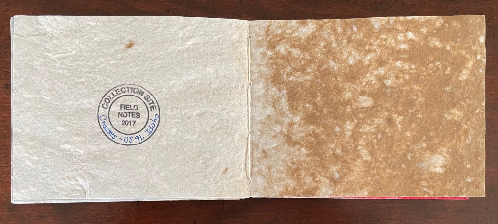
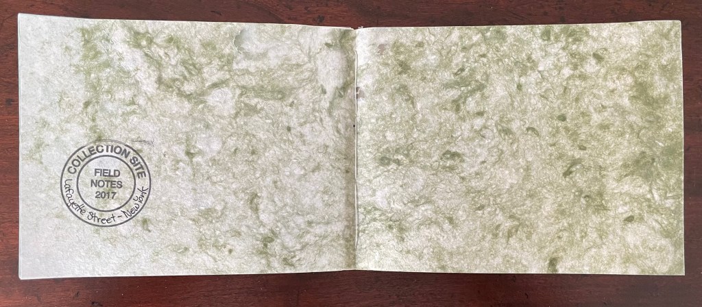
The color range is as wide as the subject range in Frank’s photobook. Mills’ charcoal gray spread made with material foraged from Hoboken corresponds to Frank’s first photo, which shows two open windows partially obscured by an American flag with parade spectators in shadows. Although both books begin with Hoboken, NJ, the order of locations deviates from there. The acqua spread for Indianapolis aligns with Frank’s photo of a waitress behind the counter of a railway coffee shop in Indiana’s largest city. Chattanooga follows Indianapolis in both books, but Frank’s two photos appear much later in his book. Mills’ lime spread for Chattanooga aligns with Frank’s photo of a young mixed-race couple looking askance from a street corner. Mills’ fourth spread, the faded terracotta spread for US285, New Mexico, aligns with Frank’s mid-book photo, an eerie image of the highway stretching out to the horizon.
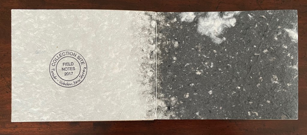
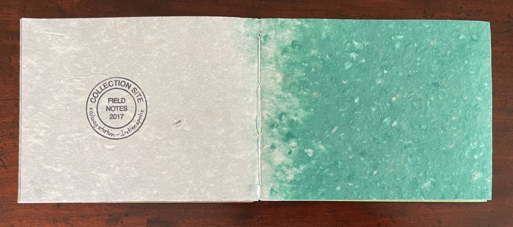
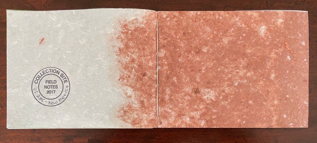
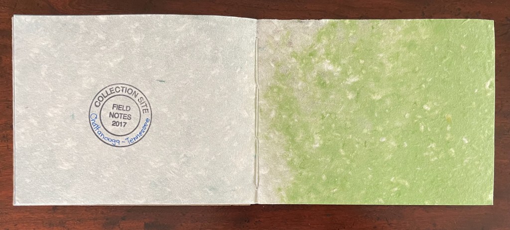
Clockwise from upper left: Parade – Hoboken, NJ; Indianapolis, IN; Chattanooga, TN; US285, New Mexico.
Discrepancy is not an oversight or fault here. Even if Mills’ book gave each photo a corresponding spread and followed the order of Frank’s book, that would lead down the road of deciphering some meaningful association of each color with the subject of its corresponding photo. Jack Kerouac’s introduction to Frank’s book offers a sort of ekphrastic prose poem in response to this book that has “sucked a sad poem right out of America onto film, taking rank among the tragic poets of the world”, but even he has to punt:
What a poem this is, what poems can be written about this book of pictures some day by some young new writer high by candlelight bending over them describing every gray mysterious detail, the gray film that caught the actual pink juice of human kind. Whether ‘t is the milk of humankind-ness, of human-kindness, Shakespeare meant, makes no difference when you look at these pictures. Better than a show. — Frank, p. iii.
Thank goodness, Mills had a different agenda. Frank “booked” with photos. Kerouac “booked” with words. Mills “books” with fiber and pigment. Mills’ The Americans is not a venture into abstract expressionism.Her artist’s book is not rendering “every gray mysterious detail” of a Frank photo into fiber and pigment. Her book parallels Frank’s, but not as a work to puzzle out whether lime green expresses a mixed-race couple in Tennessee, or aqua, a coffee shop waitress in Indiana.
Mills’ The Americans is an exercise in ekphrasis and Conceptual Materialism. By title, layout, and paper sourced from location, it responds to Frank’s The Americans. It bridges the gap between the abstract notions of homage and location, on the one hand, and the physical object of paper and pigment, on the other. Or rather it fuses those notions and foraged plants into a work of art. In Mills’ The Americans, the USA is not a melting pot; it is a rainbow of different fibers. Tactile and visual differences from spread to spread, arising from location to location, are what matter. We don’t need to know the subjects in Frank’s corresponding photos. We don’t need to know the names of the plants foraged from each location. Mills forces our imaginations back to our fingertips and eyes.
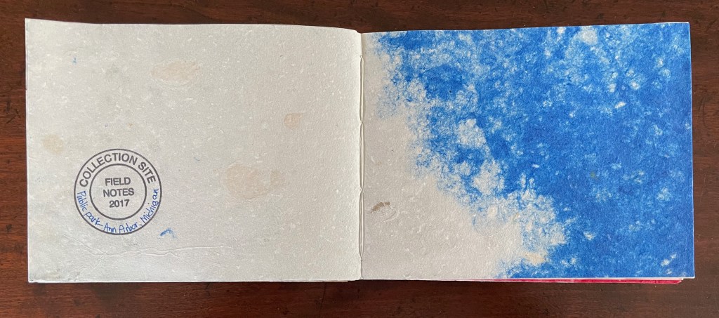
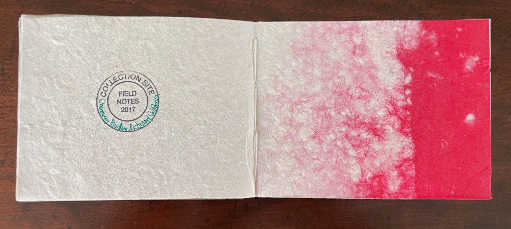
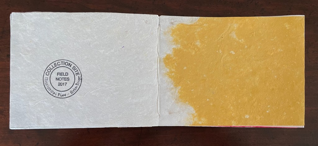
Clockwise from upper left: Ann Arbor, MI: US91, Idaho; Baton Rouge, LA; Richmond, CA.
The spread made of plants sourced from outside Mills’ studio — a location not represented in Frank’s The Americans –is the one spread in which the pigment covers both pages. Its distinction underscores that Mills’ The Americans stands confidently on its own even as it nods in ekphrastic homage to a mentor’s work of art.
The only location in Mills’ The Americans not corresponding to one in Frank’s The Americans.
Twentysix Plants and The Americans are two of five artist’s books responding to works in other media. Interaction of Tantra (2012) consists of a two-sided accordion book of mitsumotta chiri paper onto which Mills has stitched extracts from Josef Albers’s The Interaction of Color (1963) and anonymous abstract Tantric paintings from Rajasthan, India, collected by the French poet Franck André Jamme. Mills’ T/F (2023?) is a miniature accordion that plays a joke on Roland Barthes and his essay “The Death of the Author“, and in June’s Forge Door (1986), she pays homage to her other mentor June Leaf, sculptor and visual artist, in a poem with burnt initials and carved into paper. The latter is the only homage to a female artist, but highlights the feminist Conceptual aspect characterizing her approach. In her interview with WSW, Mills makes a comment underlining this aspect and also a key to her successful ekphrasis.
I do think of the hand-making as female, in a way,” says Susan. “My books are definitely, for me, feminist statements. I am not really looking back in time at these books by men—more like creating my books as a parallel to them. I am referencing books that I love, and I hope that comes through. — (Bratovich, 2014).
Further Reading
“Peter and Pat Gentenaar-Torley“. 10 October 2019. Books On Books Collection.
“Lu Jingren, Amanda Degener, and Peng Wu“. 12 May 2026. Books On Books Collection.
“Taller Leñateros“. 19 November 2020. Books On Books Collection.
“Fred Siegenthaler“. 10 January 2021. Books On Books Collection.
Bratovich, Jenn, 3 February 2014. “Twentysix Plants: Susan Mills in the Studio“. Women’s Studio Workshop. Accessed 8 May 2026.
Frank, Robert, and Jack Kerouac. 1958. The Americans. First Grove Press edition. New York: Grove Press, Inc.
Villere, Mariel. 17 June 2014. “A Conversation with Susan Mills“. Freshkills Park Alliance. Accessed 7 May 2026.
Mills, Susan. 20 March 2025. Presentation. Canadian Artists’ Book Symposium, Ontario College of Art & Design University (OCADU), 15 February 2025. Accessed 7 May 2026.
