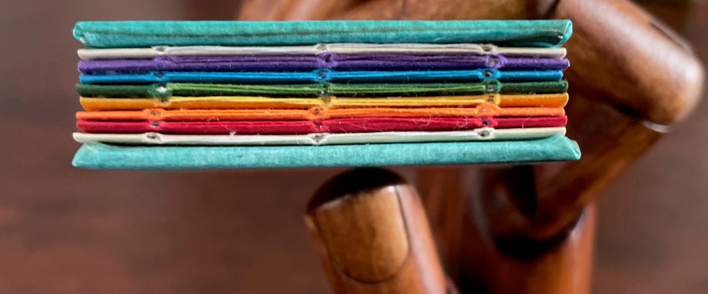
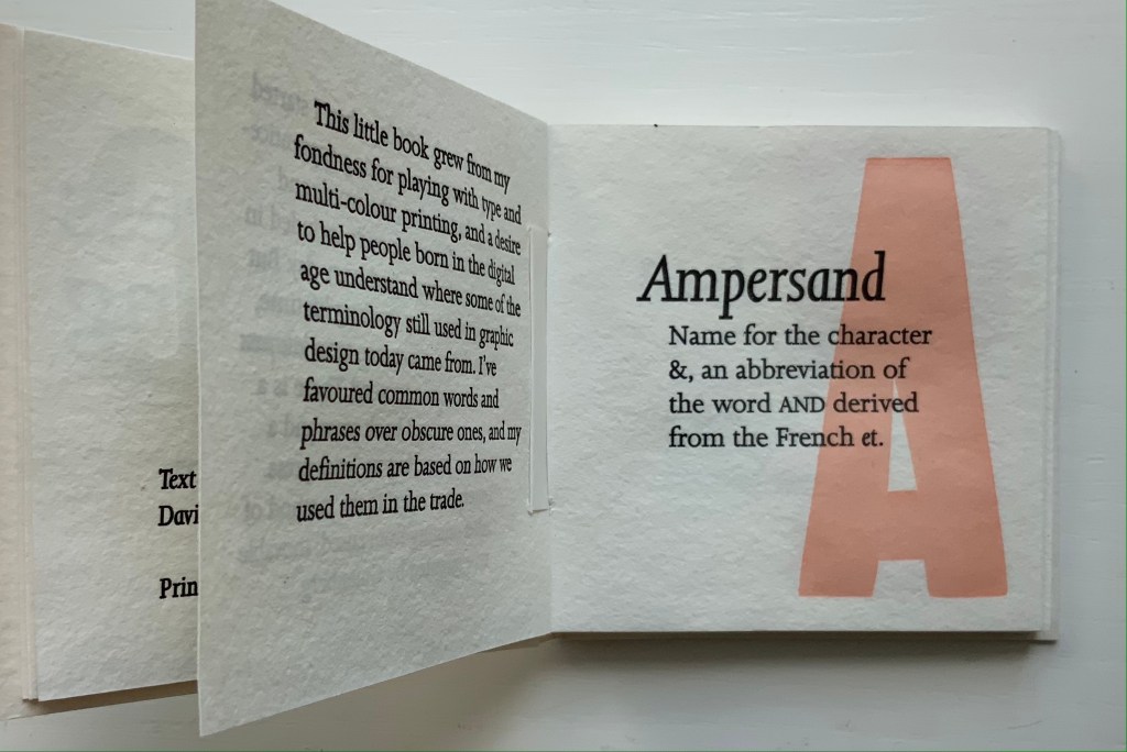
À l’infini(2007) Květa Pacovská Softcover with protective Mylar attached, exposed spine, sewn with multicolored threads. 270 x 270 x 29 mm. 128 pages. Acquired from Rakuten, 25 November 2022. Photos: Books On Books Collection.
The Buzz Lightyear character of Toy Story and his catchphrase “To infinity and beyond” arrived in 1995. While it seems unlikely that the catchphrase influenced Květa Pacovská, the audience for Á l’infini (2007) and that for Toy Story definitely overlap. In her invitation below, Pacovská explicitly addresses the youngest of her audience: Tu peux regarder chaque lettre, toucher chaque lettre, considérer chaque lettre de façon formelle ou lire chaque lettre à haute voix. Chaque lettre a son propre son, sa propre forme et sa propre couleur. Note leurs différences quand tu les prononces, quand tu écoutes le son de ta voix. [You can look at each letter, touch each letter, consider each letter formally, or read each letter aloud. Each letter has its own sound, shape and color. Note their differences when you pronounce them, when you listen to the sound of your voice.] Above all — literally at the top of the page — she urges the reader: Dis la lettre <<A>> à haute voix jusqu’à ce qu’elle heurte les murs qui l’entourent. [Say the letter “A” out loud until it knocks down the walls surrounding it.], which is what the cut-out A plays outs.
For Pacovská, letters are “the architecture of pleasure”, and À l’infini invites us to play with them in “her city of paper”. Her invitation notes alternative approaches to the book, but the suggestion to walk through it as a paper sculpture is the best and appeal to the child in everyone.
With its collage of cut-outs, pop-ups, spot varnishes, reflective silver ink, letters and, later in the book, numbers, À l’infini is a joyful visual city. Pacovská received the Hans Christian Andersen Award in 1992 for her illustration.
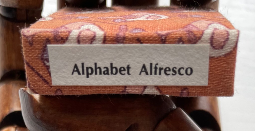
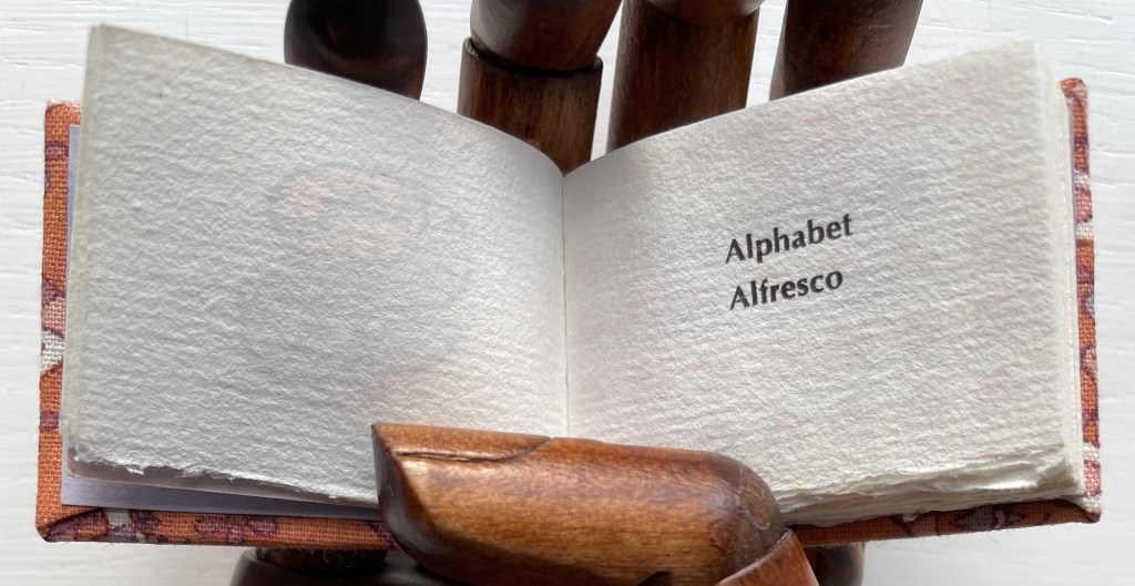
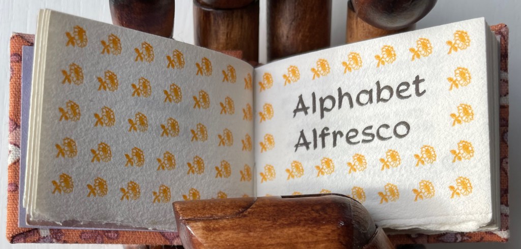
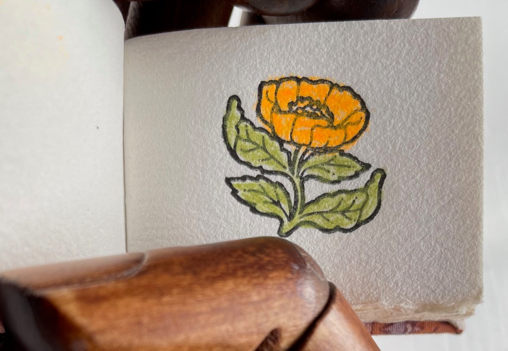
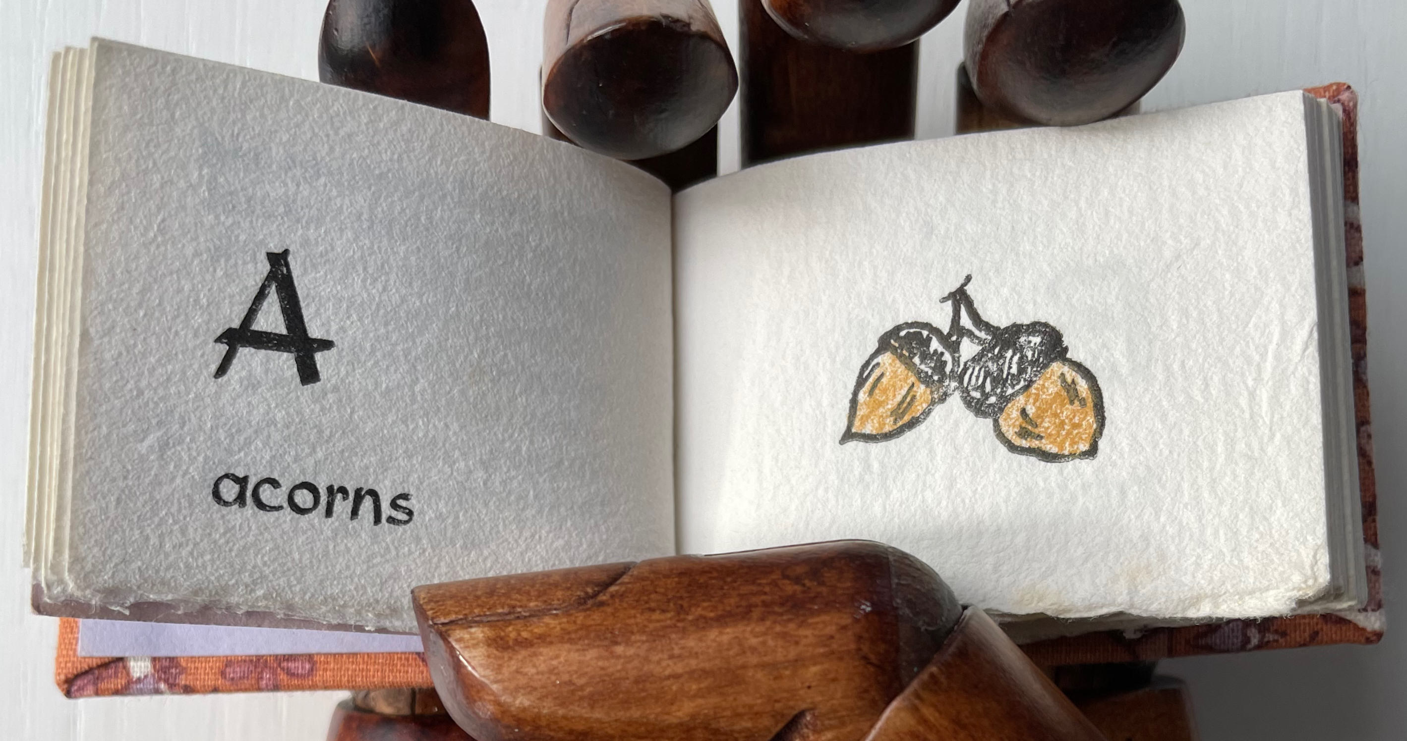
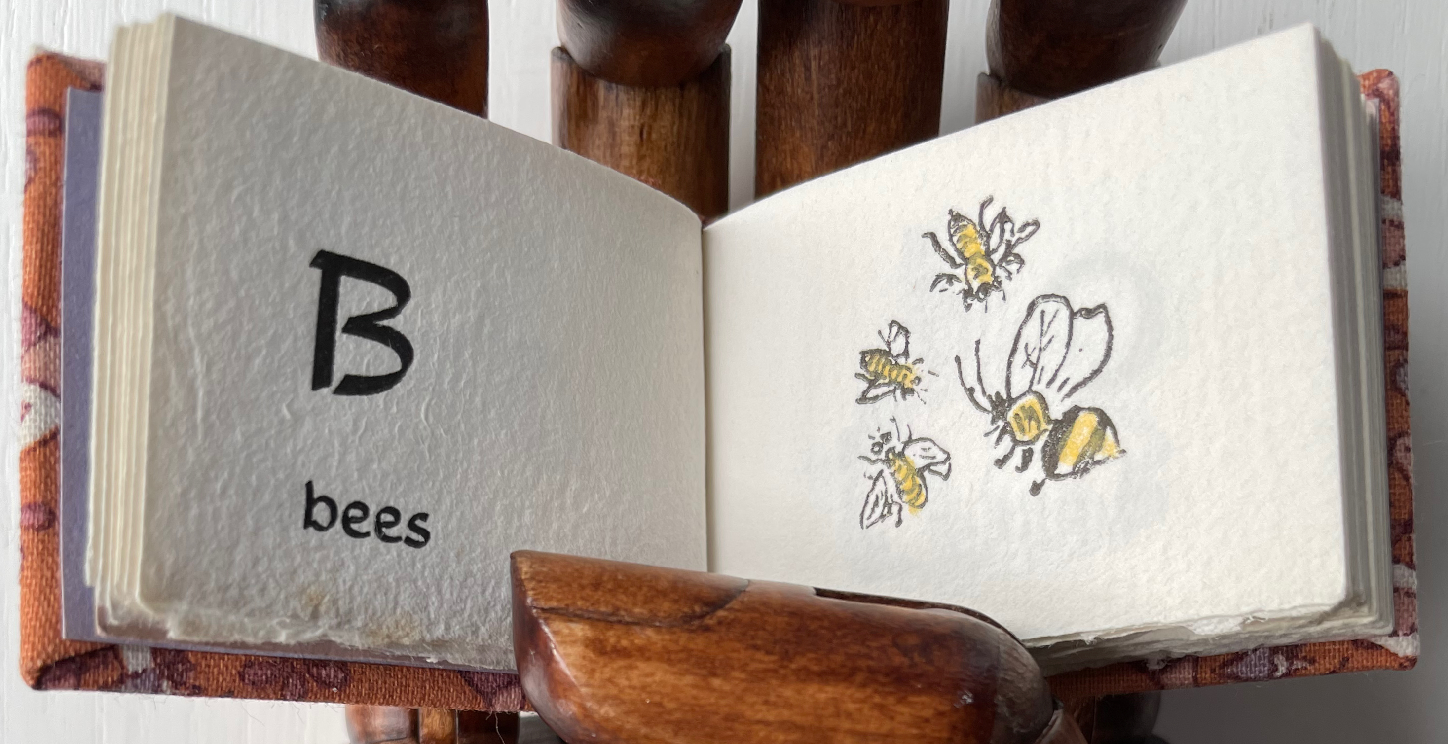
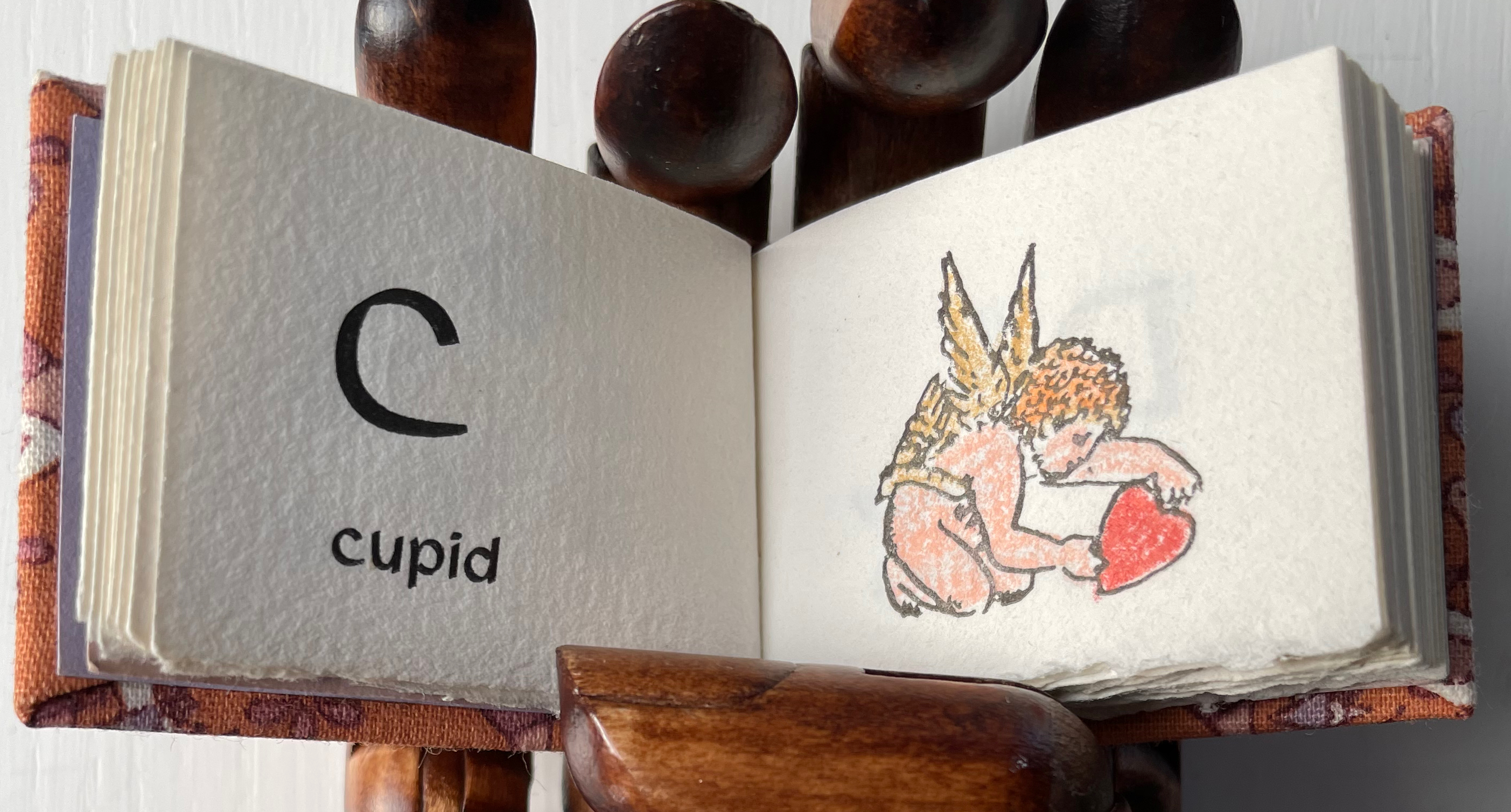
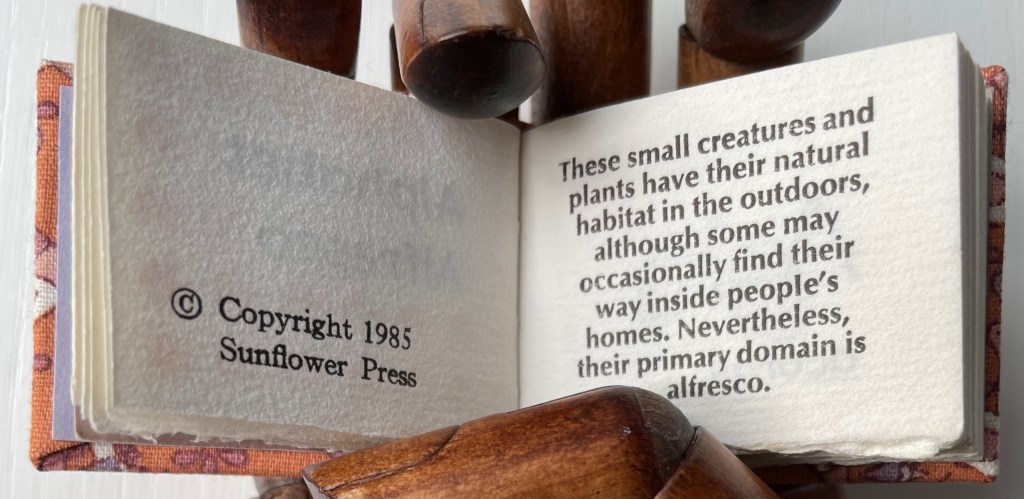
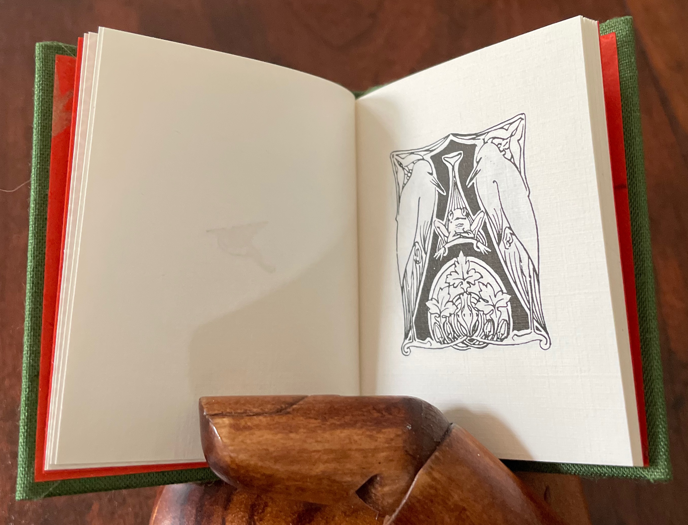
Alphabet Alfresco (1985) Carol Cunningham Casebound miniature, decorated cloth, colored doublures. H40 x W52 mm. 68 pages. Acquired from Lorson’s Books & Prints, 5 December 2022. Photos: Books On Books Collection.
Carol Cunningham’s Sunflower Press produced many gems like this. Founder of the Miniature Book Society in 1983, Cunningham also produced numerous oil paintings and prints, some of which can be found here.
If ever the dictum “Less is more” applied, it applies here — with miniaturized tongue in cheek, of course. [Links in the captions will take you to more images and details.]
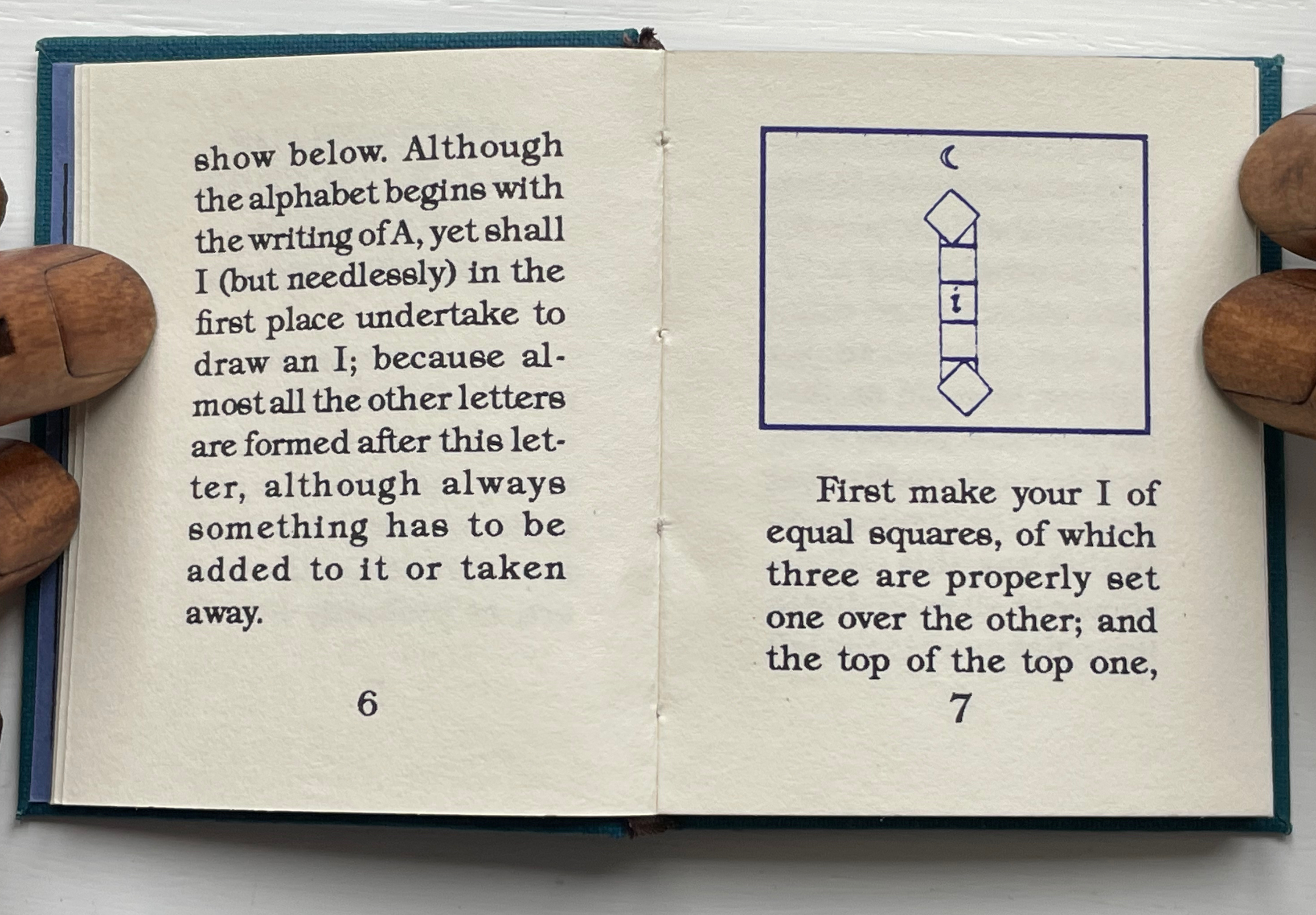
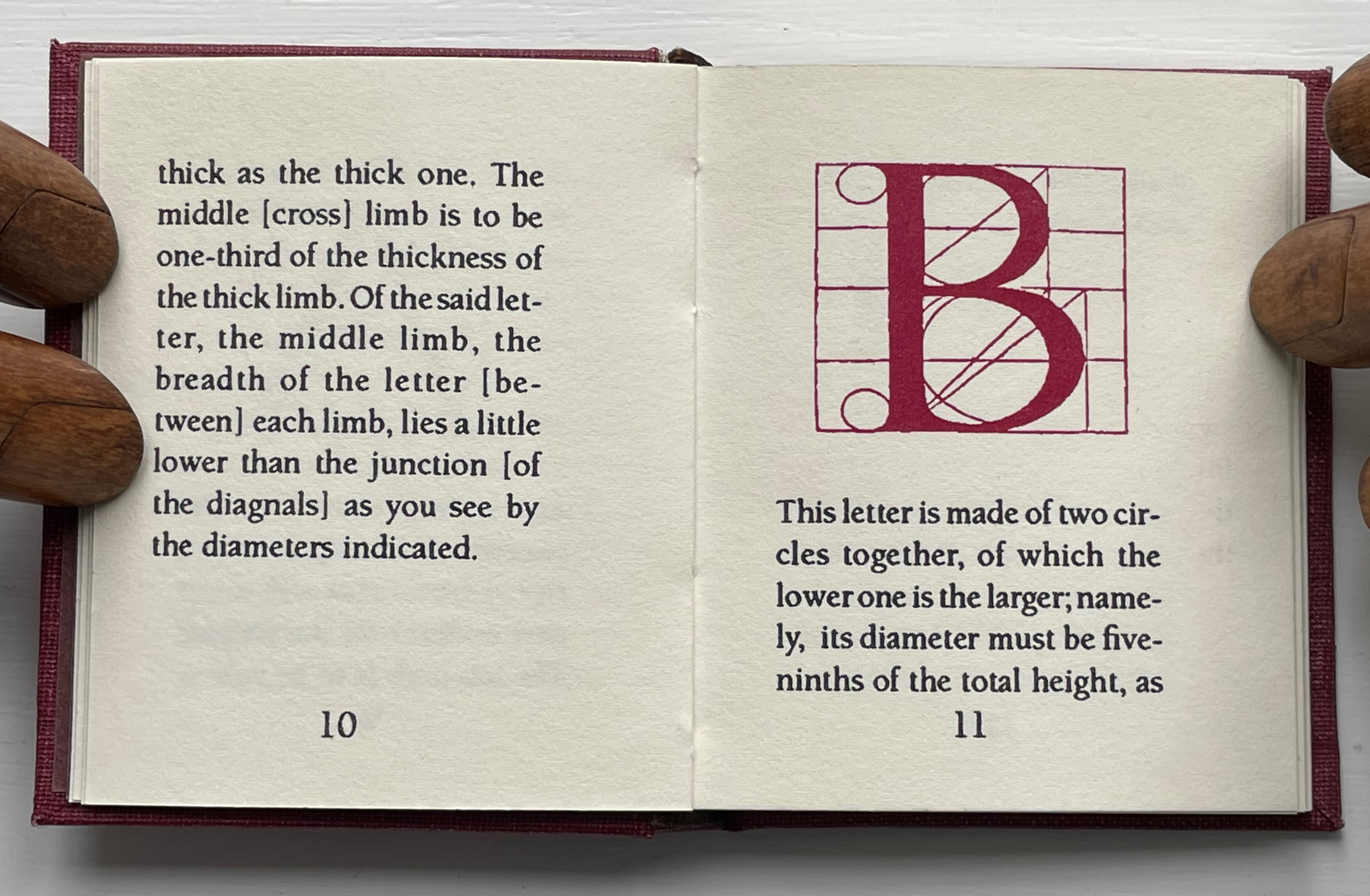
These two miniatures — Albrecht Dürer’s Directions for the Construction of the Text or Quadrate Letters (1993) and Fra Luca de Pacioli’s The Divine Alphabet (1993) — were produced by Tabula Rasa Press for a three-volume set, including Ben Shahn’s The Alphabet of Creation (1954). Although the miniature edition of Shahn remains elusive, the original edition can be seen here.
Mark Van Stone, The Evolution of the Medieval Decorated Letter(1985) In the spirit of medieval illuminators, Van Stone has imitated the hand of twenty-three of what he calls the “semi-precious jewels” of “‘minor’ illumination that usually receives little attention in the Art-History books”.
Carol DuBosch, Embossed Alphabet Gallery (2019).* This gallery structure combines elements of the flag-book and leporello to create a freestanding sculptural book to be read “in the round” — although in the Bodleian exhibition it was fixed in a wall case that allowed 180º view.
Claire Van Vliet, Tumbling Blocks for Pris and Bruce (1996).* A meander-fold book hinged to keep the cube unfolding, refolding and unfolding as it falls from hand to hand.
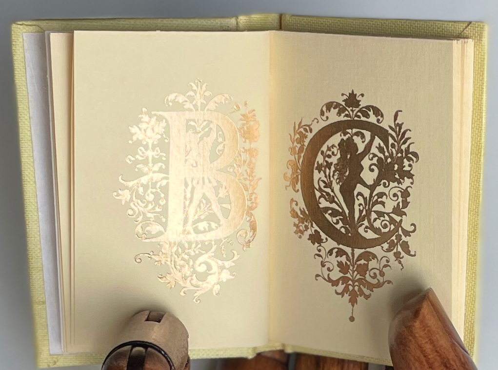
Carol Cunningham, Alphabet Alfresco(1985). One of several gems created by the founder of the Miniature Book Society (1983).
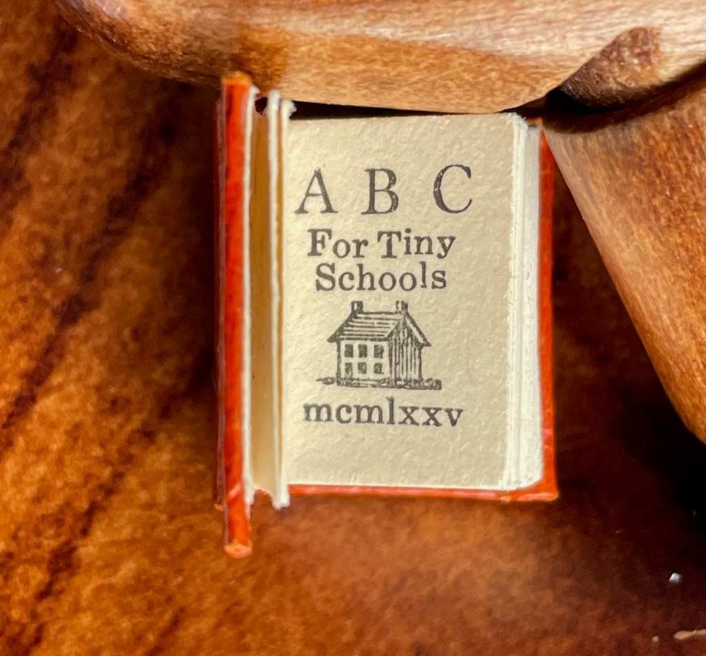
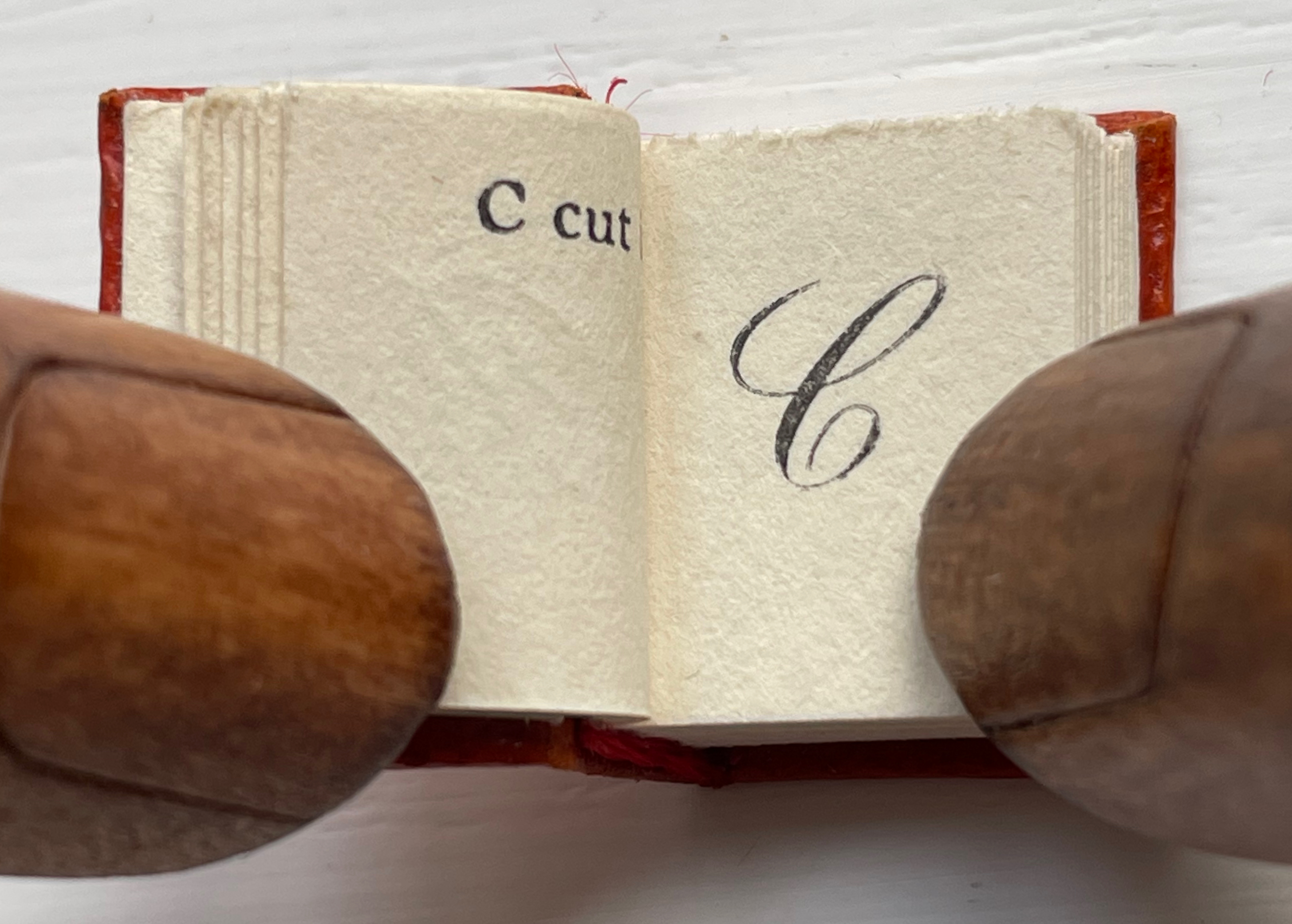
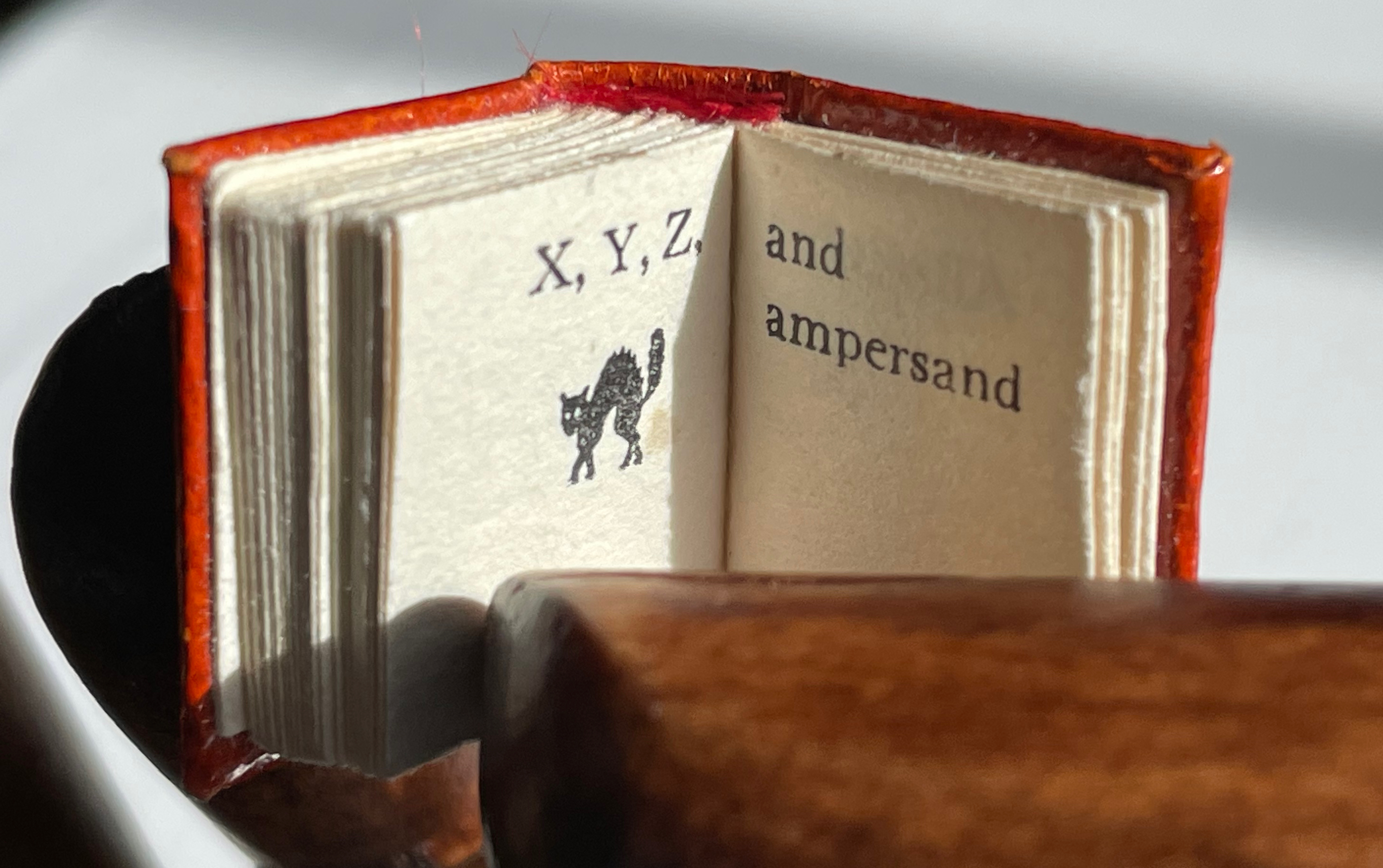
William Cheney, ABC for Tiny Schools ( 1975). Along with “A was an archer”, the “A was an apple pie” was among the earliest themes for secular alphabet books.
Alphabet Salmagundi(1988) and Golden Alphabet (1986) demonstrate the breadth of Rebecca Bingham’s interest in various periods and techniques of calligraphy.
Another Tabula Rasa Press production, Arthur Maquarie, The Uffizi ABC: a facsimile reproduction in miniature (1992)
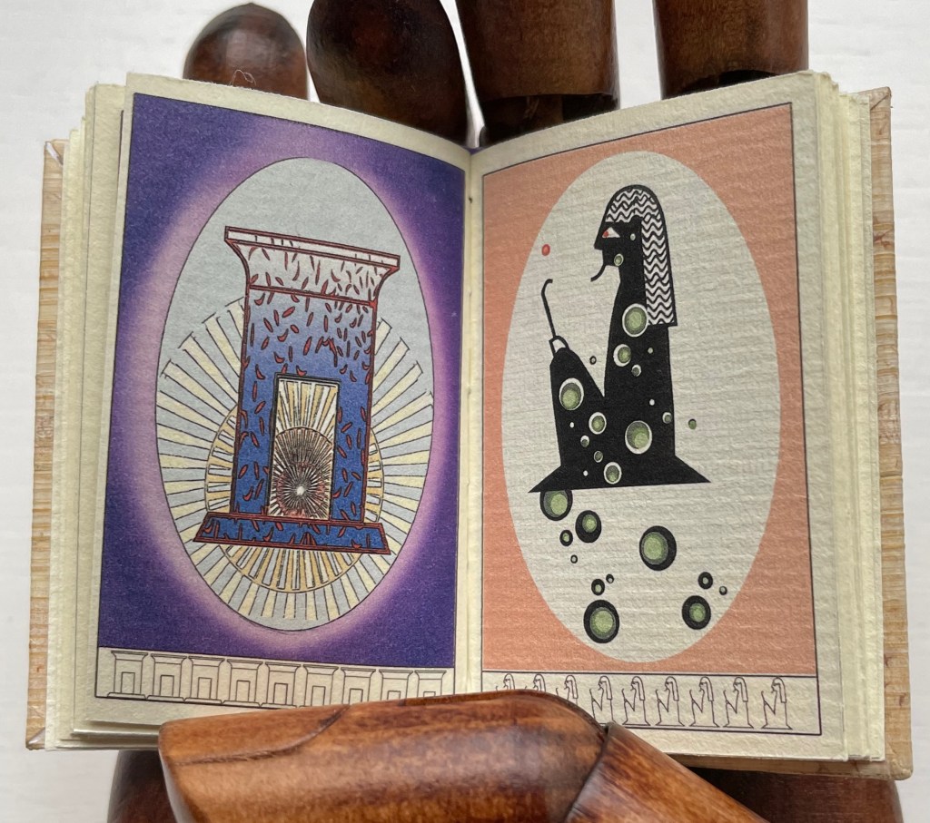
Pat Sweet’s wit led her to fill the ancient Egyptians’ previously unperceived need for an alphabet book with Hieroglyphs (2009).
June Sidwell, Lady Letters (1986). Another production by Rebecca Bingham, which also led to a miniature nod to another alphabetist — Erté.
Nicolas McDowall, A Bodoni Charade (1995). Don’t let delight in the verbal/visual punnery distract you from wondering at the skill with type and letterpress needed to pull this off.
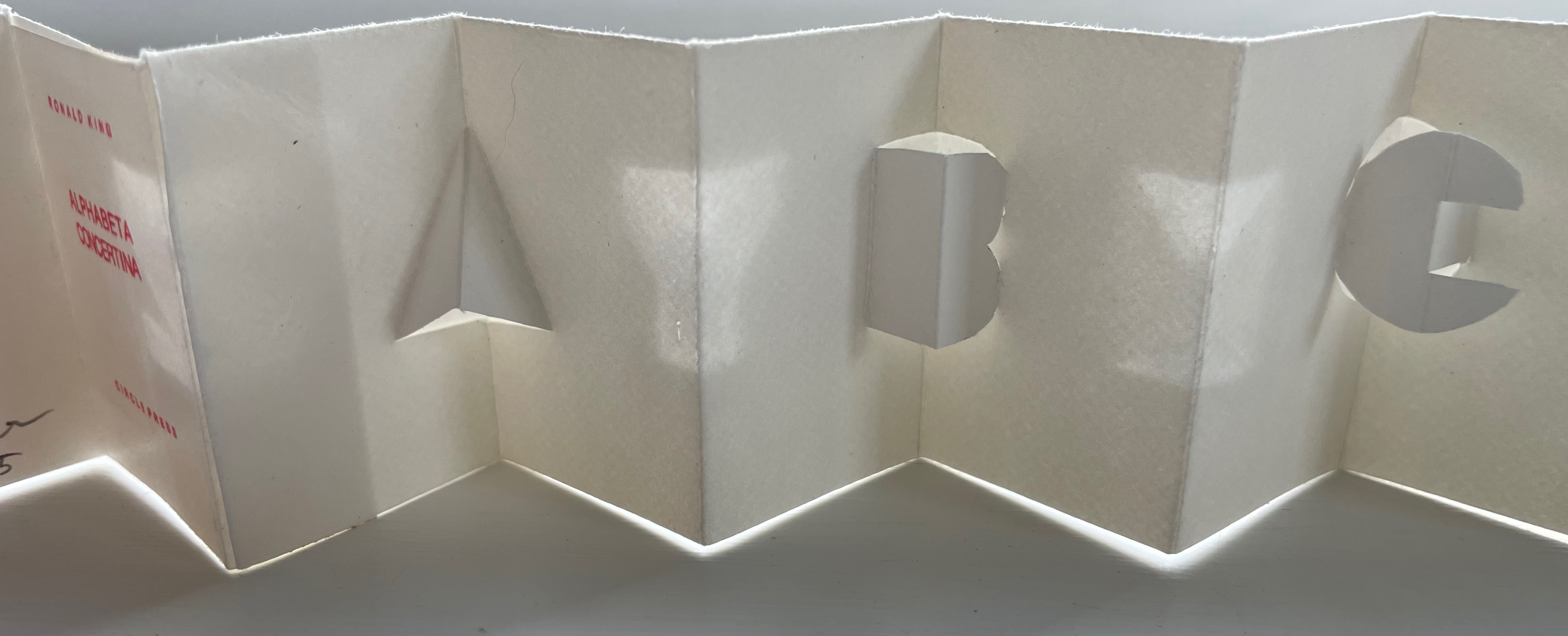
Erwin Huebner and Ron King, Alphabeta Concertina Majuscule (2015) and alphabeta concertina miniscule (2022). Miniaturist and microbiologist, Huebner obtained Ron King’s permission to reproduce King’s two signature pop-up alphabets with extraordinary results.
Juniper Von Phitzer, An Alphabet Coloring Book by Theodore Menten (1997). Lloyd L. Neilson compiled the name of his Juniper Von Phitzer Press from the names of his three cats. Theodore Menten had produced a coloring book called The Illuminated Alphabet in 1971 for Dover Publications. Obviously Juniper Von Phitzer could not fail to pounce.
Online Exhibition Bonus!
Many of the ABC books in the collection use the accordion, concertina or leporello structure, but none but Maria G. Pisano’s XYZ (2002) combine fine beaten abaca in two colors and the watermark technique to achieve their effect.
“Human society, the world, man as a whole, is in the alphabet.… The alphabet is a source.” — Victor Hugo.
“… the Book, the total expansion of the letter” — Stéphane Mallarmé
“I see new horizons approaching me and the hope of another alphabet.” Marcel Broodthaers
“There is indeed something magical about the look of the alphabet: it has to do with its infinite capacity to change shape and style, to express purpose and suggest mood, to be formal and informal, elegant and ugly, classical and romantic, delicate and robust.” — Mel Gooding
“… the letter is repeatedly a lens through which Western culture makes sense of itself and its world.” — Laurence de Looze
What do alphabets and artists’ books have to do with one another?
Early on, alphabets and books cast their magical spells over us. Learning the alphabet is a childhood rite of passage for us. We play with letters on blocks and nesting boxes. Someone points and reads the letters to us. We mouth, chew and play with the books whose pages we learn are turned or devices whose screens we learn are swiped. We sing the alphabet song and memorize the letters. We learn to draw them and make sense of our world with those “shapes for sounds”. The alphabet taps the imagination in material and immaterial ways that are deep-rooted.
The magic of the alphabet flows into the magic of the book. Historians of the book know this. It is no accident that so many chroniclers of the history of the book begin with the ABCs. Why pay so much attention to the birth of the alphabet to get to the birth of the codex? Is it the professional historian’s habit –to begin at the beginning, to ask what were the causes of this or that event, invention or change? Or is it the habit of myth-making, of storytelling — the magic of “once upon a time” that leads to “once upon a time, there was an alphabet, and then along came books”? Mel Gooding’s explanation of what’s magical about the alphabet could equally apply to the book: it, too, has the “capacity to change shape and style, to express purpose and suggest mood, to be formal and informal, elegant and ugly, classical and romantic, delicate and robust.”
In general, children’s books and artists’ books have much in common. They both play with form and structure. They play with words and images, sometimes images without words and sometimes just shapes. Almost always an attention to all the senses. Perhaps the alphabet rite of passage inspires a later one. For many designers, typographers, printers and book artists, creating an alphabet book is a common rite of passage.
In particular, children’s alphabet books have even more in common with artists’ books. Both play with animals, bodies, colors, design (of letters, page and book), calligraphy, the Babel of languages and alphabet origin stories and more. Artists’ books inspired by the alphabet, or even just one letter of it, focus our senses and attention on more than the letter. They may focus our senses on the possible shapes the book as container can take. Or the elements and parts of the book (ink, paper, cover, binding, pages, margins and other blank spaces, preliminaries, chapters, running heads, etc.). Or the very idea of the book. The choice of cloth for a book’s cover may have its unconscious origin in touching a linen ABC primer. The use of thick laser-cut pages or highly tactile paper surfaces may be rooted in early childhood board books or “Pat the Bunny” books. The choice to use the accordion structure or scroll for an artist’s abecedary may lie in the linearity of the alphabet. Or the artist may be challenging that linearity with structures that echo the boxes of Joseph Cornell or the boîte-valise of Marcel Duchamp — or a bag of alphabet blocks.
With two such potent sources of magic on offer, how can the child in the book artist resist recreating the “once upon a time” when image and letter seemed to be one and the same thing? Only under certain circumstances does the play with letters and the book become art rather than the commonplace. Only when the artist, author, designer, typesetter (or keyboardist), printer and binder digs through the material aspects and conceptual aspects of the book right down to the letters of the alphabet, fusing the elements of the alphabet (or writing system) with the elements of the book, does the work sing (or at least hum) to us.
So here begins the journey from source to artists’ books where letters and characters turn into the world, the world turns into letters and characters, and alphabets come to life.
List of “Display Cases”
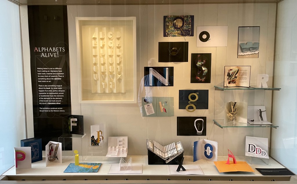
For the exhibition Alphabets Alive! — at Oxford University’s Weston Library from 18 July 2023 through 24 January 2024 — the Bodleian Libraries have brought together over 150 works — from medieval manuscripts to the AI-generated — all inspired by the alphabet and the book. Across the street from the Weston is the Old Bodleian Library, whose entrance the Proscholium houses an additional display case where works from Ron King, Kevin M. Steele and artists of the Movable Book Society point to the main exhibition.
Below, the “online display cases” of the exhibition are arranged alphabetically, concluding with a bibliography of the items consulted for the exhibition’s curation.
An Alphabet Coloring Book by Theodore Menten (1997)
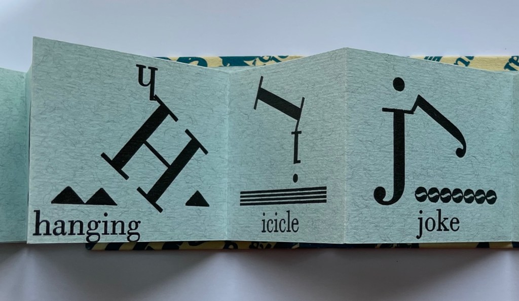
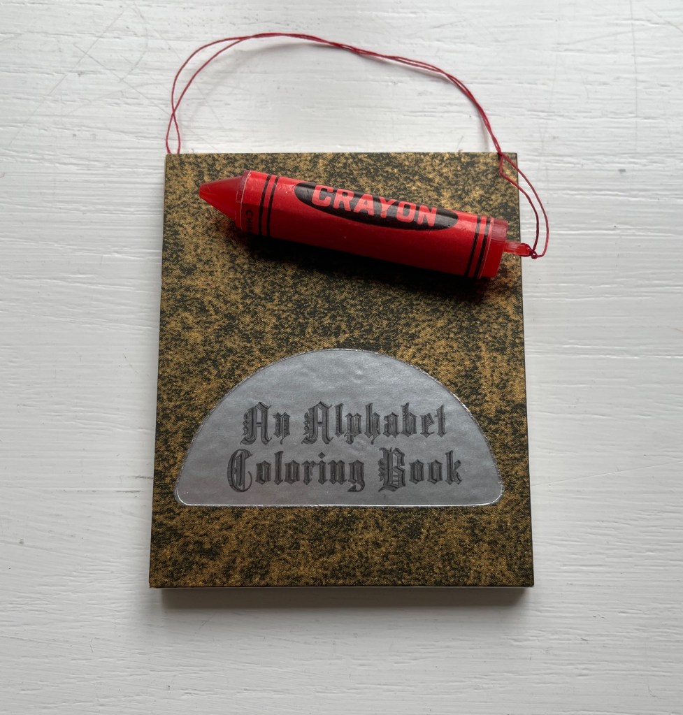
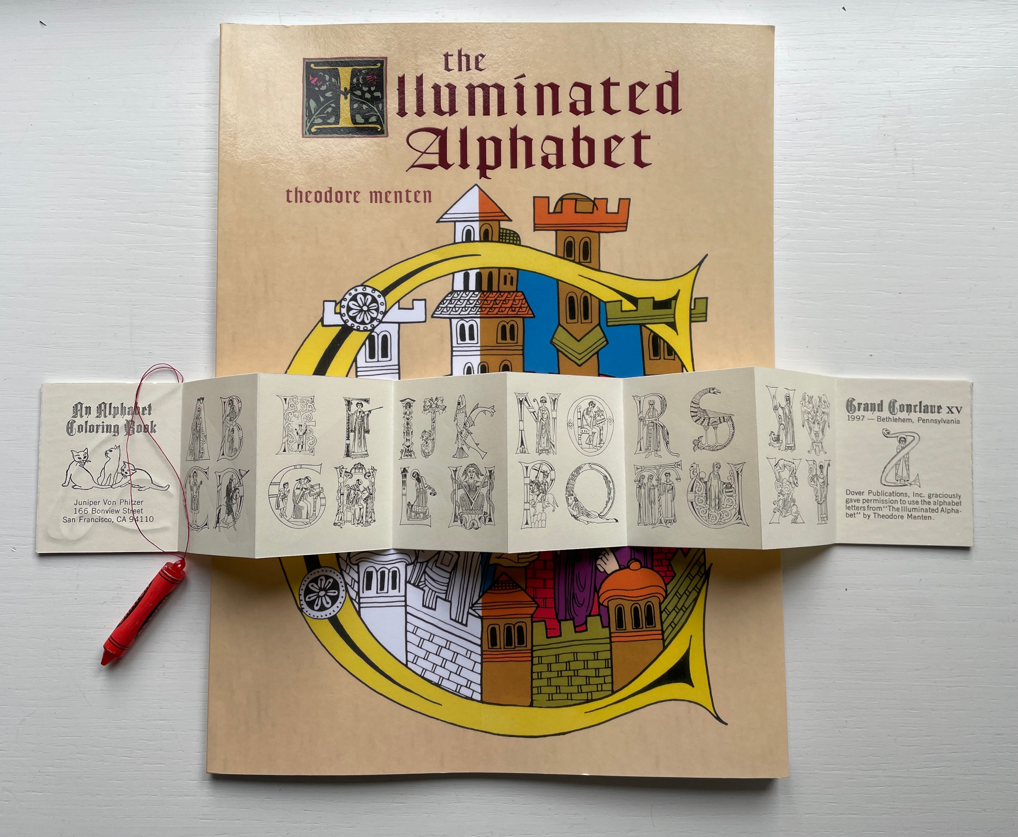
An Alphabet Coloring Book by Theodore Menten (1997) Juniper Von Phitzer Miniature leporello. Closed: H64 x W52 mm. 8 pages. Limited edition. Acquired from Book Lair, 30 October 2022. Photos: Books On Books Collection.
Lloyd L. Neilson, founder of Juniper Von Phitzer Press, compiled its name from those of his three cats, a sure sign of his sense of humor. This one signals that, like the cats, its humor was patient on the hunt. Theodore Menten had produced a coloring book called The Illuminated Alphabet in 1971 for Dover Publications. After a quarter century, Juniper Von Phitzer could not fail to pounce, capture and deposit the ultimate trophy: a miniature alphabet coloring book with a faux crayon. It was a limited edition, but individual copies could be distinguished by the color of the plastic crayon. The Books On Books Collection is proud to have this particular copy with its red crayon honoring the tradition of rubrication in medieval manuscripts.
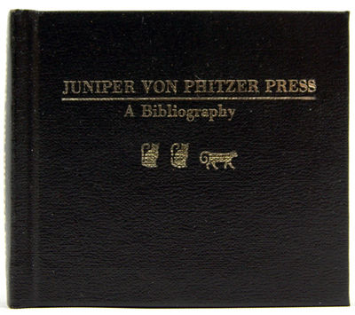
The archives of Juniper Von Phitzer Press reside at Indiana University, several universities and institutions hold copies of its numerous alphabet miniatures, and Neilson’s dedication to the craft (and his cats) was honored with a miniature gilt-stamped bibliography from the equally humorously named Opuscula Press [opuscula = small or minor literary or musical works].
The Proscholium display case in the main entrance to the Old Bodleian Library and Divinity School is frequently used as an extension to point the many visitors to this complex of buildings dating back to 1602. For “Alphabets Alive!”, Ron King, Kevin M. Steele and the Movable Book Society’s artists perform the honors.
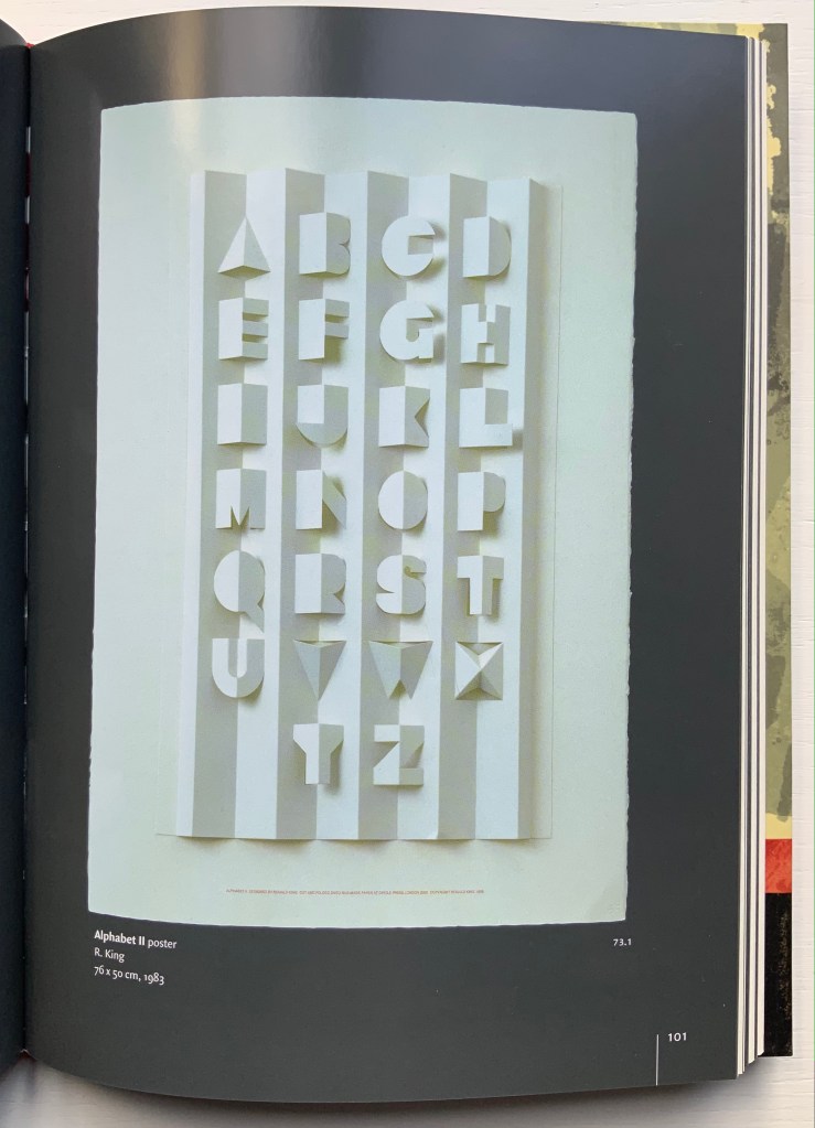
The poster displayed in the Proscholium case is Ron King’s Alphabet II(1999), captured above Cathy Courtney’s Cooking the Books (2002), a history of King’s Circle Press. Like a signpost, it points to Alphabeta Concertina in the past and the ABC Paperweights in the future, both of which appear in the display case “The ABCs of Form & Structure“.
As the alphabet developed, technology and material also played their role in more considered shaping of letters by scribes, then wood carvers and engravers, then smiths for hot metal type, and ultimately typographers, designers and artists. Kevin M. Steele’s The Movable Book of Letterforms (2009) uses pop-ups, pull tabs, flaps and a volvelle to introduce the viewer the origins and unique characteristics of letterforms.
Published to commemorate the Movable Books Society’s 25th anniversary, A to Z Marvels in Paper Engineering (2018) is aptly subtitled. Above are A by Simon Arizpe and Z by Yevgeniya Yeretskaya. The video below by Christopher Helkey gives 26 brief cameos to the contributing artists in which they demonstrate their marvels.
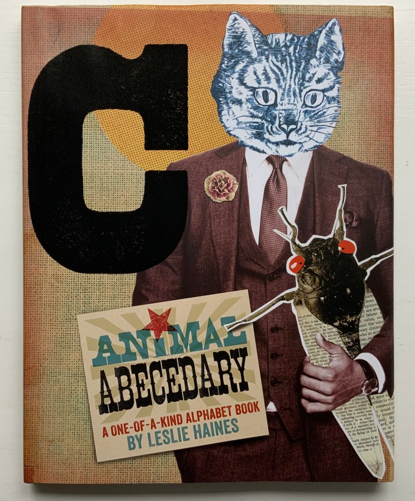
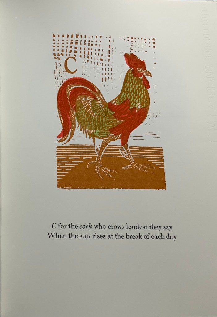
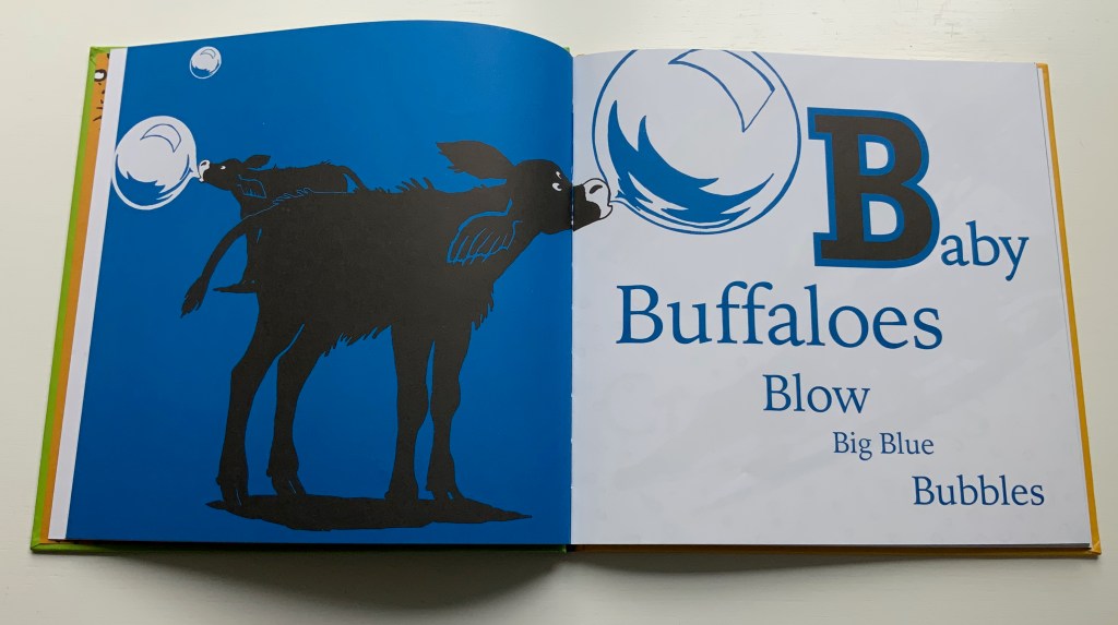
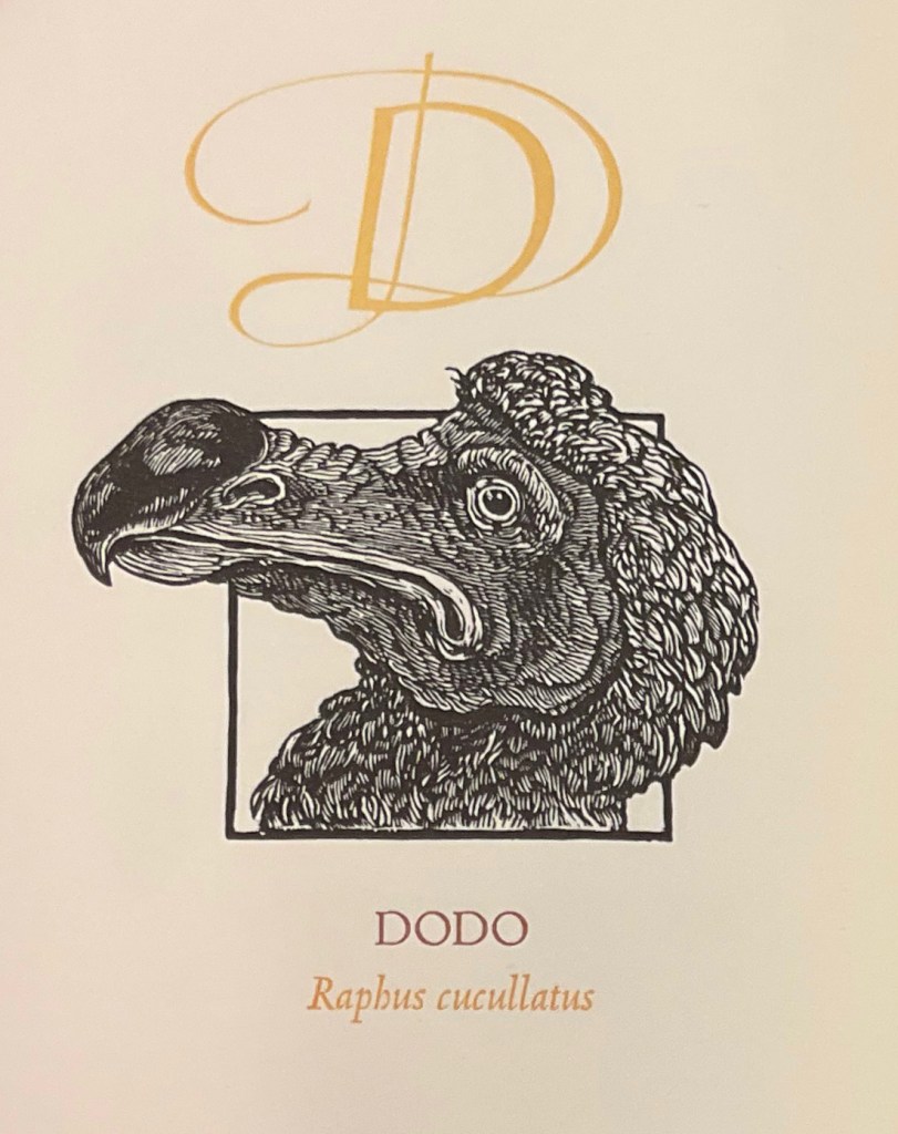
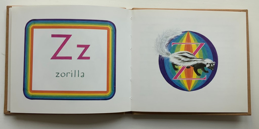
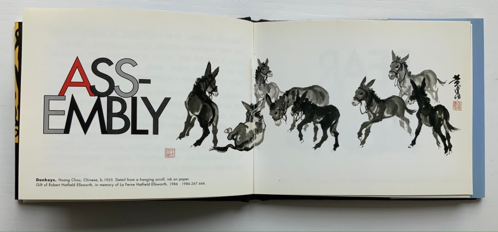
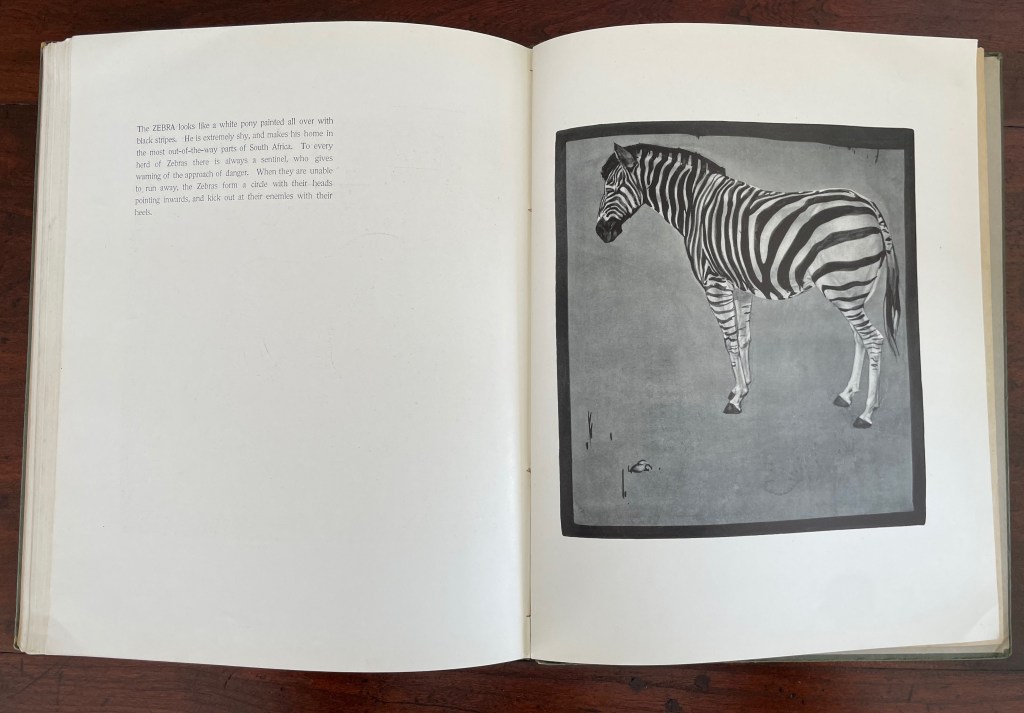
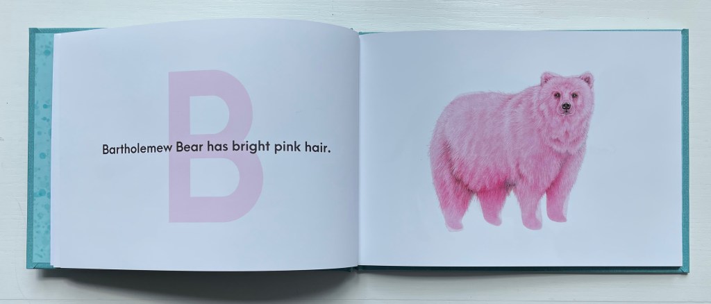
Animal alphabet books hum with imagination and wit. Animals, birds, fish, insects, even dinosaurs, decorate and transform letters, or might be created from the letters themselves. Sometimes, the animals come in disguise, or hide, only to pop out and surprise you. Perhaps the alphabet’s pictographic origin explains this animal obsession. The letter ‘A’ comes from the word ‘aleph’ meaning cow or ox, and its early letterform resembled an ox’s head and horns. [Links in the captions will take you to more images and details.]
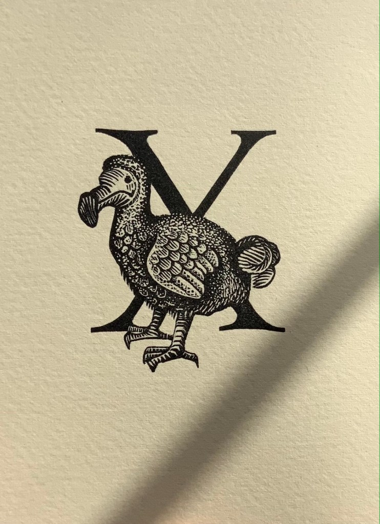
E.N. Ellis, An Alphabet (1985).* The letters Q and X always present challenges in finding suitably named animals. Ellis’s solution with X is as elegant as her engraving.
C.B. Falls, ABC Book (1923). Almost a quarter century after William Nicholson’s successful A Square Book of Animals, Falls applied his successful poster designing to this larger format.
Enid Marx,Marco’s Animal Alphabet (2000). Bringing together the talents of the engraver (Enid “Marco” Marx), “pochoir-ist” (Peter Allen) and letterpress printer (Graham Moss), this large-scale portfolio treads the boundary of fine press and artist’s book.
[Alphabet Leporello of dressed animals] (Paris, c. 1851) Opie T 407. The Books On Books Collection’s concentration on alphabet books falls primarily over the 20th and 21st centuries and extends the pre-1950s focus of the Opie Collection of children’s books. Together, the two collections offer a broad and deep source for exploring the links between artists’ books and children’s alphabet books as well as studying topics such as children’s literature and literacy.
Christiane Pieper & Anushka Ravishankar, Alphabets Are Amazing Animals (2003).* Alliteration is almost as frequent a feature of alphabet books as animal association.
Alan James Robinson and Suzanne Moore, A Fowl Alphabet (1986).* A superb collaboration between an engraver (Robinson) and calligrapher (Moore).
John Norris Wood, An Alphabet of Toads & Frogs (2002).* Sometimes past art abroad catches up with present American fauna of political celebrity.
Leonard Baskin, Hosie’s Alphabet (1972). Son Hosie and father Leonard unite their rites of passage: learning the alphabet and creating an artist’s alphabet book.
Michele Durkson Clise, Animal Alphabet: Folding Screen (1992) wrongfoots the reader with animal images that do not align with the expected alphabet letter or the letters of the first words in the leporello’s rhyming couplets. If the image does at least align with a word in the couplet (e.g., “whale”), that word’s first letter does not align with the alphabet letter expected for that panel.
Brian D. Cohen & Holiday Eames, The Bird Book (2013). Cohen’s engravings are finer in detail than most.
In Abstract Alphabet: A Book of Animals(2001), Paul Cox turns the alphabet on its evolutionary head. The letter A started out with the pictogram of an ox’s head and then developed into the abstract shape we associate with the sound /a/. Here, we have to work back from 26 different abstract shapes (each assigned to a letter on a fold-out flap) to figure out the name of the animal being spelled. The reversal conjures up the challenge that letters, objects and phonics present to children, and in their resemblance to a Hans Arp painting, the shapes challenge the reader to a renewed connection with art.
Roberto de Vicq de Cumptich, Bembo’s Zoo: An Animal ABC Book (2000). Where Sharon Forss and Sarah Werner use several type faces to shape their animals, De Vicq de Cumptich restricts his to Bembo.
David L. Kulhavy & Charles D. Jones,A Forest Insect Alphabet(2013). Extraordinary woodcuts by Jones, worth comparing with Cohen, Grieshaber, Marx and Robinson.
Metropolitan Museum of Art, Animalphabet (1996). Curators’ puns and wordplay with favorites from the Met.
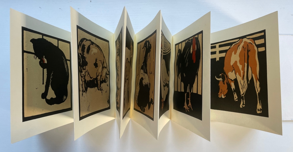
William Nicholson, A Square Book of Animals (1900). Nicholson followed his successful An Alphabet with this book, but it was Scolar Press in 1979 that redesigned and re-originated it in this well-chosen leporello format.
Carton Moore Park, An Alphabet of Animals (1899). Unusual for its grisaille technique and restriction of color to the cloth cover.
We reflect our world view through our letters*: hornbooks with their religious catechisms; moralizing Victorian alphabet books; and the racist ABC in Dixie. Knowing this, authors and artists use alphabets to disrupt the status quo and raise moral and social concerns: conspiracy paranoia, endangered animals, sexism and racism. [Links in the captions will take you to more images and details.]
Doing the work of learning the ABCs or the International Code of Signals is about memorizing. Doing the work with Mourning/Warning: An Abecedarian (2015) is about memorializing. It signals a warning to present dangers.
In light of Tia Blassingame’s Mourning/Warning, can Louise & George Bonte’s ABC In Dixie (1900?) be simply dismissed as an anachronism?
Wendy Ewald’sAmerican Alphabets (2005) offers a hopeful view and reminder that there is more than one alphabet.
If all alphabets have a world view, can an alphabet be bent and arranged into a new world view? In 2018, the Nova Scotia Chapter of the Global Afrikan Congress facilitated a “book-in-a-day” event to help the children of Halifax create R is for Reparations(2019), which answers that question.
Celebrating role models is another tool in the alphabet-book box for changing world views. In ABCs That Look Like You And Me (2020), the artist Ja’nai Harris uses featureless but allusive portraits onto which the reader is invited to project his or her own features.
Now that A is for Apple Inc. rather than the fruit, Bård Ionson wonders, “What are our children learning as they navigate digital devices vs. when children used wooden tablets with narrow ideas presented with pictograms.” Battledore (2019) explores the implications by using an Augmented Reality app to plunge the viewer into the digital realm.
In Gone Wild: An Endangered Animal Alphabet(2016), David McLimans redraws the alphabet’s capital letters to look like animals not yet extinct but on the Red List of the International Union for Conservation of Nature.
In Rescuing Q (2023), Suzanne Moore uses her beautiful calligraphy to disassociate the letter Q from QAnon, misinformation and conspiracy-thinking, and restore it to open-minded, open-hearted questions.
Tupoka Ogette’s Ein rassismuskritisches Alphabet(2022) presents another attempt at changing world views — in whatever country they arise.
And sometimes it’s good just to reverse-appropriate “the” alphabet, which Arial Robinson does inThe Modern Day Black Alphabet (2020) with joy and pride.
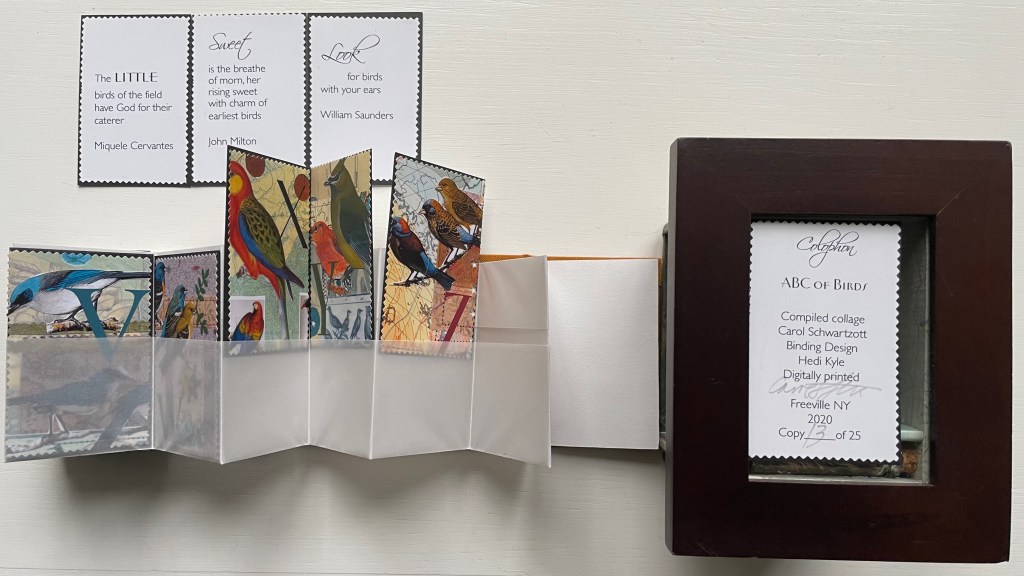
Alongside the alphabet mnemonic “A was an Archer who shot at a frog”, “A was an Apple” was a staple for the early primer publishers such as Dean, John Evans, J.L. Marks and J. & C. Mozley. Kate Greenaway revived it in the 1880s. Among the more interesting successors in the 20th and 21st centuries are Ben Sands (1966) with his bold lino-cuts, Tracy Campbell Pearson (1986) with her lengthy leporello, Allison Murray (2011) with her introduction of animals and Gennady Spirin (2020) with his watercolors echoing Arthur Rackham, the Pre-Raphaelites and the Renaissance. William Cheney’s type and Bela Blau’s binding of it in the ABC For Tiny Schools (1975) bring to it a handmade elegance in miniature.
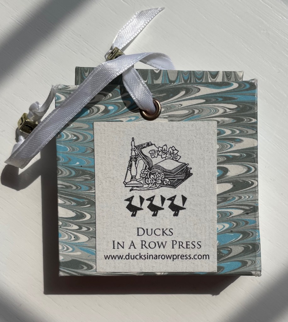
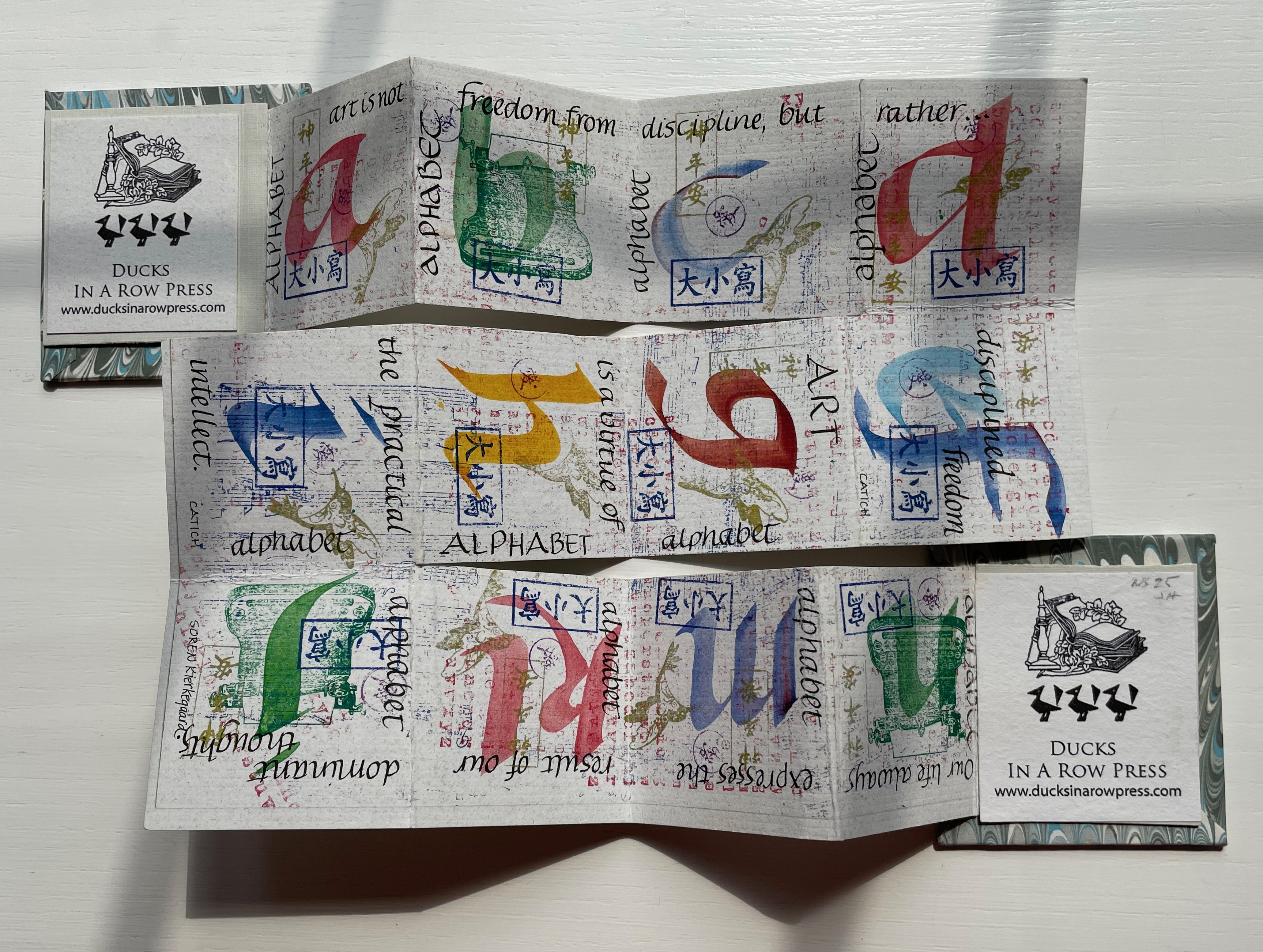
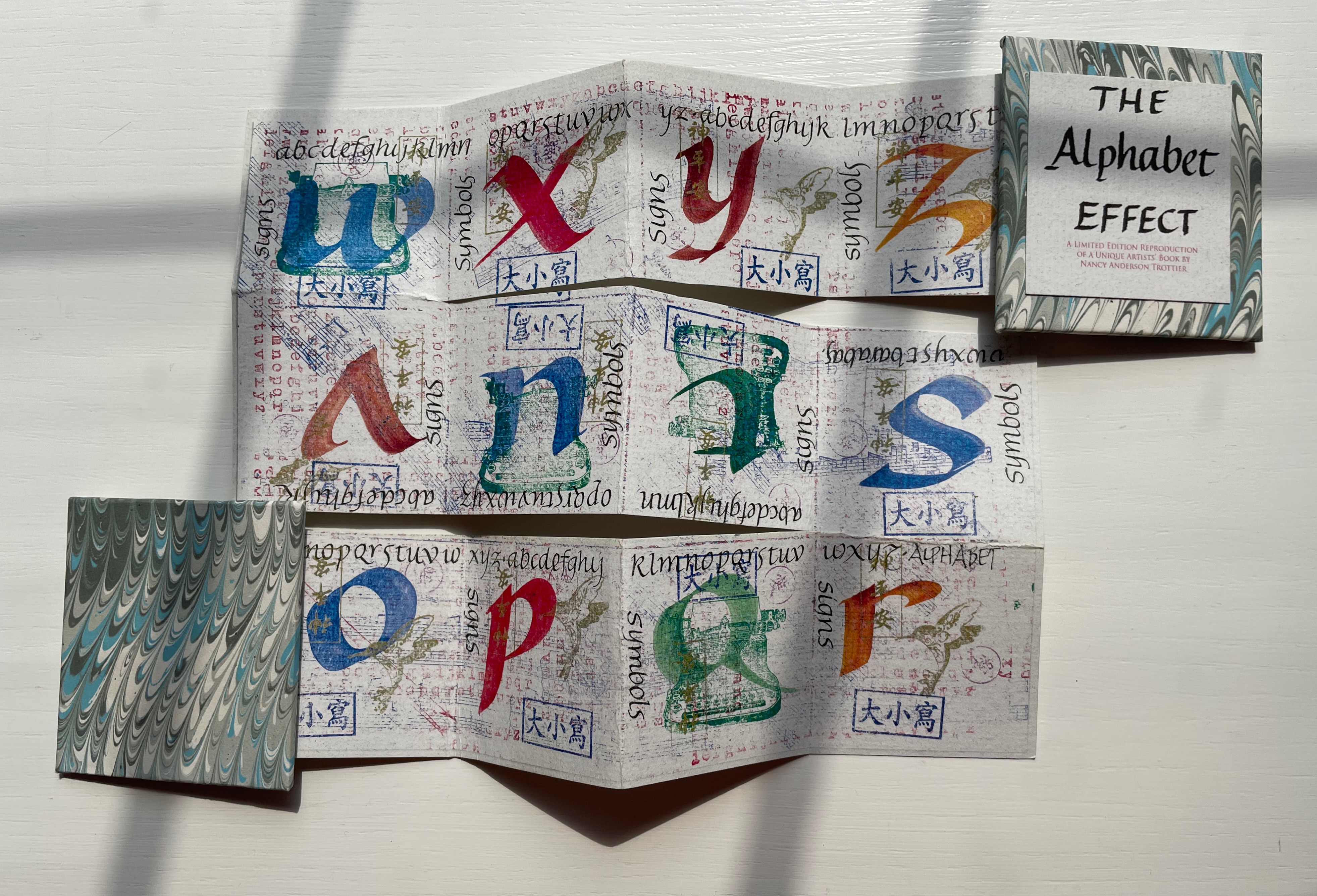
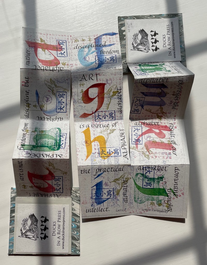
The Alphabet Effect (2013) Nancy Anderson Trottier Double-sided meander fold. 630 x 630 mm. 24 panels. Edition of 15. Acquired from Bromer Booksellers, 2 August 2022. Photos: Books On Books Collection.
This miniature reproduces a larger unique artist’s book created by Nancy Anderson Trottier. Bound in marbled boards with ribbon ties, the small book’s text concerning art and philosophy meanders among stamped signs and symbols and calligraphed letters of the alphabet printed on both sides of a single sheet cut and following the meander fold structure. When the “pages” are unfolded and rearranged into the single sheet fully extended, the alphabet effect appears. To squeeze 26 letters into 24 panels, the letters e and f are paired on one panel, as are k and l on another.