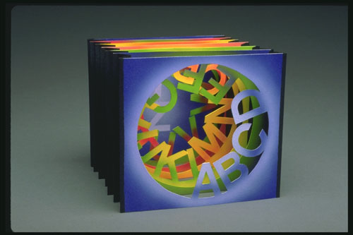
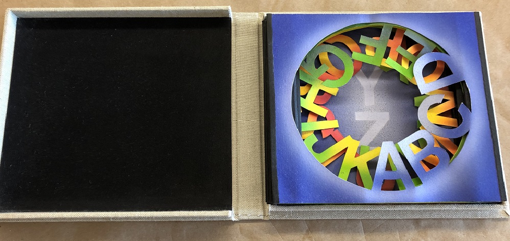
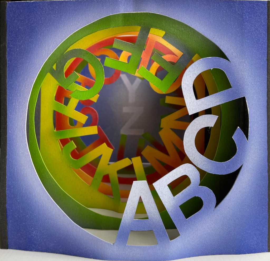
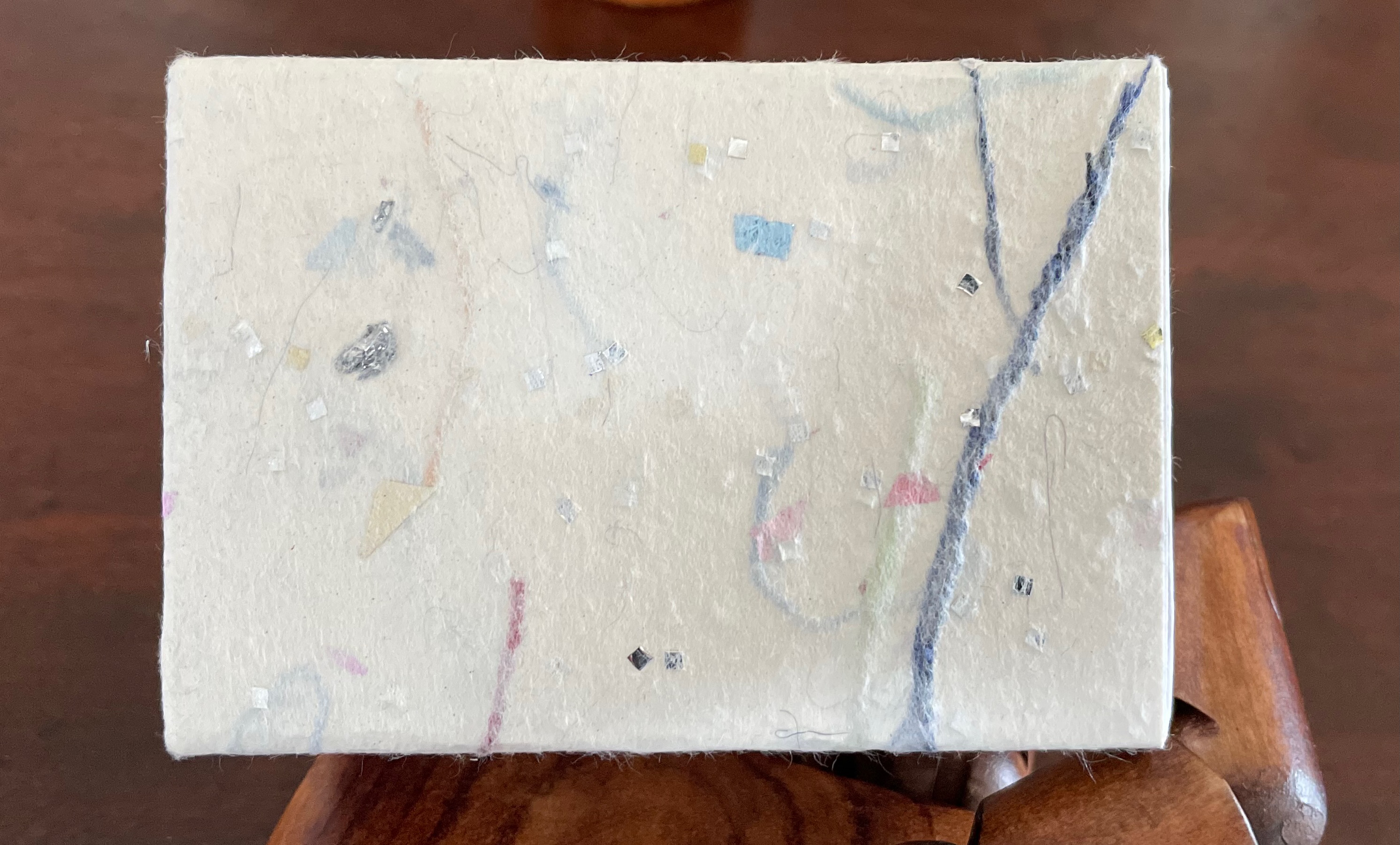
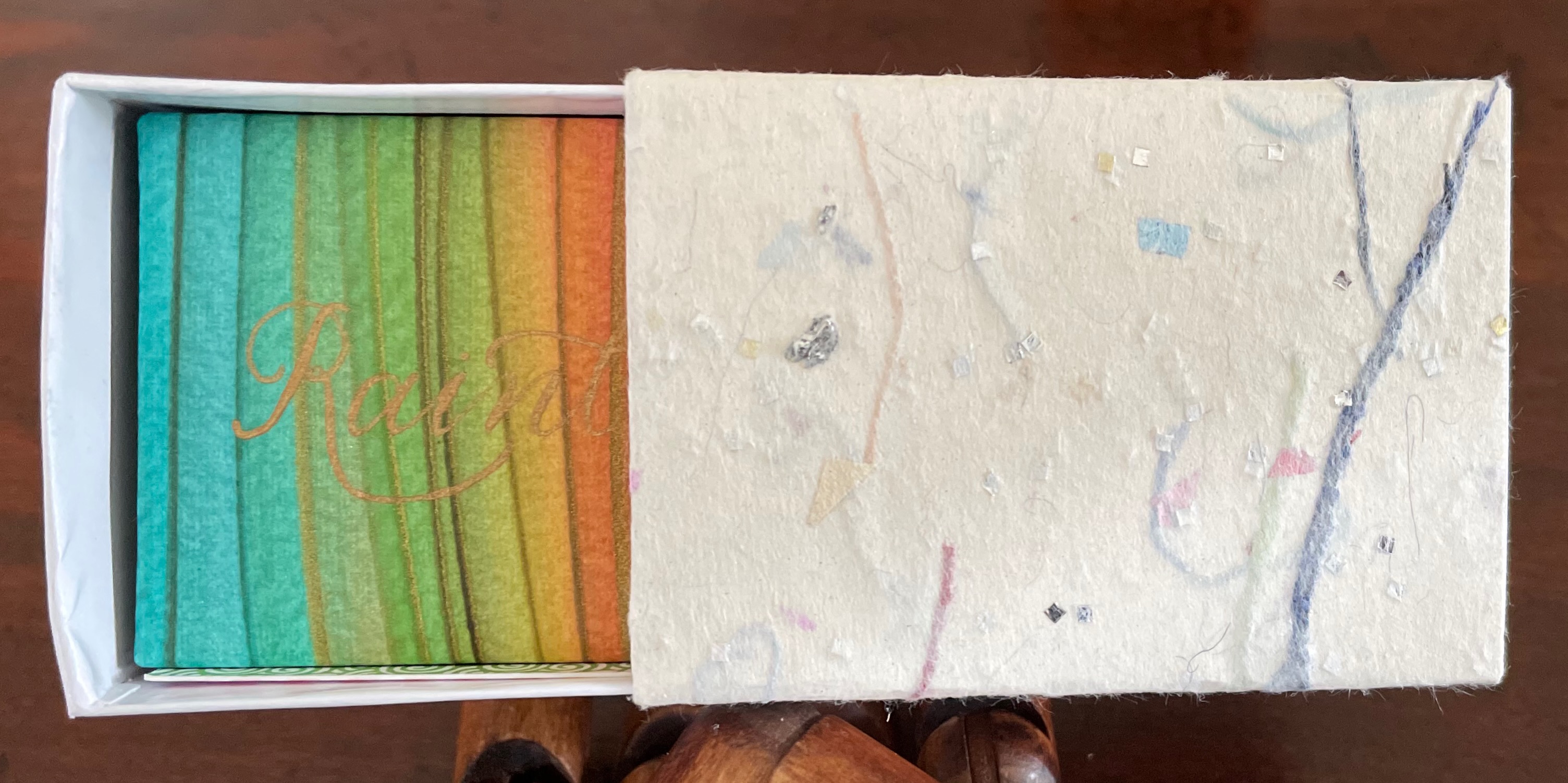
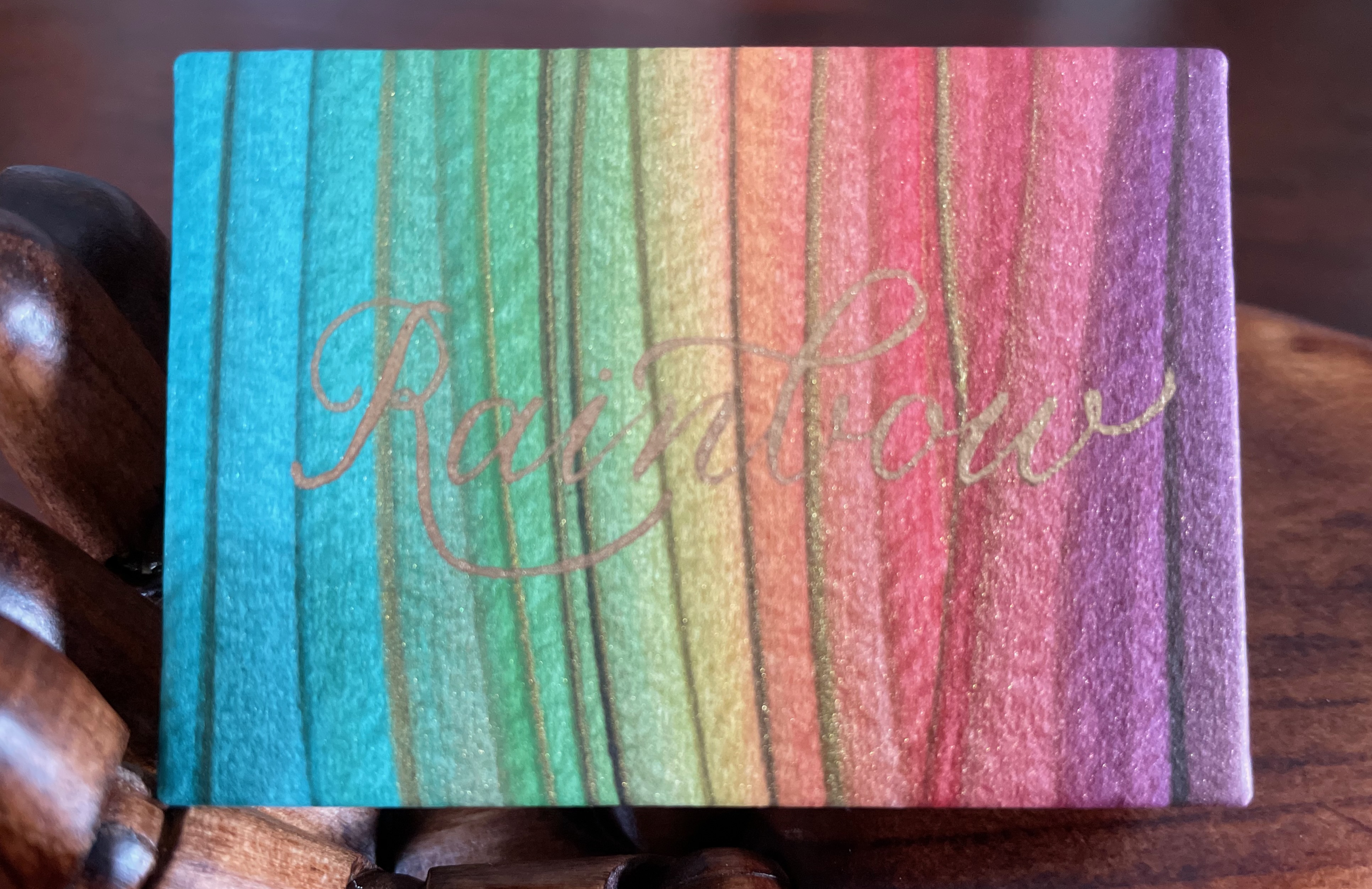
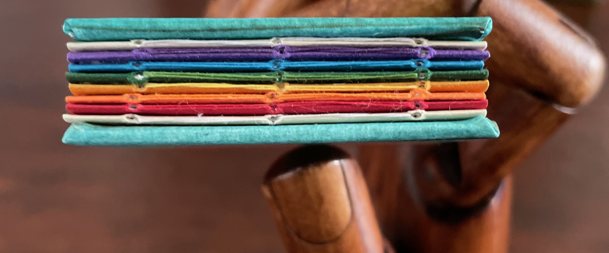
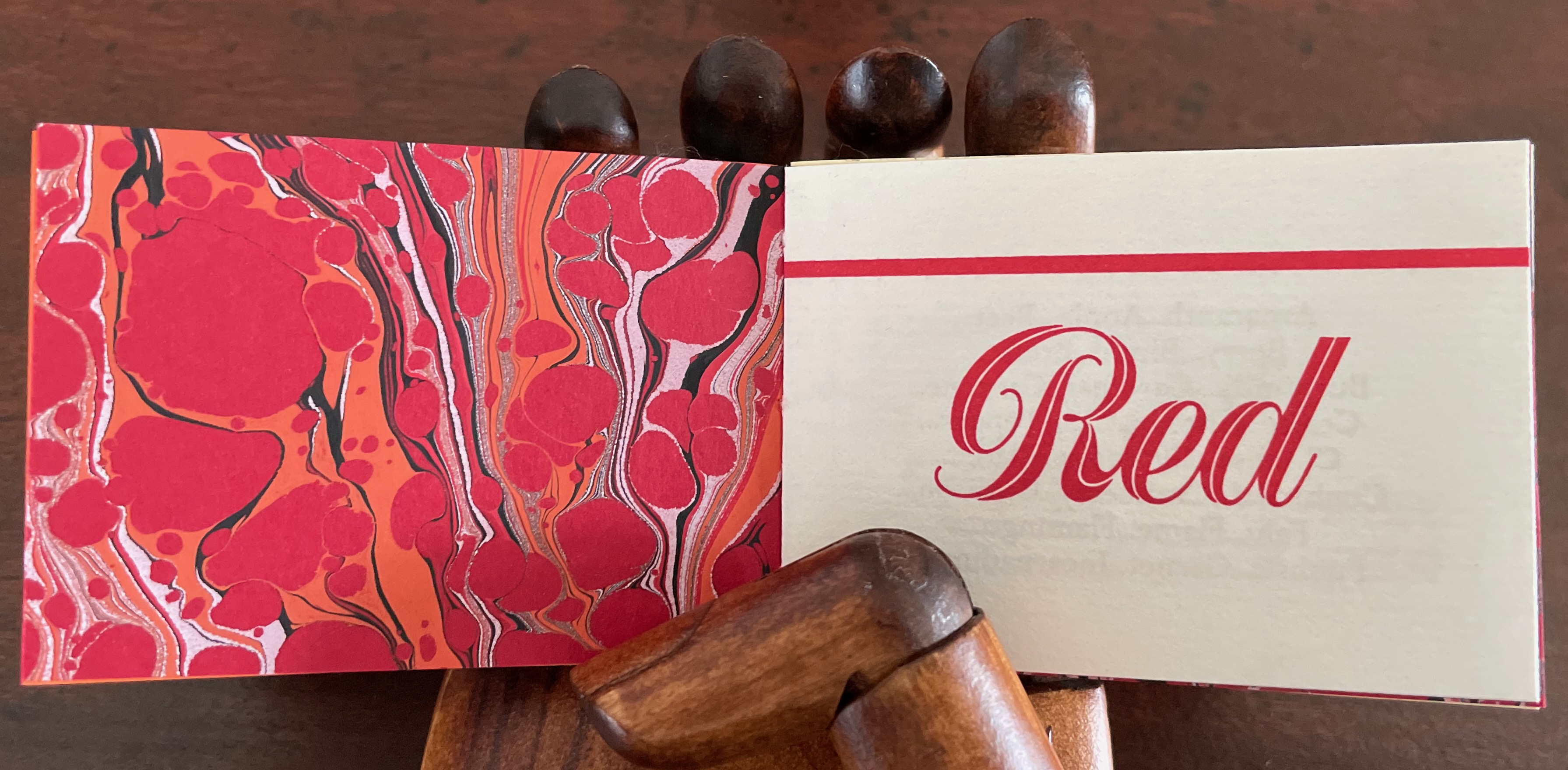
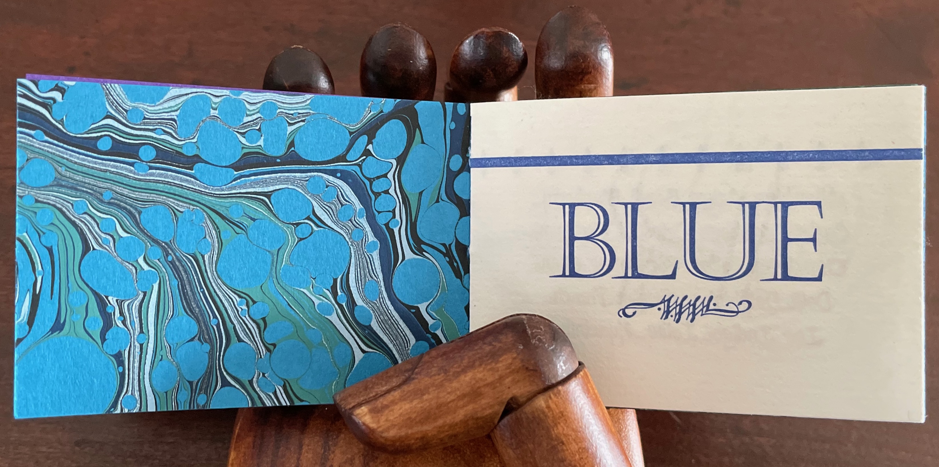
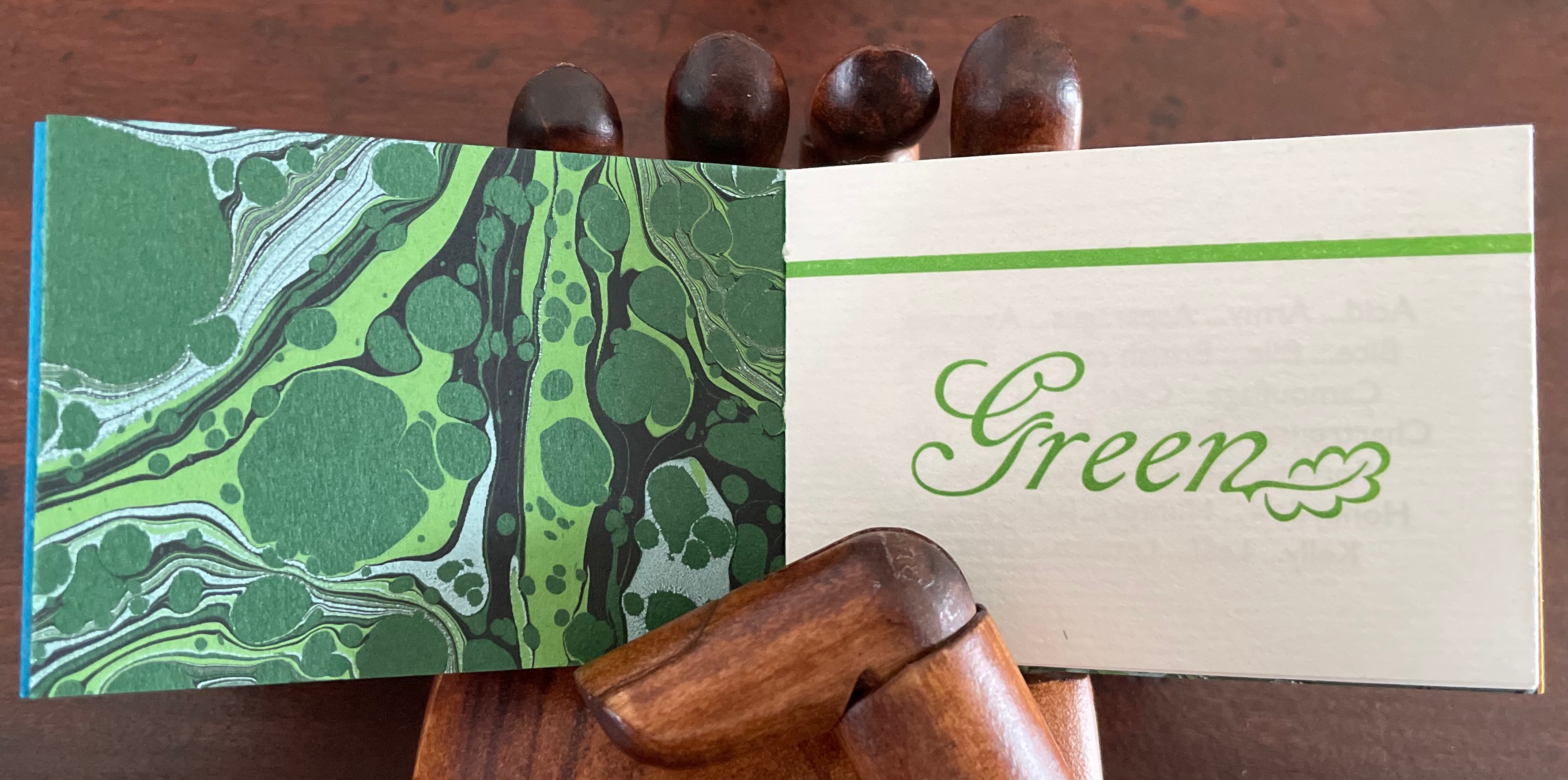
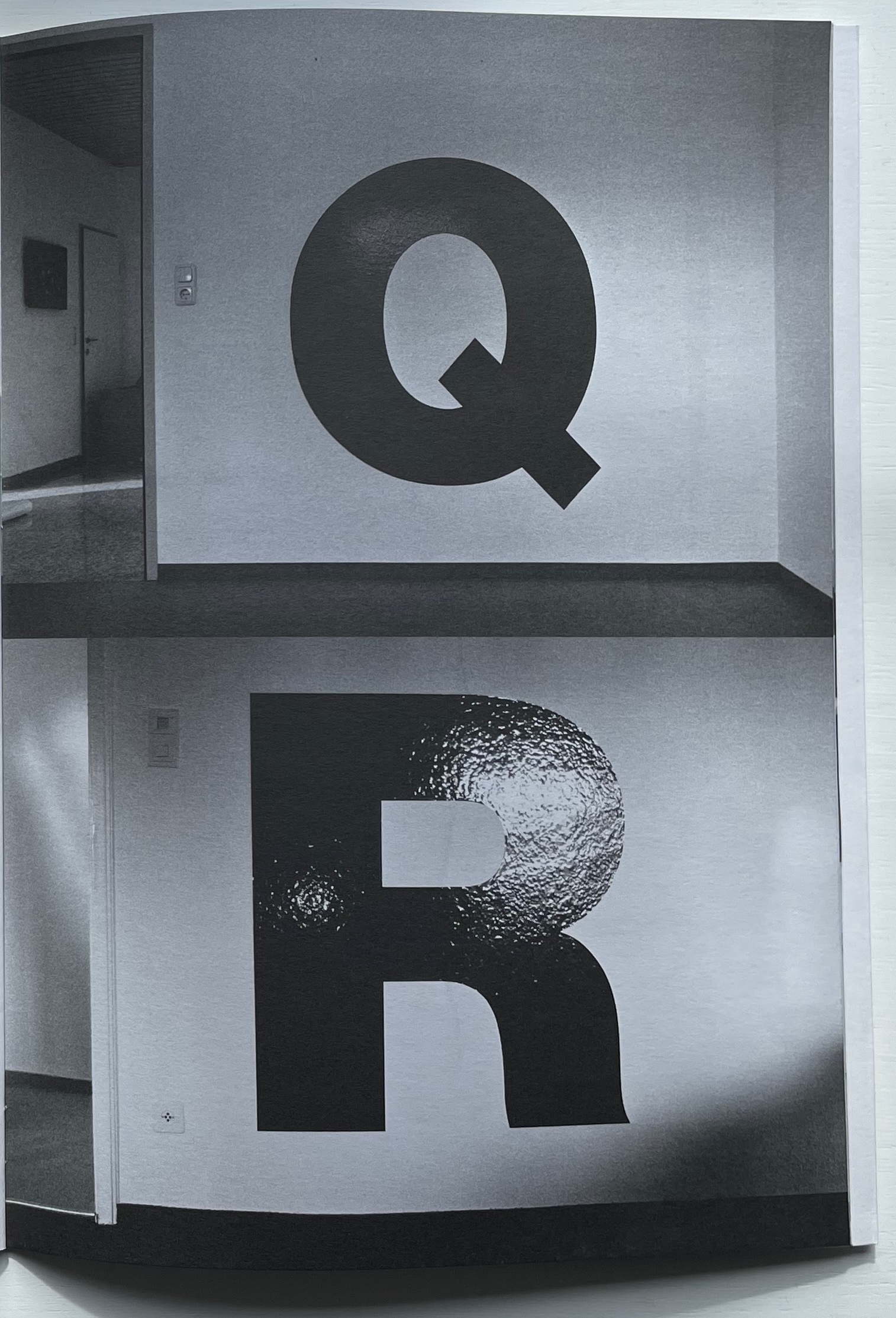
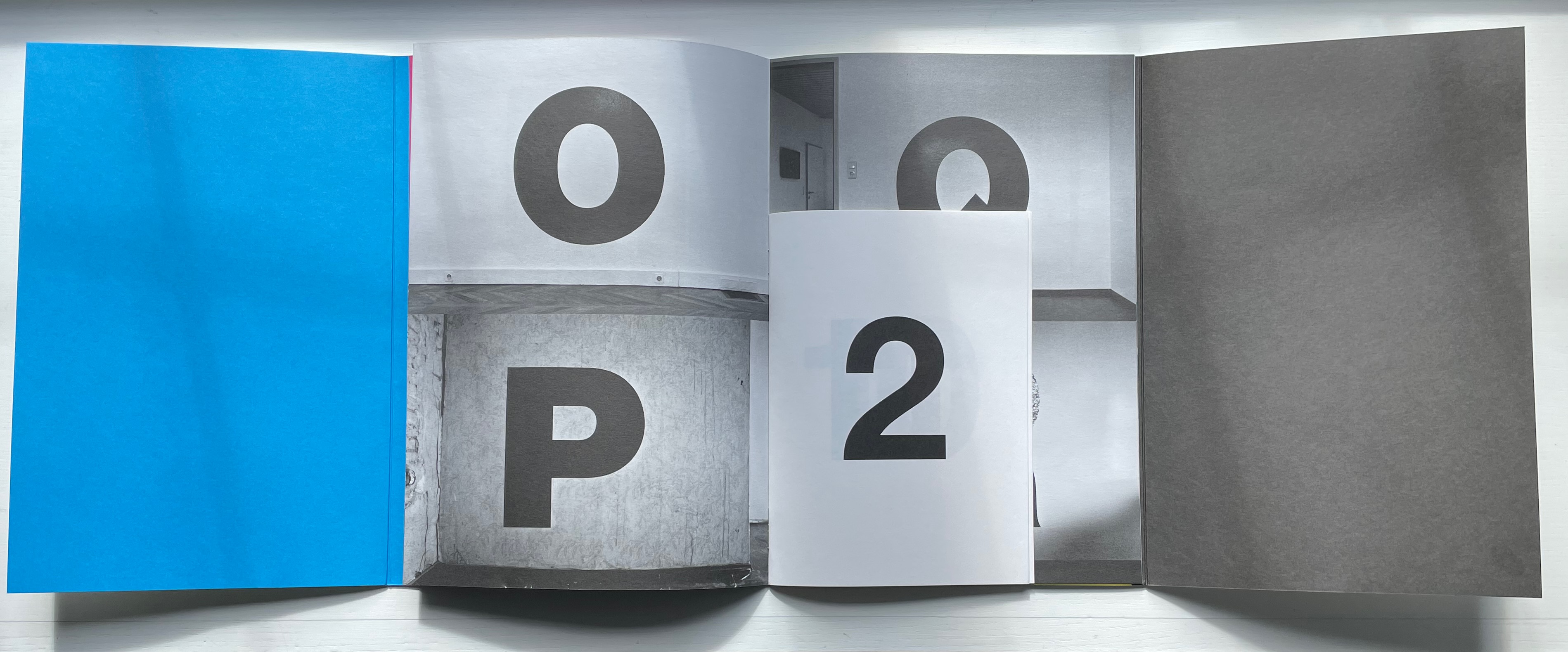
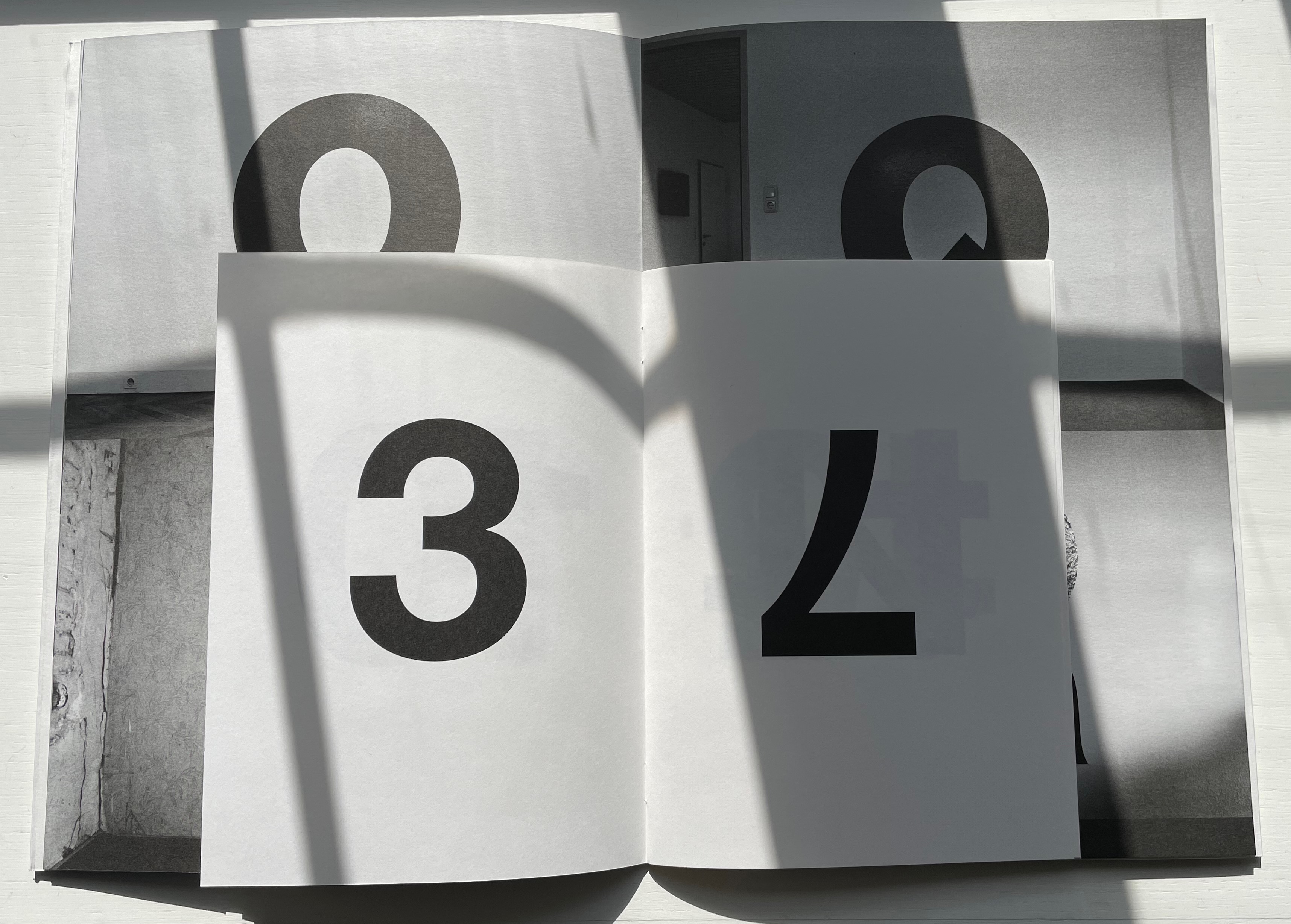
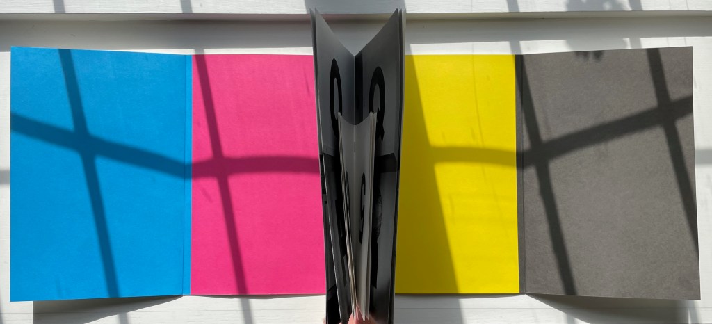
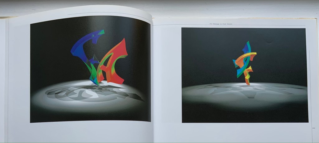
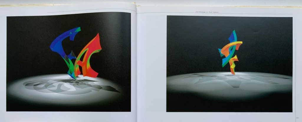
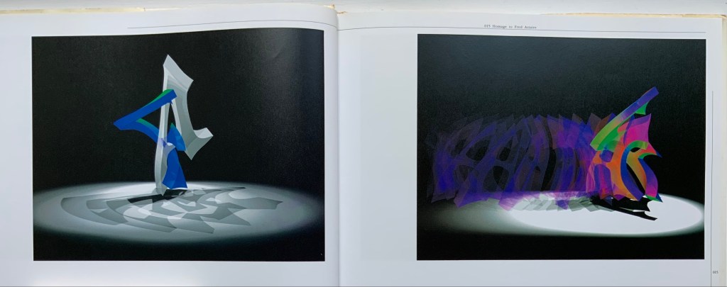
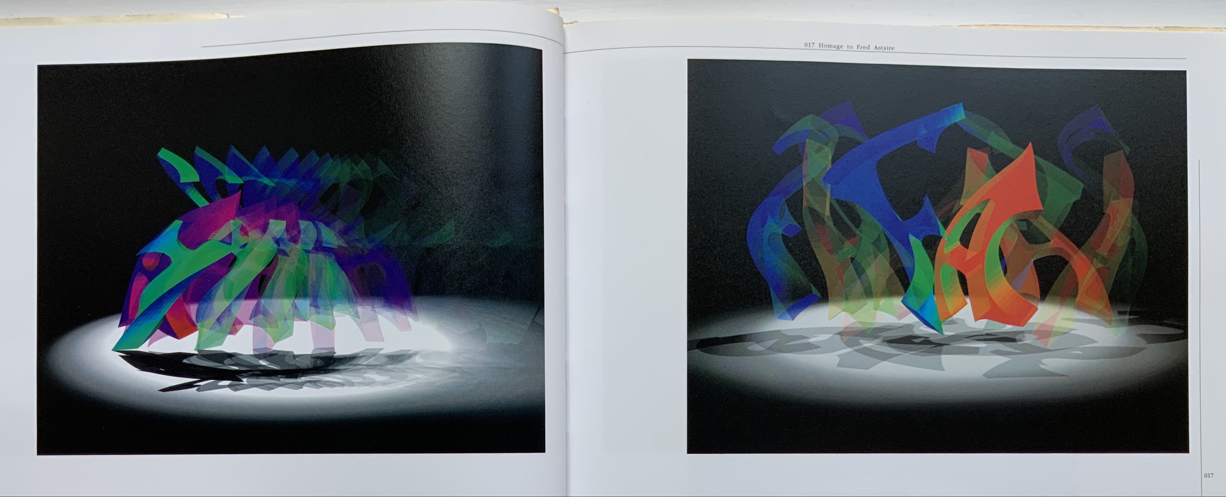
Spiralbet(1998) Amy Lapidow Tunnel book. Cloth bound and lined archival box. Closed:H165 x W185 x D5 mm. Open: D220 Acquired from the artist, 9 September 2022. Photo: James Prinz
This work was first spotted in the online catalogue for Abecedarium: An Exhibition of Alphabet Books (1998) from the Guild of Bookworkers. Being a small thumbnail on the second screen or page and accessed only by clicking on the artist’s name, its discovery was serendipitous. Its still being available was pure luck.
Photo: Books On Books Collection.
Photo: Amy Lapidow.
The structure and binding are the work of Amy Lapidow, who has taught bookbinding at the North Bennett Street School in Boston, MA. The airbrush coloring was executed by student Nancy Ames.
Photo: Books On Books Collection.
Other tunnel books with which compare and enjoy Lapidow’s are Borje Svensson & James Diaz’s Letters and Animals (1982), Karen Hanmer’s The Spectrum A-Z (2003) and Helen Malone & Jack Oudyn’s The Future of an Illusion (2017).
Along with Lapidow’s and Hanmer’s explorations of color and the alphabet, Jean Holabird’s Vladimir Nabokov: AlphaBet in Color (2005), Carol DuBosch’s Rainbow Alphabet Snowflake (2013) and Rebecca Bingham’s Defining the Rainbow (2018) offer a range of variations to compare and contrast. Andrew Morrison’s Chroma Numerica (2019) offers a similar exploration of colors but with numbers.
Defining the Rainbow(2018) Rebecca Bingham Matchbox-style box containing a miniature open spine book with paper over board covers. Box: H57 x W82 x D35 mm. Book: H51 x W73 mm. 46 pages. Edition of 81 (50 regular and 26 deluxe), of which this is #34. Acquired from Rebecca Press, 23 November 2022. Photos: Books On Books Collection. Displayed with the artist’s permission.
Defining the Rainbow is the product of a rainbow of talent. Madeleine Durhammade the paste papers for the box and covers of the book. Leonard Seastone of Tideline Press printed the book on his VanderCook from polymer plates made by Boxcar Press. Two four-page signatures for the front matter and colophon sandwich six four-page signatures of text listing shades and hues of Purple, Blue, Green, Yellow, Orange and Red. Between those signatures of handmade Hayle paper are back-to-back dividers made of marbled papers, hand-marbled by Jemma Lewismeeting several requirements: a scaled-down pattern and very specific color needs for the marbling to extend the idea of many-hued colors. Having collected and squirreled away names of shades and hues such as Byzantium, Zaffre, Smaragdine, Gamboge, Tangelo and Thulian (and researched them) and having waited for 30 years for the right project on which to expend a hoard of the handmade Hayle paper, Rebecca Bingham conceived and designed the project, convened the above-mentioned talents, spelled out their requirements, then hand-sewed and bound the results of their efforts.
On the Rebecca Press site, Bingham provides an engaging and enlightening description of the book’s letterpress printing “for those who are more familiar with the near-immediate gratification of digital printing”:
Each side of the page is printed separately (in this case, with the sheets being hand-placed into the press), after the ink has been applied (manually) to the type or (in this case) polymer plates. For something printed in one color, this means each sheet of paper passes through the press twice (front and back and alignment is not automatic — it’s fiddly work). In between, the ink needs several hours to dry. If you want a second color (for example, in my “green” section, both black and green inks are used), then the sheet must go through the press again (if color on 2 sides, then that means twice). I remind you of the alignment challenge. If you remember how hard it was to reinsert a typewriter page when corrections were needed (well, if you’re pretty old or are freakishly fascinated by ancient tech), you’ll have an idea of what this means. Plus, if you are changing the color on the press then the press needs to be thoroughly washed down so that the new color is crisp and clean (in the case of a light color like yellow, this can require more than one washing). Of course, this is a book about color, so 6 of the sections have their own second color and must go through the press 4 times (multiplied by the number of copies, of course). With the washing up and the aligning and the waiting for things to dry…
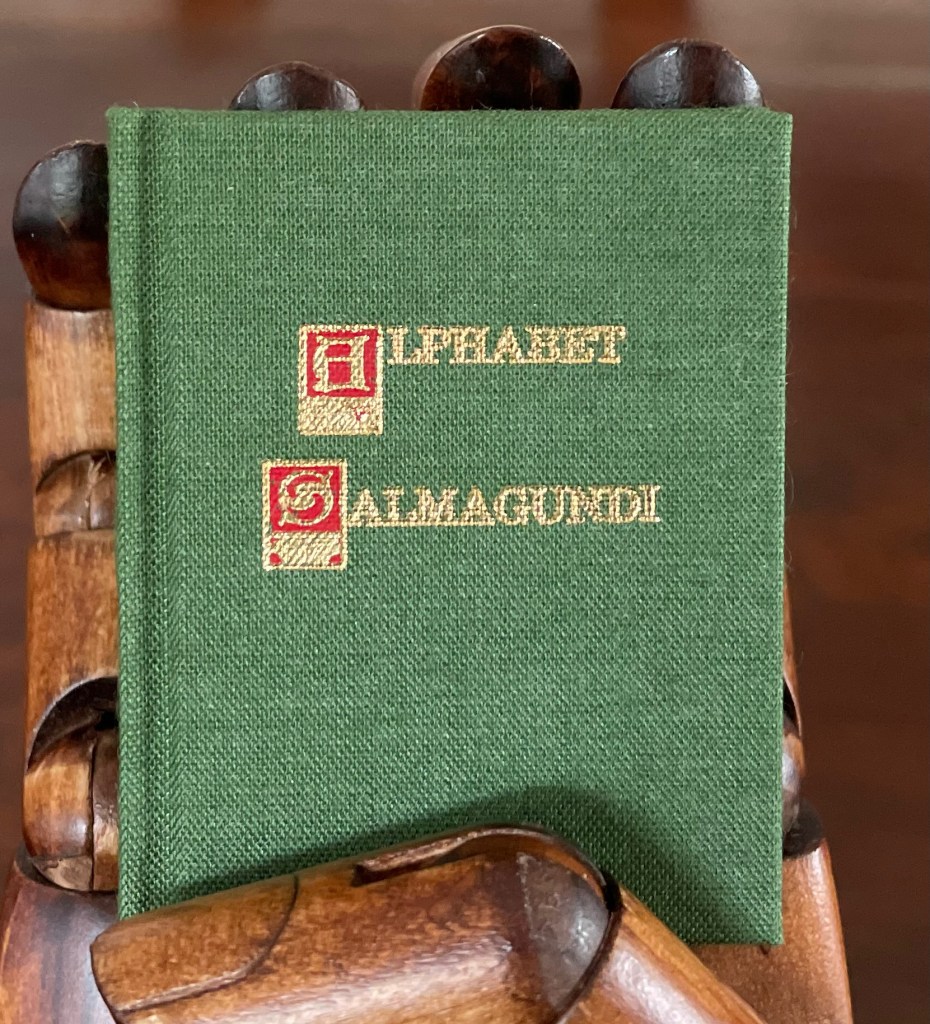
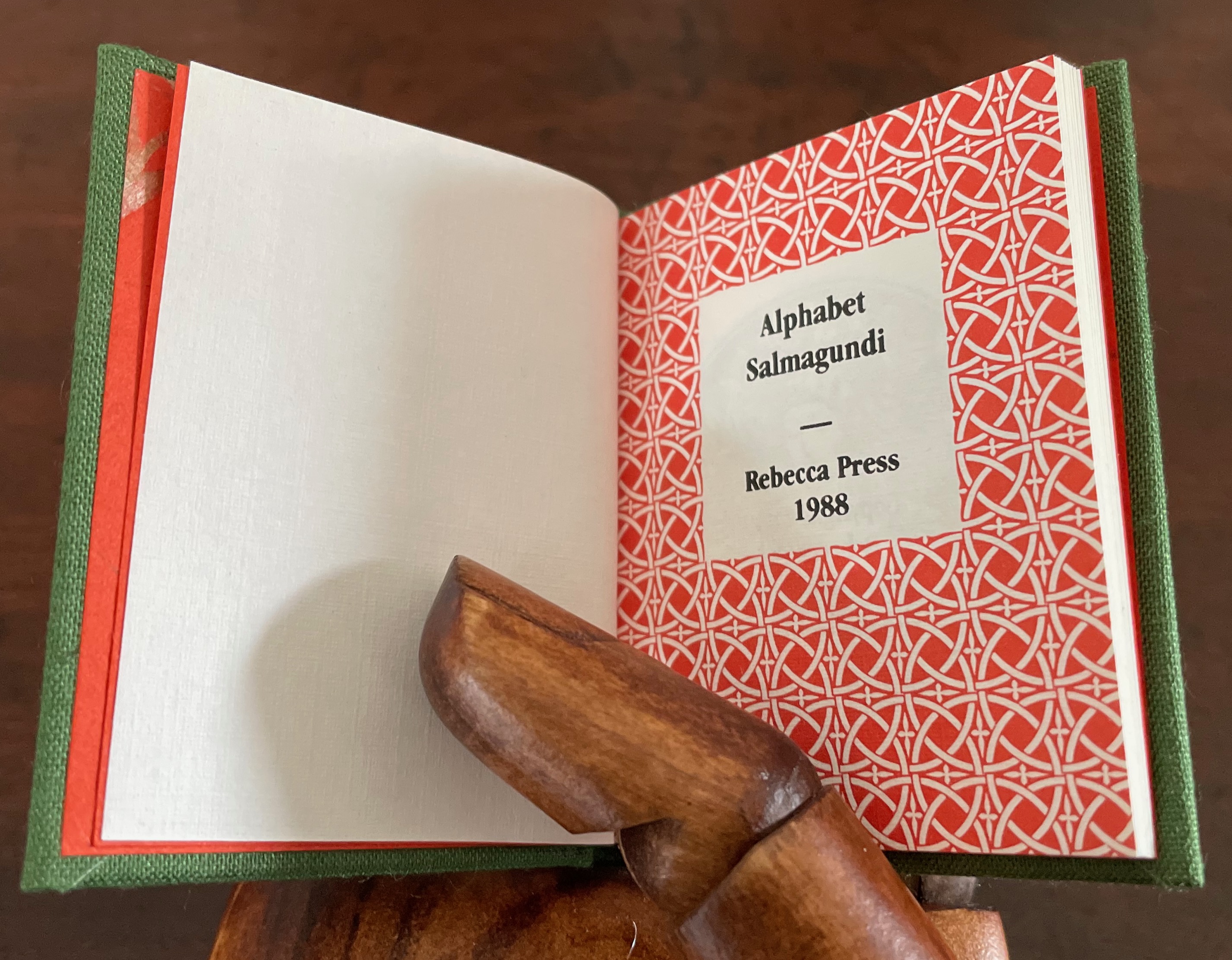
Alphabet Salmagundi (1988)
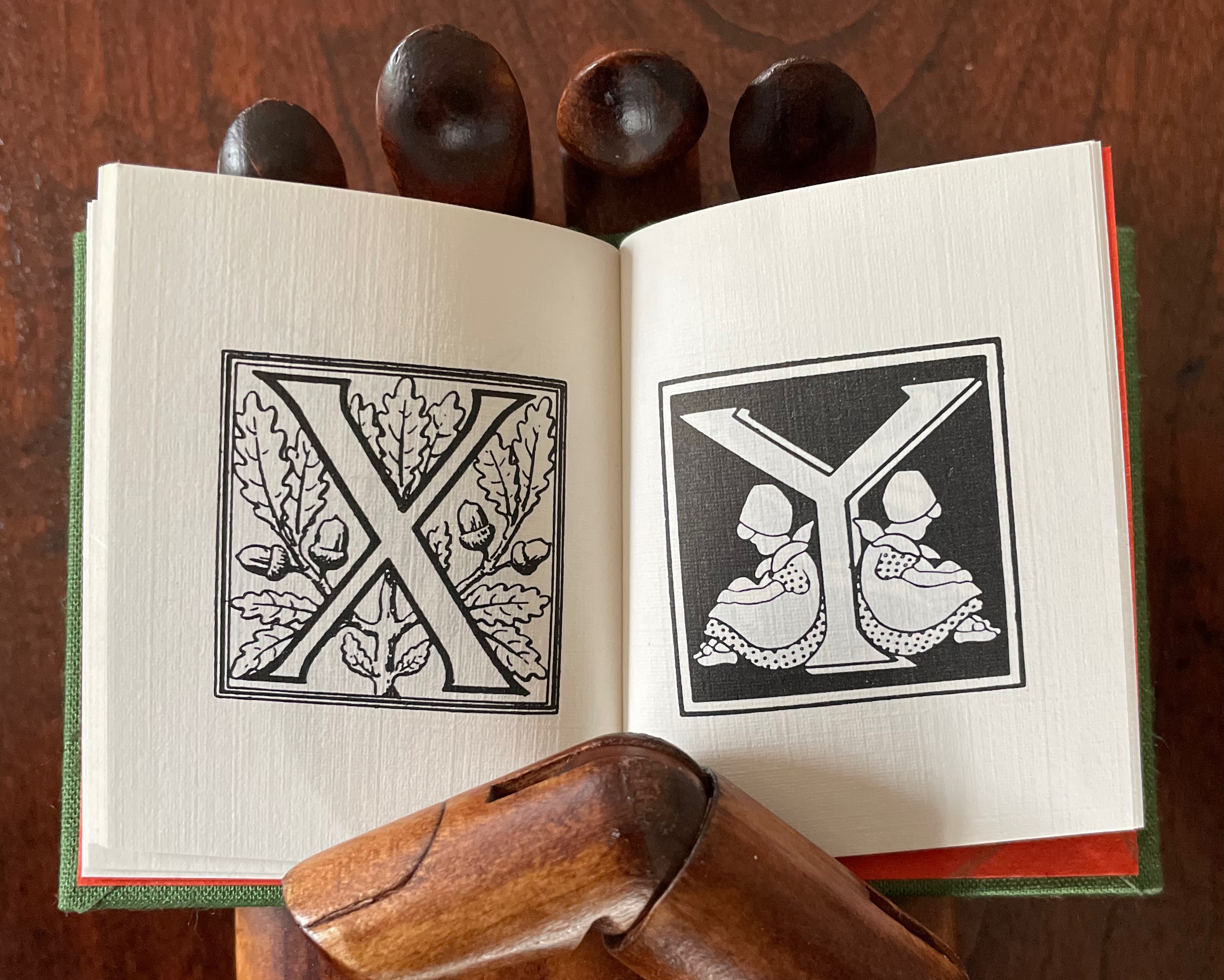
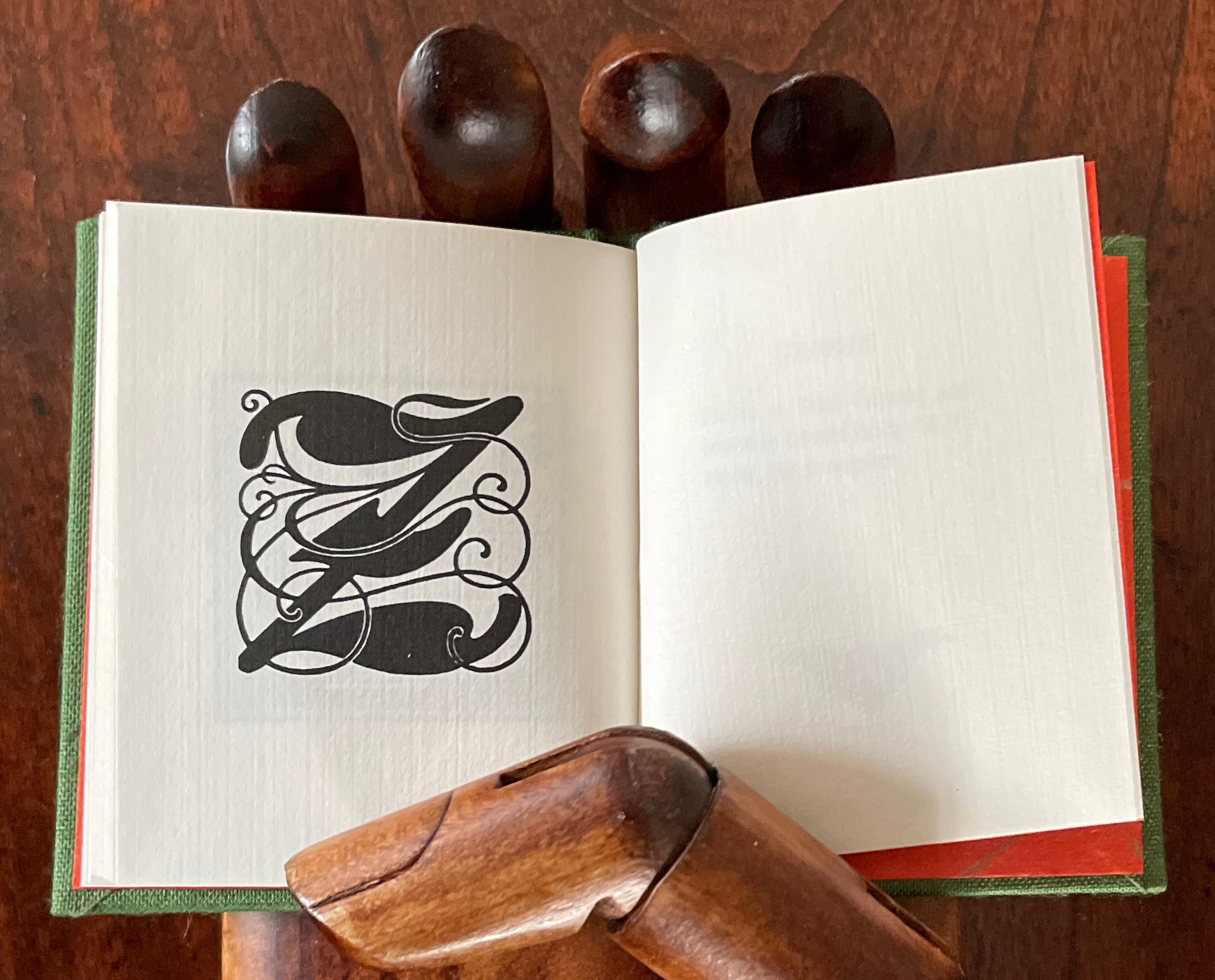
Alphabet Salmagundi (1988) Rebecca Bingham Miniature casebound, cloth over boards, colored decorated doublures, perfect bound book block. H66 x W57 mm. 40 unnumbered pages. Edition of 200, of which this is #150. Acquired from Rebecca Press, 23 November 2022. Photos: Books On Books Collection. Displayed with the artist’s permission.
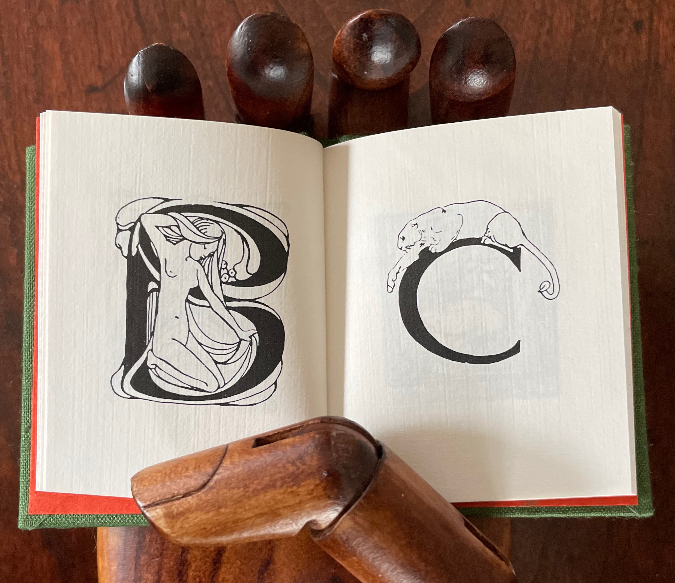
This alphabet book is a miscellany of letter styles and images, some of which clearly reflect the letters with which they are associated and some of which are less clear. For instance, C is clearly associated with cat, but the big cat depicted looks like a lioness. The letter B has a bare-breasted young lady bathing, so the usual one-to-one association is elusive. And for the letter A, any association between it and two birds eying a nervous frog — unless the scene stands for “Appetite” — is downright obscure.
The relation of the letters X, Y and Z with their images is just as loose. X for oak or acorn? Y might be for youngsters. Does the decoration of letter Z suggest a zephyr?
If “salmagundi” implies a loose collection, a mélange, a potpourri, an olio, then this little book lives up to its name.
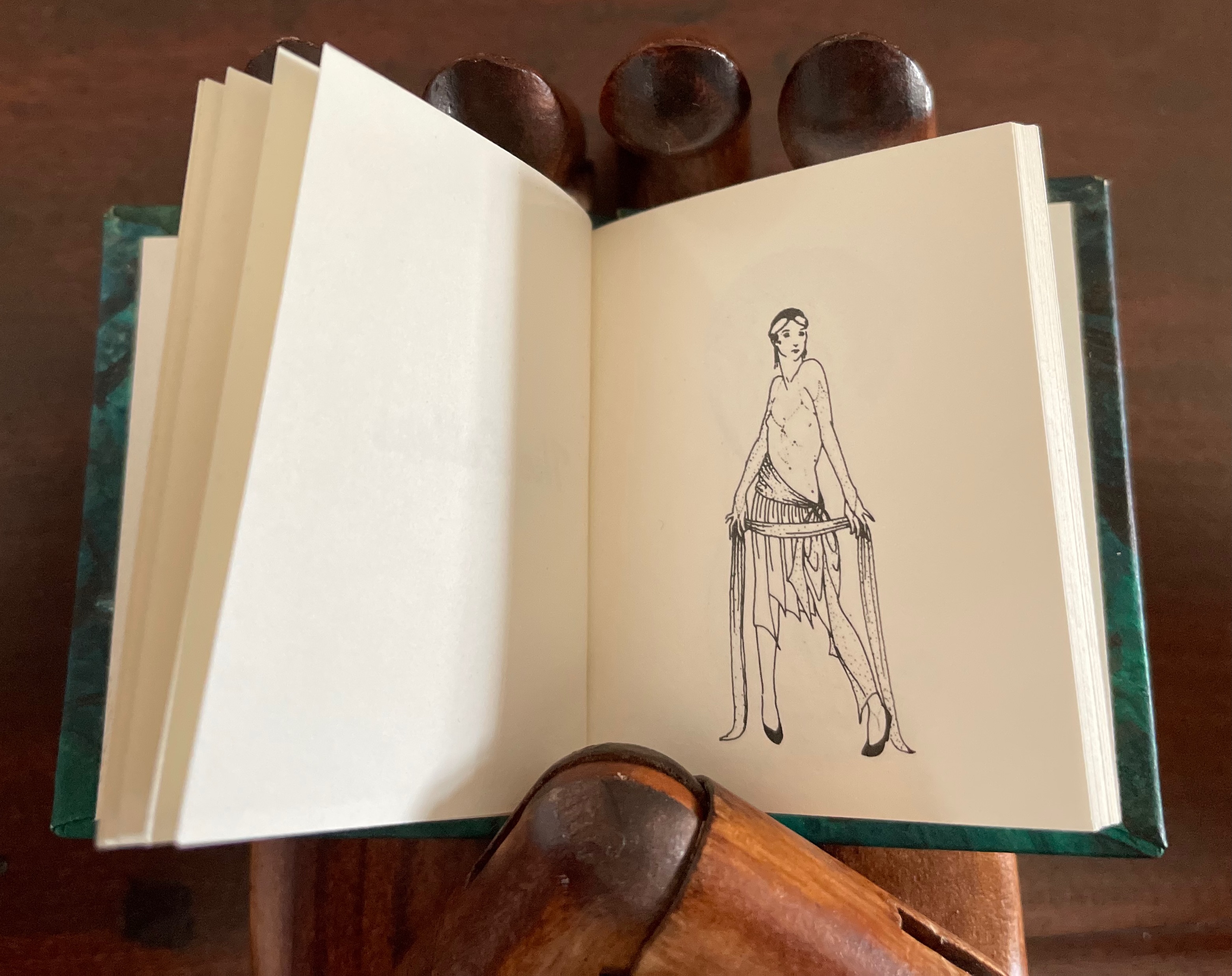
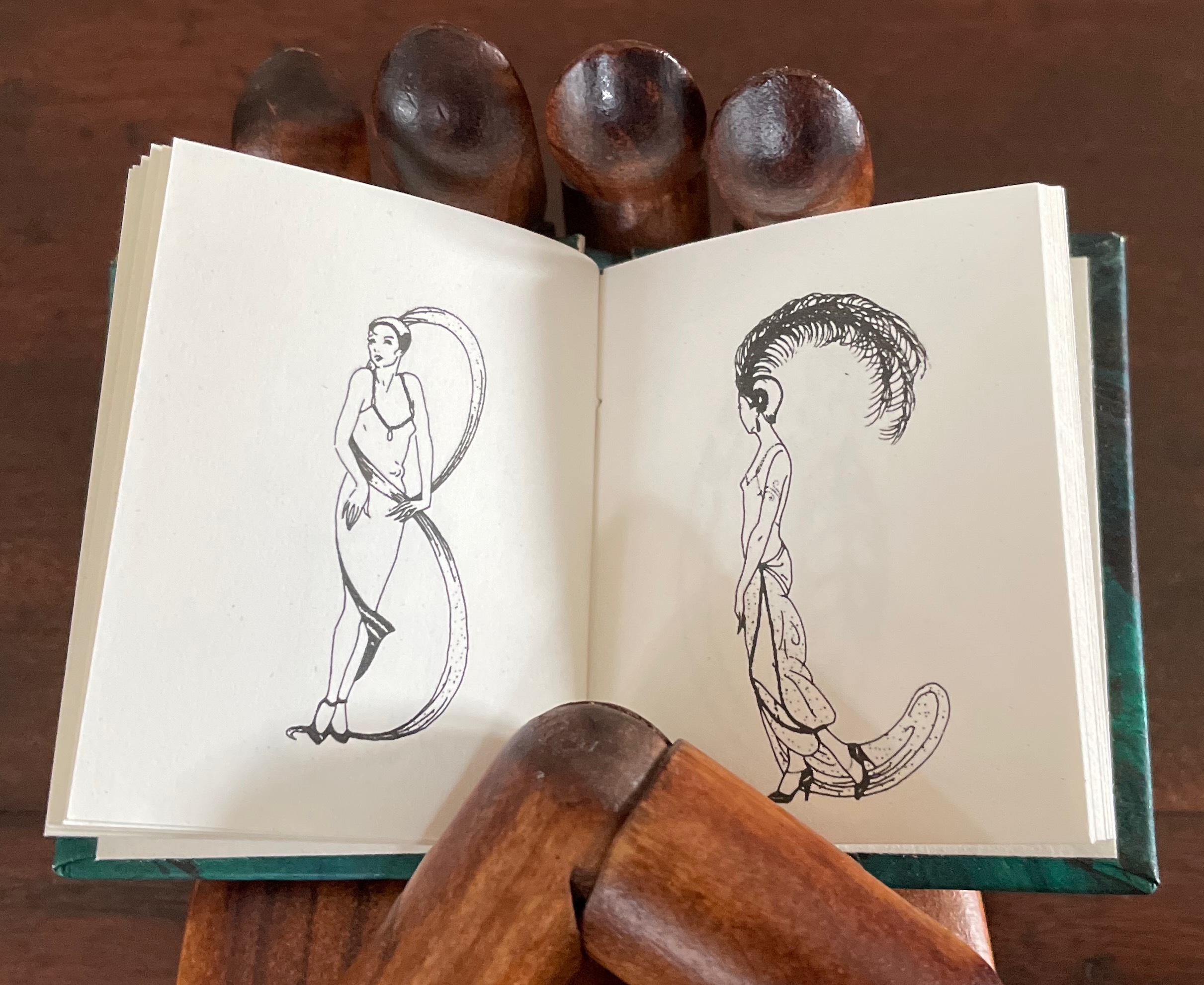
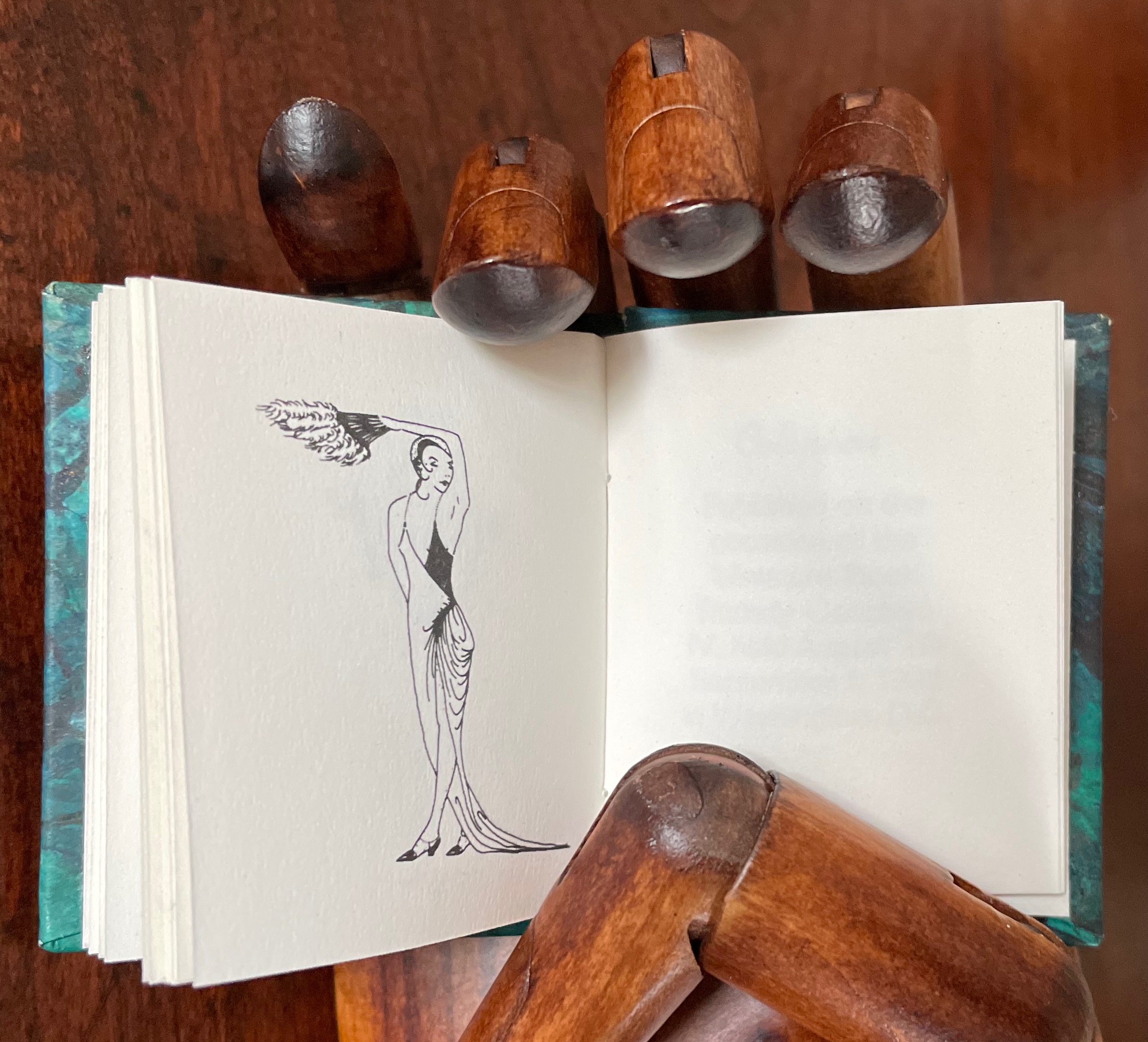
Lady Letters (1986)
June Sidwell designed, modelled and illustrated the haute couture alphabet for which Rebecca Bingham designed this book. Sidwell’s “lady letters” will likely remind the viewer of Erté’s alphabet, although his ladies take more risqué poses than Sidwell’s. Bingham actually met Erté, and on her site, she relates how she met him and presented him with a miniature version of his alphabet.
Lady Letters (1986) June Sidwell and Rebecca Bingham Miniature casebound, plain doublures, sewn book block. H58 x W48 mm. 40 unnumbered pages. Edition of 200, of which this is #33. Acquired from Rebecca Press, 23 November 2022. Photos: Books On Books Collection. Displayed with the artist’s permission.
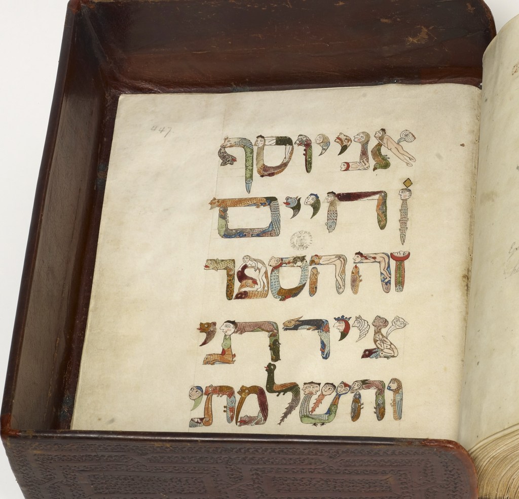
The tradition of anthropomorphic abecedary reaches back at least as far as biblical manuscripts. The Bodleian Libraries’ “Kennicott Bible” is one example.
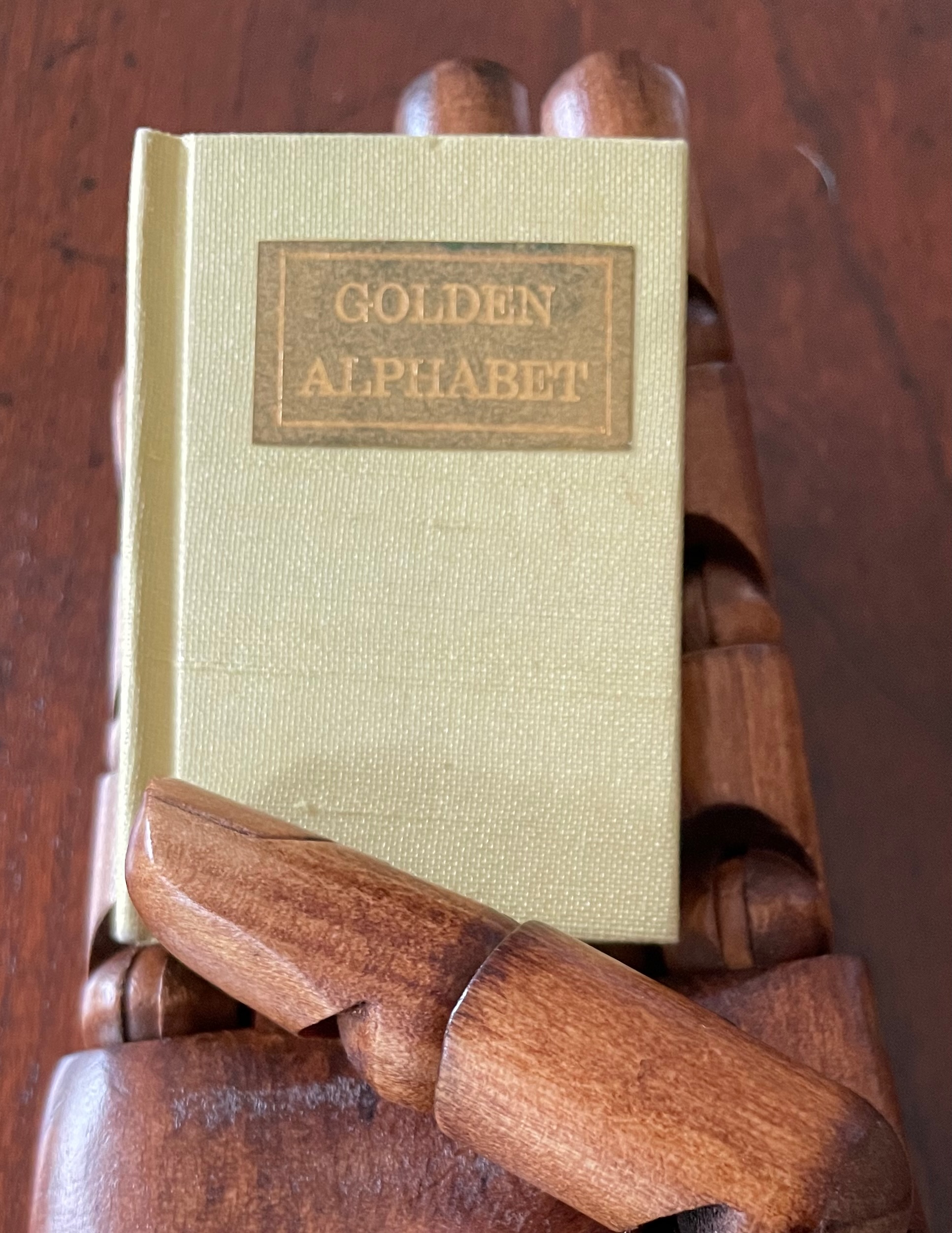
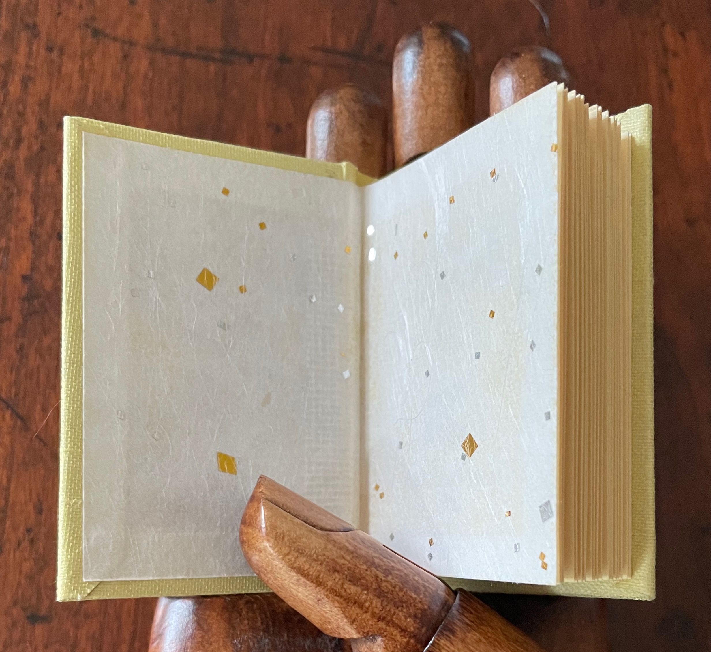
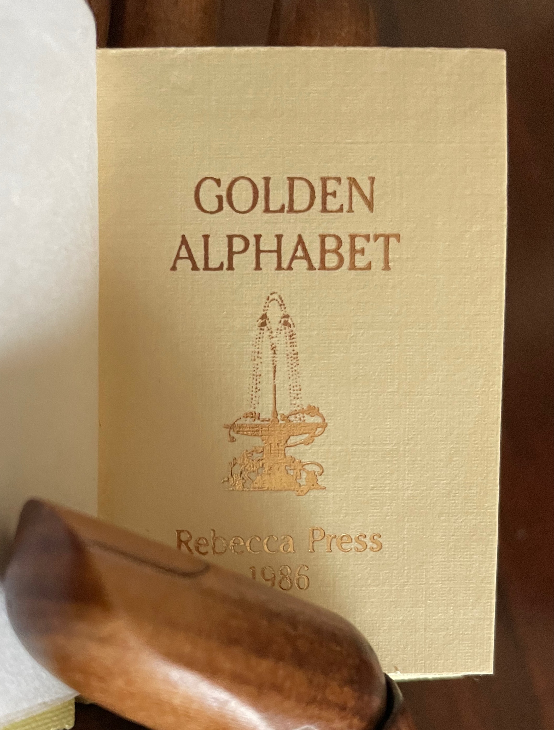
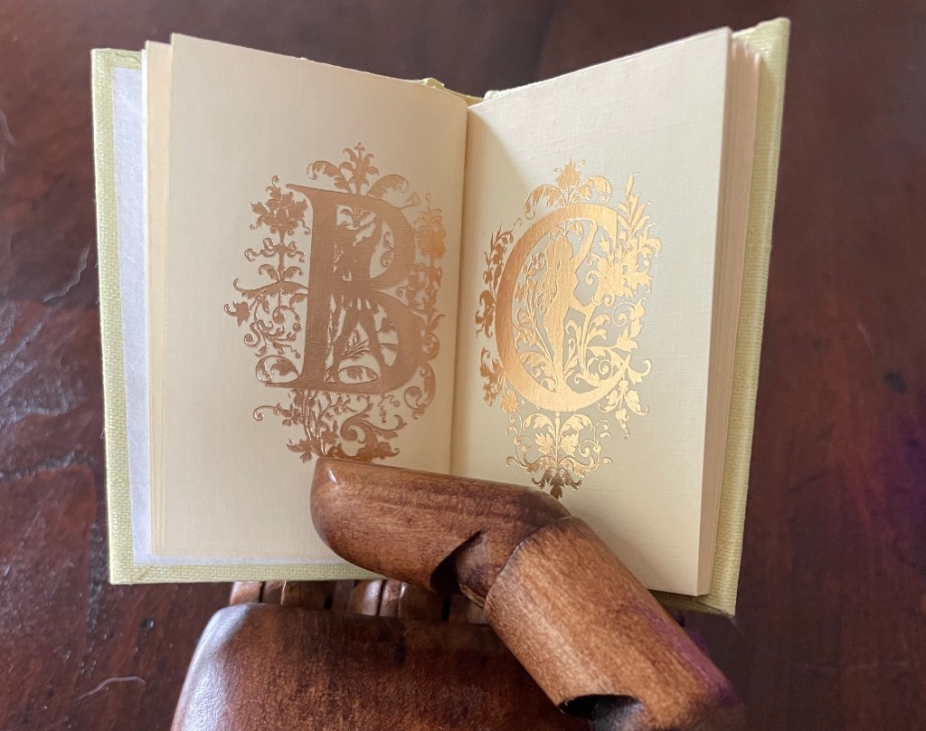
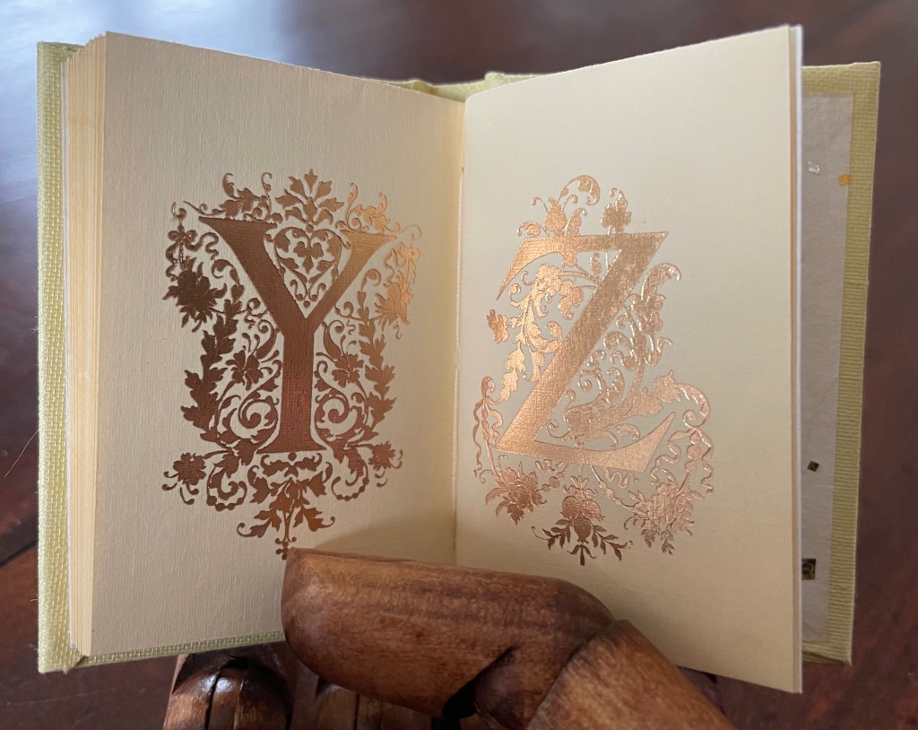
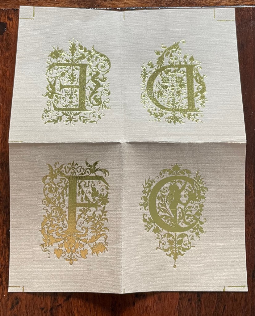
Golden Alphabet (1986) Rebecca Bingham Miniature casebound, gilt-titled leather front cover label, decorative doublures, sewn. H68 x W38 mm. 28 unnumbered pages. Edition of 200, of which this is #96. Acquired from John Howell for Books, 31 October 2022. Photos: Books On Books Collection. Displayed with the artist’s permission.
Although each letter has its own artistic treatment, this alphabet of gilt letters with their rococo decoration is no salmagundi. The folios are uncut at the top edge (the inner pages not printed on or included in the pagination), which would have been necessary for the application of the gilt foil. In a separate order, the artist sent a gratis loose folio, shown below.
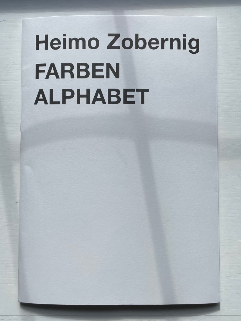
FARBEN ALPHABET (2018) Heimo Zobernig Paperback. H297 x W210 mm. 32 unnumbered pages in two signatures. Edition of 500, of which this is #427. Acquired from Les Presses du Reel, 18 September 2022. Photos: Books On Books Collection.
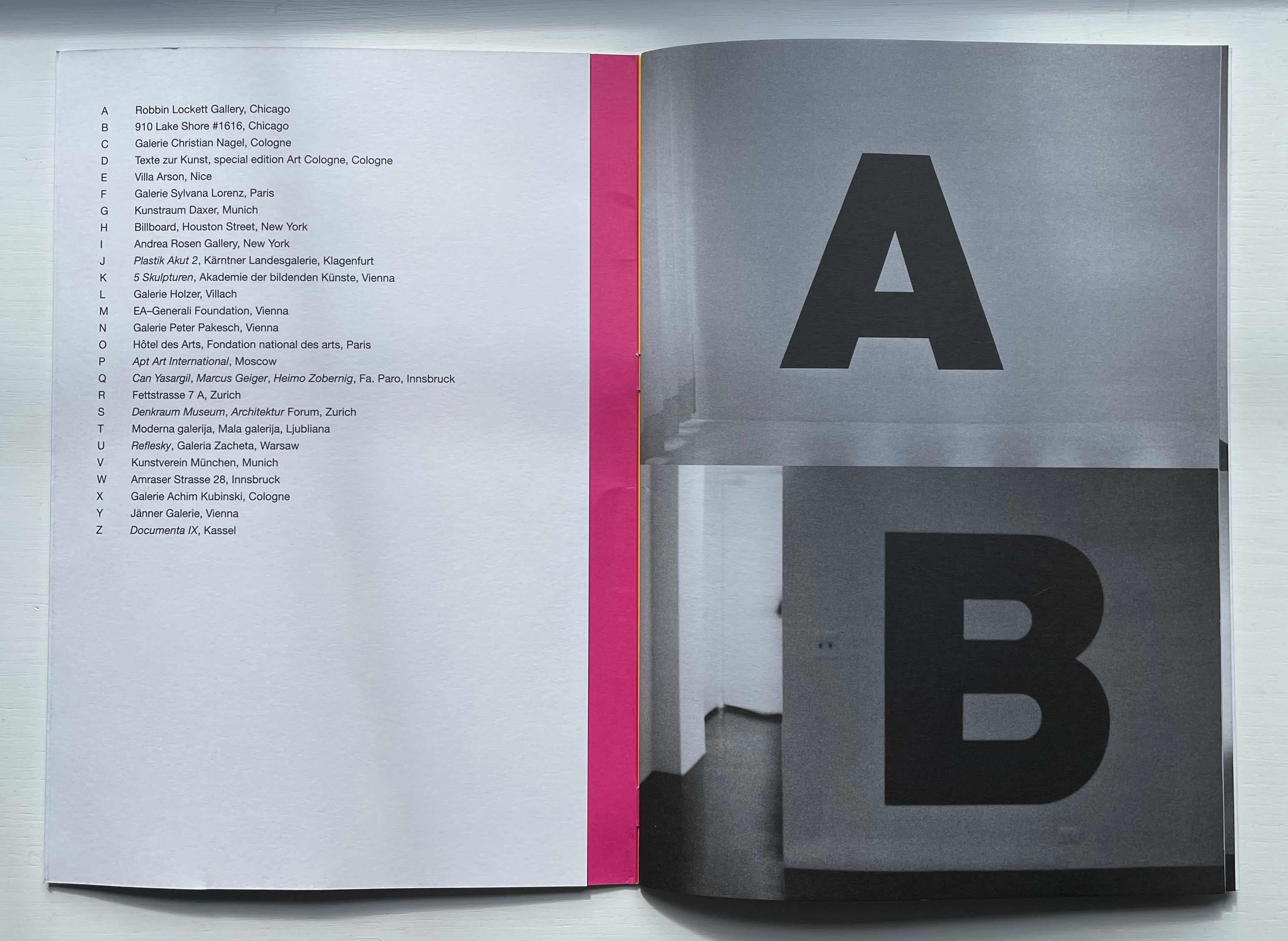
Starting with his first solo exhibit in the US, Heimo Zobernig placed a 115 cm high letter A in black adhesive vinyl foil on a wall near the entrance to the Robbin Locket Gallery in Chicago.
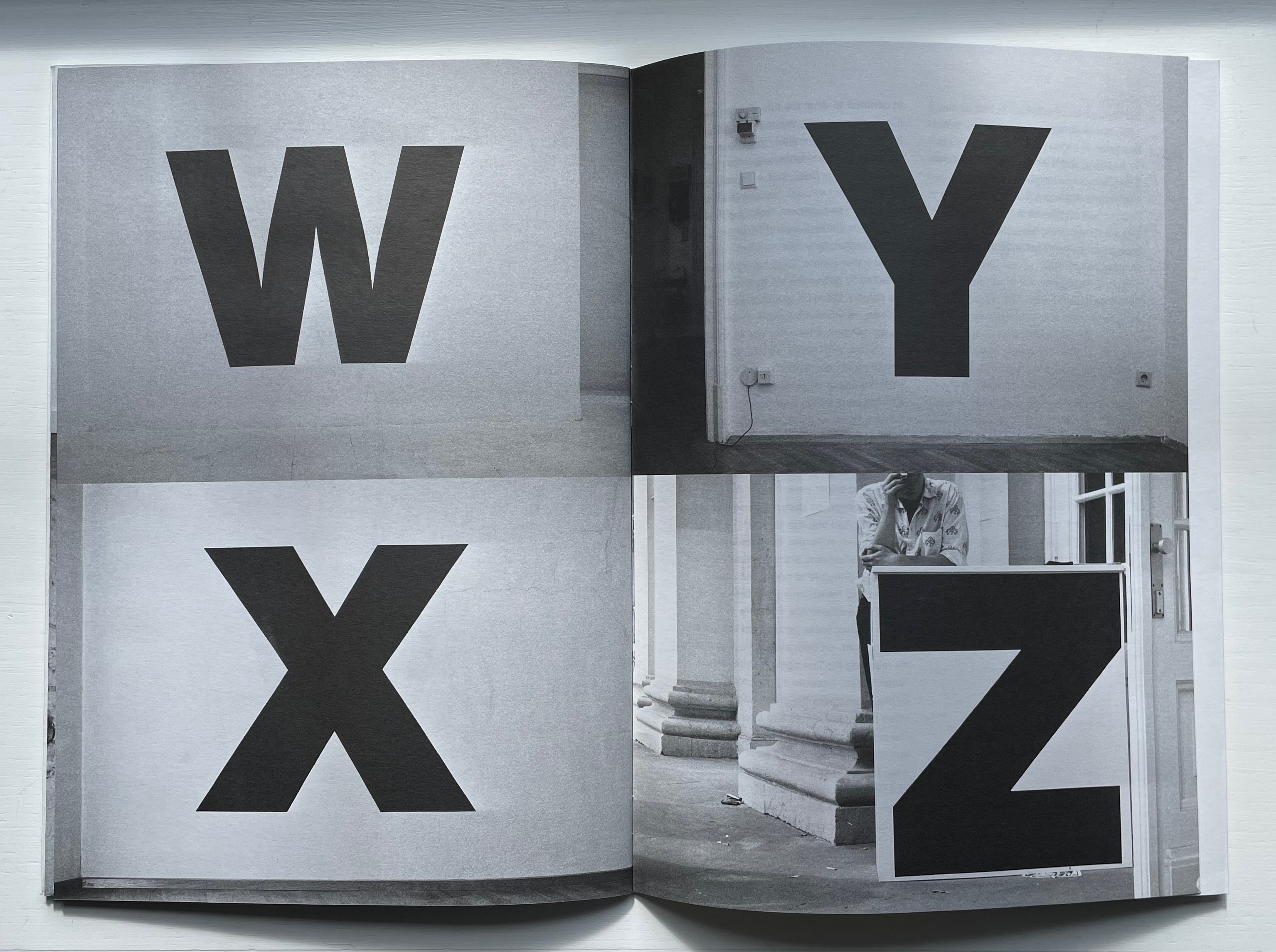
That was in 1990. By 1992 and twenty-five more exhibits later, he had accumulated a complete alphabet, the Z appearing on the ticket counter for Documenta IX in Kassel, Germany. The literary magazine Freibord (Vienna) published Zobernig’s photographic alphabetic record of his exhibitions in its centenary issue (1997). With Zobernig’s cover design, IF Publications (Barcelona) has produced Alphabet for the first time as an artist’s book. Here is the artist’s alphabet book as intervention over time. As the cover’s title and absence of color in these letters suggests, though, “But wait, there’s more”.
At the center of the photographed alphabet’s 16 pages measuring H297 x W210 mm, another 16-page signature measuring H210 x W150 appears, showing the numeral 2 in 220pt Helvetica on its cover, then the numerals 11 and 10 on the first double-page spread, then 3 and an upside-down 7 on the next spread. On the tenth unnumbered page, the word — FARBEN — appears. As if the numeric disorder were not puzzling enough, the numerals and letters are all in black despite the word FARBEN meaning “COLORS”. At the end of the book, Moritz Küng, the book’s editor, provides two crucial insights for untangling the puzzle.
First, that from the mid-1980s, Zobernig selected fifteen combinations of CMYK to define a palette from which he would not deviate until the early part of this century. Second, that the center signature self-referentially reflects on the principle of imposition (how sheets are printed and folded into signatures). Each number in the center brochure belongs to one of Zobernig’s fifteen CMYK combinations. From the top left of one side of the sheet to the bottom right of the other side of the sheet, Zobernig placed “right reading” numerical representations of these color combinations so that, when the sheet is folded and trimmed to form the booklet, the numbers and title appear in their strange orientation. This orientation that calls attention to the mechanics of the inside booklet’s creation results in the numeral 2 appearing on its cover, seemingly labelling the booklet within a booklet as the second of two volumes. Yet the cover of the outer booklet indicates that FARBEN comes first.
The seemingly contrary self-referencing abstraction does not end there. Or rather, if we stick with the cover of FARBEN ALPHABET with Küng’s clues in mind, it resolves itself. Just as Zobernig’s black and white alphabetic labels abstractly introduced his color-rich 1990-92 exhibitions, the other side of FARBEN ALPHABET’s black and white cover displays cyan, magenta, yellow and black panels, otherwise known as CMYK, the color alphabet from whose combinations Zobernig’s abstract expressionist art is created. Paradoxically, though, Zobernig’s FARBEN ALPHABET challenges such reductive labelling. Abstraction does not merely yield labels, he seems to suggest. It yields art through process and form — such as alphabetizing exhibitions to generate an artist’s alphabet book.
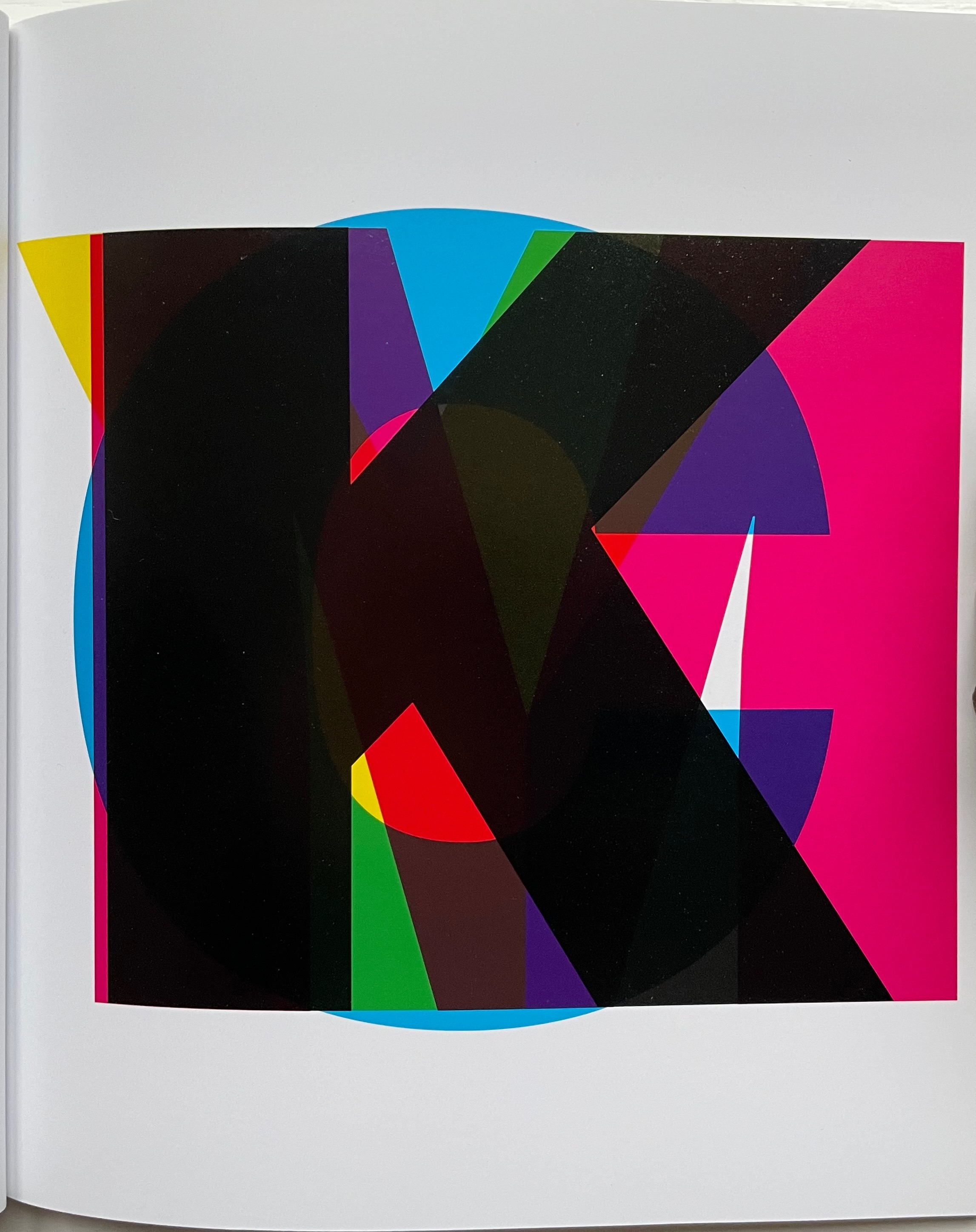
CMYK (2013)
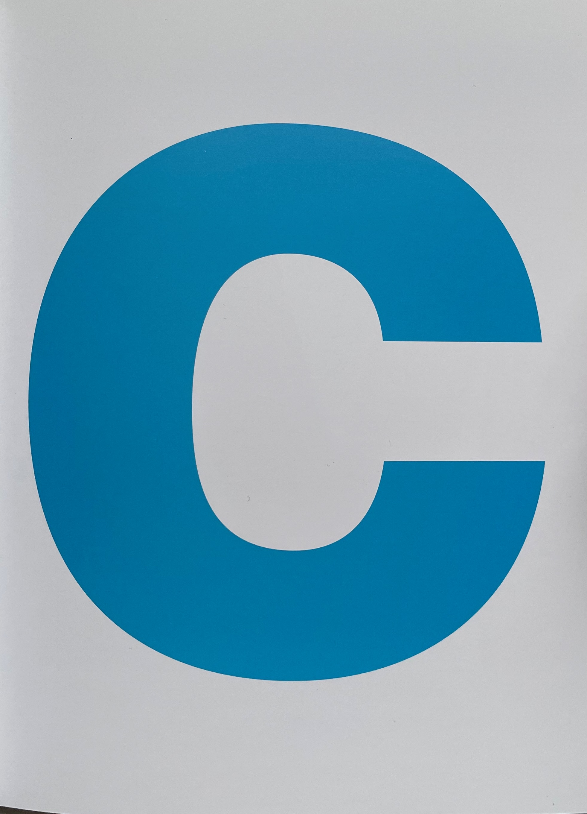
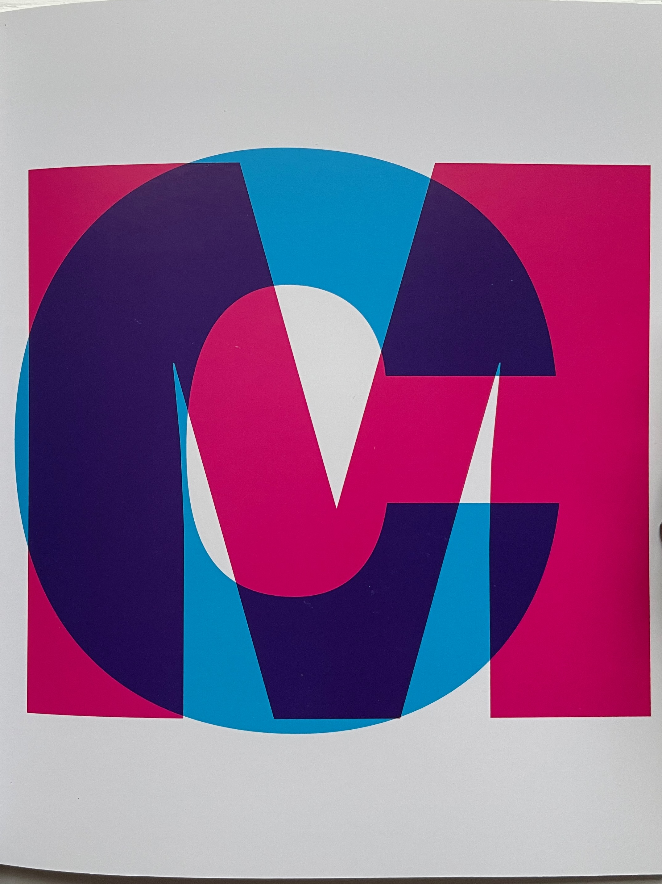
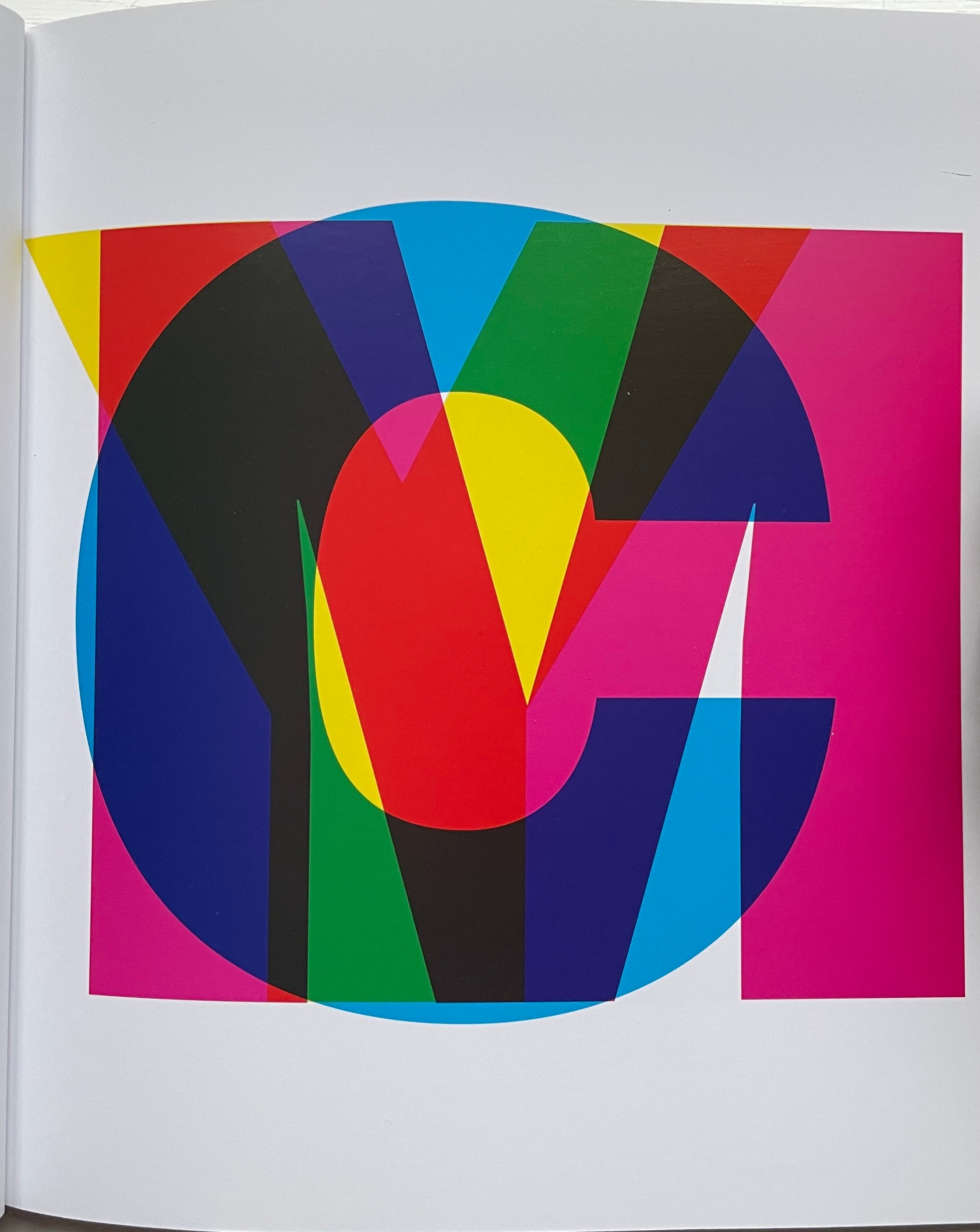
CMYK (2013) Heimo Zobernig Perfect bound in glossy card, glossy text paper. H160 x W140 cm. 36 pages. Edition of 300, of which this is #214. Acquired from Pia Jardí, 26 October 2022. Photos: Books On Books Collection.
In the additive color model RGB, white includes all the primary colors — red, green and blue — of the light spectrum, and black is the absence of light. In the subtractive color model CMYK — cyan, magenta, yellow and key (black) — white is the absence of any ink leaving the natural color of the paper as the white background on which the combination of all the CMY inks yields black. What better cover for CMYK than pure white paper. Just as Farben Alphabet uses the A-Z alphabet and printing imposition to play with our expectations, this artist’s booklet uses the letters of the color model, the colored inks and the printing process to play with our expectations. C is overlapped by M, then CM is overlapped by Y, and, to yield the letter K, CMY are combined. From there, the booklet cycles through subtracting the letters in reverse, adding them back and so on.
This conceptual, process-driven artist’s booklet, arising from a multi-artist exhibition curated by Pia Jardí for the Open Structure Art Society (OSAS) in Budapest, makes for an interesting contrast with Amy Lapidow’s Spiralbet (1998), Karen Hanmer’s The Spectrum A to Z (2003), Annesas Appel’s Ruiten Alfabet (2006), Carol DuBosch’s Rainbow Alphabet Snowflake (2013) or Rebecca Bingham’s Rainbow (2018).
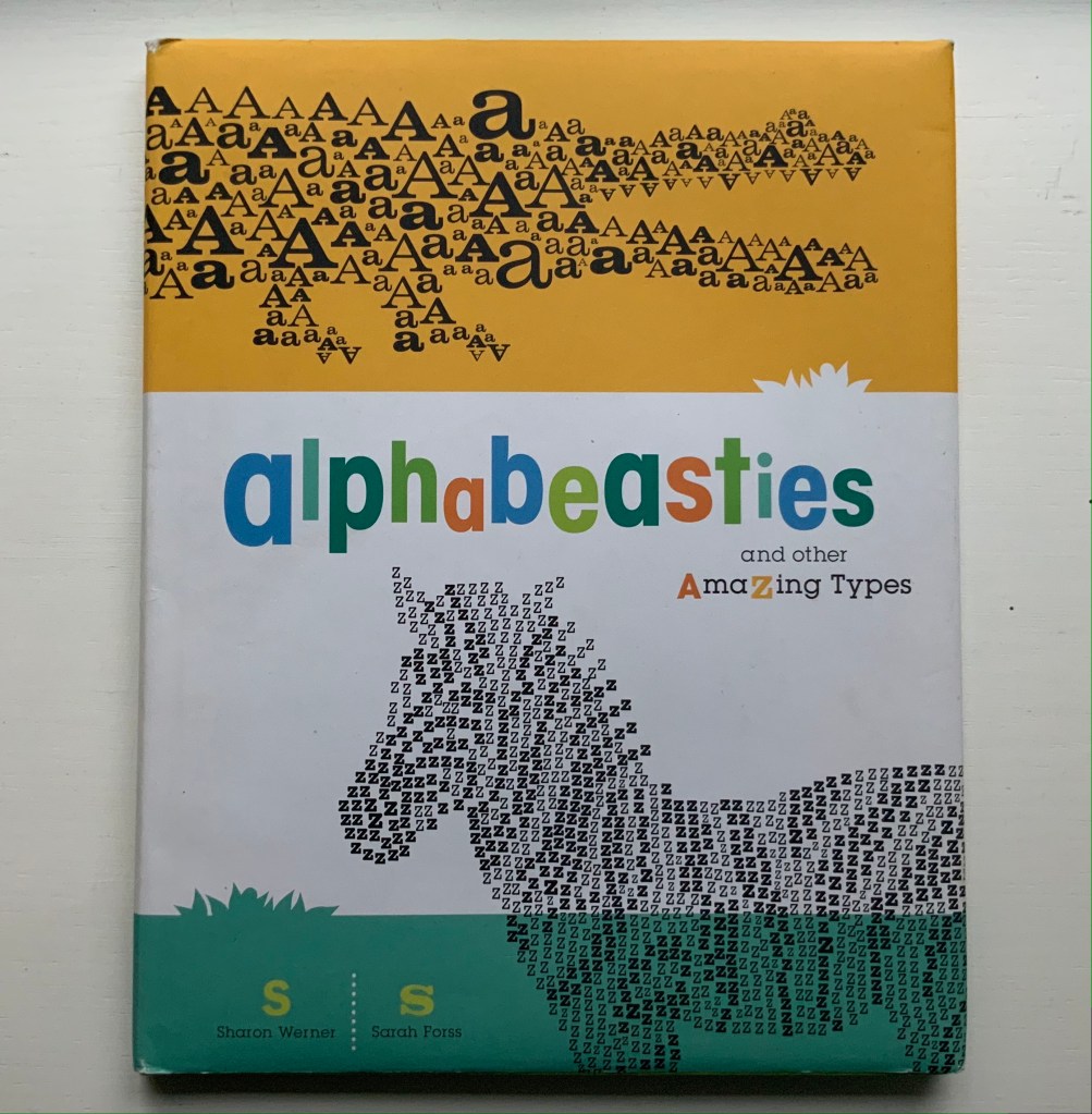
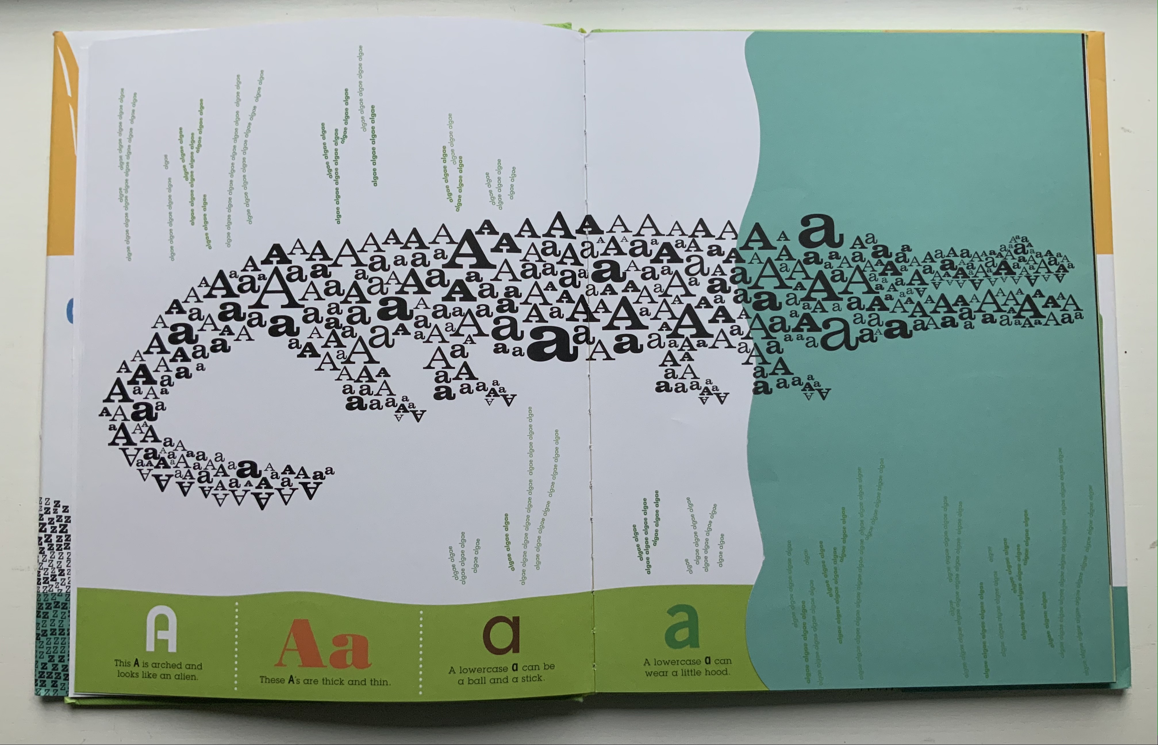
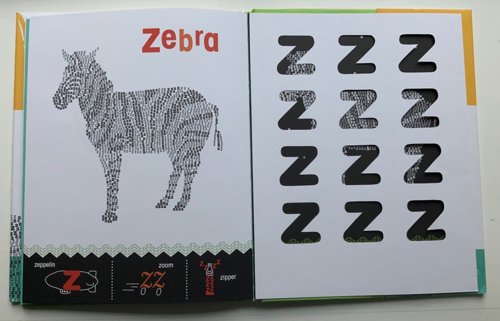
Alphabeasties and Other Amazing Types (2009) Sharon Werner & Sharon Forss Hardcover. H300 xW mm, 56 pages. Acquired from Golden Waves of Books, 7 August 2021. Photos: Books On Books Collection.
Unlike Roberto de Vicq de Cumptich’s Bembo’s Zoo (2000), this book relies on numerous type faces with which to create its alphabeasties, posed above the book’s illustratively shaped chiron that also provides the running information about “other amazing types”. Information is also conveyed from under flaps, through cutouts, across foldouts and by background images constructed of words.
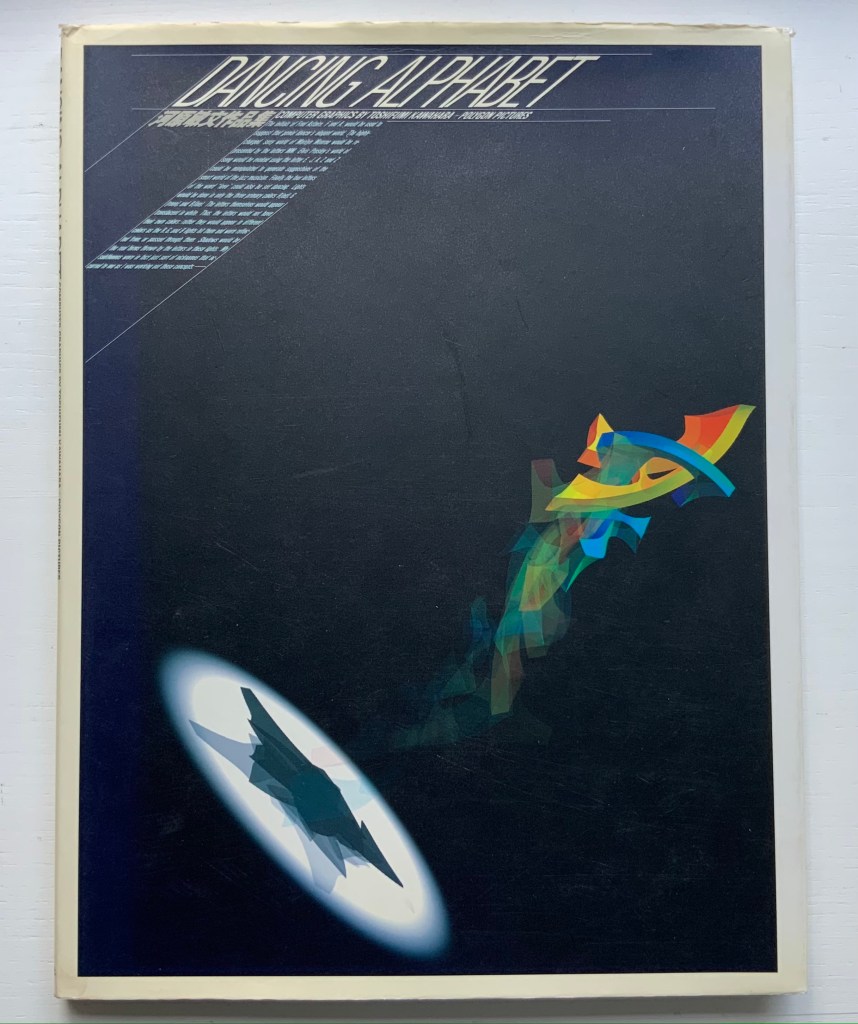
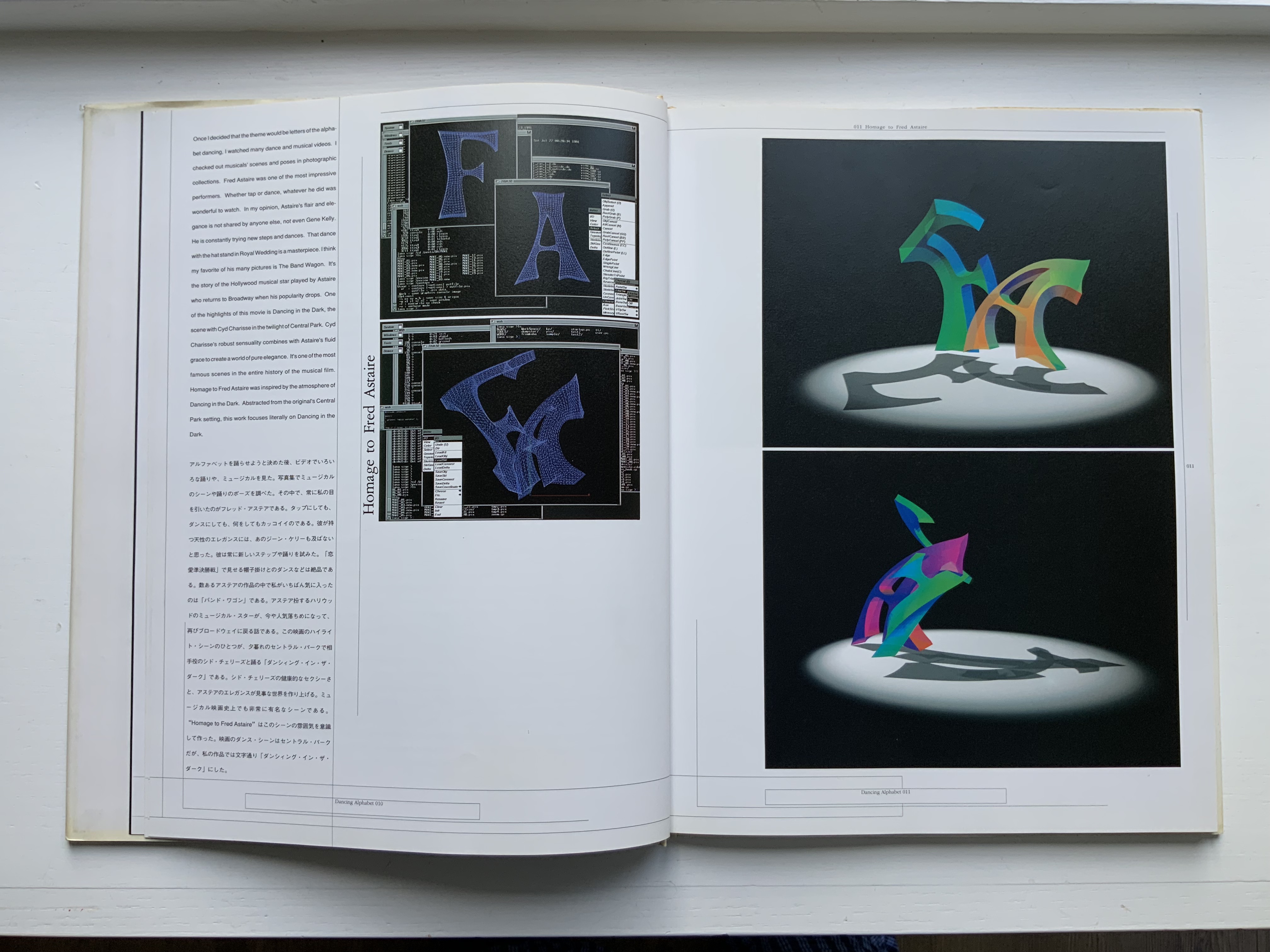
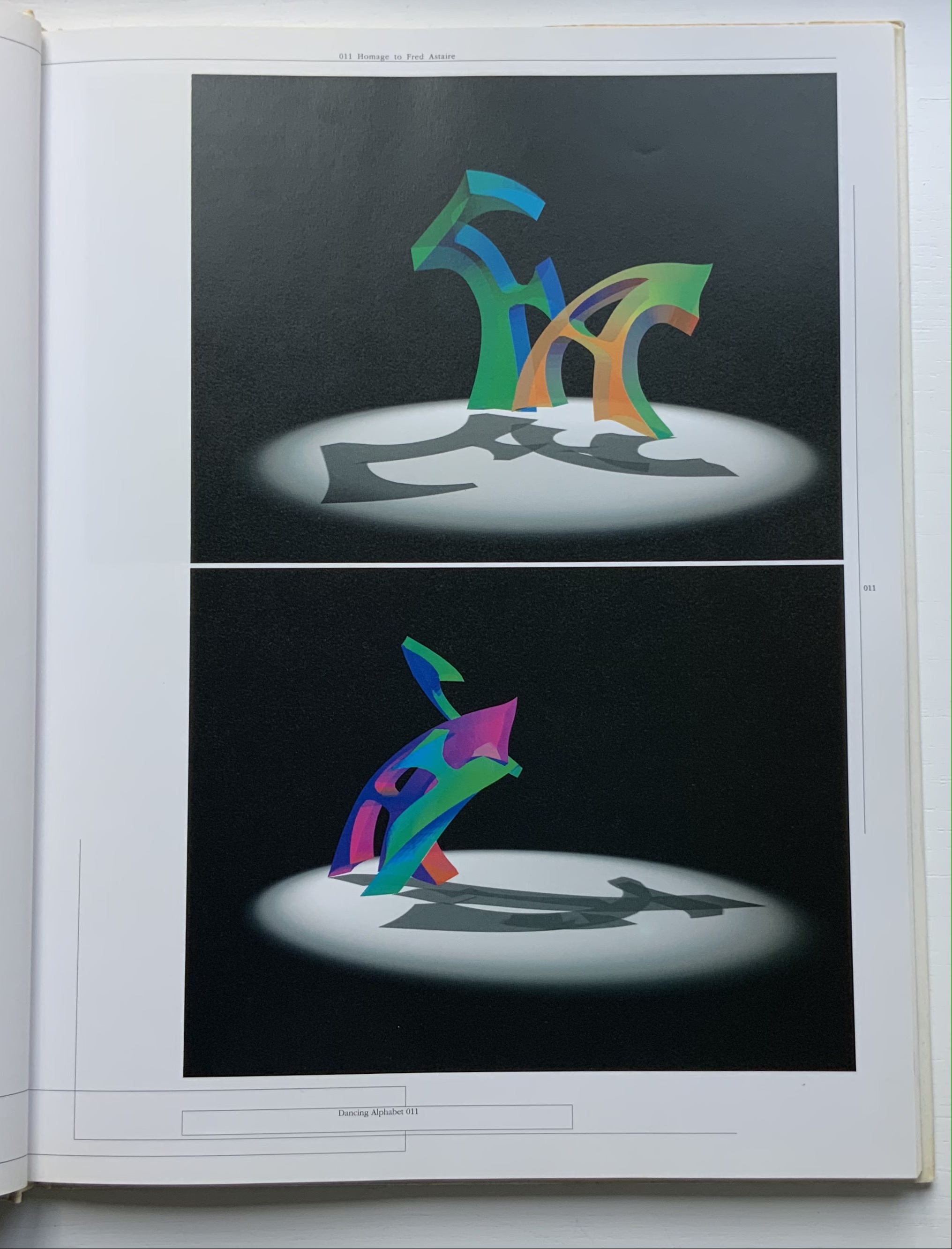
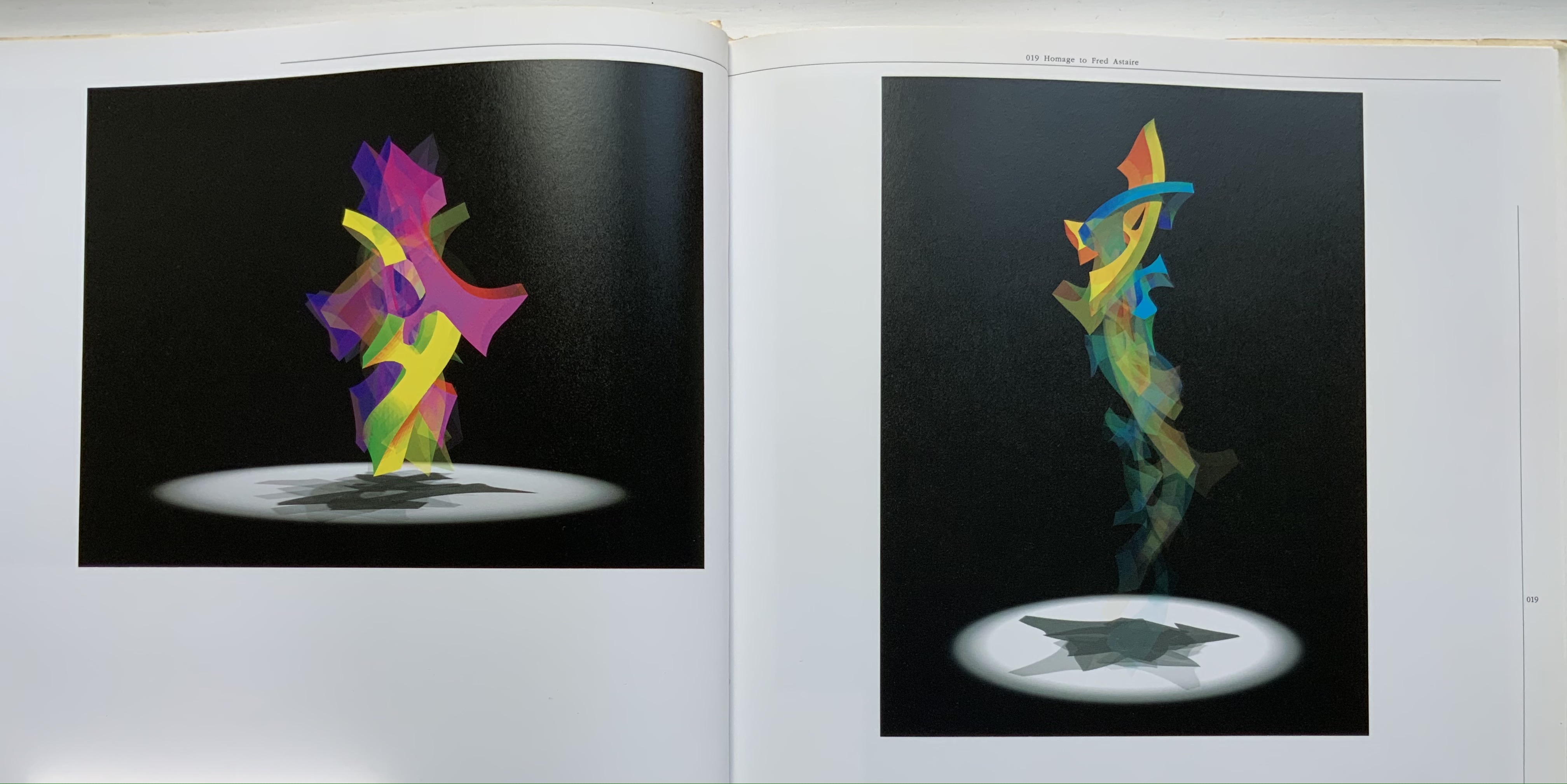
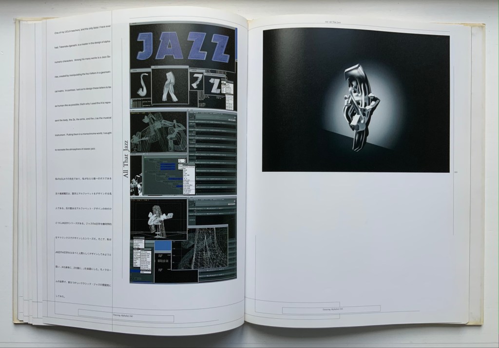
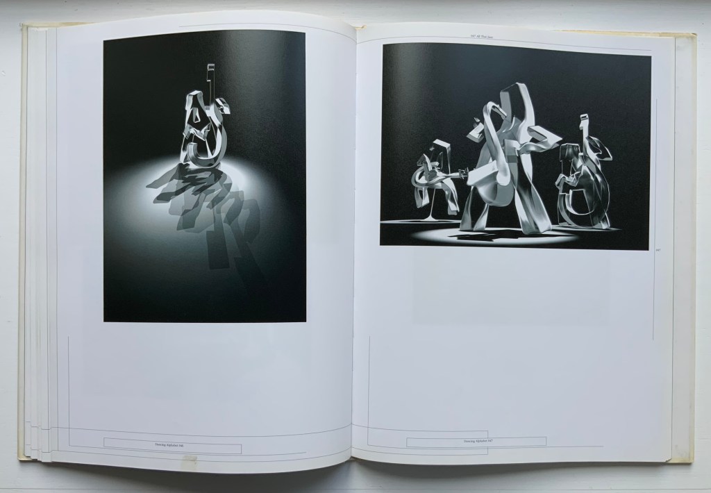
Dancing Alphabet (1991) Toshifumi Kawahara Hardback, casebound sewn. H307 x W236 mm, 96 pages. Acquired from Paper Cavalier, 27 July 2021. Photos: Books On Books Collection.
The tradition of the dancing alphabet goes back to the Greeks. In one of his plays, Kallias the 5th century Greek playwright had his characters each dance a letter of the Ionian alphabet. This may also be an early instance of product placement. At the time, there were a variety of Greek alphabets, and it was the Ionian that won out. The tradition (without the product placement) continued and, in this collection, is represented by Vítězslav Nezval’s Abeceda (1926), Marie Lancelin’s Gestes Alphabétiques (2014) as well as Toshifumi Kawahara’s Dancing Alphabet. Kawahara’s CG animation work contributed significantly to Polygon Pictures, which created the Emmy Award-winning animated series Transformers Prime and Star Wars: The Clone Wars. But this book’s presentation of Kawahara and team’s work on the “In Search of New Axis” series adds a colorful flavor to the dancing alphabet tradition.
Dancing Alphabet is not an artist’s book, but the notes and moves it adds to the collection may serve as a spark to the next artist looking to the alphabet and book art for inspiration — or the next scholar intrigued by the connections between the alphabet, music and dance.
“Karl Kempton“. 29 October 2022. Books On Books Collection.
Firmage, Richard A. 2001. The alphabet. London: Bloomsbury.
Gagné, Renaud. 2013. “Dancing Letters: The Alphabetic Tragedy of Kallias”. In Choral Mediations in Greek Tragedy, ed. R. Gagné and M. Hopman, Cambridge University Press 282-307.
Lawler, Lillian. April 1941. “The Dance of the Alphabet”. The Classical Outlook, 18: 7, pp. 69-71.
In the distance, along the green and rugged crests of the Jura, the yellow beds of dried torrents in all directions made Y’s.
Have you ever noticed what a picturesque letter Y is with its numberless significations?
A tree is a Y; the parting of two roads is a Y; the confluence of two rivers is a Y; an ass’s or ox’s head is a Y; a glass as it stands on its foot is a Y; a lily on its stem is a Y; a suppliant raising his hands to heaven is a Y. — Victor Hugo, “On the Road to Aix-les-Bains”, 24 September [18??]
Source Code (2019)
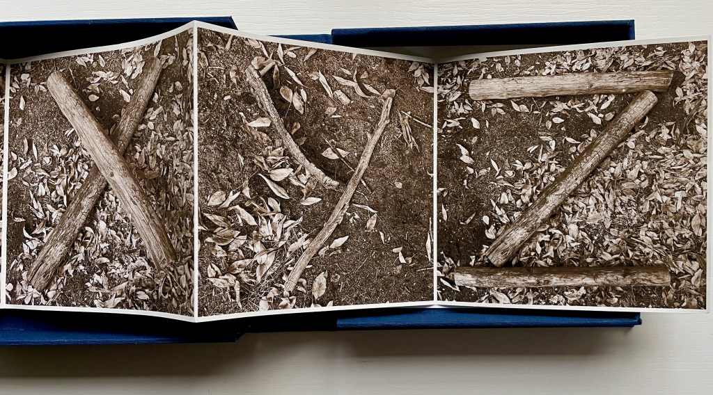
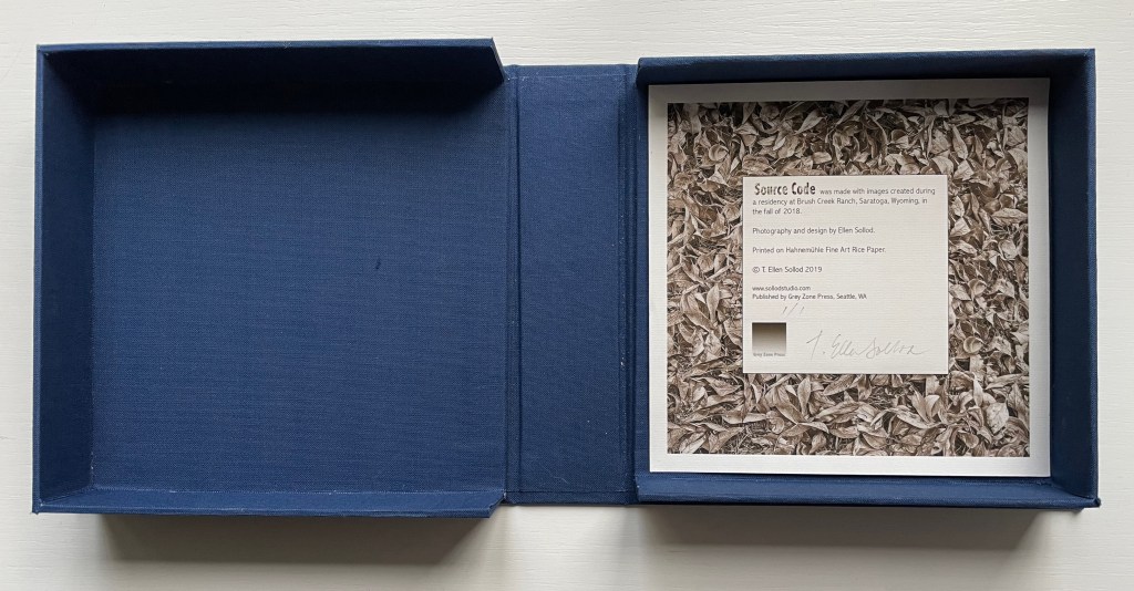
Source Code (2019) Ellen Sollod Cloth- covered clamshell box with image tipped on holds a leporello book with a loose colophon sheet laid in. Book: H5.5 x W5.5 x D1 inches closed; W154″ open. Unique edition. Acquired from Vamp&Tramp Booksellers, 7 October 2022. Photos: Courtesy of the artist; Books On Books Collection.
After finding the alphabet all around in nature, Hugo develops this Romantic notion further in his letter with which this entry began:
Human society, the world, man as a whole, is in the alphabet. …The alphabet is a source.
By gathering from nature the building blocks for the alphabet in her photographs taken while in residence at Brush Creek, Wyoming, Ellen Sollod inverts yet underscores Hugo’s notion. The source of Sollod’s alphabet is the natural environment. Artificially, nature is in this alphabet. Both are “source code”.
Referring to the twigs, logs and branches as “building blocks” also invert Hugo’s continued development of the notion in his letter:
A is the roof, the gable with its cross-beam, the arch, arx …
Below, however, the twigs are the A; the split log, the B; and the broken branches, the C. Nature provides the alphabet’s building blocks, but of course, the building is by human agency.
In the end, the source code requires human agency — whether to perceive it, build with it or perhaps preserve it.
Printed on Hahnemuhle Fine Art rice paper and laid in a cloth-covered clamshell box with an image tipped on top and inside, this sepia-tinged offering of source code may leave us feeling edgy in our admiration.
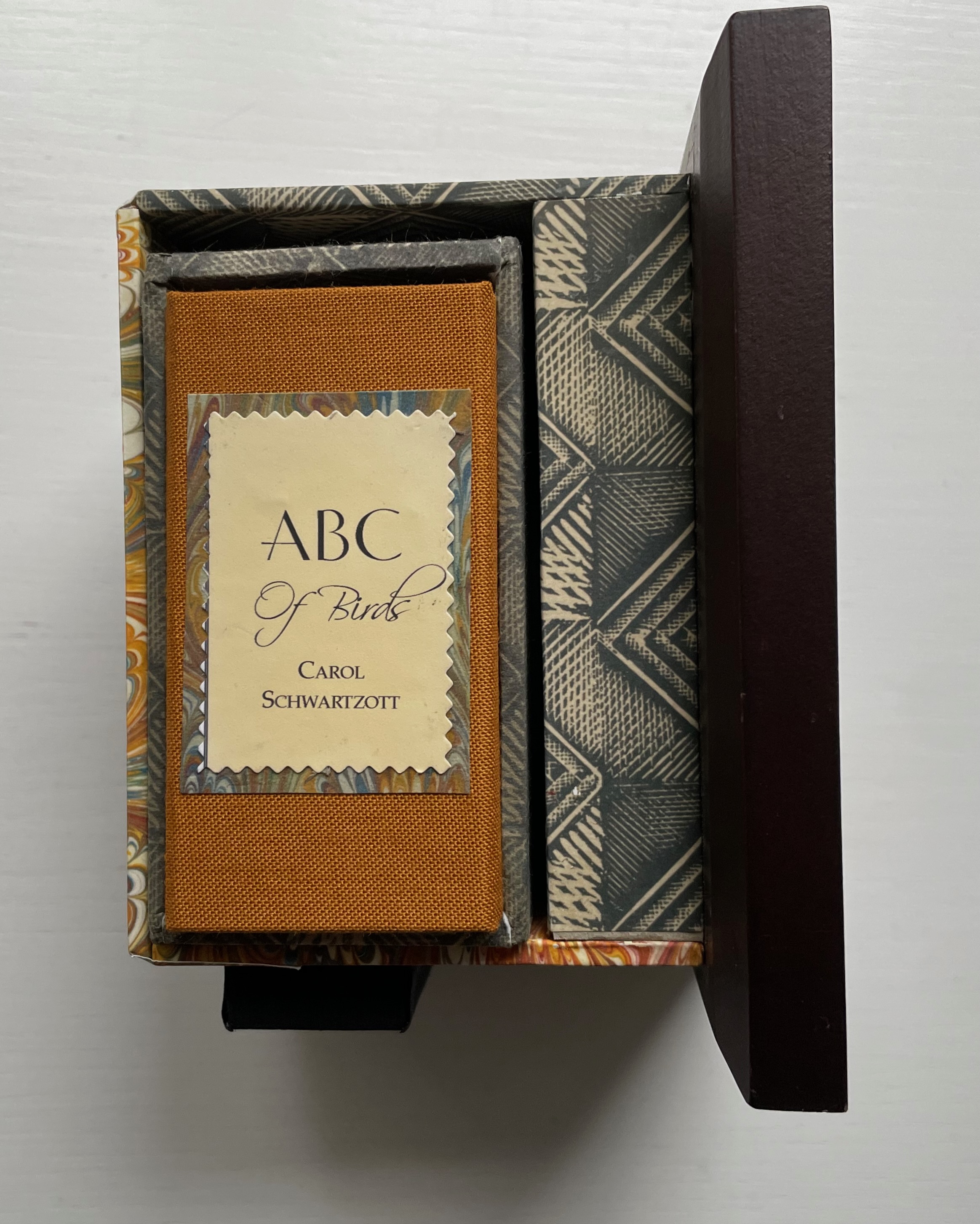
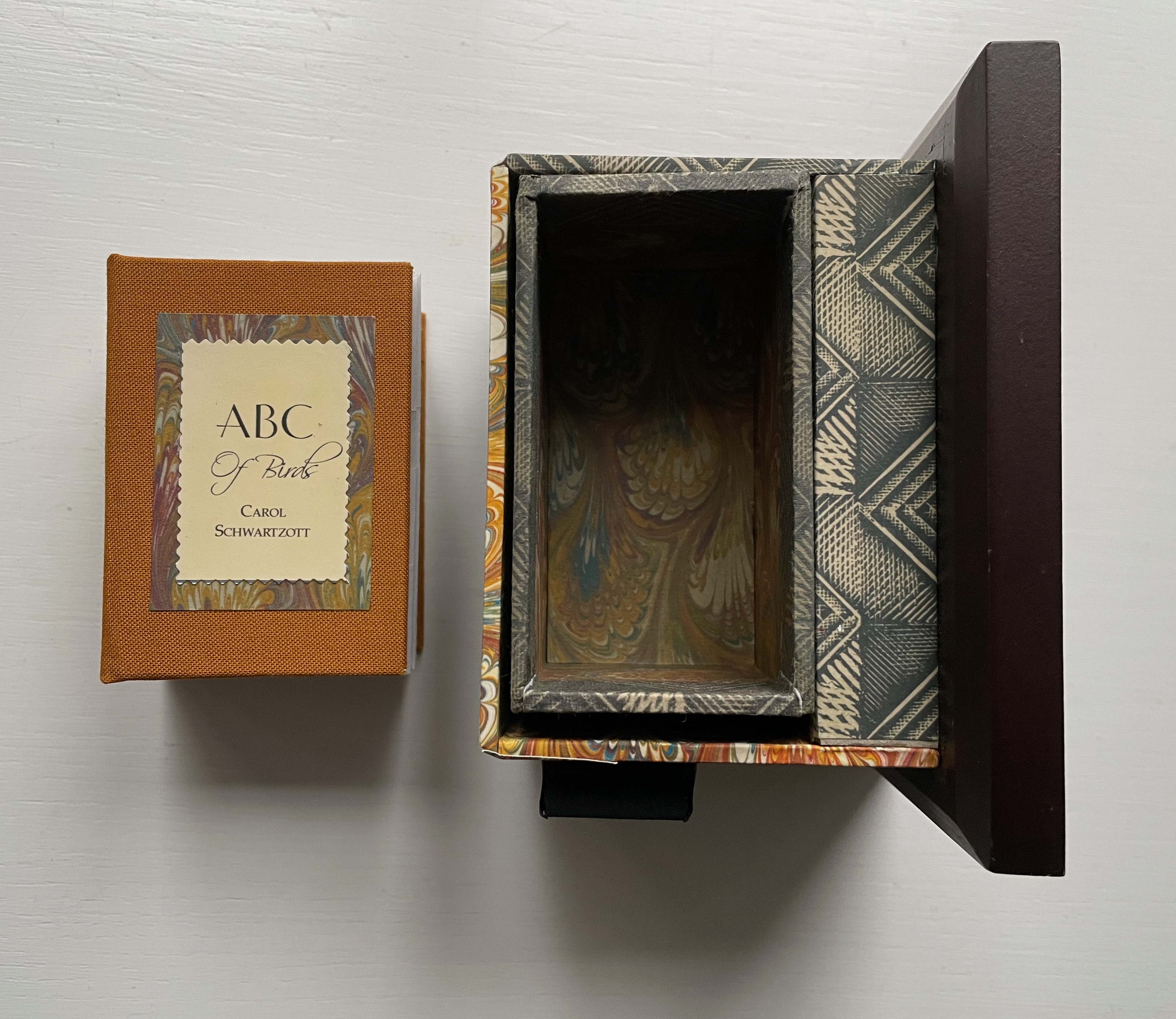
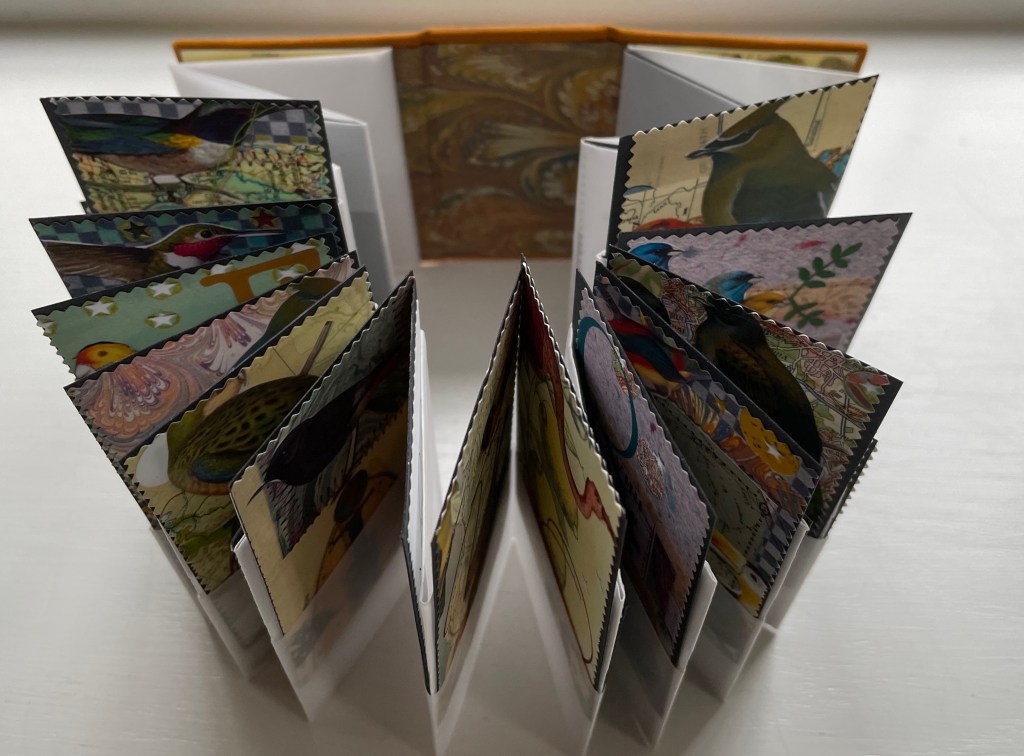
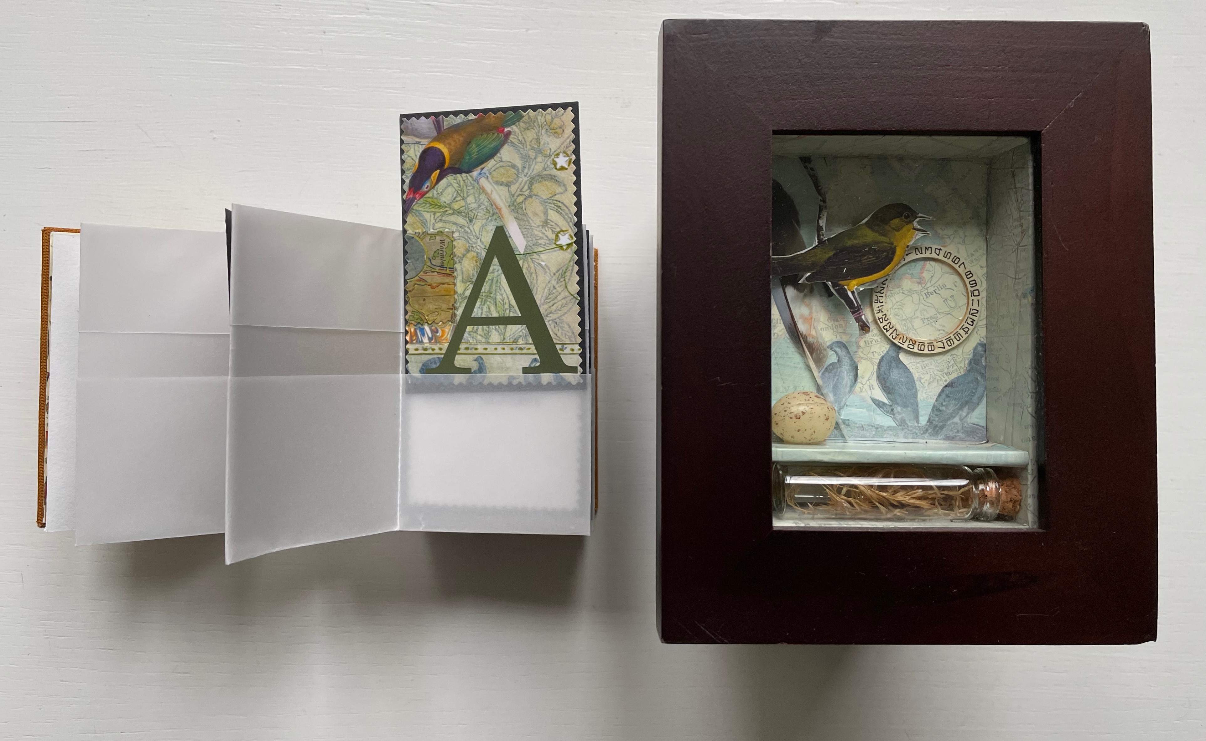
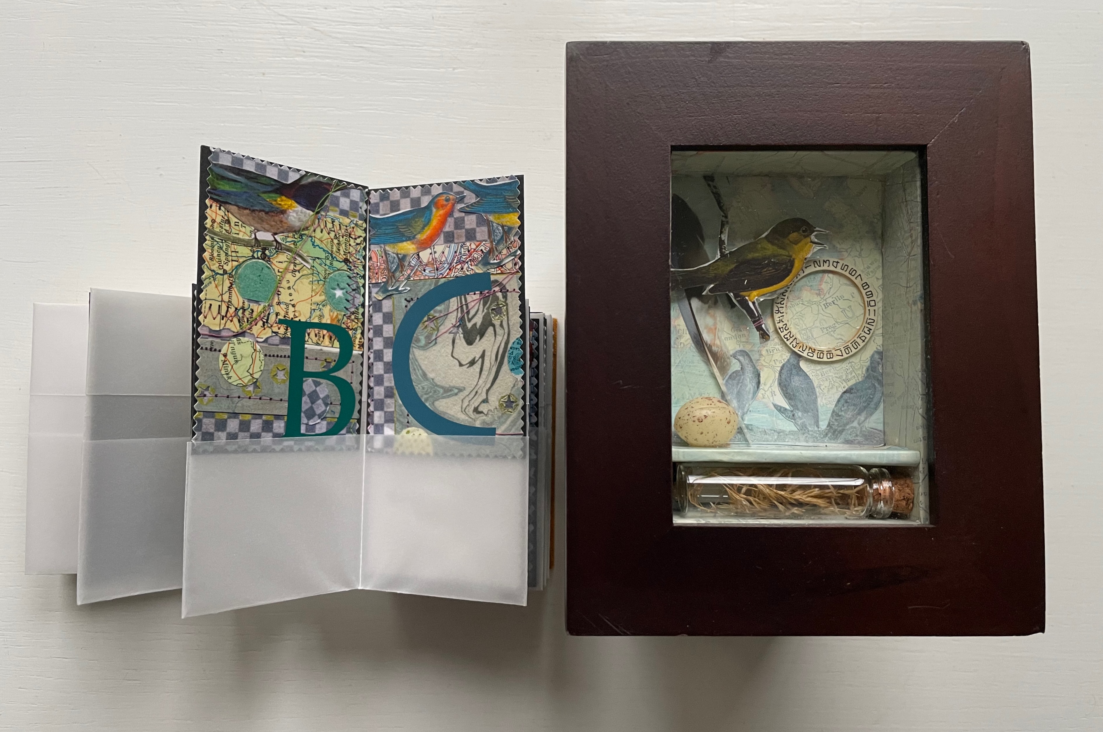
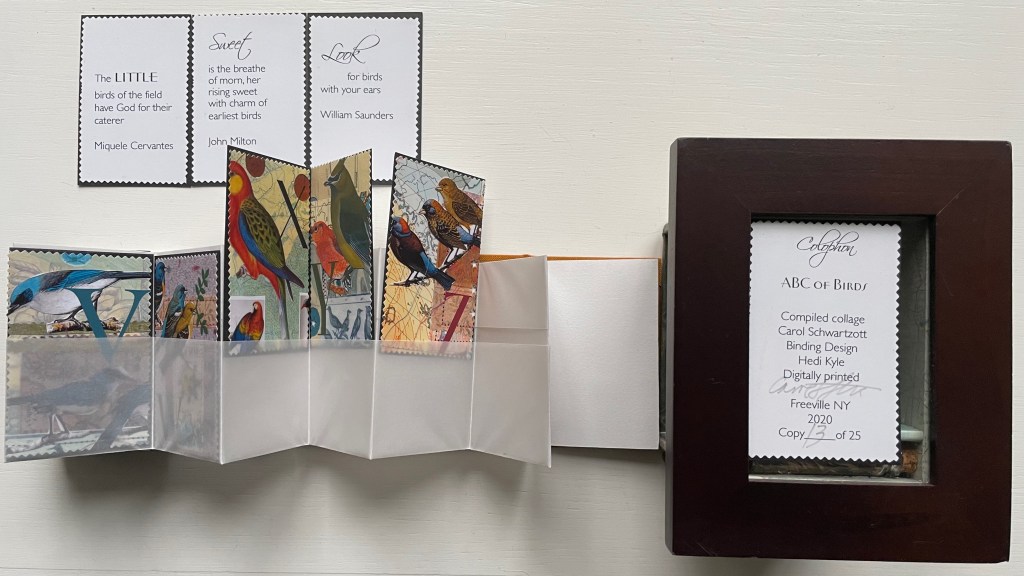
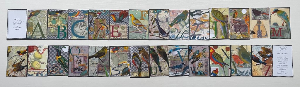
ABC of Birds (2020) Carol Schwartzott Cabinet of curiosity housing a miniature book in paste paper slipcase; double-sided leporello of transparent vellum pockets holding collaged cards. Book measures 2 x 3 x 1.5 inches. 28 pocket pages (collages, title page and colophon). Book in edition of 25, of which this is #13. “Cabinet of Curiosity” is one of five. Acquired from Vamp & Tramp, 4 January 2022. Photos: Books On Books Collection. Displayed with artist’s permission.
The cabinet of curosity recalls Joseph Cornell’s box constructions, and while the cards’ collages may extend that influence, they differ from it sufficiently in intensity of color (having been scanned for printing and “touched up” with pencils or over colored), incorporation of an abecedary and use of an unusual variant on the leporello to distinguish the work as Schwartzott’s. She writes:
The collages themselves were done as original art, each 4 x 6″ centered on a larger sheet of Rives BFK. There are 26 of these. All are reduced to miniature format, and a graphic letter in an interesting font completes the image. Each of these little cards can be removed from the book.
The trimmed edges of the cards give them the appearance of oversized postage stamps, appropriate for the album-style binding and their removability for philatelic-like examination.
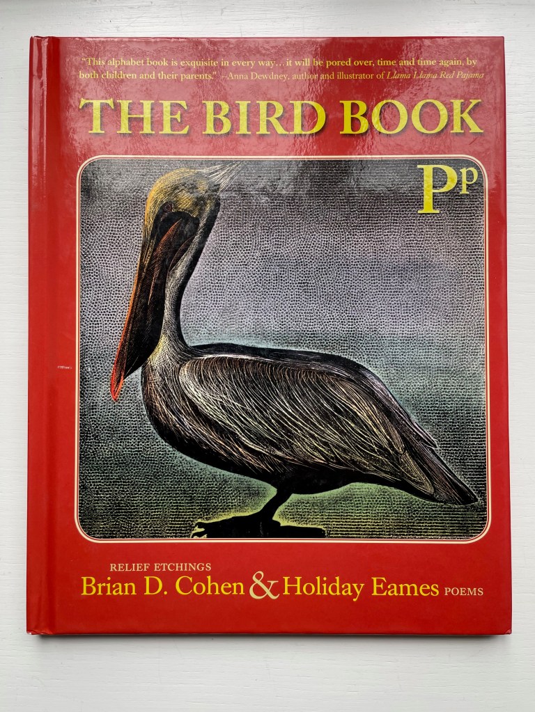
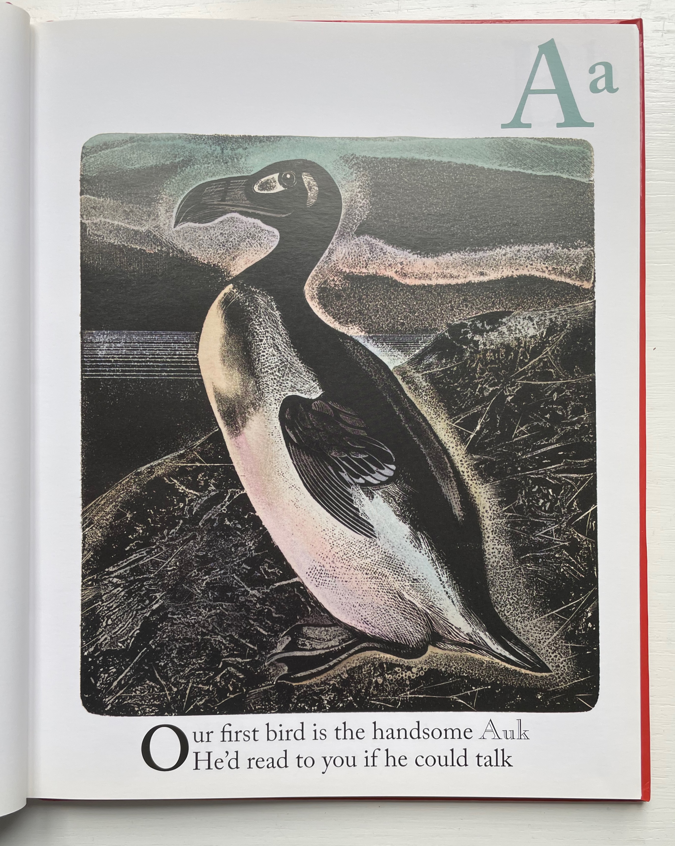
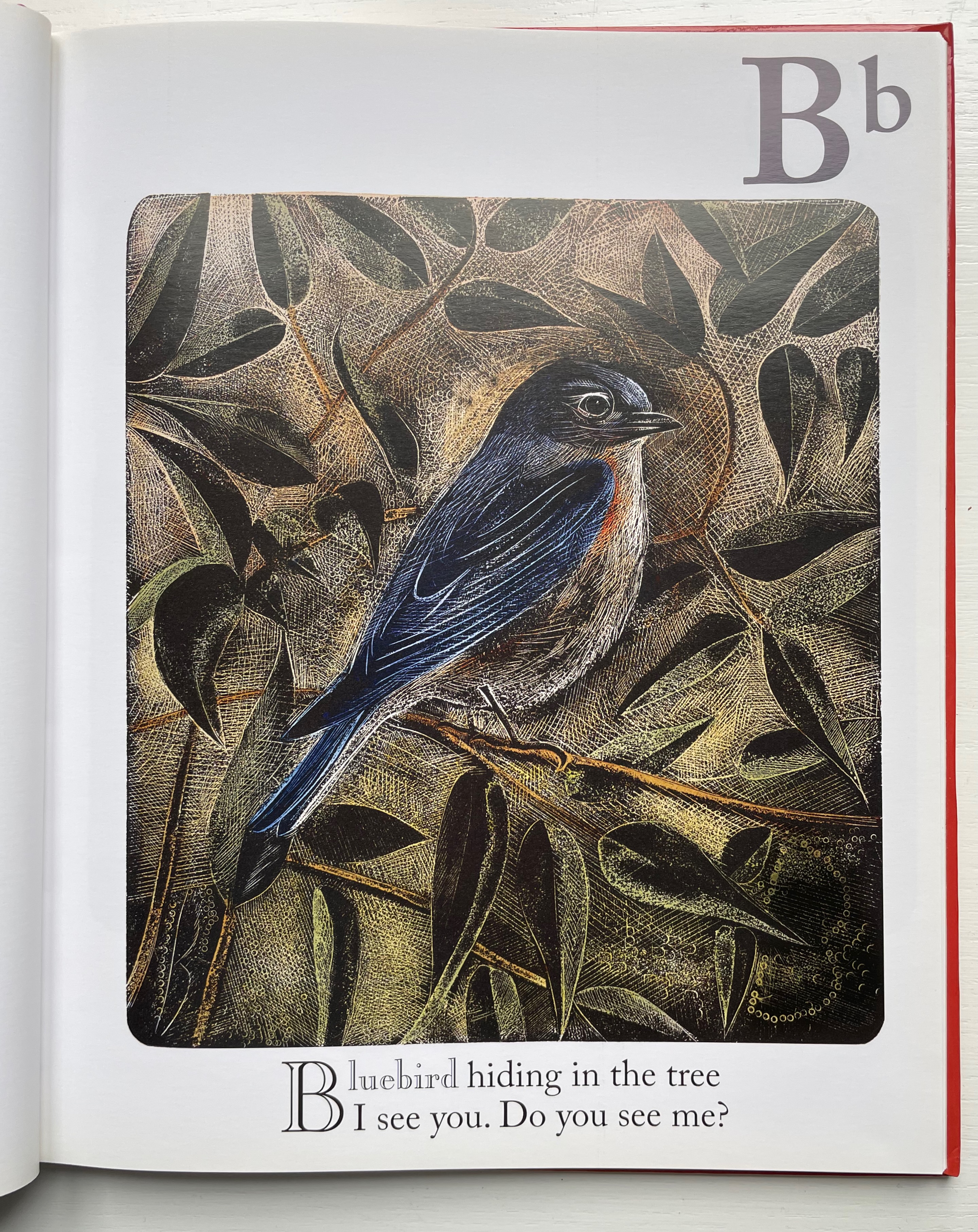
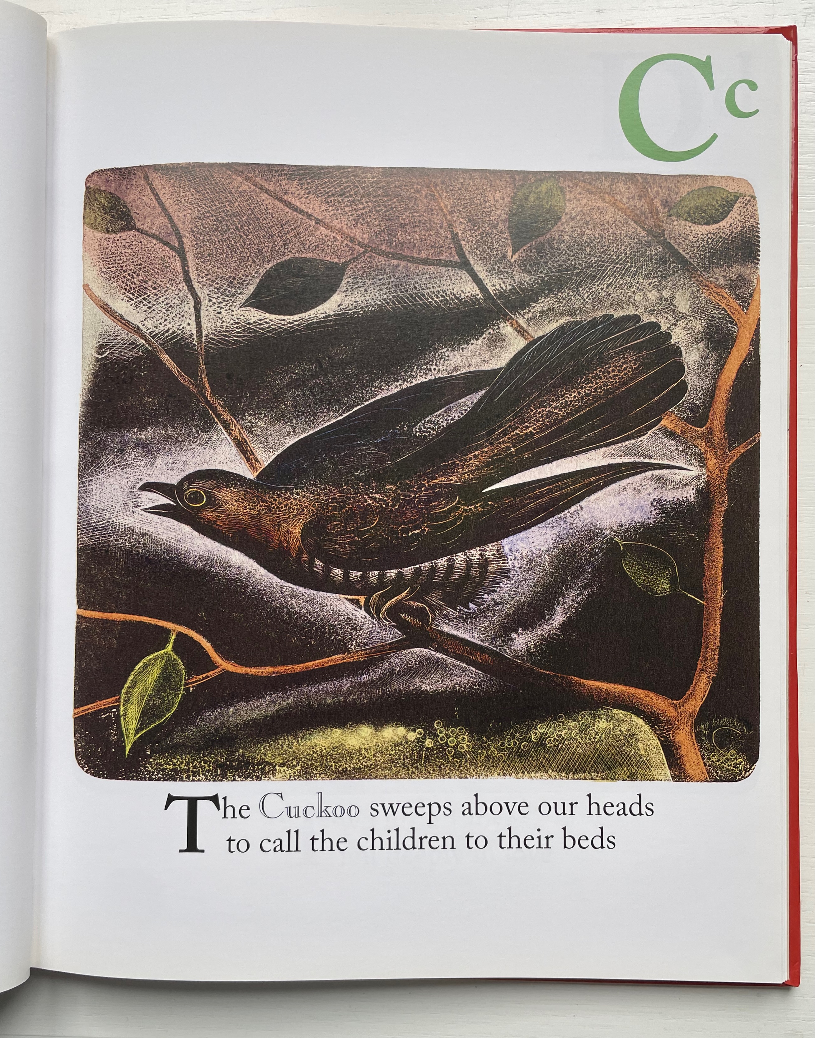
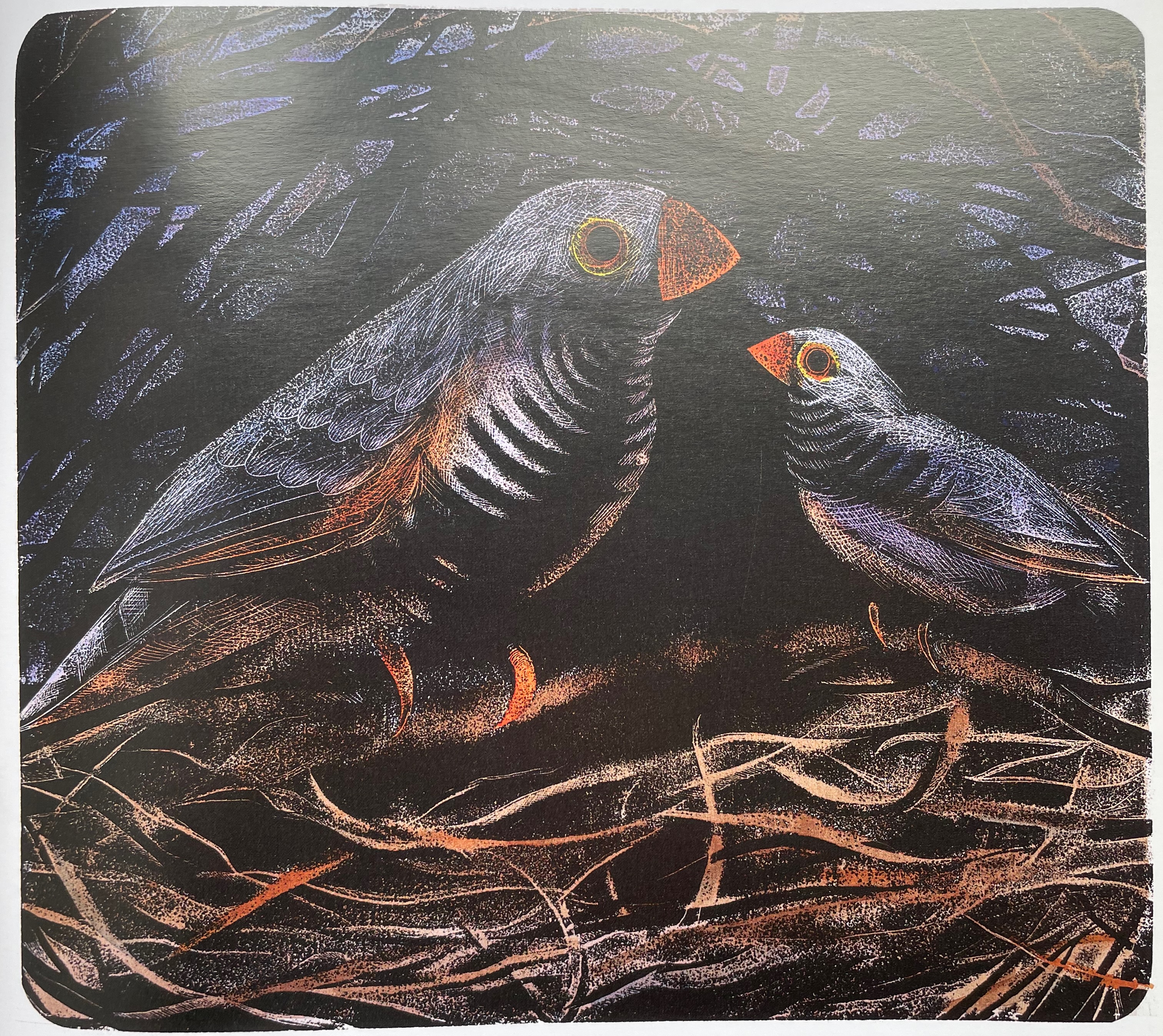
The Bird Book (2013) Brian D. Cohen & Holiday Eames Case bound hardback, paper over boards with doublures. H260 x W210 mm. 56 unnumbered pages. Acquired from The Saint Bookstore, 17 September 2022. Photos: Books On Books Collection. Displayed with the artist’s permission.
Brian Cohen’s inclusion of the following statement makes examining The Bird Book again and again a rewarding effort:
The printmaking technique … used for this book was originally developed by William Blake in 1788. The printing plates for the book were created with acids and engraving on metal (zinc) plates as in traditional etching techniques. The plates were then printed by carefully rolling a thin layer of ink over the surface of the plate, exactly the way a woodblock (relief print) is made. Because the technique combines both etching to create the plates and relief printing, it is termed relief etching. After printing, each individual sheet was hand-colored by brush with watercolor by the artist.
The artist has also encouraged close viewing of each relief etching by hiding its letter in the background, middle ground or foreground — or even the body of the bird.
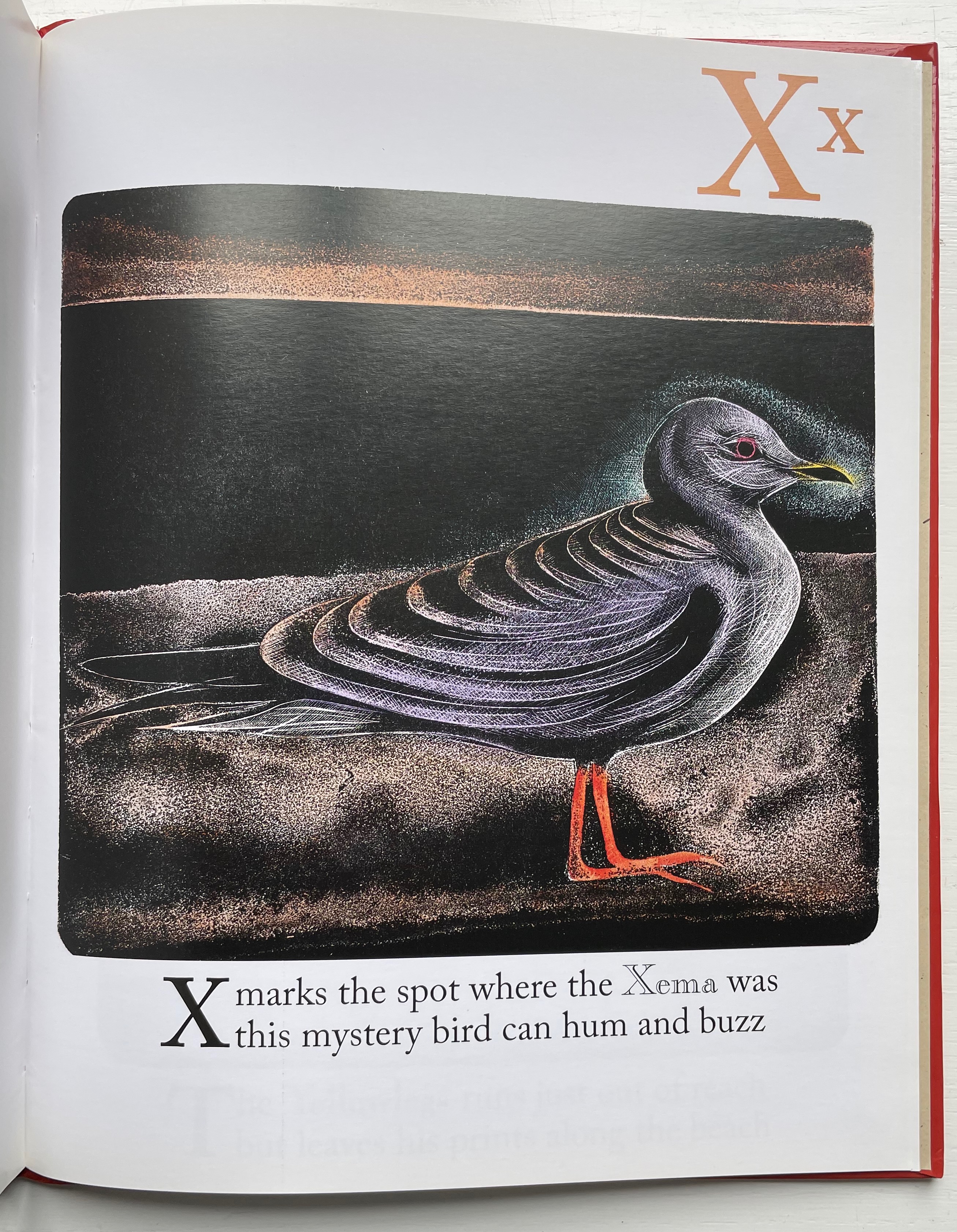
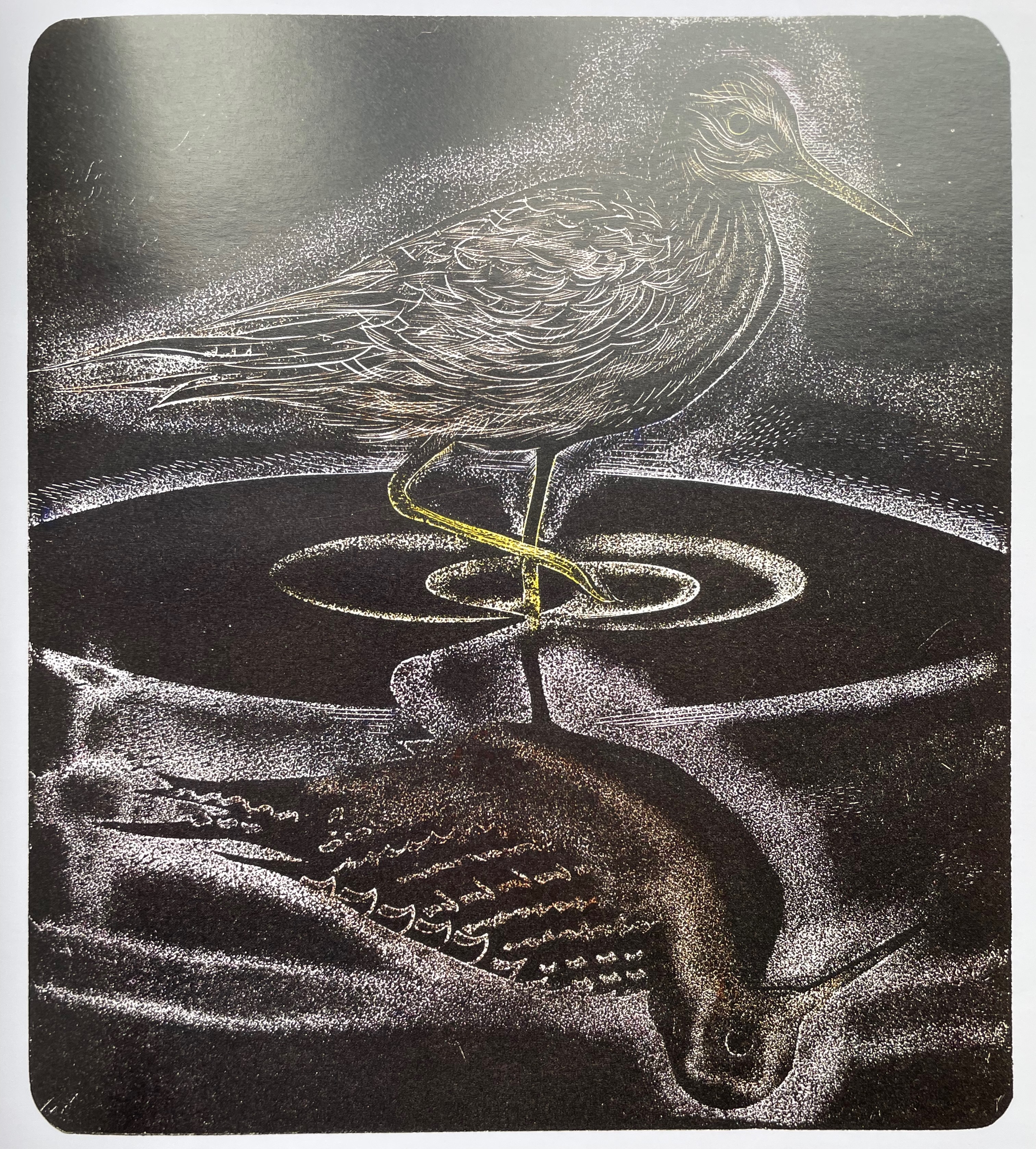
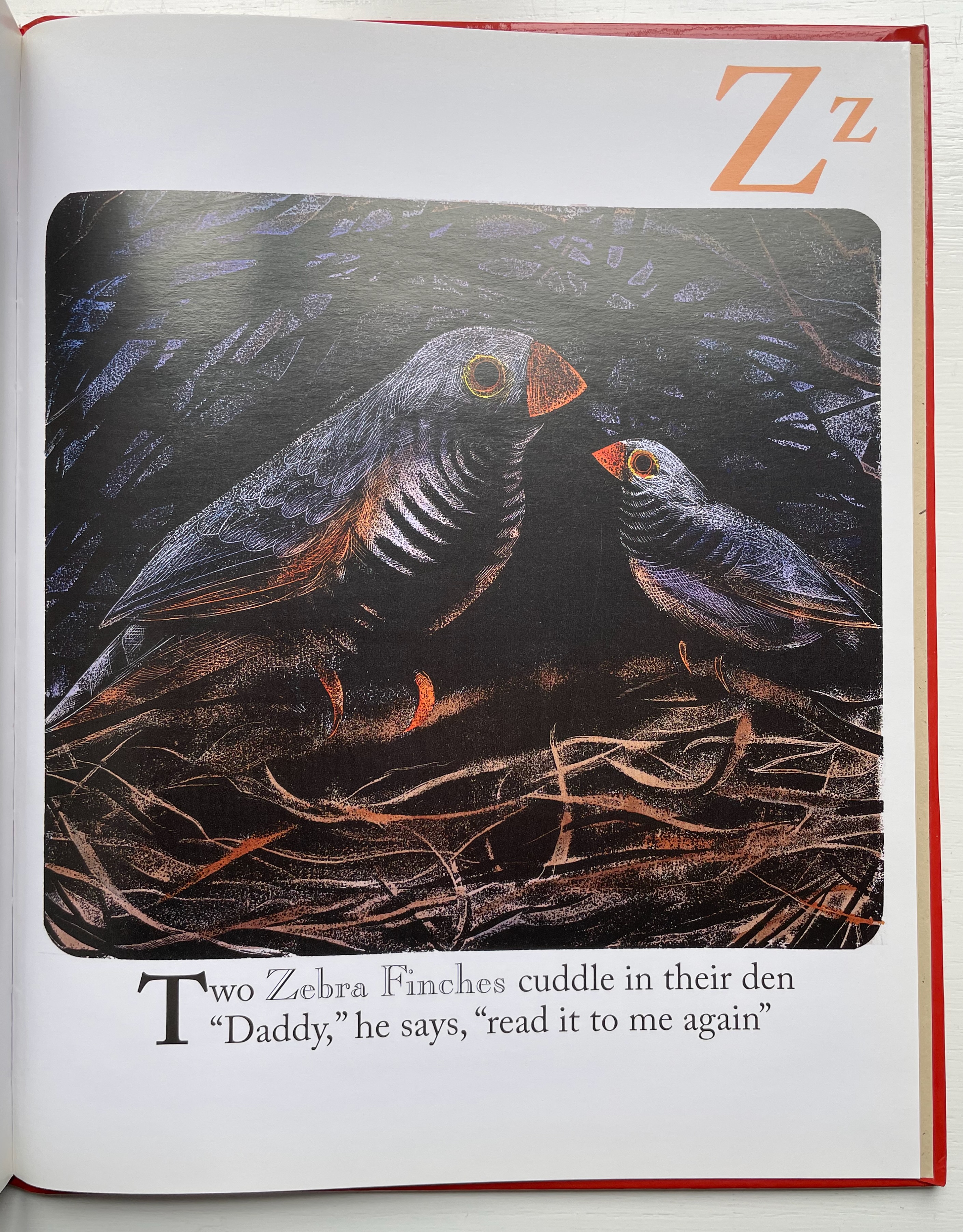
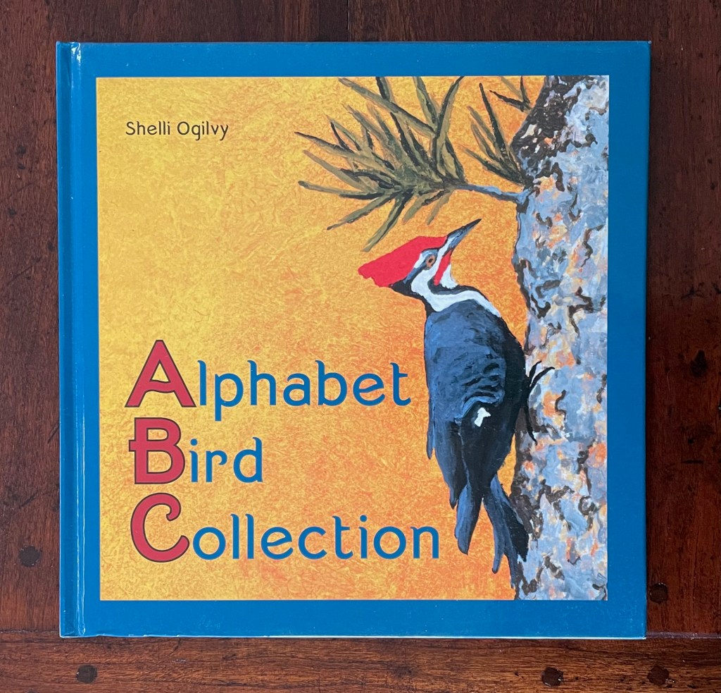
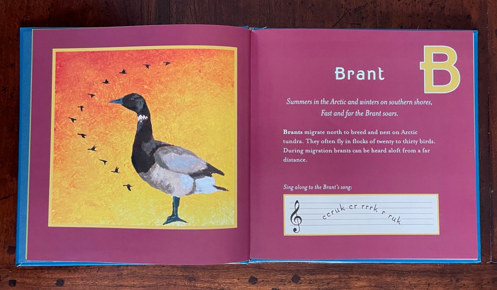
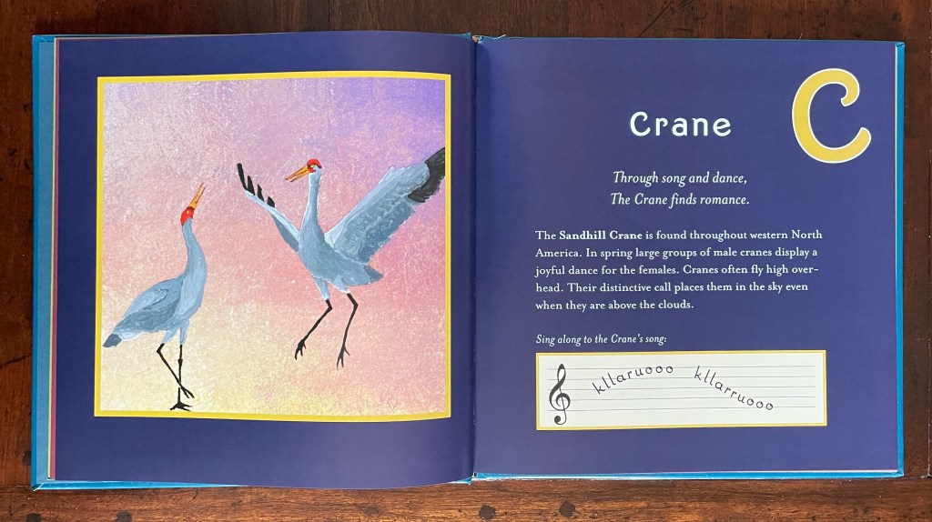
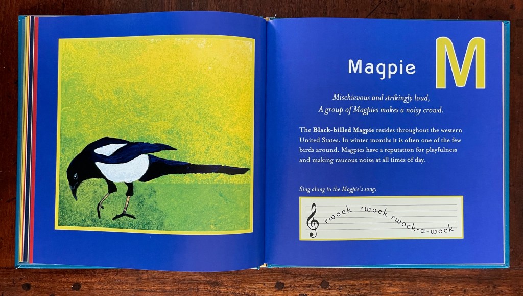
Alphabet Bird Collection (2009) Shelli Ogilvy Dustjacket, casebound paper over board, sewn, single-color doublures. H215 x W215 mm. 56 unnumbered pages. Acquired from Hay-on-Wye Booksellers, 16 December 2022. Photos: Books on Books Collection. Displayed with permission of the artist.
In Alphabet Bird Collection, each double-page spread features the letter of the alphabet, a bird representing it, a couplet followed by prose to describe the bird’s distinctive behavior and habitat, and, beneath, a musical staff with an attempt to represent a sample of each bird’s song or call. Unifying each double-page spread is its own full-bleed background color. The primary distinguishing feature of this abecedary, however, is Shelli Ogilvy’s artwork — original paintings of each bird. Ogilvy works primarily with acrylic on canvas or paper, sometimes combining mediums of chalk, ink, and spray paint into her work.
Instead of concluding with XYZ as with other abecedaries, this entry concludes with a favorite bird.
For another instance of magpie obsession, see Nick Wonham’s The Charm of Magpies (2018).
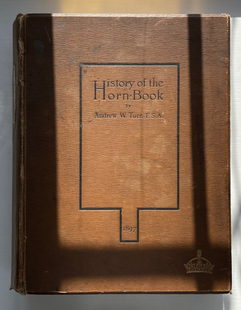
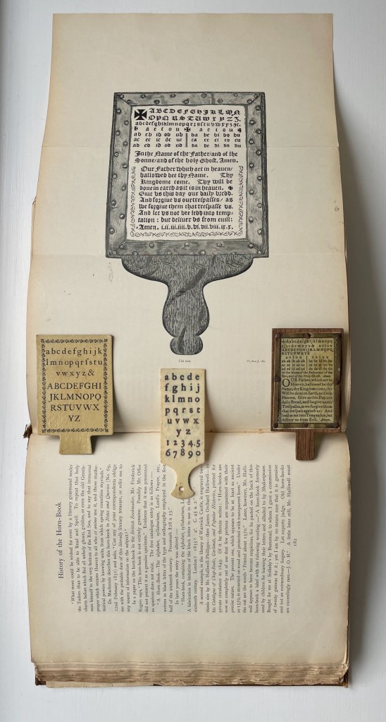
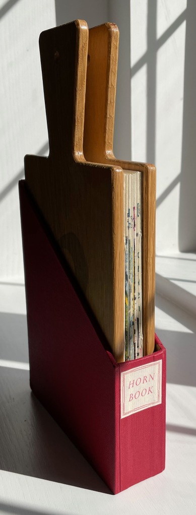
History of the Horn-Book (1897) Andrew White Tuer Casebound, sewn. H260 x W210 x D50 mm. 510 pages: 18 preliminary, 4 unnumbered leaves of plates (1 double, 2 foldout) and 300 illustrations. Acquired from Patrick Pollak, Antiquarian & Rare Books, 15 October 2021. Photos: Books On Books Collection.
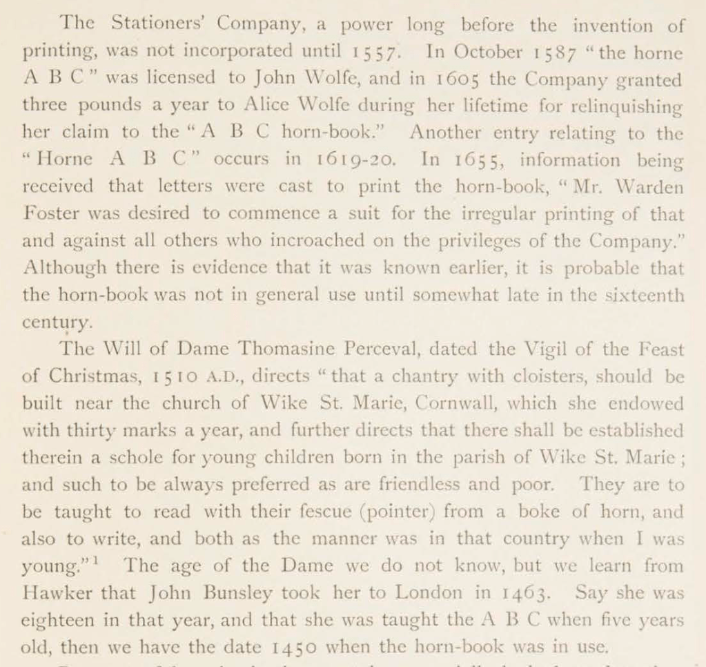
Andrew White Tuer is the Herman Melville of the horn-book. Like Melville, Tuer had many interests. Just as the sea proved an abiding theme for Melville that drew all his interests together into Moby-Dick, so proved publishing and printing for Tuer. Within his abiding theme, Tuer’s white whale was the horn-book, and his pursuit yielded the History of the Horn-Book. Although Moby-Dick first appeared in three volumes and History of the Horn-Book appeared in two, Tuer out-Melvilles Melville in other ways. His monument outweighs Melville’s by 79 pages. Where Melville takes 14 pages to lay out “Etymologies & Extracts” on the whale, Tuer requires 20 pages of anecdotal citations to document the “Christ-cross-row” as the original name of the horn-book. Admittedly Melville traces his subject back to Genesis, albeit with some stretching, but Tuer traces the earliest record “of a real horn-book with horn and not a mere alphabetical table” back to an equally important date in the history of printing and publishing: 1450.
For 125 years, Tuer’s Historyof the Horn-Book has remained the standard work on this artifact for teaching children the alphabet.
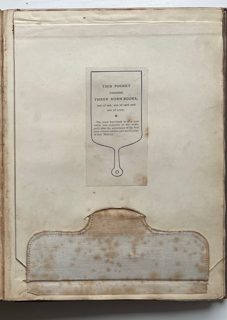
This single volume is the first trade edition of History of the Horn-Book, following a special edition in 1896 of two volumes containing seven reproductions of horn-books and battledores distributed across two compartments or pockets placed at the front of the volumes. In the single-volume edition, the compartment moved to the back, and the number of facsimile horn-books fell to three: one of oak, one of card and one of horn. Like the two-volume edition, the single volume has gilt on its top edge; the fore-edge is deckled.
After the special edition, Tuer added a section to this trade edition to announce further discoveries, including the ivory horn-book. Tuer must have been fond of this compartment feature; it shows up again in his compendium of humorous anecdotes taken from his trade journal (the Paper & Printing Trades Journal) and entitled Quads for Authors Editors & Devils (1884). The rear compartment of Quads contains a miniature version of the book.
Trade edition compartment closed
Fold out with the three facsimile horn-books from the compartment
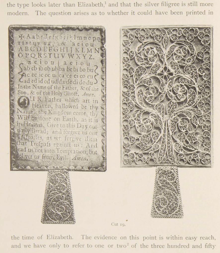
Tuer’s detail of research and analytical keenness go far to explain why History of the Horn-Book remains the standard work. If a trove of horn-books were to be discovered tomorrow, there would need to be extraordinary novelties in their composition, mechanics or material to warrant any attempt to displace this authority. Anyone making the attempt would require a foundation in printing history and practice that is hard to come by since the digital revolution. Consider Tuer’s knowledgeable comments on a silver horn-book alleged to have belonged to Queen Elizabeth I:
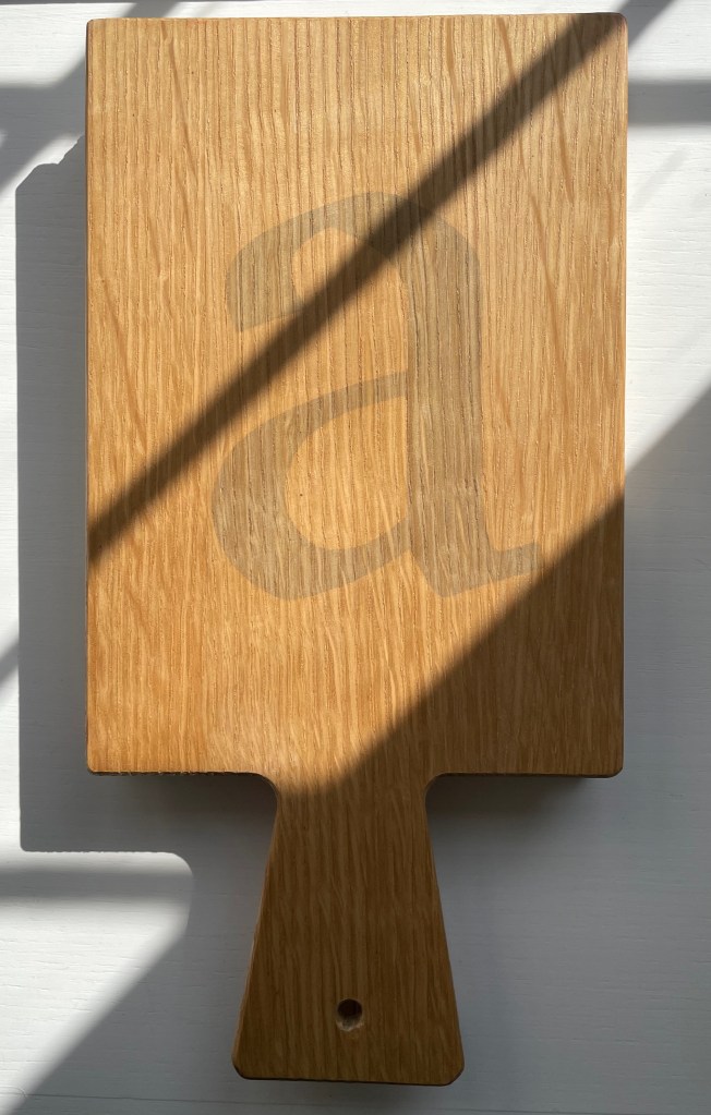
The history of horn-book is well in hand. As an educational device, it has been superseded by the battledore, building blocks, ABC books, television (Sesame Street), needlepoint samplers, wall hangings and rugs, toys and more toys and, of course, apps. But as an inspiration to book artists it still holds on. Among the book artists who have turned their hands, eyes and minds to the form are Helmut Andreas Paul (HAP) Grieshaber, Jan Paris, Daniel Essig, Kees Baart and his partners at Corps 8, and Karen Roehr.
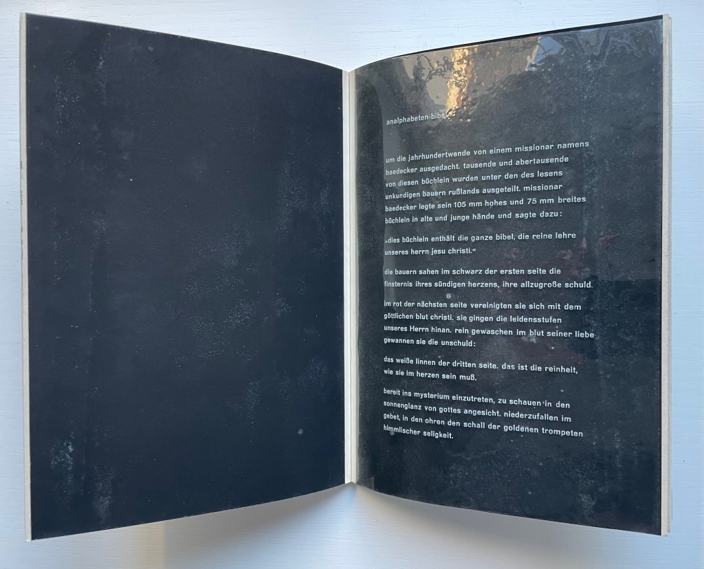
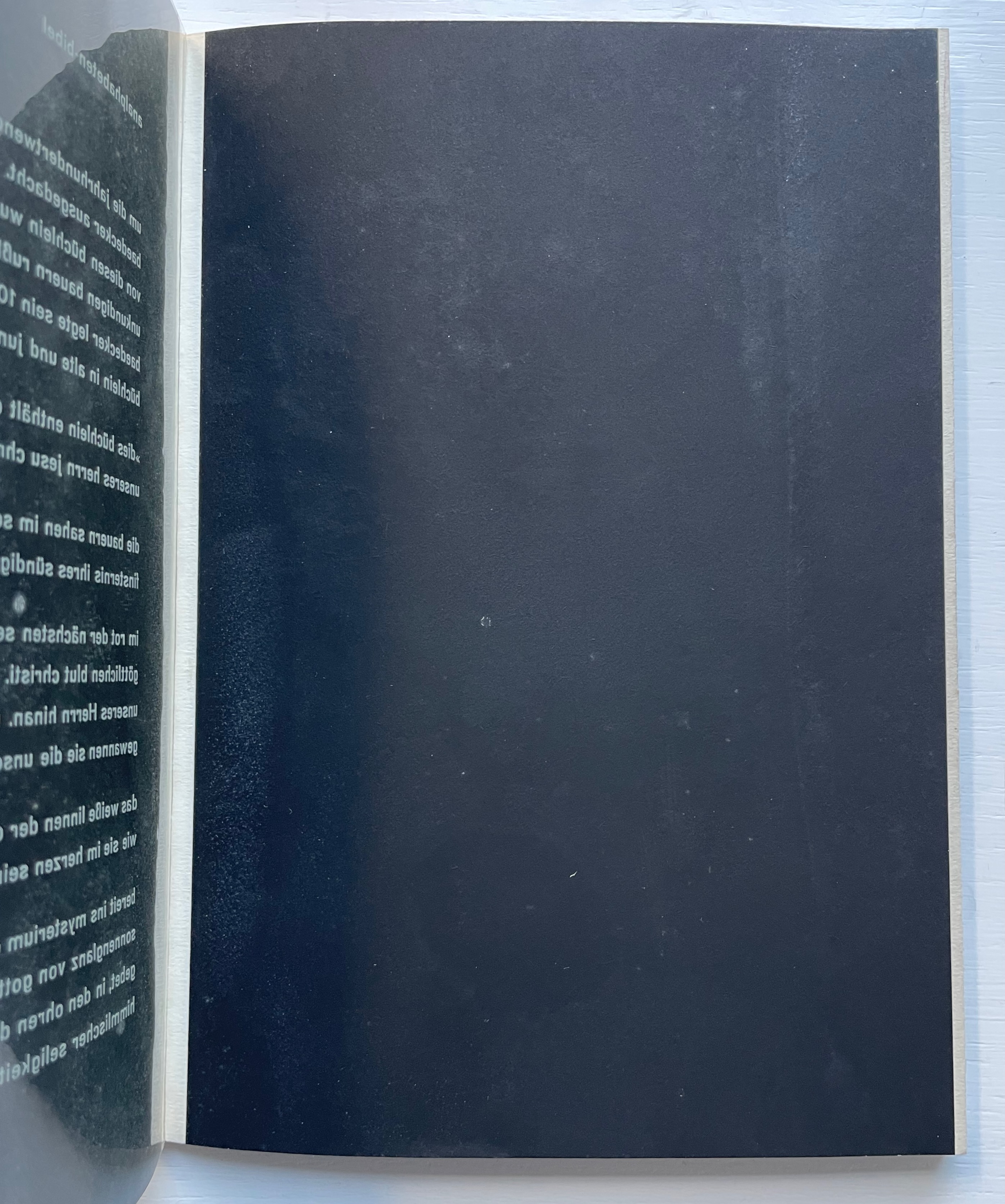
With its horn-book images on the front and back covers and a five-page piece entitled analphabeten-bibel (“the illiterates’ bible”), HAP Grieshaber’s small work of concrete poetry underlines the draw of the alphabet for book artists.
Poesia Typographica (1962) Helmut Andreas Paul (HAP) Grieshaber Paperback, perfect bound Chinese-fold folios, black endpapers. HxW. Edition of 1000. Acquired from Print Arkive, 22 October 2022. Photos: Books On Books Collection.
The white text on the clear acetate translates roughly as follows:
created around the turn of the century by a missionary named baedecker. thousands and thousands of these booklets were distributed among the illiterate peasantry of Russia. missionary baedecker put his 105 mm high and 75 mm wide booklet into old and young hands and said:
“this booklet contains the whole bible, the pure teaching of our jesus christ.”
the peasants saw in the black of the first page the darkness of their sinful hearts, their great guilt.
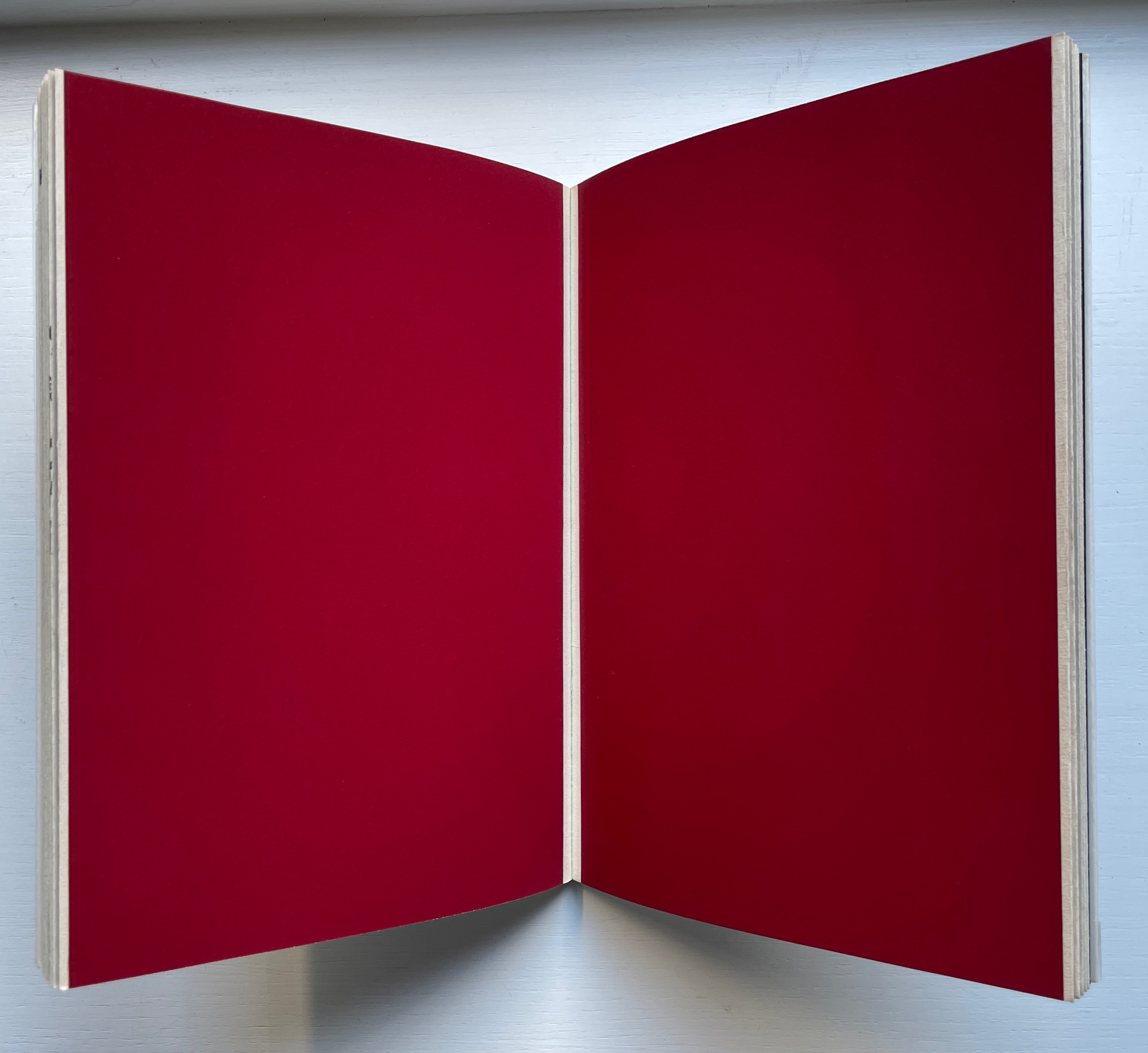
in the red of the next page, they united with the divine blood of christ. they followed the suffering steps of our lord. washed clean in the blood of his love, they won innocence:
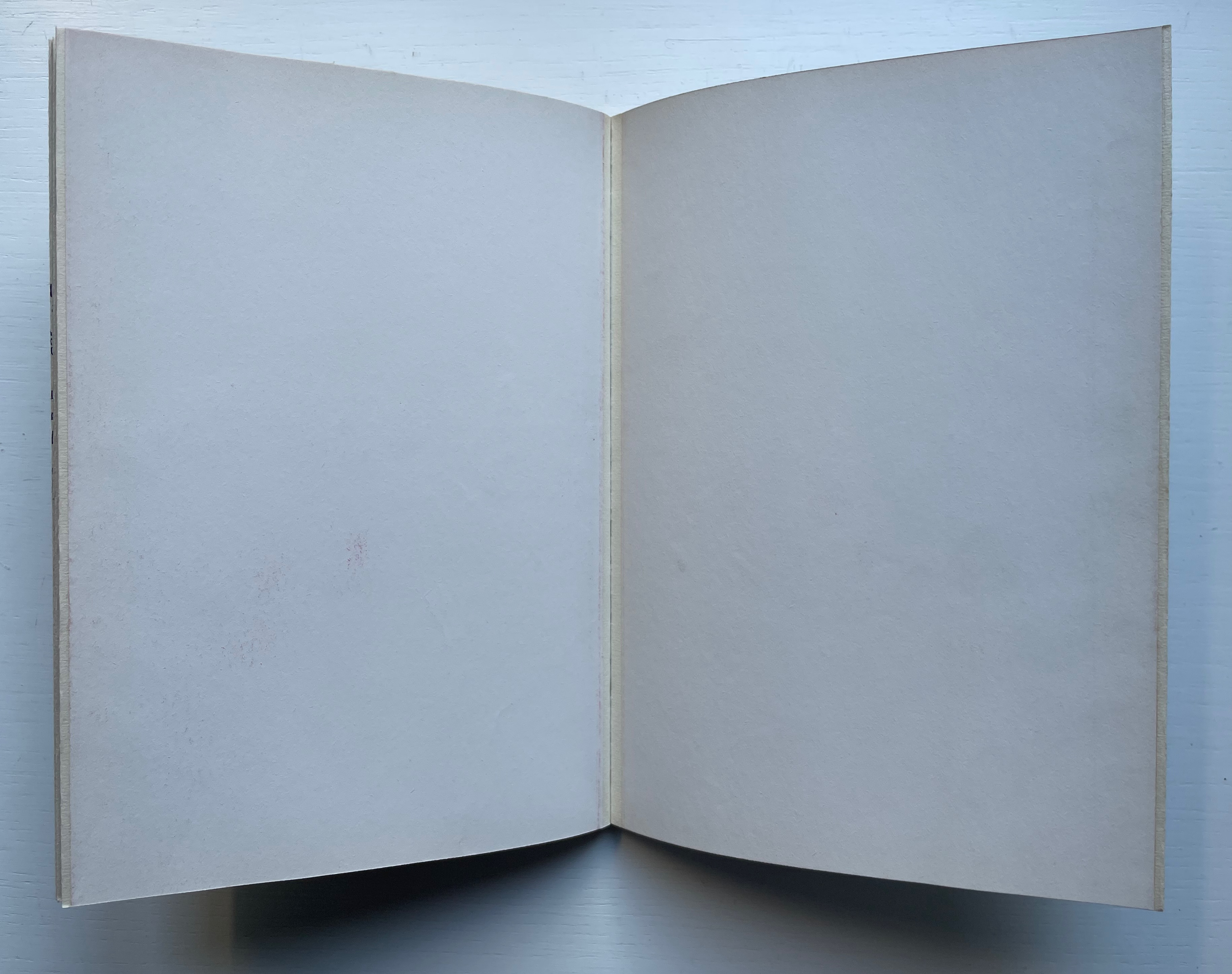
the linen pasture of the third page, that is the purity that must be in the heart.
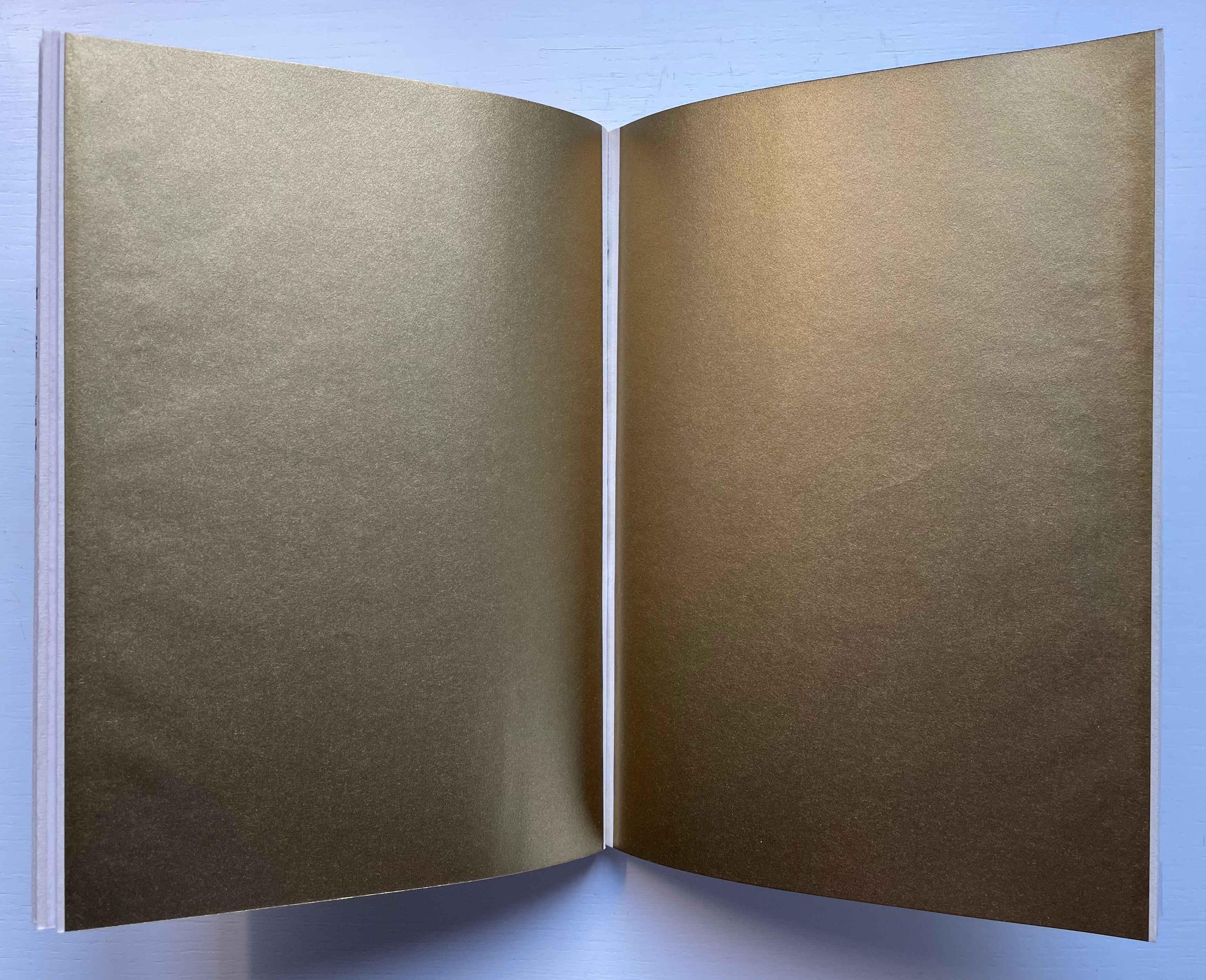
ready to enter into the mystery, to look into the sunshine of God’s face. to fall down in prayer, hearing the sound of the golden trumpets of heavenly bliss.
As the acetate page turns, the analphabetic Bible is revealed.
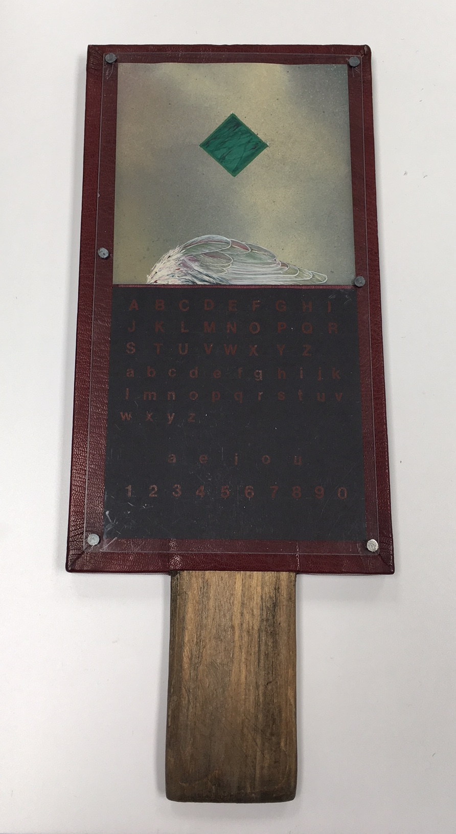
Although the horn-book by Jan Paris presents the usual uppercase and lowercase alphabets, the vowels and numbers as horn-books and battledores later came to do, it omits the Lord’s prayer, which these reading tools — early and late — preserved. In its place is a marbled green diamond shape hovering over a bird’s wing against a diffusely clouded background. Still though they may be, there is a tension between the abstract and natural things, contrarily positioned. The heavy abstraction floats or is falling. The thing that should be rising lies beneath, still and equally — although morbidly — detached. Letters, vowels and numbers, too, are certainly abstract. Until formed into words and concepts breathed into the air, they, too, lie still and detached on the horn-book’s surface.
Horn Book #2 (1983) Jan Paris Mixed media Photo: Courtesy of the artist.
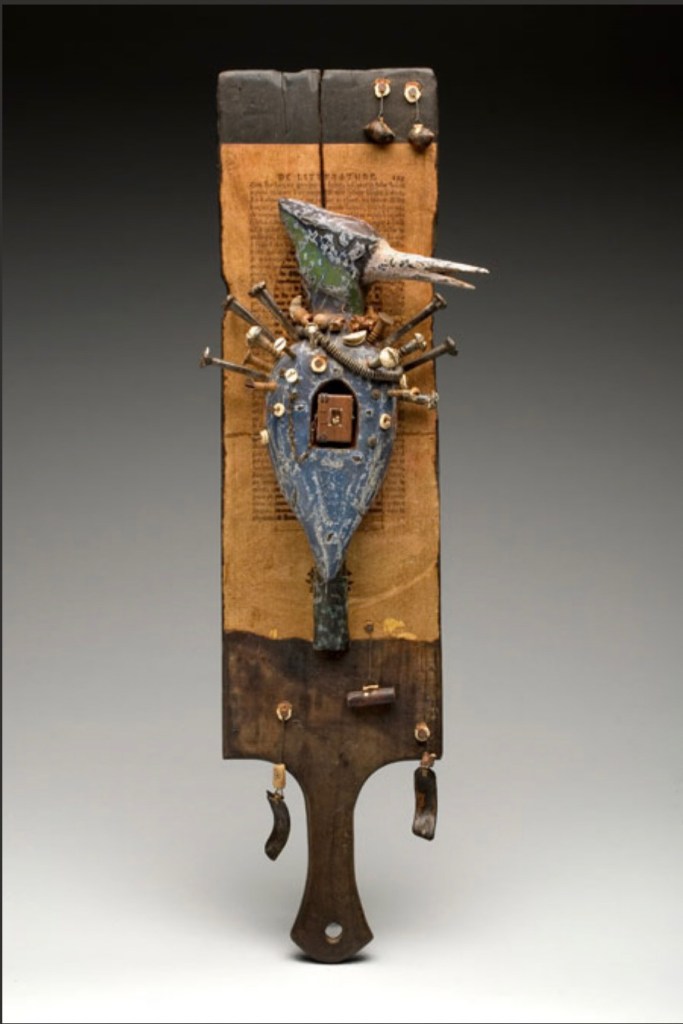
The horn-book form has become part of North Carolina artist Daniel Essig’s personal iconography. On his website, four variations can be found. The unique work below resides in Vanderbilt University’s Heard Library Special Collection. The range of materials and processes in Essig’s horn-book reflects the range of traditions, cultures and mythologies making up his eclectic iconography: miniature books, African bookbinding (contrasting with the horn-book), n’kisi nkondi (a Central African nail fetish), French literature (the unidentified collaged text), bird symbology, assemblage, carving, burning and painting. As totemic icon, Horn Book Fisher pushes the horn-book far beyond its primer function.
Horn Book Fisher (2008) Daniel Essig Carved and painted mahogany, burned cherry, mica, nails, handmade paper, found natural objects, 1800’s text papers, Ethiopian and Coptic bindings. 61 x 15 x 9 cm. Photo: Courtesy of the artist.
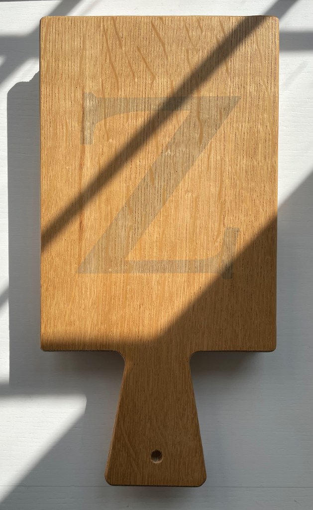
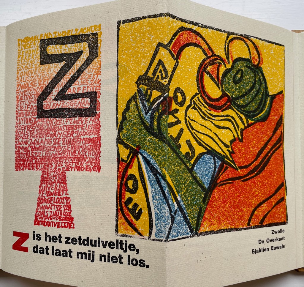
Corps 8 was a Dutch collective of private presses formed by Dick Berendes (Typografiek), Kees Baart (‘t Schuurtje, now deceased), Gerard Post van der Molen (De Ammoniet), Sjaklien Euwals (De Overkant), Dirk Engelen (Clio Pers), Thijs Weststrate (Without Roof), Silvia Zwaaneveldt (De Baaierd) and Henk Francino (De Pers Achter de Muren). Under the auspices of a larger collective Drukwerk in de Marge, founded in 1975, they created Van Hornbook tot ABC-Prentenboek (“From Hornbook to ABC Picture Book”). It is an exquisitely produced, informative and witty collaboration. More about it can be found here.
Van Hornbook tot ABC-Prentenboek (2003) Kees Baart, Dick Berendes, Henk Francino and Gerard Post van der Molen Double-sided leporello between two pamphlet-sewn booklets and bound between two oversized wooden hornbooks, held in an open cardboard box. H295 x W150 x D 30 mm. First booklet, 18 unnumbered pages; second booklet 8 pages; 52 panels. Edition of 135. Acquired from Fokas Holthuis, 13 September 2022. Photos: Books On Books Collection. Displayed with permission of the artists.
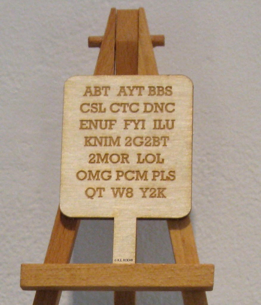
Karen Roehr’s Horn book for contemporary times is a miniature roughly the size of a small smartphone. Surely a Gen Z version with emoticons is not far behind on someone’s creative agenda.