Bookmarking Book Art — Justin James Reed

2013 by Justin James Reed Publication Date: 2012 Artwork type: Editioned book Medium: inkjet Dimensions: 9.5 in W x 13.0 in H Binding Type: pamphlet Publisher: Horses Think Press
2013 by Justin James Reed
Publication Date: 2012
Artwork type: Editioned book
Medium: Inkjet, UV Firefly Ink
Dimensions: 9.5 in W x 13.0 in H
Binding Type: pamphlet
Publisher: Horses Think Press


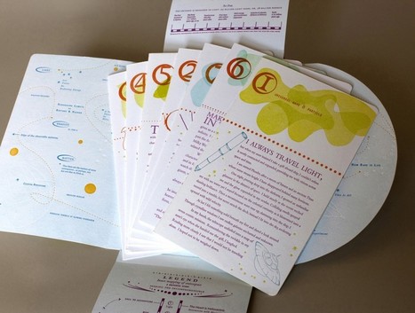
2013 is apparently a booklet of blank pages, until the lights go out and the reader begins to search the pages with the ultraviolet flashlight that accompanies the book in its archival box. Is this reading with one’s whole body? The tactile nature of a book takes on more than three-dimensionality through the pages’ reaction to the reader’s gestures.  The time it takes to “read” the book is the time it takes to perceive its ghostly images.  Reading the book becomes experiencing the book.

I enjoy the idea that when a viewer first encounters the book it appears to be blank. Indeed, this notion of the “invisible book,” was an important starting point for the work.  And in this, ingrained in the book itself, are two very concrete ways to experience the book: as a set of blank pages and then, with the help of an ultraviolet light source, a completely radical way of looking at pictures. My intention is to have this process lead a viewer to perceive the imagery less representationally and more sculpturally….


For me, this book is broadly about the future and the end or rebirth of time. The title, “2013,” came about because of the rapid pace of technology and culture. No longer do we have to look far into the future to perceive change, we witness it daily, to such an extent that even the idea of the year 2013 seems far away and distant. Beyond this though is also the concept that time is a construct. Again, this ties into perception, that in addition to the viewing experience, I want to reinforce the notion that time itself is just a way of perceiving reality. The iconography in the book: sculpture, form, nature, digital information, etc., is all mixed together so that a viewer encounters each on the same plane, and by the end of the book the number 2013 takes on the same qualities as one of the landscapes, the number has meaning.


One of my main goals with this book was also to facilitate a group experience. In my mind most books are made to be enjoyed by oneself. However, with this book, it is my intention to make something that encourages people to share in the viewing experience…. I am fascinated by the idea that an object, a book, can be a reason for people to come together and share in something. In some ways this is one of the most important components of the book.


Related articles:


Bookmarking Book Art — Paul Forte

Transformed Volumes | Exhibition of Artist’s Bookworks | Numéro Cinq.

Paul Forte has assembled a display of his own bookworks and those of Doug Beube, Claire Dannenbaum, Donna Ruff, Jacqueline Rush Lee and Irwin Susskind for the Hera Gallery, Wakefield, RI, June 15 to July 13.

3.-Paul-Forte-1024x664
“Liber Dermis (Skin Book),” Paul Forte, 2008
Medical illustrations (human skin cross section) on sealed medical book, mounted on wood, 17 1/2 x 12 1/2 x 3/4 inches

Douglas Glover’s Numéro Cinq provides an excellent venue for Forte’s introduction to this exhibition and additional photographs of items with artists’ statements.  If you cannot go to Rhode Island, visit Numéro Cinq.

Photograph of Hera Gallery's exterior
Photograph of Hera Gallery’s exterior (Photo credit: Wikipedia)

Bookmarking Book Art — Jacqueline Rush Lee

Dictionary Detail (From the Series Ex Libris), 2000Petrified Book (High-fired Book in Kiln)H 7” x W 15” x D7”H18 x W38 x D18cm
Dictionary Detail (From the Series Ex Libris), 2000
Petrified Book (High-fired Book in Kiln)
H 7” x W 15” x D7”
H18 x W38 x D18cm

From the artist’s website:

Jacqueline has been working with books for fifteen years and is recognized for working with the book form. Her artworks are featured in blogs, magazines, books and international press. Selected bibliography include: BOOK ART: Iconic Sculptures and Installations Made from Books; PAPERCRAFT: Design and Art with Paper and PLAYING WITH BOOKS: The Art of Up cycling, Deconstructing, and Reimagining the Book. Jacqueline’s work will also be featured in Art Made from Books, Chronicle Press, 2013 by Laura Heyenga. …  She exhibits her artwork nationally and internationally and her work is in private and public collections, including the Allan Chasanoff Book Under Pressure Collection, NY.

The Chasanoff collection connects Lee with Doug Beube, whose work has been noted here. Beube was the curator of the Chasanoff Collection from 1993 to 2011.   In his interview with Judith Hoffberg in UmbrellaVol 25, No 3-4 (2002), he comments on the purposes of Allan Chasanoff, a book artist in his own right, in putting together the collection “The Book Under Pressure”:

There are a number of ideas that meets Allan’s criteria in acquiring work, of which I’ll try to convey a couple. The first is; the problem of the book to perpetuate information is inefficient, it’s an obsolete technology due to the advent of the computer.  Another premise is; at the latter part of the 20th century the book is being used for purposes other than its utilitarian design. Allan has been working extensively with computers and digital imaging since 1985 and understands that the book is as “an outdated modality”, he’s fond of saying. He’s not interested in the book decaying or in its destruction, nor is he referring to the content of books, artist’s books, production costs, mass appeal or where they get exhibited. His interest is in the book as an antiquated technology.

Lee’s process of kiln firing to transform individual books, as with the dictionary above, strikes a harmonious chord. The kiln does not reduce the book to ash but rather petrifies it.  Another way of exploring “the book under pressure.”   Lee’s and Beube’s work are brought together again by Paul Forte  at the Hera Gallery for an exhibition entitled Transformed Volumes.

Bookmarking Book Art — Carl Pappenheim

Well-reviewed (see below), Spineless Classics — Carl Pappenheim’s prints that use all the words of a book to outline an emblematic image of the work — raise questions unasked by the interviewers:  If we stand before a Spineless Classic and read it, does the experience of reading the book change?  How?  What is the difference between art and decor?  Between art and craft?  Between artwork and mechanical reproduction?  

screen-shot-2012-01-12-at-00-40-07

Spineless Classics Turns Whole Books Into Graphic Art 2011

Spineless Classics 2011

Interview With Carl Pappenheim, Bringing Novels To Your Walls At Spineless Classics 2011

How to get your favourite book on your wall; 5 questions for Carl Pappenheim of Spineless Classics 2012

A Book on One Page … 2012

Carl Pappenheim: The Artist Using The Whole Texts Of Novels To Create Beautiful Silhouettes  2013

The Art of Writing; or Writing as Art 2013

Bookmarking Book Art — The Mystery Book Artist of Edinburgh Returns

993004_539663756096847_867277053_n
Preparing to Fly 2/3, The Mystery Book Artist of Edinburgh
Photo by Chris Scott, June 2013

The mystery book artist of Edinburgh has secretly delivered another work — this time to the  Leith Library, which boasts the community publication A-Z for Families in Leith with Young Children.   Appropriately, the card that rests propped against a book beneath a nest of words and hungry baby birds quotes A.A. Milne’s Winnie-the-Pooh.

It is more fun to talk with someone who doesn’t use long, difficult words but rather short, easy words like “What about lunch?

Or “let’s read a book.”

Ironic that the sculpture’s appearance coincides this month with Sam Jordison’s review of Egmont Press’s Winnie-the-Pooh app.

Thanks to Chris Scott, Literary Paparazzo, for capturing this reappearance.

Related article:  Bookmarking Book Art — The Mystery Book Artist of Edinburgh

Bookmarking Book Art – Update to “Rebound: Dissections and Excavations in Book Art”

Brian Dettmer's TED talk
Brian Dettmer’s TED talk

Watch Brian Dettmer’s delightful TED talk here. More about his work and his contemporaries follows:

Three book artists previously featured here at BooksOnBooks — Doug Beube, Brian Dettmer and Guy Laramée — were showcased in this exhibition curated by Karen Ann Myers at the Halsey Institute of Contemporary Art at the College of Charleston, South Carolina.  Two other artists — Long-Bin Chen and Francesca Pastine — complete the show.  The exhibition ran from 23 May through 6 July 2013. 

Increasingly, contemporary artists have been exploring the interplay among the function, structure, and format of books. Rebound: Dissections and Excavations in Book Art brings together the work of five mixed-media artists from around the world who, using books as a point of departure, sculpt, scrape, bend, and carve to create astonishing compositions. Doug Beube, Long-Bin Chen, Brian Dettmer, Guy Laramée, and Francesca Pastine transform various types of literature and/or printed books through sculptural intervention. Despite the individual and exclusive perspective of each artist, there are remarkable connections in the themes and ideas they respectively mourn and celebrate. The fascinating range of examples, as diverse as books themselves, offers eloquent proof that—despite or because of the advance of digital media for sources of information—the book’s legacy as a carrier of ideas and communication is being expanded today.

via Rebound – The Halsey Institute of Contemporary Art.

Bookmarking Book Art — Diane Jacobs

Nourish by Diane Jacobs
letterpress printed reduction linoleum and wood blocks, pressure printing, polymer plates, handset title page and colophon, bamboo box, gampi paper, wool felt, cast paper pulp, porcelain
8″ x 8″ x 2″

The wondrous power of the sun and moon mark our cycles of circular and linear time. We rely on them for light, energy, warmth, and continuity. The oceans and forests create habitat for a diversity of species whose existence we depend on, yet many of our human choices harm the earth. The burning of fossil fuels, pollution, and exploitation of land distresses our relationship with this majestic planet. Join me on a pictorial journey to celebrate the wonders of our natural and created world.  Nourish is a book about hope and stewardship, as the drum symbolizes the heartbeat—the pulse of life—it connects us all.

The eight twice-folded folios printed on both sides of the paper have endured over 100 runs through a Vandercook letterpress. I explored new artistic territory in this project; investigating color by mapping out fifteen different multi-color reduction relief prints, and experimenting with layered images on transparent paper.

via 23 Sandy Gallery | Nourish by Diane Jacobs *LIBRARIAN’S CHOICE AWARD!.

Nourish_01

Bookmark — “How Old is Innovation before it’s New?” David Worlock

Fachbuchhandlung
Vienna’s Manz Bookstore, facade by Adolf Loos

Two interesting words: “semantic” and “innovation.”  Find yourself a good cup of coffee, a slice of sachertorte, the aroma of cinnamon and take the time to read this article by David Worlock.

“Getting” the fundamentals of digital publishing means “getting” semantics: the semantic web, taxonomies, ontologies, tagging and all that.  David Worlock’s article is a good place to start to understand why.

Bookmarking Book Art – Vita Wells, Updated 11 February 2014

Wells %22Flights of Mind%22From 3 February to 20 March 2014, Vita Wells (born Béa Welsh Weicker) has a new “Flights of Mind” installation. A year ago, she had placed an installation of the “Flights of Mind” at the Berkeley Central Library, the first being in 2012 at the Oakopolis Gallery in Oakland, California.

Wells Flights of Mind BerkeleyFollowing the Berkeley installation, the following was posted on BooksOnBooks:

Appropriately, this latest installation was for the “11th Annual Authors Dinner,” sponsored by the Berkeley Public Library Foundation.  Soaring forty feet above the patrons’ heads were hundreds of altered discarded books, their covers spread into wingspans, their pages folded into rounded bird bellies and each book suspended on cables from the ceiling at varying pitches,  yaws and distances from one another.   They are no longer there, nor at the Oakopolis.  By the installation’s name, they should now exist only in the mind, but the artist provides an extensive online “installation” with numerous pictures and videos, an essay on her intent and a detailed description of the installation’s physical characteristics.

It is delightful to have access to the online version, and we may fool ourselves into thinking of it as virtual.  Even the digital is subject to forensics.  Still, although Wells may well take down the online installation, or its URL may be hijacked or fall into 404-dom, it is not temporary in the sense that its instances in Berkeley and Oakland were.  So does its presence challenge the integrity of those temporary installations?

Almost a century ago now, Yeats wrote of the swans’ “bell-beat” of wings overhead at Coole, and that poem entered the world of lasting works of art.  It has its many physical instantiations in books the world over.  It lives in recordings.  It lives on the Web.  It lives in countless minds ready to recite it.  Of course, the books will rot, the recordings and sites decay, the minds fall into silence.  Yet in the presence of thought become art, soaring overhead, we dare to dream of persistence even in the face of such imperfections as Wells’ “worn, frayed, … beat-up and patched” birdbooks or the challenge of the age of digital reproduction to the integrity of art.

… now they drift on the still water

Mysterious, beautiful;

Among what rushes will they build,

By what lake’s edge or pool

Delight men’s eyes, when I awake some day

To find they have flown away?

Vita Wells’ art feeds the dream.

Related publication

Tracey Taylor, “Berkeley artist Vita Wells makes books fly at main library”, Berkeleyside, 11 February 2013, accessed 11 February 2014: http://www.berkeleyside.com/2013/02/11/berkeley-artist-vita-wells-makes-books-fly-at-main-library/


Bookmarking Book Art – Casey Gardner

Body of Inquiry,            Casey Gardner
Body of Inquiry, Casey Gardner

This is a work that succeeds on every level: the text, both humorous and pithy, is engaging, the craft and material selection superb, the design and layout a balance of image, information and space.

The presentation is such that one is informed, enticed and amused before even getting to the ‘insides’ of the work – a corporeal codex, the inside story.

We read that the work was inspired by Torso Woman, a genuine anatomical model of serene evisceration. Mounted on the interior central panel, appropriately placed on a brush worked depiction of an armless, legless female, who does, however, have a head), wearing a stoic (or is it serene?) expression is an organically shaped book that includes overlapping shapes reminiscent of the human anatomy books of the fifties.

via Artists Book Cornucopia III – Casey Gardner « Abecedarian Gallery’s Blog.

Based in Denver, Colorado, Abecedarian Gallery offers an eclectic and enjoyable selection of bookworks and prints for sale.  The Abecedarian holds regular exhibitions (such as the Emerging Artists exhibition) and offers an annual Gallery Directors Award (which Gardner won in 2013).  Well worth a visit online.

Gardner was also a finalist for the MCBA 2015 award with the work below:

 Phoebe is a traveller through time and space in search of what matters. Along the way, she meets an intergalactic wayfarer who is also on a quest. He seeks the 10th dimension which can only be reached by learning what is uniquely human. Together they travel to the beginning of the universe and back. Meanwhile, the two travellers investigate the workings of the universe. Each of the seven folios chronicles a mission that revolves around a field of exploration: light, gravity, time, matter, infinity, constellations and science. On the back of each folio is a mission dispatch reporting their discoveries of meaning in the natural forces and phenomena of the cosmos.

From mcbaprize.org

This particular work reminds me of the rise of infographics. It also stands as a clever introduction to a scientific topic through fiction as well as design.  For more of Gardner’s work, visit her site Set in Motion Press.