In another elegy for paper, Mark Fox in Designers & Booksleaps from the famous conversation between Ray Bradbury’s characters Professor Faber and Fireman Montag in Fahrenheit 451 that begins, “Do you know why books such as this are so important? Because they have quality. And what does the word quality mean?” to Jaron Lanier’s assertion that the remix culture is responsible for “the digital flattening of expression into a global mush.” Fox sets this against Professor Faber’s elaboration of what he means by “quality”:
To me it means texture. This book has pores. It has features. This book can go under the microscope. You’d find life under the glass, streaming past in infinite profusion. The more pores, the more truthfully recorded details of life per square inch you can get on a sheet of paper, the more ‘literary’ you are. That’s my definition, anyway. Telling detail. Fresh detail. The good writers touch life often. The mediocre ones run a quick hand over her. The bad ones rape her and leave her for the flies.
Saalfeld – … I’m interested in the changes that take place over time. In nature, the old sits alongside the new. There are always tensions, and injuries.
Mantz – That is exactly what characterises your images. This breaking apart and breaking through as if the colours were peeling off to reveal fragments of completely different pictures behind.
Saalfeld – Gaps appear through these breaks and dislocations. This allows something different to emerge from the image. There is always an unexplained story behind the story, another version. I no longer believe in a single, individual image.
Here is a healthy “anxiety of influence” that overcomes qualms about tradition, builds upon it and, yes, perhaps devours it as if it were seed corn. Its analogs in book publishing can be found in the work of Tom Abba, Duncan Speakman and others associated with WeAreCircumstance or in the works of Jonathan Safran Foer and others published by Visual Editions, all of which represent an intersection of narrative and the plastic visual arts.
Paper is not dead, digital is not still-born, creativity is a phoenix.
These Pages Fall Like Ash, Tom Abba
Short Films for You, Tom Abba, Els Viaene, Reinout Hiel and Yoko Ishiguro
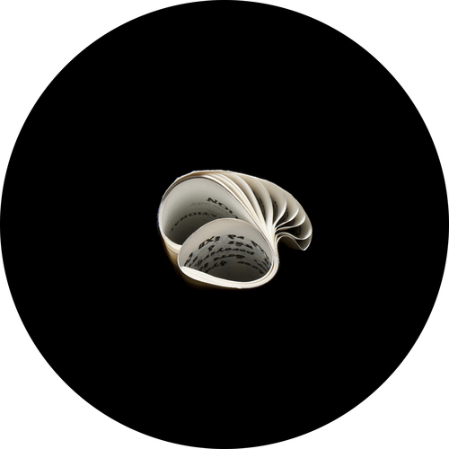
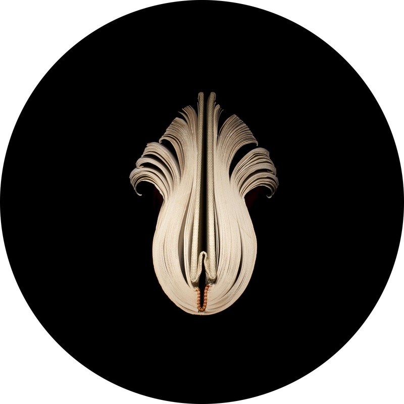
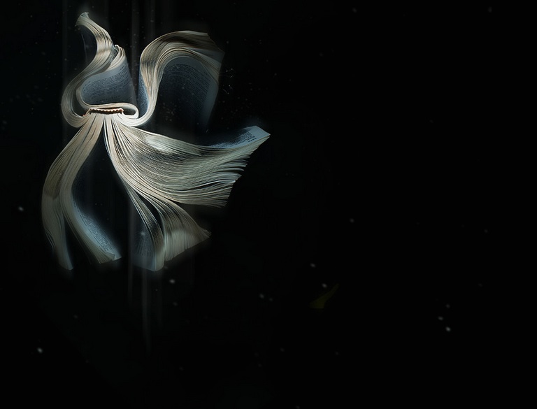
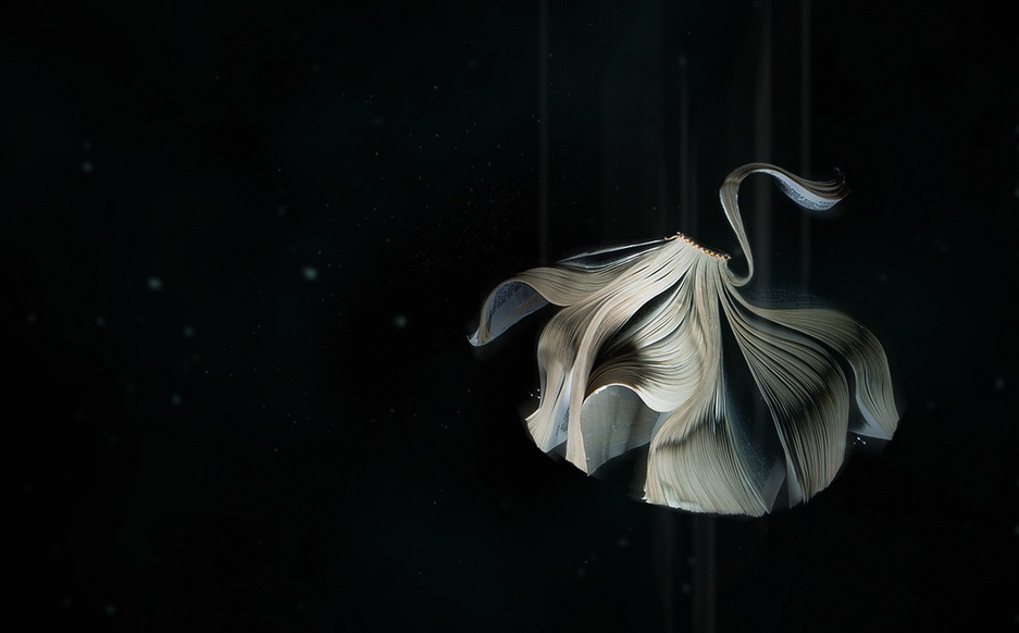
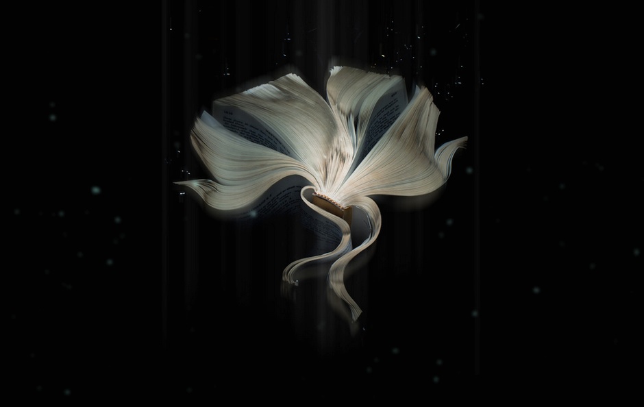
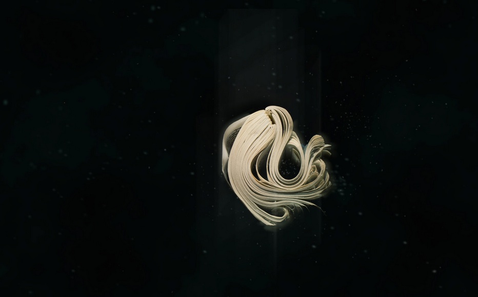
[ The book is an organism. It lived, spread all over the world and, some would consider, is endangered today. These creatures have a life of their own. They manifest themselves in many forms but where did they come from? If they are animals of paper and text, from what kind of beast did they evolve? This series studies those primordial creatures that became the developed beings colonizing our homes and libraries. By looking at growth patterns, mutations, and morphological similarities we can better understand this animal’s rise in population for so many years, as well as its current decline toward extinction. ]
The images above constitute a mesmerizing series on Monahan’s site. It is as if we are looking at photographs of deep-sea creatures or impressions of fossils or slides of microscopic organisms. The latter impression is reinforced by the petri dishes in which the circular images are framed, but of late, the organisms, shown in the rectangular photos, have escaped the petri dish to occupy an undefined abyss. Like snorkeling or diving for the first time in strange waters, the experience of viewing Specimen is beautiful, exhilarating and a bit scary. The words quoted above and fixed alongside the images are humorous, wistful but still, in the end, a bit scary. The book: evolution or extinction?
Monahan hails from the Master of Fine Arts program at the University of Michigan Ann Arbor, whose library by chance was one of the original five library partners in the Google Library Print Project that began in 2004. In March 2012, Jennifer Howard reported in The Chronicle of Higher Education that Google’s book-scanning project had reached its 20 millionth volume but was slowing down. Even so, at its average rate, Google should have about 25 million books scanned now. As if foreshadowing Monahan’s metaphor literally and using the Google collection like a literary genome project, Harvard’s Steven Pinker, Jean-Baptiste Michel and the Google Books Team “constructed a corpus of digitized texts containing about 4% of all books ever printed [enabling them] … to investigate cultural trends quantitatively”. From this reservoir of digital strands, they plucked out the references to each year between 1875 and 1975 in the books, plotted them and found
The plots had a characteristic shape. For example, “1951” was rarely discussed until the years immediately preceding 1951. Its frequency soared in 1951, remained high for 3 years, and then underwent a rapid decay, dropping by half over the next 15 years. Finally, the plots enter a regime marked by slower forgetting: Collective memory has both a short-term and a long-term component.
But there have been changes. The amplitude of the plots is rising every year: Precise dates are increasingly common. There is also a greater focus on the present. For instance, “1880” declined to half its peak value in 1912, a lag of 32 years. In contrast, “1973” declined to half its peak by 1983, a lag of only 10 years. We are forgetting our past faster with each passing year.
Ironic that. Analysis of the “DNA” extracted from over 5 million specimens of the organism designed to preserve our past tells us that we are forgetting it more quickly year by year.
Curious about his interactions with the book species, I wrote to Math Monahan to ask if we could conduct the “in medias res” experiment: to go to his bookshelf, select a volume from the middle of any shelf, open the volume to its center pages, tell me what is there and answer a set of questions.
What are the objects immediately on either side of the selected book? As you take the book from its place, what are your physical sensations? How does the book feel to you? As you open to its middle page, what do you hear, smell or see about it or around it?
Do you recall the circumstances of acquiring the book? What were you doing when you acquired it? Why this book?
As an artist whose work has an intimate relationship to “the book,” could you describe the effect this has on you when you are reading books in general?
Turning the question on its head, when the act of creating a work rather than the act of reading is in flight, how do books feed your working process?
MM: I decided to choose from my “to read” shelf. The book I found in the center felt “right” as soon as I saw it there. Although it was on my “to read” shelf, I decided to read it before replying. I wasn’t sure if I wanted to or not, I think it was the right choice. Anyway, here is my choice. As you can see, the book I’m using has a slightly different layout.
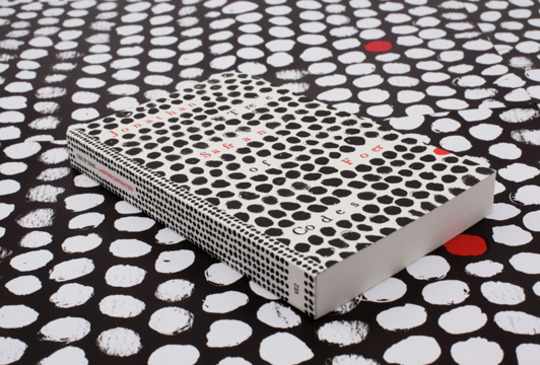
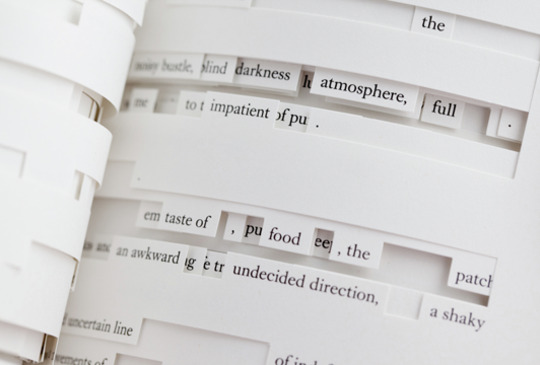
Image from Visual Editions. Author of Everything is Illuminated, Foer took one of his favorite books, The Street of Crocodiles by Polish-Jewish writer Bruno Schulz, and used it as a canvas, cutting into and out of the pages, to arrive at Tree of Codes.
BoB: And what about the books and things around it, and what you felt as took Tree of Codes from the shelf?
MM: To the left stands the book, Folklore and Book Culture by Kevin Hayes. To the right, two wooden boxes stacked, act as a book end/space filler, followed by more books. The larger box on the bottom contains various samples of handmade papers. The smaller box on top contains blank note cards. As I removed the book I felt the unfamiliar squeezing of pages that I was surprised by when I first bought the book. It was caused by the cutouts on each page. They create the different densities that differ from the standard solid-block feel of a book. When I opened the book to its estimated middle page, I remember being very gentle. The layout of the book made the pages delicate lattices that I am very careful to keep intact. The carefulness must have overridden my other senses, because I don’t remember anything else. I thought the book felt “right” when I found it because, as a book artist, I work with the form of the book and the book as an object. That is my main interest. This book is published by Visual Editions, a publishing company that believes “books should be as visually interesting as the stories they tell” (www.visual-editions.com). This idea meshes well with ideas in my own work.
BoB: Now that you’ve read Tree of Codes, you will have noticed how The Street of Crocodiles has pretty much disappeared. Almost but not completely. Are there echoes of that phenomena in your own work?
MM: Yes. Often the content of the books I’m using in my work is irrelevant. I am exploring the book as a physical form. Through folding, braiding, warping or any other alteration, I am revealing the transformative nature of the book. Each one holds different possibilities. My struggle is in convincing the viewer of this. We have a tendency to immediately read text, almost instinctual. Can text be texture? Is there more information contained in a book than words and images?
While a part of my process is (what I have been calling) relieving the book of text, I don’t feel this is an act of violence against any author(s). It is clear in Tree of Codes that the removal of text is an act of love or admiration for the primary story. My admiration is for the object itself. The text will live on in many forms. I am not using rare or one-of-a-kind books here.
BoB: Do you recall the circumstances of buying Tree of Codes? What were you doing when you decided to buy it? What prompted the purchase?
MM: I found it in a Barnes and Noble. I remember being surprised to see it there because it is a sort of unconventional book. I quickly put together that the author, Jonathan Safran Foer, recently had one of his books made into a movie and that could prompt the store to have all his works in stock. Still, I was very pleased to find it. I was introduced to the book about a year earlier by a friend. It was coming home with me that day, no question.
BoB: As an artist whose work has an intimate relationship to “the book,” could you describe the effect this has on you when you are reading books in general? The question may have different answers depending on the type of book or your intention on opening the book, so feel free to qualify your answer as you like.
MM: I think my relationship to “the book” changed how I approach books in any context. For better or for worse, I have noticed this change. The phrase, “Don’t judge a book by its cover.” comes to mind here. I find myself judging a book not only by its cover but also by its weight, size and shape, the textures of its cover and pages. Even by the fonts used in the body of the text are included in this analysis. Of course I read the summary and printed comments on the back, but these often fall after the book passes the physical tests.
BoB: Turning the question on its head, when the act of creating a work rather than the act of reading is in flight, how do books feed your working process?
MM: This is where all the information gathered through the process described above come into use. Understanding how paper textures interact with colors and fonts, how negative space in a text block affects how quickly you move through the book, how the lines of text change as you curl and warp the pages; all are now the backdrop to the creation of my own work. Sometimes this raw data is in the forefront of my thoughts while I’m working, while other times it is synthesized into a cloud of intuitive responses. The latter is often what I’m referring to when I say something “feels right”.
BoB: Decades ago, Peter Frank commented that exhibiting artists books behind glass was to confine them ” in some anaerobic chamber”. Unless your “organisms” in Specimen present themselves in the equivalent of a petting zoo, their exhibition requires us to stand at a distance and prompts us to view the book as an object to be regarded rather than “read” in the usual sense.
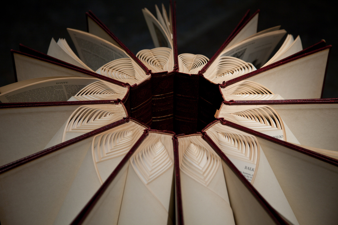
Your installation Between is another case in point but intriguingly different. There, you have taken two sets of books, opened each book, braided its pages so that it stands open and arranged each set of braided books in a circle spine to spine.
The circle arrangement holds the set together, without adhesives or mechanical apparatus, and the pages slowly unbraid themselves, each book returning to its original form. Although the installations, one in the Penny Stamps Graduate Studio and the other in the Hatcher Graduate library of the University of Michigan, are not under glass or otherwise fenced away from the “reader”, the “reading” or art experience can only occur as the unfolding occurs. And, of course, being in two separate locations, the installations do not allow us to experience them simultaneously. Yet, you intend “the installations [to] form a whole existing between the two spaces”.
So while Specimen is “at a distance” from us in one way, Between is so in another. With Specimen, we are relatively passive viewers. With Between, although we are not reading the unbraiding volumes, we are more active, almost participating. Our “witness” to the unbraiding is a necessary element of the artwork, but is that unbraiding toward forgetfulness and extinction or memory and renewal?
MM: Participation is the point of books. They are meant to be interacted with. That interaction has become a recent focus, especially thinking of library books and other books as they pass through several hands. I can admit, reading a good book leaves its mark on me. But what marks do we leave of books? What are the traces of these intimate interactions? Through time, whole communities are embedded in these artifacts. Find a book from a library or thrift store and try to imagine everyone that has ever handled that specific edition. Can you feel them around you? I aim to reveal that community.
BoB: One last question. Between forgetfulness and extinction, on the one hand, and memory and renewal, on the other, where would you bookmark us and the book?
MM: Whether book sales are up or down, it’s irrelevant. Even if the extinction of books never happens, the fact that text CAN be read digitally opens the book to possibilities beyond text, similar to (in my opinion) what happened to painting with the invention of photography. Artists are still working in representation, even hyperrealism, but the rapid expanse of painting and thought behind what a painting is – that is the direction that I’d like to see our interaction with books move in.
Klima, Stefan.Artists Books: A Critical Survey of the Literature. New York: Granary Books, 1998, p.67, citing Jacqueline Brody, “Peter Frank: A Case for Marginal Collectors”, Print Collector’s Newsletter, IX, no. 2, March-April 1978, p. 44.
Michel, Jean-Baptiste et al. “Quantitative Analysis of Culture Using Millions of Digitized Books”, Science, 14 January 2011, Vol. 331, no. 6014, pp. 176-182, accessed 19 September 2013: DOI: 10.1126/science.1199644.
The Repository of Primary Sources has been running since 1995 at the University of Idaho. Under the wing of Terry Abraham, it lists “over 5000 websites describing holdings of manuscripts, archives, rare books, historical photographs, and other primary sources for the research scholar”, and “[all] links have been tested for correctness and appropriateness”.
So what has this to do with the evolution of the book? Well, in the world of book publishing, whose job has it been to make sure that a book is known about and can be found — not only on publication but after? Marketing, Promotion and Publicity, undoubtedly, but they would be among the first to shout if Editorial or someone had not registered the book’s metadata with Bowker or the equivalent local ISBN registry.
According to Google, there are 129,864,880 books in the entire world (as of 5 August 2010, 8:26AM), but that is a semi-statistical estimate for the modern era drawn from sources such as ISBN registrars and OCLC’s WorldCat. Bookfinder/JustBooks, launched in 1997 by Anirvan Chatterjee, claims that through its network, it searches over 150 million books for sale. With the great hoohah over Hugh Howey’s Amazonian extrapolation, we can safely assume that there are many, many more books out there probably without ISBNs, which after all only came into effect in the 1970s and, even so, now there are vociferous opponents to the ISBN calling it an offline anachronism.
There is no question to beg about the usefulness of metadata. So is there a Terry Abraham and cohort out there to whom publishers and self-publishing authors can turn to deposit metadata whose links will be “tested for correctness and appropriateness”? Of course, that begs the question of whether there should be someone or organizations out there to perform that function. Why not leave it to the power of the Internet or the power of the market? Even if a book goes unnoticed or after a time becomes an “orphan work“, the power has spoken.
Let’s leave the power politics for another bookmark. Whoever performs the function, what exactly is it? Let’s call it the “findability” function. It goes beyond the usual social media marketing of a book or ebook that most publishers assign to Marketing. It goes beyond the usual search engine optimization (SEO), although it is arguably a part of it.
It goes to making the book as locatable an object as it can be, endowing it with “ambient findability.” See Peter Morville’s book of that title and judge for yourself whether “endowing something with ambient findability” misconstrues what he is saying or how the Web works. Nevertheless, …
Superfluous as they are claimed to be becoming, should publishers leave findability to the ISBN registries and librarians (until they become superfluous as well) or to the technorati?
As the book evolves, this “findability” function currently falls between the stools of Commissioning (where the editor discovers the author and pumps him or her not only for the ms but for connections leading to sales/marketing opportunities and further editorial opportunities), Editorial/Production (where the copyeditor, designer and production editor ensure that metadata is assigned and link-checks are run and the work is registered with the Library of Congress), Sales/Marketing (where marketeers scour the author’s questionnaire if it has arrived, create lists of mailing and emailing lists, compile the list of offline and online reviewers/bloggers and design the social media campaign and where a sales account manager with responsiblity for Amazon and other online accounts worries whether IT has included the work in the scheduled ONIX, EDI and customized catalog feeds) and Operations/Finance (where an accountant, analyst or inventory controller assigns the ISBN usually upon receipt of contract approval).
So if you are self-publishing or publishing books/ebooks, who attends to the ambient findability of what you are publishing? As more and more books go online, isn’t this part of the new craft and art of the book?
By the way, I found Morville’s book one rainy Saturday afternoon while shelving books at the local Oxfam bookstore. I bought it instead of shelving it.
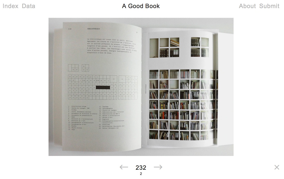
A hard question? A trick question? Yes and no. Since 2011, Bernd Kuchenbeiser, the Munich-based book designer, has been attempting an answer. He began by posting entries to a database on Twitter. With the demise of Twitter’s gallery function, Kuchenbeiser migrated the diary-like collection of photos and comments to A Good Book site with help from Simon Zirkunow. Below is a screenshot of part of the 232nd entry.
Screenshot of Méthodes, cover designed by Manuela Dechamps Otamendi, Entry #232 in A Good Book.
Until recently, the entries were Kuchenbeiser’s alone. The entries started on a daily basis, but as with many diary projects, the execution flagged. With 349 entries of his own (plus 3 from friends), he is now inviting entries from far and wide. Notice “Submit” in the upper righthand corner of the screenshot. Behind it lie the instructions and requirements for submission. Kuchenbeiser’s own entries are often brief, but his choices and comments are interesting because Kuchenbeiser and his oeuvre are interesting. See Michael Cina’s interview with him in The New Graphic(15 August 2011). For this venture to reward constant revisiting beyond that interest, however, Kuchenbeiser wisely holds potential contributors to the following standard:
Here’s what you need in order to submit a book:
– A short description of your book or the aspect that makes it ‘good’. From 140 characters to a maximum of 560, including spaces.
– The bibliographic details: author, title, year of publication, publisher, designer (if known). A questionnaire is already set up within the email that opens when you click ‘Submit now’.
– One to five photos of your book (at least 1400 pixels wide for landscape format and 1200 pixels high for portrait format).
Think of Pinterest or Flickr with serious feeling and intellectual rigor behind them. Kuchenbeiser’s design work and his own words exude that feeling:
Books have personalities. They can be our companions and friends. A good book doesn’t deserve to languish on a bookshelf; it wants to be opened, read, savoured, displayed, recommended. That’s why this website exists.
…
This site is like a message in a bottle hoping to be discovered. It will work only if it manages to generate communication.
The London Centre for Book Arts must have picked up the bottle from one of the Thames overswellings last week and placed a notice on its home page about the website. Although Kuchenbeiser does not promote it as such, if A Good Book thrives, it could generate a rich database worth semantic analysis for the book art and book arts community. All materials on A Good Book are being made available for noncommercial and educational use only.
“Previously on …” Say the phrase and most listeners’ brains switch to a favorite channel and television series. It is part of our vernacular. It instantly evokes a compound state of remembering and anticipating.
Myriapod Productions embodies that state of mind in its animated alphabet-book film series Mysteries of Vernacular. Each book for each letter is an old yellowed or gray hardback whose pages turn by themselves to reveal silhouette figures that glide across the pages, accordioned illustrations from other works or carvings reminiscent of the book sculptures of Doug Beube, Brian Dettmer and Odires Mlászho – with each vernacular word and definition emerging from an old library card pocket or from beneath a flap or cutout on the page.
The treatment of the letter Wis particularly apropos to this compound artwork. W is for “window”, which we are informed by Graham James (the narrator) is an example of the Old Norse technique of word invention called kenning. Kenning is the joining of two things (or rather two words for two different things) to designate a third thing: such as whale + road = whale-road = sea. Window is originally an Old Norse kenning word: windauga = vind (wind) + auga (eye). The book in the animation is Mikhail Sholokhov‘s The Don Flows Home to the Sea, a Nobel-prize-winning window on the life of the Don Cossacks during the Russian Revolution.
The book for the letter A (for “assassin”) is Karl Menninger‘s Love against Hate, whose theme of love’s shaping our instinctual aggressiveness suggests an ironic bent and wry, punning sense of humor in Jessica Oreck and her Myriapod team. The letter C for “clue” traces back to the ball of yarn (clew) that Ariadne gave Theseus to help him find his way out of the maze after killing the Minotaur, which is explained with an animation of George Bernard Shaw‘s The Intelligent Woman’s Guide to Socialism and Capitalism. C is also for “clever”.
D for “dynamite” plays out on the pages of A Number of Things, a satiric novel of Irish and British manners by Honor (Lilbush Wingfield) Tracy. Tracy became the fuse to a stick of dynamite planted by Bevis Hillier in his rival A.N. Wilson‘s biography of Sir John Betjeman. Hillier concocted a letter from Betjeman purporting to reveal an affair between Tracy and the Oxford don. Not only was the letter a hoax, but Hillier embedded an acrostic that spelled out “A N Wilson is a shit”.
Of course, X for “x-ray” is illuminated with George Iles‘ Little Masterpieces of Science, and naturally, Z for “zero” is accounted for with Teach Yourself Calculus. But this soupçon of humor runs out with H (what has “hearse” to do with Bernard Jaffe‘s story of chemistry?) and G (what has “gorgeous” to do with James Russell Lowell?) and F (what has “fizzle” to do with Mark Twain‘s Life on the Mississippi, although one can imagine his delight with the word’s etymological kinship with flatulence?).
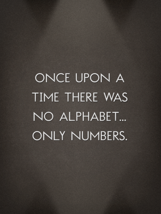
Each letter, definition, chapter, volume, episode (?) of Mysteries of Vernacular elicits affection for, if not outright love of, words and language. Perhaps that is not just down to Oreck’s and team’s skill, humor and cleverness. After all, for most of us, the alphabet-book is our childhood entrée not only to letters and words but any aspect of the internal and external world we fancy. Just for ages 3-5, our bookstores and libraries have the ABCs of Asthma, Bible Verse, Colors, Dinosaurs, Engineering, Feelings, Golf, Halloween, Ice Cream, Jobs, Kangaroos, Love, Math Riddles, Nature, Origami, Pigs, Questions, Rocks, Sounds, Touch, Under the Sea, Vanishing (endangered species), Wildlife, Yoga and Zoos. And for the more app-minded, there is also Moonbot Studio’s contribution to the ABCs: The Numberlys.
Screenshot from The Numberlys William Joyce, Moonbot Studios, 2012
Myriapod starts with the advantage of this long, long “previously on …” in our hearts and minds. In exploiting its advantage, Mysteries of Vernacular takes us on a gentle rootle round the attic and cellar of our language and social history. The tradition of the abecedary and the disciplines of history and etymology offer a natural canvas on which Myriapod’s animation projects numerous techniques of book art. The intaglio carving reminds us not only of Beube, Dettmer and Mlászho but more so of Nerhol (the collaboration persona of Ryuta Iida and Yoshihisa Tanaka) and the work entitled Oratorical Type.
Oratorical Type by Nerhol (Ryuta Iida and Yoshihisa Tanaka)
Oratorical Type by Nerhol (Ryuta Iida and Yoshihisa Tanaka)
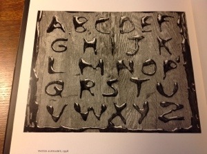
The Mysteries’ wooden desktop framing recalls Abelardo Morell‘s A Book of Books.
Water Alphabet, 1998 Abelardo Morell
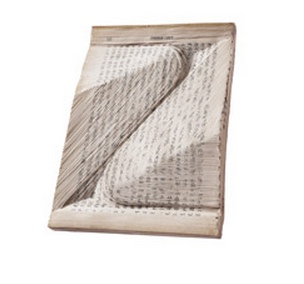
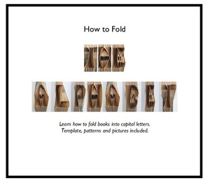
The animated book folds are enchanting (although they might have but do not aspire to the level of origami achieved by artists and craftworkers like Heather Eddy).
The Alphabet Tutorial Heather Eddy, 2013
little letters Heather Eddy, 2013
More extensively used and in keeping with the more two-dimensional feel of Mysteries is the technique of papercutting (as distinct from carving) on display with the letter W. The technique dates to the Tang Dynasty (618 -906 AD) but, in this context, harks back more recently to Victorian silhouette artistry.
Victorian Silhouette Abecedary
The series of 26 episodes so rich in content and technique is addictive. You will find yourself, as with any well-done abecedary, wishing for more letters in the alphabet. Although there is a vast vocabulary of other vernacular awaiting treatment, at a production cost of $80,000 per episode, it is likely those words will wait a long time. So we are left with having to remember our anticipation. Not all anticipation is more often enjoyed in itself rather than its resolution. You have 26 windows of opportunity to learn in Mysteries of Vernacular.
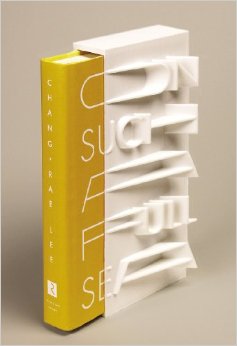
On Such a Full Sea Chang-rae Lee credit: Riverhead Books
“This limited, numbered edition of Chang-rae Lee’s On Such a Full Sea will be available on January 7th, 2014. Riverhead art director Helen Yentus and members of the MakerBot team designed the slipcase, and 200 of them will be made with the MakerBot® Replicator® 2 Desktop 3D Printer with MakerBot PLA filament, a bioplastic made of corn, fabricated by MakerBot in Brooklyn, New York. Each copy is signed and numbered by the author.” From www.riverheadbooks.com Is this the first 3D-printed slipcase? Yea or nay, this effort is clever. As the book slips from its case, the words of the title on the slipcase are completed. The design will surely make purchasers give “pride of space” to this book on their bookshelves and renewed sense to the word “outstanding”.
Additional cover design and art direction by Helen Yentus can be viewed here.
“MakerBot Creates First-of-Its-Kind 3D Printed Hardcover Book Slipcase for Award—Winning and New York Times—Bestselling Author Chang-rae Lee”, press release, 10 December 2013, accessed 5 January 2014: http://investors.stratasys.com/releasedetail.cfm?releaseid=812980
English: Comparative Bauer Bodoni versus Bodoni Català: Comparativa Bauer Bodoni vs Bodoni (Photo credit: Wikipedia)
This year marks the 200th anniversary of the passing of a great contributor to the linked histories of the book and typography: Giambattista Bodoni (1740-1813). Bodoni among others such as Fournier and Didot established the “Modern” fonts, typefaces characterized by the extreme contrast of their thick and thin strokes, delicate and sharp serifs and a chilly sparkling engraving-like quality heightened by generous leading and made possible by improvements in 18th and 19th century typecasting and manufacture of ink and paper. Bodoni planned and formed the royal printing house for the Duke of Parma in the Palazzo della Pilotta, where the Museo Bodoniano resides today. Associated with Pope Sixtus V, Carlos III of Spain and the Duke of Parma, Bodoni became one of the most celebrated printers in Europe.
View of Palazzo della Pilotta. (Photo credit: Wikipedia)
Although Bodoni’s fame in his lifetime was of a piece with that of the Romantic figures Chopin, Liszt, Byron, Goethe and Shelley, his output was Neoclassical with editions of Homer, Catullus, Virgil, Horace and the English poets Thomas Gray and James Thomson. His two-volume Manuale Tipografico (1788, 1818) is a meticulous monument of typographic art with more than 14 sets of roman and italic typefaces, a wide selection of decorative designs and symbols and alphabets from the Greek, Hebrew, Russian, Arabic, Phoenician, Armenian, Coptic, and Tibetan languages. The 1818 two-volume edition can be viewed online at the Bibiloteca Bodoni.
Portrait of Bodoni (c. 1805-1806), by Giuseppe Lucatelli. Museo Glauco Lombardi. (Photo credit: Wikipedia)
This flowering of typography and design – reflective of the age and technical developments of book printing – prompts a thought toward the impact of today’s technology – screen display, ereaders, XML and HTML, cascading style sheets, etc. – not only on type and design but their purpose as well.
“The type and pages beg to be admired – that is looked at – which is well and good, except that looking and reading are quite different, actually contradictory, acts…. To look at things, we either disengage and let them flow by on their own or we stop them in their tracks. To look we hold our breath or (in the worst of cases) pant. To read we breathe.” So say Warren Chappell and Robert Bringhurst in their critical comments on Bodoni and the Moderns. (A Short History of the Printed Word, pp. 173-74; 1970,1999.)
Perhaps we are still in the age of e-incunabula and have not reached the point where type and design on the screen beg to be admired. The improvements delivered by Readmill and Readability have been welcome for their contribution to ease of reading. It may be perverse to wish for developments that may interfere as Chappell and Bringhurst assert the Modern faces interfere with reading. But that assumes that they are right in their hieratic statement “To read we breathe.” Might it be as legitimate to assert “To read we click. To read we link. To read we dim or brighten. To read we tilt from portrait to landscape causing the page to reflow.”?
Will High Definition play the role that improved paper surfaces played to allow those thinner strokes and delicate serifs in the 18th and 19th centuries? And if it does, what on-screen design, comparable to Bodoni’s increased leading, will perform the same heightening effect for new faces and design that beg to be admired?
Bodoni Ornaments (Photo credit: Bene*)
For more on the subject of Bodoni, see “Biblioteca Bodoni Launched on Bicentennial Anniversary of Giambattista Bodoni’s Death” by Yves Peters, The Font Feed, 11 December 2013.
If the pen can be mightier than the sword, can a bookmark be mightier than Amazon? Bow Software Ltd in the UK thinks so. Using NFC technology, Charlotte Quickenden’s firm has committed “digital metonymy”: a bookmark that delivers the book.
A PhysiDigi Bookmark is a physical form which acts as a digital trigger to download an ebook. A PhysiDigi Bookmark has value, the value of the ebook that it opens for you to read. Therefore if you want to buy it, you purchase the ebook just as you would any other book by exchanging money with the vendor be that bookshop, venue or exhibition. The ebook is then yours. You own it, this is not an ebook lease controlled by DRM. If it’s a good ebook you can lend it, or, if it was a present you can wrap it and gift it. This physical digital thing is tactile, it has visual appeal, and through the act of acquiring it you will naturally have a closer connection to it than a box that you tapped ‘install’. Charlotte Quickenden, MD, Bow Software Ltd., via Bookshops of the Future: Where Physical and Digital Co-exist.
NFC (Near Field Communication) is the wireless transmission of data from a hardware device to another physical object within 10 centimeters of the device. Both must have embedded NFC chips and antennas. Quickenden hopes that her bookmarks with embedded NFC chips and antennas will level the playing field for bookstores, which for some publishers have fallen to less than 10% as a source of sales. Listen to Quickenden describe the PhysiDigi bookmark and watch it in action.
rankfurt and its book fair continues, so here is a celebration of type and the book. The initial “F” comes from Boekwetenschap en Handschriftenkunde Amsterdam, wherePaul Dijstelberge and others have posted over 30,000 photos of initials, ornaments and type in cooperation with the Special Collections, Amsterdam; the Royal Library, The Hague; and the Archive at Alkmaar.
Much has been made in recent years about the emergence of the ebook and the ‘death’ of the printed book. Such discussions are fashionable and fruitless. As long as people read, the shape or form of the book is irrelevant. In fact, the ebook may well be a blessing in disguise for those who passionately defend the printed book. Photography did not kill off portrait painting as it was once feared; neither will the ebook refer the printed text to the dustbin of history.
Photography may not have killed off portaiture, but digital photography did kill off Eastman Kodak. Which entities ebooks will see off will be debated until the event. The shape or form of extended narrative and discourse, however, is surely not irrelevant. The Fantastic Flying Books of Mr. Morris Lessmore and the walk-in book exhibition Memory Palace at the Victoria & Albert Museum are recent evidence. While more evidence may be adduced, do we need it to know that shape and form matter, or that we gather each year in Frankfurt to celebrate reading and its shape and form?
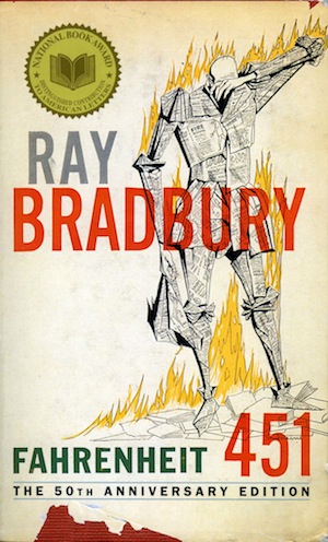 In another elegy for paper, Mark Fox in Designers & Books leaps from the famous conversation between Ray Bradbury’s characters Professor Faber and Fireman Montag in Fahrenheit 451 that begins, “Do you know why books such as this are so important? Because they have quality. And what does the word quality mean?” to Jaron Lanier’s assertion that the remix culture is responsible for “the digital flattening of expression into a global mush.” Fox sets this against Professor Faber’s elaboration of what he means by “quality”:
 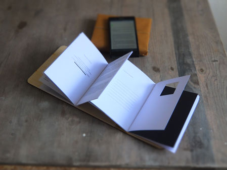 These Pages Fall Like Ash, Tom Abba
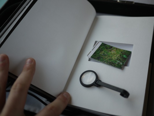 Short Films for You, Tom Abba, Els Viaene, Reinout Hiel and Yoko Ishiguro
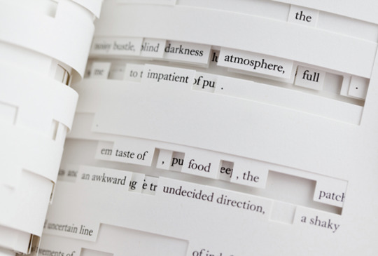 Tree of Codes, Jonathan Safran Foer
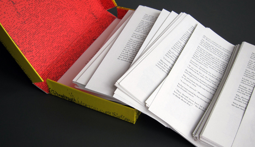 Composition No. 1, Marc Saporta
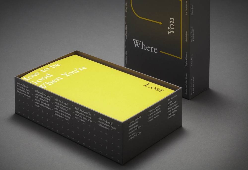 Where You Are, Visual Editions